A Statewide Study on How School Discipline Relates to Students

UNDERSTANDING COMPOSITION
Premium Photography Guide Written by Kent DuFault
Photzy

CONTENTS
Introduction 3
The What, Where, and Why of Composition 6
Art and Composition 10
What is Art? 11
Why is Composition Important? 13
Make the Activity of Asking Yourself Questions Part of Your Shooting Process 19
Using a Focal Point 29
The Natural Flow of Photographs 39
The Use of Space in Composition 46
Basic Concepts in the Use of Space 47
The Two Basic Rules of Space 48
Static Subjects versus Moving Subjects 62
Seven Basic Tools of Composition 66
Balance 67
Central Figure (Focal Point) 79
Leading Lines 85
Point of View (POV) 100
Scale 105
Frames 108
Depth of Field 112
Final Thoughts 117

INTRODUCTION

I’m sure that you’ve heard the term “snap-shooter.” This term refers to photographers that snap away with their cameras while not paying much attention to what they’re doing.
In the world of photography, we don’t generally consider it a compliment.
I’ve been involved in photography for 42 years – that’s a long time. Part of what that statement tells you is that a photographer never stops learning.
So, what establishes an individual as a “photographer” versus a “snap-shooter”?
I believe that a dedicated photographer should attempt to accomplish the following with their photographs:
1. Deliver a thoughtful and deliberate message
2. Establish a mood within the photograph
3. Cause an emotional reaction within a viewer looking at the photograph
I want to address point #3 specifically. An emotional response from viewers is a key component to your advancement as a photographer and your photography becoming recognized.
Nothing is worse than viewer apathy.
Key Lesson: Strive to create an emotional response in your viewers. That emotion could be joy or happiness. It could also be anger. Just create something that moves them, and they will remember you, and your photographs.
One of the primary tools available to you to induce the required emotional change is composition. I won’t go so far as to say it’s the only tool; however, I will say it is the MOST important tool. You could photograph a starving man in the middle of the Kalahari Desert, and if your composition is poor, no one will care.
You could photograph a magnificent sunrise over Mount Fuji in Japan during your once-in-a-lifetime vacation, and if your composition is poor, no one will care.
I believe that you don’t want to be a snap-shooter, and that’s why you’re here reading these words. I believe that you have visual stories to tell, and you want people to see and understand them.
UNDERSTANDING COMPOSITION // © PHOTZY.COM 4

This eBook is not going to solve every question you’ve ever had about composition, but it is going to give you a firm foundation on which to build your knowledge and experience.
When you complete this premium guide, you should have the following demonstrable skills:
1. An entry-level knowledge of what composition is and how it relates to your photography.
2. An increased awareness as to what “art” is and how composition plays an extremely valuable role in the definition and appreciation of art.
3. Why the history of art provides important tools for today’s photographers.
4. How composition in artwork fools the brain’s depth perception.
5. How to quickly incorporate the idea of composition into your photography (eliminate snap-shooting).
6. The importance of light, and subject placement, in a composition.
7. How the use of a focal point is a photographer’s superpower!
8. The concept of “space” as it relates to a photograph.
9. How to dissect the composition of your own photographs (or any photograph for that matter).
10. Training on seven fundamental tools of composition.
If you read this entire eBook, do all of the quizzes, and complete every assignment, then I guarantee that your photography will improve.
Are you ready to move beyond being a snap-shooter?
UNDERSTANDING COMPOSITION // © PHOTZY.COM 5
THE WHAT, WHERE, AND WHY OF COMPOSITION

If you’re new to visual arts, and photography in particular, you may be asking yourself, “What the heck is composition?”
Let’s start with some basic background information.
DefinitionComposition - noun
1. The nature of something’s ingredients or constituents. The way in which a whole or mixture is made up.
Synonyms: configuration, structure, formation, framework, form, organization, anatomy
2. A work of music, literature, or art.
Synonyms: works, work-of-art, creation, piece, arrangement
There is nothing magical about composition. Every time you raise the camera to your eye, you are, in fact, subconsciously, composing a picture.
The magic comes in the knowledge of HOW to compose your photographs in a fashion that is pleasing to others, communicates a message, and derives an emotional response.
Composition is simply the arrangement of elements within your photograph to make it appealing to the broadest audience possible.
Key Lesson: Composition, simply stated, means organizing the various elements within your photographs so that your intended message (meaning) is clearly communicated to as many viewers as possible. In the beginning, this will take thought and practice. As your skill level increases (much like riding a bicycle) it will become second nature – an unconscious reaction to events that unfold around you.
Examine the following photographs:
UNDERSTANDING COMPOSITION // © PHOTZY.COM 7

Technically, Image 001 has a composition. It was created, but the composition is disorganized. So rather than appealing to a wide audience (other than possibly this child’s relatives), it comes across as blasé. It has no universal artistic appeal.
Image 001
UNDERSTANDING COMPOSITION // © PHOTZY.COM 8

In Image 002, the photographer has utilized rules of composition. They have “organized” the photograph to “support” the subject.
Both photographs depict a similar subject: a child blowing soap bubbles. Each photograph attempts to create a similar point of focus: the child’s face and expression.
Image 001 fails because every element in the composition leads the viewer’s eyes away from the child’s face and toward the bubbles.
Image 002 is successful (and with a broad audience) because every element draws the viewer’s eyes toward the child’s face. The tools of composition used in the second photograph are frames, shapes, focal point, repetition, pattern, color, and depth of field.
Have you ever wondered where the concept of artistic composition originated?
By providing you with an understanding of where these rules, concepts, and ideas began, it will aid you in your learning process. It will also provide credibility to their worldwide acceptance.
Image 002
UNDERSTANDING COMPOSITION // © PHOTZY.COM 9

ART AND COMPOSITION

WHAT IS ART?
The creation of art is any activity that produces a product in a visual form for aesthetic or communicative purposes: expressing ideas, emotions, or a general worldview.
The human need to express themselves dates all the way back to pre-historic times.
The “elements of art” and “art-form” began to take shape as early as ancient Greece, but most of the “rules of composition” (as we know them today) were created by the master painters of the renaissance era.
Image 003 Photograph by Kaibab National Forest
UNDERSTANDING COMPOSITION // © PHOTZY.COM 11

The field of “art history” was developed in the west, with a concentration on European art history. Gradually, over the course of the 20th century, a wider vision of art history was developed. This expanded version now includes societies from across the globe.
I do not intend on making this an art history lesson for you.
My goal is to simply show you that the rules of composition go back a LONG WAY.
They are tried and true. They work. And the sooner you learn them, learn to recognize them, and learn to apply them to your own photography; the sooner you will elevate your photographs beyond the level of a simple snapshot.
Image 004
UNDERSTANDING COMPOSITION // © PHOTZY.COM 12

WHY IS COMPOSITION IMPORTANT?
Composition is important because we must fool the brain of a spectator that views our photographs!
From birth, our brain is trained to see the world in three dimensions. We have two eyes, placed on opposite sides of our head, and they send visual stimuli to our brain, which produces a three-dimensional image.
When we take a photograph, we are capturing what our brain would normally perceive as a three-dimensional scene, and we are then presenting it to our viewers on a two-dimensional medium.
Now, when a brain looks at our two-dimensional image, it evaluates the physical medium in front of it and says, “This is as flat as a pancake.”
Image 005 – Illustration by Clarisa Ponce de Leon
UNDERSTANDING COMPOSITION // © PHOTZY.COM 13

I’m sure that most of us have (at some point in our lives) stood in front of a grand scene – a scene so magnificent it took our breath away. We couldn’t wait to get our cameras out and capture the moment.
But, when we got home and viewed the results, we were very disappointed. Those mountains no longer looked so tall. The castle didn’t look so massive. The river didn’t look so majestic. The ocean didn’t look so vast. That is because without applying the rules of composition, the brain says, “You can’t fool me. That is as flat as a pancake.”
Key Lesson: Composition is the ONLY tool that you have, as a photographer, to trick a brain into seeing a three-dimensional scene within a two-dimensional medium!
This photograph is a perfect example of establishing scale through the rules of composition. There is no denying that this is a breathtaking scene. However, look at the photograph while holding your thumb over the silhouettes in the right-hand corner. Now remove your thumb and look at the entire photograph again.
Image 006 – Photograph by Kent DuFault
UNDERSTANDING COMPOSITION // © PHOTZY.COM 14

When the silhouettes of the people and signage are removed, it really loses something doesn’t it? It loses all sense of scale. Those tiny people give our brain a comparison. It now goes, “Uh huh… if those people are that small… then this must be a really big grandiose scene that I’m looking at!”
Now, I’m quite certain that there will be naysayers out there that would point out that they don’t like those people in the corner, and that’s fine. I’m not arguing that point.
Remove those people (who are a focal point, by the way), and what you have is a somewhat abstract image of water and sky.
One of the reasons that you want to learn composition is so you can make intelligent choices such as that.
If you want a photograph of water and sky untouched by mankind, then leave the people and the sign out. However, if you want to establish the magnitude of the scene in front of you, then put the people and the sign in. Knowing the rules of composition puts you in charge of making intelligent choices.
(By the way, this photograph was taken on the cliffs overlooking the Pacific Ocean near La Jolla, California – a magnificent place!)
Self Check Quiz
1. True or False: You should create photographic compositions that communicate to the smallest audience possible.
2. True or False: Composition ALWAYS requires careful, conscious, planned thought.
3. Art is used to express ideas, __________________, or a worldview.
4. Most of the rules of composition were created by _________________________.
5. Why must composition be used to “fool the brain”?
Reading Assignment:
· Read this link on art history.
Key Lesson: Your first step toward good composition is to simplify, simplify, simplify. Learning to simplify the composition of your photographs is one of the easiest, and most important, lessons that you can learn in photography.
UNDERSTANDING COMPOSITION // © PHOTZY.COM 15

When you have a creative impulse to take a photograph, handle it this way: Immediately snap a picture. This is your ‘impulse picture.’ Now, breathe for a moment and ask yourself, “What is happening here that enticed me to take this photograph? What is the story here? What is the single most important element in front of me that I want to communicate to the world?” Now, take more photographs while isolating the subject that these self-imposed questions will reveal.
Image 007 is an excellent example of the “impulse picture.” The photographer saw something that interested them. They wanted to say something about this place, or perhaps the children, or the moment, or the activity. But the impulse shot is too busy and disorganized. It doesn’t tell us anything about the place, or the child, or the activity, or the relationship between the children, or the relationship between the child and his surroundings. It lacks focus and a story. The composition fell short in communicating a universal message.
Image 007
UNDERSTANDING COMPOSITION // © PHOTZY.COM 16

Simplify your photographs and you will create viewer impact.
Image 008 has a similar “feel” to Image 007. It was shot on the street, and likely it was taken very quickly, as the action unfolded.
But this photographer chose to isolate the man and make him “the story.”
You can tell by examining the photograph that there was probably an interesting background.
But by simplifying the image, the photographer has created a stronger statement about the man, his situation, and his activity. That is what art is all about: communicating an idea, emotion, or worldview.
Image 008 - Photograph by Thomas Leuthard
UNDERSTANDING COMPOSITION // © PHOTZY.COM 17
Self Check Quiz:
1. What is an “impulse picture”?
2. What questions should you ask yourself after taking the impulse picture?
3. What key feature of a successful photograph was Image 007 missing?
4. What was the man in Image 008 doing?
5. What was the boy in Image 007 looking at?
Shooting Assignment:
1. Shoot a tabletop photograph of an apple using window light. Work through the lighting and your framing until you get an image that you’re happy with.
2. Photograph the same apple along with a knife, a cutting board, two other pieces of fruit, and a glass. Again, work with the lighting and the framing of the photograph until you get an image that you’re happy with. Remember, the apple is your subject. When you have completed both photographs print them out and study them. Which one makes a stronger, more aesthetic statement about the apple?
You now have the concept of simplification firmly embedded in your process. What’s next?
UNDERSTANDING COMPOSITION // © PHOTZY.COM 18

MAKE THE ACTIVITY OF ASKING YOURSELF QUESTIONS PART OF YOUR SHOOTING PROCESS
Begin the creative process of taking a photograph by asking the following question: “What really is my subject?” This might sound ridiculous, but it isn’t.
A lot of photographers, especially new ones, don’t really take the time to identify what they are trying to convey through a photograph.
They see something that interests them, but they don’t single out why it interests them.
Let’s discuss an example.
You’re in a room full of children that are exchanging Valentine’s Day cards and eating Valentine’s Day candy. There is a lot of activity, and you’re snapping away with your camera. Later, when you examine your photographs at home, you notice a particular boy. His face was covered with chocolate. He made a particularly funny face when a pretty young girl handed him a valentine. You’re dismayed because that poignant moment was lost in a sea of heads and activity. It’s possible, if you had stopped for a moment and asked yourself “Who, or what, is my subject here?” you may have noticed the boy with the chocolate-covered face. You may have noticed
the girl as she glanced at him. You may have noticed her as she prepared to hand him the valentine. You might then have made a decision to simplify your composition and hone in on this poignant moment as it unfolded in front of you.
Key Lesson: Good composition BEGINS with asking, “What is my subject?” Then simplify and organize the scene to highlight that subject.
Practice the following two elements of composition:
1. Ask questions
2. Simplify
Do this until these two activities become second nature.
When that happens, you are ready to build up your toolbox of composition tools. You can then begin adding the other rules of composition to your repertoire.
UNDERSTANDING COMPOSITION // © PHOTZY.COM 19

After identifying your subject, there are four basic questions that will help you build your composition.
1. What is the direction of the light source?
2. What is the best placement of the subject within my camera frame?
3. What other elements within the scene can “point” to my subject?
4. What other elements within my scene will “distract” from my subject?
Direction of the Light Source
The direction of the light source(s) should be your primary consideration. The direction of the light source(s) significantly influences your choice of camera angle to the subject.
Is it feasible to shoot with the light source behind the subject? Do you want light that “models” the subject (highlights texture and shape)? Is the light source, itself, an element of your composition?
Keep these suggestions in mind (especially when you’re a beginner).
1. Don’t use back lighting (light that comes from behind your subject) unless you WANT a silhouette.
2. When photographing people, don’t position them so that the light source is directly into their face.
3. Most subjects look their best when the light source comes from in front of the subject and at about a forty-five degree angle to the subject.
UNDERSTANDING COMPOSITION // © PHOTZY.COM 20

These are basic tips to help you begin to understand the importance of lighting when making choices about composition. With practice, you’ll learn to recognize the direction of light without even thinking about it. But, as with most things in life, your brain needs training to make that connection.
Recommended Reading
· Understanding Light: Book One · Understanding Light: Book II
Image 009
UNDERSTANDING COMPOSITION // © PHOTZY.COM 21
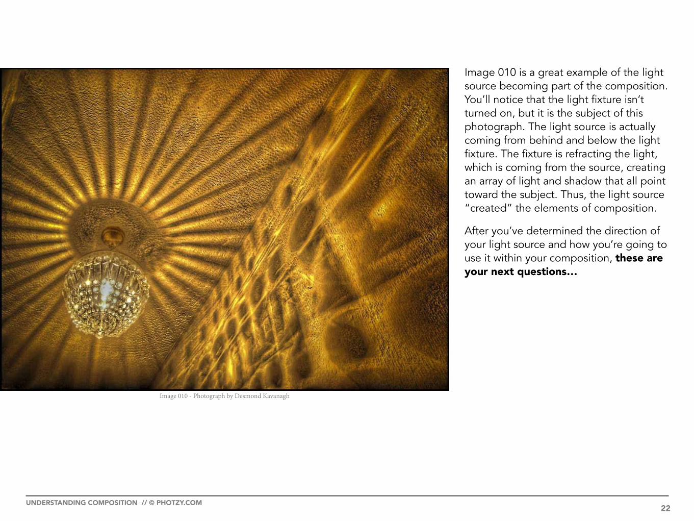
Image 010 is a great example of the light source becoming part of the composition. You’ll notice that the light fixture isn’t turned on, but it is the subject of this photograph. The light source is actually coming from behind and below the light fixture. The fixture is refracting the light, which is coming from the source, creating an array of light and shadow that all point toward the subject. Thus, the light source “created” the elements of composition.
After you’ve determined the direction of your light source and how you’re going to use it within your composition, these are your next questions…
Image 010 - Photograph by Desmond Kavanagh
UNDERSTANDING COMPOSITION // © PHOTZY.COM 22

Subject Placement
We’re going to get into subject placement with a bit more depth in a moment. For now, plant this thought in your head: In most instances (as a beginning photographer), you do not want a subject to be centered within the frame of your photographs!
Pointers
Ask yourself, “What elements within my photograph can point to (highlight) my subject?”
Look for objects within your photograph that can direct a viewer’s eyes toward your subject.
There are some guidelines for this, but for now I simply want you to make yourself aware. Begin the process of conscious thought – what can visually point toward my subject?
Key Lesson: Look for objects that can become “pointers” toward your subject.
Go back for a moment to when you were in elementary school. Remember when the teacher would stand at the front of the class with a long wooden pointer (if you’re my age – if you’re younger it might have been a laser pointer). The teacher would comment on something that they had written on the chalkboard and then he or she would point at it with their pointer to highlight their verbal comment.
Everyone’s head in the class would turn to look at what the teacher was pointing at.
This is a concept that you want to apply in your photography. You want to turn everyone’s head toward that one element that you’ve singled out as your subject – the one you’re “pointing at”!
UNDERSTANDING COMPOSITION // © PHOTZY.COM 23
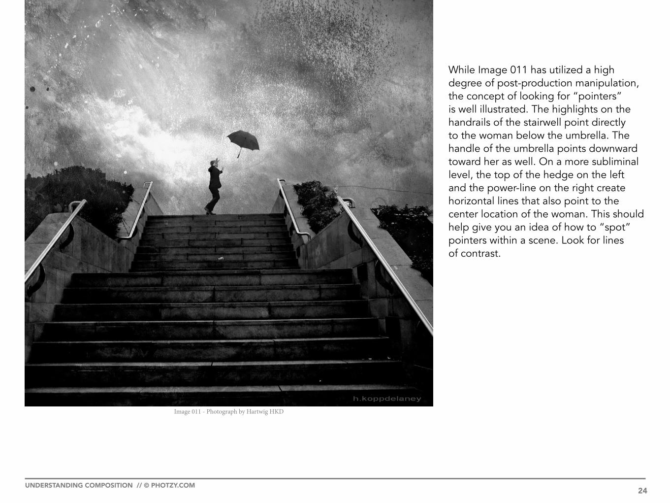
While Image 011 has utilized a high degree of post-production manipulation, the concept of looking for “pointers” is well illustrated. The highlights on the handrails of the stairwell point directly to the woman below the umbrella. The handle of the umbrella points downward toward her as well. On a more subliminal level, the top of the hedge on the left and the power-line on the right create horizontal lines that also point to the center location of the woman. This should help give you an idea of how to “spot” pointers within a scene. Look for lines of contrast.
Image 011 - Photograph by Hartwig HKD
UNDERSTANDING COMPOSITION // © PHOTZY.COM 24

Distractions
Ask yourself this question.“What elements within my scene distract from my subject?”
This question is a bit more difficult to quantify.
However, there is one tip that is almost always a universal truth.
Key Lesson: You don’t want any bright or unusually shaped objects near the edge of your frame or behind your subject. These are what I call “eye snags.” As a viewer’s eyes scan your photograph, eye snags cause their eyes to stop in a place that you don’t want them to stop; the viewer’s eyes will become interrupted in their quest to find your subject. As you begin to develop your skills, you’ll learn to spot these distractions and compose your photograph while excluding them.Image 012 - Photograph by David Woo
UNDERSTANDING COMPOSITION // © PHOTZY.COM 25

Image 012 has an obvious eye snag. A viewer’s eyes move toward the subject and then blast right on past toward the white truck in the background.
Plant this image in your mind. This distraction could have been easily avoided (had the photographer recognized it) by waiting just a few seconds longer for the vehicle to pass, or by simply taking a few steps to one side or the other.
Key Lesson: Consciously move your field of vision toward the upper-left corner of your image frame (when looking through your camera’s viewfinder). Begin to scan it like you’re reading a book: left to right and down one line at a time. Practicing this will teach you to see pointers and eye snags. After a while, you will no longer have to consciously do this. Your brain, and the force of habit, will do it for you.
In the image on the next page (Image 013), the subject lies sleeping in a literal minefield of eye snags. One is irrefutable; the other three could be debated depending on your point of view.
The irrefutable one is the small white sign surrounded by shadow which really makes it pop out from the background. It is so strong that a viewer will likely notice it first before even seeing the man on the bench.
The other three (debatable) eye snags are the trashcan, the light pole, and the white building in the upper-right corner.
Key Lesson: Analyze the elements in your proposed photograph using a simple rule: does it add or detract from the subject?
In this case, the subject is the sleeping man.
I feel that all four of the previously-mentioned elements detract from him.
What do you think?
UNDERSTANDING COMPOSITION // © PHOTZY.COM 26

Image 013 - Photograph by Sascha Kohlmann
UNDERSTANDING COMPOSITION // © PHOTZY.COM 27

Now, I can almost hear the photographer defending their inclusion of the trashcan and the light pole by saying, “They frame the subject!” And while I can’t argue that point, I can say, “Those elements are too bright. They outshine the subject and draw the viewer’s eyes away from the man rather than toward him.”
Key Lesson: Train yourself to see distractions. Keep in mind that light tones generally overpower dark tones. Bright colors generally overpower dark colors. Odd shapes will almost always overpower flat, even planes of space.
Self Check Quiz
1. Can a light source be the subject?
2. True or False: As a beginning photographer, you want to center your subject in the frame so as not to cut off anything important.
3. True or False: When discussing composition, “a pointer” is a tip that tells you how to frame your subject.
4. True or False: Eye snags do not interrupt a composition – they simply create a visual annoyance.
5. When teaching yourself to spot eye snags, how should you scan the frame (within your viewfinder) with your field of vision?
6. What is a key lesson in analyzing whether an element should be included in a photograph or not?
Shooting Assignment:
Pick an existing photograph from your files. Pick one that depicts a subject that you like, can easily return to, but you’ve never really been satisfied with your resulting photographs. Using everything that we have discussed to this point, evaluate your efforts. Now, go back to the same subject and photograph it again. When you’re done, compare the images.
UNDERSTANDING COMPOSITION // © PHOTZY.COM 28

USING A FOCAL POINT

Sit back for a moment and imagine yourself sitting on the front porch of a house. You’re looking out at the scene in front of you: there are trees, a street, two sidewalks, and houses on the other side of the street. As you look out, do your eyes continuously wander nonstop? No. They come to rest: on a squirrel in a tree, on a child bouncing a ball on the sidewalk, or on an older woman looking out a window. Sure, we’re looking at the entire scene, but we look at the squirrel and let our eyes rest, then we look at the child and let our eyes rest, and now we look at the woman and let our eyes rest, and so on.
These are focal points – resting spots. In photographic composition, I like to think of them as “anchors.” They keep the viewer’s eyes from wandering aimlessly, unsure what to take in next.
Eye snags are focal points, but they are inadvertent and ill placed. Focal points are there on purpose. You place them to anchor your viewer’s eyes within your photograph, usually near your subject.
In general, photographs will have one focal point. Sometimes the focal point is the subject, and sometimes it merely supports the subject.
Think back to our earlier photograph of the dramatic ocean and sky scene (Image 006, the one with the people and the sign down in the right corner of the photograph). Despite the fact that the people and the sign are a tiny miniscule element within the photograph, they were an important “focal point” because they helped establish scale.
Look at this photograph.
UNDERSTANDING COMPOSITION // © PHOTZY.COM 30

Image 014 has the same “feel” as Image 006. It depicts a vast ocean beach scene, the point of view is looking down, and a person is within the scene, but represented as a tiny spec.
The two photographs in question were taken very near each other. But in the case of Image 014, the focal point IS the subject.
Now, why is the focal point THE SUBJECT in Image 014, but not in Image 006? The reason is because of placement and motion (those are two other elements of composition that we will be discussing shortly).
Look at the image on the left (Image 015) with the person removed from the scene.
It really becomes quite meaningless, doesn’t it?
That’s the power of a focal point!
Let’s look at a few other case studies of focal points.
Image 015 - Photograph by Kent DuFault
UNDERSTANDING COMPOSITION // © PHOTZY.COM 32

In Image 016, the focal point is the insect’s eyes. The “subject” is the insect. But, the unusual shape of the eyes (compared to all the other elements within the photograph) bring the viewer’s field of vision to rest on the insect’s eyes. Take note how the legs and antennae of the insect work as pointers!
The following two photographs (Image 017 and 018) were taken under similar conditions. One has a focal point, and the other one doesn’t. Examine both photographs and determine for yourself which is the stronger image!
Image 016
UNDERSTANDING COMPOSITION // © PHOTZY.COM 33

Image 017 - Photograph by the United States Navy
UNDERSTANDING COMPOSITION // © PHOTZY.COM 34

Image 018 - Photograph by Tom Taker
UNDERSTANDING COMPOSITION // © PHOTZY.COM 35

Image 017 has a focal point, and Image 018 doesn’t. What happens if you don’t include a focal point? I’m sure that some of you will argue, “The flowers in Image 018 are a focal point!” Or, “The flag in the foreground of Image 018 is a focal point!” Art is always up to interpretation, isn’t it? I don’t think either of those two components (the flowers or the foreground flag) are strong enough to stop the eyes. In Image 017, with the sailor, you cannot prevent your eyes from stopping and looking at him. Now, you may argue, “Well of course my eyes will stop there! He’s the subject.” Again, that is up to interpretation. In my interpretation, the cemetery is the subject. That’s what the photograph is about: the cemetery. Without the cemetery, the kneeling sailor has no meaning. Without the sailor, the cemetery still has meaning – it simply lacks a focal point.
Image 019 is a beautiful scene; yet, it doesn’t feel complete. It doesn’t satisfy. The eye doesn’t have a resting place. It feels unfinished. It needs some type of focal point, such as a red stickman running down the path. (Kidding! For illustration purposes only.)
Image 019
UNDERSTANDING COMPOSITION // © PHOTZY.COM 36

Sometimes a focal point will be naturally available within the scene, but sometimes it won’t. This is where you must put your creative “thinking cap” on. I was presented with this beautiful scene in Alaska (Image 020), but it lacked a focal point, so I created one by throwing a rock into the water.
Key Lesson: Does a photograph always need a focal point?
No. However, if you’re in the early stages of learning composition, it is an excellent tool for improving your photography almost immediately. As you gain experience, you will learn when a focal point is necessary and when it’s not.
It’s all part of the learning process.
Image 020 - Photograph by Kent DuFault
UNDERSTANDING COMPOSITION // © PHOTZY.COM 37

Self Check Quiz:
1. What tool of composition stops eye movement across a photograph?
2. True or False: A focal point MUST be near the subject.
3. True or False: A photograph must always contain a focal point to be successful.
4. Without a focal point, a photograph can feel _____________________.
5. A focal point can be found or _______________.
Shooting Assignment:
Photograph a landscape, or a cityscape, while making use of a focal point. Then, photograph the same subject and remove the focal point. Evaluate your results. Which image is stronger?
UNDERSTANDING COMPOSITION // © PHOTZY.COM 38

THE NATURAL FLOW OF PHOTOGRAPHS

Should my photograph be horizontal or vertical?
This is one of the most common composition mistakes that beginner photographers make over and over again. (I even see experienced photographers making poor choices in this area of photography.)
It’s easy to see why!
Camera design lends itself to holding a camera in a horizontal orientation. Yes, it is easy to turn a camera into a vertical orientation; however, it’s not a natural inclination.
Key Lesson: Learn to “see” the natural flow of your subject. This may sound easier than it actually is, especially when you’re just starting out.
Photographers often get excited when they discover something they want to photograph.
Try to remember to calm yourself down, almost like a hunter.
Hunters stop themselves from overreacting. They breathe methodically and go into slow motion. It’s all part of the process for them to make an accurate shot.
Photography is much the same way. Calm down. Stop and think about what you’re doing.
If you are shooting a tall building, does it make sense to hold the camera horizontally?
If you’re photographing a bridge spanning a river, does it make sense to hold the camera vertically?
All subjects have a natural flow. Learn to recognize it.
Why is this important? You can crop, right?
The main reason is to conserve the resolution of your camera’s sensor.
You paid big bucks for a megapixel camera, why would you want to lose half that resolution (or more) because you need to crop your horizontal image into a vertical one?
Let’s see if we can identify the “flow” in these example photographs.
UNDERSTANDING COMPOSITION // © PHOTZY.COM 40

The hand holding a peapod in Image 021 has a strong horizontal flow. The hand is angled from left to right. The open peapod is almost completely horizontal, and the colorful blue bowl creates a frame on the left, which forces the eyes to move horizontally, left to right.
Hold your hands in front of you. Raise both index fingers. Leave a space of about one inch between them.
Image 021 - Photograph by Kent DuFault
UNDERSTANDING COMPOSITION // © PHOTZY.COM 41

As illustrated by the model in Image 022, view Image 021 (of the peapod in the hand) through the space created by your fingers (creating a vertical frame). Slide your upright fingers left and right across the horizontal image (021). Can you find any vertical framing that looks as good as the horizontal version?
No, and the reason is simple: the flow of this image is horizontal.
Image 022 - Photograph by Kent DuFault
UNDERSTANDING COMPOSITION // © PHOTZY.COM 42

The example depicted in Image 023 is a little less obvious. What do you think the natural flow is? I think it’s vertical. Once again, hold your hands out in front of you, but place your index fingers horizontally (like in Image 024a), and leave that one-inch space.
Image 023 - Photograph by Kent DuFault
UNDERSTANDING COMPOSITION // © PHOTZY.COM 43

Slide your fingers up and down while viewing Image 023. Does any horizontal composition look as pleasing? I don’t think so. The reason is the vertical positioning of the child’s arms. They lead the viewer’s eyes to the girl’s expression, and they create a vertical flow.
The flow of the image is vertical.
Image 024a - Photograph by Kent DuFault
Image 024b
UNDERSTANDING COMPOSITION // © PHOTZY.COM 44

What do you think the natural flow of Image 025 is? I felt it was horizontal. This image could be cropped vertically and still include all the elements: the man, the wheat, the combine, and the sky. Would it be as strong? You decide.
Quick Activity:
Evaluate three of your existing un-cropped images. Can you determine the flow of the subject? Did you choose the proper framing for the flow of the subject?
Shooting Assignment:
Take your camera out on a photo expedition. Consciously look for the flow of your subjects. Photograph your chosen subjects vertically and horizontally. Take notes as to what you felt the flow of the scene was while you were taking the pictures. Evaluate your results. Did you correctly identify the “flow”?
Image 025 - Photograph by Kent DuFault
UNDERSTANDING COMPOSITION // © PHOTZY.COM 45

THE USE OF SPACE IN COMPOSITION

BASIC CONCEPTS IN THE USE OF SPACE
The use of space in photography, or any art form for that matter, is a subject that is debatable.
New photographers (who are learning the art of composition) are best served by studying two basic principles on the use of space.
Before we discuss those two principles, let’s define the term “space.
”Think of the term “space” in this way.
You have an empty room and five pieces of furniture. You then set about the process of placing that furniture within the room. You may place all of the furniture at one end of the room, leaving the other end of the room feeling more open. You might also spread the furniture throughout the room, so that the room feels equally balanced no matter where you are in the room.
“Space,” in photographic composition, is the same thing.
The rectangular frame that will become your photograph is the “room.” Whatever objects you are going to include in your photograph are the pieces of furniture. How you place those objects within your photograph is your use of the “space.”
UNDERSTANDING COMPOSITION // © PHOTZY.COM 47

THE TWO BASIC RULES OF SPACE
Once you have the following two principles on the use of space firmly implanted in your mind, you can then open up to other more advanced techniques without confusing yourself. You can then even experiment with breaking the rules on the use of space in photography! The two principles are:
1. The Rule of Thirds
2. The 1/3 - 2/3 Rule
These two rules are important because they have been proven over the test of time.
The Rule of Thirds
The Rule of Thirds states that an image should be imagined as divided into nine equal parts by two equally spaced horizontal lines and two equally spaced vertical lines. The important elements of the composition should be placed along these lines or near their points of intersection.
Proponents of the technique claim that aligning a subject with the cross-points creates more tension, or energy and interest in the composition, than simply centering the subject.
History has proven that this concept is basically true.
Does this mean that you must follow this rule every time?
No, it doesn’t.
However, by engraining this concept into your mind, you will learn to recognize when you can successfully break the rule.
Let’s examine some case studies that utilize the Rule of Thirds.
UNDERSTANDING COMPOSITION // © PHOTZY.COM 48

By placing the cathedral (Image 026) in the lower-right corner, I created a natural flow of left to right. The curved horizon line of the hill acts as a pointer toward the building, and the cross at the top of the steeple is a focal point. Form a box with your hands and view the photograph with the building centered in the image. It really loses some of the mood, doesn’t it?
Image 026 - Photograph by Kent DuFault
UNDERSTANDING COMPOSITION // © PHOTZY.COM 49

In this example (Image 027), I placed the farmer in the upper-left, near the intersection (sweet spot) of the horizontal and vertical lines. This makes perfect sense as the farmer (subject) is looking off to camera right.
Key Lesson: When a subject is looking off to one side or another in your photographs, it’s (generally) a good idea to allow more “space” in the direction that they are looking toward. You don’t want them looking directly out of the frame.
Image 027 - Photograph by Kent DuFault
UNDERSTANDING COMPOSITION // © PHOTZY.COM 50

In Image 028, we have two subjects that carry “almost” equal weight within the space. Notice that the train conductor on the left is placed closer to the intersection (sweet spot) of the Rule of Thirds, while the conductor on the right is placed on the vertical line but between the horizontal lines. This gives the conductor on the left a slightly heavier “weight” within the composition.
Key Lesson: When you have more than one subject in your photograph, it’s usually best to make “one” the primary subject. This is important so that your viewer’s brain knows where to stop and achieve some finality.
Now, there are exceptions to this idea, such as group portraiture. Obviously, you don’t want to highlight one group member over all of the others. But, in general, you’ll want to establish a primary subject using the rules of composition.
Image 028 - Photograph by Kent DuFault
UNDERSTANDING COMPOSITION // © PHOTZY.COM 51

With time and practice, it will become so second nature that you won’t even realize that you’re establishing primary and secondary subjects within your photographs!
Let’s look at how the Rule of Thirds applies to a portrait situation.
Study this portrait of the baby. Look specifically where the eyes and the mouth land on the Rule of Thirds grid: each of them is at a point of intersection. With portraiture, your main goal is to place at least one of the eyes (the one that is most in focus) on or near a point of intersection.
Image 030 is another example.
Key Lesson: If the framing of your image allows for only one eye to be placed on a point of intersection, make sure it’s the one that is in focus!
Image 029 - Photograph by Kent DuFault
UNDERSTANDING COMPOSITION // © PHOTZY.COM 52

Let’s look at a different portrait situation.
This portrait (Image 031) demonstrates how well the Rule of Thirds applies to any situation. The activity of the boy leaning to camera right creates tension. It places the head near the sweet spot (of the Rule of Thirds) in the upper right of the grid. This small touch adds significantly to what could have been a bland image of a boy just standing there.
Key Lesson: When you’re taking portraits, imagine the Rule of Thirds grid in your viewfinder; some digital cameras actually have this feature built into them. Before you click the shutter, look at the subject’s head, body, or eyes. Could a slight movement on the subject’s part, or your part, put them in the sweet spot? Simple decisions like this take your photographs to the next level.
Image 031 - Photograph by Kent DuFault
UNDERSTANDING COMPOSITION // © PHOTZY.COM 54

The 1/3 - 2/3 Rule
The 1/3 – 2/3 Rule is an offshoot of the Rule of Thirds.
Basically, what it says is that, when viewing artwork, the human mind finds it most pleasing if the “space” utilized in the artwork is divided into components of 1/3 and 2/3s.
Image 032 is strictly an example. The 1/3 - 2/3 Rule can divide the space within the frame vertically or horizontally.
Landscape photographers often utilize this rule, and it is probably easiest to explain the rule by examining this niche as an example.
Image 032
UNDERSTANDING COMPOSITION // © PHOTZY.COM 55

In landscape photography, you almost always have a natural horizon line. In applying the 1/3 - 2/3 Rule, landscape photographers will often give 1/3 of their image space to the sky and 2/3s to the land, or, they will do the opposite, giving 2/3s of the image space to the sky and 1/3 to the land.
This tactic has two effects. Firstly, it prevents them from placing the horizon line in the center of the image, and thereby lessening the tension created. Secondly, it also establishes one (sky or land) as the primary subject.
As with everything else in art, this rule is often broken.
There are times where placing the horizon line directly in the center of the image does create an interesting symmetry.
Study the rules and apply them until they become second nature; then you will begin to recognize when to break them.
Image 033
UNDERSTANDING COMPOSITION // © PHOTZY.COM 56

Image 034 is a great example to study the Rule of Thirds and the 1/3 - 2/3 Rule. Try to imagine if the placement of the tree were in the center of the image, or if the curved horizon line was placed higher or lower within the frame. Do you think the image would be as strong? Okay, put this into your head, please (I can already see the emails coming in): That tree isn’t exactly in the sweet spot for the Rule of Thirds! And those aren’t EXACTLY 1/3 and 2/3 divisions! Art isn’t about exacting rules. It’s not like we’re designing a rocket ship, and if the specs aren’t correct the thing is going to fall apart upon takeoff. Rules of composition are guidelines, to help you use your head, to try and organize your photographs, so that someone outside of your head has some inkling what you were trying to say. That’s it. That’s all it is – interpretation. I hope you get that. Image 034 - Photograph by Bert Kaufmann
UNDERSTANDING COMPOSITION // © PHOTZY.COM 57

Image 035 is a beautiful photograph. This seascape has utilized the 1/3 - 2/3 Rule. Both the shoreline and the ocean are quite dramatic. However, if the photographer had placed the line of demarcation between them, closer to the center of the image, it would be confusing to the viewer, especially when both are so visually stimulating. The viewer would subconsciously wonder, what is the subject? What should I be looking at? The photographer chose to highlight the ocean and thus gave it 2/3s of the space. We now have a clearly defined subject; it’s the ocean, and the shoreline is a supporting element.
Image 035 - Photograph by Paulo Brandao
UNDERSTANDING COMPOSITION // © PHOTZY.COM 58

Image 036 also made good use of the 1/3 - 2/3 Rule.
When photographers are shooting a scene with a reflection, they have a tendency to center the horizon line. While this may work in certain instances, it has a tendency to turn the subject into more of an abstract view.
In Image 036, the photographer chose to give the strength to the sky.
If you take notice of the dark angular object in the lower-right corner, it’s an indication that something was “in the way” at the lower part of the frame. Occasionally, you will find that your 1/3 - 2/3 decisions are “forced” by distractions that you don’t want to include.
Image 036 - Photograph by Paul Bica
UNDERSTANDING COMPOSITION // © PHOTZY.COM 59

You may occasionally use part of a rule of composition, and then break other parts.
Image 037 has done just that.
You can see that the 1/3 - 2/3 Rule was applied, but the 1/3 was placed dead center in the image! The 2/3 portion has now become a frame! Isn’t photography fun? So much to learn!
Key Lesson: The human eye is attracted to contrast. In general, a lighter area within a photograph will attract the viewer’s eyes first over a darker area. You can utilize dark areas to force the viewer’s eyes in the direction you want them to go. Conversely, you don’t want bright lightly colored areas anywhere that could lead the eyes away from your subject. Image 037 makes excellent use of this human trait to seek contrast with a priority to a lighter area.
Image 037
UNDERSTANDING COMPOSITION // © PHOTZY.COM 60

Self Check Quiz:
1. What helps a photographer determine if a photograph should be created in a horizontal or vertical format?
2. What is the “downside” to cropping, especially a significant crop?
3. Define the term “space” as it relates to photography.
4. Why are the Rule of Thirds and the 1/3 - 2/3 Rule so important?
5. True or False: Always follow the Rule of Thirds in landscape photography.
6. You’re taking a wedding portrait. Is it a good idea to have the bride looking off-frame?
7. Taking the Rule of Thirds into consideration, if you have two subjects in your photograph, how can you make one subject primary over the other?
8. When creating a portrait headshot, what should be placed in the crosshairs (the sweet spot) of the Rule of Thirds?
9. What type of photograph often utilizes the 1/3 - 2/3 Rule?
10. The human eye is attracted to ____________________ and will often gravitate toward _____________ areas over ___________ areas.
Shooting Assignment:
1. Photograph a landscape utilizing both the Rule of Thirds and the 1/3 - 2/3 Rule. Then, photograph it again and break both rules. Compare your results.
2. Photograph a head and shoulders portrait utilizing both the Rule of Thirds and the 1/3 - 2/3 Rule. Then, photograph the subject again and break both rules. Compare your results.
UNDERSTANDING COMPOSITION // © PHOTZY.COM 61

STATIC SUBJECTS VERSUS MOVING SUBJECTS

There is always an element of excitement, and frustration, when learning something new. Learning composition isn’t all that different from learning to sing, or to play an instrument, or even playing golf.
When a person starts out playing golf, they spend a lot of time concentrating on the fundamentals. How should they stand? How should they hold their arms? Are their shoulders correct? Is their head down? A new golfer thinks about these things as they approach the tee box. They continue to think about it as they’re lining up for their shot. And, they’re really thinking about it after they shank their drive into the left rough.
So, what does the golf metaphor have to do with photography and composition?
It’s about taking methodical steps to become proficient. We’ve talked about the “up front” process – asking yourself questions and training yourself to see the frame.
However, there is more that you can do.
When you take a photograph that doesn’t work the way you envisioned, analyze it. Don’t just toss it aside and move on. Figure out why it didn’t work. You can also take this step further. Search for photographs that you think are fantastic, and analyze why they’re fantastic.
Don’t let yourself jump to the easy answer, “Well it’s a volcano erupting in Hawaii – how could it not be fantastic?”
Imagine if the image was formatted vertically instead of horizontally, or vice versa. Imagine if the subject of the photograph was centered, or not. Change it in your mind until you turn it into a lousy photograph.
Why does this exercise work? It will get you thinking about what decisions the photographer made to create a successful image.
New photographers think that it’s about having a great camera, or an exotic lens, or being in the right place at the right time, and then just snapping a picture.
Nothing could be further from the truth. Even an erupting volcano in Hawaii can look uninspiring if the image is not composed well.
I would like you to start learning composition by beginning with static subjects and analyzing your efforts.
UNDERSTANDING COMPOSITION // © PHOTZY.COM 63

The proposed exercise is the same as a golfer taking practice swings.
You are “perfecting your swing.”
Put in some shooting time with static, motionless objects, such as the laundry hanging outside the window in Image 038. Analyze your results. Print your images out on plain paper and draw out your compositions, just as I did in Image 038. Slowly begin to move your photographic subjects toward things that are in motion. Objects that are in motion require a lot more experience to compose properly.
Image 038 - Photograph by Kent DuFault
UNDERSTANDING COMPOSITION // © PHOTZY.COM 64

The reason that moving subjects are more difficult to compose is that you need the additional experience of pre-visualization, anticipation, timing, and peripheral vision.
Recommended Reading:
· When you’re ready, the subjects of pre-visualization, anticipation, timing, and peripheral vision are covered thoroughly in the Advanced Composition guide.
Assignment:
Find 10 images that you absolutely love on Flickr. Then analyze them (using the rules of composition discussed so far). Write down why you think they are appealing. Can you make them unappealing by changing their composition?
Image 039 - Photo Illustration by Kent DuFault-Original Photograph by PD Breen
UNDERSTANDING COMPOSITION // © PHOTZY.COM 65
SEVEN BASIC TOOLS OF COMPOSITION

BALANCE
One of the first components of a good photographic composition is balance.
Most photographs contain multiple elements, and it’s your job to distribute the “visual weight” of each element within the photograph.
Visualize a scale.
You want your main subject to be “visually” heavier than all of the other elements combined. Put your main subject on one side of the imaginary scale and then pile all the rest of the other elements onto the other side of the scale.
The scale should still tip in the direction of your main subject.
Image 040 - Photograph by Winifredxoxo
UNDERSTANDING COMPOSITION // © PHOTZY.COM 67

How do you accomplish this?
You accomplish this through proper placement of the subject within the frame, a critical focus on the subject, and by using the other elements within the photograph to point at the subject, thus avoiding distractions or misdirection.
Let’s study a few examples and determine if the scale is properly “tipping” on the side of the main subject.
Image 041 has definitely tipped the scale in the direction of the subject. Despite the fact that the little girl is a minor part of the total image space (the frame of the photograph), all of the other elements carry less weight in the composition, because they all point toward her.
Image 041 - Photograph by Thomas Leuthard
UNDERSTANDING COMPOSITION // © PHOTZY.COM 68

What are the elements that point toward her?
1. The bright red cap and her unique expression (storytelling action) are right on the sweet spot for the Rule of Thirds. Plus, the red cap is the brightest (the human eye seeks bright over dark) element within the composition; the hat acts as a strong focal point, drawing the viewer’s eyes to the girl, and ultimately her face.
2. The arms of the adults, and the banner held by the boy, form a frame around the girl’s face and body.
3. While the boy in the upper left is somewhat of an eye snag (because he has a fairly bright tonal value compared to the girl’s face), he plays an important “secondary subject role” by adding depth and meaning to the overall photograph. This is particularly true because her line of sight leads in his direction. Cup your hands in front of your face and crop the boy out (see Image 042 as an example).
Image 041 definitely loses something when the boy in the upper left is cropped out. His presence adds to the mood and story of the image, both of which are key components to a good composition. So, although the boy has significant weight in the composition, the scale still tips in the direction of the little girl due to the focal point and the frame.
Image 042
UNDERSTANDING COMPOSITION // © PHOTZY.COM 69

Image 043 doesn’t work as well (from a composition perspective). The idea behind it is excellent. But the mural in the background and the walking man carry equal weight. It’s difficult to discern what the main subject is.
Why is there equal weight?
There is equal weight because the mural is large, contains a compelling expression (the equivalent to action), and the whites of the eyes are a dominant brightness value within the frame.
If that’s the case, then why isn’t the man a secondary subject?
The man is in motion, which almost always commands a great deal of attention within a composition. He’s also looking at an object in his hand, which in effect creates a “pointer” (also known as “line of sight”). He’s brighter than most of the background behind him, creating contrast interest, and he’s placed at the edge of the frame; he’s almost walking off the picture.
Image 043 - Photograph by Thomas Leuthard
UNDERSTANDING COMPOSITION // © PHOTZY.COM 70

This photograph may have had an improved composition if the man was standing instead of walking or if the lighting was brighter on the mural leaving the man at a darker value or if there was more space to the right of the man so that he was closer to the sweet spot for the Rule of Thirds.
Key Lesson: When you photograph objects in motion, it’s generally best to have them moving into the frame, not out of the frame.
Sometimes, photographs can be quite convoluted in their structure and the use of space, but it still makes a strong statement. Image 044 is an excellent example of that.
Despite the fact that there is a lot going on within the frame, the viewer’s eyes go directly to the action located on the lower-right side of the image. (It’s pretty hard to miss!)
Why is that?Image 044 - Photograph by Francisco Osorio
UNDERSTANDING COMPOSITION // © PHOTZY.COM 71

The first reason is placement. The action is directly on the sweet spot for the Rule of Thirds. The second reason is that the activity is large within the image (motion always attracts attention). The third reason is that the arms become pointers to the hands.
Think about this.
The rest of the elements within the image are just as important to the story the photographer was trying to tell, which is a young lover’s display of intimate affection in a rather public place.
Key Lesson: When you’re creating photographs, imagine the scale we saw earlier (Image 040). Try to visualize the weight of each element within your photograph. Does your subject hold the most visual weight? Is there anything that you can change to add more visual weight to the subject and lessen the visual weight of surrounding objects?
Self Check Quiz:
1. Moving objects tend to attract_____________ attention.
2. What do golf and photography have in common?
3. Why are moving objects difficult to compose?
4. What element in your photographs should carry the most weight?
5. Name three things that help a “subject” carry more weight in a composition.
6. When a subject is moving in a photograph, it’s generally best if it’s moving ____________ the frame.
Shooting Assignment:
Go out and do a self-assigned street photography session. Include multiple subjects and utilize the techniques that you’ve learned thus far. Work hard to provide “more visual weight” to your primary subject and less visual weight to secondary subjects.
UNDERSTANDING COMPOSITION // © PHOTZY.COM 72

Shape
One of the strongest tools available to you for planning composition is the use of shape.
Unusual shapes are a natural focal point. They can also be used to direct the viewer’s eyes, because our minds will follow the edge of an unusual shape.
Unusual shapes also work well as the subject, especially if you’re trying to create something more abstract.
One big key to your success as a photographer is to train your mind to see shapes.
This comes naturally to some folks and not so easily to others.
When you learn to identify shapes within a scene, you will begin to utilize them in an artistic fashion.
Silhouettes (Image 045) are often utilized in composition because of their dramatic shape. When you’re learning how to employ the use of shapes into your images, silhouettes are a great way to get started. They’re fairly easy to spot, and they can be quite visually interesting.
Image 045 - Photograph by Thomas Leuthard
UNDERSTANDING COMPOSITION // © PHOTZY.COM 73

This is a rather complex use of shapes, and one that would (likely) take an experienced photographer to spot.
This rooftop scene was part of a much larger cityscape that lay sprawled out below the photographer’s location.
With a trained eye, you’ll learn to see shape within a scene, such as this puzzle-like section of rooftops.
This can be hard to understand in the beginning.
An inexperienced photographer would likely look down onto this same scene and see nothing but a bunch of rooftops.
Try not to get bogged down in the “what ifs” as you view this image. Think about the concept of shape. The point is simply this: there are shapes everywhere, and the more adept you get at spotting them, and thus using them in your photographs, the more rave reviews you will get from peers and spectators.
Image 046 - Photograph by Kent DuFault
UNDERSTANDING COMPOSITION // © PHOTZY.COM 74

This is a very sophisticated use of shape. Here, we have three very distinct shapes. The lightest shape is “the subject.” The airplane wing operates as a frame and a pointer. Finally, the airplane engine to the left is a frame.
Take note that the shape of the airplane engine on the far left mixes abstraction and reality. It is a silhouette of an airplane engine. However, there are no details to indicate this other than the shape and the setting, which adds to the abstract quality.
Key Lesson: Clues left for a viewer, through the use of shape, make an image more interesting because it forces the viewer’s mind to work through the situation. A bit of abstraction can be good. Don’t feel that you have to display every detail of the moment to the viewer. Let them use their mind to discover.
Image 047 - Photograph by Kent DuFault
UNDERSTANDING COMPOSITION // © PHOTZY.COM 75

Shapes are often used to “frame” a subject, or “lead the eyes” to a subject. Sometimes, the shape is the subject. Take Image 048 for example. It’s the unusually round face of this cat that makes this image work. If the facial structure of the cat were closer to normal, this would simply be another snapshot of a cat. But this photographer recognized the unusual shape and captured it for the rest of us to enjoy!
Shooting Assignment:
Shoot a photograph that includes three distinct shapes. Try to use the shapes in your composition in such a way that a viewer cannot help but comment about the shapes being present. Test your theory by sharing your finished images with others. Were the shapes as dominate in the composition as you had hoped?Image 048 - Photograph by Tambako
UNDERSTANDING COMPOSITION // © PHOTZY.COM 76

Horizon Line
This is our last topic relating to the subject of balance.
We’ve talked about giving weight to the primary subject. We’ve also talked about using shapes to help achieve balance in an image.
Now, we’re going to talk about a very simple mistake that beginning photographers make over and over again.
I call it “the slippery slope.
”What am I talking about? A crooked horizon line!
When you view Image 049, doesn’t it feel like everything is going to slide off the left side of the picture? Can you imagine those huts tipping over the edge one at a time? And the bird is awkwardly tripping to the left, pulled by gravity.
This is the slippery slope.
This is a problem that can be corrected in post-production.
Image 049 - Photograph by Badr Naseem
UNDERSTANDING COMPOSITION // © PHOTZY.COM 77
However, if you’re serious about training yourself to be the best photographer that you can be, you want to utilize everything that you’ve learned. You’re going to carefully compose every millimeter of your image space. You don’t want to crop off any of that carefully composed canvas and leave it on the cutting room floor, do you?
The slippery slope is easy to spot and correct in-camera.
Just train yourself to do it.
Does this mean that you can never have a crooked horizon line?
No, of course not! There are no absolutes in art (photography). The difference is that you will “choose” to have that crooked horizon line – not that it just happened – and now you must fix it.
Self Check Quiz:
1. A key element in successful composition is to train your eye to see ________________.
2. What aspect of a silhouette helps it to become a powerful tool of composition?
3. True or False: Clues left for a viewer through the use of shapes create visual interest.
4. True or False: Shapes should never be used as a frame.
5. What does the term “slippery slope” describe in photographic composition?
Shooting Assignment:
Shoot the same landscape with the horizon line straight and then with it crooked. In post-production crop the crooked version back to being straight. Compare the two and evaluate how the post-production correction changed your final image.
UNDERSTANDING COMPOSITION // © PHOTZY.COM 78

CENTRAL FIGURE (FOCAL POINT)
I touched on the use of focal points earlier in the book. Now, I’d like to take that discussion deeper.
The use of a focal point is one of the easiest tools of composition to learn and utilize.
What is a focal point exactly?
A focal point is a resting spot, an anchor, an eye snag; it defines a place where a viewer’s eyes can come to rest. The difference between a focal point and an eye snag is that you have deliberately placed it within your composition.
The focal point can be the subject, or, it can be placed near the subject to draw the viewer’s eyes toward the subject.
Here is a short list of focal point ideas: it can be a point of contact, an unusual shape, a dramatic change of color, a dramatic change of contrast, an intersection of objects or lines, or motion.
To begin our evaluation of focal points, let’s look at three photographs of a similar subject matter, which utilize three different types of focal points.
UNDERSTANDING COMPOSITION // © PHOTZY.COM 79

The focal point in Image 050 is a bright change in color, contrast, and shape, which is provided by the setting sun.
The focal point in Image 051 is a change in shape, contrast, and direction of line.
Image 050 - Photograph by Kent DuFault
Image 051 - Photograph by Kent DuFault
UNDERSTANDING COMPOSITION // © PHOTZY.COM 80

In Image 052, the focal point is directly related to contrasting shape and action.
The focal point in Image 052 is different from the previous examples (shown in Image 050 and Image 051). Can you tell me what the difference is?
All three images (050, 051, and 052) depict the subject of sailing. In each example, the focal point has changed based on the conditions presented to the photographer.
Your job, as a photographer, is to find the focal point in whatever scene is presented to you!
Why is the focal point in Image 052 different from the previous two examples? In Image 052, the focal point IS the subject, which is father and son sailing together. In the previous two examples, the focal points were submissive to the subject, which was the sailboat.
Using focal points are so important to your development as a photographer. Let’s dissect a few more examples.
Image 052 - Photograph by Kent DuFault
UNDERSTANDING COMPOSITION // © PHOTZY.COM 81

This focal point in Image 053 is obvious. Its power comes from a sudden and dramatic change in contrast and color.
Key Lesson: Learn to identify your focal points quickly! Oftentimes, a perfect focal point can disappear rendering the potential photo opportunity as gone. Image 053 would have lost its beauty had someone inside the house turned out that light, or even turned on more lights!
Image 053 - Photograph by Kent DuFault
UNDERSTANDING COMPOSITION // © PHOTZY.COM 82

In Image 054, the focal point occurs because of action and intersecting lines. As you begin to develop your skills, you will learn to anticipate where a focal point might develop.
Image 054 - Photograph by Kent DuFault
UNDERSTANDING COMPOSITION // © PHOTZY.COM 83

In Image 055, the focal point is so strong that it becomes the subject. This is despite the fact that the feet are a very small element within the overall composition. However, the feet incorporate almost every aspect on our focal point list, so much so that the rest of the image almost becomes inconsequential other than to provide a “story.”
Assignment:
Select five of your photographs that you like, but also believe that they could’ve been better. Study them carefully. Did you include a focal point? If not, could you have? If you can spot a focal point, did you place it on purpose, or is it really an eye snag? Could the placement have been better?
Image 055 - Photograph by Kent DuFault
UNDERSTANDING COMPOSITION // © PHOTZY.COM 84
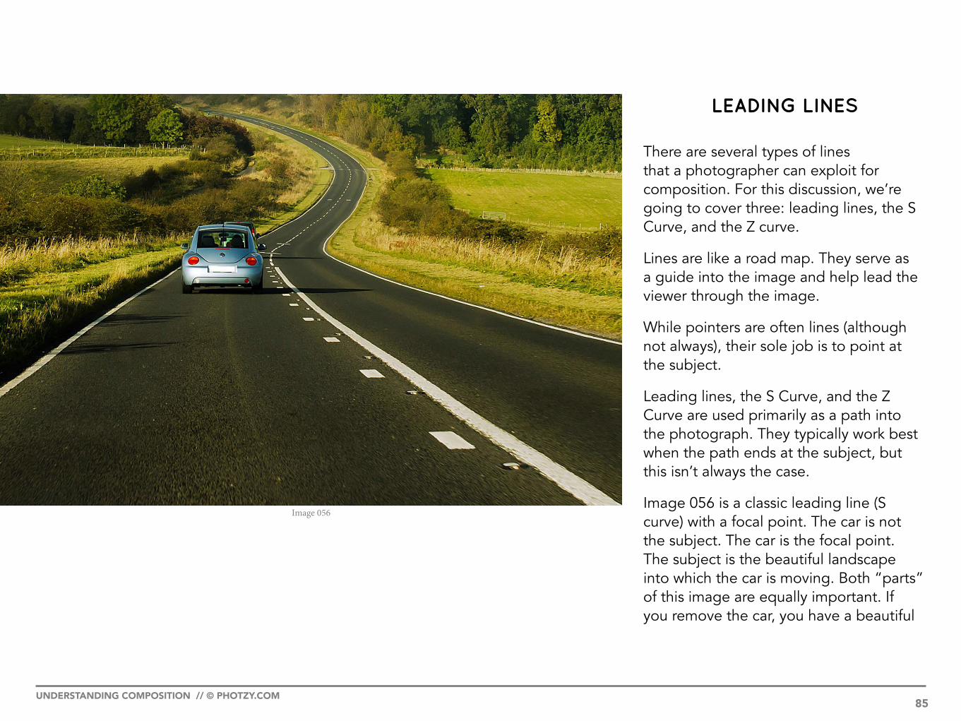
LEADING LINES
There are several types of lines that a photographer can exploit for composition. For this discussion, we’re going to cover three: leading lines, the S Curve, and the Z curve.
Lines are like a road map. They serve as a guide into the image and help lead the viewer through the image.
While pointers are often lines (although not always), their sole job is to point at the subject.
Leading lines, the S Curve, and the Z Curve are used primarily as a path into the photograph. They typically work best when the path ends at the subject, but this isn’t always the case.
Image 056 is a classic leading line (S curve) with a focal point. The car is not the subject. The car is the focal point. The subject is the beautiful landscape into which the car is moving. Both “parts” of this image are equally important. If you remove the car, you have a beautiful
Image 056
UNDERSTANDING COMPOSITION // © PHOTZY.COM 85

subject with a leading line (the S curve of the road), but no resting spot. Plus, if the photographer had shot the image tighter, leaving out the long road leading into the picture, the image would look flat and lack in character and story.
In Image 057, the fence is an effective use of a leading line, but the overall composition suffers due to the placement of the horse – going back to our previous discussion of the imaginary scale (Image 040), the horse and the background carry equal weight. This image would be stronger either without the horse, or without the barn and people in the background. Why do they carry equal weight? The leading line takes us to the horse, and the unusual shape of the horse creates a stopping point. However, the barn is large and of contrasting colors and shapes, plus there is the activity (motion) of the two people working. This creates a balance between the horse and the background. The net result is that there really isn’t a well-defined subject.
Image 057
UNDERSTANDING COMPOSITION // © PHOTZY.COM 86

In Image 058, without the road acting as a leading line, this photograph’s composition would have fallen apart completely. The subject is the windmill; but without the strong leading line directing the viewer’s eyes toward the subject, the high brightness value of the sunshine through the clouds would have overwhelmed the composition and tipped the imaginary scale away from the subject. The road (leading line) added the “extra” visual weight that was needed by the subject to remain the primary element in the photograph.
Image 058 - Photograph by Vincent van der Pas
UNDERSTANDING COMPOSITION // © PHOTZY.COM 87

Image 059 is an ill-conceived use of leading lines. The pillars create strong leading lines into the photograph, but the monkey (which is the subject) is at the front of the leading lines. In this case, the leading lines have the opposite effect, and are actually leading the viewer’s eyes away from the subject.
Key Lesson: Leading lines should lead a viewer’s eyes in the direction of your subject, not away from it. There is more leeway on this when using an S Curve or a Z Curve. However, a straight leading line such as in Image 059 should always lead toward the subject. Does this mean that the subject ALWAYS has to be at the end of the leading line? No.
Image 059 - Photograph by Vinoth Chandar
UNDERSTANDING COMPOSITION // © PHOTZY.COM 88

Even if the monkey were just a little further along the leading line (as indicated by the yellow arrow in Image 060), it would have been an improvement. The problem is that the monkey was placed on the “leading edge” of the “leading line.” The composition left the monkey in the dust (so to speak) as the eyes lurch past it.
Image 060 - Photograph by Vinoth Chandar
UNDERSTANDING COMPOSITION // © PHOTZY.COM 89

The rolling hills and fence in Image 061 provide an excellent leading line. However, this is an example of the importance of a focal point. Without a focal point, despite the fact that this is a beautiful scene, the viewer’s eyes move from front to back without gaining any real sense of meaning.
Key Lesson: Great composition typically must rely on more than one tool of composition. Image 061 has used a “leading line.” However, that one tool of composition was not enough to finish the job.
Shooting Assignment:
Shoot a tabletop photograph using leading lines to direct the viewer’s eyes toward your subject. (I want to make it a little harder for you than simply finding a road or a fence. Thus, I’m giving you a tabletop assignment.)
Image 061
UNDERSTANDING COMPOSITION // © PHOTZY.COM 90

The S Curve
The S Curve is a component of a much larger composition discussion on the use of geometric shapes in art.
These concepts date all the way back to the ancient Greeks.
If you look at ancient Greek sculpture, you’ll notice that in almost every instance, where a human body is depicted, it has an S-shaped stance.
The S shape creates a pleasing pattern within a photograph (or any artwork). Use it when you can. Generally, you will apply it using the same rules as a leading line.
Image 062 is a perfect use of the S Curve. Can you define the subject, the focal point, and the S Curve?
(Subject = winter landscape, focal point = trees, S Curve = snow bank)
Image 062 - Photograph by Matthew Venn
UNDERSTANDING COMPOSITION // © PHOTZY.COM 91

In Image 063, is the road an S Curve, a leading line, or both? I’d say both. Does an S Curve have to be shaped just like the letter S? No! Quit being such a literalist. You’re an artist. An S Curve is simply a line with curves. Do you think that the S Curve at the bottom of Image 063 has a major impact on the composition? I do. Cover it up with your finger and look at the image again.
Image 063 - Photograph by Paul Bica
UNDERSTANDING COMPOSITION // © PHOTZY.COM 92

The road is the S Curve. The road is also a leading line. The subject is a winter landscape. What’s missing? A focal point is missing. There’s no stopping point. Image 064 is one of those examples that have a grey area. Does the lack of a focal point hurt the composition of this image? I think that’s a question that must be answered by each viewer. Do I think a well-placed vehicle on that S Curve would have improved the composition? Yes, I do. Does the image fall apart without it? No, not really. Art… it’s a fickle beast.
Image 064 - Photograph by Paul Bica
UNDERSTANDING COMPOSITION // © PHOTZY.COM 93

The use of an S Curve can also be the subject, as illustrated in Image 065.
Shooting Assignment:
Shoot a city scene utilizing an S Curve.
Image 065
UNDERSTANDING COMPOSITION // © PHOTZY.COM 94

The Z Curve
The Z Curve is much the same concept as the S Curve. The primary difference is in the tension that it creates in a composition.
The S Curve is smooth and fluid, whereas the Z Curve is more abrupt and creates a stronger sense of “stepping” into the photograph.
You will often see the S Curve, and to some extent the Z Curve, employed in landscape photography. It’s an easy tool of composition for a beginner to pick up on.
However, to the trained eye, these two curves can be applied in almost any photographic situation.
Your goal is to learn how to see these lines within a scene, and use them appropriately no matter what the situation is.
In this industrial setting (Image 066), I employed a Z Curve to help tell the story of what the subject was doing. The Z Curve also helps to move the viewer’s eyes toward the subject.
Image 066 - Photograph by Kent DuFault
UNDERSTANDING COMPOSITION // © PHOTZY.COM 95

Self Check Quiz:
1. A focal point is a _______________ within a composition.
2. Focal points can be a point of contact, dramatic change of color, an intersection of objects, or even an unusual _________________.
3. To become great at composition, learn to identify focal points __________.
4. The job of a “leading line” is __________________.
5. True or False: An S Curve always looks like the letter S.
6. Leading lines can help add extra visual __________ to a subject.
7. You should not place your subject on the ______________ end of a leading line.
8. True or False: Leading lines, S Curves, and Z Curves can also be the subject.
9. A Z Curve is different from an S Curve because it creates _____________, whereas an S Curve is more _______________.
Shooting Assignment:
Shoot a night scene utilizing a Z Curve.
UNDERSTANDING COMPOSITION // © PHOTZY.COM 96

Avoiding Mergers
Mergers are points of intersection between two or more elements within your composition.
Mergers can be an effective tool (working in your favor) of your composition.
However, beginners generally have trouble identifying them, and the result is a distracting element that can destroy your image composition.
For now, I would like you to practice identifying mergers and avoiding them.
Let’s look at some examples.
Image 067 has numerous problems, not the least of which is a horrendous merger situation. But, it’s a good one in that it easily displays what a horrible merger looks like. They’re not always this obvious!
Look at the power line pole and the wires. This is where beginning photographers often have trouble with mergers.
When creating your compositions, observe your scene, and avoid any objects that jut out from behind the subject.
Image 067 - Photograph by Luke H. Gordon
UNDERSTANDING COMPOSITION // © PHOTZY.COM 97

Image 068 is a much better picture (overall) than our previous example (Image 067). In fact, if it weren’t for the merger, there isn’t much you could say is wrong with it. Hold your finger over the sail coming out of the woman’s head – it’s much better, isn’t it? In fact, I used Photoshop to remove it completely!
Recommended Reading:
· How to Improve a Wildlife Photograph with Post-Processing (excellent training for things like removing that sail from behind the bride.)
· Using Post Production to Improve a Composition
Image 068
UNDERSTANDING COMPOSITION // © PHOTZY.COM 98

This photographer did a great job (Image 069) of avoiding a merger. This scene is a literal minefield of them. Careful placement of the subject put her in just the right spot.
A huge step in your development as a photographer is to learn to identify mergers, and keep them from becoming a problem in your composition.
Editing Assignment:
Look through your files. Select five photographs of people in which you can identify a merger around the subject’s head or body. Remove the merger either through software or by holding your finger in front of it. Evaluate for yourself how much it improves the photograph.
Image 069 - Photograph by Lauragrafie
UNDERSTANDING COMPOSITION // © PHOTZY.COM 99

POINT OF VIEW (POV)
POV is one of the simplest tools for improving your composition. All it requires is your creativity and your time.
How do you use POV?
You don’t accept the first angle that comes to mind when creating a picture.
Train yourself to explore your subject.
These examples will show you how a different POV can vastly change the creative statement about a subject.
The Saint Louis Arch - The Gateway to the West in the United States is a favorite architectural subject for photography. Study these examples. Can you see how a simple change in the POV resulted in a vastly different photograph?
In Image 070, you can see that, from a distance, the structure can become almost abstract.Image 070 - Photograph by Towboat Garage
UNDERSTANDING COMPOSITION // © PHOTZY.COM 100

Image 071 presents a POV that is pretty. It looks like a first effort. While it does have a postcard-like quality, could the photographer have found something more interesting?
Image 071 - Photograph by Lucas Jans
UNDERSTANDING COMPOSITION // © PHOTZY.COM 101

Image 072 is a dramatic wide-angle view, with an almost vertical (straight up) POV. This choice of POV creates an abstraction that is still clearly the Arch.
Image 072 - Photograph by Doug Bowman
UNDERSTANDING COMPOSITION // © PHOTZY.COM 102
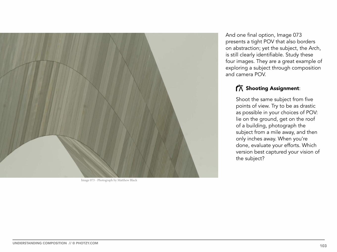
And one final option, Image 073 presents a tight POV that also borders on abstraction; yet the subject, the Arch, is still clearly identifiable. Study these four images. They are a great example of exploring a subject through composition and camera POV.
Shooting Assignment:
Shoot the same subject from five points of view. Try to be as drastic as possible in your choices of POV: lie on the ground, get on the roof of a building, photograph the subject from a mile away, and then only inches away. When you’re done, evaluate your efforts. Which version best captured your vision of the subject?
Image 073 - Photograph by Matthew Black
UNDERSTANDING COMPOSITION // © PHOTZY.COM 103

Self Check Quiz:
1. A “merger” is _____________________________.
2. You can avoid a merger by first _______________ the mergers in your scene, and then through careful ____________ of your subject.
3. How do you utilize POV for a better composition?
4. You can change the POV by changing lenses, changing camera elevation, or changing the camera ____________.
UNDERSTANDING COMPOSITION // © PHOTZY.COM 104
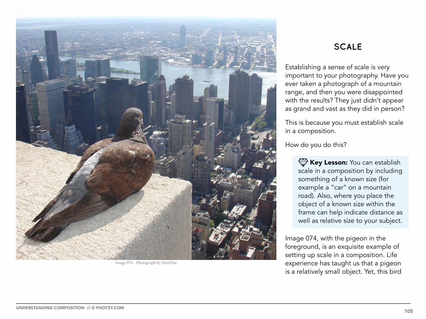
SCALE
Establishing a sense of scale is very important to your photography. Have you ever taken a photograph of a mountain range, and then you were disappointed with the results? They just didn’t appear as grand and vast as they did in person?
This is because you must establish scale in a composition.
How do you do this?
Key Lesson: You can establish scale in a composition by including something of a known size (for example a “car” on a mountain road). Also, where you place the object of a known size within the frame can help indicate distance as well as relative size to your subject.
Image 074, with the pigeon in the foreground, is an exquisite example of setting up scale in a composition. Life experience has taught us that a pigeon is a relatively small object. Yet, this bird
Image 074 - Photograph by ZeroOne
UNDERSTANDING COMPOSITION // © PHOTZY.COM 105

appears to be large compared to the vast cityscape below. Experience has also taught us that skyscrapers are very large and tall. The bird’s presence has given us a sense of depth and distance. The viewer has been given a fantastic visual clue as to just how far away those buildings are, and how high up the bird is sitting.
Image 075 has the opposite effect. If the photographer had chosen an angle with a flat, even background (such as the open sky), the viewer would have no reference as to how large this clothespin really is. We would assume that it was small, because that is what experience has taught us. By including the building in the background, and the people in the foreground, the photographer has given us a visual clue that all is not as it seems. This is a very large clothespin!
Image 075 - Photograph by All Free Photos
UNDERSTANDING COMPOSITION // © PHOTZY.COM 106

You can also use objects of a known size to establish how small something is.
Key Lesson: When you’re creating a photograph that has relevance to the size of the subject, or the distance being depicted, look for (or place) an object of a known size to establish scale and distance.
Shooting Assignment:
1. Photograph a large, or distant, subject using “scale” to establish that size or distance to the viewer.
2. Photograph a small subject, and use “scale” to establish how small it is.
Image 076 - Photograph by JD Hancock
UNDERSTANDING COMPOSITION // © PHOTZY.COM 107

FRAMES
The use of a “frame” around your subject is a nice step toward advanced composition. It is a highly effective tool, as it uses shape and line to force the viewer’s eyes toward the subject.
Train yourself to look for frames as you compose your photographs.
Trees, and tree limbs, are often used as frames, as are windows and doorways. Almost anything could become an effective frame if properly placed in a composition.
Make sure that your use of the frame supports the subject and doesn’t detract from it.
Image 077 is a classic use of a frame. The trees literally form a square box around the farm buildings. Landscape photographers will often use a tree, or part of a tree, to force the viewer’s eyes inward toward their chosen subject.
Image 077 - Photograph by Kent DuFault
UNDERSTANDING COMPOSITION // © PHOTZY.COM 108

In Image 078, I used a window as a tool of composition (a frame) to draw the eyes toward the men. Try to imagine the photograph if the men had been simply leaning against a wall or standing on a rooftop. They would disappear in their surroundings. The frame adds visual weight. So much visual weight, in fact, that the rest of the photograph almost becomes inconsequential. Can you tell me what the hand in front of the mouth is? It’s a focal point. Why? It’s an action and a contrasting shape!
Image 078 - Photograph by Kent DuFault
UNDERSTANDING COMPOSITION // © PHOTZY.COM 109
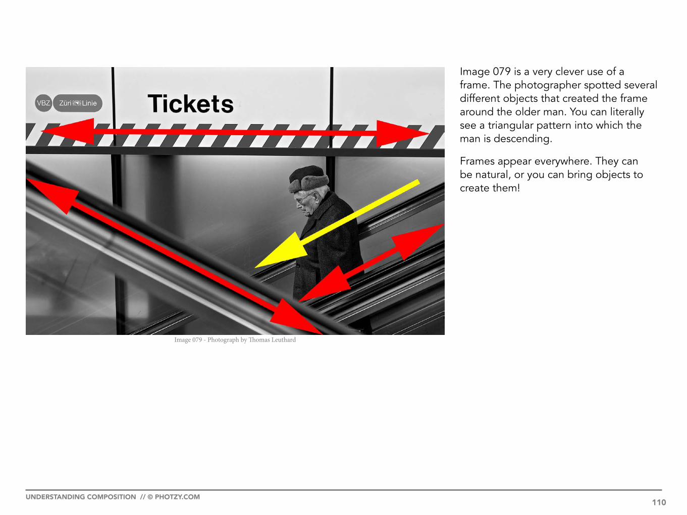
Image 079 is a very clever use of a frame. The photographer spotted several different objects that created the frame around the older man. You can literally see a triangular pattern into which the man is descending.
Frames appear everywhere. They can be natural, or you can bring objects to create them!
Image 079 - Photograph by Thomas Leuthard
UNDERSTANDING COMPOSITION // © PHOTZY.COM 110

This photographer (Image 080) created his own “frame”!
Shooting Assignment:
1. Shoot a landscape utilizing a frame to draw the viewer’s eyes toward your subject.
2. Shoot a portrait utilizing a frame made of cloth. Force the viewer’s eyes toward the portrait subject’s mouth. But also leave the subject’s eyes and nose visible.
Image 080 - Photograph by Rodrigo Baptista
UNDERSTANDING COMPOSITION // © PHOTZY.COM 111

DEPTH OF FIELD
The use of depth of field is a fantastic way to focus the viewer’s eyes in a composition. This is why “fast” lenses are so popular. Depth of field can play an important role in your overall composition. It’s a more useful tool when your objective is shallow depth of field versus extended depth of field.
Recommended Reading:
· Free Guide to Understanding Lenses · Using Selective Focus for
Better Images
Image 081 is an excellent example of depth of field being used as a tool of composition. In fact, Image 081 relies on it, and does little else to guide the viewer’s eyes toward the subject!
Image 081 - Photograph by Gabriel
UNDERSTANDING COMPOSITION // © PHOTZY.COM 112

Image 083 - Photograph by Kent DuFault
Image 082 is a portrait that uses several tools of composition: the Rule of Thirds, the 1/3 - 2/3 Rule, a frame, an S Curve, and finally depth of field. Each of these elements of composition help “push” the viewer’s eyes toward the subject’s eye. However, in this case, most of the other elements of composition rely on the use of shallow depth of field. The hair, (and the S Curve in particular) would have become a distraction if they weren’t out of focus. With the pinpoint focus on the woman’s eye, there is no room for discussion as to what I wanted to highlight in this portrait.
UNDERSTANDING COMPOSITION // © PHOTZY.COM 114

Do you think the use of shallow depth of field as a tool of composition was enough to highlight the subject in Image 084?
I don’t think so.
The focus is on the shoes, but the background is far too dominating due to contrast, texture, and shape. The similar color of the shoes to rocks and the pants almost make them disappear!
Remember! It often takes MORE than one tool of composition to create an effective photograph.
Image 084
UNDERSTANDING COMPOSITION // © PHOTZY.COM 115

Self Check Quiz:
1. To help establish scale in your images, you should place an ________ of ________ _______ in your compositions.
2. The use of scale can help a two-dimensional medium, like photography, establish depth, distance, and __________.
3. Using scale can help you establish how big something is. It can also help you establish how _________ something is.
4. The tool of composition called a frame uses shape and ____________ to force a viewer’s _______ toward the subject.
5. True or False: A frame must ALWAYS be on the left and right sides of a photograph.
6. A frame can be found within the scene, or you can _________ the frame.
7. Which depth of field settings usually work best as a tool of composition: one that creates a vast field of focus or one that creates a narrow field of focus?
Shooting Assignment:
Shoot a portrait on a city street and utilize depth of field as your primary tool of composition. It will be up to you to decide if that one tool of composition is enough, or if you must incorporate some of the other tools of composition to make the shot successful!
UNDERSTANDING COMPOSITION // © PHOTZY.COM 116

FINAL THOUGHTS

Photography is a fluid art form. This is part of what makes it so interesting.
In a matter of seconds an entire scene can drastically change. This is why you need to practice and exercise your photographic muscles.
If you have to think for too long about what you’re doing, chances are it will no longer exist. This is true for just about every type of photography.
Learning the rules of composition, and then practicing them until they become second nature, is key to your growth as a photographer.
In this book, I’ve given you everything that you need to get started. I’ve given you assignments that will help stretch your abilities; I strongly encourage you to do them.
It’s also a great learning experience to study the work of master photographers. By studying them, I don’t mean just looking at their images; I mean dissecting them.
Figure out for yourself why they are so powerful, and why they have stood the test of time.
Here are some links to the work of master photographers:
Portrait1. Irving Penn2. Herb Ritts3. Annie Leibovitz
Landscape1. David Muench2. Ansel Adams
Commercial1. Jay Maisel
Recommended Reading:
· Advanced Composition · Powerful Imagery
UNDERSTANDING COMPOSITION // © PHOTZY.COM 118

Ten more assignments to hone your skills
1. Shoot a shallow depth of field image of a child with their pet. Use a low POV by placing the camera on the ground.
2. Shoot a portrait using large strips of paper as a frame.
3. Shoot a group of people from directly above. Have them stand in a circle with their arms interlocked. Have one of them look up at the camera for a focal point.
4. Shoot a cityscape using a row of cars as a leading line.
5. Shoot the same subject using backlight, front light, sidelight, and overhead light to change the composition.
6. Shoot a landscape that relies on shapes as the subject and focal point.
7. Shoot a portrait that utilizes a Z Curve.
8. Shoot a tabletop photograph of food that utilizes an S Curve.
9. Shoot some type of sporting event. Use pointers, leading lines, and frames in your compositions.
10. Give a child a new toy. Using all the tools of composition that you’ve learned in this book, tell a story about the child’s discovery of their new toy.
UNDERSTANDING COMPOSITION // © PHOTZY.COM 119

IF YOU’D LIKE TO CONTINUE LEARNING AND IMPROVING
YOUR PHOTOGRAPHY PLEASE VISIT PHOTZY.COM
About the Author
Kent DuFault is a professional photographer and author.
LinkedIn: http://www.linkedin.com/in/kentdufault/Flickr: https://www.flickr.com/people/35449761@N04/Clippings: https://www.clippings.me/kentdufaultGurushots: https://gurushots.com/kentdufault500px: https://500px.com/kentdufault