
Typography on the Web - Inkwell Design
141
Typography on the Web An examination of current best practices http://www.inkwell.ie/typography MA in Interactive Multimedia Matt McDonagh May 2012 IT Tallaght Supervisor: Deirdre Kennedy
Transcript of Typography on the Web - Inkwell Design
Typography on the Web
An examination of current best practices
http://www.inkwell.ie/typography
MA in Interactive Multimedia
Matt McDonagh
May 2012
IT Tallaght
Supervisor: Deirdre Kennedy
2
Abstract
3
Scope of the research
This thesis examines various methods of embedding and using typography in
websites. It compares and contrasts the ‘core’ font-stacks, extended font-
stacks, embedding technologies (such as Image replacement, sIFR and Cufón)
and the use of the CSS @font-face specification in an attempt to find the most
effective methods of employing type on the Web.
A website was built to test best practice in the use of typography. Font sizes,
line heights, line lengths, typographic hierarchy and vertical rhythm are
examined in detail.
Responsive design, media queries and mobile devices are outside the scope of
this paper. The research covers type rendering and practices on the main
browsers on Windows XP and 7, OS X and Ubuntu 10.04. It does not cover
other Linux varieties, Unix, iOS, Android or any mobile devices.
Models of legibility and reading are also outside the scope of this research.
Purpose of the research
Typography exists to honour content, but much of the typography on the web
is poor in quality. Font choices, typographic specification, Operating system
and browser rendering and typeface availability all contribute to the problem.
This thesis seeks to establish an effective solution to these issues and to offer
that solution in the form of a freely available stylesheet, released under a
creative commons (CC) license.
Methodology
The thesis has two components, the research paper, and a website. The paper
examines the various methods and underlying technologies used in web
4
typography. It also details the testing of the various font technologies and the
quality of the rendering. The methodology is necessarily qualitative,
particularly in relation to Operating Systems text rendering – fonts either
render acceptably at all sizes or not.
The criteria used for font selection is quite strict. Fonts selected for testing
must have a minimum of four styles, ideally, but not necessarily, including
regular, regular italic, bold and bold italic. Exceptions have been made for
fonts which don’t have italics (or obliques) but have at least four different
weights. In both cases, this is to ensure sufficient typographic variation to
achieve a useable hierarchy in text.
Fonts also must render well on all platforms and at all sizes. Fonts which
performed well at certain sizes, but not at others, were excluded.
Testing is covered in detail in §6.5 and §6.6.
The website (inkwell.ie/typography) acts as a test-bed for the above and
adopts the best practices recommended by accomplished practitioners in type.
The testing worked in two ways – firstly as a method of gaining feedback from
typographic practitioners and secondly as a method of comparing and
contrasting type rendering across the various browsers and operating systems.
The website went through a number of iterations during development, and the
link to key versions was sent to a number of typographic practitioners and
posted on typography related websites (see appendices 4 & 5). Feedback from
these exercises informed further iterations of the website.
5
Findings
Traditionally, it has been impractical to directly specify a font in a webpage as
there is no way of determining if that font is available on an end-users
computer. The use of font-stacks is an attempt to define a system of
preference – if a specified font is available it will be displayed, if not a second
preference will be used and so on. Due to its’ nature this approach is limited in
scope. It has the further disadvantage in that many of the more available fonts
(e.g.: Helvetica, Palatino) are designed for print and merely digitized for
screen use. Their legibility therefore is not optimized for screen, particularly at
smaller sizes. Replacing the text with an image of the text in the desired font is
a widespread but impractical approach. Type rendered in this way does not
scale and is not semantic.
Embedding technologies such as sIFR (scalable Inman Flash Replacement)
and Cufón aim to bridge this gap. sIFR converts text to dynamically created
Flash files while Cufón converts to dynamically created image files. SIFR is
difficult to set up and will not display locally, due to security settings in the
Flash plug-in. It will not work if either JavaScript is disabled or the Flash
plug-in is not present (the iPhone and iPad does not run Flash). Once
configured, sIFR works reasonably well and it is scalable and semantic. Its’
use is permitted by most typefaces EULA1. sIFR does have occasional display
glitches, however and it also places a high demand on the processor, as the
text needs to be vectorised on the fly.
1 EULA (End User License Agreement). Each typeface has an accompanying EULA which sets out the terms of acceptable use. Most commercial fonts expressly forbid type embedding.
6
Cufón was intended to be a simpler replacement for sIFR. It essentially
converts the typeface to JavaScript and displays as an image. It is easy to set
up and use; however the generated text is neither scalable nor selectable.
Cufón is specifically prohibited by many EULAs, as it is possible to reverse-
engineer a font from the generated JavaScript files. Neither sIFR nor Cufón
are suitable for large passages of text. Their use should be restricted to
headings only.
The CSS @font-face selector would seem to be the holy-grail, then, as it allows
fonts to be embedded directly in a page. The raw fonts need to be converted to
a number of web formats (browser manufacturers have not agreed a standard
format) but this is an easy process. Once converted, the fonts are displayed
natively – no JavaScript or plug-in is required. In practice though, @font-face
is hindered by poor on-screen rendering and by many font’s EULA (End-user
license agreement). Like Cufón, it is possible to convert the web formats back
to TrueType or OpenType formats.
Fonts require extensive hinting to display well on (pre Vista) Windows
systems. Hinting is skilled work, time consuming and expensive. Few
typefaces therefore, are hinted well and those that are tend to be expensive. A
further drawback is that hinting adds significantly to the file-size of a font.
This may not be an issue for many users but is an issue for those with low-
bandwidth connections or on mobile devices.
While the CSS specification has improved considerably (with the release of
CSS3 modules) a number of factors remain weak. The hyphenation selector is
a blunt instrument, which rather than aiding typography serves more to
7
impede the natural flow of text. Kerning remains a further bugbear, with
many browsers ignoring kerning tables entirely. Currently only Firefox uses
kerning tables as intended.
The number of fonts designed specifically for the screen is low. These fonts
with ‘open’ faces are vastly outnumbered by digitized versions of printer fonts,
which are usually more ‘closed’ in nature. On a positive note, Operating
Systems rendering engines have improved considerably. Windows XP remains
weak in this area, but with the release of DirectWrite in Vista and Windows 7,
typographic rendering on these systems is at least the equal of OS X’s
CoreText and Ubuntu’s text display.
Significance
Major developments are currently underway in the realm of web typography.
CSS4 is in the draft stage and CSS3 typographic controls are already widely
supported. The OpenType (woff) format’s support for extended ligatures and
contextual alternates will further expand the creative possibilities.
Javascript libraries such as Lettering, Widon’t and CSS-Matrix offer more
typographic control over aspects of typography such as kerning, widows and
anti-aliased text-rotation.
“This is the best time to be a web designer.
We can make great websites; we can use great type … we’re shaping
all of this stuff, right now.”
- Santa Maria (2012)2
2 Santa Maria, J (2012) On Web Typography (http://vimeo.com/34178417)
8
Nevertheless, it is apparent that typography on the web still has a long way to
go. The @font-face selector opens the prospect of pure web typography but is
currently crippled by typefaces EULAs. The number of well-hinted typefaces is
currently quite low, although commercial services such as TypeKit are
addressing this. It should be noted that many of those fonts are digitized
printer fonts, rather than screen fonts. Javascript libraries like the
aforementioned Lettering work by wrapping each letter in a span – acceptable
in headings, but entirely inappropriate for large passages of text.
It is to be hoped that the final release specification of CSS4 coupled with
updated browsers will do much to eliminate some of the difficulties within
type rendering, but the significant market share of Windows XP means that
type choices may be restricted for some time to come.
9
List of figures
10
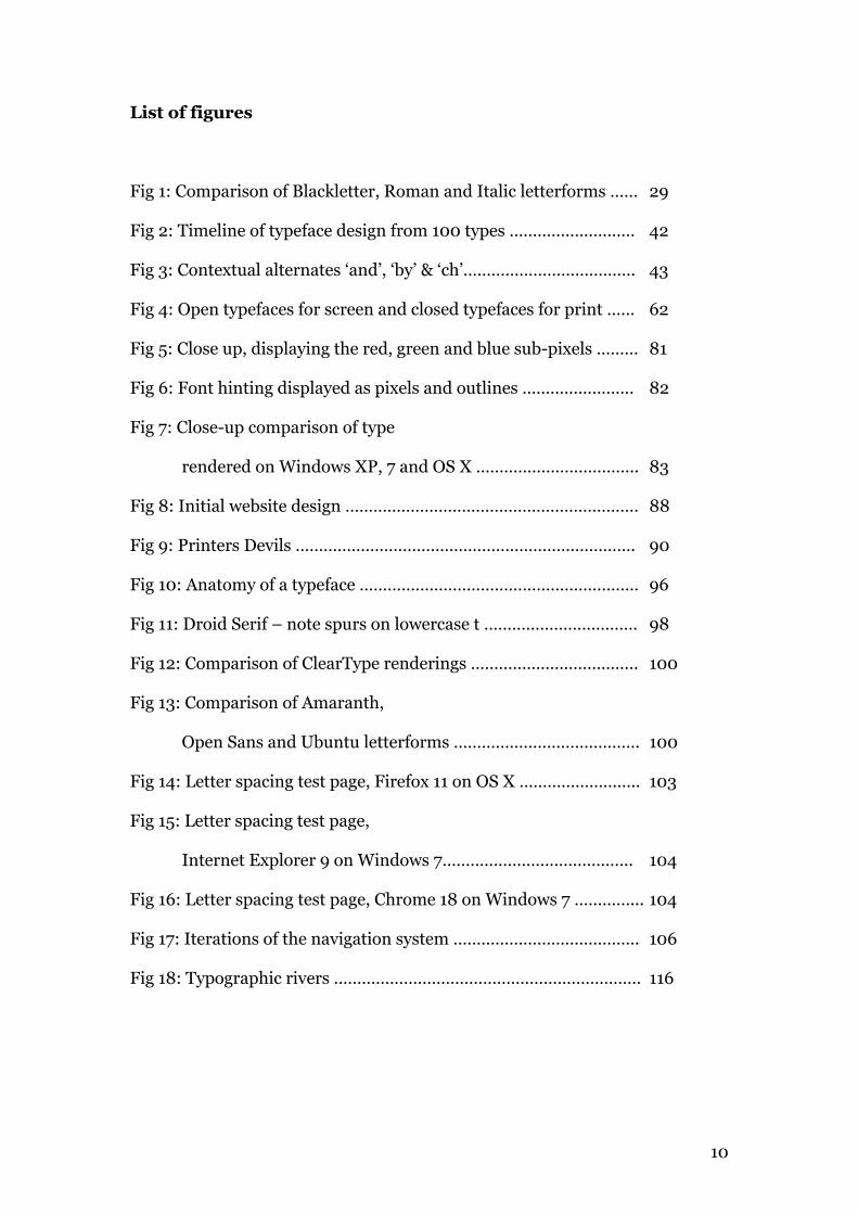
List of figures
Fig 1: Comparison of Blackletter, Roman and Italic letterforms …… 29
Fig 2: Timeline of typeface design from 100 types ……………………… 42
Fig 3: Contextual alternates ‘and’, ‘by’ & ‘ch’………………………………. 43
Fig 4: Open typefaces for screen and closed typefaces for print …… 62
Fig 5: Close up, displaying the red, green and blue sub-pixels ……… 81
Fig 6: Font hinting displayed as pixels and outlines …………………… 82
Fig 7: Close-up comparison of type
rendered on Windows XP, 7 and OS X …………………………….. 83
Fig 8: Initial website design ……………………………………………………… 88
Fig 9: Printers Devils ………………………………………………………………. 90
Fig 10: Anatomy of a typeface …………………………………………………… 96
Fig 11: Droid Serif – note spurs on lowercase t …………………………… 98
Fig 12: Comparison of ClearType renderings ……………………………… 100
Fig 13: Comparison of Amaranth,
Open Sans and Ubuntu letterforms …………………………………. 100
Fig 14: Letter spacing test page, Firefox 11 on OS X …………………….. 103
Fig 15: Letter spacing test page,
Internet Explorer 9 on Windows 7………………………………….. 104
Fig 16: Letter spacing test page, Chrome 18 on Windows 7 …………... 104
Fig 17: Iterations of the navigation system …………………………………. 106
Fig 18: Typographic rivers ………………………………………………………… 116
11
List of tables
12
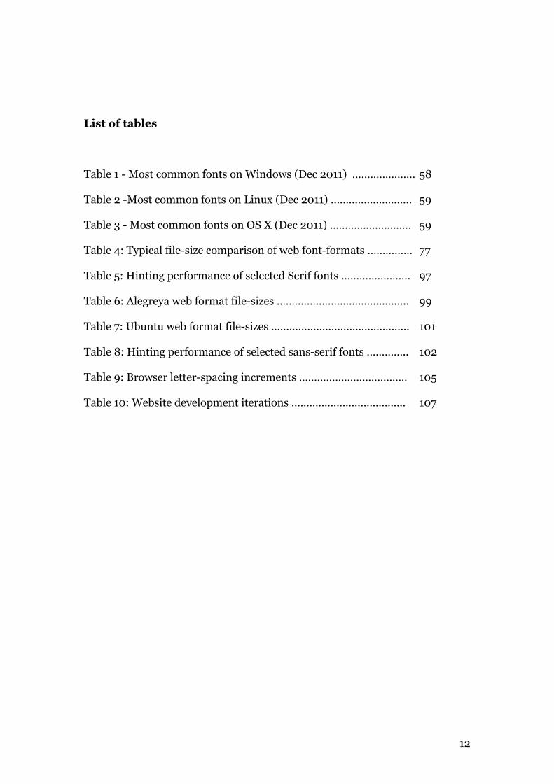
List of tables
Table 1 - Most common fonts on Windows (Dec 2011) ………………… 58
Table 2 -Most common fonts on Linux (Dec 2011) ……………………… 59
Table 3 - Most common fonts on OS X (Dec 2011) ……………………… 59
Table 4: Typical file-size comparison of web font-formats …………… 77
Table 5: Hinting performance of selected Serif fonts ………………….. 97
Table 6: Alegreya web format file-sizes …………………………………….. 99
Table 7: Ubuntu web format file-sizes ………………………………………. 101
Table 8: Hinting performance of selected sans-serif fonts ………….. 102
Table 9: Browser letter-spacing increments ……………………………… 105
Table 10: Website development iterations ……………………………….. 107
13
Table of Contents
14
Introduction
0.1 Web Publishers …………………………………………………… 20
0.2 Limitations of HTML and CSS ……………………………… 21
0.3 Browsers and Operating Systems …………………………. 22
0.4 Typeface availability and quality ………………………….. 23
0.5 The serif versus sans-serif debate ………………………… 24
0.6 Aims and objectives ……………………………………………. 24
0.7 Limitations of the research …………………………………. 24
0.8 The ideal …………………………………………………………… 25
Chapter 1: Literature review
1.1 History and background ……………………………………… 28
1.2 Typographic best practice …………………………………… 31
1.3 Web typography ………………………………………………… 33
1.3.1 A List Apart …………………………………………….. 35
1.3.2 Typotheque …………………………………………….. 40
1.3.3 Bringhurst on the web …………………………….. 41
1.3.4 100 types ………………………………………………… 42
1.3.5 Extensis webcast/web-seminar ………………… 42
1.3.6 Snook.ca ………………………………………………… 43
1.3.7 W3C.org ………………………………………………… 44
1.3.8 Columbia.edu ………………………………………… 45
1.4 In Summary ……………………………………………………… 45
1.5 Project Aims ……………………………………………………… 46
1.6 Bibliography ……………………………………………………… 47
1.7 Webography ……………………………………………………… 48
15
Chapter 2: Font stacks
2.1 Introduction ……………………………………………………… 55
2.2 Font-stacks: Core web fonts ………………………………… 55
2.3 Expanded font-stacks ………………………………………… 57
2.3.1 Serif font-stacks ………………………………………. 60
2.3.2 Sans-serif font-stacks ………………………………. 60
2.3.3 Monospaced font-stacks ………………………….. 61
2.4 Printer fonts versus screen fonts ………………………… 61
2.5 Screen optimized fonts ……………………………………… 62
2.5.1 Screen optimized serif font-stack ……………… 62
2.5.2 Screen optimized sans-serif font-stack ……… 62
2.6 In Summary ……………………………………………………… 63
Chapter 3: Font embedding technologies
3.1 Image replacement ……………………………………………… 65
3.2 sIFR …………………………………………………………………… 66
3.3 Cufón ……………………………………………………………….. 68
3.3.1 Legal note ……………………………………………….. 69
3.4 In Summary ……………………………………………………….. 70
16
Chapter 4: Font embedding with @font-face
4.1 Introduction ……………………………………………………….. 72
4.2 Using @font-face ………………………………………………… 72
4.3 Font hosting services …………………………………………… 73
4.3.1 Typekit ……………………………………………………… 74
4.3.2 Fontdeck …………………………………………………… 74
4.3.3 Google Web-fonts ……………………………………… 75
4.3.4 Pricing models…………………………………………… 75
4.4 Disadvantages of using @font-face ……………………….. 76
4.4.1 FOUT ………………………………………………………… 76
4.4.2 Filesize and bandwidth issues ……………………… 76
4.4.3 Poor rendering of un-hinted fonts ……………….. 77
4.5 EULA restrictions ………………………………………………… 78
4.6 In Summary ………………………………………………………… 79
Chapter 5: Browser and OS type rendering
5.1 Background ………………………………………………………… 81
5.2 Font hinting ………………………………………………………… 82
5.3 Operating Systems ……………………………………………….. 83
5.3.1 DirectWrite and ClearType ………………………….. 84
5.3.2 CoreText …………………………………………………… 84
5.3.3 Ubuntu ……………………………………………………… 84
5.4 Browser text rendering ………………………………………… 85
5.4.1 Browser letter spacing ………………………………… 85
5.5 In summary ………………………………………………………… 86
17
Chapter 6: Building and testing the website
6.1 Page Layout ………………………………………………………… 88
6.2 Units of measurement ………………………………………… 89
6.3 Images ………………………………………………………………… 89
6.4 Website testing …………………………………………………… 90
6.5 Typographic choices ……………………………………………. 93
6.5.1 Serif versus sans-serif ………………………………… 93
6.5.2 Font-stacks: Serif ……………………………………… 94
6.5.3 Font-stacks: Sans-serif ……………………………… 94
6.5.4 Embedded fonts with @font-face ………………… 94
6.6 Font testing and performance ………………………………. 95
6.6.1 Font testing: Serifs ……………………………………. 96
6.6.2 Font testing: Sans-serifs ……………………………. 99
6.7 Browser testing: Letter-spacing …………………………… 103
6.8 Iterations …………………………………………………………… 105
Chapter 7: Conclusions and recommendations
7.1 Conclusions ………………………………………………………… 109
7.2 Recommendations ………………………………………………. 110
7.2.1 Use two typefaces or less,
to achieve typographic hierarchy ………………… 111
7.2.2 Use 14 - 16 px for body copy ……………………….. 112
7.2.3 Use well-hinted, legible, open typefaces ………. 113
7.2.4 Headlines should be correctly kerned ………….. 114
7.2.5 Don’t letterspace lowercase without reason ….. 115
18
7.2.6 Letterspace strings of capitals,
small-caps and numbers …………………………… 115
7.2.7 Use flush-left ragged-right alignment ………… 116
7.2.8 Use between 40 and 75 characters per line … 117
7.2.9 Use a line-height which suits the typeface ….. 118
7.2.10 Don’t set body text in all-caps …………………… 119
7.2.11 Set opening paragraphs flush left ………………. 120
7.2.12 Add extra space before and after quotations .. 120
7.3 Unicode characters, Flourishes & Pseudo-elements .. 121
7.4 Further study …………………………………………………….. 122
Acknowledgements …………………………………………………………… 124
Appendices
Appendix 1 …………………………………………………………………… 126
Appendix 2 …………………………………………………………………… 127
Appendix 3 …………………………………………………………………… 128
Appendix 4 …………………………………………………………………… 128
Appendix 5 …………………………………………………………………… 129
Appendix 6 …………………………………………………………………… 133
Appendix 7 …………………………………………………………………… 135
Appendix 8 ………………………………………………………………….. 136
CD Contents ………………………………………………………………………… 140
Image Credits ……………………………………………………………………… 138
19
Introduction
20
In the west, Johann Gutenberg is credited with inventing the printing press
and first Latin movable type between 1448 and 1452. If we take this milestone
as a staring point, typographers and designers working with Latin type have
had hundreds of years to perfect the practice. While Gutenberg's black letter
bibles look archaic by todays standards, typefaces we recognise and would be
comfortable with, appeared surprisingly soon after. Nicolas Jenson's Roman
was designed in 1469 and the ubiquitous Garamond by Claude Garamond has
been around since 1528.
Practitioners in type then, have had over 550 years to refine and codify the use
of typography. Why then, is much of the typography on the web so poor?3
There are a number of factors at play here —
- Web publishers
- Scope of HTML and CSS
- Browser and OS rendering engines
- Typeface availability & quality
0.1 Web publishers
The democratic nature of the web has allowed everyone to publish a website.
There are parallels with the desktop publishing revolution of the 1980s. The
introduction in 1985 of MacPublisher followed by PageMaker and
QuarkXpress coupled with the Apple Laserwriter printer brought publishing
to the masses. The quality of general design and typography dropped
substantially for a number of years as clients bypassed design professionals in
3 http://webtypography.net/sxsw2007/
21
favour of self-publishing4. Gradually the clients realized the value of design
and returned to the design industry for their printed material.
Similarly on the web, visual web editors such as FrontPage, PageMill and
others brought web publishing to the masses. More recent developments like
content management systems (CMS) such as WordPress, Joomla and Drupal,
coupled with readily available templates further encourage self publishing.
While there are some very good templates available, these tend to concentrate
on layout and visual design rather than embracing typographic standards.
Even where organisations employ a designer, the process of website building
frequently has said designer handing his designs to a developer to implement.
Many things can change at this point - the developer may not be faithful to the
design specifications, the designer may have chosen unworkable fonts in their
design. Even now, many designers and developers still rely on the core web
fonts, (Arial, Helvetica, sans-serif or Georgia, Times, serif).
Many prominent sites give little consideration to hierarchy, type size, line-
spacing or whitespace5. It is fair to say that there are few sites on the web,
which give typography the attention to detail it deserves.
0.2 Limitations of HTML and CSS
Typography is hindered by the specification of HTML and CSS themselves.
Print designers routinely kern letter pairs or adjust tracking to avoid widows
and orphans (stray words separated from the parent text, usually at the end of 4 Reference For Business, http://www.referenceforbusiness.com/small/Co-Di/Desktop-Publishing.html Accessed Apr 12, 2012 5 http://designfestival.com/top-5-peeves-of-bad-web-design/ Accessed Apr 12 2012 http://www.webdesignshock.com/great-websites-with-ugly-design/ Accessed Apr 12 2012
22
a paragraph or the start of a page). There is a letter spacing property in CSS,
which equates to tracking, but kerning is currently not possible in CSS.
Avoiding widows and orphans is also not possible, although Widon't, a
javascript plug-in, attempts to solve this problem by adding a non-breaking
word space between the last two words in each paragraph.
This can only be partially successful as the designer cannot completely control
which font the text would be displayed in, or to a degree, its size. A certain
amount of text reflow across browsers is inevitable.
CSS4 promises improved typographic controls, but only a draft specification
exists at the time of writing.
0.3 Browsers and Operating Systems
The variety of browsers across diverse operating systems causes further
difficulty. What one browser supports is not necessarily supported by the next.
Firefox for example, uses the fonts internal kerning tables while Internet
Explorer does not, which produces different letter spacing between the two
and consequently a different text flow.
Operating systems use different technologies to render fonts. Font smoothing
in OS X is very different to Windows Cleartype. Helvetica Neue, for example,
renders beautifully on OS X but notoriously badly on Windows. Some
browsers (Safari 1.0 on windows XP) use their own rendering engine while
others leave the rendering to the operating system.
The variation in font file formats across platforms (TrueType, Postscript,
Opentype) gives rise to further inconsistencies - Windows uses the ClearType
23
rendering engine to smooth Truetype, but not Postscript or Opentype, for
example. In IE9 on Windows Vista and 7, DirectWrite enhances Cleartype.
0.4 Typeface availability and quality
The traditional approach to web typography is to use the core web fonts,
ensuring that the specified font is available on the end users computer. This is
obviously very limiting in terms of typographic choice and a number of
techniques have been developed to mitigate this. Web designers used image
editors such as Photoshop to create images of their chosen fonts, which are
then used to replace the html element. Technologies such as sIFR, FLIR and
Cufón emerged to make this kind of replacement more dynamic, but image
replacement can have a detrimental effect on the accessibility of a web page. It
can also impact negatively on SEO (search engine optimisation).
The introduction of @font-face was intended as a panacea to designers - the
ability to embed fonts directly in the page should allow the creative control
they wanted but preserve the accessibility of the text. In practice @font-face is
hindered by fonts EULA (End-user License agreement), fonts are poorly
hinted and many of the freely available fonts are poorly drawn and lack
kerning tables.
“We are currently in the Wild West of web typography.”
- Thomas Phinney, 20116
6 Phinney, T (2011) Webcast: Web Typography Best practices blog.webink.com/training/web-typography-best-practices-resources/
24
0.5 The Serif versus sans-serif debate
Conventional wisdom amongst Graphic and Web Designers suggests that serif
typefaces are more legible than sans-serif when used in print, with the
converse being true on-screen. Empirical studies have not confirmed this
conclusion. Research by Ole Lund and Alex Poole7 found no significant
difference in legibility between serif and sans-serif, either in print or on-
screen. This project therefore, will examine both types. There is a toggle on
the top right of the website to switch between serif and sans-serif (not
supported in Safari 5.01).
0.6 Aims and objectives
The purpose of this research is to examine current techniques and best
practices in typography on the web and identify their strengths and
weaknesses. The conclusions of this examination will result in a series of
practical recommendations and be implemented in a number of downloadable
stylesheets. These may be included in other stylesheets, frameworks or CMS.
0.7 Limitations of the research
The research covers type rendering and typographic practice on the main
desktop browsers on Windows XP and 7, OS X and Ubuntu 10.04. It does not
cover other Linux varieties, iOS, Android or mobile devices.
The commercial font foundries (Typekit, Fontdeck, WebInk etc.) have a
substantial presence in the web-fonts market. Their offerings currently
number in the thousands. Due to reasons of cost it is not possible to examine 7 http://alexpoole.info/which-are-more-legible-serif-or-sans-serif-typefaces
25
their products in detail. The free services (Google and Fontsquirrel) also offer
hundreds of fonts. Certain criteria (see chapter 6 §5) were used to make a
selection of fonts for examination.
There is an ongoing debate8 between typographers and cognitive
psychologists as to how we read and as to what defines legibility and
readability. Both groups accept that we read in saccadic movements (rapid
jumps of the eye) from one word or phrase to another. Where they differ is in
terms of how we perceive the words. Typographers opine that we recognise
word shapes, or bouma, and make a distinction between legibility and
readability. William Berkson9 quotes from J.Ben Lieberman’s Types of
Typeface (1967) –
“Legibility is based on the ease with which one letter can be told from
another… Readability is the ease with which the eye can absorb the
message and move along the line.”
Cognitive psychologists, on the other hand hold that we read by recognising
individual letterforms (parallel letterwise recognition). This debate seems
unresolved and is outside the scope of this research.
0.8 The ideal
In an ideal world, typefaces specified by designers would be viewable as
intended, by end users. Tools would exist which would enable typographers to
8 http://opentype.info/blog/2011/06/14/how-do-we-read-words-and-how-should-we-set-them/ 9 http://typophile.com/node/8049
26
control factors such as kerning, hyphens, ligatures, orphans and widows.
Operating systems and browsers would render the fonts beautifully and
faithfully.
Some of these tools exist today. Web designers can choose from a wide range
of typefaces and embed them in their webpages, specify their size, line-height,
weight, style and colour. They can control line length to a large extent and set
baseline grids. The optimizeLegibility property enables ligatures in
those typefaces which have them.
Others tools exist as javascript libraries such as lettering and widon’t, which
attempt to solve kerning issues and widows, respectively.
CSS4, which is in a draft stage at the time of writing promises more
typographic controls with extended pseudo-classes and selectors10. Wider
adoption of OpenType promises extended character sets with alternative and
contextual glyphs.
Operating System and browser rendering continues to improve, with
Microsoft’s replacement of GDI ClearType with DirectWrite ClearType
constituting a very positive move, while Internet Explorer 9’s subpixel
positioning is now a match for Firefox.
While Phinney holds that today, we are in “the wild west of web typography”,
tomorrow certainly looks more promising. 10 http://www.w3.org/TR/2011/WD-selectors4-20110929/
27
Chapter 1
Literature Review
28
1.1 History and background
The history, origins and development of typography are very well
documented. The craft of typography has had a remarkably long gestation.
The Chinese created the first printed book in the year 86811, having invented
engraved wooden type circa 65012. They invented movable ceramic type
between 1041 and 1049. The Koreans invented the first movable metal type
around 1230. Johann Gutenberg is credited in the West with the invention of
the printing press 1440 and 1450. Gutenberg’s invention is significant as it
established and popularized a printing process which became widespread. It
can be asserted that Latin typography had its’ genesis in the mid fifteenth
century, although written works date back much further.
In his book The Gutenberg Galaxy (1962), Marshall McLuhan quotes from
David Diringer’s The Alphabet (1967) –
“The fact that alphabetic writing has survived with relatively little
change for three and a half millennia… is the best evidence for its
suitability to serve the needs of the whole modern world.” (p47-48)
McLuhan is more concerned with the contrast between oral traditions and
reading traditions and how those reading traditions affected society and
culture than with typographic detail and legibility, however.
Diringer in turn traced the alphabet’s origins back to pictograms in the
ancient middle-east, but again his chief concern was contrasting the societal
11 Columbia University of New York, http://afe.easia.columbia.edu/song/readings/inventions_timeline.htm 12 Philip’s Key Events in History, 2002 p 41, 49
29
changes brought about by the accessibility of an alphabet as opposed to
thousands of pictograms which could only be understood by a highly educated
elite; typographic practice was not examined.
Robin Dood’s From Gutenberg to Opentype (2006) was more enlightening in
terms of the historic development of the printed letterforms. A lecturer at the
London College of Communication specializing in design history and
typographic theory, his history establishes that many of the typographic
paradigms we use today, were first established by pioneer practitioners such
as Gutenberg, and shortly thereafter by Jenson, Manutius, Caxton and
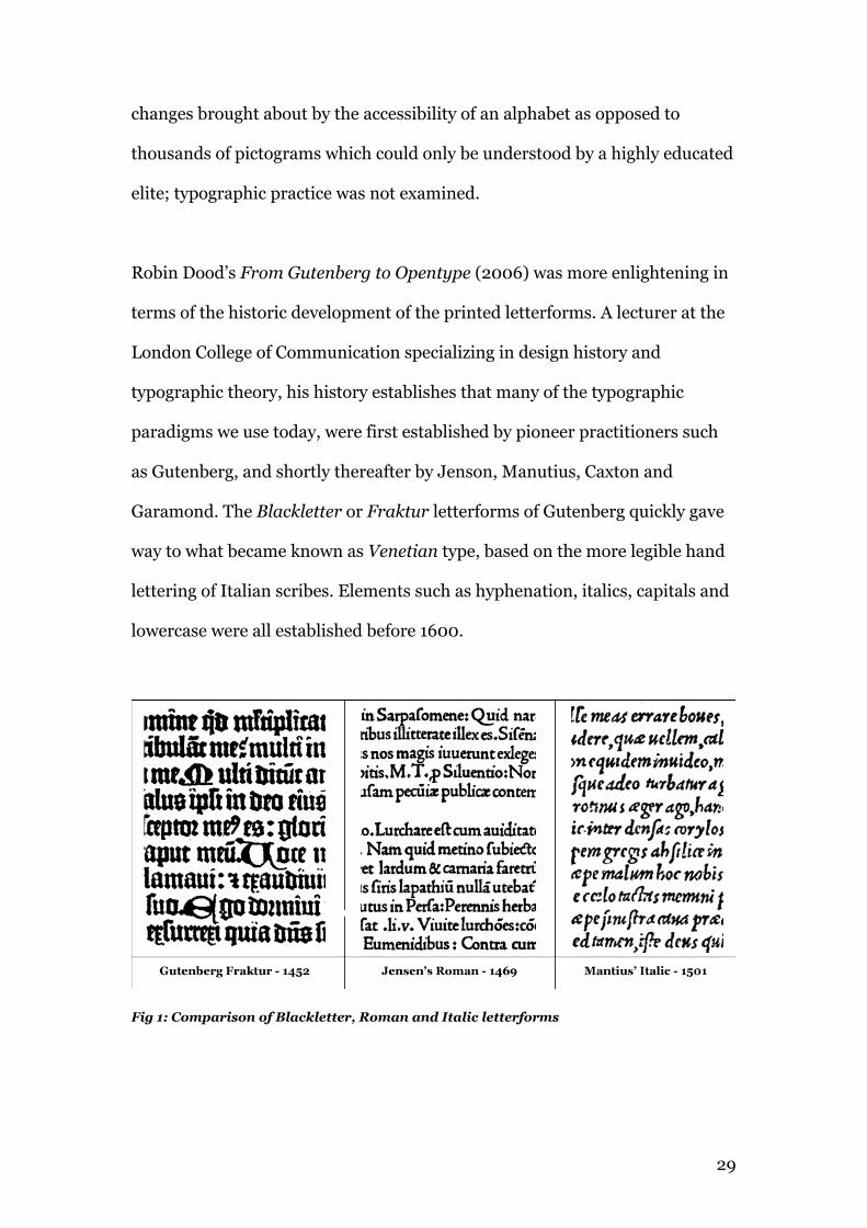
Garamond. The Blackletter or Fraktur letterforms of Gutenberg quickly gave
way to what became known as Venetian type, based on the more legible hand
lettering of Italian scribes. Elements such as hyphenation, italics, capitals and
lowercase were all established before 1600.
Fig 1: Comparison of Blackletter, Roman and Italic letterforms
30
“Aldus Manutius' Roman defined the essential form of printed letters
in Europe for the following three centuries”.
- Ben Archer, 200713
The useful timeline on the same site illustrates how many of these typefaces
keep appearing in various guises over the years, right up to present day. As
recently as 1989, the Adobe Corporation released a digital version of the afore-
mentioned Garamond.
Dood’s examination continues through the development of the grotesque
typefaces of the late 19th, to the proliferation of typographic styles of the 20th
century, such as Modernism, De Stijl, Bauhaus and the first Display faces of
the postwar years. He examines milestone typefaces in some detail, for
example, Bembo, Futura, Helvetica and Palatino, among others. Dood
concludes with an examination of Adobe’s Opentype font format and a
selection of digital type foundries, including Carter & Cone, the creators of
Georgia and Verdana.
While Dood is very thorough with the history of type, digital aspects comprise
only a small section of the book and no mention is made of web typography.
Fredrick Hamilton’s The Uses of Italic (1918, The Gutenberg Project)
corroborates Dood’s and Archer’s timeline of italic development (see Archer,
§1.3.4).
13 Archer, B (2007) http://www.100types.com/100types.com.10manutius.html
31
1.2 Typographic best practice
This research is focused primarily on typography in its functional form –
typesetting and legibility. Expressive typography is not relevant to this
research, therefore prominent twentieth century typographic practitioners
such as David Carson and Neville Brody have been excluded. The
constructivist and de-constructivist movements are also not included for the
same reason.
In Getting it right with Type (2000), Victoria Squire examines type in
practice – legibility of typefaces, leading and line length, and hierarchy are
among the aspects covered. She also has a useful section dealing with the
elements of layout, from columns and grids to footnotes and bibliographies.
While Squire’s exploration of type and typography is very thorough, only two
pages are devoted to screen typography, and then in little detail.
Robert Bringhurst’s The Elements of Typographic Style, first published in
1992 and currently in its 4th edition (called version 3.1) is widely regarded
among typographic professionals as the Typographers Bible. On the rear
cover, Hermann Zapf, the designer of Optima and Palatino describes it thus –
“Written by an expert, Robert Bringhurst’s book is particularly
welcome in an age where typographic design is sometimes
misconstrued as a form of private self-expression for designers.”
Zapf’s comment is particularly relevant in this age of democratized publishing.
The Elements of Typographic Style is a dense, incredibly detailed exploration
32
of high level typographic communication. From typefaces and obscure glyphs
to typesetting, Bringhurst leaves no stone unturned in his quest for
typographic perfection. This book is invaluable in many ways – choosing
appropriate typefaces, legibility, leading, line length, rhythm and structural
forms are but a few of the topics examined.
Although its publication precedes the web, and devotes only a small section to
digital type, its value lies in its use and examination of typographic exemplars.
Paul Felton’s The Ten Commandments of Typography / Type Heresy
(2006). Is divided into two distinct sections: The rules, where he distills
typographic practice to ten commandments; and breaking the rules, where he
disregards the afore-mentioned.
It is the former section, which is relevant to this research. These simplified
guidelines are more accessible to the non-typographer than Bringhurst’s detail
and should prove useful in influencing a general purpose stylesheet, although
some are not relevant or applicable, as marked out below*.
This list is paraphrased from Felton’s original.
1 Have no more than three typefaces in one document.
2 Have large headlines at the top of the page.
3 Use 8 – 10 pt for body copy*
(not appropriate for screen typography).
4 A typeface that is not legible is not a typeface.
5 Type should be correctly kerned *
(see §6.7 and §7.2.4 for further information on kerning).
33
6 Lay stress discretely upon text elements
7 Don’t set body text in all-caps
8 Use a baseline grid
9 Use flush-left ragged-right alignment
10 Use between 40 and 70 characters per line.
There is a small variance between Felton’s and Bringhurst’s
recommendations; for example Felton recommends line lengths of 40 – 70
characters while Bringhurst recommends 45 – 65, but such variations are
minimal. The real value in Felton’s work is in its’ simplicity.
1.3 Web Typography
Although a number of books have been published dealing specifically with
typography on the web, most have not aged well. Typography, the best work
from the Web (1999) by Carlson/Molina/Fleishman, for example, is very
outdated, dealing with typography purely in an aesthetic way. Much of the
type and websites shown are image based (the book predates the semantic
web) and typefaces have been chosen for stylistic reasons rather than
legibility. Furthermore, the styles are heavily influenced by the
deconstructivist movement, especially popular in the 1990s, which attempted
to distance itself from the more rigid modernist forms, and indeed from
Bringhurst’s classic typography.
The constantly changing nature of the web means that published works on the
subject rapidly find themselves obsolete. Many of the specifications in CSS3
and HTML 5 for example, are already supported by the latest versions of the
34
main web browsers. This is despite the fact that CSS3 is not due to reach full
specification until 2014, and HTML 5 until 2022 (w3c.com). Indeed, there are
many sites and forums already discussing the specs for CSS4 and HTML6.
Search results for “web typography” on Amazon reveal that the more recent
and likely relevant works are only available for pre-order at the time of
writing. All the other works listed date from 2003 and earlier.
Color & Type for the Screen by Verushka Gotz (1998) deals with various
issues related to screen typography, including suitability, styles, sizes, line
spacing and aliasing (which she describes as smoothing). The detail however,
is superficial, and no mention is made of either Georgia (designed in 1993) or
Verdana (1996). Much of the information on type is obsolete, but her
examination of colour and contrast remains valid.
Richard Rubinstein’s Digital Typography (1988) is geared primarily for the
print designer, but the section on making digital letterforms is enlightening in
terms of font colour (contrasting weight of strokes in a typeface) and
structural detail.
“Designs with relatively large x-heights are attractive at lower
resolutions because they make better use of the available space, and
simultaneously appear larger on the screen…”
- Richard Rubenstein14
14 Rubenstein, R (1998) Digital Typography, p90
35
The web itself has proved to be the best source of current information on web
typography. While Google gives 5,870,000 results in a search for web
typography, a certain few sites stand out in terms of their contributors’
provenance. There are a number of websites relevant to this research such as
24ways.org, Typotheque.com, Ilovetypography.com, Typophile.com and
AlistApart.com among others. They share many contributors and cover much
of the same ground, therefore a selective approach is used here.
1.3.1 A List Apart
A List Apart (alistapart.com) in its own words, explores the design,
development, and meaning of web content, with a special focus on web
standards and best practices. Its contributors include Eric Meyer (author of
the css reset), Jeffrey Zeldman (co-founder of the Web Standards project) and
Jason Santa Maria (founder of TypeKit). Although the scope of A List Apart is
wider than typography, it has an excellent section devoted to the subject with
23 detailed articles on web typography and a further six on web fonts.
Richard Rutter (How to text in CSS – 2007) and Peter K Sheerin both have
articles dealing with text sizing and specifically with the EM as a unit of
measurement in preference to pixels or points. These articles use a base
(paragraph) font-size set in pixels (14 – 16px), but all subsequent sizes set in
ems. With a base size of 16 px, 1 em equals 16px. A heading might then be set
as 1.4ems. The em has the advantage of being proportional – changing the
base font-size has the effect of changing all other measurements
proportionally. Their font-size is in contrast with Felton’s third rule (8 – 10 pt
body text), which is more appropriate for print.
36
Sheerin goes further in his piece, The Trouble With EM ’n EN (and Other
Shady Characters)(2001) detailing Unicode and specialist glyphs such as
dashes, hyphens, quotes and spaces. This article is very useful in it’s
conformance to Bringhurst’s work, but certain aspects may not be relevant to
the creation of a general-purpose stylesheet. Unicode symbols must be hard-
coded as part of the HTML, which would not be under this author’s control.
Wilson Milner’s Setting Type on the Web to a Baseline Grid (2007) is a
helpful guide to creating consistent multi-column layouts and coherent
typography. He recommends using a consistent line-height across all text
elements, based on the base font size. In his example he uses a base size of
12px text with 18px line spacing. Larger elements such as a 24px heading
receive a bottom margin of 18px (or alternatively, top and bottom margins of
12px respectively) to preserve alignment. His aim is to create a harmonious
vertical rhythm.
Milner defends his use of the pixel as a base unit because it is easier to
maintain and adjust than relative units such as the em. Although the em can
be specified to the third decimal place, screens are drawn in pixels. Em
measurements would therefore be rounded up or down to the nearest pixel
unit, potentially breaking the baseline grid.
Richard Fink’s article The look that says book (2010) builds on Milner’s
examination of columnar layout and looks specifically at justification and
hyphenation. His comparison of the advantages and disadvantages of the soft-
37
hyphen are especially useful. The soft-hyphen permits words to be
hyphenated as necessary, allowing paragraphs to be justified. He accepts that
a drawback of the soft-hyphen is that it must either be hard coded in the html,
or added dynamically using javascript such as hyphenator.js. Both approaches
would significantly bloat the html code.
More Perfect Typography (2010) and More Meaningful Typography by Tim
Brown (2011) further extends on Milner and Fink by suggesting the golden
mean (1.618) as a method of defining scales. He also covers recent
developments in CSS and browser development in terms of font rendering.
“So: as a web designer, font rendering is mostly out of your hands.
But it’s important to remember that certain styles within your control
can have an effect. When testing, keep in mind that different styles for
contrast, size, color, and rotation can result in significant differences.”
- Tim Brown (2010)15
Brown’s identification of a typefaces ‘sweet spot’ - a size at which it renders
best, is especially enlightening. His practice of identifying that size, then using
it as the base of his modular or harmonious scale should prove useful,
although he admits that “maths is by no means a replacement for the
designers eye”.
15 Brown, T (2010) More perfect typography: Build Design Conference http://vimeo.com/17079380/
38
Taming Lists (2002) by Mark Newhouse is an early article but still valid in
most respects. Newhouse deals with the disparities between the various
browsers’ methods of dealing with lists and suggests a number of methods of
dealing with them. Most of these differences are due to the browsers default
padding and margins. The article precedes Eric Meyer’s CSS reset and Nicolas
Gallagher & Jonathan Neal’s normalize.css, which both solve most of these
issues. The remainder of the article deals with inline lists, replacing or
removing bullet points, default indents and using pseudo-elements, a css
method of adding content to HTML elements.
Jason Santa Maria explores the challenges caused by the democratization of
and availability of typefaces through @fontface in On Web Typography
(2009). The parallels between the explosion of web publishing and the earlier
desktop publishing revolution are notable as everyman now has the ability to
create web typography, if badly. Noting that creators and users often have
personal preferences, he quotes16 type designer Zuzana Licko –
“We read best what we read most.”
Santa Maria recommends starting with an appropriate typeface for body copy.
Such a typeface should have a generous x-height and some personality, but
not enough that the typeface distracts from the content. He then suggests
pairing the selected type with another for headings, serif with sans-serif for
example. He offers guidelines accessible to everyman in an attempt to make a
general improvement in typography on the web. 16 http://www.alistapart.com/articles/on-web-typography/
39
“Contrast is probably the most important thing to keep in mind. When
pairing typefaces, it’s important to be able to tell that there are two
distinct typefaces in play, but contrast has other uses as well. Very
different typefaces can play off of each other in complementary ways
or resist each other to create a bit of tension, while typefaces that
appear too similar can weaken the message and confuse a design’s
visual language.”
- Santa Maria (2009)17
Santa Maria also points out that many typefaces have specific cultural
references or connections with particular time periods. It is therefore
important to match the subject matter with an appropriate typeface choice.
Typeface families with a good selection of weights and styles, give flexibility
without having to introduce a second face. He does concede that sometimes
typeface pairings “just feel right”, even when logic suggests they shouldn’t.
“Play a bold off of a light or italic weight for contrast, or try all caps
or small caps with a bit of letter-spacing for a subhead. If you choose
typefaces that only contain a single weight, you may find it very
difficult to create the contrast that a passage requires to adequately
distinguish sections visually.”
- Santa Maria (2009)18
17 http://www.alistapart.com/articles/on-web-typography/ 18 http://www.alistapart.com/articles/on-web-typography/
40
1.3.2 Typotheque
Typotheque.com has two articles which are particularly relevant to this work.
Font Hinting (2010), by Peter Bil’ak examines various methods of type
rendering across various operating systems and browsers. He goes further,
detailing how type is drawn and hinted in the case of Truetype (the dominant
font format on Windows) – essentially redrawn for use at different sizes.
Bil’ak’s work explains why so few fonts are hinted and gives examples of both
hinted and un-hinted fonts at various sizes (see chapter 5, §2). Alternative
formats such as Postscript are also covered. He predicts the eventual death of
hinting, but with Windows XP holding a 58.4% market share (his statistic,
now 43% at the time of writing), this day is a long way off.
In Typeface as Program (2011), Erik Spiekermann is interviewed by Jurg
Lehni and discusses the various issues surrounding the copyright and
licensing of fonts. Licensing is one of the major issues facing designers and
typographers on the web. Many commercially designed fonts, including
Spiekermann’s, are becoming available for web embedding from Typekit
(which has been acquired by Adobe at the time of writing).
Spiekermann explains that fonts are considered software in terms of licensing.
The letter shapes cannot be copyrighted, but the code that describes those
shapes can. This distinction has, perhaps, led to the licensing models widely
used for webfonts, where use of a font is licensed annually for specific
domains.
41
“Software companies like Microsoft charge up to 100 dollars per user
and year for the use of their programs. If that method was applied to
the licensing of fonts, it would result in massive sums for big
corporations like Bosch with 60,000 users.”
- Erik Spiekermann, 201119
1.3.3 Bringhurst on the web
The Elements of Typographic Style Applied to the Web (commenced 2005,
webtypography.net) by Richard Rutter is an ongoing attempt to apply
Bringhurst’s principles to the web. The site currently deals with just two
sections of eleven from the source book– Rhythm & Proportion, and
Harmony & Counterpoint. Having said that, those sections are among the
most relevant to this work.
His guidelines are similar to Felton’s (§1.2), with a few additions.
1 Letterspace strings of Capitals, small-caps and numbers
2 Don’t letterspace lowercase without reason
3 Choose a line-height which suits the typeface20
4 Set opening paragraphs flush left
5 Add extra space before and after quotations
6 Indent or center quotations
7 Don’t compose without a scale
19 http://www.typotheque.com/articles/typeface_as_programme_erik_spiekermann
20 Tim Brown’s suggestion of the golden mean should be used as a guideline only. A Typeface with a large x-height may require less line-spacing than one with a lower x-height.
42
Certain sections, such as “Don’t compose without a scale” equates to Felton’s
baseline grid and may be extended using Tim Brown’s modular approach.
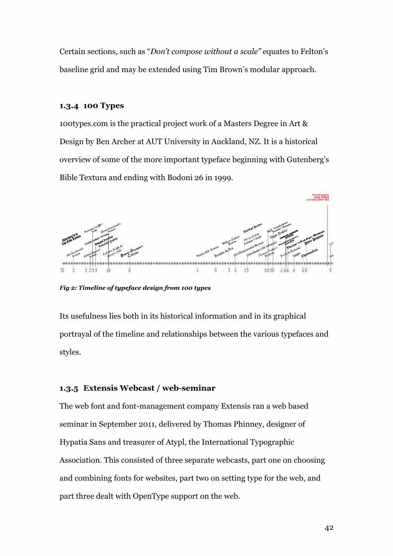
1.3.4 100 Types
100types.com is the practical project work of a Masters Degree in Art &
Design by Ben Archer at AUT University in Auckland, NZ. It is a historical
overview of some of the more important typeface beginning with Gutenberg’s
Bible Textura and ending with Bodoni 26 in 1999.
Fig 2: Timeline of typeface design from 100 types
Its usefulness lies both in its historical information and in its graphical
portrayal of the timeline and relationships between the various typefaces and
styles.
1.3.5 Extensis Webcast / web-seminar
The web font and font-management company Extensis ran a web based
seminar in September 2011, delivered by Thomas Phinney, designer of
Hypatia Sans and treasurer of Atypl, the International Typographic
Association. This consisted of three separate webcasts, part one on choosing
and combining fonts for websites, part two on setting type for the web, and
part three dealt with OpenType support on the web.
43
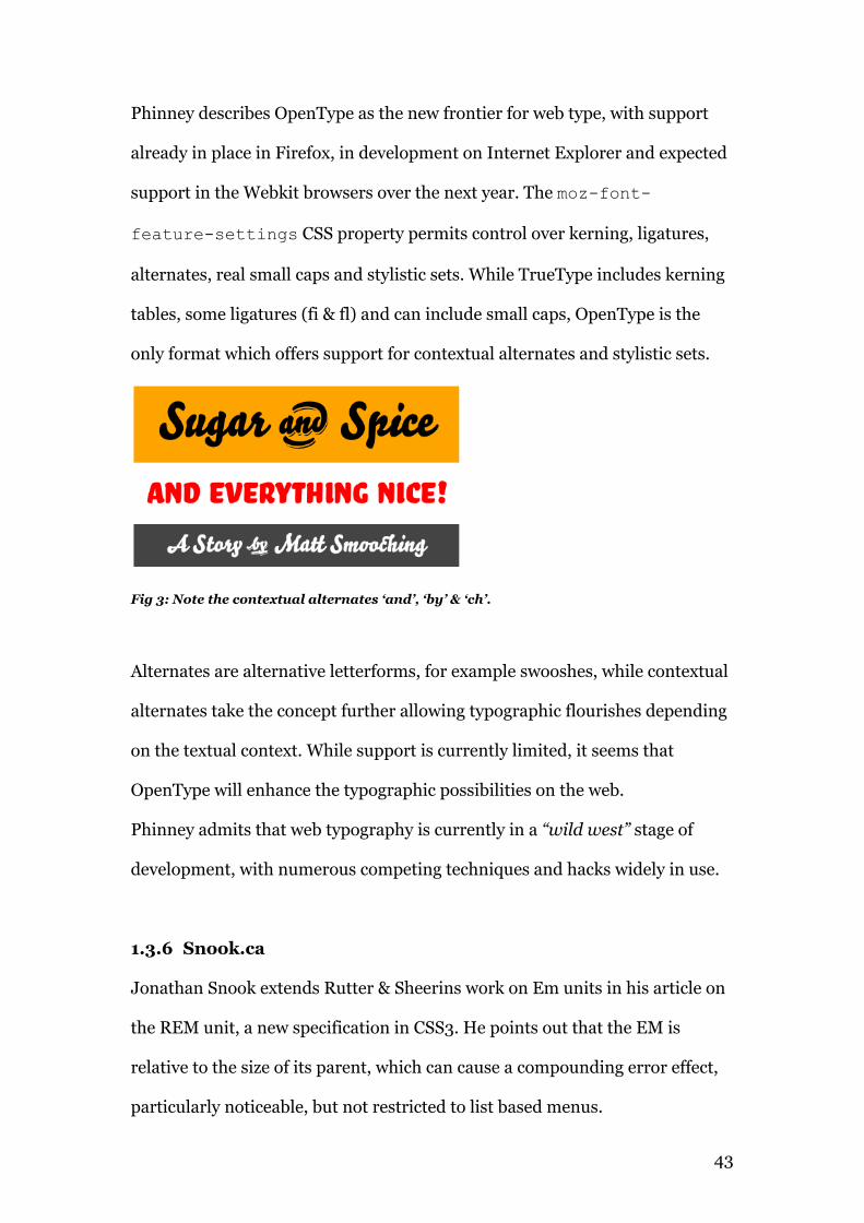
Phinney describes OpenType as the new frontier for web type, with support
already in place in Firefox, in development on Internet Explorer and expected
support in the Webkit browsers over the next year. The moz-font-
feature-settings CSS property permits control over kerning, ligatures,
alternates, real small caps and stylistic sets. While TrueType includes kerning
tables, some ligatures (fi & fl) and can include small caps, OpenType is the
only format which offers support for contextual alternates and stylistic sets.
Fig 3: Note the contextual alternates ‘and’, ‘by’ & ‘ch’.
Alternates are alternative letterforms, for example swooshes, while contextual
alternates take the concept further allowing typographic flourishes depending
on the textual context. While support is currently limited, it seems that
OpenType will enhance the typographic possibilities on the web.
Phinney admits that web typography is currently in a “wild west” stage of
development, with numerous competing techniques and hacks widely in use.
1.3.6 Snook.ca
Jonathan Snook extends Rutter & Sheerins work on Em units in his article on
the REM unit, a new specification in CSS3. He points out that the EM is
relative to the size of its parent, which can cause a compounding error effect,
particularly noticeable, but not restricted to list based menus.
44
“The problem with em-based font sizing is that the font size
compounds. A list within a list isn't 14px, it's 20px.
Go another level deeper and it's 27px!”
- Snook (2011)21
The rem, or ‘root em’ is intended to solve this problem by making the rem
relative to the root element. This means that a single font size may be declared
on the html element, and all rem units may be declared as a percentage of
that. He also specifies a fallback for older browsers, with the result that all
current browsers can have resizable text, with consistent and predictable
sizing in older versions.
1.3.7 W3C.org
The World Wide Web Consortium (W3C) is the organisation, which sets down
the standards for the web. Led by the inventor of the web, Tim Berners-Lee, it
comprises various member organisations and interested parties. The HTML
and CSS specifications are set by the W3C and implemented by the browser
creators. Draft specifications (CSS3 for example) are implemented using
browser prefixes to test the specifications and may or may not be used in the
final release. The W3C is the official source of information both in terms of
specification but also in terms of web architecture and the principles of the
semantic web.
21 Snook, J (2011) Font sizing with Rem http://snook.ca/archives/html_and_css/font-size-with-rem/
45
1.3.8 Columbia.edu
Columbia University’s Timeline of inventions22 is a useful resource for
establishing and contrasting the dates of invention of the various technologies.
In the western world, for example, Johann Gutenberg is generally credited
with the invention of the printing press and the first printed book around
1456. The Chinese had actually created the first printed book in 868 AD and
the first movable type between 1041 and 1049. Philip’s Key Events in History
gives 650AD as the invention date of wood block printing and 1050AD for
movable ceramic type.
1.4 Summary
It is apparent that the printed work cannot keep up with the rapid pace of
development on the web. Recently published works are often obsolete as soon
as they are published or have been superceded by new specifications or
rendering technologies. Regardless, the central practice of typography, honed
over 500 years, remains undiminished. Printed works, and Bringhurst’s work
in particular exemplify the central ambition for typography.
Practitioners such as Rutter, Santa Maria, Snook and Brown offer up-to-date
explorations of this ambition being realized through the available technology.
If there is a flaw, it is that the information is disparate, scattered and aimed at
the professional typographer. What is required is a coalescing and refining of
all of this information, that any web publisher may use it.
22 http://afe.easia.columbia.edu/song/readings/inventions_timeline.htm
46
1.5 Project Aims
The aims of this research then therefore can be summarised as follows –
- Collect and combine all the available information.
- Test available web-fonts for performance and legibility.
- Create a series of accessible typographic guidelines based on those
of Bringhurst, Felton et al.
- Design and build a website to host and display the guidelines.
- Provide a downloadable, flexible CSS stylesheet incorporating the
guidelines in terms of font embedding, font stacks, type-sizes, line
spacing, hierarchy and line-length.
This stylesheet would be released into the public domain through Creative
Commons and could offer an adaptable yet solid structure on which to
improve general typography on the web.
47
1.6 Bibliography
Bringhurst, R (1992) The Elements of Typographic Style:
Hartley & Marks Publishers, Vancouver
Carlson, J et al (1999) Typography - The best work from the Web:
Rockport Publishers, Gloucester, MA
Diringer, D (1967) The Alphabet: (1998 reprint)
Kessinger Publishers, Whitefish, Montana
Dood, R (2006) From Gutenberg to Opentype:
Hartley & Marks Publishers, Vancouver
Felton, P (2006) The ten commandments of Typography/Type heresy:
Merrell Publishers, London
Gotz, V (1998) Color & Type for the Screen:
Rotovision / Greypress Publishers, Hove, East Sussex
McLuhan, M (1962) The Gutenberg Galaxy:
University of Toronto Press, Toronto
Rubenstein, R (1988) Digital Typography:
Addison Westley Publishers, Reading, MA
Squire, V (2006) Getting it right with type:
Laurence King Publishers, London
Twist, C (2002) Philip’s Key Events in History
Chancellor Press, London
48
1.7 Webography
24ways.org
Boulton, M (2009) Designing for the switch
http://24ways.org/2009/designing-for-the-switch/
Accessed 6th Nov, 2011
Rutter, R (2010) Using the webfont loader to make browsers behave
http://24ways.org/2009/using -the-webfont-loader-to-make-
browsers-behave-the-same/
Accessed 6th Nov, 2011
Rutter, R (2006) Compose to a vertical rhythm
http://24ways.org/2009/compose-to-a-vertical-rhythm/
Accessed 6th Nov, 2011
Rutter, R (2007) Increase your font stacks with Font Matrix
http://24ways.org/2009/increase-your-font-stacks-with-font-matrix/
Accessed 6th Nov, 2011
Zeldman, J (2009) Real Fonts and rendering: The new Elephant in the room
http://24ways.org/2009/real-fonts-and-rendering/
Accessed 5th Nov, 2011
AlexPoole.info
Poole, A (2003-2012) Which Are More Legible: Serif or Sans Serif Typefaces?
http://alexpoole.info/which-are-more-legible-serif-or-sans-serif-
typefaces
Accessed 15th Nov, 2011
49
A List Apart Brown, T (2009) Real Type in Real Web Context
http://www.alistapart.com/articles/real-type-in-real-web-context/
Accessed 3rd Nov, 2011
Brown, T (2011) More meaningful typography
http//:www.alistapart.com/articles/more-meaningful-typography/
Accessed 3rd Nov, 2011
Fink, R (2010) Web fonts at the crossing
http://www.alistapart.com/articles/fonts-at-the-crossing/
Accessed 2nd Nov, 2011
Fink, R (2010) The look that says Book
http://www.alistapart.com/articles/the-look-that-says-book/
Accessed 2nd Nov, 2011
Mills, C (2011) CSS3 bling in the real world
http//:www.alistapart.com/articles/css3-bling-in-the-real-world/
Accessed 3rd Nov, 2011
Miner, W (2007) Setting type on the web to a baseline grid
http://www.alistapart.com/articles/settingtypeontheweb/
Accessed 2nd Nov, 2011
Mod, C (2011) A Simple Page
http//:www.alistapart.com/articles/a-simpler-page/
Accessed 3rd Nov, 2011
Newhouse, M (2002) Taming lists
http://www.alistapart.com/articles/taminglists/
Accessed 2nd Nov, 2011
50
Rutter, R (2007) How to size test in CSS
http://www.alistapart.com/articles/howtosizetextincss/
Accessed 2nd Nov, 2011
Santa Maria, J (2009) On web typography
http://www.alistapart.com/articles/on-web-typography/
Accessed 2nd Nov, 2011
Sheerin, PK (2001) The trouble with Em ‘n En (and other shady characters)
http://www.alistapart.com/articles/emen/
Accessed 2nd Nov, 2011
Wium, H (2007) Ten: The next big thing
http://www.alistapart.com/articles/cssatten/
Accessed 2nd Nov, 2011
Zeldman, J (2009) Interview with The Font Bureau’s David Berlow
http//:www.alistapart.com/articles/realfontsontheweb/
Accessed 3rd Nov, 2011
A Way Back
Sandhu, A (2009) Revised font Stack
http://www.awayback.com/revised-font-stack/
Accessed 18th Nov, 2011
Cameron Moll
Moll, C (2009) Exploring Cufón, a sIFR alternative for font embedding
http://cameronmoll.com/archives/2009/03/cufon_font_embedding/
Accessed 23rd Nov, 2011
51
Columbia.edu
http://afe.easia.columbia.edu/song/readings/inventions_timeline.htm
Accessed 23rd Nov, 2011
IloveTypography.com
Berkson, W (2010) Reviving Caslon
http://ilovetypography.com/2010/11/02/reviving-caslon-part-2-
readability-affability-authority/
Accessed 3rd Apr, 2012
Boardley, J (2008) A guide to web typography
http://ilovetypography.com/2008/02/28/a-guide-to-web-typography/
Accessed 7th Nov, 2011
Microsoft
Larson, K (2004) The Science of Word Recognition,
Or, how I learned to stop worrying and love the bouma
http://www.microsoft.com/typography/ctfonts/WordRecognition.aspx
Accessed 18th Apr, 2012
OpenType.info
Herrmann, Ralph (2011) Wayfinding & Typography
http://opentype.info/blog/2011/06/14/how-do-we-read-words-and-
how-should-we-set-them/
Accessed 19th Apr, 2012

52
53
Snook.ca
Snook, J (2011) Font sizing with Rem
http://snook.ca/archives/html_and_css/font-size-with-rem/
Accessed 24th Nov, 2011
The Gutenberg Project
Hamilton, Fredrick W. (1918) United Typothetae of America
http://www.gutenberg.org/files/24829/24829-h/24829-h.htm#Page_5
Accessed 25th Jan, 2012
Typotheque.com
Bil’ak, P (2010) Font Hinting
typotheque.com/articles/hinting
Accessed 7th Nov, 2011
Lehni,J (2011) Typeface as programme: Interview with Erik Spiekermann
typotheque.com/articles/typeface_as_programme_erik_spiekermann
Accessed 7th Nov, 2011
Unit Verse
Ford, N (2008) Better CSS Font Stacks
http://unitinteractive.com/blog/2008/06/26/better-css-font-stacks/
Accessed 18th Nov, 2011
54
Vimeo
Brown, T (2010) More perfect typography: Build Design Conference
http://vimeo.com/17079380/
Accessed 3rd Nov, 2011
Santa Maria, J (2012) On Web Typography
http://vimeo.com/34178417
Accessed 3rd April, 2012
Webink.com
Phinney, T, (2011) Webcast: Web Typography Best practices
blog.webink.com/training/web-typography-best-practices-resources/
Accessed 8th Nov, 2011
Webtypography.net
Rutter, R (2004-10) The Elements of Typographic Style Applied to the Web
http://webtypography.net/intro/
Accessed 5th Nov, 2011
Rutter, R, Boulton, M (2007) Web Typography Sucks (pdf)
http://webtypography.net/sxsw2007/
Accessed 15th Apr, 2012
W3C.org
http://www.w3.org/standards/webarch/
Accessed 25th Nov 2011
http://www.w3.org/TR/CSS21/fonts.html
55
Accessed 25th Nov 2011
Chapter 2
Font-stacks
56
2.1 Introduction
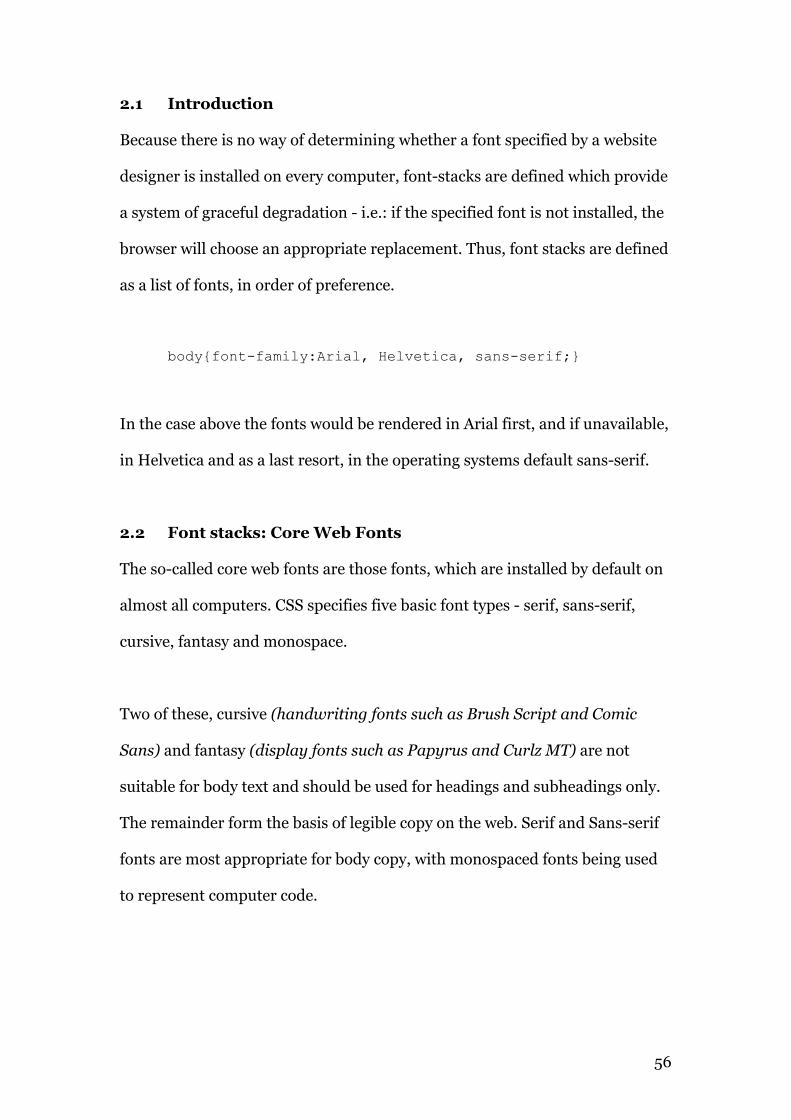
Because there is no way of determining whether a font specified by a website
designer is installed on every computer, font-stacks are defined which provide
a system of graceful degradation - i.e.: if the specified font is not installed, the
browser will choose an appropriate replacement. Thus, font stacks are defined
as a list of fonts, in order of preference.
body{font-family:Arial, Helvetica, sans-serif;}
In the case above the fonts would be rendered in Arial first, and if unavailable,
in Helvetica and as a last resort, in the operating systems default sans-serif.
2.2 Font stacks: Core Web Fonts
The so-called core web fonts are those fonts, which are installed by default on
almost all computers. CSS specifies five basic font types - serif, sans-serif,
cursive, fantasy and monospace.
Two of these, cursive (handwriting fonts such as Brush Script and Comic
Sans) and fantasy (display fonts such as Papyrus and Curlz MT) are not
suitable for body text and should be used for headings and subheadings only.
The remainder form the basis of legible copy on the web. Serif and Sans-serif
fonts are most appropriate for body copy, with monospaced fonts being used
to represent computer code.
57
“Font stacks are prioritized lists of fonts, defined in the CSS font-
family attribute, that a browser will cycle through until it finds a font
that is installed on the user’s system”
- Nathan Ford (2008)23
Serif fonts are traditionally24 considered more legible than sans-serifs, at least
in print. The serifs on the letterforms are said to aid the flow of text. On screen
the serifs can become a liability, particularly at smaller sizes as browsers
attempt to render the extra visual information. Recent serif designs such as
Georgia and Cambria have been designed specifically for screen output and do
much to address this issue.
The basic font stack for serifs is as follows –
font-family:Georgia, “Times New Roman”, Times, serif;
Sans-Serifs lack the tails of serifs and tend to be more geometric in form. They
also lack the contrast in stroke, which is characteristic of the serif font. This
consistency of stroke weight makes sans-serif fonts very useable on-screen,
and legibility tends to be superior to serifs at smaller sizes, e.g.: less than 12px.
Here is the basic sans-serif font stack –
font-family:Verdana,Arial, Helvetica, sans-serif;
23 Ford, N (2008) Better CSS Font Stacks http://unitinteractive.com/blog/2008/06/26/better-css-font-stacks/ 24 http://alexpoole.info/which-are-more-legible-serif-or-sans-serif-typefaces
58
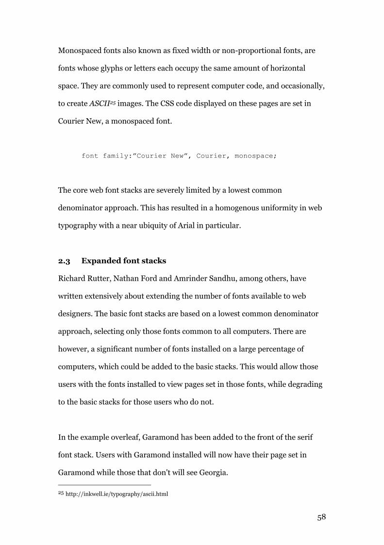
Monospaced fonts also known as fixed width or non-proportional fonts, are
fonts whose glyphs or letters each occupy the same amount of horizontal
space. They are commonly used to represent computer code, and occasionally,
to create ASCII25 images. The CSS code displayed on these pages are set in
Courier New, a monospaced font.
font family:”Courier New”, Courier, monospace;
The core web font stacks are severely limited by a lowest common
denominator approach. This has resulted in a homogenous uniformity in web
typography with a near ubiquity of Arial in particular.
2.3 Expanded font stacks
Richard Rutter, Nathan Ford and Amrinder Sandhu, among others, have
written extensively about extending the number of fonts available to web
designers. The basic font stacks are based on a lowest common denominator
approach, selecting only those fonts common to all computers. There are
however, a significant number of fonts installed on a large percentage of
computers, which could be added to the basic stacks. This would allow those
users with the fonts installed to view pages set in those fonts, while degrading
to the basic stacks for those users who do not.
In the example overleaf, Garamond has been added to the front of the serif
font stack. Users with Garamond installed will now have their page set in
Garamond while those that don't will see Georgia.
25 http://inkwell.ie/typography/ascii.html
59
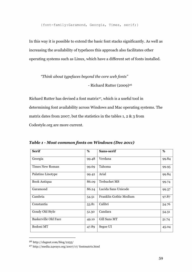
{font-family:Garamond, Georgia, Times, serif;}
In this way it is possible to extend the basic font stacks significantly. As well as
increasing the availability of typefaces this approach also facilitates other
operating systems such as Linux, which have a different set of fonts installed.
“Think about typefaces beyond the core web fonts”
- Richard Rutter (2009)26
Richard Rutter has devised a font matrix27, which is a useful tool in
determining font availability across Windows and Mac operating systems. The
matrix dates from 2007, but the statistics in the tables 1, 2 & 3 from
Codestyle.org are more current.
Table 1 - Most common fonts on Windows (Dec 2011)
Serif % Sans-serif %
Georgia 99.48 Verdana 99.84
Times New Roman 99.69 Tahoma 99.95
Palatino Linotype 99.42 Arial 99.84
Book Antiqua 86.09 Trebuchet MS 99.74
Garamond 86.24 Lucida Sans Unicode 99.37
Cambria 54.51 Franklin Gothic Medium 97.87
Constantia 53.81 Calibri 54.76
Goudy Old Style 51.30 Candara 54.31
Baskerville Old Face 49.10 Gill Sans MT 51.74
Bodoni MT 47.89 Segoe UI 45.04
26 http://clagnut.com/blog/2255/ 27 http://media.24ways.org/2007/17/ fontmatrix.html
60
Table 2 -Most common fonts on Linux (Dec 2011)
Serif % Sans-serif %
Century Schoolbook 99.28 URW Gothic L 99.28
URW Bookman L 98.81 Nimbus Sans L 98.57
URW Palladio L 98.57 Deja Vu Sans 97.37
Nimbus Roman 98.33 Deja Vu Sans Light 94.94
Deja Vu Serif 97.37 Deja Vu Sans Condensed 91.17
Bitstream Charter 92.36 Free Sans 84.01
Table 3 - Most common fonts on OS X (Dec 2011)
Serif % Sans-serif %
Times 99.37 Helvetica 100
Georgia 97.63 Geneva 98.84
Times New Roman 97.63 Lucida Grande 100
Hoefler Text 88.70 Arial 98.73
Baskerville 88.60 Verdana 99.05
Didot 87.72 Helvetica Neue 98.58
Big Caslon 85.10 Trebuchet MS 94.2
Palatino 79.71 Gill Sans 91.52
Lucida Bright 99.68 Futura 91.01
Garamond 23.84 Optima 90.14
Nathan Ford has a detailed examination of improved font stacks28 grouped by
serif / sans-serif / monospaced and by individual typeface characteristics,
28 http://unitinteractive.com/blog/2008/06/26/better-css-font-stacks/
61
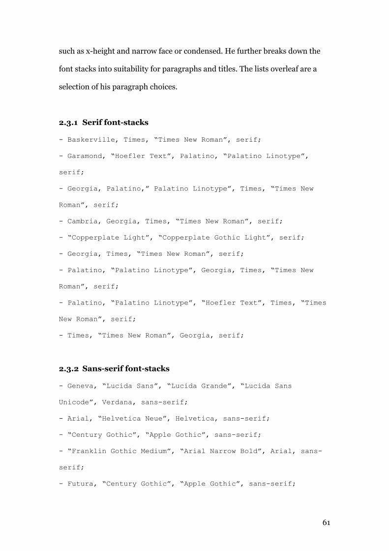
such as x-height and narrow face or condensed. He further breaks down the
font stacks into suitability for paragraphs and titles. The lists overleaf are a
selection of his paragraph choices.
2.3.1 Serif font-stacks
- Baskerville, Times, “Times New Roman”, serif;
- Garamond, “Hoefler Text”, Palatino, “Palatino Linotype”,
serif;
- Georgia, Palatino,” Palatino Linotype”, Times, “Times New
Roman”, serif;
- Cambria, Georgia, Times, “Times New Roman”, serif;
- “Copperplate Light”, “Copperplate Gothic Light”, serif;
- Georgia, Times, “Times New Roman”, serif;
- Palatino, “Palatino Linotype”, Georgia, Times, “Times New
Roman”, serif;
- Palatino, “Palatino Linotype”, “Hoefler Text”, Times, “Times
New Roman”, serif;
- Times, “Times New Roman”, Georgia, serif;
2.3.2 Sans-serif font-stacks
- Geneva, “Lucida Sans”, “Lucida Grande”, “Lucida Sans
Unicode”, Verdana, sans-serif;
- Arial, “Helvetica Neue”, Helvetica, sans-serif;
- “Century Gothic”, “Apple Gothic”, sans-serif;
- “Franklin Gothic Medium”, “Arial Narrow Bold”, Arial, sans-
serif;
- Futura, “Century Gothic”, “Apple Gothic”, sans-serif;
62
- “Gill Sans”, Calibri, “Trebuchet MS”, sans-serif;
- “Helvetica Neue”, Arial, Helvetica, sans-serif;
- Impact, Haettenschweiler, “Arial Narrow Bold”, sans-serif;
- “Lucida Sans”, “Lucida Grande”, “Lucida Sans Unicode”, sans-
serif;
- Tahoma, Geneva, Verdana, sans-serif;
- “Trebuchet MS”, “Lucida Sans Unicode”, “Lucida Grande”,
Arial, sans-serif;
- “Trebuchet MS”, Tahoma, Arial, sans-serif;
- Verdana, Tahoma, Geneva, sans-serif;
2.3.3 Monospace
- Consolas, “Lucida Console”, Monaco, monospace;
- “Courier New”, Courier, monospace;
2.4 Printer fonts versus screen fonts
Many of the fonts listed above are digitised versions of printer fonts. While
they will display reasonably well across the various systems, fonts designed for
screen will be more legible.
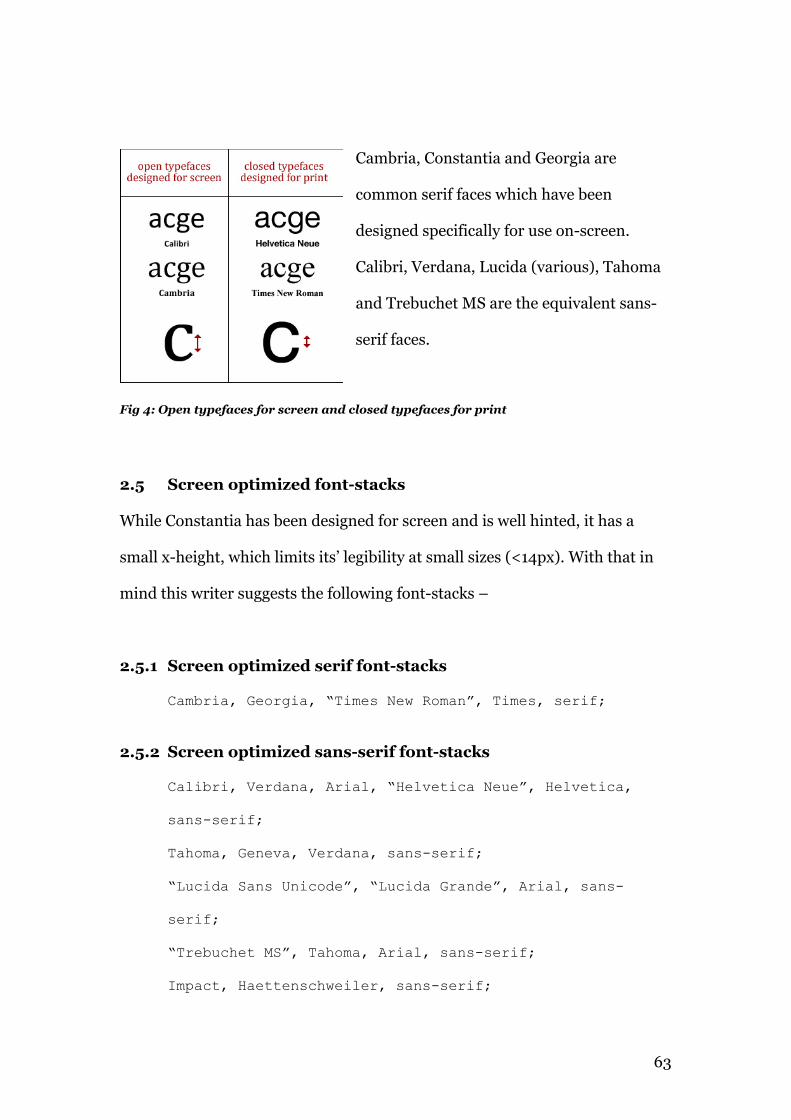
Typefaces designed specifically for screen are more open (fig 4, overleaf) and
serif faces have less contrast between the thick and thin strokes, leading to
improved legibility on-screen.
63
Cambria, Constantia and Georgia are
common serif faces which have been
designed specifically for use on-screen.
Calibri, Verdana, Lucida (various), Tahoma
and Trebuchet MS are the equivalent sans-
serif faces.
Fig 4: Open typefaces for screen and closed typefaces for print
2.5 Screen optimized font-stacks
While Constantia has been designed for screen and is well hinted, it has a
small x-height, which limits its’ legibility at small sizes (<14px). With that in
mind this writer suggests the following font-stacks –
2.5.1 Screen optimized serif font-stacks
Cambria, Georgia, “Times New Roman”, Times, serif;
2.5.2 Screen optimized sans-serif font-stacks
Calibri, Verdana, Arial, “Helvetica Neue”, Helvetica,
sans-serif;
Tahoma, Geneva, Verdana, sans-serif;
“Lucida Sans Unicode”, “Lucida Grande”, Arial, sans-
serif;
“Trebuchet MS”, Tahoma, Arial, sans-serif;
Impact, Haettenschweiler, sans-serif;
64
2.6 Summary
The tables above show that there are many widely available typefaces beyond
the core web fonts. The fact that most are simply digitized versions of printed
fonts, however, hinders their usefulness in font-stacks. Most of these fonts do
not have the extensive hinting (see §4.4.3) that their screen optimized
counterparts possess. It seems that the core web font-stacks may be expanded,
but only marginally.
65
Chapter 3
Font embedding technologies
66
3.1 Image replacement
Using images instead of text has been around as long as the <img> tag.
Designers frustrated by the lack of typographic control routinely created
designs in image editors and in worst-case scenarios, created websites entirely
from images. Today, this is almost universally considered bad practice,
because the content of an image cannot be indexed by search engines (without
horribly dense alt tags). The bandwidth overhead is also increased
substantially, both with the extra markup required and the image sizes
themselves.
Nevertheless, image replacement still remains in use, and is in fact, extremely
common. Every website using a logo in their header is using a form of image
replacement. The use of an image representing the brand coupled with an
<alt> tag is ubiquitous on the web.
The simplest approach is to insert the image directly into the html, and
include an alt tag. While this approach is accessible, it is not semantic. An
extended and superior approach is to include the text contained in the image
as a <span> or <h1> in the HTML, and use CSS to hide the text but insert a
background image. This approach maintains accessibility and should not
adversely impact SEO.
The technique is simple and effective for use with static elements such as an
identity, but can become labour intensive if, for example every heading was to
be styled in this fashion. It would also mean that many website updates would
also require image editing. FLIR (FaceLift Image Replacement) was
67
developed by Cory Mawhorter to solve this problem by making the process
dynamic. FLIR works by replacing text with png images created dynamically
on the host server by a php script (GD or ImageMagick). The use of php could
be viewed as a disadvantage, as servers running .Net cannot run FLIR.
Mawhorter’s site is no longer online, so it was not possible to test this
technique. It is unclear if FLIR is still being supported, but a version of it has
been forked to run as a WordPress plug-in.
3.2 sIFR
Shaun Inman developed Inman flash replacement as a method of replacing
generic type in webpages with a user specified Flash based replacement. Mike
Davidson and Mark Wubben took Inman's concept and made it scalable,
renaming it sIFR.
The technique works by embedding a font in a flash swf movie and using
javascript to call on that swf to replace selected html elements. The text
remains selectable and accessible. This approach relies on the user have the
Flash plug-in installed and JavaScript enabled. If either is absent, the type
degrades to whatever is specified in the CSS.
The sIFR zip unpacks to a number of files, comprising a .fla (Flash) a CSS file,
two javascript files and some supplementary files. The .fla file must be opened
and its original font changed to the desired one. An .swf file is then exported
which contains the required glyphs. If specialised glyphs are needed the
embed function in Flash can be used. The sifr-config.js file then needs to be
68
edited to reflect the name of the exported swf file. Finally, a few lines of
javascript are pasted to the html page.
Note: the javascript links must come after the links to the global and sIFR
stylesheets. There are many tutorials detailing the above, many of which did
not work for this author. This writer found Mark Wubben's tutorial be the
most straightforward. SIFR is nonetheless awkward to set up. It requires
Flash Studio to edit the .fla and export the .swf, knowledge of HTML, CSS and
JavaScript, and will not work locally due to security settings in the Flash plug-
in. It does not work with every font; many tried by this author did not display,
and of those that did some rendering glitches remained.
Using sIFR can cause slower load times, because of the increased number of
server calls for the various JavaScript, swf and CSS files, even though the files
themselves are quite compact. It also has a processing overhead as the
browser has to parse the swf files. This makes it unsuitable for large bodies of
text, although it works quite well as a heading replacement. Possibly the
biggest argument against using sIFR comes for Mark Wubben himself —
“Given that we’re well into 2011 at the time of writing, you should
really think twice about deploying sIFR. Instead take a look at Typekit
or Fontdeck. There hasn’t been an update to sIFR since October 2008,
and consequently it’s probably riddled with bugs.
Seriously, don’t use it. It’s unsupported software.”
- Mark Wubben (2000)29
29 novemberborn.net/sifr3
69
3.3 Cufón
The central aim of Cufón was to become the successor to sIFR, which as stated
above, is difficult to set up. It consists of two parts, an online font generator
(essentially a front-end to FontForge) and a JavaScript rendering engine,
which is uploaded to the target site. The font generator allows the user to
upload the chosen font (EULA permitting), where it is converted firstly to an
SVG (Scalable Vector Graphic) file, then to VML (Vector Markup Language)
and finally to JSON (JavaScript Object Notation). SVG is not retained in the
generated file due to speed issues. Because the file is essentially JavaScript no
plug-in is required for viewing the converted text.
In practice Cufón is very easy to set up and use. The font generator interface
allows the user to upload normal, bold, italic and bold italic fonts and group
them under a user-specified font family name. The user then selects which
glyphs are required from a checkbox list. Latin is checked by default and
would be sufficient for most users, unless specialised characters are required.
The user can select all glyphs but this is not recommended as the resulting file
will be unnecessarily large.
The interface also allows restricting the usage to specific domains, which is a
requirement of some typefaces EULA. Finally, the user can include or exclude
kerning tables. The inclusion of these tables slightly increases the file size of
the generated font but is highly recommended for improved type
performance.
70
“Technologies such as this encourage the use of typefaces other than
the standard set we’re all used to (Arial, Georgia, etc.).”
- Cameron Moll (2009)30
Implementing Cufón is as simple as linking to two provided JavaScript files,
the former being the rendering engine, and the latter the font itself. A snippet
of JavaScript is then pasted into the head of the page which specifies which
html elements should be replaced. Cufón replaced elements can be styled like
any other html element using CSS, e.g.: font-size, color, etc. Font weights and
italics may only be used if the corresponding fonts were included in the
upload to the font generator.
The example on the accompanying website took no longer than five minutes to
set up, from uploading the OldStyle font to its inclusion on the page.
3.3.1 Legal note
The use of Cufón requires an extended or separate license from some Type
Foundries, e.g.: Berthold, FontFont, FontSmith, Hoefler & Frere-Jones, ITC
and Linotype. Adobe fonts are known to be safe for use31. Foundries are
understandably cautious of licensing for Cufón, as the possibility exists that
the Cufón code could be reverse engineered to reproduce the original font file.
Before using Cufón it is vital to check the desired font’s EULA.
30 http://cameronmoll.com/archives/2009/03/cufon_font_embedding/ 31 http://cufon.shoqolate.com/generate/
71
Summary
Image replacement techniques are still widely used, but many of the
implementations are inappropriate. With the exception of branding, this
author recommends that image replacement has no place on the semantic
web. In contrast, techniques such as sIFR and Cufón may well be appropriate.
In practice sIFR is awkward to implement and does not work if either
JavaScript is disabled or the flash plug-in is absent. It is also unsuitable for
body copy as the flash plug-in needs to read and render the text on-the-fly.
Cufón is currently supported by IE 6/7/8/9, Firefox 1.5+, Safari 3+, Opera
9.5+, and Google Chrome. It loads quickly as it is entirely JavaScript,
particularly when compressed. While it can be used for larger bodies of text, it
has a significant drawback in that Cufón text cannot be selected. The
recommendation therefore, is to limit its use to headings/sub-headings and
navigation elements.
72
Chapter 4
Font embedding with @font-face
73
4.1 Introduction
Font embedding has long been the ‘holy-grail’ for web designers. Although it
was part of the CSS2 specification, it was removed in CSS2.1 only to be re-
introduced in CSS3. Internet Explorer has actually supported @font-face since
version 5.5 and all the major Browser developers have now implemented it.
Simply put, @font-face is a CSS rule, which downloads a font (from either its
host server or from a type service such as Typekit or Google Fonts) to the
browser for page rendering.
4.2 Using @font-face
In practice using @font-face is easy, though not without some quirks.
Although all the browsers support the specification, there is no standard font
format. Embedded OpenType (.eot), TrueType (.ttf), Scalable Vector Graphic
(.svg) and Web Open Font Format (.woff) are all in use today.
Internet Explorer supports EOT and since IE9, WOFF but not SVG or TTF.
Firefox supports TTF, WOFF but not EOT or SVG32.
Opera and Webkit browsers don't support EOT. What this means is that a
number of formats need to be generated, allowing the browser to select the
appropriate one for use.
Font Squirrel has an excellent web font generator, which handles the
conversion of fonts and the generation of the CSS code. The example overleaf
is used for the decorative fleurons on the website accompanying this paper —
32 http://webfonts.info/wiki/index.php?title=@font-face_browser_support
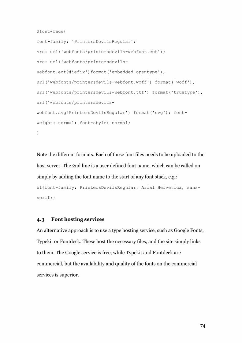
74
@font-face{
font-family: 'PrintersDevilsRegular';
src: url('webfonts/printersdevils-webfont.eot');
src: url('webfonts/printersdevils-
webfont.eot?#iefix')format('embedded-opentype'),
url('webfonts/printersdevils-webfont.woff') format('woff'),
url('webfonts/printersdevils-webfont.ttf') format('truetype'),
url('webfonts/printersdevils-
webfont.svg#PrintersDevilsRegular') format('svg'); font-
weight: normal; font-style: normal;
}
Note the different formats. Each of these font files needs to be uploaded to the
host server. The 2nd line is a user defined font name, which can be called on
simply by adding the font name to the start of any font stack, e.g.:
h1{font-family: PrintersDevilsRegular, Arial Helvetica, sans-
serif;}
4.3 Font hosting services
An alternative approach is to use a type hosting service, such as Google Fonts,
Typekit or Fontdeck. These host the necessary files, and the site simply links
to them. The Google service is free, while Typekit and Fontdeck are
commercial, but the availability and quality of the fonts on the commercial
services is superior.
75
4.3.1 Typekit
Typekit was launched in 2009 and was acquired by Adobe in 2011. This writer
reviewed the service shortly after the launch. It is without doubt the best
service at present, with many of the major type foundries on-board, including
Adobe, Bitstream and Exljbris. At the time of writing, it hosts 704
professionally designed fonts and their font variants are more extended than
the free services. Many faces are available in weights from Ultralight to Black,
with styles in italics and obliques, condensed and extended. The service is fast,
users will not notice any delay in font rendering. A caveat is that most are
designed for print, and simply licensed for use on the web.
4.3.2 Fontdeck
Fontdeck was created in 2010, as a collaboration between Clearleft, a British
web design company and OmniTi, an American software company. They
represent some of the same foundries as Typekit, such as Exljbris, but their
type suppliers are independent, for the most part. Fontdeck has a very large
display font section, but serifs (102 fonts) and sans-serifs (266) are also well
covered. The categories used are inaccurate in places, with some serifs under
the sans-serif category.
Note: some of the typefaces included in both categories would be better
described as display faces, e.g. Ollivette is a distressed font based on a
typewriter typeface. This might work well as a heading but is totally unsuitable
for body copy.
76
4.3.3 Google Web-fonts
Google’s web font service is free, but the quality of the hosted fonts is variable.
Most of the fonts on offer are for display fonts (novelty fonts) however there is
a selection of serif and sans-serif fonts available. These will be examined in
more detail in §6.5.4 and §6.6.
4.3.4 Pricing models
If there is a criticism of Typekit, it relates to their pricing model, which is
subscription based. It also scales with visitor numbers. While this is not a
problem for corporate users, this authors experience with SME clients is that
they are usually unwilling to add ongoing costs to their web presence. Typekit
does offer a free service, limited to two fonts, but the site must display the
Typekit logo. This may be sufficient for personal users. Fontdeck on the other
hand, uses a flat annual fee model regardless of site traffic (up to 1 million
page views per month, when price scaling kicks in). Their pricing is more
affordable and varies from one font to another (average price is $7.50pa).
They also offer a free service, limited to 20 ip addresses, which is useful for
site development.
At WebType, Steve Matteson recently extended the Georgia family, and David
Berlow has extended the Verdana family, both now offering ten weights, italics
and obliques, small caps and alternate numerals. These extensions of the core
web fonts would do much to improve typographic colour on the web, however
their pricing is high— $560 per annum per family for the hosted service rising
77
to $5600 for self-hosting. This unfortunately takes those fonts out of the
hands of most users.
4.4 Disadvantages of using @font-face
4.4.1 FOUT
An issue with using @font-face is FOUT (flash of unstyled text). This occurs as
some browsers (some versions of Firefox, Opera and Internet Explorer), load
the page then apply the style. Normal text will load, then flicker as it redraws
as the embedded font. More recent browser releases appear to be applying a
fix. Webkit browsers such as Chrome and Safari don't have this problem as
they keep the text invisible until it is ready to be rendered.
4.4.2 Filesize and bandwidth issues
On Windows, particularly those versions prior to Vista, fonts need to be
hinted to display well. Well-hinted fonts essentially have individual outlines
for a number of smaller font-sizes, typically 9pt – 14pt (Peter Bi’lak,
Typothetique). This has a large effect on the overall size of the font, as a
number of font outlines must be downloaded. The number of styles used
further compounds this.
For example, Ubuntu Sans is a freely available webfont designed for the Linux
Ubuntu operating system. It is available in nine styles – light, regular
medium, bold and their italics; it also includes a condensed variation. While
these variations undoubtedly offer the designer great opportunities as regards
typographic colour, they also have a large overhead. The Ubuntu font pack
78
from FontSquirrel is over 1.5MB in size. Admittedly this includes all the web
formats, but the individual formats are all quite large (see table 4).
Table 4: Typical file-size comparison of web font-formats
Webfont format Filesize
Embedded OpenType 213k
Scalable Vector Graphic 634k
TrueType 446k
Web Open Font Format 244k
This has implications for websites serving these fonts as their bandwidth
requirements and hence cost, can rise significantly. It also places a delay on
rendering the fonts on-screen, making FOUT more noticeable. Perhaps more
significantly, mobile browsers will experience longer delays, as 3G networks
are considerably slower than both wired and WiFi networks. Most mobile
users also have monthly bandwidth limits, which could be used up quickly if
each site visited uses @font-face.
4.4.3 Poor rendering of un-hinted fonts
Hinting is a skilled, time-consuming and expensive process and as a result,
most fonts are not hinted. Peter Bi’lak estimates that 99% of all fonts,
including commercial releases, are not hinted. This means that most fonts will
not display well on Windows XP, which, at the time of writing, has a market
share of 43%33. This will be examined in more detail in Chapter 6.
33 http://www.netmarketshare.com/operating-system-market-share.aspx?qprid=10
79
4.5 EULA restrictions
The End User License Agreement (EULA) which accompanies each font, is
currently the biggest obstacle to widespread font embedding. Licensing is a
hot topic among type designers and type users alike. Type designers invest
considerable time and effort in creating effective legible type and wish to
protect their investment. At the Offset conference in Dublin, 2012, David Wall
of Conor & David told this author that their typeface Orga34, available in 8
weights and obliques, took six years of design and development. It has not yet
been hinted. Speaking at the same conference and using Hoefler & Frere
Jones as a model foundry, Jessica Hische35 suggested that a hinted typeface in
a similar number of variants could cost as much as $1.5 million to develop.
Type foundries fear, justifiably, that their intellectual property may be
downloaded from sites and used for unlicensed purposes. Self-hosting of
embedded type makes it easy for unscrupulous users to either download the
various woff, eot and ttf or hotlink directly to them. For this reason,
commercial services such as Typekit use various obfuscation methods to hide
the url of their fonts while serving them.
An EULA typically grants the user a non-exclusive right to use the software (in
this case, font). At no point does the user own the font. It will specify under
which circumstances the font may be used. Most commercial EULAs either
prohibit font embedding or require extended licensing. Many also prohibit
their use in alternative technologies such as Cufón. 34 http://www.typegroup.ie/ 35 Personal correnspondance, see appendix 8
80
4.6 In Summary
The increasing number of freely available fonts for the web is encouraging,
however the quality of many of these fonts is questionable. Poor kerning
tables means that many are particularly unsuitable for body copy, restricting
them to headlines and subheadings. Most are available in one weight only,
although a few have bold and italic variants. Most browsers have little or poor
support for kerning and lack the sub-pixel positioning (using the red, green &
blue sub pixels which combine to make a pixel as we know it) that would make
kerning more accurate (see §5.4).
The commercial services offer superior typefaces, many of them well hinted
despite being designed for print, but their pricing/licensing model puts them
outside the range of many users. There is currently a dearth of well-hinted
typefaces designed specifically for the screen36.
A significant disadvantage of font embedding, especially for mobile devices, is
the bandwidth overhead. On 3G networks and with 4G still a way off, the extra
bandwidth required to download a few variants of a font, can cause long
delays in page rendering.
36 Peter Bi’lak, Hinting, 2010, http://www.typotheque.com/articles/hinting

81
Chapter 5
Browser and OS type rendering
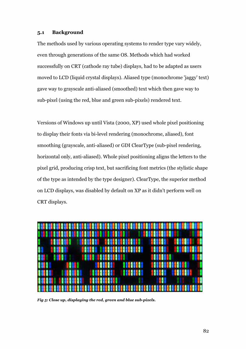
82
5.1 Background
The methods used by various operating systems to render type vary widely,
even through generations of the same OS. Methods which had worked
successfully on CRT (cathode ray tube) displays, had to be adapted as users
moved to LCD (liquid crystal displays). Aliased type (monochrome 'jaggy' text)
gave way to grayscale anti-aliased (smoothed) text which then gave way to
sub-pixel (using the red, blue and green sub-pixels) rendered text.
Versions of Windows up until Vista (2000, XP) used whole pixel positioning
to display their fonts via bi-level rendering (monochrome, aliased), font
smoothing (grayscale, anti-aliased) or GDI ClearType (sub-pixel rendering,
horizontal only, anti-aliased). Whole pixel positioning aligns the letters to the
pixel grid, producing crisp text, but sacrificing font metrics (the stylistic shape
of the type as intended by the type designer). ClearType, the superior method
on LCD displays, was disabled by default on XP as it didn't perform well on
CRT displays.
Fig 5: Close up, displaying the red, green and blue sub-pixels.
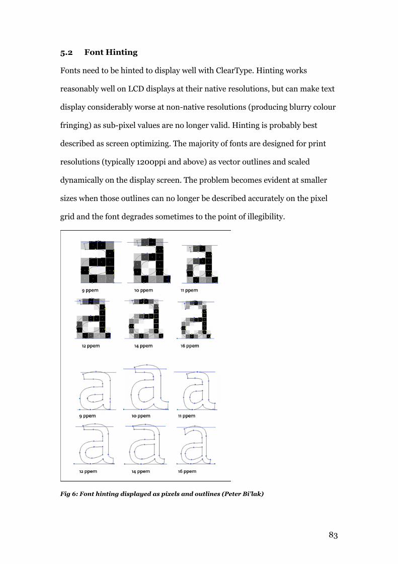
83
5.2 Font Hinting
Fonts need to be hinted to display well with ClearType. Hinting works
reasonably well on LCD displays at their native resolutions, but can make text
display considerably worse at non-native resolutions (producing blurry colour
fringing) as sub-pixel values are no longer valid. Hinting is probably best
described as screen optimizing. The majority of fonts are designed for print
resolutions (typically 1200ppi and above) as vector outlines and scaled
dynamically on the display screen. The problem becomes evident at smaller
sizes when those outlines can no longer be described accurately on the pixel
grid and the font degrades sometimes to the point of illegibility.
Fig 6: Font hinting displayed as pixels and outlines (Peter Bi’lak)
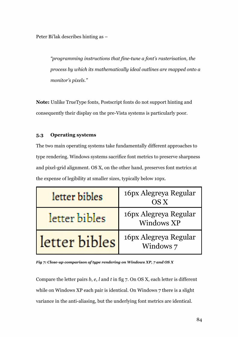
84
Peter Bi’lak describes hinting as –
“programming instructions that fine-tune a font’s rasterisation, the
process by which its mathematically ideal outlines are mapped onto a
monitor’s pixels.”
Note: Unlike TrueType fonts, Postscript fonts do not support hinting and
consequently their display on the pre-Vista systems is particularly poor.
5.3 Operating systems
The two main operating systems take fundamentally different approaches to
type rendering. Windows systems sacrifice font metrics to preserve sharpness
and pixel-grid alignment. OS X, on the other hand, preserves font metrics at
the expense of legibility at smaller sizes, typically below 10px.
Fig 7: Close-up comparison of type rendering on Windows XP, 7 and OS X
Compare the letter pairs b, e, l and t in fig 7. On OS X, each letter is different
while on Windows XP each pair is identical. On Windows 7 there is a slight
variance in the anti-aliasing, but the underlying font metrics are identical.
85
5.3.1 DirectWrite and ClearType
Since the release of Windows Vista in 2005, it and subsequent releases have
replaced GDI with DirectWrite, which improves the rendering of both
TrueType and OpenType fonts (which are often not hinted). DirectWrite uses
sub-pixel anti-aliasing both horizontally and vertically, while still making use
of hinting. Font metrics are preserved to a large extent while font smoothing
and kerning are both enhanced. DirectWrite with Cleartype is enabled by
default on Windows Vista and 7.
5.3.2 CoreText
On Apple computers, QuickDraw was the main method of displaying type on
pre-OS X systems, from OS 8.5. It enabled the anti-aliasing of Truetype fonts.
Adobe's Type Manager was also common among design professionals as it
allowed the anti-aliasing of Postscript fonts.
With the advent of OS X, ATM was no longer required as the Quartz rendering
engine now provided that functionality. Since Tiger (10.4), Quartz has been
extended by CoreText. It uses sub-pixel positioning, and anti-aliases both
horizontally and vertically. This approach preserves font metrics at the
expense of sharpness, particularly at smaller sizes. CoreText does not rely on
font-hinting.
5.3.3 Ubuntu
Ubuntu 10.04 can be configured to display text using aliased, anti-aliased or
sub-pixel rendering. Users can also specify none, slight, medium or full levels
of hinting. This writer has noted that specifying full hinting can give rise to
86
unusually wide spacing on certain fonts at small sizes (the open source
Ubuntu at 10px). That problem does not arise with medium hinting.
5.4 Browser text rendering
Browsers generally defer to the Operating Systems type-rendering engine.
This means that on OS X, Firefox, Safari, Chrome and Opera will all use
CoreText to display identical text. Similarly, browsers on Windows will
employ whichever text rendering system is specified, with an exception.
The original release of Safari for Windows used its own CoreText style
rendering system. Disliked by users, it remains an option, but has been
disabled by default in subsequent releases.
IE7 has a HTML ClearType setting enabled by default which over-rides the XP
system setting, meaning IE7 users will see text rendered with sub-pixel
rendering by default. With IE9 the system settings are also ignored and
DirectWrite is employed by default. See §6.6 for font-rendering comparisons.
5.4.1 Browser letter spacing
While browsers defer to the host OS for rendering settings, they do impose
their own letter-spacing. Firefox can letter-space in increments of 0.01 ems,
Opera uses increments of 0.05 ems while Webkit37 browsers’ letterspace in a
cruder increment of 0.075 ems. Internet Explorer versions prior to IE9 use
increments of 0.05ems while IE9 equals Firefox's 0.01 increments.
See §6.7 for letter-spacing comparisons.
37 Late addition, 4/5/12: Google have announced that they are currently working on adding subpixel support to the WebKit rendering tree - http://trac.webkit.org/wiki/LayoutUnit
87
5.5 In summary
While older versions of Windows have had somewhat crude type rendering,
the release of DirectWrite and IE9 have allowed Windows to equal or exceed
OS X in terms of the quality of display, although fonts still need hinting for
best results.
All of the current operating systems and browsers offer high quality text
rendering with good support for font metrics and some support for kerning. A
caveat is that Windows XP with its inferior text rendering still has a market
share of 43%38, as of Mar 2102, with this likely to continue for some time,
particularly among corporate users.
38 http://www.netmarketshare.com/operating-system-market-share.aspx?qprid=10
88
Chapter 6
Building and testing the website
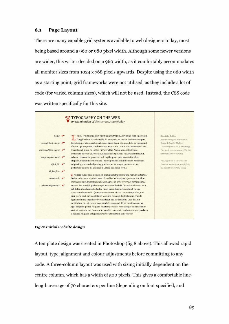
89
6.1 Page Layout
There are many capable grid systems available to web designers today, most
being based around a 960 or 980 pixel width. Although some newer versions
are wider, this writer decided on a 960 width, as it comfortably accommodates
all monitor sizes from 1024 x 768 pixels upwards. Despite using the 960 width
as a starting point, grid frameworks were not utilised, as they include a lot of
code (for varied column sizes), which will not be used. Instead, the CSS code
was written specifically for this site.
Fig 8: Initial website design
A template design was created in Photoshop (fig 8 above). This allowed rapid
layout, type, alignment and colour adjustments before committing to any
code. A three-column layout was used with sizing initially dependent on the
centre column, which has a width of 500 pixels. This gives a comfortable line-
length average of 70 characters per line (depending on font specified, and
90
platform). This is also a reason that a fluid or responsive system was not used,
as line-length can fluctuate widely depending on window size. The navigation
and right-sidebar sections are both 200 pixels wide, with the remaining space
left to gutters.
6.2 Units of Measurement
While the initial design was measured in pixels, a version of the website was
converted to ems. The em is a proportional unit, based on a root font-size. In
the case of the website, the root-size is 16px, specified in the <body> tag. One
em in this case, equals 16px. All subsequent measurements are set in ems. An
em may be specified to three decimal places.
The main advantage to using ems is its’ scalability. The entire design may be
resized simply by changing the root font-size. The change to ems however,
produced widely inconsistent rendering between the various browsers (see
§6.4 and appendices 1 and 2) particularly in relation to the pseudo elements
used throughout the website. The final version of the website reverts to pixel
based units.
6.3 Images
Early iterations of the site used a background image and images for the
fleurons and decorations used throughout. It seemed more appropriate
however, given the subject matter, to take a purer approach and use typefaces
throughout. The pseudo-elements :before and :after, coupled with the
content property, allowed the insertion of both Unicode symbols and letters.
Those letters could then be specified in a dingbat (symbol) font.
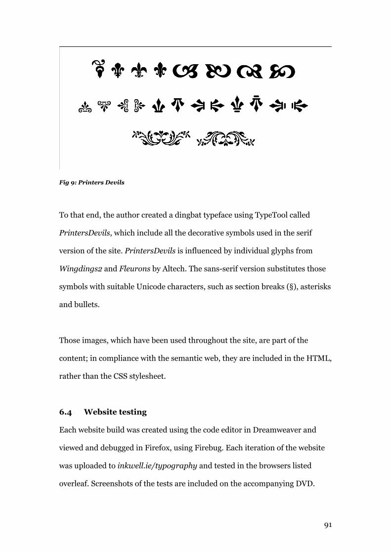
91
Fig 9: Printers Devils
To that end, the author created a dingbat typeface using TypeTool called
PrintersDevils, which include all the decorative symbols used in the serif
version of the site. PrintersDevils is influenced by individual glyphs from
Wingdings2 and Fleurons by Altech. The sans-serif version substitutes those
symbols with suitable Unicode characters, such as section breaks (§), asterisks
and bullets.
Those images, which have been used throughout the site, are part of the
content; in compliance with the semantic web, they are included in the HTML,
rather than the CSS stylesheet.
6.4 Website testing
Each website build was created using the code editor in Dreamweaver and
viewed and debugged in Firefox, using Firebug. Each iteration of the website
was uploaded to inkwell.ie/typography and tested in the browsers listed
overleaf. Screenshots of the tests are included on the accompanying DVD.
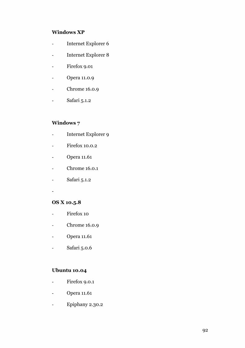
92
Windows XP
- Internet Explorer 6
- Internet Explorer 8
- Firefox 9.01
- Opera 11.0.9
- Chrome 16.0.9
- Safari 5.1.2
Windows 7
- Internet Explorer 9
- Firefox 10.0.2
- Opera 11.61
- Chrome 16.0.1
- Safari 5.1.2
-
OS X 10.5.8
- Firefox 10
- Chrome 16.0.9
- Opera 11.61
- Safari 5.0.6
Ubuntu 10.04
- Firefox 9.0.1
- Opera 11.61
- Epiphany 2.30.2
93
This approach was used to find and remedy unsupported selectors and
specifications. It contributed to the decision to remove all decorative imagery
(§6.2) as transparent pngs are not supported by IE6. Also revealed was the
inconsistent treatment of the :first-letter pseudo selector in Firefox in
comparison to the other browsers. It was also used to check consistent
behavior of the baseline grid set in the stylesheet. All browsers with the
exception of Opera on all platforms behaved consistently, while Opera used
double line-spacing on the navigation section.
Most browsers displayed the pseudo-elements (:before, :after,
:first-letter and :first-line) consistently. IE6 ignored these, but
they otherwise had no negative impact on page display. The webkit browsers
(Chrome and Safari) have a bug where text-transform:uppercase is not
displayed when applied to the :first-line pseudo element39. A work-
around is to use font-variant, and increase the font-size. Browsers will
generate a faux version of small-caps by using a reduced size of the uppercase
letters. This solution can be seen on the sans-serif version of the website.
It is not an issue on the serif version as the specified font is AlegreyaSC – a
small-caps variant.
As already mentioned in §6.2, when the pixel units were converted to ems the
browsers differed significantly in their placement of the pseudo-elements.
Firefox and the Webkit browsers were reasonably consistent, but Opera and
Internet Explorer 6, 8 and 9 varied widely (see appendices 1 and 2).
39 http://www.quirksmode.org/bugreports/archives/safari/index.html
94
More comprehensive screen shots of the browser tests are available on the
accompanying DVD).
6.5 Typographic choices
The choices of fonts are necessarily limited by their availability. Font-stacks
have been chosen using screen display characteristics and platform
availability as the main criteria.
Embedded fonts have been limited to the free services – Google Fonts and
FontSquirrel. Although both of these services offer a large range of fonts, the
selecting was restricted initially to serif and sans-serif fonts only. Many of the
available fonts were only available in one or two styles and were also excluded.
The criteria used for selection was as follows –
- The font must have at least four styles, including bold weights,
- The font should include an italic, or if not, a light variant,
- The font should have a medium to large x-height,
- The font should be ‘open’ in character.
Eight sans-serifs and four serifs were selected based on these criteria. These
fonts and their performance will be examined in § 6.6. Extended font families
offer a variety of weights and styles, which enhance both the hierarchy of the
type and the vertical rhythm of the content.
6.5.1 Serif versus sans-serif and legibility
Conventional wisdom among Graphic and Web Designers suggests that serif
typefaces are more legible than sans-serif when used in print, with the
converse being true on-screen. Empirical studies have not confirmed this
95
conclusion. Research by Ole Lund40 (2010) and Alex Poole41 (2010) found no
significant difference in legibility between serif and sans-serif, either in print
or on-screen. This project therefore, examines both types. The website
includes a toggle switch at the top left to switch between serif and sans-serif
display.
6.5.2 Font-stacks: Serifs
The site initially used a Constantia font-stack, degrading to Georgia for serifs,
however, following a number of Typophile users reporting difficulties with
Constantia’s small x-height the font-stack was changed to Cambria, degrading
to Georgia. Both Cambria, designed by Jella Bosma, and Georgia, designed by
Matthew Carter, have large x-heights and are open fonts designed specifically
for screen. See tables 2, 3 & 4 in Chapter 2 for font-stack availability.
6.5.3 Font-stacks: Sans-serifs
The first iteration of the site used Calibri degrading to Gill Sans as its’ font-
stack. Again, following feedback from Typophile, Gill Sans was changed to
Lucida Grande/Lucida Sans, both of which are designed for screen, unlike Gill
Sans, which is merely a digitized printer font.
6.5.4 Embedded Fonts with @font-face
The final version of the site extends the Cambria font-stack with Alegreya,
designed by Juan Pablo del Peral (one of the winners at AtypI Letter2
competition). Alegreya is available in 12 styles from Google Fonts and
40 2010, http://www.dkds.dk/nyheder/legibletypeface2010 41 http://alexpoole.info/which-are-more-legible-serif-or-sans-serif-typefaces#part2
96
FontSquirrel. The FontSquirrel offering was used initially as it allows the web-
formatted fonts to be downloaded (useful for file-size comparisons) and
embedded directly in the site, but performance was poor, either loading very
slowly or not at all on a number of occasions. This is not a criticism of
FontSquirrel, rather the speed of the site hosting service (hostireland.com).
See §7.4 for further information on performance.
Alegreya was selected as it offers good performance across all browsers and
systems and a large range of styles and weights. Of particular importance is
the small-caps style, which is used in the opening line of each page. Neither
Cambria, Constantia nor Georgia includes a small-caps variant, instead
substituting a reduced size version of their uppercase. This substitution is
noticeably in a lighter weight due to the size reduction.
The sans-serif font-stack was also extended with the addition of Ubuntu, again
available from Google Fonts and FontSquirrel. Ubuntu was designed as an
open-source font by Dalton Maag, for the Ubuntu OS. Available in 9 styles, it
too, is well hinted and the resulting file-sizes are also quite large. The
performance of the web-fonts will be examined in the next section.
6.6 Font testing and performance
A separate website (http://www.inkwell.ie/webfonts-testing) was created to
examine the performance of the selected webfonts. This included an index
page linked to serif and sans-serif sections. Each font has a test page including
a bold heading, italics (if available, light if not) and a paragraph in a range of
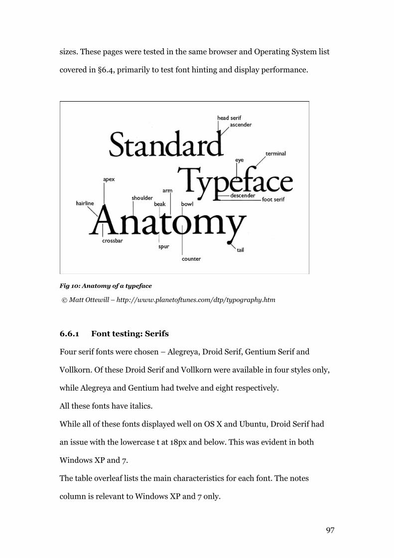
97
sizes. These pages were tested in the same browser and Operating System list
covered in §6.4, primarily to test font hinting and display performance.
Fig 10: Anatomy of a typeface
© Matt Ottewill – http://www.planetoftunes.com/dtp/typography.htm
6.6.1 Font testing: Serifs
Four serif fonts were chosen – Alegreya, Droid Serif, Gentium Serif and
Vollkorn. Of these Droid Serif and Vollkorn were available in four styles only,
while Alegreya and Gentium had twelve and eight respectively.
All these fonts have italics.
While all of these fonts displayed well on OS X and Ubuntu, Droid Serif had
an issue with the lowercase t at 18px and below. This was evident in both
Windows XP and 7.
The table overleaf lists the main characteristics for each font. The notes
column is relevant to Windows XP and 7 only.
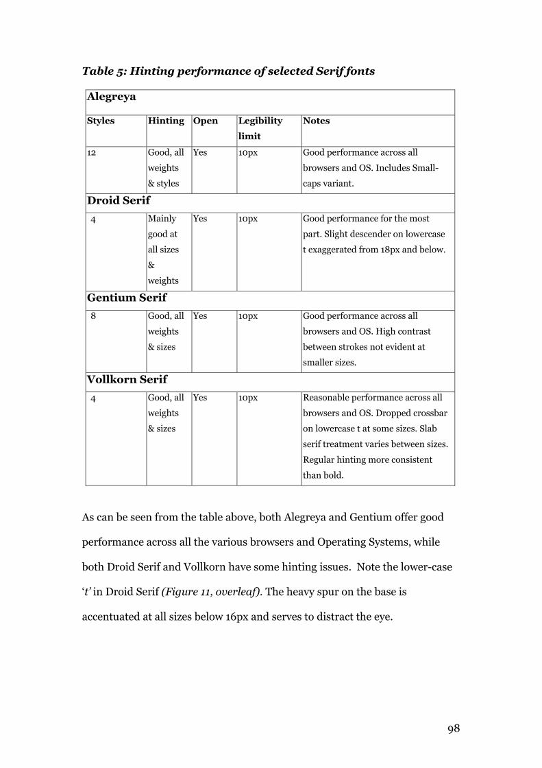
98
Table 5: Hinting performance of selected Serif fonts
Alegreya
Styles Hinting Open Legibility
limit
Notes
12 Good, all
weights
& styles
Yes 10px Good performance across all
browsers and OS. Includes Small-
caps variant.
Droid Serif 4 Mainly
good at
all sizes
&
weights
Yes 10px Good performance for the most
part. Slight descender on lowercase
t exaggerated from 18px and below.
Gentium Serif 8 Good, all
weights
& sizes
Yes 10px Good performance across all
browsers and OS. High contrast
between strokes not evident at
smaller sizes.
Vollkorn Serif 4 Good, all
weights
& sizes
Yes 10px Reasonable performance across all
browsers and OS. Dropped crossbar
on lowercase t at some sizes. Slab
serif treatment varies between sizes.
Regular hinting more consistent
than bold.
As can be seen from the table above, both Alegreya and Gentium offer good
performance across all the various browsers and Operating Systems, while
both Droid Serif and Vollkorn have some hinting issues. Note the lower-case
‘t’ in Droid Serif (Figure 11, overleaf). The heavy spur on the base is
accentuated at all sizes below 16px and serves to distract the eye.
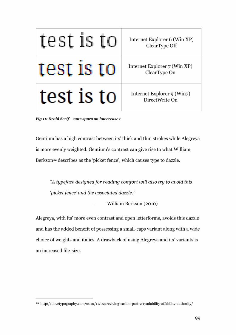
99
Fig 11: Droid Serif – note spurs on lowercase t
Gentium has a high contrast between its’ thick and thin strokes while Alegreya
is more evenly weighted. Gentium’s contrast can give rise to what William
Berkson42 describes as the ‘picket fence’, which causes type to dazzle.
“A typeface designed for reading comfort will also try to avoid this
‘picket fence’ and the associated dazzle.”
- William Berkson (2010)
Alegreya, with its’ more even contrast and open letterforms, avoids this dazzle
and has the added benefit of possessing a small-caps variant along with a wide
choice of weights and italics. A drawback of using Alegreya and its’ variants is
an increased file-size.
42 http://ilovetypography.com/2010/11/02/reviving-caslon-part-2-readability-affability-authority/
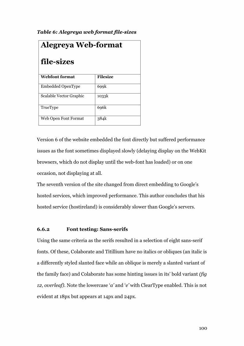
100
Table 6: Alegreya web format file-sizes
Alegreya Web-format
file-sizes
Webfont format Filesize
Embedded OpenType 699k
Scalable Vector Graphic 1033k
TrueType 696k
Web Open Font Format 384k
Version 6 of the website embedded the font directly but suffered performance
issues as the font sometimes displayed slowly (delaying display on the WebKit
browsers, which do not display until the web-font has loaded) or on one
occasion, not displaying at all.
The seventh version of the site changed from direct embedding to Google’s
hosted services, which improved performance. This author concludes that his
hosted service (hostireland) is considerably slower than Google’s servers.
6.6.2 Font testing: Sans-serifs
Using the same criteria as the serifs resulted in a selection of eight sans-serif
fonts. Of these, Colaborate and Titillium have no italics or obliques (an italic is
a differently styled slanted face while an oblique is merely a slanted variant of
the family face) and Colaborate has some hinting issues in its’ bold variant (fig
12, overleaf). Note the lowercase ‘a’ and ‘e’ with ClearType enabled. This is not
evident at 18px but appears at 14px and 24px.
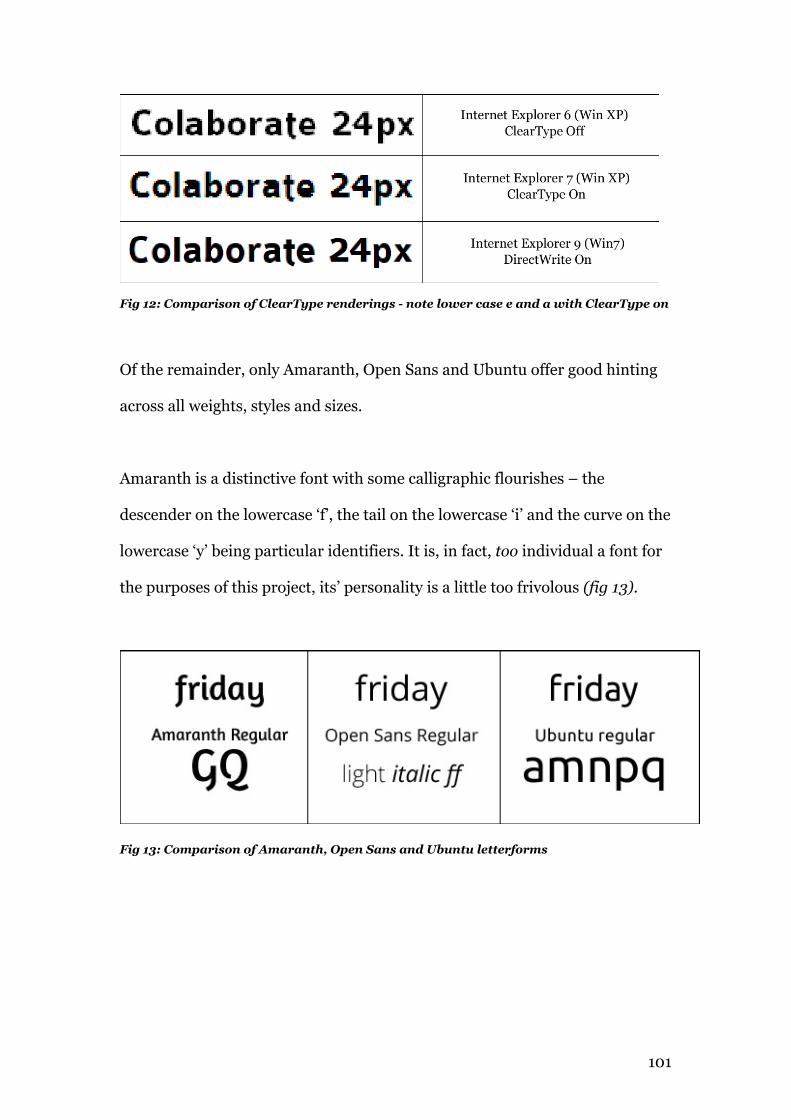
101
Fig 12: Comparison of ClearType renderings - note lower case e and a with ClearType on
Of the remainder, only Amaranth, Open Sans and Ubuntu offer good hinting
across all weights, styles and sizes.
Amaranth is a distinctive font with some calligraphic flourishes – the
descender on the lowercase ‘f’, the tail on the lowercase ‘i’ and the curve on the
lowercase ‘y’ being particular identifiers. It is, in fact, too individual a font for
the purposes of this project, its’ personality is a little too frivolous (fig 13).
Fig 13: Comparison of Amaranth, Open Sans and Ubuntu letterforms
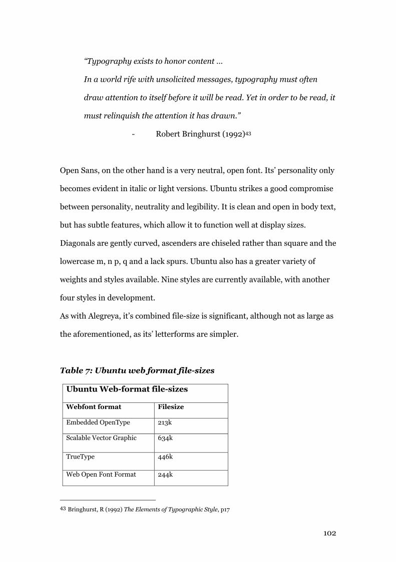
102
“Typography exists to honor content …
In a world rife with unsolicited messages, typography must often
draw attention to itself before it will be read. Yet in order to be read, it
must relinquish the attention it has drawn.”
- Robert Bringhurst (1992)43
Open Sans, on the other hand is a very neutral, open font. Its’ personality only
becomes evident in italic or light versions. Ubuntu strikes a good compromise
between personality, neutrality and legibility. It is clean and open in body text,
but has subtle features, which allow it to function well at display sizes.
Diagonals are gently curved, ascenders are chiseled rather than square and the
lowercase m, n p, q and a lack spurs. Ubuntu also has a greater variety of
weights and styles available. Nine styles are currently available, with another
four styles in development.
As with Alegreya, it’s combined file-size is significant, although not as large as
the aforementioned, as its’ letterforms are simpler.
Table 7: Ubuntu web format file-sizes
Ubuntu Web-format file-sizes
Webfont format Filesize
Embedded OpenType 213k
Scalable Vector Graphic 634k
TrueType 446k
Web Open Font Format 244k
43 Bringhurst, R (1992) The Elements of Typographic Style, p17
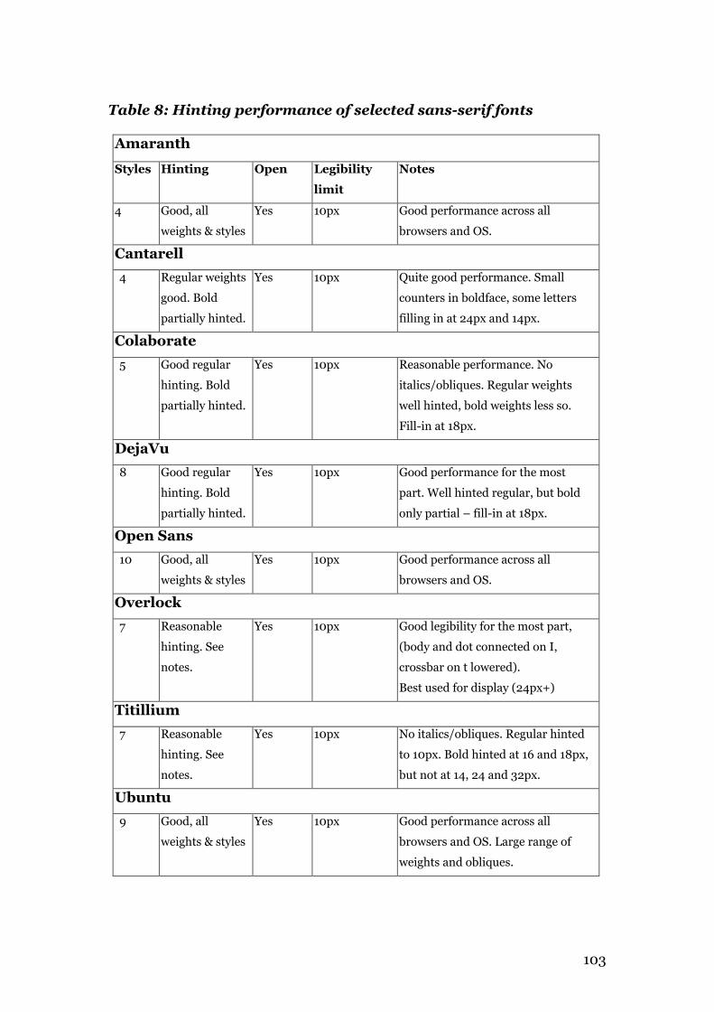
103
Table 8: Hinting performance of selected sans-serif fonts
Amaranth
Styles Hinting Open Legibility
limit
Notes
4 Good, all
weights & styles
Yes 10px Good performance across all
browsers and OS.
Cantarell 4 Regular weights
good. Bold
partially hinted.
Yes 10px Quite good performance. Small
counters in boldface, some letters
filling in at 24px and 14px.
Colaborate 5 Good regular
hinting. Bold
partially hinted.
Yes 10px Reasonable performance. No
italics/obliques. Regular weights
well hinted, bold weights less so.
Fill-in at 18px.
DejaVu 8 Good regular
hinting. Bold
partially hinted.
Yes 10px Good performance for the most
part. Well hinted regular, but bold
only partial – fill-in at 18px.
Open Sans
10 Good, all
weights & styles
Yes 10px Good performance across all
browsers and OS.
Overlock 7 Reasonable
hinting. See
notes.
Yes 10px Good legibility for the most part,
(body and dot connected on I,
crossbar on t lowered).
Best used for display (24px+)
Titillium 7 Reasonable
hinting. See
notes.
Yes 10px No italics/obliques. Regular hinted
to 10px. Bold hinted at 16 and 18px,
but not at 14, 24 and 32px.
Ubuntu 9 Good, all
weights & styles
Yes 10px Good performance across all
browsers and OS. Large range of
weights and obliques.
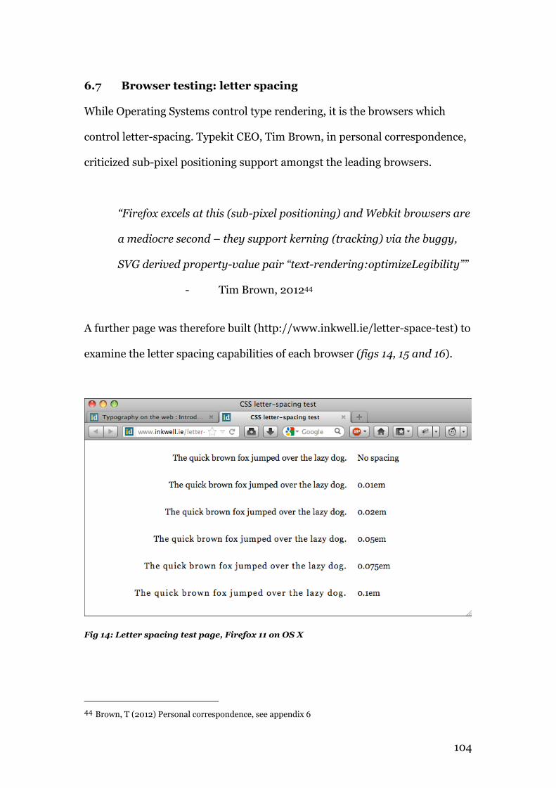
104
6.7 Browser testing: letter spacing
While Operating Systems control type rendering, it is the browsers which
control letter-spacing. Typekit CEO, Tim Brown, in personal correspondence,
criticized sub-pixel positioning support amongst the leading browsers.
“Firefox excels at this (sub-pixel positioning) and Webkit browsers are
a mediocre second – they support kerning (tracking) via the buggy,
SVG derived property-value pair “text-rendering:optimizeLegibility””
- Tim Brown, 201244
A further page was therefore built (http://www.inkwell.ie/letter-space-test) to
examine the letter spacing capabilities of each browser (figs 14, 15 and 16).
Fig 14: Letter spacing test page, Firefox 11 on OS X
44 Brown, T (2012) Personal correspondence, see appendix 6
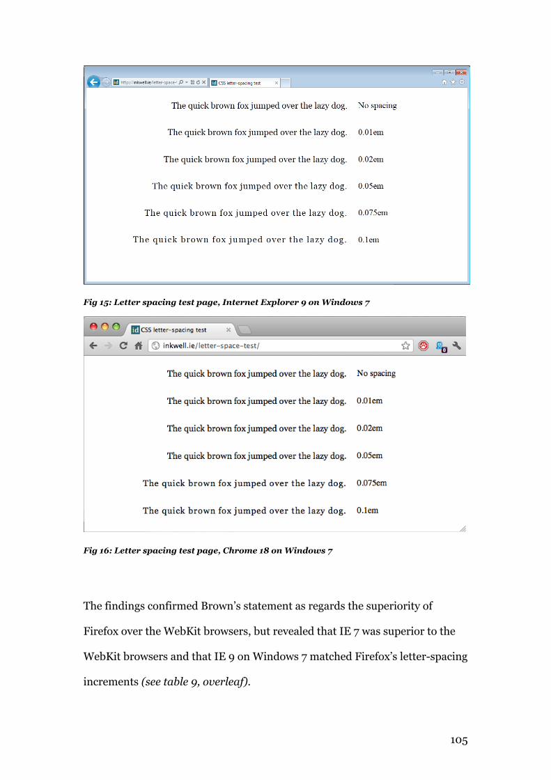
105
Fig 15: Letter spacing test page, Internet Explorer 9 on Windows 7
Fig 16: Letter spacing test page, Chrome 18 on Windows 7
The findings confirmed Brown’s statement as regards the superiority of
Firefox over the WebKit browsers, but revealed that IE 7 was superior to the
WebKit browsers and that IE 9 on Windows 7 matched Firefox’s letter-spacing
increments (see table 9, overleaf).
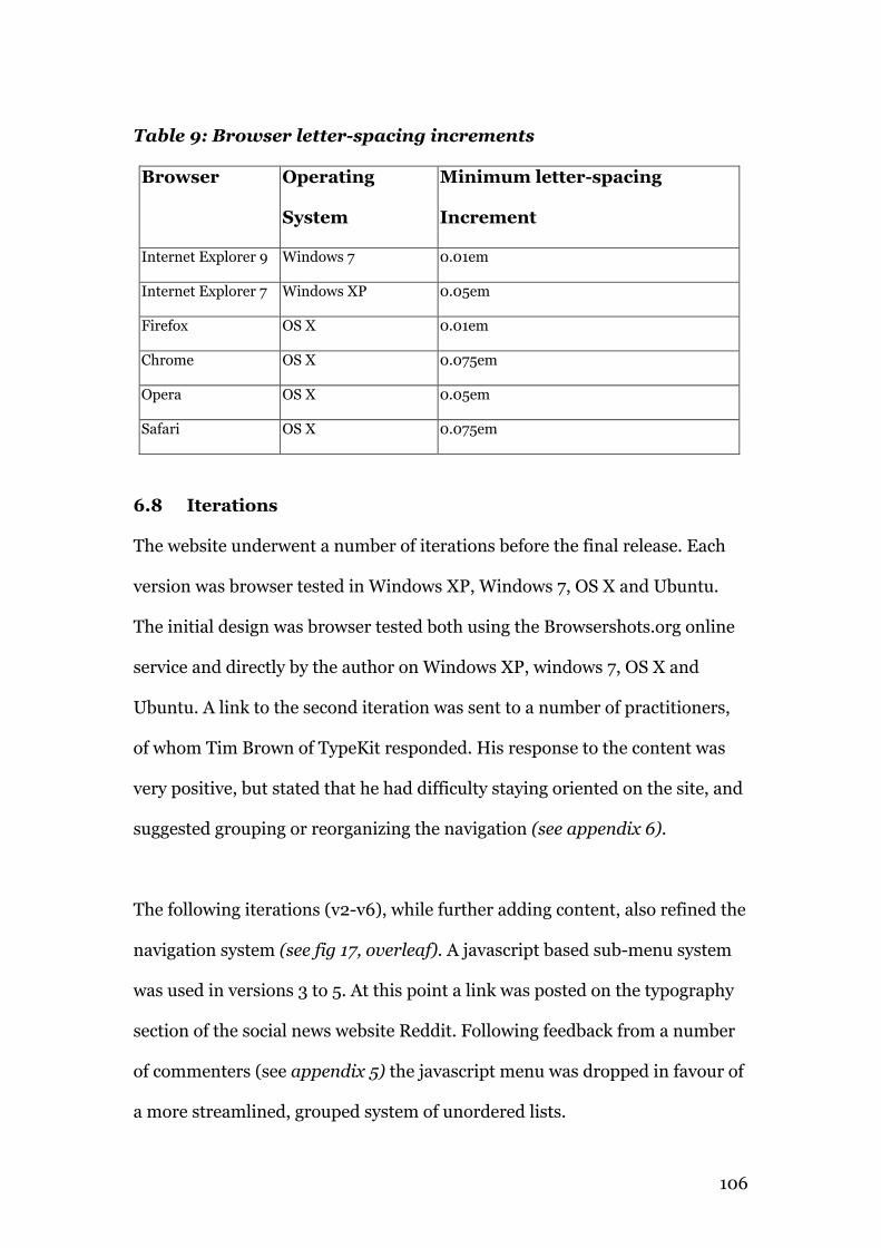
106
Table 9: Browser letter-spacing increments
Browser Operating
System
Minimum letter-spacing
Increment
Internet Explorer 9 Windows 7 0.01em
Internet Explorer 7 Windows XP 0.05em
Firefox OS X 0.01em
Chrome OS X 0.075em
Opera OS X 0.05em
Safari OS X 0.075em
6.8 Iterations
The website underwent a number of iterations before the final release. Each
version was browser tested in Windows XP, Windows 7, OS X and Ubuntu.
The initial design was browser tested both using the Browsershots.org online
service and directly by the author on Windows XP, windows 7, OS X and
Ubuntu. A link to the second iteration was sent to a number of practitioners,
of whom Tim Brown of TypeKit responded. His response to the content was
very positive, but stated that he had difficulty staying oriented on the site, and
suggested grouping or reorganizing the navigation (see appendix 6).
The following iterations (v2-v6), while further adding content, also refined the
navigation system (see fig 17, overleaf). A javascript based sub-menu system
was used in versions 3 to 5. At this point a link was posted on the typography
section of the social news website Reddit. Following feedback from a number
of commenters (see appendix 5) the javascript menu was dropped in favour of
a more streamlined, grouped system of unordered lists.
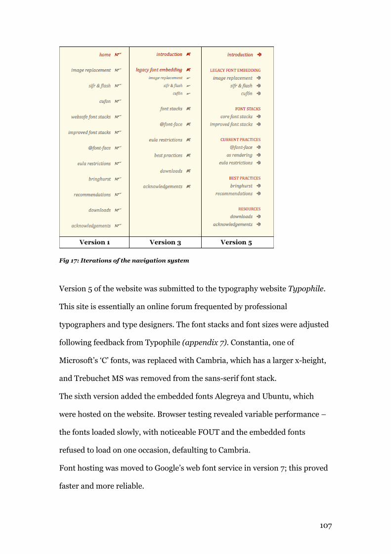
107
Fig 17: Iterations of the navigation system
Version 5 of the website was submitted to the typography website Typophile.
This site is essentially an online forum frequented by professional
typographers and type designers. The font stacks and font sizes were adjusted
following feedback from Typophile (appendix 7). Constantia, one of
Microsoft’s ‘C’ fonts, was replaced with Cambria, which has a larger x-height,
and Trebuchet MS was removed from the sans-serif font stack.
The sixth version added the embedded fonts Alegreya and Ubuntu, which
were hosted on the website. Browser testing revealed variable performance –
the fonts loaded slowly, with noticeable FOUT and the embedded fonts
refused to load on one occasion, defaulting to Cambria.
Font hosting was moved to Google’s web font service in version 7; this proved
faster and more reliable.
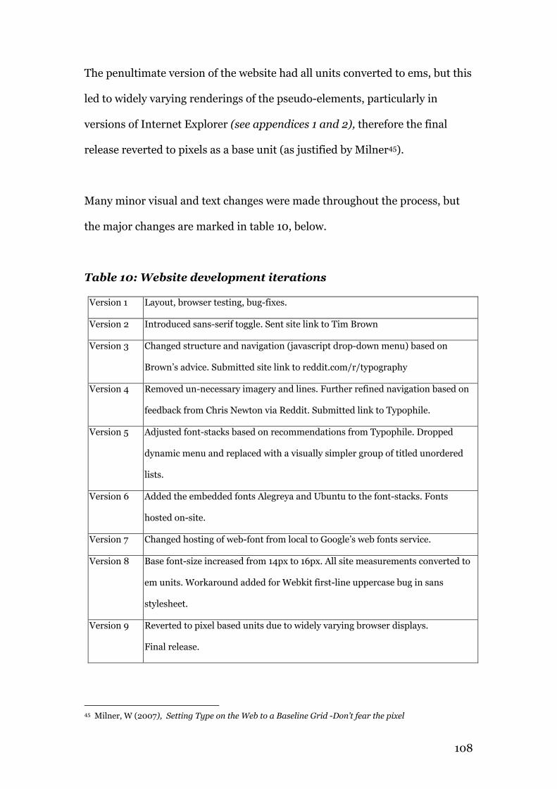
108
The penultimate version of the website had all units converted to ems, but this
led to widely varying renderings of the pseudo-elements, particularly in
versions of Internet Explorer (see appendices 1 and 2), therefore the final
release reverted to pixels as a base unit (as justified by Milner45).
Many minor visual and text changes were made throughout the process, but
the major changes are marked in table 10, below.
Table 10: Website development iterations
Version 1 Layout, browser testing, bug-fixes.
Version 2 Introduced sans-serif toggle. Sent site link to Tim Brown
Version 3 Changed structure and navigation (javascript drop-down menu) based on
Brown’s advice. Submitted site link to reddit.com/r/typography
Version 4 Removed un-necessary imagery and lines. Further refined navigation based on
feedback from Chris Newton via Reddit. Submitted link to Typophile.
Version 5 Adjusted font-stacks based on recommendations from Typophile. Dropped
dynamic menu and replaced with a visually simpler group of titled unordered
lists.
Version 6 Added the embedded fonts Alegreya and Ubuntu to the font-stacks. Fonts
hosted on-site.
Version 7 Changed hosting of web-font from local to Google’s web fonts service.
Version 8 Base font-size increased from 14px to 16px. All site measurements converted to
em units. Workaround added for Webkit first-line uppercase bug in sans
stylesheet.
Version 9 Reverted to pixel based units due to widely varying browser displays.
Final release.
45 Milner, W (2007), Setting Type on the Web to a Baseline Grid -Don’t fear the pixel
109
Chapter 7
Conclusions and recommendations
110
7.1 Conclusions
It is apparent that while typography on the web has come a long way since the
<font> tag first appeared, there is still a long way to go in comparison to
typography in print. CSS3 offers increasing capabilities in terms of typo-
graphic control, but cannot as yet control kerning, orphans or widows. It can
be anticipated that the CSS4 specification, currently in development, will
build on this progress. It is for the browser manufacturers to build in support
for font’s kerning tables, which most currently ignore by default46. In the
meantime, it is nevertheless possible to publish pages of a good typographic
quality. Font size, type hierarchy, line-heights and line-length are all under
the control of the web designer (see §7.2 for a list of recommendations).
The current move towards responsive design (where the page design responds
to the size of the viewport) brings further challenges, in terms of ideal line
lengths. The use of media queries, min and max-widths on text containers and
using the em as a unit of measurement can help mitigate this (see §7.2.8).
Windows XP retains a 43% market share among desktop users and with its’
default of turning ClearType off, is a significant obstacle in alternative
typefaces appearing on websites, as developers continue to support this
platform. Embedded fonts are currently viable, but limited, for the same
reason. When using @font-face for body copy, it is of utmost importance to
choose open-fonts, which have been hinted well, in all variants.
46 Brown, T (2012) personal correspondence, (see appendix 6)
111
The replacement of GDI Cleartype with DirectWrite in Windows 7 is a positive
improvement in text rendering. While it still relies on hinting to draw the
letterforms, it is much more faithful to the type metrics. Furthermore, its’
ability to improve the rendering of un-hinted PostScript and OpenType fonts
is very useful, and will likely become more important as more OpenType fonts
become available.
7.2 Recommendations
It behooves the typographer to treat their content with respect, attention to
detail and restraint. As we have seen in the previous sections, there are
currently a number of techniques and practices, which can be utilised to
improve general typography on the web. Most enjoy wide browser support.
Those which don't offer support (IE6), ignore these techniques and display is
otherwise not adversely affected. By combining the guidelines of Bringhurst,
Felton and Rutter and making those adjustments appropriate to screen text
delivery, this author offers the following typographic recommendations –
1 Use two typefaces or less, to achieve typographic hierarchy
2 Use 14 - 16 px for body copy
3 Use well-hinted, legible, open typefaces
4 Headlines should be correctly kerned
5 Don’t letterspace lowercase without reason
6 Letterspace strings of capitals, small-caps and numbers
7 Use flush-left ragged-right alignment
8 Use between 40 and 75 characters per line
9 Use a line-height which suits the typeface
112
10 Don’t set body text in all-caps
11 Set opening paragraphs flush left
12 Add extra space before and after quotations
These recommendations have been implemented in the stylesheets, available
from the downloads section of the website.
7.2.1 Use two typefaces or less, to achieve typographic hierarchy
Passages of text need a visual hierarchy in order to be readable. This can be
achieved through the use of different typefaces for headings and paragraphs,
for example. The aim is to achieve a contrast between those elements,
allowing the eye to easily discern the structure of the document. Matching
typefaces is an acquired skill – it is all too easy to choose typeface pairings,
which are inappropriate or lack sufficient contrast.
A simple approach is to pair a sans-serif with a serif, using the sans for
headings and the serif for paragraphs, or vice versa. An alternative approach is
to choose a single typeface, which contains a wide variety of styles. Alegreya,
for example, has 12 styles, with weights from regular to black, italics and small
caps. This single font has sufficient contrast between its styles to achieve the
hierarchy required.
HTML and CSS support a standard range of type hierarchy specifications
including six heading tags, the paragraph tag and blockquote tag. These can
be further supplemented by using classes to adjust those settings for specific
uses, for example text in a side bar.
113
HTML5 introduces further tags such as <article>, <aside>, <header>
and <section>. Collectively, these give users of type effective control over
the hierarchy of their content, from the main page heading to section
headings, subheadings, to paragraphs asides and quotes.
“Typography exists to honor content.”
- Bringhurst (1992)47
To this end it is important to let each hierarchy setting reflect its purpose in
the text. A <h1> should have more prominence than a <h2> and so on.
Prominence, and by extension, hierarchy, can be achieved through size, but
also through weight and colour.
7.2.2 Use 14- 16px for body copy
This is a fluid measurement, based largely on the average monitor resolutions.
As monitors have grown in size and resolution, pixel sizes have diminished in
a real sense. When the average monitor resolution was 1024 x 768 pixels a
base type size of 10 - 12 pixels was common. Resolutions have increased
dramatically in recent years, 1920 x 1080 pixels is not uncommon today.
Using a base size of a minimum of 14 or 16 pixels is more appropriate to these
high resolutions. This size does depend on the individual font specified - faces
with large x-heights such as Verdana can maintain legibility at relatively small
sizes. With a font with a low x-height, a size of 18 pixels may be more
47 Bringhurst,R (1992) The Elements of Typographic Style, p17
114
appropriate. For example, in the website accompanying this paper, the serif
Alegreya is set in 16px, while the sans-serif Ubuntu is set in 14px, as it has a
considerably higher x-height.
The base or root size should be specified in pixels in the #body selector.
All subsequent measurements should be set in ems. The em is a proportional
unit, based on a root font-size. An em may be specified to three decimal
places. The main advantage to using ems is its’ scalability. The entire design
may be resized simply by changing the root font-size. The em is generally a
preferable measurement to the pixel due to its’ scalability. It is particularly
useful in this age of responsive web design.
A disadvantage of using ems is that they suffer from inheritance. Take the
example of a list menu system with sub-menus. The font-size of 1.2 ems will
be inherited and compounded by the submenu giving a multiplication of
values. Assume a root size of 16px = 1em. The list size will then be 16 x 1.2 =
19.2px. The submenu will inherit the 19.2 value and apply the 1.2 value to it
giving a size of 23.04px. CSS3 includes the rem (root em) specification to
remedy this, but only the more recent browser releases offer support.
7.2.3 Use well-hinted, legible, open typefaces
Although it is possible to extend the core font-stacks, many of the additions
recommended by Ford and Sindhu are digitized printer fonts, which are either
closed in nature (Helvetica) or have a low x-height (Garamond). The “C” fonts
released by Microsoft and installed by default with Microsoft Office (Cambria,
Calibri, etc.) are a useful addition to the core stacks.
115
When choosing an embedded font, it is important to apply the same
considerations. An exception can be made for typefaces in large, display sizes
(approximately 48px and larger). Using a unique font can do wonders for a
websites brand and individual identity. The emergence of CSS font embedding
coupled with services such as Typekit, Fontdeck, FontSquirrel and the Google
fonts API have largely superceded the earlier embedding technologies such as
FLIR, sIFR and Cufón. While FLIR and Cufón may be obsolete, there still may
be occasions when sIFR might be useful, such as when a fonts' EULA does not
permit conversion to a web format.
As well as the afore-mentioned services, there are also a number of free font
catalogues such as DaFont where individual font licenses may permit
conversion to web formats. All the current major browsers and legacy versions
of Internet Explorer, right back to version 4, support embedding.
A significant drawback of embedded fonts is that the bandwidth overhead for
embedded fonts can be quite high, particularly with elaborate and/or well
hinted fonts. This may not be an issue on desktop systems but would place a
considerable overhead for mobile (3G) users. This may be alleviated in the
future as true 4G networks are rolled out.
7.2.4 Headlines should be correctly kerned
Most browsers ignore font’s built-in kerning tables (with the exception of
Firefox) and kerning errors will be more pronounced at large sizes. The
Javascript library Lettering.js can be a useful tool in kerning the letter-pairs in
116
headlines. It works by wrapping a span around each letter, which may then be
letter-spaced using CSS. This approach is a little cumbersome, and wholly
inappropriate to body text, both due to the labour overhead and to the
bloating of the code.
This author would recommend its’ use with display fonts in headings only.
7.2.5 Don’t letterspace lowercase without reason
Typefaces are designed with whitespace around each letter, with kerning
tables adjusting this space based on individual letter-pairs. Increasing the
letter-spacing can impede (Rutter, 2004-10) the legibility of the text as this
whitespace is extended.
“A man who would letterspace lower case would steal sheep,
Frederic Goudy liked to say.”
- Bringhurst (1992)48
Both Bringhurst and Rutter concede that certain typefaces can benefit from
letterspacing, for example Impact and Haettenschweiler, but these should
really be used for display only.
7.2.6 Letterspace strings of capitals, small-caps and numbers
Strings of numbers, abbreviations and small-caps should be letter spaced
using the CSS letter-spacing property. A spacing of 5 – 10% (0.05 – o.01
ems) is sufficient.
48 Bringhurst (1992) The Elements of Typographic Style, p31
117
“Many typographers like to letterspace all strings of numbers as well.
Spacing is essential for rapid reading of long, fundamentally
meaningless strings such as serial numbers, and is helpful even for
shorter strings such as phone numbers and dates.”
- Rutter (2004-2010)49
7.2.7 Use flush-left ragged-right alignment
Effective justification of text can only be achieved with long lines and the
hyphenation of long words. Designers in print routinely track (letter-space)
individual lines to avoid large word spaces and rivers (see fig 18, overleaf),
a process currently not possible in web typography.
Since most websites use multi-column grids which reduce line length
and while hyphenation is, at the moment, a draft specification, the
recommendation is to set paragraphs flush-left and ragged right.
This prevents rivers appearing through the text, which are both unsightly
and distracting.
“Renounce the use of other alignments, for they bring extra torment
upon already busy eyes.”
- Felton (2006)50
49 http://www.webtypography.net/Rhythm_and_Proportion/Horizontal_Motion/2.1.6/ 50 Felton,P (2006) The Ten Commandments of Typography/Type Heresy, p35
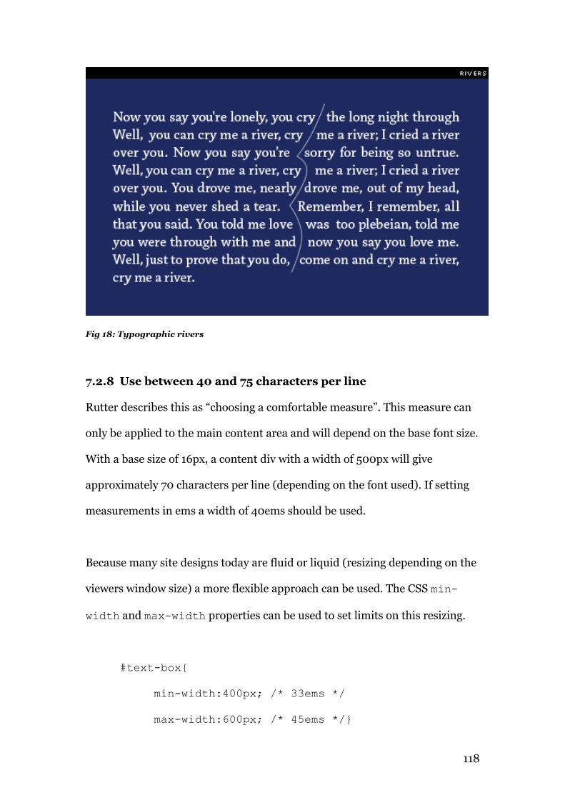
118
Fig 18: Typographic rivers
7.2.8 Use between 40 and 75 characters per line
Rutter describes this as “choosing a comfortable measure”. This measure can
only be applied to the main content area and will depend on the base font size.
With a base size of 16px, a content div with a width of 500px will give
approximately 70 characters per line (depending on the font used). If setting
measurements in ems a width of 40ems should be used.
Because many site designs today are fluid or liquid (resizing depending on the
viewers window size) a more flexible approach can be used. The CSS min-
width and max-width properties can be used to set limits on this resizing.
#text-box{
min-width:400px; /* 33ems */
max-width:600px; /* 45ems */}
119
7.2.9 Use a line-height which suits the typeface
Some browsers add line-space by default (Safari and Internet Explorer) while
others don’t (Firefox). CSS resets such as Eric Meyers or normalize.css will
remove this allowing a global line-height to be set. The size of this line-height
is dependent on the size of the x-height of the font, the typographic colour of
the font and on the line length.
The typographic colour refers to the ‘blackness’ of a font. A darker font will
need more line-spacing than a lighter one. The line length is possibly more
significant – the eye needs sufficient line-spacing, to easily move from the end
of one line to the start of the next. Many typographers (Tim Brown) suggest
using the golden mean (1.618) as a good ratio of type size to line-height while
others (Rutter, Santa Maria) hold that this is an arbitrary figure and the
measurement should be considered, based on colour, line-length, x-height and
individual font characteristics.
This author tends to agree with the second viewpoint, and finds that if the eye
can comfortably move from one line to the next without getting lost, the line-
height which best achieves that has served its’ purpose. In practice this can be
anything from 1.3 to 1.8, although 1.5 is a good starting point.
The selected line-height should then be used consistently on all elements. It is
also useful as a unit of measurement in determining paddings, margins and
indents. Multiples of the line-height may also be used without breaking out of
the underlying baseline grid.
120
7.2.10 Don’t set body text in all-caps
The received wisdom amongst typographers is that lowercase is more legible
than uppercase, because we recognize word shapes. This, hypothetically, is an
easier process with lowercase because the ascenders and descenders create
more distinctive word shapes or ‘bouma’.
Recent research by cognitive psychologists (Kevin Larson, 2004, The Science
of Word Recognition) however, suggests that we use letters within the word to
recognize the word. Ralf Herrmann, while accepting this scientific model
(known as parallel letterwise recognition) holds that lowercase is more legible,
as ascenders and descenders aid individual letter recognition.
“In such situations, ascenders and descenders will support reading,
even though not in the sense of whole word shapes, but in the sense of
single letter recognition.”
- Herrmann (2011)51
Typographers then, should avoid setting multiple lines of text in capitals. An
exception is the first line of the opening paragraph on a page.
Traditionally these have been set in small-caps; the :first-line{text-
variant:small-caps;} property supports this in CSS.
A caveat is that the majority of typefaces (especially screen designed
typefaces) do not have a small-caps variant. It is possible to replace text-
51 Herrmann, Ralph (2011) Wayfinding & Typography http://opentype.info/blog/2011/06/14/how-do-we-read-words-and-how-should-we-set-them/
121
variant:small-caps with text-transform:uppercase and decrease
the font-size slightly. This approach is less than ideal, however, as the smaller
capitals will display in a lighter weight than the rest of the (larger) body text.
7.2.11 Set opening paragraphs flush left
An indent in the first line of a paragraph is a widely used method of marking
the start of a section within the body of a text. The opening paragraph does
not need such a marker and should therefore not be indented.
Valid alternatives to the indent include block paragraphs (a paragraph
followed by a line break) outdents, and ornamented indents such as a pilcrow
or the hedera used on the accompanying website. This can be accomplished
by using the :before pseudo-element.
7.2.12 Add extra space before and after quotations
A line space should be added before and after a block quotation. This space
should conform to the baseline grid. If a line-height of 1.6em is being used, for
example, a margin of 1.6em should be applied to the blockquote at the top and
bottom. Blockquotes are indented in browsers by default.
“However the block quotations are set, there must be a visual
distinction between main text and quotation, and again between the
quotation and subsequent text.”
- Bringhurst (1992)52
52 Bringhurst R (1992) The Elements of Typographic Style, p41
122
This author suggests over-riding the default indent and replacing it with a
multiple of the base unit, for example 1.6em, 3.2em, 4.8em etc. Alternatively,
blockquotes may be centered, or indented and centered.
Blockquotes are commonly set in italics as their visual basis in handwriting
lends them a personal voice. The font-size of the blockquote may be different
to the main body, but it should conform to the baseline grid.
7.3 Unicode characters, Flourishes & Pseudo-elements
Unicode is the standard protocol for character encoding on the web. As well as
the latin character set, it supports non-English language characters and
modifiers such as accents, Arabic, Hebrew and Chinese character sets, among
others. Specialist characters such as hyphens, em dashes, geometric symbols
and dingbats are also included.
It is necessary to hard-code Unicode characters into the HTML. An em-dash,
for example, is encoded as — and an accented ó as ó.
Unicode characters may be included in the CSS using pseudo-elements and
the content declaration, but the symbol codes are slightly different to the
html codes53. In CSS the codes must be preceded by a forward slash “\”
(without quotes). It is also important to note that content added in this
manner is not semantic and therefore not indexable.
Flourishes, traditionally known as printers’ ornaments, printers’ devils or
fleurons are decorative embellishments generally used to add an aesthetic
quality to a page. They are more commonly known as dingbats today and
variations are installed by default on both Windows and OS X systems 53 http://ss64.com/ascii.html
123
(Wingdings and Webdings 1, 2 and 3). These default fonts are limited
stylistically, but there are many free dingbat fonts available both on
FontSquirrel, DaFont and elsewhere which extend the range of styles
considerably. Fleurons are functional as well as aesthetic enhancements, often
being used to signify section breaks, paragraph breaks and page endings. The
website pages use a fleuron known as a Hedera (a stylized ivy leaf) to mark
section breaks and as a site logo. The sans-serif variant uses the formal
Unicode section break (§) symbol.
Pseudo elements, while offering new opportunities in adding content to
stylesheets are limited to an extent by inconsistent support across some of the
browsers. Opera, in particular, has a range of bugs relating to the use of the
:first-line pseudo-element (see appendix 1), :first-line is applied to
the entire paragraph. Pseudo elements can also push the baseline grid out of
alignment if the inserted content is in a larger font-size. Negative margins or
reduced line-heights are necessary to compensate for the extra space added.
Internet Explorer 9 also displays unusual behaviour with the positioning of
pseudo-elements when measurements are set in ems (see appendices 1 and 2).
7.4 Further study
It has not been possible (due to the costs involved) to examine the commercial
services, Typekit and Fontdeck, in any depth. As both present themselves as
premier type services, a detailed examination of their offerings, using the
same criteria as used for the free services, is warranted.
Claimed improvements in unhinted Opentype and PostScript rendering on
Windows 7, through DirectWrite, also deserve investigation.
124
Acknowledgements
125
Acknowledgements
I would like to thank the following for their valuable time, input and
criticisms; Tim Brown in particular for his typographic input and advice. I
would also like to thank the commenters from Typophile and from the
typography subreddit on Reddit, especially Chris Newton for his detailed
critique. Finally, I would like to thank my wife for her patience while my head
was in the books.
Dedicated to my son Luke.
Supervisor
Deirdre Kennedy, I.T.Tallaght
Dissertation Readers
Mary Gallagher, Lecturer, History of Art & Design
Cormac O'Kane, Lecturer, Animation
Project readers
Joe Coll, Lecturer, Graphic Design
Michiel Drost, Lecturer, Type designer & Typographer
Kelda Gibson, Lecturer, Graphic Design
Paul Marley, Lecturer, Graphic Design
Advice & criticism
Tim Brown, CEO, Typekit
126
Appendices
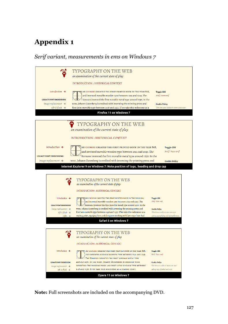
127
Appendix 1
Serif variant, measurements in ems on Windows 7
Note: Full screenshots are included on the accompanying DVD.
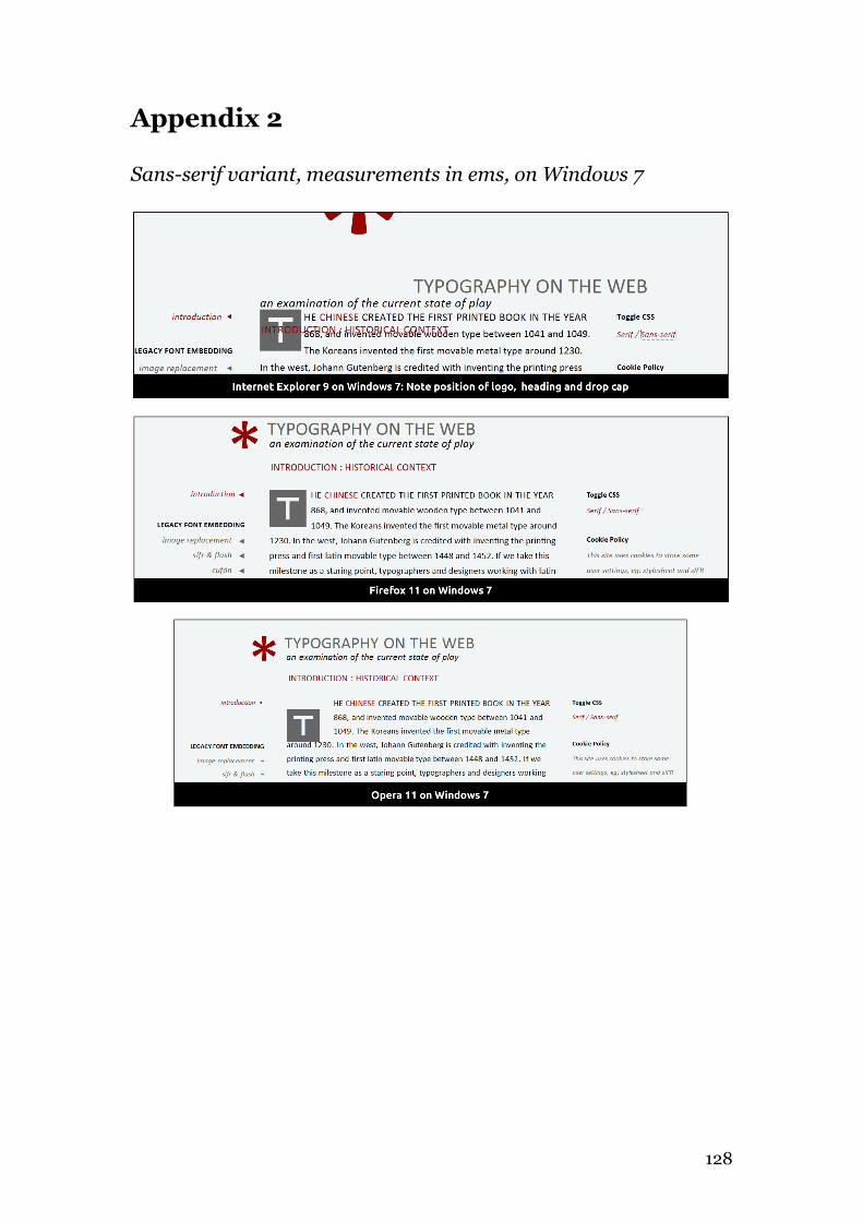
128
Appendix 2
Sans-serif variant, measurements in ems, on Windows 7
129
Appendix 3
Typographic practitioners
An email introducing myself and explaining the scope and goals of my
research, together with a link to the website was sent to the following –
Brown, Tim
Hische, Jessica,
Hoefler, Jonathan
Rutter, Richard
Spiekermann, Erik
Tannam, Bobby
Of these, Tim Brown, Jessica Hische and Bobby Tannam responded.
Appendix 4
Postings on Typographic forums
A few paragraphs explaining the scope and goals of the research were posted
along with a link to the website on the following –
Reddit.com/r/typography
http://www.reddit.com/r/typography/comments/qtihp/
an_examination_of_web_typography_an_ma_project/
Typophile.com
130
http://typophile.com/node/91026
Appendix 5
Selected comments from reddit.com/r/typography
Chris Newton
Interesting site. I think your content is generally good, and I have only a few
criticisms to make here after scanning the whole site once.
The section on improved font stacks could briefly mention the problem of
printer fonts: several of those stacks would look terrible on most computers I
have here, because old school printer fonts would take precedence over
screen-optimised alternatives with the orders given. This is a common
problem with including things like Palatino and Helvetica in font stacks that
will be viewed on Windows machines, and even professional designers fall
into the trap all too often.
When talking about embedding techniques and @font-face, you could
consider the implications for low-bandwidth connections and mobile devices,
where the overheads of downloading extra web fonts are not trivial. I think
you mentioned this very briefly on the recommendations page, but it’s a very
significant practical concern today and probably will remain so for at least a
few years.
When it comes to EULAs, I think you’re being rather kind to the foundries
and font-as-a-service businesses. I could describe what I think of their
131
delusions about licensing and pricing in the Internet age, but I won’t do so in
polite company! However, you might consider the limitations of the font-as-a-
service business model for agencies/freelancers designing sites for clients,
where the ongoing dependence on a third-party service and the typical lack of
pricing guarantees can be a significant barrier to adoption of any such fonts at
all. Maybe you could compare and contrast with other typical costs such as
stock imagery, domain name registration and web hosting. In general, I think
perhaps the commercial/legal side of web fonts is the weakest part of your
discussion, because you acknowledge the issue and allocate a whole page to it,
but then don’t really explore it.
Please don’t bring nonsense like golden ratios into your recommendations.
That kind of magic number is relevant in certain parts of design, for example
in some systematic paper sizes. Otherwise, it’s just a number, and IMHO
making it out to be anything else damages your credibility.
I’d be a little careful in the recommendations about line lengths. A lot of
people think they know a lot of good rules of thumb about line lengths. When
you study the empirical data from actual research, those rules of thumb don’t
always stand up to scrutiny. Again, this is an area that is so well entrenched
now that even professional designers will happily parrot what their teachers
taught them, without any sort of independent study of whether it’s actually
effective in practice. At the very least, know the difference between characters
and words. ;-)
132
In terms of presentation, IMHO there are several less-than-ideal typographic
choices, some of which go against the grain of your own recommendations on
the final pages. I think this harms your credibility given the subject matter.
The text is set in 14px Constantia. For a font with such a small x-height, I
suggest that a minimum of 16px is essential if you don’t want those with
imperfect vision to be zooming your site all the time, and even 18px might be
more appropriate here. Sufficiently large text is even more important given
that this is a very long piece of work for reading on-line. As an aside, the page
on improved font stacks incorrectly says the site is using a Cambria stack.
Personally, I’d probably prefer it if it were, but that’s just a matter of taste.
You have odd uses of HTML in places, particularly the apparently random
use of <br> instead of a new paragraph, and the use of <em> for titles. The
former does mess the layout up in quite a few places.
The site uses straight quotes instead of typographer’s quotes, hyphens
instead of real dashes, etc.
I think the hyphenation does more harm than good. There’s probably a
whole section waiting to be written about the difficulty of doing hyphenation
and justification properly on the Web given the limited tools available in the
standards, if you feel like extending the piece a little. In any case, I would
definitely get rid of all those mid-word breaks.
133
I didn’t notice at first that the material in the right-hand sidebar is different
from page to page and not just navigation/background info. Perhaps you
could do something to distinguish the parts that are more like main content
(such as the pros and cons of different font replacement techniques) from the
parts that are secondary such as navigation and links to sources.
And finally, here are a couple of points on usability.
A spelling check would be beneficial at some point. There are quite a few
typos. I think your sometimes-collapsing menu on the left is trying a bit too
hard to be clever. It’s not immediately obvious which parts will
collapse/expand and which will go immediately to another page, so clicking
on a top-level link does different things at different times. Given that all of
your pages are far longer than the menu, I would recommend just expanding
it fully at all times and having everything that looks like it should be a link act
like a link there.
AptMoniker
Just know this: there are two main problems facing web opentype right now.
The first problem with type for the web, is hinting. The openness and
flexibility of the web has caused major issues when trying to design type.
Browsers throw out hinting data, render type differently, etc. Secondly, most
type designs can't survive web scaling. Sure everything can work fine at 48pts,
but bring it down to 10pixels and it's a completely different game. This also
relates back to the first problem because if browsers are dumping hinting data
then s--- goes blocky, quickly. Hell, even WITH hinting data, the screen just
sucks for type.
134
Appendix 6
Email correspondence from Tim Brown, Typekit
Hi Matt,
Thanks for your note, for these kind words, and for mentioning my work in
your site.Wow, this is thorough! At a glance, which is about all I can muster at
the moment, it seems as though you're citing excellent resources and
summarizing the issues well. I did catch this one thing:
“ Poor kerning tables means that many are particularly unsuitable for
body copy, restricting them to headlines and subheadings.”
It's not necessarily that kerning tables are poor, but that browsers lack
support for kerning, and lack the subpixel positioning that would make
kerning more accurate. Firefox excels at this, and WebKit browsers are a
mediocre second (they support kerning via the buggy, SVG-derived property-
value pair "text-rendering: optimizeLegibility").
Overall, I'd say my single criticism is that I had a difficult time getting (and
staying) oriented on the site. I found myself gravitating toward the left nav,
but still confused about the sequence and scope of its sections. The first few
items are a bit of hacky history, the next few are about web fonts and the
natural mechanisms within CSS, and the final two (before
downloads/acknowledgements, that is) are about typesetting. Maybe
rewording or grouping nav items, or adding headings to the nav, might help?
Really nice collection of stuff you have here. Thanks for sharing it with me!
Tim
135
Hi Matt,
“I just wanted to query you further re: kerning. My original comment was
meant in relation to many of the free fonts (much of dafonts catalog) rather
than the professional offerings.”
I see. That is a valid concern.
“When you refer to subpixel positioning are you talking about font-hinting or
just the individual browsers rendering?”
Individual browser rendering. In the same way that subpixel rendering uses
the R, G, and B slices of pixels to render type at a higher resolution, some
browsers (Firefox) use subpixel positioning for letterspacing and word
spacing, so kerning is more accurate.
> Many thanks again for your very prompt and helpful comments.
> You can see where I've acted on your advice here -
http://www.inkwell.ie/type-website-v2
You're welcome. Nice!
Tim
136
Appendix 7
Selected comments from Typophile
Full text here - http://typophile.com/node/91026
Don McCahill
Having the option to switch between serif and sans serif was nice, but the font
size is bad, and in the sans the tracking is way too tight for the font. You could
offer options for larger size, which is probably more important … Not sure of
the font. It is too small for me to identify clearly.
Aaron Bell
…the fundamentals yes, but I wouldn't go so far as to say that one should
design a webpage experience to replicate that of a book (Of course, I'm also
one who believe's Bringhurst's book as more of guidelines than actual rules) …
Exactly, functional typography. I get that many feel Bringhurst's book is the
pinnacle of all things, but functional typography on screen is actually different
(in some ways) from functional typography in print. But there's room for
differing opinions.
T Mac
In the sans view you have a paragraph space, an indent and a pilcrow. It looks
like the pilcrows are actually meant to be section marks? And then sometimes
you have no paragraph space and no indent. Choose one, but not all. Perhaps
137
a section mark followed by indented paragraphs would be nice. And of course
setting your type to a pixel size isn't the best web practice, is it?
The author, in response to TMac –
The pilcrow may not have been the best choice. It's meant as a section break. I
chose pixels over ems to set the baseline grid and solve an issue with child
elements - I originally had a submenu system system.
T Mac in response to the author
I understand. It's curious that this website states the "section sign" is a
paragraph sign in Europe, while the pilcrow is a section mark. Just the
opposite of North America.
http://www.fileformat.info/info/unicode/char/a7/index.htm
http://www.fileformat.info/info/unicode/char/b6/index.htm
Appendix 8
Email correspondence from Jessica Hische
Hey Matt!
Sorry for the delay in getting back to you. The foundry I was speaking of is
H&FJ, and the numbers (… ~$1.5 million) were estimated based on how many
employees they have and how long I know that they worked on it.
All the best,
J

138
139
Howdy Matt!
I don't offer my typefaces as webfont yet for a pretty simple reason—when I
drew them (buttermilk in particular), I corrected a lot of spacing errors with
ligatures and kerning. As you probably know, these features aren't available in
all browsers, which means that my typefaces look like crap except in the most
modern of browsers. For this reason, I don't allow @font-face use of my
typefaces and don't host them anywhere to be used as typefaces. I do hope to
release typefaces that can be used as webfonts in the future, and am working
on one now that I will probably release through Typekit to start. I prefer
hosted services vs. self hosting, because of the added benefit of being able to
silently update the typeface if I start seeing tweaks that need to be made,
something that wasn't possible without bothering your customers before.
My fonts are not hinted, as most of the type I've made up to this point is
display type, and hinting is the most important for text. I know that typekit
does some level of hinting for foundries that they work with, though not hand-
hinting. Hinting in general adds a lot of time and cost to the production of
typefaces if you do it by hand or hire someone else to do it by hand, and since
it only matters for on screen use on windows, and none of my typefaces are
available for web yet, it hasn't been something I've had to be concerned about.
All the best,
J
140
CD contents
01 Website
02 Webfonts testing website
03 Webfonts screenshots
04 Letter-space testing website
05 Letter-spacing screenshots
06 Browser & OS testing
07 Development files
08 Website iterations
09 Thesis (docx and pdf)
141
Image Credits
http://www.gutenberg.org Gutenberg Bible
Jenson’s Roman
Mantius’ Roman Italic
http://www.100types.com/100types.com.timeline.html
Typographic timeline
http://ilovetypography.com/2008/04/11/extreme-type-terminology-part-3/
Typographic rivers
All other images by the author.


![Typography on the Web-2012 - Inkwell on the Web [2012].pdf · 4 typography. It also details the testing of the various font technologies and the quality of the rendering. The methodology](https://static.fdocuments.us/doc/165x107/5b89648d7f8b9ae7298c5137/typography-on-the-web-2012-on-the-web-2012pdf-4-typography-it-also-details.jpg)