Typography Bora Kang 2012 Fall semester
22
Graphic Style Manual for Three Local Makeovers by Bora Kang These identities were developed as part of the Troy University’s Department of Art and Design course titled Typography.
description
Typography Bora Kang 2012 Fall semester
Transcript of Typography Bora Kang 2012 Fall semester
Graphic Style Manual
for Three Local Makeoversby Bora Kang
These identities were developed as part of the Troy University’s Department of Art and Design course titled Typography.

Table of Contents1 Coco beauty supply Existing logo2 Primary Mark Color version, Black&White version3 Secondary Mark Color version, Black&White version4 Alternative Mark Wordmark, Symbol only5 Minimum clearnace & Minimum Reproduction size
6 Color Scheme RGB, CMYK Typeface7 Limitations
8 The Rubicon Existing logo
9 Primary logo Secondary logo
10 Minimum Clearance & Minimum Reproduction size
11 Color Scheme
12 Typeface
13 Dog House Existing logo14 Primary Mark Color version, Black&White version15 Alternative Mark Wordmark16 Mininum clearnace & Minimum Reproduction size
17 Color Scheme RGB, CMYK Mood Board18 Typeface
19 Limitations

Coco beauty supply
Existing logo
Coco beauty supply is in Troy, it’s a store like the sallys. It’s also the store for black people. This store contains hair stuffs. Most of customers are black.
Most of supplies in this store is wax, com, doo-rag, hair spray and mostly wigs.The logo was made by Korean owner of Coco beauty supply. It doesn’t get any attention and most of customers didn’t know this stores name or never knew they had their own logo. Also, there’s nothing about their logo say-ing it’s hair supply store. 1

Primary Mark(Color version)
Primary Mark(Black&White Version)
This is the color version of Coco hair supply logo.The image is abstact version of hair com, and I made the logo looks really strong. It’s also the combination version of the logo.They can’t be removed or saperated.
This is the black and white version of Coco hair supply logo.The image is abstact version of hair com, and I made the logo looks really strong. It’s also the combination version of the logo.They can’t be removed or saperated.
2

2
Secondary Mark(Color version)
Secondary Mark(Black&White Version)
This is the color version of Coco hair supply logo.The image is abstact version of hair com, and I made the logo looks really soft It’s also the combination version of the logo.They can’t be removed or saperated.
This is the black and white version of Coco hair supply logo.The image is abstact version of hair com, and I made the logo looks really soft It’s also the combination version of the logo.They can’t be removed or saperated.
3
4
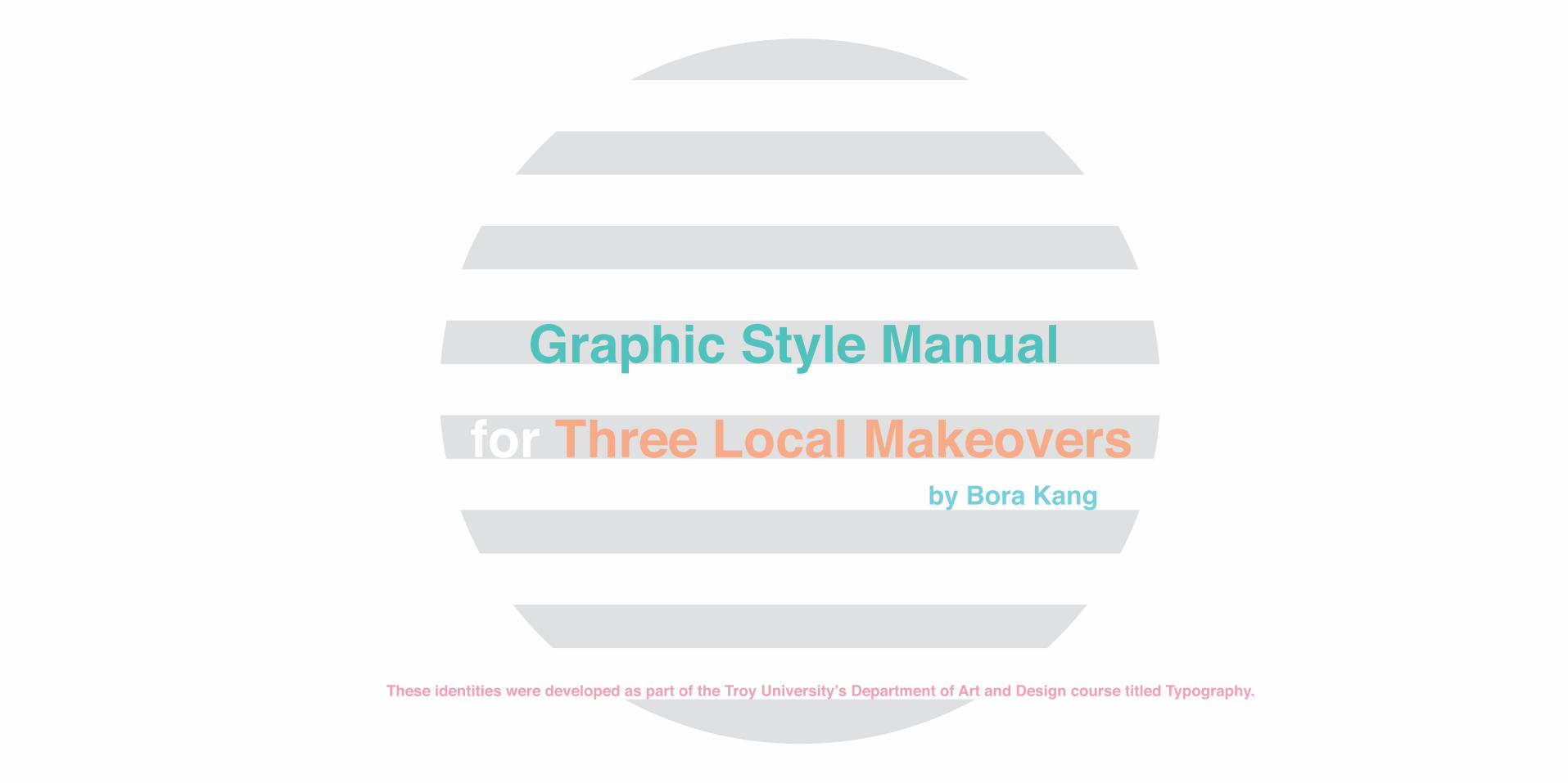
Alternative Mark (Wordmark)
Alternative Mark(Symbol only)
This is alternative mark of Coco hair salon. This doens’t include images. This also is a simple word mark without image.
This is alternative mark of Coco hair salon symbol only version. This doens’t include letters. This also is a simple word mark with-out any letters.

Minimum clearnace
Minimum reproduction size
This is minimum clearnace of Coco hair salon. The word “c” is can be around of this mark to masure. In horizontal and vertical way.
This is minimum reproduction size of Coco hair salon. It’s both primary version and secondary version. Both should be used by same size.
.50” (1/2”).50” (1/2”)
5

6
Chalkduster
ABCDEFGHIJKLMNOPQRSTUVWXYZ
1234567890
Color Scheme(RGB, CMYK)
Typeface
This is the color scheme RGB version:Green:38,97,32Grey: 63,69,60Red:206,0,0Black:0,0,0
This is the color scheme CMYK version:Green:83,36,100,31Grey:66,63,59,50Red:12,100,100,3Black: 100,100,100
This is typeface of Coco beauty supply logo.Chalkduster letter goes with com image well.

Limitation
Do not mix up two images or colors.
Do not erase any logos or images and make them seperated.
Do not change the logo images.
7

8
The Rubicon
Existing logo
The Rubicon is a student literary journal published by the En-glish Department of Troy University (Troy campus). The journal is run by students, and it publishes original works of Troy Univer-sity students.
RubiconThe
RubiconThe
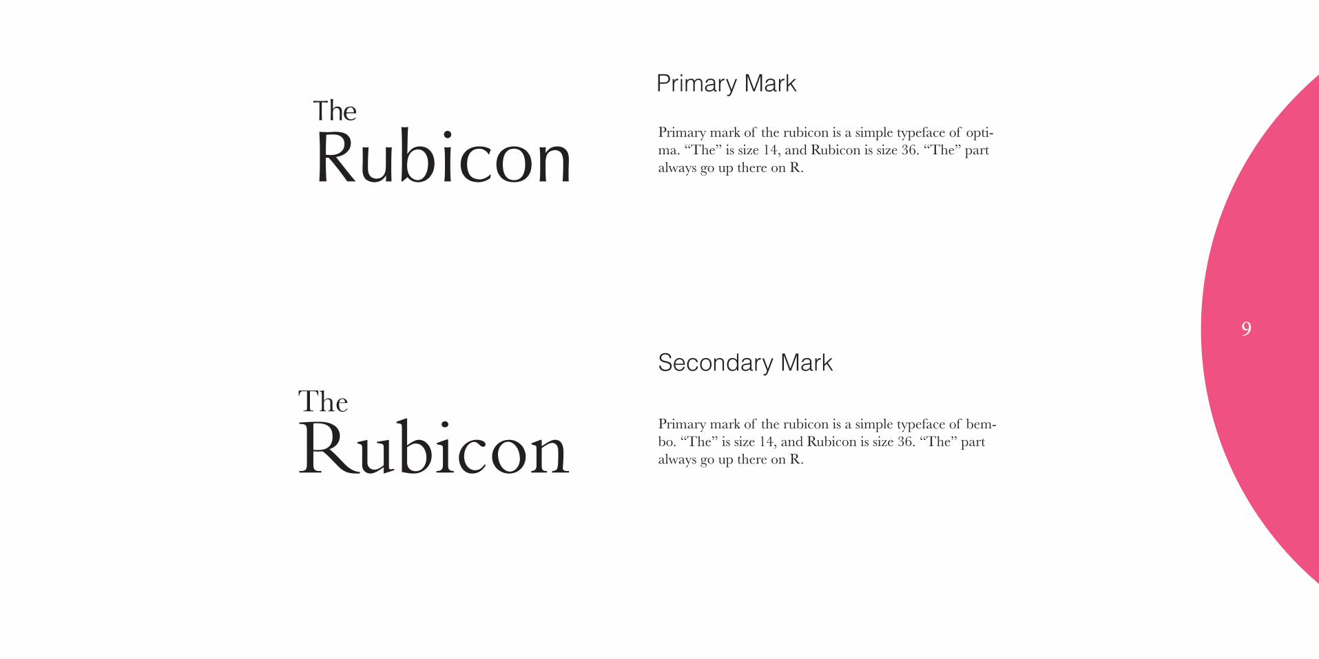
Primary Mark
Secondary Mark
Primary mark of the rubicon is a simple typeface of opti-ma. “The” is size 14, and Rubicon is size 36. “The” part always go up there on R.
Primary mark of the rubicon is a simple typeface of bem-bo. “The” is size 14, and Rubicon is size 36. “The” part always go up there on R.
9

10
Minimum clearnace
Minimum reproduction size
This is minimum clearnace of Rubicon. The word “R” is can be around of this mark to masure. In horizontal and vertical way.
This is minimum reproduction size of Rubicon. It’s both primary version and secondary version. Both should be used by diffetent size.
RubiconTheR
RR
R
RubiconThe
RubiconThe
1”
1.2”

Color Scheme(RGB, CMYK)
This is the color scheme RGB version:
Black:0,0,0White:255,255,255
This is the color scheme CMYK version:
Black: 100,100,100White:0,0,0
Limitation
Do not erase any letters.
Do not change the colors.RubiconThe
Rubicon11
12
Typeface
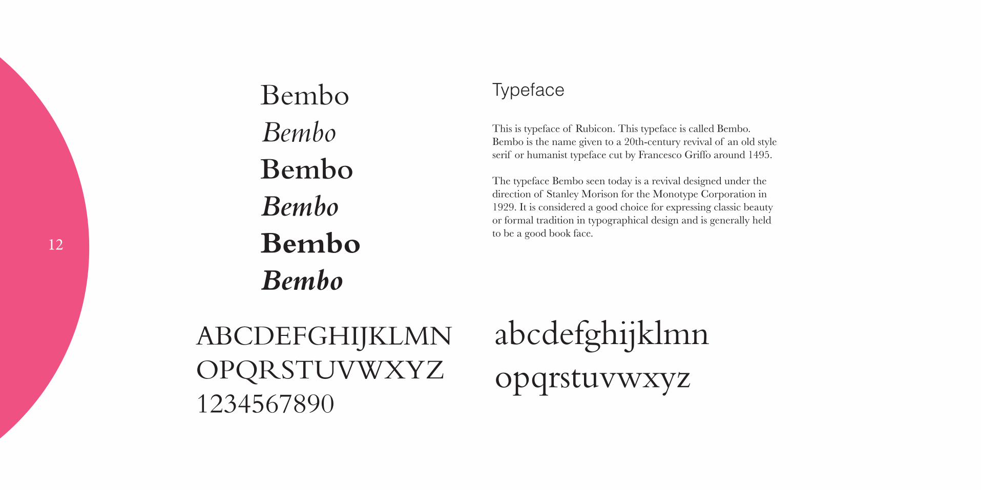
This is typeface of Rubicon. This typeface is called Bembo.Bembo is the name given to a 20th-century revival of an old style serif or humanist typeface cut by Francesco Griffo around 1495.
The typeface Bembo seen today is a revival designed under the direction of Stanley Morison for the Monotype Corporation in 1929. It is considered a good choice for expressing classic beauty or formal tradition in typographical design and is generally held to be a good book face.
ABCDEFGHIJKLMNOPQRSTUVWXYZ1234567890
BemboBemboBemboBemboBemboBembo
abcdefghijklmnopqrstuvwxyz

Dog House
Existing logo
The Dog House is the one of local restaurant which is serving hamburger and chips.This restaurant is really famous but it’s local restaurant so it’s also small.
13

14
Dog House
Primary Mark(Color version)
Primary Mark(Black&White Version)
This is the color version of Dog House logo.The image is simple version of house, and I made the logo looks also strong. It’s also the combination version of the logo. They can’t be removed or saperated.
This is the black and white version of Dog House logo.The image is simple version of house, and I made the logo looks also strong. It’s also the combination version of the logo. They can’t be removed or saperated.
Dog House
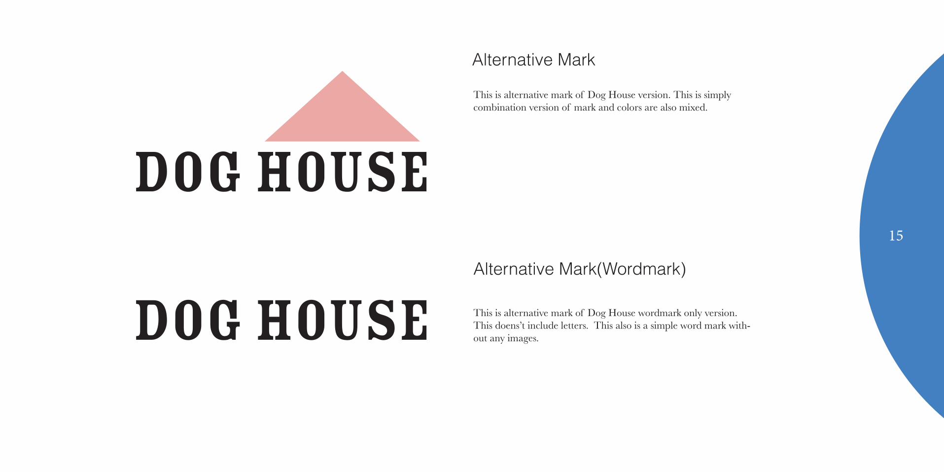
Alternative Mark
Alternative Mark(Wordmark)
This is alternative mark of Dog House version. This is simply combination version of mark and colors are also mixed.
This is alternative mark of Dog House wordmark only version. This doens’t include letters. This also is a simple word mark with-out any images.Dog House
Dog House15
16
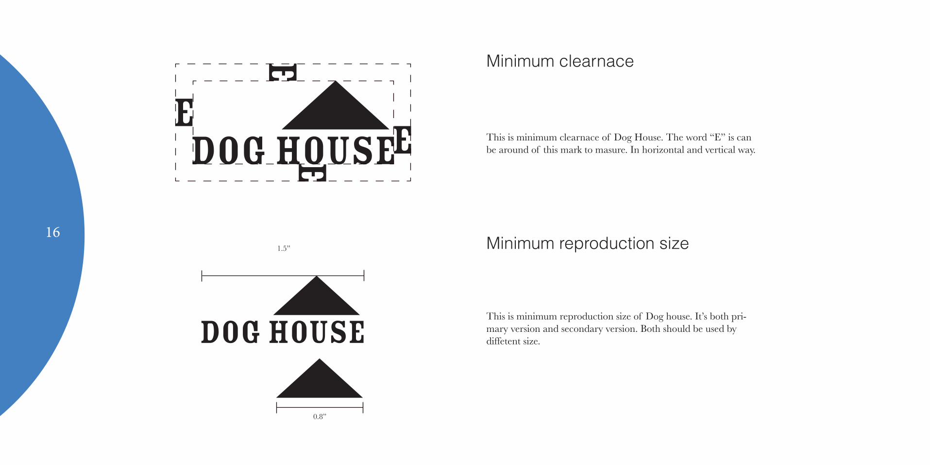
Minimum clearnace
Minimum reproduction size
This is minimum clearnace of Dog House. The word “E” is can be around of this mark to masure. In horizontal and vertical way.
This is minimum reproduction size of Dog house. It’s both pri-mary version and secondary version. Both should be used by diffetent size.
Dog House
Dog House
ee
e
e
1.5”
0.8”
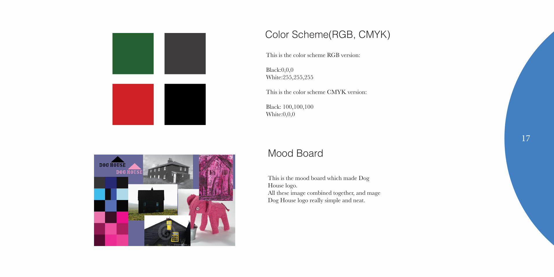
Color Scheme(RGB, CMYK)
This is the color scheme RGB version:
Black:0,0,0White:255,255,255
This is the color scheme CMYK version:
Black: 100,100,100White:0,0,0
Mood Board
This is the mood board which made Dog House logo.All these image combined together, and mage Dog House logo really simple and neat.
17
18
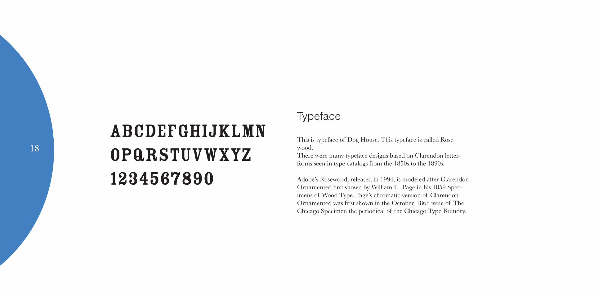
Typeface
This is typeface of Dog House. This typeface is called Rose wood.There were many typeface designs based on Clarendon letter-forms seen in type catalogs from the 1850s to the 1890s.
Adobe’s Rosewood, released in 1994, is modeled after Clarendon Ornamented first shown by William H. Page in his 1859 Spec-imens of Wood Type. Page’s chromatic version of Clarendon Ornamented was first shown in the October, 1868 issue of The Chicago Specimen the periodical of the Chicago Type Foundry.
ABCDEFGHIJKLMNOPQRSTUVWXYZ1234567890

Limitation
Do not erase any letters.
Do not mix more than 3 colors.
Dog House
Dog Hous19