Typography and the Screen: A Technical Chronology of ... · PDF fileTypography and the Screen:...
17
Typography and the Screen: A Technical Chronology of Digital Typography, 1984-1997 Author(s): Loretta Staples Source: Design Issues, Vol. 16, No. 3 (Autumn, 2000), pp. 19-34 Published by: The MIT Press Stable URL: http://www.jstor.org/stable/1511813 Accessed: 17-10-2016 04:18 UTC JSTOR is a not-for-profit service that helps scholars, researchers, and students discover, use, and build upon a wide range of content in a trusted digital archive. We use information technology and tools to increase productivity and facilitate new forms of scholarship. For more information about JSTOR, please contact [email protected]. Your use of the JSTOR archive indicates your acceptance of the Terms & Conditions of Use, available at http://about.jstor.org/terms The MIT Press is collaborating with JSTOR to digitize, preserve and extend access to Design Issues This content downloaded from 142.150.190.39 on Mon, 17 Oct 2016 04:18:28 UTC All use subject to http://about.jstor.org/terms
Transcript of Typography and the Screen: A Technical Chronology of ... · PDF fileTypography and the Screen:...

Typography and the Screen: A Technical Chronology of Digital Typography, 1984-1997Author(s): Loretta StaplesSource: Design Issues, Vol. 16, No. 3 (Autumn, 2000), pp. 19-34Published by: The MIT PressStable URL: http://www.jstor.org/stable/1511813Accessed: 17-10-2016 04:18 UTC
JSTOR is a not-for-profit service that helps scholars, researchers, and students discover, use, and build upon a wide range of content in a trusted
digital archive. We use information technology and tools to increase productivity and facilitate new forms of scholarship. For more information about
JSTOR, please contact [email protected].
Your use of the JSTOR archive indicates your acceptance of the Terms & Conditions of Use, available at
http://about.jstor.org/terms
The MIT Press is collaborating with JSTOR to digitize, preserve and extend access to Design Issues
This content downloaded from 142.150.190.39 on Mon, 17 Oct 2016 04:18:28 UTCAll use subject to http://about.jstor.org/terms

Typography and the Screen: A Technical Chronology of Digital Typography, 19841997 Loretta Staples
Digital technology radically influenced typographic design begin-
ning in the early 1980s.1 The computer enabled designers to create
and manipulate letters in new ways, offering new options for craft-
ing letterforms and "outputting" them-whether in the medium of
toner particles on paper, or pixels on a screen. Digital tools, at first,
necessitated (due to technical constraints), and later explicitly en-
couraged (due to technical advances) specific kinds of representa-
tions that would challenge their historical antecedents. Now, in the
late 1990s, the mutation of letters continues. The spatial and tempo-
ral opportunities of cyberspace are resulting in even more radical
depictions of letterforms that offer expanded formal and stylistic
possibilities, while further challenging the norms of reading and
writing.
This paper chronicles the technical developments responsi-
ble for the digital revolution in typography during the 1980s and
90s. It is an informal history based largely on my own observations
as an early practitioner of "graphical user interface design"-one
formally trained in graphic design and privileged to work at Apple
Computer during the early 1990s. Because Apple was so instru-
mental in popularizing the technologies that stimulated typographic
experimentation within the graphic design community during this
period, my paper focuses on the Macintosh platform.
Early Concepts and Technical Advances
The Apple Macintosh computer, introduced in 1984, popularized
the key technologies and concepts that would herald a new typo-
graphic age. While many of these technologies and ideas originated
elsewhere, their dissemination via the Macintosh introduced a
broad public to WYSIWYG (an acronym for "what you see is what
you get") and its associated technologies: bitmapped fonts and dot-
matrix printing, which was quickly surpassed by laser printing.
In the 1970s, researchers at the Xerox Palo Alto Research
Center (Xerox PARC) pioneered WYSIWYG and "direct manipula-
tion," key concepts in graphical user interface design. Their
efforts-based on earlier pre-Xerox research-culminated in the
Xerox Star, a computer system introduced in 1981, and its successor,
"ViewPoint" (fig. 1).2 The Star utilized a high resolution visual
In 1983, Charles Bigelow and Donald Day
defined digital type as that "made up of
discrete elements. These elements can
be line strokes, pixels, colors, shades of
gray, or any other graphic unit from which
a letterform can be constructed. Hence,
digital typography is not new: mosaic
tiles, embroidered samplers, and arrays
of lights on theater marquees have long
represented alphabetic characters as
relatively coarse discrete arrays."
However, in focusing on the display
device of the cathode-ray tube (CRT), and
the requisite "digital computer...needed
to control the on-off pattern of the elec-
tron beam" that articulated letterforms
on the screen, they defined it specifically
in terms of computer technology. Charles
Bigelow and Donald Day, "Digital
Typography," Scientific American 249:2
(August 1983): 106.
2 Jeff Johnson, et al., "The Xerox Star: A
Retrospective," IEEE Computer22:9
(September 1989): 11-29.
? Copyright 2000 Massachusetts Institute of Technology
Design Issues: Volume 16, Number 3 Autumn 2000 19
This content downloaded from 142.150.190.39 on Mon, 17 Oct 2016 04:18:28 UTCAll use subject to http://about.jstor.org/terms
Ashley Scarlett

Moe- Pic v, e-pi, 0 I, ~~- nsisossae4.'jr"
: 27:249
XEROX f E 7- Bo8Ss Workstation I : z:
U.or-Iisorfann Datigalat V zzi z Sr. -jaria .itkm*jFtio ape. ta qiit a *A Crt.h.stonr Sa 3 a~nosnjnaa.
Bthe -top diaplays alld o teat an tgr o 1 tep M 9 Ad 5. pronod to addbitain am iory. .81,.. F 4 1 1
u0bootor n om aa d..mo.o.tldo 111.k druolau* A&....... aOb1
abj rqtankoru dor. porof.rsyde- lilt guinbln ACr Dooooowth 0ro" th
dou emrt qaaihly ealoot as text. grraphic ot ofitr..ubpot .% he4p.44" 8 ) kon01 oo trpa o"
AH 9actnronS itn Vinoa s hoa wasr da. tlage *d raot1.oalhly mooingOnthm witt tos f-mon 19 MAO tM $Mo'
nMotoaa trdb.nao cad Q4rerun 0"0 udita
ruj ~~~~~~~~~~~~~ o~~~~~~~~ ~~ MA is3 I110J
Iobalad. oaotrauadtPlFirm Vir SIao,o 0865 opur rou ablvet to do Mc COf2r It 64 5- frlos Hors oampo.siens And ervect -a
t~~~~~To
Tom &ad GrapWc#~ ~ ~ ~ ~ ~ ~ ~~~~EoiaoOU'a 0 lu
Ibrur flodmoalam'flmna atur.~~~~is esruoc .i at u2-"'in tor x*01 Iayrlaoao ai Xeoiw WIt% proracop. v.rl P i i t t ex t 1 oir' f latest ban, Sai aooo pundua CotPo rrm amap 411oin e,t
~~~~~~~~~~ ~~~~~~~~36-point_text. -= ma. anr Z cw
Figure 1
Xerox Viewpoint interface. From Jeff Johnson,
et al., "The Xerox Star: A Retrospective,' IEEE
Computer 22:9 (September 1989), 11.
Reprinted by permission of the Xerox Palo
Alto Research Center.
display consisting of windows, icons, and actual-size images of
document pages that computer users could "handle" through a
novel input device, the mouse, used to control a small pointer on
the screen. Users manipulated these virtual objects by touching
them with the pointer and then clicking with the mouse, an opera-
tion called "selection," used to isolate an object and its correspond-
ing range of possible actions. Once selected, users could further
manipulate the object, performing actions such as moving and
copying.
The document served as the seminal object in this scheme.
While Xerox, a pioneer in photocopying technology, could not have
desired a wholly paperless office, the company pursued office
automation as a strategy for expanding its business markets.
Electronic document production and storage promised new market-
ing opportunities based on computer systems designed for offices.
WYSIWYG employed the use of actual-size images of docu-
ment pages on the computer screen and the corresponding ability to
print them as they appeared. The Macintosh's 72 pixel-per-inch
display corresponded closely to the number of dots used to print a
Macintosh file on its companion product, the dot-matrix-based
ImageWriter, making for a tight match between screen image and
printed output.3 While seemingly trivial now, in 1984, this innova-
tion challenged the sterility of computerized word processing by
3 The 72-pixel-per-inch display was
designed to correspond with the point,
since it was the standard unit of
measurement for specifying type.
Johnson, et al., 'The Xerox Star: A
Retrospective," 12.
20 Design Issues: Volume 16, Number 3 Autumn 2000
This content downloaded from 142.150.190.39 on Mon, 17 Oct 2016 04:18:28 UTCAll use subject to http://about.jstor.org/terms
Ashley Scarlett

Figure 2 w Comparison of ImageWriter (top) and
LaserWriter output.
To day W&ve adde the following fawn,
presenting a graphically-enhanced environment for typing and visi-
bly altering text through the specification of multiple fonts, sizes,
and styles.
The tight coupling of image to output changed not only the
way people created documents, but the way they thought about
them. Computer users increasingly considered the text's appearance
as central to the writing process. Early Macintosh users, discontent
with impoverished "text entry," readily exploited typographic
control through the built-in styling capabilities of the Macintosh
Operating System.4 These included, by default, the ability to choose
among multiple typefaces and font families that could be installed
in the Macintosh system file. In addition, Macintosh applications
included standard options for rendering type as "plain text," bold,
italic, underlined, outlined, and shadowed in a range of sizes,
usually 10 to 24 points.
The coarseness of dot-matrix printing made for degraded
visual quality, but this changed quickly with the introduction of the
Apple LaserWriter printer in 1985. The LaserWriter enabled the
Macintosh to rival offset printing through a technology that greatly
enhanced the appearance of type and images (fig. 2). In moving to
300 dots-per-inch, the LaserWriter rendered letters considerably
more smoothly, able to define subtler details in contour that would
especially affect the appearance of serifs and smaller sizes of type.
While Apple's LaserWriter provided the hardware technol-
ogy that would democratize typographic design through the rise of
"desktop publishing," Adobe Systems provided the software inno-
vation through PostScript, a "page description language" (PDL)
built into the LaserWriter. PostScript made possible the printing of
detailed page layouts, complete with images and text arranged and
scaled to the designer's specifications.5 Sophisticated graphic
layouts previously requiring laborious manual composition now
could be assembled with ease through software programs that
made page layout almost as easy as word-processing. These
programs, when used in conjunction with the LaserWriter, ensured
offset printing quality graphic output. The LaserWriter also
included a limited number of built-in PostScript fonts that could be
supplemented by fonts downloaded from the Macintosh system
folder to the printer's memory.
To showcase the capabilities of the LaserWriter and Post-
Script, Apple worked with selected software companies to develop
page layout applications. Aldus's PageMaker, Boston Software
4 Computerized word-processing's leading
product at the time was WordStar, a
program that supported limited WYSI-
WYG capabilities, but without extensive
typographic control. Roger B. White, Jr.,
WordStar With Style (Reston, VA:
Prentice Hall, Reston Publishing, 1983).
5 The PostScript PDL was not wedded to a
particular output device, however. In
being "device independent," PostScript
document descriptions contain no
specific information regarding output
devices and, as such, will print at what-
ever level of resolution the given output
device makes available. Frederic E. Davis,
et al., Desktop Publishing (Homewood, IL:
Dow Jones-Irwin, 1986), 167.
Design Issues: Volume 16, Number 3 Autumn 2000 21
This content downloaded from 142.150.190.39 on Mon, 17 Oct 2016 04:18:28 UTCAll use subject to http://about.jstor.org/terms
Ashley Scarlett
Ashley Scarlett
Ashley Scarlett
Ashley Scarlett

Publishers' MacPublisher, and Manhattan Graphics's ReadySetGo
provided programs ranging in price from roughly $150 to $500.6 All
supported the integration of text and images in multiple-column
formats. While the documents produced with them could be sent to
any Macintosh-compatible printer, they were especially impressive
when transformed by the LaserWriter's PostScript software. Within
a few years, desktop publishing supplanted professional typesetting
and offset printing as the preferred low-end prepress and printing
option.
The Digital Construction of Letterforms
In the late 1970s and early 80s, researchers and programmers,
notably at MIT and Stanford, began developing new ways to
describe and image letters digitally.7 Philippe Coueignoux's CSD
(Character Simulated Design) of 1975 decomposed the Roman
alphabet into a set of primitives that could be recombined to form
any letter.8 Pijush Ghosh and Charles Bigelow attempted a similar
strategy in 1983.9 Donald Knuth's groundbreaking METAFONT
provided a rich programming language for designing type through
the algorithmic specification of geometrical relationships.1' However,
the mathematical expression it required was alien to most type
designers, and METAFONT never caught on."l Digital typography
embraced an ever-widening group of constituencies, from computer
scientists such as Knuth to more traditional type designers includ-
ing Charles Bigelow and Kris Holmes, who were to produce new
innovations for the page and screen. Their typeface, Lucida, intro-
duced in 1986, satisfied the multiple demands of page and screen
through a comprehensive set of fonts suitable for printing and
screen display (fig. 3).12
The cathode ray tube (CRT) used pixels ("picture elements")
as the defining matrix for the construction and display of letters.
The Macintosh of 1984 provided only two color options for their
display: black and white. The Macintosh Operating System itself
required different typefaces in order to communicate necessary
textual information through the Macintosh interface. Chicago and
Geneva, bitmapped typefaces designed to suit this need, typo-
graphically defined the Macintosh "look and feel" until 1997 (fig. 4).
Chicago 12, used in pulldown menus and dialog boxes, employed a
standard stroke width of two pixels, so that gray versions of usually
black letters could be created by alternating black and white pixels.
(Gray was required to signal the unavailability of various com-
mands.) Geneva 9 appeared on the Macintosh "desktop" to label
icons, and in list views of files and applications in the Finder.
While the typographic needs of the Macintosh interface
posed one set of requirements, printed documents posed another:
variety. The original Macintosh provided a number of bitmapped
typeface options, most of them novel. A few classics emerged
6 Ibid., 95-99.
7 See Richard Rubinstein, Digital
Typography. An Introduction to Type and
Composition for Computer System Design
(Reading, MA: Addison Wesley, 1988) for
a comprehensive description of digital
typographic innovation from its inception
through the late-1 980s.
8 Ibid., 141.
9 Ibid., 141.
10 Donald E. Knuth, Computer Modem
Typefaces (Reading, MA: Addison
Wesley, 1986).
11 Rubinstein, Digital Typography, 141-145.
12 Charles Bigelow and Kris Holmes, "The
Design of Lucida?: an Integrated Family
of Types for Electronic Literacy" in J.C.
van Vliet, Text Processing and Document
Manipulation, Proceedings of the
International Conference, University of
Nottingham, April 14-16, 1986,
(Cambridge: Cambridge University Press,
1986), 1-17.
22 Design Issues: Volume 16, Number 3 Autumn 2000
This content downloaded from 142.150.190.39 on Mon, 17 Oct 2016 04:18:28 UTCAll use subject to http://about.jstor.org/terms
Ashley Scarlett
Ashley Scarlett
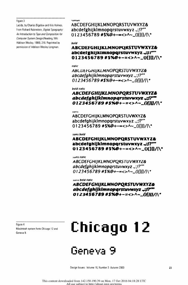
Figure 3
Lucida, by Charles Bigelow and Kris Holmes.
From Richard Rubinstein, Digital Typography:
An Introduction to Type and Composition for
Computer System Design (Reading, MA:
Addison Wesley, 1988), 216. Reprinted by
permission of Addison Wesley Longman.
Frngrm4:
ABCDEFGHIJKLMNOPQRSTUVWXYZ& abcdefghijklmnopqrstuvwxyz *4:7?" 0 1 2 3456789 #$%@+-=<>AeJ)I1I}/I\*
bold
ABCDEFGHUKLMNOFQRSTUVWXYZ& abcaetgnijiuimnopqrstuvwxyz.,:;ir'"w 0123456789 #S+-=oAut0QLjt/IN
italic
ABLLtt&-CIIJKLMNOPQRSTUVWXYZ& abcaefghijklmnopqrstuvwxyz .,:;!?" 0 123456789 #$%@+-=<>oA-0fJJ/l\t
bold italic
ABCD EFGHLJKLM PRTUVWXYZ& abcdefgh4jklmnopqrstuvwxyz .4?rw 01Z3456 789 #$%U +-r=<>AvtSK0I/fI
WrI45
ABCDEFGHUIKLM NOPQRSTUVWXYZ& abcdefghijktmnopqrstuvwxyz .,:j?"" 0123456789 #$%@+-=<>Aj_()[]{W/\*
sans bold
ABCDEFGHIJKLMNOPQRSTUVWXYZ& abcdefghijklmnopqrstuvwxyz " 0123456789 #$%+-=C>Anj)[Jl/j)
afls- italic
ABCDEFGHIJKLMNOPQRSTUVWXYZ& abcdefghijklmnopqrstuvwxyz .v,:'.7""' 0 1 234 5 6 789 #S %@+-=o<>A._j)[h1J\'
lfts bold italic
ABCDEFGHJKLMNOPQRSTUVWXYZ& abcdefghlJklmnopqrtuvwxyz .4?" 01 Z54S6 789 #5%*+-<>A^nj.?UhII
Figure 4
Macintosh system fonts Chicago 12 and
Geneva 9. ChicaIgo
Geneva 9
Design Issues: Volume 16, Number 3 Autumn 2000 23
This content downloaded from 142.150.190.39 on Mon, 17 Oct 2016 04:18:28 UTCAll use subject to http://about.jstor.org/terms
--_ 1 riI rd*il l I I I I I I _--
~~~~~~~ q4~~~~~~~~~~~~~~~~~~ ifl P,c .a aa
C,H304s S l@>.iic.
I~~~~~~~~~~~~~~~~~~~~~~~~~~~~~~~~~~~~~~~~~~~~~---- ------Sc 1 --
~~~~~~~~~~~~~~~~~~~~~~~~~~~~~~~~~tI ,. c f
| { | | 2 v i B ?e,.>?s:ts^<e Rte.hFG t- tsG.$. s~~~~~~~~~~~~~~~~~~~~~~~~~~~~~~~~~~~~~~~~~~~~~~~~~~~~~~~~~~~~RDtrO
I 14^ i11 -t . E . ... e t t D~~~~~~~~~~~~~~~~~~~~~~~~~~~~~~~~~~~~~~~~~~~~~~~~~~~~~~~~~~~~~~~~~~~~~~~~~~~~~~~~~. ...... l i,ig -- ~~~~~~~~~~~~~~~~~~~~~~~~~~~~~~~~~~. ... .__.-_w||. ..............................ye -- -- -- --- --- -- . .... . . . ... ... .. .... ... .... .. ... . . . ..... .....
| R ls S_t t~~~~~~~~~~~ 6 --
l i? . , ,\ j i sF S
Figure 5
Display PostScript at work in the NeXT inter-
face. From Welcome to the NeXT Decade
(Palo Alto, CA: NeXT, 1988).
however-Helvetica, Times, and Palatino among them-with other
options available from font vendors such as Adobe.
PostScript laser printers used economical descriptions of
letterform outlines, as distinct from memory-intensive bitmaps, to
form letters on printed pages. Thus, a given font family required
two separate descriptions-one for screen display, and the other for
printing. In fact, a third technology mediated between bitmap and
outline during the Macintosh printing process: Apple's QuickDraw
"drew" all images to the Macintosh screen. Printing from a
Macintosh to a PostScript laser printer therefore required the trans-
lation of QuickDraw commands into PostScript, a task undertaken
by the Macintosh Operating System's Print Manager in conjunction
with the LaserWriter software driver.'3
The NeXT computer, introduced in 1989, utilized PostScript
for both screen display and printed output, eliminating any need for
intermediate translation (fig. 5). In addition, the NeXT fully
exploited grayscale technology in its user interface, an enhancement
of the visual standard established by the Macintosh. The NeXT
interface, through an expanded range of values from black to white,
displayed icons and dialog boxes modeled with greater dimension-
ality, pushing the visual space of the graphical user interface from 2-
to 3-D.
13 Jim Heid and Peter Norton, Inside the
Apple Macintosh (New York: Simon &
Shuster, Brady, 1989), 221.
24 Design Issues: Volume 16, Number 3 Autumn 2000
This content downloaded from 142.150.190.39 on Mon, 17 Oct 2016 04:18:28 UTCAll use subject to http://about.jstor.org/terms
Ashley Scarlett
Ashley Scarlett

Emperor
Oakland .
Emigre Figure 6 (above)
Emperor, Oakland, and Emigre,
by Zuzanna Licko.
Figure 7 (right)
Detail from 1986 issue of Design Quarterly
by April Greiman, "Does It Make Sense?"
Reprinted by permission of the Walker Art
Center and MIT Press.
1i~~~~~~~~~~
Corresponding Innovations in Graphic Design
Almost immediately upon the introduction of the Macintosh, a
small handful of insightful graphic designers recognized the esthetic
potential of computer-based typography. In 1985, Zuzanna Licko
designed three typefaces-Emperor, Oakland, and Emigre-that
deliberately exploited the look of the pixel (fig. 6).14 These typefaces
soon redefined the look of an emerging publication, Emigre,
founded by Licko's husband, Rudy VanderLans, with artist Marc
Susan and screenwriter Menno Meyjes. It has since become one of
the most influential design publications of this century, serving as a
primary vehicle for the dissemination of new critical typographic
ideas. Emigre showcased typefaces designed by Licko and others,
and served as a catalog for purchasing those very fonts. Licko and
VanderLans lived and worked in the San Francisco Bay area, and
their close proximity to Silicon Valley encouraged their exploration
of its emerging technologies.
At the same time, in Los Angeles, April Greiman, a Swiss-
trained graphic designer, began experimenting extensively with
digital imaging and typography in her printed work. Like Licko and
VanderLans, she used pixellated letterforms and pictures in posters
and brochures, later incorporating video imagery as well (fig. 7).15
14 Rudy VanderLans, Zuzanna Licko, and
Mary E. Gray, Emigre: Graphic Design
Into the Digital Realm (New York: Van
Nostrand Reinhold, 1993), 18-25.
15 April Greiman, Hybrid Imagery: The
Fusion of Technologyand Graphic Design
(New York: Watson-Guptill Publications,
1990), 55-99.
Design Issues: Volume 16, Number 3 Autumn 2000 25
This content downloaded from 142.150.190.39 on Mon, 17 Oct 2016 04:18:28 UTCAll use subject to http://about.jstor.org/terms
Ashley Scarlett
Ashley Scarlett
Ashley Scarlett

Figure 8
Aliased (left) and antialiased versions
of the letter "a." _ _
By bringing the actual look of the screen-whether a computer
display or television monitor-to paper, Greiman began to chal-
lenge the authority of the page as the official bearer of the word.
Trained at Basel's Kunstgewerbeschule, Greiman had already
garnered a reputation for combining the rigor of Swiss formalism
with the irreverence of California pop to create an entirely new look
and attitude in contemporary graphic design-"California Swiss."
Silicon Valley's influence transformed her work even further by
providing a new formal vocabulary explicitly shaped by digital
technology.
While pixellation characterized the look of these early typo-
graphic experiments, blurring and antialiasing characterized the
later look of digital typography."6 "Aliasing" is a technical term used
to describe the stairstep appearance ("jaggies") of curved edges of
forms composed of pixels. In letterforms, aliasing is especially prob-
lematic because this stairstepping interferes with the smoothness of
curvature required to define so many individual characters. The
problem is compounded in typefaces with serifs and in type
rendered in small sizes, since few pixels are available to create each
letter.
Antialiasing solved this problem by blurring the edge of the
letter into its background (fig. 8). For example, the edges of a black
letter resting on a white background, when antialiased, reveal the
insertion of gray pixels along the contours of the letter. Only
computer systems capable of displaying more than two colors
(black and white) could support antialiasing. While antialiasing
eliminates the jagged look of letters on the computer screen, it also
diminishes their legibility by decreasing edge contrast. The loss of
contrast between letter and background virtually obliterates smaller
sizes of antialiased type.
Early Macintosh software programs for graphic editing did
not include antialiasing. Until the introduction of the Macintosh II
in 1987, the Macintosh computer supported only black and white
displays. With grayscale technology, and then color, antialiasing
became an obviously desirable feature and was later exploited in
another innovative Adobe product, Photoshop, introduced in 1990.
Its developers originally intended Photoshop for use in high-
end digital photo-retouching. As such, Photoshop presumed the
existence of a workable image, in contrast with paint programs that
16 For more on the technical aspects and
esthetic and cultural implications of blur-
ring in contemporary graphic design, see
Loretta Staples, "What Happens When
the Edges Dissolve?" Eye 5:18 (Autumn
1995): 6-7.
26 Design Issues: Volume 16, Number 3 Autumn 2000
This content downloaded from 142.150.190.39 on Mon, 17 Oct 2016 04:18:28 UTCAll use subject to http://about.jstor.org/terms
Ashley Scarlett
Ashley Scarlett
Ashley Scarlett
Ashley Scarlett
Ashley Scarlett
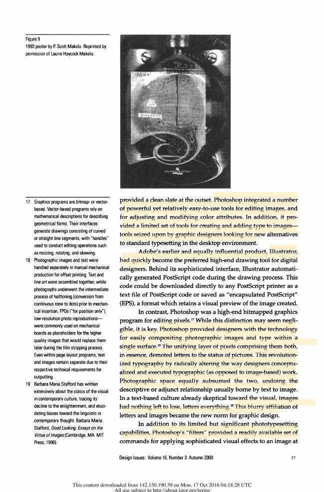
Figure 9
1993 poster by P. Scott Makela. Reprinted by
permission of Laurie Haycock Makela.
_ ..... ; ____ _______ . ~~~~~~~~~~~~~~~~~~~~~~~~~~~~~~... . ...... - j _. R.:p ....
provided a clean slate at the outset. Photoshop integrated a number
of powerful yet relatively easy-to-use tools for editing images, and
for adjusting and modifying color attributes. In addition, it pro-
vided a limited set of tools for creating and adding type to images-
tools seized upon by graphic designers looking for new altematives
to standard typesetting in the desktop environment.
Adobe's earlier and equally influential product, Illustrator,
had quickly become the preferred high-end drawing tool for digital
designers. Behind its sophisticated interface, Illustrator automati-
cally generated PostScript code during the drawing process. This
code could be downloaded directly to any PostScript printer as a
text file of PostScript code or saved as "encapsulated PostScript"
(EPS), a format which retains a visual preview of the image created.
In contrast, Photoshop was a high-end bitmapped graphics
program for editing pixels."7 While this distinction may seem negli-
gible, it is key. Photoshop provided designers with the technology
for easily compositing photographic images and type within a
single surface.18 The unifying layer of pixels comprising them both,
in essence, demoted letters to the status of pictures. This revolution-
ized typography by radically altering the way designers conceptu-
alized and executed typographic (as opposed to image-based) work.
Photographic space equally subsumed the two, undoing the
descriptive or adjunct relationship usually bome by text to image.
In a text-based culture already skeptical toward the visual, images
had nothing left to lose, letters everything.19 This blurry affiliation of
letters and images became the new norm for graphic design.
In addition to its limited but significant phototypesetting
capabilities, Photoshop's "filters" provided a readily available set of
commands for applying sophisticated visual effects to an image at
17 Graphics programs are bitmap- or vector-
based. Vector-based programs rely on
mathematical descriptions for describing
geometrical forms. Their interfaces
generate drawings consisting of curved
or straight line segments, with "handles"
used to conduct editing operations such
as resizing, rotating, and skewing.
18 Photographic images and text were
handled separately in manual mechanical
production for offset printing. Text and
line art were assembled together, while
photographs underwent the intermediate
process of halftoning (conversion from
continuous tone to dots) prior to mechan-
ical insertion. FPOs ("for position only"),
low-resolution photo reproductions-
were commonly used on mechanical
boards as placeholders for the higher
quality images that would replace them
later during the film stripping process.
Even within page layout programs, text
and images remain separate due to their
respective technical requirements for
outputting.
19 Barbara Maria Stafford has written
extensively about the status of the visual
in contemporary culture, tracing its
decline to the enlightenment, and eluci-
dating biases toward the linguistic in
contemporary thought. Barbara Maria
Stafford, Good Looking: Essays on the
Virtue of Images(Cambridge, MA: MIT
Press, 1996).
Design Issues: Volume 16, Number 3 Autumn 2000 27
This content downloaded from 142.150.190.39 on Mon, 17 Oct 2016 04:18:28 UTCAll use subject to http://about.jstor.org/terms
Ashley Scarlett
Ashley Scarlett
Ashley Scarlett
Ashley Scarlett
Ashley Scarlett
Ashley Scarlett
Ashley Scarlett
Ashley Scarlett

the touch of a button. England's Neville Brody began fusing images and type in 1992, designing provocative posters that would show-
case Photoshop's photomanipulative powers.2 He toyed extensively
with ambient, blurred compositions, as did many others including P. Scott Makela at Cranbrook in the U.S. (fig. 9).
The dissolution of the word continued as a major trend
throughout the 1990s, with David Carson a major instigator. His
pioneering sensibility, first at Beach Culture magazine and then Ray
Gun, established new thresholds for type's legibility (or lack thereof). Often criticized, Carson's controversial work further threat-
ened the authority of traditional typography through extensively
distorted letterforms and erratic layouts (fig. 10). By offering an
altemative to the more refined "production values" of TV, film, video, and advertising, Carson challenged the prevailing sensuous
norms of mass media. As might be expected, however, the main- stream readily absorbed his once-radical esthetic.
Paper vs. the Screen
Digital typography's innovations through the early 1990s lay prim-
arily in technologies and corresponding attitudes that revised the
image of the printed word. Beginning in the late 1980s, however, a new medium emerged to force the issue of the screen to the fore-
front: the CD-ROM. Interactive multimedia created a new venue for
displaying words, introducing new technical and esthetic issues.
"Authoring" tools such as VideoWorks (later to become Macro-
media Director) and Apple's HyperCard served as early develop-
ment platforms for building interactive pieces destined for the
screen, and included limited text-handling capabilities. The distinc-
RAYciUN
JE66SA B o. - K H g " ,
Figure 1 0
Cover of Ray Gun by David Carson. Reprinted
by permission of David Carson.
20 Jon Wozencroft, The Graphic Language
of Neville Brody(New York: Rizzoli,
1994), 16.
28 Design Issues: Volume 16, Number 3 Autumn 2000
This content downloaded from 142.150.190.39 on Mon, 17 Oct 2016 04:18:28 UTCAll use subject to http://about.jstor.org/terms
Ashley Scarlett
Ashley Scarlett
Ashley Scarlett
Ashley Scarlett
Ashley Scarlett
Ashley Scarlett
Ashley Scarlett

tion between text and image persisted in these software develop-
ment environments, with editing tools capable of creating letters
either as "text," dynamically reeditable through the keyboard, or as
"paint," static arrays of bitmaps that, once created, required the
editing of their individual pixels.
The suite of digital tools used to develop multimedia prod-
ucts supported numerous options for media creation and integra-
tion. Text (again, in multiple formats), still and motion graphics,
video, and sound could be brought together within a single envi-
ronment, and then orchestrated through built-in programming
languages. Once "compiled," users could navigate these multime-
dia spaces freely, choosing from among pre-programmed options
specified by the designer.
Despite the opportunities created by multimedia's screen
requirements, typeface options remained limited. Among the hun-
dreds of digital fonts available for use, most provided bitmaps not
finely tuned for the screen but, rather, coarse counterparts to their
corresponding outline files (again, these PostScript outlines were
used in printing). Screen fonts remained of secondary importance
despite the demands of the new medium.
A few insightful designers (Bigelow & Holmes already men-
tioned) recognized the needs of the screen, and worked to create
more choices. Apple developed proprietary screen fonts, the Espy
family, for use in its instructional products in 1993. Espy served as a
legible alternative to Chicago and Geneva, which were too closely
identified with the look of the Macintosh desktop. Matthew Carter,
an experienced type designer who already had tackled numerous
challenges in designing for various typesetting technologies, co-
founded Bitstream to develop digital typefaces. Responsible for
many print and screen-based innovations, in 1995, Carter designed
Walker, a typeface commissioned by the Walker Art Center that
featured interchangeable "snap-on" serifs.21 He later worked with
Microsoft to design proprietary screen fonts.
Adobe Systems had quickly emerged as the leading provider
of digital fonts, but printing remained the company's priority given
the fact that PostScript had never gained acceptance as a screen
display technology. Nonetheless, many of their font families
included well-drawn bitmaps used by early designers of electronic
media. Adobe's 1990 product, Adobe Type Manager (ATM), con-
tributed significantly to the quality of screen type in its ability to
smooth and scale type to any size, using only a limited number of
bitmaps along with the font's corresponding outline file, both stored
in the Macintosh system folder.2 With ATM, designers could gener-
ate type sizes beyond the 10-24 point bitmaps typically furnished
by type publishers. While ATM improved the onscreen look of
larger type sizes, small sizes proved a persistent problem. Designers
wanting small sizes of type relied on the 10- and 12-point furnished
21 Ellen Lupton, Mixing Messages: Graphic
Design in Contemporary Culture (New
York: Princeton Architectural Press and
Cooper Hewitt, National Design
Museum, Smithsonian Institution, 1996),
34.
22 ATM was not explicitly designed for this
purpose, however. ATM allowed non-
Postscript printers to print Adobe fonts,
desirable because it strengthened
Adobe's position as the premier digital
type foundry. Improved screen appear-
ance was a side benefit for print design-
ers wanting improved screen previews.
Gregory Wasson, "Adobe's Font Utility
Isn't Perfect, but It's Still a Worthwhile
Investment," MacUser6:2 (February 1,
1990): 64-65.
Design Issues: Volume 16, Number 3 Autumn 2000 29
This content downloaded from 142.150.190.39 on Mon, 17 Oct 2016 04:18:28 UTCAll use subject to http://about.jstor.org/terms
Ashley Scarlett
Ashley Scarlett
Ashley Scarlett
Ashley Scarlett
Ashley Scarlett
Ashley Scarlett
Ashley Scarlett

bitmaps or the automatic scaling of the Macintosh system, which
usually provided poor results.
Meanwhile, Apple began developing an alternative type for-
mat to rival Adobe's PostScript fonts. TrueType relied on auto-scal-
ing to generate type sizes as needed, side-stepping PostScript. A
"font war" ensued, with Apple and Adobe vying with each other to
become or remain the industry standard. Eventually, both compa-
nies conceded. Adobe published its Type 1 standard to support the
creation of non-Adobe PostScript fonts, and Apple supported
Adobe Type 1 fonts in addition to its own TrueType format.23
Developers of authoring tools generally neglected typogra-
phic needs but, by 1996, Director included antialiasing as a feature
of its built-in text editor. Designers now could create dynamically
reeditable text, whose smooth appearance rivaled that created by an
external graphics editor such as Photoshop.
Typography and the World Wide Web
An even more demanding and influential medium emerged in the
mid-1990s to overtake the CD-ROM market, and bring the concerns
of digital typography to a wider public. The World Wide Web
presented the designer with even more complex typographic dilem-
mas by placing ultimate control of typographic appearance in the
hands of the audience. Web browsers-software for viewing files
(Web pages) stored on the array of servers that in essence comprise
the Web-provided user-definable preferences for a number of
design attributes including typeface, font size, and color. In addi-
tion, these browsers also provided, by necessity, predefined typo-
graphic specifications to ensure a minimally adequate display by
default, should users choose not to specify their own preferences.
With users given the option to freely override the designer's
specifications, most graphic designers made use of such tools as
Photoshop to create text that could be set, antialiased, and saved as
a graphic file. Despite the economy and efficiency of HTML24 text,
which requires no downloading time and remains dynamicaly reed-
itable, most graphic designers entering the arena of Web design
chose (and continue to choose) "graphic text" as the means through
which to ensure a stable typographic appearance on Web pages,
reserving the use of HTML text for lengthy passages.
Graphic designers and clients alike considered the subver-
sion of graphic identity by Web browsers a distinct problem. In an
effort to enforce graphic identity, new companies including @Home
Network-founded to bring Web access to the home through the
infrastructure of cable television-devised font strategies to over-
ride user preferences. @Home's proprietary browser automatically
displayed HTML text in @Home's signature fonts (a default setting
users could change, however). This strategy was in place by the
time of the product launch in 1996. @Home's creative director,
Roger Black, created the product's look-as he had done success-
23 Laurie Flynn, "Warnock Says Adobe
Won't Make It Easy on Competitors,"
InfoWorld 1 1:41 (October 9, 1989): 6 and
Jai Singh, "Apple Opens Door to Adobe
Fonts-System 7 to Include Type 1 Fonts,
Adobe Type Manager," PC Week 8:34
(August26, 1991): 12.
24 HTML (Hypertext Markup Language) is
the "tagging language" used to create
Web pages. Tags placed before and after
the words constituting the textual page
content effect typographic attributes
including styling and relative sizing.
30 Design Issues: Volume 16, Number 3 Autumn 2000
This content downloaded from 142.150.190.39 on Mon, 17 Oct 2016 04:18:28 UTCAll use subject to http://about.jstor.org/terms
Ashley Scarlett

fully for the New York Times, Newsweek, and a number of other popu-
lar magazines. The product strategy strengthened @Home's overall
look and feel, critical for a Web publication serving as a directory for
the best on the Web. @Home's editorial identity offered a potential
competitive advantage against search engines capable of directing
users to specific Web pages and thus bypassing any intermediate
editorial commentary that might urge or discourage visiting a given
Website.
At the same time, Black's experience as a print designer
limited his ability to recognize that the "magazine" served simply
as a metaphor, and perhaps not the appropriate one for such an
innovative medium. Black might have chosen television, film, or
even architecture as the organizing metaphor for @Home's browser,
breaking new ground in subverting the "pageness" of the Web.
Other graphic designers would follow suit, bringing the limitations
of page-oriented conceptual models to Web design.
In an effort to establish a standard that would unify digital
type formats, an industry consortium proposed the OpenType
format early in 1996. Through OpenType-a "common container
format for TrueType and Type 1 fonts"-Adobe and Microsoft
promised greater typographic control on the Web through the abil-
ity to embed fonts in HTML documents.25 Other efforts, including
TrueDoc, a joint initiative between Adobe and Bitstream, also
ensured greater typographic control of Web documents.26 On the
whole, however, these efforts have been slow either in development,
in gaining industry support, or in adoption as a standard.
Typography and Computation in Cyberspace
While most graphic designers scrambled to take advantage of new
opportunities posed by the Web in the mid-1990s, university and
industry researchers pursued more innovative and radical ap-
proaches to type design in cyberspace as a result of their vast com-
puting resources and funding to permit such exploration. MIT's
Visible Language Workshop, under the direction of Muriel Cooper,
produced prototypes of multidimensional information displays
incorporating type. Using infinite zooming, along with various
levels of transparency and opacity, VBL's designers-including
David Small, Suguru Ishizaki, and Lisa Strausfeld-constructed
maps, charts, and timelines that users could navigate as if in flight,
a radical departure from the planar, frontal organization of most
standard user interfaces (fig. 11). When VBL's work debuted at
1994's "TED5" conference, it created a stir among the graphic design
community.
Since Muriel Cooper's death in 1994, the Visible Language
Workshop has been supplanted by another Media Lab research
group headed by Cooper's heir apparent, John Maeda. His
Aesthetics & Computation Group explores the intersection between
typography and programming to exploit computer processing
25 Rebecca Gulick, "Interlocking Font Deals
Find Center in Adobe," MacWEEK10: 20
(March 20, 1996): 10-12.
26 John Clyman and Jonathan Matzkin,
"The Font Forecast-Adobe and
Bitstream Recast Type Design," PC
Magazine 15:13 (July 1, 1996): 31.
Design Issues: Volume 16, Number 3 Autumn 2000 31
This content downloaded from 142.150.190.39 on Mon, 17 Oct 2016 04:18:28 UTCAll use subject to http://about.jstor.org/terms

Figure 1 1
"Information landscape" by Lisa Strausfeld.
From "Financial Viewpoints: Using point-of-
view to enable understanding of information,"
http://www.acm.org/turing/sigs/sigchi/chi95/
Electronic/ACMcopyright.html (New York:
Association for Computing Machinery, 1995).
Reprinted by permission of the Association for
Computing Machinery, Inc.
Figure 12
Screen from 12 o'clocks by John Maeda.
Interactive clocks visually interpret the
passage of time 12 different ways. Reprinted
by permission of John Maeda.
power unconstrained by authoring tools. Maeda trained as a com-
puter scientist, but his interest began shifting to graphic design
while still a student. After completing undergraduate and graduate
work at MIT, he eamed a doctorate at Tsukuba University Institute
of Art and Design in Japan. As an award-winning art director in
Japan, he explored print and interactive design, and published
whimsical electronic typographic works (fig. 12).r Maeda represents
a new breed of designer-the programmer/typographer-destined
to drive the future of graphic design innovation.
Outside the academy, J. Abbott Miller of the design studio
Design/Writing/Research undertook innovative experiments in
dimensional typography. Using high-end computer workstations,
Miller and his colleagues created three-dimensional letterforms.28
Lathing, extrusion, and texture-mapping defined new typefaces as
27 John Maeda, Flying Letters (Tokyo:
Naomi Enama, Digitalogue Co., Ltd.,
1996) and 12 O'clocks (Tokyo: Naomi
Enama, Digitalogue Co., Ltd., 1997).
28 J. Abbott Miller, Dimensional
Typography: Case Studies on the Shape
of Letters in Virtual Environments (New
York: Princeton Architectural Press,
1996), 24-25.
32 Design Issues: Volume 16, Number 3 Autumn 2000
This content downloaded from 142.150.190.39 on Mon, 17 Oct 2016 04:18:28 UTCAll use subject to http://about.jstor.org/terms

-.i. :" .F !
G S SS 6U S?4
Sue g r s 9 t . :
Figure 13
Univers Revolved by Ji Byol Lee. From J.
Abbott Miller, Dimensional Typography: Case
Studies on the Shape of Letters in Virtual
Environments, (New York: Princeton
Architectural Press, 1996) p. 24-25. Reprinted
by permission of J. Abbott Miller.
well as novel interpretations of existing classics. While Miller
himself acknowledged these studies as conceptual explorations,
they already have proved influential. Ji Byol Lee's lathed version of
Univers and Univers Revolved (fig. 13) appeared in the pages of the
New York Times Magazine of September 28, 1997, an issue on the
impact of computing in contemporary life. The image of the letter in
cyberspace has once again made its way back to the page.
Conclusion
The period from 1984 to 1997 saw the proliferation of key technolo-
gies that popularized digital design. New tools, including the Apple
Macintosh computer and associated software, especially that from
Adobe Systems, enabled designers to create, edit, and disseminate
words and images in new ways. Initially, designers translated the on
screen image of pixellated letterforms into fonts for printing-a wry
visual commentary on the play between page and screen.
Numerous experiments followed that challenged typographic
norms. Designers developed hybridized forms and ignored the
traditional rules of legibility. Adobe Photoshop allowed designers to
fuse text and image into a single pictorial layer, and stimulated the
rise of visual effects-driven typography in the early 1990s. The
hyperplastic esthetic that developed in print design during this
period migrated back to the screen through the World Wide Web in
Design Issues: Volume 16, Number 3 Autumn 2000 33
This content downloaded from 142.150.190.39 on Mon, 17 Oct 2016 04:18:28 UTCAll use subject to http://about.jstor.org/terms

the mid-90s. Typographic innovation now continues in cyberspace
through computer-modeled and algorithmically-driven typography.
By making it possible for designers to conceptualize and
realize letters in new ways, digital technology has provided the
platform through which words ultimately could be subsumed in the
larger pictorial space of the image, leveling the relationship between
the two. In so doing, digital technology revised the status of the
written word in the late twentieth century.
Acknowledgments
Much of the content of this article was originally presented
as a lecture at the 1996 symposium organized in conjunction with
the exhibition "Mixing Messages: Graphic Design and Contem-
porary Culture" at the Cooper Hewitt National Design Museum. I
would like to thank the curator of that exhibition, Ellen Lupton, for
inviting me to participate in that symposium. In addition, I wish to
thank the Radgale Foundation for granting me the space and time
to write this piece
34 Design Issues: Volume 16, Number 3 Autumn 2000
This content downloaded from 142.150.190.39 on Mon, 17 Oct 2016 04:18:28 UTCAll use subject to http://about.jstor.org/terms