
TTIWAdvWebGrid TTIWDBAdvWebGrid DEVELOPERS GUIDE IntraWeb Grids.pdf · TTIWAdvWebGrid -...
31
TMS SOFTWARE TTIWAdvWebGrid - TTIWDBAdvWebGrid DEVELOPERS GUIDE 1 April 2017 Copyright © 2002-2017 by tmssoftware.com bvba Web: http://www.tmssoftware.com Email : [email protected] TTIWAdvWebGrid – TTIWDBAdvWebGrid DEVELOPERS GUIDE
-
Upload
phungtuyen -
Category
Documents
-
view
240 -
download
2
Transcript of TTIWAdvWebGrid TTIWDBAdvWebGrid DEVELOPERS GUIDE IntraWeb Grids.pdf · TTIWAdvWebGrid -...

TMS SOFTWARE TTIWAdvWebGrid - TTIWDBAdvWebGrid
DEVELOPERS GUIDE
1
April 2017 Copyright © 2002-2017 by tmssoftware.com bvba
Web: http://www.tmssoftware.com Email : [email protected]
TTIWAdvWebGrid – TTIWDBAdvWebGrid DEVELOPERS GUIDE

TMS SOFTWARE TTIWAdvWebGrid - TTIWDBAdvWebGrid
DEVELOPERS GUIDE
2
Table of contents
TTIWAdvWebGrid / TTIWDBAdvWebGrid availability .................................................... 3 TTIWAdvWebGrid / TTIWDBAdvWebGrid organisation .................................................. 3 Settings of TTIWAdvWebGrid / TTIWDBAdvWebGrid visual elements ................................ 4 Controller ....................................................................................................... 4 Header ........................................................................................................... 7 Columns data display and column types ................................................................... 8 Column types ................................................................................................... 9 Inplace editors ............................................................................................... 10 Dynamic edits and text ..................................................................................... 11 Template based datafield combining .................................................................... 13 Column widths ............................................................................................... 13 Footer .......................................................................................................... 14 Cell and row selection ...................................................................................... 15 Row coloring .................................................................................................. 16 Sort control ................................................................................................... 17 Built-in scroll support ....................................................................................... 18 Detailrows ..................................................................................................... 19 Public methods and properties in TTIWAdvWebGrid .................................................. 21 Advanced TTIWAdvWebGrid / TTIWDBAdvWebGrid techniques ..................................... 23 Creating descendent classes with custom column types ............................................. 23 Using the ClientEvents ...................................................................................... 24 Using detailgrids ............................................................................................. 26 Using master/detail in a single grid ...................................................................... 28 Using Async capabilities with IntraWeb 9 ............................................................... 30
TMS SOFTWARE TTIWAdvWebGrid - TTIWDBAdvWebGrid
DEVELOPERS GUIDE
3
TTIWAdvWebGrid / TTIWDBAdvWebGrid availability TTIWAdvWebGrid and TTIWDBAdvWebGrid are available as VCL components for Delphi and C++Builder. TTIWAdvWebGrid is available for: - Delphi 2009,2010,XE,XE2,XE3,XE4,XE5,XE6,XE7,XE8,10 Seattle,10.1 Berlin, 10.2 Tokyo - C++Builder 2009,2010,XE,XE2,XE3,XE4,XE5,XE6,XE7,XE8,10 Seattle,10.1 Berlin, 10.2 Tokyo TTIWDBAdvWebGrid is available for: - Delphi 2009,2010,XE,XE2,XE3,XE4,XE5,XE6,XE7,XE8,10 Seattle,10.1 Berlin, 10.2 Tokyo - C++Builder 2009,2010,XE,XE2,XE3,XE4,XE5,XE6,XE7,XE8,10 Seattle,10.1 Berlin, 10.2 Tokyo IntraWeb 10.0, 11.0, 12.x, 14.0.x is required TTIWAdvWeBGrid and TIWDBAdvWebGrid have been designed for and tested with : Windows Vista, 7, 8 on IntraWeb 10.x or higher Current version of TTIWAdvWebGrid, TTIWDBAdvWebGrid has been designed for and tested with IE6 or higher, FireFox 2.0 and up, Chrome 2.0 and up. Some features are available only in IE6 or higher and degrade gracefully on other browsers.
TTIWAdvWebGrid / TTIWDBAdvWebGrid use The TMS TTIWAdvWebGrid and TTIWDBAdvWebGrid components are designed to be used in all kinds of grid type data presentation and editing in a browser. Data presented in the grid can be database driven in the TTIWDBAdvWebGrid component and directly web application driven in TTIWAdvWebGrid. It is from the web application running on the server that this grid presentation layer is generated along with Javascript code that is executed in the browser on the client side. TTIWAdvWebGrid and TTIWDBAdvWebGrid have built-in support for paged output, making the amount of data that is transferred from the server to the client customizable. Finally, TTIWAdvWebGrid and TTIWDBAdvWebGrid share the underlying presentation layer and browser Javascript generating code, making the end-user experience identical for both data-aware and non data-aware grid.
TTIWAdvWebGrid / TTIWDBAdvWebGrid organisation The grid components consist of 4 parts: 1 : Controller This is the part of the grid from where paging is controlled and presentation of page selection is done. Various options are available to customize the appearance of this control 2 : Headers A one or two row column header can be used. In its most simple form, the column header indicates what data is displayed in each column. It can be used to trigger a column sort, to start a filter, to

TMS SOFTWARE TTIWAdvWebGrid - TTIWDBAdvWebGrid
DEVELOPERS GUIDE
4
resize a column or to indicate logically grouped columns by spanning multiple columns. The row header is an extra fixed column that can be used to indicate the row number.

TMS SOFTWARE TTIWAdvWebGrid - TTIWDBAdvWebGrid
DEVELOPERS GUIDE
5
3 : Columns The actual data of the grid is displayed in columns. The appearance and type of each column can be defined. 4 : Footer A footer can be used to display just text information, static column calculations or dynamic column calculations. Dynamic column calculations are calculated values in the browser that can change dynamically when cell dynamic edit contents change without requiring a new server connection.
Settings of TTIWAdvWebGrid / TTIWDBAdvWebGrid visual elements Controller
The controller part of the grid can perform the automatic paging of grid data. A page is equivalent to RowCount rows. For the DB-aware grid, the total number of pages will be the total number of rows in the dataset divided by RowCount. For the non data-aware grid, the total number of rows is set with the property TotalRows. The page controller then provides selected methods such as Previous page / Next page or direct page number hyperlinks to select the desired page. The look of the page controller is set through the grid’s Controller property with following subproperties: Controller properties: Alignment: sets the alignment of the text displayed in the controller. Borders: holds various border settings for the controller Caption: this is the text displayed along with the automatic displayed page control elements. Color: this sets the background color of the controller. Specify clNone is default browser background color should be used. Font: sets the font used in the controller. If no font is specified, the default browser font is used Gradient1: specifies the start color of a gradient color in the controller. When clNone is set, no gradient is used. Note that gradients are only supported in IE6. Gradient2: specifies the end color of a gradient color in the controller. GradientDirection: sets the gradient direction to either horizontal or vertical

TMS SOFTWARE TTIWAdvWebGrid - TTIWDBAdvWebGrid
DEVELOPERS GUIDE
6
Height: specifies the height of the controller. When height is zero, height of the controller automatically adapts to height of elements inside the controller. HintFind: sets the hint that should appear over the button to start a text search in the grid HintFirst: sets the hint that should appear over the button to go to the first page HintLast: sets the hint that should appear over the button to go to the last page HintNext: sets the hint that should appear over the button to go to the next page HintPrev: sets the hint that should appear over the button to go to the previous page ImgFirst: specifies the image to be used for jumping to the first page. This can be a GIF, JPEG or BMP file. Note that the images are used when PagerType is set to cptImage ImgLast: specifies the image to be used for jumping to the last page. ImgNext: specifies the image to be used for jumping to the next page. ImgPrev: specifies the image to be used for jumping to the previous page. IndicatorFormat: This specifies how the viewed page is indicated in the controller. This is a format string with formatting features of the Delphi Format() function. Text and number specifiers can be used. The numeric data displayed depends on the IndicatorType and can be either record number or page number. Examples: Setting IndicatorType to itPageNr and IndicatorFormat to ‘(Page %d of %d)’ will display in the controller: ‘(Page 1 of 12)’ if on the first page for a 12 page grid. Setting IndicatorType to itRecordNr and IndicatorFormat to ‘- This is record number %d’ will display in the controller ‘- This is record number 1’ for the first record.
Sample controller with prev / next hyperlinks and page indication
IndicatorType: Indicator type can be either itRecordNr, to indicate current record index vs total number of records in the dataset or grid, or itPageNr to indicate the current page. The IndicatorType itNone displays no indicator. MaxPages: sets the maximum number of pages to display in the controller. The controller will display a range of pages limited to MaxPages around the currently selected page. Pager: this selects the type of paging. Currently, following paging types are defined: cpAlphaList: not yet implemented cpPageList: paging is done through clicks on page number cpPrevNext: paging is done through previous / next links cpPrevNextFirstLast: paging is done through previous / next page links as well as first and last page links. cpDropDownList: paging is done through page selection from a combobox holding page numbers PagerType: this selects the visual presentation of the paging which can be: cptLink: page numbers or previous / next actions are done through hyperlinks cptButton: page numbers or previous / next actions are done through buttons cptImage: previous, next, first and last actions are done through images specified in properties ImgPrev, ImgNext, ImgFirst, ImgLast. Note that PagerType cptImage cannot be combined with Pager cpPageList currently cptImageButton: previous, next, first and last actions are done through buttons with predefined images. Position: sets the position of the controller w.r.t. the grid. This can be: cpTop: controller is on top of the grid

TMS SOFTWARE TTIWAdvWebGrid - TTIWDBAdvWebGrid
DEVELOPERS GUIDE
7
cpNone: controller is not displayed cpBottom: controller is displayed under the grid cpBoth: controller is displayed on top and under the grid RowCountSelect : when true, a dropdown list is displayed in the controller with which the number of rows to display can be selected. The possible rowcount values are set through the RowCountValues property RowCountSelectLabelAfter : property that allows setting some text after the row count selector RowCountSelectLabelBefore : property that allows setting some text before the row count selector RowCountValues: list of possible rowcount values that can be selected from a dropdown list in the controller. ShowFind: when true, a find button is displayed in the controller. With the find button, text can be searched in the grid and focus is set on the cell where the text is found. ShowPagersAlways: when true, the Next,Last and Prev,First are always displayed whether it is possible to go back or forward. If it is not possible to go back or forward, the text is displayed but is inactive. TextFirst: sets the text for the button or hyperlink that will be used to go to the first page. By default this is ‘First’ TextLast: sets the text for the button or hyperlink that will be used to go to the last page. By default this is ‘Last’ TextNext: sets the text for the button or hyperlink that will be used to go to the next page. By default this is ‘Next’ TextPrev: sets the text for the button or hyperlink that will be used to go to the previous page. By default this is ‘Prev’ Events associated with the controller: Although the controller handles the paging automatically, events are triggered to indicate to the application what paging action the user has taken. These events are: OnGotoPage: event triggered when user selects to go to a given page when the controller pager is set to cpPageList OnFirstPage: event triggered when user selects to go to the first page when the controller pager is set to cpPrevNext or cpPrevNextFirstLast OnLastPage: event triggered when user selects to go to the last page when the controller pager is set to cpPrevNext or cpPrevNextFirstLast OnNextPage: event triggered when user selects to go to the next page when the controller pager is set to cpPrevNext or cpPrevNextFirstLast OnPrevPage: event triggered when user selects to go to the previous page when the controller pager is set to cpPrevNext or cpPrevNextFirstLast Other related paging properties: A few other public and published properties are provided here that affect the controller’s paging or are affected by it. Page: this provides a programmatic access to set or get the displayed page
TMS SOFTWARE TTIWAdvWebGrid - TTIWDBAdvWebGrid
DEVELOPERS GUIDE
8
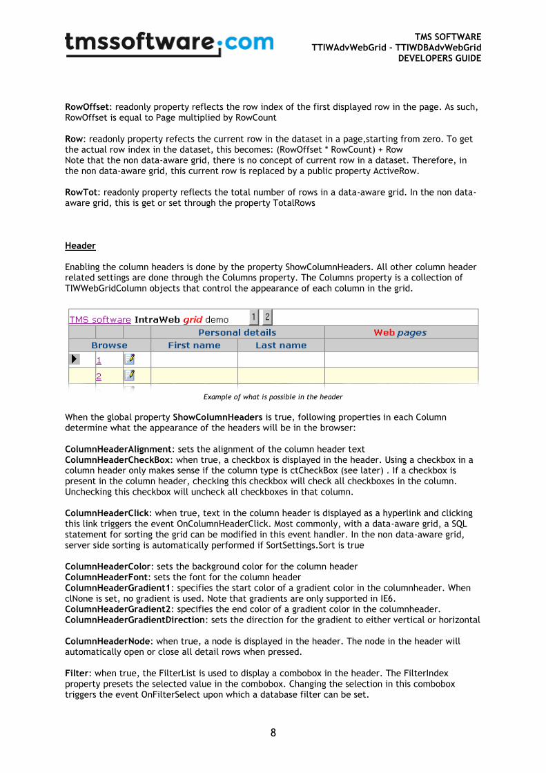
RowOffset: readonly property reflects the row index of the first displayed row in the page. As such, RowOffset is equal to Page multiplied by RowCount Row: readonly property refects the current row in the dataset in a page,starting from zero. To get the actual row index in the dataset, this becomes: (RowOffset * RowCount) + Row Note that the non data-aware grid, there is no concept of current row in a dataset. Therefore, in the non data-aware grid, this current row is replaced by a public property ActiveRow. RowTot: readonly property reflects the total number of rows in a data-aware grid. In the non data-aware grid, this is get or set through the property TotalRows Header Enabling the column headers is done by the property ShowColumnHeaders. All other column header related settings are done through the Columns property. The Columns property is a collection of TIWWebGridColumn objects that control the appearance of each column in the grid.
Example of what is possible in the header
When the global property ShowColumnHeaders is true, following properties in each Column determine what the appearance of the headers will be in the browser: ColumnHeaderAlignment: sets the alignment of the column header text ColumnHeaderCheckBox: when true, a checkbox is displayed in the header. Using a checkbox in a column header only makes sense if the column type is ctCheckBox (see later) . If a checkbox is present in the column header, checking this checkbox will check all checkboxes in the column. Unchecking this checkbox will uncheck all checkboxes in that column. ColumnHeaderClick: when true, text in the column header is displayed as a hyperlink and clicking this link triggers the event OnColumnHeaderClick. Most commonly, with a data-aware grid, a SQL statement for sorting the grid can be modified in this event handler. In the non data-aware grid, server side sorting is automatically performed if SortSettings.Sort is true ColumnHeaderColor: sets the background color for the column header ColumnHeaderFont: sets the font for the column header ColumnHeaderGradient1: specifies the start color of a gradient color in the columnheader. When clNone is set, no gradient is used. Note that gradients are only supported in IE6. ColumnHeaderGradient2: specifies the end color of a gradient color in the columnheader. ColumnHeaderGradientDirection: sets the direction for the gradient to either vertical or horizontal ColumnHeaderNode: when true, a node is displayed in the header. The node in the header will automatically open or close all detail rows when pressed. Filter: when true, the FilterList is used to display a combobox in the header. The FilterIndex property presets the selected value in the combobox. Changing the selection in this combobox triggers the event OnFilterSelect upon which a database filter can be set.
TMS SOFTWARE TTIWAdvWebGrid - TTIWDBAdvWebGrid
DEVELOPERS GUIDE
9
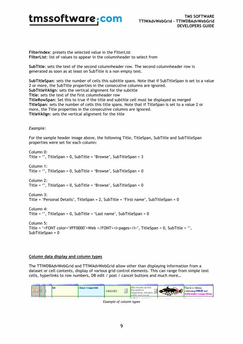
FilterIndex: presets the selected value in the FilterList FilterList: list of values to appear in the columnheader to select from SubTitle: sets the text of the second columnheader row. The second columnheader row is generated as soon as at least on SubTitle is a non empty text. SubTitleSpan: sets the number of cells this subtitle spans. Note that if SubTitleSpan is set to a value 2 or more, the SubTitle properties in the consecutive columns are ignored. SubTitleVAlign: sets the vertical alignment for the subtitle Title: sets the text of the first columnheader row TitleRowSpan: Set this to true if the title and subtitle cell must be displayed as merged TitleSpan: sets the number of cells this title spans. Note that if TitleSpan is set to a value 2 or more, the Title properties in the consecutive columns are ignored. TitleVAlign: sets the vertical alignment for the title Example: For the sample header image above, the following Title, TitleSpan, SubTitle and SubTitleSpan properties were set for each column: Column 0: Title = ‘’, TitleSpan = 0, SubTitle = ‘Browse’, SubTitleSpan = 3 Column 1: Title = ‘’, TitleSpan = 0, SubTitle = ‘Browse’, SubTitleSpan = 0 Column 2: Title = ‘’, TitleSpan = 0, SubTitle = ‘Browse’, SubTitleSpan = 0 Column 3: Title = ‘Personal Details’, TitleSpan = 2, SubTitle = ‘First name’, SubTitleSpan = 0 Column 4: Title = ‘’, TitleSpan = 0, SubTitle = ‘Last name’, SubTitleSpan = 0 Column 5: Title = ‘<FONT color="#FF0000">Web </FONT><I>pages</I>’, TitleSpan = 0, SubTitle = ‘’, SubTitleSpan = 0 Column data display and column types The TTIWDBAdvWebGrid and TTIWAdvWebGrid allow other than displaying information from a dataset or cell contents, display of various grid control elements. This can range from simple text cells, hyperlinks to row numbers, DB edit / post / cancel buttons and much more…
Example of column types

TMS SOFTWARE TTIWAdvWebGrid - TTIWDBAdvWebGrid
DEVELOPERS GUIDE
10
The above example already shows several of these types such as from left to right: DB buttons, DB state indicator, row number link, numeric edit control, text, date picker, popup memo field, graphic and template based data field combining. Column types: To explain the various capabilities and how these can be set, it should be noted that a grid cell can be set to 4 different main types:
- always static cell: this cell can not be edited and just displays fixed data - an action cell: this cell allow a fixed action, such a handling a button click - editable cell: when the grid is in editing mode, a cell editor is displayed otherwise the cell
displays data. Note that setting the grid in editing mode, sets one full row in editing mode at a time. As a result of this, a connection to the server is only done once per row when editing starts and once when editing ends. All cells of a row are thus updated at the end of editing in a single action.
- dynamic cell : this type of cells is either always in editing mode or displays a client side calculated value.
The settings for these cell types are done per column through the property Column.ColumnType which currently has following capabilities: ctNormal: column contains normal text cells. It is the Editor property that determines whether this column can be edited and if so, what type editor is used. Note: for the DB-aware grid, using this default ctNormal style will render text as well as image fields of the DB. For image BLOBs, it is required that the BLOB type is set to ftGraphic. (See Fields editor at design time to set the BLOB type) The grid will try to load GIF, JPEG or BMP file types from the BLOB stream. ctNoWrap: this is identical to the ctNormal columntype except that cell dimensions will not adapt to cell contents but will be constrained to the row height and column width settings. ctCheckbox: column contains row select checkboxes ctButton: column contains a button. Button caption is set with the ButtonText property ctRowIndicator: column contains a glyph that shows for the current row the browse, edit or insert state ctRowNumber: column shows the row number ctScroll: column shows text in a scrollbox. This is suitable for memo fields. ctPopup: column shows text in cell with button showing text in popup when clicked ctPopupImage: the image is displayed in full size when mouse is over the image, otherwise the image height is limited to the row height. ctProgress: the value of the column (between 0 and 100) is displayed as a progress bar ctLinkField: column shows text with hyperlink. Clicking the hyperlink moves the current row to the row clicked ctLinkRowNumber: column shows the row number as a hyperlink. Clicking the hyperlink moves the current row to the row clicked ctDataCheckbox: checkbox state reflects the cell value. Checkbox is checked when cell value is equal to the CheckTrue value or unchecked when equal to CheckFalse ctImage: column shows image from assigned imagelist. Selected image is choosen with the ImageIndex property ctImageCheckbox: column shows checkboxes with custom glyphs set with the properties CheckTruePicture and CheckFalsePicture. ctDataImageCheckbox: this is a combination of a ctImageCheckbox and a ctDataCheckbox ctDataImage: columns shows image from assigned imagelist. Selected image is choosen from the value of the cell. ctURL: columns shows text as hyperlink. If text has not yet a http:// prefix, it is automatically inserted ctEmail: column shows text as email hyperlink. The mailto: prefix is automatically added ctDataButton: column shows Edit, Post, Cancel buttons in current row depending on dataset state

TMS SOFTWARE TTIWAdvWebGrid - TTIWDBAdvWebGrid
DEVELOPERS GUIDE
11
ctRadioButton: columns shows a radio button. Only one radiobutton can be selected per column, allowing row selection through a radiobutton ctDynEdit: column shows edit control in all cells. Type of the edit control is set by the property DynEditor. This allows to specify a dynamic editor that only allows numeric, float entry (signed or unsigned) ctDynText: column shows dynamic text in all cells. Value of the dynamic text is calculated by the Formula property. ctDynCheckbox: column shows checkbox in all cells. A checkbox change causes a dynamic value update. The checkbox state can be used in formulas. The value is 1 for a checked checkbox and 0 for unchecked. ctDynCombo: column shows combobox in all cells. Combobox items are set with the ComboItems property. A combobox selection change causes a dynamic value update. ctNode: the column shows a node that is used to hide or unhide a detail row. The settings for the nodes are grouped under the grids Nodes property. ctLink: This is a hyperlink that when clicked triggers the event OnClickLink. It returns the cell coordinates of the link clicked but does not move the active row to the row of the link. Inplace editors: The inplace editors are displayed for the current row in the dataset (or ActiveRow for a non data-aware grid) Currently, following inplace editor types are defined: edNone: no editor is used in this column, ie. the column is read-only edEdit: inplace editor for column allows any text to be entered edPassword: inplace editor is a password style edit edCombo: inplace editor is a combobox. The values for the combobox are set through the stringlist property ComboItems edMemo: inplace editor is a textarea edCheckbox: inplace editor is a checkbox edEditNumeric: inplace editor is an edit control that only accepts characters 0..9 edEditFloat: inplace editor is an edit control that only accepts characters 0..9 and a decimal separator. The decimal separator is set with the DecimalSeparator property edEditLower: inplace editor is an edit control automatically converting entered characters to lowercase edEditUpper: inplace editor is an edit control automatically converting entered characters to uppercase edEditHex: inplace editor is an edit control that accepts characters 0..9 and A..F edDatePicker: inplace editor is a datepicker. The format of the datepicker is set with the properties DateFormat and DateSeparator. edSpinEdit: inplace editor is a spin edit control edPopupEdit: editing is done through a popup memo editor

TMS SOFTWARE TTIWAdvWebGrid - TTIWDBAdvWebGrid
DEVELOPERS GUIDE
12
Dynamic edits and text:
Sample grid control with dynamic edit and text columns
Dynamic edit columns and dynamic text columns allow configuring both the data-aware and not data-aware to perform calculations on the client side. In the example above, the Quantity column contains dynamic edit controls, the column Tax and Total contain dynamic text. The values in the dynamic text columns are dependent on the values in the ListPrice column and the Quantity column. The formula for calculating the tax is: Tax = 0.16 * Quantity * ListPrice The formula for calculating the total is: Total = 1.16 * Quantity * ListPrice Configuring this in TTIWDBAdvWebGrid or TTIWAdvWebGrid is as simple as setting the Quantity column type with ColumnType to ctDynEdit and setting the Tax and Total columns ColumnType to ctDynText. Next, the formula needs to be set that calculates the dynamic text columns. This is done with the Formula property for each column. A formula expression can be written using the variables C1, C2, ..., Cn, where Cx is the variable holding the value of the cell in column x. In this example for tax and total calculation, the formulas for column Tax and Total are: Tax column: Formula = C3*C2/100*16 Total column: Formula = C2*C3*1.16 Two more properties are used to control dynamic editing and dynamic text. First property is the DynEditor property. This property can be set to: deText: allow any text input in a dynamic deUnsigned: allow unsigned numeric input deSigned: allow signed numeric input deFloatUnsigned: allow unsigned floating point input deFloatSigned: allow signed floating point input

TMS SOFTWARE TTIWAdvWebGrid - TTIWDBAdvWebGrid
DEVELOPERS GUIDE
13
Finally, the DynPrecision property controls the number of decimals to display in the calculated result of a dynamic text. Retrieving or presetting the values of dynamic edit controls is simple. It can be accessed with the grid.DynEdits[AColumn,ARow]:string property. Thus, presetting a dynamic edit for column 3, row 7 can be done by: Grid.DynEdits[2,6] := ‘1234’; (note that column and row indexes are always zero based) After a submit, the server side can retrieve the edited value with the same grid.DynEdits[2,6] property. Note that retrieving values of dynamic text is not available. As dynamic text is always calculated with a known formula, the server side can at any time, based on database field values and dynamic edit values know the value of dynamic text. The dynamic combobox has an additional feature that allows performing calculations based on different values from those shown in the combobox. As such, the combobox can show text values and hold numeric values that are used for the calculations. Example: Suppose that a price for a hotel reservation depends on the room type. In this simplified example, we have the rule: Standard room = 1.0 x price Suite = 1.25 x price Penthouse = 1.40 price Luxe suite = 1.75 x price In Column 1, the column type is ctNormal holding the hotel room price, in column 2 the column type is ctDynCombo and in the column 3 the columntype is the ctDynText. In column 2, the ComboItems stringlist holds: “Standard room” ”Suite” ”Penthouse suite” ”Luxe suite” and the valuelist holds: ”1.0” ”1.25” ”1.40” ”1.75” For column 3, the Formula is set to : “C1*C2” With this setup, selecting a “Suite” from the combobox will show the value equal to price of column 1 multiplied by 1.25.

TMS SOFTWARE TTIWAdvWebGrid - TTIWDBAdvWebGrid
DEVELOPERS GUIDE
14
Dynamic column type & editor type selection: By default, setting the column type and editor type applies to all rows of a column. In some cases, this might not be desirable and control over the column type and/or editor type is needed on a row basis. This can be done by using the event OnGetCellType. This event is triggered during the rendering of each grid cell. It returns the column index and row index and allows dynamically changing the column type, editor type and dynamic editor type through the parameters AColumnType, Editor, DynEditor. Example: procedure TIWForm2.TIWAdvWebGrid1GetCellType(Sender: TObject; RowIndex,
ColumnIndex: Integer; var AColumnType: TTIWColumnType;
var Editor: TTIWColumnEditor; var DynEditor: TTIWDynEditType);
begin
if odd(RowIndex) and (ColumnIndex = 0) then
AColumnType := ctButton;
end;
This event will put a button in the first column of the grid for every other row. Template based datafield combining & dynamic data: This feature is only available for TTIWDBAdvWebGrid. Where in the normal case, the selected database field for a column is set with the DataField property, using a template allows combining multiple fields and applying formatting in a single column. Selecting the Template property in Columns, shows the HTML editor for specifying this template:
As can be seen from the example above, HTML formatted text can be entered and places where text should be substituted by a DB field value is set by (#fieldname). When generating the grid, TTIWDBAdvWebGrid will automatically substitute markers (#fieldname) with the field value including graphic fields.
TMS SOFTWARE TTIWAdvWebGrid - TTIWDBAdvWebGrid
DEVELOPERS GUIDE
15
In addition to using templates, it is also possible to programmatically change or generate column data on the fly. This is done through the event OnGetCellData. This event is defined as : GetCellData(Sender: TObject; RowIndex, ColumnIndex: Integer; var AValue: String); The event is triggered for each cell rendered for the browser. It allows changing the data dynamically on the server before being sent to the browser. Shown here is a sample that simulates Windows style ellipsis drawing for large text for column 4: procedure TformMain.TIWDBAdvWebGrid1GetCellData(Sender: TObject; RowIndex,
ColumnIndex: Integer; var AValue: string);
begin
if (ColumnIndex = 4) then
if Length(AValue) > 15 then
AValue := Copy(AValue,1,15) + ‘…’
end;
Column widths: Although different width specifications for columns are possible : none, percent, absolute, the absolute width specification is recommended as it allows exactly positioning the grid control with other controls on the form from Delphi or C++Builder. When setting the column’s width type to wtAbsolute, the width is set as pixel width with the Width property. With wtAbsolute column width type, it is also possible to allow the user to resize columns in the browser. This is enabled by setting the property AllowSizing = true at the same time as the global property ColumnSizing. Note: when the column type is ctNormal and absolute column width is specified, putting text in a cell that is wider than the absolute column width set, HTML tables will ‘stretch’ the column width beyond the absolute width set. As the header is for scrolling purposes in another table, the column header might not size equally and therefore cause the header widths to be out of sync with the column’s width. To avoid this, use the column type ctNoWrap which will disable this HTML table stretch effect. Footer The grid’s footer is much like the grid’s header. It is displayed when the property ShowFooter is true. The properties that determine the appearance of the footer are set per column in the Columns property: FooterAlignment: sets the alignment for the footer text FooterFormat: is a format specifier for calculated footer values FooterText: holds the fixed text for a footer FooterType: the footer for each column can have following types : ftText: footer contains simple static text ftPageSum: footer contains server calculated sum of column cell values of page ftPageMin: footer contains server calculated minimum of column cell values ftPageMax: footer contains server calculated maximum of column cell values ftPageAvg: footer contains server calculated average of column cell values ftNone: footer is empty ftDynSum: footer contains client side calculated sum of column cell values ftDynMin: footer contains client side calculated minimum of column cell values ftDynMax: footer contains client side calculated maximum of column cell values

TMS SOFTWARE TTIWAdvWebGrid - TTIWDBAdvWebGrid
DEVELOPERS GUIDE
16
ftDynAvg: footer contains client side calculated average of column cell values Note that dynamically generated values only make sense for columns that have the ctDynText or ctDynEdit style. For other column types, the column cell values are not dynamically updated in the browser, thus recalculating columns should never be done in the browser. Note also that the precision of output for server side calculated footers can be set with the FooterFormat property. Example: FooterFormat := ‘Average : %.2f’ This shows the average of values displayed with ftPageAvg type with 2 decimals. For ftDynAvg, the DynPrecision determines the number of decimals that will be displayed. Cell and row selection Checkbox disjunct multi-row selection: The most intuitive and familiar interface for selecting rows in a grid is perhaps the interface we have all learned from Hotmail, the checkbox based selection. This is enabled in TTIWDBAdvWebGrid and TTIWAdvWebGrid by adding a column with the ctCheckBox style (optionally with ColumnHeaderCheckbox true, a checkbox in the column header will select / unselect all checkboxes) If a checkbox is checked, the row is selected and displayed in the SelectColor / SelectFontColor. The selection is fully handled on the client side. Only upon a server connection, the server application can get the state of the selected rows with the property RowSelect[RowIndex: Integer]: Boolean; Following code shows how selected rows in a single displayed page can be deleted: var
i,numdel: Integer;
begin
numdel := 0;
// loop through all rows in the page
for i := 1 to TIWDBAdvWebgrid1.RowCount do
begin
// access selected row state within page
if TIWDBAdvWebGrid1.RowSelect[TIWDBAdvWebGrid1.RowOffset + i - 1] then
begin
// lookup record in table and delete
Table1.First;
Table1.MoveBy(TIWDBAdvWebGrid1.RowOffset + i - 1 - numdel);
Table1.Delete;
Inc(numdel);
end;
end;
end;
TMS SOFTWARE TTIWAdvWebGrid - TTIWDBAdvWebGrid
DEVELOPERS GUIDE
17
Note that in TTIWAdvWebGrid, selected rows can be automatically deleted with the method: Grid.DeleteSelectedRows; Unless the property SelectPersistent is true, selected rows are not remembered and a grid is always displayed without any selected row. Setting grid.SelectPersistent to true remembers the selected rows for all pages and allows to preset selections through the RowSelect[RowIndex:Integer] property. Optionally, an event is triggered OnCheckClick. Note that when the OnCheckClick event is assigned, a connection to the server will be made for each checkbox click. Selections by mouseclick on cells: It is not required to use checkboxes for selecting rows. Using the property MouseSelect, following selection methods can be used: msRow : single click selects row, another single click unselects current row and selects new row. msSingleCell: single click selects single cell and unselects previously selected cell. Optionally, an event is triggered OnCellClick. Note that if this event handler is assigned, for each cell click a server connection will be made. msRowCheck: single click selects row as if click on a checkbox. With SelectPersistent, the selected row state is remembered across pages and can be retrieved or set with grid.RowSelect[RowIndex: Integer]: Boolean; msMove: single click moves the database cursor to the clicked row msClient: generates a client side event only. The event can be handled with code in the ClientEvents.CellClick property msNone: no events are triggered for clicks on normal grid cells msEdit: in this mode, the inplace editing will automatically start without server connection upon a cell click. All editable columns can be edited this way and cells in multiple rows can be edited as well. It is only with the first server connection that all edited values are updated on the server. In TTIWAdvWebGrid, edited cells will be automatically updated in the Cells[] array. In the database-aware version, it is required to write the code that will update the database based on the new values of the edited cells. This data can be written to the database from the event OnDirectEditUpdate. The event is triggered for each edited cell with coordinates of the cell, new value of the cell and a Boolean parameter that indicates whether the value will be updated when true. Definition of the event: TTIWDirectEditUpdate = procedure(Sender: TObject; ACol,ARow: Integer; var
Value: string; var Allow: Boolean) of object;
Note: If the property AutoEdit is set true, the grid will automatically switch to editing mode, when a mouse click happens on a selected row.

TMS SOFTWARE TTIWAdvWebGrid - TTIWDBAdvWebGrid
DEVELOPERS GUIDE
18
Row coloring By default, cell colors are set through the Color property for each Column. In addition, the OnGetCellProp event allows dynamic and/or content based cell and/or row color changing.Often it is much more convenient, to quickly apply a few often used coloring schemes. In TTIWDBAdvWebGrid, these are color banding, selection colors, edit color and hovering: Color banding: This is the often used alternating color per row scheme. It is simply enabled by setting the property grid.Bands.Active to true and defining colors for odd and even rows through grid.Bands.PrimaryColor and grid.Bands.SecondaryColor. Selection colors: The color of selected rows is set by SelectColor and SelectFontColor properties if ShowSelect is true. Active row color: The color of the active row (current DB record for the DB-aware version or ActiveRow for non DB-aware version) can be set with ActiveRowColor and ActiveRowFontColor properties. Edit color: When the grid is in editing state, the row that is being editing can be conveniently displayed in its own color set by EditColor. Hovering: Hovering is the effect that a row changes color when the mouse is over it. It is enabled in TTIWDBAdvWebGrid and TTIWAdvWebGrid by setting the properties HoverColor and HoverFontColor. General note: When setting these color properties to clNone, the selected row coloring schemes are not used. Sort control TTIWDBAdvWebGrid has no built-in sorting. It is the task of the dataset to present the information in the desired sorting set by the query. TTIWAdvWebGrid has built-in sorting which is enabled by global setting grid.SortSettings.Show = true and further enabled for only those columns that must be allowed to be sorted by setting ColumnHeaderClick to true. For TTIWDBAdvWebGrid, the normal procedure to handle sorting is writing an event for the OnColumnHeaderClick, change the query statement in this event handler to sort for the clicked column or when the clicked column was previously sorted, toggle the sort direction. The grid will then visually indicate the sort direction of the sorted column by a small up or down arrow in the column header. The same applies for TTIWAdvWebGrid. The difference here is that TTIWAdvWebGrid performs sorting internally and takes care of the SortSettings property by updating sorted column and sort direction for each click on a column header. As the TTIWAdvWebGrid performs its own sorting, the type of data displayed in each column must be set to allow the internal sort to work with the correct compare routines. This is set with the property SortFormat available in TTIWAdvWebGrid only and can be: sfAlphabetic : alphabetic sorting sfNumeric : integer or floating point based sorting sfDate : date based sorting sfFinancial: sorting based on floating point data with thousandseparators

TMS SOFTWARE TTIWAdvWebGrid - TTIWDBAdvWebGrid
DEVELOPERS GUIDE
19
sfCustom: custom data compare method. The compare is performed through the event OnCustomCompare. Through this event a custom compare routine can be implemented. The possible results are: 1: value 1 > value 2 0: value 1 = value 2 -1: value 1 < value 2 In TTIWAdvWebGrid, 2 additional properties per column control the sorting, ie. the SortPrefix and SortSuffix property. When setting SortPrefix to a string, this string is ignored in the sort when this string matches the first characters of the cell text. The same is applicable for the SortSuffix where the matching must be at the end of the string. Example: Suppose the cell contents are: ‘$ 150’ ‘$ 75’ ‘$ 90’ ‘$ 50’ To perform a numerical sort, the dollar prefix must be ignored. Setting the SortFormat for this column to sfNumeric and setting SortPrefix equal to ‘$ ‘ will result in the correct numerical sort. Finally, TTIWAdvWebGrid has the capability to refer to cell independently of the sort. This can be done by two functions: function SortedToRowIndex(RowIndex: Integer): Integer;
Converts the display row index to the original row index function RowToSortedIndex(RowIndex: Integer): Integer;
Converts the unsorted row index to the display row index

TMS SOFTWARE TTIWAdvWebGrid - TTIWDBAdvWebGrid
DEVELOPERS GUIDE
20
Built-in scroll support TTIWAdvWebGrid and TTIWDBAdvWebGrid have built-in scrollbar support. This means that you can add scrolling capabilities to the grid by just setting one property : grid.Scroll.Style to either scAuto or scAlways. When Scroll.Style is set to scAuto, scrollbars will automatically appear when the total row height or total column width is higher than the grid height or width. When Scroll.Style is scAlways, the scrollbars will be shown always but inactive when the total row height or total column width is smaller than the grid height or width.
If scrolling is enabled and also column headers and column footers or row headers are displayed, the column headers and column footers or row headers will automatically scroll with the grid. The row headers will however remain visible when the grid is horizontally scrolled and the column header and column footer will remain visible when the grid is vertically scrolled. An additional property is available: grid.Scroll.Persistent. When this is true, the vertical and horizontal scroll positions are persistent between consecutive rendered pages, ie. the grid remembers and restores the last scroll position for each new renderering after a server connection. Note: in the current version, using a fixed row header combined with rows with nodes and detailrows will incorrectly render. The fixed row header will not synchronously increase its height when the detail row is opened. This is a limitation of the current version. Detail rows can however be used with scrolling enabled when no fixed row header is used.

TMS SOFTWARE TTIWAdvWebGrid - TTIWDBAdvWebGrid
DEVELOPERS GUIDE
21
Using detailrows Detailrows offer the capability to show additional record information only when the user selects to open this. Detailrows have common properties that are: DetailRowHeight: sets the height of the detailrow. If this is 0, the height automatically adapts to the information in the detail row. DetailRowShow: selects the method to display the detail row. This can be: dsNormal: client side opening of a detail row with a node without affecting other detail rows dsOneOpen: client side opening of a detail row with a node with automatic closing of other detail rows to make sure only one detail row is open at a time dsAllOpen: grid is rendered with all detail rows immediately open dsServerOpen: detail row is opened after a server connection. During the server connection, the OnNodeOpen or OnNodeClose events are generated. dsServerOneOpen: detail row is opened after a server connection. During the server connection, the OnNodeOpen or OnNodeClose events are generated. Previously opened detail rows are automatically closed upon opening a new detail row. Other settings for detailrows are in the Columns property: DetailColor: sets the background color of the detail row in this Column DetailSpan: sets the number of columns the detail row spans from this column DetailTemplate: sets the template for the information to display in the detailrow. The DetailTemplate works similar as the Template for displaying combined records in the detailrow. Example: using DetailTemplate This detailtemplate displays the Notes field in the Verdana font in the detailrow <FONT size="2" face="Verdana">(#Notes)</FONT> Additionally, for each row the event OnGetCellDetail is also triggered to set the detail row information dynamically. Example: Using DetailSpan Suppose you want to achieve following detail rows:
- Row 1 Col 1 Row 1 Col 2 Row 1 Col 3 Row 1 Col 4
Detail row 1 FieldA Detail row 1 FieldB
- Row 2 Col 1 Row 2 Col 2 Row 2 Col 3 Row 2 Col 4
Detail row 2 FieldA Detail row 2 FieldB
In column 1, the DetailSpan is set to 2 and the DetailTemplate is set to: <I>(#FieldA)</I> In column 2, the DetailSpan and DetailTemplate are not used as the detail in column 2 is the spanned information from column 1

TMS SOFTWARE TTIWAdvWebGrid - TTIWDBAdvWebGrid
DEVELOPERS GUIDE
22
In column 3, the DetailSpan is also set to 2 and the DetailTemplate to: <I>(#FieldB)</I> Detail rows are opened or closed with nodes. It is therefore required that at least one column in the grid contains nodes. A column can be set to contain nodes when its columntype is ctNode. The settings for the node appearance are available in the Nodes property with: HintClosed: set the hint to display when the mouse is over a closed node HintOpen: sets the hint to display when the mouse is over an opened node NodeClosed: sets the glyph to display for a closed node NodeOpen: sets the glyph to display for an open node The detailrows feature persistence, preset and checking state. Persistence means that a client side open or close of a detail row is persistent across consecutive rendered pages after a server connection. The state of a detail row can be set and checked with the public property: grid.DetailStates[RowIndex: Integer]: Boolean; Example: This code sets up a TTIWAdvWebGrid with 3 columns with a detailrow that spans a full row and that presets the odd rows to have the detailrow open: procedure TFormMain.IWAppFormCreate(Sender: TObject);
var
i: Integer;
begin
// set first column as node column and set detailspan to span full row
with TTIWAdvWebGrid1.Columns.Add do
begin
ColumnType := ctNode;
Width := 40;
DetailSpan := 3;
end;
TTIWAdvWebGrid1.Columns.Add;
TTIWAdvWebGrid1.Columns.Add;
for i := 1 to TIWAdvWebGrid1.TotalRows do
TIWAdvWebGrid1.DetailStates[i] := Odd(i);
end;
Using the server side opened and closed detailrows can be used to optimize bandwidth. By using this DetailRow mode, only the data for opened detailrows will be sent to the browser and thus avoiding the sending of a lot of potentially never seen data to the browser.

TMS SOFTWARE TTIWAdvWebGrid - TTIWDBAdvWebGrid
DEVELOPERS GUIDE
23
Public methods and properties in TTIWAdvWebGrid The data in TTIWAdvWebGrid is set through the Cells[col,row] property. Various methods exist to handle the cells: property Cells[ACol,ARow: Integer]: string; Basic interface through which cell data can be set. property DetailStates[ARow: Integer]: Boolean; Holds the open/close state for each detail row. The opened detail row state is true property RowSelect[ARow: Integer]: Boolean; Holds the row selection state for each row. The selected row state is true procedure ClearCells; Clears contents of all cells procedure DeleteRows(RowIndex,RowCount: Integer); Deletes RowCount rows starting from RowIndex procedure DeleteSelectedRows; Deletes all selected rows from the grid procedure InsertRows(RowIndex,RowCount: Integer); Inserts RowCount rows at position RowIndex procedure InsertColumns(ColIndex, ColCount: Integer); Inserts ColCount columns at position ColIndex procedure DeleteColumns(ColIndex, ColCount: Integer); Deletes ColCount columns starting from column ColIndex procedure ClearRows(RowIndex,RowCount: Integer); Clears contents of RowCount rows starting at row RowIndex procedure ClearDetailStates; Sets the state of all detail rows to closed procedure ClearDynEdits; Clears the contents of all dynamic edit procedure ClearRowSelect; Clears the row selection for all rows. All rows return to unselected state procedure ClearColumns(ColIndex,ColCount: Integer); Clears contents of ColCount columns starting at row ColIndex procedure InsertFromCSV(FileName: string); Adds rows from CSV file at end of current cells procedure LoadFromCSV(FileName: string); Loads cells from CSV file procedure SaveToCSV(FileName: string); Saves cells to CSV file

TMS SOFTWARE TTIWAdvWebGrid - TTIWDBAdvWebGrid
DEVELOPERS GUIDE
24
procedure AppendToCSV(FileName: string); Appends cells to CSV file procedure SaveToStream(AStream: TStream); Saves cells to a stream procedure LoadFromStream(AStream: TStream); Loads cells from a stream procedure Edit; Puts the grid in edit mode procedure Post; When the grid is in editing mode, posts the values and puts the grid back in browse mode Procedure Cancel; When the grid is in editing mode, cancels the editing and puts the grid back in browse mode

TMS SOFTWARE TTIWAdvWebGrid - TTIWDBAdvWebGrid
DEVELOPERS GUIDE
25
Advanced TTIWAdvWebGrid / TTIWDBAdvWebGrid topics
Creating descendent classes with custom column types If it is convenient to add more properties and capabilities for each column in the grid, this can be easily extended. To implement this, first descendent classes must be created from TTIWWebGridColumn and TTIWebGridColumns. For TTIWWebGridColumn, mostly some new properties will be added to this class. For TTIWWebGridColumn, it is important to override a few methods: GetItemClass, Add, Insert and the published Items property. This is necessary to allow the descendent class of TTIWWebGridColumns to create a descendent type of TTIWWebGridColumn and to override the interfaces so that the new grid column type is returned instead of TTIWWebGridColumn. This comes down to:
TTIWMyWebGridColumn = class(TTIWWebGridColumn)
private
FMyProperty: string;
procedure SetMyProperty(const Value: string);
published
property MyProperty: string read FMyProperty write SetMyProperty;
end;
TTIWMyWebGridColumns = class(TTIWWebGridColumns)
private
function GetItem(Index: Integer): TTIWMyWebGridColumn;
procedure SetItem(Index: Integer; const Value: TTIWMyWebGridColumn);
public
function GetItemClass: TCollectionItemClass; override;
function Add: TTIWMyWebGridColumn;
function Insert(index: Integer): TTIWMyWebGridColumn;
property Items[Index: Integer]: TTIWMyWebGridColumn read GetItem write
SetItem; default;
end;
Finally, a descendent grid needs to be created and the descendent TTIWMyWebGridColumns collection must be created. This is done by overriding the CreateColumns function:
TTIWMyAdvWebGrid = class(TTIWCustomWebGrid)
private
public
function CreateColumns: TTIWMyWebGridColumns; override;
published
end;

TMS SOFTWARE TTIWAdvWebGrid - TTIWDBAdvWebGrid
DEVELOPERS GUIDE
26
This CreateColumns method looks like: function TTIWMyAdvWebGrid.CreateColumns: TTIWWebGridColumns;
begin
Result := TTIWMyWebGridColumns.Create(Self);
end;
When adding this code in a separate unit and install the TTIWMyAdvWebGrid component will be installed with the new property added.
Using the clientevents
It is possible to write Javascript code that is handled in the browser for following events:
Button click CheckBox click Cell click Combobox change Dynamic checkbox click Dynamic combobox change Dynamic edit change Dynamic end of edit Grid keydown Hover row End of edit Change in edit Change in dyn edit Image click Node click Popup edit cancel Popup edit accept The Javascript code is added as TStringList in the ClientEvents property. This code is inserted inside the event handlers as Javascript and will be executed in the browser. Note that any error in the Javascript code can potentially cause that the grid is no longer working correct and that Javascript errors are displayed in the browser.
In Javascript, a number of functions are available that can be used. To call these methods, it is important to use as first parameter the Javascript grid object. In most client-events, this is returned as the first parameter.
Note: if you’re invoking grid client-event code from outside the event handlers, the Javascript object to use is ‘HTMLNameObj’, where HTMLName is the name of the component on the form. Available methods:
GetEditRow(): returns the row index of the currently edited row mode.
IsEditing(); returns true if the grid is in editing mode GetCellValue(c,r); returns the value of cell c,r. This is only applicable for cells that have text and not with cells that have controls or images.
TMS SOFTWARE TTIWAdvWebGrid - TTIWDBAdvWebGrid
DEVELOPERS GUIDE
27
SetCellValue(c,r,value); sets the value of cell c,r.
GetEditValue(c,r); returns the value of the edit control in cell c,r
SetEditValue(c,r,value); set the value of the edit control in cell c,r
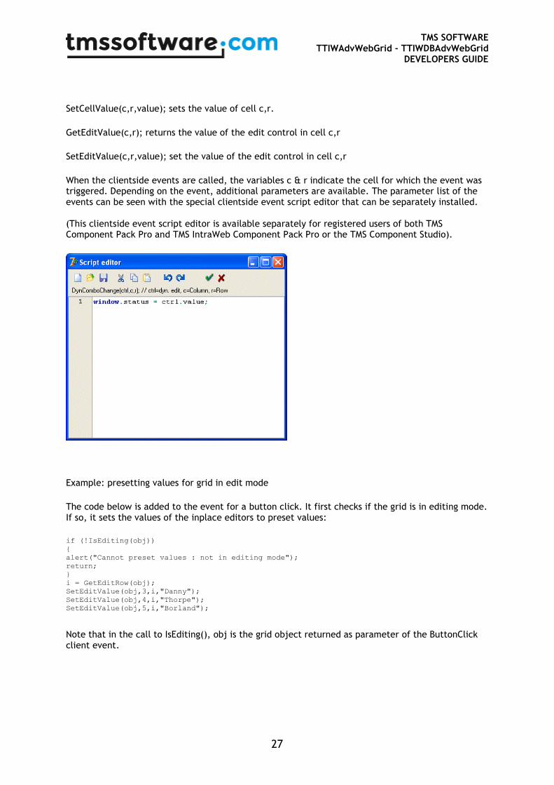
When the clientside events are called, the variables c & r indicate the cell for which the event was triggered. Depending on the event, additional parameters are available. The parameter list of the events can be seen with the special clientside event script editor that can be separately installed. (This clientside event script editor is available separately for registered users of both TMS Component Pack Pro and TMS IntraWeb Component Pack Pro or the TMS Component Studio).
Example: presetting values for grid in edit mode
The code below is added to the event for a button click. It first checks if the grid is in editing mode. If so, it sets the values of the inplace editors to preset values:
if (!IsEditing(obj))
{
alert("Cannot preset values : not in editing mode");
return;
}
i = GetEditRow(obj);
SetEditValue(obj,3,i,"Danny");
SetEditValue(obj,4,i,"Thorpe");
SetEditValue(obj,5,i,"Borland");
Note that in the call to IsEditing(), obj is the grid object returned as parameter of the ButtonClick client event.
TMS SOFTWARE TTIWAdvWebGrid - TTIWDBAdvWebGrid
DEVELOPERS GUIDE
28
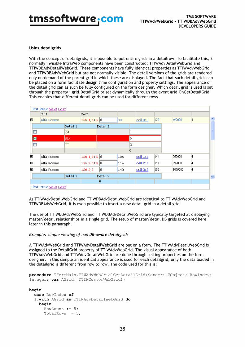
Using detailgrids
With the concept of detailgrids, it is possible to put entire grids in a detailrow. To facilitate this, 2 normally invisible IntraWeb components have been constructed: TTIWAdvDetailWebGrid and TTIWDBAdvDetailWebGrid. These components have fully identical properties as TTIWAdvWebGrid and TTIWDBAdvWebGrid but are not normally visible. The detail versions of the grids are rendered only on-demand of the parent grid in which these are displayed. The fact that such detail grids can be placed on a form facilitate design time configuration and property settings. The appearance of the detail grid can as such be fully configured on the form designer. Which detail grid is used is set through the property : grid.DetailGrid or set dynamically through the event grid.OnGetDetailGrid. This enables that different detail grids can be used for different rows.
As TTIWAdvDetailWebGrid and TTIWDBAdvDetailWebGrid are identical to TTIWAdvWebGrid and TTIWDBAdvWebGrid, it is even possible to insert a new detail grid in a detail grid.
The use of TTIWDBAdvWebGrid and TTIWDBAdvDetailWebGrid are typically targeted at displaying master/detail relationships in a single grid. The setup of master/detail DB grids is covered here later in this paragraph.
Example: simple viewing of non DB-aware detailgrids
A TTIWAdvWebGrid and TTIWAdvDetailWebGrid are put on a form. The TTIWAdvDetailWebGrid is assigned to the DetailGrid property of TTIWAdvWebGrid. The visual appearance of both TTIWAdvWebGrid and TTIWAdvDetailWebGrid are done through setting properties on the form designer. In this sample an identical appearance is used for each detailgrid, only the data loaded in the detailgrid is different from row to row. The code used for this is:
procedure TFormMain.TIWAdvWebGrid1GetDetailGrid(Sender: TObject; RowIndex:
Integer; var AGrid: TTIWCustomWebGrid);
begin
case RowIndex of
1:with AGrid as TTIWAdvDetailWebGrid do
begin
RowCount := 5;
TotalRows := 5;
TMS SOFTWARE TTIWAdvWebGrid - TTIWDBAdvWebGrid
DEVELOPERS GUIDE
29
Cells[1,0] := 'BMW';
Cells[1,1] := 'Audi';
Cells[1,2] := 'Porsche';
Cells[1,3] := 'Ferrari';
Cells[1,4] := 'Mercedes';
end;
2:with AGrid as TTIWAdvDetailWebGrid do
begin
RowCount := 3;
TotalRows := 3;
Cells[1,0] := 'Z3';
Cells[1,1] := 'SLK';
Cells[1,2] := 'TT';
end;
end;
end;
An alternative approach is to create multiple TTIWAdvDetailGrid instances and assign these dynamically in the OnGetDetailGrid event.
Example: using multiple detail grids
procedure TFormMain.TIWAdvWebGrid1GetDetailGrid(Sender: TObject; RowIndex:
Integer; var AGrid: TTIWCustomWebGrid);
begin
case RowIndex of
1: AGrid := TIWAdvDetailWebGrid1;
2: AGrid := TIWAdvDetailWebGrid2;
end;
end;
To enable editing in non DB-aware detailgrids, special care must be taken. When using the approach of the first example, one grid instance is used to control and render the detail grids in the master grid. If multiple detail grids are open at the same time and can thus be edited at the same time, only a single instance of the grid cells will be updated, hence overwriting cells can arise. The first approach for editable grids can be used as is with the DetailRowShow set to dsServerOneOpen. Only one detailrow is open at a time in this case and through the DetailStates[] it can be checked for which detail the editing happened. In the second approach, there is no such issue and the edited cells can simply be retrieved by checking the Cells[] property for the appropriate detailgrid.
TMS SOFTWARE TTIWAdvWebGrid - TTIWDBAdvWebGrid
DEVELOPERS GUIDE
30
Using master/detail in a single grid
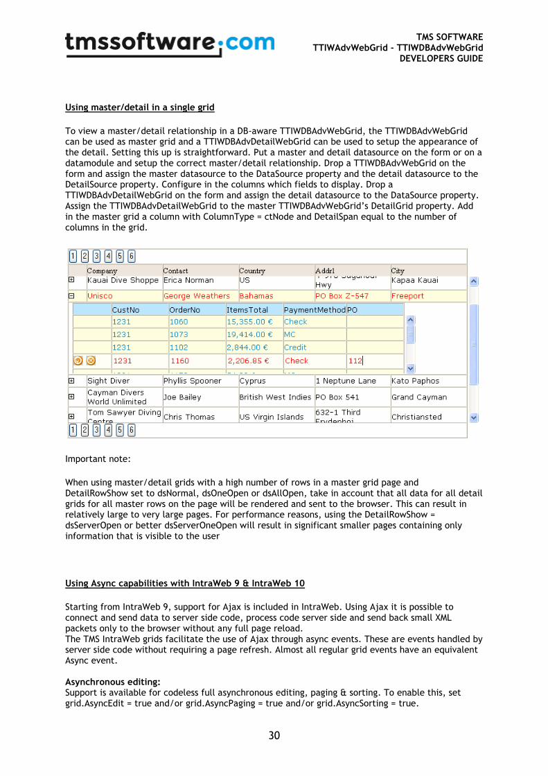
To view a master/detail relationship in a DB-aware TTIWDBAdvWebGrid, the TTIWDBAdvWebGrid can be used as master grid and a TTIWDBAdvDetailWebGrid can be used to setup the appearance of the detail. Setting this up is straightforward. Put a master and detail datasource on the form or on a datamodule and setup the correct master/detail relationship. Drop a TTIWDBAdvWebGrid on the form and assign the master datasource to the DataSource property and the detail datasource to the DetailSource property. Configure in the columns which fields to display. Drop a TTIWDBAdvDetailWebGrid on the form and assign the detail datasource to the DataSource property. Assign the TTIWDBAdvDetailWebGrid to the master TTIWDBAdvWebGrid’s DetailGrid property. Add in the master grid a column with ColumnType = ctNode and DetailSpan equal to the number of columns in the grid.
Important note:
When using master/detail grids with a high number of rows in a master grid page and DetailRowShow set to dsNormal, dsOneOpen or dsAllOpen, take in account that all data for all detail grids for all master rows on the page will be rendered and sent to the browser. This can result in relatively large to very large pages. For performance reasons, using the DetailRowShow = dsServerOpen or better dsServerOneOpen will result in significant smaller pages containing only information that is visible to the user
Using Async capabilities with IntraWeb 9 & IntraWeb 10
Starting from IntraWeb 9, support for Ajax is included in IntraWeb. Using Ajax it is possible to connect and send data to server side code, process code server side and send back small XML packets only to the browser without any full page reload. The TMS IntraWeb grids facilitate the use of Ajax through async events. These are events handled by server side code without requiring a page refresh. Almost all regular grid events have an equivalent Async event. Asynchronous editing: Support is available for codeless full asynchronous editing, paging & sorting. To enable this, set grid.AsyncEdit = true and/or grid.AsyncPaging = true and/or grid.AsyncSorting = true.

TMS SOFTWARE TTIWAdvWebGrid - TTIWDBAdvWebGrid
DEVELOPERS GUIDE
31
If you set grid.AsyncEdit = true and set one of the grid column types to ctDataButton, the editing starts asynchronously upon pressing the Edit button for the selected record. After editing, pressing the Post button asynchronously posts the edited data to the server and without causing a page refresh, stops the client-side editing for the selected record. No further code is required. The event OnAsyncPost is triggered from where additional server side cell updates can be done asynchronously by calling grid.AsyncSetCell(col,row:integer; value: string); Note that you can also put the grid in editing mode or cause posting of data from the grid from other externals controls OnAsync events by calling grid.AsyncEdit, grid.AsyncDoPost, grid.AsyncDoCancel.
When paging is enabled (via the grid.Controllor), paging is automatically handled asynchronously when setting grid.AsyncPaging = true. No further code or effort is required. When sorting is enabled (via the grid.SortSettings), sorting is automatically handled asynchronously when setting grid.AsyncSorting = true. No further code or effort is required.
Asynchronous row selection When a ctCheckBox column type checkbox is added in the grid or when grid.MouseSelect is set to msRowCheck, rows are selected checking the checkboxes or clicking a row. An asynchronous event OnAsyncRowSelect is triggered for each row where selection state toggles. Row selection can also be asynchronously set from external component’s OnAsync events by calling grid.AsyncRowSelect(rowindex: integer; checked:Boolean). All row selections can be cleared by calling grid.AsyncClearRowSelect;
Asynchronous active row move
When the active row changes, for a DB-aware grid, the DB current record is moved to the active row of the grid. This can now be done fully asynchronous is grid.MouseSelect = msMove and grid.AsyncActiveRowMove = true, the grid will asynchronously change the DB current record to the row clicked.
Asynchronous full grid updates
When a dataset changes or multiple grid cells changes from an asynchronous event from an external control, it is often desirable to cause an asynchronous update of a full grid. This can be done by calling grid.AsyncUpdateAllCells