Towards a means of consistently comparing airline business ...
32
Morrison and Mason 1 Towards a means of consistently comparing airline business models with an application to the ‘low cost’ airline sector Keith J. Mason* William G. Morrison** *Senior Lecturer, Dept of Air Transport, Cranfield University, UK. Corresponding author [email protected] Tel: +44 1234 754 233 Fax: +44 1234 720 532 ** Associate Professor, School of Business and Economics, Wilfrid Laurier University, Waterloo, Canada. [email protected] April 2008 ABSTRACT Meaningful definitions of and distinctions between airline business models are not easily formulated, particularly when one considers the extremely dynamic nature of the industry. The paper outlines a product and organizational architecture (POA) approach to classifying and relating key elements of airline business models. Using indices to create benchmark metrics, the POA model is then used to examine and compare six European airlines. The analysis shows that there are important differences in the business models of airlines who are all commonly referred to as ‘low cost carriers’. The paper demonstrates how differences in the business models adopted by the different airlines contribute to their relative profitability. Keywords: Low cost carrier; product and organizational architecture; airline business models.
Transcript of Towards a means of consistently comparing airline business ...

Morrison and Mason 1
Towards a means of consistently comparing airline business
models with an application to the ‘low cost’ airline sector
Keith J. Mason*
William G. Morrison**
*Senior Lecturer, Dept of Air Transport, Cranfield University, UK.Corresponding author
[email protected]: +44 1234 754 233Fax: +44 1234 720 532
** Associate Professor, School of Business and Economics,Wilfrid Laurier University, Waterloo, Canada. [email protected]
April 2008
ABSTRACT
Meaningful definitions of and distinctions between airline business models are not
easily formulated, particularly when one considers the extremely dynamic nature of
the industry. The paper outlines a product and organizational architecture (POA)
approach to classifying and relating key elements of airline business models. Using
indices to create benchmark metrics, the POA model is then used to examine and
compare six European airlines. The analysis shows that there are important
differences in the business models of airlines who are all commonly referred to as
‘low cost carriers’. The paper demonstrates how differences in the business models
adopted by the different airlines contribute to their relative profitability.
Keywords: Low cost carrier; product and organizational architecture; airline
business models.
LI2106
Text Box
Research in Transportation Economics, Volume 24, Issue 1, The Economics of Low Cost Airlines, 2008, Pages 75-84

1. Introduction
Much has been written about the low cost airline business model and what
elements in the business model distinguish it from traditional full service airlines.
Williams and Mason (2004) reviewed the group of strategies that together enable
low cost carriers to exercise cost advantages over full service airlines (p.8) (see
also Francis, et.al, 2003). The review highlighted significant differences between
low cost carriers in their business models. For some carriers it is not clear if they
should be called “low cost carrier”, “regional carrier”, or some other term. When
comparing airline performance it is useful to compare one airline with others of a
similar business approach and contrast it with other airline pursuing alternative
models. However, the fundamental problem is that is a lack of a consistent and
standardised approach to analysing airline business models. This paper seeks to go
someway towards rectifying this methodological gap.
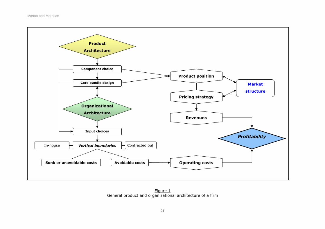
2. Product and organizational architecture
Synthesizing complex airline business models requires the identification of key
components of the product architecture – the service quality elements that define
the product relative to consumer preferences, and organizational architecture – the
vertical structure, production and distribution choices of the airline. A conceptual
framework can be developed to consider both the product and organisational
architecture of firms. Such a product and organizational architecture (POA)
approach can be applied directly to airline business models. Figure 1 illustrates the
general POA approach to defining a firm’s business model and its competitive
environment. On the one hand, product architecture gives rise to a core product
bundle that positions the firm in terms of consumer preferences (benefit drivers)
and the competitive environment (as defined by the market structure). On the
other hand, the product design also implies a choice set for inputs and possible
organizational structures (cost drivers) which define the firm’s cost position. Taken

together, both product and organizational architecture contribute to the creation
and sustainability of profits.
2.1 Applying the POA model to airlines
Figure 2 shows an application of the POA approach to airline business models. By
so doing we aim to develop a means by which airlines can be consistently
compared. Product architecture is separated into three elements of service quality:
connectivity, convenience and comfort. These three elements have the
property that they follow a general ordering with respect to the degree with which
costs are fixed or ‘avoidable’. In particular, connectivity implies a choice of
network design that distinguishes hub-and-spoke (airline-supplied connectivity)
from point-to-point (passenger-supplied) networks. This is perhaps the most
important core element that can distinguish between different airline business
models.
Some of the elements of convenience are linked to network structure decisions,
but nevertheless imply a lesser degree of fixed investment for some airlines. In
particular, use of primary airports and ‘checked-through’ baggage services tend to
follow from the
choice of a hub-and-spoke network, however an airline operating a point-point
network may also choose to offer convenience through use of a primary airport.
Elements of comfort in determining the quality of service are to some degree more
variable than the other two categories, yet these elements will vary in importance
for the overall architecture of the product. In some markets elements of comfort
might be regarded as ‘frills’ while in other markets the same elements could be
regarded as more essential; the offering of in-flight meals on short haul versus
long-haul flights for example. The 3Cs thus define the product in relation to

consumer preferences, which impacts market demand within the competitive
environment. However the 3Cs also impact the magnitude and avoidability of
production costs which in turn affects pricing flexibility and the airline’s competitive
position.
2.1.1 Organizational architecture
Within the organizational architecture the size and composition of the fleet along
with the organizational design are elements that follow on primarily from the
product architecture. In particular, the decision over network structure is key
because the complexity of operating a hub-and-spoke network requires certain
functions relating to coordination, yield management, etc. which implies a more
vertically integrated organization. In contrast, an airline operating a point-to-point
network has relatively more opportunities to form a ‘nexus of contracts’
organizational structure in which many functions are contracted out.
In terms of distribution, all airlines now take advantage of internet based booking
systems, yet even here point-to-point network carriers can offer more simplicity in
the process with implications for both cost and benefit drivers
FIGURE 1 ABOUT HERE
FIGURE 2 ABOUT HERE
2.1.2 Using indices to form benchmark metrics in the POA model
In an attempt to functionalise the conceptual POA model, a dataset of benchmark
metrics has been developed. By developing separate indices for different elements
in the business model the interaction between the items and the importance of

each item to the overall performance of each airline can be more easily identified
and their impact on the overall performance assessed.
The indices were developed for each of the following areas:
Profitability Cost drivers Revenue achievement Connectivity Convenience Comfort Distribution/Sales Aircraft productivity Labour productivity Airports Attractiveness Market Structure
The profitability index was constructed using just the operating ratio of the
carriers in the benchmark group.
While profitability identifies the overall success of the business, an airline’s unit cost
(operating cost per ASK) summaries that various organizational architecture
decisions made. It summarises the key cost values for the airline. The cost driver
index is therefore a summary of the carriers’ strategies with respect of IT,
distribution and sales, aircraft, labour, and the airports served. Each of these
items (with the exception of IT1) are treated with a separate index as detailed
below.
The Revenue Index is a measure of the revenue side of the carriers’ businesses
and incorporates a number of revenue benchmarks. The prime measure is yield
per RPK. Also included is operating revenue per sector (GBP). This will highlight
differences between the large aircraft/high density aircraft and the smaller
aircraft/higher yield operators. The final benchmark item included here is a simple
1 The IT infrastructure within an airline can have significant influence over that business’ costs.Unfortuanately, IT costs are not routinely reported in airline annual reports and therefore a separate ITindex has not been possible to construct.

measure of average fare paid per passenger (this incorporates ancillary revenues
where these are reported separately).
While some airlines have quite a dense network from their main base, the coverage
of their network elsewhere may be quite limited and therefore the number of
departure per airport per day indicates the coverage of the network. The
connectivity index, therefore, seeks to calculate an index of network density. It is
calculated from four benchmark statistics: the number of departures per airport per
day; the average frequencies per route per week; the number of routes offered and
the total number of destinations available at the airport. For some airlines in a
growth phase a strategy of serving a large number of small markets is pursued
(e.g. Ryanair), while some other low cost carriers seek to usurp the short haul
networks of traditional full service carriers (e.g. EasyJet).
Some airlines position themselves as providing a more convenient service by
having a higher frequency of service, using airports either better located or with
better surface transport links than those offered to alternative airports. They also
promote a punctual service, and offer improved baggage services. For the
Convenience Index the following benchmarks were included; the average weekly
frequency per route2, the weighted average distance of the airport served to the
city centre; the proportion of flights offered from primary airports, the proportion of
flights departed on within 15 minutes, and the Skytrax3 baggage score.
To measure on-board comfort the seat pitch and seat width was included in the
Comfort Index. The average number of passengers per flight was also included
with fewer passengers per flight assumed to be more comfortable than more4. The
2 While this benchmark statistic is also included in the connectivity index it is also a clear measure ofconvenience.3 Skytrax ratings for baggage handling for General handling, on-board baggage policy, excess baggagepolicy were aggregated and used for this rating.4 Although it is recognised that, depending on the type of aircraft equipment, smaller aircraft are notnecessarily more comfortable for passengers than larger aircraft.

final variable included in index is the number of passengers per flight-and-cabin-
crew member.
Changes to the distribution strategy of many carriers have been remarkable since
low cost airlines began using the internet as their principal distribution channel in a
bid to reduce their costs in this area. Two variables are included in the
Distribution/Sales Index; the percentage of sales made via the airline’s online
reservation system; and the airline’s cost per passenger of ticketing, sales and
promotion (TSP).
The Aircraft Productivity Index looks at both the daily utilisation of an airline’s
fleet and also the number of sectors each aircraft operates a day. While average
sector length will affect each airline’s ability to improve utilisation it is not included
in this index as it can be used later to assess sector length impacts on the various
performance indices. The uniformity of the fleet has often been highlighted as one
of the key cost saving items for low cost airlines. A third variable in this index is
then the percentage that the most populous aircraft type/mark accounts for in the
fleet – this importance of fleet uniformity may therefore be assessed.
The Labour Productivity Index has four items contributing the aggregate index
value. The index summarises the airline’s employees productivity in relation to the
number of passengers uplifted, and ASKs, the cost of personnel (per ASK). One
area where carriers have recently been able to reduce costs is in the reduction of
non-flying employees (e.g. in 2003 and 2004 British Airways reduced employee
numbers significantly with the vast majority of loses coming from staff employed in
non-flying roles). Therefore a higher proportion of flying employees is likely to
increase employee productivity and this ratio is also included in this index. To
recognize and try to reflect the effect of outsourcing that might otherwise inflate

the employees productivity ratings, the passengers per employee ratio has been
deflated by the percentage of total costs are accounted for by employee costs. This
proportion may be considered a proxy measure for amount of outsourcing that a
company does. If the proportion of employee costs over total costs is small then it
is more likely that the airline outsourced operational activities, whereas an airline
with a higher proportion of employee costs over total costs are likely to have
undertaken more operational activities in-house. The authors recognize the
potential flaws using this ratio to adjust the benchmark labour productivity variable
(i.e. one airline pays considerably lower wages), however outsourcing is a
significant part of the low cost model and the degree to which an airline outsources
is very difficult to measure from published sources. Therefore this proxy for
outsourcing is used to deflate labour productivity measures.
One of the key sources of lower costs that some low cost carriers have been able to
achieve has been in airport charges. The Airport Attractiveness Index attempts
to rate the airlines’ success at managing this cost item. Four benchmark variables
are included. Firstly the airport/en-route cost per passenger is calculated.
Secondly, smaller airports are likely to offer lower landing fees and thus a variable
is included for the weighted average annual passengers at the airport. Where an
LCC operates to an airport with higher number of full service carriers present the
opportunity to negotiate lower fares is reduced, and thus the third variable included
is the weighted average number of full service carriers at the airports served.
Finally the percent of city pair routes that are monopolies provides a measure of
how important the airline is to the airport and thus a measure of negotiating power.
The final index provides a measure of the market structures that each airline
operates within. The median and average HHI scores are calculated across each
airline’s network. This Market Structure Index also incorporates the average

number of competitors per route each airline faces, the average city size served
and the average share of capacity (by seats) per route.
2.1.3 Index calculation methodology
To demonstrate the use of the POA model to consistently compare airline business
models it was applied to the European LCC sector using six sample airlines. The
airlines considered were; EasyJet, Ryanair, Norwegian, Flybe, SkyEurope and Air
Berlin for both fiscal years 2005 and 2006. Where possible the items in the
conceptual model were included in the analysis. As the benchmarks are calculated
using published data sources (generally the annual reports of the various airlines in
question and Air Transport Intelligence5), not every item in the conceptual model
could be mapped directly by the benchmarks. However, every attempt has been
made to construct a benchmark dataset that as closely reflects the items in the
conceptual model.
The airlines in the sample represent a range of business models and inclusion of a
two year’s of data for each airline means that changes in business model or
performance can be identified. In an earlier draft of this work (presented at ATRS
2006) the authors presented an integrated index that aimed to describe the airline
in a spectrum of low cost airline business models. However subsequent work has
shown that the interaction between the various elements described above in the
business model tend to be lost in the benchmarking process by aggregating items
together. Consequently, here a number of separate indices have been developed.
The methodology adopted to calculate the eleven index scores per airline is based
on “best in class” performance by the sample airlines for each item benchmarked.
For most benchmarks the highest score represents the “best in class” – e.g. ASKs
per employee – if each employee produces a large number of ASKs the
5 www.rati.com

performance of the airline’s employee productivity is likely to be high. In some
cases the “best in class” is the lowest score – e.g the airline that achieves the
lowest unit costs per ASK in the benchmark pool is clearly the “best in class”. In
some cases the directional preference of the benchmark is not obvious and a value
judgment is required. For example, when considering network density it is not
clear whether the best airline is the one that has the highest or lowest network
density. In this case the “best in class” is considered to be the airline with the
highest benchmark statistic and the aggregate index is used to see further examine
the impact of the network decisions on the performance of the airline.
The benchmark values for the sample airlines in 2006 are detailed in the table
below. The variables included in each index are shown.
TABLE 1 ABOUT HERE
Of the airlines in the benchmark panel Ryanair and easyJet were both profitable in
both selected years. Newly established Sky Europe is some way off profitability.
Recently established Norwegian and FlyBe (which changed its operation from
regional services to low cost carrier services in 2002), are profitable in one of the
two years. Air Berlin that is the third largest carrier of the group behind Ryanair
and EasyJet has moved into a profitable position in 2006 after beginning to refocus
its operations in the low cost sector over the past couple of years. Ex-regional
carrier, FlyBe is the only one of the carriers that operates a number of different
aircraft and does not have either B737 or A320 type aircraft in its fleet.
Calculation of Maximum “Best in Class” Index
The following calculation procedures were applied to calculate each Index. For
items that for which the highest score was considered “Best in Class” the following
the highest score was identified. For each airline (and for each year) a ratio was
calculated for dividing the airline’s performance by the “best in class” value.

Benchmark Ratio = Airline’s performance/Best in class performance
Here the top mark available will be 1.0 and this will be achieved by the “best in
class” performer. The other airlines in the sample will be allocated a mark that
represents their performance as a percentage of the best in class. For example,
the following calculation was performed to establish EasyJet’s 2006 performance
ratio in the Profitability/Operating benchamark area.
Best in class = 132.4% Op profit (achieved in this case by Ryanair in 2005) EasyJet, 2005 = 108.7% Op profit
ThereforeEasyJet 2006 Op Profit Benchmark Ratio = 105.1/132.4 = 0.79
In other words easyJet’s operating profit performance is 79% that of Ryanair’s.
Calculation of Minimum “Best in Class” Index
For calculating a benchmark ratio for items where a minimum value was considered
the “best of class” the ratio was constructed to place the performance of the
individual airline on a continuum from “best in class” to “worst in class”
Benchmark Ratio = (Worst in Class – Airline Performance)/(Worst in Class – Best inClass)
For example, again looking at easyJet’s performance in 2005, this time considering
unit cost
Best in Class = 2.30 pence per ASK (achieved by Ryanair in 2006) Worst in Class = 8.48 pence per ASK (Flybe, 2005) EasyJet, 2005 = 3.97 pence per ASK
EasyJet Unit Cost Benchmark Ratio = (8.48 – 3.97)/(8.48 – 2.30) = 0.73
Here the worst performer in the benchmark group will achieve a zero benchmark
ratio. The advantage of this approach is that it draws all airlines within the
benchmark sample group across a range from zero (the worst) to one (the best).

Due to the requirement to include a “worst in class” value in the calculation to
establish the range of values the ratio indicates where in that spectrum of
performance each airline is. In this case easyJet’s performance is 73% along the
spectrum for worst to best.
2.1.4 Application of Weighting
In the calculation of each index it was felt appropriate that some items in each
index made a greater contribution to the final index and therefore a weighting
process was applied. The weights were based on a correlation of the benchmark
item against profitability. The range of weight values can be from zero to one with
one carrying the greatest weight. For each index a calculation is made to apply the
weight to each benchmark ratio item and then a total is summed.
Weighted score = ((scorea * weighti)+(scoreb * weightii)+…+(scorez * weightn))/weights i- n
TABLE 2 ABOUT HERE
2.1.5 Calculation of Final Index
This final indexing places all airlines in relationship with the best performer in the
area of analysis (such as Cost, Profitability, or Revenue, etc.). The score is
calculated by establishing a ratio of the weighted score for each airline over the
highest/best weighted score.
Final Index = Weighted Score/Best Weighted Score*10
The results of the index calculations for the sampled airlines in the table below.
TABLE 3 ABOUT HERE
2.2 Analysis of Indices

By calculating separate indices for different areas of the business model, it is
possible to develop a correlation matrix (Table 4).
TABLE 4 ABOUT HERE
The matrix reveals some interesting relationships. While cost is, as expected for
low cost carriers, correlated with profitability (with a correlation coefficient of 0.27),
the poor profitability of SkyEurope (which ironically has very low costs) has drawn
down the correlation from 0.54 if they had been excluded from the benchmark
group. The labour index is highly correlated with profitability (0.86). As for most
airlines, labour is the single largest controllable cost it is not surprising that those
airlines that are best at getting high productivity from their labour will be more
likely to be profitable. Indeed there is a very high correlation between the cost
and labour indicies indicating that low cost airlines that achieve high labour
productivity are a long way toward ensuring low costs. Aircraft productivity is also
highly correlated to profitability indicating that a successful low cost carrier will
work its aircraft assets very hard. Two indicies that are reasonably well correlated
to profitability is connectivity and airports (with correlation coefficients of 0.47 and
0.59 respectively). The airlines in the benchmark group that have the best
profitability tend also to have larger networks, offer more routes or have higher
density networks. The airline with the best profitability (Ryanair) also has a large
proportion of monopoly routes in small, secondary networks and face limited
competition from full service carriers.
Two key indicies that are inversely correlated to profitability for this panel of
benchmark low cost carriers are convenience and comfort, whilst being correlated
with the revenue index. This would suggest that in the low cost sector providing
additional levels of comfort to customers and chasing higher yielding passengers

does not attain the best financial rewards. The high inverse correlation between
the revenue and cost indicies seem to suggest that the pursuit of higher yields and
lower cost are mutually exclusive. In this airline sector carriers need to focus on
costs and productivity rather than moving into a middle ground where higher levels
of comfort and higher yields are provided and sought.
2.3 Key findings on the low cost carrier sector revealedby application of the POA model
The original concept for this research was to highlight the point that airlines that
called themselves “low cost” did not necessarily have the lowest costs, and that
within the sector a number of different business models were being practiced. The
concept was extended to highlight differences in business models. In an earlier
working paper (Morrison and Mason, 2007) we concluded that more than one LCC
model might be possible but more work was required on the indexes and the
benchmark data that supports them. From here the POA concept was formulated to
test this hypothesis. The two figures that follow lay out the index profiles of the six
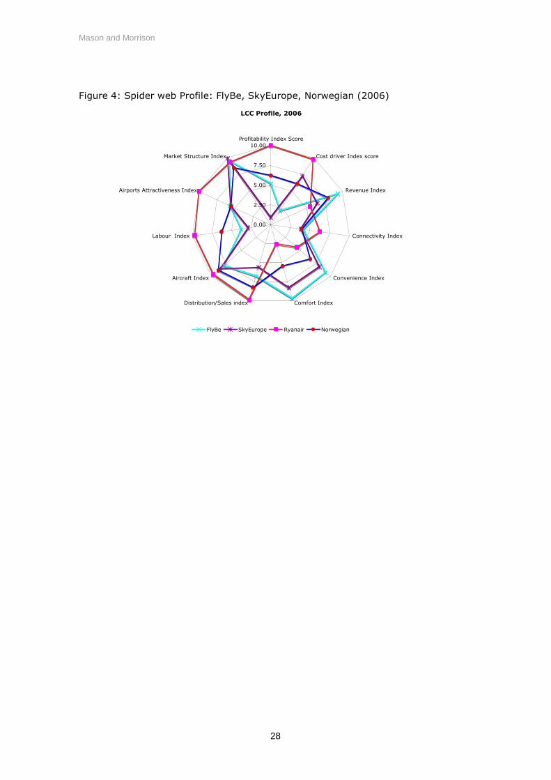
benchmark airlines in 2006. The further a carrier is toward the outermost point on
a spoke the closer they are to being the best in class for that particular index. A
score of 10 for a particular index means the airline is the best in class. We can see
that Ryanair has a profile that is best in six of the eleven indexes (and as such it is
also included in the second chart for reference). They are best in class for
profitability, cost, distribution, labour, airport attractiveness, and market structure.
They are second best for aircraft productivity. It would seem therefore that, in this
benchmarking exercise, Ryanair is best in delivering an organizational architecture
that attains the best profitability. Part of that success leads to, and derives from, a
market structure where they dominate the small markets that they serve. It is in
the product architecture area where Ryanair is not the best in class. In fact, it is
worst in class for Revenue, Comfort and Convenience. It would seem that the

carriers that pursue revenues backed by additional comfort and convenience are
those that have failed to achieve good profitability suggesting that such a model
that is less successful in the low cost sector.
FIGURE 3 ABOUT HERE
FIGURE 4 ABOUT HERE
Connectivity remains the index that does not have a clear outcome. Ryanair scores
more highly than Flybe, Norwegian and SkyEurope on account of its significantly
higher number of routes. EasyJet has the best connectivity index scores due to its
higher network density, higher frequencies, and tendency to serve larger airports
that have more available destinations. However, easyJet’s network density has
fallen consistently since 2003 when it had 12 departures per airport per day and an
average weekly flight frequency of 32.6 per route. In 2006 the airline had reduced
its number of departures per airport per day to 9.4 and reduced its weekly average
frequency per route to 18.6 – still the highest in the benchmark panel but a
significant change in strategy. As new European countries entered the EU, both
Ryanair and EasyJet have been looking to extend their network and increase the
number of routes offered. Ryanair, with its already low density strategy, has done
so without further thinning its network density, however, easyJet’s new strategy of
network expansion has been at the cost of its route density and flight frequency.
During this period of new opportunities, first mover advantage would seem to have
been important. However, it is still not clear at this time whether network
connectivity is vital to the success of a LCC and it will be a couple of more year’s
before this becomes clear.
FIGURE 5 ABOUT HERE
Figure 6 provides a clear illustration of the cost implications of product design by
relating the cost and comfort indexes of the airlines. The figure shows that Ryanair
display low levels of comfort but enjoying the best cost index in the benchmark
panel. In contrast Sky Europe with high crew to passenger ratios and lower
average passengers per flight and FlyBe with the advantage of smaller aircraft have
the best comfort index values but low cost index scores.
FIGURE 6 ABOUT HERE
Regarding sector length, most of the carriers in the benchmark panel have average
stage lengths of between 800 and 1,100 km. With the inclusion of newly purchased
dba (formerly BA owned Deutsche BA) in its figures, Air Berlin has significantly
changed it operating pattern in 2006 and joins all other benchmark airlines with the
exception of FlyBe in the central range of average sector lengths. As a previously
regional carrier offering very short sectors FlyBe offer a different model to those
offered by the rest of the benchmark group. It’s marginal profitability suggests
that it model is not particularly successful however its performance is no worse
than Norwegian or Air Berlin that follow the normal low cost model more closely.
FIGURE 7 ABOUT HERE
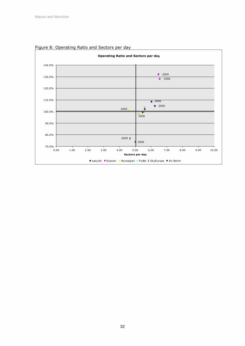
While there most carriers in the benchmark group have similar average stage
lengths, one important part of the low cost model is the effective use of aircraft
assets. The two leading carriers, Ryanair and EasyJet both get more flights per day
out of their aircraft assets than the other carriers in the panel. Additional flights
per day mean more opportunities to share the cost of aircraft ownership and
overhead cost over a larger number of passengers. Given the significantly shorter
sector lengths it flies, Flybe may be able to increase the number of sectors it
operates per day and thereby, possibly, contribute to making its model a success.

FIGURE 8 ABOUT HERE
2.4 Conclusion
Meaningful definitions of and distinctions between airline business models are not
easily formulated, particularly when one considers the extremely dynamic nature of
the industry. In order to provide a more coherent and consistent understanding of
airline competition and strategy, we have applied a product and organizational
architecture (POA) approach to classifying and relating key elements of airline
business models.
The application of the POA model to six European airlines has shown that there are
important differences in the business models of airlines who are all commonly
referred to as ‘low cost carriers’. Our paper demonstrates how differences in the
business models adopted by the different airlines contribute to their profitability.
More specifically, amongst the sample airlines examined, our analysis suggests that
the positioning of some airlines to offer increased comfort and convenience in a bid
to achieve higher yields is marginally successful but is not as profitable as the pure
low cost approach practised by Ryanair.
There may well be a first mover advantage enjoyed by Ryanair and EasyJet.
Certainly size and market power are shown to contribute to the POA strategy of
both airlines. Yet, we can see that even between these two airlines, Ryanair stands
alone as the lowest-cost carrier, providing some indication that strategically, when
one airline establishes a lowest cost position in its product and organizational
architecture, competitors are forced to choose a different POA strategy. Casual
support for this is provided by recent marketing efforts by Easyjet, aimed at driving
up the proportion of traffic that is business related. The direct objective of
targeting this market is to drive up yield, but there is also strategic value adjusting
their POA strategy thereby avoiding head-to-head direct competition with their
lowest-cost competitor.
The analysis presented here can be extended in two ways. First by continuing to
collect data covering a larger number of years, we can investigate how the POA of
airlines in the sample have evolved over time. Secondly, the POA model can
usefully be applied to analyse other airline models (subject to availability of data) –
full service carriers, premium only cabin carriers, long haul low cost carriers – and
between carriers in similar sectors in different regions – low cost airlines in North
America, Europe and Asia.

Mason and Morrison
19
Acknowledgements
We wish to acknowledge intellectual and financial support from the Centre for
Transportation Studies at the University of British Columbia, Canada and
particularly that of Prof David Gillen. Also, we thank GARS workshop participants in
Hamburg, Germany and ATRS conference participants in Nagoya, Japan for useful
comments on earlier drafts of this work.
References
Francis G., Alessandro F., and Humphreys I., 2003. Airport–airline interaction: theimpact of low-cost carriers on two European airports, Journal of Air TransportManagement, 9(4) , pp 267-273.
Morrison W. and Mason K., 2007. Defining and comparing competitive businessmodels in the context of product and organizational architecture, Working paper.
Williams, G. and Mason, K., 2004, Market analysis of Europe’s low cost airlines: Anexamination of trends in the economics and operating characteristics of Euope’sCharter and no-frills scheduled airlines. Air Transport Group Research Report 9. AirTransport Group, Cranfield University.
Bibliography
Dresner, M. and Windle, R., 1996. The Impact of Low-cost carriers on Airport andRoute Competition, Journal of Transport Economics & Policy, 30(3), pp 309-328.
Fernandez, M., and Kropac, M., 2004. Low-cost carrier: Hintergrunde undproblematik des billigflugtrends im europaischen luftverkehr. Aussenwirtschaft,59(4), 407-434.
Forsyth, P., 2003. Low-cost carriers in Australia: experiences and impacts, Journalof Air Transport Management, 9(5).
Gillen, G. and Lall, A., 2004. Competitive advantage of low-cost carriers: someimplications for airports, Journal of Air Transport Management, 10(1).
Gillen D. and Morrison W., 2003. Bundling, Integration and the Delivered Price ofAir Travel: Are Low-cost Carriers Full-service Competitors?, Journal of Air TransportManagement, 9(1).
Mason, K.J., 2000. The Propensity for Business Travellers to use Short Haul, LowCost Airlines, Journal of Transport Geography, Vol.8, No.2, pp. 107-119.
Willams G., 2001. Will Europe's charter carriers be replaced by "no frills" scheduledairlines?, Journal of Air Transport Management, 7(5), pp 277-286.

Mason and Morrison
20
Windle, R., & Dresner, M., 1999. Competitive responses to low-cost carrier entry,Transportation Research: Part E: Logistics and Transportation Review, 35(1), pp 59-75.
Mason and Morrison
21
Figure 1General product and organizational architecture of a firm
Component choice
Product
Architecture
Organizational
Architecture
Operating costs
Product position
Pricing strategy
In-house Contracted out
Core bundle design
Input choices
Profitability
Market
structure
Revenues
Vertical boundaries
Sunk or unavoidable costs Avoidable costs

Mason and Morrison
22
Figure 2Schemata of Product and Organizational Architecture of Airlines
COMPONENT CHOICE
INPUT CHOICES
Connectivity Convenience Comfort
ProductArchitecture
Hub-and-spokenetwork
Point-to-pointnetwork Punctuality
Airport location
On-board service
Flight Seating comfort
Baggage service Airport services
Fleet size
Fleet mixInternet booking
Travel agency
Core bundle design
OrganizationalArchitecture
Dist. / Sales AircraftIT Labour
Admin staff
Airport staff
Cabin crew
Pilots
Operating costs
Product position
Pricing
Marketstructure
Operatingprofits
Yield management
Maintenance
Airports
Airport location
Airport marketpower
Operating Revenues
On-board services
Market size
Market concentration
Number of connections
Vertical boundaries
Sunk or unavoidable costs Avoidable costs

Mason and Morrison
23
Table 1: Benchmark data for selected ‘low cost’ airlineseasyJet Ryanair Norwegian FlyBe SkyEurope Air Berlin
2006 2006 2006 2006 2006 2006Profitability/Op ratio 108.7% 128.5% 99.0% 99.9% 74.1% 102.2%Unit cost (per ASK) GBP pence 4.02 2.30 4.68 7.17 3.95 3.35
Revenue IndexYield per RPK (GBP pence) 5.12 3.81 5.90 10.91 3.87 4.39Operating revenue per sector (GBP) 6,388 5,081 6,861 3,454 4,242 6,293Average fare paid (GBP) (incl ancillary rev) 49.08 33.22 48.77 60.73 42.31 54.50
Connnectivity IndexNetwork density - Departures per airport p.d. 9.39 5.61 1.91 5.04 1.63 4.82Routes offered 176 284 56 95 53 273All destinations available at airports served 31.9 19.5 28.3 14.9 28.4 47.8
Convenience IndexAverage frequency per route 18.61 10.66 8.21 10.98 6.22 12.65Airport location - ave dist nearest pop'n centre (km) 23.7 25.2 30.3 9.6 13.5 12.8Flights at primary airports 36% 27% 42% 33% 41% 57%Punctuality 66% 70% 71% 77% 69% 63%Baggage Service (Skytrax rating) 1.67 1 2.67 2.33 1.67 2.67
Comfort IndexPassengers per flight 130.2 153.0 140.7 56.9 100.3 115.5Passengers per flight and cabin crew members 8980 14542 9668 7036 6775 9172Economy Seat width 17.5 17.2 17.2 17 17.5 17.2Economy seat pitch 29 30 30 31 29 0
Distribiution/Sales IndexTicketing, Sales, Promotion per pax (GBP) 1.70 0.27 1.54 3.78 2.75 2.09Internet distribution (%) 98% 98% 84% 85% 56% 45%
Aircraft IndexAircraft Utlilisation (aircraft hours per day) 11.6 9.6 10.4 5 9.29 11.5Most populous aircraft type/mark accounts for fleet 71.3% 100.0% 100.0% 74.4% 100.0% 63.6%Aircraft sectors per day 6.03 6.56 5.23 5.53 5.00 5.59
Labour IndexPax per employee 7,571 11,270 6,349 2,858 2,957 5,972Employees per aircraft 39.8 33.5 42.3 40.2 61.9 46.7Personnel cost per ASK 0.49 0.30 0.65 0.99 0.38 0.35Flight and cabin crew/total employees 84.3% 77.5% 65.7% 40.6% 43.6% 65.1%ASK per employee ('000) 8,508 12,667 6,680 2,423 4,276 9,518
Airport IndexPercent of city pair routes are monopolies 39.8% 64.4% 51.8% 72.6% 69.8% 42.8%Weighted ave Annual pax at airports served (m) 5.25 2.67 4.63 1.95 4.11 7.12No of network airlines at destination 4.6 1.6 5.5 2.1 5.0 7.3airport/enroute costs per pax (£) 11.50 7.47 12.46 24.08 15.60 18.51
Market Structure IndexMedian HHI on Capacity (seat) 6195 10000 10000 10000 10000 5600Average HHI on Capacity (seat) 6736 8038 7631 8679 8216 6758Average no of competitors per route 2.31 1.67 1.77 1.38 1.66 2.14Capacity share of seats 64.0% 80.5% 70.9% 84.7% 78.8% 64.2%Average city size served 677522 451020 307038 192007 438881 665902

Mason and Morrison
24
Table 2: Weighting of benchmark metrics to operating profitIndex items Correlations/weightsCost drivers weightingUnit cost (per ASK) GBP pence -0.35Revenue WeightingYield per RPK (GBP pence) -0.12Operating revenue per sector (GBP) 0.14Average fare paid (GBP) (incl ancillary rev) -0.45Connectivity WeightingNetwork density - Departures per airport p.d. 0.32Routes offered 0.64Average Flight Frequency -0.01All destinations available at airports served -0.57Convenience WeightingAverage frequency per route -0.01Airport location - ave distance from nearestpopulation centre (km)
0.50
Flights at primary airports -0.47Punctuality 0.24Baggage Service (Skytrax rating) -0.40Comfort WeightingPassengers per flight 0.56Passengers per flight and cabin crew members 0.87Economy Seat width 0.17Economy seat pitch 0.24Distribution/Sales weightingTicketing, Sales, Promotion per pax (GBP) -0.34Internet distribution (%) 0.58Aircraft productivity weightingAircraft Utlilisation (aircraft hours per day) 0.13Most populous aircraft type/mark accounts forfleet
-0.27
Aircraft sectors per day 0.82Labour productivity weightingPax per employee 0.84Pax per employee adjusted by % emp cost/totcost
0.88
Employees per aircraft -0.74Personnel cost per ASK -0.26Flight and cabin crew/total employees 0.46ASK per employee ('000) 0.60Airports WeightingPercent of city pair routes are monopolies -0.21Weighted ave Annual pax at airports served (m) -0.20No of full service airlines at destination -0.51airport/enroute costs per pax (£) -0.60Market Structure weightingMedian HHI on Capacity (seat) -0.05Average HHI on Capacity (seat) -0.18Average no of competitors per route 0.12Capacity share of seats -0.02Average city size served 0.17

Mason and Morrison
25
Table 3: POA Index scores for benchmark airlines (2005, 2006)
SUMMARY easyJet2005
easyJet2006
Ryanair2005
Ryanair2006
Norwegian2005
Norwegian2006
FlyBe 2005 FlyBe 2006 SkyEurope2005
SkyEurope2006
Air Berlin2005
Air Berlin2006
Profitability Index Score 7.48 8.07 10.00 9.76 6.49 6.22 5.70 5.22 1.42 0.92 6.55 6.70Cost driver Index score 7.30 7.22 9.84 10.00 5.98 6.15 0.00 2.13 7.38 7.33 8.54 8.31Revenue Index 7.27 7.86 5.48 5.52 8.40 8.01 10.00 9.34 6.61 6.45 9.65 8.42Connectivity Index 7.38 8.09 6.23 7.86 3.35 3.93 4.02 4.16 3.08 3.81 8.70 10.00Convenience Index 6.05 6.20 4.34 4.83 6.46 6.62 9.06 9.12 8.08 8.12 9.95 10.00Comfort Index 5.95 6.12 2.54 2.46 5.50 5.42 10.00 9.69 9.92 8.29 5.39 5.20Distribution/Sales index 9.05 9.00 9.85 10.00 7.36 8.22 5.13 6.72 5.26 5.58 4.01 5.33Aircraft Index 8.64 8.96 9.61 10.00 8.02 8.80 8.31 7.85 8.03 8.45 8.21 8.33Labour Index 7.45 7.40 9.71 10.00 6.20 6.29 3.02 3.78 2.94 2.92 6.19 6.09Airports Attractiveness Index 6.54 5.85 10.00 9.73 5.98 5.53 5.60 5.70 5.92 5.54 2.77 2.20Market Structure Index 8.16 8.19 9.42 9.98 7.91 8.57 9.09 9.67 9.34 10.00 7.97 8.59

Mason and Morrison
26
Table 4: Correlation Matrix of POA Indicies
Correlation Matrix OperatingRatio
CostdriverIndex
RevenueIndex
ConnectivityIndex
ConvenienceIndex
ComfortIndex
Distribution/Sales index
AircraftIndex
LabourIndex
AirportsIndex
MarketStructure
IndexOperating Ratio 1.00 0.27 -0.25 0.47 -0.60 -0.75 0.70 0.75 0.86 0.59 -0.01Cost driver Index score 0.27 1.00 -0.71 0.53 -0.44 -0.76 0.36 0.57 0.66 0.23 -0.03Revenue Index -0.25 -0.71 1.00 -0.02 0.74 0.48 -0.61 -0.70 -0.49 -0.72 -0.49Connectivity Index 0.47 0.53 -0.02 1.00 0.03 -0.58 0.14 0.38 0.59 -0.20 -0.31Convenience Index -0.60 -0.44 0.74 0.03 1.00 0.62 -0.93 -0.78 -0.73 -0.88 -0.11Comfort Index -0.75 -0.76 0.48 -0.58 0.62 1.00 -0.63 -0.76 -0.94 -0.40 0.16Distribution/Sales index 0.70 0.36 -0.61 0.14 -0.93 -0.63 1.00 0.77 0.78 0.79 0.08Aircraft Index 0.75 0.57 -0.70 0.38 -0.78 -0.76 0.77 1.00 0.82 0.73 0.30Labour Index 0.86 0.66 -0.49 0.59 -0.73 -0.94 0.78 0.82 1.00 0.54 -0.16Airports Index 0.59 0.23 -0.72 -0.20 -0.88 -0.40 0.79 0.73 0.54 1.00 0.49Market Structure Index -0.01 -0.03 -0.49 -0.31 -0.11 0.16 0.08 0.30 -0.16 0.49 1.00

Mason and Morrison
27
Figure 3: Spider web Profile, Ryanair, EasyJet and Air Berlin (2006)
LCC Profile, 2006
0.00
2.50
5.00
7.50
10.00Profitability Index Score
Cost driver Index score
Revenue Index
Connectivity Index
Convenience Index
Comfort IndexDistribution/Sales index
Aircraft Index
Labour Index
Airports Attractiveness Index
Market Structure Index
easyJet Ryanair Air Berlin
Mason and Morrison
28
Figure 4: Spider web Profile: FlyBe, SkyEurope, Norwegian (2006)
LCC Profile, 2006
0.00
2.50
5.00
7.50
10.00Profitability Index Score
Cost driver Index score
Revenue Index
Connectivity Index
Convenience Index
Comfort IndexDistribution/Sales index
Aircraft Index
Labour Index
Airports Attractiveness Index
Market Structure Index
FlyBe SkyEurope Ryanair Norwegian

Mason and Morrison
29
Figure 5: Operating Ratio and Connectivity Index
Operating Ratio and Connectivity Index
70.0%
80.0%
90.0%
100.0%
110.0%
120.0%
130.0%
140.0%
0.00 1.00 2.00 3.00 4.00 5.00 6.00 7.00 8.00 9.00 10.00
Connectivity Index
easyJet Ryanair Norwegian FlyBe SkyEurope Air Berlin
2005
2006
2006
20052005
2006
2005
2006
2006
2005
20062005

Mason and Morrison
30
Figure 6: Cost Index and Comfort Index
Cost Index and Comfort Index
0.00
1.00
2.00
3.00
4.00
5.00
6.00
7.00
8.00
9.00
10.00
0.00 1.00 2.00 3.00 4.00 5.00 6.00 7.00 8.00 9.00 10.00
Comfort Index
easyJet Ryanair Norwegian FlyBe SkyEurope Air Berlin
2005
2006
2006
2005
20062005
2005
2006
2006
2005
20052006

Mason and Morrison
31
Figure 7: Operating Profit and Sector Length
Operating Profit and Sector Length
70.0%
80.0%
90.0%
100.0%
110.0%
120.0%
130.0%
140.0%
0 200 400 600 800 1,000 1,200 1,400 1,600
Average Sector Distance
easyJet Ryanair Norwegian FlyBe SkyEurope Air Berlin
2005
2006
2005
2006
2006
20052006
20052006
2005
2006
2005
Mason and Morrison
32
Figure 8: Operating Ratio and Sectors per day
Operating Ratio and Sectors per day
70.0%
80.0%
90.0%
100.0%
110.0%
120.0%
130.0%
140.0%
0.00 1.00 2.00 3.00 4.00 5.00 6.00 7.00 8.00 9.00 10.00
Sectors per day
easyJet Ryanair Norwegian FlyBe SkyEurope Air Berlin
2005
2006
2006
20052005
2006
20052006