Tim marrs
13
Tim Marrs Max Lyndon & Laura Sullivan
-
Upload
maxlyndon -
Category
Art & Photos
-
view
150 -
download
0
Transcript of Tim marrs

Tim Marrs
Max Lyndon & Laura Sullivan

Background & History
Tim graduated from Central St Martins Art School and now lives on she south coast of England. He quoted “move to London, share a studio, travel and then move to the seaside….. it worked for me ; )”. His works have won many awards from American Illustration and the Association of Illustration images: the Best of British Illustration


Client/Audi
Tim’s work for Audi was a motion piece which portrayed a race final. It was a combination of digital and hand drawn imagery which was cleverly composed to form an interesting animation.
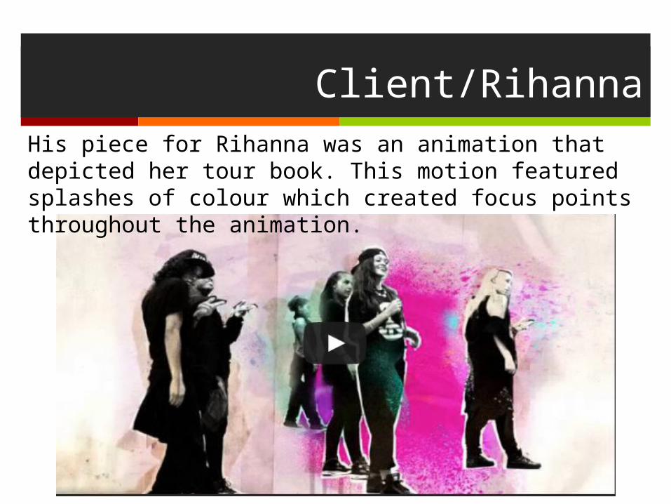
Client/RihannaHis piece for Rihanna was an animation that depicted her tour book. This motion featured splashes of colour which created focus points throughout the animation.

Client/KFC
He created a number advertisement pieces for KFC. The vibrant colours in this piece have been cleverly used and can be associated with the brand.

Client/Nike
His work for Nike was an advertising campaign and the bold orange colour is often associated with the Nike tick.

Tim has created a number of editorial pieces for a variety of clients. This piece works well as the planes represent a country, and the flags support this. The images represent travel with bold colours being used. The red is a warm colour which represents holidays, travelling and warm weather

Inspiration
A few of his inspirations are the Clayton Brothers, David Hughes and Christian Northeast

Techniques
Tim Marrs uses drawing, photography, print and digital techniques in his work, he draws attention on American pulp and pop culture and uses this throughout as part of his style. Tim also claims to have an ‘adaptable style.’

Slash
Bold colours are used with the black and dark blue, these dark colours make the sparks from the train, the moon and the cigarette stand out.
The imagery is very abstract with train having a skull face
The hierarchy is the train first with slash and the moon behind it. When you look closer you can see the skulls hair turns into tree branches
The technique he used was illustrator on a computer
Max

Person with a guitar

Person with a guitarThe colours in this piece are very bold and contrast well with one another. By using a yellow behind the head, it creates a main focal point for the image and the warm orange tones contrast well alongside the blues.
The imagery in this piece consists of photographs which have been layered. Tim has almost created a hierarchy structure in which the head has been made to be a focal point and stand out the most against other imagery.
The main techniques in this piece consist of layering and collage. By using a number of images related to music Tim easily communicates the idea of this piece being music related. As well as this he has used texture which creates a sense of a hand made element.
The most successful element in this piece is the use of colors which ties all the images together. I also think the shape work is really effective as it draws attention to the central image.
Laura


![Jim Marrs - Rule by Secrecy [the Trilateral Commission & Freemasons] (2000)](https://static.fdocuments.us/doc/165x107/55cf91c2550346f57b905a6f/jim-marrs-rule-by-secrecy-the-trilateral-commission-freemasons-2000.jpg)