The Transylvanian Phoenix: the Kis-Janson Types in the ... · Janson. This would explain how Janson...
16
61 The Transylvanian Phoenix: the Kis-Janson Types in the Digital Era f ack Stauffacher Let our people come to respect books, so their reading will allow knowledge to spread throughout Transylvania ... Once an old woman asked me if she could look at one of my books, and while leafing through the pages, asked me if there were any with thicker letters . .. This is my profession, to see to it that in this country books are plentiful and cheap. These are the words of Miklos Kis (Nicholas Kis), a typographer and scholar of Transylvania in the 17th cen- tury who devoted his life to spreading knowledge and re- ligion with the technology of his time: printing. Both his location in Transylvania and the strong and dictating rule of the Church made his desire to spread literacy a difficult task. In the 17th century Kis was considered an iconoclast because he challenged the ways of the Church in spreading enlightenment and education. Involvement with all aspects of the printing process from letter design to printing made it possible for him to express his ideas to a wide audience, but it also subjected him to a great amount of criticism. Not until recently have Kis' accomplishments been ac- knowledged and Kis recognized as a leader in his times. The importance of his work is apparent, particularly in the design of the Baroque Dutch Old Style typeface which was originally credited to Anton Janson, a punch cutter who lived and worked during the same period. It is believed to- day that this elegant typeface was actually the work of Kis. The following sequence of images and text may help to demonstrate that Kis had the ingredients to be the remark- able man behind the beautiful Kis-Janson letters. Visible Language, XIX 1 Winter 1985 Authors' Address: 300 Broadway, San Francisco, CA 94133 ©Visible Language, Box 1972 CMA, Cleveland, OH 44106
Transcript of The Transylvanian Phoenix: the Kis-Janson Types in the ... · Janson. This would explain how Janson...

61
The Transylvanian Phoenix: the Kis-Janson Types in the Digital Era
f ack Stauffacher
Let our people come to respect books, so their reading will allow knowledge to spread throughout Transylvania ... Once an old woman asked me if she could look at one of my books, and while leafing through the pages, asked me if there were any with thicker letters . .. This is my profession, to see to it that in this country books are plentiful and cheap.
These are the words of Miklos Kis (Nicholas Kis), a typographer and scholar of Transylvania in the 17th century who devoted his life to spreading knowledge and religion with the technology of his time: printing. Both his location in Transylvania and the strong and dictating rule of the Church made his desire to spread literacy a difficult task. In the 17th century Kis was considered an iconoclast because he challenged the ways of the Church in spreading enlightenment and education. Involvement with all aspects of the printing process from letter design to printing made it possible for him to express his ideas to a wide audience, but it also subjected him to a great amount of criticism.
Not until recently have Kis' accomplishments been acknowledged and Kis recognized as a leader in his times. The importance of his work is apparent, particularly in the design of the Baroque Dutch Old Style typeface which was originally credited to Anton Janson, a punch cutter who lived and worked during the same period. It is believed today that this elegant typeface was actually the work of Kis. The following sequence of images and text may help to
demonstrate that Kis had the ingredients to be the remarkable man behind the beautiful Kis-Janson letters.
Visible Language, XIX 1 Winter 1985 Authors' Address: 300 Broadway, San Francisco, CA 94133 ©Visible Language, Box 1972 CMA, Cleveland, OH 44106

Figure 2
62 Visible Language XIX 1 Winter 1985
In 1650, Nicholas Kis was born in Eastern Europe in the small borough of Misztofalu (now Tauti-Margherus, Romania), near Nagy-Banya (Baia Mare), which belonged to a region then called Partium of Transylvania. According to
Gyorgy Haiman in his book, Nicholas Kis*, Kis' dedication to 'civic liberties' may be partly attributed to the environment in which he lived. The inhabitants ofNagy-Banya were largely vine-dressers, miners, and potters, living with a degree of self-government in a region of Hungary that was exempt from the Feudal System.
Upon completion of his secondary studies, Kis was accepted to the noted Enyed (now Aiud) Reformed Church College (Enyed Collegium Academium). This Academium had an established reputation, attracting the intellectual life of the region and was at that time considered the center for the Transylvanian Reformed Church. The years of study at the Academium provided Kis with the desire and skills to propagate the spread of literacy and the message of the Bible.
* Nicholas Kis: A Hungarian Punchcutter and Printer, 1650-1702,
Jack W. Stauffacher/Greenwood Press in association with Gilman
D. Parson Books, 38 Hill Point, San Francisco, California 94II7

Figure 3
6 3 Stauffacher I The Transylvanian Phoenix
In 1677, at the age of 27, Kis completed his study at the Academium and accepted a position as head master of a school in Fogaris (Figure 2). During his stay at Fogaris he was attracted, as were many Hungarian scholars, to the study of Calvanistic Theology in Holland. Simultaneously, the leaders of the Transylvanian Reformed Church recognized the new central role of the Hungarian Bible. The only Bible printed at that time was a small format edition of the Hungarian Reformed Church Bible and it did not meet the anticipated demand. Printing facilities in Hungary were not sufficient enough to produce a new Bible, so the Reformed Church had to print the Bible in Holland.
Kis was entrusted by the Church to help the Dutch printer Daniel Elzevier in supervising the printing. Kis left F ogaris in I68o for Holland where he was to function as an editor and proofreader. He was also encouraged by the Church to acquaint himself with the printing trade. After the death of Daniel Elsevier in 1681, Kis lacked the necessary funds to purchase type matrices, so he decided to abandon his study of Calvanistic Theology and to pursue the craft of printing so that he could eventually print the Bible himself. He joined the Voskens typefoundry and apprenticed with Dirck Voskens or possibly one of the noted Blaeus. At that time in Holland the skill of punchcutting, matrix making, typefounding and typography were separate jobs.
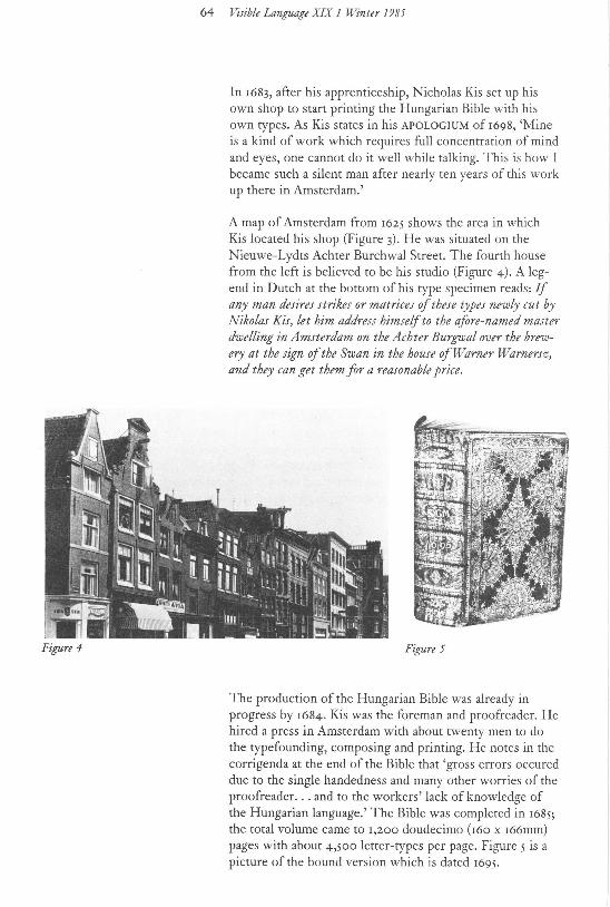
Figure 4
64 Visible Language XIX 1 Winter 1985
In 1683, after his apprenticeship, Nicholas Kis set up his own shop to start printing the Hungarian Bible with his own types. As Kis states in his APOLOGIUM of 1698, 'Mine is a kind of work which requires full concentration of mind and eyes, one cannot do it well while talking. This is how I became such a silent man after nearly ten years of this work up there in Amsterdam.'
A map of Amsterdam from 1625 shows the area in which Kis located his shop (Figure 3). He was situated on the Nieuwe-Lydts Achter Burchwal Street. The fourth house from the left is believed to be his studio (Figure 4). A legend in Dutch at the bottom of his type specimen reads: If any man desires strikes or matrices of these types newly cut by Nikolas Kis, let him address himself to the afore-named master dwelling in Amsterdam on the Achter Burgwal over the brewery at the sign of the Swan in the house of Warner Warnersz, and they can get them for a reasonable price.
Figure 5
The production of the Hungarian Bible was already in progress by 1684. Kis was the foreman and proofreader. He hired a press in Amsterdam with about twenty men to do the typefounding, composing and printing. He notes in the corrigenda at the end of the Bible that 'gross errors occured due to the single handedness and many other worries of the proofreader. .. and to the workers' lack of knowledge of the Hungarian language.' The Bible was completed in 1685; the total volume came to 1,200 doudecimo (r6o x 166mm) pages with about 4,500 letter-types per page. Figure 5 is a picture of the bound version which is dated 1695.
65 Stauffacher I The Transylvanian Phoenix
nta, quirent lun eruere, qu~
1110- namentis,t
fligi de center or e nih i/o pott
Bcgccrt iem:~mh Af.lllgcn of r.. l :~ rryzcn \'ln J~c1c Lctt~I'S, nu ccrfl: gcfncdcn door N1koLu; Ki>, aJJrcffccrczich lln den \'OOrn t.. f..:c!lcr, woancnde t'Amfh:r. dam, op d' !.ducr Burg-~~o· al, over Jc Brouway v.1n Jc Z\\'lln, ten huize u n Wamcr Warncrsz. u! Jc zdvc voor ccn rcddykc prp bC'l-omcn. rno Illi nihilomi
Figure 6
ratiocinati f CUI gen tilifmo,
nPn menfplendt Figure 7
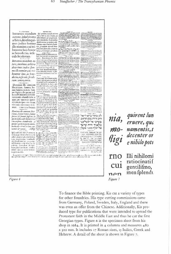
To finance the Bible printing, Kis cut a variety of types for other foundries. His type cutting commissions came from Germany, Poland, Sweden, Italy, England and there was even an offer from the Chinese. Additionally, Kis produced type for publications that were intended to spread the Protestant faith in the Middle East and thus he cut the first Georgian types. Figure 6 is the specimen sheet from his shop in 1684. It is printed in 4 columns and measures 480
x 322 mm. It includes 17 Roman sizes, 15 Italics, Greek and Hebrew. A detail of the sheet is shown in Figure 7·

66 Visible Language XIX 1 Winter 1985
Figure 9 A P 0 L 0 G I A
Figure 8
BIBLIORUM Anno 1 6 84. Amftelodami imprelforum,
ut & 0 R TH 0 G R A PH I it
;, iis ohflrvllt~:
In Tres Partes divifa.
L Epijlolam Apologeti&am, in qua utplurimum ttaEbrur de alterationibus quibusdam, quz in eaEditione conugcrunt, earwnque Generibus. cum Exemplis.
n. Catalogum 'IJOCIIm ihi omi/jll'l'ttm, hk rtjlitulllrum: ubi interim fignamur (duntaxat) Loca de necctiariis mutationibus, vel allis difficultatibos.
HI. Ratiodnationtm de Orthographia eo modo inftituenda.
Nffllllttmlfll p,.~judicia de iis conttpta meJnu/tnn &11111 ~{/iQM J ,o6is itnlilis exprtjfo
Per NrcoLAUM K1s deM.T6TFALV.
CLAUD/OPOLl Anno 1697·
In referring to his first types cut for the production of the Bible, Kis states in a letter dated August 1684, 'The types I am printing with at the present are not as trim as they should be In Excellenti Gradu; their shortcomings are due to the fact that they are specimens from my initial work, that is I prepared their matrices when I was still learning the trade. But God willing, I shall yet make types that will be notable in any part of Europe.'
In 1689, Kis left Amsterdam to return to Transylvania. It is believed that on his way home he left a set of matrices in Leipzig for the purpose of selling them, probably to Anton Janson. This would explain how Janson obtained the type for which he was later credited with having cut himself. Kis returned to the Transylvanian town of Kolozsvar to set up his printing press, typefoundry, and punchcutting shop. Figure 8 is a picture of Kolozsvar in 1607.
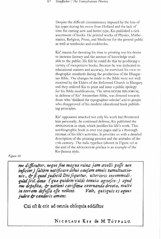
Figure 10
6 7 Stauffacher / The Transylvanian Phoenix
Despite the difficult circumstances imposed by the loss of his types during his move from Holland and the lack of time for cutting new and better type, Kis published a rich assortment of books. He printed works of Physics, Mathematics, Religion, Prose, and Medicine for the general public as well as textbooks and cookbooks.
Kis' reason for devoting his time to printing was his desire to increase literacy and the amount of knowledge avail-able to the public. He felt he could do this by producing a variety of inexpensive books. Because he was dedicated to educational matters and accuracy, he exercised his own orthographic standards during the production of the Hungarian Bible. The changes he made to the Bible were not well received by the Elders of the Reformed Church in Hungary and they ordered Kis to print and issue a public apology for his Bible modifications. The APOLOGIUM BIBLIORUM,
in defense of Kis' Amsterdam Bible, was directed towards those who 'disliked the typographer-scholar' and to people who disapproved of his modern educational book publishing principles.
Kis' opponents attacked not only his work but threatened him personally. In continued defense, Kis published the APOLOGIUM in 1698, which justifies his life's work. This autobiographic book is over 100 pages and is a thorough recount of his life's activities. It provides us with a detailed description of the printing process and the attitudes of the 17th century. The italic typeface (shown in Figure 10) at the end of the APOLOGIUM preface is an example of the Kis-Janson style.
me diflit:U/ter, 11tfUt fine magna ruina jam aveUi polfe 11on inftcior) fmttm notijicare dcfmi caufam omnis tumultuatitr 11is, (? ft fU«l jlldki3 Deifefuctur, ulterioris incommodi: f'ilJ foil. d01UJ ( fll.t guidem tJaldc tenuia agJJofoo :) apud me depojita, ly 1l4tNmi cari.f{ttr.t~ cx01'1tll1ltk mota, multi ;, tm·a• tlefo./Ja ejje TJe/knt. VIlle, g11isruis es 4fUUJ jlllk:e ir cllndtJris ama11s.
Cui eft & erit ad omnia obfequia addicrus
N 1 c o t: A u a K r r de M. To T wr A L u.

68 Visible Language XIX 1 Winter 1985
ELEMENT A GRAMMATI·
C.M LATINJE, Pro reCla Scholafticre Juventutis lnftitutione, ex prreci ..
puis Gr:tmmaticorum pr::eceptis a GRi· GOillO MoLNAR contratta.
Pofl Mrdtijflgn a.-cr/Jiwc per vnrios /()(11plctattt · ~11'-i/trtim Regulis de Nommmn Ceneribus, Vtr61-,,m Pr~ltritis & Suph1is, nee-non !!!111ntittrte SJf·
Jab11rum metro "·mpr~lmifis 11ut111. . Nunc vero 11i1iis inllll/ll(l'is fublllti;, /tiptrjlllil rtjttlis, 1/JI·
liori & Met/mid & Cru11pemlio tlv,lltll.
EDlTIO SECt!NDA.
C L A U D I 0 P 0 L I. Ex Officina NrcuLu KBUBLTO'tFll.tl'U
ANd M. oc. xcvm.
Figure 11
SIRALMAS
P A N A S Z; Hl:ennakKoLosvA.RON fekv6nagy baragjar61, abb61 fzarmazott egy· nehfmy fulyos ofiorir6l, es atmak nevezete
fen ez 1 6.9 7 Efi.tendoben Piinkoil: H~va~a~ 6~ik nap jan ikonyu
TUZZEL val6 megpufititasar61.
t}ell_ybm e' V/r.romak jiralmas ,hrs!mak lerajfi(JIIIsat is a' Mtgteresre val6lntest 1/ienhet. nyuj
eou abitlltOS Konyorgo' t.nile nleejti-be.
Emlekezetnek okfu!rt irattatott
M. ToTFALusz K. M·tn6s altai,
Ny.!l111/l/l(lt1Jtt K o L 0 S V .AR A TT. 1 6 9 7 Eitemloben,
Figure 12
-T· Titles, title pages and other typographic standards evolved from text because of the need to clarify the contents of the book. In developing stages, the title page was the introductory material of the book, usually consisting of one sentence arranged in a centered composition. Figure I I shows the title page of a Latin Grammer book printed by Kis in I698. In Figure I2, the title page includes a verse reproving the corrupted ethics of the lords of Kolozsvar in I697·

69 Stauffacher/ The Transylvanian Phoenix
Sdlio VIII. De Vil'bi; lmptrfifii;· 77 I?S· P;ima radicali.r Aleph in futuro Kal repu<liato
f(:h,vace muto, quod ex §.143. debebat recipere, quiefdt in cholcm ; in pri 1~a fingulari ( nt duo Altph co1JC'III'I'ant) plane etiam omittitur; termin:~tio autcm ell tzcri ordinari~; in prima fingulari patach ut plurimum, ad di!lin8:icnem ~ participio pnrfcnti. Obtiner autem hrec ancmalia in ifiis folum ~crbis, ,~~pc1·iit, !~J$ •1fp1chcndit, '?-!$ comcdit, .,;:?~ di:~:it, :-,~~ 7Joluit, l"i~l$ coxit. Imi
tantur interdum :")~!$ congi'Cffa7Ji:, & ,:1~~ ama7Jit. Pri•
maN in prima lingulari futuri Hi phil folet 6militcr omitti' & fub chmtieriilica ell: Kamet'L: l'i.~ pro r·.~~~ au-
ri!JIIs percipi11m; in aliis perfonis fi!turi, nc:c non in participio Hiphil non nunquam obtinet contra8:io, juxta §.78. clifo tmJen aleph: ~\1~ pro '!!J~~ tmtorium ji~et,
i'.t'-'. pro 1',1.~9 auri!;;,s percipicnJo.
f. Plural. m. Futurum Kal. £. Singul. m. il~~~·n ~~~~·,' ,?,Nf.l ,?,N' 3· iiJ7~N·~., 1"!~N·~';' '7,~tff;' ,?.N'n 2.
Cem. ,?N'J Com. ,?-.N 1
176. Prima radicalis Jod quiefcit in Conjugationibus 1\:on-dageflatis, quoties ob acce!Tum unius chara8:erifticac f' llabam debet tcrminare, ex§. 148. adeoque reiiJUit fi:hera mutum, juxt:~ §. 7 c;. Qyies vcro ejus diverlimode fe habet. ·
177. In futuro Kal qui.:fcit, e~ §.7S· vel in chirekexplicitc five cxprcfla , & t.;rminationem patach poll:ulat: ;;" domrict: vel in tzeri implicire fi\·c latens, ac termi-
'·ationcm t1.eri rcquirit: .:l~' habitabit. Illoruminfini-
1' ~ tiVI:S
Figure 13
~~,~~:~:~:~~~~~·,~t,~.;~~t.i~;.:~: ~t~$:(~;,;~?:~::~?··~~···!·~ ~ilill~~~~$IiD&~~~:~~~~m;!RE~iiEri]~~@2
LEXICI HEBRAIC! COMPENDIUM METRICUM. I. N u M 1 N A. Alp!Mbetu:n 1 .
N Ab pattr, lim 71Jatcr, bEn jiliu; , cbj6n cgouiJ. _:l ban).al A don domi1111.1, bath ji/ia, ncfd abortll.r. .l gab giMmJ, nJelj6n gAb6nh bAmi r,im mArom alt11r. , dc;rel nli<r 7Jr,xilla, SAn,\ mmltJ, t<: Eni.jictt.i. i1 hod pEr tzrbi dccu.r, mAk6m locu,, ami beat11r. t zcbu'b 1~111/t'a, menJII toga, llJCrcfi.f}onda, d% ur{u_; .. n hhagfe.flu (e/f,) hhodesmcn{zs, JAk.O:r (me;,oedJ jJi'Ct...juf, ~ tal ros, fak fttccus, fi.Anc sad moth agri, <rd<r <'_quu.r,grus. ' J.O:m marc, tzr.Jf[tt'!JitJ, 'achb.~r ?JJtt.r, pclc p01i-q; mirus. ,:, koch,\!> (leila, JASAr kEn rdltH, tzaddik iujhtJ. '7 lappidfa.~·, kodk6d vcdc . ..:, llAVC 11A11Jlm a/1111!111/S. r.l matrriahh dttvi•, mAth6k 'A rEb dulri.•, mar amaruj. J nAhAl ke<riJ evil O'AChAI pothc pcthiflu/ti/J. 0 <r.~ri:r ctmucb!IJ, SirE c.mticti, tch6m alJ;f{ttJ, J! n!lid tcftis, nJ6f tz}~p6r 11'u_is. dal dkh tem~o~t;t.<. £J pahh laqucu.r, plom1S all.pm, dod allloi', ](InA zclur. "J tdlanJ cojia, nJF.;rel 7Jitu!tt.r, g(,ren fli'Ctl, d,\ch;il.r. b kcrebi1J:ima, gia teflllm(cfl,) hhLir t1.ahh lAbAn albtt/. ~ r.\s: nJ .~nidkhp~upcr, dajjti(Jicim•, k/\seduniJ. tv f1d calx, hhAz.\k Afik 7!!11idu.r, nochri 1.ir aliwus. n t .~· thalmlll;.r, meth6m .~d.<\mt-n6shomo, yF.rpcregrimts.
Aipb.•bN:mr o. }t addir magnificus, nJiW hh!tm6r Ath6n a.fi:lltl~' ,:1 bil IEh co1·, k<ithn6th tunic.r! dod riauJ am:cus . .l g61 ,•·<'ns, kAJii. ji:utellti, <riier cod<x, gAhhon a!vus. , d;~sE'n bAri 5/\JTIEn pingvi.r ,_ hh&ri hh6m hhAr6n otf/u.r. n hJ;>-IllA l'efla, SOoinJ n)ASlx dive.~ ; hh$li morbus. f ZAChAr mas, nan)ar Jeled pucr, ~smK re~tu.r. n hhEtZ te/uht, fe jJCC/6, kar teJc kcbcJi kCfeb a gnuS . .D t6b bone, ·din.rib lis, etzbanJ dir,itus, peri fruflus. ' jahhaf (lemma, sof..:r tuba, 'ad 'olim .fPc Ia; gan hortu!. ,::> k6<r 7t.bia' agg.\n crater, )Om-que dtc.r, kcseth arcus.
'!". B
Figure 14
An example of the diversity of Kis' type and skill in handling difficult typographic situations can be seen in Figure 13 in a Latin and Hebrew text. Figure 14 demonstrates Kis' solution to a complicated linguistic compostition printed in 1698.

Figure 15
7 0 Visible Language XIX 1 Winter 19 8 5
d' Tli·
.t omnt v1 & con ten none entteremJ m exul fapiencia inQuceretur; quoru Lrentum opti1ni filii pr~ceptis, perq ceat mihi veftr3. modeilia non intet"F [) eo rum effe confvetudine, qui fum l Tabulas Mecrenatum nomina infet nt; verum etiam beneficiorum fumn 1 exiilimant. Qgorum ut pietati in~ itli1ne, Magni Ca!faris Magne Confi rhefaurarie fideliffime STE.PHANE APe fijgia ad 1"'e patrocinii Principem, 1i l Claudiopolitanam properare Acadc 1, fida Mecrenatis Iimina fubeuntem. iam, ut non folum commode, sed J
enim tua in deffitutam fubfidiis vive ~cere. 0 nunquam tnoriture in fapic ! qui annuos munifice fl:atuifri prove ucrum reddi, quam doCl:as Patrire fil nicum ad fumma tua in fidem Rom: ~ddi poterat , ut qui Pietati quaquallus fidei Romanre propugnator fur
Figure 16
Figure rs is a harmonious typographic composition of a page settirtg from a bilingual text with marginal notes. Figure r6 is an example of the rich texture of a page of text set by Kis in a 14 point Augustin Roman type.

71 Stauffacher I The Transylvanian Phoenix
.l :l i1't!'N"1::l
n11 ~)Bn ~S?~ oi~.::l ·.~~~8os?-~·, ~~ .v~~ ~;~~ M• Mi1M ~;~·N'7 ~·i-i'7N ii'\M' ~~~, : n,:·tl ~· ;-,~~; ,~~', : ~iJJ~ .,;;.t i~~;,~pN i~:1S CiR~
"'w:s? ;:;~~ FJ7~~~ :J~~-s? ;,?~~\!-;; t:J;;s~ ;~-N1~·-;,~ Mit:t~? t:::rj~~-'7~ N~;~_ C'9~'i} : i~ N1i) :'):IJ ,l!l~t. C';!~\1 ;7-~1~' ,iW~: ~~
!) c~~~;:J t)\!!7, M9i1~tl-'?~S ni.:x? Ll'JI,{~ ~~p:l : ii.U.::lir.V No;o·-~S c-1NS1 ;,,;:,;, im 1;~":· 1
N:l ~&i j~~~i o:{~~-Sp' MR;,;=' ';~8S~ ~;i,~, ~P~} :~:~ n1;,; t~~l : M~{1ryD !W? i1P~~.w;vS~n ,.,tl~
v.,t,~ ;-,~~? ~~-jO ~~?-,~~~ .V~¥iJ-,i~'C'~'}: J:l C,V.SM fi.Nf LliNMinN') : OiNM-SN MN:l'1 '?;;~;N N,~;Tn~~~ ')~~n .,~~,T·q¥~?.~~i
,, -n~ ~·~-~w.~;~-'7~ : nN:·:-~t;~R? t!f•~·~ :,rJ~ ,*'?S 1:ry) ;r1~1N:J P?-1' ;~wn~, ''?.~
:'1) N~' ii,;~~N1 OJ~:.., c•o,-w bt:1·~::1 i!'T~ jl.,11V.,MKt!'J, !)fti~.:J,"1'
N J· nw.v·jw~ M1:~':J M'!J s·?n 0,1~ r'!:~lJ~;;~1 . ,~tt·•p :"]~ :r~·~~rc;tt .,~·~ o·r~tt :-!,~,,
:~ MWN~ ~x~;~ q~~ r.!! ?~n ,,~~·~ ~? c·:+~ J YJ!!l ','J~n, : ~?,NJ iV:ri'J,' ·:~o t!i~':'?i1--~ ~)~~ ,,,:-tn, x'? o•;:-t.,~ .,~!$ i~iJ-,,,.,, :J ,~·~
i-t~, . .. .
Figure 17
(,ar~"' n4 0ntrlcra a rl. r-.J'-ad tlt;ir;;f (t'tt:i p;ldo)
A G K N 0 a b e
Figure 18
K.is .\frHas
""'" a r; . J'-0 '-0 d tigirul
A G K N 0 a b e
l)()llf''"
nntrJ:ra
0 rl. 1;_a;,od
•·i.~irol ( mui pllda}
A G K N 0 a
b e
Figure 17 is an example of Hebrew text cut and set by Kis. Figure 18 is a comparison of three text faces, Garamond, Kis-Janson, and Bodoni.

72 Visible Language XIX 1 Winter 1985
R cgi llro dell' Opera . Jl l
+ \II C DI"I" G ilii..:L~!:-<OPQRSTVXYZ
/\ ,, Bh Cc Du Fe l"fC.!! llh li 1\l Ll Mm ' n Ool'rQcJIIrS I.
T uui!Uno DuL·rm , cc:ccrro S s, ch~:c Tcmo .
1 :-; r I R r: J' l F., J\.1. DC. XC'\'1
l\dl3 ~r.mpcn> <I• S. ,\ , S. per Goo: F1loppo Le<clu . In v,. del Pat.gio . C•• LJu nZA Jr Suprr
;&_.ffrrr r P." , .¥:~4··~~~/. 'Ill'
(. , ( · -'
Figure 19
The types of Nicholas Kis were not confined to Hol-land and Hungary, but also made their way to places such as Italy. Giovanni Filippo Cecchi, the Granducale Press printer for the Grand Duke in Florence (1690), purchased type from Kis during Kis' stay in Holland.
Figure 20 shows one of Kis' last books, printed in 1701. Kis spent his last years pressured by those in power who sentenced him to public penance and asked him to withdraw his APOLOGIUM. He died in 1702 at the age of 52 and was buried in Kolozsvar where a death notice still stands today. The notice is in the reformed Church of Farkas Street which is pictured in Figure 21.
R~GI NAGY EMLEKEZITU
KEMENY FAMILIA I
GENEALOGIAJA, ~elly
l{ezdetit vette, a' Tekintetes ~JlKOLA Familiab61, 958-Efzt: a·
mint a' Leveh:k vilagosan bizonyitj:ik.
~ell Jet
Magl Nehai B6idog emlekezetu KEMENY JANos ErdClyi Fejeddem irt ki, e' kovetkezendD formaban
n!gi Leveleibol fl6r6l-fl6ra t6 56-Efltendoben Gerendi KaCh!llyaban.
Moft ptdig tUIJ Familiaknak Emldazetire ki-nyom· tattatta
SZAMOSFALVI M I K 0 LA LA S'LL o.
KOLOSVARATT, M. To TFALusz Kzs MIKLos altal1 7o1·~t.
Figure 20

7 3 Stauffacher I The Transylvanian Phoenix
~ .1~ 1 ~
l· ' j
. -- · Figure 21
As the significance of Kis' typefaces and work is realized, it is appropriate to observe the changes that his type has undergone since the 17th century. The Kis-Janson type face has been subject to modifications imposed by new printing and letter making processes. In 1983, Jack Stauffacher, to
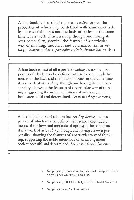
gether with a group of his students at the Center for Typographic Language (Greenwood Press, San Francisco), took up the task of following the evolution of the Kis-Janson typeface by observing and commenting on the quality of its translation into different mediums.
The participants in the study wanted to compare a given block of text when it was typeset by companies who owned a version of Kis-Janson. The text was taken from a passage by Paul Valery and was to be copied according to a model set and printed by Jack Stauffacher with the original Stempel Janson metal fonts. The model was set in both a justified and flush left format using 12h4 point type. The line length measured 25 picas. The participating companies were asked to follow the models exactly to insure an accurate comparison l>etween the various versions. Line length, punctuation, italics, small caps and special spacing were to
be identical with the model.
Portions of the resulting typeset material are shown on the following pages. The emphasis here is not to render judgement regarding the talents of one company over another, but instead to observe the ingredients necessary to
recapture the unique liveliness and clarity that allowed this Baroque Dutch Old Style typeface to remain timeless and to
survive for as many centuries as it has.

2
74 Visible Language XIX 1 Winter 1985
A fine book is first of all a perfect reading device, the properties of which may be defined with some exactitude by means of the laws and methods of optics; at the same time it is a work of art, a thing, though one having its own personality, showing the features of a particular way of thinking, suggesting the noble intentions of an arrangement both successful and determined. Let us not forget, however,
A fine book is first of all a perfect reading device, the properties of which may be defined with some exactitude by means of the laws and methods of optics; at the same time it is a work of art, a thing, though one having its own personality, showing the features of a particular way of thinking, suggesting the noble intentions of an arrangement both successful and determined. Let us not forget, however, that
A fine book is first of all a perfect reading device, the properties of which may be defined with some exactitude by means of the laws and methods of optics; at the same time it is a work of art, a thing, though one having its own personality, showing the features of a particular way of thinking, suggesting the noble intentions of an arrangement both successful and determined. Let us not forget, however,
Model set and printed by Jack Stauffacher with the original Stemple Janson metal fonts.
2 Sample set by Mergenthaler VIP Photosetter.
Sample set by ITEK Composition Systems.
4
6
7 5 Stauffacher I The Transylvanian Phoenix
A fine book is first of all a perfect reading device, the properties of which may be defined with same exactitude by means of the laws and methods of optics; at the some time it is a work of art, a thing, though one having its own personality, showing the features of a particular way of thinking, successful and determined. Let us not forget, however, that typography excludes improvisation; it is
A fine book is first of all a perfect reading device, the properties of which may be defined with some exactitude by means of the laws and methods of optics; at the same time it is a work of art, a thing, though one having its own personality, showing the features of a particular way of thinking, suggesting the noble intentions of an arrangement both successful and determined. Let us not forget, however,
A fine book is first of all a perfect reading device, the properties of which may be defined with some exactitude by means of the laws and methods of optics; at the same time it is a work of art, a thing, though one having its own personality, showing the features of a particular way of thinking, suggesting the noble intentions of an arrangement both successful and determined. Let us not forget, however,
4 Sample set by Information International Incorporated on a COMP Soh Universal Pagesetter.
Sample set by HELL GmbH, with their digital Nikis font.
6 Sample set on an Autologic APS-5 .
76 Visible Language XIX 1 Winter 1985
Special thanks are due to the companies that participated in this study: Irish Setter, Oregon (Merganthaler VIP) Itek Composition Systems Information International, Inc. Dr. Ing Rugolf Hell GmbH Autologic, Inc. Ladislas Mandel, Lumitype-Deberny & Peignot, Paris (not shown) John Dreyfus, Monotype Corporation, England (not shown)
Many of the illustrations in this article were taken from Nicholas Kis, A Hungarian Punch-Cutter and Printer, 1650-1702, by Gyorgy Haiman, English version published by Jack W. Stauffacher, The Greenwood Press in association with Gilman D. Parsons Books, San Francisco, 1983.