The Research Space Using the Career Paths of Scholars to Predict the Evolution of the Research...
20
1 The Research Space: using the career paths of scholars to predict the evolution of the research output of individuals, institutions, and nations Miguel R. Guevara 1,2,4 , Dominik Hartmann 1,3 , Manuel Aristarán 1 , Marcelo Mendoza 4 , and César A. Hidalgo 1* 1 Macro Connections, The MIT Media Lab, Massachusetts Institute of Technology, Cambridge, MA, 2 Department of Computer Science, Universidad de Playa Ancha, Valparaiso, Chile, 3 Chair for Economics of Innovation, University of Hohenheim, Germany, 4 Department of Informatics, Universidad Técnica Federico Santa María, Santiago, Chile Abstract: In recent years scholars have built maps of science by connecting the academic fields that cite each other, are cited together, or that cite a similar literature. But since scholars cannot always publish in the fields they cite, or that cite them, these science maps are only rough proxies for the potential of a scholar, organization, or country, to enter a new academic field. Here we use a large dataset of scholarly publications disambiguated at the individual level to create a map of science—or research space—where links connect pairs of fields based on the probability that an individual has published in both of them. We find that the research space is a significantly more accurate predictor of the fields that individuals and organizations will enter in the future than citation based science maps. At the country level, however, the research space and citations based science maps are equally accurate. These findings show that data on career trajectories—the set of fields that individuals have previously published in—provide more accurate predictors of future research output for more focalized units—such as individuals or organizations—than citation based science maps.
-
Upload
eric-diaz-mella -
Category
Documents
-
view
14 -
download
0
description
Miguel R. Guevara, Dominik Hartmann, Manuel Aristarán, Marcelo Mendoza, César A. Hidalgo(Submitted on 26 Feb 2016 (v1), last revised 29 Feb 2016 (this version, v2))http://arxiv.org/abs/1602.08409In recent years scholars have built maps of science by connecting the academic fields that cite each other, are cited together, or that cite a similar literature. But since scholars cannot always publish in the fields they cite, or that cite them, these science maps are only rough proxies for the potential of a scholar, organization, or country, to enter a new academic field. Here we use a large dataset of scholarly publications disambiguated at the individual level to create a map of science-or research space-where links connect pairs of fields based on the probability that an individual has published in both of them. We find that the research space is a significantly more accurate predictor of the fields that individuals and organizations will enter in the future than citation based science maps. At the country level, however, the research space and citations based science maps are equally accurate. These findings show that data on career trajectories-the set of fields that individuals have previously published in-provide more accurate predictors of future research output for more focalized units-such as individuals or organizations-than citation based science maps.
Transcript of The Research Space Using the Career Paths of Scholars to Predict the Evolution of the Research...

1
The Research Space: using the career paths of scholars to predict the evolution of the research output of individuals, institutions, and nations
Miguel R. Guevara1,2,4, Dominik Hartmann1,3, Manuel Aristarán1, Marcelo Mendoza4, and César A. Hidalgo1*
1Macro Connections, The MIT Media Lab, Massachusetts Institute of Technology, Cambridge, MA, 2Department of Computer Science, Universidad de Playa Ancha, Valparaiso, Chile, 3Chair for Economics of Innovation, University of Hohenheim, Germany, 4Department of Informatics, Universidad Técnica Federico Santa María, Santiago, Chile
Abstract: In recent years scholars have built maps of science by connecting the academic fields that
cite each other, are cited together, or that cite a similar literature. But since scholars
cannot always publish in the fields they cite, or that cite them, these science maps are
only rough proxies for the potential of a scholar, organization, or country, to enter a new
academic field. Here we use a large dataset of scholarly publications disambiguated at the
individual level to create a map of science—or research space—where links connect
pairs of fields based on the probability that an individual has published in both of them.
We find that the research space is a significantly more accurate predictor of the fields that
individuals and organizations will enter in the future than citation based science maps. At
the country level, however, the research space and citations based science maps are
equally accurate. These findings show that data on career trajectories—the set of fields
that individuals have previously published in—provide more accurate predictors of future
research output for more focalized units—such as individuals or organizations—than
citation based science maps.

2
Introduction
While most scientists are trained in one specialized academic field, their scholarly
contributions usually involve multiple fields. In fact, 99.8% of the 240,658 scholars that
had a Google Scholar profile by May 24, 2014, and that received citations in at least ten
different papers, had published in two or more academic fields (with fields defined
according to the 308 categories in the SCImago classification of journals from Scopus).
But trans-disciplinary efforts are not constrained to pairs of disciplines. In fact, 99.1% of
these scholars had also published in three or more fields, and 97.6% of them in four or
more. These numbers show that the work of most scholars is not constrained to a single
academic discipline, but often spans at least a few of them.
But while most scholars do not publish in a single discipline, their contributions are
nevertheless confined to a small set of highly related fields. Consider, for instance, the
29,856 scholars in our dataset (see Data and Methods) that have published at least two
papers in “Molecular Biology.” 45.6% of these scholars also had published in “Clinical
Biochemistry,” but only 1.2% of them also published in “Economics and Econometrics.”
Since the total number of scholars with at least two papers in “Clinical Biochemistry”
(12,506) is similar to the number of scholars with at least two papers in “Economics and
Econometrics” (12,315), the larger overlap of the first pair vis-à-vis the second, tells us
that “Molecular Biology” is more related to “Clinical Biochemistry” than to “Economics
and Econometrics.”
But the structure of these academic overlaps is not theoretically surprising. Scholars are
often trained in narrowly defined academic disciplines, and they spent most of their
careers in relatively homogenous academic departments. This homogeneity in training
also leads to relatively high levels of homogeneity in their social and professional
networks. An illustration of this social homogeneity is the large number of marriages
among scientists—a proxy for strong links in a social network. Marriages among
scientists go as high as 56% for women scientists in their first marriage, and 63% for
women scientist in their second marriage (compared to 14% and 32% for males) 1.

3
Among women in the first marriage, 36% marry a scholar within the same field. Thus,
the professional and social institutions where scholars are embedded 2 reduce the
opportunity for scholars to develop the contacts, or skills; they need to enter “distant”
academic fields. As a result, the diversification paths followed by individuals,
organizations, and countries, are constrained by the homogeneity of the social networks
of scholars and their professional institutions. These various constraints should be
reflected in the structure of the network connecting related academic fields.
But the prevalence of researchers publishing in multiple academic fields is good news for
those looking to either predict the evolution of research production, or evaluate the
potential of an organization to enter a particular academic field. In fact, the overlapping
participation of scholars in related disciplines tells us about the possible career paths of
scholars. Moreover, since research organizations, and national research efforts, are
composed of networks of scholars, the network of related academic disciplines should be
predictive of the probability that a country or organization will enter a new academic
field.
Here we leverage information on the observed career paths of more than two hundred
thousand scholars to introduce the research space, a map connecting pairs of fields based
on the probability that an author has published in both of them. We argue that this map
captures implicit information about the skills, social networks, and institutions
constraining the movement of scholars into different academic disciplines. We validate
the predictive superiority of the research space by using Response Operator
Characteristic curves (ROC curves) and show that the research space is a more accurate
predictor of the future presence of an individual or organization in an academic field than
citation based or knowledge flow science maps.
Mapping Science through Knowledge Flows and Career Paths
In recent decades bibliometricians, information scientists, sociologists, physicists, and
computer scientists, have created maps of science connecting fields that either cite each
4
other, or that cite similar literature 3–5. These citation based maps of science, or
knowledge flow maps, tell us if the knowledge developed in one field is used to produce
knowledge in other fields. Ultimately, these maps help us categorize science and
understand the trans-disciplinary impact of scholarly work.
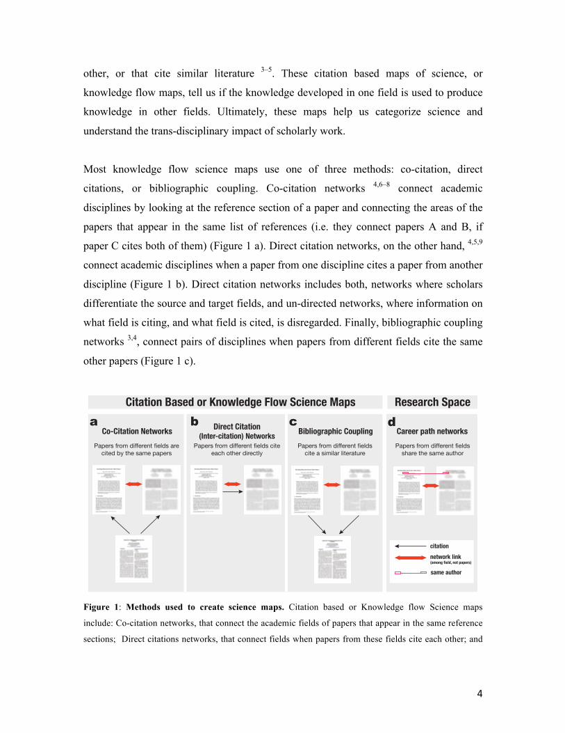
Most knowledge flow science maps use one of three methods: co-citation, direct
citations, or bibliographic coupling. Co-citation networks 4,6–8 connect academic
disciplines by looking at the reference section of a paper and connecting the areas of the
papers that appear in the same list of references (i.e. they connect papers A and B, if
paper C cites both of them) (Figure 1 a). Direct citation networks, on the other hand, 4,5,9
connect academic disciplines when a paper from one discipline cites a paper from another
discipline (Figure 1 b). Direct citation networks includes both, networks where scholars
differentiate the source and target fields, and un-directed networks, where information on
what field is citing, and what field is cited, is disregarded. Finally, bibliographic coupling
networks 3,4, connect pairs of disciplines when papers from different fields cite the same
other papers (Figure 1 c).
Figure 1: Methods used to create science maps. Citation based or Knowledge flow Science maps
include: Co-citation networks, that connect the academic fields of papers that appear in the same reference
sections; Direct citations networks, that connect fields when papers from these fields cite each other; and
citationnetwork link(among field, not papers)
same author
Citation Based or Knowledge Flow Science Maps
Co-Citation Networks Direct Citation(Inter-citation) Networks Bibliographic Coupling
Papers from different fields are cited by the same papers
Papers from different fields cite each other directly
Papers from different fields share the same author
Papers from different fields cite a similar literature
Research Space
Career path networksa b c d

5
Bibliographic coupling networks, that connect fields that cite a similar literature. The Research Space is not
based on citations and connects fields when researchers are likely to have published in both of them.
Beyond citation-based maps, scholars have also used online searchers to connect
academic disciplines. The Clickstream Science Map by 10 connects academic disciplines
based on the probability that a scholar who searched for a paper from one field, also
searched for a paper from another field. In spirit, the clickstream map is similar to the
networks created from co-citations or bibliographic coupling because it also focuses on
knowledge flows. Yet since online searches are a more common expression of interest in
a topic than a formal citation (the latter requires the costly process of publication), efforts
like clickstream help leverage new datasets that are more dynamic than those based on
citations.
But what are these science maps used for? A common use of knowledge flow maps is to
categorize knowledge. The idea of knowledge categorization has a long tradition in
bibliometrics, going back at least to the work of Paul Otlet, the creator of the Universal
Decimal Classification, and Ramon Llull, the creator of the XIV century science tree.
This idea, however, continues to be influential in recent projects, such as the consensus
Map of Science 11 or the UCSD Science Map and Classification System 3. The UCSD
science map has been used to construct a classification of 554 research areas that some
university libraries now use to understand the research production of their scholars.
Another example of the use of science maps includes the cross-citation maps of
Leydesdorff and Rafols 5, who overlaid the research structure of universities 12 to
contextualize a university’s research output.
Science maps can also be powerful policy instruments. In a world where research budgets
are constrained, and the probability of succeeding in a field is uncertain, science
promotion agencies (like the N.S.F. in the U.S., the F.A.P.s in Brazil, or the C.N.R.S. in
France) need to decide the amount of funds they will allocate to each field, including
those where a country or institution may not have a presence and the probability of
success is uncertain. Science maps can help estimate a field’s strategic value, by helping
6
administrators estimate the probability of success, and therefore the cost, of venturing
into a new research area.
But research fields are not only connected by the knowledge flows that are expressed in
citations. Since scholars around the world participate in multiple fields, information about
the career trajectories of scholars (Figure 1 d) represents a viable alternative to
knowledge flow maps. In fact, career trajectories have been used to create predictive
maps in other areas of research. For instance, labor flows among industries have been
used to study the stability of industrial clusters 13, and the labor mobility of displaced
workers 14. Labor flows among occupation have also been used to create online tools that
help visualize the possible career paths of workers or the industrial evolution of cities 15.
Here, we use the career trajectories of hundreds of thousands of scholars to create a map
of science—or research space—to predict the future research output of countries,
organizations, and individuals. We find that for the most disaggregate units (individuals
and organizations) the research space is a more accurate predictor of the development of
future research areas than knowledge flow based science maps.
Data & Methods
Data
Research maps where links connect areas sharing authors are uncommon because most
datasets on research production are not properly disambiguated at the author level (i.e.
these datasets lack the ability to distinguish among authors with similar names). Here, we
solve the disambiguation problem by looking only at data from authors who have created
a profile in Google Scholar. We note that the Google Scholar dataset is not free of biases,
as the adoption of Google Scholar is not uniform across academic fields, or age groups.
So we interpret our results in the narrow context of the data used to produce them. These
results are applicable only to the career trajectories that are observable in Google Scholar.
7
We filter this dataset by focusing only on scholars with less than fifty publications in
each year, because those with more than fifty publications tend to have many publications
that are miss-assigned and are not theirs (see SM for more details). Our filtered dataset
contains 329,334 authors who have authored a total of 6,124,436 publications indexed in
18,492 journals and proceedings between 1971 and 2014 (we note that in the introduction
we have a smaller number of authors because there we considered only authors with at
least ten papers that have received one citation).
We assign each publication to a research category based on the journal in which it was
published using Scopus classification system provided by SCImago that includes 27 main
areas of knowledge that are subdivided into 308 fine grained categories. In our dataset we
use only the 290 categories for which at least one paper was found (For a complete list of
categories see SM).
We also aggregate the author level data by identifying the organization (i.e. the university
or research institution) and country where the scholar participates in. We first identify
organizations by matching the verified email provided in the Google Scholar profile of
the author, and then, assign organizations to countries according to the list of institutions
provided by the Webometrics Ranking of World Universities 16.
For comparisons we download the UCSD science map 3, which is a citation based science
map based on bibliographic coupling (Figure 1 c) available for download at:
http://sci.cns.iu.edu/ucsdmap/. When comparing with the UCSD science map we
transform all of our papers to their classification, since in the same website, a one-way
mapping from journals to their classification was available.
Constructing The Research Space
We begin the construction of our research space by defining the presence of a scientist s
in academic field f. We define the presence of a scientist s in a field f at time T by taking
the sum of the papers produced by scientist s in academic field f before time T,
8
normalized by the number of co-authors she had on each paper p denoted by variable np
and the number of fields of the journal where the paper was published mp (since a single
paper can be assigned to multiple categories depending on the journal). Formally we
define the matrix Xsf(T) as the summation over all papers p(s,f,T) produced by scientist s
in field f before time T as:
𝑿!"(𝑇) =1
𝑛!(!,!,!)𝑚!(!,!,!)! !,!,!
𝑿!"(𝑇) is an indicator of the presence of a scientist in a field that controls for the number
of co-authors with which a scientists has published and the number of fields in which a
journal is classified. We then discretize Xsf(T) to remove scientists that have produced
only a marginal contribution to field f (scientists that have only produced a small
anecdotal participation in field f in an effort with many co-authors). We remove marginal
contributions by creating the matrix Psf(T), which is equal to one if the output Xsf(T) of
scientist s in field f is larger than 0.1 (in a simple example for a scientist with only one
paper in some field, 0.1 could represent a paper with other 9 co-authors (np=10) in a
journal indexed in only one field (mp=1); or a paper as solo author (np=1) in a journal
indexed in ten categories (mp=10)). Formally, Psf(T) is defined as:
𝑷!" T = 1 if 𝑿!" > 0.10 otherwise
We then calculate the number of authors that have participated in fields f and f’ before
time T by taking the inner product of Psf (T) with itself across all scientists. Formally, we
define the matrix Mff’(T) as:
𝑀!!!(T) = 𝑃!"(T)𝑃!"!(T)!
Finally, we define the proximity between fields f and f’ denoted by variable 𝜙!!! by
taking the probability that a scientist with presence in field f’ also has presence in field f:
9
𝜙!!!(T) =!!!!
!!"!!,
where 𝑃!"!! is the total number of scientists that have presence in field f’.
𝜙!!!(𝑇) is the adjacency matrix representing the research space expressed by the career
trajectory of scientists in our dataset observed up to time T.
We note that the structure of the research space is not sensitive to our choice of proximity
measure. Cosine Similarity, Jaccard-Index, and Euclidean distances all lead to similar
clusters of nodes and network structure (see supplementary material).
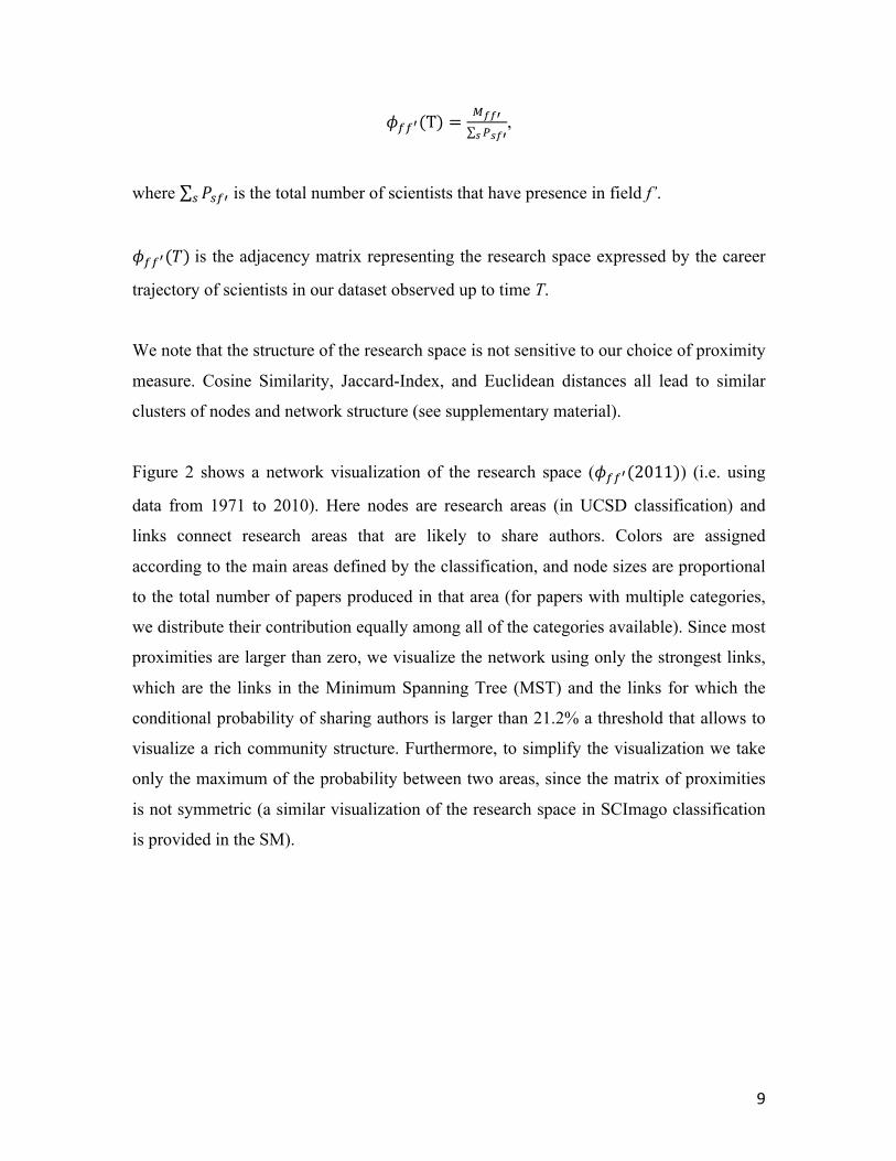
Figure 2 shows a network visualization of the research space (𝜙!!!(2011)) (i.e. using
data from 1971 to 2010). Here nodes are research areas (in UCSD classification) and
links connect research areas that are likely to share authors. Colors are assigned
according to the main areas defined by the classification, and node sizes are proportional
to the total number of papers produced in that area (for papers with multiple categories,
we distribute their contribution equally among all of the categories available). Since most
proximities are larger than zero, we visualize the network using only the strongest links,
which are the links in the Minimum Spanning Tree (MST) and the links for which the
conditional probability of sharing authors is larger than 21.2% a threshold that allows to
visualize a rich community structure. Furthermore, to simplify the visualization we take
only the maximum of the probability between two areas, since the matrix of proximities
is not symmetric (a similar visualization of the research space in SCImago classification
is provided in the SM).

10
Figure 2: The Research Space. Nodes represent research fields and links connect fields that are likely to
share authors. The size of nodes is proportional to the number of papers published in that field.
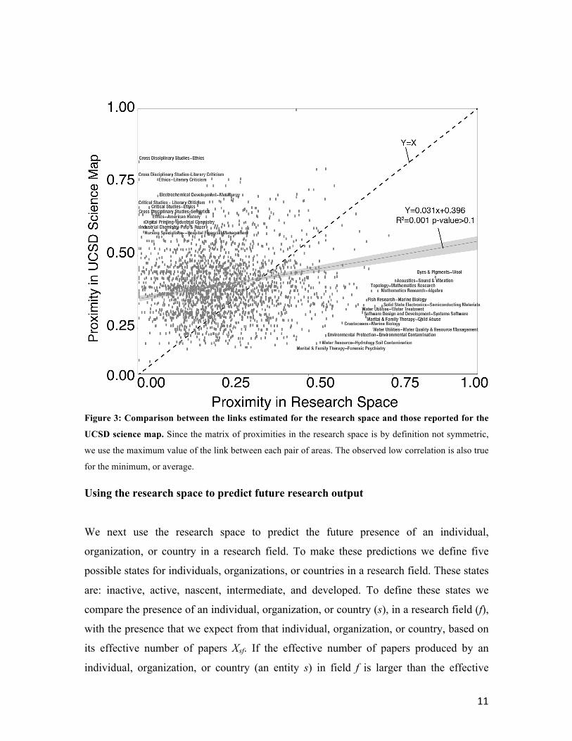
Next, we compare the links in the research space with the UCSD bibliographic coupling
science map using a scatter plot and a linear model (Figure 3). Surprisingly, since we
expect fields that share authors to cite each other, we find a relatively low correlation (R2
= 0.001) between the links in both maps. For instance, the proximity among
“Crustaceans” and “Marine Biology”, or “Environmental Protection” and “Water
Treatment” in the research space is high, while the volume of citations among both of
these pairs of fields in the UCSD science map is low. Conversely, “Cross Disciplinary
Studies” with “Ethics”, or “Electrochemical Development” and “Metallurgy” are pairs of
fields that often cite each other, but share a relatively small number of co-authors. This
orthogonally between both maps tells us that predictions made with either of them will
likely be dissimilar since the UCSD map is capturing the relatedness or knowledge flows
between fields, and the research space is capturing the sharing capacities needed to
produce science in different fields.
11
Figure 3: Comparison between the links estimated for the research space and those reported for the
UCSD science map. Since the matrix of proximities in the research space is by definition not symmetric,
we use the maximum value of the link between each pair of areas. The observed low correlation is also true
for the minimum, or average.
Using the research space to predict future research output
We next use the research space to predict the future presence of an individual,
organization, or country in a research field. To make these predictions we define five
possible states for individuals, organizations, or countries in a research field. These states
are: inactive, active, nascent, intermediate, and developed. To define these states we
compare the presence of an individual, organization, or country (s), in a research field (f),
with the presence that we expect from that individual, organization, or country, based on
its effective number of papers Xsf. If the effective number of papers produced by an
individual, organization, or country (an entity s) in field f is larger than the effective

12
number of papers we expected from an entity with that many total papers in that field,
then we say that entity s is developed in the field f. Formally we define the level of
development of an individual, organization, or country s in field f using the Revealed
Comparative Advantage indicator 17 which is defined as:
𝑅𝐶𝐴!" =
𝑋!"𝑋!"!
𝑋!"!𝑋!"!"
The RCA and its normalized version, known in Scientometrics as the Activity Index (AI),
have been widely used to analyze the research output of countries 18–22. Here, we use
RCAsf to define the five discrete states that we use to characterize the diversification and
evolution of the research output of individuals, organizations, and countries:
Inactive (with no papers in the field): 0 = RCAsf
Active (with papers in the field): 0 < RCAsf
Nascent (with a few papers in the field): 0 < RCAsf < 0.5
Intermediate (with less papers than expected in the field): 0.5 ≤ RCAsf < 1
Developed (with more papers than expected in the field): 1 ≤ RCAsf
We then predict the probability that individual, organization, or country, s will increase
its level of development in field f by creating an indicator of the fraction of fields that are
connected to field f and that are already developed by s. When we are evaluating
transitions to a developed state (to RCAsf >1), we define Usf as a matrix that is equal to
one when RCAsf ≥1 and 0 otherwise. When we are evaluating the transition from an
inactive to an active state (from RCAsf =0 to RCAsf >0), we define Usf =1 when RCAsf ≥0.
Using the U matrix we define the density of entity s on field f (ωsf), which is our
estimator of the probability that entity s will increase its level of activity in field f as:

13
𝜔!" =𝑈!"!𝜙!!!!!
𝜙!!!!!
Finally, to predict a transition of entity in field f between a pair of states (i.e. from
inactive to active), we look at all fields that are in the initial state (i.e. inactive) and sort
them by density (ωsf). The prediction is that the field with higher density will transition to
a higher state of development (e.g. from inactive to active), before the fields with lower
densities.
For the UCSD science map, we use the same algorithm, but replacing φff’ and φf’f by the
links φff’ between fields made available in 3. The construction of the links of the UCSD
science map is detailed in the supplementary material of 3.
Results
We now use the methodology described above to predict the future presence of an
individual, organization, or country, in a field that he or she has not participated in. To
measure the accuracy of our predictions we use the area under the Response Operator
Characteristics curve (ROC curve). The ROC curve plots the true positive rate of a
predictive algorithm (in the y-axis) against its false positive rate (x-axis). A random
prediction, having the same rate of true positives and false positives, produces a ROC
curve with an area of 0.5, so values between 0.5 and 1 represent the accuracy of the
predictive method. The ROC curve is a standard statistic used to measure the accuracy of
a predictive method and is related to the Mann-Whitney U-test, which measures the
probability that a true positive is ranked above a false positive.
To make our predictions using the research space we construct our proximity matrix
using only data from years prior to 2011 (i.e. from 1971 to 2010). We then look at the
state (i.e. inactive, active, etc.) of individuals, organizations, and countries for each
research field using data from 2008 to 2010. Finally, we predict changes in the level of
development (i.e. from inactive to active) of each individual, organization, and country,

14
observed between 2011 and 2013. In the remainder of the paper we study seven changes
in the level of development of an entity in a field. Changes from inactive to active for
individuals, institutions and countries, and changes from nascent to developed, and from
intermediate to developed for organizations and countries (since RCA values to level of
individuals are not meaningful).
Figures 4 a-c, compare the accuracy achieved by the research space and the UCSD
science map for the transition from inactive to. Figures 4 d-e and figures 4 f-g compare
the accuracy of the transitions from nascent to developed and from intermediate to
developed, respectively. For individuals we only look at transitions from inactive to
active, since the nascent and intermediate levels do not make sense for individuals given
their limited output (compared to organizations and countries). The distributions of areas
under the ROC curve obtained for each transition and method are shown using boxplots
(where the horizontal bar is the median, the red circle is the mean, the box contains the
interquartile range, and the whiskers encompass more than 96% of the sample). These
boxplots describe the distribution for the areas under the ROC curve obtained,
respectively, for 4,850 individuals 730 organizations (including research institutions), and
77 countries. The inclusion criteria involved all entities satisfying the inequality
𝑋!" 𝑇!
!!!!!∆!
!!!!
= 𝐵∆𝑇
with B = 3 for individuals, and B = 30 for countries and organizations. The inequality
helps us focus on the most productive individuals, organizations, and countries.

15
Figure 4: The predictive power of the Research Space (RS) versus the UCSD science map. For each
entity, a ROC curve is calculated across fields for the given transition. Each boxplot represents the
distribution of AUCs. Higher values indicate higher predictive accuracy.
We now focus on transitions from inactive to active (from having no papers in the field
(RCAsf=0) to having some (RCAsf>0)). For both individuals (Figure 3 a) and organizations
(Figure 3 b) we find that the predictions made using the research space are significantly
more accurate than the predictions made using the UCSD science map. The average area
under the ROC curve for individuals (Figure 3 a) is 0.8963 for the research space and
0.8034 for the UCSD science map. This difference is highly statistically significant
(ANOVA p-value<0.001). For organizations (Figure 3 b), the averaged accuracy is lower,
but the research space is also significantly more accurate than the UCSD science map
when it comes to predicting the future presence of a organization in a research field
(averages are AUCresearch_space=0.7148, AUCUCSD_science_map=0.6873, ANOVA p-
value<0.001). For countries, however, both methods are equally accurate (Figure 3 c
averages are AUCresearch_space=0.6816, AUCUCSD_science_map =0.6819, ANOVA p-
value>0.1), indicating that the increase in accuracy observed for the research space
expressed itself for more disaggregate units (individuals and organizations).
Individuals Institutions Countries
●
●●
●
●
●●
●
●
●
●●●
●
●
●●●
●
●
●
●
●●
●
●
●●
●
●
●
●
●
●
●
●●
●
●
●
●
●●
●
●
●●●
●
●●
●●
●
●●
●
●
●●●●
●
●●
●
●●●
●●
●
●●●
●
●
●●●
●
●
●
●
●
●
●
●
●●
●
●●
●
●
●
●
●●
●
●●●
●
●●
●
●
●
●
●
●●●●
●●
●●●
●
●
●
●●
●
●
●
●
●
●
●
●
●
●
●
●
●
●
●
●
●●
●●
●
●
●●
●●
●
●
●
●
●
●●
●
●
●
●
●
●
●●
●
●
●
●
●
●
●
●●
●
●
●
●
●
●
●
●
●
●●●
●
●
●
●
●
●
●
0.00
0.25
0.50
0.75
1.00
RS UCSD RS UCSD RS UCSD
AUC
from
Inac
tive
to A
ctiv
eInstitutions Countries
●●
●
●
●
●●
●
●
●
●●
●
●
●●
●
●
●
●
●
●
●
●●●●
●
●
●●
●
●
●
●
0.00
0.25
0.50
0.75
1.00
RS UCSD RS UCSDAU
C fr
om N
asce
nt to
Dev
elop
ed
Institutions Countries
●
●
●
●
●●
●
●
●
●
●
●
●
●
●
●
●●
●
●
●
●●
●
●
●
●
●
●
●
●●
●
●
●
●●●
●
●
●
●
●
●●
●
●●●
●
●
0.00
0.25
0.50
0.75
1.00
RS UCSD RS UCSD
AUC
from
Inte
rmed
iate
to D
evel
oped
Inactive to Active Nascent to Developed Intermediate to Developed
a b c d e f g
with p<0.01
with p<0.05
*** *** ** ***

16
Now, we focus on transitions from nascent to developed. These are transitions where a
country, or organization, went from having a relatively small presence in a research field
(0<RCAsf<0.5), to a presence that is larger than what is expected from their size and the
size of the field (RCAsf>1). Once again we find that for organizations (Figure 3 d) the
predictions made using the research space are significantly more accurate than the
predictions made using the UCSD science map when it comes to predicting the future
development of a organization in a research field (averages are AUCresearch_space=0.6927,
AUCUCSD_science_map =0.6696, ANOVA p-value<0.05). For countries, however, Figure 3 e
both methods are equally accurate (averages are AUCresearch_space=0.6387,
AUCUCSD_science_map =0.6239, ANOVA p-value>0.1), indicating that for transitions from
nascent to developed the increase in accuracy observed for the research space is also
expressed itself for more disaggregate units (individuals and organizations).
Finally, we look at the transitions from intermediate to developed. These are transitions
where a country or organization, went from having a good-sized presence in a research
field (0.5≤RCAsf<1), to a presence that is larger than what is expected from their size and
the size of the field (RCAsf≥1). Once again we find that for organizations (Figure 3 f) the
predictions made using the research space are significantly more accurate than the
predictions made using the UCSD science map. The average area under the ROC curve
for organizations is 0.6390 for the research space and 0.6164 for the UCSD science map.
This difference is highly statistically significant (ANOVA p-value<0.01). For countries,
however, Figure 3 g both methods are equally accurate (averages are
AUCresearch_space=0.6447, AUCUCSD_science_map = 0.6213, ANOVA p-value>0.05), indicating
that for transitions from nascent to developed the increase in accuracy observed for the
research space is also expressed itself for more disaggregate units (individuals and
organizations).
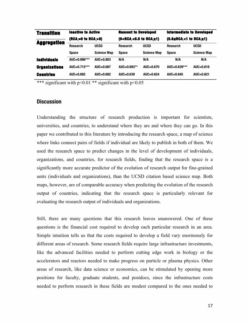
Table 1 summarizes our results. Rows represent the levels of aggregation (individuals,
organizations, and countries), and columns represent the transitions studied (inactive to
active, nascent to developed, and intermediate to developed).
17
Transition
Aggregation
Inactive to Active
(RCAsf=0 to RCA
sf>0)
Nascent to Developed
(0<RCAsf<0.5 to RCA
sf≥1)
Intermediate to Developed
(0.5≤RCAif<1 to RCA
sf≥1)
Research
Space
UCSD
Science Map
Research
Space
UCSD
Science Map
Research
Space
UCSD
Science Map
Individuals AUC=0.896*** AUC=0.803 N/A N/A N/A N/A
Organizations AUC=0.715*** AUC=0.687 AUC=0.693** AUC=0.670 AUC=0.639*** AUC=0.616
Countries AUC=0.682 AUC=0.682 AUC=0.639 AUC=0.624 AUC=0.645 AUC=0.621
*** significant with p<0.01 ** significant with p<0.05
Discussion Understanding the structure of research production is important for scientists,
universities, and countries, to understand where they are and where they can go. In this
paper we contributed to this literature by introducing the research space, a map of science
where links connect pairs of fields if individual are likely to publish in both of them. We
used the research space to predict changes in the level of development of individuals,
organizations, and countries, for research fields, finding that the research space is a
significantly more accurate predictor of the evolution of research output for fine-grained
units (individuals and organizations), than the UCSD citation based science map. Both
maps, however, are of comparable accuracy when predicting the evolution of the research
output of countries, indicating that the research space is particularly relevant for
evaluating the research output of individuals and organizations.
Still, there are many questions that this research leaves unanswered. One of these
questions is the financial cost required to develop each particular research in an area.
Simple intuition tells us that the costs required to develop a field vary enormously for
different areas of research. Some research fields require large infrastructure investments,
like the advanced facilities needed to perform cutting edge work in biology or the
accelerators and reactors needed to make progress on particle or plasma physics. Other
areas of research, like data science or economics, can be stimulated by opening more
positions for faculty, graduate students, and postdocs, since the infrastructure costs
needed to perform research in these fields are modest compared to the ones needed to
18
perform research in more capital intensive fields. In the future, a methodology to evaluate
the potential of success of an individual or organization in a field, together with the costs
needed to advance research in that direction, would help provide a tool that policy makers
could use to strategize the development of research efforts. Our hope is that the methods
advanced in this paper are a step in that direction.
Acknowledgements:
MG and CH were supported by the MIT Media Lab Consortia and MIT Chile Seed Fund.
MG was supported by the Universidad de Playa Ancha, Chile (ING01-1516) and the
Universidad Técnica Federico Santa María, Chile (PIIC2015). DH was supported by the
Marie Curie International Outgoing Fellowship within the EU 7th Framework Programme
for Research and Technical Development: Connecting_EU! - PIOF-GA-2012-328828.
MM was supported by Basal Project FB-0821. CH was supported by the Metaknowledge
Network at the University of Chicago.
References: 1. Fox, M. F. Gender, family characteristics, and publication productivity among
scientists. Soc. Stud. Sci. 35, 131–150 (2005).
2. Granovetter, M. Economic action and social structure: The problem of
embeddedness. Am. J. Sociol. 481–510 (1985).
3. Börner, K. et al. Design and Update of a Classification System: The UCSD Map of
Science. PLoS ONE 7, e39464 (2012).
4. Boyack, K. W., Klavans, R. & Börner, K. Mapping the backbone of science.
Scientometrics 64, 351–374 (2005).
5. Leydesdorff, L. & Rafols, I. A global map of science based on the ISI subject
categories. J. Am. Soc. Inf. Sci. Technol. 60, 348–362 (2009).

19
6. Moya-Anegón, F. et al. A new technique for building maps of large scientific
domains based on the cocitation of classes and categories. Scientometrics 61, 129–
145 (2004).
7. Small, H. Co-citation in the scientific literature: A new measure of the relationship
between two documents. J. Am. Soc. Inf. Sci. 24, 265–269 (1973).
8. Small, H. Visualizing science by citation mapping. J. Am. Soc. Inf. Sci. 50, 799–813
(1999).
9. Rosvall, M. & Bergstrom, C. T. Maps of random walks on complex networks reveal
community structure. Proc. Natl. Acad. Sci. 105, 1118–1123 (2008).
10. Bollen, J. et al. Clickstream Data Yields High-Resolution Maps of Science. PLoS
ONE 4, e4803 (2009).
11. Klavans, R. & Boyack, K. W. Toward a consensus map of science. J. Am. Soc. Inf.
Sci. Technol. 60, 455–476 (2009).
12. Rafols, I., Porter, A. L. & Leydesdorff, L. Science overlay maps: A new tool for
research policy and library management. J. Am. Soc. Inf. Sci. Technol. 61, 1871–1887
(2010).
13. Neffke, F. & Henning, M. Skill relatedness and firm diversification. Strateg. Manag.
J. 34, 297–316 (2013).
14. Neffke, F., Otto, A. & Hidalgo, C. A. The mobility of displaced workers: How the
local industry mix affects job search strategies. (2016).
15. DataViva. (2016). Available at: http://en.dataviva.info/. (Accessed: 3rd February
2016)

20
16. Cybermetrics Lab. About Us | Ranking Web of Universities. (2015). Available at:
http://webometrics.info/en/About_Us. (Accessed: 25th February 2016)
17. Balassa, B. Trade Liberalisation and ‘Revealed’ Comparative Advantage1. Manch.
Sch. 33, 99–123 (1965).
18. Abramo, G. & D’Angelo, C. A. How do you define and measure research
productivity? Scientometrics 1–16 (2014). doi:10.1007/s11192-014-1269-8
19. Cimini, G., Gabrielli, A. & Sylos Labini, F. The Scientific Competitiveness of
Nations. PLoS ONE 9, e113470 (2014).
20. Elhorst, J. P. & Zigova, K. Competition in Research Activity among Economic
Departments: Evidence by Negative Spatial Autocorrelation. Geogr. Anal. 46, 104–
125 (2014).
21. Guevara, M. & Mendoza, M. Revealing Comparative Advantages in the Backbone of
Science. Proceedings of the 2013 Workshop on Computational Scientometrics:
Theory & Applications 31–36 (ACM, 2013). doi:10.1145/2508497.2508503
22. Harzing, A.-W. & Giroud, A. The competitive advantage of nations: An application
to academia. J. Informetr. 8, 29–42 (2014).