E Pluribus Unum? The Language for a National Literature in ...

The Monumental Geometry of E Pluribus UnumCraig S. Kaplan∗
Cheriton School of Computer ScienceUniversity of Waterloo
Chris JordanArtist
Seattle, Washington
Abstract
We describe the conception and construction of E Pluribus Unum, alarge-scale artwork that combines text and geometry to depict overa million names of global organizations dedicated to social and en-vironmental causes. The names are rendered in small type alonglines arranged symmetrically in a disc. We examine the aestheticchoices involved in designing the artwork, and the technical chal-lenges we faced in laying out and rendering a monumental amountof text.
CR Categories: I.3.8 [Computer Graphics]: ApplicationsJ.5 [Computer Applications]: Arts and Humanities—Fine artsI.3.5 [Computer Graphics]: Computational Geometry and ObjectModeling—Geometric algorithms, languages, and systems
Keywords: typography, geometry, mandala, art
1 Introduction
The scale and interconnectedness of contemporary global cultureare too vast, too complex, and too rapidly changing for the hu-man mind to comprehend. We are steadily bombarded by quantitiesmeasured in terabytes, tonnes, and trillions of dollars, but these ab-stractions rob the real world of its substance and provide only afacile summary.
Art is a medium in which to confront these questions of scale, ameans of building a metaphorical lens through which an individualmight glimpse humanity as a whole.
The second author is a digital artist who has been tackling this prob-lem for 15 years. He has created a number of works that present theviewer with a concrete manifestation of an otherwise incomprehen-sible datum. His images typically consist of simple arrangementsof small elements—plastic cups, or cigarette packages, or creditcards—by the thousands or millions. Often the small elements arearranged by colour or tone so that they collectively give rise to asingle larger image, in the manner of an image mosaic [Rosin andCollomosse 2013, Chapter 10]. These works are gigapixel imagesintended to be presented as large-scale digital prints, ranging fromtwo to twelve square meters in surface area. The imposing phys-ical size of these artworks turns the blandness of a number into avisceral experience. They also afford a unique opportunity to expe-rience complex information at multiple scales; a viewer can standback to take in the entire composition at a glance, but then approachcontinuously until they can resolve each of the individual elements.When a large-scale physical artwork cannot be displayed at its na-tive size, an interactive visualization that permits exploration viadeep zooming can serve as a substitute.
∗e-mail:[email protected]
Most of the artist’s works depict aspects of modern society that canbe considered negative: the deterioration of the natural world, over-reliance on disposable goods, and human tendencies towards vio-lence, vice, and vanity. The goal is not to confront the viewer withpurely negative imagery, but to depict these aspects of society asthey are; the viewer is invited to contemplate the consequences ofhumanity’s collective action, and to consider change if they find theresult objectionable.
In 2008, however, he conceived of a new work that would presenta positive aspect of our interconnectedness. He envisioned a large-scale composition made up of a symmetric arrangement of linescriss-crossing a circle. The design would evoke the symbolism ofthe circle in the world’s cultural traditions—most immediately themandala in Hinduism and Buddhism, but also the Gothic rose win-dow, the compass rose, Indra’s net, and the human eye. At a dis-tance, the lines would represent links between people and groupsall over the world. Close up, it would become clear that each lineis built from text, showing the names of a million worldwide orga-nizations devoted to peace, environmental stewardship, social jus-tice, and the preservation of diverse and indigenous culture (the truenumber of such organizations is estimated to be much higher, andgrowing). The intention is to depict the ability of these organiza-tions to draw humanity closer together, into a consistent force forgood on earth. The piece was to be called E Pluribus Unum (fromthe many, one).
The creation of such an artwork embodies several novel technicalchallenges, particularly concerning the layout and rendering of suchan enormous amount of text in a single composition (the final piececontains nearly 33,000,000 characters, equivalent to more than 25copies of Moby-Dick on a single page). The first author, a com-puter graphics researcher, collaborated remotely with the artist bycreating a suite of interactive and offline software tools. The toolsallowed us to work together on decisions related to aesthetic goals(such as the geometry of the mandala and choice of typeface) andengineering goals (such as the print size and resolution).
This paper describes the artistic and technical collaboration that ledto the production of E Pluribus Unum. We will discuss the collec-tion of a database of organization names (Section 2), the explorationof the space of mandala designs (Section 3), and the layout (Sec-tion 4) and rendering (Section 5) of the text.
2 Taking names
In 2007, author and entrepreneur Paul Hawken published BlessedUnrest [Hawken 2008]. This book explores the global rise andimpact of environmental and social justice organizations, viewingthem collectively as a single movement. The book’s developmentled to the creation of the WiserEarth project (www.wiser.org),a virtual community in which individuals and organizations canexchange information. The WiserEarth website includes a direc-tory of organizations from around the world, whose names are anideal list for E Pluribus Unum. From WiserEarth we obtained alist of 113,037 names, capturing a snapshot of their directory as ofearly 2008 (their directory has since grown to 114,985). The listis perforce incomplete, and biased towards English- and Spanish-speaking parts of the world.

In such a list, errors must be accepted as inevitable. The list wouldconsume more than 900 printed pages, making it impossible toproofread every entry for spelling mistakes. A subtler technicalcomplication is that while most names were provided in a standardUTF-8 encoding, a few used alternate encodings within the samefile. Because of the frequency of accented characters, this inconsis-tency cannot be ignored. We developed a Python script that sani-tized the input. It would naively attempt to convert the string fromUTF-8 to ASCII, replacing all accented characters with equivalentXML character entity references (for example, “e” would be re-placed with “ë”). If the conversion failed, it indicated the useof an alternate non-ASCII character encoding. We repaired thesefailure cases by manually constructing an auxiliary table mappingbyte sequences to XML entity references; fortunately, only twentyor so of these fixups were needed to process the entire file. Theprocess leaves us hoping that digital text will continue to convergeon a single global standard.
3 Mandala design
The artistic goal for this project was to depict global connectionsbetween people symbolically via lines crossing a disc. It is naturalto gravitate towards a symmetric layout, with people represented byN evenly distributed points (v1, . . . , vN ) on the disc’s boundary.We will connect these points with line segments in such a way thatthe resulting design has dN symmetry (i.e., the symmetries of aregular N -sided polygon). The lines we choose to draw will then bea subset of the edges of the complete graph on these N vertices. Wecan create different designs by assigning different tones or coloursto sets of edges, including the possibility of omitting them from thedrawing altogether. We refer to any design created this way as a“mandala”. A mandala will form the geometric scaffolding uponwhich we will eventually render text.
In order to proceed, we needed an effective and collaborative way toexplore the space of mandala designs. The first author created an in-teractive Java application to facilitate this exploration. After a valueof N is chosen on the command line, the interface displays threewindows, as shown in Figure 1. The first window is a colour paletteconsisting of eight shades of grey and a “disabled” colour. The sec-ond window is a single vertex view showing v1 at the “north pole”of the mandala, together with its N − 1 connections to all othervertices. The third window is a zoomable preview of the completedesign. Each edge in the single vertex view terminates in a smalldisc; clicking on that disc applies the currently selected colour tothe corresponding edge. Clicking on vk applies the same changeto vN+2−k, the edge’s reflection across the diameter containing v1,thus preserving global dN symmetry.
The application renders the mandala by drawing the packet ofcoloured edges, as shown in the single vertex view, at every ver-tex in the mandala. We draw the edge from vi to vj only if i < j,which avoids drawing every edge twice. In our greyscale model,edges are drawn strictly from lightest to darkest (and disabled edgesare skipped). This drawing order can lead to a feeling of depth, withfainter lines receding into the background.
The mandala can be saved as an Encapsulated Postscript file foreasy viewing. The file contains an embedded comment with high-level state information, allowing mandalas to be read back into theinterface and used by subsequent algorithms in the construction ofE Pluribus Unum. This simple expedient avoids the need for a sepa-rate save file, and guarantees that the symbolic and graphical viewsof the same information remain synchronized.
This application allowed us to explore possible mandalas quicklyand productively. Figure 2 gives several examples. We concen-trated on mandalas with 108 and 144 points, with a strong bias
towards 108 because of its spiritual significance in Hinduism andBuddhism.1 We find these mandalas to be simple, compelling worksof abstract line art. For large values of N , a variety of interestingtextures emerge as one travels from the centre of the design out tothe boundary. Note that when N is even, the diameters of the discare part of the complete graph. We consistently disabled these tokeep the centre of the disc open. We favour the aesthetic qualitiesof an open centre: it creates a space of relative calm in the centre ofa chaotic design.
Once we began generating complete prototypes of E PluribusUnum, we further iterated the mandala design, driven by the goalof rendering at least a million names at the chosen mandala sizeand text size. The threshold of one million was chosen as a meansof estimating the true number of service organizations, of whichour list of names represented only a small fraction. In the end, wewere able to achieve our goal with a relatively simple design withmaximal impact (Figure 2d): a 108-pointed mandala with diametersdisabled and all other edges coloured black.
4 Layout
The previous section yields a set of lines in the plane. Each linemust now be packed with text, specifically a sequence of namestaken from the list collected in Section 2. Given our intention toplace at least a million names from a list of around 100,000, wemust expect names to repeat, and take measures to ensure that therepetitions do not produce any discernible patterns in the layout.Ideally, it would be impossible to find any repetitions upon a cur-sory inspection of the finished piece.
We proceed under the assumption that the name sequence foreach line can be computed in isolation (i.e., that sufficient per-line randomness will lead to sufficient randomness across the com-plete design). Let the complete list of K names be denoted by(s1, . . . , sK), where each si is a unicode string. Each si has somelength wi when rendered in a given typeface at a given size. Wealso define a separator string ssep that will be placed between adja-cent names, with its associated length wsep. For a line segment L oflength d, we must then find a sequence of M indices (i1, . . . , iM )
such that d−∑M
j=1 wij − (M − 1)wsep is small but positive. Thatis, the total length of all text in the line, including separators, shouldcome close to d without exceeding it.
We can immediately recognize this question as a variant of theSUBSET SUM problem [Cormen et al. 2009, Section 35.5], forwhich an optimal solution is intractable. Fortunately, there aretwo important reasons why optimality is not crucial. First, at ourplanned mandala and text sizes, lines will be much longer thannames. Because we have a large set of names evenly distributedover a range of lengths, we can expect to pack lines greedily, neverleaving behind space longer than the shortest name. Second, eachvertex will be the meeting place of a large number of overlappinglines (107 in our final design). The termination point of incom-plete lines will still be well within the region of heavy overlap. Inany case, true optimality would be deterministic, undermining ourquest for randomness.
In practice, we use a simple greedy algorithm. Assume the namesare sorted by length, so that w1 < w2 < . . . < wK . Let d repre-sent the amount of empty space remaining on a line. Using binarysearch, we can find imin, the smallest index for which wimin > d.If imin = 0 then no names fit in the remaining space and the algo-rithm terminates. Otherwise, we add s⌊√uimin⌋ to the line, whereu is a uniformly distributed random number in [0, 1]. The square
1See, for example, the Wikipedia page for the number 108.
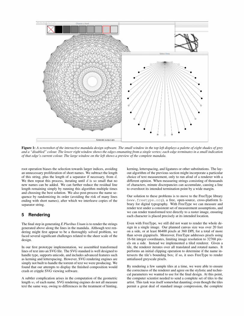
Figure 1: A screenshot of the interactive mandala design software. The small window in the top left displays a palette of eight shades of greyand a “disabled” colour. The lower right window shows the edges emanating from a single vertex; each edge terminates in a small indicationof that edge’s current colour. The large window on the left shows a preview of the complete mandala.
root operation biases the selection towards larger indices, avoidingan unnecessary proliferation of short names. We subtract the lengthof this string, plus the length of a separator if necessary, from d.We then repeat this process, iterating until d is so small that nonew names can be added. We can further reduce the residual linelength remaining simply by running this algorithm multiple timesand choosing the best solution. We also post-process the name se-quence by randomizing its order (avoiding the risk of many linesending with short names), after which we interleave copies of theseparator string.
5 Rendering
The final step in generating E Pluribus Unum is to render the stringsgenerated above along the lines in the mandala. Although text ren-dering might first appear to be a thoroughly solved problem, wefaced several significant challenges related to the sheer scale of thedesign.
In our first prototype implementation, we assembled transformedlines of text into an SVG file. The SVG standard is well designed tohandle type, supports unicode, and includes advanced features suchas kerning and letterspacing. However, SVG rendering engines aresimply not built to handle the torrent of text we were producing. Wefound that our attempts to display the finished composition wouldcrash or cripple SVG viewing software.
A subtler complication arises in the computation of the geometriclength wi of each name. SVG rendering engines do not all measuretext the same way, owing to differences in the treatment of hinting,
kerning, letterspacing, and ligatures or other substitutions. The lay-out algorithm of the previous section might incorporate a particularchoice of text measurement, only to run afoul of a renderer with adifferent opinion. When measuring strings consisting of thousandsof characters, minute discrepancies can accumulate, causing a lineto overshoot its intended termination point by a wide margin.
Our solution to these problems is to move to the FreeType library(www.freetype.org), a free, open-source, cross-platform li-brary for digital typography. With FreeType we can measure andrender text under a consistent set of measurement assumptions, andwe can render transformed text directly to a raster image, ensuringeach character is placed precisely at its intended location.
Even with FreeType, we still did not want to render the whole de-sign in a single image. Our planned canvas size was over 20 feeton a side, or at least 86400 pixels at 360 DPI, for a total of morethan seven gigapixels. Moreover, FreeType addresses pixels using16-bit integer coordinates, limiting image resolution to 32768 pix-els on a side. Instead we implemented a tiled renderer. Given atile, the renderer iterates over all translated and rotated names. Itperforms an initial clipping operation to determine if the name in-tersects the tile’s bounding box; if so, it uses FreeType to renderantialiased greyscale pixels.
By rendering a few sample tiles at a time, we were able to ensurethe correctness of the renderer and agree on the stylistic and techni-cal parameters we wanted to use for the final design. At this point,the computer scientist needed to send a complete set of tiles to theartist. This task was itself somewhat daunting; even though the tilespermit a great deal of standard image compression, the complete

Figure 2: Four sample mandalas created using the software described in Section 3. The designs have 12, 23, 60 and 108 points. The 108-pointed mandala (d) is the design used in the final composition of E Pluribus Unum. At standard screen resolutions, the geometric structurethe 108-pointed mandala is nearly invisible; the reader is encouraged to zoom in to see the fine details.

set would still be a heavy amount of data to transmit over the inter-net. In the end, the artist received the tiles in the most compressedpossible form: the renderer executable, together with the ASCII-encoded list of names and a shell script that invoked the renderer torenegerate the tiles on the artist’s computer.
As much as possible, text is oriented to be read left-to-right. Thatis, for an edge connecting two vertices, we begin the text at theleftmost of the two. Before rotating, we shift every line of text downvertically so that the centre of the line’s bounding box coincideswith the mandala edge, rather than the typeface’s baseline.
6 The final design
With the entire system in place, we explored mandala configura-tions and typographic variations until we arrived at a satisfactorydesign. The final version is intended to be rendered at 360 DPI on acanvas 24 feet on a side, containing a mandala 22 feet in diameter.The text is set in 4 point Helvetica Neue Medium Condensed, verysmall but legible when viewed from a position close to the design.The small scale of the text is consistent with previous compositionsby the artist, in which individual primitives sometimes hover on theedge of visibility.
In addition to using a condensed typeface, we took several othermeasures to increase the perception of solid lines at a distance.First, we removed all internal spaces from organization names, toavoid leaving gaps. Second, we incorporated negative letterspacingto pack characters snugly together. Third, we chose a simple slashcharacter as the separator. Naturally, the first two changes also al-lowed us to pack more names into the same mandala.
The structure of E Pluribus Unum is itself a lesson in numbers thatare difficult to comprehend. The 5724 lines of the mandala run fora total of almost 16.3 miles, and contain 1,005,714 names. Differ-ent names repeat different numbers of times, in an uneven distri-bution: 87% of names repeat fewer than 20 times, another 5.4%repeat more, up to a maximum of 544 times (still fewer than one in1800 names, ensuring that repetitions are difficult to find). By luckof the draw 7.6% of names in the original list do not appear in thefinal design. It would be interesting to revise the layout algorithmto minimize the set of unused names, though doing so is primarilyan algorithmic challenge—it is unlikely to affect the aesthetics ofthe design.
Figure 3 shows a sequence of images of E Pluribus Unum, be-ginning with the whole design and zooming in on a small sec-tion. At typical screen and document sizes, no single image canhope to convey the evolving forms and textures contained in the de-sign over its full range of magnifications. By taking advantangeof Deep Zoom Images in Microsoft Silverlight, we also createda web page where the design can be explored interactively (seehttp://www.chrisjordan.com/gallery/epu/).
We built a prototype physical print by mounting large-format inkjetprints on foamcore; this prototype was shown as part of an exhi-bition of the artist’s work. Our long-term goal, however, is to fab-ricate E Pluribus Unum from laser-etched panels of anodized alu-minium.
7 Conclusions
One goal of E Pluribus Unum was to reflect on the positive aspectsof interconnectedness in the modern world. We find it fitting, then,that this work was undertaken by two collaborators who have nevermet face-to-face, using email to bridge a continent-sized geograph-ical separation.
In the end, the technical challenges we faced were fairly straight-forward, and did not require radical new graphics techniques. Nev-ertheless, we feel that the story of our collaboration, and the workthat emerged from it, may be of interest to researchers interestedin computational aesthetics, geometric art, and the visualization oflarge amounts of text.
References
CORMEN, T. H., LEISERSON, C. E., RIVEST, R. L., AND STEIN,C. 2009. Introduction to Algorithms, third ed. MIT Press.
HAWKEN, P. 2008. Blessed Unrest: How the Largest Social Move-ment in History Is Restoring Grace, Justice, and Beauty to theWorld. Penguin Books.
ROSIN, P., AND COLLOMOSSE, J., Eds. 2013. Image and Video-Based Artistic Stylisation, vol. 42 of Computational Imaging andVision. Springer.

Figure 3: A low-resolution rendering of E Pluribus Unum. The row of smaller images at the bottom zooms in progressively on a point aboutone third of the way from the centre to the top of the disc, showing the progression of textures at different scales. Close inspection of the thirdimage in the row suggests the presence of text; the text becomes readable in the fourth, which is shown slightly larger than actual size.