The MarketPulse - corelogic.com · increase isn’t from big institutional buyers, but rather from...
20
The MarketPulse June 2019
Transcript of The MarketPulse - corelogic.com · increase isn’t from big institutional buyers, but rather from...

The MarketPulseJune 2019

Volume 8, Issue 6
June 2019
Data as of April 2019 (unless otherwise stated)
News Media Contact
Chad Yoshinaka [email protected]
817-699-4572 (office)
2
The MarketPulse
Table of ContentsMultifamily Sales and Prices at New Highs . . . . . . . . . . . . . . . .3
Special Report: Investor Home Buying . . . . . . . . . . . . . . . . . . .4
Single-Family Rent Growth Picks Up a Bit . . . . . . . . . . . . . . . . .7
Homebuyers Face Much Slower Growth in the “Typical Mortgage Payment” This Year . . . . . . . . . . . . . . . . . . . . . . . . . .9
In the News . . . . . . . . . . . . . . . . . . . . . . . . . . . . . . . . . . . . . . . . . 11
Charts & Graphs . . . . . . . . . . . . . . . . . . . . . . . . . . . . . . . . . . . . . 12
10 Largest CBSA – Loan Performance Insights Report March 2019 . . 12
Overview of Loan Performance . . . . . . . . . . . . . . . . . . . . . . . . . . . . . . . . . 12
Home Price Index State-Level Detail — Combined Single Family Including Distressed . . . . . . . . . . . . . . . . . . . . . . . . . . . . . . . . . . . . . . . . . . 13
Home Price Index . . . . . . . . . . . . . . . . . . . . . . . . . . . . . . . . . . . . . . . . . . . . . 14
CoreLogic HPI® Market Condition Overview . . . . . . . . . . . . . . . . . . . . . . 15
April 2019 . . . . . . . . . . . . . . . . . . . . . . . . . . . . . . . . . . . . . . . . . . . . . . . . . . . . . . . . . . . . 15
April 2024 . . . . . . . . . . . . . . . . . . . . . . . . . . . . . . . . . . . . . . . . . . . . . . . . . . . . . . . . . . . . 15
National Home Equity Distribution . . . . . . . . . . . . . . . . . . . . . . . . . . . . . . 16
Map of Average Year-Over-Year Equity Gain per Borrower . . . . . . . . . . 16
As of Q1 2019 . . . . . . . . . . . . . . . . . . . . . . . . . . . . . . . . . . . . . . . . . . . . . . . . . . . . . . . . . 16
Housing Statistics June 2019
HPI® YOY Chg 3 .6%
HPI YOY Chg XD 3 .2%
NegEq Share (Q1 2019) 5 .6%

3
Multifamily property sales totaled about $100 billion in 2018, the largest annual volume recorded, and apartment prices reached new highs last year. Rent is expected to rise about 3% in 2019 with cap rates close to last year’s level, supporting further gains in property values.1
Multifamily sales and prices nosedived during the Great Recession but recovered sooner and faster than single-family. According to the CoreLogic Home Price Index for the U.S., home values hit bottom in March 2011, but we found that the recovery in multifamily prices began a year earlier. (Figure 1) A review of CoreLogic’s public records data found that the median purchase price exceeded $100 per square foot in 2018, up 5% from 2017 and more than 50% from the 2010 trough.
Property sales volume and prices vary widely by metropolitan area. The New York and Los Angeles metropolitan statistical areas top all others in apartment building sales, together accounting for about 20% of the national dollar volume. Diff erences in land values and rent equate to wide variation in sales prices. (Figure 2) The sales price per square foot tends to be highest in
1 Urban Land Institute Real Estate Economic Forecast, April 2019.
metros along the Pacifi c coast and in the New York City region. Among the 20 largest multifamily sales markets, we found that San Francisco had the highest median
Multifamily Sales and Prices at New HighsCorelogic Economic Outlook: June 2019
Dr. Frank NothaftExecutive, Chief Economist, Offi ce of the Chief Economist
Frank Nothaft holds the title executive, chief economist for CoreLogic. He leads the Offi ce of the Chief Economist and is responsible for analysis, commentary and forecasting trends in global real estate, insurance and mortgage markets.
Figure 2. Multifamily Prices Highest Along Pacifi c Coast
Metropolitan AreaMedian Price per Square Foot
in 2018 (Dollars)
San Francisco, CA 474
Anaheim, CA 339
San Diego, CA 303
Los Angeles, CA 296
Oakland, CA 291
Seattle, WA 271
New York, NY-NJ 238
Denver, CO 201
Portland, OR-WA 163
Sacramento, CA 159
Washington, DC-VA-MD-WV 141
Dallas, TX 140
Austin, TX 136
Phoenix, AZ 133
Minneapolis, MN-WI 117
Charlotte, NC-SC 102
Tampa, FL 99
Chicago, IL 92
Orlando, FL 90
Atlanta, GA 74
Source: CoreLogic, multifamily property sales during 2018 in the 20 metros with largest sales volume
Continued on page 8
Figure 1. Multifamily Prices Hit New High in 2018 Median Price Per Square Foot (Dollars)
30
40
50
60
70
80
90
100
110
Source: CoreLogic, multifamily property sales

4
Home purchasing activity1 among investors is on the rise. In 2018, the share of home sales bought by investors reached its highest level in two decades. However, this increase isn’t from big institutional buyers, but rather from smaller investors just getting into the game. What’s more, these investors appear to be focusing in the starter-home tier, giving first-time homebuyers a run for their money while also chasing homes in markets with relatively high rents.
In this CoreLogic special report, we take a deep dive into investor homebuying activity. Not only do we investigate investor homebuying nationally, we also identify investor activity by home price tier. Additionally, we examine why investors are more active in some markets than others, and if increasing investor activity tightens market conditions.
1 We define investors as buyers of homes that use a corporate or non-individual identifier on the deed. This includes LLCs, CORPs, and INCs, to name a few. We have removed identifiers that are likely to be government agencies or banks, as these are likely to be non-arm’s length transactions, including REO acquisitions, repossessions, and/or foreclosures rather than open-market transactions .
Investor Activity in the U .S . Housing Market Reaches Record HighsBy the end of 2018, the investment rate in the U.S. housing market reached 11.3%—the highest rate since CoreLogic started tracking these data in 1999. The investment purchase rate in 2017 was the second highest on record at 11%, which was above the investor buying fury of 2012–2014 when purchase rates reached 10.3%–10.9%.
Smaller investors are responsible for increasing investor homebuying activity. This is in sharp contrast to the rise in large institutional investors in the years following the recession. When looking at investor activity based on the total number of properties purchased over our study
Special Report: Investor Home BuyingDon’t Call It a Comeback: Housing Investors Have Been Here for Years
Ralph McLaughlinDeputy Chief Economist
Ralph McLaughlin holds the title deputy chief economist for CoreLogic in the Office of the Chief Economist. He is responsible for leading economic research and using data and analytics to expand the visibility of the CoreLogic economic policy unit. He also works to enhance research capabilities and tools for clients, industry leaders, the public sector and news media.
Ralph has more than 15 years of experience in housing economics, applied econometrics, real estate development and investment, land use planning, spatial analysis, and economic geography. He previously worked at Trulia and Veritas Urbis Economics. He also served as an assistant professor at the San Jose State University. While at Trulia, he led the company’s housing economics research team, providing buyers with key insights about the economy, housing trends and public policy.
Figure 2. U.S. Investor Homebuying Rates by Investor Size: 1999–2018Mom-and-Pop Investor Activity on the Rise
©2019 CoreLogic, Inc. All Rights Reserved.
0%
10%
20%
30%
40%
50%
60%
70%
80%
1999
2000
2001
2002
2003
2004
2005
2006
2007
2008
2009
2010
2011
2012
2013
2014
2015
2016
2017
2018
% o
f Inv
esto
r-Pu
rcha
sed
Hom
es
1-10 Properties 11-100 Properties 101 + Properties
2
2 mclaughlin fig 2 Subhead copy goes here
Source: CoreLogic Public Records and Author’s Calculations
Figure 1. U.S. Investor Homebuying Rates: 1999–2018Investors Purchases are at 20 Year Highs
©2019 CoreLogic, Inc. All Rights Reserved.
4%
5%
6%
7%
8%
9%
10%
11%
12%
1999
2000
2001
2002
2003
2004
2005
2006
2007
2008
2009
2010
2011
2012
2013
2014
2015
2016
2017
2018
1
2 mclaughlin fig 1 Subhead copy goes here
Source: CoreLogic Public Records and Author’s Calculations
Continued on page 5
5
period, we found small investors—those who purchased 10 homes or less between 1999 and 2018—have increased their share of homebuying more than large- and medium-sized investors. These so-called “mom-and-pop” investors grew from 48% of all investor-purchased homes in 2013 to more than 60% in 2018. Large investors—those who purchased more than 101 homes—nearly doubled their activity between 2000 and 2013 but have pulled back since the foreclosure crisis and now sit at 15.8% of purchases. Medium-sized investors—those who purchased between 11 and 100 homes—have also seen their share steadily fall, from a peak of 30% in 2010 to 22.7% in 2018.
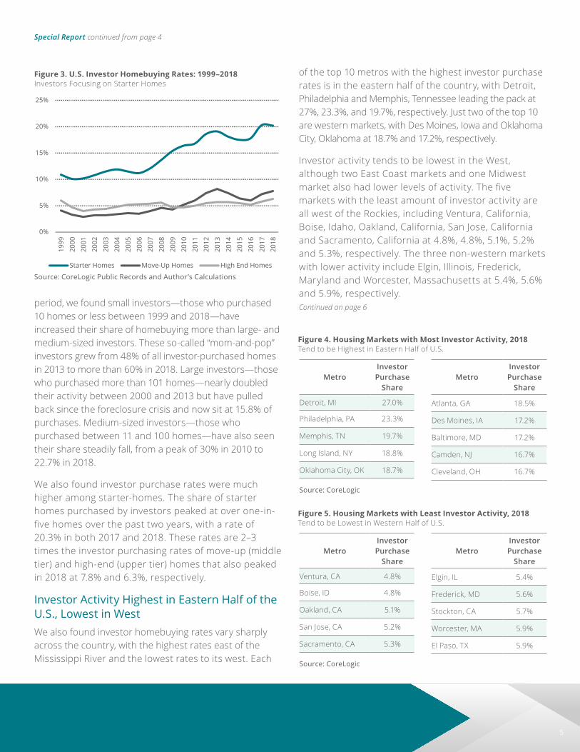
We also found investor purchase rates were much higher among starter-homes. The share of starter homes purchased by investors peaked at over one-in-five homes over the past two years, with a rate of 20.3% in both 2017 and 2018. These rates are 2–3 times the investor purchasing rates of move-up (middle tier) and high-end (upper tier) homes that also peaked in 2018 at 7.8% and 6.3%, respectively.
Investor Activity Highest in Eastern Half of the U .S ., Lowest in WestWe also found investor homebuying rates vary sharply across the country, with the highest rates east of the Mississippi River and the lowest rates to its west. Each
of the top 10 metros with the highest investor purchase rates is in the eastern half of the country, with Detroit, Philadelphia and Memphis, Tennessee leading the pack at 27%, 23.3%, and 19.7%, respectively. Just two of the top 10 are western markets, with Des Moines, Iowa and Oklahoma City, Oklahoma at 18.7% and 17.2%, respectively.
Investor activity tends to be lowest in the West, although two East Coast markets and one Midwest market also had lower levels of activity. The five markets with the least amount of investor activity are all west of the Rockies, including Ventura, California, Boise, Idaho, Oakland, California, San Jose, California and Sacramento, California at 4.8%, 4.8%, 5.1%, 5.2% and 5.3%, respectively. The three non-western markets with lower activity include Elgin, Illinois, Frederick, Maryland and Worcester, Massachusetts at 5.4%, 5.6% and 5.9%, respectively.Continued on page 6
Special Report continued from page 4
Figure 4. Housing Markets with Most Investor Activity, 2018Tend to be Highest in Eastern Half of U.S.
MetroInvestor Purchase
Share
Detroit, MI 27.0%
Philadelphia, PA 23.3%
Memphis, TN 19.7%
Long Island, NY 18.8%
Oklahoma City, OK 18.7%
Source: CoreLogic
MetroInvestor Purchase
Share
Atlanta, GA 18.5%
Des Moines, IA 17.2%
Baltimore, MD 17.2%
Camden, NJ 16.7%
Cleveland, OH 16.7%
Figure 5. Housing Markets with Least Investor Activity, 2018Tend to be Lowest in Western Half of U.S.
MetroInvestor Purchase
Share
Ventura, CA 4.8%
Boise, ID 4.8%
Oakland, CA 5.1%
San Jose, CA 5.2%
Sacramento, CA 5.3%
Source: CoreLogic
MetroInvestor Purchase
Share
Elgin, IL 5.4%
Frederick, MD 5.6%
Stockton, CA 5.7%
Worcester, MA 5.9%
El Paso, TX 5.9%
Figure 3. U.S. Investor Homebuying Rates: 1999–2018Investors Focusing on Starter Homes
©2019 CoreLogic, Inc. All Rights Reserved.
0%
5%
10%
15%
20%
25%
1999
2000
2001
2002
2003
2004
2005
2006
2007
2008
2009
2010
2011
2012
2013
2014
2015
2016
2017
2018
Starter Homes Move-Up Homes High End Homes
3
2 mclaughlin fig 3 Subhead copy goes here
Source: CoreLogic Public Records and Author’s Calculations

6
Continued on page 11
No Surprise: Investors Attracted to High-Rent MarketsWhy are investors buying homes at high rates in some markets and lower rates in others? While there are several plausible explanations, we found investors are attracted to markets where rents are relatively high compared to purchase prices. The inter-market variation in median cap rates—which is the ratio of annual rent collected on a property compared to its value—is highly correlated with the share of investor activity in a given market. Across our sample of the 100 largest markets between 2012 and 2018, the correlation is quite strong, with a Pearson’s R of 0.55 for you stats nerds out there.
Investors are likely attracted to markets with high-cap rates because cap rates are simply a measure of expected returns. For example, on an initial investment of $100,000, a property with a 10% cap rate will be expected to deliver an annual return of $10,000 in rent, and a property with a 2% cap rate would be expected to deliver $2,000. While there are certainly other considerations for investors, cap rates are simple but powerful indicators of market dynamics because they also capture other market-level opportunities and risks, such as expectations of future home value growth, vacancy rates, tenant risk and physical conditions of
Special Report continued from page 5
Figure 6. Metro Cap Rates Correlated with Investor HomebuyingAnnual Median Cap Rate vs. Annual Investor Homebuying Rates, 2012–2018
©2019 CoreLogic, Inc. All Rights Reserved.
0%
5%
10%
15%
20%
25%
30%
35%
40%
0% 2% 4% 6% 8% 10%
12%
% o
f Hom
e Pu
rcha
ses
by In
vest
ors
Median Annual Cap Rate
4
2 mclaughlin fig 6 Subhead copy goes here
Source: CoreLogic Public Records, CoreLogic REAS, and Author’s Calculations
Figure 7. Increase in Investor Activity Correlated with Tightening MarketsMarkets with Growing Share of Investors Saw Relative Supply Fall
©2019 CoreLogic, Inc. All Rights Reserved.
-30%
-25%
-20%
-15%
-10%
-5%
0%
5%
10%
15%
20%
-10% -8
%
-6%
-4%
-2% 0% 2% 4% 6% 8% 10%
12%
% P
oint
Cha
nge
in M
arke
t Vel
ocity
% Point Change in Investor Activity, 2012–2018
5
2 mclaughlin fig 7 Subhead copy goes here
Source: CoreLogic Public Records, CoreLogic REAS, and Author’s Calculations

7
� Rents for lower-priced homes increased faster than those of higher-priced homes.
� For the fifth consecutive month, Phoenix had the largest annual rent increase of the 20 analyzed metropolitan areas in April.
� Houston and Orlando had the largest deceleration in rent growth in April.
1 Metro areas used in this report are Core Based Statistical Areas . The SFRI is computed for 75 CBSAs .
U.S. single-family rents increased 3% year over year in April 2019, up from a 2.8% increase in April 2018, according to the CoreLogic Single-Family Rent Index (SFRI). The index measures rent changes among single-family rental homes, including condominiums, using a repeat-rent analysis to measure the same rental properties over time. Single-family rents climbed steadily starting in 2010, and annual rent increases have stabilized, fluctuating between 2.9% and 3.2% for the past 12 months.
Using the rent index to analyze specific price tiers reveals important differences. Figure 1 shows that the index’s overall growth in April 2019 was propped up by low-end rentals, defined as properties with rents 75% or less of a region’s median rent. Rents on lower-priced rental homes
increased 3.6% year over year and rents for higher-priced homes, defined as properties with rents more than 125% of the regional median rent, increased 2.5% year over year.
Rent growth varies significantly across metro areas1. Figure 2 shows the year-over-year change in the rental index for 20 large metropolitan areas in April 2019. Phoenix had the highest year-over-year rent growth this April with an increase of 6.9%, followed by Tucson (6.5%) and Las Vegas (6.5%). Orlando had the strongest year-over-year employment growth among the 20 metros in April, with job gains of 3.5%, and Phoenix had employment growth of 3.2%. This is compared with national employment growth of 1.8%. Miami had
Single-Family Rent Growth Picks Up a BitU .S . Single-Family Rents Up 3% Year Over Year in April
Molly BoeselPrincipal, Economist, Office of the Chief Economist
Molly Boesel holds the title principal, economist for CoreLogic in the Office of the Chief Economist and is responsible for analyzing and forecasting housing and mortgage market trends.
Figure 1. National Single-Family Rent Index Year-Over-YearPercent Change By Price Tier
©2019 CoreLogic, Inc. All Rights Reserved.
-6%
-4%
-2%
0%
2%
4%
6%
8%
2005 2006 2007 2008 2009 2010 2011 2012 2013 2014 2015 2016 2017 2018 2019
SFRI Low Tier High Tier
1
boesel Fig 1 Subhead copy goes here
Source: CoreLogic Single-Family Rent Index, April 2019
Continued on page 8

8
the lowest rent growth in April, increasing by just 0.9% from the prior year. Houston and Orlando had the largest deceleration in rent growth in April. The pace of annual rent growth in Houston fell 2.8 percentage
points, from 4% in April 2018 to 1.2% in April 2019. The pace of growth fell by 1.1 percentage points in Orlando, from 5.1% in April 2018 to 4% in April 2019.
sales price per square foot for apartment buildings during 2018, about quadruple the national median price.
The size of apartment buildings traded also varies greatly. (Figure 3) During 2018, nearly one-quarter of the properties sold had less than 20 apartments, and about one-quarter had more than 300 apartments. The
difference in project size and location of larger projects in higher-cost areas also led to large differences in the sales price per property. Nationally, nearly one-quarter of apartment building sales volume was for properties sold for $5 million or less, and another one-quarter was for properties that were sold for $50 million or more.
With rent growth expected to outpace inflation in 2019 and cap rates remaining low, multifamily property values should rise further in 2019, albeit at a slower growth than last year.
Summary: � Apartment building sales hit a new high of $100 billion in 2018.
� Multifamily median sales price exceeded $100 per square foot in 2018.
� Multifamily values in San Francisco were four times higher than the U.S. median.
� Apartment building sales varied widely in size during 2018.
� Rents expected to rise 3% in 2019, supporting further price gains.
Multifamily Sales continued from page 3
Single-Family Rent Growth continued from page 7
Figure 3. Multifamily Sales by Property Size in 2018Multifamily Dollar Sales by Number of Apartments in Property
©2019 CoreLogic, Inc. All Rights Reserved.
23%
12%
11%31%
23%
5–20 Apartments
21–50 Apartments
51–100 Apartments
101–300 Apartments
More Than 300Apartments
2
Multifamily Sales by Property Size in 2018 Subhead copy goes here
Source: CoreLogic, multifamily property sales during 2018
Figure 2. Single-Family Rent Index Year-Over-Year Percent Change in 20 Markets
©2019 CoreLogic, Inc. All Rights Reserved.
0%
1%
2%
3%
4%
5%
6%
7%
8%
Phoe
nix,
AZ
Tucs
on, A
Z
Las
Vega
s, N
V
Det
roit,
MI
Orla
ndo,
FL
Bost
on, M
A
Atla
nta,
GA
Char
lott
e, N
C
Aust
in, T
X
Los
Ange
les,
CA
Phila
delp
hia,
PA
Was
hing
ton,
DC
Seat
tle, W
A
Chic
ago,
IL
Dal
las,
TX
San
Die
go, C
A
Hon
olul
u, H
I
St. L
ouis
, MO
Hou
ston
, TX
Mia
mi,
FL
Apr 2018
Apr 2019
2
boesel Fig 2 Subhead copy goes here
Source: CoreLogic Single-Family Rent Index, April 2019

9
Last year’s rising mortgage rates meant the monthly payments that many homebuyers struggled to qualify for were rising much faster than home prices. In November 2018, for example, the U.S. median sale price rose about 4% year over year, but the principal-and-interest payment on that median-priced home—what we call the “typical mortgage payment”1—surged 17% because mortgage rates had risen a percentage point.
1 One way to measure the impact of inflation, mortgage rates and home prices on affordability over time is to use what we call the “typical mortgage payment.” It ’s a mortgage-rate-adjusted monthly payment based on each month’s U.S. median home sale price. It is calculated using Freddie Mac’s average rate on a 30-year fixed-rate mortgage with a 20% down payment. It does not include taxes or insurance, which vary geographically. The typical mortgage payment is a good gauge of affordability over time because, when adjusted for inflation, it shows the monthly principal and interest amount homebuyers have committed to historically in order to buy the median priced U .S . home
By March this year, however, declining mortgage rates had resulted in the annual growth rate for the typical mortgage payment dropping below that of home prices. Moreover, some rate and price forecasts suggest the mortgage payments homebuyers face the rest of this year will, on a year-over-year basis, be only slightly higher or a tad lower, which could help spur home sales.
Homebuyers Face Much Slower Growth in the “Typical Mortgage Payment” This YearReversing a Trend That Had Hampered Homebuyers, Lower Interest Rates Have Pushed Annual Growth in Buyers’ Mortgage Payments Below That of Prices
Andrew LePageResearch Analyst
Andrew LePage joined CoreLogic in 2015 as a research analyst working in the Office of the Chief Economist. Previously, Andrew was an analyst and writer for DQNews, a partner of DataQuick (acquired by CoreLogic in 2014). Andrew provided real estate data and trend analysis to journalists and issued a variety of housing market reports to the news media on behalf of DataQuick. Prior to that he was a staff writer at the Sacramento Bee newspaper covering residential real estate topics in the capital region and across California. He continues to monitor California’s housing market for CoreLogic in two monthly data briefs detailing trends in Southern California and the San Francisco Bay Area.
Figure 1. Lower Gains Ahead for Homebuyers’ Mortgage Payments, Rate and Price Forecasts SuggestMortgage Rates vs. Year-Over-Year Change in Real Median Sale Price & Typical Mortgage Payment
©2019 CoreLogic, Inc. All Rights Reserved.
Forecast
Mar-18: 8.1%
Mar-19: 0.0%
Mar-20: 3.6%
0
1
2
3
4
5
6
7
8
-30%
-20%
-10%
0%
10%
20%
30%
Jan-01 Jul-02 Jan-04 Jul-05 Jan-07 Jul-08 Jan-10 Jul-11 Jan-13 Jul-14 Jan-16 Jul-17 Jan-19
Mon
thly
Avg
Rat
e fo
r 30-
Yr F
ixed
-Rat
e M
tg
YoY
% C
hang
e in
Rea
l Med
ian
Pric
e an
d Re
al T
ypic
al M
tg P
mt
Avg 30-year Mtg Rate YoY Change in Real Median$ YoY Change in Real Typical Mtg Pmt
1
lepage Fig 1 Subhead copy goes here
Source: CoreLogic, IHS Markit, Freddie Mac, Fannie Mae; and IHS, National Association of Home Builders, Mortgage Bankers Association and National Association of Realtors for averaging mortgage rate forecasts . Chart forecast period begins Apr-19 .
Continued on page 10

10
The U.S. median sales price of $222,482 in March 2019 was up 3.5% year over year, down from an 8% annual gain in March 2018. The typical mortgage payment was only up 1.9% this March because of a roughly 0.1-percentage-point decline in mortgage rates over the prior year. In March 2018 the typical mortgage payment’s annual gain was 11%, thanks to a 0.2-percentage-point annual gain in mortgage rates.
Looking ahead, the CoreLogic Home Price Index (HPI) and HPI Forecast suggest annual gains in home prices each month from this April through next March will average 4.3%. That forecast, combined with the average among six mortgage rate forecasts2, suggests that over that same period the annual change in the typical mortgage payment each month will average out to a gain of 0.9%, including five months in which there is a slight annual decline (Figure 1).
The CoreLogic HPI Forecast suggests the median sale price will rise 1.8% in real, or inflation-adjusted, terms
2 Based on the average mortgage rate forecast from Freddie Mac, Fannie Mae, Mortgage Bankers Association, National Association of Realtors, National Association of Home Builders and IHS Markit .
3 Inflation adjustments made with the U.S. Bureau of Labor Statistics Consumer Price Index (CPI), Urban Consumer – All Items.
over the year ending March 2020 (or 5.0% in nominal, or not-inflation-adjusted, terms). Based on that projection, coupled with the aforementioned consensus mortgage rate forecast, the real typical monthly mortgage payment would rise from $878 in March 2019 to $910 by March 2020, a 3.6% year-over-year gain. In nominal terms the typical mortgage payment’s year-over-year increase in March 2020 would be 6.9%.
When adjusted for inflation3 the typical mortgage payment puts homebuyers’ current costs in the proper historical context. Figure 2 shows that while the real typical mortgage payment has trended higher in recent years, in March 2019 it remained 31.5% below the all-time peak of $1,281 in June 2006. That’s because the average mortgage rate back in June 2006 was about 6.7%, compared with an average rate of about 4.3% in March 2019, and the real U.S. median sale price in June 2006 was $248,066 (or $197,000 in 2006 dollars), compared with a March 2019 median of $222,482.
Homebuyers Face Much Slower Growth continued from page 9
Figure 2. Lower Rates Have Kept “Typical Mortgage Payment” Below ‘06 Peak Inflation-Adjusted Monthly “Typical Mortgage Payment” That Buyers Commit To
©2019 CoreLogic, Inc. All Rights Reserved.
Jun-06: $1,281
Mar-18: $877 Jun-18: $955
Mar-19: $878
Mar-20: $910
$400
$500
$600
$700
$800
$900
$1,000
$1,100
$1,200
$1,300
$1,400
Jan-00 Jan-02 Jan-04 Jan-06 Jan-08 Jan-10 Jan-12 Jan-14 Jan-16 Jan-18 Jan-20
Forecast
2
lepage Fig 2 Subhead copy goes here
Source: CoreLogic, IHS Markit, Freddie Mac, Fannie Mae; and IHS, National Association of Home Builders, Mortgage Bankers Association and National Association of Realtors for averaging mortgage rate forecasts . Chart forecast period begins Apr-19 .

11
In the News
Wall Street Journal – June 20Investors Are Buying More of the U .S . Housing Market Than Ever Before“The share of investor purchases of U .S . homes have climbed to an all-time high, a sign that rising home pries have done little to dampen demand for flipping homes or turning them into single-family rentals .”
CNBC – June 20Falling mortgage rates are heating home prices this summer“The pickup in sales between March and April, has helped to counter the recent slowing in annual home-price growth,” said Frank Nothaft, chief economist at CoreLogic .
National Mortgage News – June 11March foreclosure rates haven’t been this low in 20 years“Foreclosure rates in March hit their lowest reading for the month in at least 20 years, while overall and serious delinquency rates also achieved 13-year lows for the same period, according to CoreLogic .”
Herald-Tribune – June 6Fewer Sarasota-Manatee homeowners upside down on mortgages“A total of 9,070 residential properties – or 5.0% of those mortgage – in the Sarasota-Manatee region owed more on their loans than the homes were worth in the first quarter of 2019, data provider CoreLogic reported Thursday .”
Dallas News – June 4Dallas-area home prices grew by less than 3 percent in April“Home prices in Dallas rose by just 2 .68% in April compared with a year ago. That’s less than the nationwide gain of 3 .6% .”
Special Report continued from page 6
properties. All things being equal, investors tend to prefer higher over lower returns, and those in the housing market—especially smaller investors—are no different.
Increase in Investor Activity Associated with Tighter Housing Market ConditionsAdditionally, we found larger increases in investor activity from the housing market bottom (2012) to the most recent calendar year (2018) are also strongly correlated with tightening housing market conditions. Across the largest 100 markets, there is a moderate correlation (Pearson’s R of 0.35) between the change in investor activity over these six years and the change in market velocity (the rate of sales divided the number of new listings) over the same period. In other words, markets that witnessed an increase in the share of active investors also experienced a similar increase in how fast homes were selling.
Does this mean investors snapped up supply that would have otherwise been bought by owner-occupiers? Maybe, but the evidence isn’t conclusive because there’s a possible chicken-or-egg relationship between the two. While an uptick in investors into a market perhaps increases competition and lowers supply relative to demand, the opposite is also possible: markets with tightening supply could draw investors as they perceive markets with a dwindling supply to be safer bets than those with more plentiful supply.
The GistWhile we found investor activity is at an all-time high and concentrated in the lower end of the market, we can’t definitively conclude this increase leads to excessive competition for owner-occupiers. This is because it’s also possible investors are filling a void in markets where there is less owner-occupier demand. Maybe not so coincidentally, the places with the most investor activity—like Detroit, Philadelphia and Baltimore—had less demand and slower price growth in the latest economic expansion compared to regions with less investor activity and higher price growth, such as San Jose, Oakland and Ventura. Either way, it’s a truism that homebuyers today are more likely to cross paths with investors during an open house than at any other time in the past two decades.
Readers interested in the full data release can download it here.

12
Charts & Graphs
“Delinquency rates and foreclosures continue to drop through March and should decline further in the months ahead barring any serious dislocations from recent flooding in the mid-west or a severe Atlantic hurricane and/or wildfire season on the coasts.”Frank Martell President and CEO of CoreLogic
10 Largest CBSA – Loan Performance Insights Report March 2019
CBSA
30 Days or More
Delinquency Rate March
2019 (%)
Serious Delinquency Rate March
2019 (%)
Foreclosure Rate March
2019 (%)
30 Days or More
Delinquency Rate March
2018 (%)
Serious Delinquency Rate March
2018 (%)
Foreclosure Rate March
2018 (%)
Boston-Cambridge-Newton MA-NH 3.3 1.0 0.3 3.2 1.2 0.5
Chicago-Naperville-Elgin IL-IN-WI 4.4 1.7 0.6 4.4 2.0 0.8
Denver-Aurora-Lakewood CO 1.8 0.4 0.1 1.6 0.5 0.1
Houston-The Woodlands-Sugar Land TX 4.9 1.6 0.3 7.6 4.4 0.4
Las Vegas-Henderson-Paradise NV 3.6 1.5 0.6 3.9 2.1 0.8
Los Angeles-Long Beach-Anaheim CA 2.6 0.7 0.2 2.5 0.8 0.2
Miami-Fort Lauderdale-West Palm Beach FL 5.4 2.1 0.9 9.1 5.9 1.1
New York-Newark-Jersey City NY-NJ-PA 5.5 2.7 1.2 5.8 3.4 1.7
San Francisco-Oakland-Hayward CA 1.4 0.4 0.1 1.5 0.5 0.1
Washington-Arlington-Alexandria DC-VA-MD-WV 3.7 1.3 0.3 3.5 1.5 0.4
Source: CoreLogic March 2019
Overview of Loan PerformanceNational Delinquency News
©2019 CoreLogic, Inc. All Rights Reserved.
4.0
2.0
0.6 0.3
1.0 1.1
0.4
4.3
1.8
0.6 0.4
1.3 1.5
0.6
0.0
1.0
2.0
3.0
4.0
5.0
Perc
enta
ge R
ate
2.78x5.93; no legend, no horizontal axis labels; 7ptloan performance mar 2019: national overview
90-119 DaysPast Due
120+ DaysPast Due
60-89 DaysPast Due
30 Days or MorePast Due
30-59 DaysPast Due
90+ Days(not in fcl)
InForeclosure
March 2018March 2019
Source: CoreLogic March 2019

13
State
Month- Over-Month
Percent Change Year-Over-Year
Forecasted Month- Over-Month
Percent Change
Forecasted Year-Over-Year Percent Change
Alabama 0.7% 3.9% 0.8% 5.4%
Alaska 1.1% 1.8% 0.8% 6.8%
Arizona 0.8% 6.1% 0.8% 5.4%
Arkansas −0.2% 2.6% 0.6% 4.5%
California 0.7% 1.9% 1.2% 10.7%
Colorado 0.7% 4.6% 0.8% 4.7%
Connecticut −0.2% −0.3% 0.7% 6.9%
Delaware 0.7% 1.7% 0.8% 4.6%
District of Columbia 0.1% 1.8% 0.7% 4.5%
Florida 0.2% 4.0% 0.7% 5.7%
Georgia 0.0% 4.5% 0.7% 4.6%
Hawaii 0.9% 2.6% 1.1% 7.4%
Idaho 2.2% 10.3% 1.2% 5.6%
Illinois 1.1% 2.1% 1.0% 6.6%
Indiana 1.4% 6.4% 1.0% 5.7%
Iowa 0.1% 2.2% 0.8% 6.0%
Kansas 1.9% 5.1% 0.9% 4.9%
Kentucky 1.0% 3.9% 0.9% 5.1%
Louisiana 0.3% 0.5% 0.6% 2.7%
Maine 0.3% 4.7% 0.8% 5.9%
Maryland 0.8% 1.9% 0.7% 4.7%
Massachusetts 0.7% 2.9% 0.9% 6.8%
Michigan 0.8% 4.8% 1.1% 7.9%
Minnesota 1.2% 4.0% 0.9% 4.7%
Mississippi 0.4% 4.3% 0.7% 4.3%
Missouri 1.2% 3.9% 0.9% 5.7%
Montana 0.8% 2.4% 0.7% 6.0%
Nebraska 0.9% 4.5% 0.8% 5.1%
Nevada 0.7% 7.2% 1.0% 9.5%
New Hampshire 1.1% 5.1% 1.1% 7.7%
New Jersey 0.5% 2.3% 0.6% 5.8%
New Mexico 1.0% 3.2% 1.0% 5.7%
New York 0.0% 4.6% 0.6% 5.5%
North Carolina 0.6% 4.1% 0.8% 4.8%
North Dakota −0.3% −5.0% 0.7% 3.1%
Ohio 1.3% 5.6% 0.9% 5.3%
Oklahoma 0.2% 2.4% 0.6% 3.8%
Oregon 1.0% 3.9% 1.1% 7.4%
Pennsylvania 0.9% 3.8% 1.0% 6.1%
Rhode Island 1.0% 3.8% 1.1% 6.0%
South Carolina 0.8% 4.8% 0.9% 5.6%
South Dakota 1.3% 7.8% 0.9% 4.8%
Tennessee 0.9% 5.1% 0.7% 4.3%
Texas 0.4% 3.1% 0.6% 2.1%
Utah 1.2% 7.8% 0.9% 5.1%
Vermont −0.8% 2.1% 0.7% 4.0%
Virginia 0.6% 2.9% 0.8% 5.2%
Washington 1.2% 2.7% 0.9% 6.1%
West Virginia 0.0% 1.4% 0.7% 5.2%
Wisconsin 1.2% 5.3% 1.0% 5.7%
Wyoming 0.6% 2.8% 1.3% 7.3%
Source: CoreLogic April 2019
Home Price Index State-Level Detail — Combined Single Family Including DistressedApril 2019

14
Charts & Graphs (continued)
“Mortgage rates are 0.6 percentage points below what they were one year ago and incomes are up, which has improved affordability for buyers. However, price growth has remained th highest for lower-priced homes, constraining housing choices for first-time buyers.”Dr . Frank Nothaft Chief Economist for CoreLogic
Home Price IndexPercentage Change Year Over Year
©2019 CoreLogic, Inc. All Rights Reserved.
-20%
-15%
-10%
-5%
0%
5%
10%
15%
20%
2004 2005 2006 2007 2008 2009 2010 2011 2012 2013 2014 2015 2016 2017 2018 2019Including Distressed
3.04x5.67; 7pt typehpi as of apr 2019
Source: CoreLogic April 2019
15
CoreLogic HPI® Market Condition OverviewApril 2019
Source: CoreLogic CoreLogic HPI Single Family Combined Tier, data through April 2019 . CoreLogic HPI Forecasts Single Family Combined Tier, starting May 2019 .
Legend
■ Normal
■ Overvalued
■ Undervalued
CoreLogic HPI® Market Condition OverviewApril 2024
Source: CoreLogic CoreLogic HPI Single Family Combined Tier, data through April 2019 . CoreLogic HPI Forecasts Single Family Combined Tier, starting May 2019 .
Legend
■ Normal
■ Overvalued
■ Undervalued

16
Map of Average Year-Over-Year Equity Gain per BorrowerAs of Q1 2019
14 K
4 K
7 K
4 K
21 K
19 K
14 K7 K
14 K
20 K
7 K −16 K
12 K
7 K
8 K
3 K
7 K$300
3 K
4 K
2 K
7 K
8 K
3 K
7 K
10 K7 K
1 K
6 K
5 K 7 K 8 K
10 K
7 K
8 K
6 K4 K
7 K
17 K
8 K14 K
6 K
16 K
2 K4 K4 K7 K −1 K9 K
11 K
21 K
Vermont has insufficient equity data to report.Source: CoreLogic Q1 2019
Charts & Graphs (continued)
“The country continues to experience record economic expansion as illustrated by these increases in home equity. We expect home equity to continue increasing nationally in 2019, albeit at a slower pace than in recent years.”Frank Martell President and CEO of CoreLogic
National Home Equity DistributionBy LTV Segment
©2019 CoreLogic, Inc. All Rights Reserved.
0%1%2%3%4%5%6%7%8%9%
10%
Loan-to-Value Ratio
2.54x5.78q1 equity as of q1 2019
Including Distressed
Q4 2018Q1 2019
Source: CoreLogic Q1 2019
17
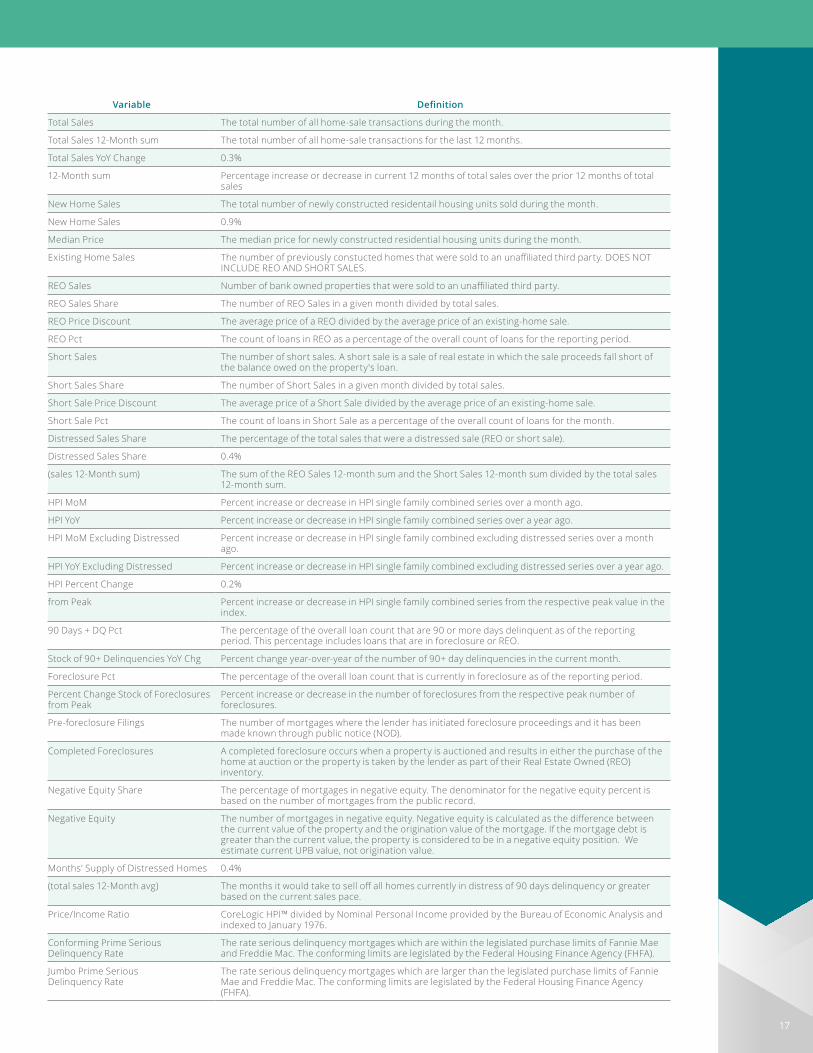
Variable Definition
Total Sales The total number of all home-sale transactions during the month.
Total Sales 12-Month sum The total number of all home-sale transactions for the last 12 months.
Total Sales YoY Change 0.3%
12-Month sum Percentage increase or decrease in current 12 months of total sales over the prior 12 months of total sales
New Home Sales The total number of newly constructed residentail housing units sold during the month.
New Home Sales 0.9%
Median Price The median price for newly constructed residential housing units during the month.
Existing Home Sales The number of previously constucted homes that were sold to an unaffiliated third party. DOES NOT INCLUDE REO AND SHORT SALES.
REO Sales Number of bank owned properties that were sold to an unaffiliated third party.
REO Sales Share The number of REO Sales in a given month divided by total sales.
REO Price Discount The average price of a REO divided by the average price of an existing-home sale.
REO Pct The count of loans in REO as a percentage of the overall count of loans for the reporting period.
Short Sales The number of short sales. A short sale is a sale of real estate in which the sale proceeds fall short of the balance owed on the property's loan.
Short Sales Share The number of Short Sales in a given month divided by total sales.
Short Sale Price Discount The average price of a Short Sale divided by the average price of an existing-home sale.
Short Sale Pct The count of loans in Short Sale as a percentage of the overall count of loans for the month.
Distressed Sales Share The percentage of the total sales that were a distressed sale (REO or short sale).
Distressed Sales Share 0.4%
(sales 12-Month sum) The sum of the REO Sales 12-month sum and the Short Sales 12-month sum divided by the total sales 12-month sum.
HPI MoM Percent increase or decrease in HPI single family combined series over a month ago.
HPI YoY Percent increase or decrease in HPI single family combined series over a year ago.
HPI MoM Excluding Distressed Percent increase or decrease in HPI single family combined excluding distressed series over a month ago.
HPI YoY Excluding Distressed Percent increase or decrease in HPI single family combined excluding distressed series over a year ago.
HPI Percent Change 0.2%
from Peak Percent increase or decrease in HPI single family combined series from the respective peak value in the index.
90 Days + DQ Pct The percentage of the overall loan count that are 90 or more days delinquent as of the reporting period. This percentage includes loans that are in foreclosure or REO.
Stock of 90+ Delinquencies YoY Chg Percent change year-over-year of the number of 90+ day delinquencies in the current month.
Foreclosure Pct The percentage of the overall loan count that is currently in foreclosure as of the reporting period.
Percent Change Stock of Foreclosures from Peak
Percent increase or decrease in the number of foreclosures from the respective peak number of foreclosures.
Pre-foreclosure Filings The number of mortgages where the lender has initiated foreclosure proceedings and it has been made known through public notice (NOD).
Completed Foreclosures A completed foreclosure occurs when a property is auctioned and results in either the purchase of the home at auction or the property is taken by the lender as part of their Real Estate Owned (REO) inventory.
Negative Equity Share The percentage of mortgages in negative equity. The denominator for the negative equity percent is based on the number of mortgages from the public record.
Negative Equity The number of mortgages in negative equity. Negative equity is calculated as the difference between the current value of the property and the origination value of the mortgage. If the mortgage debt is greater than the current value, the property is considered to be in a negative equity position. We estimate current UPB value, not origination value.
Months' Supply of Distressed Homes 0.4%
(total sales 12-Month avg) The months it would take to sell off all homes currently in distress of 90 days delinquency or greater based on the current sales pace.
Price/Income Ratio CoreLogic HPI™ divided by Nominal Personal Income provided by the Bureau of Economic Analysis and indexed to January 1976.
Conforming Prime Serious Delinquency Rate
The rate serious delinquency mortgages which are within the legislated purchase limits of Fannie Mae and Freddie Mac. The conforming limits are legislated by the Federal Housing Finance Agency (FHFA).
Jumbo Prime Serious Delinquency Rate
The rate serious delinquency mortgages which are larger than the legislated purchase limits of Fannie Mae and Freddie Mac. The conforming limits are legislated by the Federal Housing Finance Agency (FHFA).

18
This page is intentionally blank.

19
Source: CoreLogicThe data provided is for use only by the primary recipient or the primary recipient's publication or broadcast . This data may not be re-sold, republished or licensed to any other source, including publications and sources owned by the primary recipient's parent company without prior written permission from CoreLogic . Any CoreLogic data used for publication or broadcast, in whole or in part, must be sourced as coming from CoreLogic, a data and analytics company . For use with broadcast or web content, the citation must directly accompany first reference of the data . If the data is illustrated with maps, charts, graphs or other visual elements, the CoreLogic logo must be included on screen or website . For questions, analysis or interpretation of the data, contact CoreLogic at newsmedia@corelogic .com . Data provided may not be modified without the prior written permission of CoreLogic. Do not use the data in any unlawful manner . This data is compiled from public records, contributory databases and proprietary analytics, and its accuracy is dependent upon these sources .
For more information please call 866 .774 .3282The MarketPulse is a newsletter published by CoreLogic, Inc . ("CoreLogic") . This information is made available for informational purposes only and is not intended to provide specific commercial, financial or investment advice. CoreLogic disclaims all express or implied representations, warranties and guaranties, including implied warranties of merchantability, fitness for a particular purpose, title, or non-infringement. Neither CoreLogic nor its licensors make any representations, warranties or guaranties as to the quality, reliability, suitability, truth, accuracy, timeliness or completeness of the information contained in this newsletter . CoreLogic shall not be held responsible for any errors, inaccuracies, omissions or losses resulting directly or indirectly from your reliance on the information contained in this newsletter .
This newsletter contains links to third-party websites that are not controlled by CoreLogic . CoreLogic is not responsible for the content of third-party websites . The use of a third-party website and its content is governed by the terms and conditions set forth on the third-party’s site and CoreLogic assumes no responsibility for your use of or activities on the site .
More Insights
The CoreLogic Insights Blog
(corelogic.com/blog) provides an
expanded perspective on housing
economies and property markets,
including policy, trends, regulation
and compliance. Please visit the
blog for timely analysis, thought-
provoking data visualizations and
unique commentary from our team
in the Office of the Chief Economist.
CoreLogic Econ
CoreLogic

corelogic .com
©2019 CoreLogic, Inc . All Rights Reserved . CORELOGIC, the CoreLogic logo, CORELOGIC HPI and TRUESTANDINGS are trademarks of CoreLogic, Inc . and/or its
subsidiaries . All other trademarks are the property of their respective holders .17-MKTPLSE-0619-00