The making of our posterr
14
The Making of Our Poster Misconception
-
Upload
olivia5432 -
Category
Education
-
view
310 -
download
0
Transcript of The making of our posterr
The Making of Our
Poster
Misconception

Step 1: Creating the first half
of the image
1) Firstly, we opened the image of the character looking away from the mirror with a happy
facial expression. We then cropped the reflection half out and saved it.

Step 2: Creating the second
half of the image
2) Secondly, we opened Adobe Bridge and selected “pictures”. We then held down
the shift key and selected the full photo of the character looking into the mirror with
an evil- looking facial expression and the recently cropped image of the happier-
looking character.

Step 2- Inserting the second
half of the imageWe then selected tools>Photoshop>load files to open both images in Photoshop.
This enabled both the cropped happier-looking image and the whole image of the
evil-looking character to open in a single Photoshop document.
Then, we put the cropped image layer on top of the
whole image layer. Then, we expanded the images and
lined them up. This made the image whole and created
the illusion that the reflection of the mirror didn't’t match
reality

Step 3- Polishing off the
image
We then used the
spot healing brush
tool to airbrush the
image and make the
character’s face look
flawless. This reflects
on the appearance
pressures involved in
dance
Next, we zoomed
into the line where
both images met and
used the eraser,
smudge and blur
tools to make the
images align
correctly

Step 4: Editing
We then selected the
adjustments tab and
lowered the red tints
and heightened the
levels of blue. This
was to make the
image colder and hint
more to the dark
thriller genre of the
film
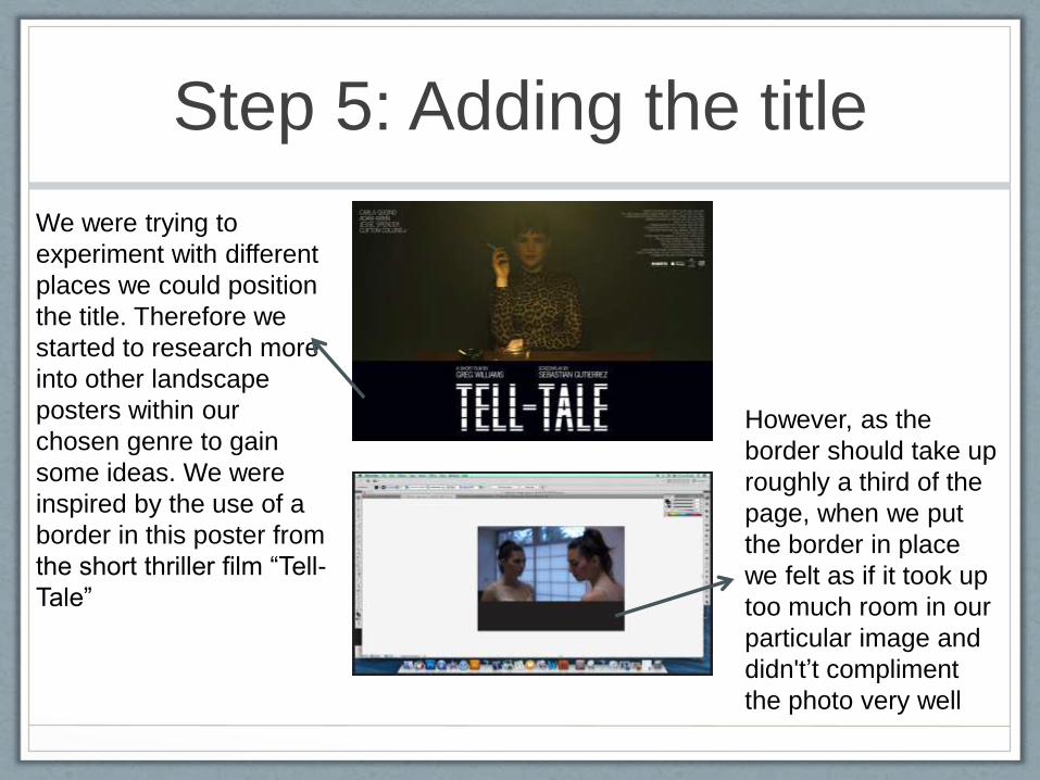
Step 5: Adding the title
We were trying to
experiment with different
places we could position
the title. Therefore we
started to research more
into other landscape
posters within our
chosen genre to gain
some ideas. We were
inspired by the use of a
border in this poster from
the short thriller film “Tell-
Tale”
However, as the
border should take up
roughly a third of the
page, when we put
the border in place
we felt as if it took up
too much room in our
particular image and
didn't’t compliment
the photo very well

Step 5: Adding the title
We then found many
posters from our chosen
genre and subgenre with
a similar image layout to
ours, landscape with two
people/faces at either
end of the frame, that
positioned the title in
between both
characters. However,
although we considered
this option, we thought
our title, “Misconception”
was too long to fit in
between both people.

Step 5: Adding the title
We also noticed many
films from our genre
and subgenre, with a
landscape frame and
similar main image
layout to ours, which
positioned their main
title at the bottom of
the page. We thought
this may be effective
on our poster as it
wouldn’t overshadow
and take away from
the creepy effect of our
main image
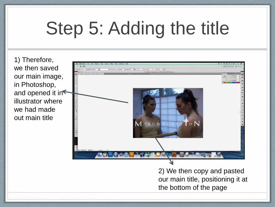
Step 5: Adding the title
1) Therefore,
we then saved
our main image,
in Photoshop,
and opened it in
illustrator where
we had made
out main title
2) We then copy and pasted
our main title, positioning it at
the bottom of the page

Step 6- Polishing off the title
The silhouette of the ballerina we used for the letter “I”
still had white marks around it from were we had erased it
too lightly

Step 6- Polishing off the title
For the white corner section near the ballerina’s head we simply used
the spot eraser tool to cover it up
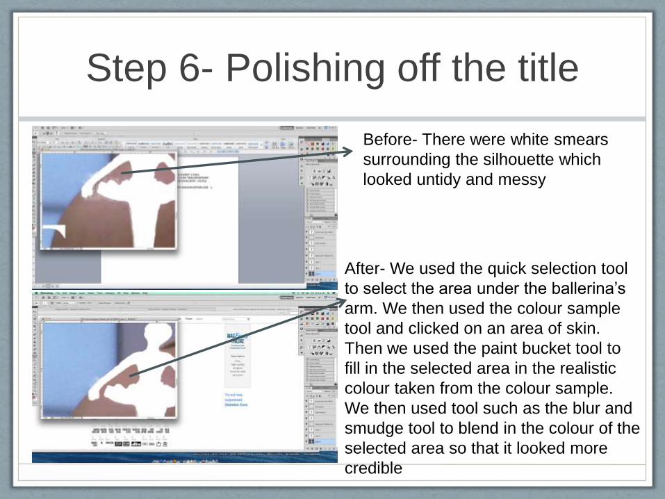
Step 6- Polishing off the title
Before- There were white smears
surrounding the silhouette which
looked untidy and messy
After- We used the quick selection tool
to select the area under the ballerina’s
arm. We then used the colour sample
tool and clicked on an area of skin.
Then we used the paint bucket tool to
fill in the selected area in the realistic
colour taken from the colour sample.
We then used tool such as the blur and
smudge tool to blend in the colour of the
selected area so that it looked more
credible

Step 7- Adding on other
conventional features
Actors names
We then followed our poster layout plan, using it as a template when adding the
following features:
Tagline
Billboard and website nameRelease Date
Review