The Logo - Harris COrPOratIOn| COrPOratE IdEntItY ManUaL the Harris tagline—the logo and tagline:...
13
HARRIS CORPORATION | CORPORATE IDENTITY MANUAL HARRIS LOGO The Harris logo features a dynamic red “A” integrated into the name “Harris.” This forms a single, distinctive mark that is both cohesive and memorable. The Harris logo is used extensively in the identification of the corporation and it is important that the mark be used properly and consistently. It may not be modified or imitated in any way other than what is specifically out- lined in this manual. Proper and consistent use of the Harris logo promotes brand recognition in the marketplace. REGISTERED HARRIS LOGO The stylized word “Harris” is our primary trademark and is used to identify all of our products. It is registered in many countries around the world in both simple block text (HARRIS) and in the design form. Harris seeks to distinguish its goods and ser- vices from those of other businesses through use and enforcement of its registered and unregistered trademarks. In order to protect Harris’ rights and interests in the trademark, it is important in any document, manual, or software application that represents Harris, that the usage of a trademarked logo, tag- line, or phrase is accompanied by the appropriate trademark designation. This designation informs the world that Harris claims rights to the mark. Failure to actively use the mark or enforce the reg- istration may result in abandonment of the mark. And once abandoned, it may be reregistered by anyone. If the average consumer no longer considers that exclusive rights are attached, a trademark risks becoming generic. Harris also has a number of secondary trade- marks designating specific products. These may be viewed at: Harris Trademarks (http://connect. harris.com/chq/programs/legalip/Documents/ TM_Report_Harris.pdf). The Logo LOGOS, FONTS AND COLORS
-
Upload
duongxuyen -
Category
Documents
-
view
220 -
download
0
Transcript of The Logo - Harris COrPOratIOn| COrPOratE IdEntItY ManUaL the Harris tagline—the logo and tagline:...

HARRIS CORPORATION | CORPORATE IDENTITY MANUAL
Harris LogoThe Harris logo features a dynamic red “A” integrated into the name “Harris.” This forms a single, distinctive mark that is both cohesive and memorable. The Harris logo is used extensively in the identification of the corporation and it is important that the mark be used properly and consistently. It may not be modified or imitated in any way other than what is specifically out-lined in this manual.
Proper and consistent use of the Harris logo promotes brand recognition in the marketplace.
registered Harris Logo The stylized word “Harris” is our primary trademark and is used to identify all of our products. It is registered in many countries around the world in both simple block text (HARRIS) and in the design form.
Harris seeks to distinguish its goods and ser-vices from those of other businesses through use and enforcement of its registered and unregistered trademarks.
In order to protect Harris’ rights and interests in the trademark, it is important in any document, manual, or software application that represents Harris, that the usage of a trademarked logo, tag-line, or phrase is accompanied by the appropriate trademark designation. This designation informs the world that Harris claims rights to the mark.
Failure to actively use the mark or enforce the reg-istration may result in abandonment of the mark.
And once abandoned, it may be reregistered by anyone. If the average consumer no longer considers that exclusive rights are attached, a trademark risks becoming generic.
Harris also has a number of secondary trade-marks designating specific products. These may be viewed at: Harris Trademarks (http://connect.harris.com/chq/programs/legalip/Documents/TM_Report_Harris.pdf).
The Logo
LOGOs, FOnTs and COLOrs

HARRIS CORPORATION | CORPORATE IDENTITY MANUAL
MiNiMUM siZeThe Logo must not be reproduced smaller than 10pt or .13” tall. For smaller sizes typeset HARRIS CORPORATION in Geogrotesque all caps.
CLear sPaCeClear space applies to how close other design ele-ments (text, taglines, other logos, etc.) may be positioned in relation to the Harris Logo. Allow a clear space equal to height of the Harris “H” above, left and right of the Logo, and a space measuring 1/2 the height of the “H” below the Logo.
Minimum Size
10 pt or .13” Harris CorPoratioN
LOGOs, FOnTs and COLOrs
The Logo
two-color Black and red on a solid white background is the preferred version, and should be used whenever possible.
One-color Black may be used on white and light colored backgrounds.
White reverse may be used on dark col-ored backgrounds.
two-color White and red may be used on dark colored backgrounds.
Clear area around the Harris Logo
For sizes smaller than 10pt, typeset in Geogrotesque
When aligning something vertically with the logo, use the center of the “H” and “R” for alignment

HARRIS CORPORATION | CORPORATE IDENTITY MANUAL
the Harris tagline—the logo and tagline: “Technology to Connect, Inform and ProtectTM”—is used for digital and print advertising and market-ing communications. Any use of the tagline, whether with the logo or in copy, must be accompanied by a TM symbol.
two-color Black and red with the tagline on a solid white background is the preferred version, used whenever possible.
One-color Black used on white and light colored backgrounds.
White reverse used on dark colored backgrounds.
two-color White and red may be used on dark colored backgrounds.
MiNiMUM siZeThe signature must not be reproduced smaller than 18pt or .25”. For smaller sizes use the Harris logo.
CLear sPaCeClear space applies to how close other design ele-ments (text, taglines, other logos, etc.) may be positioned in relation to the Harris tagline.
Allow a clear space equal to height of the Harris “H” above, left and right of the Logo, and a space mea-suring 1/2 the height of the “H” below the tagline.
LOGOs, FOnTs and COLOrs
The Tagline
Clear area horizontal Harris signature
Clear area vertical Harris signature
Minimum Size
18 pt /.25”
HARRIS CORPORATION | CORPORATE IDENTITY MANUAL LOGOs, FOnTs and COLOrs
Unacceptable Logo Use
UNaCCePtabLe UseNo part of the logo can be used as a separate graphic element with the exception of the stylized “A,” in accordance with the guidelines.
The stylized “A” element cannot be used to create another logo or artwork either as an “A” or upside down as a “V.” No other words or letters are to imitate any of the logo’s graphic elements.
Do not use the logo as any of the versions pictured on this page. Keep in mind to use the solid black logo when using it in headers or footers for manuals that are repro duced in black only. If a 2-color logo is used, then it will improperly display as black with a gray “A.”
do Not:
– Use anything but the approved and provided logo.
– Attempt to create your own Harris logo.
– Reproduce the logo in unapproved colors.
– Stretch or alter the logo’s proportions.
– Attach anything to the logo.
– Use part of the logo. It is an integral unit; always
keep it whole.
– Use the logo as part of a sentence or phrase.
– Use the logo in a crowded space.
– Print on top of the logo or under it.
– Use the logo as a watermark.
– Use the stylized “A” of the Harris logo as a separate design.
Do not stretch or distort.
Do not add additional elements or place the logo in a shape.
Do not use the logo as part of a phrase or sentence.
Do not add an illustration to the logo
Do not use black and red logo on a dark background.
Do not outline the logo
Do not use colors not in the Harris color palette.
HARRIS ®
Do not recreate the logo by
using a type font.
Do not reverse the colors
is #1
Do not use the stylized “A” in any format.

HARRIS CORPORATION | CORPORATE IDENTITY MANUAL PRODUCT MARKING
Product MarkingProduct marking provides a visible, long-lasting image for the corporation. Therefore, due care should be taken to ensure that a consistent, high-quality image of the corporation is being projected. Use the approved marked Harris logos in a prominant location on all equipment and products.
The Harris logo must be clearly visible and consistent with the guidelines of the corporate identity program. Product names should not be combined with the Harris logo.
There are many types of product marking techniques; however, it is preferred that the logo be embedded into the product design if possible. Techniques may include plastic mold, die-cast, silk-screen, pad print-ing, and decals.
When the marked Harris logo needs to be scaled down, flexibility is allowed in sizing the registration mark, obviously with good judgment, but no less than one-third inch.
To help with readability, the registration mark can be enlarged up to 50% of the “H” height in the logo.
Product Marking Guidelines
Registration mark can be enlarged up to 50% of “H” height

HARRIS CORPORATION | CORPORATE IDENTITY MANUAL PRODUCT MARKING
Product identificationFor the purpose of product identification, the Harris logo with the trademark registration symbol (®) should be used:
– On all hardware products (when the marked Harris logo needs to be scaled down, flexibility is allowed in sizing the registration mark, obvi-ously with good judgment, but no less than one-third inch.)
– On all packaging for hardware products
– For software: On the CD, its jewel case, and the insert sheet; on the first display screen upon boot-up
– For initial use in product advertising material, product user manuals, product websites, and product catalogs; subsequent use of the logo in the same materials need not bear the ®; alter-natively, a footnote to the effect that “Harris is a registered trademark of Harris Corporation” may be used
Product Identification

HARRIS CORPORATION | CORPORATE IDENTITY MANUAL PRODUCT MARKING
Shipping Identification
Packaging for ShiPMentThe Harris logo should always be used with an registration symbol. For the purposes of product identification, the Harris logo must be used on all product packaging.
HARRIS CORPORATION | CORPORATE IDENTITY MANUAL SIGNAGE
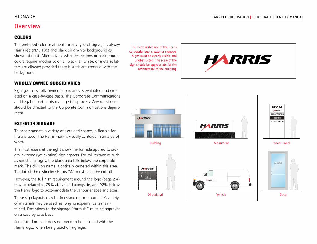
ColorsThe preferred color treatment for any type of signage is always Harris red (PMS 186) and black on a white background as shown at right. Alternatively, when restrictions or background colors require another color, all black, all white, or metallic let-ters are allowed provided there is sufficient contrast with the background.
Wholly oWned subsidiariesSignage for wholly owned subsidiaries is evaluated and cre-ated on a case-by-case basis. The Corporate Communications and Legal departments manage this process. Any questions should be directed to the Corporate Communications depart-ment.
exterior signageTo accommodate a variety of sizes and shapes, a flexible for-mula is used. The Harris mark is visually centered in an area of white.
The illustrations at the right show the formula applied to sev-eral extreme (yet existing) sign aspects. For tall rectangles such as directional signs, the black area falls below the corporate mark. The division name is optically centered within this area. The tail of the distinctive Harris “A” must never be cut off.
However, the full “H” requirement around the logo (page 2.4) may be relaxed to 75% above and alongside, and 92% below the Harris logo to accommodate the various shapes and sizes.
These sign layouts may be freestanding or mounted. A variety of materials may be used, as long as appearance is main-tained. Exceptions to the signage “formula” must be approved on a case-by-case basis.
A registration mark does not need to be included with the Harris logo, when being used on signage.
Overview
The most visible use of the Harris corporate logo is exterior signage.
Signs must be clearly visible and unobstructed. The scale of the
sign should be appropriate for the architecture of the building.
Building Tenant PanelMonument
Visitors
EmployeeParking
Shipping &Receiving
equal equal
DecalDirectional Vehicle
1.5x
1.5x
X
POST OFFICE
CHIROPRACTOR
DOCTOR

HARRIS CORPORATION | CORPORATE IDENTITY MANUAL
X1.
5x
1.5x
SIGNAGE
building sign appliCationsWhen determining the most appropriate sign type for a building application, the following should be taken into consideration: landlord and city/local restrictions, background colors, visibility and lines of sight, build-ing size, colors and sizes of other sign types in the vicinity, electrical hookups and availability, and back-ground material surface obstructions.
The preferable sign type is individual acrylic letters as shown below, left. The preferred color is Harris red (PMS 186) and 100% black if the background color provides sufficient contrast. An extruded sign cabinet with Harris red and black letters can also be used if required or if the background does not allow for indi-vidual acrylic letters.
The ideal placement of the sign is outlined at right. This placement can be altered depending on archi-tectural elements, or if lines of sight and other obstructions limit visibility.
Building Signs
Individual Letters
The preferred color is Harris red (PMS 186) and 100% black if the
background color provides sufficient contrast.
Logo Mounted Against Background
1.5x
1.5x
X

HARRIS CORPORATION | CORPORATE IDENTITY MANUAL SIGNAGE
MonuMent sign appliCationsThe preferred treatment is an externally lit panel with the Harris two-color logo. Individual, three-dimensional acrylic letters may also be an option.
The sign should be appropriately scaled for the loca-tion. Be sure to maintain adequate clear space around the Harris logo as shown in these examples.
Externally Lit Panel
Monument Signs
“H”
“H”
When incorporating a monument sign, it is important to consider landlord requirements, city/local restrictions, and visibility.

HARRIS CORPORATION | CORPORATE IDENTITY MANUAL SIGNAGE
tenant panel insertsThis is perhaps one of the most difficult sign condi-tions, as our Harris brand has to fight for attention with other company logos in a small area. Therefore, it is imperative to use our standard Harris two-color logo (red and black) whenever possible. Also, do not sac-rifice clear space requirements due to size constraints. A more appropriately scaled Harris logo provides greater recognition and visibility than a larger one that is jammed into a smaller background.
The preferred color combinations for tenant panel inserts are as follows (in order of preference):
– White background with Harris two-color red and black logo
– Black background with Harris all-white logo
– White background with Harris all-black logo
Other color combinations are unacceptable, and the Harris logo must always be used.
deCal appliCationsWhen deciding on a logo for a glass door, the light source is a determining factor. The primary consid-eration is that there is sufficient contrast between the logo and the door. Contact Corporate Communications with questions about signage.
White vinyl should always be used on glass doors because glass reads as a black background.
Our Harris two-color logo (red and black) should always be used (with or without byline) in the appropriate signature lockup. The decal should be centered left to
right as indicated below and mounted 62 to 63 inches (just above eye level) from the ground to the baseline of the logo to provide maximum visibility. Other obstruc-tions or conditions may require an alternate placement.
If the door is made of a material other than glass, or if surface obstructions are present, a decal, with the Harris red and black logo against a white background, can be used.
Dealer decals can be ordered for vendors who distribute Harris products.
CHIROPRACTOR
POST OFFICE
RICHARD BIBY
CHIROPRACTOR
POST OFFICE
RICHARD BIBY
Tenant Panels and Decals
EQ EQ
5.5"
/ 1
3.97
cm
5' /
1.5
24m
EQ EQ
5.5"
/ 1
3.97
cm
5' /
1.5
24m

HARRIS CORPORATION | CORPORATE IDENTITY MANUAL SIGNAGE
direCtional signsDirectional signs are designed to coordinate with other exterior signage. They feature the Harris logo visually centered in an area of white.
Directional descriptions must be set in initial caps (title case). Type: Frutiger 75 Black, 2.75 to 3 inches high. Hyphenation should never be used. The remainder of the sign is black. The weight of the directional sign arrows is matched to the weight of the type.
VehiCle signs—MagnetiC and deCalVehicles to which the Harris logo is applied are most often white, but not always. If the vehicle is any other color, follow the guidelines in section 2 for use of Harris logos against colored backgrounds. If the vehicle is white, the logo is in full color, Harris red (PMS 186) and black.
Vehicles are identified by either a magnetic sign (do not add borders) or a decal of a standardized size. The only identification on the vehicle is on the sides (usually doors), as indicated in the drawings at right. The logo is visually centered in the largest clear area on the door (and sized at approximately 55% of the width of the clear area). All other text or graphics should be placed at least one “H” height away from the logo. The Harris logo should be significantly larger than all other text on the vehicle, with the possible exception of the word “Security.”
Directional and Vehicle Signs
Visitors
EmployeeParking
Shipping &Receiving
Visitors
EmployeeParking
Shipping &Receiving
equal equal
equal equal
Visitors
EmployeeParking
Shipping &Receiving
For vehicles in other countries, please use this Identity Manual as a guide.

HARRIS CORPORATION | CORPORATE IDENTITY MANUAL SIGNAGE
Interior Signage
Hallway Flags
Name Plates and Room Numbers
lobby signsA positive first impression is extremely valuable in the corporate environment. Quite often a custom-er’s initial contact with our organization is through the entrance lobby or reception area. A well-designed and quality-crafted lobby sign will have the impact that reflects our company’s image in a favorable manner.
hallWay FlagsHallway flags identify department locations. Standard hallway flags are engraved on signs mea-suring 4 by 12 inches. Print is white on black.
naMe plates and rooM nuMbersOffice room numbers and their occupants’ names are engraved on small signs to hang outside office doors. Standard name plates measure 1 inch by 8 inches; room number plates are 1.5 by 3 inches. Print is white on black. Place at eye level on wall next to office entrance.
Lobby Signs