Icons-Land Sport Vector Icons V2€¦ · Icons-Land Vista Sport Vector Icons V2.0
THE IMPORTANCE OF MOBILE INTERFACE ICONS ON · PDF fileTHE IMPORTANCE OF MOBILE INTERFACE...
16
International Journal of Computer Science and Applications Technomathematics Research Foundation Vol.9, No. 3, pp. 92 – 107, 2012 92 THE IMPORTANCE OF MOBILE INTERFACE ICONS ON USER INTERACTION CHRYSOULA GATSOU * School of Applied Arts, Hellenic Open University Aristotelous 18, 26 335, Patra, Greece [email protected] ANASTASIOS POLITIS Graphic Arts Technology, Technological Educational Institute of Athens Ag. Spiridonos , 122 10, Athens, Greece [email protected] DIMITRIOS ZEVGOLIS School of Applied Arts, Hellenic Open University Aristotelous 18, 26 335, Patra, Greece [email protected] http://dzevgolis.eap.gr/ Mobile applications on smart phones and tablets and on mobile devices in general have increased the dependence of the user on icons and graphic elements for effective communication via the interface. Well-designed icons and graphics allow the user to recognize without the need of additional instructions the functions available on the mobile device in question. The present paper offers an analysis of graphic representation by means of icons for mobile devices. In terms of semiotics, the function of representation involves emphasizing the relationship between the object and the interpretant. In particular , we examine how far any icon represents the meaning of the function for which it has been designed, chosen and installed by the mobile phone manufacturer and designer. Among the chief findings are (1) graphical representation affects the recognition rate of icons and influences user perception and (2) there are significant differences in performance in recognizing icons among different age groups. Keywords: icons recognition; mobile interaction; interface design; human factors. 1. Introduction Mobile phone interaction is nowadays part of everyday human behavior and an activity which involves speaking, listening, touching and performing other tasks, in order to communicate. Interactivity converts a system into a communication medium by eliciting user interaction with the interface. One of the main goals of a mobile phone interface is to * [email protected], 25 Botasi, 185 37 Piraeus, Greece
Transcript of THE IMPORTANCE OF MOBILE INTERFACE ICONS ON · PDF fileTHE IMPORTANCE OF MOBILE INTERFACE...

International Journal of Computer Science and Applications Technomathematics Research Foundation Vol.9, No. 3, pp. 92 – 107, 2012
92
THE IMPORTANCE OF MOBILE INTERFACE ICONS ON USER INTERACTION
CHRYSOULA GATSOU*
School of Applied Arts, Hellenic Open University Aristotelous 18, 26 335, Patra, Greece
ANASTASIOS POLITIS
Graphic Arts Technology, Technological Educational Institute of Athens Ag. Spiridonos , 122 10, Athens, Greece
DIMITRIOS ZEVGOLIS
School of Applied Arts, Hellenic Open University Aristotelous 18, 26 335, Patra, Greece
[email protected] http://dzevgolis.eap.gr/
Mobile applications on smart phones and tablets and on mobile devices in general have increased the dependence of the user on icons and graphic elements for effective communication via the interface. Well-designed icons and graphics allow the user to recognize without the need of additional instructions the functions available on the mobile device in question. The present paper offers an analysis of graphic representation by means of icons for mobile devices. In terms of semiotics, the function of representation involves emphasizing the relationship between the object and the interpretant. In particular , we examine how far any icon represents the meaning of the function for which it has been designed, chosen and installed by the mobile phone manufacturer and designer. Among the chief findings are (1) graphical representation affects the recognition rate of icons and influences user perception and (2) there are significant differences in performance in recognizing icons among different age groups.
Keywords: icons recognition; mobile interaction; interface design; human factors.
1. Introduction
Mobile phone interaction is nowadays part of everyday human behavior and an activity which involves speaking, listening, touching and performing other tasks, in order to communicate. Interactivity converts a system into a communication medium by eliciting user interaction with the interface. One of the main goals of a mobile phone interface is to
* [email protected], 25 Botasi, 185 37 Piraeus, Greece
Instructions for Typing Manuscripts (Paper’s Title)
93
relate phone functions and operations to elements of interaction that are performed well (e.g. sounds and visual elements). Mobile interfaces use icons to represent the functionality required by users in performing their tasks. Since visual aspects, such as graphics and icons, are essential elements of user-device interaction, they are used extensively in interface design on the assumption that visual icons are capable of transcending language barriers and of presenting meaning in condensed form [Caplin (2001)];[ Gittins (1986)];[ McDougall et al. (2000)]. With the increase in the use of new technologies and of the internet at home, there is an exponential growth in numbers of novice users, that is, ordinary people who lack skills in computer science and are drawn from a wide range of backgrounds who face difficulties in operating their computers. Ordinary people are now the main target of the market, which produces new applications very rapidly. Yet there has been little investigation of the influence of graphical icons on the perception of ordinary mobile phone users. An icon can be defined as a graphical representation of concepts that symbolize computer actions [Ware (2004)]. Exponents of icons argue that iconic interfaces enjoy many advantages [Shank and Darke (1999)]. One such suggested advantage is that icons are easily recognized [Shneiderman (1997)]. Also, it is suggested, graphic images help users memorize and recognize functions available within an application [Siau (2005)]. In addition, iconic interfaces are especially important for novice users who use interactive systems only infrequently. To be effective, an icon must fulfill several criteria, such as whether it is visible, legible, and comprehensible. Marcus(1996) recommended that good icon design should be simple and clear. Studies have found that the visual and cognitive features of icons significantly influence an icon’s effectiveness [Blattner et al. (1989); Familant and Detweiler (1993); Rogers (1989)]. Recently designers of mobile interfaces have been using icons to represent the functionality required by users to perform their tasks. Icons are a popular method for visually representing functionality, because they provide direct access, allow direct manipulation and can economise on valuable space in interfaces. A key concern in the design of iconic interfaces is the effective depiction of the meaning of the icon. Potentially speaking, an icon can represent both the referent and its attributes, associations, and state [Gittins (1986)]. The proper use of iconic mobile interfaces reduces system complexity and helps users interact with mobile phones more easily. Given this discussion, the present study seeks answers to the following questions: 1. Are mobile phone function icons easily recognizable by a wider audience? 2. Is there any difference in recognition rate among different age groups? 3. Are there any differences in the recognition rate between the genders in each of the age groups?
2. Issues of visual cognition
The visual integration of a symbol has a significant influence on its perception [Easterby and Zwaga (1984)]. Clearly, how the user perceives and interprets icons is the key to their effective use. The nature of visual perception is obviously a crucial factor in the

Author’s Names 94
design of effective graphics and an understanding of perception can significantly improve both the quality and the quantity of information displayed [Ware (2004)]. How users interpret what they see is a domain of cognitive psychology where several competing theories have together brought about a thorough comprehension of the function of the human visual system. Such theories can be divided into two basic groups: constructivist and ecological approaches [Preece et al. (1994)]. Constructivist theorists believe that seeing is an active process in which what one sees is constructed from both information in the environment and from previously stored knowledge. Perception involves the intervention of representations and memories. What we see is not a replica or copy. It is, rather, a model that is constructed by the visual system through transforming, enhancing, distorting and discarding information [Gregory (1974)]. Ecological theorists believe that perception is a process of detecting information from the environment, with no construction or elaboration needed. Users intentionally engage in activities that cause the necessary information to become apparent [Gibson (1979)]. Gibson emphasises the role of relations with the environment. Most importantly, Gibson emphasises the role of motion in perception. Yet another view regarding the perception of images is given by Petterson, who states that the perception of an image is rapid, almost immediate [Pettersson (1999)]. In connection with this discovery [Pettersson (1999)], three assumptions regarding the perception of symbols can be made. First, several different symbols may convey a similar meaning and a specific message. Second, one symbol may be able to convey more than one message. Third, the user has first to learn the intended meaning of the symbols. Pettersson states that the concept of “perception” is a collective designation for the processes in which an organism obtains information on the outside world. In the view of Paivio’s dual coding theory [Paivio (1986)], the reason why the meaning of icons is likely to be remembered better is related to the fact that the two types of information (verbal and imaginal) are encoded by separate subsystems, one specialized in the handling of sensory images and the other specialized in handling verbal language. The visual system processes and stores more concrete information, such as images, sounds and feelings. The verbal system, on the other hand, processes and stores language and other abstract information. The two systems are independent, but connected. Furthermore, pictures are better remembered than words, because pictures are more likely to activate the image-to-word referential connections, which means that they can be coded both visually and verbally [Paivio (1971)], [Moreno and Mayer (2002)]. One of the findings of structural theories of perception is that certain simplified views are easier to read [Ware (2004)]. We therefore need to consider these different points when we want to convey information by means of icons.
3. Icon classification, semiotics and interaction
Icons can be divided into broad categories that rest on Pierce’s early exposition of semiotics. Pierce classified signs in three categories that is, icon, index and symbol [Peirce (1985)]. For a sign to exist, it must consist of all three parts (the object, the
Instructions for Typing Manuscripts (Paper’s Title)
95
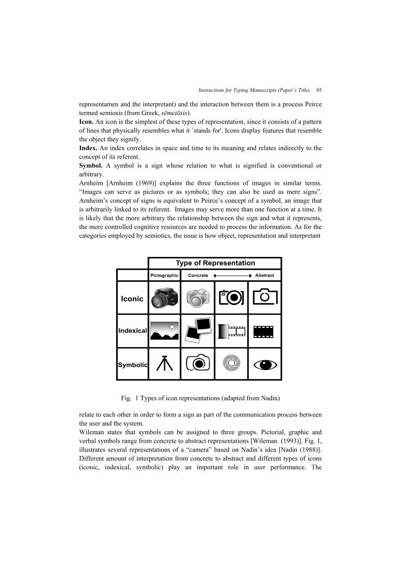
representamen and the interpretant) and the interaction between them is a process Peirce termed semiosis (from Greek, sēmeiōsis). Icon. An icon is the simplest of these types of representation, since it consists of a pattern of lines that physically resembles what it `stands for'. Icons display features that resemble the object they signify. Index. An index correlates in space and time to its meaning and relates indirectly to the concept of its referent. Symbol. A symbol is a sign whose relation to what is signified is conventional or arbitrary. Arnheim [Arnheim (1969)] explains the three functions of images in similar terms. “Images can serve as pictures or as symbols; they can also be used as mere signs”. Arnheim’s concept of signs is equivalent to Peirce’s concept of a symbol, an image that is arbitrarily linked to its referent. Images may serve more than one function at a time. It is likely that the more arbitrary the relationship between the sign and what it represents, the more controlled cognitive resources are needed to process the information. As for the categories employed by semiotics, the issue is how object, representation and interpretant
Fig. 1 Types of icon representations (adapted from Nadin)
relate to each other in order to form a sign as part of the communication process between the user and the system. Wileman states that symbols can be assigned to three groups. Pictorial, graphic and verbal symbols range from concrete to abstract representations [Wileman (1993)]. Fig. 1, illustrates several representations of a “camera” based on Nadin’s idea [Nadin (1988)]. Different amount of interpretation from concrete to abstract and different types of icons (iconic, indexical, symbolic) play an important role in user performance. The
Author’s Names 96
interpretation becomes easier, as the representation becomes more schematic. As the level of abstraction increases, the sign becomes progressively more generic and less complex. From a semiotic point of view, the design of an interface for a mobile application consists of various signs. By means of these, the designer tries to convey the meaning he intends to convey [Buchanan (2008)]. When the user interacts with the screen of the mobile phone, he or she is required to guess the object of the sign, since the sign is designed to convey specific meanings. When the user’s interpretation (interpretant) matches the intended object of the sign, the designer has achieved his aim of producing a successful icon [Nadin (1988)]. Ideally, the link between the representamen and object should be obvious to all the users of the interface and result in only one interpretant. This should activate the correct mental model, which allows the user both to understand the action and to interact appropriately [Isherwood (2009)].
4. Different symbols, different meanings, identical functions.
The range of iconography now employed on mobile phones is increasing, together with a number of interesting graphics. Not all users, however, can transfer their skills from one model to another, because of differences in the interface and in the icons between the two models. Different individuals interpret the same icon in different ways and one icon may be capable of more than one interpretation, this phenomenon is being labeled the ‘ambiguity’ of the icon. Rossi and Querrioux - Coulombier suggest that “the relationship between an icon and its meaning should be automatic and consequently independent of any learning” [Rossi and Querrioux-Coulombier (1997)]. This means that for an icon to work more effectively than some other means of representation, such as a textual description, it needs to draw on the understanding of the implicit meaning of the icon. Various icons on various handsets, differing among themselves in appearance, but representative of the same function, may complicate the intellectual model applied by the user and so cause problems in the perception on the part of the user. The most important role of an icon is to convey, without the use of text, the meaning of the function it represents, thereby making icons more efficient than text in the operation of mobile phones and in function implementation. The effectiveness of an icon in relation to its intended meaning also depends on the degree of mapping between physical form and function, this being known as the “articulatory distance”[Hutchins et al. (1986)]. The closer the visual representation is to the intended meaning, the shorter the articulatory distance becomes. Ideally, the icons used in the interface for representing information will activate the appropriate mental models in the users. How the user interprets the sign will depend on the user’s mental models. Likewise, how the designer chooses to represent the object may also depend on his own set of mental models [Norman (1993)]. It is important to note that

Instructions for Typing Manuscripts (Paper’s Title)
97
the function assigned to an icon by those designing it may be quite different to the meaning actually attributed to it by users. The correct interpretation of icons also depends on other factors, such as the context in which the icon is used. Any text labels that might be displayed together with an icon and the user’s familiarity with the icon and with its application context [Horton (1994)]. The elderly are likely to have less experience than other younger age-groups with contemporary handset devices and to be less familiar with icons displayed by a device and with applications, which thus makes such icons more difficult to interpret. Previous studies have shown that mobile phone icons make for faster, more direct access to a mobile function [Rossi and Querrioux-Coulombier (1997)]. This then leads to the inevitable question, "What makes an effective comprehensive interface mobile icon"? In Fig. 2, we see eight of the most frequent functions from five different popular brands of mobile phones, namely, Iphone, Nokia, Motorola, Samsung and Sony Erikson. We present icons from two models per brand (Nokia, Motorola, Samsung and Sony Erikson ) and one model from Iphone. It is to be observed that even the same company is not consistent in its choice of symbols to depict functions. In Nielsen’s view, “the latest mobile devices are agonizingly close to being practical, but still lack key usability features required for mainstream use” [Nielsen (2003)].
4.1. Familiarity and recognition
Familiarity is the degree to which a user recognizes user interface components and views their interaction as natural or the degree of similarity of the interface to concrete objects the user has interacted with in the past. In the general psychological literature, recognition frequently rests on feelings of familiarity [Diana et al. (2008)] and requires
Fig. 2 Types of icon representations from different handsets

Author’s Names 98
little cognitive effort [Craik & McDowd, 1987]. Dual process theories of recognition memory propose that there are two processes underlying recognition, representing qualitatively different types of memory, known as recollection and familiarity [Gardiner (1988)]. Familiarity is defined by [Alba and Hutchinson (1987)] as the number of product-related experiences that have been accumulated by the user. Luhmann (1988) argues that familiarity is the knowledge people have of a product or service, on the basis of their experience and previous contacts. This property is thought to be an important determinant of usability. Here by the term “experience” we mean the process of acquiring knowledge or skill from doing, seeing or feeling. [Cambridge University Press]. In relation to interfaces, familiarity is an awareness based on experience [Gefen (2000)]. Experience is closely related to familiarity. Familiarity related to experience has a positive effect on the degree of user skills and increases the individual’s trust in his or her own abilities [Flavián et al. (2006)]. As regards icon recognition, familiarity is defined in terms of the frequency with which icons have already been encountered. Isherwood et al (2007) and McDougall and Isherwood (2009) also found familiarity to be an important predictor of user performance with icons. Ben-Bassat and Shinar (2006) showed that sign comprehension is positively correlated with sign familiarity and sign-content compatibility. Galitz (2007) points out that familiarity will reduce learning time and this leads to higher user satisfaction, whilst lack of familiarity requires learning the meanings of the icons.
5. Research Methodology
There are several criteria that an icon must satisfy, if it is to be effective. Among these are legibility, distinctiveness, comprehension, the reaction time [Dewar (1999)]. The main issue involved in evaluating icons is their proper construction and modification [Blankenberger and Hainj (1991)]. Several methods have been utilized to evaluate graphic symbols and icons. The method used most often is a comprehension test, also termed a ‘recognition test’ [Howell and Fuchs (1968)]. Howell and Fuchs were the first to devise criteria for the correct recognition of symbols, grouping them into the following categories: identifiable (60-100%), medium (30-60%) and vague (0-30%) [Cheng and Patterson (2007)]. Many researchers have employed procedures involving “matching tests” to evaluate graphic symbols [Heard (1974)];[Easterby and Zwaga (1984)]. In the “matching” method, the suitability of an icon is evaluated in relation to other icon variables. Yet another method is the icon intuitiveness test, created by Nielsen and Sano, in which an icon is shown without any label to a small number of users, typically five [Nielsen and Sano (1994)]. The users are asked to guess what the icon is intended to represent. Sanders and McCormick have also shown that the criteria for selecting symbols generally include a degree of recognition, a matching degree and a subjective preference and opinion [Sanders and McCormick (1993)].

Instructions for Typing Manuscripts (Paper’s Title)
99
5.1. The selection of the sample for the evaluation.
After choosing handsets from five different manufacturers on the basis of brand popularity, we selected icons for our study from main menu functions. It was impossible to represent each function by a standard number of icons, since the icons in question are extremely diverse in appearance. Some were selected on the grounds that, although they were drawn from different brands, they converged and we were eager to investigate whether such convergence aided user perception. Our goal was to determine whether or not the visual representations offered by icons do indeed help users to understand the functionality of the icon in question.
5.2. Participants.
We employed a sample of 60 participants, all volunteers. They possessed mobile phones and came from various backgrounds. They were roughly equal in terms of gender and their age distribution is given in Table 1. All participants have normal vision, though some wore glasses or contact lenses. The majority had owned a mobile phone for more than one year. Each subject was given a brief overview of the experiment and briefed as to the purpose and procedure of the study.
Table 1 . Age, gender and number of participants.
Age group
No.of participants Participant Gender
Male Female
20-29 30-39 40-49 50-59 60-69 70-79
10 11 12 14 8 5
5 7 5 8 2 5
5 4 7 6 6
Σ 60 32 28
5.3. Icon recognition questionnaire
Before answering the icon recognition questionnaire, all participants completed a pre-experiment questionnaire which collected personal details and data relating to technology skills and mobile phone experience. A paper-based icon recognition questionnaire was prepared, which involved 54 mobile phone function icon .The questionnaire was designed to examine icon recognition and perception performance over different age groups. According to the Organization for International Standardization (ISO3864), icon recognition rates should be at least 66.7%, to be acceptable [Piamonte et al. (2000)]. With a view to making the procedure of presenting the participants with the icons they were to interpret as efficient as possible, a table was constructed in Adobe InDesign with numbered rows. An icon was placed next to each number, and the space to the right of the icon was left blank for a set of referents from eight functions from which participants had to select the correct one.

Author’s Names 100
Since the test required that the icons be clearly visible, they were printed at high resolution. The recognition rate was computed as follows: (Number of correct choices / Number of respondents) x 100=Recognition rate (%) In this study, the 54 icons were graded according to their recognition rate.
5.4. Analysis of Results
The summary of the test results is shown in Fig. 3. The recognition rate for 29 icons was over 66.7%, a fact which provides an overall answer to questions we posed ourselves. In view of the ISO standard mentioned above, we award the icons we tested one of two grades: ‘good’, with a correct answer rate of above 66.7%, and ‘low’, with a correct answer rate below 66.7%. On this basis, 29 of the icons tested were to be considered ‘good’ and so are suitable for mobile phone use, the remaining 25 icons achieving only a recognition rate below this level. Other facts emerge from our analysis. Six mobile icons were easily recognized and associated with their correct functions, thus fulfilling Howell’s criteria (1968). Icons E4
Fig. 3 Recognition rate of icons.
Instructions for Typing Manuscripts (Paper’s Title)
101
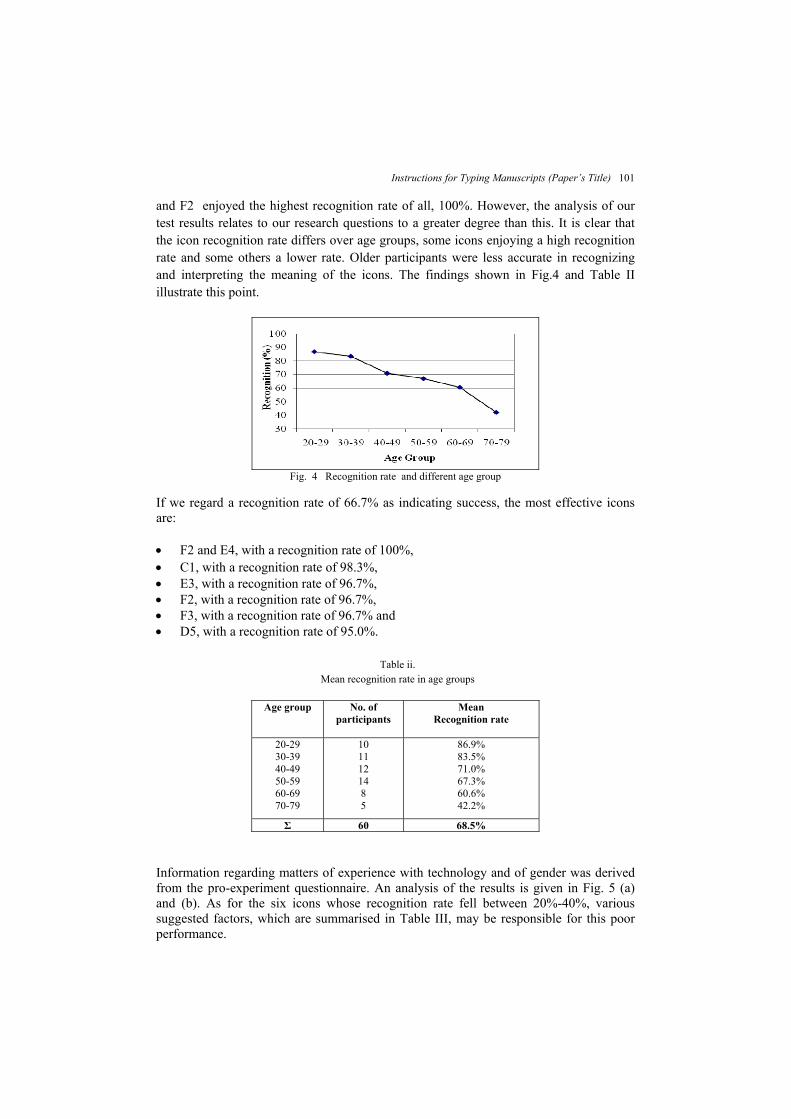
and F2 enjoyed the highest recognition rate of all, 100%. However, the analysis of our test results relates to our research questions to a greater degree than this. It is clear that the icon recognition rate differs over age groups, some icons enjoying a high recognition rate and some others a lower rate. Older participants were less accurate in recognizing and interpreting the meaning of the icons. The findings shown in Fig.4 and Table II illustrate this point.
Fig. 4 Recognition rate and different age group
If we regard a recognition rate of 66.7% as indicating success, the most effective icons are: F2 and E4, with a recognition rate of 100%, C1, with a recognition rate of 98.3%, E3, with a recognition rate of 96.7%, F2, with a recognition rate of 96.7%, F3, with a recognition rate of 96.7% and D5, with a recognition rate of 95.0%.
Table ii. Mean recognition rate in age groups
Age group No. of
participants Mean
Recognition rate
20-29 30-39 40-49 50-59 60-69 70-79
10 11 12 14 8 5
86.9% 83.5% 71.0% 67.3% 60.6% 42.2%
Σ 60 68.5%
Information regarding matters of experience with technology and of gender was derived from the pro-experiment questionnaire. An analysis of the results is given in Fig. 5 (a) and (b). As for the six icons whose recognition rate fell between 20%-40%, various suggested factors, which are summarised in Table III, may be responsible for this poor performance.

Author’s Names 102
Fig. 5 (a) Recognition rate and experience with technology, (b) Recognition rate and gender.
Table iii. Icons with low recognition rate 20%-40%
Icons R/r* Original meaning
Possible reasons for misunderstanding
40%
phone book
The graphic, intended to indicate a note book, is visually unclear.
40% internet
The use of a compass to denote the internet is unfamiliar to some users. Generally an icon of a globe is more effective.
30%
phone book
The combination of head phone and notebook is confusing.
30% games
The addition of the word ‘games’ would probably add to clarity and effectiveness
21.7%
phone call
The combination of handset and an individual is ambiguous.
20%
phone call
The resemblance to a notebook may cause confusion with the phone book icon.
*R/r = recognition rate
Interestingly, the recognition rate for the various icons denoting a very basic function, “phone call” (Fig. 6), is surprisingly low, with the exception of the icon employed by the Iphone, which consists of a head phone. This enjoyed the highest rate of recognition (75%), whilst that of all the other icons fell beneath 66.7%
Fig. 6 Recognition rates for various icons representing ‘phone call’ function.
Instructions for Typing Manuscripts (Paper’s Title)
103
6. Discussion
We found that
29 of our 54 icons enjoyed a recognition rate of more than 66.7% there is a significant difference in recognition rates among age groups, with
recognition rate decreasing as age increases and that there is no important difference between genders, with the recognition rate displayed
by males being only 4% higher than that displayed by females. Our study suffers from limitations that may have given rise to inaccuracies in our results. As we have pointed out, we settled upon a paper-based form of test, as some of our participants were unfamiliar with computer technology. Such participants, ignorant of such technology, were unable to compare the icon they were requested to evaluate with other icons from the application from which the test icon was drawn. This does not reflect reality, where the users of an application may be in a better position to guess the meaning of the icon in question by comparing it with other icons in the same application. For reasons of legibility, comparatively large depictions of icons were used in our recognition test. In reality, of course, icons are becoming ever smaller and less visible [Blankenberger and Hainj (1991)]. Our focus was upon ordinary people. Although they were not necessarily experienced users of technology and were drawn from various age groups, they were called upon to evaluate icons, no easy task. Among the factors of which account needs to be taken is the medium in which the icons were presented and examined and, above all, age differences. The display properties of mobile devices make up another important factor in icorecognition. Display properties directly dictate how legible the icon is, which, of course, is an important aspect of interface design usability. The degree of legibility is determined by how we can detect, discriminate and identify visual elements [Hoober and Berkman (2011)]. Displays vary considerably in terms of size, resolution and pixel density (ppi). Screen size varies depending on the type of mobile device. Screens are measured
diagonally from corner to opposite corner of the display. Factors that affect how the user automatically adjusts his/her visual angle to see the screen include any vision impairments, the size of the display content, including size of images, text, buttons and indicators , the amount of light emitted by the device (illuminance) and the amount of light reflected by the screen surface (luminance)[ Shurtleff (1980)].
The screen resolution is determined by the total number of physical pixels on a screen. The actual size of a pixel is dependent upon the particular device and type of technology used in the display [Hoober and Berkman (2011)].
Pixel density is dependent on screen resolution and is defined as the number of pixels within a given unit of area, such as a square inch.

Author’s Names 104
The legibility of an icon depends on the degree of the visibility of the icon, which, in its turn is dependent on the display resolution. Different pixels densities across mobile platforms affect the physical size of the icon. High resolution thus degrades legibility, because it reduces the size of already small icons (Fig.7). If icons are too small to be legible, then they are naturally difficult to understand. A large, but low-resolution screen, however, is also difficult to read because text and icons appear jagged. While it may be obvious that an icon should be optimized for various screen sizes, ignoring the impact of pixel density is a common mistake. For example, we may have three devices, each of which has a 240 x 320-pixel display, the displays themselves varying in physical dimension and therefore in pixel density, which ranges from 154 to 199 pixels per inch. The impact of such differences are obvious, particularly in regard to icons that contain fine details.
Fig. 7 Different densities, the implications are most obvious for icons that contain fine details.
In general, however, icon signs are more easily recognized than symbolic signs. It is thus extremely important that the appropriate design style be selected at the initial stage of the icon design process. If either information or function has strong ties with an object, a pictorial icon is the best choice. Examples of this are our icons F2 and E4, which enjoyed a recognition rate of 100%.
7. Conclusions
We have dealt in this study only with the representation and recognition of icons, yet our findings can contribute to the improvement in how a greater number of users experience interfaces. Other issues, however, such as the structure of menus and colour combinations employed in icons, also require in-depth study. Since the amount of information in our lives continues to increase, information designers must design solutions that match users’ requirements as much as possible. The proper selection of graphical elements is one way to optimize communication with users, but requires designers to be aware of how users interact with graphical elements. The results of our study of 54 icons related to functions suggests six recommendations for icon design practices and future research on the workings of icons. Combinations of graphics that are complex or ambiguous decrease the ease with
which the icon is correctly interpreted. The use of familiar metaphors increases the likelihood that an icon will be
interpreted correctly.
Instructions for Typing Manuscripts (Paper’s Title)
105
Users experience difficulty in correctly interpreting icons that employ symbolic or abstract representations.
Icons that employ concrete imagery are more frequently interpreted correctly. Users draw upon their experience of the real world to interpret the functions
conveyed by icons. The scale of the screen size on which the icon is displayed influences how far the
user correctly interprets the icon. The use of an appropriate icon is a vital factor in ensuring the correct functioning of mobile phone applications. In order for icons to evoke the intended meaning in the viewer's consciousness, or even subconsciousness and for them to achieve communication between designer and user, a symbol should display a strong, direct association with the desired meaning, in the mind of both designer and user. During the icon formulation process, a design whose aim is to produce functional results makes such functions comprehensible. Furthermore, in order to help new or ordinary users interpret icons correctly, some form of comprehensive test or test of recognition should precede any attempt at improving performance. We hope that the results of our study will offer a deeper understanding of how a wider audience uses mobile phones and icons, in particular.
Acknowledgments
This research has been co-financed by the European Union (European Social Fund – ESF) and Greek national funds through the Operational Program "Education and Lifelong Learning" of the National Strategic Reference Framework (NSRF) - Research Funding Program: Heracleitus II. Investing in knowledge society through the European Social Fund. We would also like to thank Aristovoulos Pavlakis and the participants in the study.
References
Alba, J.W. and Hutchinson, J.W. (1987): Dimensions of consumer expertise”, Journal of Consumer Research, 13(1), pp. 411-54.
Arnheim, R., (1969): Visual Thinking. Berkeley, CA: University of California Press Ben-Bassat, T and.Shinar,D (2006):Ergonomic guidelines for traffic sign design increase sign
comprehension, Human Factors, 48, (1), pp. 182-195. Blankenberger, S and Hainj, K.(1991): Effects of icon design on human-computer interaction. Int.
J. Man-Machine Studies, 35, 363-377. Blattner, A;Sumikawa,D; Greenberg,R. (1989):Earcons and icons: their structure and common
design principles. Human± Computer Interaction. Buchanan, R. (2008): Declaration by Design: Rhetoric, Argument, and Demonstration in Design
Practice”, Design Issues, 2(1),1985, pp, 4-22.Akerkar, R. A.; Lingras, P.. An Intelligent Web: Theory and Practice, 1st edn. Johns and Bartlett, Boston.
Caplin, S. (2001): Icon design: Graphic icons in computer interface design. London: Cassell. Cheng, H and Patterson,P. (2007):Iconic hyperlinks on e-commerce websites. Applied Ergonomics
38 (1), pp. 65–69.

Author’s Names 106
Craik, F. I. M., & McDowd, J. M. (1987) :Age differences in recall and recognition. Journal of Experimental Psychology: Learning, Memory and Cognition, 13, pp.474–479.
Dewar, R.(1999): Design and evaluation of public information symbols, inVisual Information for Everyday Use: Design and Research Perspectives, H. J. G. Zwaga, T. Boersema, and H. C. M. Hoonhout, Eds. London: Taylor & Francis, pp. 285-304.
Diana, R.A., Yonelinas, A.P., & Ranganath, C. (2008) :The effects of unitization on familiarity-based source memory: Testing a behavioral prediction derived from neuroimaging data. Journal of Experimental Psychology: Learning, Memory, & Cognition, 34, pp730-74
Easterby R. S. and Zwaga, H. (1984) :Information design, The design and evaluation of signs and printed material pp. 277-297. New York: J. Wiley & Sons
Familant, M and Detweiler, M. (1993):Iconic reference: evolving perspectives and an organizing framework”, International Journal of Man± Machine Studies, 39, 705± 728
Flavián, C; Guinalíu, M; Gurrea, R. (2006): The influence of familiarity and usability on loyalty to online journalistic services: The role of user experience. Journal of Retailing and Consumer Services. 13 (5), pp. 363-375.
Galitz,. W. G. (2007): The Essential Guide to User Interface Design: An Introduction to GUI Design Principles and Techniques. Wiley Publishing, Indianapolis, IN
Gardiner, J. M. (1988): Functional aspects of recollective experience. Memory & Cognition, 16, pp.309-318.
Gefen, D. (2000): E-commerce: the role of familiarity and trust, Omega, 28, (6), pp. 725-737. Gibson, J. (1979): The ecological approach to visual perception. Houghton Mifflin, Boston. Gittins, D. (1986): Icon-based human-computer interaction. International Journal of Man Machine
Studies, 24, pp.519-543 Gregory, L. (1974): Concepts and mechanisms of perception. London: Duckworth. Heard, E (1974): A symbol study-1972,” Paper No 740304, Society of Automotive Engineers, New
York. Hoober , S & Berkman,E. (2011) Designing Mobile Interfaces ,O’Reilly Media, Canada. Horton, W. (1994): The Icon Book – Visual symbols for computer systems and documentation,
New York: Wiley and Sons. Howell, W and Fuchs, A. (1968):Population stereotypy in code design. Organisational Behavior in
Human Performance 3, p.p 310-339. Hutchins, E; Hollan, D ; Norman, D. (1986) :Direct manipulation interfaces”, in Norman, D.A. and
Draper, S. (eds) user-centered system design Lawrence Earlbaum Associates, Hillsdale, NJ, USA.
Isherwood, S. (2009): Graphics and Semantics: The Relationship between What Is Seen and What Is Meant in Icon Design Engin. Psychol. and Cog. Ergonomics, HCII, LNAI 5639, pp. 197–205.
Isherwood, S.J., McDougall, S.J.P., Curry, M. (2007): Icon Identification in Context: The changing role of icon characteristics with user experience. Human Factors 49(3), pp. 465–476 Luhmann, N. (1988): Familiarity, confidence, trust: problems and alternatives. In: Gambetta, D. G.
(Ed.), Trust pp. 94-107. New York: Basil Blackwell. Marcus, A. (1996): Icon and symbol design issues for graphical user interfaces.In: del Galdo, E.M.,
Nielsen, J. (Eds.), International User Interfaces. John Wiley & Sons, New York, pp. 257–270. McDougall, S.J.P., and Isherwood, S.J. (2009): What’s in a name? The role of graphics, functions,
and their interrelationships in icon identification. Behaviour Research Methods 41, 325–336 Moreno, R., & Mayer, E. (2002): Verbal redundancy in multimedi a learning: When reading
helpslistening. Journal of Educational Psychology, 94, 000-000. Nadin, M.(1988): Interface design: A semiotic paradigm. Semiotica. 69, pp. 269–302. Nielsen,J. UseIt.com [Online].Available: http://www.useit.com/ /alertbox/20030818.html Nielsen, J and Sano, D. (1994). SunWeb: User Interface Design for Sun Microsystem's Internal
Web. In Proc. 2nd World Wide eb Conf.: Mosaic and the Web. Chicago, IL, pp. 547.557.
Instructions for Typing Manuscripts (Paper’s Title)
107
Norman, D. (1993): Things That Make Us Smart, Addison-Wesley Publishing Co., Reading, MA Norman, D. (1998): The Invisible Computer, MIT Press Paivio, A. (1971): Imagery and verbal processes. Holt, Rinehart and Winston. New York Peirce, C. (1985): Logic as semiotic: the theory of signs. In: Innis, R. E. (Ed.) Semiotics: an
introductory reader. Indiana: Indiana University Press. Bloomington. Pettersson, R. (1999): Graphic symbols-Design and meaning. Natural vistas: Visual Literacy & the
World around Us. R.E. Griffin, W. J. Gribbs, and V.S. Piamonte, D.P.T; Abeysekera, J.D.A. and Ohlsson, K.(2000):Understanding small graphical
symbols: a cross-cultural study. International Journal of Industrial Ergonomics, 27 (6), pp. 399-404
Preece, J., Rogers, Y., Sharp, H., Benyon, D., Holland, S., & Carey, T. (1994): Human-Computer Interaction. NY: Addison-Wesley Publishing Company, New York.
Rogers, Y. (1989): Icons at the Interface: Their Usefulness," Interacting with Computers, 1:1 Rossi, J and Querrioux-Coulombier, G. (1997): Picture Icon and Word Icon. From Human and
Machine Perception. New York, NY: Plenum Press. Sanders, M. S. and McCormick, E. J (1993). Human factors in engineering and design, 7th Ed,
New York: McGraw-Hill. Shank, G and Darke,P (1999):Understanding Corporate Data Models, Information and
Management, 35(1), pp. 19-30. Shurtleff, D. A. (1980). How to make displays legible. La Mirada, CA: Human Interface Design. Shneiderman, B. (1997). Designing the User Interface: Strategies for Effective Human-Computer
Interaction, 3rd ed. Reading, MA Siau, K. (2005): Human-computer interaction: The effect of application domain knowledge on icon
visualization, J. of Computer Information Systems, 45(3), p.p53-62. Ware, C. (2004). Information Visualization. CA: Morgan Kaufman Publishers. Christopher North .
San Francisco. Wileman , M. (1993).Visual Communicating. Educational Technology Publications, New Jersey.