The Growing Size and Incomes of the Upper Middle Class · Their objective research helps expand...
28
INCOME AND BENEFITS POLICY CENTER RESEARCH REPORT The Growing Size and Incomes of the Upper Middle Class Stephen J. Rose June 2016
Transcript of The Growing Size and Incomes of the Upper Middle Class · Their objective research helps expand...
I N C O M E A N D B E N E F I T S P O L I C Y C E N T E R
RE S E AR C H RE P O R T
The Growing Size and Incomes of the
Upper Middle Class Stephen J. Rose
June 2016

AB O U T T H E U R BA N I N S T I T U TE
The nonprofit Urban Institute is dedicated to elevating the debate on social and economic policy. For nearly five
decades, Urban scholars have conducted research and offered evidence-based solutions that improve lives and
strengthen communities across a rapidly urbanizing world. Their objective research helps expand opportunities for
all, reduce hardship among the most vulnerable, and strengthen the effectiveness of the public sector.
Copyright © June 2016. Urban Institute. Permission is granted for reproduction of this file, with attribution to the
Urban Institute. Cover image by Tim Meko.

Contents Acknowledgments iv
The Growing Size and Incomes of the Upper Middle Class 1
Methodology 2
The Changing Size and Incomes of the Upper Middle Class 6
Changing Income Shares 10
Sensitivity Tests: Other Methods of Determining the Changing Size of the Upper Middle Class 12
Conclusion 13
Appendix A. Income Share Changes Using a Relative Approach to Defining Social Classes 15
Notes 19
References 21
About the Authors 22
Statement of Independence 23

I V A C K N O W L E D G M E N T S
Acknowledgments This report was written independently by the author with logistical and editorial support from the
Urban Institute.
The views expressed are those of the author and should not be attributed to the Urban Institute, its
trustees, or its funders. Funders do not determine research findings or the insights and
recommendations of Urban experts. Further information on the Urban Institute’s funding principles is
available at www.urban.org/support.
The author thanks Greg Acs and other members of Urban who commented on earlier versions of
this paper.

The Growing Size and Incomes of the
Upper Middle Class Many people talk about the conditions of the middle class but few define it, and the term upper middle
class is equally ambiguous. Because people tend to live in communities with people with similar incomes,
they view themselves as being near the middle because their neighbors’ circumstances are similar to
their own even if their incomes are significantly below or above the US median.
In response to six Pew Research Center polls over the past six years that ask, “Of these commonly
used names for the social classes, which would you say you belong in? The upper class, upper middle
class, middle class, lower middle class, or lower class?,” about 9 out of 10 respondents identified as being
in one of the three parts of the middle class. Of the remaining respondents, 1 to 2 percent said upper
class, and 8 to 11 percent said lower class.
The concept of social class knits together multiple factors such as income, wealth, education,
prestige, and cultural sophistication, so there is no agreed-upon definition of middle class. One way to
characterize the middle class is by identifying those who clearly are not in it. The rich aren’t middle class
because they have resources that permit them to have the best of many things. The poor and near-poor
have very limited options and often rely on means-tested government programs to meet their living
expenses. Because defining by exclusion leaves a very broad middle class, many people segment it into
upper, middle, and lower portions. But even these divisions leave diverse categories. Lower middle class
people generally have modest living standards, while those in the upper middle class have living
standards considerably above the basic necessities and discretionary income available to spend on
higher-quality goods and services (e.g., bigger homes, better appliances, eating out, and foreign travel).
Studying the middle class requires an operational definition of the group. This paper uses current
money income to define class because current income is closely related to all the factors associated
with social class and because data on current income are readily available. Although there are no
generally accepted income ranges for defining classes, there are many reasonable alternatives, and this
paper considers several of them.
The paper focuses on how the upper middle and middle classes have changed between 1979 and
2014. I set class boundaries by using absolute income thresholds adjusted for inflation. This approach is
analogous to how the federal poverty level is set. The federal poverty level is based on an absolute
standard of need set in the 1960s that is adjusted for inflation each year. The advantage of this absolute

2 T H E G R O W I N G S I Z E A N D I N C O M E S O F T H E U P P E R M I D D L E C L A S S
approach is that the size of the classes can change over time. In contrast, groups of interest that are
defined by relative approaches that are based on fixed percentile ranges always stay the same size.
Appendix A presents results from a variety of relative approaches to defining class divisions.
I found that the upper middle class has grown substantially, from 12.9 percent of the population in
1979 to 29.4 percent in 2014. Further, with the exception of the bottom 6 percent, real growth
occurred throughout the income ladder. However, that growth was unevenly distributed in that people
with higher incomes had faster growth than those with lower incomes. Consequently, these findings
expand the discussion of rising inequality to focus on more than just the top 1 percent. Indeed, a
massive shift has occurred in the center of gravity of the economy. In 1979, the middle class controlled a
bit more than 46 percent of all incomes, and the upper middle class and rich controlled 30 percent. In
contrast, in 2014 the rich and upper middle class controlled 63 percent of all incomes (52 percent for
the upper middle class and 11 percent for the rich); the middle class share had shrunk to 26 percent; and
the shares of the lower middle class, poor, and near-poor had declined by half.
Methodology
Tracking the evolution of the upper middle class required several significant methodological decisions,
including selecting beginning and end points for the study, choosing a dataset, defining the unit of the
analysis (e.g., individual, family, household), adjusting for differences in the number of individuals in
each unit, and taking inflation into account.
This study used 1979 as a starting point because it was the last business cycle peak before income
inequality grew dramatically in the first half of the 1980s.1 The year 2014 was chosen as the study’s end
point because it was the most recent year for which income data were available. The study also
examined whether the size of the upper middle class changed dramatically after the slow growth from
2000 to 2007, followed by the deep recession of 2007–09 and the slow recovery from that recession.
The data for this study came from the Annual Socioeconomic Supplement to the March Current
Population Survey (CPS). This survey collects information monthly from 50,000 to 75,000 households
and is used to determine the monthly unemployment rate. The March supplement contains detailed
questions on personal and family incomes from different sources (e.g., earnings, interest payments,
dividends, pensions, unemployment insurance, and social security).

T H E G R O W I N G S I Z E A N D I N C O M E S O F T H E U P P E R M I D D L E C L A S S 3
To define the unit of analysis, the study followed the practice of Social Stratification in the United
States (Rose 2015) and focused on “non-dependent or primary adults”—people who are family heads,
spouses, or single people. Children under age 18 are excluded. Roommates or boarders are treated as
separate single people, and cohabiters are treated as married with their incomes and number of
children combined. Adults excluded from this approach include adult children (over age 18) living with
parents, other adult relatives of the family head (e.g., elderly parents, siblings), and the 8 million people
who live in group quarters (e.g., prisons, military bases, and long-term health care facilities).
The main income tables in US Census Bureau reports focus on households and combine all the
incomes of everyone in a single housing unit. Other census tabulations are limited to families—two or
more related people in the same household—and don’t treat cohabiters as being married. Finally, some
census tables report personal (individual) income for every person, including husbands and wives. This
type of report, of course, creates problems in determining how to divide the income from married
couples’ joint assets. The present study looked at family incomes and treated single people as separate
one-person “families.”
When defining social class categories based on income levels,2 it is important to adjust for the
number of people in the family. A large literature discusses this issue, and the poverty thresholds are
based on the number of people in the family. To achieve a common metric of standard of living, all
incomes were converted into family-of-three equivalents.3 As table 1 shows, a single person with an
income of $58,000 and a married couple with three children and an income of $128,000 each has a
family-of-three income equivalent of $100,000. Children over and under 18 years old were included in
determining adjusted family income, but they were not included as nondependent adults in terms of
determining population estimates.
TABLE 1
Income Level Necessary to Equal $100,000 Family-of-Three Equivalent Income
Family size Actual income 1 $57,735 2 $81,650 3 $100,000 4 $115,470 5 $129,099 6 $141,421 7 $152,753

4 T H E G R O W I N G S I Z E A N D I N C O M E S O F T H E U P P E R M I D D L E C L A S S
The family-of-three equivalent approach has the benefit of yielding a median value close to the
median of unadjusted incomes of all households and offers the closest number to the average
household size of 2.6 persons.
With this basic framework of analysis, the question became how to define five social classes in 2014
(table 2). Let’s begin by defining the bottom and the top. I defined the lower class as those people living
in families with incomes up to 150 percent of the federal poverty level ($30,000 family-of-three
equivalents) for the poor and near-poor. To set the boundary for the rich, I turned for guidance to
recent Pew polls, which report that 1 to 2 percent of the population consider themselves upper class. In
2014, 1.8 percent of the population had incomes above $350,000, so I used that as the lower boundary
for the rich.
Next, the vast middle needed to be split into the lower middle, middle, and upper middle classes. I
set the bottom threshold for the upper middle class at five times the poverty level, or $100,000 for a
family of three. This approach is similar to but a bit more exclusive than the one used in the 1970s by
the Bureau of Labor Statistics, which defined a “high budget level” at 4.25 times the poverty level. To
check the importance of this specific definition of the lower bound of the upper middle class, I used a
variety of thresholds (10 to 20 percent above and 15 percent below $100,000) and showed that the
resulting trends in the change in the size of the upper middle class are almost identical.
Setting the lower bound of the upper middle class income at $100,000 left incomes between
$30,000 and $100,000 to be divided between the middle class and lower middle class. I defined the
lower middle class as having size-adjusted incomes between $30,000 and $50,000 and for the middle
class to range from $50,000 to $100,000. The precise demarcation between the lower middle and
middle classes is not crucial for this paper because the main focus is on the upper middle class. The
sensitivity analyses that changed the lowest income of the upper middle class, however, would affect
the size of the middle class.
TABLE 2
Defining Five Social Classes by 2014 Incomes
Class description
Family-of-Three Equivalents
Lower bound Upper bound Poor and near-poor $0 $29,999 Lower middle class $30,000 $49,999 Middle class $50,000 $99,999 Upper middle class $100,000 $349,999 Rich $350,000 None
T H E G R O W I N G S I Z E A N D I N C O M E S O F T H E U P P E R M I D D L E C L A S S 5
Finally, the thresholds for 2014 needed to be adjusted for inflation to make comparisons over time.
This study used the personal consumption expenditure (PCE) price deflator as the main price deflator
(i.e., reported incomes in 1979 are multiplied by 2.74 to convert them to 2014 dollars). The PCE is
considered to be a more accurate measure of inflation than the more commonly used consumer price
index (CPI), which critics argue overstates changes in the cost of living (see Congressional Budget Office
[CBO] 2016 and a Forbes article by Scott Winship4). Nonetheless, a separate analysis of the sizes of the
various classes in 1979 is done using the CPI-U-RS (i.e., the Consumer Price Index Research Series
Using Current Methods) to adjust for inflation, which is the version of the CPI currently used by the US
Census Bureau in its historical tables.
The study did not adjust for regional differences in the cost of living, the underreporting and
exclusion of certain sources of material support, or taxes. First, the cost of living varies dramatically
depending on where you live. Although it would be sensible to adjust each family’s income to a common
“area equivalent income,” doing so is not possible for both 1979 and 2014. Using state adjustments does
not accurately adjust incomes across the state because of cost of living differences within states. Not
using area price differences certainly means that some families were incorrectly categorized in this five-
level class structure. However, inaccurately placing people from Washington, DC, as upper middle class
because they have incomes just above $100,000, even though they have high local costs and would not
generally be considered as being upper middle class in that location, is offset by categorizing Des
Moines, IA, families with incomes just below $100,000 as being middle class, even though those families
could be considered upper middle class because costs in their area are low. Because the point of this
exercise was to determine large changes in social classes, any bias one way or the other should not be
large.
Second, although total earnings in the Annual Socioeconomic Supplement align with national totals,
other sources of income, such as noncash benefits for the poor and elderly and capital gains for the rich,
are known to be underreported.5 Further, it is reasonable to include employer-paid taxes and benefits
for health care and retirement as part of incomes. These factors are important, and analyses of income
trends by the CBO account for all these additions and underreporting. The CBO has access to Internal
Revenue Service records that are unavailable publicly, and the CBO does not make its raw data
available. Consequently, I did not attempt to incorporate these income sources, but I discussed the
potential effects that incorporating these income flows would have on the income shares of the five
social-class groups. Had these sources been included, different income cut points would probably have
been required to determine the size of each group.

6 T H E G R O W I N G S I Z E A N D I N C O M E S O F T H E U P P E R M I D D L E C L A S S
Third, some might argue that the best measure of well-being might involve using after-tax income.
Although the income tax is quite progressive, federal payroll taxes and state and local taxes tend to be
regressive. Using an elaborate model, Citizens for Tax Justice report that the bottom three income
quintiles have a combined federal, state, and local tax burden less than the top 40 percent (which varies
narrowly from 30 percent for the fourth income quintile to 33 percent for the richest 1 percent).6
Consequently, using after-tax income would rebalance the income shares slightly in favor of the bottom
60 percent.
The Changing Size and Incomes of the Upper Middle
Class
This study showed that, from 1979 to 2014, mean real incomes per nondependent adult grew 53
percent. Figure 1 shows how the percentage incomes changed along the income distribution from the
5th to 95th percentiles. As is clear, the higher the income was, the greater the real income growth was
(although for all incomes at the 6th and lower percentiles, the 2014 real incomes were actually lower in
2014 than 1979). Even at the 30th percentile, income gain over these 35 years was a paltry 16 percent,
and gains at the median 50th percentile were 30 percent. Finally, only incomes above the 80th
percentile had real gains greater than the overall mean gain of 53 percent.
Between 1979 and 2014, the upper middle class more than doubled in size, from 12.9 to 29.4
percent (figure 2).7 While the share of the rich grew by 1.7 percentage points, there were sizable
declines in each of the lower three groups, with the poor and near-poor falling from 24.3 to 19.8
percent, the lower middle class from 23.9 to 17.1 percent, and the middle class from 38.8 to 32.0
percent.
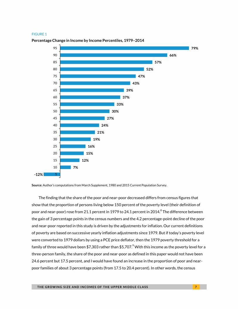
T H E G R O W I N G S I Z E A N D I N C O M E S O F T H E U P P E R M I D D L E C L A S S 7
FIGURE 1
Percentage Change in Income by Income Percentiles, 1979–2014
Source: Author’s computations from March Supplement, 1980 and 2015 Current Population Survey.
The finding that the share of the poor and near-poor decreased differs from census figures that
show that the proportion of persons living below 150 percent of the poverty level (their definition of
poor and near-poor) rose from 21.1 percent in 1979 to 24.1 percent in 2014.8 The difference between
the gain of 3 percentage points in the census numbers and the 4.2 percentage-point decline of the poor
and near-poor reported in this study is driven by the adjustments for inflation. Our current definitions
of poverty are based on successive yearly inflation adjustments since 1979. But if today’s poverty level
were converted to 1979 dollars by using a PCE price deflator, then the 1979 poverty threshold for a
family of three would have been $7,303 rather than $5,707.9 With this income as the poverty level for a
three-person family, the share of the poor and near-poor as defined in this paper would not have been
24.6 percent but 17.5 percent, and I would have found an increase in the proportion of poor and near-
poor families of about 3 percentage points (from 17.5 to 20.4 percent). In other words, the census
7%
12%
15%
16%
19%
21%
24%
27%
30%
33%
37%
39%
43%
47%
52%
57%
66%
79%
5
10
15
20
25
30
35
40
45
50
55
60
65
70
75
80
85
90
95
-12%

8 T H E G R O W I N G S I Z E A N D I N C O M E S O F T H E U P P E R M I D D L E C L A S S
finding of a three-point gain in the proportion of poor and near-poor gets converted into a 4
percentage-point decline because of the vast difference in the inflation adjustments.
FIGURE 2
Share of Each Class as a Percentage of US Population, 1979–2014
Source: Author’s computations from March Supplement, 1980 and 2015 Current Population Survey.
The growth in the rich and upper middle class and the declining proportion of the population in the
middle and lower classes indicate widespread economic growth between 1979 and 2014, but that
growth was not distributed equally. On average, incomes grew 53 percent over the period. If the growth
had been equally distributed (figure 3), then the shift upward would have been much greater. At the
extremes, the proportion of the poor and near-poor population would have dropped to 12.8 percent,
and the proportion that is rich would have barely increased (to only 0.5 percent of the population)
because the growth among the near-rich with even growth would have been much less than what
happened with uneven growth. With even growth, the size of the middle class would have declined
19.8%
17.1%
32.0%
29.4%
1.8%
24.3%
23.9%
38.8%
12.9%
0.1%
Poor or near-poor
Lower middle class
Middle class
Upper middleClass
Rich
1979 2014

T H E G R O W I N G S I Z E A N D I N C O M E S O F T H E U P P E R M I D D L E C L A S S 9
slightly (1.7 percentage points), but the growth in the upper middle class would have added another 6
percentage points and reached over a third (35.2 percent) of the nondependent adult population.
FIGURE 3
Changing Population Shares with and without Equal Growth, 1979–2014
Source: Author’s computations from March Supplement, 1980 and 2015 Current Population Survey.
Finally, CPS income-reporting practices are responsible for the share of the rich to be so low in
1979. First, through 1997, incomes in the CPS were “top-coded--set a maximal level--for confidentiality
reasons.10
Second, CPS does not include capital gains in its income measure. Third, in 1979, the highest
marginal tax rate was 70 percent while it was 28 percent rate on capital gains, creating a powerful
incentive for wealthy people to realize much of their income as capital gains. The combined effect of
these three factors means the estimated size of the rich class in 1979 is too small and the upper middle
class is too large.
12.8%
14.5%
37.1%
35.2%
0.5%
19.8%
17.1%
32.0%
29.4%
1.8%
24.3%
23.9%
38.8%
12.9%
0.1%
Poor or near-poor
Lower middleclass
Middle class
Upper middleclass
Rich
1979 2014 2014 equal growth

1 0 T H E G R O W I N G S I Z E A N D I N C O M E S O F T H E U P P E R M I D D L E C L A S S
On the lower end of the income scale, low-income people receive benefits and incomes that either
aren’t counted as income (e.g., the earned income tax credit, food stamps, free and reduced-priced
meals for children, and housing vouchers) or are underreported (e.g., pension incomes). These reporting
problems existed in both 1979 and 2014, so although it is not clear that they affect the changes in social
class shares, they might decrease the share of the population in the poor and near-poor in both years.
Changing Income Shares
Another way to look at the importance of these social divisions is by looking at their shares of all
incomes. Because these classes are divided by income, the income shares of the lower two groups are
smaller than their population shares, and the income shares of the top two groups are much larger. As
figure 4 shows, the changes in shares of the five groups are even larger than the changes of income
shares. The striking finding is the change in the center of gravity in the economy. In 1979, 70 percent of
the incomes were controlled by the three bottom groups. In contrast, in 2014, 63 percent of incomes
were held by the upper middle class and the rich and just 37 percent by the bottom three groups.
Emblematic of this shift, the income share of the middle class shrank from 46.4 percent in 1979 to
25.8 percent in 2014. This 20 percentage-point decline is much greater than the 6 percentage-point
decline in the population share of the middle class. In absolute terms the declining shares of the lower
middle class and poor and near-poor groups were smaller, but in relative terms the shares of these two
groups declined by almost one-half.11
The growth of the combined upper middle class and rich income share was driven by their
increasing share of the population and higher relative income: the average income of the upper middle
class versus the average income of the middle class grew from 91 percent higher in 1979 to 120 percent
higher in 2014. The ratio of the rich to the middle class changed even more, going from 522 percent
higher in 1979 to 661 percent higher in 2014. The main reason for the increase in the upper middle
class and rich share of total income was not because of growth in income gaps or change in average
incomes but because of the growing size of this group (85 percent).
This sizable increase in inequality has received little attention because few researchers defined the
differences in size and incomes between the middle class, the upper middle class, and the rich (see
appendix A for a discussion of four previous studies). Yet people in the middle class interact more with
the upper middle class than they do with the very rich, and they may have stronger feelings of losing
ground to the upper middle class versus their feelings about the inequality due to the huge income

T H E G R O W I N G S I Z E A N D I N C O M E S O F T H E U P P E R M I D D L E C L A S S 1 1
increases of those in the top one-tenth of 1 percent of the income ladder (see Washington Monthly
articles by Rose12
for a discussion of how middle class responses to rising inequality have fostered the
popularity of presidential candidates Bernie Sanders and Donald Trump).
FIGURE 4
Changes in Shares of Incomes of the Five Classes, 1979–2014
Source: Author’s computations from March Supplement, 1980 and 2015 Current Population Survey.
Not surprisingly, the growth of the upper middle class and rich share of total income is reflected in
the greater share of higher-end products of overall consumption. For example, the median size of a new
single-family house went from 1,650 square feet in 1979 to 2,506 square feet in 2014,13
and the share
of the luxury car segment in 2014 grew to 13 percent of all new cars from under 5 percent in 1979.14
As noted in the methodology section, the CPS income numbers understate various sources of
income: for wealthy people, capital gains are excluded, and interest and dividend income are
underreported; middle-income people are missing the value of what employers pay for their social
security taxes and health and retirement benefits; and for lower- and moderate-income people, there is
3.6%
7.5%
25.8%
52.1%
11.0%
7.4%
16.2%
46.4%
29.6%
0.4%
Poor or near-poor
Lower middle class
Middle class
Upper middle class
Rich
1979 2014

1 2 T H E G R O W I N G S I Z E A N D I N C O M E S O F T H E U P P E R M I D D L E C L A S S
underreporting of pension and government transfer income plus the exclusion of the earned income tax
credit and other noncash benefits, particularly Medicare and Medicaid. Overall, it is hard to know what
the distribution would be if all the data for a wider definition of income were available.15
Sensitivity Tests: Other Methods of Determining the Changing Size of the Upper
Middle Class
Table 3 addresses the question of changing the minimum income level for being in the upper middle
class, with one value lower than $100,000 and two values higher than $100,000. The lower value of
$85,000 is based on 4.25 percent of the poverty level, the level that the Bureau of Labor Statistics used
to define a high budget line in the 1970s; the two upper values raise the minimum by $10,000 and
$20,000.The far-right column of table 3 shows that the increase in the upper middle class share (from
14.4 to 17.1 percentage points) is virtually the same with all the changes in the lower-bound options.
TABLE 3
Effect of Raising Minimum Income Level of Upper Middle Class
Minimum income
Share of population
(%) Percentage-point change 1979 2014
$85,000 20.5 37.5 17.1 $100,000 12.9 29.4 16.4 $110,000 9.5 25.1 15.6 $120,000 7.1 21.4 14.4
Source: Author’s computations from March Supplement, 1980 and 2015 Current Population Survey.
The CPI-U-RS also functions as a sensitivity test that affects the entire distribution when it is used
to convert 1979 prices to 2014 equivalents. Because this measure shows more inflation and less
growth, its estimates show more people in the middle class and upper middle class in 1979 than the
comparable estimates using the PCE as the price deflator. Consequently, the increase in the upper
middle class share is 4.5 percentage points less when using the CPI-U-RS instead of the PCE.
Nonetheless, the upper middle class share still grows by a healthy 12 percentage points (figure 5).

T H E G R O W I N G S I Z E A N D I N C O M E S O F T H E U P P E R M I D D L E C L A S S 1 3
FIGURE 5
Differences in Growth of the Five Classes Using CPI-U-RS versus PCE
Source: Author’s computations from March Supplement, 1980 and 2015 Current Population Survey.
Note: CPI-U-RS = the Consumer Price Index Research Series Using Current Methods; PCE = personal consumption expenditure.
The last issue to be addressed concerning the growing upper middle class share is the choice of
years. Comparing 1979 to 2014 conditions might hide a period of no growth in the upper middle class
because of the low growth and deep recession in the post-2000 years. This is only partially true: in
unpublished yearly data, the share of the upper middle class rises steadily through 2007 (reaching 29
percent). After 2008, the upper middle class stabilizes at 27.5 percent until jumping in 2014 to 29.4
percent.
Conclusion
It is remarkable how often people talk about the upper middle class and how little we know about this
group. This study found that the proportion of the population in the upper middle class went from under
24.3%
23.9%
38.8%
12.9%
0.1%
21.0%
21.2%
40.2%
17.5%
0.1%
19.8%
17.1%
32.0%
29.4%
1.8%
Poor or near-poor
Lower middle class
Middle class
Upper middle class
Rich
2014 1979 CPI-U-RS 1979 PCE

1 4 T H E G R O W I N G S I Z E A N D I N C O M E S O F T H E U P P E R M I D D L E C L A S S
13 percent in 1979 to over 29 percent in 2014. The effect of this growth was magnified by the greater
income differences between this group and the rest of the population. Although wealthier people
always have a greater share of total income, this report documents a major shift in the distribution of
economic resources. In 1979, the bottom three income groups controlled 70 percent of all incomes, and
the upper middle class and rich controlled 30 percent. By 2014, this distribution shifted to 37 percent
for the bottom three groups and 63 percent for the upper middle class and rich groups. The middle class
alone saw its share of income decline from 46 percent in 1979 to 26 percent in 2014.
Any discussion of inequality that is limited to the 1 percent misses a lot of the picture because it
ignores the large inequality between the growing upper middle class and the middle and lower middle
classes. This difference has a physical dimension in that most metropolitan areas differ greatly by the
size and price of the homes in their neighborhoods and communities. We try to limit segregation by race
or ethnicity, but segregation by income (which is growing) is accepted as a fact of life.16
By setting up an absolute standard of living as the defining characteristic of social classes, economic
growth takes the form of people moving up from lower income groups to higher ones. As figure 1 shows,
only people in the bottom five adjusted-income percentiles had lower real income in 2014 than in 1979.
As incomes rise from the 7th to 99th percentile, real income growth progressively rises. So, the lower
and “middle” middle class decline is because of more families qualifying for the upper middle class. As
figure 3 shows, this movement would have been much larger if the 53 percent average income growth
had been shared equally across the entire income distribution.
Although this study found that median income grew 29 percent (only the bottom six percentiles had
no real income gains), this gain excludes the growing benefits provided by employers and other sources
of income. The CBO (2016) includes these factors (adjusts for family size and uses the PCE as the price
deflator) and finds that median incomes grew 37 percent from 1979 to 2013 (the last year of their
published data).
Finally, ongoing research will focus on the demographic characteristics of the growth of the upper
middle class and rich by family status, education, and race/ethnicity. The upper middle class and rich in
2014 were composed predominantly of people who were married or cohabiting (82 percent in 2014 and
86 percent in 1979), who had a bachelor’s or graduate degree (30 percent in 1979 and 59 percent in
2014), and who were non-Hispanic whites (79 percent in 2014 and 93 percent in 1979).
A P P E N D I X A 1 5
Appendix A. Income Share Changes
Using a Relative Approach to
Defining Social Classes A variety of studies divide social classes by relative income versus median income or by specific
percentiles of the income ladder.
First, a widely cited study from the Pew Research Center (2015) found that the share of middleclass
households declined from 59 percent in 1981 to 50 percent in 2014. This finding is based on a definition
of incomes that are between two-thirds and twice the current year’s median value. Their broad
definition of middle class in 2015 included everyone with family-of-three equivalent incomes between
$42,000 and $126,000. In contrast, they had narrow definitions of lower and upper middle class: the
lower middle class ($31,000 to $42,000 in 2015) was 9 percent in both 1981 and 2015, and the upper
middle class ($126,000 to $188,000 in 2015) was 10 percent in both years. Thus the 9 percentage-point
decline in the middle class was driven by a 6 percentage-point gain in the “highest” group share and a 3
percentage-point gain in the “lowest” income group [Pew (2016) applies the same methodology to
metropolitan areas].
The results of the Pew study are somewhat similar to the results in this study, but there are
important differences. On the one hand, the shares of those people above the middle class rose in both
approaches and the shares of the middle class declined in both approaches. On the other hand, the rise
of those above the middle class was 6 percentage points in the Pew approach and 16 percentage points
in the approach described in this paper. For the combined lower middle class, poor, and near-poor, the
Pew study found an increase of 4 percentage points, but the present study found a decline of nearly 10
percentage points. This large difference results from Pew’s defining the lower group in terms of those
with incomes under two-thirds the median level in that year versus an absolute standard of incomes
under $50,000. In other words, as the median rose and incomes below the median rose, the absolute
approach finds the bottom two groups shrinking, but the relative approach used by Pew raises the
standard-of-living bar and shows these groups increasing in size.
Second, Komlos (2016) adjusts CBO data in significant ways (making it more like CPS incomes) and
finds a “hollowing out” of the middle class. But his definition of the hollowing out is that income gains
are lowest in the second and third income quintiles and higher in the first, fourth, and fifth quintiles. It

1 6 A P P E N D I X A
should be noted that all quintiles have income gains and that the larger gains in the first quintile are
caused by the greater value of social security and Medicare payments.
The problem with this approach is that the CBO does not make their microdata available, and hence
Komlos (2016) must use the income quintile definitions of the CBO. His results would only be
meaningful if he reordered quintiles based on his definition of income. Further, his “hollowing out”
cannot mean the middle class is getting smaller, because his approach fixes the size of the middle class
as the 40 percent of people in the second and third quintiles. Using this approach means the size of the
middle class can’t change—only their share of income can change.
Third, Milanovic (2016, 194) reports a shrinking middle class in America from 1979 to 2010 with
the share below middle class growing 3 percentage points and the share above middle class growing 2
percentage points (the middle class is defined as people with incomes plus or minus 25 percent of the
median post-tax income). These results are reported without any reference to his methodological
choices. However, he uses per capita income to adjust for family size (which differs from my size
adjustments, which permit economies of scale). But in general, his approach to defining the middle class
is similar to the Pew approach (although with a much narrower income range). Without more
information about Milanovic’s approach, I can’t explain the discrepancy between his results and mine
other than to note it is once again an approach based on median income.
Fourth, Reeves defines three classes according to their place on the income ladder: the upper
middle class represents the top 20 percent, the middle class consists of those people with incomes in
the 40th to 80th percentiles, and the lower class is those in the bottom 40 percent.17
Because the shares
never change over time, Reeves tracks the average income of the three groups and shows that his upper
middle class (with no separate rich group) increased its share of total incomes from 43 percent in 1970
to 51 percent in 2013.
Finally, I created a four-way distribution of adjusted family-of-three equivalent incomes based
closely on the percentile distribution shown in figure 2:
poor and near-poor: bottom 20 percentiles
middle class: 21st to 70th percentiles
upper middle class: 71st to 98th percentiles
rich: top 2 percentiles

A P P E N D I X A 1 7
In this approach, what changes are the real income boundaries of these groups. As shown in figure
1, real income was higher at all levels along the income ladder (other than the lowest five percentiles)
from 1979 to 2014. However, the gains were not the same. Rather, they followed a clear pattern of
being larger with each additional percentile. Table A.1 shows how much lower 1979 levels were relative
to 2014 levels at the income levels used in defining social classes in this exercise: there were very small
real gains at the 20th percentile, more substantial gains at the 70th percentile, and nearly a doubling of
the real incomes at the 98th percentile.
TABLE A.1
Definitions of the Social Groups in 1979 and 2014 Using 2014 Dollars
1979 2014 Growth rate Income at 20th percentile $26,158 $29,964 15% Income at 70th percentile $71,482 $102,295 43% Income at 98th percentile $167,495 $333,067 99%
Source: Author’s computations from March Supplement, 1980 and 2015 Current Population Survey.
Table A.2 reflects this pattern of real uneven gains throughout the population by presenting the
average real income growth of four social class groups (far-right column): the average real income gain
ranged from a paltry 4 percent for the poor and near-poor to 30 percent for the middle class, 60 percent
for the upper middle class, and nearly 149 percent for the rich.
TABLE A.2
Income Growth and Shares of Total Income
Social class
Shares of Total Income Real income gain 1979 2014
Poor and near-poor 5.4% 3.7% 4% Middle class 40.5% 34.5% 30% Upper middle class 47.0% 50.1% 62% Rich 7.2% 11.7% 149%
Source: Author’s computations from March Supplement, 1980 and 2015 Current Population Survey.
Nonetheless, these large differences, when combined with no differences in the shares (which are
based on fixed percentiles) of each group, led to small changes in the shares of total incomes. The shares
of the bottom two income classes declined (1.7 percentage points for the poor and near-poor and 6.0
percentage point for the middle class), and the shares of the top two categories increased 3.2
percentage points for the upper middle class and 4.6 percentage points for the rich. So the smaller
effect on the upper middle class share of income shown in table A.2 in comparison to the shares of

1 8 A P P E N D I X A
income in figure 2 shows the effect of fixing the size of each category versus applying absolute real
incomes standards (as described in the main body of the paper).
Both the relative approach discussed in this appendix and the absolute approach in the body of the
paper show increasing inequality. The relative approach does so by documenting the widening of the
income ranges demarking the middle class; the absolute measure does so by showing the increasing
share of total income controlled by the upper middle class and rich relative to the rest of the population.

N O T E S 1 9
Notes 1. “The Rich, the Poor and the Growing Gap between Them,” The Economist, accessed May 19, 2016,
http://www.economist.com/node/7055911.
2. Many social scientists define social classes on the basis of a combination of income, education, and occupation
(sometimes referred to as socioeconomic status). There is a strong overlap among these three metrics, and the
role of education has grown in importance in determining occupation and income. Once again, no clear way
exists to combine these three social indicators into a single index, and no clear way exists to delineate among
the five social groups used in this paper. Thus, using the single monetary income measure to define social
classes is easier to understand and define. If I didn’t call these groups classes but various income ranges, people
would still think of them as middle class, lower middle class, and upper middle class.
3. Family-of-three equivalents are created by dividing the square root of three by the square root of the number
of family members.
4. Scott Winship, “Debunking Disagreements over Cost-of-Living Adjustments,” Forbes, accessed May 19, 2016,
http://www.forbes.com/sites/scottwinship/2015/06/15/debunking-disagreement-over-cost-of-living-
adjustment/#23bf57da70fc.
5. Scott Susin, “Discrepancies between Measured Income in the American Housing Survey (AHS) and the Current
Population Survey (CPS),” accessed May 20, 2016,
https://www.census.gov/hhes/www/income/publications/hudmemo8a.pdf.
6. Citizens for Tax Justice, “Who Pays Taxes in 2014?” accessed May 3, 2016,
http://ctj.org/ctjreports/2014/04/who_pays_taxes_in_america_in_2014.php#.VykNuPkrKUl.
7. There are two reasons that the 2014 share of those with incomes over $100,000 is higher than census
tabulations based on household incomes. First, because this division is based on family-of-three equivalents,
many single adult families and individuals have higher adjusted incomes than the cash incomes reported in the
census tables. Second, the universe of this study is independent adults, which means that each married or
cohabiting couple represents two observations. Because married couples have higher adjusted incomes than
single-adult households, the double weighting of independent adults versus households shows a higher share
with incomes over $100,000.
8. Table 6, “Historical Poverty Tables—People,” accessed May 19, 2016,
http://www.census.gov/hhes/www/poverty/data/historical/people.html.
9. Using the CPI-U-RS as the price deflator would have resulted in a 1979 poverty threshold for a family of three
of $6,581. Christopher Jencks makes the same point in a recent New York Review of Books article: “As a result
of these problems [bad CPI adjustments and receipt of the Earned Income Tax Credit], roughly half the families
now counted as officially poor have a higher standard of living than families with incomes at the poverty line
had in 1969.” Christopher Jencks, “Why the Very Poor Have Become Poorer,” New York Review of Books, June
9, 2016, http://www.nybooks.com/articles/2016/06/09/why-the-very-poor-have-become-poorer/.
10. After 1997, the CPS reported an adjusted “average” income for high-income people rather than the exact
incomes of these people.
11. The income shares presented in table 2 are based on the division of size-adjusted incomes and have married
couples being represented as two people living at this standard. Another method of determining shares is to
use cash incomes and count married couples as a single unit. Using this second approach means that the
income breaks used in defining the five social-class groups no long apply. To estimate the change in income
shares, I picked cut points that reflected the shares of the five groups in 1979 and 2014. The results were
almost identical to table 2; the share of the upper middle class and rich went from just under 30 percent and
just under 62 percent, respectively.

2 0 N O T E S
12. Stephen Rose, “Triumph of the Untested,” Washington Monthly, accessed May 10, 2016,
http://www.washingtonmonthly.com/ten-miles-square/2016/02/the_triumph_of_the_untested059570.php.
Stephen Rose, “Misplaced Nostalgia for the ‘Good Old Days,’” Washington Monthly, accessed May 10, 2016,
http://www.washingtonmonthly.com/republic3-0/2016/04/misplaced_nostalgia_for_the_go060235.php.
13. US Census Bureau, “Characteristics of New Single-Family Houses,” accessed May 20, 2016,
https://www.census.gov/hhes/www/income/publications/hudmemo8a.pdf.
14. For the most recent data, see “Market Data Center—Auto Sales,” Wall Street Journal, accessed June 14, 2016,
http://online.wsj.com/mdc/public/page/2_3022-autosales.html. Historic data for 1979 comes from Ward’s
Automotive, which shows luxury foreign brands were under 1 percent of the market and luxury American
brands were limited to Cadillac and Lincoln models.
15. Without underreporting of cash income, the gain in the rich share of income may be several percentage points
higher. Currently, the data show the economic effect of the upper middle class is many times that of the rich
because it is so much larger in size. But even if we add 10 percentage points to the rich share and subtract 5
percentage points from the upper middle class share in 2014, the upper middle class share would be more than
double the size of the rich share (a ratio that is consistent with data found on Internal Revenue Service income
tables). For example, CBO (2016) finds that the share of income of the top 1 percent grew from 8.4 percent in
1979 to 15.7 percent in 2013. Piketty and Saez find that the top 1 percent share of income rose from 10
percent in 1979 to 21 percent in 2014 [Thomas Piketty and Emanuel Saez, “Income Inequality in the United
States, 1913-1998" (tables and figures updated), accessed April 29, 2016, http://eml.berkeley.edu/~saez/].
Both of these studies, however, have different definitions of income and different units of analysis than used
here.
16. Kendra Bischoff and Sean Reardon, “Residential Segregation by Income, 1970-2009,” accessed May 20, 2016,
http://www.s4.brown.edu/us2010/Data/Report/report10162013.pdf.
17. Richard Reeves, “The Dangerous Separation of the American Upper Middle Class,” accessed May 18, 2016,
http://www.brookings.edu/blogs/social-mobility-memos/posts/2015/09/03-separation-upper-middle-class-
reeves.

R E F E R E N C E S 2 1
References CBO (Congressional Budget Office). 2016. “The Distribution of Household Income and Federal Taxes, 1979–2013.”
Washington, DC: Congressional Budget Office.
Komlos, John. 2016. “Growth of Income and Welfare in the U.S., 1979-2011.” Working Paper 22211. Cambridge,
MA: National Bureau of Economic Research.
Milanovic, Branko. 2016. Global Inequality: A New Approach for the Age of Globalization. Cambridge, MA: Belknap
Press of Harvard University Press.
Pew Research Center. 2015. “The American Middle Class Is Losing Ground: No Longer the Majority and Falling
Behind Financially.” Washington, DC: Pew Research Center.
———. 2016. “America’s Shrinking Middle Class: A Close Look at Changes within Metropolitan Areas.” Washington,
DC: Pew Research Center.
Rose, Stephen. 2015. Social Stratification in the United States: The American Profile Poster. New York: The New Press.

2 2 A B O U T T H E A U T H O R
About the Authors Stephen J. Rose is an affiliated scholar in the Income and Benefits Policy Center at the
Urban Institute. He is a nationally recognized labor economist and has spent the last 35
years researching and writing about the interactions between formal education,
training, career movements, incomes, and earnings. His book Social Stratification in the
United States was originally published in 1978, and the seventh edition was released in
2014. His book Rebound: Why America Will Emerge Stronger from the Financial Crisis
addresses the causes of the financial crisis and the evolving structure of the US
economy over the last three decades. Before coming to Urban, Rose held senior
positions at the Georgetown University Center on Education and the Workforce,
Educational Testing Service, the US Department of Labor, Joint Economic Committee
of Congress, the National Commission for Employment Policy, and the Washington
State Senate. His commentaries have appeared in the New York Times, Washington Post,
Wall Street Journal, and other print and broadcast media. He has a BA from Princeton
University and an MA and PhD in economics from the City University of New York.

ST A T E M E N T O F I N D E P E N D E N C E
The Urban Institute strives to meet the highest standards of integrity and quality in its research and analyses and in
the evidence-based policy recommendations offered by its researchers and experts. We believe that operating
consistent with the values of independence, rigor, and transparency is essential to maintaining those standards. As
an organization, the Urban Institute does not take positions on issues, but it does empower and support its experts
in sharing their own evidence-based views and policy recommendations that have been shaped by scholarship.
Funders do not determine our research findings or the insights and recommendations of our experts. Urban
scholars and experts are expected to be objective and follow the evidence wherever it may lead.

2100 M Street NW
Washington, DC 20037
www.urban.org