The Expenditure Experience of Older Households - IFS · The Expenditure Experience of Older...
115
Transcript of The Expenditure Experience of Older Households - IFS · The Expenditure Experience of Older...

The Expenditure Experience of Older Households
Andrew Leicester
Cormac O’Dea
Zoë Oldfield
Institute for Fiscal Studies Copy-edited by Anne Rickard The Institute for Fiscal Studies 7 Ridgmount Street London WC1E 7AE
Published by The Institute for Fiscal Studies 7 Ridgmount Street London WC1E 7AE Tel: +44 (0)20 7291 4800 Fax: +44 (0)20 7323 4780 Email: [email protected] Website: http://www.ifs.org.uk © The Institute for Fiscal Studies, August 2009 ISBN: 978-1-903274-63-7
Preface
Generous funding for this research from Age Concern and Help the Aged is gratefully acknowledged, as is co-funding from the National Institute on Aging and the ESRC Centre for the Microeconomic Analysis of Public Policy at the IFS (grant number RES 544-28-5001). The authors would like to thank Sally West and Gretel Jones of Age Concern and Help the Aged and James Banks at IFS for advice and suggestions, and Anne Rickard and Judith Payne for copy-editing. All errors are the responsibility of the authors and not Age Concern and Help the Aged or the ESRC. All views are those of the authors alone and not the IFS, which has no corporate views. Family Expenditure Survey and Expenditure and Food Survey data 1994/5–2007 are collected by the Office for National Statistics and distributed by the Economic and Social Data Service. Crown copyright material is reproduced with the permission of the Controller of HMSO and the Queen’s printer for Scotland. Andrew Leicester is a Senior Research Economist at the Institute for Fiscal Studies. Cormac O’Dea is a Research Economist at the Institute for Fiscal Studies. Zoë Oldfield is a Senior Research Economist at the Institute for Fiscal Studies. Correspondence to [email protected].


Contents
Executive summary 1
1.
Introduction 7
2. Data and measurement issues 8 2.1 Expenditure and Food Survey 8 2.2 English Longitudinal Study of Ageing2.3 What can we learn from spending data? 9103. Nonhousing expenditures 14 3.1 Trends in total expenditure and expenditure poverty 14 3.2 Trends in expenditure patterns for pensioner households 25 3.3 Trends in budget shares for specific items 39 3.4 Non-housing expenditures: conclusions 544. Housing expenditures 55 4.1 Definitions and overall trends 55 4.2 Housing expenditures by demographic group 57 4.3 Multivariate analysis4.4 Housing expenditures: conclusions 66675.
Fuel spending 5.1 Measurement issues 5.2 Levels and shares of fuel spending in 2006/7 5.3 Payment methods 5.4 Changes in fuel spending, 2004/5 to 2006/7 5.5 Fuel spending: conclusions
68 69708387946. Conclusions
Appendix A Appendix B Appendix C References
96
97 100 104
106


1
Executive summary This Commentary examines detailed trends in expenditure patterns between 1995 and 2007, with a particular focus on the pensioner population. Pensioners are not a homogeneous group, but differ widely in both their levels and patterns of spending, and so we look not just at pensioners as a whole but also at pensioners according to age, income, household composition and so on. Spending may tell us something about household welfare that other, often-used measures like incomes do not. In particular, it may be that spending is informative about long-run well-being whereas income is more about current, short-run living standards.
Using data from the Family Expenditure Survey/Expenditure and Food Survey, an annual, cross-sectional study of the spending patterns of 6,000–7,000 households, we look in depth at changes in the level of real expenditures and how spending patterns have changed over time. Then, using data from two waves of the English Longitudinal Study of Ageing, we examine household fuel expenditures in detail. Fuel is clearly of great current policy concern given recent large increases in the price of domestic fuel that may impact particularly severely on poorer and older households. Chapters 1 and 2 introduce the main issues and discuss data and measurement issues in depth. Our main findings from the rest of the Commentary are summarised below.
Chapter 3: Non-housing expenditures
Trends in total expenditure and expenditure poverty
• Pensioners spend less, on average, than non-pensioners. Between 1995 and 2001, real spending grew more quickly for non-pensioners, but between 2001 and 2007 pensioner spending has risen more rapidly.
• Since 2001, non-pensioners have seen no real spending growth at all, whereas pensioners have seen real spending rise on average by 2.1% per year. This means that by 2007 pensioners spent 80% as much as non-pensioners compared to 69% as much in 2001.
• Even after adjusting for household composition, single pensioners spent around 70% as much as pensioner couples on average. Single pensioners have also experienced slower real spending growth since 2001 than couples.
• Across the age profile, total spending peaks as households reach their late 50s, then rapidly declines. Over the whole period, households aged 80+ have spent only around half as much as those aged 55–59. The oldest households have also seen the lowest real spending growth since 2001 amongst pensioner households, at just 0.4% per year. Pensioner households in their early 60s and late 70s have seen the fastest recent spending growth.
• Richer households spent more than poorer households both amongst pensioners and non-pensioners. Poorer pensioners spent less than poorer non-pensioners but richer pensioners spent about as much as richer non-pensioners.
• Between 1995 and 2001, spending grew rapidly for poor non-pensioners. Between 2001 and 2007, spending grew rapidly for poor pensioners, in particular those in their 60s.

The expenditure experience of older households
2
• Poorer households in their 50s and 60s have seen their spending starting to catch up to richer households of the same age since 1995; this has not been true for other age groups.
• Poverty rates as measured by spending have fallen in recent years for pensioners, and fallen more rapidly for older pensioners. This appears to be the first sustained fall in pensioner spending poverty for some time.
• Expenditure poverty rates have fallen more quickly than income poverty rates for pensioners overall since 2003, though for the oldest pensioners income poverty rates are still falling more rapidly.
Trends in expenditure patterns for pensioner households
• Breaking non-housing expenditures down into 17 broadly consistent categories, in 2007 pensioners spent significantly more on average than non-pensioners on only three: food in the home, household fuel and health care. Non-pensioners spent significantly more on 11 categories.
• But looking at the budget share rather than the spending level reveals substantial differences in spending patterns across pensioners and non-pensioners. In 2007, pensioners devoted a larger share of their non-housing budget than non-pensioners to household services, leisure goods and miscellaneous items as well as food, fuel and health care.
• Between 1995 and 2007, real expenditure by pensioners rose in all categories except tobacco and household services. The largest real increases were in leisure, health care and private transport. Education spending rose substantially from a low base.
• Non-pensioners increased their real spending on communications between 1995 and 2007 by 70% compared to 28% for pensioners. This may well reflect the growth of mobile phones and Internet subscriptions.
• In general, spending patterns of pensioners appear to have ‘converged’ slightly with those of non-pensioners over the period: pensioners tended to increase their spending more rapidly on those items where they spent less than non-pensioners in 1995, and less rapidly on those items where they spent more as a share of the total budget. Health care and public transport are two exceptions to this.
• Older pensioners spent more of their budget on food in, fuel, household services and health care than younger pensioners, but less on clothing. In 2007, those aged 80+ spent on average 12.7% of their budget on household fuel compared to 6.6% for those aged 60–64 (and 7.0% across all households). Those aged 80+ spent 24.8% of their budget on food in, compared to 17.0% for those aged 60–64.
• Leisure goods (e.g. books and newspapers, audio-visual equipment) make up a similar share of the budget across different types of pensioner household, but leisure service budget shares (e.g. holidays, TV Licences and live entertainment) are much higher for younger and richer pensioners and increased more rapidly over the period for these groups.
• Older groups have benefited from free TV Licences since November 2000 which may account for some of the difference in leisure service budget shares by age. Prior to their introduction, households aged 75+ typically spent more than 1.5% of their budget on the TV Licence.
Executive summary
3
• In contrast to leisure services, private transport spending has grown more quickly for poorer pensioners over time. Those in the middle of the income distribution now spend about as large a share of their budget on private transport as the richest pensioners.
• Age and income both appear to be important determinants of expenditure patterns, but their effects differ across spending categories. For some categories like alcohol and clothing, rich pensioners have spending patterns more similar to those of poor pensioners; for others like tobacco and leisure, the spending is more comparable to rich non-pensioners.
Trends in budget shares for specific items
• Food in the home is a classic ‘necessity’; the food budget share is often used as an overall indicator of well-being. Between 1995 and 2007, the gap in ‘food in’ budget shares between pensioner and non-pensioner households narrowed from around 7 percentage points to under 5.5 percentage points.
• Pensioner households devote a larger part of their food budget to meat, fish, hot beverages and fruit than non-pensioners, and a smaller part to soft drinks and vegetables. Poor pensioners spend more of their food budget on breads and cereals and dairy products and less on fish, fruit and vegetables than richer pensioners. These differences are similar to those between rich and poor non-pensioners.
• Leisure is often seen as a classic ‘luxury’ spending item. However, it appears that at least for pensioner households, leisure goods are not a luxury in the standard sense: there is no clear relationship between the leisure goods budget share and income for pensioners.
• For leisure services, not only do richer pensioners spend a larger share of their budget, they also saw the most rapid rise in budget share over the period. The richest 20% of pensioners spent on average 15.1% of their budget on leisure services in 2007 compared to 6.4% for the poorest fifth.
• For the richest fifth of pensioners, holidays were the single largest expenditure category in 2007, accounting for 12.5% of non-housing expenditure. For the poorest fifth, holidays made up 3.3% of spending, the tenth largest spending category; the largest was electricity, at 6.5% of the budget.
• Income is the main factor correlated with the budget share of leisure services: within broad income groups, there is very little relationship between age and the total budget share of leisure services. The composition of leisure service spending does vary by age within income group: older households spend a larger share on holidays and less on other leisure services.
• There has been no consistent trend for higher health care budget shares over time. Older households spend more of their budget on medical goods but there is no clear relationship with income within an age group. For medical services, there are substantial age and income effects. Households aged 70+ in the richest third spent 4.1% of their budget on medical services in 2007, compared to 0.2% for households under 35 in the poorest third.
The expenditure experience of older households
4
• Between 2005 and 2007, the average household fuel budget share rose by similar amounts for pensioners and non-pensioners. For pensioners, the increase was 1.5 percentage points (from 7.7% to 9.2%, an increase of around one-fifth) and for non-pensioners the increase was almost 1.2 percentage points (from 4.8% to 5.9%, an increase of around one-quarter). The oldest pensioners aged 80+ saw their fuel share rise by 3 percentage points from 9.7% to 12.7%.
• Fuel budget shares for pensioners tend to be lower in the South of England than across the UK as a whole, and higher in Northern Ireland. The composition of fuel spending is very different in Northern Ireland; gas is much less common and spending on other fuels such as coal and oil is much higher. These prices might be more sensitive to crude oil prices which could explain why Northern Ireland was the only region to see a fall in fuel budget shares between 2005 and 2007.
• Transfers out of the home make up a small share of spending on average but are quite important for some households, particularly older and richer ones. Those aged 70+ in the richest third spent nearly 4% of their budget on transfers out in 2007, compared to just under 3% for those aged 70+ in the poorest third and just over 1% for those under 35 in the poorest third. There have been no clear trends over time in the transfer budget share across age or income groups.
Chapter 4: Housing expenditure
• This chapter focuses on a net housing measure that excludes rent and local tax rebates, and includes mortgage interest but not capital repayments.
• Between 1995 and 2007, real housing spending rose more quickly than spending on other goods and services, rising by around 3.0% per year on average with faster growth in the 2000s. Pensioners and non-pensioners saw a similar real-terms rise in housing spending over the period, but the increase in the housing budget share was smaller for pensioners because their non-housing spending rose by more than the non-housing expenditures of non-pensioners.
• Local taxes saw the largest real-terms increase in spending levels over the period, and rose by more on average for pensioners (84%) than non-pensioners (68%).
• Between 1995 and 2007, pensioners became much less likely to live in Local Authority accommodation and much more likely to own outright. There was a small increase in the proportion of pensioners who rented privately and no clear trend in the proportion with mortgages.
• On average, pensioners spent around 2–3 percentage points less of their budget on housing than non-pensioners over most of the period, but in recent years the gap has risen to over 5 points. By 2007, pensioners spent 17.8% of their total budget on housing compared to 23.3% for non-pensioners. This was largely driven by a big increase in the mortgage interest budget share that affects non-pensioners more.
• In 2007, pensioners spent 7.2% of their budget on local taxes on average compared to 4.4% for non-pensioners. Water payments made up 2.9% of the pensioner budget and 1.9% for non-pensioners. Over time, pensioners have been devoting less of their budget to rent on average but the rent share has increased for non-pensioners.
Executive summary
5
• The largest increases in the housing budget share came for the very youngest households. In cross-section, there is a U-shape in terms of the housing budget share with age. Households in their late 60s spent the least on housing as a share of the total budget; older and younger households spent more. This pattern is reinforced, not attenuated, if we control for other observable household characteristics.
• Local taxes make up a much larger part of the budget for the oldest households: 8.8% for those aged over 80 compared to 3.9% for those under 35 in 2007. Water charges and housing fees (including insurance) also make up a larger part of the budget for older households. In 2007, those aged 80+ spent on average 3.8% of their budget on water charges and 2.6% on fees, compared to 1.9% and 1.5%, respectively, for those under 35.
• For younger households, those with low incomes have lower housing budget shares than those with higher incomes. For older households, those with low incomes have a higher budget share. The U-shaped relationship between age and the housing share is much stronger for poorer than richer households.
• Age seems to be more strongly related to the local tax budget share than income: for households in a given age group, there is no clear pattern across income in the local tax budget share. Water charges are always a bigger part of the budget for poor households of a given age than rich households.
• Within tenure group, there is no clear pattern as to whether pensioners have higher or lower housing shares than non-pensioners. Pensioner private renters have moved from having a higher budget share than non-pensioner private renters to a lower share over time. This appears to be driven by benefits to some extent.
• The average housing budget share is around 40% lower in Northern Ireland than the average across other regions, and is highest in London. Pensioners in Northern Ireland spend on average 8.8% of their budget on housing compared to 22.7% for pensioners in London.
Chapter 5: Fuel spending
This chapter uses data from the English Longitudinal Study of Ageing in 2004/5 and 2006/7. We track spending on fuel across time for the same individuals living in a sample of households in England aged 55 or over in 2004. We find:
• Average fuel spending does not vary much by age. As a proportion of income, older individuals tend to have slightly higher fuel spending, though differences are small.
• Pensioner couples spend on average more on fuel than do single pensioners. However, as a proportion of their income, single individuals tend to spend more than couples. The median share of income spent on fuel is approximately 6% for singles aged 65–69 and 4.5% for couples in the same age group.
• Dividing the population into five groups according to their income we find that levels of fuel spending, on average, are higher for richer households. This result remains true after controlling for other observed characteristics.
• The proportion of income spent on fuel falls sharply as income rises. The poorest fifth of individuals in couples spend 8.8% of their income on fuel on average, whereas couples in the richest fifth spend 2.6% of their income on fuel. For singles, the figures are 10.6% and 2.9%, respectively.
The expenditure experience of older households
6
• Single female and single male pensioners spend similar amounts on fuel per week (around £14) but single female pensioners spend more as a proportion of their income (6.6% compared to 5.5%).
• Around two-thirds of individuals pay for their gas by direct debit and a similar proportion pay for their electricity by direct debit. Around one-quarter use bills. Only 3.3% of individuals pay for their gas, and 4.0% their electricity, by prepayment meter.
• The propensity to pay by prepayment meter falls with age (amongst our sample of those aged 55+) and with income. Single pensioners are more likely to pay by prepayment meter than pensioner couples.
• Individuals who pay for their gas or electricity by slot meter spend substantially more, on average, on fuel than those who pay by direct debit or via a bill. Single individuals who pay for their electricity by prepayment meter spend around 75% more on electricity than those paying by bill. Multivariate analysis confirms that, even after controlling for income, age and other observed factors, those paying for their fuel by prepayment meter spend more on average (both in levels and as a share of income) than those paying by direct debit or bill.
• Conditional on other observed factors, those living in very old houses (built pre-1919) spend more on fuel, around £3 per week more on average than those living in houses built between 1965 and 1985. Households with central heating not fuelled by gas or electricity (e.g. solid fuel and oil) spend £9.25 per week more on fuel than those with gas-powered central heating.
• Between 2004/5 and 2006/7 the median change in fuel spending across all those aged 55 and over was 21% for singles and 22% for couples. The median change did not vary substantially across age groups. There is also little evidence of any pattern in median change in fuel consumption across the age distribution.
• Looking at the change in fuel spending by income group between 2004/5 and 2006/7, we find that the biggest increase in fuel spending was seen in the richest 20% and the poorest 20% of couples and singles with those in the middle of the distribution experiencing the smallest increase in spending. Accordingly, we estimate that it is those at the top and bottom of the income distribution who have reduced their fuel consumption the least over the period once we take into account the price rises over this period. Singles in the poorest fifth reduced fuel consumption by around 7% and those in the richest fifth by around 8%; those in the middle of the income distribution reduced consumption by around 12%.

7
1. Introduction
Household expenditures are extremely informative for a number of reasons. Changes in spending patterns over time may reflect changing lifestyles, tastes and preferences, new technologies, changes in relative prices, growing incomes and many other factors. How much a household spends and on what goods and services may tell us something about living standards that may not be reflected so well in other, often-used measures such as household incomes. Comparisons of spending levels and patterns across different types of household may therefore be informative about differences in living standards and may reinforce or challenge the picture that is painted if we focus on other measures instead. This may be particularly true for older households. Over the last few years there has been a marked decline in pensioner poverty as measured by income, such that a pensioner plucked at random from the population is less likely to be income poor than a non-pensioner (this first happened in 2003/4, see Brewer et al., 2005). But in terms of expenditures, pensioner households did not appear to catch up with non-pensioners in the same way, at least not by 2002/3 (Brewer et al., 2006). Previous work carrying out comparisons of expenditures across groups sometimes defines demographic types quite broadly. Blow et al. (2004), for example, looked at different household types but defined ‘pensioner singles’ and ‘pensioner couples’ as distinct groups and did not look within the older population in more detail. Yet in recent years, growing amounts of research have suggested that treating the pensioner population as a largely homogeneous population ignores substantial variation within pensioner households according to age, income, family type, region and so on. Finch and Kemp (2006), for example, carried out some detailed analysis of pensioner spending behaviour and comparisons of income and spending for different groups of pensioner households. Their focus was on just two years of data in the early 2000s, trying to understand which pensioners spent little relative to their incomes. This Commentary uses expenditure survey data to look at detailed pensioner spending behaviours over a longer period back to the mid-1990s and uses more up-to-date evidence to the end of 2007. We look within much more narrowly defined groups of pensioner households, making comparisons across groups (comparing different pensioner groups to each other and to different non-pensioner groups) and across time. Using different data from a detailed survey of older households in England, we also look in detail at household fuel expenditures which are a source of much current concern. Our report is structured as follows. Chapter 2 describes the data we use and particular the issues we face in measuring expenditures and defining different household groups. Chapter 3 analyses non-housing expenditures, looking first at trends in total spending (including an up-to-date analysis of poverty rates as measured by spending), then patterns of spending across different pensioner groups over time and finally in depth at particularly interesting categories of spending. Chapter 4 looks in depth at housing expenditures, where measurement issues may be particularly acute. Chapter 5 looks in detail at fuel expenditures for older households in England. Chapter 6 concludes.

8
2. Data and measurement issues
Our analysis in this commentary relies on two main data sources: the Family Expenditure Survey (FES), which became the Expenditure and Food Survey (EFS) in 2001; and the English Longitudinal Study of Ageing (ELSA). Here we describe the data sets and our use of the data, and some of the issues involved in calculating expenditures and expenditure patterns from the data. 2.1 Expenditure and Food Survey
The Family Expenditure Survey/Expenditure and Food Survey (FES/EFS) is an annual, cross-sectional survey that records detailed expenditure patterns for around 6,500 households. Surveys are conducted throughout the year. The data are collected by the Office for National Statistics (ONS). Data from the FES exist as far back as 1961, but our analysis focuses on 13 full calendar years of data from 1995 to 2007.1 All people aged 16 and over living in participating households are asked to complete a diary for two weeks in which they record details of everything they buy (a description of the item, how much was spent and in some cases where the item was purchased). Children aged 7 to 15 are also asked to complete a simplified diary, though we do not include children’s expenditures in our figures in this Commentary. Households are also given two interviews, one a household interview that records demographic information and an income questionnaire that records details of household incomes and some other financial information. The interviews also ask about regular payments like rent and household bills, as well as infrequently purchased items like holidays and furniture where relatively few households would record any purchases over just two weeks. The expenditure information is distilled into a large number (hundreds) of expenditure codes which report the household’s average weekly spend on a wide range of items. We take this expenditure information and define a number of expenditure groups. Using the detailed codes, we construct spending groups that are defined as consistently as possible over the 13 years of data we use, and which are of interest for a particular analysis of the spending patterns of older households. Our main focus is on non-housing expenditures; Chapter 4 discusses particular issues with measuring and interpreting housing spending and provides some analysis of figures including housing. We have 56 non-housing expenditure groups. Much of our focus will be on even more aggregated expenditures where these are further combined into 17 categories. Details of the expenditure groups we use for our main analysis are given in Appendix A. We use the demographic and income data to divide households into a number of different groups which we use to analyse and compare expenditure patterns over time. Data from the FES/EFS are used widely within ONS and government departments; as the main source of detailed, comprehensive expenditure patterns, for example, they are one of the major inputs into calculating the ‘shopping basket weights’ for the Retail Prices 1 Although the FES/EFS was collected on a fiscal year basis between 1993/4 and 2005/6, the survey is designed to be nationally representative within quarter as well as within year such that merging data from two separate waves into a single calendar year (e.g. calendar year 1995 is made up of data from the 1994/5 and 1995/6 surveys) should not influence the results.
Data and measurement issues
9
Index. They are also used widely in academic and applied economic analysis, in particular in estimating how households respond to price changes (tax changes, oil price shocks and so on). FES/EFS data quality issues Response rates to the survey have been declining over time – in 2007, the overall response rate was 53% in Great Britain and 55% in Northern Ireland compared to around 70% and 59%, respectively, in 1994/5.2 Average sample sizes have been declining slightly over time as a result. To the extent that growing non-response is ‘random’ across households this should not reflect the reliability of the data, but there may be concern about whether or not this is the case. A growing body of work suggests that the extent to which EFS expenditure data are able to match the spending patterns in the UK National Accounts (the major macroeconomic source of spending patterns on which the basket weights for the Consumer Prices Index are based) has been declining in recent years. Tanner (1998) found that between 1974 and 1992, for example, the ‘grossed-up’ FES (where each household was replicated a number of times so that the number of households in the FES matched national totals) contained around 90% of the total non-housing spending in the National Accounts. Attanasio et al. (2006) found that between 1992 and 2002, the share of National Accounts non-durable spending accounted for by a grossed-up FES/EFS fell from almost 100% to less than 80%, with declines in almost all categories of expenditure.3 Clearly there are problems in collecting detailed, comprehensive measures of household spending but the FES/EFS remains the best source of such data for a large, representative sample of households in the UK and the only feasible source of data for use in an analysis such as this. 2.2. English Longitudinal Study of Ageing
The English Longitudinal Study of Ageing (ELSA) is a survey that provides a representative sample of the English population aged 50 and over on 28 February 2002. The study contains a complete picture of financial circumstances as well as detailed information on health and socio-economic factors (see Marmot et al., 2003 for further details and description of the ELSA data). ELSA also contains a limited amount of information on spending. For the purposes of this Commentary, the most useful set of information relates to spending on domestic fuel. Since wave 2 (fielded in 2004), a very detailed set of questions has been asked about fuel spending. Like the EFS, respondents are interviewed throughout the year, but these questions were designed to overcome the issue of seasonality of fuel spending. In addition, because we have two waves of data available to use (2004 and 2006), we are able to look at changes in fuel spending at the individual level over a period of time when fuel prices were increasing rapidly. 2 Note that there is a relative oversampling of Northern Ireland households; we correct for this and sampling issues in general by using household-specific weights. Since 2001/2 these weights have been provided with the data; before then, we use our own weights calculated by comparing the number of families in 17 different groups in the data each year to the number of families in the same groups in the 1991 Census. 3 Although the performance of the FES/EFS was substantially better than that of the equivalent survey in the US, where the household data accounted for only 60% of National Accounts spending by 2004.
The expenditure experience of older households
10
2.3. What can we learn from spending data?
There are several reasons to be interested in an analysis of changes in the levels and patterns of expenditure across time and across different household groups. In particular, spending may tell us something potentially interesting about living standards. Often, analyses of living standards have used household incomes as their measurement tool. Data on incomes are available on a consistent basis over a long time period and so are extremely useful, but they suffer from a number of drawbacks. Surveys of incomes record a snapshot picture of the income for a given household at the time they are surveyed but this may not reflect their true living standards very well – for example, someone who has just lost their job but expects to find another may well choose to run down their savings and maintain relatively high spending even though their incomes are temporarily low. These short-term fluctuations also have longer-term parallels. Households at the beginning of their life cycle may borrow and run up debt early on (for example to finance a car or durable purchase) which is then repaid later in life before assets are built up later in the working lifetime. These assets can then be drawn down in retirement to allow low-income retired households to enjoy living standards higher than their incomes alone would reflect. For both these short- and long-term cases, spending may be a better guide to ‘long-run’ or ‘life-cycle’ living standards than income, to the extent that living standards are ‘smoothed out’ in this way and that spending is a better measure of this smoothed path of income. The potential for spending to tell us something interesting about living standards has long been recognised in academic work (see for example Blundell and Preston, 1998 and Meyer and Sullivan, 2007, 2009) but has not been so well developed in policy terms. One of the main ambitions of the government over the last decade or so has been to reduce poverty for children and older people where ‘poverty’ was usually defined as people living in households with less than 60% of the median income in a particular year. One consequence of this definition was that poverty amongst pensioner households tended to be very sensitive to the position in the economic cycle: since pensioner incomes tended to be relatively fixed and immune from cyclical effects, when the economy grew strongly pensioners tended to fall further behind and see higher relative income poverty rates, but when the economy contracted pensioner poverty rates fell. Brewer et al. (2006) showed that when expenditure was used as a measure of living standards instead, pensioner poverty rates were much more stable, and in particular that the drop in relative income poverty for pensioners seen in the 1990s and early 2000s was not replicated in terms of spending. More recently, the government has moved towards including measures of ‘material deprivation’ in poverty figures which assess whether households have or do not have certain basic items that most people tend to view as ‘essentials’ and whether they do not have them because of an inability to afford them. These include things like keeping the home warm but also ‘having friends or family round for a meal at least once per month’. This moves some way towards using spending as a measure of well-being but it is not clear why this approach is preferred to measuring spending directly, since focusing on certain items essentially conflates preferences and living standards (some households do not have things because they do not want them; this may not mean they are deprived).4 4 For more, see chapter 5 of Brewer et al. (2008).
Data and measurement issues
11
Measuring spending: expenditure or consumption? It should not be inferred from this discussion that spending is always and everywhere a better measure of living standards than income. Spending is also recorded as a snapshot in a survey and may not reflect longer-term spending patterns of a given household. For example, EFS households record diaries for two weeks and provide some information on purchases of items that are typically bought only infrequently and regular payments to supplement the diary expenditures. This attempts to capture to a degree the distinction between expenditure, what we are observed to spend in a given period on goods and services, and consumption, the value we obtain from our purchases. Consider a household that buys a television costing £500 during the two-week EFS diary survey – it would be recording spending of £250 per week on televisions and would appear to have relatively high expenditures. However, another household that bought a £500 TV the week before it began the EFS survey would be observed spending nothing at all, yet we would imagine both households getting the same consumption value from the TV. It is this consumption value we would ideally like to measure yet the survey records spending, not consumption,5 though it may be that average spending on these more durable items within a group including those households that did not purchase the item at all is a reasonable reflection of the average consumption value. This distinction between spending and consumption is one of the key problems with including housing in any expenditure measure. Consider a couple, both aged over 80, who live in a house next door to another couple, both aged under 30, living in an identical house. The older couple have finished paying their mortgage and own the property outright whilst the younger couple are renting the property privately and paying a rental sum each month to their landlord. For the renting couple, their spending on rent each month (which we can observe in data) probably provides a good reflection of the consumption value they get from their home. For the older couple, their observed spending on housing is zero, but they are probably getting a very similar level of consumption that we simply do not observe in the data. If we relied on spending as a guide to living standards, therefore, it would seem that the younger couple had a higher living standard simply because they make housing payments, ignoring the unobserved consumption value of housing altogether. The distinction between expenditure and consumption may also emerge for people with mortgages. It is not clear whether the right measure of spending that reflects welfare includes mortgage capital repayments or just mortgage interest payments: capital repayments can be viewed as a form of savings and typically savings would not be included in measures of expenditure-based living standards.6 Mortgage payments also depend on the value of the house at the time the loan was taken out – someone who buys at the height of a housing boom has a higher payment on the same property than someone who bought at the bottom of the trough, yet the welfare value of housing services is presumably the same. 5 The survey questionnaire asks about infrequently purchased items such as furniture, cars and holidays, asking how much was spent on them over a number of months previous to the survey (normally six) and converting to a weekly average precisely for this reason. However, many consumer durables like TVs, fridges and so on are not covered by similar questions. 6 To the extent that over the whole life cycle total expenditures must equate to total incomes, including savings is effectively getting back to income-based measures of living standards.

The expenditure experience of older households
12
Thus housing data can be difficult to measure accurately and it can be hard to interpret spending in terms of well-being. Nevertheless, simply ignoring housing altogether seems somewhat unsatisfactory; housing is a large part of average outlays and differences across groups over time, particularly in terms of unavoidable expenses like local taxes, are of considerable interest. Our approach is to focus the main part of our analysis in Chapter 3 on a measure of spending that excludes housing, and then to look at housing expenditures separately in Chapter 4, mindful of the caveats about what we can infer from them about living standards. Furthermore, we also know that spending data may be subject to measurement errors; these errors may be more or less severe than those that affect income data. As we discussed earlier, FES/EFS data appear to be capturing less of the total spending recorded in National Accounts, and we know that these problems are particularly severe for goods like alcohol and tobacco where there are obvious concerns that households may not accurately record all of their purchases over the diary period. Households responding to recall questions about their purchases of holidays or other infrequently bought items may forget how much they spent, or recall spending from periods before the recall period asked about in the questionnaire. These points aside, however, it is clear that spending at the very least provides an alternative measure of living standards to income. For older households, earlier work such as Brewer et al. (2006) has demonstrated considerable differences in the relative living standards based on the two measurements, but has not delved deeper into the spending experiences within the older population. This is what our work here seeks to address. Spending levels or budget shares? In terms of thinking about how spending varies across different types of household, it may be more informative to focus on how important different items are as part of the total budget, rather than on absolute spending levels. For example, poorer households will probably spend absolutely less on most spending items but will spend a proportionately greater share of their budgets on items that are economic necessities7 and less on luxury or discretionary spending. It is straightforward, given data, to work out on average how much households spend on different items. It is not quite so obvious how the average budget share should be calculated. There are two approaches: either we can work out how much on average households spend in total, and then how much on average they spend on different items, and take the ratio of these two things (this is called the ‘ratio of averages’ or RA measure of the average budget share). Alternatively, we can work out the budget share of a particular item for each household and then take the average of these budget shares (this is called the ‘average of ratios’ or AR measure of the average budget share). These need not give the same result at all. The ratio of the averages is in effect dividing the sum of expenditure on a particular good across all of the households in the data by the sum of total expenditure across households. This means that this figure will be particularly heavily influenced by the expenditures of richer households that spend more. This is not 7 In economic terms, normal goods are those for which spending levels rise as the total budget rises, whereas luxuries are those where the budget share rises with the total budget. Necessities are goods whose budget share falls with the total budget, and inferior goods are those where absolute spending levels fall as the total budget rises. Goods can be necessities without being inferior.

Data and measurement issues
13
the case for the AR which is equally influenced by all households. Because the RA is influenced more by richer households, it is sometimes called a plutocratic average whereas, since the AR considers each household’s budget share equally, it is called a democratic average. Which is more informative when comparing the spending patterns across groups? As discussed in Leicester et al. (2008) which looked at inflation rates across groups, when we want to know what the ‘average’ pattern of spending is across the whole economy, a plutocratic average is perfectly sensible since the patterns of total spending will be more driven by those who spend more. When making comparisons across households, however, it is not really clear that we wish to weight richer households more heavily, even when comparing across different groups. Thus our focus will be on democratic averages throughout this Commentary. Comparing spending across households and over time Our data cover a relatively long time period. If we look at spending levels at the start and end of the period, we will find considerable growth in spending, at least some of which is attributable not to higher living standards but simply to general price inflation. To account for these, we express all expenditures in this Commentary in December 2007 values. In Chapter 3, where we focus on non-housing expenditures, we use a measure of the Retail Prices Index (RPI) that excludes housing costs to deflate spending. In Chapter 4, where we look at housing spending, we use the all-items RPI instead. Leicester et al. (2008) showed that inflation rates vary across different types of household because they have different patterns of expenditure. It may not be totally appropriate to deflate spending for all households using the same index. However, we find that differences in household-level inflation rates from year to year tend to even out over longer time periods, so using a common deflator may be reasonable when looking at relatively long-term spending patterns. The other issue in comparing spending across households is to do with household composition: households with more people in them are likely to spend more than those containing fewer people, but clearly this may not reflect a higher ‘standard of living’. One approach is to calculate spending per person, but this assumes that all household members contribute equally to consumption needs, which may not be the case: an extra child may not be the equivalent of an extra adult in a household, for example. Further, a household made up of two adults may not need twice the spending power of a household made up of a single adult to have the same standard of living since there are economies of scale in terms of, say, heating and food bills. To estimate these effects, we use an equivalence scale to compare the spending of households with different compositions. An equivalence scale estimates how much expenditure or income different household types need to be equivalently well off. We use the modified Organisation for Economic Co-operation and Development (OECD) equivalence scale and express values relative to a childless couple.8 8 See appendix A, table A.1, in Brewer et al. (2009) for details.
14
3. Non-housing expenditures
We focus first on spending excluding housing costs. We begin in Section 3.1 with an analysis of how total non-housing spending has changed for different pensioner groups compared to other households. Section 3.1 also looks at rates of relative poverty for pensioners measured by their expenditure, comparing poverty rates for older pensioners to the whole population and the whole pensioner population. Section 3.2 breaks down expenditures into different categories and looks at how spending patterns vary according to pensioner household characteristics. Then in Section 3.3 we look at some key spending items: food and leisure, health care, household fuel and transfer payments. Before turning to our results, we highlight some data and measurement issues and conventions that are used in Chapters 3 and 4 of this Commentary: • All results use data from the Family Expenditure Survey/Expenditure and Food Survey (see Section 2.1) on a calendar-year basis from 1995 to 2007. • Expenditure data are reported at the household level as weekly values. Households that spend a large proportion of their budget on any single expenditure category (the precise value varies according to the category) are excluded, as are households that spend in total less than £25 per week in real terms or more than £2,000 per week. These overall cut-offs exclude around 0.3% of households. • As discussed in Section 2.3, spending has been converted to December 2007 prices. Comparisons over time therefore refer to real-terms changes. Spending has also been adjusted for household composition using the modified OECD equivalence scale. • We use weighted data to correct for sampling variation. Until 2001, these weights are derived by comparing the numbers of households in the data in 17 different family groups to numbers in the Census. From 2001, we use weights as provided in the EFS data. • In general, any results that rely on fewer than 100 observations in a year will not be included. Where possible we will comment on the statistical significance of any differences that we observe across time or across groups. • ‘Pensioner households’ are those where there is at least one person of pensionable age in the primary benefit unit. • Any age-related variables define age groups based on the eldest person in the primary benefit unit. 3.1 Trends in total expenditure and expenditure poverty
Pensioners and non-pensioners Figure 3.1 shows average weekly total non-housing expenditures between 1995 and 2007 for all households, pensioner households and non-pensioner households.

Non-housing expenditures
15
Figure 3.1. Average real equivalised total non-housing expenditures, 1995–2007
Notes: Values shown are to the nearest whole pound in December 2007 prices. Dotted lines show 95% confidence intervals. Source: Authors’ calculations from FES/EFS data 1994/5–2007. There are significant differences in spending levels for pensioners and non-pensioners, but the gap has narrowed over time. In 1995, pensioners on average spent about 72% as much on non-housing items as non-pensioners; by 2007 this had risen to 80%, the highest figure over this period. What is particularly striking is that average real spending for non-pensioners has fallen since 2003 but has risen strongly for pensioners.9 Table 3.1 shows the annual average growth rate of real spending for pensioners and non-pensioners, clearly illustrating the distinction between the first and second half of our data period. Real spending has grown by 2.1% per year on average for pensioners during both periods, but non-pensioners have seen their average spending growth fall from +2.8% per year in the first six years we examine to −0.3% in the latter six. Table 3.1. Real annual average non-housing spending growth rates, pensioners and non-pensioners
All households Pensioners Non-pensioners
Whole period (1995–2007) +1.4% +2.1% +1.3%
First half (1995–2001) +2.7% +2.1% +2.8%
Second half (2001–07) +0.2% +2.1% −0.3% This sustained period of relative ‘catch-up’ for pensioner expenditures is a relatively recent phenomenon not observed in some earlier studies using older data. For example, Blow et al. (2004, table 5.2) looked over a longer period between 1975 and 1999 and found no obvious difference in the growth of real total non-housing spending for 9 Average pensioner spending was not statistically significantly higher in 2007 than it was in 2004, but was statistically significantly higher in 2006 than in 2004.
285292
306318 323
336 335343 342 341 345 345
338
224 223
238248 249
264255
262 261
275284
290 289
310320
335348
354366 367
378 378370 373 369
361
200
220
240
260
280
300
320
340
360
380
400
1995 1996 1997 1998 1999 2000 2001 2002 2003 2004 2005 2006 2007
Tota
l non
-hou
sing
spe
ndin
g (£
/wee
k)
All households
Pensioners
Non-pensioners
The expenditure experience of older households
16
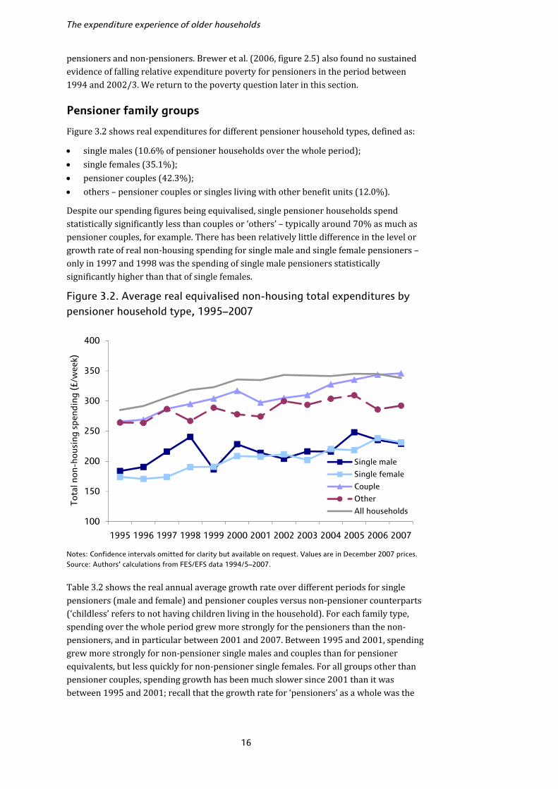
pensioners and non-pensioners. Brewer et al. (2006, figure 2.5) also found no sustained evidence of falling relative expenditure poverty for pensioners in the period between 1994 and 2002/3. We return to the poverty question later in this section. Pensioner family groups Figure 3.2 shows real expenditures for different pensioner household types, defined as: • single males (10.6% of pensioner households over the whole period); • single females (35.1%); • pensioner couples (42.3%); • others – pensioner couples or singles living with other benefit units (12.0%). Despite our spending figures being equivalised, single pensioner households spend statistically significantly less than couples or ‘others’ – typically around 70% as much as pensioner couples, for example. There has been relatively little difference in the level or growth rate of real non-housing spending for single male and single female pensioners – only in 1997 and 1998 was the spending of single male pensioners statistically significantly higher than that of single females. Figure 3.2. Average real equivalised non-housing total expenditures by pensioner household type, 1995–2007
Notes: Confidence intervals omitted for clarity but available on request. Values are in December 2007 prices. Source: Authors’ calculations from FES/EFS data 1994/5–2007. Table 3.2 shows the real annual average growth rate over different periods for single pensioners (male and female) and pensioner couples versus non-pensioner counterparts (‘childless’ refers to not having children living in the household). For each family type, spending over the whole period grew more strongly for the pensioners than the non-pensioners, and in particular between 2001 and 2007. Between 1995 and 2001, spending grew more strongly for non-pensioner single males and couples than for pensioner equivalents, but less quickly for non-pensioner single females. For all groups other than pensioner couples, spending growth has been much slower since 2001 than it was between 1995 and 2001; recall that the growth rate for ‘pensioners’ as a whole was the
100
150
200
250
300
350
400
1995 1996 1997 1998 1999 2000 2001 2002 2003 2004 2005 2006 2007
Tota
l non
-hou
sing
spe
ndin
g (£
/wee
k)
Single male
Single female
Couple
Other
All households

Non-housing expenditures
17
same in both periods. Pensioner couples have seen the fastest recent growth in spending (2.6% per year between 2001 and 2007, compared to 1.8% for single females and 1.1% for single males and other types). Indeed, by 2007, average spending for pensioner couples was slightly higher than the average across all households, the first time over the whole period this occurs for any of the pensioner groups, though the difference was not statistically significant. Table 3.2. Real annual average non-housing spending growth rates, comparable pensioner and non-pensioner family types
Single male Single female Childless couple
Pensioner Non-pen. Pensioner Non-pen. Pensioner Non-pen.
1995–2007 +1.9% +1.6% +2.4% +0.3% +2.2% +1.2%
1995–2001 +2.6% +3.1% +3.0% +1.2% +1.9% +2.5%
2001–07 +1.1% +0.2% +1.8% −0.5% +2.6% −0.1% Age group Table 3.3 shows real-terms average weekly spending and annual average growth rates according to the age of the eldest person in the primary benefit unit of the household. Figure 3.3 illustrates these figures in four equally spaced years over our period. In cross-section, spending first rises over the age profile, peaking for households in their late 50s, then falls away strongly.10 The decline in older age is much larger than the growth at younger ages: households aged 80+ typically spend around half as much as those aged 55–59, for example, whereas those aged under 35 spend around 80–90% as much. Figure 3.3. Real equivalised total non-housing spending, by age group and year
Note: Values are in December 2007 prices. Source: Authors’ calculations from FES/EFS data 1994/5–2007. 10 To the extent that equivalisation accurately accounts for household composition, this should not be a reflection of family size or number of children changing over the life cycle. If we had not equivalised, the differences across age groups would be larger.
100
150
200
250
300
350
400
450
500
<35 35-39 40-44 45-49 50-54 55-59 60-64 65-69 70-74 75-79 80+
Rea
l no
n-ho
usin
g sp
endi
ng (£
/wee
k)
2007
2003
1999
1995
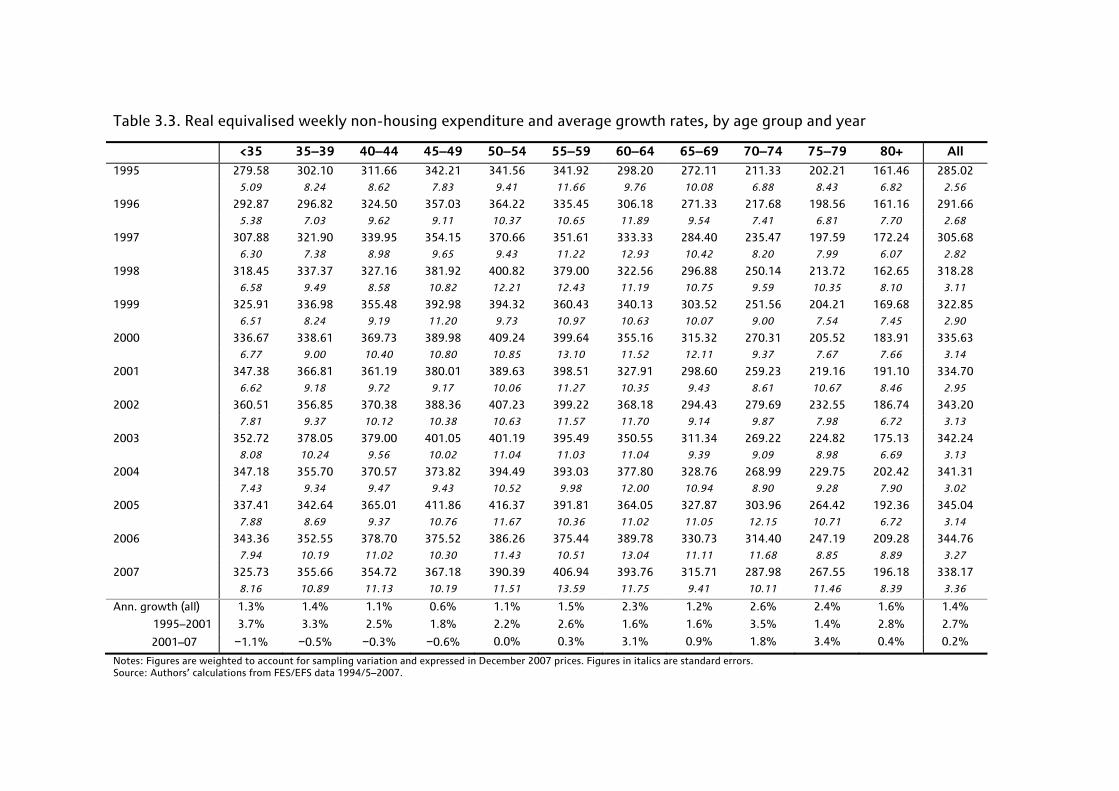
Table 3.3. Real equivalised weekly non-housing expenditure and average growth rates, by age group and year
<35 35–39 40–44 45–49 50–54 55–59 60–64 65–69 70–74 75–79 80+ All
1995 279.58 302.10 311.66 342.21 341.56 341.92 298.20 272.11 211.33 202.21 161.46 285.02 5.09 8.24 8.62 7.83 9.41 11.66 9.76 10.08 6.88 8.43 6.82 2.56
1996 292.87 296.82 324.50 357.03 364.22 335.45 306.18 271.33 217.68 198.56 161.16 291.66 5.38 7.03 9.62 9.11 10.37 10.65 11.89 9.54 7.41 6.81 7.70 2.68
1997 307.88 321.90 339.95 354.15 370.66 351.61 333.33 284.40 235.47 197.59 172.24 305.68 6.30 7.38 8.98 9.65 9.43 11.22 12.93 10.42 8.20 7.99 6.07 2.82
1998 318.45 337.37 327.16 381.92 400.82 379.00 322.56 296.88 250.14 213.72 162.65 318.28 6.58 9.49 8.58 10.82 12.21 12.43 11.19 10.75 9.59 10.35 8.10 3.11
1999 325.91 336.98 355.48 392.98 394.32 360.43 340.13 303.52 251.56 204.21 169.68 322.85 6.51 8.24 9.19 11.20 9.73 10.97 10.63 10.07 9.00 7.54 7.45 2.90
2000 336.67 338.61 369.73 389.98 409.24 399.64 355.16 315.32 270.31 205.52 183.91 335.63 6.77 9.00 10.40 10.80 10.85 13.10 11.52 12.11 9.37 7.67 7.66 3.14
2001 347.38 366.81 361.19 380.01 389.63 398.51 327.91 298.60 259.23 219.16 191.10 334.70 6.62 9.18 9.72 9.17 10.06 11.27 10.35 9.43 8.61 10.67 8.46 2.95
2002 360.51 356.85 370.38 388.36 407.23 399.22 368.18 294.43 279.69 232.55 186.74 343.20 7.81 9.37 10.12 10.38 10.63 11.57 11.70 9.14 9.87 7.98 6.72 3.13
2003 352.72 378.05 379.00 401.05 401.19 395.49 350.55 311.34 269.22 224.82 175.13 342.24 8.08 10.24 9.56 10.02 11.04 11.03 11.04 9.39 9.09 8.98 6.69 3.13
2004 347.18 355.70 370.57 373.82 394.49 393.03 377.80 328.76 268.99 229.75 202.42 341.31 7.43 9.34 9.47 9.43 10.52 9.98 12.00 10.94 8.90 9.28 7.90 3.02
2005 337.41 342.64 365.01 411.86 416.37 391.81 364.05 327.87 303.96 264.42 192.36 345.04 7.88 8.69 9.37 10.76 11.67 10.36 11.02 11.05 12.15 10.71 6.72 3.14
2006 343.36 352.55 378.70 375.52 386.26 375.44 389.78 330.73 314.40 247.19 209.28 344.76 7.94 10.19 11.02 10.30 11.43 10.51 13.04 11.11 11.68 8.85 8.89 3.27
2007 325.73 355.66 354.72 367.18 390.39 406.94 393.76 315.71 287.98 267.55 196.18 338.17 8.16 10.89 11.13 10.19 11.51 13.59 11.75 9.41 10.11 11.46 8.39 3.36
Ann. growth (all) 1.3% 1.4% 1.1% 0.6% 1.1% 1.5% 2.3% 1.2% 2.6% 2.4% 1.6% 1.4%
1995–2001 3.7% 3.3% 2.5% 1.8% 2.2% 2.6% 1.6% 1.6% 3.5% 1.4% 2.8% 2.7%
2001–07 −1.1% −0.5% −0.3% −0.6% 0.0% 0.3% 3.1% 0.9% 1.8% 3.4% 0.4% 0.2%
Notes: Figures are weighted to account for sampling variation and expressed in December 2007 prices. Figures in italics are standard errors. Source: Authors’ calculations from FES/EFS data 1994/5–2007.
Non-housing expenditures
19
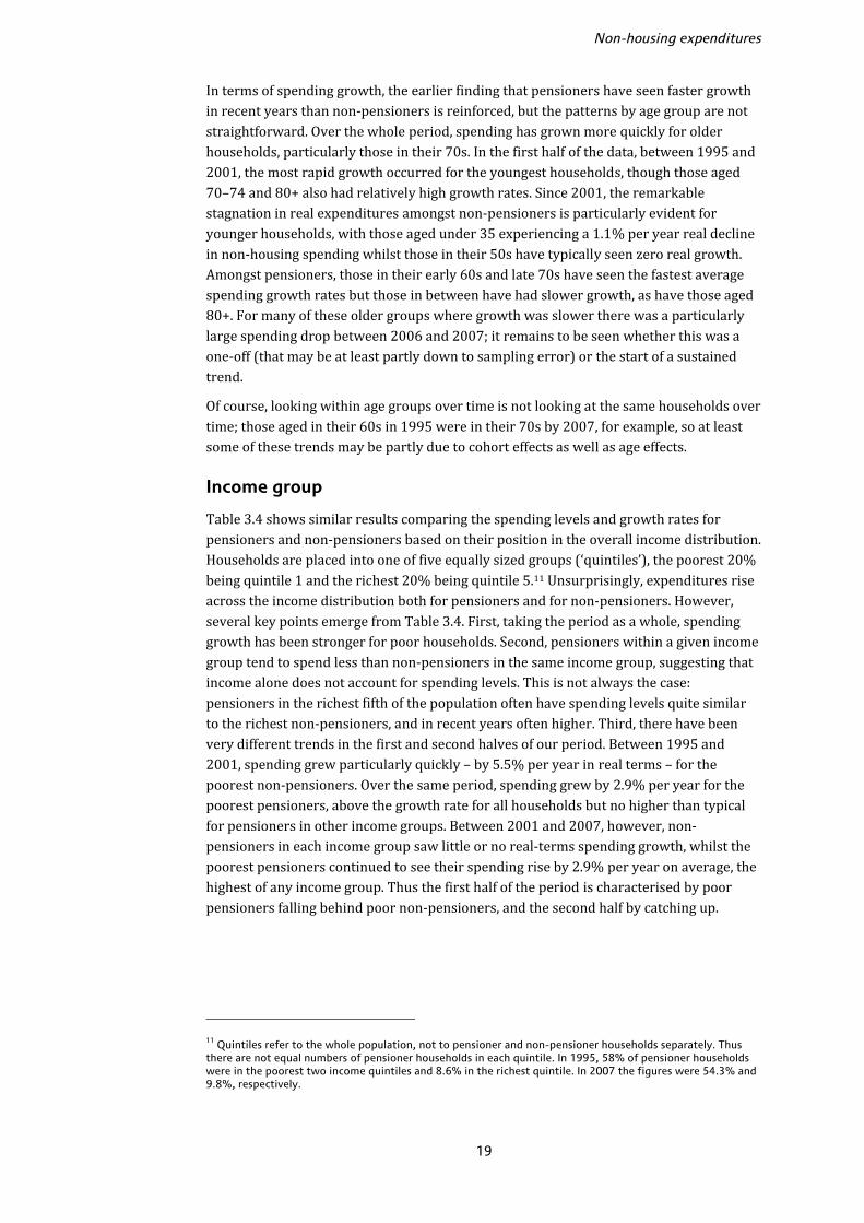
In terms of spending growth, the earlier finding that pensioners have seen faster growth in recent years than non-pensioners is reinforced, but the patterns by age group are not straightforward. Over the whole period, spending has grown more quickly for older households, particularly those in their 70s. In the first half of the data, between 1995 and 2001, the most rapid growth occurred for the youngest households, though those aged 70–74 and 80+ also had relatively high growth rates. Since 2001, the remarkable stagnation in real expenditures amongst non-pensioners is particularly evident for younger households, with those aged under 35 experiencing a 1.1% per year real decline in non-housing spending whilst those in their 50s have typically seen zero real growth. Amongst pensioners, those in their early 60s and late 70s have seen the fastest average spending growth rates but those in between have had slower growth, as have those aged 80+. For many of these older groups where growth was slower there was a particularly large spending drop between 2006 and 2007; it remains to be seen whether this was a one-off (that may be at least partly down to sampling error) or the start of a sustained trend. Of course, looking within age groups over time is not looking at the same households over time; those aged in their 60s in 1995 were in their 70s by 2007, for example, so at least some of these trends may be partly due to cohort effects as well as age effects. Income group Table 3.4 shows similar results comparing the spending levels and growth rates for pensioners and non-pensioners based on their position in the overall income distribution. Households are placed into one of five equally sized groups (‘quintiles’), the poorest 20% being quintile 1 and the richest 20% being quintile 5.11 Unsurprisingly, expenditures rise across the income distribution both for pensioners and for non-pensioners. However, several key points emerge from Table 3.4. First, taking the period as a whole, spending growth has been stronger for poor households. Second, pensioners within a given income group tend to spend less than non-pensioners in the same income group, suggesting that income alone does not account for spending levels. This is not always the case: pensioners in the richest fifth of the population often have spending levels quite similar to the richest non-pensioners, and in recent years often higher. Third, there have been very different trends in the first and second halves of our period. Between 1995 and 2001, spending grew particularly quickly – by 5.5% per year in real terms – for the poorest non-pensioners. Over the same period, spending grew by 2.9% per year for the poorest pensioners, above the growth rate for all households but no higher than typical for pensioners in other income groups. Between 2001 and 2007, however, non-pensioners in each income group saw little or no real-terms spending growth, whilst the poorest pensioners continued to see their spending rise by 2.9% per year on average, the highest of any income group. Thus the first half of the period is characterised by poor pensioners falling behind poor non-pensioners, and the second half by catching up.
11 Quintiles refer to the whole population, not to pensioner and non-pensioner households separately. Thus there are not equal numbers of pensioner households in each quintile. In 1995, 58% of pensioner households were in the poorest two income quintiles and 8.6% in the richest quintile. In 2007 the figures were 54.3% and 9.8%, respectively.
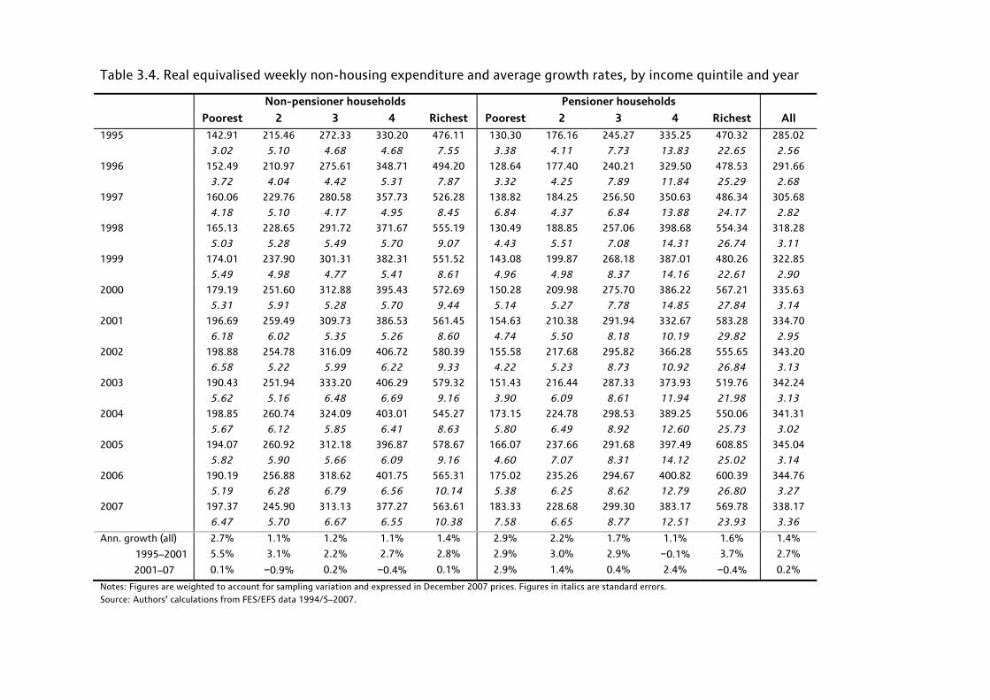
Table 3.4. Real equivalised weekly non-housing expenditure and average growth rates, by income quintile and year
Non-pensioner households Pensioner households
Poorest 2 3 4 Richest Poorest 2 3 4 Richest All
1995 142.91 215.46 272.33 330.20 476.11 130.30 176.16 245.27 335.25 470.32 285.02
3.02 5.10 4.68 4.68 7.55 3.38 4.11 7.73 13.83 22.65 2.56
1996 152.49 210.97 275.61 348.71 494.20 128.64 177.40 240.21 329.50 478.53 291.66
3.72 4.04 4.42 5.31 7.87 3.32 4.25 7.89 11.84 25.29 2.68
1997 160.06 229.76 280.58 357.73 526.28 138.82 184.25 256.50 350.63 486.34 305.68
4.18 5.10 4.17 4.95 8.45 6.84 4.37 6.84 13.88 24.17 2.82
1998 165.13 228.65 291.72 371.67 555.19 130.49 188.85 257.06 398.68 554.34 318.28
5.03 5.28 5.49 5.70 9.07 4.43 5.51 7.08 14.31 26.74 3.11
1999 174.01 237.90 301.31 382.31 551.52 143.08 199.87 268.18 387.01 480.26 322.85
5.49 4.98 4.77 5.41 8.61 4.96 4.98 8.37 14.16 22.61 2.90
2000 179.19 251.60 312.88 395.43 572.69 150.28 209.98 275.70 386.22 567.21 335.63
5.31 5.91 5.28 5.70 9.44 5.14 5.27 7.78 14.85 27.84 3.14
2001 196.69 259.49 309.73 386.53 561.45 154.63 210.38 291.94 332.67 583.28 334.70
6.18 6.02 5.35 5.26 8.60 4.74 5.50 8.18 10.19 29.82 2.95
2002 198.88 254.78 316.09 406.72 580.39 155.58 217.68 295.82 366.28 555.65 343.20
6.58 5.22 5.99 6.22 9.33 4.22 5.23 8.73 10.92 26.84 3.13
2003 190.43 251.94 333.20 406.29 579.32 151.43 216.44 287.33 373.93 519.76 342.24
5.62 5.16 6.48 6.69 9.16 3.90 6.09 8.61 11.94 21.98 3.13
2004 198.85 260.74 324.09 403.01 545.27 173.15 224.78 298.53 389.25 550.06 341.31
5.67 6.12 5.85 6.41 8.63 5.80 6.49 8.92 12.60 25.73 3.02
2005 194.07 260.92 312.18 396.87 578.67 166.07 237.66 291.68 397.49 608.85 345.04
5.82 5.90 5.66 6.09 9.16 4.60 7.07 8.31 14.12 25.02 3.14
2006 190.19 256.88 318.62 401.75 565.31 175.02 235.26 294.67 400.82 600.39 344.76
5.19 6.28 6.79 6.56 10.14 5.38 6.25 8.62 12.79 26.80 3.27
2007 197.37 245.90 313.13 377.27 563.61 183.33 228.68 299.30 383.17 569.78 338.17
6.47 5.70 6.67 6.55 10.38 7.58 6.65 8.77 12.51 23.93 3.36
Ann. growth (all) 2.7% 1.1% 1.2% 1.1% 1.4% 2.9% 2.2% 1.7% 1.1% 1.6% 1.4%
1995–2001 5.5% 3.1% 2.2% 2.7% 2.8% 2.9% 3.0% 2.9% −0.1% 3.7% 2.7%
2001–07 0.1% −0.9% 0.2% −0.4% 0.1% 2.9% 1.4% 0.4% 2.4% −0.4% 0.2%
Notes: Figures are weighted to account for sampling variation and expressed in December 2007 prices. Figures in italics are standard errors. Source: Authors’ calculations from FES/EFS data 1994/5–2007.
Non-housing expenditures
21
Income and age group Our earlier results suggested that spending is related both to age and to income, and that within income group pensioners typically spend less than non-pensioners (except for the richest). We now look more closely at the relationships between income, age and expenditure. Rather than breaking households into five income groups and comparing only across pensioners and non-pensioners, we now divide households into three income groups (‘tertiles’) each year and look at five age groups within each tertile: those under 35, ages 35–49, ages 50–59, ages 60–69 and ages 70+. These age and income groups are broader than those examined in Tables 3.3 and 3.4 to ensure a reasonable sample size in each age/income group in each year. Table 3.5 shows expenditures each year according to this breakdown; for each age group we show the figures only for households in the poorest and richest third.12 As before, richer households spend more than poorer ones within each age band, and there is mixed evidence on whether the poor have seen faster spending growth over time. Spending grew more rapidly between 1995 and 2007 for the poorest aged under 35, 50–59 and 60–69 than the richest in those age bands. Households aged 60–69 in the poorest third spent around 37% as much as the richest in the same age group in 1995, and 47% as much by 2007. For other age groups, there is no evidence of a sustained catch-up by the poorest. Figure 3.4 illustrates this, plotting real spending by age and income group in 1995 and 2007. Figure 3.4. Real equivalised weekly non-housing spending, households in poorest and richest third, by age group, 1995 and 2007
Note: Figures are in December 2007 prices. Source: Authors’ calculations from FES/EFS data 1994/5–2007. 12 Results for the middle third are available on request.
0
100
200
300
400
500
600
<35 35-49 50-59 60-69 70+
Rea
l non
-hou
sing
exp
endi
ture
(£/w
eek)
Richest third 1995Richest third 2007Poorest third 1995Poorest third 2007

Table 3.5. Real equivalised weekly non-housing expenditure and average growth rates, by age/income group and year
<35, poor
<35, rich
35–49, poor
35–49, rich
50–59, poor
50–59, rich
60–69, poor
60–69, rich
70+, poor
70+, rich All hh
1995 155.05 401.48 175.98 423.66 173.17 453.50 165.63 444.82 138.44 355.33 285.02 4.19 10.11 5.63 7.78 8.35 12.03 4.86 17.85 2.85 19.35 2.56
1996 159.43 426.05 172.19 443.04 197.39 457.75 177.83 466.04 140.27 362.29 291.66 4.24 10.16 4.83 8.46 11.10 12.07 6.87 19.95 3.18 18.64 2.68
1997 175.22 462.87 180.45 464.04 187.91 483.02 196.00 488.28 142.15 371.13 305.68 5.87 12.79 4.89 8.27 8.07 11.45 11.21 19.87 3.32 19.20 2.82
1998 168.63 467.85 184.61 480.46 210.38 519.67 187.35 491.79 138.83 471.58 318.28 5.23 12.22 5.97 9.51 12.76 13.13 6.70 19.57 4.39 26.73 3.11
1999 171.95 489.11 198.30 494.57 200.04 493.38 217.77 468.73 146.85 395.34 322.85 5.20 12.25 6.26 9.68 10.21 11.10 9.79 16.95 3.50 18.31 2.90
2000 187.26 497.29 197.04 513.49 228.24 530.32 215.74 515.70 155.23 434.98 335.63 5.78 12.72 6.79 10.17 12.73 13.54 8.63 20.16 3.78 21.45 3.14
2001 202.89 474.87 222.01 509.62 219.79 513.70 207.03 490.21 161.69 434.01 334.70 9.67 10.88 7.32 9.47 10.43 12.15 6.61 19.22 4.00 27.97 2.95
2002 196.30 509.53 209.87 512.32 242.09 529.21 207.26 540.27 169.82 416.23 343.20 6.70 14.04 7.31 10.25 12.71 11.99 6.26 19.84 3.93 21.90 3.13
2003 195.72 505.76 220.06 530.01 200.82 524.91 217.77 489.25 160.37 408.33 342.24 7.54 15.18 7.28 9.95 6.97 12.07 7.83 16.85 4.25 20.05 3.13
2004 198.15 477.54 221.12 501.16 239.81 502.11 243.16 520.51 169.00 426.45 341.31 6.94 13.32 6.99 9.82 10.45 11.43 10.52 17.98 4.51 21.34 3.02
2005 207.56 471.95 210.70 508.10 237.76 536.96 219.95 541.94 184.25 482.72 345.04 9.17 15.12 6.87 9.50 10.65 12.32 8.06 17.08 5.67 26.43 3.14
2006 188.52 478.35 219.12 519.32 219.03 500.25 236.57 527.76 182.59 533.89 344.76 7.27 13.63 7.82 11.23 8.58 12.65 9.44 19.26 4.64 28.18 3.27
2007 198.32 459.08 204.36 502.39 249.02 525.76 244.85 521.64 178.94 453.44 338.17 8.20 14.95 7.09 11.36 12.75 14.71 8.99 16.98 6.29 20.96 3.36
Ann. growth (all) 2.1% 1.1% 1.3% 1.4% 3.1% 1.2% 3.3% 1.3% 2.2% 2.1% 1.4%
1995–2001 4.6% 2.8% 3.9% 3.1% 4.1% 2.1% 3.8% 1.6% 2.6% 3.4% 2.7%
2001–2007 −0.4% −0.6% −1.4% −0.2% 2.1% 0.4% 2.8% 1.0% 1.7% 0.7% 0.2%
Notes: Figures are expressed in December 2007 prices. ‘Poor’ means bottom third of the within-year income distribution; ‘rich’ means top third. Figures in italics are standard errors. Source: Authors’ calculations from FES/EFS data 1994/5–2007.

Non-housing expenditures
23
There are some interesting trends comparing households in the same income group across age. Over most of the period, those in the richest third aged 70+ have spent around 15–20% less on average than those in the same income group aged 50–59, though the differences have been a little smaller (and indeed in 2006, reversed) in recent years.13 Those aged 70+ in the richest third have tended to spend around 10% less than households under 35 in the richest third, but again, these differences have been smaller over the last three years or so. Amongst poorer households, it is the oldest poorest who spend the least in every year (those aged 70+ in the bottom third); compared to those under 35 in the same income group, who are the next lowest spenders, the average difference was around 15% in the first half of our period and 12% in the second half. Spending grew more rapidly for the young poor between 1995 and 2001 (rising by 4.6% per year in real terms) and then for the old poor between 2001 and 2007 (rising by 1.7% per year, compared to a fall of 0.4% for the young poor in the same period). Note, though, that spending growth was more rapid between 2001 and 2007 for households in their 50s and 60s in the poorest third than those aged 70+. Expenditure poverty Our results so far have shown that, since 2001, spending has increased more rapidly for pensioners than for the population as a whole, with particularly fast growth amongst lower-income pensioners in their 60s. One of the key findings from Brewer et al. (2006) was that, up to 2002/3, relative poverty rates for pensioners measured by income had fallen strongly from their levels in the mid-1990s, but that when measured by spending, poverty rates had remained stubbornly high. Our findings now suggest that progress may have been made on pensioner spending poverty since then. ‘Poverty’ here is defined as a relative measure. For each year, we calculate median levels of household spending (or income) – if we lined up households according to their spending from lowest to highest, the median is the household directly in the middle. The poverty line is then taken as 60% of this within-year median, and all people living in households below this line are counted as being ‘in poverty’. This is consistent with official definitions of relative poverty used by the government and others. We look at two different measures of poverty: income (based on total net household income as measured in the EFS); and expenditure, using the non-housing definition discussed so far. We look at poverty rates for the whole population, for pensioners and also for pensioners aged 70+ and 80+. Note that rates are defined as the number of people (or pensioners) living in households below the poverty line as a percentage of the total number of people (or pensioners) in the whole population. Again, this is consistent with official relative poverty measurement. Figure 3.5 shows poverty rates for the whole population (solid lines) and for pensioners (dotted lines) between 1995 and 2007 for these different measures. Our results show that there has been a fairly large fall in pensioner poverty as measured by expenditure over the last few years that was not seen during the period 1995–2003, consistent with the results from Brewer et al. (2006). Between 2003 and 2007, pensioner spending poverty fell by around 18% when measured by non-housing spending and 8% measured 13 In fact, those aged 70+ in the richest third spent more than any other age/income group in 2006, £534/week on average, which dropped substantially in 2007. This may be partly due to sample error, though there is a reasonable sample size of 156 households in the oldest, richest group in 2006 and eliminating the highest spenders does not change the pattern, which implies that this result is not driven by outliers.

The expenditure experience of older households
24
by total net income, compared to falls of 3% and 1%, respectively, amongst all individuals. The fact that spending poverty has fallen by more than income poverty for pensioners over the last few years stands in stark contrast to the period 1995–2003, when income poverty for pensioners fell by 14% but spending poverty rose by 9%.14 Figure 3.5 Relative poverty rates, whole population and pensioners, 1995–2007
Note: Shows percentage of individuals/pensioners in households below the poverty line in each year as a proportion of the total number of individuals/pensioners. Poverty line is 60% of contemporaneous household median income or expenditure. Source: Authors’ calculations from FES/EFS data 1994/5–2007. Table 3.6 shows poverty rates for all pensioners and for older pensioners in each year, along with how they have changed over different periods. Spending and income poverty are both higher for older pensioners than pensioners in general. Over the period 1998–2007 (1998 is often used as a baseline year for poverty analysis as it is the year for which government targets for child poverty take their reference values), we can see that the oldest pensioners have seen the largest relative falls in their income poverty rates, down 14 Brewer et al. (2006) figure 2.5 compares non-housing spending poverty and after-housing-costs income poverty rates for pensioners. Here, our income measure is effectively a before-housing-costs income measure. Incomes are taken directly from the FES/EFS ‘Product Codes’ in each year and are not directly comparable to official income measures used in calculating income poverty rates in the Households Below Average Income (HBAI) data. If we compare our income poverty rates here to those in Brewer et al. (2008) for pensioners Before Housing Costs (see http://www.ifs.org.uk/bns/bn19figs.zip) we find our income poverty rates are typically higher than HBAI pensioner income poverty rates by around 5–8 percentage points but move in very similar directions, particularly since around 2002–03 when the HBAI has been based on UK data including Northern Ireland, which we use throughout our period here. Our results compared to Brewer et al. (2006) for non-housing spending are similar but not identical; here, we find spending poverty for pensioners falling slightly between 1995 and 2001, whereas in the earlier paper, spending poverty for pensioners rose slightly between 1995 and 2001. In both cases, however, the changes are quite small. Again, slight definitional differences (including the use of Northern Ireland households, the way spending and housing costs are defined, the criteria by which households are excluded from the data set, the choice of equivalence scale and so on) mean we would not expect identical results but the overall poverty pictures are reassuringly similar.
10%
15%
20%
25%
30%
35%
40%
1995 1996 1997 1998 1999 2000 2001 2002 2003 2004 2005 2006 2007
Pov
erty
rat
e
Non-housing spending (all)Non-housing spending (pen)Net income (all)Net income (pen)
Non-housing expenditures
25
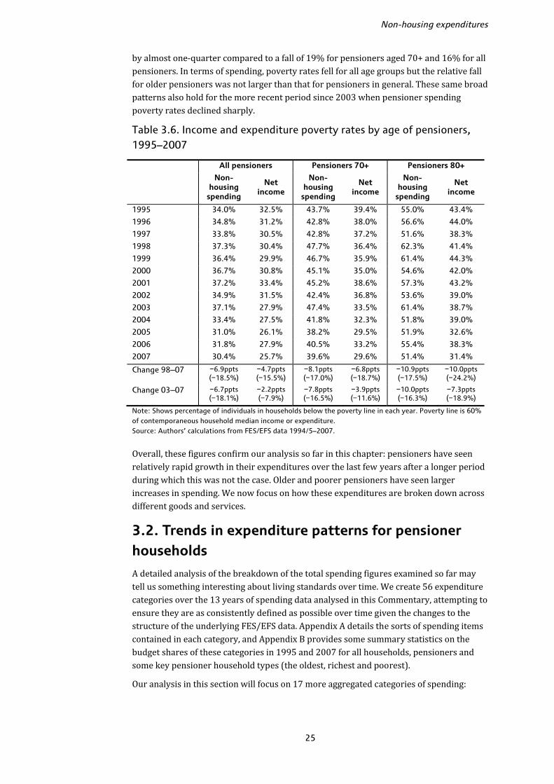
by almost one-quarter compared to a fall of 19% for pensioners aged 70+ and 16% for all pensioners. In terms of spending, poverty rates fell for all age groups but the relative fall for older pensioners was not larger than that for pensioners in general. These same broad patterns also hold for the more recent period since 2003 when pensioner spending poverty rates declined sharply. Table 3.6. Income and expenditure poverty rates by age of pensioners, 1995–2007
All pensioners Pensioners 70+ Pensioners 80+ Non-
housing spending
Net income
Non-housing
spending
Net income
Non-housing
spending
Net income
1995 34.0% 32.5% 43.7% 39.4% 55.0% 43.4%
1996 34.8% 31.2% 42.8% 38.0% 56.6% 44.0%
1997 33.8% 30.5% 42.8% 37.2% 51.6% 38.3%
1998 37.3% 30.4% 47.7% 36.4% 62.3% 41.4%
1999 36.4% 29.9% 46.7% 35.9% 61.4% 44.3%
2000 36.7% 30.8% 45.1% 35.0% 54.6% 42.0%
2001 37.2% 33.4% 45.2% 38.6% 57.3% 43.2%
2002 34.9% 31.5% 42.4% 36.8% 53.6% 39.0%
2003 37.1% 27.9% 47.4% 33.5% 61.4% 38.7%
2004 33.4% 27.5% 41.8% 32.3% 51.8% 39.0%
2005 31.0% 26.1% 38.2% 29.5% 51.9% 32.6%
2006 31.8% 27.9% 40.5% 33.2% 55.4% 38.3%
2007 30.4% 25.7% 39.6% 29.6% 51.4% 31.4%
Change 98–07 −6.9ppts (−18.5%)
−4.7ppts (−15.5%)
−8.1ppts (−17.0%)
−6.8ppts (−18.7%)
−10.9ppts (−17.5%)
−10.0ppts (−24.2%)
Change 03–07 −6.7ppts (−18.1%)
−2.2ppts (−7.9%)
−7.8ppts (−16.5%)
−3.9ppts (−11.6%)
−10.0ppts (−16.3%)
−7.3ppts (−18.9%)
Note: Shows percentage of individuals in households below the poverty line in each year. Poverty line is 60% of contemporaneous household median income or expenditure. Source: Authors’ calculations from FES/EFS data 1994/5–2007. Overall, these figures confirm our analysis so far in this chapter: pensioners have seen relatively rapid growth in their expenditures over the last few years after a longer period during which this was not the case. Older and poorer pensioners have seen larger increases in spending. We now focus on how these expenditures are broken down across different goods and services. 3.2. Trends in expenditure patterns for pensioner households A detailed analysis of the breakdown of the total spending figures examined so far may tell us something interesting about living standards over time. We create 56 expenditure categories over the 13 years of spending data analysed in this Commentary, attempting to ensure they are as consistently defined as possible over time given the changes to the structure of the underlying FES/EFS data. Appendix A details the sorts of spending items contained in each category, and Appendix B provides some summary statistics on the budget shares of these categories in 1995 and 2007 for all households, pensioners and some key pensioner household types (the oldest, richest and poorest). Our analysis in this section will focus on 17 more aggregated categories of spending:

The expenditure experience of older households
26
Food in the home Health careFood outside the home EducationAlcohol Personal expendituresTobacco Private transportHousehold fuel Public transportClothing Leisure goodsHousehold goods Leisure servicesHousehold services Miscellaneous expendituresCommunications We also consider three very broad aggregates in which the 56 groups are classified as ‘durable goods’, ‘non-durable goods’ and ‘services’. Appendix A details how each of the 56 categories is allocated into the 17 aggregate groups and the three very broad expenditure classes. We begin by looking at broad spending patterns quite generally across different household groups, then focus in Section 3.3 on some particular areas of interest in more detail: food,15 leisure, health care, household fuel and transfer payments out of the household. Pensioner households Table 3.7 shows the broad breakdown of expenditures for all households and pensioner and non-pensioner households in 1995 and 2007. Panel (a) shows the average level of spending and panel (b) the average budget share (though recall that budget shares cannot be directly inferred from the levels since we look at the democratic average share). Panel (c) then shows a comparison between the budget shares of and spending levels on each item for pensioners and non-pensioners, setting the non-pensioner level or share at 100 and expressing the pensioner values relative to this index. This allows quick comparisons to be made about how pensioner spending has changed relative to non-pensioner spending over the period. The panels confirm our earlier finding that pensioner expenditure increased more rapidly over the period. In 1995, pensioners spent around 72% as much as non-pensioners, but this rose to 80% in 2007. Table 3.7a shows that non-pensioners have, on average, higher expenditures in almost all categories than pensioners, reflecting the fact that they spend more overall and that most goods are normal goods in the economist’s sense (that is, spending levels increase as the total budget increases). Pensioners spent significantly more than non-pensioners on only three of the 17 categories in 2007: food in, household fuel and health care. In three other categories– household services, leisure goods and miscellaneous spending – there were no significant differences between spending levels for pensioners and non-pensioners. Non-pensioner households spent significantly more on the other 11 categories. Table 3.7a also shows that real-terms spending for pensioners fell between 1995 and 2007 in only one category, tobacco, falling by around one-quarter (compared to a real fall 15 Note that we will refer to the food in the home and food outside the home categories as ‘food in’ and ‘food out’, respectively, from now.
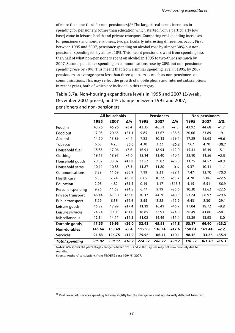
Non-housing expenditures
27
of more than one-third for non-pensioners).16 The largest real-terms increases in spending for pensioners (other than education which started from a particularly low base) came in leisure, health and private transport. Comparing real spending increases for pensioners and non-pensioners, two particularly interesting differences occur. First, between 1995 and 2007, pensioner spending on alcohol rose by almost 30% but non-pensioner spending fell by almost 10%. This meant pensioners went from spending less than half of what non-pensioners spent on alcohol in 1995 to two-thirds as much by 2007. Second, pensioner spending on communications rose by 28% but non-pensioner spending rose by 70%. This meant that from a similar spending level in 1995, by 2007 pensioners on average spent less than three-quarters as much as non-pensioners on communications. This may reflect the growth of mobile phone and Internet subscriptions in recent years, both of which are included in this category. Table 3.7a. Non-housing expenditure levels in 1995 and 2007 (£/week, December 2007 prices), and % change between 1995 and 2007, pensioners and non-pensioners
All households Pensioners Non-pensioners
1995 2007 ∆% 1995 2007 ∆% 1995 2007 ∆%
Food in 43.76 45.26 +3.4 43.35 46.51 +7.3 43.92 44.68 +1.7
Food out 17.05 20.65 +21.1 9.85 13.67 +38.8 20.06 23.89 +19.1
Alcohol 14.50 13.89 −4.2 7.82 10.13 +29.4 17.29 15.63 −9.6
Tobacco 6.68 4.23 −36.6 4.30 3.22 −25.2 7.67 4.70 −38.7
Household fuel 15.85 17.06 +7.6 16.91 18.94 +12.0 15.41 16.19 +5.1
Clothing 19.17 18.97 −1.0 12.14 13.40 +10.4 22.10 21.56 −2.5
Household goods 29.32 33.07 +12.8 23.52 29.82 +26.8 31.75 34.57 +8.9
Household servs 10.11 10.85 +7.3 11.87 11.80 −0.6 9.37 10.41 +11.1
Communications 7.39 11.59 +56.9 7.19 9.21 +28.1 7.47 12.70 +70.0
Health care 5.33 7.24 +35.8 6.65 10.22 +53.7 4.78 5.86 +22.5
Education 2.98 4.82 +61.5 0.19 1.17 +513.3 4.15 6.51 +56.9
Personal spending 9.26 11.53 +24.5 6.77 9.19 +35.6 10.30 12.62 +22.5
Private transport 46.44 61.30 +32.0 30.17 44.76 +48.3 53.24 68.97 +29.6
Public transport 5.29 6.58 +24.6 2.55 2.88 +12.9 6.43 8.30 +29.1
Leisure goods 15.32 17.99 +17.4 11.19 16.41 +46.7 17.04 18.72 +9.8
Leisure services 24.24 39.03 +61.0 18.85 32.91 +74.6 26.49 41.86 +58.1
Miscellaneous 12.34 14.11 +14.3 11.02 14.49 +31.4 12.89 13.93 +8.0
Durable goods 47.55 59.93 +26.0 32.43 45.98 +41.8 53.87 66.40 +23.2
Non-durables 145.64 153.49 +5.4 115.98 136.34 +17.6 158.04 161.44 +2.2
Services 91.83 124.75 +35.9 75.96 106.41 +40.1 98.46 133.26 +35.4
Total spending 285.02 338.17 +18.7 224.37 288.72 +28.7 310.37 361.10 +16.3
Notes: ∆% shows the percentage change between 1995 and 2007. Figures may not sum precisely due to rounding. Source: Authors’ calculations from FES/EFS data 1994/5–2007.
16 Real household services spending fell very slightly but the change was not significantly different from zero.

The expenditure experience of older households
28
Table 3.7b. Budget shares (% of total budget), pensioners and non-pensioners, 1995 and 2007
All households Pensioners Non-pensioners
1995 2007 ∆ 1995 2007 ∆ 1995 2007 ∆
Food in 19.8 17.6 −2.2 24.8 21.3 −3.4 17.7 15.9 −1.9
Food out 5.9 6.2 +0.3 4.3 4.7 +0.4 6.6 6.9 +0.3
Alcohol 4.9 4.2 −0.7 3.3 3.6 +0.3 5.6 4.5 −1.1
Tobacco 3.1 1.7 −1.4 2.5 1.4 −1.1 3.4 1.9 −1.5
Household fuel 7.7 7.0 −0.7 10.3 9.2 −1.1 6.6 5.9 −0.7
Clothing 5.9 5.4 –0.5 4.6 4.3 −0.3 6.5 5.9 −0.6
Household goods 9.1 8.4 −0.7 8.8 8.5 −0.3 9.2 8.4 −0.9
Household servs 3.3 2.9 −0.3 5.0 4.2 −0.8 2.6 2.4 −0.2
Communications 3.3 4.4 +1.1 4.2 4.2 nil 2.9 4.5 +1.6
Health care 1.7 1.8 +0.2 2.3 2.8 +0.5 1.4 1.4 nil
Education 0.7 0.9 +0.3 0.0 0.2 +0.1 0.9 1.3 +0.3
Personal spending 3.3 3.3 nil 3.2 3.3 +0.1 3.3 3.3 nil
Private transport 13.6 16.3 +2.7 9.5 13.3 +3.8 15.3 17.7 +2.4
Public transport 1.8 1.7 −0.1 1.2 0.7 −0.6 2.0 2.2 +0.2
Leisure goods 5.1 4.9 −0.2 4.8 5.2 +0.4 5.2 4.7 −0.5
Leisure services 7.1 9.4 +2.3 7.2 8.7 +1.5 7.1 9.7 +2.7
Miscellaneous 3.8 3.9 nil 4.2 4.5 +0.3 3.7 3.6 −0.1
Durable goods 12.0 13.2 +1.1 8.7 10.8 +2.1 13.5 14.3 +0.9
Non-durables 58.1 52.6 −5.5 59.8 55.4 −4.4 57.5 51.3 −6.1
Services 29.8 34.2 +4.4 31.5 33.8 +2.3 29.1 34.4 +5.3
Notes: Figures are percentages of total non-housing budget. ∆ shows the change (in percentage points) between 1995 and 2007. Figures may not sum precisely due to rounding. Source: Authors’ calculations from FES/EFS data 1994/5–2007. Table 3.7b confirms that the patterns of budget shares are quite different across pensioner and non-pensioner households and there are many categories in which pensioners spent less in cash terms than non-pensioners but which still make up a larger share of the pensioner budget on average. In 2007, pensioners spent a significantly higher share of their total non-housing budgets than non-pensioners on food in, fuel, household services, health, leisure goods and miscellaneous items, and a significantly lower share on food out, alcohol, tobacco, clothing, communications, education, private and public transport and leisure services. There were no significant differences between pensioner and non-pensioner budget shares for household goods and personal expenditures. Only one category, communications, saw a switch from pensioners having a significantly higher budget share than non-pensioners to a significantly lower share over the period. Leisure goods was the only category to go the other way, where pensioners had a significantly lower share in 1995 and a significantly higher share in 2007. Table 3.7c shows that real expenditures rose more rapidly for pensioners relative to non-pensioners in all spending groups bar three: household services, communications and public transport. In general there appears to have been some ‘convergence’ of spending patterns between 1995 and 2007: for those categories where pensioners spent a smaller share than non-pensioners in 1995 (the budget share index is below 100), the pensioner share tended to rise more quickly than the non-pensioner share whilst for those where pensioners spent a higher share (the budget share index is above 100), the pensioner share tended to rise less quickly. The exceptions are health care and miscellany, where
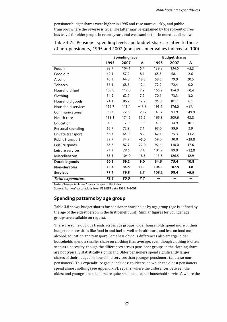
Non-housing expenditures
29
pensioner budget shares were higher in 1995 and rose more quickly, and public transport where the reverse is true. The latter may be explained by the roll-out of free bus travel for older people in recent years, and we examine this in more detail below. Table 3.7c. Pensioner spending levels and budget shares relative to those of non-pensioners, 1995 and 2007 (non-pensioner values indexed at 100)
Spending level Budget shares
1995 2007 ∆ 1995 2007 ∆
Food in 98.7 104.1 5.4 139.8 134.5 −5.3
Food out 49.1 57.2 8.1 65.5 68.1 2.6
Alcohol 45.3 64.8 19.5 59.5 79.9 20.5
Tobacco 56.1 68.5 12.4 72.2 72.4 0.2
Household fuel 109.8 117.0 7.2 155.2 154.9 −0.4
Clothing 54.9 62.2 7.2 70.1 73.3 3.2
Household goods 74.1 86.2 12.2 95.0 101.1 6.1
Household services 126.7 113.4 −13.3 193.1 176.0 −17.1
Communications 96.3 72.5 −23.7 141.7 91.9 −49.9
Health care 139.1 174.5 35.5 166.8 209.6 42.8
Education 4.6 17.9 13.3 4.9 14.9 10.1
Personal spending 65.7 72.8 7.1 97.0 99.9 2.9
Private transport 56.7 64.9 8.2 62.1 75.3 13.2
Public transport 39.7 34.7 −5.0 59.0 30.0 −29.0
Leisure goods 65.6 87.7 22.0 92.4 110.0 17.6
Leisure services 71.2 78.6 7.4 101.9 89.9 −12.0
Miscellaneous 85.5 104.0 18.5 113.6 126.5 12.9
Durable goods 60.2 69.2 9.0 64.6 75.4 10.8
Non-durables 73.4 84.5 11.1 104.1 107.9 3.8
Services 77.1 79.8 2.7 108.2 98.4 −9.9
Total expenditure 72.3 80.0 7.7 ― ― ―
Note: Changes (column ∆) are changes in the index. Source: Authors’ calculations from FES/EFS data 1994/5–2007.
Spending patterns by age group Table 3.8 shows budget shares for pensioner households by age group (age is defined by the age of the eldest person in the first benefit unit). Similar figures for younger age groups are available on request. There are some obvious trends across age groups: older households spend more of their budget on necessities like food in and fuel as well as health care, and less on food out, alcohol, education and transport. Some less obvious differences also emerge: older households spend a smaller share on clothing than average, even though clothing is often seen as a necessity, though the differences across pensioner groups in the clothing share are not typically statistically significant. Older pensioners spend significantly larger shares of their budget on household services than younger pensioners (and also non-pensioners). This expenditure group includes: childcare, on which the oldest pensioners spend almost nothing (see Appendix B); repairs, where the differences between the oldest and youngest pensioners are quite small; and ‘other household services’, where the
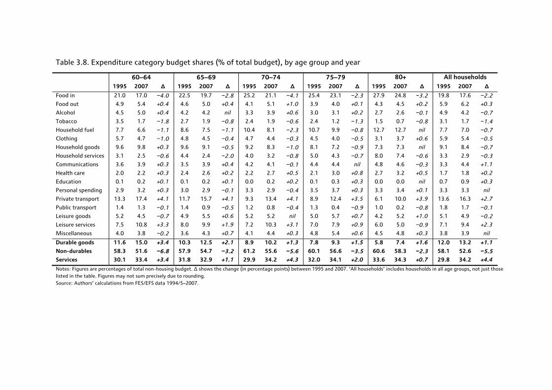
Table 3.8. Expenditure category budget shares (% of total budget), by age group and year
60–64 65–69 70–74 75–79 80+ All households 1995 2007 ∆ 1995 2007 ∆ 1995 2007 ∆ 1995 2007 ∆ 1995 2007 ∆ 1995 2007 ∆
Food in 21.0 17.0 −4.0 22.5 19.7 −2.8 25.2 21.1 −4.1 25.4 23.1 −2.3 27.9 24.8 −3.2 19.8 17.6 −2.2
Food out 4.9 5.4 +0.4 4.6 5.0 +0.4 4.1 5.1 +1.0 3.9 4.0 +0.1 4.3 4.5 +0.2 5.9 6.2 +0.3
Alcohol 4.5 5.0 +0.4 4.2 4.2 nil 3.3 3.9 +0.6 3.0 3.1 +0.2 2.7 2.6 −0.1 4.9 4.2 −0.7
Tobacco 3.5 1.7 −1.8 2.7 1.9 −0.8 2.4 1.9 −0.6 2.4 1.2 −1.3 1.5 0.7 −0.8 3.1 1.7 −1.4
Household fuel 7.7 6.6 −1.1 8.6 7.5 −1.1 10.4 8.1 −2.3 10.7 9.9 −0.8 12.7 12.7 nil 7.7 7.0 −0.7
Clothing 5.7 4.7 −1.0 4.8 4.5 −0.4 4.7 4.4 −0.3 4.5 4.0 −0.5 3.1 3.7 +0.6 5.9 5.4 −0.5
Household goods 9.6 9.8 +0.3 9.6 9.1 −0.5 9.2 8.3 −1.0 8.1 7.2 −0.9 7.3 7.3 nil 9.1 8.4 −0.7
Household services 3.1 2.5 −0.6 4.4 2.4 −2.0 4.0 3.2 −0.8 5.0 4.3 −0.7 8.0 7.4 −0.6 3.3 2.9 −0.3
Communications 3.6 3.9 +0.3 3.5 3.9 +0.4 4.2 4.1 −0.1 4.4 4.4 nil 4.8 4.6 −0.3 3.3 4.4 +1.1
Health care 2.0 2.2 +0.3 2.4 2.6 +0.2 2.2 2.7 +0.5 2.1 3.0 +0.8 2.7 3.2 +0.5 1.7 1.8 +0.2
Education 0.1 0.2 +0.1 0.1 0.2 +0.1 0.0 0.2 +0.2 0.1 0.3 +0.3 0.0 0.0 nil 0.7 0.9 +0.3
Personal spending 2.9 3.2 +0.3 3.0 2.9 −0.1 3.3 2.9 −0.4 3.5 3.7 +0.3 3.3 3.4 +0.1 3.3 3.3 nil
Private transport 13.3 17.4 +4.1 11.7 15.7 +4.1 9.3 13.4 +4.1 8.9 12.4 +3.5 6.1 10.0 +3.9 13.6 16.3 +2.7
Public transport 1.4 1.3 −0.1 1.4 0.9 −0.5 1.2 0.8 −0.4 1.3 0.4 −0.9 1.0 0.2 −0.8 1.8 1.7 −0.1
Leisure goods 5.2 4.5 −0.7 4.9 5.5 +0.6 5.2 5.2 nil 5.0 5.7 +0.7 4.2 5.2 +1.0 5.1 4.9 −0.2
Leisure services 7.5 10.8 +3.3 8.0 9.9 +1.9 7.2 10.3 +3.1 7.0 7.9 +0.9 6.0 5.0 −0.9 7.1 9.4 +2.3
Miscellaneous 4.0 3.8 −0.2 3.6 4.3 +0.7 4.1 4.4 +0.3 4.8 5.4 +0.6 4.5 4.8 +0.3 3.8 3.9 nil
Durable goods 11.6 15.0 +3.4 10.3 12.5 +2.1 8.9 10.2 +1.3 7.8 9.3 +1.5 5.8 7.4 +1.6 12.0 13.2 +1.1
Non-durables 58.3 51.6 −6.8 57.9 54.7 −3.2 61.2 55.6 −5.6 60.1 56.6 −3.5 60.6 58.3 −2.3 58.1 52.6 −5.5
Services 30.1 33.4 +3.4 31.8 32.9 +1.1 29.9 34.2 +4.3 32.0 34.1 +2.0 33.6 34.3 +0.7 29.8 34.2 +4.4
Notes: Figures are percentages of total non-housing budget. ∆ shows the change (in percentage points) between 1995 and 2007. ‘All households’ includes households in all age groups, not just those listed in the table. Figures may not sum precisely due to rounding. Source: Authors’ calculations from FES/EFS data 1994/5–2007.

Non-housing expenditures
31
oldest pensioners spend much more (4.7% of the budget in 2007 compared to 0.7% for younger pensioner households and 0.6% for those under 35). This includes things like cleaning, launderettes and home help payments, but not residential care fees which are included in medical services.17 In 2007, households aged 80+ spent significantly larger shares on health care than all age groups below age 65. One clear difference across age groups is the composition of expenditures across durables, non-durables and services: the oldest households spent 7.4% of their budget on durables in 2007 compared to 13.2% for all households and 15% for households aged 60–64. The durables share falls away particularly rapidly after pensionable age; all groups under 65 spent between 14% and 15.5% of their non-housing budget on durables in 2007, with the share falling to 12.5%, 10.2%, 9.3% and 7.4% for households aged 65–69, 70–74, 75–79 and 80+, respectively. By contrast, non-durable goods made up a larger share of the budget for older households, and whilst the budget share of non-durables fell for all age groups between 1995 and 2007, the declines were larger for younger households, meaning the differences widened over time. For services, households of different ages had similar spending shares in 2007. Over time, the key trends appear to be that non-pensioner households have shifted their spending away from non-durable goods towards services, younger pensioners have shifted away from non-durables and moved more equally towards durables and services, whilst the oldest pensioners have seen smaller compositional changes in these broad aggregate measures. One perhaps surprising finding comes in comparing leisure goods (such as audio-visual equipment, CDs, books and newspapers) and leisure services (holidays, live entertainment, cinema and so on). The spending share of leisure goods is relatively similar across age groups, whereas for leisure services a clear difference between the oldest pensioners and other households emerges. All age groups from those under 35 to those aged 70–74 spend between 9.1% and 10.8% of their budget on leisure services, compared to 7.9% for those aged 75–79 and just 5.0% for those aged 80+. These older groups were also the only ones not to see a large rise in the leisure service budget share between 1995 and 2007. One possible reason for this is the TV Licence, which since November 2000 has been free for households containing someone aged 75 and over and is part of the leisure service category. Figure 3.6 shows the budget share of TV Licence payments over the whole period for older household groups; there is a clear drop from 2001 onwards from around 2% of the budget for the older households to almost nothing.18 For other ages, the budget shares remained at around 1.0–1.5% over the whole period. Given that between 1995 and 2007 younger pensioners saw their leisure service share increase by almost 2 percentage points and the oldest pensioners saw their share fall by almost 1 percentage point, this change may well account for most of the difference. Note that although all households containing someone aged 75+ are eligible for free TV Licences, there is little evidence for a fall in the budget share for households where the eldest person in the primary benefit unit is under 75; this reflects the fact that there are few households containing older people that are not in the first benefit unit. 17 Note that the FES/EFS covers private households only, so people living in residential care are not included in the data. Thus these fees are being paid by observed households on behalf of other people. 18 Non-zero licence payments may reflect second homes since concessionary licences are only available for the primary residence, or non-take-up.
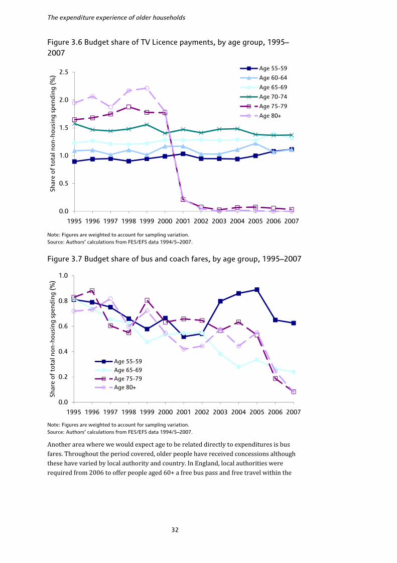
The expenditure experience of older households
32
Figure 3.6 Budget share of TV Licence payments, by age group, 1995–2007
Note: Figures are weighted to account for sampling variation. Source: Authors’ calculations from FES/EFS data 1994/5–2007.
Figure 3.7 Budget share of bus and coach fares, by age group, 1995–2007
Note: Figures are weighted to account for sampling variation. Source: Authors’ calculations from FES/EFS data 1994/5–2007. Another area where we would expect age to be related directly to expenditures is bus fares. Throughout the period covered, older people have received concessions although these have varied by local authority and country. In England, local authorities were required from 2006 to offer people aged 60+ a free bus pass and free travel within the
0.0
0.5
1.0
1.5
2.0
2.5
1995 1996 1997 1998 1999 2000 2001 2002 2003 2004 2005 2006 2007
Shar
e o
f to
tal n
on-
hous
ing
spen
ding
(%)
Age 55-59
Age 60-64
Age 65-69
Age 70-74
Age 75-79
Age 80+
0.0
0.2
0.4
0.6
0.8
1.0
1995 1996 1997 1998 1999 2000 2001 2002 2003 2004 2005 2006 2007
Shar
e o
f to
tal n
on-
hous
ing
spen
ding
(%)
Age 55-59
Age 65-69
Age 75-79
Age 80+

Non-housing expenditures
33
local area.19 In Wales, Scotland and Northern Ireland there have also been concessions and requirements for free travel within the country. If we look at the budget share of bus and coach fares for older age groups we can see the impact of this: households aged 55–59 have seen their bus budget share remain unchanged at around 0.6% over the whole period whilst older households have seen substantial falls, almost to zero. These trends are illustrated in Figure 3.7. A final area where there have been very different trends across age groups, and which we noted earlier in the general comparison for pensioners and non-pensioners, has been communications spending. Figure 3.8 illustrates the trends across all age groups. In 1995, households under 35 spent on average 3.1% of their budget here, compared to 4.8% for those aged 80+. By 2007, these figures were 5.4% and 4.6%, respectively. There is a clear divide by age: the communications budget share rose significantly for all households under 60, and the largest increases were seen for younger groups. For those over 60, there was no significant change in the communications budget share except for 65–69-year-olds where the increase from 3.5% to 3.9% was just significant. For the oldest three age groups, communications made up a smaller share of the budget in 2007 than in 1995, though in no case were the falls statistically significant. For all age groups, communications expenditures are dominated by telephone bills, rather than equipment and postage costs. For the youngest households, telephone bills (including Internet subscription fees) rose from 2.8% of the budget in 1995 to 5.1% in 2007; for the oldest households, bills were virtually unchanged at 4.2% and 4.1% of the budget in the two years. The evidence across age groups suggests strongly that the growth of communications technology spending in terms of mobile telephony and Internet expenditures has been concentrated amongst households under 60. Figure 3.8. Budget share of communications, by age group, 1995–2007
Notes: Figures are weighted to account for sampling variation. 95% confidence intervals are shown by the I-shaped bars. Source: Authors’ calculations from FES/EFS data 1994/5–2007. 19 Free off-peak travel across the whole of England was introduced in April 2008, after our data period ends.
0
1
2
3
4
5
6
7
Under 35
35-39 40-44 45-49 50-54 55-59 60-64 65-69 70-74 75-79 80+
Bud
get
shar
e o
f co
mm
unic
atio
ns (%
)
1995 2001 2007
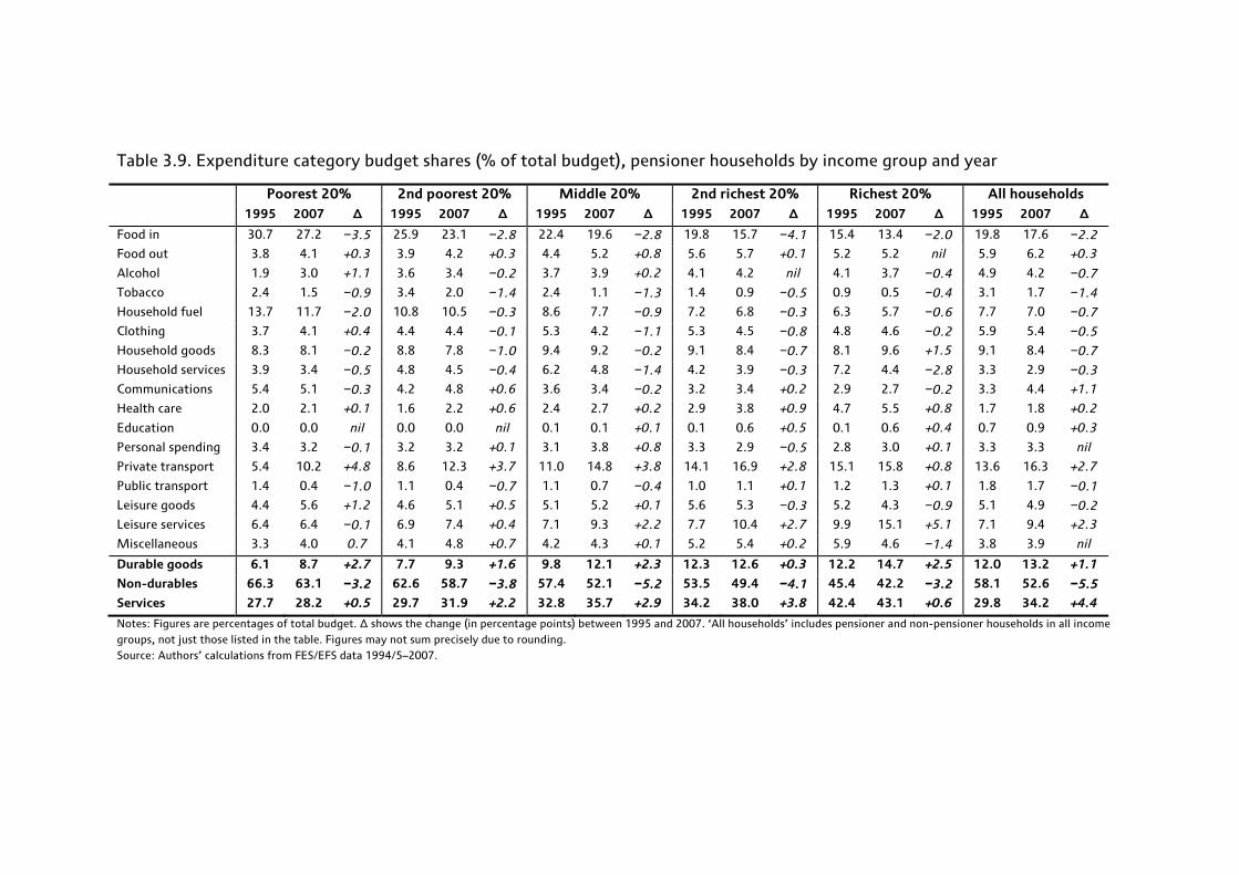
Table 3.9. Expenditure category budget shares (% of total budget), pensioner households by income group and year
Poorest 20% 2nd poorest 20% Middle 20% 2nd richest 20% Richest 20% All households 1995 2007 ∆ 1995 2007 ∆ 1995 2007 ∆ 1995 2007 ∆ 1995 2007 ∆ 1995 2007 ∆
Food in 30.7 27.2 −3.5 25.9 23.1 −2.8 22.4 19.6 −2.8 19.8 15.7 −4.1 15.4 13.4 −2.0 19.8 17.6 −2.2
Food out 3.8 4.1 +0.3 3.9 4.2 +0.3 4.4 5.2 +0.8 5.6 5.7 +0.1 5.2 5.2 nil 5.9 6.2 +0.3
Alcohol 1.9 3.0 +1.1 3.6 3.4 −0.2 3.7 3.9 +0.2 4.1 4.2 nil 4.1 3.7 −0.4 4.9 4.2 −0.7
Tobacco 2.4 1.5 −0.9 3.4 2.0 −1.4 2.4 1.1 −1.3 1.4 0.9 −0.5 0.9 0.5 −0.4 3.1 1.7 −1.4
Household fuel 13.7 11.7 −2.0 10.8 10.5 −0.3 8.6 7.7 −0.9 7.2 6.8 −0.3 6.3 5.7 −0.6 7.7 7.0 −0.7
Clothing 3.7 4.1 +0.4 4.4 4.4 −0.1 5.3 4.2 −1.1 5.3 4.5 −0.8 4.8 4.6 −0.2 5.9 5.4 −0.5
Household goods 8.3 8.1 −0.2 8.8 7.8 −1.0 9.4 9.2 −0.2 9.1 8.4 −0.7 8.1 9.6 +1.5 9.1 8.4 −0.7
Household services 3.9 3.4 −0.5 4.8 4.5 −0.4 6.2 4.8 −1.4 4.2 3.9 −0.3 7.2 4.4 −2.8 3.3 2.9 −0.3
Communications 5.4 5.1 −0.3 4.2 4.8 +0.6 3.6 3.4 −0.2 3.2 3.4 +0.2 2.9 2.7 −0.2 3.3 4.4 +1.1
Health care 2.0 2.1 +0.1 1.6 2.2 +0.6 2.4 2.7 +0.2 2.9 3.8 +0.9 4.7 5.5 +0.8 1.7 1.8 +0.2
Education 0.0 0.0 nil 0.0 0.0 nil 0.1 0.1 +0.1 0.1 0.6 +0.5 0.1 0.6 +0.4 0.7 0.9 +0.3
Personal spending 3.4 3.2 −0.1 3.2 3.2 +0.1 3.1 3.8 +0.8 3.3 2.9 −0.5 2.8 3.0 +0.1 3.3 3.3 nil
Private transport 5.4 10.2 +4.8 8.6 12.3 +3.7 11.0 14.8 +3.8 14.1 16.9 +2.8 15.1 15.8 +0.8 13.6 16.3 +2.7
Public transport 1.4 0.4 −1.0 1.1 0.4 −0.7 1.1 0.7 −0.4 1.0 1.1 +0.1 1.2 1.3 +0.1 1.8 1.7 −0.1
Leisure goods 4.4 5.6 +1.2 4.6 5.1 +0.5 5.1 5.2 +0.1 5.6 5.3 −0.3 5.2 4.3 −0.9 5.1 4.9 −0.2
Leisure services 6.4 6.4 −0.1 6.9 7.4 +0.4 7.1 9.3 +2.2 7.7 10.4 +2.7 9.9 15.1 +5.1 7.1 9.4 +2.3
Miscellaneous 3.3 4.0 0.7 4.1 4.8 +0.7 4.2 4.3 +0.1 5.2 5.4 +0.2 5.9 4.6 −1.4 3.8 3.9 nil
Durable goods 6.1 8.7 +2.7 7.7 9.3 +1.6 9.8 12.1 +2.3 12.3 12.6 +0.3 12.2 14.7 +2.5 12.0 13.2 +1.1
Non-durables 66.3 63.1 −3.2 62.6 58.7 −3.8 57.4 52.1 −5.2 53.5 49.4 −4.1 45.4 42.2 −3.2 58.1 52.6 −5.5
Services 27.7 28.2 +0.5 29.7 31.9 +2.2 32.8 35.7 +2.9 34.2 38.0 +3.8 42.4 43.1 +0.6 29.8 34.2 +4.4
Notes: Figures are percentages of total budget. ∆ shows the change (in percentage points) between 1995 and 2007. ‘All households’ includes pensioner and non-pensioner households in all income groups, not just those listed in the table. Figures may not sum precisely due to rounding. Source: Authors’ calculations from FES/EFS data 1994/5–2007.

Non-housing expenditures
35
Spending patterns by income group Table 3.9 shows a breakdown of non-housing expenditures for pensioner households by income quintile. Many of the trends are similar to those we observed by age since older pensioners are typically poorer and younger pensioners are typically richer. Thus food in and household fuel budget shares fall strongly with income, whilst private transport and leisure service shares rise strongly, mirroring the age trends. For other goods, the age and income trends are different: in health care, for example, where richer households spend significantly more than poorer households, but older pensioner households spend significantly more than younger. In some cases, the spending patterns of the poorest pensioners are different to the middle of the distribution but the middle is quite similar to the top, suggesting that the income gradient for these items diminishes as we move up the income distribution: food out, household goods and household services are three examples. Communications appears to be a necessity for pensioner households as the budget share falls with income, though there is no clear trend in the change over time in the communications share by income and no evidence that richer pensioner households increased their communications share in a similar way to the increase we saw for non-pensioners in Figure 3.8. An interesting question in general is whether the spending patterns of richer pensioners more closely resemble those of poorer pensioners (that is, is age the key factor associated with spending?) or those of richer non-pensioners (does income drive spending patterns?). Perhaps unsurprisingly, the answer appears somewhat mixed. Table 3.10 compares, for 2007, the budget share of each category for pensioners in the richest income quintile to the share for the poorest pensioners and the richest non-pensioners, and asks whether the differences are statistically significant. Categories in the top left box, for example, are those where rich pensioners have a smaller share than both poor pensioners and rich non-pensioners; categories in the middle are those where no significant differences are observed and in the bottom right are those items where richer pensioners have higher budget shares than both other groups. Categories in other boxes are those where the comparisons go in different ways. If rich pensioners had spending patterns that were statistically identical to those of rich non-pensioners, then all the items would be in the middle row; if they had patterns identical to those of poor pensioners, all the items would be in the middle column. There are some categories where richer pensioners look more like rich non-pensioners in their spending patterns, in particular tobacco and leisure. Rich pensioners look more like poor pensioners in terms of alcohol, clothing and household services. For food in and fuel, rich pensioners spend more than rich non-pensioners but less than poor pensioners, suggesting both age and income effects are important. Rich pensioners spend more of their budget on food out, education and transport than poor pensioners, but less than rich non-pensioners, suggesting the effects here work in the opposite way. Health care is the only category on which rich pensioners spend a greater share than both comparison groups, and communications the only one in which they spend less. Clearly whether age or income influences spending patterns more strongly differs across different types of expenditure.
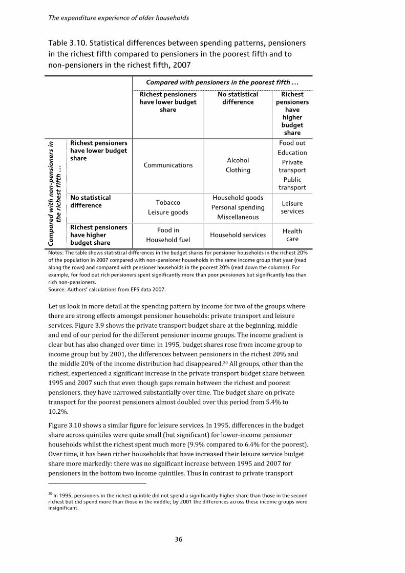
The expenditure experience of older households
36
Table 3.10. Statistical differences between spending patterns, pensioners in the richest fifth compared to pensioners in the poorest fifth and to non-pensioners in the richest fifth, 2007 Compared with pensioners in the poorest fifth …
Richest pensioners have lower budget
share
No statistical difference
Richest pensioners
have higher budget share
Com
pa
red
wit
h n
on-p
ensi
oner
s in
th
e ri
ches
t fi
fth
…
Richest pensioners have lower budget share
Communications Alcohol
Clothing
Food out
Education
Private transport
Public transport
No statistical difference Tobacco
Leisure goods
Household goods
Personal spending
Miscellaneous
Leisure services
Richest pensioners have higher budget share
Food in
Household fuel Household services
Health care
Notes: The table shows statistical differences in the budget shares for pensioner households in the richest 20% of the population in 2007 compared with non-pensioner households in the same income group that year (read along the rows) and compared with pensioner households in the poorest 20% (read down the columns). For example, for food out rich pensioners spent significantly more than poor pensioners but significantly less than rich non-pensioners. Source: Authors’ calculations from EFS data 2007. Let us look in more detail at the spending pattern by income for two of the groups where there are strong effects amongst pensioner households: private transport and leisure services. Figure 3.9 shows the private transport budget share at the beginning, middle and end of our period for the different pensioner income groups. The income gradient is clear but has also changed over time: in 1995, budget shares rose from income group to income group but by 2001, the differences between pensioners in the richest 20% and the middle 20% of the income distribution had disappeared.20 All groups, other than the richest, experienced a significant increase in the private transport budget share between 1995 and 2007 such that even though gaps remain between the richest and poorest pensioners, they have narrowed substantially over time. The budget share on private transport for the poorest pensioners almost doubled over this period from 5.4% to 10.2%. Figure 3.10 shows a similar figure for leisure services. In 1995, differences in the budget share across quintiles were quite small (but significant) for lower-income pensioner households whilst the richest spent much more (9.9% compared to 6.4% for the poorest). Over time, it has been richer households that have increased their leisure service budget share more markedly: there was no significant increase between 1995 and 2007 for pensioners in the bottom two income quintiles. Thus in contrast to private transport 20 In 1995, pensioners in the richest quintile did not spend a significantly higher share than those in the second richest but did spend more than those in the middle; by 2001 the differences across these income groups were insignificant.
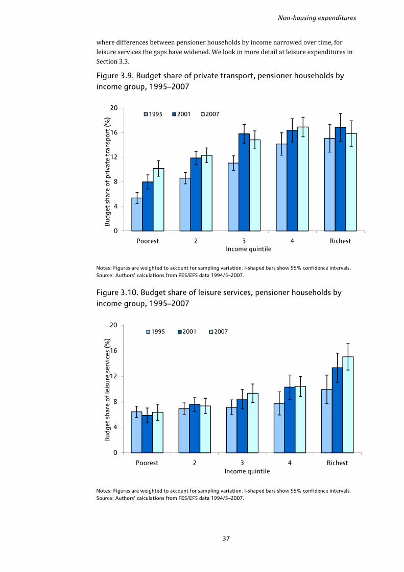
Non-housing expenditures
37
where differences between pensioner households by income narrowed over time, for leisure services the gaps have widened. We look in more detail at leisure expenditures in Section 3.3. Figure 3.9. Budget share of private transport, pensioner households by income group, 1995–2007
Notes: Figures are weighted to account for sampling variation. I-shaped bars show 95% confidence intervals. Source: Authors’ calculations from FES/EFS data 1994/5–2007.
Figure 3.10. Budget share of leisure services, pensioner households by income group, 1995–2007
Notes: Figures are weighted to account for sampling variation. I-shaped bars show 95% confidence intervals. Source: Authors’ calculations from FES/EFS data 1994/5–2007.
0
4
8
12
16
20
Poorest 2 3 4 Richest
Bud
get
shar
e of
pri
vate
tra
nspo
rt (%
)
Income quintile
1995 2001 2007
0
4
8
12
16
20
Poorest 2 3 4 Richest
Bud
get
shar
e of
leis
ure
serv
ices
(%)
Income quintile
1995 2001 2007
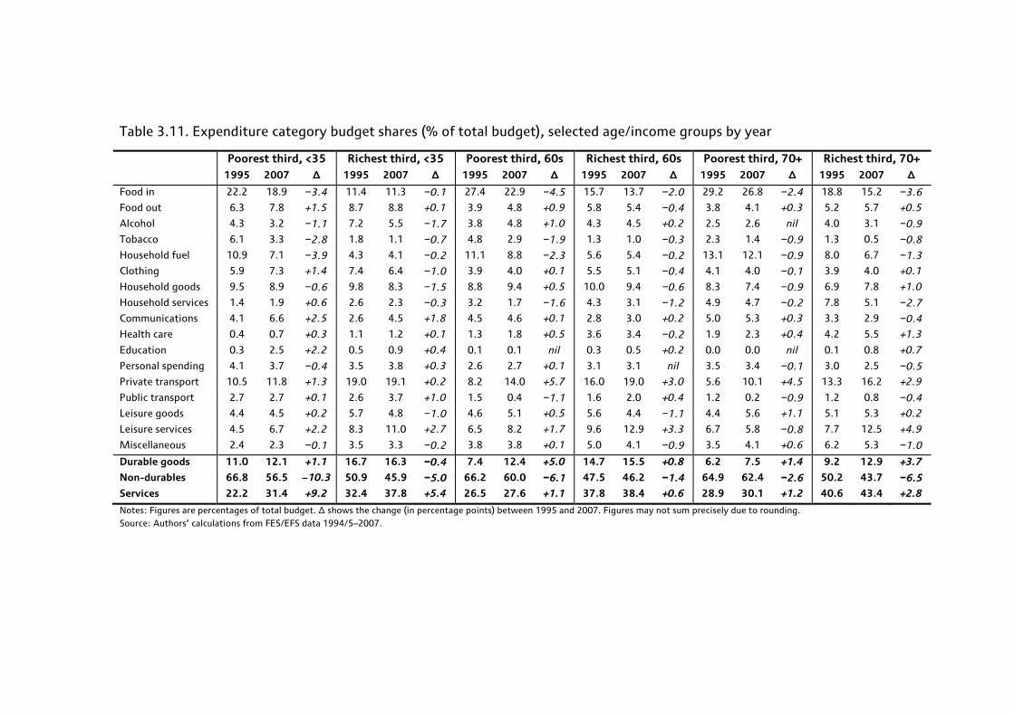
Table 3.11. Expenditure category budget shares (% of total budget), selected age/income groups by year
Poorest third, <35 Richest third, <35 Poorest third, 60s Richest third, 60s Poorest third, 70+ Richest third, 70+ 1995 2007 ∆ 1995 2007 ∆ 1995 2007 ∆ 1995 2007 ∆ 1995 2007 ∆ 1995 2007 ∆
Food in 22.2 18.9 −3.4 11.4 11.3 −0.1 27.4 22.9 −4.5 15.7 13.7 −2.0 29.2 26.8 −2.4 18.8 15.2 −3.6
Food out 6.3 7.8 +1.5 8.7 8.8 +0.1 3.9 4.8 +0.9 5.8 5.4 −0.4 3.8 4.1 +0.3 5.2 5.7 +0.5
Alcohol 4.3 3.2 −1.1 7.2 5.5 −1.7 3.8 4.8 +1.0 4.3 4.5 +0.2 2.5 2.6 nil 4.0 3.1 −0.9
Tobacco 6.1 3.3 −2.8 1.8 1.1 −0.7 4.8 2.9 −1.9 1.3 1.0 −0.3 2.3 1.4 −0.9 1.3 0.5 −0.8
Household fuel 10.9 7.1 −3.9 4.3 4.1 −0.2 11.1 8.8 −2.3 5.6 5.4 −0.2 13.1 12.1 −0.9 8.0 6.7 −1.3
Clothing 5.9 7.3 +1.4 7.4 6.4 −1.0 3.9 4.0 +0.1 5.5 5.1 −0.4 4.1 4.0 −0.1 3.9 4.0 +0.1
Household goods 9.5 8.9 −0.6 9.8 8.3 −1.5 8.8 9.4 +0.5 10.0 9.4 −0.6 8.3 7.4 −0.9 6.9 7.8 +1.0
Household services 1.4 1.9 +0.6 2.6 2.3 −0.3 3.2 1.7 −1.6 4.3 3.1 −1.2 4.9 4.7 −0.2 7.8 5.1 −2.7
Communications 4.1 6.6 +2.5 2.6 4.5 +1.8 4.5 4.6 +0.1 2.8 3.0 +0.2 5.0 5.3 +0.3 3.3 2.9 −0.4
Health care 0.4 0.7 +0.3 1.1 1.2 +0.1 1.3 1.8 +0.5 3.6 3.4 −0.2 1.9 2.3 +0.4 4.2 5.5 +1.3
Education 0.3 2.5 +2.2 0.5 0.9 +0.4 0.1 0.1 nil 0.3 0.5 +0.2 0.0 0.0 nil 0.1 0.8 +0.7
Personal spending 4.1 3.7 −0.4 3.5 3.8 +0.3 2.6 2.7 +0.1 3.1 3.1 nil 3.5 3.4 −0.1 3.0 2.5 −0.5
Private transport 10.5 11.8 +1.3 19.0 19.1 +0.2 8.2 14.0 +5.7 16.0 19.0 +3.0 5.6 10.1 +4.5 13.3 16.2 +2.9
Public transport 2.7 2.7 +0.1 2.6 3.7 +1.0 1.5 0.4 −1.1 1.6 2.0 +0.4 1.2 0.2 −0.9 1.2 0.8 −0.4
Leisure goods 4.4 4.5 +0.2 5.7 4.8 −1.0 4.6 5.1 +0.5 5.6 4.4 −1.1 4.4 5.6 +1.1 5.1 5.3 +0.2
Leisure services 4.5 6.7 +2.2 8.3 11.0 +2.7 6.5 8.2 +1.7 9.6 12.9 +3.3 6.7 5.8 −0.8 7.7 12.5 +4.9
Miscellaneous 2.4 2.3 −0.1 3.5 3.3 −0.2 3.8 3.8 +0.1 5.0 4.1 −0.9 3.5 4.1 +0.6 6.2 5.3 −1.0
Durable goods 11.0 12.1 +1.1 16.7 16.3 −0.4 7.4 12.4 +5.0 14.7 15.5 +0.8 6.2 7.5 +1.4 9.2 12.9 +3.7
Non-durables 66.8 56.5 −10.3 50.9 45.9 −5.0 66.2 60.0 −6.1 47.5 46.2 −1.4 64.9 62.4 −2.6 50.2 43.7 −6.5
Services 22.2 31.4 +9.2 32.4 37.8 +5.4 26.5 27.6 +1.1 37.8 38.4 +0.6 28.9 30.1 +1.2 40.6 43.4 +2.8
Notes: Figures are percentages of total budget. ∆ shows the change (in percentage points) between 1995 and 2007. Figures may not sum precisely due to rounding. Source: Authors’ calculations from FES/EFS data 1994/5–2007.

Non-housing expenditures
39
Expenditure patterns by age and income group The previous analyses have shown that spending patterns are correlated with both age and income, and that for some items, one or the other appeared more closely related to budget shares. Here, we look at spending patterns by both age and income, defining age groups as before based on the age of the eldest person in the first benefit unit and income according to thirds of the within-year income distribution. We use wider age bands and fewer income groups to ensure reasonable sample sizes in each age/income cell. Table 3.11 shows the breakdown of spending by selected age and income groups in each year.21 There have been some substantial changes in these spending patterns over time. Most notable is that spending on necessities like food in and fuel has fallen by more for poorer households than richer households, with the exception of those aged 70+ where the richer households saw a larger decline. Private transport also stands out: older households have seen much larger increases in the share of spending here compared to younger households in the same income tertile, and poorer households have seen larger increases than richer households. Households in their 60s in the richest third now spend roughly the same share of their budget on private transport as households under 35 in the same broad income group, having spent significantly less in 1995. The leisure service budget share has also changed substantially across groups: richer older households have seen a big increase in this budget share with particularly large increases for over 70s in the richest third, whilst poorer older households have seen much smaller increases (or no increase at all), and for younger households the increases are quite comparable across income groups. Health care is also worth looking at: the only group to see a substantial rise in the share of the budget spent on health over this period was the oldest households in the richest third where the share rose from 4.2% to 5.5%; we look at expenditure on health in more detail in Section 3.3. 3.3. Trends in budget shares for specific items
Food and leisure Food and leisure are classic examples of ‘necessities’ and ‘luxuries’. Necessities are those goods on which richer households spend a smaller share of their budget and luxuries a greater share. The relationship between the budget share of different items and the total budget was first documented in the 19th century by Ernst Engel who looked at the food share; ‘Engel Curves’ which plot the budget share against the total budget are named after this discovery. The budget share of food in the home has sometimes been used as a proxy indicator of the standard of living or to predict total household expenditures when complete spending records are unavailable, as many studies have shown that the average food budget share falls almost linearly with the total budget (see for example Banks, Blundell and Lewbel, 1997, figure 2a). This is as we would expect: as households get richer they do not need to consume more food, though they may be able to substitute better-quality (and more expensive) foods than poorer households, which might keep the food budget shares higher than merely continuing to purchase ‘subsistence’ levels of food would imply. On 21 The figures for all households are not shown in Table 3.11 but are identical to those in the rightmost columns of Tables 3.8 and 3.9.

The expenditure experience of older households
40
the other hand, an alternative substitution for richer households is food out of the home – restaurant and takeaway meals – which would tend to reduce the food in budget share more rapidly for richer households. Figure 3.11 shows the food in budget share for key groups over our data period. The budget shares declined over the whole period for all groups, as we would expect given the general increase in expenditures. But there was a noticeable levelling off after 2000 for all households, which mirrors the relatively flat trends in real total non-housing spending observed in Figure 3.1. For pensioner households, there was a further decline in budget shares after 2000: between 2000 and 2007, the pensioner food in budget share fell by 1.3 percentage points but rose by 0.7 percentage points for non-pensioners. This meant the gap between the average food in budget share for pensioners and non-pensioners narrowed, from around 7 percentage points in 1995 to under 5.5 percentage points in 2007. Figure 3.11. Food (in the home) budget share, 1995–2007, various groups
Notes: Dotted lines are 95% confidence intervals. ‘Poorest pensioners’ are the poorest fifth; ‘richest pensioners’ are the richest fifth. Source: Authors’ calculations from FES/EFS data 1994/5–2007. One interesting finding (see Figure 3.12) is that the youngest, richest households (aged under 35 in the top third of the income distribution) had roughly identical food in budget shares in 1995 and 2007 (11.4% and 11.3%, respectively) and saw the smallest decline in their share over this period of any group, though starting from the lowest base. This result holds despite real spending growth for this group of 1.1% per year on average over the period, though this is the lowest spending growth rate for any age/income group. The similarity of the budget share in the start and end periods masks a decline to just 9.2% in 2000 followed by a rise since. The oldest households in the same income group saw a large fall in the food in budget share from 18.8% to 15.2% over this period, but as Figure 3.12 shows this seems to represent two relatively large downticks in 1998 and 2006 and one large uptick in 2007; between 1998 and 2005 the food in budget share for the oldest, richest households was remarkably flat.
10
15
20
25
30
35
1995 1996 1997 1998 1999 2000 2001 2002 2003 2004 2005 2006 2007
Bud
get
shar
e o
f fo
od
in (%
)
All householdsPensioner householdsAge 80+Poorest pensionersRichest pensioners
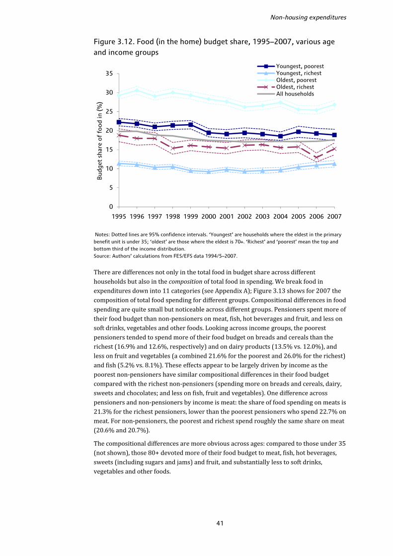
Non-housing expenditures
41
Figure 3.12. Food (in the home) budget share, 1995–2007, various age and income groups
Notes: Dotted lines are 95% confidence intervals. ‘Youngest’ are households where the eldest in the primary benefit unit is under 35; ‘oldest’ are those where the eldest is 70+. ‘Richest’ and ‘poorest’ mean the top and bottom third of the income distribution. Source: Authors’ calculations from FES/EFS data 1994/5–2007. There are differences not only in the total food in budget share across different households but also in the composition of total food in spending. We break food in expenditures down into 11 categories (see Appendix A); Figure 3.13 shows for 2007 the composition of total food spending for different groups. Compositional differences in food spending are quite small but noticeable across different groups. Pensioners spent more of their food budget than non-pensioners on meat, fish, hot beverages and fruit, and less on soft drinks, vegetables and other foods. Looking across income groups, the poorest pensioners tended to spend more of their food budget on breads and cereals than the richest (16.9% and 12.6%, respectively) and on dairy products (13.5% vs. 12.0%), and less on fruit and vegetables (a combined 21.6% for the poorest and 26.0% for the richest) and fish (5.2% vs. 8.1%). These effects appear to be largely driven by income as the poorest non-pensioners have similar compositional differences in their food budget compared with the richest non-pensioners (spending more on breads and cereals, dairy, sweets and chocolates; and less on fish, fruit and vegetables). One difference across pensioners and non-pensioners by income is meat: the share of food spending on meats is 21.3% for the richest pensioners, lower than the poorest pensioners who spend 22.7% on meat. For non-pensioners, the poorest and richest spend roughly the same share on meat (20.6% and 20.7%). The compositional differences are more obvious across ages: compared to those under 35 (not shown), those 80+ devoted more of their food budget to meat, fish, hot beverages, sweets (including sugars and jams) and fruit, and substantially less to soft drinks, vegetables and other foods.
0
5
10
15
20
25
30
35
1995 1996 1997 1998 1999 2000 2001 2002 2003 2004 2005 2006 2007
Bud
get
shar
e o
f fo
od
in (%
)
Youngest, poorestYoungest, richestOldest, poorestOldest, richestAll households

The expenditure experience of older households
42
Figure 3.13. Composition of food (in) expenditures, 2007, various groups
Note: Figures in parentheses are total average weekly food spending for the groups in 2007. Source: Authors’ calculations from FES/EFS data 2007. If food is a classic ‘necessity’ then leisure spending is something we would tend to think of as a ‘luxury’, with higher budget shares for richer households. Figure 3.14 shows the budget share for leisure goods (top panel) and leisure services (bottom panel) for key groups over our data period. There are some clear trends and differences between leisure goods and services. For leisure goods the differences in budget shares across the groups are quite small; for leisure services the differences are larger and go as we might expect: richer households spend a higher budget share, and the poorer and older households a smaller share. This mirrors the findings from the previous section showing that differences across age and income groups were much smaller for leisure goods than for leisure services. Looking at leisure goods in more detail, Figure 3.15 shows the leisure goods budget share, broken down into durable and other leisure goods, for pensioner households by income quintile in 1995, 2001 and 2007. There is no clear trend by income group; in each year, pensioners in the richest quintile spent a smaller share on leisure goods than those in the second richest (though in general these differences were not significant). Nor are there any obvious consistent trends for durable and other leisure goods as separate expenditure items. These results do not lend weight to the idea that leisure goods are ‘luxuries’, at least for pensioner households.22 22 For non-pensioner households there is a more obvious positive income gradient in the total leisure good budget share but differences across income groups are generally insignificant.
0%
10%
20%
30%
40%
50%
60%
70%
80%
90%
100%
Non-pensioners (£44.68)
Pensioners (£46.51)
Pensioners: poorest fifth
(£40.23)
Pensioners: richest fifth
(£60.08)
80+ (£38.27)
Other food
Vegetables
Fruit
Sweets
Soft drinks
Beverages
Dairy
Oils and fats
Fish
Meat
Bread and cereal
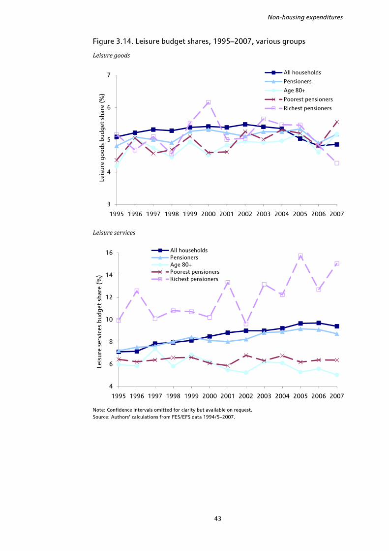
Non-housing expenditures
43
Figure 3.14. Leisure budget shares, 1995–2007, various groups
Leisure goods
Leisure services
Note: Confidence intervals omitted for clarity but available on request. Source: Authors’ calculations from FES/EFS data 1994/5–2007.
3
4
5
6
7
1995 1996 1997 1998 1999 2000 2001 2002 2003 2004 2005 2006 2007
Leis
ure
good
s bu
dget
sha
re (%
)
All households
Pensioners
Age 80+
Poorest pensioners
Richest pensioners
4
6
8
10
12
14
16
1995 1996 1997 1998 1999 2000 2001 2002 2003 2004 2005 2006 2007
Leis
ure
serv
ices
bud
get
shar
e (%
)
All householdsPensionersAge 80+Poorest pensionersRichest pensioners
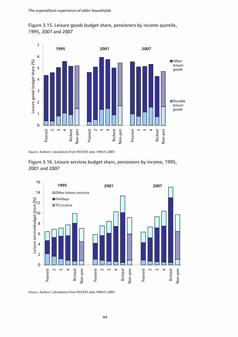
The expenditure experience of older households
44
Figure 3.15. Leisure goods budget share, pensioners by income quintile, 1995, 2001 and 2007
Source: Authors’ calculations from FES/EFS data 1994/5–2007.
Figure 3.16. Leisure services budget share, pensioners by income, 1995, 2001 and 2007
Source: Authors’ calculations from FES/EFS data 1994/5–2007.
0
1
2
3
4
5
6
7P
oo
rest 2 3 4
Ric
hest
No
n-pe
n
Po
ore
st 2 3 4
Ric
hest
No
n-pe
n
Po
ore
st 2 3 4
Ric
hest
No
n-pe
n
Leis
ure
good
s bu
dget
sha
re (%
) Other leisure goods
Durable leisure goods
0
2
4
6
8
10
12
14
16
Po
ore
st 2 3 4
Ric
hest
No
n-pe
n
Po
ore
st 2 3 4
Ric
hest
No
n-pe
n
Po
ore
st 2 3 4
Ric
hest
No
n-pe
n
Leis
ure
serv
ices
budg
et s
hare
(%)
Other leisure services
Holidays
TV Licence
1995 2001 2007
1995 2001 2007
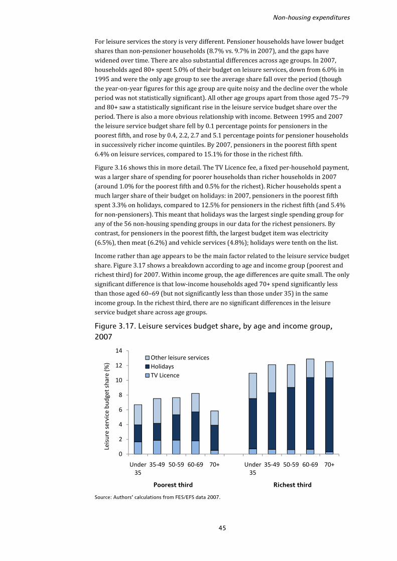
Non-housing expenditures
45
For leisure services the story is very different. Pensioner households have lower budget shares than non-pensioner households (8.7% vs. 9.7% in 2007), and the gaps have widened over time. There are also substantial differences across age groups. In 2007, households aged 80+ spent 5.0% of their budget on leisure services, down from 6.0% in 1995 and were the only age group to see the average share fall over the period (though the year-on-year figures for this age group are quite noisy and the decline over the whole period was not statistically significant). All other age groups apart from those aged 75–79 and 80+ saw a statistically significant rise in the leisure service budget share over the period. There is also a more obvious relationship with income. Between 1995 and 2007 the leisure service budget share fell by 0.1 percentage points for pensioners in the poorest fifth, and rose by 0.4, 2.2, 2.7 and 5.1 percentage points for pensioner households in successively richer income quintiles. By 2007, pensioners in the poorest fifth spent 6.4% on leisure services, compared to 15.1% for those in the richest fifth. Figure 3.16 shows this in more detail. The TV Licence fee, a fixed per-household payment, was a larger share of spending for poorer households than richer households in 2007 (around 1.0% for the poorest fifth and 0.5% for the richest). Richer households spent a much larger share of their budget on holidays: in 2007, pensioners in the poorest fifth spent 3.3% on holidays, compared to 12.5% for pensioners in the richest fifth (and 5.4% for non-pensioners). This meant that holidays was the largest single spending group for any of the 56 non-housing spending groups in our data for the richest pensioners. By contrast, for pensioners in the poorest fifth, the largest budget item was electricity (6.5%), then meat (6.2%) and vehicle services (4.8%); holidays were tenth on the list. Income rather than age appears to be the main factor related to the leisure service budget share. Figure 3.17 shows a breakdown according to age and income group (poorest and richest third) for 2007. Within income group, the age differences are quite small. The only significant difference is that low-income households aged 70+ spend significantly less than those aged 60–69 (but not significantly less than those under 35) in the same income group. In the richest third, there are no significant differences in the leisure service budget share across age groups. Figure 3.17. Leisure services budget share, by age and income group, 2007
Source: Authors’ calculations from FES/EFS data 2007.
0
2
4
6
8
10
12
14
Under 35
35‐49 50‐59 60‐69 70+ Under 35
35‐49 50‐59 60‐69 70+
Leisure service bu
dget share (%
)
Other leisure servicesHolidaysTV Licence
Poorest third Richest third

The expenditure experience of older households
46
Although the overall leisure service budget shares are similar by age within income groups, the compositions are different. The holiday share generally rises with age within income group whereas the share of other leisure services (spectator sports, leisure classes, cinema, theatre and so on) falls. Health care Health expenditures vary significantly according to both age and income but have shown no significant trends over time as a proportion of total spending. Figure 3.18 shows health care budget shares in 1995, 2001 and 2007 by age and income group. Households aged 70+ in the richest third of the population spent around 5.5% of their budget on health care in 2007, compared to 1.2% for young households (under 35) in the same income group, and 2.3% for households of the same age in the poorest third. There are no obvious time trends across groups, and none of the changes between 1995 and 2007 are statistically significant. Figure 3.18. Health care budget share, by age and income group, 1995–2007
Note: Vertical lines show 95% confidence intervals. Source: Authors’ calculations from FES/EFS data 1994/5–2007. Figure 3.19 shows that the main differences in health care spending across demographic groups are on medical services (hospital and ambulance services, health insurance, dental and optical care) rather than medical goods (prescription costs, chemist’s goods, glasses, wheelchairs, etc.). There is a clear correlation with age for medical goods: in 2007, the oldest households in a given income group had budget shares around twice as high as the youngest household in the same income group. But there is no evidence at all of any relationship with income: for a given age, the medical good budget shares for high- and low-income households are not statistically different. For medical services, by contrast, there are strong relationships with age and income. All age groups from 50 upwards spent a significantly higher share than those aged under 35 in the same income group, and the richest spent a significantly higher share than the poorest in the same age group. Looking in even finer detail at what drives these differences is difficult given the relatively small sample sizes but would be an interesting avenue for future work. For
0
1
2
3
4
5
6
7
8
<35 35‐49 50‐59 60‐69 70+ <35 35‐49 50‐59 60‐69 70+
Share of to
tal non
‐hou
sing
expen
diture (%
) 1995 2001 2007
Poorest third Richest third
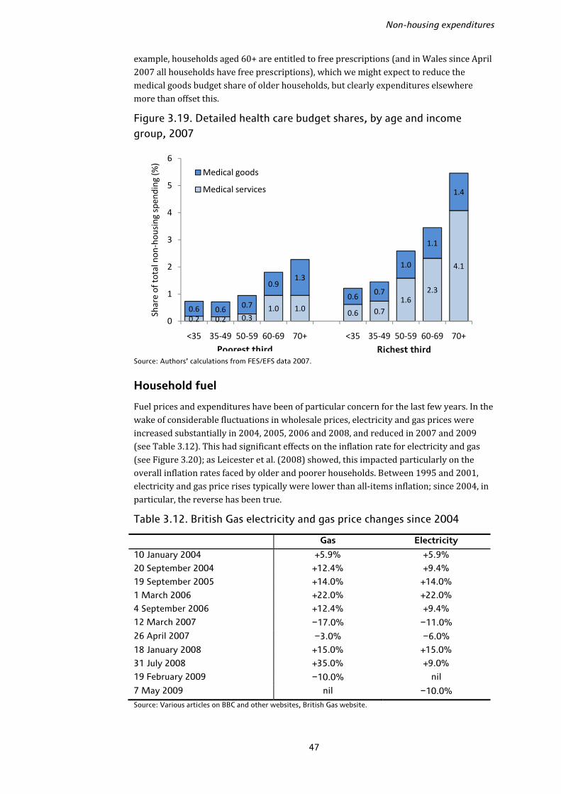
Non-housing expenditures
47
example, households aged 60+ are entitled to free prescriptions (and in Wales since April 2007 all households have free prescriptions), which we might expect to reduce the medical goods budget share of older households, but clearly expenditures elsewhere more than offset this. Figure 3.19. Detailed health care budget shares, by age and income group, 2007
Source: Authors’ calculations from FES/EFS data 2007.
Household fuel Fuel prices and expenditures have been of particular concern for the last few years. In the wake of considerable fluctuations in wholesale prices, electricity and gas prices were increased substantially in 2004, 2005, 2006 and 2008, and reduced in 2007 and 2009 (see Table 3.12). This had significant effects on the inflation rate for electricity and gas (see Figure 3.20); as Leicester et al. (2008) showed, this impacted particularly on the overall inflation rates faced by older and poorer households. Between 1995 and 2001, electricity and gas price rises typically were lower than all-items inflation; since 2004, in particular, the reverse has been true. Table 3.12. British Gas electricity and gas price changes since 2004
Gas Electricity
10 January 2004 +5.9% +5.9%
20 September 2004 +12.4% +9.4%
19 September 2005 +14.0% +14.0%
1 March 2006 +22.0% +22.0%
4 September 2006 +12.4% +9.4%
12 March 2007 −17.0% −11.0%
26 April 2007 −3.0% −6.0%
18 January 2008 +15.0% +15.0%
31 July 2008 +35.0% +9.0%
19 February 2009 −10.0% nil
7 May 2009 nil −10.0%
Source: Various articles on BBC and other websites, British Gas website.
0.2 0.2 0.31.0 1.0 0.6 0.7
1.62.3
4.1
0.6 0.6 0.7
0.91.3
0.60.7
1.0
1.1
1.4
0
1
2
3
4
5
6
<35 35‐49 50‐59 60‐69 70+ <35 35‐49 50‐59 60‐69 70+
Share of to
tal non
‐hou
sing
spe
nding (%
)
Medical goods
Medical services
Poorest third Richest third

The expenditure experience of older households
48
Figure 3.20. RPI year-on-year inflation for electricity and gas, January 1995–May 2009
Source: Office for National Statistics (ONS). Household fuel payments are another traditional necessity, where the budget share would be expected to fall with the total budget. Figure 3.21 shows the fuel spending share for key groups since 1995. Fuel shares fell between 1995 and 2001, partly because of general increases in income and spending and partly because, as we saw, fuel price increases were low; they then stabilised and appear to have started rising in particular since 2006. Blow et al. (2004, appendix B) showed that the average fuel budget share across all households tends to track the relative fuel price quite closely which implies relatively little short-term demand change as the price of fuel changes, and is backed up by our figures here. Between 2005 and 2007, the average fuel budget share rose by 1.2 percentage points (24%) for non-pensioners and 1.5 percentage points (20%) for pensioners. There were some differences across different age and income groups: the oldest pensioners aged 80+, for example, who spent the highest proportion of their budget on fuel of any age group in each year, saw their budget share increase by 3.0 percentage points (31%) between 2005 and 2007 whilst those aged 60–64 saw an increase of 1.4 percentage points (15%) on average. Pensioners in the poorest quintile saw a rise of around 1.4 points (14%) compared to 1.5 points (36%) for pensioners in the richest quintile. This reflects a (statistically insignificant) fall in the share for the poorest pensioners between 2006 and 2007 that was not matched for the richest, and also changes in the real total budget for these groups over the period. Between 2005 and 2007, pensioners in the poorest fifth by income saw their real total non-housing spending rise by around 10% from £166 per week to £183 per week, whilst those in the richest fifth saw a real fall of around 6% from £609 per week to £570 per week.
-20%
-10%
0%
10%
20%
30%
40%
50%
60%
Jan
19
95
Jan
19
96
Jan
19
97
Jan
19
98
Jan
19
99
Jan
20
00
Jan
20
01
Jan
20
02
Jan
20
03
Jan
20
04
Jan
20
05
Jan
20
06
Jan
20
07
Jan
20
08
Jan
20
09
Electricity
Gas
All-items

Non-housing expenditures
49
Figure 3.21. Household fuel budget shares, various groups, 1995–2007
Notes: Confidence intervals omitted for clarity but available on request. ‘Poorest pensioners’ are the poorest fifth; ‘richest pensioners’ are the richest fifth. Source: Authors’ calculations from FES/EFS data 1994/5–2007. Single pensioner households spend a significantly greater share of their budget on fuel than couple pensioners. In 2007, single males spent on average 11.5% of their budget on fuel, females 11.8% and couples 7.3%. Singles and couples saw similar relative increases in their fuel share between 2005 and 2007 (up by 20% for single males, 19% for females and couples). There are no significant differences between single male and single female pensioners, or between pensioner couples and ‘other’ household types (e.g. pensioners living with other family members). The fact that singles spend a higher share on fuel is unsurprising, in part because they will tend to be older, and in part because there are substantial economies of scale in fuel bills. Figure 3.21 showed that the fuel budget shares for the oldest pensioners and the poorest pensioners are very similar; age and income are clearly correlated with fuel spending. Within age groups, income still appears to play an important role. Pensioner households
3
5
7
9
11
13
15
17
1995 1996 1997 1998 1999 2000 2001 2002 2003 2004 2005 2006 2007
Bud
get
shar
e o
f ho
useh
old
fue
l (%
)
All householdsPensioner households80+Poorest pensionersRichest pensioners
3
5
7
9
11
13
15
17
1995 1996 1997 1998 1999 2000 2001 2002 2003 2004 2005 2006 2007
Bud
get
shar
e o
f ho
useh
old
fue
l (%
)
All householdsSingle male pensionerSingle female pensionerPensioner coupleOther pensioner household

The expenditure experience of older households
50
aged 70+ in the poorest third of the income distribution spent on average 12.1% of their budget on fuel in 2007, compared to 6.7% for pensioners in the same age group in the richest third. But equally within income groups, age plays a key role: under 35s in the poorest third spent 7.1% on fuel, compared to 8.8% for those aged 60–69 in the poorest third and 12.1% for those aged 70+. Of course we would expect pensioner households to spend more than younger households on fuel, given that they are likely to spend more time in the home, but the magnitude of the differences across age groups even with roughly comparable incomes is quite substantial. Figure 3.22 breaks down the fuel budget shares for the last three years for pensioner households according to their income quintile. The substantial increase in budget share for all income groups between 2005 and 2006 was driven in particular by gas payments: pensioners in the poorest fifth saw their average gas share rise from 4.4% to 5.9%, an increase of more than one-third, and all other groups saw relative increases in gas spending shares between 2005 and 2006 of at least one-fifth. This increase in the gas budget share then appeared to reverse for the poorest group but not for other income groups; it is not totally clear why this should be the case. It may reflect sampling variation, or perhaps the growth of social tariffs for the most vulnerable households over the period, but we do not know from the EFS data whether households are in receipt of such tariffs. Over the period 2005–07, the average gas share rose by just 5% overall for pensioners in the poorest fifth, compared to 39% for those in the second poorest, 25% for those in the middle, 38% for the second richest and 34% for the richest. For electricity, the increases were much more similar across income groups except at the very top, rising by 24%, 21%, 23%, 27% and 40% from poorest fifth to richest fifth, respectively. Figure 3.22. Household fuel budget shares, pensioner households by income, 2005–07
Note: Figures are weighted to take account of sampling variation. Source: Author’s calculations from EFS data 2004/5–07.
5.34.3
3.0 2.61.9
6.04.4
3.62.8 2.2
6.55.2
3.7 3.32.6
4.4
3.4
2.82.2
1.9
5.9
4.1
3.4
2.82.4
4.5
4.8
3.53.1
2.5
0.6
0.6
0.4
0.5
0.5
0.6
0.5
0.7
0.5
0.6
0.6
0.5
0.5
0.4
0.6
0
2
4
6
8
10
12
14
Po
ore
st 2 3 4
Ric
hest
Po
ore
st 2 3 4
Ric
hest
Po
ore
st 2 3 4
Ric
hest
Other Fuel
Gas
Electricity
2005 2006 2007
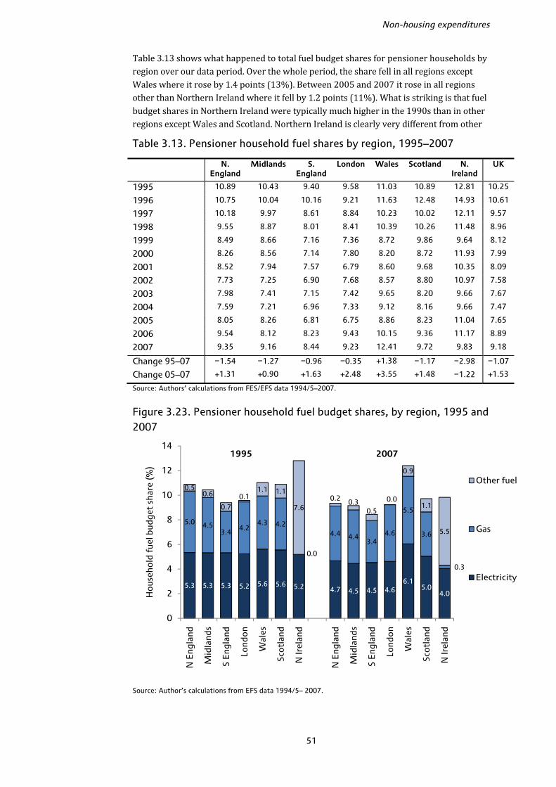
Non-housing expenditures
51
Table 3.13 shows what happened to total fuel budget shares for pensioner households by region over our data period. Over the whole period, the share fell in all regions except Wales where it rose by 1.4 points (13%). Between 2005 and 2007 it rose in all regions other than Northern Ireland where it fell by 1.2 points (11%). What is striking is that fuel budget shares in Northern Ireland were typically much higher in the 1990s than in other regions except Wales and Scotland. Northern Ireland is clearly very different from other Table 3.13. Pensioner household fuel shares by region, 1995–2007
N. England
Midlands S. England
London Wales Scotland N. Ireland
UK
1995 10.89 10.43 9.40 9.58 11.03 10.89 12.81 10.25
1996 10.75 10.04 10.16 9.21 11.63 12.48 14.93 10.61
1997 10.18 9.97 8.61 8.84 10.23 10.02 12.11 9.57
1998 9.55 8.87 8.01 8.41 10.39 10.26 11.48 8.96
1999 8.49 8.66 7.16 7.36 8.72 9.86 9.64 8.12
2000 8.26 8.56 7.14 7.80 8.20 8.72 11.93 7.99
2001 8.52 7.94 7.57 6.79 8.60 9.68 10.35 8.09
2002 7.73 7.25 6.90 7.68 8.57 8.80 10.97 7.58
2003 7.98 7.41 7.15 7.42 9.65 8.20 9.66 7.67
2004 7.59 7.21 6.96 7.33 9.12 8.16 9.66 7.47
2005 8.05 8.26 6.81 6.75 8.86 8.23 11.04 7.65
2006 9.54 8.12 8.23 9.43 10.15 9.36 11.17 8.89
2007 9.35 9.16 8.44 9.23 12.41 9.72 9.83 9.18
Change 95–07 −1.54 −1.27 −0.96 −0.35 +1.38 −1.17 −2.98 −1.07
Change 05–07 +1.31 +0.90 +1.63 +2.48 +3.55 +1.48 −1.22 +1.53
Source: Authors’ calculations from FES/EFS data 1994/5–2007.
Figure 3.23. Pensioner household fuel budget shares, by region, 1995 and 2007
Source: Author’s calculations from EFS data 1994/5– 2007.
5.3 5.3 5.3 5.2 5.6 5.6 5.2 4.7 4.5 4.5 4.66.1
5.04.0
5.0 4.53.4
4.24.3 4.2
0.0
4.4 4.43.4
4.6
5.5
3.6
0.3
0.50.6
0.7
0.11.1 1.1
7.60.2 0.3
0.5
0.0
0.9
1.1
5.5
0
2
4
6
8
10
12
14
N E
ngla
nd
Mid
land
s
S E
ngla
nd
Lond
on
Wal
es
Sco
tlan
d
N Ir
elan
d
N E
ngla
nd
Mid
land
s
S E
ngla
nd
Lond
on
Wal
es
Sco
tlan
d
N Ir
elan
d
Ho
useh
old
fue
l bud
get
shar
e (%
)
Other fuel
Gas
Electricity
1995 2007

The expenditure experience of older households
52
regions in terms of the composition of fuel spending and has also tended to suffer high rates of fuel poverty (see for example DSDNI, 2003). Relatively few households in Northern Ireland use gas whilst spending on other fuel – coal and oil, for example – is much higher. These fuels tend to be much more expensive and more directly sensitive to fluctuations in crude oil prices; budget shares in Northern Ireland grew very rapidly between 2004 and 2005, for example, which tended not to happen elsewhere and may explain why budget shares then were able to fall back. Figure 3.23 shows the budget shares of electricity, gas and other fuels by region. We will look much more closely at fuel payments for older households in England when we turn to an analysis of fuel spending in waves 2 and 3 of the English Longitudinal Study of Ageing (ELSA) in Chapter 5. The way fuel payments are recorded in ELSA is different to how they are recorded in the EFS and we know much more about the way in which people pay for fuel and the heating arrangements in different households in ELSA than in the EFS. In particular, the EFS records fuel payments according to the last bill, meaning those who are interviewed in the first six months of the year will tend to report payments on winter bills, which are higher, and those interviewed later in the year will report summer bills, which are lower. This is confirmed by a simple regression of the fuel budget share controlling for year, tenure, region, household composition, age, employment status and education. Compared to households observed in the first quarter of the year, who would typically report their winter bills, households observed in other quarters report significantly lower fuel budget shares. For those observed in quarters three and four, who report their summer bills, the difference is around 1.1–1.2 percentage points. Households’ fuel spending data in ELSA, by contrast, are gathered from bills over the whole year which means seasonal variations should be eliminated. Transfers outside the home Transfer payments to people outside the home include things such as cash gifts and presents, charity donations, remittances and maintenance allowance payments. Across all households, this has typically been a fairly small category of spending, accounting for around 2% of the non-housing total budget over most of the period. Pensioners typically have higher budget shares, closer to 3%. Transfer payments are particularly important for some groups of older households, especially the oldest and richest, accounting for 4% or more of the total budget. Looking at it another way, of the 56 spending groups we define, money outside the home ranked 25th most important for households under 35 in 2007 (1.5% of the budget), compared to 10th for those aged 80+ (3.6%). This 3.6% budget share for the oldest households is similar to the 3.7% that was spent on restaurant meals and the 3.5% spent on dairy products. In 2007, pensioners in the poorest fifth of the population spent around 2.6% of their budget on transfers out of the home, the 14th highest spending category and similar to spending on household consumables and women’s clothing. Pensioners in the richest fifth spent 3.3% on transfers, the ninth highest category and similar to their spending on ‘other leisure goods’. The differences between the transfer budget shares for the oldest and youngest age groups and for the richest and poorest pensioner households in 2007 were both statistically significant. Figure 3.24 shows the transfer payment budget share by age for the beginning, middle and end of our period. There is a clear pattern where transfer shares rise (in cross-section) towards middle age – perhaps reflecting payments to children outside the home – fall away again just before retirement and then rise substantially into older age with

Non-housing expenditures
53
households aged 75+ spending the most as a proportion of their total budget.23 There does not appear to be any clear pattern over time within age groups, however. Figure 3.24. Transfer payments budget share, by age, 1995–2007
Note: Vertical lines show 95% confidence intervals. Source: Author’s calculations from EFS data 1994/5–2007.
Figure 3.25. Transfer payments by age and income, 1995–2007
Note: Vertical lines show 95% confidence intervals. Source: Author’s calculations from EFS data 1994/5–2007.
23 In some years, the difference between households aged over 75 and those aged 45–49 are statistically significant, in other years not, but in no year does the older group spend less than the younger group.
0
1
2
3
4
5
Under 35
35-39 40-44 45-49 50-54 55-59 60-64 65-69 70-74 75-79 80+
Bud
get
shar
e o
f tr
ansf
ers
out
(%)
1995 2001 2007
0
1
2
3
4
5
6
7
<35 35-49 50-59 60-69 70+ <35 35-49 50-59 60-69 70+
Bud
get
shar
e o
f tr
ansf
ers
out
(%)
1995 2001 2007
Poorest third Richest third

The expenditure experience of older households
54
Figure 3.25 shows that within age group there is a clear correlation with income, with richer households spending a larger share on transfers out; similarly, within income group there is a clear correlation with age similar to the one we saw above. Again, there is no clear trend over time within group. The oldest, richest households – those 70+ in the top third of the income distribution – have the highest transfer budget shares at around 4% on average, compared to around 1% for the youngest households in the poorest third. 3.4 Non-housing expenditures: conclusions
Between 1995 and 2001, pensioners saw on average slower real non-housing spending growth than non-pensioners but between 2001 and 2007 the reverse was true, and there was a sustained fall in pensioner poverty rates measured by spending. In 2001, pensioners spent on average about 69% as much as non-pensioners per week on non-housing items; by 2007 this had risen to 80%. This period of catching up for pensioners has been mirrored in other areas: pensioners saw their food budget share fall between 2001 and 2007 which non-pensioners did not, and in general the patterns of expenditure for pensioners and non-pensioners began to look more similar. Within the pensioner population, however, the story is more complicated than this tale of recent relative catching up. The oldest pensioner households have seen slower recent spending growth than younger pensioners, though the poorest pensioners have seen their spending rise more quickly than the richest pensioners on average. The interaction between age and income also appears in how spending is broken down across different pensioner groups. For some items, like alcohol and clothing, age appears to be the most important factor driving spending patterns such that rich and poor pensioners have similar budget shares. For others, like leisure, income is more important such that rich pensioners and rich non-pensioners look more similar. If we look at leisure spending, particularly leisure services, rich pensioners have seen large increases in the share of their budget; holidays now make up the single largest part of the budget of the average pensioner in the richest fifth of the income distribution. Health expenditures have also risen much more rapidly for richer pensioners. But if we take private transport, the reverse story emerges: the poorest pensioners saw their budget shares rise most rapidly. There is perhaps, however, tentative evidence that the oldest pensioners have fared a little less well than younger pensioners. Pensioners over 80 saw smaller relative falls in non-housing spending poverty than younger pensioners over the period despite larger falls in income poverty. They also saw smaller reductions in food and fuel budget shares than other households (the oldest pensioners seemed to be hit hardest by the increase in fuel prices between 2005 and 2007), and smaller rises in leisure service shares (indeed, the oldest group were the only age group not to see a significant increase in leisure service shares over this period). In general, the oldest households saw the smallest changes in their spending patterns over time. Whilst poor households in their 60s appeared to catch up in terms of spending levels to richer households in their 60s over the period, the same was not true for households in their 70s. None of this is to deny that the oldest pensioners have seen improvements over the last decade or so, and compared to many non-pensioner groups, for whom real non-housing expenditures fell between 2001 and 2007, the picture for the oldest pensioners looks better.
55
4. Housing expenditures
The previous chapter focused on expenditures excluding housing. As we argued in Chapter 2, there are particular difficulties inherent in the measurement and interpretation of housing expenditures. This chapter examines housing spending separately from other outlays. Housing is, for most people, a large part of the total budget and rent, mortgage, water and local tax payments represent large expenditure commitments for many households. The system of housing payments, particularly local taxes, has changed substantially over time. Our focus on a data period since 1995 allows us to look at a time of relative stability in which Council Tax has been in place throughout Great Britain (though Northern Ireland still has a system of domestic rates). 4.1 Definitions and overall trends
Definitions Table 4.1 shows how housing expenditures are defined, breaking them down into five categories. Table 4.1. Housing expenditure categories
Rent Total household-level rent payments, net of any benefits or rebates. Also includes any other regular housing payments not covered elsewhere.
Mortgage payments Mortgage interest only.
Local taxes Council Tax (or rates) payments, net of any benefits.
Water costs Water and sewerage charges.
Housing fees and charges Housing and contents insurance, costs of moving house Since our focus is on expenditures rather than liabilities, we look at a housing measure after any local tax or rent rebates and benefits have been taken off. We choose to include mortgage interest payments and not capital repayments since the latter are more akin to a form of savings than expenditures, and we do not include any other form of savings (or debt repayments) in our spending measure. As in the previous chapter, we exclude a number of households from the data that have particularly extreme-looking expenditure patterns on housing: those spending more than 80% of their total expenditures (including housing) on rent, more than 50% on water, more than 70% on mortgage interest or more than 70% on local taxes. There are a number of issues that arise in calculating housing expenditures in the FES/EFS. The most significant of these concerns renters who pay some other costs with their rent (for example, local taxes or water bills). Typically, the data will record the total as a rental payment and record zero expenditures on the other housing components, which means rental payments are too high and water and local tax payments too low on average. However there is no way to disentangle precisely how the rent payments are split across the various categories when this is the case. Our approach uses the basket weights of the all-items Retail Prices Index in each year to estimate the proportion of rent
The expenditure experience of older households
56
payments that should be attributed to other housing categories where appropriate. Clearly this will not be the correct split of expenditures for all households though it should be approximately correct on average. In particular, in Northern Ireland, the system of housing payments is very different: there is no Council Tax, and no separate water payments which are included instead with domestic rates. Almost all Northern Ireland households require some sort of estimated split of payments across housing categories. However, this tends to result in rent payments that are very low (often in fact negative) for these households, suggesting the RPI weights are not a good guide to the appropriate split for Northern Ireland.24 Note, though, this is just an issue with how to allocate housing spending across the five groups in Table 4.1; the level of total spending over all of them should be accurate. Thus in this chapter, whenever we present regional results, we do not attempt to break down housing spending in Northern Ireland across category, but instead look only at total housing expenditures.25 Another issue concerns second homes. Data on rental payments for second homes is available in the EFS; other housing payments for second homes (water, mortgage cost, insurance and so on) for second homes are combined together into a single expenditure code which makes it very hard to allocate second dwelling spending accurately into categories other than rent. For this reason we have excluded second home spending entirely from the data and focus on spending on the primary dwelling alone. Overall trends Appendix C shows the level and budget share of housing spending for key demographic groups, and a breakdown by housing category, for 1995 and 2007. Across all households, over the whole period between 1995 and 2007, average total real26 expenditures including housing rose from £374 per week to £429 per week, an annual average growth rate of 1.2%. Between 1995 and 2001, the average real growth rate was 2.4% per year, and between 2001 and 2007 real total spending fell by 0.1% per year on average. For pensioner households total expenditures including housing rose in real terms from £286 per week in 1995 to £340 per week in 2007, an average annual growth rate of 1.5%. The growth rate over the first half of our period between 1995 and 2001 was 1.7% and between 2001 and 2007 was 1.2%. Real-terms total spending on housing rose by 42% between 1995 and 2007, from around £61 per week to £87 per week. This is an annual average real growth rate of just under 3.0% in each year, though spending grew more quickly in the 2000s than the 1990s. The overall real-terms increases were similar for pensioners and non-pensioners, and both saw faster growth in the second half of our period than the first. 24 In fact, our analysis below suggests housing payments in Northern Ireland in general are much lower than in the rest of the UK. We get negative rents because we first calculate gross rent payments from the data and allocate this to rent, water and local taxes according to RPI weights, subtracting Housing Benefits from the estimated ‘gross rent’. Since rates and water costs are lower in Northern Ireland, we allocate too little of the gross rent to the rent category, typically meaning the recorded benefits are higher than the estimated rents which results in a negative net rent. 25 Note that results that break down housing expenditures for groups other than regions do include our best estimate of the housing breakdown for households in Northern Ireland. Excluding Northern Ireland altogether from our analysis in this chapter does not change any of our findings at all substantively. 26 In the previous chapter, real non-housing expenditures were calculated using a non-housing measure of the RPI; here, real total expenditures are calculated using an all-items RPI measure, with all values expressed in December 2007 prices.

Housing expenditures
57
All components of housing spending grew substantially over the period 1995–2007. Local taxes grew most quickly – average real expenditures per week rose by almost three-quarters from £10.82 to £18.81. The real increase was larger for pensioners (84% over the period) than non-pensioners (68%). Rents rose by just under-two thirds in real terms, from £12.71 per week to £20.71. Mortgage interest payments rose by 28% in real terms, but between 1995 and 2003 showed no particular trend. Water payments and housing fees (including insurance) payments rose by 28% and 14% respectively in real terms. As in Chapter 3, our focus will be on the housing budget share rather than the level of expenditure. Budget shares in this chapter are as a share of total spending including housing, and as in the previous chapter they are calculated as simple democratic averages. Over the whole period, across all households, the average housing budget share rose from 17.0% to 21.5%. However, between 1995 and 2002, the budget share was essentially flat, varying only between 16.0% in 1997 and 17.6% in 2001. Since 2002, the average housing budget share has risen consistently each year. By component, the largest increase in budget share was Council Tax, from 3.3% of the average budget in 1995 to 5.3% in 2007. 4.2 Housing expenditures by demographic group
Housing expenditure patterns are clearly very sensitive to trends in housing tenure over time – if more people move into homeownership from renting, then, all else unchanged, the average budget share of rent would fall and that of mortgage payments would rise. Table 4.2 shows a breakdown of tenure type between 1995 and 2007 for pensioner and non-pensioner households (as before, pensioner households are those where the head or their spouse (or both) is at or above state pension age). Over time, there has been a sharp decline in the percentage of households living in Local Authority accommodation, from 19% to 11%. This has been particularly pronounced in pensioner households, where the rate more than halved. Renting privately has increased from 13% of households to 19%, a trend driven largely by non-pensioner households though there has been a small increase in the proportion of pensioner households that rent, reaching just over 11.5% by 2007. Renting as a whole has remained largely unchanged at around 30% of households, but the split between private rental and social renting has clearly changed. Perhaps surprisingly there has been a fall in the proportion of households with mortgages, from 42% in 1995 to 38% in 2007; again, this is driven by non-pensioners. The proportion of pensioner households with mortgages has remained at around 8–9% over much of the period. By contrast, there has been a relatively large increase in the proportion of households that own outright, from 24% to 30%. This has become more common for both pensioner and non-pensioner households but particularly for pensioners, where just under 55% of households owned outright in 1995 compared to around two-thirds by 2007. The relatively rapid growth in outright ownership amongst pensioners will act to reduce average pensioner housing spending shares (all else unchanged). Housing expenditures: pensioner and non-pensioner households Figure 4.1 shows the total housing budget share for pensioner and non-pensioner households (and compares to all households). Figure 4.2 breaks the total down into the five components defined in Table 4.1 – the left-hand bar shows non-pensioner households and the right-hand hatched bar shows pensioner households.
The expenditure experience of older households
58
Table 4.2. Tenure status, 1995–2007 (percentage of households)
All households
LA rental Private rental
Mortgagor Own outright
Rent free / other
1995 19.4 13.0 42.1 23.8 1.7
1996 19.9 12.9 41.4 23.8 2.1
1997 18.3 13.6 41.3 25.0 1.9
1998 17.0 15.0 40.6 25.7 1.7
1999 16.9 14.3 41.4 25.6 1.8
2000 15.6 14.9 39.5 28.1 1.8
2001 14.5 15.0 41.2 27.6 1.7
2002 14.1 14.1 41.2 28.8 1.8
2003 12.7 15.3 40.6 29.9 1.6
2004 11.9 16.9 40.2 29.1 1.9
2005 11.1 17.8 38.3 31.1 1.8
2006 10.6 16.9 39.5 31.4 1.6
2007 11.0 18.7 38.3 30.4 1.7
Pensioners LA rental Private
rental Mortgagor Own
outright Rent free /
other
1995 25.7 9.9 7.7 54.8 1.8
1996 25.2 9.5 8.7 54.1 2.6
1997 24.1 9.7 8.6 55.6 2.0
1998 22.4 9.8 7.7 58.2 2.0
1999 22.6 9.7 10.2 55.1 2.4
2000 20.1 9.3 7.6 60.9 2.2
2001 17.3 10.2 8.2 62.2 2.0
2002 18.1 10.3 7.8 61.9 2.0
2003 15.3 10.9 7.8 64.3 1.8
2004 13.6 11.8 8.9 63.2 2.5
2005 12.6 11.5 8.1 65.7 2.0
2006 12.6 10.1 8.5 67.0 1.7
2007 12.7 11.5 8.4 65.8 1.7
Non-pensioners
LA rental Private rental
Mortgagor Own outright
Rent free / other
1995 16.8 14.2 56.6 10.8 1.6
1996 17.6 14.3 55.3 10.9 1.8
1997 15.7 15.3 55.6 11.6 1.9
1998 14.8 17.1 54.4 12.1 1.6
1999 14.4 16.3 54.7 13.1 1.6
2000 13.7 17.4 53.4 13.9 1.7
2001 13.4 16.9 54.8 13.4 1.6
2002 12.4 15.8 55.6 14.5 1.7
2003 11.5 17.3 55.2 14.6 1.4
2004 11.1 19.2 54.2 14.0 1.6
2005 10.4 20.6 52.1 15.2 1.7
2006 9.7 19.9 53.3 15.5 1.6
2007 10.2 22.0 52.4 13.6 1.7
Source: Authors’ calculations from FES/EFS data.

Housing expenditures
59
Figure 4.1. Housing budget shares, pensioners and non-pensioners, 1995–2007
Note: Dotted lines are 95% confidence intervals. Source: Authors’ calculations from FES/EFS data 1994/5–2007. Pensioners spend a smaller share of their budget on housing than non-pensioners, and the growth in the share of spending devoted to housing has been much smaller for pensioner households.27 Between 2002 and 2007, the housing budget share increased by 5.5 percentage points for non-pensioners but only 2.4 percentage points for pensioners. The gap between non-pensioner and pensioner budget shares, which had been typically 1–3 percentage points over the late 1990s and early 2000s, consequently increased to 5.5 percentage points by 2007. Note though that while the increase in budget share was smaller for pensioners between 2002 and 2007, it was still statistically significant. Figure 4.2 shows substantial differences in the composition of housing expenditures between pensioners and non-pensioners. Local taxes make up a much larger share of pensioner budgets, and the increase in local tax budget shares was greater for pensioners. Mortgage interest payments are much less important for pensioners, unsurprising given typical tenure patterns. We also see different trends in the rent share, which has declined for pensioners but increased quite substantially for non-pensioners. In the late 1990s, pensioners spent a higher share of their budget than non-pensioners on rent, but by 2007 this had reversed. Again, this is related to trends in tenure: in 1995, almost 36% of pensioner households were renters (local authority or private) compared to 31% of non-pensioner households, but by 2007 these figures were 24% and 32%, respectively. Figure 4.2 also shows that water payments and housing fees make up a larger share of average pensioner budgets than non-pensioner budgets. 27 Appendix C shows that, in real terms, total housing spending grew by broadly similar amounts between 1995 and 2007 for both pensioners and non-pensioners. The fact that the housing budget share for pensioners grew much less rapidly also therefore reflects stronger increases in non-housing spending among pensioner households, particularly since 2001, as we observed in Chapter 3.
15.2 15.4 14.8 15.6 16.3 15.7 15.8 15.4 16.1 16.2 16.5 17.1 17.8
17.716.7 16.6
17.7 17.4 18.0 18.3 17.8 18.319.5
20.822.0
23.3
0
5
10
15
20
25
30
35
1995 1997 1999 2001 2003 2005 2007
Hou
sing
bud
get
shar
e (%
)
Pensioner
Non-pensioner
All
The expenditure experience of older households
60
Figure 4.2. Housing category budget shares, non-pensioners and pensioners, selected years
Notes: Left-hand bar shows non-pensioner households, right-hand bar shows pensioner households. Numbers on bars show the budget share. Source: Author’s calculations from FES/EFS data 1994/5–2007. Clearly there are substantial differences in housing payments between pensioner and non-pensioner households. We now focus on differences within the older population. Housing expenditure by age Figure 4.3 shows that the most rapid growth in housing budget shares occurred for younger households aged under 35, rising from just over 20% in 1995 to nearly 30% by 2007, the largest relative increase for any age group. Interestingly, however, within the older population there were substantial differences in the change in housing budget share over this period. Households in their early 50s had similar housing budget shares to those in their early 70s up until 2003 but then saw a more rapid increase in the share. Households in their early 60s have typically had the lowest housing budget share of all groups over the whole period and have seen the lowest growth, from around 13% to 15% since 1995. However, households in their 80s and over have housing budget shares that closely match those of households in their early 40s. Thus, in cross-section, housing budget shares do not decline with age; instead, they seem to be roughly U-shaped over the age profile, with higher budget shares for households aged 45 and below, the lowest budget shares for those in their 60s and then higher shares again into older age. Some of these differences may be due to cohort as well as age effects: when households currently in their 40s reach age 60, for example, they may not have housing budget shares that look like current 60-year-olds. The age pattern is clear from Figure 4.4 which breaks down this housing budget share by spending category for 2007. It shows that whilst, for example, households in their 80s have similar housing shares to those in their 40s and households in their 70s have similar shares to those in their 50s, the composition of the shares is very different.
3.7 4.2 4.46.6
2.9 3.1 3.7
4.48.0 7.0 6.9
8.91.5 1.7 1.6
1.9
1.7 1.51.7
1.6
5.2 5.0 4.0 4.6
4.5 5.5 6.57.2
0.70.9 0.8
1.02.62.9 2.8
2.92.21.9 2.1
2.2
0
5
10
15
20
25
30
35
1995 1999 2003 2007
Shar
e of
tot
al s
pend
ing
(%)
Housing fees
Water
Mortgage interest
Local tax
Rent
Housing expenditures
61
Figure 4.3. Housing budget share by age of eldest person in first benefit unit, 1995–2007
Source: Authors’ calculations from FES/EFS data 1994/5–2007.
Figure 4.4. Housing categories budget shares by age of eldest person in first benefit unit, 2007
Notes: Figures are weighted to take account of sampling variation. Age groups are defined according to the eldest person in the first benefit unit. Source: Authors’ calculations from EFS data 2007.
0
5
10
15
20
25
30
35
1995 1996 1997 1998 1999 2000 2001 2002 2003 2004 2005 2006 2007
Bud
get
shar
e of
hou
sing
( %
)
Under 35
40 - 44
50 - 54
60 - 64
70 - 74
80+
70 - 74
50 - 54 80+
40 - 44
Under 35
60 - 64
12.3
6.8 6.03.8 3.8 3.9 2.9 2.8
4.8 4.37.2
3.9
4.0 4.2
4.5 4.8 5.15.5 6.0
7.4 7.7
8.8
10.1
11.510.3
9.57.0 5.1
3.0 1.4
0.5 0.6
0.4
1.9
1.81.7
1.7
1.82.1
2.32.5
2.6 2.8
3.8
1.5
1.51.4
1.9
1.61.8
1.92.0
2.2 2.2
2.6
0
5
10
15
20
25
30
35
Under 35
35-39 40-44 45-49 50-54 55-59 60-64 65-69 70-74 75-79 80+
Shar
e o
f to
tal e
xpen
ditu
re (%
)
Fees
Water
Mortgage interest
Local tax
Rent
The expenditure experience of older households
62
Consider the oldest households, with a total budget share of housing of 22.8% in 2007, compared to households aged 40–44 with an average budget share of 23.5%. The most striking difference is mortgage payments, virtually zero for the older households but over 10% of the budget of households in their early 40s. This is because less than 3% of the oldest households were mortgagors compared to 62% of the younger group. About 30% of households in both age groups were renters, but rents made up over 7% of the average budget for the older households and only 6% for younger households. This is partly because the renters among the older households were slightly more likely to be Local Authority renters than private renters, and partly because older households spent less overall. In terms of spending levels, on average, households aged 80+ spent £15 per week on rent in 2007 compared to £21 per week for those aged 40–44. Local taxes make up a much larger share of spending for the older groups (indeed, the budget share of local tax rises as we move up the age distribution), as do water, housing insurance and other fees. Housing expenditure by age and income We see that housing budget shares tend to fall then rise with age. To the extent that housing overall is an economic necessity (budget shares decline with income) this may be explained by income patterns over the age profile – the youngest and oldest households tend to have on average the lowest incomes with the highest incomes at middle age (see, for example, figure 1.1 of Brewer et al., 2006). Here, we consider how housing spending varies by income within age groups. As in the previous chapter, we focus on three income groups and broader age groups to ensure reasonable sample sizes each year. In terms of trends in the overall housing budget share, patterns vary across income within a given age group. Households in their 50s saw the largest growth in housing budget share between 1995 and 2007, and the increase for those in the richest third and poorest third were similar, around a one-third rise in the budget share over time. For those in their 60s, the poorest households had virtually no change overall whilst the richest saw an increase in their housing budget share of around one-quarter. For households aged 70+, by contrast, it was the poorer households who saw the largest relative increase in their housing budget share. Table 4.3 shows the gap (in percentage points) between the housing budget share for rich and poor households within each income group in 1995, 2001 and 2007 – a positive number means the rich spent a higher share of their budget on housing than the poor within each age group. This summarises the key message: for younger households, those with low incomes have lower housing shares but have seen bigger increases than those with high incomes. For the oldest households, those with low incomes have higher budget shares and have also seen bigger increases than those with high incomes. Table 4.3. Difference between housing budget share of richest and poorest within age group, 1995–2007 (percentage points)
1995 2001 2007 Under 35 +8.9 +5.7 +2.1 35–49 +5.1 +3.2 +0.6 50–59 −1.7 0.0 −2.2 60–69 −5.2 −3.3 −2.1 70+ −3.2 −5.1 −6.9 Note: Positive figures show richer households with a higher budget share. ‘Poorest’ and ‘richest’ refer to bottom third and top third of the within-year income distribution, respectively. Source: Author’s calculations from FES/EFS data 1994/5–2007.
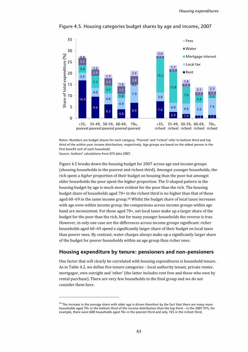
Housing expenditures
63
Figure 4.5. Housing categories budget shares by age and income, 2007
Notes: Numbers are budget shares for each category. ‘Poorest’ and ‘richest’ refer to bottom third and top third of the within-year income distribution, respectively. Age groups are based on the oldest person in the first benefit unit of each household. Source: Authors’ calculations from EFS data 2007. Figure 4.5 breaks down the housing budget for 2007 across age and income groups (showing households in the poorest and richest third). Amongst younger households, the rich spent a higher proportion of their budget on housing than the poor but amongst older households the poor spent the higher proportion. The U-shaped pattern in the housing budget by age is much more evident for the poor than the rich. The housing budget share of households aged 70+ in the richest third is no higher than that of those aged 60–69 in the same income group.28 Whilst the budget share of local taxes increases with age even within income group, the comparisons across income groups within age band are inconsistent. For those aged 70+, net local taxes make up a larger share of the budget for the poor than the rich, but for many younger households the reverse is true. However, in only one case are the differences across income groups significant: richer households aged 60–69 spend a significantly larger share of their budget on local taxes than poorer ones. By contrast, water charges always make up a significantly larger share of the budget for poorer households within an age group than richer ones. Housing expenditure by tenure: pensioners and non-pensioners One factor that will clearly be correlated with housing expenditures is household tenure. As in Table 4.2, we define five tenure categories – local authority tenant, private renter, mortgagor, own outright and ‘other’ (the latter includes rent free and those who own by rental purchase). There are very few households in the final group and we do not consider them here. 28 The increase in the average share with older age is driven therefore by the fact that there are many more households aged 70+ in the bottom third of the income distribution than the top third – in the 2007 EFS, for example, there were 608 households aged 70+ in the poorest third and only 165 in the richest third.
16.9
9.66.3
4.06.9 7.6
2.9 1.9 1.2 1.5
3.4
4.0
4.8
4.9
7.93.8
4.0 4.6 5.67.4
3.4
5.3
3.5
1.9
0.2
15.2
13.8
7.63.4
1.5
3.2
2.9
3.3
3.5
3.8
1.1
1.1
1.3
1.5 1.5
0.8
1.2
1.7
1.6
2.4
2.0
1.7
1.8
2.1 2.5
0
5
10
15
20
25
30
35
<35, poorest
35-49, poorest
50-59, poorest
60-69, poorest
70+, poorest
<35, richest
35-49, richest
50-59, richest
60-69, richest
70+, richest
Shar
e o
f to
tal e
xpen
ditu
re (%
)
Fees
Water
Mortgage interest
Local tax
Rent
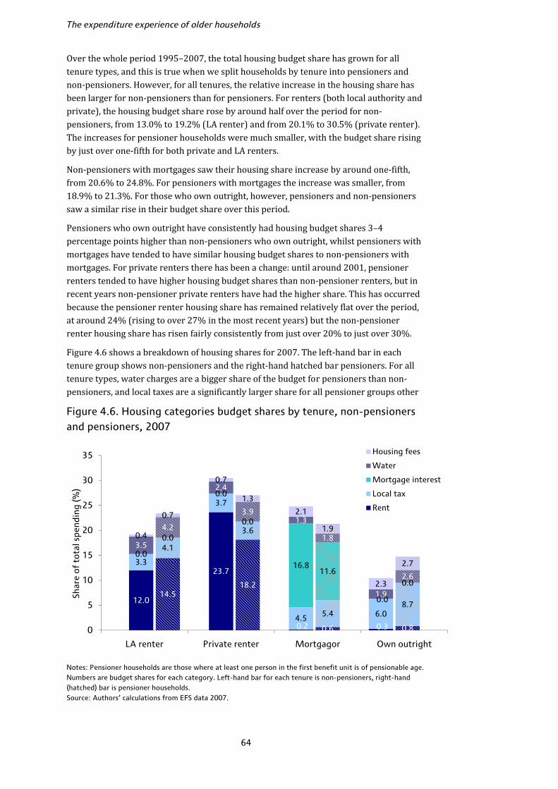
The expenditure experience of older households
64
Over the whole period 1995–2007, the total housing budget share has grown for all tenure types, and this is true when we split households by tenure into pensioners and non-pensioners. However, for all tenures, the relative increase in the housing share has been larger for non-pensioners than for pensioners. For renters (both local authority and private), the housing budget share rose by around half over the period for non-pensioners, from 13.0% to 19.2% (LA renter) and from 20.1% to 30.5% (private renter). The increases for pensioner households were much smaller, with the budget share rising by just over one-fifth for both private and LA renters. Non-pensioners with mortgages saw their housing share increase by around one-fifth, from 20.6% to 24.8%. For pensioners with mortgages the increase was smaller, from 18.9% to 21.3%. For those who own outright, however, pensioners and non-pensioners saw a similar rise in their budget share over this period. Pensioners who own outright have consistently had housing budget shares 3–4 percentage points higher than non-pensioners who own outright, whilst pensioners with mortgages have tended to have similar housing budget shares to non-pensioners with mortgages. For private renters there has been a change: until around 2001, pensioner renters tended to have higher housing budget shares than non-pensioner renters, but in recent years non-pensioner private renters have had the higher share. This has occurred because the pensioner renter housing share has remained relatively flat over the period, at around 24% (rising to over 27% in the most recent years) but the non-pensioner renter housing share has risen fairly consistently from just over 20% to just over 30%. Figure 4.6 shows a breakdown of housing shares for 2007. The left-hand bar in each tenure group shows non-pensioners and the right-hand hatched bar pensioners. For all tenure types, water charges are a bigger share of the budget for pensioners than non-pensioners, and local taxes are a significantly larger share for all pensioner groups other Figure 4.6. Housing categories budget shares by tenure, non-pensioners and pensioners, 2007
Notes: Pensioner households are those where at least one person in the first benefit unit is of pensionable age. Numbers are budget shares for each category. Left-hand bar for each tenure is non-pensioners, right-hand (hatched) bar is pensioner households. Source: Authors’ calculations from EFS data 2007.
12.0
23.7
0.2 0.3
3.3
3.7
4.5 6.0
0.0
0.0
16.8
0.0
3.5
2.4
1.3
1.9
0.4
0.7
2.1
2.314.5
18.2
0.6 0.8
4.1
3.6
5.48.7
0.0
0.0
11.60.0
4.2
3.9
1.8
2.6
0.7
1.3
1.9
2.7
0
5
10
15
20
25
30
35
LA renter Private renter Mortgagor Own outright
Shar
e of
tot
al s
pend
ing
(%)
Housing fees
Water
Mortgage interest
Local tax
Rent

Housing expenditures
65
than private renters where the budget shares are approximately equal. There is a clear distinction between local authority renters and private renters – pensioner LA tenants spend more of their budget on rent (net of benefits) than non-pensioners, but non-pensioner private tenants spend a bigger share on rent than pensioners.29 Housing expenditure by region: pensioner and non-pensioner Figure 4.7 shows how the housing budget share varies by region for pensioner and non-pensioner households in 2007. As discussed above, since we cannot accurately split rent, water and local taxes for Northern Ireland in many cases, we show only total housing budget shares for that region. Housing budget shares within region are higher for non-pensioner households than pensioners; non-pensioners have budget shares around one-sixth higher on average than pensioners in Scotland and more than one-half higher in Northern Ireland. London has the highest housing budget share for both pensioners and non-pensioners, and Northern Ireland by far the lowest. The average total housing budget share is just over 40% lower in Northern Ireland than in other regions. This accords with evidence from the Family Resources Survey, where housing costs are calculated to compare Before and After Housing Costs incomes for poverty measurement, and show that, for example, housing costs in 2006/7 on average were around 40% lower in Northern Ireland than elsewhere.30 Figure 4.7. Housing categories budget shares by region, non-pensioners and pensioners, 2007
Notes: Pensioner households are those where at least one person in the first benefit unit is of pensionable age. Numbers are budget shares for each category. Left-hand bar for each region is non-pensioners, right-hand (hatched) bar is pensioner households. 29 This appears to be driven by benefits – if we look at gross spending (before benefits and rebates are deducted), pensioner renters spend a bigger share on rent in both cases, suggesting that pensioners who are private renters are much more likely to receive Housing Benefits than non-pensioner private renters. 30 The authors would like to thank Alastair Muriel of IFS for these figures. The FRS housing costs measure is not quite the same as the housing spending definition we use here (for example it does not include housing fees) but the fact that the differences are so similar is reassuring.
5.8 5.57.4
10.6
6.74.7
4.1 4.44.6
4.2
4.04.7
7.89.6
9.3
10.1
8.67.9
2.01.9
1.8
1.6
2.5
1.6
1.51.8
1.7
1.7
1.4
1.5
4.4 3.05.1
8.2
2.9 4.2
6.86.4
7.8
7.7
6.27.8
0.50.8
1.2
2.0
0.7
0.93.22.8
2.6
2.8
3.6
2.82.0
2.1
2.5
2.1
2.41.9
14.0
8.8
0
5
10
15
20
25
30
35
North Midlands South London Wales Scotland N Ireland
Shar
e of
tot
al s
pend
ing
(%)
Housing fees
Water
Mortgage interestLocal tax
Rent
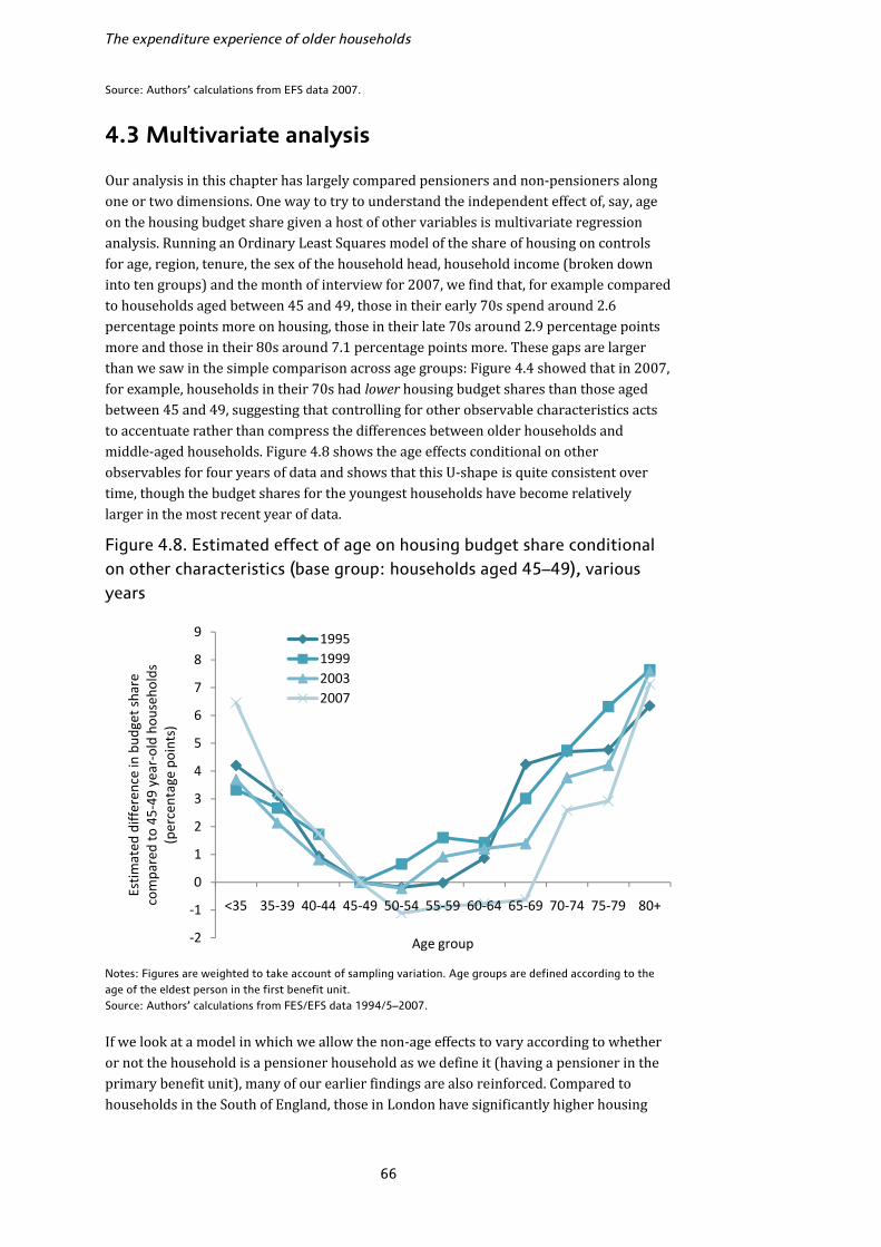
The expenditure experience of older households
66
Source: Authors’ calculations from EFS data 2007.
4.3 Multivariate analysis
Our analysis in this chapter has largely compared pensioners and non-pensioners along one or two dimensions. One way to try to understand the independent effect of, say, age on the housing budget share given a host of other variables is multivariate regression analysis. Running an Ordinary Least Squares model of the share of housing on controls for age, region, tenure, the sex of the household head, household income (broken down into ten groups) and the month of interview for 2007, we find that, for example compared to households aged between 45 and 49, those in their early 70s spend around 2.6 percentage points more on housing, those in their late 70s around 2.9 percentage points more and those in their 80s around 7.1 percentage points more. These gaps are larger than we saw in the simple comparison across age groups: Figure 4.4 showed that in 2007, for example, households in their 70s had lower housing budget shares than those aged between 45 and 49, suggesting that controlling for other observable characteristics acts to accentuate rather than compress the differences between older households and middle-aged households. Figure 4.8 shows the age effects conditional on other observables for four years of data and shows that this U-shape is quite consistent over time, though the budget shares for the youngest households have become relatively larger in the most recent year of data. Figure 4.8. Estimated effect of age on housing budget share conditional on other characteristics (base group: households aged 45–49), various years
Notes: Figures are weighted to take account of sampling variation. Age groups are defined according to the age of the eldest person in the first benefit unit. Source: Authors’ calculations from FES/EFS data 1994/5–2007. If we look at a model in which we allow the non-age effects to vary according to whether or not the household is a pensioner household as we define it (having a pensioner in the primary benefit unit), many of our earlier findings are also reinforced. Compared to households in the South of England, those in London have significantly higher housing
‐2
‐1
0
1
2
3
4
5
6
7
8
9
<35 35‐39 40‐44 45‐49 50‐54 55‐59 60‐64 65‐69 70‐74 75‐79 80+
Estim
ated
differen
ce in bud
get share
compared to 45‐49
year‐old ho
useh
olds
(percentage po
ints)
Age group
1995199920032007

Housing expenditures
67
budget shares and those in the North, Scotland and Northern Ireland significantly lower shares, but in most regions pensioner households do not have significantly lower budget shares than non-pensioners conditional on other observables. The exception is the Midlands, where pensioners have budget shares around 2.8 percentage points smaller than non-pensioners in the region. Pensioner households that are Local Authority tenants have significantly higher budget shares than non-pensioner LA renters, by around 4.7 percentage points, and pensioners who own outright have budget shares around 4.3 percentage points higher than non-pensioners who own outright. In terms of income, the results are mixed. Compared to those in the middle of the income distribution, both rich and poor households have lower housing budget shares on average: those in the poorest 10% have shares around 3.4 percentage points lower than those in the middle, whilst those in the richest 10% have shares around 2.6 percentage points lower. In general, pensioner households in a given income decile have similar housing budget shares to non-pensioner households in the same decile. The strong exception is for the poorest pensioners in the bottom 10%, who have housing shares 7.9 percentage points higher than non-pensioners in the bottom 10%. 4.4 Housing expenditures: conclusions
In this chapter, we have shown that housing expenditures are an important part of the overall budget for most households, but that they can be extremely hard to measure and interpret. On average, housing has become a much more important share of the budget over the last few years, in particular for younger households. The importance of housing in the overall budget appears to decline over the age distribution up to around retirement age, and then rise again, though this is at least partly driven by income. Within different groups, the differences between pensioner and non-pensioner housing budget shares do not always go in the same direction but, broadly speaking, pensioners spend more on local taxes and water bills than comparable non-pensioners. Pensioners in private rental accommodation spend less (as a share of total spending) on rents net of benefits than do non-pensioners in private rental accommodation, but this is driven by receipt of Housing Benefits. Overall, the differences across age are reinforced by other observable variables rather than being compressed by them.

68
5. Fuel spending
The issue of spending on fuel has become an area of concern in recent years. As Figure 3.20 makes clear, the past few years have been marked by steep rises in the cost of domestic fuel. Fuel typically takes up a larger proportion of the household budget for poorer households than richer households and so there has been increasing concern about the impact that these price changes have had on vulnerable households. There are a number of ways that households could respond to higher fuel prices. If households respond by cutting back on the amount of gas or electricity that they consume, there is a worry that some people may not be able to keep their homes warm enough. This is a particular concern for older households which are typically more vulnerable to the cold. Instead, households could respond by maintaining their fuel consumption but cutting back on other spending, by reducing savings, drawing on existing assets or accumulating debt. All of these mean they are worse off. The data that we have used so far in the report (the EFS) do not lend themselves particularly well to the analysis of fuel spending because the snapshot nature of the survey leads to problems with seasonality of spending. In addition, because the EFS is a cross-sectional survey we cannot look at changes in fuel spending for the same households over time. An alternative source of data is the English Longitudinal Study of Ageing (ELSA). As described in Section 2.2, this is a survey of individuals who were aged 50 and over in 2002.31 After an initial interview in 2002/3, these individuals were interviewed again in 2004/5 and every two years thereafter. Detailed spending on domestic fuel is available in 2004/5 and 2006/7.32 Table 3.12 shows that there were substantial increases in fuel prices throughout 2004, 2005 and 2006 which only began to be reversed in early 2007, so this data period captures a time when prices rose significantly. Section 5.1 discusses in detail how fuel spending data are gathered in ELSA. In this chapter, we will use the ELSA data to analyse spending on fuel over the two-year period from 2004/5 to 2006/7. We will start in Section 5.2 by looking at levels of fuel spending and spending as a proportion of income and how these vary by household characteristics and payment method in 2006/7. There is concern that poorer households are more likely to pay for their fuel by more expensive prepayment methods.33 We will look in Section 5.3 at how payment method varies across different household types. We will then look, in Section 5.4, at changes in fuel spending at the individual level and how these vary according to household characteristics. We will also try to relate changes in spending to changes in prices and by stripping out the change in price we will be able to begin to understand the extent to which individuals reduced the quantity of fuel that they consumed over this time period.
31 The sample was refreshed with households aged between 50 and 53 in 2006/7 but we do not include these individuals in our analysis. 32 As with the rest of this Commentary, all numbers in this chapter are expressed in December 2007 prices.
33 See National Consumer Council (2004).
Fuel spending
69
5.1 Measurement issues
Fuel spending in ELSA is collected via a series of very detailed questions which ask respondents to report the amount spent on gas, electricity, coal, paraffin or bottled gas, oil and wood separately.34 For gas and electricity, respondents are asked a different set of questions depending on which payment method they use (direct debit, quarterly/monthly bill, prepayment meter, included in rent, frequent cash payment, StayWarm scheme35 or other). For all payment methods other than direct debit and StayWarm scheme where payments are smoothed across the year, respondents are asked how much they spend on gas or electricity in summer and in winter. This approach overcomes the seasonality issue that is apparent in fuel spending in the EFS. We average the summer and winter payments to obtain an annual average and we convert this to a weekly value. Expenditure on fuel in ELSA is collected via a two-stage process. Respondents are first asked to report a precise spending amount for each category of fuel. Any respondent who either refuses or who does not know the amount is routed into a series of questions designed to elicit an interval (‘bracket’) in which their spending lies. Only a small proportion of individuals – around 6% in each year of data – have a bracket rather than a continuous value for fuel spending. One way to include these bracket values is to impute a value within the upper and lower bound. However, when looking at changes in values across time at the individual level, measurement error becomes an important issue. Imputation introduces an additional source of error and so we exclude households that do not report a precise value for fuel spending. So far in this Commentary, we have measured spending at the household level, summing expenditures across the household and counting each household just once in the analysis. In this chapter, although fuel spending is necessarily measured at the household level, we analyse our data at the individual level. The reason for this is partly driven by the fact that we look at changes in spending over time, and a household need not be a fixed unit from year to year. In addition, when we are thinking about welfare, it matters how many individuals live in any particular household. A further difficulty with measuring fuel spending in ELSA is that it is a survey of those aged 50 and over and their partners. For this reason, younger, ineligible individuals are not asked to give a full interview although characteristics about those individuals are collected via the main interview. For our purposes, the lack of detailed information on non-eligible individuals is a problem because we do not measure income of the non-eligible in sufficient detail to enable us to calculate total household income accurately for households containing younger individuals. We therefore restrict our analysis to pensioners living in households containing no adults aged under 50. This excludes around 13% of the ELSA sample. 34 Respondents who pay for their gas and electricity via a combined bill are asked to report the combined value for gas and electricity. In this chapter, where we analyse gas and electricity spending separately, for these respondents we predict the share of electricity out of the combined gas and electricity total. We do this by running a regression of electricity share on a number of household characteristics plus other variables that are predictive of how much gas and/or electricity a household might consume (including whether it has gas or electric central heating, whether it has a tumble dryer and the age of the house) for households that report separate payments and then predict the share for individuals who report a combined payment using the values of the same variables in the regression. 35 A StayWarm scheme is one open to the over 60s whereby they pay a fixed fee regardless of their use of fuel.
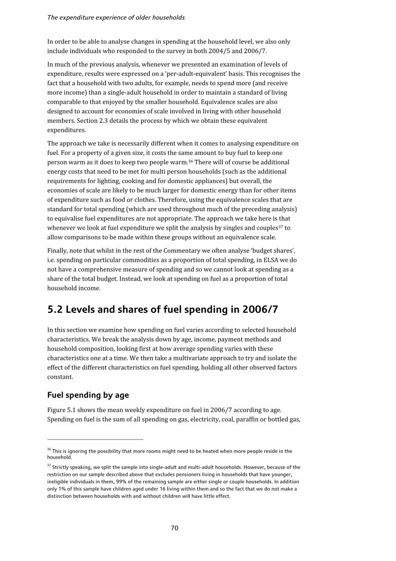
The expenditure experience of older households
70
In order to be able to analyse changes in spending at the household level, we also only include individuals who responded to the survey in both 2004/5 and 2006/7. In much of the previous analysis, whenever we presented an examination of levels of expenditure, results were expressed on a ‘per-adult-equivalent’ basis. This recognises the fact that a household with two adults, for example, needs to spend more (and receive more income) than a single-adult household in order to maintain a standard of living comparable to that enjoyed by the smaller household. Equivalence scales are also designed to account for economies of scale involved in living with other household members. Section 2.3 details the process by which we obtain these equivalent expenditures. The approach we take is necessarily different when it comes to analysing expenditure on fuel. For a property of a given size, it costs the same amount to buy fuel to keep one person warm as it does to keep two people warm.36 There will of course be additional energy costs that need to be met for multi person households (such as the additional requirements for lighting, cooking and for domestic appliances) but overall, the economies of scale are likely to be much larger for domestic energy than for other items of expenditure such as food or clothes. Therefore, using the equivalence scales that are standard for total spending (which are used throughout much of the preceding analysis) to equivalise fuel expenditures are not appropriate. The approach we take here is that whenever we look at fuel expenditure we split the analysis by singles and couples37 to allow comparisons to be made within these groups without an equivalence scale. Finally, note that whilst in the rest of the Commentary we often analyse ‘budget shares’, i.e. spending on particular commodities as a proportion of total spending, in ELSA we do not have a comprehensive measure of spending and so we cannot look at spending as a share of the total budget. Instead, we look at spending on fuel as a proportion of total household income. 5.2 Levels and shares of fuel spending in 2006/7
In this section we examine how spending on fuel varies according to selected household characteristics. We break the analysis down by age, income, payment methods and household composition, looking first at how average spending varies with these characteristics one at a time. We then take a multivariate approach to try and isolate the effect of the different characteristics on fuel spending, holding all other observed factors constant. Fuel spending by age Figure 5.1 shows the mean weekly expenditure on fuel in 2006/7 according to age. Spending on fuel is the sum of all spending on gas, electricity, coal, paraffin or bottled gas, 36 This is ignoring the possibility that more rooms might need to be heated when more people reside in the household. 37 Strictly speaking, we split the sample into single-adult and multi-adult households. However, because of the restriction on our sample described above that excludes pensioners living in households that have younger, ineligible individuals in them, 99% of the remaining sample are either single or couple households. In addition only 1% of this sample have children aged under 16 living within them and so the fact that we do not make a distinction between households with and without children will have little effect.
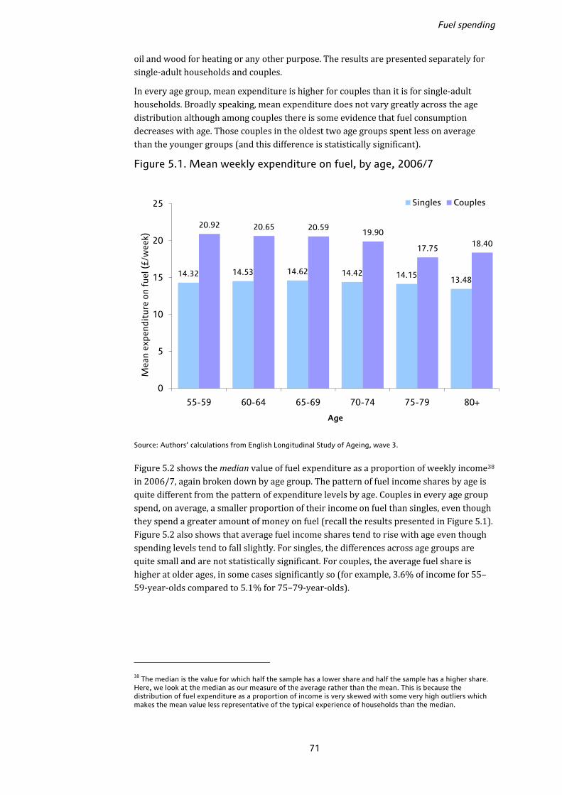
Fuel spending
71
oil and wood for heating or any other purpose. The results are presented separately for single-adult households and couples. In every age group, mean expenditure is higher for couples than it is for single-adult households. Broadly speaking, mean expenditure does not vary greatly across the age distribution although among couples there is some evidence that fuel consumption decreases with age. Those couples in the oldest two age groups spent less on average than the younger groups (and this difference is statistically significant). Figure 5.1. Mean weekly expenditure on fuel, by age, 2006/7
Source: Authors’ calculations from English Longitudinal Study of Ageing, wave 3. Figure 5.2 shows the median value of fuel expenditure as a proportion of weekly income38 in 2006/7, again broken down by age group. The pattern of fuel income shares by age is quite different from the pattern of expenditure levels by age. Couples in every age group spend, on average, a smaller proportion of their income on fuel than singles, even though they spend a greater amount of money on fuel (recall the results presented in Figure 5.1). Figure 5.2 also shows that average fuel income shares tend to rise with age even though spending levels tend to fall slightly. For singles, the differences across age groups are quite small and are not statistically significant. For couples, the average fuel share is higher at older ages, in some cases significantly so (for example, 3.6% of income for 55–59-year-olds compared to 5.1% for 75–79-year-olds).
38 The median is the value for which half the sample has a lower share and half the sample has a higher share. Here, we look at the median as our measure of the average rather than the mean. This is because the distribution of fuel expenditure as a proportion of income is very skewed with some very high outliers which makes the mean value less representative of the typical experience of households than the median.
14.32 14.53 14.62 14.42 14.1513.48
20.92 20.65 20.5919.90
17.7518.40
0
5
10
15
20
25
55-59 60-64 65-69 70-74 75-79 80+
Mea
n ex
pend
itur
e o
n fu
el (£
/wee
k)
Age
Singles Couples
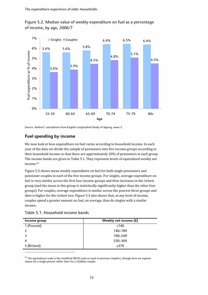
The expenditure experience of older households
72
Figure 5.2. Median value of weekly expenditure on fuel as a percentage of income, by age, 2006/7
Source: Authors’ calculations from English Longitudinal Study of Ageing, wave 3.
Fuel spending by income We now look at how expenditure on fuel varies according to household income. In each year of the data we divide the sample of pensioners into five income groups according to their household income so that there are approximately 20% of pensioners in each group. The income bands are given in Table 5.1. They represent levels of equivalised weekly net income.39 Figure 5.3 shows mean weekly expenditure on fuel for both single pensioners and pensioner couples in each of the five income groups. For singles, average expenditure on fuel is very similar across the first four income groups and then increases in the richest group (and the mean in this group is statistically significantly higher than the other four groups). For couples, average expenditure is similar across the poorest three groups and then is higher for the richest two. Figure 5.3 also shows that, at any level of income, couples spend a greater amount on fuel, on average, than do singles with a similar income. Table 5.1. Household income bands
Income group Weekly net income (£)
1 (Poorest) <140
2 140–189
3 190–249
4 250–369
5 (Richest) ≥370 39 The equivalence scale is the modified OECD scale as used in previous chapters, though here we express values for a single person rather than for a childless couple.
5.6% 5.6% 5.8%
6.4% 6.5% 6.4%
3.6%3.9%
4.5%4.8%
5.1%
4.5%
0%
1%
2%
3%
4%
5%
6%
7%
55-59 60-64 65-69 70-74 75-79 80+
Fuel
exp
endi
ture
as
% o
f in
com
e
Age
Singles Couples

Fuel spending
73
Figure 5.3. Mean weekly expenditure on fuel for pensioners, by income, 2006/7
Source: Authors’ calculations from English Longitudinal Study of Ageing, wave 3.
Figure 5.4. Median value of weekly expenditure on fuel as a share of income for pensioners, by income, 2006/7
Source: Authors’ calculations from English Longitudinal Study of Ageing, wave 3.
13.44 13.71 13.56 14.31
17.2816.93 17.60 17.61
19.59
24.06
0
5
10
15
20
25
30
1 2 3 4 5
Mea
n ex
pend
itur
e o
n fu
el (£
/wee
k)
Income Group
Singles Couples
10.6%
7.3%
5.7%
4.6%
2.9%
8.8%
6.4%
5.0%
3.7%
2.6%
0%
2%
4%
6%
8%
10%
12%
1 2 3 4 5
Fuel
exp
endi
ture
as
% o
f in
com
e
Income Group
Singles Couples

The expenditure experience of older households
74
Figure 5.4 shows the median fuel expenditure share (as a proportion of income) for each of the five income bands. The proportion of income devoted to fuel falls sharply as income rises. The median for single-adult households with incomes below £140 per week (group 1) is 10.6%, falling to 2.9% for single individuals with incomes of at least £370 per week (group 5). The gradient for couples is a little less steep than that for singles. These results are as expected since, as defined in Section 3.3, fuel is a ‘necessity’, a good for which spending shares fall as total income rises. In each income band, the median share of income devoted to fuel is lower for couples than it is for singles although the gap narrows at higher income levels. Fuel spending by fuel payment method In this section we look at expenditure on fuel according to the method of payment used by the household. Section 5.3 discusses method of payment in more detail and illustrates the distribution of payment types for various types of household. We place individuals into four groups according to their payment type as follows: • direct debit (monthly or quarterly); • standard credit (i.e. they receive a periodic bill); • prepayment (or ‘slot’) meter; • other means (e.g. paid as part of rent, StayWarm scheme). We focus on gas and electricity payments separately rather than showing the results for total spending on fuel because our data do not give details of the payment method for other fuel types (oil, wood, paraffin etc.). Figure 5.5 shows mean weekly expenditure on gas according to the payment type for those pensioner households that use gas. The lowest mean expenditure is among those who pay by bill,40 followed by those who pay by direct debit. Those who pay by prepayment meter or by some other means have substantially higher mean weekly expenditures. It is tempting to interpret these differences as resulting from differences in the prices faced by households paying by different methods. However, it is important to note that this is not necessarily the case. We do not know the quantity of gas used by these households, so it could be that those types of household that are spending more are simply using more fuel (because, for example, they could have bigger houses). Indeed, many energy companies provide a discount to those who choose to pay by direct debit over those who pay using standard credit. Yet we find a higher average payment for the former group. One possible explanation for this could be that those who pay by direct debit are more likely, on average, to live in a larger (or less energy-efficient) dwelling, have greater incomes or simply choose to spend more of their income on fuel than those who pay by standard credit. This would explain their greater expenditure relative to those who pay by bill. 40 All the differences between mean spending for bill payment and the other methods for both singles and couples are statistically significant.

Fuel spending
75
Figure 5.5. Mean weekly expenditure on gas by payment type, pensioners only, 2006/7
Source: Authors’ calculations from English Longitudinal Study of Ageing, wave 3. We can go some way to isolating the effect of one factor on fuel bills (e.g. payment method) from all other observed factors (income, size of dwelling, etc.) when we use regression analysis below (see Table 5.2). However, as we do not observe the quantity of fuel purchased, we are limited in what we can say about the prices faced by different types of household. Figure 5.6 shows, for each payment type, the median value of expenditure on gas as a proportion of income. The pattern is similar to that seen in Figure 5.5 for the mean level of spending by payment type. For both singles and couples, there is no statistical difference between the share of income spent on gas for those who pay by direct debit and those who pay by bill. Those using prepayment meters devote a much larger share of their income to gas payments. This is driven largely by two factors: people using prepayment meters spend more in absolute terms on average than those using direct debit or bills, and (as we will show in Section 5.3) they also tend to be poorer. Taken together, this means that the relative differences between those using prepayment meters and those using direct debit or bills are larger as a proportion of income than in absolute cash spending terms. We use regression analysis later in this section to isolate the effect of one factor from other observed factors. Figure 5.7 shows the mean weekly expenditure on electricity by payment method. The pattern is broadly similar to that which we saw for gas – if anything, the differences are larger. Those with bills spend the least on average, followed by those who pay by direct debit. Those who pay by prepayment meter have higher average electricity spending than those who pay by bill or direct debit with a mean expenditure that is 76% higher for singles and 44% higher for couples than those who pay by bill.
8.717.68
10.40 10.2210.69
9.04
12.83
14.83
0
2
4
6
8
10
12
14
16
direct debit bill slot meter other
Mea
n ex
pend
itur
e on
gas
(£
/wee
k)
Payment Method
Singles Couples

The expenditure experience of older households
76
Figure 5.6. Median value of weekly expenditure on gas as a share of income by payment type, pensioners only, 2006/7
Source: Authors’ calculations from English Longitudinal Study of Ageing, wave 3.
Figure 5.7. Mean weekly expenditure on electricity by payment type, pensioners only, 2006/7
Source: Authors’ calculations from English Longitudinal Study of Ageing, wave 3.
3.6%3.9%
6.3%
5.2%
2.5% 2.5%
3.9%
5.0%
0%
1%
2%
3%
4%
5%
6%
7%
direct debit bill slot meter other
Gas
l exp
endi
ture
as
% o
f in
com
e
Payment Method
Singles Couples
6.52
5.58
9.84
10.88
8.497.90
11.40 11.28
0
2
4
6
8
10
12
direct debit bill slot meter other
Mea
n e
xpen
ditu
re o
n el
ectr
icit
y(£
/wee
k)
Payment Method
Singles Couples
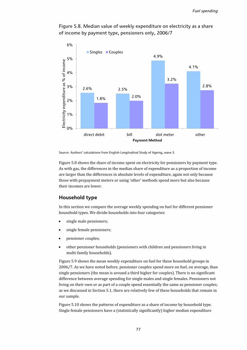
Fuel spending
77
Figure 5.8. Median value of weekly expenditure on electricity as a share of income by payment type, pensioners only, 2006/7
Source: Authors’ calculations from English Longitudinal Study of Ageing, wave 3. Figure 5.8 shows the share of income spent on electricity for pensioners by payment type. As with gas, the differences in the median share of expenditure as a proportion of income are larger than the differences in absolute levels of expenditure, again not only because those with prepayment meters or using ‘other’ methods spend more but also because their incomes are lower. Household type In this section we compare the average weekly spending on fuel for different pensioner household types. We divide households into four categories: • single male pensioners; • single female pensioners; • pensioner couples; • other pensioner households (pensioners with children and pensioners living in multi-family households). Figure 5.9 shows the mean weekly expenditure on fuel for these household groups in 2006/7. As we have noted before, pensioner couples spend more on fuel, on average, than single pensioners (the mean is around a third higher for couples). There is no significant difference between average spending for single males and single females. Pensioners not living on their own or as part of a couple spend essentially the same as pensioner couples; as we discussed in Section 5.1, there are relatively few of these households that remain in our sample. Figure 5.10 shows the patterns of expenditure as a share of income by household type. Single female pensioners have a (statistically significantly) higher median expenditure
2.6% 2.5%
4.9%
4.1%
1.8% 2.0%
3.2%
2.8%
0%
1%
2%
3%
4%
5%
6%
direct debit bill slot meter other
Ele
ctri
city
exp
endi
ture
as
% o
f in
com
e
Payment Method
Singles Couples
The expenditure experience of older households
78
share than single male pensioners. Given that we found that single males and single females have very similar spending levels this indicates that single females have, on average, lower income. Figure 5.9. Mean weekly expenditure on fuel, by household type, 2006/7
Source: Authors’ calculations from English Longitudinal Study of Ageing, wave 3. Figure 5.10. Median weekly expenditure on fuel as a share of income, by household type, 2006/7
Source: Authors’ calculations from English Longitudinal Study of Ageing, wave 3.
13.71 14.26
19.44 19.84
0
5
10
15
20
25
Single male pensioner
Single female pensioner
Couple pensioner Other pensioner hh
Mea
n ex
pend
itur
e o
n fu
el (£
/wee
k)
Household Type
5.5%
6.6%
4.7%
3.6%
0%
1%
2%
3%
4%
5%
6%
7%
Single male pensioner
Single female pensioner
Couple pensioner Other pensioner hh
Fuel
exp
endi
ture
as
% o
f in
com
e
Payment Method
Fuel spending
79
Multivariate analysis: levels and shares of fuel spending So far, we have looked only at the average level of spending, or the average level of spending as a proportion of income, by one or two household characteristic types at a time. This only allows limited statements to be made. For example, we have shown that, on average, older households spend less than younger households and that poorer households spend less than richer households. However, it is also the case that older households, on average, tend to be poorer. Thus we cannot use this analysis to answer questions such as: ‘Taking two pensioners who are the same age, but with different incomes, is the pensioner with the lower income likely to spend less, or more on fuel?’ Regression analysis allows us to answer questions of this type. It allows us to isolate the effect of one characteristic on an outcome of interest (in this case fuel spending), holding all other observed factors constant. It is important to note that, in the analysis that follows, we are not claiming that when we observe a statistically significant effect of one characteristic on fuel spending there is a causal relationship between the two. For example, we will observe below that paying by bill is associated with statistically significantly lower spending on fuel. We are not claiming that paying by bill causes a lower fuel payment (either through accessing lower prices or through some other mechanism). What we are saying is that, in the data that we have access to, holding other observed factors constant, those who pay by bill are on average likely to have lower fuel spending. a) Spending in levels The first two columns of numbers in Table 5.2 report the results from an Ordinary Least Squares (OLS) regression of total fuel spending (in 2006/7) on a number of household characteristics.41 All the variables are entered as sets of dummy variables, which means that the coefficients are expressed relative to an omitted base group. As an example of how to interpret the results, consider the coefficients on income group. The omitted category is the lowest income group (<£140 equivalised income per week). The results show (all other factors in the regression held constant) that those in income group 4 (£250–£369 per week) spent, on average, £1.60 per week more on fuel than the lowest income group. An asterisk indicates that the coefficient is statistically different from zero at the 5% level of significance. We also find that those in the highest income group spend significantly more (£2.86 per week) on fuel, on average, than the lowest whilst there is no significant difference between the lowest group and groups 2 and 3. This result broadly confirms what we found above when we looked at spending by income in a univariate framework. The difference here is that we have isolated the income effect from other confounding factors such as age and household type. Looking at the other characteristics, we find that there is no significant age effect which broadly confirms the univariate pattern that we found above. Although we find little effect of housing tenure on spending, unsurprisingly those in larger houses spend more than those in smaller houses. Payment type is also significantly related to fuel spending even after controlling for other characteristics that are correlated with fuel payment type (such as income). Here, because we are looking at total fuel spending, we define an additional payment group which is ‘mixture’. This refers to individuals who pay for their gas and electricity by 41 We also include controls for region and whether income has been imputed. The coefficients on these variables are not reported.

The expenditure experience of older households
80
different methods. To fall into (say) the direct debit group an individual has to pay for both their gas and their electricity by direct debit.42 Relative to paying by direct debit, those paying by bill spend the same (statistically) on fuel but those paying by prepayment meter spend, on average, £6.77 per week more, and those paying by any other method spend just over £7 per week more. These differences are significant at the 5% level. It is important to remember that these results are for spending and therefore do not show that individuals paying by prepayment meter pay £6.77 more for the same quantity of fuel purchased by those paying by direct debit. Those paying by prepayment meter could be consuming more fuel and hence their spending would be higher even if the cost per unit of fuel was the same as for those paying by direct debit. However, this is a large difference in spending and given that consumers paying by prepayment meter tend to pay a higher unit price for fuel43 and that we have controlled for size and age of the dwelling, it would be reasonable to assume that at least some of this difference in spending is due to prepayment consumers paying a higher price. One reason why prepayment consumers might spend more on fuel is that those paying by direct debit have a tendency to pay prices that are slightly out of date given the time lag involved in updating their periodic payments. Since our data cover a period when prices were rising quite quickly, this could result in many of those who pay by direct debit making payments based on lower prices that had not yet been updated by the energy companies, whereas prepayment meters will be based on current prices. However, the difference between spending for prepayment individuals and those paying by bill, who also pay current prices, is higher by a similar magnitude. A further possible explanation for the difference between spending for those paying by direct debit or bill and those prepaying for their fuel is differences in reporting error in the two groups. Because of the irregular nature of payments made by prepayment meter one might argue that these payments are harder for respondents to recall than more regular payments made by direct debit or periodic bill. However, if this were to account for the difference in fuel spending by payment type, those using prepayment meters would have to overestimate their fuel spending on average. One important point to note is that although the difference in average spending between those using a prepayment meter and those paying by direct debit/bill is large, the group of individuals paying by prepayment meter is relatively small (2% of our sample). This means that the number of individuals affected by the higher unit prices of fuel paid for by prepayment meter is small although, as our results in Section 5.3 will show, these people are typically poorer than average. There is little difference, on average, in fuel spending for individuals living in houses of different ages except that, relative to individuals living in houses built between 1965 and 1985, individuals living in a very old house (built pre-1919) spend £2.91 more per week, on average, on fuel. Since this controls for the number of rooms in the house, this result may well be driven by insulation standards, for example, in older houses. We also investigate the effect of having different types of central heating. There is no significant difference between average spending for those who do not have central heating and those who have either electric or gas central heating. In addition, there is no 42 The percentages of individuals falling into each of the fuel payment categories are as follows: direct debit 61%, bill 27%, prepayment 2%, other 4%, mixture 5%. 43 See for example Ofgem (2008).

Fuel spending
81
Table 5.2. Regression analysis of fuel spending and fuel spending as a proportion of income, pensioners only, 2006/7
Levelsa Shares of incomeb
coeff. t-ratio coeff. t-ratio
Age (ref grp: age 60–64) Age 65–69 −0.10 −0.13 0.000 0.00 Age 70–74 0.38 0.53 0.000 0.03 Age 75–79 −0.39 −0.54 −0.001 −0.63 Age 80+ 0.08 0.10 0.002 1.63 Tenure (ref group: owns outright) Mortgagor 1.37 1.75 0.005* 4.32 Renter (LA) −1.71* −2.13 −0.003* −2.66 Renter (private) −0.11 −0.15 −0.001 −1.30 Other tenure type −1.82 −1.22 −0.003 −1.42 Payment type (ref grp: direct debit)
Pay by bill −0.63 −1.38 −0.002* −2.68 Pay by prepayment 6.77* 5.31 0.019* 10.01 Pay by other method 7.05* 6.79 0.012* 7.74 Pay by mixture 2.90* 3.17 0.008* 5.67 No. of rooms (ref grp: 4 rooms)c 1–2 rooms −2.97* −3.41 −0.013* −9.49 3 rooms −1.33* −2.24 −0.006* −7.20 5 rooms 1.45* 2.75 0.002* 2.92 6 rooms 2.89* 4.32 0.006* 6.22 7+ rooms 9.21* 11.42 0.014* 11.70 Cen. heating type (ref grp: gas cen heat)
Electric central heating −0.99 −1.48 −0.006* −6.41 Other central heating 9.25* 12.44 0.017* 15.50 No central heating −1.16 −1.13 −0.003* −2.12 Age of property (ref grp: 1965–85)
House built <1919 2.91* 4.61 0.002* 2.41 House built 1919–44 0.28 0.47 0.001 1.30 House built 1945–64 0.25 0.50 −0.001 −1.81 House built after 1985 −0.83 −1.30 −0.003* −3.19 Income group (ref grp: <£140pw) £140–£189 per week 0.71 1.18 −0.029* −32.25 £190–£249 per week 0.27 0.45 −0.044* −48.76 £250–£369 per week 1.60* 2.62 −0.057* −61.64 ≥£370 per week 2.86* 4.32 −0.073* −72.62 Household type (ref grp: pens couple)
Single pensioner – male −3.85* −5.70 0.009* 9.14 Single pensioner – female −2.46* −5.35 0.013* 19.21 Other pensioner household 0.71 0.48 −0.003 −1.43 Constant 15.61* 16.02 0.093* 62.40 Sample size 3,236 3,235
Note: Controls also included (but not reported) for region and whether income has been imputed. a Ordinary Least Squares regression. b Median regression. c The number of rooms in the house excludes kitchens and bathrooms. * Statistically different from zero at the 5% level of significance.
The expenditure experience of older households
82
significant difference between the spending of those who have gas central heating and those who have electric central heating. However, having central heating fuelled by solid fuel, oil or something else is associated with average fuel bills that are on average £9.25 per week higher than those who have gas central heating. The percentage of individuals in our sample who live in households with central heating fuelled other than by gas or electricity is 9%. The same percentage have central heating fuelled by electricity whereas 78% of individuals have central heating fuelled by gas. The final variable discussed here is household type. Recall that our sample consists only of pensioners living in households where there are no individuals (other than spouses or partners) under the age of 50. Relative to pensioner couples (the base group), on average, single male pensioners spend £3.85 less per week and single female pensioners spend £2.46 less. The £1.39 per week difference between single male and single female pensioners is statistically significant. b) Spending in shares We now turn to differences in spending on fuel as a share of income. This share is important when we think about the burden that fuel spending places upon a household. The final two columns in Table 5.2 show the results of a regression of fuel spending as a proportion of income (referred to below simply as ‘fuel share’) on the same set of variables as in the regression of levels. Because of the issue of outliers when we look at fuel spending as a proportion of income, we use median regression rather than OLS. 44 The results show that relative to the lowest income group, all other income groups spend less at the median as a proportion of their income. The second income group spend 3 percentage points less, on average, than those in the poorest group and this difference gets larger as we move up through the income distribution until we reach the richest group who spend 7 percentage points less. Again, we find no significant correlation with age which confirms the broad pattern that we found above when we looked at fuel spending as a proportion of income by age without conditioning on other variables. The coefficients on size of house show that, on average, there is a positive relationship between the number of rooms in the dwelling and the proportion of income spent on fuel. This matches the results for spending levels. Turning to payment method, we find that, on average, as well as spending more in absolute terms, those paying for their fuel by prepayment meter spend 1.9 percentage points more of their income on fuel than those paying by direct debit. Those who pay by bill spend less as a proportion of their income than those paying by direct debit, though the magnitude of this effect is small (0.2 percentage points). Individuals who live in households where the central heating is fuelled by electricity spend, on average 0.6 percentage points more on fuel as a percentage of their income and this difference is statistically significant. Those with central heating fuelled by methods other than gas and electricity spend an average 1.7 percentage points more on fuel as a percentage of their income compared to those with gas central heating. Previously, we found that both single male pensioners and single female pensioners spent less in absolute terms than pensioner couples. As a percentage of income, on the other 44 Median regression gives less weight to outliers than does OLS.
Fuel spending
83
hand, we find that single male and single female pensioners spend significantly more than pensioner couples, on average. This is the same pattern that we found for the univariate comparisons earlier on. 5.3 Payment methods
There has been some attention given by the media and consumer organisations to the concern that those paying by certain methods (in particular prepayment meters) face higher prices than those who pay by direct debit or standard credit.45 As noted above, the ELSA data do not provide information on prices paid by respondents for their fuel. This means that we cannot analyse the extent to which those with different payment types face different prices, though our analysis in Section 5.2 of fuel spending by payment method did suggest that those not paying by bill or direct debit did spend more even taking into account observable factors that would obviously affect expenditures. In Section 5.4, we will examine changes in fuel spending between 2004/5 and 2006/7 and make some tentative assessment of implied changes in fuel consumption over the same period and how these varied by payment type. This section details the characteristics of individuals paying by different methods. As described in Section 5.2 we divide households into four different categories according to the method with which they pay their fuel bill (direct debit, bill, prepayment meter or other means). We first look at the distribution of payment types within age groups, within income groups and household types using only the 2006/7 wave of ELSA. Then, using the 2004/5 and 2006/7 ELSA waves, we look at changes in payment type over the two-year period. Age Table 5.3 shows, for each age group, the proportion paying for gas and electricity using each method. In the case of both gas and electricity, approximately two-thirds of all households aged over 55 pay by direct debit, just over a quarter pay by bill and about 4% pay by each of prepayment meter and some other method. The numbers show that the propensity to pay for gas and electricity by direct debit falls with age while the propensity to pay by bill rises with age. For example, of those aged 55–59, 70.4% pay for their gas by direct debit. This compares to just 59.3% of those aged 80+. The propensity to pay by prepayment meter falls with age for both gas and electricity while the propensity to pay by some other means generally rises with age. Income Table 5.4 shows a breakdown of payment type for pensioners by the income bands we first described in Section 5.2. Due to the fact that our sample here is different to that used in the analysis leading to Table 5.3 (here we look only at pensioners, while previously we included all individuals aged over 55), the totals paying by each method are slightly different, but largely comparable, to those shown in the previous table. There is a marked tendency for payment by direct debit to increase with income. Just over half of those in the lowest income group pay for their gas by direct debit, compared to over 80% in the highest income group. A similar pattern is found for electricity. The 45 See, for example, Consumer Focus (2009), Ofgem (2008) and The Independent (2008).

The expenditure experience of older households
84
propensity to pay for either gas or electricity by each of the other methods falls with income, with the proportion paying for their gas by bill falling from 34% in the lowest income group to approximately 16% in the highest. For prepayment meters, the fall is 4% to 1% between the bottom and top income groups and for some other method is 9% to 1%. Table 5.3. Payment type for gas and electricity, %, by age, 2006/7
Age Direct debit Bill Prepayment Other Total
Gas
55–59 70.4 22.2 5.2 2.2 100.0
60–64 70.1 22.8 4.3 2.8 100.0
65–69 65.1 25.8 2.7 6.4 100.0
70–74 70.7 23.3 1.7 4.4 100.0
75–79 60.9 30.6 4.7 3.8 100.0
80+ 59.3 31.4 1.9 7.4 100.0
Total 66.3 25.9 3.3 4.5 100.0
Electricity
55–59 66.4 25.4 6.6 1.7 100.0
60–64 66.6 25.3 5.3 2.7 100.0
65–69 61.8 28.7 3.8 5.6 100.0
70–74 67.5 26.0 3.0 3.6 100.0
75–79 59.6 33.3 3.7 3.3 100.0
80+ 58.5 34.4 1.5 5.6 100.0
Total 63.5 28.8 4.0 3.8 100.0
Source: Authors’ calculations from English Longitudinal Study of Ageing, wave 3.
Table 5.4. Payment type for gas and electricity, %, by income, pensioners only, 2006/7
Income band
Direct debit Bill Prepayment Other Total
Gas
1 52.7 34.0 4.4 8.9 100.0
2 56.5 34.1 2.8 6.7 100.0
3 64.9 25.8 3.6 5.7 100.0
4 71.9 22.9 2.0 3.3 100.0
5 81.5 16.4 0.7 1.5 100.0
Total 65.0 26.9 2.7 5.3 100.0
Electricity
1 51.1 35.7 5.2 8.0 100.0
2 54.4 35.0 5.1 5.5 100.0
3 62.0 31.9 2.4 3.7 100.0
4 70.5 25.2 1.7 2.6 100.0
5 77.0 19.9 1.2 1.9 100.0
Total 62.7 29.7 3.2 4.4 100.0
Source: Authors’ calculations from English Longitudinal Study of Ageing, wave 3.
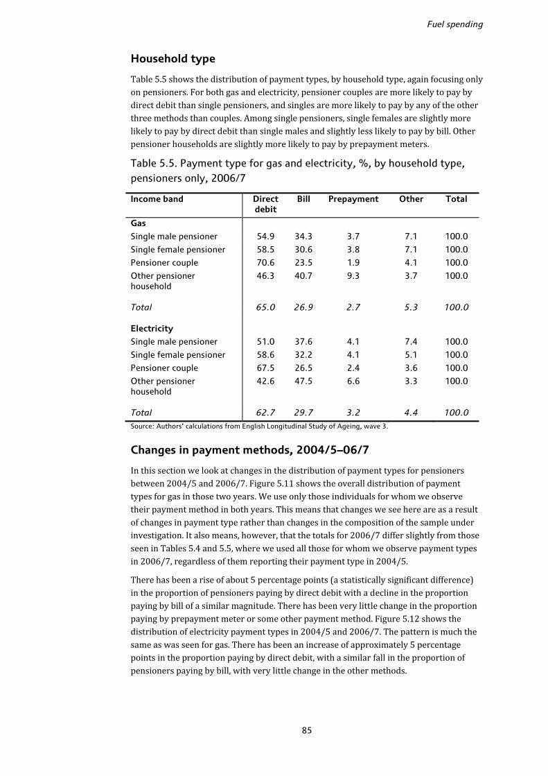
Fuel spending
85
Household type Table 5.5 shows the distribution of payment types, by household type, again focusing only on pensioners. For both gas and electricity, pensioner couples are more likely to pay by direct debit than single pensioners, and singles are more likely to pay by any of the other three methods than couples. Among single pensioners, single females are slightly more likely to pay by direct debit than single males and slightly less likely to pay by bill. Other pensioner households are slightly more likely to pay by prepayment meters. Table 5.5. Payment type for gas and electricity, %, by household type, pensioners only, 2006/7
Income band Direct debit
Bill Prepayment Other Total
Gas
Single male pensioner 54.9 34.3 3.7 7.1 100.0
Single female pensioner 58.5 30.6 3.8 7.1 100.0
Pensioner couple 70.6 23.5 1.9 4.1 100.0
Other pensioner household
46.3 40.7 9.3 3.7 100.0
Total 65.0 26.9 2.7 5.3 100.0
Electricity
Single male pensioner 51.0 37.6 4.1 7.4 100.0
Single female pensioner 58.6 32.2 4.1 5.1 100.0
Pensioner couple 67.5 26.5 2.4 3.6 100.0
Other pensioner household
42.6 47.5 6.6 3.3 100.0
Total 62.7 29.7 3.2 4.4 100.0
Source: Authors’ calculations from English Longitudinal Study of Ageing, wave 3.
Changes in payment methods, 2004/5–06/7 In this section we look at changes in the distribution of payment types for pensioners between 2004/5 and 2006/7. Figure 5.11 shows the overall distribution of payment types for gas in those two years. We use only those individuals for whom we observe their payment method in both years. This means that changes we see here are as a result of changes in payment type rather than changes in the composition of the sample under investigation. It also means, however, that the totals for 2006/7 differ slightly from those seen in Tables 5.4 and 5.5, where we used all those for whom we observe payment types in 2006/7, regardless of them reporting their payment type in 2004/5. There has been a rise of about 5 percentage points (a statistically significant difference) in the proportion of pensioners paying by direct debit with a decline in the proportion paying by bill of a similar magnitude. There has been very little change in the proportion paying by prepayment meter or some other payment method. Figure 5.12 shows the distribution of electricity payment types in 2004/5 and 2006/7. The pattern is much the same as was seen for gas. There has been an increase of approximately 5 percentage points in the proportion paying by direct debit, with a similar fall in the proportion of pensioners paying by bill, with very little change in the other methods.
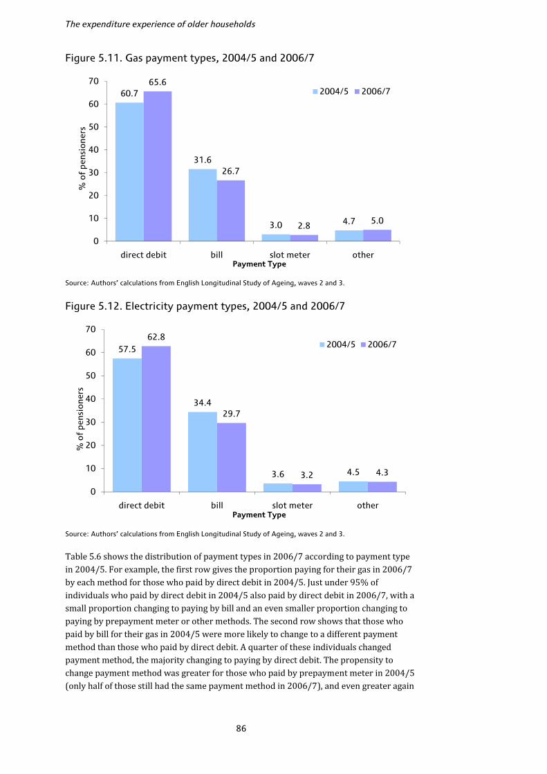
The expenditure experience of older households
86
Figure 5.11. Gas payment types, 2004/5 and 2006/7
Source: Authors’ calculations from English Longitudinal Study of Ageing, waves 2 and 3.
Figure 5.12. Electricity payment types, 2004/5 and 2006/7
Source: Authors’ calculations from English Longitudinal Study of Ageing, waves 2 and 3. Table 5.6 shows the distribution of payment types in 2006/7 according to payment type in 2004/5. For example, the first row gives the proportion paying for their gas in 2006/7 by each method for those who paid by direct debit in 2004/5. Just under 95% of individuals who paid by direct debit in 2004/5 also paid by direct debit in 2006/7, with a small proportion changing to paying by bill and an even smaller proportion changing to paying by prepayment meter or other methods. The second row shows that those who paid by bill for their gas in 2004/5 were more likely to change to a different payment method than those who paid by direct debit. A quarter of these individuals changed payment method, the majority changing to paying by direct debit. The propensity to change payment method was greater for those who paid by prepayment meter in 2004/5 (only half of those still had the same payment method in 2006/7), and even greater again
60.7
31.6
3.0 4.7
65.6
26.7
2.8 5.0
0
10
20
30
40
50
60
70
direct debit bill slot meter other
% o
f pe
nsio
ners
Payment Type
2004/5 2006/7
57.5
34.4
3.6 4.5
62.8
29.7
3.2 4.3
0
10
20
30
40
50
60
70
direct debit bill slot meter other
% o
f pe
nsio
ners
Payment Type
2004/5 2006/7

Fuel spending
87
for those who paid by some other method in 2004/5 (just over 40% had the same payment method two years later). However, the results for those paying by prepayment meter and some other method should be interpreted with some caution due to the fact that they are based on a small number of responding individuals. The pattern is similar when we look at changes in electricity payment method. Those who pay by direct debit were the least likely to change payment method, while there is a clear propensity for those who paid by bill in 2004/5 to change to paying by direct debit. As was the case with gas, those who paid by prepayment or some other method were more likely to have changed to a different payment method by 2006/7. Table 5.6. Change in payment types, 2004/5–06/7
Wave 3 (2006/7)
Direct debit
Bill Prepayment Other Total
Wav
e 2
(2
00
4/5
)
Gas
Direct debit 94.5 3.7 0.5 1.3 100.0
Bill 20.4 73.0 1.4 5.2 100.0
Prepayment 11.1 20.0 51.1 17.8 100.0
Other 31.4 16.4 10.0 42.1 100.0
Electricity
Direct debit 94.5 4.3 0.2 1.0 100.0
Bill 19.9 74.6 0.7 4.9 100.0
Prepayment 7.2 12.8 64.8 15.2 100.0
Other 30.1 23.7 12.2 34.0 100.0
Source: Authors’ calculations from English Longitudinal Study of Ageing, waves 2 and 3. The results in this final subsection give evidence of a move towards direct debit payments among pensioners. Most of the change towards direct debit payment is coming from individuals who used to pay by bill. Table 5.6 shows that only 51% of individuals who paid for their gas and 65% of individuals who paid for their electricity using a prepayment meter in 2004/5 were still using a prepayment meter in 2006/7. However, recall from Figures 5.11 and 5.12 that the proportion of all pensioners using this method fell only very slightly over the same period. This suggests that the number of pensioners switching to other methods from a prepayment meter was roughly similar to the number that switched in the other direction.46 5.4 Changes in fuel spending, 2004/5 to 2006/7
The period between 2004/5 and 2006/7 (inclusive) saw large increases in domestic fuel prices. Between July 2004 and February 2007, the period of time during which the vast majority of the ELSA respondents were interviewed, the RPI sub-index for gas increased by 79% and the electricity price index increased by 50%. Taking into account the 46 It is also possible, given the small proportion of the sample that this result is based on, it is driven at least in part by reporting error.
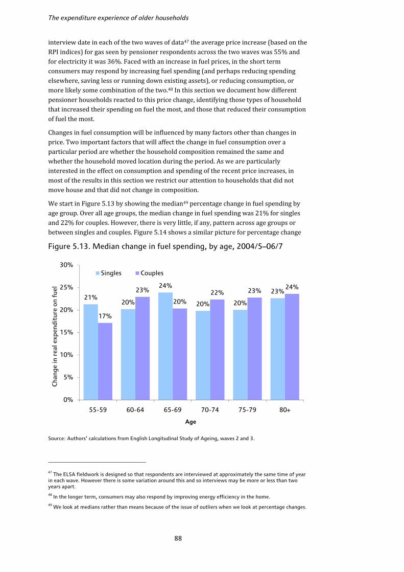
The expenditure experience of older households
88
interview date in each of the two waves of data47 the average price increase (based on the RPI indices) for gas seen by pensioner respondents across the two waves was 55% and for electricity it was 36%. Faced with an increase in fuel prices, in the short term consumers may respond by increasing fuel spending (and perhaps reducing spending elsewhere, saving less or running down existing assets), or reducing consumption, or more likely some combination of the two.48 In this section we document how different pensioner households reacted to this price change, identifying those types of household that increased their spending on fuel the most, and those that reduced their consumption of fuel the most. Changes in fuel consumption will be influenced by many factors other than changes in price. Two important factors that will affect the change in fuel consumption over a particular period are whether the household composition remained the same and whether the household moved location during the period. As we are particularly interested in the effect on consumption and spending of the recent price increases, in most of the results in this section we restrict our attention to households that did not move house and that did not change in composition. We start in Figure 5.13 by showing the median49 percentage change in fuel spending by age group. Over all age groups, the median change in fuel spending was 21% for singles and 22% for couples. However, there is very little, if any, pattern across age groups or between singles and couples. Figure 5.14 shows a similar picture for percentage change Figure 5.13. Median change in fuel spending, by age, 2004/5–06/7
Source: Authors’ calculations from English Longitudinal Study of Ageing, waves 2 and 3.
47 The ELSA fieldwork is designed so that respondents are interviewed at approximately the same time of year in each wave. However there is some variation around this and so interviews may be more or less than two years apart. 48 In the longer term, consumers may also respond by improving energy efficiency in the home. 49 We look at medians rather than means because of the issue of outliers when we look at percentage changes.
21%20%
24%
20% 20%
23%
17%
23%
20%22% 23% 24%
0%
5%
10%
15%
20%
25%
30%
55-59 60-64 65-69 70-74 75-79 80+
Cha
nge
in r
eal e
xpen
ditu
re o
n fu
el
Age
Singles Couples
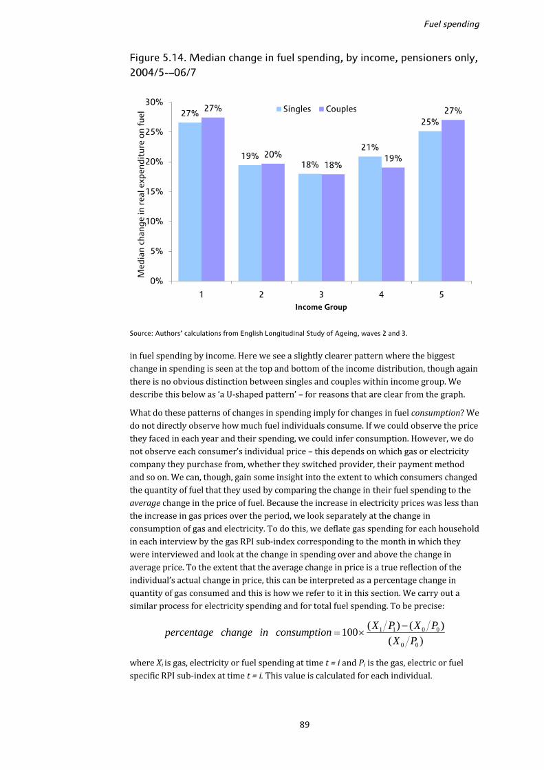
Fuel spending
89
Figure 5.14. Median change in fuel spending, by income, pensioners only, 2004/5-–06/7
Source: Authors’ calculations from English Longitudinal Study of Ageing, waves 2 and 3. in fuel spending by income. Here we see a slightly clearer pattern where the biggest change in spending is seen at the top and bottom of the income distribution, though again there is no obvious distinction between singles and couples within income group. We describe this below as ‘a U-shaped pattern’ – for reasons that are clear from the graph. What do these patterns of changes in spending imply for changes in fuel consumption? We do not directly observe how much fuel individuals consume. If we could observe the price they faced in each year and their spending, we could infer consumption. However, we do not observe each consumer’s individual price – this depends on which gas or electricity company they purchase from, whether they switched provider, their payment method and so on. We can, though, gain some insight into the extent to which consumers changed the quantity of fuel that they used by comparing the change in their fuel spending to the average change in the price of fuel. Because the increase in electricity prices was less than the increase in gas prices over the period, we look separately at the change in consumption of gas and electricity. To do this, we deflate gas spending for each household in each interview by the gas RPI sub-index corresponding to the month in which they were interviewed and look at the change in spending over and above the change in average price. To the extent that the average change in price is a true reflection of the individual’s actual change in price, this can be interpreted as a percentage change in quantity of gas consumed and this is how we refer to it in this section. We carry out a similar process for electricity spending and for total fuel spending. To be precise:
1 1 0 0
0 0
( ) ( )100( )
X P X Ppercentage change in consumptionX P−
= × where Xi is gas, electricity or fuel spending at time t = i and Pi is the gas, electric or fuel specific RPI sub-index at time t = i. This value is calculated for each individual.
27%
19%18%
21%
25%
27%
20%18%
19%
27%
0%
5%
10%
15%
20%
25%
30%
1 2 3 4 5
Med
ian
chan
ge in
rea
l exp
endi
ture
on
fuel
Income Group
Singles Couples

The expenditure experience of older households
90
Figure 5.15. Median change in gas and electricity consumption, by age, 2004/5–06/7
Note: For gas, the sample is households that consumed gas in both waves and for electricity the sample is households that consumed electricity in both waves. Source: Authors’ calculations from English Longitudinal Study of Ageing, waves 2 and 3 and RPI data.
Figure 5.16. Median change in fuel consumption, by age, 2004/5–06/7
Source: Authors’ calculations from English Longitudinal Study of Ageing, waves 2 and 3 and RPI data.
-19
%
-20
%
-16
%
-14
%
-15
%
-14
%
-18
%
-17
% -16
%
-17
% -15
%
-8%
-9%
-11
%
-13
%
-8%
-11
% -10
%
-11
%
-7%
-9% -8
%
-4%
-13
%
-25%
-20%
-15%
-10%
-5%
0%
55-59 60-64 65-69 70-74 75-79 80+
Cha
nge
in c
ons
umpt
ion
Age
Singles, gas Couples, gas
Singles, electricity Couples, electricity
-10%
-13%
-8%
-10% -11%
-9%
-12%
-8%
-10%-9%
-9%-10%
-14%
-12%
-10%
-8%
-6%
-4%
-2%
0%
55-59 60-64 65-69 70-74 75-79 80+
Cha
nge
in c
ons
umpt
ion
Age
Singles Couples

Fuel spending
91
Across all households, the average (median) reduction in electricity consumption was 9% and gas consumption 16%. Figure 5.15 shows the median change in gas and electricity consumption by age group. For gas, we look only at individuals who live in households that report that they use gas in both waves (82% of the sample). For electricity, we look only at the change in electricity consumption amongst those who report that they use electricity in both waves (94% of the sample). 50 The change in gas consumption is shown by blue bars (light blue for singles and dark blue for couples) and the change in electricity consumption is shown by green bars (light green for singles and dark green for couples). For all groups, on average, there has been a reduction in consumption of gas and electricity but there is little evidence of a pattern across age groups. What is clear, though, is that individuals have tended to reduce their consumption of gas by more than their consumption of electricity. This is not surprising given that the price of gas increased by more than the price of electricity.51 Because of the different samples and because we show median changes, it is not possible to obtain the median change in total fuel consumption by summing the bars in Figure 5.15 for gas and electricity.52 In Figure 5.16 we show the change in total fuel consumption by age. Like the results for change in fuel spending, there is no clear pattern of change in gas or electricity consumption by age. This is not surprising since the change in spending and change in consumption are very closely related.53 The average across all households was 9.5%. It is important to remember that reductions in fuel consumption do not necessarily imply large negative effects on individual living standards. For example, remembering to switch off lights or turn off the heating when leaving the house are ways that a household can reduce their consumption without any particular impact on their well-being. In addition, individuals may have responded to increases in the price of fuel by improving energy efficiency around the home and this would also lead to reductions in consumption without a negative effect on wellbeing. Of course, turning down the heating to a level that is too low to heat the home adequately clearly has serious repercussions for welfare and possibly health, and there are almost certainly some households who will have responded to the price rises in this way. But it is likely that at least some of the consumption response was achieved in ways less damaging to well-being. Figure 5.17 shows how the change in gas and electricity consumption varies by income group, and Figure 5.18 shows how the change in total fuel consumption varies by income group. Recall that we found a U-shape for the change in spending on fuel by income group, where the richest and poorest saw the biggest increase in spending. Correspondingly, we find that for both gas (blue bars) and electricity (green bars), those in the highest and lowest income groups have reduced their consumption by the least. The same U-shape is evident in looking at changes in total fuel consumption, with the 50 We believe that due to the design of the question that asks respondents which fuel they use in the home, the number of households reporting that they use electricity is too low. Some households that do not report that they use electricity subsequently report that they own various electrical appliances. 51 From these numbers it is possible to calculate an implied (local) price elasticity of demand for gas and electricity: i.e. the percentage change in quantity demanded/percentage change in price. For the whole sample, the implied price elasticity of demand for all fuel is −0.23, for gas is −0.3 and for electricity is −0.25. This calculation assumes that any other factors affecting demand for fuel remain constant over the period. 52 Total fuel consumption also includes spending on fuel other than gas and electricity. 53 Note that the change in spending is not simply divided by the same change in price for all individuals. We apply the index to spending in each of two months that individuals are interviewed.
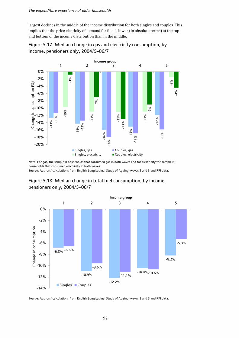
The expenditure experience of older households
92
largest declines in the middle of the income distribution for both singles and couples. This implies that the price elasticity of demand for fuel is lower (in absolute terms) at the top and bottom of the income distribution than in the middle. Figure 5.17. Median change in gas and electricity consumption, by income, pensioners only, 2004/5–06/7
Note: For gas, the sample is households that consumed gas in both waves and for electricity the sample is households that consumed electricity in both waves. Source: Authors’ calculations from English Longitudinal Study of Ageing, waves 2 and 3 and RPI data.
Figure 5.18. Median change in total fuel consumption, by income, pensioners only, 2004/5–06/7
Source: Authors’ calculations from English Longitudinal Study of Ageing, waves 2 and 3 and RPI data.
-13
%
-14
%
-16
% -15
%
-12
%
-11
%
-13
%
-18
% -17
% -16
%
-10
%
-11
%
-11
%
-11
%
-2%-1
%
-7%
-13
%
-9%
-4%
-20%
-18%
-16%
-14%
-12%
-10%
-8%
-6%
-4%
-2%
0%
1 2 3 4 5
Cha
nge
in c
ons
umpt
ion
(%)
Income group
Singles, gas Couples, gasSingles, electricity Couples, electricity
-6.8%
-10.9%
-12.2%
-10.4%
-8.2%
-6.6%
-9.6%
-11.1%-10.6%
-5.3%
-14%
-12%
-10%
-8%
-6%
-4%
-2%
0%
1 2 3 4 5
Cha
nge
in c
ons
umpt
ion
Income group
Singles Couples

Fuel spending
93
Table 5.7. Median regression analysis of the percentage change in gas, electricity and fuel consumption, 2004/5–06/7
Gas Electricity Fuel coeff t-ratio coeff t-ratio coeff t-ratio
Age (ref grp: age 60–64) Age 65–69 0.01 0.51 −0.02 −0.85 0.00 0.18 Age 70–74 0.01 0.49 0.03 1.21 0.02 1.19 Age 75–79 0.03 0.92 −0.02 −0.90 0.00 0.07 Age 80+ 0.05 1.88 −0.01 −0.32 0.03 1.53 Tenure (ref group: owns outright)
Mortgagor −0.02 −0.50 0.02 0.85 −0.03 −1.10 Renter (LA) 0.01 0.40 0.05* 2.08 0.05 1.90 Renter (private) 0.05 1.55 −0.01 −0.32 0.00 −0.02 Other tenure type −0.03 −0.36 0.02 0.43 0.01 0.23 Payment type (ref group: direct debit)
Pay by bill 0.01 0.67 −0.01 −0.46 −0.01 −0.37 Pay by prepayment −0.07 −1.46 −0.12* −3.28 0.02 0.47 Pay by other method 0.06 1.49 −0.04 −1.07 0.03 1.07 Pay by mixture −0.07* −2.52 Change in payment method
−0.04 −1.65 0.03 1.72 0.01 0.79
No. of rooms (ref group: 4 rooms)
1–2 rooms 0.00 0.01 −0.03 −1.06 −0.04 −1.53 3 rooms 0.02 0.94 −0.02 −0.83 −0.02 −1.03 5 rooms 0.01 0.72 0.01 0.70 0.00 −0.22 6 rooms 0.01 0.39 0.02 0.86 −0.01 −0.60 7+ rooms −0.01 −0.17 0.00 0.07 0.00 −0.09 Central heating type (refgroup: gas central heating)a
Gas central heating −0.03 −1.06 Electric central heating −0.02 −0.94 −0.03 −1.55 Other central heating −0.02 −0.76 No central heating −0.03 −0.95 Age of property (ref group: 1965–85)
House built <1919 −0.01 −0.36 −0.03 −1.67 −0.02 −0.87 House built 1919–44 0.01 0.59 −0.01 −0.62 −0.04* −2.18 House built 1945–64 −0.01 −0.49 −0.02 −1.19 −0.04* −2.56 House built 1985+ −0.02 −0.59 0.02 0.93 −0.03 −1.64 Income group (ref group: <£140pw)
£140–£189 per week −0.01 −0.26 0.04* 2.19 −0.02 −0.90 £190–£249 per week 0.00 −0.11 −0.03 −1.43 −0.04* −2.29 £250–£369 per week 0.01 0.37 0.03 1.32 −0.01 −0.69 ≥£370 per week −0.01 −0.39 0.01 0.32 −0.02 −0.78 Household type (ref group: couple)
Single pensioner – male −0.01 −0.39 −0.02 −0.95 −0.02 −0.82 Single pensioner – female 0.00 −0.16 −0.02 −1.04 −0.01 −0.78 Other pensioner household 0.03 0.52 −0.05 −1.08 0.03 0.68 Constant −0.18* −3.69 −0.09* −3.03 −0.08* −2.83 Sample size 2,649 3,101 3,085
Notes: Time-varying characteristics are taken from the base year, 2004/5. Controls included for region, whether income was imputed, whether the household composition changed and whether the individual moved house. * indicates significance at the 5% level. Source: Authors’ calculations from English Longitudinal Study of Ageing, waves 2 and 3. a The reference group applies only to the overall fuel regression; only the relevant central heating type is included in the gas and electricity regressions.
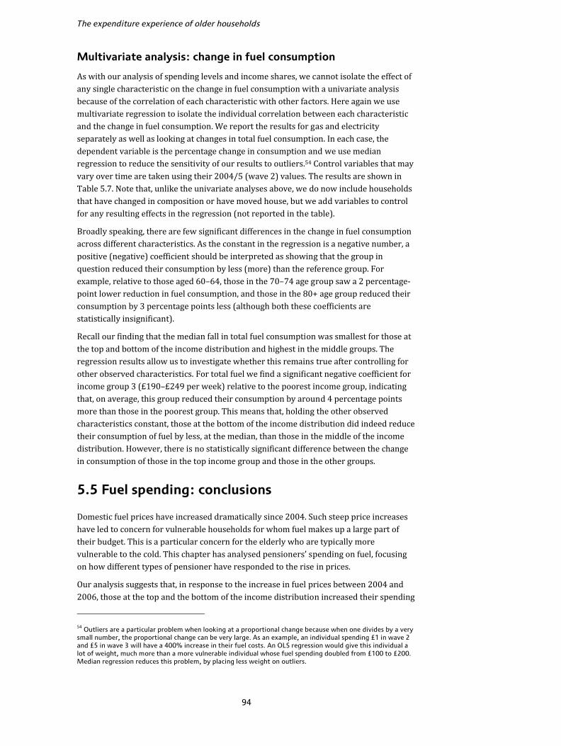
The expenditure experience of older households
94
Multivariate analysis: change in fuel consumption As with our analysis of spending levels and income shares, we cannot isolate the effect of any single characteristic on the change in fuel consumption with a univariate analysis because of the correlation of each characteristic with other factors. Here again we use multivariate regression to isolate the individual correlation between each characteristic and the change in fuel consumption. We report the results for gas and electricity separately as well as looking at changes in total fuel consumption. In each case, the dependent variable is the percentage change in consumption and we use median regression to reduce the sensitivity of our results to outliers.54 Control variables that may vary over time are taken using their 2004/5 (wave 2) values. The results are shown in Table 5.7. Note that, unlike the univariate analyses above, we do now include households that have changed in composition or have moved house, but we add variables to control for any resulting effects in the regression (not reported in the table). Broadly speaking, there are few significant differences in the change in fuel consumption across different characteristics. As the constant in the regression is a negative number, a positive (negative) coefficient should be interpreted as showing that the group in question reduced their consumption by less (more) than the reference group. For example, relative to those aged 60–64, those in the 70–74 age group saw a 2 percentage-point lower reduction in fuel consumption, and those in the 80+ age group reduced their consumption by 3 percentage points less (although both these coefficients are statistically insignificant). Recall our finding that the median fall in total fuel consumption was smallest for those at the top and bottom of the income distribution and highest in the middle groups. The regression results allow us to investigate whether this remains true after controlling for other observed characteristics. For total fuel we find a significant negative coefficient for income group 3 (£190–£249 per week) relative to the poorest income group, indicating that, on average, this group reduced their consumption by around 4 percentage points more than those in the poorest group. This means that, holding the other observed characteristics constant, those at the bottom of the income distribution did indeed reduce their consumption of fuel by less, at the median, than those in the middle of the income distribution. However, there is no statistically significant difference between the change in consumption of those in the top income group and those in the other groups. 5.5 Fuel spending: conclusions
Domestic fuel prices have increased dramatically since 2004. Such steep price increases have led to concern for vulnerable households for whom fuel makes up a large part of their budget. This is a particular concern for the elderly who are typically more vulnerable to the cold. This chapter has analysed pensioners’ spending on fuel, focusing on how different types of pensioner have responded to the rise in prices. Our analysis suggests that, in response to the increase in fuel prices between 2004 and 2006, those at the top and the bottom of the income distribution increased their spending 54 Outliers are a particular problem when looking at a proportional change because when one divides by a very small number, the proportional change can be very large. As an example, an individual spending £1 in wave 2 and £5 in wave 3 will have a 400% increase in their fuel costs. An OLS regression would give this individual a lot of weight, much more than a more vulnerable individual whose fuel spending doubled from £100 to £200. Median regression reduces this problem, by placing less weight on outliers.
Fuel spending
95
vulnerable to the cold. This chapter has analysed pensioners’ spending on fuel, focusing on how different types of pensioner have responded to the rise in prices. Our analysis suggests that, in response to the increase in fuel prices between 2004 and 2006, those at the top and the bottom of the income distribution increased their spending on fuel (as a proportion of their income) to a greater extent than those in the middle of the income distribution. This implies that those at the top and the bottom of the income distribution reduced their fuel consumption the least in response to the price rises. The fact that those at the bottom of the income distribution reduced their consumption by the least remains true after controlling for other observed characteristics. However, this does not mean that rising fuel prices are not a policy concern for low-income households. Everything else equal, these low-income households will have made other adjustments to their household budgets, for example by cutting back on other items that they consume. This chapter also looked at how spending on fuel varied according to payment method. Ofgem (2008) documents the fact that consumers who pay using prepayment meters typically pay a premium relative to those who pay by direct debit or those who receive a periodic bill. We highlighted the fact that those who pay by prepayment meter spend more on their fuel than those with other methods of payment. This remains true after we control for other observable characteristics. In addition, we showed that those who pay by prepayment meter are more likely to be poor than those who use some other method of payment, a fact that adds to the concern about the higher prices faced by these consumers (though even amongst the poorest fifth of pensioners, only around 5% use prepayment meters). Since 2006/7, the last year for which we have ELSA data available, there have been further large changes in fuel prices. Price reductions in 2007 were followed by larger increases in 2008 with the net effect being an increase in the RPI gas sub-index of 31% and in the electricity sub-index of 24% between February 2007 and January 2009. Since then fuel prices have fallen again although prices are still well above their level of two years ago. When household spending data covering this period become available, it will be possible to determine how different types of household responded to these further increases in price.
96
6. Conclusions
This Commentary has analysed the spending patterns of households in the UK over the period 1995 to 2007, focusing in particular on older people. Expenditure is an often overlooked indicator of well-being, but it may tell us something about long-run living standards that income alone cannot capture. The typical picture of a pensioner household in the UK in the past was often one of deprivation and poverty. This is certainly true for some pensioners, and on average pensioners spend less than other households. However, the key finding of this Commentary is that it is important to look within the pensioner population where there is substantial heterogeneity. Younger pensioners spend as much as households aged under 35 on average, for example, and by 2007 pensioners in the richest 40% of households were spending as much as non-pensioners in the same income group. By contrast, the oldest and poorest pensioners spend the least. Similar variations emerge if we look at expenditures on particular items. By 2007, pensioners in the richest fifth of the population spent on average one pound in every eight on holidays, whilst pensioners in the poorest fifth spent only one pound in every 30 on holidays. Those aged 80 and over spent almost 13% of their budget on domestic fuel in 2007, compared to less than 7% for those aged 60–64, and our analysis of the most recent ELSA data revealed large variations in fuel expenditure according to the type of payment method used. Expenditure patterns within the older population are clearly complicated, and in some cases appear more closely related to age in some cases and to incomes in others. There is some evidence that between 2001 and 2007 pensioners began to catch up somewhat to non-pensioners in terms of their spending. This appears to be particularly true for low-income pensioners in their 60s. As a result, poverty as measured by expenditure fell more rapidly for pensioner households than non-pensioners over this period, falling by more than 18% between 2003 and 2007, having been largely flat between 1995 and 2003. This appears to be the first sustained fall in pensioner expenditure poverty which had remained stubbornly high despite substantial falls in pensioner poverty as measured by income. However, even in 2007 more than half of pensioners aged 80+ lived in households below the expenditure poverty line compared to an income poverty rate of just over 30%. Since 2007 there have been some dramatic changes in relative prices which may substantially affect expenditure patterns beyond the period analysed in this Commentary. In particular, food and household fuel both increased dramatically in price. More recently, during late 2008 and the first part of 2009, there have been large cuts in interest rates which have had different effects on non-pensioners and on pensioners, with the latter much less likely to have mortgages but more likely to have savings. As Leicester et al. (2008, 2009) show, these recent changes have meant that, on average, the rate of inflation that pensioners have been experiencing recently is much higher than that experienced by non-pensioners, and again there are substantial differences within the pensioner population with the oldest and poorest most affected. These price changes will also impact upon both total spending and the distribution of spending across different goods and services, and as spending data covering this period become available it will be possible to see how different household groups have responded to these dramatic changes in prices.
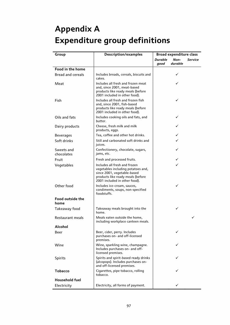
97
Appendix A Expenditure group definitions
Group Description/examples Broad expenditure classDurable
good Non-
durable Service
Food in the home
Bread and cereals Includes breads, cereals, biscuits and cakes.
Meat Includes all fresh and frozen meat and, since 2001, meat-based products like ready meals (before 2001 included in other food).
Fish Includes all fresh and frozen fish and, since 2001, fish-based products like ready meals (before 2001 included in other food).
Oils and fats Includes cooking oils and fats, and butter.
Dairy products Cheese, fresh milk and milk products, eggs.
Beverages Tea, coffee and other hot drinks.
Soft drinks Still and carbonated soft drinks and juices.
Sweets and chocolates
Confectionery, chocolate, sugars, jams, etc.
Fruit Fresh and processed fruits.
Vegetables Includes all fresh and frozen vegetables including potatoes and, since 2001, vegetable-based products like ready meals (before 2001 included in other food).
Other food Includes ice-cream, sauces, condiments, soups, non-specified foodstuffs.
Food outside the home
Takeaway food Takeaway meals brought into the home.
Restaurant meals Meals eaten outside the home, including workplace canteen meals.
Alcohol
Beer Beer, cider, perry. Includes purchases on- and off-licensed premises.
Wine Wine, sparkling wine, champagne. Includes purchases on- and off-licensed premises.
Spirits Spirits and spirit-based ready drinks (alcopops). Includes purchases on- and off-licensed premises.
Tobacco Cigarettes, pipe tobacco, rolling tobacco.
Household fuel
Electricity Electricity, all forms of payment.

The expenditure experience of older households
98
Group Description/examples Broad expenditure class Durable
good Non-
durableService
Gas Gas, all forms of payment.
Other fuel Coal, oil, wood, etc.
Clothing
Menswear Men’s outerwear, underwear and accessories.
Womenswear Women’s outerwear, underwear and accessories.
Childrenswear Children’s outerwear, underwear and accessories.
Other clothing Footwear, clothing materials, haberdashery costs, unspecified clothing purchases.
Household goods
Furniture Household and garden furniture.
Furnishings Household and garden furnishings and decorative items.
Appliances Large durable domestic electric and gas appliances such as cookers, washing machines, fridges, microwaves, vacuum cleaners and so on.
Household equipment Kitchen utensils and cutlery, glassware, china, tools and DIY expenditures.
Household consumables
Electric consumables (batteries, etc.), kitchen disposables (e.g. tin foil), cleaning products, toilet roll, stationery, cards, etc.
Household services
Repairs Repairs to appliances, clothing, furniture, etc.
Childcare Nanny, childminder, playschool, crèche (not educational payments).
Other household services
Service charges, dry cleaning, launderette, skip hire, cleaners, gardeners, au pair.
Communications
Telephony equipment Telephone, mobile phone, modem purchase.
Telephone bills Telephone, mobile, Internet bills.
Postage Stamps and other postage fees.
Health care
Medical services Hospital and ambulance services, medical insurance, dental care, optical care.
Medical goods Prescription charges, other medical goods, wheelchairs, spectacles and lenses.
Education Includes fees for people inside and outside the home, money for school trips, etc.
Personal spending
Personal durables Personal appliances (e.g. hairdryer), leather goods, baby equipment, jewellery.
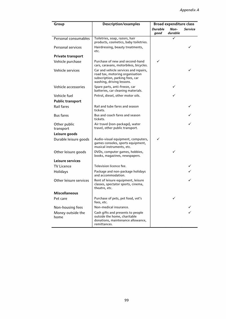
Appendix A
99
Group Description/examples Broad expenditure classDurable
good Non-
durable Service
Personal consumables Toiletries, soap, razors, hair products, cosmetics, baby toiletries.
Personal services Hairdressing, beauty treatments, etc.
Private transport
Vehicle purchase Purchase of new and second-hand cars, caravans, motorbikes, bicycles.
Vehicle services Car and vehicle services and repairs, road tax, motoring organisation subscription, parking fees, car washing, driving lessons.
Vehicle accessories Spare parts, anti-freeze, car batteries, car cleaning materials.
Vehicle fuel Petrol, diesel, other motor oils.
Public transport
Rail fares Rail and tube fares and season tickets.
Bus fares Bus and coach fares and season tickets.
Other public transport
Air travel (non-package), water travel, other public transport.
Leisure goods
Durable leisure goods Audio-visual equipment, computers, games consoles, sports equipment, musical instruments, etc.
Other leisure goods DVDs, computer games, hobbies, books, magazines, newspapers.
Leisure services
TV Licence Television licence fee.
Holidays Package and non-package holidays and accommodation.
Other leisure services Rent of leisure equipment, leisure classes, spectator sports, cinema, theatre, etc.
Miscellaneous
Pet care Purchase of pets, pet food, vet’s fees, etc.
Non-housing fees Non-medical insurance.
Money outside the home
Cash gifts and presents to people outside the home, charitable donations, maintenance allowance, remittances.

Appendix B Detailed budget shares, 1995 and 2007
All households Pensioner hh Households 80+ Richest 20% (pensioners)
Poorest 20% (pensioners)
95 07 ∆ 95 07 ∆ 95 07 ∆ 95 07 ∆ 95 07 ∆
Bread & cereals
3.1 (0.03)
2.9 (0.03)
−0.2 4.1 (0.06)
3.5 (0.07)
−0.6 4.8 (0.16)
4.3 (0.19)
−0.5 2.2 (0.13)
1.8 (0.11)
−0.4 5.2 (0.14)
4.8 (0.17)
−0.4
Meat 4.1 (0.04)
3.8 (0.05)
−0.3 5.3 (0.09)
4.8 (0.10)
−0.6 5.9 (0.23)
5.4 (0.23)
−0.5 2.9 (0.22)
2.9 (0.22)
0.0 6.7 (0.21)
6.2 (0.23)
−0.5
Fish 0.7 (0.01)
0.8 (0.02)
0.1 1.2 (0.04)
1.2 (0.04)
0.0 1.5 (0.10)
1.6 (0.11)
0.0 1.0 (0.12)
1.0 (0.14)
0.0 1.5 (0.08)
1.4 (0.09)
−0.1
Oils & fats 0.5 (0.01)
0.4 (0.01)
−0.1 0.8 (0.02)
0.6 (0.02)
−0.2 0.9 (0.05)
0.6 (0.04)
−0.3 0.4 (0.03)
0.3 (0.04)
0.0 1.0 (0.04)
0.8 (0.05)
−0.2
Dairy products
2.9 (0.03)
2.4 (0.03)
−0.5 3.6 (0.05)
2.9 (0.06)
−0.7 4.4 (0.14)
3.5 (0.15)
−0.9 2.3 (0.13)
1.6 (0.11)
−0.7 4.5 (0.12)
3.8 (0.14)
−0.7
Beverages 0.7 (0.01)
0.4 (0.01)
−0.3 1.0 (0.03)
0.6 (0.02)
−0.4 1.1 (0.06)
0.7 (0.06)
−0.4 0.6 (0.06)
0.3 (0.03)
−0.3 1.3 (0.06)
0.8 (0.06)
−0.5
Soft drinks 0.9 (0.01)
1.0 (0.02)
0.1 0.8 (0.02)
0.8 (0.03)
0.1 0.7 (0.06)
0.8 (0.07)
0.1 0.6 (0.06)
0.6 (0.07)
0.0 0.8 (0.05)
0.9 (0.07)
0.1
Sweets & chocs.
1.0 (0.02)
0.9 (0.02)
−0.1 1.3 (0.04)
1.1 (0.04)
−0.2 1.4 (0.09)
1.5 (0.12)
0.0 0.8 (0.09)
0.6 (0.08)
−0.2 1.8 (0.09)
1.4 (0.1)
−0.3
Fruit 1.2 (0.02)
1.4 (0.02)
0.2 1.8 (0.04)
2.0 (0.05)
0.2 2.1 (0.10)
2.4 (0.12)
0.3 1.3 (0.09)
1.5 (0.10)
0.2 2.1 (0.09)
2.3 (0.11)
0.2
Vegetables 2.6 (0.03)
2.5 (0.03)
−0.2 2.9 (0.05)
2.8 (0.06)
0.0 2.8 (0.11)
2.8 (0.12)
0.0 1.9 (0.12)
2.0 (0.20)
0.0 3.5 (0.11)
3.5 (0.13)
-0.1
Other food 2.0 (0.03)
1.1 (0.02)
−0.9 2.0 (0.05)
1.0 (0.03)
−0.9 2.2 (0.14)
1.1 (0.07)
−1.1 1.3 (0.11)
0.7 (0.06)
−0.6 2.4 (0.12)
1.3 (0.07)
−1.1
Food in 19.8 (0.14)
17.6 (0.15)
−2.2 24.8 (0.27)
21.3 (0.3)
−3.4 27.9 (0.64)
24.8 (0.68)
−3.1 15.4 (0.72)
13.4 (0.72)
−2.0 30.7 (0.56)
27.2 (0.68)
−3.5
Takeaway 2.3 (0.04)
2.3 (0.05)
0.0 1.2 (0.06)
1.0 (0.05)
−0.2 1.5 (0.19)
0.8 (0.11)
−0.7 0.7 (0.10)
0.9 (0.12)
0.2 1.2 (0.12)
0.9 (0.11)
−0.2
Restaurant 3.7 (0.06)
4.0 (0.07)
0.3 3.1 (0.11)
3.8 (0.13)
0.6 2.8 (0.27)
3.7 (0.32)
0.9 4.5 (0.42)
4.4 (0.36)
−0.2 2.6 (0.25)
3.1 (0.26)
0.5

Food out 5.9 (0.07)
6.2 (0.09)
0.3 4.3 (0.13)
4.7 (0.14)
0.4 4.3 (0.34)
4.5 (0.33)
0.2 5.2 (0.42)
5.2 (0.38)
0.0 3.8 (0.29)
4.1 (0.28)
0.3
Beer 3.2 (0.07)
2.1 (0.06)
−1.1 1.6 (0.09)
1.5 (0.09)
−0.1 1.1 (0.18)
0.7 (0.13)
−0.4 1.2 (0.22)
0.9 (0.15)
−0.3 0.8 (0.11)
1.3 (0.16)
0.5
Wine 1.0 (0.02)
1.3 (0.03)
0.3 0.8 (0.04)
1.2 (0.06)
0.4 0.8 (0.11)
0.9 (0.13)
0.1 1.7 (0.19)
2.2 (0.25)
0.5 0.5 (0.08)
0.9 (0.12)
0.4
Spirits 0.8 (0.03)
0.8 (0.03)
0.1 0.9 (0.06)
0.9 (0.06)
0.0 0.8 (0.14)
1.0 (0.16)
0.1 1.2 (0.22)
0.6 (0.12)
−0.6 0.6 (0.10)
0.8 (0.13)
0.2
Alcohol 4.9 (0.09)
4.2 (0.08)
−0.7 3.3 (0.13)
3.6 (0.14)
0.3 2.7 (0.27)
2.6 (0.26)
−0.1 4.1 (0.41)
3.7 (0.37)
−0.4 1.9 (0.18)
3.0 (0.26)
1.1
Tobacco 3.1 (0.07)
1.7 (0.07)
−1.4 2.4 (0.13)
1.4 (0.12)
−1.1 1.5 (0.26)
0.7 (0.20)
−0.8 0.9 (0.20)
0.5 (0.15)
−0.4 2.4 (0.27)
1.5 (0.27)
−0.9
Electricity 4.1 (0.05)
3.6 (0.06)
−0.5 5.4 (0.11)
4.7 (0.12)
−0.7 7.1 (0.30)
6.8 (0.36)
−0.3 3.1 (0.22)
2.6 (0.17)
−0.5 7.5 (0.25)
6.5 (0.37)
−1.0
Gas 3.1 (0.05)
3.1 (0.05)
0.0 4.1 (0.11)
4.0 (0.11)
−0.1 4.7 (0.27)
5.2 (0.30)
0.5 2.5 (0.21)
2.5 (0.20)
0.0 5.1 (0.26)
4.5 (0.28)
−0.6
Other fuel 0.5 (0.03)
0.4 (0.03)
−0.1 0.8 (0.08)
0.5 (0.07)
−0.3 0.9 (0.21)
0.7 (0.23)
−0.2 0.7 (0.24)
0.6 (0.28)
−0.1 1.1 (0.21)
0.6 (0.15)
−0.5
Household fuel 7.7 (0.08)
7.0 (0.09)
−0.7 10.3 (0.17)
9.2 (0.19)
−1.1 12.7 (0.41)
12.7 (0.50)
0.0 6.3 (0.40)
5.7 (0.41)
−0.6 13.7 (0.39)
11.7 (0.47)
−2.0
Menswear 1.3 (0.05)
1.2 (0.05)
−0.1 0.8 (0.07)
0.9 (0.07)
0.1 0.3 (0.07)
0.8 (0.17)
0.4 0.9 (0.34)
1.1 (0.22)
0.3 0.4 (0.10)
0.8 (0.17)
0.4
Womenswear 2.4 (0.06)
2.4 (0.06)
0.1 2.3 (0.12)
2.4 (0.13)
0.1 1.7 (0.24)
2.1 (0.31)
0.4 2.5 (0.35)
2.3 (0.28)
−0.2 1.9 (0.23)
2.3 (0.25)
0.4
Childrenswear 0.8 (0.03)
0.6 (0.03)
−0.2 0.3 (0.04)
0.2 (0.03)
0.0 0.1 (0.06)
0.1 (0.04)
0.0 0.4 (0.15)
0.4 (0.11)
0.0 0.1 (0.04)
0.2 (0.04)
0.0
Other clothing 1.4 (0.04)
1.2 (0.04)
−0.3 1.2 (0.08)
0.8 (0.07)
−0.4 1.0 (0.18)
0.8 (0.18)
−0.3 1.1 (0.21)
0.8 (0.14)
−0.3 1.2 (0.16)
0.8 (0.14)
−0.4
Clothing 5.9 (0.1)
5.4 (0.1)
−0.6 4.6 (0.17)
4.3 (0.18)
−0.2 3.1 (0.33)
3.7 (0.42)
0.6 4.8 (0.55)
4.6 (0.46)
−0.2 3.7 (0.31)
4.1 (0.38)
0.4
Furniture 2.0 (0.08)
2.5 (0.1)
0.6 1.5 (0.14)
2.1 (0.18)
0.7 1.2 (0.29)
1.9 (0.44)
0.7 1.5 (0.41)
3.7 (0.81)
2.3 1.1 (0.26)
1.4 (0.29)
0.3
Furnishings 1.8 (0.06)
1.7 (0.06)
−0.1 1.8 (0.12)
1.7 (0.12)
−0.1 1.5 (0.25)
1.1 (0.26)
−0.4 1.6 (0.37)
1.9 (0.40)
0.2 1.6 (0.22)
1.8 (0.25)
0.2
Appliances 1.1 (0.06)
0.8 (0.06)
−0.3 1.2 (0.13)
0.9 (0.13)
−0.2 0.7 (0.21)
1.2 (0.39)
0.5 1.1 (0.34)
1.0 (0.32)
−0.1 1.1 (0.30)
0.9 (0.32)
−0.2
HH equip 2.0 (0.06)
1.4 (0.05)
−0.6 1.7 (0.1)
1.4 (0.1)
−0.4 1.1 (0.19)
0.8 (0.12)
−0.4 2.0 (0.38)
1.4 (0.23)
−0.6 1.3 (0.18)
1.4 (0.24)
0.1
HH consumab 2.2 (0.03)
2.0 (0.03)
−0.2 2.6 (0.05)
2.3 (0.06)
−0.3 2.7 (0.13)
2.2 (0.13)
−0.5 1.9 (0.15)
1.5 (0.11)
−0.3 3.2 (0.13)
2.7 (0.13)
−0.5
HH goods 9.1 (0.14)
8.4 (0.15)
−0.7 8.8 (0.26)
8.4 (0.29)
−0.3 7.3 (0.51)
7.3 (0.67)
0.0 8.1 (0.79)
9.6 (0.96)
1.5 8.3 (0.5)
8.1 (0.61)
−0.2

Repairs 1.7 (0.06)
1.5 (0.07)
−0.2 2.6 (0.13)
2.2 (0.15)
−0.4 2.9 (0.3)
2.7 (0.44)
−0.2 3.6 (0.46)
2.3 (0.32)
−1.3 1.6 (0.21)
1.7 (0.3)
0.1
Childcare 0.3 (0.03)
0.4 (0.04)
0.1 0.0 (0.01)
0.0 (0.00)
0.0 0.0 (0.00)
0.0 (0.00)
0.0 0.1 (0.09)
0.0 (0.00)
−0.1 0.0 (0.00)
0.0 (0.00)
0.0
Other HH servs 1.3 (0.05)
1.0 (0.06)
−0.3 2.4 (0.16)
2.0 (0.17)
−0.4 5.1 (0.53)
4.7 (0.58)
−0.5 3.5 (0.73)
2.1 (0.44)
−1.5 2.3 (0.30)
1.7 (0.33)
−0.6
HH services 3.3 (0.09)
2.9 (0.1)
−0.4 5.0 (0.21)
4.2 (0.23)
−0.8 8 (0.59)
7.4 (0.71)
−0.6 7.2 (0.84)
4.4 (0.58)
−2.8 3.9 (0.36)
3.4 (0.47)
−0.5
Tel equip 0.1 (0.01)
0.2 (0.02)
0.1 0.0 (0.01)
0.1 (0.04)
0.1 0.0 (0.00)
0.1 (0.06)
0.1 0.0 (0.02)
0.1 (0.07)
0.1 0.0 (0.00)
0.1 (0.06)
0.1
Telephone bills 2.9 (0.04)
4.1 (0.06)
1.2 3.6 (0.07)
3.8 (0.08)
0.2 4.2 (0.17)
4.1 (0.18)
−0.1 2.3 (0.17)
2.3 (0.14)
0.0 4.7 (0.15)
4.7 (0.19)
0.0
Postage 0.3 (0.01)
0.2 (0.01)
−0.2 0.5 (0.03)
0.3 (0.02)
−0.3 0.6 (0.07)
0.4 (0.06)
−0.2 0.5 (0.06)
0.3 (0.06)
−0.3 0.7 (0.07)
0.3 (0.06)
−0.4
Communication 3.3 (0.04)
4.4 (0.06)
1.1 4.2 (0.08)
4.2 (0.09)
0.0 4.8 (0.18)
4.6 (0.20)
−0.3 2.9 (0.19)
2.7 (0.16)
−0.2 5.4 (0.17)
5.1 (0.20)
−0.3
Medical services 0.8 (0.04)
1.0 (0.05)
0.2 1.1 (0.1)
1.6 (0.14)
0.6 1.4 (0.31)
1.7 (0.32)
0.3 3.7 (0.60)
4.2 (0.62)
0.5 0.7 (0.21)
0.9 (0.24)
0.2
Medical goods 0.9 (0.04)
0.9 (0.04)
0.0 1.2 (0.09)
1.2 (0.10)
−0.1 1.3 (0.19)
1.5 (0.27)
0.2 1 (0.25)
1.3 (0.32)
0.3 1.3 (0.18)
1.2 (0.22)
−0.1
Health care 1.7 (0.06)
1.8 (0.07)
0.2 2.3 (0.13)
2.8 (0.17)
0.5 2.7 (0.37)
3.2 (0.42)
0.5 4.7 (0.66)
5.5 (0.67)
0.8 2.0 (0.28)
2.1 (0.32)
0.1
Education 0.7 (0.04)
0.9 (0.07)
0.3 0.0 (0.02)
0.2 (0.05)
0.1 0.0 (0.00)
0.0 (0.00)
0.0 0.1 (0.11)
0.6 (0.21)
0.4 0.0 (0.00)
0.0 (0.04)
0.0
Personal durab 0.5 (0.03)
0.7 (0.04)
0.2 0.3 (0.04)
0.5 (0.05)
0.2 0.2 (0.07)
0.2 (0.07)
0.0 0.4 (0.11)
0.8 (0.17)
0.4 0.2 (0.05)
0.4 (0.08)
0.2
Pers consumab 1.9 (0.03)
1.7 (0.03)
−0.2 1.4 (0.05)
1.5 (0.05)
0.1 1.2 (0.09)
1.3 (0.12)
0.1 1.0 (0.09)
1.4 (0.11)
0.4 1.5 (0.09)
1.5 (0.14)
0.1
Personal servs 0.9 (0.03)
0.9 (0.03)
0.0 1.5 (0.06)
1.3 (0.07)
−0.2 1.9 (0.16)
1.9 (0.21)
0.0 1.4 (0.21)
0.8 (0.10)
−0.6 1.7 (0.16)
1.3 (0.17)
−0.4
Personal 3.3 (0.05)
3.3 (0.06)
0.0 3.2 (0.09)
3.3 (0.10)
0.1 3.3 (0.20)
3.4 (0.24)
0.1 2.8 (0.28)
3.0 (0.25)
0.1 3.4 (0.19)
3.2 (0.24)
−0.1
Vehicle purch 3.4 (0.12)
4.5 (0.14)
1.1 1.6 (0.19)
2.9 (0.22)
1.4 0.8 (0.31)
1.2 (0.33)
0.4 4.6 (1.07)
5.0 (0.85)
0.4 0.4 (0.20)
1.8 (0.38)
1.4
Vehicle servs 5.7 (0.08)
6.3 (0.09)
0.6 5.1 (0.15)
5.9 (0.16)
0.8 3.8 (0.33)
5.8 (0.41)
2.0 6.3 (0.36)
6.0 (0.41)
−0.3 3.4 (0.29)
4.8 (0.31)
1.4
Vehicle acc 0.2 (0.02)
0.5 (0.03)
0.3 0.1 (0.01)
0.5 (0.06)
0.4 0.1 (0.03)
0.2 (0.10)
0.1 0.1 (0.03)
0.4 (0.13)
0.3 0.1 (0.03)
0.2 (0.08)
0.2
Vehicle fuel 4.4 (0.06)
5.1 (0.08)
0.7 2.8 (0.09)
4.0 (0.13)
1.2 1.4 (0.17)
2.8 (0.29)
1.5 4.1 (0.29)
4.5 (0.40)
0.3 1.6 (0.17)
3.3 (0.26)
1.8
Private transp 13.6 (0.17)
16.3 (0.21)
2.7 9.5 (0.28)
13.3 (0.33)
3.8 6.1 (0.54)
10.0 (0.69)
3.9 15.1 (1.14)
15.8 (1.06)
0.8 5.4 (0.45)
10.2 (0.64)
4.8
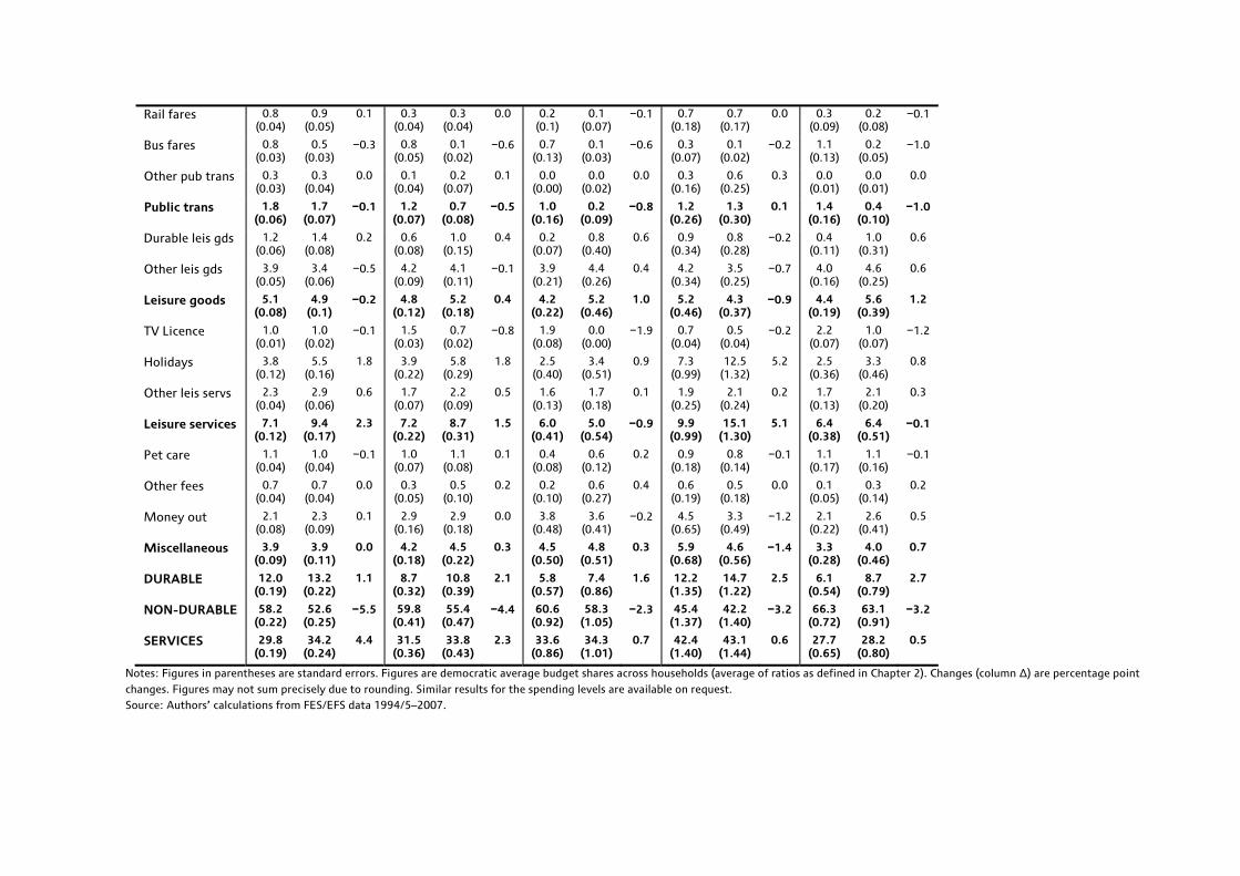
Rail fares 0.8 (0.04)
0.9 (0.05)
0.1 0.3 (0.04)
0.3 (0.04)
0.0 0.2 (0.1)
0.1 (0.07)
−0.1 0.7 (0.18)
0.7 (0.17)
0.0 0.3 (0.09)
0.2 (0.08)
−0.1
Bus fares 0.8 (0.03)
0.5 (0.03)
−0.3 0.8 (0.05)
0.1 (0.02)
−0.6 0.7 (0.13)
0.1 (0.03)
−0.6 0.3 (0.07)
0.1 (0.02)
−0.2 1.1 (0.13)
0.2 (0.05)
−1.0
Other pub trans 0.3 (0.03)
0.3 (0.04)
0.0 0.1 (0.04)
0.2 (0.07)
0.1 0.0 (0.00)
0.0 (0.02)
0.0 0.3 (0.16)
0.6 (0.25)
0.3 0.0 (0.01)
0.0 (0.01)
0.0
Public trans 1.8 (0.06)
1.7 (0.07)
−0.1 1.2 (0.07)
0.7 (0.08)
−0.5 1.0 (0.16)
0.2 (0.09)
−0.8 1.2 (0.26)
1.3 (0.30)
0.1 1.4 (0.16)
0.4 (0.10)
−1.0
Durable leis gds 1.2 (0.06)
1.4 (0.08)
0.2 0.6 (0.08)
1.0 (0.15)
0.4 0.2 (0.07)
0.8 (0.40)
0.6 0.9 (0.34)
0.8 (0.28)
−0.2 0.4 (0.11)
1.0 (0.31)
0.6
Other leis gds 3.9 (0.05)
3.4 (0.06)
−0.5 4.2 (0.09)
4.1 (0.11)
−0.1 3.9 (0.21)
4.4 (0.26)
0.4 4.2 (0.34)
3.5 (0.25)
−0.7 4.0 (0.16)
4.6 (0.25)
0.6
Leisure goods 5.1 (0.08)
4.9 (0.1)
−0.2 4.8 (0.12)
5.2 (0.18)
0.4 4.2 (0.22)
5.2 (0.46)
1.0 5.2 (0.46)
4.3 (0.37)
−0.9 4.4 (0.19)
5.6 (0.39)
1.2
TV Licence 1.0 (0.01)
1.0 (0.02)
−0.1 1.5 (0.03)
0.7 (0.02)
−0.8 1.9 (0.08)
0.0 (0.00)
−1.9 0.7 (0.04)
0.5 (0.04)
−0.2 2.2 (0.07)
1.0 (0.07)
−1.2
Holidays 3.8 (0.12)
5.5 (0.16)
1.8 3.9 (0.22)
5.8 (0.29)
1.8 2.5 (0.40)
3.4 (0.51)
0.9 7.3 (0.99)
12.5 (1.32)
5.2 2.5 (0.36)
3.3 (0.46)
0.8
Other leis servs 2.3 (0.04)
2.9 (0.06)
0.6 1.7 (0.07)
2.2 (0.09)
0.5 1.6 (0.13)
1.7 (0.18)
0.1 1.9 (0.25)
2.1 (0.24)
0.2 1.7 (0.13)
2.1 (0.20)
0.3
Leisure services 7.1 (0.12)
9.4 (0.17)
2.3 7.2 (0.22)
8.7 (0.31)
1.5 6.0 (0.41)
5.0 (0.54)
−0.9 9.9 (0.99)
15.1 (1.30)
5.1 6.4 (0.38)
6.4 (0.51)
−0.1
Pet care 1.1 (0.04)
1.0 (0.04)
−0.1 1.0 (0.07)
1.1 (0.08)
0.1 0.4 (0.08)
0.6 (0.12)
0.2 0.9 (0.18)
0.8 (0.14)
−0.1 1.1 (0.17)
1.1 (0.16)
−0.1
Other fees 0.7 (0.04)
0.7 (0.04)
0.0 0.3 (0.05)
0.5 (0.10)
0.2 0.2 (0.10)
0.6 (0.27)
0.4 0.6 (0.19)
0.5 (0.18)
0.0 0.1 (0.05)
0.3 (0.14)
0.2
Money out 2.1 (0.08)
2.3 (0.09)
0.1 2.9 (0.16)
2.9 (0.18)
0.0 3.8 (0.48)
3.6 (0.41)
−0.2 4.5 (0.65)
3.3 (0.49)
−1.2 2.1 (0.22)
2.6 (0.41)
0.5
Miscellaneous 3.9 (0.09)
3.9 (0.11)
0.0 4.2 (0.18)
4.5 (0.22)
0.3 4.5 (0.50)
4.8 (0.51)
0.3 5.9 (0.68)
4.6 (0.56)
−1.4 3.3 (0.28)
4.0 (0.46)
0.7
DURABLE 12.0 (0.19)
13.2 (0.22)
1.1 8.7 (0.32)
10.8 (0.39)
2.1 5.8 (0.57)
7.4 (0.86)
1.6 12.2 (1.35)
14.7 (1.22)
2.5 6.1 (0.54)
8.7 (0.79)
2.7
NON-DURABLE 58.2 (0.22)
52.6 (0.25)
−5.5 59.8 (0.41)
55.4 (0.47)
−4.4 60.6 (0.92)
58.3 (1.05)
−2.3 45.4 (1.37)
42.2 (1.40)
−3.2 66.3 (0.72)
63.1 (0.91)
−3.2
SERVICES 29.8 (0.19)
34.2 (0.24)
4.4 31.5 (0.36)
33.8 (0.43)
2.3 33.6 (0.86)
34.3 (1.01)
0.7 42.4 (1.40)
43.1 (1.44)
0.6 27.7 (0.65)
28.2 (0.80)
0.5
Notes: Figures in parentheses are standard errors. Figures are democratic average budget shares across households (average of ratios as defined in Chapter 2). Changes (column ∆) are percentage point changes. Figures may not sum precisely due to rounding. Similar results for the spending levels are available on request. Source: Authors’ calculations from FES/EFS data 1994/5–2007.

104
Appendix C Housing expenditure levels
Here, we show details of total housing spending for the start and end of our data period for some of the key demographic groups. All spending level figures are rounded to the nearest whole pound per week and are expressed in December 2007 prices using the all-items Retail Prices Index. The ∆ column shows changes between 1995 and 2007: for levels, they are real-terms percentage changes and for budget shares, percentage point changes. Results for other groups studied in the Commentary are available on request.
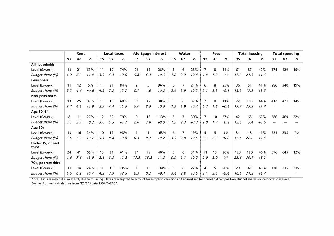
Rent Local taxes Mortgage interest Water Fees Total housing Total spending 95 07 ∆ 95 07 ∆ 95 07 ∆ 95 07 ∆ 95 07 ∆ 95 07 ∆ 95 07 ∆
All households
Level (£/week) 13 21 63% 11 19 74% 26 33 28% 5 6 28% 7 8 14% 61 87 42% 374 429 15%
Budget share (%) 4.2 6.0 +1.8 3.3 5.3 +2.0 5.8 6.3 +0.5 1.8 2.2 +0.4 1.8 1.8 0.0 17.0 21.5 +4.6 ― ― ―
Pensioners
Level (£/week) 11 12 5% 11 21 84% 2 5 96% 6 7 21% 6 8 25% 36 51 41% 286 340 19%
Budget share (%) 5.2 4.6 −0.6 4.5 7.2 +2.7 0.7 1.0 +0.2 2.6 2.9 +0.2 2.2 2.2 +0.1 15.2 17.8 +2.5 ― ― ―
Non-pensioners
Level (£/week) 13 25 87% 11 18 68% 36 47 30% 5 6 32% 7 8 11% 72 103 44% 412 471 14%
Budget share (%) 3.7 6.6 +2.9 2.9 4.4 +1.5 8.0 8.9 +0.9 1.5 1.9 +0.4 1.7 1.6 −0.1 17.7 23.3 +5.7 ― ― ―
Age 60–64
Level (£/week) 8 11 27% 12 22 79% 9 18 113% 5 7 30% 7 10 37% 42 68 62% 386 469 22%
Budget share (%) 3.1 2.9 −0.2 3.8 5.5 +1.7 2.0 3.0 +0.9 1.9 2.3 +0.3 2.0 1.9 −0.1 12.8 15.4 +2.6 ― ― ―
Age 80+
Level (£/week) 13 16 24% 10 19 98% 1 1 163% 6 7 19% 5 5 3% 34 48 41% 221 238 7%
Budget share (%) 6.5 7.2 +0.7 5.1 8.8 +3.8 0.3 0.4 +0.2 3.3 3.8 +0.5 2.4 2.6 +0.2 17.4 22.8 +5.4 ― ― ―
Under 35, richest third
Level (£/week) 24 41 69% 13 21 61% 71 99 40% 5 6 31% 11 13 26% 123 180 46% 576 645 12%
Budget share (%) 4.6 7.6 +3.0 2.6 3.8 +1.2 13.5 15.2 +1.8 0.9 1.1 +0.2 2.0 2.0 0.0 23.6 29.7 +6.1 ― ― ―
70+, poorest third
Level (£/week) 11 14 24% 8 16 105% 1 0 −34% 5 6 27% 4 5 28% 29 41 45% 178 215 21%
Budget share (%) 6.5 6.9 +0.4 4.3 7.9 +3.5 0.3 0.2 −0.1 3.4 3.8 +0.5 2.1 2.4 +0.4 16.6 21.3 +4.7 ― ― ―
Notes: Figures may not sum exactly due to rounding. Data are weighted to account for sampling variation and equivalised for household composition. Budget shares are democratic averages. Source: Authors’ calculations from FES/EFS data 1994/5–2007.
106
References
Attanasio, O., Battistin, E. and Leicester, A. (2006), From Micro to Macro, from Poor to Rich: Consumption and Income in the UK and the US, University of Michigan National Poverty Center, mimeo (http://www.npc.umich.edu/news/events/consumption06_agenda/Attanasio-Battistin-Leicester.pdf). Banks, J., Blundell, R. and Lewbel, A. (1997), ‘Quadratic Engel curves and consumer demand’, The Review of Economics and Statistics, vol. 79, no. 4 (November), pp. 527–39. Blow, L., Leicester, A. and Oldfield, Z. (2004), Consumption Trends in the UK, 1975–99, Report no. 65, London: Institute for Fiscal Studies (http://www.ifs.org.uk/comms/r65.pdf). Blundell, R. and Preston, I. (1998), ‘Consumption inequality and income uncertainty’, The Quarterly Journal of Economics, vol. 113, no. 2, pp. 603–40. Brewer, M., Goodman, A., Shaw, J. and Shephard, A. (2005), Poverty and Inequality in Britain: 2005, Commentary no. 99, London: Institute for Fiscal Studies (http://www.ifs.org.uk/comms/comm99.pdf). Brewer, M., Goodman, A. and Leicester, A. (2006), Household Spending in Britain: What Can it Teach us about Poverty?, Joseph Rowntree Foundation, Bristol: The Policy Press (http://www.jrf.org.uk/sites/files/jrf/9781861348555.pdf). Brewer, M., Muriel, A., Phillips, D. and Sibieta, L. (2008), Poverty and Inequality in the UK: 2008, Commentary no. 105, London: Institute for Fiscal Studies (http://www.ifs.org.uk/comms/comm105.pdf). Brewer, M., Muriel, A., Phillips, D. and Sibieta, L. (2009), Poverty and Inequality in the UK: 2009, Commentary no. 109, London: Institute for Fiscal Studies (http://www.ifs.org.uk/comms/c109.pdf). Consumer Focus (2009), Call to Prevent Energy Suppliers from Overcharging (press release) (http://consumerfocus.org.uk/en/content/cms/News___Press/Call_to_prevent_ener/Call_to_prevent_ener.aspx). Department for Social Development Northern Ireland (DSDNI) (2003), Towards a Fuel Poverty Strategy for Northern Ireland: Consultation Paper (http://www.dsdni.gov.uk/fuel_poverty.pdf). Finch, N. and Kemp, P. (2006), Which Pensioners Don’t Spend their Income and Why?, Research Report no. 334, London: Department for Work and Pensions (http://research.dwp.gov.uk/asd/asd5/rports2005-2006/rrep334.pdf). The Independent (2008), ‘Power giants “making millions from poorest”’ (http://www.independent.co.uk/news/uk/home-news/power-giants-making-millions-from-poorest-1020038.html). Leicester, A., O’Dea, C. and Oldfield, Z. (2008), The Inflation Experience of Older Households, Commentary no. 106, London: Institute for Fiscal Studies (http://www.ifs.org.uk/comms/comm106.pdf).

References
107
Leicester, A., O’Dea, C. and Oldfield, Z. (2009), How does Inflation Affect Different Households?, IFS presentation for ESRC Festival of Social Science 2009 (http://www.ifs.org.uk/conferences/fss09_slides.ppt). Marmot, M., Banks, J., Blundell, R., Lessof, C. and Nazroo, J. (eds) (2003), Health, Wealth and Lifestyles of the Older Population in England: The 2002 English Longitudinal Study of Ageing, London: Institute for Fiscal Studies (http://www.ifs.org.uk/elsa/report_wave1.php). Meyer, B. D. and Sullivan, J. X. (2007), Consumption and Income Poverty for those 65 and Over, Harris School Working Paper Series 07.21 (http://harrisschool.uchicago.edu/About/publications/working-papers/pdf/wp_07_21.pdf) Meyer, B. D. and Sullivan, J. X. (2009), Five Decades of Consumption and Income Poverty, NBER Working Paper 14827 National Consumer Council (2004), ‘Lifelines – affordable utilities’ in Why do the Poor Pay More … or Get Less?, London: National Consumer Council. Ofgem (2008), Energy Supply Probe – Initial Findings, London: Ofgem (http://www.ofgem.gov.uk/Markets/RetMkts/ensuppro/Documents1/Energy%20Supply%20Probe%20-%20Initial%20Findings%20Report.pdf). Tanner, S. (1998), ‘How much do consumers spend? Comparing the FES and National Accounts’, in J. Banks, and P. Johnson (eds), How Reliable is the Family Expenditure Survey?, Report no. 57, London: Institute for Fiscal Studies (http://www.ifs.org.uk/comms/r57.pdf).