The Elements of Art The Ingredients for a great Composition.
59
The Elements of Art The Ingredients for a great Composition
-
Upload
aubrey-taylor -
Category
Documents
-
view
234 -
download
1
Transcript of The Elements of Art The Ingredients for a great Composition.

The Elements of Art
The Ingredients for a great Composition

What are the elements of art?
The Elements of Art are the “tools” that artists use to make art. There are 7 of them:
Line Value Texture
ShapeForm Space Color

LineA line is a path that a point takes through
space. Lines can be thick, thin, dotted or solid. They can make straight movements, zig-zags, waves or curls.
They may be horizontal
vertical
diagonal

Horizontal Lines are generally restful, like the horizon, where the sky meets land

Vertical lines seem to be reaching, so they may seem inspirational like tall majestic trees or church steeples

Diagonal lines tend to be disturbing. They suggest decay or chaos like lightening or falling trees

Lines can convey emotion as well. They may show excitement, anger, calmness, tension, happiness and many other feelings.Because of this, some are said to be expressive.

Expressive Lines tend to be found in nature and are very organic

Other lines that are very measured, geometric, directional and angular are called Constructive lines. They tend to appear to be man-made because of their precision.
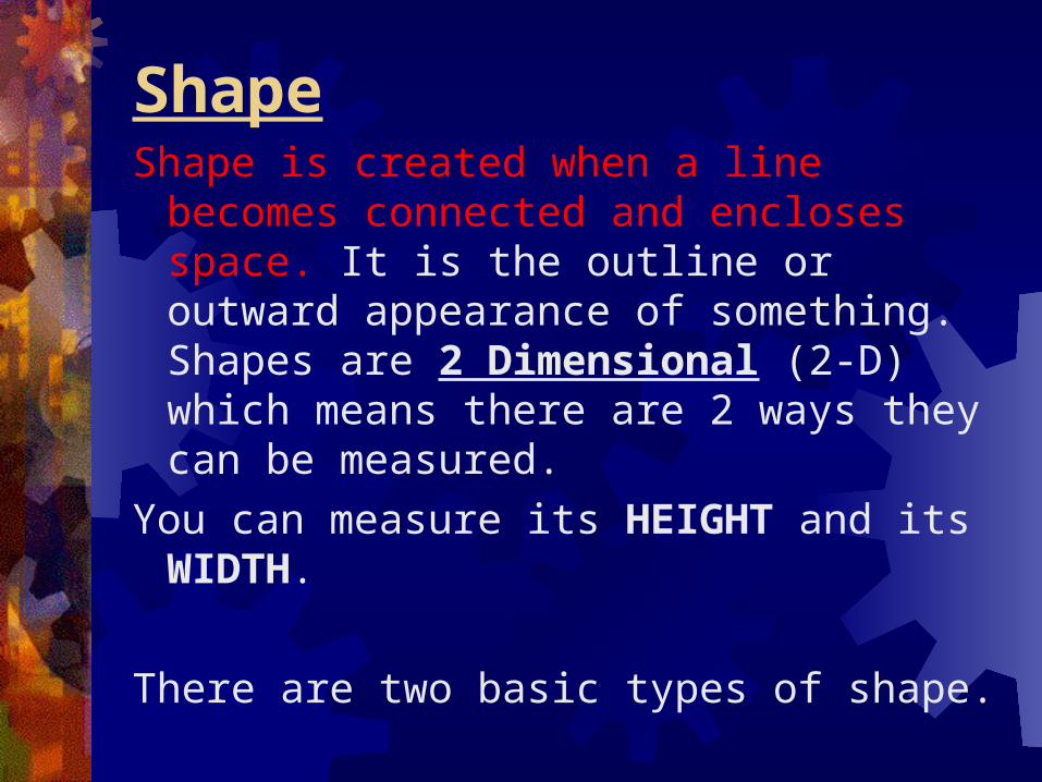
ShapeShape is created when a line becomes
connected and encloses space. It is the outline or outward appearance of something. Shapes are 2 Dimensional (2-D) which means there are 2 ways they can be measured.
You can measure its HEIGHT and its WIDTH.
There are two basic types of shape.

The 2 types of shape
Geometric shapes have smooth even edges and are measurable. The include the square, the circle, the triangle and the rectangle.

Organic shapes have more complicated edges and are usually found in nature. Leaves, flowers, ameba, etc.

FormA Form is a shape that has become 3-
Dimensional (3-D) Form has HEIGHT, WIDTH and DEPTH--which is the 3rd dimension.Depth shows the thickness of the object. Forms are NOT flat like shapes are!
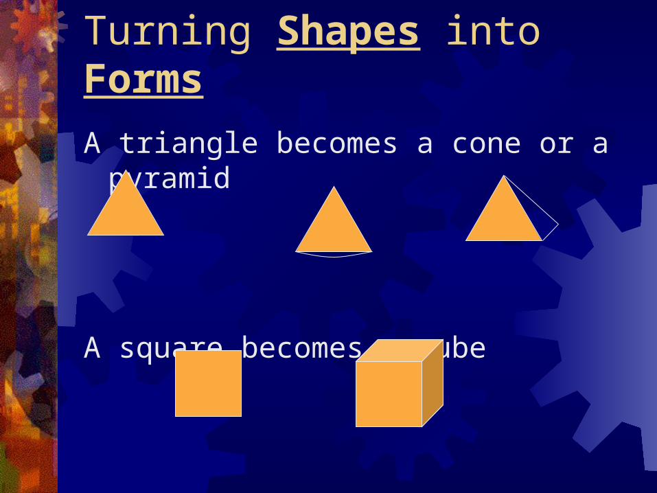
Turning Shapes into Forms
A triangle becomes a cone or a pyramid
A square becomes a cube
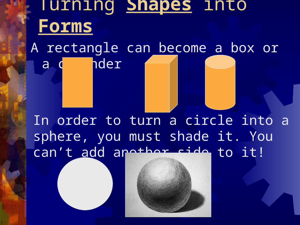
Turning Shapes into FormsA rectangle can become a box or a cylinder
In order to turn a circle into a sphere, you must shade it. You can’t add another side to it!

ValueValue is the lightness or darkness of a
color. Value makes objects appear more real because it imitates natural light. When showing value in a work of art, you will need a LIGHT SOURCE.
A light source is the place where the light is coming from, the darkest areas are always on the opposite side of the light.

ValueIn order to have a successful drawing, you will
need to show a full value range, which means that there are very light areas, middle tones, and very dark areas. This is a way of giving a work of art Contrast.
In drawing value
can be added
several ways:

Ways value can be added:
Cross-hatching is when you use irregular lengths of
parallel lines
that cross over each
other diagonally. The
closer together the
lines are placed, the
darker the value.

Ways value can be addedStippling is the use of dots to create shade.
This is accomplished by placing dots very close together to create dark values and farther apart to create lighter values.

Ways value can be added
Soft shading is when you use your pencil to create soft gradual movements from one value to the next using full value range.

The Element of COLOR Color surrounds us. Color is the most expressive element of
art. The expressive qualities of color are so powerful that they can create instant emotional reactions in people.
Color can add reality and interest to a work of art.

Adds Meaning & Interest to an artwork. Elicits strong emotional response. Franz Marc, The Large Blue Horses, 1911. Marc developed his own personal scheme for the symbolic meaning of color. To him, blue
represented the spiritual, Red represented matter, and in this work he used it to represent the land, Yellow conveyed comfort, green served to set off red, The combination of the abstract, curved forms of the horses and the blue, spiritual color reveal Marc’s philosophy that animals have a purer relationship with the earth than human beings do.
Arbitrary Color (when artists use color to express feelings, ignoring the optical color of objects),

How We Actually See Color Color is an element of art that is derived
from reflected light. You see color because light waves are reflected from objects to your eyes. White light from the sun is actually a combination of all colors.

How We See Color con’t When light passes through a wedge-shaped glass (prism) the beam of white light is bent and separated into bands of color, called the color spectrum.
The colors of the spectrum always appear in the same order: Red, Orange, Yellow, Green, Blue and Violet.Remember the anagram: ROY G BIV

How We See Color con’t Chagall has used many
different tints and shades of blue. He has also used a few other colors for emphasis. Identify some of the objects he has emphasized this way. As the light outside changes throughout the day, how do you think the artwork changes?
Marc Chagall, The American Windows, 1977, Stained Glass

Three Properties of COLOR Three Properties of color work
together to make the colors we see. Hue = The name for a color. Value = Refers to the darkness or
lightness of a color. Intensity = Refers to the brightness or
dullness of a color.

The Color WheelA color wheel- the spectrum bent into a circle. It is a useful tool for organizing colors. 12- color wheel shows the three primary, three secondary, and six intermediate hues.
*Shows us
how colors
are related

Color-Hue
There are 3 primary colors:Red, Yellow and Blue
These colors are primary for 2 reasons:
1. They can’t be mixed to be made2. They make all the other colors on the
color wheel

Color- Hue When you mix 2 primary colors together,
you get a secondary color. For example:
Red and Yellow=Orange
Red and Blue=Violet
Yellow and Blue= Green

Color-Schemes (a plan or design)
2 colors that are directly opposite each other (going across the center) creates a complimentary color scheme
Loud & Demanding. Grabs viewers attention.Used to create special effects


Color- Schemes When you mix a primary and a secondary color
together you get an intermediate (or tertiary) color For example:
1. Red and Orange= Red-Orange2. Yellow and Green=Yellow-Green3. Blue and Green=Blue-Green4. Red and Violet=Red-Violet5. Yellow and Orange=Yellow-Orange6. Blue and Violet=Blue-Violet

Color SchemesColor is divided into groups based on the way
they are placed on the color wheel:
3-4 colors “next-door-neighbors” to each other creates an analogous color scheme

Color TemperaturesWarm colors are those that have Reds,
Yellows and Oranges. Warm colors seem to advance (or come forward) in an artwork. Associated with: sunshine, fire.
Cool colors are those that have Blues, Greens and Violets. Cool colors seem to recede (or go back into) an artwork. They give the impression of calmness. Associated with: Ice, snow water, grass.

Warm Colors
The warm colors in this painting tell us the mood the artist is trying to create.
Rufino Tamayo,Toast to the Sun, 1956

Cold Dark Values The artist has
used green in the blue sky and blue in the green foliage.
How does the
color scheme affect the mood of the painting?
Emily Carr, Above the Trees, 1939

Using Space with Color Temps
Paul Cezanne, The Basket of Apples, 1895 The placement of warm and cool colors can create the illusions of depth. Warm colors
advance toward the viewer, and cool colors seem to recede and pull away. The French artist Paul Cezanne was the first to use warm and cool colors to create depth. He panted a cool blue outline around the shape of a warm, round, orange. The fruit seemed to be pushed forward by the surrounding blue background.
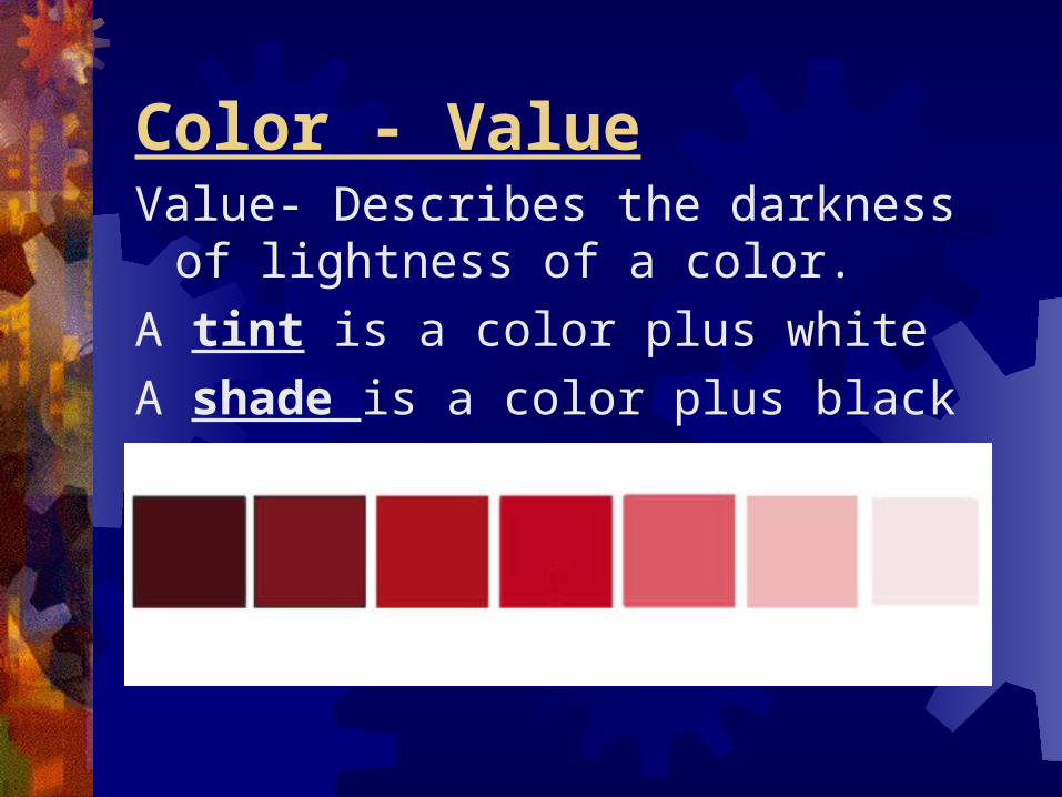
Color - ValueValue- Describes the darkness of
lightness of a color.
A tint is a color plus white
A shade is a color plus black

Value Everything except
Margot’s eyes and hair are painted with tints of color. Even the shadow in the upper left corner of the picture has been softened with gray. The white highlights shimmer and create the effects of a sunny day. (tints= high key painting).
Mary Cassatt, Margot in Blue, 1902 Pastel

Color-Value con’t
When you use only ONE color plus its tints and shades of that hue, you are using a monochromatic color scheme
Strong unifying effect of a design. (Furniture & Clothing).
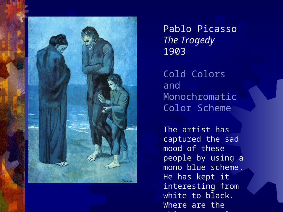
Pablo Picasso The Tragedy1903
Cold Colors and Monochromatic Color Scheme
The artist has captured the sad mood of these people by using a mono blue scheme. He has kept it interesting from white to black. Where are the whitest areas? Where are the blackest areas?: Look at the title. Does the painting evoke this feeling?

Color- IntensityRefers to the brightness of color. If we
want to dull a color, we mix in a little of its complementary color. Example- IF we add a little yellow to purple, the purple becomes less intense.

Color- Intensity Con’tNature is full of color. Many colors are
not bright, but are dulled a little. Flowers and fruit, however, are often intense or bright.

Color- Intensity Con’t This painting contains muted or
neutralized colors by mixing complementary colors.

Colors Symbolism (Meaning) Colors can convey emotion and feelings too.
Have your ever felt “blue?”Been “green” with envy?
It is important that artists understand the effects of color when they are trying to get the viewers of their art to feel a particular way. (arbitrary/ abstract compared to realistic).
(See Carrie’s power pt)

Color Schemes
A Split-Complimentary color scheme is a complimentary color and the two colors on either side of its compliment.

Color Schemes
A Triadic color scheme uses 3 colors that are equally spaced apart on the color wheel

Texture
Texture is the way the surface of an object actually feels.
In the artistic world, we refer to two types of texture---tactile and implied

Tactile (or Real) TextureTactile (or Real) Texture is the way the
surface of an object actually feels. Examples would be sandpaper, cotton balls, tree bark, puppy fur, etc.

Implied TextureImplied Texture is the way the surface of
an object looks like it feels. This is the type of texture that artists use when they draw and paint. Textures may look rough, fuzzy, gritty, or scruffy, but can’t actually be felt.

SpaceSpace is basically divided into 3 parts: Foreground, Middle Ground
and Background
Generally, the background area is considered to be the upper 1/3 of the picture plane. The middle ground area is considered to be the middle 1/3 of the picture plane. The foreground area is considered to be the lower 1/3 of the picture plane.

SpaceSpace can be shallow or deep depending
on what the artist wants to use. Shallow space is used when the artist has objects very close to the viewer.

SpaceDeep Space
may show
objects up
close but
objects are
shown far
away
too.

Space
Positive and Negative space is a way that an artwork is divided. When planning a work of art, both areas must be examined so that they balance one another. Drawing items running off the page and zooming in on objects are ways to create visual interest within a work.

SpacePositive space is the
actual object(s) within
the artwork
Negative Space is the
area in and around the
objects. It is the
“background” and it
contributes to the
work of art---you can’t
have positive space
without negative space

SpacePerspective is also a way of showing space in
a work of art. Perspective is when the artist uses a vanishing point on the horizon and then creates a sense of deep space by showing objects getting progressively smaller as they get closer to the vanishing point.

SpaceObjects may overlap as well. When objects are
overlapped it is obvious that enough space had to be in the picture to contain all the objects that have been included

The Elements of Art in Review
The Elements of Art are the “tools” that artists use to make art. They are the basic “foundation” of a good composition
Line Value Texture
ShapeForm Space Color