The Color Wheel & Color Schemes. The color wheel is the basic tool for combining colors. The first...
21
The Color Wheel & Color Schemes
-
Upload
terry-lord -
Category
Documents
-
view
226 -
download
2
Transcript of The Color Wheel & Color Schemes. The color wheel is the basic tool for combining colors. The first...

The Color Wheel &
Color Schemes
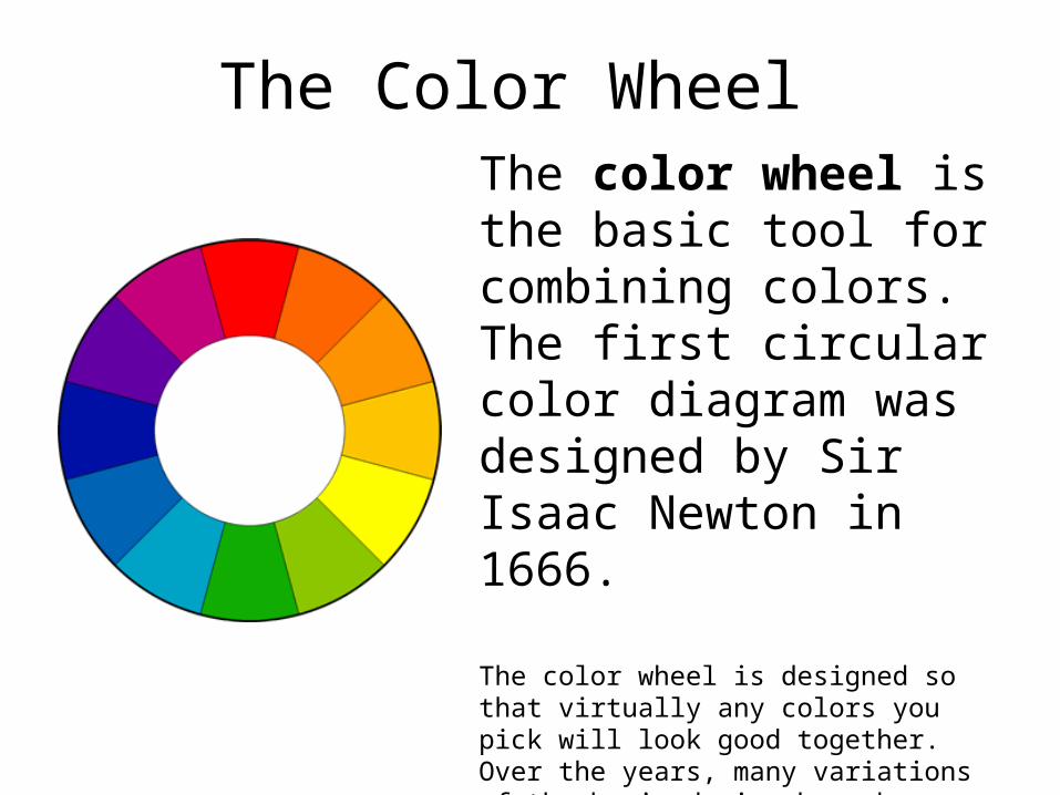
The color wheel is the basic tool for combining colors. The first circular color diagram was designed by Sir Isaac Newton in 1666.
The color wheel is designed so that virtually any colors you pick will look good together. Over the years, many variations of the basic design have been made, but the most common version is a wheel of 12 colors based on the RYB (or artistic) color model.
The Color Wheel

Hues and Neutral Colors• Hue- a hue is the name of any pure color
• found on the color spectrum and color wheel: red, yellow, blue, etc…
Neutral- a color that is not on the color wheel
like: black, white, gray, and brown
They aren’t associated with hues.
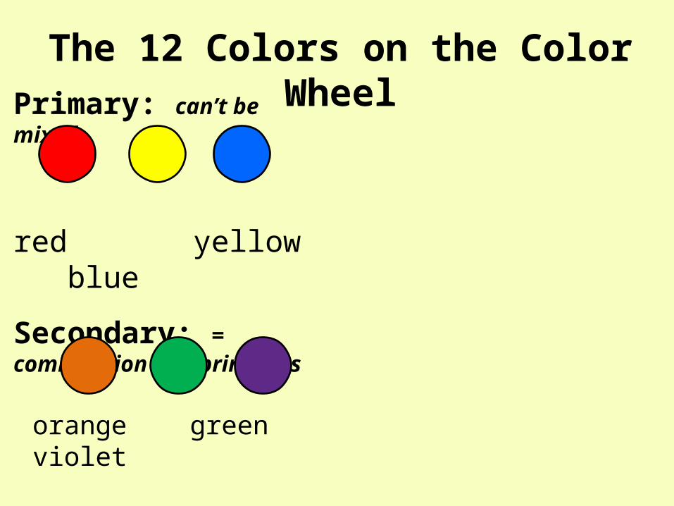
The 12 Colors on the Color WheelPrimary: can’t be mixed
red yellow blue
Secondary: = combination of 2 primaries
orange green violet

Intermediate or Tertiary= the comniantion of 1 primary + 1 secondary
1. + = yellow-green
2. + = red-orange
3. + =
4. + =
5. + =
6. + =
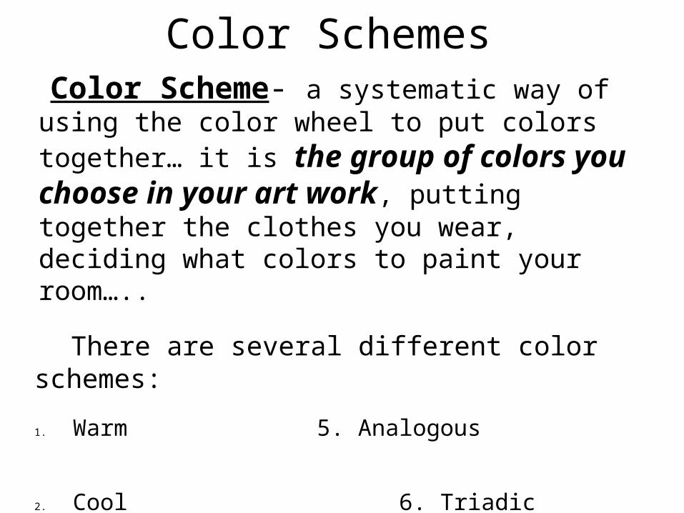
Color Schemes Color Scheme- a systematic way of using the color wheel to put colors together… it is the group of colors you choose in your art work, putting together the clothes you wear, deciding what colors to paint your room…..
There are several different color schemes:
1. Warm 5. Analogous
2. Cool 6. Triadic
3. Complementary 7. Split-complementary
4. Monochromatic

Warm and cool colorsThe color wheel can be divided into warm and cool colors.
Warm colors are vivid and energetic, and tend to advance in space (jump out at you).
Cool colors give an impression of calm, and create a soothing impression.
Warm & Cool Colors
6 warm6 co
ol
Remember: white, black, brown and gray are considered to be neutral. They aren’t on the wheel.

This drawing has a warm color scheme.

This drawing has a _________ color scheme.

Monochromatic is a color scheme where one color is used but in different tones or values
and intensity – showing the lights and darks of that 1 color.
Color comes from light; if it weren’t for light we would have no color.
When the light rays hits an object our eyes responds to the light that is bounced back and we see that color.
Color:
Tint- a light value; a color plus white Shade- a dark value; a color plus black

"The Creation"
What is the dominant color of this painting?
MONOCHROMATIC
COLOR SCHEME
A MONOCHROMATIC color scheme shows lights and darks of one maincolor.
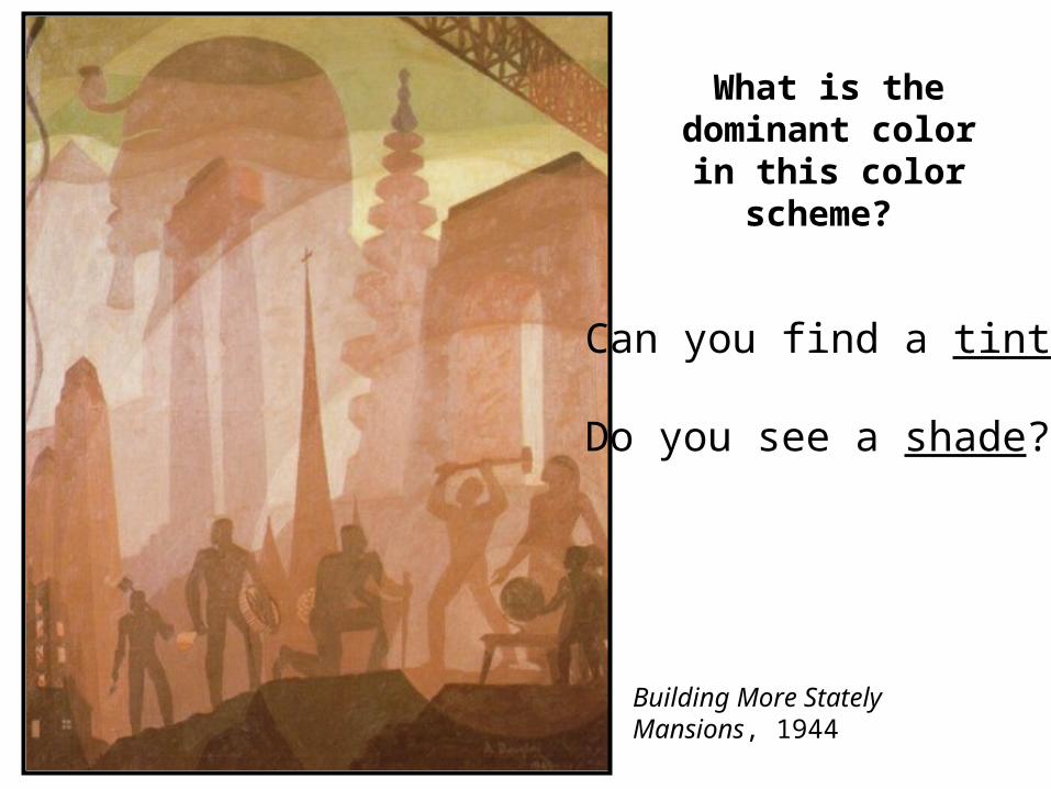
Building More Stately Mansions, 1944
What is the dominant color in
this color scheme?
Can you find a tint?
Do you see a shade?

Value: is the lightness or darkness of a color.
A value scale is a grid that shows the range of values for a color.
This is a Monochromatic value scale that shows the gradual change from light to dark with 1 color: blue
ADD white ADD black
tint shade

Petunias, Georgia O'Keeffe

Cotopaxi , Frederick Church

Complementary color scheme
Colors that are opposite each other on the color wheel are considered to be
complementary colors (example: red and green).
The high contrast of complementary colors creates a vibrant look especially when used at full saturation.


Analogous color scheme
Analogous color schemes use colors that are next to each other on the color wheel.
They usually match well and create serene and comfortable designs.
Analogous color schemes are often found in nature and are harmonious and pleasing to the eye.
Make sure you have enough contrast when choosing an analogous color scheme.Choose one color to dominate, a second to support. The third color is used (along with black, white or gray) as an accent.

Triadic color scheme
A triadic color scheme uses colors that are evenly spaced around the
color wheel.
Triadic color schemes tend to be quite vibrant, even if you use pale or
unsaturated versions of your hues.
To use a triadic harmony successfully, the colors should be carefully balanced - let
one color dominate and use the two others for accent.

Split-Complementary color scheme
The split-complementary color scheme is a variation of the
complementary color scheme. In addition to the base color, it uses
the two colors adjacent to its complement.
This color scheme has the same strong visual contrast as the complementary color scheme, but has less
tension. The split-complimentary color scheme is often a good choice for beginners, because it is difficult to mess up.

Credits
• http://www.tigercolor.com/color-lab/color-theory/color-theory-intro.htm