Textual analysis of an artist’s artwork
13
Textual Analysis of an Artist’s Artwork By Stefan Mekki
-
Upload
stefanmekki -
Category
Education
-
view
40 -
download
0
Transcript of Textual analysis of an artist’s artwork

Textual Analysis of an Artist’s Artwork
By Stefan Mekki
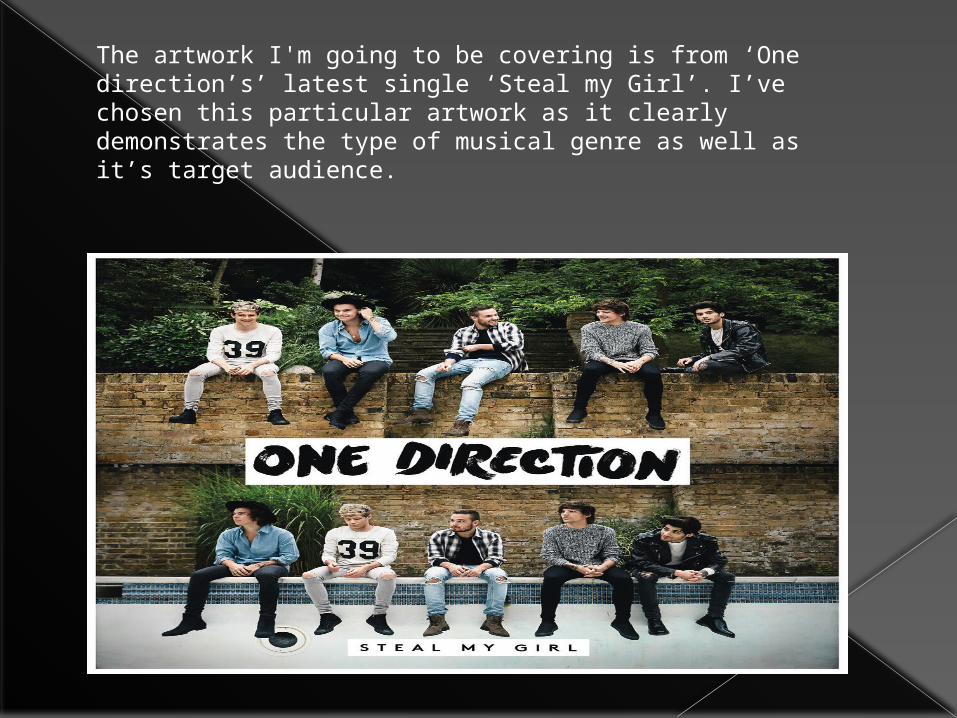
The artwork I'm going to be covering is from ‘One direction’s’ latest single ‘Steal my Girl’. I’ve chosen this particular artwork as it clearly demonstrates the type of musical genre as well as it’s target audience.
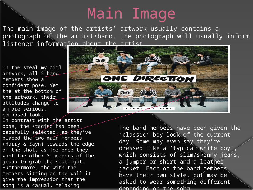
Main ImageThe main image of the artists’ artwork usually contains a photograph of the artist/band. The photograph will usually inform listener information about the artist.
In the steal my girl artwork, all 5 band members show a confident pose. Yet the at the bottom of the artwork, their attitudes change to a more serious, composed look.
In contrast with the artist pose, the staging has been carefully selected, as they’ve placed the two main members (Harry & Zayn) towards the edge of the shot, as for once they want the other 3 members of the group to grab the spotlight.Furthermore, the with the members sitting on the wall it give the impression that the song is a casual, relaxing song.
The band members have been given the ‘classic’ boy look of the current day. Some may even say they’re dressed like a ‘typical white boy’, which consists of slim/skinny jeans, a jumper or shirt and a leather jacket. Each of the band members have their own style, but may be asked to wear something different depending on the song.
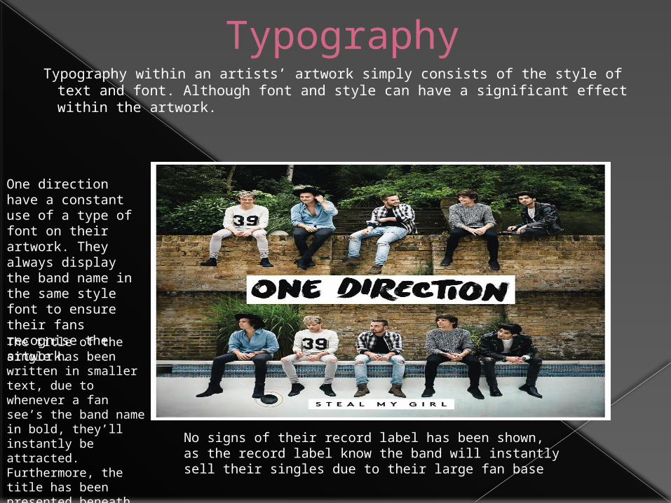
Typography Typography within an artists’ artwork simply consists of the style of text and
font. Although font and style can have a significant effect within the artwork.
One direction have a constant use of a type of font on their artwork. They always display the band name in the same style font to ensure their fans recognise the artwork.The title of the single has been written in smaller text, due to whenever a fan see’s the band name in bold, they’ll instantly be attracted. Furthermore, the title has been presented beneath their legs not to interrupt their image.
No signs of their record label has been shown, as the record label know the band will instantly sell their singles due to their large fan base
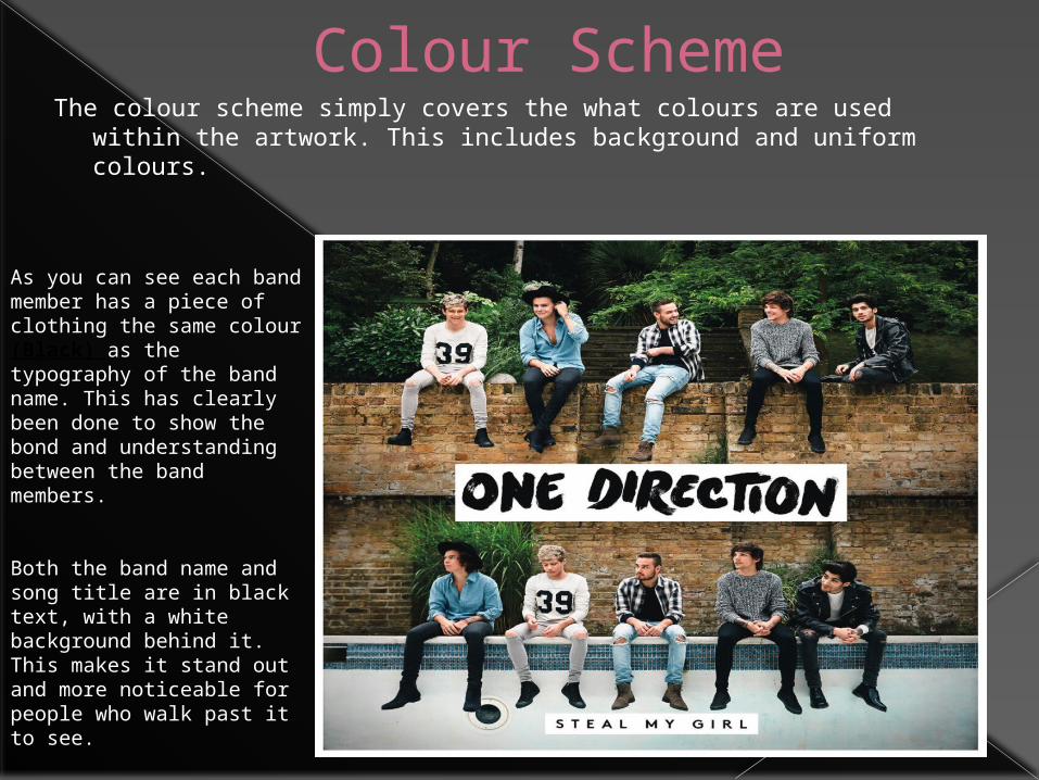
Colour SchemeThe colour scheme simply covers the what colours are used within
the artwork. This includes background and uniform colours.
As you can see each band member has a piece of clothing the same colour (Black) as the typography of the band name. This has clearly been done to show the bond and understanding between the band members.
Both the band name and song title are in black text, with a white background behind it. This makes it stand out and more noticeable for people who walk past it to see.
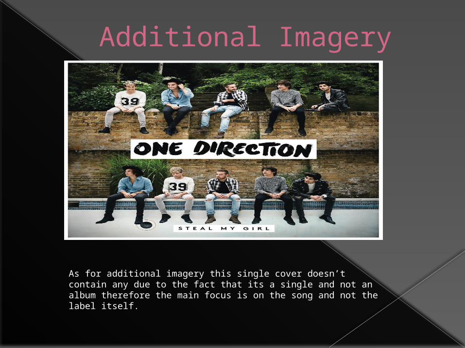
Additional Imagery
As for additional imagery this single cover doesn’t contain any due to the fact that its a single and not an album therefore the main focus is on the song and not the label itself.
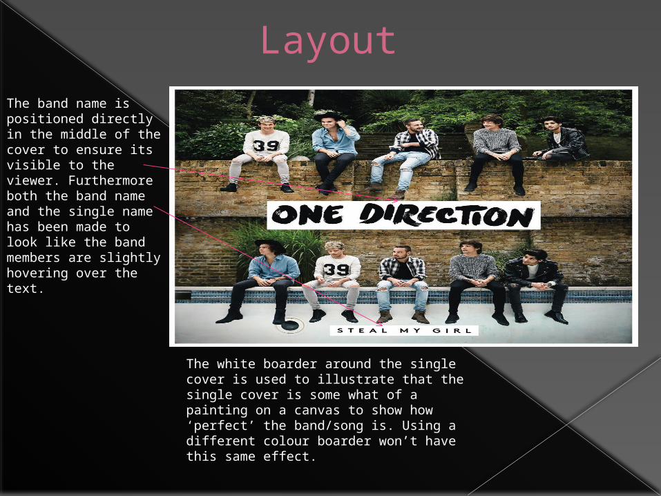
LayoutThe band name is positioned directly in the middle of the cover to ensure its visible to the viewer. Furthermore both the band name and the single name has been made to look like the band members are slightly hovering over the text.
The white boarder around the single cover is used to illustrate that the single cover is some what of a painting on a canvas to show how ‘perfect’ the band/song is. Using a different colour boarder won’t have this same effect.
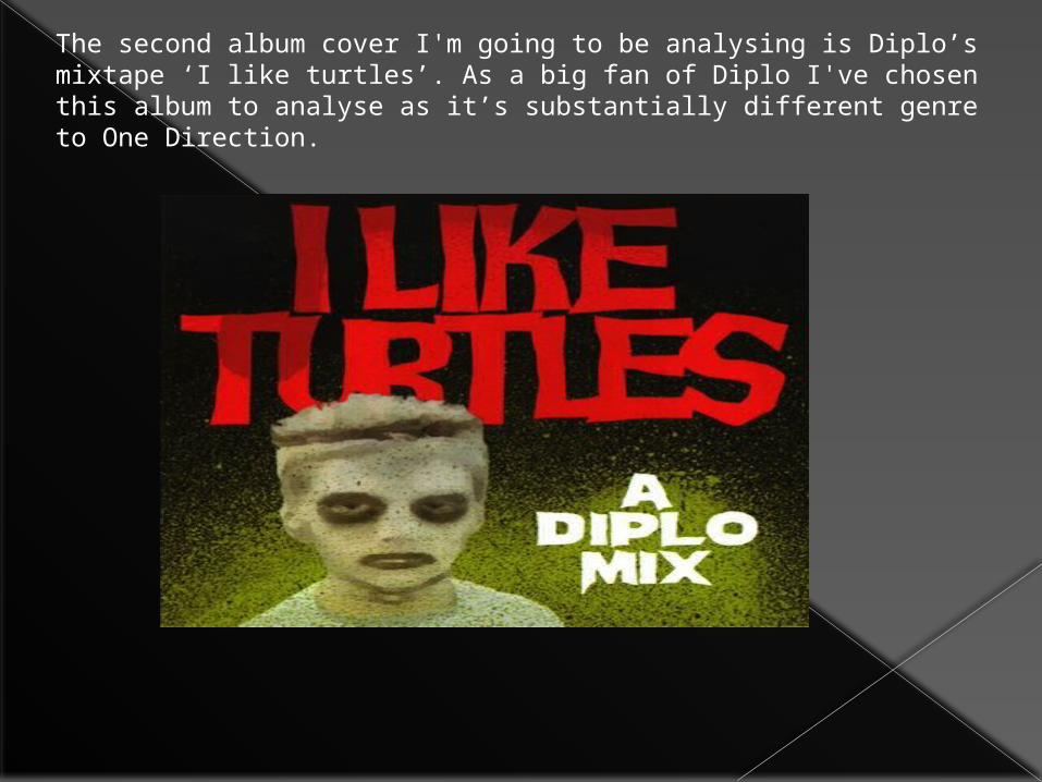
The second album cover I'm going to be analysing is Diplo’s mixtape ‘I like turtles’. As a big fan of Diplo I've chosen this album to analyse as it’s substantially different genre to One Direction.
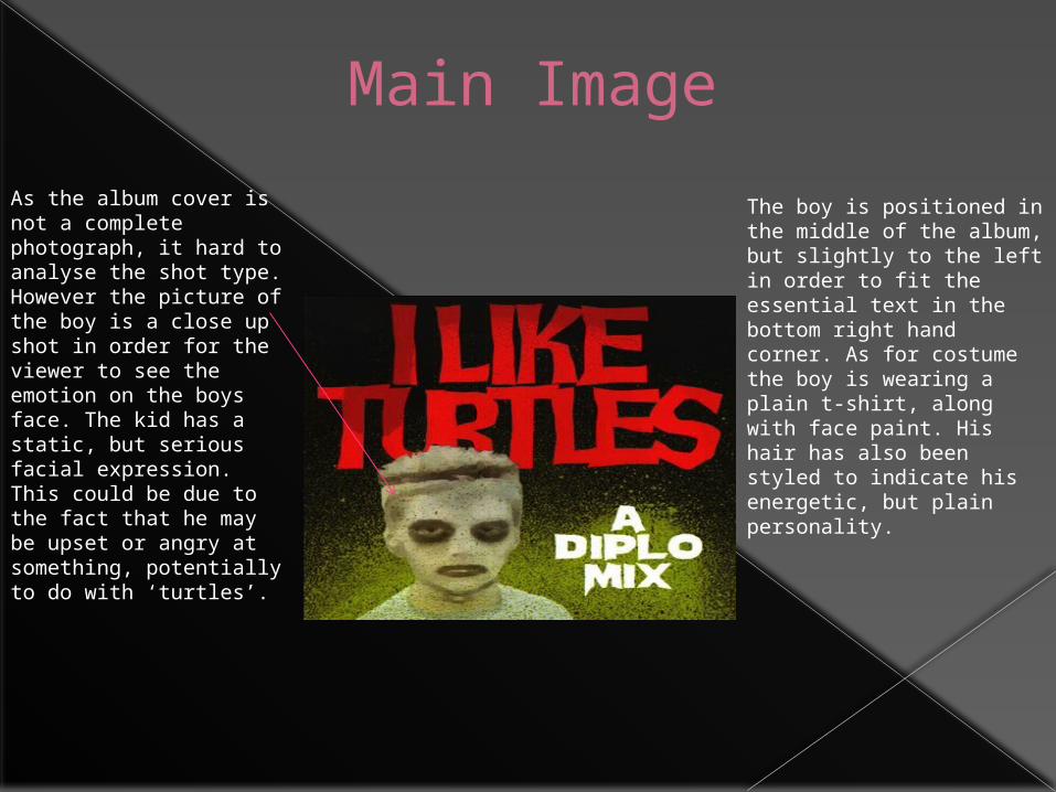
Main Image
As the album cover is not a complete photograph, it hard to analyse the shot type. However the picture of the boy is a close up shot in order for the viewer to see the emotion on the boys face. The kid has a static, but serious facial expression. This could be due to the fact that he may be upset or angry at something, potentially to do with ‘turtles’.
The boy is positioned in the middle of the album, but slightly to the left in order to fit the essential text in the bottom right hand corner. As for costume the boy is wearing a plain t-shirt, along with face paint. His hair has also been styled to indicate his energetic, but plain personality.
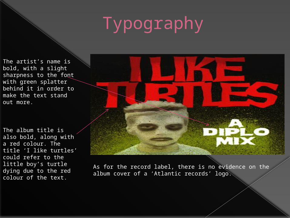
Typography
The artist’s name is bold, with a slight sharpness to the font with green splatter behind it in order to make the text stand out more.
The album title is also bold, along with a red colour. The title ‘I like turtles’ could refer to the little boy’s turtle dying due to the red colour of the text.
As for the record label, there is no evidence on the album cover of a ‘Atlantic records’ logo.
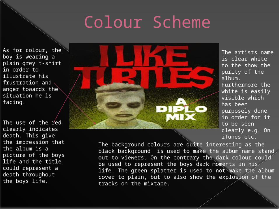
Colour Scheme
As for colour, the boy is wearing a plain grey t-shirt in order to illustrate his frustration and anger towards the situation he is facing.
The artists name is clear white to the show the purity of the album. Furthermore the white is easily visible which has been purposely done in order for it to be seen clearly e.g. On iTunes etc.
The use of the red clearly indicates death. This give the impression that the album is a picture of the boys life and the title could represent a death throughout the boys life.
The background colours are quite interesting as the black background is used to make the album name stand out to viewers. On the contrary the dark colour could be used to represent the boys dark moments in his life. The green splatter is used to not make the album cover to plain, but to also show the explosion of the tracks on the mixtape.
Layout & Mode Of Address
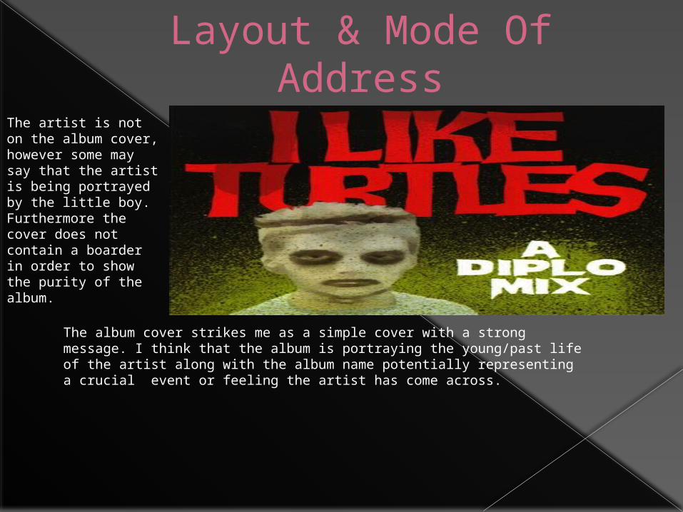
The artist is not on the album cover, however some may say that the artist is being portrayed by the little boy. Furthermore the cover does not contain a boarder in order to show the purity of the album.
The album cover strikes me as a simple cover with a strong message. I think that the album is portraying the young/past life of the artist along with the album name potentially representing a crucial event or feeling the artist has come across.
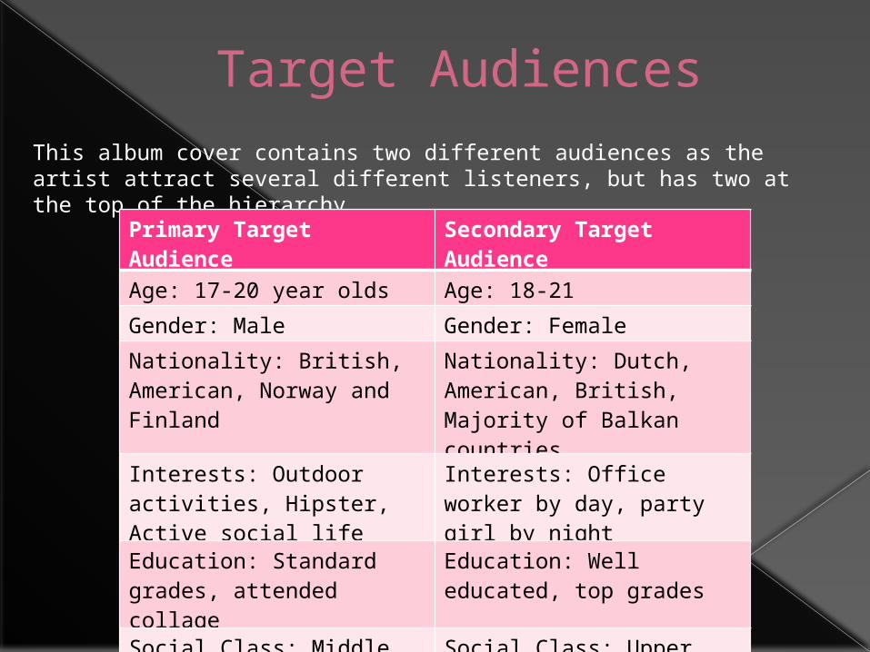
Target AudiencesThis album cover contains two different audiences as the artist attract several different listeners, but has two at the top of the hierarchy.
Primary Target Audience
Secondary Target Audience
Age: 17-20 year olds Age: 18-21
Gender: Male Gender: Female
Nationality: British, American, Norway and Finland
Nationality: Dutch, American, British, Majority of Balkan countries
Interests: Outdoor activities, Hipster, Active social life
Interests: Office worker by day, party girl by night
Education: Standard grades, attended collage
Education: Well educated, top grades
Social Class: Middle class/hipster
Social Class: Upper class, potentially middle class
Ethnicity: White, Caucasian Ethnicity: White