
Telling your story through data visualisation
52
Telling your story through data visualisation Direction Access to and Reuse of Public Information Unit EU Open Data and CORDIS Sector EU Open Data Publications Office of the European Union 2 rue Mercier, 2985 Luxembourg, LUXEMBOURG • Tel. +352 2929- • Fax +352 2929-
Transcript of Telling your story through data visualisation
Telling your story through data visualisation
Direction Access to and Reuse of Public Information
Unit EU Open Data and CORDIS
Sector EU Open Data
Publications Office of the European Union
2 rue Mercier, 2985 Luxembourg, LUXEMBOURG • Tel. +352 2929- • Fax +352 2929-

Disclaimer
The information and views set out in this publication are those of the author(s) and do not
necessarily reflect the official opinion of the Publications Office. The Publications Office
does not guarantee the accuracy of the data included in this document. Neither the
Publications Office nor any person acting on the Publications Office’ behalf may be held
responsible for the use which maybe made of the information contained therein.
This publication is used to support a webinar that will be recorded and made available to
the participants.
© European Union, 2019

INTRODUCTION TO
STORYTELLING
1.

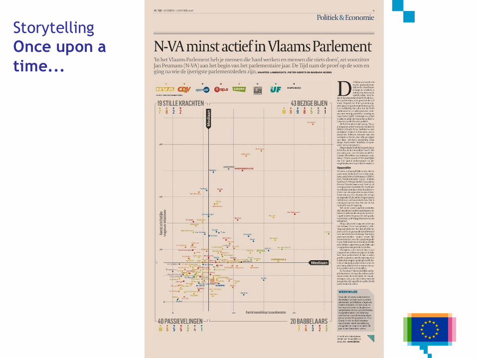
Storytelling
Once upon a
time...

Storytelling
Once upon a
time...
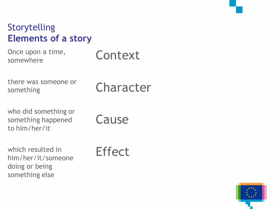
Storytelling
Elements of a story
Once upon a time,
somewhere
there was someone or something
who did something or
something happened
to him/her/it
which resulted in
him/her/it/someone
doing or being
something else
Context
Character
Cause
Effect
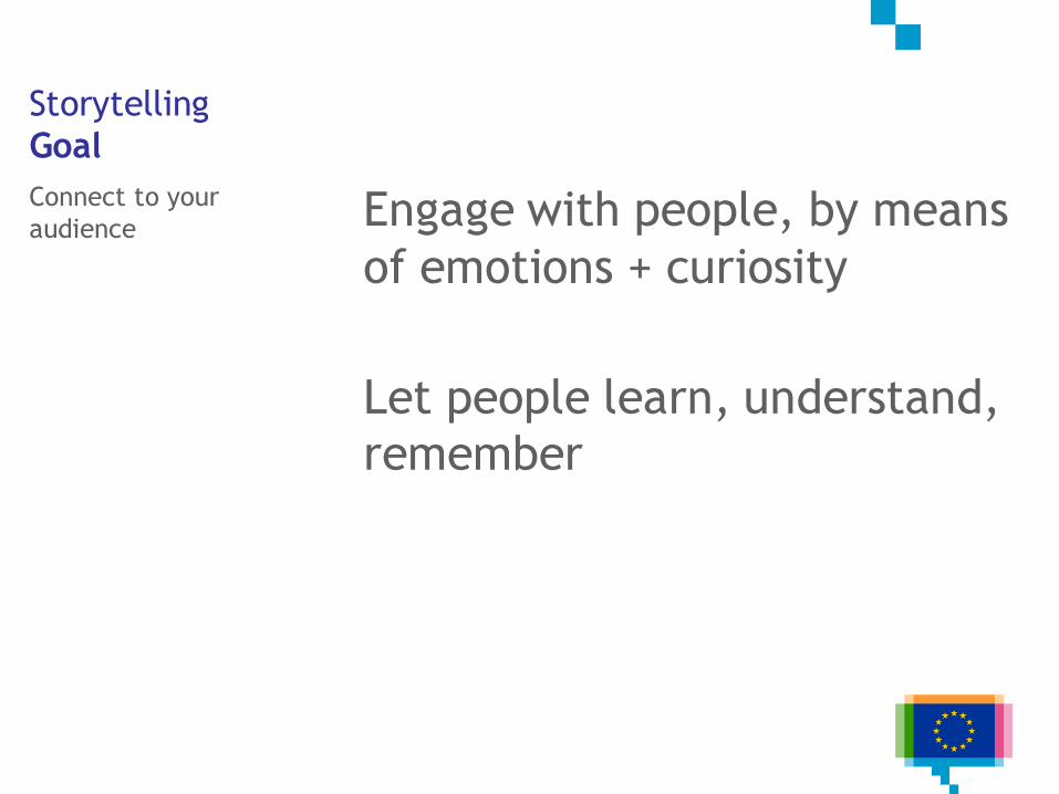
Storytelling
Goal
Connect to your
audience Engage with people, by means
of emotions + curiosity
Let people learn, understand,
remember
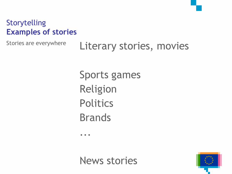
Storytelling
Examples of stories
Stories are everywhere Literary stories, movies
Sports games
Religion
Politics
Brands
...
News stories
JOURNALISTIC TECHNIQUES FOR
DATA STORYTELLING
2.
Journalistic
techniques
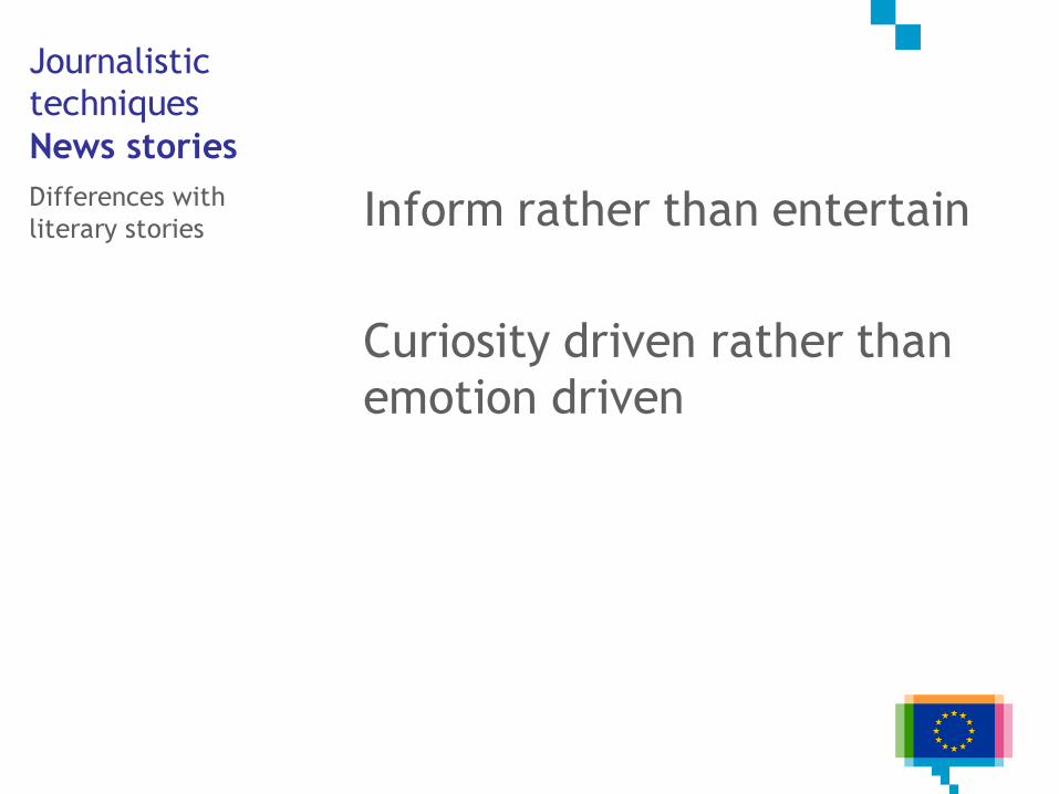
News stories
Differences with
literary stories Inform rather than entertain
Curiosity driven rather than
emotion driven
Journalistic
techniques
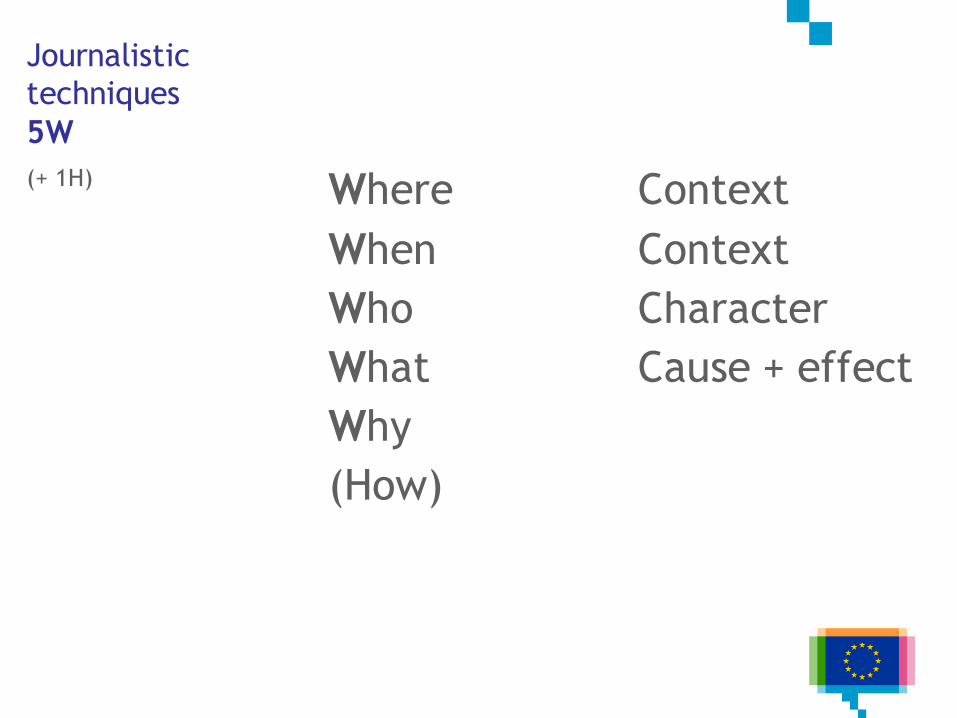
5W
(+ 1H) Where
When
Who
What
Why
(How)
Context
Context
Character
Cause + effect
Journalistic
techniques
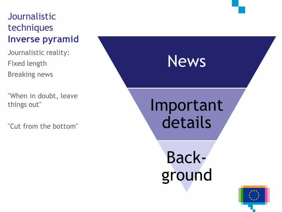
Inverse pyramid
Journalistic reality:
Fixed length
Breaking news
"When in doubt, leave
things out"
"Cut from the bottom"
News
Important details
Back-ground
Journalistic
techniques
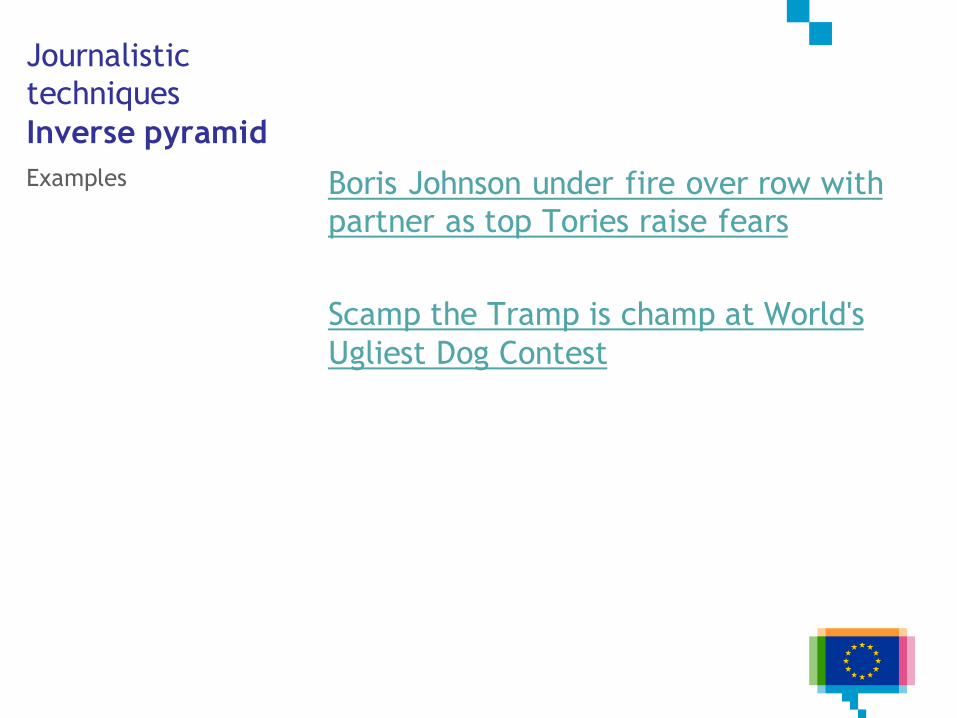
Inverse pyramid
Examples Boris Johnson under fire over row with
partner as top Tories raise fears
Scamp the Tramp is champ at World's
Ugliest Dog Contest
Journalistic
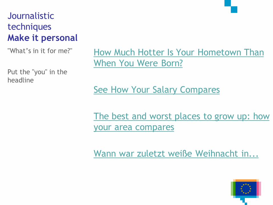
techniques
Make it personal
"What’s in it for me?"
Put the "you" in the
headline
How Much Hotter Is Your Hometown Than
When You Were Born?
See How Your Salary Compares
The best and worst places to grow up: how
your area compares
Wann war zuletzt weiße Weihnacht in...
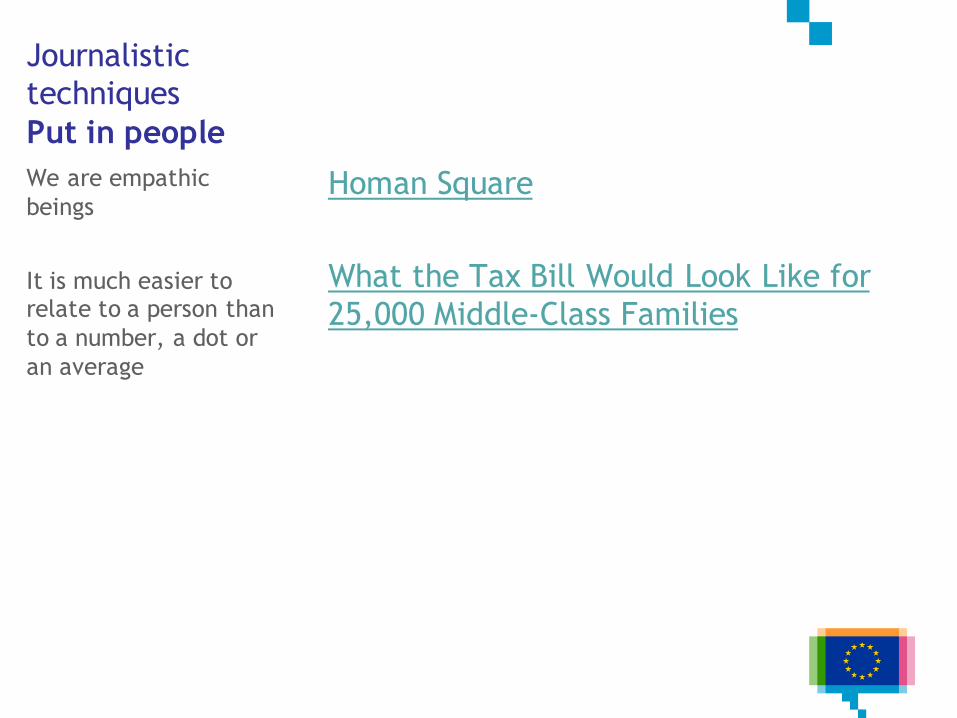
Journalistic
techniques
Put in people
We are empathic
beings
It is much easier to relate to a person than
to a number, a dot or
an average
Homan Square
What the Tax Bill Would Look Like for
25,000 Middle-Class Families
DATA STORY PATTERNS
3.
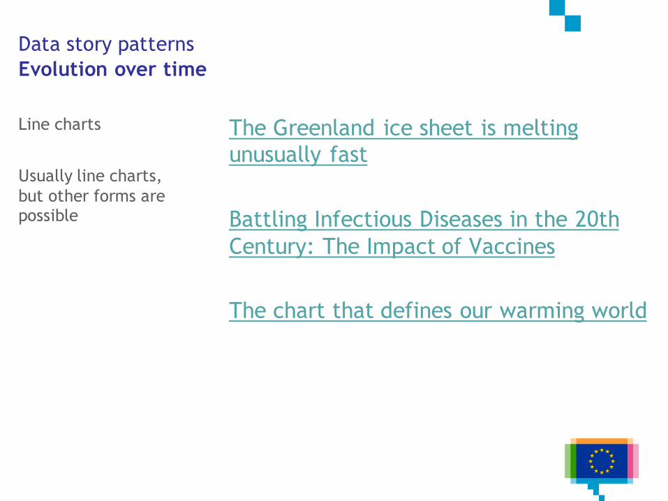
Data story patterns
Evolution over time
The Greenland ice sheet is melting
unusually fast
Battling Infectious Diseases in the 20th
Century: The Impact of Vaccines
The chart that defines our warming world
Line charts
Usually line charts,
but other forms are possible
Data story patterns
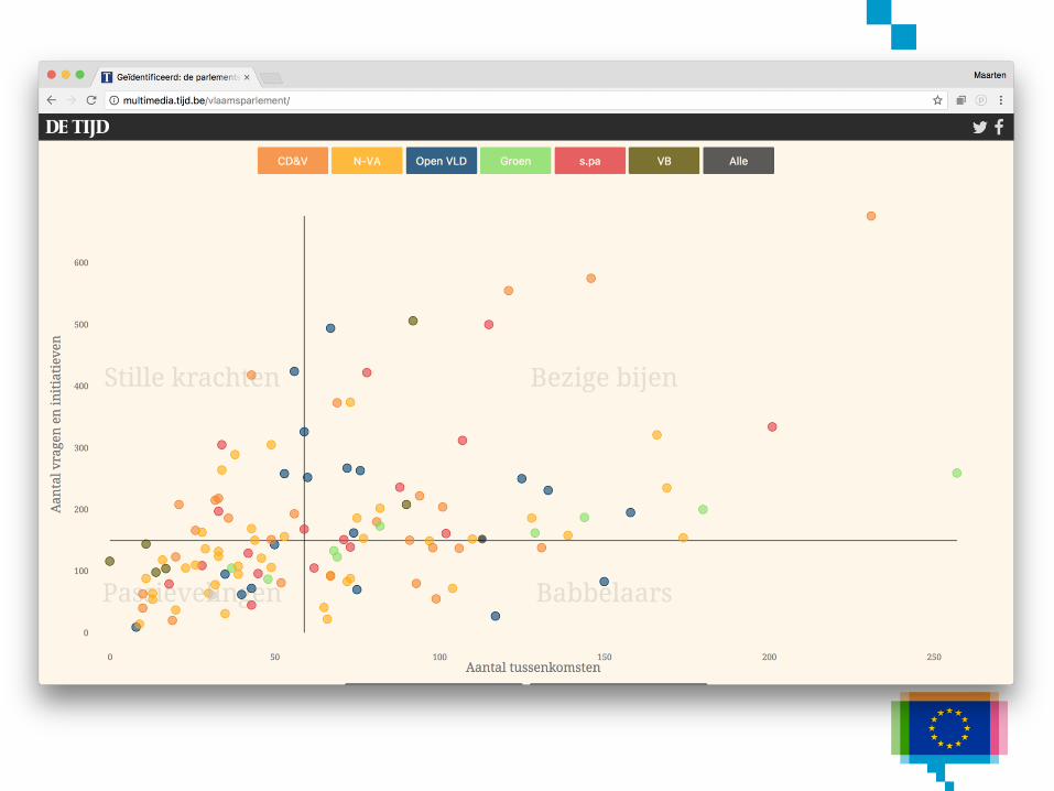
Zoom in
Start with the
overview, than zoom
to interesting details
Lazy Members of Parliament
Cancer prevalence and survival rates
Data story patterns
Zoom out
Start with a single
data point, then zoom
out to general
overview
The story of a house: how private equity
swooped in after the subprime crisis
Living in China’s Expanding Deserts
Guns
Data story patterns
Contrast
Juxtapose 2 (or more)
things against each
other
The Gender Pay Gap
The Myth of the Criminal Immigrant
How terrorism in the West compares to
terrorism everywhere else
Population pyramid Qatar
Data story patterns
Intersections
Something overtakes
something elseChance of Winning Presidency
How to make a bump chart
Bar chart race
Data story patterns
Components
A whole composed of
componentsA world of languages - and how many
speak them
Drugs, gold, cash and alcohol
All 5.5 million Belgian cars in one graphic
Four Ways to Slice Obama’s 2013 Budget
Proposal
Data story patterns
Outliers
Very high or very low
valuesWhat Lies in Irma’s Path
The Greenland ice sheet is melting
unusually fast
Where the Labour Market is Tightening
Ergebnisse der Grünen bei Europa
Data story patterns
Repetition
Fairy tales (Red Riding
Hood, 3 little pigs, ...)
also use this technique
What’s really warming the world
How work has evolved for Switzerland’s
women and men
Data story patterns
Gradual visual
reveal
Start simple, add
complexity and data
step by step
How Trump’s Trade War Went From 18
Products to 10,000
Reading the Brexit tea leaves
Rock ‘n poll
Data story patterns
Make a guess
Test own assumptions,
curiosity
Gamification
You draw the charts: 60 years of change
You draw it
Wissen Sie noch, wo Deutschland geteilt
war?
How well can you identify news trends?
Data story patterns
Surprising, unusual
Breaking conventions
attracts attentionThe glass ceiling persists
Data story patterns
Concretise
Make numbers less
abstractHousehold Income Distribution in the U.S.
Visualized as 100 Homes
Isotype
Wee people
DATA STORY GENRES
4.
Data story genres
Magazine style
Migration since the Brexit vote: what's
changed in six charts
The UK contribution to the EU budget
6 Reasons That Pay Has Lagged Behind
U.S. Job Growth
Data story genres
Annotated chart
“The annotation layer is the most
important thing we do. Otherwise it's a
case of here it is, you go figure it out.”
- Amanda Cox, New York Times
Data story genres
Annotated chart
Clearing the air
Arctic Ice Reaches a Low Winter Maximum
Is now the right time to buy property in
London?
Bailout cost will be a burden for years
Data story genres
Partitioned poster
Mostly for print
Also known as infographic
La Catedral, al detalle
EU Youth Report Infographics
En Europe, le grand écart des populations
Data story genres
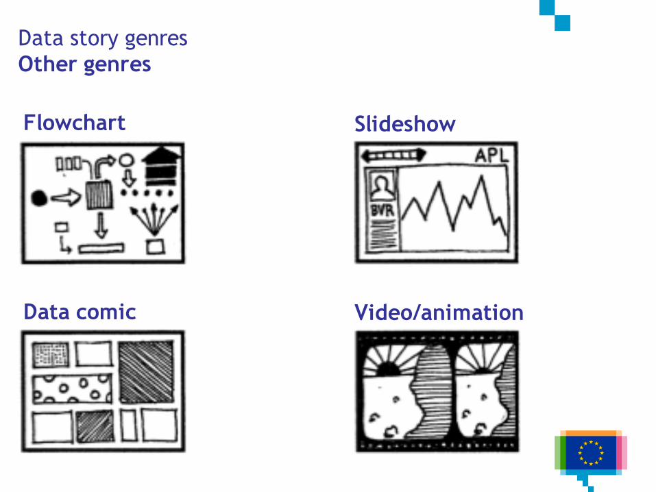
Other genres
Flowchart
Data comic
Slideshow
Video/animation

STORYTELLING WITH CHART
DESIGN
5.
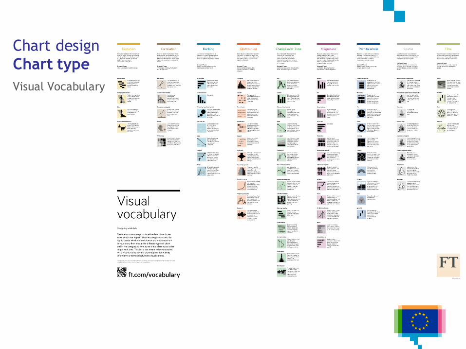
Chart design
Chart type
Visual Vocabulary
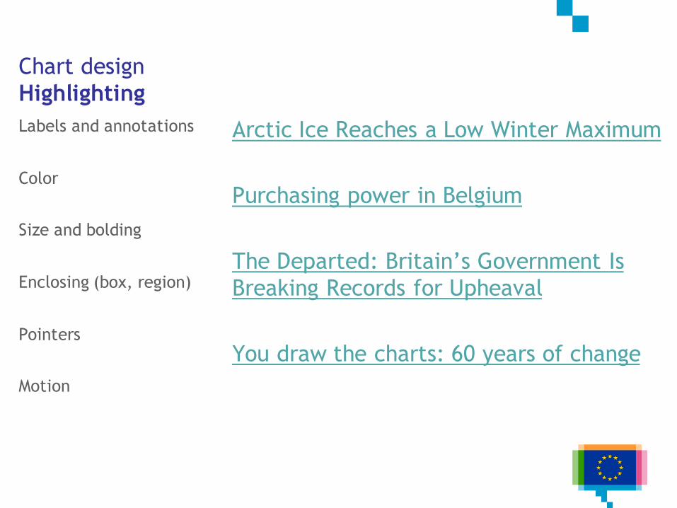
Chart design
Highlighting
Labels and annotations
Color
Size and bolding
Enclosing (box, region)
Pointers
Motion
Arctic Ice Reaches a Low Winter Maximum
Purchasing power in Belgium
The Departed: Britain’s Government Is
Breaking Records for Upheaval
You draw the charts: 60 years of change
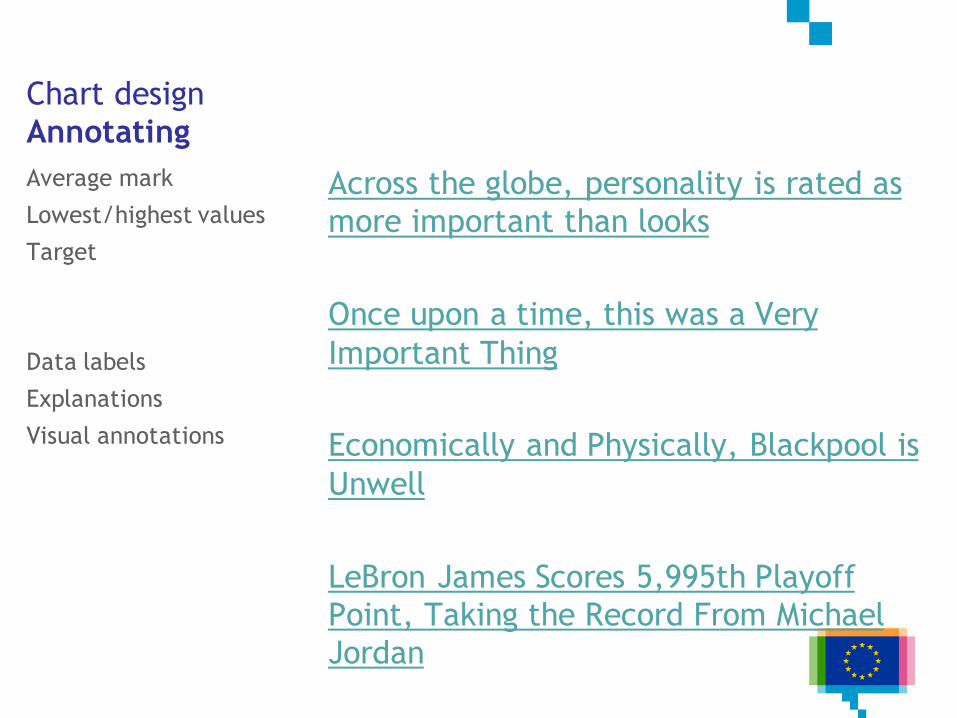
Chart design
Annotating
Average mark
Lowest/highest values
Target
Data labels
Explanations
Visual annotations
Across the globe, personality is rated as
more important than looks
Once upon a time, this was a Very
Important Thing
Economically and Physically, Blackpool is
Unwell
LeBron James Scores 5,995th Playoff
Point, Taking the Record From Michael
Jordan
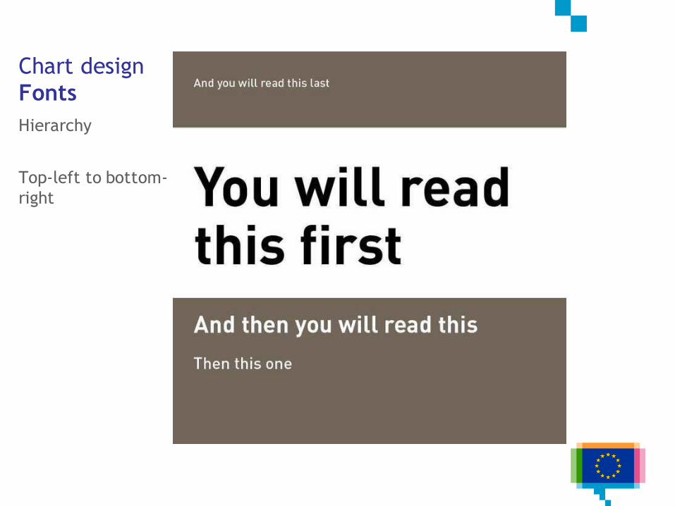
Chart design
Fonts
Hierarchy
Top-left to bottom-
right
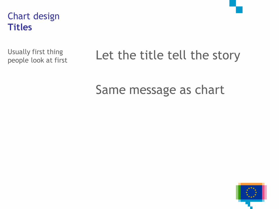
Chart design
Titles
Usually first thing
people look at first Let the title tell the story
Same message as chart
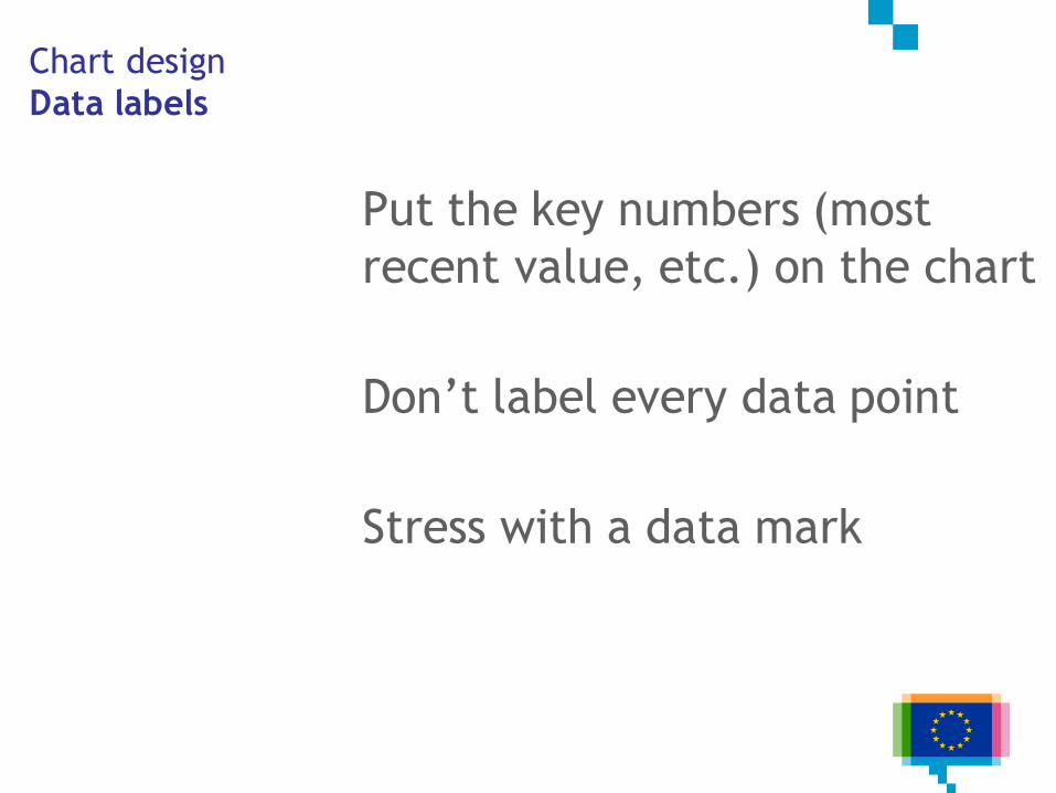
Chart design
Data labels
Put the key numbers (most
recent value, etc.) on the chart
Don’t label every data point
Stress with a data mark
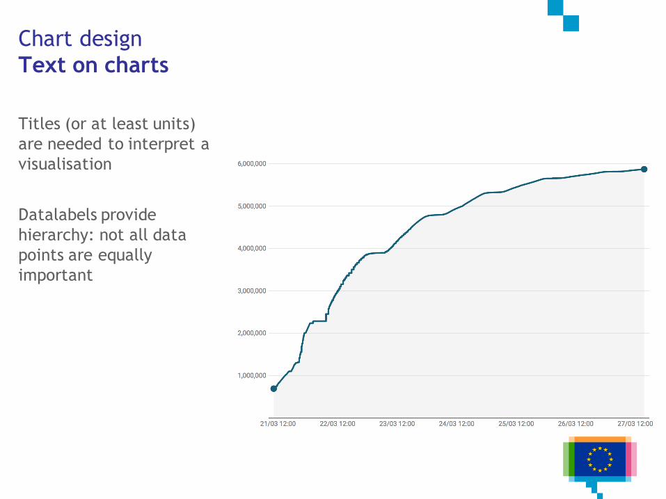
Chart design
Text on charts
Titles (or at least units)
are needed to interpret a
visualisation
Datalabels provide
hierarchy: not all data
points are equally
important
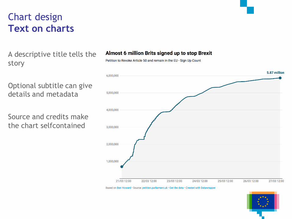
Chart design
Text on charts
A descriptive title tells the
story
Optional subtitle can give details and metadata
Source and credits make
the chart selfcontained
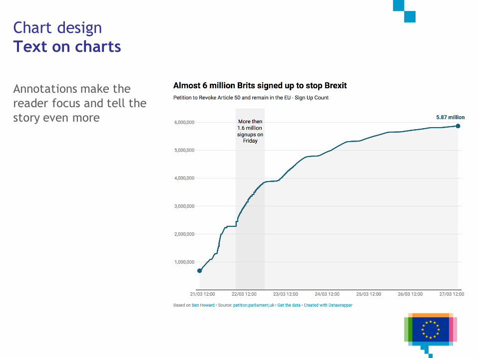
Chart design
Text on charts
Annotations make the
reader focus and tell the
story even more
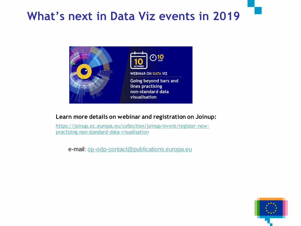
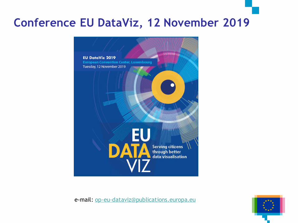
What’s next in Data Viz events in 2019
e-mail: [email protected]
Learn more details on webinar and registration on Joinup:
https://joinup.ec.europa.eu/collection/joinup/event/register-now-
practising-non-standard-data-visualisation
Resources
Data story patterns
Narrative patterns for data-driven storytelling
7 Data Story Types
Data story genres and structures
Narrative Visualization: Telling Stories with Data
Choosing a chart type
Visual Vocabulary
Data viusalisation tools
Chartmaker directory
Books
Storytelling with data
Data-driven storytelling

Q&A