STUBBURBAN
6
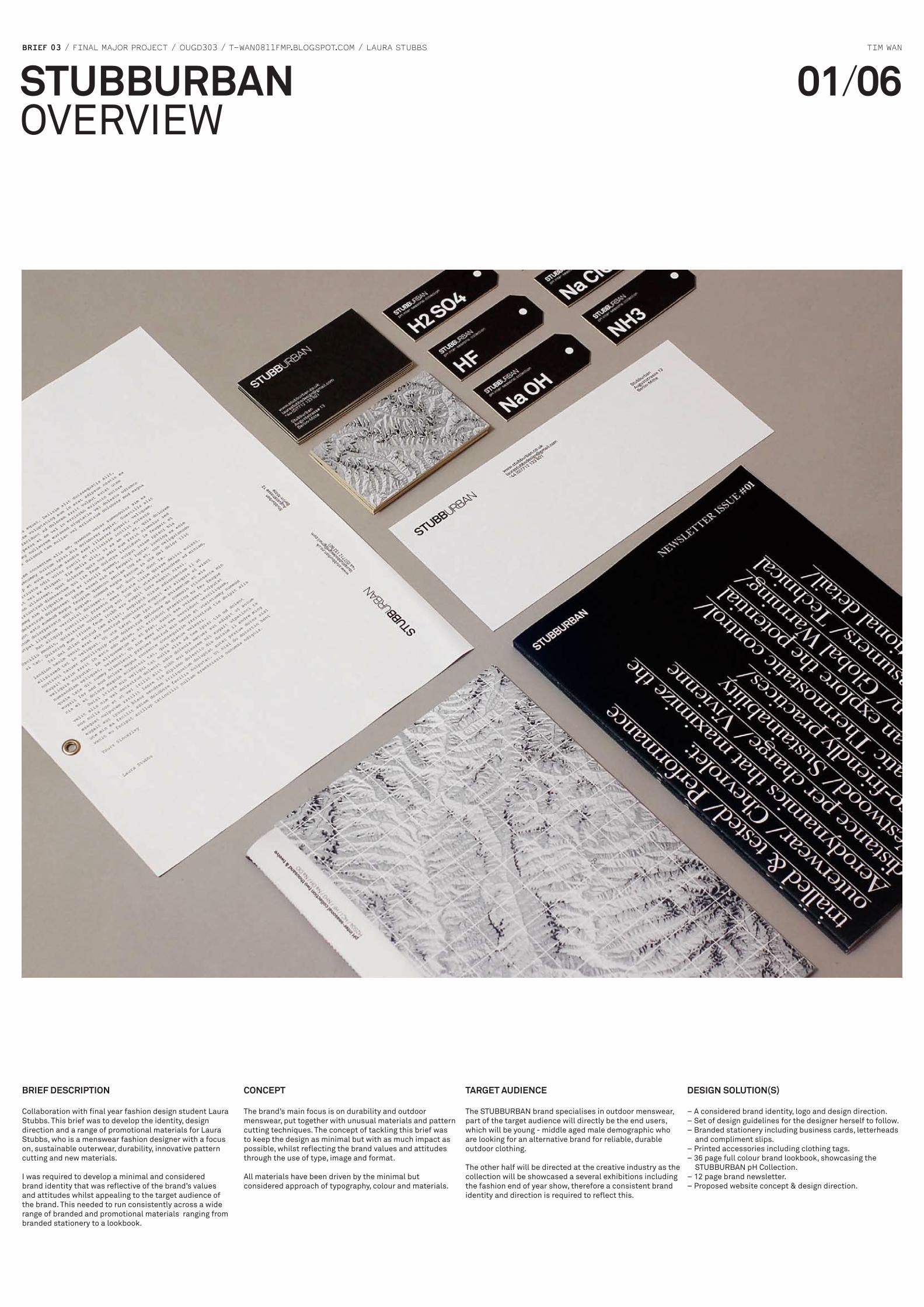
BRIEF 03 / FINAL MAJOR PROJECT / OUGD303 / T-WAN0811FMP.BLOGSPOT.COM / LAURA STUBBS TIM WAN STUBBURBAN OVERVIEW 01 / 06 BRIEF DESCRIPTION Collaboration with final year fashion design student Laura Stubbs. This brief was to develop the identity, design direction and a range of promotional materials for Laura Stubbs, who is a menswear fashion designer with a focus on, sustainable outerwear, durability, innovative pattern cutting and new materials. I was required to develop a minimal and considered brand identity that was reflective of the brand’s values and attitudes whilst appealing to the target audience of the brand. This needed to run consistently across a wide range of branded and promotional materials ranging from branded stationery to a lookbook. CONCEPT The brand’s main focus is on durability and outdoor menswear, put together with unusual materials and pattern cutting techniques. The concept of tackling this brief was to keep the design as minimal but with as much impact as possible, whilst reflecting the brand values and attitudes through the use of type, image and format. All materials have been driven by the minimal but considered approach of typography, colour and materials. TARGET AUDIENCE The STUBBURBAN brand specialises in outdoor menswear, part of the target audience will directly be the end users, which will be young - middle aged male demographic who are looking for an alternative brand for reliable, durable outdoor clothing. The other half will be directed at the creative industry as the collection will be showcased a several exhibitions including the fashion end of year show, therefore a consistent brand identity and direction is required to reflect this. DESIGN SOLUTION(S) – A considered brand identity, logo and design direction. – Set of design guidelines for the designer herself to follow. – Branded stationery including business cards, letterheads and compliment slips. – Printed accessories including clothing tags. – 36 page full colour brand lookbook, showcasing the STUBBURBAN pH Collection. – 12 page brand newsletter. – Proposed website concept & design direction.
description
DESIGN SOLUTION(S) BRIEF 03 / FINAL MAJOR PROJECT / OUGD303 / T-WAN0811FMP.BLOGSPOT.COM / LAURA STUBBS TIM WAN The STUBBURBAN brand specialises in outdoor menswear, part of the target audience will directly be the end users, which will be young - middle aged male demographic who are looking for an alternative brand for reliable, durable outdoor clothing. All materials have been driven by the minimal but considered approach of typography, colour and materials.
Transcript of STUBBURBAN
BRIEF 03 / FINAL MAJOR PROJECT / OUGD303 / T-WAN0811FMP.BLOGSPOT.COM / LAURA STUBBS TIM WAN
STUBBURBANOVERVIEW
01/06
BRIEF DESCRIPTION
Collaboration with final year fashion design student Laura Stubbs. This brief was to develop the identity, design direction and a range of promotional materials for Laura Stubbs, who is a menswear fashion designer with a focus on, sustainable outerwear, durability, innovative pattern cutting and new materials.
I was required to develop a minimal and considered brand identity that was reflective of the brand’s values and attitudes whilst appealing to the target audience of the brand. This needed to run consistently across a wide range of branded and promotional materials ranging from branded stationery to a lookbook.
CONCEPT
The brand’s main focus is on durability and outdoor menswear, put together with unusual materials and pattern cutting techniques. The concept of tackling this brief was to keep the design as minimal but with as much impact as possible, whilst reflecting the brand values and attitudes through the use of type, image and format.
All materials have been driven by the minimal but considered approach of typography, colour and materials.
TARGET AUDIENCE
The STUBBURBAN brand specialises in outdoor menswear, part of the target audience will directly be the end users, which will be young - middle aged male demographic who are looking for an alternative brand for reliable, durable outdoor clothing.
The other half will be directed at the creative industry as the collection will be showcased a several exhibitions including the fashion end of year show, therefore a consistent brand identity and direction is required to reflect this.
DESIGN SOLUTION(S)
– A considered brand identity, logo and design direction.– Set of design guidelines for the designer herself to follow.– Branded stationery including business cards, letterheads and compliment slips.– Printed accessories including clothing tags. – 36 page full colour brand lookbook, showcasing the STUBBURBAN pH Collection.– 12 page brand newsletter.– Proposed website concept & design direction.

BRIEF 03 / FINAL MAJOR PROJECT / OUGD303 / T-WAN0811FMP.BLOGSPOT.COM / LAURA STUBBS TIM WAN
STUBBURBANBRAND IDENTITY
02/06
CONCEPT
The client (Laura Stubbs) came to me with her completed collection along with the concept of her brand and what her brand is about.
Together we decided on the name STUBBURBAN as this incorporates part of her surname whilst denoting the two separates words Urban and Suburban, which relates directly to her collection, being outdoor menswear with a focus on durability and innovative materials.
Colour Pallet Tints of black used throughout all materials as a running theme.
Typeface / weightsAkkurat - BoldAkkurat - RegularAkkurat - Light
Typeface / weightsAkkurat - BoldAkkurat - RegularAkkurat - Light
22pt/24pt18pt/22pt14pt/15pt10pt/12pt
Visual directionBlack & white negative images of plan viewed terrain taken from satellite view.
DESIGN DIRECTION
The design direction of all branded identity and promotional materials all follow a strict set of brand guidelines that have been defined during the development process. The identity uses 2 weights of Akkurat to achieve a distinctive logotype which reads the brand name whilst still maintaining the words Stubb, suburb and urban.
These include the use of one typeface throughout all materials but in 3 different weights depending on the hierarchy of information. Different tints of black is also used throughout to prevent having to introduce new colours, a route that I didn’t want to take as this simply draws attention away from the work itself and didn’t fit well with the brand personality.
Imagery of terrain taken also acts as part of the identity, this textured effect compliments the minimal design direction of the rest of the materials, reinforcing what the brand does.
DESIGN GUIDELINES
Colours – limited to tints of black, only use of full colour is in the images of the products.
Typeface – Akkurat regular, light & boldType Size – 8pt/8pt body copy 22pt/26pt titles Line weights – 0.5pt or 1pt
Greyscaled images - 10% - 100% opacity
10%
10%
60%
60%
30%
30%
80%
80%
20%
20%
70%
70%
40%
40%
90%
90%
50%
50%
100%
100%
STUBBURBAN pH CollectionSTUBBURBAN pH CollectionSTUBBURBAN pH Collection
STUBBURBAN pH CollectionSTUBBURBAN pH CollectionSTUBBURBAN pH Collection
STUBBURBAN pH CollectionSTUBBURBAN pH CollectionSTUBBURBAN pH Collection
STUBBURBAN pH CollectionSTUBBURBAN pH CollectionSTUBBURBAN pH Collection
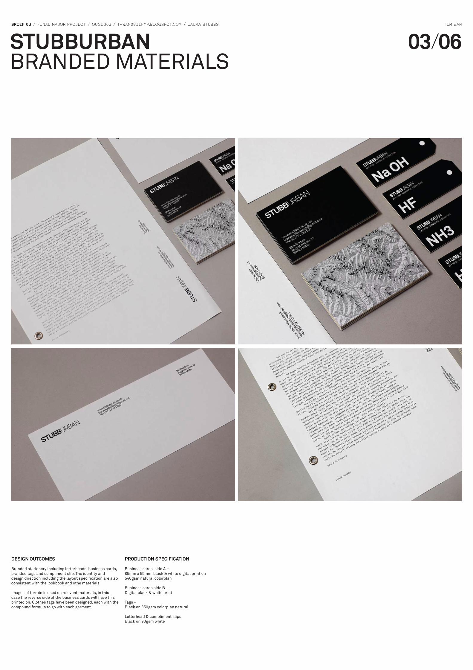
BRIEF 03 / FINAL MAJOR PROJECT / OUGD303 / T-WAN0811FMP.BLOGSPOT.COM / LAURA STUBBS TIM WAN
STUBBURBANBRANDED MATERIALS
03/06
DESIGN OUTCOmES
Branded stationery including letterheads, business cards, branded tags and compliment slip. The identity and design direction including the layout specification are also consistent with the lookbook and othe materials.
Images of terrain is used on relevent materials, in this case the reverse side of the business cards will have this printed on. Clothes tags have been designed, each with the compound formula to go with each garment.
PRODUCTION SPECIFICATION
Business cards side A –85mm x 55mm black & white digital print on 540gsm natural colorplan
Business cards side B –Digital black & white print
Tags –Black on 350gsm colorplan natural
Letterhead & compliment slipsBlack on 90gsm white

BRIEF 03 / FINAL MAJOR PROJECT / OUGD303 / T-WAN0811FMP.BLOGSPOT.COM / LAURA STUBBS TIM WAN
STUBBURBANBRAND LOOKBOOK
04/06
DESIGN CONCEPT / DIRECTION
A 165mm X 230mm 24 page brand look book promoting the STUBBURBAN pH Collection, packaged in a heavy weight slip case. The focus of this is to promote and showcase the collection, I didn’t want the design of the publication to distract away from the photography and the work so following on from the brand guidelines, I have kept the design as simple but as functional and unified with the content as much as possible. The design direction is mainly the choice of typography and the layout considerations for the spreads, images of the maps have been used to help pace the booklet.
The cover of the book incorporates the coloured bars effect, relating to the 6 different products that have been names under chemical compounds, this theme runs throughout the book in a sublte manner
DESIGN SPECIFICATION
Strict guides have informed my design decisions throughout the brand identity, this was something that needed to be consistent throughout, therefore a set of rules were used to structure the lookbook.
Grid9 column, 2.5mm gutter6 rows, 2.5mm gutter
MarginsTop – 15mm Outside – 5mmInside – 10mm Bottom – 5mm
TypeAkkurat Regular – 8pt/8pt 100% blackAkkurat Bold – 22pt/26pt 100% black
0.5pt rules 100% black
CONTENT
The content for the whole lookbook was provided by Laura, this includes all the specifications for all her garments aswell as the concept and project description. The photography was photographed by Adam Fussel, a final year visual Communication student specialising in photography.
PRODUCTION SPECIFICATION
LookbookSize – 165mm x 230mmPage numbers – 24Stock – 130gsm uncoated duplexBinding – sewn stitchColour – 4 colour process
Slip caseSize – 150mm x 230mmStock 230gsm uncoated duplexColour – Grayscale print

BRIEF 03 / FINAL MAJOR PROJECT / OUGD303 / T-WAN0811FMP.BLOGSPOT.COM / LAURA STUBBS TIM WAN
STUBBURBANPROMOTIONAL NEWSLETTER
05/06
CONCEPT / DESIGN DIRECTION
Branded newsletter promoting latest information on the STUBBURBAN pH collection and relevant topics. These will be used for the end of year show aswell as proposed newsletters to be used in a shop. The newsletter needed to capture the essence and attitude of the look book and the brand itself. It required a refined typographic design direction whilst still being able to be produced under a tight budget.
I therefore decided to work completely in black & white, it suited the idea of it being a newsletter and was therefore filled with mainly written content, which didn’t require colour. The format ended up simply being 4 sheets folded in half and put together, there was no need to stitch them.
The cover idea was simply making the cover the contents page, an engaging and distinctive typographic design is developed whilst still informing people of the content.
CONTENT
All content again was supplied by Laura Stubbs, this included a selection of her pH collection, written articles, parts of her dissertation on sustainable design and various other articles that were relevant to her brand.
DESIGN SPECIFICATION
Grid9 column modular grid, 3mm gutter
MarginsTop – 10mm Outside – 5mmInside – 15mm Bottom – 5mm
Cover typeBaskerville 42pt/41.7pt, -20 tracking 1pt underline weight, 4pt offset
Cover headerBaskerville 18pt/19pt
Body copyAkkurat Regular – 7.5pt/9pt 100% black
PRODUCTION SPECIFICATION
Size – 180mm x 250mmPage numbers – 12Stock – 130gsm uncoated duplexBinding – saddle stitchedColour – greyscale

BRIEF 03 / FINAL MAJOR PROJECT / OUGD303 / T-WAN0811FMP.BLOGSPOT.COM / LAURA STUBBS TIM WAN
STUBBURBANWEBSITE/DIGITAL RANGE
06/06
WEBSITE CONCEPT
Proposed website design for the STUBBURBAN brand. This will be used for promotion, aswell as acting as an online store, allowing user to make direct purchases from the site.
It will also be used as a platform for the designer to network with her direct target audience, posting up latest updates and collection information.
DESIGN DIRECTION
The design direction of all the printed materials and identity runs across the website. The same colour palette is used along with the photogrraphy and type specification. The layout however has changed to fit the screen format but the concept of using blocks of grey/black boxes remain as a running theme.
PH COLLECTION
STORE
ABOUT
CONTACT
13 AUgUSTRAUSSe, [email protected]+44 (0)7712 133 601
PH COLLECTION HOmE
STORE
ABOUT
13 AUgUSTRAUSSe, [email protected]+44 (0)7712 133 601
PH COLLECTION HOmE
STORE
13 AUgUSTRAUSSe, [email protected]+44 (0)7712 133 601
PH COLLECTION
STORE
ABOUT
CONTACT
13 AUgUSTRAUSSe, [email protected]+44 (0)7712 133 601
The Potential of Hydrogen Collection is inspired by contemporary issues surrounding climate change. It is an inter-seasonal, multifunctional range of six outerwear coats ordered according to their durability, protective qualities & textile performance, labelled as specific and relative chemical compounds across the pH scale.
The Acid label comprises of three concept pieces, which are the ultimate in protective outerwear. Designed for extreme protection in an all weather inter-seasonal climate the products are each waterproof, rip proof and have bullet-proof pocket detail. The ergonomic muscular structural design allow for freedom of movement within the most hardwearing and durable fabrics. The Acid products inspire the ready to wear Alkaline collection.
The Alkaline label comprises of three ready to wear sport jackets, which are designed for movement as well as protective inter-seasonal wear. The sleek twist on a more traditional sports jacket lies in the ergonomic sleeve detail allowing ease of arm movement. The lighter fabrics used for this part of the pH collection are more wearable yet still as protective against the elements as the Acid label.