StreamTraceCHI2016 battle fixed · Miscellaneous. ... Rather, streams of temporal data represent...
11
Making Sense of Temporal Queries with Interactive Visualization Leilani Battle 1 , Danyel Fisher 2 , Robert DeLine 2 , Mike Barnett 2 , Badrish Chandramouli 2 , Jonathan Goldstein 2 MIT Cambridge, Massachusetts 02139 [email protected] Microsoft Research Redmond, Washington 98052 {danyelf, rdeline, mbarnett, badrishc, jongold}@microsoft.com ABSTRACT As real-time monitoring and analysis become increasingly important, researchers and developers turn to data stream management systems (DSMS’s) for fast, efficient ways to pose temporal queries over their datasets. However, these systems are inherently complex, and even database experts find it difficult to understand the behavior of DSMS queries. To help analysts better understand these temporal queries, we developed StreamTrace, an interactive visualization tool that breaks down how a temporal query processes a given dataset, step-by-step. The design of StreamTrace is based on input from expert DSMS users; we evaluated the system with a lab study of programmers who were new to streaming queries. Results from the study demonstrate that StreamTrace can help users to verify that queries behave as expected and to isolate the regions of a query that may be causing unexpected results. Author Keywords Streaming Data; Data Visualization; Data Analysts ACM Classification Keywords H.5.m. Information interfaces and presentation (e.g., HCI): Miscellaneous. INTRODUCTION Academia, industry, and individuals are increasingly monitoring temporal data. Companies track changes in sales and inventory; app designers on the Internet of Things coordinate and monitor continuous signals from home, office and wearable devices. Medical and health-monitoring devices contain logic to process multiple temporal signals, combining GPS, heart rate, and accelerometers to determine and log when the user is running, walking and even sleeping. In e-businesses, cloud-hosted services capture both user behavior and service performance into live telemetry data. Analysts create dashboards from this data to monitor software quality and to produce game leaderboards, search results, and other client-facing products. Given the integral role of streaming data in these endeavors, programmers and data scientists need tools to analyze temporal data quickly and efficiently. To make temporal analyses scale to massive datasets, the database community has developed data stream manage- ment systems (DSMS’s) [1],[4],[5],[8],[24]. DSMS’s support fast, continuous computation over temporal data streams. A DSMS supplements a classic relational database management system (DBMS) by maintaining a first class notion of time. Time is not simply an extra column in a relational table. Rather, streams of temporal data represent facts and relationships that vary over time. Each “row” in a stream, called a stream event, has a start and end time. Entities and relationships are valid only within their temporal range. To write a DSMS query, a data analyst reasons about both the data’s content and temporal range. For instance, consider an online store with a data stream of customer shopping transactions. Both the number of customers and the contents of their carts vary over time. A simple query in a relational data model—for example, the average number of items per cart—instead becomes a windowed moving average in a streaming system. This requires the data analyst to consider temporal issues, like the duration of the window for the moving average and how to combine the time range of a customer’s shopping session with the time ranges of items in the cart. In short, queries within DSMS’s can be confusing for data analysts to understand and construct (Figure 1). In this paper, we look at data analysts as a user group with specialized skills and distinctive needs (as in Fisher et al. [12] and Kandel et al. [19]). Supporting data analysts who work with streaming data raises unique and difficult challenges; we address them by applying user-centric design principles and methodologies. We make the following contributions in this paper: 1) We discuss the complexity of understanding and debugging DSMS queries, and explore a case study; Permission to make digital or hard copies of all or part of this work for personal or classroom use is granted without fee provided that copies are not made or distributed for profit or commercial advantage and that copies bear this notice and the full citation on the first page. Copyrights for components of this work owned by others than ACM must be honored. Abstracting with credit is permitted. To copy otherwise, or republish, to post on servers or to redistribute to lists, requires prior specific permission and/or a fee. Request permissions from [email protected]. CHI'16, May 07-12, 2016, San Jose, CA, USA © 2016 ACM. ISBN 978-1-4503-3362-7/16/05…$15.00 DOI: http://dx.doi.org/10.1145/2858036.2858408 Natural User Interfaces for InfoVis #chi4good, CHI 2016, San Jose, CA, USA 5433
Transcript of StreamTraceCHI2016 battle fixed · Miscellaneous. ... Rather, streams of temporal data represent...

Making Sense of Temporal Queries with Interactive Visualization
Leilani Battle1, Danyel Fisher2, Robert DeLine2, Mike Barnett2, Badrish Chandramouli2, Jonathan Goldstein2
MIT Cambridge, Massachusetts 02139
Microsoft Research Redmond, Washington 98052
{danyelf, rdeline, mbarnett, badrishc, jongold}@microsoft.com
ABSTRACT As real-time monitoring and analysis become increasingly important, researchers and developers turn to data stream management systems (DSMS’s) for fast, efficient ways to pose temporal queries over their datasets. However, these systems are inherently complex, and even database experts find it difficult to understand the behavior of DSMS queries. To help analysts better understand these temporal queries, we developed StreamTrace, an interactive visualization tool that breaks down how a temporal query processes a given dataset, step-by-step. The design of StreamTrace is based on input from expert DSMS users; we evaluated the system with a lab study of programmers who were new to streaming queries. Results from the study demonstrate that StreamTrace can help users to verify that queries behave as expected and to isolate the regions of a query that may be causing unexpected results.
Author Keywords Streaming Data; Data Visualization; Data Analysts
ACM Classification Keywords H.5.m. Information interfaces and presentation (e.g., HCI): Miscellaneous.
INTRODUCTION Academia, industry, and individuals are increasingly monitoring temporal data. Companies track changes in sales and inventory; app designers on the Internet of Things coordinate and monitor continuous signals from home, office and wearable devices. Medical and health-monitoring devices contain logic to process multiple temporal signals, combining GPS, heart rate, and accelerometers to determine and log when the user is running, walking and even sleeping. In e-businesses, cloud-hosted services capture both user behavior and service performance into live
telemetry data. Analysts create dashboards from this data to monitor software quality and to produce game leaderboards, search results, and other client-facing products. Given the integral role of streaming data in these endeavors, programmers and data scientists need tools to analyze temporal data quickly and efficiently.
To make temporal analyses scale to massive datasets, the database community has developed data stream manage-ment systems (DSMS’s) [1],[4],[5],[8],[24]. DSMS’s support fast, continuous computation over temporal data streams. A DSMS supplements a classic relational database management system (DBMS) by maintaining a first class notion of time. Time is not simply an extra column in a relational table. Rather, streams of temporal data represent facts and relationships that vary over time. Each “row” in a stream, called a stream event, has a start and end time. Entities and relationships are valid only within their temporal range.
To write a DSMS query, a data analyst reasons about both the data’s content and temporal range. For instance, consider an online store with a data stream of customer shopping transactions. Both the number of customers and the contents of their carts vary over time. A simple query in a relational data model—for example, the average number of items per cart—instead becomes a windowed moving average in a streaming system. This requires the data analyst to consider temporal issues, like the duration of the window for the moving average and how to combine the time range of a customer’s shopping session with the time ranges of items in the cart. In short, queries within DSMS’s can be confusing for data analysts to understand and construct (Figure 1).
In this paper, we look at data analysts as a user group with specialized skills and distinctive needs (as in Fisher et al. [12] and Kandel et al. [19]). Supporting data analysts who work with streaming data raises unique and difficult challenges; we address them by applying user-centric design principles and methodologies.
We make the following contributions in this paper:
1) We discuss the complexity of understanding and debugging DSMS queries, and explore a case study;
Permission to make digital or hard copies of all or part of this work for personal or classroom use is granted without fee provided that copies are not made or distributed for profit or commercial advantage and that copies bear this notice and the full citation on the first page. Copyrights for components of this work owned by others than ACM must be honored. Abstracting with credit is permitted. To copy otherwise, or republish, to post on servers or to redistribute to lists, requires prior specific permission and/or a fee. Request permissions from [email protected]. CHI'16, May 07-12, 2016, San Jose, CA, USA © 2016 ACM. ISBN 978-1-4503-3362-7/16/05…$15.00 DOI: http://dx.doi.org/10.1145/2858036.2858408
Natural User Interfaces for InfoVis #chi4good, CHI 2016, San Jose, CA, USA
5433
2) We present a visualization design for illustrating the behavior of DSMS queries;
3) We present results from a user study showing that this visualization can help analysts better understand and construct queries.
CHALLENGES FOR USERS WITH DSMS QUERIES The fundamental difference between streaming and relational databases is reflected in the way that these systems respond to queries. While relational queries in DBMS’s produce static results (e.g., the count is 3), stream queries in DSMS’s produce result streams (e.g., the count is 3 at time stamp 1, then 4 at time stamp 2, etc.). This distinction makes interpreting query output challenging for users who are unfamiliar with DSMS’s: users need to learn to track how answers in the output stream change over time, and verify that these shifts match the input.
If interpreting stream query results can be difficult and error-prone, writing stream queries is even more challenging. DSMS’s utilize specialized stream query languages, which are designed to support both relational and temporal operations. Some operations in a stream query language, like filtering (“where”) and projection (“select”), are the same as in relational query languages. However, other query operators, like join, are “false friends” in that they have different interpretations from their relational counterparts. For example, a relational join over two tables compares every row in the first table with every row in the second, and outputs any matching pairs that are found. In contrast, a join in a DSMS will only output a matching pair of stream events if the events also overlap in time. Some DSMS operations have no equivalent operation in relational languages, such as trimming the duration of stream events, or shifting the start and end times of events.
Nor is understanding each operator individually enough: streaming queries often entail multiple phases of projection, joining, and filtering; events flow through a series of operators before they reach their final state. Analysts can find it challenging to see how those components combine, and to connect output events to the input they came from.
Expert Interviews on the Challenges of DSMS Queries To better understand how these complexities affect users, we interviewed two expert DSMS users. Both work on data science teams at a large software company1. John processes the history of software modifications across a very large codebase; his temporal queries look at how the codebase and its contributors are changing over time.
Mark supports advertising features for a large-scale website. He produces live dashboards for advertisers on the effectiveness of their campaigns, and runs spot analyses of tools and features to understand adoption and usage.
1 Names were changed to protect the privacy of these users.
In building their analytics, whether for offline use (as John does) or live streaming (as Mark does), both analysts create streaming queries in the DSMS – and, as such, can run into questions of whether their query is doing the right thing. We are generally interested in the process of constructing, testing, and iterating on a query; activities we collectively call “debugging”.
Small-Scale Versus Large-Scale Debugging John and Mark both reported that they typically debug their queries in two phases: first a small-scale prototyping phase; then a large-scale performance-testing phase. In the prototyping phase, they use small test datasets (less than 20 stream events) to manually track each input in the data stream and each output from the query. Here, each input event represents a specific test case-–a strategy reminiscent of unit tests in software engineering. During this phase, they carefully check their queries for correctness, and improve their understanding of how query operators behave and interact. Once they are confident that their queries exhibit correct behavior, they try a larger dataset for full-scale performance testing. This performance testing can sometimes drive them to change the underlying query, and they return to the prototyping phase.
John and Mark also told us that they lack tools for effectively debugging their queries during the prototyping phase. Instead, they manually create query diagrams on the whiteboard in order to manually trace them. There is a design opportunity to support the prototype phase. A design can trade scalability for specificity, and show how queries act on small-scale data examples, rather than its aggregated effect on the dataset as a whole.
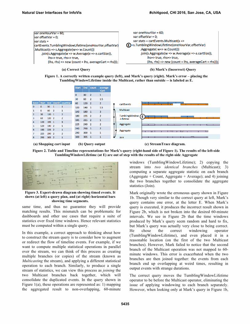
Challenges in Writing & Debugging Streaming Queries Consider a motivating example based on a scenario from Mark, who wants to analyze user session data for a new online store. The raw data is stored as a single stream of aggregated shopping cart events, where each stream event represents the current number of items in a particular user’s cart. An example of the stream is provided in the left-hand table in Figure 2a. Mark wants to write a single DSMS query to answer the following questions every 60 minutes:
• How many users are signed into the store over time?
• On average, how many products are in their shopping carts?
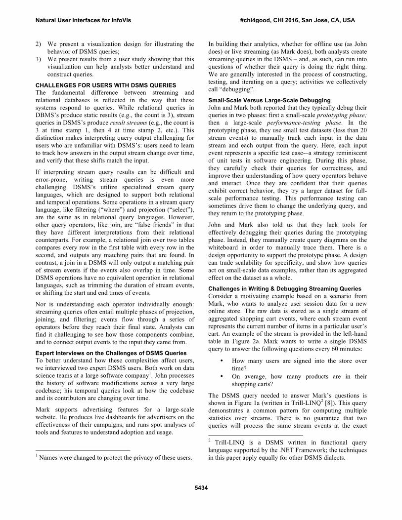
The DSMS query needed to answer Mark’s questions is shown in Figure 1a (written in Trill-LINQ2 [8]). This query demonstrates a common pattern for computing multiple statistics over streams. There is no guarantee that two queries will process the same stream events at the exact 2 Trill-LINQ is a DSMS written in functional query language supported by the .NET Framework; the techniques in this paper apply equally for other DSMS dialects.
Natural User Interfaces for InfoVis #chi4good, CHI 2016, San Jose, CA, USA
5434
same time, and thus no guarantee they will provide matching results. This mismatch can be problematic for dashboards and other use cases that require a suite of statistics over fixed time windows. Hence relevant statistics must be computed within a single query.
In this example, a correct approach to thinking about how to construct the stream query is to consider how to augment or redirect the flow of timeline events. For example, if we want to compute multiple statistical operations in parallel over the stream, we can think of this process as creating multiple branches (or copies) of the stream (known as Multicasting the stream), and applying a different statistical operation to each branch. Similarly, to produce a single stream of statistics, we can view this process as joining the two Multicast branches back together, which will consolidate the duplicated events. In the query shown in Figure 1(a), these operations are represented as: 1) mapping the aggregated result to non-overlapping, 60-minute
windows (TumblingWindowLifetime); 2) copying the stream into two identical branches (Multicast); 3) computing a separate aggregate statistic on each branch (Aggregate + Count, Aggregate + Average); and 4) joining the two branches together to consolidate the aggregate statistics (Join).
Mark originally wrote the erroneous query shown in Figure 1b. Though very similar to the correct query at left, Mark’s query contains one error, at the letter E. When Mark’s query is executed, it produces the incorrect result shown in Figure 2b, which is not broken into the desired 60-minute intervals. We see in Figure 2b that the time windows produced by Mark’s query seem random and hard to fix, but Mark’s query was actually very close to being correct. He chose the correct windowing operator (TumblingWindowLifetime), and even placed it in a reasonable location (on the first of the two Multicast branches). However, Mark failed to notice that the second branch of the Multicast operation was not mapped to 60-minute windows. This error is exacerbated when the two branches are then joined together: the events from each branch end up overlapping at weird times, resulting in output events with strange durations.
The correct query moves the TumblingWindowLifetime operator to be before the Multicast operator, eliminating the issue of applying windowing to each branch separately. However, when looking only at Mark’s query in Figure 1b,
(a) Correct Query (b) Mark’s (Incorrect) Query
Figure 1. A correctly written example query (left), and Mark’s query (right). Mark’s error – placing the TumblingWindowLifetime inside the Multicast, rather than outside -- is labeled as E.
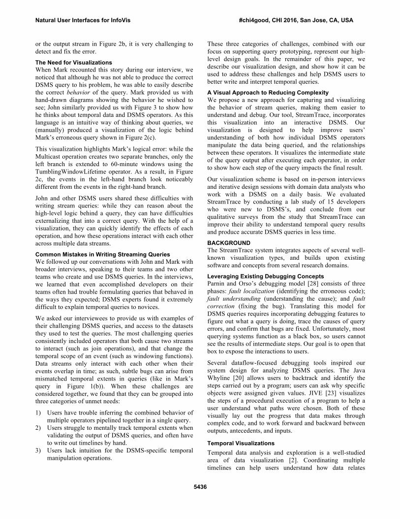
Figure 3. Expert-drawn diagram showing timed events. It shows (at left) a query plan, and (at right) horizontal bars
showing time segments.
(a) Shopping cart input (b) Query output (c) StreamTrace diagram.
Figure 2. Table and Timeline representations for Mark’s query (right-hand side of Figure 1). The results of the left-side TumblingWindowLifetime (at E) are out of step with the results of the right-side Aggregate
Natural User Interfaces for InfoVis #chi4good, CHI 2016, San Jose, CA, USA
5435
or the output stream in Figure 2b, it is very challenging to detect and fix the error.
The Need for Visualizations When Mark recounted this story during our interview, we noticed that although he was not able to produce the correct DSMS query to his problem, he was able to easily describe the correct behavior of the query. Mark provided us with hand-drawn diagrams showing the behavior he wished to see; John similarly provided us with Figure 3 to show how he thinks about temporal data and DSMS operators. As this language is an intuitive way of thinking about queries, we (manually) produced a visualization of the logic behind Mark’s erroneous query shown in Figure 2(c).
This visualization highlights Mark’s logical error: while the Multicast operation creates two separate branches, only the left branch is extended to 60-minute windows using the TumblingWindowLifetime operator. As a result, in Figure 2c, the events in the left-hand branch look noticeably different from the events in the right-hand branch.
John and other DSMS users shared these difficulties with writing stream queries: while they can reason about the high-level logic behind a query, they can have difficulties externalizing that into a correct query. With the help of a visualization, they can quickly identify the effects of each operation, and how these operations interact with each other across multiple data streams.
Common Mistakes in Writing Streaming Queries We followed up our conversations with John and Mark with broader interviews, speaking to their teams and two other teams who create and use DSMS queries. In the interviews, we learned that even accomplished developers on their teams often had trouble formulating queries that behaved in the ways they expected; DSMS experts found it extremely difficult to explain temporal queries to novices.
We asked our interviewees to provide us with examples of their challenging DSMS queries, and access to the datasets they used to test the queries. The most challenging queries consistently included operators that both cause two streams to interact (such as join operations), and that change the temporal scope of an event (such as windowing functions). Data streams only interact with each other when their events overlap in time; as such, subtle bugs can arise from mismatched temporal extents in queries (like in Mark’s query in Figure 1(b)). When these challenges are considered together, we found that they can be grouped into three categories of unmet needs:
1) Users have trouble inferring the combined behavior of multiple operators pipelined together in a single query.
2) Users struggle to mentally track temporal extents when validating the output of DSMS queries, and often have to write out timelines by hand.
3) Users lack intuition for the DSMS-specific temporal manipulation operations.
These three categories of challenges, combined with our focus on supporting query prototyping, represent our high-level design goals. In the remainder of this paper, we describe our visualization design, and show how it can be used to address these challenges and help DSMS users to better write and interpret temporal queries.
A Visual Approach to Reducing Complexity We propose a new approach for capturing and visualizing the behavior of stream queries, making them easier to understand and debug. Our tool, StreamTrace, incorporates this visualization into an interactive DSMS. Our visualization is designed to help improve users’ understanding of both how individual DSMS operators manipulate the data being queried, and the relationships between these operators. It visualizes the intermediate state of the query output after executing each operator, in order to show how each step of the query impacts the final result.
Our visualization scheme is based on in-person interviews and iterative design sessions with domain data analysts who work with a DSMS on a daily basis. We evaluated StreamTrace by conducting a lab study of 15 developers who were new to DSMS’s, and conclude from our qualitative surveys from the study that StreamTrace can improve their ability to understand temporal query results and produce accurate DSMS queries in less time.
BACKGROUND The StreamTrace system integrates aspects of several well-known visualization types, and builds upon existing software and concepts from several research domains.
Leveraging Existing Debugging Concepts Parnin and Orso’s debugging model [28] consists of three phases: fault localization (identifying the erroneous code); fault understanding (understanding the cause); and fault correction (fixing the bug). Translating this model for DSMS queries requires incorporating debugging features to figure out what a query is doing, trace the causes of query errors, and confirm that bugs are fixed. Unfortunately, most querying systems function as a black box, so users cannot see the results of intermediate steps. Our goal is to open that box to expose the interactions to users.
Several dataflow-focused debugging tools inspired our system design for analyzing DSMS queries. The Java Whyline [20] allows users to backtrack and identify the steps carried out by a program; users can ask why specific objects were assigned given values. JIVE [23] visualizes the steps of a procedural execution of a program to help a user understand what paths were chosen. Both of these visually lay out the progress that data makes through complex code, and to work forward and backward between outputs, antecedents, and inputs.
Temporal Visualizations Temporal data analysis and exploration is a well-studied area of data visualization [2]. Coordinating multiple timelines can help users understand how data relates
Natural User Interfaces for InfoVis #chi4good, CHI 2016, San Jose, CA, USA
5436

between different groups. Kosara and Miksch [21] use a hierarchical arrangement of coordinated timelines to visualize clinical guidelines as time-based plans. Gschwandtner et al. [15] use a hierarchical arrangement of timelines to support exploration of patient outcomes given time-stamped clinical treatment information. We similarly use a timeline approach, coordinated with other views, to help unpack temporal data.
Another area of work highlights alternative techniques for specifying event patterns as temporal searches [11],[18],[22],[26], where the focus is on creating new languages or specification schemes, rather than debugging queries for existing systems.
Related Visual Debugging Systems To the best of our knowledge, StreamTrace is the first GUI-based tool for open-ended temporal query writing and debugging. The visualization systems that are most closely related to StreamTrace are focused primarily on monitoring complex scientific workflows. VisTrails [29] is an interactive workflow analysis system that supports data analysis and exploration. It is oriented toward allowing users to re-execute a precise workflow, and to modify that workflow in a predicable way. The Perfopticon visualization system supports interactive analysis of workflows that perform batch execution of queries on a distributed DBMS [27].
We know of only one other system intended for direct interaction with data streams. System S [10] is a visual debugger based on showing the query plan, or the low-level sequence of compiled operations that describes how the query will be executed. In contrast, StreamTrace operates at the user level, showing the stages of the query that map directly to the clauses in the user’s input. However both visualizations share a timeline view, and track the histories of individual events. We believe that the results from our user test would also speak to the System S visualizations.
THE DESIGN OF STREAMTRACE Our visualization scheme is designed both to help new DSMS users quickly learn how DSMS queries work, and to support the techniques that experts like John and Mark already use when interpreting temporal queries. As such, we chose three goals for the design of our visualizations, one for each class of debugging problems we found through our interviews. DSMS visualizations should:
1) Clarify the input-output relationships between all stream operators in the query, to show how these operators are connected.
2) Illustrate the timeline relationships between events at each stage of operations, as in John and Mark’s hand-drawn diagrams.
3) Convey how individual events flow through each stream operator in a query, to show how these individual operators behave.
Given that the open-endedness of scripting has been shown to be a good fit for data exploration tasks [12],[19], we chose to support a scripting-based design for users to write and edit their queries, alongside our DSMS visualizations.
In the remainder of this section, we explain how we distilled our design goals into concrete visualization components, implemented these components, and validated our design choices through feedback from Mark and a third DSMS expert Hank3.
Three Visualization Components In choosing how to visualize query execution, we looked to ways that the experts thought about DSMS queries. During our expert interviews, we noticed John and Mark already
3 John had moved to a new job role by the time our StreamTrace prototype was completed, and could not provide feedback.
Figure 4. A debugging visualization produced by StreamTrace, with the following components: (A) a workflow diagram; (B) a
timeline; (C) provenance highlighting, where one time entry is highlighted; and (D) a tooltip. This query Multicasts the runningProcesses stream to two branches (or copies), applies an Aggregate operation to each branch, and consolidates
the final statistics by joining the two branches together.
Natural User Interfaces for InfoVis #chi4good, CHI 2016, San Jose, CA, USA
5437

had diagrams visible in their offices of query sequences: a real example from John’s office can be seen in Figure 3; Hank sent us sample queries that included an ASCII representation of a query timeline (Figure 6).
Mark explained that he also manually generates workflow diagrams of query operations. In these diagrams, he works with his team to decide what data they want the query to represent, and work out the sequence of operations that will generate it. These hand-drawn diagrams support the first design goal, of illustrating events on a timeline.
We developed three major components for StreamTrace’s visualizations. Figure 4 is a screenshot of a StreamTrace visualization. First, StreamTrace draws a workflow diagram representing the input streams and the sequence of query operations executed on the inputs (labeled A). Second, StreamTrace draws a timeline view for each operator (and input) in the workflow diagram (labeled B), where the timeline view captures the result of executing this particular query operator. Last, StreamTrace provides linked highlighting across timeline views (labeled C), allowing the user to explore the complete history of an individual stream event—both what that event would become later in the query, and where this event came from. We refer to this history as the provenance of the event.
The first design goal is addressed through StreamTrace’s workflow diagram. This diagram acts as a flow chart, showing the order in which the operators are executed, and which operators are responsible for producing the inputs to future operators later in the diagram.
StreamTrace’s timeline views support the second design goal. Each streaming operator updates the output stream as the query is executed. The series of timeline visualizations allows a user to pinpoint which operator introduced errors.
StreamTrace’s linked highlighting across timeline views addresses the third design goal. The linked highlighting feature allows users to figure out how a single event changes in duration or temporal position, no matter how complex, by tracing its provenance forward and backward. This fine-grained view enables users to get a very detailed view of their data
Implementation of Visualization Components Here, we provide a more detailed description of the design of the three visualization components.
Workflow Diagram StreamTrace represents the workflow diagram as a directed acyclic graph. Root nodes in the graph are inputs to the query; other nodes are query operators. The edges represent the ordering and relationship between query operators: operators that take a single input are drawn as straight lines, while operators that take multiple inputs or that produce multiple outputs are drawn as branches. The diagram is read from top to bottom; we narrow the layout to ensure that it could be seen as an annotation for the timelines. StreamTrace italicizes labels for query operator nodes; this allows users to distinguish easily between query operators and inputs.
For example, the workflow diagram in Figure 4 has one starting node, labeled runningProcesses, which is the only input stream to the query. This input is passed to a single Multicast operation, which we see in the graph by the edge between the starting node and the node labeled Multicast. The Multicast operation creates two branches (i.e., copies) of the stream, shown by the two outgoing edges from the Multicast node. The right-hand branch contains a TumblingWindowLifetime operation and an Aggregation operation. The left contains only a single Aggregation node. Last, the branches are brought back together with a Join operation.
While the workflow diagram resembles familiar DBMS query execution plans, there is an important difference: an execution plan shows the path after the database system has optimized it, which might include a number of transformations that users do not expect, such as the reordering of operations. As StreamTrace is meant to support the logical stages of query construction, we chose a workflow diagram that is a direct translation of the operations in the original query.
Timeline View The timeline view is designed to help users understand how each stream event is manipulated by a given query. Inspired by diagrams drawn by our experts—as in Figures 3 and 7—the timeline view is represented as a series of bars, each representing an event in the stream. The position and length of each bar is mapped to the start time and duration of the event. All of the events that emerge from a single operator are arranged in a lane together; within that lane, vertical
Figure 5. Four major operators in Trill, with their visual representation in StreamTrace. “Tumbling Window”
manipulates the timeline, while the others keep events in their fixed timeslots.
Natural User Interfaces for InfoVis #chi4good, CHI 2016, San Jose, CA, USA
5438

position is arbitrary, but chosen to prevent overlap between events. When a user hovers over an event, a tooltip at the right side (labeled D in Figure 4) shows the detailed begin and end times for the event, as well as any contents associated with the event.
Figure 5 shows a selection of Trill operators that manipulate either query graphs (e.g., Multicast) or temporal operators (e.g., TumblingWindowLifetime). The combination illustrates how StreamTrace uses bars to present temporal changes and extents.
Linking Timeline Views The goal of this feature is to allow the user to ask why a specific event is part of the output—or to figure out what happened to an event as it propagated through the query. When a user hovers over a specific event in the timeline, StreamTrace displays this link using provenance highlighting, which shows the history of the event. In Figure 4, the user has hovered their mouse over an output event from executing a TumblingWindowLifetime operation; all relevant stream events are highlighted (i.e., colored black) by StreamTrace. Events highlighted above the current event represent inputs that contributed to the creation of the current event earlier in the query’s execution; we call this backward provenance. For example, StreamTrace highlights the events in the input stream(s) that were used to compute the current event. Similarly, events highlighted below the current event represent intermediate and final outputs that the current event contributed to later in the query’s execution; we call this forward provenance.
Validation through Expert Feedback After we created our initial prototype of StreamTrace, we showed it to Mark and Hank to collect feedback. Hank is the lead of a performance analysis team. Like John and Mark, Hank is the DSMS expert for his team of six people. We met with Hank and the rest of his team, all of whom were in the process of learning Trill, after our first designs for StreamTrace were implemented.
They expressed interest in having a canonical set of basic queries for training their team. This inspired us to add tutorial materials as part of the StreamTrace design: a view in the analytics environment that shows core operations and allows the user to see their implementations; and a tutorial booklet with StreamTrace views of common Trill operators. After seeing the final design, Hank and his team expressed immediate interest in using StreamTrace to analyze their existing DSMS queries, and explained how they saw clear value in using a tool like StreamTrace in the future.
After learning more about StreamTrace’s final design, Mark said that StreamTrace would allow his team to verify that they are doing the right thing, and that their plan is being carried out correctly.
THE IMPLEMENTATION OF STREAMTRACE StreamTrace’s back-end design is based on a notion of tracing fine-grained provenance through queries. To capture the intermediate steps of a query, we developed a new approach for provenance recording. The key aspect is to have each event store its own list of the previous input events that contributed to it. To do this, each stream event is assigned a provenance identifier. As a query is executed, these identifiers are propagated through each query operator to the related output events. We implement these provenance lists in two parts: (1) each event is annotated with a list of past inputs; and (2) the core Trill operators are wrapped in specialized code to propagate provenance identifiers from input events to the corresponding output events. The wrapper code executes outside of the DSMS, making it applicable to other systems beyond Trill.
Without provenance tracking, StreamTrace would lack the necessary metadata for visualizing query behavior. This technique was inspired by past work in the database community on recording provenance for workflows [17] and data streams [16],[31],[13],[14]. The focus of these projects is to ensure that provenance data can be efficiently tracked and stored. This past work does not address how to make the resulting histories easy to interpret for non-DSMS experts, which is precisely what we address in StreamTrace.
StreamTrace breaks each operation out of the query expression separately through a process of query rewriting. Query rewriting happens automatically behind the scenes; users still see the original query when provenance is enabled. Users enable StreamTrace with a single click, which triggers provenance annotations, rewrites the current query, executes this new query, and shows the output. Provenance tracking is enabled for all core Trill operators; as such, StreamTrace supports all of standard relational algebra, with enhancements for time manipulations. Collectively, these operations are common to other DSMS streaming engines, too; there is nothing specific to Trill about the broader design.
LABORATORY STUDY After iteratively refining StreamTrace with expert users, we validated our design with a laboratory study.
Hypotheses and Tasks The goal of our quantitative evaluation was to learn whether users better understand and debug temporal queries
Figure 6. This comment, embedded in a sample query from
Hank, shows a timeline view drawn with ASCII art.
Natural User Interfaces for InfoVis #chi4good, CHI 2016, San Jose, CA, USA
5439

with the assistance of our visualization. The feedback we received from expert DSMS users encouraged us to believe that StreamTrace would be good for helping novice users understand queries. We carried out a laboratory user study to test two hypotheses: using StreamTrace, subjects will
H1: identify errors in Trill queries more easily. H2: find queries easier to write.
To test these hypotheses, we wanted to observe analysts in the process of working through specific queries. We created four synthetic datasets, each containing roughly a dozen events. We chose these datasets to help participants debug the intent of the temporal query, as opposed to its runtime performance where larger datasets would be necessary. For guidance, we directly referenced the test datasets given to us by our experts John and Mark when creating our own synthetic datasets. This ensured that our datasets had the same structure and relative size as test datasets used in the real world. We then created one query per dataset that we expected users to be able to solve in the study.
In choosing our tasks, we strove for a balance to accommodate the lab setting: we chose tasks that were complex enough to manifest query comprehension and authoring problems, but not so complex to overwhelm and intimidate participants. To achieve this, we collected real queries from our DSMS experts to use as starting points for our tasks, grouped the queries by difficulty (e.g., easy, medium and hard), and modified the queries as necessary to match our test datasets and reflect appropriate difficulty levels for the study. The final tasks challenged users either to expand a simpler query into a more complex one or to debug an erroneous complex query. Each query required the user to tweak two or three operations. For example, one task asked users to change a query from filtering and showing a single value, to showing a value across multiple filters in parallel. In doing so, users would need to change from a filtering operator to a grouping one, and find the appropriate syntax. Figure 4 illustrates the initial conditions for Task B in the visualization condition. Users were told they needed to debug the query so that that all of the output was mapped to a set of fixed time windows (as in our motivating example with Mark).
We carried out a series of pilots to ensure that the queries were of roughly similar difficulty. To reduce learning effects, we ensured the tasks had minimal overlap—none of the four require the same Trill operators in their solutions.
The study was carried out within-subjects. Participants carried out four rounds of tasks, alternating between with- and without the StreamTrace enhancements. We alternated which condition was first. We used a Latin-square design to counterbalance tasks and conditions in order to balance out difficulty and learning effects.
We measured the amount of time to get a correct query for each task. All sessions were audio- and video-recorded. Users filled out a brief survey after completing each of the
four tasks, then a concluding survey that compared tasks to each other. After each session, we interviewed users to get additional thoughts on their experience with the system.
Testing Environment StreamTrace is implemented within the experimental data science environment Tempe [9], which executes its data analysis operations in Trill. Tempe works in an interactive C# interpreter designed for live coding, which allows a user to modify any line of a program, and see a recomputed result immediately. Tempe also provides intelligent code-completion; when a user types part of a command, the system shows available methods on an object, the parameters of a method call, and what objects match the appropriate types. This allows us to focus on query semantics, rather than syntax.
Study Procedure We first introduce users to Trill with a paper guide specifically created for the study, a modification of the guide we created for Hank. The guide illustrates the syntax and grammar for the eight Trill operators used in the study. While Trill has dozens of other operators, this subset allows us to capture all of the query types provided by our experts. The guide illustrates its functions in a number of different ways, including timelines similar to the visualization. After spending approximately ten minutes reading the Trill guide, subjects are then introduced first to the analytics environment, then to the StreamTrace visualizations. They are given a list of queries; the experimenter works with them for another five minutes to ensure that they can correctly write a query, accurately interpret the results of queries; the experimenter also answers subjects’ questions.
Each of the four timed tasks began with two simple “warm-up” tasks to teach subjects about the current dataset and to familiarize them with the Trill operators they might need for the task. When the subject announces that they are ready to proceed, the experimenter starts a timer and the subject starts on the test query. When the participant announces they are done, the experimenter records the time and checks their answer. Participants were asked to continue attempting the task until they found the correct answer. Participants who did not complete the task correctly were stopped after twenty minutes per task and marked as “did not finish”.
Table 1: The four tasks for the user study
Task Description Operations A Find the max temperature
across multiple CPUs in one stream
GroupApply; Aggregate
B Ensure that a multicast stream has consistent time windows. (e.g., Figure 2(c))
Multicast; TumblingWindow- Lifetime
C
Join a stream with a second stream on a key
Join; Where
D Match “start” and “end” pairs within a log
AlterEventDuration; ClipEventDuration
Natural User Interfaces for InfoVis #chi4good, CHI 2016, San Jose, CA, USA
5440
Participants We recruited professional developers, data scientists, and data-oriented testers from within a large software company. We chose a random sample from three internal distributions lists. We sent personalized email invitations to screen for experience in C# and LINQ, and interest in data analysis.
From this pool, 18 participants took part in the study. We dismissed three for lacking the required skills. The remaining 15 (1 female) reported an average of
• 8.3 years of professional experience; • 5.7 years of C# experience; and • 3.4 years of LINQ experience;
In terms of job roles, 8 described themselves as developers, 4 as testers, and 3 as data scientists. We noted that seven participants had just 1 or 2 years of experience with LINQ. This was the first time any of our study participants encountered any DSMS, including Trill.
RESULTS
Observations We watched each user work through the problems and recorded both screen captures and sessions. This allowed us to track how users were interacting with the visualizations.
We found the visualizations were useful for different types of queries. P1, a LINQ beginner, started with the visualization for his first task. When he moved on to the second task (task B) he said “The visualization would really help here!” Task B requires the user to align time windows together; the visualization makes it immediately apparent which items are out of alignment (as shown in Figure 4). Without the visualization, he was more frustrated. P11, also working on Task B without the visualization, similarly complained, “I couldn’t tell why the data didn’t correspond to the correct [temporal] window.”
During times when users felt they had strong intuitions, this verification was less important: P13 did not use the visualization on Task C: “This one,” he said, “uses standard [non-temporal] LINQ queries; I don’t need it.”
The visualizations were helpful to verify and confirm that a query was working as expected. P1, for example, did not use the visualization during the course of working on Task C—but used afterward to show that he had succeeded. Similarly, P13 used the visualization after he had completed Task A to check whether he had the segments he expected. P8 said, “visually seeing the result, it’s easier to verify correctness instead of reading individual items.”
Last, the visualization helped shape people’s mental models. P5 did not use the visualization during his study at all. However, during his tutorial period, he spent a long time studying the visualizations and their interactions.
Afterward, he reported that the visualization was “helpful” but not quite worth turning on. We interpret P5 as building a more-detailed mental model of the queries based on the visualizations.
Three Phases of Debugging We used these observations to assess StreamTrace’s effectiveness across the three phases of the debugging process as described by Parnin and Orso [28]: fault understanding, fault localization, and fault correction. We found that StreamTrace was generally helpful across a majority of these phases.
For tasks like Task B, where participants greatly benefitted from seeing the temporal scope/alignment of events, we found that our visualizations helped with the fault understanding phase of debugging for some participants.
Some users also found the visualizations to be helpful during the fault localization phase of debugging queries. P12, for example, reported that he found Task B to be ambiguous—but when he saw the initial view, he figured out what needed to be done. P15 was struggling with Task D—after he turned to the visualization to walk step-by-step through the behavior he expected to see, he was able to quickly solve the problem.
Our visualizations also had their limitations. Several users struggled with the Trill syntax; while fighting compiler errors, the visualization had no extra information to show them. Thus our visualizations were less effective during fault correction. As we note above, some users found StreamTrace effective for verifying that their fixes had worked; this phase is not accounted for in this model.
Quantitative and Survey Results We measured time to accurate completion for each question. All participants were able to make it through all four questions within twenty minutes each; most took far less. However, with programming tasks, there is often high variability within users on task performance, and our study was no exception. For example, there was high variance both within- and between-users across tasks in our study. Even when compared within the same condition and for the same user, completion times could vary by 6 minutes or more for over a third of our participants. Correcting syntax errors, or understanding the question, often took some time. Disappointingly, as Figure 7 shows, the visualizations did not obviously make users quicker for any of the tasks. But we were not surprised when there was no “home run" performance measure that clearly shows a large difference between conditions. We believe that this variability is inherent in the complexity of the streaming concepts and the tasks, rather than a flaw of our study.
Natural User Interfaces for InfoVis #chi4good, CHI 2016, San Jose, CA, USA
5441

We turn, then, to our survey results. Amidst other questions, we asked users to estimate the value of the visualization to them. Figure 8 shows that users felt that the visualization was more helpful for B and D, the temporal queries, than for the others. We saw similar results for the statement “the visualization helped me solve the task faster;” and (reversed) for “the visualization was useless.”
DISCUSSION The laboratory experiment tested very specific scenarios. High variance, both within- and between-subjects, meant that we did not come to a quantitative result showing that users were faster to debug or create queries using StreamTrace. However, we did see that the visualizations assisted in query debugging in a variety of ways. Users used the visualizations, guide, and the tutorial to better understand how Trill queries were structured and to how to think about the sequence of events. During the tasks, they used StreamTrace to identify what was wrong with the data, and to check that they got the right answer at the end.
Some types of queries seem more amenable to this visualization than others: in tasks that entail manipulation of the timeline, the visualization could help users keep track of the time. As a result, users talked much more often about the visualization challenges of the temporal tasks B and D over the non-temporal tasks, A and C.
The real queries carried out by the experts tended to combine temporal and non-temporal aspects. As a result, it is likely that StreamTrace might be more generally useful for them then for the more specialized queries.
We conclude that seeing how events flow through streaming queries helps users with two specific debugging subtasks: identifying faulty code regions, and identifying the causes of erroneous or unexpected behavior within these code regions. We attribute these benefits to the use of timelines to make temporal semantics explicit, and the ability to “drill in” to see the effect of individual operators on specific stream events. Alternative query debugging designs, such as for non-temporal queries, can still utilize a “drill in” feature to show users how individual records are modified as they are processed by a query. Our timeline-based visualization design could potentially be applied to high-level pipelines outside of DSMS’s (e.g., command-line scripts, execution workflows), given appropriate input-output provenance data.
Future Opportunities Our study focused primarily on evaluating small-scale debugging techniques. As such, it is unclear how StreamTrace scales up in both visualization design and dataset size. For example, in the current implementation, the timeline remains fixed; this is a limitation on visual scalability. We plan to extend our visualizations and provenance tracking to larger event streams, which will allow users to do both small-scale prototyping and large-scale performance testing within a single debugging tool.
Both the expert users and our participants provided many suggestions to improve the system. Our participants suggested several new features and colorings to improve StreamTrace’s visualizations. With aggregate operations, users wanted to directly render aggregation values on the timeline bars, perhaps even transforming the result into a line chart. This would make the visualization more powerful as a signal processing view. Several users also wanted to be able to link the query text itself to the visualization by cross-highlighting between the workflow diagram on the left and the text above. These features would enhance the StreamTrace experience.
CONCLUSION In this paper, we have presented a visualization design to help DSMS users better understand their temporal queries. Our prototype, StreamTrace, helps improve users’ understanding of how individual DSMS operators manipulate data streams, and the relationships between these operators within temporal queries. We evaluated StreamTrace by carrying out a lab study with 18 analysts new to DSMS’s. We concluded from our user study that StreamTrace can help users at two critical points in debugging tasks: when locating faulty code regions in their queries, and when understanding and identifying the causes for unexpected query behavior.
ACKNOWLEDGEMENTS We thank Remco Chang for his insightful feedback and suggestions, which helped improve the paper. We also thank the DSMS experts who helped design our visualizations for StreamTrace.
REFERENCES [1] Abadi, D., et al. The Design of the Borealis Stream
Processing Engine. In Proc. CIDR 2005, 277-289.
Figure 8. Likert survey question: agreement by task: “The visualization was helpful for this task.” Scale from dark red
(“Strongly Disagree”) to dark blue (“Strongly agree”)
Figure 7. Time distribution for each query, by condition. The
visualization did not obviously speed users.
Natural User Interfaces for InfoVis #chi4good, CHI 2016, San Jose, CA, USA
5442
[2] Aigner, W., Miksch, S., Schumann, H., & Tominski, C. Visualization of time-oriented data. Springer Science & Business Media (2011).
[3] Amsterdamer, Y., Davidson, S.B., Deutch, D., Milo, T., Stoyanovich, J., Tannen, V. Putting Lipstick on Pig: Enabling Database-style Workflow Provenance. In Proc. VLDB Endow. 5, 4 (2011), 346–357.
[4] Babcock, B., Babu, S., Datar, M., Motwani, R., and Widom, J. Models and issues in data stream systems. In Proc. PODS 2002, ACM Press (2002), 1-16.
[5] Babu, S., and Widom, J. Continuous Queries over Data Streams. SIGMOD Record 30, 3 (2001), 109-120.
[6] Cao, J., Rector, K., Park, T.H., Fleming, S. D., Burnett, M., and Wiedenbeck, S. A Debugging Perspective on End-User Mashup Programming. In Proc. IEEE Symp. on VL/HCC 2010, ACM (2010), .
[7] Carney, D., et. al. Monitoring streams: a new class of data management applications. In Proc. VLDB 2002, VLDB Endowment (2002), 215-226.
[8] Chandramouli, B., et al. Trill: A High-performance Incremental Query Processor for Diverse Analytics. In Proc VLDB Endow 8 (2014), 401–412.
[9] DeLine, R., Fisher, D., Chandramouli, B., Goldstein, J., Barnett, M., Terwilliger, J. F. and Wernsing, J. Tempe: Live Scripting for Live Data, In Proc. of IEEE Symp. on VL/HCC 2015, ACM (2015).
[10] De Pauw, W., Leţia, M., Gedik, B., Andrade, H., Frenkiel, A., Pfeifer, M., and Sow, D. Visual Debugging for Stream Processing Applications. In Proc. RV, Springer-Verlag (2010), 18-35.
[11] Fails, J. A., Karlson, A., Shahamat, L. & Shneiderman, B. A Visual Interface for Multivariate Temporal Data: Finding Patterns of Events across Multiple Histories. in Visual Analytics Science And Technology, 2006 IEEE Symposium On 167–174 (2006).
[12] Fisher, D., DeLine, R., Czerwinski, M., and Drucker, S. 2012. Interactions with big data analytics. interactions 19, 3 (May 2012), 50-59.
[13] Glavic, B., Esmaili, K.S., Fischer, P.M., Tatbul, N. The Case for Fine-Grained Stream Provenance. In Proc. BTW Workshops 2011.
[14] Glavic, B., Esmaili, K.S., Fischer, P.M., Tatbul, N. Ariadne: managing fine-grained provenance on data streams. In Proc. DEBS 2013, ACM (2013), 39-50.
[15] Gschwandtner, T., Aigner, W., Kaiser, K., Miksch, S., Seyfang, A. CareCruiser: exploring and visualizing plans, events, and effects interactively." Pacific Visualization Symposium (PacificVis), IEEE Computer Society (2011), 43-50.
[16] Huq, M.R., Wombacher, A., and Apers, P.M. Inferring fine-grained data provenance in stream data processing: reduced storage cost, high accuracy. In Proc. DEXA 2011, Springer Berlin Heidelberg (2011), 118-127.
[17] Ikeda, R., Park, H., and Widom, J. Provenance for Generalized Map and Reduce Workflows. In Proc. CIDR 2011.
[18] Jin, J. & Szekely, P. Interactive querying of temporal data using a comic strip metaphor. in 2010 IEEE Symposium on Visual Analytics Science and Technology (VAST) 163–170 (2010).
[19] Kandel, S., Paepcke, A., Hellerstein, J. M., and Heer, J. (2012). Enterprise data analysis and visualization: An interview study. Visualization and Computer Graphics, IEEE Transactions on, 18, 12 (2012), 2917-2926.
[20] Ko, A.J. and Myers, B.A. Finding Causes of Program Output with the Java Whyline. In Proc. CHI 2009, ACM (2009), 1569-1578.
[21] Kosara, R., and Miksch, S. Metaphors of movement: a visualization and user interface for time-oriented, skeletal plans. Artificial Intelligence in Medicine 22 (2001), 111-131.
[22] Krause, J., Perer, A. & Stavropoulos, H. Supporting Iterative Cohort Construction with Visual Temporal Queries. IEEE Transactions on Visualization and Computer Graphics 22, 91–100 (2016).
[23] Lessa, D., Jayaraman, B., and Chomicki, J. A Temporal Data Model for Program Debugging. In Proc. DBPL 2011.
[24] Madden, S. and Franklin, M.J. Fjording the Stream: An Architecture for Queries over Streaming Sensor Data. In Proc. ICDE 2002, IEEE Computer Society (2002), 555.
[25] Meijer, E. The world according to LINQ. Comm. ACM 54, 10 (October 2011), 45-51.
[26] Monroe, M. et al. The Challenges of Specifying Intervals and Absences in Temporal Queries: A Graphical Language Approach. in Proceedings of the SIGCHI Conference on Human Factors in Computing Systems 2349–2358 (ACM, 2013).
[27] Moritz, D., Halperin, D., Howe, B. & Heer, J. Perfopticon: Visual Query Analysis for Distributed Databases. Comput. Graph. Forum 34 (2015), 71–80.
[28] Parnin, C. and Orso, A. Are Automated Debugging Techniques Actually Helping Programmers? In Proc. ISSTA 2011, ACM (2011), 199-209.
[29] Scheidegger, C., Koop, D., Santos, E., Vo, H., Callahan, S., Freire, J., and Silva, C. Tackling the provenance challenge one layer at a time. Concurrency and Computation: Practice and Experience 20, 5 (2008), 473-483.
[30] Subrahmaniyan, N., Beckwith, L., Grigoreanu, V., Burnett, M., Wiedenbeck, S., Narayanan, V, Bucht, K., Drummond, R., and Fern, X. Testing vs. Code Inspection vs. What Else?: Male and Female End Users' Debugging Strategies. In Proc. CHI 2008, ACM (2008), 617-626.
[31] Vijayakumar, N., and Plale, B. Tracking Stream Provenance in Complex Event Processing Systems for Workflow-Driven Computing. In VLDB EDA-PS Workshop 2007.
Natural User Interfaces for InfoVis #chi4good, CHI 2016, San Jose, CA, USA
5443