Spider Charts Collin Ferre 1 Supply Chain Management Spider Charts also known as Radar Charts By...
16
Spider Charts Collin Ferre Supply Chain Management Spider Charts also known as Radar Charts By Collin Ferre BusM 361
-
Upload
buddy-jones -
Category
Documents
-
view
267 -
download
3
Transcript of Spider Charts Collin Ferre 1 Supply Chain Management Spider Charts also known as Radar Charts By...
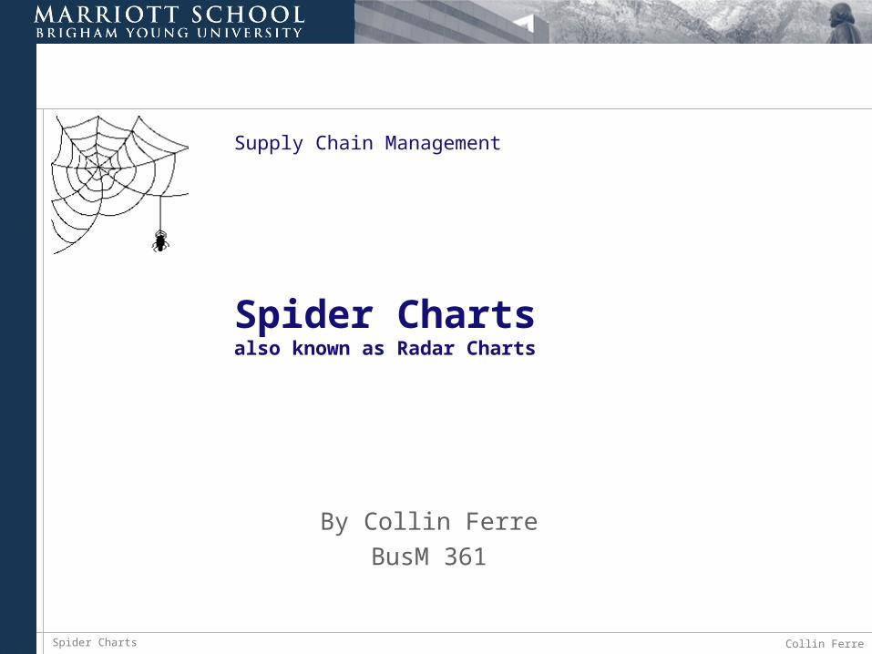
Spider Charts Collin Ferre1
Supply Chain Management
Spider Chartsalso known as Radar Charts
By Collin Ferre
BusM 361
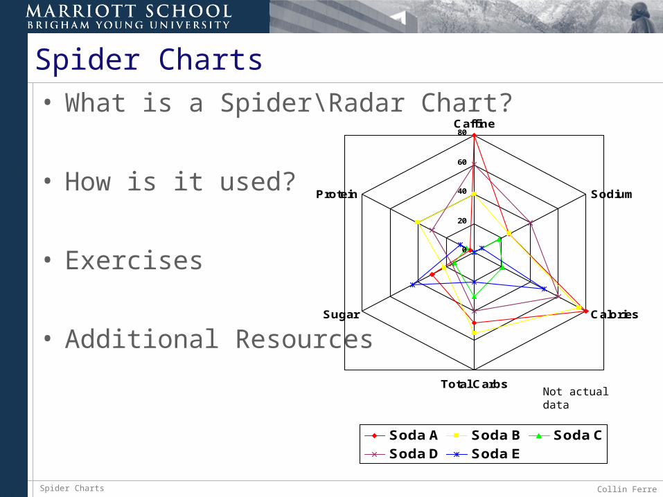
Spider Charts Collin Ferre2
Spider Charts• What is a Spider\Radar Chart?
• How is it used?
• Exercises
• Additional Resources
0
20
40
60
80Caffine
Sodium
Calories
Total Carbs
Sugar
Protein
Soda A Soda B Soda C
Soda D Soda E
Not actual data
Spider Charts Collin Ferre3
Background
Spider charts are most useful when trying to compare different set of data that all relate to a certain point.
They are very useful in visual comparisons of data to help choose the optimal solution or identify areas of improvement.
Spider Charts Collin Ferre4
How to use it• Create categories
• Standardize performance definitions
• Rate each performance category
• Construct the chart
• Plot the ratings.
• Interpret and use the results.
Spider Charts Collin Ferre5
Using Excel – Example One• Suppose that you are looking to buy a
computer
• Your top three criteria for the computer are hard drive capacity, processor speed, amount of RAM (memory), and CD\DVD drive.
• Use a spider chart to help you choose the best option for your computer
Spider Charts Collin Ferre6
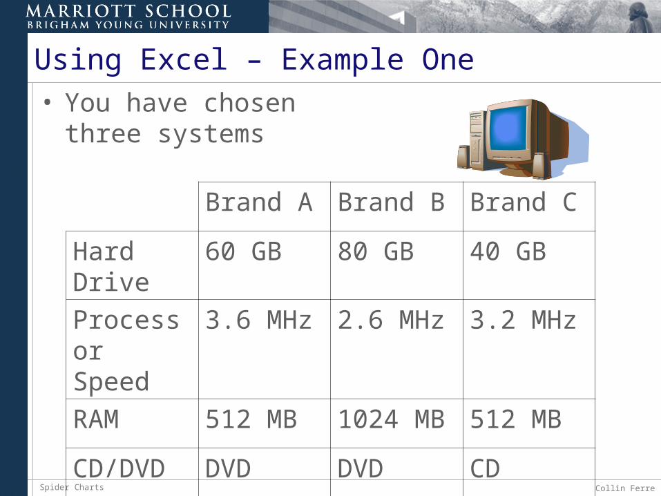
Using Excel – Example One• You have chosen
three systems
Brand A Brand B Brand C
Hard Drive
60 GB 80 GB 40 GB
Processor Speed
3.6 MHz 2.6 MHz 3.2 MHz
RAM 512 MB 1024 MB 512 MB
CD/DVD DVD DVD CD
Spider Charts Collin Ferre7
Using Excel – Example One
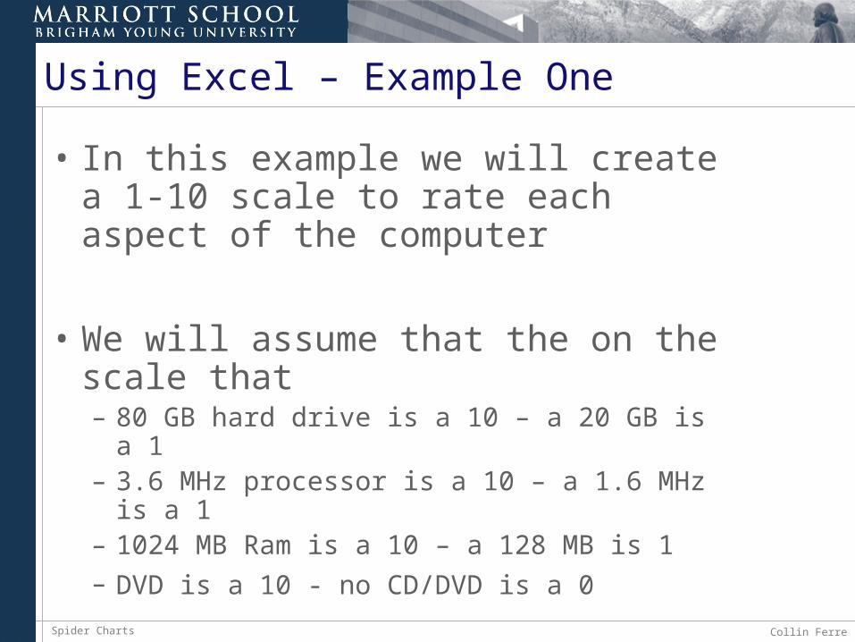
• In this example we will create a 1-10 scale to rate each aspect of the computer
• We will assume that the on the scale that– 80 GB hard drive is a 10 – a 20 GB is a 1– 3.6 MHz processor is a 10 – a 1.6 MHz is a 1– 1024 MB Ram is a 10 – a 128 MB is 1
– DVD is a 10 - no CD/DVD is a 0
Spider Charts Collin Ferre8
Using Excel – Example One
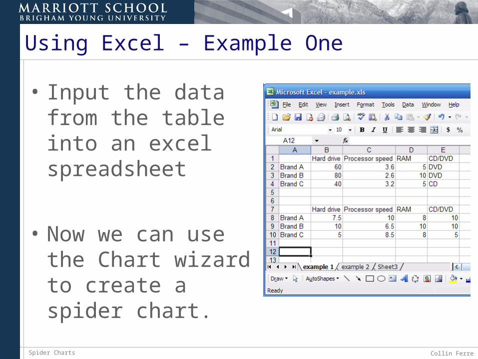
• Input the data from the table into an excel spreadsheet
• Now we can use the Chart wizard to create a spider chart.
Spider Charts Collin Ferre9
Using Excel – Example One
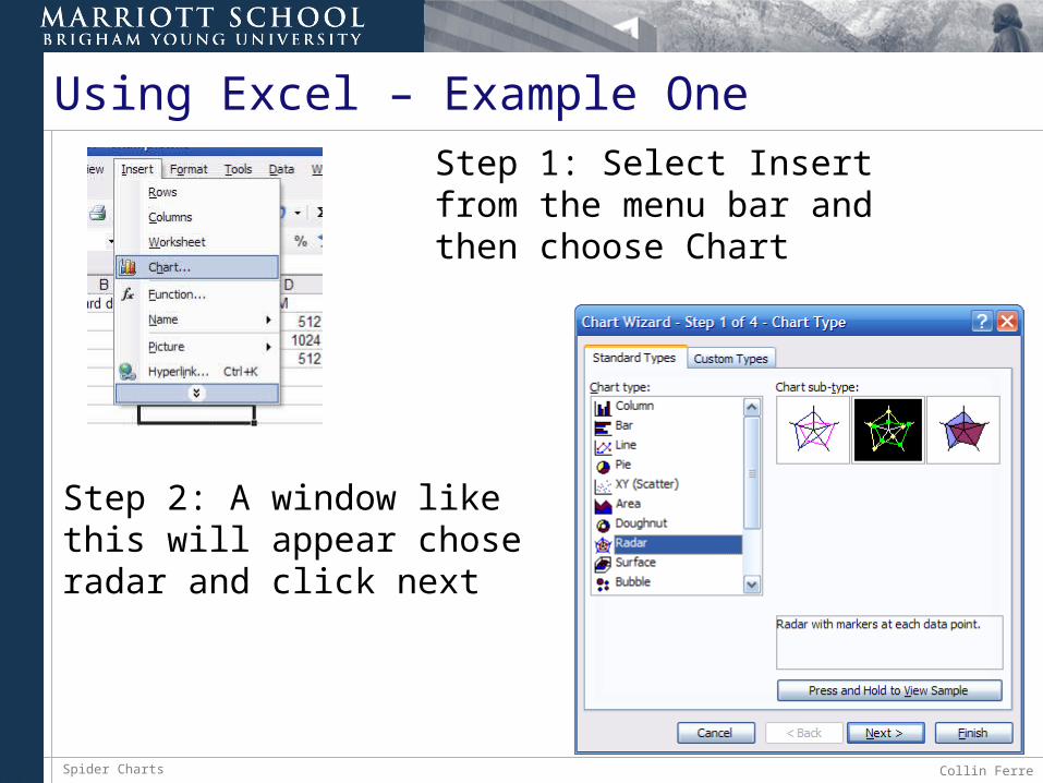
Step 2: A window like this will appear chose radar and click next
Step 1: Select Insert from the menu bar and then choose Chart
Spider Charts Collin Ferre10
Using Excel – Example One
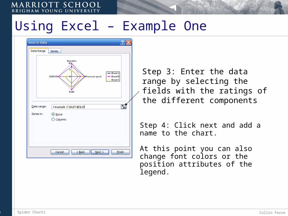
Step 4: Click next and add a name to the chart.
At this point you can also change font colors or the position attributes of the legend.
Step 3: Enter the data range by selecting the fields with the ratings of the different components
Spider Charts Collin Ferre11
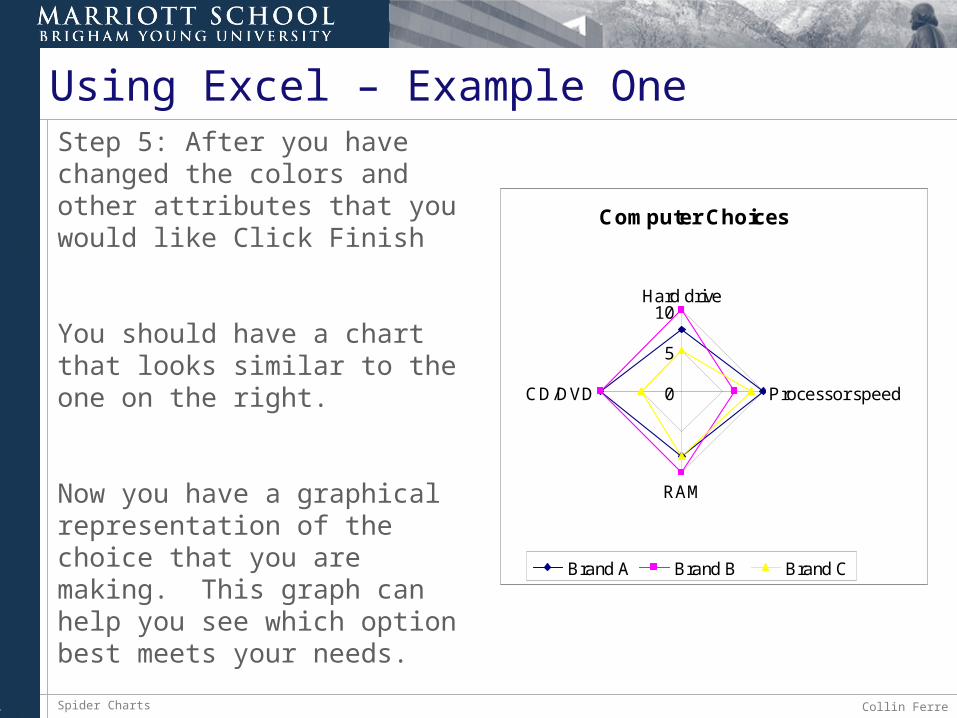
Using Excel – Example OneStep 5: After you have changed the colors and other attributes that you would like Click Finish
You should have a chart that looks similar to the one on the right.
Now you have a graphical representation of the choice that you are making. This graph can help you see which option best meets your needs.
Computer Choices
0
5
10Hard drive
Processor speed
RAM
CD/DVD
Brand A Brand B Brand C
Spider Charts Collin Ferre12
Example Two -
• Take a look at a more complex situation and this time you are on your own to create the spider chart.
• In this example it will not be necessary to rate the different components, simply use the data given in the problem
Spider Charts Collin Ferre13
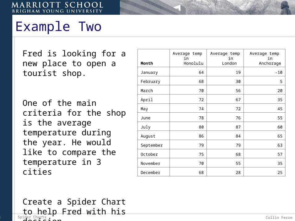
Example Two
MonthAverage temp in
Honolulu Average temp in
London Average temp in
Anchorage
January 64 19 -10
February 68 30 5
March 70 56 20
April 72 67 35
May 74 72 45
June 78 76 55
July 80 87 60
August 86 84 65
September 79 79 63
October 75 68 57
November 70 55 35
December 68 28 25
Fred is looking for a new place to open a tourist shop.
One of the main criteria for the shop is the average temperature during the year. He would like to compare the temperature in 3 cities
Create a Spider Chart to help Fred with his decision.
Spider Charts Collin Ferre14
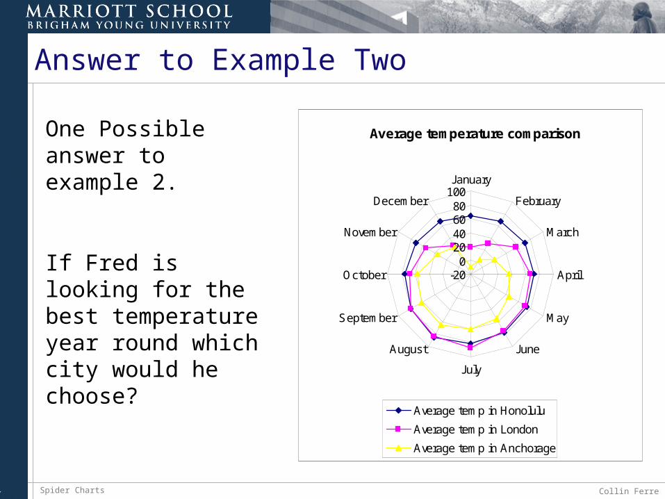
Answer to Example Two
Average temperature comparison
-200
20406080
100January
February
March
April
May
June
July
August
September
October
November
December
Average temp in Honolulu
Average temp in London
Average temp in Anchorage
One Possible answer to example 2.
If Fred is looking for the best temperature year round which city would he choose?
Spider Charts Collin Ferre15
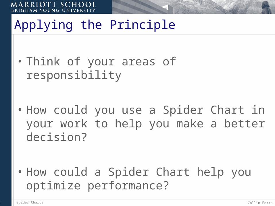
Applying the Principle
• Think of your areas of responsibility
• How could you use a Spider Chart in your work to help you make a better decision?
• How could a Spider Chart help you optimize performance?
Spider Charts Collin Ferre16
Additional Resources…• http://www.crummer.rollins.edu/journal/articles/2003_2_radar.pdf
• http://www.mori.com/pubinfo/aiz/statistical-analyses.pdf
• http://www.skymark.com/resources/tools/radar_charts.asp
• http://www.internet4classrooms.com/excel_radar.htm
• http://web2.concordia.ca/Quality/tools/23radar.pdf
• http://www.isixsigma.com/dictionary/Radar_Chart-307.htm
• http://www.infinitefutures.com/essays/prez/mapping/
• http://office.microsoft.com/en-us/assistance/HA010346071033.aspx
• http://www.ve.com/kavachart/alacarte/applets/specialty/SpiderCharts.html


![Collin College Course Syllabus FALL 2013-COLLIN …iws2.collin.edu/mrosenfield/17951.201410[1].pdf · Collin College Course Syllabus FALL 2013-COLLIN COLLEGE ... Determine and use](https://static.fdocuments.us/doc/165x107/5ae7a6e17f8b9aee078e774d/collin-college-course-syllabus-fall-2013-collin-iws2-1pdfcollin-college-course.jpg)