sparkTable: Generating Graphical Tables for Websites and Documents with R - The R … · ·...
14
CONTRIBUTED RESEARCH ARTICLES 24 sparkTable: Generating Graphical Tables for Websites and Documents with R by Alexander Kowarik, Bernhard Meindl and Matthias Templ Abstract Visual analysis of data is important to understand the main characteristics, main trends and relationships in data sets and it can be used to assess the data quality. Using the R package sparkTable, statistical tables holding quantitative information can be enhanced by including spark-type graphs such as sparklines and sparkbars . These kind of graphics are well-known in literature and are considered as simple, intense and illustrative graphs that are small enough to fit in a single line. Thus, they can easily enrich tables and texts with additional information in a comprehensive visual way. The R package sparkTable uses a clean S4 class design and provides methods to create different types of sparkgraphs that can be used in websites, presentations and documents. We also implemented an easy way for non-experts to create highly complex tables. In this case, graphical parameters can be interactively changed, variables can be sorted, graphs can be added and removed in an interactive manner. Thereby it is possible to produce custom-tailored graphical tables – standard tables that are enriched with graphs – that can be displayed in a browser and exported to various formats. Introduction Without doubt, visualization of data becomes more and more important for data analysis and for presenting aggregated information for end-users and policy needs. For surveys on the history and developments in visualization we refer to Friendly (2008) and Wickham (2013). The reason for this is that the human eye is a very powerful pattern recognition tool. Readers can easily understand simple visual presentations of data like charts published every day in newspapers, the internet, television and scientific articles. The visual presentation of data should illustrate trends and relationships quickly and easily and should display key figures about data. For readers it is often much easier to understand statistics when seeing a chart or a map rather than being confronted with a long list of numbers (see, e.g., The United Nations Economic Commission for Europe, 2009). Cleveland and McGill (1987) state that information encoded in a graph depends on a number of aspects such as plotting symbols, length, slopes or colors. Changing any aspect of a graph possibly leads to a different perception and decoding of the information. Thus it is required to research aspects of graphical representation of data and finally come up with recommendations or best practices. This task has been been tackled by various authors (see, e.g., Cleveland and McGill, 1987; Tufte, 1986). Cleveland and McGill (1987) suggest, for example, an optimum mid-angle of 45 degrees when comparing the slopes of different lines. 1 Other suggestions on how to scale the data exist and are summarized in Heer and Agrawala (2006). Details on the choice of colors can be found in Zeileis et al. (2009). Tables: Tables are a comprehensive way to summarize the most important facts about complex data. The United Nations Economic Commission for Europe (2009) claims that a small, well-formatted table can provide a great deal of information that readers can quickly absorb, and it, as well as Miller (2004), provide guidelines on how to design tables. However, the possibility of including graphics in tables (and text) is not covered. Tufte’s pioneer work: In our contribution, several examples show how to improve tables by includ- ing small graphics in the tables. It is pointed out that an improved table can contain various visual elements. This was originally proposed by Tufte (2001). He introduced the concept of sparklines and their application that is not limited to tables. These intense, simple and word-sized graphics sparklines can be embedded in continuous text and also match with other propositions he has made. For example, they can easily be used together with the small multiples approach (Tufte, 1990). According to Tufte it is always important to answer the question compared to what? when looking at graphs. Thus, the concept of small multiples is simply to put multiple graphs next to each other to allow direct visual comparisons between different (graphical) objects. He also states that small multiples are the best design solution to present a wide range of problems. 1 For example, this is also considered in the sparklines embedded in Table 2. The R Journal Vol. 7/1, June 2015 ISSN 2073-4859
Transcript of sparkTable: Generating Graphical Tables for Websites and Documents with R - The R … · ·...
CONTRIBUTED RESEARCH ARTICLES 24
sparkTable: Generating Graphical Tablesfor Websites and Documents with Rby Alexander Kowarik, Bernhard Meindl and Matthias Templ
Abstract
Visual analysis of data is important to understand the main characteristics, main trends andrelationships in data sets and it can be used to assess the data quality. Using the R package sparkTable,statistical tables holding quantitative information can be enhanced by including spark-type graphssuch as sparklines and sparkbars .
These kind of graphics are well-known in literature and are considered as simple, intense andillustrative graphs that are small enough to fit in a single line. Thus, they can easily enrich tables andtexts with additional information in a comprehensive visual way.
The R package sparkTable uses a clean S4 class design and provides methods to create differenttypes of sparkgraphs that can be used in websites, presentations and documents. We also implementedan easy way for non-experts to create highly complex tables. In this case, graphical parameters can beinteractively changed, variables can be sorted, graphs can be added and removed in an interactivemanner. Thereby it is possible to produce custom-tailored graphical tables – standard tables that areenriched with graphs – that can be displayed in a browser and exported to various formats.
Introduction
Without doubt, visualization of data becomes more and more important for data analysis and forpresenting aggregated information for end-users and policy needs. For surveys on the history anddevelopments in visualization we refer to Friendly (2008) and Wickham (2013). The reason for this isthat the human eye is a very powerful pattern recognition tool. Readers can easily understand simplevisual presentations of data like charts published every day in newspapers, the internet, television andscientific articles. The visual presentation of data should illustrate trends and relationships quicklyand easily and should display key figures about data. For readers it is often much easier to understandstatistics when seeing a chart or a map rather than being confronted with a long list of numbers (see,e.g., The United Nations Economic Commission for Europe, 2009).
Cleveland and McGill (1987) state that information encoded in a graph depends on a number ofaspects such as plotting symbols, length, slopes or colors. Changing any aspect of a graph possiblyleads to a different perception and decoding of the information. Thus it is required to research aspectsof graphical representation of data and finally come up with recommendations or best practices.This task has been been tackled by various authors (see, e.g., Cleveland and McGill, 1987; Tufte,1986). Cleveland and McGill (1987) suggest, for example, an optimum mid-angle of 45 degrees whencomparing the slopes of different lines.1 Other suggestions on how to scale the data exist and aresummarized in Heer and Agrawala (2006). Details on the choice of colors can be found in Zeileis et al.(2009).
Tables: Tables are a comprehensive way to summarize the most important facts about complex data.The United Nations Economic Commission for Europe (2009) claims that a small, well-formatted tablecan provide a great deal of information that readers can quickly absorb, and it, as well as Miller (2004),provide guidelines on how to design tables. However, the possibility of including graphics in tables(and text) is not covered.
Tufte’s pioneer work: In our contribution, several examples show how to improve tables by includ-ing small graphics in the tables. It is pointed out that an improved table can contain various visualelements. This was originally proposed by Tufte (2001). He introduced the concept of sparklines andtheir application that is not limited to tables. These intense, simple and word-sized graphics sparklines canbe embedded in continuous text and also match with other propositions he has made. For example,they can easily be used together with the small multiples approach (Tufte, 1990). According to Tufteit is always important to answer the question compared to what? when looking at graphs. Thus, theconcept of small multiples is simply to put multiple graphs next to each other to allow direct visualcomparisons between different (graphical) objects. He also states that small multiples are the bestdesign solution to present a wide range of problems.
1For example, this is also considered in the sparklines embedded in Table 2.
The R Journal Vol. 7/1, June 2015 ISSN 2073-4859
CONTRIBUTED RESEARCH ARTICLES 25
Another proposition Tufte makes is to show the data above all. In order to do so he introduces theterm of data-ink ratio. This ratio can be seen as the ink in a graph used to actually show data by the totalink used to print a graph. While the additional ink used for labels, axes, ticks and grids among othersmay help to improve graphs, it distracts attention from the most important part of the graph – the datavalues itself. Thus, in his view the data-ink ratio should be increased whenever possible and sparklinesare a way to do so, since it is possible to show a high amount of data, trends and variations in smallspace. This concept has also been criticized. Inbar et al. (2007) evaluated people’s acceptance of theminimalist approach (by increasing the data-ink ratio) to visualize information; a standard bar-graphand a minimalist version (both in Tufte, 2001) were compared. The majority of evaluators was moreattracted by the standard graph. However, they didn’t evaluate the case of placing sparklines in textor tables. Traditionally, the output in many areas of statistics is focused on tables (The United NationsEconomic Commission for Europe, 2009), this is especially true for official statistics. Large tables withlots of number provide a lot of information, but make it hard to grasp it. Visualization can providetools to make effects in the data visible at first sight and can provide the possibility to show more ofthe data than by just showing the numbers.
Software to produce sparklines: To make visualization methods applicable, software tools, whichprovide interactions with the data and provide reproducibility of any result, are needed.
To publish sparklines in newspapers has a long history. For example, the Huntsville Times reportsthe use of sparklines in their sports section on March 21, 2005. To produce this kind of sparklinesand graphical tables, various software products are available. For example, SAS© and JMP© includesuch facilities.2 Also Microsoft Excel allows to produce sparklines and there are implementations toproduce simple sparklines for Photoshop, Prism, DeltaMaster and matplotlib. Most of these solutionsare closed-source and commercial.
The sparkTable package
Our contribution goes a step beyond the before mentioned available tools. It is not just a re-implementation of sparklines in another software. Various improvements have been made andnew features are available to the user.
The presented software is free and open-source, its features are designed in a well-specified,object-oriented manner with defined classes and methods. The presented software allows to savethe sparklines in different output formats for easy inclusion in LATEX or websites with many optionalgraphical features, i.e., the sparklines are highly customizable. The software features the simple gener-ation of graphical tables with any statistical content that is automatically calculated from microdata.Finally, interactive features to create sparklines and sparktables are available and clickable in thebrowser.
In the following, a short introduction into the R package sparkTable (Kowarik et al., 2015) is givenwith the help of an example. The first version of the package was uploaded to the Comprehensive RArchive Network (CRAN) in May 2010 and has been improved various times since then.
The initial task was to find ways how common and frequent output such as tables and reports ofstatistical organizations could be improved using spark-type graphs and to find a technical solutionto create these visualizations. Since R is gaining momentum in national statistical institutes all overthe world, it was a natural choice to create an add-on package for R containing such functionality.There are a variety of reasons for this: one of them is the possibility to easily share and distribute thepackage and to instantly get feedback from users.
The goal was to create a free and open source software tool that allows the quick creation ofspark-type graphics that could easily be included in various documents such as reports or web pages.Many examples for graphical tables have been produced and – based on the feedback from bothcolleagues and users – it seems as if graphical tables are an helpful tool to improve traditional, existing,tabular-based outputs of national statistical offices. Some of these graphical tables are presented below.
sparkTable can also be used by non experts in R. Interactive clickable features have been added tothe package. Especially for graphical tables, some steps of abstraction are still required. However, ithas been made easier to customize and change graphical tables by using interactive web applications.Instead of a formal description of classes and methods and internal implementation of the package,the functionality of the package is illustrated with examples.
2They offer also the link (batch call) to the sparkTable package (Hill, 2011).
The R Journal Vol. 7/1, June 2015 ISSN 2073-4859

CONTRIBUTED RESEARCH ARTICLES 26
Function Description Comment
newSparkLine()newSparkBar()newSparkBox()newSparkHist()
creation of sparklines,sparkbars, sparkboxplotsand sparkhistograms thatmay serve as the base forcreating graphical tables
creates objects ofclass ‘sparkline’,‘sparkbar’, ‘sparkbox’and ‘sparkhist’
plot() plots objects of class‘sparkline’, ‘sparkbar’,‘sparkhist’ or ‘sparkbox’
export() saves objects of class‘sparkline’, ‘sparkbar’,‘sparkhist’, ‘sparkbox’ or‘sparkTable’
summaryST() summary for a data framein a graphical table
creates an object ofclass ‘sparkTable’. Cus-tomize the output withsetParameter()
newSparkTable() function to create an ob-ject of class ‘sparkTable’
getParameter(),setParameter()
basic functions to setparameters for objectsof class ‘sparkline’,‘sparkbar’, ‘sparkbox’,‘sparkTable’ (or‘geoTable’)
Table 1: Most important functions of package sparkTable.
Command line usage of sparkTable by example
The first step is to install and load the package. We assume that R has already been started. Then thepackage can be simply installed from any CRAN server.
Help files can be accessed from R by typing help(package = "sparkTable") into the console.This results in a browse-able, linked help archive. Each method, function and data set that comeswith the package is documented and also some example code is provided which allows users tobecome familiar with the package. So as to demonstrate the facilities of sparkTable, example data setsavailable in the package are used.
Table 1 shows the most important functions and classes of the sparkTable package. Basic functionsare available to produce sparklines, e.g., newSparkLine to create an object of class ‘sparkline’ thatcan be used as input for the plotting method plot() which dispatches based on the class of the inputmethod. Using method export() it is possible to save mini-plots as files (pdf, png or eps) on thehard-disk. In addition, functions are available to produce graphical tables and calculate summarystatistics for tables, see Basic sparks and Graphical tables for practical examples and more explanations.
In the following we show how to create basic spark graphics in Basic sparks. Then we demonstratehow to produce graphical tables that include some sparks in Graphical tables. We finish by introducingthe new interactive ways that can be used to change, modify and adjust objects generated with packagesparkTable in Interactive features.
Basic sparks
The data set pop, which is included in the package, is used. This data set contains the Austrianpopulation size for different age groups from 1981 to 2009. We start by loading the data set into thecurrent R session.
> data(pop, package = "sparkTable")
The R Journal Vol. 7/1, June 2015 ISSN 2073-4859

CONTRIBUTED RESEARCH ARTICLES 27
This data set – available in long-format – contains three variables. The variable time describesthe year, variable variable the different age groups and variable value the corresponding populationnumbers. Next, an object, which contains all the information required to plot a first sparkline, isgenerated. This can be achieved using function newSparkLine(). Calling the function and only settingargument values to use the population data of Austria stored in vector pop_ges as shown in the codelisting below, we obtain a new object sline (respectively slineIQR, where also the Inter-Quartile-Range(IQR) is visualized) with default settings for a sparkline plot.
> pop_ges <- pop$value[pop$variable == "Insgesamt"]> sline <- newSparkLine(values = pop_ges)> slineIQR <- newSparkLine(values = pop_ges, showIQR = TRUE)
The resulting object sline is of class ‘sparkline’ and has the default parameter settings. Later it isshown how to change specific settings of the graph using the generic function setParameter(). Notethat it is also possible to directly change parameters using newSparkLine() directly. The help-files thatcan be accessed using ?newSparkLine give an overview on the parameters that can be set or changed.
After creating a sparkline object it is possible to create a plot using function plot() or savingthe graphic by applying method export(). Using these methods it is possible to plot and export notonly objects of class ‘sparkline’ but also objects of class ‘sparkBar’ (generated with newSparkBar()),‘sparkBox’ (generated with newSparkBox()) and ‘sparkHist’ (generated with newSparkHist()). Thefunction export() requires a ‘spark*’ object as input and allows to specify the desired output format.Currently, one of the following output formats can be selected by changing the function argumentoutputType:
• "pdf": the spark-graphic is saved in pdf-format;
• "eps": the graph is saved as an encapsulated postscript file;
• "png": the graphic is written to disk as a portable network graph.
The function argument outputType is serialized so that it is possible to create the graphics in allpossible formats in one step. By the help of argument filename, users can specify an output filenamefor the resulting graphic. The code listing below shows how to save the sparkline represented in objsline as a pdf-graphic with filename first-sl.pdf.
> export(object = sline, outputType = "pdf",+ filename = file.path("figures", "first-sl"))> export(object = slineIQR, outputType = "pdf",+ filename = file.path("figures", "first-sl-IQR"))
This graph can now easily be included in the current text showing the development ofthe Austrian population from 1981 to 2009, alternatively with integrated IQR .
Similarly, other types of graphics can be produced. The next code listing highlights how to createother supported kind of word-graphs. In addition, some of the default parameters are changed.
> v1 <- as.numeric(table(rpois(50, 2))); v2 <- rnorm(50)> sbar <- newSparkBar(values = v1, barSpacingPerc = 5)> sbox <- newSparkBox(values = v2, boxCol = c("black", "darkblue"))> shist <- newSparkHist(values = v2, barCol = c("black", "darkgreen", "black"))> export(object = sbar, outputType = "pdf",+ filename = file.path("figures", "first-bar"))> export(object = sbox, outputType = "pdf",+ filename = file.path("figures", "first-box"))> export(object = shist, outputType = "pdf",+ filename = file.path("figures", "first-hist"))
Since they were exported as pdf-files, the produced sparkbar, the sparkbox andthe sparkhist can be easily integrated into a LATEX-document as shown here.
Changing parameters of spark objects can also be achieved by using function setParameter(). Inthe help file (accessible via ?setParameter) all possible values that can be changed are explained andlisted. Some of the options that might be changed are now listed below:
• width: available vertical space of the graph;
• height: available horizontal space of the graph;
• values: data points that should be plotted;
• lineWidth: the thickness of the line in a sparkline-plot;
The R Journal Vol. 7/1, June 2015 ISSN 2073-4859
CONTRIBUTED RESEARCH ARTICLES 28
• pointWidth: the radius of special points (minimum, maximum, last observation) of a sparkline;
• showIQR: whether the IQR is plotted in a sparkline-graph;
• outCol: color of outlying observations in a sparkbox-graph;
• barSpacingPerc: percent of the total horizontal space used between the bars in a sparkbar-graph.
We now show how to change some graphical parameters of the spark graphics we have just produced.
> sline2 <- setParameter(sline, type = "lineWidth", value = 2)> sline2 <- setParameter(sline2, type = "pointWidth", value = 5)> export(object = sline2, outputType = "pdf",+ filename = file.path("figures", "second-sl"))
For example the thickness of the line was changed in the sparkline object sline2 from the defaultvalue of 1 to 2. Additionally, we changed the size of the points for special values in the sparkline to 5.If this line is plotted, the sparkline showing Austrian population numbers looks different.
It is worth noting that the current settings can be queried using function getParameter() in ananalogue way as setting parameters by just leaving out the argument values. Detailed informationabout the kind of information that can be extracted using this function is available from the help pagethat is accessible via ?getParameter.
Further, it is worth noting that these mini-graphs can also be directly included in fully automatedreports. In the following example we show how to include a sparkline into a HTML-document that iscreated with knitr (Xie, 2014b) and the R markdown language.
```{r, echo=TRUE}require(sparkTable)sl <- newSparkLine(values = rnorm (25), lineWidth = .18, pointWidth = .4,
width = .4, height = .08)export(sl, outputType = "png", filename = "sparkLine ")```This is a sparkline included in the text ...
Listing 1: Content of minimal markdown file that contains a sparkline.
A minimal example is shown in Listing 1. In the first part, a sparkline graph with random valuesis generated and saved as an image in png-format. We made sure that the height of the image equalsapproximately the height of a single line. Using markdown code, this image is finally included in thetext. The integration in LATEX , using Sweave, knitr or brew (Horner, 2011), is straightforward, i.e., thecode environment in Listing 1 needs to be changed to Sweave, knitr or brew style.
Graphical tables
In Basic sparks, the basic usage of the package sparkTable to produce sparklines was demonstrated.Now we show how to enrich tables by including sparkgraphs. In addition, it is shown how spark-graphs can be used to visualize regional indicators in so-called checkerplots (Templ et al., 2013). Wepoint out that existing tools – specifically xtable (Dahl, 2014) – are used to generate the final output.
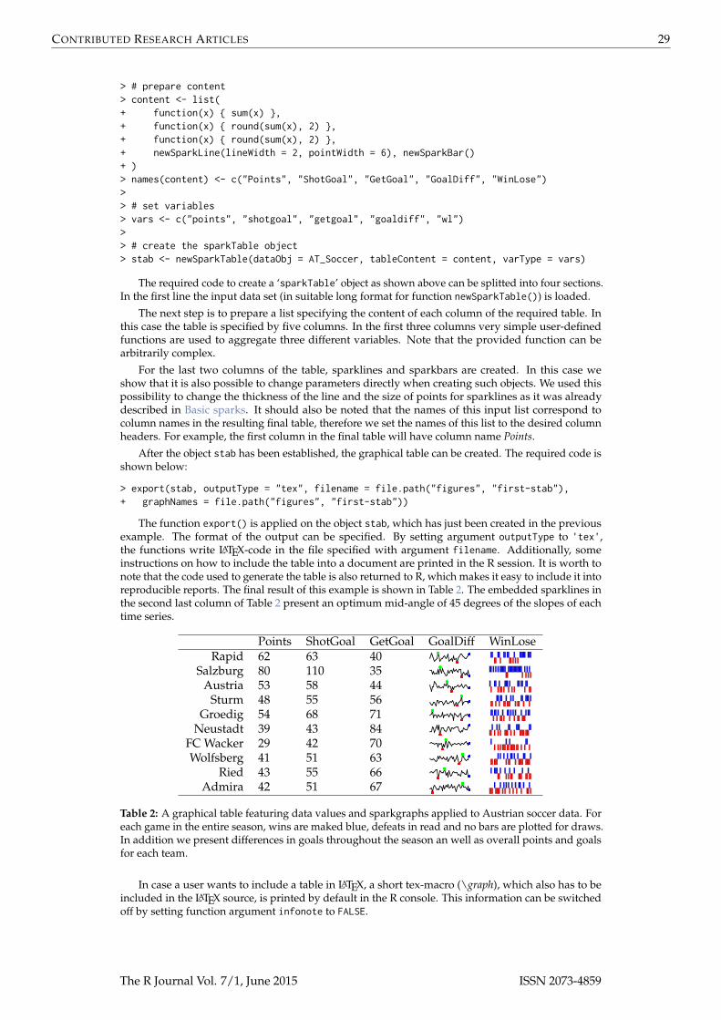
In order to plot a graphical table, the first step is to create a suitable input object - in this case anobject of class ‘sparkTable’. Objects of this kind hold the data itself in a suitable format. Further, suchobjects contain a list with information about the type of graphs or functions on the data values thatshould be shown in the resulting table. Moreover, a vector of variable names must be listed to specifyfor which variables in the data input graphs should be produced. These steps can be achieved usingfunction newSparkTable(). To illustrate this procedure, we give an example using results from the2013/2014 soccer season in Austria.
> # load data (in long format)> data(AT_Soccer, package = "sparkTable")> # first three observations to see the structure of the data> head(AT_Soccer, 3)
team time points wl goaldiff shotgoal getgoal1 Rapid 1 1 0 0 2 22 Rapid 2 3 1 4 4 03 Rapid 3 3 1 2 4 2
The R Journal Vol. 7/1, June 2015 ISSN 2073-4859
CONTRIBUTED RESEARCH ARTICLES 29
> # prepare content> content <- list(+ function(x) { sum(x) },+ function(x) { round(sum(x), 2) },+ function(x) { round(sum(x), 2) },+ newSparkLine(lineWidth = 2, pointWidth = 6), newSparkBar()+ )> names(content) <- c("Points", "ShotGoal", "GetGoal", "GoalDiff", "WinLose")>> # set variables> vars <- c("points", "shotgoal", "getgoal", "goaldiff", "wl")>> # create the sparkTable object> stab <- newSparkTable(dataObj = AT_Soccer, tableContent = content, varType = vars)
The required code to create a ‘sparkTable’ object as shown above can be splitted into four sections.In the first line the input data set (in suitable long format for function newSparkTable()) is loaded.
The next step is to prepare a list specifying the content of each column of the required table. Inthis case the table is specified by five columns. In the first three columns very simple user-definedfunctions are used to aggregate three different variables. Note that the provided function can bearbitrarily complex.
For the last two columns of the table, sparklines and sparkbars are created. In this case weshow that it is also possible to change parameters directly when creating such objects. We used thispossibility to change the thickness of the line and the size of points for sparklines as it was alreadydescribed in Basic sparks. It should also be noted that the names of this input list correspond tocolumn names in the resulting final table, therefore we set the names of this list to the desired columnheaders. For example, the first column in the final table will have column name Points.
After the object stab has been established, the graphical table can be created. The required code isshown below:
> export(stab, outputType = "tex", filename = file.path("figures", "first-stab"),+ graphNames = file.path("figures", "first-stab"))
The function export() is applied on the object stab, which has just been created in the previousexample. The format of the output can be specified. By setting argument outputType to 'tex',the functions write LATEX-code in the file specified with argument filename. Additionally, someinstructions on how to include the table into a document are printed in the R session. It is worth tonote that the code used to generate the table is also returned to R, which makes it easy to include it intoreproducible reports. The final result of this example is shown in Table 2. The embedded sparklines inthe second last column of Table 2 present an optimum mid-angle of 45 degrees of the slopes of eachtime series.
Points ShotGoal GetGoal GoalDiff WinLoseRapid 62 63 40
Salzburg 80 110 35Austria 53 58 44
Sturm 48 55 56Groedig 54 68 71
Neustadt 39 43 84FC Wacker 29 42 70Wolfsberg 41 51 63
Ried 43 55 66Admira 42 51 67
Table 2: A graphical table featuring data values and sparkgraphs applied to Austrian soccer data. Foreach game in the entire season, wins are maked blue, defeats in read and no bars are plotted for draws.In addition we present differences in goals throughout the season an well as overall points and goalsfor each team.
In case a user wants to include a table in LATEX, a short tex-macro (\graph), which also has to beincluded in the LATEX source, is printed by default in the R console. This information can be switchedoff by setting function argument infonote to FALSE.
The R Journal Vol. 7/1, June 2015 ISSN 2073-4859

CONTRIBUTED RESEARCH ARTICLES 30
Geographical tables
The concept to create geographical tables is based on the concept of the so called checkerplot (Templet al., 2013), which is also implemented in the package sparkTable in the function checkerplot(). Wenow show how to generate a geographical table for the EU using the function newGeoTable() andplotGeoTable(). The final result is shown in Table 3. Let us first load some data and print the firstthree rows of the data:
> data(popEU, package = "sparkTable")> data(debtEU, package = "sparkTable")> data(coordsEU, package = "sparkTable")> popEU <- popEU[popEU$country %in% coordsEU$country, ]> debtEU <- debtEU[debtEU$country %in% coordsEU$country, ]> EU <- cbind(popEU, debtEU[, -1])> head(EU, 3)
country B1999 B2000 B2001 B2002 B2003 B2004 B20051 BE 10213752 10239085 10263414 10309725 10355844 10396421 104458522 BG 8230371 8190876 8149468 7891095 7845841 7801273 77610493 CZ 10289621 10278098 10266546 10206436 10203269 10211455 10220577
B2006 B2007 B2008 B2009 B2010 X1999 X2000 X2001 X20021 10511382 10584534 10666866 10753080 10839905 113.7 107.9 106.6 103.52 7718750 7679290 7640238 7606551 7563710 77.6 72.5 66.0 52.43 10251079 10287189 10381130 10467542 10506813 16.4 18.5 24.9 28.2X2003 X2004 X2005 X2006 X2007 X2008 X2009 X2010
1 98.5 94.2 92.1 88.1 84.2 89.6 96.2 96.82 44.4 37.0 27.5 21.6 17.2 13.7 14.6 16.23 29.8 30.1 29.7 29.4 29.0 30.0 35.3 38.5
Before we generate sparklines, the data has to be transformed to long format. reshapeExt() canbe used to bring the data to the form so that newSparkTable() or newGeoTable() can be applied. InreshapeExt(), parameter idvar defines variables in long format that identify multiple records fromthe same group/individual and v.names corresponds to names of variables in the long format thatcorrespond to multiple variables in the wide format, see ?reshapeExt for details. We show the firsttwo list elements of the reordered data:
> EUlong <- reshapeExt(EU, idvar = "country", v.names = c("pop", "debt"),+ varying = list(2:13, 14:25), geographicVar = "country", timeValues = 1999:2010)> head(EUlong, 2)
$BEcountry time pop debt
BE.1 BE 1999 10213752 113.7BE.2 BE 2000 10239085 107.9BE.3 BE 2001 10263414 106.6BE.4 BE 2002 10309725 103.5BE.5 BE 2003 10355844 98.5BE.6 BE 2004 10396421 94.2BE.7 BE 2005 10445852 92.1BE.8 BE 2006 10511382 88.1BE.9 BE 2007 10584534 84.2BE.10 BE 2008 10666866 89.6BE.11 BE 2009 10753080 96.2BE.12 BE 2010 10839905 96.8
$BGcountry time pop debt
BG.1 BG 1999 8230371 77.6BG.2 BG 2000 8190876 72.5BG.3 BG 2001 8149468 66.0BG.4 BG 2002 7891095 52.4BG.5 BG 2003 7845841 44.4BG.6 BG 2004 7801273 37.0BG.7 BG 2005 7761049 27.5BG.8 BG 2006 7718750 21.6BG.9 BG 2007 7679290 17.2
The R Journal Vol. 7/1, June 2015 ISSN 2073-4859

CONTRIBUTED RESEARCH ARTICLES 31
IS NO SE FI EEPop : Pop : Pop : Pop : Pop :
Debt : Debt : Debt : Debt : Debt :
NL DE DK LT LVPop : Pop : Pop : Pop : Pop :
Debt : Debt : Debt : Debt : Debt :
UK IE BE CZ PL SKPop : Pop : Pop : Pop : Pop : Pop :
Debt : Debt : Debt : Debt : Debt : Debt :
LU CH LI AT HU ROPop : Pop : Pop : Pop : Pop : Pop :
Debt : Debt : Debt : Debt : Debt : Debt :
PT FR SI HR BG TRPop : Pop : Pop : Pop : Pop : Pop :
Debt : Debt : Debt : Debt : Debt : Debt :
ES IT MT GR CYPop : Pop : Pop : Pop : Pop :
Debt : Debt : Debt : Debt : Debt :
Table 3: A geographical table featuring sparkgraphs for all EU countries.
BG.10 BG 2008 7640238 13.7BG.11 BG 2009 7606551 14.6BG.12 BG 2010 7563710 16.2
The data is now ready and we can produce the geographical table:
> l <- newSparkLine(lineWidth = 3, pointWidth = 10)> content <- list(function(x) { "Population:" }, l, function(x) {"Debt:" }, l)> varType <- c(rep("pop", 2), rep("debt", 2))> xGeoEU <- newGeoTable(EUlong, content, varType, geographicVar = "country",+ geographicInfo = coordsEU)> export(xGeoEU, outputType = "tex", graphNames = file.path("figures", "out1"),+ filename = file.path("figures", "testEUT"), transpose = TRUE)
For the geographical representation in a grid, geographical coordinates have to be provided.Internally, an allocation problem is solved by linear programming to find the nearest free grid cellfrom the provided coordinates under several constraints. For this task, we refer to Templ et al. (2013),resulting in, for example, Scandinavian countries placed in the north, south Mediterranean countriesin the south, etc. Again, the sparklines in each grid can be modified by function setParameter().
Interactive features
Until recently sparkTable only provided rigid views of graphical tables in documents and on home-pages. However, when including a graphical table on a homepage some interactivity is beneficial. Twofunctions using the functionality from shiny (Chang et al., 2015) allow for interactive graphical tables.
The R Journal Vol. 7/1, June 2015 ISSN 2073-4859
CONTRIBUTED RESEARCH ARTICLES 32
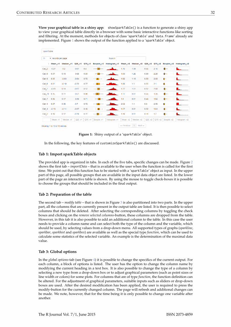
View your graphical table in a shiny app: showSparkTable() is a function to generate a shiny appto view your graphical table directly in a browser with some basic interactive functions like sortingand filtering. At the moment, methods for objects of class ‘sparkTable’ and ‘data.frame’ already areimplemented. Figure 1 shows the output of the function applied to a ‘sparkTable’ object.
Figure 1: Shiny output of a ‘sparkTable’ object.
In the following, the key features of customizeSparkTable() are discussed.
Tab 1: Import sparkTable objects
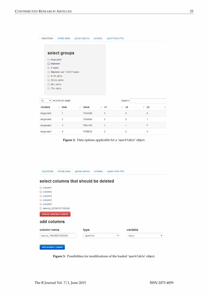
The provided app is organized in tabs. In each of the five tabs, specific changes can be made. Figure 2shows the first tab – importData – that is available to the user when the function is called for the firsttime. We point out that this function has to be started with a ‘sparkTable’ object as input. In the upperpart of this page, all possible groups that are available in the input data object are listed. In the lowerpart of the page an interactive table is shown. By using the mouse to toggle check-boxes it is possibleto choose the groups that should be included in the final output.
Tab 2: Preparation of the table
The second tab – modify table – that is shown in Figure 3 is also partitioned into two parts. In the upperpart, all the columns that are currently present in the output table are listed. It is then possible to selectcolumns that should be deleted. After selecting the corresponding columns by toggling the checkboxes and clicking on the remove selected columns-button, these columns are dropped from the table.However, in this tab it is also possible to add an additional column to the table. In this case the userneeds to provide a column name and can select both the type of the column and the variable, whichshould be used, by selecting values from a drop-down menu. All supported types of graphs (sparkline,sparkbar, sparkhist and sparkbox) are available as well as the special type function, which can be used tocalculate some statistics of the selected variable. An example is the determination of the maximal datavalue.
Tab 3: Global options
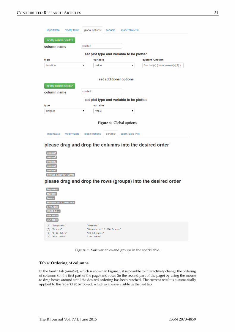
In the global options-tab (see Figure 4) it is possible to change the specifics of the current output. Foreach column, a block of options is listed. The user has the option to change the column name bymodifying the current heading in a text box. It is also possible to change the type of a column byselecting a new type from a drop-down box or to adjust graphical parameters (such as point sizes orline width or colors) for some plots. For columns that are of type function, the function definition canbe altered. For the adjustment of graphical parameters, suitable inputs such as sliders or drop-downboxes are used. After the desired modification has been applied, the user is required to press themodify-button for the currently changed column. The page will refresh and additional changes canbe made. We note, however, that for the time being it is only possible to change one variable afteranother.
The R Journal Vol. 7/1, June 2015 ISSN 2073-4859
CONTRIBUTED RESEARCH ARTICLES 33
Figure 2: Data options applicable for a ‘sparkTable’ object.
Figure 3: Possibilities for modifications of the loaded ‘sparkTable’ object.
The R Journal Vol. 7/1, June 2015 ISSN 2073-4859
CONTRIBUTED RESEARCH ARTICLES 34
Figure 4: Global options.
Figure 5: Sort variables and groups in the sparkTable.
Tab 4: Ordering of columns
In the fourth tab (sortable), which is shown in Figure 5, it is possible to interactively change the orderingof columns (in the first part of the page) and rows (in the second part of the page) by using the mouseto drag boxes around until the desired ordering has been reached. The current result is automaticallyapplied to the ‘sparkTable’ object, which is always visible in the last tab.
The R Journal Vol. 7/1, June 2015 ISSN 2073-4859
CONTRIBUTED RESEARCH ARTICLES 35
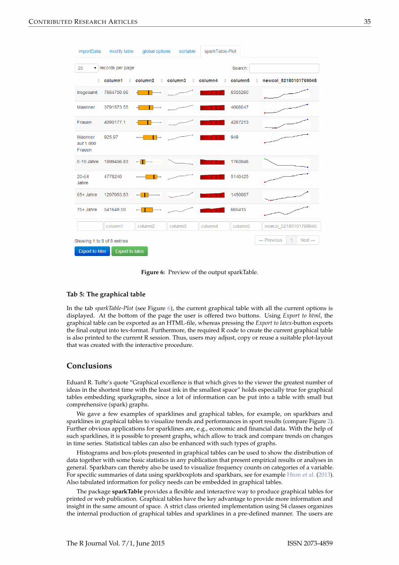
Figure 6: Preview of the output sparkTable.
Tab 5: The graphical table
In the tab sparkTable-Plot (see Figure 6), the current graphical table with all the current options isdisplayed. At the bottom of the page the user is offered two buttons. Using Export to html, thegraphical table can be exported as an HTML-file, whereas pressing the Export to latex-button exportsthe final output into tex-format. Furthermore, the required R code to create the current graphical tableis also printed to the current R session. Thus, users may adjust, copy or reuse a suitable plot-layoutthat was created with the interactive procedure.
Conclusions
Eduard R. Tufte’s quote “Graphical excellence is that which gives to the viewer the greatest number ofideas in the shortest time with the least ink in the smallest space” holds especially true for graphicaltables embedding sparkgraphs, since a lot of information can be put into a table with small butcomprehensive (spark) graphs.
We gave a few examples of sparklines and graphical tables, for example, on sparkbars andsparklines in graphical tables to visualize trends and performances in sport results (compare Figure 2).Further obvious applications for sparklines are, e.g., economic and financial data. With the help ofsuch sparklines, it is possible to present graphs, which allow to track and compare trends on changesin time series. Statistical tables can also be enhanced with such types of graphs.
Histograms and box-plots presented in graphical tables can be used to show the distribution ofdata together with some basic statistics in any publication that present empirical results or analyses ingeneral. Sparkbars can thereby also be used to visualize frequency counts on categories of a variable.For specific summaries of data using sparkboxplots and sparkbars, see for example Hron et al. (2013).Also tabulated information for policy needs can be embedded in graphical tables.
The package sparkTable provides a flexible and interactive way to produce graphical tables forprinted or web publication. Graphical tables have the key advantage to provide more information andinsight in the same amount of space. A strict class oriented implementation using S4 classes organizesthe internal production of graphical tables and sparklines in a pre-defined manner. The users are
The R Journal Vol. 7/1, June 2015 ISSN 2073-4859

CONTRIBUTED RESEARCH ARTICLES 36
provided with highly customizable functions to create sparklines and tables in a flexible manner. Thesparklines can be modified easily and the tables can also contain arbitrarily comples statistics basedon the underlying data.
Additionally, interactivity is added with the help of the package shiny. Especially these interactivefeatures allow non-experts in R to create graphical tables enriched by all kind of sparklines. Tables canthen be exported to HTML or LATEX and additionally the code required for various plots is shown bothwhen the interactive shiny-app is used and when graphical tables are exported with export().
Bibliography
W. Cleveland and R. McGill. Graphical perception: The visual decoding of quantitative informationon graphical displays of data. Journal of the Royal Statistical Society. Series A (General), 150(3):192–229,1987. [p24]
D. B. Dahl. xtable: Export Tables to LATEX or HTML, 2014. URL http://CRAN.R-project.org/package=xtable. R package version 1.7-3. [p28]
M. Friendly. A brief history of data visualization. In C. Chen, W. Härdle, and A. Unwin, editors,Handbook of Data Visualization, pages 15–56. Springer-Verlag, Heidelberg, 2008. [p24]
J. Heer and M. Agrawala. Multi-scale banking to 45 degrees. IEEE Transactions on Visualization andComputer Graphics, 12(5):701–708, Sept. 2006. [p24]
E. Hill. JMP© 9 add-ins: Taking visualization of SAS© data to new heights. In SAS Global Forum 2011,2011. [p25]
J. Horner. brew: Templating Framework for Report Generation, 2011. URL http://CRAN.R-project.org/package=brew. R package version 1.0-6. [p28]
K. Hron, M. Templ, and P. Filzmoser. Estimation of a proportion in survey sampling using the logratioapproach. Metrika, 76(6):799–818, 2013. [p35]
O. Inbar, N. Tractinsky, and J. Meyer. Minimalism in information visualization: Attitudes towardsmaximizing the data-ink ratio. In Proceedings of the 14th European Conference on Cognitive Ergonomics:Invent! Explore!, ECCE ’07, pages 185–188, New York, NY, USA, 2007. [p25]
A. Kowarik, B. Meindl, and M. Templ. sparkTable: Sparklines and Graphical Tables for TEX and HTML,2015. URL http://CRAN.R-project.org/package=sparkTable. R package version 1.0.0. [p25]
J. Miller. The Chicago Guide to Writing about Numbers. Chicago Guides to Writing, Editing, and.University of Chicago Press, 2004. [p24]
RStudio and Inc. shiny: Web Application Framework for R, 2014. URL http://CRAN.R-project.org/package=shiny. R package version 0.9.1. [p31, 140]
M. Templ, B. Hulliger, A. Kowarik, and K. Fürst. Combining geographical information and traditionalplots: The checkerplot. International Journal of Geographical Information Science, 27(4):685–698, 2013.[p28, 30, 31]
The United Nations Economic Commission for Europe. Making Data Meaningful. Part 2: A Guide toPresenting Statistics, 2009. ECE/CES/STAT/NONE/2009/3. [p24, 25]
E. Tufte. Envisioning Information. Graphics Press, 1990. [p24]
E. R. Tufte. The Visual Display of Quantitative Information. Graphics Press, Cheshire, CT, USA, 1986.[p24]
E. R. Tufte. The Visual Display of Quantitative Information. Bertrams, 2nd edition, 2001. [p24, 25]
H. Wickham. Statistical graphics. Encyclopedia of Environmetrics, 2013. Pre-print available at http://vita.had.co.nz/papers/stat-graphics.html. [p24]
Y. Xie. knitr: A General-Purpose Package for Dynamic Report Generation in R, 2014. URL http://CRAN.R-project.org/package=knitr. R package version 1.6. [p28, 99]
A. Zeileis, K. Hornik, and P. Murrell. Escaping RGBland: Selecting colors for statistical graphics.Computational Statistics & Data Analysis, 53(9):3259–3270, 2009. [p24]
The R Journal Vol. 7/1, June 2015 ISSN 2073-4859

CONTRIBUTED RESEARCH ARTICLES 37
Alexander KowarikStatistics AustriaGuglgasse 13; 1110 [email protected]
Bernhard MeindlStatistics AustriaGuglgasse 13; 1110 [email protected]
Matthias TemplCSTAT - Computational StatisticsInstitute of Statistics & Mathematical Methods in EconomicsVienna University of Technology & Statistics AustriaWiedner Hauptstr. 7; 1040 [email protected]
The R Journal Vol. 7/1, June 2015 ISSN 2073-4859