Social Security Bulletin Evaluation, and Statistics at the above address. Comments may also be made...
79
Social Security Bulletin Vol. 78, No. 1, 2018 IN THIS ISSUE: ` Trends in Men’s Wages, 1981–2014 ` The Incidence and Consequences of Private Sector Job Loss in the Great Recession ` Poverty Among the Aged Population: The Role of Out-of-Pocket Medical Expenditures and Annuitized Assets in Supplemental Poverty Measure Estimates Social Security
Transcript of Social Security Bulletin Evaluation, and Statistics at the above address. Comments may also be made...

Social Security Bulletin Vol. 78, No. 1, 2018
IN THIS ISSUE:
` Trends in Men’s Wages, 1981–2014
` The Incidence and Consequences of Private Sector Job Loss in the Great Recession
` Poverty Among the Aged Population: The Role of Out-of-Pocket Medical Expenditures and Annuitized Assets in Supplemental Poverty Measure Estimates
Social Security

The Social Security Bulletin (ISSN 1937-4666) is published quarterly by the Social Security Administration, 500 E Street, SW, 8th Floor, Washington, DC 20254-0001.
The Bulletin is prepared in the Office of Retirement and Disability Policy, Office of Research, Evaluation, and Statistics. Suggestions or comments concerning the Bulletin should be sent to the Office of Research, Evaluation, and Statistics at the above address. Comments may also be made by e-mail at [email protected].
Note: Contents of this publication are not copyrighted; any items may be reprinted, but citation of the Social Security Bulletin as the source is requested. The Bulletin is available on the web at https://www.ssa .gov/policy/docs/ssb/.
Errata Policy: If errors that impair data interpretation are found after publication, corrections will be posted as errata on the web at https://www.ssa.gov/policy /docs /ssb/v78n1/index.html.
The findings and conclusions presented in the Bulletin are those of the authors and do not necessarily represent the views of the Social Security Administration.
SSA Publication No. 13-11700Produced and published at U.S. taxpayer expense
Nancy A. BerryhillActing Commissioner of Social Security
Mark J. WarshawskyDeputy Commissioner for Retirement and Disability Policy
John W. R. PhillipsAssociate Commissioner for Research, Evaluation, and Statistics
Office of Information ResourcesMargaret F. Jones, Director
StaffJessie Ann DalrympleBenjamin PitkinWanda Sivak
Perspectives EditorMichael Leonesio

Social Security Bulletin, Vol. 78, No. 1, 2018 iii
Social Security BulletinVolume 78 ● Number 1 ● 2018
Articles
1 Trends in Men’s Wages, 1981–2014by Patrick J. Purcell
The Social Security Administration maintains wage and salary earnings records for all American workers. From those administrative records, the agency extracts a 1 percent sample called the Continuous Work History Sample (CWHS) for research and statistical pur-poses. This article uses CWHS data to examine trends in men’s real wage and salary earn-ings from 1981 through 2014. It first describes broad trends for all men aged 25–59. Then it describes the trends over that same span for men in each of seven 5-year age intervals (25–29, 30–34, 35–39, 40–44, 45–49, 50–54, and 55–59), with detail by individual birth cohort. A series of charts shows how men’s real wages changed across age groups and birth cohorts within each age group.
31 The Incidence and Consequences of Private Sector Job Loss in the Great Recessionby Kenneth A. Couch, Gayle L. Reznik, Howard M. Iams, and Christopher R. Tamborini
This article examines the extent and economic consequences of involuntary unemployment among private-sector workers aged 26–55 during the Great Recession. Using data from the 2008 panel of the Survey of Income and Program Participation, the authors document the effects of involuntary unemployment on earnings, income, and health insurance cov-erage during the economic downturn and compare outcomes across worker demographic subgroups. Those outcomes are tracked at annual intervals over a 3-year follow-up period and are compared with those of workers who did not experience a job loss. The authors discuss their findings in the context of retirement security in general and Social Security in particular.
Perspectives
47 Poverty Among the Aged Population: The Role of Out-of-Pocket Medical Expenditures and Annuitized Assets in Supplemental Poverty Measure Estimatesby Koji Chavez, Christopher Wimer, David M. Betson, and Lucas Manfield
The Supplemental Poverty Measure (SPM) does not account for the aged population’s abil-ity to draw from asset principal to cover living expenses. In this article, the authors ask two questions: (1) How much can we conservatively expect the aged to withdraw from their assets annually, and (2) To what extent would the inclusion of such assets alter the estimated propor-tion of the aged in SPM poverty—specifically, the proportion of the aged who are “pushed” into SPM poverty because of their medical out-of-pocket expenditures?


Social Security Bulletin, Vol. 78, No. 1, 2018 1
IntroductionEvery year, employers report their employees’ wage and salary earnings to the Internal Revenue Service (IRS) and the Social Security Administration (SSA) on IRS Form W-2.1 SSA stores those earnings records in its Master Earnings File (MEF), which it uses to administer the Old-Age, Survivors, and Disability Insurance (OASDI) programs.2 For research and sta-tistical purposes, SSA extracts data from the MEF and other administrative files each year to create the Con-tinuous Work History Sample (CWHS). The CWHS contains earnings records for more than 3.7 million individuals, representing 1 percent of all Social Secu-rity numbers ever issued. For researchers, the large number of earnings records in the CWHS, its longitu-dinal structure, and its accuracy have advantages over household surveys, which consist of smaller samples, typically collect data for relatively short periods, and are subject to reporting and recording errors.
This article describes the trends in real wages and salaries recorded in the CWHS among men aged 25–59 from 1981 through 2014. It briefly describes the change in real wages and salaries for all men aged 25–59 during this period, then examines trends for individual birth cohorts in each of seven age groups: 25–29, 30–34, 35–39, 40–44, 45–49, 50–54, and 55–59. Using a series of charts, I show how
men’s real wages changed across age groups and birth cohorts within each age group.
Data and MethodsThe CWHS is an analytical master file created from 1 percent samples of the Master Beneficiary Record (MBR) and the MEF, both of which SSA uses to administer the OASDI programs. To maintain the CWHS’s 1 percent sample size, each year, SSA adds the earnings records associated with a random selec-tion of newly issued Social Security numbers. The records of deceased workers remain in the CWHS, allowing researchers to study the wages of entire birth cohorts over time. When needed, SSA updates the CWHS earnings records for adjustments and correc-tions to the MEF.
The CWHS includes data on Social Security taxable wages in covered employment since 1951.3 Covered employment refers to jobs for which employers submit
Selected Abbreviations
CWHS Continuous Work History SampleIRS Internal Revenue ServiceMEF Master Earnings FileSSA Social Security Administration
* Patrick Purcell is with the Office of Retirement Policy, Office of Retirement and Disability Policy, Social Security Administration.
Note: Contents of this publication are not copyrighted; any items may be reprinted, but citation of the Social Security Bulletin as the source is requested. The Bulletin is available on the web at https://www.ssa.gov/policy/docs/ssb/. The findings and conclusions presented in the Bulletin are those of the author and do not necessarily represent the views of the Social Security Administration.
trendS in Men’S WageS, 1981–2014by Patrick J. Purcell*
The Social Security Administration maintains wage and salary earnings records for all American workers. From those administrative records, the agency extracts a 1 percent sample called the Continuous Work History Sample (CWHS) for research and statistical purposes. This article uses CWHS data to examine trends in men’s real wage and salary earnings from 1981 through 2014. It first describes broad trends for all men aged 25–59. Then it describes the trends over that same span for men in each of seven 5-year age intervals (25–29, 30–34, 35–39, 40–44, 45–49, 50–54, and 55–59), with detail by individual birth cohort. A series of charts shows how men’s real wages changed across age groups and birth cohorts within each age group.

2 https://www.ssa.gov/policy/docs/ssb/
payroll-tax deductions to the IRS and report wages to SSA to determine a worker’s eligibility for Social Security benefits and the amount of those benefits. Taxable wages are earnings in covered employment equal to or less than an annually adjusted threshold amount called the taxable maximum.4 Since 1978, the CWHS has included records on wages in noncovered employment and earnings exceeding the annual maxi-mum taxable amount.
This article describes results derived from the 2014 CWHS file, the most recent available when the analy-sis was conducted. Following the methods of Leonesio and Del Bene (2011), the earnings analyzed in this article consist of wages and salaries since 1981 in both covered and noncovered employment, including wages and salaries exceeding the annual taxable maximum. Earnings from self-employment are not included.5 The analysis includes only men’s earnings because the changes that have occurred in employment and earnings among women warrant separate analysis.6 It focuses on ages 25 to 59 because those are the ages with the highest employment rates.7 For brevity, I refer to “wages and salaries” hereafter simply as “wages.” To focus on workers who had substantial wages, the analysis includes only individuals with annual wages equal to or greater than the amount needed to earn four quarters of coverage under Social Security.8 This amount ranged from $1,240 in 1981 ($2,827 in 2014 dollars) to $4,800 in 2014. All wages have been indexed to 2014 values by the personal consumption expenditure (PCE) index of the National Income and Product Accounts.9
In addition to excluding individuals with wages lower than the amount needed to earn four quarters of coverage, this analysis excludes the top 0.1 percent of earners each year. I exclude those records because in some cases, very high wages recorded in the CWHS indicate data-reporting errors, coding errors, or fraudulent use of a Social Security number, and there is no way to distinguish between the accurate and inaccurate records. This exclusion also reduces the effect of extreme outliers at the high end of the wage distribution on the measured mean and variance of wages. The 1981 sample was bounded at the high end at $432,197, the amount of wages (in 2014 dollars) above which a man would have been in the top 0.1 per-cent of male earners that year. The 2014 sample was bounded at the high end at $1,522,006, the amount of wages above which a man would have been in the top 0.1 percent of male earners that year.
The 2014 CWHS file consists of 3,727,665 indi-vidual person-records.10 Of these records, 53.1 percent are for men and 46.9 percent are for women. For this analysis, the sample was restricted to men aged 25–59 in the year observed. Thus, for 1981, the sample includes men born from 1922 through 1956. For 2014, the sample includes men born from 1955 through 1989. Overall, the sample consists of 18,228,530 person-year observations from 1981 through 2014, with an average of 536,133 unique individuals observed each year. The number of observations ranges from a low of 434,328 for 1982 to a high of 586,865 for 2007. There are an average of 15,318 records for each year observed for each single year of age.11 The fewest records for any year observed for a single year of age is 6,839, for men aged 59 in 1992 (born in 1933). The most records for any year observed for a single year of age is 20,467, for men aged 38 in 1998 (born in 1960).
In the next section, I summarize previous research based on the CWHS. I then describe broad trends in wages from 1981 through 2014 for men aged 25 through 59. A discussion of the main findings follows, in a section that describes the changes in median real wages from 1981 through 2014 for men in seven age groups: 25–29, 30–34, 35–39, 40–44, 45–49, 50–54, and 55–59. These age-earnings profiles show how men’s real wages changed from 1981 through 2014 across age groups and birth cohorts within each age group.
Previous ResearchSeveral analysts have used the CWHS to study the growth and variance of earnings over time. Kopczuk, Saez, and Song (2010) investigated trends in the variance of annual earnings from 1970 to 2004. They found that almost all of the increase in variance was “due to [an] increase in the variance of perma-nent earnings, as opposed to transitory earnings.” Sabelhaus and Song (2010) found that between 1980 and the early 1990s, the variability of earnings growth rates across the working population declined signifi-cantly, and that the lower volatility continued through the early 2000s. They suggested that over that period, both permanent and transitory components of earnings shocks had become more moderate.
Leonesio and Del Bene (2011) used the CWHS to study the distribution of men’s and women’s wages from 1981 through 2004. They observed that “among prime-aged men, real earnings have declined or stagnated for low-wage earners, have increased

Social Security Bulletin, Vol. 78, No. 1, 2018 3
modestly in the middle of the distribution, and have risen substantially for high earners.” They also found among men “an increase in long-run earnings inequal-ity of roughly the same magnitude as the trend seen in annual earnings dispersion.” They observed relatively little increase in the dispersion of long-run earnings among women. They concluded that the trends they observed were “consistent with the view that more highly skilled and educated workers have been paid higher premiums for their labor over time, while the productivity and earnings of lower-skilled work-ers have not similarly benefited from improvements in technology.”
Guvenen, Kaplan, and Song (2014) used the CWHS to measure the progress that women have made toward achieving earnings parity with men. They found that although the share of women in the top 1 percent of earners increased by a factor of more than three from the early 1980s to 2012, women’s earnings constituted only 11 percent of the earnings of the top 1 percent of earners in 2012. Guvenen and others (2015) exam-ined changes in annual earnings and found that in any given year, most workers experience very small changes in earnings, but a small percentage experience very large shocks. They found that positive shocks to high-income individuals are transitory, but negative shocks are persistent. For low-income individuals, however, large earnings shocks are more common but less persistent. The authors concluded that in general, high-income individuals experience earnings shocks that are persistent but that their income shows lower volatility than that of lower-earning workers. Song and others (2015) matched CWHS records to employer data to compare the dispersion of earnings within firms to earnings dispersion across firms. They found an increase in earnings inequality among workers of different firms between 1978 and 2012, while differences in earnings within firms remained almost unchanged.
This study differs in focus from those described above. It exploits the large CWHS sample and its longitudinal structure to compare the real wages of men in seven age intervals over a period spanning 33 years. Charts show real median wages each year for each age group, allowing us to observe trends in men’s real median wages across age groups and birth cohorts within each age group. First, however, I sum-marize the broader trends in men’s real wages in the study period.
Men’s Wages 1981–2014Chart 1 shows the median and mean wages along with the standard deviation of wages for men aged 25–59 from 1981 through 2014. Men’s real wages during that period had a flat median, a rising mean, and increasing variance. Real median wages were $42,973 in 1981 and $45,000 in 2014, an increase of $2,027 (4.7 per-cent) overall and an average annual increase of 0.1 per-cent. Much of the growth in men’s wages occurred over a relatively short period in the late 1990s. Real median wages fell from $42,973 in 1981 to $39,968 in 1993. From there, median wages rose to $45,620 in 2001 and then remained almost level over the next 6 years, rising by $489 (1.1 percent) to $46,109 in 2007. Real median wages fell during the Great Reces-sion, declining to $44,170 in 2011 before recovering slightly to $45,000 in 2014. Nevertheless, the real median wages of men aged 25–59 in 2014 were $1,109 (2.4 percent) lower than they had been in 2007.
Real mean wages rose from $47,720 in 1981 to $64,181 in 2014, an increase of $16,461 (34.5 percent), or an average annual increase of 0.9 percent. Much of the growth occurred between 1993 and 2001. Early in the period, real mean wages rose from $47,720 in 1981 to $51,128 in 1992, an increase of $3,408, or 7.1 per-cent. By 2000, they had risen to $61,587, an increase since 1992 of 20.5 percent. Mean wage growth slowed after 2000. Wages rose to $64,282 in 2007, then fell to $62,027 in 2009 (during the Great Recession), before rebounding to $64,181 in 2014. Between 2000 and 2014, men’s mean wages rose by 4.2 percent.
As men’s real mean wages increased from 1981 to 2014, so did the standard deviation, a measure of how widely the values are distributed around the mean. In 1981, men’s real mean annual wages were $47,720 and the standard deviation was $34,797. By 2014, the mean value of men’s wages had risen by 34.5 percent to $64,181, yet the standard deviation had more than doubled, from $34,797 to $80,635, indicating a sub-stantial increase in the dispersion of wages around the mean. In both 1981 and in 2014, the distribution of wages was skewed to the right: The highest values were much farther from the mean than the lowest val-ues; recall that the latter are equivalent to the annual earnings needed to earn four quarters of coverage under Social Security.
Chart 2 shows the real wages of men aged 25–59 each year from 1981 through 2014 at the 10th, 25th, 50th, 75th, 90th, and 99th percentiles of the wage distribution. In 1981, a worker with wages at the 10th percentile

4 https://www.ssa.gov/policy/docs/ssb/
Chart 1. Mean, median, and standard deviation of real annual wages of men aged 25–59, 1981–2014 (in 2014 dollars)
SOURCE: Author’s calculations using CWHS data.
NOTES: Sample omits men with wage and salary earnings lower than the level needed to qualify for four quarters of Social Security cover-age or higher than the level that represents the top 0.1 percent of earners in the given year.
For the tabulation of these values, see Appendix Table A-1.
SOURCE: Author’s calculations using CWHS data.
NOTES: Sample omits men with wage and salary earnings lower than the level needed to qualify for four quarters of Social Security cover-age or higher than the level that represents the top 0.1 percent of earners in the given year.
For the tabulation of these values, see Appendix Table A-2.
1981 1984 1987 1990 1993 1996 1999 2002 2005 2008 2011 20140
10
20
30
40
50
60
70
80
90
64.2
45.0
80.6
Thousands of dollars
Mean
Standarddeviation
Median
34.8
43.0
47.7
Chart 2. Real annual wages of men aged 25–59, by selected percentile, 1981–2014 (in 2014 dollars)
1981 1984 1987 1990 1993 1996 1999 2002 2005 2008 2011 20140
50
100
150
200
250
300
350
400Thousands of dollars
99th
90th
75th
50th
25th
10th

Social Security Bulletin, Vol. 78, No. 1, 2018 5
earned $12,894 in 2014 dollars. In the study period, the wages of men at the 10th percentile peaked at $14,085 in 2000. By 2014, real wages at the 10th per-centile were $13,387, only 3.8 percent higher than in 1981. Real wages at the 25th percentile were $25,848 in 1981, $26,809 at their peak in 2000, and down to $25,339 in 2014, 2.0 percent lower than in 1981. As noted earlier, median real wages among men aged 25 to 59 rose from $42,973 in 1981 to $45,000 in 2014, an increase of 4.7 percent. Men’s real median wages peaked in 2007 at $46,109.
In contrast with the low rates of growth at the median and lower percentiles, real wages rose substan-tially more rapidly in the upper half of the earnings distribution. Real wages at the 75th percentile were $61,747 in 1981, changed relatively little through 1995, then began a steady rise to $71,601 in 2000 and finally to $75,413 in 2014—a level that was 22.1 percent higher than in 1981. Wages at the 90th percentile rose nearly continuously through the period, declining only slightly during 1989 and the recession years of 1982, 2002, and 2008–2009. Real annual wages at the 90th percentile rose from $80,791 in 1981 to $121,763 in 2014, an increase of 50.7 percent, representing an average annual growth rate of 1.25 percent. The most striking feature of Chart 2 is the steep increase in wages at the 99th percentile. From 1981 to 2014, real wages at the 99th percentile more than doubled, rising from $180,214 to $392,250—an increase of 117.7 per-cent, or 2.38 percent per year on average.
An individual’s lifetime path of wages depends on a number of factors, including education, occupation, industry of employment, economic conditions, and the worker’s personal traits. For many workers, annual wages are relatively low when they are in their 20s, rise rapidly in their 30s as they develop skills and gain experience, and then increase more slowly as they enter their 40s. Annual wages for many work-ers peak between ages 45 and 55. By the time many workers reach their late 50s, annual wages begin to decline. Some workers choose to work fewer hours as they get older, while some move to lower-paying jobs, either voluntarily or involuntarily, depending on their circumstances (Sonnega, McFall, and Willis 2016). For example, some are unable to continue in their career occupation because of chronic illness or work-limiting disabilities. Many workers experience declining wages in their late 50s; yet since the mid-1980s, the median wages of men aged 55–59 have been higher than those of men younger than 40.
Chart 3 shows median wages for 1981–2014 among men aged 25–29, 30–34, 35–39, 40–44, 45–49, 50–54, and 55–59. All amounts are in 2014 dollars. In both 1981 and 2014, the two age groups with the lowest median wages were 25–29 and 30–34. Also in both years, men aged 35–39 had lower median wages than those aged 40–54. Men aged 55–59 had higher median wages than did those in the two youngest age groups in both 1981 and 2014, and they experienced a greater rise in median wages over that period than did those in any other age group. Real median wages among men aged 55–59 rose from $46,334 in 1981 to $51,871 in 2014, an increase of 12.0 percent. Some of this increase was due to a trend of more hours worked in the latter years of the period while some of it may reflect increases in hourly wages for older workers. As will be seen later, the real median annual wages of men aged 55–59 rose from 1981 to 2014, yet they declined for each successive year of age from 55 to 59 throughout the period, reflecting both fewer hours of work and lower wages among workers approaching retirement.
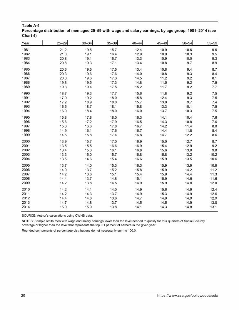
Changes in the age distribution of workers can affect the wage growth rate. For example, if the proportion of workers who are in their peak earnings years (ages 40–54) rises, the median annual wages of all men aged 25–59 may rise even if median wages within each age group remain flat. Chart 4 shows that from 1981 to 2014, the proportion of working men aged 25–59 who were 25 to 39 years old fell from 56.4 percent to 43.8 percent and the proportion who were 40 to 54 years old rose from 33.9 percent to 43.2 percent. All else being equal, the increase in the proportion of working men who were aged 40–54 would have illustrated the example noted above by causing the median annual wages of men aged 25–59 to increase even if median wages within each age group had not risen.12
We can estimate the effect of the change in the age distribution of working men on their median wages by reweighting the records from the CWHS so that the age distribution is constant each year, and then recalculating the annual median wage. Of course, if the distribution of workers by age had not changed over time, a static distribution of workers by age itself would likely have had some effect on wages. Never-theless, estimating a “fixed population weight” median wage gives us an idea how much of the increase in men’s real median wages during 1981–2014 was due to the growth in the proportion of workers who were in their prime earning years. After reweighting by

6 https://www.ssa.gov/policy/docs/ssb/
Chart 3. Real median annual wages of men aged 25–59, by age group, 1981–2014 (in 2014 dollars)
Chart 4. Percentage distribution of men aged 25–59 with wage and salary earnings, by age group, selected years 1981–2014
SOURCE: Author’s calculations using CWHS data.
NOTES: Sample omits men with wage and salary earnings lower than the level needed to qualify for four quarters of Social Security cover-age or higher than the level that represents the top 0.1 percent of earners in the given year.
For the tabulation of these values, see Appendix Table A-3.
SOURCE: Author’s calculations using CWHS data.
NOTES: Sample omits men with wage and salary earnings lower than the level needed to qualify for four quarters of Social Security cover-age or higher than the level that represents the top 0.1 percent of earners in the given year.
Rounded components of percentage distributions do not sum to 100.0.
For the tabulation of these values, see Appendix Table A-4.
1981 1984 1987 1990 1993 1996 1999 2002 2005 2008 2011 20140
10
20
30
40
50
60Thousands of dollars
25–29
30–34
35–39
40–44
45–4950–54
55–59
1981 1985 1990 1995 2000 2005 2010 20140
20
40
60
80
100Percent
21.2
19.5
15.7
12.4
10.9
10.6
9.6
15.0
15.0
13.8
14.1
14.3
14.8
13.1
25–29
30–34
35–39
40–44
45–49
50–54
55–59

Social Security Bulletin, Vol. 78, No. 1, 2018 7
age, men’s estimated real median wages for 1981 are $44,199 (2.9 percent higher than the actual median of $42,973), and for 2014, they are $44,256 (1.7 percent lower than the actual median of $45,000). In other words, if the proportion of working men in their prime earning years had not risen, the real median wages of men aged 25–59 likely would not have risen at all from 1981 to 2014, all else being equal. The observed increase in men’s real median annual wages was therefore due almost entirely to the increase in the proportion of men aged 40–59 and the corresponding decrease in the proportion aged 25–39.
Age-Earnings ProfilesThe CWHS’ large number of records and its longitu-dinal structure allow the construction of age-earnings profiles that show the median wages of workers from many birth cohorts over long periods. This section contains charts showing real median wages of men in seven age intervals over a 33-year period, allowing us to compare real wages across age groups and birth cohorts within each age group. The period 1981–2014 included four recessions and five expansions, and the charts illustrate the effects of the business cycle on the age-earnings profiles.13 Specifically, the charts show men’s real median wages from 1981 through 2014 for each of the following seven age intervals:• 25–29, comprising the 1956–1985 birth cohorts;• 30–34, comprising the 1951–1980 birth cohorts;• 35–39, comprising the 1946–1975 birth cohorts;• 40–44, comprising the 1941–1970 birth cohorts;• 45–49, comprising the 1936–1965 birth cohorts;• 50–54, comprising the 1931–1960 birth cohorts; and• 55–59, comprising the 1926–1955 birth cohorts.
The oldest men in the sample, the members of the 1926 birth cohort, attained age 55 in 1981. Because they (as well as men born 1927–1930) were older than 59 for all but the first few years of the observa-tion period, I track their wages only in the 55–59 age interval. The youngest men in the sample were born in 1985; they attained age 25 in 2010. Because they (as well as men born 1980–1984) were younger than 25 in all but the final few years of the observation period, I track their wages only in the 25–29 age interval. Although no birth cohort can be fully tracked through each of the seven age intervals in the 1981–2014 span, men born 1951–1960 are fully tracked in six of the seven charts below. In total, I track the wages in
1981–2014 of men representing 60 birth cohorts (1926 through 1985).14
Each chart includes a note highlighting the average change in real median wages over the entire observa-tion period for all members of the subject age group. Additional notes identify the single birth cohort whose members experienced the smallest wage growth (or greatest decline) and the cohort whose members expe-rienced the greatest wage growth (or smallest decline) over that age interval and show the corresponding percentage changes.
Appendix A contains tables that correspond with Charts 5–11.15 The tables show the specific real median wages for each year and cohort covered in each chart.
Chart 5 tracks the real median wages of men born 1956–1985 in the years when they were aged 25–29. For men in the 1956 birth cohort, wages rose from $27,921 at age 25 to $34,730 at age 29, or by 24.4 per-cent. For men in the 1985 birth cohort, wages rose from $25,720 at age 25 to $35,302 at age 29, or by 37.3 percent. Thus, wages at age 25 were $2,201 (7.9 percent) lower for men born in 1985 than those of men born in 1956, but at age 29 the wages of men born in 1985 were $572 (1.6 percent) higher than those of men born in 1956. On average, real median wages for all members of the 1956–1985 cohorts increased by 32.6 percent from age 25 to age 29.
Chart 6 tracks the real median wages of men born 1951–1980 in the years when they were aged 30–34. For men in the 1951 birth cohort, wages rose from $37,600 at age 30 to $42,273 at age 34, or by 12.4 per-cent. For men in the 1980 birth cohort, wages rose from $36,903 at age 30 to $43,343 at age 34, or by 17.5 percent. The wages of men born in 1980 were 1.9 percent lower than those of men born in 1951 at age 30 but were 2.5 percent higher at age 34. On aver-age, across all cohorts, real median wages increased by 15.6 percent from age 30 to age 34.
Chart 7 tracks the real median wages of men born 1946–1975 in the years when they were aged 35–39. For men in the 1946 birth cohort, wages rose from $46,073 at age 35 to $50,130 at age 39, or by 8.8 per-cent. For men in the 1975 birth cohort, wages rose from $44,075 at age 35 to $48,642 at age 39, or by 10.4 per-cent. The wages of men born in 1975 were 4.3 percent lower than those of men born in 1946 at age 35 and were 3.0 percent lower at age 39. On average, across all birth cohorts from 1946 through 1975, real median wages increased by 9.1 percent from age 35 to age 39.

8 https://www.ssa.gov/policy/docs/ssb/
Chart 5. Real median wages, 1981–2014: Men aged 25–29, by birth cohort (in 2014 dollars)
SOURCE: Author's calculations using CWHS data.
NOTES: Each line represents a single birth cohort and each data point on a given line represents a year of age, ranging left-to-right from 25 to 29.
Sample omits men with wage and salary earnings lower than the level needed to qualify for four quarters of Social Security coverage or higher than the level that represents the top 0.1 per-cent of earners in the given year.
The average increase in real median wages for men in all birth cohorts (1956–1985) was 32.6 percent.
Among the 1956–1985 birth cohorts, men born in 1964 had the lowest wage increase (20.7 percent) and men born in 1971 had the greatest wage increase (54.3 percent) from ages 25 to 29.
For the tabulation of these values, see Appendix Table A-5.
1981 1984 1987 1990 1993 1996 1999 2002 2005 2008 2011 201420
25
30
35
40
45
50
55
60Thousands of dollars
27.9
34.7
1956cohort 1960
cohort 1965cohort 1970
cohort
1975cohort 1980
cohort1985
cohort
35.3
25.7

Social Security Bulletin, Vol. 78, No. 1, 2018 9
1981 1984 1987 1990 1993 1996 1999 2002 2005 2008 2011 201420
25
30
35
40
45
50
55
60Thousands of dollars
1951cohort 1955
cohort1960
cohort1965
cohort
1970cohort 1975
cohort 1980cohort
37.6
42.343.3
36.9
Chart 6. Real median wages, 1981–2014: Men aged 30–34, by birth cohort (in 2014 dollars)
SOURCE: Author’s calculations using CWHS data.
NOTES: Each line represents a single birth cohort and each data point on a given line represents a year of age, ranging left-to-right from 30 to 34.
Sample omits men with wage and salary earnings lower than the level needed to qualify for four quarters of Social Security coverage or higher than the level that represents the top 0.1 per-cent of earners in the given year.
The average increase in real median wages for men in all birth cohorts (1951–1980) was 15.6 percent.
Among the 1951–1980 birth cohorts, men born in 1957 had the lowest wage increase (8.4 percent) and men born in 1966 had the greatest wage increase (27.3 percent) from ages 30 to 34.
For the tabulation of these values, see Appendix Table A-6.

10 https://www.ssa.gov/policy/docs/ssb/
Chart 7. Real median wages, 1981–2014: Men aged 35–39, by birth cohort (in 2014 dollars)
SOURCE: Author’s calculations using CWHS data.
NOTES: Each line represents a single birth cohort and each data point on a given line represents a year of age, ranging left-to-right from 35 to 39.
Sample omits men with wage and salary earnings lower than the level needed to qualify for four quarters of Social Security coverage or higher than the level that represents the top 0.1 per-cent of earners in the given year.
The average increase in real median wages for men in all birth cohorts (1946–1975) was 9.1 percent.
Among the 1946–1975 birth cohorts, men born in 1952 had the lowest wage increase (2.2 percent) and men born in 1961 had the greatest wage increase (18.2 percent) from ages 35 to 39.
For the tabulation of these values, see Appendix Table A-7.
1981 1984 1987 1990 1993 1996 1999 2002 2005 2008 2011 201420
25
30
35
40
45
50
55
60Thousands of dollars
1946cohort
1950cohort
1955cohort
1960cohort
1965cohort
1970cohort
1975cohort
46.1
50.148.6
44.1

Social Security Bulletin, Vol. 78, No. 1, 2018 11
Chart 8 tracks the real median wages of men born 1941–1970 in the years when they were aged 40–44. For men in the 1941 birth cohort, wages rose from $49,563 at age 40 to $51,979 at age 44, or by 4.9 per-cent. For men in the 1970 birth cohort, wages rose from $49,290 at age 40 to $52,625 at age 44, or by 6.8 percent. The wages of men born in 1970 were 0.6 percent lower than those of men born in 1941 at age 40 and were 1.2 percent higher at age 44. On aver-age, across all cohorts from 1941 through 1970, real median wages increased by 5.6 percent from age 40 to age 44.
Chart 9 tracks the real median wages of men born 1936–1965 in the years when they were aged 45–49. For men in the 1936 birth cohort, wages rose from $49,613 at age 45 to $50,895 at age 49, or by 2.6 per-cent. For men in the 1965 birth cohort, they rose from $49,911 at age 45 to $51,897 at age 49, or by 4.0 per-cent. The wages of men born in 1965 were 0.6 percent higher than those of men born in 1936 at age 45 and were 2.0 percent higher at age 49. On average, across all cohorts from 1936 through 1965, real median wages increased by 2.8 percent from age 45 to age 49.
Chart 10 tracks the real median wages of men born 1931–1960 in the years when they were aged 50–54. For men in the 1931 birth cohort, wages fell from $50,830 at age 50 to $50,267 at age 54, a decline of 1.1 percent. For men in the 1960 birth cohort, wages rose from $51,627 at age 50 to $52,879 at age 54, or by 2.4 percent. The wages of men born in 1960 were 1.6 percent higher than those of men born in 1931 at age 50 and were 5.2 percent higher at age 54. Men in several birth cohorts experienced declines in real median wages from age 50 to age 54. On aver-age, across all cohorts from 1931 through 1960, real median wages fell by 0.2 percent from age 50 to age 54.
Chart 11 tracks the real median wages of men born 1926–1955 in the years when they were aged 55–59. For men in the 1926 birth cohort, wages fell from $47,960 at age 55 to $44,379 at age 59, or by 7.5 per-cent. For men in the 1955 birth cohort, wages fell from $51,748 at age 55 to $50,710 at age 59, or by 2.0 per-cent. The wages of men born in 1955 were 7.9 percent higher than those of men born in 1926 at age 55 and were 14.3 percent higher at age 59. Members of all of the birth cohorts from 1926 through 1955 experienced declines in real median wages between the ages of 55 and 59; however, although the average rate of decline for the 1926 through 1939 cohorts was 9.2 percent, it was only 6.6 percent for the 1940 through 1955
cohorts. This could have resulted from members of the later cohorts working relatively more hours, earning higher hourly wages, or both. On average, real median wages across all cohorts fell by 7.4 percent from age 55 to age 59.
DiscussionSeveral patterns emerge in Charts 5–11. First, the relationship between age and median wages is evident. Median annual wages grow rapidly when workers are young, as they gain skills and experience. It is not age itself that influences wage growth, but rather the increase in a worker’s “human capital”—his skills and experience—that leads to the rise in earnings with age, especially in the first 10 to 20 years of a worker’s career. From 1981 through 2014, men’s real median wages at age 29 were, on average, 32.6 percent higher than their median wages at age 25. The rate of growth of wages slows in middle age. Men’s real median wages at age 49 were, on average, just 2.8 percent higher than their median wages at age 45. Finally, real median wages fall in the later years of workers’ careers. From age 55 to 59, men’s real median wages fell by an average of 7.4 percent, likely through a combination of reduced hours of work and movement to lower-paying jobs before retirement.
A second pattern illustrated in the charts is the relationship between real median wages and economic expansions and contractions. Every birth cohort from 1981 to 2014 experienced its lowest rate of growth in median annual wages during one of three overlapping periods: 1987–1991, 1988–1992, or 1989–1993. Eco-nomic growth was weak in those years; real median household income in the United States fell each year from 1990 through 1993. The fastest rate of wage growth for six of the seven age intervals—all but the 55–59 age group—occurred either from 1995 through 1999 or from 1996 through 2000. Economic growth was robust in that period. From 1995 through 2000, real median household income grew at an average annual rate of 2.1 percent (Federal Reserve Bank of St. Louis 2017). The slow growth of men’s median annual wages from 1987 through 1993 and their rapid growth from 1995 through 2000 illustrate the strong effect of the business cycle on annual earnings.
Finally, although both age—as a proxy for experi-ence—and the business cycle affect the growth of wages over time, behavioral changes can also lead to patterns of wage growth that are unique to particular birth cohorts. Chart 11, for example, appears to indi-cate a behavioral change among workers aged 55–59

12 https://www.ssa.gov/policy/docs/ssb/
1981 1984 1987 1990 1993 1996 1999 2002 2005 2008 2011 201420
25
30
35
40
45
50
55
60Thousands of dollars
1941cohort
1945cohort
1950cohort
1955cohort
1960cohort
1965cohort
1970cohort
49.6
52.0 52.6
49.3
Chart 8. Real median wages, 1981–2014: Men aged 40–44, by birth cohort (in 2014 dollars)
SOURCE: Author’s calculations using CWHS data.
NOTES: Each line represents a single birth cohort and each data point on a given line represents a year of age, ranging left-to-right from 40 to 44.
Sample omits men with wage and salary earnings lower than the level needed to qualify for four quarters of Social Security coverage or higher than the level that represents the top 0.1 per-cent of earners in the given year.
The average increase in real median wages for men in all birth cohorts (1941–1970) was 5.6 percent.
Among the 1941–1970 birth cohorts, men born in 1947 had the lowest wage increase (0.5 percent) and men born in 1956 had the greatest wage increase (13.9 percent) from ages 40 to 44.
For the tabulation of these values, see Appendix Table A-8.

Social Security Bulletin, Vol. 78, No. 1, 2018 13
Chart 9. Real median wages, 1981–2014: Men aged 45–49, by birth cohort (in 2014 dollars)
SOURCE: Author’s calculations using CWHS data.
NOTES: Each line represents a single birth cohort and each data point on a given line represents a year of age, ranging left-to-right from 45 to 49.
Sample omits men with wage and salary earnings lower than the level needed to qualify for four quarters of Social Security coverage or higher than the level that represents the top 0.1 per-cent of earners in the given year.
The average increase in real median wages for men in all birth cohorts (1936–1965) was 2.8 percent.
Among the 1936–1965 birth cohorts, men born in 1942 had the greatest wage decrease (−2.8 percent) and men born in 1951 had the greatest wage increase (10.0 percent) from ages 45 to 49.
For the tabulation of these values, see Appendix Table A-9.
1981 1984 1987 1990 1993 1996 1999 2002 2005 2008 2011 201420
25
30
35
40
45
50
55
60Thousands of dollars
1936cohort
1940cohort 1945
cohort1950
cohort
1955cohort 1960
cohort1965
cohort
49.650.9
51.9
50.0

14 https://www.ssa.gov/policy/docs/ssb/
Chart 10. Real median wages, 1981–2014: Men aged 50–54, by birth cohort (in 2014 dollars)
SOURCE: Author’s calculations using CWHS data.
NOTES: Each line represents a single birth cohort and each data point on a given line represents a year of age, ranging left-to-right from 50 to 54.
Sample omits men with wage and salary earnings lower than the level needed to qualify for four quarters of Social Security coverage or higher than the level that represents the top 0.1 per-cent of earners in the given year.
The average change in real median wages for men in all birth cohorts (1931–1960) was −0.2 percent.
Among the 1931–1960 birth cohorts, men born in 1937 had the greatest wage decrease (−6.9 percent) and men born in 1945 had the greatest wage increase (4.7 percent) from ages 50 to 54.
For the tabulation of these values, see Appendix Table A-10.
1981 1984 1987 1990 1993 1996 1999 2002 2005 2008 2011 201420
25
30
35
40
45
50
55
60Thousands of dollars
1931cohort
1935cohort 1940
cohort
1945cohort 1950
cohort 1955cohort
1960cohort
50.8
50.3
52.9
51.6

Social Security Bulletin, Vol. 78, No. 1, 2018 15
Chart 11. Real median wages, 1981–2014: Men aged 55–59, by birth cohort (in 2014 dollars)
SOURCE: Author’s calculations using CWHS data.
NOTES: Each line represents a single birth cohort and each data point on a given line represents a year of age, ranging left-to-right from 55 to 59.
Sample omits men with wage and salary earnings lower than the level needed to qualify for four quarters of Social Security coverage or higher than the level that represents the top 0.1 per-cent of earners in the given year.
The average change in real median wages for men in all birth cohorts (1926–1955) was −7.4 percent.
Among the 1926–1955 birth cohorts, men born in 1932 had the greatest wage decrease (−14.6 percent) and men born in 1955 had the smallest wage decrease (−2.0 percent) from ages 55 to 59.
For the tabulation of these values, see Appendix Table A-11.
1981 1984 1987 1990 1993 1996 1999 2002 2005 2008 2011 201420
25
30
35
40
45
50
55
60Thousands of dollars
1930cohort
1926cohort
1935cohort
1940cohort
1945cohort 1950
cohort 1955cohort
48.0
44.4
50.751.7

16 https://www.ssa.gov/policy/docs/ssb/
beginning in the mid-1990s. On average, from 1981–2014, median wages at age 59 were 7.4 percent lower than median wages at 55. Among men born from 1940 through 1954, however, the reduction in real median annual wages that occurred after age 55 was smaller than it was among earlier birth cohorts. For men born from 1926 through 1939, median wages at age 59 were 9.2 percent lower than those at age 55. For men born from 1940 through 1955, however, median wages at age 59 were only 6.6 percent lower than those at age 55. This may indicate that workers had begun to work more hours per year after reaching age 55.
ConclusionThis article has summarized trends in men’s real wages from 1981 through 2014 using CWHS data. Over that period, men’s median wages rose relatively slowly and mean wages rose more quickly. The wage distribution became more unequal as wage growth in the top 10 percent of earners substantially outpaced the rate of growth for earners below the 90th per-centile. Men’s real wages from 1981 through 2014 exhibit a relatively flat median, a rising mean, and increasing variance. The real median annual wages of men aged 25 to 59 were $42,973 in 1981 and $45,000 in 2014, an increase of just 4.7 percent in 33 years. Mean wages grew much faster, rising from $47,720 to $64,181 in that span, an increase of 34.5 percent. As the mean of men’s wages increased, so did the stan-dard deviation—from $34,797 in 1981 to $80,635 in 2014—indicating a substantial increase in the disper-sion of wages around the mean.
From 1981 to 2014, men’s real annual wages increased more quickly in the upper half of the income distribution than in the lower half. Wages at the 99th percentile rose from $180,214 in 1981 to $392,250 in 2014, an increase of 117.7 percent. Wages at the 90th percentile rose from $80,791 to $121,763, an increase of 50.7 percent. By contrast, men’s real median annual wages increased by 4.7 percent and real wages at the 25th percentile declined by 2.0 percent. Wages at the 10th percentile rose from $12,894 in 1981 to $13,387 in 2014, an increase of 3.8 percent.
Other things being equal, the increase during 1981–2014 in the proportion of men who were in the peak earnings age range of 40 to 54 would have caused the real median wages of all men aged 25–59
to rise even if median wages within each 5-year age interval had not risen. In other words: If the average age distribution of men over the entire period had been maintained for each year within the period, the real median annual wages of men aged 25 to 59 would have been essentially the same in 2014 as they were in 1981; again, with all else being equal.
Members of every birth cohort experienced their lowest rate of growth in median annual wages during one of three overlapping periods: 1987–1991, 1988–1992, or 1989–1993. The fastest rate of growth for six of the seven age intervals occurred in one of two overlapping 4-year periods: 1995–1999 or 1996–2000. Among men born in 1940 or later, the reduction in median annual wages after age 55 was smaller than that for men in earlier birth cohorts. Although median wages of men at age 59 were 7.4 percent lower on average than their median wages at age 55, the average rate of decline was lower for men born during 1940–1955 (6.6 percent) than it was for men born during 1926–1939 (9.2 percent).
One limitation of this study is that the CWHS accounts for cash compensation only. Many work-ers receive additional compensation in the form of employer payments for health insurance and contribu-tions to retirement accounts. During the period from 1981 to 2014, health insurance premiums for many workers rose more rapidly than wages; consequently, employers’ payments toward health insurance cov-erage constituted an increasingly greater share of employees’ total compensation over time.16 On the other hand, workers in the lower half of the wage distribution are less likely to have employer-sponsored health insurance than are those in the upper half, and it was in the lower half of the distribution that wage growth was slowest over this period.
Government officials at the federal, state, and local level recognize the importance of identifying and pursuing economic policies that promote employment and wage growth. To evaluate the effectiveness of eco-nomic policies, officials need detailed, accurate, repre-sentative long-term data on workers’ wages. The wage data recorded in the CWHS are ideal for this type of research and can contribute much to our knowledge of trends in the growth and distribution of wages.

Social Security Bulletin, Vol. 78, No. 1, 2018 17
Appendix A
Year Mean Median Standard deviation
1981 47,720 42,973 34,7971982 46,870 41,478 35,7451983 47,128 41,613 36,5271984 48,211 42,259 38,053
1985 48,706 42,459 38,6301986 49,465 42,768 40,2931987 50,327 42,766 44,7741988 50,538 42,405 47,2591989 50,150 41,831 46,271
1990 49,962 41,085 47,5151991 50,048 40,181 48,2431992 51,128 40,473 51,8371993 50,992 39,968 51,1811994 51,895 40,171 54,703
1995 52,569 40,271 56,8231996 53,465 40,664 59,0091997 55,277 41,814 62,1011998 57,782 43,433 65,9391999 59,362 44,410 67,762
2000 61,587 45,336 75,0852001 61,559 45,620 72,2362002 60,893 45,435 68,8782003 60,922 45,276 69,7182004 61,996 45,684 73,373
2005 62,401 45,541 75,8372006 63,509 45,944 78,8472007 64,282 46,109 81,3682008 63,445 45,571 78,1062009 62,027 44,678 73,520
2010 62,244 44,343 76,4442011 62,638 44,170 77,5262012 63,069 44,245 79,1402013 63,006 44,394 77,3782014 64,181 45,000 80,635
Table A-1.Mean, median, and standard deviation of real annual wages of men aged 25–59, 1981–2014 (in 2014 dollars) (see Chart 1)
SOURCE: Author's calculations using CWHS data.
NOTE: Sample omits men with wage and salary earnings lower than the level needed to qualify for four quarters of Social Security coverage or higher than the level that represents the top 0.1 percent of earners in the given year.

18 https://www.ssa.gov/policy/docs/ssb/
Year 10th 25th 50th (median) 75th 90th 99th
1981 12,894 25,848 42,973 61,747 80,791 180,2141982 11,897 24,469 41,478 60,816 80,402 183,7091983 11,644 24,244 41,613 61,309 80,812 186,4901984 12,095 24,665 42,259 62,683 82,234 193,569
1985 12,407 24,873 42,459 63,213 83,235 196,7781986 12,477 24,933 42,768 64,075 84,655 203,6891987 12,605 24,986 42,766 64,322 85,210 219,7611988 12,465 24,675 42,405 64,303 85,465 227,6451989 12,357 24,313 41,831 63,770 85,454 227,407
1990 12,085 23,793 41,085 63,111 86,410 231,6851991 11,563 22,888 40,181 62,496 90,498 231,0841992 11,590 22,927 40,473 63,420 92,471 241,7141993 11,552 22,642 39,968 63,163 93,233 244,0961994 11,915 22,967 40,171 63,476 93,969 276,813
1995 12,012 23,147 40,271 63,771 95,220 286,6871996 12,132 23,434 40,664 64,459 96,891 295,8621997 12,643 24,258 41,814 66,098 100,094 309,5181998 13,389 25,439 43,433 68,428 104,743 326,6431999 13,734 26,120 44,410 70,019 107,927 336,921
2000 14,085 26,809 45,336 71,601 111,534 359,9242001 14,015 26,801 45,620 72,337 112,946 349,9902002 13,725 26,442 45,435 72,478 112,390 338,1642003 13,525 26,178 45,276 72,533 112,827 341,6312004 13,569 26,330 45,684 73,415 114,461 355,505
2005 13,631 26,353 45,541 73,297 115,096 365,3232006 13,837 26,705 45,944 74,226 117,007 378,3832007 13,811 26,687 46,109 74,897 118,529 387,3922008 13,490 26,109 45,571 74,639 118,388 376,9372009 12,761 24,970 44,678 74,228 117,950 362,161
2010 12,696 24,666 44,343 73,810 118,042 372,2172011 12,842 24,645 44,170 74,069 119,234 377,2332012 13,021 24,797 44,245 74,318 119,688 386,0622013 13,125 24,947 44,394 74,436 120,140 382,7132014 13,387 25,339 45,000 75,413 121,763 392,250
Table A-2.Real annual wages of men aged 25–59, by selected percentile, 1981–2014 (in 2014 dollars) (see Chart 2)
SOURCE: Author's calculations using CWHS data.
NOTE: Sample omits men with wage and salary earnings lower than the level needed to qualify for four quarters of Social Security coverage or higher than the level that represents the top 0.1 percent of earners in the given year.

Social Security Bulletin, Vol. 78, No. 1, 2018 19
Year 25–29 30–34 35–39 40–44 45–49 50–54 55–59
1981 31,949 41,049 47,875 50,146 50,204 49,871 46,3341982 30,330 39,094 46,257 49,157 48,939 48,633 44,9721983 29,961 38,737 46,290 49,786 49,874 49,498 45,3631984 30,431 39,167 46,848 50,965 51,219 49,909 46,823
1985 30,482 39,276 46,803 51,438 51,533 50,497 47,0051986 30,503 39,453 46,659 52,115 52,691 51,024 47,7301987 30,449 39,460 46,032 51,983 53,130 51,340 48,0121988 30,050 38,902 45,397 51,459 53,154 51,351 47,7711989 29,572 38,238 44,457 50,707 52,407 50,977 46,903
1990 28,945 37,447 43,446 49,621 51,829 50,312 46,0241991 27,886 36,293 42,301 48,081 51,477 49,796 45,0431992 27,737 36,331 42,496 47,760 52,046 50,956 45,4981993 27,233 35,629 41,753 46,634 51,495 50,681 45,1151994 27,443 35,665 41,781 46,200 51,386 51,092 45,562
1995 27,677 35,753 41,626 46,201 50,965 51,456 45,4541996 28,217 36,139 41,882 46,309 50,553 51,984 46,1501997 29,466 37,208 42,572 47,215 50,855 52,898 47,7131998 31,120 38,884 43,874 48,303 51,614 54,121 49,4721999 32,361 40,019 44,613 48,882 51,921 54,406 49,956
2000 33,288 41,236 45,316 49,373 52,279 54,401 50,7282001 33,117 41,708 45,724 49,461 52,093 54,149 50,9992002 32,493 41,702 45,882 49,067 51,869 53,685 51,1832003 32,112 41,667 46,025 49,024 51,430 52,988 51,1322004 31,900 41,962 46,771 49,462 51,942 53,227 51,670
2005 31,879 41,647 47,032 49,309 51,637 52,915 51,5092006 32,241 41,926 47,732 49,973 51,897 53,236 51,5882007 32,258 41,908 48,028 50,292 52,259 53,279 51,6232008 31,839 41,350 47,636 50,184 51,936 52,658 51,3392009 30,853 40,406 46,817 49,407 50,918 51,885 50,545
2010 30,103 39,924 46,308 49,695 50,684 51,819 50,3812011 29,655 39,530 45,863 49,993 50,694 51,707 50,5462012 29,728 39,478 46,025 50,242 50,902 51,851 50,7472013 29,734 39,666 46,121 50,510 51,368 52,112 50,8762014 30,309 40,157 46,863 51,314 52,487 52,547 51,871
Table A-3.Real median annual wages of men aged 25–59, by age group, 1981–2014 (in 2014 dollars) (see Chart 3)
NOTE: Sample omits men with wage and salary earnings lower than the level needed to qualify for four quarters of Social Security coverage or higher than the level that represents the top 0.1 percent of earners in the given year.
SOURCE: Author's calculations using CWHS data.
20 https://www.ssa.gov/policy/docs/ssb/
Year 25–29 30–34 35–39 40–44 45–49 50–54 55–59
1981 21.2 19.5 15.7 12.4 10.9 10.6 9.61982 21.0 19.1 16.4 12.9 10.9 10.3 9.51983 20.8 19.1 16.7 13.3 10.9 10.0 9.31984 20.8 19.3 17.1 13.4 10.8 9.7 8.9
1985 20.6 19.5 17.5 13.4 10.8 9.4 8.71986 20.3 19.6 17.6 14.0 10.8 9.3 8.41987 20.0 19.6 17.3 14.5 11.2 9.2 8.11988 19.8 19.5 17.3 14.8 11.5 9.2 7.91989 19.3 19.4 17.5 15.2 11.7 9.2 7.7
1990 18.7 19.3 17.7 15.6 11.8 9.2 7.51991 17.9 19.2 18.0 15.8 12.4 9.3 7.51992 17.2 18.9 18.0 15.7 13.0 9.7 7.41993 16.5 18.7 18.1 15.8 13.3 10.1 7.51994 16.0 18.4 18.0 16.0 13.7 10.3 7.5
1995 15.8 17.8 18.0 16.3 14.1 10.4 7.61996 15.6 17.2 17.9 16.5 14.3 10.8 7.61997 15.3 16.6 17.8 16.7 14.2 11.4 8.01998 14.9 16.1 17.6 16.7 14.4 11.8 8.41999 14.5 15.8 17.4 16.8 14.7 12.2 8.6
2000 13.9 15.7 17.0 16.9 15.0 12.7 8.72001 13.5 15.5 16.6 16.9 15.4 12.9 9.22002 13.4 15.3 16.1 16.8 15.6 13.0 9.82003 13.3 15.0 15.7 16.8 15.8 13.2 10.22004 13.5 14.6 15.4 16.6 15.9 13.5 10.6
2005 13.7 14.0 15.3 16.3 15.9 13.9 10.92006 14.0 13.7 15.2 15.8 15.9 14.2 11.22007 14.2 13.6 15.1 15.4 15.9 14.4 11.32008 14.4 13.7 14.8 15.1 15.9 14.6 11.62009 14.2 13.8 14.5 14.9 15.9 14.8 12.0
2010 14.2 14.1 14.0 14.9 15.6 14.9 12.42011 14.2 14.3 13.7 14.9 15.3 14.9 12.62012 14.4 14.6 13.6 14.7 14.9 14.9 12.92013 14.7 14.8 13.7 14.5 14.5 14.9 13.02014 15.0 15.0 13.8 14.1 14.3 14.8 13.1
Table A-4.Percentage distribution of men aged 25–59 with wage and salary earnings, by age group, 1981–2014 (see Chart 4)
SOURCE: Author's calculations using CWHS data.
NOTES: Sample omits men with wage and salary earnings lower than the level needed to qualify for four quarters of Social Security coverage or higher than the level that represents the top 0.1 percent of earners in the given year.
Rounded components of percentage distributions do not necessarily sum to 100.0.

Social Security Bulletin, Vol. 78, No. 1, 2018 21
1956 1957 1958 1959 1960 1961 1962 1963 1964 1965 1966 1967 1968 1969 1970
1981 27,921 . . . . . . . . . . . . . . . . . . . . . . . . . . . . . . . . . . . . . . . . . . 1982 28,506 26,372 . . . . . . . . . . . . . . . . . . . . . . . . . . . . . . . . . . . . . . . 1983 30,093 28,200 25,982 . . . . . . . . . . . . . . . . . . . . . . . . . . . . . . . . . . . . 1984 32,875 30,846 28,476 26,394 . . . . . . . . . . . . . . . . . . . . . . . . . . . . . . . . . 1985 34,730 32,915 30,799 28,663 26,420 . . . . . . . . . . . . . . . . . . . . . . . . . . . . . . 1986 . . . 35,031 32,943 31,111 28,829 26,017 . . . . . . . . . . . . . . . . . . . . . . . . . . . 1987 . . . . . . 34,635 33,022 31,125 28,369 26,026 . . . . . . . . . . . . . . . . . . . . . . . . 1988 . . . . . . . . . 34,406 32,496 30,343 28,132 25,892 . . . . . . . . . . . . . . . . . . . . . 1989 . . . . . . . . . . . . 33,799 31,726 29,974 27,600 25,508 . . . . . . . . . . . . . . . . . . 1990 . . . . . . . . . . . . . . . 32,947 31,223 29,312 26,955 25,013 . . . . . . . . . . . . . . . 1991 . . . . . . . . . . . . . . . . . . 31,849 29,911 28,005 26,060 24,042 . . . . . . . . . . . . 1992 . . . . . . . . . . . . . . . . . . . . . 31,821 29,824 28,101 26,065 23,433 . . . . . . . . . 1993 . . . . . . . . . . . . . . . . . . . . . . . . 30,789 29,352 27,710 25,430 23,304 . . . . . . 1994 . . . . . . . . . . . . . . . . . . . . . . . . . . . 31,167 29,892 27,840 25,550 23,617 . . . 1995 . . . . . . . . . . . . . . . . . . . . . . . . . . . . . . 31,825 30,031 27,849 25,998 23,9771996 . . . . . . . . . . . . . . . . . . . . . . . . . . . . . . . . . 32,174 30,259 28,635 26,6121997 . . . . . . . . . . . . . . . . . . . . . . . . . . . . . . . . . . . . 33,291 31,815 30,0111998 . . . . . . . . . . . . . . . . . . . . . . . . . . . . . . . . . . . . . . . 35,207 33,5431999 . . . . . . . . . . . . . . . . . . . . . . . . . . . . . . . . . . . . . . . . . . 36,520
1971 1972 1973 1974 1975 1976 1977 1978 1979 1980 1981 1982 1983 1984 1985
1996 24,353 . . . . . . . . . . . . . . . . . . . . . . . . . . . . . . . . . . . . . . . . . . 1997 27,878 25,220 . . . . . . . . . . . . . . . . . . . . . . . . . . . . . . . . . . . . . . . 1998 31,621 28,875 26,477 . . . . . . . . . . . . . . . . . . . . . . . . . . . . . . . . . . . . 1999 34,716 32,312 29,978 27,638 . . . . . . . . . . . . . . . . . . . . . . . . . . . . . . . . . 2000 37,583 35,405 33,296 31,309 28,560 . . . . . . . . . . . . . . . . . . . . . . . . . . . . . . 2001 . . . 37,431 35,539 33,610 30,871 28,606 . . . . . . . . . . . . . . . . . . . . . . . . . . . 2002 . . . . . . 36,876 35,220 32,611 30,751 27,985 . . . . . . . . . . . . . . . . . . . . . . . . 2003 . . . . . . . . . 36,975 34,524 32,806 30,436 27,138 . . . . . . . . . . . . . . . . . . . . . 2004 . . . . . . . . . . . . 36,363 34,977 32,432 29,836 27,367 . . . . . . . . . . . . . . . . . . 2005 . . . . . . . . . . . . . . . 36,924 34,783 32,066 30,062 27,496 . . . . . . . . . . . . . . . 2006 . . . . . . . . . . . . . . . . . . 36,811 34,804 32,405 30,466 27,841 . . . . . . . . . . . . 2007 . . . . . . . . . . . . . . . . . . . . . 37,033 34,769 33,072 30,396 27,762 . . . . . . . . . 2008 . . . . . . . . . . . . . . . . . . . . . . . . 36,391 34,521 32,455 29,807 27,478 . . . . . . 2009 . . . . . . . . . . . . . . . . . . . . . . . . . . . 35,548 33,903 31,153 29,003 26,301 . . . 2010 . . . . . . . . . . . . . . . . . . . . . . . . . . . . . . 35,001 32,574 30,709 27,878 25,7202011 . . . . . . . . . . . . . . . . . . . . . . . . . . . . . . . . . 34,309 32,662 29,818 27,8732012 . . . . . . . . . . . . . . . . . . . . . . . . . . . . . . . . . . . . 34,707 32,259 30,3482013 . . . . . . . . . . . . . . . . . . . . . . . . . . . . . . . . . . . . . . . 34,512 32,6682014 . . . . . . . . . . . . . . . . . . . . . . . . . . . . . . . . . . . . . . . . . . 35,302
SOURCE: Author's calculations using CWHS data.
NOTES: Sample omits men with wage and salary earnings lower than the level needed to qualify for four quarters of Social Security coverage or higher than the level that represents the top 0.1 percent of earners in the given year.
. . . = not applicable.
Table A-5. Real median wages, 1981–2014: Men aged 25–29, by birth cohort (in 2014 dollars) (see Chart 5)
YearCohort
YearCohort
(Continued)

22 https://www.ssa.gov/policy/docs/ssb/
1951 1952 1953 1954 1955 1956 1957 1958 1959 1960 1961 1962 1963 1964 1965
1981 37,600 . . . . . . . . . . . . . . . . . . . . . . . . . . . . . . . . . . . . . . . . . . 1982 37,483 35,696 . . . . . . . . . . . . . . . . . . . . . . . . . . . . . . . . . . . . . . . 1983 38,737 36,903 35,808 . . . . . . . . . . . . . . . . . . . . . . . . . . . . . . . . . . . . 1984 40,689 39,179 38,004 36,330 . . . . . . . . . . . . . . . . . . . . . . . . . . . . . . . . . 1985 42,273 40,617 39,419 37,902 36,726 . . . . . . . . . . . . . . . . . . . . . . . . . . . . . . 1986 . . . 42,037 41,211 39,510 38,535 36,298 . . . . . . . . . . . . . . . . . . . . . . . . . . . 1987 . . . . . . 42,189 41,123 39,855 38,054 36,546 . . . . . . . . . . . . . . . . . . . . . . . . 1988 . . . . . . . . . 41,933 40,520 39,152 37,692 35,556 . . . . . . . . . . . . . . . . . . . . . 1989 . . . . . . . . . . . . 41,260 39,856 38,663 36,633 35,467 . . . . . . . . . . . . . . . . . . 1990 . . . . . . . . . . . . . . . 40,115 39,208 37,385 36,265 34,703 . . . . . . . . . . . . . . . 1991 . . . . . . . . . . . . . . . . . . 39,624 37,568 36,488 35,203 33,256 . . . . . . . . . . . . 1992 . . . . . . . . . . . . . . . . . . . . . 38,912 37,749 36,699 34,919 33,442 . . . . . . . . . 1993 . . . . . . . . . . . . . . . . . . . . . . . . 38,444 36,987 35,790 34,440 32,607 . . . . . . 1994 . . . . . . . . . . . . . . . . . . . . . . . . . . . 38,554 36,988 35,916 34,241 32,826 . . . 1995 . . . . . . . . . . . . . . . . . . . . . . . . . . . . . . 38,451 37,312 35,717 34,510 32,9961996 . . . . . . . . . . . . . . . . . . . . . . . . . . . . . . . . . 38,600 37,215 36,400 34,4771997 . . . . . . . . . . . . . . . . . . . . . . . . . . . . . . . . . . . . 39,331 38,416 37,0651998 . . . . . . . . . . . . . . . . . . . . . . . . . . . . . . . . . . . . . . . 41,001 39,7051999 . . . . . . . . . . . . . . . . . . . . . . . . . . . . . . . . . . . . . . . . . . 41,667
1966 1967 1968 1969 1970 1971 1972 1973 1974 1975 1976 1977 1978 1979 1980
1996 33,832 . . . . . . . . . . . . . . . . . . . . . . . . . . . . . . . . . . . . . . . . . . 1997 36,380 34,947 . . . . . . . . . . . . . . . . . . . . . . . . . . . . . . . . . . . . . . . 1998 39,030 38,021 36,508 . . . . . . . . . . . . . . . . . . . . . . . . . . . . . . . . . . . . 1999 41,403 40,306 38,886 37,845 . . . . . . . . . . . . . . . . . . . . . . . . . . . . . . . . . 2000 43,080 42,532 41,163 40,307 39,445 . . . . . . . . . . . . . . . . . . . . . . . . . . . . . . 2001 . . . 43,870 42,841 41,891 40,891 39,438 . . . . . . . . . . . . . . . . . . . . . . . . . . . 2002 . . . . . . 44,141 42,968 41,925 40,765 39,092 . . . . . . . . . . . . . . . . . . . . . . . . 2003 . . . . . . . . . 44,091 43,304 42,002 40,273 38,290 . . . . . . . . . . . . . . . . . . . . . 2004 . . . . . . . . . . . . 44,658 43,610 41,989 40,341 38,990 . . . . . . . . . . . . . . . . . . 2005 . . . . . . . . . . . . . . . 44,902 43,098 41,600 40,665 38,099 . . . . . . . . . . . . . . . 2006 . . . . . . . . . . . . . . . . . . 44,674 43,441 42,673 39,975 38,943 . . . . . . . . . . . . 2007 . . . . . . . . . . . . . . . . . . . . . 45,162 43,712 41,889 40,587 38,806 . . . . . . . . . 2008 . . . . . . . . . . . . . . . . . . . . . . . . 44,414 42,832 41,741 40,158 38,276 . . . . . . 2009 . . . . . . . . . . . . . . . . . . . . . . . . . . . 43,046 42,375 40,787 39,218 37,342 . . . 2010 . . . . . . . . . . . . . . . . . . . . . . . . . . . . . . 42,950 41,870 40,217 38,425 36,9032011 . . . . . . . . . . . . . . . . . . . . . . . . . . . . . . . . . 42,764 41,544 39,783 38,5132012 . . . . . . . . . . . . . . . . . . . . . . . . . . . . . . . . . . . . 42,780 41,327 39,8862013 . . . . . . . . . . . . . . . . . . . . . . . . . . . . . . . . . . . . . . . 42,784 41,4712014 . . . . . . . . . . . . . . . . . . . . . . . . . . . . . . . . . . . . . . . . . . 43,343
NOTES: Sample omits men with wage and salary earnings lower than the level needed to qualify for four quarters of Social Security coverage or higher than the level that represents the top 0.1 percent of earners in the given year.
. . . = not applicable.
Table A-6. Real median wages, 1981–2014: Men aged 30–34, by birth cohort (in 2014 dollars) (see Chart 6)
YearCohort
YearCohort
SOURCE: Author's calculations using CWHS data.
(Continued)

Social Security Bulletin, Vol. 78, No. 1, 2018 23
1946 1947 1948 1949 1950 1951 1952 1953 1954 1955 1956 1957 1958 1959 1960
1981 46,073 . . . . . . . . . . . . . . . . . . . . . . . . . . . . . . . . . . . . . . . . . . 1982 45,881 44,086 . . . . . . . . . . . . . . . . . . . . . . . . . . . . . . . . . . . . . . . 1983 47,285 45,685 44,038 . . . . . . . . . . . . . . . . . . . . . . . . . . . . . . . . . . . . 1984 49,310 47,396 45,763 43,992 . . . . . . . . . . . . . . . . . . . . . . . . . . . . . . . . . 1985 50,130 48,642 47,041 45,125 43,642 . . . . . . . . . . . . . . . . . . . . . . . . . . . . . . 1986 . . . 49,634 48,086 46,691 44,995 43,891 . . . . . . . . . . . . . . . . . . . . . . . . . . . 1987 . . . . . . 49,004 47,492 45,602 44,936 43,396 . . . . . . . . . . . . . . . . . . . . . . . . 1988 . . . . . . . . . 48,050 46,602 45,794 43,962 42,971 . . . . . . . . . . . . . . . . . . . . . 1989 . . . . . . . . . . . . 46,827 45,803 44,145 43,397 42,645 . . . . . . . . . . . . . . . . . . 1990 . . . . . . . . . . . . . . . 45,756 44,376 43,308 42,535 41,672 . . . . . . . . . . . . . . . 1991 . . . . . . . . . . . . . . . . . . 44,354 43,356 42,448 41,592 40,147 . . . . . . . . . . . . 1992 . . . . . . . . . . . . . . . . . . . . . 44,587 43,619 42,757 41,276 40,738 . . . . . . . . . 1993 . . . . . . . . . . . . . . . . . . . . . . . . 43,871 43,109 41,706 41,026 39,263 . . . . . . 1994 . . . . . . . . . . . . . . . . . . . . . . . . . . . 44,064 42,622 42,006 40,653 39,750 . . . 1995 . . . . . . . . . . . . . . . . . . . . . . . . . . . . . . 43,271 42,834 41,680 40,914 39,4531996 . . . . . . . . . . . . . . . . . . . . . . . . . . . . . . . . . 43,980 42,557 42,205 40,8241997 . . . . . . . . . . . . . . . . . . . . . . . . . . . . . . . . . . . . 44,215 43,787 42,5901998 . . . . . . . . . . . . . . . . . . . . . . . . . . . . . . . . . . . . . . . 46,177 44,5801999 . . . . . . . . . . . . . . . . . . . . . . . . . . . . . . . . . . . . . . . . . . 46,436
1961 1962 1963 1964 1965 1966 1967 1968 1969 1970 1971 1972 1973 1974 1975
1996 39,893 . . . . . . . . . . . . . . . . . . . . . . . . . . . . . . . . . . . . . . . . . . 1997 41,815 40,601 . . . . . . . . . . . . . . . . . . . . . . . . . . . . . . . . . . . . . . . 1998 44,058 42,808 42,167 . . . . . . . . . . . . . . . . . . . . . . . . . . . . . . . . . . . . 1999 45,684 44,513 43,912 42,863 . . . . . . . . . . . . . . . . . . . . . . . . . . . . . . . . . 2000 47,147 45,993 45,390 44,563 43,601 . . . . . . . . . . . . . . . . . . . . . . . . . . . . . . 2001 . . . 47,092 46,330 45,720 44,718 44,772 . . . . . . . . . . . . . . . . . . . . . . . . . . . 2002 . . . . . . 46,919 46,559 45,765 45,286 44,672 . . . . . . . . . . . . . . . . . . . . . . . . 2003 . . . . . . . . . 47,036 46,605 46,073 45,490 44,939 . . . . . . . . . . . . . . . . . . . . . 2004 . . . . . . . . . . . . 47,662 47,322 47,079 46,376 45,501 . . . . . . . . . . . . . . . . . . 2005 . . . . . . . . . . . . . . . 47,910 47,820 47,318 46,440 45,786 . . . . . . . . . . . . . . . 2006 . . . . . . . . . . . . . . . . . . 49,149 48,536 47,970 47,167 46,249 . . . . . . . . . . . . 2007 . . . . . . . . . . . . . . . . . . . . . 49,627 49,147 48,152 47,338 46,150 . . . . . . . . . 2008 . . . . . . . . . . . . . . . . . . . . . . . . 49,250 48,609 47,676 46,885 45,749 . . . . . . 2009 . . . . . . . . . . . . . . . . . . . . . . . . . . . 48,716 47,720 46,702 46,118 44,939 . . . 2010 . . . . . . . . . . . . . . . . . . . . . . . . . . . . . . 48,298 46,954 46,994 45,546 44,0752011 . . . . . . . . . . . . . . . . . . . . . . . . . . . . . . . . . 47,695 47,216 46,421 44,5072012 . . . . . . . . . . . . . . . . . . . . . . . . . . . . . . . . . . . . 48,221 47,205 45,7192013 . . . . . . . . . . . . . . . . . . . . . . . . . . . . . . . . . . . . . . . 48,698 46,4732014 . . . . . . . . . . . . . . . . . . . . . . . . . . . . . . . . . . . . . . . . . . 48,642
NOTES: Sample omits men with wage and salary earnings lower than the level needed to qualify for four quarters of Social Security coverage or higher than the level that represents the top 0.1 percent of earners in the given year.
. . . = not applicable.
Table A-7. Real median wages, 1981–2014: Men aged 35–39, by birth cohort (in 2014 dollars) (see Chart 7)
YearCohort
YearCohort
SOURCE: Author's calculations using CWHS data.
(Continued)

24 https://www.ssa.gov/policy/docs/ssb/
1941 1942 1943 1944 1945 1946 1947 1948 1949 1950 1951 1952 1953 1954 1955
1981 49,563 . . . . . . . . . . . . . . . . . . . . . . . . . . . . . . . . . . . . . . . . . . 1982 48,836 49,120 . . . . . . . . . . . . . . . . . . . . . . . . . . . . . . . . . . . . . . . 1983 49,526 50,070 49,991 . . . . . . . . . . . . . . . . . . . . . . . . . . . . . . . . . . . . 1984 51,294 51,547 51,083 49,975 . . . . . . . . . . . . . . . . . . . . . . . . . . . . . . . . . 1985 51,979 52,085 51,742 51,147 50,376 . . . . . . . . . . . . . . . . . . . . . . . . . . . . . . 1986 . . . 53,381 52,605 52,107 51,540 51,152 . . . . . . . . . . . . . . . . . . . . . . . . . . . 1987 . . . . . . 52,831 52,375 52,033 52,132 50,797 . . . . . . . . . . . . . . . . . . . . . . . . 1988 . . . . . . . . . 52,252 52,108 52,522 51,342 49,564 . . . . . . . . . . . . . . . . . . . . . 1989 . . . . . . . . . . . . 51,979 52,369 51,356 49,883 48,373 . . . . . . . . . . . . . . . . . . 1990 . . . . . . . . . . . . . . . 52,038 51,400 49,346 48,346 46,809 . . . . . . . . . . . . . . . 1991 . . . . . . . . . . . . . . . . . . 51,076 49,049 48,218 46,530 45,528 . . . . . . . . . . . . 1992 . . . . . . . . . . . . . . . . . . . . . 50,153 49,144 47,345 46,846 45,616 . . . . . . . . . 1993 . . . . . . . . . . . . . . . . . . . . . . . . 48,971 47,762 46,678 46,076 44,515 . . . . . . 1994 . . . . . . . . . . . . . . . . . . . . . . . . . . . 47,914 47,172 46,221 45,225 44,777 . . . 1995 . . . . . . . . . . . . . . . . . . . . . . . . . . . . . . 47,792 47,038 46,011 45,686 44,9301996 . . . . . . . . . . . . . . . . . . . . . . . . . . . . . . . . . 47,961 46,723 46,604 46,0741997 . . . . . . . . . . . . . . . . . . . . . . . . . . . . . . . . . . . . 48,644 48,022 47,4921998 . . . . . . . . . . . . . . . . . . . . . . . . . . . . . . . . . . . . . . . 50,000 49,4011999 . . . . . . . . . . . . . . . . . . . . . . . . . . . . . . . . . . . . . . . . . . 50,577
1956 1957 1958 1959 1960 1961 1962 1963 1964 1965 1966 1967 1968 1969 1970
1996 44,503 . . . . . . . . . . . . . . . . . . . . . . . . . . . . . . . . . . . . . . . . . . 1997 46,217 45,689 . . . . . . . . . . . . . . . . . . . . . . . . . . . . . . . . . . . . . . . 1998 48,313 47,542 46,474 . . . . . . . . . . . . . . . . . . . . . . . . . . . . . . . . . . . . 1999 49,307 49,064 48,006 47,562 . . . . . . . . . . . . . . . . . . . . . . . . . . . . . . . . . 2000 50,687 50,275 49,286 49,118 47,832 . . . . . . . . . . . . . . . . . . . . . . . . . . . . . . 2001 . . . 50,548 49,771 49,708 48,962 48,320 . . . . . . . . . . . . . . . . . . . . . . . . . . . 2002 . . . . . . 50,039 49,982 49,148 48,569 47,720 . . . . . . . . . . . . . . . . . . . . . . . . 2003 . . . . . . . . . 50,171 49,539 49,218 48,512 47,707 . . . . . . . . . . . . . . . . . . . . . 2004 . . . . . . . . . . . . 50,632 50,302 49,624 49,047 48,116 . . . . . . . . . . . . . . . . . . 2005 . . . . . . . . . . . . . . . 50,358 49,975 49,545 48,551 48,369 . . . . . . . . . . . . . . . 2006 . . . . . . . . . . . . . . . . . . 51,210 50,496 49,759 49,455 49,030 . . . . . . . . . . . . 2007 . . . . . . . . . . . . . . . . . . . . . 51,166 50,436 50,186 49,901 50,048 . . . . . . . . . 2008 . . . . . . . . . . . . . . . . . . . . . . . . 50,394 50,463 50,058 50,013 49,892 . . . . . . 2009 . . . . . . . . . . . . . . . . . . . . . . . . . . . 49,274 49,521 49,670 49,322 49,243 . . . 2010 . . . . . . . . . . . . . . . . . . . . . . . . . . . . . . 49,786 49,920 49,619 49,849 49,2902011 . . . . . . . . . . . . . . . . . . . . . . . . . . . . . . . . . 50,438 50,313 50,143 50,2902012 . . . . . . . . . . . . . . . . . . . . . . . . . . . . . . . . . . . . 50,934 50,857 50,7212013 . . . . . . . . . . . . . . . . . . . . . . . . . . . . . . . . . . . . . . . 51,443 51,3972014 . . . . . . . . . . . . . . . . . . . . . . . . . . . . . . . . . . . . . . . . . . 52,625
NOTES: Sample omits men with wage and salary earnings lower than the level needed to qualify for four quarters of Social Security coverage or higher than the level that represents the top 0.1 percent of earners in the given year.
. . . = not applicable.
Table A-8. Real median wages, 1981–2014: Men aged 40–44, by birth cohort (in 2014 dollars) (see Chart 8)
YearCohort
YearCohort
SOURCE: Author's calculations using CWHS data.
(Continued)

Social Security Bulletin, Vol. 78, No. 1, 2018 25
1936 1937 1938 1939 1940 1941 1942 1943 1944 1945 1946 1947 1948 1949 1950
1981 49,613 . . . . . . . . . . . . . . . . . . . . . . . . . . . . . . . . . . . . . . . . . . 1982 48,818 49,278 . . . . . . . . . . . . . . . . . . . . . . . . . . . . . . . . . . . . . . . 1983 49,629 50,095 50,504 . . . . . . . . . . . . . . . . . . . . . . . . . . . . . . . . . . . . 1984 50,251 51,319 51,745 51,266 . . . . . . . . . . . . . . . . . . . . . . . . . . . . . . . . . 1985 50,895 51,539 52,162 51,615 51,414 . . . . . . . . . . . . . . . . . . . . . . . . . . . . . . 1986 . . . 52,395 53,053 52,751 52,474 52,808 . . . . . . . . . . . . . . . . . . . . . . . . . . . 1987 . . . . . . 53,450 52,665 52,616 53,087 53,605 . . . . . . . . . . . . . . . . . . . . . . . . 1988 . . . . . . . . . 52,752 52,106 53,286 54,107 53,284 . . . . . . . . . . . . . . . . . . . . . 1989 . . . . . . . . . . . . 51,535 52,470 53,391 52,567 51,703 . . . . . . . . . . . . . . . . . . 1990 . . . . . . . . . . . . . . . 51,883 52,736 52,124 50,989 51,343 . . . . . . . . . . . . . . . 1991 . . . . . . . . . . . . . . . . . . 52,085 51,650 51,033 51,052 51,590 . . . . . . . . . . . . 1992 . . . . . . . . . . . . . . . . . . . . . 51,952 51,055 52,153 52,325 52,312 . . . . . . . . . 1993 . . . . . . . . . . . . . . . . . . . . . . . . 50,892 52,026 51,958 52,089 50,339 . . . . . . 1994 . . . . . . . . . . . . . . . . . . . . . . . . . . . 52,125 52,473 52,118 50,898 49,607 . . . 1995 . . . . . . . . . . . . . . . . . . . . . . . . . . . . . . 52,534 52,645 51,091 49,787 48,9441996 . . . . . . . . . . . . . . . . . . . . . . . . . . . . . . . . . 52,844 51,416 50,486 49,5631997 . . . . . . . . . . . . . . . . . . . . . . . . . . . . . . . . . . . . 52,553 51,829 51,1021998 . . . . . . . . . . . . . . . . . . . . . . . . . . . . . . . . . . . . . . . 53,045 52,4321999 . . . . . . . . . . . . . . . . . . . . . . . . . . . . . . . . . . . . . . . . . . 53,451
1951 1952 1953 1954 1955 1956 1957 1958 1959 1960 1961 1962 1963 1964 1965
1996 48,413 . . . . . . . . . . . . . . . . . . . . . . . . . . . . . . . . . . . . . . . . . . 1997 49,771 49,302 . . . . . . . . . . . . . . . . . . . . . . . . . . . . . . . . . . . . . . . 1998 51,760 50,914 50,310 . . . . . . . . . . . . . . . . . . . . . . . . . . . . . . . . . . . . 1999 52,661 51,697 51,143 50,963 . . . . . . . . . . . . . . . . . . . . . . . . . . . . . . . . . 2000 53,257 52,479 52,038 51,981 51,720 . . . . . . . . . . . . . . . . . . . . . . . . . . . . . . 2001 . . . 53,042 52,427 51,858 52,072 50,996 . . . . . . . . . . . . . . . . . . . . . . . . . . . 2002 . . . . . . 52,598 52,516 52,198 50,954 51,060 . . . . . . . . . . . . . . . . . . . . . . . . 2003 . . . . . . . . . 51,989 52,351 51,420 50,964 50,485 . . . . . . . . . . . . . . . . . . . . . 2004 . . . . . . . . . . . . 53,433 52,383 51,858 51,169 50,913 . . . . . . . . . . . . . . . . . . 2005 . . . . . . . . . . . . . . . 52,134 52,283 51,178 51,452 51,135 . . . . . . . . . . . . . . . 2006 . . . . . . . . . . . . . . . . . . 52,743 51,915 51,993 51,568 51,313 . . . . . . . . . . . . 2007 . . . . . . . . . . . . . . . . . . . . . 52,395 53,122 52,309 52,046 51,459 . . . . . . . . . 2008 . . . . . . . . . . . . . . . . . . . . . . . . 52,691 52,348 51,958 51,691 50,965 . . . . . . 2009 . . . . . . . . . . . . . . . . . . . . . . . . . . . 51,589 51,614 51,048 50,472 49,990 . . . 2010 . . . . . . . . . . . . . . . . . . . . . . . . . . . . . . 51,299 50,824 50,510 50,827 49,9112011 . . . . . . . . . . . . . . . . . . . . . . . . . . . . . . . . . 51,028 51,035 50,782 50,2342012 . . . . . . . . . . . . . . . . . . . . . . . . . . . . . . . . . . . . 51,192 51,307 50,8282013 . . . . . . . . . . . . . . . . . . . . . . . . . . . . . . . . . . . . . . . 51,406 50,8672014 . . . . . . . . . . . . . . . . . . . . . . . . . . . . . . . . . . . . . . . . . . 51,897
NOTES: Sample omits men with wage and salary earnings lower than the level needed to qualify for four quarters of Social Security coverage or higher than the level that represents the top 0.1 percent of earners in the given year.
. . . = not applicable.
Table A-9. Real median wages, 1981–2014: Men aged 45–49, by birth cohort (in 2014 dollars) (see Chart 9)
YearCohort
YearCohort
SOURCE: Author's calculations using CWHS data.
(Continued)
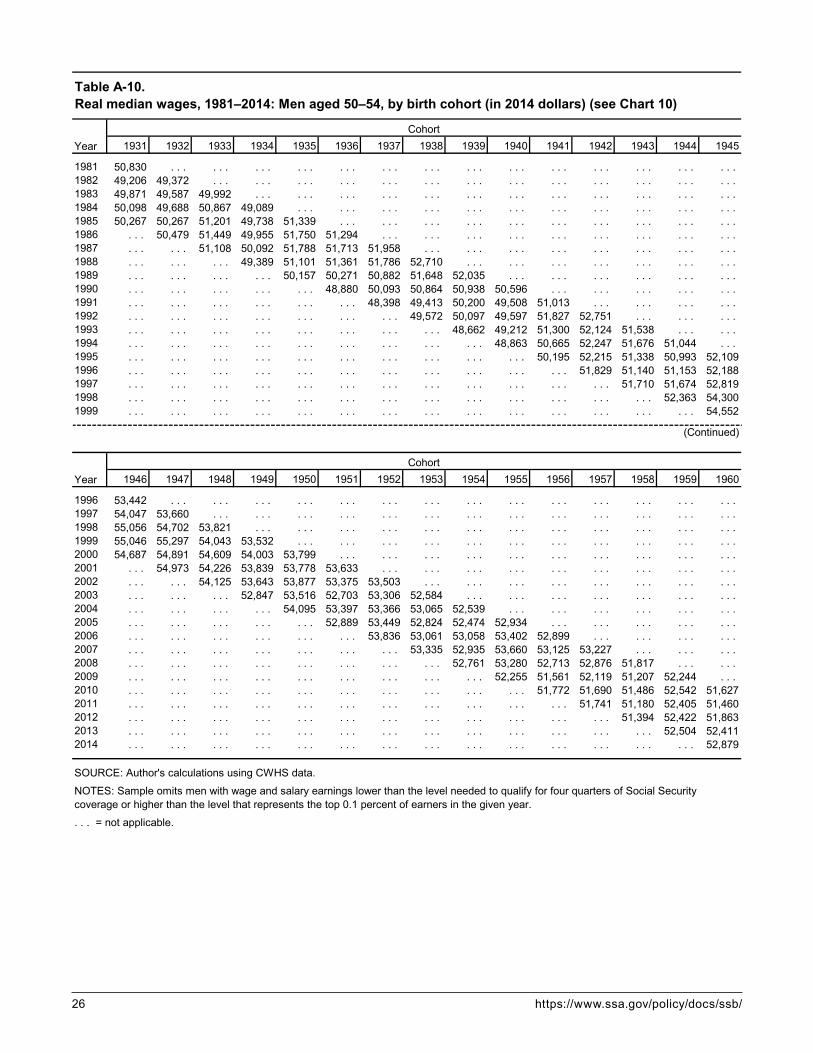
26 https://www.ssa.gov/policy/docs/ssb/
1931 1932 1933 1934 1935 1936 1937 1938 1939 1940 1941 1942 1943 1944 1945
1981 50,830 . . . . . . . . . . . . . . . . . . . . . . . . . . . . . . . . . . . . . . . . . . 1982 49,206 49,372 . . . . . . . . . . . . . . . . . . . . . . . . . . . . . . . . . . . . . . . 1983 49,871 49,587 49,992 . . . . . . . . . . . . . . . . . . . . . . . . . . . . . . . . . . . . 1984 50,098 49,688 50,867 49,089 . . . . . . . . . . . . . . . . . . . . . . . . . . . . . . . . . 1985 50,267 50,267 51,201 49,738 51,339 . . . . . . . . . . . . . . . . . . . . . . . . . . . . . . 1986 . . . 50,479 51,449 49,955 51,750 51,294 . . . . . . . . . . . . . . . . . . . . . . . . . . . 1987 . . . . . . 51,108 50,092 51,788 51,713 51,958 . . . . . . . . . . . . . . . . . . . . . . . . 1988 . . . . . . . . . 49,389 51,101 51,361 51,786 52,710 . . . . . . . . . . . . . . . . . . . . . 1989 . . . . . . . . . . . . 50,157 50,271 50,882 51,648 52,035 . . . . . . . . . . . . . . . . . . 1990 . . . . . . . . . . . . . . . 48,880 50,093 50,864 50,938 50,596 . . . . . . . . . . . . . . . 1991 . . . . . . . . . . . . . . . . . . 48,398 49,413 50,200 49,508 51,013 . . . . . . . . . . . . 1992 . . . . . . . . . . . . . . . . . . . . . 49,572 50,097 49,597 51,827 52,751 . . . . . . . . . 1993 . . . . . . . . . . . . . . . . . . . . . . . . 48,662 49,212 51,300 52,124 51,538 . . . . . . 1994 . . . . . . . . . . . . . . . . . . . . . . . . . . . 48,863 50,665 52,247 51,676 51,044 . . . 1995 . . . . . . . . . . . . . . . . . . . . . . . . . . . . . . 50,195 52,215 51,338 50,993 52,1091996 . . . . . . . . . . . . . . . . . . . . . . . . . . . . . . . . . 51,829 51,140 51,153 52,1881997 . . . . . . . . . . . . . . . . . . . . . . . . . . . . . . . . . . . . 51,710 51,674 52,8191998 . . . . . . . . . . . . . . . . . . . . . . . . . . . . . . . . . . . . . . . 52,363 54,3001999 . . . . . . . . . . . . . . . . . . . . . . . . . . . . . . . . . . . . . . . . . . 54,552
1946 1947 1948 1949 1950 1951 1952 1953 1954 1955 1956 1957 1958 1959 1960
1996 53,442 . . . . . . . . . . . . . . . . . . . . . . . . . . . . . . . . . . . . . . . . . . 1997 54,047 53,660 . . . . . . . . . . . . . . . . . . . . . . . . . . . . . . . . . . . . . . . 1998 55,056 54,702 53,821 . . . . . . . . . . . . . . . . . . . . . . . . . . . . . . . . . . . . 1999 55,046 55,297 54,043 53,532 . . . . . . . . . . . . . . . . . . . . . . . . . . . . . . . . . 2000 54,687 54,891 54,609 54,003 53,799 . . . . . . . . . . . . . . . . . . . . . . . . . . . . . . 2001 . . . 54,973 54,226 53,839 53,778 53,633 . . . . . . . . . . . . . . . . . . . . . . . . . . . 2002 . . . . . . 54,125 53,643 53,877 53,375 53,503 . . . . . . . . . . . . . . . . . . . . . . . . 2003 . . . . . . . . . 52,847 53,516 52,703 53,306 52,584 . . . . . . . . . . . . . . . . . . . . . 2004 . . . . . . . . . . . . 54,095 53,397 53,366 53,065 52,539 . . . . . . . . . . . . . . . . . . 2005 . . . . . . . . . . . . . . . 52,889 53,449 52,824 52,474 52,934 . . . . . . . . . . . . . . . 2006 . . . . . . . . . . . . . . . . . . 53,836 53,061 53,058 53,402 52,899 . . . . . . . . . . . . 2007 . . . . . . . . . . . . . . . . . . . . . 53,335 52,935 53,660 53,125 53,227 . . . . . . . . . 2008 . . . . . . . . . . . . . . . . . . . . . . . . 52,761 53,280 52,713 52,876 51,817 . . . . . . 2009 . . . . . . . . . . . . . . . . . . . . . . . . . . . 52,255 51,561 52,119 51,207 52,244 . . . 2010 . . . . . . . . . . . . . . . . . . . . . . . . . . . . . . 51,772 51,690 51,486 52,542 51,6272011 . . . . . . . . . . . . . . . . . . . . . . . . . . . . . . . . . 51,741 51,180 52,405 51,4602012 . . . . . . . . . . . . . . . . . . . . . . . . . . . . . . . . . . . . 51,394 52,422 51,8632013 . . . . . . . . . . . . . . . . . . . . . . . . . . . . . . . . . . . . . . . 52,504 52,4112014 . . . . . . . . . . . . . . . . . . . . . . . . . . . . . . . . . . . . . . . . . . 52,879
NOTES: Sample omits men with wage and salary earnings lower than the level needed to qualify for four quarters of Social Security coverage or higher than the level that represents the top 0.1 percent of earners in the given year.
. . . = not applicable.
Table A-10. Real median wages, 1981–2014: Men aged 50–54, by birth cohort (in 2014 dollars) (see Chart 10)
YearCohort
YearCohort
SOURCE: Author's calculations using CWHS data.
(Continued)

Social Security Bulletin, Vol. 78, No. 1, 2018 27
1926 1927 1928 1929 1930 1931 1932 1933 1934 1935 1936 1937 1938 1939 1940
1981 47,960 . . . . . . . . . . . . . . . . . . . . . . . . . . . . . . . . . . . . . . . . . . 1982 45,022 47,079 . . . . . . . . . . . . . . . . . . . . . . . . . . . . . . . . . . . . . . . 1983 44,784 46,162 47,362 . . . . . . . . . . . . . . . . . . . . . . . . . . . . . . . . . . . . 1984 45,281 46,714 47,294 49,488 . . . . . . . . . . . . . . . . . . . . . . . . . . . . . . . . . 1985 44,379 46,040 46,672 48,502 49,212 . . . . . . . . . . . . . . . . . . . . . . . . . . . . . . 1986 . . . 44,797 46,299 48,026 49,036 49,864 . . . . . . . . . . . . . . . . . . . . . . . . . . . 1987 . . . . . . 45,584 47,038 48,438 48,472 50,221 . . . . . . . . . . . . . . . . . . . . . . . . 1988 . . . . . . . . . 45,841 47,112 47,523 48,323 50,038 . . . . . . . . . . . . . . . . . . . . . 1989 . . . . . . . . . . . . 45,332 45,867 47,157 48,254 48,184 . . . . . . . . . . . . . . . . . . 1990 . . . . . . . . . . . . . . . 44,023 44,879 46,329 46,369 48,174 . . . . . . . . . . . . . . . 1991 . . . . . . . . . . . . . . . . . . 42,886 43,808 44,149 46,334 47,208 . . . . . . . . . . . . 1992 . . . . . . . . . . . . . . . . . . . . . 42,826 43,440 45,723 46,312 48,118 . . . . . . . . . 1993 . . . . . . . . . . . . . . . . . . . . . . . . 41,521 43,690 44,975 46,532 47,813 . . . . . . 1994 . . . . . . . . . . . . . . . . . . . . . . . . . . . 43,019 43,878 45,738 47,235 47,689 . . . 1995 . . . . . . . . . . . . . . . . . . . . . . . . . . . . . . 42,006 44,332 46,269 45,949 48,0641996 . . . . . . . . . . . . . . . . . . . . . . . . . . . . . . . . . 43,433 45,271 45,209 46,5741997 . . . . . . . . . . . . . . . . . . . . . . . . . . . . . . . . . . . . 44,687 44,949 46,7431998 . . . . . . . . . . . . . . . . . . . . . . . . . . . . . . . . . . . . . . . 45,639 46,8731999 . . . . . . . . . . . . . . . . . . . . . . . . . . . . . . . . . . . . . . . . . . 45,732
1941 1942 1943 1944 1945 1946 1947 1948 1949 1950 1951 1952 1953 1954 1955
1996 49,670 . . . . . . . . . . . . . . . . . . . . . . . . . . . . . . . . . . . . . . . . . . 1997 49,474 51,721 . . . . . . . . . . . . . . . . . . . . . . . . . . . . . . . . . . . . . . . 1998 49,630 51,704 52,119 . . . . . . . . . . . . . . . . . . . . . . . . . . . . . . . . . . . . 1999 48,627 50,673 51,567 51,926 . . . . . . . . . . . . . . . . . . . . . . . . . . . . . . . . . 2000 47,405 49,114 51,359 50,771 54,214 . . . . . . . . . . . . . . . . . . . . . . . . . . . . . . 2001 . . . 48,232 49,668 49,508 52,392 53,659 . . . . . . . . . . . . . . . . . . . . . . . . . . . 2002 . . . . . . 47,747 48,457 51,482 52,816 53,762 . . . . . . . . . . . . . . . . . . . . . . . . 2003 . . . . . . . . . 47,037 49,434 51,408 52,488 53,046 . . . . . . . . . . . . . . . . . . . . . 2004 . . . . . . . . . . . . 49,168 50,994 52,082 52,108 53,003 . . . . . . . . . . . . . . . . . . 2005 . . . . . . . . . . . . . . . 49,505 50,585 51,551 52,042 53,177 . . . . . . . . . . . . . . . 2006 . . . . . . . . . . . . . . . . . . 49,847 50,886 51,437 52,362 53,043 . . . . . . . . . . . . 2007 . . . . . . . . . . . . . . . . . . . . . 49,811 50,846 51,868 51,938 53,601 . . . . . . . . . 2008 . . . . . . . . . . . . . . . . . . . . . . . . 49,503 51,111 51,120 51,763 52,674 . . . . . . 2009 . . . . . . . . . . . . . . . . . . . . . . . . . . . 49,456 49,437 50,654 51,246 51,587 . . . 2010 . . . . . . . . . . . . . . . . . . . . . . . . . . . . . . 48,707 50,049 50,618 50,423 51,7482011 . . . . . . . . . . . . . . . . . . . . . . . . . . . . . . . . . 49,628 50,012 50,187 51,3182012 . . . . . . . . . . . . . . . . . . . . . . . . . . . . . . . . . . . . 49,753 49,892 51,0522013 . . . . . . . . . . . . . . . . . . . . . . . . . . . . . . . . . . . . . . . 49,602 50,6192014 . . . . . . . . . . . . . . . . . . . . . . . . . . . . . . . . . . . . . . . . . . 50,710
NOTES: Sample omits men with wage and salary earnings lower than the level needed to qualify for four quarters of Social Security coverage or higher than the level that represents the top 0.1 percent of earners in the given year.
. . . = not applicable.
Table A-11. Real median wages, 1981–2014: Men aged 55–59, by birth cohort (in 2014 dollars) (see Chart 11)
YearCohort
YearCohort
SOURCE: Author's calculations using CWHS data.
(Continued)

28 https://www.ssa.gov/policy/docs/ssb/
NotesAcknowledgments: The author thanks Christopher Tambo-rini, David Shoffner, Glenn Springstead, and Mark Sarney in SSA’s Office of Retirement Policy and Robert Weathers in SSA’s Office of the Chief Actuary for helpful comments and suggestions.
1 Employers submit taxes withheld from employee wages to the IRS and report employee wages to SSA on Form W-2. SSA and IRS share the W-2 data to administer Social Security benefits and the federal income tax, respectively.
2 For a detailed description of the MEF, see Olsen and Hudson (2009).
3 The CWHS comprises two component files called the active file and the inactive file. The active file contains the earnings records for workers with earnings from any employment (including self-employment), regardless of whether those earnings were covered under Social Security. The inactive file contains records only for workers who have never had covered earnings posted to the MEF. Prior to 1978, the CWHS tracked only covered earnings.
4 In 2018, wages in covered employment of up to $128,400 are taxable. The taxable maximum amount is adjusted annually according to the percentage increase in the national average wage index. For more information, see SSA’s National Average Wage Index web page (https://www.ssa.gov/oact/cola/AWI.html).
5 Leonesio and Del Bene point to data quality problems in the CWHS for 1978–1980 earnings amounts as the main reason for examining earnings only for 1981 and later. (The errors in the CWHS, a research file, do not affect benefit computations, which are based on the MEF.) They also cite limitations in self-employment (SE) earnings data in the CWHS, noting that “recordkeeping rules for Medicare-taxable earnings imply that the CWHS data for SE earnings are substantially censored in varying degrees prior to 1994, posing considerable problems for researchers.”
6 Women’s earnings during the same period will be examined in a future study.
7 The Bureau of Labor Statistics publishes labor force participation rates in Employment and Earnings Online (https://www.bls.gov/opub/ee/home.htm).
8 A worker is fully insured for Social Security retirement benefits after he or she has earned 40 quarters of coverage. A worker earns a quarter of coverage when earnings exceed the quarterly amount defined in statute for that year. A worker can earn four quarters of coverage in a single calen-dar quarter if his or her earnings equal or exceed four times the amount needed to earn a single quarter of coverage.
9 Although the Consumer Price Index (CPI) is more familiar to the public, it tends to overstate long-term price increases because it measures the price of a fixed basket of goods. As a result, the CPI fails to capture the full effect of
substitution on consumer expenditures. In the PCE index, recent expenditures are weighted more heavily than earlier ones, which is one reason why the PCE index captures the effects of substitution more effectively than the CPI does. For more information, see Velde (2015).
10 This refers to the 2014 CWHS active file, as described in note 3.
11 Throughout this article, age refers to age at year-end.12 The qualifier “all else being equal” is especially
important in this instance. Changes in earnings depend not just on the change in the number of workers available for employment, but also on their skills and abilities, the indus-try- and occupation-specific demand for labor, and changes in labor laws and regulations, among other factors.
13 The four recessions, as defined by the National Bureau of Economic Research, were July 1981–Novem-ber 1982 (16 months), July 1990–March 1991 (8 months), March 2001–November 2001 (8 months), and Decem-ber 2007–June 2009 (18 months). Expansions occurred December 1982–July 1990 (92 months), March 1991–March 2001 (120 months), November 2001–December 2007 (73 months), and beginning in June 2009. The 1981–2014 observation period began with the final 6 months of a prior contraction and ended with the first 67 months of an expan-sion that extended beyond year-end 2014.
14 I track the 1951–1955 and the 1956–1960 birth cohorts six times each; the 1946–1950 and 1961–1965 cohorts five times each; the 1941–1945 and 1966–1970 cohorts four times each; the 1936–1940 and 1971–1975 cohorts three times each; the 1931–1935 and 1976–1980 cohorts twice each; and the 1926–1930 and 1981–1985 cohorts once each. This yields a total of 210 earnings intervals ([10 × 6] + [10 × 5] + [10 × 4] + [10 × 3] + [10 × 2] + [10 × 1]) observed for men aged 25 through 59 over the period from 1981 through 2014.
15 For an alternative data file that combines the values from Chart 5 (Table A-5) through Chart 11 (Table A-11) into a single table, see https://www.ssa.gov /policy/docs/ssb /v78n1/v78n1p1-alt-table.xlsx.
16 For more information on broader measures of compen-sation, see Pierce (2010).
ReferencesFederal Reserve Bank of St. Louis. 2017. “Economic
Research: Real Median Household Income in the United States.” https://fred.stlouisfed.org/series /MEHOINUSA672N.
Guvenen, Fatih, Greg Kaplan, and Jae Song. 2014. “The Glass Ceiling and the Paper Floor: Gender Differences Among Top Earners, 1981–2012.” NBER Working Paper No. 20560. Cambridge, MA: National Bureau of Eco-nomic Research. http://www.nber.org/papers/w20560.

Social Security Bulletin, Vol. 78, No. 1, 2018 29
Guvenen, Fatih, Fatih Karahan, Serdar Ozkan, and Jae Song. 2015. What Do Data on Millions of U.S. Workers Reveal about Life-Cycle Earnings Risk? Staff Report No. 710. New York, NY: Federal Reserve Bank of New York. https://www.newyorkfed.org/research /staff _reports /sr710.html.
Kopczuk, Wojciech, Emmanuel Saez, and Jae Song. 2010. “Earnings Inequality and Mobility in the United States: Evidence from Social Security Data Since 1937.” The Quarterly Journal of Economics 125(1): 91–128. https://academic.oup.com/qje/article/125/1/91/1880381.
Leonesio, Michael V., and Linda Del Bene. 2011. “The Distribution of Annual and Long-Run US Earnings, 1981–2004.” Social Security Bulletin 71(1): 17–33. https://www.ssa.gov/policy/docs/ssb/v71n1/v71n1p17 .html.
Olsen, Anya, and Russell Hudson. 2009. “Social Security Administration’s Master Earnings File: Background Infor-mation.” Social Security Bulletin 69(3): 29–45. https://www.ssa.gov/policy/docs/ssb/v69n3 /v69n3p29.html.
Pierce, Brooks. 2010. “Recent Trends in Compensation Inequality.” In Labor in the New Economy, edited by Katherine G. Abraham, James R. Spletzer, and Michael Harper (63–98). Chicago, IL: University of Chicago Press. http://www.nber.org/chapters/c10814.
Sabelhaus, John, and Jae Song. 2010. “The Great Modera-tion in Micro Labor Earnings.” Journal of Monetary Economics 57(4): 391–403. http://www.sciencedirect .com/science/article/pii/S0304393210000358.
Song, Jae, David J. Price, Fatih Guvenen, Nicholas Bloom, and Till von Wachter. 2015. “Firming Up Inequality.” NBER Working Paper No. 21199. Cambridge, MA: National Bureau of Economic Research. http://www .nber.org/papers/w21199.
Sonnega, Amanda, Brooke Helppie McFall, and Robert J. Willis. 2016. “Occupational Transitions at Older Ages: What Moves are People Making?” Working Paper No. 2016-352. Ann Arbor, MI: Michigan Retirement Research Center. http://www.mrrc.isr.umich.edu /publications /papers/pdf/wp352.pdf.
Velde, François. 2015. “How Do We Measure Inflation?” Chicago Fed Letter No. 347. Chicago, IL: Federal Reserve Bank of Chicago. https://www.chicagofed.org /publications/chicago-fed-letter/2015/347.


Social Security Bulletin, Vol. 78, No. 1, 2018 31
IntroductionEconomic downturns have a wide range of effects on workers who lose their jobs. The negative conse-quences of job loss are exacerbated in the aftermath of a severe recession. These include effects on employ-ment and earnings, health insurance coverage, con-tributions to retirement accounts, financial security, and health-related behaviors and outcomes. Abundant literature establishes that recessions negatively affect outcomes in each of these areas (for example, Brand 2015; Couch and others 2013; Couch 1998; Couch, Jolly, and Placzek 2009, 2011; Couch and Placzek 2010; Dushi, Iams, and Tamborini 2013; Tamborini, Purcell, and Iams 2013; Gruber and Madrian 1997; Gallo and others 2004; and Gallo and others 2006). Less known is that short-run effects tend to persist over the life course. This is reflected in a growing body of literature showing that leaving work during a recession has long-term negative consequences on earnings (Jacobson, LaLonde, and Sullivan 1993; Couch and Placzek 2010) and on financial assets avail-able for retirement (Stevens and Moulton 2013). In
addition, the likelihood of receiving Disability Insur-ance (DI) and Supplemental Security Income (SSI) benefits—and of mortality—is greater (Couch and others 2013).
The Great Recession of 2007–2009 was the worst economic downturn since the Great Depression. Recently available longitudinal data allow us to analyze the short- and medium-term outcomes of leaving work during the downturn. We examine the experiences of prime-aged private-sector workers who became involuntarily unemployed during the Great Recession and track them through each of the first 3 years after job separation. We contrast their
Selected Abbreviations
BLS Bureau of Labor StatisticsCPS Current Population SurveyDI Disability InsuranceSIPP Survey of Income and Program ParticipationSSI Supplemental Security Income
* Kenneth Couch is a professor of labor economics at the University of Connecticut. Gayle Reznik and Christopher Tamborini are with the Office of Retirement Policy, Office of Retirement and Disability Policy (ORDP), Social Security Administration (SSA). Howard Iams is a research consultant to ORDP, SSA.
Note: Contents of this publication are not copyrighted; any items may be reprinted, but citation of the Social Security Bulletin as the source is requested. The Bulletin is available on the web at https://www.ssa.gov/policy/docs/ssb/. The findings and conclusions presented in the Bulletin are those of the authors and do not necessarily represent the views of the Social Security Administration.
the incidence and conSequenceS of Private Sector JoB loSS in the great receSSionby Kenneth A. Couch, Gayle L. Reznik, Howard M. Iams, and Christopher R. Tamborini*
Using data from the 2008 panel of the Survey of Income and Program Participation, we examine involuntary unemployment and its consequences among private-sector workers aged 26–55 during the Great Recession. We document the effects of involuntary unemployment on earnings, income, and health insurance coverage during the economic downturn and compare those outcomes across worker demographic subgroups. We find that about 7 percent of private-sector workers experienced a period of involuntary unemployment and that, of those, about 70 percent were reemployed by the end of a 3-year follow-up period. Workers who lost a job involuntarily were likely to experience sharp reductions in personal earnings and household income and were prone to lose health insurance coverage. We also discuss the implications of recession-related involuntary unemployment for retire-ment security in general and Social Security in particular.

32 https://www.ssa.gov/policy/docs/ssb/
experiences with those of workers who did not experi-ence job loss in that period.
Using data from the 2008 Survey of Income and Program Participation (SIPP), we present a descriptive analysis of the extent of involuntary job loss and its short- and medium-term consequences. We examine those consequences across key sociodemographic characteristics known to correlate with labor market advantages and disadvantages. We then consider the likelihood of reemployment by the end of the observa-tion period. Finally, we consider changes in personal earnings, household incomes, and health insurance coverage rates relative to a baseline period when the workers we examine were employed.
To document the consequences of involuntary unemployment during the 2007–2009 recession, our analysis relies on longitudinal data that enable us to follow workers and their families over time, rather than on cross-sectional snapshots of the labor market. This study’s data allow identification of individual workers who had a period of involuntary unemploy-ment during the Great Recession so that their experi-ences can be described before and after the event. In the future, the use of panel data such as these will also allow us to examine the longer-term experiences of workers who suffered job losses during the downturn.
The results provide insights into the extent to which involuntary job losses during the Great Recession were associated with adverse outcomes for individuals and their families. The experiences of these work-ers have implications for their retirement security. Research has shown that periods of unemployment during severe recessions are associated with increased application for Social Security disability and retire-ment benefits (Couch and others 2013; Fichtner, Phillips, and Smith 2012; Johnson, Smith, and Haaga 2013). Job loss among younger workers may also influence lifetime earnings, and thus affect future Social Security benefit amounts as well as enrollment in other social insurance programs (Bitler and Karoly 2015; Haveman and others 2015).
BackgroundIn this section, we review studies that use cross-sectional data and SIPP data to describe the economic and labor-market characteristics of the Great Recession.
Descriptions of the Great Recession and Employment from Cross-Sectional DataThe Great Recession began in December 2007 and continued through June 2009, during which the lack of aggregate demand had a major negative impact on U.S. workers. Repeated calculations using cross-sectional data allow for a timely examination of trends and provide initial evidence of the severity of the Great Recession. For example, figures derived from the monthly Current Population Survey (CPS) of the Bureau of Labor Statistics (BLS), the primary source of labor market statistics for the United States, reveal that nonfarm employment peaked in January 2008, decreased moderately in the Great Recession’s early months, and then trended more sharply downward toward the end of 2008. Employment losses averaged around 700,000 per month from October 2008 through March 2009—the largest monthly losses since 1945 (Goodman and Mance 2011).
Those reductions in employment came largely in industries and occupations associated with a high prevalence of routine tasks (Jaimovich and Siu 2012). The sharp decline in job openings, particularly for lower-skilled jobs, added to the difficulty in finding new work for the unemployed (deWolf and Klemmer 2010, Charts 1 and 2; BLS 2011b; Johnson and Feng 2013). The unemployment rate increased sharply, from 5 percent to 10 percent, between the end of 2007 and October 2009 and remained above 9 percent through 2010 (BLS 2012a; Theodossiou and Hipple 2011). In total, employment declined by 8.8 million between the peak of the business cycle in January 2008 and the trough in February 2010 (Goodman and Mance 2011).
The CPS data also captured a sharp increase in the duration of unemployment spells. From 1994 through 2008, about half of unemployed persons found a job within 5 weeks; that proportion fell to two-fifths in 2009 and to one-third in 2010 (BLS 2011a, 2012b). The Great Recession also markedly increased underemployment—that is, the number of individuals working part-time but looking for full-time work. Sum and Khatiwada (2010) estimate that about 8.9 million workers were underemployed in November 2009, the highest number in 6 decades. Another 5.6 million indi-viduals wanted a job but were not actively looking for work. Thus, the high unemployment rate, taken alone, understates the negative impact of the Great Recession on the labor market.

Social Security Bulletin, Vol. 78, No. 1, 2018 33
Estimates based on the January 2010 Displaced Workers Supplement (DWS) to the CPS show that because of insufficient aggregate demand, the Great Recession displaced about 15.4 million workers over the 3 years prior to January 2010, compared with 8.3 million workers displaced in 2005–2007 (BLS 2010). BLS defines “displaced workers” as wage-and-salary workers aged 20 or older who had held their jobs for 3 years or longer and “who lost or left their job because their plant or company closed or moved, there was insufficient work for them to do, or their position or shift was abolished” (BLS 2010, 1). The survey reported that only half of the long-term workers who were displaced from their job in the prior 3 years were reemployed, the lowest rate since the DWS was first conducted in 1984. This low reemployment rate has been described as the key feature of the labor market in the Great Recession, in contrast with reemployment rates in other recessions (Farber 2013).
With the job displacement rate in the first 3 years of the Great Recession roughly doubling the rate of the prior 3 years for long-term workers, and with extended unemployment-spell durations and relatively low earn-ings for the reemployed, the cross-sectional data depict a sharp decline in labor-market prospects for Ameri-can workers in that period. We enhance the analysis by using longitudinal data for the same observation period from the Census Bureau’s SIPP. Before discuss-ing our findings, we summarize other studies that use SIPP data to look at distinct features of the U.S. labor market during the Great Recession.
Analyses of the Great Recession Using 2008 SIPP DataJohnson and Butrica (2012) use data from the 2008 panel of the SIPP to examine unemployment and reemployment rates during the Great Recession. They report higher rates of unemployment for younger workers than for older ones, but the latter experienced longer durations of unemployment and lower rates of reemployment. For reemployed workers, estimated earnings losses ranged from 11 percent to 47 percent. Our analysis differs in that we focus specifically on workers who lost jobs involuntarily, examine addi-tional outcomes such as changes in household income and health insurance coverage, and include additional demographic breakdowns.
Johnson and Feng (2013) observe workers in the 2008 SIPP panel who were laid off or looking for work. The authors examine unemployment-spell differentials by age and the financial consequences
of unemployment spells lasting more than 6 months. They report large drops in household income imme-diately following job loss, which become even more severe among the long-term unemployed. The severity of the losses can be buffered by unemployment insur-ance benefits, increased spousal earnings, and, for workers aged 62 or older, Social Security benefits. Our study complements Johnson and Feng by focusing on a broader group of prime-aged workers who experience involuntary unemployment, providing a longer follow-up, and examining additional outcomes such as health insurance coverage changes.
Cawley, Moriya, and Simon (2011) use 2008 SIPP data to estimate the relationship between aggregate unemployment and the percentage of individu-als covered by health insurance during the period 2004–2010. They report that a 1 percent increase in the unemployment rate is associated with a 2 percent decrease in insurance coverage for men but they find no significant change for women. The authors calculate intrastate averages to perform a time-series analysis. Here, we track changes in the health insurance coverage status of specific individuals over time—again, focusing on those who lost a job involuntarily during the Great Recession.
Fang and Silos (2012) use data from the 1991, 2001, and 2008 SIPP panels to consider wage and employ-ment dynamics of hourly workers, who compose about half of the U.S. labor force. In examining all spells of unemployment, the authors find that the current wages of roughly half of the reemployed workers were lower than their former wages. Older workers and those who changed industries experienced larger wage losses. During the Great Recession, the proportion of unem-ployed hourly workers who experienced wage loss at reemployment increased, particularly among those who were unemployed longer than 4 months.
We extend these SIPP-based examinations of the Great Recession by considering all prime-aged private-sector workers who were employed at the beginning of the survey and who involuntarily lost their jobs as the unemployment rate climbed from 6.1 percent in August 2008 to 9.6 percent in August 2009.1 We concentrate on those who lost their jobs involuntarily because this analysis focuses on unemployment related to diminishing aggregate demand and one might expect that voluntary job leavers would not be as adversely affected by the recession. Then, we examine how many workers with involuntary job losses were reemployed at each of 3 yearly intervals after the job loss. We contrast

34 https://www.ssa.gov/policy/docs/ssb/
the experiences of workers who were involuntarily displaced from their jobs in the first year of observa-tion with those of workers who remained employed through that period.
We also examine changes in earnings, household incomes, and health insurance coverage rates before and after involuntary unemployment and compare them with those of workers who remained employed. In using the SIPP data to track the experiences of specific workers, our analysis employs an approach similar to that of Johnson and Butrica (2012) while focusing on involuntary unemployment and observ-ing additional outcomes. Our analysis also provides information on employment and earnings dynamics, tracking the experiences of individual workers as in Fang and Silos (2012); however, we consider all prime-aged workers (whether hourly or salaried) and a broader variety of outcomes. Finally, our analysis also considers changes in health insurance coverage, the primary topic for Cawley, Moriya, and Simon (2011); but we track the experiences of a group of workers at risk of losing their jobs, rather than relating the aggregate unemployment rate to proportional changes in coverage.
Data and MethodsWe draw longitudinal data from the 2008 SIPP panel, a nationally representative panel of noninstitutional-ized individuals. Unlike data from cross-sectional surveys, longitudinal data offer the advantage of fol-lowing individuals over time. This provides research-ers with a richer picture of the changing situations of specific individuals and their families because the data reflect conditions both before and after events such as job loss. Respondents are interviewed every 4 months, with questions eliciting discrete information for each month elapsed since the last interview. Using 4-month intervals helps reduce recall-bias errors in survey responses.
This analysis uses data from wave 1 through wave 13 of the 2008 SIPP. The initial wave 1 inter-views were conducted from September through December 2008, with respondents answering ques-tions about the preceding 4 months. Thus, the first month for which nationally representative data from the 2008 SIPP are available for all respondents and their households is August 2008. Correspondingly, because August 2012 is the last month fully covered in wave 13 interviews, it is the last month analyzed.
Although the Great Recession (which began in December 2007) was already under way by August 2008, data for that month reflect a period before the major stock market collapse in October 2008, after which job losses and unemployment dramati-cally increased (deWolf and Klemmer 2010, Charts 4 and 5). Chart 1 shows that the seasonally adjusted unemployment rate for workers aged 16 or older was 5.0 percent in January 2008. By August 2008, it was 6.1 percent. The sharp decline in the stock market in October coincided with the start of a steep increase in unemployment. By August 2009, the unemployment rate had climbed to 9.6 percent, and by October 2009 it peaked at 10.0 percent. As of the last month we ana-lyze, August 2012, the unemployment rate had fallen to 8.1 percent—below the peak, but still above the rate in the initial month we analyze. As Chart 1 shows, the period September 2008–August 2009 is associated with about three-quarters of the total increase in the unem-ployment rate that occurred in the Great Recession.
AnalysisWe use descriptive analysis to document the depth and consequences of the labor market difficulties of prime-aged workers during the Great Recession. Our analyti-cal sample consists of men and women aged 26–55 in 2008. We distinguish sample members by employment status in August 2008, excluding those who were unemployed. We define a respondent as employed if the status he or she reports is “with a job [the] entire month.” We also exclude those who report working for local, state, or federal government in August 2008 because we expect their experiences to differ from those of private-sector workers.2 We further exclude the self-employed and those working in family busi-nesses because of concerns about the availability and accuracy of data on their reported earnings.3
We use SIPP data to obtain information about the workers’ situations in August 2008 and any employment-status changes in the 1-year interval from September 2008 through August 2009. We relate these measures to their later experience in terms of employ-ment, labor earnings, family income, and health insurance coverage. We focus on workers whose jobs ended involuntarily (as defined in the next section). We choose these parameters so that the analysis specifi-cally describes the experiences of individuals who became involuntarily unemployed during the steep climb in the unemployment rate associated with the Great Recession.

Social Security Bulletin, Vol. 78, No. 1, 2018 35
Defining Job LossWe divide the August 2008 sample of employed workers into two groups. The first remained continu-ously employed through August 2009 and the second experienced a period of involuntary unemployment. We examine the SIPP data for individual respondents in the sample for each month from September 2008 through August 2009. We determine whether the respondent reported having a job for the entire month (employed) or reported being without a job for all or part of the month (unemployed). If the respondent reported being unemployed in any of these 12 months, we classify him or her as experiencing a period of unemployment. Otherwise, we classify the respondent as continuously employed.
Next, we consider whether the job separation that caused the period of unemployment was involun-tary. One SIPP question asks for the main reason the respondent stopped working for the employer. If a respondent reported being laid off, the employer being bankrupt, the job being temporary and ending because of slack work or business conditions, being discharged or fired, or the employer selling the business, we identify the separation as involuntary. In general,
workers who left a job for these reasons were active in the labor market and did not choose to separate. This group would be expected to have greater attachment to the labor market at the time of the job loss than would workers who left the labor market for voluntary reasons such as returning to school or taking care of children.
Additionally, we observe the experiences of those who had a period of involuntary unemployment and reported being reemployed (having a job the entire month) at follow-up intervals of 1, 2, and 3 years after job loss. Likewise, for workers who were continuously employed through August 2009, we identify those who were still (or again) employed 1, 2, and 3 years there-after. We do this to contrast the experiences of those who lost jobs involuntarily (conditional on whether they were subsequently reemployed) with those of the continuously employed.
Thus, the study examines short- and medium-term outcomes associated with involuntary job loss during the Great Recession. All of the analyses in this article use SIPP longitudinal weights. Our standard errors adjust for SIPP’s complex survey design.4
Chart 1. Seasonally adjusted unemployment rate (ages 16 or older): Monthly 2008–2012
SOURCE: BLS (n.d.).
January2008
July July July July July DecemberJanuary2009
January2010
January2011
January2012
4.5
6.5
8.5
10.5Percent
Employment-status observation period
(September 2008–August 2009)
Last observedmonth of followup
(August 2012)
First observedmonth
(August 2008)

36 https://www.ssa.gov/policy/docs/ssb/
Longitudinal Outcomes in FocusWe examine several dimensions of change in our analysis. For workers with a job separation (involun-tary or otherwise), the most fundamental statistic is the number who are reemployed at subsequent inter-vals. As described earlier, an individual is classified as employed or unemployed based on monthly self-reports of employment status in the 2008 SIPP.
For workers with involuntary separations, we also contrast the levels of earnings and household income at 3 yearly follow-up intervals with the levels reported at the beginning of the period. This allows us to describe how deeply some resources were affected over time by involuntary unemployment. It also indicates the effects of subsequent adjustment by such workers and their families. In addition, we track changes in rates of health insurance coverage, which is another major concern related to the loss of a job. The earnings, household income, and health insurance cov-erage data used in the analysis are from self-reported monthly observations in the 2008 SIPP.
Sociodemographic Characteristics in FocusWe examine how the outcomes of interest (involuntary unemployment, reemployment, earnings, household income, and health insurance coverage) vary across a set of sociodemographic characteristics known to correlate with labor market advantages and disadvan-tages. These characteristics are sex, race/ethnicity, age, marital status, and education.
Educational attainment is the most direct cor-relate of labor-market stability, even in a recession, and we would expect workers with the lowest levels of education to have the most negative experiences during periods of slack demand. Among race/ethnic-ity groups, non-Hispanic whites are often thought to have advantages in the labor market and tend to have the highest observed educational attainment, which generally protects workers from poor labor-market outcomes during recessions (Couch and Fairlie 2010; Couch, Fairlie, and Xu forthcoming). Similarly, older workers traditionally have more stable employment patterns, which are due in part to their longer experi-ence and the resulting higher value of their skills to employers. Thus, we might expect to observe fewer indicators of labor market difficulty for older workers than for younger ones. Additionally, married work-ers have responsibilities to their families, which may affect both their work behaviors and their employer’s attitudes toward them.
Note that although our tables include marital status, we do not discuss the “widowed” category because the unweighted sample size of widows who lost a job in our analysis period is small. We also omit the “other” race/ethnicity category from the discussion because it encompasses a mix of racial/ethnic groups, making interpretation for any member group difficult.
ResultsIn this section, we discuss our findings, focusing on unemployment, earnings, household income, and health insurance. All differences discussed in the results section are statistically significant at the 0.10 level. We do not discuss results that are not statisti-cally significant.
Employment, Unemployment, and ReemploymentTable 1 provides information for private-sector workers aged 26–55 who were employed in August 2008 and who experienced a job separation for any reason in the period September 2008–August 2009.5 It also shows reemployment rates at each of 3 yearly intervals after the month of separation.
Fourteen percent of prime-aged private-sector workers who were employed in the baseline month had a gap in employment during the following 12-month period.6 The least impacted demographic subgroups were non-Hispanic whites (13 percent), workers aged 36–45 (12 percent), married individuals (13 per-cent), and those with a college degree (10 percent). The characteristic that appears to have been the greatest protection against unemployment was a high level of education.
By contrast, the most affected groups were non-Hispanic blacks and Hispanics (16 percent each),
younger workers (aged 26–35: 16 percent), and those with a high school diploma or less (17 per-cent). The characteristics associated with the largest observed deviations from the overall average either are directly related to workplace skills or serve as a proxy for them. Low education, minority status, and young ages are all associated with lower levels of general or specific skills (Couch and Jolly 2010; Smith and Welch 1989) and reduce the likelihood of retaining employment.
Of the workers who left jobs for any reason during September 2008–August 2009, only 53 percent were reemployed 1 year after job loss. Across demo-graphic subgroups, we observe a higher likelihood

Social Security Bulletin, Vol. 78, No. 1, 2018 37
of reemployment 1 year after separation among men (59 percent), married and never-married individuals (54 percent and 55 percent, respectively), and workers with a college degree (60 percent). Women (44 per-cent) and divorced or separated individuals (46 per-cent) were among the least likely to be reemployed after 1 year. The overall likelihood of reemployment 2 years after job loss was 65 percent and at 3 years it was 71 percent. After 3 years, women (65 percent), workers aged 46–55 (66 percent), and divorced or separated individuals (64 percent) continued to have the lowest rates of reemployment.
Table 2 repeats Table 1 but for workers who lost their jobs involuntarily. Seven percent of all workers who were employed in August 2008 had an involun-tary job loss in the year that followed—about half as many as reported a job separation for any reason.
The pattern of involuntary job losses differs from that of all employment exits. For example, among workers experiencing a job separation for any reason (Table 1), the youngest age group is 2 percentage points more likely than the oldest group to separate in the first year covered by the SIPP panel. Yet involun-tary job losses in the same period (Table 2) are equally likely among the youngest and oldest age groups. In addition, a bachelor’s degree or higher reduces the likelihood of an involuntary job loss even more than it reduces the likelihood of a job separation for any reason.
The percentages of the involuntarily unemployed who were reemployed 2 and 3 years after job loss (64 percent and 72 percent, respectively) are compa-rable to those for workers who left a job for any reason (65 percent and 71 percent, respectively; Table 1).
1 year after separation
2 years after separation
3 years after separation
Total 68,382 9,628 14 53 65 71
36,866 5,255 14 59 72 7731,516 4,373 14 44 56 65
45,878 6,033 13 52 64 717,261 1,190 16 56 66 73
10,728 1,679 16 56 67 714,515 726 16 42 64 71
22,994 3,669 16 54 67 7323,416 2,920 12 54 66 7521,972 3,040 14 49 61 66
41,882 5,448 13 54 66 749,779 1,495 15 46 62 64
15,831 2,524 16 55 67 73890 161 18 36 36 46
22,070 3,695 17 48 62 6725,688 3,824 15 53 64 71
20,623 2,109 10 60 71 79
a.
b.
Because this category includes a mix of racial/ethnic groups, these data may not be representative of any specific group.
Some college
High school diploma or less
Table 1. Private-sector workers aged 26–55 in August 2008: Job separations in the following year, and subsequent annual-interval reemployment rates, by selected worker characteristics
Percentage reemployed—
Characteristic
Number of workers
employed in August 2008
(in thousands)
Other aHispanicBlack, non-HispanicWhite, non-Hispanic
WomenMen
Age
Marital status
Because the unweighted sample size is small, these data should be interpreted with caution.
Workers with any job separation during September 2008–August 2009
Number (in thousands)
As a percent-age of those employed in August 2008
46–5536–4526–35
Sex
Race/ethnicity
Education
Never marriedDivorced or separated
Widowed b
Married
SOURCE: Authors' calculations based on 2008 SIPP panel.
Bachelor's degree or more

38 https://www.ssa.gov/policy/docs/ssb/
Table 2 shows that 3 years after an involuntary job loss, men, workers aged 26–35 and 36–45, married workers, and those with a bachelor’s degree or higher were among those most likely to be reemployed. Women, older workers, and those with a high school diploma or less were among those least likely to be reemployed.
Involuntary Unemployment and Monthly EarningsTable 3 shows earnings patterns among workers with various employment experiences over the observation period. Across every demographic category, workers who would later experience involuntary unemploy-ment had lower average earnings in August 2008 than did those who would remain employed. One reason for this may be that workers who become
involuntarily unemployed tend to have lower levels of education. Another is that they are more likely to be blue-collar workers (not shown). Both of these characteristics would be associated with lower initial average earnings.
Table 3 also shows the percentage change in mean earnings at 1-, 2-, and 3-year follow-up intervals. Note that for workers who had an involuntary job loss, we measure those intervals from the month of job loss; but for workers who remained employed through August 2009, we present outcomes as of February 2010, 2011, and 2012, because February is the midpoint of the September-to-August annual cycle we observe. We further distinguish all workers who remained employed through August 2009—including those with a subsequent job separation—from those
1 year after job loss
2 years after job loss
3 years after job loss
Total 68,382 4,853 7 49 64 72
36,866 2,904 8 54 68 7531,516 1,949 6 41 58 68
45,878 3,015 6 49 62 727,261 637 8 55 71 76
10,728 812 7 51 64 764,515 389 8 34 62 62
22,994 1,660 7 48 64 7723,416 1,568 6 53 66 7421,972 1,625 7 45 61 66
41,882 2,793 6 50 63 759,779 764 7 39 66 65
15,831 1,237 7 54 65 73890 59 6 16 30 21
22,070 1,941 8 44 59 6725,688 2,041 8 51 65 73
20,623 871 4 56 73 83
a.
b.
Because this category includes a mix of racial/ethnic groups, these data may not be representative of any specific group.
Some collegeBachelor's degree or more
SOURCE: Authors' calculations based on 2008 SIPP panel.
Marital statusMarried
Widowed b
Divorced or separatedNever married
Education
Other a
Age26–3536–45
High school diploma or less
Because the unweighted sample size is small, these data should be interpreted with caution.
Table 2. Private-sector workers aged 26–55 in August 2008: Involuntary job losses in the following year, and subsequent annual-interval reemployment rates, by selected worker characteristics
Characteristic
Number of workers
employed in August 2008
(in thousands)
Workers with involuntary job loss during September 2008–August 2009
Number (in thousands)
As a percent-age of those employed in August 2008
Percentage reemployed—
46–55
SexMenWomen
Race/ethnicityWhite, non-HispanicBlack, non-HispanicHispanic

Social Security Bulletin, Vol. 78, No. 1, 2018 39
Remained employed
Had involuntary
job loss 2010 2011 2012 2010 2011 2012
1 year after job
loss
2 years after job
loss
3 years after job
loss
1 year after job
loss
2 years after job
loss
3 years after job
loss
Total 3,752 3,889 3,027 -3 -4 -2 1 3 6 -58 -48 -38 -19 -20 -17
4,331 4,502 3,365 -6 -5 -3 -2 1 4 -55 -48 -35 -22 -25 -173,074 3,174 2,523 1 -2 0 5 6 10 -64 -48 -43 -17 -12 -19
4,040 4,160 3,427 -3 -3 -2 1 3 6 -57 -51 -38 -16 -23 -172,842 2,988 2,015 -4 -1 -3 3 10 10 -57 -32 -34 -23 -4 -132,751 2,828 2,344 -7 -14 -11 -2 -5 -1 -60 -55 -37 -22 -31 -204,665 5,014 3,014 -2 -2 4 1 5 11 -63 -31 -42 -33 10 -9
3,271 3,422 2,603 -4 -1 4 0 7 13 -47 -36 -20 5 -1 03,984 4,124 3,032 -2 -5 -3 2 1 5 -58 -49 -40 -30 -24 -234,007 4,110 3,456 -4 -5 -7 0 2 2 -66 -57 -50 -27 -32 -25
4,117 4,241 3,456 -3 -3 -1 0 3 6 -56 -53 -40 -19 -27 -233,434 3,579 2,622 -6 -9 -9 -1 0 1 -71 -38 -39 -27 -8 -73,026 3,157 2,350 -1 -3 0 5 5 9 -55 -37 -29 -16 -5 -62,949 3,165 2,181 -11 -12 -6 -2 0 4 -96 -79 -82 -73 -30 -18
2,548 2,632 2,258 -9 -11 -10 -3 -3 0 -68 -57 -42 -31 -29 -183,266 3,378 2,864 -5 -7 -6 -2 1 2 -59 -51 -39 -24 -27 -19
5,645 5,739 5,122 0 1 4 3 6 10 -47 -35 -32 -12 -11 -20
a.
b.
c.
Race/ethnicity
Table 3. Mean monthly earnings of private-sector workers aged 26–55 who were employed in August 2008, and the earnings effects of various subsequent employment experiences, by selected worker characteristics
Characteristic
Earnings ($) in August 2008 Percentage change in earnings from August 2008 for workers who—
All workers
During September 2008–August 2009,
workers who—
Remained employed during September 2008–August 2009 a
Had involuntary job loss during September 2008–August 2009
Overall,as of February—
Among those employed as of February— Overall
Among those reemployed as of—
SexMenWomen
Never married
White, non-HispanicBlack, non-HispanicHispanicOther b
Age26–3536–4546–55
Marital statusMarriedDivorced or separated
Includes workers who possibly experienced a job separation after August 2009.
Because the unweighted sample size is small, these data should be interpreted with caution.
Widowed c
EducationHigh school diploma or lessSome collegeBachelor's degree or more
SOURCE: Authors' calculations based on 2008 SIPP panel.
Because this category includes a mix of racial/ethnic groups, these data may not be representative of any specific group.

40 https://www.ssa.gov/policy/docs/ssb/
who were still (or again) employed at the follow-up interval.
For workers who had remained employed in the first year of observation, earnings were relatively stable across subsequent years. For that group overall, earnings reductions did not exceed −4 percent; for those who were employed in the follow-up periods, we observe earnings gains of 1 percent to 6 percent. Across most demographic subgroups, we observe pat-terns of relatively stable earnings for workers who had remained employed through August 2009.
By contrast, 1 year after a worker’s involuntary job loss, his or her earnings, on average, had declined by 58 percent. After 2 years, the average decrease was −48 percent and after 3 years, it was −38 percent. Among workers who involuntarily lost a job and were subsequently reemployed, the earnings losses were not as large, ranging from −17 percent to −20 percent over the 3 subsequent years.
Among all workers who experienced an invol-untary job loss, earnings losses after 3 years were largest for women (−43 percent), workers aged 46–55 (−50 percent), and those with a high school diploma or less (−42 percent). Among workers with an invol-untary exit who were subsequently reemployed, the earnings losses 3 years after job loss were greatest among women (−19 percent), Hispanics (−20 percent), and workers aged 46–55 (−25 percent). Those with persistent and significant earnings losses tend to be from demographic subgroups that face disadvantages in the labor market. Notably, the sharp earnings losses of workers with involuntary job losses contrast starkly with the relatively stable earnings of those who remained employed.
Involuntary Unemployment and Household Income
Most individuals reside in households with other individuals. One advantage of the SIPP as a data source is that it was designed specifically to improve measures of available resources by accounting for the entire household. When an individual encounters unemployment, additional work by other individuals in the household can help protect them from a large drop in their standard of living. Similarly, the receipt of social insurance payments such as unemploy-ment insurance benefits helps reduce the severity of the effects of job loss. The same can be said of other means of assistance such as the Earned Income Tax Credit.
Table 4 reports average monthly household income and the percentage change in monthly household income over the observation period for the same groups of workers covered in Table 3. Household incomes in August 2008 among workers who would experience an involuntary job loss in the year that followed were lower than those among workers who would remain employed, regardless of demographic subgroup.7 In general, when we examine household income rather than personal earnings, periods of involuntary unemployment have a smaller observed proportional impact on available resources.
Among all workers who remained employed from September 2008 through August 2009, aver-age household incomes changed little in the ensuing 3 years, whether or not the individual was employed as of the February follow-up interval. Changes ranged only from −2 percent to 2 percent (for workers overall) and from 0 percent to 6 percent (for those who were employed at follow-up).
By contrast, among workers who had an involun-tary job loss during September 2008–August 2009, average monthly household income 1 year after the job loss was 23 percent lower than household income in August 2008. The average reductions 2 and 3 years after the job loss were −20 percent and −15 percent, respectively. For workers who involuntarily lost their jobs and were reemployed 1 year after the job loss, the average decline in monthly household income was −10 percent. The reductions 2 and 3 years after the job loss were −11 percent and −7 percent, respectively. Thus, for workers who involuntarily lost their jobs, all households experienced sharp losses in household income that lessened, but remained meaningful, over time.
Across demographic subgroups among workers with an involuntary job loss, the reductions in aver-age monthly household income were relatively large for older workers. The average reduction 1 year after the job loss for workers aged 46–55 was −27 percent among all such workers and −15 percent among those who were reemployed. As of 2 years after the involuntary job loss, the reductions were −25 percent and −21 percent, respectively, and as of 3 years after job loss, the reductions were still −23 percent and −15 percent, respectively. The relatively large reduc-tions in household income reflect, to some extent, the increased labor force participation of American women across successive generations (Tamborini, Couch, and Reznik 2015). The households of older workers have greater prevalence of women who lack

Social Security Bulletin, Vol. 78, No. 1, 2018 41
Remained employed
Had involuntary
job loss 2010 2011 2012 2010 2011 2012
1 year after job
loss
2 years after job
loss
3 years after job
loss
1 year after job
loss
2 years after job
loss
3 years after job
loss
Total 6,867 7,002 5,982 -2 -1 2 0 2 6 -23 -20 -15 -10 -11 -7
6,840 6,987 5,899 -3 -1 2 0 2 5 -21 -21 -13 -7 -9 -16,898 7,019 6,105 -2 -1 3 0 2 8 -24 -20 -19 -16 -15 -16
7,333 7,431 6,743 -2 0 3 0 3 7 -23 -22 -15 -10 -13 -55,197 5,426 3,678 -6 -4 1 -4 1 6 -20 -17 -8 -2 -3 05,209 5,274 4,580 -4 -6 -2 -2 -3 2 -22 -22 -17 -5 -14 -118,750 9,134 6,785 -6 -5 1 -4 -1 5 -22 -9 -22 -24 7 -14
6,364 6,472 5,518 -3 -1 4 -1 2 9 -15 -12 -2 0 1 77,089 7,279 5,698 -1 -1 2 1 3 6 -25 -23 -20 -14 -12 -117,156 7,242 6,730 -3 -2 0 -1 1 5 -27 -25 -23 -15 -21 -15
7,897 8,042 6,918 -3 -1 2 -1 2 6 -23 -23 -17 -11 -15 -124,940 5,024 4,380 -3 -1 4 -1 3 9 -29 -22 -16 -17 -10 -15,435 5,504 4,798 0 -3 2 3 0 6 -20 -15 -9 -6 4 65,033 4,858 7,201 -5 -3 0 1 4 7 16 5 -33 -92 -61 -54
5,002 5,077 4,854 -4 -4 -1 -2 -1 3 -28 -25 -16 -22 -23 -46,302 6,398 5,822 -5 -4 -1 -3 -1 2 -22 -18 -15 -17 -10 -9
9,566 9,625 8,868 0 3 7 2 5 10 -17 -19 -15 3 -8 -11
a.
b.
c.
Race/ethnicity
Table 4. Mean monthly household income of private-sector workers aged 26–55 who were employed in August 2008, and the income effects of various subsequent employment experiences, by selected worker characteristics
Characteristic
Household income ($) in August 2008 Percentage change in household income from August 2008 for workers who—
All workers
During September 2008–August 2009,
workers who—
Remained employed during September 2008–August 2009 a
Had involuntary job loss during September 2008–August 2009
Overall,as of February—
Among those employed as of February— Overall
Among those reemployed as of—
SexMenWomen
Never married
White, non-HispanicBlack, non-HispanicHispanicOther b
Age26–3536–4546–55
Marital statusMarriedDivorced or separated
Includes workers who possibly experienced a job separation after August 2009.
Because the unweighted sample size is small, these data should be interpreted with caution.
Widowed c
EducationHigh school diploma or lessSome collegeBachelor's degree or more
SOURCE: Authors' calculations based on 2008 SIPP panel.
Because this category includes a mix of racial/ethnic groups, these data may not be representative of any specific group.

42 https://www.ssa.gov/policy/docs/ssb/
extensive labor market experience or high levels of human capital. This limits their responsiveness to household income reductions resulting from the unem-ployment of other household members.
We find that workers who experience involuntary unemployment have sharp drops in average monthly household income, the majority of which are not fully recovered. This stands in sharp contrast with the experience of workers who remained employed in the first year of the SIPP sample.
Involuntary Unemployment and Health InsuranceA major concern for all workers is health insurance coverage. Table 5 shows the coverage rates for the same categories of workers observed in Tables 3 and 4. The coverage rate in August 2008 among all workers in the sample was 81 percent. Those with a college degree had the highest rate (94 percent), followed by non-Hispanic whites (87 percent), workers aged 46–55 (86 percent), and married individuals (also 86 percent).
Workers who would experience an involuntary job loss from September 2008 through August 2009 had a lower health insurance coverage rate in August 2008 (68 percent) than did workers who would remain employed through that period (83 percent). This pat-tern is evident across every demographic subgroup.8
One year after an involuntary job loss, the average health insurance coverage rate for all workers was 29 percent lower than it had been in August 2008. The coverage rate reductions 2 and 3 years after the job loss were −19 percent and −18 percent, respectively. For workers with involuntary job losses who were reemployed at the subsequent yearly intervals, reduc-tions in coverage were about half those magnitudes. Because these losses of coverage tend to occur among individuals with lower levels of available resources (see Table 4), they leave individuals particularly financially vulnerable should a health problem occur. Table 5 also shows that workers who remained employed from September 2008 through August 2009 did not later experience sizable changes in health insurance coverage rates.
The patterns discussed here predate the full imple-mentation of the Affordable Care Act (ACA) in 2014. ACA provisions include subsidies to make coverage more affordable for those near the poverty line and the creation of state-specific markets through which individuals can purchase coverage independent of their employers and regardless of preexisting health
conditions. Studies of the ACA itself and of state-level reforms have shown that these provisions expand cov-erage (Courtemanche and Zapata 2014; Courtemanche and others 2017). Although direct analysis has not yet been completed, these ACA provisions would likely be shown to have dampened the patterns reported here of reduced health insurance coverage among workers who experience involuntary unemployment.
DiscussionEconomic downturns can have a wide range of impor-tant financial and health-related impacts on workers. As longitudinal data for the period of the Great Reces-sion become available, attention increasingly focuses on that downturn’s short- and medium-term effects on domains such as employment, earnings, income, and health insurance coverage. This study uses data from waves 1–13 of the 2008 SIPP to examine prime-aged (26–55) private-sector workers who involuntarily lost their jobs during the period September 2008–August 2009—the period of sharpest increase in the unemployment rate during the Great Recession—and tracks their experiences over the ensuing 3 years.
Our analysis yields several noteworthy results. We find that 1 in 7 prime-aged private-sector workers (about 14 percent) left employment as labor market prospects plunged during September 2008–August 2009. Broadly, the reductions in employment were concentrated among less-skilled workers; more specifically, relatively younger workers, nonwhites, and those with a high school diploma or less were most likely to experience a period of unemployment. In addition, we find that about half of the prime-aged private-sector workers with a job separation lost their jobs involuntarily—this group accounted for 1 in 14 workers (about 7 percent) overall. Among them, 49 percent were reemployed 1 year after job loss and 72 percent were reemployed 3 years after job loss. Comparisons of descriptive statistics reveal that these experiences varied by sociodemographic char-acteristics. What did not vary by sociodemographic subgroup was that workers who lost jobs involuntarily were likely to have lower earnings, lower household incomes, and lower health insurance coverage rates than did workers who remained employed—and that was true even prior to the job loss.
Our analysis also documents the extent of the decline in earnings and income for the involuntarily unemployed. Overall, 1 year after experiencing invol-untary job loss, average monthly earnings dropped by more than half (−58 percent) and average monthly

Social Security Bulletin, Vol. 78, No. 1, 2018 43
Remained employed
Had involuntary
job loss 2010 2011 2012 2010 2011 2012
1 year after job
loss
2 years after job
loss
3 years after job
loss
1 year after job
loss
2 years after job
loss
3 years after job
loss
Total 81 83 68 -1 -1 -2 1 1 1 -29 -19 -18 -15 -9 -7
80 83 68 -2 -2 -4 0 0 0 -32 -21 -18 -18 -9 -481 83 70 0 0 -1 1 2 4 -27 -19 -20 -13 -10 -14
87 89 76 -1 -1 -2 1 1 1 -25 -14 -14 -11 0 -372 75 55 -1 0 -4 3 4 4 -38 -24 -15 -18 -16 058 60 50 -5 -7 -7 -2 -2 -2 -56 -50 -52 -38 -52 -4884 87 70 -1 -2 -2 0 1 1 -29 -6 1 7 0 9
76 79 59 0 -1 -3 3 3 3 -25 -10 -7 8 5 580 83 66 -1 -2 -2 0 0 0 -39 -23 -21 -32 -11 -986 88 80 -3 -2 -5 -1 1 0 -26 -23 -24 -16 -18 -14
86 88 77 -2 -2 -3 -1 0 0 -25 -16 -16 -16 -9 -1275 78 67 0 -5 -8 1 0 -1 -54 -36 -37 -28 -21 -1870 73 50 0 1 1 4 7 8 -34 -18 -10 -4 4 1276 78 84 -4 -5 -8 3 1 -5 -33 -37 -17 -44 -14 19
65 69 53 -4 -4 -7 0 0 -1 -38 -26 -28 -21 -13 -1583 85 73 -1 -2 -2 0 1 2 -33 -18 -15 -25 -12 -8
94 95 91 0 0 -1 1 1 1 -14 -13 -9 1 -3 -1
a.
b.
c.
d.
Race/ethnicity
Table 5. Mean health insurance coverage rates of private-sector workers aged 26–55 who were employed in August 2008, and the coverage-rate effects of various subsequent employment experiences, by selected worker characteristics
Characteristic
Coverage rate (%) in August 2008 Percentage change in coverage rate a from August 2008 for workers who—
All workers
During September 2008–August 2009,
workers who—
Remained employed during September 2008–August 2009 b
Had involuntary job loss during September 2008–August 2009
Overall,as of February—
Among those employed as of February— Overall
Among those reemployed as of—
SexMenWomen
Never married
White, non-HispanicBlack, non-HispanicHispanicOther c
Age26–3536–4546–55
Marital statusMarriedDivorced or separated
Includes workers who possibly experienced a job separation after August 2009.
Values are percentages of percentages and should not be mistaken for percentage-point changes.
Because the unweighted sample size is small, these data should be interpreted with caution.
Widowed d
EducationHigh school diploma or lessSome collegeBachelor's degree or more
SOURCE: Authors' calculations based on 2008 SIPP panel.
Because this category includes a mix of racial/ethnic groups, these data may not be representative of any specific group.

44 https://www.ssa.gov/policy/docs/ssb/
household income dropped by almost a quarter (−23 percent). Those reductions were moderated by subsequent reemployment. Further exposing these workers to financial instability, the health insurance coverage rate among workers with an involuntary separation had fallen by 29 percent as of 1 year after the job loss and remained 18 percent lower 3 years after the job loss. The coverage rate among workers who involuntarily lost a job and were reemployed 3 years later was 7 percent lower than it had been before job loss.
Involuntary job loss may substantially affect retire-ment security, especially for older workers, who were found to experience large drops in earnings and house-hold income. In our study period, reemployment after a short spell of unemployment was uncommon and the typical family affected by involuntary job separa-tion lost roughly one-quarter of their income. Private resources such as savings and pensions provided alternative income for some workers, but many others would turn to public programs such as DI and SSI as alternative resources. Enrollment in these programs entails access to health insurance via Medicaid. Simi-larly, even though these unemployed workers would be too young to be eligible for Social Security retirement benefits, some might plan to claim reduced benefits at the initial eligibility age of 62 to obtain additional income. Research has shown that older workers who experience unemployment often apply for and enroll in these programs (Coile and Levine 2011; Johnson, Smith, and Haaga 2013).
The potential impact of job loss on retirement resources for younger workers is also a concern. For example, extensive joblessness among younger work-ers has been shown to be associated with reduced life-time earnings and therefore with lower Social Security retirement benefits and a diminished ability to save. It has also been shown to be associated with a much higher likelihood of receipt of both DI and SSI benefits later in life (Couch and others 2013) and a reduction in savings in defined contribution retirement plans (Dushi, Iams, and Tamborini 2013; Tamborini, Pur-cell, and Iams 2013). Thus, the severity of the labor-market downturn for prime-aged workers during the Great Recession would be expected to alter patterns of Social Security and SSI application and benefit receipt. Our findings represent an initial step in documenting the short- and medium-term consequences of involun-tary unemployment during the Great Recession.
NotesAcknowledgments: The authors thank Barbara Smith, Laura Haltzel, Barbara Butrica, and Mark Sarney for their helpful comments and suggestions.
1 The seasonally adjusted U.S. unemployment rate during the Great Recession among persons aged 16 or older peaked at 10.0 percent in October 2009 (BLS n.d.).
2 In contrast with private-sector employers, the federal government increased employment during the recession. State and local governments also increased employment at first, but as revenues declined, they decreased employment. However, the American Recovery and Reinvestment Act of 2009 provided funding to states that helped delay some of those job cuts (Goodman and Mance 2011).
3 However, we place no such restriction on subsequent employment status; we classify as reemployed all individu-als who are coded in the SIPP as “with a job entire month” following an unemployment spell.
4 Standard errors are available on request ([email protected]).
5 The total (weighted) population aged 26–55 in the SIPP was approximately 121 million. We calculate that private-sector workers in August 2008 composed about 56 percent of that total.
6 Slack demand was the dominant reason given for a job loss, but other categories also played an important role, such as voluntary quits and related personal reasons includ-ing continued education, poor health, family issues, and retirement.
7 The differences in household incomes were statistically significant for every demographic subgroup except workers aged 46–55 and those with a high school diploma or less.
8 The differences in health insurance coverage rates were statistically significant for every demographic subgroup except workers with a bachelor’s degree or more.
ReferencesBitler, Marianne P., and Lynn A. Karoly. 2015. “Intended
and Unintended Effects of the War on Poverty: What Research Tells Us and Implications for Policy.” Journal of Policy Analysis and Management 34(3): 639–696.
BLS. See Bureau of Labor Statistics.Brand, Jennie E. 2015. “The Far-Reaching Impact of Job
Loss and Unemployment.” Annual Review of Sociology 41: 359–375.
Bureau of Labor Statistics. 2010. “Worker Displacement: 2007–2009.” News Release USDL-10-1174. https://www .bls.gov/news.release/archives/disp_08262010.pdf.
———. 2011a. “Duration of Unemployment, 1994–2010.” TED: The Economics Daily (June 02). https://www.bls .gov/opub/ted/2011/ted_20110602.htm.

Social Security Bulletin, Vol. 78, No. 1, 2018 45
———. 2011b. “Job Gains Exceed Job Losses for First Time Since December 2007.” TED: The Economics Daily (February 03). https://www.bls.gov/opub/ted/2011 /ted_20110203.htm.
———. 2012a. “The Recession of 2007–2009.” BLS Spotlight on Statistics (February). https://www.bls.gov /spotlight/2012/the-recession-of-2007-2009/home.htm.
———. 2012b. “Length of Job Search for the Unem-ployed.” TED: The Economics Daily (April 24). https://www.bls.gov/opub/ted/2012/ted_20120424.htm.
———. n.d. “Databases, Tables & Calculators by Subject: Labor Force Statistics from the Current Population Sur-vey.” https://data.bls.gov/timeseries/LNS14000000.
Cawley, John, Asako S. Moriya, and Kosali I. Simon. 2011. “The Impact of the Macroeconomy on Health Insurance Coverage: Evidence from the Great Recession.” NBER Working Paper No. 17600. Cambridge, MA: National Bureau of Economic Research.
Coile, Courtney C., and Phillip B. Levine. 2011. “Reces-sions, Retirement, and Social Security.” American Economic Review 101(3): 23–28.
Couch, Kenneth A. 1998. “Late Life Job Displacement.” The Gerontologist 38(1): 7–17.
Couch, Kenneth A., and Robert Fairlie. 2010. “Last Hired, First Fired? Black-White Unemployment and the Busi-ness Cycle.” Demography 47(1): 227–247.
Couch, Kenneth A., Robert Fairlie, and Huanan Xu. Forth-coming. “Racial Difference in Labor Market Transitions during the Great Recession.” Research in Labor Eco-nomics Vol. 46.
Couch, Kenneth A., and Nicholas A. Jolly. 2010. “Wage Determination.” In 21st Century Economics: A Reference Handbook, edited by Rhona C. Free. Los Angeles, CA: Sage Publishing.
Couch, Kenneth A., Nicholas A. Jolly, and Dana W. Plac-zek. 2009. “Earnings Losses of Older Displaced Work-ers: A Detailed Analysis with Administrative Data.” Research on Aging 31(1): 17–40.
———. 2011. “Earnings Losses of Displaced Workers and the Business Cycle: An Analysis with Administrative Data.” Economics Letters 111(1): 16–19.
Couch, Kenneth A., and Dana W. Placzek. 2010. “Earn-ings Losses of Displaced Workers Revisited.” American Economic Review 100(1): 572–589.
Couch, Kenneth A., Gayle L. Reznik, Christopher R. Tamborini, and Howard M. Iams. 2013. “Economic and Health Implications of Long-Term Unemployment: Earn-ings, Disability Benefits, and Mortality.” In Research in Labor Economics: New Analyses of Worker Well-Being, Vol. 38, edited by Solomon W. Polachek and Konstanti-nos Tatsiramos (259–308). Bingley (UK): Emerald Group Publishing Limited.
Courtemanche, Charles J., James Marton, Benjamin Ukert, Aaron Yelowitz, and Daniela Zapata. 2017. “Early Impacts of the Affordable Care Act on Health Insurance Coverage in Medicaid Expansion and Non-Expansion States.” Journal of Policy Analysis and Management 36(1): 178–210.
Courtemanche, Charles J., and Daniela Zapata. 2014. “Does Universal Coverage Improve Health? The Massachusetts Experience.” Journal of Policy Analysis and Manage-ment 33(1): 36–69.
deWolf, Mark, and Katherine Klemmer. 2010. “Job Open-ings, Hires, and Separations Fall During the Recession.” Monthly Labor Review 133(5): 36–44.
Dushi, Irena, Howard M. Iams, and Christopher R. Tambo-rini. 2013. “Contribution Dynamics in Defined Con-tribution Pension Plans During the Great Recession of 2007–2009.” Social Security Bulletin 73(2): 85–102.
Fang, Lei, and Pedro Silos. 2012. “Wages and Unemploy-ment across Business Cycles: A High-Frequency Inves-tigation.” Working Paper 2012-16. Atlanta, GA: Federal Reserve Bank of Atlanta.
Farber, Henry S. 2013. “Job Loss: Historical Perspective from the Displaced Workers Survey, 1984–2010.” In Life-cycle Events and Their Consequences: Job Loss, Family Change, and Declines in Health, edited by Kenneth A. Couch, Mary C. Daly, and Julie Zissimopoulos (11–33). Redwood City, CA: Stanford University Press.
Fichtner, Jason J., John W. R. Phillips, and Barbara A. Smith. 2012. “Retirement Behavior and the Global Financial Crisis.” In Reshaping Retirement Security: Lessons from the Global Financial Crisis, edited by Raimond Maurer, Olivia S. Mitchell, and Mark J. War-shawsky (81–100). New York, NY: Oxford University Press.
Gallo, William T., Elizabeth H. Bradley, Joel A. Dubin, Richard N. Jones, Tracy A. Falba, Hsun-Mei Teng, and Stanislav V. Kasl. 2006. “The Persistence of Depressive Symptoms in Older Workers Who Experience Invol-untary Job Loss: Results from the Health and Retire-ment Survey.” Journal of Gerontology: Social Sciences 61B(4): S221–S228.
Gallo, William T., Elizabeth H. Bradley, Tracy A. Falba, Joel A. Dubin, Laura D. Cramer, Sidney T. Bogardus Jr., and Stanislav V. Kasl. 2004. “Involuntary Job Loss as a Risk Factor for Subsequent Myocardial Infarction and Stroke: Findings from the Health and Retirement Survey.” American Journal of Industrial Medicine 45(5): 408–416.
Goodman, Christopher J., and Steven M. Mance. 2011. “Employment Loss and the 2007–2009 Recession: An Overview.” Monthly Labor Review 134(4): 3–12.
Gruber, Jonathan, and Brigitte C. Madrian. 1997. “Employ-ment Separation and Health Insurance Coverage.” Journal of Public Economics 66(3): 349–382.

46 https://www.ssa.gov/policy/docs/ssb/
Haveman, Robert, Rebecca Blank, Robert Moffitt, Timothy Smeeding, and Geoffrey Wallace. 2015. “The War on Poverty: Measurement, Trends, and Policy.” Journal of Policy Analysis and Management 34(3): 593–638.
Jacobson, Louis S., Robert J. LaLonde, and Daniel G. Sullivan. 1993. “Earnings Losses of Displaced Workers.” American Economic Review 83(4): 685–709.
Jaimovich, Nir, and Henry E. Siu. 2012. “The Trend Is the Cycle: Job Polarization and Jobless Recoveries.” NBER Working Paper No. 18334. Cambridge, MA: National Bureau of Economic Research.
Johnson, Richard W., and Barbara A. Butrica. 2012. “Age Disparities in Unemployment and Reemployment During the Great Recession and Recovery.” Unemployment and Recovery Project Brief No. 3. Washington, DC: Urban Institute.
Johnson, Richard W., and Alice G. Feng. 2013. “Financial Consequences of Long-Term Unemployment During the Great Recession and Recovery.” Unemployment and Recovery Project Brief No. 13. Washington, DC: Urban Institute.
Johnson, Richard W., Karen E. Smith, and Owen Haaga. 2013. “How Did the Great Recession Affect Social Security Claiming?” Program on Retirement Policy Brief No. 37. Washington, DC: Urban Institute.
Smith, James P., and Finis Welch. 1989. “Black Economic Progress after Myrdal.” Journal of Economic Literature 27(2): 519–564.
Stevens, Ann H., and Jeremy G. Moulton. 2013. “Effects of Late-Life Job Loss on Wealth and Labor Supply.” In Life Cycle Events and Their Consequences: Job Loss, Family Change, and Declines in Health, edited by Kenneth A. Couch, Mary C. Daly, and Julie Zissimopoulos (57–75). Redwood City, CA: Stanford University Press.
Sum, Andrew, and Ishwar Khatiwada. 2010. “The Nation’s Underemployed in the ‘Great Recession’ of 2007–09.” Monthly Labor Review 133(11): 3–15.
Tamborini, Christopher R., Kenneth A. Couch, and Gayle L. Reznik. 2015. “Long-Term Impact of Divorce on Women’s Earnings Across Multiple Divorce Win-dows: A Life Course Perspective.” Advances in Life Course Research 26: 44–59.
Tamborini, Christopher R., Patrick Purcell, and Howard M. Iams. 2013. “The Relationship between Job Character-istics and Retirement Savings in Defined Contribution Plans.” Monthly Labor Review 136(5): 3–16.
Theodossiou, Eleni, and Steven F. Hipple. 2011. “Unem-ployment Remains High in 2010.” Monthly Labor Review 134(3): 3–22.

Social Security Bulletin, Vol. 78, No. 1, 2018 47
IntroductionIn 2011, the Census Bureau released its first report on the Supplemental Poverty Measure (SPM). That report (Short 2011) was the culmination of decades of work attempting to improve the official poverty measure (OPM), which has been used in federal statistics and research since the 1960s. Among other differences between the two measures, the SPM includes after-tax income and in-kind benefits as components of family resources and broadens the definition of “family unit” to include cohabiting couples as well as married ones. The SPM also attempts to account for health needs by subtracting families’ medical out-of-pocket (MOOP) expenses from family resources. These changes result in a substantial difference in measured poverty, particularly among individuals aged 65 or older. According to the SPM, 15.9 percent of the aged were in poverty in 2010, nearly 7 percentage points higher than the OPM aged poverty rate of 9.0 percent. The difference in those poverty rates is almost exclusively due to the SPM’s treatment of MOOP expenses as a
nondiscretionary drain on a family’s resources. After accounting for MOOP expenses, it seems the “golden years” are not as golden as the OPM suggests.
The dramatic difference in poverty rates that appears when MOOP expenses are subtracted from family resources has led scholars to question whether poverty among the aged is indeed as high as the SPM suggests. Suspicion has turned to whether the poverty measures adequately account for the ways families finance their MOOP—and other—expenses, with a specific focus on the use of assets. The OPM and
Selected Abbreviations
BLS Bureau of Labor StatisticsCD certificate of depositCPS Current Population SurveyFCSU food, clothing, shelter, and utilitiesHRS Health and Retirement StudyIRA individual retirement account
* Koji Chavez is a postdoctoral sociology researcher at Washington University in St. Louis. Christopher Wimer is the co-director of the Center on Poverty and Social Policy (CPSP) at Columbia University. David Betson is a professor of economics and public policy at Notre Dame University. Lucas Manfield is a consultant of the CPSP at Columbia University.
Note: Contents of this publication are not copyrighted; any items may be reprinted, but citation of the Social Security Bulletin as the source is requested. The Bulletin is available on the web at https://www.ssa.gov/policy/docs/ssb/. The findings and conclusions presented in the Bulletin are those of the authors and do not necessarily represent the views of the Social Security Administration.
Poverty aMong the aged PoPulation: the role of out-of-Pocket Medical exPenditureS and annuitized aSSetS in SuPPleMental Poverty MeaSure eStiMateSby Koji Chavez, Christopher Wimer, David M. Betson, and Lucas Manfield*
We examine the extent to which the Supplemental Poverty Measure (SPM) overestimates the poverty rate of the aged population because it does not account for asset holdings. Following a conservative annuity approach, we use 2010 Health and Retirement Study data to estimate high and low bounds of potential annuitized asset with-drawals and then recalculate 2009 SPM poverty rates. Including annuitized asset principal in family resources reduces the estimated SPM poverty rate for the aged, especially among those who are in poverty because of medical out-of-pocket expenditures. For example, between 30.8 percent and 45.2 percent of the latter group would be reclassified as not SPM poor if they were to annuitize their financial assets. To better represent avail-able family resources, poverty measurements for the aged should incorporate (at minimum) the conservative estimates of available assets produced by the bounded-annuity approach.
PERSPECTIVES

48 https://www.ssa.gov/policy/docs/ssb/
SPM are both income-based measures that account for income derived from assets, but they do not address the principal that also could be used to finance current consumption.1 Some families, particularly those with high MOOP spending, may have significant asset hold-ings with which to finance necessary medical care. By ignoring family assets, poverty measures may misclas-sify as “poor” some families that have sufficient asset principal to meet their current spending needs. This may especially apply to the aged, whose measured incomes may not reflect the significant savings and other asset holdings many of them have accumulated over many years.
The goal of this article is to develop a conserva-tive approach to incorporating asset principal into measures of family resources, and then to examine the resulting impact on SPM poverty rates among the aged. We first document the family asset holdings of aged persons who are identified as poor in the SPM to determine how many of them have holdings from which they may draw to help meet their medical and nonmedical expenses. We then develop a lower- and upper-bound annuity approach for incorporating asset principal (as reported for the previous year) into cur-rent family resources. The lower-bound annuity repre-sents an extremely risk-averse strategy. It assumes that individuals expect to live 120 years and to extinguish their assets at the time of their death, and that they withdraw a fixed amount from their assets accord-ingly. The upper-bound annuity represents extremely favorable terms for the annuitant. It assumes that indi-viduals receive an annuity from a hypothetical insur-ance firm that seeks to “break even” on individuals’ assets left over after their deaths. Such an annuity rep-resents an upper bound given that real insurance firms would offer lower withdrawal rates to compensate for taking on risk, to cover the costs of selling and admin-istering the policies, and to profit. We then determine the reduction in the SPM poverty rate that results from the inclusion of annuitized assets, specifically among the aged who are “pushed” into poverty because of their MOOP expenditures. Finally, we contextualize the conservative changes to SPM poverty rates under the bounded-annuity approach by comparing them to
the changes we would see in the SPM poverty rates if the aged were to consider all assets to be available to meet their needs. Overall, we find evidence that the SPM, by not incorporating a drawdown of asset prin-cipal, overestimates the aged poverty rate, especially among those classified as poor specifically because of MOOP expenditures.
Assets and MOOP Expenditures in the SPMDrawing from asset principal is an important source of income for the aged. According to life-cycle savings models, individuals accumulate assets over their working lives with the intention of using not only the income derived from the assets but also a portion of the asset principal to meet their consumption needs during retirement (Gourinchas and Parker 2002). As the aged face high and continually increasing out-of-pocket expenditures for health insurance premiums and medical services (Meara, White, and Cutler 2004; Cutler, Rosen, and Vijan 2006; Hartman and others 2008; Paez, Zhao, and Hwang 2009), drawing from asset principal is particularly important to meet those needs (Marshall, McGarry, and Skinner 2011). From 2000 to 2010, Medicare beneficiaries’ average annual MOOP expenses for services and premiums increased nearly $1,500, from $3,293 to $4,734 (Cubanski and others 2014). Medical expenses are even greater in the final years of life (Marshall, McGarry, and Skinner 2011). Based on a national sample of Medicare benefi-ciaries who died in the period 2002–2008, total MOOP expenses in their last 5 years of life averaged $38,688 in 2008 dollars (Kelley and others 2013). Evidence suggests that the aged accumulate assets in anticipa-tion of future medical expenditures (De Nardi, French, and Jones 2010) and draw from their assets to cover health care costs along with other expenditures associ-ated with poor health (Poterba, Venti, and Wise 2011).
The SPM accounts for MOOP expenditures by subtracting them from family resources.2 The SPM thereby estimates higher poverty rates among the aged than the OPM does, and the difference is almost exclusively because of the MOOP-expense subtraction (Bridges and Gesumaria 2013; Short 2011). In 2010, the SPM poverty rate for individuals aged 65 or older was 6.9 percentage points higher than the OPM rate (15.9 percent versus 9.0 percent). By itself, the sub-traction of MOOP expenses from family resources accounted for a 7.0 percentage point increase in measured poverty, by far the largest effect (positive
Selected Abbreviations—Continued
MOOP medical out-of-pocket [expenses]OPM official poverty measureSPM Supplemental Poverty Measure

Social Security Bulletin, Vol. 78, No. 1, 2018 49
or negative) of any individual methodological change introduced by the SPM (Short 2011).
The SPM subtraction of MOOP expenses from fam-ily resources has been controversial because there is debate on the extent to which individuals may deter-mine their spending levels. If MOOP expenditures are at least partially discretionary, the aged may elect to spend more on medical care than is truly necessary, thus overstating medical needs and “spending their way” into SPM-defined poverty. Some scholars argue that medical care is discretionary (Cogan 1995), and point to the relative well-being of some aged individu-als in SPM-defined poverty to suggest that these fami-lies choose to spend as much as they do on medical care (Meyer and Sullivan 2012, 126).3
To the extent that MOOP expenses are nondiscre-tionary, subtracting them from family resources poses no problems. Indeed, scholars point to the relative price inelasticity of demand for medical care as evidence for the nondiscretionary nature of medical expenses (Newhouse and the Insurance Experiment Group 1993; Betson 2000). Furthermore, individuals respond to price only for specific forms of medical care, such as initial doctor’s visits (Korenman and Remler 2013; Remler and Greene 2009); for other health care decisions, medical providers tend to have more control than do the individuals themselves (Wennberg, Fisher, and Skinner 2002).4 We will not resolve the debate in this article. Instead, we adhere to the current SPM guidelines for the treatment of medi-cal expenditures in the measurement of poverty.
Because the SPM does not account for families’ ability to draw from asset principal to supplement family resources, it is reasonable to ask whether the SPM overstates poverty among the aged. Furthermore, by combining the exclusion of asset principal with the subtraction of MOOP expenditures from family resources, the SPM may doubly overstate poverty among the aged who are classified as poor in the SPM but not in the OPM (Bavier 2006; Wimer and Manfield 2015). If the aged draw from their asset principal to cover their MOOP spending, the omission of asset principal from counted family resources calls into question whether the increase in poverty among the aged under the SPM, relative to that under the OPM, is “real.” Our goal is to incorporate asset principal into SPM-defined family resources to better represent the ability of the aged to finance their expenditures—in particular, their MOOP expenditures—and thus to more accurately measure poverty status.
Asset Principal in SPM Family ResourcesThere are two general strategies for incorporating asset principal into poverty measurement. The first strategy is to measure asset poverty and income poverty separately. Within the asset-poverty litera-ture, families are considered “asset poor” if their assets alone (that is, independent of income) do not cover their needs (for example, they do not meet the OPM poverty threshold) over a short period such as 3 months (Caner and Wolff 2004; Haveman and Wolff 2004). Asset-poverty measures are best suited to determining the percentage of the population that cannot weather a sudden loss of income by drawing on asset principal alone. Although asset and income poverty measures are assessed separately, they may be combined in a joint poverty measure that consid-ers families to be poor if they are in asset poverty and income poverty simultaneously (Radner and Vaughan 1987; Haveman and Wolff 2004; Gornick, Sierminska, and Smeeding 2009; Azpitarte 2012).
The second strategy for incorporating assets into poverty measurement is to rely on an income-based poverty measure, but to include a portion of asset principal in family resources. However, accurately estimating the size of this portion is crucial. The most generous estimates arise from an approach that assumes that families could draw down all available assets to meet their current needs, leaving no assets for use in later years. We call this the “rainy-day” approach. In practice, many aged people have accumu-lated assets as precautionary savings in anticipation of a major transitory expenditure, medical or otherwise, and then draw from their assets as needed (Poterba, Venti, and Wise 2011). Thus, the rainy-day approach may be realistic for estimating the asset principal of the aged, to the extent that family expenditures are transitory.
If the rainy-day approach provides the most gen-erous estimate of assets to be included in family resources, what would be a reasonable conservative alterative? One promising approach is to estimate the amount the family would receive if they were to annui-tize readily available assets (Weisbrod and Hansen 1968; Van den Bosch 1998; Short and Ruggles 2004–2005; Zagorsky 2004–2005; Brandolini, Magri, and Smeeding 2010). In this approach, a family is consid-ered nonpoor if family resources, plus a hypothetical annuity from available assets, exceed the designated poverty threshold. This approach assumes that families are better off smoothing their consumption of assets as they age, and that they consequently plan on making

50 https://www.ssa.gov/policy/docs/ssb/
equal-value withdrawals each year for the rest of their lives. Thus, the annuity approach asks whether a fam-ily would be in poverty in a given year if they were to withdraw assets in such a way that it would not affect future withdrawals. In practice, such a conservative annuity approach is more appropriate to the extent that family expenditures, such as MOOP costs, recur.
In this article, we incorporate asset principal into the SPM following a conservative annuity approach and expand on its previous applications by developing lower and upper bounds for the annuitized payment amounts. We discuss the calculation of the lower- and upper-bound annuity withdrawal rate below. To con-textualize our bounded annuity approach, we compare the resulting SPM poverty rates with those that result from using the rainy-day approach, which assumes that the aged could exhaust all assets to meet current needs, as defined by the SPM poverty threshold.
We recognize that types of assets vary in the degree to which they are readily available. We thus use four definitions of available assets, with each of the first three categories subsumed by the category that fol-lows it: (a) liquid assets, such as saving and checking accounts; (b) financial assets (liquid assets plus near-liquid assets such as individual retirement accounts [IRAs], stocks, bonds, and certificates of deposit [CDs]); (c) financial assets plus primary residence assets (the latter value estimated using a hypotheti-cal reverse mortgage); and (d) all financial and real assets (the latter including second homes and other real estate).
Finally, any attempt to incorporate asset principal into poverty measurement requires an assump-tion about the extent to which families save assets to bequeath after death. In the annuity approach, Weisbrod and Hansen (1968) originally assumed exhaustion of assets at the expected end of life, and thus no bequests. To the other extreme, Wolff (1990) calculated annuities to be paid out like bond coupons, leaving principal assets unchanged. We argue that in practice, bequest motives likely influence the extent to which the aged draw assets down (Lockwood 2012). However, the approaches to asset inclusion described here are before-the-fact in that they ask whether the aged have sufficient available assets they could draw down, in a sustainable way, to cover needs unmet by income. Thus, we assume no bequests in our calcula-tions. In other words, we do not consider a family to be poor if they have the means to be well off but choose not to draw their assets down (or spend their income) because of bequest motives.
Lower-Bound AnnuityFor the lower-bound annuity withdrawal rate, we assume that individuals invest their financial assets with an average real rate of return i, and that this rate can be maintained over time.5 If we assume that an individual withdraws W dollars at the beginning of the year and that interest is collected at the end of the year, the balance of the asset accounts would be expressed as
A A i W i1 0 1 1= +( ) − +( ),where A0 is the value of the financial assets in the current year and A1 is the value of the financial assets at the end of the year. We assume that the individual wants the balance to go to zero (that is, no bequest) at the end of the year of his or her death. Consequently, the amount an individual could withdraw each year while alive would be expressed as
A A i W iDD
t
Dt= +( ) − +( ) =
=∑0
1
1 1 0,
where D is the number of years the individual expects to live. Solving this equation for the withdrawal rate w*,
w WA
i
io
D
t
D t* = =
+( )+( )
=∑1
11
.
To construct a lower-bound withdrawal rate, we assume that individuals expect to live to age 120 and plan to deplete their assets at the time of their death. We assume an interest rate of 1.88 percent, which is 120 percent of the average federal midterm rate for 2001–2011. Because the Internal Revenue Service uses 120 percent of the federal midterm rate to calculate annual minimum IRA distributions, we use it as the benchmark interest rate for our calculations.6
Upper-Bound AnnuityThe lower-bound calculation assumes that individu-als will always receive a return of i on their invest-ments. That assumption overlooks investment risk. One way to reduce both the personal risk of outliving one’s funds and the investment risk is to purchase a fixed-payment annuity and thereby shift the risk to the insurance firm that issues the annuity. For the firm, the basic cost of the annuity is to make payments to an individual who buys an annuity policy for A0 dollars. The insurance firm invests the money collected from the policyholder and promises to make future annual payments until the policyholder dies.

Social Security Bulletin, Vol. 78, No. 1, 2018 51
How large are the payments our hypothetical firm can or will promise to the policyholder? Let us assume that the only cost to the firm is in making the prom-ised annual payments for as long as the policyholder lives. When the annuitant dies, the firm pockets any remaining account balance. Neither the insurance firm nor the individual knows when the individual will die, but by selling a significant number of policies, the firm can limit its risk (this is an example of the central limit theorem). On some of the policies, the firm will profit; but on other policies, it will lose.
To determine how much the firm will, on average, make or lose from the sale of a policy, let us begin by constructing an account balance A for an individual who dies D years after taking out the policy, with the firm investing the premium funds at a rate i. The bal-ance would be expressed as
A A i W i A i w iDD
t
Dt D
d
Dd= +( ) − +( ) = +( ) − +( )
= =∑ ∑0
10
1
1 1 1 1
A A i W i A i w iDD
t
Dt D
d
Dd= +( ) − +( ) = +( ) − +( )
= =∑ ∑0
10
1
1 1 1 1 .
In general, the asset value at the time of an annuitant’s death will depend on how long he or she lives (D), what was paid for the annuity (A0), the rate of return (i) the insurer can get for the funds (we assume it is the same rate the annuitant can get, but it is most likely higher), and the cash flow rate the company has promised (w).
What cash flow rate will the firm offer? As a first approximation, if the firm assumes perfect competi-tion in the annuity markets, it will offer a rate that generates an expected balance at the time of the policyholder’s death that is equal to zero. This is called the actuarially fair cash flow rate (w**). For an initial payment of the insurance firm of A0 dollars, this is expressed as
dd d
dd
d
dd
t
dtp A A p i w p i
=
∞
=
∞
=
∞
=∑ ∑ ∑ ∑= +( ) − +( )
=
10
1 1 1
1 1 0**
dd d
dd
d
dd
t
dtp A A p i w p i
=
∞
=
∞
=
∞
=∑ ∑ ∑ ∑= +( ) − +( )
=
10
1 1 1
1 1 0**
,
where pd is the probability of dying d years into the future.
We use the actuarially fair cash flow rate w** of our hypothetical insurance firm as an upper-bound withdrawal rate. In practice, no firm would offer such a rate because it would not enable the firm to be
compensated for taking on a risk that can’t be hedged by selling numerous policies, to cover the costs of selling and administering the policies, and to profit; but such a calculation provides a useful upper bound. We again assume a 1.88 percent interest rate. We use life expectancy data derived from Internal Revenue Service mortality tables based on age and sex to calcu-late pd.7 For married or partnered couples, we compute individual withdrawal rates for each spouse or partner and apply the average to the couple.
DataWe use data from the 2010 Health and Retirement Study (HRS), a nationally representative survey of noninstitutionalized aged individuals and couples liv-ing in the United States. By focusing on a year shortly after the Great Recession, when asset values were compressed, we provide conservative estimates of the impact of including asset principal on SPM estimates. The HRS began in 1992 with a sample of individuals born during the period 1931–1941. HRS resurveys this original cohort every 2 years and periodically refreshes the sample with new cohorts to fill in gaps as members of the earlier cohorts age. The 2010 HRS (wave 10) data contain information for 13,591 non-institutionalized Americans aged 56 or older. From that sample, we exclude 3,662 persons who were aged 56–64 in 2010 and an additional 226 persons who did not respond to HRS survey wave 9 in 2008.8 Those restrictions reduce the potential sample by 28.6 percent (26.9 percent because of age, 1.7 percent because of nonresponse) and leave us with 9,702 remaining observations.9
The HRS uses a number of data-collection inno-vations that make it preferable to other data sets for examining the financial well-being of older Americans. For example, to increase the accuracy of income and asset information, the HRS designates the individual who handles household finances to answer its finance-related questions. In addition, the HRS employs an “unfolding brackets” question sequence when respondents do not indicate an exact amount for an income or asset query. This methodology reduces the severity of distortion by replacing nonresponses with a relatively restricted range of values (for exam-ple, $2,500 to $5,000).10 The HRS further improves the accuracy of information on income derived from assets by asking for the income amount immediately after asking about the value of the assets themselves. Using this sequence is shown to reduce the problem of underreporting income from assets (Roemer 2000).11
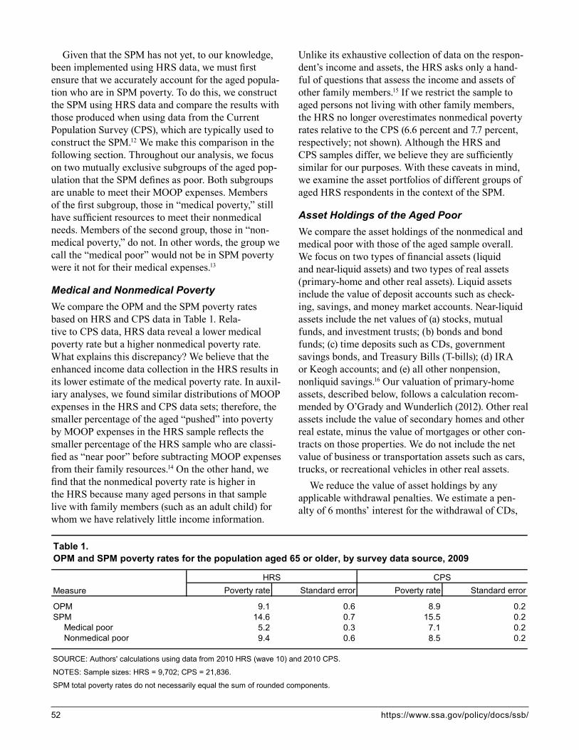
52 https://www.ssa.gov/policy/docs/ssb/
Given that the SPM has not yet, to our knowledge, been implemented using HRS data, we must first ensure that we accurately account for the aged popula-tion who are in SPM poverty. To do this, we construct the SPM using HRS data and compare the results with those produced when using data from the Current Population Survey (CPS), which are typically used to construct the SPM.12 We make this comparison in the following section. Throughout our analysis, we focus on two mutually exclusive subgroups of the aged pop-ulation that the SPM defines as poor. Both subgroups are unable to meet their MOOP expenses. Members of the first subgroup, those in “medical poverty,” still have sufficient resources to meet their nonmedical needs. Members of the second group, those in “non-medical poverty,” do not. In other words, the group we call the “medical poor” would not be in SPM poverty were it not for their medical expenses.13
Medical and Nonmedical PovertyWe compare the OPM and the SPM poverty rates based on HRS and CPS data in Table 1. Rela-tive to CPS data, HRS data reveal a lower medical poverty rate but a higher nonmedical poverty rate. What explains this discrepancy? We believe that the enhanced income data collection in the HRS results in its lower estimate of the medical poverty rate. In auxil-iary analyses, we found similar distributions of MOOP expenses in the HRS and CPS data sets; therefore, the smaller percentage of the aged “pushed” into poverty by MOOP expenses in the HRS sample reflects the smaller percentage of the HRS sample who are classi-fied as “near poor” before subtracting MOOP expenses from their family resources.14 On the other hand, we find that the nonmedical poverty rate is higher in the HRS because many aged persons in that sample live with family members (such as an adult child) for whom we have relatively little income information.
Unlike its exhaustive collection of data on the respon-dent’s income and assets, the HRS asks only a hand-ful of questions that assess the income and assets of other family members.15 If we restrict the sample to aged persons not living with other family members, the HRS no longer overestimates nonmedical poverty rates relative to the CPS (6.6 percent and 7.7 percent, respectively; not shown). Although the HRS and CPS samples differ, we believe they are sufficiently similar for our purposes. With these caveats in mind, we examine the asset portfolios of different groups of aged HRS respondents in the context of the SPM.
Asset Holdings of the Aged PoorWe compare the asset holdings of the nonmedical and medical poor with those of the aged sample overall. We focus on two types of financial assets (liquid and near-liquid assets) and two types of real assets (primary-home and other real assets). Liquid assets include the value of deposit accounts such as check-ing, savings, and money market accounts. Near-liquid assets include the net values of (a) stocks, mutual funds, and investment trusts; (b) bonds and bond funds; (c) time deposits such as CDs, government savings bonds, and Treasury Bills (T-bills); (d) IRA or Keogh accounts; and (e) all other nonpension, nonliquid savings.16 Our valuation of primary-home assets, described below, follows a calculation recom-mended by O’Grady and Wunderlich (2012). Other real assets include the value of secondary homes and other real estate, minus the value of mortgages or other con-tracts on those properties. We do not include the net value of business or transportation assets such as cars, trucks, or recreational vehicles in other real assets.
We reduce the value of asset holdings by any applicable withdrawal penalties. We estimate a pen-alty of 6 months’ interest for the withdrawal of CDs,
Poverty rate Standard error Poverty rate Standard error
9.1 0.6 8.9 0.214.6 0.7 15.5 0.2
Medical poor 5.2 0.3 7.1 0.2Nonmedical poor 9.4 0.6 8.5 0.2
SPM total poverty rates do not necessarily equal the sum of rounded components.
NOTES: Sample sizes: HRS = 9,702; CPS = 21,836.
HRS CPS
Table 1. OPM and SPM poverty rates for the population aged 65 or older, by survey data source, 2009
Measure
OPMSPM
SOURCE: Authors' calculations using data from 2010 HRS (wave 10) and 2010 CPS.

Social Security Bulletin, Vol. 78, No. 1, 2018 53
government savings bonds, and T-bills.17 To estimate the value of assets in IRA or Keogh accounts, we sub-tract federal and state taxes (at the family’s marginal tax rates) and assume that the entire account balance is taxable. We assume no early withdrawal penalties on IRA or Keogh accounts because all sample mem-bers are aged 65 or older. We also assume that the reported values of stocks, mutual funds, investment trusts, bonds, and bond funds already account for any withdrawal penalties. We are relatively confident in this assumption because the HRS asks respondents to report these values after having “paid off anything [they] owed on them.” We assume no withdrawal penalty for miscellaneous assets.
We approximate the value of primary-home assets by estimating the value of a hypothetical reverse mortgage. To determine reverse-mortgage eligibility and to estimate value, we follow the rules established by the Federal Housing Authority’s reverse mortgage program, the Home Equity Conversion Mortgage.18 A family is eligible for a reverse mortgage if they own and live in their primary residence; if the residence is valued at greater than 40 percent of any mortgages or other home loans; and if the residence is not a mobile home, a retirement home, an assisted living residence, or in a nursing home. The value of the
reverse mortgage equals the home value multiplied by a “Principal Limit Factor” published by the Depart-ment of Housing and Urban Development, minus the origination fees, closing fees, initial mortgage insur-ance premium, present-value set-aside for monthly administration fees, mandatory counseling fee, and any outstanding mortgages or home loans. We assign to eligible sample members a reverse mortgage amount if the calculated value is greater than zero. Appendix B presents a detailed description of the reverse mortgage calculation.
Table 2 provides the asset-holding rates among all aged persons and among the nonmedical and medical poor, as reported in the 2008 HRS (wave 9).19 Of the four asset categories of primary interest, liquid finan-cial assets are the most prevalent (and, by definition, the most readily accessible). A majority of the non-medical poor, 65.3 percent, have some liquid assets. A larger majority of the medical poor (86.8 percent) have liquid assets. Although majorities of those in SPM poverty possess liquid assets, the value of those assets is generally low, as we show later.
The aged in SPM poverty may draw from near-liquid financial assets, if available. However, only 26.5 percent of the nonmedical poor have such assets. The medical poor fare better: 54.7 percent have
Overall Nonmedical poor Medical poor
91.2 68.1 88.888.2 65.3 86.865.7 26.5 54.7
Stocks 31.2 10.5 19.3Bonds 8.4 2.7 6.4CDs and other time deposits 30.1 10.9 26.1IRA/Keogh accounts 43.8 12.3 34.2Other savings 18.5 5.5 10.3
25.5 41.6 34.1
68.2 42.9 62.060.5 38.6 57.325.5 9.0 18.1
Second home 15.4 6.2 10.2Other real estate 15.3 3.9 10.9
3.3 11.0 4.8
94.1 77.7 93.694.5 79.1 93.7
9,702 1,063 503
Asset type
Financial assets Liquid assets
Table 2. Percentage of the population aged 65 or older holding selected types of assets: Overall and for the nonmedical and medical poor, 2008
Real assets but no financial assets
Any financial or real assetsAny financial or primary-home assets
NOTE: All differences between the nonmedical poor and the medical poor are statistically significant at the 0.05 level.
Near-liquid assets
Liquid assets but no near-liquid assets
Primary homeOther real assets
Sample size
Real assets
SOURCE: Authors' calculations using data from 2008 HRS (wave 9).

54 https://www.ssa.gov/policy/docs/ssb/
near-liquid assets. The difference in financial asset-holding rates between the nonmedical and the medical poor is telling. Although 88.8 percent of the medical poor possess financial assets, only 68.1 percent of the nonmedical poor do. This suggests that, regardless of the value of financial assets available to those who hold them, nearly one-third of the nonmedical poor have no financial assets available to supplement their family income.
The aged may also draw from primary-home assets. For the aged population overall, primary-home assets are nearly as common as holdings of any near-liquid assets. Primary-home assets are held by 38.6 percent of the nonmedical poor and by 57.3 percent of the medical poor. Among the medical poor, 93.6 percent have either financial or primary-home assets from which they can draw, but only 77.7 percent of the nonmedical poor have this option.
The aged may also sell off other real assets, such as secondary homes, that are available. A surprising proportion of the SPM poor—specifically, the medi-cal poor—have secondary homes or other real estate. Less surprising is that the proportions of aged persons holding these types of real assets are lower among the SPM poor than among the aged overall.
We now turn to the value of assets held by the aged in SPM poverty. Table 3 presents data on the distribution of liquid assets, financial assets (liquid or near-liquid), financial or primary-home assets, and all assets (financial or real) at selected deciles for the aged population overall and for those who are in nonmedi-cal and medical poverty.20 Not surprisingly, as SPM resources increase, individuals are not only more likely to have assets, but the value of their holdings also increases.
Although 65.3 percent of the nonmedical poor have liquid financial assets, the average amount is modest ($8,536). The median amount ($300) is almost nonex-istent, meaning that most of the nonmedical poor do not have sizable liquid assets to meet their needs. The addition of near-liquid assets does not substantially increase asset values for many of the nonmedical poor; half of them have no more than $500 in com-bined financial assets of any kind. If we also include primary-home assets, the nonmedical poor have an average of $98,312 in assets, and half of them have assets of less than $5,738.
The medical poor have greater asset holdings than the nonmedical poor have. At the 30th percentile, an individual in medical poverty has $1,000 in liquid
assets, $3,000 in combined financial assets, and $15,676 in combined financial and primary-home assets. At the median, an individual in medical pov-erty has $5,000 in liquid assets, $20,000 in combined financial assets, and $72,715 in combined financial and primary-home assets—the latter value being more than 12 times the amount of combined financial and primary-home assets held by an aged individual in nonmedical poverty at the median.
Although many individuals in SPM poverty have few assets available, a small proportion—particularly among those in medical poverty—may have sub-stantial assets from which they could draw to cover their needs.
Medical and Nonmedical Poverty After Including Annuitized AssetsWe next assess the extent to which asset holdings of the aged could reasonably be included in their family resources under the bounded annuity approach. Both the lower- and upper-bound annuities in this approach are hypothetical. Recall that for the lower bound, we assume the annuity strategy of a highly risk-averse individual who withdraws assets with the expecta-tion of complete asset exhaustion by age 120. For the upper bound, we assume that a hypothetical insurance firm distributes withdrawals based on the actuarially fair cash-flow rate; this firm is not compensated for taking on risk, has no costs (other than monthly or yearly withdrawals), and no profits. The “true” annuity amount is between these bounds.
Table 4 shows the upper- and lower-bound annuities we calculated for the nonmedical poor, the medical poor, and the aged population overall. We calculated annuities using (a) only liquid assets, (b) all financial assets, (c) all financial and primary-home assets, and (d) all financial and real assets. If the nonmedical poor were to annuitize only their liquid assets, the median value would be very low—between $9 and $20 annu-ally. If they were to annuitize all financial assets, the median annuity would increase to between $17 and $37. Drawing from all financial and primary-home assets would increase the median annuity to between $209 and $462. Drawing from all assets would further increase the median annuity to between $296 and $616. The estimated annuities for the medical poor are much greater than those for the nonmedical poor. The median annuity drawn only from liquid assets for the medical poor would be between $167 and $386. The annuity would increase to between $707 and $1,557 if it were to be drawn from all financial assets, and
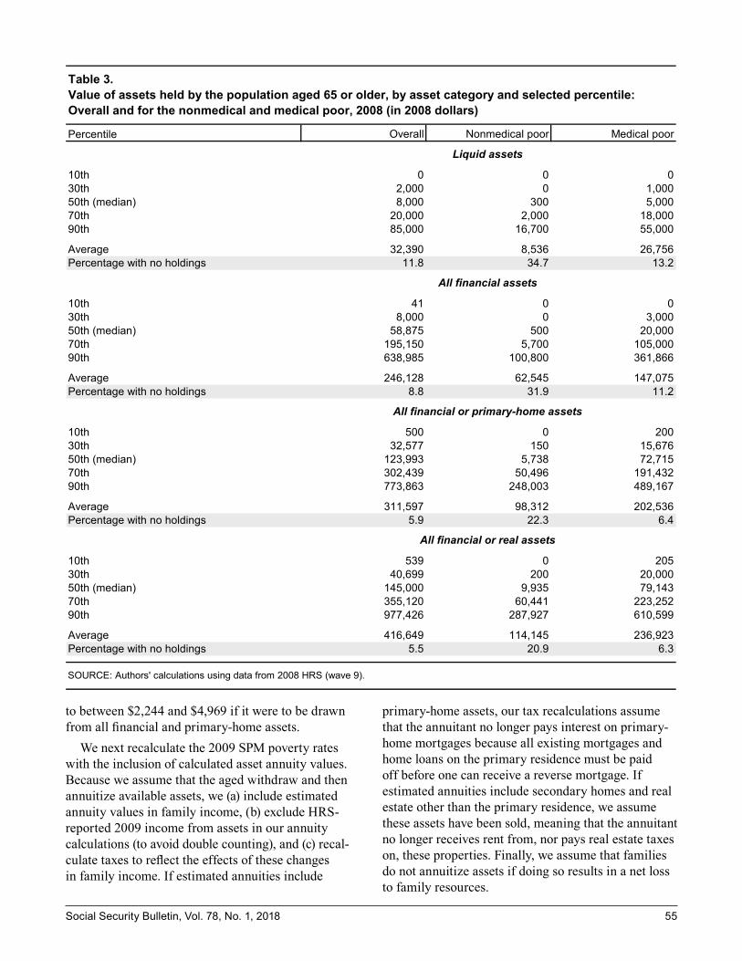
Social Security Bulletin, Vol. 78, No. 1, 2018 55
to between $2,244 and $4,969 if it were to be drawn from all financial and primary-home assets.
We next recalculate the 2009 SPM poverty rates with the inclusion of calculated asset annuity values. Because we assume that the aged withdraw and then annuitize available assets, we (a) include estimated annuity values in family income, (b) exclude HRS-reported 2009 income from assets in our annuity calculations (to avoid double counting), and (c) recal-culate taxes to reflect the effects of these changes in family income. If estimated annuities include
primary-home assets, our tax recalculations assume that the annuitant no longer pays interest on primary-home mortgages because all existing mortgages and home loans on the primary residence must be paid off before one can receive a reverse mortgage. If estimated annuities include secondary homes and real estate other than the primary residence, we assume these assets have been sold, meaning that the annuitant no longer receives rent from, nor pays real estate taxes on, these properties. Finally, we assume that families do not annuitize assets if doing so results in a net loss to family resources.
Overall Nonmedical poor Medical poor
0 0 02,000 0 1,0008,000 300 5,000
20,000 2,000 18,00085,000 16,700 55,000
32,390 8,536 26,75611.8 34.7 13.2
41 0 08,000 0 3,000
58,875 500 20,000195,150 5,700 105,000638,985 100,800 361,866
246,128 62,545 147,0758.8 31.9 11.2
500 0 20032,577 150 15,676
123,993 5,738 72,715302,439 50,496 191,432773,863 248,003 489,167
311,597 98,312 202,5365.9 22.3 6.4
539 0 20540,699 200 20,000
145,000 9,935 79,143355,120 60,441 223,252977,426 287,927 610,599
416,649 114,145 236,9235.5 20.9 6.3
Percentile
Percentage with no holdingsAverage
Table 3. Value of assets held by the population aged 65 or older, by asset category and selected percentile: Overall and for the nonmedical and medical poor, 2008 (in 2008 dollars)
All financial or primary-home assets
90th
SOURCE: Authors' calculations using data from 2008 HRS (wave 9).
Liquid assets
10th30th50th (median)70th90th
90th
All financial assets
10th
Percentage with no holdings
30th50th (median)70th
AveragePercentage with no holdings
10th30th50th (median)70th
Average
AveragePercentage with no holdings
All financial or real assets
10th30th50th (median)70th90th

56 https://www.ssa.gov/policy/docs/ssb/
The nonmedical poor can use annuitized assets to pay for either nonmedical needs or MOOP expenses. After including asset annuities in family resources, the nonmedical poor may remain classified as non-medical poor (that is, still unable to afford either their nonmedical needs or their MOOP expenses), may be reclassified as medical poor (that is, able to afford their nonmedical needs but not their MOOP expenses), or may be reclassified as not SPM poor. For the medical poor, the only question is whether they remain classi-fied as medical poor after the inclusion of annuitized assets or become reclassified as not SPM poor. Table 5 presents the percentage distributions of the nonmedi-cal and medical poor by whether (and how) they are reclassified when different types of annuitized assets are counted as part of family resources.
Recall that in our sample, 9.4 percent of the aged overall are in nonmedical SPM poverty (Table 1). Table 5 shows that if annuities from liquid finan-cial assets alone were included in family resources, between 93.2 percent and 96.2 percent of the aged in nonmedical poverty would retain that classification. However, 2.8–2.9 percent of them would be reclassi-fied as medical poor. The remaining 1.0–3.9 percent
of the nonmedical poor would be reclassified as not SPM poor. If annuities from all financial assets were included in family resources, 83.2–88.7 percent of the nonmedical poor would retain that classification, 4.9–5.2 percent would be reclassified as medical poor, and 6.4–11.6 percent would no longer be considered SPM poor. Finally, if annuities based on available financial and primary-home assets were included, 70.5–80.1 percent of the nonmedical poor would remain classified as such, 6.3–7.2 percent would be reclassified as medical poor, and 12.7–23.2 percent would be reclassified as not SPM poor.
The inclusion of annuities, particularly the inclusion of annuities from all financial and primary-home assets, has a much larger influence on the measure-ment of medical poverty. The medical poor comprise 5.2 percent of the aged population (Table 1). If annui-ties from liquid assets alone were included, 11.0–17.9 percent of the aged medical poverty population would no longer be considered SPM poor (Table 5). If annuities from all financial assets were included, 30.8–45.2 percent of this group would no longer be classified as SPM poor. If annuities from financial and primary-home assets were included, 44.5–60.0 percent
Overall Nonmedical poor Medical poor
241 9 167514 20 386
1,870 17 7073,998 37 1,557
3,978 209 2,2448,435 462 4,969
4,576 296 2,7039,926 616 5,954
a.
b.
Upper bound b
All financial and real assets
The lower bound reflects a risk-averse annuitization strategy in which an individual withdraws assets gradually enough to avoid asset exhaustion before reaching age 120.
The upper bound reflects a successful high-risk, high-reward annuitization strategy in which an individual enters an annuity contract with a hypothetical insurance firm that distributes annual payments based on an actuarially fair cash-flow rate. The firm is assumed to be uncompensated for taking on risk, to have no costs other than annuity distributions, and to have no profits.
All financial assets
SOURCE: Authors' calculations using data from 2008 HRS (wave 9).
Lower bound a
NOTE: Annuitized asset values are estimated assuming a constant real interest rate of 1.88 percent.
Table 4. Median value of the annuitized assets held by the population aged 65 or older, by potential annuity value and asset category: Overall and for the nonmedical and medical poor, 2008 (in 2008 dollars)
Potential annuity value
Liquid assets
Lower bound a
Upper bound b
All financial and primary-home assets
Lower bound a
Upper bound b
Lower bound a
Upper bound b

Social Security Bulletin, Vol. 78, No. 1, 2018 57
would no longer be categorized as SPM poor. The effect of counting financial and primary-home assets is larger for the medical poor than for the nonmedical poor for two reasons. First, as noted earlier, the aged who are in medical poverty have, on average, more financial assets than do the nonmedical poor, mean-ing that their withdrawal amounts, whether lower- or upper-bound, are larger. Second, necessary expenses for the medical poor tend to be lower than those for the nonmedical poor because the medical poor, by definition, have their nonmedical needs met by their SPM resources.
Table 6 shows the SPM poverty rates for the aged with the inclusion of asset principal using our annuity method. Including liquid-asset annuities in estimated family resources would leave 8.8–9.1 per-cent of the aged population classified as nonmedical poor and 4.5–4.8 percent classified as medical poor. The overall SPM aged poverty rate would decrease slightly, from 14.6 percent to 13.3–13.9 percent, a 0.7 to 1.3 percentage point decrease. The reduction in the SPM poverty rate would be greater with the inclusion of all financial assets. Among the aged population, 7.9–8.4 percent would be in nonmedical
SameMedical
poorNot SPM
poor SameNot SPM
poor
Liquid assets 100.0 96.2 2.8 1.0 100.0 89.0 11.0All financial assets 100.0 88.7 4.9 6.4 100.0 69.2 30.8All financial and primary-home assets 100.0 80.1 7.2 12.7 100.0 55.5 44.5All financial and real assets 100.0 78.3 7.7 13.9 100.0 53.1 46.9
Liquid assets 100.0 93.2 2.9 3.9 100.0 82.1 17.9All financial assets 100.0 83.2 5.2 11.6 100.0 54.8 45.2All financial and primary-home assets 100.0 70.5 6.3 23.2 100.0 40.0 60.0All financial and real assets 100.0 68.7 6.3 25.0 100.0 37.5 62.5
Liquid assets . . . 0.7 0.7 0.4 . . . 1.7 1.7All financial assets . . . 1.7 1.0 1.2 . . . 2.9 2.9All financial and primary-home assets . . . 1.7 1.0 1.5 . . . 2.6 2.6All financial and real assets . . . 1.7 1.1 1.5 . . . 2.7 2.7
Liquid assets . . . 1.0 0.7 0.8 . . . 2.0 2.0All financial assets . . . 1.9 0.9 1.6 . . . 2.8 2.8All financial and primary-home assets . . . 2.1 0.9 1.7 . . . 2.7 2.7All financial and real assets . . . 2.1 1.0 1.8 . . . 2.9 2.9
a.
b.
Table 5. Poverty classifications of the population aged 65 or older if annuitized assets are included in estimated family resources, by potential annuity value and asset category, 2009
Potential annuity value and asset category
Upper bound b
Lower bound a
Upper bound b
Percentage distribution
Standard error
The lower bound reflects a risk-averse annuitization strategy in which an individual withdraws assets gradually enough to avoid asset exhaustion before reaching age 120.
The upper bound reflects a successful high-risk, high-reward annuitization strategy in which an individual enters an annuity contract with a hypothetical insurance firm that distributes annual payments based on an actuarially fair cash-flow rate. The firm is assumed to be uncompensated for taking on risk, to have no costs other than annuity distributions, and to have no profits.
. . . = not applicable.
Nonmedical poor Medical poor
Lower bound a
SOURCE: Authors' calculations using data from 2010 HRS (wave 10).
Total Total
If assets are included If assets are included
NOTES: Annuitized asset values are estimated assuming a constant real interest rate of 1.88 percent.
Rounded components of percentage distributions do not necessarily sum to 100.0.

58 https://www.ssa.gov/policy/docs/ssb/
poverty, and 3.3–4.0 percent would be in medical poverty. The overall SPM aged poverty rate would decrease from 14.6 percent to 11.2–12.4 percent, representing a decline of 2.2 to 3.4 percentage points. If the aged were to annuitize financial and primary-home assets, 6.7–7.6 percent of them would be in nonmedical poverty, 2.7–3.5 percent would be in medical poverty, and the overall SPM aged poverty rate would decrease by 3.5 to 5.3 percentage points to 9.3–11.1 percent. The inclusion of annuities from all financial and real assets would decrease SPM poverty rates only slightly more.
The SPM Under the Bounded Annuity and Rainy-Day ApproachesTo contextualize our bounded annuity approach, which presents conservative estimates of the portions of assets from which the aged might draw to meet expenses, we compare its SPM poverty-rate results with those estimated using the rainy-day approach, in which the aged may draw all of their assets down to meet current needs. Chart 1 displays the results. The rainy-day SPM poverty rate would be 9.4 percent for aged individu-als who drew from liquid assets only, 7.8 percent for
Overall Nonmedical poor Medical poor
14.6 9.4 5.2
Liquid assets 13.9 9.1 4.8All financial assets 12.4 8.4 4.0All financial and primary-home assets 11.1 7.6 3.5All financial and real assets 10.9 7.4 3.5
Liquid assets 13.3 8.8 4.5All financial assets 11.2 7.9 3.3All financial and primary-home assets 9.3 6.7 2.7All financial and real assets 9.0 6.5 2.5
0.6 0.6 0.3
Liquid assets 0.7 0.6 0.3All financial assets 0.6 0.6 0.3All financial and primary-home assets 0.6 0.5 0.3All financial and real assets 0.6 0.5 0.3
Liquid assets 0.6 0.5 0.3All financial assets 0.6 0.5 0.3All financial and primary-home assets 0.5 0.5 0.2All financial and real assets 0.5 0.5 0.2
a.
b.
Excluding annuitized assets
Table 6. SPM poverty rates for the population aged 65 or older if annuitized assets are included in estimated family resources, by potential annuity value and asset category: Overall and for the nonmedical and medical poor, 2009
Potential annuity value and asset category
Excluding annuitized assetsIncluding annuitized assets
Upper bound b
Lower bound a
Poverty rate
Standard error
Including annuitized assetsLower bound a
Upper bound b
The lower bound reflects a risk-averse annuitization strategy in which an individual withdraws assets gradually enough to avoid asset exhaustion before reaching age 120.
The upper bound reflects a successful high-risk, high-reward annuitization strategy in which an individual enters an annuity contract with a hypothetical insurance firm that distributes annual payments based on an actuarially fair cash-flow rate. The firm is assumed to be uncompensated for taking on risk, to have no costs other than annuity distributions, and to have no profits.
SOURCE: Authors' calculations using data from 2010 HRS (wave 10).
NOTES: Annuitized asset values are estimated assuming a constant real interest rate of 1.88 percent.
Rounded nonmedical and medical poverty rates do not necessarily sum to overall poverty rate.

Social Security Bulletin, Vol. 78, No. 1, 2018 59
those who drew from all financial assets, 5.5 percent for those who drew from financial and primary-home assets, and 5.1 percent for those who drew from all financial and real assets. Across all configurations of available assets, the rainy-day approach decreases the SPM poverty rate by an average of 3.7 percent-age points (standard deviation = 0.3) more than the upper-bound annuity approach. Although the rainy-day approach likely overstates the effect of asset holdings, the bounded annuity approach may understate it; the actual effect of asset holdings is likely between the two.
Sensitivity AnalysesIn this section, we discuss sensitivity aspects of two major assumptions in our annuity calculations: first, that individuals expect to live to age 120; and second, of a constant real interest rate of 1.88 percent.
The lower-bound annuity calculations assume that individuals expect to live to age 120. Our decision to use age 120 to represent an extremely risk-averse life expectancy is arbitrary. Because the purpose of a lower bound is to delineate the least return to asset annuiti-zation, we decided to err on the side of extreme risk aversion. To assuage concerns that a life expectancy of age 120 is too risk averse, we also calculate changes to the SPM poverty rate using ages 110 and 100 as the
life expectancies for the lower-bound annuity calcula-tions. Table 7 shows the effects of these alternative life expectancies on the nonmedical and medical poor in terms of whether and how they are reclassified when annuitized asset values are included in family resources, and Table 8 shows how the alternative life expectancies affect SPM poverty rate estimates. When including annuities from all financial and real assets, an assumed life expectancy of age 110 decreases the lower-bound SPM poverty rate by 0.4 percentage points, from 10.9 percent (Table 6) to 10.5 percent (Table 8), and a life expectancy of age 100 decreases the lower-bound SPM poverty rate by 1.0 percentage point (to 9.9 percent). Thus, even a 20-year difference in life expectancy (from 120 to 100) changes the lower-bound SPM poverty rate by only 1.0 percentage point.
There is also a degree of arbitrariness in our selec-tion of a constant real interest rate, despite our attempt to approach the issue systematically. To address the potential arbitrariness, we calculate changes to the SPM if we estimate annuity values based on constant real interest rates as low as 0.5 percent and as high as 4.0 percent. Tables 9 and 10 repeat Tables 5 and 6 with the assumed interest rate of 0.5 percent and Tables 11 and 12 do the same with the assumed interest rate of 4.0 percent. When including annuities from all
Chart 1. SPM poverty rates for the population aged 65 or older, 2009: Original estimate and recalculations under three alternative methodologies, by asset category included in estimated family resources
SOURCES: Census Bureau; authors’ calculations using data from 2010 HRS (wave 10).
14.6 14.6 14.6 14.6
13.9
12.4
11.1 10.9
13.3
11.2
9.3 9.09.4
7.8
5.55.1
Liquid assets All financial assets All financial andprimary-home assets
All financialand real assets
4
6
8
10
12
14
16Percent
Original SPM estimate
Lower-bound annuity
Upper-bound annuity
Rainy day
60 https://www.ssa.gov/policy/docs/ssb/
SameMedical
poorNot SPM
poor SameNot SPM
poor
Liquid assets 100.0 94.9 2.9 2.3 100.0 84.2 15.8All financial assets 100.0 85.5 5.4 9.1 100.0 61.6 38.4All financial and primary-home assets 100.0 74.3 7.9 17.8 100.0 47.2 52.8All financial and real assets 100.0 72.6 7.9 19.5 100.0 45.6 54.4
Liquid assets 100.0 95.5 3.3 1.3 100.0 87.3 12.7All financial assets 100.0 87.4 5.2 7.4 100.0 65.9 34.1All financial and primary-home assets 100.0 78.4 7.4 14.2 100.0 51.4 48.6All financial and real assets 100.0 76.6 7.9 15.5 100.0 49.2 50.8
Liquid assets . . . 0.8 0.6 0.5 . . . 1.9 1.9All financial assets . . . 1.7 0.9 1.3 . . . 2.8 2.8All financial and primary-home assets . . . 1.8 1.0 1.6 . . . 2.5 2.5All financial and real assets . . . 1.8 1.0 1.6 . . . 2.5 2.5
Liquid assets . . . 0.8 0.7 0.4 . . . 1.9 1.9All financial assets . . . 1.7 1.0 1.2 . . . 2.9 2.9All financial and primary-home assets . . . 1.7 0.9 1.5 . . . 2.5 2.5All financial and real assets . . . 1.7 1.1 1.5 . . . 2.6 2.6
Percentage distribution
Standard error
Rounded components of percentage distributions do not necessarily sum to 100.0.
SOURCE: Authors' calculations using data from 2010 HRS (wave 10).
NOTES: Annuitized asset values are estimated assuming a constant real interest rate of 1.88 percent.
. . . = not applicable.
Life expectancy = 100
Life expectancy = 110
Life expectancy = 100
Life expectancy = 110
Table 7. Poverty classifications of the population aged 65 or older if annuitized assets are included in estimated family resources under alternative lower-bound definitions, by asset category, 2009
Definition and asset category
Nonmedical poor Medical poor
Total
If assets are included
Total
If assets are included

Social Security Bulletin, Vol. 78, No. 1, 2018 61
Overall Nonmedical poor Medical poor
14.6 9.4 5.2
Liquid assets 13.6 9.0 4.6All financial assets 11.8 8.1 3.7All financial and primary-home assets 10.2 7.0 3.2All financial and real assets 9.9 6.9 3.1
Liquid assets 13.8 9.0 4.8All financial assets 12.1 8.2 3.9All financial and primary-home assets 10.7 7.4 3.3All financial and real assets 10.5 7.2 3.3
0.6 0.6 0.3
Liquid assets 0.7 0.6 0.3All financial assets 0.6 0.5 0.3All financial and primary-home assets 0.5 0.5 0.2All financial and real assets 0.5 0.4 0.2
Liquid assets 0.7 0.6 0.3All financial assets 0.6 0.5 0.3All financial and primary-home assets 0.5 0.5 0.2All financial and real assets 0.5 0.5 0.2
Rounded nonmedical and medical poverty rates do not necessarily sum to overall poverty rate.
Life expectancy = 110
SOURCE: Authors' calculations using data from 2010 HRS (wave 10).
NOTES: Annuitized asset values are estimated assuming a constant real interest rate of 1.88 percent.
Table 8. SPM poverty rates for the population aged 65 or older if annuitized assets are included in estimated family resources under alternative lower-bound definitions, by asset category: Overall and for the nonmedical and medical poor, 2009
Definition and asset category
Excluding annuitized assetsIncluding annuitized assets
Life expectancy = 100
Life expectancy = 110
Excluding annuitized assetsIncluding annuitized assets
Life expectancy = 100
Poverty rate
Standard error

62 https://www.ssa.gov/policy/docs/ssb/
SameMedical
poorNot SPM
poor SameNot SPM
poor
Liquid assets 100.0 96.6 2.6 0.8 100.0 89.8 10.2All financial assets 100.0 90.1 5.7 4.2 100.0 72.5 27.5All financial and primary-home assets 100.0 82.6 8.4 9.0 100.0 59.9 40.1All financial and real assets 100.0 81.2 8.9 9.8 100.0 57.1 42.9
Liquid assets 100.0 93.7 2.4 3.8 100.0 82.1 17.9All financial assets 100.0 83.5 5.2 11.3 100.0 55.2 44.8All financial and primary-home assets 100.0 70.9 7.0 22.1 100.0 41.5 58.5All financial and real assets 100.0 69.1 6.9 24.1 100.0 40.1 59.9
Liquid assets . . . 0.7 0.6 0.4 . . . 1.7 1.7All financial assets . . . 1.5 1.2 0.9 . . . 2.8 2.8All financial and primary-home assets . . . 1.5 1.1 1.1 . . . 2.7 2.7All financial and real assets . . . 1.6 1.2 1.2 . . . 2.8 2.8
Liquid assets . . . 0.9 0.5 0.8 . . . 2.0 2.0All financial assets . . . 1.9 0.9 1.6 . . . 2.9 2.9All financial and primary-home assets . . . 2.1 1.1 1.8 . . . 2.7 2.7All financial and real assets . . . 2.1 1.0 1.8 . . . 2.7 2.7
a.
b.
SOURCE: Authors' calculations using data from 2010 HRS (wave 10).
NOTES: Rounded components of percentage distributions do not necessarily sum to 100.0.
The lower bound reflects a risk-averse annuitization strategy in which an individual withdraws assets gradually enough to avoid asset exhaustion before reaching age 120.
The upper bound reflects a successful high-risk, high-reward annuitization strategy in which an individual enters an annuity contract with a hypothetical insurance firm that distributes annual payments based on an actuarially fair cash-flow rate. The firm is assumed to be uncompensated for taking on risk, to have no costs other than annuity distributions, and to have no profits.
Lower bound a
Upper bound b
Lower bound a
Upper bound b
. . . = not applicable.
Percentage distribution
Standard error
Table 9. Poverty classifications of the population aged 65 or older if annuitized assets are included in estimated family resources and a constant real interest rate of 0.5 percent is assumed, by potential annuity value and asset category, 2009
Potential annuity value and asset category
Nonmedical poor Medical poor
Total
If assets are included
Total
If assets are included

Social Security Bulletin, Vol. 78, No. 1, 2018 63
Overall Nonmedical poor Medical poor
14.6 9.4 5.2
Liquid assets 14.0 9.1 4.9All financial assets 12.8 8.5 4.3All financial and primary-home assets 11.7 7.8 3.9All financial and real assets 11.4 7.7 3.8
Liquid assets 13.3 8.8 4.5All financial assets 11.2 7.9 3.3All financial and primary-home assets 9.5 6.7 2.8All financial and real assets 9.2 6.5 2.7
0.6 0.6 0.3
Liquid assets 0.7 0.6 0.3All financial assets 0.7 0.6 0.3All financial and primary-home assets 0.6 0.5 0.3All financial and real assets 0.6 0.5 0.3
Liquid assets 0.7 0.5 0.3All financial assets 0.6 0.5 0.3All financial and primary-home assets 0.5 0.5 0.2All financial and real assets 0.5 0.5 0.2
a.
b.
SOURCE: Authors' calculations using data from 2010 HRS (wave 10).
The lower bound reflects a risk-averse annuitization strategy in which an individual withdraws assets gradually enough to avoid asset exhaustion before reaching age 120.
The upper bound reflects a successful high-risk, high-reward annuitization strategy in which an individual enters an annuity contract with a hypothetical insurance firm that distributes annual payments based on an actuarially fair cash-flow rate. The firm is assumed to be uncompensated for taking on risk, to have no costs other than annuity distributions, and to have no profits.
Upper bound b
Excluding annuitized assetsIncluding annuitized assets
Lower bound a
Upper bound b
Standard error
Rounded nonmedical and medical poverty rates do not necessarily sum to overall poverty rate.
Lower bound a
Table 10. SPM poverty rates for the population aged 65 or older if annuitized assets are included in estimated family resources and a constant real interest rate of 0.5 percent is assumed, by potential annuity value and asset category: Overall and for the nonmedical and medical poor, 2009
Potential annuity value and asset category
Excluding annuitized assetsIncluding annuitized assets
Poverty rate

64 https://www.ssa.gov/policy/docs/ssb/
SameMedical
poorNot SPM
poor SameNot SPM
poor
Liquid assets 100.0 95.0 3.4 1.6 100.0 85.6 14.4All financial assets 100.0 86.1 5.7 8.2 100.0 63.8 36.2All financial and primary-home assets 100.0 76.1 7.6 16.3 100.0 48.6 51.4All financial and real assets 100.0 74.1 7.9 18.0 100.0 46.7 53.3
Liquid assets 100.0 92.7 3.2 4.1 100.0 81.5 18.5All financial assets 100.0 82.8 4.5 12.6 100.0 53.7 46.3All financial and primary-home assets 100.0 69.2 6.0 24.7 100.0 39.3 60.7All financial and real assets 100.0 67.4 6.1 26.5 100.0 36.8 63.2
Liquid assets . . . 0.8 0.7 0.5 . . . 1.9 1.9All financial assets . . . 1.8 1.0 1.2 . . . 2.9 2.9All financial and primary-home assets . . . 1.9 1.1 1.7 . . . 2.6 2.6All financial and real assets . . . 2.0 1.2 1.7 . . . 2.7 2.7
Liquid assets . . . 1.0 0.7 0.8 . . . 2.1 2.1All financial assets . . . 2.0 0.8 1.8 . . . 2.8 2.8All financial and primary-home assets . . . 2.1 0.8 1.8 . . . 2.6 2.6All financial and real assets . . . 2.2 0.8 1.9 . . . 2.9 2.9
a.
b.
Percentage distribution
Standard error
. . . = not applicable.
SOURCE: Authors' calculations using data from 2010 HRS (wave 10).
NOTES: Rounded components of percentage distributions do not necessarily sum to 100.0.
The lower bound reflects a risk-averse annuitization strategy in which an individual withdraws assets gradually enough to avoid asset exhaustion before reaching age 120.
The upper bound reflects a successful high-risk, high-reward annuitization strategy in which an individual enters an annuity contract with a hypothetical insurance firm that distributes annual payments based on an actuarially fair cash-flow rate. The firm is assumed to be uncompensated for taking on risk, to have no costs other than annuity distributions, and to have no profits.
Lower bound a
Upper bound b
Lower bound a
Upper bound b
Table 11. Poverty classifications of the population aged 65 or older if annuitized assets are included in estimated family resources and a constant real interest rate of 4.0 percent is assumed, by potential annuity value and asset category, 2009
Potential annuity value and asset category
Nonmedical poor Medical poor
Total
If assets are included
Total
If assets are included

Social Security Bulletin, Vol. 78, No. 1, 2018 65
Overall Nonmedical poor Medical poor
14.6 9.4 5.2
Liquid assets 13.7 9.0 4.7All financial assets 12.0 8.1 3.8All financial and primary-home assets 10.4 7.2 3.2All financial and real assets 10.1 7.0 3.1
Liquid assets 13.2 8.7 4.5All financial assets 11.0 7.8 3.2All financial and primary-home assets 9.1 6.5 2.6All financial and real assets 8.8 6.4 2.5
0.6 0.6 0.3
Liquid assets 0.7 0.6 0.3All financial assets 0.6 0.5 0.3All financial and primary-home assets 0.5 0.5 0.2All financial and real assets 0.5 0.5 0.2
Liquid assets 0.7 0.5 0.3All financial assets 0.6 0.5 0.3All financial and primary-home assets 0.5 0.5 0.2All financial and real assets 0.5 0.5 0.2
a.
b.
SOURCE: Authors' calculations using data from 2010 HRS (wave 10).
The lower bound reflects a risk-averse annuitization strategy in which an individual withdraws assets gradually enough to avoid asset exhaustion before reaching age 120.
The upper bound reflects a successful high-risk, high-reward annuitization strategy in which an individual enters an annuity contract with a hypothetical insurance firm that distributes annual payments based on an actuarially fair cash-flow rate. The firm is assumed to be uncompensated for taking on risk, to have no costs other than annuity distributions, and to have no profits.
Upper bound b
Excluding annuitized assetsIncluding annuitized assets
Lower bound a
Upper bound b
Standard error
Rounded nonmedical and medical poverty rates do not necessarily sum to overall poverty rate.
Lower bound a
Table 12. SPM poverty rates for the population aged 65 or older if annuitized assets are included in estimated family resources and a constant real interest rate of 4.0 percent is assumed, by potential annuity value and asset category: Overall and for the nonmedical and medical poor, 2009
Potential annuity value and asset category
Excluding annuitized assetsIncluding annuitized assets
Poverty rate

66 https://www.ssa.gov/policy/docs/ssb/
financial and real assets, a real interest rate of 0.5 per-cent increases the lower-bound SPM poverty rate by 0.5 percentage points, from 10.9 percent (Table 6) to 11.4 percent (Table 10), and increases the upper-bound SPM poverty rate by 0.2 percentage points from 9.0 percent (Table 6) to 9.2 percent (Table 10). A real interest rate of 4.0 percent (Table 12) decreases the lower-bound SPM poverty rate by 0.8 percent-age points (from 10.9 percent to 10.1 percent), and decreases the upper bound by 0.2 percentage points (from 9.0 percent to 8.8 percent). Again, major changes in the assumed real interest rate have surprisingly minimal effects on SPM poverty rates.
ConclusionHow many of the aged in the United States are in poverty, and how many of those individuals are in poverty because of MOOP spending? The OPM is not equipped to answer those questions. However, the SPM, by accounting for MOOP expenditures, indicates that a much greater share of the aged population lives in poverty than is estimated by the OPM. When poverty calculations account for MOOP expenses, the “golden years” seem not as golden as had been thought.
The substantial difference between the OPM and SPM poverty rates for the aged has led scholars to question the approach with which the SPM accounts for MOOP expenditures, and specifically the extent to which individuals may be able to cover medical and other expenses. Central to this debate is the treatment of assets, especially for aged persons, who may have accumulated substantial asset holdings specifically for retirement. The aged may use those assets to finance living expenses, yet the SPM does not incorporate asset holdings into its poverty estimates. By not accounting for asset principal, does the SPM overes-timate the proportion of the aged population living in poverty, specifically those who are poor because of MOOP expenses?
In this article, we used a lower- and upper-bound annuity approach to incorporate asset principal into SPM family resource estimates, assuming that aged persons draw down their asset principal through con-sistent yearly withdrawals (annuities) with no planned asset bequests after death. To do so, we first deter-mined the extent to which the aged in SPM poverty have asset holdings to draw from. In general, aged persons who are in medical poverty (meaning that they are able to cover basic living expenses but unable
to cover MOOP expenses without falling into pov-erty) have more financial and real asset holdings than those in nonmedical poverty have. We then calculated lower and upper bounds for potential annuitized asset withdrawals. For the lower bound, we assumed that individuals expect to live to age 120 and withdraw a fixed amount each year to extinguish their assets upon their death. For the upper bound, we assumed that individuals receive fixed annuity distributions from a hypothetical insurance firm that plans to break even on the individuals’ assets after their death. We recalcu-lated family resources with the inclusion of annuitized withdrawals based on liquid financial assets, all finan-cial assets, financial and primary-home assets, and all financial and real assets, and reported the subsequent changes in estimated SPM poverty rates.
We found that by including annuitized assets in estimated family resources, the proportion of the aged population that is considered to be in medical poverty would be significantly smaller. Specifically, if their financial assets were annuitized, between 30.8 percent and 45.2 percent of the aged who are classified as medical poor would be reclassified as not SPM poor, and the overall SPM aged poverty rate would decrease by 2.2 to 3.4 percentage points. If primary-home assets were also annuitized, between 44.5 percent and 60.0 percent of the aged in medical poverty would be reclassified as not SPM poor, and the SPM poverty rate would decrease by 3.5 to 5.3 percentage points. The 2009 official poverty rate for the aged in the HRS was 9.1 percent. With financial and primary-residence assets included in estimated family resources, the recalculated SPM poverty rate is slightly higher than the OPM rate, suggesting that the SPM drastically overstates poverty among the aged by accounting for MOOP expenditures yet ignoring asset principal.
The bounded annuity approach assumes that aged persons prioritize a sustained drawdown of asset prin-cipal over the rest of their lives rather than meeting their current needs. As a result, the bounded annuity approach is a conservative estimate of the value of the assets to be included in family resources. In reality, many aged persons are likely to draw down their asset principal in response to a health-related or other financial shock (Poterba, Venti, and Wise 2011). If the shock is large enough, they may draw down their assets in a lump sum. Our rainy-day approach reflects such a circumstance. Although the bounded annuity and rainy-day approaches represent two opposing strategies for including assets in income-based poverty

Social Security Bulletin, Vol. 78, No. 1, 2018 67
SameMedical
poorNot SPM
poor SameNot SPM
poor
Liquid assets 100.0 94.4 4.1 1.6 100.0 89.6 10.4All financial assets 100.0 82.2 8.2 9.6 100.0 69.3 30.7All financial and primary-home assets 100.0 72.3 10.0 17.7 100.0 55.8 44.2All financial and real assets 100.0 69.8 10.5 19.7 100.0 53.9 46.1
Liquid assets 100.0 89.9 4.1 6.0 100.0 82.4 17.6All financial assets 100.0 74.4 7.7 17.9 100.0 54.1 45.9All financial and primary-home assets 100.0 61.3 8.8 29.9 100.0 39.4 60.6All financial and real assets 100.0 59.7 8.3 32.0 100.0 37.5 62.5
Liquid assets . . . 1.2 1.2 0.6 . . . 1.9 1.9All financial assets . . . 2.8 1.8 2.0 . . . 3.0 3.0All financial and primary-home assets . . . 2.8 1.5 2.4 . . . 3.0 3.0All financial and real assets . . . 2.8 1.7 2.4 . . . 3.2 3.2
Liquid assets . . . 1.7 1.2 1.4 . . . 2.1 2.1All financial assets . . . 3.0 1.5 2.5 . . . 3.0 3.0All financial and primary-home assets . . . 3.1 1.5 2.5 . . . 2.9 2.9All financial and real assets . . . 3.1 1.5 2.6 . . . 3.1 3.1
a.
b.
Percentage distribution
Standard error
Table 13. Poverty classifications of the population aged 65 or older if annuitized assets are included in estimated family resources and the sample is restricted to individuals who do not live with other family members, by potential annuity value and asset category, 2009
Potential annuity value and asset category
Nonmedical poor Medical poor
Total
If assets are included
Total
If assets are included
SOURCE: Authors' calculations using data from 2010 HRS (wave 10).
NOTES: Rounded components of percentage distributions do not necessarily sum to 100.0.
The lower bound reflects a risk-averse annuitization strategy in which an individual withdraws assets gradually enough to avoid asset exhaustion before reaching age 120.
The upper bound reflects a successful high-risk, high-reward annuitization strategy in which an individual enters an annuity contract with a hypothetical insurance firm that distributes annual payments based on an actuarially fair cash-flow rate. The firm is assumed to be uncompensated for taking on risk, to have no costs other than annuity distributions, and to have no profits.
Lower bound a
Upper bound b
Lower bound a
Upper bound b
. . . = not applicable.
measurement, we suggest the bounded annuity approach as more appropriate for researchers who desire a conservative estimate of the portion of asset holdings to include in family resources.
These analyses have some important limitations. Although the HRS provides detailed information on the assets and income of the aged, information on the assets and income of family members with whom the aged live is less accurate. About 23.2 percent of the aged in the HRS sample live with other family mem-bers, meaning that our conclusions may underestimate the effect of including annuitized assets on the SPM
poverty rate for the entire aged population if those who live with other family members have substan-tially lower asset holdings than do those who do not live with other family members. On the other hand, our calculations using HRS data may overstate SPM poverty and thus overstate the effect of including asset annuities on SPM poverty status. To assuage these latter concerns, in Tables 13 and 14 we recalculate Tables 5 and 6 to show the SPM poverty-rate effects of including annuitized asset values in estimated family resources if we restrict the sample to aged persons who do not live with other family members (that is, the

68 https://www.ssa.gov/policy/docs/ssb/
Overall Nonmedical poor Medical poor
12.2 6.6 5.6
Liquid assets 11.5 6.2 5.3All financial assets 9.9 5.4 4.5All financial and primary-home assets 8.6 4.8 3.8All financial and real assets 8.3 4.6 3.7
Liquid assets 10.8 5.9 4.9All financial assets 8.5 4.9 3.6All financial and primary-home assets 6.8 4.0 2.8All financial and real assets 6.6 3.9 2.7
0.7 0.5 0.4
Liquid assets 0.7 0.5 0.4All financial assets 0.6 0.4 0.4All financial and primary-home assets 0.5 0.4 0.3All financial and real assets 0.5 0.4 0.3
Liquid assets 0.7 0.5 0.4All financial assets 0.5 0.4 0.3All financial and primary-home assets 0.4 0.4 0.3All financial and real assets 0.4 0.4 0.3
a.
b.
Lower bound a
Table 14. SPM poverty rates for the population aged 65 or older if annuitized assets are included in estimated family resources and the sample is restricted to individuals who do not live with other family members, by potential annuity value and asset category: Overall and for the nonmedical and medical poor, 2009
Potential annuity value and asset category
Excluding annuitized assetsIncluding annuitized assets
Poverty rate
SOURCE: Authors' calculations using data from 2010 HRS (wave 10).
The lower bound reflects a risk-averse annuitization strategy in which an individual withdraws assets gradually enough to avoid asset exhaustion before reaching age 120.
The upper bound reflects a successful high-risk, high-reward annuitization strategy in which an individual enters an annuity contract with a hypothetical insurance firm that distributes annual payments based on an actuarially fair cash-flow rate. The firm is assumed to be uncompensated for taking on risk, to have no costs other than annuity distributions, and to have no profits.
Upper bound b
Excluding annuitized assetsIncluding annuitized assets
Lower bound a
Upper bound b
Standard error
subgroup for whom we have the most reliable income and asset data). The substantive results hold in this restricted sample; when annuitized assets are included in family resources, similar percentages of the aged in medical poverty are reclassified as not SPM poor, and we find a similar percentage point decrease in the SPM poverty rate. However, future research should seek to better understand the impact of including asset princi-pal on SPM poverty estimates, particularly among the aged who live with other family members.
The SPM makes a number of updates to the OPM, yet its accuracy can still be improved. In this article,
we address a specific problem: how to incorporate asset principal into family resource estimates, given its importance to the well-being of the aged. Following a conservative approach to asset annuitization, we show that if the aged were to draw from their asset principal in a consistent way, the SPM poverty rate, and in par-ticular the medical poverty rate, would be substantially lower. This finding suggests that the SPM, as currently measured, overstates the poverty rate of the aged, yet it may be improved by including a portion of asset principal in family resource estimates as calculated using a bounded annuity approach.

Social Security Bulletin, Vol. 78, No. 1, 2018 69
Appendix A: Calculating SPM Poverty Rates Using HRS DataThe SPM defines a “family unit” as all persons living at the same address who are related by marriage, blood, or adoption, plus any unrelated children cared for by the family and any cohabitants and their chil-dren (Short 2011). SPM family units are easily identi-fied in the HRS, as unmarried partners are treated the same as spouses. About 3 percent of respondents in the HRS data are unmarried partners.
Construction of the Poverty ThresholdA family is considered to be poor if the value of their total resources is less than a threshold amount. Since the 1960s, OPM thresholds have been based on the cost of food and updated for inflation (Fisher 1998). By contrast, the SPM threshold is based on contemporary expenditures for a core basket of goods chosen to reflect actual family expenditures on all necessities, rather than focusing only on nutritional requirements (Johnson, Rogers, and Tan 2001).21 The SPM thresh-olds represent combined family expenditures for food, clothing, shelter, and utilities (FCSU) and a small additional amount to cover other necessary expenses such as household supplies and personal care items. The thresholds are updated over time as spending levels change.
The Bureau of Labor Statistics (BLS) uses 5 years of quarterly Consumer Expenditure Survey data to calculate the FCSU expenditures of families in the 30th through 36th percentiles. BLS uses the average of these FCSU expenditures to produce the yearly SPM thresholds for consumer units with two children. BLS calculates separate poverty thresholds by housing tenure (homeowners with mortgages, homeown-ers without mortgages, and renters).22 In 2009, the SPM threshold for a two-adult, two-child family was $24,450 for homeowners with a mortgage, $20,590 for homeowners without a mortgage, and $24,301 for renters.23 We adjust for different family types using a three-parameter scale developed by Betson (1996)
and used by the Census Bureau. Table A-1 presents those parameters.
After adjusting for family size and composition, we then adjust the shelter and utility portion of the pov-erty thresholds to account for geographic differences in housing costs, following a procedure described in Renwick (2011). The geographic adjustment of the housing and utility portion of the SPM thresholds is
)Threshold
ThresholdHousingShare HousingShare
ijt
tij
nt
=+× −1(
×
NF
t
MGRD2BMGRD2B ,
where MGRD2B is the median gross rent for a “decent” 2-bedroom unit; HousingShare is the per-centage of the threshold reserved for housing and utility expenses; NF is the normalization factor; i is state of residence; n denotes the entire United States; j is either the specific metro area, “other” metro area, or “other” nonmetro area; and t represents housing ten-ure. The normalization factor ensures that the average geographic threshold adjustment is equal to 1, mean-ing that the average poverty threshold is not affected by geographic adjustment.
We use American Community Survey (ACS) data for 2006–2010 to compute the median gross rent for a 2-bedroom unit for specific metro areas, unidenti-fied metro areas by state, and unidentified nonmetro areas by state.24 We follow Census Bureau practice by restricting gross rents to 2-bedroom apartments with complete kitchen and plumbing facilities. Because the HRS restricted-use geographic data are available at the county level, we use a Census Bureau metro area/county crosswalk to merge the ACS metro-level cost data to the HRS data.
Construction of Family ResourcesFamily resources include all cash income plus in-kind benefits that the family may use to meet their FCSU needs, minus MOOP expenditures, work and childcare expenditures, child support expenditures, and taxes (Short 2011).
Equation
(Number of adults )0.5
(Number of adults + [0.8 × first child ] + [0.5 × number of other children ])0.7
(Number of adults + [0.5 × number of other children ])0.7
SOURCE: Betson (1996).
Table A-1. Three-parameter incidence scale
Family unit type
All othersSingle parentOne or two adults

70 https://www.ssa.gov/policy/docs/ssb/
Family income. HRS collects data from individual respondents on earnings in the form of wage and sal-ary income, bonuses, overtime pay, commissions, tips, earnings from a second job, military reserve earnings, professional practice or trade income, and self-employment earnings. Individual HRS respondents also report income from pensions and annuities; Social Security disabled-worker, retired-worker, and spouse or survivor benefits; Supplemental Security Income; unemployment and worker’s compensation benefits; and veteran’s benefits. From couples, HRS collects data on income from welfare, food stamps, business or farm income (if not counted in self-employment income), gross rent, and interest from dividends, bonds, checking and savings accounts, and CDs. Finally, HRS respondent couples are asked to report the combined sum of all other income to account for “private disability insurance payments, consulting fees, rent from your home or second home, odd jobs, and so forth,” and from “an inheritance, a trust fund, or an insurance settlement.” We also include recurring payments the family receives from children or other relatives living outside of the household.
HRS collects information on work earnings for each family member in the household, and includes a catch-all question for all other income for all family members in the household. We replicate the technique described in St. Clair and others (2011) to impute miss-ing values.
In-kind benefits. The SPM counts the following five sources of in-kind benefits in its definition of resources: the Supplemental Nutrition Assistance Program (SNAP, formerly known as food stamps); the Special Supplemental Nutrition Program for Women, Infants, and Children (WIC); housing subsidy pro-grams; free and reduced-price school lunch programs; and the Low Income Home Energy Assistance Pro-gram (LIHEAP). In the HRS, only SNAP benefits and housing subsidies are reported. Therefore, we lack data on WIC, school lunch programs, and LIHEAP. We assume that the lack of data on WIC and on par-ticipation in school lunch programs is unproblematic given the age of our sample. We also view the absence of data on LIHEAP benefits as unproblematic given that LIHEAP benefits make no practical difference in poverty rates (Short 2011). About 4 percent of respon-dents in our sample live in subsidized housing. To approximate the value of their housing subsidies, we subtract rental payments from the shelter and utilities portion of the poverty threshold. The HRS does not collect information on receipt of government rental
subsidies for respondents who do not reside in public housing complexes. However, our analyses of CPS data reveal that more than 90 percent of government-supported housing benefits received by individuals older than 65 came in the form of public housing.
MOOP expenditures. HRS collects information on out-of-pocket expenditures for prescription drugs and each of the following services: hospital visits, nurs-ing home care, doctor visits, dental care, outpatient surgery, home health care, and use of special facili-ties.25 Respondents report those MOOP expenses for the period since their previous interview, which for most respondents occurred 2 years prior. We divide the amount reported for the reference period by the number of years to approximate MOOP expenses in the previous calendar year.
MOOP expenditures also include health insurance premiums. HRS collects data on the amounts paid by each respondent in premiums for Medicare Advantage, Medicare Part D, and each of up to three other health care plans, as well as for premiums for long-term care coverage. Unlike the reference period for HRS ques-tions on medical services, the period for premiums refers to current payment amounts. We assume that the respondent paid a similar premium in the previous calendar year.26 Similar to its questions on income, the HRS uses an unfolding-brackets methodology to nar-row the range of MOOP expenses (both for insurance premiums and for medical services) in following up on initial-nonresponse items.
For aged individuals with Medicare Part B cov-erage, the premium is deducted from their Social Security income. Short (2011) found it particularly dif-ficult to determine Part B premiums, given that some CPS respondents reported their gross Social Security income (before the Part B premium was deducted) and others did not. This is not an issue in the HRS, as all respondents are asked to report net Social Security income received (that is, after the Part B premium deduction).
Work-related expenditures. In 2009, the median weekly amount of work-related expenditures for earners aged 18 or older was $33.00, according to the Survey of Income and Program Participation (SIPP). In accordance with National Academy of Sciences panel recommendations, we estimated respondents’ work-related expenditures by multiplying the number of weeks worked by 85 percent of the median weekly expenditure. HRS asks working respondents for the number of weeks usually worked per year in primary

Social Security Bulletin, Vol. 78, No. 1, 2018 71
and secondary jobs. Ninety-nine percent of these respondents know the total weeks worked. We cat-egorize the remaining working respondents by work status (full-time, part-time, and no answer) and impute the number of weeks worked based on the mean number of weeks worked for full-time, part-time, and all workers in similar years of CPS data. If a respon-dent holds two jobs, we calculate work expenditures for both.
Childcare expenditures. We assume that all families with children younger than 15 (and with no nonwork-ing family members older than 21, who could presum-ably provide childcare in the home) incur childcare expenses. To approximate the amounts, we multiply a “base amount” of 85 percent of the childcare expenses for female-headed households reported in SIPP for spring 2010 by the number of weeks worked by the worker with fewest weeks, subject to a cap of the annual earnings of the household’s lowest earner.
Taxes. The amount of taxes paid are not reported to the HRS. Consequently, we impute taxes for each taxpayer using the TAXSIM (v9) simulation software from the National Bureau of Economic Research. We assume that all married respondents file jointly and that partnered or single respondents file separately. We simulate taxes paid in the year prior to the interview. For the majority of respondents, this refers to 2009; however, a handful of respondents were interviewed at the beginning of 2011, making their simulated tax payments for 2010.
The TAXSIM (v9) software uses 21 components to estimate federal and state tax liabilities: tax year, state, marital status, number of dependent exemp-tions, number of taxpayers aged 66 or older in the family unit, wage and salary income of taxpayer, wage and salary income of spouse, dividend income, other property income, taxable pensions, gross Social Secu-rity benefits, other nontaxable transfer income, rent paid, real estate taxes paid, other itemized deductions (including preference shares of medical expenses), child care expenses, unemployment compensation, number of dependents younger than 17, other deduc-tions (including deductible medical expenses not previously included, home mortgage interest, and charitable contributions), short-term capital gains or losses, and long-term capital gains or losses. We do not include reported taxable IRA distributions in the “other property income” category, nor do we include short- or long-term capital gains or losses.
Appendix B: Home Equity Conversion Mortgage CalculationWe calculate the amount available to a family from a hypothetical reverse mortgage as the initial principal limit (described below) minus origination fees, closing fees, initial mortgage insurance premium, the present value of a set-aside for monthly administration fees, a mandatory counseling fee, and any mortgages or home loans on the property. We follow procedures described in Warshawsky and Zohrabyan (2016).
We determine the initial principal limit by multi-plying the lesser of the home value or $625,500 by a Principal Limit Factor.27 That factor, which is published on the Department of Housing and Urban Development website, is a function of the expected mortgage interest rate (that is, the sum of the 10-year constant-term Treasury rate and an average lender’s margin, plus an ongoing mortgage insurance pre-mium) and the age of the asset holder.28 In 2009, the average 10-year constant-term Treasury rate was 3.26 percent. We assume an average lender’s margin of 2.5 percent and an ongoing mortgage insurance premium of 1.25 percent.
From the initial principal limit, we subtract financ-ing fees (origination fees, closing fees, initial mort-gage insurance premium), the present value of the set-aside amount for monthly administration fees, and any outstanding mortgages and home loans. Origination fees equal 2 percent of the home value if less than $200,000, and 1 percent of the value if above $200,000, with a lower limit of $2,500 and an upper limit of $6,000. To approximate closing fees, we use the formula derived by Warshawsky and Zohrabyan (2016):
CF HOMEVALUE= + × ( )2021 7 0 0039 625500. . ,min .
We assume an initial mortgage insurance premium of 2.5 percent if mortgages and home loans equal 33 percent of the home value or more, and 0.5 percent of the home value otherwise. We calculate the present value of a set-aside amount for monthly administra-tive fees, assuming a monthly payment of $35 until the asset holder reaches age 100, discounted at the expected rate of 7.01 percent (3.26 + 2.5 + 1.25). We assume a mandatory counseling fee of $125.
NotesAcknowledgments: The authors acknowledge the research support of the Center on Poverty and Inequality at Stanford University.

72 https://www.ssa.gov/policy/docs/ssb/
1 Some scholars argue that consumption-based poverty measures are more appropriate than income-based measures for capturing well-being (Meyer and Sullivan 2003, 2011, 2012). The argument is three-pronged: (1) conceptually, consumption-based measures better capture the standard of living for those who draw on their assets to smooth consumption or who have access to credit; (2) consumption-based measures better capture well-being empirically, especially among those with few resources (see Brewer, Goodman, and Leicester 2006); and (3) consumption is more accurately reported than income for disadvantaged families (however, see Bavier 2006). The comparative analysis of consumption-based and income-based poverty measures is an important topic for ongoing research.
2 The SPM definition of family resources differs from that of the OPM in other ways as well. Those ways include (a) the addition of the market value of in-kind benefits, (b) the subtraction of other nondiscretionary expenses such as work-related and childcare costs, and (c) an account-ing of the impact of income and payroll taxes. The SPM poverty thresholds are (a) based on current consumer expenditures on food, clothing, shelter, and utilities, plus a small amount for other necessary expenses; (b) adjusted according to a family’s housing tenure (renters, homeown-ers with mortgages, and homeowners without mortgages); and (c) geographically adjusted to account for cost of living differences across the United States. The SPM family unit includes cohabiting unmarried partners and partners’ children. These definitions were the culmination of decades of debate on how to improve the OPM (for example, Citro and Michael 1995; National Research Council 2005; and Interagency Technical Working Group on Developing a Supplemental Poverty Measure 2010).
3 Scholars also find that the MOOP-expense subtraction does not improve the prediction of material hardship (Levy 2009; Meyer and Sullivan 2012).
4 Beyond this debate, the subtraction of MOOP expen-ditures from family resources solves a practical problem because the alternative approach of including expected medical needs in the poverty threshold presents technical difficulties (Bavier 2006; Korenman and Remler 2013). Furthermore, subtracting MOOP expenditures from family resources records the actual amount spent; even if MOOP expenditures are discretionary, the resulting drain on fam-ily resources is real (Betson 2000).
5 This is a significant assumption for two reasons. First, interest rates fluctuate over time, and rates differ depending on where assets are held. Second, past returns are a good predictor of future returns. We assume we know the future returns on the person’s assets.
6 The midterm rate is based on the 1-month average of market yields from obligations of maturities of 3 to 9 years. Federal midterm rates can be found at https://apps.irs.gov /app/picklist/list/federalRates.html.
7 For the underlying mortality data, see Internal Revenue Service (2017).
8 The average family resources of HRS wave 9 respon-dents did not differ significantly from those of nonre-spondents ($46,192 and $42,412, respectively; p = 0.15, two-tailed t-test).
9 One observation was removed because it was the lone observation in its sampling stratum.
10 For instance, if the financial respondent does not know or refuses to indicate the value of an income or asset, HRS asks: “Would it be less than $2,000, $2,000, or more than $2,000?” If the respondent answers more than $2,000, HRS asks: “Would it be less than $5,000, more than $5,000, or what?” This process continues until the “true” amount is confined to a fairly limited income or asset bracket.
11 For more advantages of the HRS, see Juster and others (2007).
12 HRS and CPS samples are similar; the main difference between the surveys is HRS’s better collection of family income data. A detailed comparison of the HRS and the CPS samples in terms of their demographic and social char-acteristics, family income, family MOOP expenditures, and SPM family resources prior to the subtraction of MOOP expenses is available on request ([email protected]). Appendix A provides a detailed description of the construc-tion of the SPM using HRS data.
13 Aged persons in nonmedical poverty possess family resources of less than the SPM poverty threshold before MOOP expenses are subtracted, while the family resources of those in medical poverty equal or exceed the threshold before MOOP expenses are subtracted.
14 A “near-poor” family has resources of at least 100 per-cent but less than 150 percent of the SPM poverty threshold.
15 To assess job-related income of each family member, HRS asks the financial respondent: “About how much money did [the family member] earn from all jobs in [last calendar year]?” To assess all other income of family mem-bers, HRS asks the financial respondent: “Not including job income, about how much in total did other members of your family living (here/there) receive in [last calendar year] from Social Security, pensions, welfare, interest, gifts, or anything else, (before taxes and other deductions)?”
16 We do not include employer pensions in near-liquid assets for the annuity process because of high survey nonresponse for pension amounts. However, 2009 reported income from pensions is included in all calculations.
17 Respondents report only the combined value of these assets. We assume the penalty for early withdrawal of these assets is equal to the average penalty for early CD with-drawal (see http://www.bankrate.com/finance/cd/cd-early -withdrawal -penalties-sock-1.aspx).

Social Security Bulletin, Vol. 78, No. 1, 2018 73
18 Warshawsky and Zohrabyan (2016) provide a detailed examination of the use of reverse mortgages to enhance retirement security.
19 Unlike the HRS income questions, which refer to the previous calendar year, asset questions refer to the time of the survey.
20 The asset distributions for the aged in nonmedical poverty are surprisingly similar to those for the aged in OPM poverty. Among the aged in OPM poverty, the aver-age value of liquid assets is $7,979, the median value is $200, and 36.2 percent have no holdings. The average value of financial assets is $56,428, the median value is $224, and 34.5 percent have no holdings. The average value of any financial or primary-home assets is $88,947, the median value is $6,106, and 23.6 percent have no holdings
21 The SPM eliminates age-based differences in pov-erty thresholds, another significant change affecting the aged population.
22 For details on the BLS procedures, see http://www.bls .gov/pir/spmhome.htm#threshold.
23 For a detailed discussion of the BLS thresholds, see Garner (2010).
24 We downloaded these data from the Integrated Public Use Microdata Series website (Ruggles and others 2015).
25 The Center for the Study of Aging at the RAND Corporation provides imputations for missing MOOP expenditure values.
26 We cap premiums at the 99th percentile.27 The Housing and Economic Recovery Act of 2008
raised the Home Equity Conversion Mortgage limit to $625,500.
28 We use the age of the younger individual for married or partnered couples.
ReferencesAzpitarte, Francisco. 2012. “Measuring Poverty Using
Both Income and Wealth: A Cross-Country Comparison between the U.S. and Spain.” Review of Income and Wealth 58(1): 24–50.
Bavier, Richard. 2006. “Misclassification in an Experimen-tal Poverty Measure.” Monthly Labor Review 129(6): 46–55.
Betson, David M. 1996. “‘Is Everything Relative?’ The Role of Equivalence Scales in Poverty Measurement.” Census Bureau Supplemental Poverty Measure Working Paper. https://www.census.gov/library/working-papers /1996 /demo/betson-02.html.
———. 2000. “Response to Bavier’s Critique of the NRC Panel’s Recommendations.” Census Bureau Supplemen-tal Poverty Measure Working Paper. https://www.census .gov/library/working-papers/2000/demo/betson-01.html.
Brandolini, Andrea, Silvia Magri, and Timothy M. Smeed-ing. 2010. “Asset-Based Measurement of Poverty.” Jour-nal of Policy Analysis and Management 29(2): 267–284.
Brewer, Mike, Alisa Goodman, and Andrew Leicester. 2006. Household Spending in Britain: What Can It Teach Us about Poverty? Bristol, UK: University of Bristol Policy Press.
Bridges, Benjamin, and Robert V. Gesumaria. 2013. “The Supplemental Poverty Measure (SPM) and the Aged: How and Why the SPM and Official Poverty Estimates Differ.” Social Security Bulletin 73(4): 49–69.
Caner, Asena, and Edward N. Wolff. 2004. “Asset Poverty in the United States, 1984–99: Evidence from the Panel Study of Income Dynamics.” Review of Income and Wealth 50(4): 493–518.
Citro, Constance F., and Robert T. Michael, editors. 1995. Measuring Poverty: A New Approach. Washington DC: The National Academies Press.
Cogan, John. 1995. “Dissent.” In Measuring Poverty: A New Approach, edited by Constance F. Citro and Rob-ert T. Michael (385–390). Washington DC: The National Academies Press.
Cubanski, Juliette, Christina Swoope, Anthony Damico, and Tricia Neuman. 2014. “How Much Is Enough? Out-of-Pocket Spending Among Medicare Beneficiaries: A Chartbook.” Menlo Park, CA: Henry J. Kaiser Family Foundation. http://kff.org/medicare/report/how -much -is-enough-out-of-pocket-spending-among-medicare -beneficiaries-a-chartbook/.
Cutler, David M., Allison B. Rosen, and Sandeep Vijan. 2006. “The Value of Medical Spending in the United States, 1960–2000.” The New England Journal of Medi-cine 355(9): 920–927.
De Nardi, Mariacristina, Eric French, and John B. Jones. 2010. “Why Do the Elderly Save? The Role of Medical Expenses.” Journal of Political Economy 118(1): 39–75.
Fisher, Gordon M. 1998. “Setting American Standards of Poverty: A Look Back.” Focus 19(2): 47–52.
Garner, Thesia I. 2010. “Supplemental Poverty Measure Thresholds: Laying the Foundation.” Washington, DC: Department of Labor, Bureau of Labor Statistics.
Gornick, Janet C., Eva Sierminska, and Timothy M. Smeeding. 2009. “The Income and Wealth Packages of Older Women in Cross-National Perspective.” Journal of Gerontology: Social Sciences 64B: 402–414.
Gourinchas, Pierre-Olivier, and Jonathan A. Parker. 2002. “Consumption Over the Life Cycle.” Econometrica 70(1): 47–89.
Hartman, Micah, Aaron Catlin, David Lassman, Jonathan Cylus, and Stephen Heffler. 2008. “U.S. Health Spending by Age, Selected Years Through 2004.” Health Affairs 27(1): w1–12.

74 https://www.ssa.gov/policy/docs/ssb/
Haveman, Robert, and Edward N. Wolff. 2004. “The Con-cept and Measurement of Asset Poverty: Levels, Trends and Composition for the U.S., 1983–2001.” Journal of Economic Inequality 2(2): 145–169.
Interagency Technical Working Group on Developing a Supplemental Poverty Measure. 2010. Observations from the Interagency Technical Working Group on Develop-ing a Supplemental Poverty Measure. Washington, DC: Census Bureau.
Internal Revenue Service. 2017. “Actuarial Tables.” https://www.irs.gov/retirement-plans/actuarial-tables.
Johnson, David S., John M. Rogers, and Lucilla Tan. 2001. “A Century of Family Budgets in the United States.” Monthly Labor Review 124(5): 28–45.
Juster, Thomas F., Honggao Cao, Mick Couper, Daniel H. Hill, Michael Hurd, Joseph P. Lutpon, Michael Perry, and James P. Smith. 2007. “Enhancing the Quality of Data on the Measurement of Income and Wealth.” MRRC Working Paper No. 2007-151. Ann Arbor, MI: University of Michigan Retirement Research Center.
Kelley, Amy S., Kathleen McGarry, Sean Fahle, Samuel M. Marshall, Qingling Du, and Jonathan S. Skinner. 2013. “Out-of-Pocket Spending in the Last Five Years of Life.” Journal of General Internal Medicine 28(2): 304–309.
Korenman, Sanders, and Dahlia Remler. 2013. “Rethink-ing Elderly Poverty: Time for a Health Inclusive Poverty Measure?” NBER Working Paper No. 18900. Cambridge, MA: National Bureau of Economic Research. http://www.nber.org/papers/w18900.
Levy, Helen. 2009. “Income, Material Hardship, and the Use of Public Programs among the Elderly.” MRRC Working Paper No. 2009-208. Ann Arbor, MI: Univer-sity of Michigan Retirement Research Center. https://deepblue.lib.umich.edu/handle/2027.42/64462.
Lockwood, Lee M. 2012. “Bequest Motives and the Annuity Puzzle.” Review of Economic Dynamics 15(2): 226–243.
Marshall, Samuel, Kathleen McGarry, and Jonathan S. Skinner. 2011. “The Risk of Out-of-Pocket Health Care Expenditure at the End of Life.” In Explorations in the Economics of Aging, edited by David A. Wise (101–128). Chicago, IL: University of Chicago Press.
Meara, Ellen, Chapin White, and David M. Cutler. 2004. “Trends in Medical Spending by Age, 1963–2000.” Health Affairs 23(4): 176–183.
Meyer, Bruce D., and James X. Sullivan. 2003. “Measuring the Well-Being of the Poor Using Income and Consump-tion.” NBER Working Paper No. 9760. Cambridge, MA: National Bureau of Economic Research. http://www .nber.org/papers/w9760.
———. 2011. “Viewpoint: Further Results on Measuring the Well-Being of the Poor Using Income and Consump-tion.” The Canadian Journal of Economics 44(1): 52–87.
———. 2012. “Identifying the Disadvantaged: Official Poverty, Consumption Poverty, and the New Supplemen-tal Poverty Measure.” The Journal of Economic Perspec-tives 26(3): 111–136.
National Research Council. 2005. Experimental Poverty Measures: Summary of a Workshop. Washington DC: The National Academies Press.
Newhouse, Joseph P., and the Insurance Experiment Group. 1993. Free for All? Lessons from the RAND Health Insurance Experiment. Cambridge, MA: Harvard University Press.
O’Grady, Michael J., and Gooloo S. Wunderlich, editors. 2012. Medical Care Economic Risk: Measuring Finan-cial Vulnerability from Spending on Medical Care. Panel on Measuring Medical Care Risk in Conjunction with the New Supplemental Income Poverty Measure. Washing-ton, DC: The National Academies Press.
Paez, Kathryn Anne, Lan Zhao, and Wenke Hwang. 2009. “Rising Out-of-Pocket Spending for Chronic Conditions: A Ten-Year Trend.” Health Affairs 28(1): 15–25.
Poterba, James, Steven Venti, and David Wise. 2011. “The Composition and Drawdown of Wealth in Retirement.” Journal of Economic Perspectives 25(4): 95–118.
Radner, Daniel B., and Denton R. Vaughan. 1987. “Wealth, Income, and the Economic Status of Aged Households.” In International Comparisons of the Distribution of Household Wealth, edited by Edward N. Wolff. New York, NY: Oxford University Press.
Remler, Dahlia K., and Jessica Greene. 2009. “Cost-Sharing: A Blunt Instrument.” Annual Review of Public Health 30(1): 293–311.
Renwick, Trudi. 2011. “Geographic Adjustments of Supple-mental Poverty Measure Thresholds: Using the Ameri-can Community Survey Five-Year Data on Housing Costs.” SEHSD Working Paper No. 2011-21. Washington, DC: Census Bureau, Social, Economic, and Housing Statistics Division.
Roemer, Marc I. 2000. “Assessing the Quality of the March Current Population Survey and the Survey of Income and Program Participation Income Estimates, 1990–1996.” Washington, DC: Census Bureau, Social, Economic, and Housing Statistics Division.
Ruggles, Steven, Katie Genadek, Ronald Goeken, Josiah Grover, and Matthew Sobek. 2015. “Integrated Public Use Microdata Series: Version 5.0 [Machine-readable Database].” Minneapolis, MN: University of Minnesota. https://usa.ipums.org.
Short, Kathleen C. 2011. The Research Supplemental Pov-erty Measure: 2010. Census Bureau, Current Population Reports, P60-241. Washington, DC: Census Bureau.
Short, Kathleen C., and Patricia Ruggles. 2004–2005. “Experimental Measures of Poverty and Net Worth: 1996.” Journal of Income Distribution 13(3–4): 8–21.

Social Security Bulletin, Vol. 78, No. 1, 2018 75
St. Clair, Patricia, Delia Bugliari, Nancy Campbell, Sandy Chien, Orla Hyden, Michael Hurd, Regan Main, Angela Miu, Mike Moldoff, Constantijn Panis, Philip Pantoja, Afshin Rastegar, Susann Rohwedder, Marian Oshiro, and Julie Zissimopoulos. 2011. RAND HRS Data Docu-mentation, Version L. Santa Monica, CA: RAND Corpo-ration. http://www.rand.org/content/dam/rand/www /external/labor/aging/dataprod/randhrsL.pdf.
Van den Bosch, Karel. 1998. “Poverty and Assets in Bel-gium.” Review of Income and Wealth 44(2): 215–228.
Warshawsky, Mark J., and Tatevik Zohrabyan. 2016. “Retire on the House: The Use of Reverse Mortgages to Enhance Retirement Security.” Cambridge, MA: Massachusetts Institute of Technology Center on Finance and Policy.
Weisbrod, Burton A., and W. Lee Hansen. 1968. “An Income-Net Worth Approach to Measuring Economic Welfare.” American Economic Review 58(5): 1315–1329.
Wennberg, John E., Elliott S. Fisher, and Jonathan S. Skin-ner. 2002. “Geography and the Debate over Medicare Reform.” Health Affairs supplemental web exclusive w96–114.
Wimer, Christopher, and Lucas Manfield. 2015. “Elderly Poverty in the United States in the 21st Century: Explor-ing the Role of Assets in the Supplemental Poverty Mea-sure.” CRR Working Paper No. 2015-29. Chestnut Hill, MA: Center for Retirement Research, Boston College.
Wolff, Edward N. 1990. “Wealth Holdings and Poverty Status in the U.S.” Review of Income and Wealth 36(2): 143–165.
Zagorsky, Jay L. 2004–2005. “Measuring Poverty Using Both Income and Wealth.” Journal of Income Distribu-tion 13(3–4): 22–40.