Smithalisha Thesis - Iowa State University
159
Definition and Development of a Measurement Instrument for Compellingness in Human Computer Interaction by Alisha Smith A thesis submitted to the graduate faculty in partial fulfillment of the requirements for the degree of MASTER OF SCIENCE Major: Industrial Engineering Program of Study Committee: Dr. Michael Dorneich, Major Professor Dr. Stephen Gilbert Dr. Shawn Dorius Iowa State University Ames, Iowa 2017 Copyright © Alisha Smith, 2017. All rights reserved
Transcript of Smithalisha Thesis - Iowa State University

Definition and Development of a Measurement Instrument for Compellingness in
Human Computer Interaction
by
Alisha Smith
A thesis submitted to the graduate faculty
in partial fulfillment of the requirements for the degree of
MASTER OF SCIENCE
Major: Industrial Engineering
Program of Study Committee:
Dr. Michael Dorneich, Major Professor
Dr. Stephen Gilbert
Dr. Shawn Dorius
Iowa State University
Ames, Iowa
2017
Copyright © Alisha Smith, 2017. All rights reserved

i
TABLE OF CONTENTS
Page
LIST OF FIGURES ................................................................................................... iii
LIST OF TABLES ..................................................................................................... iv
ACKNOWLEDGMENTS ......................................................................................... v
ABSTRACT………………………………. .............................................................. vi
CHAPTER 1 INTRODUCTION .......................................................................... 1
1.1 Introduction of Compellingness ..................................................................... 1
1.2 Effects of Compellingness ............................................................................. 3
1.3 Importance of Compellingness in Human Computer Interaction .................. 5
1.4 Previous Compellingness Research ............................................................... 6
1.5 Purpose of This Research............................................................................... 7
1.6 Survey of Compellingness ............................................................................. 8
CHAPTER 2 RELATED WORK ......................................................................... 11
2.1 Introduction .................................................................................................... 11
2.2 Definitions...................................................................................................... 12
2.3 Compellingness in Narratives ........................................................................ 14
2.4 Compellingness in Developing Evaluative Arguments ................................. 17
2.5 Visual-Auditory Compellingness................................................................... 17
2.6 Compellingness in Display Design ................................................................ 19
2.7 Design Strategies that Induce Compellingness .............................................. 20
2.8 Compellingness in Human Computer Interaction.......................................... 21
2.9 Definition of Compellingness ........................................................................ 24
CHAPTER 3 STUDY 1: ITEM GENERATION AND EXPERT REVIEW ....... 25
3.1 Introduction .................................................................................................... 25
3.2 Initial Item Pool ............................................................................................. 25
3.3 Methods ......................................................................................................... 28
3.4 Results ......................................................................................................... 33
3.5 Discussion ...................................................................................................... 42
CHAPTER 4 INITIAL SURVEY DEVELOPMENT .......................................... 44
4.1 Theoretical Groupings ................................................................................... 44

ii
4.2 Second Expert Review of Item Pool .............................................................. 47
4.3 Question Development................................................................................... 50
4.4 Final Question List ......................................................................................... 55
CHAPTER 5 STUDY 2 ........................................................................................ 57
5.1 Introduction .................................................................................................... 57
5.2 Methods ......................................................................................................... 57
5.3 Results ......................................................................................................... 74
5.4 Discussion ...................................................................................................... 101
CHAPTER 6 OVERALL CONCLUSIONS AND CONTRIBUTION ................ 108
6.1 Final Compellingness Scale ........................................................................... 108
6.2 Summary ........................................................................................................ 109
6.3 Future Work ................................................................................................... 110
6.4 Contribution ................................................................................................... 113
REFERENCES .......................................................................................................... 115
APPENDIX A STUDY 1 ...................................................................................... 121
APPENDIX B STUDY 2 PARTICIPANT GUIDE .............................................. 138

iii
LIST OF FIGURES
Figure 1: Vocabulary Categories used in Compellingness Research .................................... 14 Figure 2: Example of Semantics Question ............................................................................. 30 Figure 3: Word Cloud for Question 1: "In your own words, please tell me what you think
compellingness means." .......................................................................................................... 33 Figure 4: Graph of how Often Participants use Various Interactive Electronic Displays ..... 34
Figure 5: Word Cloud for Question 6: In your own words, please tell me what
compellingness means to you in relation to interactive electronic displays (such as tablets,
laptops, computers or phones). ............................................................................................... 34 Figure 6: Word Cloud for Question 7: Think about smart phones and their display screens.
What would make you choose one phone over another? ........................................................ 35 Figure 7: Graph of how often participants use various applications...................................... 36
Figure 8: Word Cloud for Question 16: In your own words, please tell me what
compellingness means to you in relation to applications (such as video games, learning
software, office software, online news or shopping sites, social media, phone apps or
navigational ............................................................................................................................. 37 Figure 9: Word Cloud for Question 17: Think about video games and their content. What
would make you choose one video game over another? ......................................................... 37 Figure 10: Mean Values of Responses for Semantics Questions with 1.25 Mean Value
Question Cutoff ....................................................................................................................... 40 Figure 11: Word Cloud for Question 18: Think about an application on an interactive
electronic display that you consider compelling. What is it and what features make it
compelling? ............................................................................................................................. 41
Figure 12: Word Cloud for Question 19: Think about an application on an interactive
electronic display that you do not consider compelling. What is it and what features make it
not compelling? ....................................................................................................................... 42
Figure 13: Concept Map of Compellingness, its 3 factors, 11 groupings and 47 items ........ 46 Figure 14: Concept Map after expert review ......................................................................... 49
Figure 15: (left) Map View of Task- Low Display Realism; (right) Satellite View of Task-
High Display Realism ............................................................................................................. 62
Figure 16: (left) Low Interactivity Condition; (right) High Interactivity Condition ............. 63 Figure 19: Eigenvalues of Full Human Factor ....................................................................... 75 Figure 20: Factor Tree for Compellingness including H ....................................................... 77 Figure 21: Eigenvalues of Full System Factor ....................................................................... 79 Figure 20: Eigenvalues of Reduced System Factor ............................................................... 82
Figure 21: Factor Tree for Compellingness including H and S ............................................. 83 Figure 22: Eigenvalues of Full Interaction Factor ................................................................. 85
Figure 23: Eigenvalues of Reduced Interaction Factor .......................................................... 88 Figure 24: Final Factor Tree for Compellingness .................................................................. 90 Figure 25: First Order Factor Model...................................................................................... 92 Figure 17: Second Order Factor Model ................................................................................. 93 Figure 27: Mean Responses and Standard Errors for each NASA TLX Question and
Independent Variable Manipulation Condition ...................................................................... 96

iv
Figure 28: Mean Completion Times and Standard Error for each Independent Variable
Manipulation Condition .......................................................................................................... 98 Figure 29: Mean Responses and Standard Error for each Factor Question Grouping ......... 100

v
LIST OF TABLES
Table 1: Scale Development Methodology and Compellingness Survey Process (DeVellis,
2012) ......................................................................................................................................... 9 Table 2: Results of Design Strategies that use Compellingness as an Information Source .... 21 Table 3: List of Initial Contributing Factors to Compellingness ............................................ 26 Table 4: Semantics Questions Results .................................................................................... 38
Table 5: Final Item Pool ......................................................................................................... 43 Table 6: Aesthetics Scale (Tractinsky, Katz & Ikar, 2000) .................................................... 51 Table 7: Flow Scale developed by Davis and Widenbeck (2001) .......................................... 53 Table 8: Game Engagement Questionnaire developed by Brockmyer et al (2009) ............... 54
Table 9: Perceived Ease of Use Scale developed by Ahuja and Webster (2001) ................... 55 Table 10: Initial Question List for the Compellingness Survey ............................................. 56
Table 11: Study 2 Independent Variables ............................................................................... 60 Table 12: Distribution of Participants in Study 2 Experimental Design ................................ 64
Table 13: Output of Cronbach's Alpha on Full Human factor questions ................................ 75 Table 14: Factor Loadings for 1 Factor in the Full Human Factor ......................................... 76 Table 15: Output of Cronbach's Alpha on Full System Factor ............................................... 78
Table 16: Factor Loadings (>.35) for 2 Factors in the Full System Factor ............................ 79 Table 17: Output of Cronbach's Alpha on Reduced System Factor ....................................... 81
Table 18: Factor Loadings for 2 Factors in the Reduced System Factor ................................ 82 Table 19: Output of Cronbach's Alpha on Full Interaction Factor ......................................... 84 Table 20: Factor Loadings (>.35) for 3 Factors in the Full Interaction Factor ....................... 86
Table 21: Output of Cronbach's Alpha on Reduced Interaction Factor .................................. 87
Table 22: Factor Loadings for 3 Factors in the Reduced Interaction Factor .......................... 89 Table 23: Output of Cronbach's Alpha on Reduced Full Survey ........................................... 91 Table 24: Final Compellingness Scale .................................................................................. 108
vi
ACKNOWLEDGMENTS
I would like to thank my committee chair, Dr. Michael Dorneich, and my committee
members, Dr. Stephen Gilbert and Dr. Shawn Dorius for their guidance and support
throughout the course of this research. I’d also like to thank Dr. Steven Landry for providing
an important reference.
In addition, I would also like to thank my friends, colleagues, the department faculty
and staff for making my time at Iowa State University a wonderful experience. I want to also
offer my appreciation to those who were willing to participate in my surveys and
observations, without whom, this thesis would not have been possible. Thank you to my
family that was there to support me along the way.

vii
ABSTRACT
Overly compelling displays may cause users to under or overestimate the validity of
data that is presented, leading to faulty decision making, distractions and missed information.
However, no measure currently exists to determine the level of compellingness of an
interface. The goal of this research was to develop an empirically determined measurement
instrument of the compellingness of an interface. Literature review and a semantics survey
were used to develop a pool of items that relate or contribute to compellingness, and two
expert reviews of the list resulted in 28 potential questions. These 28 questions were fielded
in study with a map-based task. Exploratory Factor Analysis and Cronbach’s Alpha were
used on the results to eliminate questions, identify factor groupings, and quantify the amount
each question loaded on the factor groupings. That analysis resulted in a final compellingness
survey with 22 questions across six sub-factors and a final Cronbach’s Alpha value of 0.92.
Additionally, the survey is organized into three factors of compellingness: human, computer,
and interaction, resulting in a two-level survey. An empirically-based measure of
compellingness can be used in evaluations of human factors issues in domains such as
aviation, weather, and game design. Understanding the underlying aspects of compellingness
in an interface will enable researchers to understand the interaction between compellingness
and other human factors issues such as trust, attention allocation, information quality,
performance, error, and workload.

1
CHAPTER I
INTRODUCTION
1.1 Introduction of Compellingness
Compellingness describes how likely something is to capture attention, attract
interest, and convince someone of different opinions, beliefs and actions (Collins English
Dictionary, 2017). In the realm of Human-Computer Interaction, compellingness affects
where attention is focused and may contribute to potential human factors risks (Conejo and
Wickens, 1997). The aim of this thesis is to develop an empirically-based survey instrument
to measure compellingness, and identify the components that define compellingness. An
ability to measure and understand the elements of an interface that contribute to its
compellingness will enable researchers to evaluate how compellingness interacts with other
human performance issues in human-computer interaction.
Compellingness is a concept that appears in many different contexts. In general,
compellingness is a description of the influence that something or someone can have over a
user’s opinions, beliefs and actions (Collins English Dictionary, 2017). If a person were to be
described as being compelled, often they are convinced of something and are inspired to act
(Dictionary.com, 2017). If a speech is compelling, it is believable and convincing (Harrison
and Gough, 1996). If an idea or concept is compelling, it is interesting, gaining traction, and
more people are discussing it (Rodriguez, 2002). If a device or video game is compelling, it
captures your attention (Brockmyer, Fox, Curtiss, McBroom, Burkhart & Pidruzny, 2009). If
a story is compelling, it draws the reader in and makes the reader feel immersed in the story
(Harrison & Gough, 1996).

2
Common use of the term compelling consists of compelling arguments or stories, or
something that convinced you or moved you to believe a fact or story (Wright, Lackner &
Dizio, 2006). Compellingness is a descriptor that means being believable and convincing
(Collins English Dictionary, 2017). In the digital world, it is more than just having the user
believe the interaction with the application feels real, but also includes important factors that
enhance the users’ interaction with the interface. These factors not only make the user
convinced that they are immersed in the environment but also convince the user that the
interaction is valuable and directs their attention to proper (or improper) features in order to
enhance their experience or performance.
The majority of this research focuses on the development of compellingness in
regards to digital displays and applications. From the research that will be presented in
Chapter 2, a proposed definition of compellingness in regards to digital displays or
applications is as follows:
The amount to which a display or application directs and controls your attention,
drives you toward a course of action, aligns with your prior beliefs, values and knowledge,
convinces you of facts and immerses you in an experience.
This research also hypothesizes that there are three main factors that make up
compellingness and seeks to confirm them via development of a measurement tool. These
three factors are categorized as the human, the system, and the interaction. The three factors
were derived from literature related to compellingness. For the human category, research on
compellingness was linked to the beliefs, knowledge, preferences and ideas that the user
brings to an interaction. These are inherent and intrinsic features of humans that influence
how they approach an interaction and how they are affected by it. The human factor includes

3
attributes that are important to the user (Moore, Foster, Lemon & White, 2004), information
about the user (Lamont, 2003), and the ethics, rationale, reasoning, empathy and beliefs of
the user (Maturana, 1988).
The system factor includes invariant features of the display or application. That
includes things like design strategies (Dickey, 2006), synchronicity (Warran et al, 1981),
display quality including age, resolution and size (McMahan, Bowman, Zielinski & Brady,
2012), display realism and graphics quality (Banos, Botella, Alcaniz, Liano, Guerrero & Rey,
2004), and the consistency of the interface (Tonelli, 2012). It was chosen as a factor because
this group of items consisted of objective features associated with the system and its design,
and are unlikely to change based on the type of user.
The third factor, the interaction, includes all of the features that are affected based on
an interplay of the user and the interface. This includes all of the features that depend on the
interaction between the user and. It includes attributes such as the ease of use (Ahuja and
Webster, 2001), intensity of flow (Davis and Widenbeck, 2001), engagement (Brockmyer et
al, 2009), and complexity (Tractinsky, Katz & Ikar, 2000).
1.2 Effects of Compellingness
While a compelling argument can be beneficial to someone giving a speech or trying
to win a debate, a high level of compellingness can have negative consequences as well. It
has been shown that well-written or “compelling” statements that include known falsified
information can still convince people that the false statement is in fact true (Teigen, 1986).
This demonstrates how high levels of compellingness can be distracting and cause people to
ignore their prior knowledge.

4
In human computer interaction, a display is defined as compelling if it is “more likely
to cause attention to be drawn to it and possibly captured by it” (Ververs & Wickens, 1998,
p. 78). This capturing of attention has been shown to decrease the ability to notice other
events (Yeh & Wickens, 2000; Gempler & Wickens, 1998).
Compellingness of displays has been identified as an issue almost from the start of the
aviation industry. Hersey (1925) described how “personal prejudices” influence how
compelling they find an instrument, despite how “fool proof” it is:
If the instrument for any reason fails to appeal to the individual pilot, he will take
great chances rather than trouble to look at it. On the other hand, if the instrument
pleases his fancy, he may grow so attached to it that he will claim he could not fly
safely without it, even though the instrument be scientifically known to be incorrect
(p. 9).
This is similar to the idea of complacency. If a user believes that a system will always
give them correct information, that user may not double check that the information provided
was correct (Parasuraman, Molloy and Singh, 1993). Compellingness can also draw a user’s
attention elsewhere, distracting a user from their main objective. In one example, pilots were
given predictor information that was so compelling that they ignored the aircraft’s current
condition and focused on the future events (Gempler & Wickens, 1998).
Positive and negative examples can be found for different levels of compellingness,
but there are tradeoffs. Compellingness has been used beneficially by cueing and targeting
user’s attention towards the task at hand, but also has been proven to decrease the likelihood
and speed of noticing unexpected events (Davison & Wickens, 1999). Tradeoffs such as
these impact design decisions. The ability to identify whether an interface is compelling is

5
subjective and has been assumed based on the proportion of the user’s attention drawn to a
display (Ververs &Wickens, 1998). However, the ability to control how compelling an
interface design is has not been researched in detail and would prove beneficial. In order to
control compellingness of an interface, a measurement tool must first be created to assess the
level of compellingness of an interface.
1.3 Importance of Compellingness in Human Computer Interaction
Human computer interaction (HCI) can benefit from compellingness research. It is
the premise of this work, to be tested in the evaluations described, that the construct of
compellingness has contributions from the three factors of HCI: the human, the computer
(system), and the interaction between the human and the system. The human factor is crucial
because what is highly compelling to one user might not be to another. The beliefs and
opinions of people influence how easily persuaded or convinced they are of new ideas. The
system factor relates to the influence the design and hardware features have on the
compellingness of an interface. The final factor, the interaction, influences the opinions
derived from the human’s use of the system.
Because of the influence compellingness has been shown to have in aviation
(Thomas & Wickens, 2004), compellingness levels could also have an impact on many
resultant variables such as the trust a user has in the system automation, the performance
capabilities of pilots, the level of enjoyment users have in interactions with displays and
applications, stress levels, knowledge retention, speed of learning, beliefs, and amount of
errors. This leads to the idea of being able to control and design the level of compellingness.

6
An agreed-upon measurement scale of compellingness would enable a new avenue of
research into the interplay of compellingness and these human factor issues.
1.4 Previous Compellingness Research
There has been extensive work in the field of attention and cognitive tunneling in
aviation and how a compelling feature can direct attention and decrease a pilot’s ability to
notice other events (Yeh & Wickens, 2000). A display is compelling if it is “more likely to
cause attention to be drawn to it and possibly captured by it (p. 78, Ververs & Wickens,
1998)”. Additionally, undesired allocation of attention, which can be caused by
compellingness, has been shown to be countered using display techniques that involve
reorienting attention to more relevant parts of a task (Rizzolatti, Riggi, Dascola, & Umiltá,
1987). There has also been research in the field of audio-visual synchronization where
compellingness is referred to the relationship between sensory modalities such as how in
sync audio cues are with visual cues (Warren et al., 1981). If there is a perfect sync between
the audio and the visual, even if they are coming from two different locations, a user will be
compelled to believe that they are related and connected. However, when they are out of
sync, a user will notice the difference and the relationship would not be considered
compelling since the user could tell the difference.
There are three research question related to compellingness that may benefit from
further research: 1) can compellingness be measured? 2) If so, is a measure of
compellingness on a single or multi-dimensional, sliding scale? 3) Can a measure of
compellingness contribute to the manipulation of compellingness through design? Currently,

7
there is no defined scale of compellingness. However, if participants are able to measure the
difference in compellingness from one interface to another, it is possible to quantify the
contribution of compellingness to the quality of a design.
1.5 Research Aims
The aim of this study is to develop an empirically-based measurement instrument for
the compellingness in relation to electronic displays and applications, provide insight into the
factors that affect compellingness, and lay the groundwork for future research to discover
how to design different levels of compellingness.
Before compellingness levels can be designed, a better understanding is needed of
what it is and how to measure it. The first phase of this research identified what items
influence compellingness, and how it is defined. This phase included a review of the
literature and an initial user study. The next phase developed a survey tool that allowed
designers and experimenters to measure the level of compellingness of a display or
application. The survey was developed following established measurement scale
development steps (DeVellis, 2012). Research then was done to identify the relationship
between the items identified in phase one and converted them into questions, followed by a
fielding the questions, and a factor analysis on them to see which questions loaded on which
factors, and how much. Additionally, the resultant survey had to be as concise as possible,
allowing for full measurement of compellingness, while minimizing the burden on the
respondent to complete the survey.
1.6 Developing a Valid and Reliable Survey of Compellingness

8
When developing a scale of a construct that has little or no conceptual work done on
it, the scale and construct often evolve together as the scale is developed (Spector, 1992).
Since compellingness has not been discussed at length previously, the development of this
scale will allow for future research in the area.
Subjective surveys have been used frequently for measures similar in nature to
compellingness such as simulator sickness and workload (Kennedy, Lane, Berbaum &
Lilienthal, 1993; Hart and Staveland, 1988). It is a tool used that provides a high level of
capability in representing a large population, is low cost to implement, convenient to use,
provides good statistical significance, leads to little observer subjectivity and precise results
(Sincero, 2012). Since compellingness relies heavily on the user’s prior beliefs and
knowledge as well as their interaction with the system, a survey tool would be best to quickly
measure their thoughts and opinions on the interaction.
In order to develop a measurement tool to answer the question “What are the factors
affecting compellingness of an interface?” The idea of compellingness must first be defined.
When answering a research question like this, developing a measurement instrument is the
most appropriate path (DeVellis, 2012). While it may be much simpler to just ask users “Did
you find this compelling?”, a yes/no response or a simple 1-10 rating is not acceptable when
measuring complex issues (Spector, 1992). Compellingness may have several contributing
factors. A concept with several constructs likely requires many questions to reveal their
multi-dimensionality (Netemeyer, Bearden, & Sharma, 2003). Having only a yes/no question
also does not allow differentiation between the responders within the “yes” or the “no”
responses, more dimensions are necessary in order to demonstrate the level of

9
compellingness and the factors that are affecting that value. Therefore, a multi-dimensional
scale will be needed to accurately measure compellingness.
The most widely used guidelines for developing a measurement scale were specified
by DeVellis (2012) and consist of the eight steps. The steps are provided on the left side of
Table 1 and how the methodology was implemented in the development of the
Compellingness Survey in this research can be found in the middle column. The final column
of Table 1 shows where each step can be found in this thesis.
Table 1: Scale Development Methodology and Compellingness Survey Process (DeVellis, 2012)
Step Scale Development Methodology Current Research Method Location in Thesis
1 Determine what is being measured. Conducted literature review Chapter 2
2 Compose item pool. Generated initial items from literature, Conducted Study 1
Chapter 2 Section 9, Chapter 3
3 Determine scale format. Compared to current scales and created questions
Chapter 4 Section 4
4 Expert review of initial item pool. Ad-hoc review of item pool Chapter 4 Section 2
5 Determine items or scales for testing construct validity.
Created initial draft of survey Chapter 4 Sections 3&4
6 Administer items to sample of respondents.
Conducted Study 2 Chapter 5
7 Evaluate the items. Conducted initial assessment and exploratory factor analysis on item pool to test validity
Chapter 5
8 Adjust scale length. Used Cronbach’s alpha to test reliability. Result was Compellingness Survey
Chapter 5
First, a comprehensive literature review was conducted in order to determine key
synonyms used in literature as well as any vocabulary and research pertaining to the
definition of compellingness. From this, a definition was created to define what was being
measured. This is all outlined in Chapter 2. A list of constructs that form an “item pool” was
generated from the literature review. This list consisted of words or phrases that were
considered to be factors that affect compellingness and can be found in Chapter 2, Section 9.

10
Chapter 3 details Study 1 in which participants were asked to define compellingness
and were asked to rate how much that features in the item pool described compellingness.
From their responses, items were changed, added, or eliminated from the item pool. An
expert review of the item pool followed, rusting in wording changes and item consolidation.
The logic of all the choices that were made is outlined in Chapter 4 Section 2. After the
modifications to the item pool, each item was turned into a question to be put in the first draft
of the survey. This is outlined in Chapter 4 Sections 3&4.
Study 2 was conducted to test the questions from the item pool and to analyze data to
build and reduce the survey. Study 2 can be found in Chapter 5. An initial assessment and
exploratory factor analysis was conducted on the results of Study 2 to test the question
validity and group questions into main factors Cronbach’s alpha was used to test the
reliability of the questions and the survey and also allowed questions that did not relate to the
survey to be eliminated.

11
CHAPTER 2
RELATED WORK
2.1 Introduction
Compellingness has been described as a feature in evaluative arguments, narratives,
the ventriloquism effect, and displays. The following chapter will provide an overview of
related threads of research related to the concept of compellingness, with the ultimate goal of
presenting a definition of compellingness in human computer interaction. An initial set of
definitions of compellingness will be presented from multiple domains. Research in multiple
domains can be informative when developing a definition of compellingness. The chapter
will include a discussion of the importance of the persuasion in evaluating arguments,
compellingness narratives, writing, and media to understand what how each of these
contribute to a user’s perception and influence the user’s beliefs and opinions on a topic. As
the focus of this work is human computer interaction, compellingness in displays can be
informed by a review of how the timing of visual and auditory features influence
compellingness. The chapter will continue with a review of compellingness in display design
and the tradeoffs necessary, including examples of human factors issues that have arisen due
to the compellingness of a feature or interaction. Finally, the chapter will conclude with a
proposed definition of compellingness in human-computer interaction, which will be used as
the starting point in the development of a measurement instrument of compellingness is
human-computer interaction.

12
2.2 Definitions
Dictionary.com defines compelling as “having a powerful and irresistible effect;
requiring acute admiration, attention, or respect” as well as “to force or push toward a course
of action; overpowering”. These definitions both describe something compelling as being
something that causes someone to do or feel something, regardless of their will
(Dictionary.com, 2017).
Merriam-Webster defines compelling as “forceful, demanding attention, convincing”,
all words again showing strong action (Merriam-Webster, 2017). The American Heritage
Dictionary defines compelling as “urgently requiring attention, drivingly forceful” (American
Heritage Dictionary, 2017) while the Collins English Dictionary defines compellingness as
“arousing or denoting strong interest, especially admiring interest; convincing” (Collins
English Dictionary, 2017).
While these four definitions are not identical, they do have similarities in their
vocabulary and bring together themes of requiring attention, being convincing, and being
drivingly forceful- all leading to a proposed broad definition of compellingness: a descriptor
of an object, feature or argument that commands your attention, drives you toward a course
of action, and convinces you of facts.
In addition to the dictionary definitions of compellingness, papers used the word
compellingness but did not provide a definition. It was used in place of many similar terms
such as fascinating, believable, or pleasing. One example of this was a scale of perceived
self-motion where the participants rate the “compellingness” of the feeling that their body
moved (Wright, Lackner & Dizio., 2006). They describe a “compelling realistic visual scene”

13
and suggest that compellingness may be driven by the “heightened sense of presence elicited
by the virtual-environment/real-environment match”.
Essentially, the participant would rate the experience as highly compelling if they
were convinced that they had both body displacement and velocity, regardless of whether or
not they actually did move. This ties closely into the dictionary definitions as the interface
commanded participants’ attention by immersing the user into the virtual environment, drove
them toward the feeling of moving and convinced them that they did in fact feel both
displacement and velocity.
In another example, Kramer (2003) frames the question “how can we effectively
represent this one data variable in the most compelling way? (p. 3)” and implies that beyond
attractiveness, a compelling representation of the data would enhance the information-
conveying capacity and will reduce listening fatigue and annoyance (Kramer, 2003). The
premise is that enhancing the information-conveying capacity, getting the point across more
clearly and convincingly, and commanding attention will reduce fatigue and annoyance
because of the forced interest the user shows.
There are many ways to influence the beliefs and trust of individuals. Compellingness
could help influence the trust a user has in a website or system which is something that many
are attempting to convey (Jiang, 2016). Additionally, false trust or coercion could be
obtained using compellingness similarly to how researchers have shown how the presentation
of data can change the belief of a user (Huff, 2010).
Figure 1 shows a breakdown of some of the most common vocabulary terms used in
literature to describe compellingness, based on the discussion above. While each genre of
literature used different vocabulary, four branches were created that contain the most

14
commonly used words and are grouped by similarity of the words. Two of the four categories
of compellingness vocabulary, the attention and convincing categories, come from dictionary
definitions. However, these dictionary definitions only look at the most frequent uses of the
word compelling. Attention and distraction are grouped together, for example, because they
are antonyms. Value, knowledge and beliefs are grouped together because they are all held
by a person and contribute to the users’ preferences. These four branches are shown below
in Figure 1 and were used in the following chapter sections to draw connections between the
research.
Figure 1: Vocabulary Categories used in Compellingness Research
2.3 Compellingness in Narratives
The first three branches of the vocabulary describe aspects of the proposed interaction
factor. The amount of attention a user pays to an interface, how convincing and believable
the interface is, and the realism of the interaction need both a human user and the computer
system interaction. The fourth branch of values, beliefs and knowledge of the user align with
the proposed human factor as they are all features of the human.
Compelling narratives, literature, television and writing all require knowledge about
the user. This focus on the user can help drive how to design information presentation to
make something more compelling, command the user or reader’s attention, drive them
toward a directed course of action and convince them of facts regardless of the truth.

15
Creating compelling television requires that three important characteristics be taken
into account during the creation process: information about the user, the television program,
and the interactive content (Lamont, 2003). Compellingness in an argument is based on the
ethics, rationale, reasoning, empathy and beliefs of the listener, and therefore arguments must
be tailored around those items (Maturana, 1988). Many of the design aspects of compelling
writing and media are all tailored toward a specific audience or user in order to draw in that
user group. All of these design factors tie in with the value, beliefs and knowledge category
in Figure 1, capturing the importance of understanding your user groups’ background.
In a discussion on compellingness between Colin Harrison and Philip Gough (1996)
in the Conversations series of Reading Research Quarterly, they argued that “no matter how
timely, brilliantly conceived, carefully constructed, or well-written an article is, if we do not
find it compelling, the article will fail in its most important goal, namely to change our view
of how things are (p. 335)”. Not only should the end user be considered in the writing
process, but the interaction between the text and the reader has to be considered as well.
In the end, if an argument or reading is compelling, it can cause people to believe
what they read was the truth, regardless of whether it is or not. Fiction compelled many
Americans’ attitudes towards slavery; journalism may have influenced the withdrawal from
Vietnam because of the compellingness of the journalistic accounts of what was occurring,
books even change views of modern art (Harrison and Gough, 1996). In short, compelling
writing can be quite powerful. Compellingness is centered on a change in one’s beliefs, not
their knowledge, which influences many of these authors’ writings, and a powerful enough
change in one’s belief can change their view of the entire world. This argument ties into the

16
convincing and believable category of Figure 1 again, as a compelling argument or book can
convince someone of new facts and make that person believe new things.
Designing a compelling narrative to change a person’s view of the world is not an
easy feat. Compelling narratives are intensely interpretative, but all narratives possess some
level of compellingness. Compellingness can be described using vocabulary such as pushing
to act, challenging, encouraging, forceful, giving new possibilities and giving new and
different ways of understanding and experiencing the world (Rodriguez, 2002).
There are four principle of social realism in writing: recording events in a scene-by-
scene construction, recording dialogue in full, making use of a series of I was there
perspectives and recording symbolic details of an event or scene in order to evoke entire
patterns of life. These principles are often what make for compellingness in case studies and
ethnographies in reading research (Harrison & Gough, 1996). These four principles are some
of many design strategies for narratives that have been implemented to draw a reader in and
make them feel like they are truly immersed in the book. This contributes to the realism and
immersion vocabulary in Figure 1.
In a more computer-based field, similar game design strategies are being used for the
narrative in order to compel learners or players to continue (Brockmyer et. al, 2009). There
are many different methods for framing and continuing a story including learning arcs,
various roles, and lines to hook and motivate learners to continue playing learning games
(Dickey, 2006). These contribute to the realism and immersion a user feels, but also
contributes to the direction of the user’s attention. Both of these areas are included in Figure
1.

17
2.4 Compellingness in Developing Evaluative Arguments
In 2000, Carenini and Moore developed an equation for Artificial Intelligence or
other computer interface to decide which parts of an argument were most relevant to a user
and were worth mentioning in an argument. Two measures were defined, the s-
compellingness and the s-notably-compelling. The s-compellingness of an object or attribute
is defined as the “measure of its strength in determining the overall value difference between
the two alternatives, other things being equal. (p. 50)” The term s-notably-compelling means
it is worth mentioning and is considered such it if is an outlier in a population of objectives
with respect to compellingness (Carenini & Moore, 2000b). In each of these equations, the
user must first create a factor tree of what is important in the decision process and the
weights of each. These factors and weights are then assessed by the computer for each
potential option and the computer then provides the best option available, as well as the most
compelling remaining options in terms of tradeoffs between attributes which are important to
the user (Moore et al., 2004).
It is important to know preferences of all of the users present in order to choose the
most compelling argument. This work is related to the “value” vocabulary section in Figure
1 with the idea that user’s preferences contribute to what will be the most compelling to
them. It also introduces the idea that what is compelling to one user group may not be the
same level of compelling to a different user group.
2.5 Visual-Auditory Compellingness
Compellingness has been used in reference to the relationship between the sensory
modalities (Warren, Welch & McCarthy, 1981). This use of compellingness focuses only on

18
the synchronization between audio and visual cues. However, in this work the researchers
introduce the idea that compellingness is not just present or not present but instead has
multiple levels. This supports the premise of the thesis work that compellingness can be
measured. We build on this idea to propose that compellingness can be measured and
designed on a sliding scale according to which items are manipulated.
The ventriloquism effect describes the mental mapping of the location of an auditory
feature and visual display that do not originate from the same location (Warren et al., 1981).
Compellingness in the ventriloquism effect is the synchronization between the audio and
visual features. The high compelling situation included a video of a person on a screen and
their voice being played over the video, the medium compellingness situation included a 150
millisecond lag between the mouth movements and the voice, and the low compellingness
had the normal audio but no person on the screen, just tape.
This ventriloquism idea and similar levels of compellingness was also used to look at
lip reading. The high compellingness situation had a man’s voice and a man’s image while
the low compelling situation had a woman’s voice and a man’s image (Easton & Basala,
1982). It was also used in an experiment where high compellingness was a face and voice
and low compellingness had no face and the voice (Warren, McCarthy & Welch, 1983). In
each of these cases, compellingness referred to the relationship between the sensory
modalities. This research looked only at the compellingness of that specific relationship but
does build the groundwork for the idea that compellingness is something with multiple levels
and values. The ventriloquism effect research contributes to both the believability as well as
the distraction provided by the lag which created a lower compellingness condition, both
features in the vocabulary outlined in Figure 1.

19
2.6 Compellingness in Display Design
The potential allocation of attention is an important consideration in display design
(Gempler & Wickens, 1998). In aviation, designers must make sure that a pilot’s attention is
drawn to the right information sources such as warning lights or navigation cues when
necessary. Compelling is described as “a characteristic which may influence what
information is noticed by the user as well as the level of confidence that users attribute to the
validity of that information whether the display designer intended it to be noticed or not”
(Yeh & Wickens, 2000, p. 3). Since compellingness can affect what information is being
noticed by the user, it is important for a display designer to take compellingness into
consideration when designing so as to keep control over what information is noticed. The
compellingness of an information source can be induced by superimposing information at the
same location (Fadden, Ververs, & Wickens, 1998; McCann, Foyle, & Johnston, 1992;
Wickens & Long, 1995), presenting cueing information (Yeh, Wickens, & Seagull, 1998;
Ockerman & Pritchett, 1998) and increasing realism by using an immersed perspective
(Wickens, Olmos, Chudy & Davenport, 1997; Wickens, 1999).
The more information provided in guidance symbology, the more compelling a
display becomes and the more attention the operator pays to it (Gempler & Wickens, 1998).
This can reduce the attention allocated to the rest of the visual scene. Peripheral cues were
found to be so compelling that some subjects were unable to ignore them. Even when
subjects were told to ignore them, they were unable to (Jonides, 1981). There is also a
phenomenon where operators do not have sufficient attentional capacity to view other visual
elements concurrently. Even when the altimeter was not relevant to the task at hand, if it was

20
placed in a specific position, the compellingness of it caused cognitive tunneling and less
attention paid to the task at hand (Crawford & Neal, 2006).
The “tunnel-in-the-sky” symbology is designed to keep users focus on the course
ahead. However, it has been shown that the tunnel-in-the-sky can be so compelling as to
cause pilots to miss in-the-world events that occur outside the tunnel (Thomas & Wickens,
2004). The tunnel provides a more compelling sense of three dimensionality then a mere
runway does however the total capture of the pilot’s attention comes at the expense of
monitoring for and detecting unexpected events (Wickens et al., 2000). Research has been
done in simply contrasting the display to create visual enhancement where the designer wants
the information to be more compelling (Bossi, Ward & Parkes, 1997). Visual enhancement of
a display aids in the performance of tracking but at the cost of detecting targets outside of the
visually enhanced section of the display.
2.7 Design Strategies that Induce Compellingness
There are many design strategies that induce compellingness in an information
source, such as superimposing information at the same location (Fadden, Ververs, &
Wickens, 1998; McCann, Foyle, & Johnston, 1992; Wickens & Long, 1995), presenting
cueing information (Yeh, Wickens, & Seagull, 1998; Ockerman & Pritchett, 1998) and
increasing realism by using an immersed perspective (Wickens, Olmos, Chudy &
Davenport, 1997; Wickens, 1999). Table 2 outlines the results of various studies where one
of these design strategies was used. Some of these studies resulted in accidents while others
resulted in a reduction to notice hazards or targets.

21
Table 2: Results of Design Strategies that use Compellingness as an Information Source
Design strategy Category
Design strategy implementation
Task Description of results Study
Cueing Target highlighted in red or with lead-in blinking
During aerial bombing run, identify objects as target or non-target
Highlighting lead to confidence increases in pilots’ decisions of whether or not to shoot a target, no increase in accuracy. Pilots allocated less attention to determining presence/absence of other items in the environment
Conejo and Wickens, 1997
Cueing Target on electronic map and highlighted in visual scene
Simulated exploration mission requiring target avoidance
Cueing led to greater hazard awareness but directed attention away from unexpected events
Davison & Wickens, 1999
Location Superimposing information at same location- HUD
HUD in simulated low-visibility approaches
More accurate with HUD but less likely to see an aircraft taxiing on the runway
Fischer, Haines, Price, 1980
Symbology Length of predictor line decreased as time to predicted conflict increased, intruder highlighted in yellow
Avoid traffic conflicts
Predictor information was so compelling that subjects ignored what the aircraft was currently doing and focused on future events
Gempler & Wickens, 1998
Cueing Presence or absence of cueing
Target detection, identification and location
Cueing resulted in reduced detections of unexpected but high priority targets
Merlo, Wickens, & Yeh, 1999
Cueing Previous crew told them #1 engine needed to be monitored closely due to wear
Perform preflight inspection (#2 engine damaged)
Crews using paper checklists were more likely to perform the correct task, other crews immediately shut down engine #1 due to compelling misinformation from previous crew
Mosier, Palmer, and Degani, 1992
Modaility of information
Checklists items were either in text or text+picture with a wearable computer
Perform preflight inspection
The higher realism picture system was more compelling and those pilots did not do as thorough a preflight inspection as users followed computer’s advice blindly instead of their own knowledge
Ockerman & Pritchett, 1998
Symbology Tunnel-in-the-sky Fly simulated path, perform landing, watch out for runway incursion
Pilots responded slower to traffic in the real world such as reporting that the runway was in sight and spotting the runway incursion
Ververs & Wickens, 1998
Perspective Hand-held miniature representation of virtual environment
Navigation through virtual environment
The icon in the hand-held captures users’ attention and they go so far as to orient the viewpoint so that they are looking over the icon’s shoulder
Pausch, Burnette, Brockway, & Weiblen, 1995
2.8 Compellingness in Human Computer Interaction
This research proposes that there are three main factors that make up compellingness.
These three factors include the human, the system and the interaction. The first factor, “the
human”, includes the variable prior knowledge and interest which contains the users’ view of

22
the world, value of output, and willingness to participate and continue to use the interface.
These factors all group together because they are intrinsic properties of the user that have
little to no influence from the system design. In a study assessing the practical relevance of
clinical research results, Tonelli (2012) looked at what factors determined the compellingness
of clinical research results. A few of these focused on the user including their prior
knowledge/belief as well as the value of the outcome. Tonelli argued that when research
supports the prior understanding and preconceived beliefs people have on a subject matter,
they much more readily accept conclusions and reports. The opposite was also seen as true,
that when findings counter strongly held beliefs, likely a single study or person will not be
found compelling (Tonelli, 2012). This specific variable is related to others such as the
willingness to participate and the value the user sees in the information and output provided
because the user is likely to believe what they believe, and one interaction with an interface
is not going to sway them otherwise.
The second factor, “the system,” has a list of contributing variables that describe
features such as the aesthetic quality of the interface, design choices to promote engaged
learning, the fidelity of the interface, the goals and feedback provided and the layout design.
These variables describe the features of the interface, automation, software and hardware.
In a paper aimed at making UI more compelling, Birnbaum, Horvitz, Kurlander,
Lieberman, Marks & Roth (1997) discussed how effort should be focused on “better design
of layout, controls, and functionality of user interfaces, and, where necessary, weaving into
the designs relatively straightforward pattern matching, similarity metrics and search
techniques” in order to increase compellingness of a UI. Salesforce also discusses on their
website how their software has a compelling UI because of their standardized and easily

23
understood interface that still has an immense amount of functionality (Compelling UI,
2008). The quality and realism of an environment are also incredibly important features that
influence compellingness (Banos et al, 2004).
In order to encourage users to be more meaningfully engaged, authentic activities and
interacting with other learners as well as focused goals, challenging tasks, clear standards,
affirmation of performance, novelty, choice and challenges can all be provided (Jones,
Valdez, Norakowski & Rasmussen, 1994; Kearsley & Shneiderman, 1999; Scardamalia,
Bereiter, McLean, Swallow & Woodruff, 1989; Shneiderman, 1992; Schlechty, 1997;
Malone, 1981). These activities and many others provide a medium to become more involved
in the interaction but do not require any user input to be present, and thus are in “the system”
factor. Similarly, variables such as the workload required, completion time necessary and
effort necessary all do depend on the user but should be relatively similar on the same
interface with a few outliers. The reason variables like these are included in “the system”
factor is because they have much more variability between interfaces than between users.
From one interface or system to another, the workload may be incredibly different because
users are likely completing a different task. However if two users are completing the same
task it might be a bit harder for one than the other but not as much as it would be if they were
performing different tasks.
The third and final factor, “the interaction”, consists of many variables that involve
how the user interprets and reacts to the system such as their sense of control, how desirable
they view the system as, whether or not they lose track of time and how immersed they get
into the system. These are grouped into the categories of intrinsic motivation, engagement,
perceived ease of use, interest and the change in knowledge of the topic. When designing a

24
tool for an animation package, designers replicated the artists’ annotation language and
interaction techniques to make the experience more fluid and understandable to meet the
users’ expectations and be more predictable (Vronay and Wang, 2004). It was a great
example of how the designers took the user’s prior knowledge and designed a feedback and
interaction style to meet their needs and make a more compelling tool. This is one example
of how a designer might improve their design using variables in “the interaction” factor such
as the user knowing what to do, a matchup between the user’s expectations and the system
and ease of comprehension.
2.9 Definition of Compellingness
The goal of this work is to develop an empirically-based instrument to measure
compellingness of human-computer displays. Figure 1 outlined four themes of the
vocabulary found in dictionary definitions and previous literature. Based on this work, the
following definition of compellingness is provided as a starting point for this research:
“The compellingness of display is dependent on the amount to which a display
or application directs and controls your attention, drives you toward a course
of action, aligns with your prior beliefs, values and knowledge, convinces you
of facts, and immerses you in the experience.”

25
CHAPTER 3
STUDY 1: ITEM POOL GENERATION AND EXPERT REVIEW
3.1 Introduction
While compellingness can be found in literature in many different fields, it has not
yet been developed in the field of electronic displays and applications outside of Wickens’
work on attention. Because of this, it is important to verify the proposed definition and
constructs presented in this research. DeVellis’s (2012) third step in survey development is to
conduct an expert review of the item pool.
The objective of Study 1 is to verify the definition created in Chapter 2, to understand
common word associations with compellingness, and to identify constructs not uncovered in
literature. The end result of Study 1 will be an item pool that will be used to design the
compellingness survey.
Participants were asked to define compellingness in their own words. The purpose of
the free-response questions were to assess participants’ view on the definition of
compellingness, and to pick up on any constructs not covered in the semantics question
section. Any additional constructs were added to the list in Table 3. In addition, participates
were asked to rate how strongly compellingness is related to each of the constructs in Table
3, Constructs not closely related to compellingness were eliminated. The resultant list was
used to generate the questions that made up the compellingness survey to be tested in Study
2.
3.2 Initial Item Pool
DeVellis (2012) developed a set of eight steps for developing a measurement scale.
These steps were provided in Chapter 1 in Table 1. After the first step of literature review

26
was completed, the initial items were generated from that literature. From the literature
presented in Chapter 2 as well as additional material, both objective and subjective items
were identified that either contributed to or were a result of compellingness. These items and
their sources can be found in Table 3. This is an initial draft of what items contribute to
compellingness. Study 1 was conducted to determine how closely each of the items
contributed to compellingness when presented to represented users. While some of these
items could be measured objectively, others have to do with the user and the interaction
between the user and the system which leads to the idea that a subjective survey may be
sufficient for a measurement instrument of compellingness.
Table 3: List of Initial Contributing Factors to Compellingness
Contributing Items Source
completion time Warren, Welch and McCarthy, 1981
deafness/alertness to outside world Davis and Widenbeck, 2001; Brockmyer, et al., 2009
repetition of content Tonelli, 2012
prior knowledge of topic Tonelli, 2012
concentration required Davis and Widenbeck, 2001; Brockmyer, et al., 2009
negative consequences present Provenzo, 1991
appreciative feedback from virtual audience Turkle, 1995
emotional support provided by the system Scardamalia et al, 1989
dazed and inattentive Brockmyer, et al., 2009
fear Brockmyer, et al., 2009
interaction with other users Blythe, Overbeeke, Monk & Wright, 2008; Schubert, Friedmann & Regenbrecht, 2001
workload Ahuja and Webster, 2001
view of world is changed Harrison and Gough, 1996
lose track of time Davis and Widenbeck, 2001; Brockmyer, et al., 2009
calm/ hyper Brockmyer, et al., 2009
display size McMahan et al, 2012
physical interaction with system and interface Blythe et al, 2008
user takes on a role or persona in order to complete a task Dickey, 2005
challenging Kearsley & Shneiderman, 1999
system seems simple/complex Tractinsky, Katz & Ikar , 2000
age of display McMahan et al, 2012
user feels tired/energized Brockmyer, et al., 2009
interface is standardized Compelling UI, 2008

27
Table 3 continued.
amount of distraction Davis and Widenbeck, 2001; Brockmyer, et al., 2009
user feels a sense of being physically present with the
environment provided by the system
Brockmyer, et al., 2009
display realism Banos et al, 2004
sense of control Davis and Widenbeck, 2001; Brockmyer, et al., 2009
mental engagement Brockmyer, et al., 2009
user reaction time Davis and Widenbeck, 2001
actions feel automatic/actions require a lot of thought Davis and Widenbeck, 2001; Brockmyer, et al., 2009
desirability of system Karvonen, 2000
story or narrative provided Dickey, 2005
immersion Davis and Widenbeck, 2001
feedback is direct Davis and Widenbeck, 2001
the output matters to the user Tonelli, 2012
increase in knowledge of topic Harrison and Gough, 1996
specific goals Jones et al., 1994
display resolution McMahan et al, 2012
meaningfulness of information and result Tonelli, 2012
speed of feedback Bowman, 1982
order of information McMahan et al, 2012
user motivation Jacques, Precce & Carey, 1995; Linnenbrick-Garcia, Rogat and Koskey, 2006
effort necessary to use system Davis and Widenbeck, 2001
user willingness to use system Linnenbrick-Garcia, Rogat and Koskey, 2006
clearness of goals Bowman, 1982
matchup between user's expectations and the system Vronay and Wang, 2004
number of choices Schlechty, 1997; Malone, 1981
interesting dialogue Harrison and Gough, 1996
visually appealing Tractinsky, Katz & Ikar, 2000
quality of graphics Banos et al, 2004
information quality McMahan et al, 2012
ease of navigation Ahuja and Webster, 2001
ease of comprehension Ahuja and Webster, 2001
know what to do Davis and Widenbeck, 2001
legibility of instructions Tractinsky, Katz & Ikar, 2000
consistency in interface Tonelli, 2012
convenience of display location McMahan et al, 2012
understandability Ahuja and Webster, 2001
ease of use Tonelli, 2012; Ahuja and Webster, 2001
system is interesting Tractinsky, Katz & Ikar, 2000
functionality Birnbaum et al, 1997, Compelling UI, 2008
satisfaction Bowman, 1982
response time Jack and Thurlow, 1973
time delay between visual and audio Warren, Welch and McCarthy, 1981; Radeau and Bertelson, 1977
28
3.3 Method
Participants
This study was approved by the Iowa State Institutional Review Board (IRB #16-
581). Students, faculty and staff at a Midwest university were invited to participate in the
online survey via sources such as flyers, emails and word of mouth. The compellingness
survey is developed to help researchers study the human factors of interface design. Thus the
chosen demographic of participants was chosen to represent the types of participants often
involved in assessing interfaces. The survey was started by 576 people and completed by 238
participants (140 identified as female, 132 identified as male, 9 identified as other and 2
chose not to answer). The average age of participants was 24 (SD = 6.2). Participants’
highest education received included 1 participant with some high school, 24 with a high
school diploma, GED or similar, 164 with some college, 16 with an associate’s degree, 48
with a bachelor’s degree, 24 with a master’s degree, 4 with a doctorate and 2 with other. Of
the fields the participants work in or are studying, 46 are in Agriculture and Life Sciences, 27
are in Business, 14 are in Design, 87 are in Engineering, 31 are in Human Sciences, 61 are in
Liberal Arts and Sciences, 7 are in Veterinary Medicine and 10 are in Other.
Measures
Study 1 consisted of three separate sets of measures grouped into sections as can be
seen in Appendix A. The first section consisted of free response and multiple choice
questions that asked users to define compellingness and assessed their use of different types
of technology. The second section consisted of a review of the item pool where participants
were asked to rate how well each item is related to compellingness. Section three consisted of

29
open ended questions that assessed what participants believed were examples of high and
low compellingness interfaces and what features contributed to their level of compellingness.
Definitions and frequency of use questions
Participants were asked to answer a series of questions asking them to define
compellingness. Participants were asked to define, in the own words, compellingness in
general, compellingness in relation to interactive electronic displays, and compellingness in
relation to applications. They were also asked how often participants used interactive
electronic displays (tablets, laptops, computers, phones) and applications (video games,
learning software, office software, online news or shopping sites, social media, phone apps,
navigational software). Finally, participants were asked what would make them choose one
video game over another? These questions can be found below in Appendix A.
Item review
In order to review the 67 item constructs, participants were asked to rate how strongly
each described compellingness. An example is provided in Figure 2. This 7-point scale from
-3 to +3 was centered on 0 with a 0 meaning that the feature does not describe
compellingness at all. The endpoints were chosen to be positive and negative as each of the
two sides of the semantics questions had a positive and negative description of a feature. If
the participant was unsure they were asked to leave the question blank. Blank answers are not
counted towards the average score.

30
Figure 2: Example of Semantics Question
Open ended questions
Finally, participants were asked which displays they did and did not consider
compelling. They were first asked to think about an application on an interactive electronic
display that they considered compelling. They were asked to describe it and what features it
had that made it compelling. They were then asked to think of an application on an
interactive electronic display that they did not consider compelling. They were again asked to
describe it and the features that made it not compelling. The survey in its entirety can be
found in Appendix A.
Procedure
Participants received a link via email, flyer, social media or word of mouth, where
they were directed to a Qualtrics survey in the comfort of their own environment. Due to the
electronic nature of the study, the participants were able to take the study wherever they were
most comfortable, including on mobile devices. Each participant was asked to follow a link
to the survey. They electronically signed a consent form, and verified that they were over the
age of 18. If they consented to participate and were over the age of 18 they then received an
intro of the study and instructions followed by each of the questions found in Appendix A.
To avoid making respondents conscious and aware of their identifying characteristics and
introducing a bias, participants filled out the demographics questions after completing the

31
survey. At the end they were thanked for their participation and were given the option to
enter their email addresses for a gift card drawing.
Data analysis plan
The free response questions yielded paragraphs of answers which were analyzed by
looking at the frequency of word use and the context the most frequent words were used in.
Word clouds were created to aid in visualization of these frequencies. The context of these
responses aided in the addition of questions to the Compellingness Survey. If a word was
used frequently but the context it was used in was not addressed in one of the semantics
questions developed from the item pool, a new question was created to address it.
For the three questions that asked participants to write out a definition of
compellingness, word clouds were created that show the frequency with which a word was
used from all the responses, denoted by word size. For instance, if the word “interest” was
used 100 times but the word “persuasive” was used 50 times, “interest” will show in a font
size twice as large as “persuasive”. The word clouds were used as a visual representation of
frequency but actual frequency numbers were recorded as well to rank words by their
frequency. The top 20-30 words used to answer each question were defined as being used
with high frequency and were compared against the current list of questions on the first draft
of the Compellingness Survey. If the words from the responses describe features of
compellingness not yet included in the Compellingness Survey, they were be added.
A few questions asked responders to describe why they would choose one phone or
video game over another as well as what electronic displays they considered compelling and
not compelling. For each of these free response questions, word clouds were again used to

32
discover any parts of the compellingness defined in responses that were not detailed in
literature.
The semantics scale questions resulted in an average rating ranging from -3 to 3 in
describing how well the construct was related to compellingness. The absolute values of the
mean responses were analyzed since high correlation was desired but direction was not
important, just power. The closer the average absolute value of the score was to 3, the more
related the construct was to compellingness. The closer the average was to 0, the less. The
constructs with the lowest averages were looked at and analyzed as to whether they just
needed rewording or should have been eliminated from the final list of questions. The cutoff
threshold can be defined as the point at which every construct with a mean below that value
was eliminated. It was chosen based on the distribution of the means and where the data
naturally appeared to break. Any questions below that cutoff threshold were eliminated from
the list and the questions just above that threshold were evaluated for wording changes.
Limitations and assumptions
Due to the location of the researchers, only Midwest university students and faculty
were sampled which does not provide a world-wide, diverse view of the definition of
compellingness. It is likely that in other countries or other parts of the globe, people may
view the word and its definition differently and that was not captured in the sampled
population.
DeVellis’ (2012) Step 4 calls for an expert review of the item pool which was
accomplished in this case by conducting Study 1 on a representative population of

33
participants, as well as an expert review conducted by the principle investigators in Chapter 4
Section 3.
3.4 Results
Definitions and frequency of use questions
The first free response question, Question 1, asked, “In your own words, please tell
me what you think compellingness means.” The resulting word cloud is presented in Error!
Reference source not found.. The most frequent words used were: action (34 times) attention
(18 times), interest (36 times), drive (18 times) feel (33 times), persuasive (33 times) and
willing (23 times). These words were assessed against the semantic difference item pool and
action, attention, interest, drive, feel, and willing were all verified on the list. No vocabulary
similar to persuasive was in the item pool so it was added.
Figure 3: Word Cloud for Question 1: "In your own words, please tell me what you think compellingness means."
Questions 2-5 asked how often participants use various electronic devices. The results
are displayed in Figure 4. Participants used a cell phone the most frequently with 276 of the
283 participants saying they used it a few times a day or more. Participants used a tablet the

34
least frequently with only 32 participants saying they used it a few times a day or more and
201 participants saying they used it never or less than once a week.
Figure 4: Graph of how Often Participants use Various Interactive Electronic Displays
The second free response question, Question 6, asked, “In your own words, please tell
me what compellingness means to you in relation to interactive electronic displays (such as
tablets, laptops, computers or phones).” The resulting word cloud is presented in Figure 5.
The most frequent words used were: interactive (35 times), feel (38 times), interest (16 times)
and attention (13 times). These words were assessed against the semantic difference item
pool and interactive, feel, interest and attention were all verified on the list.
Figure 5: Word Cloud for Question 6: In your own words, please tell me what compellingness means to you in relation to
interactive electronic displays (such as tablets, laptops, computers or phones).

35
The third free response question, Question 7, asked, “Think about smart phones and
their display screens. What would make you choose one phone over another?” The resulting
word cloud is presented in Figure 6. The most frequent words used were: phone (114 times),
display (70 times), size (72 times), quality (33 times), clarity (23 times), large (38 times) and
ease/easy (73 times). These words were assessed against the semantic difference item pool
and phone, display, size, quality, clarity and large were all verified on the list.
Figure 6: Word Cloud for Question 7: Think about smart phones and their display screens. What would make you choose
one phone over another?
Questions 8-15 asked how often participants use various applications. The results are
displayed below in Figure 7. Participants used phone apps the most frequently with 246 of
the 283 participants saying they used it a few times a day or more. Participants used online
shopping sites the least frequently with only 13 participants saying they used it a few times a
day or more and 172 participants saying they used it never or less than once a week.

36
Figure 7: Graph of how often participants use various applications
The fourth free response question, Question 16, asked, “In your own words, please
tell me what compellingness means to you in relation to applications (such as video games,
learning software, office software, online news or shopping sites, social media, phone apps or
navigational software).” The resulting word cloud is presented in
. The most frequent words used were: easy (78 times), social (37 times), media (32
times), interesting (25 times), navigational (18 times) and entertainment (17 times). These
words were assessed against the semantic difference item pool and easy, interesting,
navigational, and entertainment were all verified on the list. No vocabulary similar to social
or media was in the item pool so they were added.

37
Figure 8: Word Cloud for Question 16: In your own words, please tell me what compellingness means to you in relation to
applications (such as video games, learning software, office software, online news or shopping sites, social media, phone
apps or navigational
The fifth free response question, Question 17, asked, “Think about video games and
their content. What would make you choose one video game over another?” The resulting
word cloud is presented in Figure 9. The most frequent words used were: story (86 times),
graphics (48 times), interesting (40 times), reviews (30 times), fun (34 times), type (22 times)
and content (24 times). These words were assessed against the semantic difference item pool
and story, graphics, interesting, fun, type and content were all verified on the list. No
vocabulary similar to reviews was in the item pool so it was added.
Figure 9: Word Cloud for Question 17: Think about video games and their content. What would make you choose one video
game over another?
Item review
After the initial 17 questions were asked, participants were then given the semantics
scale questions. Table 4 below summarizes all features’ mean scores (sorted smallest to
largest) as well as the standard deviations. Three of the questions were asked in reverse, so

38
the absolute value captures the strength of the relationship between the concept and
compellingness.
Table 4: Semantics Questions Results
Endpoint Endpoint mean std. dev.
time delay between visual and audio no time delay between visual and audio 2.56 0.91
system response time is long system response time is short 2.55 0.88
low satisfaction high satisfaction 2.46 0.89
low functionality high functionality 2.44 0.98
system is uninteresting system is interesting 2.38 1.01
low ease of use high ease of use 2.36 1.05
interface is not easily understood interface is easily understood 2.33 1.00
display located inconveniently display located conveniently 2.31 0.99
inconsistency in interface consistency in interface 2.19 1.08
illegible instructions legible instructions 2.13 1.10
user will not know what to do user will know what to do 2.12 1.10
system is hard to comprehend system is easy to comprehend 2.09 1.09
user has difficulty navigating system user is able to navigate the system easily
2.08 1.16
low information quality high information quality 2.08 1.09
low quality graphics high quality graphics 2.06 1.10
system is not visually appealing system is visually appealing 2.03 1.25
uninteresting dialogue interesting dialogue 2.02 1.13
user does not have choices to make user has choices to make 2.01 1.24
user's expectations do not match system user's expectations match system 1.99 1.15
goals are unclear goals are clear 1.99 1.24
low user willingness to use system high user willingness to use system 1.97 1.13
high effort necessary to use system low effort necessary to use system 1.95 1.33
low user motivation high user motivation 1.94 1.23
information is presented in random order information is presented in order 1.90 1.33
delayed feedback immediate feedback 1.88 1.24
information and result are not meaningful information and result are meaningful 1.88 1.30
low display resolution high display resolution 1.87 1.18
un-specific goals specific goals 1.85 1.18
no increase in knowledge of topic increased knowledge of topic 1.83 1.19
the output does not matter to the user the output matters to the user 1.80 1.25
feedback is indirect feedback is direct 1.80 1.18
user does not become immersed user becomes immersed 1.74 1.47
no story or narrative provided story or narrative provided 1.74 1.40
low desirability of system high desirability of system 1.73 1.44

39
Table 4continued.
actions require a lot of thought Actions feel automatic 1.64 1.42
user reaction time is slow user reaction time is fast 1.61 1.26
low mental engagement high mental engagement 1.60 1.33
user has full sense of control user has little sense of control 1.55 1.82
low display realism high display realism 1.54 1.38
user does not feel a sense of being physically present with the environment
provided by the system
user feels a sense of being physically present with the environment provided by the system
1.50 1.44
high amount of distraction low amount of distraction 1.48 1.52
interface is not standardized interface is standardized 1.47 1.41
user feels energized user feels tired 1.44 1.50
old technology display new technology display 1.40 1.29
system seems complex system seems simple 1.34 1.52
not challenging Challenging 1.34 1.43
user does not take on a role or persona in order to complete a task
user takes on a role or persona in order to complete a task
1.23 1.54
low amount of physical interaction with system and interface
high amount of physical interaction with system and interface
1.04 1.54
small display size large display size 0.99 1.35
user is hyper user is calm 0.94 1.45
user does not lose track of time user loses track of time 0.91 1.76
view of world is not changed view of world is changed 0.91 1.49
high workload low workload 0.85 1.44
user has no interaction with other users user interacts with other users 0.82 1.71
user feels fear user does not feel fear 0.81 1.71
user does not get dazed and inattentive user gets dazed and inattentive 0.79 1.79
little or no emotional support provided by the system
large amount of emotional support provided by the system
0.73 1.61
no appreciative feedback from virtual audience
appreciative feedback from virtual audience
0.72 1.69
no negative consequences present negative consequences present 0.64 1.80
low concentration required high concentration required 0.45 1.53
user has a lot of prior knowledge of topic user has little prior knowledge of topic 0.25 1.58
no repetition of content repetition of content 0.20 1.66
user is alert to the outside world user becomes deaf to the outside world 0.09 1.92
shorter completion time than normal longer completion time than normal 0.06 1.78
Figure 10 shows a graph of each of the above responses from lowest mean value to
highest mean value. From the combination of Table 4 and Figure 10, the questions with a
mean value of lower than 1.25 were cut from the question list due to little connection to
compellingness. This cut-off point was decided by looking at Figure 10 to find a gap in the
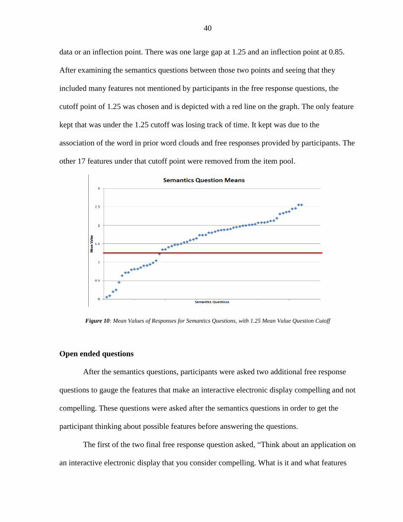
40
data or an inflection point. There was one large gap at 1.25 and an inflection point at 0.85.
After examining the semantics questions between those two points and seeing that they
included many features not mentioned by participants in the free response questions, the
cutoff point of 1.25 was chosen and is depicted with a red line on the graph. The only feature
kept that was under the 1.25 cutoff was losing track of time. It kept was due to the
association of the word in prior word clouds and free responses provided by participants. The
other 17 features under that cutoff point were removed from the item pool.
Figure 10: Mean Values of Responses for Semantics Questions, with 1.25 Mean Value Question Cutoff
Open ended questions
After the semantics questions, participants were asked two additional free response
questions to gauge the features that make an interactive electronic display compelling and not
compelling. These questions were asked after the semantics questions in order to get the
participant thinking about possible features before answering the questions.
The first of the two final free response question asked, “Think about an application on
an interactive electronic display that you consider compelling. What is it and what features
0
0.5
1
1.5
2
2.5
3
Me
an V
alu
e
Semantics Questions
Semantics Question Means
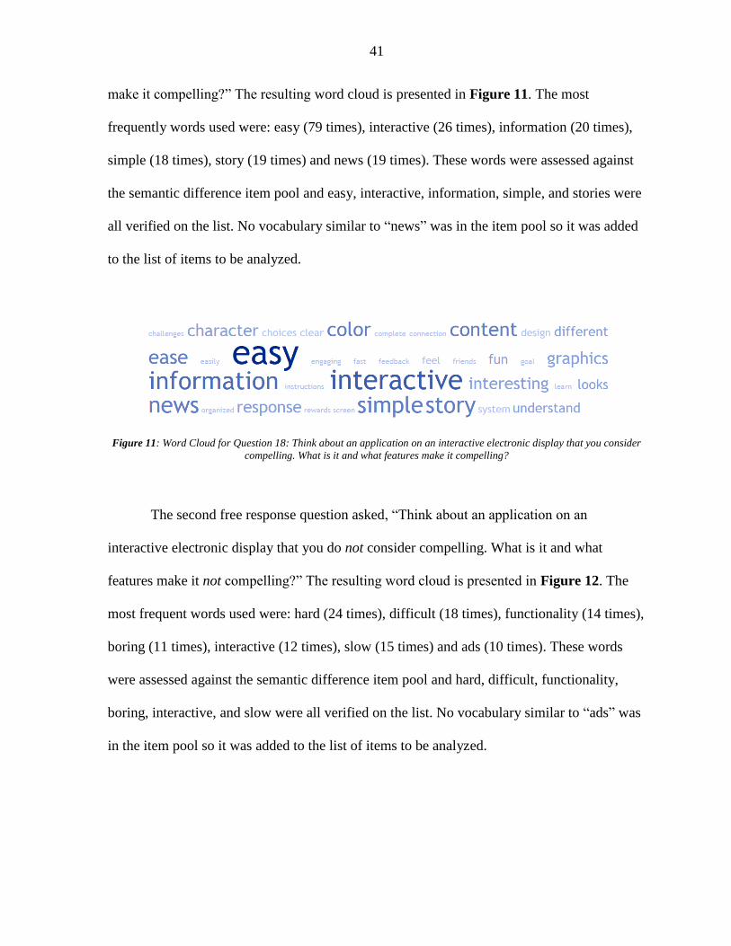
41
make it compelling?” The resulting word cloud is presented in Figure 11. The most
frequently words used were: easy (79 times), interactive (26 times), information (20 times),
simple (18 times), story (19 times) and news (19 times). These words were assessed against
the semantic difference item pool and easy, interactive, information, simple, and stories were
all verified on the list. No vocabulary similar to “news” was in the item pool so it was added
to the list of items to be analyzed.
Figure 11: Word Cloud for Question 18: Think about an application on an interactive electronic display that you consider
compelling. What is it and what features make it compelling?
The second free response question asked, “Think about an application on an
interactive electronic display that you do not consider compelling. What is it and what
features make it not compelling?” The resulting word cloud is presented in Figure 12. The
most frequent words used were: hard (24 times), difficult (18 times), functionality (14 times),
boring (11 times), interactive (12 times), slow (15 times) and ads (10 times). These words
were assessed against the semantic difference item pool and hard, difficult, functionality,
boring, interactive, and slow were all verified on the list. No vocabulary similar to “ads” was
in the item pool so it was added to the list of items to be analyzed.

42
Figure 12: Word Cloud for Question 19: Think about an application on an interactive electronic display that you do not
consider compelling. What is it and what features make it not compelling?
3.5 Discussion
The objective of Study 1 was to understand common word associations with
compellingness and identify any missed constructs not covered in literature. From the
definitions provided by participants from the free response questions, all portions of the
definition created in Chapter 2 were frequently used by participants.
The missed constructs that were identified from the free responses of users consisted
of the words “reviews”, “social”, “ads” and “media.” These construct were all used to
describe the influences in life that manipulate a user’s motivation. Many users reported
wanting to play a video game because of good reviews that they have heard about or talk
amongst their social network. The media also influenced their decisions and ads were
mentioned with a negative connotation in responses reporting that “too many ads” made an
application not compelling.
Analysis of responses led to the identification of an item that captures the idea that
extraneous information not relevant to the task at hand can distract participants and cause
their attention to be focused elsewhere. A review of the meaning behind each of these
constructs led to a deeper look into the constructs of motivation, persuasion and attention.
Ultimately, the questions “I am willing to continue with this task,” “After interacting with
this interface I am persuaded to take an action,” and “This interface was able to hold my

43
attention” were added with responses ranging from strongly disagree to strongly agree. These
were chosen to supplement the already existing constructs.
The item pool originally consisted of the items in Table 3 and those items were used
in the semantics questions in order to understand word association. Study 1 identified four
words that identified and described two additional items to this list from the free response
question as well as removed non-associated words because of the semantics question
responses. The result of Study 1 is a new, updated item pool that more closely represents all
the factors that go into compellingness. This revised item pool can be seen below in Table 5
and was used to create the initial compellingness survey.
Table 5: Final Item Pool
Items Items Items
visual and audio sync uninteresting dialogue story or narrative
Length of system response time number of choices to make desirability of system
satisfaction match between user expectations and system
actions require a lot of thought
functionality clarity of goals user reaction time
system is uninteresting user willingness mental engagement
ease of use effort necessary to use system sense of control
understandability user motivation display realism
convenience of display location order of information sense of being physically present with the environment provided by the system
interface consistency speed of feedback amount of distraction
legibility of instructions meaningfulness of information and result
standardization of interface
knowing what to do display resolution user feels energized
comprehension of system specificity of goals age of technology display
navigation of system increase in knowledge of topic system complexity
information quality output meaning to the user challenges present
quality of graphics directness of feedback Track of time
visual appeal of system immersion

44
CHAPTER 4
INITIAL SURVEY DEVELOPMENT
4.1 Theoretical Groupings
Objective
The objective of this chapter was to analyze all of the items in the item pool,
group them into categories, remove any repetitive items, and develop a final question list that
included each of the items. The question list was then tested in Study 2. The objective of this
first section was to group the items in the item pool into categories known as factors. This
Chapter includes Devellis’ (2012) Steps 3-5 including determining a scale format, an expert
review of the initial item pool, and determining the items or scales for testing construct
validity.
Methods
A card sorting method was used to analyze the relationship between the items in the
item pool. Similar items were grouped together into small groupings and then similar
groupings were also grouped together by their similarity. These categories were then
displayed on a concept map to visualize their relationships.
Results
Through the card sorting, 11 groups were defined: prior knowledge and interest,
intrinsic motivation, engagement, perceived ease of use, interest, knowledge state, aesthetic
quality, engaged learning, fidelity, goals/feedback, and layout design (see Figure 13). Further
discussion of the initial groupings from the card sorting exercise revealed relationships
between many of the groupings and thus three hypothesized overarching factors were

45
created. These three factors were: (1) the user’s beliefs and intentions with which they
approach the situation, (2) the features of the system such as the fidelity and information
provided, and (3) the interaction between the user and the system that affects things such as
the user’s sense of control or the perceived desirability of the system. Those three categories
or “factors” were labeled: the human, the system, and the interaction. Each of the small initial
groupings of items fell under one of these three factors and they became the second level
headers in the concept map found in Figure 13. Each of the small groupings of items were
given a title or overarching theme descriptor that is displayed above them. The computer
factor was renamed to “the system” to account for not just the computer itself, but also the
automation and the interface.

46
Figure 13: Concept Map of Compellingness, its 3 factors, 11 groupings and 47 items
Discussion
The factor structure that resulted from the card sorting was a two level structure
consisting of three overarching factors of human, system and interaction. This highlights the
importance of not just the system itself, but also what the user brings and the interaction
between the two. The second level consisted of 11 groupings identified in the card sorting,
each with their own items from the initial item pool. This concept map was then put through

47
a second expert review of the item pool to assess if there was remaining redundancy in the
item pool or opportunities to condense the survey.
4.2 Second Expert Review of Item Pool
Objective
From these initial groupings, a second expert review was performed to assess if there
was any remaining redundancy in the words used, a common level of abstraction among the
item pool, and if there were opportunities to condense the survey. The goal was to develop
the most efficient set of question in the initial survey that still covered all the principal
concepts.
Methods
The principle investigators then examined each of the individual factors to decide
which should be combined. The principle investigators looked for any redundancy as well as
the number of questions that were asked per item and per grouping. Items that described the
same concept were combined and items that seemed vague or could be interpreted incorrectly
were re-phrased.
Results
To start, factors were grouped together that were extremely similar such as the
responsiveness which consisted of the response time, direct feedback, visual and audio time
sync, reaction time and speed of feedback factors. The ease of comprehension was also
eliminated because of its similarities to the understandability and the mental engagement was

48
removed because of its similarity to immersion. The meaningfulness of info and result was
combined with the value of the output in the Human grouping. Functionality and
standardization were also removed as they seemed to be covered by the ease of use, ease of
navigation and understandability. Desirability seemed interesting but since the idea of the
survey is to assess the users’ view of the compellingness of the interface after the fact,
satisfaction, value of the output and willingness all seemed to cover the desirability.
The change in knowledge of the topic appeared too vague to assess and was similar to
the idea that the information provided is not what makes an interface compelling, it’s the way
that information is provided (Harrison and Gough, 1996). Because of this idea, coupled with
the idea that the display and application were the focus of this research, all topics regarding
the information and hardware not associated with the display were removed including the age
of the display, the quality of the information, the interesting dialogue and the display
location. The age of the display was redundant with the graphics quality and display
resolution as those were two key features that often already indicated age.
While the Game Engagement Questionnaire (Brockmyer et al, 2009) provided many
questions to help measure engagement, the features of challenges and choices present as well
as a story or narrative were too specific to games and could not be applied across many other
applications and thus were removed from the item pool. The effort necessary also seemed
less relevant to compellingness, as it is instead a feature of workload and thus was removed
(Hart and Staveland, 1988).
The final factor eliminated was the matchup between the user expectations and the
system. The system is designed with the user in mind so that when the user goes to interact
with the system, they do not have to think too much or get confused by the system or

49
interface, they can get right to performing the task (Gilbert, 2017). The ease of use, ease of
navigation and understandability of the system as well as the satisfaction of the user all cover
the matchup between the user expectations and the system.
The thinning of the question list contributes to DeVellis’ (2012) step of the expert
review of the item pool. With the additional review of each individual factor, underlying
constructs could be identified and redundant questions were removed to allow for a shorter to
be administered in Study 2. The final item pool of 28 items was used to create a question for
each constructs. This process is documented in the following section.
Twenty-eight of the forty-seven items remain after the expert review conducted in
this section. The remaining 28 items sorted into their groupings under the three factors can be
found in Figure 14.
Figure 14: Concept Map after expert review

50
4.3 Question Development
Objective and method
In order to measure each of the 28 items within 8 groupings under the 3 factors,
literature was referenced to find pre-designed survey questions for as many constructs as
possible. For the constructs where no relevant measure was already established, a question
was designed to assess the construct.
Similar surveys that obtain frequent use include the NASA TLX for workload (Hart
and Staveland, 1988), simulator sickness (Kennedy, Lane, Berbaum & Lilenthal, 1993), trust
(Jian, Bisantz & Drury, 2000) and the USE questionnaire (Lund, 2001). These questionnaires
ranged from four options to twenty and each had a negative to positive scaling with similar or
identical endpoints used for all questions. Because of this, a similar Likert scale was chosen
with the scale ranging from Strongly Disagree to Strongly Agree. Only five points were
selected in order to give the participant enough of a range to answer clearly, but not so much
to not be able to distinguish between two points on a scale. Points were labeled on the scale
that have been shown to be equally spaced.
Human Factor Questions
The “human” factor consists of the value the user has in the output, their motivation,
their satisfaction, and the willingness of the user to participate and interact with the interface.
These are completely to do with the user and will vary from user to user. The willingness is
measured by asking the user “I am willing to continue with this task” with options ranging
from strongly disagree to strongly agree in order to gauge how much they want to continue to
participate. Similarly, motivation was asked using a question similar to “How motivated were

51
you to use the system?” The value the user has in the output is measured by asking “How
much did the output matter to you?” and satisfaction was measured by an outright question as
well.
System Questions
The aesthetic quality grouping under the “system” factor includes visual appeal, order
of information, consistency, complexity of the system, and instruction legibility. Schaik and
Ling (2009) assessed five psychometric scales that can be used to measure the quality of
human computer interactions in websites. These scales consisted of a 9-item flow scale
developed by Davis and Widenbeck (2001) as a measure of intrinsic motivation, perceived
ease of use, perceived usefulness and disorientation scales by Ahuja and Webster (2001), and
a 7-item aesthetics scale developed by Tractinsky, Katz & Ikar (2000). The 7-item scale they
chose to use to judge the appearance of the webpage developed by Tractinsky, Katz & Ikar in
2000 can be seen in Table 6.
Table 6: Aesthetics Scale (Tractinsky, Katz & Ikar, 2000)
Q# Question
1 I judge the Web page to be Very complex 1 2 3 4 5 6 7 very simple
2 I judge the Web page to be Very illegible 1 2 3 4 5 6 7 very legible
3 I judge the Web page to be Very disordered 1 2 3 4 5 6 7 very ordered
4 I judge the Web page to be Very ugly 1 2 3 4 5 6 7 very beautiful
5 I judge the Web page to be Very meaningless 1 2 3 4 5 6 7 very meaningful
6 I judge the Web page to be Very incomprehensible 1 2 3 4 5 6 7 very comprehensible
7 I judge the Web page to be Very bad 1 2 3 4 5 6 7 very good

52
Six of the seven questions in the aesthetic quality scale addressed an item in the item
pool and were chosen to be used in the compellingness survey. The first question of the
aesthetic quality scale addressed the item “complexity of the system”, the second addressed
the item “legibility of the system”, the third addressed the item “order of the information”,
the fourth addressed how “visually appealing” the system was, the fifth addressed the “value
of the output”, the sixth addressed the “comprehension of the system”, and seventh did not
measure an item originally identified in this study and appeared too vague to address the
compellingness of the web page.
The other grouping within the system factor is the fidelity of the system which can be
defined as “the objective degree of exactness with which real-world experiences and effects
are reproduced by a computing system” (McMahan et al, 2012, p. 1). This grouping includes
the realism of the display, quality of graphics, physical interaction, response time of system,
and display resolution. This grouping consists of objective constructs that can easily be
measured on a 5-point Likert scale gauging the realism, quality, amount of interaction, and
resolution.
Interaction Factor Questions
The “interaction” factor contains four groupings including the intrinsic motivation,
engagement, perceived ease of use and goals/feedback. The intensity of flow is commonly
measured using a 9-item flow scale developed by Davis and Widenbeck (2001) as a measure
of intrinsic motivation. This scale is broken into two categories, involvement and control.
The control category measures the factors of the sense of control the user feels, the interest
and the ease of comprehension using the questions found in Table 7. Questions were created

53
for each of these groupings based on the Flow Scale (Davis and Widenbeck, 2001).
Birnbaum et al. (1997) argues that effective and interesting dialogues are what make a UI
more compelling. In fact, Birnbaum et al. (1997) interchanges the word interesting for the
word compelling when describing how to make a compelling UI.
Table 7: Flow Scale developed by Davis and Widenbeck (2001)
Q # Questions
1 I thought about other things
2 I had to make an effort to keep my mind on the activity
3 I was aware of distractions
4 I was aware of other problems
5 Time seemed to pass more quickly
6 I knew the right things to do
7 I felt like I received a lot of direct feedback
8 I felt in control of myself
9 I felt in harmony with the environment
Intrinsic motivation and engagement each contain many overlapping concepts. These
concepts had a question measuring them in both the flow scale (Davis and Widenbeck, 2001)
and in the Game Engagement Questionnaire (Brockmyer et al, 2009). One concept, for
example, is “losing track of time. In the flow scale, question 5 asks “time seemed to pass
more quickly”. Similarly, in the Game Engagement Questionnaire, question 1 asked “I lose
track of time”. Both questions measured the ability of the user to be aware of the amount of
time that had passed, but for the purpose of the compellingness survey, one of the two
questions had to be chosen. The overlapping concepts that can be found in both constructs
and that were also in the item pool included losing track of time, knowing what to do,
distraction, and automatic actions which could be measured using either the flow survey
questions #5, 6, 3 and 6 again from Table 7 or questions #1, 15, 6 and 2 from the game
engagement questionnaire found below in Table 8. The flow survey questions were selected

54
for the items “knowing what to do” and “being aware of distractions” and the Game
Engagement Questionnaire questions were chosen for “losing track of time” and “automatic
actions”. Along with the overlapping questions, engagement also includes the items
“tired/energized” and “immersion”. Questions 4, 5, 9, 13, 14, 16, 17 and 18 from Table 8
each represented a way to gauge immersion, but were combined to form the question “I feel
very immersed while interacting with this system.” To gauge how tired or energized the user
was, question 11 was selected from the Game Engagement Questionnaire for the
compellingness survey.
Table 8: Game Engagement Questionnaire developed by Brockmyer et al (2009)
Q # Questions
1 I lose track of time
2 Things seem to happen automatically
3 I feel different
4 I feel scared
5 The game feels real
6 If someone talks to me, I don’t hear them
7 I get wound up
8 Time seems to kind of stand still or stop
9 I feel spaced out
10 I don’t answer when someone talks to me
11 I can’t tell that I’m getting tired
12 Playing seems automatic
13 My thoughts go fast
14 I lose track of where I am
15 I play without thinking about how to play
16 Playing makes me feel calm
17 I play longer than I meant to
18 I really get into the game
19 I feel like I just can’t stop playing
Perceived ease of use consists of the ease of use, ease of navigation, and
understandability. Ahuja and Webster created a perceived ease of use scale in 2001 that can
be found in Table 9. This scale provides measures of the perceived ease of use and covers

55
the ease of use, ease of navigation and understandability. All three of these questions were
used in the compellingness survey to represent the ease of use, ease of navigation, and
understandability items.
Table 9: Perceived Ease of Use Scale developed by Ahuja and Webster (2001)
Q# Questions
1 Learning to use this site was easy
2 Becoming skillful at using the site was easy
3 The site was easy to navigate
The final grouping in the interaction factor is the goals/feedback section which
consists of having specific goals and the clearness of the goals. Educational books ask “How
clear were the goals of this web site?” (p. 43) and “How clear were the tasks you did today?”
(Johnson, Maddux and Ewing-Taylor, 2003, p. 43). Since this category consists of more
subjective measures, asking the participants’ opinion of the clearness of the goals and how
specific they were was the best route. Thus, the participants were asked the following
questions with responses ranging from strongly disagree to strongly agree: “The goals of the
interface were extremely clear” and “The goals were very specific”.
4.4 Final Question List
Due to the nature of the survey and its future uses, it is important that it is easy and
quick to use. Each of the questions chosen in Chapter 4 Section 3 could have been asked in
many different ways, but in order to encourage consistency, all were asked in a way in which
the participant could respond along a 5-point Likert scale of strongly disagree, disagree,
neutral, agree, and strongly disagree. The questions were also worded to sound consistent and
avoid confusion. For example, questions that started with “I judge this web page to be…”

56
such as I judge the web page to be…” ranging from very beautiful to very ugly was changed
to “The interface was very beautiful” ranging from strongly disagree to strongly agree. This
change was made since the interface the participant would be interacting with may not be a
web page. The final question list is presented in Table 10.
Table 10: Initial Question List for the Compellingness Survey
Q# Question Item Source
1 I am willing to continue with this task. Willingness New question developed
2 The output mattered to me. Value of output Tractinsky, Katz & Ikar, 2000
3 I was very motivated to use the system. Motivation New question developed
4 I got a lot of satisfaction from using the interface. Satisfaction New question developed
5 The goals of the interface were extremely clear. Clearness of goals Johnson, Maddux and Ewing-Taylor, 2003
6 The goals were very specific. Specific goals Johnson, Maddux and Ewing-Taylor, 2003
7 I lost track of time. Track of time Brockmyer et al, 2009
8 I found the interface to be interesting. Interesting Davis and Widenbeck, 2001
9 I felt in control of myself. Sense of control Davis and Widenbeck, 2001
10 Things seemed to happen automatically. Automatic actions Brockmyer et al, 2009
11 I had to make an effort to keep my mind on the activity. Distraction Davis and Widenbeck, 2001
12 The interface was easy to navigate. Ease of navigation Ahuja and Webster, 2001
13 Learning to use this site was easy. Ease of use Ahuja and Webster, 2001
14 Becoming skillful at using the site was easy. Understandability Ahuja and Webster, 2001
15 I felt very immersed while interacting with the system. Immersion Brockmyer et al, 2009
16 I feel very tired. Tired/energized Brockmyer et al, 2009
17 The interface was very beautiful. Visually appealing Tractinsky, Katz & Ikar, 2000
18 The interface was very ordered. Order of information Tractinsky, Katz & Ikar, 2000
19 The interface was consistent. Consistency Tonelli, 2012
20 The system had a high level of difficulty. Complexity of system
Tractinsky, Katz & Ikar, 2000
21 The instructions were easily legible in the interface. Instruction legibility Tractinsky, Katz & Ikar, 2000
22 The graphics quality was high. Quality of graphics New question developed
23 The display resolution was high. Display resolution New question developed
24 The display was very realistic. Realism of display New question developed
25 The system response time was very long. Response time New question developed
26 I had a lot of physical interaction with the system and interface.
Physical interaction New question developed
27 This interface was able to hold my attention. Study 1 Study 1
28 After interacting with this interface I am persuaded to take an action.
Study 1 Study 1

57
CHAPTER 5
STUDY 2
5.1 Introduction
The aim of this chapter was to empirically determine the validity and reliability of the
survey through Cronbach’s Alpha and to investigate the variable relationships in the concept
of compellingness through factor analysis. These statistical analyses methods were used
statistically assess which questions should remain in a final draft of the survey. The result of
Study 2 is an empirically-based compellingness survey instrument that can be used to assess
the level of compellingness of an interface.
5.2 Methods
Research objectives
Based on an extensive literature review and expert judgment, 28 initial questions
were formulated as contributors to overall compellingness, as described in Chapter 3-4. The
objective of this step in the research was to refine a survey that measures compellingness
down to its most parsimonious form. A factorial experiment was designed that manipulated
factors to create different interfaces to test. These factors were manipulated to create
interface conditions with different levels of compellingness. The resulting data set can be
used to study the cohesiveness and reliability of the survey questions. This study executes the
final three steps in DeVellis’s (2012) survey development: administer items to sample of
respondents, evaluate the items, adjust scale length. A factor analysis and Cronbach’s Alpha
were run on the data set to evaluate the items by grouping them into sub-factors with like
constructs, and to adjust the scale length by eliminating questions that do not load on the

58
factors or survey as a whole. These results were used to create a final survey that can be used
to measure compellingness. Additionally, ANOVA results were analyzed to see if the
manipulation of aspects of the display resulted in differing ratings of compellingness as
scored by the final survey.
Participants
This study was approved by the Iowa State Institutional Review Board (IRB #17-
052). Students, faculty and staff at a Midwest university as well as working professionals
were invited to participate in an on-campus study via sources such as flyers, emails, and
word of mouth. Participants were compensated with a chance to win one of 3 $50 gift cards.
Sixty participants completed the study in its entirety.
Of those 60, 23 identified as female, 37 identified as male, 0 identified as other and 0
chose not to answer. The average age of participants was 35.6 with a standard deviation of
14.9. Participants’ highest education received included 0 participants with some high school,
9 with a high school diploma, GED or similar, 12 with some college, 5 with an associate’s
degree, 21 with a bachelor’s degree, 12 with a master’s degree, 0 with a doctorate and 1 with
other. Of the fields the participants work in or are studying, 6 are in Agriculture and Life
Sciences, 11 are in Business, 1 are in Design, 18 are in Engineering, 2 are in Human
Sciences, 7 are in Liberal Arts and Sciences, 0 are in Veterinary Medicine and 15 are in
Other (mainly IT).
Participants were also asked how many hours per week that they spent their time on
the computer. The majority of respondents, 41, said 25+, 6 said 21-25, 4 said 16-20, 3 said
11-15, 1 said 6-10 and 3 said less than 5 hours per week.

59
Tasks and scenarios
Participants completed two map-based tasks, each requiring them to navigate between
four pre-loaded destinations. These included a “home” location, a “friend’s house” location,
an “accident” location and a final destination location that was either “restaurant” or “movie
theater.” They were then read the scenario about how they needed to pick up gas, then their
friend, avoid the accident, and get to their final destination as fast as possible with as few left
turns as possible. The map locations consisted of cities in Nevada and Tennessee to avoid
any location familiarity for the Midwestern participants.
The locations were chosen such that stopping for gas would make the route longer
and so would picking up their friend. The accident was chosen along the most likely route the
participant would choose which required them to make additional turns and decisions. If the
participant followed all of the instructions and met all of the requirements, their route would
have a minimum of 10 turns.
The constraint that they needed to make as few left turns as possible was added to
better immerse the participant in the task. Instead of being able to use the optimal route that
Google Map provides (in some conditions), participants had to consider each and every turn
that they made to determine whether it was a left or a right turn. If it was a left turn, they then
problem solved to figure out how to avoid it. They were also told that they needed to get
there as fast as possible so that participants did not take a long, scenic route with no left
turns. In both cases, participants were told that each of the requirements weighed equally on
their scoring so they needed to find a balance between the number of left turns and the
distance travelled. This required more planning and thought on the participants’ part.

60
Independent variables
The experiment had three independent variables, each with two levels (low, high):
motivation, display realism, and interactivity. Each of these three independent variables were
selected from one of the three hypothesized factors of compellingness, one from each. The
independent variables are summarized in Table 11.
Table 11: Study 2 Independent Variables
Factor Variable Low High
Human Motivation Chances of winning a gift card is not tied to performance
Higher performance results in higher chance to win gift card
System Display realism Map view Satellite view
Interaction Interactivity Route guidance allowed, participants choose where to deviate from the route
No route guidance allowed, participant makes all turn-by-turn decisions
Motivation
The human factor consisted of the following items: willingness, value of output,
motivation and satisfaction. Motivation was chosen as the independent variable to manipulate
since the willingness of the users would be expected to be related to the motivation, and
extrinsic motivation can be manipulated. The value of the output and the satisfaction would
be hard to control for participant groups. Intrinsic motivation of participants is often difficult
to manipulate and even more difficult to measure (Wiersma, 1992). Because of this, an
external monetary motivation was chosen to provide a greater amount of motivation to
college participants (Ariely, Brach & Meier, 2007).
In the low motivation condition, participants were told that their performance on the
task would determine how many entries into the gift card drawing they would get. If they
were in the top 10% of participants, they would receive ten entries, if they were in the 80th to
90th percentiles, they would receive nine entries and so on. The bottom 10% of participants

61
would only receive one entry. This competition was to encourage a higher motivation to
perform well and was expected to result in a higher level of compellingness.
In the low motivation condition, participants were told that numbers were randomly
selected to receive one to ten entries into the gift card drawing and their number was selected
to only receive one entry. In this low motivation condition, they received only one entry and
their number of entries was not tied to their performance. They were also led to believe that
other participants got more gift card entries than they did. Therefore, it was expected that the
participants would try less and be less motivated.
Display realism
The System factor was manipulated through the display realism. The display realism
was chosen for manipulation sinceit would not affect the task, but could cause a noticeable
difference in the display for the participant. Participants were either presented a map in
“map” view or “satellite” view of the city where they were to determine the route. The two
views can be seen in Figure 15. In the low display realism condition, the background was
light gray and only roads, water and parks were illuminated in a color. In the map view, it
was much easier for participants to see all of the roads and turns on the map. In the high
display fidelity condition, the map was in “satellite” view where the map background was
satellite imagery of the location. The satellite view presented higher resolution imagery of the
landscape.

62
Figure 15: (left) Map View of Task- Low Display Realism; (right) Satellite View of Task- High Display Realism
Interactivity
The third factor consisted of different features of the interaction that takes place
between the user and the interface. Interactivity is in part determined by levels of automation
used by the system (Sheridan & Verplank, 1978). Thus the factor was manipulated by
providvind the user with different levels of automation assistance in the navigation planning
task. Participants were asked to either complete the task using navigational assistance or no
navigational assistance. In the low interactivity condition shown in Figure 16, participants
were required to use route guidance where a blue “optimal route” was displayed on the map
that showed the fastest way to get to their final destination. This blue route was considered a
level 4 in the Levels of Automation (Parasuraman, Sheridan & Wickens, 2000) where the
computer “suggests one alternative”. This route, however, led them right through the
accident and had left turns so the participant was asked to indicate what route they would
take and where they would deviate from the blue route. This was the low interactivity
condition since participants were provided a route and were asked to make just a few
decisions about where they wanted to change the path. They had to interact with the interface
only a few times in those locations where they wanted to deviate from the path provided.

63
In the high interactivity condition shown in Figure 16, participants were not allowed
to use route guidance and were instead forced to make every turn-by-turn decision
themselves. This was considered a level 1 on the Levels of Automation (Parasuraman,
Sheridan & Wickens, 2000) where the computer “offered no assistance and the human must
take all decisions and actions”. Participants were expected to have a higher amount of
interaction with the interface in order to make every decision at every intersection.
Figure 16: (left) Low Interactivity Condition; (right) High Interactivity Condition
Dependent variables
The dependent variables measured were the responses to the compellingness survey
developed in Table 10, the participants’ responses to NASA TLX questions that measure
workload, completion time for each of the two tasks, and demographics including how often
participants spend on a computer in a week. Each of these variables were measured using an
online Qualtrics survey that participants took on the same IPad that they performed the task
on.
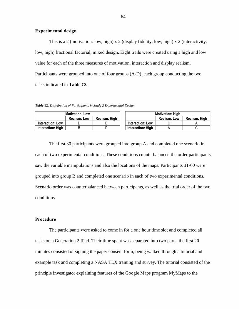
64
Experimental design
This is a 2 (motivation: low, high) x 2 (display fidelity: low, high) x 2 (interactivity:
low, high) fractional factorial, mixed design. Eight trails were created using a high and low
value for each of the three measures of motivation, interaction and display realism.
Participants were grouped into one of four groups (A-D), each group conducting the two
tasks indicated in Table 12.
Table 12: Distribution of Participants in Study 2 Experimental Design
Motivation: Low Motivation: High
Realism: Low Realism: High Realism: Low Realism: High
Interaction: Low D B Interaction: Low C A
Interaction: High B D Interaction: High A C
The first 30 participants were grouped into group A and completed one scenario in
each of two experimental conditions. These conditions counterbalanced the order participants
saw the variable manipulations and also the locations of the maps. Participants 31-60 were
grouped into group B and completed one scenario in each of two experimental conditions.
Scenario order was counterbalanced between participants, as well as the trial order of the two
conditions.
Procedure
The participants were asked to come in for a one hour time slot and completed all
tasks on a Generation 2 IPad. Their time spent was separated into two parts, the first 20
minutes consisted of signing the paper consent form, being walked through a tutorial and
example task and completing a NASA TLX training and survey. The tutorial consisted of the
principle investigator explaining features of the Google Maps program MyMaps to the

65
participant, and asking them to interact with it. The script for the tutorial and the rest of the
participant guide can be found in Appendix B. The features of the program highlighted were
how to open and close the legend, how to create locations, how to get driving directions, how
to hide layers, how to add lines, how to edit lines and how to plan a route along roads with as
few left turns as possible.
After the tutorial, participants were read a short training on the NASA TLX survey
and then took a practice NASA TLX survey on how much workload the training was. After
the survey, participants were read one of two prompts to manipulate their motivation. One
prompt explained to participants that they were competing for their number of entries into a
drawing for one of three $50 gift cards and the other prompt told them that participants were
randomly selected to receive 1-10 entries into the gift card drawing and they were selected to
only receive one.
The last 40 minutes consisted of being read the prompt for their first scenario,
completing their first scenario, the compellingness survey, a NASA TLX survey, being read
the prompt for their second scenario, completing the second scenario, the compellingness
survey, a NASA TLX survey, and finally, a demographics survey.
Data analysis plan
Four statistical methods were used to test the validity and reliability of a
questionnaire measuring compellingness: sampling adequacy, exploratory factor analysis,
Cronbach’s Alpha, and Confirmatory Factor Analysis (Field, 2009; Bornstedt, 1977; Rattray
& Jones, 2007). Once the compellingness survey instrument is finalized, an analysis of the 2
x 2 x 2 interface experiment data was conducted. Since the compellingness was hypothesized

66
to be the result of three factors (human, system, and interaction), the data analysis was run on
each of the factors as well as the total survey. For each factor, analysis was run to identify
sub-factors and questions that are candidates for elimination. The data analysis will be
presented in a three-step process of initial analysis and results, elimination decisions, and a
final analysis and results of the reduced question list for the factor.
Sampling adequacy
A reliable factor analysis requires two things: that the sample size be large and that
the variables are measured at an interval level (Field, 2009). In order to determine if the
sample size is large enough, the Kaiser-Meyer-Olkin measure of sampling adequacy (KMO)
was used (Field, 2009). If the KMO is close to zero, it will be difficult to extract factors but
the closer it is to one, factors can likely be extracted. All questions were measured on a
Likert scale which should be interpreted as an interval scale (Rattray & Jones, 2007).
For the Kaiser-Meyer-Olkin measure of sampling adequacy, Kaiser (1974) put the
following values on the results:
0.00 to 0.49 unacceptable.
0.50 to 0.59 miserable.
0.60 to 0.69 mediocre.
0.70 to 0.79 middling.
0.80 to 0.89 meritorious.
0.90 to 1.00 marvelous.
In addition to the KMO, Bartlett’s test (Snedecor and Cochran, 1983) is used to test if
the samples have equal variances. It is also sensitive to departures from normality and can
identify if the samples come from non-normal distributions (Nist, 2017). KMO and Bartlett’s
Test were reported for each of the three factors as well as the entire survey.

67
Exploratory factor analysis
Exploratory factor analysis was the first step used in order to achieve a multi-
dimensional measure that holds up under cross-validation. Factor analysis allows the testing
of construct validity of a questionnaire, meaning that if the questionnaire is considered
construct valid, all questions together represent the underlying construct well (Bornstedt,
1977; Rattray & Jones, 2007). Exploratory factor analysis is meant to detect the patterns and
constructs (or factors) that underlie a question set based on the correlation between the
questions (Field, 2009; Tabachnik & Fidell, 2001; Rietveld & Van Hout, 1993). Factors that
explain the most variance represent the underlying constructs (Hof, 2012).
Factor extraction produces a correlation matrix with eigenvectors that are a linear
representation of the variance that variables share (Field, 2009; Tabachnik & Fidell, 2001;
Rietveld & Van Hout, 1993). In order to decide how many factors to keep there are three
possible data analysis: the default of statistical packages keeps any eigenvalue over one, the
screeplot can be examined and all factors with values at the break point or below are
eliminated, or a likelihood factor analysis in R can be run. In this case, the screeplot will be
examined, any factor with an eigenvalue over one will be considered. When all factors with
eigenvalues over one are kept, it may lead to too many factors being retained (Costello &
Osborn, 2005), therefore the factor groupings with the most logical sense will be selected.
Additionally, the factor analysis will be re-run with chosen questions removed to confirm
that the correct number of factors was selected.
It may be confusing to think of a factor analysis on a factor but note that the factors
being identified through the factor analysis are actually second level factors (or sub-factors)
of the three proposed factors. In this work the term “factors” always refers to the three top

68
level factors (human, system, interaction), and “sub-factors” refers to any groupings of
questions under each of the three factors. When there are many extracted factors, sometimes
the same question loads on multiple factors, and it becomes difficult to determine the
construct the question represent. In factor analysis, the factors are rotated towards some
constructs and away from others. Rotation is a mathematical process where the axes of
factors is rotated within the multidimensional variable space to fit the actual data points
better and to make the factors more easily interpretable. There are two different types of
rotation, orthogonal which is used when factors are assumed to be independent, and oblique
when the factors are assumed to correlate (Field, 2009; Tabachnik & Fidell, 2001; Rietveld &
Van Hout, 1993). Since it can be assumed that all items in the questionnaire measure
compellingness an oblique rotation is expected to be appropriate and the factor analysis was
run with an oblique rotation. To be safe, an orthogonal and non-rotated factor analysis were
also run to visualize any differences between the rotations.
After running a factor analysis, a table of factor loadings is given. Factor loadings are
the correlations between a question and a factor and can range from -1 to 1 however the sign
does not matter. Often, factor loadings are considered high if they are greater than 0.6 and
moderately high if they are greater than 0.3. Any loadings lower than 0.3 show that the
questions doesn’t load on that factor and will likely either load on a different factor or is not
related (Kline, 2014).The questions that do load on the factor are grouped together. If a
question loads on two factors it can be grouped into the factor on which it loads higher.

69
Cronbach’s Alpha
Cronbach’s Alpha will be used to remove unnecessary questions. Cronbach’s Alpha
is used to measure the internal consistency and reliability of a survey. The reason it was
chosen as an analysis tool is that we can use it to see if all of the questions in the survey
reliably measure the same variable of compellingness. It will be used to get an overall alpha
value of the entire survey to get a big picture of if all the questions reliably measure
compellingness, but it will also be used on each of the principle components defined by the
factor analysis. Both of these analyses will identify questions that do not positively contribute
to the reliability of the questionnaire and are candidates for removal.
The output of running Cronbach’s Alpha produces a correlation matrix that shows
how each variable is related to each other. The output also includes an alpha value for the
entire set of questions as well as an alpha value for each of the individual questions. The
alpha value next to each of the individual questions represents what the entire set’s alpha
value would be if that question were to be eliminated. The closer an alpha value is to one, the
closer related the questions are so if an individual question’s alpha value is greater than the
alpha value of the entire set, that question should be considered for removal since it is
bringing down the correlation within the entire set.
Confirmatory Factor Analysis
A Confirmatory Factor Analysis was run to directly test the hypothesized model
which exploratory factor analysis does not have the ability to do (Harrington, 2009). A
Confirmatory Factor Analysis compares a hypothesized model to the data to see how well the

70
model describes the data. Resultant model fit statistics diagnose how good of a fit the
specified model is.
For Confirmatory Factor Analysis, sample sizes between 25 and 400 can be
considered small and the percentage of proper solutions, the accuracy of parameter estimates,
the appropriateness of the X2 test statistic, and the sampling variability in parameter estimates
were all influenced favorably by larger sample sizes (Boomsma & Hoogland, 2001; Gerbing
& Anderson, 1993). It is recommended that the sample size be at least 100 but 200 would be
more desirable (Boomsma, 1982). Convergence toward proper solutions and accuracy of
estimates is also positively influenced by increasing N, increasing the number of times each
variable is measured, and having higher factor loadings (Velicer & Fava, 1998; Marsh, Hau,
Balla & Grayson, 1998). With this study only running 60 participants, it was not likely to
find strong results for any proposed model. However it can be informative to conduct a
preliminary confirmatory factor analysis at this early stage to provide useful guidance for
future work.
Multiple model fit statistics were analyzed to determine the goodness of a fit
twoproposed survey models:Root Mean Squared Error of Approximation (RMSEA),
Comparative Fit Index (CFI), Tuker-Lewis Index (TLI), Akaike’s Information Criterion
(AIC), Bayesian Information Criterion (BIC), and Standardized Root Mean Square Residual
(SRMR). Table 13 summarizes these six model fit statistics, whether or not they are absolute
statistics that can be analyzed or comparative statistics that require multiple models to
compare the values, and what the success criteria are for each.

71
Table 13: Confirmatory Factor Analysis Model Fit Statistics
Metric Statistic Absolute or Comparative?
Criteria
Chi Square Goodness of Fit X2 Absolute p < .05
Root Mean Squared Error of Approximation RMSEA Absolute 0-0.01 excellent 0.01-0.05 good 0.05-0.08 mediocre 0.08-0.10 poor
Comparative Fit Index CFI Absolute CFI > 0.9 satisfactory
Tuker-Lewis Index TLI Absolute TLI > 0.9 satisfactory
Akaike’s Information Criterion AIC Comparative Lower indicates better fit
Bayesian Information Criterion BIC Comparative Lower indicates better fit
Standardized Root Mean Square Residual SRMR Absolute 0 perfect fit SRMR < 0.08 good fit
RMSEA is an absolute measure of fit based on the non-centrality parameter. A lower
value of the RMSEA is more desired. Commonly used cutoffs include 0.01 as excellent, 0.05
as good, 0.08 as mediocre, and 0.10 as poor (MacCallum, Browne and Sugawara, 1996).
The CFI and TLI are also based on the non-centrality measure but are incremental
measures between zero and one. They are often not reported or computed if the RMSEA of
the null model is less than 0.158 because one will obtain too small a value of the CFI (Kenny,
2014). A CFI and TLI value greater than 0.9 is considered a satisfactory fit (Awang, 2012).
The AIC and BIC are both comparative measures of fit and are only meaningful when
estimating two different models. Lower values indicate a better fit so the model with the
lowest AIC or BIC is the best fitting model however there are no cutoff values for the AIC or
BIC of an individual model. The SRMR is an absolute measure of fit and is the standardized
difference between the predicted correlation and the observed correlation. Because it is an
absolute measure of fit, zero indicates perfect fit and a value less than 0.08 is generally
considered a good fit (Hu & Bentler, 1999).

72
Analysis of experimental manipulations
To highlight whether or not the manipulations made in the study were strong enough
to make a noticeable and significant difference in participants’ responses, t-tests were run on
each of the three independent variables for the questions that corresponded to the
independent variable. The purpose of manipulating three independent variables was to
attempt to exercise the survey to its full extent to get participant responses across the full
range of scores. However, the data can also be analyzed to assess whether the different
experimental manipulations resulted in different levels of compellingness, workload, and
performance (time). Potential variables of completion time, gender of participant and task
order were assessed to see if they had any effect on the results. Additionally, NASA TLX
response scores were assessed to see if there was any difference in workload required for
each of the conditions.
A repeated measure analysis of variance (ANOVA) was used for the normally
distributed data. Since only half (four) of the combinations of the three independent variables
were conducted, it is not possible to do a complete factorial 2x2x2 ANOVA. The dependent
variables were thus analyzed using a one-way ANOVA with four levels (the four
combinations of the independent variables that were run). Results are reported as significant
for alpha <.05, and marginally significant for alpha <.10 (Gelman, 2013). The abbreviation
“ns” is used to denote non-significant results. Tukey post-hoc tests determined significance
between pairwise comparisons of normally distributed data groups. Results will present
letters above each group; the letters indicate significant (at the .05 level) pairwise differences
between groups when they do not share a letter. Cohen’s d calculated an effect size and

73
provides a standard measure that expresses the mean difference between two groups in
standard deviation units. Cohen’s d results are reported as small effects for .20 < d <.50,
medium effects for .50 < d <.80, and large effects for d >.80.
Limitations and assumptions
A limitation of this study was the limited types of interfaces this survey was tested on.
There is a very large array of devices, software and interfaces that this survey is developed to
be used on however this study only assessed one program on a single type of device
conducting a single task. Future work should look at a wider range of application of the
survey. Additionally, sixty participants were run, which is adequate for an exploratory factor
analysis but is considered a low number for confirmatory factor analysis and has been shown
negatively influence many model fit statistics (Boomsma & Hoogland, 2001; Gerbing &
Anderson, 1993).
Testing environment
The evaluation was conducted in both a private conference room and a private
laboratory. Up to two participants were able to participate at the same time and two iPad
Generation 2 models were used to conduct the evaluation. Participants were told to interact
with the IPad using only the stylus provided to them on the back of their pens. All maps and
surveys were conducted on the IPad in a Google Chrome browser. The map-based tasks were
conducted in a Google Maps program called MyMaps and the surveys were conducted in
Qualtrics.

74
5.3 Results
The results are split into five sections, the first three containing the analysis on each
of the three factors (human, system and interaction), the fourth containing the analysis of the
whole survey, and the final section reporting the results of the manipulations of the
independent variables. Each of the first three sections will be presented in a three-step
process of initial results and analysis, elimination decisions, and finally a follow-up analysis
of the results of the remaining items. This will be followed by the fourth section which
contains a review of the entire resultant survey after eliminations.
Human predicted factor
The “Human” predicted factor was one of three initial predicted factors from the card
sorting exercise in Chapter 4.1. This factor consisted of questions 1-4 that can be found in
Table 10.
Sampling adequacy
The Kaiser-Meyer-Olkin measure of sampling adequacy for the predicted human
factor had a value of 0.764. Using the results values presented by Kaiser (1974), the resulting
KMO of 0.764 is middling and can be considered high enough that factor analysis can be run
on this data. The Bartlett’s Test of Sphericity, which tests the overall significance of all the
correlations within the correlation matrix, was significant (2(6) = 154.253, p < .05) and thus
the assumption of equal variances is valid and indicating that it was appropriate to use the
factor analytic model on this set of data.

75
Full Cronbach’s Alpha
Cronbach’s Alpha for the entire set of questions in the Human factor was 0.800 The
Alpha value for each of the four questions can be found in Table 14.
Table 14: Output of Cronbach's Alpha on Full Human factor questions
Question Number Alpha Value
Q1 0.784
Q2 0.765
Q3 0.694
Q4 0.751
From the Cronbach’s Alpha it can be seen that none of the questions have alpha
values higher than that the overall alpha value of 0.800, therefore, none of the four questions
should be considered for removal.
Full exploratory factor analysis
First, a plot of the eigenvalues was created during the factor analysis. It is typical to
say that the number of eigenvalues whose value is greater than one is equivalent to the
number of factors that make up the list of questions. The eigenvalues for the Human factor
can be found below in Figure 17.
Figure 17: Eigenvalues of Full Human Factor

76
From the eigenvalues in Figure 17, it can be seen that one factor would likely
describe the data. However, eigenvalues are not the only way to determine how many factors
the questions break into so a look at the variance explained by each factor and the factor
loadings were also included in the analysis. The solution for one factor was examined. The
results of the principle components factor analysis, including the factor loadings, can be seen
in Table 16.
Table 15: Factor Loadings for 1 Factor in the Full Human Factor
Questions Factor Loadings on Interest and Value sub-factor
I am willing to continue with this task. 0.73
The output mattered to me. 0.77
I was very motivated to use the system. 0.87
I got a lot of satisfaction from using the interface. 0.80
In this case, since there is only one expected factor, there was no need to rotate how
the questions loaded on the factors so the un-rotated factor loadings were used. All four
questions load on the single proposed factor much higher than the 0.6 “moderately high”
cutoff and thus are well described by that factor. Additionally, a large percentage (63.13%)
of the variance in responses can be described using just the one factor. As a result, one sub-
factor was chosen and no questions were eliminated for the proposed Human factor. The start
of the factor tree for compellingness can be seen in Figure 18

77
Figure 18: Factor Tree for Compellingness including H
System predicted factor
The “System” predicted factor was the second of three initial predicted factors from
the card sorting exercise in Chapter 4.1. This factor consisted of questions 17-26 that can be
found in Table 10.
Sampling adequacy
The Kaiser-Meyer-Olkin measure of sampling adequacy for the predicted system
factor had a value of 0.767. The resulting KMO of 0.767 is middling Kaiser (1974) and can
be considered high enough that factor analysis can be run on this data. The Bartlett’s Test of
Sphericity was significant (2(45) = 370.430, p < .05) and thus the assumption of equal
variances is valid and indicated that it was appropriate to use the factor analytic model on this
set of data.
Full Cronbach’s Alpha

78
From the Cronbach’s Alpha, the overall alpha value for the full system factor is
mediocre at 0.517. Two of the questions from Table 16had higher alpha values: Q20 at 0.652
and Q25 at 0.631. Each of these alpha values means that if that question were to be
eliminated, the resultant alpha value would increase to the corresponding number. An alpha
value was not given for the case of eliminating both questions, however, a second
Cronbach’s Alpha will be run after questions are eliminated. As a result of this analysis, Q20
and Q25 were strongly considered for elimination.
Table 16: Output of Cronbach's Alpha on Full System Factor
Question Number Alpha Value
Q17 0.405
Q18 0.422
Q19 0.458
Q20 0.652
Q21 0.484
Q22 0.376
Q23 0.398
Q24 0.445
Q25 0.631
Q26 0.499
Full exploratory factor analysis
Exploratory Factor Analysis was used on the proposed System factor to see if there
were any sub-factors that contributed to the factor. The KMO was high enough to confidently
say that the data is fit for factor analysis. First, a plot of the eigenvalues was created during
the factor analysis and can be found in Figure 19.

79
Figure 19: Eigenvalues of Full System Factor
The eigenvalues in Figure 19 suggest that up to three factors can be used to group the
questions in the System factor. However, eigenvalues are not the only way to determine how
many factors the questions break into, so a look at the variance explained by each factor, the
factor loadings, and which questions were grouped together were also included. Solutions for
one, two and three factors were each examined using Promax and Quartimin rotations of the
factor loading matrix. The two factor solution, which explained 56.63% of the variance and
can be found in Table 17, was preferred because of: (a) its previous theoretical support from
the card sorting in chapter 4.1; (b) the ‘leveling off’ of eigenvalues on the scree plot after two
factors; and (c) the insufficient number of primary loadings and difficulty of interpreting the
one or three factor solutions. Note that Table 17 only contains the factor loadings that are
above 0.35 since factor loadings below that value mean that the question does not load very
much on the factor. There was little difference between the two factor Promax and Quartimin
solutions, thus both solutions were examined in subsequent analyses before deciding to use a
Quartimin rotation for the final solution.
Table 17: Factor Loadings (>.35) for 2 Factors in the Full System Factor. Factor loadings <.35 are suppressed.
Q# Question Wording Factor Loadings on Aesthetic Quality
Factor Loadings on Fidelity sub-factor

80
sub-factor
17 The interface was very beautiful. 0.40 0.51
18 The interface was very ordered. 0.73
19 The interface was consistent. 0.83
20 The system had a high level of difficulty. -0.81
21 The instructions were easily legible in the interface. 0.40
22 The graphics quality was high. 0.79
23 The display resolution was high. 0.84
24 The display was very realistic. 0.62
25 The system response time was very long. -0.51
26 I had a lot of physical interaction with the system and interface.
From the card sorting method in Chapter 4.1, questions 17-21 were originally
identified in a grouping called “aesthetic quality” and questions 22-26 were originally in a
grouping called “fidelity.” The two factor groupings mirror that grouping almost perfectly
except that question 25 switched from fidelity to aesthetic quality and question 26 did not
load on either factor. Additionally, question 17 loaded on both factor one and two but was
chosen to be grouped into factor one, even though it loaded higher on factor two in this case.
Two factors described a good portion (56.63%) of the variance in responses as well.
As a result, two sub-factors were chosen and question 26 was considered for elimination for
the proposed System factor. The first sub-factor, consisting of questions 17-21 and 25 was
named aesthetic quality to match the naming of the grouping from the card sorting in Chapter
4.1. The second sub-factor consisted of questions 22-24 and 26 and was named fidelity to
match the card sorting title.
Elimination decisions
From the Cronbach’s Alpha analysis, two questions were identified that would raise
the overall alpha value a large amount. Question 20 (The system had a high level of
difficulty) was identified that its elimination would raise the alpha value by 0.135, and
question 25 (The system response time was very long) was identified to raise the alpha value

81
by 0.115 if it was eliminated. Both of these are large increases in the alpha value and
therefore both questions were chosen to be eliminated. Question 20 loaded surprisingly high
on the first factor, however it increased the alpha value too much to be kept. Question 25
loaded relatively low on both factors which confirmed the decision to eliminate it.
From the full exploratory factor analysis, 2 sub-factors were chosen to most
accurately describe the breakout of questions in the System factor. One question was found
to not fit with the two chosen sub-factors and thus must be considered for elimination.
Question 26 (I had a lot of physical interaction with the system and interface) loaded low on
both factors and would barely decrease the Cronbach’s Alpha value (0.017) if it were to be
eliminated and therefore was eliminated.
Reduced Cronbach’s Alpha
After eliminating questions 20, 25 and 26, Cronbach’s Alpha was conducted on the
remaining questions to get a view of how well the new set of questions relate to each other.
This analysis can be found in Table 18.
Table 18: Output of Cronbach's Alpha on Reduced System Factor
Question Number Alpha Value
Q17 0.747
Q18 0.744
Q19 0.752
Q21 0.811
Q22 0.731
Q23 0.744
Q24 0.794

82
The alpha value of the entire set originally was 0.517 before eliminating questions.
After elimination, it became 0.789. Analysis of this second Cronbach’s Alpha shows two
additional questions would increase the alpha value a small amount. Question 21 (The
instructions were easily legible in the interface) would increase the alpha value by 0.022 and
question 24 (The display was very realistic) would increase the alpha value by 0.005. Both of
these questions would increase the alpha value, but that increase would be quite small and
therefore both questions were kept.
Reduced exploratory factor analysis
After eliminating questions 20, 25 and 26, an exploratory factor analysis was
conducted on the remaining questions to see if these new factors would be identified as the
only two factors contributing to the data. The eigenvalues for this analysis can be found in
Figure 20.
Figure 20: Eigenvalues of Reduced System Factor
These eigenvalues identify two factors being the ideal number of factors for this
group of questions. The factor loadings can be seen in Table 19.
Table 19: Factor Loadings for 2 Factors in the Reduced System Factor. Factor loadings <.35 are suppressed.
Q# Question Wording Factor Loadings on Fidelity sub-factor
Factor Loadings on Aesthetic Quality sub-factor
17 The interface was very beautiful. 0.53 0.38
18 The interface was very ordered. 0.72

83
19 The interface was consistent. 0.77
21 The instructions were easily legible in the interface. 0.69
22 The graphics quality was high. 0.87
23 The display resolution was high. 0.92
24 The display was very realistic. 0.57
The factors have switched sides, but the same questions still remain in each of the two
factors and each question has similar factor loadings to the previous factor analysis. The
factor loadings for questions 22 and 23 both increased. This confirms the two sub-factor
selection choice. The resultant sub-factors and their loadings, after eliminating the three
questions identified through Cronbach’s Alpha and the Exploratory Factor Analysis can be
seen in the factor tree for compellingness in Figure 21.
Figure 21: Factor Tree for Compellingness including H and S
Interaction predicted factor
The “Interaction” predicted factor was the final of three initial predicted factors from
the card sorting exercise in Chapter 4.1. This factor consisted of questions 5-16 and 27-28
that can be found in Table 10.
Sampling adequacy

84
The Kaiser-Meyer-Olkin measure of sampling adequacy for the predicted interaction
factor had a value of 0.799. Using the results values presented by Kaiser (1974), the resulting
KMO of 0.799 is middling and can be considered high enough that factor analysis can be run
on this data. The Bartlett’s Test of Sphericity, which tests the overall significance of all the
correlations within the correlation matrix, was significant (2(91) = 633.92, p < .05) and thus
the assumption of equal variances is valid and indicating that it was appropriate to use the
factor analytic model on this set of data.
Full Cronbach’s Alpha
From the Cronbach’s Alpha the overall alpha value for the full interaction factor is
high at 0.728. Four of the questions from Table 20 had higher alpha values: Q7 at 0.756,
Q10 at 0.730, Q11 at 0.772 and Q16 at 0.771. As a result of this analysis, Q7, Q11 and Q16
were strongly considered for elimination and Q10 was considered as well.
Table 20: Output of Cronbach's Alpha on Full Interaction Factor
Question Number Alpha Value
Q5 0.706
Q6 0.717
Q7 0.756
Q8 0.683
Q9 0.688
Q10 0.730
Q11 0.772
Q12 0.674
Q13 0.684
Q14 0.682
Q15 0.684
Q16 0.771
Q27 0.692
Q28 0.696

85
Full exploratory factor analysis
Exploratory Factor Analysis was used on the proposed Interaction factor to see if
there were any sub-factors that contributed to the factor. The KMO was high enough to
confidently say that the data is fit for factor analysis. First, a plot of the eigenvalues was
created during the factor analysis and can be found in Figure 22.
Figure 22: Eigenvalues of Full Interaction Factor
From the eigenvalues in Figure 22, it can be seen that up to four factors can be used
to group the questions in the Interaction factor. However, eigenvalues are not the only way to
determine how many factors the questions break into, so a look at the variance explained by
each factor, the factor loadings, and which questions were grouped together were also
included. Solutions for one, two, three and four factors were each examined using Promax
and Quartimin rotations of the factor loading matrix. The three factor solution, which
explained 62.351% of the variance, was preferred because of: (a) its previous theoretical
support from the card sorting exercise in Chapter 4.1; (b) the ‘leveling off’ of eigenvalues on
the scree plot after three factors; and (c) the insufficient number of primary loadings and
difficulty of interpreting the one, two and four factor results. Again, factor loadings less than
.35 were not included in the table to better visualize which questions actually loaded on

86
which factors. There was little difference between the three factor Promax and Quartimin
solutions, thus both solutions were examined in subsequent analyses before deciding to use a
Quartimin rotation for the final solution found in Table 21.
Table 21: Factor Loadings (>.35) for 3 Factors in the Full Interaction Factor. Note, Factor loadings <.35 are suppressed
Q# Question Wording Factor Loadings on perceived ease of use sub-factor
Factor Loadings on interest and attention sub-factor
Factor Loadings on goals and actions sub-factor
5 The goals of the interface were extremely clear. 0.64
6 The goals were very specific. 0.76
7 I lost track of time. 0.72
8 I found the interface to be interesting. 0.62
9 I felt in control of myself. 0.68
10 Things seemed to happen automatically. 0.47 -0.60
11 I had to make an effort to keep my mind on the activity. -0.49 -0.42
12 The interface was easy to navigate. 0.76
13 Learning to use this site was easy. 0.82
14 Becoming skillful at using the site was easy. 0.80
15 I felt very immersed while interacting with the system. 0.73
16 I feel very tired.
27 This interface was able to hold my attention. 0.46 0.62
28 After interacting with this interface I am persuaded to take an action.
0.56
The original card sorting method had the questions split into five groupings:
goals/feedback (Q5-6), intrinsic motivation (Q7-11), perceived ease of use (Q12-14),
engagement (Q15-16), and questions added from study 1 (Q27-28). While the three factor
option does not keep all of the items together in their original groupings, groupings such as
the perceived ease of use remained together in the same factor. Question 16 (I feel very tired)
did not load on either factor and thus was considered for elimination.
Three factors described a good portion (62.35%) of the variance in responses as well.
As a result, three sub-factors were chosen and question 16 was considered for elimination for
the proposed Interaction factor. The first sub-factor, consisting of questions 9, 12-14 and 28

87
was named perceived ease of use to match the title given to questions 12-14 in Chapter 4.1’s
card sorting exercise. The second sub-factor consisted of question 7-8, 11, 15 and 27 and was
named interest and attention. The third and final factor consisted of questions 5-6 and 10 and
was named goals and actions.
Elimination decisions
From the Cronbach’s Alpha analysis, three questions were identified that would raise
the overall alpha value a large amount and one a small amount. Question 7 (I lost track of
time) was identified that is elimination would raise the alpha value by 0.0282, question 10
(Things seemed to happen automatically) was identified to raise the alpha value by 0.0020,
question 11 (I had to make an effort to keep my mind on the activity) was identified to raise
the alpha value by 0.0442, and question 16 (I feel very tired) was identified to raise the alpha
value by 0.0434 if it was eliminated. Questions 7, 11 and 16 all resulted in moderate
increases in the alpha value and were eliminated.
Reduced Cronbach’s Alpha
After eliminating questions 7, 11 and 16, Cronbach’s Alpha was conducted on the
remaining questions to get a view of how well the new set of questions relate to each other.
This analysis can be found in Table 22.
Table 22: Output of Cronbach's Alpha on Reduced Interaction Factor
Question Number Alpha Value
Q5 0.841
Q6 0.846
Q8 0.830
Q9 0.826
Q10 0.862
Q12 0.818
Q13 0.826
Q14 0.826
Q15 0.830

88
Q27 0.829
Q28 0.839
The alpha value of the entire set originally was 0.728 before eliminating questions.
After elimination, it became 0.847. As expected, analysis of this second Cronbach’s Alpha
shows one additional question would increase the alpha value a small amount. Question 10
(Things seemed to happen automatically) would increase the alpha value by 0.015 however
that increase would be small and therefore question 10 was kept.
Reduced exploratory factor analysis
After eliminating questions 7, 11 and 16, an exploratory factor analysis was
conducted on the remaining questions to see if these new factors would be identified as the
only three factors contributing to the data. The eigenvalues for this analysis can be found
below in Figure 23.
Figure 23: Eigenvalues of Reduced Interaction Factor
These eigenvalues identify three factors being the ideal number of factors for this
group of questions. The factor loadings can be seen in Table 23.

89
Table 23: Factor Loadings for 3 Factors in the Reduced Interaction Factor. Note, factor loadings <.35 are suppressed
Q# Question Wording Factor Loadings on perceived ease of use sub-factor
Factor Loadings on interest and attention sub-factor
Factor Loadings on goals and actions sub-factor
5 The goals of the interface were extremely clear. 0.50 0.57
6 The goals were very specific. 0.81
8 I found the interface to be interesting. 0.66
9 I felt in control of myself. 0.65
10 Things seemed to happen automatically. -0.61
12 The interface was easy to navigate. 0.70
13 Learning to use this site was easy. 0.91
14 Becoming skillful at using the site was easy. 0.82
15 I felt very immersed while interacting with the system. 0.94
27 This interface was able to hold my attention. 0.91
28 After interacting with this interface I am persuaded to take an action.
0.58
The same questions remain in each factor except question 28 (After interacting with
this interface I am persuaded to take an action) which has switched from the ease of use
factor to the interest and attention factor. The questions also have similar factor loadings and
the factor loadings for questions 5, 6, 8, 10, 13, 14, 15, 27 and 28 (all but 9 and 12) all
increased. This confirms the three sub-factor selection choice. The resultant sub-factors and
their loadings after eliminating the three questions identified through Cronbach’s Alpha and
the Exploratory Factor Analysis can be seen in the factor tree for compellingness in Figure
24.

90
Figure 24: Final Factor Tree for Compellingness
Complete survey analysis with eliminated factors
Sampling adequacy
The Kaiser-Meyer-Olkin measure of sampling adequacy for the entire survey minus
the six eliminated questions had a value of 0.866. The resulting KMO of 0.866 is meritorious
Kaiser (1974) and can be considered high enough that factor analysis can be run on this data.
The Bartlett’s Test of Sphericity was significant (2(231) = 1447.451, p < .05) and thus the
assumption of equal variances is valid and indicating that it was appropriate to use the factor
analytic model on this set of data.
Reduced Cronbach’s Alpha
The overall alpha value of the entire reduced survey from Cronbach’s Alpha was high
at 0.916. As can be seen in Table 24, two questions just barely had higher alpha values than

91
the overall: Q10 at 0.921 and Q21 at 0.916. The increases are miniscule at 0.005 and 0.0002
and do not warrant elimination.
Table 24: Output of Cronbach's Alpha on Reduced Full Survey
Question Number Alpha Value
Q1 0.913
Q2 0.914
Q3 0.909
Q4 0.908
Q5 0.913
Q6 0.914
Q8 0.909
Q9 0.909
Q10 0.921
Q12 0.908
Q13 0.910
Q14 0.910
Q15 0.911
Q17 0.911
Q18 0.910
Q19 0.910
Q21 0.916
Q22 0.912
Q23 0.913
Q24 0.915
Q27 0.910
Q28 0.913
Confirmatory Factor Analysis: First Order Model
Based on the results of the EFA, the first order model was constructed as show in
Figure 25.

92
Figure 25: First Order Factor Model
A chi-square test of goodness-of-fit was performed to determine whether the six first
order factors were equally distributed. Responses to the six first order factors was not equally
distributed in the population, X2 (194) = 415.53, p < .0001. The Chi Square goodness of fit
statistic suggests that the model may not fit the data all that well. However, the rest of the
goodness of fit statistics can provide more information.
From the model fit statistics of this model, the CFI = .834, the TLI = .803, and the
RMSEA = .098. The RMSEA was in the mediocre range but very close to the poor range.
Since the RMSEA was less than 0.158, the CFI and TLI are not very useful but were both not
in the satisfactory fit range. The AIC = 6287.818 and the BIC = 6513.60. Since these are both
comparative measures, they do not have cutoff values but will be compared to the alternative
model. The SRMR = 0.091 which is much higher than the 0.08 cutoff for a good fitting

93
model. From these model fit statistics, there are no statistics that say that this model is a good
fit for the data.
Confirmatory Factor Analysis: Second Order Model
Based on the results of the EFA, the second order model was constructed as shown in
Figure 26.
Figure 26: Second Order Factor Model
A chi-square test of goodness-of-fit was performed to determine whether the six first
order and three second order factors were equally distributed. Responses to the six first order
factors was not equally distributed in the population, X2 (201) = 440.22, p < .0001. This
suggests that the model may not fit the data all that well. However, the rest of the goodness
of fit statistics can provide more information.
From the model fit statistics of this model, the CFI = .821, the TLI = .794, and the
RMSEA = .100. The RMSEA was in the poor fit range. Since the RMSEA was less than

94
0.158, the CFI and TLI are not very useful but were both not in the satisfactory fit range. The
AIC = 6298.513 and the BIC = 6504.788. The AIC value was larger than the previous model
and the BIC as smaller than the previous model. Both of these are comparative measures and
can be used to compare alternative models. Seeing as the AIC and the BIC were not both
higher for one model and the other model fit statistics were all poor for both models, it can be
concluded that neither of these models is a good fit for the data. The standardized root mean
square residual (SRMR) = 0.096 which is much higher than the 0.08 cutoff for a good fitting
model. From these model fit statistics, there are no statistics that say that this model is a good
fit for the data.
Analysis of experimental manipulations
The purpose of manipulating three independent variables was to attempt to exercise
the survey to its full extent to get participant responses across the full range of scores.
Responses were received for all questions across the full range of values from -3 to 3,
however the manipulations of the three independent variables was subtle and an analysis
must be run to determine whether there was a significant difference between the trials.
Analysis of Variance (ANOVA) was used to determine if the independent variable
manipulations actually did make a difference.
Variable checks
To begin, a check was done to see if there were any affects due to the location the
task took place (Nevada or Tennessee), the gender of the participant (Male or Female), or the

95
Trial Order (first or second). This analysis was conducted using 2-way ANOVA tests to
ensure that there were no underlying variables that cause variability in the data. The main
effect of location of the tasks was not significant, F(1,56) = 2.89, p = .095 ns. Participants did
not rate the study significantly differently between the Nevada and Tennessee locations.
The main effect of trial number was also not significant, F(1,56) = 2.91, p = .093 ns.
Participants did not perform significantly differently in the same task when it was performed
either first or second. The main effect of gender was not significant, F(1,56) = 2.26, p = .14
ns. This meant that there was not a significant difference in responses between male and
female respondents.
NASA TLX
Figure 27 shows a graph of the means and standard error for separate analysis of
each of the size NAS TLX scales. For each scale, post hoc Tukeys analysis determined if any
of the four conditions were significantly different from each other. When two results (for an
individual question scale) do not share a letter, then they are significantly different from each
other. Only the four conditions for each NASA TLX can be compared, each of the six scales
displayed in Figure 27 are a separate analysis. For example, the first two columns for the
mental demand question can be compared against each other but they cannot be compared to
the first to columns of the physical demand question.

96
Figure 27: Mean Responses and Standard Errors for each NASA TLX Question and Independent Variable Manipulation
Condition
The letters above the bars indicate which conditions are significantly different from
each other. If two or more bars do not share a letter, they are significantly different from each
other. In this case, two levels of conditions were significantly different for mental demand,
F(78.16) = 7.81, p < .001. In the case of high motivation, two levels of conditions were found
to be significantly different between the high display realism, low interactivity condition and
the low display realism, high interactivity condition for completion time, p = .023.
Additionally, a significant difference was found between the high motivation, high display
realism, low activity condition and the low motivation, low display realism, high interactivity
condition, p < .001.
Two levels of condition were found to be significantly different for physical demand,
F(78.16) = 3.50, p = .019. A significant difference was found for the case of high motivation,

97
high display realism and low interactivity and high motivation, low display realism and high
interactivity, p = .015.
Two levels of condition were found to be significantly different for temporal demand,
F(78.16) = 7.70, p < .001. A significant difference was found for the case of high motivation,
high display realism and low interactivity and high motivation, low display realism and high
interactivity, p = .007. Additionally, a significant difference was found in the case of high
motivation, high display realism and low interactivity and low motivation, low display
realism and high interactivity, p < .001.
No significant difference of condition was found on performance, F(78.16) = 0.73, p
= 0.54 ns. A significant difference of condition was found on effort, F(78.16) = 4.34, p =
.007. A significant difference was found in the case of high motivation, high display realism
and low interactivity and high motivation, low display realism and high interactivity, p =
.009.
No significant difference of condition was found on frustration, F(78.16) = 2.51, p =
.06, however a significant difference of condition was in the case of high motivation, high
display realism and low interactivity and low motivation, low display realism and high
interactivity, p = .041.
Task completion time
A main effect of condition on the resulting task completion time was significant,
F(3,78.2) = 8.71, p < .001. Post-hoc Tukey’s Test was conducted to identify which
conditions were significantly different than each other. The letters above the bars indicate
which conditions are significantly different from each other. If two or more bars do not share

98
a letter, they are significantly different from each other. The four conditions can be seen in
Figure 28, which shows the means, error bars and results of Tukey’s Test for the 1-way
ANOVA of completion time and condition.
Figure 28: Mean Completion Times and Standard Error for each Independent Variable Manipulation Condition
In the case of high motivation, a main effect was found between the high display
realism, low interactivity condition and the low graphics quality, high interactivity condition
for completion time, p = .001. A main effect was also found for the high motivation, high
display realism and low interactivity condition and the low motivation, low display realism,
high interactivity condition, p = 0.017. Two more main effects were also found, one between
the low motivation, high display realism, low interactivity condition and the high motivation,
low display realism, high interactivity condition, p = .006; the other between the low
motivation, high display realism, low interactivity condition and the low motivation, low
display realism, high interactivity condition, p = .006.

99
Independent variable manipulations
To highlight whether or not the manipulations made in the study were strong enough
to make a noticeable and significant difference in participants’ responses, t-tests were run on
each of the three independent variables for the questions that corresponded to the
independent variable. The main effect of motivation was not significant on the average scores
of the human factor questions of the survey, t(58) = 0.71, p = 0.48 ns, d = 0.17. Participants
between the high motivation and low motivation manipulation conditions did not differ on
the reported responses to the human factor questions. The main effect of display realism was
also not significant t(58) = -0.71, p = .48 ns, d = 0.08. Participants between the map view and
satellite view display realism manipulation conditions did not differ on the reported
responses to the system factor questions.
The main effect of interactivity was significant on the average scores of the
interaction factor questions of the survey, t(58) = -2.67, p = .010, d = .35. Participants
between the high interactivity and low interactivity manipulation conditions differed on the
reported responses to the interaction factor questions.
Additionally, Tukey’s test was run for each of the groupings of questions identified in
Chapter 4’s human, system and interaction factors. The purpose of the ANOVA was to see if
there was a significant difference in responses to certain types of questions between the
independent variable conditions. One analysis was run for each of the three first-level factors
as well as a fourth analysis run for the mean response across all questions in all factors. The
results of these Tukeys are summarized in Figure 29.

100
Figure 29: Mean Responses and Standard Error for each Factor Question Grouping
Each independent variable condition is the same as reported before. The letters above
the bars indicate which conditions are significantly different from each other. If two or more
bars do not share a letter, they are significantly different from each other. Bars between
factor questions groupings cannot be compared. For example, results in the human factor
cannot be compared to results in the interaction factor. In this case, a main effect of condition
was found for all question categories, F(78.16) = 4.33, p = .007. Additionally, a main effect
was found for the case of high motivation, high display realism and low interactivity and
high motivation, low display realism and high interactivity, p = .004.
For the human factor category questions, a main effect of condition was found,
F(78.16) = 5.06, p = .003. Additionally, a main effect was found for the case of high

101
motivation, high display realism and low interactivity and high motivation, low display
realism and high interactivity, p = .002.
For the system factor category questions, a main effect of condition was not found,
F(78.16) = 0.43, p = 0.73 ns. For the interaction factor category questions, a main effect of
condition was found, F(78.16) = 4.07, p = .010. Additionally, a main effect was found for the
case of high motivation, high display realism and low interactivity and high motivation, low
display realism and high interactivity, p = .015.
5.4 Discussion
Through research on the construct and a card sorting exercise, a two-level survey was
proposed for compellingness consisting of three main factors (human, system and
interaction) split into eight original sub-factors. Through factor analysis on each of the three
factors, six resultant sub-factors were identified and categorized that very similarly matched
the original proposed eight from the card sorting exercise in Chapter 4. Figure 24 shows the
breakdown of the factor structure for compellingness.
Through the data analysis process, six questions were identified for elimination.
These questions were identified because of how low they loaded on the factor structure, how
much sense they made in context with the proposed factor structures, and how little they
loaded with the other questions in their respective factor. Two additional questions were
identified as potentials for elimination but were kept since they made since with the other
factors or loaded moderately on one of the identified factors.
After eliminating each of the six questions, a resultant survey was analyzed to
confirm that by eliminating the six questions, the remaining survey questions are better

102
related to each other. The Cronbach’s Alpha overall alpha value was found to be 0.916 which
was much larger than any of the factors’ alpha values. This demonstrates that the questions
fit together better as an entire survey and that there are interrelated questions in the three
identified factors.
The data analysis run in this study included only internal factor development and
assessed internal validity. The factor structure that was proposed through the exploratory
factor analysis was run through the confirmatory factor analysis internally with the same set
of data to confirm its validity; however external validity will be an important part of future
work. With the external validity, the proposed factor structure can be tested against a new
data set including new manipulations and can also be compared to similar scales.
From initial internal confirmatory factor analysis and based on the results of the
model fit statistics, it can be concluded that the model created does not fit the 60 participants
worth of data well. Results show that the fully specified six factor model is not supported by
the current data set. It has been shown that multiple goodness of fit statistics do not indicate a
good model of fit or often produce non-significant results with low sample sizes (Hoyle,
2000). Because of this, it was expected that any proposed model would result in mediocre
findings at best and there is the potential that not enough data was gathered to properly assess
the model fit. Thus futire work should run the remaining 60 participants to complete the
2x2x2 experimental design. Additional work may also include a more extensive expert
review into the remaining questions and different groupings of the questions.
The results of the CFA and the EFA contradict each other. The EFA results show a
high Cronbach’s Alpha value of the resultant survey, indicating that the questions are all
highly related and are likely measuring the same construct of compellingness. However, the

103
fact that the Alpha value of the entire survey was higher than each of the individual factors’
Alpha values suggests that there may be errors in the structure of the two-factor model due to
the restrictions that were put on it. The CFA results were insufficient to draw a definitive
conclusion.
A potential cause for the poor model fit statistic results and the difference between the
CFA and EFA results is that the process used to create the model involved restricting
question items to each of the three factors. In the exploratory factor analysis process, the
factor that each question item belonged to was determined in the card sort and expert item
review and then was restricted to that factor during the exploratory factor analysis. This did
not allow analysis to see how question items from different factors loaded on each other and
therefore could have hidden the possibility of different factor structures.
This research focused its findings on the second level sub-factor analysis. Future
work should be conducted to determine the relationship between the first level factors of
compellingness and to confirm the second-level groupings developed in this section. This can
be done through an external confirmatory factor analysis which has the ability to directly test
specific hypotheses, unlike exploratory factor analysis (Harrington, 2009). This confirmatory
factor analysis is proposed to be run as future research with more distinct differences in the
independent variable conditions. A higher number of participants would be suggested for a
confirmatory factor analysis as many measures of fit such as Chi-Square and Standardized
Root Mean Square Residual (SRMR) do not indicate a good model of fit or often produce
non-significant results with low sample sizes (Hoyle, 2000).
The manipulations that were conducted on the three independent variables for this
study included a difference in the motivation of the participant, the realism of the display and

104
the interactivity in the interface. The purpose of these three manipulations was to exercise all
ranges of the compellingness survey. Ideally, results would show responses from participants
who found the same task to be very lowly compelling all the way up to extremely
compelling. To get that range, a manipulation was chosen in each of the three proposed first
level factors to try to get variation across responses.
An evaluation of each of the manipulations was conducted to see how similarly to
expectations the manipulations actually performed. It was expected that the mean response to
the human factor questions (questions 1-4) would change due to the motivation manipulation.
The same was expected for both the interactivity manipulation on the interaction questions
and the display realism manipulation on the system questions.
No significance was found to exist for the motivation manipulation on the human
factor questions or for the display realism manipulation on the system factor questions. The
lack of significant difference in the motivation manipulations was expected since many of the
participants in the high motivation condition commented on how the gift card did not matter
to them. Many participants mentioned signing up to participate in the study because of their
interest in the research or their desire to help the principle investigators. An additional gift
card drawing likely did not matter to many of the participants as they came in with their own
intrinsic motivation. This was true of both the high and low motivation conditions and thus
the “competition” aspect was not enough of a motivator in this study to provide a significant
difference. The gift card was also mentioned before the reading of the prompt for each of the
tasks and was likely forgotten about as the participants started to strategize their plan for the
activity.

105
For the display realism manipulation, it was originally intended for the satellite view
to be the “low” manipulation of the system factor, however halfway through running
participants, it was discovered that it was in fact the “high” manipulation of display realism.
This led to the opposite four conditions being run than were planned and led to results that
were closer together and harder to interpret. For example, the two conditions run in the high
motivation condition were planned to be [high system factor, high interaction factor] and
[low system factor, low interaction factor]. Because of the switching of the display
manipulations, the high system factor, low interaction factor and low system factor, high
interaction factor were run and resulted in closer data sets, since each data set had one factor
high and one factor low.
The questions found in the human factor all relate to intrinsic properties of the human
being and likely would be better influenced by intrinsic motivation. However, the motivation
manipulation that was chosen was extrinsic as it was the more easily measureable and easy to
manipulate type of motivation. Because of this, it is possible that intrinsic motivation of
participants was not affected using the IV manipulation, and resulted in non-significant
results.
Between the conditions chosen to be run and the strength of the manipulations, strong
differences in the results because of these manipulations was not seen. That does not mean,
however, that the factor analysis is not valid. The purpose of the manipulations was to
exercise different levels of compellingness so the factor analysis was not tailored to only a
high or low compelling interface. Through the activity and manipulations, a range of
responses were gathered that provided enough variation to get good results. The KMO for

106
each of the factors and the survey overall were also each middling or above which showed
that the data was fit for factor analysis.
Since all eight conditions were not run for the experiment, an exact breakdown of
each of the independent variable manipulations and how they affected the results cannot be
completed. Initial analysis, however, points to evidence that some combination of the display
realism and interactivity conditions had an effect on the data. For five of the six measures of
workload in the NASA TLX survey as well as for completion time of a task and the human
factor questions, interaction factor questions and all questions, there was a significant
difference between the high motivation, high display realism, low interactivity and high
motivation, low display realism, high interactivity conditions. Because almost every analysis
has shown a difference between these two variable conditions, it can confidently be said that
there is some combination of the display realism manipulation and the interactivity
manipulation that causes a significant difference in the resultant compellingness score.
Factor analysis was conducted to group the initial 28 questions of the survey into
factors of similar concepts. The original expectation presented in Chapter 4 was that the
questions should naturally split into three groups: The Human, The System, and The
Interaction. This was very similar to the results from the factor analysis where 4 questions
were split into a factor that was similar to the hypothesized Human factor, 7 questions were
split into a factor that was similar to the hypothesized System factor, 11 questions were split
into a factor that was similar to the hypothesized Interaction factor, and 6 questions were
eliminated.
The final survey found in Figure 24 is split into 3 factors and 6 sub-factors identified
by the factor analysis. A resultant score can be calculated from the final survey as a whole,

107
and also for each of the individual factors. This provides a way to not only compare
interfaces’ compellingness levels against each other, but also allows for better knowledge of
why an interface’s compellingness level is where it is. A low resultant score for any factor
could show that the items in that factor are lacking and design changes can be focused in that
area.

108
CHAPTER 6
CONTRIBUTIONS AND FUTURE WORK
6.1 Final Compellingness Scale
Table 25: Final Compellingness Scale
Q# Question Factor Item Source
1 I am willing to continue with this task. Human Willingness New question developed
2 The output mattered to me. Human Value of output Tractinsky, Katz & Ikar, 2000
3 I was very motivated to use the system. Human Motivation New question developed
4 I got a lot of satisfaction from using the interface.
Human Satisfaction New question developed
5 The goals of the interface were extremely clear.
Interaction Clearness of goals
Johnson, Maddux and Ewing-Taylor, 2003
6 The goals were very specific. Interaction Specific goals Johnson, Maddux and Ewing-Taylor, 2003
8 I found the interface to be interesting. Interaction Interesting Davis and Widenbeck, 2001
9 I felt in control of myself. Interaction Sense of control Davis and Widenbeck, 2001
10 Things seemed to happen automatically. Interaction Automatic actions
Brockmyer et al, 2009
12 The interface was easy to navigate. Interaction Ease of navigation
Ahuja and Webster, 2001
13 Learning to use this site was easy. Interaction Ease of use Ahuja and Webster, 2001
14 Becoming skillful at using the site was easy. Interaction Understandability Ahuja and Webster, 2001
15 I felt very immersed while interacting with the system.
Interaction Immersion Brockmyer et al, 2009
17 The interface was very beautiful. System Visually appealing
Tractinsky, Katz & Ikar, 2000
18 The interface was very ordered. System Order of information
Tractinsky, Katz & Ikar, 2000
19 The interface was consistent. System Consistency Tonelli, 2012
21 The instructions were easily legible in the interface.
System Instruction legibility
Tractinsky, Katz & Ikar, 2000
22 The graphics quality was high. System Quality of graphics
New question developed
23 The display resolution was high. System Display resolution
New question developed
24 The display was very realistic. System Realism of display
New question developed
27 This interface was able to hold my attention. Interaction Study 1 Study 1
28 After interacting with this interface I am persuaded to take an action.
Interaction Study 1 Study 1

109
6.2 Summary
Compellingness describes how likely something is to capture attention and influence
opinions, beliefs and actions. In the realm of Human-Computer Interaction, compellingness
affects where attention is focused and thus can lead to potential human factors risks. The aim
of this thesis was to develop an empirically-based survey instrument to measure
compellingness, and decompose compellingness into sub-constructs.
The Scale Development Methodology (DeVellis, 2012) was followed including a
literature review to determine what was being measured and to compose the initial item pool.
An initial Study 1 and an expert review of the item pool narrowed it down and created 28
questions for testing construct validity. The 28 questions were administered to a sample of
respondents in Study 2 and were evaluated using exploratory factor analysis and Cronbach’s
Alpha. Through the process of creating and refining this survey, a resultant survey of 22
questions was created that can be used to measure the level of compellingness an interface or
device design.
This initial development of the compellingness survey provides the first steps towards
developing a robust, usable future survey. The current survey requires additional data
analysis but can currently be used as a single use survey. However, if the survey can be
condensed, it is the goal to be able to use it in real time to assess whether or not
compellingness can fluctuate throughout the use of an application or device. It is
hyppthesized that some factors may be invariant (e.g. system), while others may fluatcue
moment-to-moment (e.g. human). Currently the survey contains questions, especially in the
system factor, that are not dynamic and do not change from moment to moment, however it
contains others that could, such as the distractions felt by the user or the level of immersion.

110
This research provides a first step toward future research including: further data collection
and confirmatory factor analysis, deeper analysis into the factor structure, validation of the
survey and analysis against measures such as trust or usability as well as across different
interfaces. Future research can help develop this survey with more internal validation as well
as external validation.
While two of the three independent variable manipulations were not found to have
made a significant difference in the results, all levels of compellingness were still reached
and exercised for the survey and allowed for proper data analysis. This measurement tool can
allow for better variable manipulation and can also be used to help meet design requirements
such as the amount of attention allocation necessary for design features.
6.3 Future Work
This study presented an introduction of a survey instrument with means to measure
compellingness levels. Sixty participants completed trials that manipulated three different
variables, but only four of the eight possible combinations were executed during the course
of Study 2. Additional trials including more participants and the other four combinations
could provide clearer insight into the effects of the independent variables.
There was not enough evidence to reject the hypothesis that the four trials with
manipulations of the three independent variables were different. The manipulations were too
subtle and did not produce as dramatic of a difference as expected. It is suggested that future
work be done to exercise the full range of the survey to validate the results found within this
study. Only the manipulations in the interaction independent variable were found to be
significant, so rather than complete the final four combinations, the results suggest that

111
stronger manipulations be made across a different interface to gain more significant
differences in responses.
The data analysis run in this study included only internal factor development and only
assessed internal validity. The factor structure that was proposed through the exploratory
factor analysis was run through the confirmatory factor analysis internally with the same set
of data to confirm its validity; however external validity will be an important part of future
work. With the external validity, the proposed factor structure can be tested against a new
data set including new manipulations and can also be compared to similar scales. . Ideally, a
new analysis with new manipulations of the three factors (human, system and interaction)
will also be conducted and a CFA would be performed. The CFA would analyze the
proposed factor structure from this research but will be testing it on a new sample of the
population to determine how the three factors load on each other.
Model fit statistics from multiple models can be compared to determine which models
are a better fit for the data than others. For the purpose of this study, a six factor first order
model of the proposed groupings was compared to a three factor, six sub-factor second order
model. Neither of the two models were found to be a good fit for the data however the
exploratory factor analysis and Cronbach’s Alpha results indicate that more data may be
necessary to get a better picture of fit using CFA.
Future research includes running the final 60 participants, running a secondary CFA,
and diagnosing whether the problem was the sample size or something else such as the model
structure. This study presented an exploratory factor analysis of items that make up the
second order of the factor tree and an educated hypothesis of the appearance of the first
order. Confirmatory factor analysis can be conducted to identify the loadings that each of the

112
human, system and interaction factors had on each other as well as how well the sub-factors
identified in this survey properly fit the population data as a whole.
To further validate the survey, potential future work includes exercising it on
interfaces that are thought to have different levels of compellingness to ensure that the survey
can pick up on those differences. This study only analyzed one task in one program on one
device however this survey has wider application.
Additionally, compellingness can be evaluated in conjunction with such factors as
trust, attention allocation, performance, error and workload to discover the relationship
between the factors. The following is provided as an example of a human factors study that
can utilize a scale of compellingness. In this example, the compellingness survey can be used
to study the design of heads up displays of real-time weather. These heads up displays are
currently being designed to allow pilots to navigate in weather more accurately. It is expected
that different levels of compellingness in the display of the data will affect the path that pilots
choose to take. The compellingness level of the interface could affect the risks the pilots are
willing to take as well as how much trust they have in the display.
In sensory-based displays for pilots, all the sensory cues of aircrafts are given on a
display instead of visually out a window. Since these displays are the only cues the pilot has
to what is going on outside the aircraft, the displays need to be designed properly so that the
correct amount of information is displayed, the information is displayed in locations that are
useful and intuitive to the pilot, and the information has the right amount of compellingness
at the right time in order to cue the pilots’ attention toward it.
Through the use of the compellingness survey in research areas such as developing
these sensory-based displays, design changes can now be made to see if compellingness

113
results in different situational awareness, attention, knowledge retention or trust. By
measuring the level of compellingness that the interface has, the responses to the survey can
highlight in what areas design decisions should be made in to get the results desired.
6.4 Contribution
This research has developed an empirically-based measurement scale of compellingness.
Additionally, it identified three contributing factors with six total sub-factors. Research prior
was limited to binary assessment for compellingness (e.g. an interface was compelling or not
compelling). With this research, researchers will now have a continuous scale for
compellingness. Furthermore, this work has defined compellingness as a multi-dimensional
construct, which is reflected in the two-levels of factors in the survey instrument. This will
enable to researchers to be more specific in quantifying in what way an interface is
compelling.
Much of the work that currently exists for compellingness research lies in the field of
attention in aviation. A compelling feature can direct attention to that feature and decrease a
pilots’ ability to notice other events (Yeh & Wickens, 2000). A feature can be so compelling
that a pilot can claim to not be able to fly without it (Hersey, 1925). Additionally, display
techniques have been created that involve reorienting attention in order to counter unwanted
allocation of attention (Rizzolatti, Riggi, Dascola, & Umiltá, 1987). This all leads to the need
for a measurement tool to gauge the expected level of compellingness of an interface or
feature before implementation so that measures to counteract effects of compellingness do
not have to exist.

114
This survey can be used to gauge the level of compellingness of an interface when in
the beginning stages of design. It can assist in the design process to balance the
compellingness levels of instrumentation in tasks that require divided attention and can be
used to gauge which more important features need a higher level of compellingness to attract
the correct amount of attention desired.
Overall, this study has contributed an empirically-based measurement scale of
compellingness that consists of three contributing factors and six sub-factors whose items
make up the survey. This survey will benefit many research areas throughout the realm of
Human-Computer Interaction and can further research in fields such as trust, attention
allocation, performance, error and workload.

115
REFERENCES
"Compelling UI". (2008, February). Retrieved from Salesforce.com, inc. website:
https://developer.salesforce.com/page/Compelling_UI
Ahuja, J. S., & Webster, J. (2001). Perceived disorientation: an examination of a new measure to assess web
design effectiveness. Interacting with computers, 14(1), 15-29.
Ariely, D., Bracha, A., & Meier, S. (2007). Doing good or doing well? Image motivation and monetary
incentives in behaving prosocially.
Awang, Z. (2012). Structural equation modeling using AMOS graphic. Penerbit Universiti Teknologi MARA.
Baños, R. M., Botella, C., Alcañiz, M., Liaño, V., Guerrero, B., & Rey, B. (2004). Immersion and emotion:
their impact on the sense of presence. CyberPsychology & Behavior, 7(6), 734-741.
Birnbaum, L., Horvitz, E., Kurlander, D., Lieberman, H., Marks, J., & Roth, S. (1997, January). Compelling
intelligent user interfaces—how much AI?. In Proceedings of the 2nd international conference on
Intelligent user interfaces (pp. 173-175). ACM.
Blythe, M., Overbeeke, K., Monk, A.F., & Wright, P.C. (2003). Funology: From usability to enjoyment (Vol.
3). Dordrecht, The Netherlands: Kluwer.
Boomsma, A. (1982). Robustness of LISREL against small sample sizes in factor analysis models. In K. G.
Jo¨reskog & H. Wold (Eds), Systems under indirect observation: Causality, structure, prediction, Vol.
1 (pp.149–173). Amsterdam: North-Holland.
Boomsma, A., & Hoogland, J. J. (2001). The robustness of LISREL modeling revisited. In R. Cudeck, S. du
Toit, & D. So¨rbom (Eds), Structural equation modelling: Present and future. A Festschrift in honor of
Karl Jo ¨reskog (pp.139–168). Lincolnwood, IL: Scientific Software International.
Bornstedt, G. W. 1977. “Reliability and validity assessment in attitude measurement”, Attitude measurement. In
G. F. Summers (Ed.),.pp 80-99. London, England.
Bornstedt, G.W. (1977). Reliability and Validity in Attitude Measurement. In: G.F. Summers (Ed.), Attitude
Measurement (pp. 80-99). Kershaw Publishing Company: London.
Bossi, L., Ward, N., & Parkes, A. (1994). The effect of simulated vision enhancement systems on driver
peripheral target detection and identification. In Proceedings of the 12th Triennial Congress of the
International Ergonomics Association (pp. 192-195).
Bowman, R. F. (1982). A “Pac-Man” theory of motivation: Tactile implications for classroom
instruction.Educational Technology, 22(9), 14–17.
Brockmyer, J. H., Fox, C. M., Curtiss, K. A., McBroom, E., Burkhart, K. M., & Pidruzny, J. N. (2009). The
development of the Game Engagement Questionnaire: A measure of engagement in video game-
playing. Journal of Experimental Social Psychology, 45(4), 624-634.
Carenini, G., & Moore, J. D. (2000, June). A strategy for generating evaluative arguments. In Proceedings of
the first international conference on Natural language generation-Volume 14 (pp. 47-54). Association
for Computational Linguistics.
Carenini, G., & Moore, J. D. (2000, October). An empirical study of the influence of argument conciseness on
argument effectiveness. In Proceedings of the 38th Annual Meeting on Association for Computational
Linguistics (pp. 150-157). Association for Computational Linguistics.

116
Compelling. (2017). In Collins English Dictionary. HarperCollins Publishers.
Compelling. (2017). In Merriam-Webster English Dictionary. Merriam Webster.
Compelling. (2017). In The American Heritage® Dictionary of the English Language (Fifth ed.). Houghton
Mifflin Harcourt Publishing Company.
compelling. (2017). Dictionary.com Unabridged. Retrieved June 15, 2017 from Dictionary.com website
http://www.dictionary.com/browse/compelling
Conejo, R., & Wickens, C. D. (1997). The effects of highlighting validity and feature type on air-to-ground
target acquisition performance (University of Illinois Institute of Aviation Tech. Report No. ARL-97-
ll/NAWC-ONR-97-1). Savoy, IL: Aviation Research Laboratory.
Costello, A.B. & Osborne, J.W. (2005). Best Practices in Exploratory Factor Analysis: Four Recommendations
for Getting the Most From Your Analysis. Practical Assessment, Research and Evaluation, 10, 1-9
Crawford, J., & Neal, A. (2006). A review of the perceptual and cognitive issues associated with the use of
head-up displays in commercial aviation. The International Journal of Aviation Psychology, 16(1), 1-
19.
Davis, S., & Wiedenbeck, S. (2001). The mediating effects of intrinsic motivation, ease of use and usefulness
perceptions on performance in first-time and subsequent computer users. Interacting with computers,
13(5), 549-580.
Davison, H., & Wickens, C. D. (1999). Rotorcraft hazard cueing: The effects on attention and trust (Technical
Report ARL-99-5/NASA-99-1). Savoy, IL: University of Illinois, Aviation Research Lab.
DeVellis, R. F. (2012). Scale Development: Theory and Applications (Vol. 26). SAGE Publications.
Dickey, M. D. (2005). Engaging by design: How engagement strategies in popular computer and video games
can inform instructional design. Educational Technology Research and Development, 53(2), 67-83.
Dickey, M. D. (2006). Game design narrative for learning: Appropriating adventure game design narrative
devices and techniques for the design of interactive learning environments. Educational Technology
Research and Development, 54(3), 245-263.
Easton, R. D., & Basala, M. (1982). Perceptual dominance during lipreading. Perception & Psychophysics,
32(6), 562-570.
Fadden, S., Ververs, P. M., & Wickens, C. D. (1998). Costs and benefits of head-up display use: A meta-
analytic approach. In Proceedings of the human factors and ergonomics society annual meeting (Vol.
42, No. 1, pp. 16-20). SAGE Publications.
Field, A. (2009). Discovering Statistics using SPSS. Sage: London
Gelman, A. (2013). Commentary: P values and statistical practice. Epidemiology, 24(1), 69-72.
Gempler, K.S., & Wickens, C.D. (1998). Display of predictor reliability on a cockpit display of traffic
information. (Technical Report ARL-98-6/ROCKWELL-98-1). Savoy, IL: University of Illinois,
Institute of Aviation, Aviation Research Lab.
Gerbing, D. W., & Anderson, J. C. (1993). Monte Carlo evaluations of goodness-of-fit indices for structural
equation models. In K. A. Bollen & J. S. Long (Eds), Testing structural equation models (pp.40–65).
Newbury Park, CA: Sage.

117
Gilbert, S. (2017). Perceived Realism of Virtual Environments Depends on Authenticity. Presence, 25(4), 322-
324. Haines, R. F., Fischer, E., & Price, T. A. (1980). Head-up transition behavior of pilots with and
without head-up display in simulated low-visibility approaches.
Harrington, D. (2009). Confirmatory factor analysis. Oxford University Press.
Harrison, C., & Gough, P. B. (1996). Compellingness in reading research. Reading Research Quarterly, 31(3),
334-341.
Hart, S. G., & Staveland, L. E. (1988). Development of NASA-TLX (Task Load Index): Results of empirical
and theoretical research. Advances in psychology, 52, 139-183.
Hersey, M. D. (1925). Aeronautic Instruments: Vol. 1. General classification of instruments and problems
including bibliography (Report No. 125). National Advisory Committee for Aeronautics
Hof, M. (2012). Questionnaire evaluation with factor analysis and Cronbach’s alpha: An example.
Hoyle, R. H. (2000). Confirmatory factor analysis. Handbook of applied multivariate statistics and
mathematical modeling, 465-497.
Hu, L., & Bentler, P. M. (1999). Cutoff criteria for fit indexes in covariance structure analysis: Conventional
criteria versus new alternatives. Structural Equation Modeling, 6, 1–55.
Huff, D. (2010). How to lie with statistics. WW Norton & Company.
Jack, C. E., & Thurlow, W. R. (1973). Effects of degree of visual association and angle of displacement on the"
ventriloquism" effect. Perceptual and motor skills.
Jacques. R.. Precce. J. and Carey. J. T. (1995). "Engagement as a Design Concept for Hypermedia,” Canadian
Journal of Educational Communications (Spring), pp. 49-59.
Jiang, X. (2016). Designing and Communicating Trust: How Nonprofits Can Use Design To Better
Communicatie Their Trustworthiness.
Johnson, D. L., Maddux, C. D., & Ewing-Taylor, J. (2003). Distance education: Issues and concerns. CRC
Press.
Jones, B., Valdez, G., Norakowski, J., & Rasmussen, C. (1994). Designing learning and technology for
educational reform.North Central Regional Educational Laboratory. [Online]. Available:
http://www.ncrtec.org/capacity/profile/profwww.htm
Jonides, J. (1981). Voluntary versus automatic control over the mind’s eye’s movement. Attention and
performance IX, 9, 187-203.
Kaiser, M. O. (1974). Kaiser-Meyer-Olkin measure for identity correlation matrix. Journal of the Royal
Statistical Society, 52.
Karvonen, K. (2000). The beauty of simplicity. In Proceedings on the 2000 conference on Universal Usability
(pp. 85-90). ACM.
Kearsley, G., & Shneiderman, B. (1999). Engagement theory: A framework for technology-based teaching and
learning.

118
Kennedy, R. S., Lane, N. E., Berbaum, K. S., & Lilienthal, M. G. (1993). Simulator sickness questionnaire: An
enhanced method for quantifying simulator sickness. The international journal of aviation psychology,
3(3), 203-220.
Kenny, D. A. (2014). Measuring model fit.
Kline, P. (2014). An easy guide to factor analysis. Routledge.
Kramer, G. (1996). Mapping a single data stream to multiple auditory variables: A subjective approach to
creating a compelling design. In International Conference on Auditory Displays, Palo Alto, California,
USA (Vol. 15).
Lamont, S. (2003). An 8-step process for creating compelling enhanced television. In Proceedings of the
EuroiTV2003 the 1st European Conference on Interactive Television: from Viewers to Actors (pp. 2-
4).
Linnenbrink-Garcia, Lisa, Toni Kempler Rogat, and Kristin LK Koskey.(2011). "Affect and engagement
during small group instruction." Contemporary Educational Psychology 36.1 (13-24).
MacCallum, R. C., Browne, M. W., & Sugawara, H. M. (1996). Power analysis and determination of sample
size for covariance structure modeling. Psychological Methods, 1, 130-149.
Malone, T. W. (1981). Toward a theory of intrinsically motivating instruction.Cognitive Science 4, (333–369).
Marsh, H. W., Hau, K. T., Balla, J. R., & Grayson, D. (1998). Is more ever too much? The number of indicators
per factor in confirmatory factor analysis. Multivariate Behavioral Research, 33, 181–220.
Maturana, H. R. (1988). Reality: The search for objectivity or the quest for a compelling argument. The Irish
journal of psychology, 9(1), 25-82.
McCann, R. S., Foyle, D. C., & Johnston, J. C. (1993). Attentional limitations with head-up displays. In
Proceedings of the 7th international Symposium on Aviation Psychology (pp. 70-75).
McMahan, R. P., Bowman, D. A., Zielinski, D. J., & Brady, R. B. (2012). Evaluating display fidelity and
interaction fidelity in a virtual reality game. IEEE Transactions on Visualization and Computer
Graphics, 18(4), 626-633.
Merlo, J. L., Wickens, C. D., & Yeh, M. (1999). Effect of Reliability on Cue Effectiveness and Display
Signaling: Aviation Research Lab. Institute of Aviation.
Moore, Foster, Lemon, & White (2004). Generating tailored, comparative descriptions in spoken dialogue.
Mosier, K. L., Palmer, E. A., & Degani, A. (1992). Electronic checklists: Implications for decision making. In
Proceedings of the Human Factors and Ergonomics Society Annual Meeting (Vol. 36, No. 1, pp. 7-
11). Sage CA: Los Angeles, CA: SAGE Publications.
Netemeyer, R. G., Bearden, W. O., & Sharma, S. (2003). Scaling procedures: Issues and applications. Sage
Publications.
Nist. (2017) Bartlett's Test [Fact sheet]. (n.d.). Retrieved June 17, 2017, from Engineering Statistics Handbook.
website: http://www.itl.nist.gov/div898/handbook/eda/section3/eda357.htm
Ockerman, J. J., & Pritchett, A. R. (1998). Preliminary investigation of wearable computers for task guidance in
aircraft inspection. In Wearable Computers, 1998. Digest of Papers. Second International Symposium
on (pp. 33-40). IEEE.

119
Parasuraman, R., Molloy, R., & Singh, I. L. (1993). Performance consequences of automation-
induced'complacency'. The International Journal of Aviation Psychology, 3(1), 1-23.
Parasuraman, R., Sheridan, T. B., & Wickens, C. D. (2000). A model for types and levels of human interaction
with automation. IEEE Transactions on systems, man, and cybernetics-Part A: Systems and Humans, 30(3),
286-297.
Pausch, R., Burnette, T., Brockway, D., & Weiblen, M. E. (1995). Navigation and locomotion in virtual worlds
via flight into hand-held miniatures. In Proceedings of the 22nd annual conference on Computer
graphics and interactive techniques (pp. 399-400). ACM.
Provenzo Jr, E. F. (1991). Video kids: Making sense of Nintendo. Harvard University Press.
Radeau, M., & Bertelson, P. (1977). Adaptation to auditory-visual discordance and ventriloquism in
semirealistic situations. Perception & Psychophysics, 22(2), 137-146.
Rattray, J.C. and Jones, M.C. (2007), “Essential elements of questionnaire design and development”, Journal of
Clinical Nursing, 16, pp 234-243.
Rietveld, T. & Van Hout, R. (1993). Statistical Techniques for the Study of Language and Language Behaviour.
Berlin - New York: Mouton de Gruyter.
Rizzolatti, G., Riggio, L., Dascola, I., & Umiltá, C. (1987). Reorienting attention across the horizontal and
vertical meridians: Evidence in favor of a premotor theory of attention. Neuropsychologia, 25, 31-40.
Rodriguez, A. (2002). Redefining our understanding of narrative. The Qualitative Report, 7(1), 1-8.
Scardamalia, M., Bereiter, C., McLean, R., Swallow, J., & Woodruff, E. (1989). Computer-supported
intentional learning environments.Journal of Educational Computing Research, 5(1), 51–68.
Schlechty, P. C. (1997).Inventing better schools: An action plan for educational reform. San Francisco, CA:
Jossey-Bass.
Schubert, T., Friedmann, F., & Regenbrecht, H. (2001). The experience of presence: Factor analytic insights.
Presence: Teleoperators and virtual environments, 10(3), 266-281.
Sheridan, T. B., & Verplank, W. L. (1978). Human and computer control of undersea teleoperators.
MASSACHUSETTS INST OF TECH CAMBRIDGE MAN-MACHINE SYSTEMS LAB.
Shneiderman, B. (1992). Education by engagement and construction: A strategic education initiative for the
multimedia renewal of American education, In E. Barrett (Ed.),Sociomedia: Hypermedia, multimedia
and the social construction of knowledge, Cambridge, MA: MIT Press.
Sincero, S. M. (2012). Advantages and disadvantages of surveys. Retrieved from.
Spector, P. E. (1992). Summated rating scale construction: An introduction (No. 82). Sage.
Tabachnik, B.G., & Fidell, L.S. (2001) Using Multivariate Statistics (4th ed.). Pearson: Needham Heights, MA.
Teigen, K. H. (1986). Old truths or fresh insights? A study of students' evaluations of proverbs. British Journal
of Social Psychology, 25(1), 43-49.
Thomas, L. C., & Wickens, C. D. (2004). Eye-tracking and individual differences in off-normal event detection
when flying with a synthetic vision system display. In Proceedings of the Human Factors and
Ergonomics Society Annual Meeting (Vol. 48, No. 1, pp. 223-227). SAGE Publications.

120
Tonelli, M. R. (2012). Compellingness: assessing the practical relevance of clinical research results. Journal of
evaluation in clinical practice, 18(5), 962-967.
Tractinsky, N., Katz, A. S., & Ikar, D. (2000). What is beautiful is usable. Interacting with computers, 13(2),
127-145.
Turkle, S. (1995). Life in the Screen: Identity in the Internet. New York: Simon.
Van Schaik, P., & Ling, J. (2009). The role of context in perceptions of the aesthetics of web pages over time.
International Journal of Human-Computer Studies, 67(1), 79-89.
Velicer, W. F., & Fava, J. L. (1998). Effects of variable and subject sampling on factor pattern recovery.
Psychological Methods, 3, 231–251.
Ververs, P. M., & Wickens, C. D. (1998). Head-up displays: Effect of clutter, display intensity, and display
location on pilot performance. The International Journal of Aviation Psychology, 8(4), 377-403.
Vronay, D., & Wang, S. (2004). Designing a compelling user interface for morphing. In Proceedings of the
SIGCHI Conference on Human Factors in Computing Systems (pp. 143-149). ACM.
Warren, D. H., McCarthy, T. J., & Welch, R. B. (1983). Discrepancy and nondiscrepancy methods of assessing
visual-auditory interaction. Perception & psychophysics, 33(5), 413-419.
Warren, D. H., Welch, R. B., & McCarthy, T. J. (1981). The role of visual-auditory “compellingness” in the
ventriloquism effect: Implications for transitivity among the spatial senses. Attention, Perception, &
Psychophysics, 30(6), 557-564.
Wickens, C. D. (1999). Frames of reference for navigation.
Wickens, C. D., & Long, J. (1995). Object versus space-based models of visual attention: Implications for the
design of head-up displays. Journal of Experimental Psychology: Applied, 1(3), 179.
Wickens, C. D., Fadden, S., Merwin, D., & Ververs, P. M. (1998). Cognitive factors in aviation display design.
In Digital Avionics Systems Conference, 1998. Proceedings., 17th DASC. The AIAA/IEEE/SAE (Vol. 1,
pp. E32-1). IEEE.
Wickens, C. D., Olmos, O., Chudy, A., & Davenport, C. (1997). Aviation display support for situation
awareness (No. ARL-97-10/LOGICON-97-2). ILLINOIS UNIV AT URBANA-CHAMPAIGN
SAVOY AVIATION RESEARCH LAB.
Wiersma, U. J. (1992). The effects of extrinsic rewards in intrinsic motivation: A meta‐ analysis. Journal of
Occupational and Organizational Psychology, 65(2), 101-114.
Wright, W. G., DiZio, P., & Lackner, J. R. (2006). Perceived self-motion in two visual contexts: dissociable
mechanisms underlie perception. Journal of Vestibular Research, 16(1, 2), 23-28.
Yeh, M., & Wickens, C. D. (2000). Attention and trust biases in the design of augmented reality displays (No.
ARL-00-3/FED-LAB-00-1). ILLINOIS UNIV AT URBANA-CHAMPAIGN SAVOYAVIATION
RESEARCH LAB.
Yeh, M., Wickens, C. D., & Seagull, F. J. (1998). Conformality and target cueing: Presentation of symbology in
augmented reality. In Proceedings of the Human Factors and Ergonomics Society Annual Meeting
(Vol. 42, No. 21, pp. 1526-1530). Sage CA: Los Angeles, CA: SAGE Publications.

121
APPENDIX A
STUDY 1 SURVEY

122

123

124

125

126

127

128

129

130

131

132

133

134

135
136

137

138
APPENDIX B
STUDY 2 PARTICIPANT GUIDE
Briefing and Introduction Thank you for coming to participate in my study today. Before we get
started, please read over and sign this informed consent document. It
explains to you that you will be completing a map based task followed by a
survey. We will de-identify all of your data and you can stop your
participation at any time.
If you have any questions, please ask. All the data will be collected in this
booklet. Please do not look ahead and only at the page you are given.
Do you have any questions at this time?

139
140

141

142
Training
The tasks you will be doing will be done in a Google Maps program called MyMaps. In this
program you can not only search for locations, get navigational instructions, and indicate
locations, but you can also draw on the map. You will be using this drawing feature to
indicate what route you would choose to take for the given scenario. We are going to do
some short training here for you to learn how to use this program.
We will start by opening the MyMap called “Training”. To open this map, simply click on
the map in the menu. Everything will automatically save so if you ever accidentally back out
of the map to this page, you can just click on the map again to get to your previous work.
The left side navigational menu panel is called the Legend. Please select the button labeled
“legend” to open that menu now. Selecting this button will open and close the side menu.
In this menu you will now see a layer entitled “Layer 1-Locations”. Under this layer, I have
already created one location for you entitled “Black Engineering”. This is the building I take
most of my classes in and do much of my research in at Iowa State. I am now going to have
you add a location to this layer. Please find the search bar at the top left of the map view. In
it, start typing “Hilton Coliseum”. As you type, automatic suggestions should be appearing in
a list below where you are typing. Select the one that says “Hilton Coliseum, Ames, IA,
United States”. The map should now have zoomed in on that location and popped up a box
that says Hilton Coliseum on the top. On the bottom of that box there is an option to add that
location to the map. Click on the plus sign or words to add it. You should now see Hilton
Coliseum in your Layer 1- Location under Black Engineering in your Legend to the left.
Try adding a third location, “Hickory Park” by yourself.
Great, now let’s try searching near here. To begin, start typing “hotels” into the search bar.
You will notice that it will give you exact hotel name options to select but if you want to see
all options appear on the map at the same time, there is a choice at the bottom of the
dropdown list that says “search places near current view”. Select that option and all hotels in
your current map will appear. We are not going to select a hotel at this time but this is an
important search feature to know for the later tasks.
Next I will teach you how to get navigational directions on a layer. To do this we will add
another layer to keep organized. Think of a layer as a grouped section of additions to a map
such as location dots or navigational routes. Each layer can be shown or hidden in order to
make the map easier to read.

143
To create a driving layer, there are a few button options underneath the search bar we used
previously. Select the one that looks like an arrow choosing one of two paths shaped like a Y.
This should create a layer in your legend that is untitled and says “driving” below the title in
blue lettering. There are also two input boxes denoting the starting location and final
destination. Please click inside the first box.
Notice that the layer you are working in has a blue bar to the left of it denoting which layer
you are in. To switch between layers you simply click inside that layer box and the left bar
will turn blue.
If you begin to type “Black Engineering” you will see the first option that appears is your
location from Layer 1. Select that option. In the second box, start typing “Hilton Coliseum”
and select the first option from layer 1. After the page automatically refreshes, a blue line
will appear on the map denoting the best route, and the words “Add Destination” will appear
in the Directions layer (which has now renamed itself to Directions from Black Engineering
to Hilton Coliseum”). Click the words “Add Destination” now and add the destination of
Hickory Park from Layer 1.
You will notice that next to the name of the layers there is a small check box. Try unchecking
the one next to the directions. See how the blue lines disappeared? Now click the check box
again to make them reappear.
Now we are going to make our own route just by drawing lines. This may take a bit of
practice so take your time experimenting with this portion. We’ll start by learning how to
make a line in the first place. Under the search bar, select the icon that looks like three dots
connected by lines. Under it, select the option “add line or shape”. You are now ready to start
drawing your line. To begin, click anywhere on the map. Click again elsewhere and a line
will be drawn between these two points. Click a few more times to make your line longer and
zig-zaggy. When you are finished making your line, double click to finish. You will then see
a box entitled “Line 1” with options in the bottom left to change the color of the line, edit the
line, upload an image for the line, and delete the line. Go ahead and select the edit feature
that looks like a pencil. Take some time clicking on the points of the line and moving them
around to familiarize yourself with how you can change its shape.
Please note that when you are in the line drawing mode, you cannot zoom in or out or pan in
any direction. This may force you to zoom in and draw smaller sections of lines at a time so
that you can add more detail to them. To get out of the line drawing mode in order to zoom
you may select the hand icon under the search bar.

144
Once you feel comfortable drawing lines, I will now ask you to try to make some lines that
trace out the path that the directions in the second layer give you between each of the
locations we made in Layer 1. This does not have to be one continuous line but can be many
short line segments if you would so desire. I just would like to see something similar to the
blue navigational lines if I were to hide them.
Please let me know if you have any questions as you are attempting this and also let me know
when you feel you are finished with the task.
Finally, the routes you will be making in today’s tasks will require you to make as few left
turns as possible. From the lines that you have already drawn, or from completely new lines,
try to take this route with as few left turns as possible. It may be helpful to hide the
navigation layer at this point.

145
NASA TLX I will now have you complete a quick study about how much workload the
training was. This study consists of six questions that gauge how much
work the tutorial was. Please note that the performance scale goes in the
opposite direction of the other 5 factors.
Have participant take qualtrics survey “NASA TLX”
Start Time: _____________
End time: ___________
Overview For this experiment we are going to start by conducting a route planning
task. In the recruitment materials and in the informed consent you may
have read about the three $50 gift cards. The number of entries you get for
this gift card will depend on your performance on this task compared to
the other participants. If you are in the top 10% of participants you will
receive 10 entries into the gift card drawing for this task. If you are in the
80-90th percentile you will get 9 entries and so on and so forth. The bottom
10% of participants will only get 1 entry into the gift card drawing.
Any questions?
Open MyMap file “Participant #, Trial 1”
I will now read to you the first scenario that you will be deciding your
route based on. You will have this scenario in front of you when planning
your route.

146
Scenario 1: Nevada dinner You and a friend are heading out to dinner for the night. You are at your house
and must pick them up from theirs before getting to the restaurant. You are a
little short on gas so you want to be sure to get some before you pick up your
friend. You also hear that there is an accident along your route that you must
avoid. You are all starving so you want to get to the restaurant as fast as
possible and so to cut down on time you want to take as few left turns as
possible.
Using the home, friend’s house, accident, and restaurant locations on your map,
navigate the best route for this scenario. You may choose what gas station you
would like to stop at and which roads you would like to take. Remember to
avoid the accident marked on the map and to take as few left turns as possible.
To denote which path you are going to take you will draw lines on the map in a
“Final Route” layer like you were taught in the tutorial. You are welcome to
add any destinations you would like to the other layers and create additional
layers if it will help you with the task. Your final route that you draw will be
scored against the other participant to determine your number of entries into the
gift card drawing.
You will be scored on the length of your route, your ability to avoid the
accident, whether you picked up gas before your friend, and how few left turns
you took.

147
Scenario A: no navigation, map format
For this task I will ask that you keep the map view on at all times.
Additionally, you cannot use the route planning navigational tool that you
were taught in the tutorial, you must select the route on your own without
route guidance. You are welcome to type in “gas”, “gas station”, or other
keywords to help to identify locations but cannot ask Google Maps to help
you choose a route from one point to another. Remember to please use the
line drawing tools to draw your route.
First or Second task (circle one)
Start Time: _____________
End time: ___________

148
Compellingness Questionnaire Now we will ask that you fill out an online questionnaire while reflecting on
the task you just completed. Try to answer these questions about the way
you felt while performing the task, not the way you feel now.
Have participant take qualtrics survey “Study 2”
Start Time ______________
End Time ____________
Briefing Cont.
I will now read to you the second scenario that you will be deciding your
route based on. You will have this scenario in front of you when planning
your route. For this task, you have the opportunity to get 1 to 10 more
entries into the gift card drawing. Again, the number of entries you get for
this gift card will depend on your performance on this task compared to
the other participants.
Any questions?
Open MyMap file “Participant #, Trial 2”

149
Scenario 2- Tennessee Movie Theater You and a friend are heading out to a movie for the night. You are at your
house and must pick them up from theirs before arriving at the theater. You are
a little short on gas so you want to be sure to get some before you pick up your
friend. You also hear that there is an accident along your route that you must
avoid. You are running a bit late so you want to get to the movie theater as fast
as possible and so to cut down on time you want to take as few left turns as
possible.
Using the home, friend’s house, accident, and movie theater locations on your
map, navigate the best route for this scenario. You may choose what gas station
you would like to stop at and which roads you would like to take. Remember to
avoid the accident marked on the map and to take as few left turns as possible.
To denote which path you are going to take you will draw lines on the map in a
“Final Route” layer like you were taught in the tutorial. You are welcome to
add any destinations you would like to the other layers and create additional
layers if it will help you with the task. Your final route that you draw will be
scored against the other participant to determine your number of entries into the
gift card drawing.
You will be scored on the length of your route, your ability to avoid the
accident, whether you picked up gas before your friend, and how few left turns
you took.

150
Scenario B: navigation, satellite format
For this task I will ask that you keep the satellite view on at all times.
Additionally, you are required to use the route planning tools available to
you through the application including route guidance, keyword search and
zoom features. You are welcome to type in “gas”, “gas station”, or other
keywords to help to identify locations. Remember to please use the line
drawing tools to draw your route.
First or Second task (circle one)
Start Time: _____________
End time: ___________

151
Compellingness Questionnaire
Now we will ask that you fill out the same online questionnaire as you did
previously while reflecting on the task you just completed. Try to answer
these questions about the way you felt while performing the task, not the
way you feel now.
Have participant take qualtrics survey “Study 2”
Start Time ______________
End Time ____________
Post-Experiment Questionnaire
Now we will ask that you fill out a final brief questionnaire that includes a
few demographic questions for our records. This is the last thing I will
need from you today. If you would like to receive the gift card entries you
earned today, please enter your email in the last question of this survey.
Have participant take qualtrics survey “Study 2 Post Survey”
Start Time ______________
End Time ____________
Debriefing
Thank you for participating in my study today, I greatly appreciate it. This
research will help develop a measurement tool to better understand the
level of compellingness that an interface or device design has. This research
helps me to complete my Master’s in Science and I again appreciate your
contribution. Please refrain from mentioning any details of this study to
anyone else so as not to compromise any future participants.