
Slide Makeover #82: Showing trends as lines, not clustered columns
17
Slide Makeover #82: Showing trends as lines, not clustered columns Based on Dave Paradi’s ideas at www.ThinkOutsideTheSlide.com
-
Upload
dave-paradi -
Category
Data & Analytics
-
view
2.073 -
download
0
Transcript of Slide Makeover #82: Showing trends as lines, not clustered columns

Slide Makeover #82:
Showing trends as lines,
not clustered columns
Based on Dave Paradi’s ideas at
www.ThinkOutsideTheSlide.com

I’ve recently seen a clustered
column graph used to show the
trend in multiple data series. Here’s
what a client slide looked like …
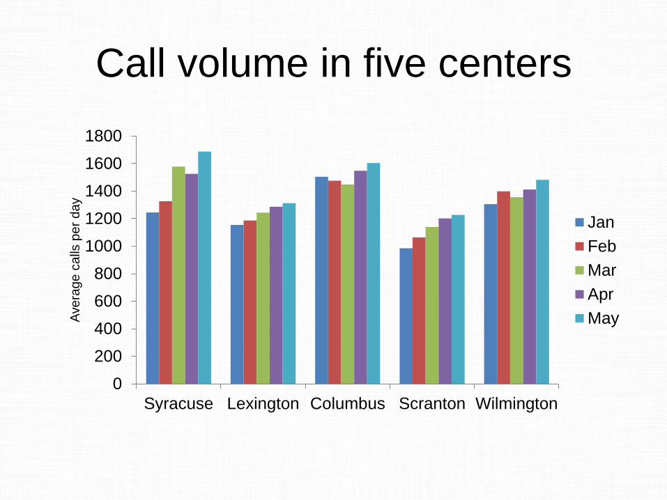
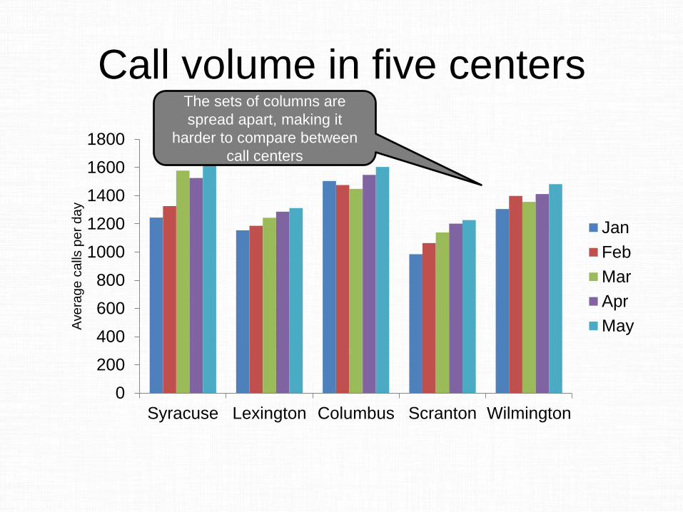
Call volume in five centers
0
200
400
600
800
1000
1200
1400
1600
1800
Syracuse Lexington Columbus Scranton Wilmington
Ave
rag
e c
alls
pe
r d
ay
Jan
Feb
Mar
Apr
May
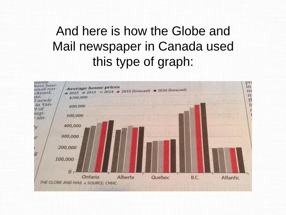
And here is how the Globe and
Mail newspaper in Canada used
this type of graph:
A clustered column graph is not a
good way to show trends in
multiple data series.
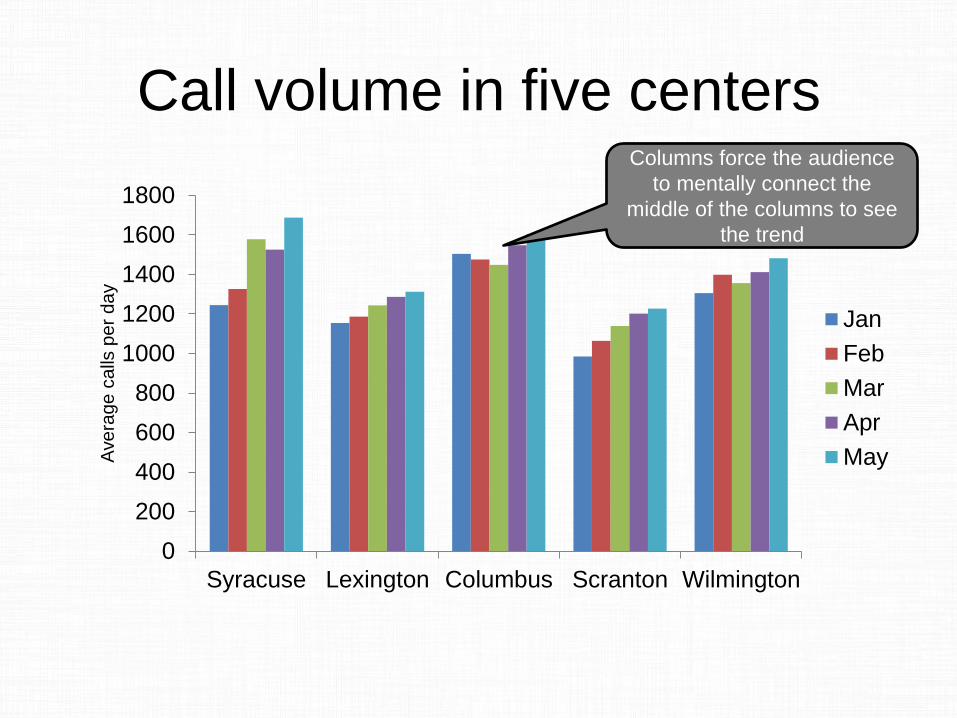
Call volume in five centers
0
200
400
600
800
1000
1200
1400
1600
1800
Syracuse Lexington Columbus Scranton Wilmington
Ave
rag
e c
alls
pe
r d
ay
Jan
Feb
Mar
Apr
May
Columns force the audience
to mentally connect the
middle of the columns to see
the trend
Call volume in five centers
0
200
400
600
800
1000
1200
1400
1600
1800
Syracuse Lexington Columbus Scranton Wilmington
Ave
rag
e c
alls
pe
r d
ay
Jan
Feb
Mar
Apr
May
The sets of columns are
spread apart, making it
harder to compare between
call centers
When your message is a trend in a
data series, use a line graph. Draw
the line for the audience, don’t
make them draw the line between
the columns.
When you have multiple data
series, use a multiple line graph so
it is easy to compare the trends to
each other.
Finally, trends should have a time
based axis, usually the horizontal
axis. Like this …
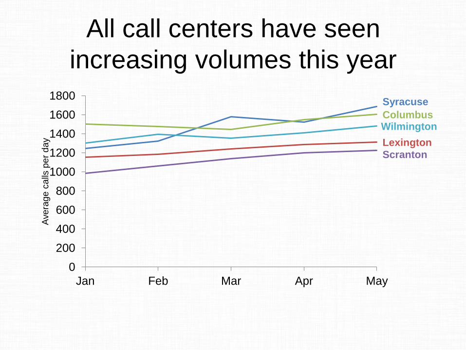
All call centers have seen
increasing volumes this year
Syracuse
Lexington
Columbus
Scranton
Wilmington
0
200
400
600
800
1000
1200
1400
1600
1800
Jan Feb Mar Apr May
Ave
rag
e c
alls
pe
r d
ay
The trends are easy to see over
the five month period of time and it
is easy to compare the different
call centers because they are close
to each other.

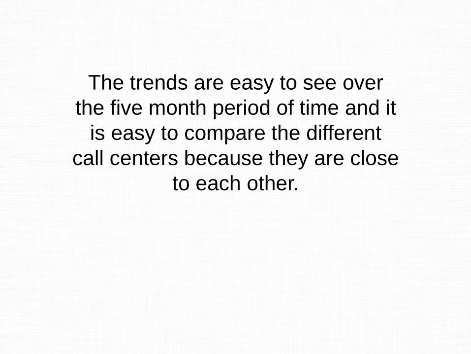
This is a standard line graph
created in PowerPoint. You can
create in Excel just the same way if
you’d like. Here are a couple of tips.
All call centers have seen
increasing volumes this year
Syracuse
Lexington
Columbus
Scranton
Wilmington
0
200
400
600
800
1000
1200
1400
1600
1800
Jan Feb Mar Apr May
Ave
rag
e c
alls
pe
r d
ay
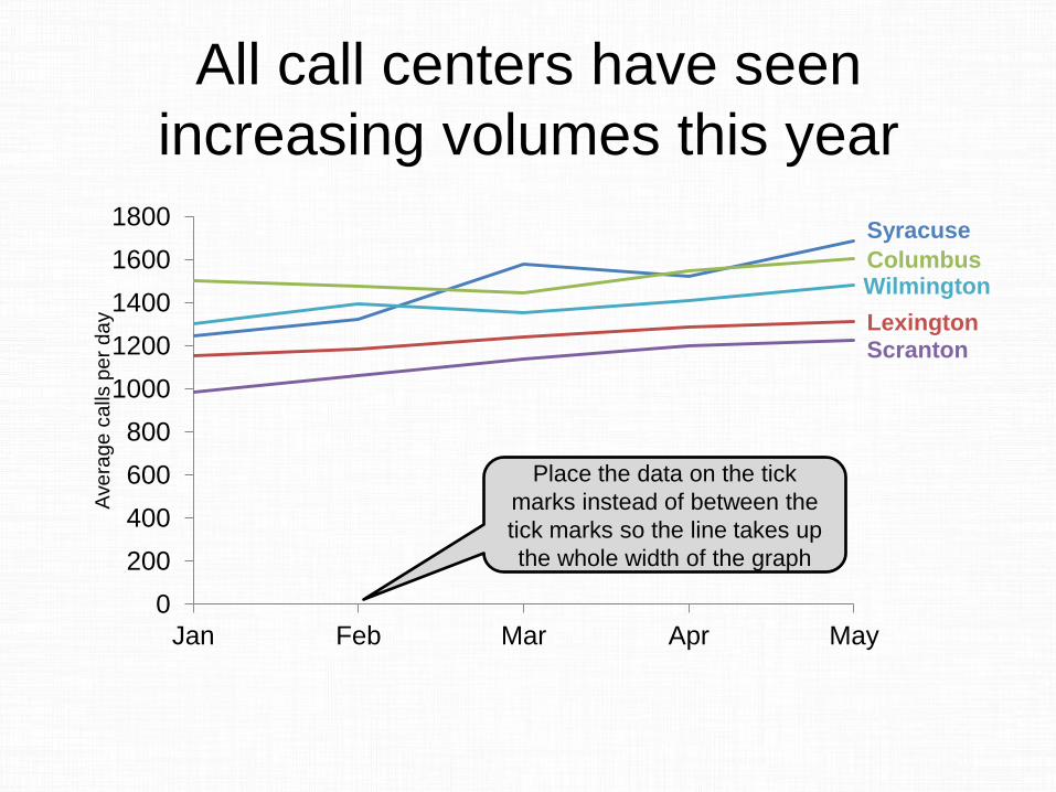
Place the data on the tick
marks instead of between the
tick marks so the line takes up
the whole width of the graph
All call centers have seen
increasing volumes this year
Syracuse
Lexington
Columbus
Scranton
Wilmington
0
200
400
600
800
1000
1200
1400
1600
1800
Jan Feb Mar Apr May
Ave
rag
e c
alls
pe
r d
ay
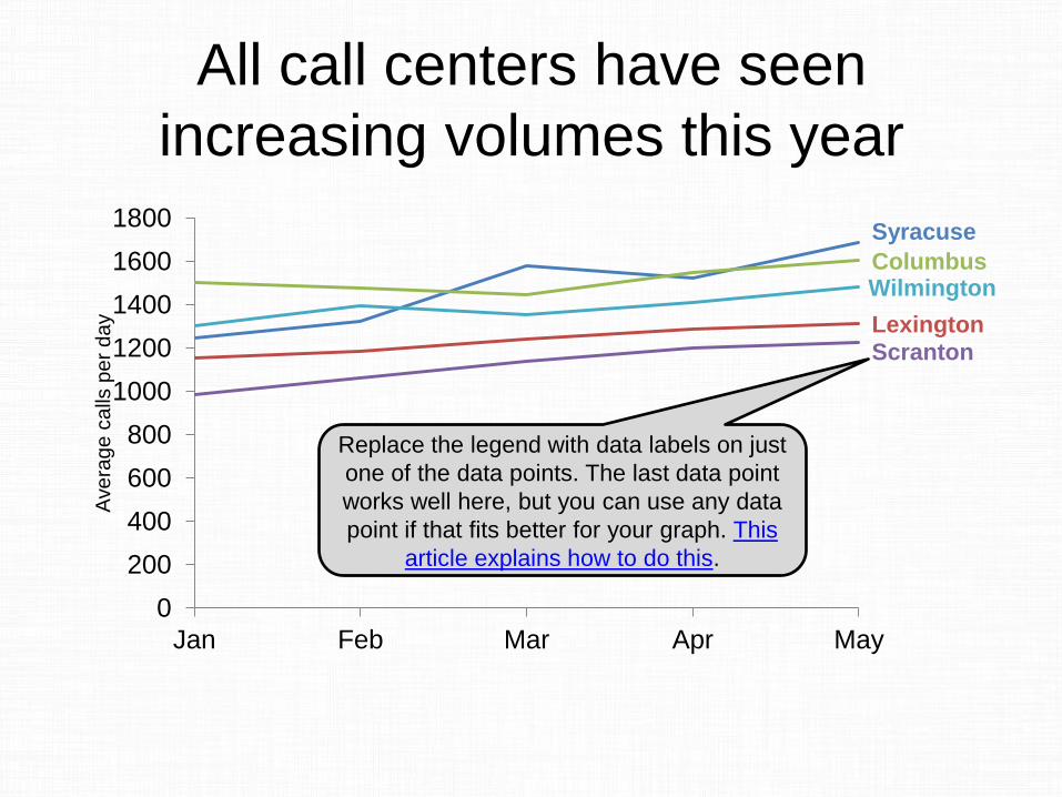
Replace the legend with data labels on just
one of the data points. The last data point
works well here, but you can use any data
point if that fits better for your graph. This
article explains how to do this.
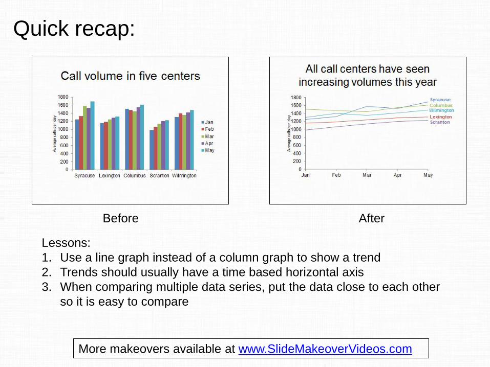
Before After
Lessons:
1. Use a line graph instead of a column graph to show a trend
2. Trends should usually have a time based horizontal axis
3. When comparing multiple data series, put the data close to each other
so it is easy to compare
Quick recap:
More makeovers available at www.SlideMakeoverVideos.com

If you would like me to help
your team create presentations
that have a clear message with
focused content and effective
visuals, get in touch:
P: 905-510-4911
W: www.ThinkOutsideTheSlide.com