You Can’t Ship from Your Ivory Tower: Including Developers in the Design Process (MinneWebCon 2015)
Upload
marc-drummondCategory
view
380download
0
MARC DRUMMOND
TALK
DATE SPEAKERAPRIL 25, 2016
SIZING UP RESPONSIVE IMAGESMAKE A PLAN WITH THE HELP OF THESE KITTENS
Photo credit: Dave Emerson, “Trouble”, Flickr Creative Commons

Photo credit: Dave Emerson, “Trouble”, Flickr Creative Commons
Marc Drummond
@MarcDrummond
mdrummondIRC, drupal.org
marcdrummond.com
Front-end Developer, Lullabot
CERN, WE HAVE A PROBLEMAND IT INVOLVES CATS

Photo credit: Mr Thinktank, “SDC19276”, Flickr Creative Commons

Photo credit: Doug Woods, “Midge Our Cute New Kitten Cat”, Flickr Creative Commons
Photo credit: [paumelia], “so happy smiling cat”, Flickr Creative Commons

Photo credit: Pete Teoh, “Aston Loves Andy”, Flickr Creative Commons
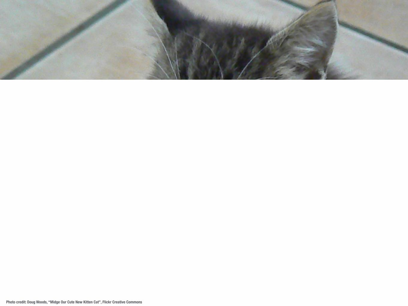
Photo credit: Doug Woods, “Midge Our Cute New Kitten Cat”, Flickr Creative Commons
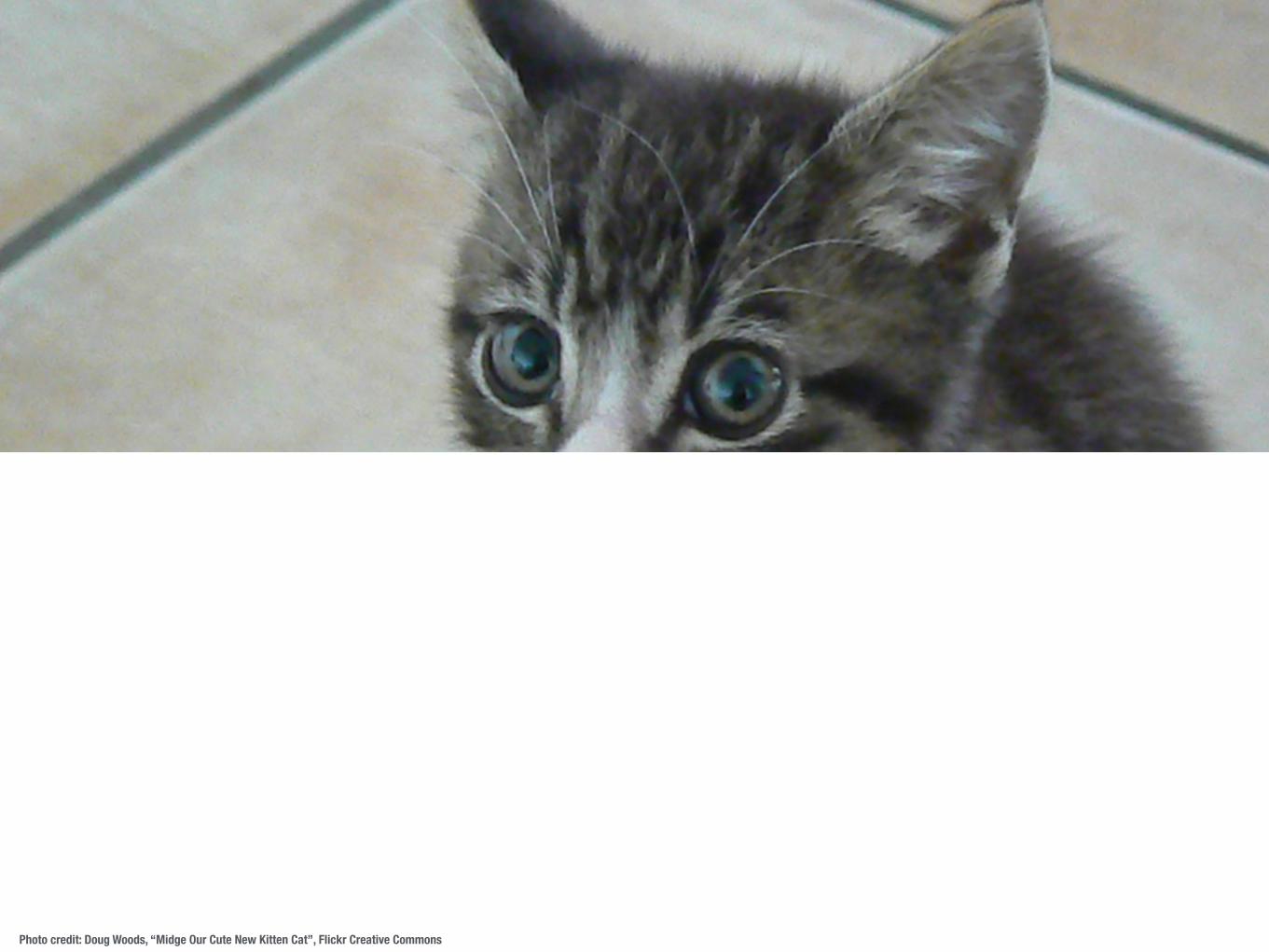
Photo credit: Doug Woods, “Midge Our Cute New Kitten Cat”, Flickr Creative Commons
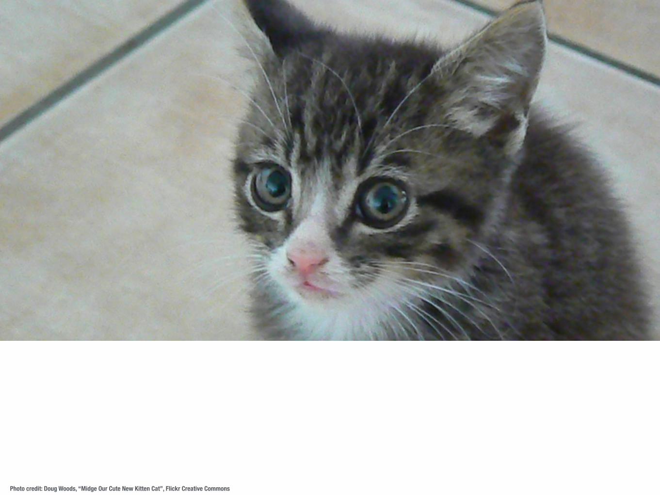
Photo credit: Doug Woods, “Midge Our Cute New Kitten Cat”, Flickr Creative Commons
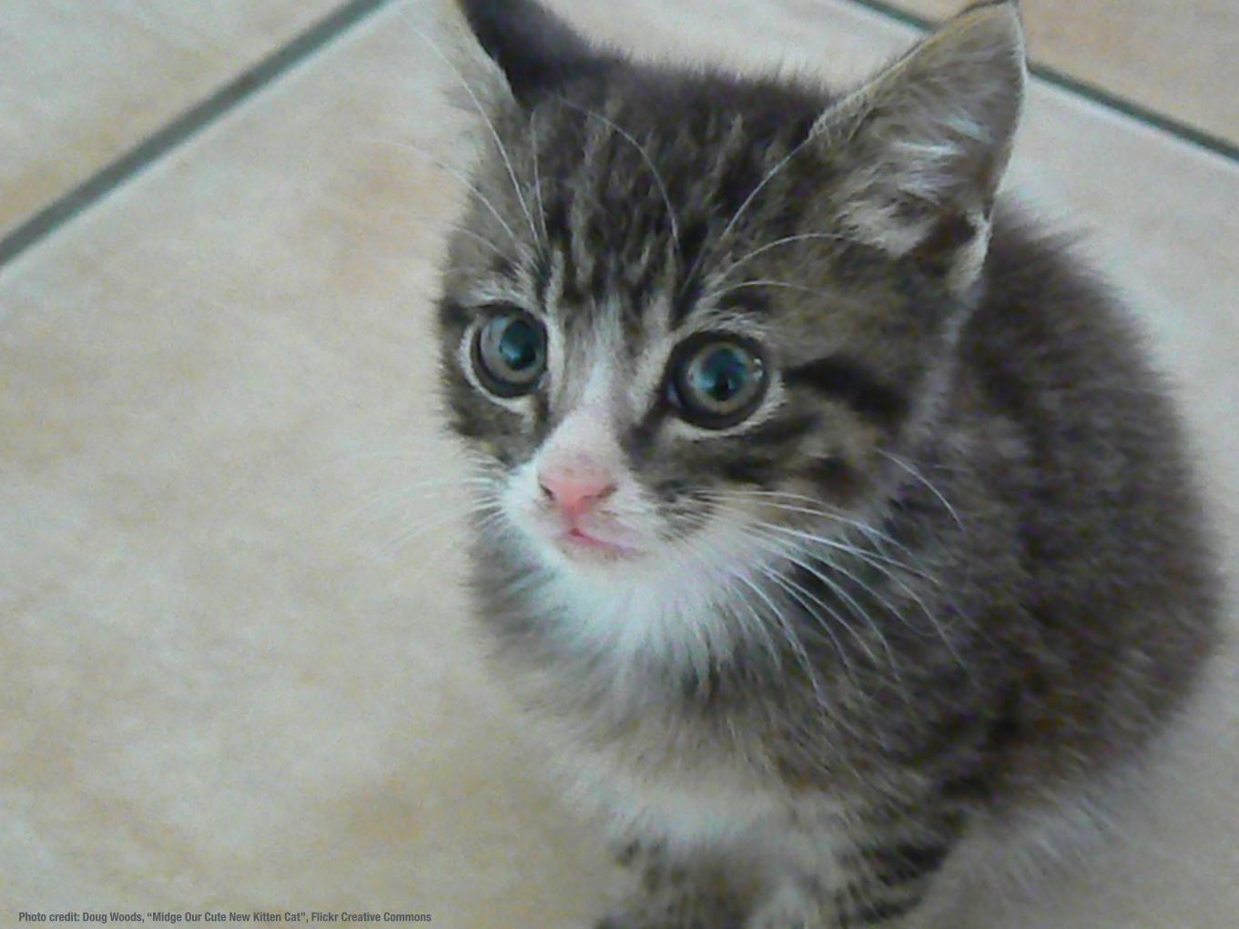
Photo credit: Doug Woods, “Midge Our Cute New Kitten Cat”, Flickr Creative Commons

Photo credit: Guyon Moree, “Angry Tiger”, Flickr Creative Commons
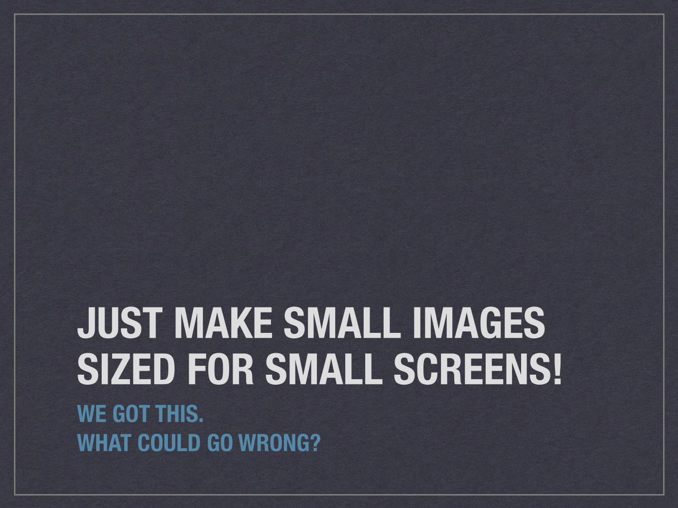
JUST MAKE SMALL IMAGES SIZED FOR SMALL SCREENS!WE GOT THIS.WHAT COULD GO WRONG?
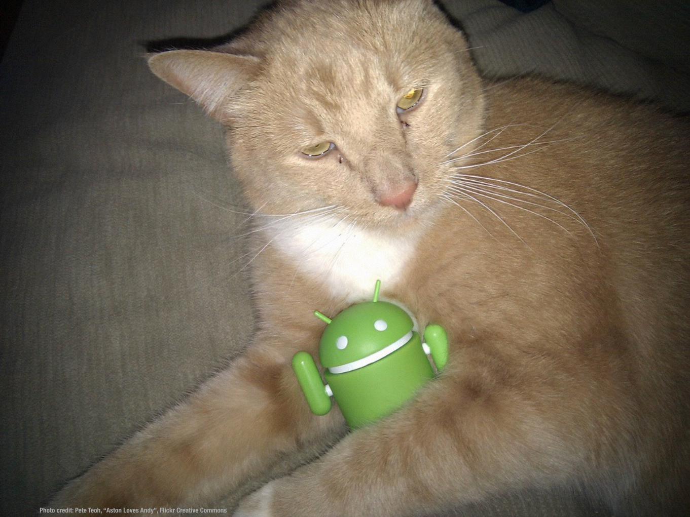
Photo credit: Pete Teoh, “Aston Loves Andy”, Flickr Creative Commons

Photo credit: Doug Woods, “Midge Our Cute New Kitten Cat”, Flickr Creative Commons

Photo credit: [paumelia], “so happy smiling cat”, Flickr Creative Commons
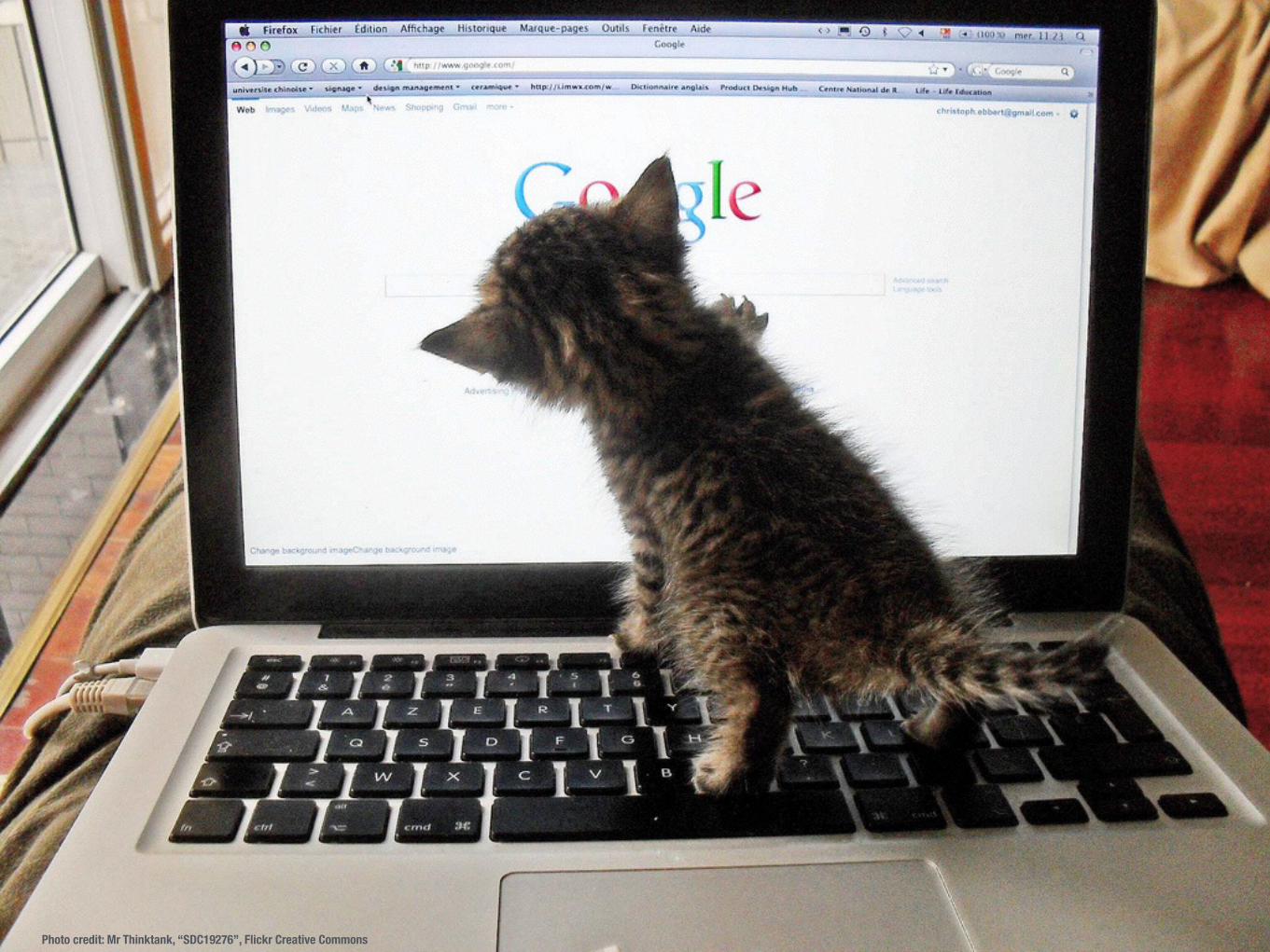
Photo credit: Mr Thinktank, “SDC19276”, Flickr Creative Commons
Photo credit: Doug Woods, “Midge Our Cute New Kitten Cat”, Flickr Creative Commons
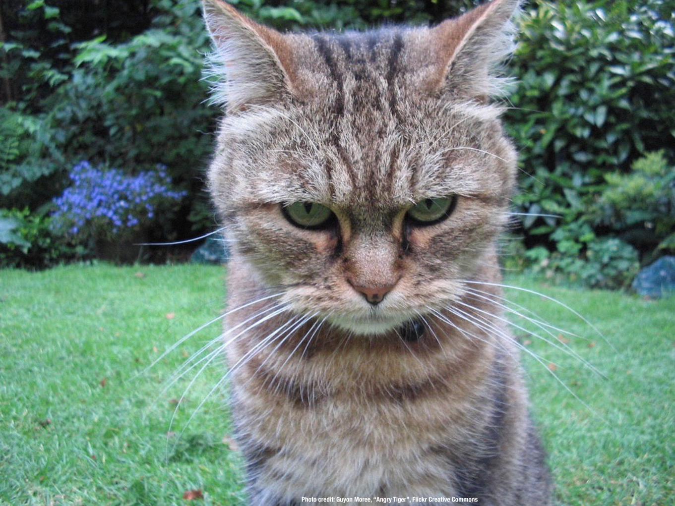
Photo credit: Guyon Moree, “Angry Tiger”, Flickr Creative Commons
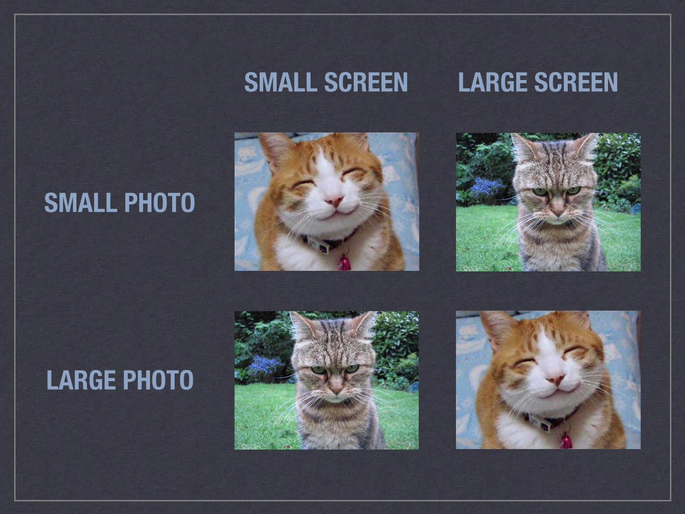
SMALL SCREEN LARGE SCREEN
SMALL PHOTO
LARGE PHOTO
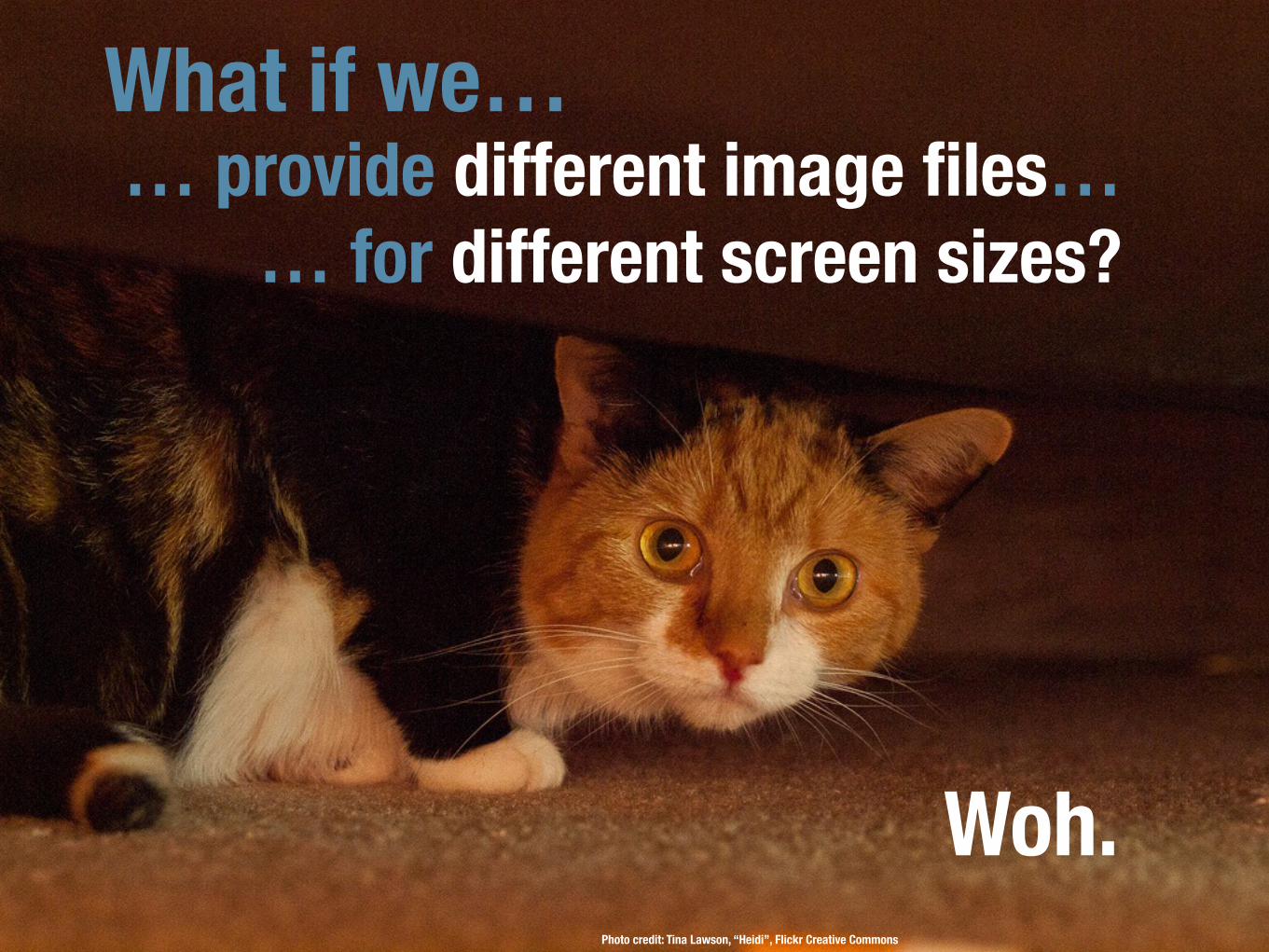
Photo credit: Tina Lawson, “Heidi”, Flickr Creative Commons
What if we…… provide different image files…
… for different screen sizes?
Woh.
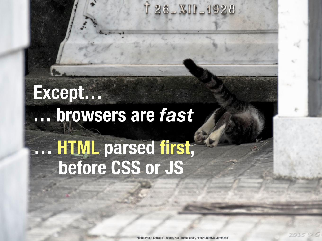
Photo credit: Gonzolo G Useta, “La Ultima Vida”, Flickr Creative Commons
… browsers are fastExcept…
… HTML parsed first, before CSS or JS
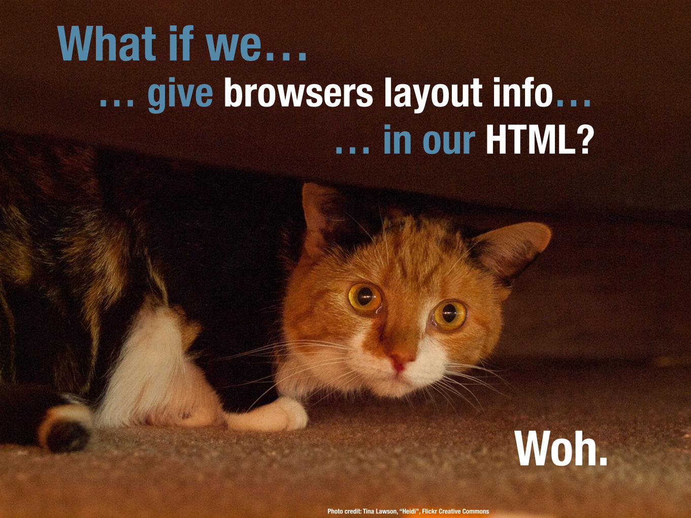
Photo credit: Tina Lawson, “Heidi”, Flickr Creative Commons
What if we…… give browsers layout info…
… in our HTML?
Woh.

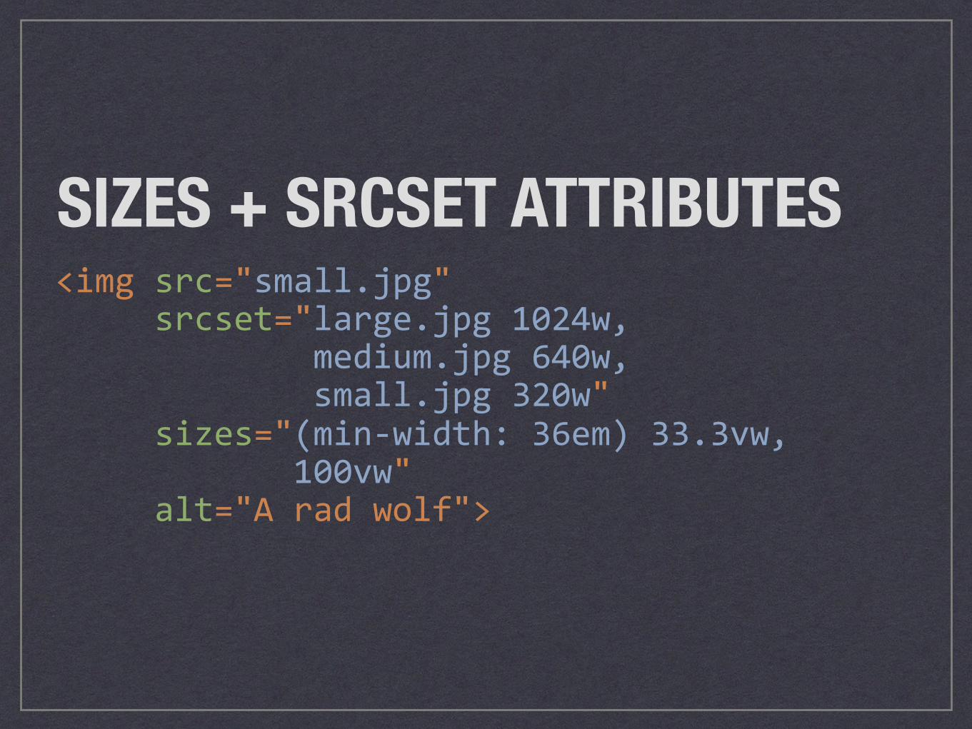
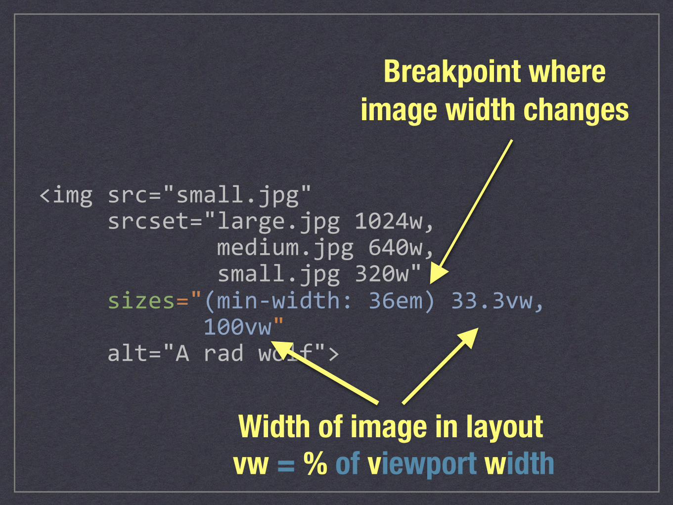
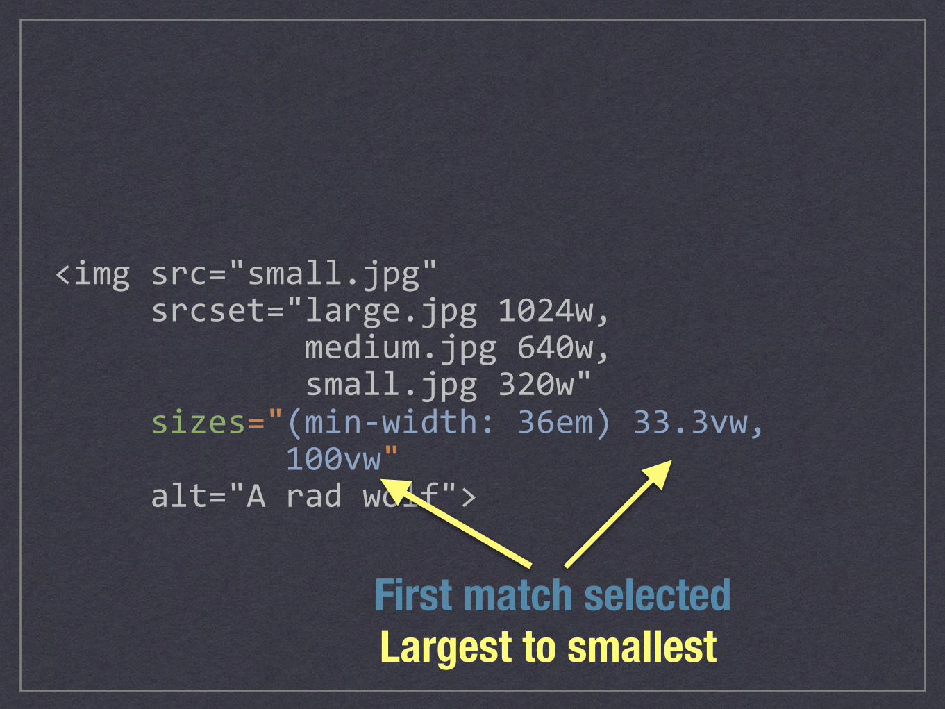
<imgsrc="small.jpg"srcset="large.jpg1024w,medium.jpg640w,small.jpg320w"sizes="(min-width:36em)33.3vw,100vw"alt="Aradwolf">
SIZES + SRCSET ATTRIBUTES
<imgsrc="small.jpg"srcset="large.jpg1024w,medium.jpg640w,small.jpg320w"sizes="(min-width:36em)33.3vw,100vw"alt="Aradwolf">
Width of image in layoutvw = % of viewport width
Breakpoint where image width changes
<imgsrc="small.jpg"srcset="large.jpg1024w,medium.jpg640w,small.jpg320w"sizes="(min-width:36em)33.3vw,100vw"alt="Aradwolf">
Largest to smallestFirst match selected
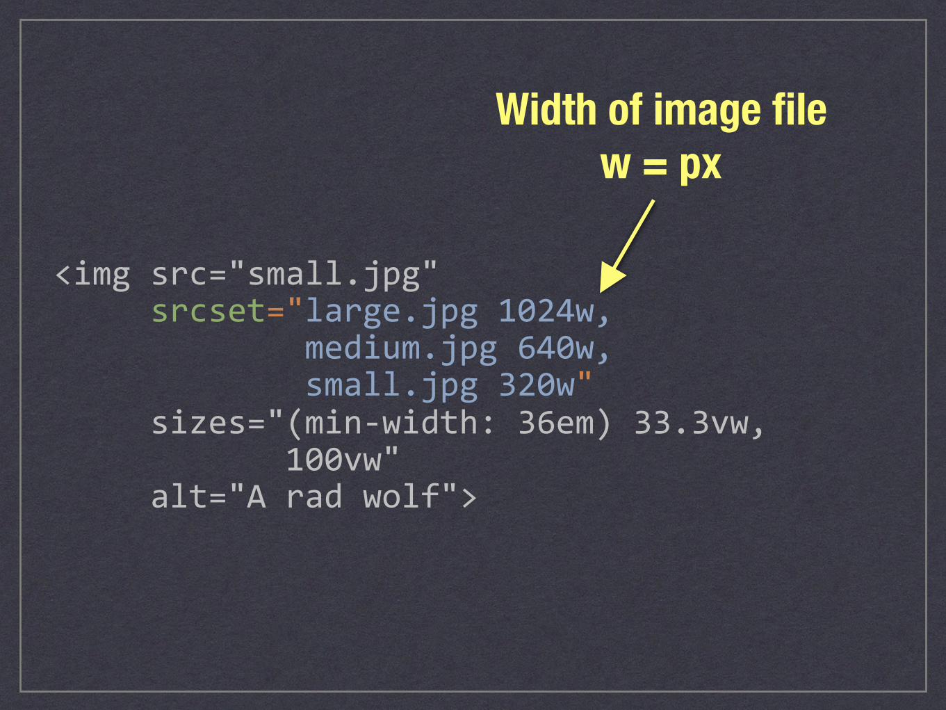
<imgsrc="small.jpg"srcset="large.jpg1024w,medium.jpg640w,small.jpg320w"sizes="(min-width:36em)33.3vw,100vw"alt="Aradwolf">
Width of image file w = px
<imgsrc="small.jpg"srcset="large.jpg1024w,medium.jpg640w,small.jpg320w"sizes="(min-width:36em)33.3vw,100vw"alt="Aradwolf">
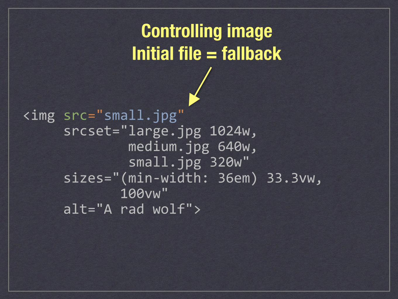
Controlling image Initial file = fallback
<imgsrc="small.jpg"srcset="large.jpg1024w,medium.jpg640w,small.jpg320w"sizes="(min-width:36em)33.3vw,100vw"alt="Aradwolf">
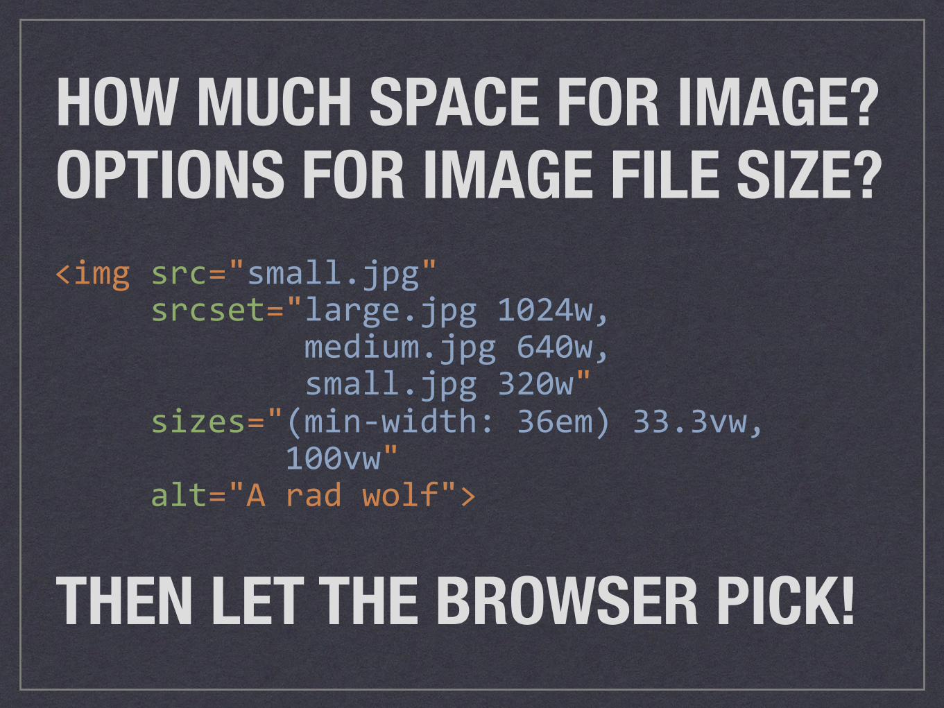
THEN LET THE BROWSER PICK!
HOW MUCH SPACE FOR IMAGE? OPTIONS FOR IMAGE FILE SIZE?

LET’S MAKE A PLAN.
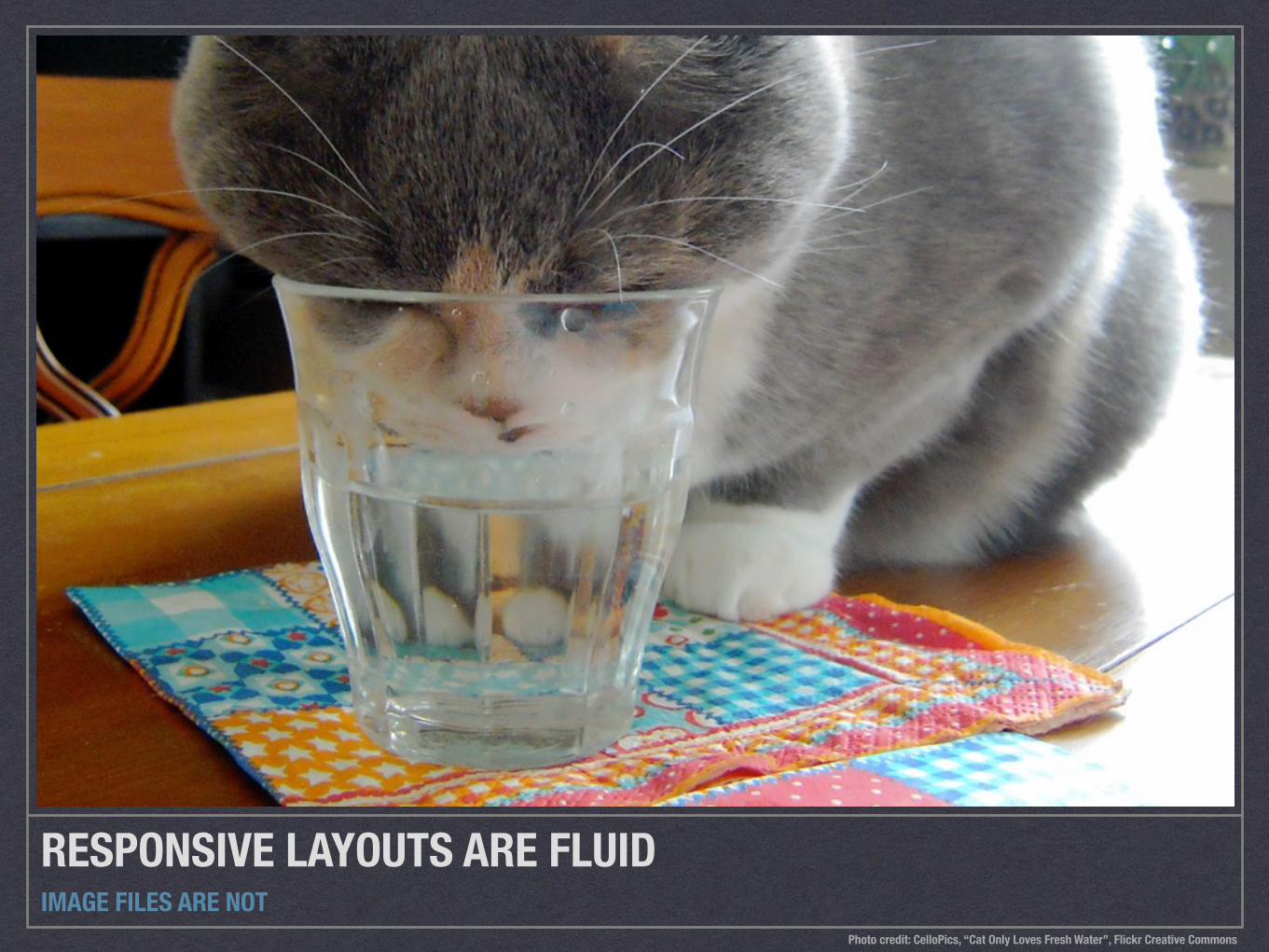
RESPONSIVE LAYOUTS ARE FLUIDIMAGE FILES ARE NOT
Photo credit: CelloPics, “Cat Only Loves Fresh Water”, Flickr Creative Commons
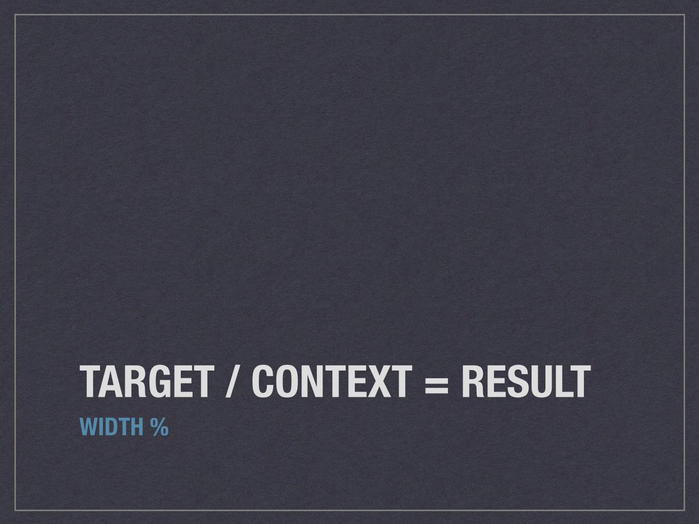
TARGET / CONTEXT = RESULTWIDTH %
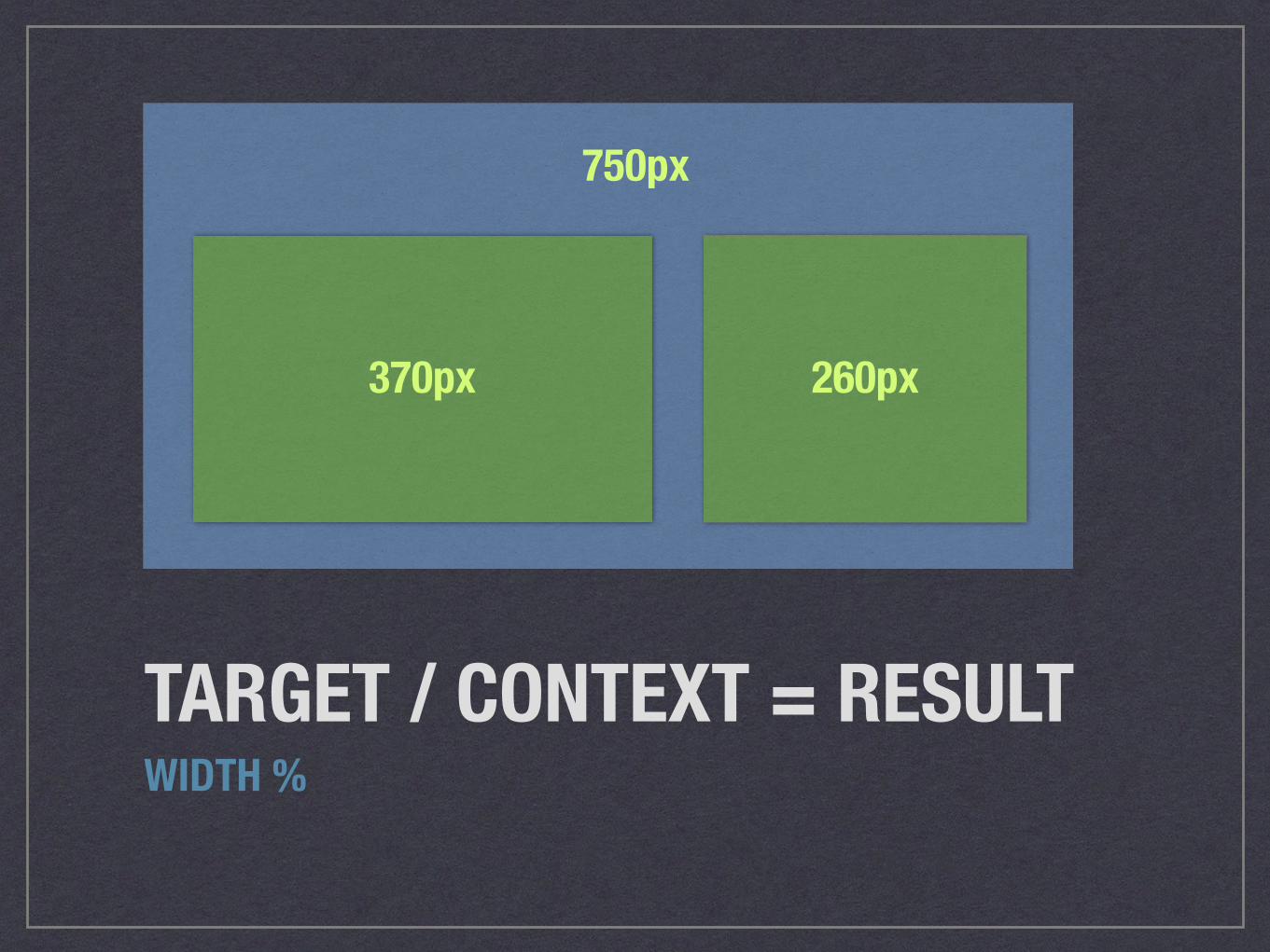
TARGET / CONTEXT = RESULTWIDTH %
750px
370px 260px
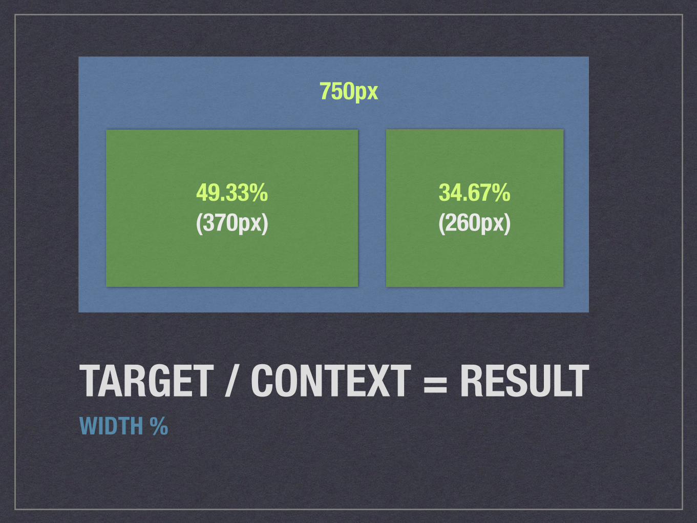
TARGET / CONTEXT = RESULTWIDTH %
750px
49.33%(370px)
34.67%(260px)

TARGET / CONTEXT = RESULTWIDTH %
1000px
49.33%(493px)
34.67%(347px)

TARGET / CONTEXT = RESULTWIDTH %
1653px
49.33%(815px)
34.67%(573px)
RASTER IMAGESMEASURED IN PX, NOT %
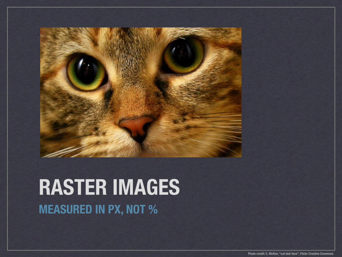
RASTER IMAGESMEASURED IN PX, NOT %
Photo credit: C. McKee, “cat duh face”, Flickr Creative Commons
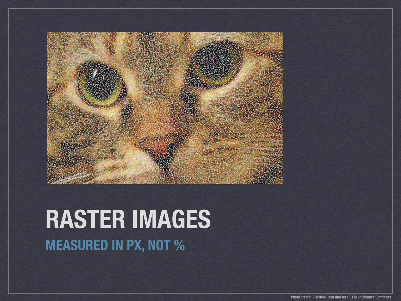
RASTER IMAGESMEASURED IN PX, NOT %
Photo credit: C. McKee, “cat duh face”, Flickr Creative Commons
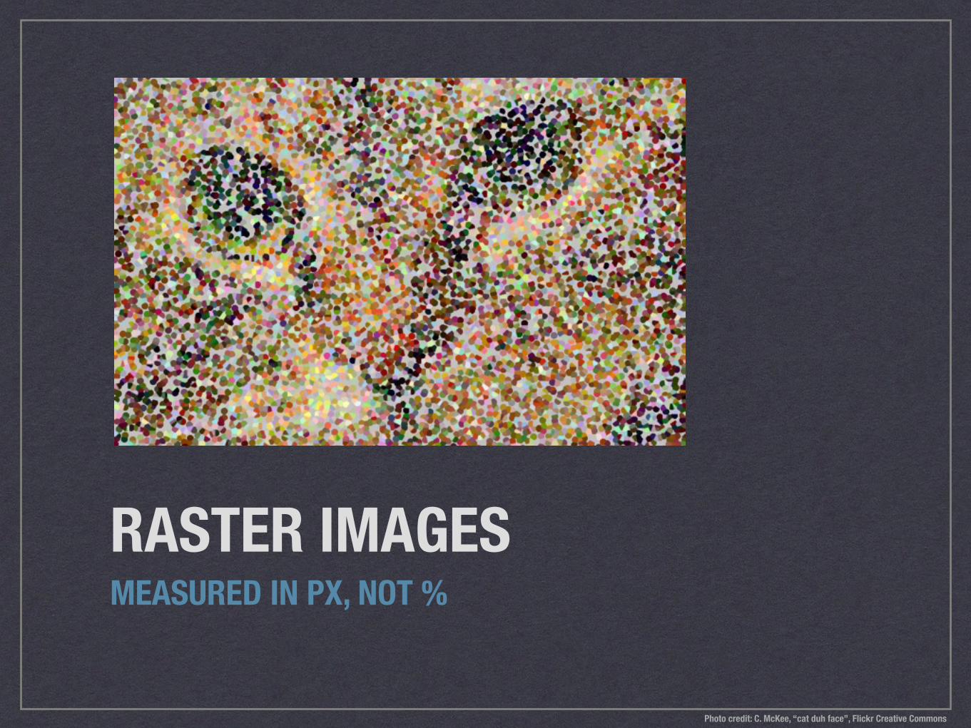
RASTER IMAGESMEASURED IN PX, NOT %
Photo credit: C. McKee, “cat duh face”, Flickr Creative Commons
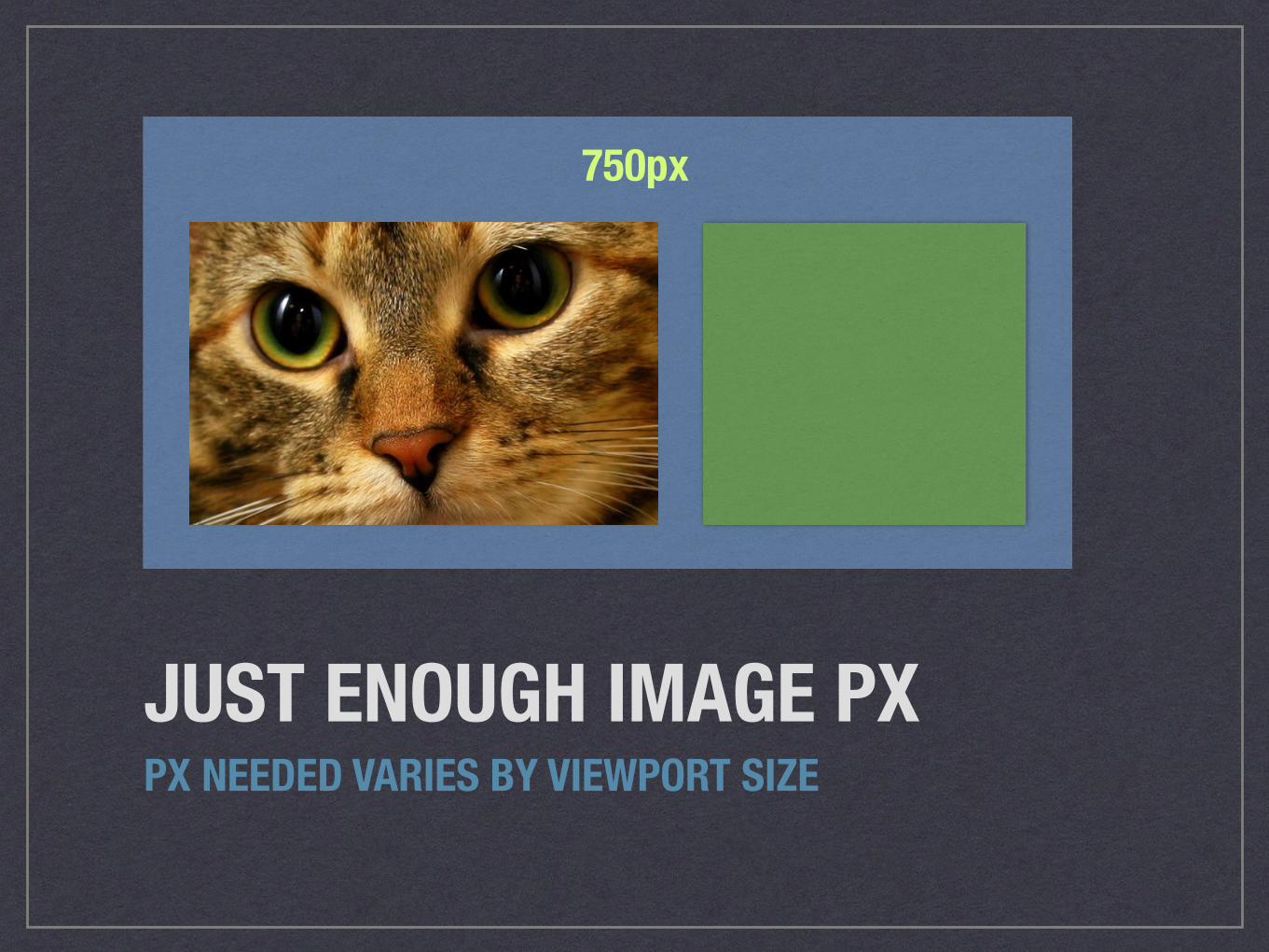
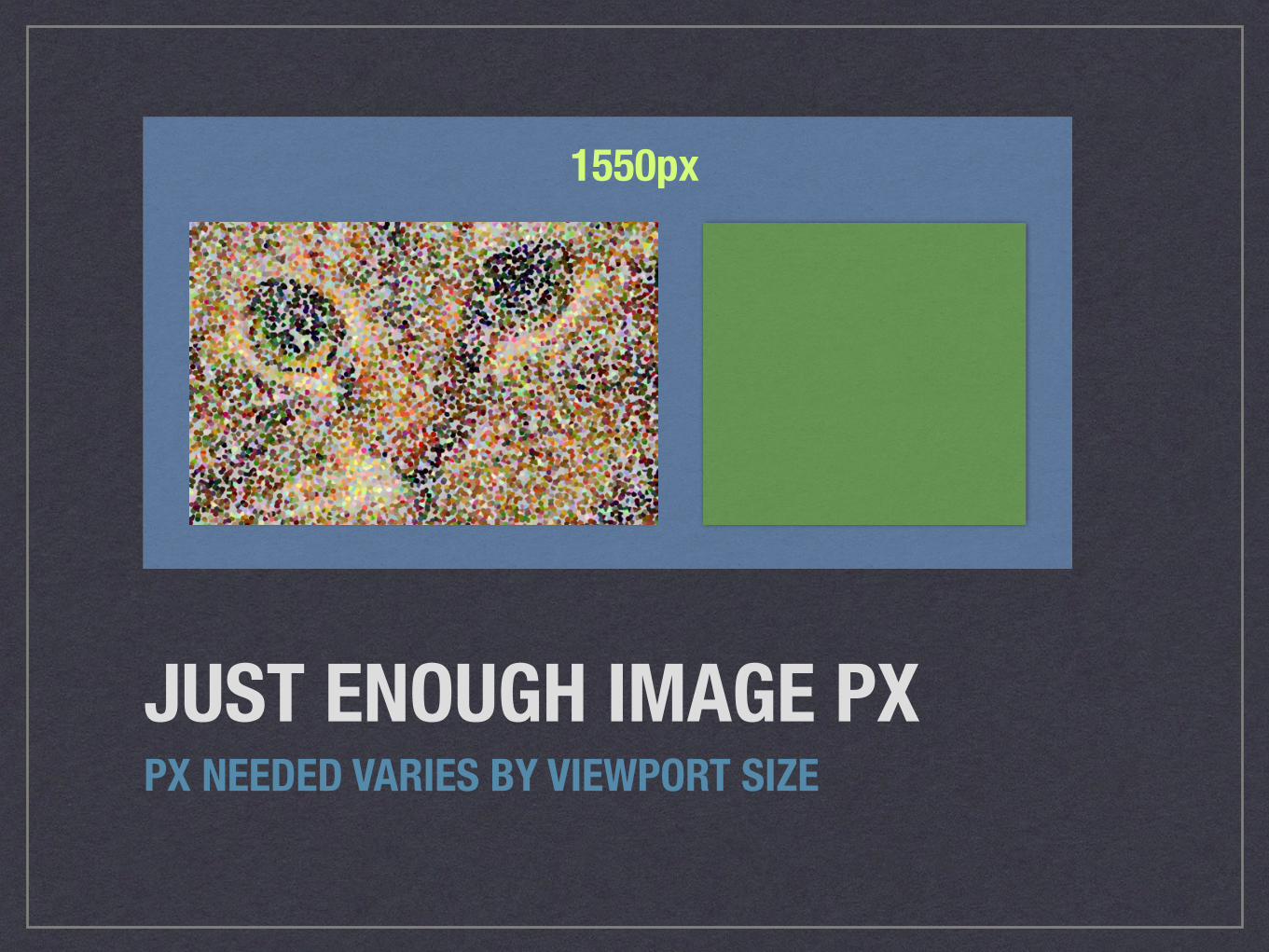
JUST ENOUGH IMAGE PXPX NEEDED VARIES BY VIEWPORT SIZE
750px
JUST ENOUGH IMAGE PXPX NEEDED VARIES BY VIEWPORT SIZE
1550px
ANALYZEHOW DOES THIS TYPE OF IMAGE FIT INTO THE SITE LAYOUT?
Photo credit: Jenny Lee Silver, “Photo A Day: June 2006”, Flickr Creative Commons
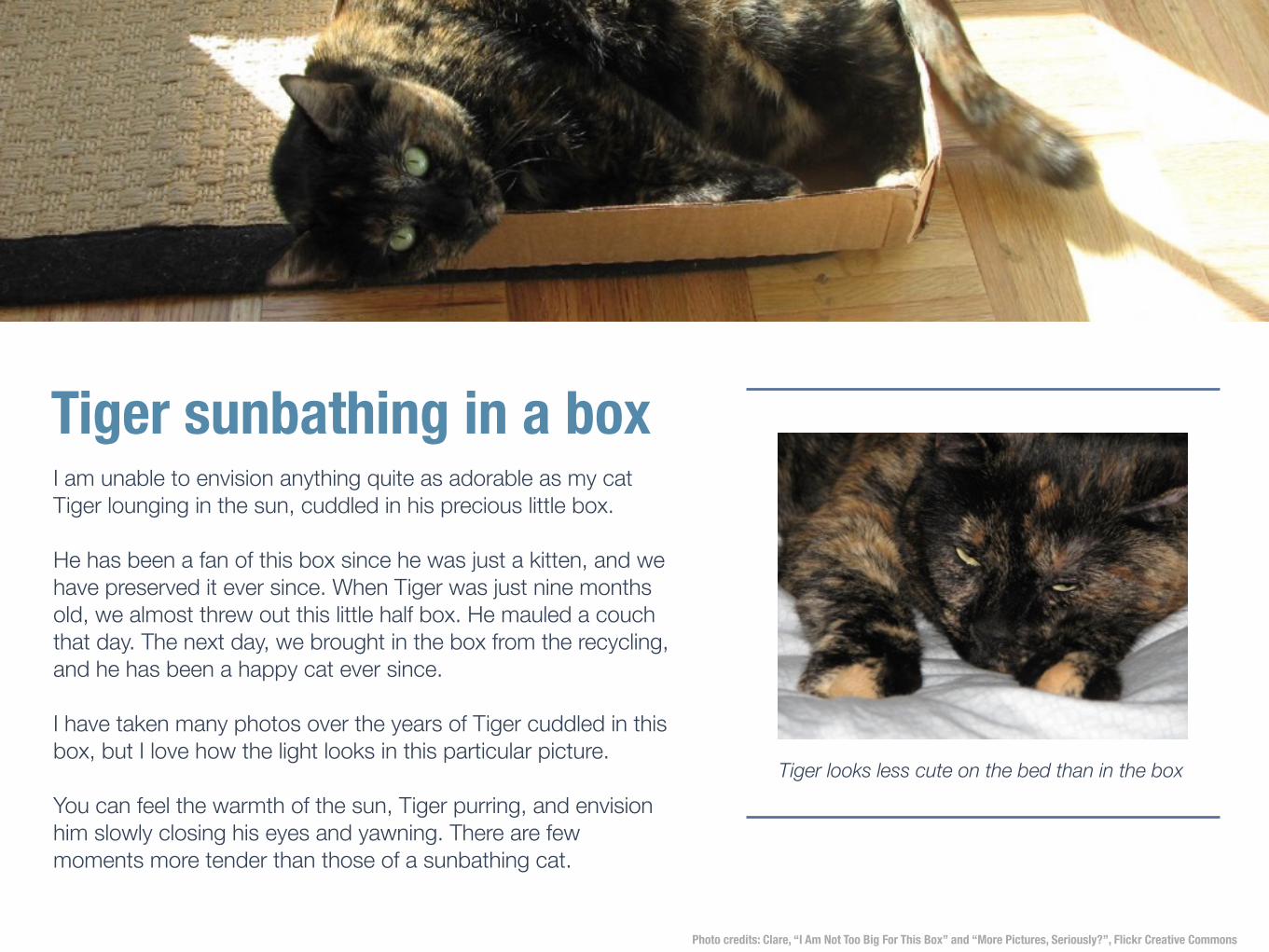
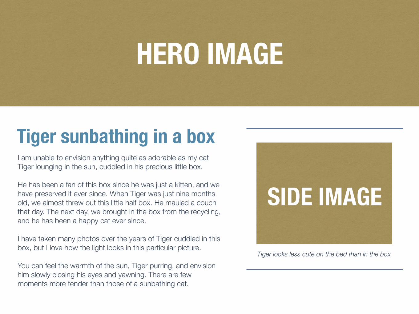
Tiger sunbathing in a boxI am unable to envision anything quite as adorable as my cat Tiger lounging in the sun, cuddled in his precious little box.
He has been a fan of this box since he was just a kitten, and we have preserved it ever since. When Tiger was just nine months old, we almost threw out this little half box. He mauled a couch that day. The next day, we brought in the box from the recycling, and he has been a happy cat ever since.
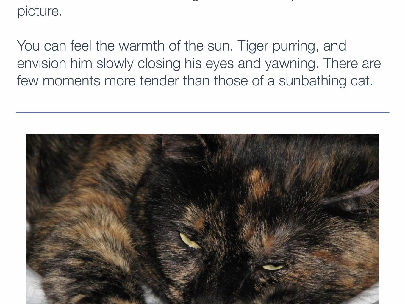
I have taken many photos over the years of Tiger cuddled in this box, but I love how the light looks in this particular picture.
You can feel the warmth of the sun, Tiger purring, and envision him slowly closing his eyes and yawning. There are few moments more tender than those of a sunbathing cat.
Tiger looks less cute on the bed than in the box
Photo credits: Clare, “I Am Not Too Big For This Box” and “More Pictures, Seriously?”, Flickr Creative Commons
Tiger sunbathing in a boxI am unable to envision anything quite as adorable as my cat Tiger lounging in the sun, cuddled in his precious little box.
He has been a fan of this box since he was just a kitten, and we have preserved it ever since. When Tiger was just nine months old, we almost threw out this little half box. He mauled a couch that day. The next day, we brought in the box from the recycling, and he has been a happy cat ever
this box, but I love how the light looks in this particular picture.
You can feel the warmth of the sun, Tiger purring, and envision him slowly closing his eyes and yawning. There are few moments more tender than those of a sunbathing cat.

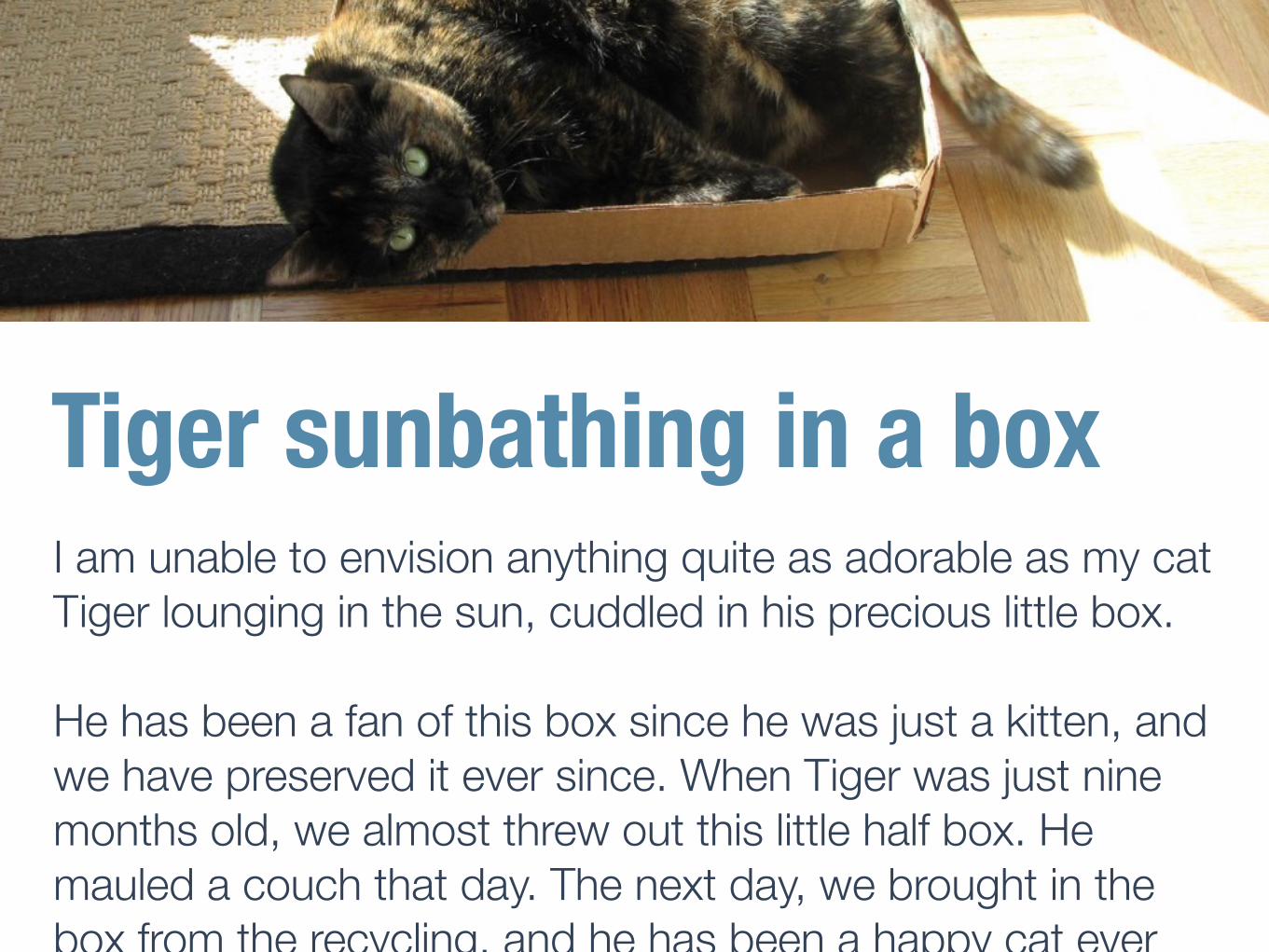
Tiger sunbathing in a boxI am unable to envision anything quite as adorable as my cat Tiger lounging in the sun, cuddled in his precious little box.
He has been a fan of this box since he was just a kitten, and we have preserved it ever since. When Tiger was just nine months old, we almost threw out this little half box. He mauled a couch that day. The next day, we brought in the box from the recycling, and he has been a happy cat ever since.
I have taken many photos over the years of Tiger cuddled in this box, but I love how the light looks in this particular picture.
You can feel the warmth of the sun, Tiger purring, and envision him slowly closing his eyes and yawning. There are few moments more tender than those of a sunbathing cat.
Tiger looks less cute on the bed than in the box
HERO IMAGE
SIDE IMAGE
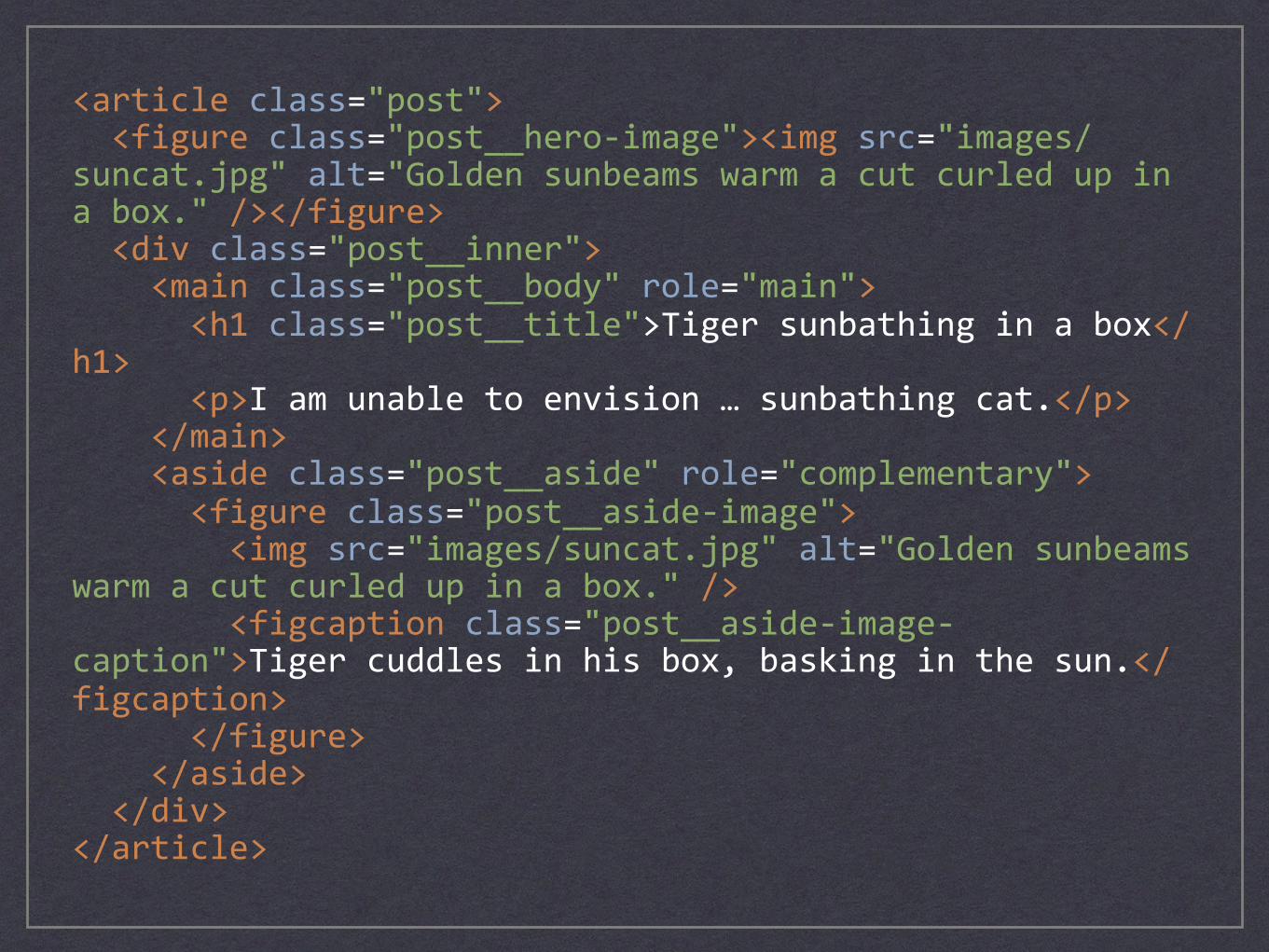
<articleclass="post"><figureclass="post__hero-image"><imgsrc="images/suncat.jpg"alt="Goldensunbeamswarmacutcurledupinabox."/></figure><divclass="post__inner"><mainclass="post__body"role="main"><h1class="post__title">Tigersunbathinginabox</h1><p>Iamunabletoenvision…sunbathingcat.</p></main><asideclass="post__aside"role="complementary"><figureclass="post__aside-image"><imgsrc="images/suncat.jpg"alt="Goldensunbeamswarmacutcurledupinabox."/><figcaptionclass="post__aside-image-caption">Tigercuddlesinhisbox,baskinginthesun.</figcaption></figure></aside></div></article>
HERO IMAGE.post > .post__hero-image > img
HERO IMAGE.post > .post__hero-image > img
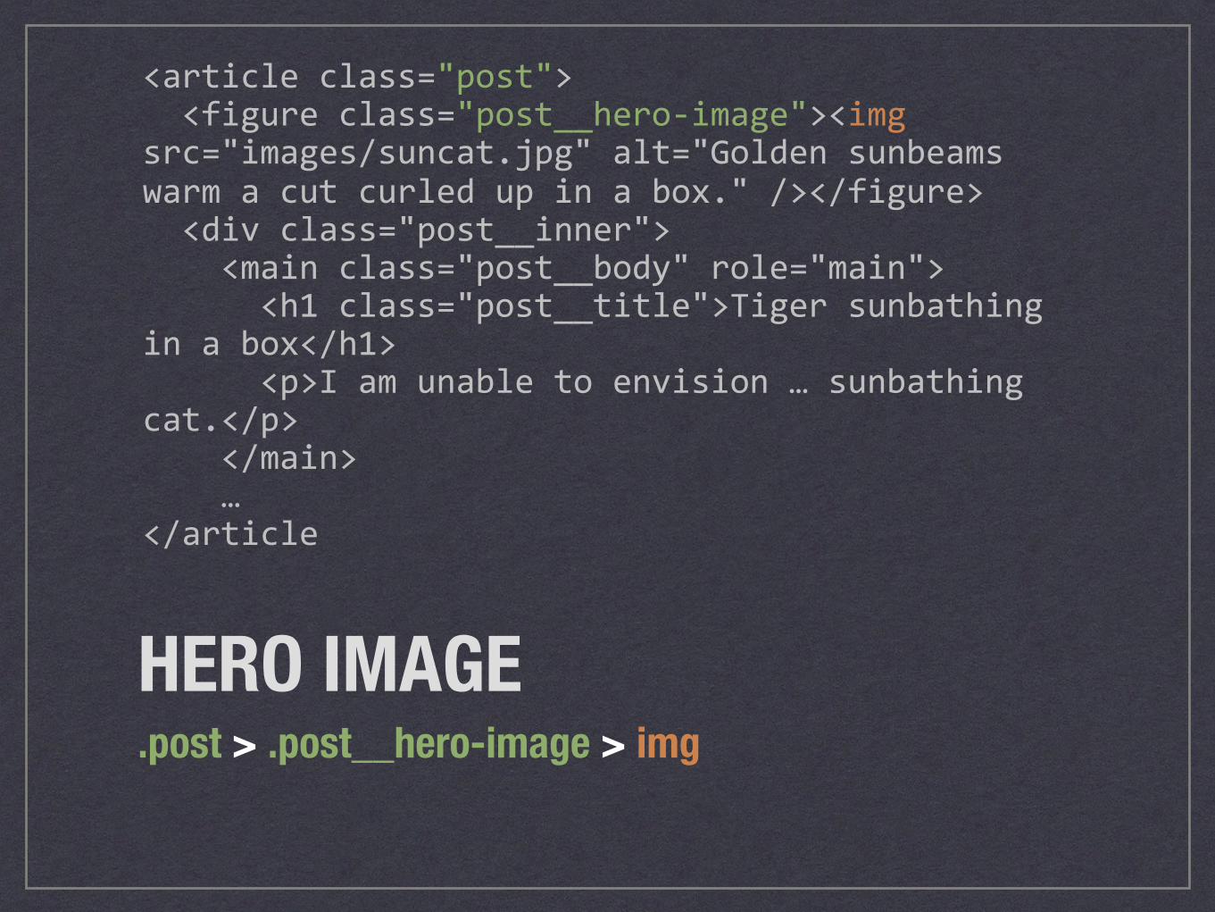
<articleclass="post"><figureclass="post__hero-image"><imgsrc="images/suncat.jpg"alt="Goldensunbeamswarmacutcurledupinabox."/></figure><divclass="post__inner"><mainclass="post__body"role="main"><h1class="post__title">Tigersunbathinginabox</h1><p>Iamunabletoenvision…sunbathingcat.</p></main>…</article
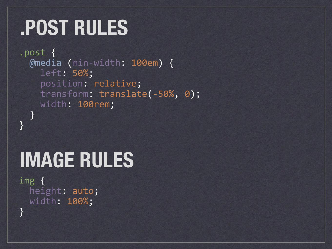
.post{@media(min-width:100em){left:50%;position:relative;transform:translate(-50%,0);width:100rem;}}
.POST RULES
IMAGE RULESimg{height:auto;width:100%;}
HERO IMAGEBreakpoints .post .post__hero-image Final width
Default 100% 100% 100%
(min-width: 100em) 100rem 100% 100rem
BALLPARK FIGURESDETERMINE INITIAL SOURCE FILE WIDTHS
Photo credit: Fuzzy Gerdes, “Parker Loooves the Cubs”, Flickr Creative Commons
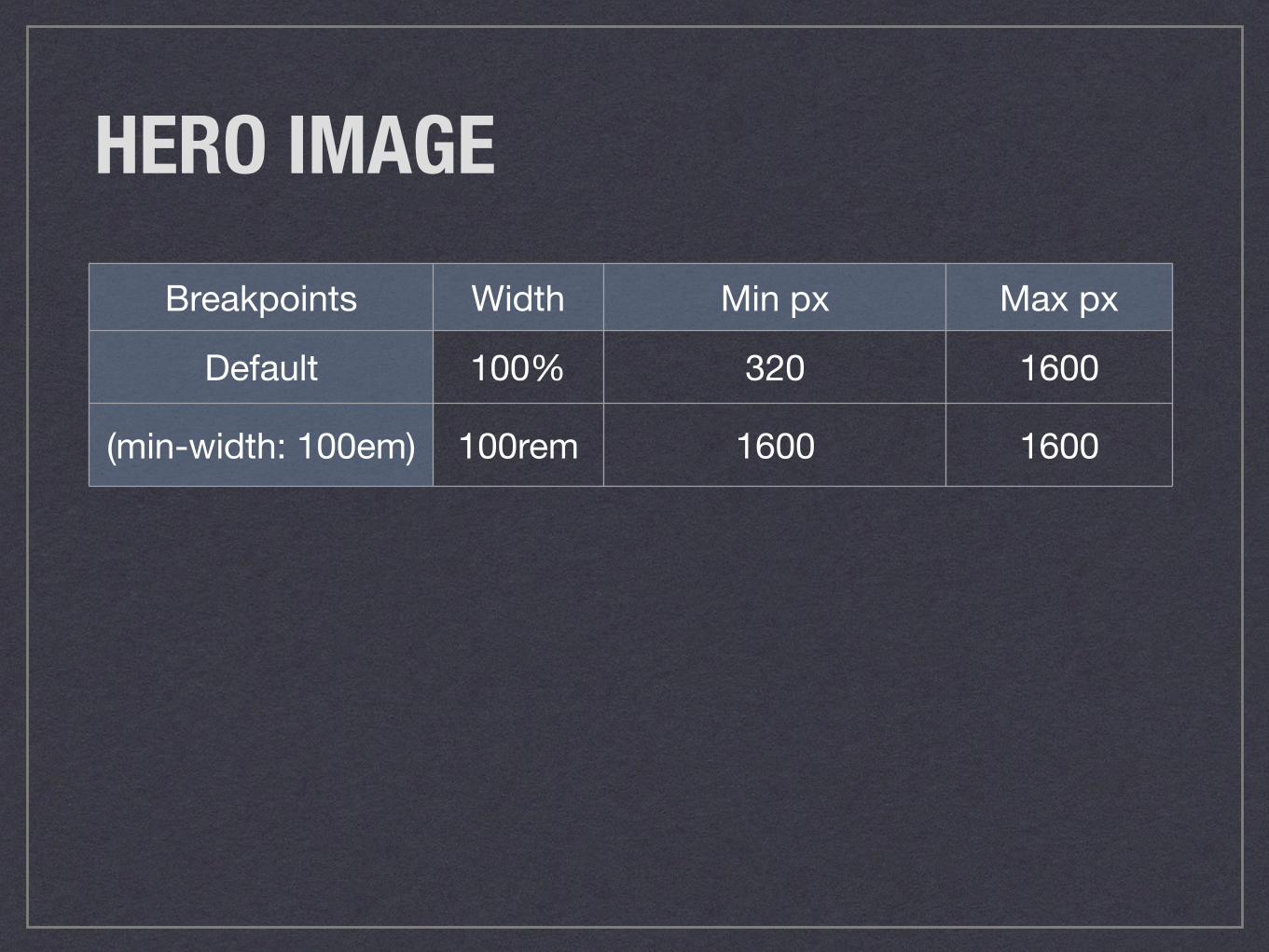
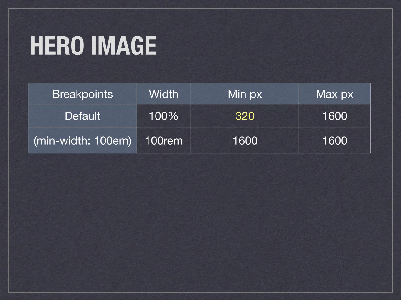
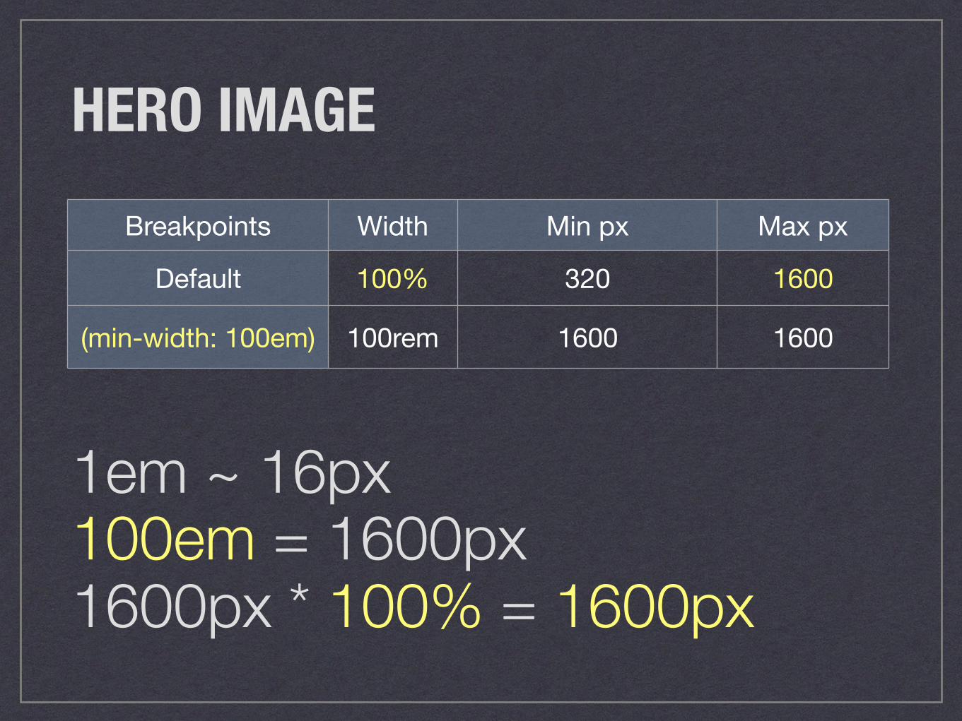
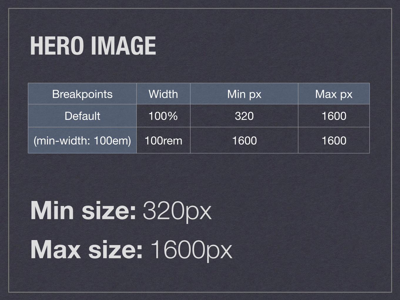
HERO IMAGEBreakpoints Width Min px Max px
Default 100% 320 1600
(min-width: 100em) 100rem 1600 1600
HERO IMAGEBreakpoints Width Min px Max px
Default 100% 320 1600
(min-width: 100em) 100rem 1600 1600
HERO IMAGEBreakpoints Width Min px Max px
Default 100% 320 1600
(min-width: 100em) 100rem 1600 1600
1em ~ 16px 100em = 1600px 1600px * 100% = 1600px
HERO IMAGEBreakpoints Width Min px Max px
Default 100% 320 1600
(min-width: 100em) 100rem 1600 1600
Min size: 320pxMax size: 1600px
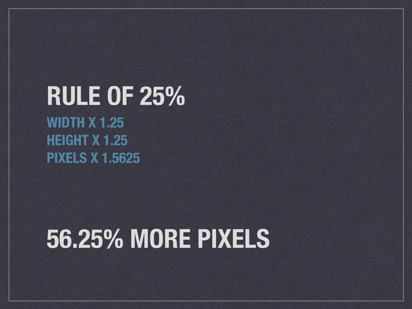
RULE OF 25%WIDTH X 1.25 HEIGHT X 1.25 PIXELS X 1.5625
56.25% MORE PIXELS
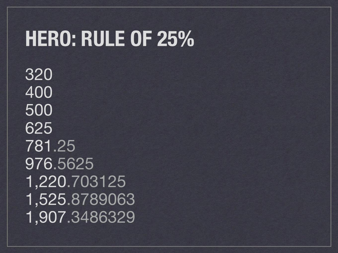
HERO: RULE OF 25%320400500625781.25976.56251,220.7031251,525.87890631,907.3486329
TWICE AS NICESCREEN RESOLUTION DENSITIES
Photo credit: Mrs eNil, “Bed cuddles”, Flickr Creative Commons
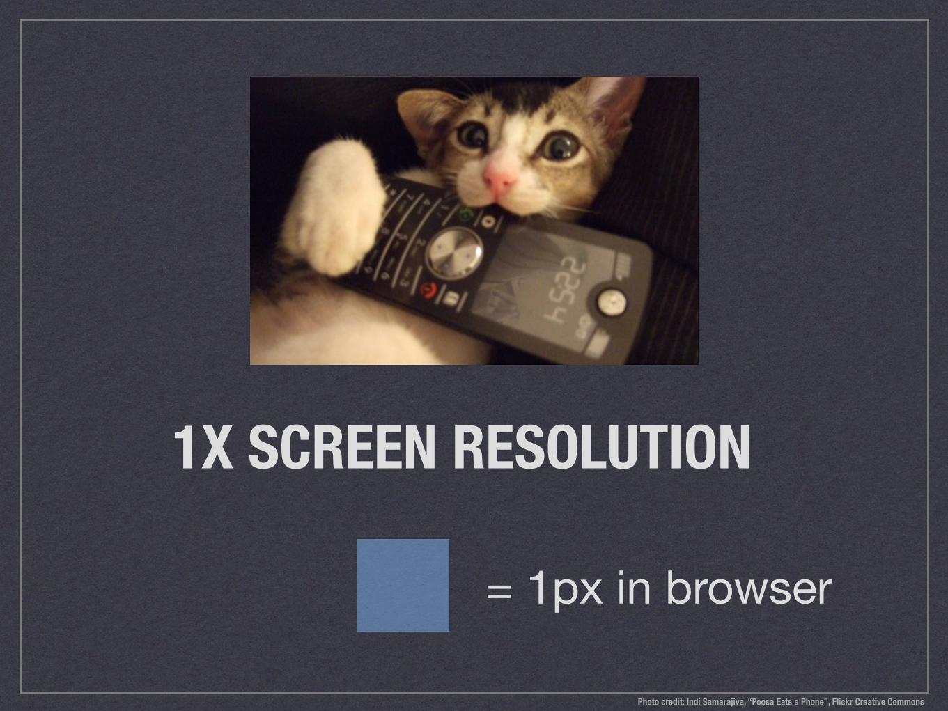
1X SCREEN RESOLUTION
= 1px in browser
Photo credit: Indi Samarajiva, “Poosa Eats a Phone”, Flickr Creative Commons
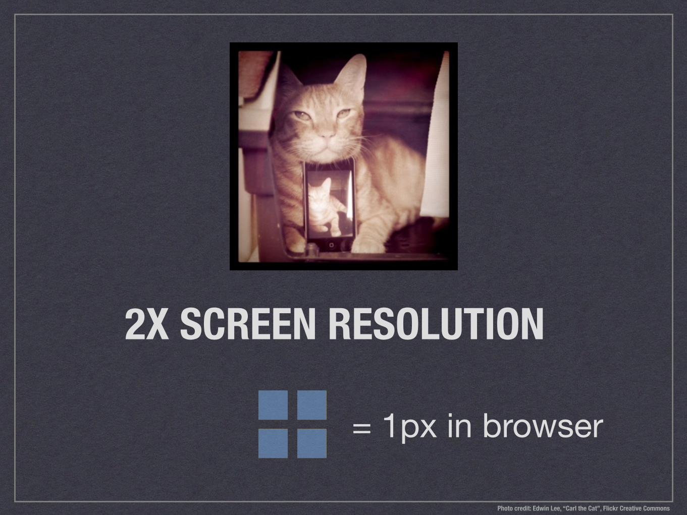
2X SCREEN RESOLUTION
= 1px in browser
Photo credit: Edwin Lee, “Carl the Cat”, Flickr Creative Commons
GET ME MORE PIXELS, STAT! Photo credit: Jami, “Singin’ on the Fridge”, Flickr Creative Commons
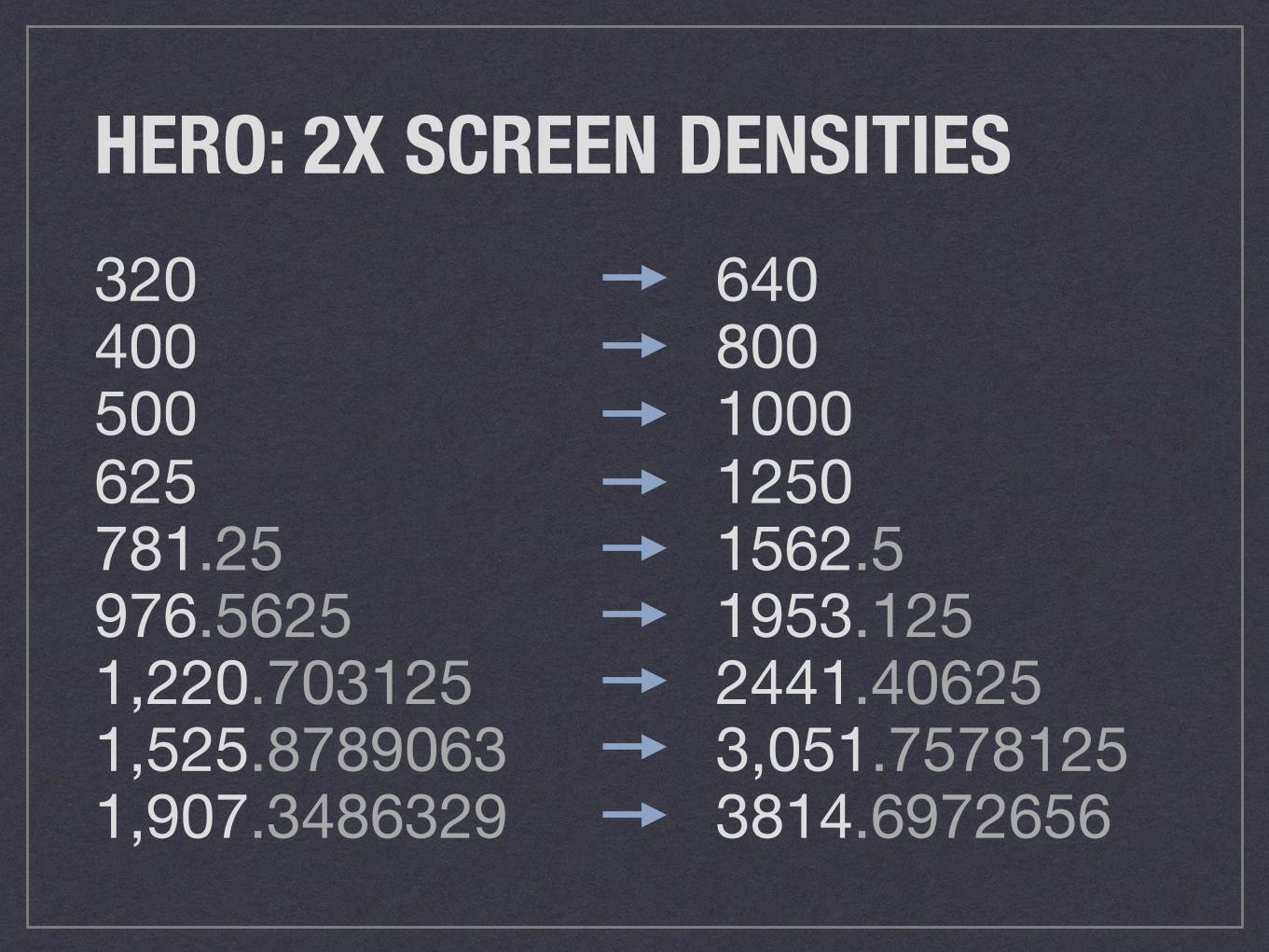
HERO: 2X SCREEN DENSITIES320400500625781.25976.56251,220.7031251,525.87890631,907.3486329
640800100012501562.51953.1252441.406253,051.75781253814.6972656
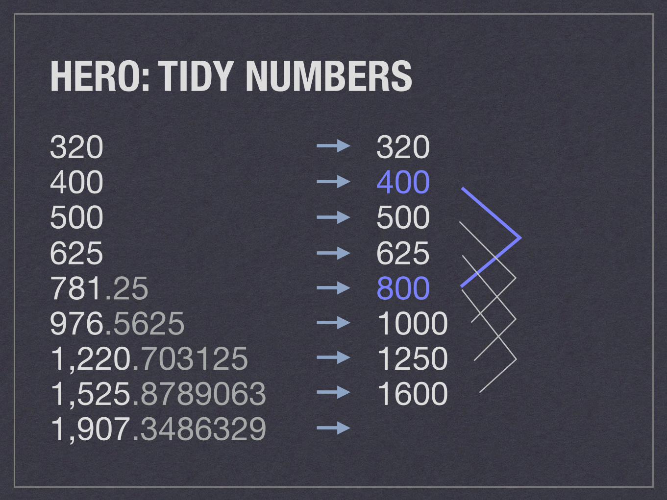
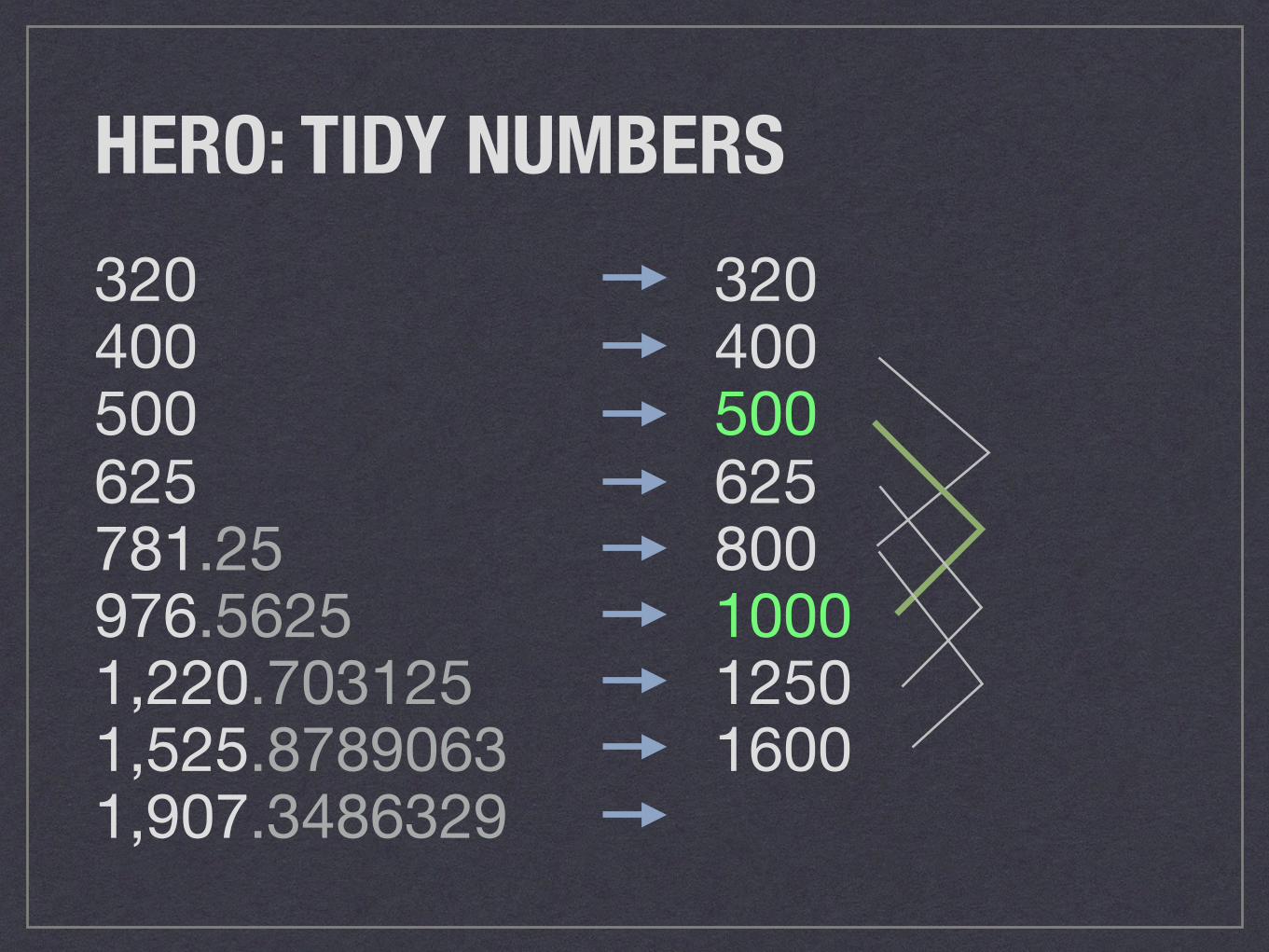
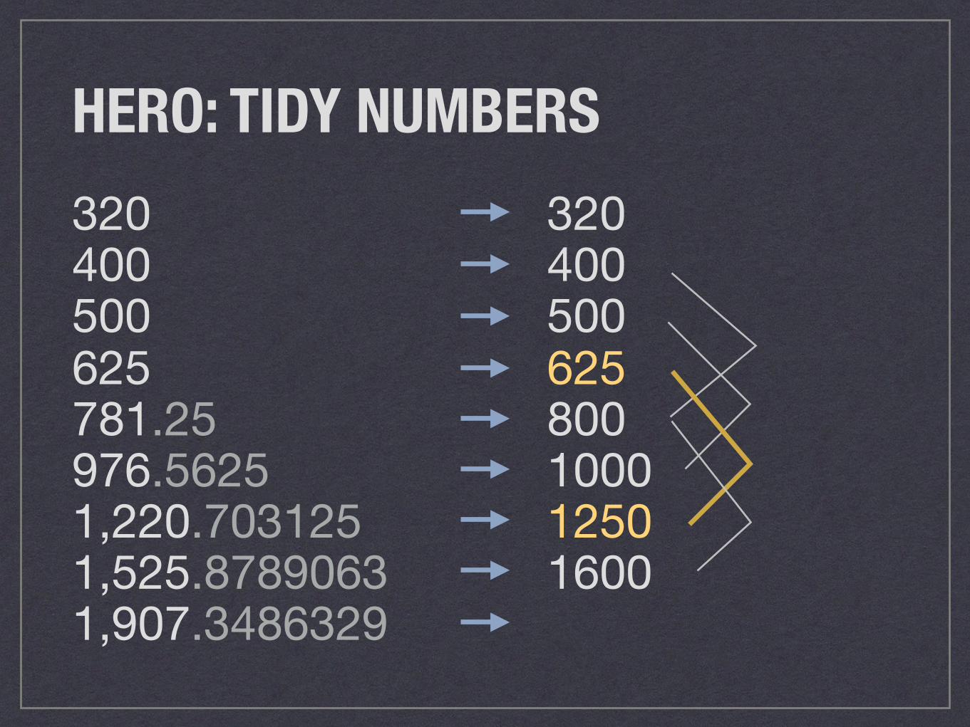
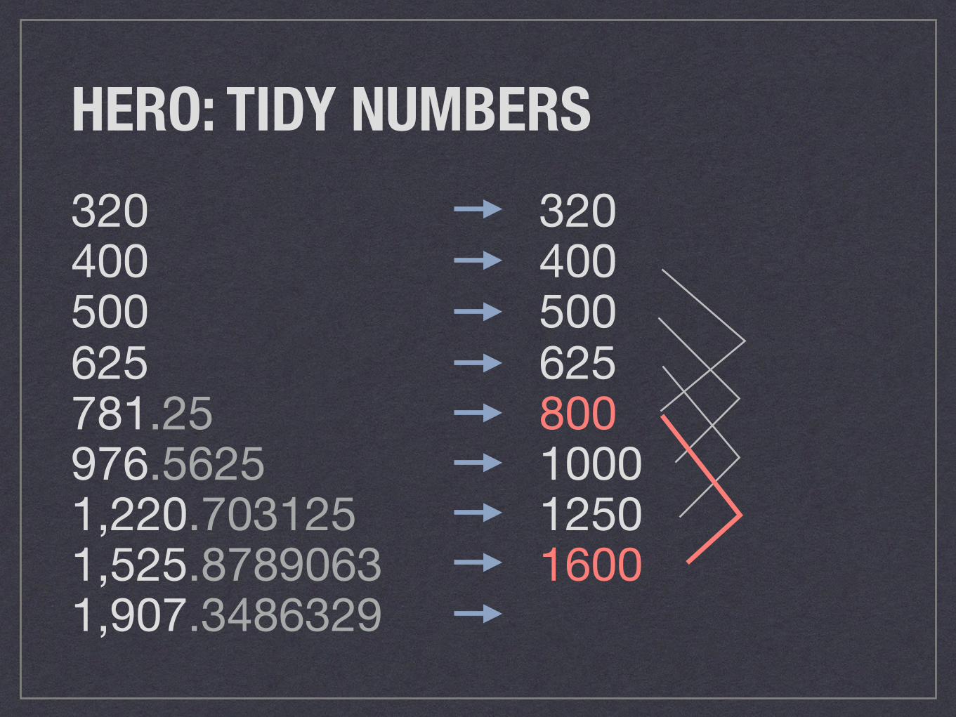
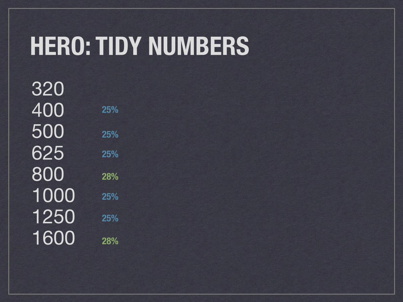
TIDY UPSENSIBLE SOURCE FILE WIDTHS
Photo credit: Sandra Forbes, “Clean Kitty”, Flickr Creative Commons
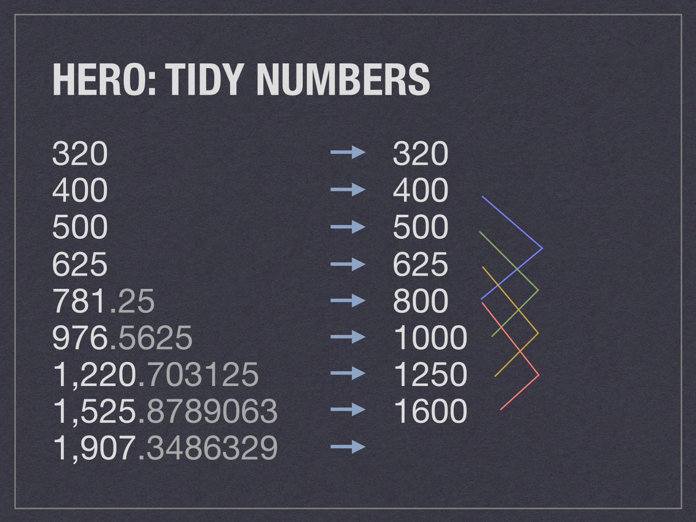
HERO: TIDY NUMBERS320400500625781.25976.56251,220.7031251,525.87890631,907.3486329
320400500625800100012501600
HERO: TIDY NUMBERS320400500625781.25976.56251,220.7031251,525.87890631,907.3486329
320400500625800100012501600
HERO: TIDY NUMBERS320400500625781.25976.56251,220.7031251,525.87890631,907.3486329
320400500625800100012501600
HERO: TIDY NUMBERS320400500625781.25976.56251,220.7031251,525.87890631,907.3486329
320400500625800100012501600
HERO: TIDY NUMBERS320400500625781.25976.56251,220.7031251,525.87890631,907.3486329
320400500625800100012501600
HERO: TIDY NUMBERS320400500625800100012501600
25%
25%
25%
28%
25%
25%
28%
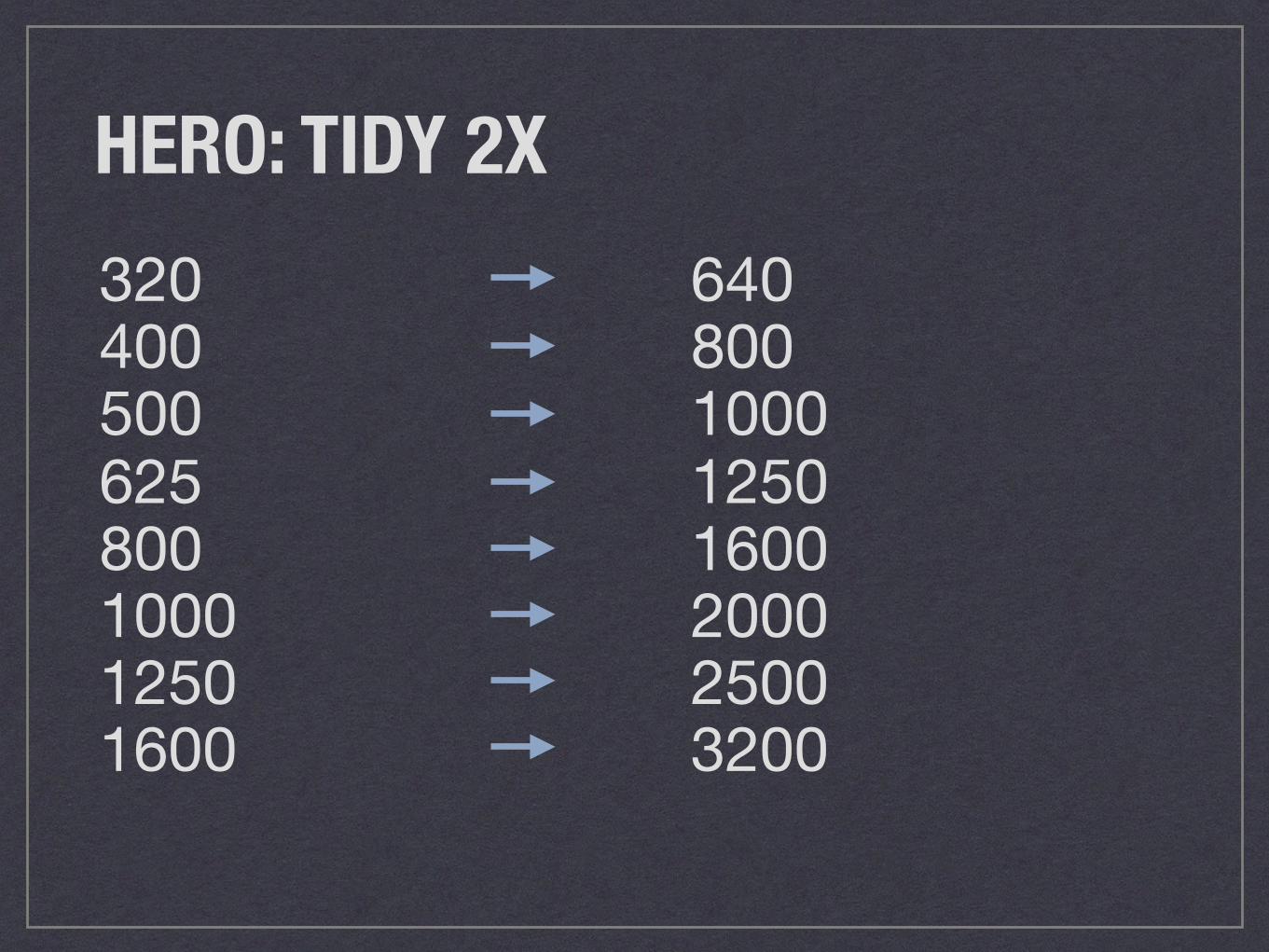
HERO: TIDY 2X320400500625800100012501600
640800100012501600200025003200
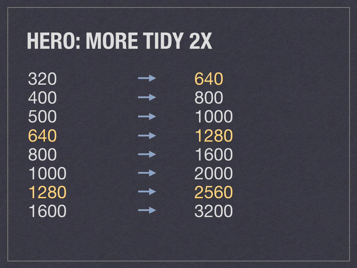
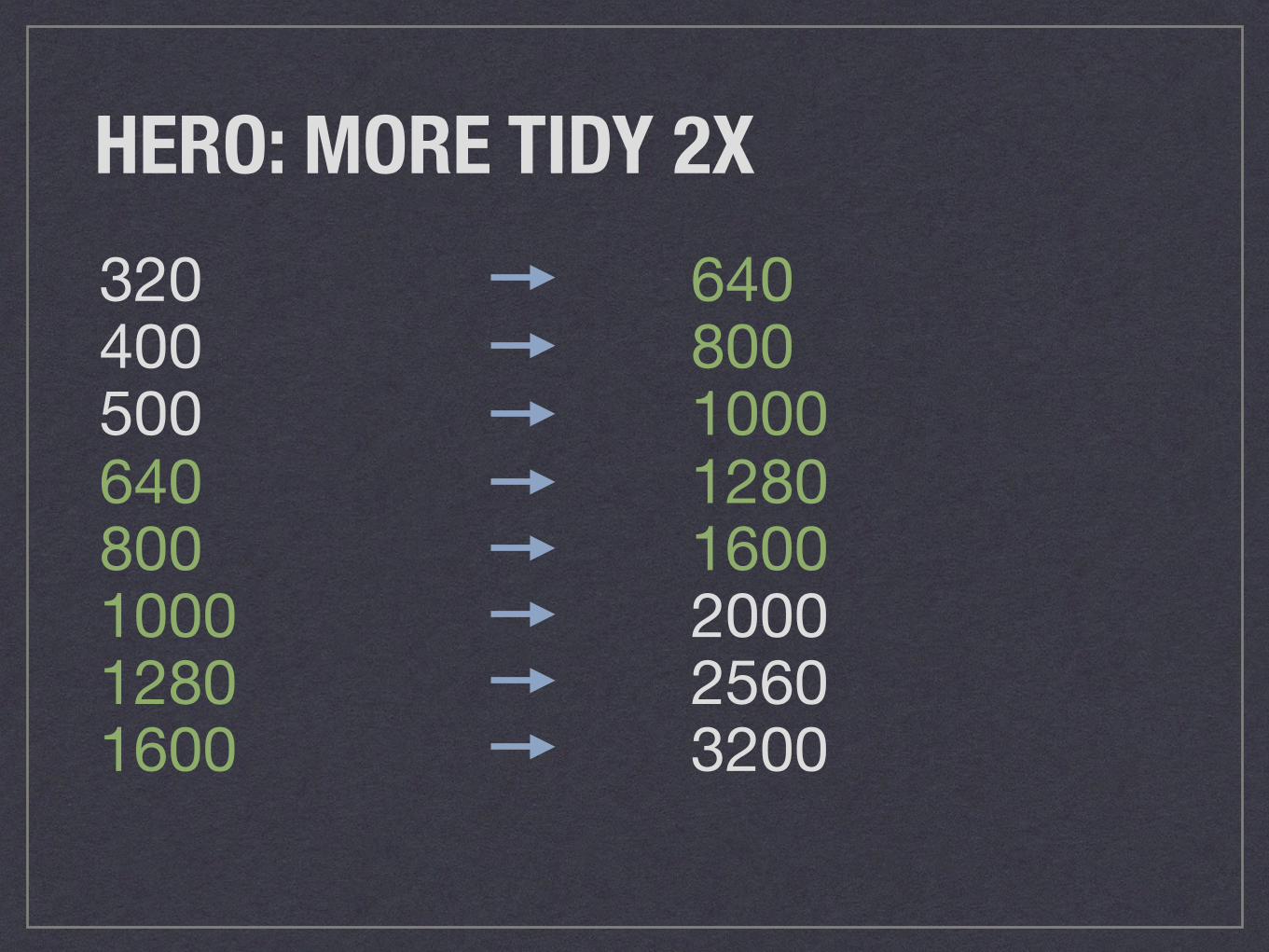
HERO: MORE TIDY 2X320400500640800100012801600
640800100012801600200025603200
HERO: MORE TIDY 2X320400500640800100012801600
640800100012801600200025603200
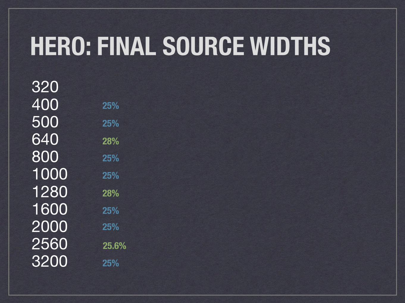
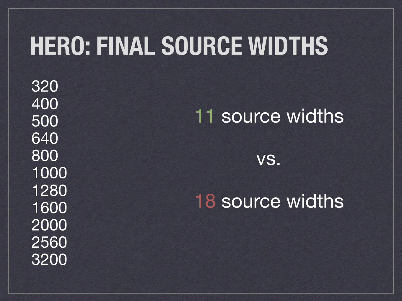
HERO: FINAL SOURCE WIDTHS320400500640800100012801600200025603200
25%
25%
25%28%
25%
25%
28%
25%
25.6%
25%
HERO: FINAL SOURCE WIDTHS320400500640800100012801600200025603200
11 source widths
vs.
18 source widths
SIZES ATTRIBUTEQUICK ACCESS LAYOUT INFO
Photo credit: London Looks, “Kittens!”, Flickr Creative Commons
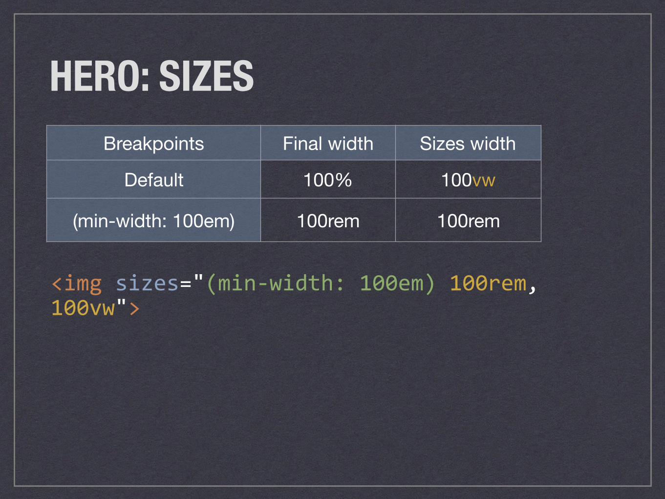
HERO: SIZES
<imgsizes="(min-width:100em)100rem,100vw">
Breakpoints Final width Sizes width
Default 100% 100vw
(min-width: 100em) 100rem 100rem
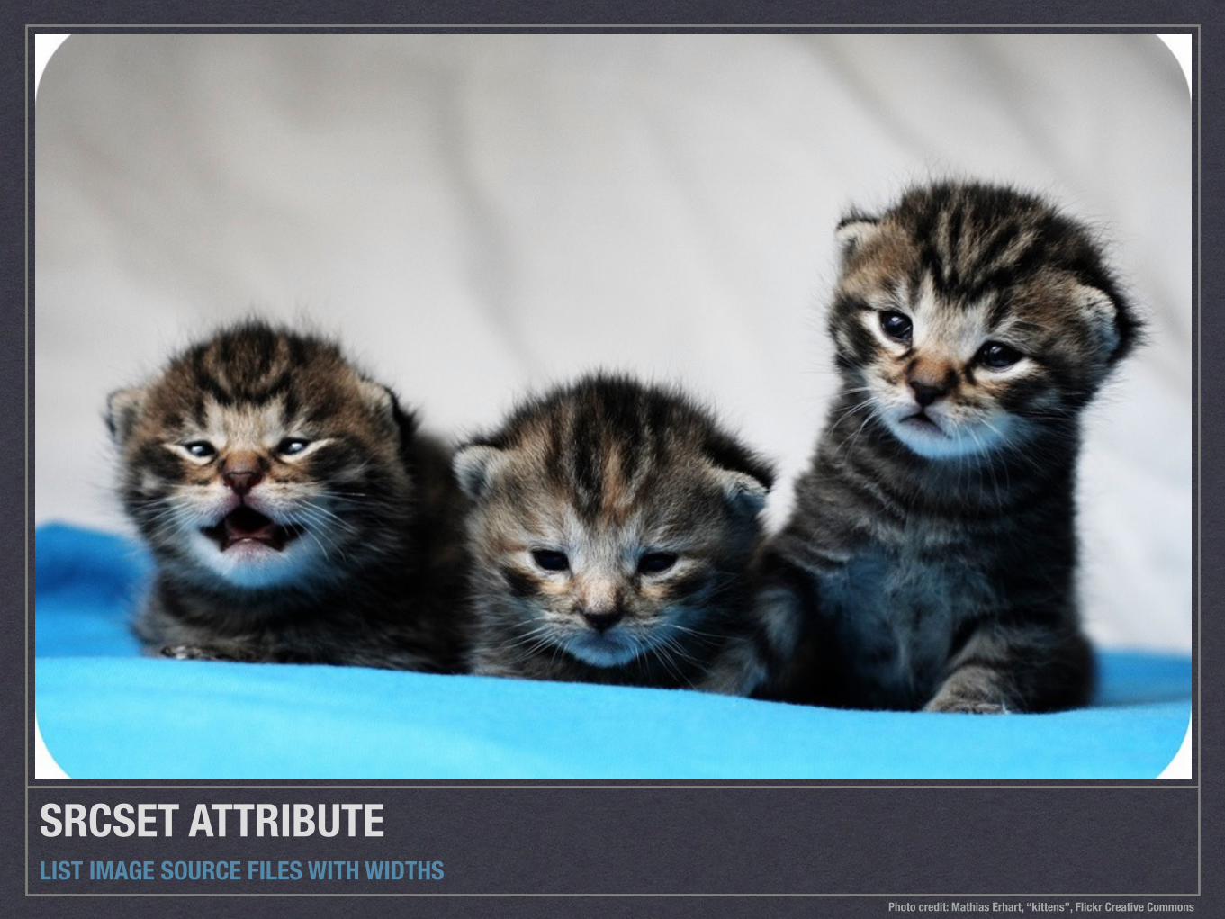
SRCSET ATTRIBUTELIST IMAGE SOURCE FILES WITH WIDTHS
Photo credit: Mathias Erhart, “kittens”, Flickr Creative Commons
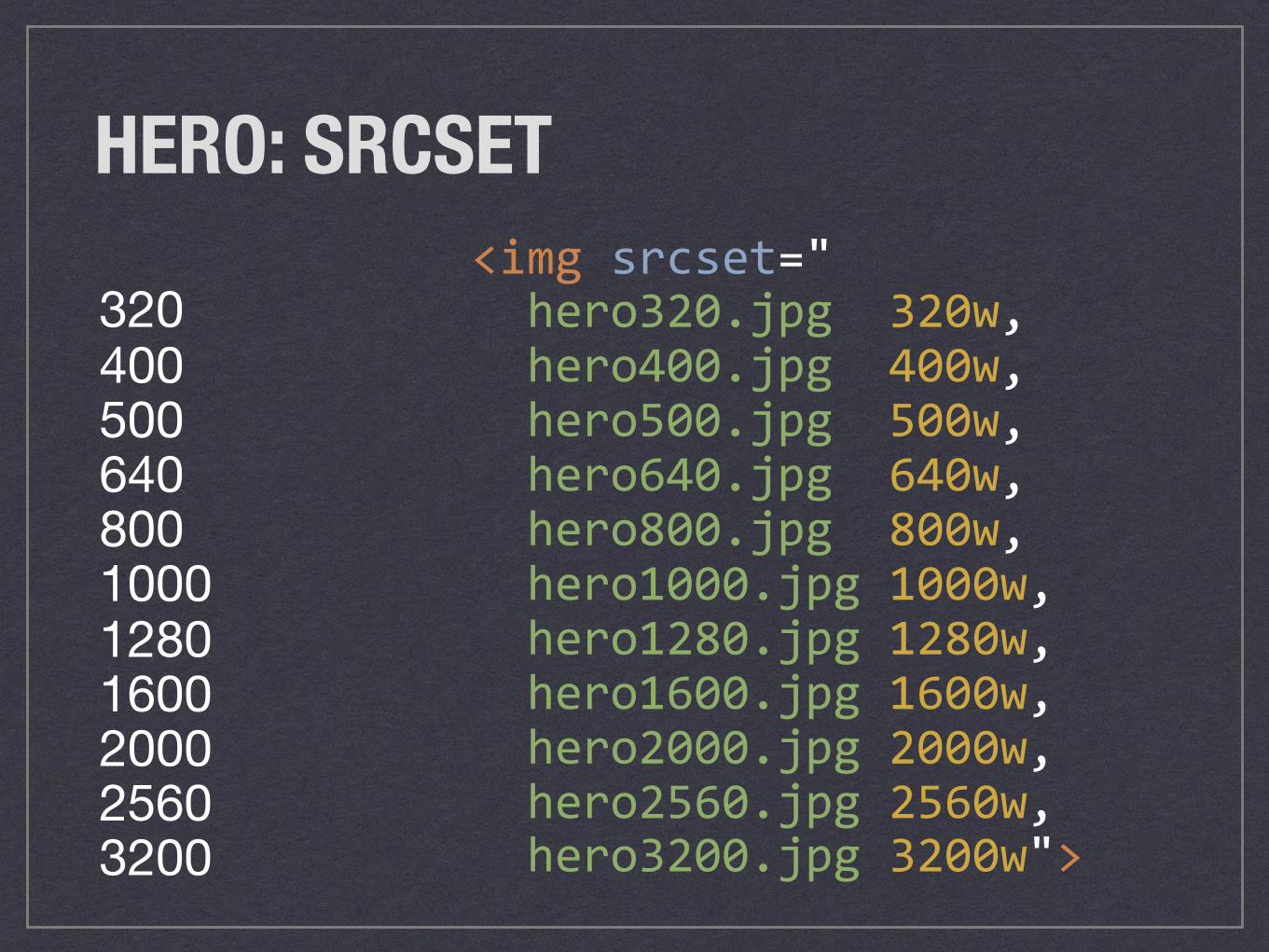
HERO: SRCSET
320400500640800100012801600200025603200
<imgsrcset="hero320.jpg320w,hero400.jpg400w,hero500.jpg500w,hero640.jpg640w,hero800.jpg800w,hero1000.jpg1000w,hero1280.jpg1280w,hero1600.jpg1600w,hero2000.jpg2000w,hero2560.jpg2560w,hero3200.jpg3200w">
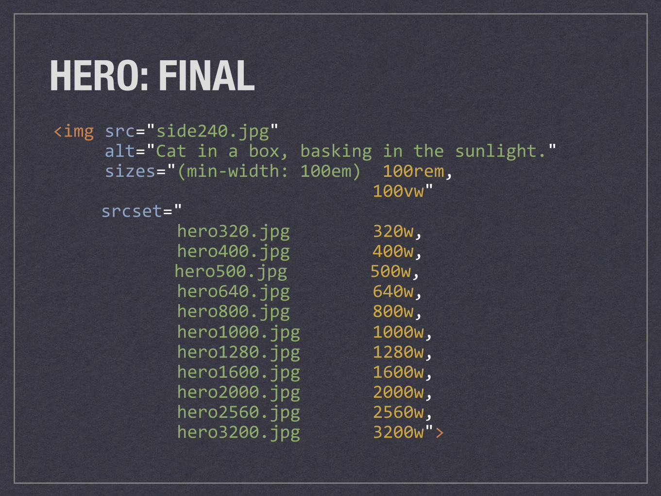
HERO: FINAL<imgsrc="side240.jpg"alt="Catinabox,baskinginthesunlight."sizes="(min-width:100em)100rem,
100vw"srcset="
hero320.jpg320w,hero400.jpg400w,
hero500.jpg500w,hero640.jpg640w,hero800.jpg800w,hero1000.jpg1000w,hero1280.jpg1280w,hero1600.jpg1600w,hero2000.jpg2000w,hero2560.jpg2560w,hero3200.jpg3200w">
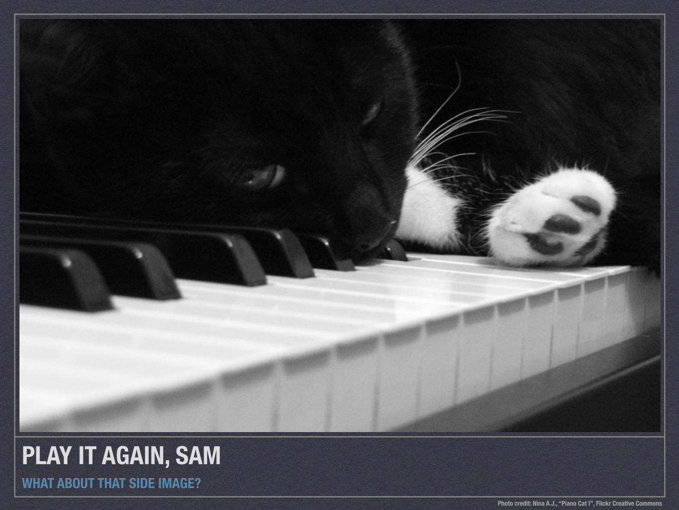
PLAY IT AGAIN, SAMWHAT ABOUT THAT SIDE IMAGE?
Photo credit: Nina A.J., “Piano Cat I”, Flickr Creative Commons
Tiger sunbathing in a boxI am unable to envision anything quite as adorable as my cat Tiger lounging in the sun, cuddled in his precious little box.
He has been a fan of this box since he was just a kitten, and we have preserved it ever since. When Tiger was just nine months old, we almost threw out this little half box. He mauled a couch that day. The next day, we brought in the box from the recycling, and he has been a happy cat ever since.
I have taken many photos over the years of Tiger cuddled in this box, but I love how the light looks in this particular picture.
You can feel the warmth of the sun, Tiger purring, and envision him slowly closing his eyes and yawning. There are few moments more tender than those of a sunbathing cat.
Tiger looks less cute on the bed than in the box
HERO IMAGE
SIDE IMAGE

<articleclass="post"><figureclass="post__hero-image"><imgsrc="images/suncat.jpg"alt="Goldensunbeamswarmacutcurledupinabox."/></figure><divclass="post__inner"><mainclass="post__body"role="main"><h1class="post__title">Tigersunbathinginabox</h1><p>Iamunabletoenvision…sunbathingcat.</p></main><asideclass="post__aside"role="complementary"><figureclass="post__aside-image"><imgsrc="images/suncat.jpg"alt="Goldensunbeamswarmacutcurledupinabox."/><figcaptionclass="post__aside-image-caption">Tigercuddlesinhisbox,baskinginthesun.</figcaption></figure></aside></div></article>
SIDE IMAGE.post > .post__inner > .post__aside > .post__aside-image > img
SIDE IMAGE.post > .post__inner > .post__aside > .post__aside-image > img
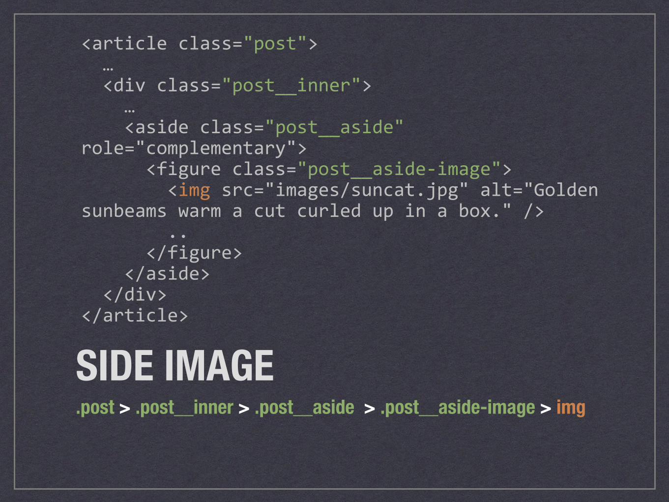
<articleclass="post">…<divclass="post__inner">…<asideclass="post__aside"role="complementary"><figureclass="post__aside-image"><imgsrc="images/suncat.jpg"alt="Goldensunbeamswarmacutcurledupinabox."/>..</figure></aside></div></article>
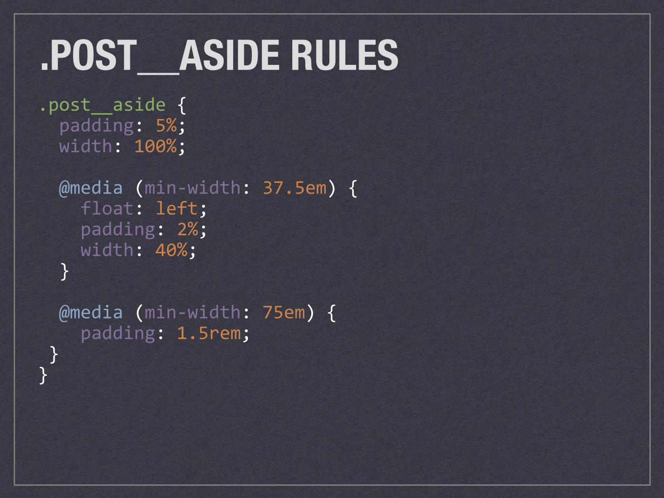
.post__aside{padding:5%;width:100%;
@media(min-width:37.5em){float:left;padding:2%;width:40%;}
@media(min-width:75em){padding:1.5rem;}}
.POST__ASIDE RULES
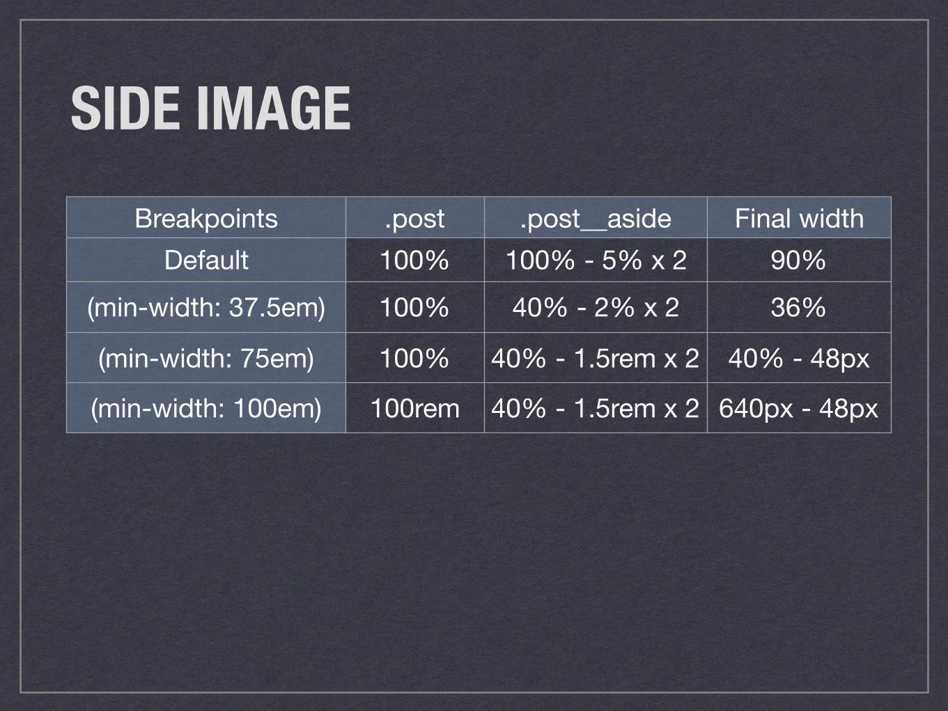
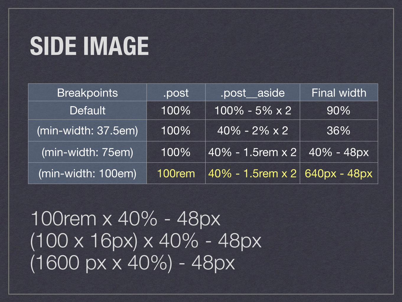
SIDE IMAGEBreakpoints .post .post__aside Final width
Default 100% 100% - 5% x 2 90%(min-width: 37.5em) 100% 40% - 2% x 2 36%
(min-width: 75em) 100% 40% - 1.5rem x 2 40% - 48px
(min-width: 100em) 100rem 40% - 1.5rem x 2 640px - 48px
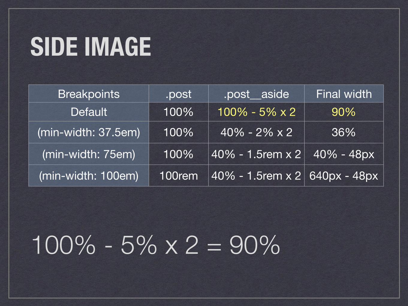
SIDE IMAGEBreakpoints .post .post__aside Final width
Default 100% 100% - 5% x 2 90%(min-width: 37.5em) 100% 40% - 2% x 2 36%
(min-width: 75em) 100% 40% - 1.5rem x 2 40% - 48px
(min-width: 100em) 100rem 40% - 1.5rem x 2 640px - 48px
100% - 5% x 2 = 90%
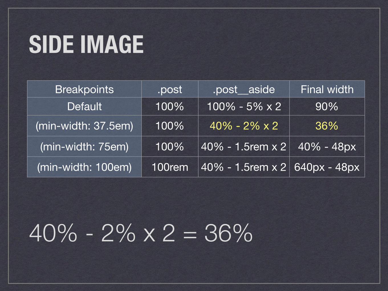
SIDE IMAGEBreakpoints .post .post__aside Final width
Default 100% 100% - 5% x 2 90%(min-width: 37.5em) 100% 40% - 2% x 2 36%
(min-width: 75em) 100% 40% - 1.5rem x 2 40% - 48px
(min-width: 100em) 100rem 40% - 1.5rem x 2 640px - 48px
40% - 2% x 2 = 36%
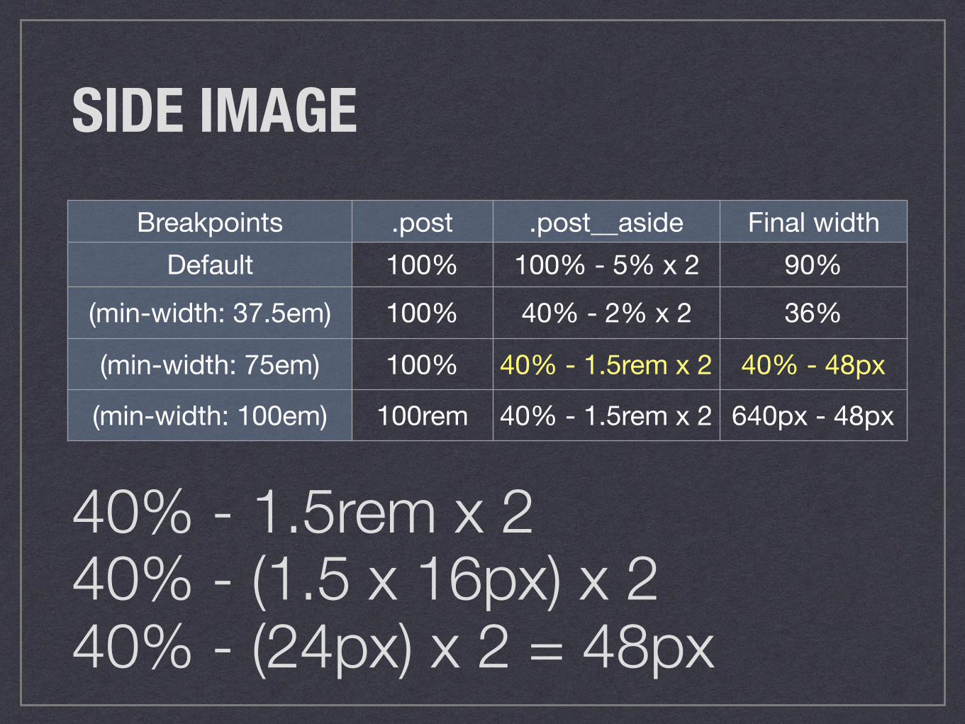
SIDE IMAGEBreakpoints .post .post__aside Final width
Default 100% 100% - 5% x 2 90%(min-width: 37.5em) 100% 40% - 2% x 2 36%
(min-width: 75em) 100% 40% - 1.5rem x 2 40% - 48px
(min-width: 100em) 100rem 40% - 1.5rem x 2 640px - 48px
40% - 1.5rem x 2 40% - (1.5 x 16px) x 2 40% - (24px) x 2 = 48px
SIDE IMAGEBreakpoints .post .post__aside Final width
Default 100% 100% - 5% x 2 90%(min-width: 37.5em) 100% 40% - 2% x 2 36%
(min-width: 75em) 100% 40% - 1.5rem x 2 40% - 48px
(min-width: 100em) 100rem 40% - 1.5rem x 2 640px - 48px
100rem x 40% - 48px (100 x 16px) x 40% - 48px (1600 px x 40%) - 48px
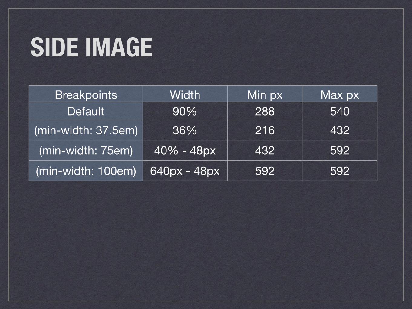
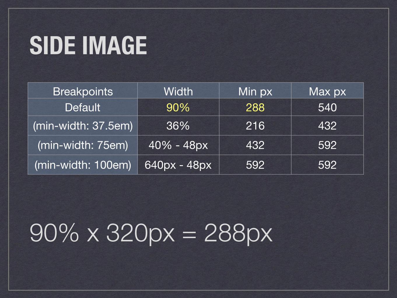
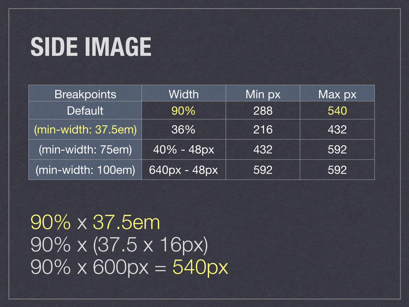
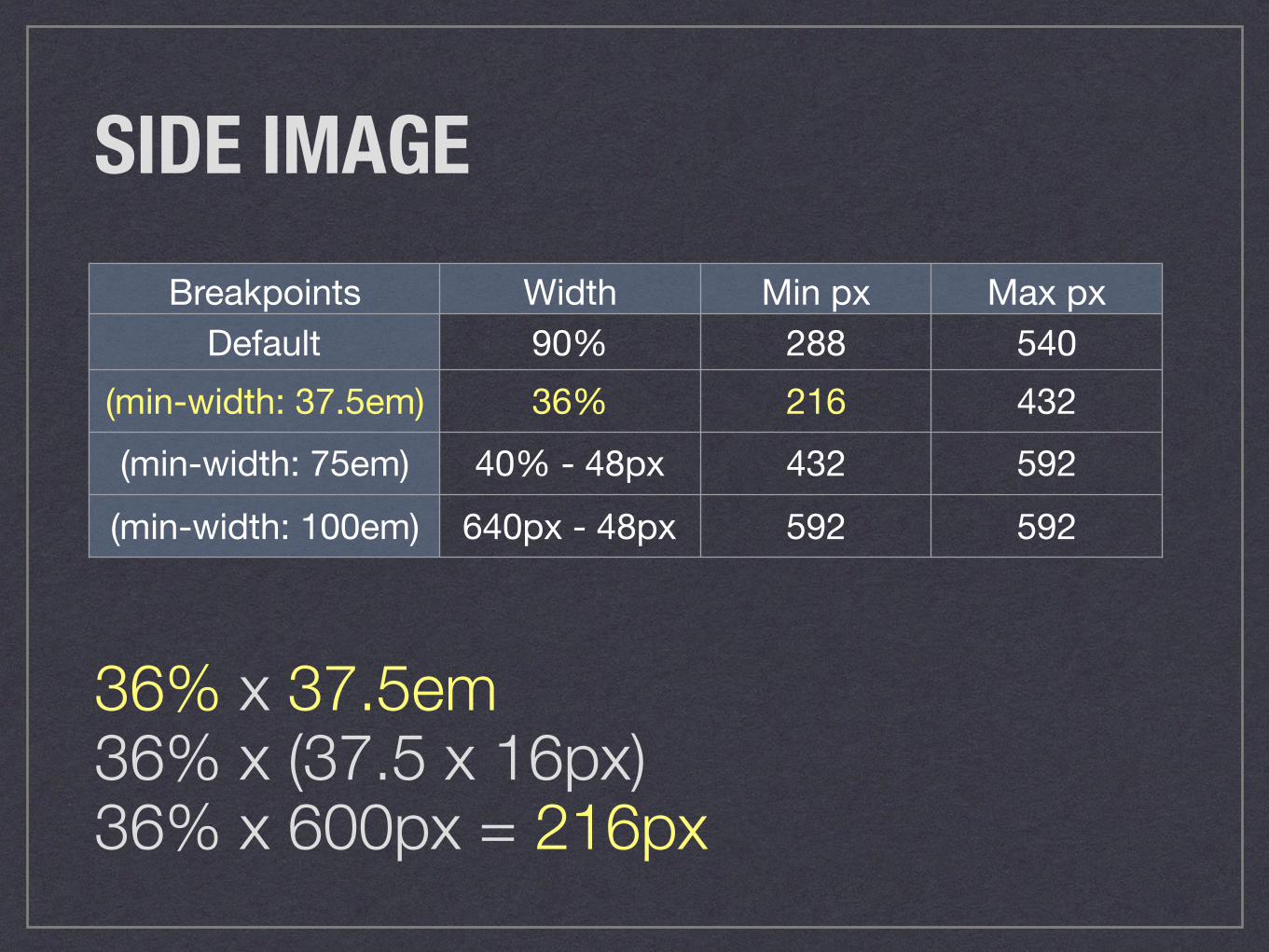
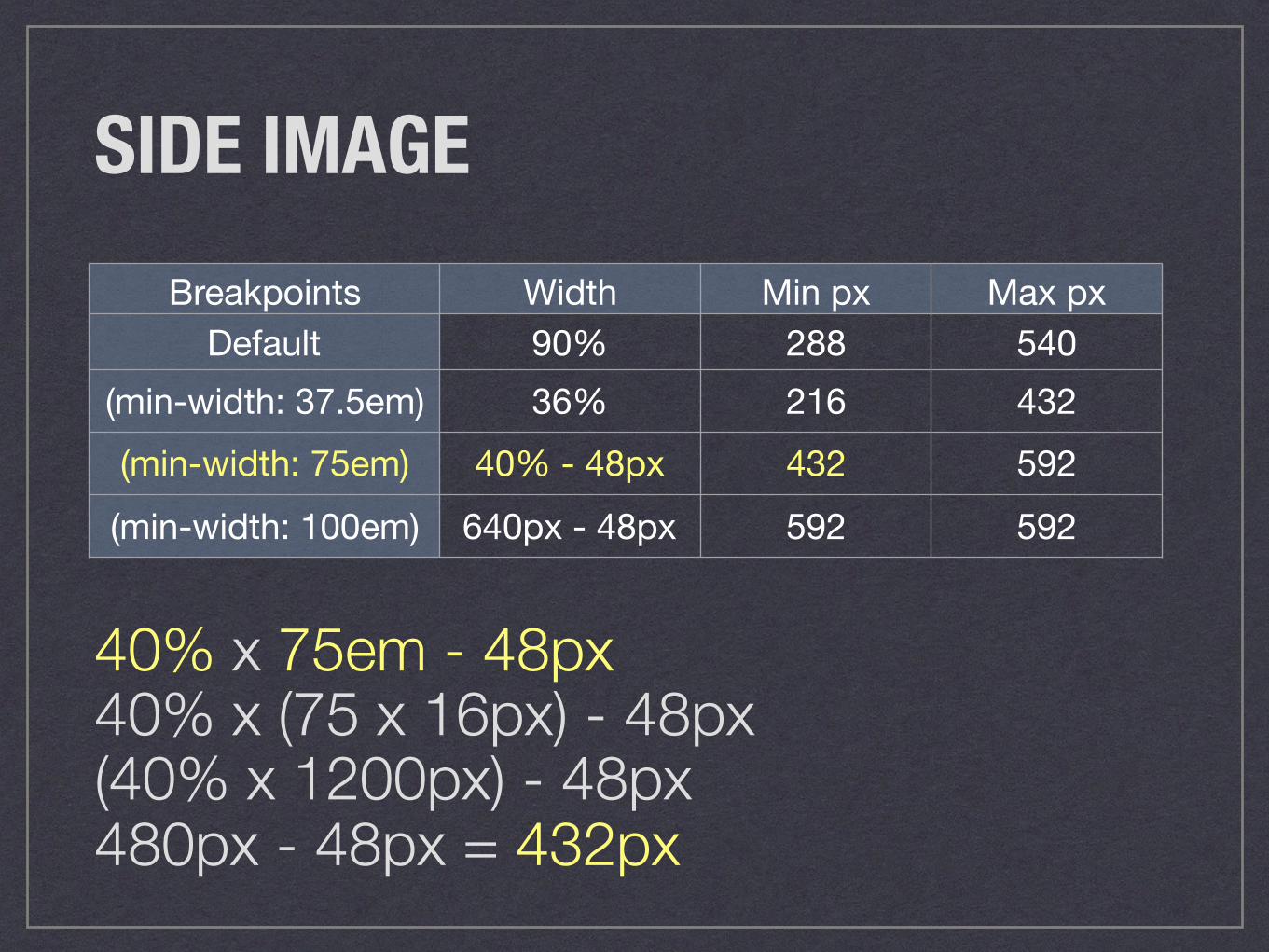
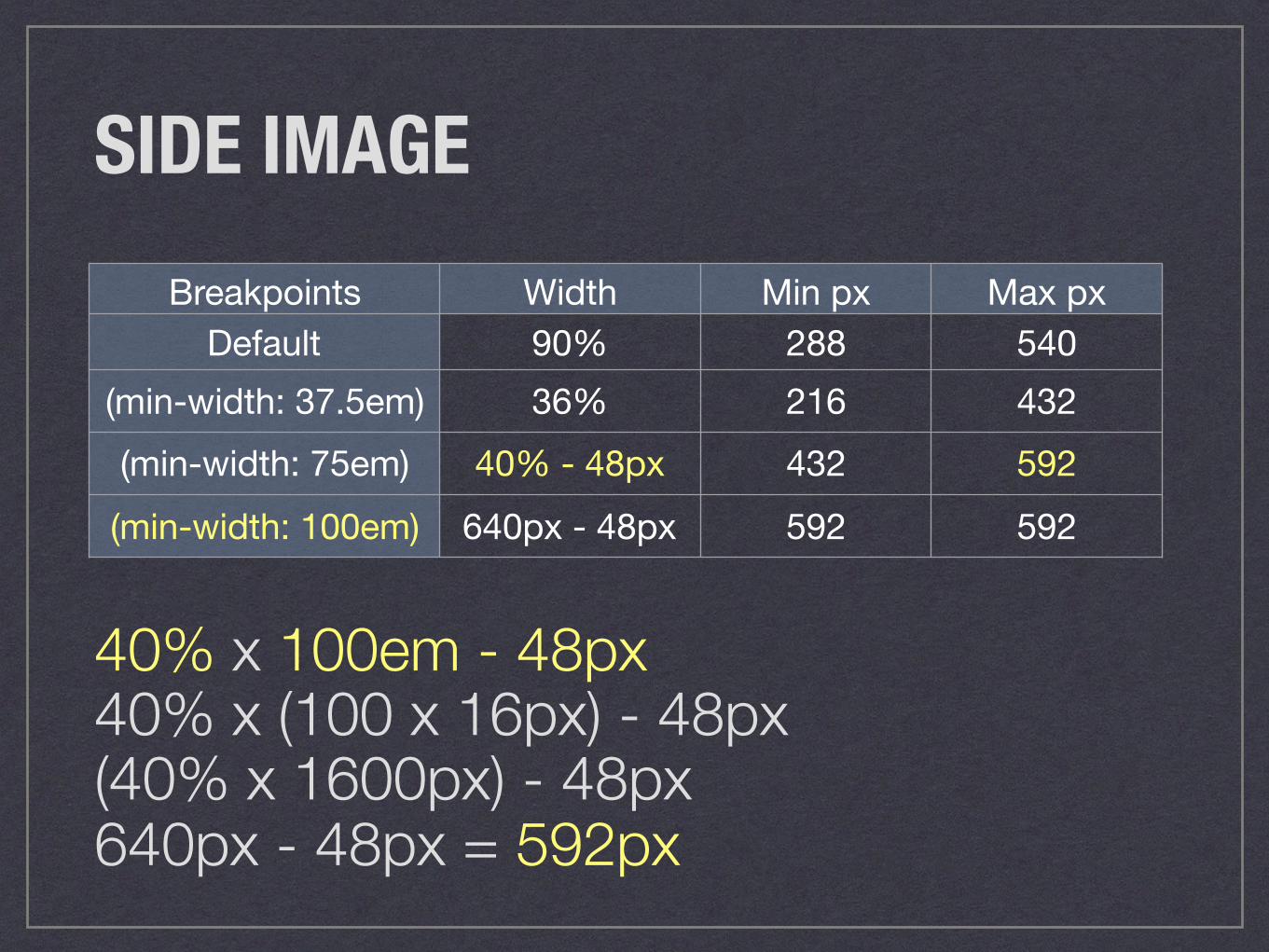
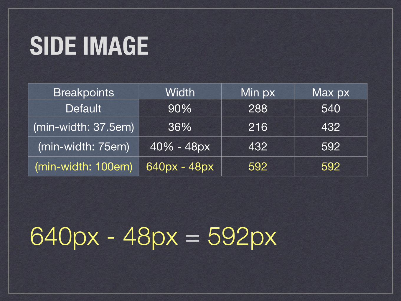
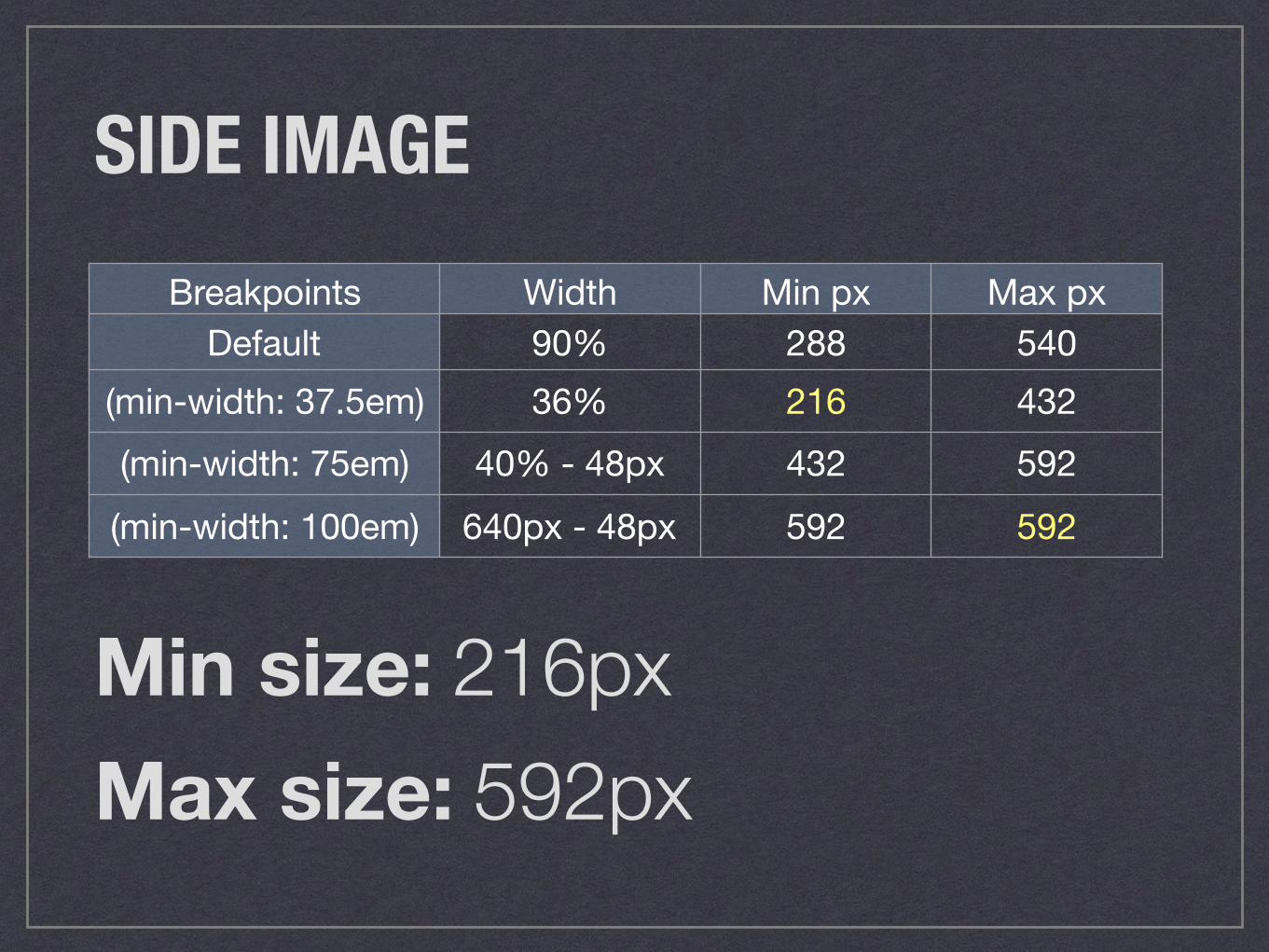
SIDE IMAGEBreakpoints Width Min px Max px
Default 90% 288 540(min-width: 37.5em) 36% 216 432(min-width: 75em) 40% - 48px 432 592(min-width: 100em) 640px - 48px 592 592
SIDE IMAGEBreakpoints Width Min px Max px
Default 90% 288 540(min-width: 37.5em) 36% 216 432(min-width: 75em) 40% - 48px 432 592(min-width: 100em) 640px - 48px 592 592
90% x 320px = 288px
SIDE IMAGEBreakpoints Width Min px Max px
Default 90% 288 540(min-width: 37.5em) 36% 216 432(min-width: 75em) 40% - 48px 432 592(min-width: 100em) 640px - 48px 592 592
90% x 37.5em 90% x (37.5 x 16px) 90% x 600px = 540px
SIDE IMAGEBreakpoints Width Min px Max px
Default 90% 288 540(min-width: 37.5em) 36% 216 432(min-width: 75em) 40% - 48px 432 592(min-width: 100em) 640px - 48px 592 592
36% x 37.5em 36% x (37.5 x 16px) 36% x 600px = 216px

SIDE IMAGEBreakpoints Width Min px Max px
Default 90% 288 540(min-width: 37.5em) 36% 216 432(min-width: 75em) 40% - 48px 432 592(min-width: 100em) 640px - 48px 592 592
36% x 75em 36% x (75 x 16px) 36% x 1200px = 432px
SIDE IMAGEBreakpoints Width Min px Max px
Default 90% 288 540(min-width: 37.5em) 36% 216 432(min-width: 75em) 40% - 48px 432 592(min-width: 100em) 640px - 48px 592 592
40% x 75em - 48px 40% x (75 x 16px) - 48px (40% x 1200px) - 48px 480px - 48px = 432px
SIDE IMAGEBreakpoints Width Min px Max px
Default 90% 288 540(min-width: 37.5em) 36% 216 432(min-width: 75em) 40% - 48px 432 592(min-width: 100em) 640px - 48px 592 592
40% x 100em - 48px 40% x (100 x 16px) - 48px (40% x 1600px) - 48px 640px - 48px = 592px
SIDE IMAGEBreakpoints Width Min px Max px
Default 90% 288 540(min-width: 37.5em) 36% 216 432(min-width: 75em) 40% - 48px 432 592(min-width: 100em) 640px - 48px 592 592
640px - 48px = 592px
SIDE IMAGEBreakpoints Width Min px Max px
Default 90% 288 540(min-width: 37.5em) 36% 216 432(min-width: 75em) 40% - 48px 432 592(min-width: 100em) 640px - 48px 592 592
Min size: 216pxMax size: 592px
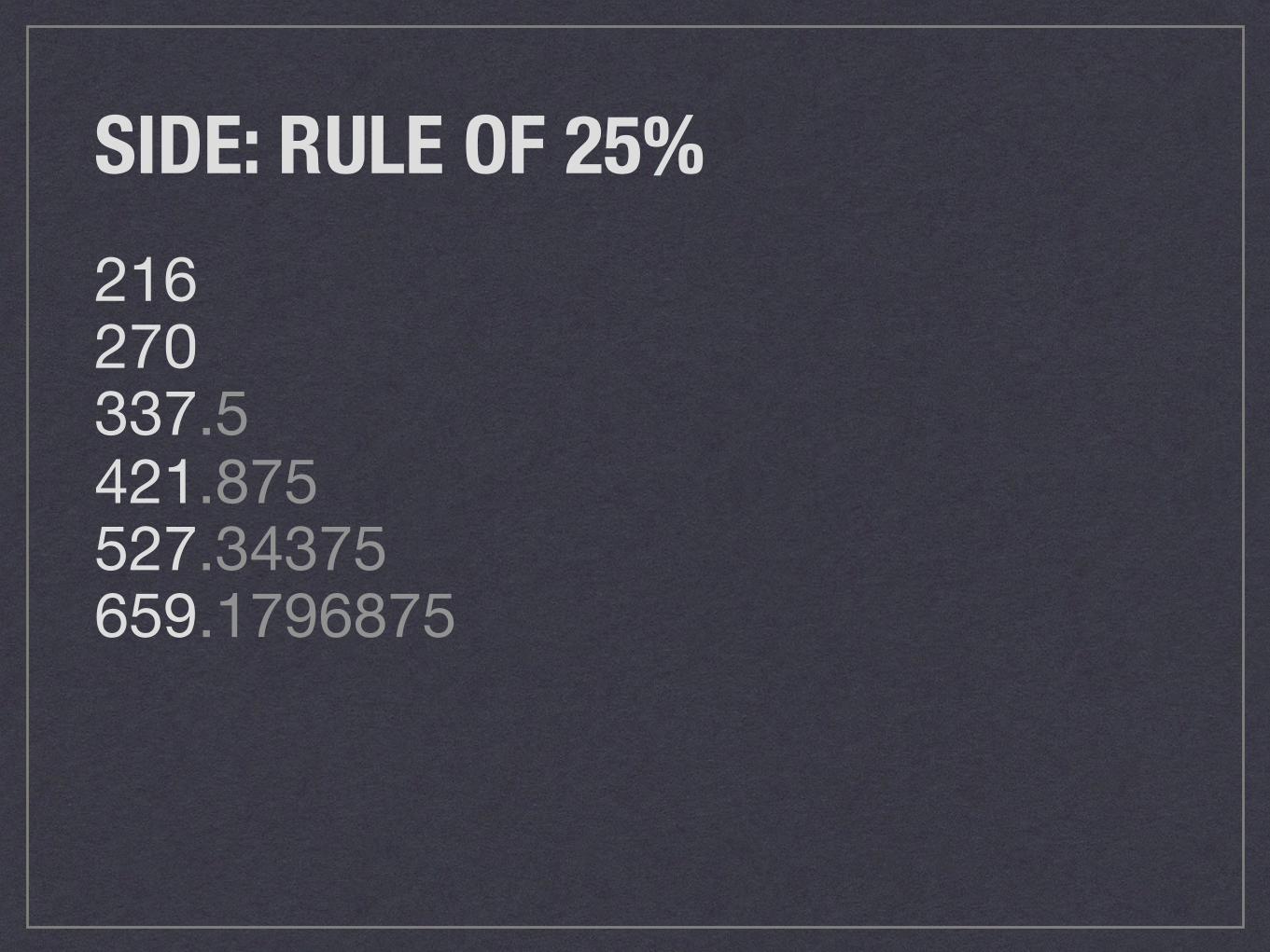
SIDE: RULE OF 25%216270337.5421.875527.34375659.1796875
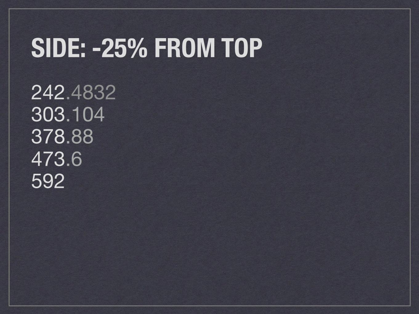
SIDE: -25% FROM TOP242.4832303.104378.88473.6592
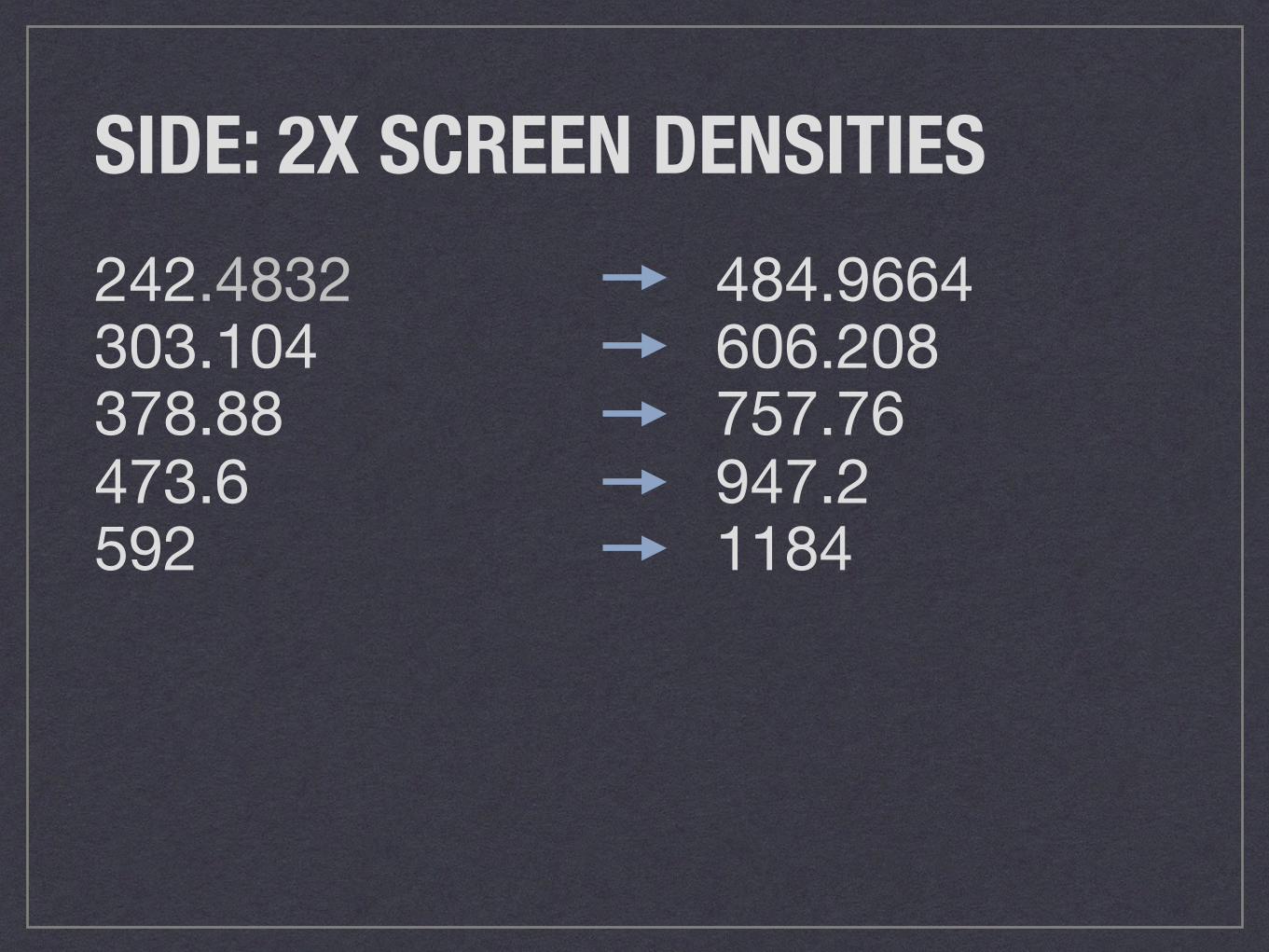
SIDE: 2X SCREEN DENSITIES242.4832303.104378.88473.6592
484.9664 606.208757.76947.21184
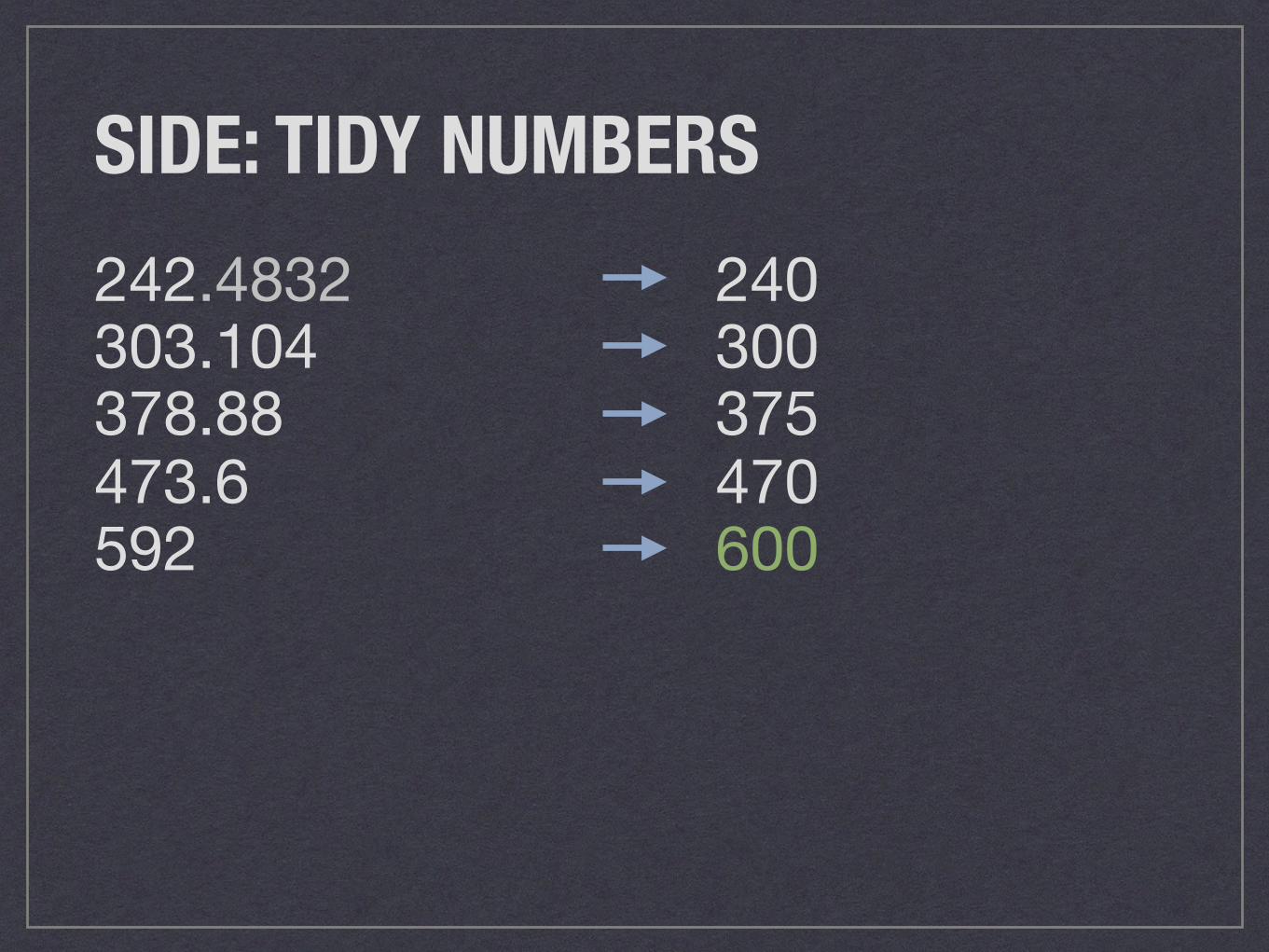
SIDE: TIDY NUMBERS242.4832303.104378.88473.6592
240300375470600
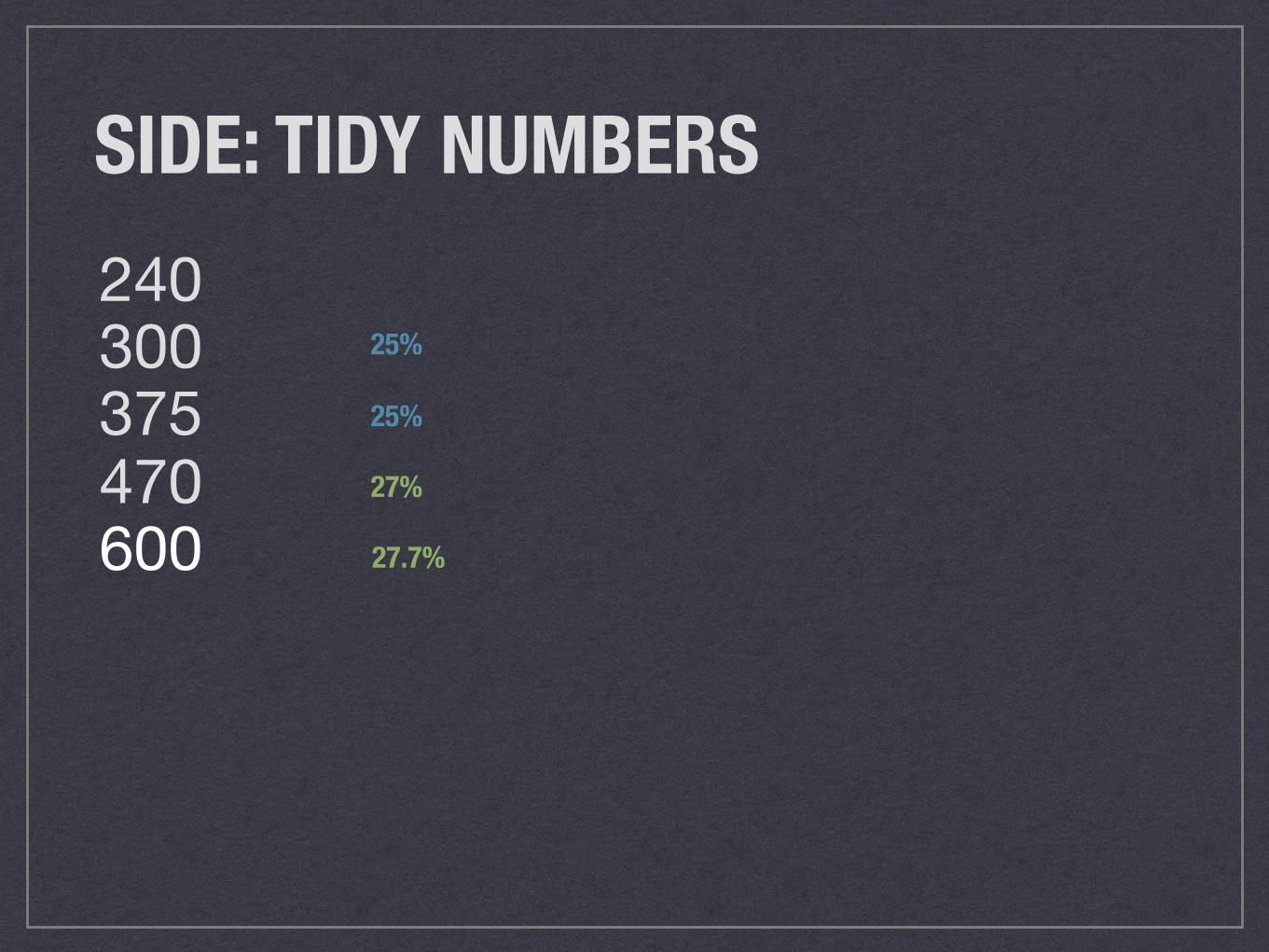
SIDE: TIDY NUMBERS240300375470600
25%
27%
27.7%
25%
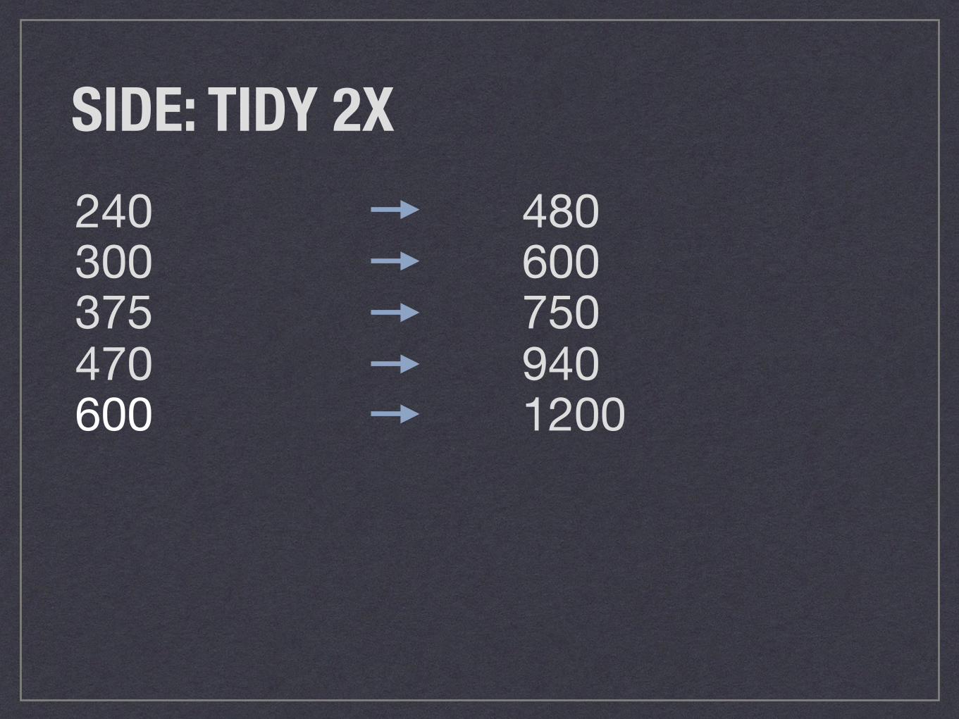
SIDE: TIDY 2X240300375470600
4806007509401200
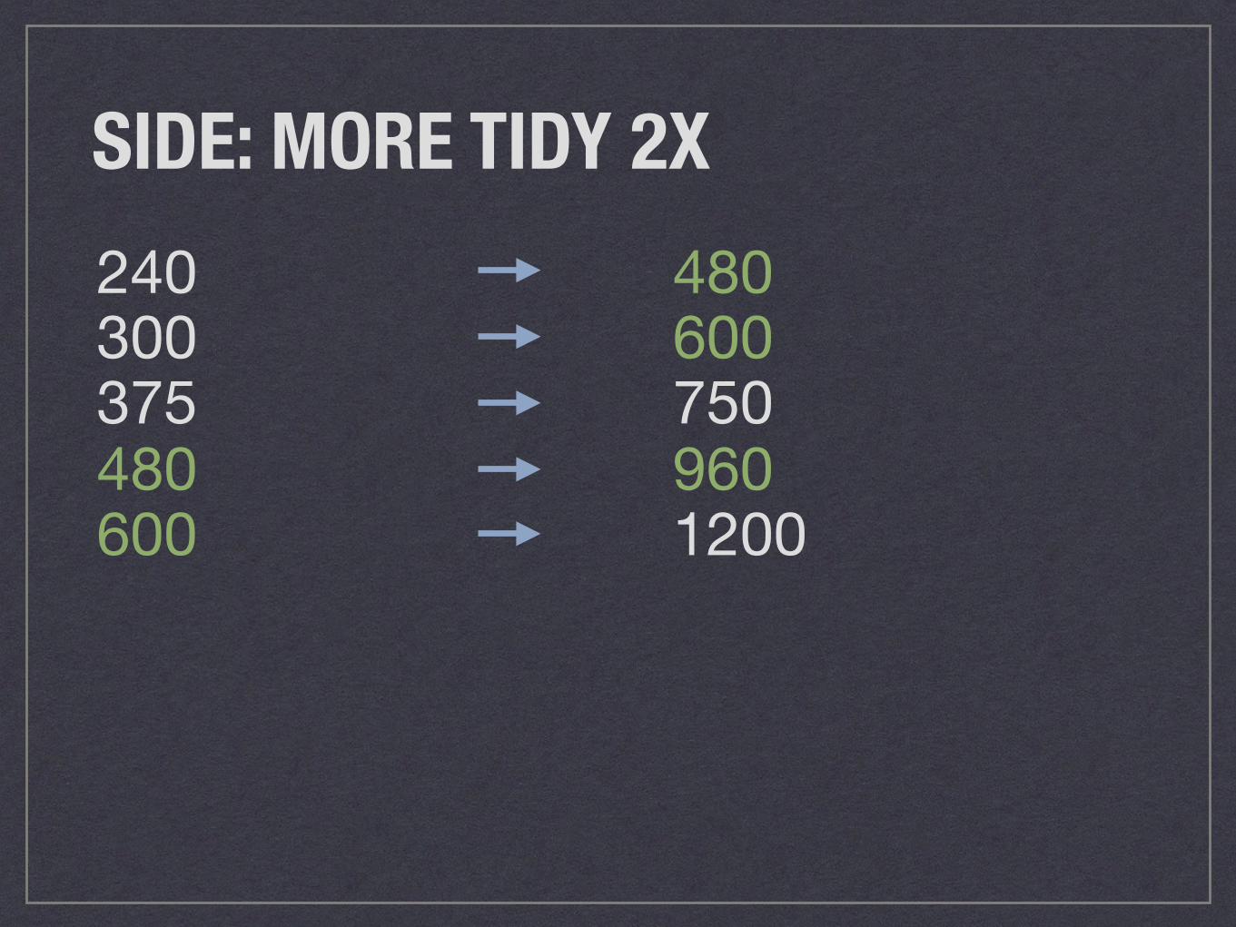
SIDE: MORE TIDY 2X240300375480600
4806007509601200
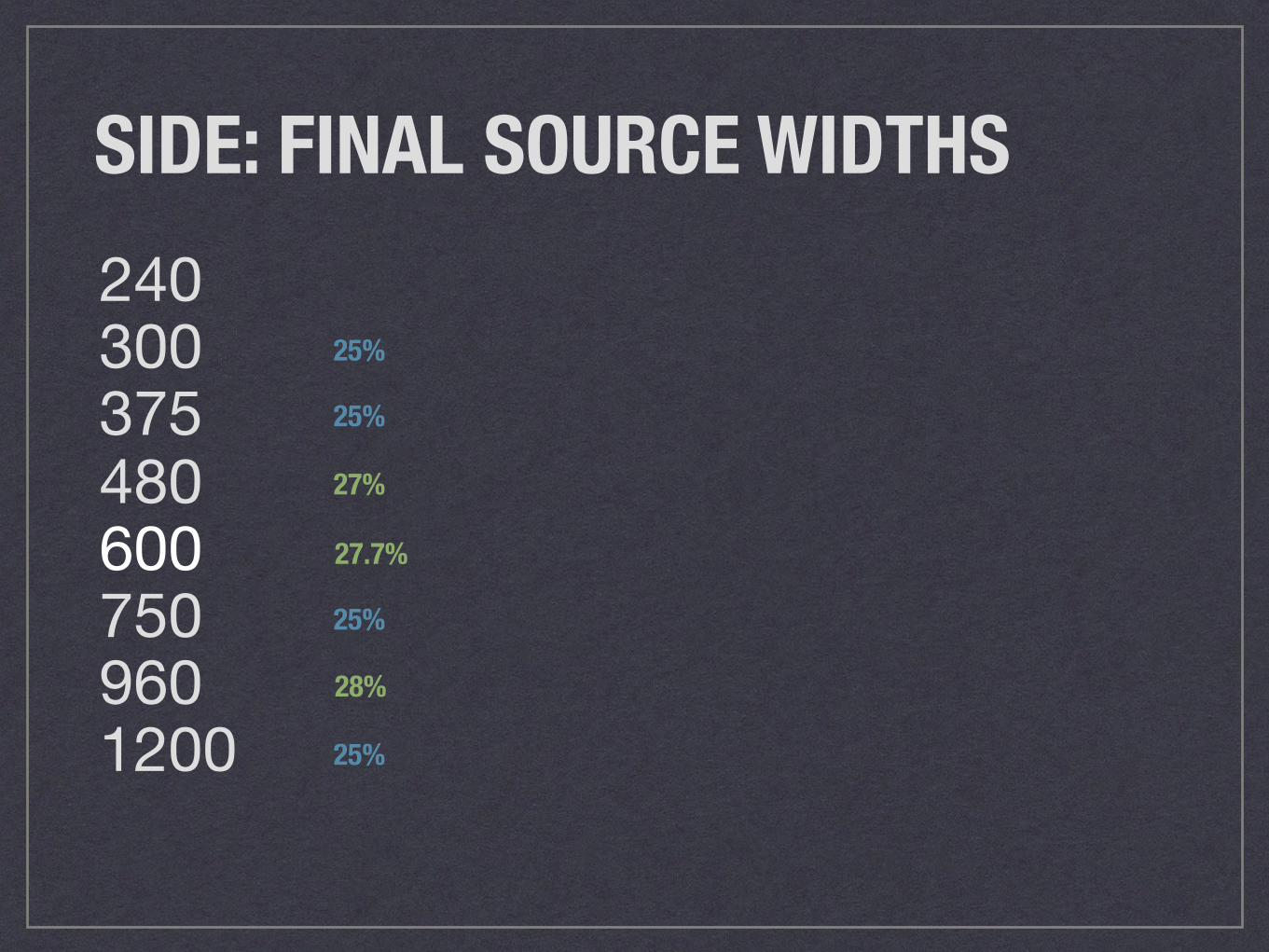
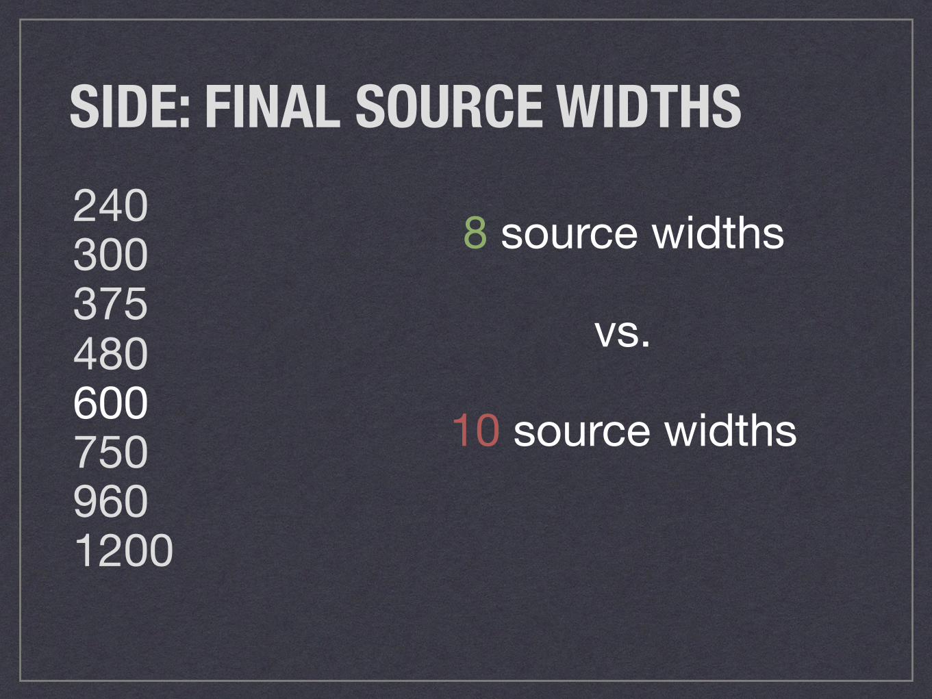
SIDE: FINAL SOURCE WIDTHS2403003754806007509601200
25%
27%
25%
27.7%
28%
25%
25%
SIDE: FINAL SOURCE WIDTHS2403003754806007509601200
8 source widths
vs.
10 source widths
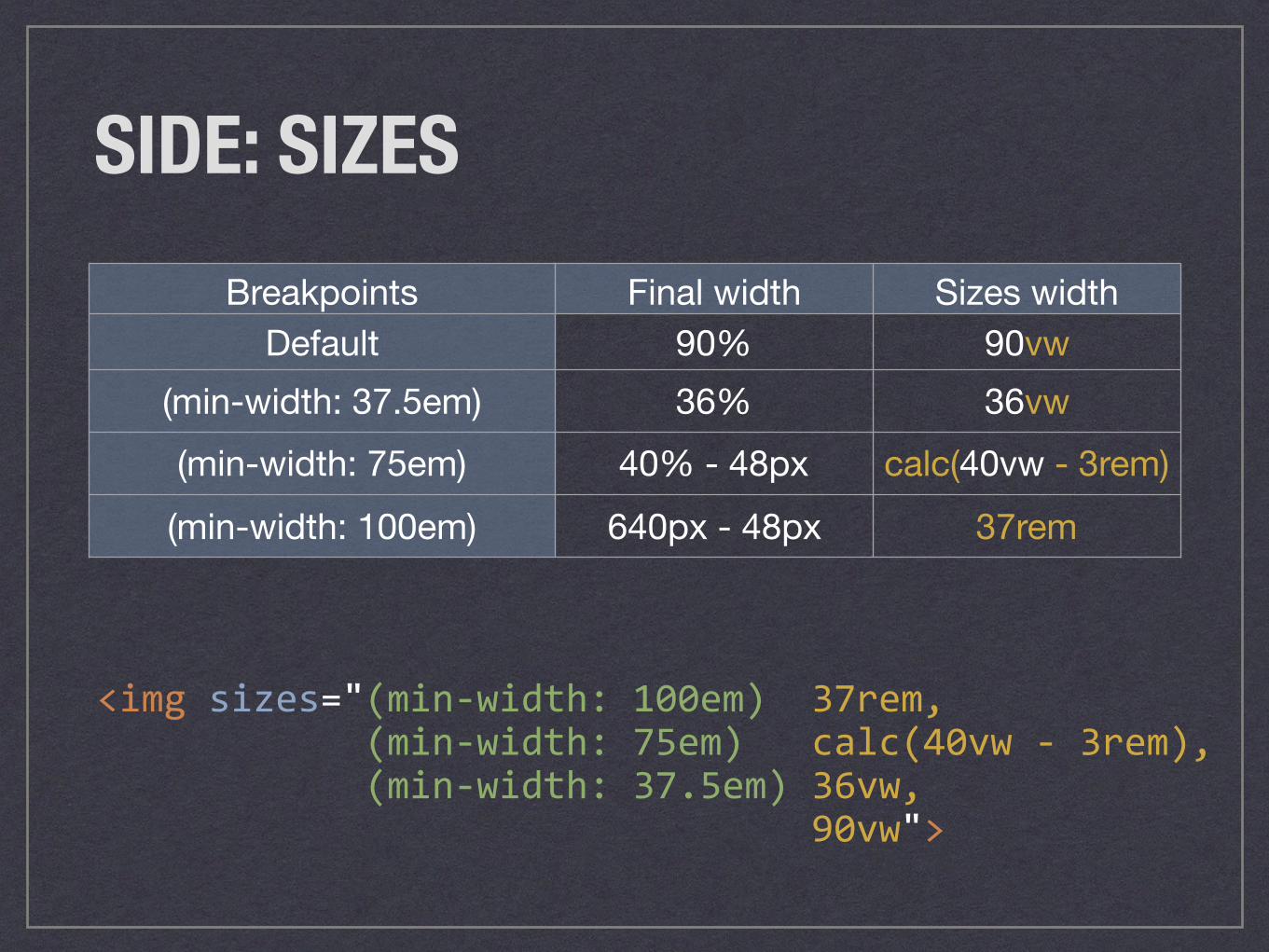
SIDE: SIZES
<imgsizes="(min-width:100em)37rem,(min-width:75em)calc(40vw-3rem),(min-width:37.5em)36vw,90vw">
Breakpoints Final width Sizes widthDefault 90% 90vw
(min-width: 37.5em) 36% 36vw(min-width: 75em) 40% - 48px calc(40vw - 3rem)(min-width: 100em) 640px - 48px 37rem
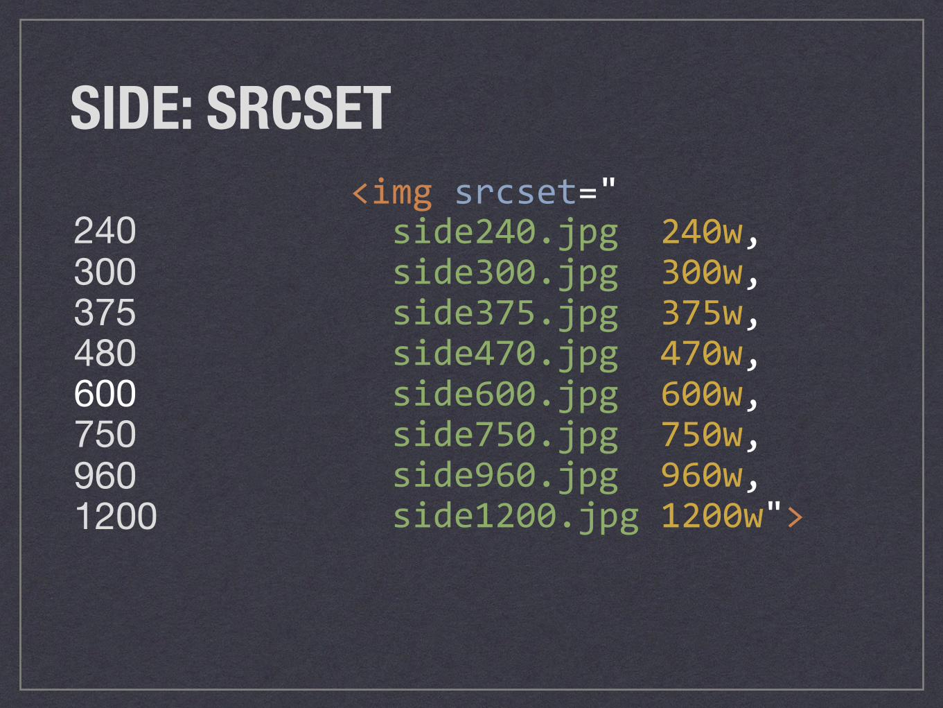
SIDE: SRCSET
2403003754806007509601200
<imgsrcset="side240.jpg240w,side300.jpg300w,side375.jpg375w,side470.jpg470w,side600.jpg600w,side750.jpg750w,side960.jpg960w,side1200.jpg1200w">
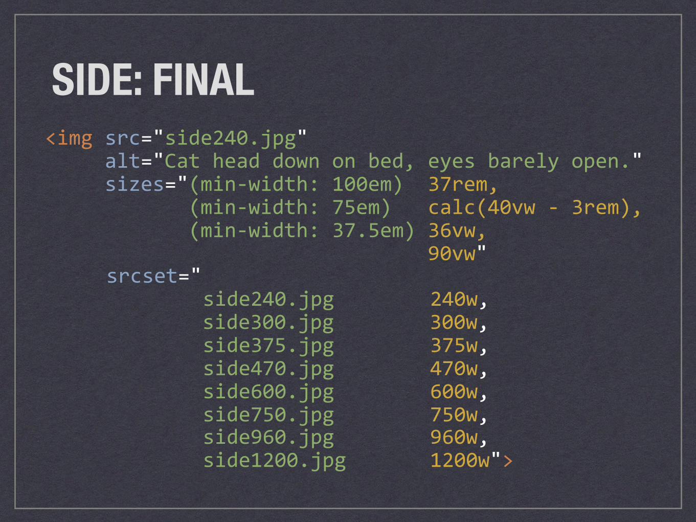
SIDE: FINAL<imgsrc="side240.jpg"alt="Catheaddownonbed,eyesbarelyopen."sizes="(min-width:100em)37rem,(min-width:75em)calc(40vw-3rem),(min-width:37.5em)36vw,90vw"
srcset="side240.jpg240w,
side300.jpg300w,side375.jpg375w,side470.jpg470w,side600.jpg600w,side750.jpg750w,side960.jpg960w,side1200.jpg1200w">
CSS RULESMAKE IMAGES FLUID
Photo credit: Kevin Pelrine, “Leroy the Ruler”, Flickr Creative Commons
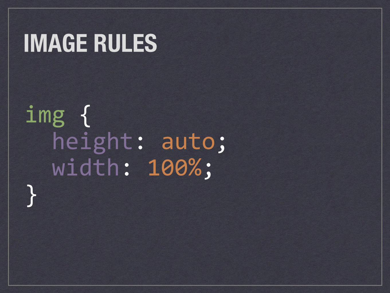
IMAGE RULES
img{height:auto;width:100%;}
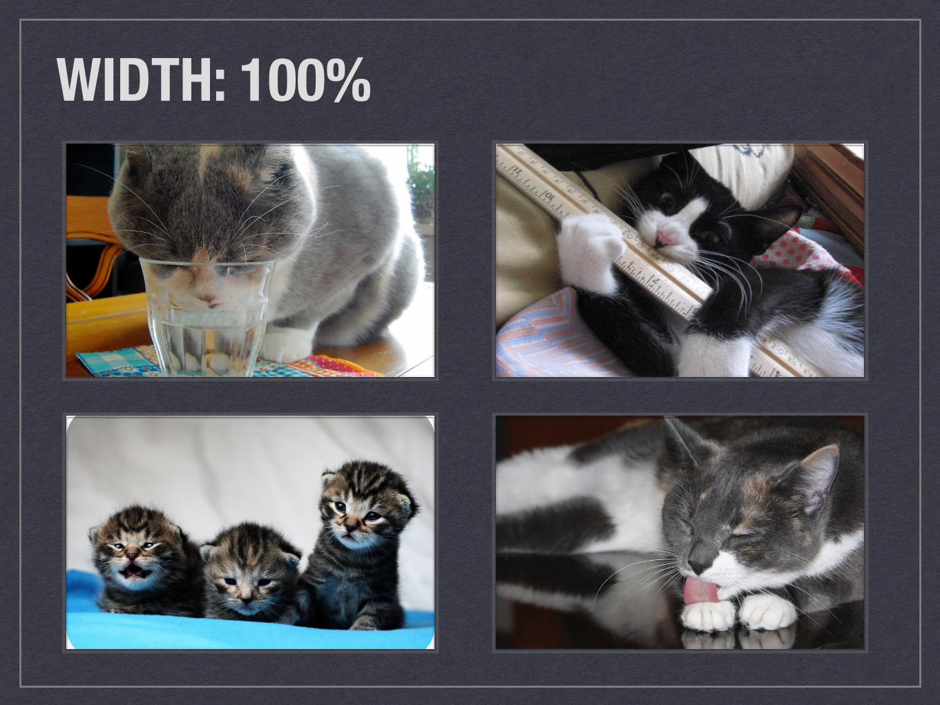
WIDTH: 100%
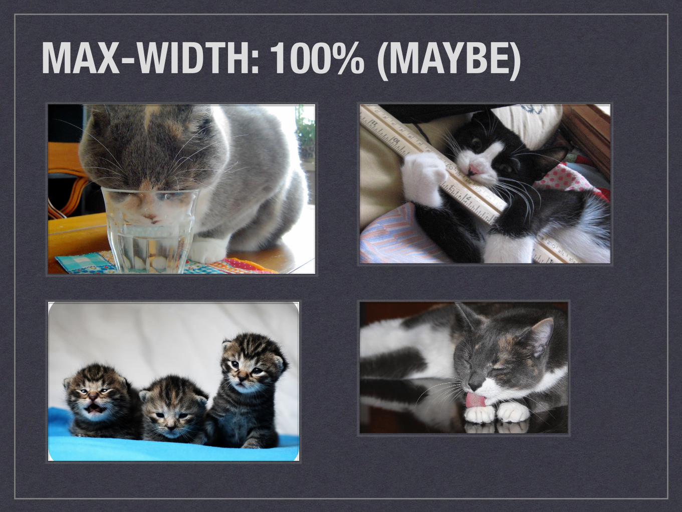
MAX-WIDTH: 100% (MAYBE)
TIME TO GET EVEN MORE HIPADVANCED RESPONSIVE IMAGE USE CASES
Photo credit: UnknownNet Photography, “Cat in the Hat”, Flickr Creative Commons
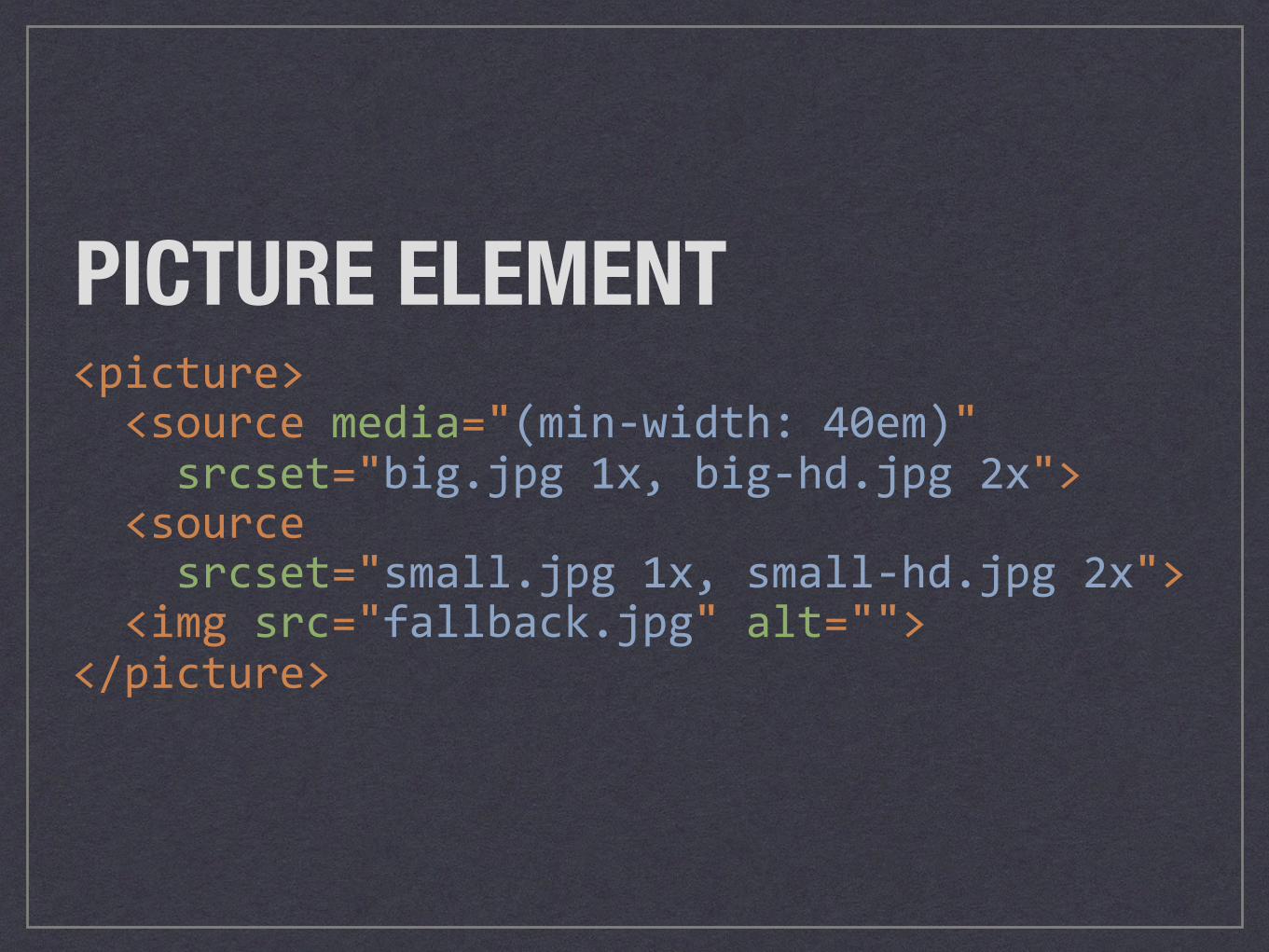
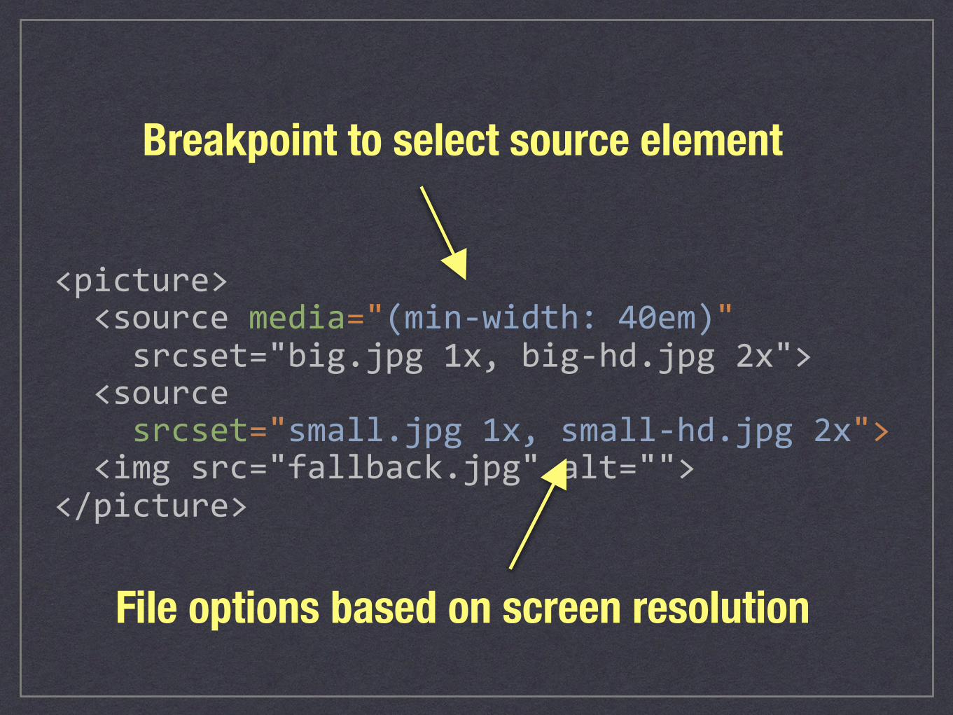
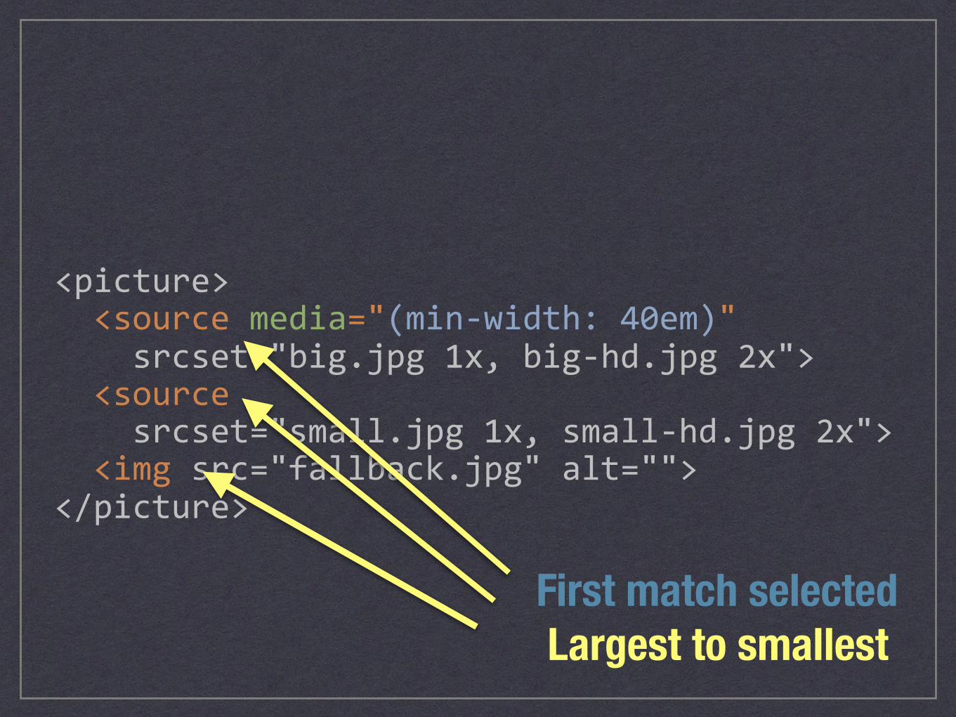
<picture><sourcemedia="(min-width:40em)"srcset="big.jpg1x,big-hd.jpg2x"><sourcesrcset="small.jpg1x,small-hd.jpg2x"><imgsrc="fallback.jpg"alt=""></picture>
PICTURE ELEMENT
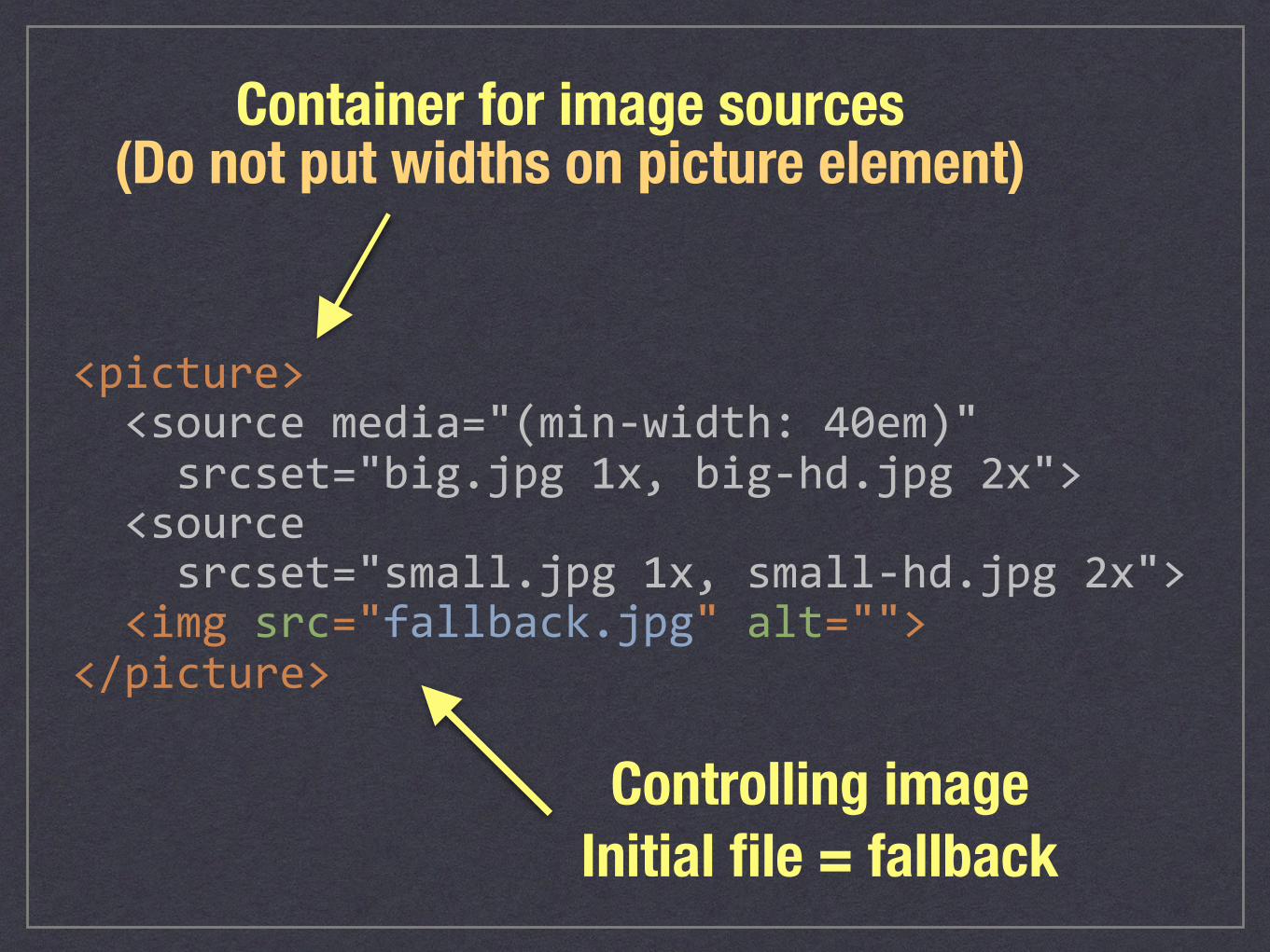
<picture><sourcemedia="(min-width:40em)"srcset="big.jpg1x,big-hd.jpg2x"><sourcesrcset="small.jpg1x,small-hd.jpg2x"><imgsrc="fallback.jpg"alt=""></picture>
Container for image sources
Controlling image Initial file = fallback
(Do not put widths on picture element)
<picture><sourcemedia="(min-width:40em)"srcset="big.jpg1x,big-hd.jpg2x"><sourcesrcset="small.jpg1x,small-hd.jpg2x"><imgsrc="fallback.jpg"alt=""></picture>
Breakpoint to select source element
File options based on screen resolution
<picture><sourcemedia="(min-width:40em)"srcset="big.jpg1x,big-hd.jpg2x"><sourcesrcset="small.jpg1x,small-hd.jpg2x"><imgsrc="fallback.jpg"alt=""></picture>
Largest to smallestFirst match selected
ART DIRECTIONDIFFERENT ASPECT RATIOS PER MEDIA QUERY
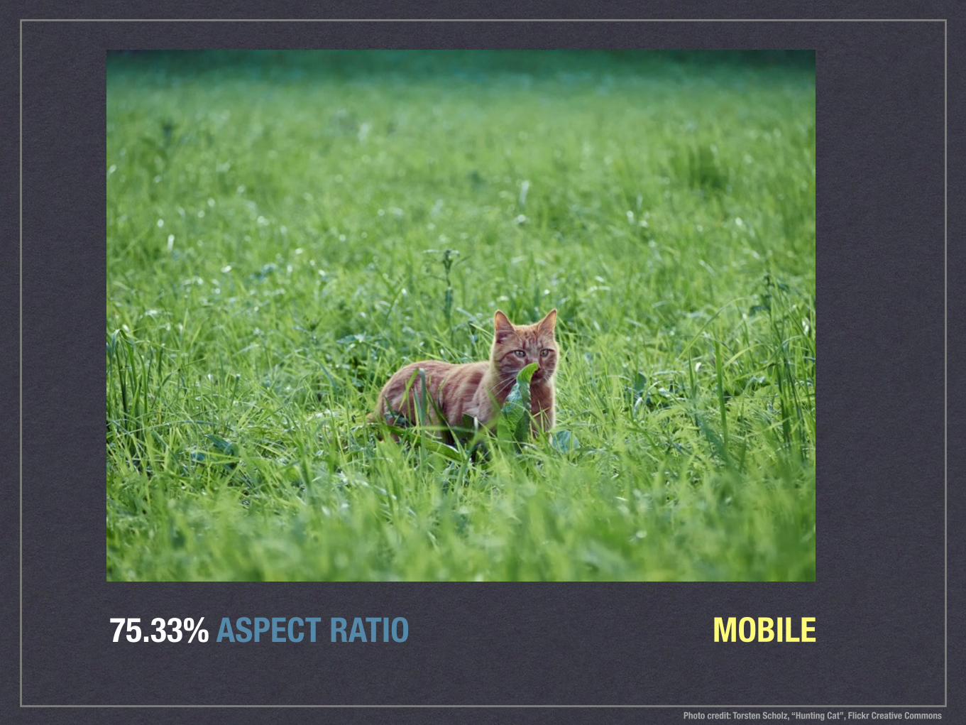
75.33% ASPECT RATIO MOBILE
Photo credit: Torsten Scholz, “Hunting Cat”, Flickr Creative Commons
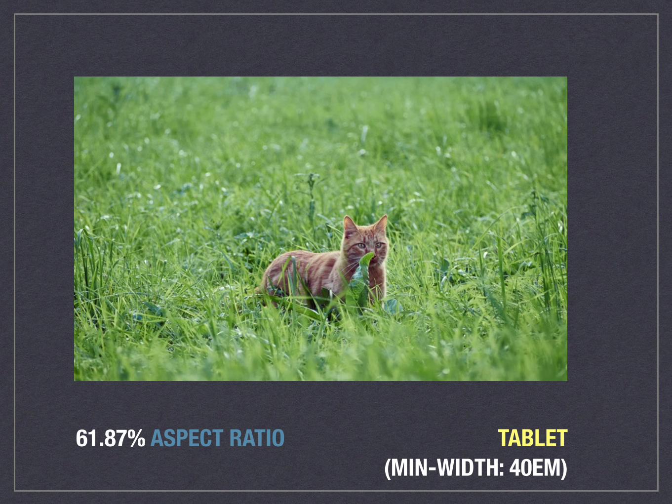
61.87% ASPECT RATIO TABLET(MIN-WIDTH: 40EM)
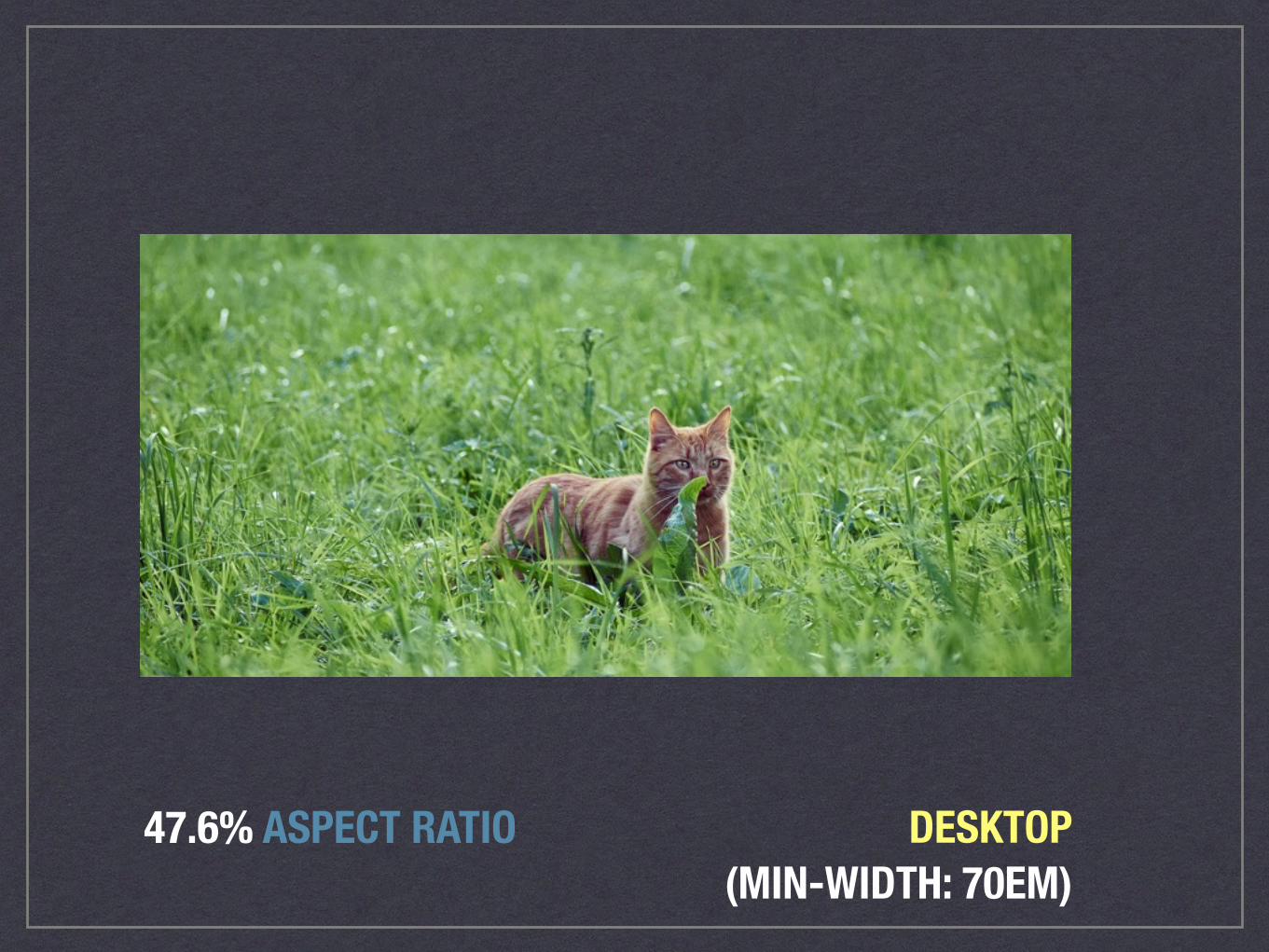
47.6% ASPECT RATIO DESKTOP(MIN-WIDTH: 70EM)
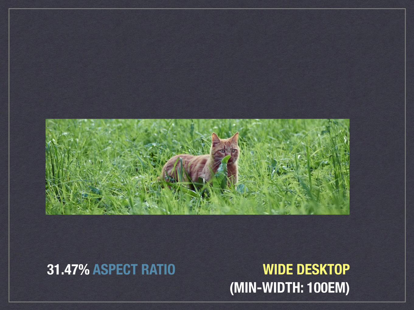
31.47% ASPECT RATIO WIDE DESKTOP(MIN-WIDTH: 100EM)
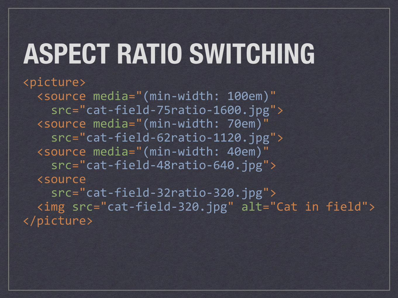
<picture><sourcemedia="(min-width:100em)"src="cat-field-75ratio-1600.jpg"><sourcemedia="(min-width:70em)"src="cat-field-62ratio-1120.jpg"><sourcemedia="(min-width:40em)"src="cat-field-48ratio-640.jpg"><sourcesrc="cat-field-32ratio-320.jpg"><imgsrc="cat-field-320.jpg"alt="Catinfield"></picture>
ASPECT RATIO SWITCHING
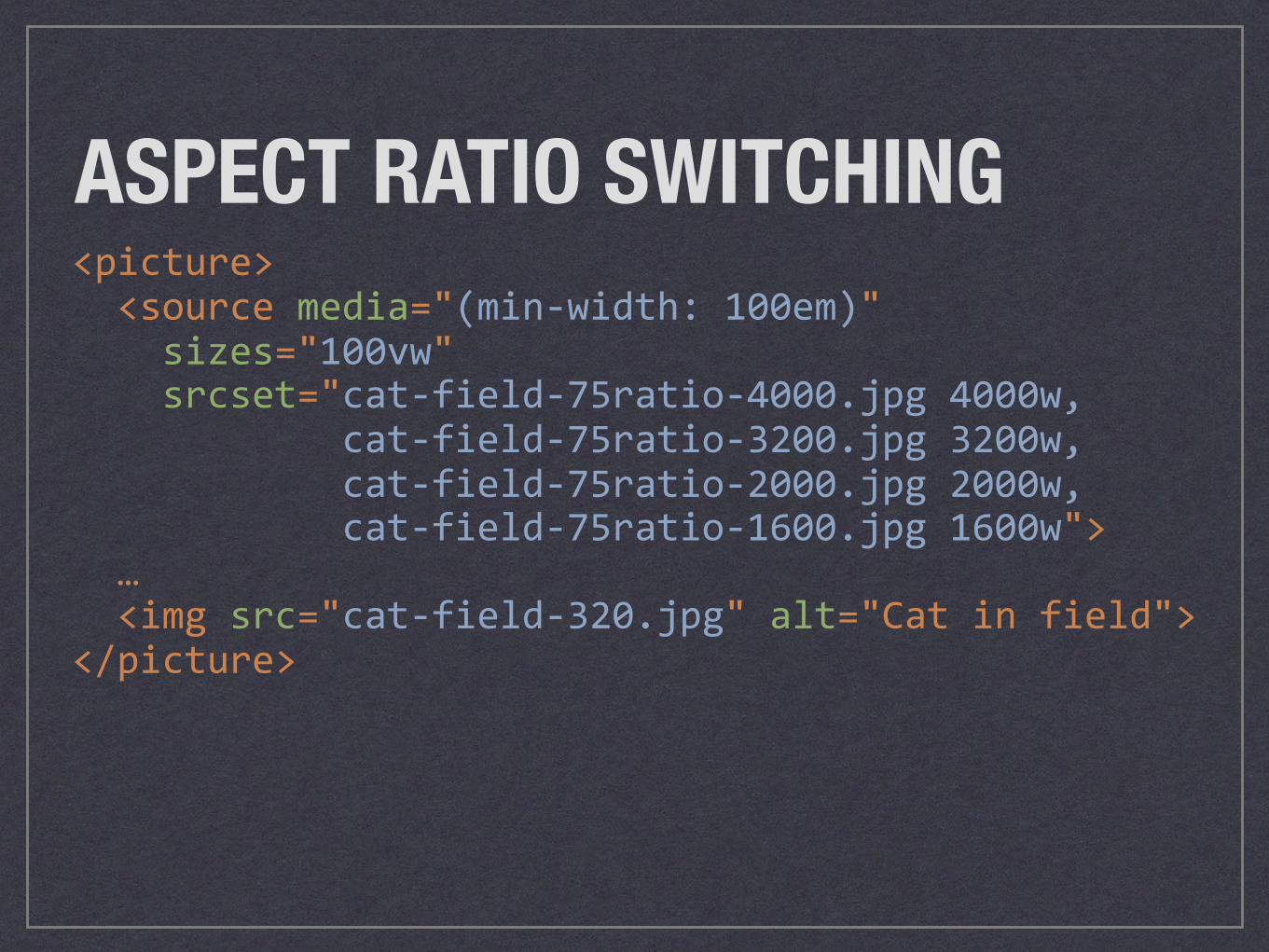
<picture><sourcemedia="(min-width:100em)"sizes="100vw"srcset="cat-field-75ratio-4000.jpg4000w,cat-field-75ratio-3200.jpg3200w,cat-field-75ratio-2000.jpg2000w,cat-field-75ratio-1600.jpg1600w">…<imgsrc="cat-field-320.jpg"alt="Catinfield"></picture>
ASPECT RATIO SWITCHING
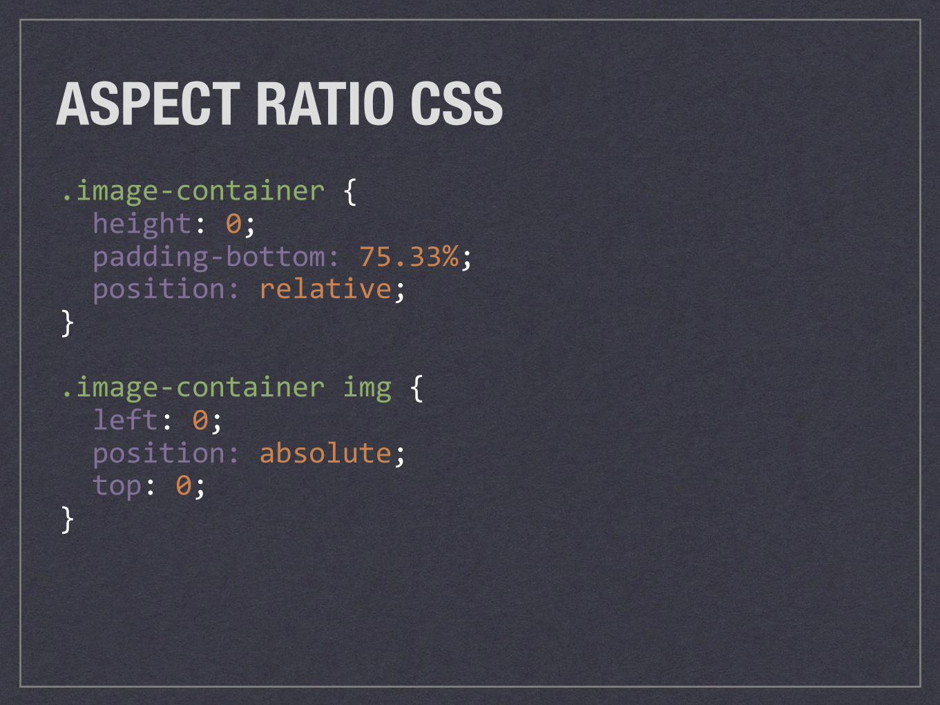
ASPECT RATIO CSS.image-container{height:0;padding-bottom:75.33%;position:relative;}
.image-containerimg{left:0;position:absolute;top:0;}
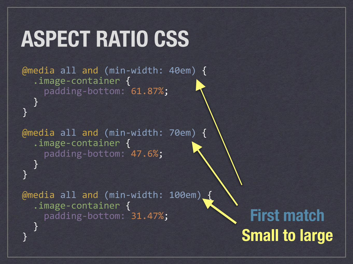
ASPECT RATIO CSS@mediaalland(min-width:40em){.image-container{padding-bottom:61.87%;}}
@mediaalland(min-width:70em){.image-container{padding-bottom:47.6%;}}
@mediaalland(min-width:100em){.image-container{padding-bottom:31.47%;}} Small to large
First match
ART DIRECTIONDIFFERENT IMAGE CROPS PER MEDIA QUERY
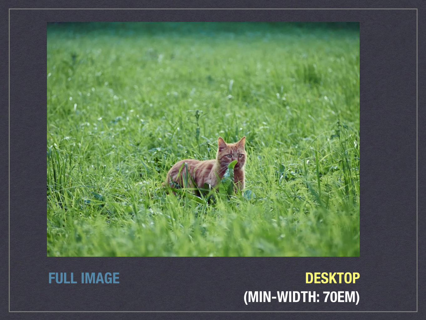
FULL IMAGE DESKTOP(MIN-WIDTH: 70EM)
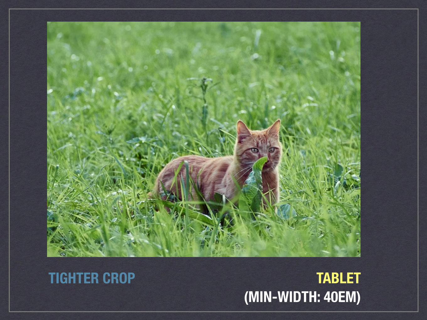
TIGHTER CROP TABLET(MIN-WIDTH: 40EM)
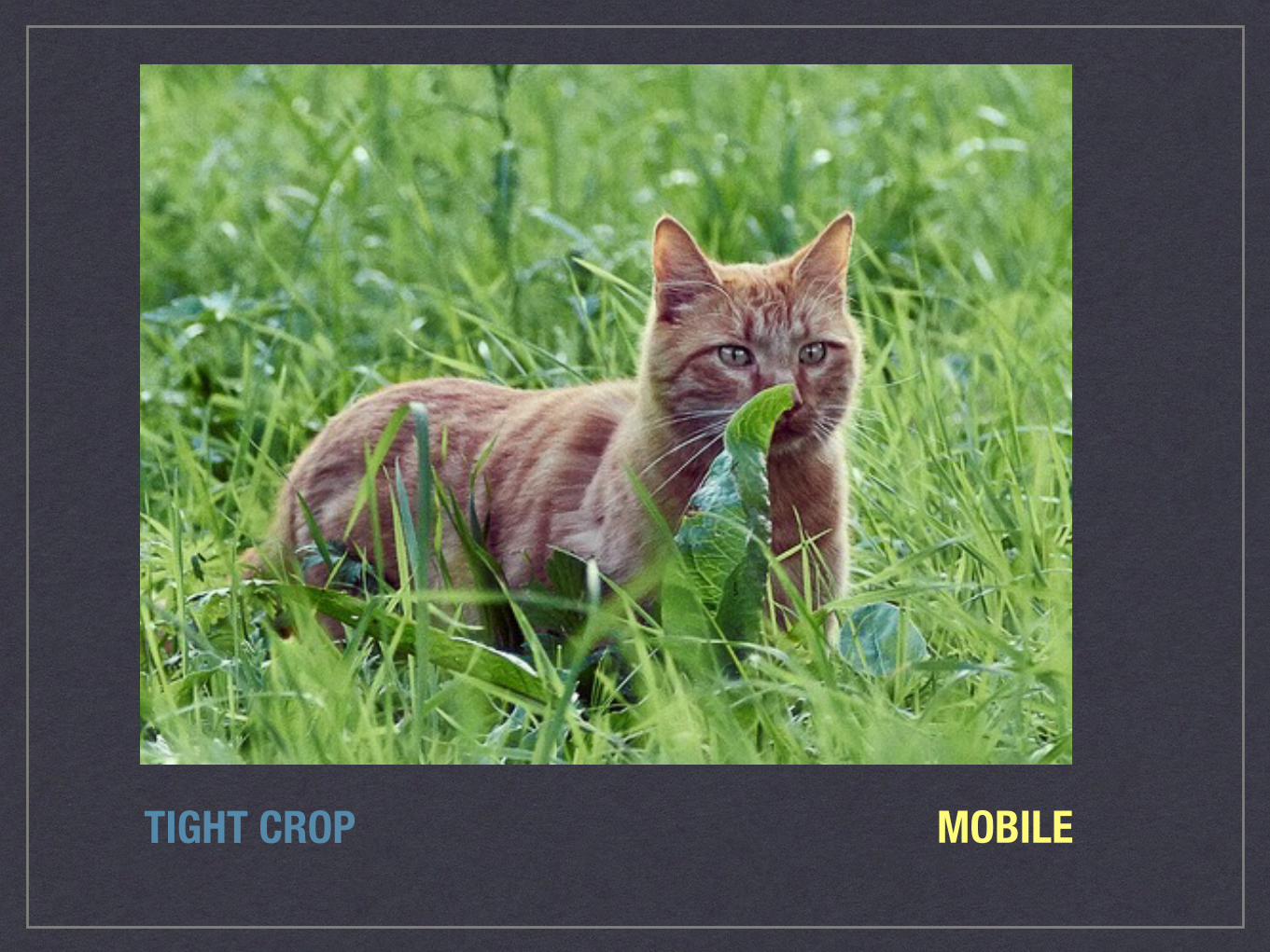
TIGHT CROP MOBILE
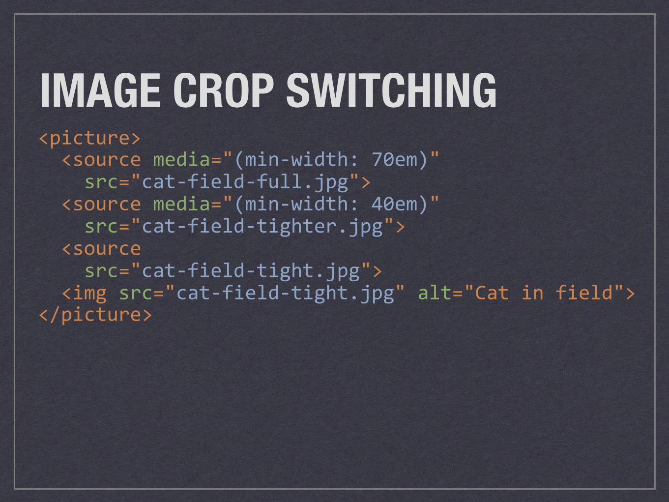
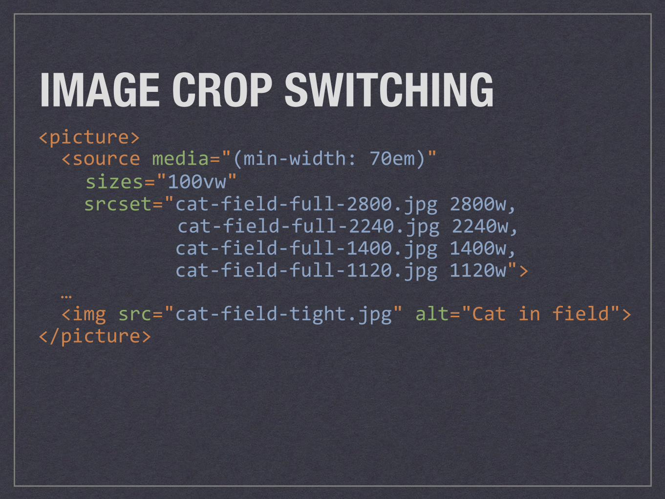
<picture><sourcemedia="(min-width:70em)"src="cat-field-full.jpg"><sourcemedia="(min-width:40em)"src="cat-field-tighter.jpg"><sourcesrc="cat-field-tight.jpg"><imgsrc="cat-field-tight.jpg"alt="Catinfield"></picture>
IMAGE CROP SWITCHING
<picture><sourcemedia="(min-width:70em)"sizes="100vw"srcset="cat-field-full-2800.jpg2800w,
cat-field-full-2240.jpg2240w,cat-field-full-1400.jpg1400w,cat-field-full-1120.jpg1120w">…<imgsrc="cat-field-tight.jpg"alt="Catinfield"></picture>
IMAGE CROP SWITCHING
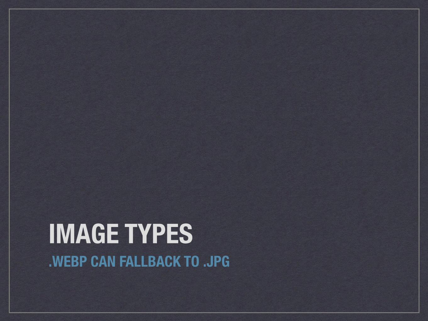
IMAGE TYPES.WEBP CAN FALLBACK TO .JPG
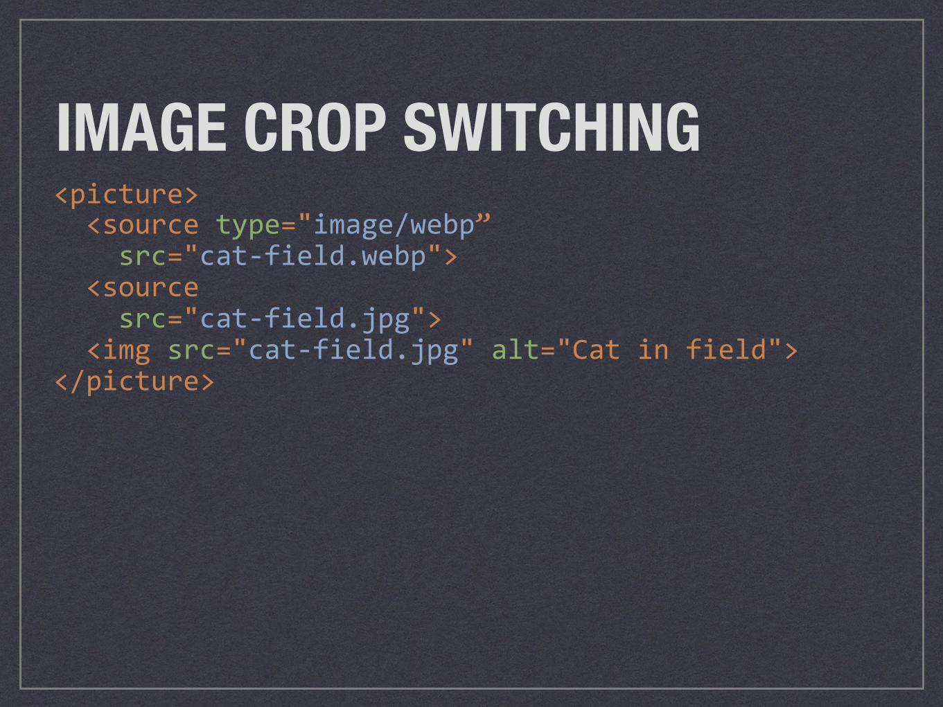
<picture><sourcetype="image/webp”src="cat-field.webp"><sourcesrc="cat-field.jpg"><imgsrc="cat-field.jpg"alt="Catinfield"></picture>
IMAGE CROP SWITCHING
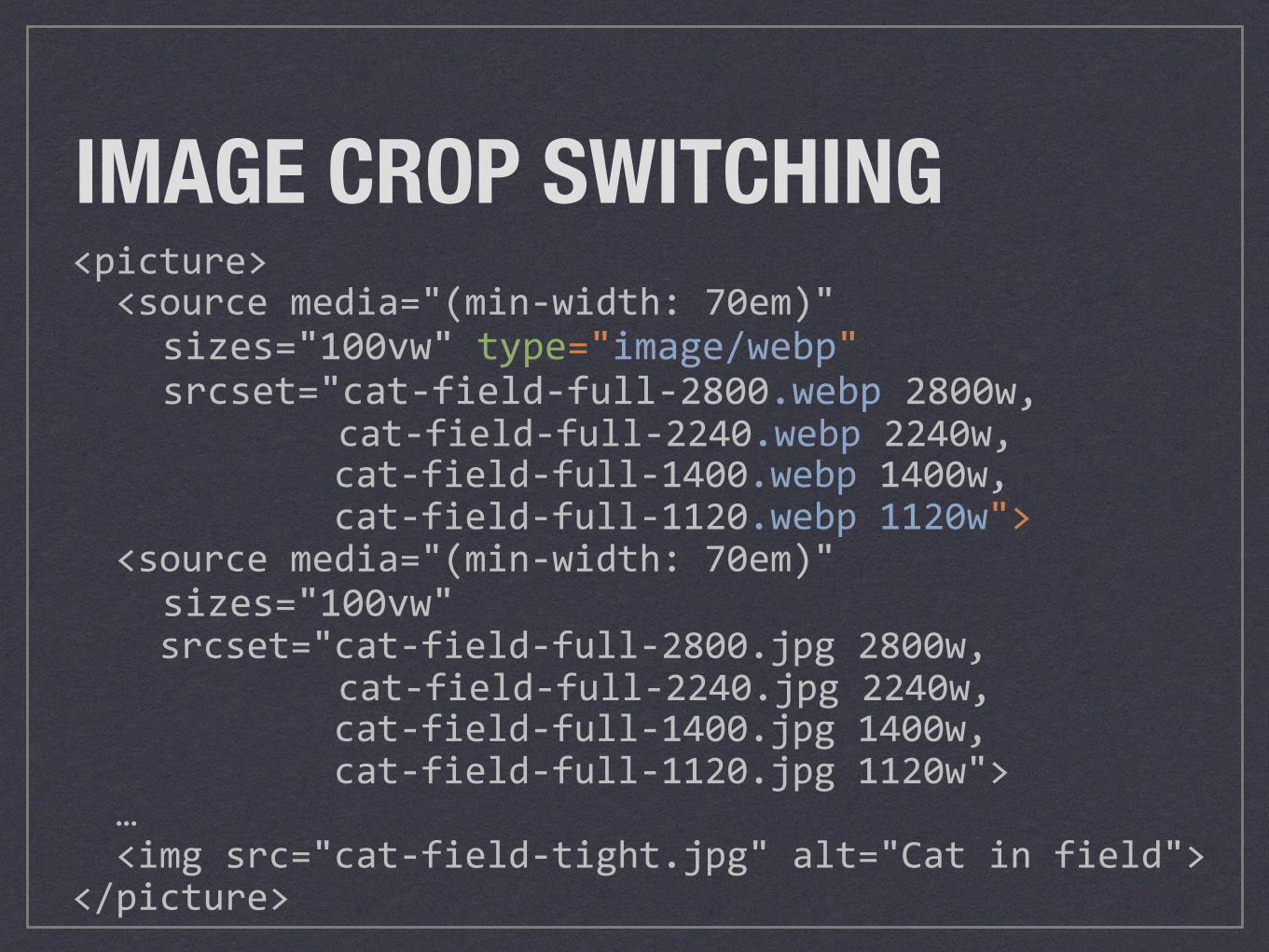
<picture><sourcemedia="(min-width:70em)"sizes="100vw"type="image/webp"srcset="cat-field-full-2800.webp2800w,
cat-field-full-2240.webp2240w,cat-field-full-1400.webp1400w,cat-field-full-1120.webp1120w"><sourcemedia="(min-width:70em)"sizes="100vw"srcset="cat-field-full-2800.jpg2800w,
cat-field-full-2240.jpg2240w,cat-field-full-1400.jpg1400w,cat-field-full-1120.jpg1120w">…<imgsrc="cat-field-tight.jpg"alt="Catinfield"></picture>
IMAGE CROP SWITCHING
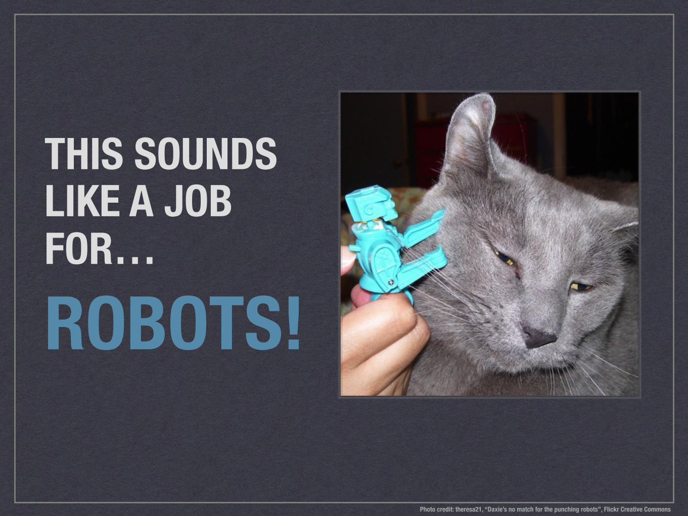
THIS SOUNDS LIKE A JOB FOR…
ROBOTS!
Photo credit: theresa21, “Daxie’s no match for the punching robots”, Flickr Creative Commons
PICTUREFILL.JSUSE RESPONSIVE IMAGES IN OLDER BROWSERS SCOTTJEHL.GITHUB.IO/PICTUREFILL/
HOLD UP. TIME TO DRUPAL.
DRUPAL 7PICTURE AND BREAKPOINTS MODULES
DRUPAL 8RESPONSIVE IMAGE AND BREAKPOINT MODULES (IN CORE!)
BREAK DANCINGBREAKPOINTS AND BREAKPOINT GROUPS
Photo credit: Trish Hamme, “Ta-Da !!!!”, Flickr Creative Commons
SEND IN THE ROBOTSIMAGE STYLES
Photo credit: Andy Miicone, “Miisa”, Flickr Creative Commons
LET’S MAP THIS OUTPICTURE MAPPINGS AND FALLBACK STYLES
Photo credit: Little Dog Laughed, “Geography Cat”, Flickr Creative Commons
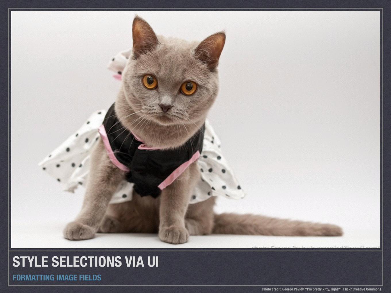
STYLE SELECTIONS VIA UIFORMATTING IMAGE FIELDS
Photo credit: George Pavlov, “I’m pretty kitty, right?”, Flickr Creative Commons
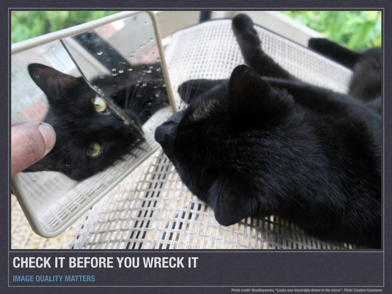
CHECK IT BEFORE YOU WRECK ITIMAGE QUALITY MATTERS
Photo credit: Woodleyworks, “Lucky was inexorably drawn to the mirror”, Flickr Creative Commons
RESPONSIVE IMAGES AND WYSIWYG IN DRUPALDRUPAL 8 ISSUE: DRUPAL.ORG/NODE/2061377
FOCAL POINT: ART DIRECTIONDRUPAL.ORG/PROJECT/FOCAL_POINT ASSIGN FOCUS LEVELS TO IMAGE STYLES
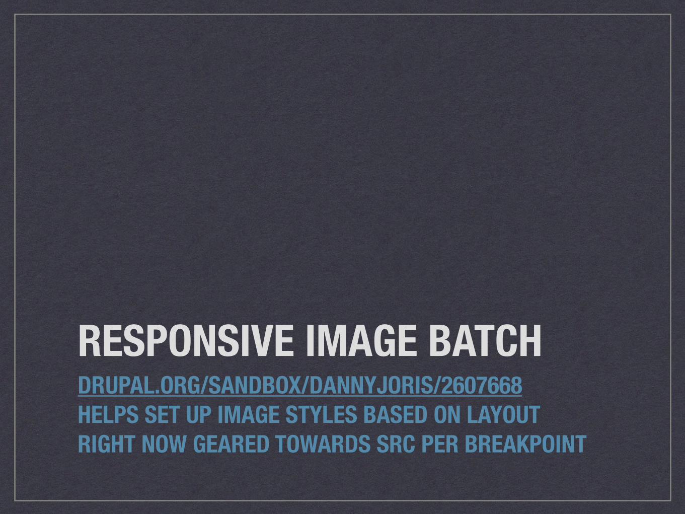
RESPONSIVE IMAGE BATCHDRUPAL.ORG/SANDBOX/DANNYJORIS/2607668 HELPS SET UP IMAGE STYLES BASED ON LAYOUT RIGHT NOW GEARED TOWARDS SRC PER BREAKPOINT

DRUPAL SASS BREAKPOINTSNPMJS.COM/PACKAGE/DRUPAL-SASS-BREAKPOINTS IMPORT DRUPAL BREAKPOINTS.YML VALUES INTO SASS
STOP THE PRESSESWORDPRESS OFFERS BUILT-IN RESPONSIVE IMAGES SUPPORT
Photo credit: Helena Jacoba, “Fluffy cat reads the Globe and Mail newspaper”, Flickr Creative Commons
RESPONSIVE IMAGES BREAKPOINT GENERATORTHE BEST CAT IMAGE I COULD FIND FOR ‘CAT GENERATOR’ I GUESS BECAUSE ELECTRICITY?
Photo credit: zeevveez, “Electric cat”, Flickr Creative Commons
MAKE THE WEB BETTERBeautiful photos + Fast loading photos

Photo credit: Pete Markham, “Domino the Cat, Week 2”, Flickr Creative Commons

Photo credit: Pete Markham, “Domino the Cat, Week 2”, Flickr Creative Commons
5120px1500k
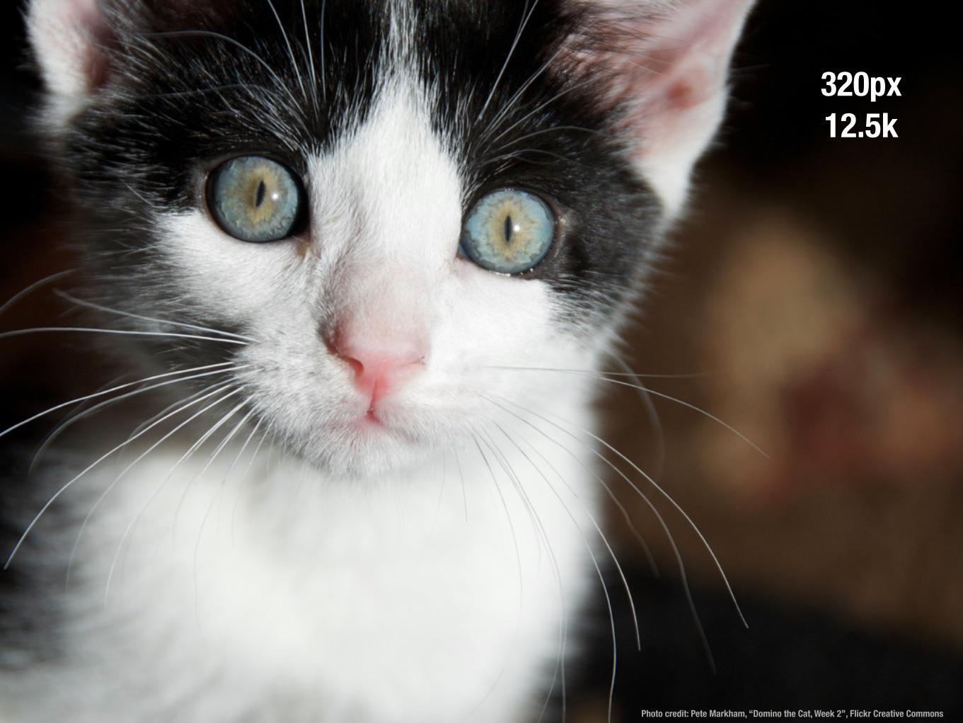
Photo credit: Pete Markham, “Domino the Cat, Week 2”, Flickr Creative Commons
320px12.5k

Photo credit: Pete Markham, “Domino the Cat, Week 2”, Flickr Creative Commons
120x
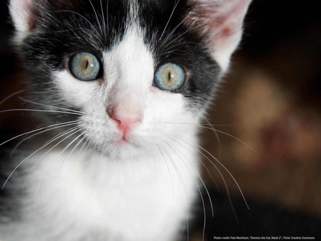
Photo credit: Pete Markham, “Domino the Cat, Week 2”, Flickr Creative Commons

Photo credit: Dave Emerson, “Trouble”, Flickr Creative Commons
Marc Drummond
@MarcDrummond
mdrummondIRC, drupal.org
marcdrummond.com
Front-end Developer, Lullabot


