Seven Steps to Creating an Accessible Microsoft Word...
21
i Seven Steps to Creating an Accessible Microsoft Word document Disability Access Services
Transcript of Seven Steps to Creating an Accessible Microsoft Word...

i
Seven Steps to Creating an Accessible
Microsoft Word document
Disability Access Services

ii
About Disability Access Services
Centralized Resource and Information on Disability Access
Disability Access Services provides technical assistance and informational
guidance to promote the civil rights and equality for persons with disabilities
in the following areas:
Employment
Reasonable Accommodation
Physical Access of built environments
Access to private sector goods and services
Digital Access of electronic and information technology
Access to government programs, services, and activities
Disability Access Services Website www.dor.ca.gov/disabilityaccessinfo
Disability Access Services
CA Department of Rehabilitation
721 Capitol Mall, 4th Floor
Sacramento, CA 95814
DAS Email: [email protected] Voice (916) 558-5755
Fax (916) 558-5757
TTY (916) 558-5758
Telecommunications Relay Service 711
Promoting an Accessible Future through Education and Information
iii
Seven Steps to Creating an Accessible Word Document
TABLE OF CONTENTS
STEP ONE: USE APPROPRIATE FONT STYLE AND SIZE ..................... 1
STEP TWO: USE COLOR APPROPRIATELY ........................................... 2
STEP THREE: ADD ALTERNATIVE TEXTS AND CAPTIONS ................. 4
STEP FOUR: SPECIFY COLUMN HEADER ROWS IN TABLES .............. 5
STEP FIVE: USE MEANINGFUL HYPERLINK TEXT ................................ 8
STEP SIX: USE BUILT-IN FORMATTING STYLES ................................... 9
STEP SEVEN: CHECK ACCESSIBILITY................................................. 16
Alternative Formats
In accordance with ADA requirements, this document can be made
available in Braille or large print as a reasonable accommodation for an
individual with a disability. To request a copy of alternative formats, please
contact Disability Access Services.
Equal Opportunity Employer/Program
A Note About Hyperlinks in This Document
All links in this document have been created with meaningful text. The Uniform Resource Locator (URL) is also published to be available as a resource for those persons who print the document. The URL addresses that are spelled out in the document are not active links to avoid the confusion of presenting duplicate links.
iv
Introduction
It is estimated that up to 4% of the population relies on some sort of Assistive Technology to access electronic documents and Web pages. Assistive Technology includes; Screen Reading software, Refreshable Braille displays, and Screen Magnifiers. In the United States alone that equals 12.5 million people. If electronic documents are not created with accessibility issues in mind, they become very difficult if not impossible to read or navigate for this large number of people. Accessibility to electronic documents is a right that is protected by both Federal and State law. Creating accessible electronic documents is important to ensure access to persons with disabilities and the company or agency is protected against legal action. Additionally, it is just good business, when a very large segment of the population can equally participate and take advantage of the products or services that the company or agency provides. Disability Access Services of California Department of Rehabilitation has put together this list of seven easy steps to follow when creating Word documents. Take just a few moments to be acquainted with these seven simple steps to ensure that Word documents are fully accessible to everyone. These steps are explained utilizing Microsoft Word 2007 and 2010. The Menu map of other versions of Microsoft Word or other word processors may be different.
1
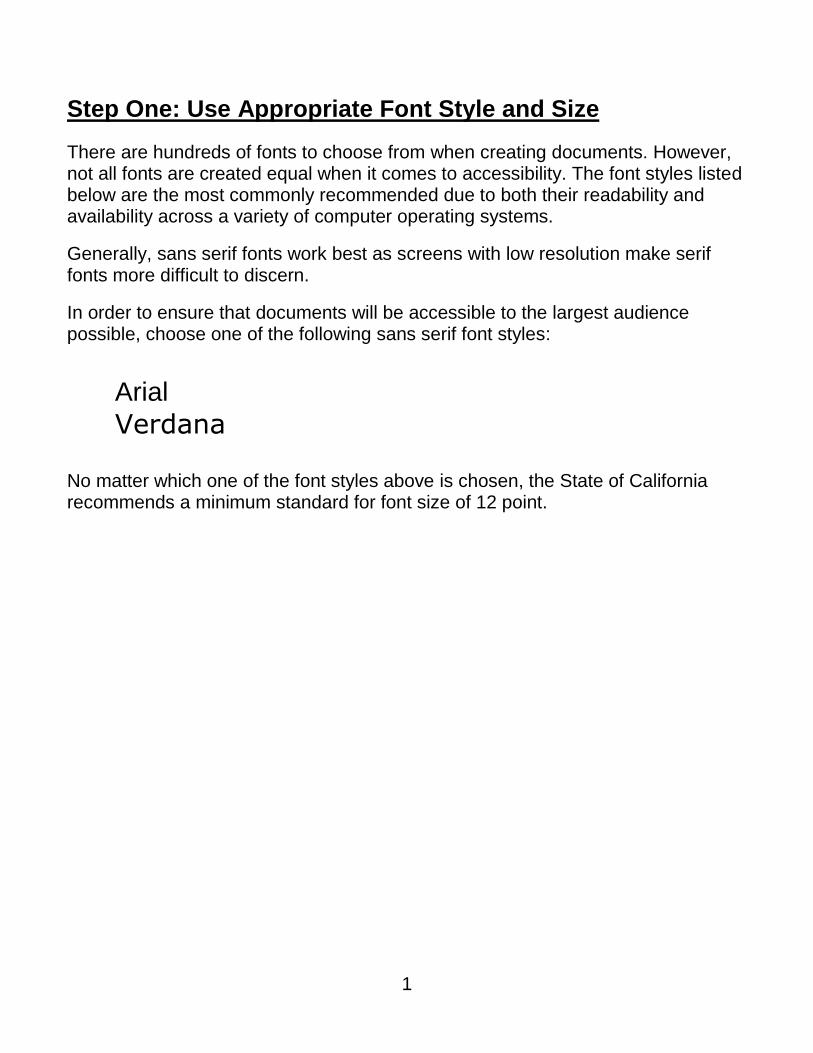
Step One: Use Appropriate Font Style and Size
There are hundreds of fonts to choose from when creating documents. However, not all fonts are created equal when it comes to accessibility. The font styles listed below are the most commonly recommended due to both their readability and availability across a variety of computer operating systems.
Generally, sans serif fonts work best as screens with low resolution make serif fonts more difficult to discern.
In order to ensure that documents will be accessible to the largest audience possible, choose one of the following sans serif font styles:
Arial
Verdana No matter which one of the font styles above is chosen, the State of California recommends a minimum standard for font size of 12 point.
2
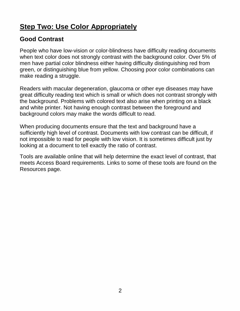
Step Two: Use Color Appropriately
Good Contrast
People who have low-vision or color-blindness have difficulty reading documents when text color does not strongly contrast with the background color. Over 5% of men have partial color blindness either having difficulty distinguishing red from green, or distinguishing blue from yellow. Choosing poor color combinations can make reading a struggle. Readers with macular degeneration, glaucoma or other eye diseases may have great difficulty reading text which is small or which does not contrast strongly with the background. Problems with colored text also arise when printing on a black and white printer. Not having enough contrast between the foreground and background colors may make the words difficult to read. When producing documents ensure that the text and background have a sufficiently high level of contrast. Documents with low contrast can be difficult, if not impossible to read for people with low vision. It is sometimes difficult just by looking at a document to tell exactly the ratio of contrast.
Tools are available online that will help determine the exact level of contrast, that meets Access Board requirements. Links to some of these tools are found on the Resources page.
3
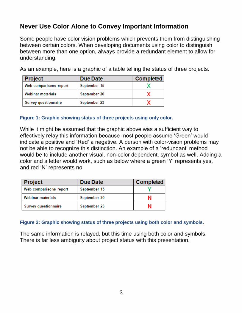
Never Use Color Alone to Convey Important Information
Some people have color vision problems which prevents them from distinguishing between certain colors. When developing documents using color to distinguish between more than one option, always provide a redundant element to allow for understanding.
As an example, here is a graphic of a table telling the status of three projects.
Figure 1: Graphic showing status of three projects using only color.
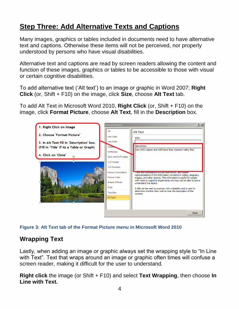
While it might be assumed that the graphic above was a sufficient way to effectively relay this information because most people assume ‘Green’ would indicate a positive and ‘Red’ a negative. A person with color-vision problems may not be able to recognize this distinction. An example of a ‘redundant’ method would be to include another visual, non-color dependent, symbol as well. Adding a color and a letter would work, such as below where a green ‘Y’ represents yes, and red ‘N’ represents no.
Figure 2: Graphic showing status of three projects using both color and symbols.
The same information is relayed, but this time using both color and symbols. There is far less ambiguity about project status with this presentation.
4
Step Three: Add Alternative Texts and Captions
Many images, graphics or tables included in documents need to have alternative text and captions. Otherwise these items will not be perceived, nor properly understood by persons who have visual disabilities.
Alternative text and captions are read by screen readers allowing the content and function of these images, graphics or tables to be accessible to those with visual or certain cognitive disabilities.
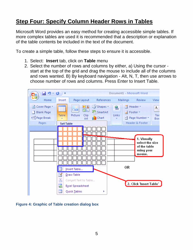
To add alternative text (‘Alt text’) to an image or graphic in Word 2007; Right Click (or, Shift + F10) on the image, click Size, choose Alt Text tab.
To add Alt Text in Microsoft Word 2010, Right Click (or, Shift + F10) on the image, click Format Picture, choose Alt Text, fill in the Description box.
Figure 3: Alt Text tab of the Format Picture menu in Microsoft Word 2010
Wrapping Text
Lastly, when adding an image or graphic always set the wrapping style to “In Line with Text”. Text that wraps around an image or graphic often times will confuse a screen reader, making it difficult for the user to understand.
Right click the image (or Shift + F10) and select Text Wrapping, then choose In Line with Text.
5
Step Four: Specify Column Header Rows in Tables
Microsoft Word provides an easy method for creating accessible simple tables. If more complex tables are used it is recommended that a description or explanation of the table contents be included in the text of the document.
To create a simple table, follow these steps to ensure it is accessible.
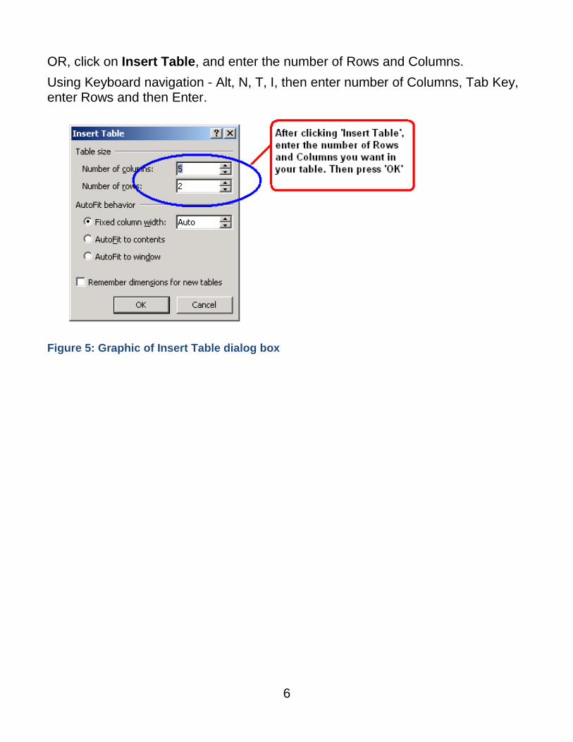
1. Select: Insert tab, click on Table menu 2. Select the number of rows and columns by either, a) Using the cursor -
start at the top of the grid and drag the mouse to include all of the columns and rows wanted. B) By keyboard navigation - Alt, N, T, then use arrows to choose number of rows and columns. Press Enter to Insert Table.
Figure 4: Graphic of Table creation dialog box
6
OR, click on Insert Table, and enter the number of Rows and Columns.
Using Keyboard navigation - Alt, N, T, I, then enter number of Columns, Tab Key, enter Rows and then Enter.
Figure 5: Graphic of Insert Table dialog box
7
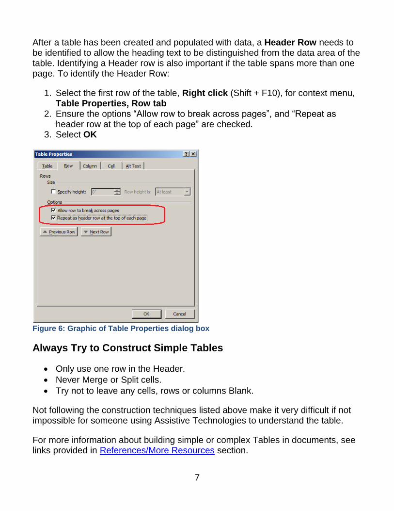
After a table has been created and populated with data, a Header Row needs to be identified to allow the heading text to be distinguished from the data area of the table. Identifying a Header row is also important if the table spans more than one page. To identify the Header Row:
1. Select the first row of the table, Right click (Shift + F10), for context menu, Table Properties, Row tab
2. Ensure the options “Allow row to break across pages”, and “Repeat as header row at the top of each page” are checked.
3. Select OK
Figure 6: Graphic of Table Properties dialog box
Always Try to Construct Simple Tables
Only use one row in the Header.
Never Merge or Split cells.
Try not to leave any cells, rows or columns Blank.
Not following the construction techniques listed above make it very difficult if not impossible for someone using Assistive Technologies to understand the table.
For more information about building simple or complex Tables in documents, see links provided in References/More Resources section.
8
Step Five: Use Meaningful Hyperlink Text
Hyperlink text should provide a clear description of the link destination. One of the ways a person who uses Assistive Technologies can navigate a document is by skipping from hyperlink to hyperlink, or they can also pull up a list of all the links in a document (Insert + F7). Since both of these methods of navigation do not include any of the surrounding text, the hyperlink text by itself needs to provide sufficient meaning.
For this reason, using phrases like, ‘Click Here’, or ‘Visit’ are not sufficient as they by themselves do not provide enough meaning.
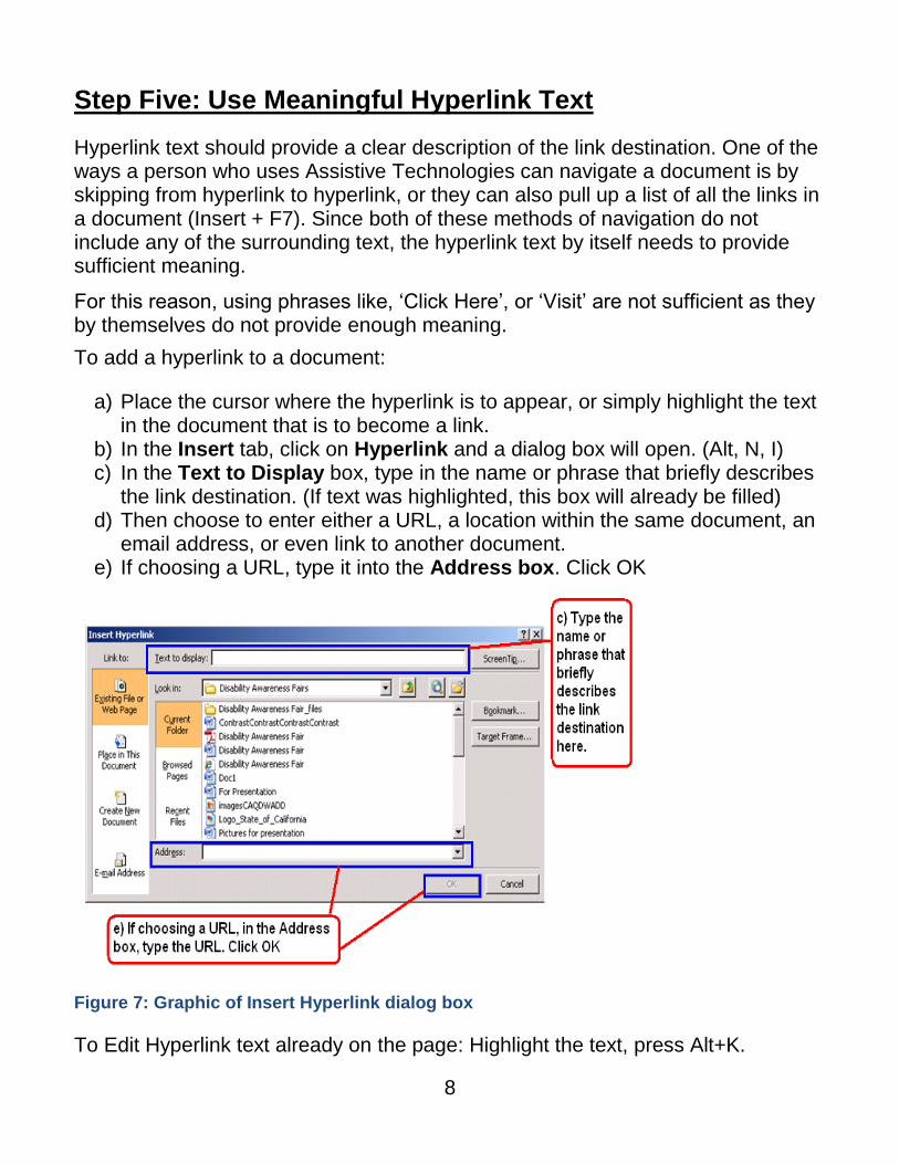
To add a hyperlink to a document:
a) Place the cursor where the hyperlink is to appear, or simply highlight the text in the document that is to become a link.
b) In the Insert tab, click on Hyperlink and a dialog box will open. (Alt, N, I) c) In the Text to Display box, type in the name or phrase that briefly describes
the link destination. (If text was highlighted, this box will already be filled) d) Then choose to enter either a URL, a location within the same document, an
email address, or even link to another document. e) If choosing a URL, type it into the Address box. Click OK
Figure 7: Graphic of Insert Hyperlink dialog box
To Edit Hyperlink text already on the page: Highlight the text, press Alt+K.
9
Step Six: Use Built-in Formatting Styles
Using built-in formatting styles could be the single most important step in making documents accessible. Built-in formatting styles provide a logical reading order that serves as a navigation guide for persons utilizing assistive technologies.
Always use styles to format documents. Most importantly, always use styles to create Headings and Lists.
Choosing a Style
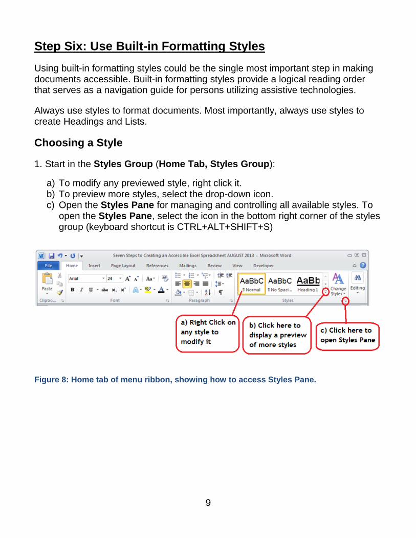
1. Start in the Styles Group (Home Tab, Styles Group):
a) To modify any previewed style, right click it. b) To preview more styles, select the drop-down icon. c) Open the Styles Pane for managing and controlling all available styles. To
open the Styles Pane, select the icon in the bottom right corner of the styles group (keyboard shortcut is CTRL+ALT+SHIFT+S)
Figure 8: Home tab of menu ribbon, showing how to access Styles Pane.
10
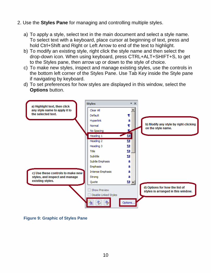
2. Use the Styles Pane for managing and controlling multiple styles.
a) To apply a style, select text in the main document and select a style name. To select text with a keyboard, place cursor at beginning of text, press and hold Ctrl+Shift and Right or Left Arrow to end of the text to highlight.
b) To modify an existing style, right click the style name and then select the drop-down icon. When using keyboard, press CTRL+ALT+SHIFT+S, to get to the Styles pane, then arrow up or down to the style of choice.
c) To make new styles, inspect and manage existing styles, use the controls in the bottom left corner of the Styles Pane. Use Tab Key inside the Style pane if navigating by keyboard.
d) To set preferences for how styles are displayed in this window, select the Options button.
Figure 9: Graphic of Styles Pane
11
Apply Heading Levels in Style Formatting
When headings are defined using Word's built-in heading styles, Screen Reader users can quickly navigate through the document and can easily skip from heading to heading.
When headings are incorrectly marked up, using character formatting only (e.g., applying BOLD format, and/or using ALL CAPITAL LETTERS), there is no programmatic way for the Screen Reader to know where the headings are in the document.
To Apply Headings:
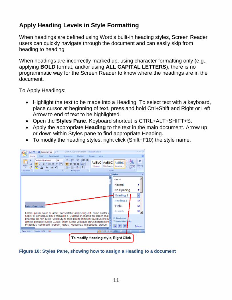
Highlight the text to be made into a Heading. To select text with a keyboard, place cursor at beginning of text, press and hold Ctrl+Shift and Right or Left Arrow to end of text to be highlighted.
Open the Styles Pane. Keyboard shortcut is CTRL+ALT+SHIFT+S.
Apply the appropriate Heading to the text in the main document. Arrow up or down within Styles pane to find appropriate Heading.
To modify the heading styles, right click (Shift+F10) the style name.
Figure 10: Styles Pane, showing how to assign a Heading to a document
12
Heading Order
Assigning headings in documents is the most important accessibility feature that
can be added to a document. Traveling from heading to heading is the number
one way people who use Assistive Technologies navigate documents.
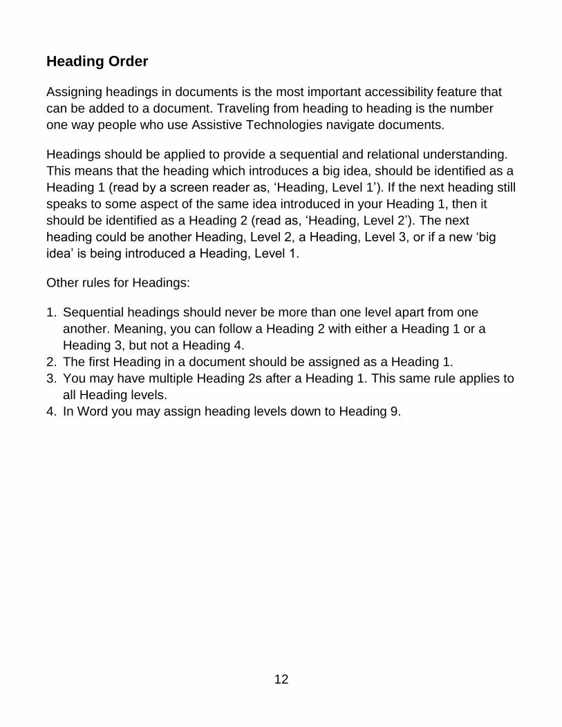
Headings should be applied to provide a sequential and relational understanding.
This means that the heading which introduces a big idea, should be identified as a
Heading 1 (read by a screen reader as, ‘Heading, Level 1’). If the next heading still
speaks to some aspect of the same idea introduced in your Heading 1, then it
should be identified as a Heading 2 (read as, ‘Heading, Level 2’). The next
heading could be another Heading, Level 2, a Heading, Level 3, or if a new ‘big
idea’ is being introduced a Heading, Level 1.
Other rules for Headings:
1. Sequential headings should never be more than one level apart from one
another. Meaning, you can follow a Heading 2 with either a Heading 1 or a
Heading 3, but not a Heading 4.
2. The first Heading in a document should be assigned as a Heading 1.
3. You may have multiple Heading 2s after a Heading 1. This same rule applies to
all Heading levels.
4. In Word you may assign heading levels down to Heading 9.
13
Table of Contents
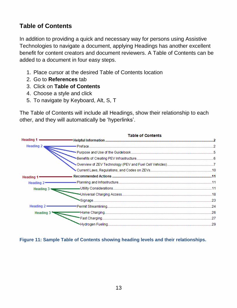
In addition to providing a quick and necessary way for persons using Assistive
Technologies to navigate a document, applying Headings has another excellent
benefit for content creators and document reviewers. A Table of Contents can be
added to a document in four easy steps.
1. Place cursor at the desired Table of Contents location
2. Go to References tab
3. Click on Table of Contents
4. Choose a style and click
5. To navigate by Keyboard, Alt, S, T
The Table of Contents will include all Headings, show their relationship to each
other, and they will automatically be ‘hyperlinks’.
Figure 11: Sample Table of Contents showing heading levels and their relationships.

14
List Formatting
When bulleted or numbered list formatting is used, screen readers will properly announce the text as being part of a list. List formatting provides the user with a means to quickly navigate between items as well as move in and out of lists.
When lists are made with repeated use of the Tab key or Spacebar, screen readers will not recognize them as lists, meaning that the list reading controls are inoperative.
Set lists in Word by: Home Tab, Paragraph Group and use the list controls.
Navigating by Keyboard - make a list by first highlighting the text then pressing Alt, H, then U for Unordered list (bulleted list), N for Numbered list, or M for more options for the list.
To indent - Alt, H, then AI for increasing indent, or AO for reducing indent.
Figure 12: Paragraph formatting menu in Home tab
15
An Accessible ‘Text Box’ Alternative
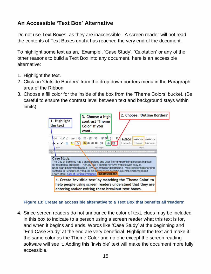
Do not use Text Boxes, as they are inaccessible. A screen reader will not read
the contents of Text Boxes until it has reached the very end of the document.
To highlight some text as an, ‘Example’, ‘Case Study’, ‘Quotation’ or any of the
other reasons to build a Text Box into any document, here is an accessible
alternative:
1. Highlight the text.
2. Click on ‘Outside Borders’ from the drop down borders menu in the Paragraph
area of the Ribbon.
3. Choose a fill color for the inside of the box from the ‘Theme Colors’ bucket. (Be
careful to ensure the contrast level between text and background stays within
limits)
Figure 13: Create an accessible alternative to a Text Box that benefits all 'readers'
4. Since screen readers do not announce the color of text, clues may be included
in this box to indicate to a person using a screen reader what this text is for,
and when it begins and ends. Words like ‘Case Study’ at the beginning and
‘End Case Study’ at the end are very beneficial. Highlight the text and make it
the same color as the Theme Color and no one except the screen reading
software will see it. Adding this ‘invisible’ text will make the document more fully
accessible.
16
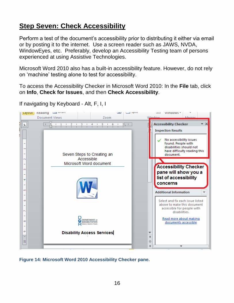
Step Seven: Check Accessibility
Perform a test of the document’s accessibility prior to distributing it either via email or by posting it to the internet. Use a screen reader such as JAWS, NVDA, WindowEyes, etc. Preferably, develop an Accessibility Testing team of persons experienced at using Assistive Technologies.
Microsoft Word 2010 also has a built-in accessibility feature. However, do not rely on ‘machine’ testing alone to test for accessibility.
To access the Accessibility Checker in Microsoft Word 2010: In the File tab, click on Info, Check for Issues, and then Check Accessibility.
If navigating by Keyboard - Alt, F, I, I
Figure 14: Microsoft Word 2010 Accessibility Checker pane.
17
References/More Resources
Creating Accessible Forms in Microsoft Word http://www.freedomscientific.com/doccenter/archives/Training/accessible-forms-in-word.htm
Best Practices Section 508 http://www.section508.va.gov/docs/WordBestPractices.pdf
Creating Accessible Tables in Microsoft Word http://easi.cc/archive/col-tables/week3/02_CreatingAccessibleTablesInMicrosoftWord.htm
Social Security Administration (SSA) Guide: Producing Accessible Word and PDF Documents http://www.ssa.gov/accessibility/files/The_Social_Security_Administration_Accessible_Document_Authoring_Guide_2.1.2.pdf
Creating Accessible Word Documents http://office.microsoft.com/en-us/word-help/creating-accessible-word-documents-HA101999993.aspx
Top 10 Guidelines For Making Your Documents Braille-Ready http://www.duxburysystems.com/documentation/dbt11.1/working_with_word/Word_Top_10_guidelines.htm
Colour Contrast Analyser http://www.visionaustralia.org/business-and-professionals/digital-access/resources/tools-to-download/colour-contrast-analyser-2-2-for-web-pages
To Find a Color Code Number: http://www.2createawebsite.com/build/hex-colors.html
To Check the Level of Contrast:
http://www.paciellogroup.com/resources/contrastAnalyser
For more information and technical assistance
contact the Disability Access Services
This document may be reproduced without change and in its entirety for redistribution purposes without prior permission from
Disability Access Services. (January 2014)