AMS Heater Circuit Separation AMS TRD Gas Control Separation Cryo-Cooler Control Separation

Separation Suite Plug-in for Adobe Photoshop CS6 or CC (Creative Cloud) for Mac or Windows/PC.
Version 3.0
Reference Manual
© 2009-2013 All Rights Reserved Manual revision 8-27-13 For Build 1.15 or higher.
Distributed by
T-Biz Network International, LLC Scottsdale, Arizona USA
Toll Free in USA 1/888-801-1561 Main Phone 480-212-1078 [email protected]
www.T-BizNetwork.com www.T-Seps.com

1
Welcome to T-Seps In 1999 I developed one of the first automated color separation programs for screeners called FastFilms. FastFilms was based on my many years of teaching how to do high-end color separations first in the camera (yes – a LONG time ago), and then in Photoshop. The program evolved out of my frustration in not being able to spend the weeks or even months it might take to train someone in how to do separations. I realized that for the majority of jobs I could automate many of the procedures. FastFilms has evolved into my new program T-Seps. T-Seps has all the great features and functions of FastFilms but with many improvements, enhancements, and new routines. With T-Seps 3.0 I have made major changes and improvements to the program. It now works in the Panels section of Photoshop and has a new graphical interface. T-Seps is the most powerful separation software available for T-shirt screen printers. With just the push of a button you will be able to do industry specific separations for simulated process color on light and dark shirts, index color on light and dark shirts, real process color, basic spot color, and sepiatone.
Unlike other programs that only do one thing, T-Seps is a suite of programs in one. Certain designs are perfect for index separations where specific Pantone colors are needed, or where a high contrast bright image is required. Other images that are very photo-realistic need to be separated as true process color (CMYK) for light shirts, or simulated process color for dark shirts. Other images work better if a graphic treatment is given to them like the stunning “old photo” routine.
And for those of you who need a little artistic help, T-Seps has built in edge effects and does the distressed look! In fact, T-Seps even does basic spot color separations right in Photoshop!
T-Seps was created as a way to automate the color separation process. It is the culmination of dozens of years of teaching the process to large and small companies and quite literally contains the knowledge gained from thousands of hours spent doing color separations and high-end printing. What has taken years to learn and perfect is now at your fingertips and just a push button away.
It is my hope that printers will no longer need to spend hours learning intricate computer moves and can now focus on the artistic aspects and challenges of simply running a business. T-Seps is a very powerful tool to help you become more proficient, do higher quality work and increase profits.
If you are new to Photoshop and high-end computer separations, don’t let the power of Photoshop and T-Seps intimidate you. Read the manual, view the training videos online - and dig in. In no time you will be a master of both!
I hope you enjoy the program as much as I enjoyed creating it!
Scott Fresener, T-Seps developer

2
T-Seps Reference Manual
Copyright Notice ©2009-2013 Distributed under license by T-Biz Network International, LLC Scottsdale, AZ USA All Rights Reserved The use and copying of this product is subject to a license agreement. Any other use is prohibited. No part of this publication may be reproduced, transmitted, transcribed, stored in a retrieval system or translated into any language in any form by any means without the prior written consent of T-Biz Network International, LLC. Information in this manual is subject to change without notice and does not represent a commitment on the part of the vendor. Federal copyright laws permit you to make a backup copy of this software for archival purposes only. Any other duplication of this software, including copies offered through sale, loan, rental or gift is a violation of law and subject to both criminal and civil penalties. Credits Created, programmed and developed by Scott Fresener Trademarks
T-Seps is a trademark of T-Biz Network International, LLC. All other trademarks and trade names are acknowledged. Brand or product names are the trademarks, registered trademarks, or trade names of their respective holders. Pantone is a registered trademark of Pantone, Incorporated. Adobe, the Adobe logo and Photoshop are trademarks of Adobe Systems Incorporated. Windows is a registered trademark of the Microsoft Corporation. Mac and Macintosh are registered trademarks of Apple Computer Inc. A WORD ABOUT THIS MANUAL This manual has details about the key routines in T-Seps. There are a number of optional routines and buttons that are not covered in this manual. When you run any of the routines in T-Seps, you are shown simple “help” tutorial menus that tell about the routine. It is VERY important to not brush by these menus. They explain the routine and the steps necessary to make it run correctly. Please take time to read the tutorial menus to minimize problems or questions. ON-LINE VIDEOS
This manual is very detailed but there is often nothing better than seeing something in action. There are direct links within T-Seps 3.0 to dozens of online videos and more videos are online at www.T-Seps.com. Click on Training Videos. Please take time to watch some of the videos – especially the ones on Installation and Quick Start.
T-Biz Network International, LLC 14747 N. Northsight Blvd. Suite 111-402 Scottsdale, Arizona 85260 USA 1/888-801-1561 480-212-1078 Email: [email protected] Internet: www.T-BizNetwork.com

3
Software License and Warranty Agreement Please carefully read all the terms and conditions of this Agreement before installing T-Seps. Installing T-Seps indicates your acceptance of these terms and conditions. T-Biz Network International, LLC, Scottsdale, Arizona USA give the license set forth below, with respect to a program called T-Seps. YOU MAY NOT ASSIGN, SUBLICENSE, RENT, LEASE, CONVEY, OR OTHERWISE TRANSFER, TRANSLATE, CONVERT TO ANOTHER PROGRAMMING LANGUAGE, DECOMPILE OR DISASSEMBLE SUCH PROGRAMS. YOU MAY COPY THE PROGRAMS ONLY FOR BACKUP PURPOSES AS EXPRESSLY PROVIDED BELOW. 1. License: You have the limited non-exclusive right to use the enclosed program on no more than two computers. You may physically transfer the program from one computer system to another provided that the programs are used on no more than two computers at a time. You may not provide copies of the Software to others. If the program is to be used by multiple users across a network or on more than two computers you must purchase additional licensed copies for each additional computer. 2. Copies and Modifications: The Software is copyrighted. You may make one copy of the program solely for back-up purposes. You must reproduce and include the copyright notice on the back-up copy. You may not copy the program except for the back-up copy. You may not modify the Software. 3. Confidentiality: Copyright, trade secret and trademark law protects the Software. By accepting this license you acknowledge that the Software is proprietary in nature, and that the Software contains valuable confidential information developed or acquired at great expense, including data processing algorithms, innovations and concepts. You will not disclose to others or utilize such trade secrets or proprietary information except as provided herein. This obligation shall survive the termination of this Agreement. 4. Term: This license is effective from the day you install T-Seps until terminated. You may terminate this license by destroying the Software together with any copy thereof. If you fail to comply with any term of this Agreement, T-Biz Network International, LLC may terminate this license upon notice to you and you must then promptly return the Software. In addition, T-Biz Network International, LLC may enforce their legal rights. 5. Limited Warranty and Liability: It is your responsibility to choose, maintain and match the hardware and software components of your microcomputer system. Thus, T-Biz Network International, LLC does not guarantee uninterrupted service or correction of errors and the programs are licensed on an “AS IS” basis. No implied warranty (or condition)* as to the quality or performance of T-Seps, including any warranty (or condition)* of merchantability or fitness for a particular purpose, is given for T-Seps and all such warranties are expressly disclaimed. No other warranty or guarantee given by
any person, firm or corporation with respect to T-Seps shall bind T-Biz Network International, LLC or anyone else who has been involved in the creation, production or delivery of the program (some states or provinces do not allow limitations on how long an implied warranty lasts, so the above limitations may not apply to you). Neither T-Biz Network International, LLC nor any other person, firm or corporation is responsible for the loss of revenue or profits, expense or inconvenience, or for any other special, incidental or consequential damages caused by the use, misuse or inability to use T-Seps, whether on account of negligence or otherwise, or by failure to conform to any express or implied warranties or conditions (some states or provinces do not allow the exclusion or limitation of incidental or consequential damages, so the above limitation or exclusion may not apply to you). This limited warranty shall not extend to anyone other than the original user of the Software. In no case shall T-Biz Network International, LLC’s liability exceed the purchase price of the Software. The disclaimers and limitations set forth above will apply regardless of whether or not you accept the Software Agreement. This limited warranty gives legal rights and you may also have rights, which vary according to state, province or country. 6. Technical Support: Tech support is provided to the original purchaser free of charge for T-Seps for one year from the date of purchase. Support is via email at [email protected] and T-Seps Support Forums at www.T-BizNetwork.com. See the support section of this Reference Manual for support specifics. Support does not include free training on the program. The end user is expected to read and follow the Reference Manual as it pertains to the installation and running of the program. Free support also does not mean training on other third party programs such as Adobe Photoshop. 7. Severability: In the event that any of the provisions of this Agreement shall be held by a legal court or other tribunal of component jurisdiction to be unenforceable, the remaining portions of this Agreement shall remain in full force and effect. 8. Acknowledgement: By opening this Software package, you acknowledge that you have read this Agreement, understand it, and agree to be bound by its terms and conditions. You also agree that this Agreement is the complete and exclusive statement of Agreement between the parties and supersedes all proposals or prior Agreements, verbal or written and any other communications between the parties relating to the subject matter of this Agreement. No amendment to this Agreement shall be effective unless signed by an authorized officer of T-Biz Network International. 9. Modifications to Agreement: This Agreement is governed by the laws of The State of Arizona. This Agreement may only be modified by a license addendum, which accompanies this license, or by a written document which has been signed by both you and an authorized officer of T-Biz Network International, LLC. Should you have any questions concerning this Agreement or if you desire to contact T-Biz Network International, LLC for any reason, please write: T-Biz Network International, LLC, Customer Sales and Service, 14747 N. Northsight Blvd. Suite 111-402, Scottsdale, Arizona 85260 USA. *Applies to software used in Canada

4
Table of Contents
Welcome to T-Seps 1 Credits, Copyrights & Trademarks 2 License & Warranty Agreement 3
Section 1 – In a hurry? T-Seps Quick Start 6
Section 2 – T-Seps Overview 10
About T-Seps 10 Types of Separations 11
Section 3 – General Information 12
T-Seps and Photoshop Versions 12 About This Manual 12 Prerequisites and Assumptions 12 A Word About Photoshop 12 A Word About Screen Printing 12 Technical Support 13
Section 4 – Installation and Program Setup 14
Installation From CD and Free Trial 14 Unlocking the Program 16 Configuring Photoshop Setup 17 Photoshop Setup 18
Section 5 – Original Art and Photoshop Adjustments 20
About Original Art 21 Photoshop Tutorial 22 Preparing Artwork for T-Seps 29
Section 6 – Running T-Seps 33
Choosing the Best Routine 35 General Running of the Program 36 Work File Formats 36
About the Work Files 37 Previewing Images on the Screen 37 Working With Channels 37 Adjusting Individual Channels 38
Section 7 – Simulated Process Color Separations 41
What is Simulated Process? 41 Specific Color Set 42 Running Simulated Process Color 45 Custom Color Separations 45 Discharge Waterbased Ink Separations 47 Fleshtone Separations 48 Hot Split Heat Transfer Separations 48 Additional Separation Options 48
Section 8 – True Process Color Separations (CMYK) 50
What is Process Color on Shirts? 50 The Problems of CMYK on Shirts 50 Process Separations With T-Seps 51 Custom Ink Values 51

5
Section 9 – Index Color Separations (Stochastic or “Square Dot”) 53
What is Index Color? 53 Image Resolution 53 Index Color Tables 54 Custom Index Colors 55 Previewing and Printing Index Color 56
Section 10 – Black & White & Sepiatone Separations (“Old Photo” Look) 58
About Black & White and Sepiatone Effects 58
Section 11 – Basic Spot Color Separations 59
Creating Spot Color Separations 59 Underbase and Trapping 59 Running Spot Color Separations 60
Section 12 – Special Effects 61
About Image Graphic Effects 61 Sawtooth Edge 61 Brushstroke Edge 61 Hand Stipple Edge 61 Stucco Edge 61 Pond Ripple Edge 61 Vignetted Edge 61 Distressed Look 62 Convert Photo to Black and White Drawing 62
Section 13 – Outputting Files 64
Printing Directly From Photoshop 64 Halftones from Inkjet 64 Printing Channels 65 Registration Marks 65 Converting Files to Halftones 66 Halftone Converter Routine 67 Printing Media 68 Creating a Job Proof 69
Section 14 – Dark Shirt Screen Printing Techniques 72
Quick Tips for Successful Dark Shirt Printing 72
Section 15 – Important Terms 74
Section 16 – Troubleshooting and Technical Support 76 About the Developer 84

6
Section 1 In a Hurry? T-Seps Quick Start
Who Is This Section For? For those of you who wish to get up and running fast and don’t want to have to wade through the manual….. this section is for you. If you are experienced with Photoshop and have already done separations with FastFilms or T-Seps 1.0 or 2.0 – or if you are familiar with “channel” separations in Photoshop, this section will give you the basic steps needed to start doing your first set of separations in just a few minutes! If you are new to Photoshop and color separation it is highly recommended that you go through the entire manual to get familiar with T-Seps 3.0. T-Seps is very easy to use. There is much more of a learning curve to Photoshop or Corel Draw. Those programs do thousands of things. T-Seps does just a few things (very well!) and only has a couple of dozen buttons that are important. Once you get up and running please take the time to read this entire manual. Even if you are a seasoned pro you will find little tips and tricks that will help you run the program and produce better separations. 1. Installation in Adobe Photoshop Read and follow all the steps in Section 4 – Installation and Program Setup. If you are bold and brave simply run the standard T-Seps 3.0 installer. If you are familiar with T-Seps older versions please take note that T-Seps 3.0 uses a different security program and unlocking routine. Also, in most installations you do NOT have to load the Action in the Actions Panel because this is done automatically during installation and you will not always see the main Plug-ins under File/Automate as you did in T-Seps 1.0 and 2.0. 2. Open T-Seps 3.0 as a Panel in the Photoshop Extensions Window Go to Window/Extensions and click on T-Seps 3.0 Separation Suite.
3. Open the T-Seps 3.0 Panel
T-Seps 3.0 is no longer a list of buttons as in previous versions. It is in its own Panel with a graphic interface. The new Panel is very intuitive. 4. Open the Channels Panel Go to Window and select Channels or Show Channels. Place it next to the T-Seps 3.0 Panel (these use to be called Palettes). T-Seps will separate each color into a separate channel to be printed and you will need to see the channels to make any final adjustments and print them out correctly.

7
5. Create the Proper Artwork IMPORTANT NOTE: There has been a major change in the type of artwork needed for
T-Seps. The initial release of T-Seps 3.0 and earlier versions of T-Seps (and FastFilms) required you have two versions of the artwork when running routines for light and dark shirts. T-Seps 3.0 (build 1.15 or higher) now allows you to use a Photoshop file with a transparent background on a single layer. When you run a separation routine you will be asked what type of artwork you have. Refer to Section 6 – Original Artwork and Photoshop Adjustments for more detailed information. Artwork for T-Seps separations MUST have the following attributes:
A. In RGB mode. (Check by going to Image/Mode) B. Flattened with ONLY a Background layer or a file with a transparent
background (one layer only). C. Have NO additional channels other than RGB: Red, Green, Blue
If these things are not correct then you WILL have errors during the routines.
6. Use the Correct Resolutions The file resolutions need to be between 250 to 300 DPI, in RGB Mode and with no additional channels or layers. For most of the separation routines, 300 DPI is normally as high as you will ever need to go for a crisp separation and is the norm in this industry. But, if you are use to vector programs you can also work at 400 to 500 dpi for the sharpest edges. For any of the Index routines, use files that are between 150-225 DPI. The image needs to be already adjusted for proper color balance and sharpness. If your file is not the correct resolution you need to “upsample” it by going to Image/Image Size and make it the correct physical size and resolution. 7. Determine if file should be open or closed. If separating from files with a transparent background the file MUST be open. If working from two versions of the artwork (black and white) as outlined in the artwork preparation section, these files need to be closed before running any of the T-Seps routines. T-Seps will prompt you to open the files during the routine. The exception is for any of the Edge Effect routines, and some of the image adjustment routines - the files should already be open. 8. Run Any of the Main Separation Routines If you are in doubt about which routine to run when starting out, run the Simulated 9 Color + 2 Whites routine. This routine gives you the most control over the separation and
will be your “bread and butter” routine. Even if you cannot print all of these channels on your particular press, you can pick and choose the channels that you need and preview them on the screen. Even if you can’t print nine colors – run this routine. You will be able to combine colors and delete colors you do not need. 9. Follow the On-screen Help Messages Exactly! Each routine will have messages throughout the process that will help you to select the correct settings (if any) for that particular type of separation. Once you do the routines a few times, these things will be second nature.

8
If you get ANY errors that say “can’t find T-Seps3” the program is not installed correctly and no matter how many times you say “OK” to these errors, the final routine will not be correct. Check the Troubleshooting section of this manual or email
[email protected]. 10. Adjust the Separations Very Important Tips: It is not uncommon for the image to NOT match the original exactly when the separation routine is first run. Keep in mind that we are trying to separate an image with thousands of colors into just a handful of colors. Don’t get discouraged with your first job. T-Seps is a tool that will get you very close to where you want to be. You will learn after doing a few sets of separations that all it takes to make a good set of separations GREAT is to do minor adjustments if necessary. This is where the training videos in the Support tab at the bottom of the main T-Seps menu come into play. You can see exactly how to adjust an image after the routine is run. The program will automatically use Black as the shirt color as default (Except the Real Process routine). You can easily change the shirt color by double-clicking the on the Shirt Color Channel. When viewing an image on a black shirt you should take the Photoshop “eye” off of the Black Channel, since you would not need to print that color. When you do this, the image will often look a little washed out. THIS IS NORMAL. T-Seps displays the image with Dot Gain applied. Even if you have little 1% dots in Highlight areas, Photoshop will make them brighter when they print (you probably won’t even be able to hold them on a screen). A simple tweak with the Tone Curve to the Underbase channel will help make it a higher contrast. The same thing applies to light shirts. The Black channel may seem weak. Remember,
the color that will get darker more than any other at press is black. The image will print correctly but may not display quite as dark. Remember that you can also use a Tone Curve to any of the color channels as well,
allowing more ink through the screen at press. Also remember that T-Seps likes files that are bright to begin with. If the original is dark and muddy, so will be the separation. The important thing is to start with a bright, clean original. This will allow the program to get sufficient color information on each channel, if there are adjustments to be made, the information will be there to work with. After the image is separated, try to eliminate colors, combine channels and tweak individual color channels. Don’t let the number of colors fool you. If you only have a six-color press it is easy to get most designs down to six or eight colors. You can also try to use the Simulated 5-color + Two Whites routine (You typically don’t print the Black channel on a black shirt and you don’t need the two White channels on a light shirt). Some designs separate better if you pick the actual colors to be used (Custom Index separations). Other images look better on light shirts if you use the Real Process (CMYK) routine and add additional spot colors. You will not have nearly the control over the result though as with Simulated Process. The beauty of T-Seps is that you aren’t stuck with just one routine. This is why we have thousands of users of both T-Seps and FastFilms in over 70 countries doing work for companies such as Disney, Harley, Walmart, Warner Bros., and more, plus thousands of small shops doing award winning work that would not have been possible before FastFilms and now T-Seps. Yes, there may be a slight learning curve to understand how to adjust the separations but the reward will be well worth it. To see samples of the type of work being done with T-Seps, go to www.T-Seps.com.

9
11. Output the Image Print out the image to vellum, film, acetate or whatever you normally use. If you have a RIP like T-RIP for film output you will need to tell the RIP the halftone LPI, angle and dot shape. The most common settings are 55lpi, dot shape Ellipse, and angle of 25 degrees for all colors. Plan B for film output: T-Seps 3.0 has a built in routine that will AUTOMATICALLY convert each separation to a separate file that already has the grayscale information converted to a halftone dot and it will put all the channels back together so you can see how it will look as halftones. This process is very close to what you can get from software RIP. The only difference is that a software RIP will generally have more control over the ink deposit and will give you darker black images on film. 12. Make a Print on a Shirt Screen print the image using the recommended mesh counts from the Optional Routines button Outputting and Screen Printing Recommendations.
10
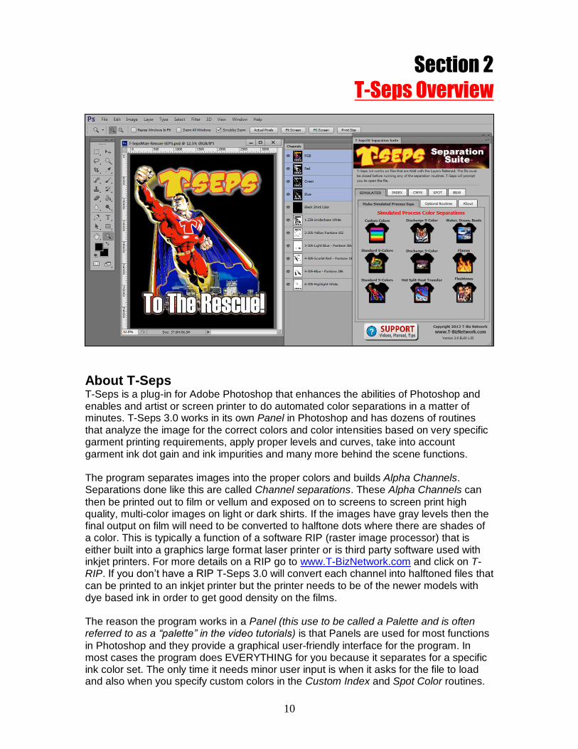
Section 2
T-Seps Overview
About T-Seps T-Seps is a plug-in for Adobe Photoshop that enhances the abilities of Photoshop and enables and artist or screen printer to do automated color separations in a matter of minutes. T-Seps 3.0 works in its own Panel in Photoshop and has dozens of routines that analyze the image for the correct colors and color intensities based on very specific garment printing requirements, apply proper levels and curves, take into account garment ink dot gain and ink impurities and many more behind the scene functions. The program separates images into the proper colors and builds Alpha Channels. Separations done like this are called Channel separations. These Alpha Channels can
then be printed out to film or vellum and exposed on to screens to screen print high quality, multi-color images on light or dark shirts. If the images have gray levels then the final output on film will need to be converted to halftone dots where there are shades of a color. This is typically a function of a software RIP (raster image processor) that is either built into a graphics large format laser printer or is third party software used with inkjet printers. For more details on a RIP go to www.T-BizNetwork.com and click on T-RIP. If you don’t have a RIP T-Seps 3.0 will convert each channel into halftoned files that can be printed to an inkjet printer but the printer needs to be of the newer models with dye based ink in order to get good density on the films. The reason the program works in a Panel (this use to be called a Palette and is often referred to as a “palette” in the video tutorials) is that Panels are used for most functions
in Photoshop and they provide a graphical user-friendly interface for the program. In most cases the program does EVERYTHING for you because it separates for a specific ink color set. The only time it needs minor user input is when it asks for the file to load and also when you specify custom colors in the Custom Index and Spot Color routines.

11
Not Just For T-shirts The program will also work with non-textile and graphics screen printing applications. It is simply a matter of changing the dot gain characteristics before running the routines. Certain areas of the program are specific to T-shirts. It is also so easy to use that you will be doing color separations almost the minute you install the program. It Does More Than Separate
Not only does the program separate, it determines color sequence and tells you what halftone frequencies and angles to use PLUS indicates ink colors, types of ink and mesh counts. All the guesswork is taken out of the process. Artists can now be artists rather than separators! Types of Separations T-Seps separates a variety of ways depending on the end goal and type of original artwork that you have. It will do normal RGB to CMYK conversions including building additional spot color channels (bump plates) and creating Underbase and Highlight whites for dark shirt printing. It also creates very high quality Simulated Process color for light and dark shirts. The program has an excellent Index Color routine (square dot or stochastic) that uses your own custom color panel and creates Underbase and Highlight channels. The Underbase and Highlight channels can be either standard index channels, or Simulated Process channels that can be adjusted for more brightness using Tone Curves.
Another nice feature is the ability to do basic Spot Color separations. While this is normally done in a vector based program, it can be done with T-Seps including trapping and choking colors! Special Effects Too! Along with its excellent separations, T-Seps also creates special effects for images. There are a number of graphic edge effects that can keep an image from being a plain rectangle on a shirt. You can also make an image look like it has been washed and worn with the Distressed Look. To give the image an old photo look, there’s a very effective Black and White routine and a stunning Sepiatone routine too. T-Seps is a Tool Think of T-Seps as a tool allowing you to reach new levels of print quality. It will separate most designs in less than one minute and saves you hours of art and production time!

12
Section 3
General Information
T-Seps and Adobe Photoshop Versions T-Seps 3.0 is an Adobe Photoshop plug in that is designed to ONLY work in Photoshop CS6 or CC (Creative Cloud version) on a Mac or Windows/PC. About This Manual This manual is designed to work with version 3.0 of the program. Most support calls are from first time users who have not read the manual at all. Please take time to review this entire manual first. If you are an experienced computer user and want to get up and running in a short amount of time, go to Section 1 – Quick Start of the manual. Prerequisites and Assumptions
T-Seps is a separation program. It is designed to work with the quality of the images that it is given. In other words, if you ask T-Seps to separate a very flat, muddy image that is not sharp, the image on the shirt will be something that is not very sharp. It’s TITO….Trash In, Trash Out, also known as GIGO….Garbage In Garbage Out. Try to brighten the original with Saturation and Hue to get color information on many channels
during separation – then you will have more to work with and choose from. It is almost impossible for any program to “just know” that you don’t want the image to have a color cast or dust specks from the scan as a part of the final print. Photoshop is a very powerful program that can be used to enhance the quality of the original image. It is your responsibility to make the original look as good as possible, nice and vibrant, and be at the correct resolution in order for T-Seps to generate a high-end separation. The program has Color Adjustment and sharpening features, but you must determine the
degree of adjustment for each file. The cleaner originals will produce the best separations. Using high quality files should be a priority. A Word About Photoshop This Reference Manual assumes that you know the basics of working in Photoshop since T-Seps is a program designed to work in Photoshop. If you do not know how to use the basic tools and moves in Photoshop please take the time to read the Photoshop manual or purchase the T-shirt Graphics in Adobe Photoshop DVD’s from the T-Biz Network International at www.T-BizNetwork.com/store/. Section 5 – Original Art and Photoshop Adjustments of this manual details how to adjust the image and work with the original art. The good news is that if you do a good scan at a high enough resolution, only minor adjustments may be needed before simply running a T-Seps routine. There are also a number of short Photoshop Tutorial videos at www.T-Seps.com.
A Word About Screen Printing It is often assumed that you have a good grasp of the screen printing process. Other than simple Spot Color separations, the program produces very high quality separations
that will require good screen making and good screen printing skills to look like the original. This means high tension screens, the ability to hold fine halftone dots, a good printing press, sharp squeegees, proper inks, and good printing technique. Obviously some will have better success than others. For the best initial success, try using the software on a non-critical image such as a cartoon type image. You will be surprised at how great the image looks. Next, use T-Seps on one of the sample images

13
with flesh tones. Reference colors such as flesh are harder to reproduce and will require better overall printing technique. Film Output T-Seps creates color separations in Photoshop that end up with solid areas where needed and grayscale areas where there are tones and shading. These grayscale areas of the image need to be printed on films as halftone dots. T-Seps can convert the final separations into halftone dots for output to a laser or inkjet printer. But, typically a screen printer uses a software program called a RIP (raster image processor) that converts the file to halftone dots and also controls the ink volume when printing to a low priced inkjet printer. There is more detail on this later in the manual. You can also go to www.T-BizNetwork.com and click on T-RIP to learn more about a RIP. Technical Support Technical support is offered free. Email: [email protected] Phone: Toll Free in the USA 1/888-801-1561
Main Phone 480-212-1078 Internet: www.T-Seps.com Click on Support
Support hours are 8:30am to 4:30pm M-F Mountain Standard Time USA. Please allow sufficient time for a support member to respond. Response is generally within 24 hours. If you have an immediate job deadline please make sure to note in the Subject Line of your email “Urgent.” If you have a problem with the program please re-read the manual to make sure you are following the on-screen prompts exactly before you email support. There are excellent Training Videos online at www.T-Seps.com. Basic technical support is offered to T-Seps trial users. In many cases better support can be given if the file is available for inspection. If you are having problems with a file or need assistance with what routine to use you can e-mail the file to [email protected]. DO NOT EMAIL A FULL SIZE FILE. The file must be low resolution (72 DPI) and saved as a JPG (JPEG) file format. This should make the file size no more than 200 – 500 Kb that is easy to e-mail. For some files the support technician may request a higher resolution file though please wait to see if the technician requests a larger file. If you need to send a full size file use our Drop Box with www.YouSendIt.com. Go to www.T-BizNetwork.com/downloads/ and scroll down to the bottom. There is an UPLOAD link you can use to send large files.

14
Section 4
Installation and Program Setup Installing T-Seps You must read and follow these steps for the program to run correctly. If you follow and understand these steps it will eliminate unnecessary support emails. There is also short video called Installation for T-Seps 3.0 at www.T-Seps.com. Click on Training Videos. In fact, all of the information covered in this manual is covered in the over 25 videos online. Many of the videos were created using T-Seps 2.0. Other than major improvements to routines and the fact that T-Seps 2.0 works as simple buttons in the Actions panel, both programs work very similar and you can watch videos created in T-Seps 2.0 to learn about T-Seps 3.0. The installation of T-Seps 3.0 is very simple. The installer program will do all the work for you other than make minor changes to the Color Settings menu (more later) and opening the actual Panel that contains T-Seps. IMPORTANT NOTE: T-Seps is a plug-in. That means it has to work inside Photoshop and there is no desktop icon or EXE file to run (other than the installer). During installation T-Seps will create a new folder on your hard disk called TSeps3. You
may be asked if you want to change the location of this folder. Do NOT change this. The T-Seps routines will often look to key files in the TSeps3 folder and if it can’t find that folder you might get errors. The Installer will also install a number of additional folders and files in the TSeps3 folder. These include ink company ink values, the most current manual, special ReadMe files, sample files, license files and more. The new TSeps3 folder will be on your C: drive for Windows, or in the Applications folder for a Mac. If you also have a version of T-Seps 2.0 installed and want to keep it for earlier versions of Photoshop that is OK. You can have both versions installed at one time.
You will need to have full administrative rights or privileges for your computer during installation. You may be asked for your computer password if you do not have full rights. Typically if you are the owner of the computer then you obviously have all rights. But, if you are in a corporate environment or on a network you may need to have an IT or network administrator give you full access during installation. 32- and 64-bit Versions On a Mac there is only a 64-bit version of Photoshop CS6/CC. On a Windows/PC there are 32-bit and 64-bit versions. T-Seps installs the correct files for both versions on a PC.
Windows Computers Locate the downloaded file or file on the CD called TSeps30Installer.exe. You should have other programs including Photoshop closed when you run the installation routine. Double-click on this file. Follow the instructions on the screen. This is a normal Windows installer program that will show progress screens as it installs the program.

15
Mac Computers Locate the downloaded file called TSeps30Installer.pkg.dmg.zip or file on the CD called TSeps30Installer.pkg.dmg. If this is a download file it is archived as a ZIP file and it will need to be unzipped. Make sure other programs including Photoshop are closed when you run the installation routine. Double-click on this file. Follow the instructions on the screen. This is a normal Mac installer package that will show progress screens as it installs the program. IMPORTANT NOTE: If you are a previous FastFilms, T-Seps 1.0 or 2.0 user you will NOT see the T-Seps plug-ins under File/Automate anymore. There has been a change to the location of these files. You also do NOT need to Load or Replace an Action in the Actions Panel. T-Seps 3.0 no longer works in the Actions panel. A special version of an Action is loaded automatically by the installer but you do not run T-Seps from the Actions panel.

16
Unlocking the Program T-Seps has a security feature that locks the program to a specific computer. If you bought just one copy of this program then it is designed to be installed on no more than TWO computers. If you wish to have the program on more than two computers you will need to purchase additional licenses for the program. If you have a computer crash or need to move the program to a newer computer simply follow the unlocking routine and we will unlock the program again. The unlock feature does not activate until you have installed T-Seps. When you open Photoshop you will get a T-Seps window. Click on Authorize. You will either be given a number called a Request Code. This number is specific to your computer. If you install T-Seps on a different computer you will get a different number. If you are a trial user of the program or are waiting for your unlock code, simply press the TRY button to run T-Seps for 20 days. Until you receive your permanent unlock you will get this T-Seps window every time you open Photoshop and every time you run a main separation routine. Send unlock requests to [email protected] and make sure to include your company name and order number. If you bought T-Seps from a dealer, give us details about the purchase and dealer name. You can help speed up the process by giving all the details when requesting the unlock. We need to verify that you are a legal user and we lose time if we have to email back asking for more information. You will generally be issued the Activation Code within 24 hours. We do NOT unlock Free Trials for users who don’t own the program. We will often grant additional trial time in which case send the Request Code to use and tell us that you want a few more days to try T-Seps. We will issue a temporary unlock. IMPORTANT NOTE: If for some reason you do not get the T-Seps window either when opening Photoshop or when you start to run a T-Seps routine, then it means the key plug-in files have not loaded correctly. You will NOT get this window once you have been permanently unlocked. There could be a variety of reasons the plug-ins did not load including permissions/rights or other software conflicts. Refer to the Troubleshooting section of this manual or the Support pages at www.T-Seps.com. You can also send email to [email protected].

17
Configuring Photoshop Setup Prior to running T-Seps you will need to do some basic setups to Photoshop. These are small changes to certain program settings that will have an effect on how T-Seps operates. Photoshop is designed for paper printing and the display of final channels and the dot gain applied to that display is wrong for T-Shirt printing. Also, if creating CMYK separations the default Photoshop settings are wrong. Changes to these settings is simple. We have provided a special T-Seps Color Settings file that makes all the changes automatically. If you don’t load this file correctly your separations will be dull on the monitor and your CMYK prints will be muddy. In Photoshop go to Edit/Color Settings. Click on Load. On a Windows computer go to your C: drive and find the TSeps3 folder. Find a sub-folder called Actions.
Load a file called T-Seps Color Settings. On a Mac computer go to your Applications folder. Find the TSeps3 folder. Find a sub-folder called Actions. Load a file called T-Seps Color Settings. Opening T-Seps in a Panel T-Seps 3.0 works in a special custom Extension Panel in Photoshop. To open/load T-Seps go to Window/Extensions and click on T-Seps Separation Suite. You will now have a new Panel in Photoshop for T-Seps. This panel is like all other Photoshop panels in that you can dock it with other panels, move it around, have it on a second monitor if you are multi-monitoring or you can simply minimize it to give you more screen space. .

18
Photoshop Final Setup Adobe made a change in Photoshop a few versions ago where the default setting for opening files was to Open Documents in Tabs. This means that rather than having individual files on your screen you now have all the files in one large container and each file has a tab across the top with the file name.
For many older Photoshop users this seems foreign and you can change Photoshop to NOT open files as Tabs if you go to Edit/Preferences/Interface and uncheck Open Documents as Tabs. DO NOT DO THIS. Regardless of your own preferences – there is a documented bug (as of this manual writing) where Photoshop will not recognize the “Previous Document” if more than one document is open - unless the documents are in tabs. T-Seps will often have duplicate versions of files open and will look to a previous document that is open for information. If you are not opening documents as tabs you may get a scripting error.

19
Photoshop CS6 and CC Color Theme Photoshop now allows you to choose from four different color themes. The default theme is the new dark theme that is popular with a lot of software. If you are use to a lighter color theme you can change to the lighter color or medium grays by going to Edit/Preferences/Interface. T-Seps changes color depending on the theme you are using.

20
Section 5 Original Art and Photoshop Adjustments
About Original Art The problem today is that everyone is an artist. Typically you don’t get a great photograph or image. Customers think they can take a web graphic and it will look great on a shirt. Or, they think they are doing you a favor by providing a JPG file and they make it a Low Quality JPG so they can email it. They just screwed up what might have been a great piece of artwork. The problem is they don’t know this and they think you can perform miracles. OK, T-Seps can perform miracles when doing separations but it can’t do much for a bad piece of artwork. Over the years a majority of support phone calls for FastFilms and now T-Seps are about how to fix a bad piece of artwork. In general ALL artwork can use a little tweaking to make it better. Photoshop is excellent for adjusting images and making them look better than the original. T-Seps will give you a very high quality set of separations but only if you give it a very high quality image. If you tell it to separate a low resolution image that has no detail, expect the same of your separation. The program has an excellent help section that will guide you through many of the important points of scanning and image manipulation. Do not ignore this section of the program. If you are unfamiliar with Photoshop you should go through the Help, Tips and Troubleshooting section step-by-step. A common problem with new Photoshop users is they take what artwork is given to them (even if from a graphic design studio), and they assume that is all they get. With a few simple adjustments the artwork can go from very poor to outstanding. T-Seps 3.0 has a Support button at the bottom of the main menu that takes you to a separate panel with links to the online Support pages, the online Manual, online Videos and a Helpful Tips page. You can actually watch online videos from these pages without ever leaving Photoshop. If you are new to Photoshop make sure to watch some of the short Photoshop tutorials and read the Tips page for general file information.

21
Photoshop Computer Graphics Tutorial Photoshop Basics Let's start with some basics. We will assume you have installed Photoshop and followed the steps in their excellent manual. The program also comes with tutorials and there are many excellent articles on Photoshop at www.T-BizNetwork.com. Photoshop is a pixel/raster based program. That means that images in Photoshop are made up of tiny square dots of color. These dot/pixels/raster (call them what you like), are a fixed size/resolution. If you enlarge an image the pixels get bigger. A Word about Vector Programs Programs like Corel Draw, Adobe Illustrator and Adobe Freehand are Vector based programs that are great where the image has more of a cartoon or hard edge graphic. With a vector image, as you enlarge the image the resolution (sharpness) of the image does not deteriorate. Most GREAT pieces of artwork combine the best of both programs. T-Shirt artists typically use Corel or Illustrator for the text and hard edge portion of the image and they us Photoshop for the photorealistic portion. T-Seps ONLY works with Photoshop. You can easily create files in your favorite vector program and then separate the file with T-Seps in Photoshop. Files from these programs can be exported as EPS, TIF or PSD files. Of course you can always us an “AI” Adobe Illustrator file. Make sure to export from these programs at the final image size and a resolution of at least 300 dpi. If you have control, set the Fountain Fill steps as high as possible. Files should be exported as RGB. If you want to use a vector file on separate Layers in Photoshop, ALWAYS export the file as an EPS or PDF file format. The file will have a transparent background that works well on Layers. VERY IMPORTANT NOTE: When you open a PDF, EPS or other vector file in Photoshop you get an Import window. The default settings in this window are 72 dpi for resolution and anti-aliasing checked. You MUST turn off anti-aliasing because it is Photoshop’s way of softening edges. You MUST change the file resolution to 300 dpi for normal jobs and up to 450 dpi if you really want to maintain edge sharpness.

22
The Photoshop Main Screen You will notice Photoshop has a variety of items on the right of the screen that have divider tabs on top. These are called Panels and you can "hide" them or "show" them. If you go to the Window pull down menu you will see the Panel list. You don't need all of the Panels open for basic work. In fact, the ones we like to "show" are: Layers, Channels, History, Actions, Info. The rest you can close by clicking in the upper right X in each Panel. You can group Panels together by "docking" them. You can also click and drag on a Panel name and "undock" it. The idea here is to keep the working area clear of clutter. Keep the Panels docked and to the right of the page. The top Menu Bar has lots of Pull Down menus and there is a typical Toolbar on the left. The key thing to remember is to NOT get too bogged down with all the bells and whistles. You will find that with most graphic programs you will use 20% of the program 80% of the time (the old 80/20 rule). File Formats Photoshop will let you open a wide variety of files including, TIF, JPG, GIF, EPS, PSD, AI and others. If you open a file that is vector based like one from Adobe Illustrator, Photoshop will convert the file from mathematical vectors to small pixels. This is called Rasterizing a file (converting it to pixels). The important point here is to keep the file resolution high enough for the image to remain sharp. It is generally taught that a file needs to be at 300 dpi at the final size in order for it to remain crisp. In T-Shirt printing, you can get away with file resolutions of 175 to 225 dpi at the final size BUT IF POSSIBLE STAY AT 300 dpi. In fact, if you want to have “vector quality” edges to type you can even work at 500 dpi or higher. The default setting for opening vector files in Photoshop is 72 dpi. REMEMBER to always change the resolution setting when opening a vector file in Photoshop. The most common file type is called a JPG. This is typically a file that someone has made using their digital camera or from a website. JPG is a popular “compression” format that will make a large file small enough to email. When a JPG file is made there are different qualities. A quality of “1” is very low and is almost impossible to use.

23
The file has been compressed so much that areas of gradations have “boxes” and averaged areas. Areas that have hard edges now have “artifacts” around these edges. One solution is to use JPG Enhancement programs. These will soften areas with excessive compression to the file size and will help eliminate artifacts. The image on the right shows a very low quality JPG file with a lot of artifacts (unwanted garbage in file). T-Seps 3.0 has an Improve JPG Quality feature that is excellent. The image below shows a “before and after” comparison. Photoshop Test File To Open a file. Go to the File menu and then to Open. Search your hard disk for a test file, or if needed, find the Samples folder that comes with Photoshop or the Samples folder that came with T-Seps. Open or load a file. There is a file with Layers in the TSeps/Samples folder called PhotoshopTestFileLowRes.psd. This is a good file to use
for learning.
This file started off as a scan of a photograph from a travel guide of a picture of a monument called Tikal. The original picture was no larger than 6” x 8”. The sample test file has a resolution (more about this later) of 72 dpi which is typical of what a customer will give you. The rest of the elements are from stock clipart (royalty free artwork available online). The text was added in Photoshop and the soft edge was created using the Edge Effect routine in T-Seps.
If you have your Layers Panel open then you can see that this image is made up of a variety of Layers. There is a Layer for each key element. You will see as you play

24
around a little that you can select a Layer (click on it) and then use any of the Photoshop tools tore-size, lighten, darken, blur, and more. This is how all great images are built in Photoshop. When you see a HOT magazine ad with a lot going on – the ad was “built” in Layers in Photoshop using a wide variety of graphic elements. Check File Size and Resolution You MUST know the actual resolution and size of the image. Otherwise you could be working on a very small file and not know it. Go to Image/Image Size. If you are using the test file you will see it is 72 dpi and 8” x 9”. This is not very big physically and a pretty low resolution. The resolution should be 250 to 300 dpi or higher in pixels-per-inch. If it says pixels per CM, change this to inches. The physical size should be the final print size. Many graphics coming from customers are often very low resolution and off of a website. Stock graphic images that are downloaded from the web are typically only 72 dpi and physically small in size. Even though a file like this will work, it will not be as sharp as an image that is higher resolution at a larger physical size. You must know what you are working with. The image on the right shows a magnified view of a file that is 200 dpi and one that is 72 dpi. Obviously, the 72 dpi file will be softer. And, if the physical size of the file is small, when you enlarge the image to print full-size on a shirt, the image will be softer yet. What if the file size and resolution is not correct? This is where it gets hard. Let's say your file is only 5 inches in width and 72 dpi, AND you want it to print 10 inches wide. In the Image Size window, under Document Size, if you uncheck Resample Image, you will see that all three windows are now "locked" together. If you
change the file size to 10 inches notice that the resolution changed to 36! 36 dpi is a LONG WAY from 200. The problem you have is the file is very low resolution. Your only real choice is to check Resample Image and change the width to 10 inches and the resolution to 200. Photoshop "upsamples" the image. But, it has to guess at where to place all the extra pixels and what color to make the pixels. Images can get softer when upsampled. If this is the only thing you have to work with then so be it. If you can get a higher resolution file from the client, by all means do it. For our sample file change the physical width to 13” and let the height change by itself (proportional). Make sure Resample Image is checked and that only the Width and Height are locked together. Make the Resolution 300 dpi. When you say OK, the image on the screen will now be much larger.

25
There are a number of Photoshop plug-ins on the market that are designed to upsample a file without losing detail. These range from free to hundreds of dollars. Some use very complete math formulas to make a very low resolution file look sharp at high resolutions. Notice the improvement in the edge detail on the upsampled image at the top of the next page! T-Seps 3.0 has a routine called Upsample Image in the Optional Routines/Improve Image Quality drop down menu. The image on the left was 72dpi and
the right upsampled image is 200dpi. We use a complex algorithm that really works.
Check File Mode
This is where beginners go wrong. You open a file and don't bother to learn about the file. At this point, the file should be RGB and not CMYK. Yes, Photoshop will do process color separations for screen printing called CMYK, but for file manipulation and adjustment you should work in RGB mode. To see the Mode of the file go to Image/Mode. If CMYK is check, click on RGB. The file should also be 8-bit. Check file Saturation Most files from customers are flat and need a color boost. Always check a file to see if it needs a saturation boost by going to Image/Adjustments/Hue Saturation
Don’t be shy here. You can boost the color saturation of the overall file or you can select key colors to saturate. Remember - when you reproduce the image with screen printing, heat transfers or inkjet-to-garment printing techniques, the file will often print flatter and less saturated.

26
Using the Tone Curve Images tend to get muddy when printed which is why boosting color saturation helps. But, another excellent way to make images pop is to brighten them a little. You could use the Brighten slider, but a better method which gives you more control over the different tonal areas is to use the Tone Curve. If you have a file with lots of detail in the shadow areas, this will probably be lost when printed. Go to the Image pull down menu and then to Adjustments/Curves. The Tone Curve is a very powerful tool. It lets you adjust specific tonal areas from the lightest highlights to the darkest shadows. By placing your cursor in the middle of the curve "midtones" and dragging the mouse up or down, you can lighten and darken the medium or midtones in an image. By clicking on the very top corner and dragging the mouse in, you can make the highlights lighter. Play around with the Tone Curve and see what happens. A good curve for flat images is a
slight “S” where you lighten the highlight 25% area and darken the 75% shadow area. Sharpening Images Typically, an image can be made sharper. Even if the file came from an agency or large licensed job, don't assume that their artist knew your needs. Images that are printed, not only get darker but they get softer. You MUST make them as sharp as possible. Go to Filter/Sharpen/Unsharp Masking. Don't let the "unsharp" term fool you. This term came from the old process camera days and basically means it only sharpens areas of high contrast. It sharpens but keeps it less apparent that you have sharpened the image. Set the Amount slider to 200, the Radius to 1 pixel and the Threshold to 8. How does the image look? To compare the original to the sharpened version, uncheck the Preview check box. Click it on and off and compare the results. If you can't see much difference, move the Amount slider higher. Go all the way to 500% if you need. Don't get the image too grainy. Remember, Photoshop displays images a little sharper than they really are which means you can go a little too far and be OK. Selecting Areas If you want to apply a Tone Curve adjustment or apply Unsharp Masking to select areas, you can choose these areas with one of the Selection Tools on the Toolbar. Click on the tool that looks like a Lasso - yes it is called the Lasso Tool. Now, simply hold the mouse button down and draw around an area you want to change. When you release the mouse, you will have little moving dashes, commonly called "marching ants". You have just selected an area. Now, anything you do ONLY happens to this area. Think of this like "selecting" an object in Corel or Illustrator. To remove the marching ants, go to the Select pull down menu and to De-Select. If you want to select square or round areas, the

27
top left tool is called the Marquee Tool. It does the same thing as the Lasso tool only it does it to square or round areas. Channels and Layers For most of your work, make sure to have the Layers Panel and the Channels Panel showing - and separate. People always get these confused because they look very similar. Here are the rules. The Channels Panel shows whether the image is RGB or CMYK. T-Seps uses the Channels Panel to create color separations that can be output (often called Channel Separations). Channels can be printed individually for color separations. If you are printing directly to a heat transfer or inkjet-to-garment printer, the file needs to be in RGB channels. The Layers Panel is used to create or build the image. You use the Layers Panel to put various components together including adding type to an image as with our sample file. Layers don't print. Simple. You will notice that your Channels Panel shows four channels. RGB, R, G and B. If you opened a graphic from a digital camera or web JPG file, it should only have one Layer called Background. When you click on a Layer, you make it "active" and available for changes. You can also select areas for adjustment using the Marquee or Lasso tools. Removing Backgrounds In order to apply effects to objects on Layers they need to have a transparent background (this shows up as “checks” on a Layer). The easiest method is to have an image with very simple backgrounds. If you are in charge of taking the photo, take it with very uniform backgrounds that are of the same color. If the photo is of a car, park it with just sky behind it and nothing else. OK, if you can't do that, park it in front of a solid colored building. Make sure to take the photo at as high a resolution as possible. If your "old" digital camera is only 2 megapixels, about the best you are going to get is an image that is 10 inches wide at 150 dpi. On the edge of being too low resolution. You should try for full image size with a resolution of 250 to 300 dpi. Use Magic Wand and Click and Delete They don't call it the Magic Wand for nothing. This tool is hot. With the Magic Wand you simply click on the neutral areas around the image. It works best if the background color is slightly different than any of the edges of your image. Just click and watch the Magic Wand make a selection around the image. If the "marching ants" selection goes into the main design, change the Tolerance on the Property Bar. The default is 32 pixels.

28
Making Your Selection a New Layer You need to get your main image on a layer with a transparent background. In Photoshop this will show as checks all around the image. With a transparent background you can add additional elements to the image including type behind the image, drop shadows, glows and more. Finalizing a File before Separating
If you built the file using Layers, you MUST always remember to save the file and name it so you know it has Layers. Call it something like TestFile_Layers.psd. BEFORE you run a separation routine with T-Seps the file must NOT have any Layers. The file must be Flattened. Click on the small upper right arrow in the Layers Panel and click on Flatten. Once Flattened and saved you can’t come back and adjust the Layers (they are gone). That is why you always have two versions of the final artwork…. one that has Layers (for future use), and one that is Flattened (for separating). This concludes the short Photoshop tutorial. For additional help consult the Photoshop manual and view some of the excellent Photoshop DVDs online and from the Store at www.T-BizNetwork.com. Image Resolution and T-Seps A beginners mistake when creating artwork is to take a graphic off of the internet that is 72 dpi and use it as the basis for a design. Beginners leave the resolution alone and start to add other graphic elements like text. When they are ready to separate the image, the upsample the image to the final print size and wonder why the text is jagged. When you add type to a graphic in Photoshop the type will end up the resolution of the file. In this case 72 dpi. TIP: ALWAYS, ALWAYS, ALWAYS take the original graphic file and upsample it to the final print size and final resolution you want – around 300 dpi. THEN start to add text elements and build the design! The text will be high resolution and not jagged. If you feel that 300dpi is not high enough to keep your text razor sharp then use a higher resolution. IMPORTANT NOTE: You CANNOT re-sample the resolution or make color adjustments of an Index Color separation after you have run the routine! Make sure all size and color adjustments have been made before running an Index Color routine! Changing either will ruin the separation! (Exception: you may adjust the Underbase and Highlight channels of the Index Color - Halftone Base routine. IMPORTANT NOTE: When running Index Color routines, the actual dot size that is put onto the media directly correlates to pixel size and you may not be able to hold these smaller square dots on your screens! 225 DPI is considered the maximum for high detail Index Color separations. See Section 9 for more about Index Color separations.

29
Preparing Artwork for T-Seps IMPORTANT NOTE: There has been a major change in the type of artwork needed for T-Seps. The initial release of T-Seps 3.0 and earlier versions of T-Seps (and FastFilms) required you have two versions of the artwork that was on a flattened layer when running routines for light and dark shirts. T-Seps 3.0 (build 1.15 or higher) now allows you to use a Photoshop file with a transparent background on a single layer. When you run a separation routine you will be asked what type of artwork you have. There are reasons to have both types of artwork and it often depends on whether you get a vector file from the customer or if they bring the typical low quality JPG file that already has the shirt color as part of the file. If a file is created in a vector program like Corel Draw or Adobe Illustrator, it can be brought into Photoshop with a transparent background (if they don’t have large raster images placed in them). In the case of Corel Draw, simply save the file as a PDF and then Open the file in Photoshop. In the case of Adobe Illustrator you can simply Open an AI file in Photoshop or save the file in Adobe Illustrator as a PDF and Open it in Photoshop. Make sure to uncheck Anti-Aliased and to increase the file resolution when
opening files this way (refer to Page 21). Remember, if the file has a checkerboard image behind the file then you know the file has a transparent background. If the file says “background” in the Layers Panel then you know it is “flattened”
and does NOT have a transparent background. Certain file formats like PSD, PDF, TIF, EPS, PNG, and GIF can have a transparent background. A JPG file format will always be flattened and not have a transparent background.

30
Separating from File with Transparent Background For most jobs this will be the easiest method to use. You won’t have to worry about making two versions of the artwork (see below). The file must have only one layer. If you have a file with multiple layers, simply put the Photoshop “eye” on all the layers that are part of the design (do not put the eye on any background or shirt color), and then go to the upper right arrow in the layers panel and Merge Visible Layers. The layer can be named anything you like but there can only be one layer.
When running a separation routine from a file with a transparent background the file MUST be Open on the screen before you run the routine. And, unlike previous versions of the program or routines where you load two versions of the file (see next section) you do not load more than one file. You simply open the file with the transparent background, make sure it only has one layer, and run any of the separation routines. Two Versions of Art Earlier versions of T-Seps had you create two different versions of the artwork. One version has black in the “canvas” area and one version has white in the canvas area. For some people this was/is confusing but there is good logic. You will often get a file that already has the shirt color as part of the artwork. This is normally the case where the file is going on white or black shirts. You get a flattened JPG file with a white background or “canvas” around the image. And, the edge of the artwork often vignettes or fades into the background. The same is true for artwork for black shirts. The artist will often work on a black background and you get the JPG with the black background as part of the image. It is often VERY HARD to remove these backgrounds – especially if the artwork fades into them. This is where using the two versions of the artwork below is the method to use.

31
IMPORTANT NOTE: If you have a piece of artwork going on a white shirt and the artwork is on a white background then you do NOT need two pieces of artwork. Even if the file is flattened and says Background in the Layers Panel, you can open the file, click on the appropriate separation routine and choose to run the file on a file with a transparent background! T-Seps will unflatten the file and create the separations. T-Seps will obviously make the various underbase and highlight channels and they will be incorrect but you won’t use them on a white shirt. Simply delete these channels. The same is true if the file is on a black background and is ONLY going on a black shirt. You can simply use this file and run the option to use a file with a transparent background. T-Seps will unflatten the file and will make a black channel but it will be incorrect (it will have black around the image) but you simply delete this channel and don’t print black ink on a black shirt. If the artwork has a hard edge and you can easily remove the background using methods outlined earlier, or third party “background removal” software then that is the better method to use and run the job using the transparent background option. If you have a version with a transparent background then there is no need to make the two versions of the file. Simply run the routine using the transparent background option. If your image is going on light AND dark shirts and if you do NOT have a version with a transparent background – then you will need to have TWO versions of the art or find a way to remove the background color leaving a transparent background. The main version will be the image as it should look on a white shirt. This is often called the Unmasked file (masking started as an old process camera term). We will now call this the “White” version. The second version will have black around the image so that it

32
looks the way it should print on a black shirt. This can be called the Masked file but we will call this the “White” version. T-Seps will ask you twice to load files when running color separation routines. It will prompt you to load the Masked/Black version of the file first and then load the Unmasked/White version second. If at all possible and you have an opportunity to get a layered file from your artist or customer then by all means do so! This is by far the easiest way to create separations. File Requirements
Here are the requirements for files to be separated:
A. In RGB mode. (Check by going to Image/Mode) B. Flattened with ONLY a Background layer or a file with a transparent
background (one layer only). C. Have NO additional channels other than RGB: Red, Green, Blue
If these things are not correct then you WILL have errors during the routines. Artwork Summary Remember, time spent adjusting artwork before you separate it will give you a much better set of separations. You will find that “tweaking” original artwork becomes automatic. You will find yourself immediately checking the resolution and upsampling the resolution and the physical file size. You will then use a Tone Curve to boost the file contrast and next boost the Hue/Saturation to boost the color intensity. You will become very proficient at using Unsharp Masking. It is IMPORTANT to note that you may feel you need to maintain the file integrity – meaning to match the shirt print to what the customer gave you to work with. Our approach is that you need to not be shy about improving the file so it will print bright and sharp. Yes, if there are key colors or critical flesh tones you don’t want to deviate too far or have the file “glow” with color saturation. Use your instincts and give the customer an excellent print!

33
Section 6
Running T-Seps
Choosing the Best Routine to Run There are a number of ways and methods that can be used to separate a design. If the image is only going on light colored shirts, it could be separated as Real Process Color (CMYK), Simulated Process Color, or even Index Color. If you are not familiar with these processes it can be difficult to determine which is the best method to use. Often, the method used is dictated by the customer’s demands and/or the artwork style. The following section should help greatly in making the correct decision. Since T-Seps is easy to run and very fast, you may want to try separating an image in a variety of ways to see the final outcome for each routine. There are specific sections of this manual that detail how to use each separation method. IMPORTANT NOTE: It is very common for new users to email support only to ask what type of separation they should run on a certain image. Since T-Seps runs separations so quickly, it is recommended that you at least try one or two different types and see the results and take a few minutes to experiment before contacting support. Simulated Process Color This method works well on light and dark shirts. Although this routine creates eleven channels of color, many of them you will not need – especially on light shirts. If your image has a lot of standard colors such as red, yellow, blue, purple, green and brown then this routine should be run first. In fact, even though this routine is designed for images with a lot of color gradations, you may be surprised at how well it does on simple spot color images. Simulated Process Color is also called tonal spot color. Because all-purpose plastisol inks are used, the image will print very bright and be more wash-fast than Process Color. Simulated Process prints use an Elliptical halftone dot. When in doubt, run Simulated Process Color FIRST. The Simulated Process Color routine gives you the MOST freedom and control over the separation, allowing you to eliminate colors, combine colors, boost colors and much more. The Simulated 9-color plus Two Whites gives you a lot of color choices. Process Color – RGB to CMYK Conversion If the image is very photo-realistic and needs to go only on light or medium color shirts, this may be the method to use. It will give somewhat of a softer look to an image and will not work as well on dark shirts. The program does create an Underbase and Highlight white plus the CMYK channels, with the option to create additional spot colors if there are Pantone matches or problem colors – though Process Color on an Underbase of white may be somewhat dull looking. This routine should be run where absolute photo-realism is a must and where you are trying to come as close as possible to the original. Process Color prints are not as bright as Simulated Process Color and because of the high mesh counts used they may fade slightly when washed. Process Color uses an elliptical halftone dot with varying screen angles to eliminate possible moiré patterns (screen angle interference) in the final print.

34
Index Color Index Color separations are great for light and dark shirts. They print easily and very consistent because you are printing a square stochastic dot next to a dot and not a halftone on top of a halftone dot. Indexing works well for many designs but for close accuracy on colorful designs, Index Color separations like a lot of print colors. It is not uncommon for a great index print to be eight colors or more. T-Seps has an optional routine to separate the file and have the Underbase and Highlight white channels output as halftoned channels that may be adjusted with tone curves after separation, unlike the previous standard Index Color routines. This is called a “hybrid” Index Color routine and will be covered in more detail in Section 9 of this
manual. By choosing your own colors, you can tell the program specifically what colors to use although you may need six or eight colors to get a more accurate match. With Index Color separations, the more colors, the better. The downfall is that you lose the option to curve channels to increase color information (as with halftones), eliminate certain channels, combine channels, or resize the image after separation. For these reasons, you may want to run the Simulated Process Color routine first and the Index Color
routine second to find the appropriate method. Much has been written about square dots and round dots and there is great confusion about Index Color. It can be an excellent method of reproduction and also fall short if the colors are not correct. Even though competing programs tout that square dots are far superior to (round) halftone dots, if you simply look at all the great award winning shirts, 75% of them are done using halftone dots. Also, since some complex images require so many colors to reproduce with Index Color, smaller shops that do not have the ability to
print so many colors gain greater control over the quality of their garments with the Simulated Process routines because of much increased ability to manipulate the color channels after separation, thereby keeping the number of screens to a minimum. If you run an Index Color routine, you have NO control over the image once it is separated – other than to put a different color of ink in the actual screen on the press or to rearrange the print sequence. Index Color uses a diffusion dither (stochastic) dot that is a bitmap and not a grayscale. For this reason you do not need to specify lines per inch or angle for Index Color since the square dots are determined by original file resolution. IMPORTANT NOTE: Once Index Color is run, you CANNOT apply tone curves or eliminate colors because an Index Color routine places dots side by side and the image is like a puzzle. If you remove a color there will be “holes” in the design. Changing these WILL ruin the separation. (This does not apply to the halftoned Underbase and Highlight channels in the Run Index Color – Halftone Base routine since these channels are created as grayscale channels and still require you to set the frequency and angle. You can still use Tone Curves on the Underbase and Highlight channels in these routines See Section - 9.5 – Hybrid Custom Index Routines for more information. Spot Color The Spot Color routine should be used for very simple designs (solid color) that don’t have gradations. Spot Color is better separated using a vector based program such as Corel Draw or Adobe Illustrator. The Spot Color routine in T-Seps is available for those occasional jobs that are already finished in a pixel based painting program (such as a JPG) and can’t be reconverted to vectors.

35
Black and White The Black and White routine is great for monochrome images where you need a final grayscale image that has no color. For the best prints these images are generally printed using white, black (not on black shirts), and various levels of gray.
General Running of the Program T-Seps is very easy to use. The T-Seps Panel is grouped by the above mentioned separation types. By clicking on a tab for the separation type - you are given a main tab that has the key separation routines for that particular type of separation. When first starting out explore each of the main separation type tabs. And, if you drop down the Optional Routines tab you get other options. The Optional Routines tab choices will vary depending on the type of separation you are doing. Don’t be overwhelmed by all the choices. Keep your focus and realize that the various separation types and optional routines give you a lot of power. You simply need to determine the type of separation you want to run and then play with all the options. Most of the program is designed to separate to a specific color set, such as Lemon Yellow, Scarlet Red, Light Blue, etc. This is to your benefit. You no longer need to mix custom colors for each job, unless you need a precise Pantone spot color match.

36
Just Click on a Button To run a routine simply click the appropriate color separation button. Make sure to have the file ready but CLOSED before starting any routine. Each routine is started with a help message screen that explains what is going to happen and tells you exactly what to do. The program contains over 100 help screens. In fact, these help screens are like an on-line manual. It is VERY IMPORTANT to read these help screens. They give specific instructions that need to be understood and followed. Each help screen contains either both Continue and Stop buttons or a single Stop button. You will normally press Continue to have the program continue running a routine. You might press the Stop button if you feel you need to re-start the routine, fix the file or
just stop a routine. IMPORTANT NOTE: If you get errors during running a routine then the plug-in is not installed correctly. It is ONLY the first error that is important and it is usually “can’t find T-Seps3” which means Photoshop has not found the main plug-in. After you get this error you will get dozens and dozens of other errors – all created because the plug-in is not installed correctly. If this happens refer back to the Installation and Program Setup section or the Troubleshooting section.
The work files MUST also be in RGB Mode. Many of the support calls received from new users of the program are because the files are in CMYK mode. About The Work Files As you know from Section 5 – Original Art and Photoshop Adjustments you can use files with a transparent background or files that are flattened when running T-Seps. For T-Seps to run correctly the image MUST be at the final resolution and be adjusted for optimum quality (sharpness, good tonal range, etc.). If the image is dark in the mid-tones and shadows, apply Tone Curve adjustments. Opening the Working Files
Earlier versions of T-Seps required that you use flattened files and these files needed to be closed before you started to run any of the separation routines. T-Seps 3.0 now gives you an option when running separations. You can run from flattened files or files with a transparent background. If running separation routines from a file with a transparent background that file needs to be OPEN when you run the routine. Remember, you can even use flattened files for the “transparent background” routine as long as you remember that they must have a white or black background and they will only print on white or black shirts. See page 31 for more details. If using the older “black” and “white” file method where you are asked to load two different files – these files must be CLOSED to run these routines.

37
When you click on one of the small T-Shirt icons to run a routine the separation routine starts and a help message screen will ask you to choose if you want to run the routine on a file with a transparent background or on flattened RGB files. Previewing Images on Screen After you have run a specific routine, you will need to preview the image to see how it will look on a shirt. Photoshop allows you to see a channel by placing clicking on the small square box at the right of each channel. This places an “eye” in the box. With an eye checked it means that the channel is visible. If only one channel has the eye next to it, the image will be in black and white grayscale on the monitor. If more than one channel has the eye, Photoshop will display the image in the correct color. T-Seps has a very accurate on-screen display which allows for dot gain that will get when you print the image on a shirt. Working With Channels You can also preview a single channel by placing just one eye next to the channel (making it visible) and removing the eyes from the others. If you want to adjust a specific channel it will need to be selected. Don't confuse SELECTING a channel – clicking on it so it is highlighted with a blue background in the channels panel - with placing an EYE next to it and PREVIEWING it. These are two separate commands. You can have channels set for preview (with eyes) and have only one selected (highlighted and light blue in color) for adjustment. Sometimes you might forget and have an eye on one channel and think you are working on it when in fact you have a different channel selected/highlighted. Optional Channels You will notice that on most routines there is more than one underbase white and multiple black channels. Each piece of artwork is different. For some images – especially on black shirts where we use the shirt as the black in the image – a high contrast underbase is better to let more shirt show through. On other images a low contrast more detailed underbase is better. You have these choices with T-Seps. The same goes for the black channel. Some images that have a lot shadow areas benefit from printing two different black screens. One screen has just the solid spot color black information and one has just the grayscale halftone information. Also, even though you should try not to print black ink on a black shirt there are times it is helpful to maintain detail if you print just the halftone black on a black shirt. Again, you have options and you simply delete the extra channels you don’t want.

38
Adjusting Individual Channels – The Important “Tweaks” Once a channel is selected it's possible to apply a tone curve or levels, sharpen or erase sections, use the Dodge/Burn tool and much more. There are times when image touch-up will be necessary if you find that a color is not intense enough. If the preview of the image is close but maybe just not dead on, don't be afraid to adjust channels. Good separators run the program first and then tweak individual colors. You can double-click on the Shirt Color channel and see a preview on different color backgrounds. You may find that the black shirt looks great but on a white shirt the Black channel needs a curve. Don't be shy. Go to extremes to see what adjustments need to be done.
Using Tone Curve The best place to start is with the Tone Curve (Image/Adjustments/Curves). Put
your cursor on the center of the curve a pull it up or down. If you have the preview eyes on all the channels but only have the channel you are adjusting selected you will be able to see the effect the adjustment has on the overall image. Changing the Assigned Color
The problem with using a pre-set palette of colors is that often T-Seps has the right color information but maybe the wrong color. T-Seps uses Yellow Pantone 102 as a stock yellow. If your image has a more golden yellow – the T-Seps yellow will have the correct information. You just need to double-click on the channel header and change the assigned color to the proper color. Simple. It is very easy to simply sample the color from your image using the eye dropper and determine what Pantone color this is and then change a channel to display in this color. T-Seps calls for a Pantone 185 red. Your image might have a Pantone 485. No big deal. Change it Moving Channels to Change Print Order Some images may need a different print order than T-Seps recommends. Simply click on a channel name and hold the mouse down while moving the channel to a different location. A typical print order is light to dark but also you can print the smallest print area to the largest. Changing the Shirt Color The default shirt color in all routines is Black. You can easily preview the image on a different shirt color by double-clicking on the Shirt Color Channel and then clicking on the colored square box. This will bring up the Color Picker. Select any color you choose
and you will see an immediate on-screen change to the new shirt color. Deleting Channels Channels that you don't need can also be deleted by dragging the channel to the Trash Can at the bottom of the Channels Panel. This can simplify the file to make and also
make the file size smaller when saved to conserve disk space.

39
Changing Channel Header You can also change the wording in the channel header by double-clicking on the channel name. This feature will allow you to put the color sequence, mesh count or other information here. This information will print on the actual individual separation films if you check the Labels option in the Print With Preview window. Using the Dodge/Burn Tool This is a tool you will use all the time. The Dodge tool looks like a lollipop and is on the Toolbar. By moving this tool around the image you can lighten areas of the design. You can also change how big the “tip” of the tool is by changing the Brushes. If these terms are new to you simply do a web search of using these tools or watch the short Photoshop tutorial videos at www.T-Seps.com. By converting this tool to the Burn tool (looks like a cupped hand), you can burn areas in and make them darker. Using the Info Panel This one is HUGE. On the surface - a set of separations might look great on the monitor. But, based on the colors in the image, some of the colors that look solid (100%) on the monitor might actually not be 100%. Using your screen printing experience and intuition you know that if there is a solid red area in a design – this area should probably be solid red – 100%. The same goes for the underbase below a bright red. On a black shirt this should be 100%. If your original image is dull, T-Seps might make the red only 90% and the underbase 80%. It will look good on the monitor but when you output films you will have halftone dots on the films. That is not what you want. You can never trust your eyes for color density on the monitor. An image might look solid when it is not. This is where the Info Panel comes into play. You can open it from Window/Info. It reads density levels. You should keep this panel open ALL THE TIME and use it on every channel. In the image on the right, the red area shows what is being sampled by the cursor or eye dropper. The yellow area shows the reading in the Info Panel. The reason it says “K” is that K is a common reference for Black or Grayscale images. Select one of your channels. Place the cursor or eye dropper over various areas of the image. Check parts of the image that you think are 100%. If they are not – and you know they should be – use a Tone Curve or Dodge/Burn tool to make them 100%. The Info

40
Panel reads “before and after” when doing tweaks so you can see exactly how it is turning out. Checking each channel this way will help your prints be brighter and save film. Often an area that should really be 100% might end up 95% with T-Seps. Your film will have halftone dots on it and you don’t want that. The Info Panel is not only to read areas that should be 100%. If you have subtle light areas in your image you should read them also. Sometimes areas will appear to have some color on the monitor but when you read those areas they are less than 5%. Unless you are a really good screen maker – you can probably not hold any halftone dot less than 5% on the screen. You should boost these light/weak areas a little so they will actually show up as halftones on your films and end up on the screens.
Now that you have a good idea of what to do with T-Seps you should go back to Section 1 – T-Seps Quick Start (page 6) and review those steps.

41
Section 7
Simulated Process Color Separations
What is Simulated Process Color?
Generally a Real Process job is a photo-
realistic image that is printed with the colors of cyan, magenta, yellow and black (CMYK). This process generally only works well on a light shirt although some jobs that have a lot of colors that need to be kept to six or less on a black shirt benefit from CMYK. The term Simulated Process Color has evolved to mean an image that is photo-realistic but does not use CMYK. Simulated Process colors generally are made up of specific spot colors that are halftoned. From the distance they look like Real Process Color but upon examination are not CMYK. In the old days Simulated Process applied only to black shirts. In recent
years it has also been applied to photo-realistic images on light shirts that are not printed with CMYK. The beauty of Simulated Process color images is that they look vibrant on black shirts because other than the Underbase and they are printed with all-purpose inks. Simulated Process prints are generally at least six colors and if going on a dark shirt almost always have an Underbase white and a Highlight white. In the past, doing separations for Simulated Process color was an art that took a very good understanding of Photoshop and screen printing. T-Seps has changed all of that. A complete set of separations can be done in just a few minutes with very little intervention of the user. Simulated Process or Index Color? A common question is whether to use Simulated Process Color or Index Color for an image. Index Color has gained popularity because it was easy to let Photoshop do the separations without much knowledge of the process. Simulated Process has always been harder to separate because the separator needed to have more knowledge. Simulated Process Color has a smoother look to gradations because you are printing a halftone dot rather than one size pixel. If the image is critical use Simulated Process Color. Indexing can tend to have a posterized and grainy look to the images. This is OK for some graphics but may not work where you need true photo-realism. Now that you have T-Seps do all the thinking for you, Simulated Process Color may be the better choice for a more photo-realistic look but you can also run the same job as Index Color and see which one is best. Specific Color Set To make separating and printing easier, T-Seps was designed with a very specific color set for all routines other than the Custom Color routine. The program will analyze the image for specific colors and separate according to what it finds. It also applies the proper Tone Curve and Levels adjustments based on the ink color, amount of coverage,

42
dot gain expected from each color and other industry specific parameters. The beauty of the program is that you can eliminate unnecessary colors and reduce the color panel down. The program is designed to pull seven colors (Run 5-colors + Two Whites) or eleven colors (Run 9-colors + Two Whites) for the standard routines. Plus, if you have images with a water/ocean/boat theme – there is a routine that focuses more on blues in the image. If you have an image with flames and oranges, there is a routine for that. Flesh tones are very hard to reproduce and T-Seps has an excellent routine for that. If you are printing with discharge ink there are routines for that and if you are making hot-split heat transfers there is a routine for that. Other than the Underbase which is a high opacity ink, the rest of the inks are just off-the-shelf all purpose inks and in most cases very basic colors that should be found in every shop.
Simulated Process Color Ink Set, Suggested Mesh Counts and Sequence
Standard 9-Color Plus 2 White Print order – Ink Color Mesh Counts 1. High Opacity White 180-230 (70-90cm) 2. Lemon Yellow - Pantone 102 280-355 (110-140cm) 3. Pink - Pantone 219 280-355 (110-140cm) 4. Light Blue - Pantone 306 280-355 (110-140cm) 5. Green - Pantone 361 280-355 (110-140cm) 6. Gray - Pantone 421 280-355 (110-140cm) 7. Scarlet Red - Pantone 185 280-355 (110-140cm) 8. Blue - Pantone 286 280-355 (110-140cm) 9. Brown - Pantone 167 280-355 (110-140cm) 10. Highlight White - all purpose 180-230 (70-90cm) 11. Black 280-355 (110-140cm)
Standard 5-Color Plus 2 White Print order – Ink Color Mesh Counts 1. High Opacity White 180-230 (70-90cm) 2. Lemon Yellow - Pantone 102 280-355 (110-140cm) 3. Light Blue - Pantone 306 280-355 (110-140cm) 4. Scarlet Red - Pantone 185 280-355 (110-140cm) 5. Blue - Pantone 286 280-355 (110-140cm) 6. Highlight White - all purpose 180-230 (70-90cm) 7. Black 280-355 (110-140cm)

43
Discharge 9-Color Plus 2 White Print order – Ink Color Mesh Counts 1. High Opacity White 180-230 (70-90cm) 2. Lemon Yellow - Pantone 102 280-355 (110-140cm) 3. Pink - Pantone 219 280-355 (110-140cm) 4. Light Blue - Pantone 306 280-355 (110-140cm) 5. Green - Pantone 361 280-355 (110-140cm) 6. Gray - Pantone 421 280-355 (110-140cm) 7. Scarlet Red - Pantone 185 280-355 (110-140cm) 8. Blue - Pantone 286 280-355 (110-140cm) 9. Brown - Pantone 167 280-355 (110-140cm) 12. Black 280-355 (110-140cm)
Discharge 5-Color Plus 2 White Print order – Ink Color Mesh Counts 1. High Opacity White 180-230 (70-90cm) 2. Lemon Yellow - Pantone 102 280-355 (110-140cm) 3. Light Blue - Pantone 306 280-355 (110-140cm) 4. Scarlet Red - Pantone 185 280-355 (110-140cm) 5. Blue - Pantone 286 280-355 (110-140cm) 6. Highlight White - all purpose 180-230 (70-90cm) 7. Black 280-355 (110-140cm)
Hot Split Heat Transfer 9-Color Plus 2 White Print order – Ink Color Mesh Counts* 1. High Opacity White 180-230 (70-90cm) 2. Lemon Yellow - Pantone 102 280-355 (110-140cm) 3. Pink - Pantone 219 280-355 (110-140cm) 4. Light Blue - Pantone 306 280-355 (110-140cm) 5. Green - Pantone 361 280-355 (110-140cm) 6. Gray - Pantone 421 280-355 (110-140cm) 7. Scarlet Red - Pantone 185 280-355 (110-140cm) 8. Blue - Pantone 286 280-355 (110-140cm) 9. Brown - Pantone 167 280-355 (110-140cm) 10. Highlight White - all purpose 180-230 (70-90cm) 11. Black 280-355 (110-140cm) 11. Clear Coat 280-355 (110-140cm) * These mesh counts can vary greatly depending on if you are doing a lot of halftones or mainly spot colors. If spot colors you can drop down to much lower mesh counts. Consult your ink manufacturer’s recommendations for making hot-split heat transfers.

44
Water, Ocean, Boats 10-Color Plus 2 White Print order – Ink Color Mesh Counts 1. High Opacity White 180-230 (70-90cm) 2. Lemon Yellow - Pantone 102 280-355 (110-140cm) 3. Turquoise – Pantone 319 280-355 (110-140cm) 4. Pink - Pantone 219 280-355 (110-140cm) 5. Light Blue - Pantone 306 280-355 (110-140cm) 6. Green - Pantone 361 280-355 (110-140cm) 7. Gray - Pantone 421 280-355 (110-140cm) 8. Scarlet Red - Pantone 185 280-355 (110-140cm) 9. Blue - Pantone 286 280-355 (110-140cm) 10. Brown - Pantone 167 280-355 (110-140cm) 11. Highlight White - all purpose 180-230 (70-90cm) 12. Black 280-355 (110-140cm)
Flames 10-Color Plus 2 White Print order – Ink Color Mesh Counts 1. High Opacity White 180-230 (70-90cm) 2. Lemon Yellow - Pantone 102 280-355 (110-140cm) 3. Pink - Pantone 219 280-355 (110-140cm) 4. Light Blue - Pantone 306 280-355 (110-140cm) 5. Green - Pantone 361 280-355 (110-140cm) 6. Gray - Pantone 421 280-355 (110-140cm) 7. Orange – Pantone 1374 280-355 (110-140cm) 8. Scarlet Red - Pantone 185 280-355 (110-140cm) 9. Blue - Pantone 286 280-355 (110-140cm) 10. Brown - Pantone 167 280-355 (110-140cm) 11. Highlight White - all purpose 180-230 (70-90cm) 12. Black 280-355 (110-140cm)
Fleshtones 15-Color Plus 2 White ** Print order – Ink Color Mesh Counts 1. High Opacity White 180-230 (70-90cm) 2. Lemon Yellow - Pantone 102 280-355 (110-140cm) 3. Light Flesh - Pantone 7507 280-355 (110-140cm) 4. Medium Flesh - Pantone 472 280-355 (110-140cm) 5. Pink - Pantone 219 280-355 (110-140cm) 6. Light Blue - Pantone 306 280-355 (110-140cm) 7. Green - Pantone 361 280-355 (110-140cm) 8. Gray - Pantone 421 280-355 (110-140cm) 9. Orange – Pantone 1374 280-355 (110-140cm) 10. Scarlet Red - Pantone 185 280-355 (110-140cm) 11. Blue - Pantone 286 280-355 (110-140cm) 12. Dark Flesh - Pantone 7525 280-355 (110-140cm) 13. Brown - Pantone 167 280-355 (110-140cm) 14. Highlight White - all purpose 180-230 (70-90cm) 15. Black 280-355 (110-140cm) ** This is a lot of colors but you don’t need all of the fleshtones and may or may not need the brown. This routine gives you a lot of choices.

45
Running Simulated Process Color To run the program, have two versions of the original art as mentioned earlier. Have the Channels Panel and T-Seps Panel open at the same time if you have room on the screen. If you don’t have room you can dock these. Which Routine To Run There are a number of Simulated Process routines in T-Seps and some are designed for specific image types. The main routines are Standard 5-Color plus 2 Whites and Standard 9 Color plus 2 Whites. When you run the 9-Color plus 2 Whites the program will make twelve new channels, including one for the shirt color. If your image is of a typical ocean or lake image with water, boats, fish, etc., you might run the Water, Ocean, Boats routine. This is the same for images with
flames and fleshtones. Analyze your image and determine what might work best. The beauty of T-Seps is you can run a number of different routines in a matter of minutes and see which one suits your needs. When in doubt run the Standard 9-Color routine. It gives you good options and you can often reduce the color count down on this routine.
The Standard 5-Color routine is also good and it has reduced the color count for you. First Look at Separations After running your first set of seps – don’t panic at all the colors....... examine the separations. If it is going on a black shirt you will not normally print black as a color. If it is going on a white shirt you will not need any of the whites (you may print just the Highlight). By taking a quick second to eliminate unneeded colors you will see that it is not hard to reduce the number of colors. If you drop down the Optional Routines tab you will see a section Additional Color Separation Options and it is here you can combine channels and more. After the program is done, analyze the image. Try rearranging color sequences and if necessary select specific channels and boost or decrease the intensity of colors with Tone Curve. If you have a limited number of print heads, now is the time to determine what colors are not necessary or that you can live without. Use the visible channel “eyes” to turn colors in the channel display on and off. The program selected two blues. Chances are you don't need two. In fact you might try combining the two blues using the Combine Channel routine. To eliminate channels simply drag them down to the trash container. Custom Color Separations It always sounds perfect if you can pick the colors from the image rather than using pre-set colors. The problem with this is that you often need to pick a lot of colors – similar to how you pick colors with Index Color seps – and if you are not smart about what colors you pick – the result will not be good.

46
T-Seps has a Custom Color routine that is based on how the Index Color routine works. It lets you build a Color Table of key colors and then creates separations from that. When done correctly, this routine is a thing of beauty. Based on the complex routines it runs, this routine will build huge temporary files. Your file size might grow from to 20 to 30 times its original size during the process. When the routine is done the file is back to a manageable size. The problem is that Photoshop creates HUGE temporary files and if you don’t have a lot of RAM or free disk space, these files can bog down Photoshop. If you find that Photoshop is sluggish after running this routine, shut down Photoshop and re-start it to clear out these huge temporary files. This routine works best with files that are sharp and 300 dpi. It does not do as well with files from very low quality/low resolution “soft” files – even if you upsample them. It is very important to read and follow the menu prompts on this routine. You will need to pick the colors from the image and if you have the basic settings wrong the seps will not be correct. After the routine has asked you to load the two files it will give you a few menu prompts and then bring up the Indexed Color menu. We have taken the strength of Photoshop’s Index Color color table routine and combined it with creating non-indexed separations that can be printed as halftone dots. Drop down the Palette window and choose Custom. If you have done index jobs before then this window may already have colors in it. These colors have NOTHING to do with your current job. They are from the last job. You need to make this Color Table all white. Simply click and drag over all of the squares. When Color Picker comes up, select white (255 levels of R,G,B) by dragging the cursor off the upper left corner. Say OK to this screen and when asked again say OK a second time. You now have a blank palette. Picking Colors
You need to next click on the first upper left white square and use the eye dropper to select a key color from the image. Do this for all key colors including black but don’t pick white. T-Seps already has made the white underbase and highlight. When you are done picking colors say OK to this window and the Indexed Color
window (the more colors the better and don’t forget the key colors are the colors of red, yellow, blue and black).

47
T-Seps builds individual channels for each color and it has already created the underbase and highlight white. It is very important to read the menus and follow them exactly with this routine.
Previewing a Custom Color Image When the Custom Color routine is finished, each color that you chose during the routine will show up named Spot Color 1, Spot Color 2, etc. To change each channel to a specific Pantone color, first double click the Channel Thumbnail, click on the Spot Channel Color Swatch and then click Color Libraries to see the Pantone swatch list. You should use the Solid Coated Pantone list for Book.
You can now tweak the channels with Tone Curve and you can pull additional spot colors and use all the Additional Color Separation options. Discharge Waterbased Ink Separations Color separations for printing with Discharge ink or waterbased inks are very different than traditional Simulated Process separations. With Simulated Process you print an underbase white ink below colors to make them brighter. With Discharge ink each ink color has a discharge agent in it that removes the dye color in the shirt and replaces it with the ink color. This means you don’t need an underbase. The white separation only prints white discharge ink where it needs this color. And, there is no highlight white with this process. Each color is also knocked out so there is little to no color printing on top of color. These separations are ONLY designed to work with Discharge ink for ALL the print colors. If you are using a Discharge ink for an underbase and printing the rest of the colors with normal plastisol ink, then run the Simulated Process routine and boost the underbase using the Tone Curve.

48
Fleshtone Separations Fleshtones are very hard. Photoshop CS6 has a new facial recognition routine that T-Seps takes advantage of. The Fleshtones routine actually gives you a lot of choices. It may appear that there are far too many colors to print. You goal is to find the fleshtone that closely matches the skin tones in your image. The best fleshtones on shirts have an overall flesh, a shadow color such as brown or red, and a highlight white to sit on top of the flesh to give it a highlight. Heat Transfer Base and Clear Coat If you screen print hot split (hot peel) heat transfers then this is for you. The program will make ten channels (no Highlight white) that are flipped horizontally and have the ink opacities adjusted so the image displays the way it will print. This includes a Clear Coat plate to be used as a backing for the transfer. You can delete unnecessary colors, combine channels and do other adjustments to enhance the image.
Additional Color Separation Options Custom Spot Colors
Certain jobs have colors that are hard to separate from a design. If the program has not found a very specific color or if there is a critical Pantone color, simply use this routine to "pull" the color. Follow the screen prompts very closely. This routine only works after you have run the other main separation routine. When it is done, you will need to move the channel to the correct channel preview order – usually from light to dark in the sequence. Remove Black from Underbase Button
This is a GREAT button. It can help increase the detail and contrast of the Underbase. The Black channel often has the most detail in it. When creating an Underbase white, this detail is often lost. By clicking this button you will be removing any areas of image that are on the Black channel from the Underbase white. You can run this routine more than once to increase the contrast of the Underbase.
Choking Underbase White Certain designs have solid text areas with a solid Underbase of white. For these images to print better it is often helpful to choke back the Underbase. Choking an Underbase makes it "skinnier" where the solid top colors print over it. This allows for better registration and less of the white peeking around the top colors. This routine will choke the solid areas of the Underbase white by 1 or 3 pixels (approx. 2 to 5 point choke at 200 dpi). This may help designs with a lot of heavy text that need to have the Underbase choked.
IMPORTANT NOTE ABOUT CHOKING: This routine DOES NOT work properly on low resolution test images. The amount of choking is based on pixels. If the image is low resolution the choking will be greatly exaggerated. This routine does not work on halftone images. It only works on solid areas of color. You can run this routine as many times as you want. Follow the on-screen message prompts very closely!

49
Combining Two Channels If you have a limited number of printing heads this routine will help you combine channels in order to eliminate the number of colors. FIRST, select the channel you want to copy another channel into. Then click on Finish Combining Channels. It is also possible to combine a channel with more than one other channel. Try combining the Green channel with the Yellow and Lt. Blue. You will now be making the green with those two colors and you can eliminate the Green channel!
Knockout Under Colors Sometimes there is a lot of a top color (such as brown) that prints over the yellow and scarlet halftones. Also, when pulling custom spot colors, they will print over other colors that the program has already created. For a job to print cleaner, it is helpful if you can knockout or remove the colors that are under other solid colors. To do this run the Select Colors to Knockout first and then follow the on-screen prompts. Knockout Shirt Color This routine is designed to let you knock out any areas of a separation where you want the shirt color to be part of the image. For example, if you do race cars you might want the car to be the color of the shirt. This routine will alter the look of each separation. The program will make a duplicate of the image first. If you don't like how the knockout routine worked, simply close the duplicate and run the routine again. To run this routine, follow the on-screen prompts. Outputting Film and Screen Printing Simulated Process Color Section 13 has details about outputting films and creating a job proof. Section 14 has details about screen printing simulated process color.

50
Section 8
True Process Color Separations (CMYK)
What is Process Color on Shirts? True Process Color (also known as four-color process) is where an image is separated from its RGB component on the computer to the pigment colors of CMYK. These images are then printed through very high mesh counts using special process plastisol ink. In most cases, Process Color is more than four colors of ink. It is impossible for just four colors of ink to reproduce the millions of colors that may be in a design. Important design colors that cannot be reproduced are often printed as additional spot colors or touch plates. Also, since many images are printed on light colored or pastel shirts, white is an additional color that may be printed. This white is generally not an Underbase but what is called a negative white printer - it just puts white where there is white in the image. The Problems of CMYK on Shirts In shirt printing we manage to take a great image and then make it look poor by converting it to halftone dots, putting it on a woven screen mesh and then printing it on a knit shirt. The quality of the original degrades all the way down the line. On top of that, it is hard to hold the very fine dots on the screen - causing dot loss AND the dots in the mid-tones and shadows grow in size, causing dot gain. While CMYK will do the best job at separating very colorful/detailed images – the final print will normally not be bright. That is where additional spot colors come into play. And, CMYK is harder to print. The screen printer must be very consistent with each color. If the printer prints too heavy on the magenta screen then the browns, reds, purples and other colors will be darker. It is much harder to control CMYK than Simulated Process Color which is more forgiving. Process Separations with T-Seps T-Seps automates doing Process Color separations using industry specific numbers and standards. It also compensates for weaknesses in Adobe Photoshop and does calculations that help the image print clean and sharp. The program will automatically make two white plates. One is a negative white plate and the other is an Underbase
white plate for medium and dark colored shirts. You can choose the one you want to use. After running the main separation routine you can create additional spot colors if necessary from the Optional Routines drop down menu. Color Settings Setup In the installation section you were told to load a custom Color Settings file that pre-set the way Photoshop displays colors and does CMYK separations. You may want to make changes to these settings depending on the image.

51
You can get to these settings by going to Edit/Color Settings and under the CMYK Working Space section select Custom CMYK. In this section we have pre-set the Ink Colors, dot gain, and the amount of ink that is printed. The default settings for Photoshop are designed for paper printing and we have to back off on the amount of ink we print for absorbent T-Shirts. The default Black Ink Generation is Medium. If your image has a lot of solid black you might change this to Heavy. Custom Ink Values For a better reproduction of the original, install the ink values for the brand of ink you are using. Some ink companies provide this information as Photoshop files that you can simply load. If you have ever printed CMYK jobs then you know that you can put four brands of ink side-by-side and each one will be a little different in color. One company’s magenta might be more purple while another might be more red. They should all be the same but they aren’t. We have provided ink values for a few companies in a folder called Inks in the TSeps3 folder. To load these values into the Color Settings/CMYK window go to Edit/Color Settings and drop down the CMYK window and scroll to the top and click on Load CMYK. IMPORTANT NOTE: Change the Files of Type at the bottom of this window to search for an API file. The default is ICM and this NOT the file format provided by T-Seps.
If you choose Union Ink you will see that they have provided five different files. The file name refers to mesh count and manual or automatic printing. Not all companies provide the files this way and some ink companies do not have a clue that a file like this would help your prints be more accurate.

52
IMPORTANT NOTE: Remember that the Run Process Color RGB to CMYK routine makes your shirt color a tan color by default. To display the result correctly, make sure to change the shirt color accordingly by double clicking the Shirt Color channel thumbnail, then clicking on the Spot Channel Color Swatch to get the color picker. Outputting Film and Screen Printing CMYK Process Color Section 13 has details about outputting films and creating a job proof. Section 14 has details about screen printing process color.

53
Section 9
Index Color Separations
What is Index Color?
Index Color is a term that
generally means to reduce the number of colors in the color panel. Photoshop has an Index Color routine that
has been used for years in internet web graphics to make images have a smaller file size with a limited color palette. The process was adapted to T-Shirt separations a number of years ago. When indexing, Photoshop is told what colors to use to index and then tries to make the other non-index colors from those chosen. Generally a color palette or color table is made up of the dominate colors in the image. Index Color separations are made up of small random pixels called a diffusion dither (stochastic). Unlike halftone dots that have different dot sizes, all of the pixels in an Index Color separation are the same size. Because of this, Index Color images are very easy to print. You are not printing a dot on top of a dot, but rather square dots next to square dots. This is why you do not need to set the angles and line counts for Index Color channels. Index Color prints are also very forgiving. The prints can be done with all-purpose inks on light and dark shirts (if underbased properly), and all the prints look the same. Other than a flash after the Underbase (if on dark shirts), Index Color images can be printed wet-on-wet. This technique actually helps blend the colors and gives very smooth gradations. T-Seps did not invent Index Color. Photoshop does the indexing. T-Seps simplifies the procedure and automates the task of converting an index image into individual channels that can then be printed out. Image Resolution The image resolution is much more critical for Index Color. Since there is no halftone
dot, the size of the pixel is determined by the resolution of the image. A 200 DPI image has a very small pixel that is equivalent to a 10% 65 LPI halftone dot. A 60 DPI image has a very large pixel and if indexed, will give a hand stippled look to the print. For general work, scan the image at 150 to 175 DPI - at the final print size. For high-end work, go to 200 or 225 DPI at the final print size. Try to keep from sampling up. The Index Color routine has a hard time knowing what to do with unwanted shadow areas around the image. It is also helpful to have your original index image higher contrast and use the hue/saturation menu to increase the saturation slightly. Try to make the black areas dead black.

54
Index Color Tables Although index separations have been normally done from custom color tables that were created specifically for each design, T-Seps has developed a number of stock color tables that will work with most images AND allow you to once again use a stock ink set. The following color tables are menu selections for T-Seps. You may find that less is more with indexing. A common belief is that you need a lot of colors. This is true if you are picking your own color table. But, it you choose a table that is made up of primary colors, plus other standard colors you will be pleasantly surprised at the results. You can do a very respectable index job just using the five color table below!
All of the stock tables below show the number of colors you would print on a light shirt. Each routine also creates an underbase white and a highlight white. If you pick one of the routines that does not have colors similar to those in your design the final separations may look very pixilated. For best results use the Custom Color Index routine.
Eight Color Index Table
Lemon Yellow – Pantone 102 Scarlet Red – Pantone 185 Royal Blue – Pantone 286 Purple – Pantone 219 Green - Pantone 361 Lt. Blue - Pantone 311 Orange - Pantone 716 Black - Plus Two Whites
Seven Color Index Table
Lemon Yellow - Pantone 102 Scarlet Red - Pantone 185 Royal Blue - Pantone 286 Purple - Pantone 219 Green - Pantone 361 Lt. Blue - Pantone 311 Black - Plus Two Whites
Six Color Index Table
Lemon Yellow - Pantone 102 Scarlet Red - Pantone 185 Royal Blue - Pantone 286 Green - Pantone 361 Lt. Blue - Pantone 311 Black - Plus Two Whites
Five Color Index Table
Lemon Yellow - Pantone 102 Scarlet Red - Pantone 185 Royal Blue - Pantone 286 Lt. Blue - Pantone 311 Black - Plus Two Whites
Four Color Index Table Lemon Yellow - Pantone 102 Scarlet Red - Pantone 185 Lt. Blue - Pantone 311 Black - Plus Two Whites

55
Custom Index Colors T-Seps will let you pick your own colors for jobs that are more critical. When in doubt you should run this routine for Index Colors. This is actually a much more accurate method if you are trying to match the original artwork. This routine builds an Underbase and Highlight white and then lets you pick a Custom Color Table. You can pick as many colors as you wish. When you are done selecting the colors the program automatically makes the channels, assigns the correct color, and puts them in the correct print sequence. IMPORTANT NOTE: It is VERY important to follow the on-screen prompts very closely during this routine. The Problem With Index Color Seps The problem with index color is that when you are done running a routine you no longer have any control over the density (lightness or darkness) of any of the channels. They are now fixed as small square dots. You are pretty much done. Photoshop tools work on grayscale images and these channels are no longer grayscale. You can use the erase tool. About all you can do is change the ink color for the channel preview or change the ink color or color sequence on the printing press to change the look. This is not normally a problem for the colors, BUT, sometimes you want to apply a Tone Curve to the Underbase channel to boost it. With that in mind, there are TWO different Index Color routines. One routine makes all channels small square dots. The other routine makes the color channels square dots but the Underbase and Highlight channels grayscale (like Simulated Process Color). This means you can apply a tone curve or use other Photoshop tools to adjust the Underbase or Highlight channels. This is a GREAT feature and one you should use. IMPORTANT NOTE: Do not forget that when using the new Index Color – Halftone Base routine, that you still need to set the angle and line counts for these white channels before you print them out. Running Custom Index Separations This routine is like the others. It will prompt you to open the files. You will need the two versions and remember that they both need to be identical in size and from 180 to 225 dpi. If running the Index Base routine you will be asked to verify the input and output resolution. Just make sure the output resolution is set the same as the input. You will get to Indexed Color window make sure Preview is unchecked and that this window is moved away from your image so you can see the image. Set the Amount to 100% for the best accuracy and check Preserve Exact Colors if there are a lot of critical colors.

56
Drop down the Palette window and choose Custom. If you have done index jobs before then this window may already have colors in it. These colors have NOTHING to do with your current job. They are from the last job. You need to make this Color Table all white. Simply click and drag over all of the squares. When Color Picker comes up, select white (255 levels of R,G,B) by dragging the cursor off the upper left corner. Say OK to this screen and when asked again say OK a second time. You now have a blank palette. Picking Colors
You need to next click on the first upper left white square and use the eye dropper to select a key color from the image. Do this for all key colors including black but don’t pick white. T-Seps already has made the white underbase and highlight. When you are done picking colors say OK to this window and the Indexed Color window (the more colors the better and don’t forget the key colors are the colors of red, yellow, blue and black). T-Seps builds individual channels for each color and it has already created the underbase and highlight white. It is very important to read the menus and follow them exactly with this routine. Discharge Index Separations
There is also and index routine that makes separations that work well when printing with discharge ink. See this part of the Simulated Process routine for more details. Previewing and Printing Index Color Index Separations can be previewed and channels moved around to see what color sequence works best. Remember, even if the image is only going on a black shirt you MUST make black one of your colors. You will just not print this plate. Also, it is much harder to eliminate index channels because there will be a hole where the color is missing from. This is not the same as in Simulated Process Color where you can delete certain minor colors. Photoshop tends to preview indexed images very grainy until you zoom in to see what the image looks like close-up. Once indexed you can also convert the image back to RGB mode to improve the preview and it will have no effect on the individual channels. The individual channels will preview correctly when the Photoshop “eye” is placed next the each channel image. Another area of concern is that once the image is indexed it is no longer in Grayscale mode. You cannot apply curves, sharpen, etc. (Unless it is the Index Color – Halftone

57
Base routine – then you can adjust the Underbase and Highlight channels. You can still use the eraser to remove random dots and clean up images on all channels.) When the Index Color routine is finished, each color that you chose during the routine will show up named Spot Color 1, Spot Color 2, etc. To change each channel to a specific Pantone color, first double click the Channel Thumbnail, click on the Spot Channel Color Swatch and then click Color Libraries to see the Pantone swatch list. You should use the Solid Coated Pantone list for Book. Outputting Film and Screen Printing Index Color Section 13 has details about outputting films and creating a job proof. Section 14 has details about screen printing index color.

58
Section 10
Black & White & Sepiatone Separations
About Black & White and Sepiatone Effects These routines are almost like a special effect. They convert a full-color image into either a high-quality black and white image, or they give the image an old photo sepiatone tint. The routines are very straight forward. There are actually three different Black and White routines. Each one creates the underbase, highlight white and black, and they make an additional 1, 2, or 3 grays to help the image print richer and use less halftones of black to make the gray. There is also a vintage/old photo sepiatone routine that creates a nice effect on a graphic. Outputting Film and Screen Printing Black and White Separations Section 13 has details about outputting films and creating a job proof. Section 14 has details about screen printing these seps.

59
Section 11
Basic Spot Color Separations
Simple Spot Color Separations T-Seps will create simple Spot Color
separations. Generally, these images are separated in vector programs like Corel Draw or Adobe Illustrator and not in Photoshop, BUT if you have a simple image, this is the place to do it. And, if you get an image that was obviously created in a vector program but came to you as a JPG or raster image – this is the routine that might work to separate the image. A resolution of 250 to 300 dpi will work well for most designs. Simply create the design in your favorite drawing program and export the image at the correct resolution at the correct size. This routine will also work with images that have been scanned and have very specific solid colors. The image should also have solid well-defined colors. You can separate images with gradations, but may find doing even these jobs in the Simulated Process or Index Color routines will work better. Underbase and Trapping
The program will allow you to create basic underbases that can also have a slight choke (made skinnier). You can also apply a trap to the spot color images to allow for easier setup and printing (especially if using vellum paper on wooden screen frames).

60
Running Spot Color Separations
This part of the program requires a fair amount of user intervention. You will need to read and follow the on-screen prompts very closely. Outputting Film and Screen Printing Spot Color Separations Section 13 has details about outputting films and creating a job proof. Section 14 has details about screen printing these seps.

61
Section 12 Special Effects
About Image Graphic Effects In order to make an image more appealing on a garment, T-Seps has a number of special Edge Effects that give designs interesting and very
graphical edge treatments. These effects can make a simple rectangular design take on life and graphically jump off the shirt. To use these effects click on the Optional Routines and drop down the Select a Page menu and select Graphic Effects – Edge Effects and Distressed Look.
The program also can make the image look like it has been washed and worn. This effect works best on simple text images and is called the Distressed Look.
These routines do not harm the original image. The special effect routines make a duplicate and close the original. Before running any of these effects the image must be the original RGB with no layers AND no additional channels. Run these routines BEFORE you do the separations. You must use the Marquee Tool and make a rectangular selection approx. 1/2" from the outside edge of the image all the way around.

62
For a more interesting edge effect, use the Lasso Tool and make a more freeform selection about 1/2” to 1” in from the edge of the image. Make sure to carefully follow all of the on-screen message screens. Different settings will give different results. The remaining canvas around the images can be black or white and the program allows you to run the routine twice without losing the original marquee selection. This means you can run the same effect on the image twice to give you the two versions you need to run most of the separation routines, or prepare the files for the Distressed Look routines. Sawtooth Edge This effect will give the design a special edge treatment that looks like a sawtooth. Brush Stroke Edge
This effect will give the design a special edge treatment that looks like brush stroke.
Hand Stippled Edge
This effect will give the design a special edge treatment that looks like it has been hand stippled. Stucco Edge
This effect will give the design a special edge treatment that looks like a stucco wall. Pond Ripple Edge This effect will give the design a special edge treatment that looks like a ripple in a pond. Vignetted Edge Effect This effect will give the design a soft “vignetted” edge effect.

63
Distressed Look - Washed and Worn This is not an edge effect. You do not need to make a marquee selection on your image before running these routines – just make sure to follow the on screen prompts closely. You must run this routine before you create the separations. It gives the entire image a distressed or washed and worn look. You have probably seen this effect before on sports shirts in the mall. If you want the image to have a soft edge AND distressed look, run one of the Edge Effects first and then run this routine. This routine runs on masked files, unmasked files or both at the same time to create new files for multi-colored shirts. Just have your masked and unmasked files ready and flattened and follow the on screen prompts. The Distressed Look routines also incorporate many new texture files that are in the Distressed folder in the TSeps folder. You can even create your own distressed patterns. Just use the provided files in the Distressed folder as samples. Convert to Black and White Drawing T-Seps 3.0 lets you convert a photograph or full-color image to a black and white drawing. Keep in mind that this routine works well on most designs and OK on some. If your image has a lot of dark shadow areas, these will be solid black on the conversion and may not be what you want. For best results use high contrast images or use the Tone Curve and make the image high contrast before running this routine.

64
Section 13 Outputting Files
Printing Directly from Photoshop T-Seps has been designed for ease of output. Many graphic designers are taught to take Photoshop images into Quark Express, Adobe Illustrator, Corel Draw or other programs for additional graphics and printing. This is great if you are proficient with all those programs and want to spend the extra time exporting and importing individual channels. But, the majority of T-Seps users print directly from Photoshop to a software RIP like T-RIP (for better ink deposit and halftone dots) to an inexpensive inkjet printer. More on this later. A Word About Halftone Dots When a file is done being separated in Photoshop the channels either have solid information where you want to print solid ink colors or they have grayscale information for shades or blends of colors. These parts of the image have to be converted into halftone dots in order to burn them on a screen. Photoshop will NOT convert a channel separation to halftone dots. You can split the channels apart and then using the Image/Mode/Bitmap routine to convert each individual file into halftones but the final output is not a very clean dot. Getting Halftones from an Inkjet Printer The most popular printers today for film output are inexpensive Epson inkjet printers. They print in perfect registration on specially coated inkjet receptive film. The problem is these printers are designed to print in color and they have no idea what a halftone dot is. There are a number of software products on the market called RIPs (raster image processor) that convert a Photoshop file into halftone dots and also tell an inexpensive inkjet printer to do more passes of the head to lay down more ink. The most popular of these products is a program called T-RIP (formerly called FastRIP) available from www.T-BizNetwork.com. Click on T-RIP. With a software RIP and an inexpensive inkjet printer you are able to print out very high quality films that burn great screens! What makes a rip different than printing directly to the printer with the Epson driver is that it not only converts the gray level images into halftone dots but it also controls ink deposit or density. Many inkjet printers simply don’t lay down enough ink to have good black density on the film. A RIP solves this problem.

65
The good news is many of the newer Epson model printers use dye based ink which prints much darker than the standard pigment ink that many inkjet printers use. If you print directly to one of the dye base printers using the Epson driver and use the highest photo quality setting possible, you get very dense black. T-Seps has a built in Convert to Halftone routine that works like a RIP when printing to a printer that prints dark black. Printing Channels To print directly from Photoshop either to a printer that will print halftones or to a RIP that then prints to an inkjet printer, simply select or put the Channel Visibility “eye” on a channel. You can send all of the channels to your printer at once by simply putting the “eye” next to all the channels you would like to print. Registration Marks The standard registration targets/marks in Photoshop are often hard to burn on a screen because they are so small. You can use the Photoshop registration marks by checking that feature in the Print Settings window in the Printing Marks section. You should check Labels here so any channel information prints on the film. T-Seps 3.0 has a feature that allows you to place bolder registration marks on the corners of the films. Go to Optional Routines and drop down Registration Marks. There are three sizes to choose from ¼” (.63cm), ½” (1.27cm) and 1” (2.54cm). You can choose to place registration marks in the four corners, the four centers, or just top and bottom center. This routine needs to be run on a file that is separated, tweaked, and ready to print out. If you plan to use the Convert to Halftone routine then you must run the registration mark routine first.

66
Converting File to Halftones
T-Seps has two different routines for converging files to halftone dots. These files can be printed to a RIP in order to get ink control or they can be printed directly to a printer like the newer Epson models that use dye based ink using the highest photo quality settings for dense images. These routines are under Optional Routines in a menu called Create Halftone Dots and Output. If you would rather print files from Corel Draw or Adobe Illustrator, you can use the Convert Separations to Individual Pre-Halftoned File. This routine takes a normal channel separation (don’t forget to put registration marks on the file) and makes individual files that are halftoned. You can select the LPI, angle and dot shape AND the new file name will be the information you put in the channel header. After running this routine save each file individually and keep the name which is the same as the channel header.

67
The Missing Screen Button If you have created separations in older versions of Photoshop then you are aware that in Photoshop CS4 and earlier you could set the halftone LPI, angle and dot shape in the Photoshop Print window by click on the “Screen” button. Starting in Photoshop CS5 the Screen button was removed. Frankly, Adobe has never given a good answer to this and regardless of all the complaining on Adobe Forums by screen printers, they claim the button will not be coming back. That means that if you have a software RIP like T-RIP that you have to set the halftone LPI, angle and dot shape in the RIP and make sure the RIP is set to control this. If you have questions on this contact your RIP developer. Halftone Converter Routine In order to let you create separations that are still a composite (all the channels in place) that are halftoned and ready to output, T-Seps has a routine called Convert Separations to Halftones in Channels. This routine makes a very large file because in order to have sharp edges and clean halftones the image needs to be upsampled to 720 dpi or higher. If you find Photoshop is sluggish after running this routine then close it down and re-start it to clear out the large temp files. This routine is very informative! You can see each channel as halftones and each channel still has the color and the solidity/opacity applied to it. When you put the “eye” on each channel you see how it will look when printed! In fact, you run this routine and then use the Create Job Proof routine and you will end up with an RGB file that is of the actual seps as they will look on a shirt.

68
When running this routine you will get two menus. The first one wants you to check the channels you want to convert to halftones. The second menu wants you to set the LPI/Frequency, dot shape and angle of halftones. The normal setting is 45lpi to 55lpi for the Frequency, angle of 25 degrees for all channels and dot shape of Ellipse. The resolution should be set as high as possible which is 1440. But, the file size will become huge. The reason for the high resolution is to emulate the resolution of an inkjet printer.
Printing Media Inkjet Output This technology has come a long way in just the last few years and that's why we list it first. Inkjet printing on clear film was the first step in creating the perfect, economical film positive. Your films are dense black, in perfect registration, and output very quickly. All of this and much more makes this more cost effective than even the most inexpensive laser printer or imagesetter. Most inkjet printers use pigment based ink which is not as dark on film as dye based ink. You can normally replace the pigment ink with dye ink from most screen print supply companies. Some of the newer Epson printers like the 1400 series use dye based ink. A good portion of the industry has gone to inkjet output using special waterproof inkjet ink receptive film. To keep ink costs down most users bypass the expensive ink cartridges and use special continues ink systems (CIS) with high-capacity ink bottles sitting next to the printer. Vellum For non-critical jobs you can use vellum or translucency, and many screen printers still use vellum for simple spot color jobs. It is not as stable as inkjet film and may not hold

69
tight registration but will be adequate. Vellum will have a hard time holding a 5% dot without getting burn-through when exposing the screen. Laser Acetate This is a matte finish acetate product that goes through a laser printer and is more stable than paper vellum. It should be used for jobs that are a bit more critical. Darkening the Image Both vellum and laser acetate benefit greatly by spraying the printed images with an artist's matte finish spray or fixative (make sure it doesn't have a UV block in it). This spray makes the black toner almost twice as dark and helps the material hold a finer dot during exposure. Dry Film Image Systems These systems are fairly expensive and use a heated strip to convert special film that is heat sensitive to film positives. The film is more expensive than waterproof inkjet film and the heads can have a short shelf life and cost thousands to replace. DCS2 Files for Quark Xpress and Adobe Illustrator
Photoshop 5.0 and later supports DCS2 files with alpha channels that you can bring into Quark Xpress or Adobe Illustrator version 8.0 and newer (many MAC users who print to imagesetters need to print through a program like Quark Xpress). To create a DCS2 file (for the Simulated Process and Index Color routines only), simply convert the main RGB or Index image to grayscale (Image/Mode/Grayscale). For CMYK images from the Process Color routines you do not need to convert to a grayscale. You should be doing this on a duplicate file so you will not lose the original image colors. Next, simply do a Save As a DCS2 EPS format.
Creating a Job Proof Simple RGB Seps Proof T-Seps makes it very easy to create a proof of the job to show the customer. The simplest proof is where the individual channels – including the shirt color – are merged together to make a new RGB file that is of the actual separations. This file can them simply be printed to an inkjet printer. Better yet, create a job proof of a file that has had the channels converted to halftone dots as a composite set of channels. That way the printed proof will be in halftones and look closer to the final image. To do this go to the Optional Routines menu and select Create Job Proof. Click on Merge All Channels to Make Composite Seps Proof.

70
Create a PDF Detailed Job Proof This routine will save you a lot of time. It allows you to create a detailed PDF of the job to show the customer. Click on Create PDF Job Proof Sheet and you will be shown a
window where you can fill out all the detailed job information.
If you click on Edit Company Info you can customize this with your logo and company details.

71
All you need to run this routine is a channel separation of the image. The “Shirt Color” channel must still say Shirt Color and it has to have a color assigned to it. To create a Job Proof, fill out the form with all the pertinent information. T-Seps comes supplied with two basic T-Shirt images for the front and back of a shirt. These images are PNG files and they are colored in from the Shirt Color information in your channels. You can supply your own shirt (or other item) graphic files but they must have a transparent background and be in PNG format. IMPORTANT POINT: The critical point in running this routine is that you MUST load the Shirt Front or Shirt Back before you load the Front Image or Back Image (the channel separations). Otherwise the shirt graphics will be white. To use the included shirt graphics, when you click on Shirt Front or Shirt Back you will get a Browse window to browse your computer. The stock shirt graphics are in a folder called Job Proof Graphics in the TSeps3 folder on your computer. When you are done simply click on Save Job – for future editing or use and then click on Save PDF. T-Seps will create a standard PDF file that has all the details along with the
channel header information showing the colors, print order, shirt color, etc. You can print this out or email it to the customer for approval. This document can also go with the job work order to production.

72
Section 14
Dark Shirt Screen Printing Techniques Quick Tips for Successful High-End Dark Shirt Printing Printing Simulated Process Color and Index Color on dark shirts can be very rewarding and also very frustrating. If you have never done this type of printing you might be shocked at the high mesh counts and type of ink used. If you normally print spot color and heavy athletic printing this will be MUCH DIFFERENT. In order to have great results with T-Seps you may need to change your thinking on how you print and make screens. It is important to try to follow these guidelines. 1. All screens should be properly tensioned. At best, use retensionables that are at 30
Newtons or use rigid aluminum screen frames with well tensioned fabric. If you have wood frames, use the tightest ones you have. Yes, these images will work with wood, but you will lose some detail and not have as good an Underbase. 2. Use medium-hard squeegees that are sharp. Triple durometers are better (70/90/70). 3. The Underbase white plastisol should be designed as an Underbase or if not, should at least give a smooth deposit of ink. Some of the low-bleed whites tend to bubble slightly when heated and do not make a good Underbase.
4. The Underbase should be printed through 180 to 230 (70-90cm) meshes. Try to do one good stroke. If necessary a second stroke may help coverage. Try to hold the fine detail in the image. You ARE NOT really looking for the white to jump off the shirt. This is the job of the Highlight white! Flash cure after the Underbase. This is the most critical print. 5. The Highlight white can be the same as the Underbase white, but IDEALLY should be
a standard mixing white (semi-opaque). This will let it blend better when laid on top of other colors. Print the Highlight white through a 180 to 230 (70-90cm) mesh and keep the stroke to one firm pass. The Highlight white is printed last in the sequence. 6. The top colors (other than Highlight) should be all-purpose plastisol. They should be smooth and creamy and printed through 280 - 355 (110-140cm) mesh with one good stroke, wet-on-wet. Again, do not kill these prints. A fast stroke is better to clean off the screen and hold the halftone dots. DO NOT PANIC until the last color is printed. Often, it is the Highlight that brings it all together. It brightens areas and lightens other colors. 7. If a design does not look like the original art, modify an ink color and try different color sequences. This is normal when printing on dark shirts. It generally takes more than one shirt for an image to settle in and print correctly. There are many variables that affect the final print, from screen tension to quality of the printing press, and technique of the printer or machine. Adjustments at the screen press are commonly performed by high-end printers who have often spent thousands of dollars on separations. T-Seps takes into account the crushing of inks wet-on-wet. 8. Print on a good shirt. DO NOT use a test square - other than for lining up the screens. The print needs to have the absorbency of the shirt AND the tighter the knit the better. 100% cotton is obviously better than a 50/50 Cotton/Polyester blend because of the dye migration from the shirt.

73
9. For stencil systems, we recommend a dual-cure or pure photopolymer direct emulsion. Use thin coats and try to hold all the halftone dots. It may mean adjusting exposure times and doing a test exposure. Use dyed mesh in order to hold better halftone dots. Also, denser, crisper film positives will obviously have a positive effect on variance in exposure times.

74
Section 15
Important Terms The Most Misunderstood Computer and Art Terms – All About Halftones, DPI, PPI, LPI, SPI
Quick Screen Printing Glossary: Halftone A series of large and small dots that represent image areas of a continuous tone image. Continuous tone artwork can be converted into printable halftone dots using a process camera or by scanning into a computer and outputting onto film or paper as a series of dots. Even the photos in this manual are printed as a series of halftone dots. They are just smaller than we use in garment printing. LPI - Lines-per-inch This actually refers to the number of dots-per-inch in a halftone but the term is LPI and NOT DPI. You can see where LPI and DPI can get confused. This term is also known as the frequency in computer graphics (frequency of lines-per-inch). The standard LPI of a screen printable design is 35 LPI to 45 LPI for cartoon type work and from 55 LPI for manual process prints to 65 LPI for automatic process prints. The higher the number the smaller the dot and the harder it is to put on a screen. The LPI's are higher for automatic presses because the mechanized squeegee pulling systems can pull the squeegee harder and more consistently than the human hand, enabling the printer to use higher screen mesh counts and therefore higher LPI's. Percentage The amount of coverage in a halftone dot is called Percentage or Tint. A 10% dot is
much smaller than an 80% dot - but if the LPI was at 45, there would still be 45 halftone dots per inch no matter what the percentage. When screen printed, a dot grows in size. This is called dot gain and it can be as much as 30% when printing on an automatic press and 40% when using a manual. For this reason you should try not to apply any tints in designs above 70% (they will just grow and be a solid). It is also important to take into account dot gain when using tints. Always use a smaller tint percentage than you think because in most drawing programs you cannot specify the dot gain (you can in Photoshop). Shape Dots are also used in various shapes that range from diamonds, to squares, circles and ellipses. An elliptical dot is the best to use no matter what program you are printing from because it tends to chain together and is easier to burn on a screen and the dot gain will not be as noticeable in the mid-tone range. Angle
The angle of the dot is the angle at which the dots chain together. The problem with most computer graphics programs is that the angles of the halftones are generally great for offset printing but not good for screening. The recommended angle for Simulated Process Color and even CMYK printing is for all color channels set for 25 degrees.

75
Moiré Pattern A moiré is an interference of two patterns. It generally has a checkerboard pattern to it. If you have ever looked through a chain link fence and it momentarily looked closer than it actually was, you could say that the angle difference between your two eyes was causing moiré. You get moiré patterns when using patterns on patterns - as you do when you put halftone dots on screen mesh and/or halftone dots on screen mesh on a shirt pattern. Moiré patterns can be reduced or even eliminated by using a different angles for each plate and using a higher mesh count in relation to the LPI of the halftone. The default CMYK angles in most graphic programs are just fine for things such offset printing though we have found that our recommended angles are best for garments. The general rule of thumb has been that to reduce moiré patterns use a mesh that is 4 to 5 times the LPI. For example, when using a 55 LPI halftone frequency, a mesh count of 230 would be a good start. There have been lengthy articles written about moiré. DPI - Dots-per-inch Generally used to describe printer resolution and often used to describe scanner resolution. Obviously the higher the number the better the resolution of the image. By doubling the number the resolution actually becomes four times larger. In the old days (a few years ago) 300 dpi was normal for a laser printer. Unfortunately, at 300 dpi, the edges of the image were still a little ragged and at 300 DPI a halftone will only generate around 16 gray levels. A 600 dpi halftone will give you over 300 gray levels. DPI is also used as the designation for a scan. Like printers, the higher the number, the higher the resolution. Most scanners default to 300 dpi when they should really be set much higher when scanning line art. PPI - Pixels-per-inch
This is actually what a scanners resolution should be referred to. PPI is the same as DPI and you see the terms used interchangeably. SPI - Samples-per-inch
This is the same as PPI or DPI and again is really how we should talk about a scanner’s resolution. You see SPI used for some older scanners. It is the same as PPI and DPI. This may be much more information than you need but you must get the vernacular down. You know……. "I scanned the job at 600 DPI and printed it on a 250 mesh with a 45 LPI ellipse at 20 degrees and didn’t get any moiré."

76
Section 16
Troubleshooting and Technical Support
Please read this section before calling for technical support.
T-Seps is a GREAT program that is an improved version of FastFilms – which is being used by thousands of printers in more than 70 countries. It is very "clean" and should run totally without errors. If errors are encountered it generally means that the program was not installed properly, being run properly or the files are not set up correctly. If you continue running a routine after getting an error, the separations will not be correct. If you encounter problems please read all of the following section before emailing for technical support. For the best success with the program, please take time to view some of the many training videos at www.T-Seps.com. Even videos created in earlier versions of T-Seps are very applicable to T-Seps 3.0.
Technical Support If you have a problem with the program, please re-read the manual and make sure you are following the on-screen prompts exactly. Please read the following Problems and Solutions before you email for support. Technical support is offered free. Email: [email protected] Phone: Toll Free in the USA 1/888-801-1561
Main Phone 480-212-1078 Internet: www.T-Seps.com Click on Support
Support hours are 8:30am to 4:30pm M-F Mountain Standard Time USA. Please allow sufficient time for a support member to respond. Response is generally within 24 hours. If you have an immediate job deadline please make sure to note in the Subject Line of your email “Urgent.” If you have a problem with the program please re-read the manual to make sure you are following the on-screen prompts exactly before you email support. There are excellent Training Videos online at www.T-Seps.com. Basic technical support is offered to T-Seps trial users. In many cases better support can be given if the file is available for inspection. If you are having problems with a file or need assistance with what routine to use you can e-mail the file to [email protected]. DO NOT EMAIL A FULL SIZE FILE. The file must be low resolution (72 DPI) and saved as a JPG (JPEG) file format. This should make the file size no more than 200 – 500 Kb that is easy to e-mail. For some files the support technician may request a higher resolution file though please wait to see if the technician requests a larger file. If you need to send a full size file use our Drop Box with www.YouSendIt.com. Go to www.T-BizNetwork.com/downloads/ and scroll down to the bottom. There is an UPLOAD link you can use to send large files.

77
Support Inside T-Seps 3.0 T-Seps 3.0 has a new Support panel that has links to the online support pages, the most current manual, training videos and tips and help. Simply click on Support at the bottom of the T-Seps 3.0 menu.
Team Viewer For the best support it is often easiest for one of our support staff to log onto your computer and do a short training session or check settings and look at files. In the TSeps3 folder on your hard disk there is a folder called Team Viewer. There is a version here for both Mac and Windows. You can load this program and when you run it you will be given a Password and an ID Number. When you give this to our support staff on the phone, they can log onto your computer.

78
Problems and Solutions Problem: I keep getting a “can’t find T-Seps3” error. This is the most common error you will get if the program is not installed properly. When you get this error, you will get dozens of errors after it. Users often say “they are getting all types of errors” when in reality it is just the first error that is the problem.
Solution: The T-Seps 3.0 Installer is set to find all versions of Adobe Photoshop CS6 and CC for both Mac and Windows and to install all the key files. The installation might fail if you do not have the proper permissions to write to key files or if Photoshop is open during the installation. If you get this error try to re-install T-Seps. If that does not help send email or call Support and someone will walk you through it and use Team Viewer to see where the problem is.
Problem: The channels do not look right when separated. Solution: The image MUST be in RGB mode and there cannot be any layers except a locked (lock symbol on the layer) or any additional channels besides RGB, Red, Green, Blue. This is the most common support issue. Check the mode of the image (Image/Mode) and open the Layers Panel to verify that the image is flattened. It MUST say Background in the Layers Panel. Make sure the program was not stopped in the middle of a routine. If ANY action button is RED, the program was stopped and the Actions Panel must be reset. In this case, click the yellow Reset Menus button near the top of the T-Seps action list. Also, this could be caused by memory errors. Photoshop has a "memory leak" that allows it to build very large temporary files that are not always deleted as you close work files. If certain channels do not look correct, close and re-start Photoshop and/or re-boot your computer.
Problem: I can’t change the halftone line count or angle in CS6. The “Screen” button is missing. Solution: For years Adobe Photoshop has had a feature called “Screen” where you were able to change the halftone line count and angle before printing to a software RIP. Adobe chose to REMOVE this feature from CS5 and CS6. Outlandish! They now force printers to take a separation done in CS5 or CS6 and place the image in In-Design or Adobe Illustrator to print. Or, you need to have a software RIP like T-RIP that allows control of the halftone dots in the RIP.
Problem: The routine stops in the middle and Photoshop gives me "Out of Memory" errors. Solution: The program greatly increases the file size. Try to have at least 1gb and preferably more free hard disk space. Because of Photoshop's memory leaks, try re-starting Photoshop or re-booting your computer to eliminate as many temporary files as possible.

79
Problem: General File Errors when running routines. "can't perform command" "command not available" "object not available" etc. Solution: If you get continuous errors such as "commands" can't be found, it usually means the file is not in the correct format. Make sure the original file is RGB, No Layers (must say "Background Layer") and has no additional channels other than the RGB composite and individual R, G, B (four channels total). Even if you think the file is OK, take time to open the file and double-check these issues: Checking for RGB: 1. Open the file. 2. Open the Channels Panel (Window/ Channels). 3. The file MUST have four channels - RGB, R, G, B. There can be no additional "alpha" channels, channel masks, etc. Sometimes if you stop a routine in the middle and save the file, these extra channels stay with the file. Also, when getting files from customers, there are often mask channels that they forgot to delete. NEVER run a file without opening it first to check it out. Checking Layers: 1. Open the file. 2. Open the Layers Panel (Window/Layers). 3. There MUST only be ONE layer and it MUST say "Background." If there is more than one layer or if the single layer says "Layer 1" or anything else, the layers are not flattened. To flatten the layers, go to the upper right arrow in the Layers Panel and click on Flatten Layers, or save the file as a .JPG - since this file format will not allow additional layers or channels. Problem: The images are very jagged when I print out films. Solution:
This can be from working with a low resolution file that has jaggies. But, more than likely the file was upsampled from a low resolution – or the file was opened from a vector program with anti-aliasing turned on. This gives the edges of graphics a soft edge. Simply zoom in on the graphic to see if the edges are sharp and crisp or if they are soft. If they are soft or have a gray edge to them, this area will OBVIOUSLY be halftoned when the file is sent to the printer or the Convert to Halftones routine is run. The final films will appear to be jagged but in fact the soft edge is a halftone. The only real solution is always works at 300 dpi or higher or use an aggressive Tone Curve on channels that should be sharp but have soft edges. Problem: Files created in CS6 or CC do not open correctly in earlier versions of Photoshop. I get a “Color book can’t be found error.” Solution: Adobe added a new Color Book in CS6/CC that is the default. It is called PANTONE + Solid Color. This new Color Book does not exist in earlier versions. T-Seps does NOT
use this Color Book as a color reference – so files created with T-Seps can be opened in earlier versions of Photoshop. But, if you create new spot color channels and don’t take notice of what Color Book is being used, the default is PANTONE + Solid Color. You should make sure to use PANTONE solid coated as the Color Book.

80
Problem: Some of the channels seem to be inverted or a negative of what they should be. Solution:
There seems to be a bug in Photoshop CS6 and CC where some commands get confused. T-Seps will often create a new channel and make sure it is inverted (a positive) and Photoshop will instead ignore the Invert command. This seems to happen after a series of other routines are run. Photoshop will often remember previous settings and it saves these settings to its Preferences file. When you first start Photoshop it loads the Preferences which include certain previous mouse clicks, the layout of your workspace (how you have the panels set), the Color Settings setups, etc. If you have been using Photoshop on a regular basis you know that every now and then you will open it and it will look just like a new installation. This means Photoshop has corrupted the Preferences file. The solution to certain channels being inverted is to reset the Preferences file in Photoshop. This will mean you may have to reload the Color Settings file – and your workspace layout will look like a new installation of Photoshop – but it will fix the problem. To open Photoshop with a reset Preferences file: Windows – Double-click on the Photoshop icon to launch the program and immediately hold down the Control-Shift-Alt keys. You will get a window asking if you want to Delete the Photoshop Setting File? Say OK to this and Photoshop creates a new default Preferences file. Mac - Double-click on the Photoshop icon to launch the program and immediately hold down the Command-Shift-Options keys. You will get a window asking if you want to Delete the Photoshop Setting File? Say OK to this and Photoshop creates a new default Preferences file.
Problem: The separations are not dead on - the job doesn’t look like the original. Solution:
It is very difficult to take an image with thousands of colors and have them print with only a handful. Many designs will be extremely close. Other images may need a little "tweaking" to bring them around to match the original. Sometimes your first few jobs will be a learning experience - especially if you have never done this type of work. You will learn to trust what the monitor shows you and to trust your screen printing experience when "tweaking" the separations. Color Settings can affect this as well. Refer back to the Installation section and review the Color Settings. Most of the time, one or two minor adjustments with the Tone Curve is all it takes. T-Seps will generally get you within 95% of where you want the separations to be. Without a program like T-Seps it can take hours and hours of work, even for a Photoshop professional, to do the separations and many failures at the printing press. With T-Seps as a tool, it generally takes less than one minute on most modern systems to run a basic routine and then just a few more minutes to do minor adjustments. Problem: The separations on the monitor look great when the Black Channel is turned on but when I turn it off, the image looks flat. Solution:

81
This is not uncommon. If you have areas of solid black in the image, they must not have any color. This means if you use the Info Panel and do a reading, they should be at 0 levels for RGB. If these areas are NOT dead black, T-Seps will "think" you want color where you actually want it to be the color of the black shirt. When you display the Underbase Channel without the Black Channel on, you will be seeing a small 1% or 2% dot pattern. Obviously you won't be able to burn this on the screen, but it will show on the monitor. To clean up the Underbase, simply press the button marked Remove Black from Underbase. This removes all areas on the black channel from the Underbase and helps the image display better. You can also take a Tone Curve (Image/Adjustments/Curves) and adjust the Highlight end slightly give the Underbase a higher contrast.
Problem: The Underbase and Highlight channels are blank. Solution #1:
There is a known issue with Photoshop occasionally turning off the “copy/paste” command due to low memory or conflicts with other programs. T-Seps uses this command to copy and then paste the underbase and highlight channels into the final separations. The only known solutions are to free up hard disk space, assign a larger “scratch disk” to an external drive in Preferences or shut down Photoshop and re-boot the computer – to remove any temporary files that take up hard disk space.
Solution #2: Photoshop allows you to show the channel thumbnails images in the actual color you have assigned to them. You do NOT want to do this. In Preferences/Interface you can check or uncheck “Show Channels in Color.” Turn this off. If you have white as an ink color then if you have this option checked you will think the white channel is blank – white on white.
Problem: The prints at press look muddy and are not bright. Solution: It is critical that you have a good clean Underbase. Low tension screens will give a
mottled look to the white. Increase the screen tension and make sure you are on the correct mesh. The top colors need a clean and fairly fast stroke. Problem: The separations on screen are muddy and are not bright. Solution: It is very important to begin with bright, vibrant images so that T-Seps can separate as much color on each channel as possible. Photoshop is very good at displaying poor quality images better than they actually are. Images that have been upsampled (increased in physical size at the same DPI) may have pixel compression that won't be very noticeable until the file is broken down to just a few colors. Sometimes, this is caused by a darker color printing over areas of a lighter color. Example: You separate a photograph of a horse standing on a field of grass. You definitely need to print a brown channel because of the tones in the horse, but you notice that when you turn the brown channel on, the grass area becomes darker. Because the original file had a darker shade of green on the grass area, it separated brown in those areas. You can either spend more time adjusting the channels after separation, or begin with bright original files in the first place.

82
Also in this case, you may use the green channel to make quick adjustments. You could put the Photoshop eye (channel visibility) on only the green channel (also select the channel) and use the Magic Wand tool to make a selection in the areas where green
would print. Then you would simply select the brown channel and push the delete key. This would effectively delete any information that was going to print on the Brown Channel wherever it was going to print over Green Channel, since you are only affecting the selected areas. This gives you GREAT control over what colors print in certain areas after separation, since you can use the different channels to make these selections. Problem: Process color prints look muddy on the shirt. Solution: If you are experiencing too much dot gain (from low tension screens, soft shirts, poor printing conditions, etc.) apply 10% more dot gain to the image before running the routines (make it 10% lighter) by using Image/Adjustments/Curves.
Problem: The original design has solid spot colors of text and the program made the colors halftones. Solution: T-Seps uses a pre-determined panel of colors. If your image has a light red, T-Seps will have to make the red (Scarlet Pantone 185) from its panel lighter by using halftone dots and other colors. If you want the red area to be 100% color, simply be aggressive with a Tone Curve to that particular channel. If you need to do 100% solid Pantone matches through-out the image, it is better to run the Custom Index Color routine where YOU pick the colors from the image. Use the Info Panel (Window/Info) to read the gray levels of each separation/channel. Solid areas should read 100% K. If not, use a Tone Curve to make obvious solid areas 100%.
Problem: Index images do not look correct if resampled. Solution: If you created an index separation – you can’t upsample it. When upsampling an indexed image, Photoshop places grayscale pixels of various shades around other pixels causing the pixels during printout to be very soft. Make sure to be at the final resolution and size before running the Index Separation routines.
Problem: White underbase is not heavy enough. Solution: The white Underbase has been carefully created to make a soft Underbase where there are gradations in the image, and a solid Underbase where there is solid text and graphic elements. If this Underbase is too weak, simply select the Underbase channel and apply a Tone Curve adjustment to it (Image/Adjustments/Curves).You cannot adjust the white Underbase in an index image once it has been indexed. (Except in the Custom Index - Halftone Base routine, where the white channels are halftoned). If the Underbase it too weak in an Custom Index - Index Base routine or any of the standard index routines
make the version of the file that has been masked (the first one to load) lighter than normal before running the program routine.

83
Problem: Black channel too weak on simulated and real process jobs. Solution: The dilemma is how to make the black display the way it will print. Since black ink will gain more than any other color, it is hard to have it both ways. Generally the black plate is correct but may look a little light on the monitor. If you feel the black channel is too light, simply apply a slight Tone Curve to it. Another way to avoid this is by changing a setting in the Color Settings. Try setting Black Generation to Heavy and/or Black Ink Limit to 100% instead of 85%. Problem: The Index routine images look grainy on the monitor. Solution: Index images can be grainier on the monitor than when they print. Also, the file resolution determines how "grainy" the image will be. You must be at a resolution of at least 150 to 200dpi for indexing to look good. If you run the routine on a low resolution file it will be very grainy AND you can't upsample an indexed image once the routines are run. Problem: Index routine underbase and top colors don't match in size. Solution: This one is easy to miss. When the index routine is running the menus will prompt you TWICE to "verify that the input and the output resolutions are the same." Sometimes Photoshop will change the resolution in this menu. If it says Input 200 dpi and Output 150 dpi, then you will be sampling the image down in size. The Underbase will now be SMALLER than the top colors. You must read the menus and follow the directions. Problem: Image has a square box of black around it. Solution:
Many first time users don't understand about the black "masking" around an image. Any areas outside of the actual design are called the canvas. These areas must be filled with black. This doesn't mean a black box around the design. It means the black must go up the edge of the image. Just imagine what the image should look like on a black shirt and this is how the masked version must look. Problem:
If All Else Fails..... Solution: If all else fails, please re-read the manual and re-run the routine making sure to follow the on-screen menus exactly. It is also helpful to view the video training again and
learn more about proper image adjustment.

84
ABOUT THE DEVELOPER
Scott Fresener Director of T-Biz Network International, LLC Former CEO of U.S. Screen Print & Inkjet Technology Co-Founder of The U.S. Screen Printing Institute
Scott Fresener has been in the screen printing industry since 1970, when he and his wife Pat opened a small garment printing business out of their garage. This business grew to be a large company with automatic equipment and gave the Freseners experience in both technical areas and business management. The lack of standardization and training programs in the industry prompted the Freseners to write their books and begin offering training classes. Scott and Pat are the authors of How To Print T-Shirts For Fun and Profit! and The Encyclopedia of Garment Printing. In 1979 they co- founded the U.S. Screen Printing
Institute and have taught over 14,000 students the business of screen printing on garments. In 1989 and 1992, Scott and the Institute received the coveted Magnus Award from the Screen Printing Association International (now called the Specialty Graphic Imaging Association, or SGIA) for outstanding contributions to the industry. Scott has written hundreds of articles for the trade magazines and has been a feature speaker and lecturer at industry trade shows and has presented over 500 seminars and workshops around the world. In 1995, Scott was made a member of prestigious SGIA Academy of Screen Printing Technology. In 1996 Scott was awarded the Specialty Graphic Imaging Association's prestigious Parmele Award, which is the highest honor you can receive in this industry. This award is given for outstanding lifetime contributions to the industry. Scott was a member of the Board of Directors of the SGIA from 2004 to 2008. He is also a popular industry consultant and has spent much of his time on the road consulting large and small firms in this country and abroad on screen printing and computer graphics. His specialty is teaching companies how to do very high-end separations for light and dark shirts in house. In the pre-computer days Scott taught the separation process using the original darkroom method with a process camera. Scott has also produced dozens of video tapes and DVD's on screen printing and computer graphics including T-Shirt Graphics with Adobe Photoshop, T-Shirt Graphics with Corel Draw, Dark Shirt Printing Made Easy and Index Separations for Screen Printers.
Scott also is a professional color separator and does thousands of separations every year for large and small clients around the world including people who print for Disney, Harley, WalMart and more. Chances are when you buy a hot NASCAR shirt or get a shirt from a Disney theme park – Scott did the separations. And, of course Scott uses his own programs to do the separations and then applies his own screen printing knowledge and understanding of the printing process to tweak the separations.