
Segue Technologies, Inc. RESPONSIVE DESIGN · WHA T IS IT? 1 URL ONE CONTENT ONE CODE BASE...
50
Segue Technologies, Inc. Version 1.0 www.seguetech.com Optimizing User Experience for all Devices RESPONSIVE DESIGN
Transcript of Segue Technologies, Inc. RESPONSIVE DESIGN · WHA T IS IT? 1 URL ONE CONTENT ONE CODE BASE...

Segue Technologies, Inc.
Version 1.0www.seguetech.com
Optimizing User Experience for all Devices
RESPONSIVE
DESIGN

Published 2014 by Segue Technologies, Inc.
Cover Design, Layout, and Illustrations created by Segue Technologies.
All links featured in this book can be found at
www.seguetech.com/blog
About Segue TechnologiesSegue has developed innovative, dependable, and user-friendly applications since our founding in 1997. We provide a wide range of Information Technology services, focusing on Software Engineering, Information Management, Quality Assurance, and Systems Integration. We are a growing small-business, supporting Federal, Commercial, and Non-Profit clients.
www.seguetech.com

TABLE OF CONTENTS
4 Foreword
INTRODUCTION TO RESPONSIVE DESIGN
6 Infographic 1: Responsive Design - What is it?
7 Infographic 2: Responsive Design - What are the benefits?
8 Why Your Next Website Should Be Responsive
12 Responsive Design: Getting Started
PLANNING AND PREPARATION
19 How Much Does a Responsive Web Design Cost?
24 The Importance of Wireframing for a Responsive Website
31 Using Site Analytics to Guide Your Responsive Website
35 Considerations When Planning a Responsive Design
IMPLEMENTATION
39 Using Task Analysis to Prioritize Content in Responsive Design
43 How CSS3 Supports Developing Responsive Design Websites
46 Challenges When Testing a Responsive Website

Foreword Version 1.0 4
FOREWORD
Do you leave home without your smartphone? Have you replaced your laptop with a tablet? In addition to working at a desk or a home office, you’ve probably used your mobile hand-held or tablet device to accomplish web-based tasks when you are up and about, and you are definitely not alone. This year the number of smart phones has topped one billion devices world-
wide. These users are seeking the information, services, and/or products that you provide from their mobile and tablet devices. Your target audience is probably a much smaller number, but the reality of this growing mobile trend is that you need to make sure the digital door to your company welcomes all visitors from all devices with the same quality of user experience as desktop visitors, and this is achieved through Responsive Design.
These days, the desire for information, and the expectation to immediately find it, is unprecedented. The ability to find a website with precisely what you want through a search engine is simply amazing. This has shifted the importance of a business website from mostly informational, to a primary communica-tion avenue to customers, and often a replacement for brick and mortar retail space. Websites are where customers interact and shop. Websites used to be built for “typical” users, designed for the most common web browsers and the most typical screen resolutions (usually 1024x768). Some sites even went so far as

Foreword Version 1.05
to proclaim the specific browser and screen resolution that visitors should have. However, with the proliferation of smart-phones, tablets, “ultrabooks,” and other devices, you must realize that there is no longer a “typical” user. To properly serve all cus-tomers, websites have to be built smarter so that they look great on just about any device, of any size, using any web browser.
The mobile experience cannot be ignored. Visitors on websites that are not optimized for their mobile and tablet devices tend to quickly leave and 57% of consumers won’t recommend a business with a poorly designed mobile site and 40% will go directly to a competitor’s site after having a bad mobile experience (Source:
Mobile Marketer). If you want to maintain the interest and loyalty of people viewing your site, you need to ensure that it is opti-mized for the devices they use. Responsive Design is a technique that allows web developers and designers to meet this goal, as it allows the layout of the site to “respond” to the screen size of the display (large or small).
This ebook is a collection of articles focused on responsive design written by Segue experts. We consider responsive design a best practice in website and web application development as it ensures an optimum user experience for all users, and every site should be designed for the user.

WHAT IS IT?
1URL ONE
CONTENTONE
CODE BASE
RESPONSIVE WEB DESIGN
Responsive Design is the approach that allows your website to
respond to the device that it is being viewed on. Whether your
audience visits your site on a computer, tablet, or phone, your
site is tailored to provide the best user experience.
Responsive Design targets the size of each user’s browsers
to determine the size of the website it should display.
Breakpoints, like the ones above, are created to determine
the size of the browsing experience.
1024+ px 768 -1023 460 -767
KEY COMPONENTS
CSS3 MEDIAQUERIES
MULTIPLEDEVICES

WHAT ARE THE BENEFITS?
MOBILE TRAFFIC AS % OF GLOBAL INTERNET TRAFFIC
GLOBAL MOBILE TRAFFIC AS % OF TOTAL INTERNET TRAFFIC, 12/08 - 5/13(with Trendline Projection to 5/15E)
30%
No need to zoom on smaller devices
to read content
Your websitelooks greateverywhere
Updates take less time because of a single
source of content & code
Better performance/consistent & tailored
user experience
Source: StatCounter Global Stats, 5/13. Note that PC-basedInternet data observed by streaming
% o
f In
tern
et
Tra
ffic
Growing 1.5x per year and likely to maintain trajectory or accelerate
25%
20%
15%
10%
5%
0%12/08 12/09 12/10 12/11 12/12 12/13E 12/14E
0,9%in 5/09
2.4%in 5/10
6%in 5/11
10%in 5/12
15%in 5/13
TRENDLINE

Responsive Design: 8
Introduction to ResponsiveDesign
Chapter 1
Why Your Next Website Should Be Responsiveby Jason Silkey
According to Wikipedia, Responsive web design (RWD) is a web design approach aimed at crafting sites to provide an optimal viewing experience—easy reading and navigation with a minimum of resizing, panning, and scrolling—across a wide range of devices (from desktop computer monitors to mobile phones). Ethan Marcotte first coined the term “responsive web design” in his seminal article on A List Apart. He laid out the theory behind this “new” approach and provided code examples
Introduction

Responsive Design: 9
that established the foundation for building websites that will work well on any device.
By making your web design flexible and using CSS media queries to determine the screen and window size, orientation (portrait like a smartphone held normally, or landscape like a typical computer monitor), display resolution, and other characteristics of the user’s device, we can design websites that reformat themselves, help with readability and improve the overall user experience. A number of high profile websites have launched responsive redesigns since Ethan’s article was published in 2010, including The Boston Globe, Microsoft, Starbucks, and Harvard University. To see how respon-sive designs work, open any of these sites in your web browser on your computer and slowly resize your browser window.
WHY IS RESPONSIVE WEB DESIGN BETTER?
Most websites today solve the mobile vs. PC dilemma by creating two different websites optimized for each type of device and direct-ing users to each site based on the type of device they are using. Often, the mobile website is a stripped-down version of the main website with access to only some of the site’s content with none of the bells and whistles. Users are given a link so they can switch between the two sites in case the information they want isn’t avail-able on the mobile site or if they run into an issue and are directed to the wrong site.
Introduction

Responsive Design: 10
Figure 1
HEADER TITLE
CALL TO ACTION CALL TO ACTION CALL TO ACTION
HEADER TITLE
HEADER TITLE HEADER TITLE
CALL TOACTION
CALL TOACTION
CALL TOACTION
PROBLEMS WITH SEPARATE MOBILE SITES
Having a separate mobile site causes a litany of problems including:
1. Mobile users are often given a “crippled,” less functional experience with less content.
2. Mobile devices are not all created equal: they have a wide range of screen sizes and capabilities.
3. Tablets don’t fit neatly into the mobile vs. PC paradigm; often they have screen sizes similar to PCs, but they function like mobile devices.
4. Users often get directed to the “wrong” website either because they opened a link to the mobile site from their PC (or vice versa), or because the website failed to correctly detect the type of device.
5. Companies have to maintain two versions of their websites.
Introduction

Responsive Design: 11
Responsive web design solves these problems by eliminating the second website and by optimizing the layout based on the capabil-ities of the device instead of trying to guess the type of the device. This means no more trying to guess if the user is on a smartphone, or tablet or PC, and no more links to content that doesn’t exist on one version of the site or the other. There is only one website, and it looks great on any device.
Finally, responsive design isn’t just about mobile. Many users have larger-than-average screens on their PCs. While many websites will stop resizing once the window reaches a certain size, a good responsive design will take advantage of all of the screen real estate available. Smashing Magazine, a website for web designers and developers, does a good job of filling even the largest screens.
Building responsive websites requires designers and developers to think differently about what we create. Steven Allsop said it best in his classic article, A Dao of Web Design: “The control which designers know in the print medium, and often desire in the web medium, is simply a function of the limitation of the printed page. We should embrace the fact that the web doesn’t have the same constraints, and design for this flexibility. But first, we must accept the ebb and flow of things.”
Introduction

Responsive Design: 12
Responsive Design: Getting Startedby Dana Frank
In 2013, Segue decided that it was time to make our website re-sponsive. With thousands of users visiting our website each month from various devices, it had become evident that we needed to find a way to provide the same quality of user experience to all of our visitors.
Responsive design isn’t just for mobile displays. “Truly” respon-sive sites have content that formats to both large AND small displays. That said, our site was already suited for the average desktop layout and was designed for a seamless display on those larger than usual devices (hello, 27” iMac monitors). So, we opted to focus our energy on the smaller screen viewing sizes that were quickly increasing across our user base. For the record, we plan to revisit the larger display for the .01% after we meet the needs of our one billion mobile and tablet users.
As we worked through our journey in responsive design, we were able to capture several lessons that are key points of focus for any future responsive efforts.
Introduction

Responsive Design: 13
LESSON #1: MAKE SURE YOUR WEBSITE CONTENT IS READY TO BE TRANSFORMED INTO A RESPONSIVE DESIGN
It would be wasteful to design around content that was dated and in need of an update. So first things first - do everything you can to make sure your website is ready to be transitioned into a responsive site. Usability comes into play here by way of a heuristic review. Take the time to go through your site and document outdated content and other areas that need a functional update.
The next move is to determine the priority of content on smaller devices. This is very different from figuring out how the content will look when it’s viewed on different displays. I’m talking about what areas are more important to users and what should be moved to the top of the screen for more visibility.
Mobile users don’t have much screen real estate, and it’s frus-trating to explore an entire website looking for information if it doesn’t smack you in the face right away. We needed to identify high priority content areas and make that information easy to find - or risk losing a visitor, or worse – a potential client! One Billion potential clients.
Introduction
Responsive Design: 14
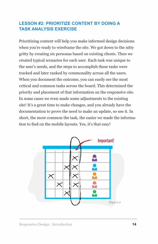
LESSON #2: PRIORITIZE CONTENT BY DOING A TASK ANALYSIS EXERCISE
Prioritizing content will help you make informed design decisions when you’re ready to wireframe the site. We got down to the nitty gritty by creating six personas based on existing clients. Then we created typical scenarios for each user. Each task was unique to the user’s needs, and the steps to accomplish these tasks were tracked and later ranked by commonality across all the users. When you document the outcome, you can easily see the most critical and common tasks across the board. This determined the priority and placement of that information on the responsive site. In some cases we even made some adjustments to the existing site! It’s a great time to make changes, and you already have the documentation to prove the need to make an update, so use it. In short, the more common the task, the easier we made the informa-tion to find on the mobile layouts. Yes, it’s that easy!
Important!
Figure 2
Introduction

Responsive Design: 15
LESSON #3: WIREFRAME, WIREFRAME, WIREFRAME!
Now that you have your sections of content prioritized, you’re ready to start laying out the responsive design for each page using wireframes. The process is easier than it sounds. When you size down information, the possible ways it can appear on the screen become limited. You may have fifteen page templates for your current site, but in tablet form that reduces to ten, and on a phone, you end up with five possible layouts.
For our team, the best way to track the content and ensure it was being translated to the responsive design was to break up the sec-tions using colors to block out each area, then tag unique content on the page with a number. As the responsive designs are mocked up, we cross-referenced the content to ensure every piece was in-cluded, especially the content that needed to be pushed to the top of the page (according to our task analysis information).
Figure 3
Introduction

Responsive Design: 16
LESSON #4: PROTOTYPES ARE HELPFUL, BUT SO ARE STYLE LIBRARIES!
Ready for development? The next step is to provide direction to developers. This isn’t what it used to be. After all, now you’re designing for many different displays – not just one. Our solution was a hybrid Style Library paired with a hi-fidelity prototype of the homepage – just for kicks.
Why? For one, you really want to illustrate the general “feel” for the responsive layouts. Creating a polished prototype was helpful in establishing the artistic direction. But the more important doc-ument was the style library.
Our style library is basically a collection of treatments that contain specific information about all the web elements that get pushed around to make the different sized layouts. This includes every-
Figure 4
Introduction

Responsive Design: 17
thing from colors to components, navigation, and formatting, and all the details in between. When the developers have this informa-tion, along with the lo-fidelity wireframes, they have everything they need to begin coding the site exactly how you planned it. If you save the style library, you can use it on future projects too. Just update the areas with the new design elements and you’ve saved yourself a lot of time.
This doesn’t conclude the involvement of the Design and UX team, but outlines a series of steps we took to determine one (of many) design decisions that were taken into consideration during the responsive design phase of this project. Design and UX will remain a constant in the project lifecycle to support ongoing requirements. Style libraries are meant to be a living document. They should be reviewed and updated on a regular basis to keep the developers up to speed on those changes. In the scheme of things, updating the style libraries takes much less time than updating multiple prototypes.
Figure 5
Introduction

Responsive Design: 18
This approach to responsive design made adding additional functionality to our webpage a smooth process and will ultimately result in delivering better communication options to our customers.
ABOUT THE AUTHOR
Dana Frank is Segue’s Creative Director and Certified Usability Analyst, specializing in responsive design and mobile application usability.
Introduction

Responsive Design: 19
Planning &Preparation
Chapter 2
How Much Does a Responsive Web Design Cost?by Ron Novak
An increasing amount of our customers and potential customers started to ask us, “How much does a responsive design website cost?” Well, the truth is that there are many factors that can impact the cost of responsive design development. Like any custom web development effort, cost will ultimately come down to the requirements and complexity of the project. I think the analogy most often used here to explain the variance in web development costs is - How much does it cost to build a house? I won’t bore you with the explanation of the comparison because I am sure you get the point. Although there are numerous
Responsive Design:
Planning & Preparation

Responsive Design: 20
factors that affect the cost of a responsive design website I will focus on breakpoints, content, style and performance, and extent of customization.
BREAKPOINTS
Breakpoints, or adaptation points as I prefer to call them, are essentially the pre-defined ranges of browser width where a change in layout is programmed to take place (typically by calling a media query). In simple terms, these are the points that your website begins to display differently. It’s an important concept to understand, because the more breakpoints that are required, the more your responsive design site will theoretically cost. There are many technical articles out there proclaiming best practices for defining breakpoints (often by resolution size of common devices). In my opinion, every site is different and these breakpoints should be defined by how your site information and functionality is best presented at each size.
CONTENT AND FUNCTIONALITY
Content is king! The amount, type, complexity, and language requirements of your content can drastically increase development time, and subsequently the cost, of your site. It is rare for a site to contain just text now a days, so it is important to take imagery, video, mapping data, and custom functionality into consideration when assessing scope and ultimately the cost of your site. The visual complexity of your content and the breakpoints that are required to support optimized display, will impact cost, as there is additional work required to create assets of different sizes.
Planning & Preparation

Responsive Design: 21
CUSTOMIZATION
You have probably seen numerous sites that will sell you responsive design templates that are pre-built. If you have a very basic website, simple requirements, and don’t mind the fact that others can also use the same templates on their sites, they might be a decent option. However, in our experience, our customers typically want a design that is customized to their brand. This customization doesn’t always affect the cost of a responsive design, but often does.
Figure 6
cost?$$$ $$
Planning & Preparation
Responsive Design: 22
STYLE AND PERFORMANCE REQUIREMENTS
I would like to address style and performance together because they have an inverse relationship with one another. Increased style complexity and quality of imagery/video content requirements can either reduce speed and performance of your site, or make it much more difficult to maintain those at acceptable levels. The effort to optimize performance will ultimately increase costs, particularly as more breakpoints are required. In controlling costs of performance optimization, many organizations choose to stick with three break-points to loosely respond to various desktops, tablets, and hand-helds. However, there are great examples of sites (such as http://tekroc.com/) that have put a lot of thought into how their site looks on very large screen devices. Although each site is unique to customer requirements and its role in supporting visitors, it is critical to strike a balance between performance (load times) and image quality at various breakpoints, as a site should be as pleas-ing to use as it is to view.
“That’s great Ron, but can you now tell me how much a respon-sive design website costs?” My mantra for costs associated with custom software development is,” it depends.” At Segue, we have developed smaller websites that didn’t require Content Manage-ment System (CMS) integration and only required two breakpoints for under $25K. However, we have also developed larger enter-prise-level responsive sites for over $100K, where we integrated a CMS (such as WordPress or Drupal) and developed 5-7 break-points to meet the customer’s expectations for the user experience on different devices.
Planning & Preparation

Responsive Design: 23
ABOUT THE AUTHOR
As part of Segue’s ownership team, Ron Novak leads the Commercial and Non-Profit customer verticals with the guiding principles of innovation, exceptional customer support, and customer value. His diverse expe-rience in Information Technology has been formed through a consis-tent desire to understand the total picture with respect to information exchange, security, and the end-user experience. Ron is currently focused on leading development of Mobile Technologies to help businesses reach their customers in exciting new ways and supporting Non-Profits in bet-ter serving their members. Mobile application development is a natural extension of Segue’s capabilities in Web development; Ron is applying this Segue experience to rapidly develop exceptional applications at low cost. Under his strategic direction, Segue’s Mobile Application Develop-ment Team has grown from a small two-person operation to a cohesive development team that is releasing capability-specific mobile apps for Android and iOS platforms.
Planning & Preparation

Responsive Design: 24
The Importance of Wireframing for a Responsive Websiteby Michelle Lana
Designing and developing websites that work across multiple devices is an important part of the work we do on today’s web. Responsive design is forcing us to re-think about how we plan out our site designs and how our pages gracefully fit the device they are being viewed on. These days, we rarely ever start a design without going through some sort of wireframing process. Even if clients do not need to see a wireframe, I think it’s still important to create one internally so that designers and developers are all on the same page.
CHANGING THE WAY WE DO WIREFRAMES
A wireframe is the skeleton of the page, usually drawn with basic shapes and lines with limited colors and styling. The point is to focus on figuring out layout and content placement, and solving navigation and functionality problems in a format that is easy to adjust. When planning for a responsive website design, we cannot continue to think through the wireframing process from a desktop only perspective. However, I understand that changing the way we think about these layouts and choosing a new direction can be a little challenging. For years we have spent our time designing fixed width layouts or maximum 960px width in our designs. Now we need to mentally deconstruct our site as we create our wireframes,
Planning & Preparation

Responsive Design: 25
breaking it down into columns and elements that cannot only exist side by side, but also above and below each other. Wireframing for mobile devices first (or from narrow widths outwards) helps us pri-oritize site elements while putting us in a good mindset for think-ing about what content is most relevant to the site visitor and how your content becomes available to work with on wider screens.
YOUR WIREFRAMING TOOLS
The first step of any good design is to sketch out your ideas and determine the placement of all the different elements on a page. If you’re trying to decide which type of wireframing tool to use, there are a wide variety of tools and apps out there that make wirefram-ing quick and easy. Tools such as Balsamiq Mockups, Omnigraffle, and Axure are widely used for creating wireframes and have very extensive toolsets and features. For some, designing directly in the browser using CSS and HTML offers a lot of benefits as well. For me, personally, using Adobe Illustrator is great for wireframing (since I love it a whole lot) and good old paper and a marker can make an excellent wireframing tool as well. I find that sketching and drawing out your wireframes on paper is always a great way to get ideas flowing, to quickly illustrate those ideas to colleagues and to get things straight in your own head. When collaborating with our team here at Segue, I still start with paper and a pencil, rough-ly sketching things out and I probably always will.
Planning & Preparation

Responsive Design: 26
Figure 7
WHAT TO AVOID
Wireframing is both a process for thinking through problems and specifying interfaces. Like other aspects of your development process, wireframing can have its pitfalls if not done properly. Here are some things to avoid when you are creating your responsive wireframes.
1. Emphasizing color and design: Wireframing is for deciding the layout and location of elements. Working in grayscale helps maintain focus on the primary function of the process, which is to finalize the layout, not the design. Starting with simple, low-fidelity wireframes is probably better and easier to work with if you decide to change and move things around.
Planning & Preparation

Responsive Design: 27
2. Too much detail: You can always add more detail to show to your team and clients later in the process. But including too much in the beginning may add confusion. Drawing on paper is always a great place to start and rough sketches allow you to come up with new, more interesting solutions. Keep the fidelity low and focus on making something that others will collaborate around.
3. Wireframing every single page: Creating wireframes doesn’t usually require that you lay out every single page view. It’s always good to know your website’s content ahead of time and what your user is trying to achieve. All of that gathered informa-tion from stakeholder interviews, a content audit, and research are all important pieces of your site that will help prioritize elements on your page. Doing what’s necessary to move the project forward and get consensus before building is what I think wireframes are most useful for.
Figure 8
Planning & Preparation
Responsive Design: 28
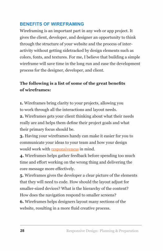
BENEFITS OF WIREFRAMING
Wireframing is an important part in any web or app project. It gives the client, developer, and designer an opportunity to think through the structure of your website and the process of inter-activity without getting sidetracked by design elements such as colors, fonts, and textures. For me, I believe that building a simple wireframe will save time in the long run and ease the development process for the designer, developer, and client.
The following is a list of some of the great benefits of wireframes:
1. Wireframes bring clarity to your projects, allowing you to work through all the interactions and layout needs.2. Wireframes gets your client thinking about what their needs really are and helps them define their project goals and what their primary focus should be.3. Having your wireframes handy can make it easier for you to communicate your ideas to your team and how your design would work with responsiveness in mind.4. Wireframes helps gather feedback before spending too much time and effort working on the wrong thing and delivering the core message more effectively.5. Wireframes gives the developer a clear picture of the elements that they will need to code. How should the layout adjust for smaller-sized devices? What is the hierarchy of the content? How does the navigation respond to smaller screens?6. Wireframes helps designers layout many sections of the website, resulting in a more fluid creative process.
Planning & Preparation

Responsive Design: 29
Figure 9
There is no getting away from the fact that responsive thinking challenges our design options and certain approaches will not be easy to implement as others. You might need to go through several wireframe revisions with your team and client to agree on a layout that both parties feel comfortable with. At the end of the day, fre-quent collaboration among team members and the client is a must in your design workflow, not the exception. It’s always important
Planning & Preparation

Responsive Design: 30
to keep in mind that content, design, and development team members should review and collaborate regularly at every stage in the creation process until the site is live.
Links and references:• http://blog.crazyegg.com/2013/05/07/responsive-web-design-tools/• http://www.kalamuna.com/news/importance-mobile-first-wireframing• http://alistapart.com/article/responsive-comping-obtaining-signoff-with-mockups• http://trentwalton.com/2013/02/07/where-to-start/
ABOUT THE AUTHOR
Michelle Lana is an illustrator and graphic designer at Segue focusing on web design, print, and UI/UX designs for web and mobile applications.
Planning & Preparation

Responsive Design: 31
Using Analytics to Guide Your Responsive Websiteby Segue Technologies
When you’ve decided to make your site responsive, it’s time to make some important decisions about how to implement your re-sponsive design. While there may be some urge to just throw some mood boards at your designers and ask for an update when they are done, there is quite a bit of work in a responsive site design that doesn’t involve graphics, colors, and fonts. Three big deci-sion-making areas that need attention during a responsive rollout include prioritization, content, and impact.
This is not the time to pull out your crystal ball to make these de-cisions. Coin tosses, dart throwing, and trusting your gut are also less-than-stellar guides for making complex decisions. You have data, so use it! Make informed decisions throughout the respon-sive design process using the web analytics data right from your existing website.
If for some reason you don’t have analytics set up on your existing site, do it now! We tend to use Google Analytics for most projects, but feel free to pick the option that best suits your needs. You only need a few weeks of data to get a clear picture of how visitors are using your site.
Planning & Preparation

Responsive Design: 32
PRIORITIZATION
Your redevelopment budget is probably not unlimited. You’re going to have to make some tough decisions about what is and is not included in your responsive site. By combining the goal of your responsive design project with analytics data, you can identify high leverage points to generate the greatest value for your project stakeholders.
Normally, a significant goal of a responsive redevelopment project is to make the site more usable for those on mobile devices. By filtering your analytics data to show only mobile devices, you can get a clearer picture of how mobile users are trying to use your existing site. In addition, you can see numbers of device types and browsers, which can determine priority levels for addressing cross browser/device compat-ibility issues and discrepancies. Whether you are rolling out the responsive site in phases or doing it all at once, working on these frequently-accessed portions of your site first will generate the most value early on in the project.
CONTENT
While one major goal of a responsive design is to make content look good on any device, it will not magically organize all of your content in a meaningful manner for everyone who visits your site. The content on your site will be broken down into smaller, more atomic units as a part of the responsive design process. Breaking these content elements down means you will also have to adjust the site’s navigation so that users can find the content they are looking for.
Planning & Preparation

Responsive Design: 33
Use analytics to determine what pieces of content your mobile, desktop, and other user types are seeking. Pay special attention to the analytics data for how much time site visitors spent on the page combined with the last page the user visits in a session to determine what the user was most interested in. Also, keep in mind external, generalized analytics about users on different platforms when making decisions. For example, because users on mobile devices are twice as likely to share content over social media than those on desktop devices, you may want to make your social media links are easier to access on smaller screens, than on larger screens.
Figure 10
Planning & Preparation

Responsive Design: 34
IMPACT
How are you defining success for your responsive design? As awesome as your site is going to look when you’re done, something more measurable than “coolness factor” will be useful in proving the value of the project to those with less aesthetic interests. Comparing site analytics before and after the responsive implementation will prove that you have made gains in user engagement and social media presence.
So remember, use data to inform your decisions about your responsive redesign. Save your magic 8-ball for making decisions about lunch.
Planning & Preparation

Responsive Design: 35
Considerations When Planning a Responsive Designby Matthew Gorbsky
While there are many reasons and methods for implementing responsive web designs, there are also some challenges of which developers and clients need to be aware. While these may not be a concern with every project, you can safely assume that imple-mentation and/or design could suffer from these pitfalls and it’s a good idea to at least consider them up front. Before committing to a responsive design or redesign, consider the complexity, costs, and performance impacts compared to the needs and goals for your website.
COMPLEXITY OF RESPONSIVE DESIGN
There’s a delicate balance that needs to be found in responsive de-sign. The end goal is not to have a site (or web application) that is designed for every device. The goal is to have a site that looks good and functions well on whatever device people are using, whether that’s today or next year. This balance reflects the complexity of your site and design. The best way to manage this complexity isn’t some secret formula. There’s no “responsive site generator” (and if you find one, be wary). The best way to manage the complexity is to first understand it, and then address it. Yes, that’s a vague copout of an answer, but it’s also the truth. You need to analyze your site and how your visitors use it, to understand how your responsive design needs to either preserve or enhance the user
Planning & Preparation

Responsive Design: 36
experience at varying screen sizes. You also need to understand where your visitors are coming from, what they are using to view your site, and the actions they are most commonly taking. I suggest checking our posts on using site analytics to guide your responsive website to get an idea of how to understand the complexity and break it down. Then read the post on the importance of wirefram-ing and mockups for a responsive website to understand how to address it.
COST FACTORS OF RESPONSIVE DESIGN
The increased complexity can have a direct impact on total project cost. More complex code takes longer to write, is more difficult to test, and has higher maintenance costs associated with it. Relative-ly simple responsive sites can be tested with desktop browsers and a subset of mobile devices. Sites that perform advanced device de-tection, utilize mobile device-specific functions (e.g. camera, GPS, etc.), or redirection services require more hands on testing time with actual devices. Third party services exist to help here, but there are costs associated with them as well. Because costs are one of the main constraints for our clients, it is extremely important to understand the complexity up front, make important decisions up front, and focus on delivering the most value to your users without going overboard and creating a separate version of your site for every conceivable device.
Planning & Preparation

Responsive Design: 37
Figure 11
PERFORMANCE IMPACTS WITH RESPONSIVE DESIGN
One issue many responsive websites currently face is that they can become very bloated very quickly. HTML, CSS, and JavaScript for the site must be delivered to the devices and then rendered for that display. While this varies from implementation to implementation, the fastest (read: cheapest) way to make a site responsive is to deliver all of the content, regardless of whether or not the device displays it. Previously, desktop sites would only send the desk-top version of the site to the desktop browsers. Dedicated mobile sites (or “m dot” sites) would only send streamlined content to the mobile browsers. Responsive sites have to package all of these ver-sions (and those in between) and send it all to the browser and let it figure out how to display it. This leads to increased load times for all users. If the performance achieved from sending all content to all visitors is not good enough, there are technical approaches that can help reduce HTML packet sizes, select JavaScript libraries, and
Planning & Preparation

Responsive Design: 38
optimize image sizes. Those add complexity to the implementation (see above). Ironically, if not used correctly, they can also poten-tially reduce performance by requiring pre-processing and device detection to be performed. This also increases complexity (read: cost).
In the end, responsive design can make your site’s content avail-able to everyone, regardless of the device used – you just need to watch out for a few roadblocks (or money pits) along the way. I think we’re going to start seeing changes to HTML/CSS/JavaScript very soon to help accommodate these variations in content delivery natively. In the meantime, however, we need to take what we have now and make it work for our users in the best way possible.
ABOUT THE AUTHOR
Matt Gorbsky is an analyst, mobile services manager, and a Certified Scrum Product Owner at Segue focusing on mobile applications, health-care IT, and web development. He’s a graduate of Penn State and a fan of technology. Matt enjoys working on electronic projects and brewing beer in his spare time.
Planning & Preparation

Responsive Design: 39
Using Task Analysisto Prioritize Content in Responsive Designby Dana Frank
A desktop view has more freedom for layout because designers have a lot more space to work with. But as the viewport shrinks, so do the options for content placement.
Before we could plan the design for Segue’s responsive website, we had to determine exactly what information our users needed first, particularly when they accessed the site on mobile devices. Of course, you should always follow best practices for placement of logos, menus, and so forth. However, the real “meat” of the website, and the relative information our users were looking for
Implementation
Chapter 3
Responsive Design:
Implementation

Responsive Design: 40
still had to be defined and prioritized so they could find it just as easily. By prioritizing this information and making that content easy to find, we could keep our website visitors happy and increase the likelihood of them remaining on the site for longer periods of time, hopefully moving them one step closer towards becoming a customer. This is when task analysis comes in handy!
WHAT IS TASK ANALYSIS?
A task analysis is a usability exercise that helps identify users’ tasks and goals on a website. Doing a task analysis will help designers make informed layout decisions as they wireframe the site. In our case, we already had a website but needed to work on the respon-sive solution, so, a task analysis was justified because technically we were designing a new site… a responsive one!
When conducting a task analysis, you’ll learn more about:
• What are users are doing on your site?• Looking for an order form?• Sending an email?• Looking for information on a contract vehicle?• What effect does environment have on users?• Are they on the road?• Do they work from home?• Do they sit in a cubicle with other people close by?
Implementation

Responsive Design: 41
CREATING PERSONAS
Before we could perform a task analysis, we had to identify the types of users that would actually be completing the tasks. This is when personas are reintroduced to the project. Personas are written representations of your users. Since our website was built years ago, we opted to use actual clients. We pulled client informa-tion by reviewing contact forms and marketing wins accomplished through the website. It’s good to have anywhere from six to eight personas, depending on the project. We had six different personas for our exercise and each persona had a story about who they were, and what they were trying to accomplish on our website. Each story was very specific to that persona because, just like in real life, no two people are exactly alike. So now that we had our personas, we were ready to compare the frequency of specific tasks on our website.
To get started, every team member was assigned a persona. We had a spreadsheet with all the possible tasks listed down the side, as well as room for new tasks we didn’t consider. The names of each of the personas were along the top of the spreadsheet. Each team member read aloud what their particular persona was doing on the website. Every time they completed a specific task, we checked it off on the spreadsheet. We did this for every single persona.
By the end of the exercise we had a document that outlined critical tasks for our users. This information was exactly what the design-ers needed before they could make suggestions for content layout on smaller viewports. The more frequent the tasks, the more visi-ble the content. It’s really that easy!
Implementation

Responsive Design: 42
You can also use this opportunity to update a few things on the desktop version of your website as you “walk” in your users’ shoes. We made some changes to our existing website as well. These changes were particularly made to the careers section and how specific job openings are accessed. We also updated the location of some information on our homepage to accommodate our Govern-ment clients.
Remember, this is your opportunity to improve the site so go for it! As a matter of fact, you should do a persona run through on your website every so often to make sure you’re still providing good content in a useful format. This is exactly what you are doing with the task analysis and persona exercise, and you will now have the documentation to justify your suggestions to any decision makers in your company.
Implementation

Responsive Design: 43
How CSS3 Supports Developing Responsive Design Websitesby Todd Godbout and Srinath Davu
With the increased use of tablets, smartphones, and even wear-able computers; developers must account for multiple devices and screen sizes when designing websites or web applications. This situation will result in lengthier and more complex designs, but can be implemented rather gracefully using standard stylesheets and CSS3.
There are two approaches a developer can implement to become more responsive to the user’s environment. The first is to create a miniaturized version of the larger desktop view. The benefit of this option is that users are accustomed to the layout and user flow. On the other hand, the miniaturized layout may not provide a benefi-cial experience if the links, text, graphics, and other elements are too small to adequately interact with.
A more adaptive approach is to create multiple layouts - a fixed width for large and medium screens and fluid widths for smaller screens. In practice this means not only scaling columns to smaller widths, but also reducing columns – eventually displaying all con-
Implementation

Responsive Design: 44
tent in one column. This is the approach we normally implement here at Segue Technologies. Both approaches are implemented using varying stylesheets. CSS 2.1 introduced the concept of media types where the site can recognize the environment and load a stylesheet based on that environment.
<link rel=”stylesheet” type=”text/css” href=”core.css” me-dia=”screen” /> <link rel=”stylesheet” type=”text/css” href=”print.css” media=”print” />
Improving on this concept, CSS3 added the media query – a method which allows developers to target not only certain device classes, but to actually inspect the physical characteristics of the environment before rendering the page. Developers can load var-ious style sheets based on the media query or even more granular changes to html elements or css classes. The query contains two components, the legacy 2.1 media type and the media component, which contains a media feature.
For instance within this code (<link rel=”stylesheet” type=”text/css” media=”screen and (max-device-width: 480px)” href=”segue.css” />) the section within the parentheses is the media query. It translates to “if the device is in a horizontal position and the width is equal to or less than 480px, then load the segue.css file”.
Media queries are not limited to loading css files; media queries can also determine the character of specific html elements or css classes. For instance if you have a layout with three columns in a large display; a media query can reformat the layout to one column, with the content displayed vertically. To create our three
Implementation

Responsive Design: 45
column display we add a class in our stylesheet called grid—3 and set the float: left and the width: 33%. For smaller layouts, we utilize a media query to set the width: 100% so now the columns stack on top of each other.
.grid—3 { float: left; width: 33%; } @media screen and (max-width: 480px) { .grid—3 { width: 100%; } }
That’s it. The browser sets all .grid—3 classes to 100% width for de-vices that are equal to or less than 480px width; otherwise the width of .grid—3 classes is set to 33%. Pretty easy! Two common CMS platforms for developing responsive design websites are Drupal and Wordpress. The following sections show how to incorporate Respon-sive Design concepts into these platforms.
ABOUT THE AUTHOR
Todd M Godbout is a Senior Software Engineer at Segue Technologies dappling in .Net, Mobile Development, HTML5, and Responsive Design.
Srinath Davu is a Senior Developer for Segue Technologies, Inc. with over 13 years of software development/engineering experience. As a commercial software developer, Srinath has been responsible for full life cycle support of a variety of applications, from initial design, through development, testing, deployment, and post-deployment maintenance. Additionally, he was the team lead and played a major role in building a web-based contract management system for J&J and Back office management systems for different gaming industries. He has also assisted on a number of other applications for CSC, J&J, Assured Guaranty and Tyco Electronics. Srinath is an experienced C# / ASP.Net, MVC, SQL Server and Oracle developer and is familiar with other database management systems and Reporting tools including ReportNet, Crystal Reports as well as other languages and technologies. He has experience building websites using Drupal CMS. Srinath has a Master’s degree in Computer Science from Western Michigan University.
Implementation

Responsive Design: 46
Challenges When Testing a Responsive Websiteby the Segue Quality Control Team
Although a responsive website has several benefits to the organi-zation and the end users, it presents numerous challenges to the software tester. These challenges include a unique testing environ-ment, lack of automation framework, and misleading design.
CHALLENGE 1: TESTING ENVIRONMENT
First, the testing environment presents some challenges because of the plethora of operating systems, browsers, platforms, and mobile devices that are required to replicate the end users experi-ence. For example, a website on a desktop monitor with 1600x900 pixels will render differently when scaled down to an iPhone 5’s 4-inch Retina 1136-by-640 pixel screen, which will also be dif-ferent on a Galaxy S4’s five inch screen with 1080x1920 pixel resolution. Ensuring that mobile websites will work on all types of devices (smartphones, tablets, and laptops) produced by the major brands (Apple, HTC, Nokia, Samsung, Sony, etc.) and on all the platforms (Android, BlackBerry, iOS, Windows, etc.) is a daunting task. Additionally, new devices are constantly being introduced into the market, so there’s an almost constant game of catch up in the quest to cover all the major devices. This means that the tester should test the functionality of the website on the most popular devices and platforms.
Implementation

Responsive Design: 47
It is not feasible to test on each and every available device/OS/browser combination, which means testers have to strategical-ly choose multiple configurations of physical devices. Tracers like Google Analytics can track which browsers, operating sys-tems, and devices that the majority of people are using to reach your site. This information helps narrow your testing scope. It is important to create something on the lines of graded browser support used by Yahoo to ensure that major platforms are cov-ered. Using emulators is another method to overcome some of the issues of testing on numerous devices.
CHALLENGE 2: LACK OF AUTOMATION FRAMEWORK
Secondly, not having an automation framework will hamper the efficiency and thoroughness of the testing efforts. An automation framework is an integrated system that establishes the rules of automation testing of the product. The framework offers the basis for and simplifies test automation. Frequent application changes can make automation a huge aid in completing responsive test-ing across multiple platforms. However, without an automation framework that has specific verification points, the test process becomes difficult and time consuming, making smoke and regres-sion testing timely, and cost ineffective to automate. As a result, you cannot perform automation testing on responsive sites and manual testing time must be increased to handle all the smoke and regression testing.
Here at Segue Technologies we use Selenium WebDriver, an auto-mation tool, to tackle many of these changes. Selenium WebDriver can be used in conjunction with other tools to increase test cov-erage and the variety of mobile devices we can test on. Webdriver
Implementation

Responsive Design: 48
scripts can run on real devices and in an Android emulator or in the iOS Simulator. Sauce LABS gives us the ability to run their tests across hundreds of real browsers and platforms. Segue has used Selenium WebDriver with Sauce LABS for the testing of its own website. Sauce LABS takes screen shots after each page-alter-ing command (issued by the selenium script) and a person can flip through the shots to diagnose errors and verify layout. Or, they can also watch a screencast of the whole test from start to finish.
CHALLENGE 3: MISLEADING DESIGN
Third, design strategies and approaches can easily mislead the tester, especially if they are not familiar with what to test and how they expect to test it on several devices and across different size break points. The nature of a responsive design is for the screen to display differently and appropriately to each screen size, which creates multiple versions for the tester to verify at each. Interac-tions that are standard on a desktop device may be irrelevant on a mobile device, and vice versa, because we interact with desktop and mobile devices differently. We use a mouse and keyboard shortcuts to navigate on a desktop, but touch and gestures are used on mobile devices, and not all interactions transfer over from one device to another. For instance, the designer may build in links that are displayed with a hover-over-effect in the desktop version. How is that feature transferred into a touch-screen mo-bile version where there is no mouse? Most touchscreen devices have gestures that are not possible with a desktop setup, unless the user has a touchscreen monitor. The different behaviors and the challenge to simultaneously accommodate for both regular and touch screens, requires some excessive testing. Knowing the interaction methods of the different platforms shapes the testing
Implementation

Responsive Design: 49
approach and strategy. A multi-platform tester will learn to recog-nize which test cases do not apply or must be edited when applied to various platforms. Without this knowledge, test cases can be selected and applied incorrectly, resulting in inadequate coverage on some platforms and false test run failures.
A responsive website offers a suitable solution to the key challeng-es arising from the increase in the use of mobile devices to access the internet. This is because the fluidity of the responsive website allows the content to fit on screens of any size. Most importantly, responsive websites save time and money that would be required to design different websites for various devices. However, respon-sive sites can make testing efforts much more difficult than for a non-responsive site. These challenges may be reflected in develop-ment costs and timelines, but they are worth it to ensure a positive user experience and proper site functionality for all of your visi-tors, regardless of the device they are using.
About the AuthorSegue’s Quality Control (QC) focus integrates Requirements and Testing services to ensure our solutions are squarely aligned with our customer’s needs. Our Systems Engineering processes meet or exceed SEI/CMMI Level-2 standards for all phases of the software development lifecycle. We’ve instituted a model for reviewing and improving our quality ap-proach with every project we undertake. As a software developer, Segue is keenly aware of the critical nature of well-engineered and properly executed and managed processes.
Implementation

Responsive Design: 50
ABOUT RESPONSIVE WEB DESIGN: Optimizing User Experience for all Devices
Thank you for reading our eBook. We hope you found it informa-tive and interesting. If you are interested in working with Segue, please contact us so we can learn about your needs and plan a development path that works for you.
Segue Technologies provides:
Web• Custom Application Development• User Interface Design• Content Management Systems
Data• Business Intelligence• Data Quality and Profiling• Enterprise Data Management
Mobile• iOS Development• Android Development• Mobile Web
Implementation


![Responsive Design Fundamentals [Read-Only] - … Design Fundame… · Responsive Design Fundamentals Carolyn Yon, PMI-ACP Development Manager ... Responsive Design • web design](https://static.fdocuments.us/doc/165x107/5b7c060b7f8b9adb4c8df8c4/responsive-design-fundamentals-read-only-design-fundame-responsive-design.jpg)