SECRETS OF A GREAT PRESENTATION - gov.uk · SECRETS OF A GREAT PRESENTATION ... have impact, it...
14
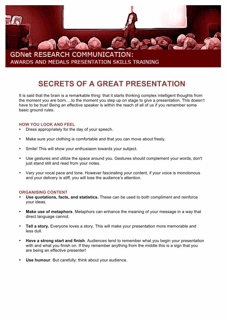
SECRETS OF A GREAT PRESENTATION It is said that the brain is a remarkable thing: that it starts thinking complex intelligent thoughts from the moment you are born….to the moment you step up on stage to give a presentation. This doesn’t have to be true! Being an effective speaker is within the reach of all of us if you remember some basic ground rules. HOW YOU LOOK AND FEEL • Dress appropriately for the day of your speech. • Make sure your clothing is comfortable and that you can move about freely. • Smile! This will show your enthusiasm towards your subject. • Use gestures and utilize the space around you. Gestures should complement your words, don't just stand still and read from your notes. • Vary your vocal pace and tone. However fascinating your content, if your voice is monotonous and your delivery is stiff, you will lose the audience’s attention. ORGANISING CONTENT • Use quotations, facts, and statistics. These can be used to both compliment and reinforce your ideas. • Make use of metaphors. Metaphors can enhance the meaning of your message in a way that direct language cannot. • Tell a story. Everyone loves a story. This will make your presentation more memorable and less dull. • Have a strong start and finish. Audiences tend to remember what you begin your presentation with and what you finish on. If they remember anything from the middle this is a sign that you are being an effective presenter! • Use humour. But carefully: think about your audience.
Transcript of SECRETS OF A GREAT PRESENTATION - gov.uk · SECRETS OF A GREAT PRESENTATION ... have impact, it...
SECRETS OF A GREAT PRESENTATION It is said that the brain is a remarkable thing: that it starts thinking complex intelligent thoughts from the moment you are born….to the moment you step up on stage to give a presentation. This doesn’t have to be true! Being an effective speaker is within the reach of all of us if you remember some basic ground rules. HOW YOU LOOK AND FEEL • Dress appropriately for the day of your speech. • Make sure your clothing is comfortable and that you can move about freely. • Smile! This will show your enthusiasm towards your subject. • Use gestures and utilize the space around you. Gestures should complement your words, don't
just stand still and read from your notes. • Vary your vocal pace and tone. However fascinating your content, if your voice is monotonous
and your delivery is stiff, you will lose the audience’s attention. ORGANISING CONTENT • Use quotations, facts, and statistics. These can be used to both compliment and reinforce
your ideas.
• Make use of metaphors. Metaphors can enhance the meaning of your message in a way that direct language cannot.
• Tell a story. Everyone loves a story. This will make your presentation more memorable and
less dull.
• Have a strong start and finish. Audiences tend to remember what you begin your presentation with and what you finish on. If they remember anything from the middle this is a sign that you are being an effective presenter!
• Use humour. But carefully: think about your audience.
STRUCTURE YOUR PRESENTATION • Organise your ideas logically. This will allow your audience to absorb information more easily
and to follow your train of thought. Make sure you bridge your ideas to make the presentation flow.
• Pace yourself. Make sure that the majority of the time is given to the most important things you
have to say in your presentation. Don’t get caught out by being given a ‘two minute warning’ when you’re still busy with your introduction.
• Stick to what you know. Don't talk about anything you're unfamiliar with and can’t provide
evidence for. Be disciplined about keeping to topics that you have the confidence and track record to deliver well.
• Use visual aids to compliment your message. Visual aids should aid the message: make
sure they are not distracting and do not shift focus from what you are saying.
• Connect with your audience. Make eye contact. Interact with them by asking questions, seek volunteers, and maintain a conversational style. Holding a Question and Answer session at the end is very helpful to both answer the audience’s questions, and to let you know how you can improve next time.
• Display confidence and poise. You may feel very nervous, but if you can display confidence,
the audience will be confident in what you have to say.
PRACTICE, PRACTICE, PRACTICE • Hone your speech by editing difficult words. Make sure it flows nicely. Time yourself to make
sure you can stick to the slot you are given. • Practice in front of other people. Choose those who you know will be positively critical in their
feedback: you need to know how to improve and will not do so if people are too polite to tell you the truth.
• Listen to and critically analyse other speakers. What do they do well? What are their
weaknesses? Use this analysis to improve your own performance.
WANT TO KNOW MORE? http://sixminutes.dlugan.com/25-skills-every-public-speaker-should-have/ http://sixminutes.dlugan.com/story-factor-book-review-annette-simmons/ http://sixminutes.dlugan.com/metaphor-speech-examples/\
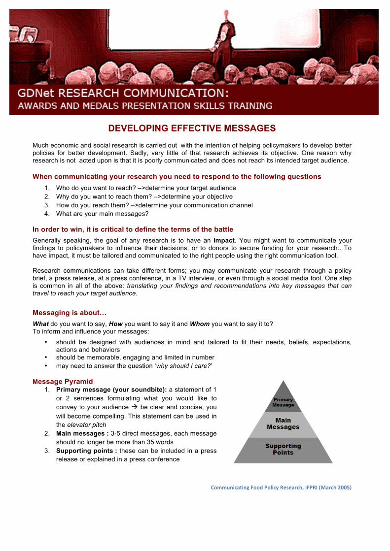
DEVELOPING EFFECTIVE MESSAGES Much economic and social research is carried out with the intention of helping policymakers to develop better policies for better development. Sadly, very little of that research achieves its objective. One reason why research is not acted upon is that it is poorly communicated and does not reach its intended target audience. When communicating your research you need to respond to the following questions
1. Who do you want to reach? –>determine your target audience 2. Why do you want to reach them? –>determine your objective 3. How do you reach them? –>determine your communication channel 4. What are your main messages?
In order to win, it is critical to define the terms of the battle Generally speaking, the goal of any research is to have an impact. You might want to communicate your findings to policymakers to influence their decisions, or to donors to secure funding for your research.. To have impact, it must be tailored and communicated to the right people using the right communication tool. Research communications can take different forms; you may communicate your research through a policy brief, a press release, at a press conference, in a TV interview, or even through a social media tool. One step is common in all of the above: translating your findings and recommendations into key messages that can travel to reach your target audience. Messaging is about… What do you want to say, How you want to say it and Whom you want to say it to? To inform and influence your messages:
• should be designed with audiences in mind and tailored to fit their needs, beliefs, expectations, actions and behaviors
• should be memorable, engaging and limited in number • may need to answer the question ‘why should I care?’
Message Pyramid 1. Primary message (your soundbite): a statement of 1
or 2 sentences formulating what you would like to convey to your audience be clear and concise, you will become compelling. This statement can be used in the elevator pitch
2. Main messages : 3-5 direct messages, each message should no longer be more than 35 words
3. Supporting points : these can be included in a press release or explained in a press conference
Communicating Food Policy Research, IFPRI (March 2005)
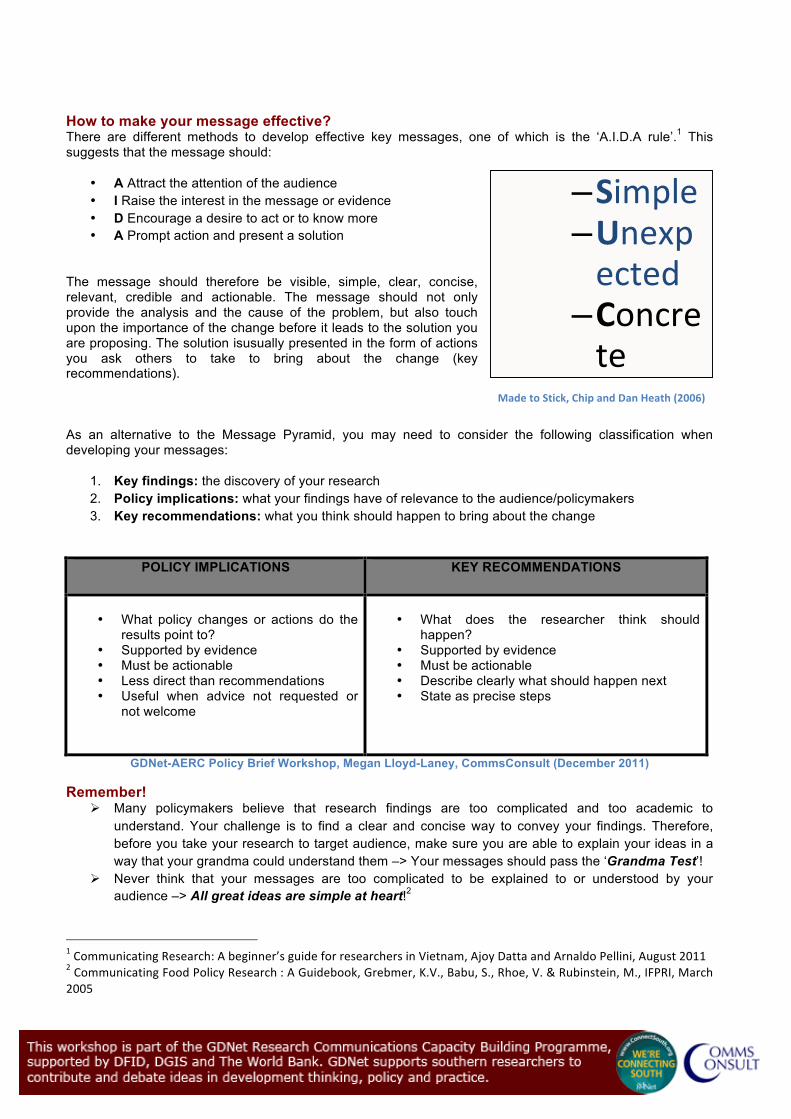
How to make your message effective? There are different methods to develop effective key messages, one of which is the ‘A.I.D.A rule’.1 This suggests that the message should:
• A Attract the attention of the audience • I Raise the interest in the message or evidence • D Encourage a desire to act or to know more • A Prompt action and present a solution
The message should therefore be visible, simple, clear, concise, relevant, credible and actionable. The message should not only provide the analysis and the cause of the problem, but also touch upon the importance of the change before it leads to the solution you are proposing. The solution isusually presented in the form of actions you ask others to take to bring about the change (key recommendations). As an alternative to the Message Pyramid, you may need to consider the following classification when developing your messages:
1. Key findings: the discovery of your research 2. Policy implications: what your findings have of relevance to the audience/policymakers 3. Key recommendations: what you think should happen to bring about the change
POLICY IMPLICATIONS KEY RECOMMENDATIONS
• What policy changes or actions do the
results point to? • Supported by evidence • Must be actionable • Less direct than recommendations • Useful when advice not requested or
not welcome
• What does the researcher think should
happen? • Supported by evidence • Must be actionable • Describe clearly what should happen next • State as precise steps
GDNet-AERC Policy Brief Workshop, Megan Lloyd-Laney, CommsConsult (December 2011)
Remember! Many policymakers believe that research findings are too complicated and too academic to
understand. Your challenge is to find a clear and concise way to convey your findings. Therefore, before you take your research to target audience, make sure you are able to explain your ideas in a way that your grandma could understand them –> Your messages should pass the ‘Grandma Test’!
Never think that your messages are too complicated to be explained to or understood by your audience –> All great ideas are simple at heart!2
1 Communicating Research: A beginner’s guide for researchers in Vietnam, Ajoy Datta and Arnaldo Pellini, August 2011 2 Communicating Food Policy Research : A Guidebook, Grebmer, K.V., Babu, S., Rhoe, V. & Rubinstein, M., IFPRI, March 2005
– Simple – Unexpected
– Concrete
– Credible
– Emotional
– Stories
Made to Stick, Chip and Dan Heath (2006)
MAKING POWERFUL POWERPOINTS
"Less is more on a slide show. Too much information on a single slide becomes unreadable, especially when it is projected on a big screen for a large audience." Delhi-based Ajay Jain, CEO, TCP Media Too many people use their PowerPoint slides as a script. They turn their backs to their audience, and read lots of words on the screen as if reading a book. Don’t be tempted to do this! A good PowerPoint presentation uses few words, presents powerful images, and supports what the speaker wants to say. A great presentation understands what the audience wants to know, and delivers it to them in an entertaining and to-the-point way. A great presenter understands that the audience will believe you if you say you are going to speak for 30 minutes – so don’t go on for an hour! CONTENT • Pick the key ideas and stories from your research and draft your presentation around them.
• Use a font that is easy to read such as: Ariel or Helvetica (Times New Roman and Palatino are
harder to read quickly)
• Use a large font size (18-24pt) in order to make your points readable. (To test the font, stand six feet back from the monitor and see if you can read the slide.)
• Present your content in the form of four to five bulleted points per slide.
• Use short sentences: keep the bullet points to approximately six words per line.
• Try to restrict it to six lines in a slide.
• To highlight certain important information, present that text in a larger font size.
• Do not make it too animated; too many fancy transitions will take attention from what you are saying.
IMPORTANT THINGS ABOUT DESIGN • Use a visually interesting but simple and clean Master Slide so that there is some consistency to
the presentation
• Keep the design uncluttered, leaving empty space around the text and graphics.
• Check all of the graphics and layouts of your PowerPoint on the machines you will be using
before the presentation itself to ensure there are no technical glitches.
• Check that you’ve not included more information than you need – avoid clutter!
USING AUDIO VISUALS • A selection of engaging images, video or audio that supports your research can make listening
to your presentation a more enjoyable, and memorable, experience for your audience. But make sure that they add value, adding to the information you are communicating, rather than being just for decoration.
Visual imagery It is important to break up the text within a PowerPoint by including interesting, but relevant, illustrations and photographs. Think about using: • A map or illustration of the region where your work is being done
• Images of the people involved in your research
• Illustrated graphs and charts of statistics included in your presentation (but keep these simple
and easy to follow) Video Dynamic content, such as a brief video that illustrates an important point, is a great way to engage your audience, make sure its directly related to your content. • If you have any talking heads of surrounding your research then these can be embedded into a
PowerPoint slideshow. Audio Using audio that helps convey your message can also help you keep your slides clean and approachable. Adding recorded narration to slides when sending your presentation to others to view on their own. If you have any recordings of interviews or statements by people involved in your research these can be added over still images. WANT TO KNOW MORE? http://www.43folders.com/2007/08/23/better-presentations http://presentationsoft.about.com/od/firststeps/p/lose_audience.htm
PRESENTING COMPLEX DATA VISUALLY: USING WEB-‐BASED TOOLS TO MAKE YOUR STATISTICS TRAVEL
Data and statistics are a powerful way to communicate development research. Including data and statistics within research findings can enhance their impact, however, large tables or spreadsheets of numbers take time to decipher and sometimes the true meaning behind the data itself can be misinterpreted. One option to prevent your data being misread is to present the figures visually in the form of charts, graphs or even infographics. This will provide clarification and emphasis to your main points, appeal to a number of learning styles and add impact and interest to your research findings. There are now a plethora of online tools with which you can visualise data findings in an interesting, accurate and arresting way. Here are some of the best:
• StatPlanet: this browser-‐based interactive data visualization and mapping application allows you to create a wide range of visualizations, from simple Flash maps to more advanced infographics. http://www.sacmeq.org/statplanet/
• Xtimeline: allows you to create your own timelines of data. http://www.xtimeline.com/index.aspx
• Gap Minder: this site created by Hans Rosling allows you to upload data and create an interactive motion charts and graphs. http://www.gapminder.org/upload-‐data/
• Many Eyes: created by IBM Research allows you to upload data in a range of very versatile formats. http://www-‐958.ibm.com/software/data/cognos/manyeyes/
• Creately: this is easy to use Online Diagramming software -‐ purpose built for team collaboration. http://creately.com/
• Google Chart Tools: this application lets you include constantly changing research data sourced online. Google has also released Fusion Tables where you can share, discuss and track your charts and graphs with specific people online. http://code.google.com/apis/chart/
• Hohli: this online chart maker is simple to use and allows you to create a range of colourful pie, line, scatter, radar and bar charts. http://charts.hohli.com/
• Tagcloud: allows you to upload texts and highlight the most common concepts. The clouds can be exported as images and inserted in a website or power point presentation. http://tagcrowd.com/
• Wordle: similar to tagcloud, this application lets you create images out of key phrases and words relevant to your research, great for using in PowerPoint presentations. http://www.wordle.net/
• Tableau: a free Windows-‐only software for creating colourful data visualisations. http://www.tableausoftware.com/public/
To see how other researchers are presenting work in new innovative and visual ways see:
• Information is Beautiful: David McCandless, an “independent data journalist and information designer interested in how designed information can help us understand the world.” http://www.informationisbeautiful.net/
• Flowing Data: This blog explores how “designers, statisticians and computer scientists are using data to understand ourselves better.” http://flowingdata.com/
• Afrographique: Ivan Colic’s “small contribution to assist the changing perception of Africa and it’s people…This blog aims to collect as much data as possible with the aim of presenting the information in an exciting and digestible format to all.” http://afrographique.tumblr.com/
MAKING FULL USE OF THE POWER OF SOCIAL MEDIA IN YOUR RESEARCH
Increasingly, social media is the way the world is networking and communicating in order to share information and knowledge. Social media fosters transparency, dialogue and engagement. For researchers, social media can be a powerful ally that helps you to ‘work smarter’, and to make your research outputs travel further and faster in order to become useful in development. MANAGING INFORMATION WITH SOCIAL MEDIA Browsing and searching for information on the web is time consuming; on the other hand we often have to deal with information overload. One basic, fundamental tool is your best ally: RSS feeds. With RSS feeds, you don’t need to look for information, because information comes to you. Efficiency and efficacy in managing information is not an accident, it is guaranteed! COMMUNICATING RESEARCH USING BLOGS No researcher can afford to be ‘invisible’ in the modern information landscape. But this doesn’t mean that you have to ‘retrain’ to become a communication professional: it does mean that you should learn how to use the simple and smart techniques which are freely available to make you and your work more visible. Blogs present an easy solution for setting up a personal/research group/research project website. Blogs help to spread research work around. They help researchers to create a community of readers that bring new ideas and perspectives that can support your research project, across its different phases. Moreover, by blogging, researchers learn and practice communicating in different ways to different audiences beyond the academic community, in order to reach ‘the ordinary man in the street’.1
1 http://www.edwardrcarr.com/opentheechochamber/2012/01/05/is-blogging-an-extreme-sport-for-academics/
CONNECTING AND NETWORKING ONLINE WITH MICRO-BLOGS Twitter is a form of free micro-blogging which allows users to send and receive short public messages called tweets. Tweets are limited to no more than 140 characters. By following other people and sources you are able to build up an instant, personalized newsfeed that meets your full range of interests, both academic and personal. With Twitter, you can notify others about new publications and new developments on research projects, as well as share relevant government policy changes, reports, articles, etc. Furthermore, Twitter is a great ally in reaching out to external audiences, and making links with practitioners in business, government, and public policy.2 THERE IS MUCH MORE THAT SOCIAL MEDIA CAN DO FOR YOU! This is probably the basic functions that social media media can help you with, but to fully exploit this, there is one thing you have to do: Think digital, be digital. Social media in research is not about adding an extra amount of work to what you are doing already. Instead, it is about changing the way and underpinning what you are doing already with social, digital tools.3
2 Mollett, Amy and Moran, Danielle and Dunleavy, Patrick (2011) Using Twitter in university research, teaching and impact activities. Impact of social sciences: maximizing the impact of academic research, LSE Public Policy Group, London School of Economics and Political Science., London, UK. 3 Peña-López, I. (2011). e-Research: social media for social sciences. Research seminar at the Open University of Catalonia. January 12, 2012. Barcelona: ICTlogy.
EFFECTIVE WRITING FOR THE WEB
Writing for an online audience requires very different kinds of writing skills to those you have acquired for writing for print. You will know as an internet user yourself, that you don’t read everything on screen so much as scan the article until you find something that catches your eye. To be an effective writer for the web, you therefore need to do things slightly differently. KNOW YOUR AUDIENCE Before picking up your pen (or more probably, turning on your computer), you need to think carefully about who will be reading what you write. If your website or blog has a very specific audience, industry-related terminology and jargon may be appropriate. But if you are writing for a more general audience, be sure to avoid words or phrases that they may not understand. USE HEADINGS AND SUB-HEADINGS You can break up your text and make it much easier to scan by using headings and sub-headings. This will help the reader to find the parts of the article that they are most interested in. Headings introduce useful white space which acts like fresh air around dense text. This makes it easier and less intimidating for readers to follow your thoughts. They introduce a logic to your writing, and make content more easily digestible. USE LISTS Both bulleted lists and numerical lists will increase the readability of your article by making it easier to scan and keeping the content organized. USE SHORT PARAGRAPHS Short paragraphs help readers find what they are looking for. They look less daunting on screen and are more likely to be read. Long paragraphs stretched across narrow columns look never-ending. USE BOLD TEXT FOR EMPHASIS Regardless of what you're writing about, your article will contain some phrases that are more important than others. Bold text allows you to control what is emphasized. Typically headings and
sub-headings are bold, but bold text can also be used within paragraphs to make important information stand out. INCLUDE LINKS IN THE ARTICLE Be generous with the number of links you make to other articles. However comprehensive your written piece, you will not be able to cover every aspect of your topic. Using ‘hyperlinks’ that direct readers to other parts of your website, or to other internet locations, is a useful service for your readers. And if you’re useful, you’ll be remembered, and people will come back to your site. USE A BLOG TO ALLOW FEEDBACK Blogs provide readers with the ability to ask questions and to comment on what is being said. This helps to ‘bond’ author and reader and to generate a dialogue around the your topics of interest. Blogging also allows you to write in an informal way about your area of expertise, in a way that communicates with people who are not specialists. PAY ATTENTION TO TEXT AND BACKGROUND COLOR Websites give you the opportunity to use every color imaginable; however, drastic colors and color combinations should be avoided. Generally a white or very light-colored background with dark text is easiest for reading from a screen. Dark backgrounds with white text can also work. WANT TO KNOW MORE? http://www.dailyblogtips.com/43-web-design-mistakes-you-should-avoid/ http://www.studygs.net/writingcontent.htm http://www.associatedcontent.com/article/114980/six_tips_for_writing_effective_web.html?cat=35
TEMPLATE FOR LEAVE-BEHIND HANDOUTS AWARDS AND MEDALS PARTICIPANTS
• Images to be set across the top of the handout (in the header) so that it is uniquely ‘yours’ –
this could be something from your presentation. Ideally this will be colourful, fit with information in presentation and fit a rectangular shape.
• Include a logo of your university so that you can use this when you get home
• Information to include: Title of Project/Research Paper Name of Participant Institution/Organisation you are working for
Subheading 1: Introduce a brief abstract/executive summary of your project Small abstract of project (200 words approx) Subheading 2: Methodology and/or Terminology If your research contains some complicated methodology and terminology then use this section to explain it in as brief and clear way as possible. Unpack key terms of calculations. Other relevant information to support your presentation – if there is information that you do not have time to include but is important for your proposal/project. Subheading 3: Key Findings of your research This section should include the discovery/results of your research.
Subheading 4: Policy Implications This section should describe clearly what you think should happen next. You can present your recommendations as precise steps/actions you think others should take. Subheading 5: Where to find more information Include any web references where people can see the full research paper, or if you haven’t published anything yet, include links to your institution (preferably where you have a research profile).
• Font type: Ariel
• Font Sizes: - Title (14pt, Bold, Underlined) -‐ Subheadings (12pt, Bold, Underlined) -‐ Document Text (12pt)