Searching, Exporting, Cleaning, & Graphing US...
14
1 Searching, Exporting, Cleaning, & Graphing US Census Data Kelly Clonts Presentation for UC Berkeley, D-lab March 9, 2015 Learning Objectives • To become familiar with the types of data published by the US Census Bureau – US Decennial Census – American Community Survey • To understand how to search and analyze US Census data – Find appropriate data – Download and format data in Excel – Create population pyramids using Excel • Be able to create presentable Census data – Today: graphs, charts – Mapping in Social Explorer – Next lecture (Oct 29 th ): GIS maps using US Census Data Figure: Example of graph using US Census Data (created in Excel)
Transcript of Searching, Exporting, Cleaning, & Graphing US...

1
Searching, Exporting, Cleaning, & Graphing US Census Data Kelly Clonts
Presentation for UC Berkeley, D-lab
March 9, 2015
Learning Objectives • To become familiar with the types of data published by the US Census Bureau
– US Decennial Census
– American Community Survey
• To understand how to search and analyze US Census data
– Find appropriate data
– Download and format data in Excel
– Create population pyramids using Excel
• Be able to create presentable Census data
– Today: graphs, charts
– Mapping in Social Explorer
– Next lecture (Oct 29th): GIS maps using US Census Data
Figure: Example of graph using US Census Data (created in Excel)

2
Figure: Example of map using US Census Data (created in ArcGIS)
The US Census Decennial (Every 10 years)
o Mandated by the Constitution
o Sets the number of members in the House of Representatives
o Basis for $400 billion/year in community spending
o “100%”
o Costs $7billion (2010 decennial)
o Traditionally, various agencies of the US government have backed away from
aggressively pursuing and deporting illegal immigrants ahead of the official
census count day. The Census Bureau allocated an additional $250 million for the
2010 census for advertising and outreach programs to help boost participation
rates in the traditionally underreported groups. As well, more than one thousand
national and local groups have partnered with the Census Bureau in an attempt to
better reach the underserved segments of the population.
American Community Survey
o A continuous survey (taken throughout the decade)
o Samples about 3 million addressees each year
o More detailed information
o A “moving snapshot”

3
o Changed in 2006
o An “estimate,” creating a Margin of Error
Uses of the US Census Uses of census data
• Decide the location of new housing and public facilities,
• Examine the demographic characteristics of communities, states, and the USA,
• Plan transportation systems and roadways,
• Determine quotas and creation of police and fire precincts, and
• Create localized areas for elections, schools, utilities, etc.
Cool things you can do with the US Census:
o Compare the median age of your neighborhood with the city as a whole
o Look at where families are living in the Bay Area
o Compare the median income of your cities with other cities
o Look at segregation within cities:
http://www.salon.com/2011/03/29/most_segregated_cities/slide_show/1

4
Navigating the US Census – Factfinder
1. Go to census.gov
a. Go to “Community Facts” in the upper left-hand corner
b. Navigate the data fields on the left to see what characteristics are in the census.
Note which fields are in the American Community Survey (some are in both
surveys)
c. Type in the zip code of the town where you are from

5
2. Go back to the main page and select “advanced search”>”Show me all”
Searching and Finding Data 1. Go to Geography>Address>Type your address
2. Select the ‘Census Tract” under “Geography type”
a. There is no “rule” for what geography you are selecting.
b. Think about what you want to analyze
c. Do you want to compare data about cities? About
regions? Neighborhoods?
d. Do you want to make a map? At what level of detail do
you want it?

6
3. Add a second geography to compare yours to. This can be the larger area (such as the
city or state) or another area (such as another tract in the city).
a. Multiple geographies can be selected, but not multiple data topics.
b. Keep an eye on the top left box with “your selections” to make sure you only have
1 data topic selection at a time.
4. Select a data topic by clicking on topic and going through the options
a. Once you select a topic it gets added to “your selections”
b. Remove this and instead select a topic by using the search box. Type in a
selection such as “income” or “households” or “poverty”
c. Note the dataset you are using
d. Can select the “i” for more information
e. Look at the naming (QT = quick table, summary)
f. Think about the relative benefits to more recent data (2013 ACS) vs. more
accurate and detailed data (2010 Census)

7
5. Download your data
a. Download > Excel format > Open in excel
Graphing Your data 1. Things to think about
What is our goal? What do we want to learn or present?
We have a bunch of data that’s confusing, how do we make it easy to understand in a few
seconds and presentable. Less is more.
o Maps vs. tables vs. graphs/charts
Example 1: Means of Transportation to work
Getting the data from Factfinder 1. Go to http://factfinder.census.gov
2. Advanced Search>Show me all
3. Geographies>Address>type in your home address
a. Select census tract as well as the city (2 geographical selections)
4. Make sure your selections are clear, type in “transportation” in the search bar
5. Find “Means of Transportation to Work by Age”
a. Check that you are using the most recent 5-
year estimates data (Dataset field)
b. The “ID” field should say B08101
6. Click on the dataset>Download>Excel format
7. Open in Excel
Cleaning the data 1. Copy and paste top and bottom text to another tab.
Delete these rows
2. What data do we want? We can get rid of all the
age data
a. Highlight cells and delete age rows
b. Data is organized hierarchically
c. Indented data sums up to the higher column
3. Make all columns the same width.
a. Do this by highlighting the top bar and
0%
10%
20%
30%
40%
Pe
rce
nt
of
Tota
l
Means of Transportation to Work for San Francisco, California

8
dragging each column to be a specific width.
b. This gets rid of extra columns
4. After getting rid of the extra rows and columns, your data set should have Columns A-E
and Rows 1-9 (like below)
5. Look at the Margin of Error to understand the relative accuracy of the data. At the
smaller level, the data is much less accurate. If this were a report, this should be noted.
a. Margin of Error is 62% of the total for carpooling in the tract
b. Margin of Error is only 5% of the total for carpooling in the City
6. After noting the Margins of Error, delete the columns
7. Convert the data to real numbers
8. Rename your titles to be more “user friendly” such as “Drove Alone” & “Carpooled” and
“Census Tract 301.02”
9. Move total to bottom, bold the titles Now you have an easy-to-read table:

9
Creating graphs 1. From here, we can easily highlight cells A2 through B6 and create a pie chart of mode
shares
2. Highlight desired cells. Insert>Pie chart
3. To display both sets of data in a comparative way, calculate the percentages for each
mode
Drove Alone 37%
Carpooled 7%
Transit 33%
Walked 10%
Other 13%
B08101: MEANS OF TRANSPORTATION San Francisco

10
4. Highlight cells and go to Insert>2D column
Social Explorer Go to www.socialexplorer.com and create an account
You should have a free professional license from UC Berkeley
Navigating Social Explorer 1. Go to maps
2. Select U.S. Demography (start here)
3. Note the upper tool bar
4. Change the “show data by:” to Tract
5. Change “visualization type” to “shaded area”
6. Zoom to the Bay Area (using mouse or bottom left “zoom”)
Exporting dataset
1. Select the menu drop down on the upper right
2. Chose “Create a Report”
a. Select ACS 2013 (5-Year Estimates)
b. Select “Means of Transportaiton & Travel Time”
c. Select County-level data “San Francisco”
0%
5%
10%
15%
20%
25%
30%
35%
40%
45%
Drove Alone Carpooled Transit Walked Other
B08101: MEANS OF TRANSPORTATION San Francisco vs. Census Tract 301.02
San Francisco Census Tract 301.02

11
d. Create a report
Browsing for a dataset 1. Select “Change Data” in the upper left hand corner
2. Select “transportation”
a. Default: ACS 2010 5-year estimate
b. Change Survey Year to 2013
3. Select the dataset you want
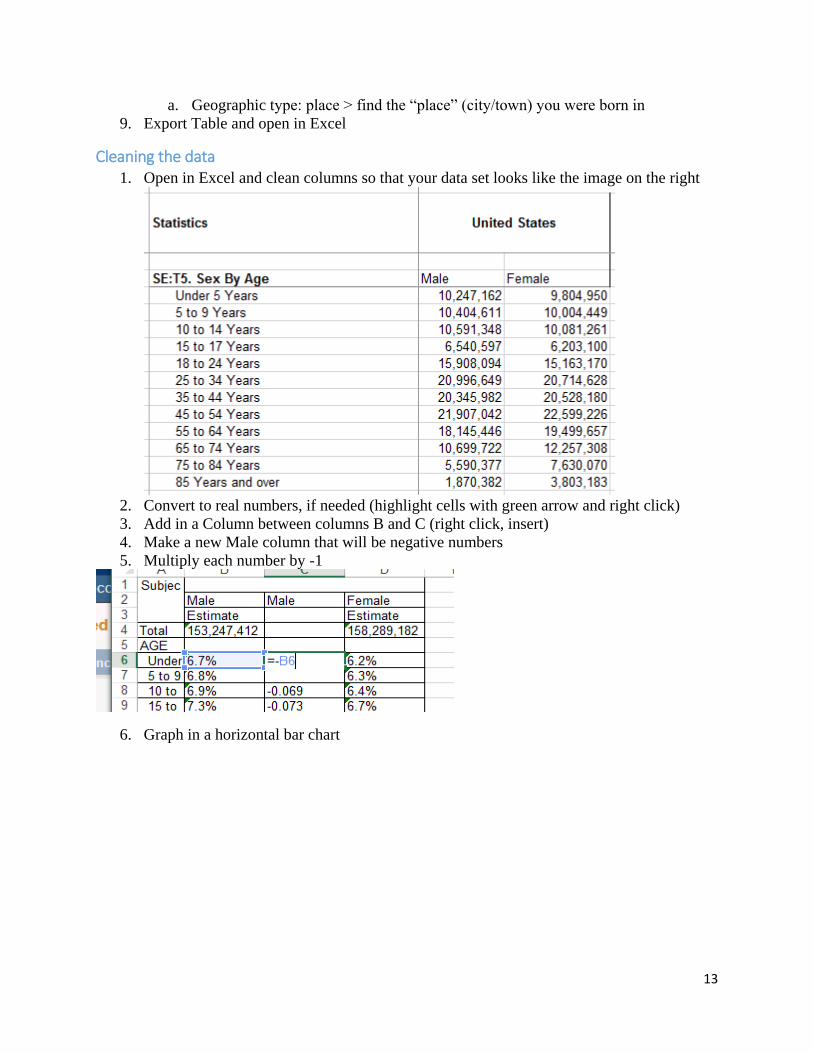
Example 2: Population Pyramids
What is a population pyramid? 1. Comparison of different age groups. Shows how a region is growing (West Africa: high
growth rate, Western Europe, low growth rate)

12
2. Also can show major events (wars) or economic boom (births in some cases, decline in
births in longer term trends)
Getting the data - Factfinder 1. Go to http://factfinder.census.gov
2. Advanced Search>Show me all
3. Geographies>Address>Select the “place” (city/town) that you were born in
4. Clear selections, search “Age and Sex” (S0101
5. Make sure dataset is 2013 ACS 5-year OR 2010 US Census
6. Download data
Getting the data – Social Explorer 7. Go to socialexplorer.com
8. Select “Tables”
13
a. Geographic type: place > find the “place” (city/town) you were born in
9. Export Table and open in Excel
Cleaning the data 1. Open in Excel and clean columns so that your data set looks like the image on the right
2. Convert to real numbers, if needed (highlight cells with green arrow and right click)
3. Add in a Column between columns B and C (right click, insert)
4. Make a new Male column that will be negative numbers
5. Multiply each number by -1
6. Graph in a horizontal bar chart
14
Social Explorer Resources http://www.socialexplorer.com/blog/post/help-resources-for-using-social-explorer-2699
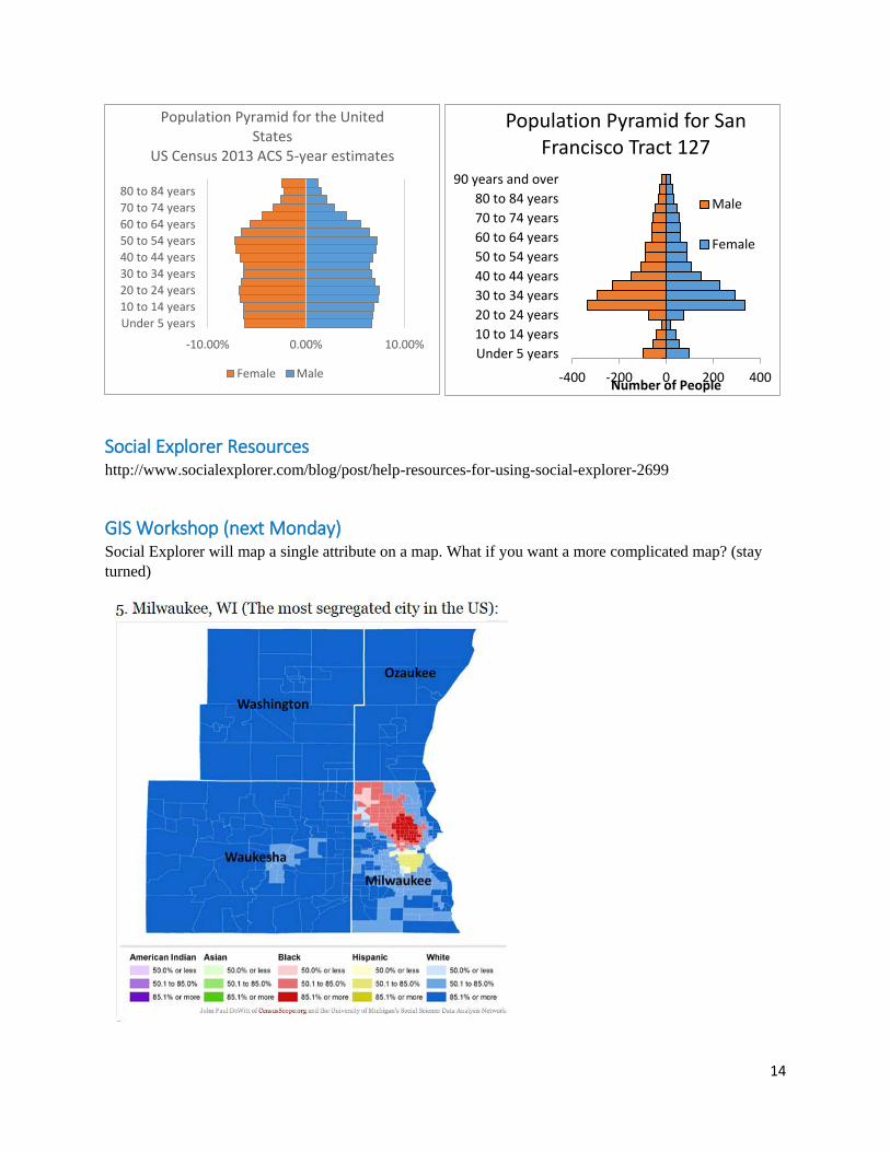
GIS Workshop (next Monday) Social Explorer will map a single attribute on a map. What if you want a more complicated map? (stay
turned)
-10.00% 0.00% 10.00%
Under 5 years
10 to 14 years
20 to 24 years
30 to 34 years
40 to 44 years
50 to 54 years
60 to 64 years
70 to 74 years
80 to 84 years
Population Pyramid for the United States
US Census 2013 ACS 5-year estimates
Female Male -400 -200 0 200 400
Under 5 years
10 to 14 years
20 to 24 years
30 to 34 years
40 to 44 years
50 to 54 years
60 to 64 years
70 to 74 years
80 to 84 years
90 years and over
Number of People
Population Pyramid for San Francisco Tract 127
Male
Female