Science Shop Visual Diary
16
INTERACTIVE GROUP Michael Kearney MED526 Interactive Media Arts PROJECT
-
Upload
mkearney949 -
Category
Documents
-
view
30 -
download
0
description
Visual Diary documenting design work from concept to delivery for a small local charity
Transcript of Science Shop Visual Diary

INTERACTIVEGROUP
Michael Kearney
MED526
Interactive Media Arts
PROJECT

The group met with the clients on the 11th of February. In this meeting, Pips presented to us a variety of projects that they required help with. They had recently launched a new programme called Bounceback, a programme on “personal resilience” targeted towards Secondary School adolescents that had yet to have any particular logo, aesthetic or motto made for it. For the group this became a great opportunity to build something new from scratch rather than redesign or repurpose existing media for their older projects or overall website. A design brief was then written up based on the combined suggestions and ideas of the group and those attending the meeting.
The Group
The Meeting
The group consisted of 3 members, Michael Kearney, Jamie Peacock and Nicholas Tracey. Each of us decided to work at different media forms, making sure to make best use of our team’s varying skill set. The work was divided as follows,
Michael Kearney - Typography, Colour, Print layout, Photography and FIlming.
Jamie Peacock - Web Authoring, Web Design
Nicholas Tracey - Logo Design, Storyboarding, Photography, Filming and Editing
IntroductionOur project was assigned to the students by the Science Shop. The Science Shop is a group dedicated to giving community or voluntary groups the opportunity to have a project completed to a professional standard by students. From a range of different projects, it was decided that our group would work with Pips charity in Belfast
Pips CharityPips Charity is a not-for-profit company that provides support and training for people dealing with suicide, bereavement or want to aid in the prevention of suicide. They offer a variety of programmes and support for Belfast and the local community and have recently launched a new programme “Bounce Back” that promotes emotional resilience.
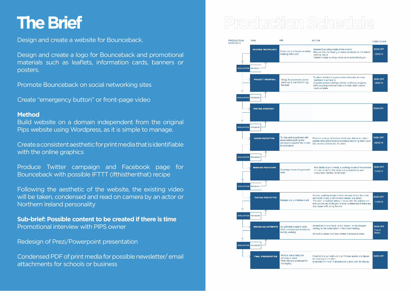
Design and create a website for Bounceback.
Design and create a logo for Bounceback and promotional materials such as leaflets, information cards, banners or posters.
Promote Bounceback on social networking sites
Create “emergency button” or front-page video
MethodBuild website on a domain independent from the original Pips website using Wordpress, as it is simple to manage.
Create a consistent aesthetic for print media that is identifiable with the online graphics
Produce Twitter campaign and Facebook page for Bounceback with possible IFTTT (ifthisthenthat) recipe
Following the aesthetic of the website, the existing video will be taken, condensed and read on camera by an actor or Northern Ireland personality
Sub-brief: Possible content to be created if there is timePromotional interview with PIPS owner
Redesign of Prezi/Powerpoint presentation
Condensed PDF of print media for possible newsletter/ email attachments for schools or business
The Brief

ResearchI began to look at the websites of similar topics for ideas on font use and colour, mainly from local companies that deal with suicide prevention.
Font-wise they were all relatively plain and sans-serif that tended to contrast strongly with their background, presumably for legibility purposes. For the most part, their web design seemed relatively dated, with very little to no styling and simple containers. Stampoutsuicide is a clear example of the cluttered navigation and design of many suicide prevention/charity websites.
For colours blue was incredibly common, being a colour generally associated with calm and peace. This is clearly juxtaposed by the orange and white scheme of the Lifeline website that uses a plain one page design with default browser text and style.
What was interesting was that these companies generally did not have an easily identifiable logo, often using the company name as the sole method of differentiating them from another similar company
Although this research was web based, its influence on our overall design would have to clearly pair with that of the print and video work. To make a more up to date design I would have to take what was important about these websites graphic design; clarity, legibility and a layout that was clean and easy to understand, and make the aesthetic more relevant to todays design standards.
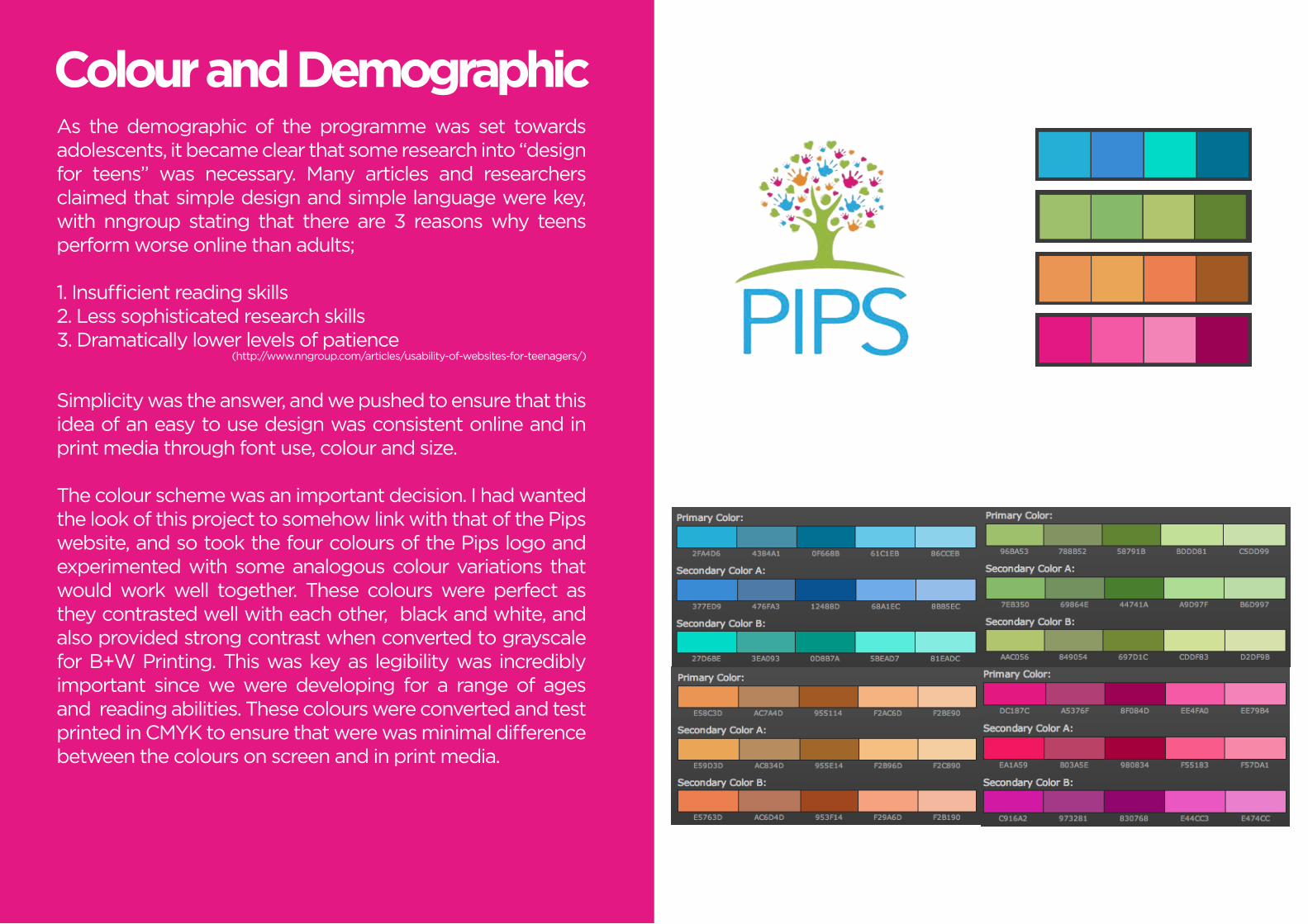
Colour and DemographicAs the demographic of the programme was set towards adolescents, it became clear that some research into “design for teens” was necessary. Many articles and researchers claimed that simple design and simple language were key, with nngroup stating that there are 3 reasons why teens perform worse online than adults;
1. Insufficient reading skills2. Less sophisticated research skills 3. Dramatically lower levels of patience
(http://www.nngroup.com/articles/usability-of-websites-for-teenagers/)
Simplicity was the answer, and we pushed to ensure that this idea of an easy to use design was consistent online and in print media through font use, colour and size.
The colour scheme was an important decision. I had wanted the look of this project to somehow link with that of the Pips website, and so took the four colours of the Pips logo and experimented with some analogous colour variations that would work well together. These colours were perfect as they contrasted well with each other, black and white, and also provided strong contrast when converted to grayscale for B+W Printing. This was key as legibility was incredibly important since we were developing for a range of ages and reading abilities. These colours were converted and test printed in CMYK to ensure that were was minimal difference between the colours on screen and in print media.

FontsSimilarly to how the colour scheme was chosen, the font’s decision was highly based on legibility and clarity rather than style or pure aesthetic reasons. I took a large variety of fonts and narrowed them down to a small selection of sans serif and one subtle serif font, and experimented to see how each looked in different weights and in the chosen colours + greyscale. These fonts were:
- Gotham Book + Gotham Light- Miso Regular + Miso Light- Code Bold + Code Light- Saint Marie (faux bold) + Saint Marie- Helvetica Regular + Helvetica Light
After conversing with the rest of the group, it was decided that Gotham Book and Gotham Light should be used for the prototypes to be shown to Pips several weeks later as it appeared to be the most legible and most aesthetically pleasing font of the selection.
For the programme title it was decided that full capitals was the most bold and would suit us well as several weeks later we would begin to pair it with a motto, “Imagine. Believe. Achieve.” which was taken from the programme presentation.


MISOABCDEFGHIJKLMNOPQRSTUVWXYZabcdefghijklmnopqrstuvwxyz1234567890
ABCDEFGHIJKLMNOPQRSTUVWXYZabcdefghijklmnopqrstuvwxyz1234567890
ABCDEFGHIJKLMNOPQRSTUVWXYZabcdefghijklmnopqrstuvwxyz1234567890
KilogramABCDEFGHIJKLMNOPQRSTUVWXYZ1234567890
GothamABCDEFGHIJKLMNOPQRSTU-VWXYZabcdefghijklmnopqrstuvwxyz
1234567890ABCDEFGHIJKLMNOPQRSTU-VWXYZabcdefghijklmnopqrstuvwxyz1234567890ABCDEFGHIJKLMNOPQRSTU-VWXYZabcdefghijklmnopqrstuvwxyz1234567890

ContinuumABCDEFGHIJKLMNOPQRSTUVWXYZabcdefghijklmnopqrstuvwxyz1234567890
ABCDEFGHIJKLMNOPQRSTUVWXYZabcdefghijklmnopqrstuvwxyz1234567890
ABCDEFGHIJKLMNOPQRSTUVWXYZabcdefghijklmnopqrstuvwxyz1234567890
St.MarieABCDEFGHIJKLMNOPQRSTU-VWXYZabcdefghijklmnopqrstuvwxyz1234567890
Code
ABCDEFGHIJKLMNOPQRSTUVWXYZ
1234567890ABCDEFGHIJKLMNOPQRSTUVWXYZ
1234567890
HelveticaABCDEFGHIJKLMNOPQRSTUVWXYZabcdefghijklmnopqrstuvwxyz1234567890
ABCDEFGHIJKLMNOPQRSTUVWXYZabcdefghijklmnopqrstuvwxyz1234567890
ABCDEFGHIJKLMNOPQRSTUVWXYZabcdefghijklmnopqrstuvwxyz1234567890

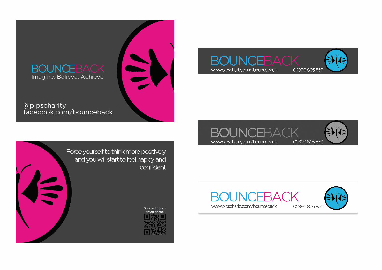
Cards and PrintFor print we felt that the standard leaflets, booklets and flyers that are commonly associated with charity was a bad idea for our project. As the demographic was for adolescent children, we felt that we didn’t want to ever put the user in a position where they would have to read a lot of text that may include some “boring” or rather complex language. We came up with the idea of a business-card sized information card. It would include large simple text, well contrasting colours and all the contact information for Pips and the Bounceback programme. A QR code would link the user to more information and an emergency video on the website, essentially turning a multi-page booklet into a small, concealable card that gives the user more information whenever they need it.
I drew up some simple card designs, taking the blue and pink colours to create a design that was not typically directed towards one gender, seeing that pink is generally accepted as a more feminine colour. I used a dark grey to ensure that the QR code and information was clear against the background with white text and finally transferred this design to an A4 page header for use in teacher or staff handbooks, papers and worksheets. This design was tested for B+W and also in a white colour scheme for the consideration of the clients when the prototype work was to be presented.
The layout of the card was based on the existing Pips business card. It had this odd, sweeping line coming from the side that contained the Pips logo, and it reminded me of the preliminary logos that Nicholas had designed. Matching the style, I took our logo and split it in half, using the left half for the card front, and right half for the card back. I took some of the contact inforation and spread it on both sides, preferring to substitute the company’s address for social media links, as it was already available on these forms of media


Presenting the Prototypes...the group presented our finished prototypes to some of the staff at Pips. The process of choosing a final design was a long and complicated one that resulted in several different overall opinions from the staff members. It was clear that the staff enjoyed our sample of designs, quickly agreeing with our font choice and similar colour scheme to the existing Pips website.
When reviewing the designs for the information cards, the decision was relatively split at first. While some enjoyed the design and layout, others had problems with the wording of the statement on the back of the cards and felt that the design was too dark for the subject matter. I passed on the print header concept and offered them the suggestion of the lighter white and grey scheme I had experimented with and it immediately became the favoured design with the entire group. This became the top priority in my redesign along with updating the text as the web addresses and social media accounts were finalised.
As a group, our designs were reviewed relatively positively by the staff at Pips. Nicholas’ storyboards were accepted and Jamie’s white/beige wordpress theme was selected from his range of concepts, requiring some adjusments. The staff agreed with our decision of the butterfly logo -designed by Nicholas- , asking us to try the logo with a blue butterfly and pink background alongside our other colours. With these changes in mind, and the green light for video and web design, we began to reshape our work to fit the client’s requests.


Updating the emergency video was incredibly important if we wanted to keep a consistently clean and modern looking aesthetically.
Filming and Photography


![E-Mail Version CSI News - CSI Visual Shop | Visual Shop ... 2006.pdf · Program Default in [parts] acrobat_pathandname = {path\application name} Billing Billing > Create Invoices](https://static.fdocuments.us/doc/165x107/5f2a62c0045f835d8d67b0b7/e-mail-version-csi-news-csi-visual-shop-visual-shop-2006pdf-program-default.jpg)