SAS Workshop Series: Quality Graphics in SAS - ecu.edu · SAS Workshop Series: Quality Graphics in...
33
SAS Workshop Series: Quality Graphics in SAS Jason Brinkley Department of Biostatistics
Transcript of SAS Workshop Series: Quality Graphics in SAS - ecu.edu · SAS Workshop Series: Quality Graphics in...
SAS Workshop Series: Quality Graphics in SAS
Jason Brinkley
Department of Biostatistics
SAS and Graphics
• SAS software has a sordid history with graphics. Being a code based software that was originally available for mainframe computers in the early 1970s, SAS was given a reputation for poor quality graphical output in the 1980s when point and click softwares became widely available.
• Modern users will find many different ways to obtain graphs in SAS, and SAS continues to add new options in newer versions.
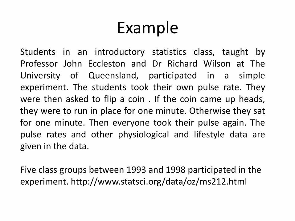
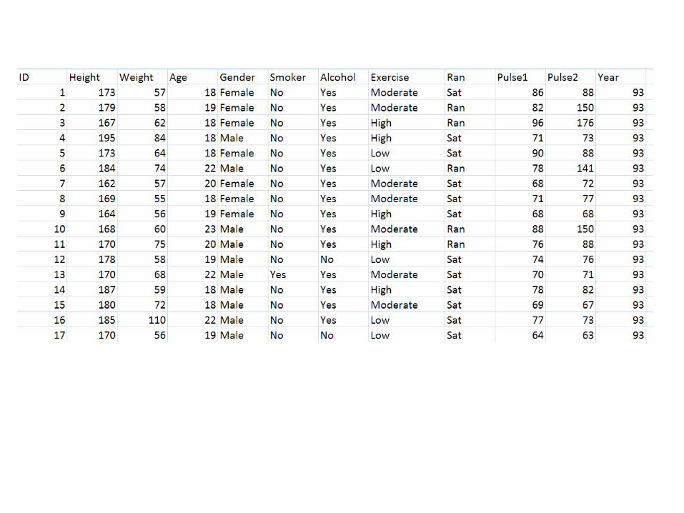
Example Students in an introductory statistics class, taught by Professor John Eccleston and Dr Richard Wilson at The University of Queensland, participated in a simple experiment. The students took their own pulse rate. They were then asked to flip a coin . If the coin came up heads, they were to run in place for one minute. Otherwise they sat for one minute. Then everyone took their pulse again. The pulse rates and other physiological and lifestyle data are given in the data. Five class groups between 1993 and 1998 participated in the experiment. http://www.statsci.org/data/oz/ms212.html
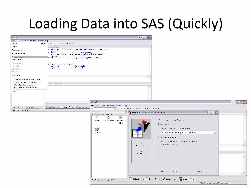
Loading Data into SAS (Quickly)
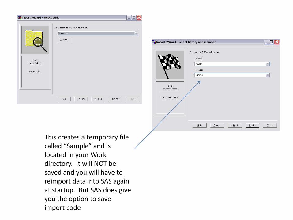
This creates a temporary file called “Sample” and is located in your Work directory. It will NOT be saved and you will have to reimport data into SAS again at startup. But SAS does give you the option to save import code
Review: Descriptives
• We will focus on three variables for now: Height (cm), Weight (kg), and Gender.
• We can start by reviewing how to print and summarize data.
• We expect to see difference in heights and weights by gender.
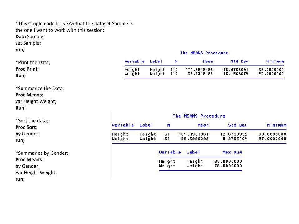
*This simple code tells SAS that the dataset Sample is the one I want to work with this session; Data Sample; set Sample; run; *Print the Data; Proc Print; Run; *Summarize the Data; Proc Means; var Height Weight; Run; *Sort the data; Proc Sort; by Gender; run; *Summaries by Gender; Proc Means; by Gender; Var Height Weight; run;
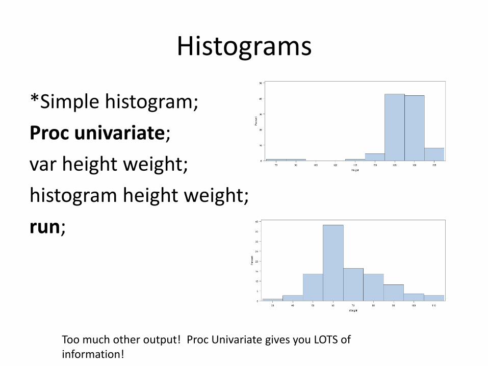
Histograms
*Simple histogram;
Proc univariate;
var height weight;
histogram height weight;
run;
Too much other output! Proc Univariate gives you LOTS of information!
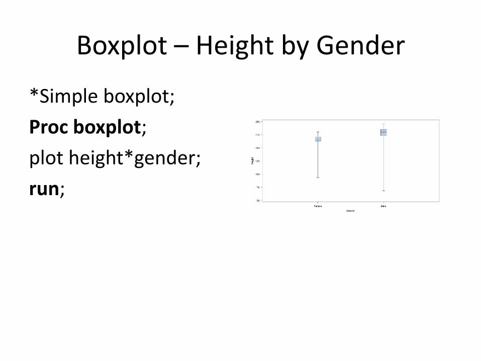
Boxplot – Height by Gender
*Simple boxplot;
Proc boxplot;
plot height*gender;
run;
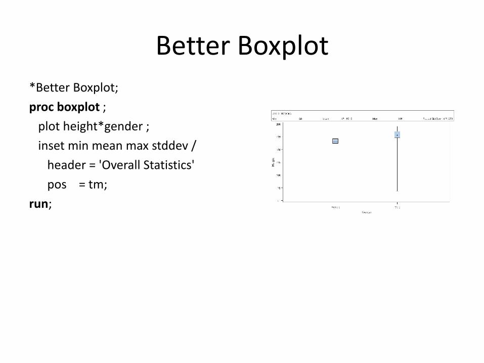
Better Boxplot *Better Boxplot;
proc boxplot ;
plot height*gender ;
inset min mean max stddev /
header = 'Overall Statistics'
pos = tm;
run;
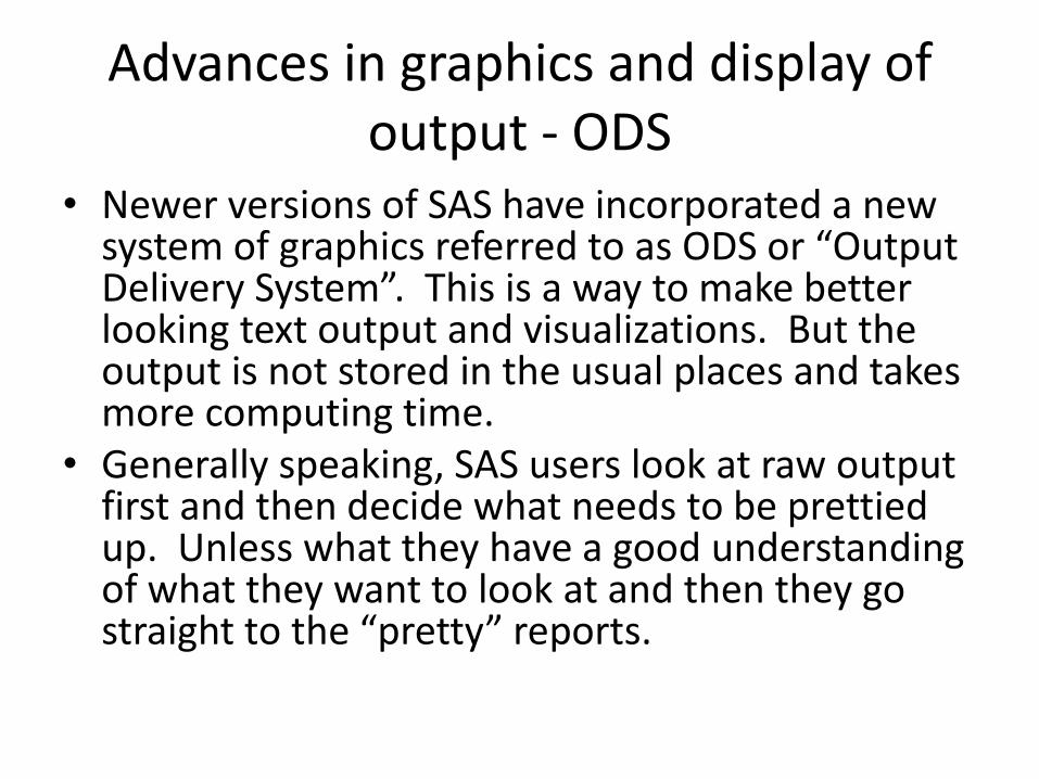
Advances in graphics and display of output - ODS
• Newer versions of SAS have incorporated a new system of graphics referred to as ODS or “Output Delivery System”. This is a way to make better looking text output and visualizations. But the output is not stored in the usual places and takes more computing time.
• Generally speaking, SAS users look at raw output first and then decide what needs to be prettied up. Unless what they have a good understanding of what they want to look at and then they go straight to the “pretty” reports.
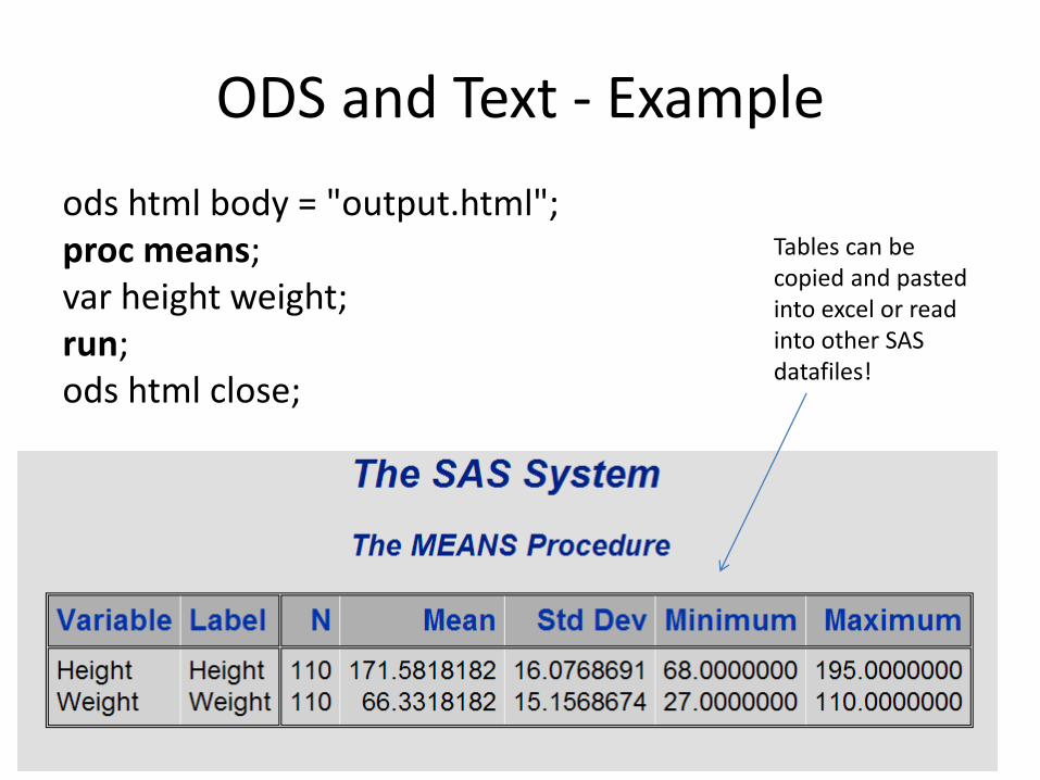
ODS and Text - Example
ods html body = "output.html"; proc means; var height weight; run; ods html close;
Tables can be copied and pasted into excel or read into other SAS datafiles!
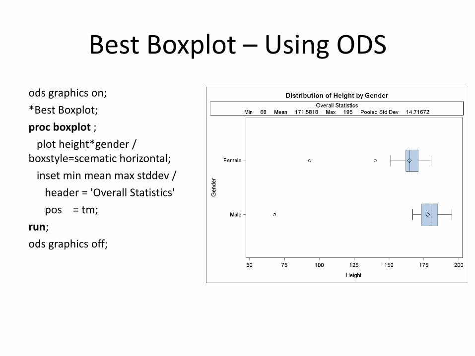
Best Boxplot – Using ODS
ods graphics on;
*Best Boxplot;
proc boxplot ;
plot height*gender / boxstyle=scematic horizontal;
inset min mean max stddev /
header = 'Overall Statistics'
pos = tm;
run;
ods graphics off;
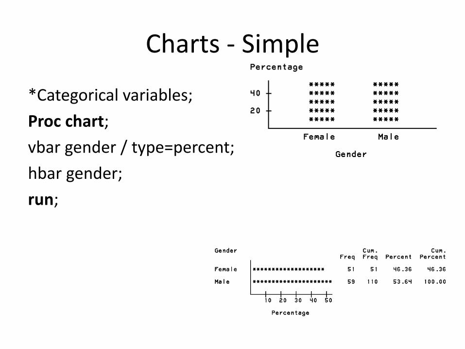
Charts - Simple
*Categorical variables;
Proc chart;
vbar gender / type=percent;
hbar gender;
run;
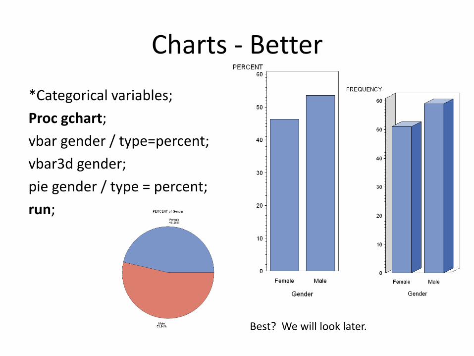
Charts - Better
*Categorical variables;
Proc gchart;
vbar gender / type=percent;
vbar3d gender;
pie gender / type = percent;
run;
Best? We will look later.
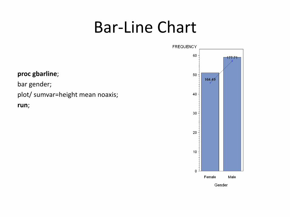
Bar-Line Chart
proc gbarline;
bar gender;
plot/ sumvar=height mean noaxis;
run;
Scatterplots
• Scatterplots are by far some of the most useful graphs for looking at the relationship between variables.
• We can see the two way relationship between quantitative variables, and we can add a third categorical variable for different aspects of the same graph.
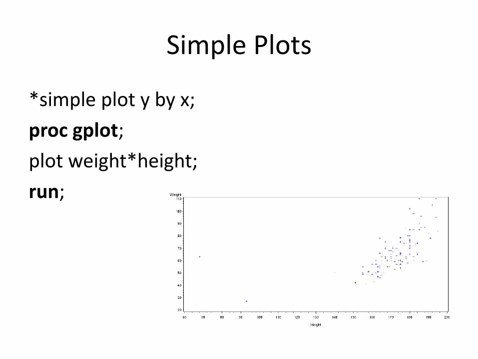
Simple Plots
*simple plot y by x;
proc gplot;
plot weight*height;
run;
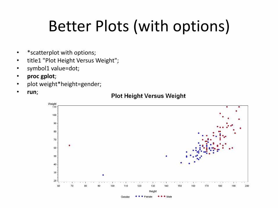
Better Plots (with options)
• *scatterplot with options; • title1 "Plot Height Versus Weight"; • symbol1 value=dot; • proc gplot; • plot weight*height=gender; • run;
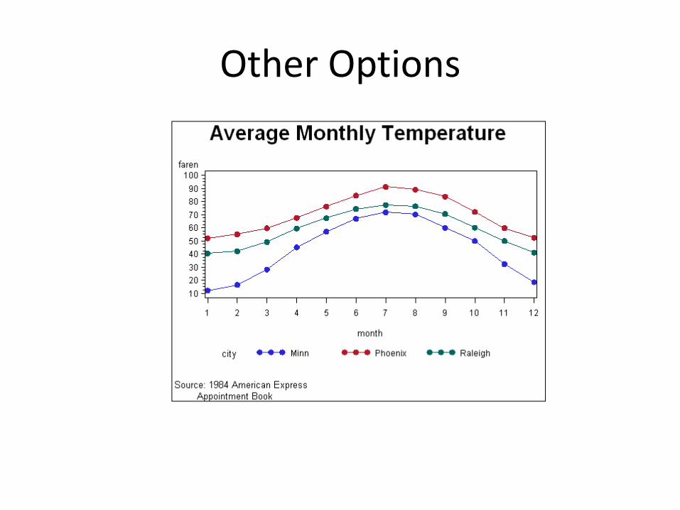
Other Options
New in SAS 9.2 – Statistical Graphics
• Starting in SAS 9.2 a set of powerful new graphical options became available to users. They combine ODS delivery with easy to code graphics and a powerful set of options.
• The most useful (and novel) is that in some cases statistical analysis has been added to the visualizations.
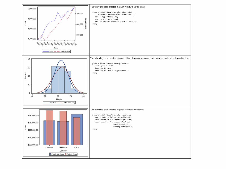
Proc SGPlot
• Proc SGPlot does it all: histograms, bar charts, box plots, and scatterplots.
• Let’s look at the height versus weight example.
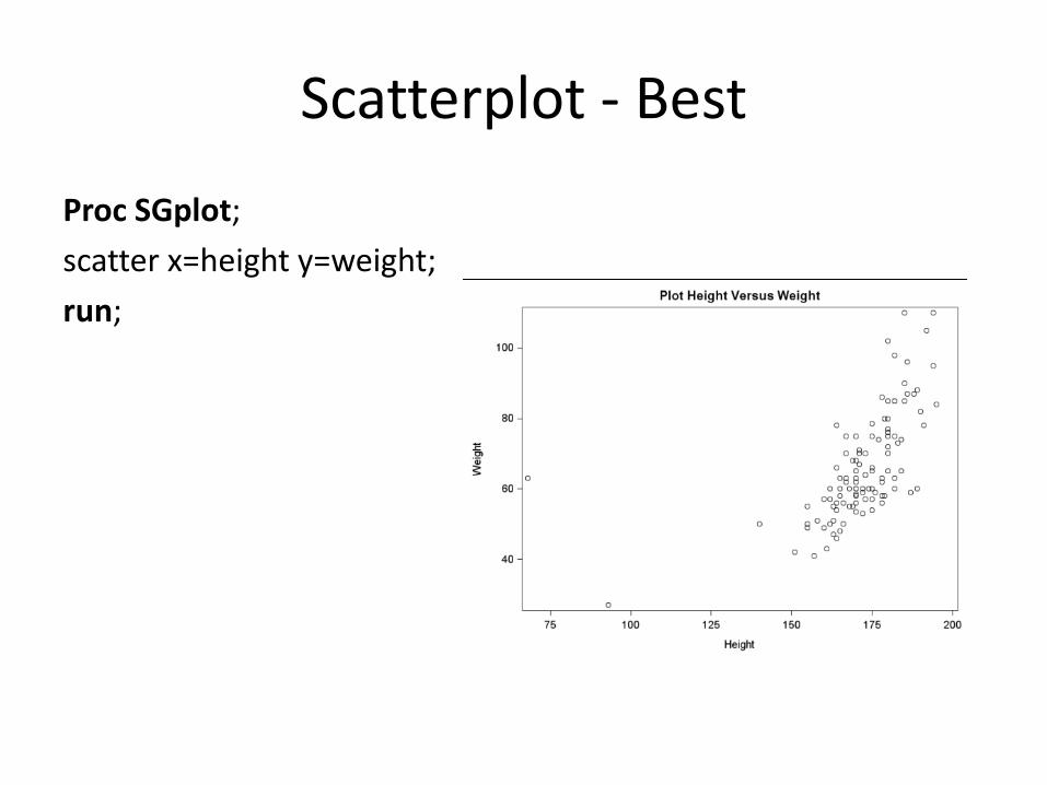
Scatterplot - Best
Proc SGplot;
scatter x=height y=weight;
run;
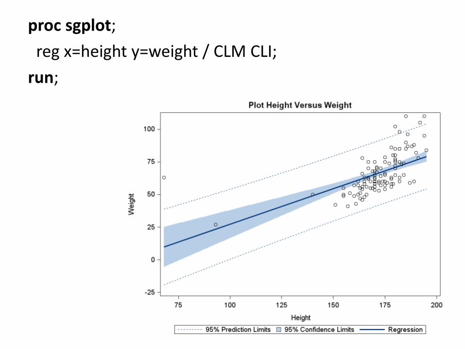
proc sgplot;
reg x=height y=weight / CLM CLI;
run;
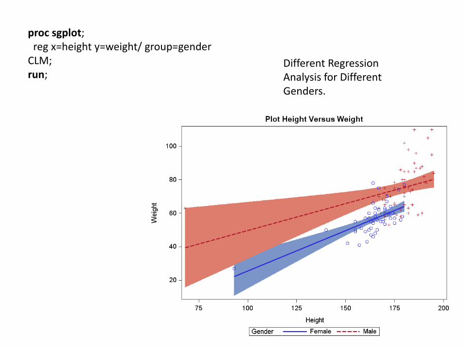
proc sgplot; reg x=height y=weight/ group=gender CLM; run;
Different Regression Analysis for Different Genders.
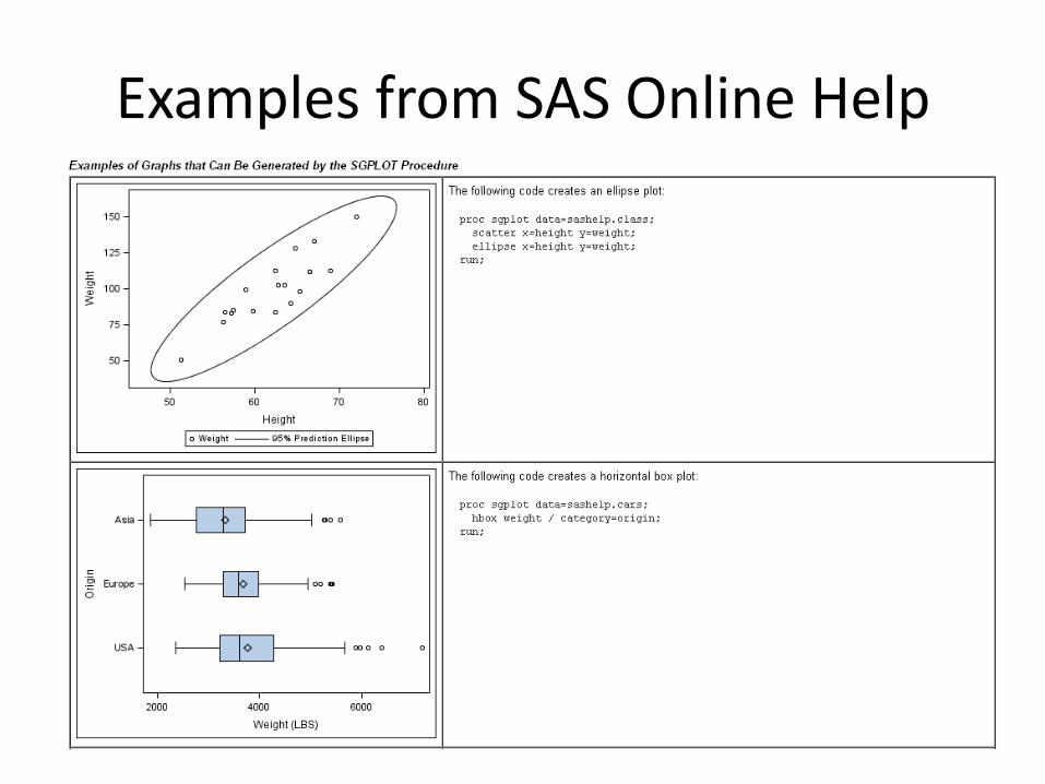
Examples from SAS Online Help
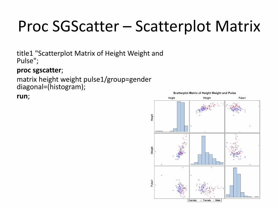
Proc SGScatter – Scatterplot Matrix
title1 "Scatterplot Matrix of Height Weight and Pulse"; proc sgscatter; matrix height weight pulse1/group=gender diagonal=(histogram); run;
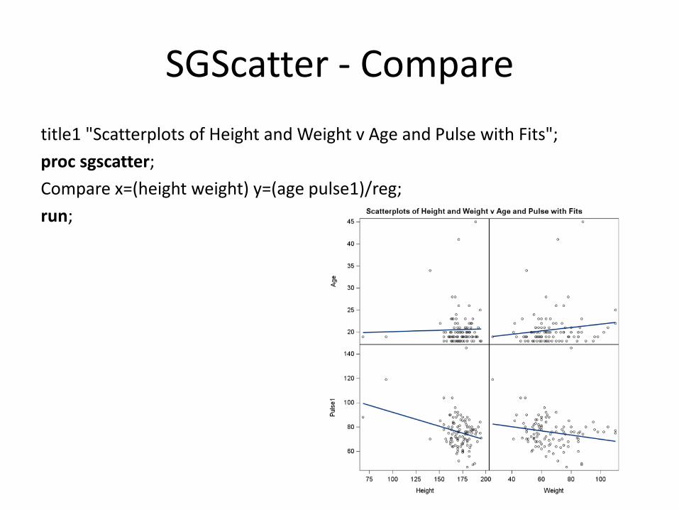
SGScatter - Compare
title1 "Scatterplots of Height and Weight v Age and Pulse with Fits";
proc sgscatter;
Compare x=(height weight) y=(age pulse1)/reg;
run;
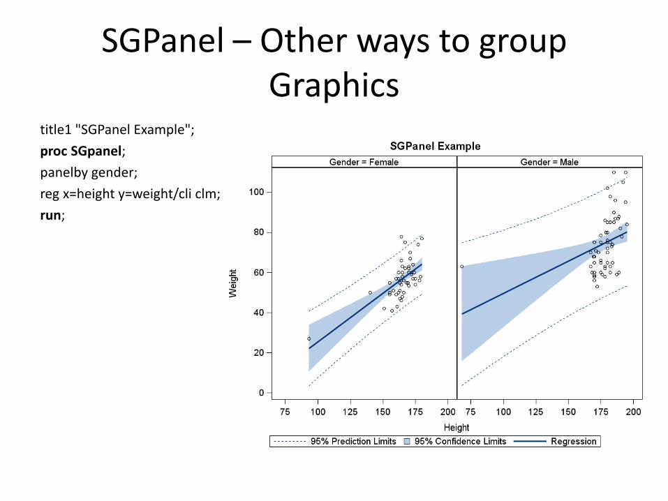
SGPanel – Other ways to group Graphics
title1 "SGPanel Example";
proc SGpanel;
panelby gender;
reg x=height y=weight/cli clm;
run;
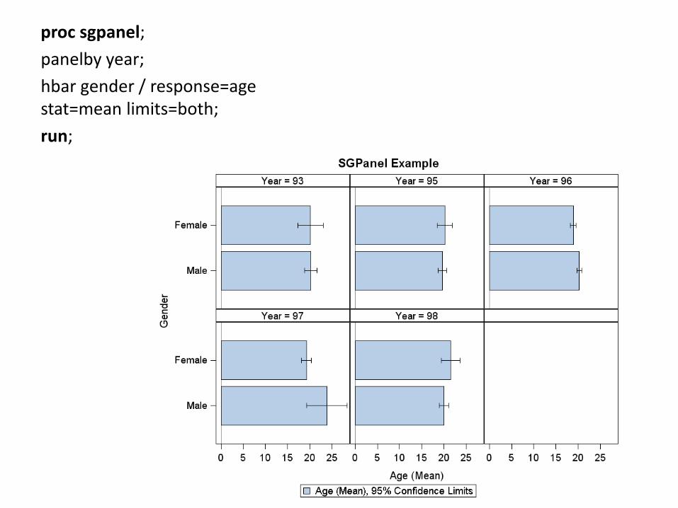
proc sgpanel;
panelby year;
hbar gender / response=age stat=mean limits=both;
run;
Additional Resources
• Introduction to Graphics Using SAS/GRAPH® Software – Mike Kalt http://analytics.ncsu.edu/sesug/2010/RIV13.slides.Kalt.pdf
• SAS Online Documentation
http://support.sas.com/cdlsearch?ct=80000