
SAS Web Editor 2.5: Developer's Guide
60
SAS® Web Editor 2.5: Developer’s Guide SAS ® Documentation
Transcript of SAS Web Editor 2.5: Developer's Guide

SAS® Web Editor 2.5:Developer’s Guide
SAS® Documentation

The correct bibliographic citation for this manual is as follows: SAS Institute Inc. 2013. SAS® Web Editor 2.5: Developer's Guide. Cary, NC: SAS Institute Inc.
SAS® Web Editor 2.5: Developer's Guide
Copyright © 2013, SAS Institute Inc., Cary, NC, USA
All rights reserved. Produced in the United States of America.
For a hard-copy book: No part of this publication may be reproduced, stored in a retrieval system, or transmitted, in any form or by any means, electronic, mechanical, photocopying, or otherwise, without the prior written permission of the publisher, SAS Institute Inc.
For a web download or e-book: Your use of this publication shall be governed by the terms established by the vendor at the time you acquire this publication.
The scanning, uploading, and distribution of this book via the Internet or any other means without the permission of the publisher is illegal and punishable by law. Please purchase only authorized electronic editions and do not participate in or encourage electronic piracy of copyrighted materials. Your support of others' rights is appreciated.
U.S. Government Restricted Rights Notice: Use, duplication, or disclosure of this software and related documentation by the U.S. government is subject to the Agreement with SAS Institute and the restrictions set forth in FAR 52.227-19, Commercial Computer Software-Restricted Rights (June 1987).
SAS Institute Inc., SAS Campus Drive, Cary, North Carolina 27513.
September 2013
SAS provides a complete selection of books and electronic products to help customers use SAS® software to its fullest potential. For more information about our e-books, e-learning products, CDs, and hard-copy books, visit support.sas.com/bookstore or call 1-800-727-3228.
SAS® and all other SAS Institute Inc. product or service names are registered trademarks or trademarks of SAS Institute Inc. in the USA and other countries. ® indicates USA registration.
Other brand and product names are registered trademarks or trademarks of their respective companies.

Contents
Using This Book . . . . . . . . . . . . . . . . . . . . . . . . . . . . . . . . . . . . . . . . . . . . . . . . . . . . . . . . . . . . . . vRecommended Reading . . . . . . . . . . . . . . . . . . . . . . . . . . . . . . . . . . . . . . . . . . . . . . . . . . . vii
Chapter 1 • Introduction to the Common Task Model . . . . . . . . . . . . . . . . . . . . . . . . . . . . . . . . . . . . . 1About the SAS Web Editor Tasks . . . . . . . . . . . . . . . . . . . . . . . . . . . . 1How to Create a New Task . . . . . . . . . . . . . . . . . . . . . . . . . . . . . . . . . 2Validation Steps for the Task . . . . . . . . . . . . . . . . . . . . . . . . . . . . . . . 4Testing a Task . . . . . . . . . . . . . . . . . . . . . . . . . . . . . . . . . . . . . . . . . . 4
Chapter 2 • Working with the Registration Element . . . . . . . . . . . . . . . . . . . . . . . . . . . . . . . . . . . . . . 5About the Registration Element . . . . . . . . . . . . . . . . . . . . . . . . . . . . . 5Example: The Registration Element from the Sample
Task Definition . . . . . . . . . . . . . . . . . . . . . . . . . . . . . . . . . . . . . . . . 6
Chapter 3 • Working with the Metadata Element . . . . . . . . . . . . . . . . . . . . . . . . . . . . . . . . . . . . . . . . . 7About the Metadata Element . . . . . . . . . . . . . . . . . . . . . . . . . . . . . . . 7Working with the Roles Element . . . . . . . . . . . . . . . . . . . . . . . . . . . . . 7Working with the Options Element . . . . . . . . . . . . . . . . . . . . . . . . . . 10
Chapter 4 • Working with the UI Element . . . . . . . . . . . . . . . . . . . . . . . . . . . . . . . . . . . . . . . . . . . . . . 21About the UI Element . . . . . . . . . . . . . . . . . . . . . . . . . . . . . . . . . . . . 21Example: UI Element for the Sample Task Definition . . . . . . . . . . . . 22
Chapter 5 • Working with the Dependencies Element . . . . . . . . . . . . . . . . . . . . . . . . . . . . . . . . . . . . 25About the Dependencies Element . . . . . . . . . . . . . . . . . . . . . . . . . . 25Example 1: Selecting a Check Box Enables Text Boxes . . . . . . . . . 26Example 2: Selecting a Check Box Enables a Combination Box . . . 28Example 3: Selecting a Radio Button Enables a
Number Stepper Control . . . . . . . . . . . . . . . . . . . . . . . . . . . . . . . 30Example 4: The Selected Value for a Combination
Box Enables the Text Box . . . . . . . . . . . . . . . . . . . . . . . . . . . . . . 31

Example 5: Selecting a Check Box Enables Multiple Types of Options . . . . . . . . . . . . . . . . . . . . . . . . . . . . . . . . . . . . . 32
Example 6: Compound Condition Using AND and OR Logic . . . . . . 34
Chapter 6 • Understanding the Code Template . . . . . . . . . . . . . . . . . . . . . . . . . . . . . . . . . . . . . . . . . 37About the Code Template . . . . . . . . . . . . . . . . . . . . . . . . . . . . . . . . . 37Predefined Variables . . . . . . . . . . . . . . . . . . . . . . . . . . . . . . . . . . . . . 38Predefined SAS Macros . . . . . . . . . . . . . . . . . . . . . . . . . . . . . . . . . . 38Roles . . . . . . . . . . . . . . . . . . . . . . . . . . . . . . . . . . . . . . . . . . . . . . . . . 39Options . . . . . . . . . . . . . . . . . . . . . . . . . . . . . . . . . . . . . . . . . . . . . . . 40
Chapter 7 • Example: Task Definition for List Data Task . . . . . . . . . . . . . . . . . . . . . . . . . . . . . . . . . 45Open the List Data Task . . . . . . . . . . . . . . . . . . . . . . . . . . . . . . . . . . 45View the XML Code for the List Data Task . . . . . . . . . . . . . . . . . . . . 46Understanding the XML Code for the List Data Task . . . . . . . . . . . . 47
iv Contents

Using This Book
Audience
The SAS Web Editor: Developer's Guide is intended for programmers who need to develop custom tasks for their site. This document describes the common task model for SAS Web Editor and explains the syntax used in this task model.
Prerequisites
For task development, it is recommended that you use the latest version of Google Chrome because of its debugging tools.
v

vi
Recommended Reading
n What’s New in SAS Web Editor 2.5
For a complete list of SAS books, go to support.sas.com/bookstore. If you have questions about which titles you need, please contact a SAS Book Sales Representative:
SAS BooksSAS Campus DriveCary, NC 27513-2414Phone: 1-800-727-3228Fax: 1-919-677-8166E-mail: [email protected] address: support.sas.com/bookstore
vii

viii Recommended Reading

1Introduction to the Common Task Model
About the SAS Web Editor Tasks . . . . . . . . . . . . . . . . . . . . . . . . . . . . . . . . . . . . . . . 1
How to Create a New Task . . . . . . . . . . . . . . . . . . . . . . . . . . . . . . . . . . . . . . . . . . . . . . . 2
Validation Steps for the Task . . . . . . . . . . . . . . . . . . . . . . . . . . . . . . . . . . . . . . . . . . . . 4
Testing a Task . . . . . . . . . . . . . . . . . . . . . . . . . . . . . . . . . . . . . . . . . . . . . . . . . . . . . . . . . . . . . . 4
About the SAS Web Editor Tasks
SAS Web Editor is shipped with several predefined tasks, which are point-and-click user interfaces that guide the user through an analytical process. For example, tasks enable users to create a bar chart, run a correlation analysis, or rank data. When a user selects a task option, SAS code is generated and run on the SAS server. Any output (such as graphical results or data) is displayed in SAS Web Editor.
Because of the flexibility of the task framework, you can create tasks for your site. In SAS Web Editor, all tasks use the same common task model and the Velocity Template Language. No Java coding or ActionScript coding is required to build a task.
A task is defined by its input data and the options that are available to the user. In addition, the task has metadata so that it is recognized by SAS Web Editor.
In SAS Web Editor, a task is defined by the Task element, which has these children:
1

RegistrationThe Registration element identifies the type of task. In this element, you define the task name, icon, and unique identifier.
MetadataThe Metadata element contains both the roles information and option settings.
n The UI engine reads the Roles element to determine what type of variables are required by the task. Here is the information that you would specify in this element:
o type of variable that the user can assign to this role (for example, numeric or character)
o the minimum or maximum number of variables that you can assign to a role
o the label or description of the role that appears in the user interface
n The UI engine reads the Options element to determine how to display the options in the user interface:
UIThe UI element describes how to present the user interface to the user. A top-down layout is supported.
DependenciesThe Dependencies element describes any dependencies that options might have on one another. For example, selecting a check box could enable a text box.
Code TemplateThe Code Template element determines the output of the task. For most tasks, the output is SAS code. However, you can create any type of text output.
How to Create a New Task
To create a new task:
1 In the navigation pane, open the Tasks and Snippets section.
2 Chapter 1 / Introduction to the Common Task Model

2 Click and select New Task. The sample task definition that is shipped with SAS
Web Editor appears.
3 Edit the sample task definition to create your task. For help with the Velocity Template Language, click to open Apache Velocity User’s Guide.
4 To save the task, click .
How to Create a New Task 3

5 Enter a unique name for the task. The task is saved with the CTM file extension in your file system.
Validation Steps for the Task
When you run a task, SAS Web Editor validates the code by determining whether the XML is well formed, whether the Velocity template has any syntax errors, and whether there are any logical XML errors.
Testing a Task
To test your task, click . (Alternatively, you can press F3.) The user interface for the task appears to the right of your work area.
If you are using Google Chrome, press F12 to view any errors.
4 Chapter 1 / Introduction to the Common Task Model

2Working with the Registration Element
About the Registration Element . . . . . . . . . . . . . . . . . . . . . . . . . . . . . . . . . . . . . . . . . 5
Example: The Registration Element from the Sample Task Definition . . . . . . . . . . . . . . . . . . . . . . . . . . . . . . . . . . . . . . . . . . . . . . . . . . . 6
About the Registration Element
The Registration element represents a collection of metadata for the task. The hosting application requires this element in order to know the type of task.
Here are the child elements for the Registration element:
Element Name Description
Name The name of the task. This name is used throughout the application to represent the task.
Description A description of the task. This text could appear in the task properties or in tooltips for the task.
Category The group for the task. SAS Web Editor has these predefined groups: Graph, Analytical, Data, and Descriptive. You can create new groups to meet the needs of your site.
GUID A unique identifier for the task.
Icon The image to associate with the task.
5

Element Name Description
Procedures A list of SAS procedures that are used by this task.
Version A simple integer value that represents the version of the task.
Links A list of hyperlinks to help or resources related to this task.
Example: The Registration Element from the Sample Task Definition
To create a new task, you can use the sample task definition that is shipped with SAS Web Editor.
Here is the Registration element from the sample task definition:
<Registration> <Name>Task Template</Name> <Description>Demonstrates the Common Task Model functionality.</Description> <Category>Test</Category> <GUID>*</GUID> <Icon/> <Procedures>PRINT</Procedures> <Version>1</Version> <Links> <Link href="http://www.sas.com">SAS Home page</Link> </Links></Registration>
6 Chapter 2 / Working with the Registration Element

3Working with the Metadata Element
About the Metadata Element . . . . . . . . . . . . . . . . . . . . . . . . . . . . . . . . . . . . . . . . . . . . . 7
Working with the Roles Element . . . . . . . . . . . . . . . . . . . . . . . . . . . . . . . . . . . . . . . . 7About the Roles Element . . . . . . . . . . . . . . . . . . . . . . . . . . . . . . . . . . . . . . . . . . . . . . . 7Example: Roles Element from the Sample Task Definition . . . . . . . . 9
Working with the Options Element . . . . . . . . . . . . . . . . . . . . . . . . . . . . . . . . . . . . 10About the Options Element . . . . . . . . . . . . . . . . . . . . . . . . . . . . . . . . . . . . . . . . . . . 10Supported Input Types . . . . . . . . . . . . . . . . . . . . . . . . . . . . . . . . . . . . . . . . . . . . . . . . 11
About the Metadata Element
The Metadata element comprises two parts: the Roles element and the Options element.
Working with the Roles Element
About the Roles Element
The Roles element identifies the variables that must be assigned in order to run the task. The Role tag, which is the only child of the Roles element, describes one type of role assignment for the task.
7

Attribute Description
name Specifies the name assigned to this role.
type Specifies the type of column that can be assigned to this role.Here are the valid values:
AAll column types are allowed. In the user interface, all columns
are identified by the icon.N
Only numeric columns can be assigned to this role. In the user
interface, numeric columns are identified by the icon.C
Only character columns can be assigned to this role. In the user
interface, character columns are identified by the icon.
minVars Specifies the minimum number of columns that must be assigned to this role. If minVars=0, the role is optional. If minVars=1, a column is required to run this task, and a red asterisk appears next to the label in the user interface.
maxVars Specifies the maximum number of columns that can be assigned to this role. If maxVars=0, users can assign an unlimited number of columns to this role.
exclude Specifies the list of roles that are mutually exclusive to this role. If a column is assigned to a role in this list, the column does not appear in the list of available columns for this role.
order Specifies that the user can order the columns that are assigned to this role. Valid values are true and false. If order=true, the user can use up and down arrows in the user interface to modify the order.
8 Chapter 3 / Working with the Metadata Element

Example: Roles Element from the Sample Task Definition
Here is an example of the Roles element and Role tags:
<Roles> <Role type="A" maxVars="0" order="true" minVars="1" name="VAR"> Required variable label</Role> <Role type="N" maxVars="0" order="true" minVars="0" name="OPTNVAR" exclude="VAR">Numeric variable label</Role> <Role type="C" maxVars="3" order="true" minVars="0" name="OPTCVAR">Character variable label<Role></Roles>
When you run this code, here is the resulting user interface:
Working with the Roles Element 9

Working with the Options Element
About the Options Element
The Options element identifies the options that are required in order to run the task. The Option tag, which is the only child of the Options element, describes the assigned option.
Attribute Description
name Specifies the name assigned to this option.
defaultValue Specifies the initial value for the option.
inputType Specifies the input control for this option. Here are the valid values:n checkboxn colorn comboboxn inputtextn numsteppern radion slidern stringn validationtext
For more information, see “Supported Input Types” on page 11.
indent Specifies the indention for this option in the task interface. Here are the valid values:n 1 – minimal indention (about 16px)n 2 – average indention (about 26px)n 3 – maximum indention (about 36px)
10 Chapter 3 / Working with the Metadata Element

Supported Input Types
checkbox
This input type does not have additional attributes. The code in the sample task definition creates two check boxes.
<Option name="GROUP1" inputType="string">Check Boxes</Option><Option name="chkCheck defaultValue=1" inputType="checkbox"> Enable another field</Option><Option name="chkEXAMPLE" defaultValue="0" inputType="checkbox"> Check box</Option>
When you run the code, here is the user interface that is created:
These check boxes also show an example of dependencies. The Check box option is available only when the Enable another field option is selected. Because defaultvalue=1 for the Enable another field option, this check box is selected by default. For more information, see “Working with the Dependencies Element” on page 25.
color
This input type does not have additional attributes. Here is an example from the sample task definition:
<Option name="colorEXAMPLE defaultValue="gray" inputType="color">Choose Color</Option>
When you run the code, here is the user interface that is created:
Working with the Options Element 11

combobox
This input type has one attribute.
Attribute Description
width Specifies the width of the control. This value can be in percent (%), em, or px. By default, SAS Web Editor sizes the control based on the available width and content.
The code in the sample task definition creates a combination box called Drop-down list. This list contains three options: Default value, Value 2, and Value 3.
<Option name="comboEXAMPLE" defaultValue="default" inputType="combobox"> Drop-down list:</Option><Option name="default" inputType="string">Default value</Option><Option name="value1" inputType="string">Value 2</Option><Option name="value2" inputType="string">Value 3</Option>
When you run the code, here is the resulting user interface:
inputtext
This input type has these attributes:
Attribute Description
required Specifies whether any input text is required. Valid values are true and false. The default is false.
missingMessage Specifies the tooltip text that appears when the text box is empty but input text is required. The default value is null.
promptMessage Specifies the tooltip text that appears when the text box is empty and the text box is selected.
12 Chapter 3 / Working with the Metadata Element

Attribute Description
width Specifies the width of the control. This value can be in percent (%), em, or px. By default, SAS Web Editor sizes the control based on the available width and content.
The code in the sample task definition creates a text box called Indented field with default value. The default value for this option is output.xls. If the user removes this text, the message “Enter a filename” appears because a valid filename is required.
<Option name="txtEXAMPLE" defaultValue="output.xls" inputType="inputtext" width="100%" indent="1" required="true" promptMessage="Enter a filename" missingMessage"Missing filename">Indented field with default value:</Option>
When you run the code, here is the user interface that is created:
numstepper
This input type has these attributes:
Attribute Description
decimalPlaces Specifies the number of decimal places to display. Valid values include a single value or a range. To create a field that allows 0 to 3 decimal places, specify decimalPlaces=”0,3”.
increment Specifies the number of values that the option increases or decreases when a user clicks the up or down button. The default value is 1.
maxValue Specifies the maximum value that is allowed. If the user tries to exceed this value, a message appears. The default value is 9000000000000.
Working with the Options Element 13

Attribute Description
minValue Specifies the minimum value that is allowed. If the user specifies a value that is below the minimum value, a message appears.
required Specifies whether a value is required. Valid values are true and false. The default value is false.
width Specifies the width of the control. This value can be in percent (%), em, or px. By default, SAS Web Editor sizes the control based on the available width and content.
The first example in the sample task definition creates an option with an assigned default value of 5.
<Option name="labelNumStepperEXAMPLE1" inputType="string"> Numeric stepper with default values:</Option><Option name="basicStepperEXAMPLE" defaultValue="5" inputType="numstepper" indent="1">Label:</Option>
When you run this code, here is the resulting user interface:
The second example in the sample task definition creates an option with a specified minimum value, maximum value, and increment.
<Option name="labelNumStepperEXAMPLE2" inputType="string"> Numeric stepper with a minimum value of -10, a maximum value of 120, and an increment of 2.</Option><Option name="advancedStepperEXAMPLE" defaultValue="80" inputType="numstepper" increment="2" minValue="-10" maxValue="120" decimalPlaces="0,2" size="8em" indent="1">Label:</Option>
14 Chapter 3 / Working with the Metadata Element

When you run the code, here is the resulting user interface:
radio
This input type has one attribute:
Attribute Description
variable Specifies a variable that contains the name of the currently selected radio button.
The second example in the sample task definition creates an option called Radio button group label with the Radio button 1 button selected by default.
<Option name="labelEXAMPLE2" inputType="string">Radio button group label:</Option><Option name="radioButton1" variable="radioEXAMPLE" defaultValue="radioButton1" inputType="radio">Radio Button 1</Option><Option name="radioButton2" variable="radioEXAMPLE" inputType="radio">Radio Button 2</Option><Option name="radioButton3" variable="radioEXAMPLE" inputType="radio">Radio Button 3</Option>
When you run the code, here is the resulting user interface:
Working with the Options Element 15
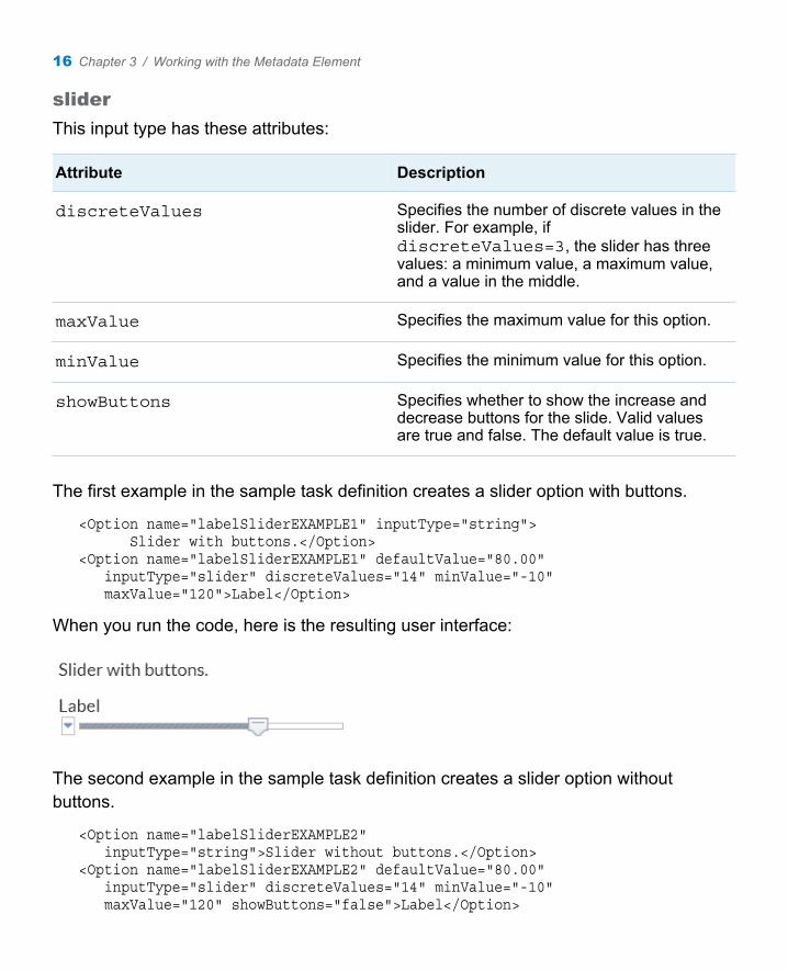
slider
This input type has these attributes:
Attribute Description
discreteValues Specifies the number of discrete values in the slider. For example, if discreteValues=3, the slider has three values: a minimum value, a maximum value, and a value in the middle.
maxValue Specifies the maximum value for this option.
minValue Specifies the minimum value for this option.
showButtons Specifies whether to show the increase and decrease buttons for the slide. Valid values are true and false. The default value is true.
The first example in the sample task definition creates a slider option with buttons.
<Option name="labelSliderEXAMPLE1" inputType="string"> Slider with buttons.</Option><Option name="labelSliderEXAMPLE1" defaultValue="80.00" inputType="slider" discreteValues="14" minValue="-10" maxValue="120">Label</Option>
When you run the code, here is the resulting user interface:
The second example in the sample task definition creates a slider option without buttons.
<Option name="labelSliderEXAMPLE2" inputType="string">Slider without buttons.</Option><Option name="labelSliderEXAMPLE2" defaultValue="80.00" inputType="slider" discreteValues="14" minValue="-10" maxValue="120" showButtons="false">Label</Option>
16 Chapter 3 / Working with the Metadata Element

When you run the code, here is the resulting user interface:
string
This input type has no attributes. The code for the sample task definition contains several examples of the string input type. In the code for the slider option, the explanatory text (Slider with buttons) is created by the string input type.
<Option name="labelSliderEXAMPLE1" inputType="string"> Slider with buttons.</Option><Option name="labelSliderEXAMPLE1" defaultValue="80.00" inputType="slider" discreteValues="14" minValue="-10" maxValue="120">Label</Option>
When you run the code, here is the resulting user interface:
validationtext
This input type has these attributes:
Attribute Description
required Specifies whether any input text is required. Valid values are true and false. The default is false.
invalidMessage Specifies the tooltip text to display when the content in the text box is invalid. The default value is null.
missingMessage Specifies the tooltip text that appears when the text box is empty but text is required. The default value is null.
Working with the Options Element 17

Attribute Description
promptMessage Specifies the tooltip text that appears when the text box is empty and the text box is selected. The default value is null.
regExp Specifies the regular expression pattern to use for validation. This syntax comes directly from JavaScript Regular Expressions.
width Specifies the width of the control. This value can be in percent (%), em, or px. By default, SAS Web Editor sizes the control based on the available width and content.
The code for the sample task definition creates a text box called Label.
<Option name="validationTextExample" defaultValue="99999" inputType="validationtext" required="true" width="100%" promptMsg="A message that tells the user what type of value to enter" invalidMsg="Invalid value message" missingMsg="This value is required." regExp="\d{5}">Label:</Option>
When you run the code, here is the resulting user interface:
If you remove the default value from this box, the This value is required message appears.
18 Chapter 3 / Working with the Metadata Element

When the user begins entering a value, this message appears: A message that tells the user what type of value to enter.
If the specified value is invalid, Invalid value message appears.
Working with the Options Element 19

20 Chapter 3 / Working with the Metadata Element

4Working with the UI Element
About the UI Element . . . . . . . . . . . . . . . . . . . . . . . . . . . . . . . . . . . . . . . . . . . . . . . . . . . . 21
Example: UI Element for the Sample Task Definition . . . . . . . . . . . . . 22
About the UI Element
This element is read by the UI engine to determine the layout of the user interface. Only linear layouts are supported. The UI tag is for grouping purposes only and has no attributes associated with it.
The UI element has these children:
Child Description
Group A container for a group of options. The UI engine displays these options sequentially. A labeled group box or tab is created for this grouping. This tag takes the open attribute only, which specifies whether groups can be expanded or collapsed. By default, open=false, and the group is collapsed in the user interface. To display the contents of a group by default, specify open=true.
21

Child Description
OptionItem A reference to an option that has a single state. This type of option is either on or off, or has a single value. This tag takes the option attribute only. The option attribute refers to the metadata name attribute for the option. The string for this option is taken from the metadata string value.
OptionChoice A reference to an option that has a choice of values. This type of option could be displayed as a combination box or a series of radio buttons. The OptionChoice element uses the OptionItem or OptionValue element to represent the choice of values.
OptionValue A value choice. This tag is valid only as a child of the OptionChoice element.
Example: UI Element for the Sample Task Definition
The code for the sample task definition creates a group for each input type. Here is the code for the first three groups:
<UI> <Group option="GROUP0" open="true"> <OptionItem option="labelEXAMPLE"/> </Group>
<Group option="GROUP1"> <OptionItem option="chkCheck"/> <OptionItem option="chkEXAMPLE"/> </Group>
<Group option="GROUP2"> <OptionItem option="labelEXAMPLE2"/> <OptionItem option="radioButton1"/> <OptionItem option="radioButton2"/>
22 Chapter 4 / Working with the UI Element

<OptionItem option="radioButton3"/> </Group>
...
When you run this code, the Groups, Check Boxes, and Radio Buttons groups appear in the user interface. The first group is expanded by default because the open attribute is set to true.
Example: UI Element for the Sample Task Definition 23

24 Chapter 4 / Working with the UI Element

5Working with the Dependencies Element
About the Dependencies Element . . . . . . . . . . . . . . . . . . . . . . . . . . . . . . . . . . . . . 25
Example 1: Selecting a Check Box Enables Text Boxes . . . . . . . . . 26
Example 2: Selecting a Check Box Enables a Combination Box . . . . . . . . . . . . . . . . . . . . . . . . . . . . . . . . . . . . . . . . . . . . . . . . . . . . . . . . . 28
Example 3: Selecting a Radio Button Enables a Number Stepper Control . . . . . . . . . . . . . . . . . . . . . . . . . . . . . . . . . . . . . . . . . . . . . . . . 30
Example 4: The Selected Value for a Combination Box Enables the Text Box . . . . . . . . . . . . . . . . . . . . . . . . . . . . . 31
Example 5: Selecting a Check Box Enables Multiple Types of Options . . . . . . . . . . . . . . . . . . . . . . . . . . . . . . . . . . . . . . . . . . . . . . . 32
Example 6: Compound Condition Using AND and OR Logic . . . . 34
About the Dependencies Element
The Dependencies element specifies how certain options rely on one another in order for the task to work properly. For example, a check box can enable or disable a text box depending on whether the check box is selected. The Dependencies element is a grouping mechanism for the individual dependency tags. There are no attributes associated with this element.
25

The Dependencies tag can have multiple Dependency elements. The Dependency tag does not have any attributes associated with it, but it does have two children.
n The Source element has the condition attribute, which is a conditional expression that determines the state of the targets. This conditional expression is identical to the conditional expression in the Apache Velocity Template Language.
n The Target element has two attributes:
o The option attribute references the option that receives the action.
o The action attribute indicates what action occurs if the source element is true. Each action has an opposite action that occurs if the source element is false.
Here is the list of actions and corresponding opposite actions:
Action That Occurs When the Source Element Is True
Opposite Action That Occurs When the Source Element Is False
visible hidden
hidden visible
enabled disabled
disabled enabled
Example 1: Selecting a Check Box Enables Text Boxes
In this example from the Characterize Data task, the selection of the SAS data sets check box determines whether the Frequency data and Univariate data text boxes are available. (In the Tasks and Snippets section, the Characterize Data task is in the Descriptive group.)
26 Chapter 5 / Working with the Dependencies Element

In this example, SASDATASETS is the name of the check box. FRQDATA and UNIDATA are the names of the input text options.
<Dependency> <Source condition="$SASDATASETS=='1'"/> <Targets> <Target option="FRQDATA" action="enable"/> <Target option="UNIDATA" action="enable"/> </Targets></Dependency>
By default, the SAS data sets check box is selected, so the Frequency data and Univariate data text boxes are enabled. Here are the results that appear on the Options tab:
If you clear the SAS data sets check box, the Frequency data and Univariate data text boxes are not available. Here are the results that appear on the Options tab:
Example 1: Selecting a Check Box Enables Text Boxes 27

Example 2: Selecting a Check Box Enables a Combination Box
In this example from the Summary Statistics task, the Quantile method drop-down list is enabled only if the user selects the check box for at least one of the quantile options. (In the Tasks and Snippets section, the Summary Statistics task is in the Descriptive group.)
In this example, P1, P5, P10, Q1, MEDIAN, Q3, P90, P95, and P99 are the names of the check boxes. QUANTILE is the name of the combination box.
<Dependency> <Source condition="$P1=='1' || $P5=='1' || $P10=='1' || $Q1=='1' || $MEDIAN=='1' || $Q3=='1' || $P90=='1' || $P95=='1' || $P99=='1' "/> <Target> <Target option="QUANTILE" action="enable"/> </Targets></Dependency>
28 Chapter 5 / Working with the Dependencies Element

By default, no check boxes are selected, so the Quantile method drop-down list is not available. Here is the result that appears on the Options tab:
Example 2: Selecting a Check Box Enables a Combination Box 29
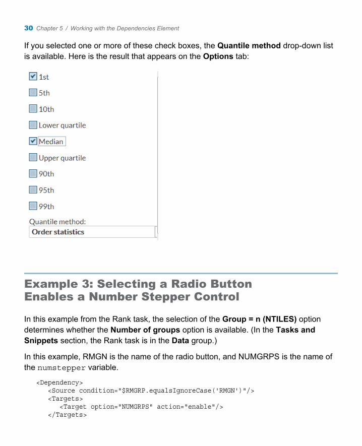
If you selected one or more of these check boxes, the Quantile method drop-down list is available. Here is the result that appears on the Options tab:
Example 3: Selecting a Radio Button Enables a Number Stepper Control
In this example from the Rank task, the selection of the Group = n (NTILES) option determines whether the Number of groups option is available. (In the Tasks and Snippets section, the Rank task is in the Data group.)
In this example, RMGN is the name of the radio button, and NUMGRPS is the name of the numstepper variable.
<Dependency> <Source condition="$RMGRP.equalsIgnoreCase('RMGN')"/> <Targets> <Target option="NUMGRPS" action="enable"/> </Targets>
30 Chapter 5 / Working with the Dependencies Element

</Dependency>
By default, the Group = n (NTILES) option is not selected, so the Number of groups option is not available. Here is the result that appears on the Options tab:
When you select the Group = n (NTILES) option, the Number of groups option is available. Here is the result that appears on the Options tab:
Example 4: The Selected Value for a Combination Box Enables the Text Box
In this example from the Sort Data task, the Value text box is available only if you select B (bytes), KB (kilobytes), MB (megabytes), or GB (gigabytes) from the Memory for sorting drop-down list. (In the Tasks and Snippets section, the Sort Data task is in the Data group.)
In this example, MEMSORT is the name of the drop-down list that is created by the combobox variable. The MEMSORT option has these values: MSSD (Server default), MSMA (Maximum allowed), MSB (B (bytes)), MSKB (KB (kilobytes)), MSMB (MB (megabytes)), and MSGB (GB (gigabytes)). MEMAMT is the name of the validation text box.
<Dependency> <Source condition="$MEMSORT.equalsIgnoreCase('MSB') ||
Example 4: The Selected Value for a Combination Box Enables the Text Box 31

$MEMSORT.equalsIgnoreCase('MSKB') || $MEMSORT.equalsIgnoreCase('MSMB') || $MEMSORT.equalsIgnoreCase('MSGB') ||"/> <Targets> <Target option="MEMAMT" action="enable"/> </Targets></Dependency>
By default, the Server default option is selected, so the Value option is not available. Here is the result that appears on the Options tab:
If you select the B (bytes) option, the Value option is available. Here is the result that appears on the Options tab:
Example 5: Selecting a Check Box Enables Multiple Types of Options
In this example from the Table Attributes task, selecting the Enhanced report check box enables the Sort variables by drop-down list and the Ascending and Descending radio buttons. (In the Tasks and Snippets section, the Sort Data task is in the Data group.)
32 Chapter 5 / Working with the Dependencies Element

In this example, ENHANCEDRPT is the name of the check box. SORTROWS, ASCENDING, and DESCENDING are the names of the Sort variables by, Ascending, and Descending options, respectively.
<Dependency> <Source condition="$ENHANCEDRPT=='1'"/> <Targets> <Target option="SORTROWS" action"enables"/> <Target option="ASCENDING" action"enables"/> <Target option="DESCENDING" action"enables"/> </Targets></Dependency>
By default, the Enhanced report check box is selected, so all options are available. Here is the result that appears on the Options tab:
If you clear the Enhanced report check box, the Sort variables by, Ascending, and Descending options are not available. Here is the result that appears on the Options tab:
Example 5: Selecting a Check Box Enables Multiple Types of Options 33

Example 6: Compound Condition Using AND and OR Logic
In this example from the One-Way Frequencies task, the Seconds option is available only if you select the Exact p-values check box (for Binomial proportion or Chi-square goodness of fit) and the Limit computation time check box. (In the Tasks and Snippets section, the Sort Data task is in the Descriptive group.)
In this example, SECONDS is the name of the number stepper control. chkEXACTP is the name of the Exact p-values check box for binomial proportions. chkCHIEXACTP is the name of the Exact p-values check box for chi-square goodness of fit. chkLIMIT is the name of the Limit computation time check box.
<Dependency> <Source condition="((($chkEXACTP=='1') || ($chkCHIEXACTP=='1')) && ($chkLIMIT=='1'))"/> <Targets> <Target option="SECONDS" action"enable"/> </Targets></Dependency>
34 Chapter 5 / Working with the Dependencies Element

By default, neither of the Exact p-values check boxes is selected, so the Seconds option is not available. Here is the result that appears on the Options tab:
Example 6: Compound Condition Using AND and OR Logic 35
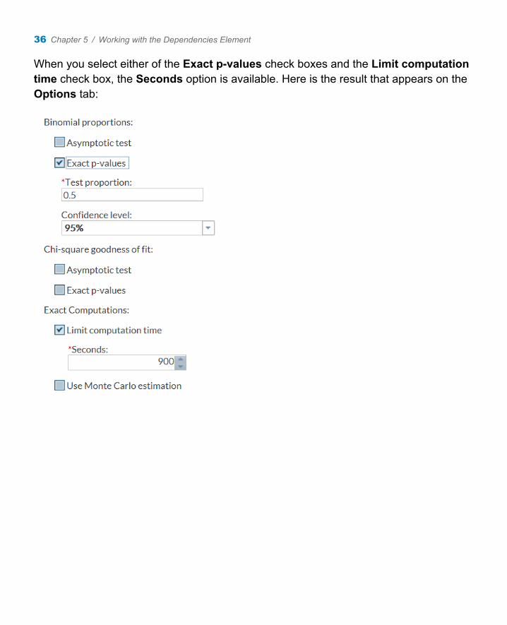
When you select either of the Exact p-values check boxes and the Limit computation time check box, the Seconds option is available. Here is the result that appears on the Options tab:
36 Chapter 5 / Working with the Dependencies Element

6Understanding the Code Template
About the Code Template . . . . . . . . . . . . . . . . . . . . . . . . . . . . . . . . . . . . . . . . . . . . . . . 37
Predefined Variables . . . . . . . . . . . . . . . . . . . . . . . . . . . . . . . . . . . . . . . . . . . . . . . . . . . . . 38
Predefined SAS Macros . . . . . . . . . . . . . . . . . . . . . . . . . . . . . . . . . . . . . . . . . . . . . . . . . 38
Roles . . . . . . . . . . . . . . . . . . . . . . . . . . . . . . . . . . . . . . . . . . . . . . . . . . . . . . . . . . . . . . . . . . . . . . . . 39
Options . . . . . . . . . . . . . . . . . . . . . . . . . . . . . . . . . . . . . . . . . . . . . . . . . . . . . . . . . . . . . . . . . . . . . 40checkbox . . . . . . . . . . . . . . . . . . . . . . . . . . . . . . . . . . . . . . . . . . . . . . . . . . . . . . . . . . . . . . . . 40color . . . . . . . . . . . . . . . . . . . . . . . . . . . . . . . . . . . . . . . . . . . . . . . . . . . . . . . . . . . . . . . . . . . . . . 40combobox . . . . . . . . . . . . . . . . . . . . . . . . . . . . . . . . . . . . . . . . . . . . . . . . . . . . . . . . . . . . . . . 41inputtext . . . . . . . . . . . . . . . . . . . . . . . . . . . . . . . . . . . . . . . . . . . . . . . . . . . . . . . . . . . . . . . . . 41numstepper . . . . . . . . . . . . . . . . . . . . . . . . . . . . . . . . . . . . . . . . . . . . . . . . . . . . . . . . . . . . . 42radio . . . . . . . . . . . . . . . . . . . . . . . . . . . . . . . . . . . . . . . . . . . . . . . . . . . . . . . . . . . . . . . . . . . . . . 42slider . . . . . . . . . . . . . . . . . . . . . . . . . . . . . . . . . . . . . . . . . . . . . . . . . . . . . . . . . . . . . . . . . . . . . 43string . . . . . . . . . . . . . . . . . . . . . . . . . . . . . . . . . . . . . . . . . . . . . . . . . . . . . . . . . . . . . . . . . . . . . 43validationtext . . . . . . . . . . . . . . . . . . . . . . . . . . . . . . . . . . . . . . . . . . . . . . . . . . . . . . . . . . . . 43
About the Code Template
The code template creates the string output of the task. For most tasks, this output is SAS code. The only contents in the Code Template element is a CDATA block of the Apache Velocity scripting language. The string output is produced using this scripting language.
37

Predefined Variables
To access option variables, a Velocity variable is defined for each option. The names of these variables correlate to the option name attribute. For example, to access a check box with a name attribute of cbx1, a velocity variable of $cbx1 is defined.
Here are the predefined Velocity variables:
Variable Description
$DATASET The complete name (Library.DataSet) of the input data source for this task
$SASLIBRARY The name of the library that contains the input data source
$SASTABLE The table name of the input data source
Predefined SAS Macros
If you need to generate SAS code, SAS Web Editor has these predefined macros:
SAS Macro Description
%web_drop_table(table-name1, table-name2, ... table-name_n)
Drops the specified tables
%web_open_table(table-name) Instructs SAS Web Editor to open the specified table
%web_open_file(filename, type) Instructs SAS Web Editor to open the specified file with the specified MIME type
38 Chapter 6 / Understanding the Code Template

SAS Macro Description
%web_open_url(url) Instructs SAS Web Editor to open the specified URL
Roles
For each role, a Velocity variable is used to access the role information. This variable is the same as the role’s name attribute.
In this example, the Analysis Group role is given the name of BY. As a result, the Velocity variable, $BY, is created. When this script is run, the $BY variable is checked to see whether any columns are assigned. If the user has assigned any columns to the Analysis Group role, the generated SAS code sorts on these columns.
<Roles> <Role type="A" maxVars="0" order="true" minVars="0" name="VAR">Columns</Role> <Role type="A" maxVars="0" order="true" minVars="0" name="BY">Analysis group</Role> <Role type="N" maxVars="0" order="true" minVars="0" name="SUM">Total of</Role> <Role type="A" maxVars="0" order="true" minVars="0" name="ID">Identifying label</Role></Roles><CodeTemplate> <![CDATA[#if( $BY )/* Sort $DATASET for BY group processing. */
PROC SORT DATA=$DATASET OUT=WORK.SORTTEMP; BY #foreach($item in $BY ) $item#end;#endRUN;]]></CodeTemplate>
Roles 39

Options
checkbox
The checkbox variable holds the state information for the check box option. If the check box is selected, the variable is set to 1. If the check box is not selected, the variable is set to 0.
In this example, the code outputs the character N if the Print row numbers check box is selected.
<Options> <Option name="PRINTNUMROWS" defaultValue="1" inputType="checkbox">Print row numbers</Option></Options><Code Template> <![CDATA[#if ($PRINTNUMROWS == '1') N#end]]></CodeTemplate>
color
The color variable holds the specified color.
In this example, the code template is printed as colorEXAMPLE=specified-color.
<Options> <Option name="colorEXAMPLE" defaultValue="white" inputType="color">Select a color</Option></Options><CodeTemplate> <![CDATA[%put colorEXAMPLE=$colorEXAMPLE;#end]]></CodeTemplate>
40 Chapter 6 / Understanding the Code Template

combobox
The combobox variable holds the name of the selected option. If no option is selected, the variable is null.
This example outputs the string HEADING=option-name, where option-name is the value selected from the Direction of heading drop-down list. If the user selects Horizontal from the Direction of heading drop-down list, the output is HEADING=”horizontal”.
<Options> <Option name="HEADING" defaultValue="default" inputType="combobox">Direction of heading:</Option> <Option name="default" inputType="string">Default</Option> <Option name="horizontal" inputType="string">Horizontal</Option> <Option name="vertical" inputType="string">Vertical</Option></Options><UI> <OptionChoice option="HEADING"> <OptionItem option="default"/> <OptionItem option="horizontal"/> <OptionItem option="vertical"/> </OptionChoice></UI><CodeTemplate> <![CDATA[#if ($HEADING && (&HEADING !="default")) HEADING=$HEADING#end]]></CodeTemplate>
inputtext
The inputtext variable holds the string that was specified in the text box.
This example outputs the string OBS= and the text specified in the Column text box. If the user enters Student Number into the Column text box, the output is OBS=”Student Number”.
<Options> <Option name="OBSHEADING" indent="1" defaultValue="Row number"
Options 41

inputType="inputtext">Column label:</Option> </Options><CodeTemplate> <![CDATA[OBS="$OBSHEADING"#end]]></CodeTemplate>
numstepper
The numstepper variable holds the string specified in the number control box.
This example outputs the string GROUPS= and the value in the Number of groups box. If the user enters 2 into the Number of groups text box, the string output is GROUPS=”2”.
<Options> <Option name="NUMGRPS" defaultValue="1" minValue="0" inputType="numstepper" indent="1">Number of groups:</Option> </Options><CodeTemplate> <![CDATA[GROUPS="$NUMGRPS"#end]]></CodeTemplate>
radio
The radio button options are grouped together with the same variable attribute. It is this attribute that defines the Velocity scripting variable. The Velocity scripting variable holds the name of the selected radio button. If no radio button is selected, the variable is null.
In this example, there are four radio buttons.
n If the first radio button is selected, there is no output.
n If the second radio button is selected, the string output is GROUPS=”100”.
n If the third radio button is selected, the string output is GROUPS=”10”.
n If the fourth radio button is selected, the string output is GROUPS=”4”.
<Options> <Option name="RMSL" inputType="radio" variable="RMGRP" defaultValue="1">Smallest to largest</Option> <Option name="RMPR" inputType="radio"
42 Chapter 6 / Understanding the Code Template
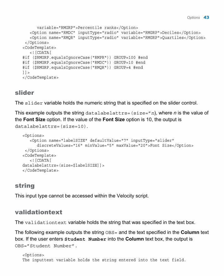
variable="RMGRP">Percentile ranks</Option> <Option name="RMDC" inputType="radio" variable="RMGRP">Deciles</Option> <Option name="RMQR" inputType="radio" variable="RMGRP">Quartiles</Option> </Options><CodeTemplate> <![CDATA[#if ($RMGRP.equalsIgnoreCase("RMPR")) GROUP=100 #end#if ($RMGRP.equalsIgnoreCase("RMDC")) GROUP=10 #end#if ($RMGRP.equalsIgnoreCase("RMQR")) GROUP=4 #end]]></CodeTemplate>
slider
The slider variable holds the numeric string that is specified on the slider control.
This example outputs the string datalabelattrs=(size=”n), where n is the value of the Font Size option. If the value of the Font Size option is 10, the output is datalabelattrs=(size=10).
<Options> <Option name="labelSIZE" defaultValue="7" inputType="slider" discreteValues="16" minValue="5" maxValue="20">Font Size</Option> </Options><CodeTemplate> <![CDATA[datalabelattrs=(size=$labelSIZE]]></CodeTemplate>
string
This input type cannot be accessed within the Velocity script.
validationtext
The validationtext variable holds the string that was specified in the text box.
The following example outputs the string OBS= and the text specified in the Column text box. If the user enters Student Number into the Column text box, the output is OBS=”Student Number”.
<Options>The inputtext variable holds the string entered into the text field.
Options 43

The following example outputs the string "rho0=" and the text in the Null hypothesis correlation option. If the user specifies 0,the string rho0=0 is generated. <source lang="xml"><Options> <Option name="nullRho" indent="1" inputType="validationtext" defaultValue="0" required="true" promptMessage="Enter a number greater than -1 and less than 1 for the null hypothesis correlation" invalidMessage="Enter a number greater than -1 and less than 1 for the null hypothesis correlation" missingMessage="Enter a number grearter than -1 and less than 1 for the null hypothesis correlation" regExp="[-+]?((0\.\d*)|(\.\d+)|0)">Null hypothesis correlation:</Option> </Options><CodeTemplate> <![CDATA[rho0=$nullRho]]></CodeTemplate>
44 Chapter 6 / Understanding the Code Template

7Example: Task Definition for List Data Task
Open the List Data Task . . . . . . . . . . . . . . . . . . . . . . . . . . . . . . . . . . . . . . . . . . . . . . . . . 45
View the XML Code for the List Data Task . . . . . . . . . . . . . . . . . . . . . . . . . . 46
Understanding the XML Code for the List Data Task . . . . . . . . . . . . . . 47
Open the List Data Task
To view the user interface for a predefined task:
1 In the navigation pane, open the Tasks and Snippets section.
2 Expand the folder that contains the task.
3 Right-click the task name and select Open. Alternatively, you can double-click the task to open it.
The task opens to the right of the work area.
45

View the XML Code for the List Data Task
You cannot edit the code for a predefined task. However, you can copy the task code and edit the copy.
To view the code for a predefined task:
1 In the navigation pane, open the Tasks and Snippets section.
2 Expand the folder that contains the task.
3 Right-click the name of the task that you want to edit and select Add to My Tasks. A copy of the task is added to your My Tasks folder.
4 Open the My Tasks folder and select the copied task.
5 Click . The XML code for the task appears.
46 Chapter 7 / Example: Task Definition for List Data Task

Understanding the XML Code for the List Data Task
This example shows the task definition for the List Data task and labels each element in the XML code.
<?xml version="1.0" encoding="utf-8"?><Task>1 <Registration> <Name>List Data</Name> <Description>Display the contents of a table.</Description> <Category>Descriptive</Category> <GUID>3C74D5C3-B845-4926-A749-E56CBA1283E2</GUID> <Icon>TBD</Icon> <Procedures>PRINT</Procedures> <Version>1</Version></Registration>2 <Metadata> <Roles> <Role type="A" maxVars="0" order="true" minVars="0" name="VAR">Columns</Role> <Role type="A" maxVars="0" order="true" minVars="0"
Understanding the XML Code for the List Data Task 47

name="BY">Analysis group</Role> <Role type="N" maxVars="0" order="true" minVars="0" name="SUM">Total of</Role> <Role type="A" maxVars="0" order="true" minVars="0" name="ID">Identifying label</Role> </Roles> <Options> <Option name="print options" inputType="string">List Data Options</Options> <Option name="basic options" inputType="string">Basic Options</Options>
<Option name="OBS" defaultValue="1" inputType="checkbox">Display row numbers</Option> <Option name="OBSHEADING" defaultValue="Row number" inputType="inputtext">Column label:</Option>
<Option name="LABEL" defaultValue="1" inputType="checkbox">Use column labels as column headings</Options>
<Option name="PRINTNUMROWS" defaultValue="0" inputType="checkbox">Display number of rows</Option>
<Option name="ROUND" defaultValue="0" inputType="checkbox">Round values before summing</Option>
<Option name="HEADING" defaultValue="default" inputType="combobox">Direction of heading":</Option> <Option name="default" inputType="string">Default</Option> <Option name="horizontal" inputType="string">Horizontal</Option> <Option name="vertical" inputType="string">Vertical</Option>
<Option name="WIDTH" defaultValue="default" inputType="combobox">Rows to list:</Option> <Option name="full" inputType="string">Full</Option> <Option name="minimum" inputType="string">Minimum</Option> <Option name="uniform" inputType="string">Uniform</Option? <Option name="uniformby" inputType="string">Uniform by</Option>
<Option name="SPLITLABEL" defaultValue="0" inputType="checkbox">Split labels</Option> <Option name="SPLITLABELVALUE" defaultValue="*" inputType="combobox">Split character:</Option> </Options></Metadata>3 <UI> <Group option="basic options">
<OptionItem option="OBS"/>
48 Chapter 7 / Example: Task Definition for List Data Task

<OptionItem option="OBSHEADING"/>
<OptionItem option="LABEL"/>
<OptionItem option="PRINTNUMROWS"/>
<OptionItem option="ROUND"/>
<OptionChoice option="HEADING"/> <OptionItem option="default"/> <OptionItem option="horizontal"/> <OptionItem option="vertical"/> </OptionChoice>
<OptionChoice option="WIDTH"/> <OptionItem option="default"/> <OptionItem option="full"/> <OptionItem option="minimum"/> <OptionItem option="uniform"/> <OptionItem option="uniformby"/> </OptionChoice>
<OptionItem option="SPLITLABEL"/> <OptionChoice option="SPLITLABELVALUE"/> <OptionValue>*</OptionValue> <OptionValue>!</OptionValue> <OptionValue>@</OptionValue> <OptionValue>#</OptionValue> <OptionValue>$</OptionValue> <OptionValue>%</OptionValue> <OptionValue>^</OptionValue> <OptionValue>amp</OptionValue> <OptionValue>+</OptionValue> </OptionChoice>
</Group></UI>4 <Dependencies> <Dependency> <Source condition="OBS=='1'"/> <Targets> <Target option="OBSHEADING" action="enable"/> </Targets> </Dependency> <Dependency> <Source condition="$SPLITLABEL=='1'"/>
Understanding the XML Code for the List Data Task 49

<Targets> <Target option="SPLITLABELVALUE" action"enable"/> </Targets> </Dependency></Dependencies>5 <CodeTemplate> <!
SPLIT='$SPLITLABELVALUE'#end ;#if( $VAR) VAR #foreach ( $item in $VAR ) $item#end;#end#if( $BY ) BY #if($BY)#foreach ( $item in $BY ) $item#end#end;#end#if( $SUM ) SUM #foreach ( $item in $SUM ) $item#end;#end#if( $ID ) ID #foreach ( $item in $ID ) $item#end#end;#endRUN;]]> </CodeTemplate></Task>
Use this list to identify each section in the preceding code:
1 The Registration element. For more information, see “Working with the Registration Element” on page 5.
2 The Metadata element, which defines the roles and options that are required for the task to run. For more information, see “Working with the Metadata Element” on page 7.
3 The UI element, which specifies the layout of the task in the user interface. For more information, see “Working with the UI Element” on page 21.
4 The Dependencies element, which specifies the options that rely on one another in order for the task to work. For more information, see “Working with the Dependencies Element” on page 25.
5 The Code Template, which shows the generated SAS code. For more information, see “Understanding the Code Template” on page 37.
Understanding the XML Code for the List Data Task 51

52 Chapter 7 / Example: Task Definition for List Data Task