Samples and Populations
95
description
Gathering, organizing, andanalyzing data from such a largepopulation is expensive and timeconsuming. In most studies of largepopulations, data are gathered froma sample, or portion, of thepopulation. The data from thesample are then used to makepredictions or to draw conclusionsabout the full population.Sampling is an important tool instatistics and data analysis.Understanding how to select samplesand use them to make predictionswill help you answer questions
Transcript of Samples and Populations


viii Samples and Populations
Samples and PopulationsData and Statistics
Unit Opener . . . . . . . . . . . . . . . . . . . . . . . . . . . . . . . . . . . . . . . . . . . . . . . . . . . . . 2
Mathematical Highlights . . . . . . . . . . . . . . . . . . . . . . . . . . . . . . . . . . . . . . . . . . 4
Comparing Data Sets. . . . . . . . . . . . . . . . . . . . . . . . . . . . 5
1.1 From Line Plots to Histograms . . . . . . . . . . . . . . . . . . . . . . . . . . . . . . . . . . . 7
1.2 Using Histograms . . . . . . . . . . . . . . . . . . . . . . . . . . . . . . . . . . . . . . . . . . . . 10
1.3 Box-and-Whisker Plots. . . . . . . . . . . . . . . . . . . . . . . . . . . . . . . . . . . . . . . . . 12
1.4 Making a Quality Choice: Analyzing Data . . . . . . . . . . . . . . . . . . . . . . . . 16
Homework . . . . . . . . . . . . . . . . . . . . . . . . . . . . . . . . . . . . . . . . . . . . . . . 17
Mathematical Reflections . . . . . . . . . . . . . . . . . . . . . . . . . . . . . . . . . . . . . . . . . . 25
Choosing a Sample From a Population . . . . . . . . . . 26
2.1 Asking About Honesty: Using a Sample to Make Predictions . . . . . . . 28
2.2 Selecting a Sample . . . . . . . . . . . . . . . . . . . . . . . . . . . . . . . . . . . . . . . . . . . 29
2.3 Choosing Random Samples . . . . . . . . . . . . . . . . . . . . . . . . . . . . . . . . . . . . . 31
2.4 Choosing a Sample Size . . . . . . . . . . . . . . . . . . . . . . . . . . . . . . . . . . . . . . . . 34
Homework . . . . . . . . . . . . . . . . . . . . . . . . . . . . . . . . . . . . . . . . . . . . . . . 36
Mathematical Reflections . . . . . . . . . . . . . . . . . . . . . . . . . . . . . . . . . . . . . . . . . . 46
8cmp06se_SPTOC.qxd 6/8/06 9:07 AM Page viii
Solving Real-World Problems . . . . . . . . . . . . . . . . . . . 47
3.1 Solving an Archeological Mystery: Comparing and Analyzing Data . . . . . . . . . . . . . . . . . . . . . . . . . . . . . . . . . . . . . . . . . . . . . . 47
3.2 Simulating Cookies: Using a Simulation to Make a Decision . . . . . . . 51
Homework . . . . . . . . . . . . . . . . . . . . . . . . . . . . . . . . . . . . . . . . . . . . . . . 54
Mathematical Reflections . . . . . . . . . . . . . . . . . . . . . . . . . . . . . . . . . . . . . . . . . . 61
Relating Two Variables . . . . . . . . . . . . . . . . . . . . . . . . 62
4.l Are Quality Ratings and Prices Related?:Interpreting Scatter Plots. . . . . . . . . . . . . . . . . . . . . . . . . . . . . . . . . . . . . . 62
4.2 Writing an Equation to Describe a Relationship . . . . . . . . . . . . . . . . . . . 63
4.3 Human Development Index and Life Expectancies:Analyzing a Relationship. . . . . . . . . . . . . . . . . . . . . . . . . . . . . . . . . . . . . . 66
Homework . . . . . . . . . . . . . . . . . . . . . . . . . . . . . . . . . . . . . . . . . . . . . . . 69
Mathematical Reflections . . . . . . . . . . . . . . . . . . . . . . . . . . . . . . . . . . . . . . . . . . 80
The Unit Project. . . . . . . . . . . . . . . . . . . . . . . . . . . . . . . . . . . . . . . . . . . . . . . . . 81
Looking Back and Looking Ahead . . . . . . . . . . . . . . . . . . . . . . . . . . . . . . . . 83
English/Spanish Glossary . . . . . . . . . . . . . . . . . . . . . . . . . . . . . . . . . . . . . . . . 86
Index . . . . . . . . . . . . . . . . . . . . . . . . . . . . . . . . . . . . . . . . . . . . . . . . . . . . . . . . . . 91
Acknowledgments . . . . . . . . . . . . . . . . . . . . . . . . . . . . . . . . . . . . . . . . . . . . . . 93
Table of Contents ix
8cmp06se_SPTOC.qxd 6/8/06 9:07 AM Page ix

How is it possible toestimate the deer population of a state,or even of a small part of the state?
Yung-nan takes 150 beans from ajar of beans, marks them with ared dot, and mixes them with theunmarked beans. Then she scoopsout a few beans and counts thenumber of marked ones. Will thismethod help her predict the totalnumber of beans in the jar?
A radio talk-show host asked her listeners to call in to expresstheir opinions about a local election. Could the results of this survey be used to describe the opinions of all the show’s listeners?
2 Samples and Populations
Data and Statistics
8cmp06se_SPUO.qxd 6/8/06 9:09 AM Page 2

The United States Censusattempts to gather information fromevery household in the UnitedStates. Gathering, organizing, andanalyzing data from such a largepopulation is expensive and time-consuming. In most studies of largepopulations, data are gathered froma sample, or portion, of thepopulation. The data from the
sample are then used to makepredictions or to draw conclusionsabout the full population.
Sampling is an important tool instatistics and data analysis.Understanding how to select samplesand use them to make predictionswill help you answer questions likethose on the previous page.
Unit Opener 3
8cmp06se_SPUO.qxd 6/8/06 9:09 AM Page 3

Data and Statistics
In Samples and Populations, you will explore ways of collecting andanalyzing data.
You will learn how to
• Use the process of statistical investigation to explore problems
• Use information from samples to draw conclusions about populations
• Explore the influence of sample size on the variability of thedistribution of sample means or medians
• Evaluate sampling plans
• Use probability to select random samples from populations
• Compare sample distributions using measures of center (mean,median), measures of variability (range, minimum and maximum datavalues, percentiles), and displays that group data (histograms, box-and-whisker plots)
• Explore relationships between paired values of numerical variables
As you work on the problems in this unit, ask yourself questions aboutsituations that involve analyzing data using samples.
What is the population?
What is the sample?
What kinds of comparisons and relationships can I explore using datafrom the sample?
Can I use my results to make predictions or generalizations about thepopulation?
4 Samples and Populations
8cmp06se_SPUO.qxd 6/8/06 9:09 AM Page 4

1
Comparing Data Sets American shoppers have a great variety of products from which to choose. Many people turn to information in consumer surveys and product comparisons to help make decisions.
A consumer magazine rated 37 varieties of peanut butter. Each peanut butter was assigned a quality rating from 1 to 100 points. A panel of trained tasters made two general statements about quality:
• Peanut butters with higher quality ratings were smooth; had a sweet, nutty flavor; and were not overly dry or sticky.
• Peanut butters with lower quality ratings were not very nutty, had small bits of peanuts, or had a burnt or slightly rancid taste.
The article also gave the sodium content and price per 3-tablespoon servingfor each type. Peanut butters were classified according to three attributes:natural or regular, creamy or chunky, and salted or unsalted. The data arepresented in the table on the next page. A fourth attribute, name brand orstore brand, has been added to the data.
Investigation 1 Comparing Data Sets 5
8cmp06se_SP1.qxd 6/8/06 8:42 AM Page 5

6 Samples and Populations
SOURCE: Consumer Reports and Workshop Statistics: Student Activity Guide
Peanut Butter
Smucker’s Natural
Deaf Smith Arrowhead
Adams 100% Natural
Adams
Laura Scudder’s All Natural
Country Pure Brand
Hollywood Natural
Smucker’s Natural
Adams 100% Natural
Deaf Smith Arrowhead
Country Pure Brand
Laura Scudder’s All Natural
Smucker’s Natural
Health Valley 100%
Jif
Skippy
Kroger
NuMade
Peter Pan
Peter Pan
A & P
Food Club
Pathmark
Lady Lee
Albertsons
ShurFine
Jif
Skippy
Food Club
Kroger
A & P
Peter Pan
NuMade
Lady Lee
Albertsons
Pathmark
ShurFine
1.
2.
3.
4.
5.
6.
7.
8.
9.
10.
11.
12.
13.
14.
15.
16.
17.
18.
19.
20.
21.
22.
23.
24.
25.
26.
27.
28.
29.
30.
31.
32.
33.
34.
35.
36.
37.
QualityRating
71
69
60
60
57
52
34
89
69
69
67
63
57
40
76
60
54
43
40
35
34
33
31
23
23
11
83
83
54
49
46
45
40
34
31
29
26
Price perServing(cents)
27
32
26
26
26
21
32
27
26
32
21
24
26
34
22
19
14
20
21
22
12
17
9
16
17
16
23
21
17
14
11
22
21
16
17
9
16
Regular/Natural
natural
natural
natural
natural
natural
natural
natural
natural
natural
natural
natural
natural
natural
natural
regular
regular
regular
regular
regular
regular
regular
regular
regular
regular
regular
regular
regular
regular
regular
regular
regular
regular
regular
regular
regular
regular
regular
Creamy/Chunky
creamy
creamy
creamy
creamy
creamy
creamy
creamy
chunky
chunky
chunky
chunky
chunky
chunky
chunky
creamy
creamy
creamy
creamy
creamy
creamy
creamy
creamy
creamy
creamy
creamy
creamy
chunky
chunky
chunky
chunky
chunky
chunky
chunky
chunky
chunky
chunky
chunky
Salted/Unsalted
unsalted
unsalted
unsalted
salted
salted
salted
unsalted
unsalted
unsalted
unsalted
salted
salted
salted
unsalted
salted
salted
salted
salted
salted
unsalted
salted
salted
salted
salted
salted
salted
salted
salted
salted
salted
salted
salted
salted
salted
salted
salted
salted
NameBrand/StoreBrand
name
name
name
name
name
store
name
name
name
name
store
name
name
name
name
name
store
store
name
name
store
store
store
store
store
store
name
name
store
store
store
name
store
store
store
store
store
Sodiumper
Serving(mg)
15
0
0
168
165
225
15
15
0
0
105
165
188
3
220
225
240
187
225
3
225
225
255
225
225
225
162
211
195
255
225
180
208
225
225
210
195
Peanut Butter Comparison
8cmp06se_SP1.qxd 6/8/06 8:42 AM Page 6

Investigation 1 Comparing Data Sets 7
1.1
• Who might be interested in the results of this peanut butter study?
• What questions about peanut butter can be answered with these data?
• What questions about peanut butter cannot be answered with thesedata?
From Line Plots to Histograms
In this problem, you will look at the of quality ratings for theregular peanut butters. You will use measures of center, minimum andmaximum values, range, the shape of the data, and where the data cluster todescribe the distribution. Locate quality ratings in the table.
Arachibutyrophobia (uh rak ih byoo tih ruh FOH bee uh) is the fear ofgetting peanut butter stuck to the roof of your mouth!
distribution
Getting Ready for Problem 1.1
8cmp06se_SP1.qxd 6/8/06 8:42 AM Page 7

8 Samples and Populations
Problem 1.1 From Line Plots to Histograms
A. Each dot on the line plot below represents the quality rating of oneregular peanut butter from the table.
1. Which interval (or intervals) includes the most quality ratings?
2. Look at the interval marked 40 to 50. What is the lowest rating inthis interval? What is the highest rating in this interval?
3. Suppose you want to add a quality rating of 50 to the plot. In whichinterval would you put this value? Explain.
4. Suppose you want to add a quality rating of 59. In which intervalwould you put this value? Explain.
5. What do you think is the typical rating for regular peanut butters?Explain.
B. In the plot below, the collection of dots in the intervals have been usedto make bars that show the number of data values in each interval.
1. To which interval would you add each of these quality ratings:93, 69, 10, and 57?
2. How would you change the bar in an interval to show the additionof a new quality rating?
Regular Peanut Butter Quality Ratings
0 10 20 30 40 50 60 70 80 90 100
Quality Rating
35 49
34 46
34 45
33 43
31 40
31
29
26
23
2311 40
54
54
83
8360 76
0 10 20 30 40 50 60 70 80 90 100
Quality Rating
Regular Peanut Butter Quality Ratings
35 49
34 46
34 45
33 43
31 40
31
29
26
23
2311 40
54
54
83
8360 76
8cmp06se_SP1.qxd 6/8/06 8:42 AM Page 8

C. The below shows the same distribution as the interval bars with numerical values in Question B. A frequency axis has beenadded to the side of the plot.
1. How is this histogram the same as the plot in Question B? How is it different?
2. Why is a scale on the vertical axis needed? What information does the scale provide?
3. To which interval would you add each of these quality ratings: 93, 69, 10, and 57? How would you change each bar to show a new quality rating?
D. Describe the distribution of quality ratings for the regular peanut butters. Use information from both the histogram and the table. Include the following in your description:
• the minimum and maximum values
• the range of the data and any outliers
• intervals where data cluster
• the shape of the distribution
• related statistics, such as the mean and median
Homework starts on page 17.
Regular Peanut Butter Quality Ratings
Co
un
t
12345678
0 10 20 30 40 50 60 70 80 90 100
Quality Rating
histogram
Investigation 1 Comparing Data Sets 9
For: Stat ToolsVisit: PHSchool.comWeb Code: apd-8101
8cmp06se_SP1.qxd 6/8/06 8:42 AM Page 9
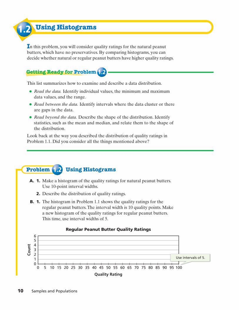
10 Samples and Populations
1.2
Problem 1.2
Using Histograms
In this problem, you will consider quality ratings for the natural peanutbutters, which have no preservatives. By comparing histograms, you candecide whether natural or regular peanut butters have higher quality ratings.
This list summarizes how to examine and describe a data distribution.
• Read the data. Identify individual values, the minimum and maximumdata values, and the range.
• Read between the data. Identify intervals where the data cluster or thereare gaps in the data.
• Read beyond the data. Describe the shape of the distribution. Identifystatistics, such as the mean and median, and relate them to the shape ofthe distribution.
Look back at the way you described the distribution of quality ratings inProblem 1.1. Did you consider all the things mentioned above?
Using Histograms
A. 1. Make a histogram of the quality ratings for natural peanut butters.Use 10-point interval widths.
2. Describe the distribution of quality ratings.
B. 1. The histogram in Problem 1.1 shows the quality ratings for theregular peanut butters. The interval width is 10 quality points. Makea new histogram of the quality ratings for regular peanut butters.This time, use interval widths of 5.
Regular Peanut Butter Quality Ratings
Co
un
t
10
23456
0 5 10 15 20 25 30 35 40 45 50 55 60 65 70 75 80 85 90 95 100
Quality Rating
Use intervals of 5.
Getting Ready for Problem 1.2
8cmp06se_SP1.qxd 6/8/06 8:42 AM Page 10

2. Make another histogram of the same data. Use interval widths ofeither 2 or 15.
3. a. Compare the histogram from Problem 1.1 and the histogramsyou made in parts (1) and (2). What is the same about the threehistograms? What is different?
b. What are the reasons for the differences in the histograms?
c. Would your decision about what is a typical quality rating be affected by the histogram you used? Explain.
4. This rule of thumb can help you choose a good interval width for a histogram:
If possible, use a width that gives 8–10 bars.
Using this rule of thumb, which of the three histograms is best for representing the distribution of quality ratings for the regular peanut butters?
C. When the data sets you want to compare have different numbers ofentries, you can change the vertical axis to show the percent of all valuesthat lie in each interval.This is called a relative frequency histogram.
1. Make two new histograms like the one started below, one for naturalpeanut butters and one for regular peanut butters. Because 1 out of14 of the natural peanut butters has a quality rating between 80 and90 points, the relative frequency for this interval is 7%.
2. Do natural peanut butters or regular peanut butters have higherquality ratings? Use the histograms and other relevant informationto justify your choice.
Homework starts on page 17.
Because 1 out of 14 of the natural peanut butters has a quality rating between 80 and 90 points, the relative frequency for the interval is 7%.
Natural Peanut Butter Quality Ratings
Rel
ativ
e Fr
equ
ency
10%
0%
20%
30%
40%
50%
60%
0 10 20 30 40 50 60 70 80 90 100
Quality Rating
Investigation 1 Comparing Data Sets 11
8cmp06se_SP1.qxd 6/8/06 8:42 AM Page 11

12 Samples and Populations
1.3 Box-and-Whisker Plots
or box plots, are useful for showing thedistribution of values in a data set. The box plot below is an example.
A box plot is constructed from the of the data,which includes the minimum value, maximum value, median, lower quartile,and upper quartile.
When a set of data is ordered from least to greatest, the isthe median of the values to the left of the median. The isthe median of the values to the right of the median.
The box plot below shows how the five-number summary corresponds tothe features of the box plot.
40 50 1000 10 20 30 80 9060 70
Quality Rating
minimum value maximum valuelower quartile upper quartile
median
57 60 69 71 8934 40 52 57 69 6960 6763
minimum value � 34 maximum value � 89median � 61.5
lower quartile � 57 upper quartile � 69
upper quartilelower quartile
five-number summary
40 50 1000 10 20 30 80 9060 70
Quality Rating
Natural Peanut Butter Quality Ratings
Box-and-whisker plots,
8cmp06se_SP1.qxd 6/8/06 8:42 AM Page 12

The five-number summary divides a data distribution into four parts.
About what percent of the data values fall in each of the followingintervals?
• before the median
• after the median
• in the box (between the upper and lower quartiles)
• before the upper quartile
• after the upper quartile
• before the lower quartile
• after the lower quartile
• between the median and the upper quartile
• between the median and the lower quartile
What do you think the term quartile means?
You can compare distributions by displaying two or more box plots on thesame scale.
40 50 1000 10 20 30 80 9060 70
Regular
Natural
Bra
nd
s
Peanut Butter Quality Ratings
Investigation 1 Comparing Data Sets 13
Getting Ready for Problem 1.3
8cmp06se_SP1.qxd 6/8/06 8:42 AM Page 13
14 Samples and Populations
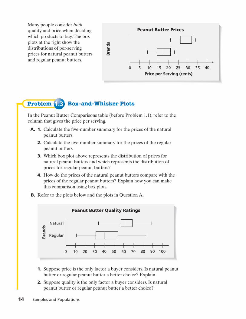
Problem 1.3
Many people consider bothquality and price when deciding which products to buy. The box plots at the right show thedistributions of per-serving prices for natural peanut butters and regular peanut butters.
Box-and-Whisker Plots
In the Peanut Butter Comparisons table (before Problem 1.1), refer to thecolumn that gives the price per serving.
A. 1. Calculate the five-number summary for the prices of the naturalpeanut butters.
2. Calculate the five-number summary for the prices of the regularpeanut butters.
3. Which box plot above represents the distribution of prices fornatural peanut butters and which represents the distribution ofprices for regular peanut butters?
4. How do the prices of the natural peanut butters compare with theprices of the regular peanut butters? Explain how you can makethis comparison using box plots.
B. Refer to the plots below and the plots in Question A.
1. Suppose price is the only factor a buyer considers. Is natural peanutbutter or regular peanut butter a better choice? Explain.
2. Suppose quality is the only factor a buyer considers. Is naturalpeanut butter or regular peanut butter a better choice?
40 50 1000 10 20 30 80 9060 70
Regular
Natural
Bra
nd
s
Peanut Butter Quality Ratings
20 250 5 10 15 4030 35
Price per Serving (cents)
Peanut Butter Prices
Bra
nd
s
8cmp06se_SP1.qxd 6/8/06 8:42 AM Page 14

C. In a box plot, the length of the box represents the difference betweenthe upper and lower quartiles. The difference is called the interquartilerange (IQR).
1. What is the IQR for the quality ratings for natural peanut butters?What does it tell you?
2. What is the IQR for the quality ratings for regular peanut butters?What does it tell you?
D. Values in a data set that are much greater or much less than most of theother values are called outliers. To decide whether a value is an outlier,first find the IQR. Outliers are data values that are either
• greater than 1.5 times the IQR added to the upper quartile, or
• less than 1.5 times the IQR subtracted from the lower quartile
1. What are the outliers in the quality ratings for the natural peanutbutters?
2. What are the outliers in the ratings for the regular peanut butters?
3. On a box plot, outliers are sometimes indicated with asterisks (*).The box plots in Question B and the box plots below show the samedata distributions.
a. In the Question B plots, the whiskers extend to the minimumand maximum values. What values do the whiskers in the plotsabove extend to?
b. Describe how you would construct a box plot if you wanted toshow the outliers in the distribution.
E. 1. Make a pair of box plots to compare the quality ratings for creamyand chunky peanut butters.
2. What is the IQR for each distribution? Use the IQR to determinewhether there are any outliers.
3. Based on quality ratings, are creamy peanut butters or chunkypeanut butters a better choice? Explain.
Homework starts on page 17.
40 50 1000 10 20 30 80
**
9060 70
Peanut Butter Quality Ratings
Regular
Natural
Bra
nd
s
Investigation 1 Comparing Data Sets 15
8cmp06se_SP1.qxd 6/8/06 8:42 AM Page 15

16 Samples and Populations
1.4
Problem 1.4
Making a Quality Choice
In this problem, you will use what you have learned to compare qualityratings for salted and unsalted peanut butters and for name brand and storebrand peanut butters.
Analyzing Data
Justify your answers to the following questions with statistics and graphs,such as histograms and box plots.
A. Compare the quality ratings of salted peanut butters with the qualityratings of unsalted peanut butters. Based on quality ratings, are saltedpeanut butters or unsalted peanut butters a better choice?
B. Compare the quality ratings of name brands with the quality ratings ofstore brands. Based on quality ratings, are name brands or store brandsa better choice?
C. Use your results from this and earlier problems to name the attributesof the type of peanut butter you would recommend to someone. Besure to say whether the peanut butter would be natural or regular,creamy or chunky, salted or unsalted, and name brand or store brand.
D. Can you find at least one peanut butter in the table that has all theattributes you recommend?
Homework starts on page 17.
8cmp06se_SP1.qxd 6/8/06 8:42 AM Page 16

Applications1. The horizontal scale of a histogram begins at 40 and has interval
widths of 10. In which intervals are the values 85 and 90 located?
2. a. Make two histograms, using the Peanut Butter Comparisons tablebefore Problem 1.1, that allow you to compare the prices of naturalpeanut butters with the prices of regular peanut butters.
b. What interval widths did you use? Why?
c. Did you show counts or percents on the vertical axis? Why?
For Exercises 3–5, refer to the Peanut Butter Comparisons table. Usestatistics and histograms to justify each answer.
3. Based on price, are creamy peanut butters or chunky peanut butters a better choice?
4. Based on price, are salted peanut butters or unsalted peanut butters a better choice?
5. Based on price, are name brands or store brands a better choice?
6. a. Suppose someone wants to choose a peanut butter based on price.Use your answers for Exercises 2–5 to list the four attributes—natural or regular, creamy or chunky, salted or unsalted, and namebrand or store brand—you would recommend.
b. Can you find at least one type of peanut butter that has all theattributes you recommend?
Investigation 1 Comparing Data Sets 17
8cmp06se_SP1.qxd 6/8/06 8:42 AM Page 17

Use the histograms and box plots below for Exercises 7–17.
80 100 2800 20 40 60 160
*
180120 140 240 260200 220
Sodium per Serving (mg)
Box Plot B
80 100 2800 20 40 60 160 180120 140 240 260200 220
Sodium per Serving (mg)
Box Plot A
Sodium in Regular Peanut Butters
Nu
mb
er o
f Pe
anu
t B
utt
ers
Sodium per Serving (mg)
0
2
4
6
8
10
12
240 260 280220200180160140120100806040200
Sodium in Natural Peanut ButtersN
um
ber
of
Pean
ut
Bu
tter
s
Sodium per Serving (mg)
0
2
4
6
8
10
12
240 260 280220200180160140120100806040200
18 Samples and Populations
8cmp06se_SP1.qxd 6/8/06 8:42 AM Page 18

Investigation 1 Comparing Data Sets 19
7. Which box plot shows the distribution of sodium values for the natural peanut butters? Explain.
8. Which box plot shows the distribution of sodium values for the regular peanut butters? Explain.
9. What is the median of the sodium values for the natural peanutbutters? Explain what this tells you.
10. What is the median of the sodium values for the regular peanutbutters? Explain what this tells you.
11. Where do the sodium values for natural peanut butters cluster?
12. Where do the sodium values for regular peanut butters cluster?
13. Suppose you are on a low sodium diet. Should you choose a regular or natural peanut butter? Explain.
For Exercises 14 and 15, fill in the blanks.
14. The sodium values for the natural peanut butters vary from 9 to 9.The range is 9.
15. The sodium values for the regular peanut butters vary from 9 to 9.The range is 9.
16. Box Plot A is missing a “whisker.” Explain why.
17. Use the IQR to help you identify which data values are outliers in thesodium values for the regular peanut butters shown on Box Plot B.
18. Multiple Choice Which value is not needed to construct a box plot?
A. upper quartile B. minimum value
C. median D. mean
For: Help with Exercise 7Web Code: ape-8107
8cmp06se_SP1.qxd 6/8/06 8:42 AM Page 19

Use the histograms below for Exercises 19–21. The means and medians aremarked on each histogram.
19. How much taller is a student in grades 6–8 than a student ingrades K–2? Explain.
20. How much taller is a student in grades 6–8 than a student ingrades 3–5?
21. The heights for the students in grades 3–5 cluster in a different waythan those for students in grades K–2 and 6–8. What is different aboutthe heights for the students in grades 3–5? Why do you think this mightbe so?
Student Heights (Grades 6–8)
Nu
mb
er o
f St
ud
ents
Height (cm)
0
2
4
6
1
3
5
78
185 190 200195180175170165160140 145 150 155135130125120115110105100
Student Heights (Grades 3–5)
Nu
mb
er o
f St
ud
ents
Height (cm)
0
2
4
6
1
3
5
78
185 190 200195180175170165160140 145 150 155135130125120115110105100
Student Heights (Grades K–2)
Nu
mb
er o
f St
ud
ents
Height (cm)
0
2
4
6
1
3
5
78
185 190 200195180175170165160140 145 150 155135130125120115110105100
MeanMedian
20 Samples and Populations
8cmp06se_SP1.qxd 6/8/06 8:42 AM Page 20
Investigation 1 Comparing Data Sets 21
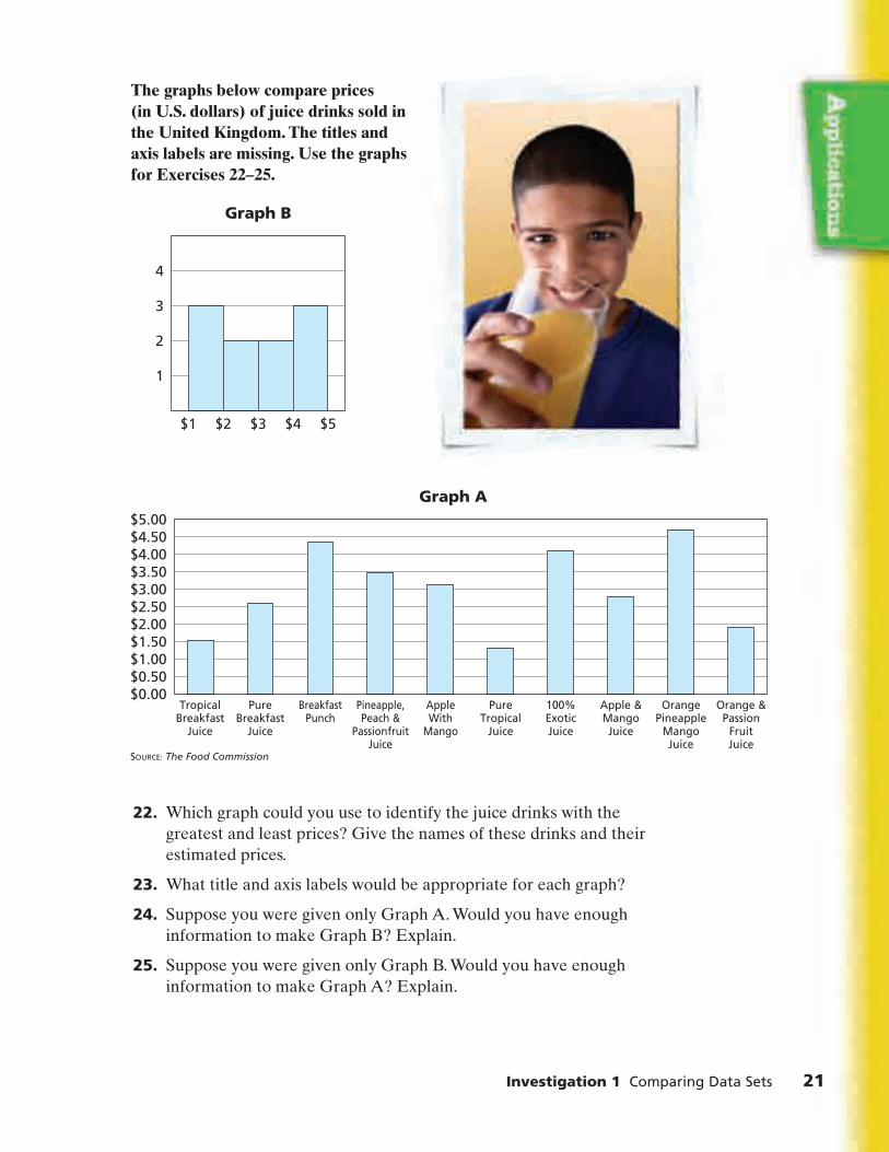
The graphs below compare prices (in U.S. dollars) of juice drinks sold in the United Kingdom. The titles and axis labels are missing. Use the graphs for Exercises 22–25.
22. Which graph could you use to identify the juice drinks with thegreatest and least prices? Give the names of these drinks and theirestimated prices.
23. What title and axis labels would be appropriate for each graph?
24. Suppose you were given only Graph A. Would you have enoughinformation to make Graph B? Explain.
25. Suppose you were given only Graph B. Would you have enoughinformation to make Graph A? Explain.
SOURCE: The Food Commission
Graph A
$0.00
$1.00$0.50
$2.00$1.50
$3.00$2.50
$4.00$3.50
$5.00$4.50
TropicalBreakfast
Juice
Orange &Passion
FruitJuice
OrangePineapple
MangoJuice
Apple &MangoJuice
100%ExoticJuice
PureTropical
Juice
AppleWith
Mango
Pineapple,Peach &
PassionfruitJuice
BreakfastPunch
PureBreakfast
Juice
Graph B
1
2
3
4
$1 $2 $3 $4 $5
8cmp06se_SP1.qxd 6/8/06 8:42 AM Page 21

26. Tim says TastiSnak raisins are a better deal than HarvestTime raisins because there are more raisins in each box.Kadisha says that, because a box of either type contains half an ounce, both brands give you the same amount foryour money.
The students found the number of raisins and the mass for 50 boxes of each type. They made the plots below. Based on this information, which brand is a better deal? Explain.
Connections27. a. Make a data set with 20 values and a mean of 25.
b. Do you think other students made the same data set as you? Explain.
c. Does the median of the data set need to be close in value to themean? Explain.
28. a. Some students were asked to randomly choose a number from 1 to 10. The results are shown. Make a circle graph of these data.
b. Make a bar graph of these data.
c. What is the mode of the numbers selected?
d. Based on the results, do you think the students actually chose thenumbers at random?
e. Nine students chose 5 as their number. How many students are inthe seventh grade?
Percent of StudentsWho Chose Number
Number
Random Number Choosing
5 6 7 8 94321
1 5 12 11 10 12 30 9 7
10
3
22 Samples and Populations
38 4222 26 30 34 46
Harvest Time
TastiSnak
Number
Bran
d
Raisin Boxes
18 1914 15 16 17Weight (g)
For: Multiple-Choice SkillsPractice
Web Code: apa-8154
8cmp06se_SP1.qxd 6/8/06 8:42 AM Page 22

Investigation 1 Comparing Data Sets 23
29. At a diving competition, Jeff’s dive receives seven scores with a meanof 9.0. For his final score, the greatest and least scores are removed andthe mean of the remaining scores is calculated. Jeff’s final score for thedive is 9.1. What is the sum of the two removed scores? Explain.
30. Use the tables from National Basketball Association (NBA) teamsbelow, statistics, and graphs to justify your answers to parts (a)–(c).
a. Are the players on one team older than the players on the otherteam, or are they about the same age?
b. Are the players on one team taller than the players on the otherteam, or are they about the same height?
c. Based on these data, what estimates would you make for the ageand height distributions of a typical professional men’s basketballteam? What cautions would you suggest in making generalizationsfrom the given data?
31. Vicky has misplaced one of her algebra quizzes. The scores on thequizzes she has are 82, 71, 83, 91, and 78. She knows that the mean ofall six quiz scores is 79.5. What is the score on the missing quiz?
SOURCE: www.nba.com
Player
Chandler
Curry
Davis
Deng
Duhon
Gordon
Griffin
Harrington
Hinrich
Nocioni
Pargo
Piatowski
Reiner
Williams
Age
23
23
37
20
23
22
31
31
24
26
26
35
23
25
Height (cm)
216
211
206
203
185
191
196
206
191
200
185
200
211
191
2004 Chicago Bulls
SOURCE: www.nba.com
Player
Baker
Barry
Bowen
Braggs
Howard
McGrady
Mutombo
Norris
Padgett
Sura
Ward
Weatherspoon
Wesley
Yao
Age
34
36
30
29
32
26
39
32
29
32
35
35
35
25
Height (cm)
211
196
206
203
206
203
218
185
206
196
188
200
185
229
2004 Houston Rockets
8cmp06se_SP1.qxd 6/8/06 8:42 AM Page 23

32. Terrence’s test scores in math class this semester are 98, 83, 72, 85, 91,79, and 85. He thinks he can reasonably expect an 87 or better averagefor his semester grade. Without doing an exact computation, do youthink he is correct? Explain.
Extensions33. Bill and Joe are interested in baseball. The histogram below shows
data they collected about the duration of baseball games. The title andaxes labels are missing.
a. What title and axis labels are appropriate for this graph?
b. What does the shape of the graph tell you about the length of a typical baseball game?
c. About how many games are represented in the graph?
d. Estimate the lower quartile, median, and upper quartile for these data. What do these numbers tell you about the length of a typical baseball game?
0
5
10
15
20
25
30
220 230 240 250 260 270 280210200190180170160150140130120110100
24 Samples and Populations
8cmp06se_SP1.qxd 6/8/06 8:42 AM Page 24

1
In this investigation, you grouped data into intervals to make histograms,and you used the five-number summaries of data sets to make box plots.You used these graphs to analyze and compare data distributions. Thesequestions will help you summarize what you have learned.
Think about your answers to these questions. Discuss your ideas with otherstudents and your teacher. Then write a summary of your findings in yournotebook.
1. a. Describe how to construct a histogram for a set of data.
b. Describe how to construct a box plot for a set of data.
c. In what ways are histograms and box plots alike? In what ways arethey different?
2. a. How can you compare two data sets displayed in histograms?
b. How can you compare two data sets displayed in box plots?
Investigation 1 Comparing Data Sets 25
8cmp06se_SP1.qxd 6/8/06 8:42 AM Page 25

�
Choosing a Sample From a Population Suppose you want to gather information about students in your class, suchas their preferences for food, television, music, or sports. It would be fairlyeasy to conduct a survey. But collecting information about all the studentsin your school or all the people in your city, your state, or the entire countrywould be very difficult.
You can study a large population by collecting data from a small part, orof that population. Depending on how the sample is selected from
the population, it is possible to use data from the sample to help you makepredictions or draw conclusions about the entire population. The challengeis to choose a sample that is likely to help you accurately predictinformation about a population.
sample,
26 Samples and Populations
8cmp06se_SP2.qxd 6/8/06 8:45 AM Page 26

Consider this information.
• Of children 9 to 13 years old,59% say they get information about new clothing styles from friends,58% say they get such information from television, 38% from school,and 31% from stores.
• The average child eats 1,500 peanut butter and jelly sandwiches before graduating from high school.
• Between grades 7 and 12, teenagers listen to about 10,500 hours of rock music. This is only 500 fewer hours than they spend in school over 12 years.
• The average American child watches 30,000 commercials each year.
How could the groups who reported these data know about the activities ofall the children or teenagers in the United States?
Do you think each of these facts was gathered from a census (a survey ofevery person in the population) or from a sample?
Investigation 2 Choosing a Sample From a Population 27
Getting Ready for Problem 2.1
8cmp06se_SP2.qxd 6/8/06 8:45 AM Page 27

2.1 Asking About Honesty
Newspapers, magazines, radio and television programs, and Internet sites conduct surveys on a variety of subjects. Suppose a magazine with anational circulation asked its readers the five questions about honestyshown below. The magazine asks the readers to go to their Web site andenter their answers.
28 Samples and Populations
What would you do if you found someone’s wallet on the street?
a. Try to return it to the owner b. Return it, but keep the money c. Keep the wallet and the money
What would you do if a cashier mistakenly gave you $10 extra in change? a. Tell the cashier about the error b. Say nothing and keep the cash
Would you cheat on an exam if you were sure you wouldn’t get caught? a. Yes b. No
Would you download music from the Internet illegally instead of buying the CD? a. Yes b. No
Do you feel that you are an honest person in most situations? a. Yes b. No
1.
2.
3.
4.
5.
8cmp06se_SP2.qxd 6/8/06 8:45 AM Page 28

Problem 2.1
2.2
Using a Sample to Make Predictions
A. A sampling plan is a strategy for choosing a sample from a population.What is the population for the honesty survey? What is the sample?How is the sample chosen from the population?
B. Suppose 5,280 people complete the survey, and 4,224 of them answer“No” to Question 3. What percent of responders said they would notcheat on an exam?
C. Of the 5,280 responders, 1,584 answer yes to Question 4. What percentof responders said they would not download music illegally from theInternet?
D. Refer to the survey results given in Questions B and C. The UnitedStates population is about 300 million.
1. Estimate how many people in the United States would say theywould not cheat on an exam.
2. Estimate how many people in the United States would say theywould not download music illegally from the Internet.
E. List some reasons why predictions about all Americans based on thissurvey might be inaccurate.
F. How could you revise the sampling plan for this survey so you wouldbe more confident that the results predict the percent of the UnitedStates population that is honest?
Homework starts on page 36.
Selecting a Sample
Making accurate predictions about a population based on a sample can becomplicated, even when you are interested in a relatively small population.
Suppose you are doing research on the lives of students at your school. Youwould like to answer these questions:
• How many hours of sleep do students get each night?
• How many movies do students watch each week?
If your school has a large student population, it might be difficult to gatherand analyze data from every student.
How could you select a sample of your school population to survey?
Investigation 2 Choosing a Sample From a Population 29
8cmp06se_SP2.qxd 6/8/06 8:45 AM Page 29

Problem 2.2 Selecting a Sample
Ms. Ruiz’s class wants to conduct this survey abouthours spent sleeping and watching movies. They plan to survey students in their school. The class divides into four groups. Each group devises a plan for sampling the school population.
• Each member of Group 1 will survey the students who ride on his or her school bus.
• Group 2 will survey every fourth person in the cafeteria line.
• Group 3 will post a notice in the morning announcements asking for volunteers for their survey.
• Group 4 will randomly select 30 students for their survey from a list of three-digit student ID numbers. They will label the faces of a 10-sided solid with the numbers 0 through 9 and roll it three times to generate each number.
A. What are the advantages and disadvantages of each sampling plan?
B. Which plan do you think will lead to the most accurate predictions for students in the whole school? Explain.
C. The four sampling plans are examples of common sampling methods.
1. Group 1’s plan is an example of What doyou think convenience sampling is? Describe another plan thatwould use convenience sampling.
2. Group 2’s plan is an example of What do youthink systematic sampling is? Describe another plan that would usesystematic sampling.
3. Group 3’s plan is an example of What do you think voluntary-response sampling is? Describeanother plan that would use voluntary-response sampling.
4. Group 4’s plan is an example of What do youthink random sampling is? Describe another plan that would userandom sampling.
D. Jahmal thinks Group 1’s and Group 3’s plans may not give samplesthat are likely to predict what is typical of the population. Do youagree or disagree? Explain.
Homework starts on page 36.
random sampling.
voluntary-response sampling.
systematic sampling.
convenience sampling.
30 Samples and Populations
8cmp06se_SP2.qxd 6/8/06 8:45 AM Page 30

2.3 Choosing Random Samples
In most cases, a good sampling plan is one that gives each sample selectedfrom the population the same chance of being chosen. Sampling plans withthis property are called random sampling plans. Samples chosen with arandom sampling plan are called random samples.
To select a random sample from a population of 100 students, you could usespinners like these to generate pairs of random digits.
What two-digit numbers can you generate with these spinners?
How can you make sure student 100 has an equally likely chance of beingincluded in your sample?
There are many other ways to select a random sample of students. Forexample, you could roll two 10-sided solids or generate random numberswith your calculator.
Suppose you have two concert tickets. You want to choose one of your sixbest friends to go with you. Consider these possible strategies:
Strategy 1: Choose the first person who calls you tonight.
Strategy 2: Assign each friend a different whole number from 1 to 6. Thenumber you roll on a six-sided number cube determines who goes.
Strategy 3: Tell each friend to meet you after school. Toss a coin to choosebetween the first two friends who arrive.
• You want to give each friend the same chance of being selected. Whichstrategy would accomplish this? Explain.
• Describe another strategy that would give each of your friends anequally likely chance of being selected.
123
4
5 0
6 97 8
123
4
5 0
6 97 8
Investigation 2 Choosing a Sample From a Population 31
Getting Ready for Problem 2.3
8cmp06se_SP2.qxd 6/8/06 8:45 AM Page 31

Problem 2.3
The table on the next page shows data collected on a Monday in an eighth-grade class. The data include the number of hours of sleep eachstudent got the previous night and the number of movies each studentwatched the previous week.
You can use statistics about a random sample of these data to makepredictions about the entire population.
Choosing Random Samples
You are going to choose a sample and represent your sample with a lineplot and a box plot. To make it easier to compare your sample’s distributionwith others, your class should decide on a scale before starting.
A. 1. Use spinners, 10-sided number cubes, a graphing calculator, or some other method to select a random sample of 30 students.(Your sample should contain 30 different students. If you select astudent who is already in your sample, select another.)
2. For each student in your sample, record the number of movieswatched and the number of hours slept.
B. 1. Make a line plot showing the distribution of the movie data from your sample.
2. Describe the variability in the number of movies watched by students in your sample.
3. Compare your distribution with those of other members of your class. Describe any similarities or differences.
4. What can you conclude about the movie-watching behavior of the population of 100 students based on all the samples? Explain.
C. 1. Make a box plot showing the distributions of the hours of sleep from your sample.
2. Describe the variability in the number of hours of sleep for students in your sample.
3. Compare your distribution with those of the other members of your class. Describe any similarities or differences.
4. What can you conclude about the hours of sleep of the population of 100 students based on the samples selected by members of your class? Explain.
Homework starts on page 36.
32 Samples and Populations
8cmp06se_SP2.qxd 6/8/06 8:45 AM Page 32

StudentNumber
0102030405060708091011121314151617181920212223242526272829303132333435363738394041424344454647484950
Genderboyboygirlboyboyboyboygirlgirlgirlboyboyboygirlboyboygirlboygirlboygirlgirlboygirlboygirlgirlgirlboygirlgirlgirlboygirlboyboygirlboygirlgirlboyboyboygirlgirlgirlboygirlgirlgirl
Movies14831
16141
13151
105
15102231011201000222855513367
173524
151011104
Sleep(h)
11.52.07.79.37.17.58.07.88.08.09.09.28.56.06.58.37.4
11.27.38.07.87.89.27.58.88.59.08.58.27.88.07.36.07.56.59.38.27.37.48.55.56.57.08.59.38.08.56.2
11.89.0
StudentNumber
51525354555657585960616263646566676869707172737475767778798081828384858687888990919293949596979899
100
Genderboyboygirlboygirlgirlgirlgirlgirlgirlgirlgirlboyboyboygirlgirlgirlboygirlboygirlboyboyboyboygirlboyboyboyboygirlgirlboyboyboygirlgirlboygirlboyboyboyboyboyboygirlgirlgirlboy
Movies452
152127
10154334500710121131140080060350644033
145132
Sleep(h)5.06.58.59.17.58.58.07.08.49.57.37.38.59.09.07.35.75.5
10.57.57.87.39.39.08.78.59.08.08.06.58.09.08.07.09.07.39.07.58.07.58.09.07.08.08.38.37.88.58.37.5
Grade 8 Database
Investigation 2 Choosing a Sample From a Population 33
8cmp06se_SP2.qxd 6/8/06 8:45 AM Page 33
Problem 2.4
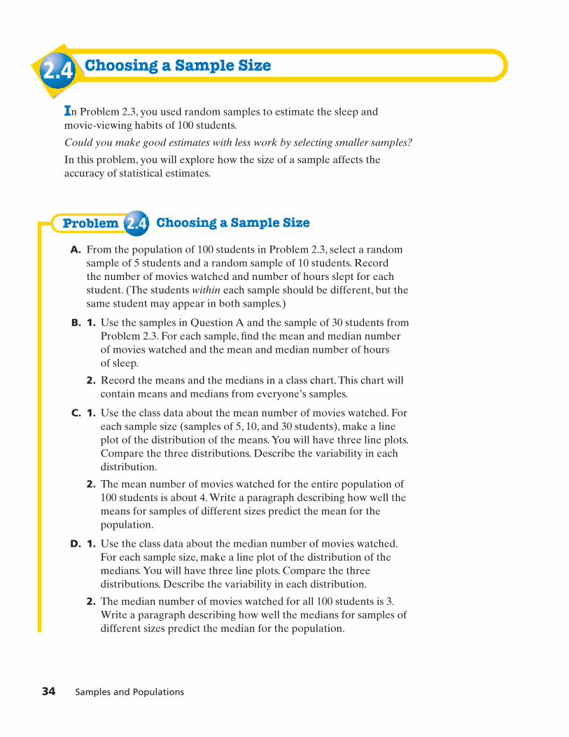
2.4 Choosing a Sample Size
In Problem 2.3, you used random samples to estimate the sleep and movie-viewing habits of 100 students.
Could you make good estimates with less work by selecting smaller samples?
In this problem, you will explore how the size of a sample affects theaccuracy of statistical estimates.
Choosing a Sample Size
A. From the population of 100 students in Problem 2.3, select a randomsample of 5 students and a random sample of 10 students. Record the number of movies watched and number of hours slept for eachstudent. (The students within each sample should be different, but thesame student may appear in both samples.)
B. 1. Use the samples in Question A and the sample of 30 students fromProblem 2.3. For each sample, find the mean and median number of movies watched and the mean and median number of hours of sleep.
2. Record the means and the medians in a class chart. This chart willcontain means and medians from everyone’s samples.
C. 1. Use the class data about the mean number of movies watched. Foreach sample size (samples of 5, 10, and 30 students), make a lineplot of the distribution of the means. You will have three line plots.Compare the three distributions. Describe the variability in eachdistribution.
2. The mean number of movies watched for the entire population of100 students is about 4. Write a paragraph describing how well themeans for samples of different sizes predict the mean for thepopulation.
D. 1. Use the class data about the median number of movies watched.For each sample size, make a line plot of the distribution of themedians. You will have three line plots. Compare the threedistributions. Describe the variability in each distribution.
2. The median number of movies watched for all 100 students is 3.Write a paragraph describing how well the medians for samples ofdifferent sizes predict the median for the population.
34 Samples and Populations
8cmp06se_SP2.qxd 6/8/06 8:45 AM Page 34

E. For the entire population, the mean number of hours slept is 7.7, andthe median is 10. Follow the procedures you used in Questions C andD to explore the distribution of means and medians for the samples ofdifferent sizes. Discuss how well samples of different sizes predict themean and median for the entire population.
F. Suppose each student in your class chose a sample of 50 students andfound the mean and median of the data for movies watched and hoursslept. What would you expect line plots of these means and medians tolook like? Explain.
Homework starts on page 36.
Investigation 2 Choosing a Sample From a Population 35
8cmp06se_SP2.qxd 6/8/06 8:45 AM Page 35

ApplicationsFor Exercises 1–4, describe the population and the sampling method.
1. A magazine for teenagers asks its readers to write in with informationabout how they solve personal problems.
2. An eighth-grade class wants to find out how much time middle schoolstudents spend on the telephone each day. Students in the class keep a record of the amount of time they spend on the phone each day for a week.
3. Ms. Darnell’s class wants to estimate the number of soft drinks middleschool students drink each day. They obtain a list of students in theschool and write each name on a card. They put the cards in a box andselect the names of 40 students to survey.
4. A survey found that 52% of American adults believe that globalwarming is a serious threat. The editors of the school paper want tofind out how students in their school feel about this issue. They select26 students for their survey—one whose name begins with A, onewhose name begins with B, one whose name begins with C, and so on.
A middle school has 350 students. One math class wants to find out howmany hours a typical student in the school spent doing homework last week.Several students suggest sampling plans. For Exercises 5–8, name the typeof sampling method and tell whether you think it would give a sample thatlets you make accurate predictions about the population.
5. Zak suggests surveying every third student on each homeroom classlist.
6. Kwang-Hee suggests putting 320 white beans and 30 red beans in abag. Each student would draw a bean as he or she enters theauditorium for tomorrow’s assembly. The 30 students who draw redbeans will be surveyed.
7. Ushio suggests that each student in the class survey everyone in his orher English class.
8. Kirby suggests putting surveys on a table at the entrance to the schooland asking students to return completed questionnaires at the end ofthe day.
36 Samples and Populations
8cmp06se_SP2.qxd 6/8/06 8:45 AM Page 36

9. A radio host asked her listeners to call in to express their opinionsabout a local election. What kind of sampling method is she using? Do you think the results of this survey could be used to describe theopinions of all the show’s listeners? Explain.
Manufacturers often conduct quality-control tests on samples of theirproducts. For Exercises 10–13, describe a random sampling plan you wouldrecommend to the company. Justify your recommendation.
10. A toy company produces 5,000 video-game systems each day.
11. A music company manufactures a total of 200,000 compact discs forabout 100 recording artists each day.
12. A fireworks company produces more than 1,500 rockets each day.
13. A bottling company produces 25,000 bottles of spring water each day.
14. a. In Problem 2.3, suppose that, instead of choosing random samplesof 30 students, you select the first 30 students for your sample, asecond student selects the next 30 students for his sample, and soon. Is this procedure likely to result in samples that allow you tomake accurate predictions about the population?
b. Suppose you select students 1, 5, 9, 13, 17, 21, 25, cfor yoursample. Is this sample likely to allow you to make accuratepredictions about the population?
Investigation 2 Choosing a Sample From a Population 37
For: Help with Exercise 14Web Code: ape-8214
8cmp06se_SP2.qxd 6/8/06 8:46 AM Page 37

15. a. The homecoming committee wants to estimate how many studentswill attend the homecoming dance. However, they don’t want to askevery student in the school. Describe a method the committee coulduse to select a sample of students to survey.
b. Describe how the committee could use the results of its survey topredict the number of students who will attend the dance.
For Exercises 16 and 17, use the graph below.
16. About how many more hours per day does a newborn sleep than atypical 10- to 13-year-old?
17. Suppose you want to survey a random sample of students in yourschool to find out how many hours they sleep each night. Which wouldbe the best sample size: 5 students, 10 students, or 30 students? Explain.
Connections18. Multiple Choice This stem-and-leaf plot shows Ella’s
diving scores from a recent competition. What was Ella’s lowest score for the competition?
A. 0.03 B. 1.4
C. 8.0 D. None of these
SOURCE: Science
Hours Kids Typically Sleep
Age
Slee
p p
er D
ay (
h)
0
2
4
6
8
10
12
14
16
18
1–15days
3–5mo.
6–23mo.
2–3yr
3–5yr
5–9yr
10–13yr
14–18yr
38 Samples and Populations
Key: 5 1 means 5.1
Ella’s Diving Scores
5678
1 4160 3
8cmp06se_SP2.qxd 6/8/06 8:46 AM Page 38

Investigation 2 Choosing a Sample From a Population 39
19. a. From age 5–18, the average student eats 1,500 peanut butter andjelly sandwiches. You can make about 15 sandwiches from an18-ounce jar of peanut butter. How many jars of peanut butterwould you need to make 1,500 sandwiches? Explain.
b. About how many jars of peanut butter does an average student eateach year from age 5 to age 18?
c. How many peanut butter sandwiches does a student need to eateach week to consume the number of jars per year from part (b)?
20. Multiple Choice Belissa is now 18 years old. An 18-ounce jar ofBelissa’s favorite peanut butter costs $2.29. She reasons that her momhas spent about $2,300 on peanut butter for her since she was 5 yearsold. Which best describes her estimate?
F. Less than the actual amount because she rounded the cost for a jarof peanut butter to the nearest dollar.
G. Less than the actual amount because she rounded the cost of a jarof peanut butter to the nearest tenth of a dollar.
H. More than the actual amount because she rounded the cost of a jarof peanut butter to the nearest dollar.
J. More than the actual amount because she rounded the cost of a jarof peanut butter to the nearest tenth of a dollar.
21. a. A geyser is a spring from which columns of boiling water and steam erupt. Using the graph, describe the overall relationship between the height of an eruption and the time since the previous eruption.
b. The data above were collected for one particular geyser. Whatadditional information would you need to decide whether therelationship in part (a) is true for most geysers?
450 475 500 525 550 650575 600 625 775 700
Time Since Previous Eruption (min)
Hei
gh
t o
f Er
up
tio
n (
ft)
170
160
190
200
210
180
150
Geyser Eruption Data
y
x
8cmp06se_SP2.qxd 6/8/06 8:46 AM Page 39

This plot shows the number of hours students at a middle school spentdoing homework one Monday. Use the plot for Exercises 22–24.
22. Find the median homework time for each grade.
23. a. For each grade, describe the variability in the distribution ofhomework times.
b. Use statistics to explain how the times for sixth-graders compare tothe times for eighth-graders.
24. Could these data be used to describe what is typical of all school nightsin each of the two grades? Explain.
25. Consider the following data set: 20, 22, 23, 23, 24, 24, and 25.
a. Find the mean and the range of the values.
b. Add three values to the data set so that the mean of the new dataset is greater than the mean of the original data set. What is therange of the new data set?
c. Add three values to the original data set so that the mean of thenew data set is less than the mean of the original data set. What isthe range of the new data set?
d. How do the ranges of the three data sets compare? Why do youthink this is so?
Grade 6
Key: 5 3 0 means 35minutes for Grade 6and 30 minutes forGrade 8
3
Grade 8
Minutes Spent on Homework
012345678
00 5 50 0 0 5 5 5 50 0 0 0 5 5 50 0 0 5 5 50 50 5 550
0 0 0 0 0 05 5 5 5 5 5
5 0 05 5 55 5 0
0 0
05
40 Samples and Populations
8cmp06se_SP2.qxd 6/8/06 8:46 AM Page 40

Investigation 2 Choosing a Sample From a Population 41
26. Multiple Choice You survey 30 students from a population of150 eighth-graders. Which statement is not correct?
F. The ratio of those sampled to those not sampled is 30 to 120.
G. One out of every five people in the population was sampled.
H. Twenty-five percent of the students in the population were sampled.
K. One fifth of the students in the population were sampled.
27. There are 350 students in a school. Ms. Cabral’s class surveys tworandom samples of students to find out how many went to camp lastsummer. Here are the results:
Sample 1: 8 of 25 attended camp
Sample 2: 7 of 28 attended camp
a. Based on the results from Sample 1, what fraction of the students in the school would you predict attended camp? How manystudents is this?
b. Based on the results from Sample 2, what fraction of the students inthe school would you predict attended camp? How many students isthis?
c. Which sample predicts that the greater fraction of studentsattended camp?
d. One of Ms. Cabral’s students says, “We were careful to choose oursamples randomly. Why did the two samples give us differentpredictions?” How would you answer the student’s question?
8cmp06se_SP2.qxd 6/8/06 8:46 AM Page 41

Annie’s teacher starts each class with the names of all his students in acontainer. He chooses students to present answers by pulling out names atrandom. Once a name is chosen, it is set aside. There are 12 girls and 6 boysin the class.
28. What is the probability Annie will be the first student chosen on Monday?
29. What is the probability Annie will be the first student chosen on Tuesday?
30. What is the probability Annie will be the first student chosen on both Monday and Tuesday?
31. What is the probability the first student chosen on a given day will be a girl?
32. Suppose Annie is chosen first. What is the probability that the nextstudent selected will be another girl?
33. Suppose the teacher plans to choose six students during one class.Would you be surprised if only two girls were chosen? Explain.
Alyssa wants to know what students think about replacing the candy in twovending machines in the cafeteria with more healthful snacks. There are300 sixth-graders, 300 seventh-graders, and 200 eighth-graders. Half of thestudents in each grade are girls. Alyssa obtains a list of student names,grouped by grade, with the girls listed first in each grade. Use thisinformation for Exercises 34 and 35.
34. Alyssa randomly chooses 3 different students from the list of800 students.
a. What are the chances the first choice is a girl? The second choice isa girl? The third choice is a girl?
b. What are the chances that Alyssa chooses three girls?
42 Samples and Populations
For: Multiple-Choice SkillsPractice
Web Code: apa-8254
8cmp06se_SP2.qxd 6/8/06 8:46 AM Page 42

Investigation 2 Choosing a Sample From a Population 43
35. Alyssa decides to choose one person from each grade at random.
a. What are the chances that her sixth-grade choice is a girl?
b. What are the chances that she chooses three girls?
Alyssa chooses one girl and one boy from each grade. She asks each,“Which would you prefer, a machine with healthful snacks or a machinewith candy?” Base your answers to Exercises 36–39 on her results below.
36. Predict how many sixth-grade students prefer a machine with healthfulsnacks.
37. Predict how many students in the whole school prefer a machine withhealthful snacks.
38. What is the probability that a student chosen at random from thewhole school is an eighth-grader who prefers machine with healthfulsnacks?
39. What advice would you give Alyssa’s principal about Alyssa’s data andthe two vending machines? Explain.
40. Alyssa’s principal polls all 800 students and finds that 600 prefer amachine with healthful snacks.
a. What is the probability that a randomly selected student prefers a machine with healthful snacks?
b. What is the probability that a randomly selected student is a girl who prefers a machine with healthful snacks?
c. What is the probability that a randomly selected student is a boy who prefers a machine with healthful snacks?
d. What advice would you give the principal about the data collected and the vending machines?
Girl
Boy
Grade 6
healthful snack
candy
Grade 7
healthful snack
candy
Grade 8
healthful snack
healthful snack
Vending Machine Survey Results
8cmp06se_SP2.qxd 6/8/06 8:46 AM Page 43

Extensions41. Television stations, radio stations, and newspapers often use polls to
predict the winners of elections long before the votes are cast. Whatfactors might cause a pre-election poll to be inaccurate?
42. Political parties often conduct their own pre-election polls to find outwhat voters think about their campaign and their candidates. Howmight a political party bias such a poll?
43. Find out how a local television station, radio station, or newspapertakes pre-election polls. Do you think the method they use is sensible?
44. a. Polls conducted prior to presidential elections commonly usesamples of about 1,000 eligible voters. There are at most 203 millioneligible voters in the United States. About what percent of eligiblevoters are in a sample of 1,000?
b. How do you think this small sample is chosen so that the results willpredict the winner with reasonable accuracy?
45. Use the table on the next page for parts (a)–(f).
a. Pick your favorite M&M’s® color. From the table, select randomsamples of 5, 10, and 30 bags.
b. For each bag in a sample, calculate the percent of your favoritecolor.
c. For each sample size, make a line plot to display the distribution ofthe percent of your favorite color.
d. Estimate the percent of your favorite color in all 100 bags.
e. Predict the company’s fixed percent of each color. Explain yourreasoning.
44 Samples and Populations
8cmp06se_SP2.qxd 6/8/06 8:46 AM Page 44

Investigation 2 Choosing a Sample From a Population 45
Bag123456789
1011121314151617181920212223242526272829303132333435363738394041424344454647484950
Gre
en
3574
1210118256599533658
10736
104651
10466
1258258
10736
105666
104
Ora
nge
94928665444445554538736914666862866423873691297428
Blue
56417563414245223542753327775044442464275332453566
Red
18111219138
1210121318161114141114221416141210171716137
149
121411111617211916141210171711139
109
15
Brow
n
10191614141512162426152314141319231521208
2025101514151722261819201112161121208
20231015221416231910
Total5557585661555857575660585557585557605461575755565757565358575858565551585459615757505657575757585355
Yello
w
Gre
en
Ora
nge
Blue
Red
Brow
n
Yello
w
Bag Total1012101479
1115117
138
1310191510777
11108
1112129
11104
14187
11109
1277
11108
1112131016107
12
51525354555657585960616263646566676869707172737475767778798081828384858687888990919293949596979899
100
946
111677666
1049
104666963574153
10569784457947579
12954
116
6438767867428853478789492
10464772942677486823936956
668
12343
10735666428164256411931176051347244361235336
101312
81011211315
910
9151516151014161014181112191411101013
516201015121310181011121112
5121310
94
1717139
2219101512162319108
122110191015191019161622112423211413131324212013121618202628181717211716
5757545659575555565758535558535653555456585557585656575757575357565057585755565758565559585558585754
913128
161172
1016107
12126
111588
119
101210148
15119
1014117
1011128
11111511836
111112111216
Data From 100 Bags of Plain M&M’s® Candies (pre-March 2004)
8cmp06se_SP2.qxd 6/8/06 8:46 AM Page 45

�
In this investigation, you learned about sampling techniques. You alsomade predictions about a population by examining data from randomsamples. The following questions will help you summarize what you havelearned.
Think about your answers to these questions. Discuss your ideas with otherstudents and your teacher. Then write a summary of your findings in yournotebook.
1. Why are data often collected from a sample rather than from an entirepopulation?
2. Describe several methods for selecting a sample from a population.Discuss the advantages and disadvantages of each method.
3. a. How are random samples different from convenience,self-selected, and systematic samples?
b. Why is random sampling preferable to convenience, self-selected,or systematic sampling?
4. Describe three methods for selecting a random sample from a givenpopulation. What are the advantages and disadvantages of eachmethod?
5. Suppose several random samples were selected from the samepopulation. What similarities and differences would you expect to findin the medians, means, and ranges of the samples?
46 Samples and Populations
8cmp06se_SP2.qxd 6/8/06 8:46 AM Page 46

3.1
�
Solving Real-World ProblemsIn this investigation, you will apply what you have learned about statisticsto solve two real-world problems.
Solving an Archeological Mystery
Archeologists study past civilizations by excavating ancient settlementsand examining the artifacts of the people who lived there.
On digs in southeastern Montana and north-central Wyoming,archeologists discovered the remains of two Native American settlements. They unearthed a number of arrowheads at both sites.
Investigation 3 Solving Real-World Problems 47
8cmp06se_SP3.qxd 6/8/06 8:49 AM Page 47

48 Samples and Populations
The tables below give the length, width, and neckwidth for each arrowhead the archeologists found.All measurements are in millimeters.
The archeologists hoped to use the arrowhead data to estimate the time period during which each site was inhabited.
To help them with their work, the archeologists used arrowhead data fromfour other settlement sites. These data are given on the next page.
The archeologists knew the following:
• The Big Goose Creek and Wortham Shelter sites were settled between A.D. 500 and 1600.
• The Laddie Creek/Dead Indian Creek and Kobold/Buffalo Creek sites were settled between 4000 B.C. and A.D. 500.
How could you use these data to help you estimate the settlement periods forthe new sites?
SOURCE: Plains Anthropologist
Length(mm)
24
27
29
29
31
31
37
38
38
40
45
45
55
62
63
Width(mm)
19
19
19
22
16
32
23
22
26
25
22
28
22
26
29
NeckWidth(mm)
8
10
11
12
12
16
11
12
14
16
11
15
13
14
18
Site I: 15 Arrowheads
Length(mm)
13
15
16
16
17
18
19
19
20
20
21
22
22
22
22
23
23
24
24
Width(mm)
10
11
12
13
15
12
12
13
12
12
11
13
13
13
14
14
15
11
12
6
7
8
7
9
10
8
9
7
9
7
9
9
8
10
9
9
8
7
Length(mm)
24
24
24
24
24
25
25
25
25
26
26
26
27
28
28
32
42
43
Width(mm)
13
13
14
15
15
13
13
15
24
14
14
15
14
11
13
12
16
14
NeckWidth(mm)
8
8
10
9
8
7
7
10
7
10
11
11
8
6
9
8
11
9
Site II: 37 Arrowheads
NeckWidth(mm)
neckwidth
width
length
8cmp06se_SP3.qxd 6/8/06 8:49 AM Page 48

Investigation 3 Solving Real-World Problems 49
SOURCE: Plains Anthropologist
Length(mm)
16161717181818181819202021212122222223232324242525252626262627272727272828282930303030303031333334353940
Width(mm)
13141313121213131511111211121212131313131414141313141112141613131414171013151511131414141512131515141814
NeckWidth(mm)
9108
107878
1186877998
108999
117888
129
109999
13579878889
118799
10128
Big Goose Creek:52 Arrowheads
Length(mm)
25303031313232323535373738383940404040414242444444454546464647474749505050515252525456565657616466677180
Width(mm)
18171916172022231922182118242119202021212222202025202217202319202220212323181722242419212522192120212425
NeckWidth(mm)
151215131213171811141211
9151415121312131415111214131313141413121314131516101215161312151315121315131311
Kobold/Buffalo Creek:52 Arrowheads
Length(mm)
181919191920202022222323232424252525252526262627272728282829292929303030313131313132323542
Width(mm)
111214141613141512141314151213141415151513131514141513141613141417141617131414161714151818
NeckWidth(mm)
89
1010148
101198
1111119
108
101010129
10128
10111110121099
12119
1410101112127
10147
Wortham Shelter:45 Arrowheads
Length(mm)
252727292930313232353738394041424452
Width(mm)
182020142023181619201717181815221821
NeckWidth(mm)
131314111313111010151314151111121316
Laddie Creek/Dead Indian Creek:
18 Arrowheads
8cmp06se_SP3.qxd 6/8/06 8:49 AM Page 49

Problem 3.1 Comparing and Analyzing Data
The archeologists hypothesized that Native Americans inhabiting the same area of the country during the same time period would havefashioned similar tools.
A. Use box plots to compare the lengths of the arrowheads discovered at the new sites with the lengths of those from the known sites.
1. Based on your comparisons, during which time period (4000 B.C.to A.D. 500, or A.D. 500 to 1600) do you think Site I was settled?Explain how your statistics and graphs support your answers.
2. During which time period do you think Site II was settled? Explain how your statistics and graphs support your answers.
B. Use box plots to compare the widths of the arrowheads discovered at the new sites with the widths of those from the known sites. Do your findings support your answers from Question A? Explain.
C. Suppose the archeologists had collected only a few arrowheads fromeach new site. Might they have reached a different conclusion?Explain.
Homework starts on page 54.
50 Samples and Populations
8cmp06se_SP3.qxd 6/8/06 8:49 AM Page 50
3.2
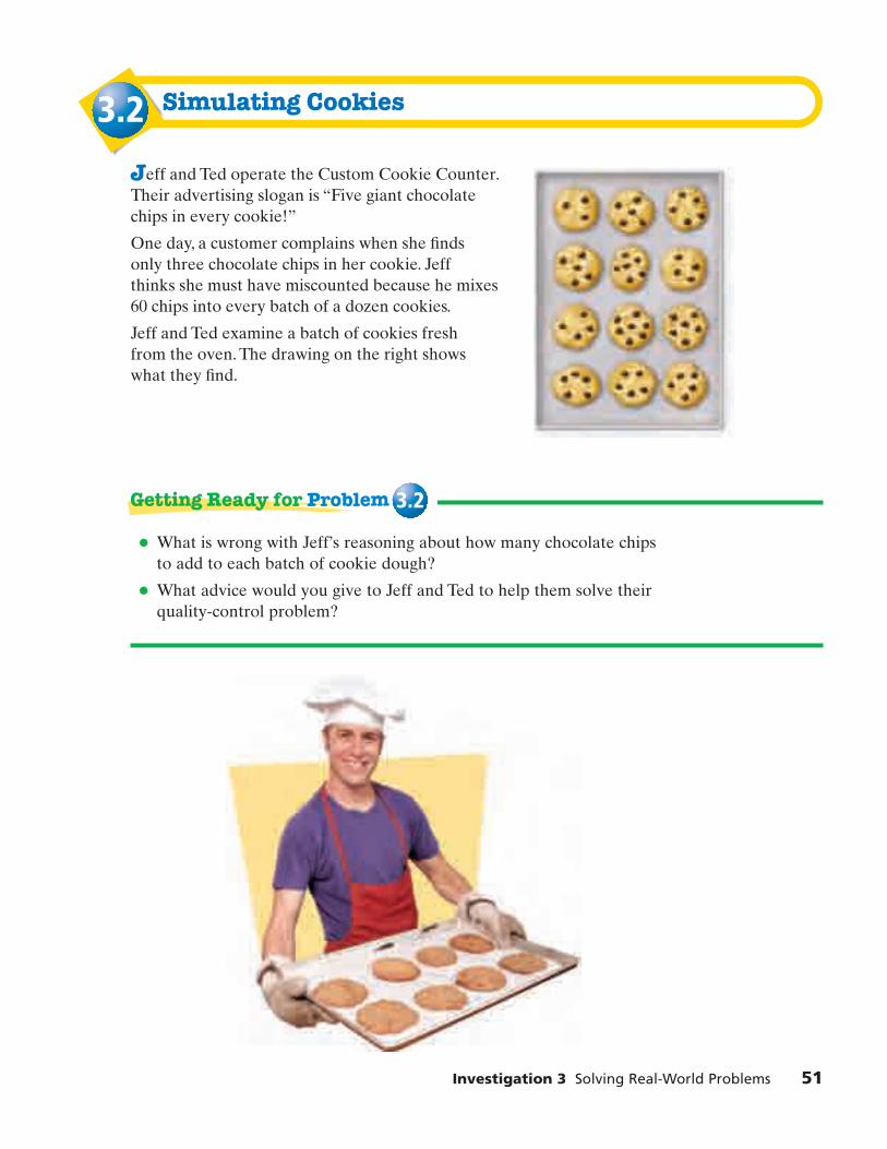
Investigation 3 Solving Real-World Problems 51
Simulating Cookies
Jeff and Ted operate the Custom Cookie Counter.Their advertising slogan is “Five giant chocolate chips in every cookie!”
One day, a customer complains when she finds only three chocolate chips in her cookie. Jeff thinks she must have miscounted because he mixes 60 chips into every batch of a dozen cookies.
Jeff and Ted examine a batch of cookies fresh from the oven. The drawing on the right shows what they find.
• What is wrong with Jeff’s reasoning about how many chocolate chips to add to each batch of cookie dough?
• What advice would you give to Jeff and Ted to help them solve their quality-control problem?
Getting Ready for Problem 3.2
8cmp06se_SP3.qxd 6/8/06 8:49 AM Page 51

Ted wants to figure out how many chocolate chips they should add to each batch of dough to be fairly confident each cookie will have five chips.He comes up with an idea that involves random sampling. He explains his idea to Jeff.
“Think of a batch of dough as 12 cookies packed in a bowl. As we add chips to the dough, each chip lands in one of the cookies. There is an equally likely chance that a chip will land in any 1 of the 12 cookies.”
“We can simulate adding the chips by generating random integers from 1 to 12. A 1 means a chip is added to cookie 1, a 2 means a chip is added to cookie 2, and so on.
“We can keep a tally of where the ‘chips’ land and stop when each ‘cookie’ contains at least five chips. The total number will be an estimate of the number of chips we need to add to each batch.”
Jeff says, “If we only do this once, we might need only 60 chips. If we do it again, we might need 90. Some cookies might be loaded with chips before every cookie gets five chips. We need to repeat the experimentenough times to find a typical result.”
=
52 Samples and Populations
8cmp06se_SP3.qxd 6/8/06 8:49 AM Page 52

Problem 3.2 Using a Simulation to Make a Decision
A. 1. Conduct the simulation Ted describes.Use a chart like the one at the right.
2. Find the total number of chips in theentire batch.
B. 1. Make a histogram of the total numberof chips from each student in your class.
2. Describe what your histogram shows about the distribution of the results.
3. Make a box plot of the total number of chips from each student in your class.
4. Describe what your box plot shows about the distribution of the results.
C. Jeff and Ted want to be sure that most of thetime there will be at least five chips in eachcookie. However, they don’t want to wastemoney by mixing in too many chips. Based onyour class data and the two representations youmade, how many chips would you advise them to use in each batch? Explain.
D. 1. As a class, discuss students’ recommendationsfrom Question C. Choose a number the whole class can agree on.
2. Conduct 30 simulations to randomly distribute the recommended number of chipsamong the 12 cookies. For each simulation,record whether each cookie has at least fivechips. Organize your information in a table like the one at the right.
3. What percent of the time did your simulation give at least five chips per cookie?
4. Using the distribution of your simulation results, make a finalrecommendation to Jeff and Ted about how many chips to put ineach batch. Justify your choice.
5. Suggest what Jeff and Ted might say to promote their cookies in a more accurate way.
Homework starts on page 54.
Investigation 3 Solving Real-World Problems 53
Cookie Number
1
2
3
4
5
6
7
8
9
10
11
12
Number of Chipsper Cookie
SimulationTrial Number
Did Each Cookie Haveat Least Five Chips?
1
2
3
4
30
…
8cmp06se_SP3.qxd 6/8/06 8:49 AM Page 53

Applications1. a. Refer to the arrowhead tables from Problem 3.1. These data
include the neck width of each arrowhead. Calculate thefive-number summaries of the neck-width data for all six sites (the two new sites and the four known sites).
b. On the same scale, make a box plot of the neck-width data for each site.
c. Based on your results from parts (a) and (b), during which timeperiods do you think Sites I and II were settled? Explain.
2. a. A baker makes raisin muffins in batches of four dozen. She pours a box of raisins into each batch. How could you use a sample from a batch of muffins to estimate the number of raisins in a box?
b. There are 1,000 raisins in a box. How many raisins would youexpect to find in a typical muffin? Explain.
3. Keisha opens a bag containing60 chocolate chip cookies. She selects a sample of 20 cookies and counts the chips in each one. She records her data in the table shown.
Estimate the number of chocolate chips in the bag. Explain.
Cookie
1
2
3
4
5
6
7
8
9
10
6
8
8
11
7
6
6
7
11
7
Chips Cookie
11
12
13
14
15
16
17
18
19
20
8
7
9
9
8
6
8
10
10
8
Chips
neck width
54 Samples and Populations
8cmp06se_SP3.qxd 6/8/06 8:49 AM Page 54

Investigation 3 Solving Real-World Problems 55
4. Use Keisha’s data from Exercise 3. Copy and complete each statement
with the most appropriate fraction: or
More than 9 of the cookies have at least 8 chips.
More than 9 of the cookies have at least 9 chips.
More than 9 of the cookies have at least 10 chips.
5. Yung-nan wants to estimate the number of beans in a large jar. Shetakes out 150 beans, marks each with a red dot, returns them to the jar,and mixes them with the unmarked beans. She then takes four samplesfrom the jar.
a. Which sample has the greatest percent of beans that aremarked with red dots? Use this sample to predict the numberof beans in the jar.
b. The shaded bars below are a visual way to think about making aprediction from Sample 3. Explain what the bars show and howthey can be used to estimate the number of beans in the whole jar.
c. Which sample has the least percent of beans that are marked withred dots? Use this sample to predict the number of beans in the jar.
d. What is your best guess for the total number of beans in the jar?
Sample 3Beans in sample: 75
Whole Jar Beans in entire jar: ?
150, or 20%marked
15, or 20%marked
Sample
1
2
3
4
Total Beans
25
150
75
250
Beans WithRed Dots
3
23
15
25
Bean Samples
12 .1
6 ,14 ,
8cmp06se_SP3.qxd 6/8/06 8:49 AM Page 55

6. After testing many samples, an electric company determines thatapproximately 2 of every 1,000 light bulbs on the market are defective. Suppose Americans buy over a billion light bulbs every year. Estimate how many of these bulbs are defective.
7. Multiple Choice After testing many samples, a milk shipperdetermines that approximately 3 in every 100 cartons of milk leak. The company ships 200,000 cartons of milk every week.About how many of these cartons leak?
A. 3 B. 600 C. 2,000 D. 6,000
Connections8. Multiple Choice The circle graph shows data for 1,585 students.
Which is the best approximation of the number of studentsrepresented by the pink sector?
F. 40 G. 160 H. 590 J. 58,650
To monitor driving speeds, states set up radar checkpoints to measure the speeds of samples of drivers. Use this information for Exercises 9 and 10.
9. Suppose you want to show that drivers in your state generally obey speed limits. Where and when would you set up radarcheckpoints?
10. Suppose you want to show that drivers in your state often exceed speed limits. Where and when would you set up radar checkpoints?
37°
56 Samples and Populations
For: Multiple-Choice SkillsPractice
Web Code: apa-8354
8cmp06se_SP3.qxd 6/8/06 8:49 AM Page 56

Investigation 3 Solving Real-World Problems 57
11. Sometimes graphs can be misleading. The graphs below all display the same data about the percent of newspapers recycled from 1993 to 2004.
a. Which graph do you think gives the clearest picture of the data pattern? Why?
b. Why are the other graphs misleading?
SOURCE: American Forest & Paper Association
1993 1995 1997 1999 2001 2003
70%
60%
90%
100%
80%
50%
Graph W
1993 1995 1997 1999 2001 2003
40%
20%
80%
100%
60%
0%
Graph X
1993 1995 1997 1999 2001 2003
60%
55%
70%
75%
65%
50%
Graph Y
1993 1995 1997 1999 2001 2003
50%
40%
70%
80%
60%
30%
Graph Z
Number of Recycled Newspapers 1993–2004
For: Help with Exercise 11Web Code: ape-8311
8cmp06se_SP3.qxd 6/8/06 8:49 AM Page 57

For Exercises 12–16, use these and other questions to analyze each survey.
• What is the goal of the survey?
• What is the population being studied?
• How is the sample chosen?
• How is the data analyzed and reported?
• Does the analysis support the conclusions?
12. In designing a remote control, representatives for a televisionmanufacturer call 1,000 households with television sets. They find that remote-control users sit an average of 3 meters from theirtelevision sets. Based on this finding, the manufacturer designs theremote control to work well at distances of 2.5 meters to 3.5 metersfrom a television set.
13. A lightbulb manufacturer wants to know the “defect rate” for itsproduct. One morning, the manager takes 10 boxes of 50 lightbulbsfrom the assembly line and tests them. All but five bulbs work. Themanager concludes that production quality is acceptable.
14. A nutritionist wants to know what percent of Calories in a typicalUnited States teenager’s diet are from fat. She asks health teachers in Dallas, Texas, to have their students keep logs of what they eat onone school day. The nutritionist analyzes the logs and finds that the median intake was 500 fat Calories per day, which is therecommended daily allowance. She concludes that Calories from fatare not a problem in the diets of teenagers.
58 Samples and Populations
8cmp06se_SP3.qxd 6/8/06 8:49 AM Page 58

Investigation 3 Solving Real-World Problems 59
15. A cookie maker claims that there are over 1,000 chocolate chips in abag of its cookies. A skeptical consumer calls the company and askshow they know this. A spokesperson says they chose a sample of bagsof cookies, soaked each bag in cold water to remove all the dough, andweighed the chips that remained. In each case, the chips weighed morethan a bag of 1,000 chocolate chips.
16. In the cafeteria line, Sam wrinkles his nose when he sees salami subs.When the cook asks what he would prefer, Sam replies, “I like bolognabetter.” The cook surveys the next ten students. Seven students saythey prefer bologna to salami. The cook decides to serve bologna subsinstead of salami subs in the future.
For Exercises 17–21, use the box plot below. Tell whether each statement istrue. Explain.
17. The class median is less than 80.
18. Half the class scored between 60 and 80.
19. At least one student earned a score of 100.
20. The class mean is probably less than the median.
21. If there are 30 students in the class, at least 10 scored above 80.
80 1000 20 40 60
Social Studies Test Scores
8cmp06se_SP3.qxd 6/8/06 8:49 AM Page 59

Color
white
yellow
red
orange
green
blue
Percent
15%
10%
15%
20%
15%
25%
Percent of Pushpinsof Each Color
Extensions22. A company produces pushpins in the
percents shown in the table. The school secretary opens a large bag of pushpins. She puts the pins into small boxes to distribute to teachers. She puts 50 pins in each box.
a. How many pushpins of each color do you expect to be in a box?
b. How do you expect the number of pushpins of each color to vary across the samples?
c. You can simulate filling the boxes by generating random integers from 1 to 20.Which numbers would you let represent each color? How many random numbers do you need to generate to simulate filling one box?
d. Carry out the simulation described in part (c) three times. Compare the distributions of colors in your simulated samples with the expected distribution from part (a).
e. Suppose the secretary selects a random sample of 1,000 pushpins from the bag. How closely would you expect the percent of each color in her sample to match the percent in the table?
23. You can use a simulation to help you answer this question:
If you select five students at random from your class, what is theprobability that at least two will have the same birth month?
a. Design a simulation to model this situation. Tell which month eachsimulation outcome represents.
b. Use your birth-month simulation to produce at least 25 samples of five people. Use your results to estimate the probability that atleast two people in a group of five will have the same birth month.
c. Explain how you could revise your simulation to explore thisquestion:
What are the chances that at least two students in a class of 25 havethe same birthday (month and day, but not year)?
60 Samples and Populations
8cmp06se_SP3.qxd 6/8/06 8:50 AM Page 60

�
In this investigation, you applied your knowledge of statistics and datadisplays to solve real-world problems. These questions will help yousummarize what you have learned.
Think about your answers to these questions. Discuss your ideas with other students and your teacher. Then write a summary of your findings inyour notebook.
1. How can you use statistics to
a. compare samples?
b. draw conclusions about the population from which each sample was selected?
2. In what ways can you expect the distribution of data values for asample to be similar to and different from the distribution of datavalues for the entire population from which samples were selected?
Investigation 3 Solving Real-World Problems 61
8cmp06se_SP3.qxd 6/8/06 8:50 AM Page 61
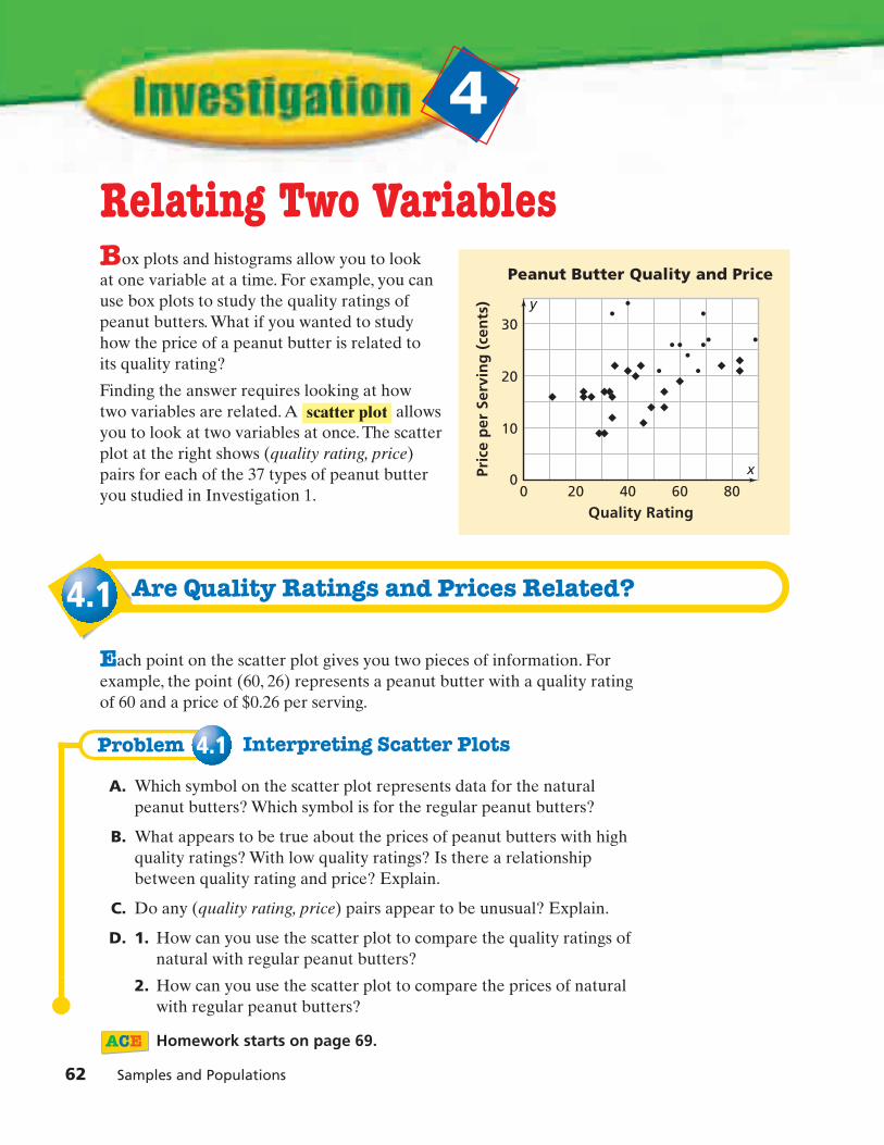
�
62 Samples and Populations
4.1
Problem 4.1
Relating Two VariablesBox plots and histograms allow you to look at one variable at a time. For example, you canuse box plots to study the quality ratings ofpeanut butters. What if you wanted to study how the price of a peanut butter is related to its quality rating?
Finding the answer requires looking at how two variables are related. A allows you to look at two variables at once. The scatter plot at the right shows (quality rating, price) pairs for each of the 37 types of peanut butter you studied in Investigation 1.
Are Quality Ratings and Prices Related?
Each point on the scatter plot gives you two pieces of information. Forexample, the point (60, 26) represents a peanut butter with a quality ratingof 60 and a price of $0.26 per serving.
Interpreting Scatter Plots
A. Which symbol on the scatter plot represents data for the naturalpeanut butters? Which symbol is for the regular peanut butters?
B. What appears to be true about the prices of peanut butters with highquality ratings? With low quality ratings? Is there a relationshipbetween quality rating and price? Explain.
C. Do any (quality rating, price) pairs appear to be unusual? Explain.
D. 1. How can you use the scatter plot to compare the quality ratings ofnatural with regular peanut butters?
2. How can you use the scatter plot to compare the prices of naturalwith regular peanut butters?
Homework starts on page 69.
scatter plot
0 20 40 60 80
Quality Rating
Pric
e p
er S
ervi
ng
(ce
nts
)
10
20
30
0
Peanut Butter Quality and Price
y
x
8cmp06se_SP4.qxd 6/8/06 8:55 AM Page 62

130 140 150 160 170 180
Height (cm)
Arm
Sp
an (
cm)
150
140
170
180
160
130
Height and Arm Span
y
x
Investigation 4 Relating Two Variables 63
4.2
Problem 4.2
Writing an Equation to Describe a Relationship
In Data About Us, a group of 54 sixth-grade students measured their armspans and their heights. Their data are shown in the scatter plot.
If you know someone’s height, what can you say about his or her arm span?
Find a line to model the trend in the data.
• Where does your line cross the y-axis?
• What is the y-coordinate of the point on the line with an x-coordinateof 190?
• What is the x-coordinate of the point with a y-coordinate of 175?
Writing an Equation to Describe a Relationship
A. Consider a line through (130, 130) and (190, 190).
1. How might you use this line to describe the relationship betweenheight and arm span?
2. Write an equation for this line using h for height and a for armspan.
3. What is true about the relationship between height and arm spanfor the points on the line? For the points above the line? For thepoints below the line?
Getting Ready for Problem 4.2
8cmp06se_SP4.qxd 6/8/06 8:55 AM Page 63

B. 1. Make a scatter plot of the (body length, wingspan) data from thetable.
2. Does your equation relating height and arm span from Question A also describe the relationship between body length andwingspan for airplanes? Explain.
3. Predict the wingspan of an airplane with a body length of 40 meters.
4. Predict the body length of an airplane with a wingspan of 60 meters.
SOURCE: Airport Airplanes
Plane
Boeing 707
Boeing 747
Ilyushin IL-86
McDonnell Douglas DC-8
Antonov An-124
British Aerospace 146
Lockheed C-5 Galaxy
Antonov An-225
Airbus A300
Airbus A310
Airbus A320
Boeing 737
Boeing 757
Boeing 767
Lockheed Tristar L-1011
McDonnell Douglas DC-10
Aero/Boeing Spacelines Guppy
Douglas DC-4 C-54 Skymaster
Douglas DC-6
Lockheed L-188 Electra
Vickers Viscount
Antonov An-12
de Havilland DHC Dash-7
Lockheed C-130 Hercules/L-100
British Aerospace 748/ATP
Convair 240
Curtiss C-46 Commando
Douglas DC-3
Grumman Gulfstream I/I-C
Ilyushin IL-14
Martin 4-0-4
Saab 340
Engine Type
jet
jet
jet
jet
jet
jet
jet
jet
jet
jet
jet
jet
jet
jet
jet
jet
propeller
propeller
propeller
propeller
propeller
propeller
propeller
propeller
propeller
propeller
propeller
propeller
propeller
propeller
propeller
propeller
Body Length (m)
46.6
70.7
59.5
57.1
69.1
28.6
75.5
84.0
54.1
46.0
37.5
33.4
47.3
48.5
54.2
55.5
43.8
28.6
32.2
31.8
26.1
33.1
24.5
34.4
26.0
24.1
23.3
19.7
19.4
22.3
22.8
19.7
Wingspan (m)
44.4
59.6
48.1
45.2
73.3
26.3
67.9
88.4
44.9
43.9
33.9
28.9
38.1
47.6
47.3
50.4
47.6
35.8
35.8
30.2
28.6
38.0
28.4
40.4
30.6
32.1
32.9
29.0
23.9
31.7
28.4
21.4
Airplane Comparisons
64 Samples and Populations
8cmp06se_SP4.qxd 6/8/06 8:55 AM Page 64

C. 1. Use the scatter plot below. Does your equation relating height andarm span from Question A also describe the relationship betweenbody length and wingspan for birds? Explain.
2. Find a line that fits the overall pattern of points. What is theequation of your line?
3. Predict the wingspan for a bird whose body length is 60 inches.Explain.
Homework starts on page 69.
0 20 40 60 80 100
Body Length (in.)
Win
gsp
an (
in.)
40
20
80
100
120
60
0
Bird Body Lengthand Wingspan
y
x
Investigation 4 Relating Two Variables 65
8cmp06se_SP4.qxd 6/8/06 8:55 AM Page 65

66 Samples and Populations
4.3
Problem 4.3
Human Development Index and Life Expectancies
The Human Development Index (HDI) is a number used to report how well a country is doing in overall human development. The HDImeasures the average achievement in three basic dimensions of humandevelopment—a long and healthy life, access to education, and a decentstandard of living.
Countries with an HDI of over 0.800 are part of the high humandevelopment group. Countries from 0.500 to 0.800 are part of the mediumgroup. Countries below 0.500 are part of the low group.
Analyzing a Relationship
A. 1. Describe the variability in the data in the histogram.
2. Estimate the percent of the countries with life expectancies of60 years or greater.
2003 Life Expectancyfor 177 Countries
Perc
ent
of
Co
un
trie
s
10%
0%
20%
30%
40%
50%
30 40 50 60 70 80 90
Life Expectancy at Birth (yr)
8cmp06se_SP4.qxd 6/8/06 8:55 AM Page 66

3. Use the box plots. Describe how the life expectancies of thecountries with upper and medium HDIs compare with the lifeexpectancies of countries with low HDIs.
4. The medium HDI group has outliers. Using the table, identify whichcountries are the outliers. Explain.
SOURCE: United Nations Development Programme
Country
Lao People’s Dem. Rep.
Botswana
Zimbabwe
South Africa
Equatorial Guinea
India
Namibia
Uganda
Life Expectancyat Birth (yr)
54.7
36.3
36.9
48.4
43.3
63.3
48.3
47.3
HDI
0.545
0.565
0.505
0.658
0.655
0.602
0.627
0.508
2003 Life Expectancy and HDI
Upper HDI
Low HDI
Medium HDI *****
10 20 30 40 50 60 700 80 90
Life Expectancy at Birth (yr)
2003 Life Expectancy andHDI for 177 Countries
Investigation 4 Relating Two Variables 67
8cmp06se_SP4.qxd 6/8/06 8:55 AM Page 67

B. Use a straightedge to locate the line y = 0.01325x - 0.166 on thescatter plot shown below. Hint: Use the equation to find two points,(0, y1) and (80, y2), on the line.
1. How well does this line model the relationship between lifeexpectancy and HDI?
2. Use this line to estimate the HDI for x = 90 years.
3. Describe how you can use this line to estimate HDI when you knowlife expectancy.
Homework starts on page 69.
SOURCE: United Nations Development Programme
0 20 40 60 70 80 9010 30 50
Life Expectancy (yr)
HD
I
0.00
0.20
0.40
0.80
1.00
0.60
�0.20
2003 Life Expectancy andHDI for 177 Countries
y
x
68 Samples and Populations
8cmp06se_SP4.qxd 6/8/06 8:55 AM Page 68

Applications1. a. Compare the values in the peanut butter comparison table in
Problem 1.1 to the points on the scatter plot. Why are some pointslocated on or very near the horizontal axis?
b. Give the approximate coordinates of each labeled point. Explainwhat the coordinates tell you about the peanut butter representedby the point.
c. Jeff says, “Most peanut butters, no matter what their quality rating,have between 160 and 240 milligrams of sodium per serving.” Doyou agree or disagree? Explain.
Nutrition Facts Serving Size 2 Tbsp (32g) Servings Per Container about 15
Amount Per Serving
Calories 190 Calories from Fat 140
% Daily Value*
Total Fat 17g 26%
Saturated Fat 3.5g 18%
Cholesterol 0 mg 0%
Sodium 150mg 6%
% Daily Value*
Total Carbohydrate 7g 2%
Dietary Fiber 2g 8%
Sugars 3g
Protein 7g
Vitamin A 0% • Vitamin C 0%
Calcium 0% • Iron 2% Niacin
20% Vitamin E 10%
*Percent Daily Values are based on a 2,000 calorie diet.
0 20 40
A
B
C
D
E 60 80
Quality Rating
Sod
ium
per
Ser
vin
g (
mg
)
60
120
180
240
0
Peanut Butter Quality and Sodium Content
y
x
Investigation 4 Relating Two Variables 69
8cmp06se_SP4.qxd 6/8/06 8:55 AM Page 69

2. a. Plot the (height, arm span) data from the table below.
b. Draw the line y = x on your scatter plot.
c. Explain how this line can be used to describe the relationshipbetween height and arm span.
d. Plot the (height, foot length) data.
e. Experiment with different lines to see if you can find one that fitsthe data. You might try y = or y = . Give the equation of aline that “fits” the data.
13 y1
2 x
Gender
F
M
F
F
F
F
M
F
M
M
F
M
M
F
Height (cm)
160
111
160
152
146
157
136
143
147
133
153
148
125
150
Arm Span (cm)
158
113
160
155
144
156
135
142
145
133
151
149
123
149
Foot Length (cm)
25
15
23
23.5
24
24
21
23
20
20
25
23
20
20
Student Measurement Data
70 Samples and Populations
For: Help with Exercise 2Web Code: ape-8402
8cmp06se_SP4.qxd 6/8/06 8:55 AM Page 70

Investigation 4 Relating Two Variables 71
3. This scatter plot shows (length, width) data for the arrowheads foundat Kobold/Buffalo Creek (see Problem 3.1).
a. Estimate the range of the lengths.
b. Estimate the range of the widths.
c. Shannon drew the line y = 20. Do you think it gives a good estimate of the relationship between length and width? Explain.
d. Suppose you know the width of an arrowhead from the site that is not on the scatter plot. Can you predict its length? Explain.
0 10 20 30 405 15 25 35 5045 6055 7065 8075 85
Length of Arrow (mm)
Wid
th o
f A
rro
w (
mm
)
5
10
15
20
75
25
0
Kobold/Buffalo Creek Arrowheads
y
x
For: Multiple-Choice SkillsPractice
Web Code: apa-8454
8cmp06se_SP4.qxd 6/8/06 8:55 AM Page 71

ConnectionsFor Exercises 4–6, use the graph below. There are two sections to the graph:
• The top section shows information about the world and aboutdeveloping and least developed countries.
• The bottom section shows different continents.
4. Write three comparison statements about the data.
5. Fill in the missing information to make a true statement.
With the exception of 9 and 9, at least 50% of the population ofeach region has access to adequate sanitation.
6. Multiple Choice Tell which fraction completes this statement:
In 9 of the regions, less than 75% of the population has access to safe water.
A. B. C. D. 45
35
25
15
72 Samples and Populations
Least DevelopedCountries
Developing Countries
Middle East andNorth Africa
South Asia
Latin America andthe Caribbean
East Asia andthe Pacific
10% 20% 30% 40% 50% 60% 70% 80% 90% 100%
SOURCE: United Nations Development Programme
0%
Access to Safe Water andAdequate Sanitation—2002
Sub-Saharan Africa
World
Percent
Safe Water
Adequate Sanitation
8cmp06se_SP4.qxd 6/8/06 8:55 AM Page 72
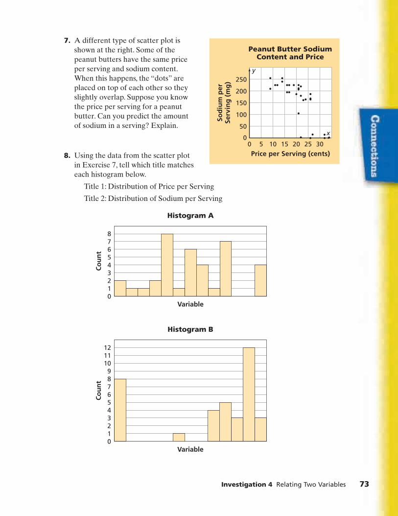
Investigation 4 Relating Two Variables 73
7. A different type of scatter plot is shown at the right. Some of the peanut butters have the same priceper serving and sodium content.When this happens, the “dots” are placed on top of each other so theyslightly overlap. Suppose you know the price per serving for a peanut butter. Can you predict the amount of sodium in a serving? Explain.
8. Using the data from the scatter plot in Exercise 7, tell which title matcheseach histogram below.
Title 1: Distribution of Price per Serving
Title 2: Distribution of Sodium per Serving
0123456789
101112
Histogram B
Co
un
t
Variable
012345678
Histogram A
Co
un
t
Variable
0 10 155 20 25 30
Price per Serving (cents)
Sod
ium
per
Serv
ing
(m
g)
50
100
150
250
200
0
Peanut Butter SodiumContent and Price
y
x
8cmp06se_SP4.qxd 6/8/06 8:55 AM Page 73

9. a. Refer to the Airplane Data from Problem 4.2.Make two histograms that allow you to compare the body lengths of propeller planes with those of jet planes.Experiment with interval widths of 5 or 10 meters. (Remember to use the same interval width on both graphs.)
b. Determine the mean, median, and range for the body lengths of the propeller planes.
c. Determine the mean, median, and range for the body lengths of the jet planes.
d. Write three statements comparing the body lengths of propeller airplanes with the body lengths of jet airplanes.
For Exercises 10–13, write an equation for the line through the pair of points.
10. (2, 3) and (1, 6) 11. (0, 2) and (-2, 7)
12. (-1, 0) and (-2,-6) 13. (3, 7) and (1, 8)
Multiple Choice Experts say that for every 20 pounds of body weight,you should carry only 3 pounds in a backpack. This means that yourbackpack should weigh no more than 15% of your body weight. Completeeach sentence in Exercises 14–17 to make a true statement using the boxplots on the facing page.
14. At least 7 of students in seventh grade carry backpacks that areheavier than 15% of their body weight.
F. 25% G. 50% H. 75% J. 100%
15. Over 7 of students in third grade carry backpacks that are in theacceptable weight range.
A. 25% B. 50% C. 75% D. 100%
16. Between 7 of boys carry backpacks that are in the acceptable range.
F. 0 and 25% G. 25% and 50%
H. 50% and 75% J. 75% and 100%
17. Between 7 of girls carry backpacks that are not in the acceptable range.
A. 0 and 25% B. 25% and 50%
C. 50% and 75% D. 75% and 100%
74 Samples and Populations
8cmp06se_SP4.qxd 6/8/06 8:55 AM Page 74

Investigation 4 Relating Two Variables 75
Tell whether each statement is true or false using the box plots above.Explain your reasoning.
18. Students in grades five and seven carry more backpack weightcompared to body weight than do students in first or third grades.
19. Girls carry at least twice as much backpack weight compared to bodyweight as boys do.
20. The data for students in grade one has the most outliers.
21. The school Sam attends sells backpacks as a fundraiser. The schoolneeds to sell $3,600 to earn enough to have a dance. Grade 6 collected$736.25. Grade 7 collected $1,211.25. Grade 8 collected $1,591.25.Sam says they have raised enough for the dance. He rounded the threetotals to $800, $1,200, and $1,600 to get exactly $3,600. Is his estimate agood one? Why or why not?
12 14
15.0
244 6 8 10 20 2216 18 26 3632 3428 30
Girls *
Boys *
Percent of Body Weight
Gen
der
Backpack Weight as a Percent of Body Weight by Gender
SOURCE: Cliff Konald
12 14
15.0
244 6 8 10 20 2216 18 26 3632 3428 30
One * *
Three
Five
Seven
Percent of Body Weight
Gra
de
Backpack Weight as a Percent of Body Weight by Grade
8cmp06se_SP4.qxd 6/8/06 8:55 AM Page 75

22. Multiple Choice Sam’s school bought some new technologyequipment. They spent $2,089.98 on graphing calculators, $398.75 onmotion detectors for experiments, and $4,456.20 on computers. Theschool will pay the bill in 12 equal installments. What is a reasonableamount for each payment?
F. $100 G. $500
H. $600 J. $1,000
For Exercises 23–25, use the box plot to choose one of the followingnumbers to make a correct statement: 75, 99, 106, 127, 151. Give evidencefrom the box plot to support each answer.
23. Half of all successful batches use fewer than 9 chips.
24. You should add at least 9 chips if you want to make a successfulbatch at least 75% of the time.
25. You should add at least 9 chips if you want to make a successfulbatch at least 25% of the time.
26. Multiple Choice Which equation best fits the data in the graph?
A. y = x
B. y = 7x
C. y =
D. There is too little information to know.
x7
0 50 100 150
Arm Span (cm)
Foo
t Le
ng
th (
cm)
5
10
15
25
20
0
Arm Span and Foot Length
y
x
Median
115 12575
n � 25 simualations
85 95 105106
155135 145
Chips
Chips Needed per Batch of 12 Cookies
76 Samples and Populations
8cmp06se_SP4.qxd 6/8/06 8:55 AM Page 76
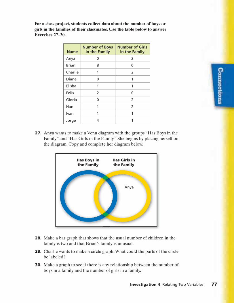
Investigation 4 Relating Two Variables 77
For a class project, students collect data about the number of boys or girls in the families of their classmates. Use the table below to answer Exercises 27–30.
27. Anya wants to make a Venn diagram with the groups “Has Boys in theFamily” and “Has Girls in the Family.” She begins by placing herself onthe diagram. Copy and complete her diagram below.
28. Make a bar graph that shows that the usual number of children in thefamily is two and that Brian’s family is unusual.
29. Charlie wants to make a circle graph. What could the parts of the circlebe labeled?
30. Make a graph to see if there is any relationship between the number ofboys in a family and the number of girls in a family.
Anya
Has Girls inthe Family
Has Boys inthe Family
Name
Anya
Brian
Charlie
Diane
Elisha
Felix
Gloria
Han
Ivan
Jorge
Number of Boysin the Family
0
8
1
0
1
2
0
1
1
4
Number of Girlsin the Family
2
0
2
1
1
0
2
2
1
1
8cmp06se_SP4.qxd 6/8/06 8:55 AM Page 77

An Honor Society shovels snow for senior citizens on weekends. Somestudents can shovel only on Fridays, some can shovel only on Saturdays,some can shovel only on Sundays, some can shovel two out of three days,and some can shovel all three days. Justin is organizing this project andmust report on it at the end of the school year.
For Exercises 31–35, decide which of these five representations Justinshould choose. Explain why.
box plot Venn diagram circle graphvalue bar graph back-to-back stem-and-leaf plot
31. Justin wants to know whom he can call on any snowy weekend day.
32. At the end of a month, Justin wants to show how many hours eachperson shoveled snow.
33. The Honor Society worked on the same project last year. Justin wantsto compare the hours members spent shoveling snow this year with thehours spent shoveling snow last year.
34. The Honor Society performs four other service projects in addition toshoveling snow. Justin wants to report how the total hours spent on allthe projects was divided among the five projects.
35. Some members contribute a lot of time and other just a little. Justinwants to make a graph that shows what is a typical time commitment,what is an outstanding time commitment, and what is an unusually lowtime commitment. He does not want to show individual names.
78 Samples and Populations
8cmp06se_SP4.qxd 6/8/06 8:55 AM Page 78

Investigation 4 Relating Two Variables 79
Extensions36. a. The graph below models the relationship between a pumpkin’s
circumference and its weight. Suppose that, instead of beingmodeled by this curve, the relationship was modeled by the line y = x. What would this indicate about how the weight of a pumpkinchanges as the circumference increases?
b. Describe what the actual curve indicates about how the weight of apumpkin changes as the circumference increases.
0 50 100 15017525 75 125
Circumference (in.)
Wei
gh
t (l
b)
100
200
300
500
600
700
400
0
Pumpkin Measurements
y
x
8cmp06se_SP4.qxd 6/8/06 8:55 AM Page 79

�
In this investigation, you made scatter plots to look for relationshipsbetween pairs of variables. Where possible, you drew a line to fit the patternin the points, and used the line to predict the value of one variable given thevalue of the other. These questions will help you summarize what you havelearned.
Think about your answers to these questions. Discuss your ideas with otherstudents and your teacher. Then write a summary of your findings in yournotebook.
1. Describe some situations you explored in which the values of twovariables are related in a predictable way. For example, you saw thatyou can estimate a person’s arm span if you know his or her height.
2. Describe some situations you explored in which the values of twovariables are not related in a predictable way. For example, as thelengths of the arrowheads increase, the widths do not increase in aregular pattern.
3. What does it mean to say one variable is related to another variable?Think about your answers to Questions 1 and 2.
80 Samples and Populations
8cmp06se_SP4.qxd 6/8/06 8:55 AM Page 80

Unit Project Estimating a Deer Population 81
Estimating a Deer Population
The statewide deer population in Michigan is estimated to be about1.7 million.
How is it possible to estimate the deer population of a state, or even of a small part of a state?
The capture-tag-recapture method is one way of estimating a deerpopulation. Biologists capture deer in a targeted area, tag them, and thenrelease them. Later, they capture deer and count the number with tags toestimate the population of deer in the targeted area.
You can simulate the capture-tag-recapture method by using a containerfilled with white beans. Think of each bean as a deer in the upper peninsulaof Michigan. Your job is to estimate the number of deer without actuallycounting them all.
Work with your group to perform the experiment described below.
Materials
a container with a lid
a package of white beans (about two cups)
a marker
8cmp06se_SPUP.qxd 6/8/06 9:12 AM Page 81
Collect the Data
• Remove 100 beans from the container and mark them with a pen ormarker.
• Put the marked beans back into the container and mix them with theunmarked beans.
• Without looking at the beans, one person should scoop out 25 beansfrom the jar. Record the number of marked and unmarked beans inthis sample. Then, return the beans to the jar and mix the beans. Repeatthis until everyone in your group has chosen a sample.
• Repeat the scoop-and-count procedure for samples of 50, 75, and 100 beans. For each sample, record the number of marked andunmarked beans.
Analyze and Summarize the Data
1. Find the percent of “deer” in each of your group’s samples. Make oneor more representations of these data.
2. Use tables, graphs, and statistics to analyze the data you collected.
3. Use your analysis to estimate the number of “deer” in your container.
4. Prepare a report about your experiment and findings. Be sure toinclude the following:
• A discussion of how you investigated the problem
• An analysis and summary of the data you collected, includingtables, graphs, and statistics
• An estimate of the number of “deer” in your container and anexplanation of how you made this estimate
You might also do Internet research on the following topics andinclude your findings in your report:
• Other methods used to count deer
• Methods used to count whales, salmon, prairie dogs, or otheranimals
82 Samples and Populations
8cmp06se_SPUP.qxd 6/8/06 9:12 AM Page 82

Unit Review
In this unit, you collected, organized, and displayed sample data. Youlearned how to choose samples and how to compare samples in order todraw conclusions about the population from which they were taken. Youalso looked at the ways two attributes of a sample might be related.
Use Your Understanding: Statistical Reasoning
Test your understanding and skill in the use of samples to describepopulations by solving these problems that arose during a nutritiondiscussion in a health class.
1. One student claims that stores promote sales of cereals with high sugarcontent by putting them on low shelves, where children can see them.
To test this claim, the class collects data for 77 different cereals. Foreach cereal, they record the sugar content and calories per serving andwhether the cereal is on the top, middle, or bottom shelf.
These plots show the sugar content of the cereals on each shelf.
8 10 200 2 4 6 16 1812 14
Bottom (33 cereals)
Middle (24 cereals)
Top (20 cereals)
Sugar per Serving (grams)
Shel
f
Shelf Location and Sugar Content
Looking Back and Looking Ahead 83
For: Vocabulary Review Puzzle
Web Code: apj-8051
8cmp06se_SPLB.qxd 6/8/06 9:05 AM Page 83

a. What is the range of sugar content for cereals on the top shelf? Forcereals on the middle shelf? For cereals on the bottom shelf?
b. Estimate the median sugar content for the cereals on each shelf.
c. How many of the 20 top-shelf cereals have a sugar content greaterthan or equal to the upper quartile?
d. What percent of the 33 bottom-shelf cereals have a sugar content atleast as great as the lower quartile but no greater than the upperquartile?
e. Does there seem to be a pattern relating sugar content and shelfplacement for cereals?
f. The top shelf, middle shelf, and bottom shelf have different numbersof cereals. How does using a box plot make it easy to compare thethree distributions?
g. Suppose you collected data from a sample of cereals in asupermarket near you. What do you think you would find out aboutthe sugar content in cereals on different shelves?
2. Jerome wants to make a scatter plot to see if there is a relationshipbetween sugar content and calories for the cereals. Instead of lookingat data for all 77 cereals, he decides to choose a sample of 25. Heconsiders three ways of selecting a sample.
• Method 1: List the 77 cereals in alphabetical order. Include everythird cereal in the sample.
• Method 2: Choose the first eight cereals from each shelf.
• Method 3: Number the cereals from 1 to 77. Use two spinners withequal sections numbered 0–9 to produce 25 different two-digitnumbers. Choose the cereals corresponding to these numbers.
a. Which method is an example of convenience sampling?
b. Which method is an example of random sampling?
c. Which method is an example of systematic sampling?
d. Which method would you recommend? Explain.
84 Samples and Populations
8cmp06se_SPLB.qxd 6/8/06 9:05 AM Page 84

3. The health class randomly selects 50 of the 600 students in their school.They ask these students the following questions:
• Question 1: On how many school days last week did you eat cerealfor breakfast?
• Question 2: Do you prefer sweetened or unsweetened cereal?
a. Of the students in the sample, 14 give answers of 4 or 5 to the firstquestion. How many students in the entire school would you predictate cereal on 4 or 5 days last week?
b. Of the students in the sample, 32 say they prefer sweetened cereal.How many students in the school would you expect to prefersweetened cereal?
Explain Your Reasoning
When you compare data sets, read graphs, choose samples, and use samplesto make predictions, you should be able to justify your procedures andconclusions.
4. In what types of situations are box plots useful tools?
5. In what types of situations are scatter plots useful tools?
6. When does it make sense to use data from a sample to study apopulation?
7. Describe three kinds of sampling methods and their strengths andweaknesses.
8. How could you choose a random sample?
Statistical techniques for collecting and displaying data and drawingconclusions are used in nearly every branch of science, business, andgovernment work. You will extend and use your statistical understandingand skills in your classes, in your future jobs, and in your everyday life.
Looking Back and Looking Ahead 85
8cmp06se_SPLB.qxd 6/8/06 9:05 AM Page 85
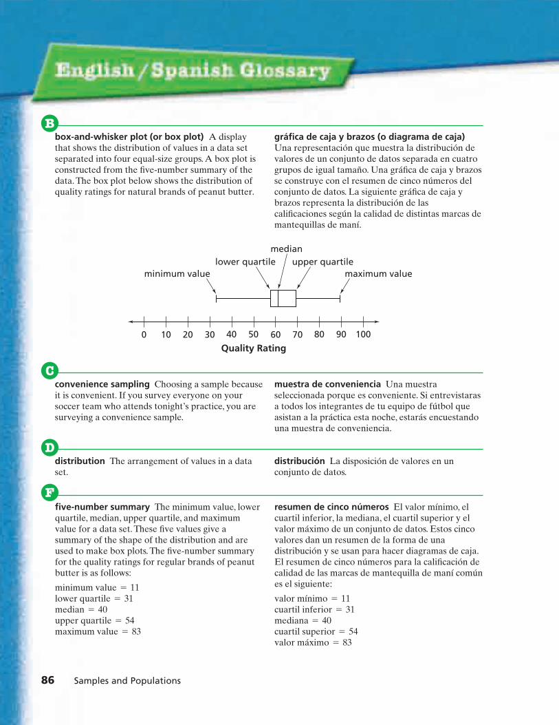
86 Samples and Populations
box-and-whisker plot (or box plot) A displaythat shows the distribution of values in a data setseparated into four equal-size groups. A box plot isconstructed from the five-number summary of thedata. The box plot below shows the distribution ofquality ratings for natural brands of peanut butter.
gráfica de caja y brazos (o diagrama de caja)Una representación que muestra la distribución devalores de un conjunto de datos separada en cuatrogrupos de igual tamaño. Una gráfica de caja y brazosse construye con el resumen de cinco números delconjunto de datos. La siguiente gráfica de caja ybrazos representa la distribución de lascalificaciones según la calidad de distintas marcas demantequillas de maní.
B
Cconvenience sampling Choosing a sample becauseit is convenient. If you survey everyone on yoursoccer team who attends tonight’s practice, you aresurveying a convenience sample.
muestra de conveniencia Una muestraseleccionada porque es conveniente. Si entrevistarasa todos los integrantes de tu equipo de fútbol queasistan a la práctica esta noche, estarás encuestandouna muestra de conveniencia.
distribution The arrangement of values in a dataset.
distribución La disposición de valores en unconjunto de datos.
D
40 50 1000 10 20 30 80 9060 70
Quality Rating
minimum value maximum valuelower quartile upper quartile
median
five-number summary The minimum value, lowerquartile, median, upper quartile, and maximumvalue for a data set. These five values give asummary of the shape of the distribution and areused to make box plots. The five-number summaryfor the quality ratings for regular brands of peanutbutter is as follows:
minimum value = 11lower quartile = 31median = 40upper quartile = 54maximum value = 83
resumen de cinco números El valor mínimo, elcuartil inferior, la mediana, el cuartil superior y elvalor máximo de un conjunto de datos. Estos cincovalores dan un resumen de la forma de unadistribución y se usan para hacer diagramas de caja.El resumen de cinco números para la calificación decalidad de las marcas de mantequilla de maní comúnes el siguiente:
valor mínimo = 11 cuartil inferior = 31 mediana = 40 cuartil superior = 54 valor máximo = 83
F
8cmp06se_SPGL.qxd 6/8/06 8:38 AM Page 86

English/Spanish Glossary 87
histogram A display that shows the distribution ofnumeric data. The range of data values, divided intointervals, is displayed on the horizontal axis. Thevertical axis shows frequency in numbers or inpercents. The height of the bar over each intervalindicates the count or percent of data values in thatinterval. The histogram below shows quality ratingsfor regular brands of peanut butter. The height ofthe bar over the interval from 20 to 30 is 4. Thisindicates that four brands of peanut butter havequality ratings between 20 and 30.
histograma Una representación que muestra ladistribución de datos numéricos. El rango de valoresde los datos, dividido en intervalos, se representa enel eje horizontal. El eje vertical muestra lafrecuencia en número o en porcentajes. La altura dela barra sobre cada intervalo indica el número, oporcentaje, de valores de datos en ese intervalo.El siguiente histograma representa la calificaciónpor calidad de las marcas de mantequilla de manícomún. La altura de la barra sobre el intervalo de 20 a 30 es 4. Esto indica que cuatro marcas demantequilla de maní tienen una calificación entre 20 y 30.
H
Quality of Regular Brands
Co
un
t
1
0
2
3
4
5
6
7
0 10 20 30 40 50 60 70 80 90
Quality Rating
lower quartile The median of the data values tothe left of the median (assuming the values arelisted from least to greatest). For example, consideran odd number of data values:
1, 2, 5, 6, 7, 8, 8, 10, 12, 15, 20
There are 11 data values. The median of the data setis 8. (Six values are at or above 8 and six are at orbelow 8.) The median of the values to the left of themedian (1, 2, 5, 6, 7) is 5. So, the lower quartile is 5.
Consider an even number of data values:2, 3, 4, 5, 6, 6, 8, 8
There are eight data values. The median of the dataset is 5.5, the average of 5 and 6. The data values tothe left of the median are 2, 3, 4, and 5. The medianof these values is 3.5. So, the lower quartile is 3.5.
cuartil inferior La mediana del valor de los datos ala izquierda de la mediana (asumiendo que losvalores indicados van de menor a mayor). Porejemplo, consideremos un número impar de valoresde datos:
1, 2, 5, 6, 7, 8, 8, 10, 12, 15, 20
Hay 11 valores de datos. La mediana del conjuntode datos es 8. (Seis valores están en o sobre 8 y seisestán en o bajo 8.) La mediana de los valores a laizquierda de la mediana es (1, 2, 5, 6, 7) es 5. Demodo que el cuartil inferior es 5.
Consideremos un número par de valores de datos:2, 3, 4, 5, 6, 6, 8, 8
Hay ocho valores de datos. La mediana del conjuntode datos es 5.5, el promedio de 5 y 6. Los valores delos datos a la izquierda de la mediana son 2, 3, 4 y 5.La mediana de estos valores es 3.5. De modo que elcuartil inferior es 3.5.
L
8cmp06se_SPGL.qxd 6/8/06 8:38 AM Page 87

sample A group of people or objects selected froma population.
muestra Un grupo de personas u objetosseleccionados de una población.
scatter plot A graph used to explore therelationship between two variables. The graph belowis a scatter plot of (quality rating, price per serving)for several peanut butters. Each point represents thequality rating and price per serving for one peanutbutter.
diagrama de dispersión Una gráfica usada paraexplorar la relación entre dos variables. El siguientees un diagrama de dispersión (clasificación decalidad, precio por porción) para varias mantequillasde cacahuate. Cada punto representa la clasificaciónde calidad y el precio por porción de unamantequilla de cacahuate.
S
88 Samples and Populations
population The entire collection of people orobjects you are studying.
población Un conjunto entero de personas uobjetos en estudio.
P
random sampling Choosing a sample in a way thatgives every sample from a population an equallylikely chance of being selected.
muestra aleatoria Elegir una muestra de maneraque se dé a cada miembro de una población lamisma posibilidad de ser elegido.
R
0 20 40 60 80
Quality Rating
Pric
e p
er S
ervi
ng
(ce
nts
)
10
20
30
0
Peanut Butter Quality and Price
y
x
sampling distribution The distribution of themeans (or medians) of a set of same-size samplesselected randomly from the same population.
distribución de muestra Distribución de lasmedias (o medianas) de un conjunto de muestras delmismo tomaño, seleccionadas al azar de la mismapoblación.
8cmp06se_SPGL.qxd 6/8/06 8:38 AM Page 88

English/Spanish Glossary 89
stem-and-leaf plot (or stem plot) A display thatshows the distribution of values in a data set. Unlikea box plot or a histogram, a stem plot allows you tosee the individual values in the data set. The stemplot below shows the distribution of quality ratingsfor regular brands of peanut butter. In this plot, thestems are a vertical list of the tens digits of theratings. Attached to each stem are the correspondingleaves, in this case the ones digits. The leaves 3, 3, 6,and 9 next to the stem 2 indicate that the data setincludes the values 23, 23, 26, and 29.
diagrama de tallo y hojas Una representaciónque muestra la distribución de valores en unconjunto de datos. A diferencia de una gráfica decaja y brazos o un histograma, un diagrama de talloy hojas permite ver los valores individuales de unconjunto de datos. El diagrama de tallo y hojassiguiente muestra la distribución de la calificaciónpor calidad de las marcas de mantequilla de manícomún. En este diagrama, los tallos son una listavertical de los dígitos de las decenas de lascalificaciones. Unidas a cada tallo están las hojascorrespondientes, en este caso, los dígitos de lasunidades. Las hojas 3, 3, 6 y 9 al lado del tallo 2,indican que el conjunto de datos incluye los valores23, 23, 26, and 29.
systematic sampling Choosing a sample in amethodical way. If you survey every tenth person onan alphabetical list of names, you are surveying asystematic sample.
muestra sistemática Una muestra seleccionada deuna manera metódica. Si entrevistaras a cadadécima persona en una lista de nombres en ordenalfabético, estarías encuestando una muestrasistemática.
Key: 2 6 means 26
Quality Ratingsof Regular
Peanut Butters
0
1
2
3
4
5
6
7
8
9
1
3 3 6 9
1 1 3 4 4 5
0 0 3 5 6 9
4 4
0
6
3 3
8cmp06se_SPGL.qxd 6/8/06 8:38 AM Page 89

upper quartile The median of the data values tothe right of the median (assuming the values arelisted from least to greatest). For example, consideran odd number of data values:
1, 2, 5, 6, 7, 8, 8, 10, 12, 15, 20
There are 11 data values. The median of the data setis 8. The median of the values to the right of themedian (8, 10, 12, 15, and 20) is 12. So, the upperquartile is 12.
Consider an even number of data values:2, 3, 4, 5, 6, 6, 8, 8
There are eight data values. The median of the dataset is 5.5, the average of 5 and 6. The data values tothe right of the median are 6, 6, 8, 8. The median ofthese values is 7. So, the upper quartile is 7.
cuartil superior La mediana de los valores de losdatos a la derecha de la mediana (asumiendo quelos valores están indicados de menor a mayor). Porejemplo, consideremos un número impar de valoresde datos:
1, 2, 5, 6, 7, 8, 8, 10, 12, 15, 20
Hay 11 valores de datos. La mediana del conjuntode datos es 8. La mediana de los valores a la derechade la mediana (8, 10, 12, 15, y 20) es 12. De modoque el cuartil superior es 12.
Consideremos un número par de valores de datos:2, 3, 4, 5, 6, 6, 8, 8
Hay ocho valores de datos. La mediana del conjuntode datos es 5.5, el promedio de 5 y 6. Los valores delos datos a la derecha de la mediana son 6, 6, 8, 8. Lamediana de estos valores es 7. De modo que elcuartil superior es 7.
voluntary-response sample A sample that selectsitself. If you put an ad in the school paper asking forvolunteers to take a survey, the students whorespond will be a voluntary-response sample.
muestra de respuesta voluntaria Una muestraque se selecciona a sí misma. Si pones un anuncio enel periódico escolar pidiendo voluntarios paraparticipar en una encuesta, los estudiantes querespondan serán una muestra de respuestasvoluntarias.
V
U
90 Samples and Populations
8cmp06se_SPGL.qxd 6/8/06 8:38 AM Page 90

Index 91
Acting it out, 53, 60, 81–82
Arachibutyrophobia, 7
Back-to-back stem-and-leaf plot,78
Bar graph, 22, 72, 77–78making, 22, 77–78value, 78
Box-and-whisker plot, 4, 12–16, 25,32, 50, 53, 67, 83–86
ACE, 18–19, 22, 54, 59, 75–76, 78five-number summary and,
12–14, 54, 86interquartile range and, 15, 19lower quartile and, 12–13, 15,
24, 84, 86, 87making, 15–16, 32, 50, 53, 54maximum value, 12, 86median, 12, 86minimum value, 12, 19, 86outliers on, 15, 19, 67, 75upper quartile and, 12–13, 15,
19, 24, 84, 86, 90
Box plot, see Box-and-whisker plot
Circle graph, 22, 56, 77–78making, 22
Comparisons, making, 4, 5–25, 32,34, 40, 46, 50, 60, 61, 62, 67,69, 72, 74, 83, 85
Concrete model, see Model
Consumer survey, 5–25, 27–29, 62ACE, 17–24, 36–37, 43, 69
Convenience sample, 30, 46, 84, 86
Convenience sampling plan,see Convenience sample
Coordinate graph, 57, 79
Data cluster, 7, 9–10, 19–20
Data setsairplane data, 64arrowhead measurements,
48–49basketball player age and
height, 23box-and-whisker plot for,
12–16, 18–19, 22, 25, 32, 50,53, 54, 59, 67, 75–76, 78,83–86
clusters in, 7, 9–10, 19–20comparing, 5–25five-number summary of,
12–14, 54, 86grade eight database, 33M&M’s color data, 45outliers in, 9, 15, 19, 67, 75peanut butter data, 6quartiles in, 12–15scatter plot for, 39, 62–65, 68,
69–71, 73–74, 76, 79, 80,84–85, 88
Distribution, definition, 7, 86
Equation, writing an, 63–65, 70, 74
Estimating, 29, 34, 66, 68, 80,81–82, 84
ACE, 21, 23–24, 38, 44, 54–56,60, 71
Five-number summary, 12–14, 54,86
Glossary, 85–90
Graphbar, 22, 77–78circle, 22, 56, 77–78making, 22–23, 77–78, 82misleading, 57
Histogram, 4, 9–11, 16, 25, 53, 66,87
ACE, 17–18, 20–21, 24, 38, 73making, 10–11, 16, 17, 53relative frequency, 11
Interpreting databar graph, 22, 72, 77–78box-and-whisker plot, 12–16,
18–19, 22, 25, 32, 50, 53, 54,59, 67, 75–76, 78, 83–86
circle graph, 22, 56, 77–78coordinate graph, 57, 79histogram, 9–11, 16, 17–18,
20–21, 24, 25, 38, 53, 66, 73, 87line plot, 8, 32, 34–35, 44picture, 31, 51scatter plot, 39, 62–65, 68,
69–71, 73–74, 76, 79, 80,84–85, 88
spinner, 31stem-and-leaf plot, 38, 40, 78, 89
table, 5–7, 17, 22–23, 33–34,43–45, 48–49, 53–55, 60, 64,67, 70, 74, 77, 82
Venn diagram, 77–78
Interquartile range (IQR), 15, 19
InvestigationsChoosing a Sample From a
Population, 26–46Comparing Data Sets, 5–25Relating Two Variables, 62–80Solving Real-World Problems,
47–61
IQR, see Interquartile range
Justify answer, 8, 11, 14–16, 30, 32,35, 50, 53, 62, 64–65, 67, 82,84–85
ACE, 17, 19–23, 37–40, 42–44,54–55, 57, 59, 69–71, 73,75–76
Justify method, 25, 30–31, 46, 82,84
ACE, 17, 40, 44, 78
Line plot, 8, 32, 34–35, 44making, 32, 34, 44
Looking Back and Looking Ahead: Unit Review, 83–84
Lower quartile, 12–13, 15, 24, 84,86, 87
Mathematical Reflections, 25, 46,61, 80
Mathematical Highlights, 4
Maximum value, 4, 7–10, 12, 86shown on a box-and-whisker
plot, 12, 86
Mean, 4, 9, 19–20, 23, 34–35, 40,46, 59, 74
Measures of center (see alsoMean; Median; Mode), 4, 7
Median, 4, 9, 12–13, 34–35, 46, 84,86–87, 90
ACE, 19–20, 22, 24, 40, 59, 74shown on a box-and-whisker
plot, 12, 86
Minimum value, 4, 7–10, 12, 19, 86shown on a box-and-whisker
plot, 12, 19, 86
8cmp06se_SPIDX.qxd 6/8/06 8:40 AM Page 91

92 Samples and Populations
Mode, 22Model
bar graph, 72box-and-whisker plot, 12–15,
18, 22, 59, 67, 75–76, 83, 86circle graph, 56coordinate graph, 57, 79histogram, 9–11, 18, 20–21, 24,
38, 66, 73, 87line plot, 8picture, 31, 51scatter plot, 39, 62–63, 65, 68,
69, 71, 73, 76spinner, 31stem-and-leaf plot, 38, 40Venn diagram, 77
Notation, for outliers, 15Notebook, 25, 46, 61, 80Outlier, 9, 15, 19, 67, 75
notation for, 15Pattern, looking for a, 57, 80, 84Pictorial model, see ModelPicture, 31, 51Plot
box-and-whisker, 12–16, 18–19,22, 25, 32, 50, 53, 54, 59, 67,75–76, 78, 83–86
line, 8, 32, 34–35, 44scatter, 39, 62–65, 68, 69–71,
73–74, 76, 79, 80, 84–85, 88stem-and-leaf, 38, 40, 78, 89
Populationdefinition, 88random sample of, 4, 30–34,
37–38, 41–44, 46, 54–56, 60,84–85, 88
selecting a representativesample for, 4, 29–33using samples to estimate,
26–46, 47–53Prediction, 4, 26–46, 61, 64–65, 85
ACE. 36–45, 54–55, 60, 71, 73using random samples, 30–34,
37–38, 41–44, 46Problem-solving strategies
acting it out, 53, 60, 81–82looking for a pattern, 57, 80, 84making a bar graph, 22, 77–78making a box-and-whisker plot,
15–16, 32, 50, 53, 54
making a circle graph, 22making a histogram, 10–11, 16,
17, 53making a line plot, 32, 34, 44making a scatter plot, 64, 70making a table, 34, 53, 82making a Venn diagram, 77writing an equation, 63–65, 70,
74
Quality rating, see Rating
Quartiles, in a data set, 12–15
Random numbers, simulation and,52–53, 60
Random sample, 4, 30–34, 46,84–85, 88
ACE, 37–38, 41–44, 54–56, 60choosing, 31–33
Random sampling plan,see Random sample
Range, 4, 7, 9–10, 40, 46, 71, 74
Rating, comparison, 5–22, 62, 69
Relationshipbetween two variables, 62–80writing an equation for, 63–65
Relative frequency histogram, 11
Sampleaccuracy of, 26, 29–30convenience, 30, 46, 84, 86definition, 3, 26, 88estimating a population with,
47–53random, 4, 30–34, 37–38,
41–44, 46, 54–56, 60, 84–85,88
selecting, 29–33self-selected, see
voluntary-responsesize, 4, 34–35, 38systematic, 30, 46, 84, 89voluntary-response, 30, 46, 88,
90
Sampling distribution, 88
Sampling methods (see alsoSampling plan), 26–46, 85
Sampling plan, 3, 29–33, 36–37convenience, 30, 46, 84, 86random, 4, 30–34, 37–38, 41–44,
46, 54–56, 60, 84–85, 88
systematic, 30, 46, 84, 89voluntary-response, 30, 46, 88,
90
Scatter plot, 62–65, 68, 80, 84–85,88
ACE, 39, 69–71, 73–74, 76, 79fitting a line to, 63, 65, 68,
70–71, 74, 76, 79, 80making, 64, 70
Self-selected sample, seeVoluntary-response sample
Simulation, 51–53, 60, 81–82designing, 60and random numbers, 52–53, 60
Spinner, 31
Stem plot, see Stem-and-leaf plot
Stem-and-leaf plot, 38, 40, 78, 89back-to-back, 78
Surveycomparing data sets from, 5–25conducting, 26–35selecting a sample population,
29–33
Systematic sample, 30, 46, 84, 89
Systematic sampling plan, seeSystematic sample
Table, 5–7, 33–34, 48–49, 53, 64,67, 82
ACE, 17, 22–23, 43–45, 54–55,60, 70, 74, 77
making, 34, 53, 82
Unit Project: Estimating a Deer Population, 81–82
Upper quartile, 12–13, 15, 19, 24,84, 86, 90
Value bar graph, 78
Variables, relationship between two, 62–80
ACE, 69–79
Venn diagram, 77–78making, 77
Voluntary-response sample, 30,46, 88, 90
Voluntary-response sampling plan, see Voluntary-response sample
8cmp06se_SPIDX.qxd 6/8/06 8:40 AM Page 92

Acknowledgments 93
Photos
2 t, Design Pics Inc./Alamy; 2 b, eStockPhoto/Peter Miller; 3, Fritz Polking/The ImageWorks; 5, Burke/Triolo Productions/FoodPix/PictureQuest; 7, Michael Newman/PhotoEdit;16, Nicole Katano/AGE Fotostock; 21, SWProductions/Getty Images, Inc.; 24, KimKarpeles/Alamy; 26, Spencer Grant/PhotoEdit;27, Rob Melnychuk/Getty Images, Inc.;30, Richard Haynes; 35, Max Oppenheim/Getty Images, Inc.; 37, Design Pics Inc./Alamy;39, image100/SuperStock; 43, Bob Johns/expresspictures.co.uk/Alamy; 47, Louie Psihoyos/Corbis; 48, Hemera Technologies/Alamy;50, SuperStock/AGE Fotostock; 51, GaryConner/Index Stock Imagery, Inc.; 54, HemeraTechnologies/Alamy; 56, Peter Casolino/Alamy;58, David Mendelsohn/Masterfile; 63, RichardHaynes; 65, Brakefield Photo/PictureQuest;70, Richard Haynes; 71 all, Hemera Technologies/Alamy; 72, © Airbus—photo by exm company—P. Masclet; 79, altrendo nature/Getty Images, Inc.;81, eStock Photo/Peter Miller
Technical Illustration
WestWords, Inc.
Cover Design
tom white.images
Data Sources
The peanut butter data on page 6 are from ConsumerReports®, September, 1990. Copyright © 1990–2006Consumers Union of U.S., Inc.
The juice data on page 21 are from “ParentsBeware: Juice in juice drinks costs up to £34 per litre!” in Food Magazine, April 30, 2004.Copyright © 2004 The Food Commission.
The team rosters on page 23 are fromwww.nba.com Copyright © 2004–2006 NBA Media Ventures, LLC.
The information in the third bullet on page 27 is reprinted with permission of the Institute ofGeneral Semantics, Fort Worth, TX.
The arrowhead data on pages 48, 49, and 71 arefrom “A Mathematical Technique for DatingProjectile Points Common to the NorthwesternPlains” by George C. Knight and James D. Keyserin Plains Anthropologist #28 Volume 101.Copyright © 1983 Plains Anthropological Society.
The data for the graphs on page 57 are from The Recovered Paper Statistical Highlights,2005 Edition, by the American Forest and PaperAssociation. Copyright © 2005 by the AmericanForest and Paper Association, Inc. Used bypermission.
The airplane data on page 64 are from Guide toAirport Airplanes by William and Frank Berk.Copyright © 1993 Plymouth Press, Ltd.
Team Credits
The people who made up the ConnectedMathematics 2 team—representing editorial,editorial services, design services, and productionservices—are listed below. Bold type denotescore team members.
Leora Adler, Judith Buice, Kerry Cashman,Patrick Culleton, Sheila DeFazio, RichardHeater, Barbara Hollingdale, Jayne Holman,Karen Holtzman, Etta Jacobs, Christine Lee,Carolyn Lock, Catherine Maglio, Dotti Marshall,Rich McMahon, Eve Melnechuk, KristinMingrone, Terri Mitchell, Marsha Novak, IreneRubin, Donna Russo, Robin Samper, SiriSchwartzman, Nancy Smith, Emily Soltanoff,Mark Tricca, Paula Vergith, Roberta Warshaw,Helen Young
Additional Credits
Diana Bonfilio, Mairead Reddin, MichaelTorocsik, nSight, Inc.
8cmp06se_SPACK.qxd 6/8/06 8:35 AM Page 93