S t a c k i n g G r a p h i c E l e m e n t s t o A v o i ...wilkinson/Publications/stacking.pdf ·...
9
Stacking Graphic Elements to Avoid Over-Plotting Tuan Nhon Dang, Leland Wilkinson, and Anushka Anand Fig. 1. Visualization of Old Faithful data: (a) Single-variable dot plot; (b) Two-variable dot plot; Visualization of Cars data: (c) Parallel Coordinate Dot Plot; (d) Stacked Parallel Coordinate Plot. Abstract—An ongoing challenge for information visualization is how to deal with over-plotting forced by ties or the relatively lim- ited visual field of display devices. A popular solution is to represent local data density with area (bubble plots, treemaps), color (heatmaps), or aggregation (histograms, kernel densities, pixel displays). All of these methods have at least one of three deficiencies: 1) magnitude judgments are biased because area and color have convex downward perceptual functions, 2) area, hue, and brightness have relatively restricted ranges of perceptual intensity compared to length representations, and/or 3) it is difficult to brush or link to individual cases when viewing aggregations. In this paper, we introduce a new technique for visualizing and interacting with datasets that preserves density information by stacking overlapping cases. The overlapping data can be points or lines or other geometric elements, depending on the type of plot. We show real-dataset applications of this stacking paradigm and compare them to other techniques that deal with over-plotting in high-dimensional displays. Index Terms—Dot plots, Parallel coordinate plots, Multidimensional data, Density-based visualization. 1 I NTRODUCTION Overplotting instances in scatterplots, parallel coordinates, and other displays has been a longstanding problem in information visualiza- tion. Data points with similar or identical values partially or com- pletely overlap in a scatterplot. The same data points overlap in a parallel coordinate plot and in many other multivariate displays. We tackle this problem with a strategy that stacks representation elements (symbols, lines, etc.) in an additional dimension based on density or counts. The height of the stack shows the density in the neighborhood of a data value. Several other solutions to this problem have been been devised over several centuries of charts and graphics. One approach is to aggre- gate cases in local neighborhoods and to use area to represent density. • Tuan Nhon Dang is with Department of Computer Science, University of Illinois at Chicago, E-mail: [email protected]. • Leland Wilkinson is with SYSTAT Inc., Department of Computer Science, University of Illinois at Chicago, and Department of Statistics, Northwestern University, E-mail: [email protected]. • Anushka Anand is with Department of Computer Science, University of Illinois at Chicago, E-mail: [email protected]. Manuscript received 31 March 2010; accepted 1 August 2010; posted online 24 October 2010; mailed on 16 October 2010. For information on obtaining reprints of this article, please send email to: [email protected]. For example, we can bin cases inside political, geographic, or abstract regions and represent counts by the size of circles or length of bars superimposed on a map of those regions [7]. The so-called “bubble plot” was invented by Playfair [25] and has been used for over two centuries. Unfortunately, sizing symbols to represent aggregates ame- liorates but does not eliminate overlapping; bubbles or other repre- sentation elements can still cover each other when their sizes exceed nearest-neighbor distances. Furthermore, using area to represent mag- nitude incurs nonlinear distortions in perception [8, 38, 32]. Another approach is to partition a space, aggregate within parti- tions, and adjust the size of partitions in order to represent counts [20, 10]. This approach prevents overlaps but risks displacing or dis- torting density locations. Furthermore, using polygon size to represent the count of points within a partition has the same nonlinear perceptual problems that arise with bubble plots. Another approach is to aggregate and use color to represent the magnitude of the aggregation [5, 21, 14]. The most common instance of this approach is the choropleth map. Another approach is to use kernel density estimation or other forms of smoothing and then rep- resent the smoothed density with a color or intensity gradient. These approaches risk distortion from using color to represent a continuum. Lightness/darkness has a concave downward psychometric function [38] and representing a linear scale with hue is problematic [4]. Another approach is to dispense with aggregation and to use ran- dom local displacement to prevent overlap, commonly called jittering [6]. This is a useful method for representing bootstrap estimates in a
Transcript of S t a c k i n g G r a p h i c E l e m e n t s t o A v o i ...wilkinson/Publications/stacking.pdf ·...

Stacking Graphic Elements to Avoid Over-PlottingTuan Nhon Dang, Leland Wilkinson, and Anushka Anand
Fig. 1. Visualization of Old Faithful data: (a) Single-variable dot plot; (b) Two-variable dot plot; Visualization of Cars data: (c) ParallelCoordinate Dot Plot; (d) Stacked Parallel Coordinate Plot.
Abstract—An ongoing challenge for information visualization is how to deal with over-plotting forced by ties or the relatively lim-ited visual field of display devices. A popular solution is to represent local data density with area (bubble plots, treemaps), color(heatmaps), or aggregation (histograms, kernel densities, pixel displays). All of these methods have at least one of three deficiencies:1) magnitude judgments are biased because area and color have convex downward perceptual functions, 2) area, hue, and brightnesshave relatively restricted ranges of perceptual intensity compared to length representations, and/or 3) it is difficult to brush or link toindividual cases when viewing aggregations. In this paper, we introduce a new technique for visualizing and interacting with datasetsthat preserves density information by stacking overlapping cases. The overlapping data can be points or lines or other geometricelements, depending on the type of plot. We show real-dataset applications of this stacking paradigm and compare them to othertechniques that deal with over-plotting in high-dimensional displays.
Index Terms—Dot plots, Parallel coordinate plots, Multidimensional data, Density-based visualization.
1 INTRODUCTION
Overplotting instances in scatterplots, parallel coordinates, and otherdisplays has been a longstanding problem in information visualiza-tion. Data points with similar or identical values partially or com-pletely overlap in a scatterplot. The same data points overlap in aparallel coordinate plot and in many other multivariate displays. Wetackle this problem with a strategy that stacks representation elements(symbols, lines, etc.) in an additional dimension based on density orcounts. The height of the stack shows the density in the neighborhoodof a data value.
Several other solutions to this problem have been been devised overseveral centuries of charts and graphics. One approach is to aggre-gate cases in local neighborhoods and to use area to represent density.
• Tuan Nhon Dang is with Department of Computer Science, University ofIllinois at Chicago, E-mail: [email protected].
• Leland Wilkinson is with SYSTAT Inc., Department of Computer Science,University of Illinois at Chicago, and Department of Statistics,Northwestern University, E-mail: [email protected].
• Anushka Anand is with Department of Computer Science, University ofIllinois at Chicago, E-mail: [email protected].
Manuscript received 31 March 2010; accepted 1 August 2010; posted online24 October 2010; mailed on 16 October 2010.For information on obtaining reprints of this article, please sendemail to: [email protected].
For example, we can bin cases inside political, geographic, or abstractregions and represent counts by the size of circles or length of barssuperimposed on a map of those regions [7]. The so-called “bubbleplot” was invented by Playfair [25] and has been used for over twocenturies. Unfortunately, sizing symbols to represent aggregates ame-liorates but does not eliminate overlapping; bubbles or other repre-sentation elements can still cover each other when their sizes exceednearest-neighbor distances. Furthermore, using area to represent mag-nitude incurs nonlinear distortions in perception [8, 38, 32].
Another approach is to partition a space, aggregate within parti-tions, and adjust the size of partitions in order to represent counts[20, 10]. This approach prevents overlaps but risks displacing or dis-torting density locations. Furthermore, using polygon size to representthe count of points within a partition has the same nonlinear perceptualproblems that arise with bubble plots.
Another approach is to aggregate and use color to represent themagnitude of the aggregation [5, 21, 14]. The most common instanceof this approach is the choropleth map. Another approach is to usekernel density estimation or other forms of smoothing and then rep-resent the smoothed density with a color or intensity gradient. Theseapproaches risk distortion from using color to represent a continuum.Lightness/darkness has a concave downward psychometric function[38] and representing a linear scale with hue is problematic [4].
Another approach is to dispense with aggregation and to use ran-dom local displacement to prevent overlap, commonly called jittering[6]. This is a useful method for representing bootstrap estimates in a
common space [38]. For smaller datasets, this approach works ratherwell. Plotting area is quickly overwhelmed as N increases, conse-quently, jittering has only limited application.
Another approach is to use transparency/opacity (alpha channel) torepresent density. This method is attractive because alternative densityestimators, such as kernel density estimation or histograms take longerto compute. A scatterplot of semi-transparent point symbols whosediameters are roughly a tenth of the frame width resembles a kerneldensity plot with saturation used to represent the height field for thedensity.
Many of these approaches have been applied to parallel coordi-nates, where over-plotting lines can create the same problems as over-plotting points. Solutions have involved kernel smoothing methods[12, 23] and 3D parallel coordinates[29][18, 16].
A serious drawback with all of these methods is that they break themapping between individual points and locations on the screen or dis-play area. The consequence is that brushing and linking are problem-atic [2] (although see [36] for some other remedies for this drawback).
By contrast, we propose using stacking to provide a view of densedata that reveals a range of magnitude considerably larger than whatis available in color and area representations. We have also developednew stacking methods for extending these representations to 3D. Weare not enthusiastic advocates of the use of 3D, but we show examplesof appropriate use of stacking where 2D representations of magnitudefail.
The main contributions of this paper are:
• We revise the single-variable dot plot algorithm [37] and extendit to multi-dimensional space.
• We extend stacking dots to stacking lines and show how thishelps solve a problem with parallel coordinates and other case-wise line plots.
• We show how stacking can be used to represent larger datasetswithout disabling brushing and linking.
This paper is organized as follows: Section 2 reviews related workin the field of density estimation. Section 3 describes and discusses ourstacking algorithms for two and three dimensions. Section 4 extendsstacking dots to stacking lines. We present our conclusions in Section5.
2 RELATED WORK
While the oldest form of stacking is probably the simple tally, the ap-proaches we introduce in this paper are related to representations ofdensity such as histograms and kernels. Histograms are the classicmethod for displaying densities [25, 24]. Their virtues are ease of com-putation (one or two passes through the data suffice) and interpretabil-ity (histogram bars allow visual estimates of counts or density withinintervals). Their drawbacks are statistical efficiency (histograms donot closely approximate population distributions in smaller samples),scale sensitivity (histogram shapes change when cutpoints vary), andlocation bias (histogram bars are not necessarily centered on regionsof high conditional density). Kernel density estimates overcome thesedeficiencies [27, 28]. Rather than grouping observations together inbins in the way a histogram does, the kernel density estimator centersa kernel probability function at each observation. The estimator con-sists of the sum of these functions; if the functions are smooth (theusual case) then the kernel density is smooth, unlike the histogram.The virtues of kernel density estimators compared to histograms aretheir unbiasedness and efficiency. Their drawbacks are computationalcomplexity (particularly in higher-dimensional spaces) and their de-pendence on a bandwidth parameter. Choice of bandwidth is not aserious drawback; however, adaptive methods have proven effective inpractice [31].
Dot plots offer a third approach to density representation. Similarto tallies, dot plots stack small dots on top of each other to repre-sent conditional counts. Their advantages include a natural frameworkfor brushing and linking (each dot represents an individual case or
instance), low location bias (dots are centered on data values, unlikehistograms), flexiblility (dot plots work for both continuous or categor-ical variables), and sensitivity (dot plots reveal granularity in integeror rounded data, unlike histograms or kernels).
Dot plots have been used for over a century in the medical, eco-nomic, and scientific literature (e.g., [15, 22]). They were originallyhand-drawn by medical and scientific illustrators. After Wilkinson[37] introduced an algorithm and computer program to render dot plotsautomatically, these plots began to appear in a few statistical packages,such as, SYSTAT, SPSS, Stata, and R. Other packages (such as BMDPand Minitab) have offered graphics that appear to be dot plots but areinstead simply histograms with stacks of dots replacing the bars. Itis easy to distinguish “fake” dot plots from the real thing. Simply in-put irregularly spaced data and observe whether the stacks are evenlyspaced. If they are, the graphic is not a true dot plot.
3 STACKING DOTS
The remainder of this paper covers several different types of stacking,inspired by the original formulation for dot plots. We begin with atechnical introduction to the dot plot algorithm and then extend thisalgorithm to multiple dimensions. We provide several examples onreal datasets to illustrate the usefulness of these extensions. In thenext section, we introduce new methods for stacking lines and showhow these can enhance the usefulness of parallel coordinate plots andother displays.
3.1 One Variable
This section covers the original dot plot algorithm introduced in [37]and shows a modification that reduces directional bias in the placementof dots. This modification also enables the extension of dot plots tohigher dimensions.
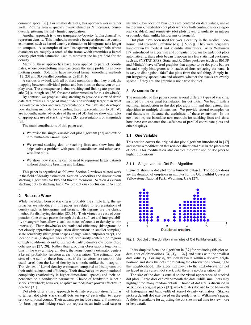
3.1.1 Single-variable Dot Plot Algorithm
Figure 2 shows a dot plot for a bimodal dataset. The observationsare the duration of eruptions in minutes for the Old Faithful Geyser inYellowstone National Park, Wyoming, USA [27].
Fig. 2. Dot plot of the duration in minutes of Old Faithful eruptions.
In its simplest form, the algorithm in [37] for producing this plot or-ders a set of observations {X1,X2, ...,Xn} and starts with the smallestdata value X1. For any Xi, we look below it within a dot-size neigh-borhood and stack the dots representing the observations belonging tothis neighborhood. The algorithm moves to the next observation notincluded in the current dot stack until there is no observation left.
The size of the dots is crucial to the visual appearance of stackeddot plots. Large dots can over-smooth the data, while small dots mayhighlight too many random details. Choice of dot size is discussed inWilkinson’s original paper [37], which relates dot size to the bar-widthof histograms and bandwidth of kernel density estimators. Stackerpicks a default dot size based on the guidelines in Wilkinson’s paper.A slider is available for adjusting the dot size in real time to view moreor less detail.

3.1.2 Improved Version of Single-variable Dot Plot AlgorithmThere are three limitations of the original algorithm:
• This algorithm produces dot plots by moving from the smallestdata point X1 to the largest data point Xn (from left to right).In like manner, dot plots can be produced by moving in reverseorder (from right to left). These different moving directions pro-duced different dot plots on the same batch of data. This is not adesirable consequence.
• Symmetrically distributed data may result in an asymmetric dot-plot.
• Multidimensional dot plots cannot be extended from this algo-rithm because it is intrinsically unidimensional along a singlenumerical axis.
We have devised an undirected algorithm that overcomes the draw-backs of the original dot plot algorithm. Instead of starting with thesmallest data value (moving from left to right) or the largest data value(moving from right to left), we begin with a data point that has themaximum number of neighbors in a dot-radius neighborhood. Here isa summary of the algorithm:
1. For each data point Xi, create a set of its neighbors Ci in a dotradius neighborhood h/2 including itself.
2. Instantiate a set of data points that have not been considered,D= {X1,X2, ...,Xn}.
3. Start with a data point Xl 2 D that has the maximum number ofneighbors.
4. Place |Cl | dots above the center of this set cl , where cl =(max(Cl)+min(Cl))/2.
5. Update D: D= DCl .
6. Remove all elements ofCl from the set of neighbors of other datapoints in D.
7. Move to the next data point Xl 2 D that has a maximum numberof neighbors.
8. Repeat steps 4-7, until there are no data values left to plot (D isempty).
Figure 3 compares this algorithm to the original for a symmetricdataset with 5 observations. The first panel shows dot plots producedby a left-to-right implementation of the original algorithm, the secondpanel shows dot plots produced by a right-to-left implementation ofthe original algorithm, and the third panel shows dot plots producedby the undirected algorithm. The symmetry of the original data isrevealed by the undirected algorithm.
3.1.3 Comparison of Dot Plots with Histograms and KernelDensity Estimates
To understand the strengths and weaknesses of dot plots, it helps tocompare and contrast them with histograms and kernel density esti-mates. First of all, dot plots are better for revealing granularity in data.This can be important when examining integer-valued rating scalesor rounded physical measurements for miscodings or unusual gaps.Specifically, a dot plot places the dots where the data values actuallyoccur, so that they leave gaps between values empty for granular data[38]. In contrast, kernel densities smooth over gaps in the data, andhistogram bins tend to cover gaps.
Second, histograms and kernel densities obscure local features be-cause they aggregate. By contrast, the dots in dot plots can be labelledor colored with group values. Moreover, since dot plots represent in-dividual observations by single symbols, they are suitable for brushingand linking.
X1 X2X3 X4 X5
X1 X2X3 X4 X5
X1 X2X3 X4 X5
Left-to-right
Right-to-left
Undirected
Fig. 3. Dot plots produced by different algorithms.
Third, dot plots lend themselves to highlighting outliers in a dis-play because singletons can be labeled, colored, resized or reshaped tostand out. Histograms and kernels tend to conceal singleton outliersbecause they do not have the mass to affect the overall shape.
Finally, dot plots can be devised to handle large datasets by impos-ing an aggregation on each dot. This condition allows us to definea continuum between N dots (the traditional dot plot) and 1 dot (thewhole batch aggregated into a single large dot). From a mathematicalperspective, a dot is a ball in a metric (usually Euclidean) space whoseradius determines the set of points within its boundary. In our soft-ware, we have implemented a slider that determines the dot radius andallows us to drill-down to different levels of detail.
3.2 Two Variables
The undirected dot plot algorithm is easily extended to the two-variable case. We simply compute Euclidean distance between points.Data point P(p1, p2) belongs to the neighborhood of data pointQ(q1,q2) if
(p1q1)2+(p2q2)2 r2 (1)
where r is dot radius.
3.3 Software
The visualization testbed implemented in this paper, called Stacker,provides a number of controls to create and manipulate stacked plots.Figure 4 shows the console. The open data set contains utility usageby a Chicago family from 2002 to 2008 [19]. The variables plottedare electricity and water usage. We have distinguished summer andwinter months by selecting red and blue from a color scale. Stackeroffers a color slider for each category on a variable, so a user can pickcontrasting colors. For a continuous variable, Stacker offers a num-ber of linearized scales. The sliders below this panel control dot size,opacity, aspect ratio of the geometric representation elements (usuallydots), and overlap of the elements. A button directly below these slid-ers allows the user to expend additional time to minimize overlaps it-eratively. The bottom panel offers options for brushing and displayingaxes and data points.
Figure 5 illustrates the use of these controls on the utility dataset.Figure 5(a) shows the result of using the slider to overlap dots. Fig-ure 5(b) shows the same plot with ellipsoidal dots. Figure 5(c) showstransparent dots; the opacity was set to 0.3. This device helps to re-veal embedded sub-densities; most dots are in the area of low water

Fig. 4. Stacker console.
and low electricity usage. Figure 5(d) shows the plot colored to dis-tinguish summer (red) and winter (blue) months. This plot shows thathigh water and high electricity usage occur in summers.
3.4 Geographic Dot Plots
This section describes an application in which 3D dot plots are used toshow the distribution of Lyme disease in the United States. Dot plotsare particularly suited to geographic applications because they stackwhere the data are measured (as opposed to choropleth maps, whichare aggregations).
Figure 6(a) shows the distribution of Lyme disease cases reported inthe U.S. in 2005, mapped by the CDC. As depicted, the Lyme diseasedistribution is dense in the Midwest and the East. Each case is rep-resented by a black dot in the graph. The map is saturated; however,there is little density discrimination in the concentrated areas. Conse-quently, it is hard to compare the densities in the Midwest and East,and it is hard to see variations within the East distribution.
Dot plots overcome these limitations by representing densitythrough dot stacks. Dots are stacked exactly over the counties wherethe Lyme disease cases are reported. Thus, one can visualize not onlyLyme disease cases by region, but also the density distribution withina region.
Figure 6(b) shows the dot plot of Lyme disease distribution in 2005.One might argue, of course, that a county-level choropleth map wouldbe a suitable alternative to the map in Figure 6(a). Nevertheless, itwould be hard to argue that a county-level choropleth map using hueor brightness could reveal the threefold increase in Lyme disease casescentered around New England vs. the Midwest.
Dots can be colored by year as depicted in Figure 7. In particular,red dots are Lyme disease cases reported in 2005, green dots as re-ported in 2006, and blue dots as reported in 2007. Moreover, Stackeralso supports geodata brushing as depicted in Figure 7. Users canbrowse over the dots; the region containing the dots is highlighted inthe table. Similarly, users can select regions from the table and seethem highlighted in the display. With brushing, users can easily com-pare Lyme disease densities among different regions. Furthermore,with Stacker, a user can select several regions for further analysis,while fading others from the view. In this way, one can reduce theeffects of occlusion. In this display, data brushing can be done at thestate or county level.
Fig. 5. Two dimensional dot plots of the data set: (a) Vertically over-lapped dots; (b) Ellipsoidal dots; (c) Dot plot with opacity set to 0.3; (d)Colored dots distinguishing different groups.
3.5 Parallel Coordinate Dot Plots
Parallel coordinate plots [13] have become a commonly used tech-nique for providing insight into multivariate data. In parallel coordi-nates, each N-dimensional data point is transformed into a polylinethat intersects N parallel axes at the respective value on that dimen-sion. Parallel coordinate plots allow displaying high-dimensional datain one plot because the axes are visually separated from each other. Forlarger data sets, however, it is difficult to discern relative frequenciesof subsets of points.
A number of extensions have addressed this problems. For the vi-sualization of categorical variables, Parallel Sets [3] substitutes the in-dividual data points at each axis by a frequency-based area element.However, this method works only with categorical variables. An-other strategy is to replace regions of similar lines by a density gra-dient. Wegman [34] was the first to do this and many have followed[1, 17, 26, 12].
We have devised two alternatives. The first, parallel dot plots, isillustrated in Figure 8. This figure contains parallel coordinate plotsof the Utility data used in Section 3.3. Polylines are colored by theSeason categorical variable. Figure 8(a) shows a conventional parallelcoordinate plot rendered by Stacker. Figure 8(b) depicts the parallelcoordinate plot with a dot plot at each axis.

Fig. 6. Lyme disease distribution in 2005: (a) Scatterplot overlaid onmap (b) Geographic dot plot.
Fig. 7. Data brushing in dot plot presenting Lyme disease distribution.
Fig. 8. Views of the Utility data set: a) Conventional parallel coordinateplot; (b) Parallel coordinate dot plot.
Why do this? Does it add to the visual clutter of the display? Does3D impair decoding? First of all, we are not suggesting to replace par-allel coordinate plots with 3D parallel dot displays. We are instead ad-vocating a pairing of the two types of display in the same application.Stacker has simple controls to switch back and forth between theserepresentations. Second, we have arranged a mild perspective viewand narrow dot towers to facilitate length-based magnitude compar-isons and to minimize occlusion, both of which are significant prob-lems for 3D bar graphs and other 3D displays. As can be seen in thefigure, the dot towers highlight major differences in frequency that arenot evident in the parallel coordinates display. Notice, for example,that low gas consumption in the summer months is immediately ap-parent in the dot display but not conspicuous in the ordinary parallelcoordinate display.
Figure 9 shows data brushing on parallel dot plots. Data brushingcan be done in several ways: one polyline, one dot, one dot stack, orone class of data. Specifically, Figure 9(a) depicts single dot brushingin which the polyline and dots associated with that record are high-lighted (the record selected is March 2008). Figure 9(b) depicts singlestack brushing (the dot stack selected contains months with very lowgas usage). Figure 9(c) depicts single class brushing (the class selectedis winter of every year from 2002 to 2008).
4 STACKING LINES
A second approach we have devised involves stacking lines instead ofdots. For parallel coordinate plots and other types of line plots, wehave implemented a method that extends the dot-stacking algorithm toline elements. As with dots, we can stack either single lines per caseor stack lines aggregating subsets of cases. In this section, we willshow two different stacking strategies for parallel coordinate plots andan example of stacking regression lines.
4.1 Stacked Parallel Coordinate Plots
Figure 10 shows several parallel coordinate displays of the Pollendataset (http://lib.stat.cmu.edu/datasets/pollen.data). This artificial dataset, used in a competition at the 1986 JointMeetings of the American Statistical Association, was given its nameas well as fake variable names in order to mislead analysts into think-ing it had to do with biology. Instead, the dataset contains a clusterof points spelling the word EUREKA surrounded by random points infive dimensions. Nowadays, the Pollen data are used to illustrate the

Fig. 9. Data brushing on parallel coordinate dot plot of the Utility dataset: (a) One dot brushing; (b) One dot stack brushing; (c) One class ofdata brushing.
effectiveness of panning and zooming in 3D visualization programs.This effectiveness depends on knowing that EUREKA is spelled at thecentroid and knowing that zooming and rotating around this positioncan reveal the hidden word. The real challenge involves discoveringthe structure without knowing this information.
Figure 10(a) shows an arbitrary 2D view of the data in the form ofa scatterplot. Figure 10(b) is an ordinary parallel coordinate plot ofthe data. In both of these graphics, it is impossible to discern the coreword. Figure 10(c) shows the same display with a density gradientdevised by Wegman[35]. A faint line in the center gives us a clue thatthere may be a subset of points with its own distribution. Figure 10(d)shows a more recent version of Wegman’s display [1]. The densitygradient has been modified to make the middle line more salient.
Figure 10(e) shows a stacked parallel coordinate plot of the samedata where stacks are colored based on their heights. One easily rec-ognizes the central cluster comprising EUREKA. This is a clear illus-tration of the fact that stacking enables a larger range of magnituderepresentation than intensity. As we have seen with the Lyme dataset,it is difficult to construct a linear brightness gradient that has a resolu-tion throughout its range sufficient to detect extreme values [8].
From Figure 10(e), we selected the central cluster in the stackedparallel coordinate display and requested plots of these data in newwindows: Figure 10(f) zooms in on the central cluster; the polylinesare colored by stack height. One can detect six smaller clusters inthe central cluster. Figure 10(g) shows a scatterplot of data in the sixclusters. Zooming in on this collection of points, we see the wordEUREKA spelled in the scatterplot. Additionally, the data points arecolored by the stacks which they belong to. In just three gestures, wehave identified the code at the center of the scatterplot.
Fig. 10. Visualization of the Pollen data set: (a) Scatterplot; (b) Con-ventional parallel coordinates; (c) Brightness used to represent densityof profiles; (d) Interactive Parallel Coordinates Frequency Plots with abrightness gradient; (e) Parallel coordinate plot with line stacks; (f) Thecentral stacks colored by height; (g) Scatterplot of the subset of pointsin (f).

Fig. 11. Several techniques to visualize a portion of the Cars dataset:(a) Interactive Parallel Coordinates Frequency Plots when a scaling fac-tor s = 0.5 ; (c) Density Plots using logarithmic color transfer function;(d) Parallel coordinate plot with line stacks; (e) Another view of Parallelcoordinate plot with line stacks; .
Another example is shown in Figure 11. In this example, we usethe Cars dataset. The data contain 392 instances and several differentkinds of variables: categorical, integer, continuous. Figure 11(a) is anordinary parallel coordinate plot of the data. Figure 11(b) shows theInteractive Parallel Coordinates Frequency Plot [1] for the same data.This program assigns pixel intensity proportional to the frequency ofthe adjacent pairs of variables.
Figure 11(c) shows a Density Plot [23] for the same data. This tech-nique smooths the polylines (similar to a kernel density estimate) andgenerates a color gradient in order to highlight clusters. A nonlineartransfer function is used to accentuate the contrast.
Figure 11(d) and (e) show a stacked parallel coordinate plots in twodifferent views. As in the previous example, stacks are colored basedon their heights. Looking at Figure 11(d) (e), one notices that the lastpair of variables (Year and Origin) shows more cars coming from thefirst origin than from the others. In all cars produced by the first origin,one can easily detect the year during which the first origin producedthe most (the red stack). This important detail is not evident in theother plots.
4.2 Categorical Stacked Parallel Coordinate Plots
As with ordinary dot plots, stacked parallel coordinate plots work wellfor both continuous and categorical data; no special adjustments arerequired. Figure 12 shows how this works. The data are from the Ti-tanic survivors data set [9]. The data involve four categorical attributesfor each of the 2201 people on board the Titanic when it struck an ice-berg and sank. The attributes are cabin class (first class, second class,third class, crew member), age (adult or child), sex (male or female),and whether or not the person survived.
Figure 12(a) shows a parallel coordinate plot of these data using analgorithm in [12]. Figure 12(b) shows the stacked parallel coordinateplot. The figure shows another variation of our stacking algorithm. Weanchor the lines at the vertices in order to reduce occlusions and wepermute the values to place large densities at the rear. The stacks areshaded with a linearized hue scale to help distinguish density magni-tudes. The stacked parallel coordinate plot clearly reveals the majordiscrepancies in survival rates. A disproportionate number of malesand adult passengers did not survive. Notice that Figure 12(a) failsto reveal this dramatic contrast because there is not sufficient dynamicrange in the color palette to represent the magnitude of the count range.
Fig. 12. Visualization of Titanic dataset: (a) Parallel coordinates ofcounts with profiles colored to represent frequency; (b) Parallel coor-dinates of counts with line stacks to represent frequency.
An analytic tool should allow us to drill down easily to subcate-gories. Figure 13 shows how this works with Stacker. We color thestacks by cabin class, so we can examine the conditional distributionsof the other variables. Figure 13(a) shows this breakdown; it is evidentthat the largest category of passengers was the crew (red). Figure 13(b)highlights the crew with the help of single class filtering. Figure 13(c)highlights all surviving passengers. A surprising number of the malecrew survived relative to the number of female first or second classpassengers who survived. This outcome did not reflect well on thecompany that owned the Titanic (theWhite Star Line). In Figure 13(d),we highlight male surviving passengers by clicking on the middle linestack. In each of the selections in the figure, Stacker highlights casesin its data editor, so we can examine them more closely.

Fig. 13. (a) Parallel coordinate with line stacks of the Titanic dataset;(b) Class filtering: Crew in the boat; (c) Dot stack brushing: Survivedpassengers; (d) Line stack brushing: Male survived passengers.
4.3 Stacked Regression Lines
Our stacking algorithm can be applied to other geometric elementsused in visualizations. Figure 14 shows an example. The upper panelshows a plot of the level curves of the theoretical distribution of sam-ple estimates of a population regression function. Statistical packagescompute this distribution in order to derive a confidence interval on aregression line. Statisticians know that the cross-section of this dis-tribution is a normal distribution under the conditional normality as-sumption for ordinary least squares, but no statistics book or Web sitethat we could find plots this distribution in such a way that would re-veal this conditional distribution. Students would be hard pressed todiscern the real shape of the distribution from Figure 14(a).
Accordingly, we decided to simulate the distribution by computing5,000 multiple regressions. Each regression was computed on 25 ran-domly generated bivariate normals with a population correlation of .7.Figure 14(b) shows the result of our simulation. We have oriented the3D plot a little differently in order to show clearly the resulting dotplot comprised of the ends of the cylinders representing the regressionlines. The envelope of these lines clearly reveals the underlying nor-mal distribution. Having this figure in an introductory statistics bookwould give students an understanding of the distribution of linear re-gression functions with normally distributed error. The two panels ofFigure 14 would make an excellent side-by-side plot for illustratingthe geometry of the ordinary least squares regression model and helpstudents get beyond formulas.
5 CONCLUSIONS
Tallies are one of the oldest forms of visualization. The term tallycomes from the practice of cutting notches into bones or sticks. Morethan 30 years ago, Tukey reformulated tallies as stem-and-leaf plots[30], which are numerical tallies that closely resemble single-variabledot plots. In the computer era, tallies appear to have fallen out of favor(although there is at least one iPhone app for them). Perhaps this isbecause they are thought to be primitive, to be replaced by “modern”kernel densities, mosaic plots, and other displays. We argue otherwise.Stacking counts deserves a new look and a formal evaluation. Weplan to do that now that we have a testbed for generating them. Webelieve stacking, in appropriate applications, can outperform mosaics,treemaps, parallel coordinates, and other count displays in a perceptualexperiment involving judging count magnitudes.
In conclusion, we note the following:
• Stacking in 3D should be regarded as an adjunct rather than asubstitute for 2D displays. Just as a 3D plot of a manifold canreveal mathematical structure not discernable in a 2D contourplot, so can stacking reveal a data-based structure not evident in2D panels or contours, as we have seen in Figure 14.
• Stacking is especially appropriate when color, area, or other aes-thetic variables do not have the dynamic range to permit extrememagnitude comparisons. Figure 10 is a cogent example of thispoint. While brightness perception admits to several orders ofmagnitude in ideal conditions, printed and computer displaysgreatly reduce the perceptual range of a stimulus. The third panelof Figure 10 shows a faint white horizontal area, while the fifthpanel shows a huge ridge running through the display. We wouldneed custom filtering on the black-and-white image to exposethis large a contrast.
• Stacking is not limited to points and lines. Theme River [11]and Baby Name Voyager [33] stack areas to represent time se-ries. Our algorithm implements stacking at the individual caselevel. We advocate extending our algorithm to other geometricrepresentation elements.
ACKNOWLEDGMENTS
This work was supported by NSF/DHS grant DMS-FODAVA-0808860.

Fig. 14. Regression lines: (a) contours of conditional distribution com-puted by SYSTAT; (b) 5,000 regression lines stacked and colored byheight of stack.
REFERENCES
[1] A. O. Artero, M. C. F. de Oliveira, and H. Levkowitz. Uncovering clustersin crowded parallel coordinates visualizations. In IEEE Symposium onInformation Visualization, pages 81–88, 2004.
[2] R. A. Becker and W. S. Cleveland. Brushing Scatterplots. Technometrics,29:127–142, 1987.
[3] F. Bendix, R. Kosara, and H. Hauser. Parallel sets: Visual analysis ofcategorical data. In IEEE Symposium on Information Visualization, pages133–140, 2005.
[4] C. A. Brewer. Guidelines for selecting colors for diverging schemes onmaps. The Cartographic Journal, 33:79–86, 1996.
[5] D. B. Carr. Looking at large data sets using binned data plots. In A. Bujaand P. Tukey, editors, Computing and Graphics in Statistics, pages 7–39.Springer-Verlag, New York, 1993.
[6] J. M. Chambers, W. S. Cleveland, B. Kleiner, and P. A. Tukey. GraphicalMethods for Data Analysis. Chapman and Hall, New York, 1983.
[7] W. S. Cleveland. The Elements of Graphing Data. Hobart Press, Summit,NJ, 1985.
[8] W. S. Cleveland and R. McGill. Graphical perception: Theory, exper-imentation, and application to the development of graphical methods.Journal of the American Statistical Association, 79:531–554, 1984.
[9] R. J. M. Dawson. The “unusual episode” data revisited. Journal of Statis-tics Education, 3:3, 1995.
[10] M. T. Gastner and M. E. J. Newman. Diffusion-based method for produc-
ing density equalizing maps. In Proceedings of the National Academy ofSciences, volume 101, pages 7499–7504, Washington, DC, USA, 2004.National Academy of Sciences.
[11] S. Havre, B. Hetzler, and L. Nowell. Themeriver: Visualizing themechanges over time. In Proceedings of the 2000 IEEE Symposium on In-formation Visualization, pages 115–123, Washington, DC, USA, 2000.IEEE Computer Society.
[12] J. Heinrich and D. Weiskopf. Continuous parallel coordinates. IEEETransactions on Visualization and Computer Graphics, 15(6):1531–1538, 2009.
[13] A. Inselberg. The plane with parallel coordinates. The Visual Computer,1:69–91, 1985.
[14] D. F. Jerding and J. T. Stasko. The information mural: A technique fordisplaying and navigating large information spaces. IEEE Transactionson Visualization and Computer Graphics, 4(3):257–271, /1998.
[15] W. S. Jevons. On the condition of the gold coinage of the United King-dom, with reference to the question of international currency. Macmillan,London, 1884.
[16] J. Johansson, M. Cooper, and M. Jern. 3-dimensional display for clus-tered multi-relational parallel coordinates. In In Proceedings 9th IEEEInternational Conference on Information Visualization (2005, page 188,2005.
[17] J. Johansson, P. Ljung, M. Jern, and M. Cooper. Revealing structurewithin clustered parallel coordinates displays. In IEEE Symposium onInformation Visualization, pages 125–132, 2005.
[18] J. Johansson, P. Ljung, M. Jern, and M. Cooper. Revealing structurein visualizations of dense 2d and 3d parallel coordinates. InformationVisualization, 5(2):125–136, 2006.
[19] A. Johnson. Utilities dataset. Personal communication, 2010.[20] B. Johnson and B. Shneiderman. Treemaps: A space-filling approach to
the visualization of hierarchical information structures. In Proceedingsof the IEEE Information Visualization ’91, pages 275–282, 1991.
[21] D. A. Keim. Information visualization and visual data mining. IEEETransactions on Visualization and Computer Graphics, 8(1):1–8, 2002.
[22] A. F. Krieg, J. R. Beck, and M. Bongiovanni. The dot plot: A startingpoint for evaluating test performance. Journal of the American MedicalAssociation, 260:3309–3312, 1978.
[23] K. T. Mcdonnell and K. Mueller. Illustrative parallel coordinates. Com-puter Graphics Forum, 2008.
[24] K. Pearson. Maps and chartograms. Gresham Lecture, 1891.[25] W. Playfair. The commercial and political atlas and statistical bre-
viary. Original edition (1786) edited and republished by H. Wainer and I.Spence. Cambridge University Press, Cambridge, 1786.
[26] J. F. Rodrigues, A. J. M. Traina, and C. Traina. Frequency plot and rele-vance plot to enhance visual data exploration. In Computer Graphics andImage Processing, pages 117–124, 2003.
[27] D. W. Scott. Multivariate Density Estimation: Theory, Practice, andVisualization. John Wiley & Sons, New York, 1992.
[28] B. Silverman. Density Estimation for Statistics and Data Analysis. Chap-man & Hall, New York, 1986.
[29] M. Streit, R. C. Ecker, K. sterreicher, G. E. Steiner, H. Bischof,C. Bangert, T. Kopp, and R. Rogojanu. 3D parallel coordinate systems-anew data visualization method in the context of microscopy-based multi-color tissue cytometry. Cytometry Part A, 69A(7):601–611, 2006.
[30] J. W. Tukey. Exploratory Data Analysis. Addison-Wesley PublishingCompany, Reading, MA, 1977.
[31] B. A. Turlach. Bandwidth selection in kernel density estimation: A re-view. In CORE and Institut de Statistique, 1993.
[32] C. Ware. Visual thinking for design. Morgan Kaufman, Burlington, MA,2008.
[33] M. Wattenberg. Baby names, visualization, and social data analysis. InProceedings of the 2005 IEEE Symposium on Information Visualization,page 1, Washington, DC, USA, 2005. IEEE Computer Society.
[34] E. J. Wegman. Hyperdimensional data analysis using parallel coordi-nates. Journal of the American Statistical Association, 85:664–675, 1985.
[35] E. J. Wegman and Q. Luo. High dimensional clustering using parallel co-ordinates and the grand tour. Computing Science and Statistics, 28:361–368, 1997.
[36] A. Wilhelm. User interaction at various levels of data displays. Compu-tational Statistics and Data Analysis, 43(4):471–494, 2003.
[37] L. Wilkinson. Dot plots. The American Statistician, 53:276–281, 1999.[38] L. Wilkinson. The Grammar of Graphics. Springer-Verlag, New York,
2nd edition, 2005.


![arXiv:1911.01040v2 [stat.ME] 18 Dec 2019p n B n( bL 0) + W n (7) where B n p n I p 1 n X i M ix ix T i ; and W n 1 p n X i M ix i" i: Predictability of (M i) i n ensures that W n is](https://static.fdocuments.us/doc/165x107/60f6b745f4ae2e32183880cd/arxiv191101040v2-statme-18-dec-2019-p-n-b-n-bl-0-w-n-7-where-b-n-p-n.jpg)