ryzup_brand-guide
9
BRAND GUIDE
-
Upload
chris-capital -
Category
Documents
-
view
222 -
download
0
Transcript of ryzup_brand-guide

B R A N D G U I D E

0 1 . L O G O
0 2 . V A R I A T I O N S
0 3 . S Y M B O L G R I D
0 4 . L O G O G R I D
0 5 . I S O L A T I O N A R E A
0 6 . M A X . R E D U C T I O N
0 7. C O L O R S P E C S
0 8 . C O L O R U S A G E
1 0 . T Y P O G R A P H Y � P R I N T �
1 1 . T Y P O G R A P H Y � W E B �
1 2 . P H I L O S O P H Y
1 3 . D O N ’ T S
Design, Advertising and Digital Marketing are card games in which
companies are the players and customers are the audience. Like
games, our job requires skill, knowledge, cooperation,
communication, motivation and creativity.
Like game players, companies have challenges to overcome,
and shining prizes waiting for them. Some may want to win because
of the money, but we are looking a�er something deeper. Something
that only people very passionate know: satisfaction to see their effort
being transformed into results.
This concept of card games can be a very rich source of material
to work with, and it gives RYZUP Media a strong personallity
that every digital marketing boutique needs.
L E T ’ S P L A Y !
=

V A R I A T I O N S
Simplified version for small sizes
Full Version
Although we have two versions available, please use the full version
whenever is possible. The simplified version is an option only in cases
where there’s little space to fit the logo.
02
L O G O
RYZUP Logo
Above is our logo: simple, legible and unique.
The “Playing Cards” concept is present in the form of the “Ace cursor”
that is pointing towards the UP. Our concept should be the main guide
for all our marketing strategies and our visual identity,
01

The grid shows some details of proportion and positioning of its
elements, demonstrating not only how the brand was conceived, but
also how to reproduce it with high fidelity in cases where the
large-scale commercial printing is not an option.
L O G O G R I D
04
The grid shows some details of proportion and positioning of its
elements, demonstrating not only how the brand was conceived, but
also how to reproduce it with high fidelity in cases where the
large-scale commercial printing is not an option.
S Y M B O L G R I D
03

The isolation area protects the brand from other elements, in order to
preserve a good visualization of the logo. The width of the capital letter
“R” in the logo is used as the unit of measure for the isolation area.
I S O L A T I O N A R E A
05
1in 0,5in
To keep its minimum readability in miniature sizes, we can use
the logo in the minimum sizes specified above. Common sense
should be used in all applications of the brand.
M A X . R E D U C T I O N
06

White BG - 4 and 2 ColorsBlack BG - 4 and 2 Colors
White BG - 1 ColorBlack BG - 1 Color
Teal Green BG - 1 Color
Above are the possibile color usage in our logo, depending on the background color
and number of colors available (may vary in some print processes). To keep it
simple, we use a full color or a monochromatic version of the logo.
C O L O R U S A G E
08
C / M / Y / K
PANTONE®
R / G / B
90 / 0 / 52 / 0
3275
0 / 179 / 152
0 / 0 / 0 / 90 0 / 0 / 0 / 08
Black C
65 / 64 / 66 239 / 239 / 239
HEX #00b398 #414042 #EFEFEF
The color specifications help ensure fidelity in printing graphic
materials regardless of the vendor. In the case of digital media, there
is also the color values in RGB and Hexadecimal RGB.
C O L O R S P E C S
07
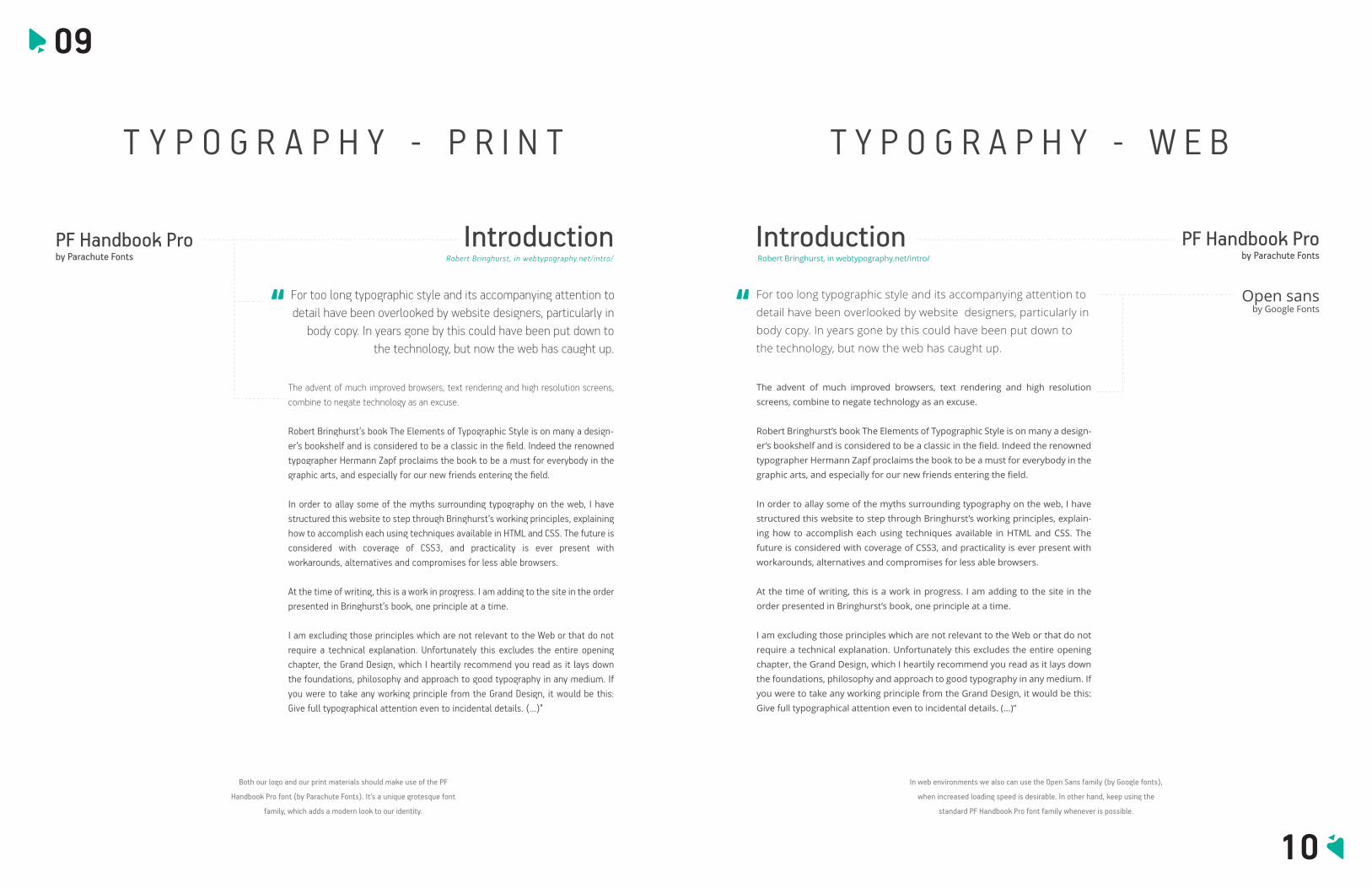
IntroductionPF Handbook Proby Parachute Fonts Robert Bringhurst, in webtypography.net/intro/
The advent of much improved browsers, text rendering and high resolution screens, combine to negate technology as an excuse.
Robert Bringhurst’s book The Elements of Typographic Style is on many a design-er’s bookshelf and is considered to be a classic in the field. Indeed the renowned typographer Hermann Zapf proclaims the book to be a must for everybody in the graphic arts, and especially for our new friends entering the field.
In order to allay some of the myths surrounding typography on the web, I have structured this website to step through Bringhurst’s working principles, explaining how to accomplish each using techniques available in HTML and CSS. The future is considered with coverage of CSS3, and practicality is ever present with workarounds, alternatives and compromises for less able browsers.
At the time of writing, this is a work in progress. I am adding to the site in the order presented in Bringhurst’s book, one principle at a time.
I am excluding those principles which are not relevant to the Web or that do not require a technical explanation. Unfortunately this excludes the entire opening chapter, the Grand Design, which I heartily recommend you read as it lays down the foundations, philosophy and approach to good typography in any medium. If you were to take any working principle from the Grand Design, it would be this: Give full typographical attention even to incidental details. (...)”
“ For too long typographic style and its accompanying attention to detail have been overlooked by website designers, particularly in
body copy. In years gone by this could have been put down to the technology, but now the web has caught up.
Both our logo and our print materials should make use of the PF
Handbook Pro font (by Parachute Fonts). It’s a unique grotesque font
family, which adds a modern look to our identity.
T Y P O G R A P H Y � P R I N T
09
PF Handbook Proby Parachute Fonts
Open sansby Google Fonts
IntroductionRobert Bringhurst, in webtypography.net/intro/
The advent of much improved browsers, text rendering and high resolution
screens, combine to negate technology as an excuse.
Robert Bringhurst’s book The Elements of Typographic Style is on many a design-
er’s bookshelf and is considered to be a classic in the field. Indeed the renowned
typographer Hermann Zapf proclaims the book to be a must for everybody in the
graphic arts, and especially for our new friends entering the field.
In order to allay some of the myths surrounding typography on the web, I have
structured this website to step through Bringhurst’s working principles, explain-
ing how to accomplish each using techniques available in HTML and CSS. The
future is considered with coverage of CSS3, and practicality is ever present with
workarounds, alternatives and compromises for less able browsers.
At the time of writing, this is a work in progress. I am adding to the site in the
order presented in Bringhurst’s book, one principle at a time.
I am excluding those principles which are not relevant to the Web or that do not
require a technical explanation. Unfortunately this excludes the entire opening
chapter, the Grand Design, which I heartily recommend you read as it lays down
the foundations, philosophy and approach to good typography in any medium. If
you were to take any working principle from the Grand Design, it would be this:
Give full typographical attention even to incidental details. (...)”
“ For too long typographic style and its accompanying attention to
detail have been overlooked by website designers, particularly in
body copy. In years gone by this could have been put down to
the technology, but now the web has caught up.
In web environments we also can use the Open Sans family (by Google fonts),
when increased loading speed is desirable. In other hand, keep using the
standard PF Handbook Pro font family whenever is possible.
T Y P O G R A P H Y � W E B
10
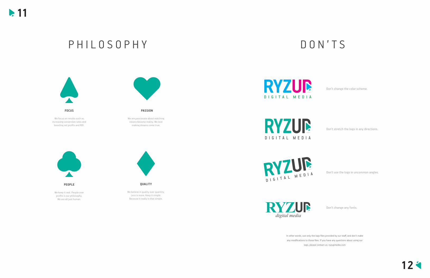
P H I L O S O P H Y
FOCUS
We focus on results such as increasing conversion rates and
boosting net profits and ROI.
PASSION
We are passionate about watching visions become reality. We love
making dreams come true.
PEOPLE
We keep it real. People over profits is our philosophy.
We are all just human.
QUALITY
We believe in quality over quantity. Less is more. Keep it simple.
Because it really is that simple.
11
In other words, use only the logo files provided by our staff, and don’t make
any modifications to those files. If you have any questions about using our
logo, please contact us: ryzupmedia.com
D O N ’ T S
Don’t change the color scheme.
Don’t stretch the logo in any directions.
Don’t use the logo in uncommon angles.
Don’t change any fonts.
12