ROAD CONGESTION IN AUSTRALIA - aaa.asn.au · AAA 4 Road congestion in Australia - 2018 No-one...
40
ROAD CONGESTION IN AUSTRALIA October 2018
Transcript of ROAD CONGESTION IN AUSTRALIA - aaa.asn.au · AAA 4 Road congestion in Australia - 2018 No-one...

ROAD CONGESTIONIN AUSTRALIA
October 2018

2AAA Road congestion in Australia - 2018

Section one
Section two
Section three
Section four
Section five
Introduction 6
National Summary 10
City by city analysis
Case study journeys
About the data
14
30
39
Table of contents
Foreword 4
4AAA Road congestion in Australia - 2018
No-one benefits from congestion, and everyone pays.
Smart government investment can help address this problem.
But to develop effective solutions for congestion, we first need a strong understanding of the problem.
This report confirms what most people living in and around our capital cities know all too well – traffic congestion is growing worse year after year.
Over this report’s 5.5-year reference period (1 January 2013 to 30 June 2018), average driving speeds have declined markedly in Australia’s capital cities. Speeds in Sydney and Brisbane fell by 3.6 per cent and 3.7 per cent respectively. In Melbourne, the slow-down was even worse - 8.2 per cent.
Without decisive action, these congestion problems will only get worse and Australians will spend even more time in traffic.
This isn’t just bad for quality of life. It also harms the economy and the environment.
Traffic jams push up emissions and air pollution – damaging public health and the environment.
Business costs rise and productivity declines when workers and goods are stuck in traffic. These costs end up being passed on to consumers, feeding into our rising cost of living.
The Bureau of Infrastructure, Transport and Regional Economics estimated that congestion cost Australia $16.5 billion in 2015.
Without major policy changes, congestion costs are predicted to reach between $27.7 and $37.3 billion by 2030.1
Road Congestion in Australia is the first report aimed at benchmarking road congestion in all of the nation’s capital cities. Delivering reliable, nationally consistent and regular reporting on road congestion will enable the AAA and its member clubs to advocate for greater investment in infrastructure and traffic management programs to enhance road networks. This report is intended to help stimulate discussion and problem-solving so that Australia can develop smart measures to address our growing traffic congestion.
1 Bureau of Infrastructure, Transport and Regional Economics, Information Sheet 74: Traffic and congestion cost trends for Australian capital cities (2015).
Michael Bradley
Chief Executive Australian Automobile Association
Road Congestion in Australia
Foreword

5AAA Road congestion in Australia - 2018
6AAA Road congestion in Australia - 2018
Introduction
Section one
The AAA’s inaugural Road Congestion in Australia report is the first report to deliver and assess speed performance and reliability data to benchmark road congestion on arterial road networks across all Australian capital cities.
The AAA intends to release regular reports that analyse high-level changes in road performance across capital city networks in the areas of average speed performance, congestion and reliability. The analysis of key routes (given in Section 5 of this report) will be regularly updated to show a more detailed picture of how road performance affects users on key routes, including an airport route, across the network.
Economic consulting firm HoustonKemp (founder of Journey Analytics) developed the road performance metrics using data provided by HERE Technologies, a leading global navigation system mapping company that is developing technology to support the shift towards autonomous vehicles. In partnership with leading car manufacturers, HERE collects data from in-vehicle navigation systems and hand-held smart phones to provide speed information across Australia.
The data is provided for a road link (the length of road between any two intersections). It is available for every local and arterial road across Australia, from 1 January 2013 to yesterday, and for every 15-minute period. The report examines data collected from 1 January 2013 to 30 June 2018. The data’s granularity and length of history provides rich insights to inform trends analysis down to specific road segments.
Several road agencies are now using HERE traffic data to inform the development of trend analysis, to support road safety programs, and to inform post-completion evaluation of road projects. The data also underpins the Infrastructure Performance Measurement Dashboard being developed by the Bureau of Transport and Regional Economics (BITRE), Infrastructure Australia and Data611. This dashboard is intended to report on high-level road performance trends in capital cities.2
1 Infrastructure Performance Dashboard accessed at: https://bitre.gov.au/data_dissemination/priority_projects/infrastructure_performance_dashboard.aspx
2 National Infrastructure Data Collection and Dissemination Plan accessed at: https://bitre.gov.au/data_dissemination/files/National_Infrastructure_Data_Collection_and_Dissemination_Plan.pdf
Overview
By reporting on AM/PM peaks, free flow speeds and analysing key routes, this report will enable much deeper insights into how, where and when road performance is changing across the road network. This work uses the same data and methodology that BITRE will be using for its public reporting at the city-wide level.
Understanding this report
The capital city road performance results are for arterial roads in the Greater Capital City Statistical Areas (GCCSA), as defined by the Australian Bureau of Statistics. Because road performance measurements are based on a statistical boundary, they do not account for different configurations in road networks across Australia’s capital cities. For example, the boundary does not account for variability of land use, population density and infrastructure availability.
Given the variability in network designs, some road performance indicators lend themselves more to intercity comparisons than others. For example, variability and the measurements for congestion (average speeds as a percentage of free flow speeds (POFF) and average speeds as a percentage of the speed limit (POSL)) compare road performance against the capacity of the city’s network. On the other hand, different speed limits and network configurations mean average speeds do not lend themselves to direct inter-city comparisons.
The report will have the greatest value for intra-city comparisons, where performance of individual road networks can be tracked over time.

7AAA Road congestion in Australia - 2018
Key definitions
This report measures several comparative performance metrics across Australia’s capital cities, including:
• Average speed across capital city arterial road networks
• Percentage of Speed Limit (POSL) - average speeds as a percentage of the speed limit for the segment of road
• Free flow speeds - average observed speeds over a number of hours in an overnight period (i.e. congestion-free speeds)
• Percentage of Free Flow (POFF) - average speeds as a percentage of free flow speeds
• Variability - the coefficient of variation of average speeds. Highly variable average speeds reduce the reliability and predictability of journey time.
POSL is a useful medium-to-long-term road performance benchmark that reflects the impact of asset quality and network investment on road speed performance.
But acceleration and deceleration on the road network, and general road user behaviour mean that average free flow speeds are likely to always be lower than the speed limit. For example, traffic lights, intersections, roundabouts and other road limitations make it unachievable to consistently travel at the speed limit on many sections of the arterial road network.
Because a road’s speed limit might not be a realistic benchmark for achievable speed performance, it is appropriate to include an alternative metric representing free flow speeds. The POFF metric is a more useful measure of the ‘best’ road performance that could be achieved without congestion.
POFF also provides a useful benchmark for comparing short-term road network performance between cities. It directly measures differences in speed performance as a consequence of traffic congestion.
However, the POFF metric can be affected by changes in free flow speeds that often mask increases in congestion. For example, improvements in POFF can be due to lower free flow speeds in a deteriorating network. The graph below tracks changes in free flow speeds over the reference period. On average across the capital cities, free flow speeds have declined by 4.8 per cent over the reference period.
The overall deterioration in free flow speeds clearly reveals that the underlying infrastructure, road quality and network configuration is not meeting road users’ needs and is significantly impairing road performance. Not only is congestion hampering our road network - the network itself is also deteriorating.
Both POSL and POFF metrics have been included in the AAA report for comparative purposes. 2013 data is not available for the POFF metric because free flow speeds are calculated using a 365-day moving average, so the first data point available is for 2014.
The capital city road performance results are for arterial roads in the Greater Capital City Statistical Areas (GCCSA), as defined by the Australian Bureau of Statistics. The GCCSAs are designed to represent the functional extent of each of the eight state and territory capital cities. They represent each city’s labour market and draw upon Census Travel to Work data.
55
60
65
70
75
80
85
2014 2015 2016 2017 2018
km/h
Average free flow speeds
Sydney Melbourne Brisbane Canberra
Adelaide Perth Hobart Darwin
8AAA Road congestion in Australia - 2018
Key findings
Road performance across Australia is deteriorating. Average speed and reliability have declined and congestion is growing worse.
Melbourne has had the largest decline in average speeds - a fall of 8.1 per cent over the 5.5-year reference period. Melbourne’s annual rate of reduction in speed is more than twice that of Sydney.
Brisbane had the second-largest decline in speed - 3.6 per cent since 2013. Sydney was close behind with a 3.5 per cent decline. Only Darwin achieved speed improvements, increasing by about 5.1 per cent.
Average monthly free flow speeds declined over the reference period. Adelaide has the lowest free flow overnight speeds. Melbourne had the greatest decline in free flow speed - a fall of 12.3 per cent over the reference period.
The measurement for congestion, average speeds as a percentage of the posted speed limit (POSL), shows congestion worsened in most capital cities over the reference period. This steady decline accelerated in 2017 and 2018. Melbourne has the lowest POSL results, closely followed by Adelaide and Sydney.
When average speeds are measured against free flow speeds (POFF), Sydney is the most congested city, closely followed by Melbourne and Adelaide, although the latter two cities recorded slight improvements from 2017 to 2018. Darwin and Brisbane had the greatest declines in this congestion metric from 2017 to 2018.
Overall, the POFF results have been relatively stable across the capital cities. But the consistent results for POFF are because free flow speeds declined over the reference period by an average of 4.8 per cent. Deteriorating free flow speeds can give cities misleadingly high performances in this metric.
Predictability of travel time is a key determinant for road performance. Predictability and variability are inversely related; a highly variable road performance makes travel less predictable and less reliable. If variability forces users to allot additional time for a trip, this affects productivity.
Melbourne has the most variable results, followed by Sydney. From 2017 to 2018, trip variability (reliability) improved in Adelaide and Sydney, while Brisbane and Canberra had the greatest deteriorations. Over 2013 to 2018, Darwin and Hobart had the greatest improvements in variability - reductions of almost 2 per cent.
Analysis of case study routes in Section 5 shows Melbourne’s Tullamarine Airport route had the largest increase in congestion over the reference period. This road’s congestion increased by almost 13 per cent over 2013 to 2018 and its variability is still notably higher than on any other airport route. Over 2017 to 2018, Brisbane Airport’s route had the largest decline in average speed, while Melbourne and Sydney had slight increases in speeds.
The capital city case study routes had a wide range of results. Some routes’ performances improved but others declined. Melbourne’s Dandenong to CBD route had the largest increase in travel time (3.7 minutes), while Adelaide’s South to CBD route had the biggest decrease in travel time (2.6 minutes).
24.0% 0.2%
VARIABILITYAVG. SPEED
1.1%63.5 KM/H
CONGESTION (POFF)
94.8% 0.3%
National congestion measurements - 2017 to 30 June 2018
9AAA Road congestion in Australia - 2018
10AAA Road congestion in Australia - 2018
Section two
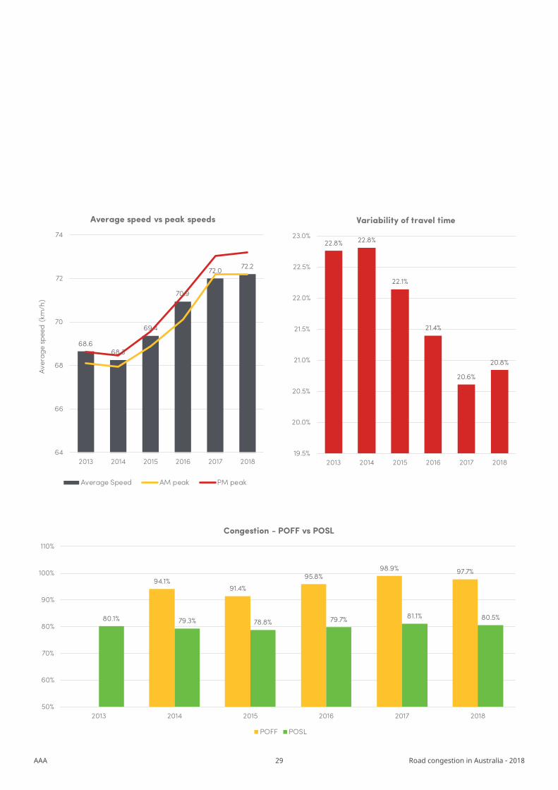
DARWIN
1 January 2017 to 30 June 2018
AVG. SPEED
97.7%
20.8%
CONGESTED SPEED (% OF FREE FLOW)
CONGESTED SPEED (% OF FREE FLOW)
CONGESTED SPEED (% OF FREE FLOW)
VARIABILITY
PERTH
AVG. SPEED
94.8%
24.3%VARIABILITY
ADELAIDE
AVG. SPEED
93.9%
24.5%VARIABILITY
72.2 KM/H
61.6 KM/H
54.3 KM/H
National summary
CONGESTED SPEED (% OF FREE FLOW)
HOBART
AVG. SPEED
94.3%
22.6%VARIABILITY
65.0 KM/H
11AAA Road congestion in Australia - 2018
CONGESTED SPEED (% OF FREE FLOW)
MELBOURNE
AVG. SPEED
93.6%
27.9%VARIABILITY
59.9 KM/H
CONGESTED SPEED (% OF FREE FLOW)
CONGESTED SPEED (% OF FREE FLOW)
CONGESTED SPEED (% OF FREE FLOW)
CANBERRA
AVG. SPEED
95.5%
23.9%VARIABILITY
SYDNEY
AVG. SPEED 58.2 KM/H
65.5 KM/H
92.5%
26.0%VARIABILITY
BRISBANE
AVG. SPEED
96.3%
21.7%VARIABILITY
71.5KM/H
= improved= deteriorated
12AAA Road congestion in Australia - 2018
Average speeds
Variability
50
55
60
65
70
75
80
2013 2014 2015 2016 2017 2018
km/h
Sydney Melbourne Brisbane Canberra Adelaide Perth Hobart Darwin
18%
20%
22%
24%
26%
28%
30%
2013 2014 2015 2016 2017 2018
Sydney Melbourne Brisbane Canberra Adelaide Perth Hobart Darwin
City Rank
Sydney 7
Melbourne 6
Brisbane 2
Canberra 3
Adelaide 8
Perth 5
Hobart 4
Darwin 1
City Rank
Sydney 7
Melbourne 8
Brisbane 2
Canberra 4
Adelaide 6
Perth 5
Hobart 3
Darwin 1

13AAA Road congestion in Australia - 2018
Congestion
86%
88%
90%
92%
94%
96%
98%
100%
2014 2015 2016 2017 2018
Percentage of Free Flow (POFF)
Sydney Melbourne Brisbane Canberra Adelaide Perth Hobart Darwin
70%
72%
74%
76%
78%
80%
82%
84%
86%
88%
90%
2013 2014 2015 2016 2017 2018
Percentage of Speed Limit (POSL)
Sydney Melbourne Brisbane Canberra Adelaide Perth Hobart Darwin
City Rank
Sydney 6
Melbourne 8
Brisbane 1
Canberra 5
Adelaide 7
Perth 4
Hobart 2
Darwin 3
City Rank
Sydney 8
Melbourne 7
Brisbane 2
Canberra 3
Adelaide 6
Perth 4
Hobart 5
Darwin 1
14AAA Road congestion in Australia - 2018
City by city analysis
Section three
Sydney
Average speeds
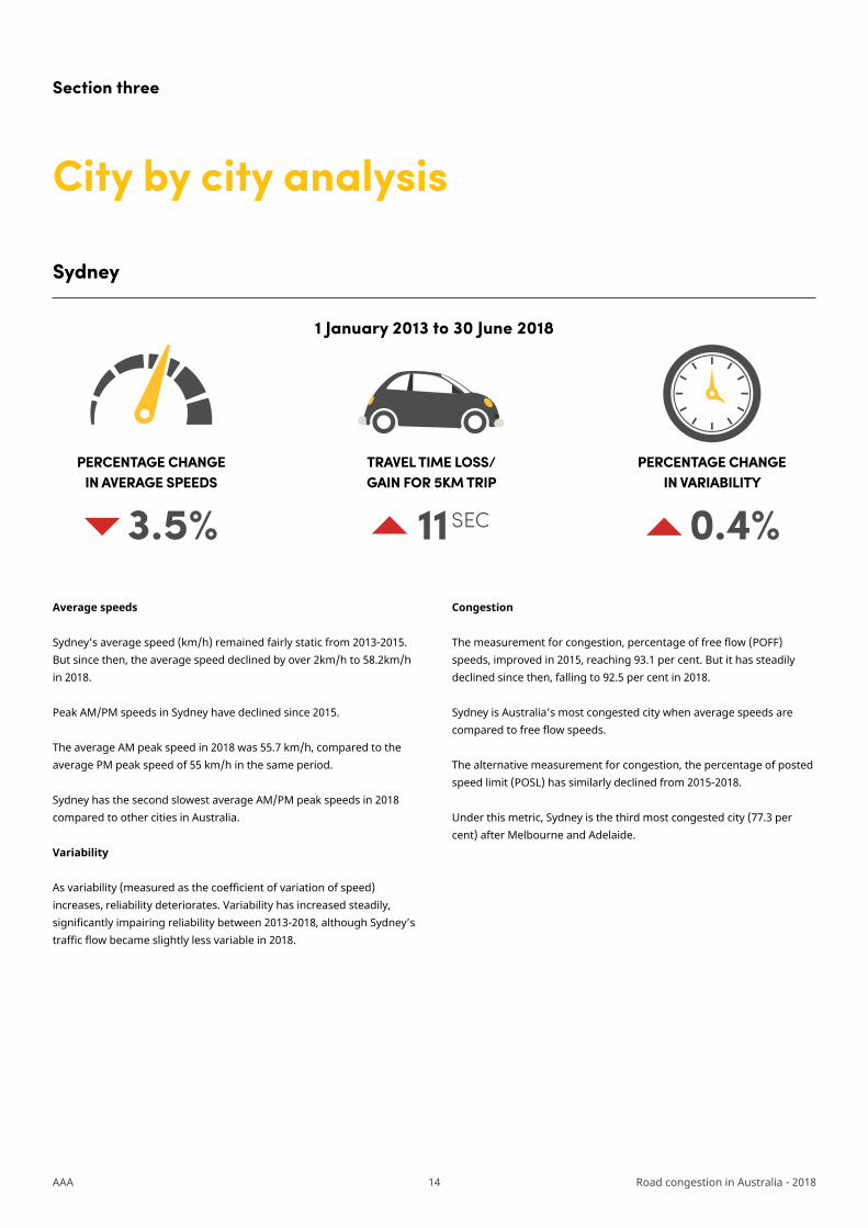
Sydney’s average speed (km/h) remained fairly static from 2013-2015. But since then, the average speed declined by over 2km/h to 58.2km/h in 2018.
Peak AM/PM speeds in Sydney have declined since 2015.
The average AM peak speed in 2018 was 55.7 km/h, compared to the average PM peak speed of 55 km/h in the same period.
Sydney has the second slowest average AM/PM peak speeds in 2018 compared to other cities in Australia.
Variability
As variability (measured as the coefficient of variation of speed) increases, reliability deteriorates. Variability has increased steadily, significantly impairing reliability between 2013-2018, although Sydney’s traffic flow became slightly less variable in 2018.
Congestion
The measurement for congestion, percentage of free flow (POFF) speeds, improved in 2015, reaching 93.1 per cent. But it has steadily declined since then, falling to 92.5 per cent in 2018.
Sydney is Australia’s most congested city when average speeds are compared to free flow speeds.
The alternative measurement for congestion, the percentage of posted speed limit (POSL) has similarly declined from 2015-2018.
Under this metric, Sydney is the third most congested city (77.3 per cent) after Melbourne and Adelaide.
PERCENTAGE CHANGE IN AVERAGE SPEEDS
TRAVEL TIME LOSS/GAIN FOR 5KM TRIP
PERCENTAGE CHANGE IN VARIABILITY
3.5% 11 SEC 0.4%
1 January 2013 to 30 June 2018
15AAA Road congestion in Australia - 2018
25.6%
25.8%
25.9%
25.8%
26.1%
26.0%
25.4%
25.6%
25.8%
26.0%
26.2%
2013 2014 2015 2016 2017 2018
Variability of travel time
Sydney
92.7% 93.1% 92.8% 92.7% 92.5%
79.6% 79.4% 79.8% 79.4% 78.4% 77.3%
50%
55%
60%
65%
70%
75%
80%
85%
90%
95%
100%
2013 2014 2015 2016 2017 2018
Congestion - POFF vs POSL
POFF POSL
60.4 60.360.5
59.9
58.8
58.2
52
54
56
58
60
62
2013 2014 2015 2016 2017 2018
Aver
age
spee
d (k
m/h
)
Average speed vs peak speeds
Average Speed AM peak PM peak

16AAA Road congestion in Australia - 2018
Melbourne
Average speeds
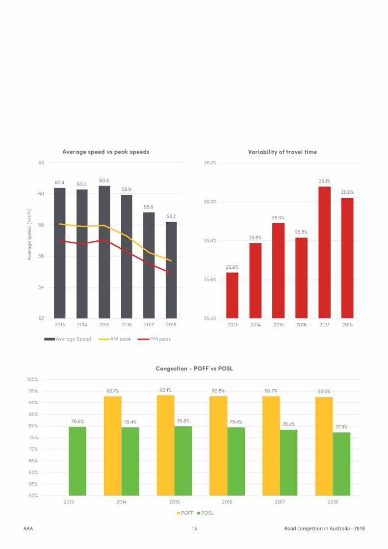
Melbourne’s average speeds barely changed from 2013 to 2015, but there has been a marked decline since 2016. The city’s 8.1 per cent fall in average speeds is the worst decline among all capitals.
Peak periods (AM/PM peak) also show similar trends to average speeds. Melbourne has the third-slowest average speeds over peak periods.
Variability
As variability (measured as the coefficient of variation of speed) increases, reliability deteriorates. Melbourne’s reliability has been declining over time. In 2018, Melbourne recorded the worst road variability results among all other capital cities.
Congestion
When looking at the metrics for congestion (the Percentage of Free Flow (POFF) and Percentage of Speed Limit (POSL)) the results are more variable. When average speeds are compared against free flow speeds (the POFF metric), 2018 saw an improvement in congestion. But when average speeds are compared against posted speed limits (the POSL metric), congestion increased in 2018 compared to 2017. This difference in results between the two congestion metrics is because Melbourne’s free flow speeds declined by 3.8 per cent from 2017 to 2018.
Melbourne is the most congested capital city under the POSL metric and the second most congested under the POFF metric.
PERCENTAGE CHANGE IN AVERAGE SPEEDS
TRAVEL TIME LOSS/GAIN FOR 5KM TRIP
PERCENTAGE CHANGE IN VARIABILITY
8.1% 24.4SEC 0.6%
1 January 2013 to 30 June 2018
17AAA Road congestion in Australia - 2018
65.3 65.3 65.1
64.0
61.1
59.9
52
54
56
58
60
62
64
66
2013 2014 2015 2016 2017 2018
Aver
age
spee
d (k
m/h
)
Average speed vs peak speeds
Average Speed AM peak PM peak
27.3%
27.4%
27.6%
27.4%
27.8%
27.9%
27.0%
27.2%
27.4%
27.6%
27.8%
28.0%
2013 2014 2015 2016 2017 2018
Variability of travel time
Melbourne
93.1% 94.3% 93.8% 93.0% 93.6%
78.7% 78.7% 78.7% 78.1%75.4% 74.1%
50%
55%
60%
65%
70%
75%
80%
85%
90%
95%
100%
2013 2014 2015 2016 2017 2018
Congestion - POFF vs POSL
POFF POSL

18AAA Road congestion in Australia - 2018
Brisbane
Average speeds
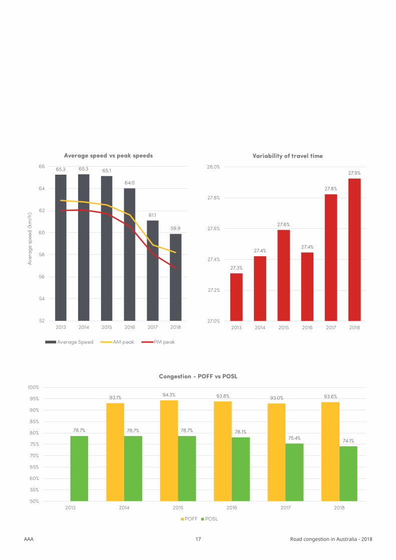
Average speed (km/h) remained relatively static in Brisbane until 2016. Since then average speeds have steadily declined. Average speed decreased by a total of 3.7 per cent between 2013-2018.
Peak AM and PM speeds in Brisbane have declined since 2015.
Variability
As variability (measured as the coefficient of variation of speed) increases, reliability deteriorates. Brisbane’s reliability has been steadily declining. Brisbane’s variability has worsened by a greater percentage than any other capital city.
Congestion
Brisbane’s percentage of free flow (POFF) speeds improved from 2014 to 2017, but declined significantly in 2018.
The alternative measurement for congestion, the percentage of posted speed limit (POSL) remained relatively stable between 2013-2016, but declined to 83.8 per cent in 2018.
PERCENTAGE CHANGE IN AVERAGE SPEEDS
TRAVEL TIME LOSS/GAIN FOR 5KM TRIP
PERCENTAGE CHANGE IN VARIABILITY
3.7% 9.4SEC 1.2%
1 January 2013 to 30 June 2018

19AAA Road congestion in Australia - 2018
74.2 74.274.5
73.9
73.0
71.5
66
68
70
72
74
76
2013 2014 2015 2016 2017 2018
Aver
age
spee
d (k
m/h
)
Average speed vs peak speeds
Average Speed AM peak PM peak
20.5%
20.3% 20.3%
20.7%
21.0%
21.7%
19.5%
20.0%
20.5%
21.0%
21.5%
22.0%
2013 2014 2015 2016 2017 2018
Variability of travel time
Brisbane
96.8% 97.0% 97.0% 97.3% 96.3%
86.7% 86.7% 87.3% 86.9% 85.7%83.8%
50%
55%
60%
65%
70%
75%
80%
85%
90%
95%
100%
2013 2014 2015 2016 2017 2018
Congestion - POFF vs POSL
POFF POSL

20AAA Road congestion in Australia - 2018
Canberra
Average speeds
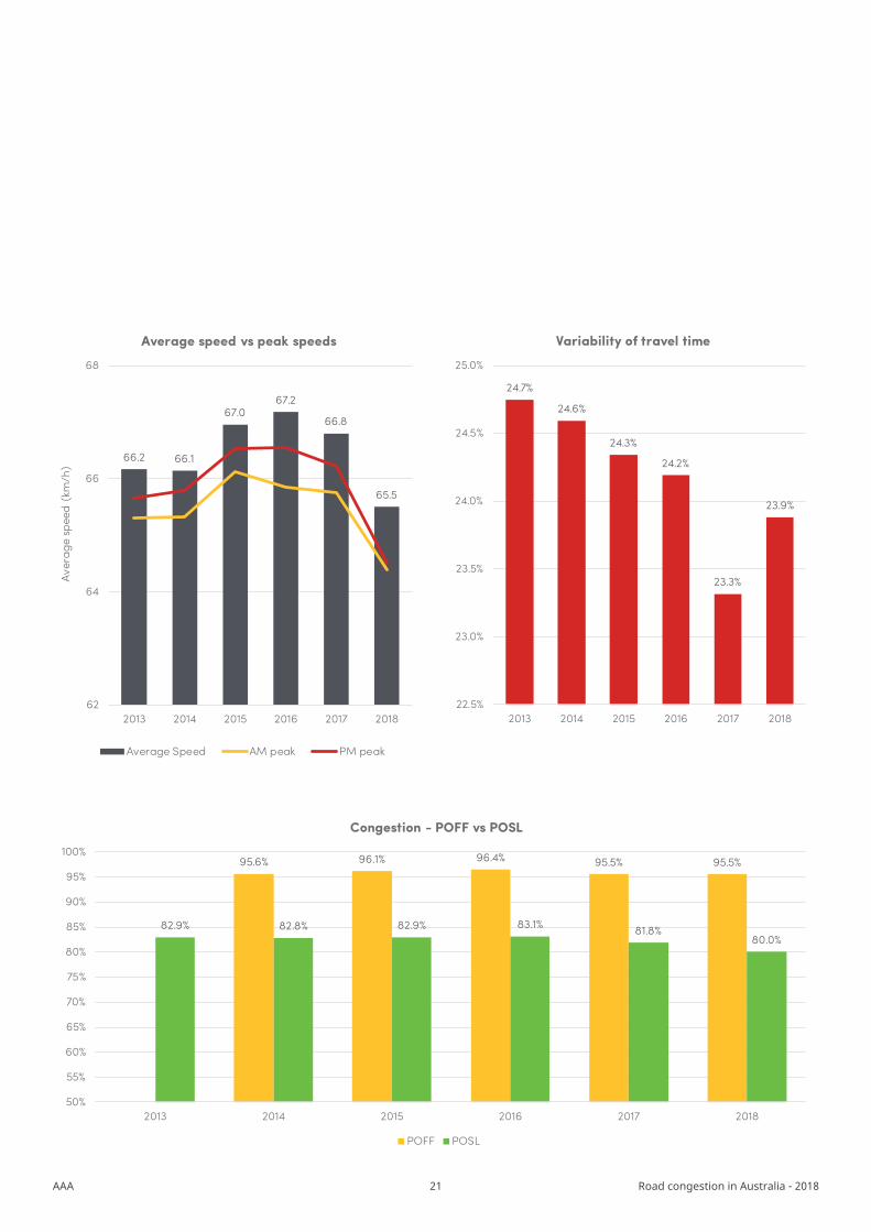
Average speed (km/h) in Canberra improved until 2016, after which it gradually declined. Average speed fell by 1 per cent over the period 2013 to 2018. Canberra has relatively fast average speeds compared to other cities; it is the third fastest under this metric.
Peak AM/PM speeds have declined since 2016 and this decline became much sharper in 2018.
Canberra tends to perform worse in the AM peak than in the PM peak period.
Variability
As variability (measured as the coefficient of variation of speed) increases, reliability deteriorates. Canberra’s reliability has been increasing over time, but deteriorated slightly in 2018. Canberra has the fourth-least variable road network among Australian capitals.
Congestion
The measurement for congestion, percentage of Free Flow (POFF) speeds, has deteriorated significantly since 2016.
Despite this, Canberra is Australia’s third-least congested city (behind Brisbane and Darwin) when POFF speed is considered (95.5 per cent).
The alternative measurement for congestion, percentage of posted speed limit (POSL) has remained relatively static until 2016. Since then, there has been a considerable decline in POSL. As with POFF speeds, Canberra performs relatively well compared to other capital cities, ranking fifth.
PERCENTAGE CHANGE IN AVERAGE SPEEDS
TRAVEL TIME LOSS/GAIN FOR 5KM TRIP
PERCENTAGE CHANGE IN VARIABILITY
1.0% 2.8SEC 0.9%
1 January 2013 to 30 June 2018
21AAA Road congestion in Australia - 2018
66.2 66.1
67.067.2
66.8
65.5
62
64
66
68
2013 2014 2015 2016 2017 2018
Aver
age
spee
d (k
m/h
)
Average speed vs peak speeds
Average Speed AM peak PM peak
24.7%
24.6%
24.3%
24.2%
23.3%
23.9%
22.5%
23.0%
23.5%
24.0%
24.5%
25.0%
2013 2014 2015 2016 2017 2018
Variability of travel time
Canberra
95.6% 96.1% 96.4% 95.5% 95.5%
82.9% 82.8% 82.9% 83.1% 81.8%80.0%
50%
55%
60%
65%
70%
75%
80%
85%
90%
95%
100%
2013 2014 2015 2016 2017 2018
Congestion - POFF vs POSL
POFF POSL
22AAA Road congestion in Australia - 2018
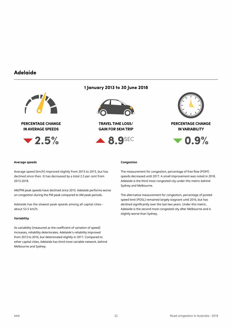
Adelaide
Average speeds
Average speed (km/h) improved slightly from 2013 to 2015, but has declined since then. It has decreased by a total 2.5 per cent from 2013-2018.
AM/PM peak speeds have declined since 2015. Adelaide performs worse on congestion during the PM peak compared to AM peak periods.
Adelaide has the slowest peak speeds among all capital cities - about 53.5 km/h.
Variability
As variability (measured as the coefficient of variation of speed) increases, reliability deteriorates. Adelaide’s reliability improved from 2013 to 2016, but deteriorated slightly in 2017. Compared to other capital cities, Adelaide has third most variable network, behind Melbourne and Sydney.
Congestion
The measurement for congestion, percentage of free flow (POFF) speeds decreased until 2017. A small improvement was noted in 2018. Adelaide is the third most congested city under this metric behind Sydney and Melbourne.
The alternative measurement for congestion, percentage of posted speed limit (POSL) remained largely stagnant until 2016, but has declined significantly over the last two years. Under this metric, Adelaide is the second most congested city after Melbourne and is slightly worse than Sydney.
PERCENTAGE CHANGE IN AVERAGE SPEEDS
TRAVEL TIME LOSS/GAIN FOR 5KM TRIP
PERCENTAGE CHANGE IN VARIABILITY
2.5% 8.9SEC 0.9%
1 January 2013 to 30 June 2018

23AAA Road congestion in Australia - 2018
55.756.0
56.656.2
55.0
54.3
50
52
54
56
58
2013 2014 2015 2016 2017 2018
Aver
age
spee
d (k
m/h
)
Average speed vs peak speeds
Average Speed AM peak PM peak
25.3%
25.2%
24.5%
24.2%
24.9%
24.5%
23.6%
23.8%
24.0%
24.2%
24.4%
24.6%
24.8%
25.0%
25.2%
25.4%
25.6%
2013 2014 2015 2016 2017 2018
Variability of travel time
Adelaide
93.7% 94.9% 94.2% 93.5% 93.9%
79.7% 79.4% 79.7% 79.3%77.5% 76.3%
50%
55%
60%
65%
70%
75%
80%
85%
90%
95%
100%
2013 2014 2015 2016 2017 2018
Congestion - POFF vs POSL
POFF POSL
24AAA Road congestion in Australia - 2018
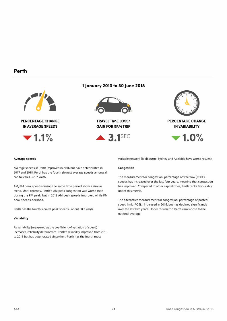
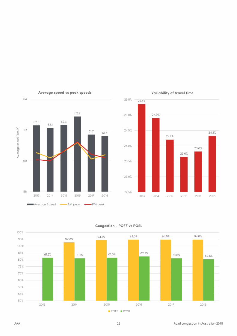
Perth
Average speeds
Average speeds in Perth improved in 2016 but have deteriorated in 2017 and 2018. Perth has the fourth slowest average speeds among all capital cities - 61.7 km/h.
AM/PM peak speeds during the same time period show a similar trend. Until recently, Perth’s AM peak congestion was worse than during the PM peak, but in 2018 AM peak speeds improved while PM peak speeds declined.
Perth has the fourth slowest peak speeds - about 60.3 km/h.
Variability
As variability (measured as the coefficient of variation of speed) increases, reliability deteriorates. Perth’s reliability improved from 2013 to 2016 but has deteriorated since then. Perth has the fourth most
variable network (Melbourne, Sydney and Adelaide have worse results).
Congestion
The measurement for congestion, percentage of free flow (POFF) speeds has increased over the last four years, meaning that congestion has improved. Compared to other capital cities, Perth ranks favourably under this metric.
The alternative measurement for congestion, percentage of posted speed limit (POSL), increased in 2016, but has declined significantly over the last two years. Under this metric, Perth ranks close to the national average.
PERCENTAGE CHANGE IN AVERAGE SPEEDS
TRAVEL TIME LOSS/GAIN FOR 5KM TRIP
PERCENTAGE CHANGE IN VARIABILITY
1.1% 3.1SEC 1.0%
1 January 2013 to 30 June 2018
25AAA Road congestion in Australia - 2018
62.362.1
62.3
62.9
61.7 61.6
58
60
62
64
2013 2014 2015 2016 2017 2018
Aver
age
spee
d (k
m/h
)
Average speed vs peak speeds
Average Speed AM peak PM peak
25.4%
24.9%
24.2%
23.6%
23.8%
24.3%
22.5%
23.0%
23.5%
24.0%
24.5%
25.0%
25.5%
2013 2014 2015 2016 2017 2018
Variability of travel time
Perth
92.8%94.3% 94.8% 94.8% 94.8%
81.5% 81.1% 81.6% 82.3% 81.0% 80.5%
50%
55%
60%
65%
70%
75%
80%
85%
90%
95%
100%
2013 2014 2015 2016 2017 2018
Congestion - POFF vs POSL
POFF POSL
26AAA Road congestion in Australia - 2018
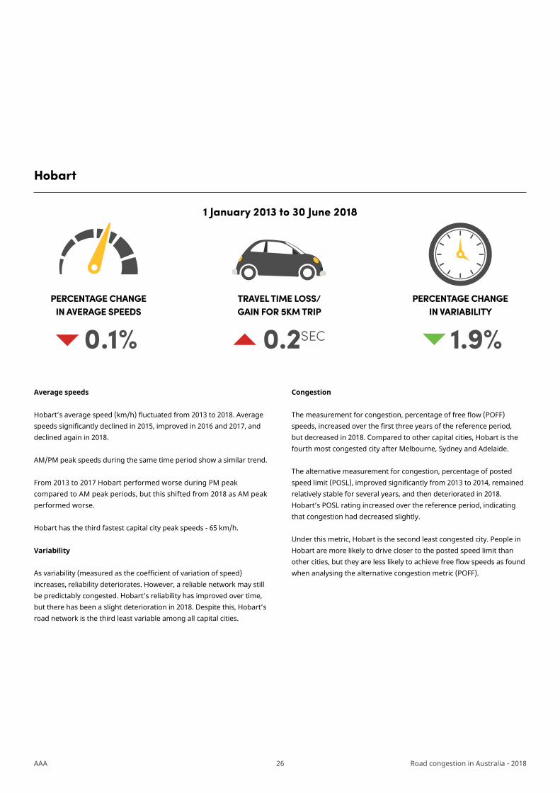
Hobart
Average speeds
Hobart’s average speed (km/h) fluctuated from 2013 to 2018. Average speeds significantly declined in 2015, improved in 2016 and 2017, and declined again in 2018.
AM/PM peak speeds during the same time period show a similar trend.
From 2013 to 2017 Hobart performed worse during PM peak compared to AM peak periods, but this shifted from 2018 as AM peak performed worse.
Hobart has the third fastest capital city peak speeds - 65 km/h.
Variability
As variability (measured as the coefficient of variation of speed) increases, reliability deteriorates. However, a reliable network may still be predictably congested. Hobart’s reliability has improved over time, but there has been a slight deterioration in 2018. Despite this, Hobart’s road network is the third least variable among all capital cities.
Congestion
The measurement for congestion, percentage of free flow (POFF) speeds, increased over the first three years of the reference period, but decreased in 2018. Compared to other capital cities, Hobart is the fourth most congested city after Melbourne, Sydney and Adelaide.
The alternative measurement for congestion, percentage of posted speed limit (POSL), improved significantly from 2013 to 2014, remained relatively stable for several years, and then deteriorated in 2018. Hobart’s POSL rating increased over the reference period, indicating that congestion had decreased slightly.
Under this metric, Hobart is the second least congested city. People in Hobart are more likely to drive closer to the posted speed limit than other cities, but they are less likely to achieve free flow speeds as found when analysing the alternative congestion metric (POFF).
PERCENTAGE CHANGE IN AVERAGE SPEEDS
TRAVEL TIME LOSS/GAIN FOR 5KM TRIP
PERCENTAGE CHANGE IN VARIABILITY
0.2SEC 1.9%
1 January 2013 to 30 June 2018
0.1%
27AAA Road congestion in Australia - 2018
65.0
65.5
64.6
65.265.3
65
62
64
66
2013 2014 2015 2016 2017 2018
Aver
age
spee
d (k
m/h
)
Average speed vs peak speeds
Average Speed AM peak PM peak
24.4%24.3%
23.7%
23.1%
22.3%
22.6%
21.0%
21.5%
22.0%
22.5%
23.0%
23.5%
24.0%
24.5%
25.0%
2013 2014 2015 2016 2017 2018
Variability of travel time
Hobart
93.2% 93.0% 93.5%95.1% 94.3%
80.1% 81.4% 81.1% 81.3% 81.2% 80.6%
50%
55%
60%
65%
70%
75%
80%
85%
90%
95%
100%
2013 2014 2015 2016 2017 2018
Congestion - POFF vs POSL
POFF POSL
28AAA Road congestion in Australia - 2018
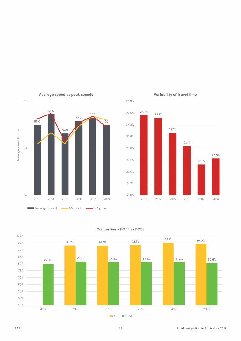
Darwin
Average speeds
Darwin’s average speeds have improved year on year over the reference period. Darwin now has the fastest average speeds compared to all other capital cities, recently overtaking Brisbane.
AM/PM peak speeds have improved over the reference period. Darwin performs worse on congestion during AM peak compared to PM peak periods.
Darwin has the fastest AM/PM peak speeds when compared to all other capital cities at 72.7 km/h.
Variability
As variability (measured as the coefficient of variation of speed) increases, reliability deteriorates. Darwin’s reliability has improved significantly over the reference period, but there has been a slight deterioration in 2018. Despite this, Darwin has the least variable capital city road network.
Congestion
The measurement for congestion, percentage of free flow (POFF) speeds has increased over the first three years of the reference period, but decreased in 2018. Under this metric, Darwin is Australia’s least congested city.
Darwin’s rating under the alternative measurement for congestion - percentage of posted speed limit (POSL) - decreased over the first three years of the reference period, increased in 2016 and 2017, and then declined again in 2018. Over the reference period, it increased slightly.
Under this metric, Darwin ranks equal third, performing worse than the POFF congestion metric. This may mean network constraints make it difficult to drive to the posted speed limit.
PERCENTAGE CHANGE IN AVERAGE SPEEDS
TRAVEL TIME LOSS/GAIN FOR 5KM TRIP
PERCENTAGE CHANGE IN VARIABILITY
5.1% 12.8SEC 1.9%
1 January 2013 to 30 June 2018
29AAA Road congestion in Australia - 2018
68.668.3
69.4
70.9
72.0 72.2
64
66
68
70
72
74
2013 2014 2015 2016 2017 2018
Aver
age
spee
d (k
m/h
)
Average speed vs peak speeds
Average Speed AM peak PM peak
22.8% 22.8%
22.1%
21.4%
20.6%
20.8%
19.5%
20.0%
20.5%
21.0%
21.5%
22.0%
22.5%
23.0%
2013 2014 2015 2016 2017 2018
Variability of travel time
Darwin
94.1%91.4%
95.8%98.9% 97.7%
80.1% 79.3% 78.8% 79.7% 81.1% 80.5%
50%
60%
70%
80%
90%
100%
110%
2013 2014 2015 2016 2017 2018
Congestion - POFF vs POSL
POFF POSL
30AAA Road congestion in Australia - 2018
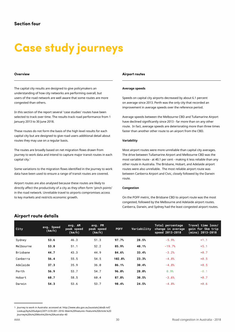
The capital city results are designed to give policymakers an understanding of how city networks are performing overall, but users of the road network are well aware that some routes are more congested than others.
In this section of the report several ‘case studies’ routes have been selected to track over time. The results track road performance from 1 January 2013 to 30 June 2018.
These routes do not form the basis of the high level results for each capital city but are designed to give road users additional detail about routes they may use on a regular basis.
The routes are broadly based on net migration flows drawn from journey to work data and intend to capture major transit routes in each capital city.1
Some variations to the migration flows identified in the journey to work data have been used to ensure a range of transit routes are covered.
Airport routes are also analysed because these routes are likely to directly affect the productivity of a city as they often form ‘pinch points’ in the road network. Unreliable travel to airports compromises access to key markets and restricts economic growth.
1 Journey to work in Australia: accessed at: http://www.abs.gov.au/ausstats/[email protected]/Lookup/by%20Subject/2071.0.55.001~2016~Main%20Features~Feature%20Article:%20Journey%20to%20Work%20in%20Australia~40
Case study journeys
Section four
Airport route details
Average speeds
Speeds on capital city airports decreased by about 6.1 percent on average since 2013. Perth was the only city that recorded an improvement in average speeds over the reference period.
Average speeds between the Melbourne CBD and Tullamarine Airport have declined significantly since 2013 - far more than on any other route. In fact, average speeds are deteriorating more than three times faster than another other route to an airport from the CBD.
Variability
Most airport routes were more unreliable than capital city averages. The drive between Tullamarine Airport and Melbourne CBD was the most variable route - at 40.1 per cent - making it less reliable than any other route in Australia. The Brisbane, Hobart, and Adelaide airport routes were also unreliable. The most reliable airport route was between Canberra Airport and Civic, closely followed by the Darwin route.
Congestion
On the POFF metric, the Brisbane CBD to airport route was the most congested, followed by the Melbourne and Adelaide airport routes. Canberra, Darwin, and Sydney had the least congested airport routes.
Overview Airport routes
City avg. Speed (km/h)
avg. AM peak speed (km/h)
avg. PM peak speed (km/h)
POFF VariabilityTotal percentage change in average speed 2013-2018
Travel time loss/gain for 5km trip (mins) 2013-2018
Sydney 53.6 46.3 51.3 97.7% 28.5% -5.9% +1.1
Melbourne 53.0 51.1 52.2 85.9% 40.1% -19.7% +5.1
Brisbane 44.7 43.3 44.9 84.6% 33.4% -3.2% +0.7
Canberra 56.4 55.5 54.5 102.8% 23.3% -4.8% +0.5
Adelaide 37.3 35.9 36.0 86.1% 30.4% -4.8% +0.5
Perth 56.9 53.7 54.7 96.0% 28.0% 0.9% -0.1
Hobart 60.7 58.5 60.4 87.8% 30.5% -3.6% +0.7
Darwin 54.3 53.6 53.7 98.4% 24.5% -4.8% +0.6

31AAA Road congestion in Australia - 2018
Sydney
Sydneysiders travelling to the CBD via Inner South West or the Sutherland routes lost an average 2.7 minutes during the AM peak period.
SYDNEYCBD
INNER SOUTH WEST - CBD2.7 MINUTES LOST49.3km/h AM Peak 2018
PARRAMATTA - CBD1.2 MINUTES GAIN51.1km/h AM Peak 2018
SUTHERLAND - CBD2.7 MINUTES LOST47.7km/h AM Peak 2018
AIRPORT - CBD2.2 MINUTES LOST46.2km/h AM Peak 2018
EASTERN SUBURBS - CBD2.1 MINUTES LOST44.7km/h AM Peak 2018
PENRITH - CBD1.2 MINUTES GAIN60.7km/h AM Peak 2018
QUAKERS HILL - CBD0.7 MINUTES LOST70.6km/h AM Peak 2018
RYDE - CBD1.9 MINUTES LOST39.8km/h AM Peak 2018
NORTHERN BEACHES - CBD1.7 MINUTES LOST38.1km/h AM Peak 2018
CAMPBELLTOWN - CBD1.5 MINUTES GAIN67.7km/h AM Peak 2018
HORNSBY - CBD2.2 MINUTES LOST53.7km/h AM Peak 2018
In contrast, people living in Penrith, Parramatta and Campbelltown gained an additional 1.2 to 1.5 minutes when travelling to the CBD in the AM peak period.
Sydney case study routes – 1 January 2013 - 30 June 2018

32AAA Road congestion in Australia - 2018
Melbourne
The Dandenong route to the Melbourne CBD has had the greatest increase to average trip times, adding an additional 3.7 minutes to the trip. Ormond to the Melbourne CBD and Melbourne airport to the CBD also had an additional 3.5 minutes added to the trip due to deteriorating road performance.
Routes from Ravenhall and Hoppers Crossing to the Melbourne CBD, from Kew to Parkville and from Bundoora to Nunawading also had slower trip times over the reference period. No routes analysed had an improvement in travel time.
MELBOURNE
BUNDOORA - NUNAWADING1.7 MINUTES LOST53.3km/h AM Peak 2018
KEW - PARKVILLE1.5 MINUTES LOST35.5km/h AM Peak 2018
RAVENHALL - CBD1.1 MINUTES LOST55.0km/h AM Peak 2018
HOPPERS CROSSING - CBD1.0 MINUTES LOST53.1km/h AM Peak 2018
AIRPORT - CBD3.5 MINUTES LOST51.1km/h AM Peak 2018
OROMOND - CBD3.5 MINUTES LOST43.9km/h AM Peak 2018
EPPING - CBD2.9 MINUTES LOST58.8km/h AM Peak 2018
BULLEEN - CBD2.5 MINUTES LOST37.3km/h AM Peak 2018
DANDENONG - CBD3.7 MINUTES LOST56.0km/h AM Peak 2018
Melbourne case study routes – 1 January 2013 - 30 June 2018

33AAA Road congestion in Australia - 2018
Brisbane
The Beenleigh-CBD route was among Brisbane’s most congested routes, with an average 3.0 minutes lost in the AM peak from 2013-2018. Similarly, motorists travelling from North to CBD or Brown Plains to CBD lost between 2.4 to 2.2 minutes in AM peak periods.
In contrast to most other cities, no travel-time gains were reported for any of the major routes selected in Brisbane from 2013-2018.
BRISBANE
NORTH - CBD2.4 MINUTES LOST35.2km/h AM Peak 2018
BROWNS PLAINS - CBD2.2 MINUTES LOST45.3km/h AM Peak 2018
BEENLEIGH - CBD3.0 MINUTES LOST67.4km/h AM Peak 2018
NORTHWEST - CBD1.2 MINUTES LOST36.7km/h AM Peak 2018
PINJARRA HILLS via MOGGILL RD - CBD1.4 MINUTES LOST34.4km/h AM Peak 2018
AIRPORT - CBD0.8 MINUTES LOST43.3km/h AM Peak 2018
EAST - CBD2.0 MINUTES LOST39.2km/h AM Peak 2018
CENTENARY MOTORWAY- CBD1.5 MINUTES LOST60.3km/h AM Peak 2018
Brisbane case study routes – 1 January 2013 - 30 June 2018
34AAA Road congestion in Australia - 2018
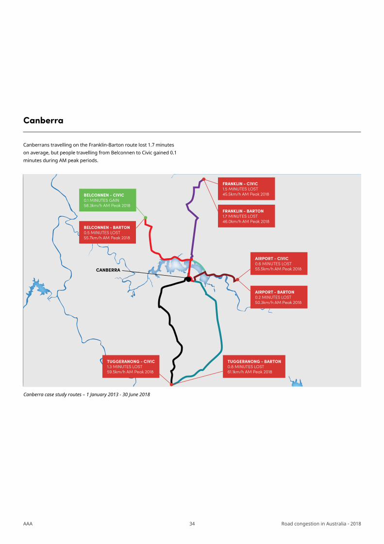
Canberra
Canberrans travelling on the Franklin-Barton route lost 1.7 minutes on average, but people travelling from Belconnen to Civic gained 0.1 minutes during AM peak periods.
CANBERRA
BELCONNEN - CIVIC0.1 MINUTES GAIN58.3km/h AM Peak 2018
BELCONNEN - BARTON0.5 MINUTES LOST55.7km/h AM Peak 2018
TUGGERANONG - CIVIC1.3 MINUTES LOST59.5km/h AM Peak 2018
TUGGERANONG - BARTON0.8 MINUTES LOST61.1km/h AM Peak 2018
AIRPORT - BARTON0.2 MINUTES LOST50.3km/h AM Peak 2018
AIRPORT - CIVIC0.6 MINUTES LOST55.5km/h AM Peak 2018
FRANKLIN - CIVIC1.5 MINUTES LOST45.5km/h AM Peak 2018
FRANKLIN - BARTON1.7 MINUTES LOST46.0km/h AM Peak 2018
Canberra case study routes – 1 January 2013 - 30 June 2018
35AAA Road congestion in Australia - 2018
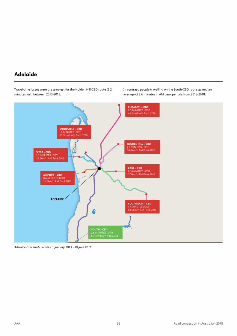
Adelaide
Travel-time losses were the greatest for the Holden Hill-CBD route (2.2 minutes lost) between 2013-2018.
In contrast, people travelling on the South-CBD route gained an average of 2.6 minutes in AM peak periods from 2013-2018.
ADELAIDESOUTH EAST - CBD1.7 MINUTES LOST58.9km/h AM Peak 2018
ELIZABETH- CBD2.0 MINUTES LOST48.1km/h AM Peak 2018
EAST - CBD0.3 MINUTES LOST37.1km/h AM Peak 2018
WEST - CBD1.0 MINUTES LOST36.2km/h AM Peak 2018
AIRPORT - CBD0.4 MINUTES LOST35.9km/h AM Peak 2018
WOODVILLE - CBD1.7 MINUTES LOST35.5km/h AM Peak 2018
HOLDEN HILL - CBD2.2 MINUTES LOST38.8km/h AM Peak 2018
SOUTH - CBD2.6 MINUTES GAIN51.4km/h AM Peak 2018
Adelaide case study routes – 1 January 2013 - 30 June 2018
36AAA Road congestion in Australia - 2018
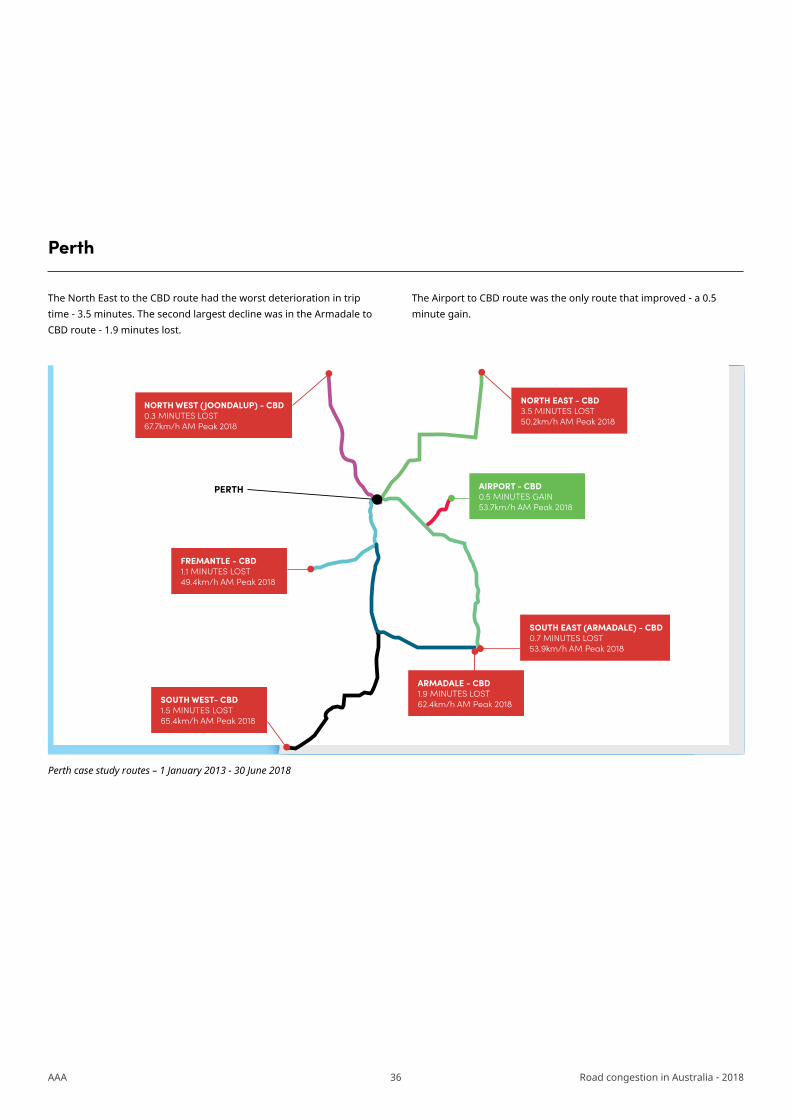
Perth
The North East to the CBD route had the worst deterioration in trip time - 3.5 minutes. The second largest decline was in the Armadale to CBD route - 1.9 minutes lost.
The Airport to CBD route was the only route that improved - a 0.5 minute gain.
PERTH
NORTH EAST - CBD3.5 MINUTES LOST50.2km/h AM Peak 2018
SOUTH EAST (ARMADALE) - CBD0.7 MINUTES LOST53.9km/h AM Peak 2018
ARMADALE - CBD1.9 MINUTES LOST62.4km/h AM Peak 2018SOUTH WEST- CBD
1.5 MINUTES LOST65.4km/h AM Peak 2018
FREMANTLE - CBD1.1 MINUTES LOST49.4km/h AM Peak 2018
NORTH WEST (JOONDALUP) - CBD0.3 MINUTES LOST67.7km/h AM Peak 2018
AIRPORT - CBD0.5 MINUTES GAIN53.7km/h AM Peak 2018
Perth case study routes – 1 January 2013 - 30 June 2018
37AAA Road congestion in Australia - 2018
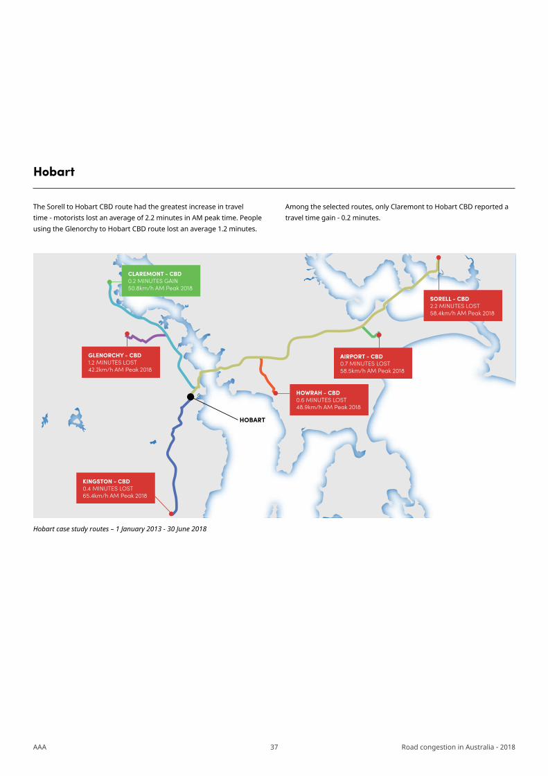
Hobart
The Sorell to Hobart CBD route had the greatest increase in travel time - motorists lost an average of 2.2 minutes in AM peak time. People using the Glenorchy to Hobart CBD route lost an average 1.2 minutes.
Among the selected routes, only Claremont to Hobart CBD reported a travel time gain - 0.2 minutes.
HOBART
CLAREMONT - CBD0.2 MINUTES GAIN50.8km/h AM Peak 2018
SORELL - CBD2.2 MINUTES LOST58.4km/h AM Peak 2018
AIRPORT - CBD0.7 MINUTES LOST58.5km/h AM Peak 2018
HOWRAH - CBD0.6 MINUTES LOST48.9km/h AM Peak 2018
KINGSTON - CBD0.4 MINUTES LOST65.4km/h AM Peak 2018
GLENORCHY - CBD1.2 MINUTES LOST42.2km/h AM Peak 2018
Hobart case study routes – 1 January 2013 - 30 June 2018

38AAA Road congestion in Australia - 2018
Darwin
The Darwin North to CBD route had the worst increase in travel time - an average 1.2 minutes lost in AM peak periods from 2013 to 2018. The Wagaman to CBD route also had a slower travel time, with an average 1.0 minute added to the trip.
But the Litchfield to CBD route had a quicker travel time, with motorists gaining an additional 0.9 minutes on average.
DARWIN
LITCHFIELD - CBD0.9 MINUTES GAIN74.6km/h AM Peak 2018
DARWIN NORTH - CBD1.2 MINUTES LOST53.3km/h AM Peak 2018
AIRPORT - CBD0.8 MINUTES LOST53.6km/h AM Peak 2018
WAGAMAN - CBD1.0 MINUTES LOST52.5km/h AM Peak 2018
Darwin case study routes – 1 January 2013 - 30 June 2018
39AAA Road congestion in Australia - 2018
About the data
Section five
The measures of road performance set out in this report were developed by HoustonKemp using speed data provided by HERE Technologies.
The data is collected from GPS probes, which provide information on speed and the speed distribution for road segments across Australia since 1 January 2013. The data is updated daily.
HERE uses information collected from a variety of devices, including: vehicle sensor data, smartphones, portable navigation devices, road sensors and connected cars.
The HERE traffic speed data covers all of Australia. It includes 6 million road segments, providing measures of:
• average speed (km/h);• speed by decile band (km/h)• speed limit by road link
HoustonKemp use the HERE data to produce hourly road performance metrics for all roads in Australia. These can be reported for any road, collection of roads, point-to-point routes, or geographic areas (for example, local government area or capital city). This enables an analysis of trends in traffic speed, free flow speeds, and the prevalence of speeding. The data can also provide insights on congestion hot-spots, how traffic incidents and road changes affect traffic speeds, and overall road performance.
Mailing Address:GPO Box 1555
Canberra ACT 2601
Address: 103 Northbourne Ave
Canberra ACT 2601
P 02 6247 7311
T @aaacomms
W www.aaa.asn.au
PRINTED AND AUTHORISED BY M.BRADLEY,
AUSTRALIAN AUTOMOBILE ASSOCIATION, 103 NORTHBOURNE AVE CANBERRA ACT 2601.