
RichFaces Developer Guide - JBoss
488
RichFaces Developer Guide RichFaces framework with a huge library of rich components and skinnability support
Transcript of RichFaces Developer Guide - JBoss

RichFaces Developer Guide
RichFaces framework with a huge library of
rich components and skinnability support
RichFaces Developer Guide
iii
1. Introduction ................................................................................................................... 1
2. Technical Requirements ................................................................................................. 3
2.1. Supported Java Versions .................................................................................... 3
2.2. Supported JavaServer Faces Implementations and Frameworks ............................ 3
2.3. Supported Servers .............................................................................................. 3
2.4. Supported Browsers ............................................................................................ 4
3. Getting Started with RichFaces ...................................................................................... 5
3.1. Downloading the RichFaces ................................................................................ 5
3.2. Simple JSF application with RichFaces ................................................................ 5
3.2.1. Adding RichFaces libraries into the project ................................................ 5
3.2.2. Registering RichFaces in web.xml ............................................................. 6
3.2.3. Managed bean ......................................................................................... 8
3.2.4. Registering bean in faces-cofig.xml ........................................................... 8
3.2.5. RichFaces Greeter index.jsp ..................................................................... 9
3.3. Integration of RichFaces into Maven Project ....................................................... 10
3.4. Relevant Resources Links ................................................................................. 16
4. Settings for different environments ................................................................................ 17
4.1. Web Application Descriptor Parameters .............................................................. 17
4.2. Sun JSF RI ...................................................................................................... 20
4.3. Apache MyFaces .............................................................................................. 20
4.4. Facelets Support ............................................................................................... 21
4.5. JBoss Seam Support ........................................................................................ 21
4.6. Portlet Support .................................................................................................. 25
4.7. Sybase EAServer .............................................................................................. 25
4.8. Oracle AS/OC4J ............................................................................................... 25
5. Basic concepts of the RichFaces Framework ................................................................ 27
5.1. Introduction ....................................................................................................... 27
5.2. RichFaces Architecture Overview ....................................................................... 28
5.3. Partial Rendering .............................................................................................. 31
5.4. RichFaces Integral Parts ................................................................................... 31
5.5. Limitations and Rules ........................................................................................ 32
5.6. Ajax Request Optimization ................................................................................. 32
5.6.1. Re-Rendering ......................................................................................... 32
5.6.2. Queue and Traffic Flood Protection ......................................................... 34
5.6.3. Queue Principles .................................................................................... 35
5.6.4. Data Processing Options ........................................................................ 41
5.6.5. Action and Navigation ............................................................................. 42
5.6.6. JavaScript Interactions ............................................................................ 42
5.6.7. Iteration components Ajax attributes ........................................................ 44
5.6.8. Other useful attributes ............................................................................ 44
5.6.9. Common Ajax Attributes ......................................................................... 45
5.7. How To... ......................................................................................................... 55
5.7.1. Send an Ajax request ............................................................................. 55
5.7.2. Decide What to Send ............................................................................. 56

RichFaces Developer Guide
iv
5.7.3. Decide What to Change ......................................................................... 56
5.7.4. Decide what to process .......................................................................... 56
5.8. Filter Configuration ............................................................................................ 57
5.9. Scripts and Styles Load Strategy ....................................................................... 59
5.10. Request Errors and Session Expiration Handling ............................................... 60
5.10.1. Request Errors Handling ....................................................................... 61
5.10.2. Session Expired Handling ..................................................................... 61
5.11. Skinnability ..................................................................................................... 62
5.11.1. Why Skinnability ................................................................................... 62
5.11.2. Using Skinnability ................................................................................. 63
5.11.3. Example ............................................................................................... 63
5.11.4. Skin Parameters Tables in RichFaces .................................................... 64
5.11.5. Creating and Using Your Own Skin File ................................................. 66
5.11.6. Built-in Skinnability in RichFaces ........................................................... 67
5.11.7. Changing skin in runtime ...................................................................... 68
5.11.8. Standard Controls Skinning ................................................................... 70
5.11.9. Client-side Script for Extended Skinning Support .................................... 79
5.11.10. XCSS File Format .............................................................................. 81
5.11.11. Plug-n-Skin ......................................................................................... 82
5.12. Definition of Custom Style Classes ................................................................... 88
5.13. State Manager API .......................................................................................... 90
5.14. Identifying User Roles ..................................................................................... 95
6. The RichFaces Components ........................................................................................ 97
6.1. Ajax Support ..................................................................................................... 97
6.1.1. < a4j:ajaxListener > ............................................................................... 97
6.1.2. < a4j:actionparam > .............................................................................. 99
6.1.3. < a4j:form > ........................................................................................ 101
6.1.4. < a4j:region > ..................................................................................... 103
6.1.5. < a4j:support > .................................................................................... 106
6.1.6. < a4j:commandButton > ....................................................................... 109
6.1.7. < a4j:commandLink > .......................................................................... 112
6.1.8. < a4j:jsFunction > ................................................................................ 114
6.1.9. < a4j:poll > ......................................................................................... 115
6.1.10. < a4j:push > ...................................................................................... 117
6.1.11. < a4j:queue > .................................................................................... 120
6.1.12. < a4j:status > .................................................................................... 123
6.2. Resources/Beans Handling .............................................................................. 125
6.2.1. < a4j:loadBundle > .............................................................................. 125
6.2.2. < a4j:keepAlive > ................................................................................ 129
6.2.3. < a4j:loadScript > ................................................................................ 130
6.2.4. < a4j:loadStyle > ................................................................................. 131
6.3. Ajax Validators ................................................................................................ 132
6.3.1. < rich:ajaxValidator > ........................................................................... 132
6.3.2. < rich:beanValidator > ......................................................................... 136
RichFaces Developer Guide
v
6.3.3. < rich:graphValidator > ........................................................................ 139
6.4. Ajax Output ..................................................................................................... 141
6.4.1. < a4j:include > .................................................................................... 141
6.4.2. < a4j:mediaOutput > ............................................................................ 143
6.4.3. < a4j:outputPanel > ............................................................................. 146
6.5. Ajax Miscellaneous .......................................................................................... 148
6.5.1. < a4j:page > ....................................................................................... 148
6.5.2. < a4j:portlet > ..................................................................................... 150
6.5.3. < a4j:htmlCommandLink > ................................................................... 151
6.5.4. < a4j:log > .......................................................................................... 152
6.6. Data Iteration .................................................................................................. 153
6.6.1. < rich:column > ................................................................................... 153
6.6.2. < rich:columnGroup > .......................................................................... 164
6.6.3. < rich:columns > ................................................................................. 169
6.6.4. < rich:dataDefinitionList > ..................................................................... 173
6.6.5. < rich:dataFilterSlider > ........................................................................ 176
6.6.6. < rich:dataGrid > ................................................................................. 179
6.6.7. < rich:dataList > .................................................................................. 182
6.6.8. < rich:dataOrderedList > ...................................................................... 185
6.6.9. < rich:datascroller > ............................................................................. 188
6.6.10. < rich:dataTable > ............................................................................. 196
6.6.11. < rich:subTable > .............................................................................. 202
6.6.12. < rich:extendedDataTable > ............................................................... 204
6.6.13. < a4j:repeat > ................................................................................... 213
6.6.14. < rich:scrollableDataTable > ............................................................... 214
6.7. Drag-Drop Support .......................................................................................... 223
6.7.1. < rich:dragIndicator > ........................................................................... 223
6.7.2. < rich:dragSupport > ............................................................................ 226
6.7.3. < rich:dragListener > ........................................................................... 229
6.7.4. < rich:dropListener > ........................................................................... 230
6.7.5. < rich:dropSupport > ............................................................................ 232
6.7.6. <rich:dndParam> ................................................................................. 237
6.8. Rich Menu ...................................................................................................... 238
6.8.1. < rich:contextMenu > ........................................................................... 238
6.8.2. < rich:dropDownMenu > ....................................................................... 244
6.8.3. < rich:menuGroup > ............................................................................ 249
6.8.4. < rich:menuItem > ............................................................................... 252
6.8.5. < rich:menuSeparator > ....................................................................... 256
6.9. Rich Trees ...................................................................................................... 257
6.9.1. < rich:tree > ........................................................................................ 257
6.9.2. < rich:treeNode > ................................................................................ 270
6.9.3. < rich:treeNodesAdaptor > ................................................................... 273
6.9.4. < rich:recursiveTreeNodesAdaptor > ..................................................... 275
6.9.5. < rich:changeExpandListener > ............................................................ 278
RichFaces Developer Guide
vi
6.9.6. < rich:nodeSelectListener > .................................................................. 279
6.10. Rich Output ................................................................................................... 280
6.10.1. <rich:modalPanel> ............................................................................. 280
6.10.2. < rich:paint2D > ................................................................................ 289
6.10.3. < rich:panel > .................................................................................... 291
6.10.4. < rich:panelBar > ............................................................................... 294
6.10.5. <rich:panelBarItem> ........................................................................... 296
6.10.6. <rich:panelMenu> .............................................................................. 298
6.10.7. <rich:panelMenuGroup> ..................................................................... 303
6.10.8. <rich:panelMenuItem> ........................................................................ 307
6.10.9. < rich:progressBar > .......................................................................... 310
6.10.10. < rich:separator > ............................................................................ 316
6.10.11. < rich:simpleTogglePanel > .............................................................. 318
6.10.12. < rich:spacer > ................................................................................ 321
6.10.13. <rich:tabPanel> ................................................................................. 323
6.10.14. <rich:tab> ......................................................................................... 326
6.10.15. < rich:togglePanel > ......................................................................... 331
6.10.16. < rich:toggleControl > ....................................................................... 334
6.10.17. < rich:toolBar > ................................................................................ 337
6.10.18. < rich:toolBarGroup > ....................................................................... 339
6.10.19. < rich:toolTip > ................................................................................ 341
6.11. Rich Input ..................................................................................................... 346
6.11.1. < rich:calendar > ............................................................................... 346
6.11.2. < rich:colorPicker > ............................................................................ 362
6.11.3. < rich:comboBox > ............................................................................ 367
6.11.4. < rich:editor > .................................................................................... 373
6.11.5. < rich:fileUpload > ............................................................................. 382
6.11.6. < rich:inplaceInput > .......................................................................... 396
6.11.7. < rich:inplaceSelect > ........................................................................ 403
6.11.8. < rich:inputNumberSlider > ................................................................. 410
6.11.9. < rich:inputNumberSpinner > .............................................................. 414
6.11.10. < rich:suggestionbox > ..................................................................... 417
6.12. Rich Selects .................................................................................................. 427
6.12.1. < rich:listShuttle > .............................................................................. 427
6.12.2. < rich:orderingList > ........................................................................... 436
6.12.3. < rich:pickList > ................................................................................. 443
6.13. Rich Semantic Layouts .................................................................................. 449
6.13.1. < rich:page > .................................................................................... 449
6.13.2. < rich:layout > ................................................................................... 452
6.13.3. < rich:layoutPanel > ........................................................................... 454
6.14. Rich Miscellaneous ........................................................................................ 455
6.14.1. < rich:componentControl > ................................................................. 455
6.14.2. <rich:effect> ...................................................................................... 459
6.14.3. < rich:gmap > .................................................................................... 461
RichFaces Developer Guide
vii
6.14.4. < rich:virtualEarth > ........................................................................... 465
6.14.5. < rich:hotKey > .................................................................................. 468
6.14.6. < rich:insert > .................................................................................... 471
6.14.7. <rich:message> ................................................................................. 473
6.14.8. <rich:messages> ............................................................................... 475
6.14.9. < rich:jQuery > .................................................................................. 477
7. IDE Support ............................................................................................................... 483
8. Links to information resources .................................................................................... 485
Chapter 1. Introduction
1
IntroductionRichFaces is an open source framework that adds Ajax capability into existing JSF applications
without resorting to JavaScript.
RichFaces leverages JavaServer Faces framework including lifecycle, validation, conversion
facilities and management of static and dynamic resources. RichFaces components with built-
in Ajax support and a highly customizable look-and-feel can be easily incorporated into JSF
applications.
RichFaces allows to:
• Intensify the whole set of JSF benefits while working with Ajax. RichFaces is fully integrated into
the JSF lifecycle. While other frameworks only give you access to the managed bean facility,
RichFaces advantages the action and value change listeners, as well as invokes server-side
validators and converters during the Ajax request-response cycle.
• Add Ajax capability to the existing JSF applications. Framework provides two components
libraries (Core Ajax and UI). The Core library sets Ajax functionality into existing pages, so
there is no need to write any JavaScript code or to replace existing components with new Ajax
ones. RichFaces enables page-wide Ajax support instead of the traditional component-wide
support and it gives the opportunity to define the event on the page. An event invokes an Ajax
request and areas of the page which become synchronized with the JSF Component Tree after
changing the data on the server by Ajax request in accordance with events fired on the client.
• Create quickly complex View basing on out of the box components. RichFaces UI library
contains components for adding rich user interface features to JSF applications. It extends
the RichFaces framework to include a large (and growing) set of powerful rich Ajax-enabled
components that come with extensive skins support. In addition, RichFaces components are
designed to be used seamlessly with other 3d-party component libraries on the same page, so
you have more options for developing your applications.
• Write your own custom rich components with built-in Ajax support. We're always working on
improvement of Component Development Kit (CDK) that was used for RichFaces UI library
creation. The CDK includes a code-generation facility and a templating facility using a JSP-
like syntax. These capabilities help to avoid a routine process of a component creation.
The component factory works like a well-oiled machine allowing the creation of first-class
rich components with built-in Ajax functionality even more easily than the creation of simpler
components by means of the traditional coding approach.
• Package resources with application Java classes. In addition to its core, Ajax functionality of
RichFaces provides an advanced support for the different resources management: pictures,
JavaScript code, and CSS stylesheets. The resource framework makes possible to pack easily
these resources into Jar files along with the code of your custom components.
Chapter 1. Introduction
2
• Easily generate binary resources on-the-fly. Resource framework can generate images,
sounds, Excel spreadsheets etc.. on-the-fly so that it becomes for example possible to create
images using the familiar approach of the "Java Graphics2D" library.
• Create a modern rich user interface look-and-feel with skins-based technology. RichFaces
provides a skinnability feature that allows easily define and manage different color schemes
and other parameters of the UI with the help of named skin parameters. Hence, it is possible to
access the skin parameters from JSP code and the Java code (e.g. to adjust generated on-the-
fly images based on the text parts of the UI). RichFaces comes with a number of predefined
skins to get you started, but you can also easily create your own custom skins.
• Test and create the components, actions, listeners, and pages at the same time. An automated
testing facility is in our roadmap for the near future. This facility will generate test cases for your
component as soon as you develop it. The testing framework will not just test the components,
but also any other server-side or client-side functionality including JavaScript code. What is
more, it will do all of this without deploying the test application into the Servlet container.
RichFaces UI components come ready to use out-of-the-box, so developers save their time and
immediately gain the advantage of the mentioned above features in Web applications creation.
As a result, usage experience can be faster and easily obtained.

Chapter 2. Technical Requirements
3
Technical RequirementsRichFaces was developed with an open architecture to be compatible with the widest possible
variety of environments.
This is what you need to start working with RichFaces 3.3.3:
• Java
• JavaServer Faces
• Java application server or servlet container
• Browser (on client side)
• RichFaces framework
2.1. Supported Java Versions
• JDK 1.5 and higher
2.2. Supported JavaServer Faces Implementations and
Frameworks
• Sun JSF-RI - 1.2_x (1.2_14 recommended), 2.x
• MyFaces 1.2.x (1.2.5 recommended), 2.x
• Facelets 1.1.x
• Seam 2.x
2.3. Supported Servers
• Apache Tomcat 5.5 - 6.0
• BEA WebLogic 9.1 - 10.0
• Resin 3.1.x
• Jetty 6.1.x
• Sun Application Server 9 (J5EE)
• Glassfish V2, V3
Chapter 2. Technical Requirements
4
• JBoss 4.2.x - 5
• Websphere 7.0. and higher
• Geronimo 2.0 and higher
2.4. Supported Browsers
Linux environments
• Firefox 3.0 and higher
• Opera 9.5 and higher
Windows environments
• Firefox 3.0 and higher
• Google Chrome
• Internet Explorer 6.0 and higher
• Opera 9.5 and higher
• Safari 3.0 and higher
Mac OS environments
• Safari 3.0 and higher
• Firefox 3.5 and higher
This list is composed basing on reports received from our users. We assume the list can be
incomplete and absence of your environment in the list doesn't mean incompatibility.
We appreciate your feedback on platforms and browsers that aren't in the list but are compatible
with RichFaces. It helps us to keep the list up-to-date.
Chapter 3. Getting Started with RichFaces
5
Getting Started with RichFacesThis chapter describes all necessary actions and configurations that should be done for plugging
the RichFaces components into a JSF appplication. The description relies on a simple JSF with
RichFaces application creation process from downloading the libraries to running the application
in a browser. The process of application creation described here is common and does not depend
on used IDE.
3.1. Downloading the RichFaces
The latest release of RichFaces components is available for download at JBoss RichFaces
Downloads area [http://labs.jboss.com/jbossrichfaces/downloads] at JBoss community. Binary
files (uploaded there in *.bin.zip or *.bin.tar.gz archives) contains compiled, ready-to-use
version of RichFaces with set of basic skins.
To start with RichFaces in computer file system create new folder with name "RichFaces",
download and unzip the archive with binaries there.
For those who want to download and compile the RichFaces by themselfs there is an
article at JBoss community that describes the RichFaces repository's structure overview [http://
www.jboss.org/community/docs/DOC-11864] and some aspects of working with it.
3.2. Simple JSF application with RichFaces
"RichFaces Greeter"—the simple application—is hello-world like application but with one
difference: the world of RichFaces will say "Hello!" to user first.
Create standard JSF 1.2 project with all necessary libraries; name the project "Greeter" and follow
the decription.
3.2.1. Adding RichFaces libraries into the project
Go to the folder with unzipped earlier RichFaces binary files and open lib folder. This folder
contains three *.jar files with API, UI and implementation libraries. Copy that "jars" from lib
folder to WEB-INF/lib folder of "Greeter" JSF application.
Important:
A JSF application with RichFaces assumes that the following JARs are available in
the project: commons-beanutils-1.7.0.jar, commons-collections-3.2.jar, commons-
digester-1.8.jar, commons-logging-1.0.4.jar, jhighlight-1.0.jar.
Chapter 3. Getting Started with RichFaces
6
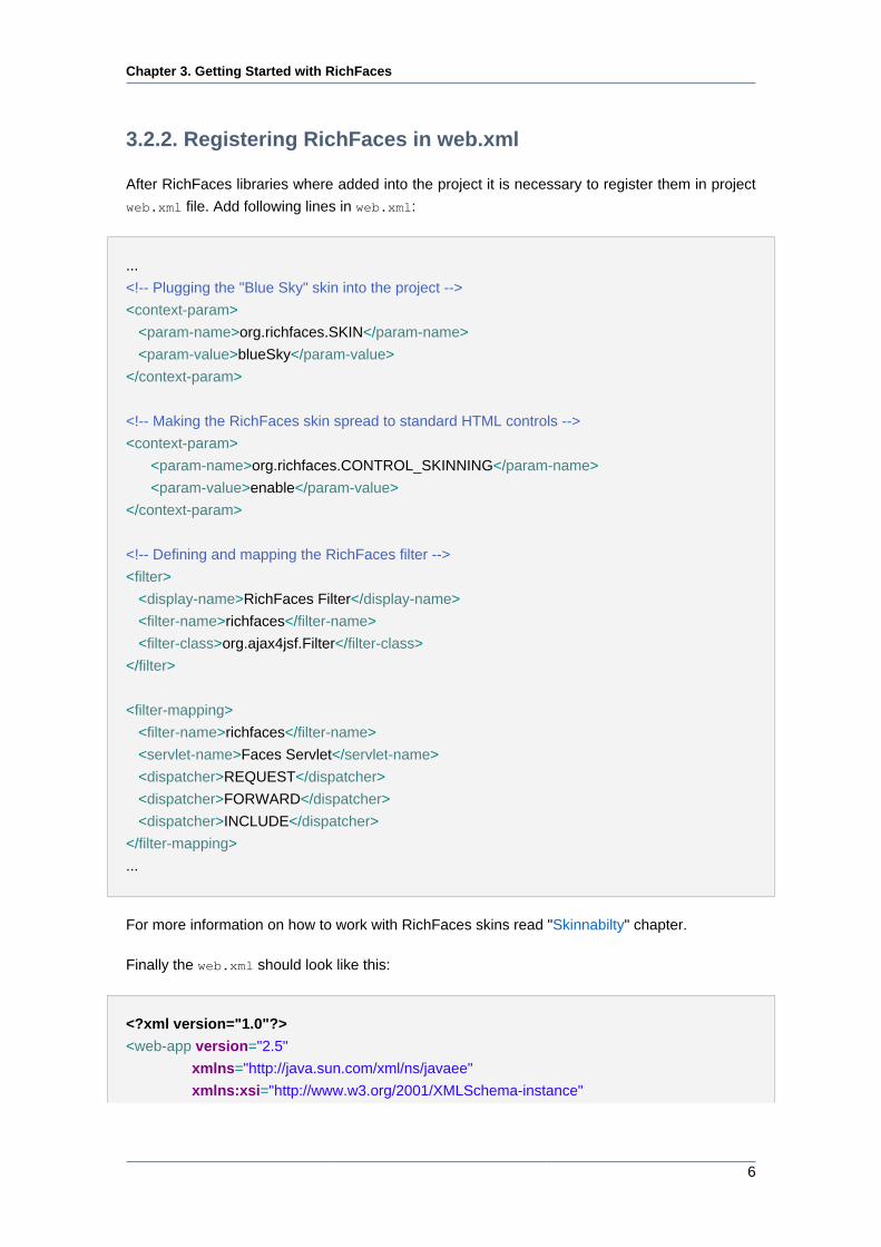
3.2.2. Registering RichFaces in web.xml
After RichFaces libraries where added into the project it is necessary to register them in project
web.xml file. Add following lines in web.xml:
...
<!-- Plugging the "Blue Sky" skin into the project -->
<context-param>
<param-name>org.richfaces.SKIN</param-name>
<param-value>blueSky</param-value>
</context-param>
<!-- Making the RichFaces skin spread to standard HTML controls -->
<context-param>
<param-name>org.richfaces.CONTROL_SKINNING</param-name>
<param-value>enable</param-value>
</context-param>
<!-- Defining and mapping the RichFaces filter -->
<filter>
<display-name>RichFaces Filter</display-name>
<filter-name>richfaces</filter-name>
<filter-class>org.ajax4jsf.Filter</filter-class>
</filter>
<filter-mapping>
<filter-name>richfaces</filter-name>
<servlet-name>Faces Servlet</servlet-name>
<dispatcher>REQUEST</dispatcher>
<dispatcher>FORWARD</dispatcher>
<dispatcher>INCLUDE</dispatcher>
</filter-mapping>
...
For more information on how to work with RichFaces skins read "Skinnabilty" chapter.
Finally the web.xml should look like this:
<?xml version="1.0"?>
<web-app version="2.5"
xmlns="http://java.sun.com/xml/ns/javaee"
xmlns:xsi="http://www.w3.org/2001/XMLSchema-instance"
Chapter 3. Getting Started with RichFaces
7
xsi:schemaLocation="http://java.sun.com/xml/ns/javaee http://java.sun.com/xml/ns/
javaee/web-app_2_5.xsd">
<display-name>Greeter</display-name>
<context-param>
<param-name>javax.faces.STATE_SAVING_METHOD</param-name>
<param-value>server</param-value>
</context-param>
<context-param>
<param-name>org.richfaces.SKIN</param-name>
<param-value>blueSky</param-value>
</context-param>
<context-param>
<param-name>org.richfaces.CONTROL_SKINNING</param-name>
<param-value>enable</param-value>
</context-param>
<filter>
<display-name>RichFaces Filter</display-name>
<filter-name>richfaces</filter-name>
<filter-class>org.ajax4jsf.Filter</filter-class>
</filter>
<filter-mapping>
<filter-name>richfaces</filter-name>
<servlet-name>Faces Servlet</servlet-name>
<dispatcher>REQUEST</dispatcher>
<dispatcher>FORWARD</dispatcher>
<dispatcher>INCLUDE</dispatcher>
</filter-mapping>
<listener>
<listener-class>com.sun.faces.config.ConfigureListener</listener-class>
</listener>
<!-- Faces Servlet -->
<servlet>
<servlet-name>Faces Servlet</servlet-name>
<servlet-class>javax.faces.webapp.FacesServlet</servlet-class>
<load-on-startup>1</load-on-startup>
</servlet>
Chapter 3. Getting Started with RichFaces
8
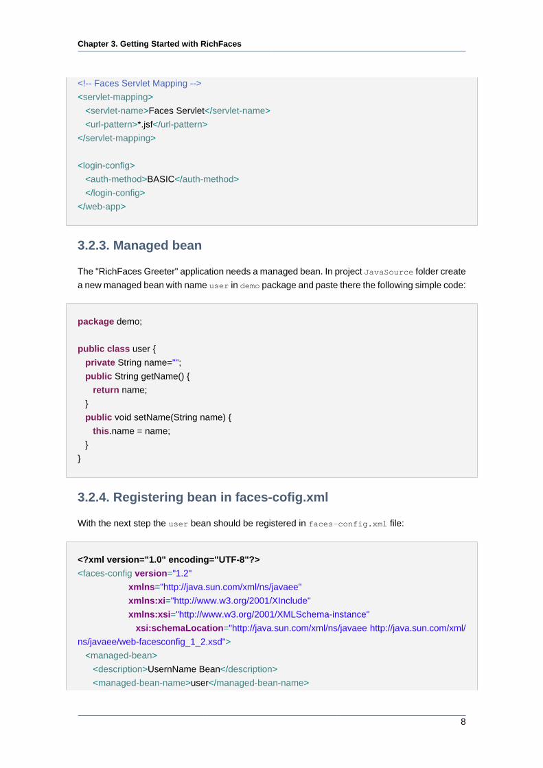
<!-- Faces Servlet Mapping -->
<servlet-mapping>
<servlet-name>Faces Servlet</servlet-name>
<url-pattern>*.jsf</url-pattern>
</servlet-mapping>
<login-config>
<auth-method>BASIC</auth-method>
</login-config>
</web-app>
3.2.3. Managed bean
The "RichFaces Greeter" application needs a managed bean. In project JavaSource folder create
a new managed bean with name user in demo package and paste there the following simple code:
package demo;
public class user {
private String name="";
public String getName() {
return name;
}
public void setName(String name) {
this.name = name;
}
}
3.2.4. Registering bean in faces-cofig.xml
With the next step the user bean should be registered in faces-config.xml file:
<?xml version="1.0" encoding="UTF-8"?>
<faces-config version="1.2"
xmlns="http://java.sun.com/xml/ns/javaee"
xmlns:xi="http://www.w3.org/2001/XInclude"
xmlns:xsi="http://www.w3.org/2001/XMLSchema-instance"
xsi:schemaLocation="http://java.sun.com/xml/ns/javaee http://java.sun.com/xml/
ns/javaee/web-facesconfig_1_2.xsd">
<managed-bean>
<description>UsernName Bean</description>
<managed-bean-name>user</managed-bean-name>
Chapter 3. Getting Started with RichFaces
9
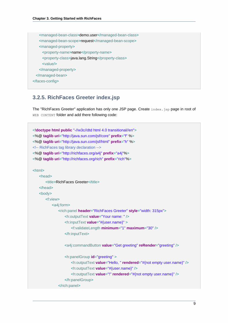
<managed-bean-class>demo.user</managed-bean-class>
<managed-bean-scope>request</managed-bean-scope>
<managed-property>
<property-name>name</property-name>
<property-class>java.lang.String</property-class>
<value/>
</managed-property>
</managed-bean>
</faces-config>
3.2.5. RichFaces Greeter index.jsp
The "RichFaces Greeter" application has only one JSP page. Create index.jsp page in root of
WEB CONTENT folder and add there following code:
<!doctype html public "-//w3c//dtd html 4.0 transitional//en">
<%@ taglib uri="http://java.sun.com/jsf/core" prefix="f" %>
<%@ taglib uri="http://java.sun.com/jsf/html" prefix="h" %>
<!-- RichFaces tag library declaration -->
<%@ taglib uri="http://richfaces.org/a4j" prefix="a4j"%>
<%@ taglib uri="http://richfaces.org/rich" prefix="rich"%>
<html>
<head>
<title>RichFaces Greeter</title>
</head>
<body>
<f:view>
<a4j:form>
<rich:panel header="RichFaces Greeter" style="width: 315px">
<h:outputText value="Your name: " />
<h:inputText value="#{user.name}" >
<f:validateLength minimum="1" maximum="30" />
</h:inputText>
<a4j:commandButton value="Get greeting" reRender="greeting" />
<h:panelGroup id="greeting" >
<h:outputText value="Hello, " rendered="#{not empty user.name}" />
<h:outputText value="#{user.name}" />
<h:outputText value="!" rendered="#{not empty user.name}" />
</h:panelGroup>
</rich:panel>
Chapter 3. Getting Started with RichFaces
10
</a4j:form>
</f:view>
</body>
</html>
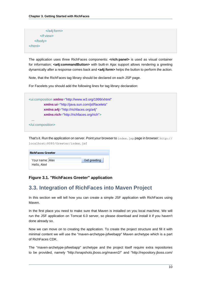
The application uses three RichFaces components: <rich:panel> is used as visual container
for information; <a4j:commandButton> with built-in Ajax support allows rendering a greeting
dynamically after a response comes back and <a4j:form> helps the button to perform the action.
Note, that the RichFaces tag library should be declared on each JSP page.
For Facelets you should add the following lines for tag library declaration:
<ui:composition xmlns="http://www.w3.org/1999/xhtml"
xmlns:ui="http://java.sun.com/jsf/facelets"
xmlns:a4j="http://richfaces.org/a4j"
xmlns:rich="http://richfaces.org/rich">
...
</ui:composition>
That's it. Run the application on server. Point your browser to index.jsp page in browser: http://
localhost:8080/Greeter/index.jsf
Figure 3.1. "RichFaces Greeter" application
3.3. Integration of RichFaces into Maven Project
In this section we will tell how you can create a simple JSF application with RichFaces using
Maven.
In the first place you need to make sure that Maven is installed on you local machine. We will
run the JSF application on Tomcat 6.0 server, so please download and install it if you haven't
done already so.
Now we can move on to creating the application. To create the project structure and fill it with
minimal content we will use the "maven-archetype-jsfwebapp" Maven archetype which is a part
of RichFaces CDK.
The "maven-archetype-jsfwebapp" archetype and the project itself require extra repositories
to be provided, namely "http://snapshots.jboss.org/maven2/" and "http://repository.jboss.com/
Chapter 3. Getting Started with RichFaces
11
maven2/". The easiest way to make the repositories visible for Maven is to create a profile in
"maven_installation_folder/conf/settings.xml" in <profiles> element. This is the content of the
profile:
<profile>
<id>jsf-app-profile</id>
<repositories>
<repository>
<releases>
<enabled>true</enabled>
</releases>
<snapshots>
<enabled>true</enabled>
<updatePolicy>always</updatePolicy>
</snapshots>
<id>snapshots.jboss.org</id>
<name>Snapshot Jboss Repository for Maven</name>
<url>http://snapshots.jboss.org/maven2/</url>
<layout>default</layout>
</repository>
<repository>
<releases>
<enabled>true</enabled>
</releases>
<snapshots>
<enabled>true</enabled>
<updatePolicy>always</updatePolicy>
</snapshots>
<id>repository.jboss.com</id>
<name>Jboss Repository for Maven</name>
<url>http://repository.jboss.com/maven2/</url>
<layout>default</layout>
</repository>
</repositories>
</profile>
When the profile is added you need to activate it in the <activeProfiles> element. It can be
done like this:
...
Chapter 3. Getting Started with RichFaces
12
<activeProfiles>
<activeProfile>jsf-app-profile</activeProfile>
</activeProfiles>
...
Now you have everything to create the project using the "maven-archetype-jsfwebapp" archetype.
Create a folder that will house your project and run the this command in it:
...
mvn archetype:generate -DarchetypeGroupId=org.richfaces.cdk -DarchetypeArtifactId=maven-
archetype-jsfwebapp -DarchetypeVersion=3.3.3-SNAPSHOT -DgroupId=org.docs.richfaces -
DartifactId=jsf-app
...
You can adjust some parameters of the command.
Table 3.1. Title of the table
Parameter Description
-DgroupId Defines the package for the Managed beans
-DartifactId Defines the name of the project
This command generates a JSF project that has the following structure:
jsf-app
|-- pom.xml
`-- src
|-- main
| |-- java
| | `-- org
| | `-- docs
| | `-- richfaces
| | `-- Bean.java
| |-- resources
| `-- webapp
| |-- WEB-INF
| | |-- faces-config.xml
| | `-- web.xml
| |-- index.jsp
| `-- pages
| |-- index.jsp
Chapter 3. Getting Started with RichFaces
13
| `-- index.xhtml
`-- test
`-- java
`-- org
`-- docs
`-- richfaces
`-- BeanTest.java
Now go to "jsf-app" folder, it contains a project descriptor(pom.xml). Open the project descriptor
to edit and add dependencies to the <dependencies> element. Your <dependencies> element
content should be the following:
...
<dependencies>
<dependency>
<groupId>junit</groupId>
<artifactId>junit</artifactId>
<version>3.8.1</version>
<scope>test</scope>
</dependency>
<dependency>
<groupId>javax.servlet</groupId>
<artifactId>servlet-api</artifactId>
<version>2.4</version>
<scope>provided</scope>
</dependency>
<dependency>
<groupId>javax.servlet</groupId>
<artifactId>jsp-api</artifactId>
<version>2.0</version>
<scope>provided</scope>
</dependency>
<dependency>
<groupId>jstl</groupId>
<artifactId>jstl</artifactId>
<version>1.1.2</version>
</dependency>
<dependency>
<groupId>javax.servlet.jsp</groupId>
<artifactId>jsp-api</artifactId>
<version>2.1</version>
<scope>provided</scope>
Chapter 3. Getting Started with RichFaces
14
</dependency>
<dependency>
<groupId>javax.faces</groupId>
<artifactId>jsf-api</artifactId>
<version>1.2_12</version>
</dependency>
<dependency>
<groupId>javax.faces</groupId>
<artifactId>jsf-impl</artifactId>
<version>1.2_12</version>
</dependency>
<dependency>
<groupId>javax.el</groupId>
<artifactId>el-api</artifactId>
<version>1.0</version>
<scope>provided</scope>
</dependency>
<dependency>
<groupId>el-impl</groupId>
<artifactId>el-impl</artifactId>
<version>1.0</version>
<scope>provided</scope>
</dependency>
<dependency>
<groupId>javax.annotation</groupId>
<artifactId>jsr250-api</artifactId>
<version>1.0</version>
</dependency>
<!-- RichFaces libraries -->
<dependency>
<groupId>org.richfaces.framework</groupId>
<artifactId>richfaces-api</artifactId>
<version>3.3.3-SNAPSHOT</version>
</dependency>
<dependency>
<groupId>org.richfaces.framework</groupId>
<artifactId>richfaces-impl</artifactId>
<version>3.3.3-SNAPSHOT</version>
</dependency>
<dependency>
<groupId>org.richfaces.ui</groupId>
<artifactId>richfaces-ui</artifactId>
<version>3.3.3-SNAPSHOT</version>
</dependency>
Chapter 3. Getting Started with RichFaces
15
</dependencies>
...
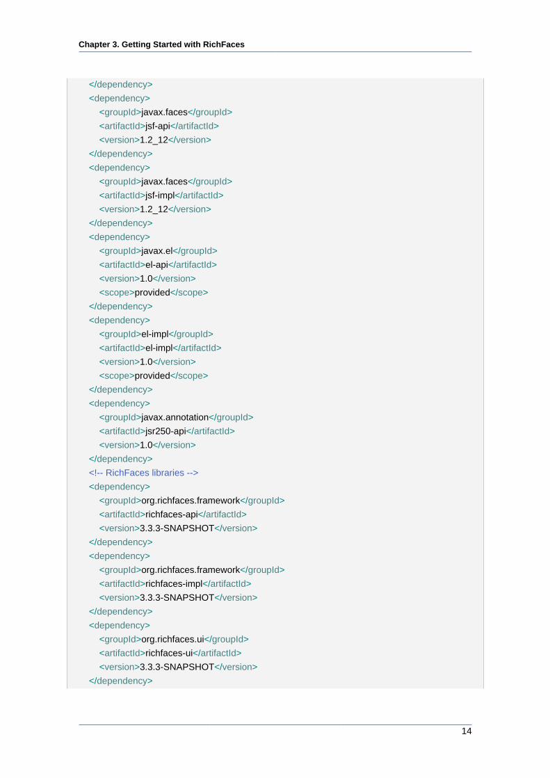
The last three dependences add RichFaces libraries to the project. You can now build the project
with the mvn install command.
When you see the "BUILD SUCCESSFUL" message, the project is assembled and can be
imported to a IDE and run on the server.
The project can be built for Eclipse IDE with mvn eclipse:eclipse -Dwtpversion=2.0
command.
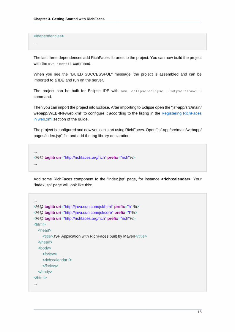
Then you can import the project into Eclipse. After importing to Eclipse open the "jsf-app/src/main/
webapp/WEB-INF/web.xml" to configure it according to the listing in the Registering RichFaces
in web.xml section of the guide.
The project is configured and now you can start using RichFaces. Open "jsf-app/src/main/webapp/
pages/index.jsp" file and add the tag library declaration.
...
<%@ taglib uri="http://richfaces.org/rich" prefix="rich"%>
...
Add some RichFaces component to the "index.jsp" page, for instance <rich:calendar>. Your
"index.jsp" page will look like this:
...
<%@ taglib uri="http://java.sun.com/jsf/html" prefix="h" %>
<%@ taglib uri="http://java.sun.com/jsf/core" prefix="f"%>
<%@ taglib uri="http://richfaces.org/rich" prefix="rich"%>
<html>
<head>
<title>JSF Application with RichFaces built by Maven</title>
</head>
<body>
<f:view>
<rich:calendar />
</f:view>
</body>
</html>
...
Chapter 3. Getting Started with RichFaces
16
Now run the application on Tomcat server and open it in your favourite browser by pointing it to
"http://localhost:8080/jsf-app/" .
3.4. Relevant Resources Links
The Photo Album Application [http://livedemo.exadel.com/photoalbum] is designed and
developed with RichFaces.
Maven Resource Dependency Plugin Reference [http://www.jboss.org/community/wiki/
MavenResourceDependencyPluginReference] article discusses plugin configuration and usage.
See also the "How to start RichFaces application with NetBeans IDE" [http://www.jboss.org/
community/wiki/HowtostartRichFacesapplicationwithNetBeansIDE] article in the RichFaces
Cookbook.
JBoss Developer Studio [https://www.redhat.com/apps/store/developers/
jboss_developer_studio.html] comes with a tight integration with RichFaces component
framework. Following links might be useful for those who already use this IDE and RichFaces for
developing applications and those who wish to improve their development process:
• "Rich Components [http://download.jboss.org/jbosstools/nightly-docs/en/GettingStartedGuide/
html/first_seam.html#rich_components]" chapter in "Getting Started with JBoss Developer
Studio Guide" describes how to add RichFaces components into a CRUD application;
• "JBoss Tools Palette [http://download.jboss.org/jbosstools/nightly-docs/en/jsf/html/
palette.html]" chapter in "Visual Web Tools Reference Guide" describes advantages that gives
Tools Pallete (comes together with JBDS) for quick and easy pages creation processs including
RichFaces applications;
• "RichFaces Toolkit for developing Web application [http://docs.jboss.org/tools/movies/demos/
rich_faces_demo/rich_faces_demo.htm]" video tutorial demonstrates some aspects of
interaction with JBoss Developer Studio while working with RichFaces.
• "How to Configure Maven for RichFaces [http://docs.jboss.org/tools/movies/demos/
rich_faces_demo/rich_faces_demo.htm]" article shortly discusses Maven configuration for
RichFaces.
• " RichFaces Release Procedure [http://www.jboss.org/community/docs/DOC-13446]" article
describes how RichFaces release builds are made.
Read "RichFaces installing and configuration" [http://www.jboss.org/community/wiki/
RichFacesinstallingandconfiguration] article to find out how to integrate RichFaces and Trinidad
and possible problems that may occur while launching the RichFaces sample on the JBoss server.
Read also the quick overview [http://mkblog.exadel.com/?p=110] to "Practical RichFaces " book
by Max Katz at his blog.
Chapter 4. Settings for different environments
17
Settings for different environmentsRichFaces comes with support for all tags (components) included in the JavaServer Faces
specification. To add RichFaces capabilities to the existing JSF project you should just put the
RichFaces libraries into the lib folder of the project and add filter mapping. The behavior of the
existing project doesn't change just because of RichFaces.
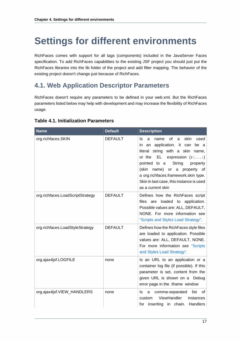
4.1. Web Application Descriptor Parameters
RichFaces doesn't require any parameters to be defined in your web.xml. But the RichFaces
parameters listed below may help with development and may increase the flexibility of RichFaces
usage.
Table 4.1. Initialization Parameters
Name Default Description
org.richfaces.SKIN DEFAULT Is a name of a skin used
in an application. It can be a
literal string with a skin name,
or the EL expression (#{...})
pointed to a String property
(skin name) or a property of
a org.richfaces.framework.skin type.
Skin in last case, this instance is used
as a current skin
org.richfaces.LoadScriptStrategy DEFAULT Defines how the RichFaces script
files are loaded to application.
Possible values are: ALL, DEFAULT,
NONE. For more information see
"Scripts and Styles Load Strategy".
org.richfaces.LoadStyleStrategy DEFAULT Defines how the RichFaces style files
are loaded to application. Possible
values are: ALL, DEFAULT, NONE.
For more information see "Scripts
and Styles Load Strategy".
org.ajax4jsf.LOGFILE none Is an URL to an application or a
container log file (if possible). If this
parameter is set, content from the
given URL is shown on a Debug
error page in the iframe window
org.ajax4jsf.VIEW_HANDLERS none Is a comma-separated list of
custom ViewHandler instances
for inserting in chain. Handlers
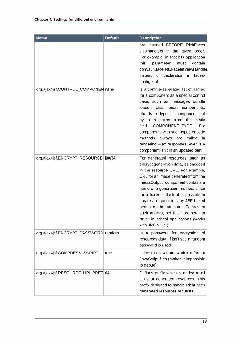
Chapter 4. Settings for different environments
18
Name Default Description
are inserted BEFORE RichFaces
viewhandlers in the given order.
For example, in facelets application
this parameter must contain
com.sun.facelets.FaceletViewHandler,
instead of declaration in faces-
config.xml
org.ajax4jsf.CONTROL_COMPONENTSnone Is a comma-separated list of names
for a component as a special control
case, such as messages bundle
loader, alias bean components,
etc. Is a type of component got
by a reflection from the static
field COMPONENT_TYPE . For
components with such types encode
methods always are called in
rendering Ajax responses, even if a
component isn't in an updated part
org.ajax4jsf.ENCRYPT_RESOURCE_DATAfalse For generated resources, such as
encrypt generation data, it's encoded
in the resource URL. For example,
URL for an image generated from the
mediaOutput component contains a
name of a generation method, since
for a hacker attack, it is possible to
create a request for any JSF baked
beans or other attributes. To prevent
such attacks, set this parameter to
"true" in critical applications (works
with JRE > 1.4 )
org.ajax4jsf.ENCRYPT_PASSWORD random Is a password for encryption of
resources data. If isn't set, a random
password is used
org.ajax4jsf.COMPRESS_SCRIPT true It doesn't allow framework to reformat
JavaScript files (makes it impossible
to debug)
org.ajax4jsf.RESOURCE_URI_PREFIXa4j Defines prefix which is added to all
URIs of generated resources. This
prefix designed to handle RichFaces
generated resources requests
Chapter 4. Settings for different environments
19
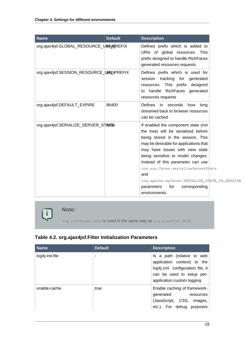
Name Default Description
org.ajax4jsf.GLOBAL_RESOURCE_URI_PREFIXa4j/g Defines prefix which is added to
URIs of global resources. This
prefix designed to handle RichFaces
generated resources requests
org.ajax4jsf.SESSION_RESOURCE_URI_PREFIXa4j/s Defines prefix which is used for
session tracking for generated
resources. This prefix designed
to handle RichFaces generated
resources requests
org.ajax4jsf.DEFAULT_EXPIRE 86400 Defines in seconds how long
streamed back to browser resources
can be cached
org.ajax4jsf.SERIALIZE_SERVER_STATEfalse If enabled the component state (not
the tree) will be serialized before
being stored in the session. This
may be desirable for applications that
may have issues with view state
being sensitive to model changes.
Instead of this parameter can use
com.sun.faces.serializeServerState
and
org.apache.myfaces.SERIALIZE_STATE_IN_SESSION
parameters for corresponding
environments.
Note:
org.richfaces.SKIN is used in the same way as org.ajax4jsf.SKIN
Table 4.2. org.ajax4jsf.Filter Initialization Parameters
Name Default Description
log4j-init-file - Is a path (relative to web
application context) to the
log4j.xml configuration file, it
can be used to setup per-
application custom logging
enable-cache true Enable caching of framework-
generated resources
(JavaScript, CSS, images,
etc.). For debug purposes
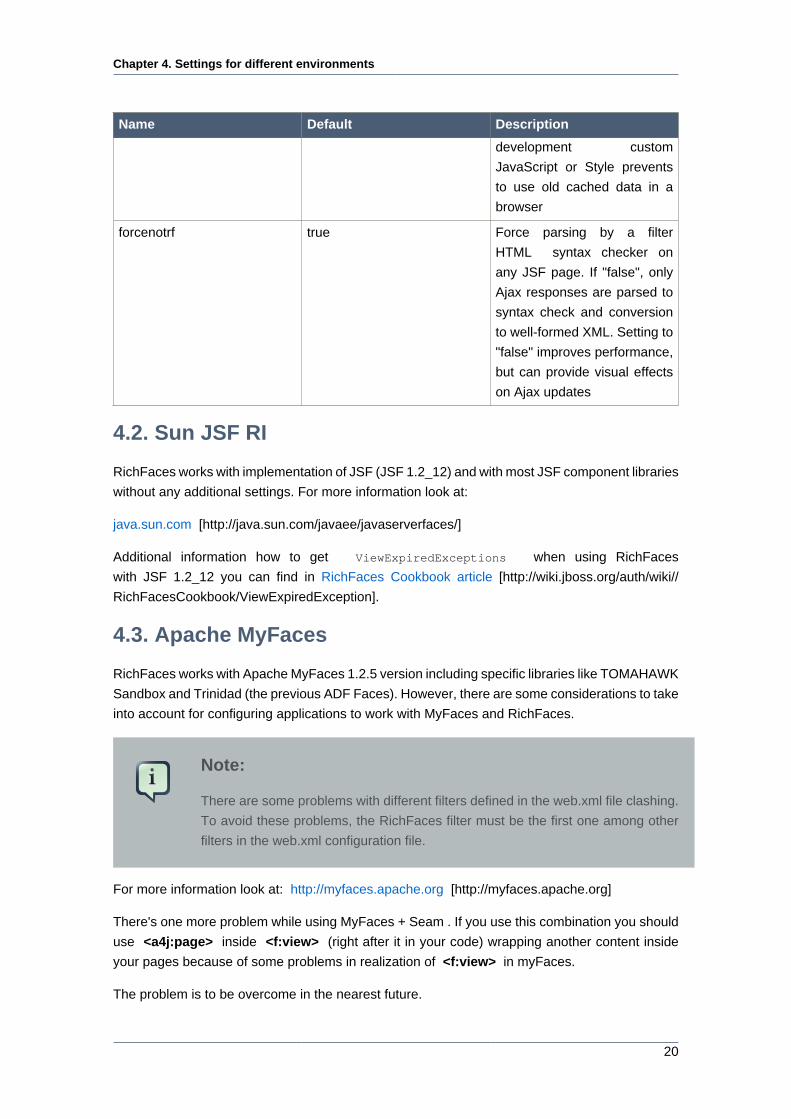
Chapter 4. Settings for different environments
20
Name Default Description
development custom
JavaScript or Style prevents
to use old cached data in a
browser
forcenotrf true Force parsing by a filter
HTML syntax checker on
any JSF page. If "false", only
Ajax responses are parsed to
syntax check and conversion
to well-formed XML. Setting to
"false" improves performance,
but can provide visual effects
on Ajax updates
4.2. Sun JSF RI
RichFaces works with implementation of JSF (JSF 1.2_12) and with most JSF component libraries
without any additional settings. For more information look at:
java.sun.com [http://java.sun.com/javaee/javaserverfaces/]
Additional information how to get ViewExpiredExceptions when using RichFaces
with JSF 1.2_12 you can find in RichFaces Cookbook article [http://wiki.jboss.org/auth/wiki//
RichFacesCookbook/ViewExpiredException].
4.3. Apache MyFaces
RichFaces works with Apache MyFaces 1.2.5 version including specific libraries like TOMAHAWK
Sandbox and Trinidad (the previous ADF Faces). However, there are some considerations to take
into account for configuring applications to work with MyFaces and RichFaces.
Note:
There are some problems with different filters defined in the web.xml file clashing.
To avoid these problems, the RichFaces filter must be the first one among other
filters in the web.xml configuration file.
For more information look at: http://myfaces.apache.org [http://myfaces.apache.org]
There's one more problem while using MyFaces + Seam . If you use this combination you should
use <a4j:page> inside <f:view> (right after it in your code) wrapping another content inside
your pages because of some problems in realization of <f:view> in myFaces.
The problem is to be overcome in the nearest future.
Chapter 4. Settings for different environments
21
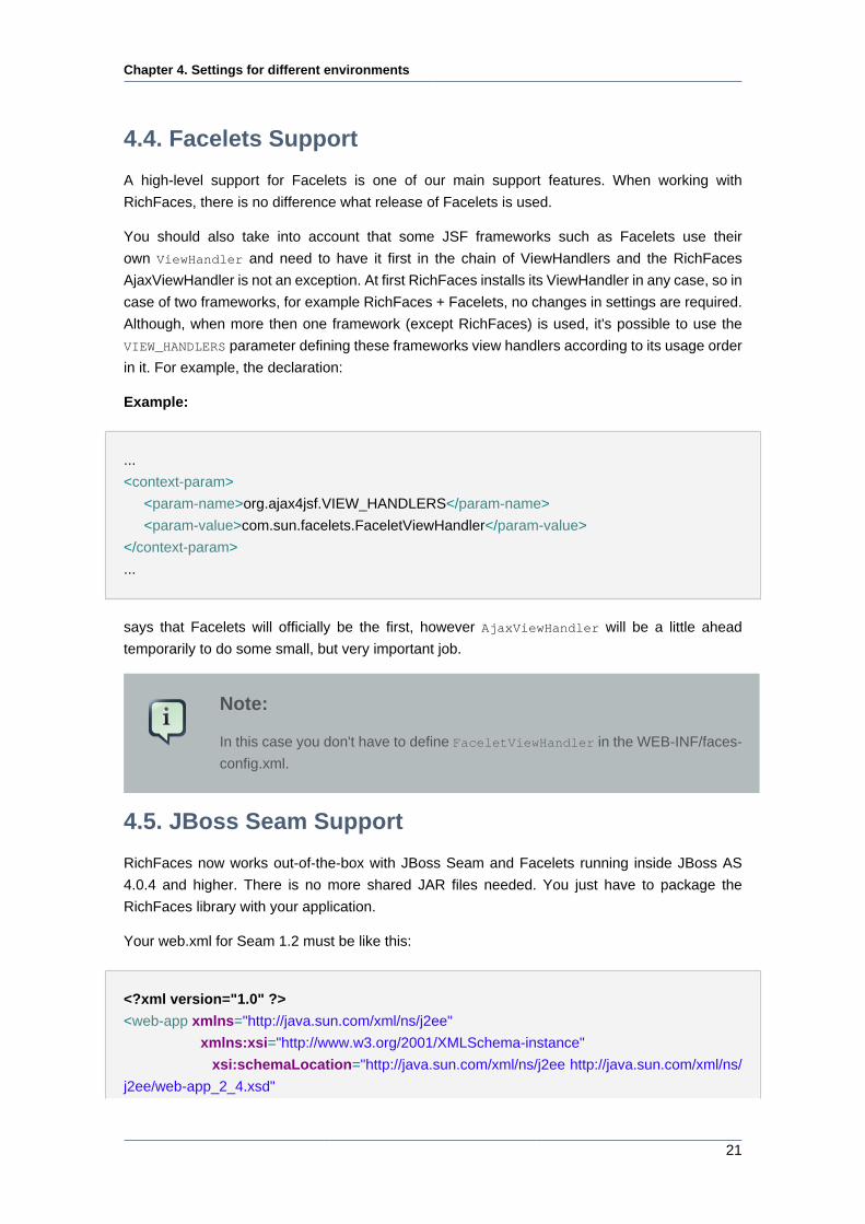
4.4. Facelets Support
A high-level support for Facelets is one of our main support features. When working with
RichFaces, there is no difference what release of Facelets is used.
You should also take into account that some JSF frameworks such as Facelets use their
own ViewHandler and need to have it first in the chain of ViewHandlers and the RichFaces
AjaxViewHandler is not an exception. At first RichFaces installs its ViewHandler in any case, so in
case of two frameworks, for example RichFaces + Facelets, no changes in settings are required.
Although, when more then one framework (except RichFaces) is used, it's possible to use the
VIEW_HANDLERS parameter defining these frameworks view handlers according to its usage order
in it. For example, the declaration:
Example:
...
<context-param>
<param-name>org.ajax4jsf.VIEW_HANDLERS</param-name>
<param-value>com.sun.facelets.FaceletViewHandler</param-value>
</context-param>
...
says that Facelets will officially be the first, however AjaxViewHandler will be a little ahead
temporarily to do some small, but very important job.
Note:
In this case you don't have to define FaceletViewHandler in the WEB-INF/faces-
config.xml.
4.5. JBoss Seam Support
RichFaces now works out-of-the-box with JBoss Seam and Facelets running inside JBoss AS
4.0.4 and higher. There is no more shared JAR files needed. You just have to package the
RichFaces library with your application.
Your web.xml for Seam 1.2 must be like this:
<?xml version="1.0" ?>
<web-app xmlns="http://java.sun.com/xml/ns/j2ee"
xmlns:xsi="http://www.w3.org/2001/XMLSchema-instance"
xsi:schemaLocation="http://java.sun.com/xml/ns/j2ee http://java.sun.com/xml/ns/
j2ee/web-app_2_4.xsd"
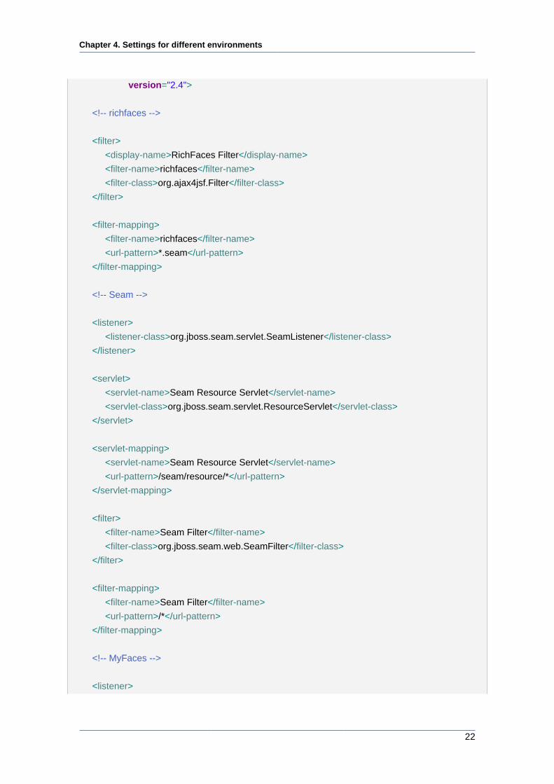
Chapter 4. Settings for different environments
22
version="2.4">
<!-- richfaces -->
<filter>
<display-name>RichFaces Filter</display-name>
<filter-name>richfaces</filter-name>
<filter-class>org.ajax4jsf.Filter</filter-class>
</filter>
<filter-mapping>
<filter-name>richfaces</filter-name>
<url-pattern>*.seam</url-pattern>
</filter-mapping>
<!-- Seam -->
<listener>
<listener-class>org.jboss.seam.servlet.SeamListener</listener-class>
</listener>
<servlet>
<servlet-name>Seam Resource Servlet</servlet-name>
<servlet-class>org.jboss.seam.servlet.ResourceServlet</servlet-class>
</servlet>
<servlet-mapping>
<servlet-name>Seam Resource Servlet</servlet-name>
<url-pattern>/seam/resource/*</url-pattern>
</servlet-mapping>
<filter>
<filter-name>Seam Filter</filter-name>
<filter-class>org.jboss.seam.web.SeamFilter</filter-class>
</filter>
<filter-mapping>
<filter-name>Seam Filter</filter-name>
<url-pattern>/*</url-pattern>
</filter-mapping>
<!-- MyFaces -->
<listener>
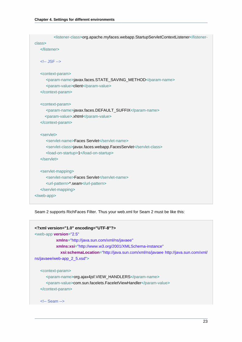
Chapter 4. Settings for different environments
23
<listener-class>org.apache.myfaces.webapp.StartupServletContextListener</listener-
class>
</listener>
<!-- JSF -->
<context-param>
<param-name>javax.faces.STATE_SAVING_METHOD</param-name>
<param-value>client</param-value>
</context-param>
<context-param>
<param-name>javax.faces.DEFAULT_SUFFIX</param-name>
<param-value>.xhtml</param-value>
</context-param>
<servlet>
<servlet-name>Faces Servlet</servlet-name>
<servlet-class>javax.faces.webapp.FacesServlet</servlet-class>
<load-on-startup>1</load-on-startup>
</servlet>
<servlet-mapping>
<servlet-name>Faces Servlet</servlet-name>
<url-pattern>*.seam</url-pattern>
</servlet-mapping>
</web-app>
Seam 2 supports RichFaces Filter. Thus your web.xml for Seam 2 must be like this:
<?xml version="1.0" encoding="UTF-8"?>
<web-app version="2.5"
xmlns="http://java.sun.com/xml/ns/javaee"
xmlns:xsi="http://www.w3.org/2001/XMLSchema-instance"
xsi:schemaLocation="http://java.sun.com/xml/ns/javaee http://java.sun.com/xml/
ns/javaee/web-app_2_5.xsd">
<context-param>
<param-name>org.ajax4jsf.VIEW_HANDLERS</param-name>
<param-value>com.sun.facelets.FaceletViewHandler</param-value>
</context-param>
<!-- Seam -->
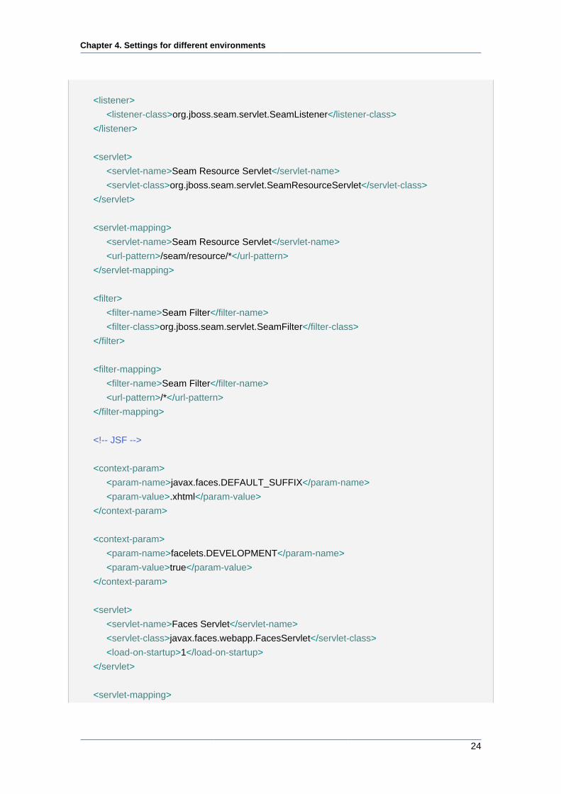
Chapter 4. Settings for different environments
24
<listener>
<listener-class>org.jboss.seam.servlet.SeamListener</listener-class>
</listener>
<servlet>
<servlet-name>Seam Resource Servlet</servlet-name>
<servlet-class>org.jboss.seam.servlet.SeamResourceServlet</servlet-class>
</servlet>
<servlet-mapping>
<servlet-name>Seam Resource Servlet</servlet-name>
<url-pattern>/seam/resource/*</url-pattern>
</servlet-mapping>
<filter>
<filter-name>Seam Filter</filter-name>
<filter-class>org.jboss.seam.servlet.SeamFilter</filter-class>
</filter>
<filter-mapping>
<filter-name>Seam Filter</filter-name>
<url-pattern>/*</url-pattern>
</filter-mapping>
<!-- JSF -->
<context-param>
<param-name>javax.faces.DEFAULT_SUFFIX</param-name>
<param-value>.xhtml</param-value>
</context-param>
<context-param>
<param-name>facelets.DEVELOPMENT</param-name>
<param-value>true</param-value>
</context-param>
<servlet>
<servlet-name>Faces Servlet</servlet-name>
<servlet-class>javax.faces.webapp.FacesServlet</servlet-class>
<load-on-startup>1</load-on-startup>
</servlet>
<servlet-mapping>
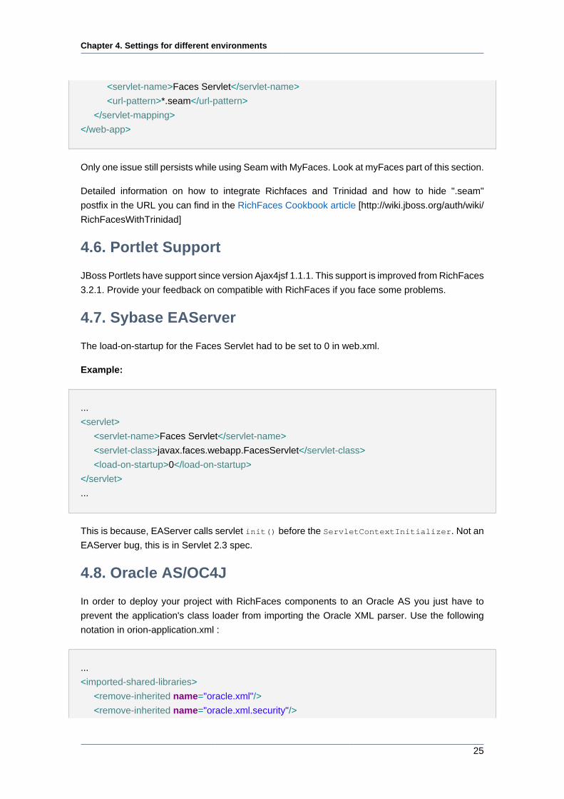
Chapter 4. Settings for different environments
25
<servlet-name>Faces Servlet</servlet-name>
<url-pattern>*.seam</url-pattern>
</servlet-mapping>
</web-app>
Only one issue still persists while using Seam with MyFaces. Look at myFaces part of this section.
Detailed information on how to integrate Richfaces and Trinidad and how to hide ".seam"
postfix in the URL you can find in the RichFaces Cookbook article [http://wiki.jboss.org/auth/wiki/
RichFacesWithTrinidad]
4.6. Portlet Support
JBoss Portlets have support since version Ajax4jsf 1.1.1. This support is improved from RichFaces
3.2.1. Provide your feedback on compatible with RichFaces if you face some problems.
4.7. Sybase EAServer
The load-on-startup for the Faces Servlet had to be set to 0 in web.xml.
Example:
...
<servlet>
<servlet-name>Faces Servlet</servlet-name>
<servlet-class>javax.faces.webapp.FacesServlet</servlet-class>
<load-on-startup>0</load-on-startup>
</servlet>
...
This is because, EAServer calls servlet init() before the ServletContextInitializer. Not an
EAServer bug, this is in Servlet 2.3 spec.
4.8. Oracle AS/OC4J
In order to deploy your project with RichFaces components to an Oracle AS you just have to
prevent the application's class loader from importing the Oracle XML parser. Use the following
notation in orion-application.xml :
...
<imported-shared-libraries>
<remove-inherited name="oracle.xml"/>
<remove-inherited name="oracle.xml.security"/>

Chapter 4. Settings for different environments
26
</imported-shared-libraries>
...
Chapter 5. Basic concepts of the RichFaces
Framework
27
Basic concepts of the RichFaces
Framework
5.1. Introduction
The framework is implemented as a component library which adds Ajax capability into existing
pages, so you don't need to write any JavaScript code or to replace existing components with new
Ajax widgets. RichFaces enables page-wide Ajax support instead of the traditional component-
wide support. Hence, you can define the event on the page that invokes an Ajax request and
the areas of the page that should be synchronized with the JSF Component Tree after the Ajax
request changes the data on the server according to the events fired on the client.
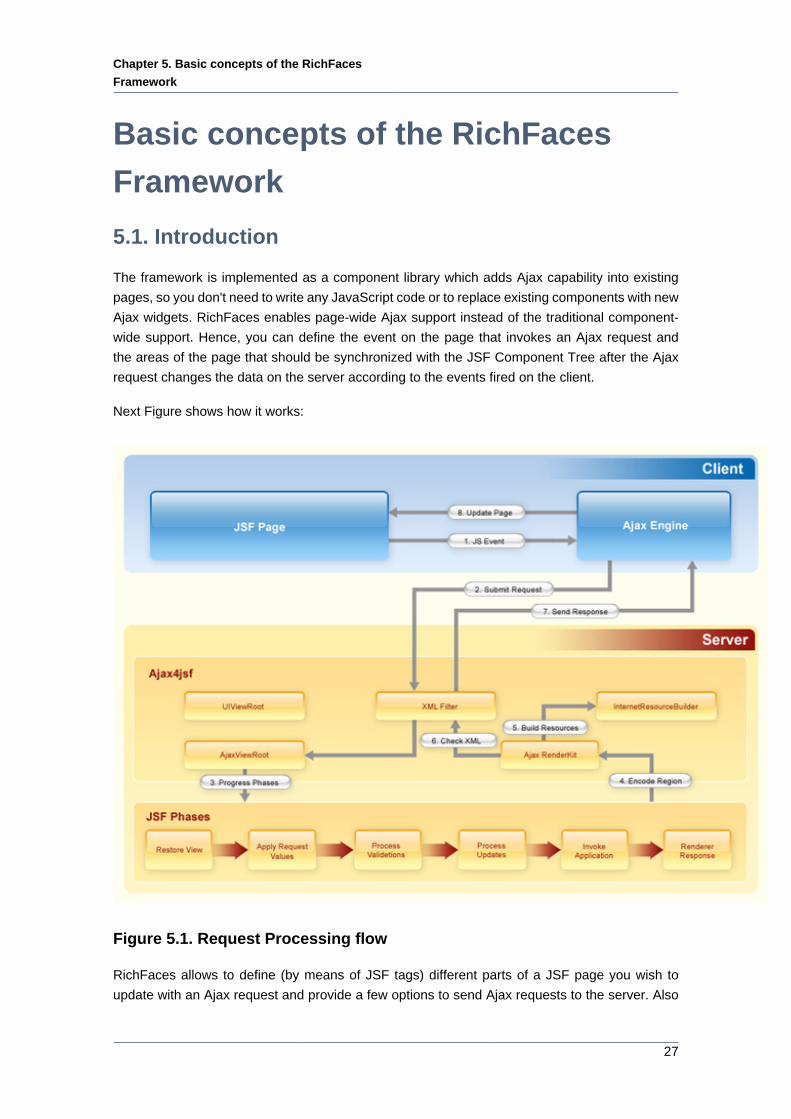
Next Figure shows how it works:
Figure 5.1. Request Processing flow
RichFaces allows to define (by means of JSF tags) different parts of a JSF page you wish to
update with an Ajax request and provide a few options to send Ajax requests to the server. Also
Chapter 5. Basic concepts of the RichFaces
Framework
28
JSF page doesn't change from a "regular" JSF page and you don't need to write any JavaScript
or XMLHTTPRequest objects by hands, everything is done automatically.
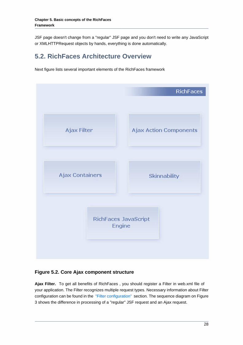
5.2. RichFaces Architecture Overview
Next figure lists several important elements of the RichFaces framework
Figure 5.2. Core Ajax component structure
Ajax Filter. To get all benefits of RichFaces , you should register a Filter in web.xml file of
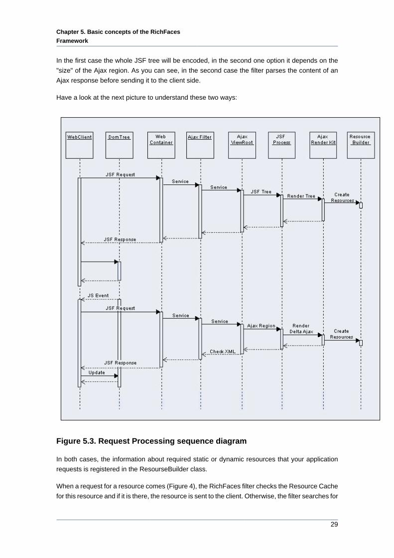
your application. The Filter recognizes multiple request types. Necessary information about Filter
configuration can be found in the "Filter configuration" section. The sequence diagram on Figure
3 shows the difference in processing of a "regular" JSF request and an Ajax request.
Chapter 5. Basic concepts of the RichFaces
Framework
29
In the first case the whole JSF tree will be encoded, in the second one option it depends on the
"size" of the Ajax region. As you can see, in the second case the filter parses the content of an
Ajax response before sending it to the client side.
Have a look at the next picture to understand these two ways:
Figure 5.3. Request Processing sequence diagram
In both cases, the information about required static or dynamic resources that your application
requests is registered in the ResourseBuilder class.
When a request for a resource comes (Figure 4), the RichFaces filter checks the Resource Cache
for this resource and if it is there, the resource is sent to the client. Otherwise, the filter searches for
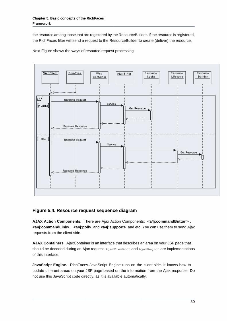
Chapter 5. Basic concepts of the RichFaces
Framework
30
the resource among those that are registered by the ResourceBuilder. If the resource is registered,
the RichFaces filter will send a request to the ResourceBuilder to create (deliver) the resource.
Next Figure shows the ways of resource request processing.
Figure 5.4. Resource request sequence diagram
AJAX Action Components. There are Ajax Action Components: <a4j:commandButton> ,
<a4j:commandLink> , <a4j:poll> and <a4j:support> and etc. You can use them to send Ajax
requests from the client side.
AJAX Containers. AjaxContainer is an interface that describes an area on your JSF page that
should be decoded during an Ajax request. AjaxViewRoot and AjaxRegion are implementations
of this interface.
JavaScript Engine. RichFaces JavaScript Engine runs on the client-side. It knows how to
update different areas on your JSF page based on the information from the Ajax response. Do
not use this JavaScript code directly, as it is available automatically.
Chapter 5. Basic concepts of the RichFaces
Framework
31
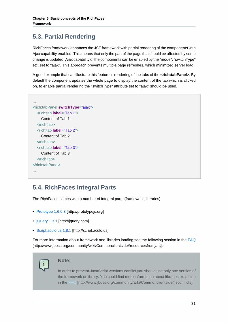
5.3. Partial Rendering
RichFaces framework enhances the JSF framework with partial rendering of the components with
Ajax capability enabled. This means that only the part of the page that should be affected by some
change is updated. Ajax capability of the components can be enabled by the "mode", "switchType"
etc. set to "ajax". This approach prevents multiple page refreshes, which minimized server load.
A good example that can illustrate this feature is rendering of the tabs of the <rich:tabPanel>. By
default the component updates the whole page to display the content of the tab which is clicked
on, to enable partial rendering the "switchType" attribute set to "ajax" should be used.
...
<rich:tabPanel switchType="ajax">
<rich:tab label="Tab 1">
Content of Tab 1
</rich:tab>
<rich:tab label="Tab 2">
Content of Tab 2
</rich:tab>
<rich:tab label="Tab 3">
Content of Tab 3
</rich:tab>
</rich:tabPanel>
...
5.4. RichFaces Integral Parts
The RichFaces comes with a number of integral parts (framework, libraries):
• Prototype 1.6.0.3 [http://prototypejs.org]
• jQuery 1.3.1 [http://jquery.com]
• Script.aculo.us 1.8.1 [http://script.aculo.us]
For more information about framework and libraries loading see the following section in the FAQ
[http://www.jboss.org/community/wiki/Commonclientside#resourcesfromjars].
Note:
In order to prevent JavaScript versions conflict you should use only one version of
the framework or library. You could find more information about libraries exclusion
in the FAQ [http://www.jboss.org/community/wiki/Commonclientside#jsconflicts].
Chapter 5. Basic concepts of the RichFaces
Framework
32
5.5. Limitations and Rules
In order to create RichFaces applications properly, keep the following points in mind:
• Any Ajax framework should not append or delete, but only replace elements on the page. For
successful updates, an element with the same ID as in the response must exist on the page.
If you'd like to append any code to a page, put in a placeholder for it (any empty element). For
the same reason, it's recommended to place messages in the "AjaxOutput" component (as
no messages is also a message).
• Don't use <f:verbatim> for self-rendered containers, since this component is transient and
not saved in the tree.
• Ajax requests are made by XMLHTTPRequest functions in XML format, but this XML bypasses
most validations and the corrections that might be made in a browser. Thus, create only a strict
standards-compliant code for HTML and XHTML, without skipping any required elements or
attributes. Any necessary XML corrections are automatically made by the XML filter on the
server, but lot's of unexpected effects can be produced by an incorrect HTML code.
• The RichFaces ViewHandler puts itself in front of the Facelets ViewHandlers chain.
• RichFaces components uses their own renderers. On the Render Response Phase RichFaces
framework makes a traversal of the component tree, calls its own renderer and put the result
into the Faces Response.
5.6. Ajax Request Optimization
5.6.1. Re-Rendering
Ajax attributes are common for Ajax components such as <a4j:support> ,
<a4j:commandButton> , <a4j:jsFunction> , <a4j:poll> , <a4j:push> and so on. Also, most
RichFaces components with built-in Ajax support have these attributes for a similar purpose. Ajax
components attributes help RichFaces to expose its features. Most of the attributes have default
values. Thus, you can start working with RichFaces without knowing the usage of these attribute.
However, their usage allows to tune the required Ajax behavior very smoothly.
"reRender" is a key attribute. The attribute allows to point to area(s) on a page that should be
updated as a response on Ajax interaction. The value of the "reRender" attribute is an id of the
JSF component or an id list.
A simple example is placed below:
...
<a4j:commandButton value="update" reRender="infoBlock"/>
...
<h:panelGrid id="infoBlock">
Chapter 5. Basic concepts of the RichFaces
Framework
33
...
</h:panelGrid>
...
The value of "reRender" attribute of the <a4j:commandButton> tag defines which part(s) of your
page is (are) to be updated. In this case, the only part of the page to update is the <h:panelGrid>
tag because its ID value matches to the value of "reRender" attribute. As you see, it's not difficult
to update multiple elements on the page, only list their IDs as the value of "reRender" .
"reRender" uses UIComponent.findComponent() algorithm [http://java.sun.com/javaee/
javaserverfaces/1.2_MR1/docs/api/javax/faces/component/
UIComponent.html#findComponent(java.lang.String)] (with some additional exceptions) to find
the component in the component tree. As can you see, the algorithm presumes several steps.
Each other step is used if the previous step is not successful. Therefore, you can define how fast
the component is found mentioning it more precisely. The following example shows the difference
in approaches (both buttons will work successfully):
...
<h:form id="form1">
...
<a4j: commandButton value="Usual Way" reRender="infoBlock, infoBlock2" />
<a4j:commandButton value="Shortcut" reRender=":infoBlockl,:sv:infoBlock2" />
...
</h:form>
<h:panelGrid id="infoBlock">
...
</h:panelGrid>
...
<f:subview id="sv">
<h:panelGrid id="infoBlock2">
...
</h:panelGrid>
...
</f:subview>
...
It's also possible to use JSF EL expression as a value of the reRender attribute. It might be a
property of types Set, Collection, Array or simple String. The EL for reRender is resolved right
before the Render Response phase. Hence, you can calculate what should be re-rendered on
any previous phase during the Ajax request processing.
Most common problem with using reRender is pointing it to the component that has a "rendered"
attribute. Note, that JSF does not mark the place in the browser DOM where the outcome of the
Chapter 5. Basic concepts of the RichFaces
Framework
34
component should be placed in case the "rendered" condition returns false. Therefore, after the
component becomes rendered during the Ajax request, RichFaces delivers the rendered code to
the client, but does not update a page, because the place for update is unknown. You need to
point to one of the parent components that has no "rendered" attribute. As an alternative, you
can wrap the component with <a4j:outputPanel> layout="none" .
"ajaxRendered" attribute of the <a4j:outputPanel> set to "true" allows to define the area of the
page that will be re-rendered even if it is not pointed in the reRender attribute explicitly. It might be
useful if you have an area on a page that should be updated as a response on any Ajax request.
For example, the following code allows to output error messages regardless of what Ajax request
causes the Validation phase failed.
...
<a4j:outputPanel ajaxRendered="true">
<h:messages />
</a4j:outputPanel>
...
"limitToList" attribute allows to dismiss the behavior of the <a4j:outputPanel> "ajaxRendered"
attribute. limitToList = "true" means to update only the area(s) that mentioned in the
"reRender" attribute explicitly. All output panels with ajaxRendered="true" is ignored. An
example is placed below:
...
<h:form>
<h:inputText value="#{person.name}">
<a4j:support event="onkeyup" reRender="test" limitToList="true"/>
</h:inputText>
<h:outputText value="#{person.name}" id="test"/>
</form>
...
5.6.2. Queue and Traffic Flood Protection
"eventsQueue" attribute defines the name of the queue that will be used to order upcoming
Ajax requests. By default, RichFaces does not queue Ajax requests. If events are produced
simultaneously, they will come to the server simultaneously. JSF implementations (especially, the
very first ones) does not guaranty that the request that comes first will be served or passed into
the JSF lifecycle first. The order how the server-side data will be modified in case of simultaneous
request might be unpredictable. Usage of eventsQueue attribute allows to avoid possible mess.
Define the queue name explicitly, if you expect intensive Ajax traffic in your application.
Chapter 5. Basic concepts of the RichFaces
Framework
35
The next request posted in the same queue will wait until the previos one is not processed and
Ajax Response is returned back if the "eventsQueue" attribute is defined. In addition, RichFaces
starts to remove from the queue "similar" requests. "Similar'"requests are the requests produced
by the same event. For example, according to the following code, only the newest request will be
sent to the server if you type very fast and has typed the several characters already before the
previous Ajax Response is back.
...
<h:inputText value="#{userBean.name}">
<a4j:support event="onkeyup" eventsQueue="foo" reRender="bar" />
</h:inputText>
...
"requestDelay" attribute defines the time (in ms) that the request will be wait in the queue before
it is ready to send. When the delay time is over, the request will be sent to the server or removed
if the newest "similar" request is in a queue already .
"ignoreDupResponses" attribute orders to ignore the Ajax Response produced by the request
if the newest "similar" request is in a queue already. ignoreDupResponses"="true" does not
cancel the request while it is processed on the server, but just allows to avoid unnecessary updates
on the client side if the response loses the actuality.
Defining the "eventsQueue" along with "requestDelay" allows to protect against unnecessary
traffic flood and synchronizes Ajax requests order. If you have several sources of Ajax requests,
you can define the same queue name there. This might be very helpful if you have Ajax
components that invoke request asynchronously from the ones produced by events from users.
For example, <a4j:poll> or <a4j:push> . In case the requests from such components modify
the same data, the synchronization might be very helpful.
More information can be found on the RichFaces Users Forum [http://jboss.com/index.html?
module=bb&op=viewtopic&t=105766] .
"timeout" attribute is used for setting response waiting time on a particular request. If a response
is not received during this time, the request is aborted.
5.6.3. Queue Principles
Starting from 3.3.0 version RichFaces has an improved queue.
There are some reasons why the queue has been improved. In previous versions the queue had
quite simple implementation: it sent to the server only the last Ajax request out of all requests
coming in the queue during request delay.
The improved queue allows to
Chapter 5. Basic concepts of the RichFaces
Framework
36
• Eliminate the possibility of collisions when several JSF requests pass the JSF lifecycle at the
same time. The queue prevents sending such requests. Only one request is processed. The
rest ones are waiting.
• Reduce the traffic between browser and the server. The "similar" requests came within request
delay are absorbed. Only the last one is actually sent. Reducing the number of request reduces
the server load.
There are 4 types of the queue:
• Global default queue, defined in the web.xml file
• View scoped default queue
• View scoped named queue
• Form-based default queue
In this section we will take a closer look at the listed above types of the queue and see in more
detail how they differ. Usage details are covered in the <a4j:queue> chapter.
5.6.3.1. Global default queue, defined in the web.xml file
Design details
• Only one global queue will ever exist on a view
If you define more than one with this name while attempting to set its attributes a warning will
appear in server console during rendering. All the same named queues after the first instance
are ignored.
• The queue class name is "org.richfaces.queue.global"
Global default queue has application scope and is defined in the web.xml
It can be done as follows:
...
<context-param>
<param-name>org.richfaces.queue.global.enabled</param-name>
<param-value>true</param-value>
</context-param>
...
The global default queue is disabled by default, because artificial serializing of all Ajax requests
on a page can significantly affect expected behavior. The global default queue causes all
Chapter 5. Basic concepts of the RichFaces
Framework
37
Asynchronous JavaScript And XML requests becoming synchronous via the single global queue.
If the global queue is turned on it can change the behavior on all views of the application without
any visible or obvious setting.
5.6.3.2. View scoped default queue
Design details
• Only one default queue is ever active at one time for a given view or form.
• If ever more are detected a warning will appears in server console during rendering. All the
same named queues after the first instance are ignored.
• View scoped default queue is also created for components which have the following Ajax
attributes: (in this case queue has a component scope)
• "requestDelay"
• "ignoreDupResponce"
• View scoped default queue is created automatically if the "eventsQueue" attribute is defined
with some name in a component but not found in the view. It has a scope the same as defined
in corresponding context param.
The view scoped default, named and formed-based types of queue utilize the <a4j:queue> tag
to override the settings of the global queue defined in the web.xml file.
You can also programmatically enable/disable the global queue on a single view using the
following:
...
<a4j:queue name="org.richfaces.queue.global" disabled="true"... />
...
Hence, to enable the queue for a single view page you need to define the "disable" attribute with
"false".
Now, you can override the default settings using the attributes of the <a4j:queue> component.
The full list of attributes [file:///C:/Projects/RichFaces/docs/userguide/en/target/docbook/publish/
en-US/html_single/index.html#d0e10019] is given in the "6.20. <a4j:queue>" chapter of the guide.
Example:
...
<a4j:queue name="org.richfaces.queue.global" requestDelay="1000" />
Chapter 5. Basic concepts of the RichFaces
Framework
38
...
View scoped queue can be also added by just definition of the queue without name specified.
In this case it should be placed anywhere outside the forms in order not to be recognized as a
form-based queue.
...
<a4j:queue ... />
...
5.6.3.3. View scoped named queue
Design details
• Named queues must have a unique name, if a second queue with the same name is defined
all the same named queues after the first instance are ignored.
• Form elements are used as naming container for the queue i.e. custom queue defined within
the form cannot be used by the components outside this concrete form.
You can reference a named queue from any Ajax4JSF or RichFaces component that supports
the "eventsQueue" attribute. Below there is an example of how the components can reference
a named queue.
Example:
...
<a4j:queue name="sampleQueue"/>
<h:inputText value="#{bean.inputValue}" >
<a4j:support id="inputSupport" event="onkeyup" eventsQueue="sampleQueue"/>
</h:inputText>
<rich:comboBox value="#{bean.state}" suggestionValues="#{bean.suggestions}" eventsQueue="sampleQueue" /
>
...
In this example, two components(<a4j:queue>, <rich:comboBox>,) reference the named
( "sampleQueue") queue via the "eventsQueue" attribute.
5.6.3.4. Form based default queue
Design details
• Only one enabled form based default queue can be active at a time.
Chapter 5. Basic concepts of the RichFaces
Framework
39
• A warning appears in server console during rendering if more than one enabled form based
queue exists. All queues with the same name after the first instance should be ignored.
• Users can define more than one form queue, however all but one must be disabled.
Queues are often used within forms, but defining the "eventsQueue" attribute on every component
within a form can be tedious work. To avoid that you can create a default queue for a form
(overriding the global default queue ).
You can use either a JSF <h:form> or an Ajax4JSF <a4j:form>.
Example:
...
<h:form ... >
<a4j:queue ... /><!-- note no name specified -->
...
</h:form>
...
Though, using an Ajax4JSF <a4j:form> you can refrence a named queue via the "eventsQueue".
Example:
...
<a4j:form eventsQueue="fooQueue" ...>
...
</a4j:form>
...
However the implementation of the queue allows you to reference a named queue from the form
with a form-based queue.
Example:
...
<a4j:queue name="sampleQueue" ... /> <!-- named queue -->
...
<h:form ... >
<a4j:queue ... /><!-- form-based queue-->
<a4j:commandButton ... /> <!-- uses the form-based queue -->
<a4j:commandButton eventsQueue="sampleQueue" /> <!-- uses named queue -->
</h:form>
Chapter 5. Basic concepts of the RichFaces
Framework
40
...
5.6.3.5. Queue functionality
This section will cover some queue's functionality aspects.
5.6.3.5.1. Events Similarity
By default all the events raised by the same component are similar to the queue (according to
client Id of event source). This means that if new requests come from the same component they
are combined with the previous ones. For example: if we use a4j:support on an input field and
the user types frequently all the request raised by key up during requestDelay will be combined
into one.
You can also manually specify multiple components which will produce similar requests. The
"similarityGroupingId" attribute is added to all the Ajax action components with 3.3.0 release.
Hence, for example, you can add two <a4j:support/> components to the input (one for key up
and the second for blur) and define that request events are similar by specifying the same
"similarityGroupingId".
5.6.3.5.2. Similar requests during request delay
As written above requests are collected in the queue during requestDelay and similar ones are
combined. But similar requests can only be combined if they are raised sequentially. This is done
in order not to block the queue and not to change the requests order.
Example:
A request with some delay comes to the queue, let it be A1 the delay counter for this request is
started. If similar request(e.g. from the same component - A2) appears - these two requests are
combined(A1A2 to Acombined ) and the counter is reset.
But if some not similar request comes to the queue B1 - it is placed after the first one(Acombined,B1).
And if the Acombined request doesn't exit the queue and another request similar to A (let is be A3)
appears again - these requests are not combined with the first one. The request is placed after
B1. (Acombined, B1, A3).
Such behavior allows
• to maximize similar requests throughput
• to send only the latest fields state for similar requests
• not to block the queue if the different types of requests comes to queue and should wait one
for another
The <a4j:poll> component has delay time 0 by default staring from 3.3.0 version in order not
to use the queue delay(its own value for this parameter redefines queue's parameter) to avoid
blocking periodical update in the queue. You can redefine this on the component level if need.
Chapter 5. Basic concepts of the RichFaces
Framework
41
5.6.3.5.3. JavaScript API
Table 5.1. JavaScript API
Function Description
getSize() Returns the current size to the queue
getMaximumSize() Returns the maximum size to the queue,
specified in the "size" attribute
5.6.4. Data Processing Options
RichFaces uses form based approach for Ajax request sending. This means each time, when you
click an Ajax button or <a4j:poll> produces an asynchronous request, the data from the closest
JSF form is submitted with the XMLHTTPRequest object. The form data contains the values from
the form input element and auxiliary information such as state saving data.
When "ajaxSingle" attribute value is "true" , it orders to include only a value of the current
component (along with <f:param> or <a4j:actionparam> values if any) to the request map. In
case of <a4j:support> , it is a value of the parent component. An example is placed below:
...
<h:form>
<h:inputText value="#{person.name}">
<a4j:support event="onkeyup" reRender="test" ajaxSingle="true"/>
</h:inputText>
<h:inputText value="#{person.middleName}"/>
</form>
...
In this example the request contains only the input component causes the request generation, not
all the components contained on a form, because of ajaxSingle="true" usage.
Note, that ajaxSingle="true" reduces the upcoming traffic, but does not prevent decoding other
input components on the server side. Some JSF components, such as <h:selectOneMenu> do
recognize the missing data in the request map value as a null value and try to pass the validation
process with a failed result. Thus, use <a4j:region> to limit a part of the component tree that will
be processed on the server side when it is required.
"immediate" attribute has the same purpose as any other non-JSF component. The default
"ActionListener" should be executed immediately (i.e. during the Apply Request Values phase
of a request processing lifecycle), rather than waiting until the Invoke Application phase. Using
immediate="true" is one of the ways to have some data model values updated when other
cannot be updated because of a problem with passing the Validation phase successfully. This
might be important inside the <h:dataTable> like components where using <a4j:region> is
impossible due to the <h:dataTable> component architecture.
Chapter 5. Basic concepts of the RichFaces
Framework
42
"bypassUpdates" attribute allows to bypass the Update Model phase. It might be useful if you need
to check your input against the available validator, but not to update the model with those data.
Note, that an action will be invoked at the end of the Validation phase only if the Validation phase
is passed successfully. The listeners of the Application phase will not be invoked in any case.
5.6.5. Action and Navigation
Ajax component is similar to any other non-Ajax JSF component like <h:commandButton> . It
allows to submit the form. You can use "action" and "actionListener" attributes to invoke the
action method and define the action event.
"action" method must return null if you want to have an Ajax Response with a partual page update.
This is regular mode called "Ajax request generates Non-Ajax Response". In case of action
does not return null, but the action outcome that matches one of navigation rules, RichFaces starts
to work in "Ajax request generates Non-Ajax Response" mode. This mode might be helpful
in two major cases:
• RichFaces allows to organize a page flow inside the <a4j:include> component. This is a typical
scenario for Wizard like behavior. The new content is rendered inside the <a4j:include> area.
The content is taken from the navigation rule of the faces configuration file (usually, the faces-
config.xml). Note, that the content of the "wizard" is not isolated from the rest of the page. The
included page should not have own <f:view> (it does not matter if you use facelets). You need
to have an Ajax component inside the <a4j:include> to navigate between the wizard pages.
Otherwize, the whole page update will be performed.
• If you want to involve the server-side validators and navigate to the next page only if
the Validation phase is passed successfully, you can replace <h:commandButton> with
<a4j:commandButton> and point to the action method that navigates to the next page. If
Validation process fails, the partial page update will occur and you will see an error message.
Otherwize, the application proceeds to the next page. Make sure, you define <redirect/> option
for the navigation rule to avoid memory leaks.
5.6.6. JavaScript Interactions
RichFaces allows writing Ajax-enabled JSF application without writing any Javascript code.
However, you can still invoke the JavaScript code if you need. There are several Ajax attributes
that helps to do it.
"onsubmit" attribute allows to invoke JavaScript code before an Ajax request is sent. If "onsubmit"
returns "false" , the Ajax request is canceled. The code of "onsubmit" is inserted before the
RichFaces Ajax call. Hence, the "onsubmit" should not has a "return" statement if you want
the Ajax request to be sent. If you are going to invoke a JavaScript function that returns "true"
or "false" , use the conditional statement to return something only when you need to cancel the
request. For example:
...
Chapter 5. Basic concepts of the RichFaces
Framework
43
onsubmit="if (mynosendfunct()==false){return false}"
...
"onclick" attribute is similar to the "onsubmit" , but for clickable components such as
<a4j:commandLink> and <a4j:commandButton> . If it returns "false" , the Ajax request is
canceled also.
The "oncomplete" attribute is used for passing JavaScript that would be invoked right after the
Ajax response returns back and DOM is updated. It is not recommended to use use keyword this
inside the EL-expression, because it will not always point to the component where Ajax request
was initiated.
"onbeforedomupdate" attribute defines JavaScript code for call after Ajax response receiving and
before updating DOM on a client side.
"data" attribute allows to get the additional data from the server during an Ajax call. You can use
JSF EL to point the property of the managed bean and its value will be serialized in JSON format
and be available on the client side. You can refer to it using the "data" variable. For example:
...
<a4j:commandButton value="Update" data="#{userBean.name}" oncomplete="showTheName(data.name)" /
>
...
RichFaces allows to serialize not only primitive types into JSON format, but also complex types
including arrays and collections. The beans should be serializable to be refered with "data" .
There is a number of useful functions which can be used in JavaScript:
• rich:clientId('id') - returns client id by short id or null if the component with the id specified
hasn't been found
• rich:element('id') - is a shortcut for
document.getElementById(#{rich:clientId('id')})
• rich:component('id') - is a shortcut for #{rich:clientId('id')}.component
• rich:findComponent('id') - returns an instance of UIComponent taking the short ID of the
component as a parameter.
...
<h:inputText id="myInput">
<a4j:support event="onkeyup" reRender="outtext"/>
</h:inputText>
<h:outputText id="outtext" value="#{rich:findComponent('myInput').value}" />
Chapter 5. Basic concepts of the RichFaces
Framework
44
...
5.6.7. Iteration components Ajax attributes
"ajaxKeys" attribute defines strings that are updated after an Ajax request. It provides possibility
to update several child components separately without updating the whole page.
...
<a4j:poll intervall="1000" action="#{repeater.action}" reRender="text">
<table>
<tbody>
<a4j:repeat value="#{bean.props}" var="detail" ajaxKeys="#{repeater.ajaxedRowsSet}">
<tr>
<td>
<h:outputText value="detail.someProperty" id="text"/>
</td>
</tr>
</a4j:repeat>
</tbody>
</table>
</a4j:poll>
...
5.6.8. Other useful attributes
"status" attribute for Ajax components (such as <a4j:commandButton> , <a4j:poll> , etc.)
points to an ID of <a4j:status> component. Use this attribute if you want to share <a4j:status>
component between different Ajax components from different regions. The following example
shows it.
...
<a4j:region id="extr">
<h:form>
<h:outputText value="Status:" />
<a4j:status id="commonstatus" startText="In Progress...." stopText=""/>
<h:panelGrid columns="2">
<h:outputText value="Name"/>
<h:inputText id="name" value="#{userBean.name}">
<a4j:support event="onkeyup" reRender="out" />
</h:inputText>
<h:outputText value="Job"/>
<a4j:region id="intr">
Chapter 5. Basic concepts of the RichFaces
Framework
45
<h:inputText id="job" value="#{userBean.job}">
<a4j:support event="onkeyup" reRender="out" status="commonstatus"/>
</h:inputText>
</a4j:region>
</h:panelGrid>
<a4j:region>
<h:outputText id="out" value="Name: #{userBean.name}, Job: #{userBean.job}" />
<br />
<a4j:commandButton ajaxSingle="true" value="Clean Up Form" reRender="name, job,
out" status="commonstatus">
<a4j:actionparam name="n" value="" assignTo="#{userBean.name}" />
<a4j:actionparam name="j" value="" assignTo="#{userBean.job}" />
</a4j:commandButton>
</a4j:region>
</h:form>
</a4j:region>
...
In the example <a4j:support> and <a4j:commandButton> are defined in different regions.
Values of "status" attribute for these components points to an ID of <a4j:support> .Thus, the
<a4j:support> component is shared between two components from different regions.
More information could be found on the RichFaces Live Demo [http://livedemo.exadel.com/
richfaces-demo/richfaces/status.jsf?c=status] .
Other useful attribute is "focus" . It points to an ID of a component where focus will be set after
an Ajax request.
5.6.9. Common Ajax Attributes
This section of the guide summarizes all Ajax-related attributes that both rich and a4j components
have.
Table 5.2. Title of the table
Attribute Description A4J Components Rich Components
ajaxSingle Limits JSF tree
processing (decoding,
conversion, validation
and model updating)
only to a component
that sends the
request. Boolean.
Default value is
"false".
<a4j:form>
<a4j:support>
<a4j:commandButton>
<a4j:commandLink>
<a4j:jsFunction>
<a4j:poll>
<rich:dataFilterSlider>
<rich:dataFilterSlider>
<rich:datascroller>
<rich:dropSupport>
<rich:menuItem>
<rich:tree>
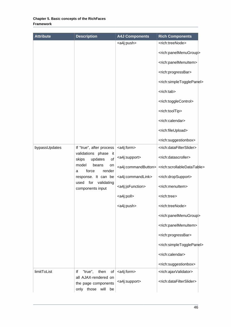
Chapter 5. Basic concepts of the RichFaces
Framework
46
Attribute Description A4J Components Rich Components
<a4j:push> <rich:treeNode>
<rich:panelMenuGroup>
<rich:panelMenuItem>
<rich:progressBar>
<rich:simpleTogglePanel>
<rich:tab>
<rich:toggleControl>
<rich:toolTip>
<rich:calendar>
<rich:fileUpload>
<rich:suggestionbox>
bypassUpdates If "true", after process
validations phase it
skips updates of
model beans on
a force render
response. It can be
used for validating
components input
<a4j:form>
<a4j:support>
<a4j:commandButton>
<a4j:commandLink>
<a4j:jsFunction>
<a4j:poll>
<a4j:push>
<rich:dataFilterSlider>
<rich:datascroller>
<rich:scrollableDataTable>
<rich:dropSupport>
<rich:menuItem>
<rich:tree>
<rich:treeNode>
<rich:panelMenuGroup>
<rich:panelMenuItem>
<rich:progressBar>
<rich:simpleTogglePanel>
<rich:calendar>
<rich:suggestionbox>
limitToList If "true", then of
all AJAX-rendered on
the page components
only those will be
<a4j:form>
<a4j:support>
<rich:ajaxValidator>
<rich:dataFilterSlider>
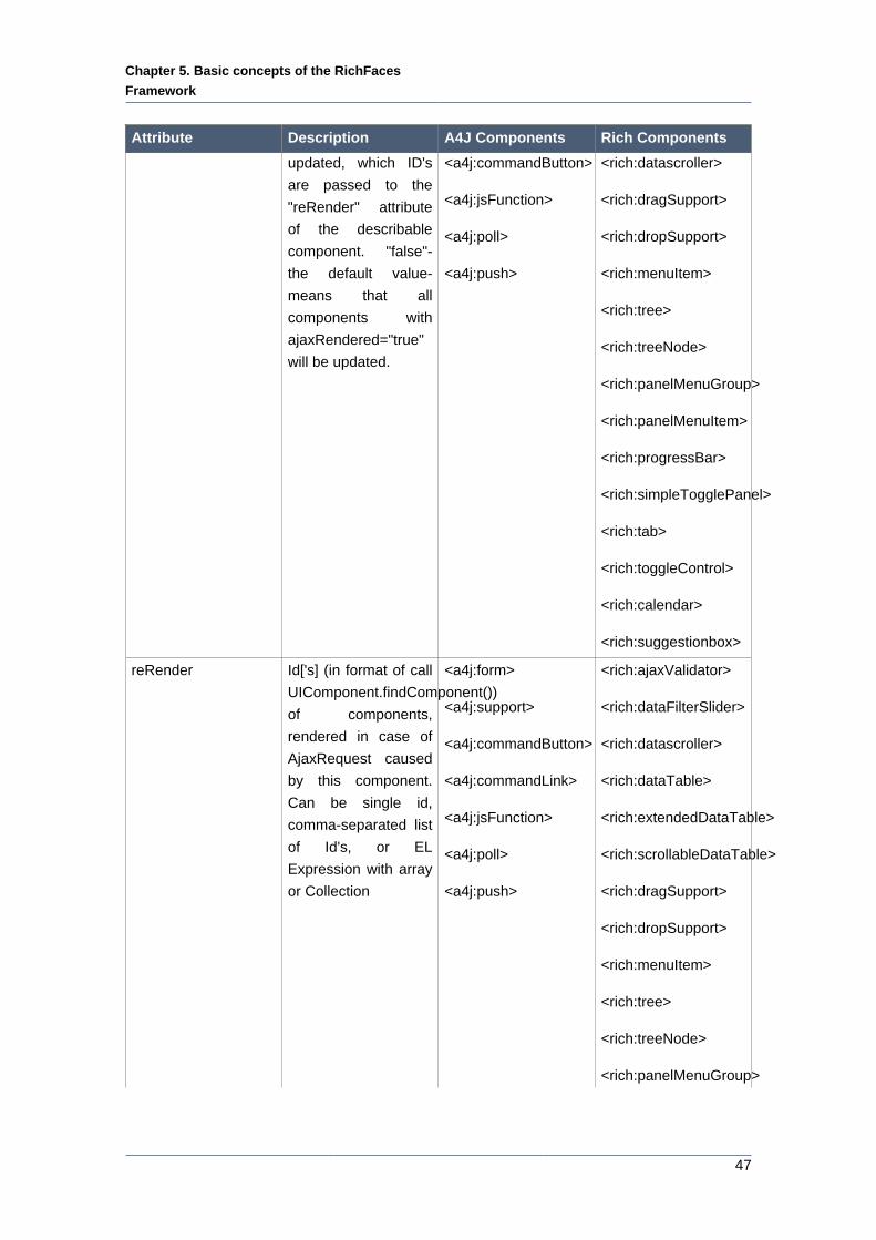
Chapter 5. Basic concepts of the RichFaces
Framework
47
Attribute Description A4J Components Rich Components
updated, which ID's
are passed to the
"reRender" attribute
of the describable
component. "false"-
the default value-
means that all
components with
ajaxRendered="true"
will be updated.
<a4j:commandButton>
<a4j:jsFunction>
<a4j:poll>
<a4j:push>
<rich:datascroller>
<rich:dragSupport>
<rich:dropSupport>
<rich:menuItem>
<rich:tree>
<rich:treeNode>
<rich:panelMenuGroup>
<rich:panelMenuItem>
<rich:progressBar>
<rich:simpleTogglePanel>
<rich:tab>
<rich:toggleControl>
<rich:calendar>
<rich:suggestionbox>
reRender Id['s] (in format of call
UIComponent.findComponent())
of components,
rendered in case of
AjaxRequest caused
by this component.
Can be single id,
comma-separated list
of Id's, or EL
Expression with array
or Collection
<a4j:form>
<a4j:support>
<a4j:commandButton>
<a4j:commandLink>
<a4j:jsFunction>
<a4j:poll>
<a4j:push>
<rich:ajaxValidator>
<rich:dataFilterSlider>
<rich:datascroller>
<rich:dataTable>
<rich:extendedDataTable>
<rich:scrollableDataTable>
<rich:dragSupport>
<rich:dropSupport>
<rich:menuItem>
<rich:tree>
<rich:treeNode>
<rich:panelMenuGroup>
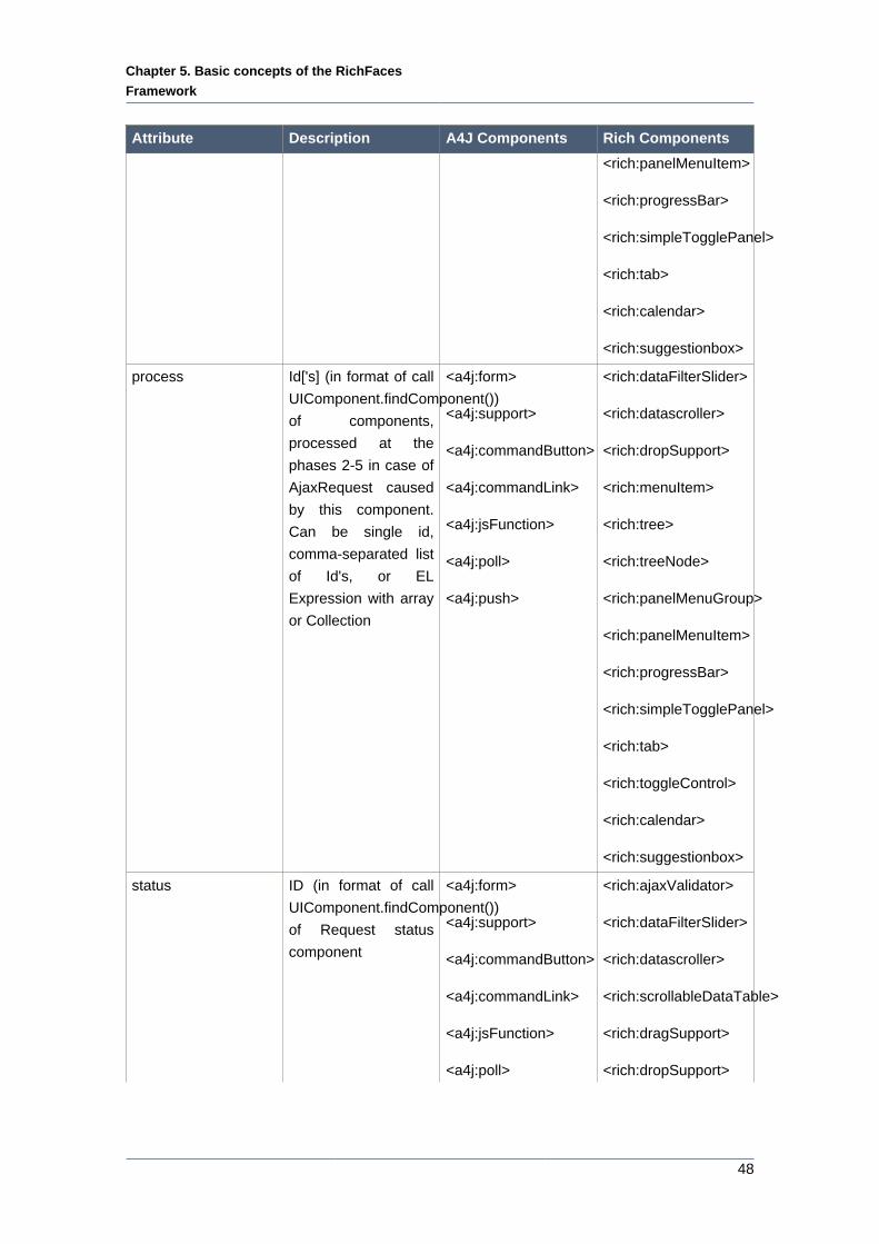
Chapter 5. Basic concepts of the RichFaces
Framework
48
Attribute Description A4J Components Rich Components
<rich:panelMenuItem>
<rich:progressBar>
<rich:simpleTogglePanel>
<rich:tab>
<rich:calendar>
<rich:suggestionbox>
process Id['s] (in format of call
UIComponent.findComponent())
of components,
processed at the
phases 2-5 in case of
AjaxRequest caused
by this component.
Can be single id,
comma-separated list
of Id's, or EL
Expression with array
or Collection
<a4j:form>
<a4j:support>
<a4j:commandButton>
<a4j:commandLink>
<a4j:jsFunction>
<a4j:poll>
<a4j:push>
<rich:dataFilterSlider>
<rich:datascroller>
<rich:dropSupport>
<rich:menuItem>
<rich:tree>
<rich:treeNode>
<rich:panelMenuGroup>
<rich:panelMenuItem>
<rich:progressBar>
<rich:simpleTogglePanel>
<rich:tab>
<rich:toggleControl>
<rich:calendar>
<rich:suggestionbox>
status ID (in format of call
UIComponent.findComponent())
of Request status
component
<a4j:form>
<a4j:support>
<a4j:commandButton>
<a4j:commandLink>
<a4j:jsFunction>
<a4j:poll>
<rich:ajaxValidator>
<rich:dataFilterSlider>
<rich:datascroller>
<rich:scrollableDataTable>
<rich:dragSupport>
<rich:dropSupport>
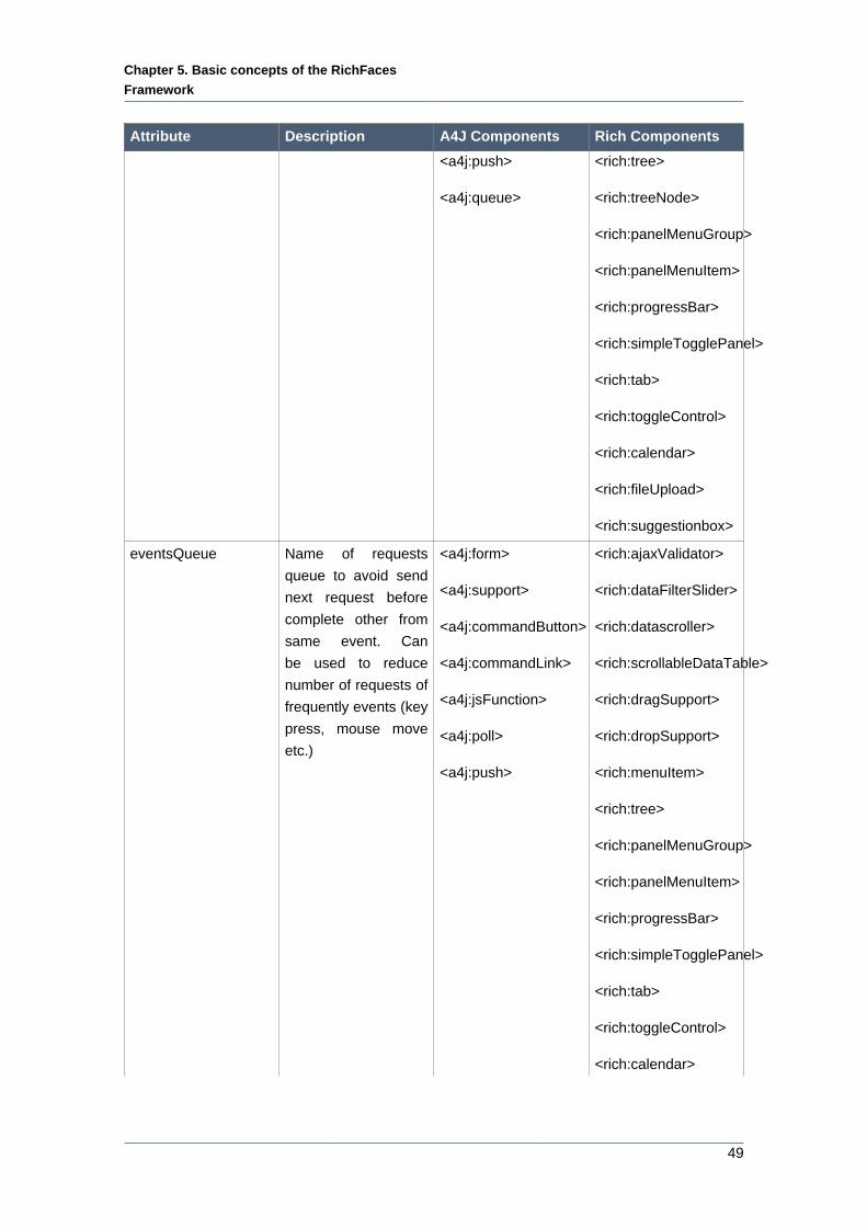
Chapter 5. Basic concepts of the RichFaces
Framework
49
Attribute Description A4J Components Rich Components
<a4j:push>
<a4j:queue>
<rich:tree>
<rich:treeNode>
<rich:panelMenuGroup>
<rich:panelMenuItem>
<rich:progressBar>
<rich:simpleTogglePanel>
<rich:tab>
<rich:toggleControl>
<rich:calendar>
<rich:fileUpload>
<rich:suggestionbox>
eventsQueue Name of requests
queue to avoid send
next request before
complete other from
same event. Can
be used to reduce
number of requests of
frequently events (key
press, mouse move
etc.)
<a4j:form>
<a4j:support>
<a4j:commandButton>
<a4j:commandLink>
<a4j:jsFunction>
<a4j:poll>
<a4j:push>
<rich:ajaxValidator>
<rich:dataFilterSlider>
<rich:datascroller>
<rich:scrollableDataTable>
<rich:dragSupport>
<rich:dropSupport>
<rich:menuItem>
<rich:tree>
<rich:panelMenuGroup>
<rich:panelMenuItem>
<rich:progressBar>
<rich:simpleTogglePanel>
<rich:tab>
<rich:toggleControl>
<rich:calendar>
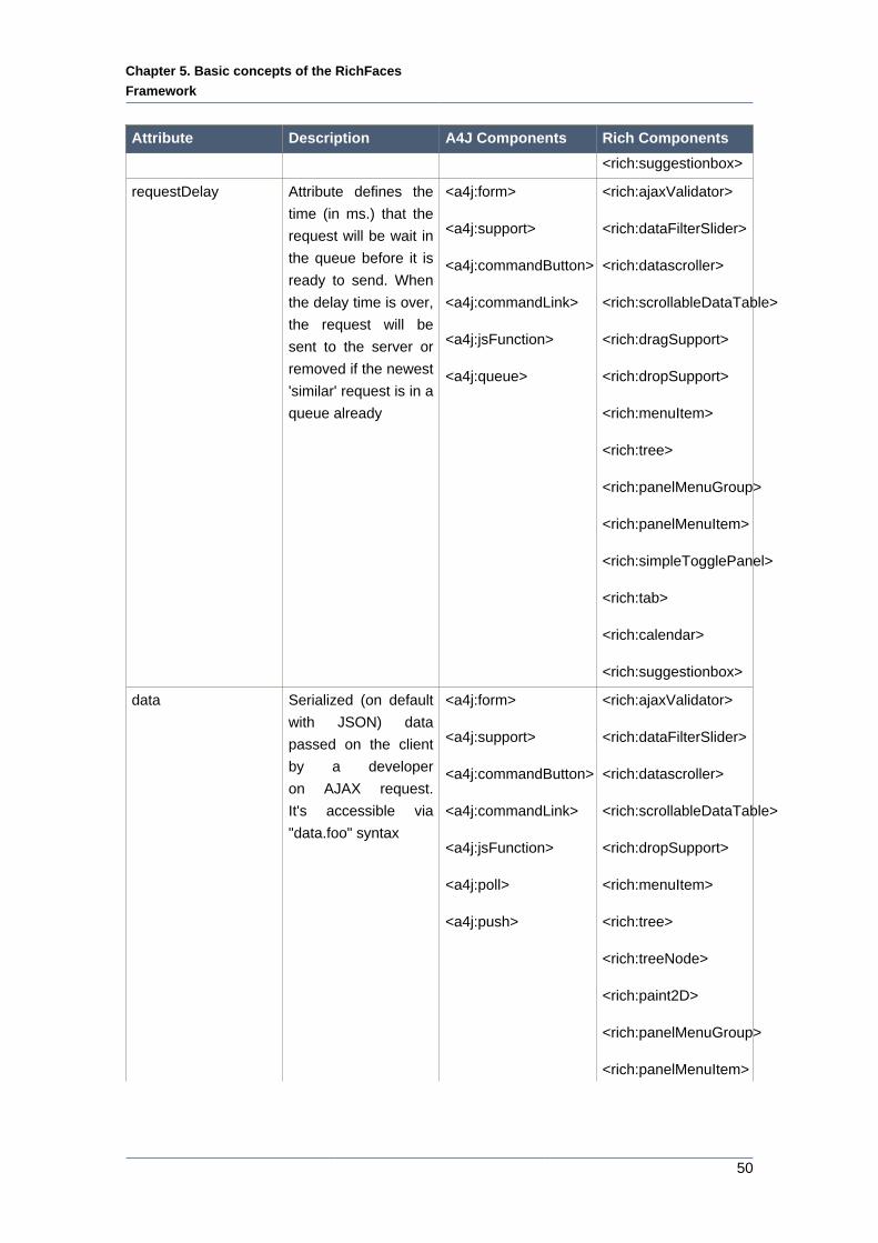
Chapter 5. Basic concepts of the RichFaces
Framework
50
Attribute Description A4J Components Rich Components
<rich:suggestionbox>
requestDelay Attribute defines the
time (in ms.) that the
request will be wait in
the queue before it is
ready to send. When
the delay time is over,
the request will be
sent to the server or
removed if the newest
'similar' request is in a
queue already
<a4j:form>
<a4j:support>
<a4j:commandButton>
<a4j:commandLink>
<a4j:jsFunction>
<a4j:queue>
<rich:ajaxValidator>
<rich:dataFilterSlider>
<rich:datascroller>
<rich:scrollableDataTable>
<rich:dragSupport>
<rich:dropSupport>
<rich:menuItem>
<rich:tree>
<rich:panelMenuGroup>
<rich:panelMenuItem>
<rich:simpleTogglePanel>
<rich:tab>
<rich:calendar>
<rich:suggestionbox>
data Serialized (on default
with JSON) data
passed on the client
by a developer
on AJAX request.
It's accessible via
"data.foo" syntax
<a4j:form>
<a4j:support>
<a4j:commandButton>
<a4j:commandLink>
<a4j:jsFunction>
<a4j:poll>
<a4j:push>
<rich:ajaxValidator>
<rich:dataFilterSlider>
<rich:datascroller>
<rich:scrollableDataTable>
<rich:dropSupport>
<rich:menuItem>
<rich:tree>
<rich:treeNode>
<rich:paint2D>
<rich:panelMenuGroup>
<rich:panelMenuItem>
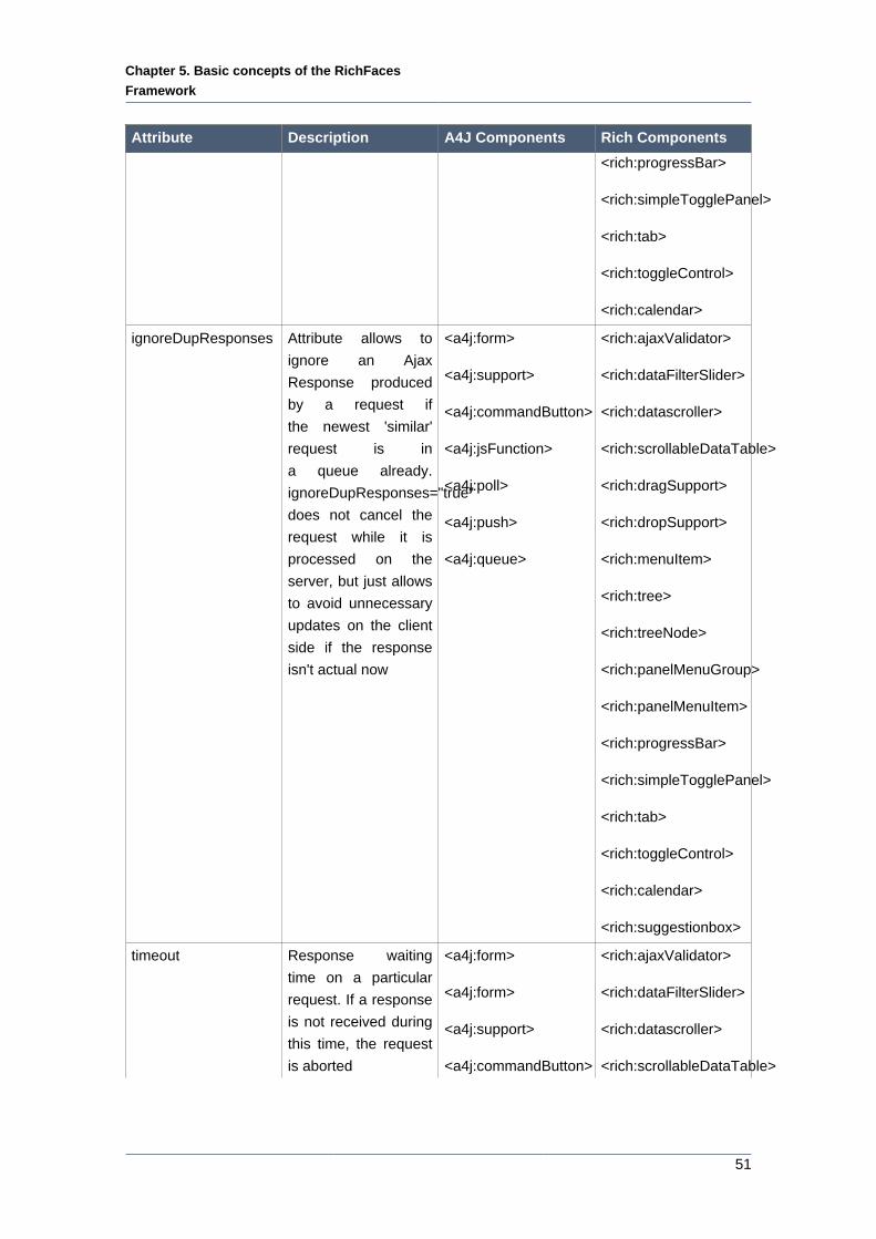
Chapter 5. Basic concepts of the RichFaces
Framework
51
Attribute Description A4J Components Rich Components
<rich:progressBar>
<rich:simpleTogglePanel>
<rich:tab>
<rich:toggleControl>
<rich:calendar>
ignoreDupResponses Attribute allows to
ignore an Ajax
Response produced
by a request if
the newest 'similar'
request is in
a queue already.
ignoreDupResponses="true"
does not cancel the
request while it is
processed on the
server, but just allows
to avoid unnecessary
updates on the client
side if the response
isn't actual now
<a4j:form>
<a4j:support>
<a4j:commandButton>
<a4j:jsFunction>
<a4j:poll>
<a4j:push>
<a4j:queue>
<rich:ajaxValidator>
<rich:dataFilterSlider>
<rich:datascroller>
<rich:scrollableDataTable>
<rich:dragSupport>
<rich:dropSupport>
<rich:menuItem>
<rich:tree>
<rich:treeNode>
<rich:panelMenuGroup>
<rich:panelMenuItem>
<rich:progressBar>
<rich:simpleTogglePanel>
<rich:tab>
<rich:toggleControl>
<rich:calendar>
<rich:suggestionbox>
timeout Response waiting
time on a particular
request. If a response
is not received during
this time, the request
is aborted
<a4j:form>
<a4j:form>
<a4j:support>
<a4j:commandButton>
<rich:ajaxValidator>
<rich:dataFilterSlider>
<rich:datascroller>
<rich:scrollableDataTable>
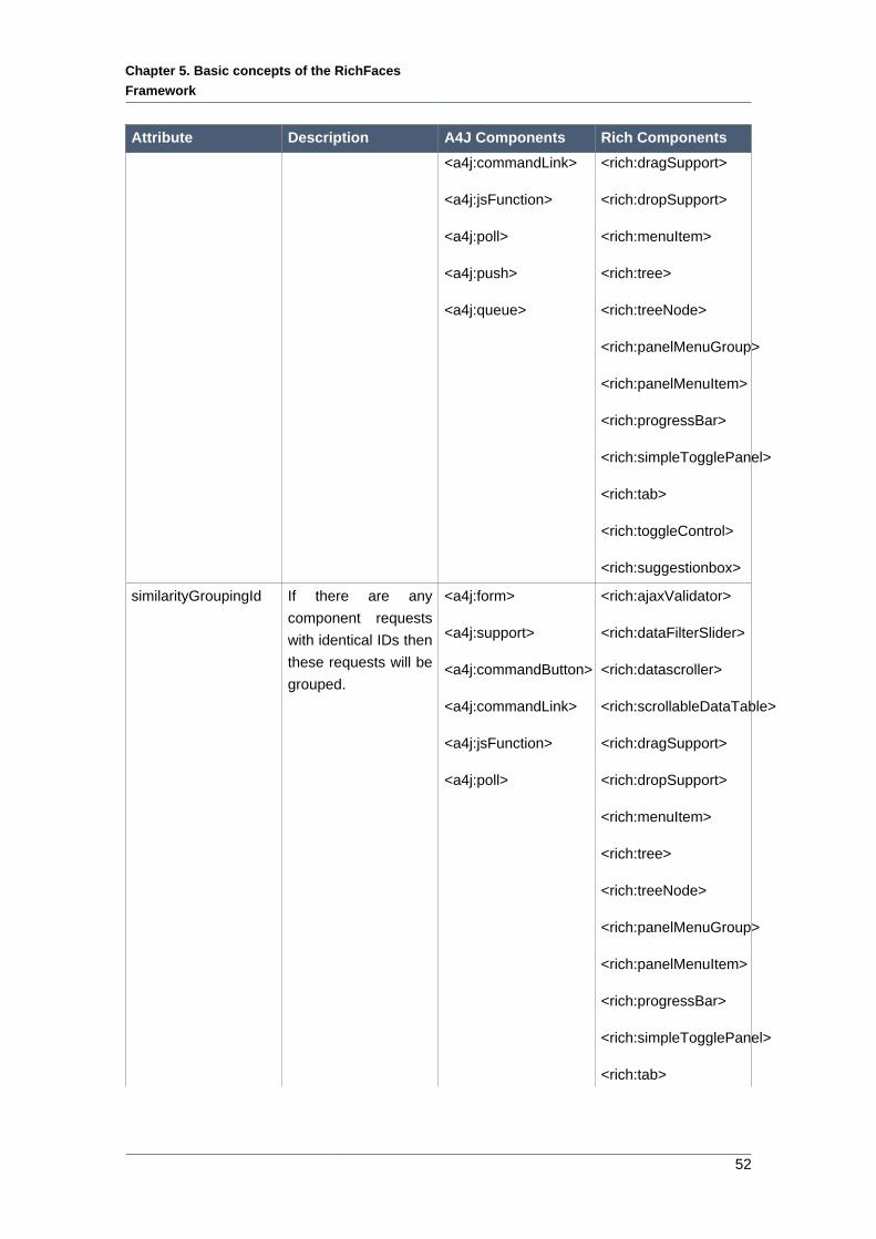
Chapter 5. Basic concepts of the RichFaces
Framework
52
Attribute Description A4J Components Rich Components
<a4j:commandLink>
<a4j:jsFunction>
<a4j:poll>
<a4j:push>
<a4j:queue>
<rich:dragSupport>
<rich:dropSupport>
<rich:menuItem>
<rich:tree>
<rich:treeNode>
<rich:panelMenuGroup>
<rich:panelMenuItem>
<rich:progressBar>
<rich:simpleTogglePanel>
<rich:tab>
<rich:toggleControl>
<rich:suggestionbox>
similarityGroupingId If there are any
component requests
with identical IDs then
these requests will be
grouped.
<a4j:form>
<a4j:support>
<a4j:commandButton>
<a4j:commandLink>
<a4j:jsFunction>
<a4j:poll>
<rich:ajaxValidator>
<rich:dataFilterSlider>
<rich:datascroller>
<rich:scrollableDataTable>
<rich:dragSupport>
<rich:dropSupport>
<rich:menuItem>
<rich:tree>
<rich:treeNode>
<rich:panelMenuGroup>
<rich:panelMenuItem>
<rich:progressBar>
<rich:simpleTogglePanel>
<rich:tab>
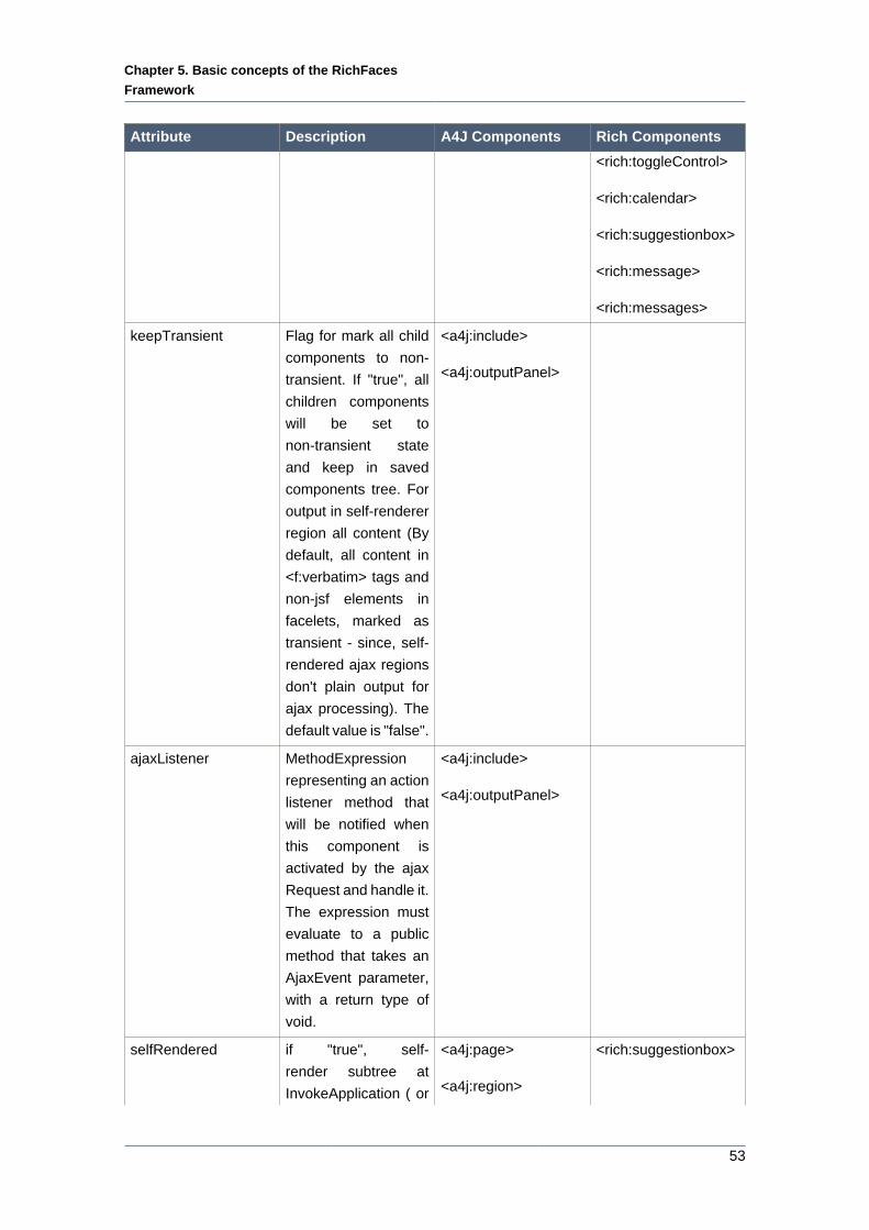
Chapter 5. Basic concepts of the RichFaces
Framework
53
Attribute Description A4J Components Rich Components
<rich:toggleControl>
<rich:calendar>
<rich:suggestionbox>
<rich:message>
<rich:messages>
keepTransient Flag for mark all child
components to non-
transient. If "true", all
children components
will be set to
non-transient state
and keep in saved
components tree. For
output in self-renderer
region all content (By
default, all content in
<f:verbatim> tags and
non-jsf elements in
facelets, marked as
transient - since, self-
rendered ajax regions
don't plain output for
ajax processing). The
default value is "false".
<a4j:include>
<a4j:outputPanel>
ajaxListener MethodExpression
representing an action
listener method that
will be notified when
this component is
activated by the ajax
Request and handle it.
The expression must
evaluate to a public
method that takes an
AjaxEvent parameter,
with a return type of
void.
<a4j:include>
<a4j:outputPanel>
selfRendered if "true", self-
render subtree at
InvokeApplication ( or
<a4j:page>
<a4j:region>
<rich:suggestionbox>
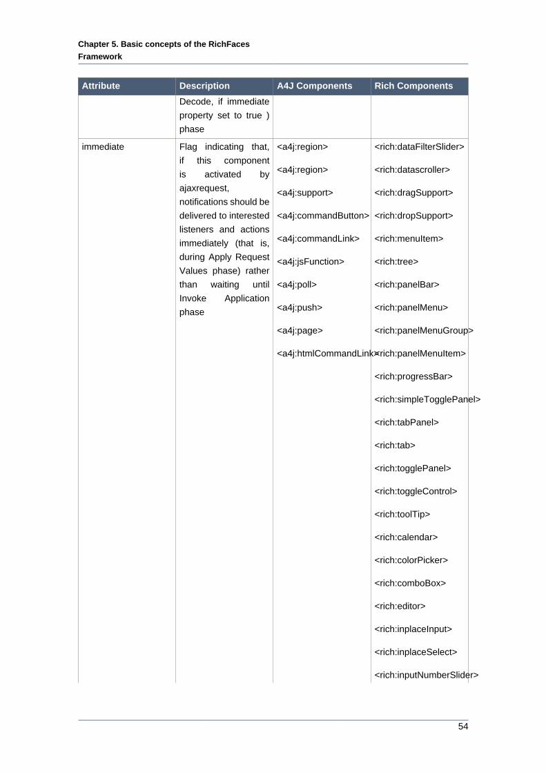
Chapter 5. Basic concepts of the RichFaces
Framework
54
Attribute Description A4J Components Rich Components
Decode, if immediate
property set to true )
phase
immediate Flag indicating that,
if this component
is activated by
ajaxrequest,
notifications should be
delivered to interested
listeners and actions
immediately (that is,
during Apply Request
Values phase) rather
than waiting until
Invoke Application
phase
<a4j:region>
<a4j:region>
<a4j:support>
<a4j:commandButton>
<a4j:commandLink>
<a4j:jsFunction>
<a4j:poll>
<a4j:push>
<a4j:page>
<a4j:htmlCommandLink>
<rich:dataFilterSlider>
<rich:datascroller>
<rich:dragSupport>
<rich:dropSupport>
<rich:menuItem>
<rich:tree>
<rich:panelBar>
<rich:panelMenu>
<rich:panelMenuGroup>
<rich:panelMenuItem>
<rich:progressBar>
<rich:simpleTogglePanel>
<rich:tabPanel>
<rich:tab>
<rich:togglePanel>
<rich:toggleControl>
<rich:toolTip>
<rich:calendar>
<rich:colorPicker>
<rich:comboBox>
<rich:editor>
<rich:inplaceInput>
<rich:inplaceSelect>
<rich:inputNumberSlider>
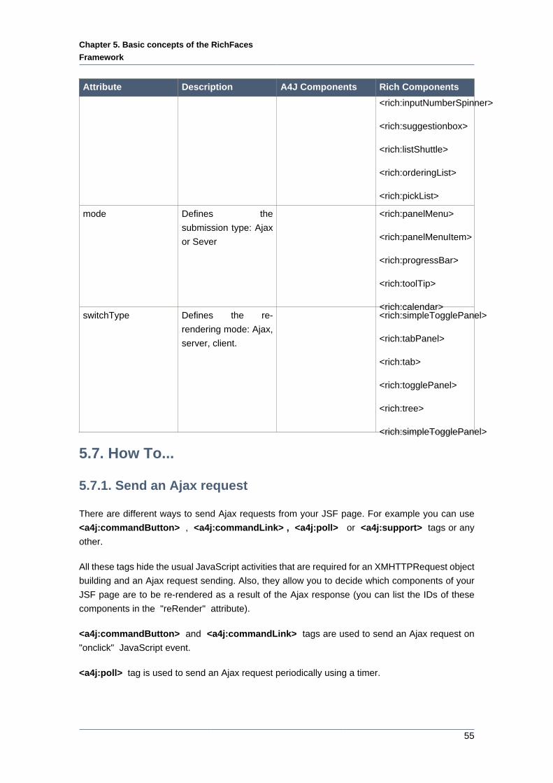
Chapter 5. Basic concepts of the RichFaces
Framework
55
Attribute Description A4J Components Rich Components
<rich:inputNumberSpinner>
<rich:suggestionbox>
<rich:listShuttle>
<rich:orderingList>
<rich:pickList>
mode Defines the
submission type: Ajax
or Sever
<rich:panelMenu>
<rich:panelMenuItem>
<rich:progressBar>
<rich:toolTip>
<rich:calendar>switchType Defines the re-
rendering mode: Ajax,
server, client.
<rich:simpleTogglePanel>
<rich:tabPanel>
<rich:tab>
<rich:togglePanel>
<rich:tree>
<rich:simpleTogglePanel>
5.7. How To...
5.7.1. Send an Ajax request
There are different ways to send Ajax requests from your JSF page. For example you can use
<a4j:commandButton> , <a4j:commandLink> , <a4j:poll> or <a4j:support> tags or any
other.
All these tags hide the usual JavaScript activities that are required for an XMHTTPRequest object
building and an Ajax request sending. Also, they allow you to decide which components of your
JSF page are to be re-rendered as a result of the Ajax response (you can list the IDs of these
components in the "reRender" attribute).
<a4j:commandButton> and <a4j:commandLink> tags are used to send an Ajax request on
"onclick" JavaScript event.
<a4j:poll> tag is used to send an Ajax request periodically using a timer.
Chapter 5. Basic concepts of the RichFaces
Framework
56
The <a4j:support> tag allows you to add Ajax functionality to standard JSF components and
send Ajax request onto a chosen JavaScript event: "onkeyup" , "onmouseover" , etc.
5.7.2. Decide What to Send
You may describe a region on the page you wish to send to the server, in this way you can control
what part of the JSF View is decoded on the server side when you send an Ajax request.
The easiest way to describe an Ajax region on your JSF page is to do nothing, because the content
between the <f:view> and </f:view> tags is considered the default Ajax region.
You may define multiple Ajax regions on the JSF page (they can even be nested) by using the
<a4j:region> tag.
If you wish to render the content of an Ajax response outside of the active region then the value
of the "renderRegionOnly" attribute should be set to "false" ("false" is default value). Otherwise,
your Ajax updates are limited to elements of the active region.
5.7.3. Decide What to Change
Using IDs in the "reRender" attribute to define "AJAX zones" for update works fine in many cases.
But you can not use this approach if your page contains, e.g. a <f:verbatim> tag and you wish
to update its content on an Ajax response.
The problem with the <f:verbatim/> tag as described above is related to the value of the
transientFlag of JSF components. If the value of this flag is true, the component must not
participate in state saving or restoring of process.
In order to provide a solution to this kind of problems, RichFaces uses the concept of an output
panel that is defined by the <a4j:outputPanel> tag. If you put a <f:verbatim> tag inside of the
output panel, then the content of the <f:verbatim/> tag and content of other panel's child tags
could be updated on Ajax response. There are two ways to control this:
• By setting the "ajaxRendered" attribute value to "true".
• By setting the "reRender" attribute value of an Action Component to the output panel ID.
5.7.4. Decide what to process
The "process" attribute allows to define the ids of components to be processed together with the
component which is marked as ajaxSingle or wrapped to region.
You could make use of the "process" attribute when you need to process only two components
in the different parts of view.
Imagine you need to process only two input fields but not all the view. If you wrap the first input
to region or make <a4j:support> component with ajaxSingle="true" nested the second input
will not be processed.
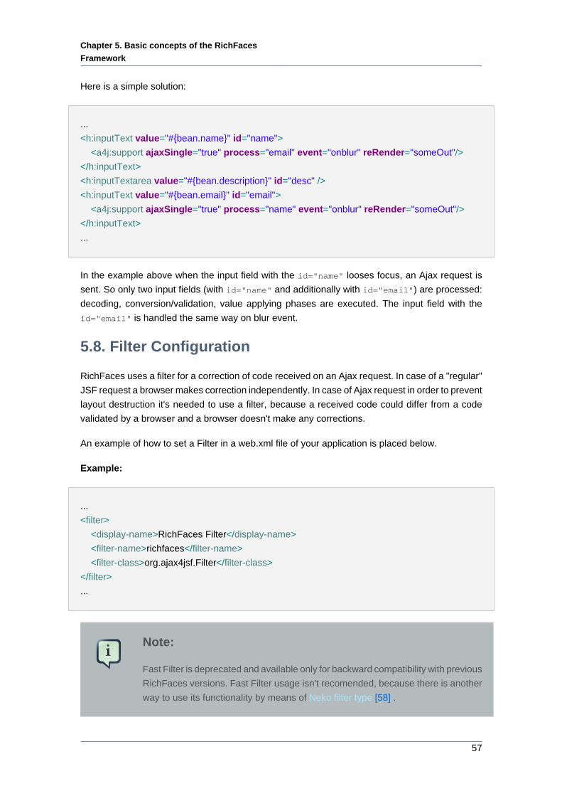
Chapter 5. Basic concepts of the RichFaces
Framework
57
Here is a simple solution:
...
<h:inputText value="#{bean.name}" id="name">
<a4j:support ajaxSingle="true" process="email" event="onblur" reRender="someOut"/>
</h:inputText>
<h:inputTextarea value="#{bean.description}" id="desc" />
<h:inputText value="#{bean.email}" id="email">
<a4j:support ajaxSingle="true" process="name" event="onblur" reRender="someOut"/>
</h:inputText>
...
In the example above when the input field with the id="name" looses focus, an Ajax request is
sent. So only two input fields (with id="name" and additionally with id="email") are processed:
decoding, conversion/validation, value applying phases are executed. The input field with the
id="email" is handled the same way on blur event.
5.8. Filter Configuration
RichFaces uses a filter for a correction of code received on an Ajax request. In case of a "regular"
JSF request a browser makes correction independently. In case of Ajax request in order to prevent
layout destruction it's needed to use a filter, because a received code could differ from a code
validated by a browser and a browser doesn't make any corrections.
An example of how to set a Filter in a web.xml file of your application is placed below.
Example:
...
<filter>
<display-name>RichFaces Filter</display-name>
<filter-name>richfaces</filter-name>
<filter-class>org.ajax4jsf.Filter</filter-class>
</filter>
...
Note:
Fast Filter is deprecated and available only for backward compatibility with previous
RichFaces versions. Fast Filter usage isn't recomended, because there is another
way to use its functionality by means of Neko filter type [58] .
Chapter 5. Basic concepts of the RichFaces
Framework
58
From RichFaces 3.2 filter configuration becomes more flexible. It's possible to configure different
filters for different sets of pages for the same application.
The possible filter types are:
• TIDY
"TIDY" filter type based on the Tidy parser. This filter is recommended for applications with
complicated or non-standard markup when all necessary code corrections are made by the filter
when a response comes from the server.
• NEKO
"NEKO" filter type corresponds to the former "Fast Filter" and it's based on the Neko parser. In
case of using this filter code isn't strictly verified. Use this one if you are sure that your application
markup is really strict for this filter. Otherwise it could cause lot's of errors and corrupt a layout as
a result. This filter considerably accelerates all Ajax requests processing.
• NONE
No correction.
An example of configuration is placed below.
Example:
...
<context-param>
<param-name>org.ajax4jsf.xmlparser.ORDER</param-name>
<param-value>NONE,NEKO,TIDY</param-value>
</context-param>
<context-param>
<param-name>org.ajax4jsf.xmlparser.NONE</param-name>
<param-value>/pages/performance\.xhtml,/pages/default.*\.xhtml</param-value>
</context-param>
<context-param>
<param-name>org.ajax4jsf.xmlparser.NEKO</param-name>
<param-value>/pages/repeat\.xhtml</param-value>
</context-param>
<filter>
<display-name>RichFaces Filter</display-name>
<filter-name>richfaces</filter-name>
<filter-class>org.ajax4jsf.Filter</filter-class>
</filter>
<filter-mapping>
<filter-name>richfaces</filter-name>
<servlet-name>Faces Servlet</servlet-name>
Chapter 5. Basic concepts of the RichFaces
Framework
59
<dispatcher>FORWARD</dispatcher>
<dispatcher>REQUEST</dispatcher>
<dispatcher>INCLUDE</dispatcher>
</filter-mapping>
...
The example shows that ORDER parameter defines the order in which particular filter types are
used for pages code correction.
First of all "NONE" type is specified for the filter. Then two different sets of pages are defined for
which two filter types (NONE and NEKO) are used correspondingly. If a page relates to the first
set that is defined in the following way:
<param-value>/pages/performance\.xhtml,/pages/default.*\.xhtml</param-value>
it's not corrected, because filter type for this page is defined as "NONE". If a page is not from the
first set, then "NEKO" type is set.
If a page relates to the second set that is defined in the following way:
<param-value>/pages/repeat\.xhtml</param-value>
then "NEKO" filter type is used for correction. If it's not related to the second set, "TIDY" type is
set for the filter ("TIDY" filter type is used for code correction).
5.9. Scripts and Styles Load Strategy
Before the version 3.1.3, RichFaces loaded styles and script on demand. I.e. files are loaded only
if they are required on a particular page. Since RichFaces 3.1.3, it's possible to manage how the
RichFaces script and style files are loaded to application.
org.richfaces.LoadScriptStrategy
The following declaration in your web.xml allows loading the integrated script files.
...
<context-param>
<param-name>org.richfaces.LoadScriptStrategy</param-name>
<param-value>ALL</param-value>
</context-param>
...
Chapter 5. Basic concepts of the RichFaces
Framework
60
If you do not declare the org.richfaces.LoadScriptStrategy in the web.xml, it equals to:
...
<context-param>
<param-name>org.richfaces.LoadScriptStrategy</param-name>
<param-value>DEFAULT</param-value>
</context-param>
...
The third possible value is "NONE". You have no a special reason to use it unless you obtain the
newest (or modified) version of the script and want to include it manually in a page header.
org.richfaces.LoadStyleStrategy
The following declaration allows to load only one integrated style sheet file.
...
<context-param>
<param-name>org.richfaces.LoadStyleStrategy</param-name>
<param-value>ALL</param-value>
</context-param>
...
The integrated style sheet contains style for all shipped components. The skinnability feature still
works.
The "DEFAULT" value is a classical on-demand variant.
The "NONE" stops loading the styles at all. The earlier introduced plain skin resets all color and
font parameters to null. The "NONE" value for org.richfaces.LoadStyleStrategy means that
predefined styles for RichFaces are not used.
For more information see RichFaces User Forum [http://www.jboss.com/index.html?
module=bb&op=viewtopic&p=4114033] .
5.10. Request Errors and Session Expiration Handling
RichFaces allows to redefine standard handlers responsible for processing of different exceptional
situations. It helps to define own JavaScript, which is executed when these situations occur.
Add the following code to web.xml:
<context-param>
<param-name>org.ajax4jsf.handleViewExpiredOnClient</param-name>
Chapter 5. Basic concepts of the RichFaces
Framework
61
<param-value>true</param-value>
</context-param>
5.10.1. Request Errors Handling
To execute your own code on the client in case of an error during Ajax request, it's necessary to
redefine the standard "A4J.AJAX.onError" method:
A4J.AJAX.onError = function(req, status, message){
window.alert("Custom onError handler "+message);
}
The function defined this way accepts as parameters:
• req - a params string of a request that calls an error
• status - the number of an error returned by the server
• message - a default message for the given error
Thus, it's possible to create your own handler that is called on timeouts, internal server errors,
and etc.
5.10.2. Session Expired Handling
It's possible to redefine also the "onExpired" framework method that is called on the "Session
Expiration" event.
Example:
A4J.AJAX.onExpired = function(loc, expiredMsg){
if(window.confirm("Custom onExpired handler "+expiredMsg+" for a location: "+loc)){
return loc;
} else {
return false;
}
}
Here the function receives in params:
• loc - URL of the current page (on demand can be updated)
Chapter 5. Basic concepts of the RichFaces
Framework
62
• expiredMsg - a default message on "Session Expiration" event.
Note:
Note that custom "onError", "onExpire" handlers do not work under MyFaces.
MyFaces handles exception by its internals generating debug page. You could use
the following code to prevent such behavior:
...
<context-param>
<param-name>org.apache.myfaces.ERROR_HANDLING</param-name>
<param-value>false</param-value>
</context-param>
...
5.11. Skinnability
5.11.1. Why Skinnability
If you have a look at a CSS file in an enterprise application, for example, the one you're working
on now, you'll see how often the same color is noted in it. Standard CSS has no way to define
a particular color abstractly for defining as a panel header color, a background color of an active
pop-up menu item, a separator color, etc. To define common interface styles, you have to copy
the same values over and over again and the more interface elements you have the more copy-
and-paste activity that needs to be performed.
Hence, if you want to change the application palette, you have to change all interrelating values,
otherwise your interface can appear a bit clumsy. The chances of such an interface coming
about is very high, as CSS editing usually becomes the duty of a general developer who doesn't
necessarily have much knowledge of user interface design.
Moreover, if a customer wishes to have an interface look-and-feel that can be adjusted on-the-fly
by an end user, your work is multiplied, as you have to deal with several CSS files variants, each
of which contains the same values repeated numerous times.
These problems can be solved with the skinnability system built into the RichFaces project and
implemented fully in RichFaces. Every named skin has some skin-parameters for the definition of
a palette and the other parameters of the user interface. By changing just a few parameters, you
can alter the appearance of dozens of components in an application in a synchronized fashion
without messing up user interface consistency.
The skinnability feature can't completely replace standard CSS and certainly doesn't eliminate
its usage. Skinnability is a high-level extension of standard CSS, which can be used together
Chapter 5. Basic concepts of the RichFaces
Framework
63
with regular CSS declarations. You can also refer to skin parameters in CSS via JSF Expression
Language. You have the complete ability to synchronize the appearance of all the elements in
your pages.
5.11.2. Using Skinnability
RichFaces skinnability is designed for mixed usage with:
• Skin parameters defined in the RichFaces framework
• Predefined CSS classes for components
• User style classes
The color scheme of the component can be applied to its elements using any of three style classes:
• A default style class inserted into the framework
This contains style parameters linked to some constants from a skin. It is defined for every
component and specifies a default representation level. Thus, an application interface could be
modified by changing the values of skin parameters.
• A style class of skin extension
This class name is defined for every component element and inserted into the framework to
allow defining a class with the same name into its CSS files. Hence, the appearance of all
components that use this class is extended.
• User style class
It's possible to use one of the styleClass parameters for component elements and define your
own class in it. As a result, the appearance of one particular component is changed according
to a CSS style parameter specified in the class.
5.11.3. Example
Here is a simple panel component:
Example:
<rich:panel> ... </rich:panel>
The code generates a panel component on a page, which consists of two elements: a wrapper
<div> element and a <div> element for the panel body with the particular style properties. The
wrapper <div> element looks like:
Example:
Chapter 5. Basic concepts of the RichFaces
Framework
64
<div class="dr-pnl rich-panel">
...
</div>
dr-pnl is a CSS class specified in the framework via skin parameters:
• background-color is defined with generalBackgroundColor
• border-color is defined with panelBorderColor
It's possible to change all colors for all panels on all pages by changing these skin parameters.
However, if a <rich:panel> class is specified somewhere on the page, its parameters are also
acquired by all panels on this page.
A developer may also change the style properties for a particular panel. The following definition:
Example:
<rich:panel styleClass="customClass" />
Could add some style properties from customClass to one particular panel, as a result we get
three styles:
Example:
<div class="dr_pnl rich-panel customClass">
...
</div>
5.11.4. Skin Parameters Tables in RichFaces
RichFaces provides eight predefined skin parameters (skins) at the simplest level of common
customization:
• DEFAULT
• plain
• emeraldTown
• blueSky
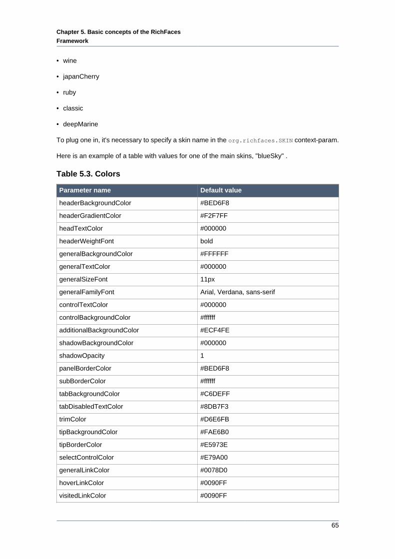
Chapter 5. Basic concepts of the RichFaces
Framework
65
• wine
• japanCherry
• ruby
• classic
• deepMarine
To plug one in, it's necessary to specify a skin name in the org.richfaces.SKIN context-param.
Here is an example of a table with values for one of the main skins, "blueSky" .
Table 5.3. Colors
Parameter name Default value
headerBackgroundColor #BED6F8
headerGradientColor #F2F7FF
headTextColor #000000
headerWeightFont bold
generalBackgroundColor #FFFFFF
generalTextColor #000000
generalSizeFont 11px
generalFamilyFont Arial, Verdana, sans-serif
controlTextColor #000000
controlBackgroundColor #ffffff
additionalBackgroundColor #ECF4FE
shadowBackgroundColor #000000
shadowOpacity 1
panelBorderColor #BED6F8
subBorderColor #ffffff
tabBackgroundColor #C6DEFF
tabDisabledTextColor #8DB7F3
trimColor #D6E6FB
tipBackgroundColor #FAE6B0
tipBorderColor #E5973E
selectControlColor #E79A00
generalLinkColor #0078D0
hoverLinkColor #0090FF
visitedLinkColor #0090FF
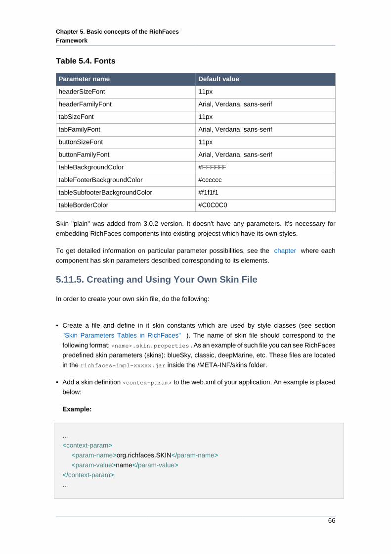
Chapter 5. Basic concepts of the RichFaces
Framework
66
Table 5.4. Fonts
Parameter name Default value
headerSizeFont 11px
headerFamilyFont Arial, Verdana, sans-serif
tabSizeFont 11px
tabFamilyFont Arial, Verdana, sans-serif
buttonSizeFont 11px
buttonFamilyFont Arial, Verdana, sans-serif
tableBackgroundColor #FFFFFF
tableFooterBackgroundColor #cccccc
tableSubfooterBackgroundColor #f1f1f1
tableBorderColor #C0C0C0
Skin "plain" was added from 3.0.2 version. It doesn't have any parameters. It's necessary for
embedding RichFaces components into existing projecst which have its own styles.
To get detailed information on particular parameter possibilities, see the chapter where each
component has skin parameters described corresponding to its elements.
5.11.5. Creating and Using Your Own Skin File
In order to create your own skin file, do the following:
• Create a file and define in it skin constants which are used by style classes (see section
"Skin Parameters Tables in RichFaces" ). The name of skin file should correspond to the
following format: <name>.skin.properties . As an example of such file you can see RichFaces
predefined skin parameters (skins): blueSky, classic, deepMarine, etc. These files are located
in the richfaces-impl-xxxxx.jar inside the /META-INF/skins folder.
• Add a skin definition <contex-param> to the web.xml of your application. An example is placed
below:
Example:
...
<context-param>
<param-name>org.richfaces.SKIN</param-name>
<param-value>name</param-value>
</context-param>
...
Chapter 5. Basic concepts of the RichFaces
Framework
67
• Put your <name>.skin.properties file in one of the following classpath elements: META-INF/
skins/ or classpath folder (e.g. WEB-INF/classes).
5.11.6. Built-in Skinnability in RichFaces
RichFaces gives an opportunity to incorporate skinnability into UI design. With this framework
you can easily use named skin parameters in properties files to control the appearance of the
skins that are applied consistently to a whole set of components. You can look at examples of
predefined skins at:
http://livedemo.exadel.com/richfaces-demo/ [http://livedemo.exadel.com/richfaces-demo/]
You may simply control the look-and-feel of your application by using the skinnability service of the
RichFaces framework. With the means of this service you can define the same style for rendering
standard JSF components and custom JSF components built with the help of RichFaces.
To find out more on skinnability possibilities, follow these steps:
• Create a custom render kit and register it in the faces-config.xml like this:
<render-kit>
<render-kit-id>NEW_SKIN</render-kit-id>
<render-kit-class>org.ajax4jsf.framework.renderer.ChameleonRenderKitImpl</render-kit-
class>
</render-kit>
• Then you need to create and register custom renderers for the component based on the look-
and-feel predefined variables:
<renderer>
<component-family>javax.faces.Command</component-family>
<renderer-type>javax.faces.Link</renderer-type>
<renderer-class>newskin.HtmlCommandLinkRenderer</renderer-class>
</renderer>
• Finally, you need to place a properties file with skin parameters into the class path root. There
are two requirements for the properties file:
• The file must be named <skinName>.skin.properties , in this case, it would be called
newskin.skin.properties .
• The first line in this file should be render.kit=<render-kit-id> in this case, it would be
called render.kit=NEW_SKIN .
Extra information on custom renderers creation can be found at:
Chapter 5. Basic concepts of the RichFaces
Framework
68
http://java.sun.com/javaee/javaserverfaces/reference/docs/index.html [http://java.sun.com/
javaee/javaserverfaces/reference/docs/index.html]
5.11.7. Changing skin in runtime
It's possible to change skins in runtime. In order to do that, define the EL-expression in the
web.xml. For example:
<context-param>
<param-name>org.richfaces.SKIN</param-name>
<param-value>#{skinBean.skin}</param-value>
</context-param>
The skinBean code looks as follows:
public class SkinBean {
private String skin;
public String getSkin() {
return skin;
}
public void setSkin(String skin) {
this.skin = skin;
}
}
Further, it is necessary to set the skin property to the initial value in the configuration file. For
example, "classic":
<managed-bean>
<managed-bean-name>skinBean</managed-bean-name>
<managed-bean-class>SkinBean</managed-bean-class>
<managed-bean-scope>session</managed-bean-scope>
<managed-property>
<property-name>skin</property-name>
<value>classic</value>
</managed-property>
</managed-bean>
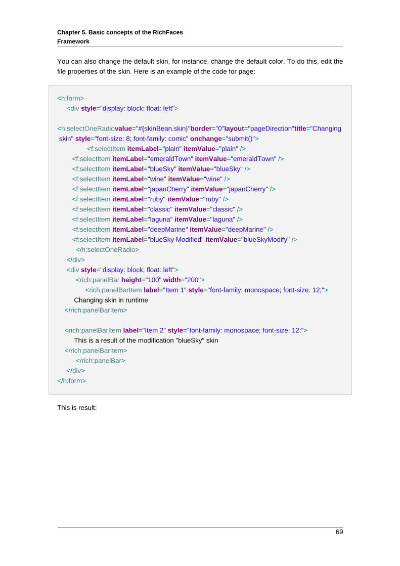
Chapter 5. Basic concepts of the RichFaces
Framework
69
You can also change the default skin, for instance, change the default color. To do this, edit the
file properties of the skin. Here is an example of the code for page:
<h:form>
<div style="display: block; float: left">
<h:selectOneRadio value="#{skinBean.skin}" border="0" layout="pageDirection" title="Changing
skin" style="font-size: 8; font-family: comic" onchange="submit()">
<f:selectItem itemLabel="plain" itemValue="plain" />
<f:selectItem itemLabel="emeraldTown" itemValue="emeraldTown" />
<f:selectItem itemLabel="blueSky" itemValue="blueSky" />
<f:selectItem itemLabel="wine" itemValue="wine" />
<f:selectItem itemLabel="japanCherry" itemValue="japanCherry" />
<f:selectItem itemLabel="ruby" itemValue="ruby" />
<f:selectItem itemLabel="classic" itemValue="classic" />
<f:selectItem itemLabel="laguna" itemValue="laguna" />
<f:selectItem itemLabel="deepMarine" itemValue="deepMarine" />
<f:selectItem itemLabel="blueSky Modified" itemValue="blueSkyModify" />
</h:selectOneRadio>
</div>
<div style="display: block; float: left">
<rich:panelBar height="100" width="200">
<rich:panelBarItem label="Item 1" style="font-family: monospace; font-size: 12;">
Changing skin in runtime
</rich:panelBarItem>
<rich:panelBarItem label="Item 2" style="font-family: monospace; font-size: 12;">
This is a result of the modification "blueSky" skin
</rich:panelBarItem>
</rich:panelBar>
</div>
</h:form>
This is result:
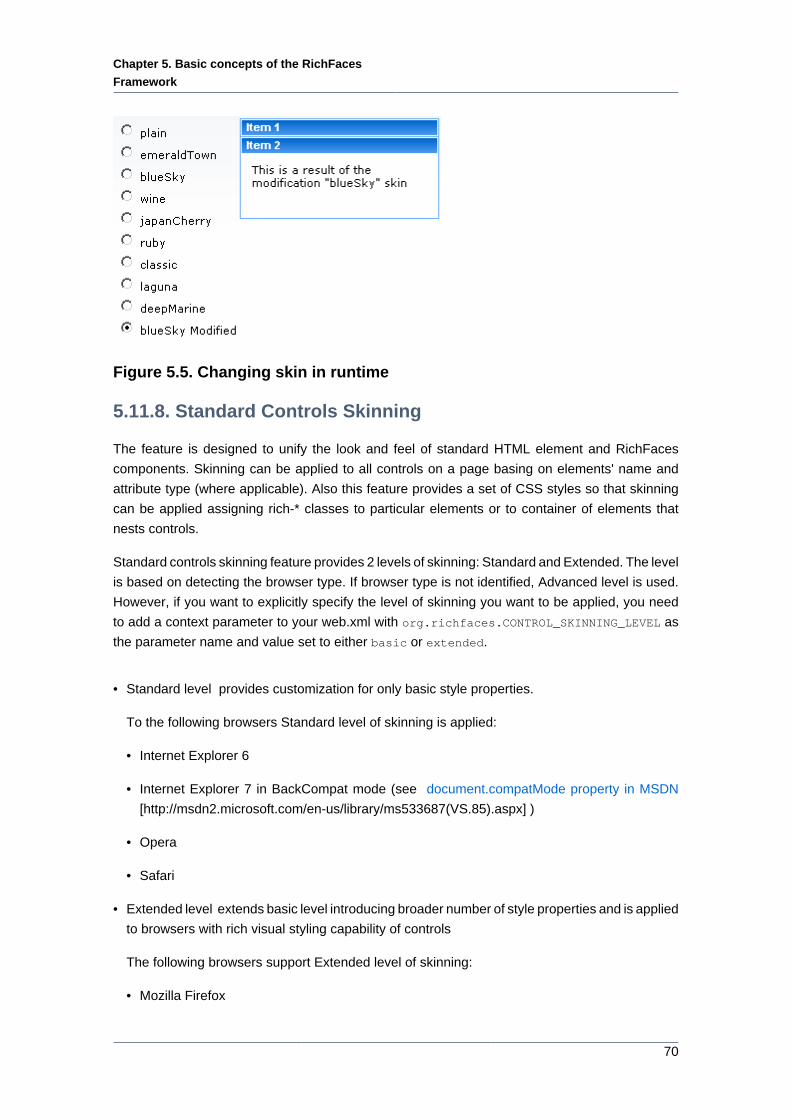
Chapter 5. Basic concepts of the RichFaces
Framework
70
Figure 5.5. Changing skin in runtime
5.11.8. Standard Controls Skinning
The feature is designed to unify the look and feel of standard HTML element and RichFaces
components. Skinning can be applied to all controls on a page basing on elements' name and
attribute type (where applicable). Also this feature provides a set of CSS styles so that skinning
can be applied assigning rich-* classes to particular elements or to container of elements that
nests controls.
Standard controls skinning feature provides 2 levels of skinning: Standard and Extended. The level
is based on detecting the browser type. If browser type is not identified, Advanced level is used.
However, if you want to explicitly specify the level of skinning you want to be applied, you need
to add a context parameter to your web.xml with org.richfaces.CONTROL_SKINNING_LEVEL as
the parameter name and value set to either basic or extended.
• Standard level provides customization for only basic style properties.
To the following browsers Standard level of skinning is applied:
• Internet Explorer 6
• Internet Explorer 7 in BackCompat mode (see document.compatMode property in MSDN
[http://msdn2.microsoft.com/en-us/library/ms533687(VS.85).aspx] )
• Opera
• Safari
• Extended level extends basic level introducing broader number of style properties and is applied
to browsers with rich visual styling capability of controls
The following browsers support Extended level of skinning:
• Mozilla Firefox
Chapter 5. Basic concepts of the RichFaces
Framework
71
• Internet Explorer 7 in Standards-compliant mode (CSS1Compat mode)
These are the elements that affected by skinning:
• input
• select
• textarea
• keygen
• isindex
• legend
• fieldset
• hr
• a (together with a:hover, a:visited "pseudo"-elements)
Skinning for standard HTML controls can be initialized in two ways:
• by adding org.richfaces.CONTROL_SKINNING parameter to web.xml. Values: "enable" and
"disable". This way implies that skinning style properties are applied to elements by element
name and attribute type (where applicable). No additional steps required. Please find below the
table that contains the list of elements to which skinning is applicable.
• by adding org.richfaces.CONTROL_SKINNING_CLASSES parameter to web.xml file. Possible
values "enable" and "disable". When this option is enabled you are provided with a set of
predefined CSS classes that you can use for skinning your HTML components.
By setting org.richfaces.CONTROL_SKINNING_CLASSES to "enable" you are provided with style
classes applicable to:
• Basic elements nested inside element having rich-container class, e.g.:
Example:
...
.rich-container select {
//class content
}
...
• Elements that have class name corresponding to one of the basic elements name/type mapped
by the following scheme rich-<elementName>[-<elementType>] . See the example:
Chapter 5. Basic concepts of the RichFaces
Framework
72
Example:
...
.rich-select {
//class content
}
.rich-input-text {
//class content
}
...
Note:
Elements have classes based on "link" and pseudo class name, e.g.: rich-link,
rich-link-hover, rich-link-visited
Additionally, the predefined rich CSS classes that we provide can be used not only as classes for
basic HTML elements but also as classes for creation of complex elements .
There is a snippet with some of them for example:
...
<u:selector name=".rich-box-bgcolor-header">
<u:style name="background-color" skin="headerBackgroundColor" />
</u:selector>
<u:selector name=".rich-box-bgcolor-general">
<u:style name="background-color" skin="generalBackgroundColor" />
</u:selector>
...
//gradient elements
...
<u:selector name=".rich-gradient-menu">
<u:style name="background-image">
<f:resource f:key="org.richfaces.renderkit.html.gradientimages.MenuGradientImage"/>
</u:style>
<u:style name="background-repeat" value="repeat-x" />
</u:selector>
<u:selector name=".rich-gradient-tab">
<u:style name="background-image">
Chapter 5. Basic concepts of the RichFaces
Framework
73
<f:resource f:key="org.richfaces.renderkit.html.gradientimages.TabGradientImage"/>
</u:style>
<u:style name="background-repeat" value="repeat-x" />
</u:selector>
...
To get a better idea of standard component skinning we recommend to explore CSS files located
in ui/core/src/main/resources/org/richfaces/ folder of RichFaces svn.
5.11.8.1. Standard level
Table 5.5. Html Elements Skin Bindings for input, select, textarea, button,
keygen, isindex, legend
CSS Properties Skin parameters
font-size generalSizeFont
font-family generalFamilyFont
color controlTextColor
Table 5.6. Html Elements Skin Bindings for fieldset
CSS Properties Skin parameters
border-color panelBorderColor
Table 5.7. Html Elements Skin Bindings for hr
CSS Properties Skin parameters
border-color panelBorderColor
Table 5.8. Html Elements Skin Bindings for a
CSS Properties Skin parameters
color generalLinkColor
Table 5.9. Html Elements Skin Bindings for a:hover
CSS Properties Skin parameters
color hoverLinkColorgeneralLinkColor
Table 5.10. Html Elements Skin Bindings for a:visited
CSS Properties Skin parameters
color visitedLinkColor
Chapter 5. Basic concepts of the RichFaces
Framework
74
Table 5.11. Rich Elements Skin Bindings for .rich-input, .rich-select, .rich-
textarea, .rich-keygen, .rich-isindex, .rich-link
CSS Properties Skin parameters
font-size generalSizeFont
font-family generalFamilyFont
color controlTextColor
Table 5.12. Rich Elements Skin Bindings for .rich-fieldset
CSS Properties Skin parameters
border-color panelBorderColor
Table 5.13. Rich Elements Skin Bindings for .rich-hr
CSS Properties Skin parameters/Value
border-color panelBorderColor
border-width 1px
border-style solid
Table 5.14. Rich Elements Skin Bindings for .rich-link
CSS Properties Skin parameters
color generalLinkColor
Table 5.15. Rich Elements Skin Bindings for .rich-link:hover
CSS Properties Skin parameters
color hoverLinkColor
Table 5.16. Rich Elements Skin Bindings for .rich-link:visited
CSS Properties Skin parameters
color visitedLinkColor
Table 5.17. Rich Elements Skin Bindings for .rich-field
CSS Properties Skin parameters/Value
border-width 1px
border-style inset
border-color panelBorderColor
background-color controlBackgroundColor
background-repeat no-repeat
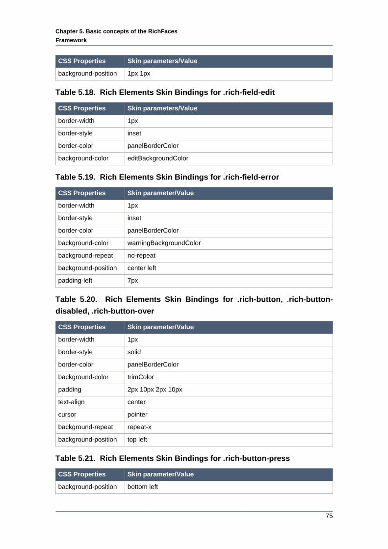
Chapter 5. Basic concepts of the RichFaces
Framework
75
CSS Properties Skin parameters/Value
background-position 1px 1px
Table 5.18. Rich Elements Skin Bindings for .rich-field-edit
CSS Properties Skin parameters/Value
border-width 1px
border-style inset
border-color panelBorderColor
background-color editBackgroundColor
Table 5.19. Rich Elements Skin Bindings for .rich-field-error
CSS Properties Skin parameter/Value
border-width 1px
border-style inset
border-color panelBorderColor
background-color warningBackgroundColor
background-repeat no-repeat
background-position center left
padding-left 7px
Table 5.20. Rich Elements Skin Bindings for .rich-button, .rich-button-
disabled, .rich-button-over
CSS Properties Skin parameter/Value
border-width 1px
border-style solid
border-color panelBorderColor
background-color trimColor
padding 2px 10px 2px 10px
text-align center
cursor pointer
background-repeat repeat-x
background-position top left
Table 5.21. Rich Elements Skin Bindings for .rich-button-press
CSS Properties Skin parameter/Value
background-position bottom left
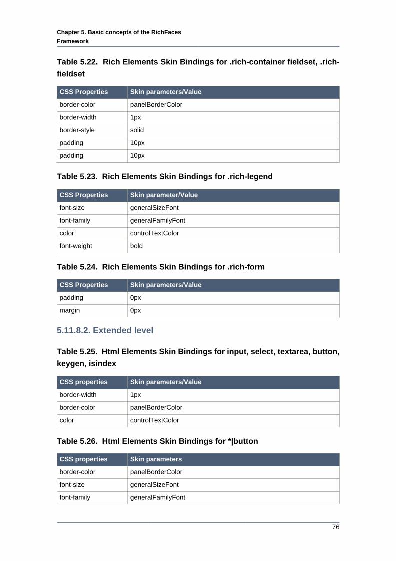
Chapter 5. Basic concepts of the RichFaces
Framework
76
Table 5.22. Rich Elements Skin Bindings for .rich-container fieldset, .rich-
fieldset
CSS Properties Skin parameters/Value
border-color panelBorderColor
border-width 1px
border-style solid
padding 10px
padding 10px
Table 5.23. Rich Elements Skin Bindings for .rich-legend
CSS Properties Skin parameter/Value
font-size generalSizeFont
font-family generalFamilyFont
color controlTextColor
font-weight bold
Table 5.24. Rich Elements Skin Bindings for .rich-form
CSS Properties Skin parameters/Value
padding 0px
margin 0px
5.11.8.2. Extended level
Table 5.25. Html Elements Skin Bindings for input, select, textarea, button,
keygen, isindex
CSS properties Skin parameters/Value
border-width 1px
border-color panelBorderColor
color controlTextColor
Table 5.26. Html Elements Skin Bindings for *|button
CSS properties Skin parameters
border-color panelBorderColor
font-size generalSizeFont
font-family generalFamilyFont
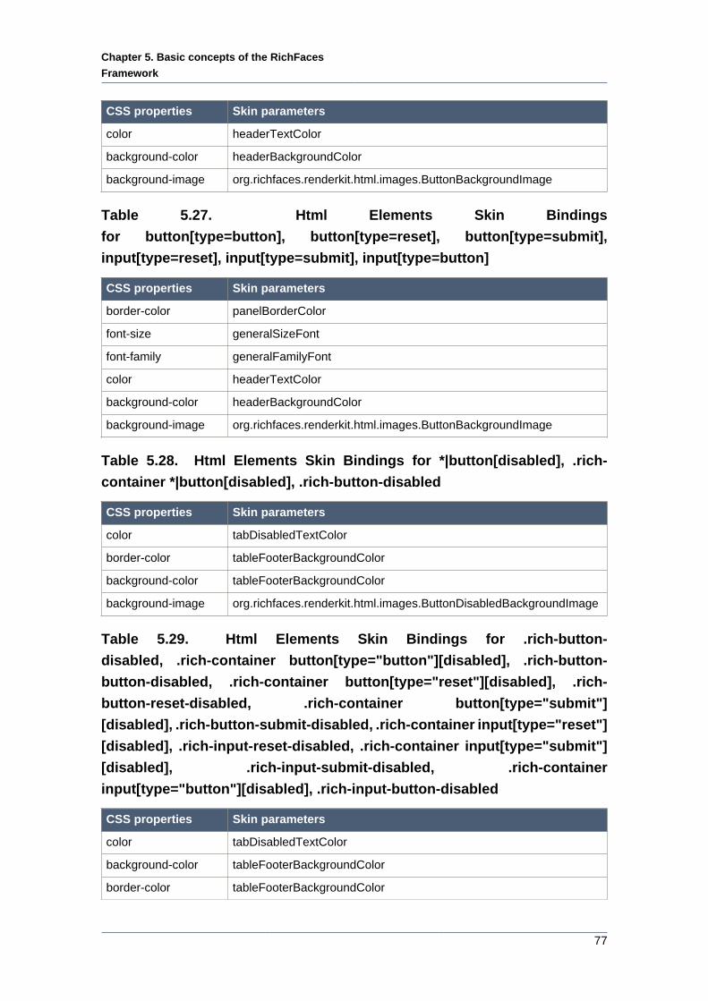
Chapter 5. Basic concepts of the RichFaces
Framework
77
CSS properties Skin parameters
color headerTextColor
background-color headerBackgroundColor
background-image org.richfaces.renderkit.html.images.ButtonBackgroundImage
Table 5.27. Html Elements Skin Bindings
for button[type=button], button[type=reset], button[type=submit],
input[type=reset], input[type=submit], input[type=button]
CSS properties Skin parameters
border-color panelBorderColor
font-size generalSizeFont
font-family generalFamilyFont
color headerTextColor
background-color headerBackgroundColor
background-image org.richfaces.renderkit.html.images.ButtonBackgroundImage
Table 5.28. Html Elements Skin Bindings for *|button[disabled], .rich-
container *|button[disabled], .rich-button-disabled
CSS properties Skin parameters
color tabDisabledTextColor
border-color tableFooterBackgroundColor
background-color tableFooterBackgroundColor
background-image org.richfaces.renderkit.html.images.ButtonDisabledBackgroundImage
Table 5.29. Html Elements Skin Bindings for .rich-button-
disabled, .rich-container button[type="button"][disabled], .rich-button-
button-disabled, .rich-container button[type="reset"][disabled], .rich-
button-reset-disabled, .rich-container button[type="submit"]
[disabled], .rich-button-submit-disabled, .rich-container input[type="reset"]
[disabled], .rich-input-reset-disabled, .rich-container input[type="submit"]
[disabled], .rich-input-submit-disabled, .rich-container
input[type="button"][disabled], .rich-input-button-disabled
CSS properties Skin parameters
color tabDisabledTextColor
background-color tableFooterBackgroundColor
border-color tableFooterBackgroundColor
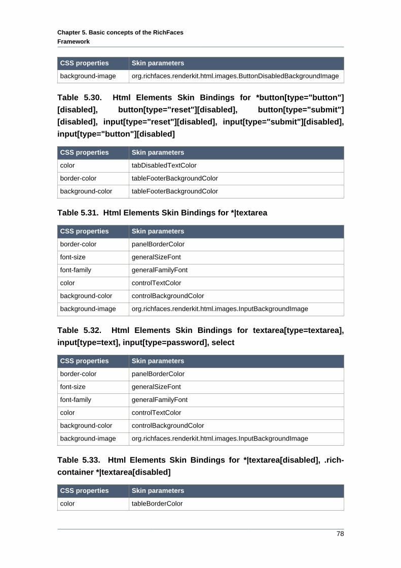
Chapter 5. Basic concepts of the RichFaces
Framework
78
CSS properties Skin parameters
background-image org.richfaces.renderkit.html.images.ButtonDisabledBackgroundImage
Table 5.30. Html Elements Skin Bindings for *button[type="button"]
[disabled], button[type="reset"][disabled], button[type="submit"]
[disabled], input[type="reset"][disabled], input[type="submit"][disabled],
input[type="button"][disabled]
CSS properties Skin parameters
color tabDisabledTextColor
border-color tableFooterBackgroundColor
background-color tableFooterBackgroundColor
Table 5.31. Html Elements Skin Bindings for *|textarea
CSS properties Skin parameters
border-color panelBorderColor
font-size generalSizeFont
font-family generalFamilyFont
color controlTextColor
background-color controlBackgroundColor
background-image org.richfaces.renderkit.html.images.InputBackgroundImage
Table 5.32. Html Elements Skin Bindings for textarea[type=textarea],
input[type=text], input[type=password], select
CSS properties Skin parameters
border-color panelBorderColor
font-size generalSizeFont
font-family generalFamilyFont
color controlTextColor
background-color controlBackgroundColor
background-image org.richfaces.renderkit.html.images.InputBackgroundImage
Table 5.33. Html Elements Skin Bindings for *|textarea[disabled], .rich-
container *|textarea[disabled]
CSS properties Skin parameters
color tableBorderColor
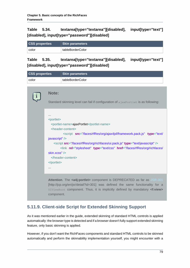
Chapter 5. Basic concepts of the RichFaces
Framework
79
Table 5.34. textarea[type="textarea"][disabled], input[type="text"]
[disabled], input[type="password"][disabled]
CSS properties Skin parameters
color tableBorderColor
Table 5.35. textarea[type="textarea"][disabled], input[type="text"]
[disabled], input[type="password"][disabled]
CSS properties Skin parameters
color tableBorderColor
Note:
Standard skinning level can fail if configuration of ajaxPortlet is as following:
...
<portlet>
<portlet-name>ajaxPortlet</portlet-name>
<header-content>
<script src="/faces/rfRes/org/ajax4jsf/framework.pack.js" type="text/
javascript" />
<script src="/faces/rfRes/org/richfaces/ui.pack.js" type="text/javascript" />
<link rel="stylesheet" type="text/css" href="/faces/rfRes/org/richfaces/
skin.xcss" />
</header-content>
</portlet>
...
Attention. The <a4j:portlet> component is DEPRECATED as far as JSR-301
[http://jcp.org/en/jsr/detail?id=301] was defined the same functionality for a
UIViewRoot component. Thus, it is implicitly defined by mandatory <f:view>
component.
5.11.9. Client-side Script for Extended Skinning Support
As it was mentioned earlier in the guide, extended skinning of standard HTML controls is applied
automatically: the browser type is detected and if a browser doesn't fully support extended skinning
feature, only basic skinning is applied.
However, if you don't want the RichFaces components and standard HTML controls to be skinned
automatically and perform the skinnability implementation yourself, you might encounter with a
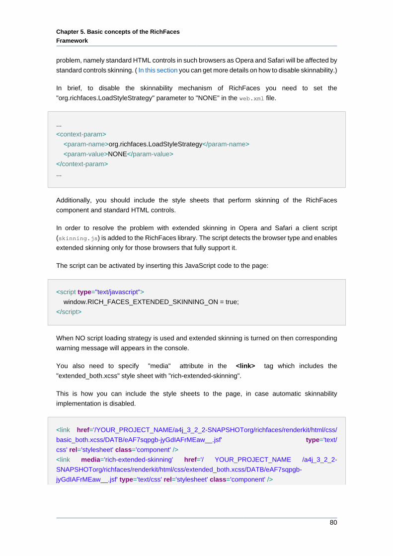
Chapter 5. Basic concepts of the RichFaces
Framework
80
problem, namely standard HTML controls in such browsers as Opera and Safari will be affected by
standard controls skinning. ( In this section you can get more details on how to disable skinnability.)
In brief, to disable the skinnability mechanism of RichFaces you need to set the
"org.richfaces.LoadStyleStrategy" parameter to "NONE" in the web.xml file.
...
<context-param>
<param-name>org.richfaces.LoadStyleStrategy</param-name>
<param-value>NONE</param-value>
</context-param>
...
Additionally, you should include the style sheets that perform skinning of the RichFaces
component and standard HTML controls.
In order to resolve the problem with extended skinning in Opera and Safari a client script
(skinning.js) is added to the RichFaces library. The script detects the browser type and enables
extended skinning only for those browsers that fully support it.
The script can be activated by inserting this JavaScript code to the page:
<script type="text/javascript">
window.RICH_FACES_EXTENDED_SKINNING_ON = true;
</script>
When NO script loading strategy is used and extended skinning is turned on then corresponding
warning message will appears in the console.
You also need to specify "media" attribute in the <link> tag which includes the
"extended_both.xcss" style sheet with "rich-extended-skinning".
This is how you can include the style sheets to the page, in case automatic skinnability
implementation is disabled.
<link href='/YOUR_PROJECT_NAME/a4j_3_2_2-SNAPSHOTorg/richfaces/renderkit/html/css/
basic_both.xcss/DATB/eAF7sqpgb-jyGdIAFrMEaw__.jsf' type='text/
css' rel='stylesheet' class='component' />
<link media='rich-extended-skinning' href='/ YOUR_PROJECT_NAME /a4j_3_2_2-
SNAPSHOTorg/richfaces/renderkit/html/css/extended_both.xcss/DATB/eAF7sqpgb-
jyGdIAFrMEaw__.jsf' type='text/css' rel='stylesheet' class='component' />
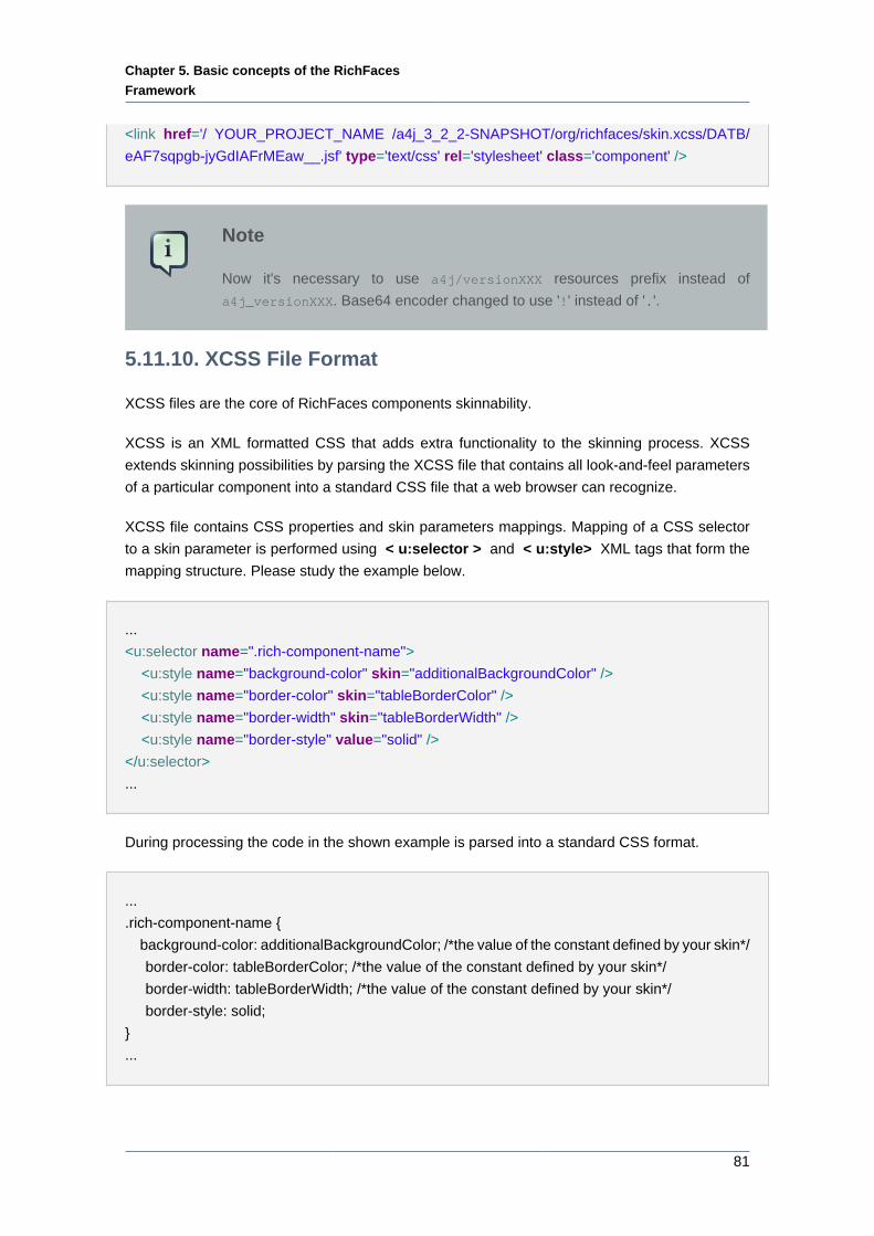
Chapter 5. Basic concepts of the RichFaces
Framework
81
<link href='/ YOUR_PROJECT_NAME /a4j_3_2_2-SNAPSHOT/org/richfaces/skin.xcss/DATB/
eAF7sqpgb-jyGdIAFrMEaw__.jsf' type='text/css' rel='stylesheet' class='component' />
Note
Now it's necessary to use a4j/versionXXX resources prefix instead of
a4j_versionXXX. Base64 encoder changed to use '!' instead of '.'.
5.11.10. XCSS File Format
XCSS files are the core of RichFaces components skinnability.
XCSS is an XML formatted CSS that adds extra functionality to the skinning process. XCSS
extends skinning possibilities by parsing the XCSS file that contains all look-and-feel parameters
of a particular component into a standard CSS file that a web browser can recognize.
XCSS file contains CSS properties and skin parameters mappings. Mapping of a CSS selector
to a skin parameter is performed using < u:selector > and < u:style> XML tags that form the
mapping structure. Please study the example below.
...
<u:selector name=".rich-component-name">
<u:style name="background-color" skin="additionalBackgroundColor" />
<u:style name="border-color" skin="tableBorderColor" />
<u:style name="border-width" skin="tableBorderWidth" />
<u:style name="border-style" value="solid" />
</u:selector>
...
During processing the code in the shown example is parsed into a standard CSS format.
...
.rich-component-name {
background-color: additionalBackgroundColor; /*the value of the constant defined by your skin*/
border-color: tableBorderColor; /*the value of the constant defined by your skin*/
border-width: tableBorderWidth; /*the value of the constant defined by your skin*/
border-style: solid;
}
...
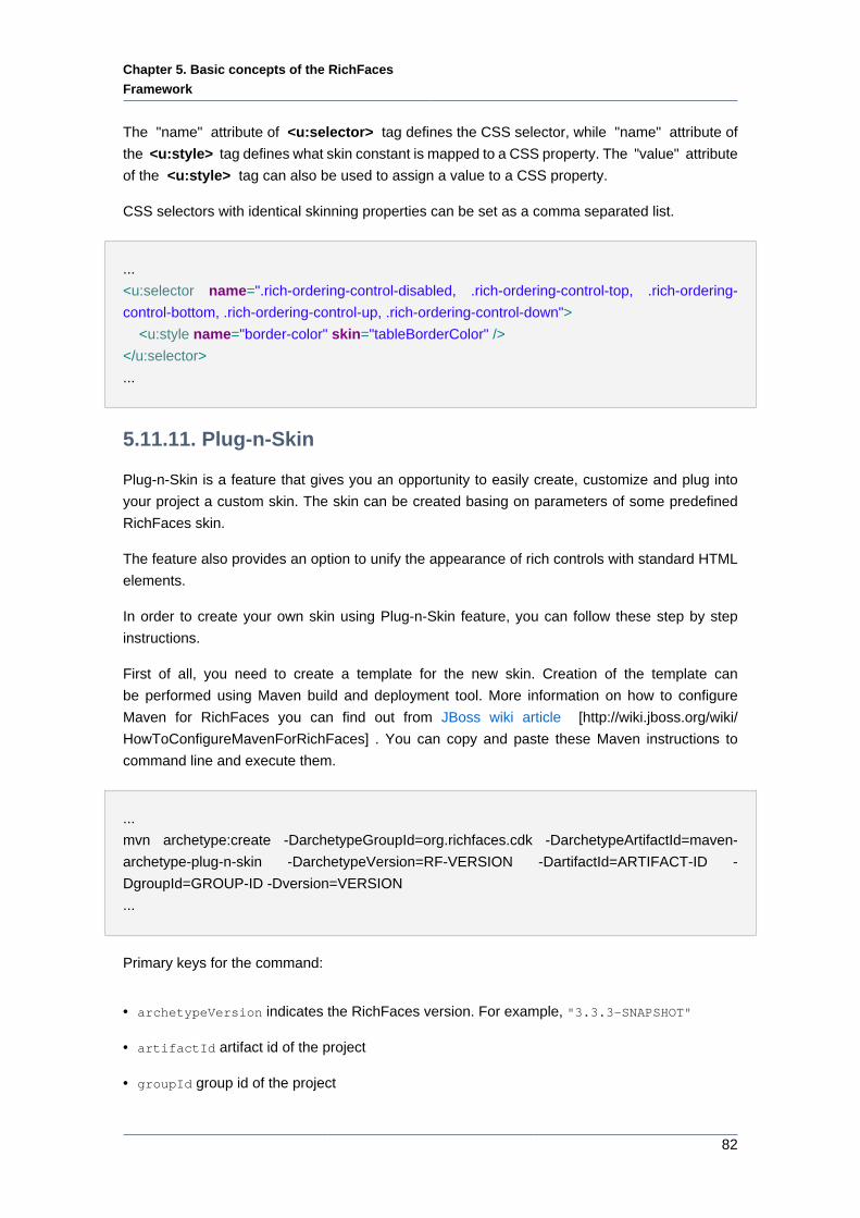
Chapter 5. Basic concepts of the RichFaces
Framework
82
The "name" attribute of <u:selector> tag defines the CSS selector, while "name" attribute of
the <u:style> tag defines what skin constant is mapped to a CSS property. The "value" attribute
of the <u:style> tag can also be used to assign a value to a CSS property.
CSS selectors with identical skinning properties can be set as a comma separated list.
...
<u:selector name=".rich-ordering-control-disabled, .rich-ordering-control-top, .rich-ordering-
control-bottom, .rich-ordering-control-up, .rich-ordering-control-down">
<u:style name="border-color" skin="tableBorderColor" />
</u:selector>
...
5.11.11. Plug-n-Skin
Plug-n-Skin is a feature that gives you an opportunity to easily create, customize and plug into
your project a custom skin. The skin can be created basing on parameters of some predefined
RichFaces skin.
The feature also provides an option to unify the appearance of rich controls with standard HTML
elements.
In order to create your own skin using Plug-n-Skin feature, you can follow these step by step
instructions.
First of all, you need to create a template for the new skin. Creation of the template can
be performed using Maven build and deployment tool. More information on how to configure
Maven for RichFaces you can find out from JBoss wiki article [http://wiki.jboss.org/wiki/
HowToConfigureMavenForRichFaces] . You can copy and paste these Maven instructions to
command line and execute them.
...
mvn archetype:create -DarchetypeGroupId=org.richfaces.cdk -DarchetypeArtifactId=maven-
archetype-plug-n-skin -DarchetypeVersion=RF-VERSION -DartifactId=ARTIFACT-ID -
DgroupId=GROUP-ID -Dversion=VERSION
...
Primary keys for the command:
• archetypeVersion indicates the RichFaces version. For example, "3.3.3-SNAPSHOT"
• artifactId artifact id of the project
• groupId group id of the project
Chapter 5. Basic concepts of the RichFaces
Framework
83
• version the version of the project you create, by default it is "1.0.-SNAPSHOT"
After this operation, a folder with the name of your "ARTIFACT-ID" appears. The folder contains
a template of Maven project.
Next steps will guide you though creating of the skin itself.
In the root folder of Maven project (the one that contains "pom.xml" file) you should run the
following command in the command line:
...
mvn cdk:add-skin -Dname=SKIN-NAME -Dpackage=SKIN-PACKAGE
...
Primary keys for the command:
• name defines the name of the new skin
• package base package of the skin. By default "groupId" of the project is used.
Additional optional keys for the command:
• baseSkin defines the name of the base skin.
• createExt if set to "true", extended CSS classes are added. For more information, please, see
"Standard controls skinning"
As a result of the performed operations the following files and folders are created:
• BaseImage.java - the base class to store images. Location: "\src\main\java\SKIN-PACKAGE
\SKIN-NAME\images\"
• BaseImageTest.java - a test version of a class that stores images. Location: "\src\test\java
\SKIN-PACKAGE\SKIN-NAME\images\"
• XCSS files - XCSS files define the new look of RichFaces components affected by the new skin.
Location: "\src\main\resources\SKIN-PACKAGE\SKIN-NAME\css\"
• SKIN-NAME.properties - a file that contains properties of the new skin. Location: "\src\main
\resources\SKIN-PACKAGE\SKIN-NAME\css\"
The following properties are used to configure the SKIN-NAME.properties file:
• baseSkin – the name of the base skin to be used as basis. The look of the skin you define
will be affected by new style properties.
• generalStyleSheet - a path to the style sheet (SKIN-NAME.xcss) that imports style sheets of
the components to be affected by the new skin.

Chapter 5. Basic concepts of the RichFaces
Framework
84
• extendedStyleSheet - a path to a style sheet that is used to unify the appearance of RichFaces
components and standard HTML controls. For additional information please read "Standard
controls skinning" chapter.
• gradientType - a predefined property to set the type of gradient applied to the new skin.
Possible values are glass, plastic, plain. More information on gradient implementation you
can find further in this chapter.
• SKIN-NAME.xcss - a XCSS file that imports XCSS files of the components to be affected by
the new skin. Location: "src\main\resources\META-INF\skins "
• XCSS files If the command is executed with the "DcreateExt" key set to "true", the XCSS
(extended_classes.xcss and extended.xcss) files that define style for standard controls will be
created. Location: "\src\main\resources\SKIN-PACKAGE\SKIN-NAME\css\".
• SKIN-NAME-ext.xcss If the command is executed with the "DcreateExt" key set to "true", the
configuration SKIN-NAME-ext.xcss file that imports XCSS file defining styles for the standard
controls will be created. Location: "src\main\resources\META-INF\skins ".
• SKIN-NAME-resources.xml - the file contains the description of all listed above files. Location:
"src\main\config\resources ".
Now you can start editing the XCSS files located in "\src\main\resources\SKIN-PACKAGE\SKIN-
NAME\css\". New style properties can be assigned to the selectors (the selectors listed in the
XCSS files) in two ways, which are both valid, and it'up to you what way to choose.
• Standard CSS coding approach, i.e. you can add CSS properties to the given selectors. The
only thing, you have to keep in mind is that the selectors must be inside <f:verbatim> <!
[CDATA[ ...]]> </f:verbatim> tags.
For example
...
.rich-calendar-cell {
background: #537df8;
}
...
• Using XCSS coding approach, the same way as XCSS files are normally formed in RichFaces.
The XCSS tags have to be placed outside <f:verbatim> <![CDATA[ ...]]> </f:verbatim>
tags.
...
<u:selector name=".rich-calendar-cell">
<u:style name="border-bottom-color" skin="panelBorderColor"/>
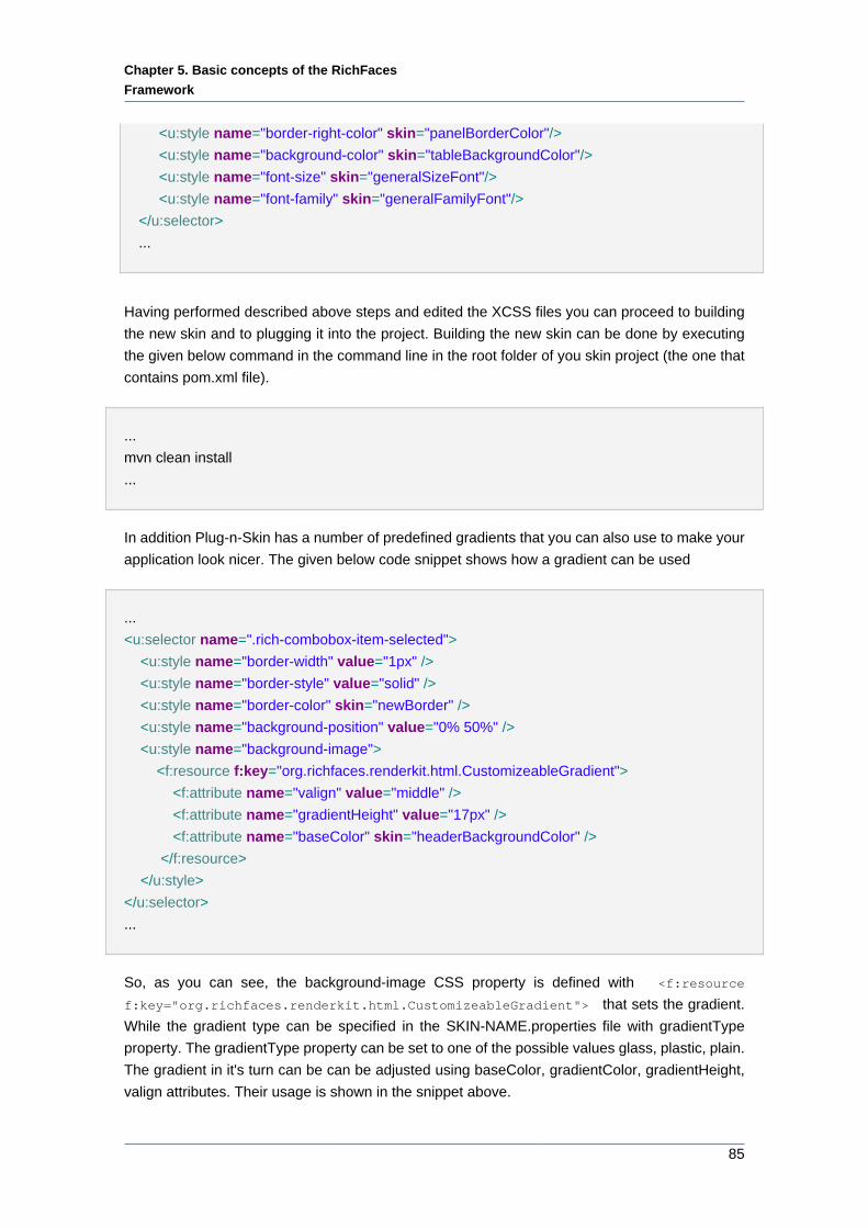
Chapter 5. Basic concepts of the RichFaces
Framework
85
<u:style name="border-right-color" skin="panelBorderColor"/>
<u:style name="background-color" skin="tableBackgroundColor"/>
<u:style name="font-size" skin="generalSizeFont"/>
<u:style name="font-family" skin="generalFamilyFont"/>
</u:selector>
...
Having performed described above steps and edited the XCSS files you can proceed to building
the new skin and to plugging it into the project. Building the new skin can be done by executing
the given below command in the command line in the root folder of you skin project (the one that
contains pom.xml file).
...
mvn clean install
...
In addition Plug-n-Skin has a number of predefined gradients that you can also use to make your
application look nicer. The given below code snippet shows how a gradient can be used
...
<u:selector name=".rich-combobox-item-selected">
<u:style name="border-width" value="1px" />
<u:style name="border-style" value="solid" />
<u:style name="border-color" skin="newBorder" />
<u:style name="background-position" value="0% 50%" />
<u:style name="background-image">
<f:resource f:key="org.richfaces.renderkit.html.CustomizeableGradient">
<f:attribute name="valign" value="middle" />
<f:attribute name="gradientHeight" value="17px" />
<f:attribute name="baseColor" skin="headerBackgroundColor" />
</f:resource>
</u:style>
</u:selector>
...
So, as you can see, the background-image CSS property is defined with <f:resource
f:key="org.richfaces.renderkit.html.CustomizeableGradient"> that sets the gradient.
While the gradient type can be specified in the SKIN-NAME.properties file with gradientType
property. The gradientType property can be set to one of the possible values glass, plastic, plain.
The gradient in it's turn can be can be adjusted using baseColor, gradientColor, gradientHeight,
valign attributes. Their usage is shown in the snippet above.
Chapter 5. Basic concepts of the RichFaces
Framework
86
Now, you can use your newly-created and customized skin in your project by adding your new
skin parameters to web.xml file and placing the jar file with your skin ( the jar file is located in
"target" folder of your skin project) to "\WebContent\WEB-INF\lib\".
...
<context-param>
<param-name>org.ajax4jsf.SKIN</param-name>
<param-value>SKIN-NAME</param-value>
</context-param>
...
5.11.11.1. Details of Usage
This section will cover some practical aspects of Plug-n-Skin implementation. It's assumed that
you have read the section of the guide that tells how the new skin using Plug-n-Skin prototype
can be created.
Above all, we need to create a new skin, in order to do that we just have to follow the steps
described in the previous section.
This command will be used to create a template of the new skin project.
mvn archetype:create -DarchetypeGroupId=org.richfaces.cdk -DarchetypeArtifactId=maven-
archetype-plug-n-skin -DarchetypeVersion=3.3.3-SNAPSHOT -DartifactId=P-n-S -
DgroupId=GROUPID -Dversion=1.0.-SNAPSHOT
Now you can browse the "P-n-S" folder to view what files and folders were created there.
Next, we will use Maven to add all needed files to the skin project. This will done by the following
command:
mvn cdk:add-skin -DbaseSkin=blueSky -DcreateExt=true -Dname=PlugnSkinDemo -
Dpackage=SKINPACKAGE
As you remember from the previous section "-DbaseSkin" key defines what RichFaces built-in
skin to be used as a base one, "-DcreateExt=true" determines that the new skin will come with
XCSS files that unify the look of the rich components with standard HTML controls.
So, now the files and folder with all needed resources are created and redefining/editing the new
skin can be started.
Chapter 5. Basic concepts of the RichFaces
Framework
87
Now we can start editing XCSS files of the rich components. In order to see how the Plug-n-Skin
feature works we will change some style attributes of <rich:calendar> and some basic HTML
controls to see how they are affected by standard controls skinning.
Thus, it will be demonstrated how to:
• Recolor the current day's cell background of the <rich:calendar> to see how the new skin
created with the help of Plug-n-Skin feature affects the style of the component;
• Recolor a standard HTML submit button;
In oder to edit the style properties of <rich:calendar> you need to open the "calendar.xcss" file
located in "P-n-S\src\main\resources\skinpackage\plugnskindemo\css\". Once, you have opened
the file, please find ".rich-calendar-today" selector and amend it as follows: background-color:
#075ad1;. The current day's background color can be considered recolored.
Now we will see how font style of a standard HTML submit button can be changed. Please,
open "extended.xcss" file located in "P-n-S\src\main\resources\skinpackage\plugnskindemo\css
\" and put in font-weight: bold; inside the curly braces of these coma separated
selectors button[type="button"], button[type="reset"], button[type="submit"],
input[type="reset"], input[type="submit"], input[type="button"]. So, the CSS code
should look like this.
button[type="button"], button[type="reset"],
button[type="submit"], input[type="reset"],
input[type="submit"], input[type="button"] { font-weight: bold;
}
All the changes that were planned to be preformed are done and now you can proceed to building
the new PlugnSkinDemo skin and import it into the project. As you read in the previous section,
the skin should be built in the "P-n-S" folder of the skin project by executing mvn clean install
command. This procedure results in creating a "target" folder that contains a .jar file with a
compiled new skin, it our case the file is named "P-n-S-1.0.-SNAPSHOT.jar". The next step is to
import the new PlugnSkinDemo skin into the project.
What you need to do, in order to have the new skin imported to the project is to
• Copy the "P-n-S-1.0.-SNAPSHOT.jar" file to the "\WebContent\WEB-INF\lib\" folder.
• Add the new skin's name to the "web.xml" file. It is done like this
<context-param>
<param-name>org.ajax4jsf.SKIN</param-name>
<param-value>PlugnSkinDemo</param-value>
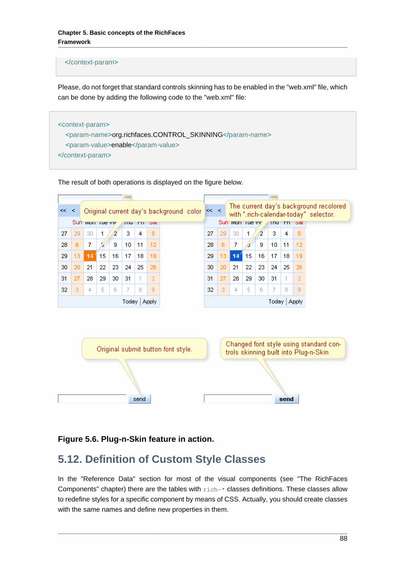
Chapter 5. Basic concepts of the RichFaces
Framework
88
</context-param>
Please, do not forget that standard controls skinning has to be enabled in the "web.xml" file, which
can be done by adding the following code to the "web.xml" file:
<context-param>
<param-name>org.richfaces.CONTROL_SKINNING</param-name>
<param-value>enable</param-value>
</context-param>
The result of both operations is displayed on the figure below.
Figure 5.6. Plug-n-Skin feature in action.
5.12. Definition of Custom Style Classes
In the "Reference Data" section for most of the visual components (see "The RichFaces
Components" chapter) there are the tables with rich-* classes definitions. These classes allow
to redefine styles for a specific component by means of CSS. Actually, you should create classes
with the same names and define new properties in them.
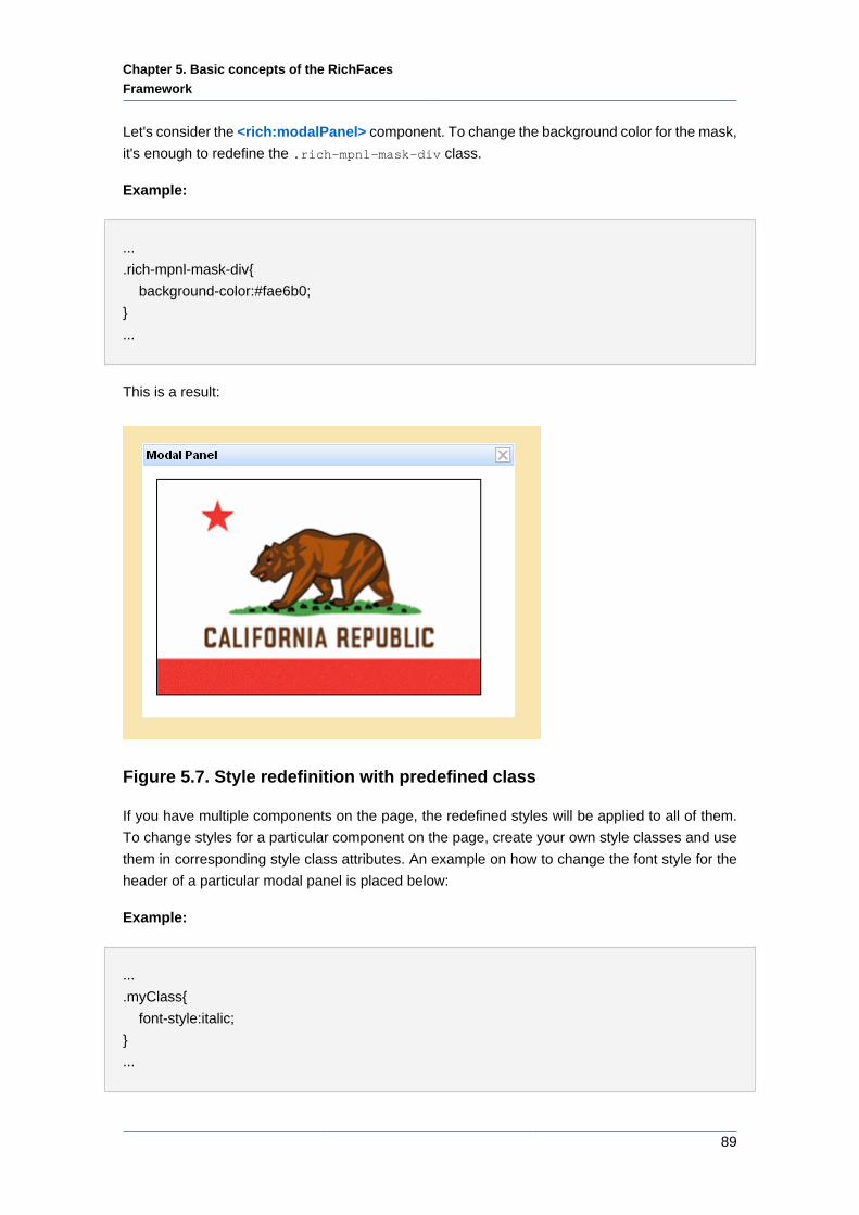
Chapter 5. Basic concepts of the RichFaces
Framework
89
Let's consider the <rich:modalPanel> component. To change the background color for the mask,
it's enough to redefine the .rich-mpnl-mask-div class.
Example:
...
.rich-mpnl-mask-div{
background-color:#fae6b0;
}
...
This is a result:
Figure 5.7. Style redefinition with predefined class
If you have multiple components on the page, the redefined styles will be applied to all of them.
To change styles for a particular component on the page, create your own style classes and use
them in corresponding style class attributes. An example on how to change the font style for the
header of a particular modal panel is placed below:
Example:
...
.myClass{
font-style:italic;
}
...
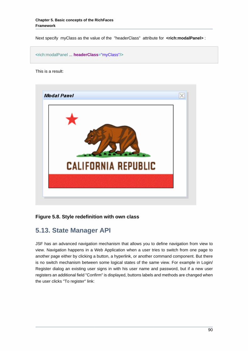
Chapter 5. Basic concepts of the RichFaces
Framework
90
Next specify myClass as the value of the "headerClass" attribute for <rich:modalPanel> :
<rich:modalPanel ... headerClass="myClass"/>
This is a result:
Figure 5.8. Style redefinition with own class
5.13. State Manager API
JSF has an advanced navigation mechanism that allows you to define navigation from view to
view. Navigation happens in a Web Application when a user tries to switch from one page to
another page either by clicking a button, a hyperlink, or another command component. But there
is no switch mechanism between some logical states of the same view. For example in Login/
Register dialog an existing user signs in with his user name and password, but if a new user
registers an additional field "Confirm" is displayed, buttons labels and methods are changed when
the user clicks "To register" link:
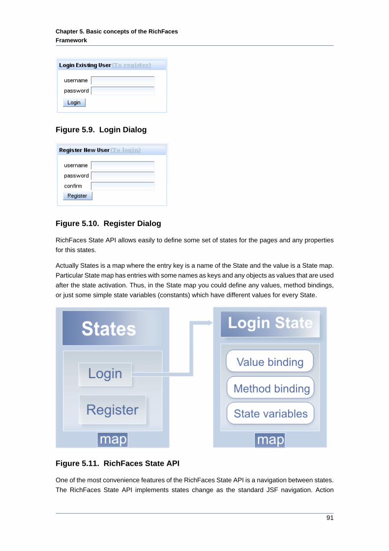
Chapter 5. Basic concepts of the RichFaces
Framework
91
Figure 5.9. Login Dialog
Figure 5.10. Register Dialog
RichFaces State API allows easily to define some set of states for the pages and any properties
for this states.
Actually States is a map where the entry key is a name of the State and the value is a State map.
Particular State map has entries with some names as keys and any objects as values that are used
after the state activation. Thus, in the State map you could define any values, method bindings,
or just some simple state variables (constants) which have different values for every State.
Figure 5.11. RichFaces State API
One of the most convenience features of the RichFaces State API is a navigation between states.
The RichFaces State API implements states change as the standard JSF navigation. Action
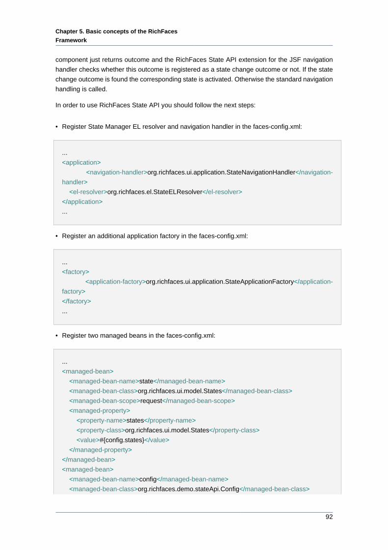
Chapter 5. Basic concepts of the RichFaces
Framework
92
component just returns outcome and the RichFaces State API extension for the JSF navigation
handler checks whether this outcome is registered as a state change outcome or not. If the state
change outcome is found the corresponding state is activated. Otherwise the standard navigation
handling is called.
In order to use RichFaces State API you should follow the next steps:
• Register State Manager EL resolver and navigation handler in the faces-config.xml:
...
<application>
<navigation-handler>org.richfaces.ui.application.StateNavigationHandler</navigation-
handler>
<el-resolver>org.richfaces.el.StateELResolver</el-resolver>
</application>
...
• Register an additional application factory in the faces-config.xml:
...
<factory>
<application-factory>org.richfaces.ui.application.StateApplicationFactory</application-
factory>
</factory>
...
• Register two managed beans in the faces-config.xml:
...
<managed-bean>
<managed-bean-name>state</managed-bean-name>
<managed-bean-class>org.richfaces.ui.model.States</managed-bean-class>
<managed-bean-scope>request</managed-bean-scope>
<managed-property>
<property-name>states</property-name>
<property-class>org.richfaces.ui.model.States</property-class>
<value>#{config.states}</value>
</managed-property>
</managed-bean>
<managed-bean>
<managed-bean-name>config</managed-bean-name>
<managed-bean-class>org.richfaces.demo.stateApi.Config</managed-bean-class>
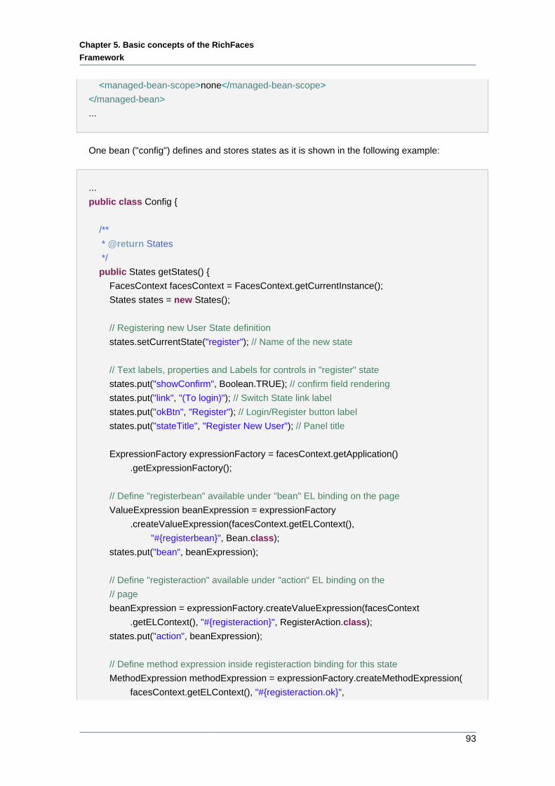
Chapter 5. Basic concepts of the RichFaces
Framework
93
<managed-bean-scope>none</managed-bean-scope>
</managed-bean>
...
One bean ("config") defines and stores states as it is shown in the following example:
...
public class Config {
/**
* @return States
*/
public States getStates() {
FacesContext facesContext = FacesContext.getCurrentInstance();
States states = new States();
// Registering new User State definition
states.setCurrentState("register"); // Name of the new state
// Text labels, properties and Labels for controls in "register" state
states.put("showConfirm", Boolean.TRUE); // confirm field rendering
states.put("link", "(To login)"); // Switch State link label
states.put("okBtn", "Register"); // Login/Register button label
states.put("stateTitle", "Register New User"); // Panel title
ExpressionFactory expressionFactory = facesContext.getApplication()
.getExpressionFactory();
// Define "registerbean" available under "bean" EL binding on the page
ValueExpression beanExpression = expressionFactory
.createValueExpression(facesContext.getELContext(),
"#{registerbean}", Bean.class);
states.put("bean", beanExpression);
// Define "registeraction" available under "action" EL binding on the
// page
beanExpression = expressionFactory.createValueExpression(facesContext
.getELContext(), "#{registeraction}", RegisterAction.class);
states.put("action", beanExpression);
// Define method expression inside registeraction binding for this state
MethodExpression methodExpression = expressionFactory.createMethodExpression(
facesContext.getELContext(), "#{registeraction.ok}",
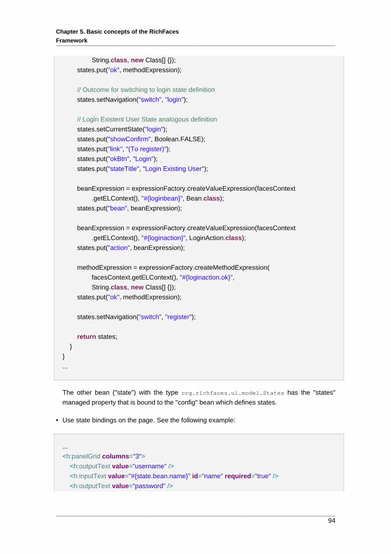
Chapter 5. Basic concepts of the RichFaces
Framework
94
String.class, new Class[] {});
states.put("ok", methodExpression);
// Outcome for switching to login state definition
states.setNavigation("switch", "login");
// Login Existent User State analogous definition
states.setCurrentState("login");
states.put("showConfirm", Boolean.FALSE);
states.put("link", "(To register)");
states.put("okBtn", "Login");
states.put("stateTitle", "Login Existing User");
beanExpression = expressionFactory.createValueExpression(facesContext
.getELContext(), "#{loginbean}", Bean.class);
states.put("bean", beanExpression);
beanExpression = expressionFactory.createValueExpression(facesContext
.getELContext(), "#{loginaction}", LoginAction.class);
states.put("action", beanExpression);
methodExpression = expressionFactory.createMethodExpression(
facesContext.getELContext(), "#{loginaction.ok}",
String.class, new Class[] {});
states.put("ok", methodExpression);
states.setNavigation("switch", "register");
return states;
}
}
...
The other bean ("state") with the type org.richfaces.ui.model.States has the "states"
managed property that is bound to the "config" bean which defines states.
• Use state bindings on the page. See the following example:
...
<h:panelGrid columns="3">
<h:outputText value="username" />
<h:inputText value="#{state.bean.name}" id="name" required="true" />
<h:outputText value="password" />
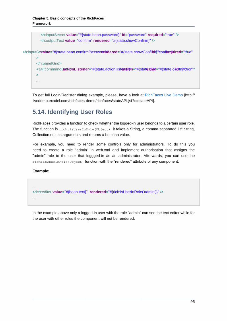
Chapter 5. Basic concepts of the RichFaces
Framework
95
<h:inputSecret value="#{state.bean.password}" id="password" required="true" />
<h:outputText value="confirm" rendered="#{state.showConfirm}" />
<h:inputSecret value="#{state.bean.confirmPassword}" rendered="#{state.showConfirm}" id="confirm" required="true" /
>
</h:panelGrid>
<a4j:commandButton actionListener="#{state.action.listener}" action="#{state.ok}" value="#{state.okBtn}" id="action"/
>
...
To get full Login/Register dialog example, please, have a look at RichFaces Live Demo [http://
livedemo.exadel.com/richfaces-demo/richfaces/stateAPI.jsf?c=stateAPI].
5.14. Identifying User Roles
RichFaces provides a function to check whether the logged-in user belongs to a certain user role.
The function is rich:isUserInRole(Object), it takes a String, a comma-separated list String,
Collection etc. as arguments and returns a boolean value.
For example, you need to render some controls only for administrators. To do this you
need to create a role "admin" in web.xml and implement authorisation that assigns the
"admin" role to the user that loggged-in as an administrator. Afterwards, you can use the
rich:isUserInRole(Object) function with the "rendered" attribute of any component.
Example:
...
<rich:editor value="#{bean.text}" rendered="#{rich:isUserInRole('admin')}" />
...
In the example above only a logged-in user with the role "admin" can see the text editor while for
the user with other roles the component will not be rendered.
Chapter 6. The RichFaces Components
97
The RichFaces ComponentsThe library encompasses ready-made components built based on the Rich Faces CDK.
6.1. Ajax Support
The component in this section lets you easily add Ajax capabilities to other components as well
as manage Ajax requests.
6.1.1. < a4j:ajaxListener > available since 3.0.0
6.1.1.1. Description
The <a4j:ajaxListener> component adds an action listener to a parent component and works
like the <f:actionListener> or <f:valueChangeListener> JSF components but for the whole
Ajax container.
6.1.1.2. Details of Usage
The <a4j:ajaxListener> component adds an action listener to a parent component. That listener
is invoked on each Ajax request during the "Render Response" JSF phase. In comparison with
standard JSF <f:actionListener> and <f:valueChangeListener> components the invocation
of the <a4j:ajaxListener> is not skipped in case when validation of "Update Model" fails. The
<a4j:ajaxListener> is guarantied to be invoked for each Ajax response.
The "type" attribute defines the fully qualified Java class name for the listener. This Java
class should implement org.ajax4jsf.event.AjaxListener [../../apidoc_framework/
org/ajax4jsf/event/AjaxListener.html] interface which is base interface for all listeners,
capable for receiving Ajax events. The object on which the Event initially occurred could
be accessed using the java.util.EventObject.getSource() [http://java.sun.com/
j2se/1.4.2/docs/api/java/util/EventObject.html] method.
The <a4j:ajaxListener> is not invoked for non-Ajax requests and when RichFaces works in the
"Ajax Request generates Non-Ajax Response" mode, so <a4j:ajaxListener> invocation is a good
indicator that Ajax Response is going to be processed. Let's check it in the following example.
Example:
...
<rich:messages/>
<h:form id="form">
<a4j:commandLink value="Click to send Ajax request">
<a4j:ajaxListener type="org.docs.richfaces.actionListenerBean"/>
</a4j:commandLink>
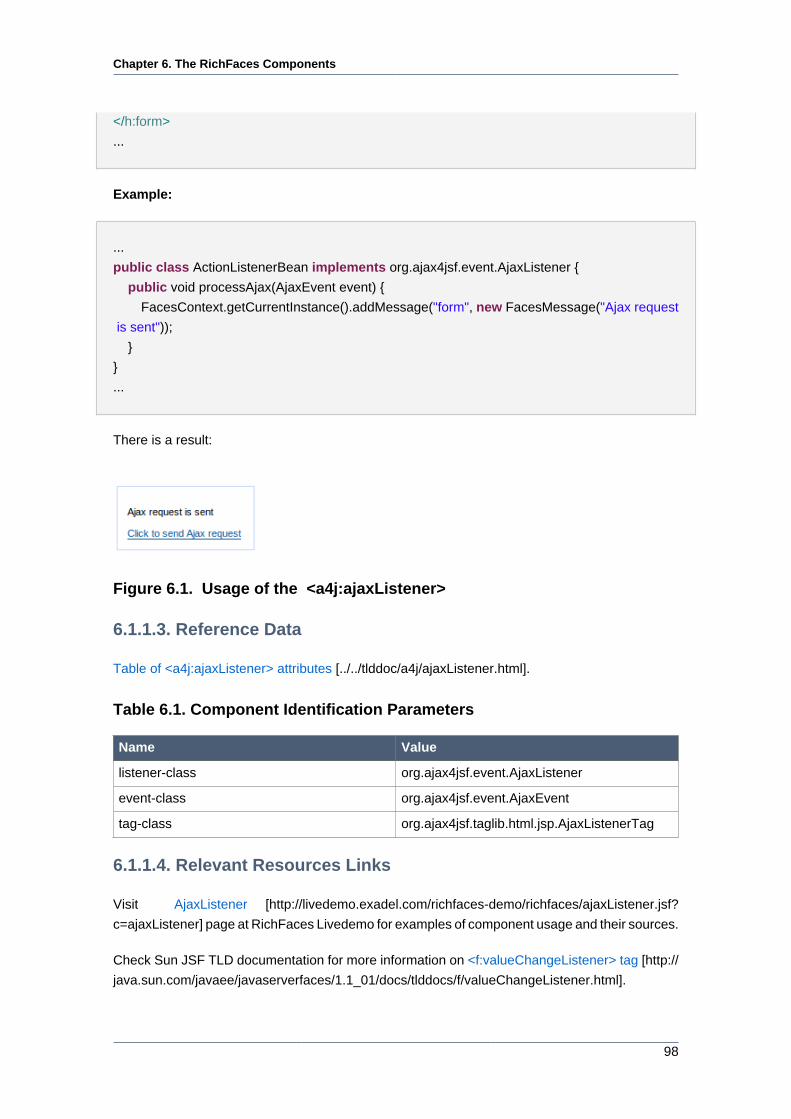
Chapter 6. The RichFaces Components
98
</h:form>
...
Example:
...
public class ActionListenerBean implements org.ajax4jsf.event.AjaxListener {
public void processAjax(AjaxEvent event) {
FacesContext.getCurrentInstance().addMessage("form", new FacesMessage("Ajax request
is sent"));
}
}
...
There is a result:
Figure 6.1. Usage of the <a4j:ajaxListener>
6.1.1.3. Reference Data
Table of <a4j:ajaxListener> attributes [../../tlddoc/a4j/ajaxListener.html].
Table 6.1. Component Identification Parameters
Name Value
listener-class org.ajax4jsf.event.AjaxListener
event-class org.ajax4jsf.event.AjaxEvent
tag-class org.ajax4jsf.taglib.html.jsp.AjaxListenerTag
6.1.1.4. Relevant Resources Links
Visit AjaxListener [http://livedemo.exadel.com/richfaces-demo/richfaces/ajaxListener.jsf?
c=ajaxListener] page at RichFaces Livedemo for examples of component usage and their sources.
Check Sun JSF TLD documentation for more information on <f:valueChangeListener> tag [http://
java.sun.com/javaee/javaserverfaces/1.1_01/docs/tlddocs/f/valueChangeListener.html].
Chapter 6. The RichFaces Components
99
6.1.2. < a4j:actionparam > available since 3.0.0
6.1.2.1. Description
The <a4j:actionparam> component combines the functionality of <f:param> and
<f:actionListener> and allows to assign the value to the property of the managed bean directly
using the "assignTo" attribute.
6.1.2.2. Details of Usage
The <a4j:actionparam> component has 3 main attributes:
• "name" defines a name of this parameter
• "value" defines initial value of this parameter or a value binding
• "assignTo" defines updatable bean property. This property will be updated if the
parent command component performs an actionEvent. The update occurs in the same
phase as the actionEvent is processed (INVOKE_APPLICATION, PROCESS_VALIDATIONS, or
APPLY_REQUEST_VALUES, depending on the values of the "immediate" and "bypassUpdates"
attributes).
Example:
...
<h:form id="form">
<a4j:commandButton value="Set Name to Alex" reRender="rep">
<a4j:actionparam name="username" value="Alex" assignTo="#{actionparamBean.name}"/>
</a4j:commandButton>
<br/>
<h:outputText id="rep" value="Name: #{actionparamBean.name}"/>
</h:form>
...
There is a managed bean:
...
public class ActionparamBean {
private String name = "John";
public String getName() {
return name;
}
Chapter 6. The RichFaces Components
100
public void setName(String name) {
this.name = name;
}
}
...
You can use <a4j:actionparam> not only with Ajax components, but with non-ajax
command component also. This feature allows to update model values without invoking even
a single line of Java code on the server side. The usage of this feature you can find at
ActionParameter Usage [http://livedemo.exadel.com/richfaces-demo/richfaces/actionparam.jsf?
c=actionparam&tab=usage] page of RichFaces LiveDemo.
If you need to convert the value before the "Update Model" phase you can specify the converter
in the "converter" attribute.
Note:
The property is assigned with a parameter value on the "Update Model" phase.
Therefore if the validation of the form is failed, this phase will be skipped and the
property won't be updated.
It is possible to use JavaScript expression or function in the "value" attribute. In this case the
"noEscape" attribute should be set to "true". The result of this JavaScript invocation is sent to the
server as a value of <a4j:actionparam> .
6.1.2.3. Reference Data
Table of <a4j:actionparam> attributes [../../tlddoc/a4j/actionparam.html].
Table 6.2. Component Identification Parameters
Name Value
component-type org.ajax4jsf.ActionParameter
component-class org.ajax4jsf.component.html.HtmlActionParameter
6.1.2.4. Relevant Resources Links
Visit the ActionParameter [http://livedemo.exadel.com/richfaces-demo/richfaces/
actionparam.jsf?c=actionparam] page at RichFaces LiveDemo for examples of component usage
and their sources.
More information can be found on the Ajax4jsf Users Forum [http://www.jboss.com/index.html?
module=bb&op=viewtopic&p=4063764].
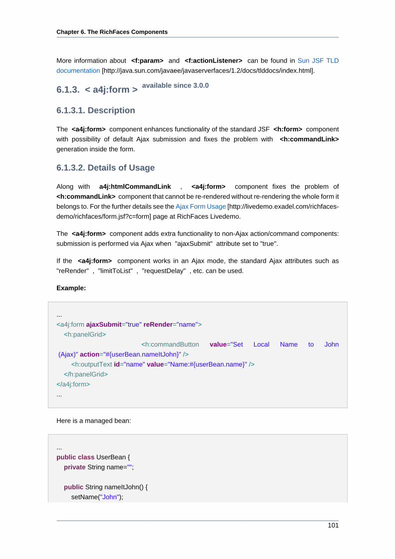
Chapter 6. The RichFaces Components
101
More information about <f:param> and <f:actionListener> can be found in Sun JSF TLD
documentation [http://java.sun.com/javaee/javaserverfaces/1.2/docs/tlddocs/index.html].
6.1.3. < a4j:form > available since 3.0.0
6.1.3.1. Description
The <a4j:form> component enhances functionality of the standard JSF <h:form> component
with possibility of default Ajax submission and fixes the problem with <h:commandLink>
generation inside the form.
6.1.3.2. Details of Usage
Along with a4j:htmlCommandLink , <a4j:form> component fixes the problem of
<h:commandLink> component that cannot be re-rendered without re-rendering the whole form it
belongs to. For the further details see the Ajax Form Usage [http://livedemo.exadel.com/richfaces-
demo/richfaces/form.jsf?c=form] page at RichFaces Livedemo.
The <a4j:form> component adds extra functionality to non-Ajax action/command components:
submission is performed via Ajax when "ajaxSubmit" attribute set to "true".
If the <a4j:form> component works in an Ajax mode, the standard Ajax attributes such as
"reRender" , "limitToList" , "requestDelay" , etc. can be used.
Example:
...
<a4j:form ajaxSubmit="true" reRender="name">
<h:panelGrid>
<h:commandButton value="Set Local Name to John
(Ajax)" action="#{userBean.nameItJohn}" />
<h:outputText id="name" value="Name:#{userBean.name}" />
</h:panelGrid>
</a4j:form>
...
Here is a managed bean:
...
public class UserBean {
private String name="";
public String nameItJohn() {
setName("John");
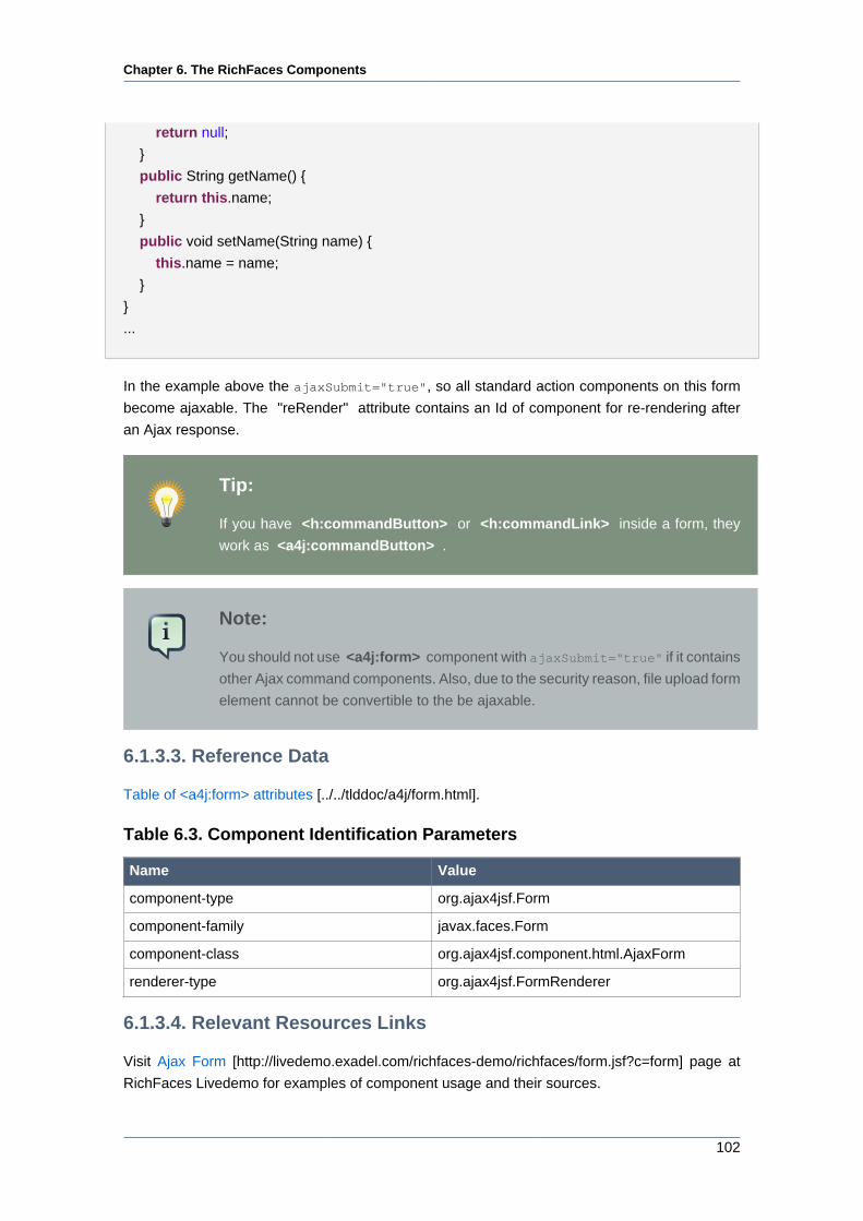
Chapter 6. The RichFaces Components
102
return null;
}
public String getName() {
return this.name;
}
public void setName(String name) {
this.name = name;
}
}
...
In the example above the ajaxSubmit="true", so all standard action components on this form
become ajaxable. The "reRender" attribute contains an Id of component for re-rendering after
an Ajax response.
Tip:
If you have <h:commandButton> or <h:commandLink> inside a form, they
work as <a4j:commandButton> .
Note:
You should not use <a4j:form> component with ajaxSubmit="true" if it contains
other Ajax command components. Also, due to the security reason, file upload form
element cannot be convertible to the be ajaxable.
6.1.3.3. Reference Data
Table of <a4j:form> attributes [../../tlddoc/a4j/form.html].
Table 6.3. Component Identification Parameters
Name Value
component-type org.ajax4jsf.Form
component-family javax.faces.Form
component-class org.ajax4jsf.component.html.AjaxForm
renderer-type org.ajax4jsf.FormRenderer
6.1.3.4. Relevant Resources Links
Visit Ajax Form [http://livedemo.exadel.com/richfaces-demo/richfaces/form.jsf?c=form] page at
RichFaces Livedemo for examples of component usage and their sources.
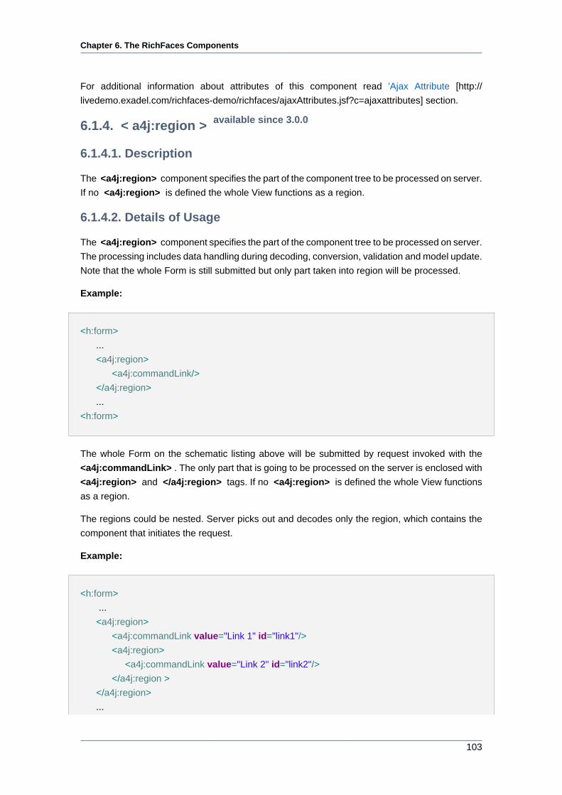
Chapter 6. The RichFaces Components
103
For additional information about attributes of this component read 'Ajax Attribute [http://
livedemo.exadel.com/richfaces-demo/richfaces/ajaxAttributes.jsf?c=ajaxattributes] section.
6.1.4. < a4j:region > available since 3.0.0
6.1.4.1. Description
The <a4j:region> component specifies the part of the component tree to be processed on server.
If no <a4j:region> is defined the whole View functions as a region.
6.1.4.2. Details of Usage
The <a4j:region> component specifies the part of the component tree to be processed on server.
The processing includes data handling during decoding, conversion, validation and model update.
Note that the whole Form is still submitted but only part taken into region will be processed.
Example:
<h:form>
...
<a4j:region>
<a4j:commandLink/>
</a4j:region>
...
<h:form>
The whole Form on the schematic listing above will be submitted by request invoked with the
<a4j:commandLink> . The only part that is going to be processed on the server is enclosed with
<a4j:region> and </a4j:region> tags. If no <a4j:region> is defined the whole View functions
as a region.
The regions could be nested. Server picks out and decodes only the region, which contains the
component that initiates the request.
Example:
<h:form>
...
<a4j:region>
<a4j:commandLink value="Link 1" id="link1"/>
<a4j:region>
<a4j:commandLink value="Link 2" id="link2"/>
</a4j:region >
</a4j:region>
...
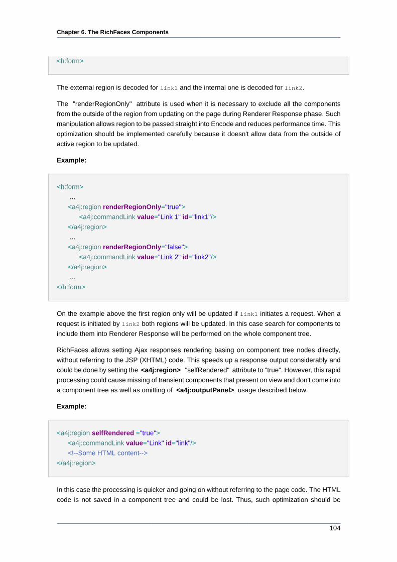
Chapter 6. The RichFaces Components
104
<h:form>
The external region is decoded for link1 and the internal one is decoded for link2.
The "renderRegionOnly" attribute is used when it is necessary to exclude all the components
from the outside of the region from updating on the page during Renderer Response phase. Such
manipulation allows region to be passed straight into Encode and reduces performance time. This
optimization should be implemented carefully because it doesn't allow data from the outside of
active region to be updated.
Example:
<h:form>
...
<a4j:region renderRegionOnly="true">
<a4j:commandLink value="Link 1" id="link1"/>
</a4j:region>
...
<a4j:region renderRegionOnly="false">
<a4j:commandLink value="Link 2" id="link2"/>
</a4j:region>
...
</h:form>
On the example above the first region only will be updated if link1 initiates a request. When a
request is initiated by link2 both regions will be updated. In this case search for components to
include them into Renderer Response will be performed on the whole component tree.
RichFaces allows setting Ajax responses rendering basing on component tree nodes directly,
without referring to the JSP (XHTML) code. This speeds up a response output considerably and
could be done by setting the <a4j:region> "selfRendered" attribute to "true". However, this rapid
processing could cause missing of transient components that present on view and don't come into
a component tree as well as omitting of <a4j:outputPanel> usage described below.
Example:
<a4j:region selfRendered ="true">
<a4j:commandLink value="Link" id="link"/>
<!--Some HTML content-->
</a4j:region>
In this case the processing is quicker and going on without referring to the page code. The HTML
code is not saved in a component tree and could be lost. Thus, such optimization should be
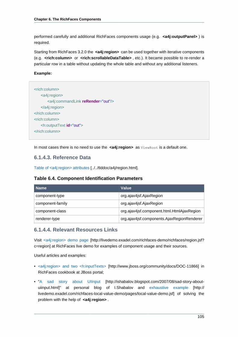
Chapter 6. The RichFaces Components
105
performed carefully and additional RichFaces components usage (e.g. <a4j:outputPanel> ) is
required.
Starting from RichFaces 3.2.0 the <a4j:region> can be used together with iterative components
(e.g. <rich:column> or <rich:scrollableDataTable> , etc.). It became possible to re-render a
particular row in a table without updating the whole table and without any additional listeners.
Example:
<rich:column>
<a4j:region>
<a4j:commandLink reRender="out"/>
</a4j:region>
</rich:column>
<rich:column>
<h:outputText id="out">
</rich:column>
In most cases there is no need to use the <a4j:region> as ViewRoot is a default one.
6.1.4.3. Reference Data
Table of <a4j:region> attributes [../../tlddoc/a4j/region.html].
Table 6.4. Component Identification Parameters
Name Value
component-type org.ajax4jsf.AjaxRegion
component-family org.ajax4jsf.AjaxRegion
component-class org.ajax4jsf.component.html.HtmlAjaxRegion
renderer-type org.ajax4jsf.components.AjaxRegionRenderer
6.1.4.4. Relevant Resources Links
Visit <a4j:region> demo page [http://livedemo.exadel.com/richfaces-demo/richfaces/region.jsf?
c=region] at RichFaces live demo for examples of component usage and their sources.
Useful articles and examples:
• <a4j:region> and two <h:inputTexts> [http://www.jboss.org/community/docs/DOC-11866] in
RichFaces cookbook at JBoss portal;
• "A sad story about UIInput [http://ishabalov.blogspot.com/2007/08/sad-story-about-
uiinput.html]" at personal blog of I.Shabalov and exhaustive example [http://
livedemo.exadel.com/richfaces-local-value-demo/pages/local-value-demo.jsf] of solving the
problem with the help of <a4j:region> .
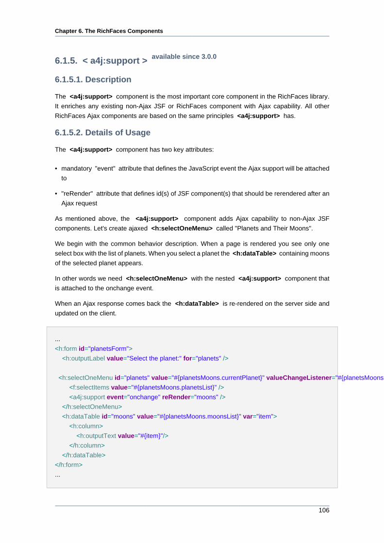
Chapter 6. The RichFaces Components
106
6.1.5. < a4j:support > available since 3.0.0
6.1.5.1. Description
The <a4j:support> component is the most important core component in the RichFaces library.
It enriches any existing non-Ajax JSF or RichFaces component with Ajax capability. All other
RichFaces Ajax components are based on the same principles <a4j:support> has.
6.1.5.2. Details of Usage
The <a4j:support> component has two key attributes:
• mandatory "event" attribute that defines the JavaScript event the Ajax support will be attached
to
• "reRender" attribute that defines id(s) of JSF component(s) that should be rerendered after an
Ajax request
As mentioned above, the <a4j:support> component adds Ajax capability to non-Ajax JSF
components. Let's create ajaxed <h:selectOneMenu> called "Planets and Their Moons".
We begin with the common behavior description. When a page is rendered you see only one
select box with the list of planets. When you select a planet the <h:dataTable> containing moons
of the selected planet appears.
In other words we need <h:selectOneMenu> with the nested <a4j:support> component that
is attached to the onchange event.
When an Ajax response comes back the <h:dataTable> is re-rendered on the server side and
updated on the client.
...
<h:form id="planetsForm">
<h:outputLabel value="Select the planet:" for="planets" />
<h:selectOneMenu id="planets" value="#{planetsMoons.currentPlanet}" valueChangeListener="#{planetsMoons.planetChanged}">
<f:selectItems value="#{planetsMoons.planetsList}" />
<a4j:support event="onchange" reRender="moons" />
</h:selectOneMenu>
<h:dataTable id="moons" value="#{planetsMoons.moonsList}" var="item">
<h:column>
<h:outputText value="#{item}"/>
</h:column>
</h:dataTable>
</h:form>
...
Chapter 6. The RichFaces Components
107
Finally we need a backing bean:
...
public class PlanetsMoons {
private String currentPlanet="";
public List<SelectItem> planetsList = new ArrayList<SelectItem>();
public List<String> moonsList = new ArrayList<String>();
private static final String [] EARTH = {"The Moon"};
private static final String [] MARS = {"Deimos", "Phobos"};
private static final String [] JUPITER = {"Europa", "Gamymede", "Callisto"};
public PlanetsMoons() {
SelectItem item = new SelectItem("earth", "Earth");
planetsList.add(item);
item = new SelectItem("mars", "Mars");
planetsList.add(item);
item = new SelectItem("jupiter", "Jupiter");
planetsList.add(item);
}
public void planetChanged(ValueChangeEvent event){
moonsList.clear();
String[] currentItems;
if (((String)event.getNewValue()).equals("earth")) {
currentItems = EARTH;
}else if(((String)event.getNewValue()).equals("mars")){
currentItems = MARS;
}else{
currentItems = JUPITER;
}
for (int i = 0; i < currentItems.length; i++) {
moonsList.add(currentItems[i]);
}
}
//Getters and Setters
...
}
There are two properties planetsList and moonsList. The planetsList is filled with planets
names in the constructor. After you select the planet, the planetChanged() listener is called and
the moonsList is populated with proper values of moons.
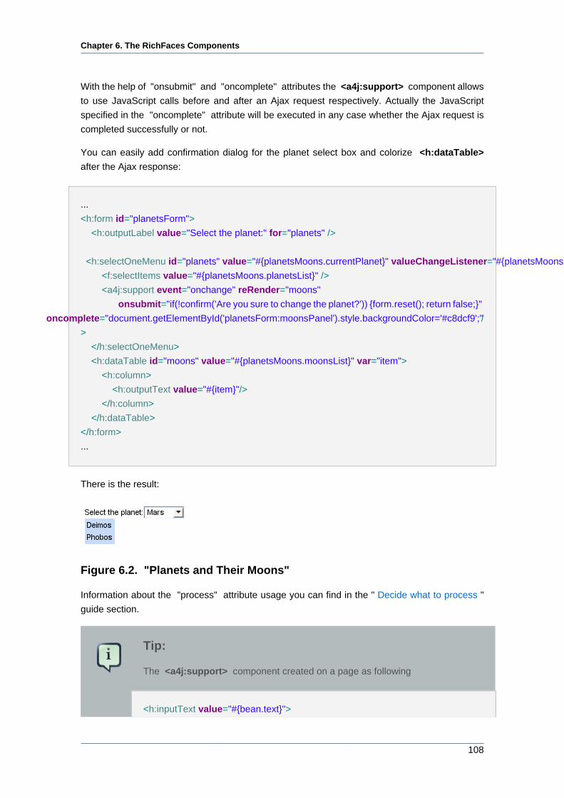
Chapter 6. The RichFaces Components
108
With the help of "onsubmit" and "oncomplete" attributes the <a4j:support> component allows
to use JavaScript calls before and after an Ajax request respectively. Actually the JavaScript
specified in the "oncomplete" attribute will be executed in any case whether the Ajax request is
completed successfully or not.
You can easily add confirmation dialog for the planet select box and colorize <h:dataTable>
after the Ajax response:
...
<h:form id="planetsForm">
<h:outputLabel value="Select the planet:" for="planets" />
<h:selectOneMenu id="planets" value="#{planetsMoons.currentPlanet}" valueChangeListener="#{planetsMoons.planetChanged}">
<f:selectItems value="#{planetsMoons.planetsList}" />
<a4j:support event="onchange" reRender="moons"
onsubmit="if(!confirm('Are you sure to change the planet?')) {form.reset(); return false;}"
oncomplete="document.getElementById('planetsForm:moonsPanel').style.backgroundColor='#c8dcf9';" /
>
</h:selectOneMenu>
<h:dataTable id="moons" value="#{planetsMoons.moonsList}" var="item">
<h:column>
<h:outputText value="#{item}"/>
</h:column>
</h:dataTable>
</h:form>
...
There is the result:
Figure 6.2. "Planets and Their Moons"
Information about the "process" attribute usage you can find in the " Decide what to process "
guide section.
Tip:
The <a4j:support> component created on a page as following
<h:inputText value="#{bean.text}">

Chapter 6. The RichFaces Components
109
<a4j:support event="onkeyup" reRender="output" action="#{bean.action}"/>
</h:inputText>
is decoded in HTML as
<input onkeyup="A4J.AJAX.Submit( Some request parameters )"/>
6.1.5.3. Reference Data
Table of <a4j:support> attributes [../../tlddoc/a4j/support.html].
Table 6.5. Component Identification Parameters
Name Value
component-type org.ajax4jsf.Support
component-family org.ajax4jsf.AjaxSupport
component-class org.ajax4jsf.component.html.HtmlAjaxSupport
renderer-type org.ajax4jsf.components.AjaxSupportRenderer
6.1.5.4. Relevant Resources Links
Visit <a4j:support> demo page [http://livedemo.exadel.com/richfaces-demo/richfaces/support.jsf?
c=support] at RichFaces live demo for examples of component usage and their sources.
6.1.6. < a4j:commandButton > available since 3.0.0
6.1.6.1. Description
The <a4j:commandButton> component is very similar to JSF <h:commandButton> , the only
difference is that an Ajax form submit is generated on a click and it allows dynamic rerendering
after a response comes back.
Figure 6.3. The <a4j:commandButton> component rendered in Blue Sky
skin
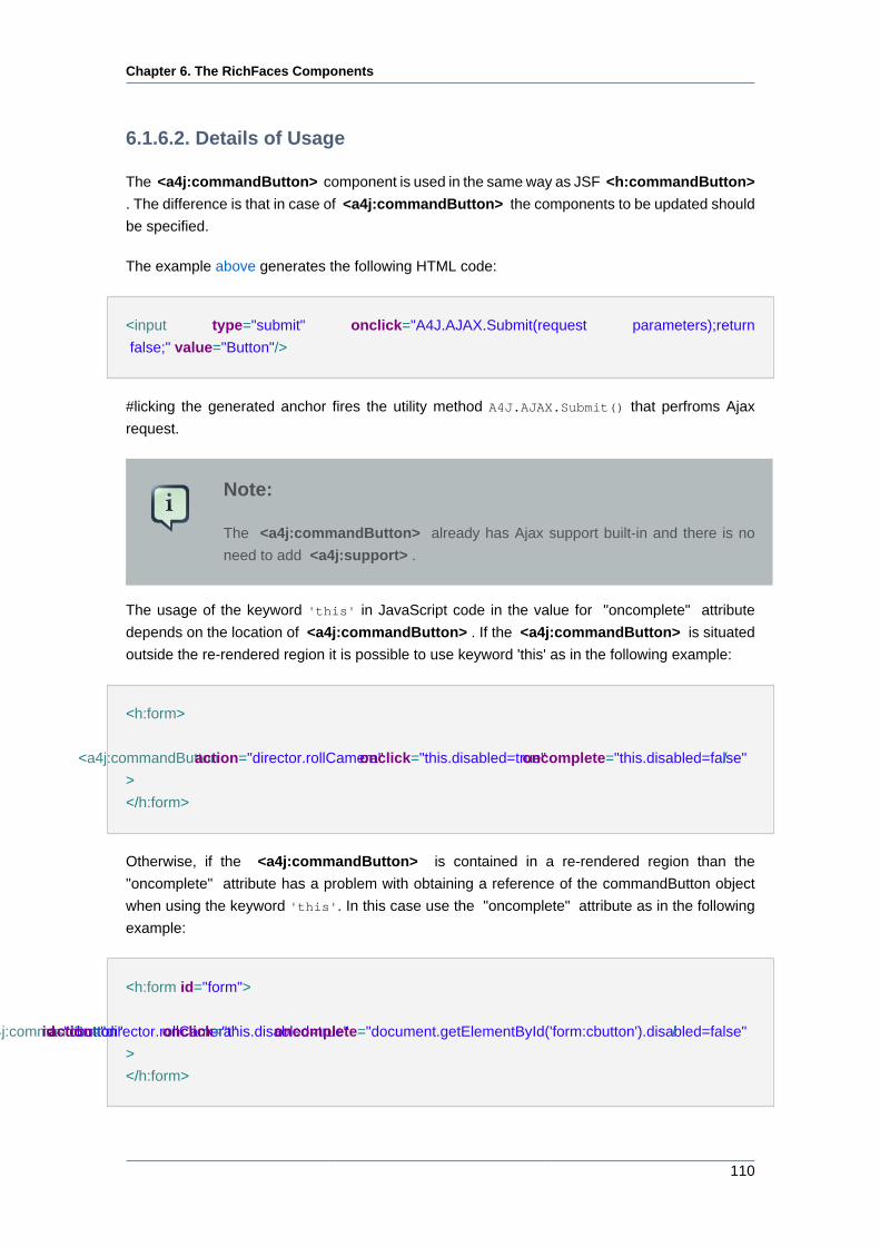
Chapter 6. The RichFaces Components
110
6.1.6.2. Details of Usage
The <a4j:commandButton> component is used in the same way as JSF <h:commandButton>
. The difference is that in case of <a4j:commandButton> the components to be updated should
be specified.
The example above generates the following HTML code:
<input type="submit" onclick="A4J.AJAX.Submit(request parameters);return
false;" value="Button"/>
#licking the generated anchor fires the utility method A4J.AJAX.Submit() that perfroms Ajax
request.
Note:
The <a4j:commandButton> already has Ajax support built-in and there is no
need to add <a4j:support> .
The usage of the keyword 'this' in JavaScript code in the value for "oncomplete" attribute
depends on the location of <a4j:commandButton> . If the <a4j:commandButton> is situated
outside the re-rendered region it is possible to use keyword 'this' as in the following example:
<h:form>
<a4j:commandButton action="director.rollCamera" onclick="this.disabled=true" oncomplete="this.disabled=false" /
>
</h:form>
Otherwise, if the <a4j:commandButton> is contained in a re-rendered region than the
"oncomplete" attribute has a problem with obtaining a reference of the commandButton object
when using the keyword 'this'. In this case use the "oncomplete" attribute as in the following
example:
<h:form id="form">
<a4j:commandButton id="cbutton" action="director.rollCamera" onclick="this.disabled=true" oncomplete="document.getElementById('form:cbutton').disabled=false" /
>
</h:form>
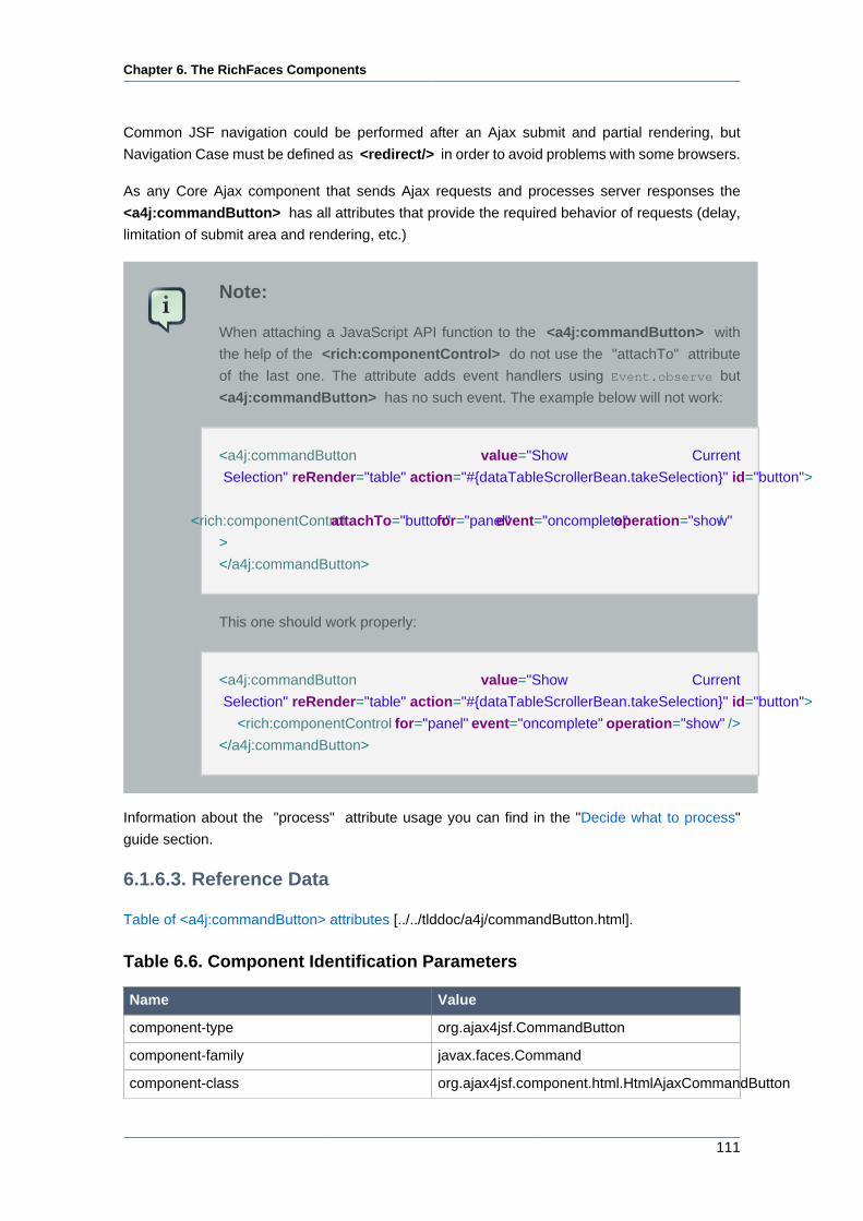
Chapter 6. The RichFaces Components
111
Common JSF navigation could be performed after an Ajax submit and partial rendering, but
Navigation Case must be defined as <redirect/> in order to avoid problems with some browsers.
As any Core Ajax component that sends Ajax requests and processes server responses the
<a4j:commandButton> has all attributes that provide the required behavior of requests (delay,
limitation of submit area and rendering, etc.)
Note:
When attaching a JavaScript API function to the <a4j:commandButton> with
the help of the <rich:componentControl> do not use the "attachTo" attribute
of the last one. The attribute adds event handlers using Event.observe but
<a4j:commandButton> has no such event. The example below will not work:
<a4j:commandButton value="Show Current
Selection" reRender="table" action="#{dataTableScrollerBean.takeSelection}" id="button">
<rich:componentControl attachTo="button" for="panel" event="oncomplete" operation="show" /
>
</a4j:commandButton>
This one should work properly:
<a4j:commandButton value="Show Current
Selection" reRender="table" action="#{dataTableScrollerBean.takeSelection}" id="button">
<rich:componentControl for="panel" event="oncomplete" operation="show" />
</a4j:commandButton>
Information about the "process" attribute usage you can find in the "Decide what to process"
guide section.
6.1.6.3. Reference Data
Table of <a4j:commandButton> attributes [../../tlddoc/a4j/commandButton.html].
Table 6.6. Component Identification Parameters
Name Value
component-type org.ajax4jsf.CommandButton
component-family javax.faces.Command
component-class org.ajax4jsf.component.html.HtmlAjaxCommandButton
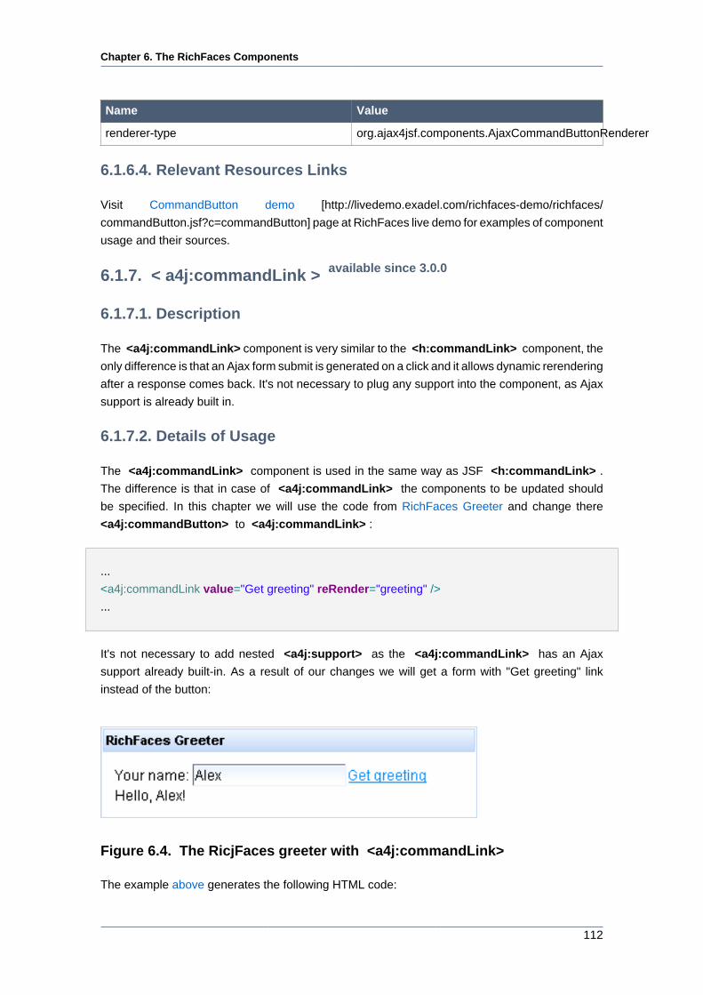
Chapter 6. The RichFaces Components
112
Name Value
renderer-type org.ajax4jsf.components.AjaxCommandButtonRenderer
6.1.6.4. Relevant Resources Links
Visit CommandButton demo [http://livedemo.exadel.com/richfaces-demo/richfaces/
commandButton.jsf?c=commandButton] page at RichFaces live demo for examples of component
usage and their sources.
6.1.7. < a4j:commandLink > available since 3.0.0
6.1.7.1. Description
The <a4j:commandLink> component is very similar to the <h:commandLink> component, the
only difference is that an Ajax form submit is generated on a click and it allows dynamic rerendering
after a response comes back. It's not necessary to plug any support into the component, as Ajax
support is already built in.
6.1.7.2. Details of Usage
The <a4j:commandLink> component is used in the same way as JSF <h:commandLink> .
The difference is that in case of <a4j:commandLink> the components to be updated should
be specified. In this chapter we will use the code from RichFaces Greeter and change there
<a4j:commandButton> to <a4j:commandLink> :
...
<a4j:commandLink value="Get greeting" reRender="greeting" />
...
It's not necessary to add nested <a4j:support> as the <a4j:commandLink> has an Ajax
support already built-in. As a result of our changes we will get a form with "Get greeting" link
instead of the button:
Figure 6.4. The RicjFaces greeter with <a4j:commandLink>
The example above generates the following HTML code:
Chapter 6. The RichFaces Components
113
<a href="#" onclick="A4J.AJAX.Submit(?"request parameters"); return
false;"><span>Get greeting</span></a>
If you click on the generated anchor the utility method A4J.AJAX.Submit() will be fired.
Note:
Common JSF navigation could be performed after Ajax submit and partial
rendering, but Navigation Case must be defined as <redirect/> in order to avoid
problems with some browsers.
As any Core Ajax component that sends Ajax requests and processes server responses the
<a4j:commandLink> has all attributes that provide the required behavior of requests (delay,
limitation of submit area and rendering, etc.)
Information about the "process" attribute usage you can find "Decide what to process" guide
section.
6.1.7.3. Reference Data
Table of <a4j:commandLink> attributes [../../tlddoc/a4j/commandLink.html].
Table 6.7. Component Identification Parameters
Name Value
component-type org.ajax4jsf.CommandLink
component-family javax.faces.Command
component-class org.ajax4jsf.component.html.HtmlAjaxCommandLink
renderer-type org.ajax4jsf.components.AjaxCommandLinkRenderer
6.1.7.4. Relevant Resources Links
Visit CommandLink demo [http://livedemo.exadel.com/richfaces-demo/richfaces/
commandLink.jsf?c=commandLink] page at RichFaces live demo for examples of component
usage and their sources.
Useful articles:
• How to use "window.confirm" JavaScript with <a4j:commandLink> "onclick" attribute [http://
www.jboss.org/community/docs/DOC-11850] in RichFaces cookbook at JBoss portal.
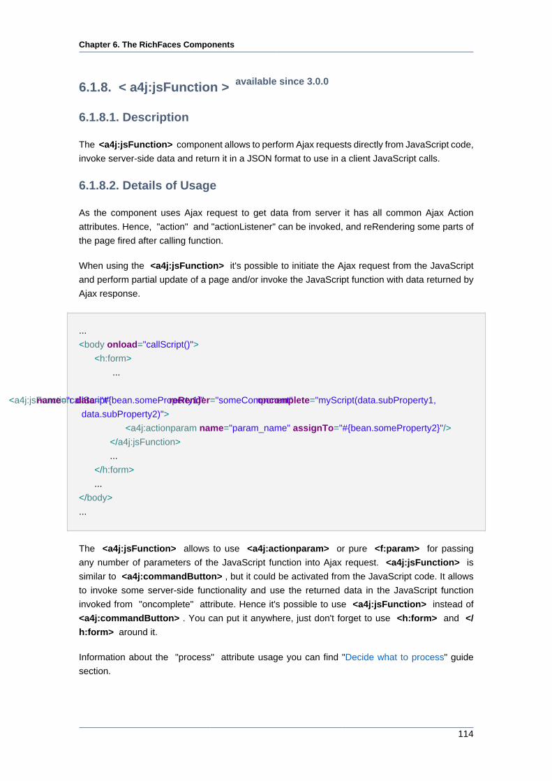
Chapter 6. The RichFaces Components
114
6.1.8. < a4j:jsFunction > available since 3.0.0
6.1.8.1. Description
The <a4j:jsFunction> component allows to perform Ajax requests directly from JavaScript code,
invoke server-side data and return it in a JSON format to use in a client JavaScript calls.
6.1.8.2. Details of Usage
As the component uses Ajax request to get data from server it has all common Ajax Action
attributes. Hence, "action" and "actionListener" can be invoked, and reRendering some parts of
the page fired after calling function.
When using the <a4j:jsFunction> it's possible to initiate the Ajax request from the JavaScript
and perform partial update of a page and/or invoke the JavaScript function with data returned by
Ajax response.
...
<body onload="callScript()">
<h:form>
...
<a4j:jsFunction name="callScript" data="#{bean.someProperty1}" reRender="someComponent" oncomplete="myScript(data.subProperty1,
data.subProperty2)">
<a4j:actionparam name="param_name" assignTo="#{bean.someProperty2}"/>
</a4j:jsFunction>
...
</h:form>
...
</body>
...
The <a4j:jsFunction> allows to use <a4j:actionparam> or pure <f:param> for passing
any number of parameters of the JavaScript function into Ajax request. <a4j:jsFunction> is
similar to <a4j:commandButton> , but it could be activated from the JavaScript code. It allows
to invoke some server-side functionality and use the returned data in the JavaScript function
invoked from "oncomplete" attribute. Hence it's possible to use <a4j:jsFunction> instead of
<a4j:commandButton> . You can put it anywhere, just don't forget to use <h:form> and </
h:form> around it.
Information about the "process" attribute usage you can find "Decide what to process" guide
section.
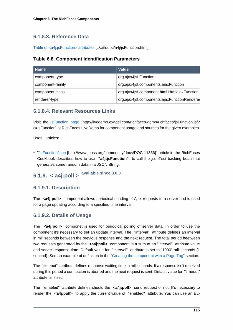
Chapter 6. The RichFaces Components
115
6.1.8.3. Reference Data
Table of <a4j:jsFunction> attributes [../../tlddoc/a4j/jsFunction.html].
Table 6.8. Component Identification Parameters
Name Value
component-type org.ajax4jsf.Function
component-family org.ajax4jsf.components.ajaxFunction
component-class org.ajax4jsf.component.html.HtmlajaxFunction
renderer-type org.ajax4jsf.components.ajaxFunctionRenderer
6.1.8.4. Relevant Resources Links
Visit the jsFunction page [http://livedemo.exadel.com/richfaces-demo/richfaces/jsFunction.jsf?
c=jsFunction] at RichFaces LiveDemo for component usage and sources for the given examples.
Useful articles:
• "JsFunctionJson [http://www.jboss.org/community/docs/DOC-11856]" article in the RichFaces
Cookbook describes how to use "a4j:jsFunction" to call the jsonTest backing bean that
generates some random data in a JSON String;
6.1.9. < a4j:poll > available since 3.0.0
6.1.9.1. Description
The <a4j:poll> component allows periodical sending of Ajax requests to a server and is used
for a page updating according to a specified time interval.
6.1.9.2. Details of Usage
The <a4j:poll> componet is used for periodical polling of server data. In order to use the
component it's necessary to set an update interval. The "interval" attribute defines an interval
in milliseconds between the previous response and the next request. The total period beetween
two requests generated by the <a4j:poll> component is a sum of an "interval" attribute value
and server response time. Default value for "interval" attribute is set to "1000" milliseconds (1
second). See an example of definition in the "Creating the component with a Page Tag" section.
The "timeout" attribute defines response waiting time in milliseconds. If a response isn't received
during this period a connection is aborted and the next request is sent. Default value for "timeout"
attribute isn't set.
The "enabled" attribute defines should the <a4j:poll> send request or not. It's necessary to
render the <a4j:poll> to apply the current value of "enabled" attribute. You can use an EL-
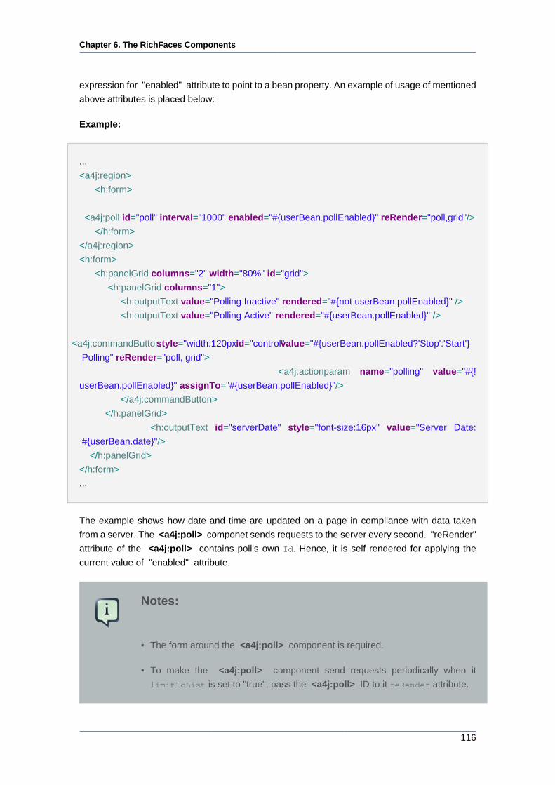
Chapter 6. The RichFaces Components
116
expression for "enabled" attribute to point to a bean property. An example of usage of mentioned
above attributes is placed below:
Example:
...
<a4j:region>
<h:form>
<a4j:poll id="poll" interval="1000" enabled="#{userBean.pollEnabled}" reRender="poll,grid"/>
</h:form>
</a4j:region>
<h:form>
<h:panelGrid columns="2" width="80%" id="grid">
<h:panelGrid columns="1">
<h:outputText value="Polling Inactive" rendered="#{not userBean.pollEnabled}" />
<h:outputText value="Polling Active" rendered="#{userBean.pollEnabled}" />
<a4j:commandButton style="width:120px" id="control" value="#{userBean.pollEnabled?'Stop':'Start'}
Polling" reRender="poll, grid">
<a4j:actionparam name="polling" value="#{!
userBean.pollEnabled}" assignTo="#{userBean.pollEnabled}"/>
</a4j:commandButton>
</h:panelGrid>
<h:outputText id="serverDate" style="font-size:16px" value="Server Date:
#{userBean.date}"/>
</h:panelGrid>
</h:form>
...
The example shows how date and time are updated on a page in compliance with data taken
from a server. The <a4j:poll> componet sends requests to the server every second. "reRender"
attribute of the <a4j:poll> contains poll's own Id. Hence, it is self rendered for applying the
current value of "enabled" attribute.
Notes:
• The form around the <a4j:poll> component is required.
• To make the <a4j:poll> component send requests periodically when it
limitToList is set to "true", pass the <a4j:poll> ID to it reRender attribute.
Chapter 6. The RichFaces Components
117
Information about the "process" attribute usage you can find "Decide what to process" guide
section.
6.1.9.3. Reference Data
Table of <a4j:poll> attributes [../../tlddoc/a4j/poll.html].
Table 6.9. Component Identification Parameters
Name Value
component-type org.ajax4jsf.Poll
component-family org.ajax4jsf.components.AjaxPoll
component-class org.ajax4jsf.component.html.AjaxPoll
renderer-type org.ajax4jsf.components.AjaxPollRenderer
6.1.9.4. Relevant Resources Links
Visit the Poll page [http://livedemo.exadel.com/richfaces-demo/richfaces/poll.jsf?c=poll] at
RichFaces LiveDemo for examples of the component usage and their sources.
Useful examples and articles:
• "Create a Banner Using Effects and Poll [http://www.jboss.org/community/wiki/
CreateABannerUsingEffectsAndPoll]" article at RichFaces Wiki gives an example of how to
create an image banner using <rich:effect> and <a4j:poll> components;
• "Create an HTML Banner Using Effects and Poll [http://www.jboss.org/community/wiki/
CreateAHTMLBannerUsingEffectsAndPoll]" article at RichFaces Wiki brings the code of the
way of creating an HTML banner banner using <rich:effect> and <a4j:poll> components;
• "RichFaces and Slideshow [http://www.jboss.org/index.html?
module=bb&op=viewtopic&t=125621]" thread in the RichFaces users forum contains an
information and code on making a Slide Show with the help of the <a4j:poll> component;
Manage the RichFaces Users Forum [http://jboss.com/index.html?
module=bb&op=viewtopic&t=103909] for fresh issues about the component usage.
6.1.10. < a4j:push > available since 3.0.0
6.1.10.1. Description
The <a4j:push> periodically perform Ajax request to server, to simulate 'push' data.
The main difference between <a4j:push> and <a4j:poll> components is that <a4j:push>
makes request to minimal code only (not to JSF tree) in order to check the presence of messages
in the queue. If the message exists the complete request is performed. The component doesn't
poll registered beans but registers EventListener which receives messages about events.
Chapter 6. The RichFaces Components
118
6.1.10.2. Details of Usage
The <a4j:push> implements reverse Ajax technique.
The bean, for example, could be subscribed to Java Messaging Service (JMS [http://java.sun.com/
products/jms/]) topic or it could be implemented as Message Driven Bean (MDB) in order to send
a message to the <a4j:push> component about an event presence. In the presence of the event
some action occurs.
Thus, a work paradigm with the <a4j:push> component corresponds to an anisochronous model,
but not to pools as for <a4j:poll> component. See the simplest example below:
Example:
...
class MyPushEventListener implements PushEventListener {
public void onEvent(EventObject evt) {
System.out.println(evt.getSource());
//Some action
}
}
...
Code for EventListener registration in the bean is placed below:
Example:
...
public void addListener(EventListener listener) {
synchronized (listener) {
if (this.listener != listener) {
this.listener = (PushEventListener) listener;
}
}
}
...
A page code for this example is placed below.
Example:
...
<a4j:status startText="in progress" stopText="done"/>
Chapter 6. The RichFaces Components
119
<a4j:form>
<a4j:region>
<a4j:push reRender="msg" eventProducer="#{pushBean.addListener}" interval="2000"/>
</a4j:region>
<a4j:outputPanel id="msg">
<h:outputText value="#{pushBean.date}">
<f:convertDateTime type="time"/>
</h:outputText>
</a4j:outputPanel>
<a4j:commandButton value="Push!!" action="#{pushBean.push}" ajaxSingle="true"/>
</a4j:form>
...
The example shows how date is updated on a page in compliance with data taken from a server. In
the example "interval" attribute has value "2000". This attribute defines an interval in milliseconds
between the previous response and the next request. Default value is set to "1000" milliseconds
(1 second). It's possible to set value equal to "0". In this case connection is permanent.
The "timeout" attribute defines response waiting time in milliseconds. If a response isn't received
during this period a connection is aborted and the next request is sent. Default value for "timeout"
attribute isn't set. Usage of "interval" and "timeout" attributes gives an opportunity to set short
polls of queue state or long connections.
Note:
The form around the <a4j:push> component is required.
6.1.10.3. Reference Data
Table of <a4j:push> attributes [../../tlddoc/a4j/push.html].
Table 6.10. Component Identification Parameters
Name Value
component-type org.ajax4jsf.Push
component-family org.ajax4jsf.components.AjaxPush
component-class org.ajax4jsf.component.html.AjaxPush
renderer-type org.ajax4jsf.components.AjaxPushRenderer
6.1.10.4. Relevant Resources Links
On RichFaces LiveDemo page [http://livedemo.exadel.com/richfaces-demo/richfaces/push.jsf?
c=push] you can found some additional information for <a4j:push> component usage.
Chapter 6. The RichFaces Components
120
Refer to Simple IRC Widget with <a4j:push> [http://www.jboss.org/community/wiki/
SimpleIRCWidgetwitha4jpush] article to find out real-world usage of the <a4j:push> component.
6.1.11. < a4j:queue > available since 3.3.0
6.1.11.1. Description
The <a4j:queue> component enqueues set of Ajax requests sent from client. The RichFaces
components with built-in Ajax can reference the queue to optimize Ajax requests.
6.1.11.2. Details of Usage
The RichFaces Queue has four different types: global default, view scoped default, view scoped
named and form-based default queue (general Queue principles are good documented in the
"Queue Principles" section). The current section will take closer to the form based queue. The
usage of other types is similar.
In order to disable or enable the <a4j:queue> component on the page you can use the "disabled"
attribute.
The "requestDelay" attribute defines delay time for all the requests fired by the action
components.
The "size" attribute specifies the number of requests that can be stored in the queue at a time. The
attribute helps to prevent server overloading. It is also possible to determine queue's behaviour
when it's size is exceeded. Use the "sizeExceededBehavior" for this purpose. There are four
possible strategies of exceeded queue's behavior:
• "dropNext" drops next request that should be fired
• "dropNew" drops the incoming request
• "fireNext" immediately fires the next request in line to be fired
• "fireNew" immediately fires the incoming request.
Example:
<h:form>
<a4j:queue size="2" requestDelay="500" sizeExceededBehavior="dropNext" onsizeexceeded="alert('The
size of the queue is exceeded')" />
<h:inputText value="#{bean.a}">
<a4j:support event="onkeyup" />
</h:inputText>
<h:inputText value="#{bean.b}">
Chapter 6. The RichFaces Components
121
<a4j:support event="onblur" />
</h:inputText>
<h:selectBooleanCheckbox value="#{bean.check}" id="checkboxID">
<a4j:support id="checkboxSupport" event="onchange" />
</h:selectBooleanCheckbox>
</h:form>
In this example if the queue has more than 2 requests waiting to be processed the next event will
be dropped and a message (the "onsizeexceeded" attribute fires a JavaScript function) saying
that the queues is exceeded will be displayed.
The "ignoreDupResponses" attribute that takes a boolean value can also help optimize your
Ajax requests. If set to true, response processing for request will not occur if a similar request is
already waiting in the queue. New request will be fired immediately when the response from the
previous one returns.
Example:
<h:form>
<a4j:queue requestDelay="500" ignoreDupResponses="true" />
<h:inputText value="#{bean.a}">
<a4j:support event="onkeyup" />
</h:inputText>
</h:form>
In this example, the requests are glued together and only the last one is submitted.
Another key attribute that easies server load is "timeout" . The attribute specifies the amount of
time an item can be in the queue before the sent event is be aborted and dropped from the queue.
If the request is sent and response is not returned within the time frame defined in this attribute
- the request is aborted, and the next one is sent.
Example:
<h:form>
<a4j:queue timeout="1000" />
<h:inputText value="#{bean.a}">
<a4j:support event="onkeyup" />
</h:inputText>
</h:form>
In this case if the sever doesn't respond within a second the request will be aborted.
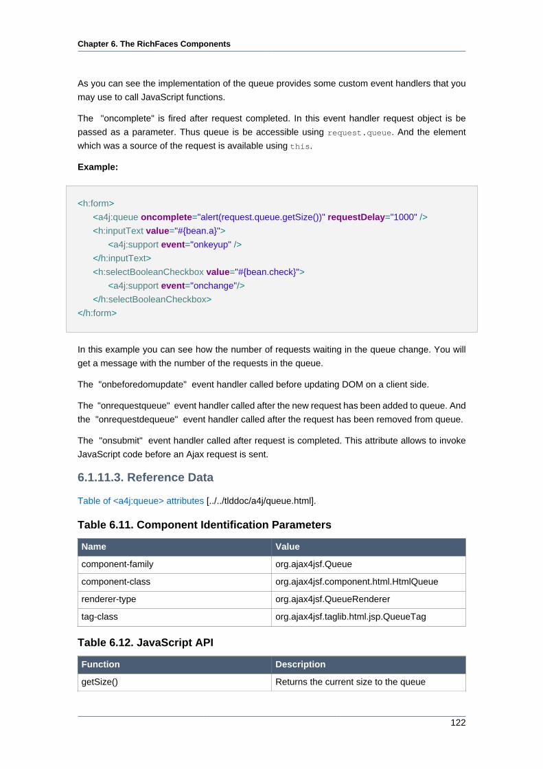
Chapter 6. The RichFaces Components
122
As you can see the implementation of the queue provides some custom event handlers that you
may use to call JavaScript functions.
The "oncomplete" is fired after request completed. In this event handler request object is be
passed as a parameter. Thus queue is be accessible using request.queue. And the element
which was a source of the request is available using this.
Example:
<h:form>
<a4j:queue oncomplete="alert(request.queue.getSize())" requestDelay="1000" />
<h:inputText value="#{bean.a}">
<a4j:support event="onkeyup" />
</h:inputText>
<h:selectBooleanCheckbox value="#{bean.check}">
<a4j:support event="onchange"/>
</h:selectBooleanCheckbox>
</h:form>
In this example you can see how the number of requests waiting in the queue change. You will
get a message with the number of the requests in the queue.
The "onbeforedomupdate" event handler called before updating DOM on a client side.
The "onrequestqueue" event handler called after the new request has been added to queue. And
the "onrequestdequeue" event handler called after the request has been removed from queue.
The "onsubmit" event handler called after request is completed. This attribute allows to invoke
JavaScript code before an Ajax request is sent.
6.1.11.3. Reference Data
Table of <a4j:queue> attributes [../../tlddoc/a4j/queue.html].
Table 6.11. Component Identification Parameters
Name Value
component-family org.ajax4jsf.Queue
component-class org.ajax4jsf.component.html.HtmlQueue
renderer-type org.ajax4jsf.QueueRenderer
tag-class org.ajax4jsf.taglib.html.jsp.QueueTag
Table 6.12. JavaScript API
Function Description
getSize() Returns the current size to the queue
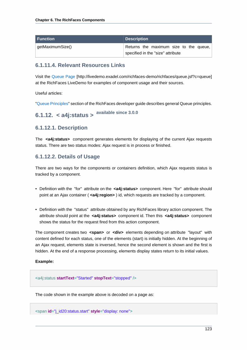
Chapter 6. The RichFaces Components
123
Function Description
getMaximumSize() Returns the maximum size to the queue,
specified in the "size" attribute
6.1.11.4. Relevant Resources Links
Visit the Queue Page [http://livedemo.exadel.com/richfaces-demo/richfaces/queue.jsf?c=queue]
at the RichFaces LiveDemo for examples of component usage and their sources.
Useful articles:
"Queue Principles" section of the RichFaces developer guide describes general Queue principles.
6.1.12. < a4j:status > available since 3.0.0
6.1.12.1. Description
The <a4j:status> component generates elements for displaying of the current Ajax requests
status. There are two status modes: Ajax request is in process or finished.
6.1.12.2. Details of Usage
There are two ways for the components or containers definition, which Ajax requests status is
tracked by a component.
• Definition with the "for" attribute on the <a4j:status> component. Here "for" attribute should
point at an Ajax container ( <a4j:region> ) id, which requests are tracked by a component.
• Definition with the "status" attribute obtained by any RichFaces library action component. The
attribute should point at the <a4j:status> component id. Then this <a4j:status> component
shows the status for the request fired from this action component.
The component creates two <span> or <div> elements depending on attribute "layout" with
content defined for each status, one of the elements (start) is initially hidden. At the beginning of
an Ajax request, elements state is inversed, hence the second element is shown and the first is
hidden. At the end of a response processing, elements display states return to its initial values.
Example:
<a4j:status startText="Started" stopText="stopped" />
The code shown in the example above is decoded on a page as:
<span id="j_id20:status.start" style="display: none">
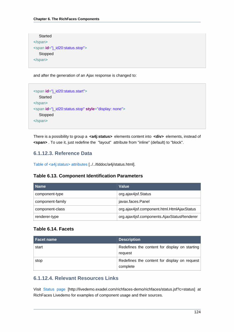
Chapter 6. The RichFaces Components
124
Started
</span>
<span id="j_id20:status.stop">
Stopped
</span>
and after the generation of an Ajax response is changed to:
<span id="j_id20:status.start">
Started
</span>
<span id="j_id20:status.stop" style="display: none">
Stopped
</span>
There is a possibility to group a <a4j:status> elements content into <div> elements, instead of
<span> . To use it, just redefine the "layout" attribute from "inline" (default) to "block".
6.1.12.3. Reference Data
Table of <a4j:status> attributes [../../tlddoc/a4j/status.html].
Table 6.13. Component Identification Parameters
Name Value
component-type org.ajax4jsf.Status
component-family javax.faces.Panel
component-class org.ajax4jsf.component.html.HtmlAjaxStatus
renderer-type org.ajax4jsf.components.AjaxStatusRenderer
Table 6.14. Facets
Facet name Description
start Redefines the content for display on starting
request
stop Redefines the content for display on request
complete
6.1.12.4. Relevant Resources Links
Visit Status page [http://livedemo.exadel.com/richfaces-demo/richfaces/status.jsf?c=status] at
RichFaces Livedemo for examples of component usage and their sources.
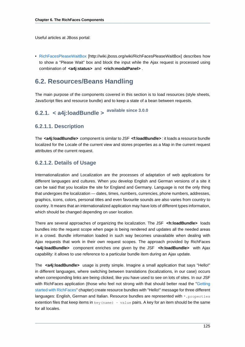
Chapter 6. The RichFaces Components
125
Useful articles at JBoss portal:
• RichFacesPleaseWaitBox [http://wiki.jboss.org/wiki/RichFacesPleaseWaitBox] describes how
to show a "Please Wait" box and block the input while the Ajax request is processed using
combination of <a4j:status> and <rich:modalPanel> .
6.2. Resources/Beans Handling
The main purpose of the components covered in this section is to load resources (style sheets,
JavaScript files and resource bundle) and to keep a state of a bean between requests.
6.2.1. < a4j:loadBundle > available since 3.0.0
6.2.1.1. Description
The <a4j:loadBundle> component is similar to JSF <f:loadBundle> : it loads a resource bundle
localized for the Locale of the current view and stores properties as a Map in the current request
attributes of the current request.
6.2.1.2. Details of Usage
Internationalization and Localization are the processes of adaptation of web applications for
different languages and cultures. When you develop English and German versions of a site it
can be said that you localize the site for England and Germany. Language is not the only thing
that undergoes the localization — dates, times, numbers, currencies, phone numbers, addresses,
graphics, icons, colors, personal titles and even favourite sounds are also varies from country to
country. It means that an internationalized application may have lots of different types information,
which should be changed depending on user location.
There are several approaches of organizing the localization. The JSF <h:loadBundle> loads
bundles into the request scope when page is being rendered and updates all the needed areas
in a crowd. Bundle information loaded in such way becomes unavailable when dealing with
Ajax requests that work in their own request scopes. The approach provided by RichFaces
<a4j:loadBundle> component enriches one given by the JSF <h:loadBundle> with Ajax
capability: it allows to use reference to a particular bundle item during an Ajax update.
The <a4j:loadBundle> usage is pretty simple. Imagine a small application that says "Hello!"
in different languages, where switching between translations (localizations, in our case) occurs
when corresponding links are being clicked, like you have used to see on lots of sites. In our JSF
with RichFaces application (those who feel not strong with that should better read the "Getting
started with RichFaces" chapter) create resource bundles with "Hello!" message for three different
languages: English, German and Italian. Resource bundles are represented with *.properties
extention files that keep items in key(name) - value pairs. A key for an item should be the same
for all locales.
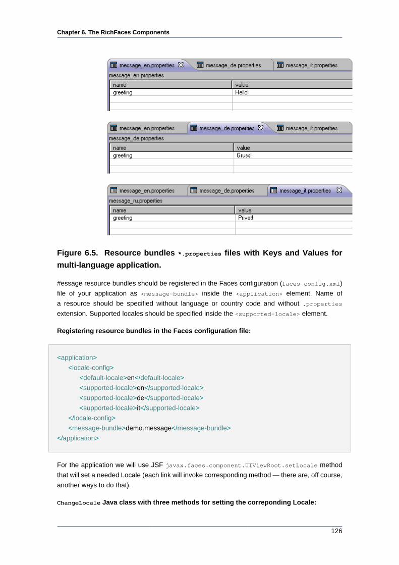
Chapter 6. The RichFaces Components
126
Figure 6.5. Resource bundles *.properties files with Keys and Values for
multi-language application.
#essage resource bundles should be registered in the Faces configuration (faces-config.xml)
file of your application as <message-bundle> inside the <application> element. Name of
a resource should be specified without language or country code and without .properties
extension. Supported locales should be specified inside the <supported-locale> element.
Registering resource bundles in the Faces configuration file:
<application>
<locale-config>
<default-locale>en</default-locale>
<supported-locale>en</supported-locale>
<supported-locale>de</supported-locale>
<supported-locale>it</supported-locale>
</locale-config>
<message-bundle>demo.message</message-bundle>
</application>
For the application we will use JSF javax.faces.component.UIViewRoot.setLocale method
that will set a needed Locale (each link will invoke corresponding method — there are, off course,
another ways to do that).
ChangeLocale Java class with three methods for setting the correponding Locale:
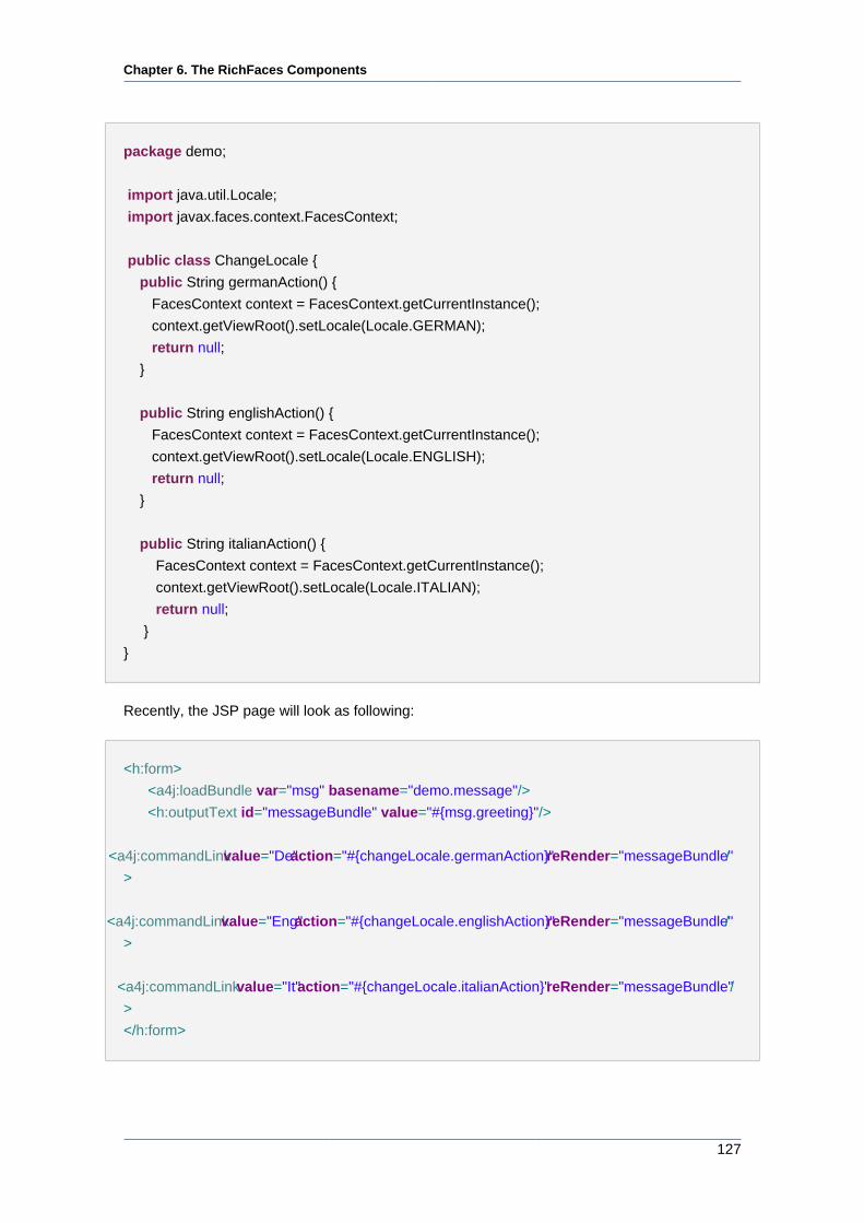
Chapter 6. The RichFaces Components
127
package demo;
import java.util.Locale;
import javax.faces.context.FacesContext;
public class ChangeLocale {
public String germanAction() {
FacesContext context = FacesContext.getCurrentInstance();
context.getViewRoot().setLocale(Locale.GERMAN);
return null;
}
public String englishAction() {
FacesContext context = FacesContext.getCurrentInstance();
context.getViewRoot().setLocale(Locale.ENGLISH);
return null;
}
public String italianAction() {
FacesContext context = FacesContext.getCurrentInstance();
context.getViewRoot().setLocale(Locale.ITALIAN);
return null;
}
}
Recently, the JSP page will look as following:
<h:form>
<a4j:loadBundle var="msg" basename="demo.message"/>
<h:outputText id="messageBundle" value="#{msg.greeting}"/>
<a4j:commandLink value="De" action="#{changeLocale.germanAction}" reRender="messageBundle" /
>
<a4j:commandLink value="Eng" action="#{changeLocale.englishAction}" reRender="messageBundle" /
>
<a4j:commandLink value="It" action="#{changeLocale.italianAction}" reRender="messageBundle" /
>
</h:form>
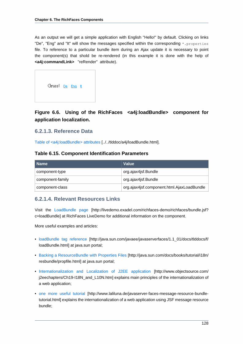
Chapter 6. The RichFaces Components
128
As an output we will get a simple application with English "Hello!" by default. Clicking on links
"De", "Eng" and "It" will show the messages specified within the corresponding *.properties
file. To reference to a particular bundle item during an Ajax update it is necessary to point
the component(s) that shold be re-rendered (in this example it is done with the help of
<a4j:commandLink> "reRender" attribute).
Figure 6.6. Using of the RichFaces <a4j:loadBundle> component for
application localization.
6.2.1.3. Reference Data
Table of <a4j:loadBundle> attributes [../../tlddoc/a4j/loadBundle.html].
Table 6.15. Component Identification Parameters
Name Value
component-type org.ajax4jsf.Bundle
component-family org.ajax4jsf.Bundle
component-class org.ajax4jsf.component.html.AjaxLoadBundle
6.2.1.4. Relevant Resources Links
Visit the LoadBundle page [http://livedemo.exadel.com/richfaces-demo/richfaces/bundle.jsf?
c=loadBundle] at RichFaces LiveDemo for additional information on the component.
More useful examples and articles:
• loadBundle tag reference [http://java.sun.com/javaee/javaserverfaces/1.1_01/docs/tlddocs/f/
loadBundle.html] at java.sun portal;
• Backing a ResourceBundle with Properties Files [http://java.sun.com/docs/books/tutorial/i18n/
resbundle/propfile.html] at java.sun portal;
• Internationalization and Localization of J2EE application [http://www.objectsource.com/
j2eechapters/Ch19-I18N_and_L10N.htm] explains main principles of the internationalization of
a web application;
• one more useful tutorial [http://www.laliluna.de/javaserver-faces-message-resource-bundle-
tutorial.html] explains the internationalization of a web application using JSF message resource
bundle;
Chapter 6. The RichFaces Components
129
• Some special problem with JSF internationalization [http://www.i-coding.de/www/en/jsf/
application/locale.html] and solution from the i-coding.de portal.
6.2.2. < a4j:keepAlive > available since 3.0.0
6.2.2.1. Description
The <a4j:keepAlive> tag allows to keep a state of a bean between requests.
6.2.2.2. Details of Usage
If a managed bean is declared with request scope in the configuration file with the help of
<managed-bean-scope> tag then the life-time of this bean instance is valid only for the current
request. Any attempts to make a reference to the bean instance after the request end will throw
in Illegal Argument Exception by the server. To avoid these kinds of Exceptions component
<a4j:keepAlive> is used to maintain the state of the whole bean object among subsequent
request.
Example:
<a4j:keepAlive beanName = "#{myClass.testBean}"/>
The "beanName" attribute defines the request scope bean name you'd like to re-use. Note that
this attribute must point to a legal JSF EL expression which resolves to a managed mean instance.
For example for the above code the class definition may look like this one:
class MyClass{
...
private TestBean testBean;
// Getters and Setters for testBean.
...
}
The "ajaxOnly" attribute declares whether the value of the bean should be available during a
non-Ajax request. If the value of this attribute is "true" a request scope bean keeps the same value
during Ajax requests from the given page. If a non-Ajax request is sent from this page the bean
is re-created as a regular request scope bean.
6.2.2.3. Reference Data
Table of <a4j:keepAlive> attributes [../../tlddoc/a4j/keepAlive.html].
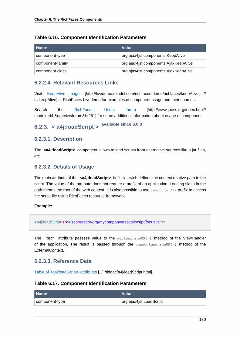
Chapter 6. The RichFaces Components
130
Table 6.16. Component Identification Parameters
Name Value
component-type org.ajax4jsf.components.KeepAlive
component-family org.ajax4jsf.components.AjaxKeepAlive
component-class org.ajax4jsf.components.AjaxKeepAlive
6.2.2.4. Relevant Resources Links
Visit KeepAlive page [http://livedemo.exadel.com/richfaces-demo/richfaces/keepAlive.jsf?
c=keepAlive] at RichFaces Livedemo for examples of component usage and their sources.
Search the RichFaces Users forum [http://www.jboss.org/index.html?
module=bb&op=viewforum&f=261] for some additional information about usage of component.
6.2.3. < a4j:loadScript > available since 3.0.0
6.2.3.1. Description
The <a4j:loadScript> component allows to load scripts from alternative sources like a jar files,
etc.
6.2.3.2. Details of Usage
The main attribute of the <a4j:loadScript> is "src" , wich defines the context relative path to the
script. The value of the attribute does not require a prefix of an application. Leading slash in the
path means the root of the web context. It is also possible to use resource:/// prefix to access
the script file using RichFaces resource framework.
Example:
<a4j:loadScript src="resource:///org/mycompany/assets/script/focus.js" />
The "src" attribute passses value to the getResourceURL() method of the ViewHandler
of the application, The result is passed through the encodeResourceURL() method of the
ExternalContext.
6.2.3.3. Reference Data
Table of <a4j:loadScript> attributes [../../tlddoc/a4j/loadScript.html].
Table 6.17. Component Identification Parameters
Name Value
component-type org.ajax4jsf.LoadScript
Chapter 6. The RichFaces Components
131
Name Value
component-family org.ajax4jsf.LoadScript
component-class org.ajax4jsf.component.html.HtmlLoadScript
renderer-type org.ajax4jsf.LoadScriptRenderer
6.2.3.4. Relevant Resources Links
Visit the Script page at RichFaces LiveDemo [http://livedemo.exadel.com/richfaces-demo/
richfaces/script.jsf?c=loadScript] for examples of component usage abd their sources.
6.2.4. < a4j:loadStyle > available since 3.0.0
6.2.4.1. Description
The <a4j:loadStyle> component allows to load a style sheet file from alternative sources like a
jar file, etc. It inserts stylesheet links to the head element.
6.2.4.2. Details of Usage
The main attribute of the <a4j:loadStylet> is "src" , wich defines the context relative path to the
script. The value of the attribute does not require a prefix of an application. Leading slash in the
path means the root of the web context. It is also possible to use resource:/// prefix to access
the script file using RichFaces resource framework.
Example:
<a4j:loadStyle src="resource:///org/mycompany/assets/script/focus.js" />
The "src" attribute passses value to the getResourceURL() method of the ViewHandler
of the application, The result is passed through the encodeResourceURL() method of the
ExternalContext.
6.2.4.3. Reference Data
Table of <a4j:loadStyle> attributes [../../tlddoc/a4j/loadStyle.html].
Table 6.18. Component Identification Parameters
Name Value
component-type org.ajax4jsf.LoadStyle
component-family org.ajax4jsf.LoadStyle
component-class org.ajax4jsf.component.html.HtmlLoadStyle
renderer-type org.ajax4jsf.LoadStyleRenderer
Chapter 6. The RichFaces Components
132
6.2.4.4. Relevant Resources Links
Visit the Script page at RichFaces LiveDemo [http://livedemo.exadel.com/richfaces-demo/
richfaces/style.jsf?c=loadStyle] for examples of component usage abd their sources.
6.3. Ajax Validators
RichFaces components library provides 3 components to validate user input data. These
components enhance JSF validation capabilities with Ajax support and possibility to use Hibernate
validators.
6.3.1. < rich:ajaxValidator > available since 3.2.2
6.3.1.1. Description
The <rich:ajaxValidator> is a component designed to provide Ajax validation inside for JSF
inputs.
6.3.1.2. Key Features
• Skips all JSF processing except validation
• Possibility to use both standard and custom validation
• Possibility to use Hibernate Validation
• Event based validation triggering
6.3.1.3. Details of Usage
The <rich:ajaxValidator> component should be added as a child component to an input JSF
tag which data should be validated and an event that triggers validation should be specified as
well. The component is ajaxSingle by default so only the current field will be validated.
The following example demonstrates how the <rich:ajaxValidator> adds Ajax functionality
to standard JSF validators. The request is sent when the input field loses focus, the action is
determined by the "event" attribute that is set to "onblur".
...
<rich:panel>
<f:facet name="header">
<h:outputText value="User Info:" />
</f:facet>
<h:panelGrid columns="3">
<h:outputText value="Name:" />
<h:inputText value="#{userBean.name}" id="name" required="true">
<f:validateLength minimum="3" maximum="12"/>
<rich:ajaxValidator event="onblur"/>
Chapter 6. The RichFaces Components
133
</h:inputText>
<rich:message for="name" />
<h:outputText value="Age:" />
<h:inputText value="#{userBean.age}" id="age" required="true">
<f:convertNumber integerOnly="true"/>
<f:validateLongRange minimum="18" maximum="99"/>
<rich:ajaxValidator event="onblur"/>
</h:inputText>
<rich:message for="age"/>
</h:panelGrid>
</rich:panel>
...
This is the result of the snippet.
Figure 6.7. Simple example of <rich:ajaxValidator> with
In the example above it's show how to work with standard JSF validators. The
<rich:ajaxValidator> component also works perfectly with custom validators enhancing their
usage with Ajax.
Custom validation can be performed in two ways:
• Using JSF Validation API is available in javax.faces.validator package
• Using Hibernate Validator, specifying a constraint for the data to be validated. A reference
on Hibernate Validator can be found in Hibernated documentation [http://www.hibernate.org/
hib_docs/validator/reference/en/html_single/].
The following example shows how the data entered by user can be validated using Hibernate
Validator.
...
<rich:panel>
<f:facet name="header">
<h:outputText value="User Info:" />
</f:facet>
<h:panelGrid columns="3">
<h:outputText value="Name:" />
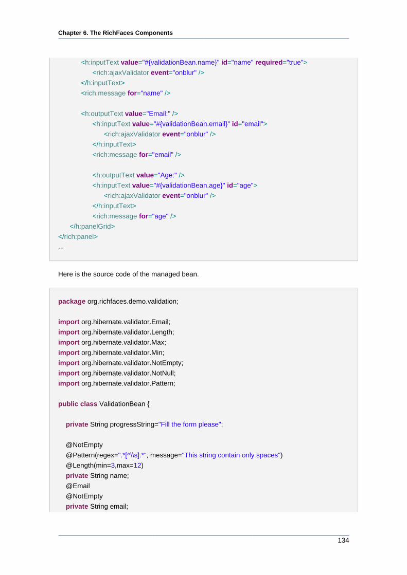
Chapter 6. The RichFaces Components
134
<h:inputText value="#{validationBean.name}" id="name" required="true">
<rich:ajaxValidator event="onblur" />
</h:inputText>
<rich:message for="name" />
<h:outputText value="Email:" />
<h:inputText value="#{validationBean.email}" id="email">
<rich:ajaxValidator event="onblur" />
</h:inputText>
<rich:message for="email" />
<h:outputText value="Age:" />
<h:inputText value="#{validationBean.age}" id="age">
<rich:ajaxValidator event="onblur" />
</h:inputText>
<rich:message for="age" />
</h:panelGrid>
</rich:panel>
...
Here is the source code of the managed bean.
package org.richfaces.demo.validation;
import org.hibernate.validator.Email;
import org.hibernate.validator.Length;
import org.hibernate.validator.Max;
import org.hibernate.validator.Min;
import org.hibernate.validator.NotEmpty;
import org.hibernate.validator.NotNull;
import org.hibernate.validator.Pattern;
public class ValidationBean {
private String progressString="Fill the form please";
@NotEmpty
@Pattern(regex=".*[^\\s].*", message="This string contain only spaces")
@Length(min=3,max=12)
private String name;
@NotEmpty
private String email;
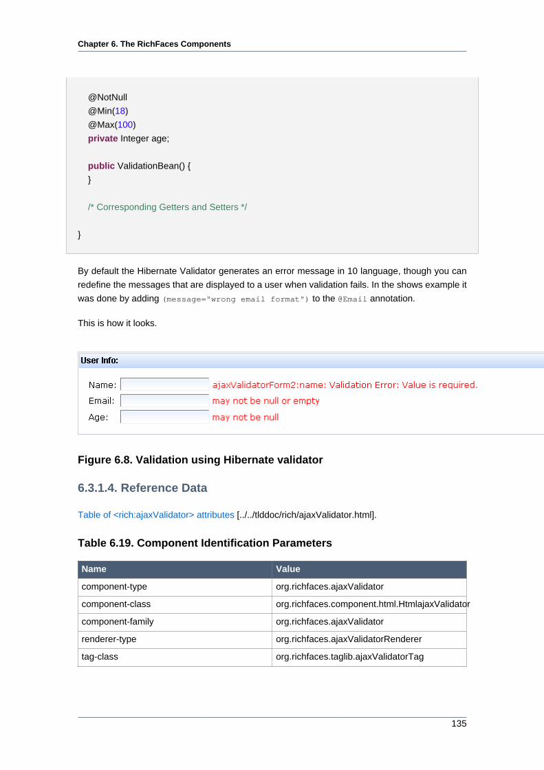
Chapter 6. The RichFaces Components
135
@NotNull
@Min(18)
@Max(100)
private Integer age;
public ValidationBean() {
}
/* Corresponding Getters and Setters */
}
By default the Hibernate Validator generates an error message in 10 language, though you can
redefine the messages that are displayed to a user when validation fails. In the shows example it
was done by adding (message="wrong email format") to the @Email annotation.
This is how it looks.
Figure 6.8. Validation using Hibernate validator
6.3.1.4. Reference Data
Table of <rich:ajaxValidator> attributes [../../tlddoc/rich/ajaxValidator.html].
Table 6.19. Component Identification Parameters
Name Value
component-type org.richfaces.ajaxValidator
component-class org.richfaces.component.html.HtmlajaxValidator
component-family org.richfaces.ajaxValidator
renderer-type org.richfaces.ajaxValidatorRenderer
tag-class org.richfaces.taglib.ajaxValidatorTag
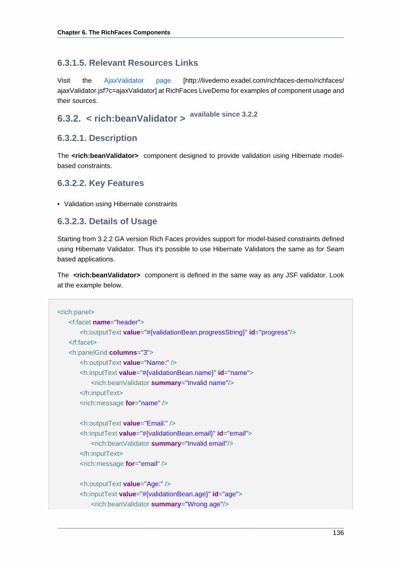
Chapter 6. The RichFaces Components
136
6.3.1.5. Relevant Resources Links
Visit the AjaxValidator page [http://livedemo.exadel.com/richfaces-demo/richfaces/
ajaxValidator.jsf?c=ajaxValidator] at RichFaces LiveDemo for examples of component usage and
their sources.
6.3.2. < rich:beanValidator > available since 3.2.2
6.3.2.1. Description
The <rich:beanValidator> component designed to provide validation using Hibernate model-
based constraints.
6.3.2.2. Key Features
• Validation using Hibernate constraints
6.3.2.3. Details of Usage
Starting from 3.2.2 GA version Rich Faces provides support for model-based constraints defined
using Hibernate Validator. Thus it's possible to use Hibernate Validators the same as for Seam
based applications.
The <rich:beanValidator> component is defined in the same way as any JSF validator. Look
at the example below.
<rich:panel>
<f:facet name="header">
<h:outputText value="#{validationBean.progressString}" id="progress"/>
</f:facet>
<h:panelGrid columns="3">
<h:outputText value="Name:" />
<h:inputText value="#{validationBean.name}" id="name">
<rich:beanValidator summary="Invalid name"/>
</h:inputText>
<rich:message for="name" />
<h:outputText value="Email:" />
<h:inputText value="#{validationBean.email}" id="email">
<rich:beanValidator summary="Invalid email"/>
</h:inputText>
<rich:message for="email" />
<h:outputText value="Age:" />
<h:inputText value="#{validationBean.age}" id="age">
<rich:beanValidator summary="Wrong age"/>
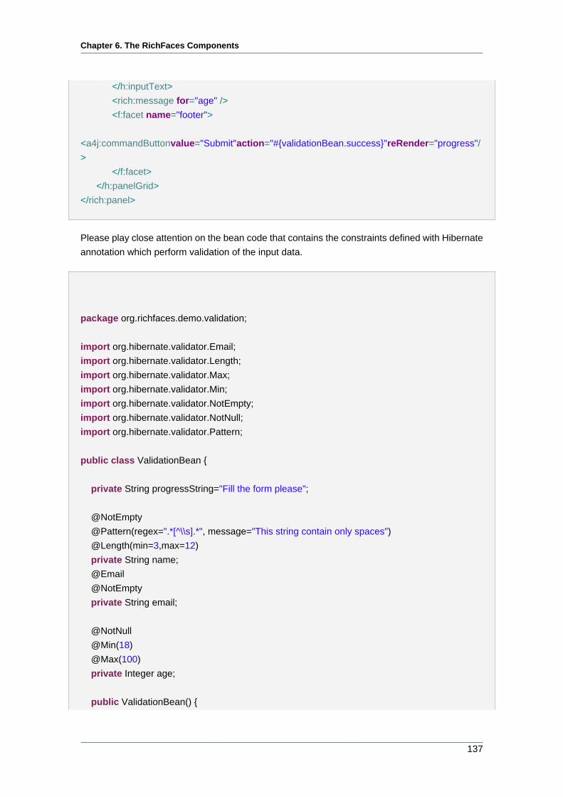
Chapter 6. The RichFaces Components
137
</h:inputText>
<rich:message for="age" />
<f:facet name="footer">
<a4j:commandButton value="Submit" action="#{validationBean.success}" reRender="progress"/
>
</f:facet>
</h:panelGrid>
</rich:panel>
Please play close attention on the bean code that contains the constraints defined with Hibernate
annotation which perform validation of the input data.
package org.richfaces.demo.validation;
import org.hibernate.validator.Email;
import org.hibernate.validator.Length;
import org.hibernate.validator.Max;
import org.hibernate.validator.Min;
import org.hibernate.validator.NotEmpty;
import org.hibernate.validator.NotNull;
import org.hibernate.validator.Pattern;
public class ValidationBean {
private String progressString="Fill the form please";
@NotEmpty
@Pattern(regex=".*[^\\s].*", message="This string contain only spaces")
@Length(min=3,max=12)
private String name;
@NotEmpty
private String email;
@NotNull
@Min(18)
@Max(100)
private Integer age;
public ValidationBean() {
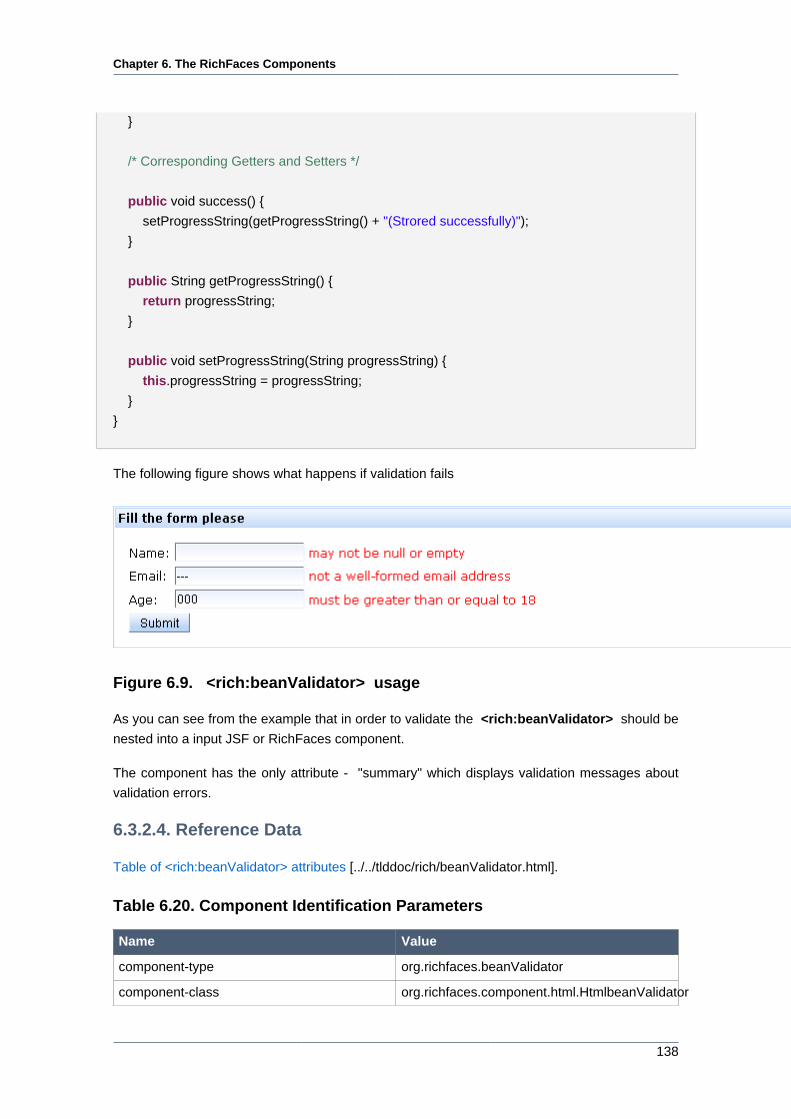
Chapter 6. The RichFaces Components
138
}
/* Corresponding Getters and Setters */
public void success() {
setProgressString(getProgressString() + "(Strored successfully)");
}
public String getProgressString() {
return progressString;
}
public void setProgressString(String progressString) {
this.progressString = progressString;
}
}
The following figure shows what happens if validation fails
Figure 6.9. <rich:beanValidator> usage
As you can see from the example that in order to validate the <rich:beanValidator> should be
nested into a input JSF or RichFaces component.
The component has the only attribute - "summary" which displays validation messages about
validation errors.
6.3.2.4. Reference Data
Table of <rich:beanValidator> attributes [../../tlddoc/rich/beanValidator.html].
Table 6.20. Component Identification Parameters
Name Value
component-type org.richfaces.beanValidator
component-class org.richfaces.component.html.HtmlbeanValidator
Chapter 6. The RichFaces Components
139
Name Value
component-family org.richfaces.beanValidator
renderer-type org.richfaces.beanValidatorRenderer
tag-class org.richfaces.taglib.beanValidatorTag
6.3.2.5. Relevant Resources Links
On RichFaces LiveDemo page [http://livedemo.exadel.com/richfaces-demo/richfaces/
beanValidator.jsf?c=beanValidator] you can see an example of <rich:beanValidator> usage
and sources for the given example.
6.3.3. < rich:graphValidator > available since 3.2.2
6.3.3.1. Description
The <rich:graphValidator> component allows to register Hibernate Validators for multiple input
components.
6.3.3.2. Key Features
• Skips all JSF processing except validation
6.3.3.3. Details of Usage
The <rich:graphValidator> component behaves basically the same way as the
<rich:beanValidator> The deference between these two components is that in order to validate
some input data with a <rich:beanValidator> component, it should be a nested element of
an input component, whereas <rich:graphValidator> wraps multiple input components and
validates the data received from them.
The following example demonstrates a pattern of how the <rich:graphValidator> can be used:
...
<rich:graphValidator>
<h:panelGrid columns="3">
<h:outputText value="Name:" />
<h:inputText value="#{validationBean.name}" id="name">
<f:validateLength minimum="2" />
</h:inputText>
<rich:message for="name" />
<h:outputText value="Email:" />
<h:inputText value="#{validationBean.email}" id="email" />
<rich:message for="email" />
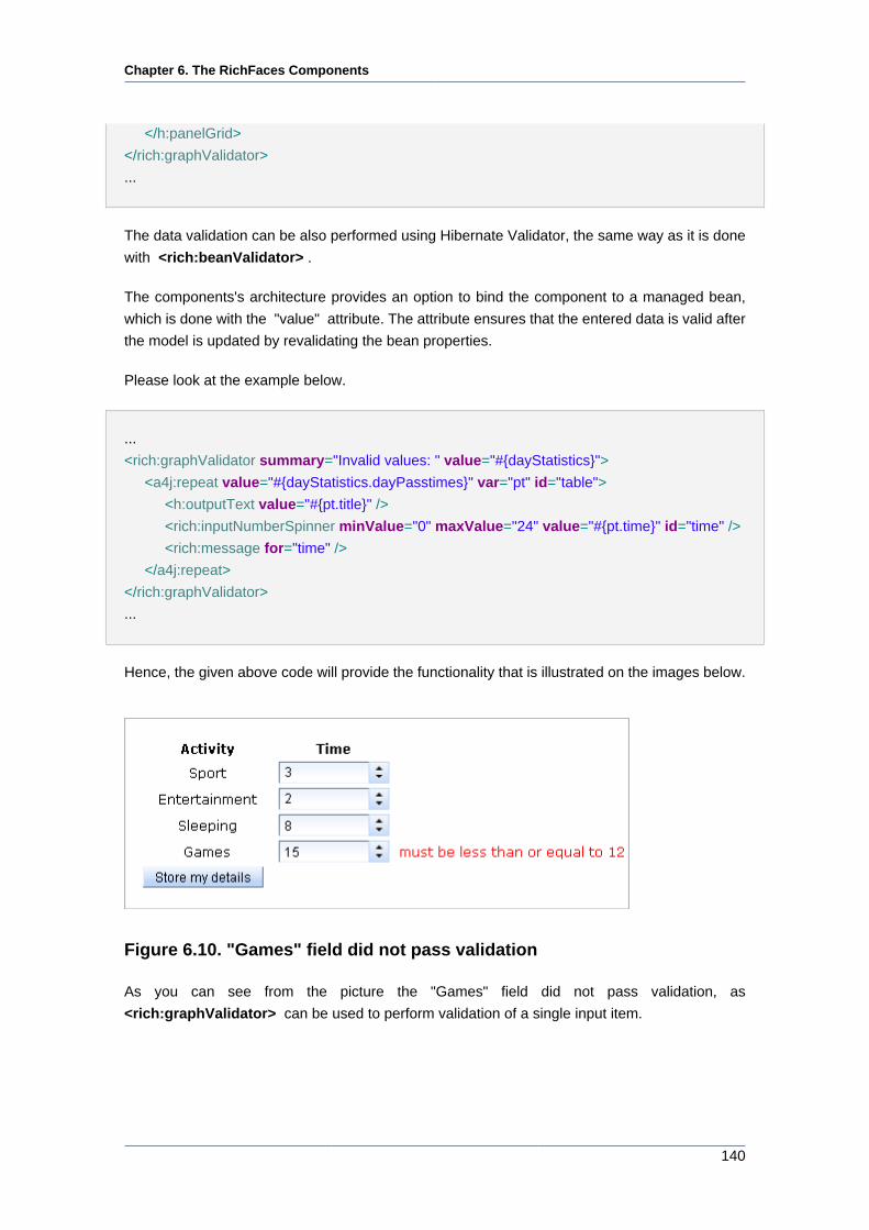
Chapter 6. The RichFaces Components
140
</h:panelGrid>
</rich:graphValidator>
...
The data validation can be also performed using Hibernate Validator, the same way as it is done
with <rich:beanValidator> .
The components's architecture provides an option to bind the component to a managed bean,
which is done with the "value" attribute. The attribute ensures that the entered data is valid after
the model is updated by revalidating the bean properties.
Please look at the example below.
...
<rich:graphValidator summary="Invalid values: " value="#{dayStatistics}">
<a4j:repeat value="#{dayStatistics.dayPasstimes}" var="pt" id="table">
<h:outputText value="#{pt.title}" />
<rich:inputNumberSpinner minValue="0" maxValue="24" value="#{pt.time}" id="time" />
<rich:message for="time" />
</a4j:repeat>
</rich:graphValidator>
...
Hence, the given above code will provide the functionality that is illustrated on the images below.
Figure 6.10. "Games" field did not pass validation
As you can see from the picture the "Games" field did not pass validation, as
<rich:graphValidator> can be used to perform validation of a single input item.
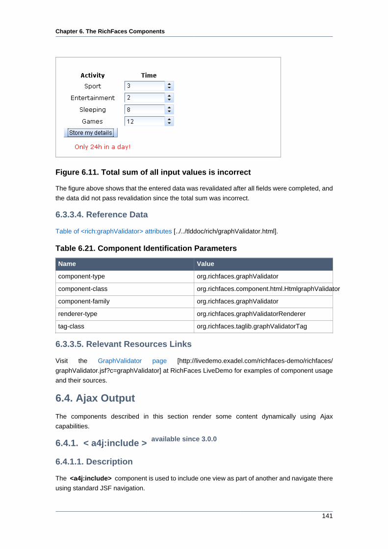
Chapter 6. The RichFaces Components
141
Figure 6.11. Total sum of all input values is incorrect
The figure above shows that the entered data was revalidated after all fields were completed, and
the data did not pass revalidation since the total sum was incorrect.
6.3.3.4. Reference Data
Table of <rich:graphValidator> attributes [../../tlddoc/rich/graphValidator.html].
Table 6.21. Component Identification Parameters
Name Value
component-type org.richfaces.graphValidator
component-class org.richfaces.component.html.HtmlgraphValidator
component-family org.richfaces.graphValidator
renderer-type org.richfaces.graphValidatorRenderer
tag-class org.richfaces.taglib.graphValidatorTag
6.3.3.5. Relevant Resources Links
Visit the GraphValidator page [http://livedemo.exadel.com/richfaces-demo/richfaces/
graphValidator.jsf?c=graphValidator] at RichFaces LiveDemo for examples of component usage
and their sources.
6.4. Ajax Output
The components described in this section render some content dynamically using Ajax
capabilities.
6.4.1. < a4j:include > available since 3.0.0
6.4.1.1. Description
The <a4j:include> component is used to include one view as part of another and navigate there
using standard JSF navigation.
Chapter 6. The RichFaces Components
142
6.4.1.2. Details of Usage
The component is used to include one view as part of another and may be put anywhere in the
page code. The 'viewID' attribute is used to point at the part to be included and should present
a full context-relative path of the resource in order to be used as from-view and to-view in the
JSF navigation cases. In general the component functions as Fecelets <ui:include> tag but with
partial page navigation in Ajax mode as an advantage.
Note:
To make the RichFaces <a4j:include> component (as well as Facelets
<ui:include> tag) work properly when including the part of the page check that
included page does not generates extra HTML <!DOCTYPE>, <html>, <body>
tags.
The navigation rules could look as following:
Example:
...
<navigation-rule>
<from-view-id>/pages/include/first.xhtml</from-view-id>
<navigation-case>
<from-outcome>next</from-outcome>
<to-view-id>/pages/include/second.xhtml</to-view-id>
</navigation-case>
</navigation-rule>
...
6.4.1.3. Reference Data
Table of <a4j:include> attributes [../../tlddoc/a4j/include.html].
Table 6.22. Component Identification Parameters
Name Value
component-type org.ajax4jsf.Include
component-family javax.faces.Output
component-class org.ajax4jsf.component.html.Include
renderer-type org.ajax4jsf.components.AjaxIncludeRenderer
Chapter 6. The RichFaces Components
143
6.4.1.4. Relevant Resources Links
Visit the Include page [http://livedemo.exadel.com/richfaces-demo/richfaces/include.jsf?
c=include] for examples of component usage and their sources.
6.4.2. < a4j:mediaOutput > available since 3.0.0
6.4.2.1. Description
The <a4j:mediaOutput> component is a facility for generating images, video, sounds and other
binary resources defined by you on-the-fly.
6.4.2.2. Details of Usage
The <a4j:mediaOutput> component is used for generating images, videos or sounds on-the-fly.
Let's consider an image creation and generate a JPEG image with verification digits for captcha
(the image will include just digits without any graphical noise and distortion).
Write the following line on the page:
<a4j:mediaOutput element="img" cacheable="false" session="false" createContent="#{mediaBean.paint}" value="#{mediaData}" mimeType="image/
jpeg"/>
As You see from the example above, first it is necessary to specify the kind of media data You
want to generate. This can be done with the help of "element" attribute, which possible values
are img, object, applet, script, link or a.
The "cacheable" defines whether the response will be cached or not. In our case we don't need
our image to be cached, cause we need it to be changed every time we refresh the page.
The "mimeType" attribute defines the type of output content. It is used to define the corresponded
type in the header of an HTTP response.
The <a4j:mediaOutput> attribute has two main attributes:
• "createContent" specifies a method that will be used for content creating. The method accepts
two parameters. The first one — with an java.io.OutputStream type — is a reference to the
stream that should be used for output. An output stream accepts output bytes and sends them
to a recipient. The second parameter is a reference to the component's "value" attribute and
has java.lang.Object type. This parameter contains deserialized object with data specified
in the "value" attribute.
• "value" attribute specifies a bean class that keeps data for transmitting it into a stream in the
method specified with "createContent" .
Now let's create the MediaBean class and specify there a primitive random-number generator and
paint method that will convert the generated numbers into an output stream and give a JPEG
image as a result. The code for MediaBean class is going to look as following:
Chapter 6. The RichFaces Components
144
Example:
package demo;
import java.awt.Graphics2D;
import java.awt.image.BufferedImage;
import java.io.IOException;
import java.io.OutputStream;
import java.util.Random;
import javax.imageio.ImageIO;
public class MediaBean {
public void paint(OutputStream out, Object data) throws IOException{
Integer high = 9999;
Integer low = 1000;
Random generator = new Random();
Integer digits = generator.nextInt(high - low + 1) + low;
if (data instanceof MediaData) {
MediaData paintData = (MediaData) data;
BufferedImage img = new BufferedImage(paintData.getWidth(),paintData.getHeight(),BufferedImage.TYPE_INT_RGB);
Graphics2D graphics2D = img.createGraphics();
graphics2D.setBackground(paintData.getBackground());
graphics2D.setColor(paintData.getDrawColor());
graphics2D.clearRect(0,0,paintData.getWidth(),paintData.getHeight());
graphics2D.setFont(paintData.getFont());
graphics2D.drawString(digits.toString(), 20, 35);
ImageIO.write(img,"png",out);
}
}
}
Now it is necessary to create a class that will keep transmissional data that will be used as input
data for a content creation method. The code for MediaData class is going to be as following:
Note:
A bean class transmitted into value should implement Serializable interface in
order to be encoded to the URL of the resource.
Example:
package demo;
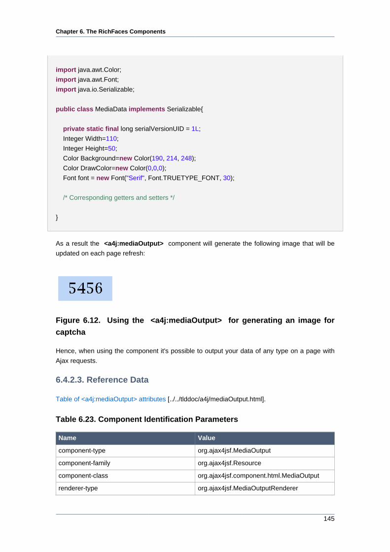
Chapter 6. The RichFaces Components
145
import java.awt.Color;
import java.awt.Font;
import java.io.Serializable;
public class MediaData implements Serializable{
private static final long serialVersionUID = 1L;
Integer Width=110;
Integer Height=50;
Color Background=new Color(190, 214, 248);
Color DrawColor=new Color(0,0,0);
Font font = new Font("Serif", Font.TRUETYPE_FONT, 30);
/* Corresponding getters and setters */
}
As a result the <a4j:mediaOutput> component will generate the following image that will be
updated on each page refresh:
Figure 6.12. Using the <a4j:mediaOutput> for generating an image for
captcha
Hence, when using the component it's possible to output your data of any type on a page with
Ajax requests.
6.4.2.3. Reference Data
Table of <a4j:mediaOutput> attributes [../../tlddoc/a4j/mediaOutput.html].
Table 6.23. Component Identification Parameters
Name Value
component-type org.ajax4jsf.MediaOutput
component-family org.ajax4jsf.Resource
component-class org.ajax4jsf.component.html.MediaOutput
renderer-type org.ajax4jsf.MediaOutputRenderer
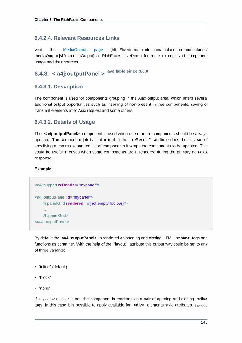
Chapter 6. The RichFaces Components
146
6.4.2.4. Relevant Resources Links
Visit the MediaOutput page [http://livedemo.exadel.com/richfaces-demo/richfaces/
mediaOutput.jsf?c=mediaOutput] at RichFaces LiveDemo for more examples of component
usage and their sources.
6.4.3. < a4j:outputPanel > available since 3.0.0
6.4.3.1. Description
The component is used for components grouping in the Ajax output area, which offers several
additional output opportunities such as inserting of non-present in tree components, saving of
transient elements after Ajax request and some others.
6.4.3.2. Details of Usage
The <a4j:outputPanel> component is used when one or more components should be always
updated. The component job is similar to that the "reRender" attribute does, but instead of
specifying a comma separated list of components it wraps the components to be updated. This
could be useful in cases when some components aren't rendered during the primary non-ajax
response.
Example:
<a4j:support reRender="mypanel"/>
...
<a4j:outputPanel id="mypanel">
<h:panelGrid rendered="#{not empty foo.bar}">
...
</h:panelGrid>
</a4j:outputPanel>
By default the <a4j:outputPanel> is rendered as opening and closing HTML <span> tags and
functions as container. With the help of the "layout" attribute this output way could be set to any
of three variants:
• "inline" (default)
• "block"
• "none"
If layout="block" is set, the component is rendered as a pair of opening and closing <div>
tags. In this case it is possible to apply available for <div> elements style attributes. layout
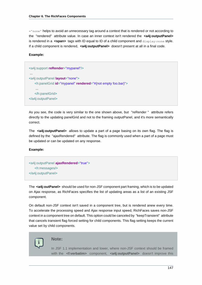
Chapter 6. The RichFaces Components
147
="none" helps to avoid an unnecessary tag around a context that is rendered or not according to
the "rendered" attribute value. In case an inner context isn't rendered the <a4j:outputPanel>
is rendered in a <span> tags with ID equal to ID of a child component and display:none style.
If a child component is rendered, <a4j:outputPanel> doesn't present at all in a final code.
Example:
<a4j:support reRender="mypanel"/>
...
<a4j:outputPanel layout="none">
<h:panelGrid id="mypanel" rendered="#{not empty foo.bar}">
...
</h:panelGrid>
</a4j:outputPanel>
As you see, the code is very similar to the one shown above, but "reRender " attribute refers
directly to the updating panelGrid and not to the framing outputPanel, and it's more semantically
correct.
The <a4j:outputPanel> allows to update a part of a page basing on its own flag. The flag is
defined by the "ajaxRendered" attribute. The flag is commonly used when a part of a page must
be updated or can be updated on any response.
Example:
<a4j:outputPanel ajaxRendered="true">
<h:messages/>
</a4j:outputPanel>
The <a4j:outPanel> should be used for non-JSF component part framing, which is to be updated
on Ajax response, as RichFaces specifies the list of updating areas as a list of an existing JSF
component.
On default non-JSF context isn't saved in a component tree, but is rendered anew every time.
To accelerate the processing speed and Ajax response input speed, RichFaces saves non-JSF
context in a component tree on default. This option could be canceled by "keepTransient" attribute
that cancels transient flag forced setting for child components. This flag setting keeps the current
value set by child components.
Note:
In JSF 1.1 implementation and lower, where non-JSF context should be framed
with the <f:verbatim> component, <a4j:outputPanel> doesn't improve this
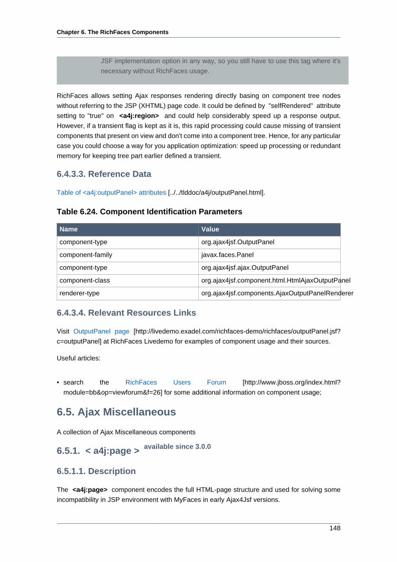
Chapter 6. The RichFaces Components
148
JSF implementation option in any way, so you still have to use this tag where it's
necessary without RichFaces usage.
RichFaces allows setting Ajax responses rendering directly basing on component tree nodes
without referring to the JSP (XHTML) page code. It could be defined by "selfRendered" attribute
setting to "true" on <a4j:region> and could help considerably speed up a response output.
However, if a transient flag is kept as it is, this rapid processing could cause missing of transient
components that present on view and don't come into a component tree. Hence, for any particular
case you could choose a way for you application optimization: speed up processing or redundant
memory for keeping tree part earlier defined a transient.
6.4.3.3. Reference Data
Table of <a4j:outputPanel> attributes [../../tlddoc/a4j/outputPanel.html].
Table 6.24. Component Identification Parameters
Name Value
component-type org.ajax4jsf.OutputPanel
component-family javax.faces.Panel
component-type org.ajax4jsf.ajax.OutputPanel
component-class org.ajax4jsf.component.html.HtmlAjaxOutputPanel
renderer-type org.ajax4jsf.components.AjaxOutputPanelRenderer
6.4.3.4. Relevant Resources Links
Visit OutputPanel page [http://livedemo.exadel.com/richfaces-demo/richfaces/outputPanel.jsf?
c=outputPanel] at RichFaces Livedemo for examples of component usage and their sources.
Useful articles:
• search the RichFaces Users Forum [http://www.jboss.org/index.html?
module=bb&op=viewforum&f=26] for some additional information on component usage;
6.5. Ajax Miscellaneous
A collection of Ajax Miscellaneous components
6.5.1. < a4j:page > available since 3.0.0
6.5.1.1. Description
The <a4j:page> component encodes the full HTML-page structure and used for solving some
incompatibility in JSP environment with MyFaces in early Ajax4Jsf versions.
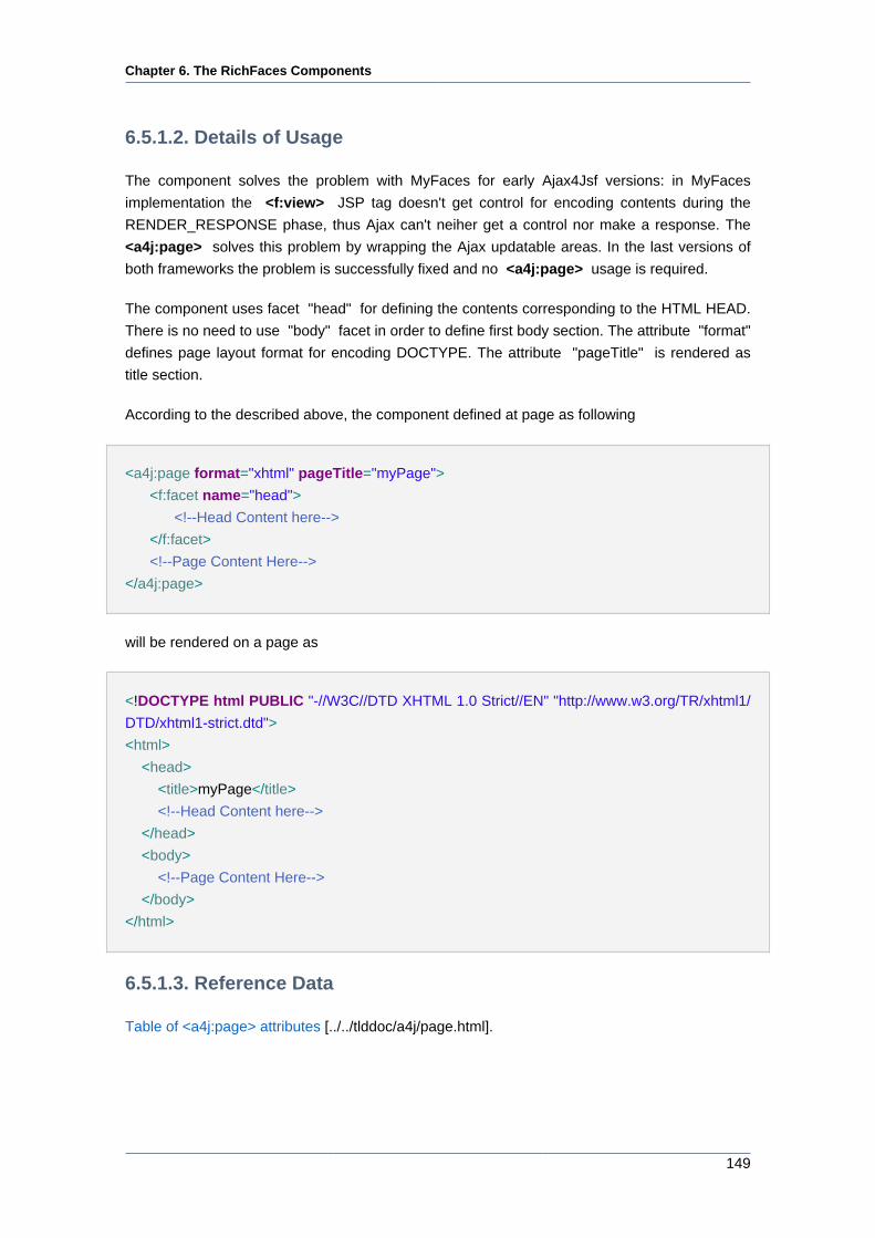
Chapter 6. The RichFaces Components
149
6.5.1.2. Details of Usage
The component solves the problem with MyFaces for early Ajax4Jsf versions: in MyFaces
implementation the <f:view> JSP tag doesn't get control for encoding contents during the
RENDER_RESPONSE phase, thus Ajax can't neiher get a control nor make a response. The
<a4j:page> solves this problem by wrapping the Ajax updatable areas. In the last versions of
both frameworks the problem is successfully fixed and no <a4j:page> usage is required.
The component uses facet "head" for defining the contents corresponding to the HTML HEAD.
There is no need to use "body" facet in order to define first body section. The attribute "format"
defines page layout format for encoding DOCTYPE. The attribute "pageTitle" is rendered as
title section.
According to the described above, the component defined at page as following
<a4j:page format="xhtml" pageTitle="myPage">
<f:facet name="head">
<!--Head Content here-->
</f:facet>
<!--Page Content Here-->
</a4j:page>
will be rendered on a page as
<!DOCTYPE html PUBLIC "-//W3C//DTD XHTML 1.0 Strict//EN" "http://www.w3.org/TR/xhtml1/
DTD/xhtml1-strict.dtd">
<html>
<head>
<title>myPage</title>
<!--Head Content here-->
</head>
<body>
<!--Page Content Here-->
</body>
</html>
6.5.1.3. Reference Data
Table of <a4j:page> attributes [../../tlddoc/a4j/page.html].
Chapter 6. The RichFaces Components
150
Table 6.25. Component Identification Parameters
Name Value
component-type org.ajax4jsf.components.Page
component-family org.ajax4jsf.components.AjaxRegion
component-class org.ajax4jsf.component.html.HtmlPage
renderer-type org.ajax4jsf.components.AjaxPageRenderer
Table 6.26. Facets
Facet name Description
head Defines a head content
6.5.1.4. Relevant Resources Links
Visit the AjaxPage page [http://livedemo.exadel.com/richfaces-demo/richfaces/page.jsf?c=page]
at RichFaces LiveDemo for examples of component usage and their sources.
6.5.2. < a4j:portlet > available since 3.0.0
6.5.2.1. Description
The <a4j:portlet> component is DEPRECATED as far as JSR-301 was defined a same
functionality for a UIViewRoot component. Thus, it is implicitly defined by mandatory <f:view>
component.
6.5.2.2. Details of Usage
The main component purpose is realization of possibility to create several instances the same
portlet on one page. But clientId of elements should be different for each window. In that case
namespace is used for each portlet. The <a4j:portlet> implemets NaimingContainer interface
and adds namespace to all componets on a page. All portlet content should be wrapped by
<a4j:portlet> for resolving problems mentioned before.
6.5.2.3. Reference Data
Table of <a4j:portlet> attributes [../../tlddoc/a4j/portlet.html].
Table 6.27. Component Identification Parameters
Name Value
component-type org.ajax4jsf.Portlet
component-family org.ajax4jsf.component.Portlet
component-class org.ajax4jsf.component.html.HtmlPortlet
Chapter 6. The RichFaces Components
151
6.5.2.4. Relevant Resources Links
Visit the Portlet page [http://livedemo.exadel.com/richfaces-demo/richfaces/portlet.jsf?c=portlet]
at RichFaces LiveDemo for examples of component usage and their sources.
Useful publications:
• Ajax4Jsf Users Forum [http://www.jboss.com/index.html?
module=bb&op=viewtopic&t=107325] — check the forum for additional information about
component usage;
• portal-echo application [http://anonsvn.jboss.org/repos/ajax4jsf/trunk/samples/portal-echo/] —
Portlet Sample, could be checked out from JBoss SVN;
• First snapshot with Portal environment support [http://www.jboss.com/index.html?
module=bb&op=viewtopic&t=107325] contains usage instructions for the Portlet Sample demo.
6.5.3. < a4j:htmlCommandLink > available since 3.0.0
6.5.3.1. Description
The <a4j:htmlCommandLink> component is very similar to the same component from the JSF
HTML library, the only slight difference is in links generation and problem solving that occurs when
an original component is used.
6.5.3.2. Details of Usage
The difference with the original component is that all hidden fields required for command links with
the child <f:param> elements are always rendered and it doesn't depend on links rendering on
the initial page. It solves the problem with invalid links that weren't rendered on a page immediately,
but after some Ajax request.
Example:
<a4j:form>
...
<a4j:htmlComandLink action="action" value="link" rendered="#{bean.rendered}">
<f:param .../>
<a4j:htmlComandLink>
...
</a4j:form>
In this example <a4j:htmlCommandLink> works as standard <h:commandLink> , but here
hidden fields required for correct functionality are rendered before the first downloading of a page,
though it doesn't happen if its attribute isn't set to "false".
Chapter 6. The RichFaces Components
152
6.5.3.3. Reference Data
Table of <a4j:htmlCommandLink> attributes [../../tlddoc/a4j/htmlCommandLink.html].
Table 6.28. Component Identification Parameters
Name Value
component-type javax.faces.HtmlCommandLink
component-family javax.faces.Command
component-class javax.faces.component.html.HtmlCommandLink
renderer-type org.ajax4jsf.HtmlCommandLinkRenderer
6.5.3.4. Relevant Resources Links
On RichFaces LiveDemo page [http://livedemo.exadel.com/richfaces-demo/richfaces/
htmlCommandLink.jsf?c=htmlCommandLink] you can found some additional information for
<a4j:htmlCommandLink> component usage.
On RichFaces LiveDemo page [http://java.sun.com/javaee/javaserverfaces/1.1_01/docs/tlddocs/
f/param.html] you can found some additional information about <f:param> component.
6.5.4. < a4j:log > available since 3.0.0
6.5.4.1. Description
The <a4j:log > component generates JavaScript that opens a debug window with useful debug
information.
6.5.4.2. Details of Usage
The <a4j:log > component generates JavaScript that opens a log window with useful debug
information, which contains data on requests and responses, DOM tree changes et al. The log
could be generated not only in a new window, but also on the current page in a separate <div>
element. This feature is controlled with the component "popup" attribute. The window is opened
on pressing of "CTRL+SHIFT+L", which is default registered key. The hot key could be changed
with the "hotkey" attribute, where it's necessary to define one letter that together with "CTRL
+SHIFT" opens a window.
The "level" attribute has several possible values "FATAL", "ERROR", "WARN", "INFO", "ALL"
and is used when it is necessary to change a logging level.
Example:
<a4j:log level="ALL" popup="false" width="400" height="200"/>
Chapter 6. The RichFaces Components
153
The component defined this way is decoded on a page as <div> inside a page, where all the
information beginning with informational message is generated.
Note:
<a4j:log> is getting renewed automatically after execution of Ajax requests. Do
not renew <a4j:log> by using reRender!
6.5.4.3. Reference Data
Table of <a4j:log> attributes [../../tlddoc/a4j/log.html].
Table 6.29. Component Identification Parameters
Name Value
component-type org.ajax4jsf.Log
component-family org.ajax4jsf.Log
component-class org.ajax4jsf.component.html.AjaxLog
renderer-type org.ajax4jsf.LogRenderer
6.5.4.4. Relevant Resources Links
Visit the Log page [http://livedemo.exadel.com/richfaces-demo/richfaces/log.jsf?c=log] at
RichFaces LiveDemo for example of component usage and their sources.
You can find some cases when <a4j:log> might cause JavaScript error on Ajax Core
Components Page. [http://www.jboss.org/community/wiki/AjaxCoreComponents]
6.6. Data Iteration
The following components iterate over a collection of data and represent it on the page.
6.6.1. < rich:column > available since 3.0.0
6.6.1.1. Description
The component is meant for row rendering in UIData components.
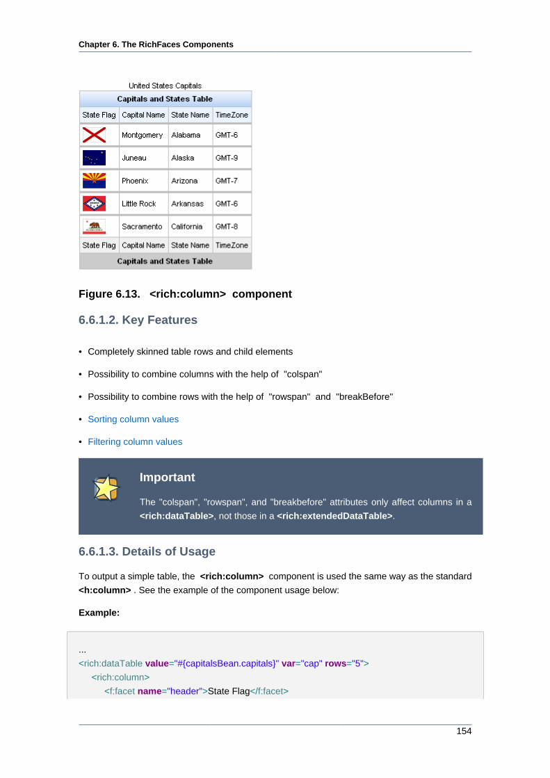
Chapter 6. The RichFaces Components
154
Figure 6.13. <rich:column> component
6.6.1.2. Key Features
• Completely skinned table rows and child elements
• Possibility to combine columns with the help of "colspan"
• Possibility to combine rows with the help of "rowspan" and "breakBefore"
• Sorting column values
• Filtering column values
Important
The "colspan", "rowspan", and "breakbefore" attributes only affect columns in a
<rich:dataTable>, not those in a <rich:extendedDataTable>.
6.6.1.3. Details of Usage
To output a simple table, the <rich:column> component is used the same way as the standard
<h:column> . See the example of the component usage below:
Example:
...
<rich:dataTable value="#{capitalsBean.capitals}" var="cap" rows="5">
<rich:column>
<f:facet name="header">State Flag</f:facet>
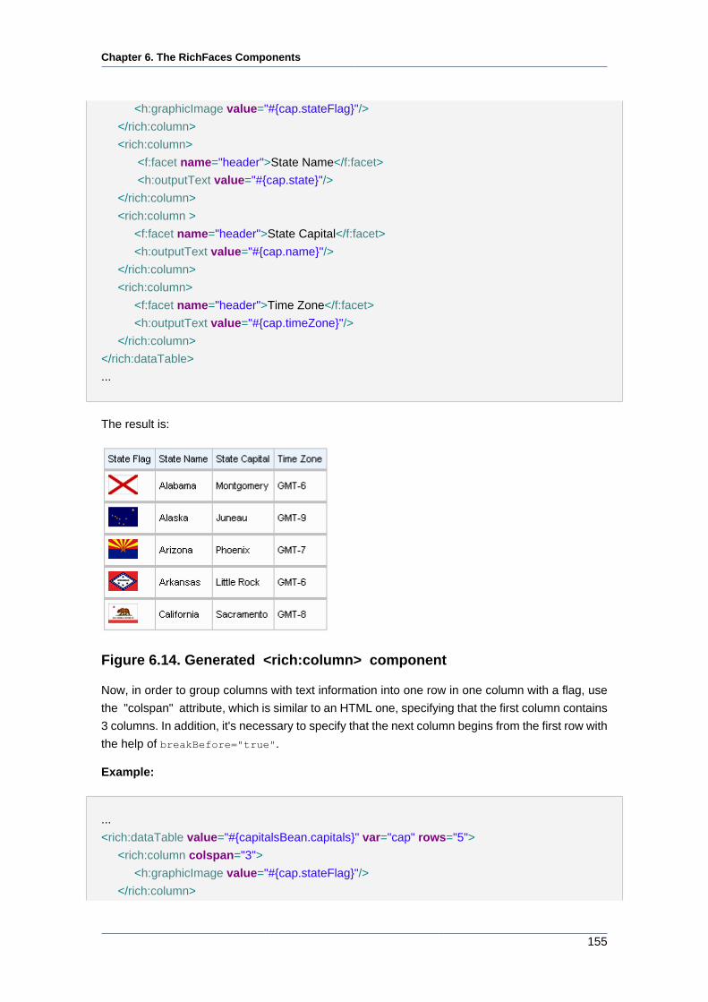
Chapter 6. The RichFaces Components
155
<h:graphicImage value="#{cap.stateFlag}"/>
</rich:column>
<rich:column>
<f:facet name="header">State Name</f:facet>
<h:outputText value="#{cap.state}"/>
</rich:column>
<rich:column >
<f:facet name="header">State Capital</f:facet>
<h:outputText value="#{cap.name}"/>
</rich:column>
<rich:column>
<f:facet name="header">Time Zone</f:facet>
<h:outputText value="#{cap.timeZone}"/>
</rich:column>
</rich:dataTable>
...
The result is:
Figure 6.14. Generated <rich:column> component
Now, in order to group columns with text information into one row in one column with a flag, use
the "colspan" attribute, which is similar to an HTML one, specifying that the first column contains
3 columns. In addition, it's necessary to specify that the next column begins from the first row with
the help of breakBefore="true".
Example:
...
<rich:dataTable value="#{capitalsBean.capitals}" var="cap" rows="5">
<rich:column colspan="3">
<h:graphicImage value="#{cap.stateFlag}"/>
</rich:column>
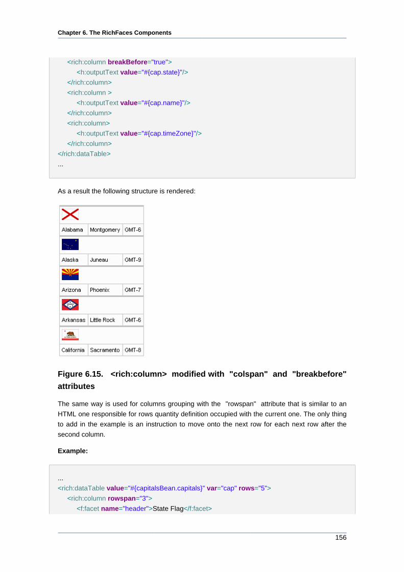
Chapter 6. The RichFaces Components
156
<rich:column breakBefore="true">
<h:outputText value="#{cap.state}"/>
</rich:column>
<rich:column >
<h:outputText value="#{cap.name}"/>
</rich:column>
<rich:column>
<h:outputText value="#{cap.timeZone}"/>
</rich:column>
</rich:dataTable>
...
As a result the following structure is rendered:
Figure 6.15. <rich:column> modified with "colspan" and "breakbefore"
attributes
The same way is used for columns grouping with the "rowspan" attribute that is similar to an
HTML one responsible for rows quantity definition occupied with the current one. The only thing
to add in the example is an instruction to move onto the next row for each next row after the
second column.
Example:
...
<rich:dataTable value="#{capitalsBean.capitals}" var="cap" rows="5">
<rich:column rowspan="3">
<f:facet name="header">State Flag</f:facet>
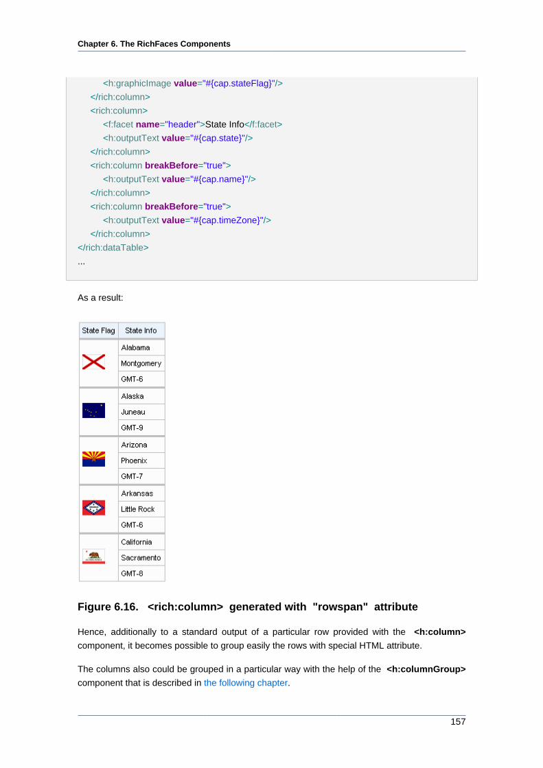
Chapter 6. The RichFaces Components
157
<h:graphicImage value="#{cap.stateFlag}"/>
</rich:column>
<rich:column>
<f:facet name="header">State Info</f:facet>
<h:outputText value="#{cap.state}"/>
</rich:column>
<rich:column breakBefore="true">
<h:outputText value="#{cap.name}"/>
</rich:column>
<rich:column breakBefore="true">
<h:outputText value="#{cap.timeZone}"/>
</rich:column>
</rich:dataTable>
...
As a result:
Figure 6.16. <rich:column> generated with "rowspan" attribute
Hence, additionally to a standard output of a particular row provided with the <h:column>
component, it becomes possible to group easily the rows with special HTML attribute.
The columns also could be grouped in a particular way with the help of the <h:columnGroup>
component that is described in the following chapter.
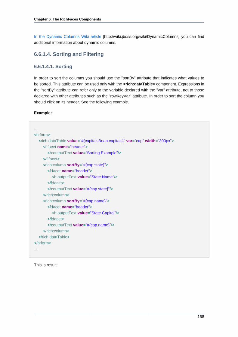
Chapter 6. The RichFaces Components
158
In the Dynamic Columns Wiki article [http://wiki.jboss.org/wiki/DynamicColumns] you can find
additional information about dynamic columns.
6.6.1.4. Sorting and Filtering
6.6.1.4.1. Sorting
In order to sort the columns you should use the "sortBy" attribute that indicates what values to
be sorted. This attribute can be used only with the <rich:dataTable> component. Expressions in
the "sortBy" attribute can refer only to the variable declared with the "var" attribute, not to those
declared with other attributes such as the "rowKeyVar" attribute. In order to sort the column you
should click on its header. See the following example.
Example:
...
<h:form>
<rich:dataTable value="#{capitalsBean.capitals}" var="cap" width="300px">
<f:facet name="header">
<h:outputText value="Sorting Example"/>
</f:facet>
<rich:column sortBy="#{cap.state}">
<f:facet name="header">
<h:outputText value="State Name"/>
</f:facet>
<h:outputText value="#{cap.state}"/>
</rich:column>
<rich:column sortBy="#{cap.name}">
<f:facet name="header">
<h:outputText value="State Capital"/>
</f:facet>
<h:outputText value="#{cap.name}"/>
</rich:column>
</rich:dataTable>
</h:form>
...
This is result:
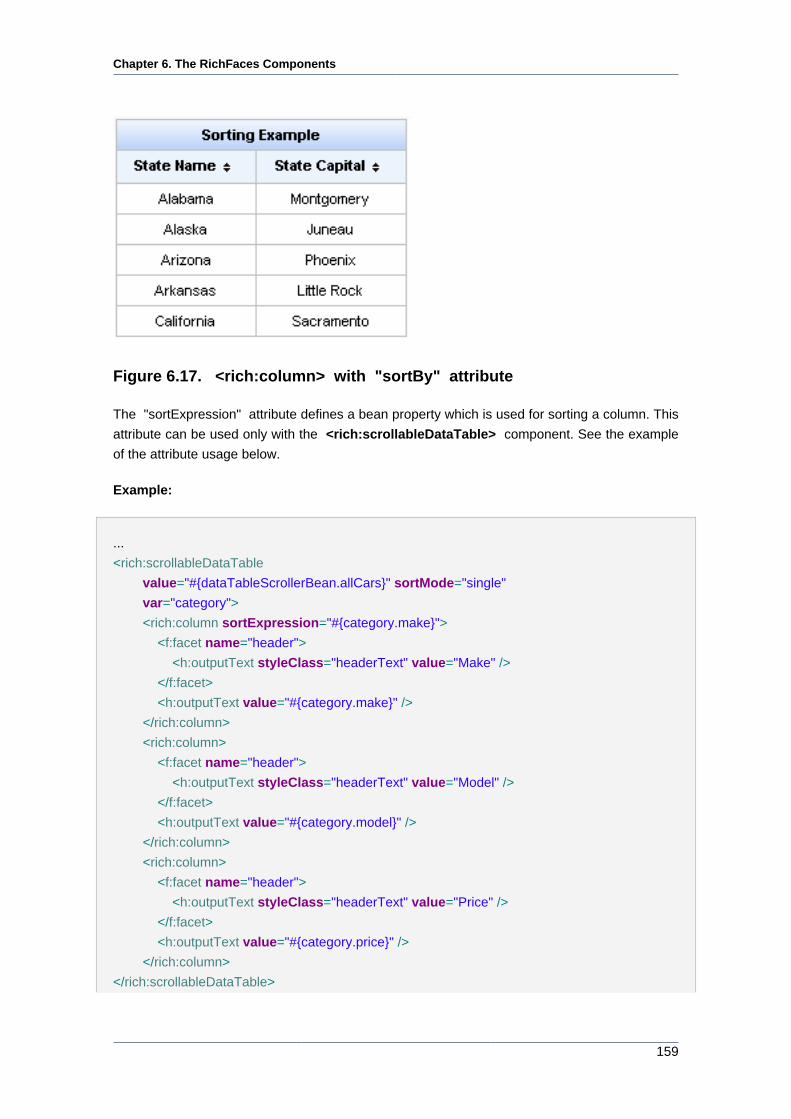
Chapter 6. The RichFaces Components
159
Figure 6.17. <rich:column> with "sortBy" attribute
The "sortExpression" attribute defines a bean property which is used for sorting a column. This
attribute can be used only with the <rich:scrollableDataTable> component. See the example
of the attribute usage below.
Example:
...
<rich:scrollableDataTable
value="#{dataTableScrollerBean.allCars}" sortMode="single"
var="category">
<rich:column sortExpression="#{category.make}">
<f:facet name="header">
<h:outputText styleClass="headerText" value="Make" />
</f:facet>
<h:outputText value="#{category.make}" />
</rich:column>
<rich:column>
<f:facet name="header">
<h:outputText styleClass="headerText" value="Model" />
</f:facet>
<h:outputText value="#{category.model}" />
</rich:column>
<rich:column>
<f:facet name="header">
<h:outputText styleClass="headerText" value="Price" />
</f:facet>
<h:outputText value="#{category.price}" />
</rich:column>
</rich:scrollableDataTable>
Chapter 6. The RichFaces Components
160
...
The "selfSorted" attribute is meant for adding the possibility of automatic sorting by clicking on
the column header. Default value is "true". In the example below the second column is unavailable
for sorting.
Example:
...
<rich:dataTable value="#{capitalsBean.capitals}" var="cap">
<rich:column>
<f:facet name="header">
<h:outputText value="State Flag"/>
</f:facet>
<h:graphicImage value="#{cap.stateFlag}"/>
</rich:column>
<rich:column sortBy="#{cap.state}" selfSorted="false">
<f:facet name="header">
<h:outputText value="State Name"/>
</f:facet>
<h:outputText value="#{cap.state}"/>
</rich:column>
</rich:dataTable>
...
The "sortOrder" attribute is used for changing the sort order of columns by means of external
controls.
Possible values are:
• "ASCENDING" - column is sorted in ascending order
• "DESCENDING" - column is sorted in descending order
• "UNSORTED" - column isn't sorted
Example:
...
<h:form>
<rich:dataTable value="#{capitalsBean.capitals}" var="cap" width="300px">
<f:facet name="header">
<h:outputText value="Sorting Example"/>
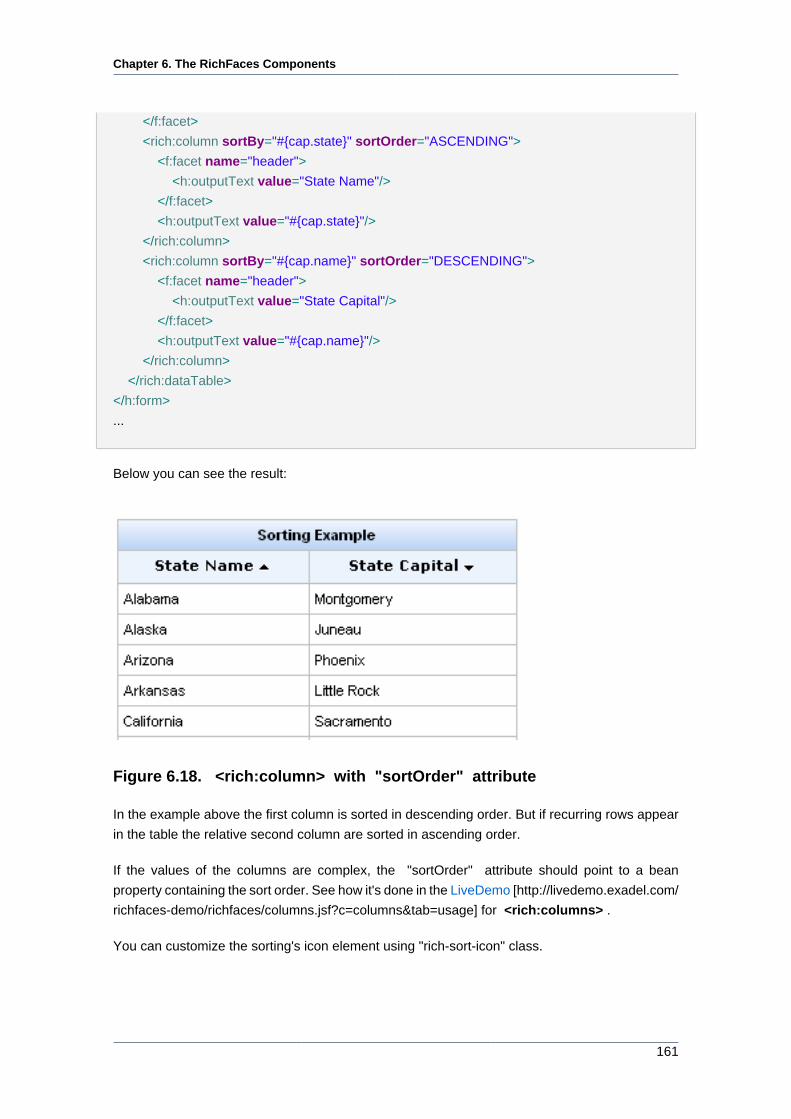
Chapter 6. The RichFaces Components
161
</f:facet>
<rich:column sortBy="#{cap.state}" sortOrder="ASCENDING">
<f:facet name="header">
<h:outputText value="State Name"/>
</f:facet>
<h:outputText value="#{cap.state}"/>
</rich:column>
<rich:column sortBy="#{cap.name}" sortOrder="DESCENDING">
<f:facet name="header">
<h:outputText value="State Capital"/>
</f:facet>
<h:outputText value="#{cap.name}"/>
</rich:column>
</rich:dataTable>
</h:form>
...
Below you can see the result:
Figure 6.18. <rich:column> with "sortOrder" attribute
In the example above the first column is sorted in descending order. But if recurring rows appear
in the table the relative second column are sorted in ascending order.
If the values of the columns are complex, the "sortOrder" attribute should point to a bean
property containing the sort order. See how it's done in the LiveDemo [http://livedemo.exadel.com/
richfaces-demo/richfaces/columns.jsf?c=columns&tab=usage] for <rich:columns> .
You can customize the sorting's icon element using "rich-sort-icon" class.
Chapter 6. The RichFaces Components
162
Note
In order to sort a column with the values not in English you can add the
org.richfaces.datatableUsesViewLocale context parameter in your web.xml.
Its value should be "true".
Note:
The "sortBy" and the "selfSorted" attributes used with the
<rich:dataTable> component. Also the "selfSorted" can be used with the
<rich:extendedDataTable> .
The "sortable" and the "sortExpression" attributes used with the
<rich:scrollableDataTable> component.
6.6.1.4.2. Filtering
There are two ways to filter the column value:
• Using built-in filtering. It uses startsWith() function to make filtering. In this case you need to
define the "filterBy" attribute at a column you want to be filterable. This attribute defines iterable
object property which is used when filtering performed. Expressions in the "filterBy" attribute
can refer only to the variable declared with the "var" attribute, not to those declared with other
attributes such as the "rowKeyVar" attribute.
The "filterValue" attribute is used to get or change current filtering value. It could be defined with
initial filtering value on the page or as value binding to get/change it on server. If the "filterValue"
attribute isn't empty from the beginning table is filtered on the first rendering.
You can customize the input form using "rich-filter-input" CSS class.
In order to change filter event you could use "filterEvent" attribute on column, e.g.
"onblur"(default value).
Below you can see the example:
Example:
...
<rich:dataTable value="#{capitalsBean.capitals}" var="cap" width="200px">
<f:facet name="header">
<h:outputText value="Sorting Example"/>
</f:facet>
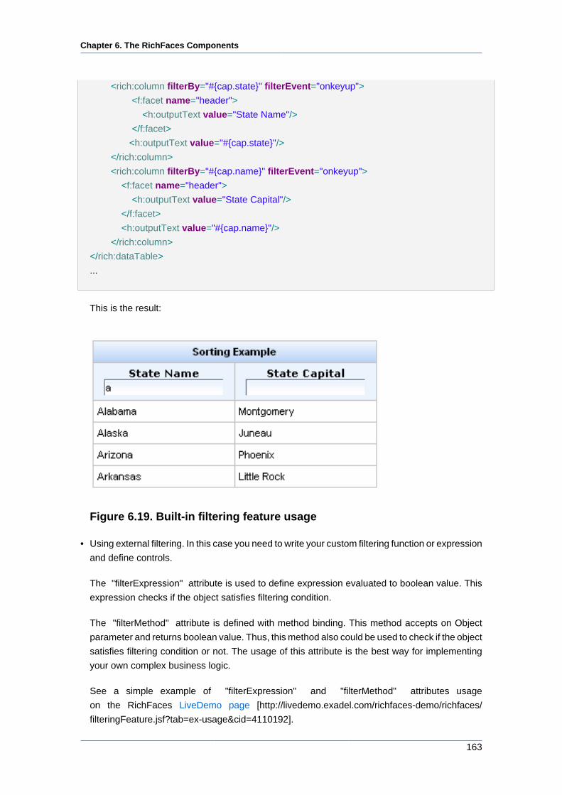
Chapter 6. The RichFaces Components
163
<rich:column filterBy="#{cap.state}" filterEvent="onkeyup">
<f:facet name="header">
<h:outputText value="State Name"/>
</f:facet>
<h:outputText value="#{cap.state}"/>
</rich:column>
<rich:column filterBy="#{cap.name}" filterEvent="onkeyup">
<f:facet name="header">
<h:outputText value="State Capital"/>
</f:facet>
<h:outputText value="#{cap.name}"/>
</rich:column>
</rich:dataTable>
...
This is the result:
Figure 6.19. Built-in filtering feature usage
• Using external filtering. In this case you need to write your custom filtering function or expression
and define controls.
The "filterExpression" attribute is used to define expression evaluated to boolean value. This
expression checks if the object satisfies filtering condition.
The "filterMethod" attribute is defined with method binding. This method accepts on Object
parameter and returns boolean value. Thus, this method also could be used to check if the object
satisfies filtering condition or not. The usage of this attribute is the best way for implementing
your own complex business logic.
See a simple example of "filterExpression" and "filterMethod" attributes usage
on the RichFaces LiveDemo page [http://livedemo.exadel.com/richfaces-demo/richfaces/
filteringFeature.jsf?tab=ex-usage&cid=4110192].
Chapter 6. The RichFaces Components
164
6.6.1.5. Reference Data
Table of <rich:column> attributes [../../tlddoc/rich/column.html].
Table 6.30. Component Identification Parameters
Name Value
component-type org.richfaces.Column
component-class org.richfaces.component.html.HtmlColumn
component-family org.richfaces.Column
renderer-type org.richfaces.renderkit.CellRenderer
tag-class org.richfaces.taglib.ColumnTag
Table 6.31. Facets
Facet name Description
header Defines the header content
footer Defines the footer content
Custom style classes as well as skin parameters for <rich:column> are the same as for the
<rich:dataTable> component.
You can find all necessary information about style classes redefinition in Definition of Custom
Style Classes section.
6.6.1.6. Relevant Resources Links
Visit the Column [http://livedemo.exadel.com/richfaces-demo/richfaces/dataTable.jsf?c=column]
page at RichFaces LiveDemo for examples of the component usage and their sources.
See the example on how to use the "rendered" attribute of <rich:column> in the RichFaces
Cookbook article [http://www.jboss.org/community/docs/DOC-9607].
6.6.2. < rich:columnGroup > available since 3.0.0
6.6.2.1. Description
The component combines columns in one row to organize complex subparts of a table.
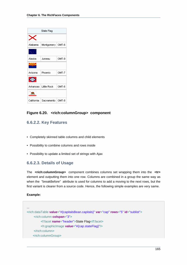
Chapter 6. The RichFaces Components
165
Figure 6.20. <rich:columnGroup> component
6.6.2.2. Key Features
• Completely skinned table columns and child elements
• Possibility to combine columns and rows inside
• Possibility to update a limited set of strings with Ajax
6.6.2.3. Details of Usage
The <rich:columnGroup> component combines columns set wrapping them into the <tr>
element and outputting them into one row. Columns are combined in a group the same way as
when the "breakBefore" attribute is used for columns to add a moving to the next rows, but the
first variant is clearer from a source code. Hence, the following simple examples are very same.
Example:
...
<rich:dataTable value="#{capitalsBean.capitals}" var="cap" rows="5" id="sublist">
<rich:column colspan="3">
<f:facet name="header">State Flag</f:facet>
<h:graphicImage value="#{cap.stateFlag}"/>
</rich:column>
<rich:columnGroup>
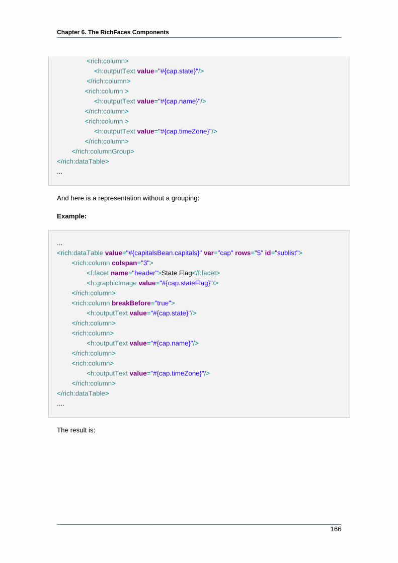
Chapter 6. The RichFaces Components
166
<rich:column>
<h:outputText value="#{cap.state}"/>
</rich:column>
<rich:column >
<h:outputText value="#{cap.name}"/>
</rich:column>
<rich:column >
<h:outputText value="#{cap.timeZone}"/>
</rich:column>
</rich:columnGroup>
</rich:dataTable>
...
And here is a representation without a grouping:
Example:
...
<rich:dataTable value="#{capitalsBean.capitals}" var="cap" rows="5" id="sublist">
<rich:column colspan="3">
<f:facet name="header">State Flag</f:facet>
<h:graphicImage value="#{cap.stateFlag}"/>
</rich:column>
<rich:column breakBefore="true">
<h:outputText value="#{cap.state}"/>
</rich:column>
<rich:column>
<h:outputText value="#{cap.name}"/>
</rich:column>
<rich:column>
<h:outputText value="#{cap.timeZone}"/>
</rich:column>
</rich:dataTable>
....
The result is:
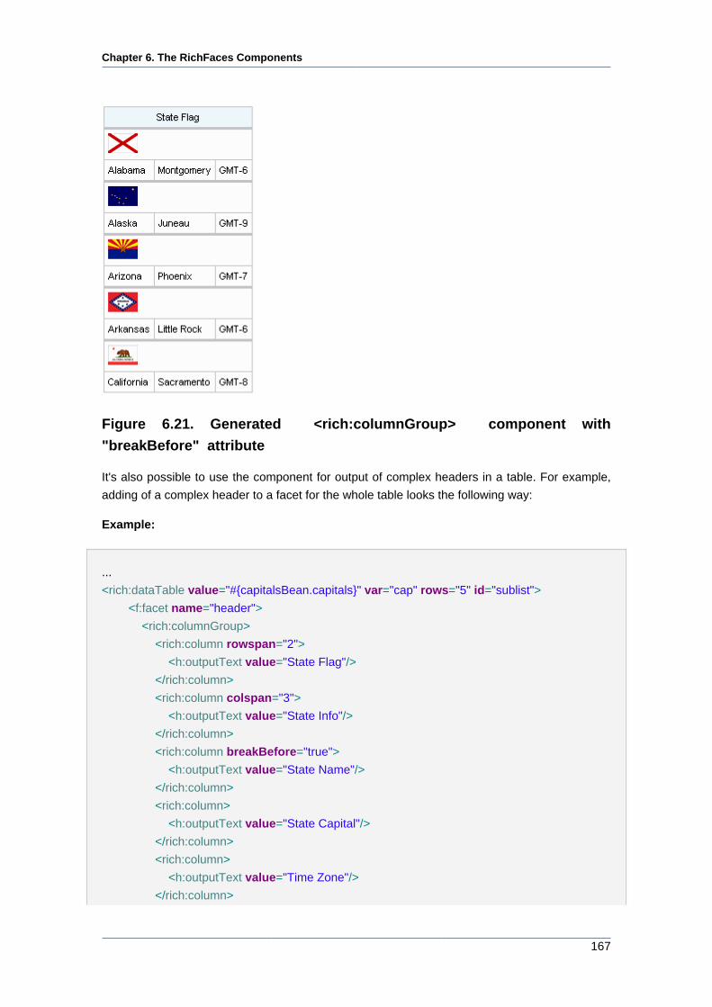
Chapter 6. The RichFaces Components
167
Figure 6.21. Generated <rich:columnGroup> component with
"breakBefore" attribute
It's also possible to use the component for output of complex headers in a table. For example,
adding of a complex header to a facet for the whole table looks the following way:
Example:
...
<rich:dataTable value="#{capitalsBean.capitals}" var="cap" rows="5" id="sublist">
<f:facet name="header">
<rich:columnGroup>
<rich:column rowspan="2">
<h:outputText value="State Flag"/>
</rich:column>
<rich:column colspan="3">
<h:outputText value="State Info"/>
</rich:column>
<rich:column breakBefore="true">
<h:outputText value="State Name"/>
</rich:column>
<rich:column>
<h:outputText value="State Capital"/>
</rich:column>
<rich:column>
<h:outputText value="Time Zone"/>
</rich:column>
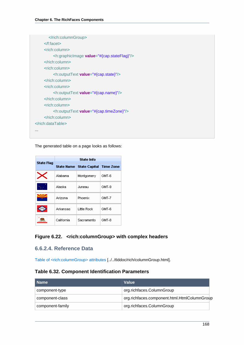
Chapter 6. The RichFaces Components
168
</rich:columnGroup>
</f:facet>
<rich:column>
<h:graphicImage value="#{cap.stateFlag}"/>
</rich:column>
<rich:column>
<h:outputText value="#{cap.state}"/>
</rich:column>
<rich:column>
<h:outputText value="#{cap.name}"/>
</rich:column>
<rich:column>
<h:outputText value="#{cap.timeZone}"/>
</rich:column>
</rich:dataTable>
...
The generated table on a page looks as follows:
Figure 6.22. <rich:columnGroup> with complex headers
6.6.2.4. Reference Data
Table of <rich:columnGroup> attributes [../../tlddoc/rich/columnGroup.html].
Table 6.32. Component Identification Parameters
Name Value
component-type org.richfaces.ColumnGroup
component-class org.richfaces.component.html.HtmlColumnGroup
component-family org.richfaces.ColumnGroup
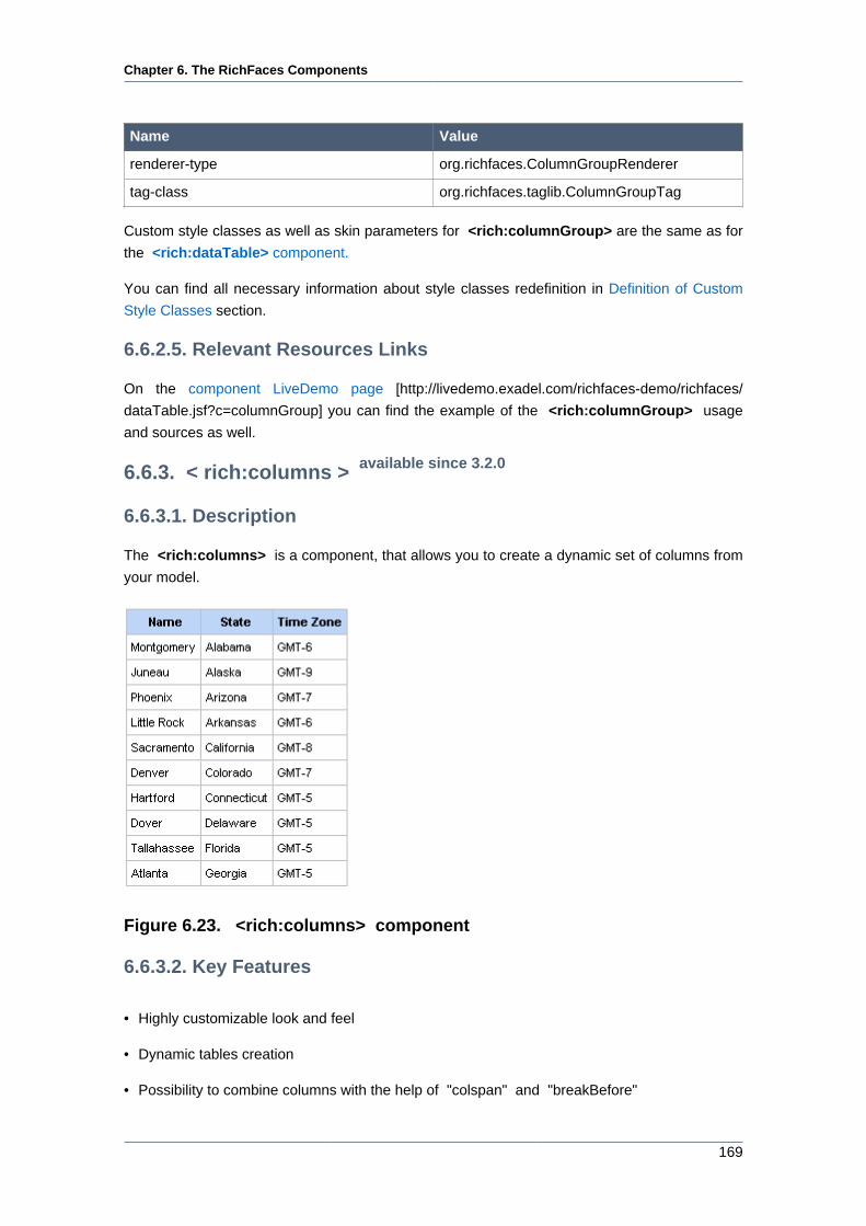
Chapter 6. The RichFaces Components
169
Name Value
renderer-type org.richfaces.ColumnGroupRenderer
tag-class org.richfaces.taglib.ColumnGroupTag
Custom style classes as well as skin parameters for <rich:columnGroup> are the same as for
the <rich:dataTable> component.
You can find all necessary information about style classes redefinition in Definition of Custom
Style Classes section.
6.6.2.5. Relevant Resources Links
On the component LiveDemo page [http://livedemo.exadel.com/richfaces-demo/richfaces/
dataTable.jsf?c=columnGroup] you can find the example of the <rich:columnGroup> usage
and sources as well.
6.6.3. < rich:columns > available since 3.2.0
6.6.3.1. Description
The <rich:columns> is a component, that allows you to create a dynamic set of columns from
your model.
Figure 6.23. <rich:columns> component
6.6.3.2. Key Features
• Highly customizable look and feel
• Dynamic tables creation
• Possibility to combine columns with the help of "colspan" and "breakBefore"
Chapter 6. The RichFaces Components
170
• Possibility to combine rows with the help of "rowspan"
• Sorting column values
• Filtering column values
6.6.3.3. Details of Usage
The <rich:columns> component gets a list from data model and outputs a corresponding set of
columns inside <rich:dataTable> on a page. It is possible to use "header" and "footer" facets
with <rich:columns> component.
The "value" and "var" attributes are used to access the values of collection.
The simple example is placed below.
Example:
...
<rich:dataTable value="#{dataTableScrollerBean.model}" var="model" width="750">
<rich:columns value="#{dataTableScrollerBean.columns}" var="columns"
index="ind" id="column#{ind}">
<f:facet name="header">
<h:outputText value="#{columns.header}" />
</f:facet>
<h:outputText value="#{model[ind].model} " />
<h:outputText value="#{model[ind].mileage} miles " />
<h:outputText value="#{model[ind].price}$" />
</rich:columns>
</rich:dataTable>
...
The "columns" attribute defines the count of columns.
The "rowspan" attribute defines the number of rows to be displayed. If the value of this attribute
is zero, all remaining rows in the table are displayed on a page.
The "begin" attribute contains the first iteration item. Note, that iteration begins from zero.
The "end" attribute contains the last iteration item.
With the help of the attributes described above you can customize the output, i.e. define which
columns and how many rows appear on a page.
The <rich:columns> component does not prevent to use <rich:column> . In the following
example one column renders in any way and another columns are picked from the model.
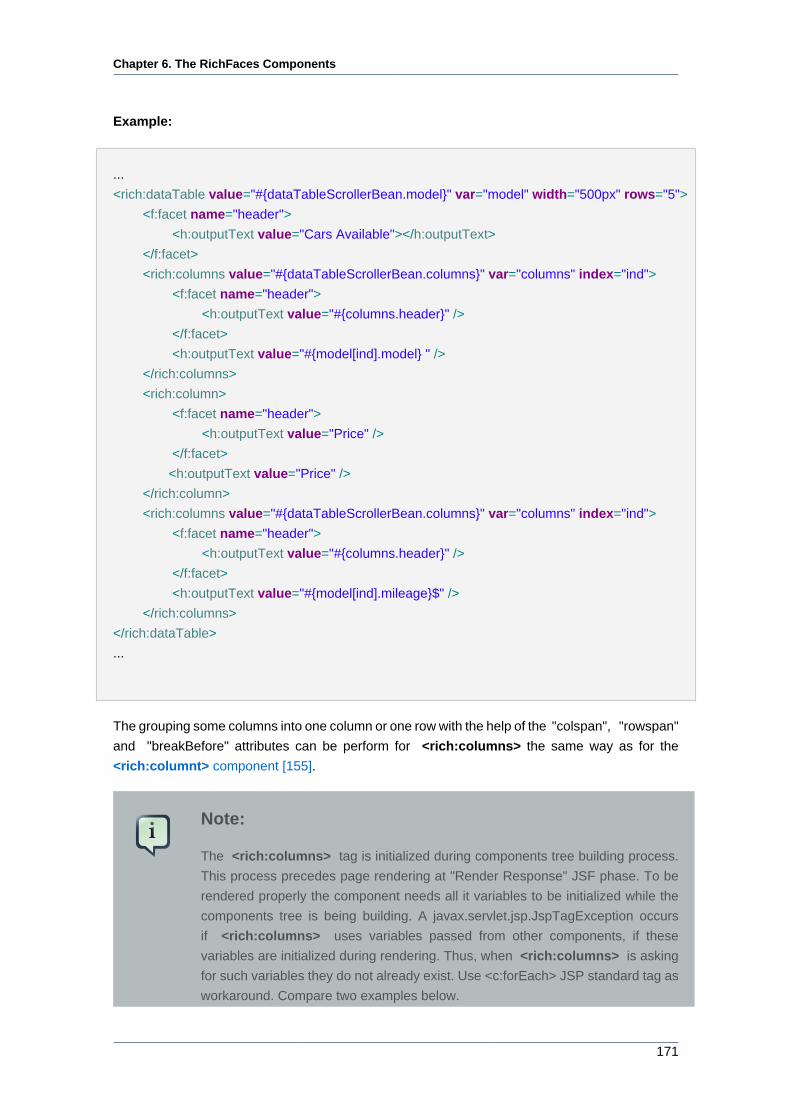
Chapter 6. The RichFaces Components
171
Example:
...
<rich:dataTable value="#{dataTableScrollerBean.model}" var="model" width="500px" rows="5">
<f:facet name="header">
<h:outputText value="Cars Available"></h:outputText>
</f:facet>
<rich:columns value="#{dataTableScrollerBean.columns}" var="columns" index="ind">
<f:facet name="header">
<h:outputText value="#{columns.header}" />
</f:facet>
<h:outputText value="#{model[ind].model} " />
</rich:columns>
<rich:column>
<f:facet name="header">
<h:outputText value="Price" />
</f:facet>
<h:outputText value="Price" />
</rich:column>
<rich:columns value="#{dataTableScrollerBean.columns}" var="columns" index="ind">
<f:facet name="header">
<h:outputText value="#{columns.header}" />
</f:facet>
<h:outputText value="#{model[ind].mileage}$" />
</rich:columns>
</rich:dataTable>
...
The grouping some columns into one column or one row with the help of the "colspan", "rowspan"
and "breakBefore" attributes can be perform for <rich:columns> the same way as for the
<rich:columnt> component [155].
Note:
The <rich:columns> tag is initialized during components tree building process.
This process precedes page rendering at "Render Response" JSF phase. To be
rendered properly the component needs all it variables to be initialized while the
components tree is being building. A javax.servlet.jsp.JspTagException occurs
if <rich:columns> uses variables passed from other components, if these
variables are initialized during rendering. Thus, when <rich:columns> is asking
for such variables they do not already exist. Use <c:forEach> JSP standard tag as
workaround. Compare two examples below.
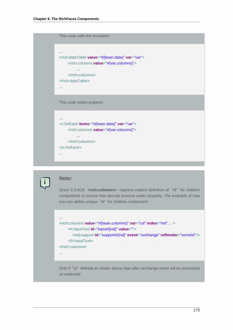
Chapter 6. The RichFaces Components
172
This code calls the exception:
...
<rich:dataTable value="#{bean.data}" var="var">
<rich:columns value="#{var.columns}">
...
</rich:columns>
</rich:dataTable>
...
This code works properly:
...
<c:forEach items="#{bean.data}" var="var">
<rich:columns value="#{var.columns}">
...
</rich:columns>
</c:forEach>
...
Note:
Since 3.3.0GA <rich:columns> requires explicit definition of "id" for children
components to ensure that decode process works properly. The example of how
you can define unique "id" for children component:
...
<rich:columns value="#{bean.columns}" var="col" index="ind" ... >
<h:inputText id="input#{ind}" value="">
<a4j:support id="support#{ind}" event="onchange" reRender="someId" />
</h:inputText>
</rich:columns>
...
Only if "id" defined as shown above Ajax after onchange event will be processed
as expected.
Chapter 6. The RichFaces Components
173
Sorting and filtering for the <rich:columns> component works the same as for <rich:column>
. See the "Sorting and Filtering" section.
6.6.3.4. Reference Data
Table of <rich:columns> attributes [../../tlddoc/rich/columns.html].
Table 6.33. Component Identification Parameters
Name Value
component-type org.richfaces.Column
tag-class org.richfaces.taglib.ColumnsTagHandler
Table 6.34. Facets
Facet name Description
header Defines the header content
footer Defines the footer content
Custom style classes as well as skin parameters for <rich:columns> are the same as for the
<rich:dataTable> component.
You can find all necessary information about style classes redefinition in Definition of Custom
Style Classes section.
6.6.3.5. Relevant Resources Links
On the component LiveDemo page [http://livedemo.exadel.com/richfaces-demo/richfaces/
dataTable.jsf?c=columns] you can find an additional information on the <rich:columns>
component usage.
6.6.4. < rich:dataDefinitionList > available since 3.0.0
6.6.4.1. Description
The component to render definition lists that allows choosing data from a model and obtains built-
in support of Ajax updates.
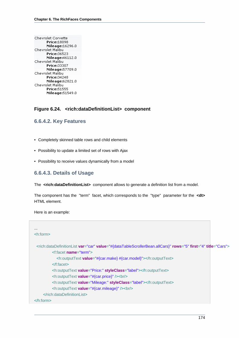
Chapter 6. The RichFaces Components
174
Figure 6.24. <rich:dataDefinitionList> component
6.6.4.2. Key Features
• Completely skinned table rows and child elements
• Possibility to update a limited set of rows with Ajax
• Possibility to receive values dynamically from a model
6.6.4.3. Details of Usage
The <rich:dataDefinitionList> component allows to generate a definition list from a model.
The component has the "term" facet, which corresponds to the "type" parameter for the <dt>
HTML element.
Here is an example:
...
<h:form>
<rich:dataDefinitionList var="car" value="#{dataTableScrollerBean.allCars}" rows="5" first="4" title="Cars">
<f:facet name="term">
<h:outputText value="#{car.make} #{car.model}"></h:outputText>
</f:facet>
<h:outputText value="Price:" styleClass="label"></h:outputText>
<h:outputText value="#{car.price}" /><br/>
<h:outputText value="Mileage:" styleClass="label"></h:outputText>
<h:outputText value="#{car.mileage}" /><br/>
</rich:dataDefinitionList>
</h:form>
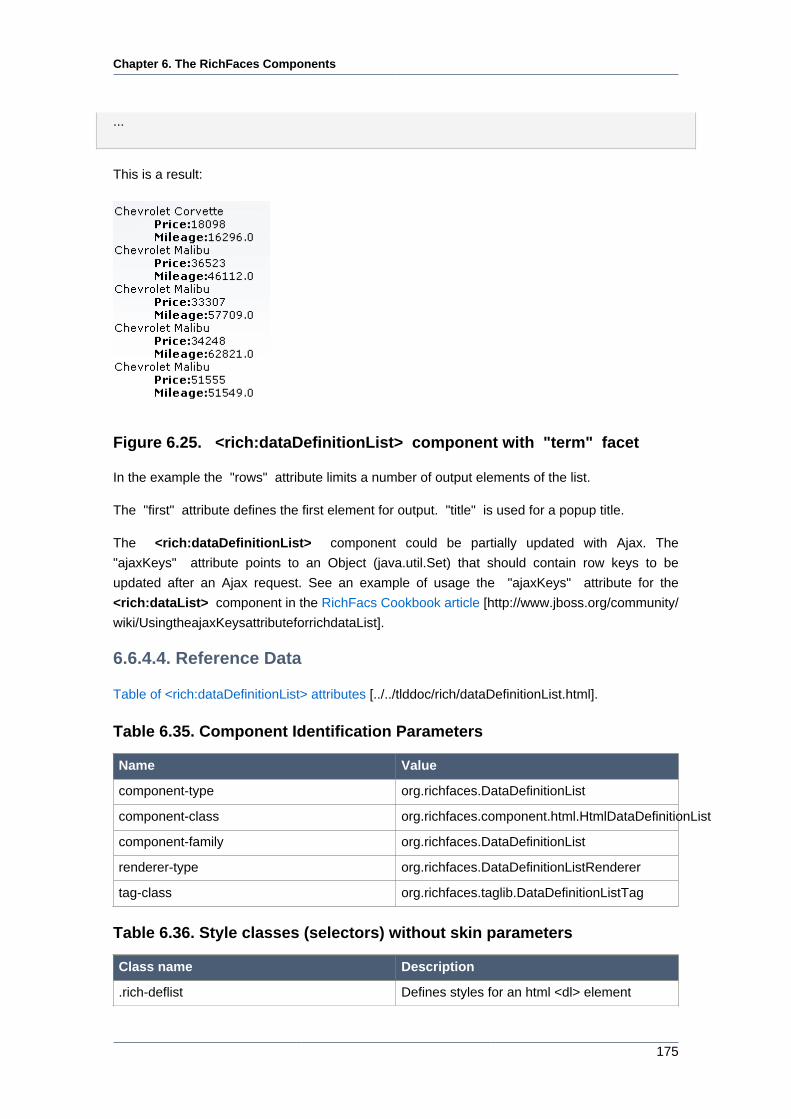
Chapter 6. The RichFaces Components
175
...
This is a result:
Figure 6.25. <rich:dataDefinitionList> component with "term" facet
In the example the "rows" attribute limits a number of output elements of the list.
The "first" attribute defines the first element for output. "title" is used for a popup title.
The <rich:dataDefinitionList> component could be partially updated with Ajax. The
"ajaxKeys" attribute points to an Object (java.util.Set) that should contain row keys to be
updated after an Ajax request. See an example of usage the "ajaxKeys" attribute for the
<rich:dataList> component in the RichFacs Cookbook article [http://www.jboss.org/community/
wiki/UsingtheajaxKeysattributeforrichdataList].
6.6.4.4. Reference Data
Table of <rich:dataDefinitionList> attributes [../../tlddoc/rich/dataDefinitionList.html].
Table 6.35. Component Identification Parameters
Name Value
component-type org.richfaces.DataDefinitionList
component-class org.richfaces.component.html.HtmlDataDefinitionList
component-family org.richfaces.DataDefinitionList
renderer-type org.richfaces.DataDefinitionListRenderer
tag-class org.richfaces.taglib.DataDefinitionListTag
Table 6.36. Style classes (selectors) without skin parameters
Class name Description
.rich-deflist Defines styles for an html <dl> element
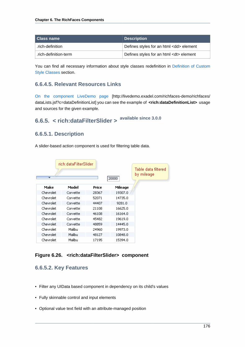
Chapter 6. The RichFaces Components
176
Class name Description
.rich-definition Defines styles for an html <dd> element
.rich-definition-term Defines styles for an html <dt> element
You can find all necessary information about style classes redefinition in Definition of Custom
Style Classes section.
6.6.4.5. Relevant Resources Links
On the component LiveDemo page [http://livedemo.exadel.com/richfaces-demo/richfaces/
dataLists.jsf?c=dataDefinitionList] you can see the example of <rich:dataDefinitionList> usage
and sources for the given example.
6.6.5. < rich:dataFilterSlider > available since 3.0.0
6.6.5.1. Description
A slider-based action component is used for filtering table data.
Figure 6.26. <rich:dataFilterSlider> component
6.6.5.2. Key Features
• Filter any UIData based component in dependency on its child's values
• Fully skinnable control and input elements
• Optional value text field with an attribute-managed position
Chapter 6. The RichFaces Components
177
• Optional disablement of the component on a page
• Optional toolTip to display the current value while a handle is dragged
• Dragged state is stable after the mouse moves
• Optional manual input possible if a text input field is present
• Validation of manual input
6.6.5.3. Details of Usage
The dataFilterSlider component is bound to some UIData component using the "for" attribute
and filters data in a table.
Example:
...
<rich:dataFilterSlider sliderListener="#{mybean.doSlide}"
startRange="0"
endRange="50000"
increment="10000"
handleValue="1"
for="carIndex"
forValRef="inventoryList.carInventory"
filterBy="getMileage" />
...
<h:dataTable id="carIndex">
...
</h:dataTable>
...
In this example other two attributes are used for filtering:
• "forValRef" is a string which is used in a value attribute of the target UIData component. It's
designed for resetting the UIData component back to the original list provided by a backing bean.
• "filterBy" is a getter of an object member that is to be compared to a slider value. It's a value
that is used in results filtering.
"handleValue" is an attribute for keeping the current handle position on the dataFilterSlider
component. Based on the current value, appropriate values obtained from a getter method defined
in "filterBy" are filtered.
One more important attribute is a "storeResults" one that allows the dataFilterSlider component
to keep UIData target object in session.
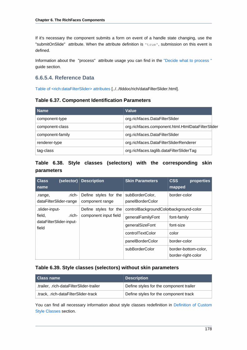
Chapter 6. The RichFaces Components
178
If it's necessary the component submits a form on event of a handle state changing, use the
"submitOnSlide" attribute. When the attribute definition is "true", submission on this event is
defined.
Information about the "process" attribute usage you can find in the "Decide what to process "
guide section.
6.6.5.4. Reference Data
Table of <rich:dataFilterSlider> attributes [../../tlddoc/rich/dataFilterSlider.html].
Table 6.37. Component Identification Parameters
Name Value
component-type org.richfaces.DataFilterSlider
component-class org.richfaces.component.html.HtmlDataFilterSlider
component-family org.richfaces.DataFilterSlider
renderer-type org.richfaces.DataFilterSliderRenderer
tag-class org.richfaces.taglib.dataFilterSliderTag
Table 6.38. Style classes (selectors) with the corresponding skin
parameters
Class (selector)
name
Description Skin Parameters CSS properties
mapped
.range, .rich-
dataFilterSlider-range
Define styles for the
component range
subBorderColor,
panelBorderColor
border-color
controlBackgroundColorbackground-color
generalFamilyFont font-family
generalSizeFont font-size
controlTextColor color
panelBorderColor border-color
.slider-input-
field, .rich-
dataFilterSlider-input-
field
Define styles for the
component input field
subBorderColor border-bottom-color,
border-right-color
Table 6.39. Style classes (selectors) without skin parameters
Class name Description
.trailer, .rich-dataFilterSlider-trailer Define styles for the component trailer
.track, .rich-dataFilterSlider-track Define styles for the component track
You can find all necessary information about style classes redefinition in Definition of Custom
Style Classes section.
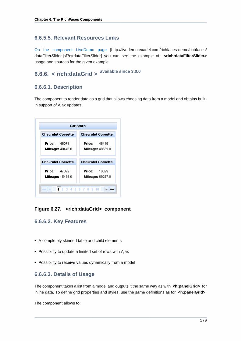
Chapter 6. The RichFaces Components
179
6.6.5.5. Relevant Resources Links
On the component LiveDemo page [http://livedemo.exadel.com/richfaces-demo/richfaces/
dataFilterSlider.jsf?c=dataFilterSlider] you can see the example of <rich:dataFilterSlider>
usage and sources for the given example.
6.6.6. < rich:dataGrid > available since 3.0.0
6.6.6.1. Description
The component to render data as a grid that allows choosing data from a model and obtains built-
in support of Ajax updates.
Figure 6.27. <rich:dataGrid> component
6.6.6.2. Key Features
• A completely skinned table and child elements
• Possibility to update a limited set of rows with Ajax
• Possibility to receive values dynamically from a model
6.6.6.3. Details of Usage
The component takes a list from a model and outputs it the same way as with <h:panelGrid> for
inline data. To define grid properties and styles, use the same definitions as for <h:panelGrid>.
The component allows to:
Chapter 6. The RichFaces Components
180
• Use "header" and "footer" facets for output
• Limit number of output elements ( "elements" attribute) and define first element for output (
"first" attribute)
• Bind pages with <rich:datascroller> component
Here is an example:
Example:
...
<rich:panel style="width:150px;height:200px;">
<h:form>
<rich:dataGrid value="#{dataTableScrollerBean.allCars}" var="car" columns="2" elements="4" first="1">
<f:facet name="header">
<h:outputText value="Car Store"></h:outputText>
</f:facet>
<rich:panel>
<f:facet name="header">
<h:outputText value="#{car.make} #{car.model}"></h:outputText>
</f:facet>
<h:panelGrid columns="2">
<h:outputText value="Price:" styleClass="label"></h:outputText>
<h:outputText value="#{car.price}"/>
<h:outputText value="Mileage:" styleClass="label"></h:outputText>
<h:outputText value="#{car.mileage}"/>
</h:panelGrid>
</rich:panel>
<f:facet name="footer">
<rich:datascroller></rich:datascroller>
</f:facet>
</rich:dataGrid>
</h:form>
</rich:panel>
...
This is a result:
Chapter 6. The RichFaces Components
181
Figure 6.28. Component usage
The component was created basing on the <a4j:repeat> component and as a result it could
be partially updated with Ajax. "ajaxKeys" attribute allows to define row keys that are updated
after an Ajax request.
Here is an example:
Example:
...
<rich:dataGrid value="#{dataTableScrollerBean.allCars}" var="car" ajaxKeys="#{listBean.list}"
binding="#{listBean.dataGrid}" id="grid" elements="4" columns="2">
...
</rich:dataGrid>
...
<a4j:commandButton action="#{listBean.action}" reRender="grid" value="Submit"/>
...
In the example "reRender" attribute contains value of "id" attribute for <rich:dataGrid>
component. As a result the component is updated after an Ajax request.
6.6.6.4. Reference Data
Table of <rich:dataGrid> attributes [../../tlddoc/rich/dataGrid.html].
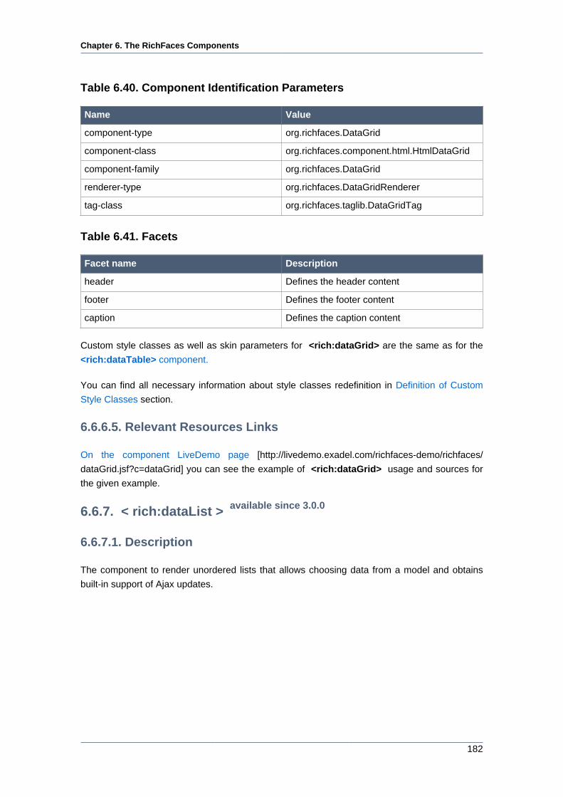
Chapter 6. The RichFaces Components
182
Table 6.40. Component Identification Parameters
Name Value
component-type org.richfaces.DataGrid
component-class org.richfaces.component.html.HtmlDataGrid
component-family org.richfaces.DataGrid
renderer-type org.richfaces.DataGridRenderer
tag-class org.richfaces.taglib.DataGridTag
Table 6.41. Facets
Facet name Description
header Defines the header content
footer Defines the footer content
caption Defines the caption content
Custom style classes as well as skin parameters for <rich:dataGrid> are the same as for the
<rich:dataTable> component.
You can find all necessary information about style classes redefinition in Definition of Custom
Style Classes section.
6.6.6.5. Relevant Resources Links
On the component LiveDemo page [http://livedemo.exadel.com/richfaces-demo/richfaces/
dataGrid.jsf?c=dataGrid] you can see the example of <rich:dataGrid> usage and sources for
the given example.
6.6.7. < rich:dataList > available since 3.0.0
6.6.7.1. Description
The component to render unordered lists that allows choosing data from a model and obtains
built-in support of Ajax updates.
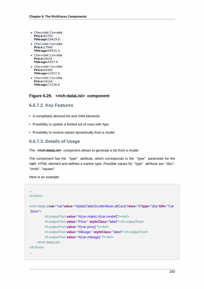
Chapter 6. The RichFaces Components
183
Figure 6.29. <rich:dataList> component
6.6.7.2. Key Features
• A completely skinned list and child elements
• Possibility to update a limited set of rows with Ajax
• Possibility to receive values dynamically from a model
6.6.7.3. Details of Usage
The <rich:dataList> component allows to generate a list from a model.
The component has the "type" attribute, which corresponds to the "type" parameter for the
<ul> HTML element and defines a marker type. Possible values for "type" attribute are: "disc",
"circle", "square".
Here is an example:
...
<h:form>
<rich:dataList var="car" value="#{dataTableScrollerBean.allCars}" rows="5" type="disc" title="Car
Store">
<h:outputText value="#{car.make} #{car.model}"/><br/>
<h:outputText value="Price:" styleClass="label"></h:outputText>
<h:outputText value="#{car.price} "/><br/>
<h:outputText value="Mileage:" styleClass="label"></h:outputText>
<h:outputText value="#{car.mileage} "/><br/>
</rich:dataList>
</h:form>
...
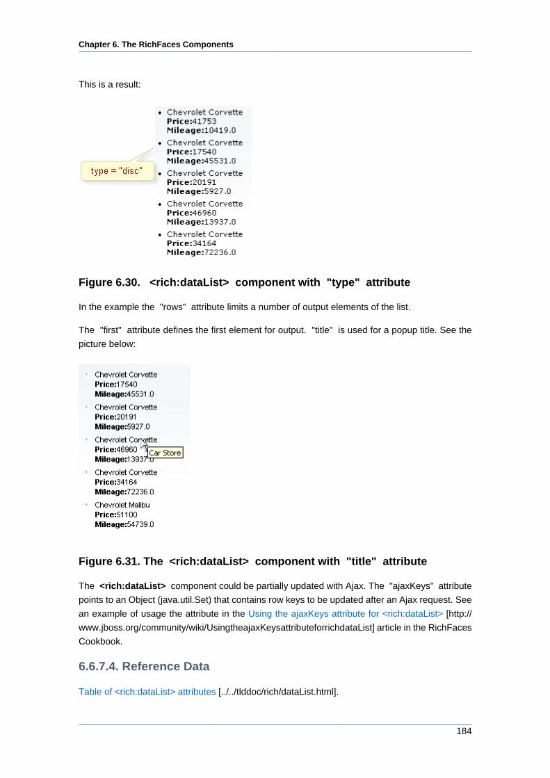
Chapter 6. The RichFaces Components
184
This is a result:
Figure 6.30. <rich:dataList> component with "type" attribute
In the example the "rows" attribute limits a number of output elements of the list.
The "first" attribute defines the first element for output. "title" is used for a popup title. See the
picture below:
Figure 6.31. The <rich:dataList> component with "title" attribute
The <rich:dataList> component could be partially updated with Ajax. The "ajaxKeys" attribute
points to an Object (java.util.Set) that contains row keys to be updated after an Ajax request. See
an example of usage the attribute in the Using the ajaxKeys attribute for <rich:dataList> [http://
www.jboss.org/community/wiki/UsingtheajaxKeysattributeforrichdataList] article in the RichFaces
Cookbook.
6.6.7.4. Reference Data
Table of <rich:dataList> attributes [../../tlddoc/rich/dataList.html].
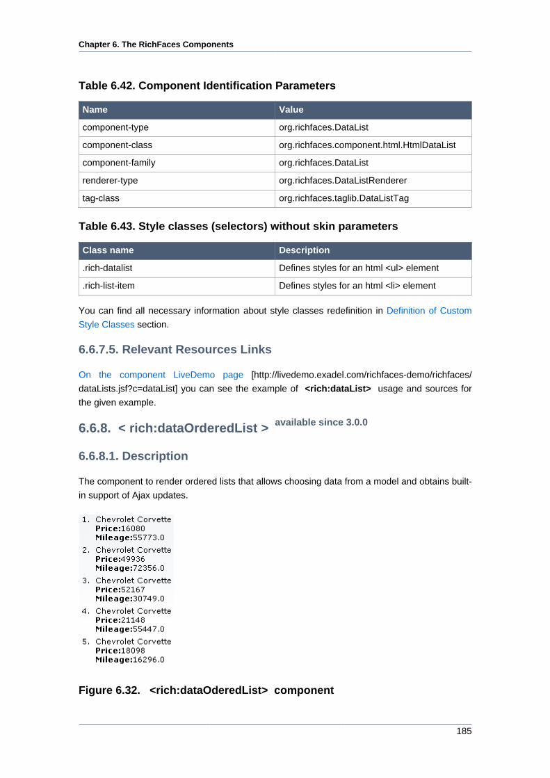
Chapter 6. The RichFaces Components
185
Table 6.42. Component Identification Parameters
Name Value
component-type org.richfaces.DataList
component-class org.richfaces.component.html.HtmlDataList
component-family org.richfaces.DataList
renderer-type org.richfaces.DataListRenderer
tag-class org.richfaces.taglib.DataListTag
Table 6.43. Style classes (selectors) without skin parameters
Class name Description
.rich-datalist Defines styles for an html <ul> element
.rich-list-item Defines styles for an html <li> element
You can find all necessary information about style classes redefinition in Definition of Custom
Style Classes section.
6.6.7.5. Relevant Resources Links
On the component LiveDemo page [http://livedemo.exadel.com/richfaces-demo/richfaces/
dataLists.jsf?c=dataList] you can see the example of <rich:dataList> usage and sources for
the given example.
6.6.8. < rich:dataOrderedList > available since 3.0.0
6.6.8.1. Description
The component to render ordered lists that allows choosing data from a model and obtains built-
in support of Ajax updates.
Figure 6.32. <rich:dataOderedList> component
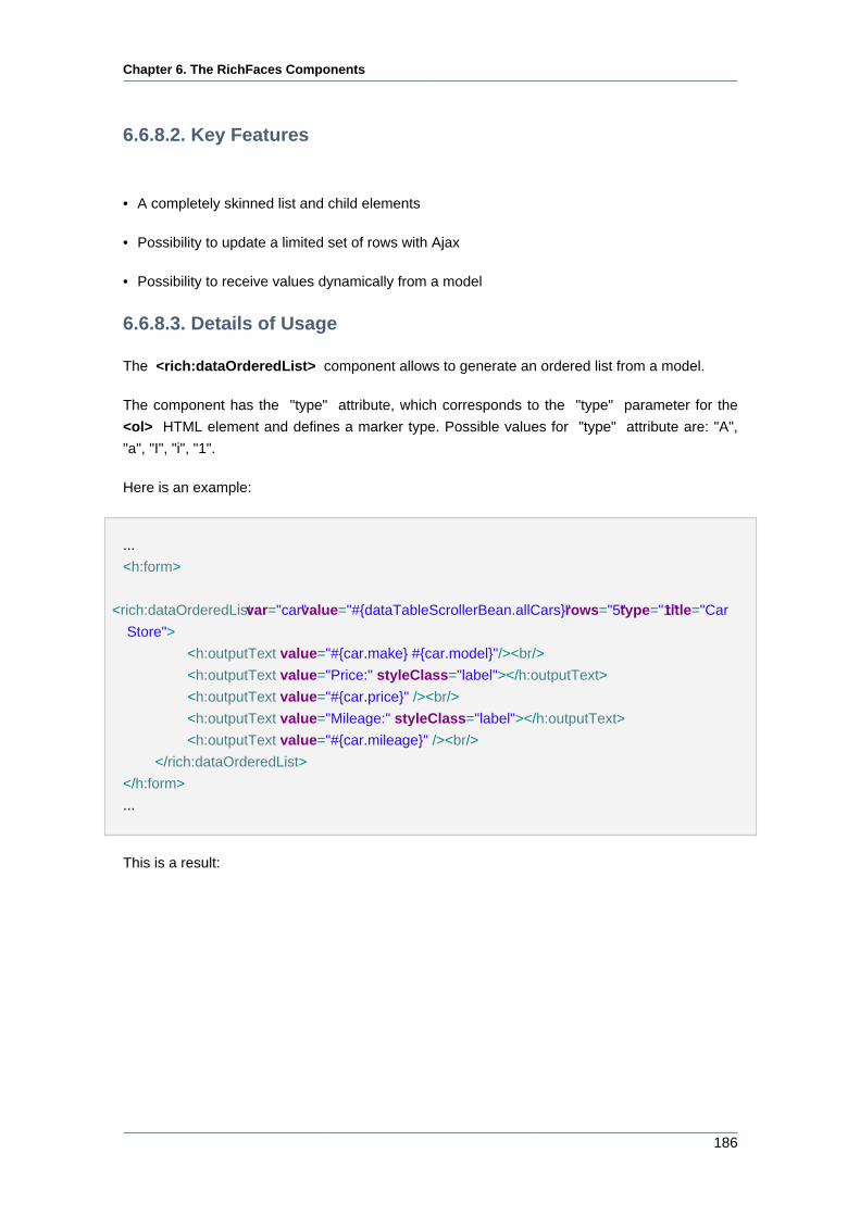
Chapter 6. The RichFaces Components
186
6.6.8.2. Key Features
• A completely skinned list and child elements
• Possibility to update a limited set of rows with Ajax
• Possibility to receive values dynamically from a model
6.6.8.3. Details of Usage
The <rich:dataOrderedList> component allows to generate an ordered list from a model.
The component has the "type" attribute, which corresponds to the "type" parameter for the
<ol> HTML element and defines a marker type. Possible values for "type" attribute are: "A",
"a", "I", "i", "1".
Here is an example:
...
<h:form>
<rich:dataOrderedList var="car" value="#{dataTableScrollerBean.allCars}" rows="5" type="1" title="Car
Store">
<h:outputText value="#{car.make} #{car.model}"/><br/>
<h:outputText value="Price:" styleClass="label"></h:outputText>
<h:outputText value="#{car.price}" /><br/>
<h:outputText value="Mileage:" styleClass="label"></h:outputText>
<h:outputText value="#{car.mileage}" /><br/>
</rich:dataOrderedList>
</h:form>
...
This is a result:
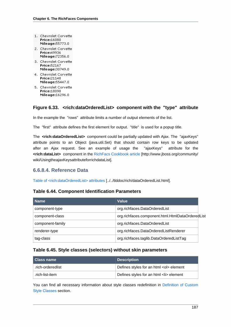
Chapter 6. The RichFaces Components
187
Figure 6.33. <rich:dataOrderedList> component with the "type" attribute
In the example the "rows" attribute limits a number of output elements of the list.
The "first" attribute defines the first element for output. "title" is used for a popup title.
The <rich:dataOrderedList> component could be partially updated with Ajax. The "ajaxKeys"
attribute points to an Object (java.util.Set) that should contain row keys to be updated
after an Ajax request. See an example of usage the "ajaxKeys" attribute for the
<rich:dataList> component in the RichFacs Cookbook article [http://www.jboss.org/community/
wiki/UsingtheajaxKeysattributeforrichdataList].
6.6.8.4. Reference Data
Table of <rich:dataOrderedList> attributes [../../tlddoc/rich/dataOrderedList.html].
Table 6.44. Component Identification Parameters
Name Value
component-type org.richfaces.DataOrderedList
component-class org.richfaces.component.html.HtmlDataOrderedList
component-family org.richfaces.DataOrderedList
renderer-type org.richfaces.DataOrderedListRenderer
tag-class org.richfaces.taglib.DataOrderedListTag
Table 6.45. Style classes (selectors) without skin parameters
Class name Description
.rich-orderedlist Defines styles for an html <ol> element
.rich-list-item Defines styles for an html <li> element
You can find all necessary information about style classes redefinition in Definition of Custom
Style Classes section.
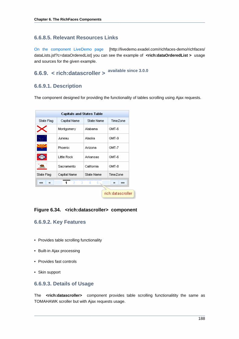
Chapter 6. The RichFaces Components
188
6.6.8.5. Relevant Resources Links
On the component LiveDemo page [http://livedemo.exadel.com/richfaces-demo/richfaces/
dataLists.jsf?c=dataOrderedList] you can see the example of <rich:dataOrderedList > usage
and sources for the given example.
6.6.9. < rich:datascroller > available since 3.0.0
6.6.9.1. Description
The component designed for providing the functionality of tables scrolling using Ajax requests.
Figure 6.34. <rich:datascroller> component
6.6.9.2. Key Features
• Provides table scrolling functionality
• Built-in Ajax processing
• Provides fast controls
• Skin support
6.6.9.3. Details of Usage
The <rich:datascroller> component provides table scrolling functionalitity the same as
TOMAHAWK scroller but with Ajax requests usage.
Chapter 6. The RichFaces Components
189
The <rich:datascroller> component should be reRendered also with <rich:dataTable> when
you changing filter in order to be updated according to the <rich:dataTable> current model.
The component should be placed into the footer of the parent table or be bound to it with the
"for" attribute. Note, that "for" is evaluated on view build, not on view render, that is why it will
ignore JSTL tags.
The table should also have the defined "rows" attribute limiting the quantity of inputted table rows.
The scroller could limit the maximum quantity of rendered links on the table pages with the help
of the "maxPages" attribute.
Component provides two controllers groups for switching:
• Page numbers for switching onto a particular page
• The controls of fast switching: "first", "last", "next", "previous", "fastforward", "fastrewind"
The controls of fast switching are created adding the facets component with the corresponding
name:
Example:
...
<rich:datascroller for="table" maxPages="10">
<f:facet name="first">
<h:outputText value="First"/>
</f:facet>
<f:facet name="last">
<h:outputText value="Last"/>
</f:facet>
</rich:datascroller>
...
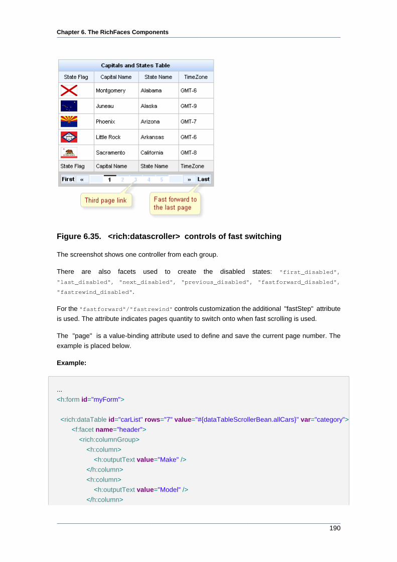
Chapter 6. The RichFaces Components
190
Figure 6.35. <rich:datascroller> controls of fast switching
The screenshot shows one controller from each group.
There are also facets used to create the disabled states: "first_disabled",
"last_disabled", "next_disabled", "previous_disabled", "fastforward_disabled",
"fastrewind_disabled".
For the "fastforward"/"fastrewind" controls customization the additional "fastStep" attribute
is used. The attribute indicates pages quantity to switch onto when fast scrolling is used.
The "page" is a value-binding attribute used to define and save the current page number. The
example is placed below.
Example:
...
<h:form id="myForm">
<rich:dataTable id="carList" rows="7" value="#{dataTableScrollerBean.allCars}" var="category">
<f:facet name="header">
<rich:columnGroup>
<h:column>
<h:outputText value="Make" />
</h:column>
<h:column>
<h:outputText value="Model" />
</h:column>
Chapter 6. The RichFaces Components
191
<h:column>
<h:outputText value="Price" />
</h:column>
</rich:columnGroup>
</f:facet>
<h:column>
<h:outputText value="#{category.make}" />
</h:column>
<h:column>
<h:outputText value="#{category.model}" />
</h:column>
<h:column>
<h:outputText value="#{category.price}" />
</h:column>
</rich:dataTable>
<rich:datascroller id="sc2" for="carList" reRender="sc1" maxPages="7" page="#{dataTableScrollerBean.scrollerPage}" /
>
<h:panelGrid>
<h:panelGroup>
<h:outputText value="Set current page number:" />
<h:inputText value="#{dataTableScrollerBean.scrollerPage}" id="sc1" size="1"/>
<h:commandButton value="Set" />
</h:panelGroup>
</h:panelGrid>
</h:form>
...
In the example above you can enter the page number you want and set it by clicking on the
<h:commandButton> . By the way, if you use <rich:datascroller> page links the input field
rerenders and current page number changes.
The result should be like below:
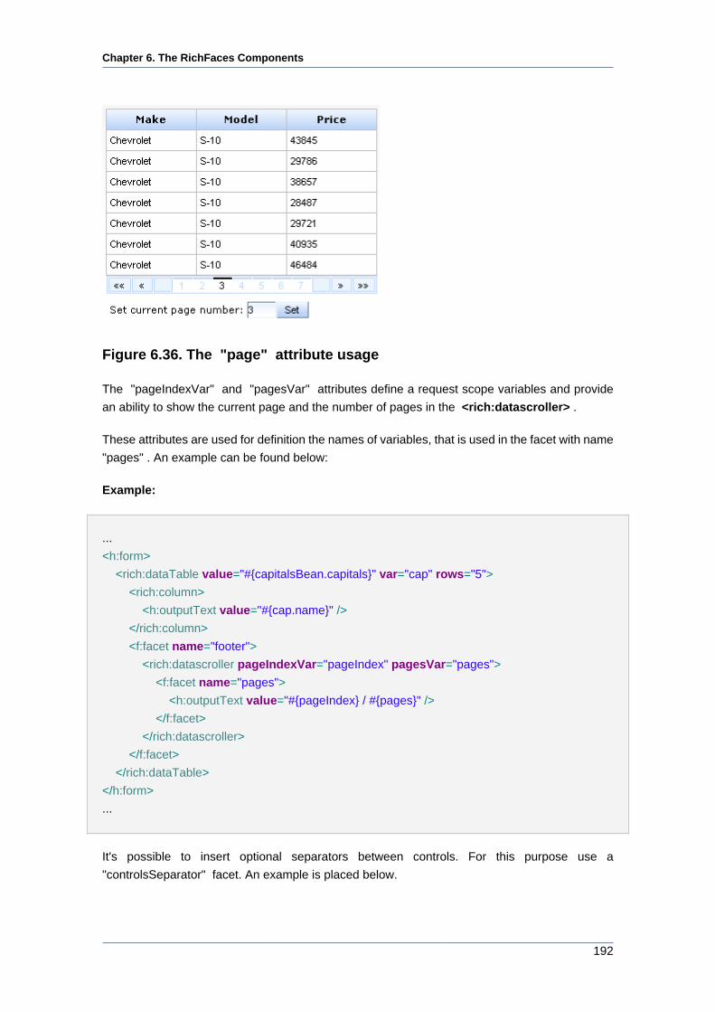
Chapter 6. The RichFaces Components
192
Figure 6.36. The "page" attribute usage
The "pageIndexVar" and "pagesVar" attributes define a request scope variables and provide
an ability to show the current page and the number of pages in the <rich:datascroller> .
These attributes are used for definition the names of variables, that is used in the facet with name
"pages" . An example can be found below:
Example:
...
<h:form>
<rich:dataTable value="#{capitalsBean.capitals}" var="cap" rows="5">
<rich:column>
<h:outputText value="#{cap.name}" />
</rich:column>
<f:facet name="footer">
<rich:datascroller pageIndexVar="pageIndex" pagesVar="pages">
<f:facet name="pages">
<h:outputText value="#{pageIndex} / #{pages}" />
</f:facet>
</rich:datascroller>
</f:facet>
</rich:dataTable>
</h:form>
...
It's possible to insert optional separators between controls. For this purpose use a
"controlsSeparator" facet. An example is placed below.
Chapter 6. The RichFaces Components
193
...
<f:facet name="controlsSeparator">
<h:graphicImage value="/image/sep.png"/>
</f:facet>
...
Starting from 3.2.1 of RichFaces multiple <rich:datascroller> instances behavior and page
bindings are corrected. Incorrect page after model changes handling is added. Phase Listener
called before RenderResponce scans the page for the <rich:datascroller> and performs the
following operations:
• Checks if the <rich:datascroller> is rendered. (If the checking generates an exception, the
<rich:datascroller> is considered to be not rendered )
• If the <rich:datascroller> is rendered - the table to which the <rich:datascroller> is attached
gets the value of the page attribute of <rich:datascroller> .
Information about the "process" attribute usage you can find in the " Decide what to process
" guide section.
Note:
Make sure, that all <rich:datascroller> components, defined for a table, have
same values for all "page" attributes. The page, specified in the last "page" , will
be rendered in browser.
6.6.9.4. Reference Data
Table of <rich:datascroller> attributes [../../tlddoc/rich/datascroller.html].
Table 6.46. Component Identification Parameters
Name Value
component-type org.richfaces.Datascroller
component-class org.richfaces.component.html.HtmlDatascroller
component-family org.richfaces.Datascroller
renderer-type org.richfaces.DataScrollerRenderer
tag-class org.richfaces.taglib.DatascrollerTag
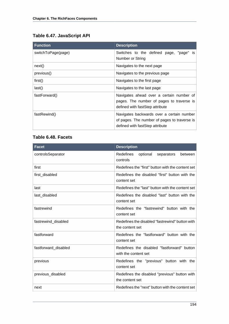
Chapter 6. The RichFaces Components
194
Table 6.47. JavaScript API
Function Description
switchToPage(page) Switches to the defined page, "page" is
Number or String
next() Navigates to the next page
previous() Navigates to the previous page
first() Navigates to the first page
last() Navigates to the last page
fastForward() Navigates ahead over a certain number of
pages. The number of pages to traverse is
defined with fastStep attribute
fastRewind() Navigates backwards over a certain number
of pages. The number of pages to traverse is
defined with fastStep attribute
Table 6.48. Facets
Facet Description
controlsSeparator Redefines optional separators between
controls
first Redefines the "first" button with the content set
first_disabled Redefines the disabled "first" button with the
content set
last Redefines the "last" button with the content set
last_disabled Redefines the disabled "last" button with the
content set
fastrewind Redefines the "fastrewind" button with the
content set
fastrewind_disabled Redefines the disabled "fastrewind" button with
the content set
fastforward Redefines the "fastforward" button with the
content set
fastforward_disabled Redefines the disabled "fastforward" button
with the content set
previous Redefines the "previous" button with the
content set
previous_disabled Redefines the disabled "previous" button with
the content set
next Redefines the "next" button with the content set
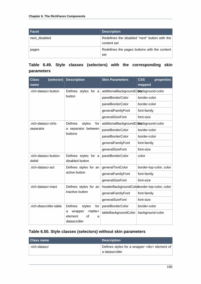
Chapter 6. The RichFaces Components
195
Facet Description
next_disabled Redefines the disabled "next" button with the
content set
pages Redefines the pages buttons with the content
set
Table 6.49. Style classes (selectors) with the corresponding skin
parameters
Class (selector)
name
Description Skin Parameters CSS properties
mapped
additionalBackgroundColorbackground-color
panelBorderColor border-color
panelBorderColor border-color
generalFamilyFont font-family
.rich-datascr-button Defines styles for a
button
generalSizeFont font-size
additionalBackgroundColorbackground-color
panelBorderColor border-color
panelBorderColor border-color
generalFamilyFont font-family
.rich-datascr-ctrls-
separator
Defines styles for
a separator between
buttons
generalSizeFont font-size
.rich-datascr-button-
dsbld
Defines styles for a
disabled button
panelBorderColor color
generalTextColor border-top-color, color
generalFamilyFont font-family
.rich-datascr-act Defines styles for an
active button
generalSizeFont font-size
headerBackgroundColorborder-top-color, color
generalFamilyFont font-family
.rich-datascr-inact Defines styles for an
inactive button
generalSizeFont font-size
panelBorderColor border-color.rich-dtascroller-table Defines styles for
a wrapper <table>
element of a
datascroller
tableBackgroundColor background-color
Table 6.50. Style classes (selectors) without skin parameters
Class name Description
.rich-datascr Defines styles for a wrapper <div> element of
a datascroller
Chapter 6. The RichFaces Components
196
You can find all necessary information about style classes redefinition in Definition of Custom
Style Classes section.
6.6.9.5. Relevant Resources Links
On the component LiveDemo page [http://livedemo.exadel.com/richfaces-demo/richfaces/
dataTableScroller.jsf?c=dataTableScroller] you can see the example of <rich:datascroller>
usage and sources for the given example.
The solution about how to do correct pagination using datascroller (load a part of data from
database) can be found on the RichFaces Users Forum [http://www.jboss.com/index.html?
module=bb&op=viewtopic&p=4060199#4060199].
How to use <rich:dataTable> and <rich:datascroller> in a context of Extended
Data Model see on the RichFaces Users Forum [http://www.jboss.com/index.html?
module=bb&op=viewtopic&t=115636].
This article [http://www.jboss.org/community/wiki/
DataTablemodeldoesntgetupdatedwhenrichdatascrollerused] describes how to solve
<rich:datatable> update problem when <rich:datascroller> used.
Here [http://www.jboss.org/community/wiki/
HowtousepairofrichdatascrollersoutsidetheanydataTable] you can find out how to use pair of
<rich:datascrollers> outside the any dataTable.
The solution about how to make <rich:datascroller> be updated after sorting/filtering
can be found on Data Iteration Components FAQ. [http://www.jboss.org/community/wiki/
richdataScrollerisnotupdatedaftersortingfiltering]
6.6.10. < rich:dataTable > available since 3.0.0
6.6.10.1. Description
The component is meant for rendering tables. It allows choosing data from a model and obtains
built-in support of Ajax updates.
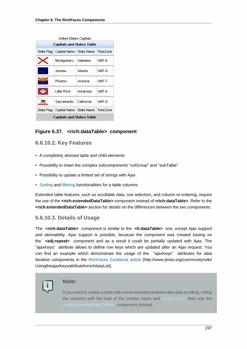
Chapter 6. The RichFaces Components
197
Figure 6.37. <rich:dataTable> component
6.6.10.2. Key Features
• A completely skinned table and child elements
• Possibility to insert the complex subcomponents "colGroup" and "subTable"
• Possibility to update a limited set of strings with Ajax
• Sorting and filtering functionalities for a table columns
Extended table features, such as scrollable data, row selection, and column re-ordering, require
the use of the <rich:extendedDataTable> component instead of <rich:dataTable>. Refer to the
<rich:extendedDataTable> section for details on the differences between the two components.
6.6.10.3. Details of Usage
The <rich:dataTable> component is similar to the <h:dataTable> one, except Ajax support
and skinnability. Ajax support is possible, because the component was created basing on
the <a4j:repeat> component and as a result it could be partially updated with Ajax. The
"ajaxKeys" attribute allows to define row keys which are updated after an Ajax request. You
can find an example which demonstrate the usage of the "ajaxKeys" attributes for data
iteration components in the RichFaces Cookbook article [http://www.jboss.org/community/wiki/
UsingtheajaxKeysattributeforrichdataList].
Note:
If you need to render a table with some extended features like data scrolling, hiding
the columns with the help of the context menu and some others, then use the
<rich:extendedDataTable> component instead.
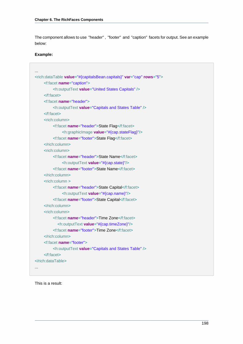
Chapter 6. The RichFaces Components
198
The component allows to use "header" , "footer" and "caption" facets for output. See an example
below:
Example:
...
<rich:dataTable value="#{capitalsBean.capitals}" var="cap" rows="5">
<f:facet name="caption">
<h:outputText value="United States Capitals" />
</f:facet>
<f:facet name="header">
<h:outputText value="Capitals and States Table" />
</f:facet>
<rich:column>
<f:facet name="header">State Flag</f:facet>
<h:graphicImage value="#{cap.stateFlag}"/>
<f:facet name="footer">State Flag</f:facet>
</rich:column>
<rich:column>
<f:facet name="header">State Name</f:facet>
<h:outputText value="#{cap.state}"/>
<f:facet name="footer">State Name</f:facet>
</rich:column>
<rich:column >
<f:facet name="header">State Capital</f:facet>
<h:outputText value="#{cap.name}"/>
<f:facet name="footer">State Capital</f:facet>
</rich:column>
<rich:column>
<f:facet name="header">Time Zone</f:facet>
<h:outputText value="#{cap.timeZone}"/>
<f:facet name="footer">Time Zone</f:facet>
</rich:column>
<f:facet name="footer">
<h:outputText value="Capitals and States Table" />
</f:facet>
</rich:dataTable>
...
This is a result:
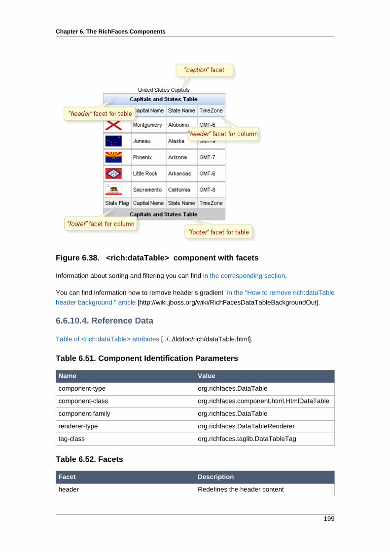
Chapter 6. The RichFaces Components
199
Figure 6.38. <rich:dataTable> component with facets
Information about sorting and filtering you can find in the corresponding section.
You can find information how to remove header's gradient in the "How to remove rich:dataTable
header background " article [http://wiki.jboss.org/wiki/RichFacesDataTableBackgroundOut].
6.6.10.4. Reference Data
Table of <rich:dataTable> attributes [../../tlddoc/rich/dataTable.html].
Table 6.51. Component Identification Parameters
Name Value
component-type org.richfaces.DataTable
component-class org.richfaces.component.html.HtmlDataTable
component-family org.richfaces.DataTable
renderer-type org.richfaces.DataTableRenderer
tag-class org.richfaces.taglib.DataTableTag
Table 6.52. Facets
Facet Description
header Redefines the header content
Chapter 6. The RichFaces Components
200
Facet Description
footer Redefines the footer content
caption Defines the caption content
Table 6.53. Style classes (selectors) with the corresponding skin
parameters
Class (selector)
name
Description Skin Parameters CSS properties
mapped
.rich-table Defines styles for a
table
tableBackgroundColor background-color
generalSizeFont font-size
generalTextColor color
.rich-table-cell Defines styles for a
table cell
generalFamilyFont font-family
.rich-table-header Defines styles for a
table header row
headerBackgroundColorbackground-color
.rich-table-header-
continue
Defines styles for all
header lines after the
first
headerBackgroundColorbackground-color
tableBorderWidth,
tableBorderColor
border-right, border-
bottom
headerTextColor color
headerWeightFont font-weight
generalSizeFont font-size
.rich-table-headercell Defines styles for a
header cell
generalFamilyFont font-family
.rich-table-subheader Defines styles for a
column header
additionalBackgroundColorbackground-color
.rich-table-thead tableBorderWidth,
tableBorderColor
border-bottom
tableBorderWidth,
tableBorderColor
border-right
generalTextColor color
generalSizeFont font-size
.rich-table-
subheadercell
Defines styles for a
column header cell
generalFamilyFont font-family
.rich-table-footer Defines styles for a
footer row
tableFooterBackgroundColorbackground-color
.rich-table-footer-
continue
Defines styles for all
footer lines after the
first
tableFooterBackgroundColorbackground-color
Chapter 6. The RichFaces Components
201
Class (selector)
name
Description Skin Parameters CSS properties
mapped
tableBorderWidth,
tableBorderColor
border-right, border-
bottom
generalTextColor color
headerWeightFont font-weight
generalSizeFont font-size
.rich-table-footercell Defines styles for a
footer cell
generalFamilyFont font-family
.rich-table-subfooter Defines styles for a
column footer
tableSubfooterBackgroundColorbackground-color
tableBorderWidth,
tableBorderColor
border-right, border-
bottom
generalTextColor color
generalSizeFont font-size
.rich-table-
subfootercell
Defines styles for a
column footer cell
generalFamilyFont font-family
Table 6.54. Style classes (selectors) without skin parameters
Class name Description
.rich-table-caption Defines styles for a "caption" facet element
.rich-table-row Defines styles for a table row
.rich-table-firstrow Defines styles for a table's first row
You can find all necessary information about style classes redefinition in Definition of Custom
Style Classes section.
6.6.10.5. Relevant Resources Links
On the component LiveDemo page [http://livedemo.exadel.com/richfaces-demo/richfaces/
dataTable.jsf?c=dataTable] you can see the example of <rich:dataTable> usage and sources
for the given example.
The article about <rich:dataTable> flexibility can be found in the "rich:dataTable Flexibility "
article [http://www.jboss.org/community/docs/DOC-11847].
Article on dataTable skinability [http://www.jboss.org/community/docs/DOC-11848] provides you
a simple example of skinnability.
More information about using <rich:dataTable> and <rich:subTable>
could be found on the RichFaces Users Forum [http://www.jboss.com/index.html?
module=bb&op=viewtopic&p=4059044#4059044].
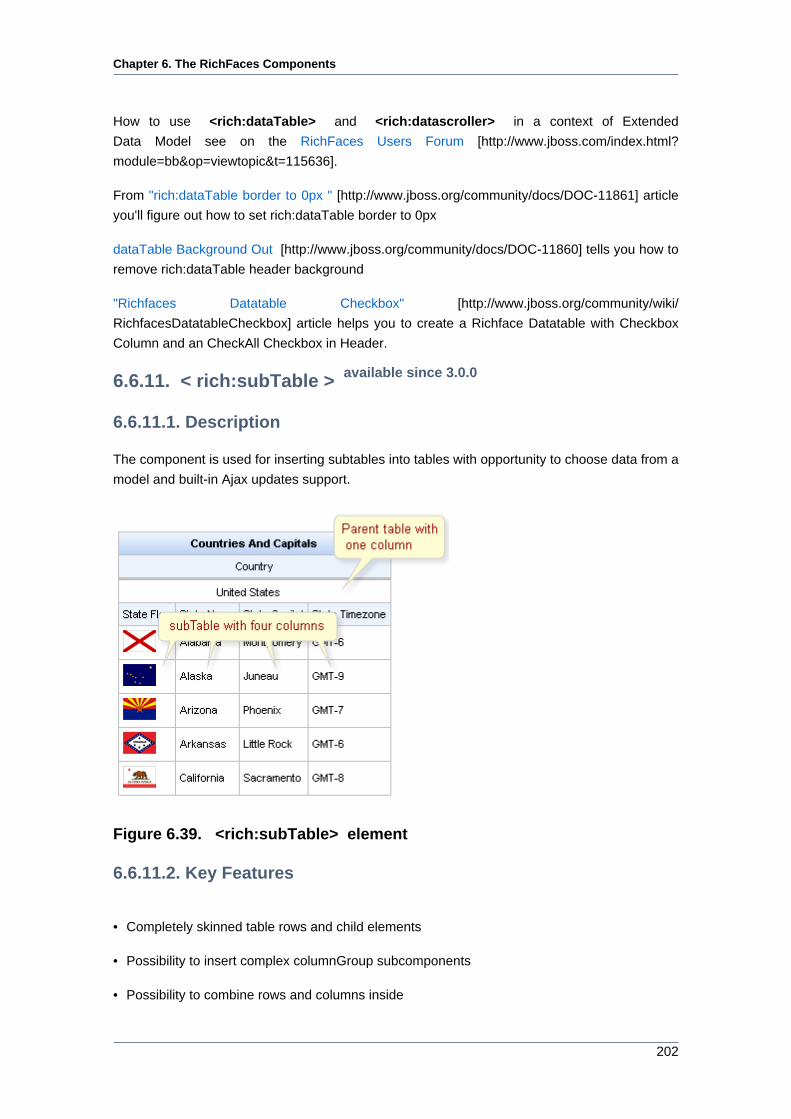
Chapter 6. The RichFaces Components
202
How to use <rich:dataTable> and <rich:datascroller> in a context of Extended
Data Model see on the RichFaces Users Forum [http://www.jboss.com/index.html?
module=bb&op=viewtopic&t=115636].
From "rich:dataTable border to 0px " [http://www.jboss.org/community/docs/DOC-11861] article
you'll figure out how to set rich:dataTable border to 0px
dataTable Background Out [http://www.jboss.org/community/docs/DOC-11860] tells you how to
remove rich:dataTable header background
"Richfaces Datatable Checkbox" [http://www.jboss.org/community/wiki/
RichfacesDatatableCheckbox] article helps you to create a Richface Datatable with Checkbox
Column and an CheckAll Checkbox in Header.
6.6.11. < rich:subTable > available since 3.0.0
6.6.11.1. Description
The component is used for inserting subtables into tables with opportunity to choose data from a
model and built-in Ajax updates support.
Figure 6.39. <rich:subTable> element
6.6.11.2. Key Features
• Completely skinned table rows and child elements
• Possibility to insert complex columnGroup subcomponents
• Possibility to combine rows and columns inside
Chapter 6. The RichFaces Components
203
• Possibility to update a limited set of rows with Ajax
6.6.11.3. Details of Usage
The <rich:subTable> component is similar to the <h:dataTable> one, except Ajax support
and skinnability. One more difference is that the component doesn't add the wrapping <table>
and <tbody> tags. Ajax support is possible, because the component was created basing
on the <a4j:repeat> component and as a result it could be partially updated with Ajax.
The "ajaxKeys" attribute allows to define row keys which are updated after an Ajax request.
You can find an example which demonstrate the usage of the "ajaxKeys" attributes for data
iteration components in the RichFaces Cookbook article [http://www.jboss.org/community/wiki/
UsingtheajaxKeysattributeforrichdataList].
The component allows to use "header" and "footer" facets for output. See an example for
<rich:dataTable> component [198].
6.6.11.4. Reference Data
Table of <rich:subTable> attributes [../../tlddoc/rich/subTable.html].
Table 6.55. Component Identification Parameters
Name Value
component-type org.richfaces.SubTable
component-class org.richfaces.component.html.HtmlSubTable
component-family org.richfaces.SubTable
renderer-type org.richfaces.SubTableRenderer
tag-class org.richfaces.taglib.SubTableTag
Table 6.56. Facets
Facet name Description
header Defines the header content
footer Defines the footer content
Table 6.57. Style classes (selectors) with the corresponding skin
parameters
Class (selector)
name
Description Skin Parameters CSS properties
mapped
generalSizeFont font-size
generalTextColor color
.rich-subtable-cell Defines styles for a
subtable cell
generalFamilyFont font-family
Chapter 6. The RichFaces Components
204
Class (selector)
name
Description Skin Parameters CSS properties
mapped
tableBorderWidth,
tableBorderColor
border-right, border-
bottom
generalTextColor color
generalSizeFont font-size
.rich-subtable-
headercell
Defines styles for a
subtable header cell
generalFamilyFont font-family
.rich-subtable-header Defines styles for a
subtable header row
additionalBackgroundColorbackground-color
.rich-subtable-footer Defines styles for a
subtable footer row
tableSubfooterBackgroundColorbackground-color
.rich-subtable-
footercell
Defines styles for a
subtable footer cell
tableBorderWidth,
tableBorderColor
border-right, border-
bottom
Table 6.58. Style classes (selectors) without skin parameters
Class name Description
.rich-subtable Defines styles for all subtable
.rich-subtable-caption Defines styles for a "caption" facet element
.rich-subtable-header-continue Defines styles for all subtable header lines after
the first
.rich-subtable-subheader Defines styles for a column header of subtable
.rich-subtable-subfooter Defines styles for a column footer of subtable
.rich-subtable-footer-continue Defines styles for all subtable footer lines after
the first
.rich-subtable-subheadercell Defines styles for a column header cell of
subtable
.rich-subtable-row Defines styles for a subtable row
.rich-subtable-firstrow Defines styles for a subtable start row
.rich-subtable-subfootercell Defines styles for a column footer cell of
subtable
You can find all necessary information about style classes redefinition in Definition of Custom
Style Classes section.
6.6.12. < rich:extendedDataTable > available since 3.2.2
6.6.12.1. Description
The component is meant for rendering tables and differs from the standard <rich:dataTable>
component in that supports some extended features.
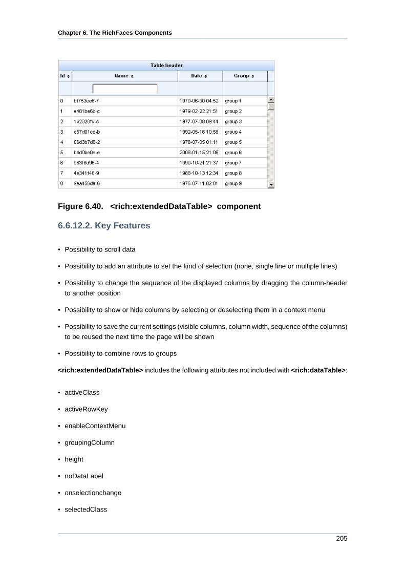
Chapter 6. The RichFaces Components
205
Figure 6.40. <rich:extendedDataTable> component
6.6.12.2. Key Features
• Possibility to scroll data
• Possibility to add an attribute to set the kind of selection (none, single line or multiple lines)
• Possibility to change the sequence of the displayed columns by dragging the column-header
to another position
• Possibility to show or hide columns by selecting or deselecting them in a context menu
• Possibility to save the current settings (visible columns, column width, sequence of the columns)
to be reused the next time the page will be shown
• Possibility to combine rows to groups
<rich:extendedDataTable> includes the following attributes not included with <rich:dataTable>:
• activeClass
• activeRowKey
• enableContextMenu
• groupingColumn
• height
• noDataLabel
• onselectionchange
• selectedClass
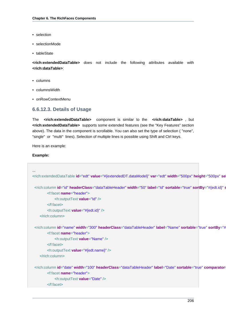
Chapter 6. The RichFaces Components
206
• selection
• selectionMode
• tableState
<rich:extendedDataTable> does not include the following attributes available with
<rich:dataTable>:
• columns
• columnsWidth
• onRowContextMenu
6.6.12.3. Details of Usage
The <rich:extendedDataTable> component is similar to the <rich:dataTable> , but
<rich:extendedDataTable> supports some extended features (see the "Key Features" section
above). The data in the component is scrollable. You can also set the type of selection ( "none",
"single" or "multi" lines). Selection of multiple lines is possible using Shift and Ctrl keys.
Here is an example:
Example:
...
<rich:extendedDataTable id="edt" value="#{extendedDT.dataModel}" var="edt" width="500px" height="500px" selectedClass="dataTableSelectedRow" sortMode="single" selectionMode="multi" selection="#{extendedDT.selection}" rowKeyVar="rkvar" tableState="#{extendedDT.tableState}">
<rich:column id="id" headerClass="dataTableHeader" width="50" label="Id" sortable="true" sortBy="#{edt.id}" sortIconAscending="dataTableAscIcon" sortIconDescending="dataTableDescIcon">
<f:facet name="header">
<h:outputText value="Id" />
</f:facet>
<h:outputText value="#{edt.id}" />
</rich:column>
<rich:column id="name" width="300" headerClass="dataTableHeader" label="Name" sortable="true" sortBy="#{edt.name}" sortIconAscending="dataTableAscIcon" sortIconDescending="dataTableDescIcon" filterBy="#{edt.name}" filterEvent="onkeyup" visible="false">
<f:facet name="header">
<h:outputText value="Name" />
</f:facet>
<h:outputText value="#{edt.name}" />
</rich:column>
<rich:column id="date" width="100" headerClass="dataTableHeader" label="Date" sortable="true" comparator="#{extendedDT.dateComparator}" sortIconAscending="dataTableAscIcon" sortIconDescending="dataTableDescIcon">
<f:facet name="header">
<h:outputText value="Date" />
</f:facet>
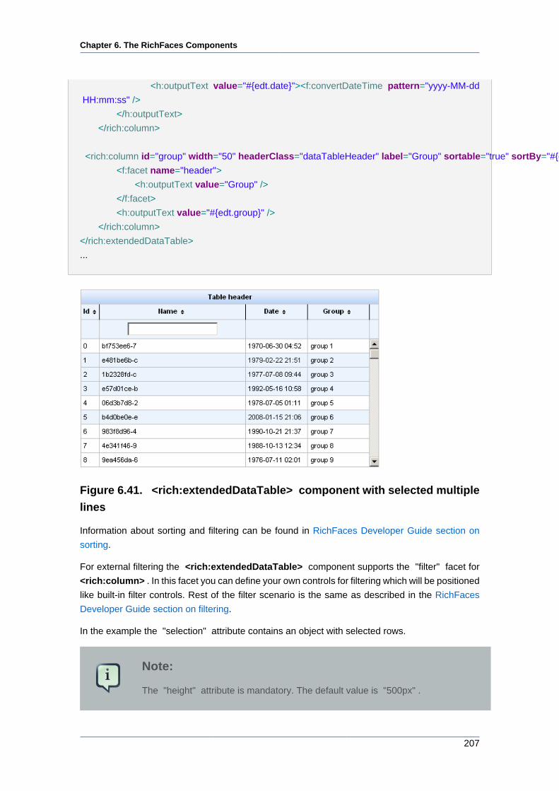
Chapter 6. The RichFaces Components
207
<h:outputText value="#{edt.date}"><f:convertDateTime pattern="yyyy-MM-dd
HH:mm:ss" />
</h:outputText>
</rich:column>
<rich:column id="group" width="50" headerClass="dataTableHeader" label="Group" sortable="true" sortBy="#{edt.group}" sortIconAscending="dataTableAscIcon" sortIconDescending="dataTableDescIcon">
<f:facet name="header">
<h:outputText value="Group" />
</f:facet>
<h:outputText value="#{edt.group}" />
</rich:column>
</rich:extendedDataTable>
...
Figure 6.41. <rich:extendedDataTable> component with selected multiple
lines
Information about sorting and filtering can be found in RichFaces Developer Guide section on
sorting.
For external filtering the <rich:extendedDataTable> component supports the "filter" facet for
<rich:column> . In this facet you can define your own controls for filtering which will be positioned
like built-in filter controls. Rest of the filter scenario is the same as described in the RichFaces
Developer Guide section on filtering.
In the example the "selection" attribute contains an object with selected rows.
Note:
The "height" attribute is mandatory. The default value is "500px" .
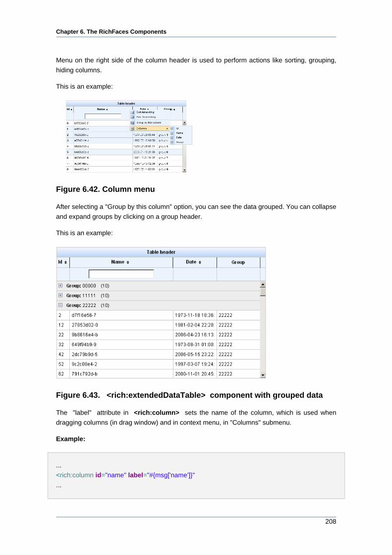
Chapter 6. The RichFaces Components
208
Menu on the right side of the column header is used to perform actions like sorting, grouping,
hiding columns.
This is an example:
Figure 6.42. Column menu
After selecting a "Group by this column" option, you can see the data grouped. You can collapse
and expand groups by clicking on a group header.
This is an example:
Figure 6.43. <rich:extendedDataTable> component with grouped data
The "label" attribute in <rich:column> sets the name of the column, which is used when
dragging columns (in drag window) and in context menu, in "Columns" submenu.
Example:
...
<rich:column id="name" label="#{msg['name']}"
...
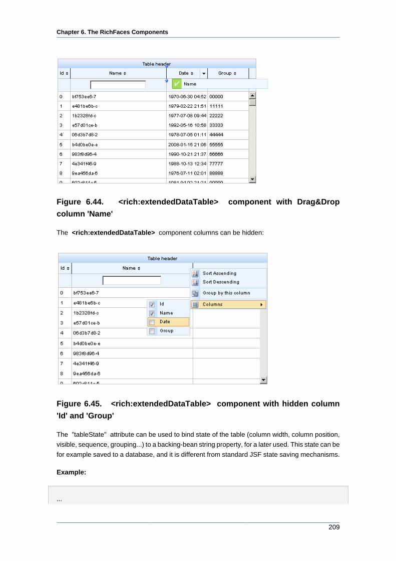
Chapter 6. The RichFaces Components
209
Figure 6.44. <rich:extendedDataTable> component with Drag&Drop
column 'Name'
The <rich:extendedDataTable> component columns can be hidden:
Figure 6.45. <rich:extendedDataTable> component with hidden column
'Id' and 'Group'
The "tableState" attribute can be used to bind state of the table (column width, column position,
visible, sequence, grouping...) to a backing-bean string property, for a later used. This state can be
for example saved to a database, and it is different from standard JSF state saving mechanisms.
Example:
...
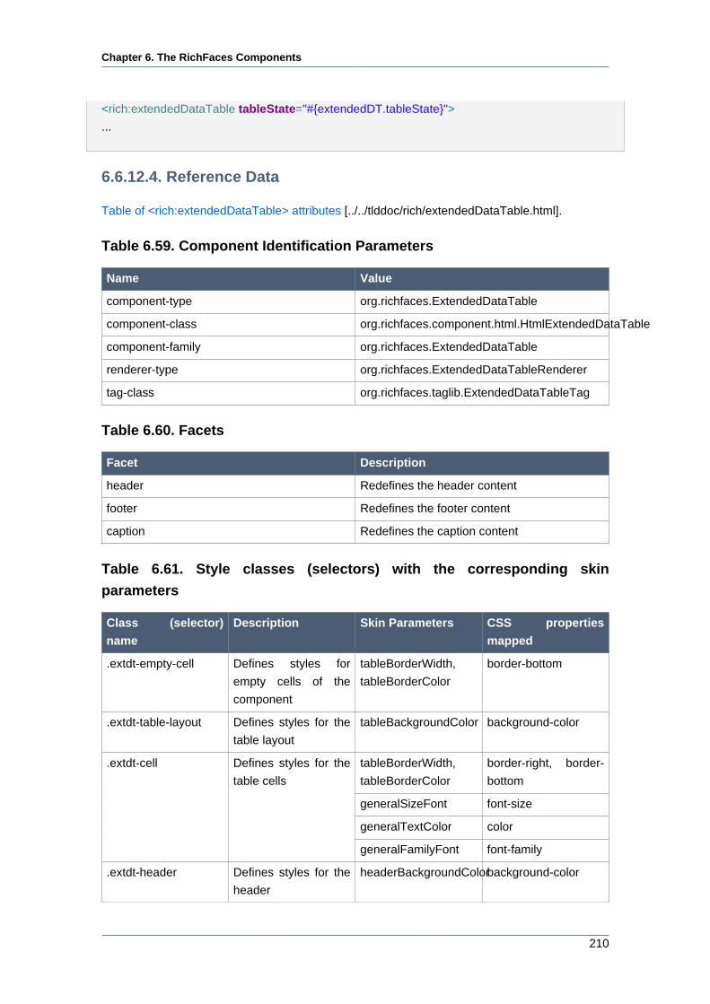
Chapter 6. The RichFaces Components
210
<rich:extendedDataTable tableState="#{extendedDT.tableState}">
...
6.6.12.4. Reference Data
Table of <rich:extendedDataTable> attributes [../../tlddoc/rich/extendedDataTable.html].
Table 6.59. Component Identification Parameters
Name Value
component-type org.richfaces.ExtendedDataTable
component-class org.richfaces.component.html.HtmlExtendedDataTable
component-family org.richfaces.ExtendedDataTable
renderer-type org.richfaces.ExtendedDataTableRenderer
tag-class org.richfaces.taglib.ExtendedDataTableTag
Table 6.60. Facets
Facet Description
header Redefines the header content
footer Redefines the footer content
caption Redefines the caption content
Table 6.61. Style classes (selectors) with the corresponding skin
parameters
Class (selector)
name
Description Skin Parameters CSS properties
mapped
.extdt-empty-cell Defines styles for
empty cells of the
component
tableBorderWidth,
tableBorderColor
border-bottom
.extdt-table-layout Defines styles for the
table layout
tableBackgroundColor background-color
tableBorderWidth,
tableBorderColor
border-right, border-
bottom
generalSizeFont font-size
generalTextColor color
.extdt-cell Defines styles for the
table cells
generalFamilyFont font-family
.extdt-header Defines styles for the
header
headerBackgroundColorbackground-color
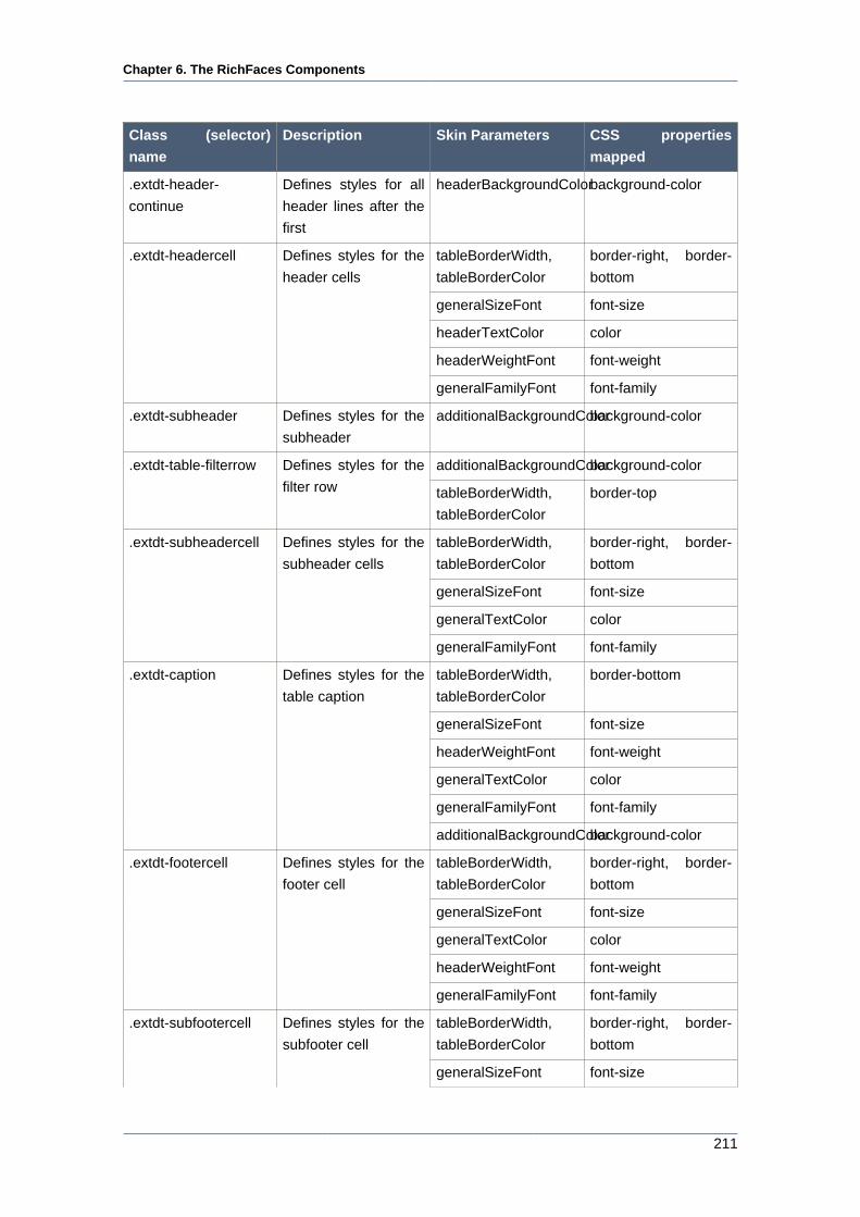
Chapter 6. The RichFaces Components
211
Class (selector)
name
Description Skin Parameters CSS properties
mapped
.extdt-header-
continue
Defines styles for all
header lines after the
first
headerBackgroundColorbackground-color
tableBorderWidth,
tableBorderColor
border-right, border-
bottom
generalSizeFont font-size
headerTextColor color
headerWeightFont font-weight
.extdt-headercell Defines styles for the
header cells
generalFamilyFont font-family
.extdt-subheader Defines styles for the
subheader
additionalBackgroundColorbackground-color
additionalBackgroundColorbackground-color.extdt-table-filterrow Defines styles for the
filter row tableBorderWidth,
tableBorderColor
border-top
tableBorderWidth,
tableBorderColor
border-right, border-
bottom
generalSizeFont font-size
generalTextColor color
.extdt-subheadercell Defines styles for the
subheader cells
generalFamilyFont font-family
tableBorderWidth,
tableBorderColor
border-bottom
generalSizeFont font-size
headerWeightFont font-weight
generalTextColor color
generalFamilyFont font-family
.extdt-caption Defines styles for the
table caption
additionalBackgroundColorbackground-color
tableBorderWidth,
tableBorderColor
border-right, border-
bottom
generalSizeFont font-size
generalTextColor color
headerWeightFont font-weight
.extdt-footercell Defines styles for the
footer cell
generalFamilyFont font-family
tableBorderWidth,
tableBorderColor
border-right, border-
bottom
.extdt-subfootercell Defines styles for the
subfooter cell
generalSizeFont font-size
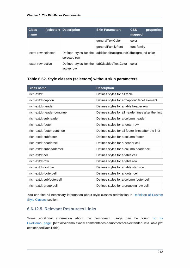
Chapter 6. The RichFaces Components
212
Class (selector)
name
Description Skin Parameters CSS properties
mapped
generalTextColor color
generalFamilyFont font-family
.extdt-row-selected Defines styles for the
selected row
additionalBackgroundColorbackground-color
.extdt-row-active Defines styles for the
active row
tabDisabledTextColor color
Table 6.62. Style classes (selectors) without skin parameters
Class name Description
.rich-extdt Defines styles for all table
.rich-extdt-caption Defines styles for a "caption" facet element
.rich-extdt-header Defines styles for a table header row
.rich-extdt-header-continue Defines styles for all header lines after the first
.rich-extdt-subheader Defines styles for a column header
.rich-extdt-footer Defines styles for a footer row
.rich-extdt-footer-continue Defines styles for all footer lines after the first
.rich-extdt-subfooter Defines styles for a column footer
.rich-extdt-headercell Defines styles for a header cell
.rich-extdt-subheadercell Defines styles for a column header cell
.rich-extdt-cell Defines styles for a table cell
.rich-extdt-row Defines styles for a table row
.rich-extdt-firstrow Defines styles for a table start row
.rich-extdt-footercell Defines styles for a footer cell
.rich-extdt-subfootercell Defines styles for a column footer cell
.rich-extdt-group-cell Defines styles for a grouping row cell
You can find all necessary information about style classes redefinition in Definition of Custom
Style Classes section.
6.6.12.5. Relevant Resources Links
Some additional information about the component usage can be found on its
LiveDemo page [http://livedemo.exadel.com/richfaces-demo/richfaces/extendedDataTable.jsf?
c=extendedDataTable].
Chapter 6. The RichFaces Components
213
6.6.13. < a4j:repeat > available since 3.0.0
6.6.13.1. Description
The <a4j:repeat> component implements a basic iteration component that allows to update a
set of its children with Ajax.
6.6.13.2. Details of Usage
The <a4j:repeat> component is similar to Facelets <ui:repeat> tag, which is used to iterate
through a collection of objects binded with JSF page as EL expression. The main difference of the
<a4j:repeat> is a possibility to update particular components (it's children) instead of all using
Ajax requests. The feature that makes the component different is a special "ajaxKeys" attribute
that defines row that are updated after an Ajax request. As a result it becomes easier to update
several child components separately without updating the whole page.
...
<table>
<tbody>
<a4j:repeat value="#{repeatBean.items}" var="item" ajaxKeys="#{updateBean.updatedRow}">
<tr>
<td><h:outputText value="#{item.code}" id="item1" /></td>
<td><h:outputText value="#{item.price}" id="item2" /></td>
</tr>
</a4j:repeat>
</tbody>
</table>
...
The example above points to a method that contains row keys to be updated.
Note:
The <a4j:repeat> component is defined as fully updated, but really updated there
are only the row keys which defined in the "ajaxKeys" attribute.
One more benefit of this component is absence of strictly defined markup as JSF HTML DataTable
and TOMAHAWK DataTable have. Hence the components could be used more flexibly anywhere
where it's necessary to output the results of selection from some collection.
If you want to output a collection as a plain HTML list, use the following structure:
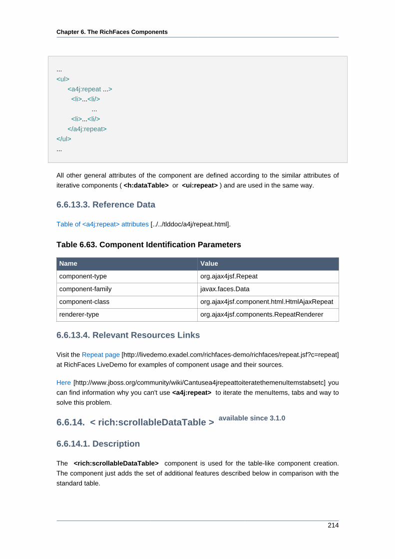
Chapter 6. The RichFaces Components
214
...
<ul>
<a4j:repeat ...>
<li>...<li/>
...
<li>...<li/>
</a4j:repeat>
</ul>
...
All other general attributes of the component are defined according to the similar attributes of
iterative components ( <h:dataTable> or <ui:repeat> ) and are used in the same way.
6.6.13.3. Reference Data
Table of <a4j:repeat> attributes [../../tlddoc/a4j/repeat.html].
Table 6.63. Component Identification Parameters
Name Value
component-type org.ajax4jsf.Repeat
component-family javax.faces.Data
component-class org.ajax4jsf.component.html.HtmlAjaxRepeat
renderer-type org.ajax4jsf.components.RepeatRenderer
6.6.13.4. Relevant Resources Links
Visit the Repeat page [http://livedemo.exadel.com/richfaces-demo/richfaces/repeat.jsf?c=repeat]
at RichFaces LiveDemo for examples of component usage and their sources.
Here [http://www.jboss.org/community/wiki/Cantusea4jrepeattoiteratethemenuItemstabsetc] you
can find information why you can't use <a4j:repeat> to iterate the menuItems, tabs and way to
solve this problem.
6.6.14. < rich:scrollableDataTable > available since 3.1.0
6.6.14.1. Description
The <rich:scrollableDataTable> component is used for the table-like component creation.
The component just adds the set of additional features described below in comparison with the
standard table.

Chapter 6. The RichFaces Components
215
Figure 6.46. <rich:scrollableDataTable> component
6.6.14.2. Key Features
• Highly customizable look and feel
• Variable content of the table cells
• Dynamically fetching the rows from the server when the table is scrolled up and down
• Resizing columns by mouse dragging the column bar
• Sorting column by clicking the header
• Fixed one or more left columns when table is scrolled horizontally
• One and multi-selection rows mode
• Built-it drag-n-drop support
• Sorting column values
<rich:scrollableDataTable> includes the following attributes not included with <rich:dataTable>:
• activeClass
• activeRowKey
Chapter 6. The RichFaces Components
216
• bypassUpdates
• data
• eventsQueue
• frozenColCount
• height
• hideWhenScrolling
• ignoreDupResponses
• onselectionchange
• requestDelay
• scriptVar
• selectedClass
• selection
• selectionMode
• similarityGroupingId
• sortOrder
• status
• timeout
<rich:scrollableDataTable> does not include the following attributes available with
<rich:dataTable>:
• align
• bgcolor
• border
• captionClass
• captionStyle
• cellpadding
• cellspacing
• columns
• columnsWidth
Chapter 6. The RichFaces Components
217
• dir
• frame
• lang
• onRowContextMenu
• onRowMouseMove
• onRowMouseOut
• onRowMouseOver
• onclick
• ondblclick
• onkeydown
• onkeypress
• onkeyup
• onmousedown
• onmousemove
• onmouseout
• onmouseover
• onmouseup
• rules
• sortPriority
• title
Using <rich:column>
The relative width of <rich:column> is not supported by
<rich:scrollableDataTable>. It is, however, supported by <rich:dataTable> and
<rich:extendedDataTable>.
6.6.14.3. Details of Usage
The component represents on a page as a scrollable table with some fixed (non-scrollable) rows
( with header and footer) and columns. Like other tables <rich:scrollableDataTable> also has
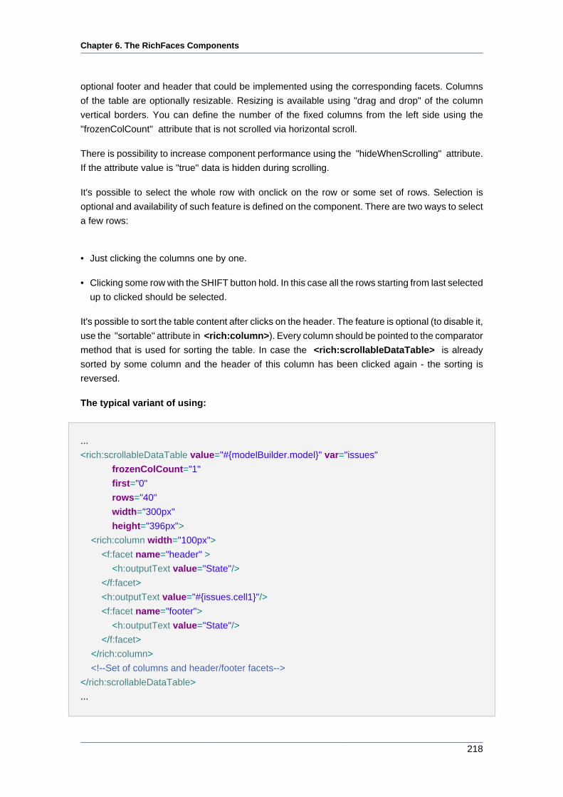
Chapter 6. The RichFaces Components
218
optional footer and header that could be implemented using the corresponding facets. Columns
of the table are optionally resizable. Resizing is available using "drag and drop" of the column
vertical borders. You can define the number of the fixed columns from the left side using the
"frozenColCount" attribute that is not scrolled via horizontal scroll.
There is possibility to increase component performance using the "hideWhenScrolling" attribute.
If the attribute value is "true" data is hidden during scrolling.
It's possible to select the whole row with onclick on the row or some set of rows. Selection is
optional and availability of such feature is defined on the component. There are two ways to select
a few rows:
• Just clicking the columns one by one.
• Clicking some row with the SHIFT button hold. In this case all the rows starting from last selected
up to clicked should be selected.
It's possible to sort the table content after clicks on the header. The feature is optional (to disable it,
use the "sortable" attribute in <rich:column>). Every column should be pointed to the comparator
method that is used for sorting the table. In case the <rich:scrollableDataTable> is already
sorted by some column and the header of this column has been clicked again - the sorting is
reversed.
The typical variant of using:
...
<rich:scrollableDataTable value="#{modelBuilder.model}" var="issues"
frozenColCount="1"
first="0"
rows="40"
width="300px"
height="396px">
<rich:column width="100px">
<f:facet name="header" >
<h:outputText value="State"/>
</f:facet>
<h:outputText value="#{issues.cell1}"/>
<f:facet name="footer">
<h:outputText value="State"/>
</f:facet>
</rich:column>
<!--Set of columns and header/footer facets-->
</rich:scrollableDataTable>
...
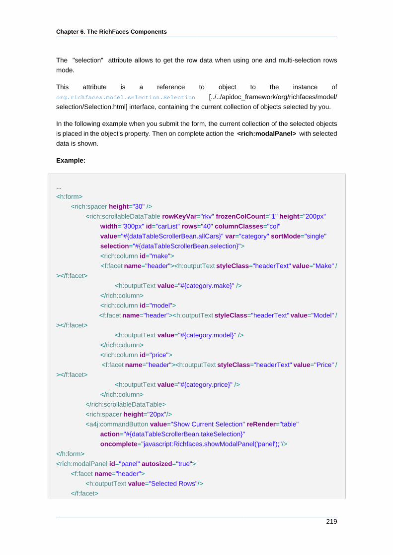
Chapter 6. The RichFaces Components
219
The "selection" attribute allows to get the row data when using one and multi-selection rows
mode.
This attribute is a reference to object to the instance of
org.richfaces.model.selection.Selection [../../apidoc_framework/org/richfaces/model/
selection/Selection.html] interface, containing the current collection of objects selected by you.
In the following example when you submit the form, the current collection of the selected objects
is placed in the object's property. Then on complete action the <rich:modalPanel> with selected
data is shown.
Example:
...
<h:form>
<rich:spacer height="30" />
<rich:scrollableDataTable rowKeyVar="rkv" frozenColCount="1" height="200px"
width="300px" id="carList" rows="40" columnClasses="col"
value="#{dataTableScrollerBean.allCars}" var="category" sortMode="single"
selection="#{dataTableScrollerBean.selection}">
<rich:column id="make">
<f:facet name="header"><h:outputText styleClass="headerText" value="Make" /
></f:facet>
<h:outputText value="#{category.make}" />
</rich:column>
<rich:column id="model">
<f:facet name="header"><h:outputText styleClass="headerText" value="Model" /
></f:facet>
<h:outputText value="#{category.model}" />
</rich:column>
<rich:column id="price">
<f:facet name="header"><h:outputText styleClass="headerText" value="Price" /
></f:facet>
<h:outputText value="#{category.price}" />
</rich:column>
</rich:scrollableDataTable>
<rich:spacer height="20px"/>
<a4j:commandButton value="Show Current Selection" reRender="table"
action="#{dataTableScrollerBean.takeSelection}"
oncomplete="javascript:Richfaces.showModalPanel('panel');"/>
</h:form>
<rich:modalPanel id="panel" autosized="true">
<f:facet name="header">
<h:outputText value="Selected Rows"/>
</f:facet>
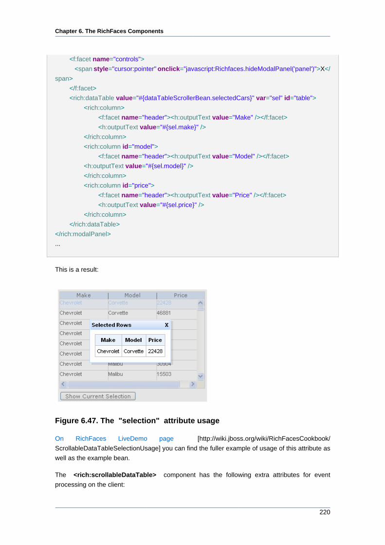
Chapter 6. The RichFaces Components
220
<f:facet name="controls">
<span style="cursor:pointer" onclick="javascript:Richfaces.hideModalPanel('panel')">X</
span>
</f:facet>
<rich:dataTable value="#{dataTableScrollerBean.selectedCars}" var="sel" id="table">
<rich:column>
<f:facet name="header"><h:outputText value="Make" /></f:facet>
<h:outputText value="#{sel.make}" />
</rich:column>
<rich:column id="model">
<f:facet name="header"><h:outputText value="Model" /></f:facet>
<h:outputText value="#{sel.model}" />
</rich:column>
<rich:column id="price">
<f:facet name="header"><h:outputText value="Price" /></f:facet>
<h:outputText value="#{sel.price}" />
</rich:column>
</rich:dataTable>
</rich:modalPanel>
...
This is a result:
Figure 6.47. The "selection" attribute usage
On RichFaces LiveDemo page [http://wiki.jboss.org/wiki/RichFacesCookbook/
ScrollableDataTableSelectionUsage] you can find the fuller example of usage of this attribute as
well as the example bean.
The <rich:scrollableDataTable> component has the following extra attributes for event
processing on the client:
Chapter 6. The RichFaces Components
221
• "onselectionchange"
• "onRowClick"
• "onRowDblClick"
• "onRowMouseUp"
• "onRowMouseDown"
Starting with the 3.3.1 version of the components framework it becomes possible to switch
selection mode with the "selectionMode" attribute.
Information about sorting and filtering you can find in the RichFaces Developer guide section
about sorting.
Information on the "process" attribute usage you can find in the "Decide what to process" guide
section.
Note:
If you want to use specific features such as pagination on database level you should
pass to the "value" of the <rich:scrollableDataTable> component an object
which class extends org.richfaces.model.ScrollableTableDataModel.
6.6.14.4. Reference Data
Table of <rich:scrollableDataTable> attributes [../../tlddoc/rich/scrollableDataTable.html].
Table 6.64. Component Identification Parameters
Name Value
component-type org.richfaces.component.ScrollableDataTable
component-class org.richfaces.component.html.HtmlScrollableDataTable
component-family org.richfaces.component.ScrollableDataTable
renderer-type org.richfaces.renderkit.html.ScrollableDataTableRenderer
tag-class org.richfaces.taglib.ScrollableDataTableTag
Table 6.65. Facets
Facet Description
header Defines the header content
footer Defines the footer content
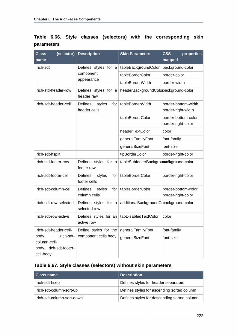
Chapter 6. The RichFaces Components
222
Table 6.66. Style classes (selectors) with the corresponding skin
parameters
Class (selector)
name
Description Skin Parameters CSS properties
mapped
tableBackgroundColor background-color
tableBorderColor border-color
.rich-sdt Defines styles for a
component
appearancetableBorderWidth border-width
.rich-std-header-row Defines styles for a
header raw
headerBackgroundColorbackground-color
tableBorderWidth border-bottom-width,
border-right-width
tableBorderColor border-bottom-color,
border-right-color
headerTextColor color
generalFamilyFont font-family
.rich-sdt-header-cell Defines styles for
header cells
generalSizeFont font-size
.rich-sdt-hsplit tipBorderColor border-right-color
.rich-std-footer-row Defines styles for a
footer raw
tableSubfooterBackgroundColorbackground-color
.rich-sdt-footer-cell Defines styles for
footer cells
tableBorderColor border-right-color
.rich-sdt-column-cel Defines styles for
column cells
tableBorderColor border-bottom-color,
border-right-color
.rich-sdt-row-selected Defines styles for a
selected row
additionalBackgroundColorbackground-color
.rich-sdt-row-active Defines styles for an
active row
tabDisabledTextColor color
generalFamilyFont font-family.rich-sdt-header-cell-
body, .rich-sdt-
column-cell-
body, .rich-sdt-footer-
cell-body
Define styles for the
component cells body generalSizeFont font-size
Table 6.67. Style classes (selectors) without skin parameters
Class name Description
.rich-sdt-hsep Defines styles for header separators
.rich-sdt-column-sort-up Defines styles for ascending sorted column
.rich-sdt-column-sort-down Defines styles for descending sorted column
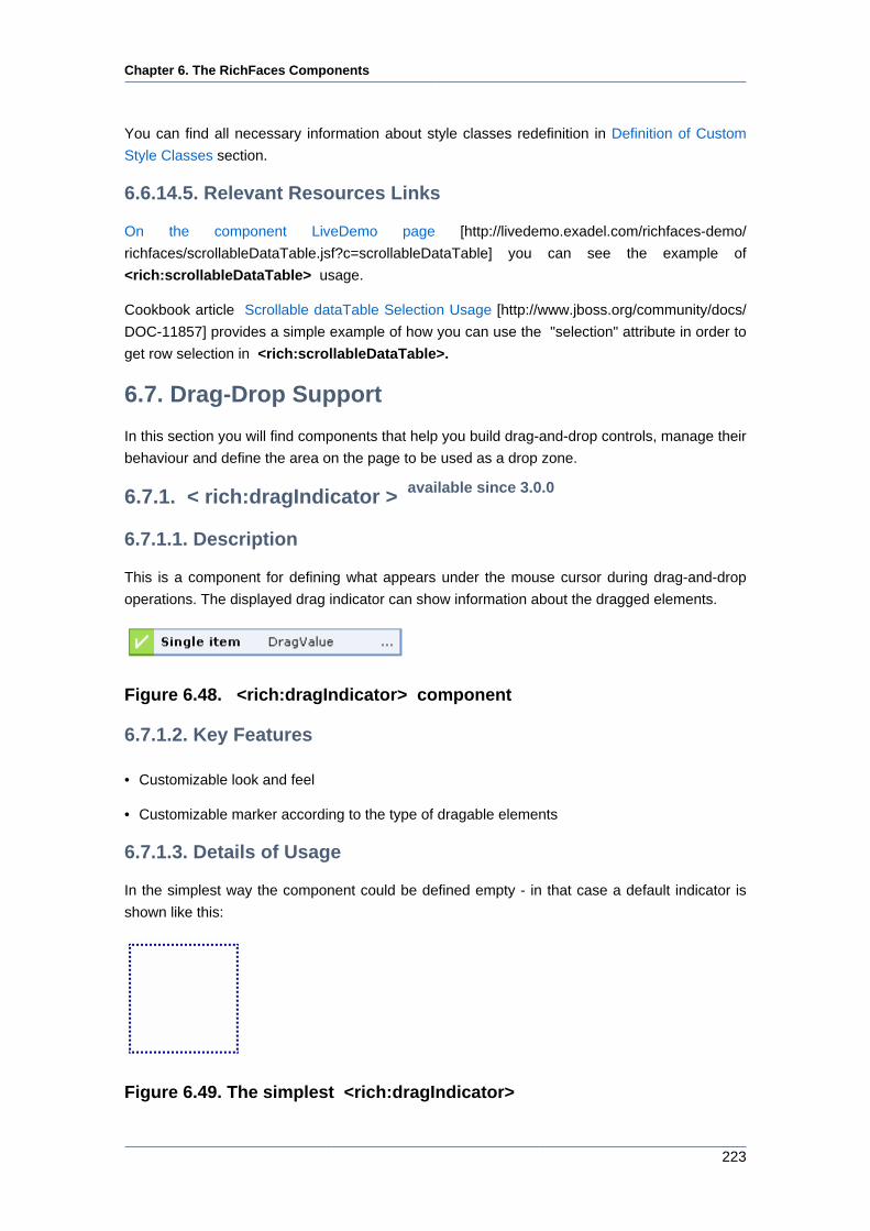
Chapter 6. The RichFaces Components
223
You can find all necessary information about style classes redefinition in Definition of Custom
Style Classes section.
6.6.14.5. Relevant Resources Links
On the component LiveDemo page [http://livedemo.exadel.com/richfaces-demo/
richfaces/scrollableDataTable.jsf?c=scrollableDataTable] you can see the example of
<rich:scrollableDataTable> usage.
Cookbook article Scrollable dataTable Selection Usage [http://www.jboss.org/community/docs/
DOC-11857] provides a simple example of how you can use the "selection" attribute in order to
get row selection in <rich:scrollableDataTable>.
6.7. Drag-Drop Support
In this section you will find components that help you build drag-and-drop controls, manage their
behaviour and define the area on the page to be used as a drop zone.
6.7.1. < rich:dragIndicator > available since 3.0.0
6.7.1.1. Description
This is a component for defining what appears under the mouse cursor during drag-and-drop
operations. The displayed drag indicator can show information about the dragged elements.
Figure 6.48. <rich:dragIndicator> component
6.7.1.2. Key Features
• Customizable look and feel
• Customizable marker according to the type of dragable elements
6.7.1.3. Details of Usage
In the simplest way the component could be defined empty - in that case a default indicator is
shown like this:
Figure 6.49. The simplest <rich:dragIndicator>
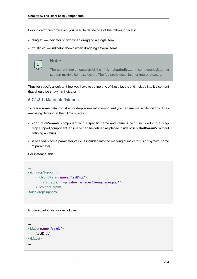
Chapter 6. The RichFaces Components
224
For indicator customization you need to define one of the following facets:
• "single" — indicator shown when dragging a single item;
• "multiple" — indicator shown when dragging several items.
Note:
The current implementation of the <rich:dragIndicator> component does not
support multiple items selection. The feature is described for future releases.
Thus for specify a look-and-feel you have to define one of these facets and include into it a content
that should be shown in indicator.
6.7.1.3.1. Macro definitions
To place some data from drag or drop zones into component you can use macro definitions. They
are being defining in the following way:
• <rich:dndParam> component with a specific name and value is being included into a drag/
drop support component (an image can be defined as placed inside <rich:dndParam> without
defining a value).
• in needed place a parameter value is included into the marking of indicator using syntax (name
of parameter)
For instance, this:
...
<rich:dropSupport...>
<rich:dndParam name="testDrop">
<h:graphicImage value="/images/file-manager.png" />
</rich:dndParam>
</rich:dropSupport>
...
Is placed into indicator as follows:
...
<f:facet name="single">
{testDrop}
</f:facet>
...
Chapter 6. The RichFaces Components
225
6.7.1.3.2. Predefined macro definitions
Indicator can accept two default macro definitions:
• marker
• label
Thus including one of these elements in the marking of indicator, in other words after setting up
appropriate parameters in DnD components and defining only default indicator - without specifying
facets - a developer gets these parameters values displayed in indicator in the order "marker -
label".
6.7.1.3.3. Marker customization
The macro definition "marker" can be customized depending on what a draggable element is
located over. For that you should define one of these three parameters (specify a parameter with
one of three names):
• accept
Parameter will be set instead of {marker} into indicator when a draggable element is positioned
over drop zone that accept this type of elements
• reject
Parameter is set instead of {marker} into indicator when a draggable element is positioned over
drop zone that doesn't accept this type of elements
• default
Parameter is set instead of {marker} into indicator when a draggable element is positioned over
all the rest of page elements
Note:
If you use <rich:dragIndicator> inside a form do not forget to use id like
formId:indicatorID defined in <rich:dragSupport> indicator attribute.
6.7.1.4. Reference Data
Table of <rich:dragIndicator> attributes [../../tlddoc/rich/dragIndicator.html].
Table 6.68. Component Identification Parameters
Name Value
component-type org.richfaces.Draggable
component-class org.richfaces.component.html.HtmlDragIndicator
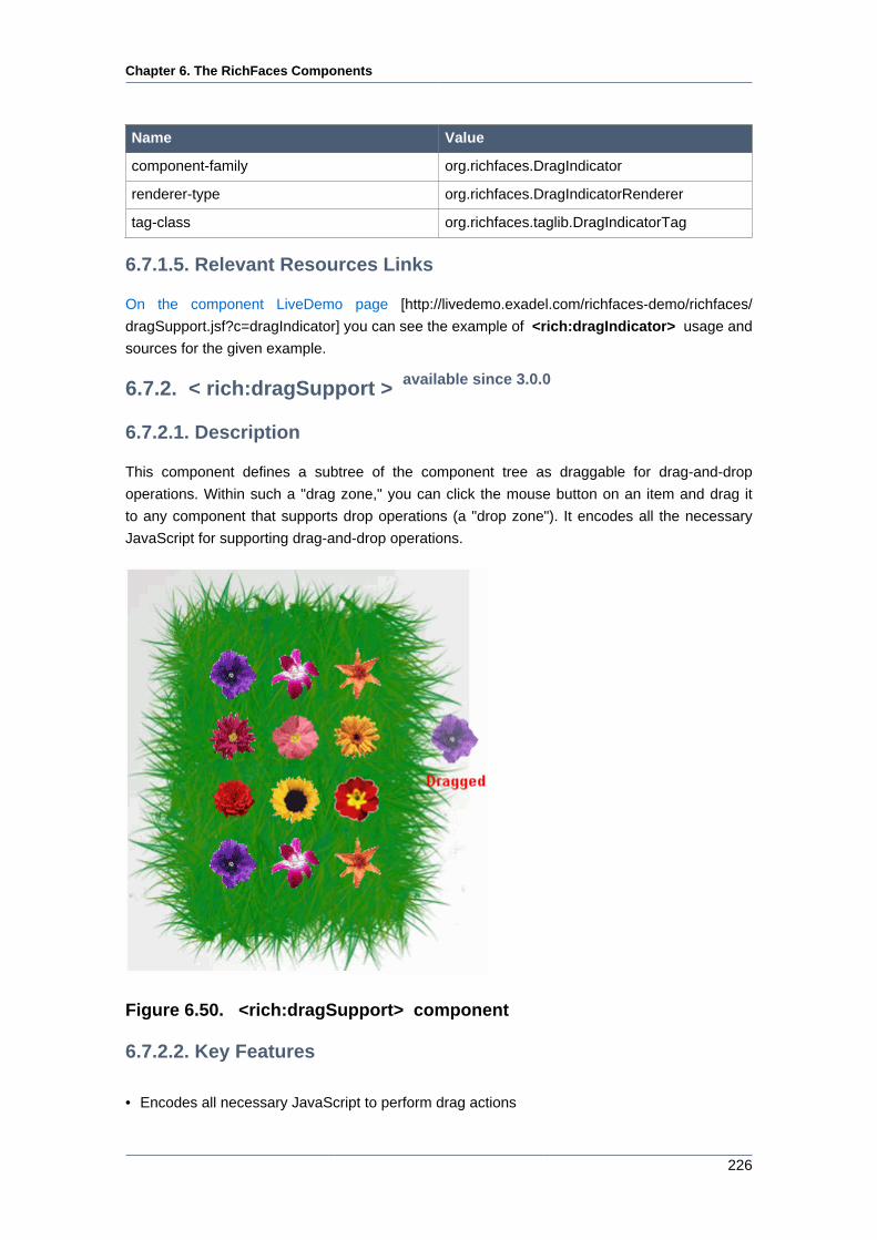
Chapter 6. The RichFaces Components
226
Name Value
component-family org.richfaces.DragIndicator
renderer-type org.richfaces.DragIndicatorRenderer
tag-class org.richfaces.taglib.DragIndicatorTag
6.7.1.5. Relevant Resources Links
On the component LiveDemo page [http://livedemo.exadel.com/richfaces-demo/richfaces/
dragSupport.jsf?c=dragIndicator] you can see the example of <rich:dragIndicator> usage and
sources for the given example.
6.7.2. < rich:dragSupport > available since 3.0.0
6.7.2.1. Description
This component defines a subtree of the component tree as draggable for drag-and-drop
operations. Within such a "drag zone," you can click the mouse button on an item and drag it
to any component that supports drop operations (a "drop zone"). It encodes all the necessary
JavaScript for supporting drag-and-drop operations.
Figure 6.50. <rich:dragSupport> component
6.7.2.2. Key Features
• Encodes all necessary JavaScript to perform drag actions
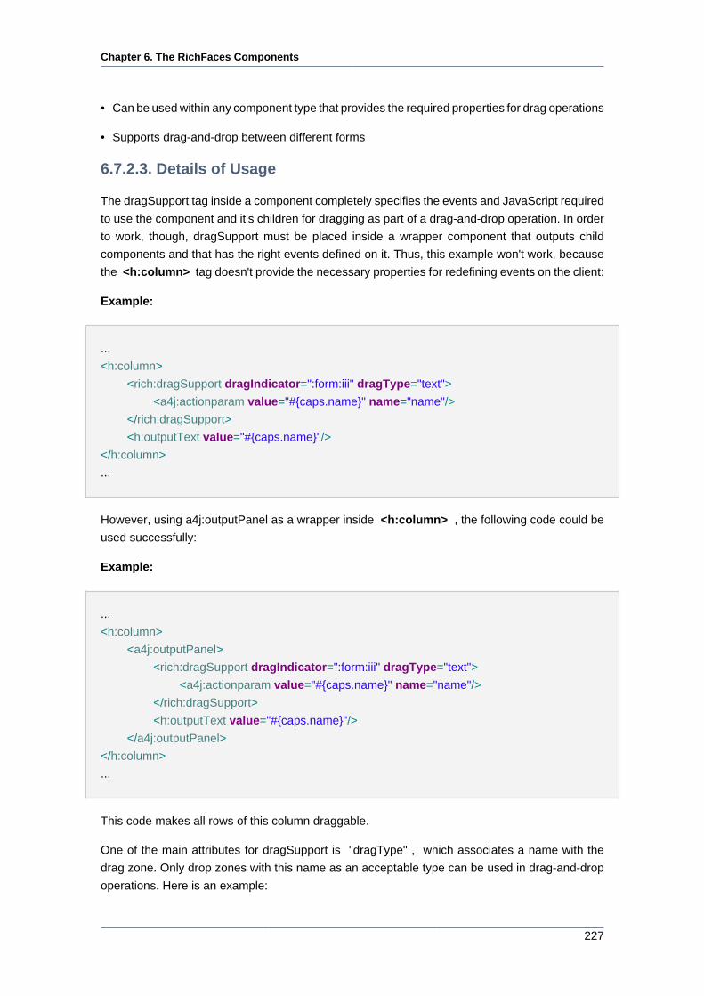
Chapter 6. The RichFaces Components
227
• Can be used within any component type that provides the required properties for drag operations
• Supports drag-and-drop between different forms
6.7.2.3. Details of Usage
The dragSupport tag inside a component completely specifies the events and JavaScript required
to use the component and it's children for dragging as part of a drag-and-drop operation. In order
to work, though, dragSupport must be placed inside a wrapper component that outputs child
components and that has the right events defined on it. Thus, this example won't work, because
the <h:column> tag doesn't provide the necessary properties for redefining events on the client:
Example:
...
<h:column>
<rich:dragSupport dragIndicator=":form:iii" dragType="text">
<a4j:actionparam value="#{caps.name}" name="name"/>
</rich:dragSupport>
<h:outputText value="#{caps.name}"/>
</h:column>
...
However, using a4j:outputPanel as a wrapper inside <h:column> , the following code could be
used successfully:
Example:
...
<h:column>
<a4j:outputPanel>
<rich:dragSupport dragIndicator=":form:iii" dragType="text">
<a4j:actionparam value="#{caps.name}" name="name"/>
</rich:dragSupport>
<h:outputText value="#{caps.name}"/>
</a4j:outputPanel>
</h:column>
...
This code makes all rows of this column draggable.
One of the main attributes for dragSupport is "dragType" , which associates a name with the
drag zone. Only drop zones with this name as an acceptable type can be used in drag-and-drop
operations. Here is an example:
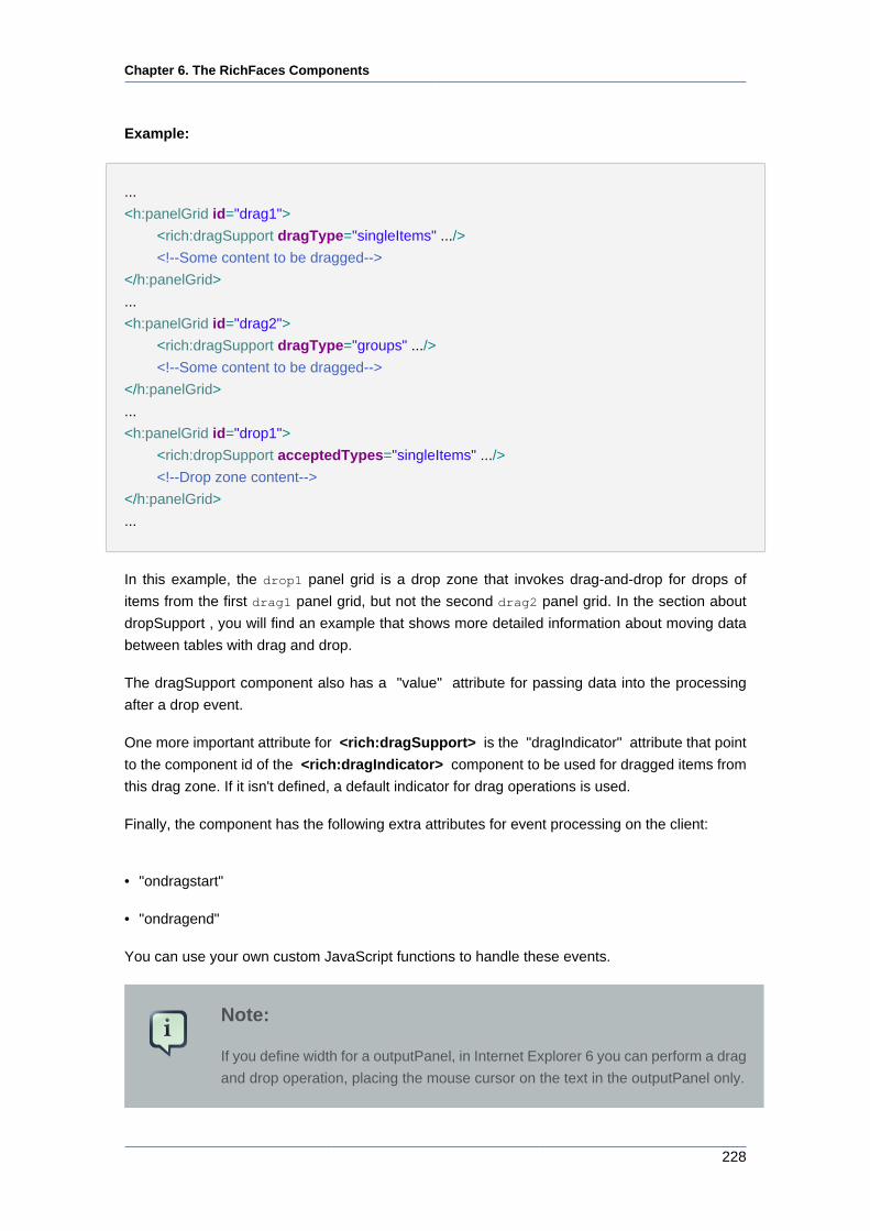
Chapter 6. The RichFaces Components
228
Example:
...
<h:panelGrid id="drag1">
<rich:dragSupport dragType="singleItems" .../>
<!--Some content to be dragged-->
</h:panelGrid>
...
<h:panelGrid id="drag2">
<rich:dragSupport dragType="groups" .../>
<!--Some content to be dragged-->
</h:panelGrid>
...
<h:panelGrid id="drop1">
<rich:dropSupport acceptedTypes="singleItems" .../>
<!--Drop zone content-->
</h:panelGrid>
...
In this example, the drop1 panel grid is a drop zone that invokes drag-and-drop for drops of
items from the first drag1 panel grid, but not the second drag2 panel grid. In the section about
dropSupport , you will find an example that shows more detailed information about moving data
between tables with drag and drop.
The dragSupport component also has a "value" attribute for passing data into the processing
after a drop event.
One more important attribute for <rich:dragSupport> is the "dragIndicator" attribute that point
to the component id of the <rich:dragIndicator> component to be used for dragged items from
this drag zone. If it isn't defined, a default indicator for drag operations is used.
Finally, the component has the following extra attributes for event processing on the client:
• "ondragstart"
• "ondragend"
You can use your own custom JavaScript functions to handle these events.
Note:
If you define width for a outputPanel, in Internet Explorer 6 you can perform a drag
and drop operation, placing the mouse cursor on the text in the outputPanel only.
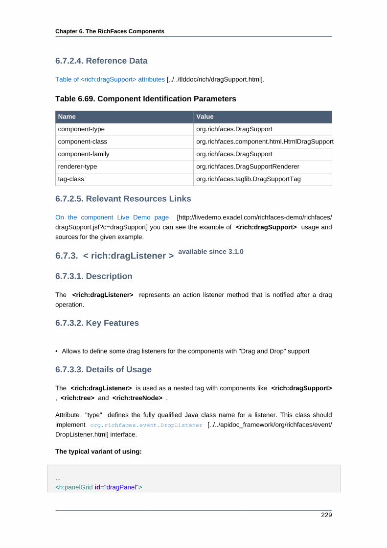
Chapter 6. The RichFaces Components
229
6.7.2.4. Reference Data
Table of <rich:dragSupport> attributes [../../tlddoc/rich/dragSupport.html].
Table 6.69. Component Identification Parameters
Name Value
component-type org.richfaces.DragSupport
component-class org.richfaces.component.html.HtmlDragSupport
component-family org.richfaces.DragSupport
renderer-type org.richfaces.DragSupportRenderer
tag-class org.richfaces.taglib.DragSupportTag
6.7.2.5. Relevant Resources Links
On the component Live Demo page [http://livedemo.exadel.com/richfaces-demo/richfaces/
dragSupport.jsf?c=dragSupport] you can see the example of <rich:dragSupport> usage and
sources for the given example.
6.7.3. < rich:dragListener > available since 3.1.0
6.7.3.1. Description
The <rich:dragListener> represents an action listener method that is notified after a drag
operation.
6.7.3.2. Key Features
• Allows to define some drag listeners for the components with "Drag and Drop" support
6.7.3.3. Details of Usage
The <rich:dragListener> is used as a nested tag with components like <rich:dragSupport>
, <rich:tree> and <rich:treeNode> .
Attribute "type" defines the fully qualified Java class name for a listener. This class should
implement org.richfaces.event.DropListener [../../apidoc_framework/org/richfaces/event/
DropListener.html] interface.
The typical variant of using:
...
<h:panelGrid id="dragPanel">
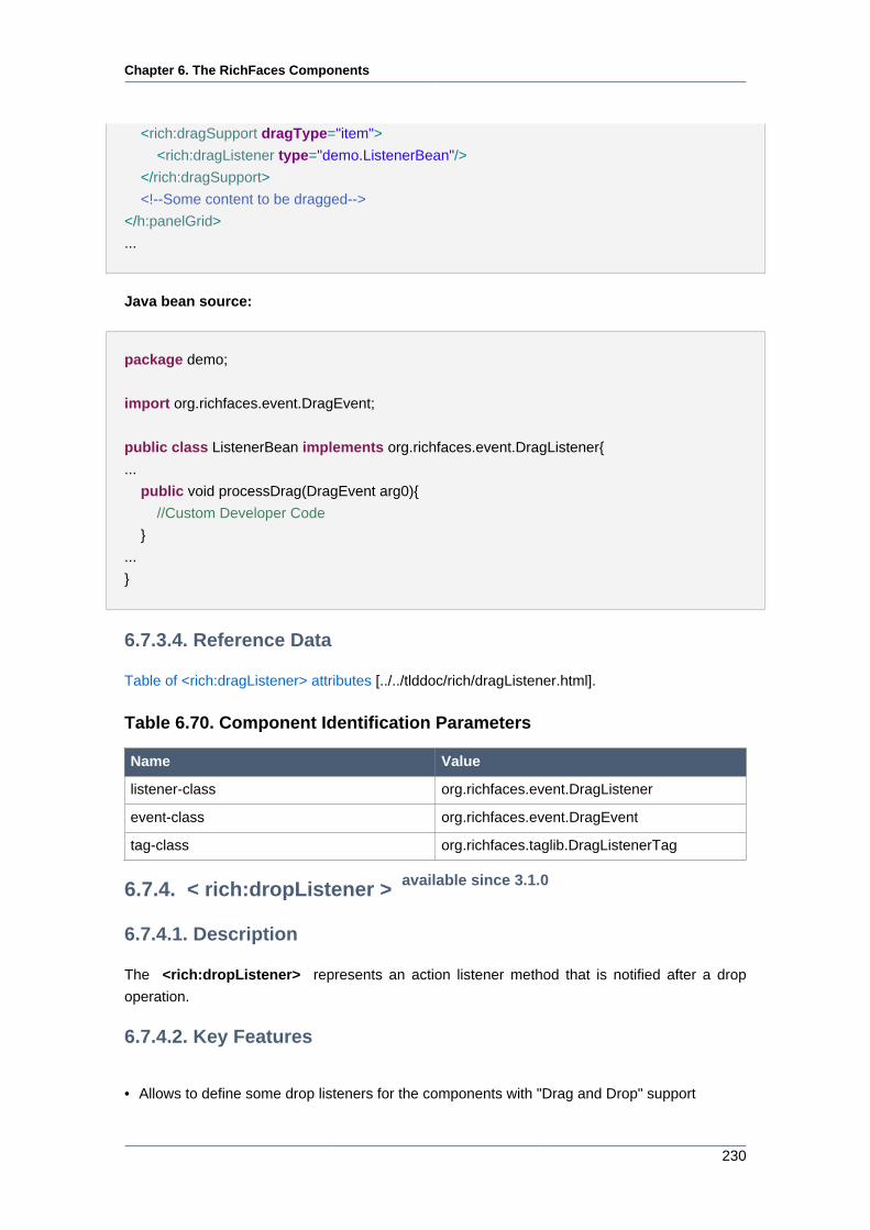
Chapter 6. The RichFaces Components
230
<rich:dragSupport dragType="item">
<rich:dragListener type="demo.ListenerBean"/>
</rich:dragSupport>
<!--Some content to be dragged-->
</h:panelGrid>
...
Java bean source:
package demo;
import org.richfaces.event.DragEvent;
public class ListenerBean implements org.richfaces.event.DragListener{
...
public void processDrag(DragEvent arg0){
//Custom Developer Code
}
...
}
6.7.3.4. Reference Data
Table of <rich:dragListener> attributes [../../tlddoc/rich/dragListener.html].
Table 6.70. Component Identification Parameters
Name Value
listener-class org.richfaces.event.DragListener
event-class org.richfaces.event.DragEvent
tag-class org.richfaces.taglib.DragListenerTag
6.7.4. < rich:dropListener > available since 3.1.0
6.7.4.1. Description
The <rich:dropListener> represents an action listener method that is notified after a drop
operation.
6.7.4.2. Key Features
• Allows to define some drop listeners for the components with "Drag and Drop" support
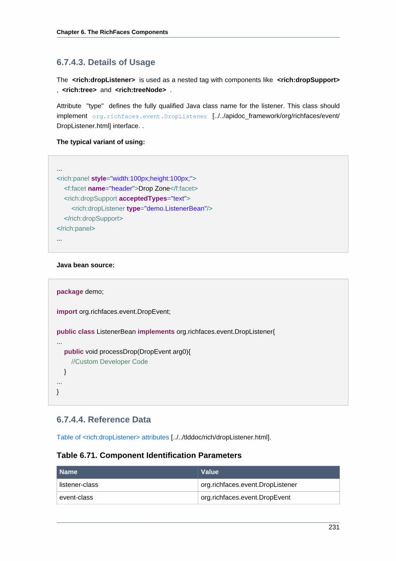
Chapter 6. The RichFaces Components
231
6.7.4.3. Details of Usage
The <rich:dropListener> is used as a nested tag with components like <rich:dropSupport>
, <rich:tree> and <rich:treeNode> .
Attribute "type" defines the fully qualified Java class name for the listener. This class should
implement org.richfaces.event.DropListener [../../apidoc_framework/org/richfaces/event/
DropListener.html] interface. .
The typical variant of using:
...
<rich:panel style="width:100px;height:100px;">
<f:facet name="header">Drop Zone</f:facet>
<rich:dropSupport acceptedTypes="text">
<rich:dropListener type="demo.ListenerBean"/>
</rich:dropSupport>
</rich:panel>
...
Java bean source:
package demo;
import org.richfaces.event.DropEvent;
public class ListenerBean implements org.richfaces.event.DropListener{
...
public void processDrop(DropEvent arg0){
//Custom Developer Code
}
...
}
6.7.4.4. Reference Data
Table of <rich:dropListener> attributes [../../tlddoc/rich/dropListener.html].
Table 6.71. Component Identification Parameters
Name Value
listener-class org.richfaces.event.DropListener
event-class org.richfaces.event.DropEvent
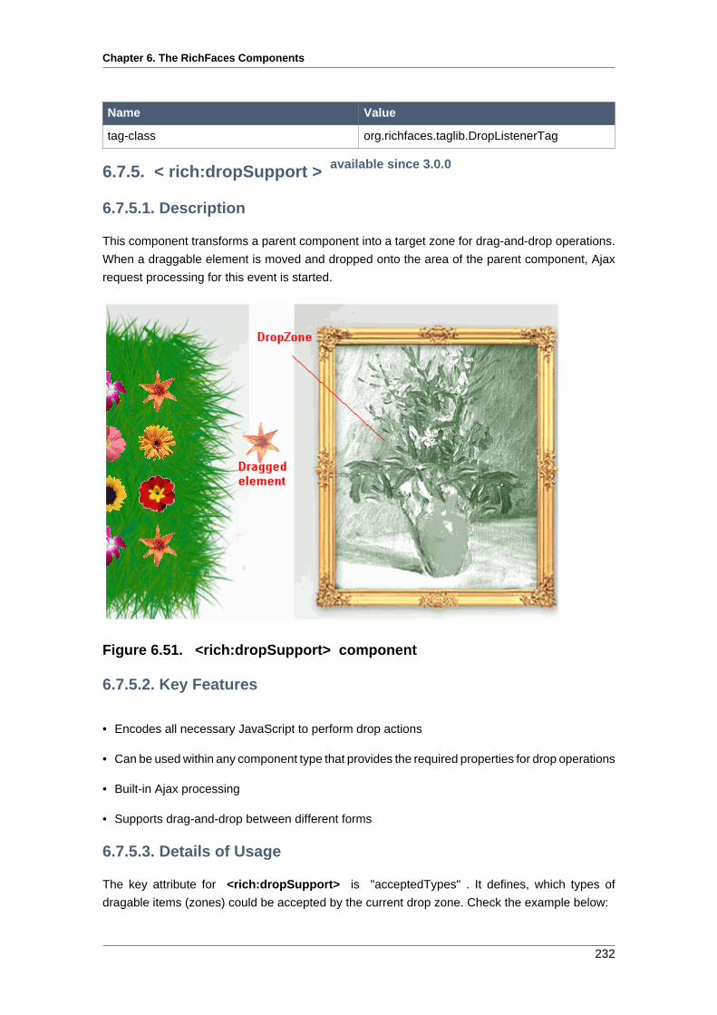
Chapter 6. The RichFaces Components
232
Name Value
tag-class org.richfaces.taglib.DropListenerTag
6.7.5. < rich:dropSupport > available since 3.0.0
6.7.5.1. Description
This component transforms a parent component into a target zone for drag-and-drop operations.
When a draggable element is moved and dropped onto the area of the parent component, Ajax
request processing for this event is started.
Figure 6.51. <rich:dropSupport> component
6.7.5.2. Key Features
• Encodes all necessary JavaScript to perform drop actions
• Can be used within any component type that provides the required properties for drop operations
• Built-in Ajax processing
• Supports drag-and-drop between different forms
6.7.5.3. Details of Usage
The key attribute for <rich:dropSupport> is "acceptedTypes" . It defines, which types of
dragable items (zones) could be accepted by the current drop zone. Check the example below:
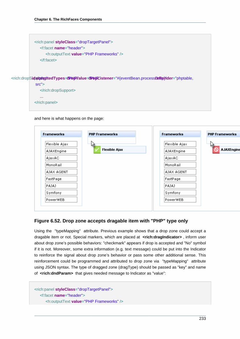
Chapter 6. The RichFaces Components
233
<rich:panel styleClass="dropTargetPanel">
<f:facet name="header">
<h:outputText value="PHP Frameworks" />
</f:facet>
<rich:dropSupport id="php" acceptedTypes="PHP" dropValue="PHP" dropListener="#{eventBean.processDrop}" reRender="phptable,
src">
</rich:dropSupport>
...
</rich:panel>
and here is what happens on the page:
Figure 6.52. Drop zone accepts dragable item with "PHP" type only
Using the "typeMapping" attribute. Previous example shows that a drop zone could accept a
dragable item or not. Special markers, which are placed at <rich:dragIndicator> , inform user
about drop zone’s possible behaviors: "checkmark" appears if drop is accepted and "No" symbol
if it is not. Moreover, some extra information (e.g. text message) could be put into the Indicator
to reinforce the signal about drop zone’s behavior or pass some other additional sense. This
reinforcement could be programmed and attributed to drop zone via "typeMapping" attribute
using JSON syntax. The type of dragged zone (dragType) should be passed as "key" and name
of <rich:dndParam> that gives needed message to Indicator as "value":
<rich:panel styleClass="dropTargetPanel">
<f:facet name="header">
<h:outputText value="PHP Frameworks" />
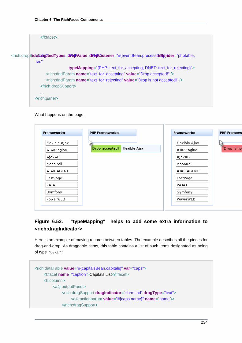
Chapter 6. The RichFaces Components
234
</f:facet>
<rich:dropSupport id="php" acceptedTypes="PHP" dropValue="PHP" dropListener="#{eventBean.processDrop}" reRender="phptable,
src"
typeMapping="{PHP: text_for_accepting, DNET: text_for_rejecting}">
<rich:dndParam name="text_for_accepting" value="Drop accepted!" />
<rich:dndParam name="text_for_rejecting" value="Drop is not accepted!" />
</rich:dropSupport>
...
</rich:panel>
What happens on the page:
Figure 6.53. "typeMapping" helps to add some extra information to
<rich:dragIndicator>
Here is an example of moving records between tables. The example describes all the pieces for
drag-and-drop. As draggable items, this table contains a list of such items designated as being
of type "text" :
<rich:dataTable value="#{capitalsBean.capitals}" var="caps">
<f:facet name="caption">Capitals List</f:facet>
<h:column>
<a4j:outputPanel>
<rich:dragSupport dragIndicator=":form:ind" dragType="text">
<a4j:actionparam value="#{caps.name}" name="name"/>
</rich:dragSupport>
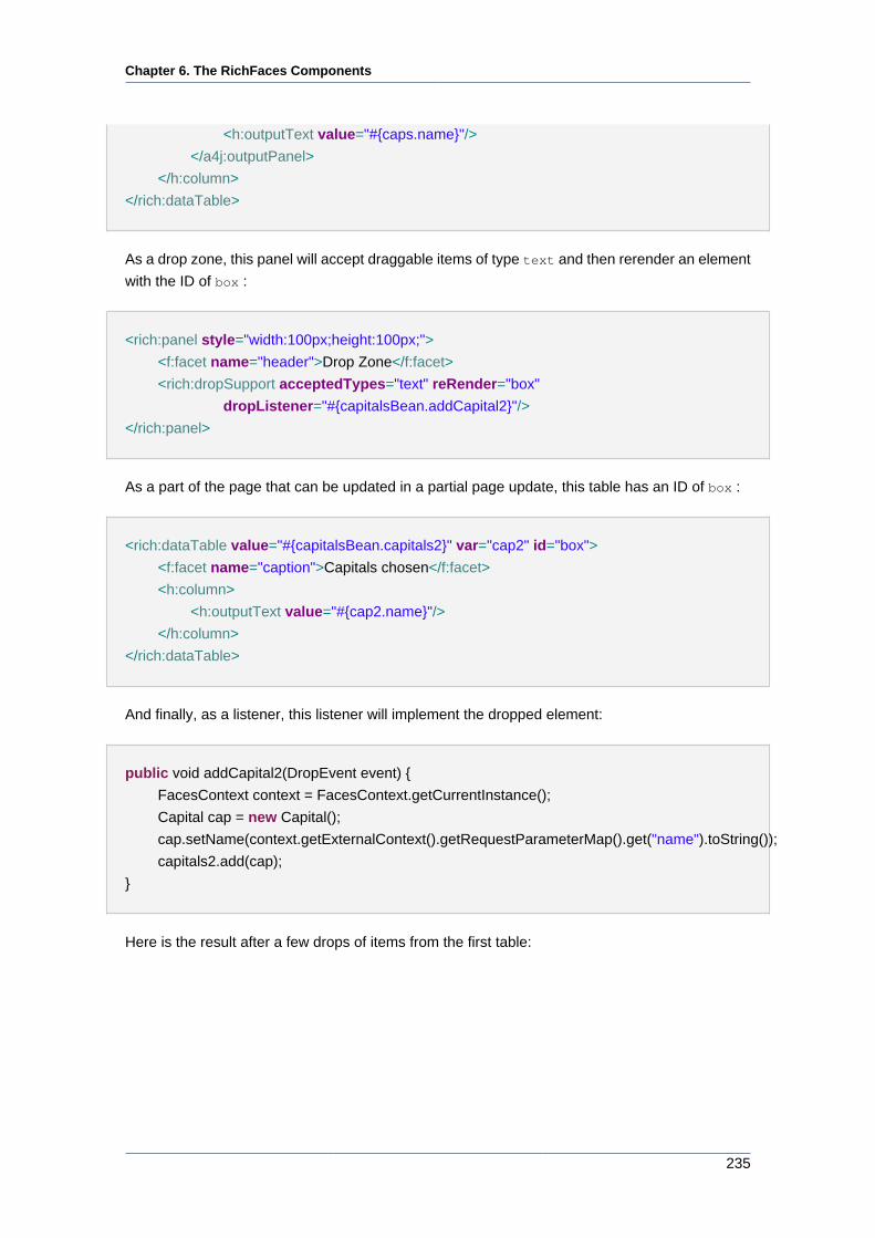
Chapter 6. The RichFaces Components
235
<h:outputText value="#{caps.name}"/>
</a4j:outputPanel>
</h:column>
</rich:dataTable>
As a drop zone, this panel will accept draggable items of type text and then rerender an element
with the ID of box :
<rich:panel style="width:100px;height:100px;">
<f:facet name="header">Drop Zone</f:facet>
<rich:dropSupport acceptedTypes="text" reRender="box"
dropListener="#{capitalsBean.addCapital2}"/>
</rich:panel>
As a part of the page that can be updated in a partial page update, this table has an ID of box :
<rich:dataTable value="#{capitalsBean.capitals2}" var="cap2" id="box">
<f:facet name="caption">Capitals chosen</f:facet>
<h:column>
<h:outputText value="#{cap2.name}"/>
</h:column>
</rich:dataTable>
And finally, as a listener, this listener will implement the dropped element:
public void addCapital2(DropEvent event) {
FacesContext context = FacesContext.getCurrentInstance();
Capital cap = new Capital();
cap.setName(context.getExternalContext().getRequestParameterMap().get("name").toString());
capitals2.add(cap);
}
Here is the result after a few drops of items from the first table:
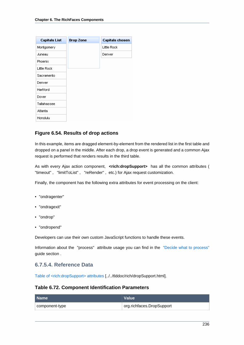
Chapter 6. The RichFaces Components
236
Figure 6.54. Results of drop actions
In this example, items are dragged element-by-element from the rendered list in the first table and
dropped on a panel in the middle. After each drop, a drop event is generated and a common Ajax
request is performed that renders results in the third table.
As with every Ajax action component, <rich:dropSupport> has all the common attributes (
"timeout" , "limitToList" , "reRender" , etc.) for Ajax request customization.
Finally, the component has the following extra attributes for event processing on the client:
• "ondragenter"
• "ondragexit"
• "ondrop"
• "ondropend"
Developers can use their own custom JavaScript functions to handle these events.
Information about the "process" attribute usage you can find in the "Decide what to process"
guide section .
6.7.5.4. Reference Data
Table of <rich:dropSupport> attributes [../../tlddoc/rich/dropSupport.html].
Table 6.72. Component Identification Parameters
Name Value
component-type org.richfaces.DropSupport
Chapter 6. The RichFaces Components
237
Name Value
component-class org.richfaces.component.html.HtmlDropSupport
component-family org.richfaces.DropSupport
renderer-type org.richfaces.DropSupportRenderer
tag-class org.richfaces.taglib.DropSupportTag
6.7.5.5. Relevant Resources Links
On the component Live Demo page [http://livedemo.exadel.com/richfaces-demo/richfaces/
dragSupport.jsf?c=dropSupport] you can see the example of <rich:dropSupport> usage and
sources for the given example.
6.7.6. <rich:dndParam> available since 3.0.0
6.7.6.1. Description
The component is used for passing parameters during drag-and-drop operations.
6.7.6.2. Details of Usage
The <rich:dndParam> is used during drag-and-drop operations for passing parameters to an
indicator. To use the component it is necessary to set "type" attribute that specifies what kind of
functionality the component will provide: dragging or dropping. Attributes "name" and "value" are
also should be defiend. Instead of the "value" attribute definition it is possible to define value of
the component using nested contents.
Variants of usage:
• Passing parameters for indicator's drag icon. The <rich:dndParam> can define the indicator's
drag icon that will be used during dragging instead of indicator's default icon. For example,
a drag icon may be represented with a minimized image of a dragged element. In this case
type="drag":
...
<rich:dragSupport ... >
<rich:dndParam type="drag" name="dragging">
<h:graphicImage value="/img/product1_small.png"/>
</rich:dndParam>
<h:graphicImage value="product1.png"/>
</rich:dragSupport>
...
• Passing parameters for indicator's informational part. The <rich:dndParam> can transmit it's
value into indicator's. In this case type="drag":
Chapter 6. The RichFaces Components
238
...
<rich:dragSupport ... >
<rich:dndParam type="drag" name="label" value="#{msg.subj}"/>
...
</rich:dragSupport>
...
• Passing parameters to a component that supports drop after drop happens. The
<rich:dndParam> can pass icons into an indicator, if dragged content of a comp type is above
the given drop zone that processes it on the next drop event. In this case type="drop":
...
<rich:dropSupport ... >
<rich:dndParam type="drop" name="comp" >
<h:graphicImage height="16" width="16" value="/images/comp.png"/>
</rich:dndParam>
...
</rich:dropSupport >
...
6.7.6.3. Reference Data
Table of <rich:dndParam> attributes [../../tlddoc/rich/dndParam.html].
Table 6.73. Component Identification Parameters
Name Value
component-type org.richfaces.DndParam
component-class org.richfaces.component.html.HtmlDndParam
tag-class org.richfaces.taglib.DndParamTag
6.8. Rich Menu
This section tells how you can create menus on your page: either navigational ones or context.
6.8.1. < rich:contextMenu > available since 3.0.0
6.8.1.1. Description
The <rich:contextMenu> component is used for creation of multilevelled context menus that
are activated after defined events like "onmouseover" , "onclick" etc. The component could be
applied to any element on the page.
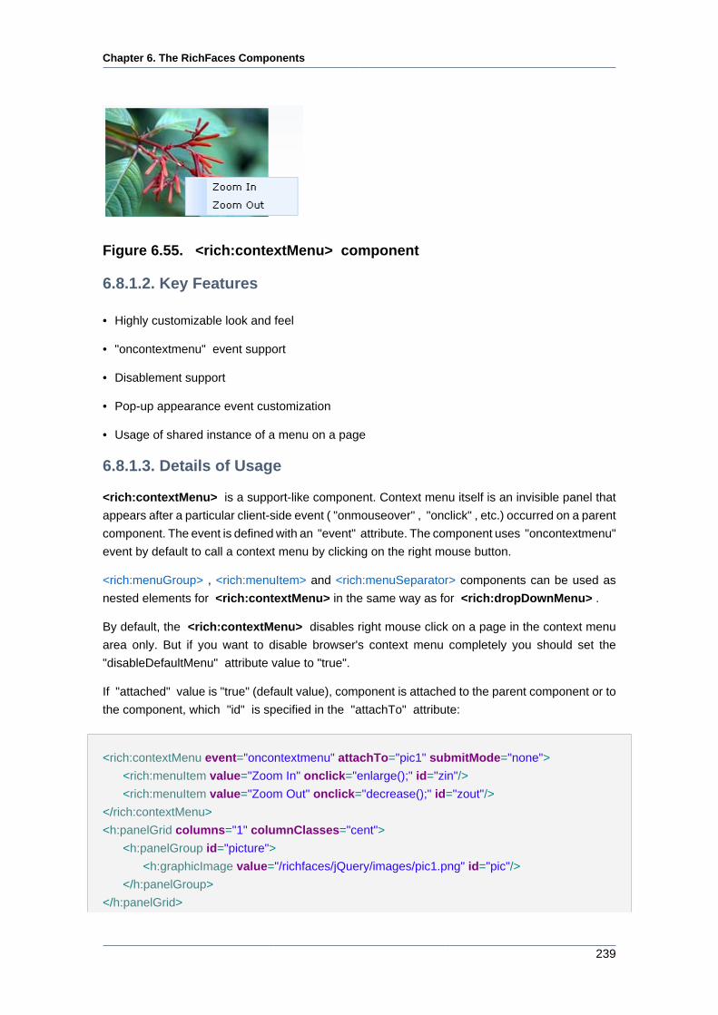
Chapter 6. The RichFaces Components
239
Figure 6.55. <rich:contextMenu> component
6.8.1.2. Key Features
• Highly customizable look and feel
• "oncontextmenu" event support
• Disablement support
• Pop-up appearance event customization
• Usage of shared instance of a menu on a page
6.8.1.3. Details of Usage
<rich:contextMenu> is a support-like component. Context menu itself is an invisible panel that
appears after a particular client-side event ( "onmouseover" , "onclick" , etc.) occurred on a parent
component. The event is defined with an "event" attribute. The component uses "oncontextmenu"
event by default to call a context menu by clicking on the right mouse button.
<rich:menuGroup> , <rich:menuItem> and <rich:menuSeparator> components can be used as
nested elements for <rich:contextMenu> in the same way as for <rich:dropDownMenu> .
By default, the <rich:contextMenu> disables right mouse click on a page in the context menu
area only. But if you want to disable browser's context menu completely you should set the
"disableDefaultMenu" attribute value to "true".
If "attached" value is "true" (default value), component is attached to the parent component or to
the component, which "id" is specified in the "attachTo" attribute:
<rich:contextMenu event="oncontextmenu" attachTo="pic1" submitMode="none">
<rich:menuItem value="Zoom In" onclick="enlarge();" id="zin"/>
<rich:menuItem value="Zoom Out" onclick="decrease();" id="zout"/>
</rich:contextMenu>
<h:panelGrid columns="1" columnClasses="cent">
<h:panelGroup id="picture">
<h:graphicImage value="/richfaces/jQuery/images/pic1.png" id="pic"/>
</h:panelGroup>
</h:panelGrid>
Chapter 6. The RichFaces Components
240
<h:panelGrid columns="1" columnClasses="cent">
<h:panelGroup id="picture1">
<h:graphicImage value="/richfaces/jQuery/images/pic2.png" id="pic1"/>
</h:panelGroup>
</h:panelGrid>
The "enlarge()" and "decrease()" functions definition is placed below.
<script type="text/javascript">
function enlarge(){
document.getElementById('pic').width=document.getElementById('pic').width*1.1;
document.getElementById('pic').height=document.getElementById('pic').height*1.1;
}
function decrease(){
document.getElementById('pic').width=document.getElementById('pic').width*0.9;
document.getElementById('pic').height=document.getElementById('pic').height*0.9;
}
</script>
In the example a picture zooming possibility with <rich:contextMenu> component usage was
shown. The picture is placed on the <h:panelGroup> component. The <rich:contextMenu>
component is not nested to <h:panelGroup> and has a value of the "attachTo" attribute defined
as "pic1". Thus, the context menu is attached to the component, which "id" is "pic1". The
context menu has two items to zoom in (zoom out) a picture by "onclick" event. For earch item
corresponding JavaScript function is defined to provide necessary action as a result of the clicking
on it. For the menu is defined an "oncontextmenu" event to call the context menu on a right
click mouse event.
In the example the context menu is defined for the parent <h:panelGroup> component with a
value of "id" attribute equal to "picture" You should be careful with such definition, because
a client context menu is looked for a DOM element with a client Id of a parent component
on a server. If a parent component doesn't encode an Id on a client, it can't be found by the
<rich:contextMenu> and it's attached to its closest parent in a DOM tree.
If the "attached" attribute has "false" value, component activates via JavaScript API with
assistance of <rich:componentControl> . An example is placed below.
Example:
<h:form id="form">
<rich:contextMenu attached="false" id="menu" submitMode="ajax">
<rich:menuItem ajaxSingle="true">
<b>{car} {model}</b> details
Chapter 6. The RichFaces Components
241
<a4j:actionparam name="det" assignTo="#{ddmenu.current}" value="{car} {model}
details"/>
</rich:menuItem>
<rich:menuGroup value="Actions">
<rich:menuItem ajaxSingle="true">
Put <b>{car} {model}</b> To Basket
<a4j:actionparam name="bask" assignTo="#{ddmenu.current}" value="Put {car} {model} To
Basket"/>
</rich:menuItem>
<rich:menuItem value="Read Comments" ajaxSingle="true">
<a4j:actionparam name="bask" assignTo="#{ddmenu.current}" value="Read
Comments"/>
</rich:menuItem>
<rich:menuItem ajaxSingle="true">
Go to <b>{car}</b> site
<a4j:actionparam name="bask" assignTo="#{ddmenu.current}" value="Go
to {car} site"/>
</rich:menuItem>
</rich:menuGroup>
</rich:contextMenu>
<h:panelGrid columns="2">
<rich:dataTable value="#{dataTableScrollerBean.tenRandomCars}" var="car" id="table" onRowMouseOver="this.style.backgroundColor='#F8F8F8'" onRowMouseOut="this.style.backgroundColor='#{a4jSkin.tableBackgroundColor}'" rowClasses="cur">
<rich:column>
<f:facet name="header">Make</f:facet>
<h:outputText value="#{car.make}"/>
</rich:column>
<rich:column>
<f:facet name="header">Model</f:facet>
<h:outputText value="#{car.model}"/>
</rich:column>
<rich:column>
<f:facet name="header">Price</f:facet>
<h:outputText value="#{car.price}" />
</rich:column>
<rich:componentControl event="onRowClick" for="menu" operation="show">
<f:param value="#{car.model}" name="model"/>
<f:param value="#{car.make}" name="car"/>
</rich:componentControl>
</rich:dataTable>
<a4j:outputPanel ajaxRendered="true">
<rich:panel>
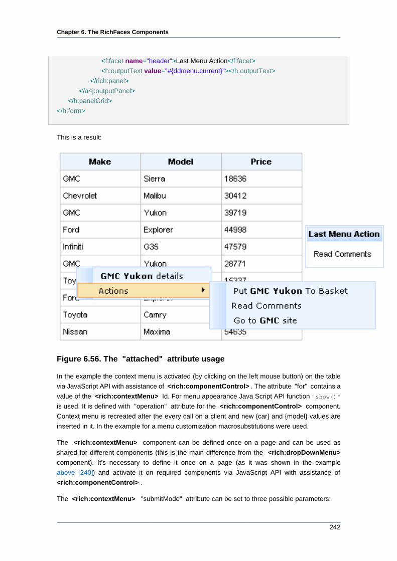
Chapter 6. The RichFaces Components
242
<f:facet name="header">Last Menu Action</f:facet>
<h:outputText value="#{ddmenu.current}"></h:outputText>
</rich:panel>
</a4j:outputPanel>
</h:panelGrid>
</h:form>
This is a result:
Figure 6.56. The "attached" attribute usage
In the example the context menu is activated (by clicking on the left mouse button) on the table
via JavaScript API with assistance of <rich:componentControl> . The attribute "for" contains a
value of the <rich:contextMenu> Id. For menu appearance Java Script API function "show()"
is used. It is defined with "operation" attribute for the <rich:componentControl> component.
Context menu is recreated after the every call on a client and new {car} and {model} values are
inserted in it. In the example for a menu customization macrosubstitutions were used.
The <rich:contextMenu> component can be defined once on a page and can be used as
shared for different components (this is the main difference from the <rich:dropDownMenu>
component). It's necessary to define it once on a page (as it was shown in the example
above [240]) and activate it on required components via JavaScript API with assistance of
<rich:componentControl> .
The <rich:contextMenu> "submitMode" attribute can be set to three possible parameters:
Chapter 6. The RichFaces Components
243
• Server — default value, uses regular form submition request;
• Ajax — Ajax submission is used for switching;
• None — neither Server nor Ajax is used.
The "action" and "actionListener" item's attributes are ignored. Menu items don't fire any submits
themselves. The behavior is fully defined by the components nested inside items.
Notes:
• When nesting <rich:contextMenu> into JSF <h:outputText> , specify an id
for <h:outputText> , otherwise, do not nest the <rich:contextMenu> to make
it work properly.
• As the <rich:contextMenu> component doesn't provide its own form, use it
between <h:form> and </h:form> tags.
6.8.1.4. Reference Data
Table of <rich:contextMenu> attributes [../../tlddoc/rich/contextMenu.html].
Table 6.74. Component Identification Parameters
Name Value
component-type org.richfaces.ContextMenu
component-class org.richfaces.component.html.ContextMenu
component-family org.richfaces.ContextMenu
renderer-type org.richfaces.DropDownMenuRenderer
tag-class org.richfaces.taglib.ContextMenuTagHandler
Table 6.75. JavaScript API
Function Description Apply to
hide() Hides component or group Component, group
show(event, context) Shows component or group Component, group
Table 6.76. Classes names that define the contextMenu element
Class name Description
rich-menu-list-border Defines styles for borders
rich-menu-list-bg Defines styles for a general background list
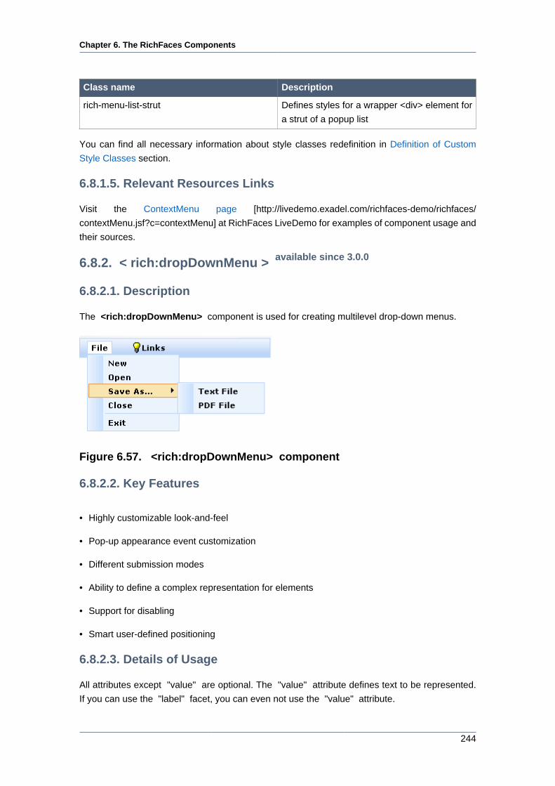
Chapter 6. The RichFaces Components
244
Class name Description
rich-menu-list-strut Defines styles for a wrapper <div> element for
a strut of a popup list
You can find all necessary information about style classes redefinition in Definition of Custom
Style Classes section.
6.8.1.5. Relevant Resources Links
Visit the ContextMenu page [http://livedemo.exadel.com/richfaces-demo/richfaces/
contextMenu.jsf?c=contextMenu] at RichFaces LiveDemo for examples of component usage and
their sources.
6.8.2. < rich:dropDownMenu > available since 3.0.0
6.8.2.1. Description
The <rich:dropDownMenu> component is used for creating multilevel drop-down menus.
Figure 6.57. <rich:dropDownMenu> component
6.8.2.2. Key Features
• Highly customizable look-and-feel
• Pop-up appearance event customization
• Different submission modes
• Ability to define a complex representation for elements
• Support for disabling
• Smart user-defined positioning
6.8.2.3. Details of Usage
All attributes except "value" are optional. The "value" attribute defines text to be represented.
If you can use the "label" facet, you can even not use the "value" attribute.
Chapter 6. The RichFaces Components
245
Here is an example:
Example:
...
<f:facet name="label">
<h:graphicImage value="/images/img1.png"/>
</f:facet>
...
Use the "event" attribute to define an event for the represented element that triggers a menu
appearance. An example of a menu appearance on a click can be seen below.
Example:
...
<rich:dropDownMenu event="onclick" value="Item1">
<!--Nested menu components-->
</rich:dropDownMenu>
...
The <rich:dropDownMenu> "submitMode" attribute can be set to three possible parameters:
• Server (default)
Regular form submission request is used.
• Ajax
Ajax submission is used for switching.
• None
The "action" and "actionListener" item's attributes are ignored. Menu items don't fire any submits
themselves. The behavior is fully defined by the components nested into items.
Note:
As the <rich:dropDownMenu> component doesn't provide its own form, use it
between <h:form> and </h:form> tags.
Chapter 6. The RichFaces Components
246
The "direction" and "jointPoint" attributes are used for defining aspects of menu appearance.
Possible values for the "direction" attribute are:
• "top-left" - a menu drops to the top and left
• "top-right" - a menu drops to the top and right
• "bottom-left" - a menu drops to the bottom and left
• "bottom-right" - a menu drops to the bottom and right
• "auto" - smart positioning activation
Possible values for the "jointPoint" attribute are:
• "tr" - a menu is attached to the top-right point of the button element
• "tl" - a menu is attached to the top-left point of the button element
• "br" - a menu is attached to the bottom-right point of the button element
• "bl" - a menu is attached to the bottom-left point of the button element
• "auto" - smart positioning activation
By default, the "direction" and "jointPoint" attributes are set to "auto".
Here is an example:
Example:
...
<rich:dropDownMenu value="File" direction="bottom-right" jointPoint="bl">
<rich:menuItem submitMode="ajax" value="New" action="#{ddmenu.doNew}"/>
<rich:menuItem submitMode="ajax" value="Open" action="#{ddmenu.doOpen}"/>
<rich:menuGroup value="Save As...">
<rich:menuItem submitMode="ajax" value="Text File" action="#{ddmenu.doSaveText}"/>
<rich:menuItem submitMode="ajax" value="PDF File" action="#{ddmenu.doSavePDF}"/>
</rich:menuGroup>
<rich:menuItem submitMode="ajax" value="Close" action="#{ddmenu.doClose}"/>
<rich:menuSeparator id="menuSeparator11"/>
<rich:menuItem submitMode="ajax" value="Exit" action="#{ddmenu.doExit}"/>
</rich:dropDownMenu>
...
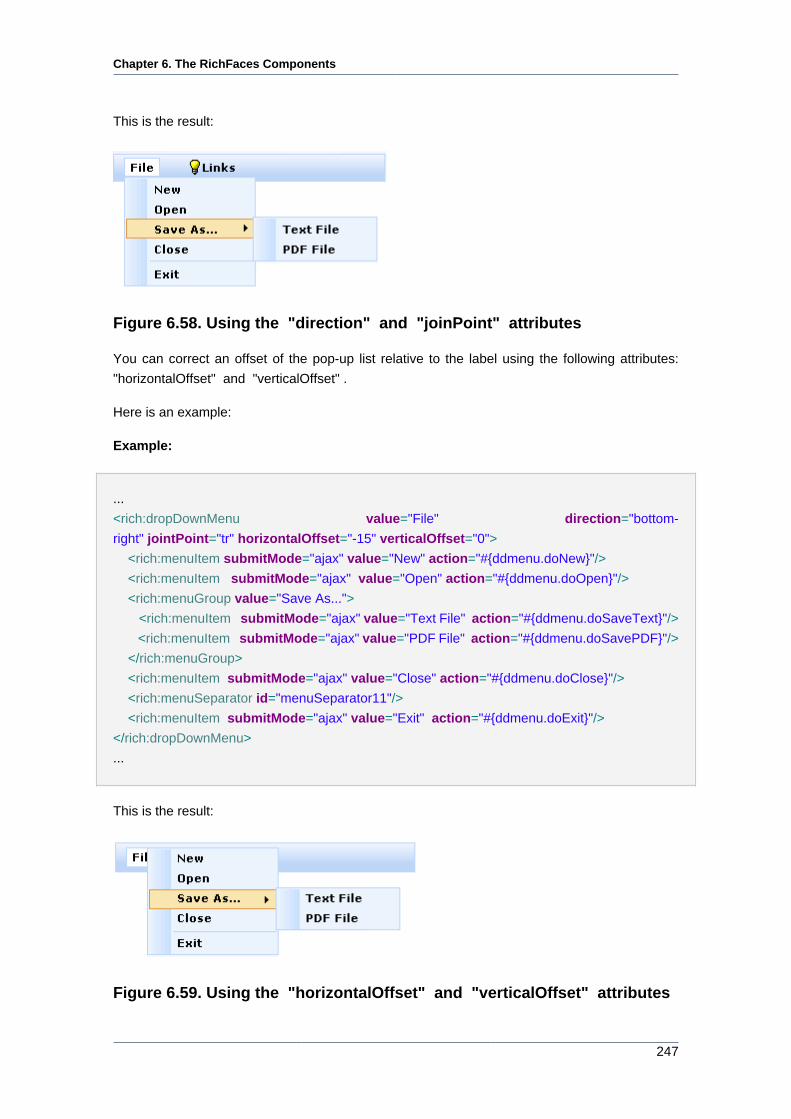
Chapter 6. The RichFaces Components
247
This is the result:
Figure 6.58. Using the "direction" and "joinPoint" attributes
You can correct an offset of the pop-up list relative to the label using the following attributes:
"horizontalOffset" and "verticalOffset" .
Here is an example:
Example:
...
<rich:dropDownMenu value="File" direction="bottom-
right" jointPoint="tr" horizontalOffset="-15" verticalOffset="0">
<rich:menuItem submitMode="ajax" value="New" action="#{ddmenu.doNew}"/>
<rich:menuItem submitMode="ajax" value="Open" action="#{ddmenu.doOpen}"/>
<rich:menuGroup value="Save As...">
<rich:menuItem submitMode="ajax" value="Text File" action="#{ddmenu.doSaveText}"/>
<rich:menuItem submitMode="ajax" value="PDF File" action="#{ddmenu.doSavePDF}"/>
</rich:menuGroup>
<rich:menuItem submitMode="ajax" value="Close" action="#{ddmenu.doClose}"/>
<rich:menuSeparator id="menuSeparator11"/>
<rich:menuItem submitMode="ajax" value="Exit" action="#{ddmenu.doExit}"/>
</rich:dropDownMenu>
...
This is the result:
Figure 6.59. Using the "horizontalOffset" and "verticalOffset" attributes
Chapter 6. The RichFaces Components
248
The "disabled" attribute is used for disabling whole <rich:dropDownMenu> component. In this
case it is necessary to define "disabled" attribute as "true". An example is placed below.
Example:
...
<rich:dropDownMenu value="File" disabled="true">
...
</rich:dropDownMenu>
...
6.8.2.4. Reference Data
Table of <rich:dropDownMenu> attributes [../../tlddoc/rich/dropDownMenu.html].
Table 6.77. Component Identification Parameters
Name Value
component-type org.richfaces.DropDownMenu
component-class org.richfaces.component.html.HtmlDropDownMenu
component-family org.richfaces.DropDownMenu
renderer-type org.richfaces.DropDownMenuRenderer
tag-class org.richfaces.taglib.DropDownMenuTag
Table 6.78. Facets
Facet Description
label Redefines the content set of label
labelDisabled Redefines the content set of disabled label
Table 6.79. Classes names that define a label
Class name Description
rich-label-text-decor Defines text style for a representation element
rich-ddmenu-label Defines styles for a wrapper <div> element of
a representation element
rich-ddmenu-label-select Defines styles for a wrapper <div> element of
a selected representation element
rich-ddmenu-label-unselect Defines styles for a wrapper <div> element of
an unselected representation element
rich-ddmenu-label-disabled Defines styles for a wrapper <div> element of
a disabled representation element
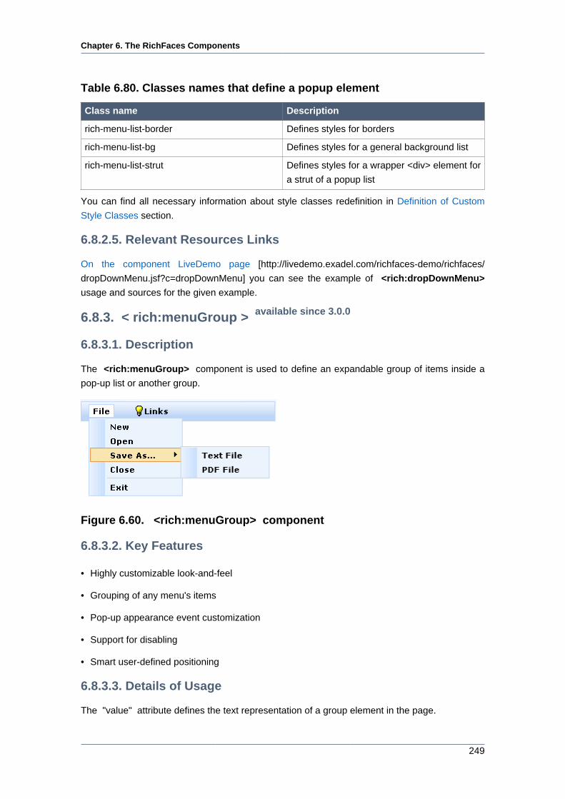
Chapter 6. The RichFaces Components
249
Table 6.80. Classes names that define a popup element
Class name Description
rich-menu-list-border Defines styles for borders
rich-menu-list-bg Defines styles for a general background list
rich-menu-list-strut Defines styles for a wrapper <div> element for
a strut of a popup list
You can find all necessary information about style classes redefinition in Definition of Custom
Style Classes section.
6.8.2.5. Relevant Resources Links
On the component LiveDemo page [http://livedemo.exadel.com/richfaces-demo/richfaces/
dropDownMenu.jsf?c=dropDownMenu] you can see the example of <rich:dropDownMenu>
usage and sources for the given example.
6.8.3. < rich:menuGroup > available since 3.0.0
6.8.3.1. Description
The <rich:menuGroup> component is used to define an expandable group of items inside a
pop-up list or another group.
Figure 6.60. <rich:menuGroup> component
6.8.3.2. Key Features
• Highly customizable look-and-feel
• Grouping of any menu's items
• Pop-up appearance event customization
• Support for disabling
• Smart user-defined positioning
6.8.3.3. Details of Usage
The "value" attribute defines the text representation of a group element in the page.
Chapter 6. The RichFaces Components
250
The "icon" attribute defines an icon for the component. The "iconDisabled" attribute defines an
icon for when the group is disabled. Also you can use the "icon" and "iconDisabled" facets. If
the facets are defined, the corresponding "icon" and "iconDisabled" attributes are ignored and
the facets' contents are used as icons. This could be used for an item check box implementation.
Here is an example:
...
<f:facet name="icon">
<h:selectBooleanCheckbox value="#{bean.property}"/>
</f:facet>
...
The "iconFolder" and "iconFolderDisabled" attributes are defined for using icons as folder
icons. The "iconFolder" and "iconFolderDisabled" facets use their contents as folder icon
representations in place of the attribute values.
The "direction" attribute is used to define which way to display the menu as shown in the example
below:
Possible values are:
• "left - down" - a submenu is attached to the left side of the menu and is dropping down
• "left - up" - a submenu is attached to the left side of the menu and is dropping up
• "right - down" - a submenu is attached to the right side of the menu and is dropping down
• "right - up" - a submenu is attached to the right side of the menu and is dropping up
• "auto - smart" positioning activation
By default, the "direction" attribute is set to "auto".
Here is an example:
...
<rich:menuGroup value="Save As..." direction="left-down">
<rich:menuItem submitMode="ajax" value="Text File" action="#{ddmenu.doSaveText}"/>
<rich:menuItem submitMode="ajax" value="PDF File" action="#{ddmenu.doSavePDF}"/>
</rich:menuGroup>
...
This would be the result:
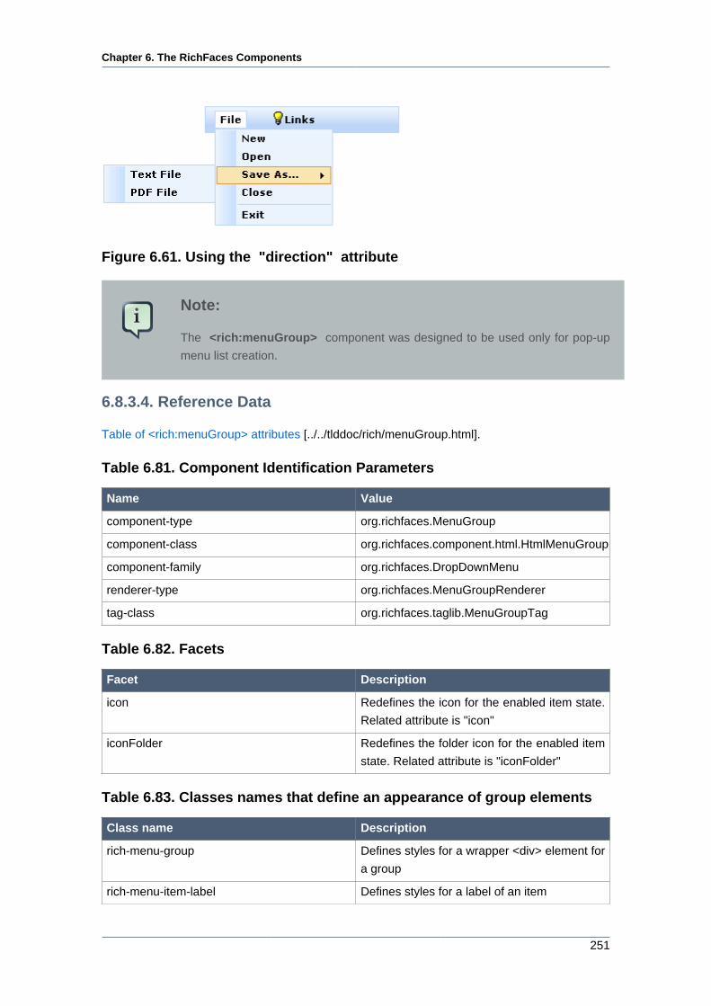
Chapter 6. The RichFaces Components
251
Figure 6.61. Using the "direction" attribute
Note:
The <rich:menuGroup> component was designed to be used only for pop-up
menu list creation.
6.8.3.4. Reference Data
Table of <rich:menuGroup> attributes [../../tlddoc/rich/menuGroup.html].
Table 6.81. Component Identification Parameters
Name Value
component-type org.richfaces.MenuGroup
component-class org.richfaces.component.html.HtmlMenuGroup
component-family org.richfaces.DropDownMenu
renderer-type org.richfaces.MenuGroupRenderer
tag-class org.richfaces.taglib.MenuGroupTag
Table 6.82. Facets
Facet Description
icon Redefines the icon for the enabled item state.
Related attribute is "icon"
iconFolder Redefines the folder icon for the enabled item
state. Related attribute is "iconFolder"
Table 6.83. Classes names that define an appearance of group elements
Class name Description
rich-menu-group Defines styles for a wrapper <div> element for
a group
rich-menu-item-label Defines styles for a label of an item
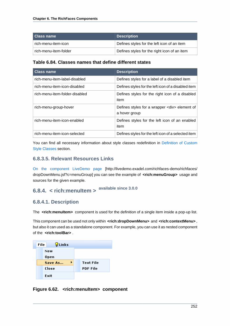
Chapter 6. The RichFaces Components
252
Class name Description
rich-menu-item-icon Defines styles for the left icon of an item
rich-menu-item-folder Defines styles for the right icon of an item
Table 6.84. Classes names that define different states
Class name Description
rich-menu-item-label-disabled Defines styles for a label of a disabled item
rich-menu-item-icon-disabled Defines styles for the left icon of a disabled item
rich-menu-item-folder-disabled Defines styles for the right icon of a disabled
item
rich-menu-group-hover Defines styles for a wrapper <div> element of
a hover group
rich-menu-item-icon-enabled Defines styles for the left icon of an enabled
item
rich-menu-item-icon-selected Defines styles for the left icon of a selected item
You can find all necessary information about style classes redefinition in Definition of Custom
Style Classes section.
6.8.3.5. Relevant Resources Links
On the component LiveDemo page [http://livedemo.exadel.com/richfaces-demo/richfaces/
dropDownMenu.jsf?c=menuGroup] you can see the example of <rich:menuGroup> usage and
sources for the given example.
6.8.4. < rich:menuItem > available since 3.0.0
6.8.4.1. Description
The <rich:menuItem> component is used for the definition of a single item inside a pop-up list.
This component can be used not only within <rich:dropDownMenu> and <rich:contextMenu> ,
but also it can used as a standalone component. For example, you can use it as nested component
of the <rich:toolBar> .
Figure 6.62. <rich:menuItem> component
Chapter 6. The RichFaces Components
253
6.8.4.2. Key Features
• Highly customizable look-and-feel
• Different submission modes
• Support for disabling
• Custom content support
6.8.4.3. Details of Usage
The "value" attribute defines the text representation for an item element.
There are two icon-related attributes. The "icon" attribute defines an icon. The "iconDisabled"
attribute defines an icon for a disabled item. Also you can use the "icon" and "iconDisabled"
facets. If the facets are defined, the corresponding "icon" and "iconDisabled" attributes are
ignored and the facets content is shown as an icon. It could be used for an item check box
implementation.
Here is an example:
...
<f:facet name="icon">
<h:selectBooleanCheckbox value="#{bean.property}"/>
</f:facet>
...
The <rich:menuItem> "submitMode" attribute can be set to three possible parameters:
• Server (default)
Regular form submission request is used.
• Ajax
Ajax submission is used for switching.
• None
The "action" and "actionListener" item's attributes are ignored. Menu items don' fire any submits
themselves. The behavior is fully defined by the components nested into items.
Chapter 6. The RichFaces Components
254
For example, you can put any content into an item, but, in this case, you should set the
"submitMode" attribute as "none" .
Here is an example:
...
<rich:dropDownMenu>
...
<rich:menuItem submitMode="none">
<h:outputLink value="www.jboss.org"/>
</rich:menuItem>
...
<rich:dropDownMenu>
...
You can use the "disabled" attribute to set the item state.
Here is an example:
...
<rich:dropDownMenu>
<rich:menuItem value="Disable" disabled="true"/>
<rich:dropDownMenu>
...
Note:
The <rich:menuItem> component was designed to be used only for pop-up menu
list creation.
Information about the "process" attribute usage you can find RichFaces Developer Guide section
about "process" attribute .
6.8.4.4. Reference Data
Table of <rich:menuItem> attributes [../../tlddoc/rich/menuItem.html].
Table 6.85. Component Identification Parameters
Name Value
component-type org.richfaces.MenuItem
component-class org.richfaces.component.html.HtmlMenuItem
Chapter 6. The RichFaces Components
255
Name Value
component-family org.richfaces.DropDownMenu
renderer-type org.richfaces.MenuItemRenderer
tag-class org.richfaces.taglib.MenuItemTag
Table 6.86. Facets
Facet Description
icon Redefines the icon for the enabled item state.
Related attribute is "icon"
iconDisabled Redefines the folder icon the disabled item
state. Related attribute is "iconDisabled"
Table 6.87. Classes names that define an appearance of item elements
Class name Description
rich-menu-item Defines styles for a wrapper <div> element for
an item
rich-menu-item-label Defines styles for a label of an item
rich-menu-item-icon Defines styles for the left icon of an item
Table 6.88. Classes names that define different states
Class name Description
rich-menu-item-disabled Defines styles for a wrapper <div> element of
an item
rich-menu-item-enabled Defines styles for a wrapper <div> element of
an enabled item
rich-menu-item-hover Defines styles for a wrapper <div> element of
a hover item
rich-menu-item-label-disabled Defines styles for a label of a disabled item
rich-menu-item-icon-disabled Defines styles for the left icon of a disabled item
rich-menu-item-label-enabled Defines styles for a label of an enabled item
rich-menu-item-icon-enabled Defines styles for the left icon of an enabled
item
rich-menu-item-label-selected Defines styles for a label of a selected item
rich-menu-item-icon-selected Defines styles for the left icon of a selected item
You can find all necessary information about style classes redefinition in Definition of Custom
Style Classes section.
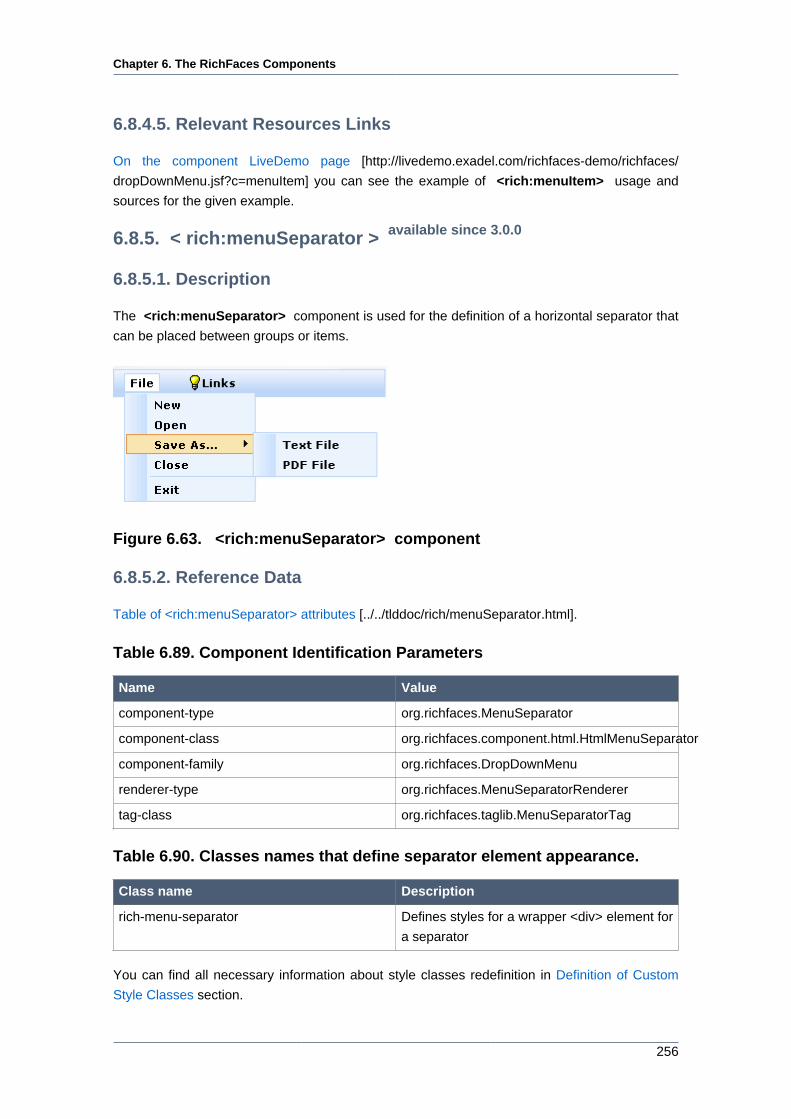
Chapter 6. The RichFaces Components
256
6.8.4.5. Relevant Resources Links
On the component LiveDemo page [http://livedemo.exadel.com/richfaces-demo/richfaces/
dropDownMenu.jsf?c=menuItem] you can see the example of <rich:menuItem> usage and
sources for the given example.
6.8.5. < rich:menuSeparator > available since 3.0.0
6.8.5.1. Description
The <rich:menuSeparator> component is used for the definition of a horizontal separator that
can be placed between groups or items.
Figure 6.63. <rich:menuSeparator> component
6.8.5.2. Reference Data
Table of <rich:menuSeparator> attributes [../../tlddoc/rich/menuSeparator.html].
Table 6.89. Component Identification Parameters
Name Value
component-type org.richfaces.MenuSeparator
component-class org.richfaces.component.html.HtmlMenuSeparator
component-family org.richfaces.DropDownMenu
renderer-type org.richfaces.MenuSeparatorRenderer
tag-class org.richfaces.taglib.MenuSeparatorTag
Table 6.90. Classes names that define separator element appearance.
Class name Description
rich-menu-separator Defines styles for a wrapper <div> element for
a separator
You can find all necessary information about style classes redefinition in Definition of Custom
Style Classes section.
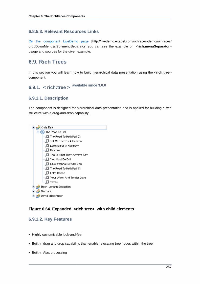
Chapter 6. The RichFaces Components
257
6.8.5.3. Relevant Resources Links
On the component LiveDemo page [http://livedemo.exadel.com/richfaces-demo/richfaces/
dropDownMenu.jsf?c=menuSeparator] you can see the example of <rich:menuSeparator>
usage and sources for the given example.
6.9. Rich Trees
In this section you will learn how to build hierarchical data presentation using the <rich:tree>
component.
6.9.1. < rich:tree > available since 3.0.0
6.9.1.1. Description
The component is designed for hierarchical data presentation and is applied for building a tree
structure with a drag-and-drop capability.
Figure 6.64. Expanded <rich:tree> with child elements
6.9.1.2. Key Features
• Highly customizable look-and-feel
• Built-in drag and drop capability, than enable relocating tree nodes within the tree
• Built-in Ajax processing
Chapter 6. The RichFaces Components
258
• Possibility to define a visual representation by node type
• Support of several root elements in a tree
6.9.1.3. Details of Usage
As it has been mentioned above the <rich:tree> component allows rendering any tree-like data
model.
You can build your <rich:tree> using model (org.richfaces.model.TreeNode or
javax.swing.tree.TreeNode). In this case the <rich:tree> component interacts with data
model via "TreeNode" interface ( org.richfaces.model.TreeNode [../../apidoc_framework/org/
richfaces/model/TreeNode.html]) that is used for the <rich:tree> nodes representation.
Actually you can develop and use your own implementation of the "TreeNode"
interface or use a default one, which is defined with a default class
"TreeNodeImpl" ( org.richfaces.model.TreeNodeImpl [../../apidoc_framework/org/richfaces/
model/TreeNodeImpl.html]).
The "value" attribute of the <rich:tree> component contains a nodes structure defined in a
bean property.
When the <rich:tree> component is being rendered it iterates over the model nodes and renders
them using one of its immediate <rich:treeNode> children. Data property of the current model
TreeNode is exposed using "var" attribute, so if var="station" you can refer to that data using
#{station} syntax.
In the following example the <rich:tree> is built from a simple org.richfaces.model.TreeNode
model:
...
private TreeNodeImpl<String> stationRoot = new TreeNodeImpl<String>();
private TreeNodeImpl<String> stationNodes = new TreeNodeImpl<String>();
private String[] kickRadioFeed = { "Hall & Oates - Kiss On My List",
"David Bowie - Let's Dance", "Lyn Collins - Think (About It)",
"Kim Carnes - Bette Davis Eyes",
"KC & the Sunshine Band - Give It Up" };
...
stationRoot.setData("KickRadio");
stationNodes.addChild(0, stationRoot);
for (int i = 0; i < kickRadioFeed.length; i++){
TreeNodeImpl<String> child = new TreeNodeImpl<String>();
child.setData(kickRadioFeed[i]);
stationRoot.addChild(i, child);
}
...
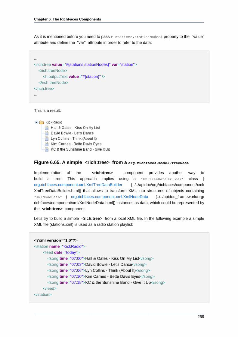
Chapter 6. The RichFaces Components
259
As it is mentioned before you need to pass #{stations.stationNodes} property to the "value"
attribute and define the "var" attribute in order to refer to the data:
...
<rich:tree value="#{stations.stationNodes}" var="station">
<rich:treeNode>
<h:outputText value="#{station}" />
</rich:treeNode>
</rich:tree>
...
This is a result:
Figure 6.65. A simple <rich:tree> from a org.richfaces.model.TreeNode
Implementation of the <rich:tree> component provides another way to
build a tree. This approach implies using a "XmlTreeDataBuilder" class (
org.richfaces.component.xml.XmlTreeDataBuilder [../../apidoc/org/richfaces/component/xml/
XmlTreeDataBuilder.html]) that allows to transform XML into structures of objects containing
"XmlNodeData" ( org.richfaces.component.xml.XmlNodeData [../../apidoc_framework/org/
richfaces/component/xml/XmlNodeData.html]) instances as data, which could be represented by
the <rich:tree> component.
Let's try to build a simple <rich:tree> from a local XML file. In the following example a simple
XML file (stations.xml) is used as a radio station playlist:
<?xml version="1.0"?>
<station name="KickRadio">
<feed date="today">
<song time="07:00">Hall & Oates - Kiss On My List</song>
<song time="07:03">David Bowie - Let's Dance</song>
<song time="07:06">Lyn Collins - Think (About It)</song>
<song time="07:10">Kim Carnes - Bette Davis Eyes</song>
<song time="07:15">KC & the Sunshine Band - Give It Up</song>
</feed>
</station>
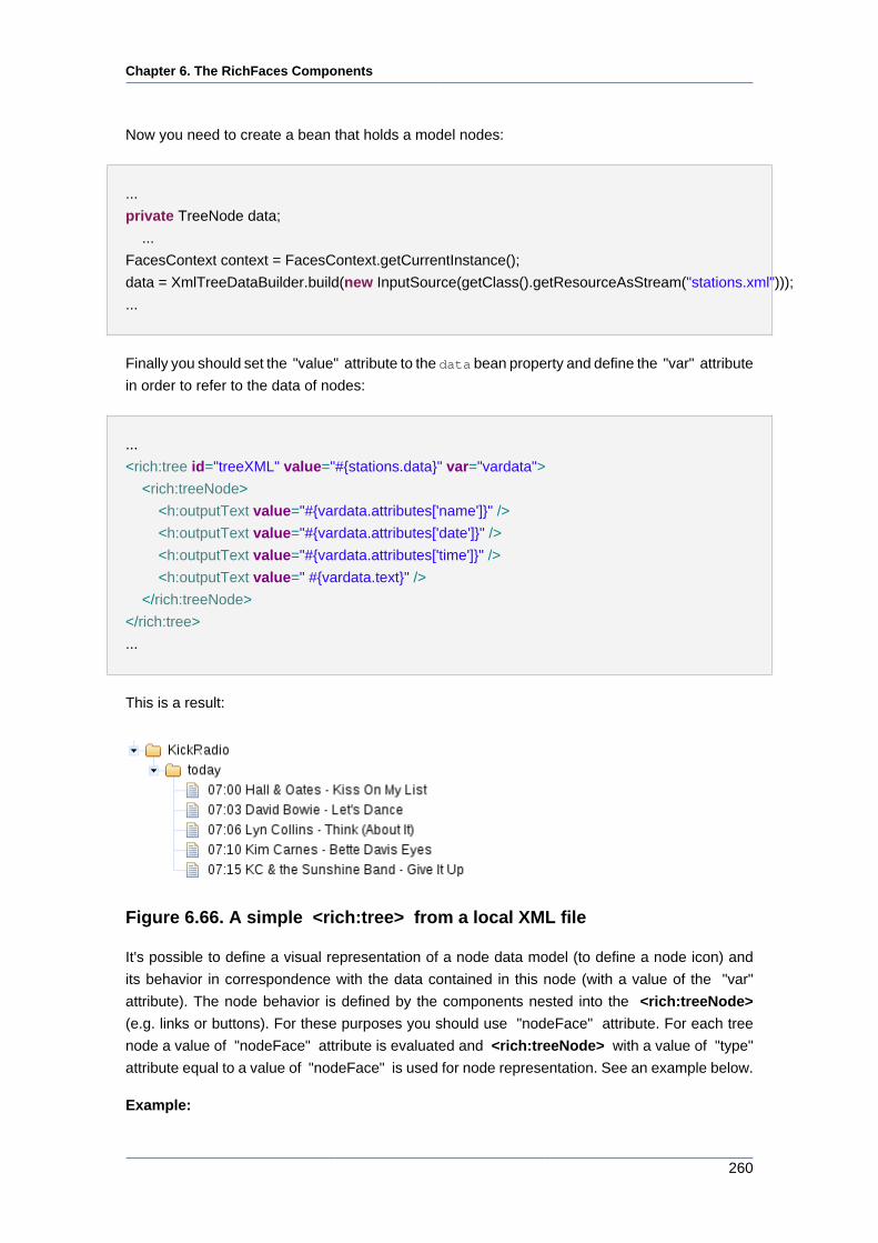
Chapter 6. The RichFaces Components
260
Now you need to create a bean that holds a model nodes:
...
private TreeNode data;
...
FacesContext context = FacesContext.getCurrentInstance();
data = XmlTreeDataBuilder.build(new InputSource(getClass().getResourceAsStream("stations.xml")));
...
Finally you should set the "value" attribute to the data bean property and define the "var" attribute
in order to refer to the data of nodes:
...
<rich:tree id="treeXML" value="#{stations.data}" var="vardata">
<rich:treeNode>
<h:outputText value="#{vardata.attributes['name']}" />
<h:outputText value="#{vardata.attributes['date']}" />
<h:outputText value="#{vardata.attributes['time']}" />
<h:outputText value=" #{vardata.text}" />
</rich:treeNode>
</rich:tree>
...
This is a result:
Figure 6.66. A simple <rich:tree> from a local XML file
It's possible to define a visual representation of a node data model (to define a node icon) and
its behavior in correspondence with the data contained in this node (with a value of the "var"
attribute). The node behavior is defined by the components nested into the <rich:treeNode>
(e.g. links or buttons). For these purposes you should use "nodeFace" attribute. For each tree
node a value of "nodeFace" attribute is evaluated and <rich:treeNode> with a value of "type"
attribute equal to a value of "nodeFace" is used for node representation. See an example below.
Example:
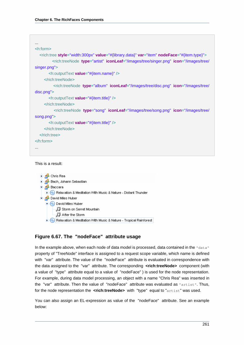
Chapter 6. The RichFaces Components
261
...
<h:form>
<rich:tree style="width:300px" value="#{library.data}" var="item" nodeFace="#{item.type}">
<rich:treeNode type="artist" iconLeaf="/images/tree/singer.png" icon="/images/tree/
singer.png">
<h:outputText value="#{item.name}" />
</rich:treeNode>
<rich:treeNode type="album" iconLeaf="/images/tree/disc.png" icon="/images/tree/
disc.png">
<h:outputText value="#{item.title}" />
</rich:treeNode>
<rich:treeNode type="song" iconLeaf="/images/tree/song.png" icon="/images/tree/
song.png">
<h:outputText value="#{item.title}" />
</rich:treeNode>
</rich:tree>
</h:form>
...
This is a result:
Figure 6.67. The "nodeFace" attribute usage
In the example above, when each node of data model is processed, data contained in the "data"
property of "TreeNode" interface is assigned to a request scope variable, which name is defined
with "var" attribute. The value of the "nodeFace" attribute is evaluated in correspondence with
the data assigned to the "var" attribute. The corresponding <rich:treeNode> component (with
a value of "type" attribute equal to a value of "nodeFace" ) is used for the node representation.
For example, during data model processing, an object with a name "Chris Rea" was inserted in
the "var" attribute. Then the value of "nodeFace" attribute was evaluated as "artist". Thus,
for the node representation the <rich:treeNode> with "type" equal to "artist" was used.
You can also assign an EL-expression as value of the "nodeFace" attribute. See an example
below:
Chapter 6. The RichFaces Components
262
Example:
nodeFace="#{data.name != 'param-value' ? 'artist' : 'album'}"
There are some essential points in a "nodeFace" attribute usage: you need to define notions for
typeless and a default nodes.
The typeless node is the first <rich:treeNode> component (from all children nodes nested to the
<rich:tree> component) with not defined "type" attribute and defined "rendered" attribute. The
typeless node is used for representation when "nodeFace" attribute is null.
Default node has the following interior presentation:
Example:
...
<h:outputText value="#{varAttributeName}">
...
"varAttributeName" is a value for "var" attribute.
Default node is used in the following cases:
• "nodeFace" attribute is defined, but its value isn't equal to any "type" attribute value from all
children nodes;
• "nodeFace" attribute is defined and its value is equal to a value of some "type" attribute from
all children nodes, but the value of "rendered" attribute for this node is "false".
There is also one thing that has to be remembered using "type" and "rendered" attributes: it's
possible to define several <rich:treeNode> components with equal values of "type" attribute and
different values of "rendered" attribute. It provides a possibility to define different representation
styles for the same node types. In the example with artists and their albums (see above [260])
it's possible to represent albums that are available for sale and albums that are not available.
Please study the example below:
Example:
...
<h:form>
<rich:tree style="width:300px" value="#{library.data}" var="item" nodeFace="#{item.type}">
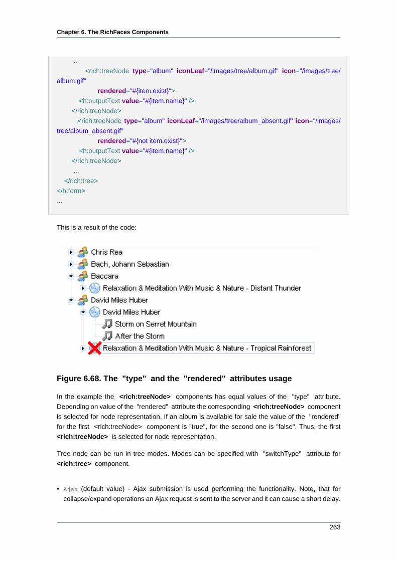
Chapter 6. The RichFaces Components
263
...
<rich:treeNode type="album" iconLeaf="/images/tree/album.gif" icon="/images/tree/
album.gif"
rendered="#{item.exist}">
<h:outputText value="#{item.name}" />
</rich:treeNode>
<rich:treeNode type="album" iconLeaf="/images/tree/album_absent.gif" icon="/images/
tree/album_absent.gif"
rendered="#{not item.exist}">
<h:outputText value="#{item.name}" />
</rich:treeNode>
...
</rich:tree>
</h:form>
...
This is a result of the code:
Figure 6.68. The "type" and the "rendered" attributes usage
In the example the <rich:treeNode> components has equal values of the "type" attribute.
Depending on value of the "rendered" attribute the corresponding <rich:treeNode> component
is selected for node representation. If an album is available for sale the value of the "rendered"
for the first <rich:treeNode> component is "true", for the second one is "false". Thus, the first
<rich:treeNode> is selected for node representation.
Tree node can be run in tree modes. Modes can be specified with "switchType" attribute for
<rich:tree> component.
• Ajax (default value) - Ajax submission is used performing the functionality. Note, that for
collapse/expand operations an Ajax request is sent to the server and it can cause a short delay.
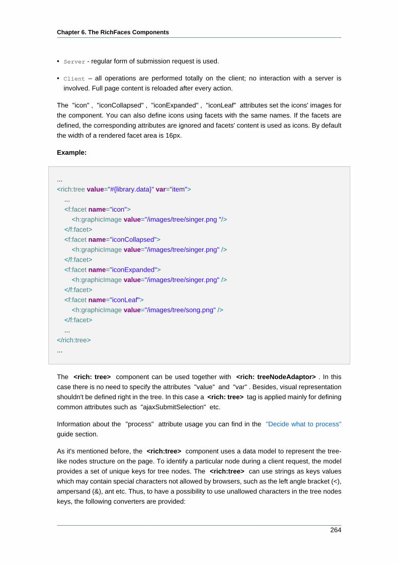
Chapter 6. The RichFaces Components
264
• Server - regular form of submission request is used.
• Client – all operations are performed totally on the client; no interaction with a server is
involved. Full page content is reloaded after every action.
The "icon" , "iconCollapsed" , "iconExpanded" , "iconLeaf" attributes set the icons' images for
the component. You can also define icons using facets with the same names. If the facets are
defined, the corresponding attributes are ignored and facets' content is used as icons. By default
the width of a rendered facet area is 16px.
Example:
...
<rich:tree value="#{library.data}" var="item">
...
<f:facet name="icon">
<h:graphicImage value="/images/tree/singer.png "/>
</f:facet>
<f:facet name="iconCollapsed">
<h:graphicImage value="/images/tree/singer.png" />
</f:facet>
<f:facet name="iconExpanded">
<h:graphicImage value="/images/tree/singer.png" />
</f:facet>
<f:facet name="iconLeaf">
<h:graphicImage value="/images/tree/song.png" />
</f:facet>
...
</rich:tree>
...
The <rich: tree> component can be used together with <rich: treeNodeAdaptor> . In this
case there is no need to specify the attributes "value" and "var" . Besides, visual representation
shouldn't be defined right in the tree. In this case a <rich: tree> tag is applied mainly for defining
common attributes such as "ajaxSubmitSelection" etc.
Information about the "process" attribute usage you can find in the "Decide what to process"
guide section.
As it's mentioned before, the <rich:tree> component uses a data model to represent the tree-
like nodes structure on the page. To identify a particular node during a client request, the model
provides a set of unique keys for tree nodes. The <rich:tree> can use strings as keys values
which may contain special characters not allowed by browsers, such as the left angle bracket (<),
ampersand (&), ant etc. Thus, to have a possibility to use unallowed characters in the tree nodes
keys, the following converters are provided:

Chapter 6. The RichFaces Components
265
• org.richfaces.TreeRowKeyConverter that is used for "TreeNode" based trees. The key
should be of a java.lang.String type.
• org.richfaces.TreeAdaptorRowKeyConverter that is used for adaptor-based trees (see
<rich:treeNodesAdaptor> , <rich:recursiveTreeNodesAdaptor> ). The key should be of
a java.lang.String type.
• org.richfaces.TreeAdaptorIntegerRowKeyConverter which is provided for adaptor-based
trees. The key should be of a java.lang.Integer type.
The converters can be extended in order to have a possibility for implementing custom converters.
To apply a converter to the <rich:tree> component, you should define it as a value of the
"rowKeyConverter" attribute.
Have a look at the example of a tree which contains the RichFaces components as its nodes
and the components attributes as the nodes child elements. As the components have unallowed
characters (< and >) in their names, the org.richfaces.TreeRowKeyConverter is used here.
Example:
...
<rich:tree value="#{treeBean.data}" var="node" switchType="ajax" rowKeyConverter="org.richfaces.TreeRowKeyConverter">
<rich:treeNode ajaxSingle="true">
<h:outputText value="#{node}"/>
</rich:treeNode>
</rich:tree>
...
In the example the tree uses the following data model:
...
String[ ] components = {"< a4j:ajaxListener >", "< a4j:keepAlive >", "< a4j:actionparam >" };
String[ ][ ] attributes = {{"type"},
{"ajaxOnly", "beanName"},
{"actionListener", "assignTo", "binding", "converter", "id", "name", "noEscape", "value"}};
data = new TreeNodeImpl<String>();
for (int i = 0; i < components.length; i++) {
TreeNode<String> child = new TreeNodeImpl<String>();
child.setData(components[i]);
data.addChild(components[i], child);
for (int j = 0; j < attributes[i].length; j++) {
Chapter 6. The RichFaces Components
266
TreeNode<String> grandChild = new TreeNodeImpl<String>();
grandChild.setData(attributes[i][j]);
child.addChild(attributes[i][j], grandChild);
}
}
...
6.9.1.4. Built-in Drag and Drop
Words "built-in" in this context mean, that <rich:tree> component has its own attributes, that
provide drag-and-drop capability. These attributes can be divided into two groups: those ones
which provide drag and those which provide drop operations (see the tables below).
Table 6.91. Drag group
Attribute Name Description
dragValue Element value drag passed into processing
after a Drop event
dragListener A listener that processes a Drag event
dragIndicator Id of a component that is used as a drag pointer
during the drag operation
dragType Defines a drag zone type that is used for
definition of a dragged element, which can be
accepted by a drop zone
Table 6.92. Drop group
Attribute Name Description
dropValue Element value drop passed into processing
after Drop events
dropListener A listener that processes a Drop event.
acceptedTypes Drag zone names are allowed to be processed
with a Drop zone
typeMapping Drag zones names mapping on the
corresponding drop zone parameters
Consider drag-and-drop inside a tree. All zones, which are assumed to be dragged, must be
marked. In terms of <rich:tree> these zones completely correspond to tree nodes. So, all
dragging nodes should be marked with "dragType" attribute. Then, to mark zone(-s), where the
dragging node could be dropped, pass the type of dragging node to the "acceptedTypes" attribute
of the drop zone. It would be good to itemize, that each tree node in the <rich:tree> component’s
structure has its own key. Depending on how the component is used, these keys can be generated
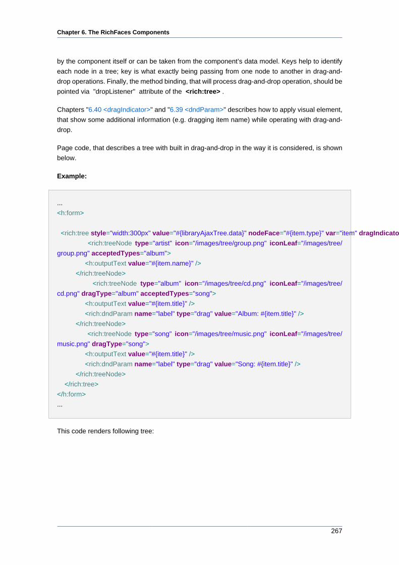
Chapter 6. The RichFaces Components
267
by the component itself or can be taken from the component’s data model. Keys help to identify
each node in a tree; key is what exactly being passing from one node to another in drag-and-
drop operations. Finally, the method binding, that will process drag-and-drop operation, should be
pointed via "dropListener" attribute of the <rich:tree> .
Chapters "6.40 <dragIndicator>" and "6.39 <dndParam>" describes how to apply visual element,
that show some additional information (e.g. dragging item name) while operating with drag-and-
drop.
Page code, that describes a tree with built in drag-and-drop in the way it is considered, is shown
below.
Example:
...
<h:form>
<rich:tree style="width:300px" value="#{libraryAjaxTree.data}" nodeFace="#{item.type}" var="item" dragIndicator=":treeDragIndicator" dropListener="#{libraryAjaxTree.processDrop}">
<rich:treeNode type="artist" icon="/images/tree/group.png" iconLeaf="/images/tree/
group.png" acceptedTypes="album">
<h:outputText value="#{item.name}" />
</rich:treeNode>
<rich:treeNode type="album" icon="/images/tree/cd.png" iconLeaf="/images/tree/
cd.png" dragType="album" acceptedTypes="song">
<h:outputText value="#{item.title}" />
<rich:dndParam name="label" type="drag" value="Album: #{item.title}" />
</rich:treeNode>
<rich:treeNode type="song" icon="/images/tree/music.png" iconLeaf="/images/tree/
music.png" dragType="song">
<h:outputText value="#{item.title}" />
<rich:dndParam name="label" type="drag" value="Song: #{item.title}" />
</rich:treeNode>
</rich:tree>
</h:form>
...
This code renders following tree:
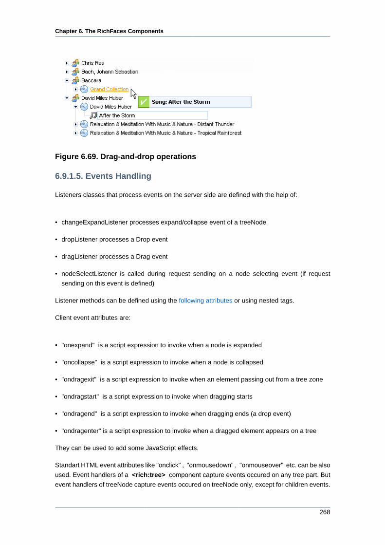
Chapter 6. The RichFaces Components
268
Figure 6.69. Drag-and-drop operations
6.9.1.5. Events Handling
Listeners classes that process events on the server side are defined with the help of:
• changeExpandListener processes expand/collapse event of a treeNode
• dropListener processes a Drop event
• dragListener processes a Drag event
• nodeSelectListener is called during request sending on a node selecting event (if request
sending on this event is defined)
Listener methods can be defined using the following attributes or using nested tags.
Client event attributes are:
• "onexpand" is a script expression to invoke when a node is expanded
• "oncollapse" is a script expression to invoke when a node is collapsed
• "ondragexit" is a script expression to invoke when an element passing out from a tree zone
• "ondragstart" is a script expression to invoke when dragging starts
• "ondragend" is a script expression to invoke when dragging ends (a drop event)
• "ondragenter" is a script expression to invoke when a dragged element appears on a tree
They can be used to add some JavaScript effects.
Standart HTML event attributes like "onclick" , "onmousedown" , "onmouseover" etc. can be also
used. Event handlers of a <rich:tree> component capture events occured on any tree part. But
event handlers of treeNode capture events occured on treeNode only, except for children events.
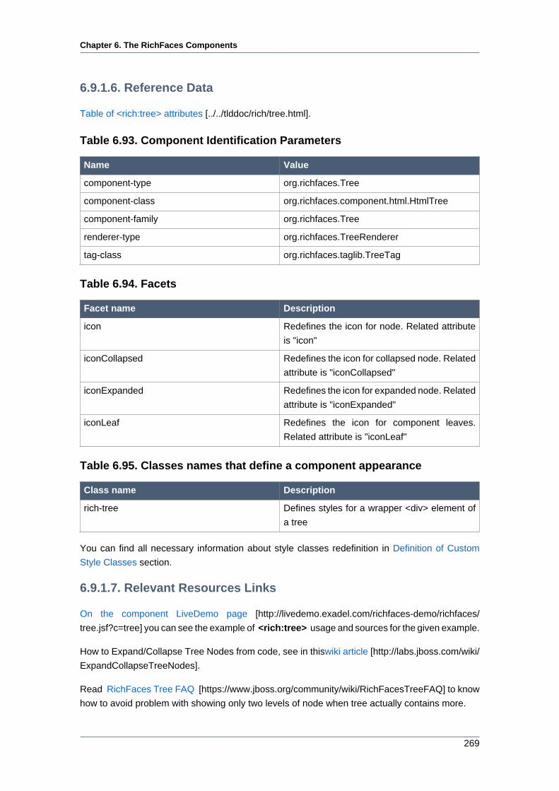
Chapter 6. The RichFaces Components
269
6.9.1.6. Reference Data
Table of <rich:tree> attributes [../../tlddoc/rich/tree.html].
Table 6.93. Component Identification Parameters
Name Value
component-type org.richfaces.Tree
component-class org.richfaces.component.html.HtmlTree
component-family org.richfaces.Tree
renderer-type org.richfaces.TreeRenderer
tag-class org.richfaces.taglib.TreeTag
Table 6.94. Facets
Facet name Description
icon Redefines the icon for node. Related attribute
is "icon"
iconCollapsed Redefines the icon for collapsed node. Related
attribute is "iconCollapsed"
iconExpanded Redefines the icon for expanded node. Related
attribute is "iconExpanded"
iconLeaf Redefines the icon for component leaves.
Related attribute is "iconLeaf"
Table 6.95. Classes names that define a component appearance
Class name Description
rich-tree Defines styles for a wrapper <div> element of
a tree
You can find all necessary information about style classes redefinition in Definition of Custom
Style Classes section.
6.9.1.7. Relevant Resources Links
On the component LiveDemo page [http://livedemo.exadel.com/richfaces-demo/richfaces/
tree.jsf?c=tree] you can see the example of <rich:tree> usage and sources for the given example.
How to Expand/Collapse Tree Nodes from code, see in thiswiki article [http://labs.jboss.com/wiki/
ExpandCollapseTreeNodes].
Read RichFaces Tree FAQ [https://www.jboss.org/community/wiki/RichFacesTreeFAQ] to know
how to avoid problem with showing only two levels of node when tree actually contains more.
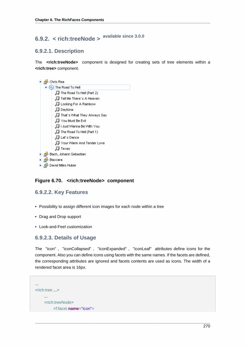
Chapter 6. The RichFaces Components
270
6.9.2. < rich:treeNode > available since 3.0.0
6.9.2.1. Description
The <rich:treeNode> component is designed for creating sets of tree elements within a
<rich:tree> component.
Figure 6.70. <rich:treeNode> component
6.9.2.2. Key Features
• Possibility to assign different icon images for each node within a tree
• Drag and Drop support
• Look-and-Feel customization
6.9.2.3. Details of Usage
The "icon" , "iconCollapsed" , "iconExpanded" , "iconLeaf" attributes define icons for the
component. Also you can define icons using facets with the same names. If the facets are defined,
the corresponding attributes are ignored and facets contents are used as icons. The width of a
rendered facet area is 16px.
...
<rich:tree ...>
...
<rich:treeNode>
<f:facet name="icon">
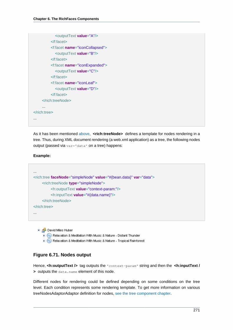
Chapter 6. The RichFaces Components
271
<outputText value="A"/>
</f:facet>
<f:facet name="iconCollapsed">
<outputText value="B"/>
</f:facet>
<f:facet name="iconExpanded">
<outputText value="C"/>
</f:facet>
<f:facet name="iconLeaf">
<outputText value="D"/>
</f:facet>
</rich:treeNode>
...
</rich:tree>
...
As it has been mentioned above, <rich:treeNode> defines a template for nodes rendering in a
tree. Thus, during XML document rendering (a web.xml application) as a tree, the following nodes
output (passed via var="data" on a tree) happens:
Example:
...
<rich:tree faceNode="simpleNode" value="#{bean.data}" var="data">
<rich:treeNode type="simpleNode">
<h:outputText value="context-param:"/>
<h:inputText value="#{data.name}"/>
</rich:treeNode>
</rich:tree>
...
Figure 6.71. Nodes output
Hence, <h:outputText /> tag outputs the "context-param" string and then the <h:inputText /
> outputs the data.name element of this node.
Different nodes for rendering could be defined depending on some conditions on the tree
level. Each condition represents some rendering template. To get more information on various
treeNodesAdaptorAdaptor definition for nodes, see the tree component chapter.
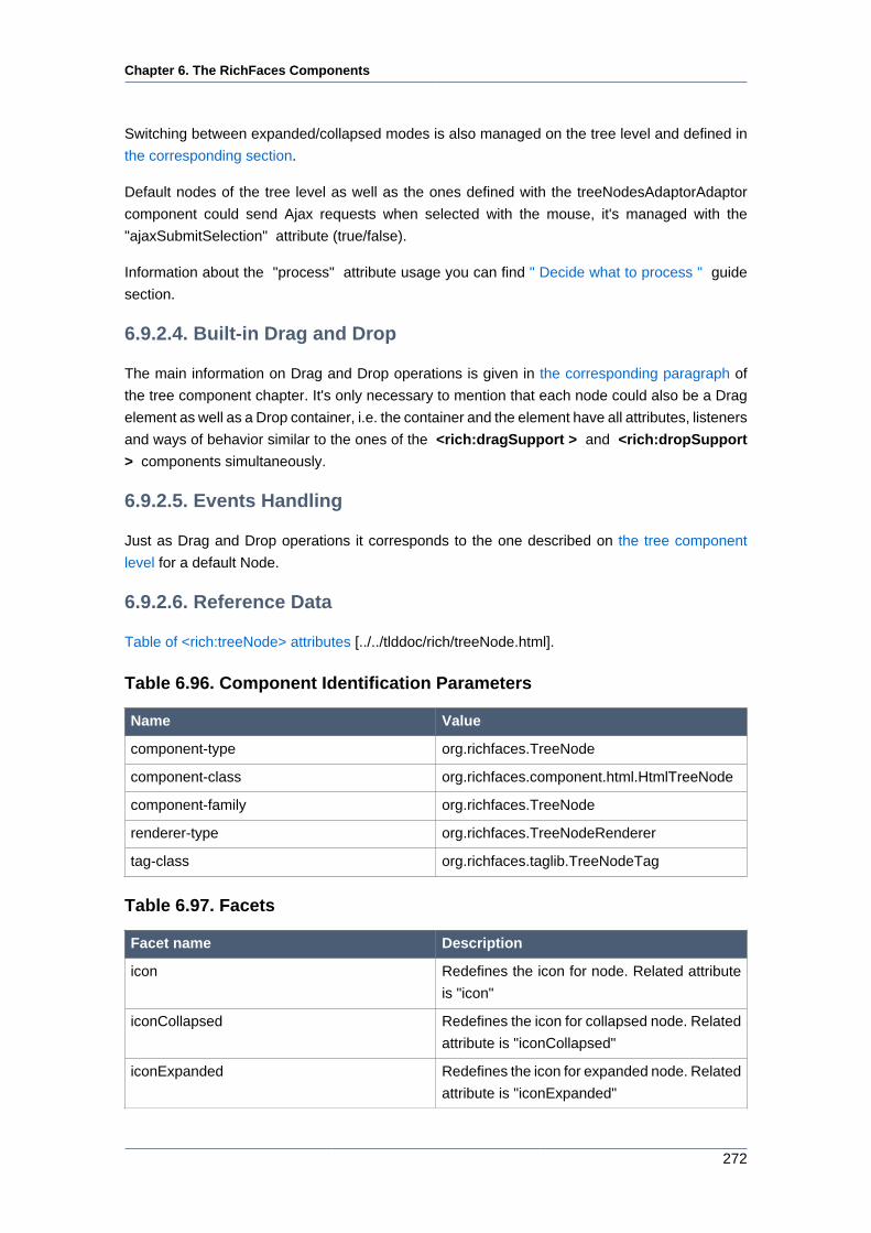
Chapter 6. The RichFaces Components
272
Switching between expanded/collapsed modes is also managed on the tree level and defined in
the corresponding section.
Default nodes of the tree level as well as the ones defined with the treeNodesAdaptorAdaptor
component could send Ajax requests when selected with the mouse, it's managed with the
"ajaxSubmitSelection" attribute (true/false).
Information about the "process" attribute usage you can find " Decide what to process " guide
section.
6.9.2.4. Built-in Drag and Drop
The main information on Drag and Drop operations is given in the corresponding paragraph of
the tree component chapter. It's only necessary to mention that each node could also be a Drag
element as well as a Drop container, i.e. the container and the element have all attributes, listeners
and ways of behavior similar to the ones of the <rich:dragSupport > and <rich:dropSupport
> components simultaneously.
6.9.2.5. Events Handling
Just as Drag and Drop operations it corresponds to the one described on the tree component
level for a default Node.
6.9.2.6. Reference Data
Table of <rich:treeNode> attributes [../../tlddoc/rich/treeNode.html].
Table 6.96. Component Identification Parameters
Name Value
component-type org.richfaces.TreeNode
component-class org.richfaces.component.html.HtmlTreeNode
component-family org.richfaces.TreeNode
renderer-type org.richfaces.TreeNodeRenderer
tag-class org.richfaces.taglib.TreeNodeTag
Table 6.97. Facets
Facet name Description
icon Redefines the icon for node. Related attribute
is "icon"
iconCollapsed Redefines the icon for collapsed node. Related
attribute is "iconCollapsed"
iconExpanded Redefines the icon for expanded node. Related
attribute is "iconExpanded"
Chapter 6. The RichFaces Components
273
Facet name Description
iconLeaf Redefines the icon for component leaves.
Related attribute is "iconLeaf"
Table 6.98. Classes names that define a node element
Class name Description
rich-tree-node Defines styles for a tree node
rich-tree-node-handle Defines styles for a tree node handle
rich-tree-node-handleicon Defines styles for a tree node handle icon
rich-tree-node-children Defines styles for all tree node subnodes
rich-tree-node-text Defines styles for a tree node text
rich-tree-node-icon Defines styles for a tree node icon
rich-tree-h-ic-img Defines styles for an image of a tree node
rich-tree-node-icon-leaf Defines styles for a tree node icon leaf
Table 6.99. Classes names that define states for a node element
Class name Description
rich-tree-node-selected Defines styles for a selected tree node
rich-tree-node-highlighted Defines styles for a highlighted tree node
rich-tree-node-handleicon-collapsed Defines styles for a collapsed tree node
handleicon
rich-tree-node-handleicon-expanded Defines styles for a expanded tree node
handleicon
You can find all necessary information about style classes redefinition in Definition of Custom
Style Classes section.
6.9.2.7. Relevant Resources Links
How to Expand/Collapse Tree Nodes from code see in thiswiki article [http://labs.jboss.com/wiki/
ExpandCollapsetreeNodesAdaptor].
6.9.3. < rich:treeNodesAdaptor > available since 3.1.0
6.9.3.1. Description
The <rich:treeNodesAdaptor> provides the possibility to define data models and create
representations for them.
Chapter 6. The RichFaces Components
274
Figure 6.72. Expanded tree with <rich:treeNodesAdaptor>
6.9.3.2. Key Features
• Allows to define combined data models
• Possibility to define nodes for processing via attributes
6.9.3.3. Details of Usage
The <rich:treeNodesAdaptor> component has a "nodes" attribute that defines a collection of
elements to iterate through.
Collections are allowed to include lists, arrays, maps, XML NodeList and NamedNodeMap either
as a single object.
The "var" attribute is used to access to the current collection element.
The <rich:treeNodesAdaptor> component can be nested without any limitations. See the
following example.
Example:
...
<rich:tree adviseNodeOpened="#{treeModelBean.adviseNodeOpened}" switchType="client">
<rich:treeNodesAdaptor id="project" nodes="#{loaderBean.projects}" var="project">
<rich:treeNode>
<h:commandLink action="#{project.click}" value="Project: #{project.name}" />
</rich:treeNode>
<rich:treeNodesAdaptor id="srcDir" var="srcDir" nodes="#{project.srcDirs}">
<rich:treeNode>
<h:commandLink action="#{srcDir.click}" value="Source directory: #{srcDir.name}" />
</rich:treeNode>
Chapter 6. The RichFaces Components
275
<rich:treeNodesAdaptor id="pkg" var="pkg" nodes="#{srcDir.packages}">
<rich:treeNode>
<h:commandLink action="#{pkg.click}" value="Package: #{pkg.name}" />
</rich:treeNode>
<rich:treeNodesAdaptor id="class" var="class" nodes="#{pkg.classes}">
<rich:treeNode>
<h:commandLink action="#{class.click}" value="Class: #{class.name}" />
</rich:treeNode>
</rich:treeNodesAdaptor>
</rich:treeNodesAdaptor>
</rich:treeNodesAdaptor>
</rich:treeNodesAdaptor>
</rich:tree>
...
6.9.3.4. Reference Data
Table of <rich:treeNodesAdaptor> attributes [../../tlddoc/rich/treeNodesAdaptor.html].
Table 6.100. Component Identification Parameters
Name Value
component-type org.richfaces.TreeNodesAdaptor
component-class org.richfaces.component.html.HtmlTreeNodesAdaptor
component-family org.richfaces.TreeNodesAdaptor
tag-class org.richfaces.taglib.TreeNodesAdaptorTag
6.9.3.5. Relevant Resources Links
On the component LiveDemo page [http://livedemo.exadel.com/richfaces-demo/
richfaces/treeNodesAdaptor.jsf?c=treeNodesAdaptor] you can see the example of
<rich:treeNodesAdaptor > usage and sources for the given example.
6.9.4. < rich:recursiveTreeNodesAdaptor > available since 3.1.0
6.9.4.1. Description
The <rich:recursiveTreeNodesAdaptor> is an extension of a <rich:treeNodesAdaptor>
component that provides the possibility to define data models and process nodes recursively.
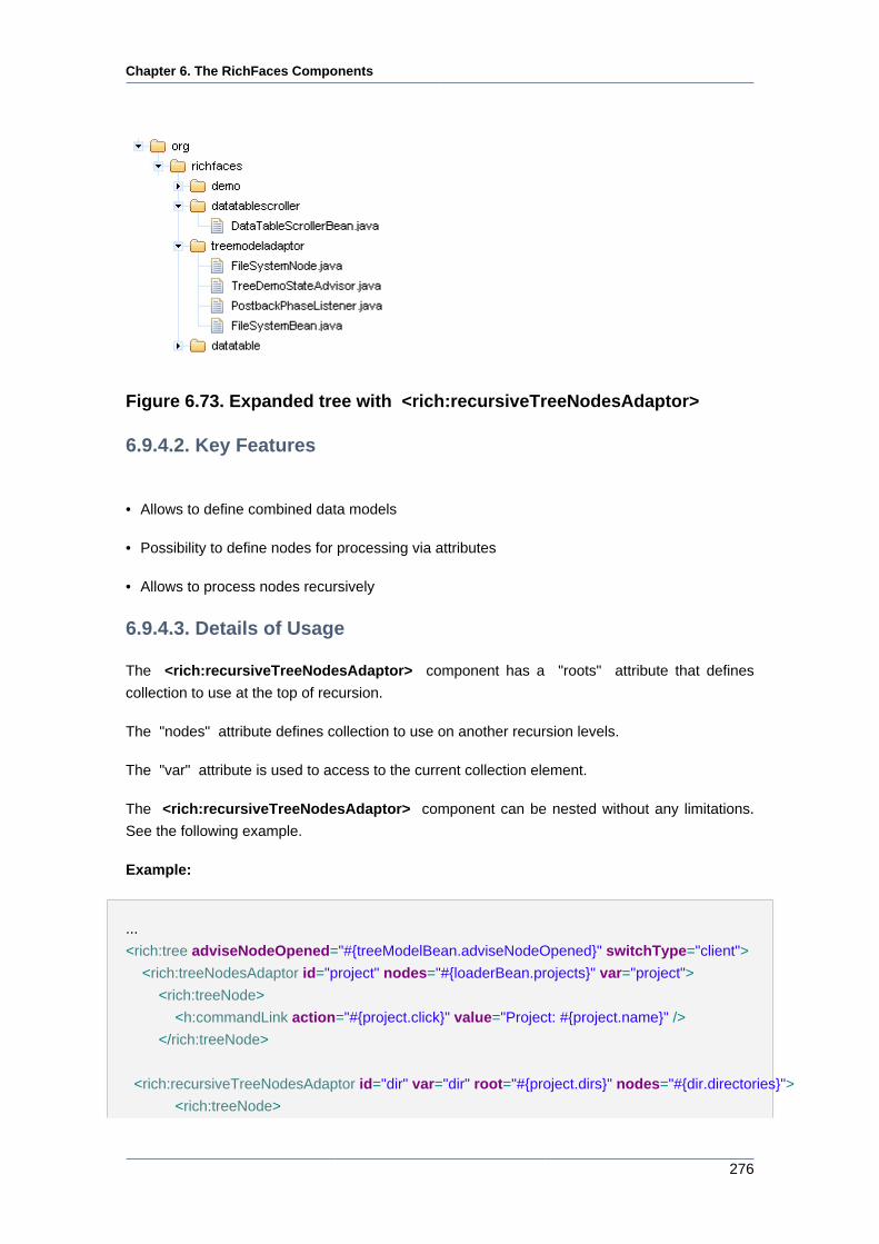
Chapter 6. The RichFaces Components
276
Figure 6.73. Expanded tree with <rich:recursiveTreeNodesAdaptor>
6.9.4.2. Key Features
• Allows to define combined data models
• Possibility to define nodes for processing via attributes
• Allows to process nodes recursively
6.9.4.3. Details of Usage
The <rich:recursiveTreeNodesAdaptor> component has a "roots" attribute that defines
collection to use at the top of recursion.
The "nodes" attribute defines collection to use on another recursion levels.
The "var" attribute is used to access to the current collection element.
The <rich:recursiveTreeNodesAdaptor> component can be nested without any limitations.
See the following example.
Example:
...
<rich:tree adviseNodeOpened="#{treeModelBean.adviseNodeOpened}" switchType="client">
<rich:treeNodesAdaptor id="project" nodes="#{loaderBean.projects}" var="project">
<rich:treeNode>
<h:commandLink action="#{project.click}" value="Project: #{project.name}" />
</rich:treeNode>
<rich:recursiveTreeNodesAdaptor id="dir" var="dir" root="#{project.dirs}" nodes="#{dir.directories}">
<rich:treeNode>
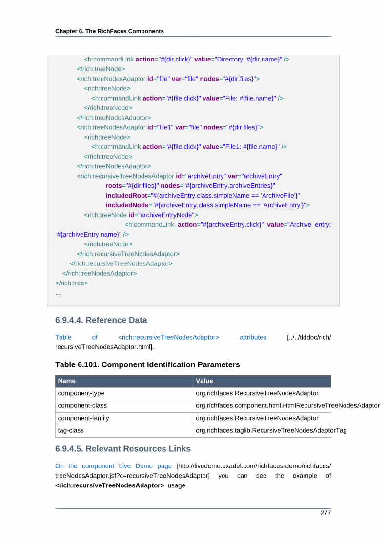
Chapter 6. The RichFaces Components
277
<h:commandLink action="#{dir.click}" value="Directory: #{dir.name}" />
</rich:treeNode>
<rich:treeNodesAdaptor id="file" var="file" nodes="#{dir.files}">
<rich:treeNode>
<h:commandLink action="#{file.click}" value="File: #{file.name}" />
</rich:treeNode>
</rich:treeNodesAdaptor>
<rich:treeNodesAdaptor id="file1" var="file" nodes="#{dir.files}">
<rich:treeNode>
<h:commandLink action="#{file.click}" value="File1: #{file.name}" />
</rich:treeNode>
</rich:treeNodesAdaptor>
<rich:recursiveTreeNodesAdaptor id="archiveEntry" var="archiveEntry"
roots="#{dir.files}" nodes="#{archiveEntry.archiveEntries}"
includedRoot="#{archiveEntry.class.simpleName == 'ArchiveFile'}"
includedNode="#{archiveEntry.class.simpleName == 'ArchiveEntry'}">
<rich:treeNode id="archiveEntryNode">
<h:commandLink action="#{archiveEntry.click}" value="Archive entry:
#{archiveEntry.name}" />
</rich:treeNode>
</rich:recursiveTreeNodesAdaptor>
</rich:recursiveTreeNodesAdaptor>
</rich:treeNodesAdaptor>
</rich:tree>
...
6.9.4.4. Reference Data
Table of <rich:recursiveTreeNodesAdaptor> attributes [../../tlddoc/rich/
recursiveTreeNodesAdaptor.html].
Table 6.101. Component Identification Parameters
Name Value
component-type org.richfaces.RecursiveTreeNodesAdaptor
component-class org.richfaces.component.html.HtmlRecursiveTreeNodesAdaptor
component-family org.richfaces.RecursiveTreeNodesAdaptor
tag-class org.richfaces.taglib.RecursiveTreeNodesAdaptorTag
6.9.4.5. Relevant Resources Links
On the component Live Demo page [http://livedemo.exadel.com/richfaces-demo/richfaces/
treeNodesAdaptor.jsf?c=recursiveTreeNodesAdaptor] you can see the example of
<rich:recursiveTreeNodesAdaptor> usage.
http://livedemo.exadel.com/richfaces-demo/richfaces/treeNodesAdaptor.jsf?c=recursiveTreeNodesAdaptor
Chapter 6. The RichFaces Components
278
6.9.5. < rich:changeExpandListener > available since 3.1.0
6.9.5.1. Description
The <rich:changeExpandListener> represents an action listener method that is notified on an
expand/collapse event on the node.
6.9.5.2. Key Features
• Allows to define some "changeExpand" listeners for the component
6.9.5.3. Details of Usage
The <rich:changeExpandListener> is used as a nested tag with <rich:tree> and
<rich:treeNode> components.
Attribute "type" defines the fully qualified Java
class name for the listener. This class should implement
org.richfaces.event.NodeExpandedListener [../../apidoc_framework/org/richfaces/event/
TreeListenerEventsProducer.html#addChangeExpandListener(org.richfaces.event.NodeExpandedListener)]interface.
The typical variant of using:
...
<rich:tree switchType="server" value="#{project.data}" var="item" nodeFace="#{item.type}">
<rich:changeExpandListener type="demo.ListenerBean"/>
...
<!-- Tree nodes -->
...
</rich:tree>
...
Java bean source:
package demo;
import org.richfaces.event.NodeExpandedEvent;
public class ListenerBean implements org.richfaces.event.NodeExpandedListener{
...
public void processExpansion(NodeExpandedEvent arg0){
//Custom Developer Code
}
...
Chapter 6. The RichFaces Components
279
}
...
6.9.5.4. Reference Data
Table of <rich:changeExpandListener> attributes [../../tlddoc/rich/changeExpandListener.html].
Table 6.102. Component Identification Parameters
Name Value
listener-class org.richfaces.event.NodeExpandedListener
event-class org.richfaces.event.NodeExpandedEvent
tag-class org.richfaces.taglib.ChangeExpandListenerTag
6.9.6. < rich:nodeSelectListener > available since 3.1.0
6.9.6.1. Description
The <rich:nodeSelectListener> represents an action listener method that is notified after
selection of a node.
6.9.6.2. Key Features
• Allows to define some "nodeSelect" listeners for the component
6.9.6.3. Details of Usage
The <rich:nodeSelectListener> is used as a nested tag with <rich:tree> and <rich:treeNode>
components.
Attribute "type" defines the fully qualified Java class name for listener. This class
should implement org.richfaces.event.NodeSelectedListener [../../apidoc_framework/org/
richfaces/event/NodeSelectedListener.html]. interface
The typical variant of using:
...
<rich:tree switchType="server" value="#{project.data}" var="item" nodeFace="#{item.type}">
<rich:nodeSelectListener type="demo.ListenerBean"/>
...
<!-- Tree nodes -->
...
Chapter 6. The RichFaces Components
280
</rich:tree>
...
Java bean source:
package demo;
import org.richfaces.event.NodeSelectedEvent;
public class ListenerBean implements org.richfaces.event.NodeSelectedListener{
...
public void processSelection(NodeSelectedEvent arg0){
//Custom Developer Code
}
...
}
6.9.6.4. Reference Data
Table of <rich:nodeSelectListener> attributes [../../tlddoc/rich/nodeSelectListener.html].
Table 6.103. Component Identification Parameters
Name Value
listener-class org.richfaces.event.NodeSelectedListener
event-class org.richfaces.event.NodeSelectedEvent
tag-class org.richfaces.taglib.NodeSelectListenerTag
6.10. Rich Output
This section covers the components that are designed to be used as output and UI elements.
6.10.1. <rich:modalPanel> available since 3.0.0
6.10.1.1. Description
The component implements a modal window that blocks user interaction with the main application
while active.
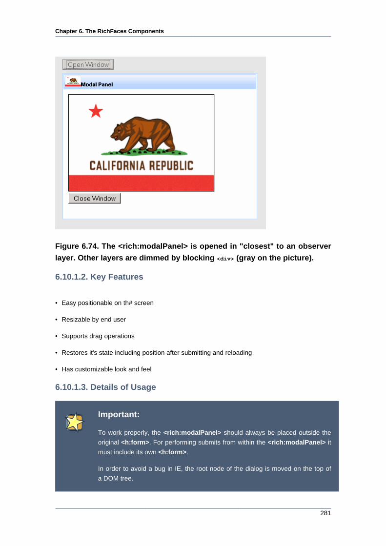
Chapter 6. The RichFaces Components
281
Figure 6.74. The <rich:modalPanel> is opened in "closest" to an observer
layer. Other layers are dimmed by blocking <div> (gray on the picture).
6.10.1.2. Key Features
• Easy positionable on th# screen
• Resizable by end user
• Supports drag operations
• Restores it's state including position after submitting and reloading
• Has customizable look and feel
6.10.1.3. Details of Usage
Important:
To work properly, the <rich:modalPanel> should always be placed outside the
original <h:form>. For performing submits from within the <rich:modalPanel> it
must include its own <h:form>.
In order to avoid a bug in IE, the root node of the dialog is moved on the top of
a DOM tree.
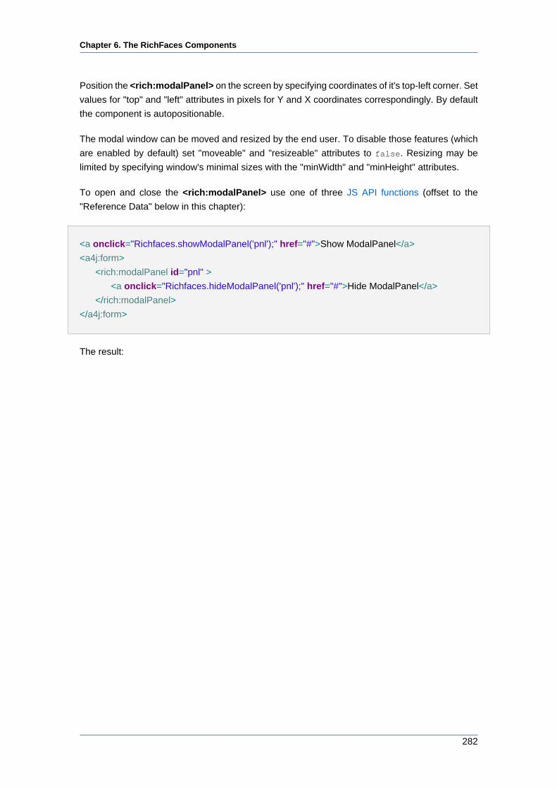
Chapter 6. The RichFaces Components
282
Position the <rich:modalPanel> on the screen by specifying coordinates of it's top-left corner. Set
values for "top" and "left" attributes in pixels for Y and X coordinates correspondingly. By default
the component is autopositionable.
The modal window can be moved and resized by the end user. To disable those features (which
are enabled by default) set "moveable" and "resizeable" attributes to false. Resizing may be
limited by specifying window's minimal sizes with the "minWidth" and "minHeight" attributes.
To open and close the <rich:modalPanel> use one of three JS API functions (offset to the
"Reference Data" below in this chapter):
<a onclick="Richfaces.showModalPanel('pnl');" href="#">Show ModalPanel</a>
<a4j:form>
<rich:modalPanel id="pnl" >
<a onclick="Richfaces.hideModalPanel('pnl');" href="#">Hide ModalPanel</a>
</rich:modalPanel>
</a4j:form>
The result:
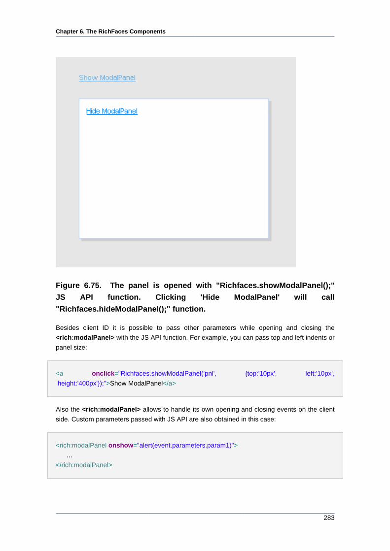
Chapter 6. The RichFaces Components
283
Figure 6.75. The panel is opened with "Richfaces.showModalPanel();"
JS API function. Clicking 'Hide ModalPanel' will call
"Richfaces.hideModalPanel();" function.
Besides client ID it is possible to pass other parameters while opening and closing the
<rich:modalPanel> with the JS API function. For example, you can pass top and left indents or
panel size:
<a onclick="Richfaces.showModalPanel('pnl', {top:'10px', left:'10px',
height:'400px'});">Show ModalPanel</a>
Also the <rich:modalPanel> allows to handle its own opening and closing events on the client
side. Custom parameters passed with JS API are also obtained in this case:
<rich:modalPanel onshow="alert(event.parameters.param1)">
...
</rich:modalPanel>
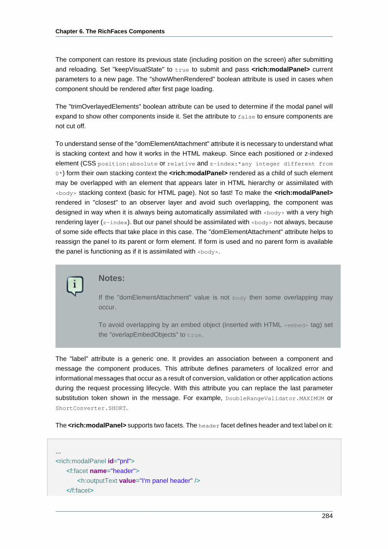
Chapter 6. The RichFaces Components
284
The component can restore its previous state (including position on the screen) after submitting
and reloading. Set "keepVisualState" to true to submit and pass <rich:modalPanel> current
parameters to a new page. The "showWhenRendered" boolean attribute is used in cases when
component should be rendered after first page loading.
The "trimOverlayedElements" boolean attribute can be used to determine if the modal panel will
expand to show other components inside it. Set the attribute to false to ensure components are
not cut off.
To understand sense of the "domElementAttachment" attribute it is necessary to understand what
is stacking context and how it works in the HTML makeup. Since each positioned or z-indexed
element (CSS position:absolute or relative and z-index:*any integer different from
0*) form their own stacking context the <rich:modalPanel> rendered as a child of such element
may be overlapped with an element that appears later in HTML hierarchy or assimilated with
<body> stacking context (basic for HTML page). Not so fast! To make the <rich:modalPanel>
rendered in "closest" to an observer layer and avoid such overlapping, the component was
designed in way when it is always being automatically assimilated with <body> with a very high
rendering layer (z-index). But our panel should be assimilated with <body> not always, because
of some side effects that take place in this case. The "domElementAttachment" attribute helps to
reassign the panel to its parent or form element. If form is used and no parent form is available
the panel is functioning as if it is assimilated with <body>.
Notes:
If the "domElementAttachment" value is not body then some overlapping may
occur.
To avoid overlapping by an embed object (inserted with HTML <embed> tag) set
the "overlapEmbedObjects" to true.
The "label" attribute is a generic one. It provides an association between a component and
message the component produces. This attribute defines parameters of localized error and
informational messages that occur as a result of conversion, validation or other application actions
during the request processing lifecycle. With this attribute you can replace the last parameter
substitution token shown in the message. For example, DoubleRangeValidator.MAXIMUM or
ShortConverter.SHORT.
The <rich:modalPanel> supports two facets. The header facet defines header and text label on it:
...
<rich:modalPanel id="pnl">
<f:facet name="header">
<h:outputText value="I'm panel header" />
</f:facet>
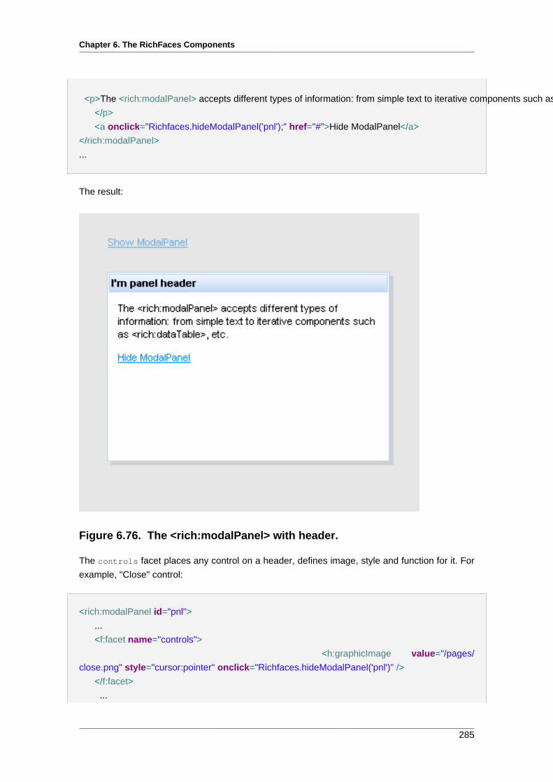
Chapter 6. The RichFaces Components
285
<p>The <rich:modalPanel> accepts different types of information: from simple text to iterative components such as <rich:dataTable>, etc.
</p>
<a onclick="Richfaces.hideModalPanel('pnl');" href="#">Hide ModalPanel</a>
</rich:modalPanel>
...
The result:
Figure 6.76. The <rich:modalPanel> with header.
The controls facet places any control on a header, defines image, style and function for it. For
example, "Close" control:
<rich:modalPanel id="pnl">
...
<f:facet name="controls">
<h:graphicImage value="/pages/
close.png" style="cursor:pointer" onclick="Richfaces.hideModalPanel('pnl')" />
</f:facet>
...
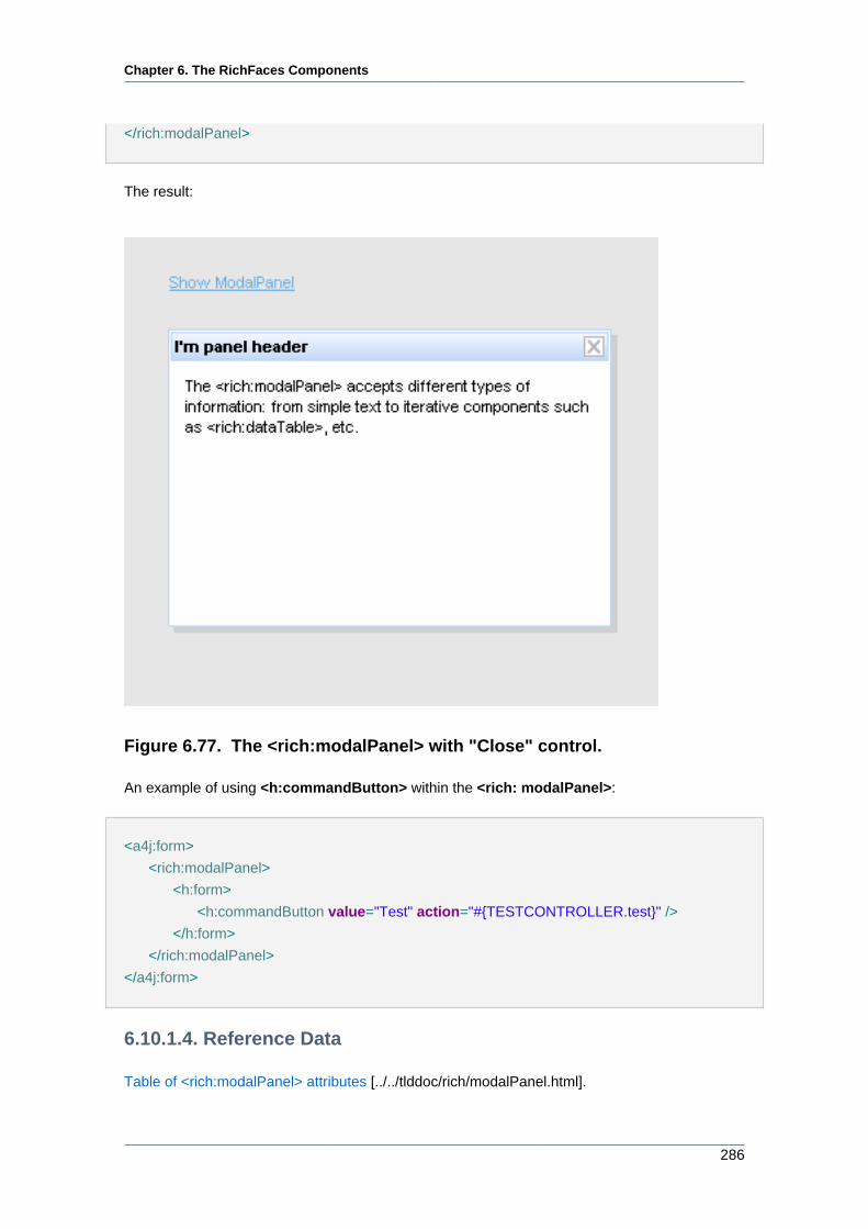
Chapter 6. The RichFaces Components
286
</rich:modalPanel>
The result:
Figure 6.77. The <rich:modalPanel> with "Close" control.
An example of using <h:commandButton> within the <rich: modalPanel>:
<a4j:form>
<rich:modalPanel>
<h:form>
<h:commandButton value="Test" action="#{TESTCONTROLLER.test}" />
</h:form>
</rich:modalPanel>
</a4j:form>
6.10.1.4. Reference Data
Table of <rich:modalPanel> attributes [../../tlddoc/rich/modalPanel.html].
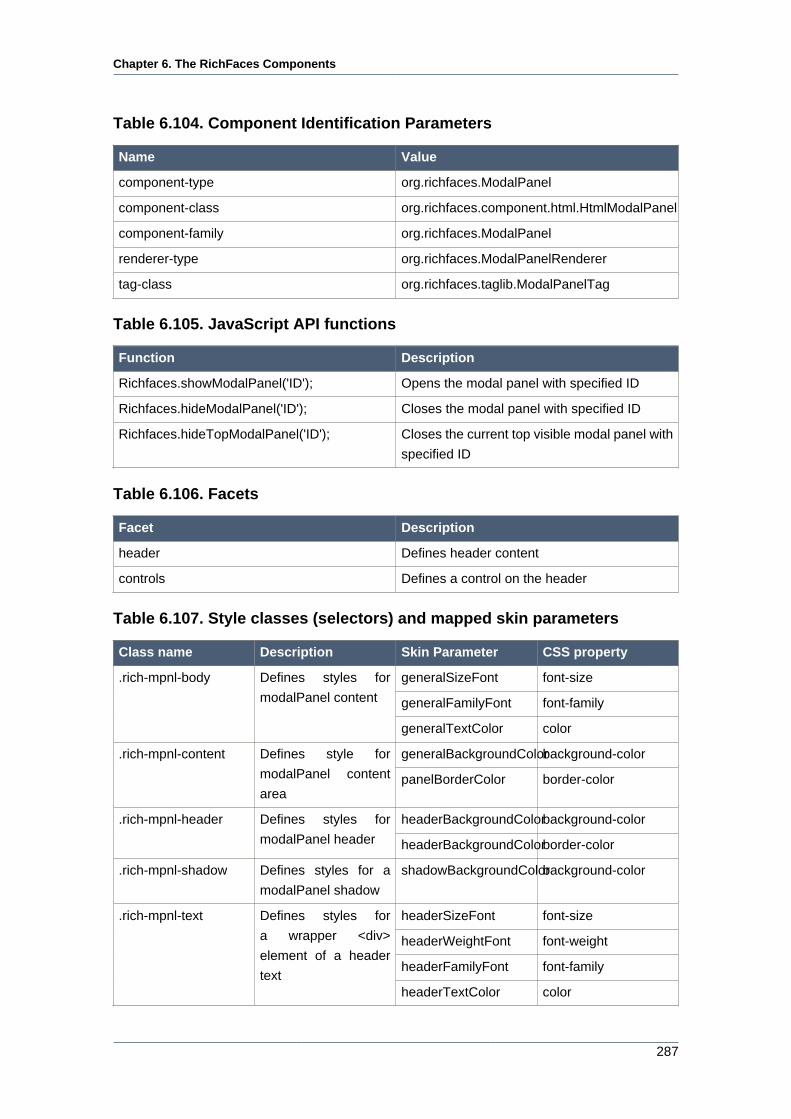
Chapter 6. The RichFaces Components
287
Table 6.104. Component Identification Parameters
Name Value
component-type org.richfaces.ModalPanel
component-class org.richfaces.component.html.HtmlModalPanel
component-family org.richfaces.ModalPanel
renderer-type org.richfaces.ModalPanelRenderer
tag-class org.richfaces.taglib.ModalPanelTag
Table 6.105. JavaScript API functions
Function Description
Richfaces.showModalPanel('ID'); Opens the modal panel with specified ID
Richfaces.hideModalPanel('ID'); Closes the modal panel with specified ID
Richfaces.hideTopModalPanel('ID'); Closes the current top visible modal panel with
specified ID
Table 6.106. Facets
Facet Description
header Defines header content
controls Defines a control on the header
Table 6.107. Style classes (selectors) and mapped skin parameters
Class name Description Skin Parameter CSS property
generalSizeFont font-size
generalFamilyFont font-family
.rich-mpnl-body Defines styles for
modalPanel content
generalTextColor color
generalBackgroundColorbackground-color.rich-mpnl-content Defines style for
modalPanel content
areapanelBorderColor border-color
headerBackgroundColorbackground-color.rich-mpnl-header Defines styles for
modalPanel header headerBackgroundColorborder-color
.rich-mpnl-shadow Defines styles for a
modalPanel shadow
shadowBackgroundColorbackground-color
headerSizeFont font-size
headerWeightFont font-weight
headerFamilyFont font-family
.rich-mpnl-text Defines styles for
a wrapper <div>
element of a header
textheaderTextColor color
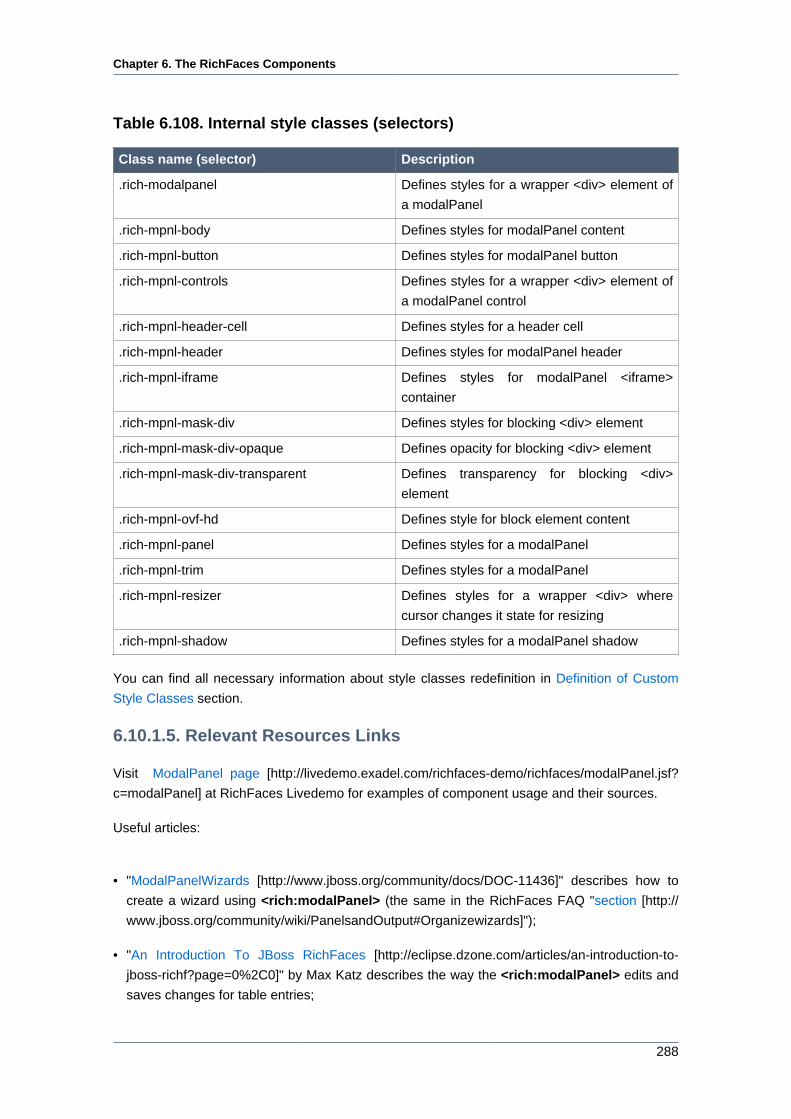
Chapter 6. The RichFaces Components
288
Table 6.108. Internal style classes (selectors)
Class name (selector) Description
.rich-modalpanel Defines styles for a wrapper <div> element of
a modalPanel
.rich-mpnl-body Defines styles for modalPanel content
.rich-mpnl-button Defines styles for modalPanel button
.rich-mpnl-controls Defines styles for a wrapper <div> element of
a modalPanel control
.rich-mpnl-header-cell Defines styles for a header cell
.rich-mpnl-header Defines styles for modalPanel header
.rich-mpnl-iframe Defines styles for modalPanel <iframe>
container
.rich-mpnl-mask-div Defines styles for blocking <div> element
.rich-mpnl-mask-div-opaque Defines opacity for blocking <div> element
.rich-mpnl-mask-div-transparent Defines transparency for blocking <div>
element
.rich-mpnl-ovf-hd Defines style for block element content
.rich-mpnl-panel Defines styles for a modalPanel
.rich-mpnl-trim Defines styles for a modalPanel
.rich-mpnl-resizer Defines styles for a wrapper <div> where
cursor changes it state for resizing
.rich-mpnl-shadow Defines styles for a modalPanel shadow
You can find all necessary information about style classes redefinition in Definition of Custom
Style Classes section.
6.10.1.5. Relevant Resources Links
Visit ModalPanel page [http://livedemo.exadel.com/richfaces-demo/richfaces/modalPanel.jsf?
c=modalPanel] at RichFaces Livedemo for examples of component usage and their sources.
Useful articles:
• "ModalPanelWizards [http://www.jboss.org/community/docs/DOC-11436]" describes how to
create a wizard using <rich:modalPanel> (the same in the RichFaces FAQ "section [http://
www.jboss.org/community/wiki/PanelsandOutput#Organizewizards]");
• "An Introduction To JBoss RichFaces [http://eclipse.dzone.com/articles/an-introduction-to-
jboss-richf?page=0%2C0]" by Max Katz describes the way the <rich:modalPanel> edits and
saves changes for table entries;
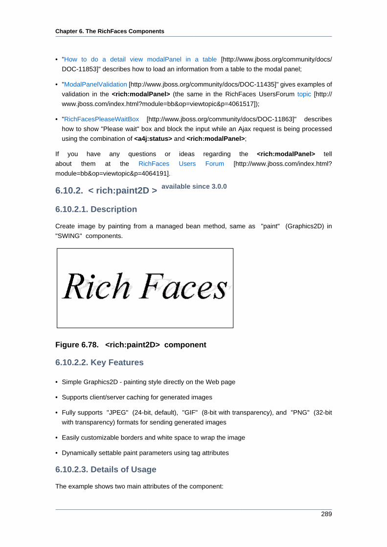
Chapter 6. The RichFaces Components
289
• "How to do a detail view modalPanel in a table [http://www.jboss.org/community/docs/
DOC-11853]" describes how to load an information from a table to the modal panel;
• "ModalPanelValidation [http://www.jboss.org/community/docs/DOC-11435]" gives examples of
validation in the <rich:modalPanel> (the same in the RichFaces UsersForum topic [http://
www.jboss.com/index.html?module=bb&op=viewtopic&p=4061517]);
• "RichFacesPleaseWaitBox [http://www.jboss.org/community/docs/DOC-11863]" describes
how to show "Please wait" box and block the input while an Ajax request is being processed
using the combination of <a4j:status> and <rich:modalPanel>;
If you have any questions or ideas regarding the <rich:modalPanel> tell
about them at the RichFaces Users Forum [http://www.jboss.com/index.html?
module=bb&op=viewtopic&p=4064191].
6.10.2. < rich:paint2D > available since 3.0.0
6.10.2.1. Description
Create image by painting from a managed bean method, same as "paint" (Graphics2D) in
"SWING" components.
Figure 6.78. <rich:paint2D> component
6.10.2.2. Key Features
• Simple Graphics2D - painting style directly on the Web page
• Supports client/server caching for generated images
• Fully supports "JPEG" (24-bit, default), "GIF" (8-bit with transparency), and "PNG" (32-bit
with transparency) formats for sending generated images
• Easily customizable borders and white space to wrap the image
• Dynamically settable paint parameters using tag attributes
6.10.2.3. Details of Usage
The example shows two main attributes of the component:
Chapter 6. The RichFaces Components
290
• "paint"
Specify a method receiving an object specified in data as a parameter and sending graphical
information into the stream
• "data"
Specifies a bean class keeping your data for rendering
Note:
Data object should implement serializable interface
The "format" attribute of the component defines a format of visual data passing to the server.
Generated data can be used as a cacheable or non-cacheable resource. It's defined with
"cacheable" attribute. If cache support is turned on, a key is created in URI with a mix of size
(width/height), "paint" method, "format" and "data" attributes.
Example:
paintBean.java:
public void paint(Graphics2D g2, Object obj) {
// code that gets data from the data Bean (PaintData)
PaintData data = (PaintData) obj;
...
// a code drawing a rectangle
g2.drawRect(0, 0, data.Width, data.Height);
...
// some more code placing graphical data into g2 stream below
}
dataBean.java:
public class PaintData implements Serializable{
private static final long serialVersionUID = 1L;
Integer Width=100;
Integer Height=50;
...
}
page.xhtml:
...
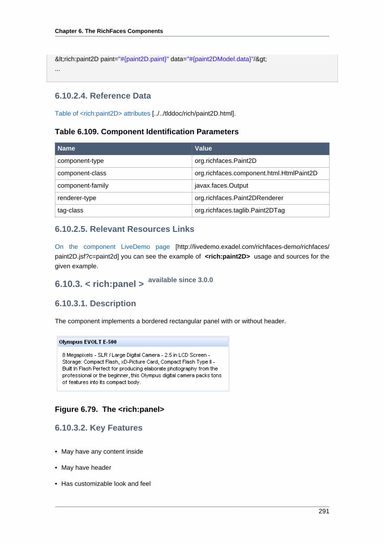
Chapter 6. The RichFaces Components
291
<rich:paint2D paint="#{paint2D.paint}" data="#{paint2DModel.data}"/>
...
6.10.2.4. Reference Data
Table of <rich:paint2D> attributes [../../tlddoc/rich/paint2D.html].
Table 6.109. Component Identification Parameters
Name Value
component-type org.richfaces.Paint2D
component-class org.richfaces.component.html.HtmlPaint2D
component-family javax.faces.Output
renderer-type org.richfaces.Paint2DRenderer
tag-class org.richfaces.taglib.Paint2DTag
6.10.2.5. Relevant Resources Links
On the component LiveDemo page [http://livedemo.exadel.com/richfaces-demo/richfaces/
paint2D.jsf?c=paint2d] you can see the example of <rich:paint2D> usage and sources for the
given example.
6.10.3. < rich:panel > available since 3.0.0
6.10.3.1. Description
The component implements a bordered rectangular panel with or without header.
Figure 6.79. The <rich:panel>
6.10.3.2. Key Features
• May have any content inside
• May have header
• Has customizable look and feel
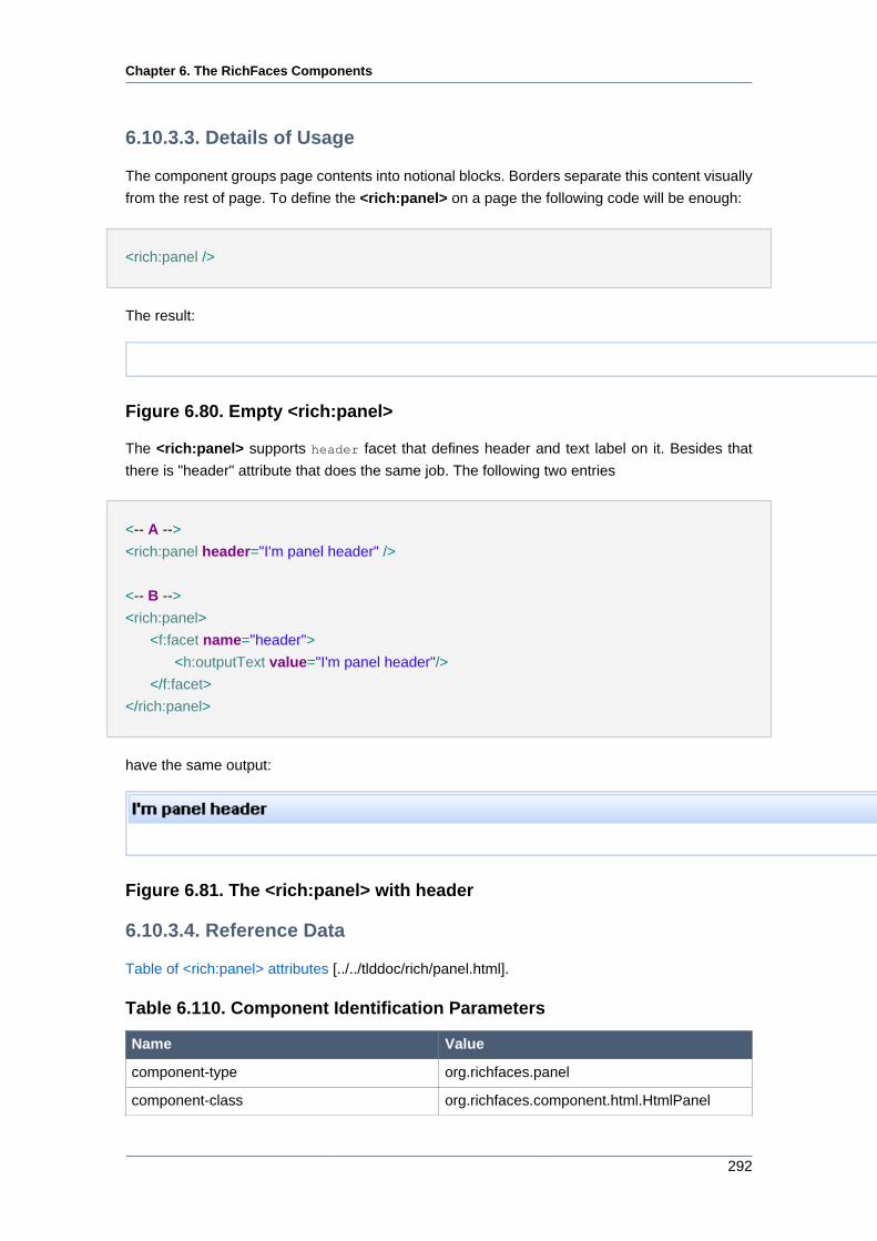
Chapter 6. The RichFaces Components
292
6.10.3.3. Details of Usage
The component groups page contents into notional blocks. Borders separate this content visually
from the rest of page. To define the <rich:panel> on a page the following code will be enough:
<rich:panel />
The result:
Figure 6.80. Empty <rich:panel>
The <rich:panel> supports header facet that defines header and text label on it. Besides that
there is "header" attribute that does the same job. The following two entries
<-- A -->
<rich:panel header="I'm panel header" />
<-- B -->
<rich:panel>
<f:facet name="header">
<h:outputText value="I'm panel header"/>
</f:facet>
</rich:panel>
have the same output:
Figure 6.81. The <rich:panel> with header
6.10.3.4. Reference Data
Table of <rich:panel> attributes [../../tlddoc/rich/panel.html].
Table 6.110. Component Identification Parameters
Name Value
component-type org.richfaces.panel
component-class org.richfaces.component.html.HtmlPanel
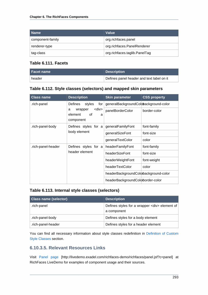
Chapter 6. The RichFaces Components
293
Name Value
component-family org.richfaces.panel
renderer-type org.richfaces.PanelRenderer
tag-class org.richfaces.taglib.PanelTag
Table 6.111. Facets
Facet name Description
header Defines panel header and text label on it
Table 6.112. Style classes (selectors) and mapped skin parameters
Class name Description Skin parameter CSS property
generalBackgroundColorbackground-color.rich-panel Defines styles for
a wrapper <div>
element of a
component
panelBorderColor border-color
generalFamilyFont font-family
generalSizeFont font-size
.rich-panel-body Defines styles for a
body element
generalTextColor color
headerFamilyFont font-family
headerSizeFont font-size
headerWeightFont font-weight
headerTextColor color
headerBackgroundColorbackground-color
.rich-panel-header Defines styles for a
header element
headerBackgroundColorborder-color
Table 6.113. Internal style classes (selectors)
Class name (selector) Description
.rich-panel Defines styles for a wrapper <div> element of
a component
.rich-panel-body Defines styles for a body element
.rich-panel-header Defines styles for a header element
You can find all necessary information about style classes redefinition in Definition of Custom
Style Classes section.
6.10.3.5. Relevant Resources Links
Visit Panel page [http://livedemo.exadel.com/richfaces-demo/richfaces/panel.jsf?c=panel] at
RichFaces LiveDemo for examples of component usage and their sources.
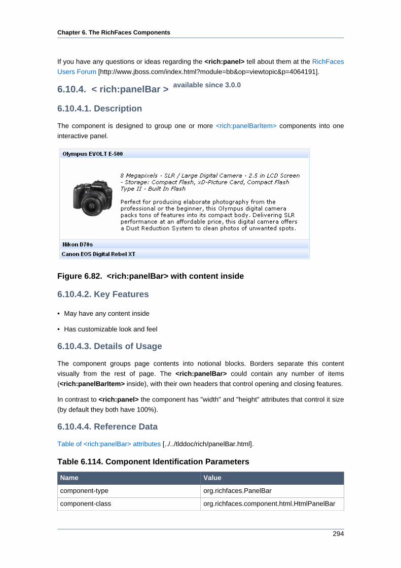
Chapter 6. The RichFaces Components
294
If you have any questions or ideas regarding the <rich:panel> tell about them at the RichFaces
Users Forum [http://www.jboss.com/index.html?module=bb&op=viewtopic&p=4064191].
6.10.4. < rich:panelBar > available since 3.0.0
6.10.4.1. Description
The component is designed to group one or more <rich:panelBarItem> components into one
interactive panel.
Figure 6.82. <rich:panelBar> with content inside
6.10.4.2. Key Features
• May have any content inside
• Has customizable look and feel
6.10.4.3. Details of Usage
The component groups page contents into notional blocks. Borders separate this content
visually from the rest of page. The <rich:panelBar> could contain any number of items
(<rich:panelBarItem> inside), with their own headers that control opening and closing features.
In contrast to <rich:panel> the component has "width" and "height" attributes that control it size
(by default they both have 100%).
6.10.4.4. Reference Data
Table of <rich:panelBar> attributes [../../tlddoc/rich/panelBar.html].
Table 6.114. Component Identification Parameters
Name Value
component-type org.richfaces.PanelBar
component-class org.richfaces.component.html.HtmlPanelBar
Chapter 6. The RichFaces Components
295
Name Value
component-family org.richfaces.PanelBar
renderer-type org.richfaces.PanelBarRenderer
tag-class org.richfaces.taglib.PanelBarTag
Table 6.115. Style classes (selectors) and mapped skin parameters
Class name Description Skin parameter CSS property
.rich-panelbar Defines styles for
wrapper <div>
element of a
component
headerBackgroundColorborder-color
preferableDataFamilyFontfont-family
preferableDataSizeFontfont-size
.rich-panelbar-content Defines styles for
panelBar content
generalTextColor color
headerBackgroundColorbackground-color
headerFamilyFont font-family
headerSizeFont font-size
headerWeightFont font-weight
.rich-panelbar-header Defines styles for
panelBar header
headerTextColor color
headerBackgroundColorbackground-color
headerFamilyFont font-family
headerSizeFont font-size
headerWeightFont font-weight
.rich-panelbar-
header-act
Defines styles for
panelBar active
header
headerTextColor color
.rich-panelbar-interior Defines styles for
panelBar content
generalBackgroundColorbackground-color
Table 6.116. Internal style classes (selectors)
Class name (selector) Description
.rich-panel-b Defines styles for panelBar content
.rich-panel-header Defines styles for active header element
.rich-panel-header-act Defines styles for header element
.rich-panelbar-content Defines styles for panelBar content
.rich-panelbar-interior Defines styles for panelBar content
You can find all necessary information about style classes redefinition in Definition of Custom
Style Classes section.
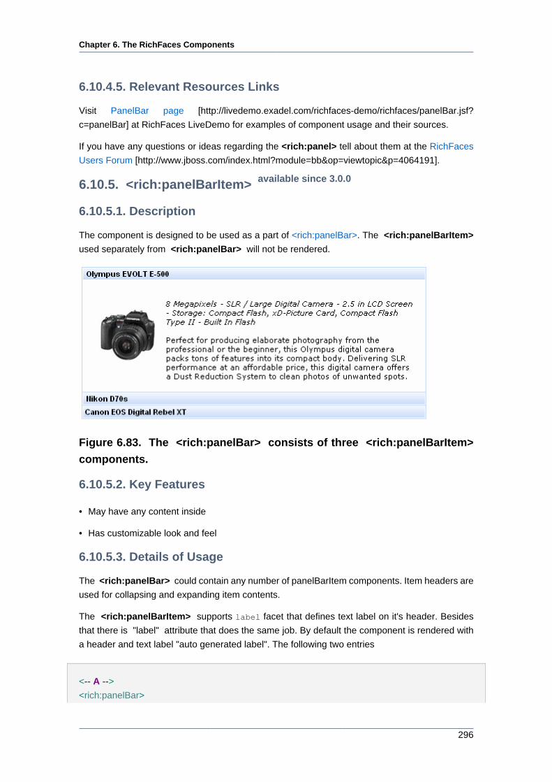
Chapter 6. The RichFaces Components
296
6.10.4.5. Relevant Resources Links
Visit PanelBar page [http://livedemo.exadel.com/richfaces-demo/richfaces/panelBar.jsf?
c=panelBar] at RichFaces LiveDemo for examples of component usage and their sources.
If you have any questions or ideas regarding the <rich:panel> tell about them at the RichFaces
Users Forum [http://www.jboss.com/index.html?module=bb&op=viewtopic&p=4064191].
6.10.5. <rich:panelBarItem> available since 3.0.0
6.10.5.1. Description
The component is designed to be used as a part of <rich:panelBar>. The <rich:panelBarItem>
used separately from <rich:panelBar> will not be rendered.
Figure 6.83. The <rich:panelBar> consists of three <rich:panelBarItem>
components.
6.10.5.2. Key Features
• May have any content inside
• Has customizable look and feel
6.10.5.3. Details of Usage
The <rich:panelBar> could contain any number of panelBarItem components. Item headers are
used for collapsing and expanding item contents.
The <rich:panelBarItem> supports label facet that defines text label on it's header. Besides
that there is "label" attribute that does the same job. By default the component is rendered with
a header and text label "auto generated label". The following two entries
<-- A -->
<rich:panelBar>
Chapter 6. The RichFaces Components
297
<rich:panelBarItem label="Olympus EVOLT E-500" />
</rich:panelBar>
<-- B -->
<rich:panelBar>
<rich:panelBarItem>
<f:facet name="label">
<h:outputText value="Olympus EVOLT E-500"/>
</f:facet>
</rich:panelBarItem>
</rich:panelBar>
will have the same output.
6.10.5.4. Reference Data
Table of <rich:panelBarItem> attributes [../../tlddoc/rich/panelBarItem.html].
Table 6.117. Component Identification Parameters
Name Value
component-type org.richfaces.PanelBarItem
component-class org.richfaces.component.html.HtmlPanelBarItem
component-family org.richfaces.PanelBarItem
renderer-type org.richfaces.PanelBarItemRenderer
tag-class org.richfaces.taglib.PanelBarItemTag
Table 6.118. Facet
Facet name Description
label Defines text label on panel header
Table 6.119. Style classes (selectors) and mapped skin parameters
Class name Description Skin parameter CSS property
preferableDataFamilyFontfont-family
preferableDataSizeFontfont-size
.rich-panelbar-content Defines styles for
panelBar content
generalTextColor color
headerBackgroundColorbackground-color
headerFamilyFont font-family
headerSizeFont font-size
.rich-panelbar-header Defines styles for
panelBar header
headerWeightFont font-weight
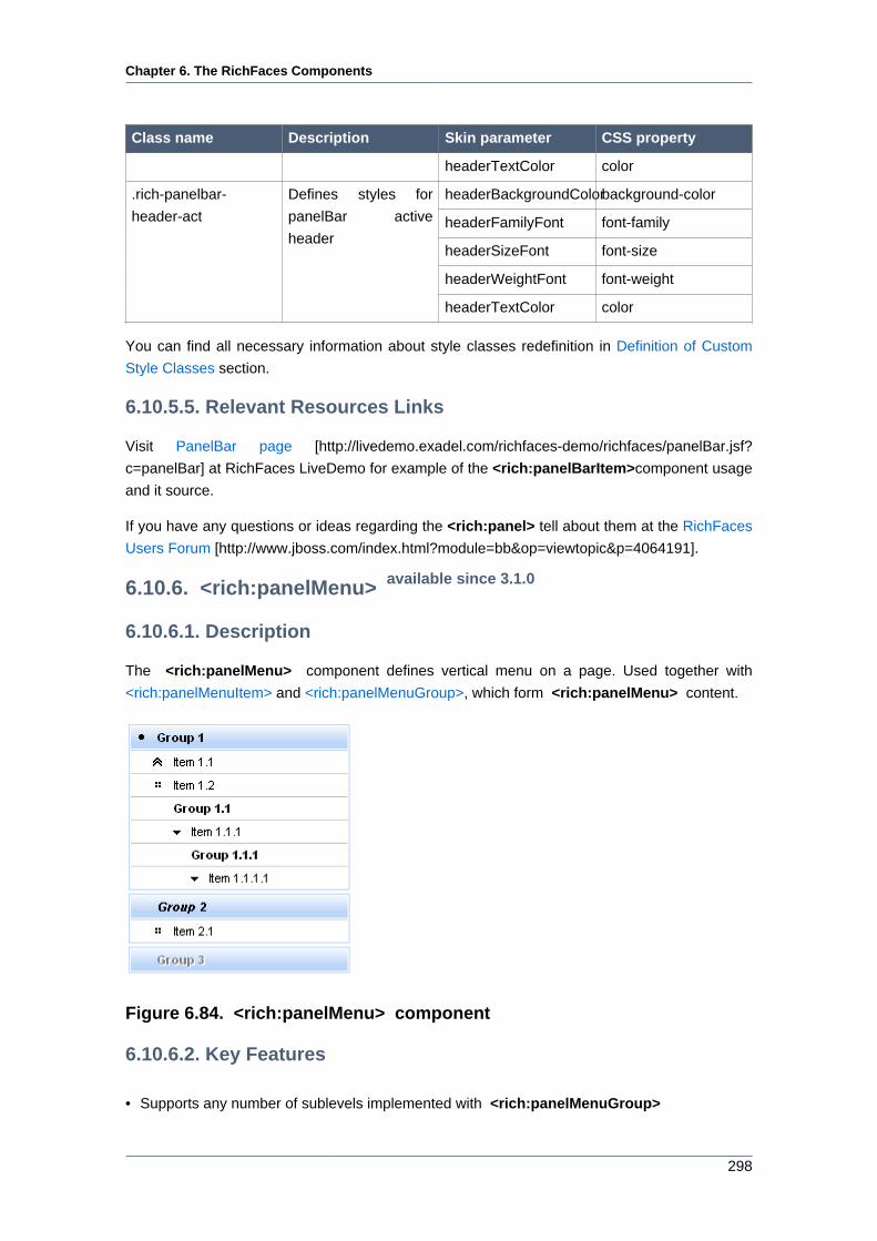
Chapter 6. The RichFaces Components
298
Class name Description Skin parameter CSS property
headerTextColor color
headerBackgroundColorbackground-color
headerFamilyFont font-family
headerSizeFont font-size
headerWeightFont font-weight
.rich-panelbar-
header-act
Defines styles for
panelBar active
header
headerTextColor color
You can find all necessary information about style classes redefinition in Definition of Custom
Style Classes section.
6.10.5.5. Relevant Resources Links
Visit PanelBar page [http://livedemo.exadel.com/richfaces-demo/richfaces/panelBar.jsf?
c=panelBar] at RichFaces LiveDemo for example of the <rich:panelBarItem>component usage
and it source.
If you have any questions or ideas regarding the <rich:panel> tell about them at the RichFaces
Users Forum [http://www.jboss.com/index.html?module=bb&op=viewtopic&p=4064191].
6.10.6. <rich:panelMenu> available since 3.1.0
6.10.6.1. Description
The <rich:panelMenu> component defines vertical menu on a page. Used together with
<rich:panelMenuItem> and <rich:panelMenuGroup>, which form <rich:panelMenu> content.
Figure 6.84. <rich:panelMenu> component
6.10.6.2. Key Features
• Supports any number of sublevels implemented with <rich:panelMenuGroup>
Chapter 6. The RichFaces Components
299
• Has three submission modes: ajax, server and none
• Can be disabled
• Supports predefined and custom icons
• Has customizable look and feel
6.10.6.3. Details of Usage
Use "event" attribute to define an event for appearance of collapsing/expanding sublevels. Default
value is onclick:
<rich:panelMenu event="onmouseover">
...
</rich:panelMenu>
Switching mode could be chosen with the "mode" attribute for all panelMenu items except
ones where this attribute was redefined. By default all items send traditional request. The
"expandMode" attribute defines the submission modes for all collapsing/expanding panelMenu
groups except ones where this attribute was redefined. The "mode" and "expandMode" attributes
could be used with three possible parameters. The "mode" attribute defines parameters for all
included <rich:panelMenuItem> elements.
• Server (default) the common submission of the form is performed and page is completely
refreshed:
...
<rich:panelMenu mode="server">
<rich:panelMenuGroup label="test Group" action="#{bean.action}">
<rich:panelMenuItem label="test" action="#{capitalsBean.action}">
<f:param value="test value" name="test"/>
</rich:panelMenuItem>
</rich:panelMenuGroup>
</rich:panelMenu>
...
• Ajax an Ajax form submission is performed, and additionally specified elements in the
"reRender" attribute are reRendered:
...
<rich:panelMenu mode="ajax">
<rich:panelMenuGroup label="test Group" action="#{bean.action}">
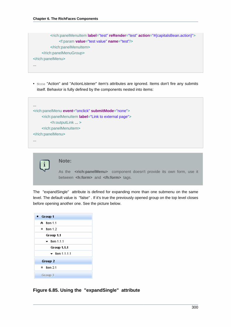
Chapter 6. The RichFaces Components
300
<rich:panelMenuItem label="test" reRender="test" action="#{capitalsBean.action}">
<f:param value="test value" name="test"/>
</rich:panelMenuItem>
</rich:panelMenuGroup>
</rich:panelMenu>
...
• None "Action" and "ActionListener" item's attributes are ignored. Items don't fire any submits
itself. Behavior is fully defined by the components nested into items:
...
<rich:panelMenu event="onclick" submitMode="none">
<rich:panelMenuItem label="Link to external page">
<h:outputLink ... >
<rich:panelMenuItem>
</rich:panelMenu>
...
Note:
As the <rich:panelMenu> component doesn't provide its own form, use it
between <h:form> and </h:form> tags.
The "expandSingle" attribute is defined for expanding more than one submenu on the same
level. The default value is "false" . If it's true the previously opened group on the top level closes
before opening another one. See the picture below.
Figure 6.85. Using the "expandSingle" attribute
Chapter 6. The RichFaces Components
301
The "selectedChild" attribute is used for defining the name of the selected group or item. An
example for group is placed below:
Here is an example:
...
<rich:panelMenu selectedChild="thisChild">
<rich:panelMenuGroup label="Group1" name="thisChild">
<!--Nested panelMenu components-->
</rich:panelMenuGroup>
</rich:panelMenu>
...
The "label" attribute is a generic attribute. The "label" attribute provides an association between
a component, and the message that the component (indirectly) produced. This attribute defines
the parameters of localized error and informational messages that occur as a result of conversion,
validation, or other application actions during the request processing lifecycle. With the help of
this attribute you can replace the last parameter substitution token shown in the messages. For
example, {1} for "DoubleRangeValidator.MAXIMUM", {2} for "ShortConverter.SHORT".
6.10.6.4. Reference Data
Table of <rich:panelMenu> attributes [../../tlddoc/rich/panelMenu.html].
Table 6.120. Component Identification Parameters
Name Value
component-type org.richfaces.PanelMenu
component-class org.richfaces.component.html.HtmlPanelMenu
component-family org.richfaces.PanelMenu
renderer-type org.richfaces.PanelMenuRenderer
tag-class org.richfaces.taglib.PanelMenuTag
Table 6.121. JavaScript API
Function Description
expand() Expands group element
collapse() Collapses group element
Chapter 6. The RichFaces Components
302
Table 6.122. Style classes (selectors) and mapped skin parameters
Class name Description Skin parameter CSS property
.rich-pmenu-disabled-
element
Defines styles for
panel menu disabled
element
tabDisabledTextColor color
generalTextColor color
headerFamilyFont font-family
headerSizeFont font-size
headerWeightFont font-weight
.rich-pmenu-group Defines styles for
panel menu group
tableBorderColor border-top-color
.rich-pmenu-hovered-
element
Defines styles for
panel menu hevered
element
additionalBackgroundColorbackground-color
generalTextColor color
generalFamilyFont font-family
genealSizeFont font-size
generalWeightFont font-weight
.rich-pmenu-item Defines styles for
panel menu item
tableBorderColor border-top-color
generalFamilyFont font-family
headerSizeFont font-size
headerTextColor color
headerWeightFont font-weight
.rich-pmenu-top-
group
Defines styles for a
top group element of a
component
headerBackgroundColorbackground-color
.rich-pmenu-top-
group-div
Defines styles for a top
group div element of a
component
panelBorderColor border-color
Table 6.123. Internal style classes (selectors)
Class name (selector) Description
.rich-pmenu Defines styles for panel menu
.rich-pmenu-disabled-element Defines styles for panel menu disabled
element
.rich-pmenu-group Defines styles for panel menu group
.rich-pmenu-group-self-label Defines styles for panel menu group label
.rich-pmenu-item Defines styles for panel menu item
.rich-pmenu-nowrap Defines styles for panel menu wrapper
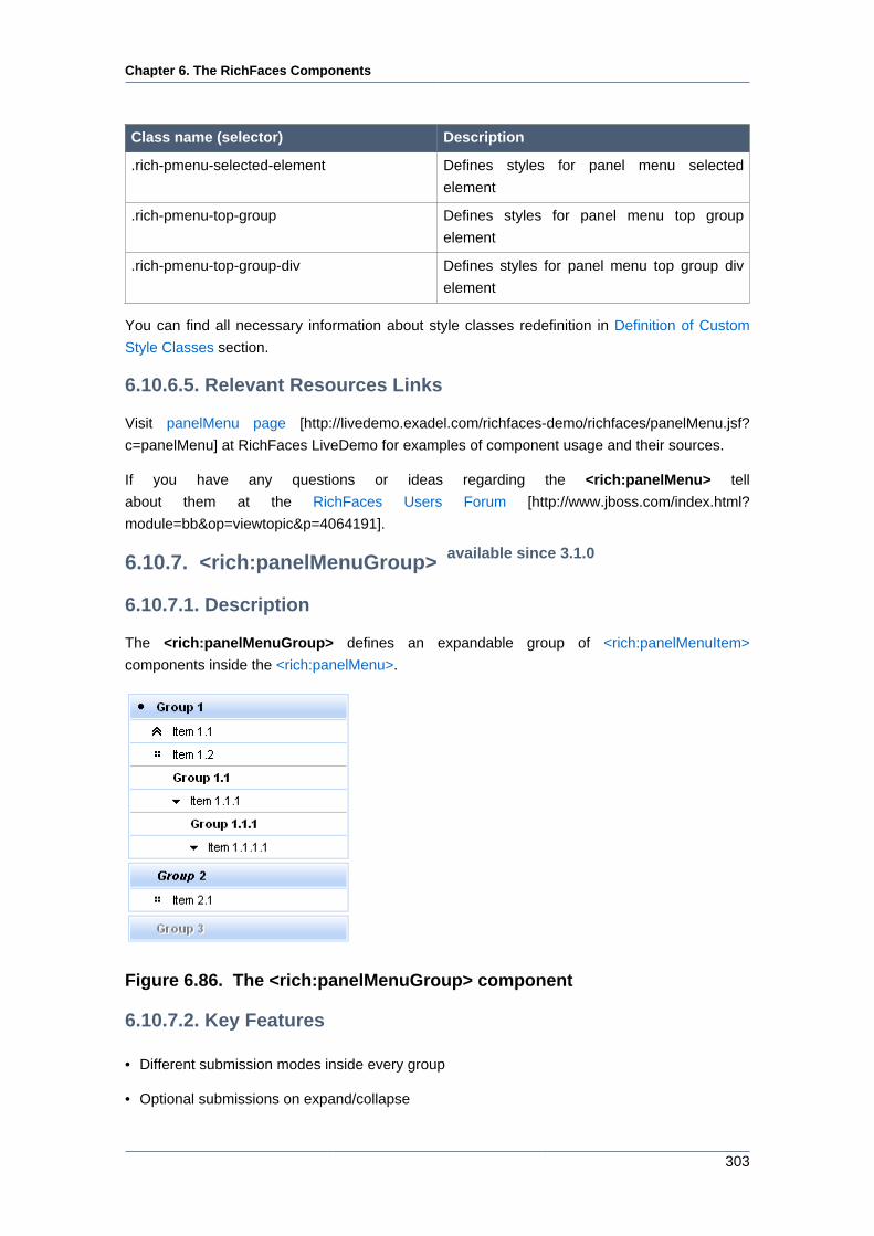
Chapter 6. The RichFaces Components
303
Class name (selector) Description
.rich-pmenu-selected-element Defines styles for panel menu selected
element
.rich-pmenu-top-group Defines styles for panel menu top group
element
.rich-pmenu-top-group-div Defines styles for panel menu top group div
element
You can find all necessary information about style classes redefinition in Definition of Custom
Style Classes section.
6.10.6.5. Relevant Resources Links
Visit panelMenu page [http://livedemo.exadel.com/richfaces-demo/richfaces/panelMenu.jsf?
c=panelMenu] at RichFaces LiveDemo for examples of component usage and their sources.
If you have any questions or ideas regarding the <rich:panelMenu> tell
about them at the RichFaces Users Forum [http://www.jboss.com/index.html?
module=bb&op=viewtopic&p=4064191].
6.10.7. <rich:panelMenuGroup> available since 3.1.0
6.10.7.1. Description
The <rich:panelMenuGroup> defines an expandable group of <rich:panelMenuItem>
components inside the <rich:panelMenu>.
Figure 6.86. The <rich:panelMenuGroup> component
6.10.7.2. Key Features
• Different submission modes inside every group
• Optional submissions on expand/collapse
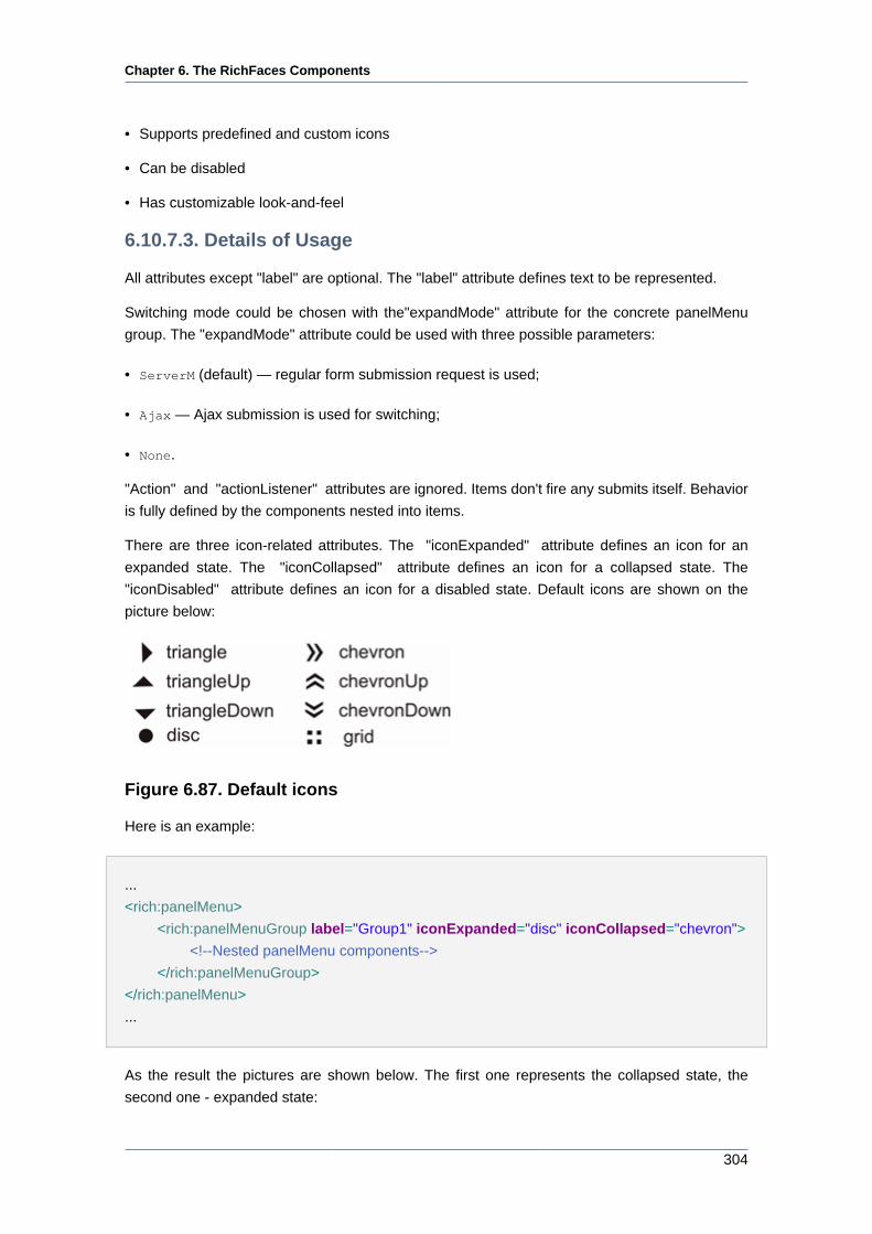
Chapter 6. The RichFaces Components
304
• Supports predefined and custom icons
• Can be disabled
• Has customizable look-and-feel
6.10.7.3. Details of Usage
All attributes except "label" are optional. The "label" attribute defines text to be represented.
Switching mode could be chosen with the"expandMode" attribute for the concrete panelMenu
group. The "expandMode" attribute could be used with three possible parameters:
• ServerM (default) — regular form submission request is used;
• Ajax — Ajax submission is used for switching;
• None.
"Action" and "actionListener" attributes are ignored. Items don't fire any submits itself. Behavior
is fully defined by the components nested into items.
There are three icon-related attributes. The "iconExpanded" attribute defines an icon for an
expanded state. The "iconCollapsed" attribute defines an icon for a collapsed state. The
"iconDisabled" attribute defines an icon for a disabled state. Default icons are shown on the
picture below:
Figure 6.87. Default icons
Here is an example:
...
<rich:panelMenu>
<rich:panelMenuGroup label="Group1" iconExpanded="disc" iconCollapsed="chevron">
<!--Nested panelMenu components-->
</rich:panelMenuGroup>
</rich:panelMenu>
...
As the result the pictures are shown below. The first one represents the collapsed state, the
second one - expanded state:
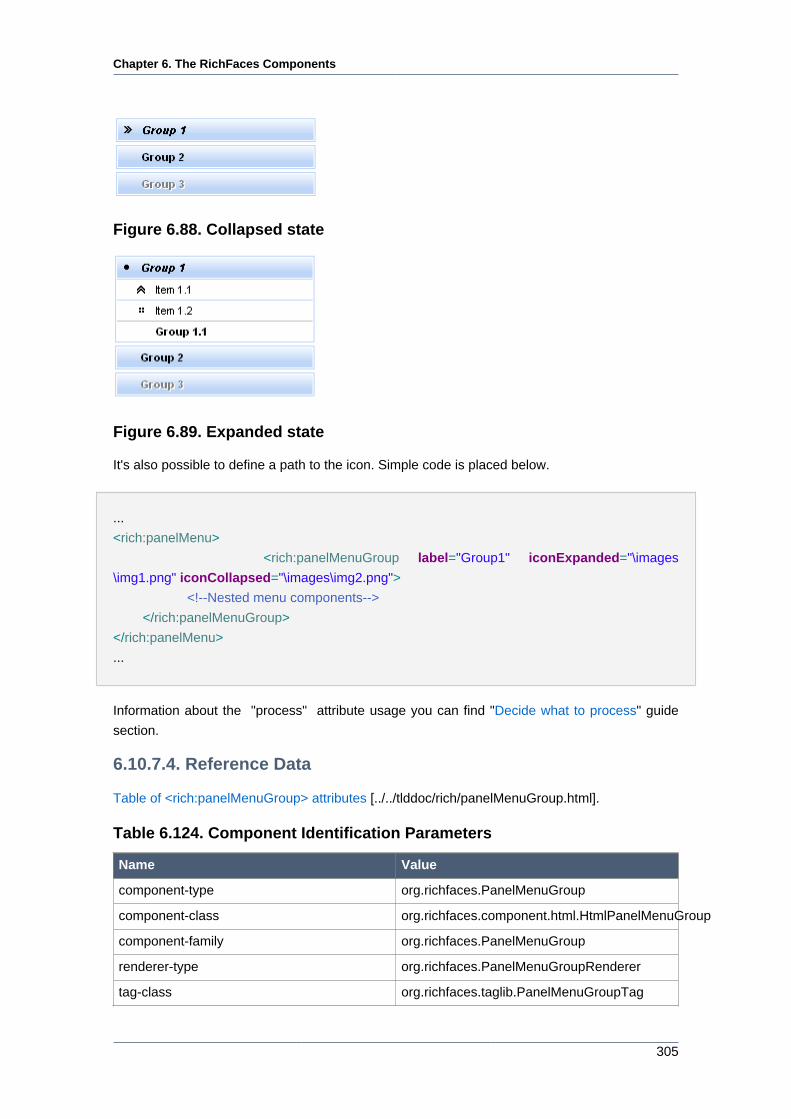
Chapter 6. The RichFaces Components
305
Figure 6.88. Collapsed state
Figure 6.89. Expanded state
It's also possible to define a path to the icon. Simple code is placed below.
...
<rich:panelMenu>
<rich:panelMenuGroup label="Group1" iconExpanded="\images
\img1.png" iconCollapsed="\images\img2.png">
<!--Nested menu components-->
</rich:panelMenuGroup>
</rich:panelMenu>
...
Information about the "process" attribute usage you can find "Decide what to process" guide
section.
6.10.7.4. Reference Data
Table of <rich:panelMenuGroup> attributes [../../tlddoc/rich/panelMenuGroup.html].
Table 6.124. Component Identification Parameters
Name Value
component-type org.richfaces.PanelMenuGroup
component-class org.richfaces.component.html.HtmlPanelMenuGroup
component-family org.richfaces.PanelMenuGroup
renderer-type org.richfaces.PanelMenuGroupRenderer
tag-class org.richfaces.taglib.PanelMenuGroupTag
Chapter 6. The RichFaces Components
306
Table 6.125. JavaScript API
Function Description
expand() Expands group
collapse() Collapses group
Table 6.126. Style classes (selectors) and mapped skin parameters
Class name Description Skin parameter CSS property
.rich-pmenu-disabled-
element
Defines styles for
panel menu disabled
element
tabDisabledTextColor color
generalTextColor color
headerFamilyFont font-family
headerSizeFont font-size
headerWeightFont font-weight
.rich-pmenu-group Defines styles for
panel menu group
tableBorderColor border-top-color
.rich-pmenu-hovered-
element
Defines styles for
panel menu hevered
element
additionalBackgroundColorbackground-color
generalFamilyFont font-family
headerSizeFont font-size
headerTextColor color
headerWeightFont font-weight
.rich-pmenu-top-
group
Defines styles for a
top group element of a
component
headerBackgroundColorbackground-color
.rich-pmenu-top-
group-div
Defines styles for a top
group div element of a
component
panelBorderColor border-color
Table 6.127. Internal style classes (selectors)
Class name (selector) Description
.rich-pmenu-disabled-element Defines styles for panel menu disabled
element
.rich-pmenu-group Defines styles for panel menu group
.rich-pmenu-group-self-label Defines styles for panel menu group label
.rich-pmenu-nowrap Defines styles for panel menu wrapper
.rich-pmenu-top-group Defines styles for panel menu top group
element
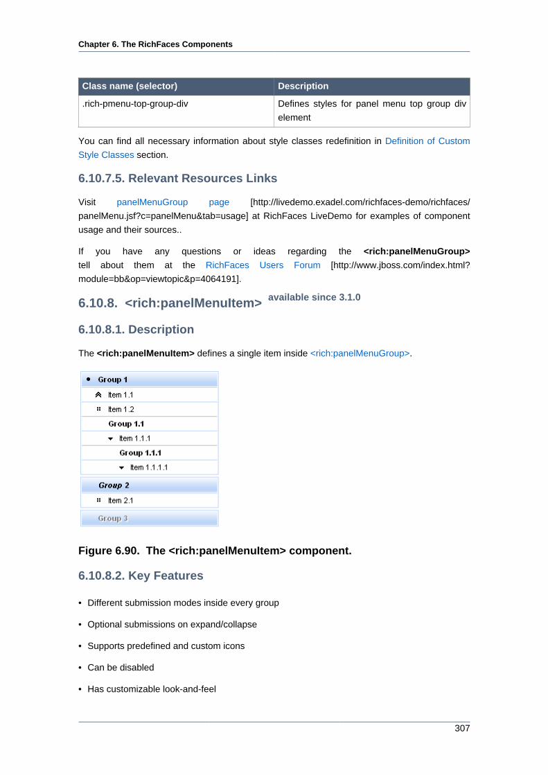
Chapter 6. The RichFaces Components
307
Class name (selector) Description
.rich-pmenu-top-group-div Defines styles for panel menu top group div
element
You can find all necessary information about style classes redefinition in Definition of Custom
Style Classes section.
6.10.7.5. Relevant Resources Links
Visit panelMenuGroup page [http://livedemo.exadel.com/richfaces-demo/richfaces/
panelMenu.jsf?c=panelMenu&tab=usage] at RichFaces LiveDemo for examples of component
usage and their sources..
If you have any questions or ideas regarding the <rich:panelMenuGroup>
tell about them at the RichFaces Users Forum [http://www.jboss.com/index.html?
module=bb&op=viewtopic&p=4064191].
6.10.8. <rich:panelMenuItem> available since 3.1.0
6.10.8.1. Description
The <rich:panelMenuItem> defines a single item inside <rich:panelMenuGroup>.
Figure 6.90. The <rich:panelMenuItem> component.
6.10.8.2. Key Features
• Different submission modes inside every group
• Optional submissions on expand/collapse
• Supports predefined and custom icons
• Can be disabled
• Has customizable look-and-feel
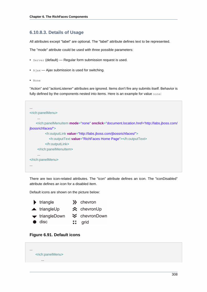
Chapter 6. The RichFaces Components
308
6.10.8.3. Details of Usage
All attributes except "label" are optional. The "label" attribute defines text to be represented.
The "mode" attribute could be used with three possible parameters:
• Server (default) — Regular form submission request is used.
• Ajax — Ajax submission is used for switching.
• None
"Action" and "actionListener" attributes are ignored. Items don't fire any submits itself. Behavior is
fully defined by the components nested into items. Here is an example for value none:
...
<rich:panelMenu>
...
<rich:panelMenuItem mode="none" onclick="document.location.href='http://labs.jboss.com/
jbossrichfaces/">
<h:outputLink value="http://labs.jboss.com/jbossrichfaces/">
<h:outputText value="RichFaces Home Page"></h:outputText>
</h:outputLink>
</rich:panelMenuItem>
...
</rich:panelMenu>
...
There are two icon-related attributes. The "icon" attribute defines an icon. The "iconDisabled"
attribute defines an icon for a disabled item.
Default icons are shown on the picture below:
Figure 6.91. Default icons
...
<rich:panelMenu>
...
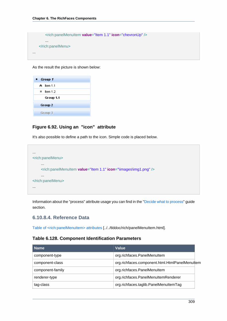
Chapter 6. The RichFaces Components
309
<rich:panelMenuItem value="Item 1.1" icon="chevronUp" />
...
</rich:panelMenu>
...
As the result the picture is shown below:
Figure 6.92. Using an "icon" attribute
It's also possible to define a path to the icon. Simple code is placed below.
...
<rich:panelMenu>
...
<rich:panelMenuItem value="Item 1.1" icon="\images\img1.png" />
...
</rich:panelMenu>
...
Information about the "process" attribute usage you can find in the "Decide what to process" guide
section.
6.10.8.4. Reference Data
Table of <rich:panelMenuItem> attributes [../../tlddoc/rich/panelMenuItem.html].
Table 6.128. Component Identification Parameters
Name Value
component-type org.richfaces.PanelMenuItem
component-class org.richfaces.component.html.HtmlPanelMenuItem
component-family org.richfaces.PanelMenuItem
renderer-type org.richfaces.PanelMenuItemRenderer
tag-class org.richfaces.taglib.PanelMenuItemTag
Chapter 6. The RichFaces Components
310
Table 6.129. Style classes (selectors) and mapped skin parameters
Class name Description Skin parameter CSS property
.rich-pmenu-disabled-
element
Defines styles for
panel menu disabled
element
tabDisabledTextColor color
.rich-pmenu-hovered-
element
Defines styles for
panel menu hevered
element
additionalBackgroundColorbackground-color
generalTextColor color
generalFamilyFont font-family
genealSizeFont font-size
generalWeightFont font-weight
.rich-pmenu-item Defines styles for
panel menu item
tableBorderColor border-top-color
Table 6.130. Internal style classes (selectors)
Class name (selector) Description
.rich-pmenu-disabled-element Defines styles for panel menu disabled
element
.rich-pmenu-group-self-label Defines styles for panel menu group label
.rich-pmenu-item Defines styles for panel menu item
.rich-pmenu-selected-element Defines styles for panel menu selected
element
You can find all necessary information about style classes redefinition in Definition of Custom
Style Classes section.
6.10.8.5. Relevant Resources Links
Visit panelMenuItem page [http://livedemo.exadel.com/richfaces-demo/richfaces/panelMenu.jsf?
c=panelMenu&tab=usage] at RichFaces LiveDemo for examples of component usage and their
sources.
If you have any questions or ideas regarding the <rich:panelMenu> tell
about them at the RichFaces Users Forum [http://www.jboss.com/index.html?
module=bb&op=viewtopic&p=4064191].
6.10.9. < rich:progressBar > available since 3.2.0
6.10.9.1. Description
The <rich:progressBar> component is designed for displaying a progress bar which shows the
current status of the process.
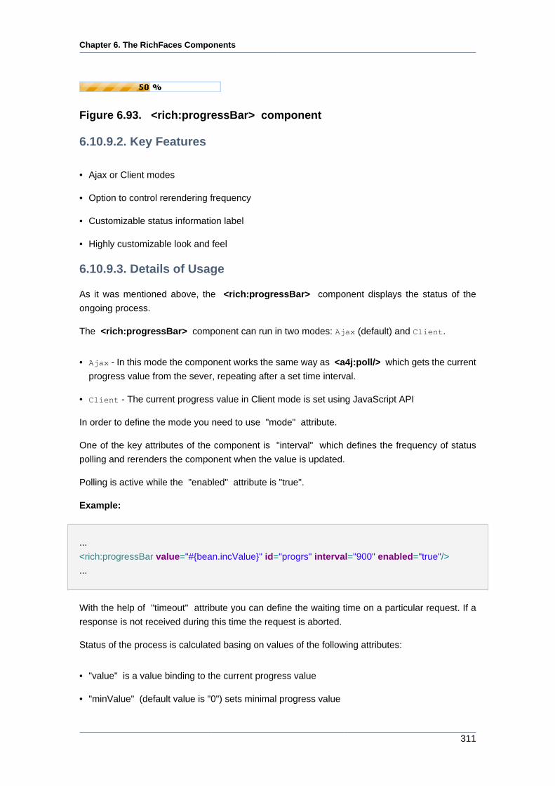
Chapter 6. The RichFaces Components
311
Figure 6.93. <rich:progressBar> component
6.10.9.2. Key Features
• Ajax or Client modes
• Option to control rerendering frequency
• Customizable status information label
• Highly customizable look and feel
6.10.9.3. Details of Usage
As it was mentioned above, the <rich:progressBar> component displays the status of the
ongoing process.
The <rich:progressBar> component can run in two modes: Ajax (default) and Client.
• Ajax - In this mode the component works the same way as <a4j:poll/> which gets the current
progress value from the sever, repeating after a set time interval.
• Client - The current progress value in Client mode is set using JavaScript API
In order to define the mode you need to use "mode" attribute.
One of the key attributes of the component is "interval" which defines the frequency of status
polling and rerenders the component when the value is updated.
Polling is active while the "enabled" attribute is "true".
Example:
...
<rich:progressBar value="#{bean.incValue}" id="progrs" interval="900" enabled="true"/>
...
With the help of "timeout" attribute you can define the waiting time on a particular request. If a
response is not received during this time the request is aborted.
Status of the process is calculated basing on values of the following attributes:
• "value" is a value binding to the current progress value
• "minValue" (default value is "0") sets minimal progress value
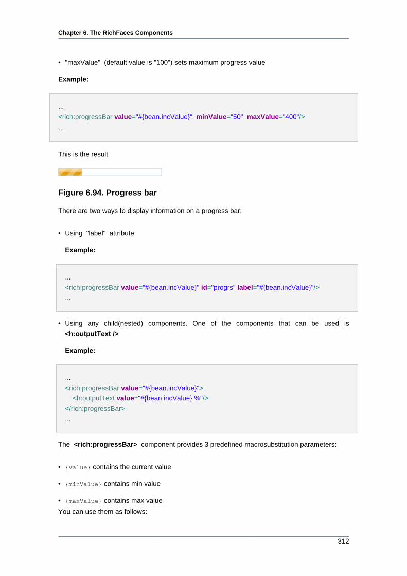
Chapter 6. The RichFaces Components
312
• "maxValue" (default value is "100") sets maximum progress value
Example:
...
<rich:progressBar value="#{bean.incValue}" minValue="50" maxValue="400"/>
...
This is the result
Figure 6.94. Progress bar
There are two ways to display information on a progress bar:
• Using "label" attribute
Example:
...
<rich:progressBar value="#{bean.incValue}" id="progrs" label="#{bean.incValue}"/>
...
• Using any child(nested) components. One of the components that can be used is
<h:outputText />
Example:
...
<rich:progressBar value="#{bean.incValue}">
<h:outputText value="#{bean.incValue} %"/>
</rich:progressBar>
...
The <rich:progressBar> component provides 3 predefined macrosubstitution parameters:
• {value} contains the current value
• {minValue} contains min value
• {maxValue} contains max value
You can use them as follows:
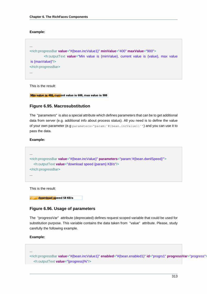
Chapter 6. The RichFaces Components
313
Example:
...
<rich:progressBar value="#{bean.incValue1}" minValue="400" maxValue="900">
<h:outputText value="Min value is {minValue}, current value is {value}, max value
is {maxValue}"/>
</rich:progressBar>
...
This is the result:
Figure 6.95. Macrosubstitution
The "parameters" is also a special attribute which defines parameters that can be to get additional
data from server (e.g. additional info about process status). All you need is to define the value
of your own parameter (e.g parameters="param:'#{bean.incValue1}'") and you can use it to
pass the data.
Example:
...
<rich:progressBar value="#{bean.incValue}" parameters="param:'#{bean.dwnlSpeed}'">
<h:outputText value="download speed {param} KB/s"/>
</rich:progressBar>
...
This is the result:
Figure 6.96. Usage of parameters
The "progressVar" attribute (deprecated) defines request scoped variable that could be used for
substitution purpose. This variable contains the data taken from "value" attribute. Please, study
carefully the following example.
Example:
...
<rich:progressBar value="#{bean.incValue1}" enabled="#{bean.enabled1}" id="progrs1" progressVar="progress">
<h:outputText value="{progress}%"/>
Chapter 6. The RichFaces Components
314
</rich:progressBar>
...
In the shown example "progressVar" attribute defines a variable "progress" with the value taken
from "value" attribute of the <rich:progressBar> component. The "progress" variable performs
substitution passing the current progress value to the "value" attribute of the <h:outputText> .
This is how the current value of a progress appears on the label of <rich:progressBar> .
As the "progressVar" attribute is deprecated, it's better to use the predefined macrosubstitution
parameter {value} instead. See how you can rewrite the above example with the help of {value}.
Example:
...
<rich:progressBar value="#{bean.incValue1}" enabled="#{bean.enabled1}" id="progrs1">
<h:outputText value="{value}%"/>
</rich:progressBar>
...
The component can also employ "initial" and "complete" facets to display the states of the
process: "initial" facet is displayed when the progress value is less or equal to "minValue" , and
the "complete" facet is shown when the value is greater or equal to "maxValue" . Please see
an example below.
Example:
...
<rich:progressBar value="#{bean.incValue1}">
<f:facet name="initial">
<h:outputText value="Process not started"/>
</f:facet>
<f:facet name="complete">
<h:outputText value="Process completed"/>
</f:facet>
</rich:progressBar>
...
Information about the "process" attribute usage you can find " Decide what to process " guide
section.
6.10.9.4. Reference Data
Table of <rich:progressBar> attributes [../../tlddoc/rich/progressBar.html].
Chapter 6. The RichFaces Components
315
Table 6.131. Component Identification Parameters
Name Value
component-type org.richfaces.ProgressBar
component-class org.richfaces.component.html.HtmlProgressBar
component-family org.richfaces.ProgressBar
renderer-type org.richfaces.renderkit.ProgressBarRenderer
tag-class org.richfaces.taglib.ProgressBarTag
Table 6.132. JavaScript API
Function Description
enable() Begins polling for Ajax mode
disable() Stops polling for Ajax mode
setValue(value) Updates the progress of the process
setLabel(label) Update the label for the process
Table 6.133. Facets
Facet name Description
initial Defines the information content about the state
of the process if the progress value is less or
equal to "minValue"
complete Defines the information content about the state
of the process if the value is greater or equal
to "maxValue"
Table 6.134. Classes names for the progressBar without a label
Class name Description
rich-progress-bar-shell Defines styles for a wrapper <div> element of
a progressBar
rich-progress-bar-uploaded Defines styles for the completed progress area
rich-progress-bar-height Defines height for a progressBar
rich-progress-bar-width Defines width for a progressBar
Table 6.135. Classes names for the progressBar with a label
Class name Description
rich-progress-bar-shell-dig Defines styles for a wrapper <div> element of
a progressBar
Chapter 6. The RichFaces Components
316
Class name Description
rich-progress-bar-uploaded-dig Defines styles for the label
rich-progress-bar-remained Defines styles for the remained progress area
rich-progress-bar-completed Defines styles for the completed progress area
rich-progress-bar-height-dig Defines height for a progressBar
rich-progress-bar-width Defines width for a progressBar
Note:
It's necessary to define width of the component in pixels only.
You can find all necessary information about style classes redefinition in Definition of Custom
Style Classes section.
6.10.9.5. Relevant Resources Links
On the component Live Demo page [http://livedemo.exadel.com/richfaces-demo/richfaces/
progressBar.jsf?c=progressBar] you can see the example of <rich:progressBar> usage and
sources for the given example.
Read "Simple Ping Application with <rich:progressBar>" [http://www.jboss.org/community/wiki/
SimplePingApplicationwithrichprogressBar] article to find out how to show the progress of server
ping process.
6.10.10. < rich:separator > available since 3.0.0
6.10.10.1. Description
A horizontal line to use as a separator in a layout. The line type can be customized with the
"lineType" parameter.
Figure 6.97. <rich:separator> component
6.10.10.2. Key Features
• Highly customizable look and feel
• Leveraging layout elements creation
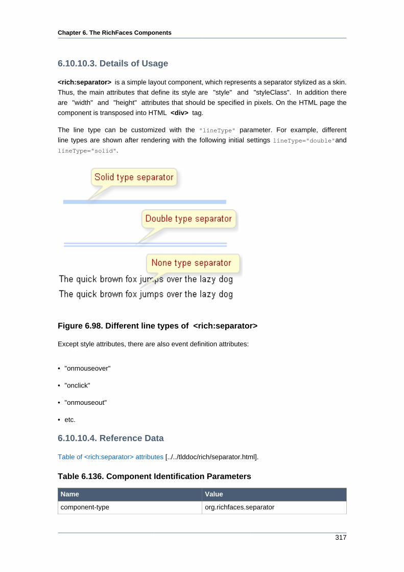
Chapter 6. The RichFaces Components
317
6.10.10.3. Details of Usage
<rich:separator> is a simple layout component, which represents a separator stylized as a skin.
Thus, the main attributes that define its style are "style" and "styleClass". In addition there
are "width" and "height" attributes that should be specified in pixels. On the HTML page the
component is transposed into HTML <div> tag.
The line type can be customized with the "lineType" parameter. For example, different
line types are shown after rendering with the following initial settings lineType="double"and
lineType="solid".
Figure 6.98. Different line types of <rich:separator>
Except style attributes, there are also event definition attributes:
• "onmouseover"
• "onclick"
• "onmouseout"
• etc.
6.10.10.4. Reference Data
Table of <rich:separator> attributes [../../tlddoc/rich/separator.html].
Table 6.136. Component Identification Parameters
Name Value
component-type org.richfaces.separator
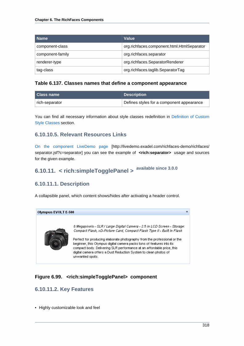
Chapter 6. The RichFaces Components
318
Name Value
component-class org.richfaces.component.html.HtmlSeparator
component-family org.richfaces.separator
renderer-type org.richfaces.SeparatorRenderer
tag-class org.richfaces.taglib.SeparatorTag
Table 6.137. Classes names that define a component appearance
Class name Description
rich-separator Defines styles for a component appearance
You can find all necessary information about style classes redefinition in Definition of Custom
Style Classes section.
6.10.10.5. Relevant Resources Links
On the component LiveDemo page [http://livedemo.exadel.com/richfaces-demo/richfaces/
separator.jsf?c=separator] you can see the example of <rich:separator> usage and sources
for the given example.
6.10.11. < rich:simpleTogglePanel > available since 3.0.0
6.10.11.1. Description
A collapsible panel, which content shows/hides after activating a header control.
Figure 6.99. <rich:simpleTogglePanel> component
6.10.11.2. Key Features
• Highly customizable look and feel
Chapter 6. The RichFaces Components
319
• Support for any content inside
• Collapsing expanding content
• Three modes of collapsing/expanding
• Server
• Client
• Ajax
6.10.11.3. Details of Usage
The component is a simplified version of toggle panel that initially has a defined layout as a panel
with a header playing a role of a mode switching control. On a component header element, it's
possible to define a label using an attribute with the same name.
Switching mode could be defined with the "switchType" attribute with three possible parameters.
• Server (DEFAULT)
The common submission is performed around simpleTogglePanel and a page is completely
rendered on a called panel. Only one at a time panel is uploaded onto the client side.
• Ajax
AJAX form submission is performed around the panel, content of the called panel is uploaded
on Ajax request and additionally specified elements in the "reRender" attribute are rendered.
Only one at a time panel is uploaded on the client side.
• Client
All panels are uploaded on the client side. Switching from the active to the hidden panel is
performed with client JavaScript.
The <rich:simpleTogglePanel> component also has an "opened" attribute responsible for
keeping a panel state. It gives an opportunity to manage state of the component from a model. If
the value of this attribute is"true" the component is expanded.
• "onmouseover "
• "onclick "
• "onmouseout "
• etc.
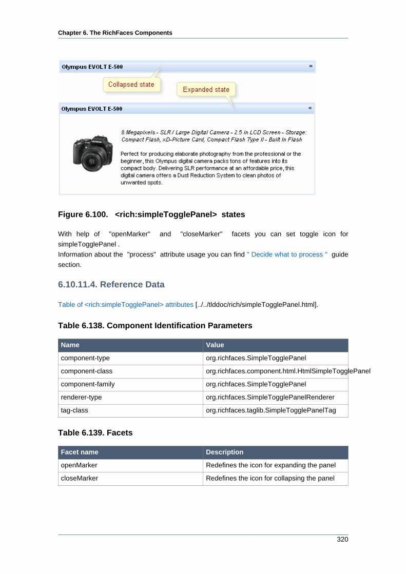
Chapter 6. The RichFaces Components
320
Figure 6.100. <rich:simpleTogglePanel> states
With help of "openMarker" and "closeMarker" facets you can set toggle icon for
simpleTogglePanel .
Information about the "process" attribute usage you can find " Decide what to process " guide
section.
6.10.11.4. Reference Data
Table of <rich:simpleTogglePanel> attributes [../../tlddoc/rich/simpleTogglePanel.html].
Table 6.138. Component Identification Parameters
Name Value
component-type org.richfaces.SimpleTogglePanel
component-class org.richfaces.component.html.HtmlSimpleTogglePanel
component-family org.richfaces.SimpleTogglePanel
renderer-type org.richfaces.SimpleTogglePanelRenderer
tag-class org.richfaces.taglib.SimpleTogglePanelTag
Table 6.139. Facets
Facet name Description
openMarker Redefines the icon for expanding the panel
closeMarker Redefines the icon for collapsing the panel
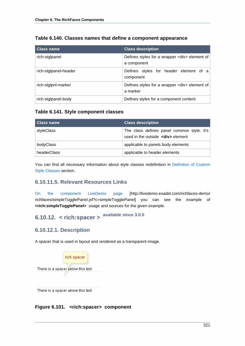
Chapter 6. The RichFaces Components
321
Table 6.140. Classes names that define a component appearance
Class name Class description
rich-stglpanel Defines styles for a wrapper <div> element of
a component
rich-stglpanel-header Defines styles for header element of a
component
rich-stglpnl-marker Defines styles for a wrapper <div> element of
a marker
rich-stglpanel-body Defines styles for a component content
Table 6.141. Style component classes
Class name Class description
styleClass The class defines panel common style. It's
used in the outside <div> element
bodyClass applicable to panels body elements
headerClass applicable to header elements
You can find all necessary information about style classes redefinition in Definition of Custom
Style Classes section.
6.10.11.5. Relevant Resources Links
On the component LiveDemo page [http://livedemo.exadel.com/richfaces-demo/
richfaces/simpleTogglePanel.jsf?c=simpleTogglePanel] you can see the example of
<rich:simpleTogglePanel> usage and sources for the given example.
6.10.12. < rich:spacer > available since 3.0.0
6.10.12.1. Description
A spacer that is used in layout and rendered as a transparent image.
Figure 6.101. <rich:spacer> component
Chapter 6. The RichFaces Components
322
6.10.12.2. Key Features
• Easily used as a transparent layout spacer
• Horizontal or vertical spacing is managed by an attribute
• Easily customizable sizes parameters
6.10.12.3. Details of Usage
<rich:spacer> is a simple layout component which represents a transparent spacer. Thus, the
main attributes that define its style are "style" and "styleClass".
In addition, the attributes are responsible for the component size: "width" and "height".
Moreover, to add e.g. some JavaScript effects, events defined on it are used.
• "onmouseover "
• "onclick "
• "onmouseout "
• etc.
6.10.12.4. Reference Data
Table of <rich:spacer> attributes [../../tlddoc/rich/spacer.html].
Table 6.142. Component Identification Parameters
Name Value
component-type org.richfaces.spacer
component-class org.richfaces.component.html.HtmlSpacer
component-family org.richfaces.spacer
renderer-type org.richfaces.SpacerRenderer
tag-class org.richfaces.taglib.SpacerTag
6.10.12.5. Relevant Resources Links
On the component LiveDemo page [http://livedemo.exadel.com/richfaces-demo/richfaces/
spacer.jsf?c=spacer] you can see the example of <rich:spacer> usage and sources for the
given example.
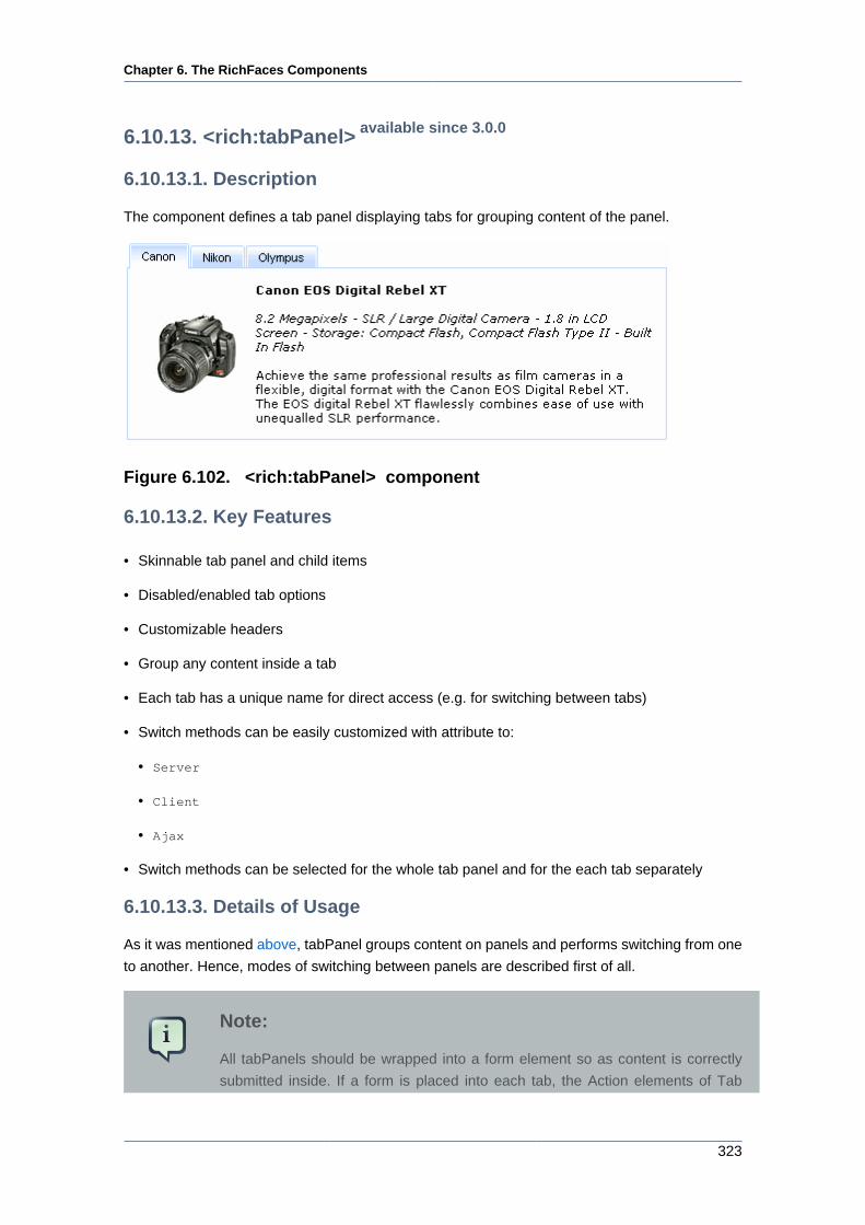
Chapter 6. The RichFaces Components
323
6.10.13. <rich:tabPanel> available since 3.0.0
6.10.13.1. Description
The component defines a tab panel displaying tabs for grouping content of the panel.
Figure 6.102. <rich:tabPanel> component
6.10.13.2. Key Features
• Skinnable tab panel and child items
• Disabled/enabled tab options
• Customizable headers
• Group any content inside a tab
• Each tab has a unique name for direct access (e.g. for switching between tabs)
• Switch methods can be easily customized with attribute to:
• Server
• Client
• Ajax
• Switch methods can be selected for the whole tab panel and for the each tab separately
6.10.13.3. Details of Usage
As it was mentioned above, tabPanel groups content on panels and performs switching from one
to another. Hence, modes of switching between panels are described first of all.
Note:
All tabPanels should be wrapped into a form element so as content is correctly
submitted inside. If a form is placed into each tab, the Action elements of Tab
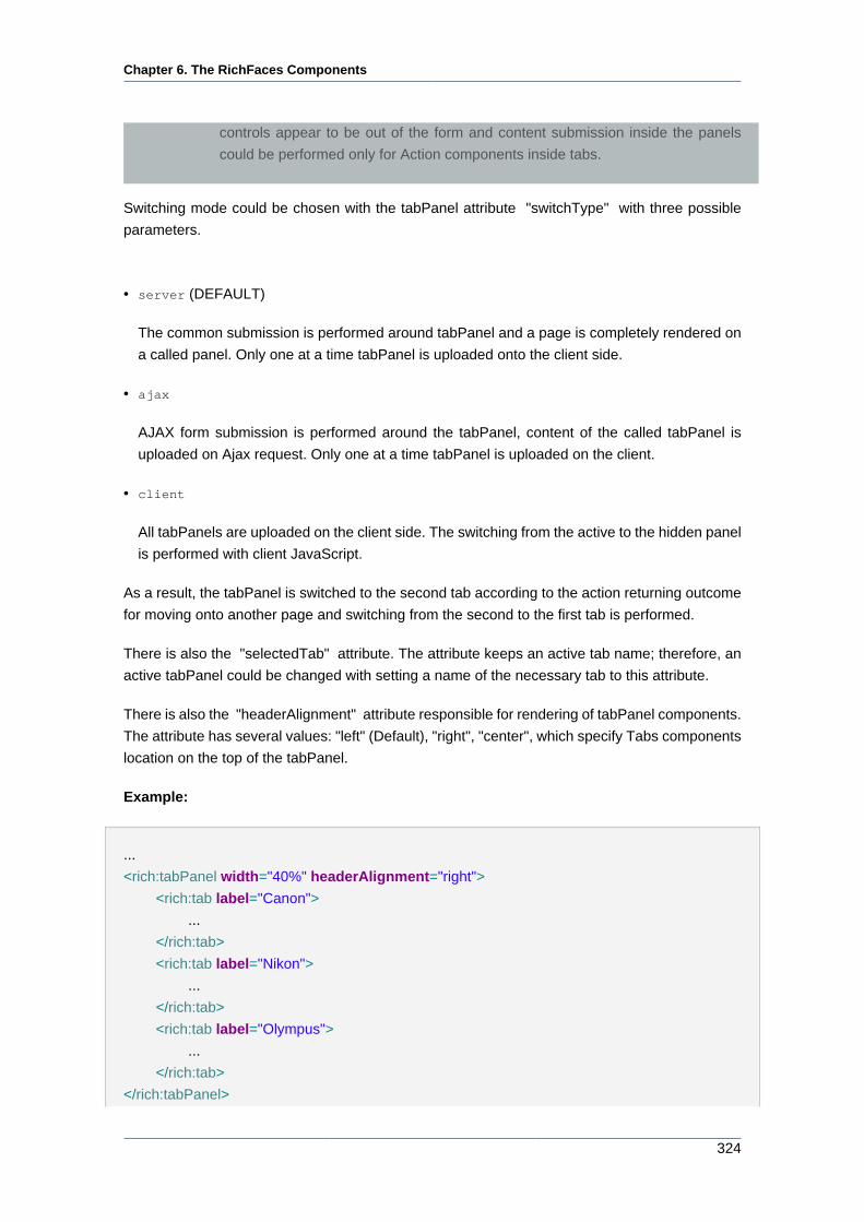
Chapter 6. The RichFaces Components
324
controls appear to be out of the form and content submission inside the panels
could be performed only for Action components inside tabs.
Switching mode could be chosen with the tabPanel attribute "switchType" with three possible
parameters.
• server (DEFAULT)
The common submission is performed around tabPanel and a page is completely rendered on
a called panel. Only one at a time tabPanel is uploaded onto the client side.
• ajax
AJAX form submission is performed around the tabPanel, content of the called tabPanel is
uploaded on Ajax request. Only one at a time tabPanel is uploaded on the client.
• client
All tabPanels are uploaded on the client side. The switching from the active to the hidden panel
is performed with client JavaScript.
As a result, the tabPanel is switched to the second tab according to the action returning outcome
for moving onto another page and switching from the second to the first tab is performed.
There is also the "selectedTab" attribute. The attribute keeps an active tab name; therefore, an
active tabPanel could be changed with setting a name of the necessary tab to this attribute.
There is also the "headerAlignment" attribute responsible for rendering of tabPanel components.
The attribute has several values: "left" (Default), "right", "center", which specify Tabs components
location on the top of the tabPanel.
Example:
...
<rich:tabPanel width="40%" headerAlignment="right">
<rich:tab label="Canon">
...
</rich:tab>
<rich:tab label="Nikon">
...
</rich:tab>
<rich:tab label="Olympus">
...
</rich:tab>
</rich:tabPanel>
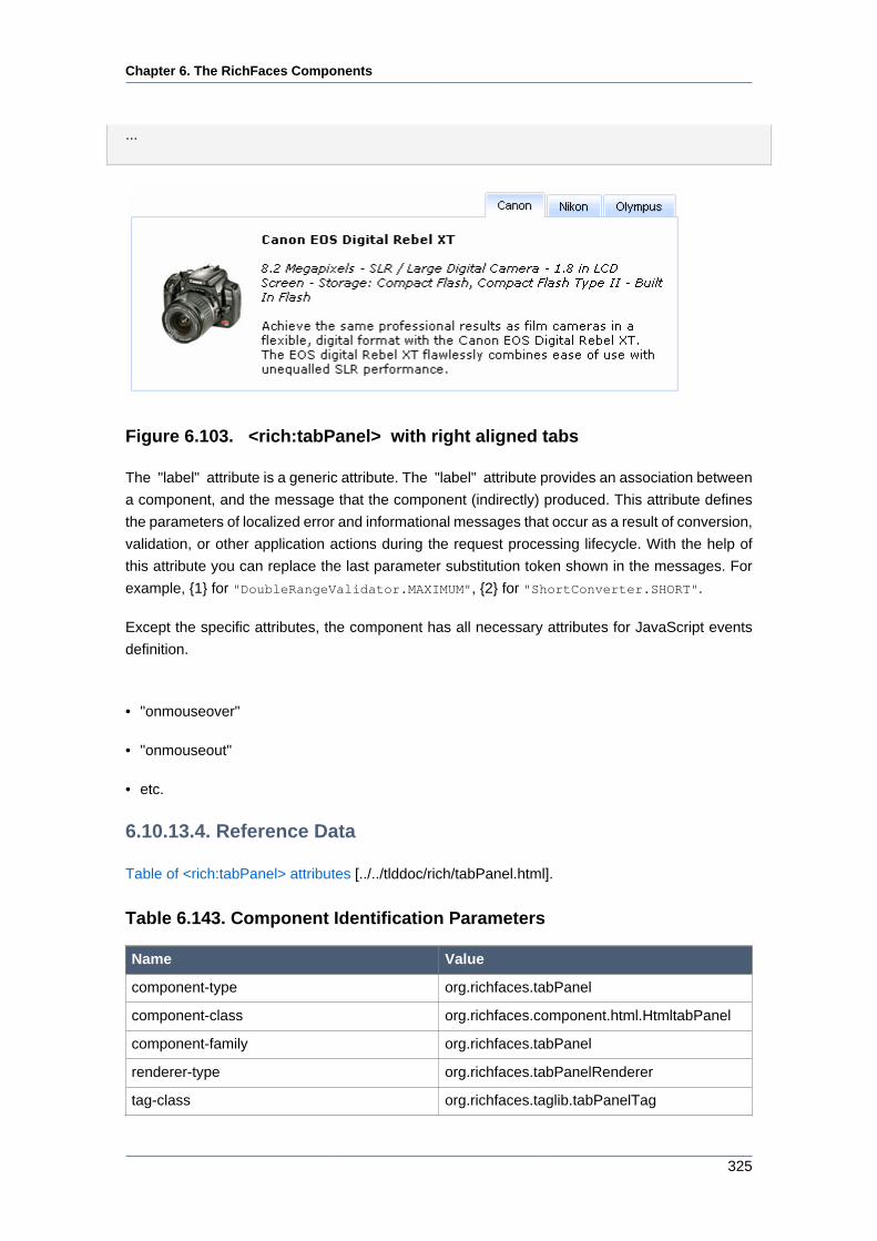
Chapter 6. The RichFaces Components
325
...
Figure 6.103. <rich:tabPanel> with right aligned tabs
The "label" attribute is a generic attribute. The "label" attribute provides an association between
a component, and the message that the component (indirectly) produced. This attribute defines
the parameters of localized error and informational messages that occur as a result of conversion,
validation, or other application actions during the request processing lifecycle. With the help of
this attribute you can replace the last parameter substitution token shown in the messages. For
example, {1} for "DoubleRangeValidator.MAXIMUM", {2} for "ShortConverter.SHORT".
Except the specific attributes, the component has all necessary attributes for JavaScript events
definition.
• "onmouseover"
• "onmouseout"
• etc.
6.10.13.4. Reference Data
Table of <rich:tabPanel> attributes [../../tlddoc/rich/tabPanel.html].
Table 6.143. Component Identification Parameters
Name Value
component-type org.richfaces.tabPanel
component-class org.richfaces.component.html.HtmltabPanel
component-family org.richfaces.tabPanel
renderer-type org.richfaces.tabPanelRenderer
tag-class org.richfaces.taglib.tabPanelTag
Chapter 6. The RichFaces Components
326
Table 6.144. Classes names that define a component appearance
Class name Description
rich-tabpanel Defines styles for all tabPanel
rich-tabpanel-content Defines styles for an internal content
rich-tabpanel-content-position Defines styles for a wrapper element of a
tabPanel content. It should define a shift equal
to borders width in order to overlap panel tabs
rich-tabhdr-side-border Defines styles for side elements of a tabPanel
header
rich-tabhdr-side-cell Defines styles for a header internal element
rich-tab-bottom-line Defines styles for a tab bottom line element of
a tabPanel
Table 6.145. Classes names that define different tab header states
(corresponds to rich-tabhdr-side-cell)
Class name Description
rich-tabhdr-cell-active Defines styles for an internal element of an
active header
rich-tabhdr-cell-inactive Defines styles for an internal element of an
inactive label
rich-tabhdr-cell-disabled Defines styles for an internal element of a
disabled label
You can find all necessary information about style classes redefinition in Definition of Custom
Style Classes section.
6.10.13.5. Relevant Resources Links
Visit TabPanel page [http://livedemo.exadel.com/richfaces-demo/richfaces/tabPanel.jsf;] at
RichFaces LiveDemo for examples of component usage and their sources.
If you have any questions or ideas regarding the <rich:tab> tell about them at the RichFaces
Users Forum [http://www.jboss.com/index.html?module=bb&op=viewtopic&p=4064191].
6.10.14. <rich:tab> available since 3.0.0
6.10.14.1. Description
The component defines a tab section within a tab panel.
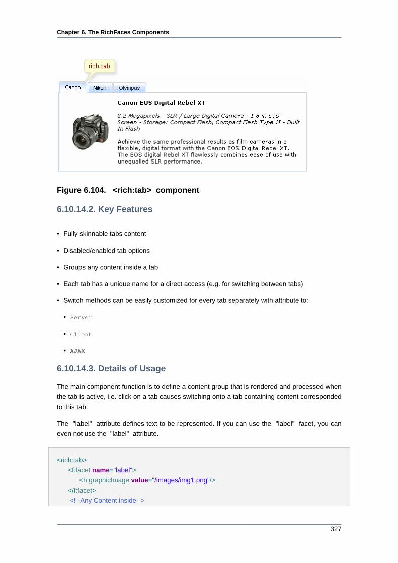
Chapter 6. The RichFaces Components
327
Figure 6.104. <rich:tab> component
6.10.14.2. Key Features
• Fully skinnable tabs content
• Disabled/enabled tab options
• Groups any content inside a tab
• Each tab has a unique name for a direct access (e.g. for switching between tabs)
• Switch methods can be easily customized for every tab separately with attribute to:
• Server
• Client
• AJAX
6.10.14.3. Details of Usage
The main component function is to define a content group that is rendered and processed when
the tab is active, i.e. click on a tab causes switching onto a tab containing content corresponded
to this tab.
The "label" attribute defines text to be represented. If you can use the "label" facet, you can
even not use the "label" attribute.
<rich:tab>
<f:facet name="label">
<h:graphicImage value="/images/img1.png"/>
</f:facet>
<!--Any Content inside-->
Chapter 6. The RichFaces Components
328
</rich:tab>
A marker on a tab header defined with the "label" attribute. Moreover, each tab could be disabled
(switching on this tab is impossible) with the "disable" attribute.
<rich:tabPanel width="20%">
<tabs:tab label="Canon">
<h:outputText value="Canon EOS Digital Rebel XT" />
...
</tabs:tab>
<tabs:tab label="Nikon">
<h:outputText value="Nikon D70s" />
...
</tabs:tab>
<tabs:tab label="Olympus">
<h:outputText value="Olympus EVOLT E-500" />
...
</tabs:tab>
<tabs:tab disabled="true" name="disabled" label="Disabled"/>
</rich:tabPanel>
With this example it's possible to generate the tab panel with the last disabled and three active
tabs (see the picture).
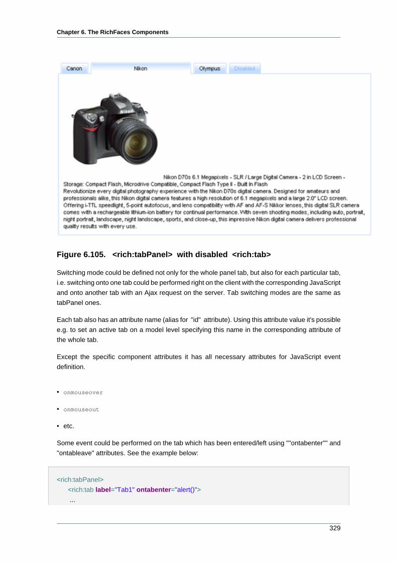
Chapter 6. The RichFaces Components
329
Figure 6.105. <rich:tabPanel> with disabled <rich:tab>
Switching mode could be defined not only for the whole panel tab, but also for each particular tab,
i.e. switching onto one tab could be performed right on the client with the corresponding JavaScript
and onto another tab with an Ajax request on the server. Tab switching modes are the same as
tabPanel ones.
Each tab also has an attribute name (alias for "id" attribute). Using this attribute value it's possible
e.g. to set an active tab on a model level specifying this name in the corresponding attribute of
the whole tab.
Except the specific component attributes it has all necessary attributes for JavaScript event
definition.
• onmouseover
• onmouseout
• etc.
Some event could be performed on the tab which has been entered/left using ""ontabenter"" and
"ontableave" attributes. See the example below:
<rich:tabPanel>
<rich:tab label="Tab1" ontabenter="alert()">
...
Chapter 6. The RichFaces Components
330
</rich:tab>
...
</rich:tabPanel>
The following example shows how on the client side to get the names of entered/left tabs.
ontabenter="alert(leftTabName)"
Information about the "process" attribute usage you can find in the "Decide what to process"
guide section.
6.10.14.4. Reference Data
Table of <rich:tab> attributes [../../tlddoc/rich/tab.html].
Table 6.146. Component Identification Parameters
Name Value
component-type org.richfaces.Tab
component-class org.richfaces.component.html.HtmlTab
component-family org.richfaces.Tab
renderer-type org.richfaces.TabRenderer
tag-class org.richfaces.taglib.TabTag
Table 6.147. Facet
Facet name Description
label Defines the text for the actual "tab" in a tab
section
Table 6.148. Style classes (selectors) and mapped skin parameters
Class name Description Skin parameter CSS property
generalTextColor color
generalBackgroundColorbackground-color
.rich-tab-active Defines styles for an
active tab
subBorderColor border-color
.rich-tab-bottom-line Defines styles for a tab
bottom line
panelBorderColor border-bottom-color
.rich-tab-disabled Defines styles for a
disabled tab
subBorderColor border-color
Chapter 6. The RichFaces Components
331
Class name Description Skin parameter CSS property
tabBackgroundColor background-color
tabDisabledTextColor color
generalFamilyFont font-family
generalSizeFont font-size
.rich-tab-header Defines styles for a tab
header
generalTextColor color
subBorderColor border-color.rich-tab-inactive Defines styles for an
inactive tab tabBackgroundColor background-color
Table 6.149. Internal style classes (selectors)
Class name (selector) Description
.rich-tab-active Defines styles for an active tab
.rich-tab-disabled Defines styles for a disabled tab
.rich-tab-header Defines styles for a tab header
You can find all necessary information about style classes redefinition in Definition of Custom
Style Classes section.
6.10.14.5. Relevant Resources Links
Visit TabPanel page [http://livedemo.exadel.com/richfaces-demo/richfaces/tabPanel.jsf;] at
RichFaces LiveDemo for examples of component usage and their sources.
If you have any questions or ideas regarding the <rich:tab> tell about them at the RichFaces
Users Forum [http://www.jboss.com/index.html?module=bb&op=viewtopic&p=4064191].
6.10.15. < rich:togglePanel > available since 3.0.0
6.10.15.1. Description
A wrapper component with named facets, where every facet is shown after activation of the
corresponding toggleControl (the other is hidden).
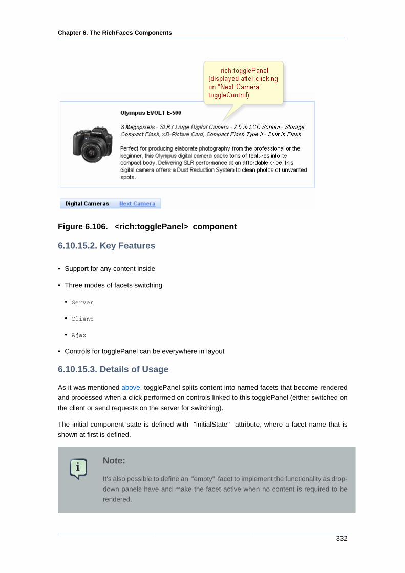
Chapter 6. The RichFaces Components
332
Figure 6.106. <rich:togglePanel> component
6.10.15.2. Key Features
• Support for any content inside
• Three modes of facets switching
• Server
• Client
• Ajax
• Controls for togglePanel can be everywhere in layout
6.10.15.3. Details of Usage
As it was mentioned above, togglePanel splits content into named facets that become rendered
and processed when a click performed on controls linked to this togglePanel (either switched on
the client or send requests on the server for switching).
The initial component state is defined with "initialState" attribute, where a facet name that is
shown at first is defined.
Note:
It's also possible to define an "empty" facet to implement the functionality as drop-
down panels have and make the facet active when no content is required to be
rendered.
Chapter 6. The RichFaces Components
333
Switching mode could be defined with the "switchType" attribute with three possible parameters:
• Server (DEFAULT)
The common submission is performed around togglePanel and a page is completely rendered
on a called panel. Only one at a time the panel is uploaded onto the client side.
• Ajax
AJAX form submission is performed around the panel, content of the called panel is uploaded
on an Ajax request . Only one at a time the panel is uploaded on the client side.
• Client
All panels are uploaded on the client side. The switching from the active to the hidden panel
is performed with client JavaScript.
"Facets" switching order could be defined on the side of <rich:toggleControl> component or
on the panel. On the side of the togglePanel it's possible to define facets switching order with the
"stateOrder" attribute. The facets names are enumerated in such an order that they are rendered
when a control is clicked, as it's not defined where to switch beforehand.
Example:
...
<rich:togglePanel id="panel" initialState="panelB" switchType="client"
stateOrder="panelA,panelB,panelC">
<f:facet name="panelA">
...
</f:facet>
<f:facet name="panelB">
...
</f:facet>
<f:facet name="panelC">
...
</f:facet>
</rich:togglePanel>
<rich:toggleControl for="panel" value="Switch"/>
...
The example shows a togglePanel initial state when the second facet (panelB) is rendered and
successive switching from the first to the second happens.
The "label" attribute is a generic attribute. The "label" attribute provides an association between
a component, and the message that the component (indirectly) produced. This attribute defines
Chapter 6. The RichFaces Components
334
the parameters of localized error and informational messages that occur as a result of conversion,
validation, or other application actions during the request processing lifecycle. With the help of
this attribute you can replace the last parameter substitution token shown in the messages. For
example, {1} for "DoubleRangeValidator.MAXIMUM", {2} for "ShortConverter.SHORT".
6.10.15.4. Reference Data
Table of <rich:togglePanel> attributes [../../tlddoc/rich/togglePanel.html].
Table 6.150. Component Identification Parameters
Name Value
component-type org.richfaces.TogglePanel
component-class org.richfaces.component.html.HtmlTogglePanel
component-family org.richfaces.TogglePanel
renderer-type org.richfaces.TogglePanelRenderer
tag-class org.richfaces.Taglib.togglePanelTag
Table 6.151. Classes names that define a component appearance
Class name Description
rich-toggle-panel Defines styles for all component
rich-tglctrl Defines styles for a toggle control
You can find all necessary information about style classes redefinition in Definition of Custom
Style Classes section.
6.10.15.5. Relevant Resources Links
On the component LiveDemo page [http://livedemo.exadel.com/richfaces-demo/richfaces/
togglePanel.jsf?c=togglePanel] you can see the example of <rich:togglePanel> usage and
sources for the given example.
6.10.16. < rich:toggleControl > available since 3.0.0
6.10.16.1. Description
A link type control for switching between togglePanel facets. Target Panel is specified with
"for" attribute. It can be located inside or outside the togglePanel. As the result of switching
between facets previous facet is hidden and another one (specified with "switchToState" or panel
"stateOrder" attributes) is shown.
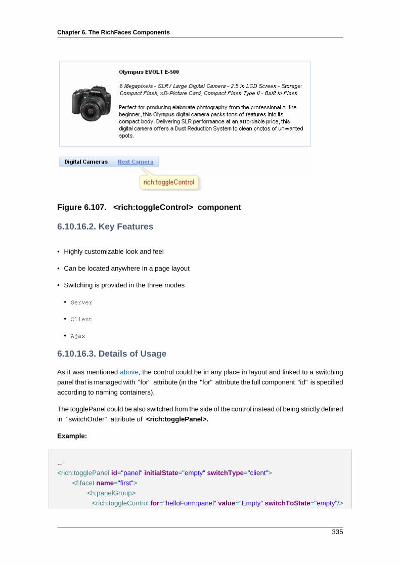
Chapter 6. The RichFaces Components
335
Figure 6.107. <rich:toggleControl> component
6.10.16.2. Key Features
• Highly customizable look and feel
• Can be located anywhere in a page layout
• Switching is provided in the three modes
• Server
• Client
• Ajax
6.10.16.3. Details of Usage
As it was mentioned above, the control could be in any place in layout and linked to a switching
panel that is managed with "for" attribute (in the "for" attribute the full component "id" is specified
according to naming containers).
The togglePanel could be also switched from the side of the control instead of being strictly defined
in "switchOrder" attribute of <rich:togglePanel>.
Example:
...
<rich:togglePanel id="panel" initialState="empty" switchType="client">
<f:facet name="first">
<h:panelGroup>
<rich:toggleControl for="helloForm:panel" value="Empty" switchToState="empty"/>
Chapter 6. The RichFaces Components
336
<rich:toggleControl for="helloForm:panel" value=" Second" switchToState="second"/
>
<!--Some content-->
</h:panelGroup>
</f:facet>
<f:facet name="second">
<h:panelGroup>
<rich:toggleControl for="helloForm:panel" value="Empty" switchToState="empty"/>
<rich:toggleControl for="helloForm:panel" value=" first" switchToState="first"/>
<!--Some content-->
</h:panelGroup>
</f:facet>
<f:facet name="empty">
<h:panelGroup>
<rich:toggleControl for="helloForm:panel" value="first" switchToState="first"/>
<rich:toggleControl for="helloForm:panel" value=" second" switchToState="second"/
>
</h:panelGroup>
</f:facet>
</rich:togglePanel>
...
In this example the switching is performed on facets specified in the "switchToState" attribute.
Information about the "process" attribute usage you can find " Decide what to process " guide
section.
6.10.16.4. Reference Data
Table of <rich:toggleControl> attributes [../../tlddoc/rich/toggleControl.html].
Table 6.152. Component Identification Parameters
Name Value
component-type org.richfaces.ToggleControl
component-class org.richfaces.component.html.HtmlToggleControl
component-family org.richfaces.ToggleControl
renderer-type org.richfaces.ToggleControlRenderer
tag-class org.richfaces.taglib.ToggleControlTag
Table 6.153. Classes names that define a component appearance
Class name Description
rich-tglctrl Defines styles for a toggle control
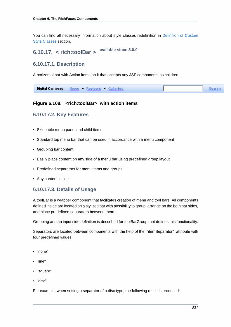
Chapter 6. The RichFaces Components
337
You can find all necessary information about style classes redefinition in Definition of Custom
Style Classes section.
6.10.17. < rich:toolBar > available since 3.0.0
6.10.17.1. Description
A horizontal bar with Action items on it that accepts any JSF components as children.
Figure 6.108. <rich:toolBar> with action items
6.10.17.2. Key Features
• Skinnable menu panel and child items
• Standard top menu bar that can be used in accordance with a menu component
• Grouping bar content
• Easily place content on any side of a menu bar using predefined group layout
• Predefined separators for menu items and groups
• Any content inside
6.10.17.3. Details of Usage
A toolBar is a wrapper component that facilitates creation of menu and tool bars. All components
defined inside are located on a stylized bar with possibility to group, arrange on the both bar sides,
and place predefined separators between them.
Grouping and an input side definition is described for toolBarGroup that defines this functionality.
Separators are located between components with the help of the "itemSeparator" attribute with
four predefined values:
• "none"
• "line"
• "square"
• "disc"
For example, when setting a separator of a disc type, the following result is produced:
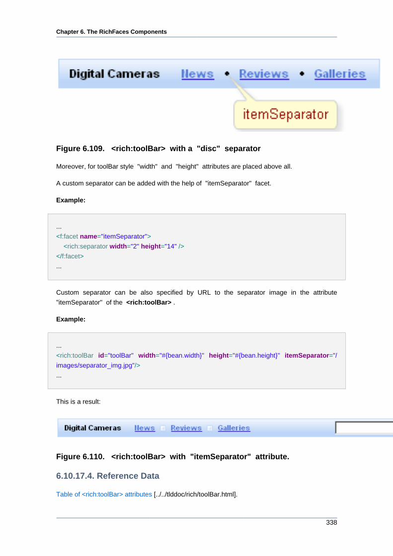
Chapter 6. The RichFaces Components
338
Figure 6.109. <rich:toolBar> with a "disc" separator
Moreover, for toolBar style "width" and "height" attributes are placed above all.
A custom separator can be added with the help of "itemSeparator" facet.
Example:
...
<f:facet name="itemSeparator">
<rich:separator width="2" height="14" />
</f:facet>
...
Custom separator can be also specified by URL to the separator image in the attribute
"itemSeparator" of the <rich:toolBar> .
Example:
...
<rich:toolBar id="toolBar" width="#{bean.width}" height="#{bean.height}" itemSeparator="/
images/separator_img.jpg"/>
...
This is a result:
Figure 6.110. <rich:toolBar> with "itemSeparator" attribute.
6.10.17.4. Reference Data
Table of <rich:toolBar> attributes [../../tlddoc/rich/toolBar.html].
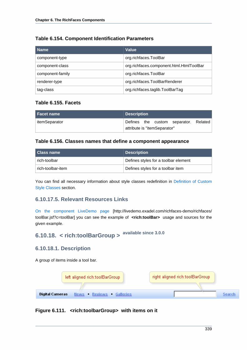
Chapter 6. The RichFaces Components
339
Table 6.154. Component Identification Parameters
Name Value
component-type org.richfaces.ToolBar
component-class org.richfaces.component.html.HtmlToolBar
component-family org.richfaces.ToolBar
renderer-type org.richfaces.ToolBarRenderer
tag-class org.richfaces.taglib.ToolBarTag
Table 6.155. Facets
Facet name Description
itemSeparator Defines the custom separator. Related
attribute is "itemSeparator"
Table 6.156. Classes names that define a component appearance
Class name Description
rich-toolbar Defines styles for a toolbar element
rich-toolbar-item Defines styles for a toolbar item
You can find all necessary information about style classes redefinition in Definition of Custom
Style Classes section.
6.10.17.5. Relevant Resources Links
On the component LiveDemo page [http://livedemo.exadel.com/richfaces-demo/richfaces/
toolBar.jsf?c=toolBar] you can see the example of <rich:toolBar> usage and sources for the
given example.
6.10.18. < rich:toolBarGroup > available since 3.0.0
6.10.18.1. Description
A group of items inside a tool bar.
Figure 6.111. <rich:toolbarGroup> with items on it
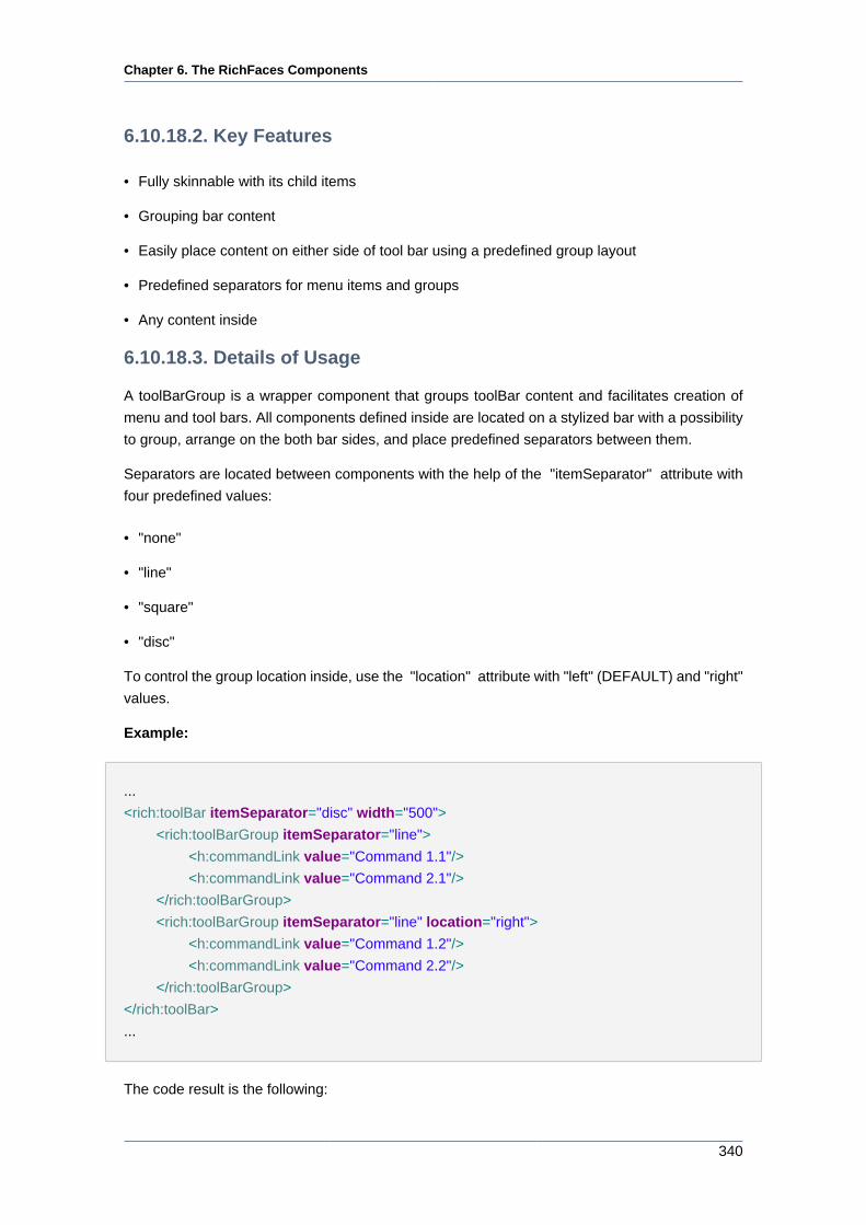
Chapter 6. The RichFaces Components
340
6.10.18.2. Key Features
• Fully skinnable with its child items
• Grouping bar content
• Easily place content on either side of tool bar using a predefined group layout
• Predefined separators for menu items and groups
• Any content inside
6.10.18.3. Details of Usage
A toolBarGroup is a wrapper component that groups toolBar content and facilitates creation of
menu and tool bars. All components defined inside are located on a stylized bar with a possibility
to group, arrange on the both bar sides, and place predefined separators between them.
Separators are located between components with the help of the "itemSeparator" attribute with
four predefined values:
• "none"
• "line"
• "square"
• "disc"
To control the group location inside, use the "location" attribute with "left" (DEFAULT) and "right"
values.
Example:
...
<rich:toolBar itemSeparator="disc" width="500">
<rich:toolBarGroup itemSeparator="line">
<h:commandLink value="Command 1.1"/>
<h:commandLink value="Command 2.1"/>
</rich:toolBarGroup>
<rich:toolBarGroup itemSeparator="line" location="right">
<h:commandLink value="Command 1.2"/>
<h:commandLink value="Command 2.2"/>
</rich:toolBarGroup>
</rich:toolBar>
...
The code result is the following:
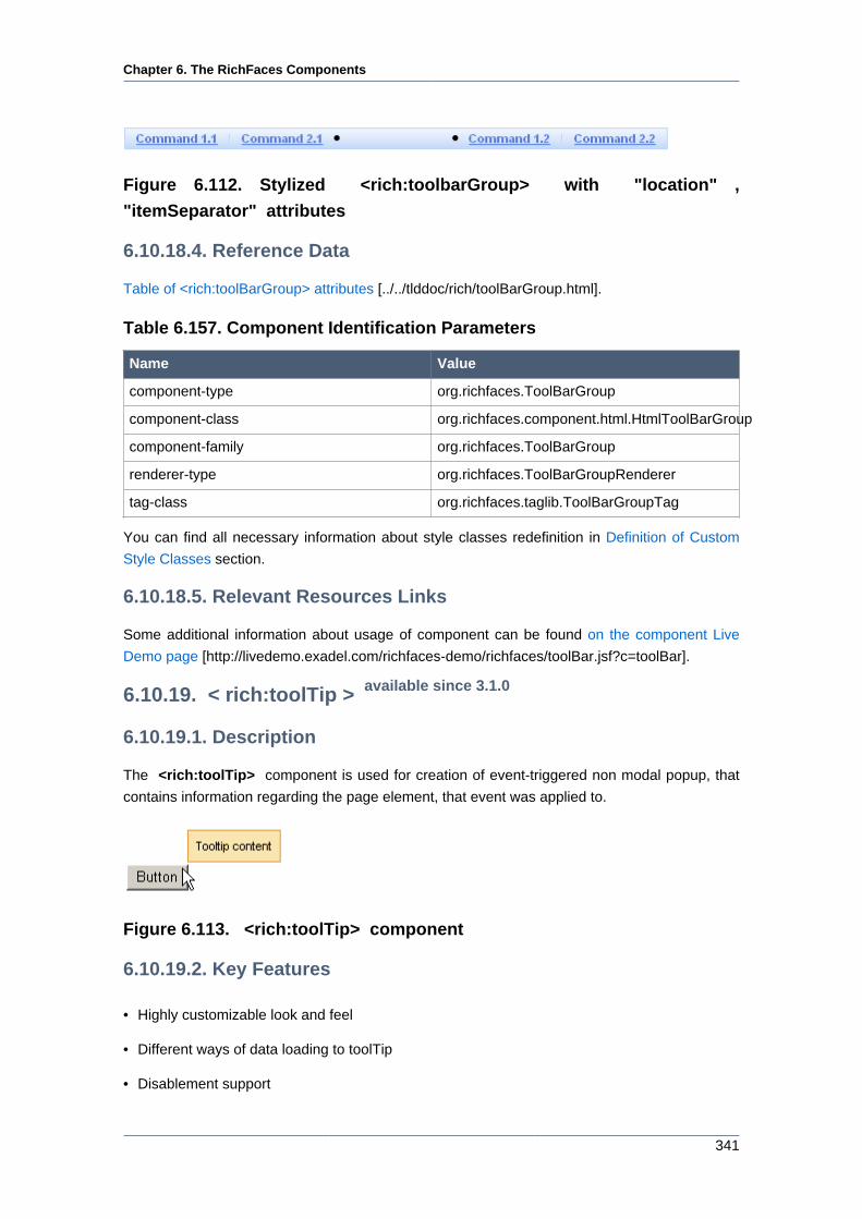
Chapter 6. The RichFaces Components
341
Figure 6.112. Stylized <rich:toolbarGroup> with "location" ,
"itemSeparator" attributes
6.10.18.4. Reference Data
Table of <rich:toolBarGroup> attributes [../../tlddoc/rich/toolBarGroup.html].
Table 6.157. Component Identification Parameters
Name Value
component-type org.richfaces.ToolBarGroup
component-class org.richfaces.component.html.HtmlToolBarGroup
component-family org.richfaces.ToolBarGroup
renderer-type org.richfaces.ToolBarGroupRenderer
tag-class org.richfaces.taglib.ToolBarGroupTag
You can find all necessary information about style classes redefinition in Definition of Custom
Style Classes section.
6.10.18.5. Relevant Resources Links
Some additional information about usage of component can be found on the component Live
Demo page [http://livedemo.exadel.com/richfaces-demo/richfaces/toolBar.jsf?c=toolBar].
6.10.19. < rich:toolTip > available since 3.1.0
6.10.19.1. Description
The <rich:toolTip> component is used for creation of event-triggered non modal popup, that
contains information regarding the page element, that event was applied to.
Figure 6.113. <rich:toolTip> component
6.10.19.2. Key Features
• Highly customizable look and feel
• Different ways of data loading to toolTip
• Disablement support
Chapter 6. The RichFaces Components
342
6.10.19.3. Details of Usage
Text information, labeled on the <rich:toolTip> , is specified with "value" attribute. Text that
is put between tooltip start and end tags will also be rendered as tooltip content and could be
marked with HTML tags. Images, links, buttons and other RichFaces components are also may
be put and composed inside the <rich:toolTip> . The <rich:toolTip> borders are stretched
automatically to enclose the contents.
There are three ways to attach the <rich:toolTip> to a page element. The first and simplest
one is when the <rich:toolTip> is nested into a page element the tooltip is applied to. This way
is shown on example in the Creating the Component with a Page Tag section. The "attached"
attribute is "true" by default in this case, which means that the tolltip will be invoked automatically
when the mouse cursor is hovered above the parent component.
The second one uses <rich:toolTip> "for" attribute. In this case the <rich:toolTip> is defined
separately from a component it is applied to.
Example:
<rich:panel id="panelId">
...
</rich:panel>
<rich:toolTip value="This is a tooltip." for="panelId"/>
These two ways are also applicable for HTML elements that are not presented in components
tree built by facelets. Use "for" attribute to attach the <rich:toolTip> in both cases.
Example:
<!-- The <rich:toolTip> is nested into the parent HTML element -->
<div id="para1">
<p>This paragraph and tooltip are nested into the same <div> element.</p>
<rich:toolTip for="para1">This is a tooltip.</rich:toolTip>
</div>
<!-- The <rich:toolTip> is defined separately -->
<div id="para2">
<p>The tooltip for this paragraph is defined separately.</p>
</div>
<rich:toolTip for="para2">This is a tooltip.</rich:toolTip>
The third way to invoke the <rich:toolTip> uses JS API function. List of JS API functions
available for <rich:toolTip> is listed below. JS API functions are defined for a component the
Chapter 6. The RichFaces Components
343
<rich:toolTip> is applied to. The <rich:toolTip> "attached" attribute should be set to "false"
in this case.
Example:
<rich:panel id="panelId" onclick="#{rich:component("tooltipId")}.show(event);" />
<a4j:form>
<rich:toolTip id="tooltipId" attached="false" value="This is a tooltip."/>
</a4j:form>
Notes:
To provide <rich:toolTip> component proper work in complex cases do the
following:
• specify "id's" for both <rich:toolTip> and component it is applied to;
• define the <rich:toolTip> as last child, when nesting it into the component the
<rich:toolTip> is applied to;
• put the <rich:toolTip> into <a4j:form> when invoking it with JS API function.
The "mode" attribute is provided you to control the way of data loading to <rich:toolTip> . The
component works properly in client and Ajax modes. In client mode <rich:toolTip> content is
rendered once on the server and could be rerendered only via external submit. In Ajax mode
<rich:toolTip> content is requested from server for every activation. For Ajax mode there is
possibility to define a facet "defaultContent" , which provides default <rich:toolTip> content to
be displayed, while main content is loading into the <rich:toolTip> (see the example below).
Example:
...
<h:commandLink value="Simple Link" id="link">
<rich:toolTip followMouse="true" direction="top-
right" mode="ajax" value="#{bean.toolTipContent}" horizontalOffset="5"
verticalOffset="5" layout="block">
<f:facet name="defaultContent">
<f:verbatim>DEFAULT TOOLTIP CONTENT</f:verbatim>
</f:facet>
</rich:toolTip>
</h:commandLink>
...
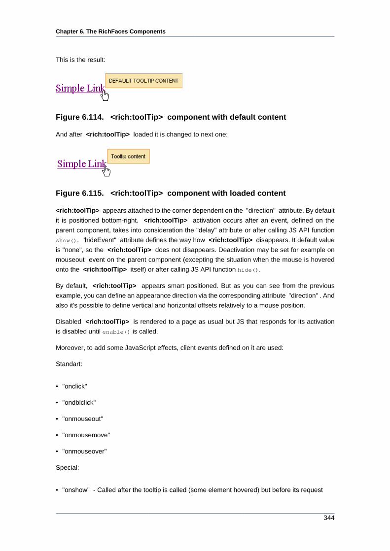
Chapter 6. The RichFaces Components
344
This is the result:
Figure 6.114. <rich:toolTip> component with default content
And after <rich:toolTip> loaded it is changed to next one:
Figure 6.115. <rich:toolTip> component with loaded content
<rich:toolTip> appears attached to the corner dependent on the "direction" attribute. By default
it is positioned bottom-right. <rich:toolTip> activation occurs after an event, defined on the
parent component, takes into consideration the "delay" attribute or after calling JS API function
show(). "hideEvent" attribute defines the way how <rich:toolTip> disappears. It default value
is "none", so the <rich:toolTip> does not disappears. Deactivation may be set for example on
mouseout event on the parent component (excepting the situation when the mouse is hovered
onto the <rich:toolTip> itself) or after calling JS API function hide().
By default, <rich:toolTip> appears smart positioned. But as you can see from the previous
example, you can define an appearance direction via the corresponding attribute "direction" . And
also it's possible to define vertical and horizontal offsets relatively to a mouse position.
Disabled <rich:toolTip> is rendered to a page as usual but JS that responds for its activation
is disabled until enable() is called.
Moreover, to add some JavaScript effects, client events defined on it are used:
Standart:
• "onclick"
• "ondblclick"
• "onmouseout"
• "onmousemove"
• "onmouseover"
Special:
• "onshow" - Called after the tooltip is called (some element hovered) but before its request
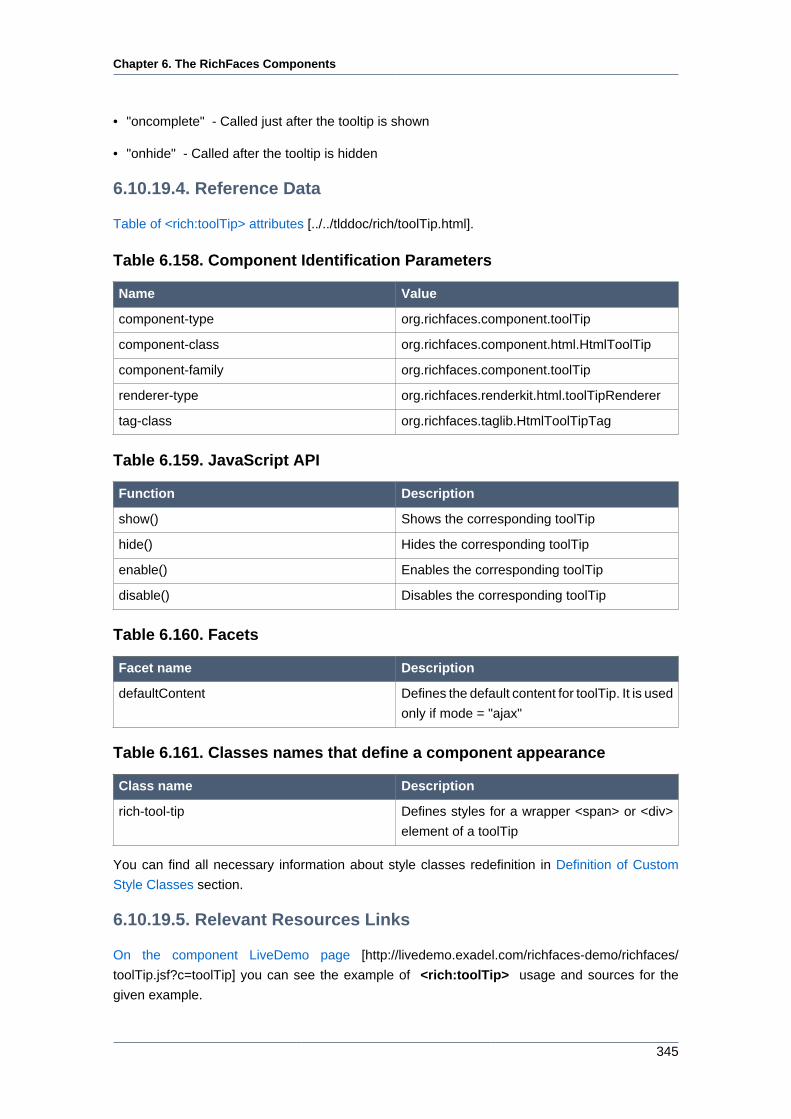
Chapter 6. The RichFaces Components
345
• "oncomplete" - Called just after the tooltip is shown
• "onhide" - Called after the tooltip is hidden
6.10.19.4. Reference Data
Table of <rich:toolTip> attributes [../../tlddoc/rich/toolTip.html].
Table 6.158. Component Identification Parameters
Name Value
component-type org.richfaces.component.toolTip
component-class org.richfaces.component.html.HtmlToolTip
component-family org.richfaces.component.toolTip
renderer-type org.richfaces.renderkit.html.toolTipRenderer
tag-class org.richfaces.taglib.HtmlToolTipTag
Table 6.159. JavaScript API
Function Description
show() Shows the corresponding toolTip
hide() Hides the corresponding toolTip
enable() Enables the corresponding toolTip
disable() Disables the corresponding toolTip
Table 6.160. Facets
Facet name Description
defaultContent Defines the default content for toolTip. It is used
only if mode = "ajax"
Table 6.161. Classes names that define a component appearance
Class name Description
rich-tool-tip Defines styles for a wrapper <span> or <div>
element of a toolTip
You can find all necessary information about style classes redefinition in Definition of Custom
Style Classes section.
6.10.19.5. Relevant Resources Links
On the component LiveDemo page [http://livedemo.exadel.com/richfaces-demo/richfaces/
toolTip.jsf?c=toolTip] you can see the example of <rich:toolTip> usage and sources for the
given example.
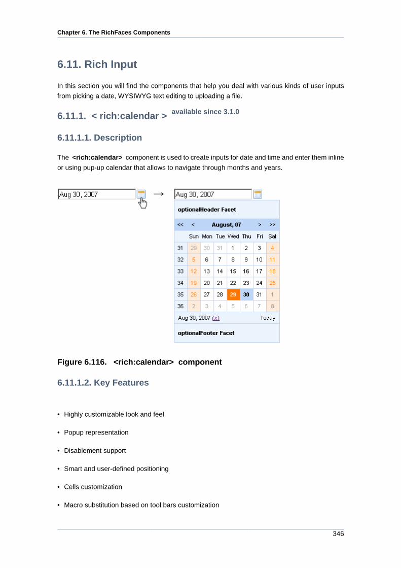
Chapter 6. The RichFaces Components
346
6.11. Rich Input
In this section you will find the components that help you deal with various kinds of user inputs
from picking a date, WYSIWYG text editing to uploading a file.
6.11.1. < rich:calendar > available since 3.1.0
6.11.1.1. Description
The <rich:calendar> component is used to create inputs for date and time and enter them inline
or using pup-up calendar that allows to navigate through months and years.
Figure 6.116. <rich:calendar> component
6.11.1.2. Key Features
• Highly customizable look and feel
• Popup representation
• Disablement support
• Smart and user-defined positioning
• Cells customization
• Macro substitution based on tool bars customization
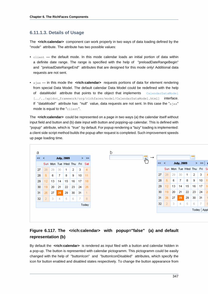
Chapter 6. The RichFaces Components
347
6.11.1.3. Details of Usage
The <rich:calendar> component can work properly in two ways of data loading defined by the
"mode" attribute. The attribute has two possible values:
• client — the default mode. In this mode calendar loads an initial portion of data within
a definite date range. The range is specified with the help of "preloadDateRangeBegin"
and "preloadDateRangeEnd" attributes that are designed for this mode only! Additional data
requests are not sent.
• ajax — in this mode the <rich:calendar> requests portions of data for element rendering
from special Data Model. The default calendar Data Model could be redefined with the help
of dataModel attribute that points to the object that implements CalendarDataModel
[../../apidoc_framework/org/richfaces/model/CalendarDataModel.html] interface.
If "dataModel" attribute has "null" value, data requests are not sent. In this case the "ajax"
mode is equal to the "client".
The <rich:calendar> could be represented on a page in two ways (a) the calendar itself without
input field and button and (b) date input with button and popping-up calendar. This is defined with
"popup" attribute, which is "true" by default. For popup rendering a "lazy" loading is implemented:
a client side script method builds the popup after request is completed. Such improvement speeds
up page loading time.
Figure 6.117. The <rich:calendar> with popup="false" (a) and default
representation (b)
By default the <rich:calendar> is rendered as input filed with a button and calendar hidden in
a pop-up. The button is represented with calendar pictogramm. This pictogramm could be easily
changed with the help of "buttonIcon" and "buttonIconDisabled" attributes, which specify the
icon for button enabled and disabled states respectively. To change the button appearance from
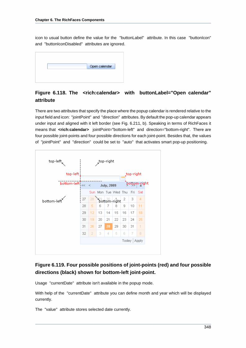
Chapter 6. The RichFaces Components
348
icon to usual button define the value for the "buttonLabel" attribute. In this case "buttonIcon"
and "buttonIconDisabled" attributes are ignored.
Figure 6.118. The <rich:calendar> with buttonLabel="Open calendar"
attribute
There are two attributes that specify the place where the popup calendar is rendered relative to the
input field and icon: "jointPoint" and "direction" attributes. By default the pop-up calendar appears
under input and aligned with it left border (see Fig. 6.211, b). Speaking in terms of RichFaces it
means that <rich:calendar> jointPoint="bottom-left" and direction="bottom-right". There are
four possible joint-points and four possible directions for each joint-point. Besides that, the values
of "jointPoint" and "direction" could be set to "auto" that activates smart pop-up positioning.
Figure 6.119. Four possible positions of joint-points (red) and four possible
directions (black) shown for bottom-left joint-point.
Usage "currentDate" attribute isn't available in the popup mode.
With help of the "currentDate" attribute you can define month and year which will be displayed
currently.
The "value" attribute stores selected date currently.
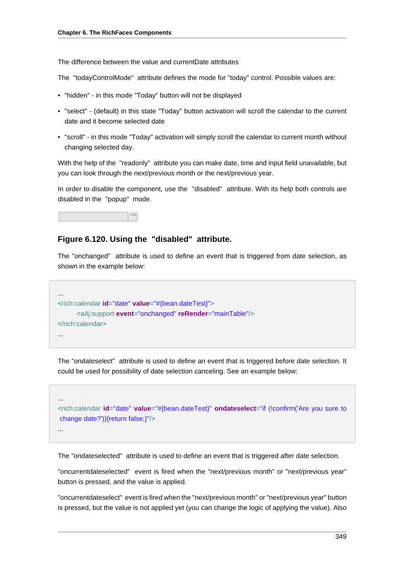
Chapter 6. The RichFaces Components
349
The difference between the value and currentDate attributes
The "todayControlMode" attribute defines the mode for "today" control. Possible values are:
• "hidden" - in this mode "Today" button will not be displayed
• "select" - (default) in this state "Today" button activation will scroll the calendar to the current
date and it become selected date
• "scroll" - in this mode "Today" activation will simply scroll the calendar to current month without
changing selected day.
With the help of the "readonly" attribute you can make date, time and input field unavailable, but
you can look through the next/previous month or the next/previous year.
In order to disable the component, use the "disabled" attribute. With its help both controls are
disabled in the "popup" mode.
Figure 6.120. Using the "disabled" attribute.
The "onchanged" attribute is used to define an event that is triggered from date selection, as
shown in the example below:
...
<rich:calendar id="date" value="#{bean.dateTest}">
<a4j:support event="onchanged" reRender="mainTable"/>
</rich:calendar>
...
The "ondateselect" attribute is used to define an event that is triggered before date selection. It
could be used for possibility of date selection canceling. See an example below:
...
<rich:calendar id="date" value="#{bean.dateTest}" ondateselect="if (!confirm('Are you sure to
change date?')){return false;}"/>
...
The "ondateselected" attribute is used to define an event that is triggered after date selection.
"oncurrentdateselected" event is fired when the "next/previous month" or "next/previous year"
button is pressed, and the value is applied.
"oncurrentdateselect" event is fired when the "next/previous month" or "next/previous year" button
is pressed, but the value is not applied yet (you can change the logic of applying the value). Also
Chapter 6. The RichFaces Components
350
this event could be used for possibility of "next/previous month" or "next/previous year" selection
canceling. See an example below:
Example:
...
<rich:calendar id="date" value="#{bean.dateTest}" oncurrentdateselect="if (!confirm('Are you
sure to change month(year)?')){return false;}"
oncurrentdateselected="alert('month(year) select:'+event.rich.date.toString());"/>
...
How to use these attributes see also on the RichFaces Users Forum [http://www.jboss.com/
index.html?module=bb&op=viewtopic&p=4092275#4092275].
Information about the "process" attribute usage you can find in the corresponding section .
The "label" attribute is a generic attribute. The "label" attribute provides an association between
a component, and the message that the component (indirectly) produced. This attribute defines
the parameters of localized error and informational messages that occur as a result of conversion,
validation, or other application actions during the request processing lifecycle. With the help of
this attribute you can replace the last parameter substitution token shown in the messages. For
example, {1} for "DoubleRangeValidator.MAXIMUM", {2} for "ShortConverter.SHORT".
The "defaultTime" attribute to set the default time value for the current date in two cases:
• If time is not set
• If another date is selected and the value of the "resetTimeOnDateSelect" attribute is set to
"true"
The "enableManualInput" attribute enables/disables input field, so when enableManualInput =
"false" , user can only pick the date manually and has no possibility to type in the date (default
value is "false").
The <rich:calendar> component allows to use "header" , "footer"
, "optionalHeader" , "optionalFooter" facets. The following elements
are available in these facets: {currentMonthControl}, {nextMonthControl},
{nextYearControl}, {previousYearControl}, {previousMonthControl}, {todayControl},
{selectedDateControl}. These elements could be used for labels output.
Also you can use "weekNumber" facet with available {weekNumber}, {elementId}
elements and "weekDay" facet with {weekDayLabel}, {weekDayLabelShort},
{weekDayNumber}, {isWeekend}, {elementId} elements. {weekNumber}, {weekDayLabel},
{weekDayLabelShort}, {weekDayNumber} elements could be used for labels output,
{isWeekend}, {elementId} - for additional processing in JavaScript code.
These elements are shown on the picture below.
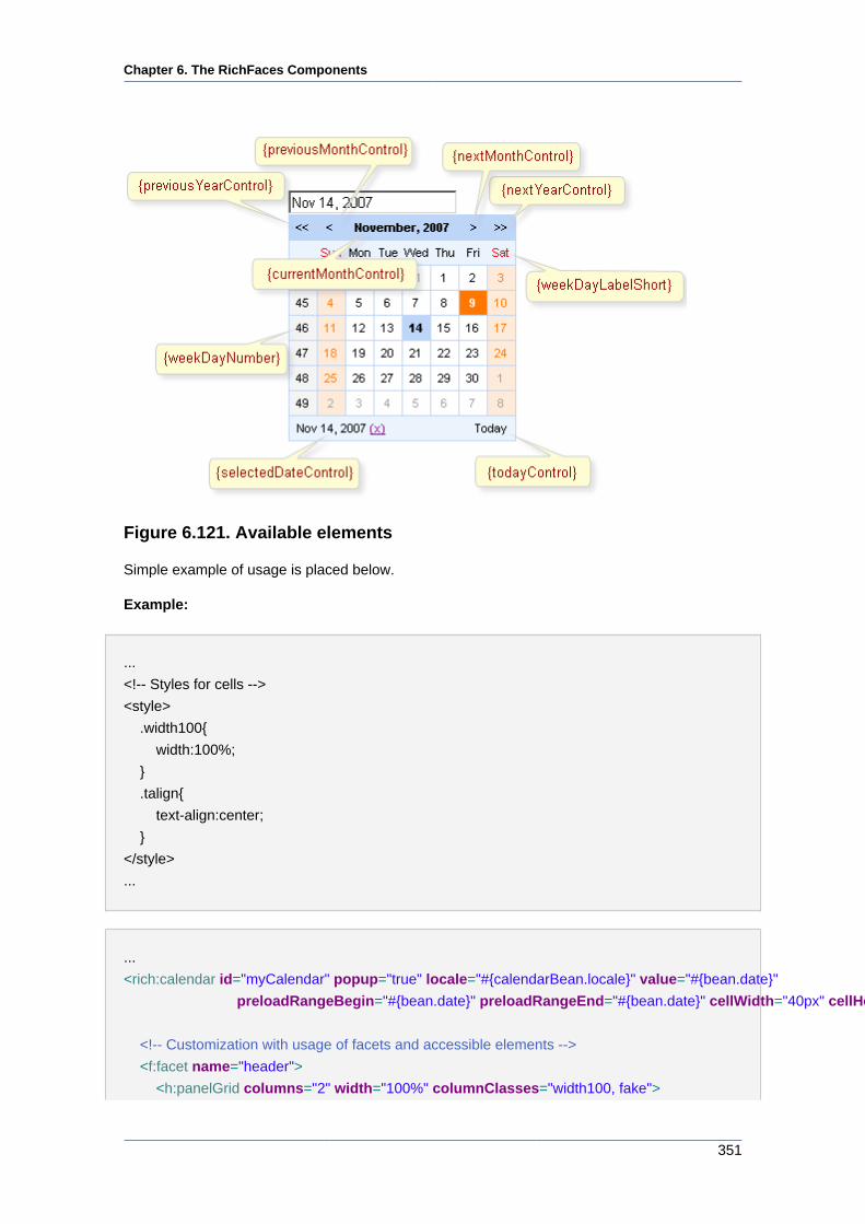
Chapter 6. The RichFaces Components
351
Figure 6.121. Available elements
Simple example of usage is placed below.
Example:
...
<!-- Styles for cells -->
<style>
.width100{
width:100%;
}
.talign{
text-align:center;
}
</style>
...
...
<rich:calendar id="myCalendar" popup="true" locale="#{calendarBean.locale}" value="#{bean.date}"
preloadRangeBegin="#{bean.date}" preloadRangeEnd="#{bean.date}" cellWidth="40px" cellHeight="40px">
<!-- Customization with usage of facets and accessible elements -->
<f:facet name="header">
<h:panelGrid columns="2" width="100%" columnClasses="width100, fake">
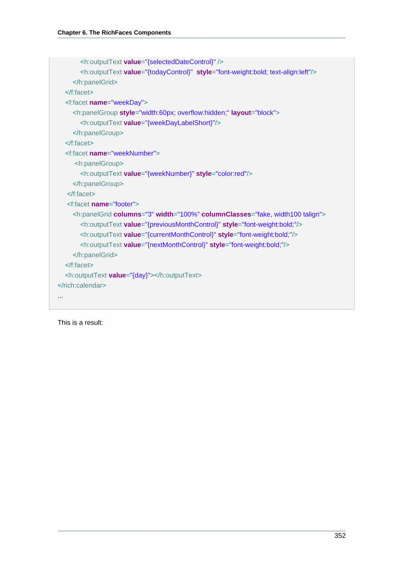
Chapter 6. The RichFaces Components
352
<h:outputText value="{selectedDateControl}" />
<h:outputText value="{todayControl}" style="font-weight:bold; text-align:left"/>
</h:panelGrid>
</f:facet>
<f:facet name="weekDay">
<h:panelGroup style="width:60px; overflow:hidden;" layout="block">
<h:outputText value="{weekDayLabelShort}"/>
</h:panelGroup>
</f:facet>
<f:facet name="weekNumber">
<h:panelGroup>
<h:outputText value="{weekNumber}" style="color:red"/>
</h:panelGroup>
</f:facet>
<f:facet name="footer">
<h:panelGrid columns="3" width="100%" columnClasses="fake, width100 talign">
<h:outputText value="{previousMonthControl}" style="font-weight:bold;"/>
<h:outputText value="{currentMonthControl}" style="font-weight:bold;"/>
<h:outputText value="{nextMonthControl}" style="font-weight:bold;"/>
</h:panelGrid>
</f:facet>
<h:outputText value="{day}"></h:outputText>
</rich:calendar>
...
This is a result:
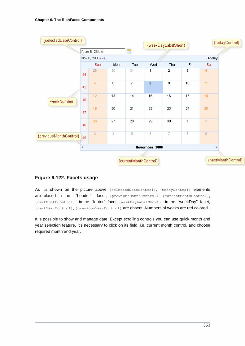
Chapter 6. The RichFaces Components
353
Figure 6.122. Facets usage
As it's shown on the picture above {selectedDateControl}, {todayControl} elements
are placed in the "header" facet, {previousMonthControl}, {currentMonthControl},
{nextMonthControl} - in the "footer" facet, {weekDayLabelShort} - in the "weekDay" facet,
{nextYearControl}, {previousYearControl} are absent. Numbers of weeks are red colored.
It is possible to show and manage date. Except scrolling controls you can use quick month and
year selection feature. It's necessary to click on its field, i.e. current month control, and choose
required month and year.
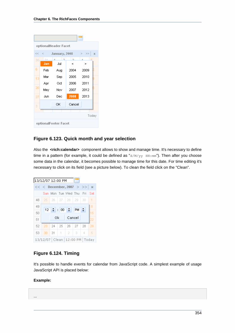
Chapter 6. The RichFaces Components
354
Figure 6.123. Quick month and year selection
Also the <rich:calendar> component allows to show and manage time. It's necessary to define
time in a pattern (for example, it could be defined as "d/M/yy HH:mm"). Then after you choose
some data in the calendar, it becomes possible to manage time for this date. For time editing it's
necessary to click on its field (see a picture below). To clean the field click on the "Clean".
Figure 6.124. Timing
It's possible to handle events for calendar from JavaScript code. A simplest example of usage
JavaScript API is placed below:
Example:
...
Chapter 6. The RichFaces Components
355
<rich:calendar value="#{calendarBean.selectedDate}" id="calendarID"
locale="#{calendarBean.locale}"
popup="#{calendarBean.popup}"
datePattern="#{calendarBean.pattern}"
showApplyButton="#{calendarBean.showApply}" style="width:200px"/>
<a4j:commandLink onclick="$('formID:calendarID').component.doExpand(event)" value="Expand"/
>
...
Also the discussion about this problem can be found on the RichFaces Users Forum [http://
www.jboss.com/index.html?module=bb&op=viewtopic&p=4078301#4078301].
The <rich:calendar> component provides the possibility to use internationalization method
to redefine and localize the labels. You could use application resource bundle and define
RICH_CALENDAR_APPLY_LABEL, RICH_CALENDAR_TODAY_LABEL, RICH_CALENDAR_CLOSE_LABEL,
RICH_CALENDAR_OK_LABEL, RICH_CALENDAR_CLEAN_LABEL, RICH_CALENDAR_CANCEL_LABEL
there.
You could also pack org.richfaces.renderkit.calendar resource [../../apidoc/org/richfaces/
renderkit/CalendarRendererBase.html#CALENDAR_BUNDLE] bundle with your JARs defining
the same properties.
Note:
Only for Internet Explorer 6 and later. To make <rich:calendar> inside
<rich:modalPanel> rendered properly, enable the standards-compliant mode.
Explore !DOCTYPE reference at MSDN [http://msdn.microsoft.com/en-us/library/
ms535242(VS.85).aspx] to find out how to do this.
6.11.1.4. Reference Data
Table of <rich:calendar> attributes [../../tlddoc/rich/calendar.html].
Table 6.162. Component Identification Parameters
Name Value
component-type org.richfaces.Calendar
component-class org.richfaces.component.html.HtmlCalendar
component-family org.richfaces.Calendar
renderer-type org.richfaces.CalendarRenderer
tag-class org.richfaces.taglib.CalendarTag
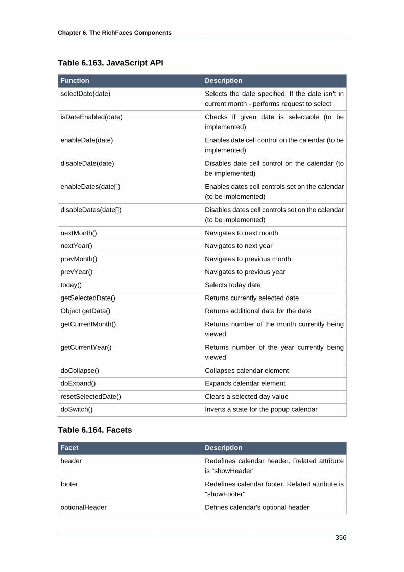
Chapter 6. The RichFaces Components
356
Table 6.163. JavaScript API
Function Description
selectDate(date) Selects the date specified. If the date isn't in
current month - performs request to select
isDateEnabled(date) Checks if given date is selectable (to be
implemented)
enableDate(date) Enables date cell control on the calendar (to be
implemented)
disableDate(date) Disables date cell control on the calendar (to
be implemented)
enableDates(date[]) Enables dates cell controls set on the calendar
(to be implemented)
disableDates(date[]) Disables dates cell controls set on the calendar
(to be implemented)
nextMonth() Navigates to next month
nextYear() Navigates to next year
prevMonth() Navigates to previous month
prevYear() Navigates to previous year
today() Selects today date
getSelectedDate() Returns currently selected date
Object getData() Returns additional data for the date
getCurrentMonth() Returns number of the month currently being
viewed
getCurrentYear() Returns number of the year currently being
viewed
doCollapse() Collapses calendar element
doExpand() Expands calendar element
resetSelectedDate() Clears a selected day value
doSwitch() Inverts a state for the popup calendar
Table 6.164. Facets
Facet Description
header Redefines calendar header. Related attribute
is "showHeader"
footer Redefines calendar footer. Related attribute is
"showFooter"
optionalHeader Defines calendar's optional header
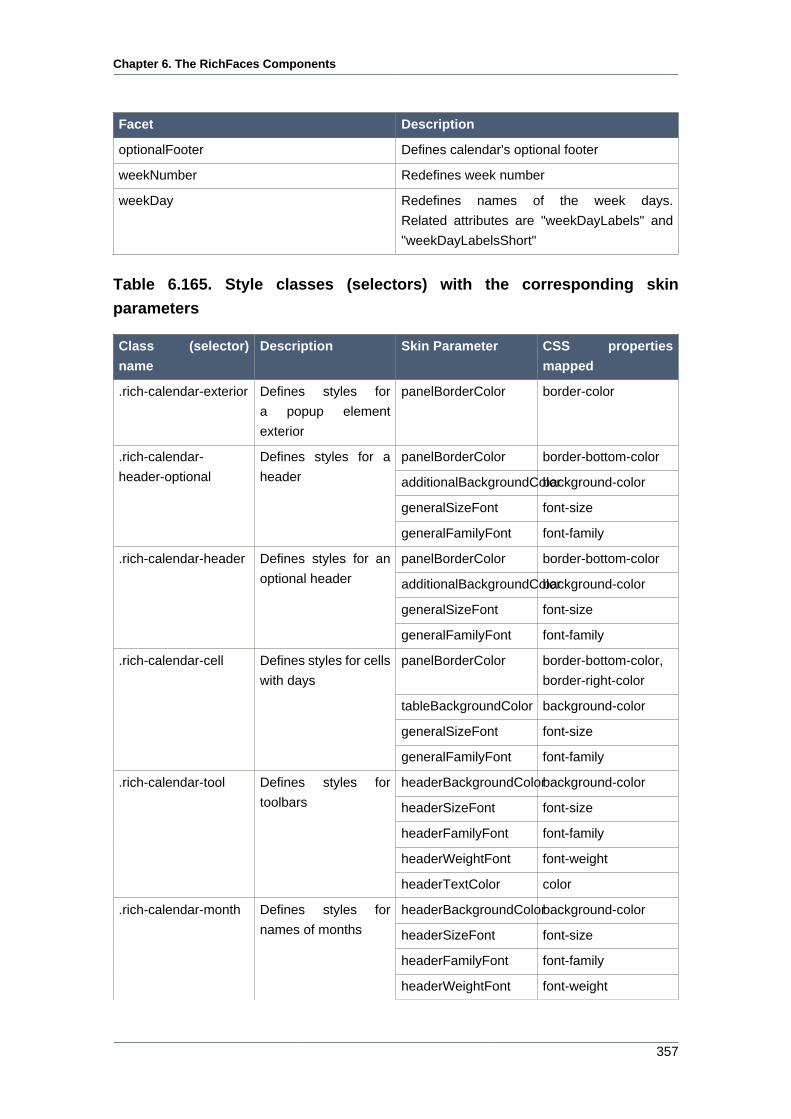
Chapter 6. The RichFaces Components
357
Facet Description
optionalFooter Defines calendar's optional footer
weekNumber Redefines week number
weekDay Redefines names of the week days.
Related attributes are "weekDayLabels" and
"weekDayLabelsShort"
Table 6.165. Style classes (selectors) with the corresponding skin
parameters
Class (selector)
name
Description Skin Parameter CSS properties
mapped
.rich-calendar-exterior Defines styles for
a popup element
exterior
panelBorderColor border-color
panelBorderColor border-bottom-color
additionalBackgroundColorbackground-color
generalSizeFont font-size
.rich-calendar-
header-optional
Defines styles for a
header
generalFamilyFont font-family
panelBorderColor border-bottom-color
additionalBackgroundColorbackground-color
generalSizeFont font-size
.rich-calendar-header Defines styles for an
optional header
generalFamilyFont font-family
panelBorderColor border-bottom-color,
border-right-color
tableBackgroundColor background-color
generalSizeFont font-size
.rich-calendar-cell Defines styles for cells
with days
generalFamilyFont font-family
headerBackgroundColorbackground-color
headerSizeFont font-size
headerFamilyFont font-family
headerWeightFont font-weight
.rich-calendar-tool Defines styles for
toolbars
headerTextColor color
headerBackgroundColorbackground-color
headerSizeFont font-size
headerFamilyFont font-family
.rich-calendar-month Defines styles for
names of months
headerWeightFont font-weight
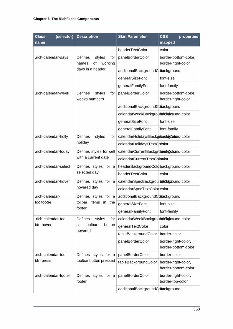
Chapter 6. The RichFaces Components
358
Class (selector)
name
Description Skin Parameter CSS properties
mapped
headerTextColor color
panelBorderColor border-bottom-color,
border-right-color
additionalBackgroundColorbackground
generalSizeFont font-size
.rich-calendar-days Defines styles for
names of working
days in a header
generalFamilyFont font-family
panelBorderColor border-bottom-color,
border-right-color
additionalBackgroundColorbackground
calendarWeekBackgroundColorbackground-color
generalSizeFont font-size
.rich-calendar-week Defines styles for
weeks numbers
generalFamilyFont font-family
calendarHolidaysBackgroundColorbackground-color.rich-calendar-holly Defines styles for
holiday calendarHolidaysTextColorcolor
calendarCurrentBackgroundColorbackground-color.rich-calendar-today Defines styles for cell
with a current date calendarCurrentTextColorcolor
headerBackgroundColorbackground-color.rich-calendar-select Defines styles for a
selected day headerTextColor color
calendarSpecBackgroundColorbackground-color.rich-calendar-hover Defines styles for a
hovered day calendarSpecTextColor color
additionalBackgroundColorbackground
generalSizeFont font-size
.rich-calendar-
toolfooter
Defines styles for a
tollbar items in the
footergeneralFamilyFont font-family
calendarWeekBackgroundColorbackground-color
generalTextColor color
tableBackgroundColor border-color
.rich-calendar-tool-
btn-hover
Defines styles for
a toolbar button
hovered
panelBorderColor border-right-color,
border-bottom-color
panelBorderColor border-color.rich-calendar-tool-
btn-press
Defines styles for a
toolbar button pressed tableBackgroundColor border-right-color,
border-bottom-color
panelBorderColor border-right-color,
border-top-color
.rich-calendar-footer Defines styles for a
footer
additionalBackgroundColorbackground
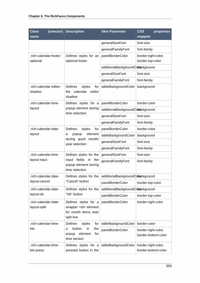
Chapter 6. The RichFaces Components
359
Class (selector)
name
Description Skin Parameter CSS properties
mapped
generalSizeFont font-size
generalFamilyFont font-family
panelBorderColor border-right-color,
border-top-color
additionalBackgroundColorbackground
generalSizeFont font-size
.rich-calendar-footer-
optional
Defines styles for an
optional footer
generalFamilyFont font-family
.rich-calendar-editor-
shadow
Defines styles for
the calendar editor
shadow
tableBackgroundColor background
panelBorderColor border-color
additionalBackgroundColorbackground
generalSizeFont font-size
.rich-calendar-time-
layout
Defines styles for a
popup element during
time selection
generalFamilyFont font-family
panelBorderColor border-color
tableBackgroundColor background
generalSizeFont font-size
.rich-calendar-date-
layout
Defines styles for
a popup element
during quick month/
year selectiongeneralFamilyFont font-family
generalSizeFont font-size.rich-calendar-time-
layout input
Defines styles for the
input fields in the
popup element during
time selection
generalFamilyFont font-family
additionalBackgroundColorbackground.rich-calendar-date-
layout-cancel
Defines styles for the
"Cancel" button panelBorderColor border-top-color
additionalBackgroundColorbackground.rich-calendar-date-
layout-ok
Defines styles for the
"Ok" button panelBorderColor border-top-color
.rich-calendar-date-
layout-split
Defines styles for a
wrapper <td> element
for month items near
split line
panelBorderColor border-right-color
tableBackgroundColor border-color.rich-calendar-time-
btn
Defines styles for
a button in the
popup element for
time section
panelBorderColor border-right-color,
border-bottom-color
.rich-calendar-time-
btn-press
Defines styles for a
pressed button in the
tableBackgroundColor border-right-color,
border-bottom-color
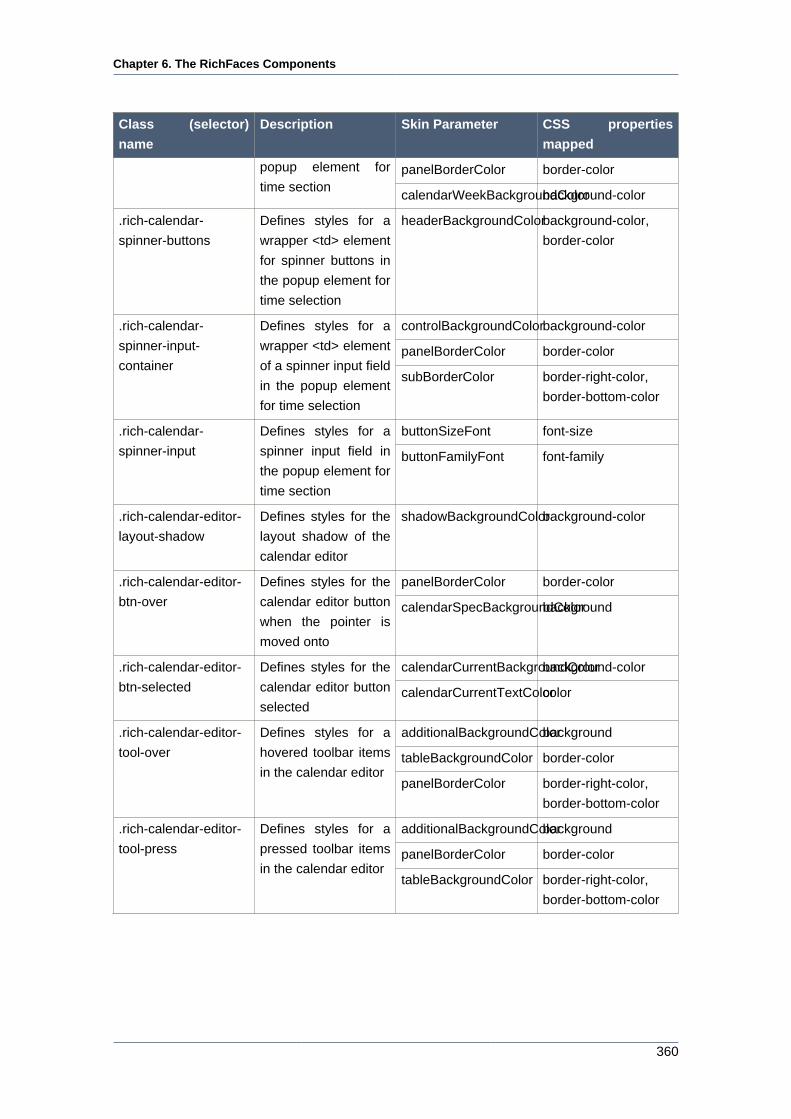
Chapter 6. The RichFaces Components
360
Class (selector)
name
Description Skin Parameter CSS properties
mapped
panelBorderColor border-colorpopup element for
time sectioncalendarWeekBackgroundColorbackground-color
.rich-calendar-
spinner-buttons
Defines styles for a
wrapper <td> element
for spinner buttons in
the popup element for
time selection
headerBackgroundColorbackground-color,
border-color
controlBackgroundColorbackground-color
panelBorderColor border-color
.rich-calendar-
spinner-input-
container
Defines styles for a
wrapper <td> element
of a spinner input field
in the popup element
for time selection
subBorderColor border-right-color,
border-bottom-color
buttonSizeFont font-size.rich-calendar-
spinner-input
Defines styles for a
spinner input field in
the popup element for
time section
buttonFamilyFont font-family
.rich-calendar-editor-
layout-shadow
Defines styles for the
layout shadow of the
calendar editor
shadowBackgroundColorbackground-color
panelBorderColor border-color.rich-calendar-editor-
btn-over
Defines styles for the
calendar editor button
when the pointer is
moved onto
calendarSpecBackgroundColorbackground
calendarCurrentBackgroundColorbackground-color.rich-calendar-editor-
btn-selected
Defines styles for the
calendar editor button
selectedcalendarCurrentTextColorcolor
additionalBackgroundColorbackground
tableBackgroundColor border-color
.rich-calendar-editor-
tool-over
Defines styles for a
hovered toolbar items
in the calendar editorpanelBorderColor border-right-color,
border-bottom-color
additionalBackgroundColorbackground
panelBorderColor border-color
.rich-calendar-editor-
tool-press
Defines styles for a
pressed toolbar items
in the calendar editortableBackgroundColor border-right-color,
border-bottom-color
Chapter 6. The RichFaces Components
361
Table 6.166. Style classes (selectors) without skin parameters
Class name Description
.rich-calendar-input Defines styles for an input field
.rich-calendar-button Defines styles for a popup button
.rich-calendar-weekends Defines styles for names of weekend in a
header
.rich-calendar-popup Defines styles for a popup element
.rich-calendar-tool-btn Defines styles for a toolbar buttons
.rich-calendar-tool-btn-disabled Defines styles for a toolbar buttons disabled
.rich-calendar-tool-close Defines styles for a toolbar "Close" button
.rich-calendar-boundary-dates Defines styles for an active boundary button
.rich-calendar-btn Defines styles for a date button
.rich-calendar-editor-btn Defines styles for a button in the calendar editor
.rich-calendar-time-layout-fields Defines styles for a wrapper <td> element for
input fields and buttons
.rich-calendar-spinner-up Defines styles for the "Up" spinner button in the
popup element for time section
.rich-calendar-spinner-down Defines styles for the "Down" spinner button in
the popup element for time section
.rich-calendar-spinner-pressed Defines styles for a pressed spinner button in
the popup element for time section
.rich-calendar-time-layout-ok Defines styles for the "Ok" button in the popup
element for time section
.rich-calendar-time-layout-cancel Defines styles for the "Cancel" button in the
popup element for time section
You can find all necessary information about style classes redefinition in Definition of Custom
Style Classes section.
6.11.1.5. Relevant Resources Links
On the component LiveDemo page [http://livedemo.exadel.com/richfaces-demo/richfaces/
calendar.jsf?c=calendar] you can see the example of <rich:calendar> usage and sources for
the given example.
How to use JavaScript API see on the RichFaces Users Forum [http://www.jboss.com/index.html?
module=bb&op=viewtopic&p=4078301#4078301].
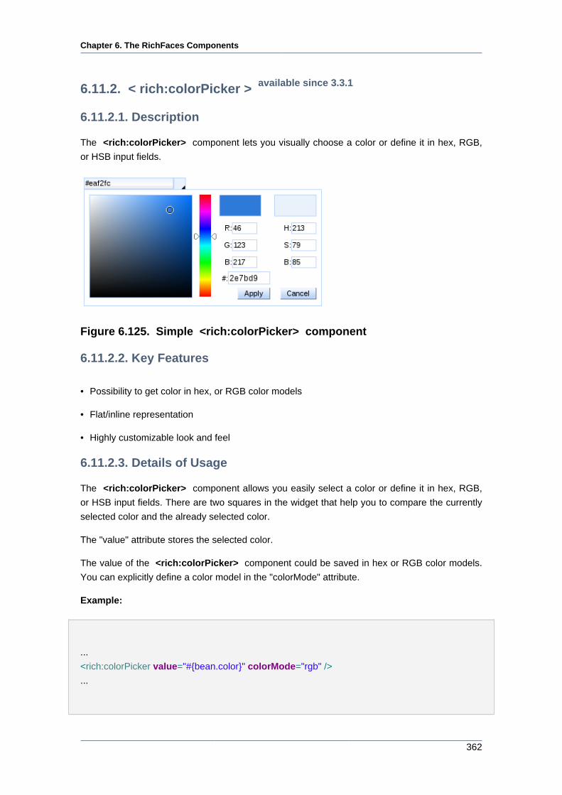
Chapter 6. The RichFaces Components
362
6.11.2. < rich:colorPicker > available since 3.3.1
6.11.2.1. Description
The <rich:colorPicker> component lets you visually choose a color or define it in hex, RGB,
or HSB input fields.
Figure 6.125. Simple <rich:colorPicker> component
6.11.2.2. Key Features
• Possibility to get color in hex, or RGB color models
• Flat/inline representation
• Highly customizable look and feel
6.11.2.3. Details of Usage
The <rich:colorPicker> component allows you easily select a color or define it in hex, RGB,
or HSB input fields. There are two squares in the widget that help you to compare the currently
selected color and the already selected color.
The "value" attribute stores the selected color.
The value of the <rich:colorPicker> component could be saved in hex or RGB color models.
You can explicitly define a color model in the "colorMode" attribute.
Example:
...
<rich:colorPicker value="#{bean.color}" colorMode="rgb" />
...
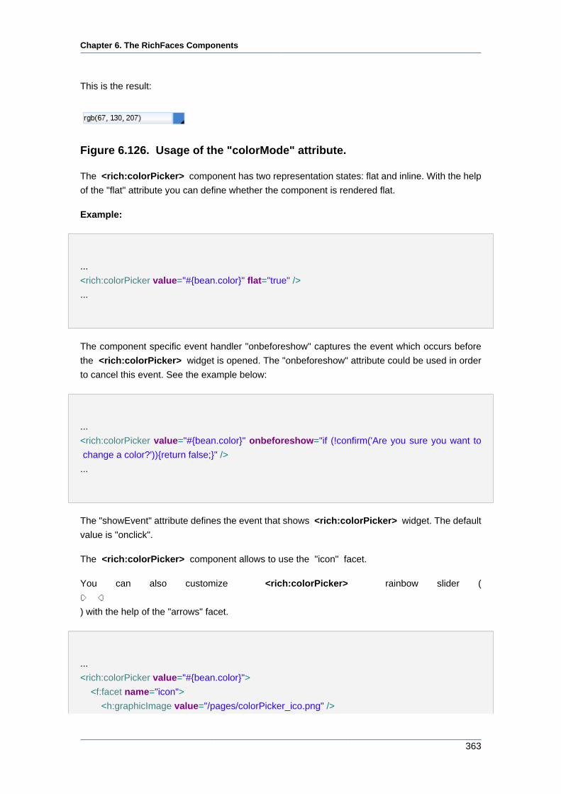
Chapter 6. The RichFaces Components
363
This is the result:
Figure 6.126. Usage of the "colorMode" attribute.
The <rich:colorPicker> component has two representation states: flat and inline. With the help
of the "flat" attribute you can define whether the component is rendered flat.
Example:
...
<rich:colorPicker value="#{bean.color}" flat="true" />
...
The component specific event handler "onbeforeshow" captures the event which occurs before
the <rich:colorPicker> widget is opened. The "onbeforeshow" attribute could be used in order
to cancel this event. See the example below:
...
<rich:colorPicker value="#{bean.color}" onbeforeshow="if (!confirm('Are you sure you want to
change a color?')){return false;}" />
...
The "showEvent" attribute defines the event that shows <rich:colorPicker> widget. The default
value is "onclick".
The <rich:colorPicker> component allows to use the "icon" facet.
You can also customize <rich:colorPicker> rainbow slider (
) with the help of the "arrows" facet.
...
<rich:colorPicker value="#{bean.color}">
<f:facet name="icon">
<h:graphicImage value="/pages/colorPicker_ico.png" />
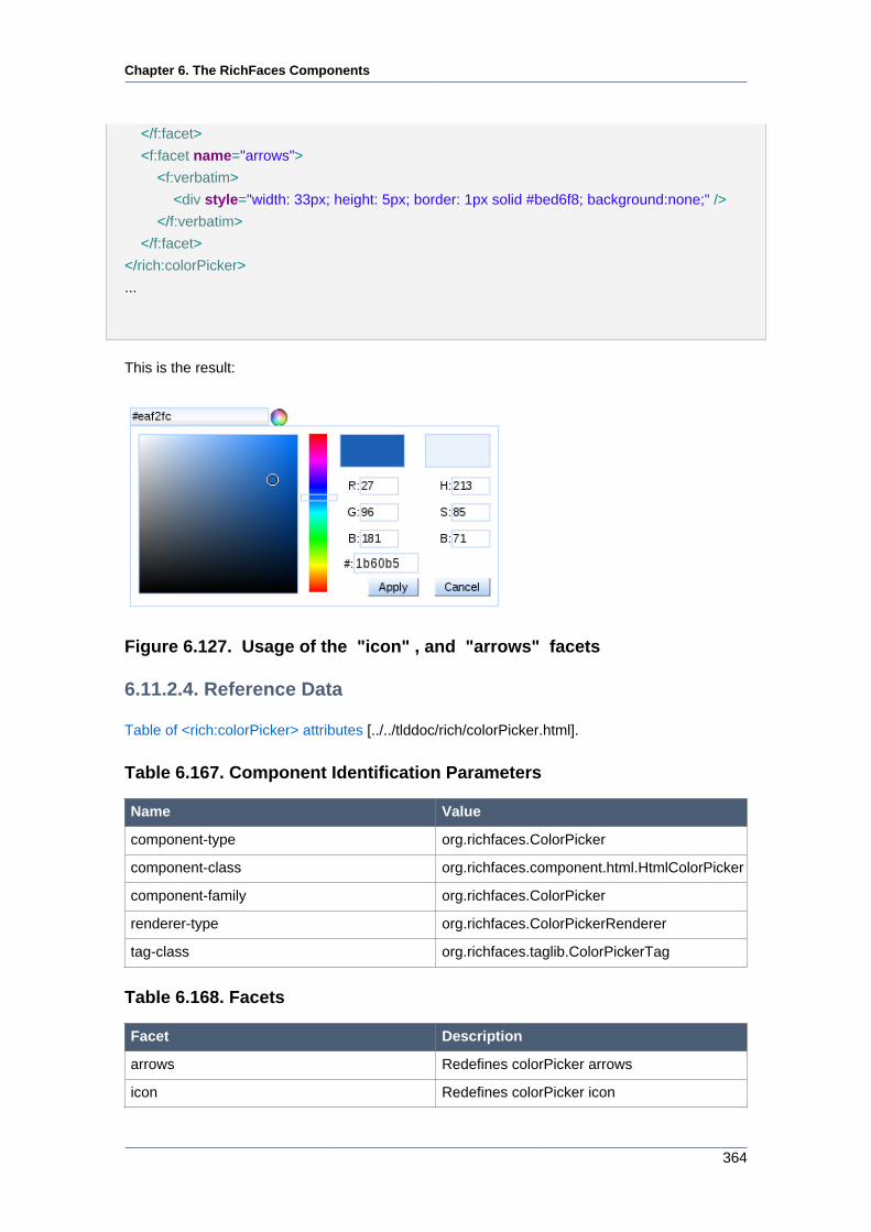
Chapter 6. The RichFaces Components
364
</f:facet>
<f:facet name="arrows">
<f:verbatim>
<div style="width: 33px; height: 5px; border: 1px solid #bed6f8; background:none;" />
</f:verbatim>
</f:facet>
</rich:colorPicker>
...
This is the result:
Figure 6.127. Usage of the "icon" , and "arrows" facets
6.11.2.4. Reference Data
Table of <rich:colorPicker> attributes [../../tlddoc/rich/colorPicker.html].
Table 6.167. Component Identification Parameters
Name Value
component-type org.richfaces.ColorPicker
component-class org.richfaces.component.html.HtmlColorPicker
component-family org.richfaces.ColorPicker
renderer-type org.richfaces.ColorPickerRenderer
tag-class org.richfaces.taglib.ColorPickerTag
Table 6.168. Facets
Facet Description
arrows Redefines colorPicker arrows
icon Redefines colorPicker icon
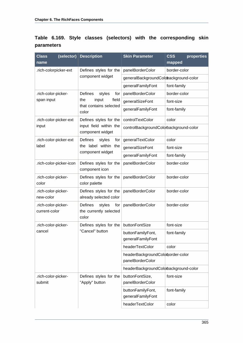
Chapter 6. The RichFaces Components
365
Table 6.169. Style classes (selectors) with the corresponding skin
parameters
Class (selector)
name
Description Skin Parameter CSS properties
mapped
panelBorderColor border-color
generalBackgroundColorbackground-color
.rich-colorpicker-ext Defines styles for the
component widget
generalFamilyFont font-family
panelBorderColor border-color
generalSizeFont font-size
.rich-color-picker-
span input
Defines styles for
the input field
that contains selected
colorgeneralFamilyFont font-family
controlTextColor color.rich-color-picker-ext
input
Defines styles for the
input field within the
component widgetcontrolBackgroundColorbackground-color
generalTextColor color
generalSizeFont font-size
.rich-color-picker-ext
label
Defines styles for
the label within the
component widgetgeneralFamilyFont font-family
.rich-color-picker-icon Defines styles for the
component icon
panelBorderColor border-color
.rich-color-picker-
color
Defines styles for the
color palette
panelBorderColor border-color
.rich-color-picker-
new-color
Defines styles for the
already selected color
panelBorderColor border-color
.rich-color-picker-
current-color
Defines styles for
the currently selected
color
panelBorderColor border-color
buttonFontSize font-size
buttonFamilyFont,
generalFamilyFont
font-family
headerTextColor color
headerBackgroundColor,
panelBorderColor
border-color
.rich-color-picker-
cancel
Defines styles for the
"Cancel" button
headerBackgroundColorbackground-color
buttonFontSize,
panelBorderColor
font-size
buttonFamilyFont,
generalFamilyFont
font-family
.rich-color-picker-
submit
Defines styles for the
"Apply" button
headerTextColor color
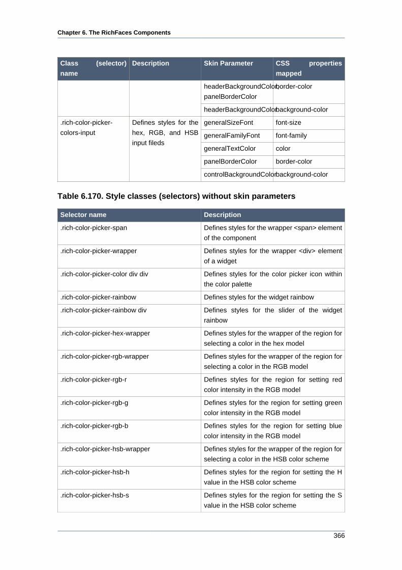
Chapter 6. The RichFaces Components
366
Class (selector)
name
Description Skin Parameter CSS properties
mapped
headerBackgroundColor,
panelBorderColor
border-color
headerBackgroundColorbackground-color
generalSizeFont font-size
generalFamilyFont font-family
generalTextColor color
panelBorderColor border-color
.rich-color-picker-
colors-input
Defines styles for the
hex, RGB, and HSB
input fileds
controlBackgroundColorbackground-color
Table 6.170. Style classes (selectors) without skin parameters
Selector name Description
.rich-color-picker-span Defines styles for the wrapper <span> element
of the component
.rich-color-picker-wrapper Defines styles for the wrapper <div> element
of a widget
.rich-color-picker-color div div Defines styles for the color picker icon within
the color palette
.rich-color-picker-rainbow Defines styles for the widget rainbow
.rich-color-picker-rainbow div Defines styles for the slider of the widget
rainbow
.rich-color-picker-hex-wrapper Defines styles for the wrapper of the region for
selecting a color in the hex model
.rich-color-picker-rgb-wrapper Defines styles for the wrapper of the region for
selecting a color in the RGB model
.rich-color-picker-rgb-r Defines styles for the region for setting red
color intensity in the RGB model
.rich-color-picker-rgb-g Defines styles for the region for setting green
color intensity in the RGB model
.rich-color-picker-rgb-b Defines styles for the region for setting blue
color intensity in the RGB model
.rich-color-picker-hsb-wrapper Defines styles for the wrapper of the region for
selecting a color in the HSB color scheme
.rich-color-picker-hsb-h Defines styles for the region for setting the H
value in the HSB color scheme
.rich-color-picker-hsb-s Defines styles for the region for setting the S
value in the HSB color scheme
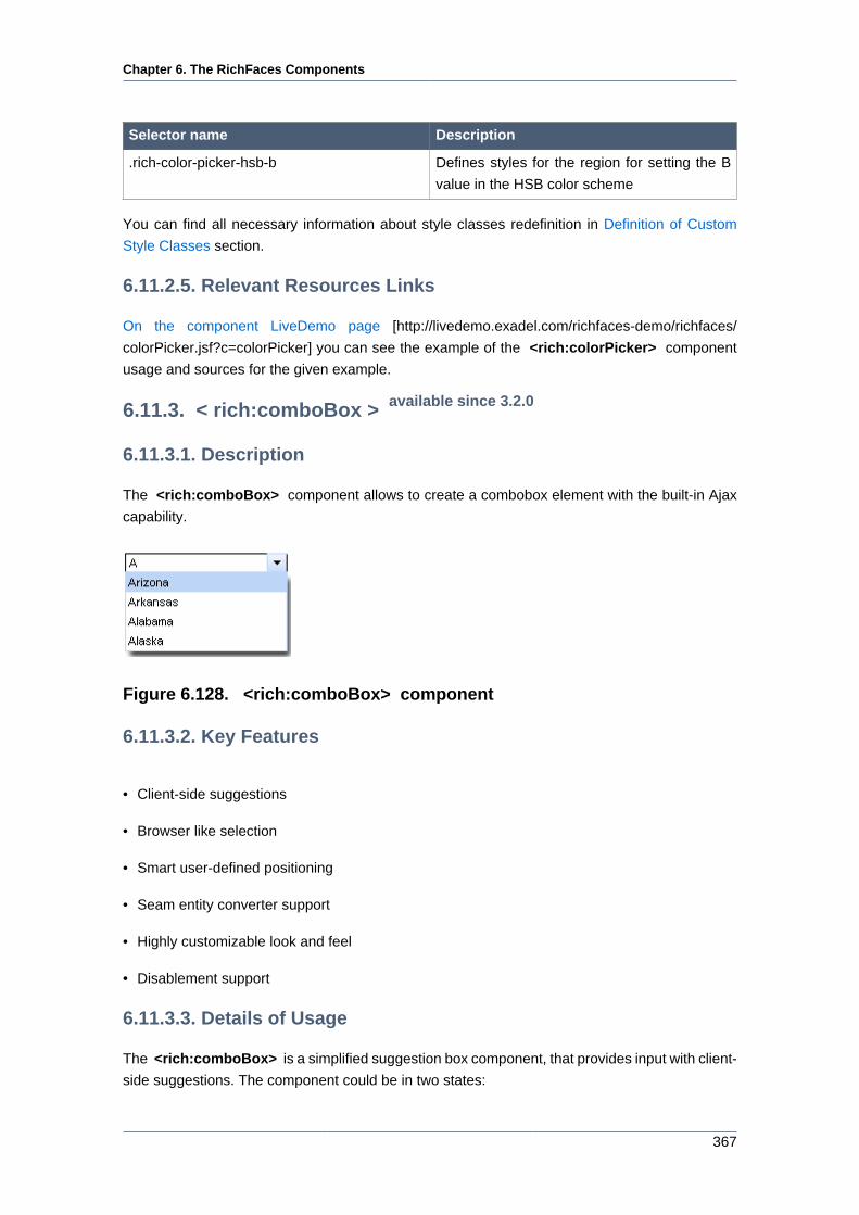
Chapter 6. The RichFaces Components
367
Selector name Description
.rich-color-picker-hsb-b Defines styles for the region for setting the B
value in the HSB color scheme
You can find all necessary information about style classes redefinition in Definition of Custom
Style Classes section.
6.11.2.5. Relevant Resources Links
On the component LiveDemo page [http://livedemo.exadel.com/richfaces-demo/richfaces/
colorPicker.jsf?c=colorPicker] you can see the example of the <rich:colorPicker> component
usage and sources for the given example.
6.11.3. < rich:comboBox > available since 3.2.0
6.11.3.1. Description
The <rich:comboBox> component allows to create a combobox element with the built-in Ajax
capability.
Figure 6.128. <rich:comboBox> component
6.11.3.2. Key Features
• Client-side suggestions
• Browser like selection
• Smart user-defined positioning
• Seam entity converter support
• Highly customizable look and feel
• Disablement support
6.11.3.3. Details of Usage
The <rich:comboBox> is a simplified suggestion box component, that provides input with client-
side suggestions. The component could be in two states:
Chapter 6. The RichFaces Components
368
• Default - only input and button is shown
• Input, button and a popup list of suggestions attached to input is shown
There are two ways to get values for the popup list of suggestions:
• Using the "suggestionValues" attribute, that defines the suggestion collection
...
<rich:comboBox value="#{bean.state}" suggestionValues="#{bean.suggestions}" />
...
• Using the <f:selectItem /> or <f:selectItems /> JSF components.
...
<rich:comboBox value="#{bean.state}" valueChangeListener="#{bean.selectionChanged}">
<f:selectItems value="#{bean.selectItems}"/>
<f:selectItem itemValue="Oregon"/>
<f:selectItem itemValue="Pennsylvania"/>
<f:selectItem itemValue="Rhode Island"/>
<f:selectItem itemValue="South Carolina"/>
</rich:comboBox>
...
Note:
These JSF components consider only the "value" attribute for this component.
Popup list content loads at page render time. No additional requests could be performed on the
popup calling.
The "value" attribute stores value from input after submit.
The "directInputSuggestions" attribute defines, how the first value from the suggested one
appears in an input field. If it's "true" the first value appears with the suggested part highlighted.
...
<rich:comboBox value="#{bean.state}" suggestionValues="#{bean.suggestions}" directInputSuggestions="true" /
>
...
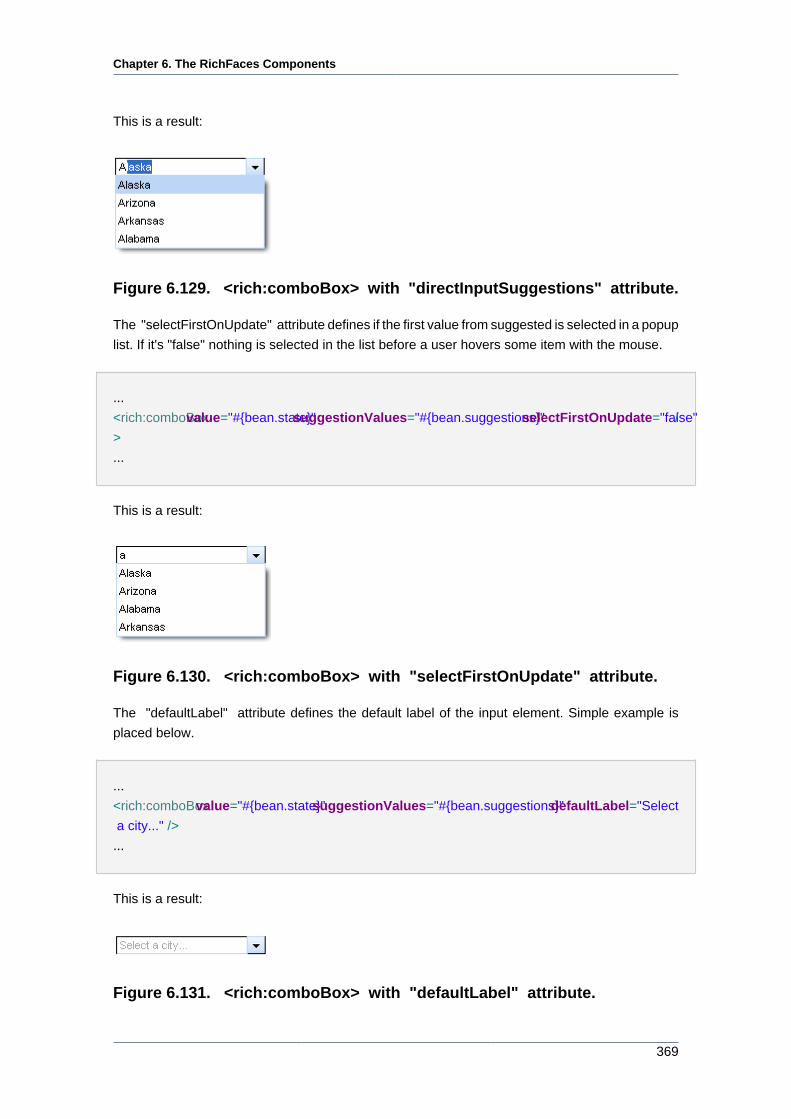
Chapter 6. The RichFaces Components
369
This is a result:
Figure 6.129. <rich:comboBox> with "directInputSuggestions" attribute.
The "selectFirstOnUpdate" attribute defines if the first value from suggested is selected in a popup
list. If it's "false" nothing is selected in the list before a user hovers some item with the mouse.
...
<rich:comboBox value="#{bean.state}" suggestionValues="#{bean.suggestions}" selectFirstOnUpdate="false" /
>
...
This is a result:
Figure 6.130. <rich:comboBox> with "selectFirstOnUpdate" attribute.
The "defaultLabel" attribute defines the default label of the input element. Simple example is
placed below.
...
<rich:comboBox value="#{bean.state}" suggestionValues="#{bean.suggestions}" defaultLabel="Select
a city..." />
...
This is a result:
Figure 6.131. <rich:comboBox> with "defaultLabel" attribute.
Chapter 6. The RichFaces Components
370
With the help of the "disabled" attribute you can disable the whole <rich:comboBox>
component. See the following example.
...
<rich:comboBox value="#{bean.state}" suggestionValues="#{bean.suggestions}" defaultLabel="Select
a city..." disabled="true" />
...
This is a result:
Figure 6.132. <rich:comboBox> with "disabled" attribute.
The "enableManualInput" attribute enables/disables input field, so when enableManualInput =
"false", user can only pick the value manually and has no possibility to type in the value (default
value is "false").
The <rich:comboBox> component provides to use specific event attributes:
• "onlistcall" which is fired before the list opening and gives you a possibility to cancel list popup/
update
• "onselect" which gives you a possibility to send Ajax request when item is selected
The <rich:comboBox> component allows to use sizes attributes:
• "listWidth" and "listHeight" attributes specify popup list sizes with values in pixels
• "width" attribute customizes the size of input element with values in pixels.
6.11.3.4. Reference Data
Table of <rich:comboBox> attributes [../../tlddoc/rich/comboBox.html].
Table 6.171. Component Identification Parameters
Name Value
component-type org.richfaces.ComboBox
component-class org.richfaces.component.html.HtmlComboBox
component-family org.richfaces.ComboBox
renderer-type org.richfaces.renderkit.ComboBoxRenderer
Chapter 6. The RichFaces Components
371
Name Value
tag-class org.richfaces.taglib.ComboBoxTag
Table 6.172. JavaScript API
Function Description
showList() Shows the popup list
hideList() Hides the popup list
enable() Enables the control for input
disable() Disables the control for input
Table 6.173. Style classes (selectors) with the corresponding skin
parameters
Class (selector)
name
Description Skin Parameter CSS properties
mapped
input.rich-combobox-
button-background,
input.rich-combobox-
button-background-
disabled, input.rich-
combobox-button-
background-inactive
Define styles for
a background of
the combobox button,
disabled button and
inactive button
respectively
tabBackgroundColor background-color
input.rich-combobox-
button-pressed-
background
Define styles for a
background of the
pressed button
tabBackgroundColor background-color
panelBorderColor border-top-colorinput.rich-combobox-
button, input.rich-
combobox-button-
inactive, input.rich-
combobox-button-
disabled
Define styles for
the combobox button,
disabled button and
inactive button
respectively
panelBorderColor border-left-color
generalSizeFont font-size
generalFamilyFont font-family
.rich-combobox-font,
input.rich-combobox-
font
Define styles for a font
generalTextColor color
headerFamilyFont font-familyinput.rich-combobox-
font-disabled, .rich-
combobox-font-
disabled
Defines styles for a
disabled font headerSizeFont font-size
input.rich-combobox-
font-inactive, .rich-
Defines styles for an
inactive font
generalSizeFont font-size
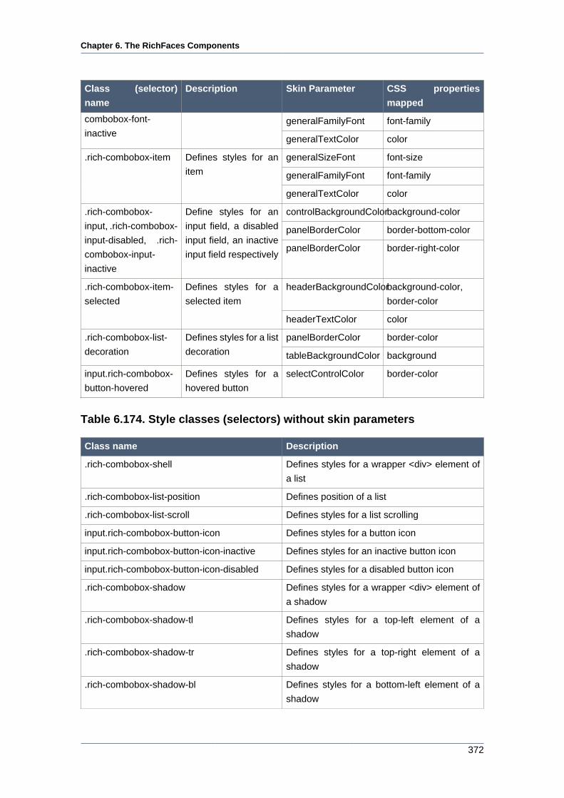
Chapter 6. The RichFaces Components
372
Class (selector)
name
Description Skin Parameter CSS properties
mapped
generalFamilyFont font-familycombobox-font-
inactivegeneralTextColor color
generalSizeFont font-size
generalFamilyFont font-family
.rich-combobox-item Defines styles for an
item
generalTextColor color
controlBackgroundColorbackground-color
panelBorderColor border-bottom-color
.rich-combobox-
input, .rich-combobox-
input-disabled, .rich-
combobox-input-
inactive
Define styles for an
input field, a disabled
input field, an inactive
input field respectivelypanelBorderColor border-right-color
headerBackgroundColorbackground-color,
border-color
.rich-combobox-item-
selected
Defines styles for a
selected item
headerTextColor color
panelBorderColor border-color.rich-combobox-list-
decoration
Defines styles for a list
decoration tableBackgroundColor background
input.rich-combobox-
button-hovered
Defines styles for a
hovered button
selectControlColor border-color
Table 6.174. Style classes (selectors) without skin parameters
Class name Description
.rich-combobox-shell Defines styles for a wrapper <div> element of
a list
.rich-combobox-list-position Defines position of a list
.rich-combobox-list-scroll Defines styles for a list scrolling
input.rich-combobox-button-icon Defines styles for a button icon
input.rich-combobox-button-icon-inactive Defines styles for an inactive button icon
input.rich-combobox-button-icon-disabled Defines styles for a disabled button icon
.rich-combobox-shadow Defines styles for a wrapper <div> element of
a shadow
.rich-combobox-shadow-tl Defines styles for a top-left element of a
shadow
.rich-combobox-shadow-tr Defines styles for a top-right element of a
shadow
.rich-combobox-shadow-bl Defines styles for a bottom-left element of a
shadow
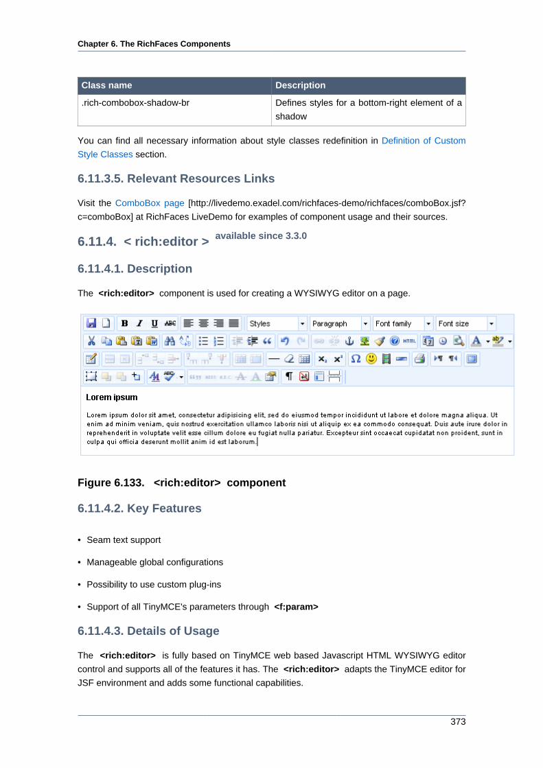
Chapter 6. The RichFaces Components
373
Class name Description
.rich-combobox-shadow-br Defines styles for a bottom-right element of a
shadow
You can find all necessary information about style classes redefinition in Definition of Custom
Style Classes section.
6.11.3.5. Relevant Resources Links
Visit the ComboBox page [http://livedemo.exadel.com/richfaces-demo/richfaces/comboBox.jsf?
c=comboBox] at RichFaces LiveDemo for examples of component usage and their sources.
6.11.4. < rich:editor > available since 3.3.0
6.11.4.1. Description
The <rich:editor> component is used for creating a WYSIWYG editor on a page.
Figure 6.133. <rich:editor> component
6.11.4.2. Key Features
• Seam text support
• Manageable global configurations
• Possibility to use custom plug-ins
• Support of all TinyMCE's parameters through <f:param>
6.11.4.3. Details of Usage
The <rich:editor> is fully based on TinyMCE web based Javascript HTML WYSIWYG editor
control and supports all of the features it has. The <rich:editor> adapts the TinyMCE editor for
JSF environment and adds some functional capabilities.
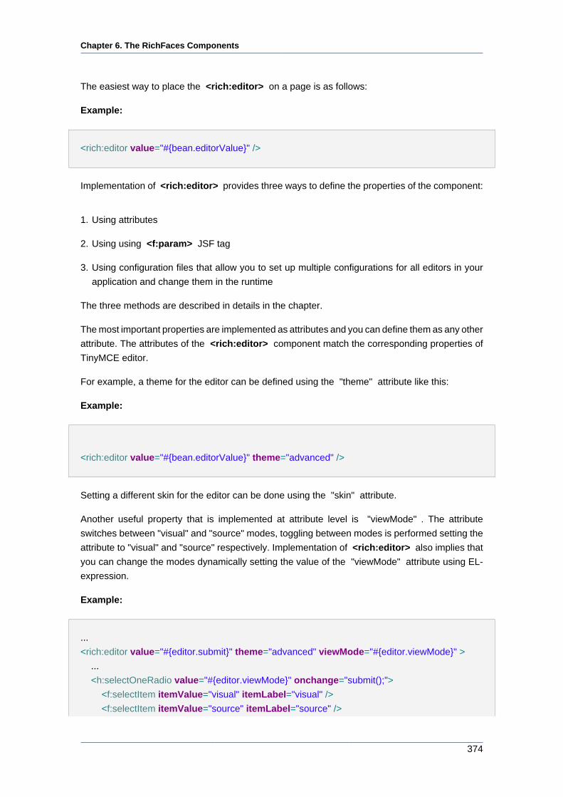
Chapter 6. The RichFaces Components
374
The easiest way to place the <rich:editor> on a page is as follows:
Example:
<rich:editor value="#{bean.editorValue}" />
Implementation of <rich:editor> provides three ways to define the properties of the component:
1. Using attributes
2. Using using <f:param> JSF tag
3. Using configuration files that allow you to set up multiple configurations for all editors in your
application and change them in the runtime
The three methods are described in details in the chapter.
The most important properties are implemented as attributes and you can define them as any other
attribute. The attributes of the <rich:editor> component match the corresponding properties of
TinyMCE editor.
For example, a theme for the editor can be defined using the "theme" attribute like this:
Example:
<rich:editor value="#{bean.editorValue}" theme="advanced" />
Setting a different skin for the editor can be done using the "skin" attribute.
Another useful property that is implemented at attribute level is "viewMode" . The attribute
switches between "visual" and "source" modes, toggling between modes is performed setting the
attribute to "visual" and "source" respectively. Implementation of <rich:editor> also implies that
you can change the modes dynamically setting the value of the "viewMode" attribute using EL-
expression.
Example:
...
<rich:editor value="#{editor.submit}" theme="advanced" viewMode="#{editor.viewMode}" >
...
<h:selectOneRadio value="#{editor.viewMode}" onchange="submit();">
<f:selectItem itemValue="visual" itemLabel="visual" />
<f:selectItem itemValue="source" itemLabel="source" />
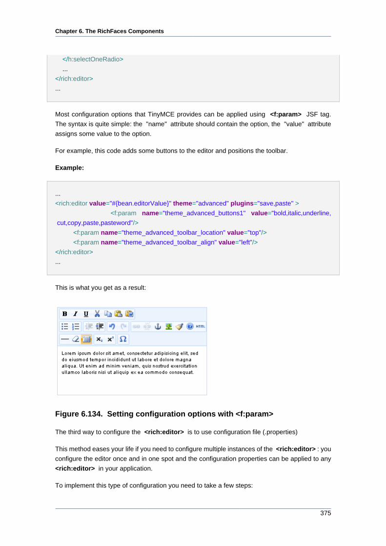
Chapter 6. The RichFaces Components
375
</h:selectOneRadio>
...
</rich:editor>
...
Most configuration options that TinyMCE provides can be applied using <f:param> JSF tag.
The syntax is quite simple: the "name" attribute should contain the option, the "value" attribute
assigns some value to the option.
For example, this code adds some buttons to the editor and positions the toolbar.
Example:
...
<rich:editor value="#{bean.editorValue}" theme="advanced" plugins="save,paste" >
<f:param name="theme_advanced_buttons1" value="bold,italic,underline,
cut,copy,paste,pasteword"/>
<f:param name="theme_advanced_toolbar_location" value="top"/>
<f:param name="theme_advanced_toolbar_align" value="left"/>
</rich:editor>
...
This is what you get as a result:
Figure 6.134. Setting configuration options with <f:param>
The third way to configure the <rich:editor> is to use configuration file (.properties)
This method eases your life if you need to configure multiple instances of the <rich:editor> : you
configure the editor once and in one spot and the configuration properties can be applied to any
<rich:editor> in your application.
To implement this type of configuration you need to take a few steps:
Chapter 6. The RichFaces Components
376
• Create a configuration file (.properties) in the classpath folder and add some properties to it. Use
standard syntax for the .properties files: parameter=value. Here is an example of configuration
file:
Example:
theme="advanced"
plugins="save,paste"
theme_advanced_buttons1="bold,italic,underline, cut,copy,paste,pasteword"
theme_advanced_toolbar_location="top"
theme_advanced_toolbar_align="left"
• The properties stored in configuration file are passed to the <rich:editor> via "configuration"
attribute which takes the name of the configuration file as a value (with out .properties
extension).
For example, if you named the configuration file "editorconfig", you would address it as follows:
Example:
...
<rich:editor value="#{bean.editorValue}" configuration="editorconfig"/>
...
• Alternately, you can use a EL-expression to define a configuration file. This way you can
dynamically change the sets of configuration properties.
For example, you have two configuration files "configurationAdvanced" and
"configurationSimple" and you want them to be applied under some condition.
To do this you need to bind "configuration" attribute to the appropriate bean property like this.
Example:
...
<rich:editor value="#{bean.editorValue}" configuration="#{editor.configuration}" />
...
Your Java file should look like this.
...
String configuration;
Chapter 6. The RichFaces Components
377
if(some condition){//defines some condition
configuration = "configurationAdvanced"; //the name on the file with advanced properties
}
else{
configuration= "configurationSimple"; //the name on the file with simplified properties
}
...
You also might want to add some custom plug-ins to your editor. You can read about how to create
a plugin in TinyMCE Wiki article [http://wiki.moxiecode.com/index.php/TinyMCE:Creating_Plugin].
Adding a custom plugin also requires a few steps to take. Though, the procedure is very similar
to adding a configuration file.
This is what you need to add a plugin:
• Create a .properties file and put the name of the plug-in and a path to it into the file. The file can
contain multiple plug-in declarations. Your .properties file should be like this.
Example:
...
pluginName=/mytinymceplugins/plugin1Name/editor_plugin.js
...
• Use the "customPlugins" attribute to specify the .properties file with a plugin name and a path
to it.
If your .properties file is named "myPlugins", then your will have this code on the page.
Example:
...
<rich:editor theme="advanced" customPlugins="myPlugins" plugins="pluginName" />
...
Note:
Some plug-ins which available for download might have some dependencies on
TinyMCE scripts. For example, dialog pop-ups require tiny_mce_popup.js script
file. Assuming that you will not plug custom plugins to the RF jar with editor
Chapter 6. The RichFaces Components
378
component (standard TinyMCE plugins creation implies that plugins are put into
TinyMCE's corresponding directory) you should manually add required TinyMCE
scripts to some project folder and correct the js includes.
The implementation of the <rich:editor> component has two methods for handling events.
The attributes take some function name as a value with is triggered on the appropriate event. You
need to use standard JavaScript function calling syntax.
• Using attributes ( "onchange" , "oninit" , "onsave" , "onsetup" )
Example:
...
<rich:editor value="#{bean.editorValue}" onchange="myCustomOnChangeHandler()" />
...
• Using <f:param> as a child element defining the "name" attribute with one of the TinyMCE's
callbacks and the "value" attribute takes the function name you want to be called on the
corresponding event as the value. Note, that the syntax in this case is a bit different: parentheses
are not required.
Example:
...
<rich:editor value="#{bean.editorValue}">
<f:param name="onchange" value="myCustomOnChangeHandler" />
</rich:editor>
...
The <rich:editor> component has a build-in converter that renders HTML code generated
by the editor to Seam text (you can read more on Seam in Seam guide [http://docs.jboss.org/
seam/1.1.5.GA/reference/en/html/text.html].), it also interprets Seam text passed to the
<rich:editor> and renders it to HTML. The converter can be enable with the "useSeamText"
attribute.
Example:
This HTML code generated by editor
...
<p><a href="http://mysite.com">Lorem ipsum</a> <i>dolor sit</i> amet, ea <u>commodo</
u> consequat.</p>
Chapter 6. The RichFaces Components
379
...
will be parsed to the following Seam text:
...
[Lorem ipsum=>http://mysite.com] *dolor sit* amet, ea _commodo_ consequat.
...
Accordingly, if the Seam text is passed to the component it will be parsed to HTML code.
6.11.4.4. Reference Data
Table of <rich:editor> attributes [../../tlddoc/rich/editor.html].
Table 6.175. Component Identification Parameters
Name Value
component-type org.richfaces.component.Editor
component-class org.richfaces.component.html.Htmleditor
component-family org.richfaces.component.Editor
renderer-type org.richfaces.renderkit.html.EditorRenderer
tag-class org.richfaces.taglib.EditorTag
Table 6.176. Style classes (selectors) with the corresponding skin
parameters
Class (selector)
name
Description Skin Parameter CSS properties
mapped
.richfacesSkin
a:hover, .richfacesSkin
a:link, .richfacesSkin
a:visited, .richfacesSkin
a:active
Defines styles for links
state
generalTextColor color
.richfacesSkin table Defines styles for
the wrapper <table>
element of the editor
additionalBackgroundColorbackground
.richfacesSkin iframe Defines styles for the
editor text area
tableBackgroundColor background
.richfacesSkin .mceExternalToolbarDefines styles for the
toolbar
panelBorderColor border-color
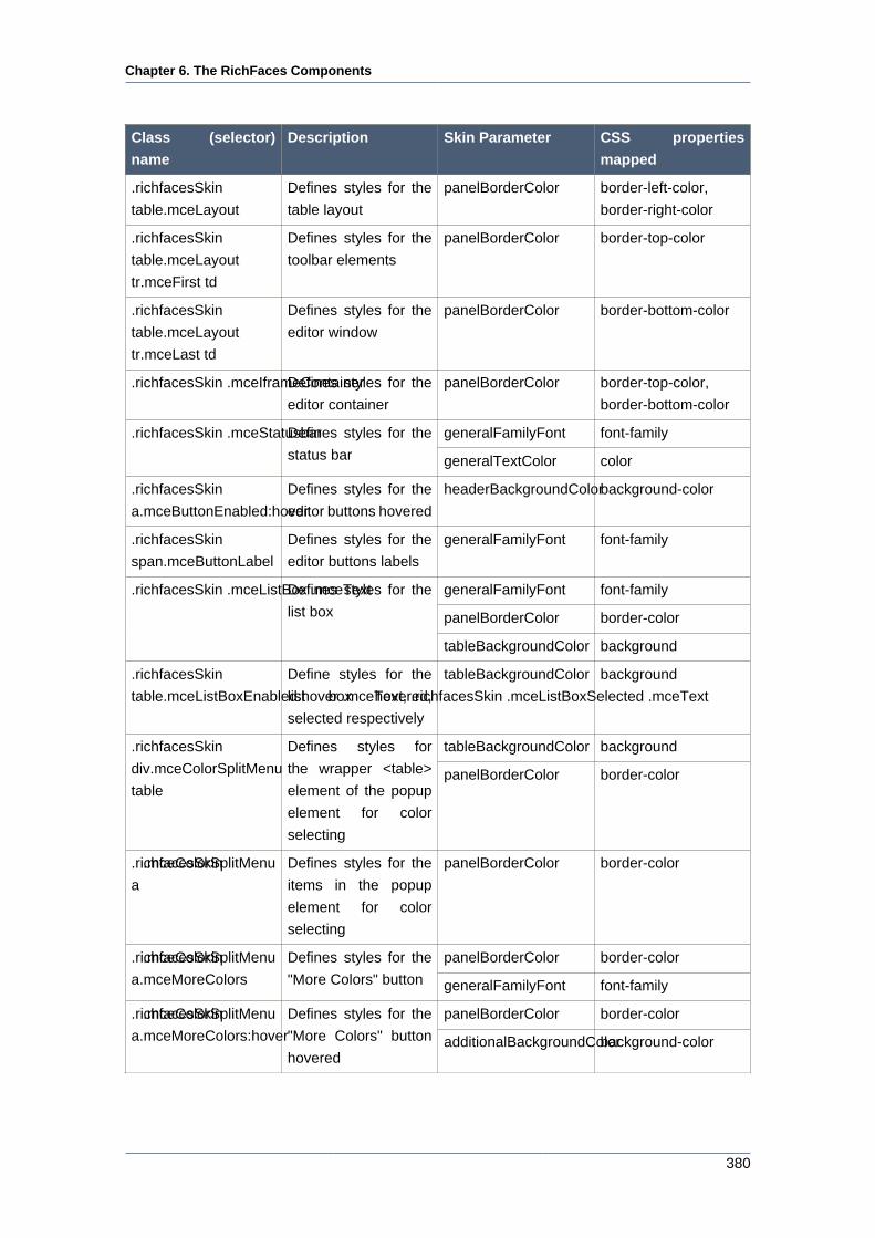
Chapter 6. The RichFaces Components
380
Class (selector)
name
Description Skin Parameter CSS properties
mapped
.richfacesSkin
table.mceLayout
Defines styles for the
table layout
panelBorderColor border-left-color,
border-right-color
.richfacesSkin
table.mceLayout
tr.mceFirst td
Defines styles for the
toolbar elements
panelBorderColor border-top-color
.richfacesSkin
table.mceLayout
tr.mceLast td
Defines styles for the
editor window
panelBorderColor border-bottom-color
.richfacesSkin .mceIframeContainerDefines styles for the
editor container
panelBorderColor border-top-color,
border-bottom-color
generalFamilyFont font-family.richfacesSkin .mceStatusbarDefines styles for the
status bar generalTextColor color
.richfacesSkin
a.mceButtonEnabled:hover
Defines styles for the
editor buttons hovered
headerBackgroundColorbackground-color
.richfacesSkin
span.mceButtonLabel
Defines styles for the
editor buttons labels
generalFamilyFont font-family
generalFamilyFont font-family
panelBorderColor border-color
.richfacesSkin .mceListBox .mceTextDefines styles for the
list box
tableBackgroundColor background
.richfacesSkin
table.mceListBoxEnabled:hover .mceText, .richfacesSkin .mceListBoxSelected .mceText
Define styles for the
list box hovered,
selected respectively
tableBackgroundColor background
tableBackgroundColor background.richfacesSkin
div.mceColorSplitMenu
table
Defines styles for
the wrapper <table>
element of the popup
element for color
selecting
panelBorderColor border-color
.richfacesSkin .mceColorSplitMenu
a
Defines styles for the
items in the popup
element for color
selecting
panelBorderColor border-color
panelBorderColor border-color.richfacesSkin .mceColorSplitMenu
a.mceMoreColors
Defines styles for the
"More Colors" button generalFamilyFont font-family
panelBorderColor border-color.richfacesSkin .mceColorSplitMenu
a.mceMoreColors:hover
Defines styles for the
"More Colors" button
hoveredadditionalBackgroundColorbackground-color
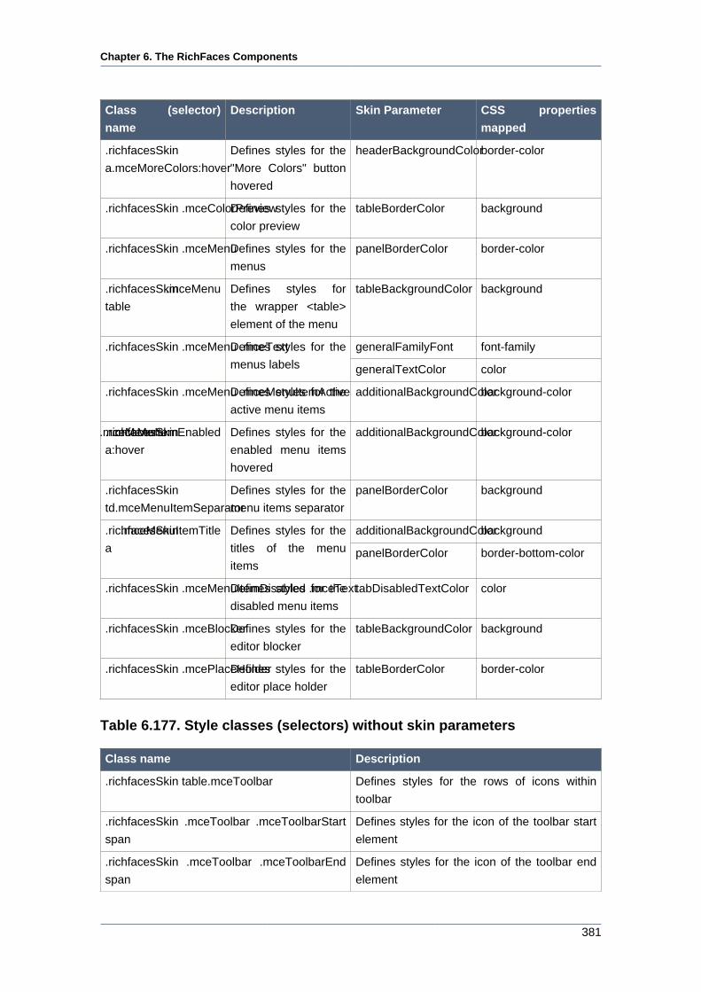
Chapter 6. The RichFaces Components
381
Class (selector)
name
Description Skin Parameter CSS properties
mapped
.richfacesSkin
a.mceMoreColors:hover
Defines styles for the
"More Colors" button
hovered
headerBackgroundColorborder-color
.richfacesSkin .mceColorPreviewDefines styles for the
color preview
tableBorderColor background
.richfacesSkin .mceMenuDefines styles for the
menus
panelBorderColor border-color
.richfacesSkin .mceMenu
table
Defines styles for
the wrapper <table>
element of the menu
tableBackgroundColor background
generalFamilyFont font-family.richfacesSkin .mceMenu .mceTextDefines styles for the
menus labels generalTextColor color
.richfacesSkin .mceMenu .mceMenuItemActiveDefines styles for the
active menu items
additionalBackgroundColorbackground-color
.richfacesSkin .mceMenu .mceMenuItemEnabled
a:hover
Defines styles for the
enabled menu items
hovered
additionalBackgroundColorbackground-color
.richfacesSkin
td.mceMenuItemSeparator
Defines styles for the
menu items separator
panelBorderColor background
additionalBackgroundColorbackground.richfacesSkin .mceMenuItemTitle
a
Defines styles for the
titles of the menu
itemspanelBorderColor border-bottom-color
.richfacesSkin .mceMenuItemDisabled .mceTextDefines styles for the
disabled menu items
tabDisabledTextColor color
.richfacesSkin .mceBlockerDefines styles for the
editor blocker
tableBackgroundColor background
.richfacesSkin .mcePlaceHolderDefines styles for the
editor place holder
tableBorderColor border-color
Table 6.177. Style classes (selectors) without skin parameters
Class name Description
.richfacesSkin table.mceToolbar Defines styles for the rows of icons within
toolbar
.richfacesSkin .mceToolbar .mceToolbarStart
span
Defines styles for the icon of the toolbar start
element
.richfacesSkin .mceToolbar .mceToolbarEnd
span
Defines styles for the icon of the toolbar end
element
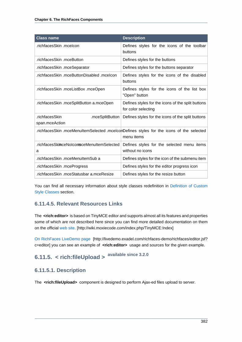
Chapter 6. The RichFaces Components
382
Class name Description
.richfacesSkin .mceIcon Defines styles for the icons of the toolbar
buttons
.richfacesSkin .mceButton Defines styles for the buttons
.richfacesSkin .mceSeparator Defines styles for the buttons separator
.richfacesSkin .mceButtonDisabled .mceIcon Defines styles for the icons of the disabled
buttons
.richfacesSkin .mceListBox .mceOpen Defines styles for the icons of the list box
"Open" button
.richfacesSkin .mceSplitButton a.mceOpen Defines styles for the icons of the split buttons
for color selecting
.richfacesSkin .mceSplitButton
span.mceAction
Defines styles for the icons of the split buttons
.richfacesSkin .mceMenuItemSelected .mceIconDefines styles for the icons of the selected
menu items
.richfacesSkin .mceNoIcons .mceMenuItemSelected
a
Defines styles for the selected menu items
without no icons
.richfacesSkin .mceMenuItemSub a Defines styles for the icon of the submenu item
.richfacesSkin .mceProgress Defines styles for the editor progress icon
.richfacesSkin .mceStatusbar a.mceResize Defines styles for the resize button
You can find all necessary information about style classes redefinition in Definition of Custom
Style Classes section.
6.11.4.5. Relevant Resources Links
The <rich:editor> is based on TinyMCE editor and supports almost all its features and properties
some of which are not described here since you can find more detailed documentation on them
on the official web site. [http://wiki.moxiecode.com/index.php/TinyMCE:Index]
On RichFaces LiveDemo page [http://livedemo.exadel.com/richfaces-demo/richfaces/editor.jsf?
c=editor] you can see an example of <rich:editor> usage and sources for the given example.
6.11.5. < rich:fileUpload > available since 3.2.0
6.11.5.1. Description
The <rich:fileUpload> component is designed to perform Ajax-ed files upload to server.
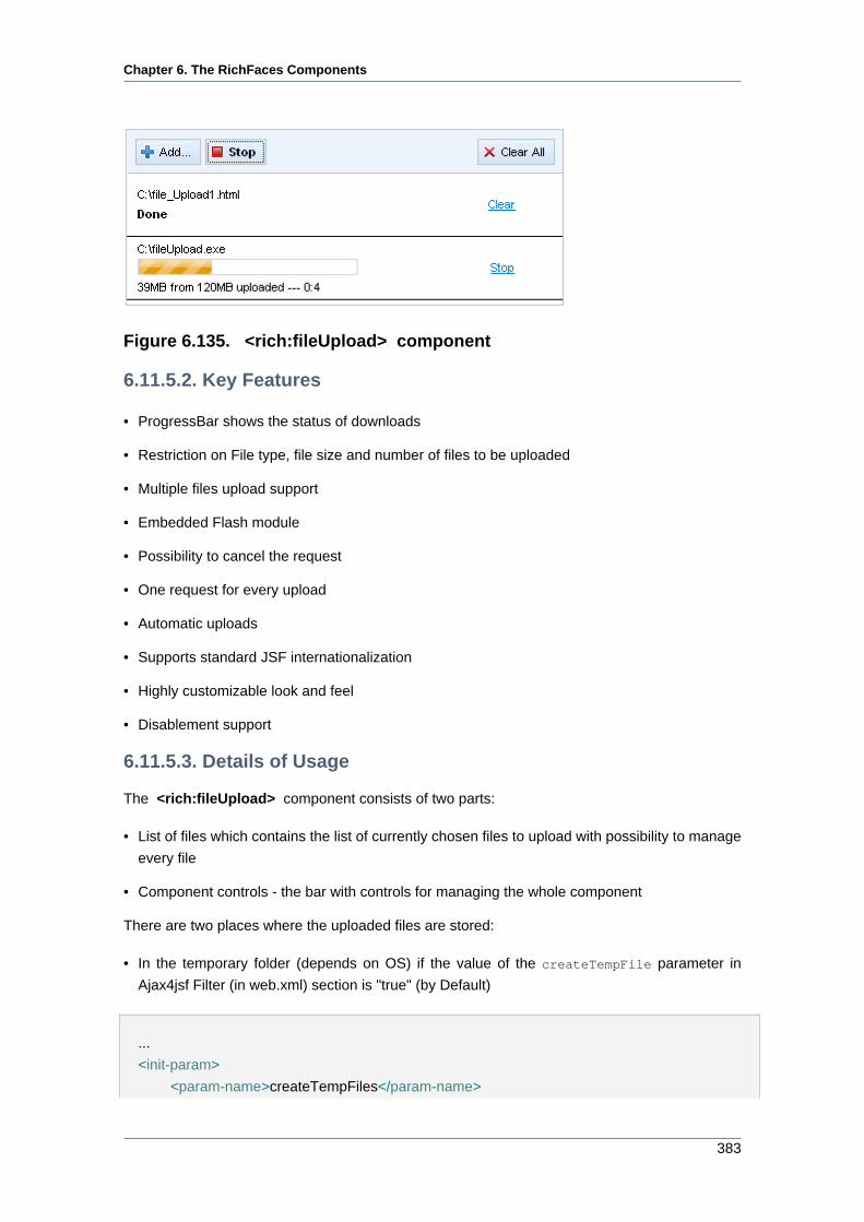
Chapter 6. The RichFaces Components
383
Figure 6.135. <rich:fileUpload> component
6.11.5.2. Key Features
• ProgressBar shows the status of downloads
• Restriction on File type, file size and number of files to be uploaded
• Multiple files upload support
• Embedded Flash module
• Possibility to cancel the request
• One request for every upload
• Automatic uploads
• Supports standard JSF internationalization
• Highly customizable look and feel
• Disablement support
6.11.5.3. Details of Usage
The <rich:fileUpload> component consists of two parts:
• List of files which contains the list of currently chosen files to upload with possibility to manage
every file
• Component controls - the bar with controls for managing the whole component
There are two places where the uploaded files are stored:
• In the temporary folder (depends on OS) if the value of the createTempFile parameter in
Ajax4jsf Filter (in web.xml) section is "true" (by Default)
...
<init-param>
<param-name>createTempFiles</param-name>
Chapter 6. The RichFaces Components
384
<param-value>true</param-value>
</init-param>
...
• In the RAM if the value of the createTempFile parameter in Ajax4jsf Filter section is "false".
This is a better way for storing small-sized files.
The "uploadData" attribute defines the collection of files uploaded. See the example below.
Example:
...
<rich:fileUpload uploadData="#{bean.data}"/>
...
The "fileUploadedListener" is called at server side after every file uploaded and used for the
saving files from temporary folder or RAM.
Example:
...
<rich:fileUpload uploadData="#{bean.data}" fileUploadListener="#{bean.listener}"/>
...
The following methods for processing the uploaded files are available:
• isMultiUpload(). It returns "true" if several files have been uploaded
• getUploadItems(). It returns the list of the uploaded files. If one file was uploaded, the
getUploadItems() method will return the list consisting of one file
• getUploadItem(). It returns the whole list in case of uploading one file only. If several files were
uploaded, the getUploadItem() method will return the first element of the uploaded files list.
Automatically files uploading could be performed by means of the "immediateUpload" attribute.
If the value of this attribute is "true" files are uploaded automatically once they have been added
into the list. All next files in the list are uploaded automatically one by one. If you cancel uploading
process next files aren't started to upload till you press the "Upload" button or clear the list.
Example:
...
<rich:fileUpload uploadData="#{bean.data}" fileUploadListener="#{bean.listener}" immediateUpload="true"/
>
Chapter 6. The RichFaces Components
385
...
The "autoclear" attribute is used to remove automatically files from the list after upload completed.
See the simple example below.
Example:
...
<rich:fileUpload uploadData="#{bean.data}" autoclear="true"/>
...
Each file in list waiting for upload has link "Cancel" opposite its name. Clicking this link invokes
JS API remove() function, which gets $('id').component.entries[i] as a parameter and
removes the particular file from list and from the queue for upload. After a file has been uploaded
the link "Cancel" changes to "Clear". Clicking "Clear" invokes clear() JS API function, which
also gets ID of the particular entry and removes it from the list. Uploaded to server file itself is
kept untouched.
The <rich:fileUpload> component provides following restrictions:
• On file types, use "acceptedTypes" attribute to define file types accepted by component. In
the example below only files with "html" and "jpg" extensions are accepted to upload.
Example:
...
<rich:fileUpload acceptedTypes="html, jpg"/>
...
• On file size, use the maxRequestSize parameter(value in bytes) inside Ajax4jsf Filter section
in web.xml:
...
<init-param>
<param-name>maxRequestSize</param-name>
<param-value>1000000</param-value>
</init-param>
...
• On max files quantity, use the "maxFilesQuantity" attribute to define max number of files
allowed to be uploaded. After a number of files in the list equals to the value of this attribute
"Add" button is disabled and nothing could be uploaded even if you clear the whole list. In order
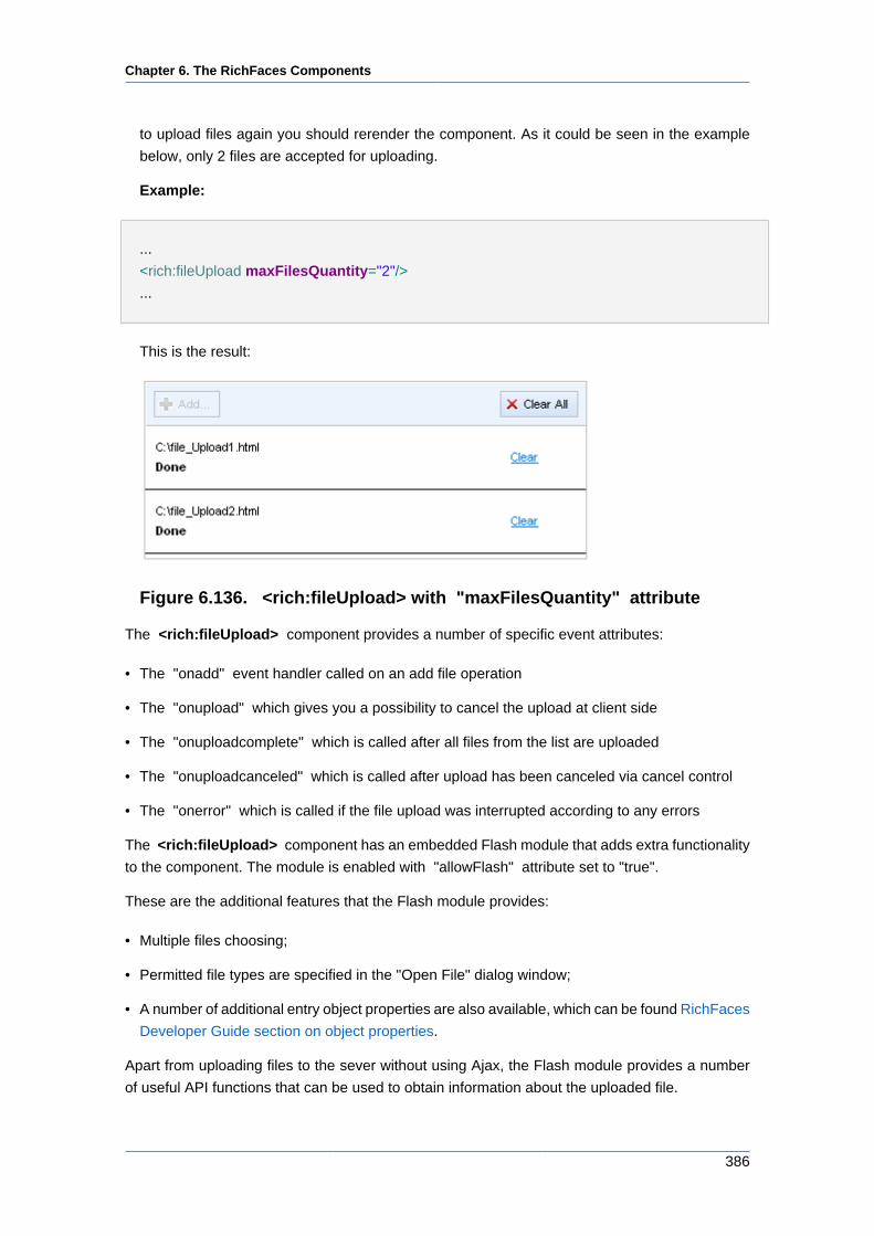
Chapter 6. The RichFaces Components
386
to upload files again you should rerender the component. As it could be seen in the example
below, only 2 files are accepted for uploading.
Example:
...
<rich:fileUpload maxFilesQuantity="2"/>
...
This is the result:
Figure 6.136. <rich:fileUpload> with "maxFilesQuantity" attribute
The <rich:fileUpload> component provides a number of specific event attributes:
• The "onadd" event handler called on an add file operation
• The "onupload" which gives you a possibility to cancel the upload at client side
• The "onuploadcomplete" which is called after all files from the list are uploaded
• The "onuploadcanceled" which is called after upload has been canceled via cancel control
• The "onerror" which is called if the file upload was interrupted according to any errors
The <rich:fileUpload> component has an embedded Flash module that adds extra functionality
to the component. The module is enabled with "allowFlash" attribute set to "true".
These are the additional features that the Flash module provides:
• Multiple files choosing;
• Permitted file types are specified in the "Open File" dialog window;
• A number of additional entry object properties are also available, which can be found RichFaces
Developer Guide section on object properties.
Apart from uploading files to the sever without using Ajax, the Flash module provides a number
of useful API functions that can be used to obtain information about the uploaded file.
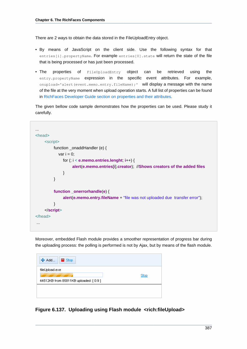
Chapter 6. The RichFaces Components
387
There are 2 ways to obtain the data stored in the FileUploadEntry object.
• By means of JavaScript on the client side. Use the following syntax for that
entries[i].propertyName. For example entries[0].state will return the state of the file
that is being processed or has just been processed.
• The properties of FileUploadEntry object can be retrieved using the
entry.propertyName expression in the specific event attributes. For example,
onupload="alert(event.memo.entry.fileName);" will display a message with the name
of the file at the very moment when upload operation starts. A full list of properties can be found
in RichFaces Developer Guide section on properties and their attributes.
The given bellow code sample demonstrates how the properties can be used. Please study it
carefully.
...
<head>
<script>
function _onaddHandler (e) {
var i = 0;
for (; i < e.memo.entries.lenght; i++) {
alert(e.memo.entries[i].creator); //Shows creators of the added files
}
}
function _onerrorhandle(e) {
alert(e.memo.entry.fileName + "file was not uploaded due transfer error");
}
</script>
</head>
...
Moreover, embedded Flash module provides a smoother representation of progress bar during
the uploading process: the polling is performed is not by Ajax, but by means of the flash module.
Figure 6.137. Uploading using Flash module <rich:fileUpload>
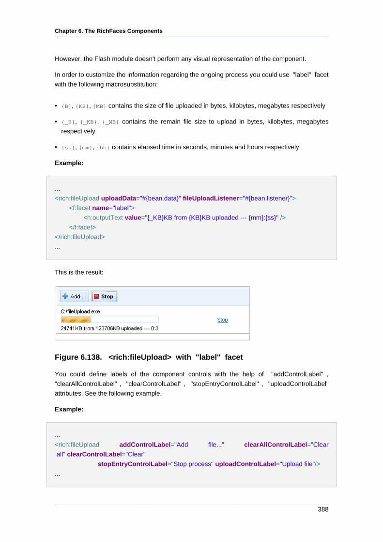
Chapter 6. The RichFaces Components
388
However, the Flash module doesn't perform any visual representation of the component.
In order to customize the information regarding the ongoing process you could use "label" facet
with the following macrosubstitution:
• {B}, {KB}, {MB} contains the size of file uploaded in bytes, kilobytes, megabytes respectively
• {_B}, {_KB}, {_MB} contains the remain file size to upload in bytes, kilobytes, megabytes
respectively
• {ss}, {mm}, {hh} contains elapsed time in seconds, minutes and hours respectively
Example:
...
<rich:fileUpload uploadData="#{bean.data}" fileUploadListener="#{bean.listener}">
<f:facet name="label">
<h:outputText value="{_KB}KB from {KB}KB uploaded --- {mm}:{ss}" />
</f:facet>
</rich:fileUpload>
...
This is the result:
Figure 6.138. <rich:fileUpload> with "label" facet
You could define labels of the component controls with the help of "addControlLabel" ,
"clearAllControlLabel" , "clearControlLabel" , "stopEntryControlLabel" , "uploadControlLabel"
attributes. See the following example.
Example:
...
<rich:fileUpload addControlLabel="Add file..." clearAllControlLabel="Clear
all" clearControlLabel="Clear"
stopEntryControlLabel="Stop process" uploadControlLabel="Upload file"/>
...
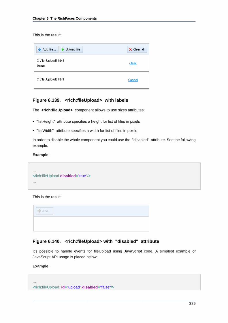
Chapter 6. The RichFaces Components
389
This is the result:
Figure 6.139. <rich:fileUpload> with labels
The <rich:fileUpload> component allows to use sizes attributes:
• "listHeight" attribute specifies a height for list of files in pixels
• "listWidth" attribute specifies a width for list of files in pixels
In order to disable the whole component you could use the "disabled" attribute. See the following
example.
Example:
...
<rich:fileUpload disabled="true"/>
...
This is the result:
Figure 6.140. <rich:fileUpload> with "disabled" attribute
It's possible to handle events for fileUpload using JavaScript code. A simplest example of
JavaScript API usage is placed below:
Example:
...
<rich:fileUpload id="upload" disabled="false"/>
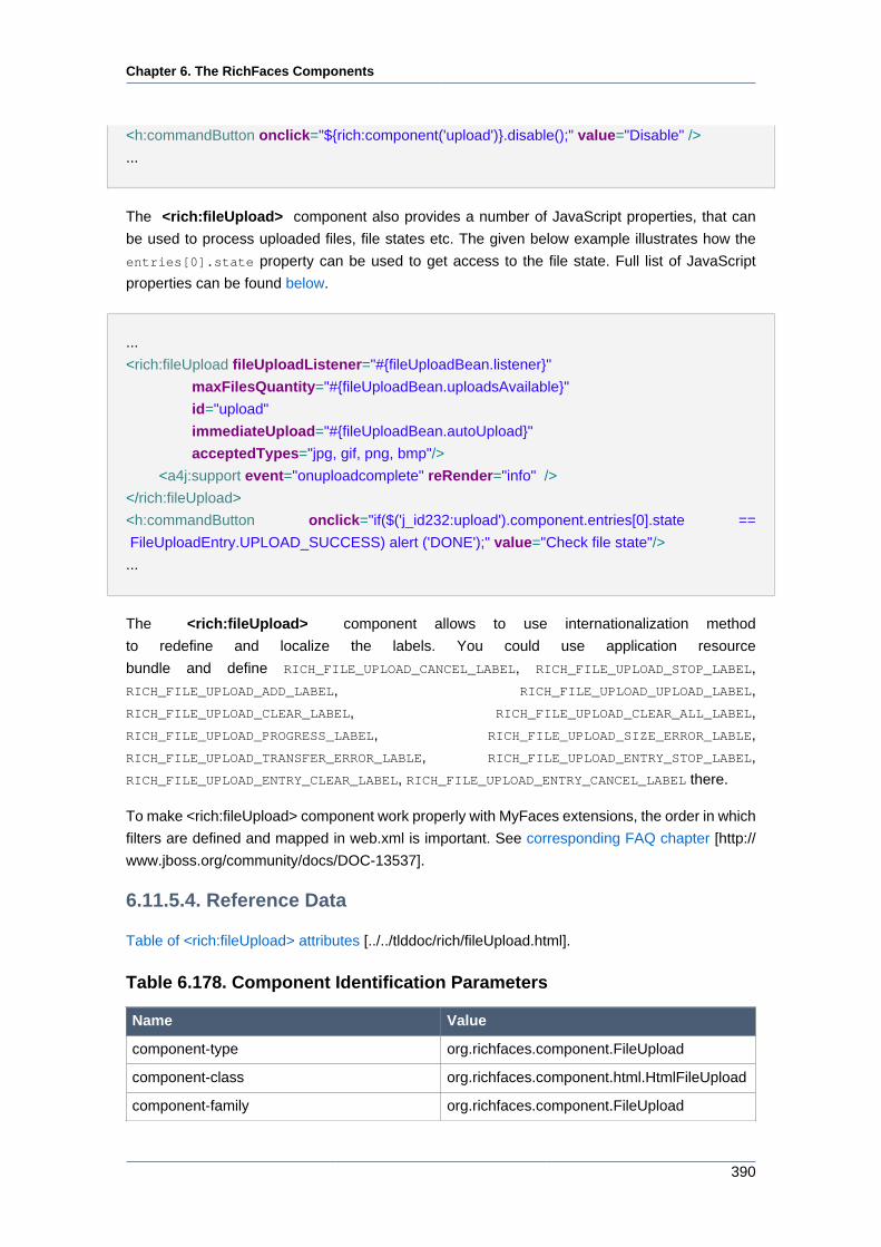
Chapter 6. The RichFaces Components
390
<h:commandButton onclick="${rich:component('upload')}.disable();" value="Disable" />
...
The <rich:fileUpload> component also provides a number of JavaScript properties, that can
be used to process uploaded files, file states etc. The given below example illustrates how the
entries[0].state property can be used to get access to the file state. Full list of JavaScript
properties can be found below.
...
<rich:fileUpload fileUploadListener="#{fileUploadBean.listener}"
maxFilesQuantity="#{fileUploadBean.uploadsAvailable}"
id="upload"
immediateUpload="#{fileUploadBean.autoUpload}"
acceptedTypes="jpg, gif, png, bmp"/>
<a4j:support event="onuploadcomplete" reRender="info" />
</rich:fileUpload>
<h:commandButton onclick="if($('j_id232:upload').component.entries[0].state ==
FileUploadEntry.UPLOAD_SUCCESS) alert ('DONE');" value="Check file state"/>
...
The <rich:fileUpload> component allows to use internationalization method
to redefine and localize the labels. You could use application resource
bundle and define RICH_FILE_UPLOAD_CANCEL_LABEL, RICH_FILE_UPLOAD_STOP_LABEL,
RICH_FILE_UPLOAD_ADD_LABEL, RICH_FILE_UPLOAD_UPLOAD_LABEL,
RICH_FILE_UPLOAD_CLEAR_LABEL, RICH_FILE_UPLOAD_CLEAR_ALL_LABEL,
RICH_FILE_UPLOAD_PROGRESS_LABEL, RICH_FILE_UPLOAD_SIZE_ERROR_LABLE,
RICH_FILE_UPLOAD_TRANSFER_ERROR_LABLE, RICH_FILE_UPLOAD_ENTRY_STOP_LABEL,
RICH_FILE_UPLOAD_ENTRY_CLEAR_LABEL, RICH_FILE_UPLOAD_ENTRY_CANCEL_LABEL there.
To make <rich:fileUpload> component work properly with MyFaces extensions, the order in which
filters are defined and mapped in web.xml is important. See corresponding FAQ chapter [http://
www.jboss.org/community/docs/DOC-13537].
6.11.5.4. Reference Data
Table of <rich:fileUpload> attributes [../../tlddoc/rich/fileUpload.html].
Table 6.178. Component Identification Parameters
Name Value
component-type org.richfaces.component.FileUpload
component-class org.richfaces.component.html.HtmlFileUpload
component-family org.richfaces.component.FileUpload
Chapter 6. The RichFaces Components
391
Name Value
renderer-type org.richfaces.renderkit.html.FileUploadRenderer
tag-class org.richfaces.taglib.FileUploadTag
Table 6.179. JavaScript API
Function Description
beforeSubmit() Sets up necessary request parameters for
file uploading and submits form to server by
command button. This method should be used
together with commands.
clear() Removes all files from the list. The function can
also get the $('id').component.entries[i]
as a parameter to remove a particular file.
disable() Disables the component
enable() Enables the component
remove() Cancels the request for uploading
a file by removing this file from
upload list and upload queue. Gets
$('id').component.entries[i] as a
parameter.
stop() Stops the uploading process
submitForm() Submits form to server. All added files will be
put to model and event.
Table 6.180. Client-side object properties
Property Description
entries Returns a array of all files in the list
entries.length Returns the number of files in the list
entries[i].fileName Returns the file name, that is retrieved by the
array index
entries[i].state Returns the file state. Possible states are
• "initialized" - the file is added, corresponds to
FileUploadEntry.INITIALIZED constant
• "progress" - the file is
being uploaded, corresponds to
FileUploadEntry.UPLOAD_IN_PROGRESS
constant
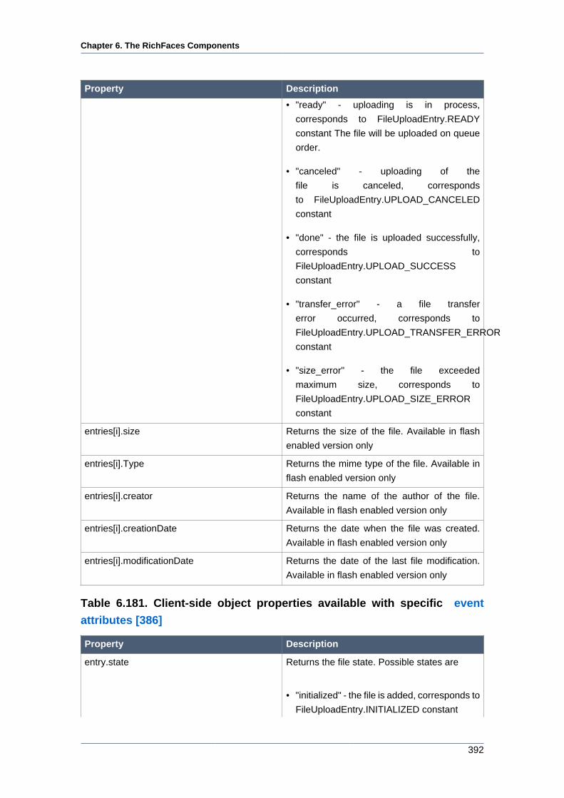
Chapter 6. The RichFaces Components
392
Property Description
• "ready" - uploading is in process,
corresponds to FileUploadEntry.READY
constant The file will be uploaded on queue
order.
• "canceled" - uploading of the
file is canceled, corresponds
to FileUploadEntry.UPLOAD_CANCELED
constant
• "done" - the file is uploaded successfully,
corresponds to
FileUploadEntry.UPLOAD_SUCCESS
constant
• "transfer_error" - a file transfer
error occurred, corresponds to
FileUploadEntry.UPLOAD_TRANSFER_ERROR
constant
• "size_error" - the file exceeded
maximum size, corresponds to
FileUploadEntry.UPLOAD_SIZE_ERROR
constant
entries[i].size Returns the size of the file. Available in flash
enabled version only
entries[i].Type Returns the mime type of the file. Available in
flash enabled version only
entries[i].creator Returns the name of the author of the file.
Available in flash enabled version only
entries[i].creationDate Returns the date when the file was created.
Available in flash enabled version only
entries[i].modificationDate Returns the date of the last file modification.
Available in flash enabled version only
Table 6.181. Client-side object properties available with specific event
attributes [386]
Property Description
entry.state Returns the file state. Possible states are
• "initialized" - the file is added, corresponds to
FileUploadEntry.INITIALIZED constant
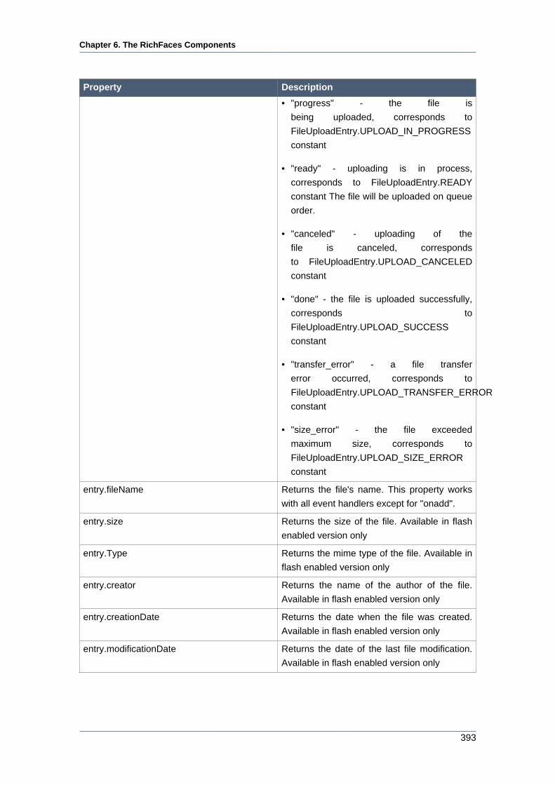
Chapter 6. The RichFaces Components
393
Property Description
• "progress" - the file is
being uploaded, corresponds to
FileUploadEntry.UPLOAD_IN_PROGRESS
constant
• "ready" - uploading is in process,
corresponds to FileUploadEntry.READY
constant The file will be uploaded on queue
order.
• "canceled" - uploading of the
file is canceled, corresponds
to FileUploadEntry.UPLOAD_CANCELED
constant
• "done" - the file is uploaded successfully,
corresponds to
FileUploadEntry.UPLOAD_SUCCESS
constant
• "transfer_error" - a file transfer
error occurred, corresponds to
FileUploadEntry.UPLOAD_TRANSFER_ERROR
constant
• "size_error" - the file exceeded
maximum size, corresponds to
FileUploadEntry.UPLOAD_SIZE_ERROR
constant
entry.fileName Returns the file's name. This property works
with all event handlers except for "onadd".
entry.size Returns the size of the file. Available in flash
enabled version only
entry.Type Returns the mime type of the file. Available in
flash enabled version only
entry.creator Returns the name of the author of the file.
Available in flash enabled version only
entry.creationDate Returns the date when the file was created.
Available in flash enabled version only
entry.modificationDate Returns the date of the last file modification.
Available in flash enabled version only
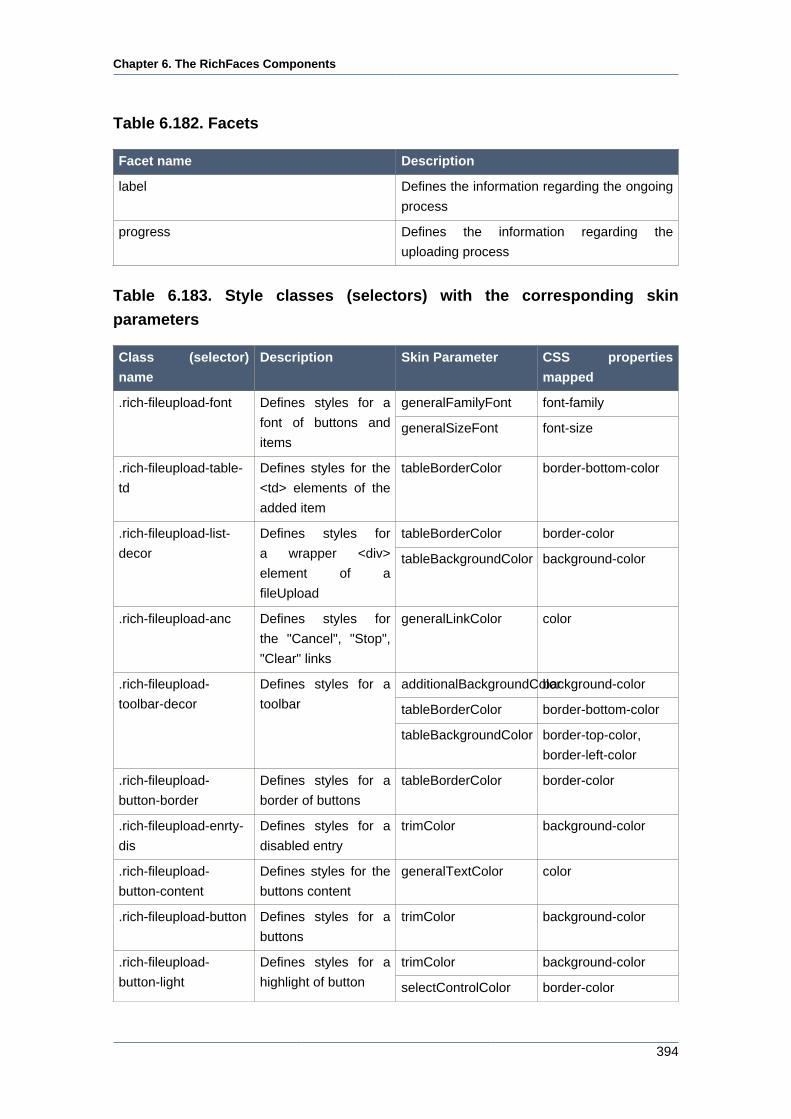
Chapter 6. The RichFaces Components
394
Table 6.182. Facets
Facet name Description
label Defines the information regarding the ongoing
process
progress Defines the information regarding the
uploading process
Table 6.183. Style classes (selectors) with the corresponding skin
parameters
Class (selector)
name
Description Skin Parameter CSS properties
mapped
generalFamilyFont font-family.rich-fileupload-font Defines styles for a
font of buttons and
itemsgeneralSizeFont font-size
.rich-fileupload-table-
td
Defines styles for the
<td> elements of the
added item
tableBorderColor border-bottom-color
tableBorderColor border-color.rich-fileupload-list-
decor
Defines styles for
a wrapper <div>
element of a
fileUpload
tableBackgroundColor background-color
.rich-fileupload-anc Defines styles for
the "Cancel", "Stop",
"Clear" links
generalLinkColor color
additionalBackgroundColorbackground-color
tableBorderColor border-bottom-color
.rich-fileupload-
toolbar-decor
Defines styles for a
toolbar
tableBackgroundColor border-top-color,
border-left-color
.rich-fileupload-
button-border
Defines styles for a
border of buttons
tableBorderColor border-color
.rich-fileupload-enrty-
dis
Defines styles for a
disabled entry
trimColor background-color
.rich-fileupload-
button-content
Defines styles for the
buttons content
generalTextColor color
.rich-fileupload-button Defines styles for a
buttons
trimColor background-color
trimColor background-color.rich-fileupload-
button-light
Defines styles for a
highlight of button selectControlColor border-color
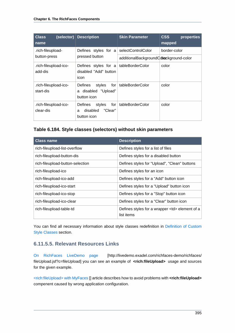
Chapter 6. The RichFaces Components
395
Class (selector)
name
Description Skin Parameter CSS properties
mapped
selectControlColor border-color.rich-fileupload-
button-press
Defines styles for a
pressed button additionalBackgroundColorbackground-color
.rich-fileupload-ico-
add-dis
Defines styles for a
disabled "Add" button
icon
tableBorderColor color
.rich-fileupload-ico-
start-dis
Defines styles for
a disabled "Upload"
button icon
tableBorderColor color
.rich-fileupload-ico-
clear-dis
Defines styles for
a disabled "Clear"
button icon
tableBorderColor color
Table 6.184. Style classes (selectors) without skin parameters
Class name Description
rich-fileupload-list-overflow Defines styles for a list of files
rich-fileupload-button-dis Defines styles for a disabled button
rich-fileupload-button-selection Defines styles for "Upload", "Clean" buttons
rich-fileupload-ico Defines styles for an icon
rich-fileupload-ico-add Defines styles for a "Add" button icon
rich-fileupload-ico-start Defines styles for a "Upload" button icon
rich-fileupload-ico-stop Defines styles for a "Stop" button icon
rich-fileupload-ico-clear Defines styles for a "Clear" button icon
rich-fileupload-table-td Defines styles for a wrapper <td> element of a
list items
You can find all necessary information about style classes redefinition in Definition of Custom
Style Classes section.
6.11.5.5. Relevant Resources Links
On RichFaces LiveDemo page [http://livedemo.exadel.com/richfaces-demo/richfaces/
fileUpload.jsf?c=fileUpload] you can see an example of <rich:fileUpload> usage and sources
for the given example.
<rich:fileUpload> with MyFaces [] article describes how to avoid problems with <rich:fileUpload>
compenent caused by wrong application configuration.
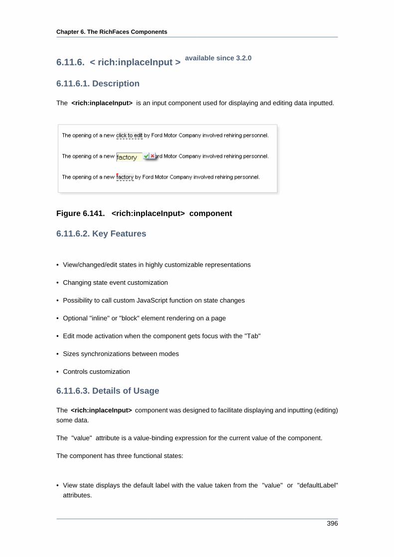
Chapter 6. The RichFaces Components
396
6.11.6. < rich:inplaceInput > available since 3.2.0
6.11.6.1. Description
The <rich:inplaceInput> is an input component used for displaying and editing data inputted.
Figure 6.141. <rich:inplaceInput> component
6.11.6.2. Key Features
• View/changed/edit states in highly customizable representations
• Changing state event customization
• Possibility to call custom JavaScript function on state changes
• Optional "inline" or "block" element rendering on a page
• Edit mode activation when the component gets focus with the "Tab"
• Sizes synchronizations between modes
• Controls customization
6.11.6.3. Details of Usage
The <rich:inplaceInput> component was designed to facilitate displaying and inputting (editing)
some data.
The "value" attribute is a value-binding expression for the current value of the component.
The component has three functional states:
• View state displays the default label with the value taken from the "value" or "defaultLabel"
attributes.
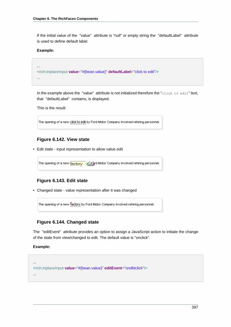
Chapter 6. The RichFaces Components
397
If the initial value of the "value" attribute is "null" or empty string the "defaultLabel" attribute
is used to define default label.
Example:
...
<rich:inplaceInput value="#{bean.value}" defaultLabel="click to edit"/>
...
In the example above the "value" attribute is not initialized therefore the "click to edit" text,
that "defaultLabel" contains, is displayed.
This is the result:
Figure 6.142. View state
• Edit state - input representation to allow value edit
Figure 6.143. Edit state
• Changed state - value representation after it was changed
Figure 6.144. Changed state
The "editEvent" attribute provides an option to assign a JavaScript action to initiate the change
of the state from view/changed to edit. The default value is "onclick".
Example:
...
<rich:inplaceInput value="#{bean.value}" editEvent="ondblclick"/>
...
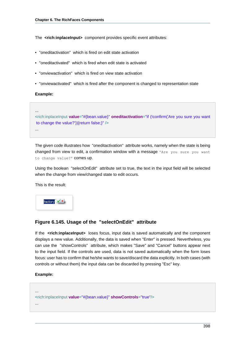
Chapter 6. The RichFaces Components
398
The <rich:inplaceInput> component provides specific event attributes:
• "oneditactivation" which is fired on edit state activation
• "oneditactivated" which is fired when edit state is activated
• "onviewactivation" which is fired on view state activation
• "onviewactivated" which is fired after the component is changed to representation state
Example:
...
<rich:inplaceInput value="#{bean.value}" oneditactivation="if (!confirm('Are you sure you want
to change the value?')){return false;}" />
...
The given code illustrates how "oneditactivation" attribute works, namely when the state is being
changed from view to edit, a confirmation window with a message "Are you sure you want
to change value?" comes up.
Using the boolean "selectOnEdit" attribute set to true, the text in the input field will be selected
when the change from view/changed state to edit occurs.
This is the result:
Figure 6.145. Usage of the "selectOnEdit" attribute
If the <rich:inplaceInput> loses focus, input data is saved automatically and the component
displays a new value. Additionally, the data is saved when "Enter" is pressed. Nevertheless, you
can use the "showControls" attribute, which makes "Save" and "Cancel" buttons appear next
to the input field. If the controls are used, data is not saved automatically when the form loses
focus: user has to confirm that he/she wants to save/discard the data explicitly. In both cases (with
controls or without them) the input data can be discarded by pressing "Esc" key.
Example:
...
<rich:inplaceInput value="#{bean.value}" showControls="true"/>
...
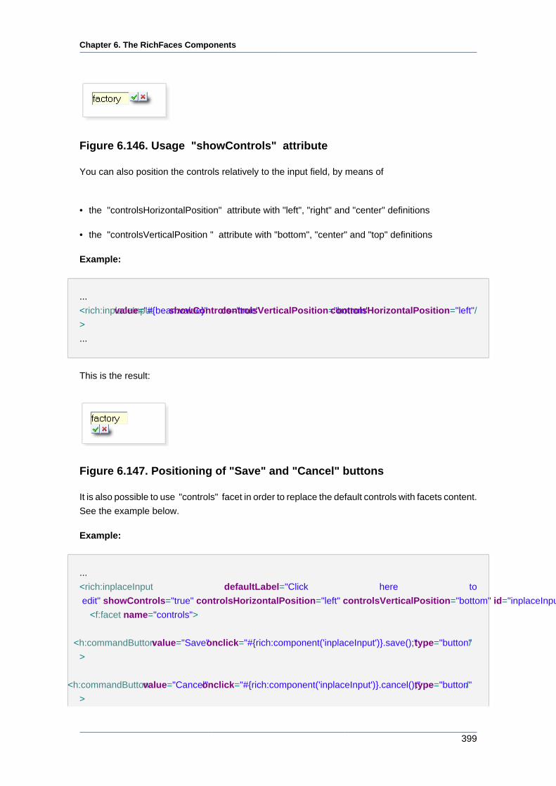
Chapter 6. The RichFaces Components
399
Figure 6.146. Usage "showControls" attribute
You can also position the controls relatively to the input field, by means of
• the "controlsHorizontalPosition" attribute with "left", "right" and "center" definitions
• the "controlsVerticalPosition " attribute with "bottom", "center" and "top" definitions
Example:
...
<rich:inplaceInput value="#{bean.value}" showControls="true" controlsVerticalPosition="bottom" controlsHorizontalPosition="left"/
>
...
This is the result:
Figure 6.147. Positioning of "Save" and "Cancel" buttons
It is also possible to use "controls" facet in order to replace the default controls with facets content.
See the example below.
Example:
...
<rich:inplaceInput defaultLabel="Click here to
edit" showControls="true" controlsHorizontalPosition="left" controlsVerticalPosition="bottom" id="inplaceInput">
<f:facet name="controls">
<h:commandButton value="Save" onclick="#{rich:component('inplaceInput')}.save();" type="button" /
>
<h:commandButton value="Cancel" onclick="#{rich:component('inplaceInput')}.cancel();" type="button" /
>
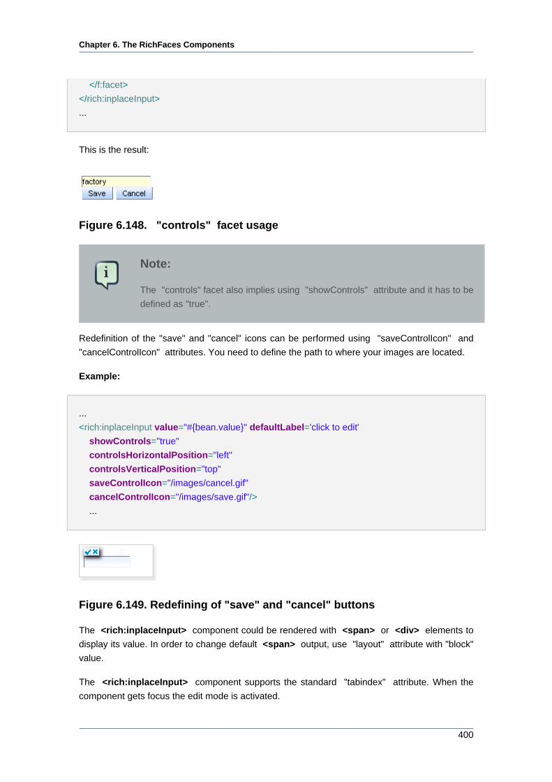
Chapter 6. The RichFaces Components
400
</f:facet>
</rich:inplaceInput>
...
This is the result:
Figure 6.148. "controls" facet usage
Note:
The "controls" facet also implies using "showControls" attribute and it has to be
defined as "true".
Redefinition of the "save" and "cancel" icons can be performed using "saveControlIcon" and
"cancelControlIcon" attributes. You need to define the path to where your images are located.
Example:
...
<rich:inplaceInput value="#{bean.value}" defaultLabel='click to edit'
showControls="true"
controlsHorizontalPosition="left"
controlsVerticalPosition="top"
saveControlIcon="/images/cancel.gif"
cancelControlIcon="/images/save.gif"/>
...
Figure 6.149. Redefining of "save" and "cancel" buttons
The <rich:inplaceInput> component could be rendered with <span> or <div> elements to
display its value. In order to change default <span> output, use "layout" attribute with "block"
value.
The <rich:inplaceInput> component supports the standard "tabindex" attribute. When the
component gets focus the edit mode is activated.
Chapter 6. The RichFaces Components
401
The "inputWidth" , "minInputWidth" , "maxInputWidth" attributes are provided to specify the
width, minimal width and maximal width for the input element respectively.
Table 6.185. Keyboard usage
Keys and combinations Description
ENTER Saves the input data, and changes the state
from edit to changed
ESC Changes the state from edit to view or
changed, value is not affected
TAB Switches between the components
6.11.6.4. Reference Data
Table of <rich:inplaceInput> attributes [../../tlddoc/rich/inplaceInput.html].
Table 6.186. Component Identification Parameters
Name Value
component-type org.richfaces.inplaceInput
component-class org.richfaces.component.html.HtmlInplaceInput
component-family org.richfaces.inplaceInput
renderer-type org.richfaces.renderkit.inplaceInputRenderer
tag-class org.richfaces.taglib.inplaceInputTag
Table 6.187. JavaScript API
Function Description
edit() Changes the state to edit
cancel() Changes its state to the previous one before
editing (changed or view)
save() Changes its state to changed with a new value
getValue() Gets the current value
setValue(newValue) Sets the current value (to be implemented)
Table 6.188. Facets
Facet name Description
controls Defines the contols contents. Related
attributes are "saveControlIcon" and
"cancelControlIcon"
Chapter 6. The RichFaces Components
402
Table 6.189. Style classes (selectors) with the corresponding skin
parameters
Class (selector)
name
Description Skin Parameters CSS properties
mapped
tabBackgroundColor background-color.rich-inplace-control Defines styles for the
controls panelBorderColor border-color
tabBackgroundColor background-color.rich-inplace-control-
press
Defines styles for the
controls when either of
the buttons is pressedpanelBorderColor border-color
editorBackgroundColor background-color.rich-inplace-view Defines styles for the
view state generalTextColor border-bottom-color
editorBackgroundColor background-color.rich-inplace-changed Defines styles for the
"Changed" state generalTextColor border-bottom-color
editorBackgroundColor background-colorinput.rich-inplace-field Defines styles for the
input field in edit state panelBorderColor border-color
Table 6.190. Style classes (selectors) without skin parameters
Class name Description
.rich-inplace Defines styles for a wrapper <span> (or <div>)
element of a component
.rich-inplace-input Defines styles for the component input field
.rich-inplace-input-view-hover Defines styles for hovered text in the view state
.rich-inplace-field Defines styles for the input field look and feel
in edit state
.rich-inplace-input-changed-hover Defines styles for the hovered text in the
"Changed" state
.rich-inplace-shadow-size Defines size of the shadow
.rich-inplace-shadow-tl Defines styles for the shadow in the top left
corner
.rich-inplace-shadow-tr Defines styles for the shadow in the top right
corner
.rich-inplace-shadow-bl Defines styles for the shadow in the bottom left
corner
.rich-inplace-shadow-br Defines styles for the shadow in the bottom
right corner
You can find all necessary information about style classes redefinition in Definition of Custom
Style Classes section.
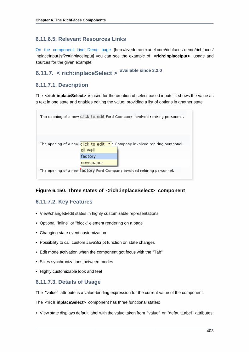
Chapter 6. The RichFaces Components
403
6.11.6.5. Relevant Resources Links
On the component Live Demo page [http://livedemo.exadel.com/richfaces-demo/richfaces/
inplaceInput.jsf?c=inplaceInput] you can see the example of <rich:inplaceIput> usage and
sources for the given example.
6.11.7. < rich:inplaceSelect > available since 3.2.0
6.11.7.1. Description
The <rich:inplaceSelect> is used for the creation of select based inputs: it shows the value as
a text in one state and enables editing the value, providing a list of options in another state
Figure 6.150. Three states of <rich:inplaceSelect> component
6.11.7.2. Key Features
• View/changed/edit states in highly customizable representations
• Optional "inline" or "block" element rendering on a page
• Changing state event customization
• Possibility to call custom JavaScript function on state changes
• Edit mode activation when the component got focus with the "Tab"
• Sizes synchronizations between modes
• Highly customizable look and feel
6.11.7.3. Details of Usage
The "value" attribute is a value-binding expression for the current value of the component.
The <rich:inplaceSelect> component has three functional states:
• View state displays default label with the value taken from "value" or "defaultLabel" attributes.
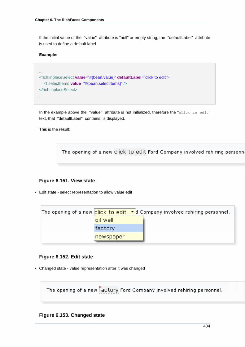
Chapter 6. The RichFaces Components
404
If the initial value of the "value" attribute is "null" or empty string, the "defaultLabel" attribute
is used to define a default label.
Example:
...
<rich:inplaceSelect value="#{bean.value}" defaultLabel="click to edit">
<f:selectItems value="#{bean.selectItems}" />
</rich:inplaceSelect>
...
In the example above the "value" attribute is not initialized, therefore the "click to edit"
text, that "defaultLabel" contains, is displayed.
This is the result:
Figure 6.151. View state
• Edit state - select representation to allow value edit
Figure 6.152. Edit state
• Changed state - value representation after it was changed
Figure 6.153. Changed state
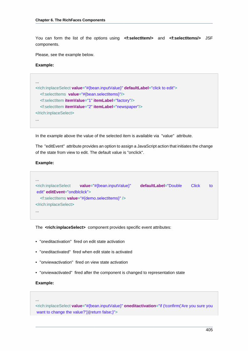
Chapter 6. The RichFaces Components
405
You can form the list of the options using <f:selectItem/> and <f:selectItems/> JSF
components.
Please, see the example below.
Example:
...
<rich:inplaceSelect value="#{bean.inputValue}" defaultLabel="click to edit">
<f:selectItems value="#{bean.selectItems}"/>
<f:selectItem itemValue="1" itemLabel="factory"/>
<f:selectItem itemValue="2" itemLabel="newspaper"/>
</rich:inplaceSelect>
...
In the example above the value of the selected item is available via "value" attribute.
The "editEvent" attribute provides an option to assign a JavaScript action that initiates the change
of the state from view to edit. The default value is "onclick".
Example:
...
<rich:inplaceSelect value="#{bean.inputValue}" defaultLabel="Double Click to
edit" editEvent="ondblclick">
<f:selectItems value="#{demo.selectItems}" />
</rich:inplaceSelect>
...
The <rich:inplaceSelect> component provides specific event attributes:
• "oneditactivation" fired on edit state activation
• "oneditactivated" fired when edit state is activated
• "onviewactivation" fired on view state activation
• "onviewactivated" fired after the component is changed to representation state
Example:
...
<rich:inplaceSelect value="#{bean.inputValue}" oneditactivation="if (!confirm('Are you sure you
want to change the value?')){return false;}">
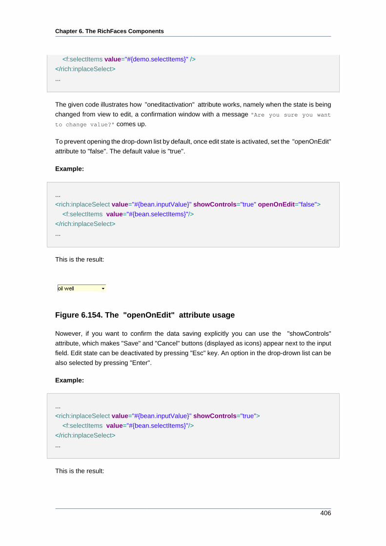
Chapter 6. The RichFaces Components
406
<f:selectItems value="#{demo.selectItems}" />
</rich:inplaceSelect>
...
The given code illustrates how "oneditactivation" attribute works, namely when the state is being
changed from view to edit, a confirmation window with a message "Are you sure you want
to change value?" comes up.
To prevent opening the drop-down list by default, once edit state is activated, set the "openOnEdit"
attribute to "false". The default value is "true".
Example:
...
<rich:inplaceSelect value="#{bean.inputValue}" showControls="true" openOnEdit="false">
<f:selectItems value="#{bean.selectItems}"/>
</rich:inplaceSelect>
...
This is the result:
Figure 6.154. The "openOnEdit" attribute usage
Nowever, if you want to confirm the data saving explicitly you can use the "showControls"
attribute, which makes "Save" and "Cancel" buttons (displayed as icons) appear next to the input
field. Edit state can be deactivated by pressing "Esc" key. An option in the drop-drown list can be
also selected by pressing "Enter".
Example:
...
<rich:inplaceSelect value="#{bean.inputValue}" showControls="true">
<f:selectItems value="#{bean.selectItems}"/>
</rich:inplaceSelect>
...
This is the result:
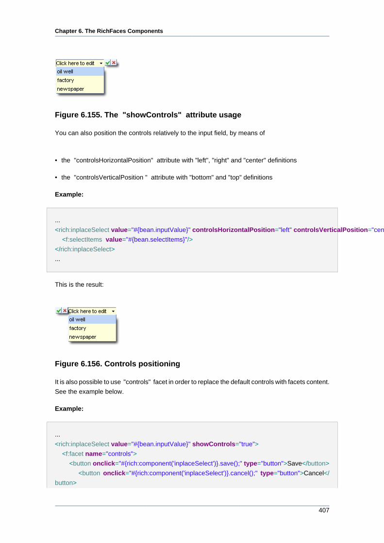
Chapter 6. The RichFaces Components
407
Figure 6.155. The "showControls" attribute usage
You can also position the controls relatively to the input field, by means of
• the "controlsHorizontalPosition" attribute with "left", "right" and "center" definitions
• the "controlsVerticalPosition " attribute with "bottom" and "top" definitions
Example:
...
<rich:inplaceSelect value="#{bean.inputValue}" controlsHorizontalPosition="left" controlsVerticalPosition="center" showControls="true">
<f:selectItems value="#{bean.selectItems}"/>
</rich:inplaceSelect>
...
This is the result:
Figure 6.156. Controls positioning
It is also possible to use "controls" facet in order to replace the default controls with facets content.
See the example below.
Example:
...
<rich:inplaceSelect value="#{bean.inputValue}" showControls="true">
<f:facet name="controls">
<button onclick="#{rich:component('inplaceSelect')}.save();" type="button">Save</button>
<button onclick="#{rich:component('inplaceSelect')}.cancel();" type="button">Cancel</
button>
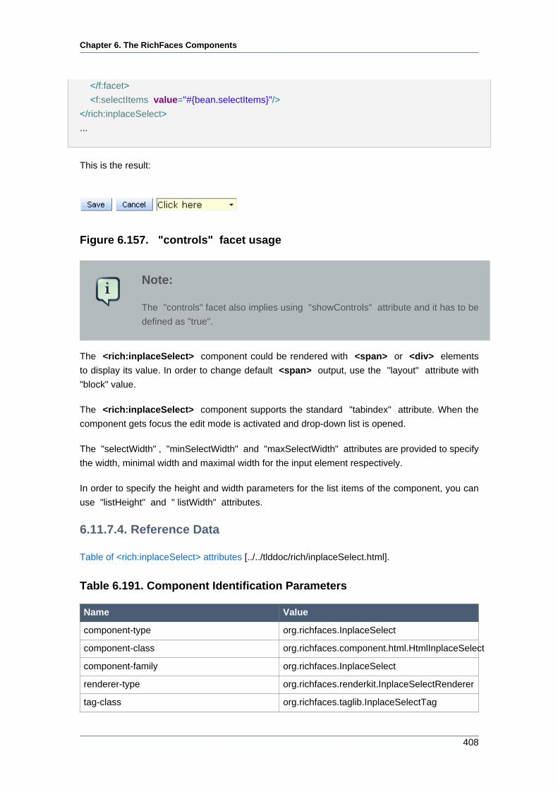
Chapter 6. The RichFaces Components
408
</f:facet>
<f:selectItems value="#{bean.selectItems}"/>
</rich:inplaceSelect>
...
This is the result:
Figure 6.157. "controls" facet usage
Note:
The "controls" facet also implies using "showControls" attribute and it has to be
defined as "true".
The <rich:inplaceSelect> component could be rendered with <span> or <div> elements
to display its value. In order to change default <span> output, use the "layout" attribute with
"block" value.
The <rich:inplaceSelect> component supports the standard "tabindex" attribute. When the
component gets focus the edit mode is activated and drop-down list is opened.
The "selectWidth" , "minSelectWidth" and "maxSelectWidth" attributes are provided to specify
the width, minimal width and maximal width for the input element respectively.
In order to specify the height and width parameters for the list items of the component, you can
use "listHeight" and " listWidth" attributes.
6.11.7.4. Reference Data
Table of <rich:inplaceSelect> attributes [../../tlddoc/rich/inplaceSelect.html].
Table 6.191. Component Identification Parameters
Name Value
component-type org.richfaces.InplaceSelect
component-class org.richfaces.component.html.HtmlInplaceSelect
component-family org.richfaces.InplaceSelect
renderer-type org.richfaces.renderkit.InplaceSelectRenderer
tag-class org.richfaces.taglib.InplaceSelectTag
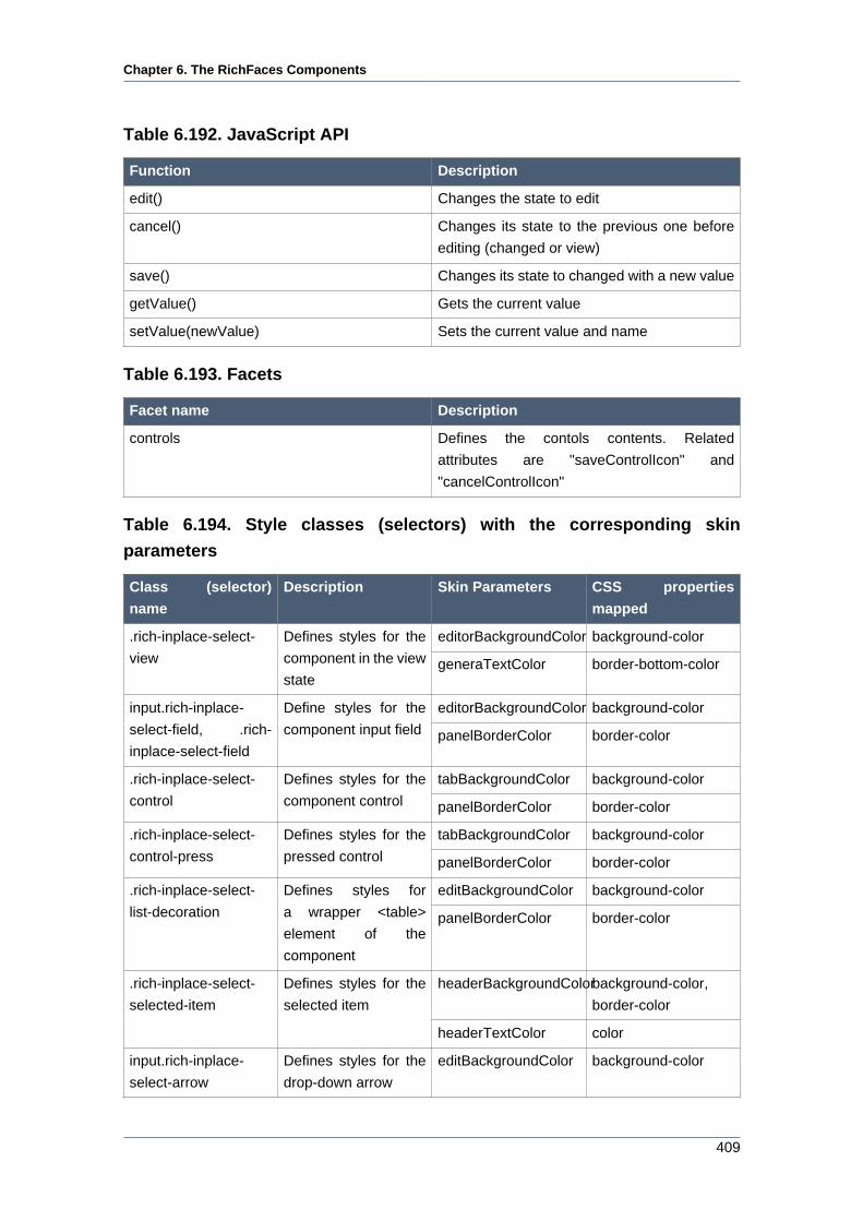
Chapter 6. The RichFaces Components
409
Table 6.192. JavaScript API
Function Description
edit() Changes the state to edit
cancel() Changes its state to the previous one before
editing (changed or view)
save() Changes its state to changed with a new value
getValue() Gets the current value
setValue(newValue) Sets the current value and name
Table 6.193. Facets
Facet name Description
controls Defines the contols contents. Related
attributes are "saveControlIcon" and
"cancelControlIcon"
Table 6.194. Style classes (selectors) with the corresponding skin
parameters
Class (selector)
name
Description Skin Parameters CSS properties
mapped
editorBackgroundColor background-color.rich-inplace-select-
view
Defines styles for the
component in the view
stategeneraTextColor border-bottom-color
editorBackgroundColor background-colorinput.rich-inplace-
select-field, .rich-
inplace-select-field
Define styles for the
component input field panelBorderColor border-color
tabBackgroundColor background-color.rich-inplace-select-
control
Defines styles for the
component control panelBorderColor border-color
tabBackgroundColor background-color.rich-inplace-select-
control-press
Defines styles for the
pressed control panelBorderColor border-color
editBackgroundColor background-color.rich-inplace-select-
list-decoration
Defines styles for
a wrapper <table>
element of the
component
panelBorderColor border-color
headerBackgroundColorbackground-color,
border-color
.rich-inplace-select-
selected-item
Defines styles for the
selected item
headerTextColor color
input.rich-inplace-
select-arrow
Defines styles for the
drop-down arrow
editBackgroundColor background-color
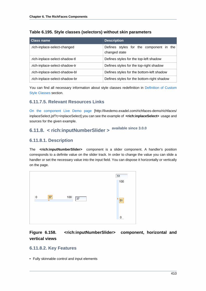
Chapter 6. The RichFaces Components
410
Table 6.195. Style classes (selectors) without skin parameters
Class name Description
.rich-inplace-select-changed Defines styles for the component in the
changed state
.rich-inplace-select-shadow-tl Defines styles for the top-left shadow
.rich-inplace-select-shadow-tr Defines styles for the top-right shadow
.rich-inplace-select-shadow-bl Defines styles for the bottom-left shadow
.rich-inplace-select-shadow-br Defines styles for the bottom-right shadow
You can find all necessary information about style classes redefinition in Definition of Custom
Style Classes section.
6.11.7.5. Relevant Resources Links
On the component Live Demo page [http://livedemo.exadel.com/richfaces-demo/richfaces/
inplaceSelect.jsf?c=inplaceSelect] you can see the example of <rich:inplaceSelect> usage and
sources for the given example.
6.11.8. < rich:inputNumberSlider > available since 3.0.0
6.11.8.1. Description
The <rich:inputNumberSlider> component is a slider component. A handler's position
corresponds to a definite value on the slider track. In order to change the value you can slide a
handler or set the necessary value into the input field. You can dispose it horizontally or vertically
on the page.
Figure 6.158. <rich:inputNumberSlider> component, horizontal and
vertical views
6.11.8.2. Key Features
• Fully skinnable control and input elements
Chapter 6. The RichFaces Components
411
• Optional value text field with an attribute-managed position
• Optional disablement of the component on a page
• Optional toolTip to display the current value while a handle is dragged
• Dragged state is stable after the mouse moves
• Optional manual input possible if a text input field is present
• Validation of manual input
• Possibility to display 2 controls that increase/decrease the value by the defined step width, when
they will be clicked.
• Attribute "orientation" that can have the values "vertical" and "horizontal" to define in which
direction the slider should be movable.
6.11.8.3. Details of Usage
<rich:inputNumberSlider> is used to facilitate your data input with rich UI Controls.
Here is the simplest variant of a slider definition with "minValue" , "maxValue" and "step" (by
default is "1") attributes, which define the beginning and the end of a numerical area and a slider
property step.
Example:
<rich:inputNumberSlider></rich:inputNumberSlider>
Here is a component generated on a page:
Figure 6.159. Generated <rich:inputNumberSlider>
Using "showInput" (default value is "true") and "enableManualInput" (default value is "true")
attributes, it's possible to output the input area near the slider, and make it read-only or editable.
To remove input area use showInput = "false" :
Example:
<rich:inputNumberSlider minValue="1" maxValue="100" showInput="false"/>
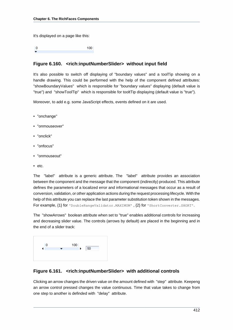
Chapter 6. The RichFaces Components
412
It's displayed on a page like this:
Figure 6.160. <rich:inputNumberSlider> without input field
It's also possible to switch off displaying of "boundary values" and a toolTip showing on a
handle drawing. This could be performed with the help of the component defined attributes:
"showBoundaryValues" which is responsible for "boundary values" displaying (default value is
"true") and "showToolTip" which is responsible for tooltTip displaying (default value is "true").
Moreover, to add e.g. some JavaScript effects, events defined on it are used.
• "onchange"
• "onmouseover"
• "onclick"
• "onfocus"
• "onmouseout"
• etc.
The "label" attribute is a generic attribute. The "label" attribute provides an association
between the component and the message that the component (indirectly) produced. This attribute
defines the parameters of a localized error and informational messages that occur as a result of
conversion, validation, or other application actions during the request processing lifecycle. With the
help of this attribute you can replace the last parameter substitution token shown in the messages.
For example, {1} for "DoubleRangeValidator.MAXIMUM" , {2} for "ShortConverter.SHORT".
The "showArrows" boolean attribute when set to "true" enables additional controls for increasing
and decreasing slider value. The controls (arrows by default) are placed in the beginning and in
the end of a slider track:
Figure 6.161. <rich:inputNumberSlider> with additional controls
Clicking an arrow changes the driven value on the amount defined with "step" attribute. Keepeng
an arrow control pressed changes the value continuous. Time that value takes to change from
one step to another is definded with "delay" attribute.
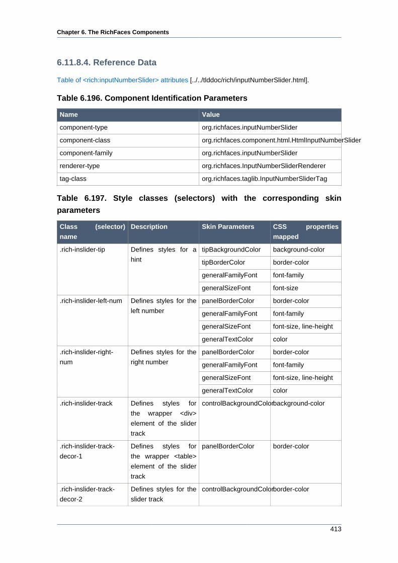
Chapter 6. The RichFaces Components
413
6.11.8.4. Reference Data
Table of <rich:inputNumberSlider> attributes [../../tlddoc/rich/inputNumberSlider.html].
Table 6.196. Component Identification Parameters
Name Value
component-type org.richfaces.inputNumberSlider
component-class org.richfaces.component.html.HtmlInputNumberSlider
component-family org.richfaces.inputNumberSlider
renderer-type org.richfaces.InputNumberSliderRenderer
tag-class org.richfaces.taglib.InputNumberSliderTag
Table 6.197. Style classes (selectors) with the corresponding skin
parameters
Class (selector)
name
Description Skin Parameters CSS properties
mapped
tipBackgroundColor background-color
tipBorderColor border-color
generalFamilyFont font-family
.rich-inslider-tip Defines styles for a
hint
generalSizeFont font-size
panelBorderColor border-color
generalFamilyFont font-family
generalSizeFont font-size, line-height
.rich-inslider-left-num Defines styles for the
left number
generalTextColor color
panelBorderColor border-color
generalFamilyFont font-family
generalSizeFont font-size, line-height
.rich-inslider-right-
num
Defines styles for the
right number
generalTextColor color
.rich-inslider-track Defines styles for
the wrapper <div>
element of the slider
track
controlBackgroundColorbackground-color
.rich-inslider-track-
decor-1
Defines styles for
the wrapper <table>
element of the slider
track
panelBorderColor border-color
.rich-inslider-track-
decor-2
Defines styles for the
slider track
controlBackgroundColorborder-color
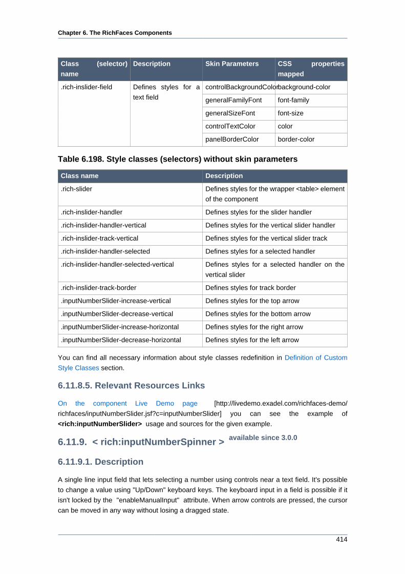
Chapter 6. The RichFaces Components
414
Class (selector)
name
Description Skin Parameters CSS properties
mapped
controlBackgroundColorbackground-color
generalFamilyFont font-family
generalSizeFont font-size
controlTextColor color
.rich-inslider-field Defines styles for a
text field
panelBorderColor border-color
Table 6.198. Style classes (selectors) without skin parameters
Class name Description
.rich-slider Defines styles for the wrapper <table> element
of the component
.rich-inslider-handler Defines styles for the slider handler
.rich-inslider-handler-vertical Defines styles for the vertical slider handler
.rich-inslider-track-vertical Defines styles for the vertical slider track
.rich-inslider-handler-selected Defines styles for a selected handler
.rich-inslider-handler-selected-vertical Defines styles for a selected handler on the
vertical slider
.rich-inslider-track-border Defines styles for track border
.inputNumberSlider-increase-vertical Defines styles for the top arrow
.inputNumberSlider-decrease-vertical Defines styles for the bottom arrow
.inputNumberSlider-increase-horizontal Defines styles for the right arrow
.inputNumberSlider-decrease-horizontal Defines styles for the left arrow
You can find all necessary information about style classes redefinition in Definition of Custom
Style Classes section.
6.11.8.5. Relevant Resources Links
On the component Live Demo page [http://livedemo.exadel.com/richfaces-demo/
richfaces/inputNumberSlider.jsf?c=inputNumberSlider] you can see the example of
<rich:inputNumberSlider> usage and sources for the given example.
6.11.9. < rich:inputNumberSpinner > available since 3.0.0
6.11.9.1. Description
A single line input field that lets selecting a number using controls near a text field. It's possible
to change a value using "Up/Down" keyboard keys. The keyboard input in a field is possible if it
isn't locked by the "enableManualInput" attribute. When arrow controls are pressed, the cursor
can be moved in any way without losing a dragged state.
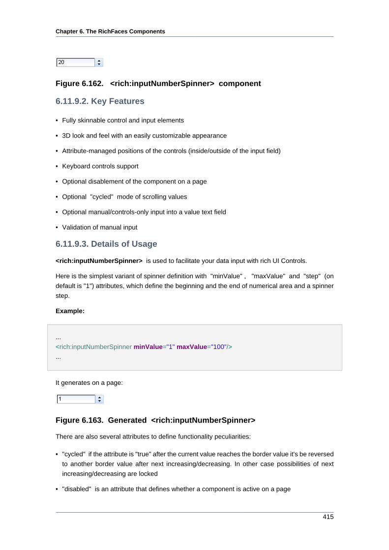
Chapter 6. The RichFaces Components
415
Figure 6.162. <rich:inputNumberSpinner> component
6.11.9.2. Key Features
• Fully skinnable control and input elements
• 3D look and feel with an easily customizable appearance
• Attribute-managed positions of the controls (inside/outside of the input field)
• Keyboard controls support
• Optional disablement of the component on a page
• Optional "cycled" mode of scrolling values
• Optional manual/controls-only input into a value text field
• Validation of manual input
6.11.9.3. Details of Usage
<rich:inputNumberSpinner> is used to facilitate your data input with rich UI Controls.
Here is the simplest variant of spinner definition with "minValue" , "maxValue" and "step" (on
default is "1") attributes, which define the beginning and the end of numerical area and a spinner
step.
Example:
...
<rich:inputNumberSpinner minValue="1" maxValue="100"/>
...
It generates on a page:
Figure 6.163. Generated <rich:inputNumberSpinner>
There are also several attributes to define functionality peculiarities:
• "cycled" if the attribute is "true" after the current value reaches the border value it's be reversed
to another border value after next increasing/decreasing. In other case possibilities of next
increasing/decreasing are locked
• "disabled" is an attribute that defines whether a component is active on a page
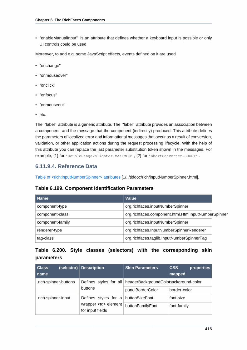
Chapter 6. The RichFaces Components
416
• "enableManualInput" is an attribute that defines whether a keyboard input is possible or only
UI controls could be used
Moreover, to add e.g. some JavaScript effects, events defined on it are used
• "onchange"
• "onmouseover"
• "onclick"
• "onfocus"
• "onmouseout"
• etc.
The "label" attribute is a generic attribute. The "label" attribute provides an association between
a component, and the message that the component (indirectly) produced. This attribute defines
the parameters of localized error and informational messages that occur as a result of conversion,
validation, or other application actions during the request processing lifecycle. With the help of
this attribute you can replace the last parameter substitution token shown in the messages. For
example, {1} for "DoubleRangeValidator.MAXIMUM" , {2} for "ShortConverter.SHORT" .
6.11.9.4. Reference Data
Table of <rich:inputNumberSpinner> attributes [../../tlddoc/rich/inputNumberSpinner.html].
Table 6.199. Component Identification Parameters
Name Value
component-type org.richfaces.inputNumberSpinner
component-class org.richfaces.component.html.HtmlInputNumberSpinner
component-family org.richfaces.inputNumberSpinner
renderer-type org.richfaces.InputNumberSpinnerRenderer
tag-class org.richfaces.taglib.InputNumberSpinnerTag
Table 6.200. Style classes (selectors) with the corresponding skin
parameters
Class (selector)
name
Description Skin Parameters CSS properties
mapped
headerBackgroundColorbackground-color.rich-spinner-buttons Defines styles for all
buttons panelBorderColor border-color
buttonSizeFont font-size.rich-spinner-input Defines styles for a
wrapper <td> element
for input fieldsbuttonFamilyFont font-family
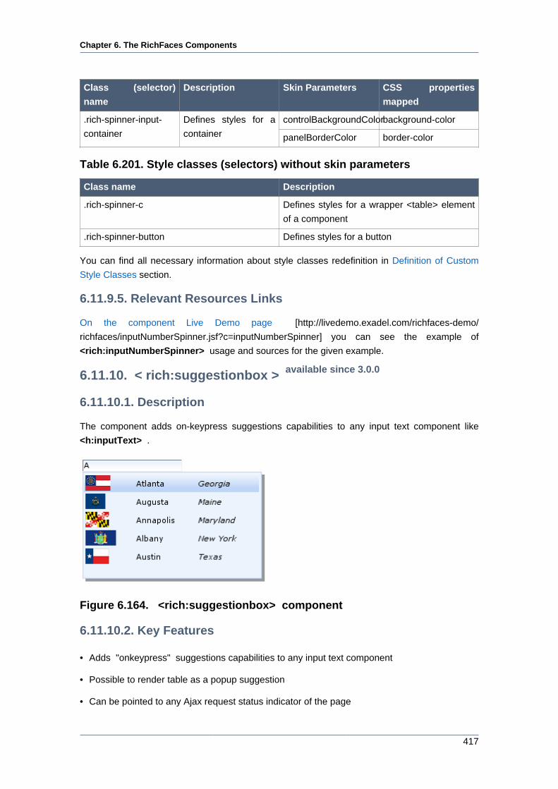
Chapter 6. The RichFaces Components
417
Class (selector)
name
Description Skin Parameters CSS properties
mapped
controlBackgroundColorbackground-color.rich-spinner-input-
container
Defines styles for a
container panelBorderColor border-color
Table 6.201. Style classes (selectors) without skin parameters
Class name Description
.rich-spinner-c Defines styles for a wrapper <table> element
of a component
.rich-spinner-button Defines styles for a button
You can find all necessary information about style classes redefinition in Definition of Custom
Style Classes section.
6.11.9.5. Relevant Resources Links
On the component Live Demo page [http://livedemo.exadel.com/richfaces-demo/
richfaces/inputNumberSpinner.jsf?c=inputNumberSpinner] you can see the example of
<rich:inputNumberSpinner> usage and sources for the given example.
6.11.10. < rich:suggestionbox > available since 3.0.0
6.11.10.1. Description
The component adds on-keypress suggestions capabilities to any input text component like
<h:inputText> .
Figure 6.164. <rich:suggestionbox> component
6.11.10.2. Key Features
• Adds "onkeypress" suggestions capabilities to any input text component
• Possible to render table as a popup suggestion
• Can be pointed to any Ajax request status indicator of the page
Chapter 6. The RichFaces Components
418
• Easily customizable look-and-feel
• Fully skinnable component
• Managing area of components submitted on Ajax request
• Flexible list of components to update after Ajax request managed by attributes
• Setting restriction to Ajax request generation
• Keyboard navigation support
6.11.10.3. Details of Usage
6.11.10.3.1. Main attributes
There are 3 main component attributes:
• "for" contains an ID of an input component for which the suggestion support is provided
• "suggestionAction" defines the method to get a collection of suggestion data on request
• "var" defines a collection name that provides an access for the current row while iterating
through
To create the simplest variant on a page use the following syntax:
...
<h:inputText id="city" value="#{capitalsBean.capital}" />
<rich:suggestionbox for="city" var="result"
suggestionAction="#{capitalsBean.autocomplete}">
<h:column>
<h:outputText value="#{result.name}" />
</h:column>
</rich:suggestionbox>
...
There is a managed bean:
...
public class SBbean {
private ArrayList<Capital> capitals = new ArrayList<Capital>();
private ArrayList<String> capitalsNames = new
ArrayList<String>();
private List<SelectItem> capitalsOptions = new
ArrayList<SelectItem>();
Chapter 6. The RichFaces Components
419
private String capital = "";
public List<Capital> autocomplete(Object suggest) {
String pref = (String) suggest;
ArrayList<Capital> result = new ArrayList<Capital>();
Iterator<Capital> iterator = getCapitals().iterator();
while (iterator.hasNext()) {
Capital elem = ((Capital) iterator.next());
if ((elem.getName() != null && elem.getName().toLowerCase()
.indexOf(pref.toLowerCase()) == 0)
|| "".equals(pref)) {
result.add(elem);
}
}
return result;
}
public SBbean() {
URL rulesUrl = getClass().getResource("capitals-rules.xml");
Digester digester = DigesterLoader.createDigester(rulesUrl);
digester.push(this);
try {
digester.parse(getClass().getResourceAsStream("capitals.xml"));
} catch (IOException e) {
throw new FacesException(e);
} catch (SAXException e) {
throw new FacesException(e);
}
capitalsNames.clear();
for (Capital cap : capitals) {
capitalsNames.add(cap.getName());
}
capitalsOptions.clear();
for (Capital cap : capitals) {
capitalsOptions.add(new SelectItem(cap.getName(), cap.getState()));
}
}
public String addCapital(Capital capital) {
capitals.add(capital);
return null;
}
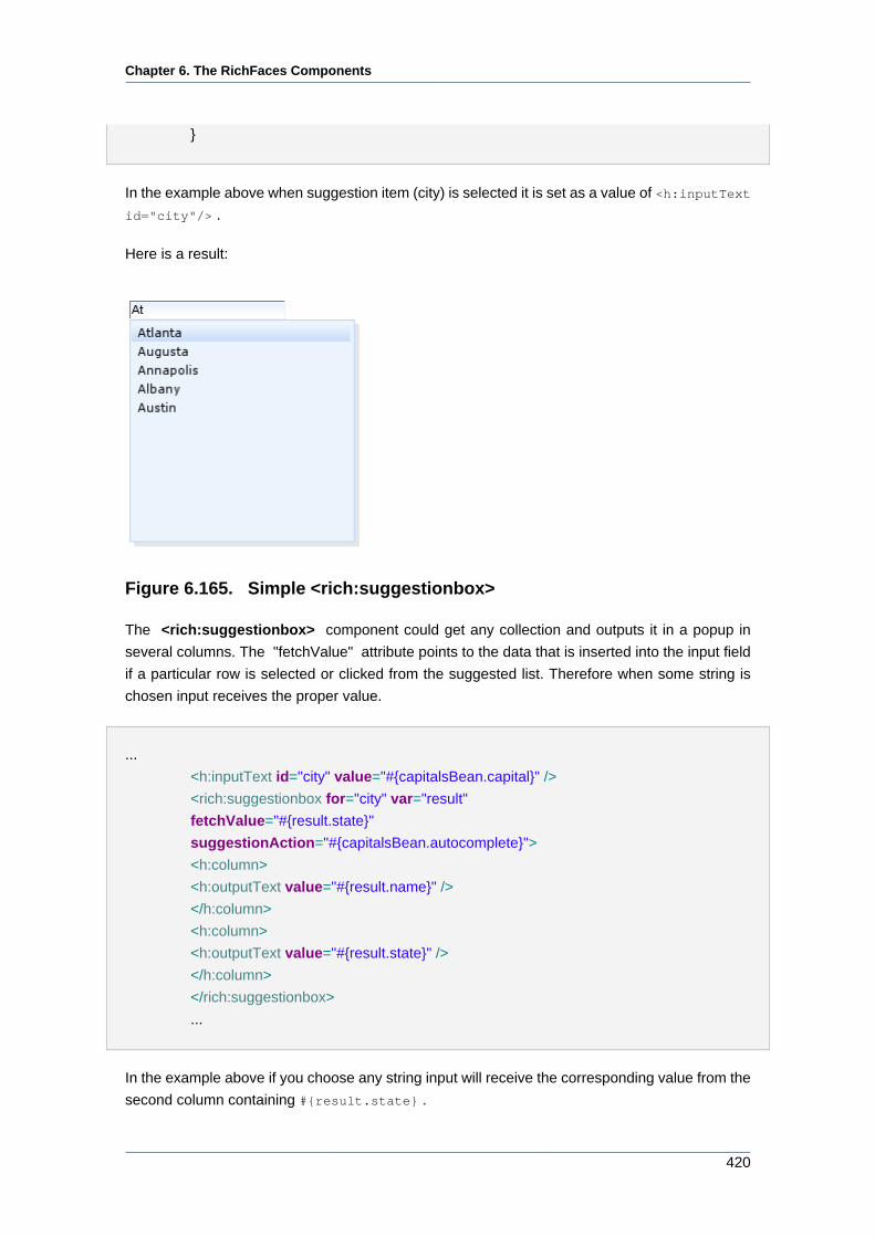
Chapter 6. The RichFaces Components
420
}
In the example above when suggestion item (city) is selected it is set as a value of <h:inputText
id="city"/> .
Here is a result:
Figure 6.165. Simple <rich:suggestionbox>
The <rich:suggestionbox> component could get any collection and outputs it in a popup in
several columns. The "fetchValue" attribute points to the data that is inserted into the input field
if a particular row is selected or clicked from the suggested list. Therefore when some string is
chosen input receives the proper value.
...
<h:inputText id="city" value="#{capitalsBean.capital}" />
<rich:suggestionbox for="city" var="result"
fetchValue="#{result.state}"
suggestionAction="#{capitalsBean.autocomplete}">
<h:column>
<h:outputText value="#{result.name}" />
</h:column>
<h:column>
<h:outputText value="#{result.state}" />
</h:column>
</rich:suggestionbox>
...
In the example above if you choose any string input will receive the corresponding value from the
second column containing #{result.state} .
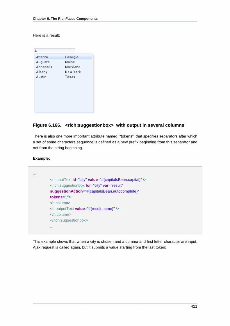
Chapter 6. The RichFaces Components
421
Here is a result:
Figure 6.166. <rich:suggestionbox> with output in several columns
There is also one more important attribute named "tokens" that specifies separators after which
a set of some characters sequence is defined as a new prefix beginning from this separator and
not from the string beginning.
Example:
...
<h:inputText id="city" value="#{capitalsBean.capital}" />
<rich:suggestionbox for="city" var="result"
suggestionAction="#{capitalsBean.autocomplete}"
tokens=",">
<h:column>
<h:outputText value="#{result.name}" />
</h:column>
</rich:suggestionbox>
...
This example shows that when a city is chosen and a comma and first letter character are input,
Ajax request is called again, but it submits a value starting from the last token:
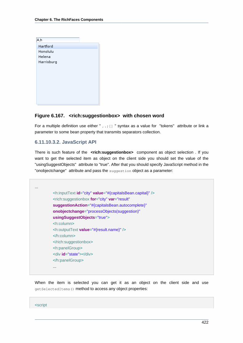
Chapter 6. The RichFaces Components
422
Figure 6.167. <rich:suggestionbox> with chosen word
For a multiple definition use either " ,.;[] " syntax as a value for "tokens" attribute or link a
parameter to some bean property that transmits separators collection.
6.11.10.3.2. JavaScript API
There is such feature of the <rich:suggestionbox> component as object selection . If you
want to get the selected item as object on the client side you should set the value of the
"usingSuggestObjects" attribute to "true". After that you should specify JavaScript method in the
"onobjectchange" attribute and pass the suggestion object as a parameter:
...
<h:inputText id="city" value="#{capitalsBean.capital}" />
<rich:suggestionbox for="city" var="result"
suggestionAction="#{capitalsBean.autocomplete}"
onobjectchange="processObjects(suggestion)"
usingSuggestObjects="true">
<h:column>
<h:outputText value="#{result.name}" />
</h:column>
</rich:suggestionbox>
<h:panelGroup>
<div id="state"></div>
</h:panelGroup>
...
When the item is selected you can get it as an object on the client side and use
getSelectedItems() method to access any object properties:
<script
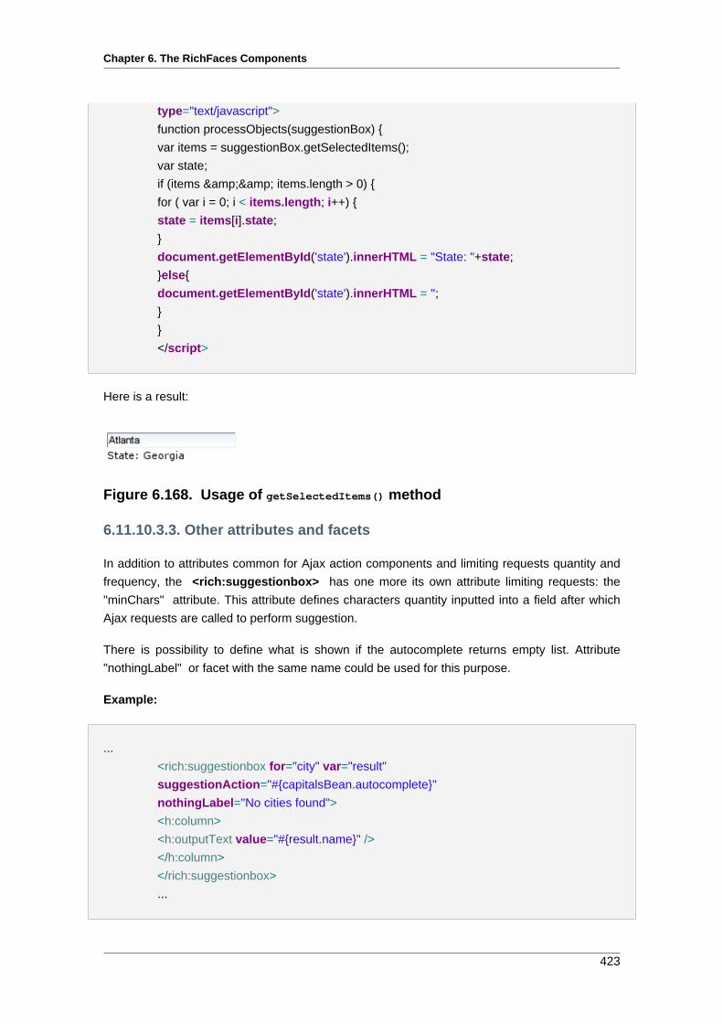
Chapter 6. The RichFaces Components
423
type="text/javascript">
function processObjects(suggestionBox) {
var items = suggestionBox.getSelectedItems();
var state;
if (items && items.length > 0) {
for ( var i = 0; i < items.length; i++) {
state = items[i].state;
}
document.getElementById('state').innerHTML = "State: "+state;
}else{
document.getElementById('state').innerHTML = '';
}
}
</script>
Here is a result:
Figure 6.168. Usage of getSelectedItems() method
6.11.10.3.3. Other attributes and facets
In addition to attributes common for Ajax action components and limiting requests quantity and
frequency, the <rich:suggestionbox> has one more its own attribute limiting requests: the
"minChars" attribute. This attribute defines characters quantity inputted into a field after which
Ajax requests are called to perform suggestion.
There is possibility to define what is shown if the autocomplete returns empty list. Attribute
"nothingLabel" or facet with the same name could be used for this purpose.
Example:
...
<rich:suggestionbox for="city" var="result"
suggestionAction="#{capitalsBean.autocomplete}"
nothingLabel="No cities found">
<h:column>
<h:outputText value="#{result.name}" />
</h:column>
</rich:suggestionbox>
...
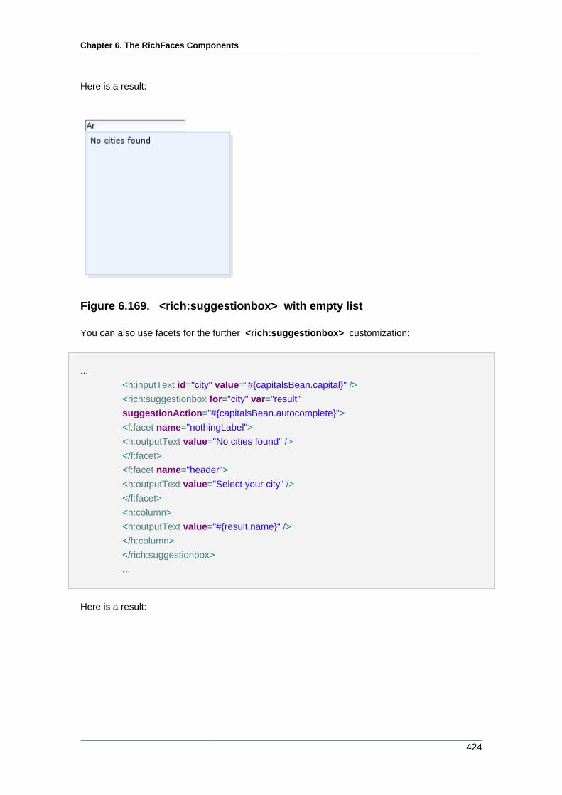
Chapter 6. The RichFaces Components
424
Here is a result:
Figure 6.169. <rich:suggestionbox> with empty list
You can also use facets for the further <rich:suggestionbox> customization:
...
<h:inputText id="city" value="#{capitalsBean.capital}" />
<rich:suggestionbox for="city" var="result"
suggestionAction="#{capitalsBean.autocomplete}">
<f:facet name="nothingLabel">
<h:outputText value="No cities found" />
</f:facet>
<f:facet name="header">
<h:outputText value="Select your city" />
</f:facet>
<h:column>
<h:outputText value="#{result.name}" />
</h:column>
</rich:suggestionbox>
...
Here is a result:
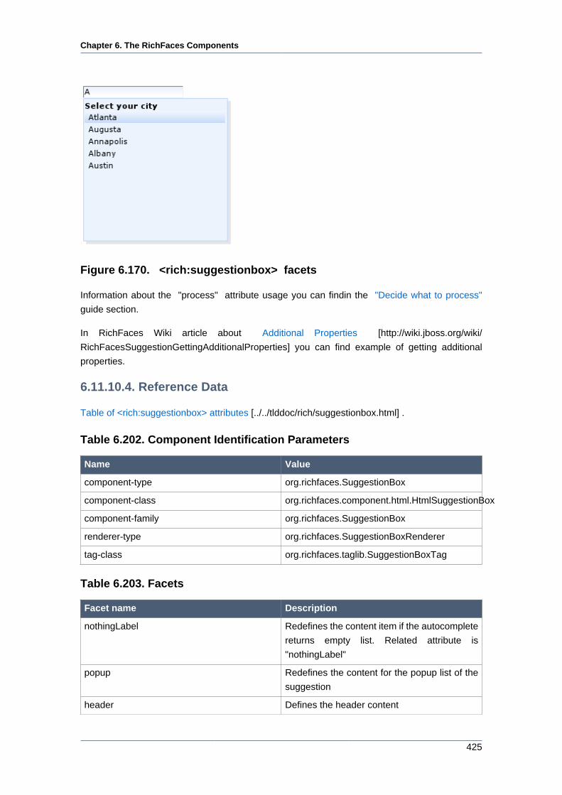
Chapter 6. The RichFaces Components
425
Figure 6.170. <rich:suggestionbox> facets
Information about the "process" attribute usage you can findin the "Decide what to process"
guide section.
In RichFaces Wiki article about Additional Properties [http://wiki.jboss.org/wiki/
RichFacesSuggestionGettingAdditionalProperties] you can find example of getting additional
properties.
6.11.10.4. Reference Data
Table of <rich:suggestionbox> attributes [../../tlddoc/rich/suggestionbox.html] .
Table 6.202. Component Identification Parameters
Name Value
component-type org.richfaces.SuggestionBox
component-class org.richfaces.component.html.HtmlSuggestionBox
component-family org.richfaces.SuggestionBox
renderer-type org.richfaces.SuggestionBoxRenderer
tag-class org.richfaces.taglib.SuggestionBoxTag
Table 6.203. Facets
Facet name Description
nothingLabel Redefines the content item if the autocomplete
returns empty list. Related attribute is
"nothingLabel"
popup Redefines the content for the popup list of the
suggestion
header Defines the header content
Chapter 6. The RichFaces Components
426
Facet name Description
footer Defines the footer content
Table 6.204. Style classes (selectors) with the corresponding skin
parameters
Class name Description Skin Parameters CSS properties
generalSizeFont font-size
generalFamilyFont font-family
.rich-sb-int Defines the styles for
a suggestion box table
rows <tr>generalTextColor color
headerBackgroundColorbackground-color
generalSizeFont font-size
generalFamilyFont font-family
.rich-sb-int-sel Defines styles for a
selected row
headerTextColor color
panelBorderColor border-color.rich-sb-ext-decor-2 Defines styles for
the second wrapper
<div> element of
a suggestion box
exterior
additionalBackgroundColorbackground-color
shadowBackgroundColorbackground-color
shadowBackgroundColorborder-color
.rich-sb-shadow Defines styles for
a suggestion box
shadowshadowOpacity opacity
Table 6.205. Style classes (selectors) without skin parameters
Class name Description
.rich-sb-common-container Defines styles for a wrapper <div> element of
a suggestion container
.rich-sb-ext-decor-1 Defines styles for the first wrapper <div>
element of a suggestion box exterior
.rich-sb-ext-decor-3 Defines styles for the third wrapper <div>
element of a suggestion box exterior
.rich-sb-overflow Defines styles for a inner wrapper <div>
element
.rich-sb-int-decor-table Defines styles for a suggestion box table
.rich-sb-cell-padding Defines the styles for suggestion box table cells
<td>
You can find all necessary information about style classes redefinition in Definition of Custom
Style Classes section.
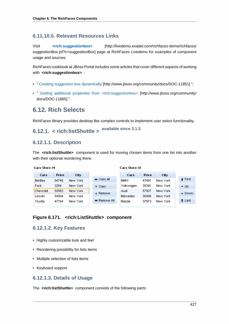
Chapter 6. The RichFaces Components
427
6.11.10.5. Relevant Resources Links
Visit <rich:suggestionbox> [http://livedemo.exadel.com/richfaces-demo/richfaces/
suggestionBox.jsf?c=suggestionBox] page at RichFaces Livedemo for examples of component
usage and sources.
RichFaces cookbook at JBoss Portal includes some articles that cover different aspects of working
with <rich:suggestionbox> :
• " Creating suggestion box dynamically [http://www.jboss.org/community/docs/DOC-11851] ";
• " Getting additional properties from <rich:suggectionbox> [http://www.jboss.org/community/
docs/DOC-11865] ".
6.12. Rich Selects
RichFaces library provides desktop like complex controls to implement user select functionality.
6.12.1. < rich:listShuttle > available since 3.1.3
6.12.1.1. Description
The <rich:listShuttle> component is used for moving chosen items from one list into another
with their optional reordering there.
Figure 6.171. <rich:ListShuttle> component
6.12.1.2. Key Features
• Highly customizable look and feel
• Reordering possibility for lists items
• Multiple selection of lists items
• Keyboard support
6.12.1.3. Details of Usage
The <rich:listShuttle> component consists of the following parts:
Chapter 6. The RichFaces Components
428
• two item lists (source and target). List consists of items. Each item has three different
representations: common, selected, active
• optional caption element
• optional ordering controls set is a set of controls that performs reordering
• move controls set is a set of controls, which performs moving items between lists
Note:
Now the listener can not be called from the column facet. This is a temporary
limitation. The additional information can be found in RichFaces Jira [http://
jira.jboss.org/jira/browse/RF-5327].
The "sourceValue" attribute defines a List or Array of items to be shown in the source list.
The "targetValue" attribute defines a List or Array of items to be shown in the target list.
The "var" attribute could be shared between both Lists or Arrays to define lists on the page.
The "sourceRequired" and "targetRequired" attributes define the case when source and target
values are being validated. If the value of both attributes is "true" there should be at least one item
in source and target lists. Otherwise validation fails.
Example:
...
<h:form id="myForm">
<rich:messages>
<f:facet name="errorMarker">
<h:graphicImage value="/images/ajax/error.gif" />
</f:facet>
</rich:messages>
<rich:listShuttle id="myListShuttle" sourceValue="#{toolBar.freeItems}" targetValue="#{toolBar.items}"
sourceRequired = "true" targetRequired = "true" var="items" converter="listShuttleconverter"
sourceCaptionLabel="Source List" targetCaptionLabel="Target List">
<rich:column>
<h:graphicImage value="#{items.iconURI}" />
</rich:column>
<rich:column>
<h:outputText value="#{items.label}" />
</rich:column>
</rich:listShuttle>
<a4j:commandButton value="Submit" />
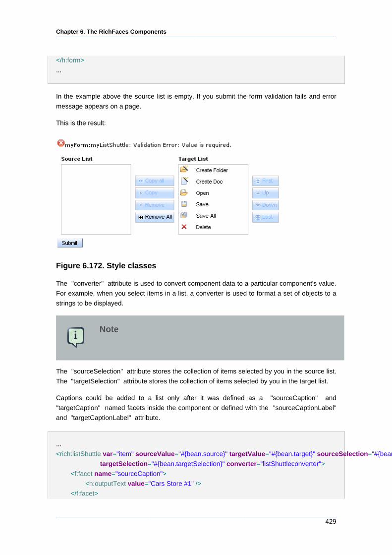
Chapter 6. The RichFaces Components
429
</h:form>
...
In the example above the source list is empty. If you submit the form validation fails and error
message appears on a page.
This is the result:
Figure 6.172. Style classes
The "converter" attribute is used to convert component data to a particular component's value.
For example, when you select items in a list, a converter is used to format a set of objects to a
strings to be displayed.
Note
The "sourceSelection" attribute stores the collection of items selected by you in the source list.
The "targetSelection" attribute stores the collection of items selected by you in the target list.
Captions could be added to a list only after it was defined as a "sourceCaption" and
"targetCaption" named facets inside the component or defined with the "sourceCaptionLabel"
and "targetCaptionLabel" attribute.
...
<rich:listShuttle var="item" sourceValue="#{bean.source}" targetValue="#{bean.target}" sourceSelection="#{bean.sourceSelection}"
targetSelection="#{bean.targetSelection}" converter="listShuttleconverter">
<f:facet name="sourceCaption">
<h:outputText value="Cars Store #1" />
</f:facet>
Chapter 6. The RichFaces Components
430
<f:facet name="targetCaption">
<h:outputText value="Cars Store #2" />
</f:facet>
<rich:column>
<h:outputText value="#{items.name}" />
</rich:column>
</rich:listShuttle>
...
The <rich:listShuttle> component provides the possibility to use ordering controls set, which
performs reordering in the target item list. Every control has possibility to be disabled.
An ordering controls set could be defined with "topControlLabel" , "bottomControlLabel" ,
"upControlLabel" , "downControlLabel" attributes.
It is also possible to use "topControl" , "topControlDisabled" , "bottomControl"
, "bottomControlDisabled" , "upControl" , "upControlDisabled" , "downControl" ,
"downControlDisabled" facets in order to replace the default controls with facets content.
Example:
...
<rich:listShuttle var="item" sourceValue="#{bean.source}" targetValue="#{bean.target}" converter="listShuttleconverter">
...
<f:facet name="topControl">
<h:outputText value="Move to top" />
</f:facet>
<f:facet name="upControl">
<h:outputText value="Move up" />
</f:facet>
<f:facet name="downControl">
<h:outputText value="Move down" />
</f:facet>
<f:facet name="bottomControl">
<h:outputText value="Move to bottom" />
</f:facet>
</rich:listShuttle>
...
The <rich:listShuttle> component also provides 4 predefined controls in move controls set for
moving items between source and target lists. Every control has possibility to be disabled.
A move controls set could be defined with "copyControlLabel" , "removeControlLabel" ,
"copyAllControlLabel" , "removeAllControlLabel" attributes.
Chapter 6. The RichFaces Components
431
It is also possible to use "copyControl" , "removeControl" , "copyAllControl" , "removeAllControl"
facets in order to replace the default controls with facets content.
...
<rich:listShuttle var="item" sourceValue="#{bean.source}" targetValue="#{bean.target}" converter="listShuttleconverter"
copyControlLabel="Copy" removeControlLabel="Remove"
copyAllControlLabel="Copy all" removeAllControlLabel="Remove all">
<h:column>
<f:facet name="header">
<h:outputText value="Cars" />
</f:facet>
<h:outputText value="#{item.name}" />
</h:column>
</rich:listShuttle>
...
Controls rendering is based on the "controlsType" attribute. Possible types are button and none.
Note
Currently the button controls type is based on <div> element.
The <rich:listShuttle> component allows to use internationalization
method to redefine and localize the labels. You could
use application resource bundle and define RICH_SHUTTLES_TOP_LABEL,
RICH_SHUTTLES_BOTTOM_LABEL, RICH_SHUTTLES_UP_LABEL, RICH_SHUTTLES_DOWN_LABEL
RICH_LIST_SHUTTLE_COPY_ALL_LABEL, RICH_LIST_SHUTTLE_COPY_LABEL,
RICH_LIST_SHUTTLE_REMOVE_ALL_LABEL, RICH_LIST_SHUTTLE_REMOVE_LABEL there.
You could also pack org.richfaces.renderkit.listShuttle resource bundle with your JARs
defining the same properties.
Table 6.206. Keyboard usage for elements selection
Keys and combinations Description
CTRL+click Inverts selection for an item
SHIFT+click Selects all rows from active one to a clicked row
if they differ, else select the actve row. All other
selections are cleared
CTRL+A Selects all elements inside the list if some
active element is already present in a list
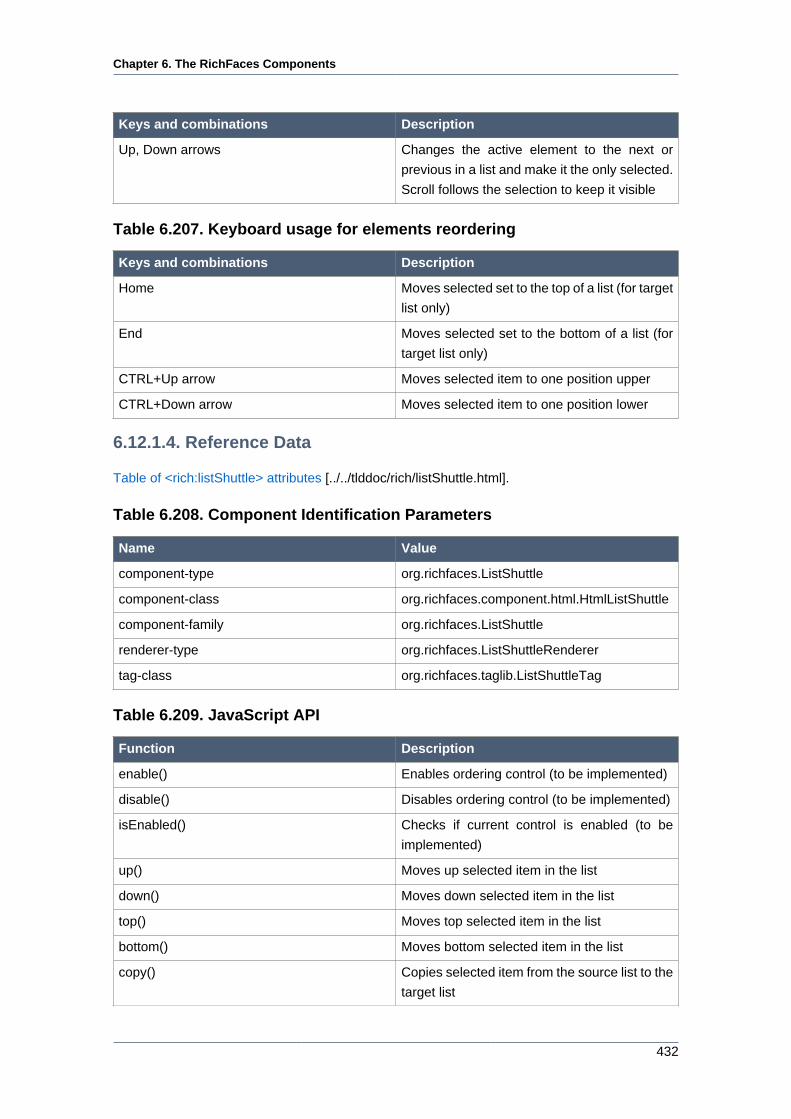
Chapter 6. The RichFaces Components
432
Keys and combinations Description
Up, Down arrows Changes the active element to the next or
previous in a list and make it the only selected.
Scroll follows the selection to keep it visible
Table 6.207. Keyboard usage for elements reordering
Keys and combinations Description
Home Moves selected set to the top of a list (for target
list only)
End Moves selected set to the bottom of a list (for
target list only)
CTRL+Up arrow Moves selected item to one position upper
CTRL+Down arrow Moves selected item to one position lower
6.12.1.4. Reference Data
Table of <rich:listShuttle> attributes [../../tlddoc/rich/listShuttle.html].
Table 6.208. Component Identification Parameters
Name Value
component-type org.richfaces.ListShuttle
component-class org.richfaces.component.html.HtmlListShuttle
component-family org.richfaces.ListShuttle
renderer-type org.richfaces.ListShuttleRenderer
tag-class org.richfaces.taglib.ListShuttleTag
Table 6.209. JavaScript API
Function Description
enable() Enables ordering control (to be implemented)
disable() Disables ordering control (to be implemented)
isEnabled() Checks if current control is enabled (to be
implemented)
up() Moves up selected item in the list
down() Moves down selected item in the list
top() Moves top selected item in the list
bottom() Moves bottom selected item in the list
copy() Copies selected item from the source list to the
target list
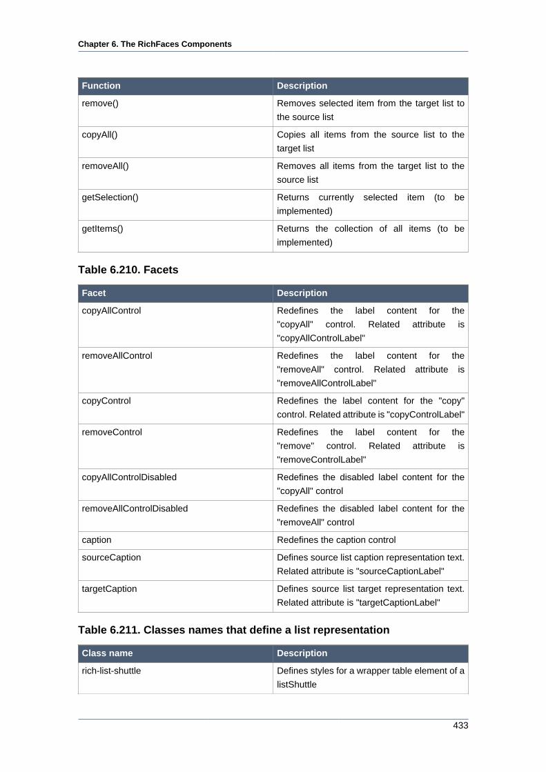
Chapter 6. The RichFaces Components
433
Function Description
remove() Removes selected item from the target list to
the source list
copyAll() Copies all items from the source list to the
target list
removeAll() Removes all items from the target list to the
source list
getSelection() Returns currently selected item (to be
implemented)
getItems() Returns the collection of all items (to be
implemented)
Table 6.210. Facets
Facet Description
copyAllControl Redefines the label content for the
"copyAll" control. Related attribute is
"copyAllControlLabel"
removeAllControl Redefines the label content for the
"removeAll" control. Related attribute is
"removeAllControlLabel"
copyControl Redefines the label content for the "copy"
control. Related attribute is "copyControlLabel"
removeControl Redefines the label content for the
"remove" control. Related attribute is
"removeControlLabel"
copyAllControlDisabled Redefines the disabled label content for the
"copyAll" control
removeAllControlDisabled Redefines the disabled label content for the
"removeAll" control
caption Redefines the caption control
sourceCaption Defines source list caption representation text.
Related attribute is "sourceCaptionLabel"
targetCaption Defines source list target representation text.
Related attribute is "targetCaptionLabel"
Table 6.211. Classes names that define a list representation
Class name Description
rich-list-shuttle Defines styles for a wrapper table element of a
listShuttle
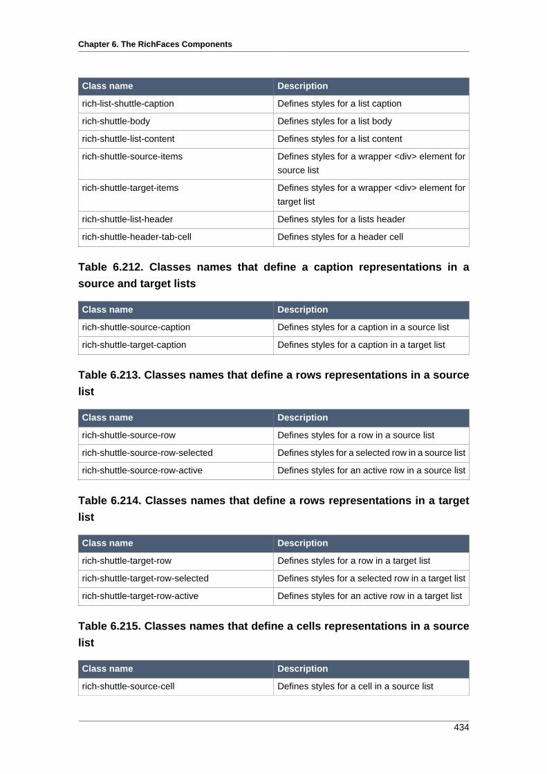
Chapter 6. The RichFaces Components
434
Class name Description
rich-list-shuttle-caption Defines styles for a list caption
rich-shuttle-body Defines styles for a list body
rich-shuttle-list-content Defines styles for a list content
rich-shuttle-source-items Defines styles for a wrapper <div> element for
source list
rich-shuttle-target-items Defines styles for a wrapper <div> element for
target list
rich-shuttle-list-header Defines styles for a lists header
rich-shuttle-header-tab-cell Defines styles for a header cell
Table 6.212. Classes names that define a caption representations in a
source and target lists
Class name Description
rich-shuttle-source-caption Defines styles for a caption in a source list
rich-shuttle-target-caption Defines styles for a caption in a target list
Table 6.213. Classes names that define a rows representations in a source
list
Class name Description
rich-shuttle-source-row Defines styles for a row in a source list
rich-shuttle-source-row-selected Defines styles for a selected row in a source list
rich-shuttle-source-row-active Defines styles for an active row in a source list
Table 6.214. Classes names that define a rows representations in a target
list
Class name Description
rich-shuttle-target-row Defines styles for a row in a target list
rich-shuttle-target-row-selected Defines styles for a selected row in a target list
rich-shuttle-target-row-active Defines styles for an active row in a target list
Table 6.215. Classes names that define a cells representations in a source
list
Class name Description
rich-shuttle-source-cell Defines styles for a cell in a source list
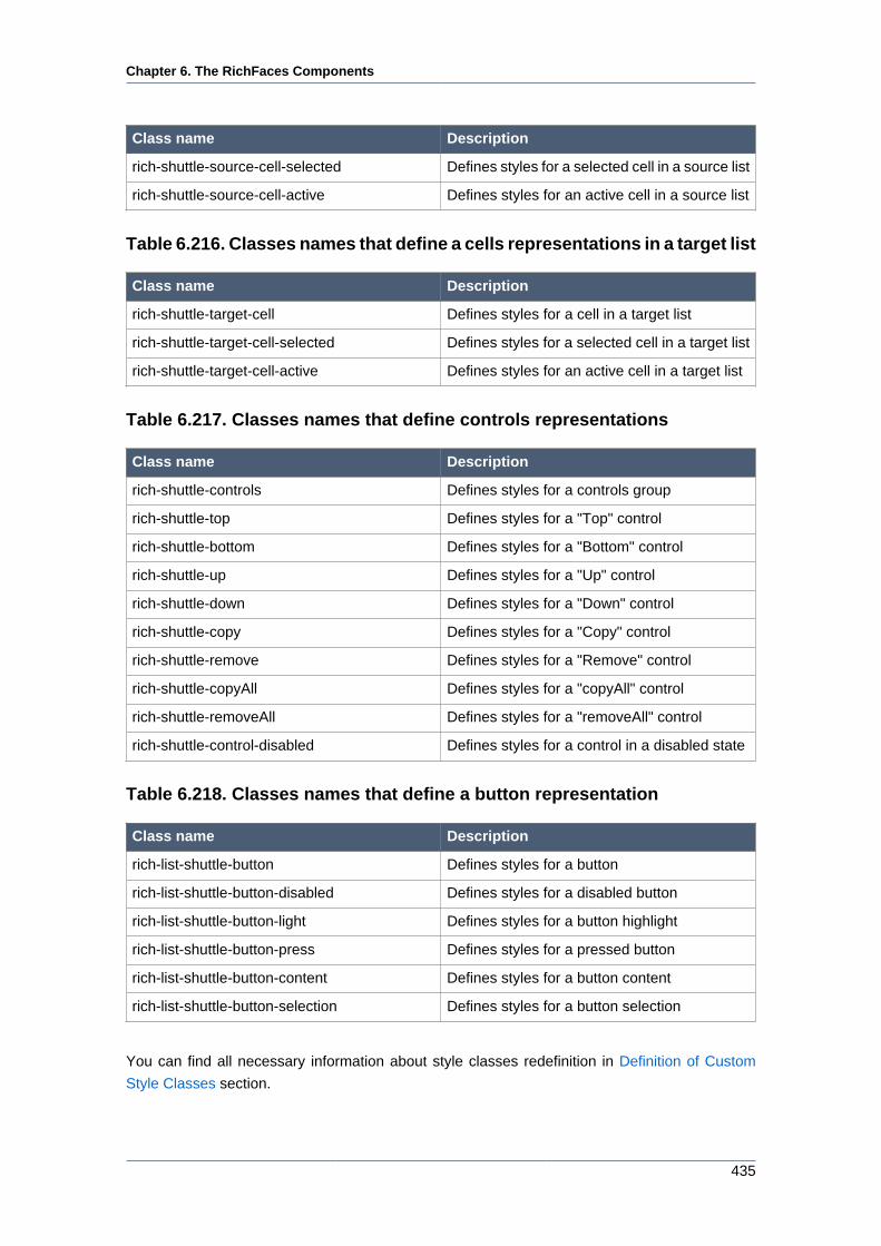
Chapter 6. The RichFaces Components
435
Class name Description
rich-shuttle-source-cell-selected Defines styles for a selected cell in a source list
rich-shuttle-source-cell-active Defines styles for an active cell in a source list
Table 6.216. Classes names that define a cells representations in a target list
Class name Description
rich-shuttle-target-cell Defines styles for a cell in a target list
rich-shuttle-target-cell-selected Defines styles for a selected cell in a target list
rich-shuttle-target-cell-active Defines styles for an active cell in a target list
Table 6.217. Classes names that define controls representations
Class name Description
rich-shuttle-controls Defines styles for a controls group
rich-shuttle-top Defines styles for a "Top" control
rich-shuttle-bottom Defines styles for a "Bottom" control
rich-shuttle-up Defines styles for a "Up" control
rich-shuttle-down Defines styles for a "Down" control
rich-shuttle-copy Defines styles for a "Copy" control
rich-shuttle-remove Defines styles for a "Remove" control
rich-shuttle-copyAll Defines styles for a "copyAll" control
rich-shuttle-removeAll Defines styles for a "removeAll" control
rich-shuttle-control-disabled Defines styles for a control in a disabled state
Table 6.218. Classes names that define a button representation
Class name Description
rich-list-shuttle-button Defines styles for a button
rich-list-shuttle-button-disabled Defines styles for a disabled button
rich-list-shuttle-button-light Defines styles for a button highlight
rich-list-shuttle-button-press Defines styles for a pressed button
rich-list-shuttle-button-content Defines styles for a button content
rich-list-shuttle-button-selection Defines styles for a button selection
You can find all necessary information about style classes redefinition in Definition of Custom
Style Classes section.
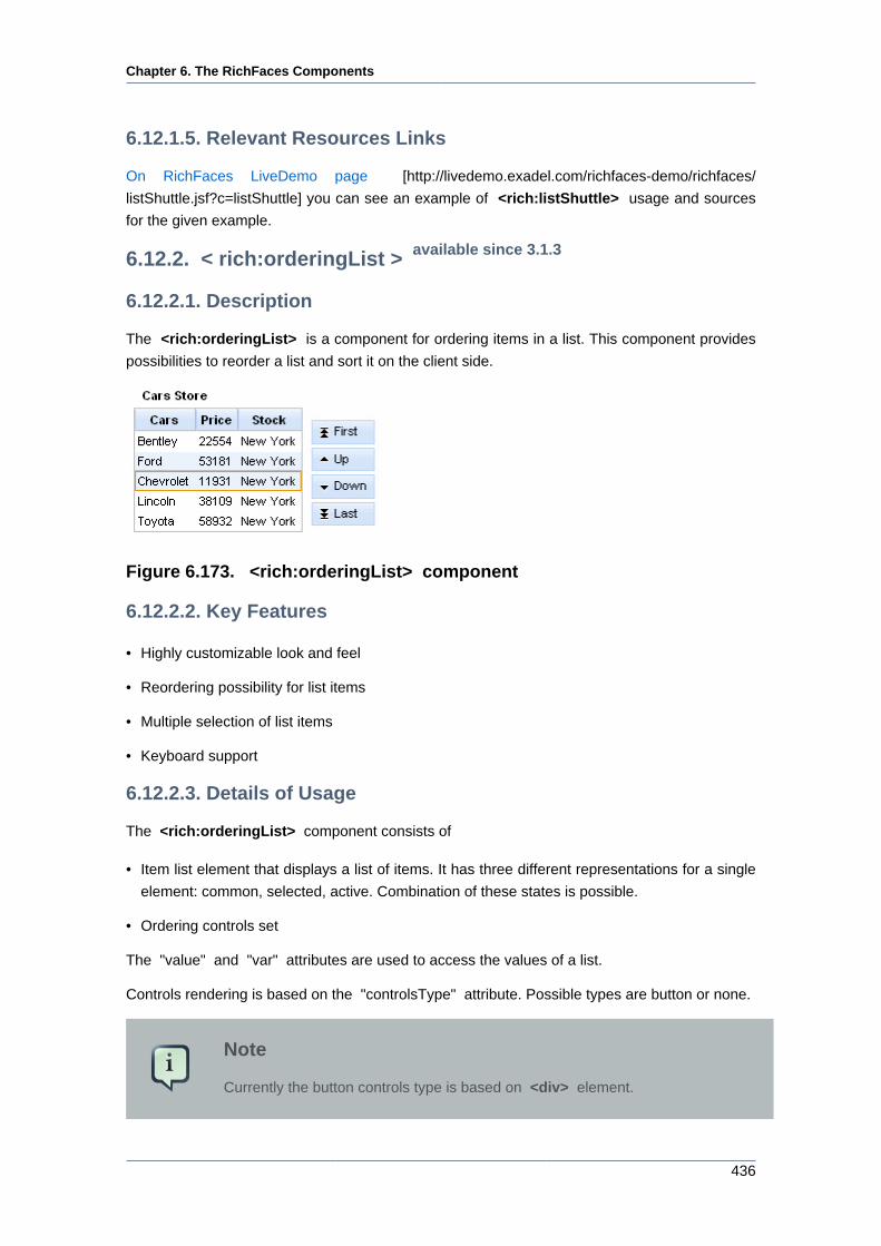
Chapter 6. The RichFaces Components
436
6.12.1.5. Relevant Resources Links
On RichFaces LiveDemo page [http://livedemo.exadel.com/richfaces-demo/richfaces/
listShuttle.jsf?c=listShuttle] you can see an example of <rich:listShuttle> usage and sources
for the given example.
6.12.2. < rich:orderingList > available since 3.1.3
6.12.2.1. Description
The <rich:orderingList> is a component for ordering items in a list. This component provides
possibilities to reorder a list and sort it on the client side.
Figure 6.173. <rich:orderingList> component
6.12.2.2. Key Features
• Highly customizable look and feel
• Reordering possibility for list items
• Multiple selection of list items
• Keyboard support
6.12.2.3. Details of Usage
The <rich:orderingList> component consists of
• Item list element that displays a list of items. It has three different representations for a single
element: common, selected, active. Combination of these states is possible.
• Ordering controls set
The "value" and "var" attributes are used to access the values of a list.
Controls rendering is based on the "controlsType" attribute. Possible types are button or none.
Note
Currently the button controls type is based on <div> element.
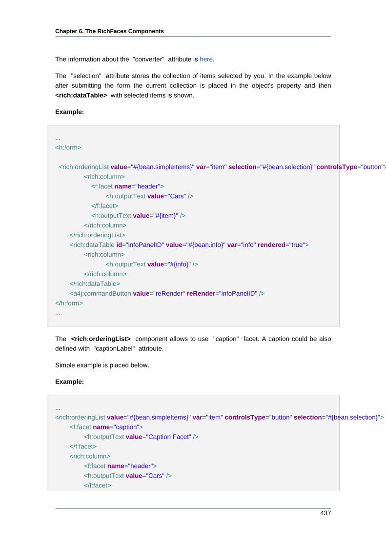
Chapter 6. The RichFaces Components
437
The information about the "converter" attribute is here.
The "selection" attribute stores the collection of items selected by you. In the example below
after submitting the form the current collection is placed in the object's property and then
<rich:dataTable> with selected items is shown.
Example:
...
<h:form>
<rich:orderingList value="#{bean.simpleItems}" var="item" selection="#{bean.selection}" controlsType="button">
<rich:column>
<f:facet name="header">
<h:outputText value="Cars" />
</f:facet>
<h:outputText value="#{item}" />
</rich:column>
</rich:orderingList>
<rich:dataTable id="infoPanelID" value="#{bean.info}" var="info" rendered="true">
<rich:column>
<h:outputText value="#{info}" />
</rich:column>
</rich:dataTable>
<a4j:commandButton value="reRender" reRender="infoPanelID" />
</h:form>
...
The <rich:orderingList> component allows to use "caption" facet. A caption could be also
defined with "captionLabel" attribute.
Simple example is placed below.
Example:
...
<rich:orderingList value="#{bean.simpleItems}" var="item" controlsType="button" selection="#{bean.selection}">
<f:facet name="caption">
<h:outputText value="Caption Facet" />
</f:facet>
<rich:column>
<f:facet name="header">
<h:outputText value="Cars" />
</f:facet>
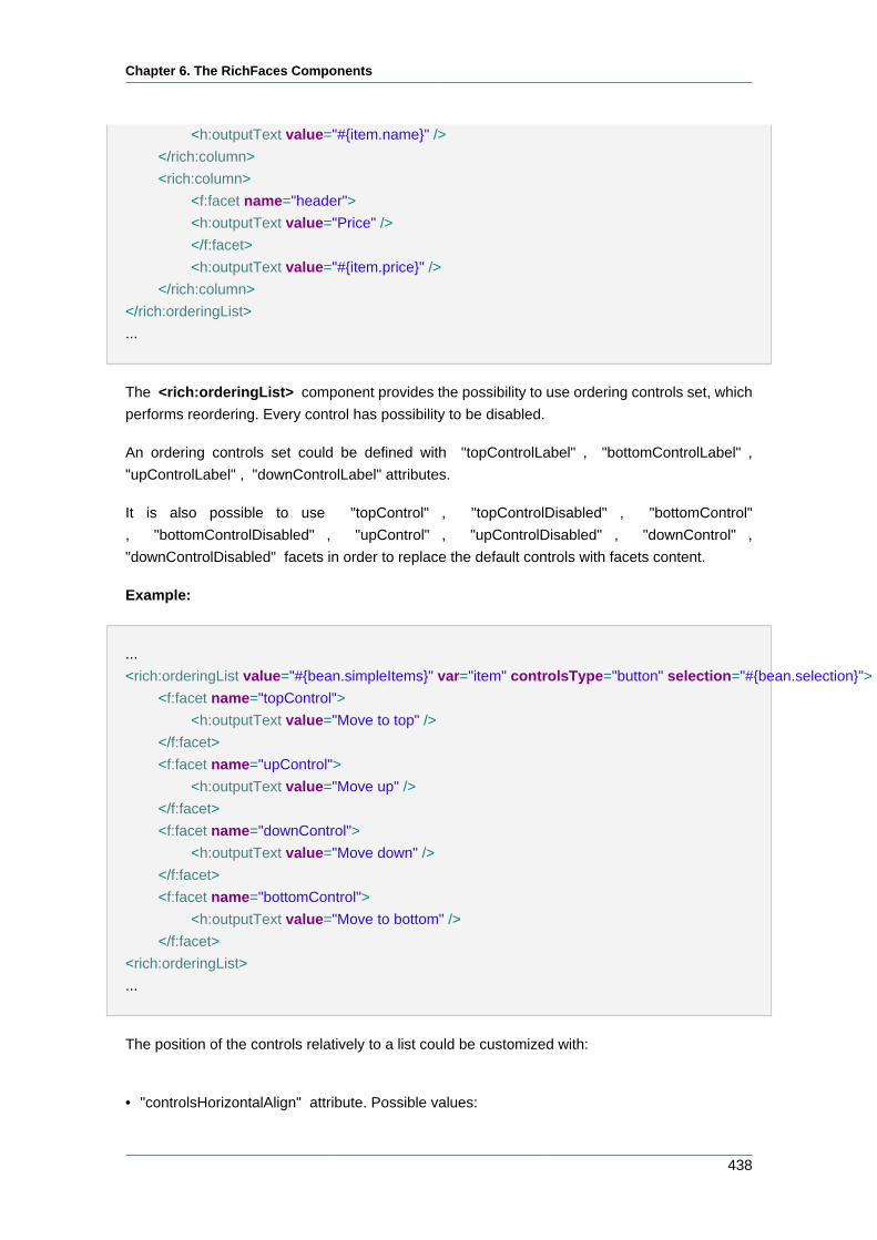
Chapter 6. The RichFaces Components
438
<h:outputText value="#{item.name}" />
</rich:column>
<rich:column>
<f:facet name="header">
<h:outputText value="Price" />
</f:facet>
<h:outputText value="#{item.price}" />
</rich:column>
</rich:orderingList>
...
The <rich:orderingList> component provides the possibility to use ordering controls set, which
performs reordering. Every control has possibility to be disabled.
An ordering controls set could be defined with "topControlLabel" , "bottomControlLabel" ,
"upControlLabel" , "downControlLabel" attributes.
It is also possible to use "topControl" , "topControlDisabled" , "bottomControl"
, "bottomControlDisabled" , "upControl" , "upControlDisabled" , "downControl" ,
"downControlDisabled" facets in order to replace the default controls with facets content.
Example:
...
<rich:orderingList value="#{bean.simpleItems}" var="item" controlsType="button" selection="#{bean.selection}">
<f:facet name="topControl">
<h:outputText value="Move to top" />
</f:facet>
<f:facet name="upControl">
<h:outputText value="Move up" />
</f:facet>
<f:facet name="downControl">
<h:outputText value="Move down" />
</f:facet>
<f:facet name="bottomControl">
<h:outputText value="Move to bottom" />
</f:facet>
<rich:orderingList>
...
The position of the controls relatively to a list could be customized with:
• "controlsHorizontalAlign" attribute. Possible values:
Chapter 6. The RichFaces Components
439
• "left" - controls render to the left side of a list
• "right" (default) - controls render to the right side of a list
• "center" - controls is centered
• "controlsVerticalAlign" attribute. Possible values:
• "top" - controls render aligned to the top side of a list
• "bottom" - controls render aligned to the bottom side of a list
• "center" (default) - controls is centered relatively to a list
The <rich:orderingList> component has a possibility to hide any of the controls by pairs using
following attributes:
• "orderControlsVisible" attribute has two values: "true" or "false". If false Up and Down controls
are not displayed.
• "fastOrderControlsVisible" attribute has two values: "true" or "false". If false Top and Bottom
controls are not displayed.
The <rich:orderingList> component allows to use internationalization method to
redefine and localize the labels. You could use application resource bundle and
define RICH_SHUTTLES_TOP_LABEL, RICH_SHUTTLES_BOTTOM_LABEL, RICH_SHUTTLES_UP_LABEL,
RICH_SHUTTLES_DOWN_LABEL there.
You could also pack org.richfaces.renderkit.orderingList resource bundle with your JARs
defining the same properties.
Table 6.219. Keyboard usage for elements selection
Keys and combinations Description
CTRL+click Inverts selection for an item
SHIFT+click Selects all rows from active one to a clicked
row if they differ, else select the active row. All
other selections are cleared
CTRL+A Selects all elements inside the list if some
active element is already present in a list
Up, Down arrows Changes the active and selected elements to
the next or previous in a list
Table 6.220. Keyboard usage for elements reordering
Keys and combinations Description
Page Up Moves selected set to the top of a list
Chapter 6. The RichFaces Components
440
Keys and combinations Description
Page Down Moves selected set to the bottom of a list
CTRL+Up arrow Moves selected item to one position upper
CTRL+Down arrow Moves selected item to one position lower
6.12.2.4. Reference Data
Table of <rich:orderingList> attributes [../../tlddoc/rich/orderingList.html].
Table 6.221. Component Identification Parameters
Name Value
component-type org.richfaces.OrderingList
component-class org.richfaces.component.html.HtmlOrderingList
component-family org.richfaces.OrderingList
renderer-type org.richfaces.OrderingListRenderer
Table 6.222. JavaScript API
Function Description
hide() Hides ordering control (to be implemented)
show() Shows ordering control (to be implemented)
isShown() Checks if current control is shown (to be
implemented)
enable() Enables ordering control (to be implemented)
disable() Disables ordering control (to be implemented)
isEnabled() Checks if current control is enabled (to be
implemented)
Up() Moves up selected item in the list
Down() Moves down selected item in the list
Top() Moves top selected item in the list
Bottom() Moves bottom selected item in the list
getSelection() Returns currently selected item
getItems() Returns the collection of all items
Table 6.223. Facets
Facet Description
caption Redefines the caption content. Related
attribute is "captionLabel"
Chapter 6. The RichFaces Components
441
Facet Description
topControl Redefines the label for the "Top" control.
Related attribute is "topControlLabel"
bottomControl Redefines the label for the "Bottom" control.
Related attribute is "bottomControlLabel"
upControl Redefines the label for the "Up" control.
Related attribute is "upControlLabel"
downControl Redefines the label for the "Down" control.
Related attribute is "downControlLabel"
topControlDisabled Redefines the disabled label for the "Top"
control
bottomControlDisabled Redefines the disabled label for the "Bottom"
control
upControlDisabled Redefines the disabled label for the "Up"
control
downControlDisabled Redefines the disabled label for the "Down"
control
Table 6.224. Classes names that define a list representation
Class name Description
rich-ordering-list-body Defines styles for a wrapper table element of
an orderingList
rich-ordering-list-output Defines styles for a wrapper <div> element of
a list
rich-ordering-list-items Defines styles for a wrapper table element of
items in the list
rich-ordering-list-content Defines styles for a list content
rich-ordering-list-header Defines styles for a wrapper <div> element for
a list header
rich-ordering-list-table-header Defines styles for a wrapper <tr> element for a
list header
rich-ordering-list-table-header-cell Defines styles for a header cell
Table 6.225. Classes names that define a caption representation
Class name Description
rich-ordering-list-caption Defines styles for a caption
rich-ordering-list-caption-disabled Defines styles for a caption in disabled state
rich-ordering-list-caption-active Defines styles for a caption in active state
Chapter 6. The RichFaces Components
442
Table 6.226. Classes names that define rows representation
Class name Description
rich-ordering-list-row Defines styles for a row
rich-ordering-list-row-selected Defines styles for a selected row
rich-ordering-list-row-active Defines styles for an active row
rich-ordering-list-row-disabled Defines styles for a disabled row
Table 6.227. Classes names that define cells representation
Class name Description
rich-ordering-list-cell Defines styles for a cell
rich-ordering-list-cell-selected Defines styles for a selected cell
rich-ordering-list-cell-active Defines styles for an active cell
rich-ordering-list-cell-disabled Defines styles for a disabled cell
Table 6.228. Classes names that define a button representation
Class name Description
rich-ordering-list-button Defines styles for a button
rich-ordering-list-button-disabled Defines styles for a disabled button
rich-ordering-list-button-light Defines styles for a button highlight
rich-ordering-list-button-press Defines styles for a pressed button
rich-ordering-list-button-content Defines styles for a button content
rich-ordering-list-button-selection Defines styles for a button selection
rich-ordering-list-button-valign Defines styles for a wrapper <td> element for
buttons vertical align
rich-ordering-list-button-layout Defines styles for a wrapper <div> element of
buttons layout
Table 6.229. Classes names that define controls representation
Class name Description
rich-ordering-controls Defines styles for a controls group
rich-ordering-control-top Defines styles for a "top" control
rich-ordering-control-bottom Defines styles for a "bottom" control
rich-ordering-control-up Defines styles for a "up" control
rich-ordering-control-down Defines styles for a "down" control
rich-ordering-control-disabled Defines styles for controls in disabled state
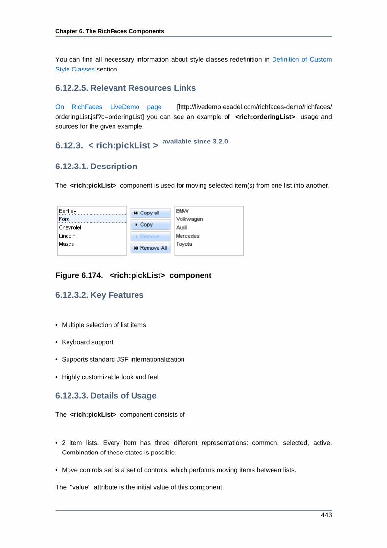
Chapter 6. The RichFaces Components
443
You can find all necessary information about style classes redefinition in Definition of Custom
Style Classes section.
6.12.2.5. Relevant Resources Links
On RichFaces LiveDemo page [http://livedemo.exadel.com/richfaces-demo/richfaces/
orderingList.jsf?c=orderingList] you can see an example of <rich:orderingList> usage and
sources for the given example.
6.12.3. < rich:pickList > available since 3.2.0
6.12.3.1. Description
The <rich:pickList> component is used for moving selected item(s) from one list into another.
Figure 6.174. <rich:pickList> component
6.12.3.2. Key Features
• Multiple selection of list items
• Keyboard support
• Supports standard JSF internationalization
• Highly customizable look and feel
6.12.3.3. Details of Usage
The <rich:pickList> component consists of
• 2 item lists. Every item has three different representations: common, selected, active.
Combination of these states is possible.
• Move controls set is a set of controls, which performs moving items between lists.
The "value" attribute is the initial value of this component.
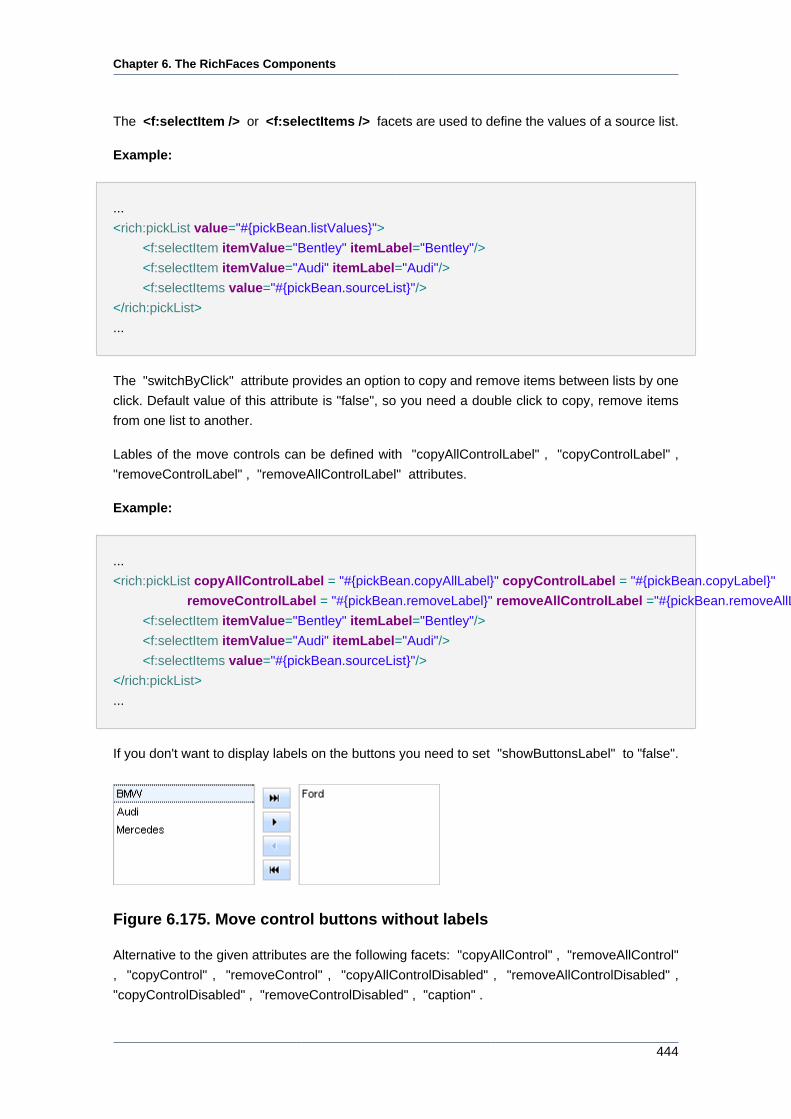
Chapter 6. The RichFaces Components
444
The <f:selectItem /> or <f:selectItems /> facets are used to define the values of a source list.
Example:
...
<rich:pickList value="#{pickBean.listValues}">
<f:selectItem itemValue="Bentley" itemLabel="Bentley"/>
<f:selectItem itemValue="Audi" itemLabel="Audi"/>
<f:selectItems value="#{pickBean.sourceList}"/>
</rich:pickList>
...
The "switchByClick" attribute provides an option to copy and remove items between lists by one
click. Default value of this attribute is "false", so you need a double click to copy, remove items
from one list to another.
Lables of the move controls can be defined with "copyAllControlLabel" , "copyControlLabel" ,
"removeControlLabel" , "removeAllControlLabel" attributes.
Example:
...
<rich:pickList copyAllControlLabel = "#{pickBean.copyAllLabel}" copyControlLabel = "#{pickBean.copyLabel}"
removeControlLabel = "#{pickBean.removeLabel}" removeAllControlLabel ="#{pickBean.removeAllLabel}" value="#{pickBean.listValues}">
<f:selectItem itemValue="Bentley" itemLabel="Bentley"/>
<f:selectItem itemValue="Audi" itemLabel="Audi"/>
<f:selectItems value="#{pickBean.sourceList}"/>
</rich:pickList>
...
If you don't want to display labels on the buttons you need to set "showButtonsLabel" to "false".
Figure 6.175. Move control buttons without labels
Alternative to the given attributes are the following facets: "copyAllControl" , "removeAllControl"
, "copyControl" , "removeControl" , "copyAllControlDisabled" , "removeAllControlDisabled" ,
"copyControlDisabled" , "removeControlDisabled" , "caption" .
Chapter 6. The RichFaces Components
445
It is an example of usage of the facets and it is identical to the previous example.
...
<rich:pickList value="#{pickBean.listValues}">
<f:facet name="copyAllControl">
<h:commandButton value="#{pickBean.copyAllLabel}" />
</f:facet>
<f:facet name="copyControl">
<h:commandButton value="#{pickBean.copyLabel}" />
</f:facet>
<f:facet name="removeControl">
<h:commandButton value="#{pickBean.removeLabel}" />
</f:facet>
<f:facet name="removeAllControl">
<h:commandButton value="#{pickBean.removeAllLabel}" />
</f:facet>
<f:selectItem itemValue="Bentley" itemLabel="Bentley"/>
<f:selectItem itemValue="Audi" itemLabel="Audi"/>
<f:selectItems value="#{pickBean.sourceList}"/>
</rich:pickList>
...
With the help of "moveControlsVerticalAlign" attribute you can align move controls vertically.
The possible value for "moveControlsVerticalAlign" are "top", "bottom" and "center" (default
value).
The <rich:pickList> component provides resizing of lists by using such attributes as:
• "listsHeight" defines height of the lists.
• "sourceListWidth" defines width of a source list.
• "targetListWidth" defines width of a target list.
Example:
...
<rich:pickList listsHeight="#{pickBean.listsHeight}" sourceListWidth="#{pickBean.sourceListWidth}" targetListWidth="#{pickBean.targetListWidth}" value="#{pickBean.listValues}">
<f:selectItem itemValue="Bentley" itemLabel="Bentley"/>
<f:selectItem itemValue="Audi" itemLabel="Audi"/>
<f:selectItems value="#{pickBean.sourceList}"/>
</rich:pickList>
Chapter 6. The RichFaces Components
446
...
The <rich:pickList> component allows to use internationalization method
to redefine and localize the labels. You could use application resource
bundle and define RICH_PICK_LIST_COPY_ALL_LABEL, RICH_PICK_LIST_COPY_LABEL,
RICH_PICK_LIST_REMOVE_ALL_LABEL, RICH_PICK_LIST_REMOVE_LABEL there.
Table 6.230. Keyboard usage for elements selection
Keys and combinations Description
CTRL+click Inverts selection for an item
SHIFT+click Selects all rows from active one to a clicked
row if they differ, else select the active row. All
other selections are cleared
CTRL+A Selects all elements inside the list if some
active element is already present in a list
Up, Down arrows Changes the active and selected elements to
the next or previous in a list
6.12.3.4. Reference Data
Table of <rich:pickList> attributes [../../tlddoc/rich/pickList.html].
Table 6.231. Component Identification Parameters
Name Value
component-type org.richfaces.PickList
component-class org.richfaces.component.html.HtmlPickList
component-family org.richfaces.PickList
renderer-type org.richfaces.PickListRenderer
tag-class org.richfaces.taglib.PickListTag
Table 6.232. Facets
Facet Description
copyAllControl Redefines the "copyAll" label with the control
set. Related attribute is "copyAllControlLabel"
removeAllControl Redefines the "removeAll" label with
the control set. Related attribute is
"removeAllControlLabel"
copyControl Redefines the "copy" label with the control set.
Related attribute is "copyControlLabel"
Chapter 6. The RichFaces Components
447
Facet Description
removeControl Redefines the "remove" label with the control
set. Related attribute is "removeControlLabel"
copyAllControlDisabled Redefines the disabled "copyAll" label with the
control set.
removeAllControlDisabled Redefines the disabled "removeAll" label with
the control set.
copyControlDisabled Redefines the disabled "copy" label with the
control set.
removeControlDisabled Redefines the disabled "remove" label with the
control set.
caption Defines the "caption" label with the control set.
Table 6.233. Classes names that define a list representation
Class name Description
rich-list-picklist Defines styles for a wrapper <table> element
of a pickList
Table 6.234. Classes names that define a source and target items
representation
Class name Description
rich-picklist-source-items Defines styles for a wrapper <div> element of
a source list
rich-picklist-target-items Defines styles for a wrapper <div> element of
a target list
rich-picklist-body Defines styles for a wrapper <table> element
of a list body (source and target)
rich-picklist-list Defines styles for a (source and target) list
rich-picklist-list-content Defines styles for a (source and target) list
content
rich-picklist-internal-tab Defines styles for a wrapper <table> element
of list items (source and target)
Table 6.235. Classes names that define rows representation
Class name Description
rich-picklist-source-row Defines styles for a source list row
rich-picklist-source-row-selected Defines styles for a selected row in a source list
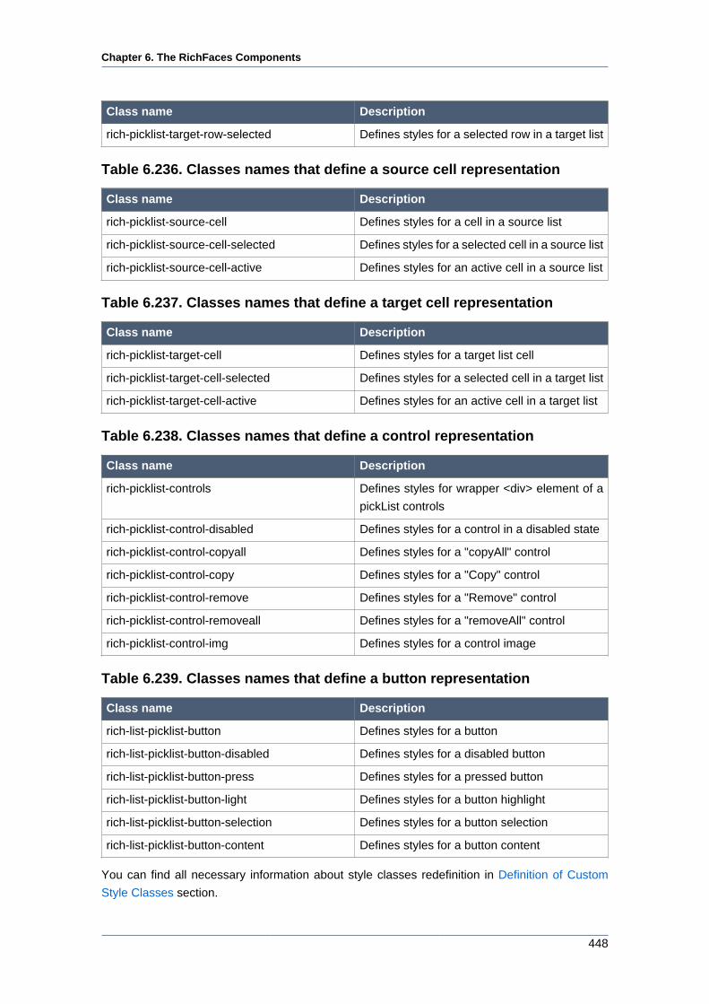
Chapter 6. The RichFaces Components
448
Class name Description
rich-picklist-target-row-selected Defines styles for a selected row in a target list
Table 6.236. Classes names that define a source cell representation
Class name Description
rich-picklist-source-cell Defines styles for a cell in a source list
rich-picklist-source-cell-selected Defines styles for a selected cell in a source list
rich-picklist-source-cell-active Defines styles for an active cell in a source list
Table 6.237. Classes names that define a target cell representation
Class name Description
rich-picklist-target-cell Defines styles for a target list cell
rich-picklist-target-cell-selected Defines styles for a selected cell in a target list
rich-picklist-target-cell-active Defines styles for an active cell in a target list
Table 6.238. Classes names that define a control representation
Class name Description
rich-picklist-controls Defines styles for wrapper <div> element of a
pickList controls
rich-picklist-control-disabled Defines styles for a control in a disabled state
rich-picklist-control-copyall Defines styles for a "copyAll" control
rich-picklist-control-copy Defines styles for a "Copy" control
rich-picklist-control-remove Defines styles for a "Remove" control
rich-picklist-control-removeall Defines styles for a "removeAll" control
rich-picklist-control-img Defines styles for a control image
Table 6.239. Classes names that define a button representation
Class name Description
rich-list-picklist-button Defines styles for a button
rich-list-picklist-button-disabled Defines styles for a disabled button
rich-list-picklist-button-press Defines styles for a pressed button
rich-list-picklist-button-light Defines styles for a button highlight
rich-list-picklist-button-selection Defines styles for a button selection
rich-list-picklist-button-content Defines styles for a button content
You can find all necessary information about style classes redefinition in Definition of Custom
Style Classes section.
Chapter 6. The RichFaces Components
449
6.12.3.5. Relevant Resources Links
On RichFaces LiveDemo page [http://livedemo.exadel.com/richfaces-demo/richfaces/
pickList.jsf?c=pickList] you can see an example of <rich:pickList> usage and sources for the
given example.
6.13. Rich Semantic Layouts
Layout components enrich RichFaces with functionality that enables you to create the whole page
layout and define the parameters of the page. You can also create your custom theme and use
it alongside with these components.
6.13.1. < rich:page > available since 3.3.1
6.13.1.1. Description
The <rich:page> component is used to create basic (X)HTML markup and define document
parameters like DOCTYPE, title etc. The component also allows to build top level layout: header,
bottom, center and left or right layout areas.
6.13.1.2. Key Features
• Option to change the renderer of the component (themes support)
• Possibility to define parameters of an HTML page
• Possibility to create page layout with facets
• Provides styling based on RichFaces skinnability
6.13.1.3. Details of Usage
The <rich:page> component together with the <rich:layout> component provides a full-fledged
mechanism for markup creation.
First of all, to declare the document type of the page you should use the "markupType" attribute
which has the following values:
• "html"
• "html-transitional"
• "xhtml"
• "xhtml-transitional"
• "html-frameset"
Chapter 6. The RichFaces Components
450
• "html-3.2"
The default value is "html".
The "contentType" allows to specify the type of the content and encoding for the page.
The title of the page can be set with the "pageTitle" attribute. To place some other page
parameters (like meta information, links to CSS style sheets etc.) in the <head> element of an
HTML page use "pageHeader" facet.
Example:
...
<rich:page pageTitle="The title of the page" markupType="xhtml">
<f:facet name="pageHeader">
<meta content="The rich:page component" name="keywords" />
<link rel="shortcut icon" href="/images/favicon.ico" />
<link href="/css/style.css" rel="stylesheet" type="text/css" />
<script type="text/javascript" src="/js/menu.js"></script>
</f:facet>
<!-- page content -->
</rich:page>
...
Note:
Note, the <rich:page> component encodes the full page structure. Therefore,
be sure you don't use the doctype declaration, root html element, head and body
elements on the same page where you've put this component.
The implementation of the <rich:page> component provides four facets that you can use to
arrange the layout of the page: "header", "subheader", "sidebar" and "footer". Their behavior is
quite self-explanatory.
The position of the panel rendered by the "sidebar" facet can be set with the "sidebarPosition"
attribute that can take either "right" or "left" as values, you can also specify the width for this facet
with the "sidebarWidth" attribute.
Example:
...
<rich:page sidebarPosition="left" sidebarWidth="300">
<f:facet name="header">
<!-- header content -->
Chapter 6. The RichFaces Components
451
</f:facet>
<f:facet name="sidebar">
<!-- side panel content -->
</f:facet>
<!-- body content -->
<f:facet name="footer">
<!-- footer content -->
</f:facet>
</rich:page>
...
The <rich:page> component also provides attributes to define CSS classes for each nested
facet as well as a body part of the page created with the component.
Several templates are available for the <rich:page> component. A template can be activated
with the "theme" attribute.
The theme defines the way the <rich:page> is rendered. Default renderer (default theme) of the
<rich:page> has no mappings to skin parameters and just provides CSS classes for the page
part. However, the simple theme, which is an extension of the default theme, has mappings to
skin parameters and adds the RichFaces skinning for the page elements.
As a whole, RichFaces provides 4 themes for the <rich:page> component out-of-the-box:
"simple", "violetRays", "oldschool", "smooth". The Creating a Theme for <rich:page> [http://
www.jboss.org/community/docs/DOC-13635] article tells how you can create your custom theme
for the <rich:page> component.
6.13.1.4. Reference Data
Table of <rich:page> attributes [../../tlddoc/rich/page.html].
Table 6.240. Component Identification Parameters
Name Value
component-type org.richfaces.Page
component-class org.richfaces.component.html.HtmlPage
component-family org.richfaces.Page
renderer-type org.richfaces.PageRenderer
tag-class org.richfaces.taglib.PageTag
Table 6.241. Facets
Facet Name Description
pageHeader Creates the <head/> part of the HTML page
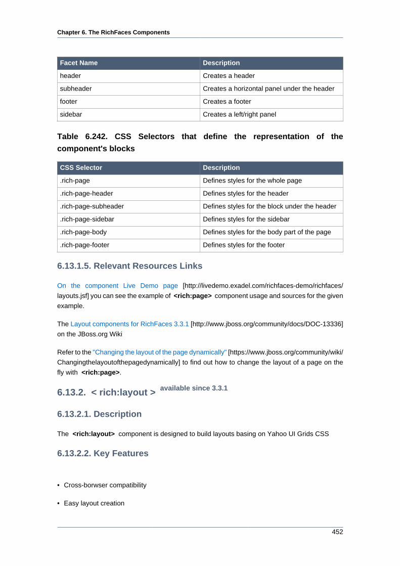
Chapter 6. The RichFaces Components
452
Facet Name Description
header Creates a header
subheader Creates a horizontal panel under the header
footer Creates a footer
sidebar Creates a left/right panel
Table 6.242. CSS Selectors that define the representation of the
component's blocks
CSS Selector Description
.rich-page Defines styles for the whole page
.rich-page-header Defines styles for the header
.rich-page-subheader Defines styles for the block under the header
.rich-page-sidebar Defines styles for the sidebar
.rich-page-body Defines styles for the body part of the page
.rich-page-footer Defines styles for the footer
6.13.1.5. Relevant Resources Links
On the component Live Demo page [http://livedemo.exadel.com/richfaces-demo/richfaces/
layouts.jsf] you can see the example of <rich:page> component usage and sources for the given
example.
The Layout components for RichFaces 3.3.1 [http://www.jboss.org/community/docs/DOC-13336]
on the JBoss.org Wiki
Refer to the "Changing the layout of the page dynamically" [https://www.jboss.org/community/wiki/
Changingthelayoutofthepagedynamically] to find out how to change the layout of a page on the
fly with <rich:page>.
6.13.2. < rich:layout > available since 3.3.1
6.13.2.1. Description
The <rich:layout> component is designed to build layouts basing on Yahoo UI Grids CSS
6.13.2.2. Key Features
• Cross-borwser compatibility
• Easy layout creation
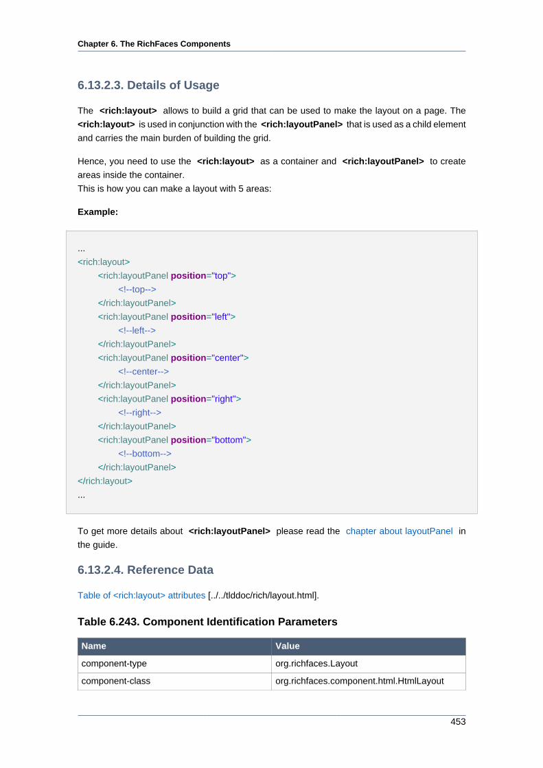
Chapter 6. The RichFaces Components
453
6.13.2.3. Details of Usage
The <rich:layout> allows to build a grid that can be used to make the layout on a page. The
<rich:layout> is used in conjunction with the <rich:layoutPanel> that is used as a child element
and carries the main burden of building the grid.
Hence, you need to use the <rich:layout> as a container and <rich:layoutPanel> to create
areas inside the container.
This is how you can make a layout with 5 areas:
Example:
...
<rich:layout>
<rich:layoutPanel position="top">
<!--top-->
</rich:layoutPanel>
<rich:layoutPanel position="left">
<!--left-->
</rich:layoutPanel>
<rich:layoutPanel position="center">
<!--center-->
</rich:layoutPanel>
<rich:layoutPanel position="right">
<!--right-->
</rich:layoutPanel>
<rich:layoutPanel position="bottom">
<!--bottom-->
</rich:layoutPanel>
</rich:layout>
...
To get more details about <rich:layoutPanel> please read the chapter about layoutPanel in
the guide.
6.13.2.4. Reference Data
Table of <rich:layout> attributes [../../tlddoc/rich/layout.html].
Table 6.243. Component Identification Parameters
Name Value
component-type org.richfaces.Layout
component-class org.richfaces.component.html.HtmlLayout
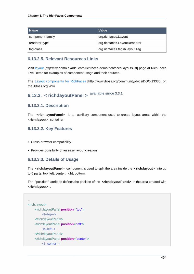
Chapter 6. The RichFaces Components
454
Name Value
component-family org.richfaces.Layout
renderer-type org.richfaces.LayoutRenderer
tag-class org.richfaces.taglib.layoutTag
6.13.2.5. Relevant Resources Links
Visit layout [http://livedemo.exadel.com/richfaces-demo/richfaces/layouts.jsf] page at RichFaces
Live Demo for examples of component usage and their sources.
The Layout components for RichFaces [http://www.jboss.org/community/docs/DOC-13336] on
the JBoss.org Wiki
6.13.3. < rich:layoutPanel > available since 3.3.1
6.13.3.1. Description
The <rich:layouPanel> is an auxiliary component used to create layout areas within the
<rich:layout> container.
6.13.3.2. Key Features
• Cross-browser compatibility
• Provides possibility of an easy layout creation
6.13.3.3. Details of Usage
The <rich:layoutPanel> component is used to split the area inside the <rich:layout> into up
to 5 parts: top, left, center, right, bottom.
The "position" attribute defines the position of the <rich:layoutPanel> in the area created with
<rich:layout> .
...
<rich:layout>
<rich:layoutPanel position="top">
<!--top-->
</rich:layoutPanel>
<rich:layoutPanel position="left">
<!--left-->
</rich:layoutPanel>
<rich:layoutPanel position="center">
<!--center-->
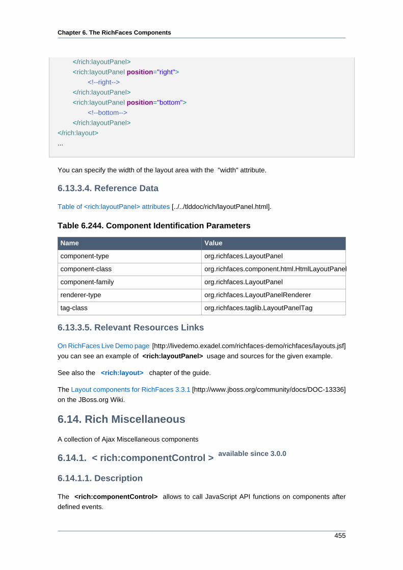
Chapter 6. The RichFaces Components
455
</rich:layoutPanel>
<rich:layoutPanel position="right">
<!--right-->
</rich:layoutPanel>
<rich:layoutPanel position="bottom">
<!--bottom-->
</rich:layoutPanel>
</rich:layout>
...
You can specify the width of the layout area with the "width" attribute.
6.13.3.4. Reference Data
Table of <rich:layoutPanel> attributes [../../tlddoc/rich/layoutPanel.html].
Table 6.244. Component Identification Parameters
Name Value
component-type org.richfaces.LayoutPanel
component-class org.richfaces.component.html.HtmlLayoutPanel
component-family org.richfaces.LayoutPanel
renderer-type org.richfaces.LayoutPanelRenderer
tag-class org.richfaces.taglib.LayoutPanelTag
6.13.3.5. Relevant Resources Links
On RichFaces Live Demo page [http://livedemo.exadel.com/richfaces-demo/richfaces/layouts.jsf]
you can see an example of <rich:layoutPanel> usage and sources for the given example.
See also the <rich:layout> chapter of the guide.
The Layout components for RichFaces 3.3.1 [http://www.jboss.org/community/docs/DOC-13336]
on the JBoss.org Wiki.
6.14. Rich Miscellaneous
A collection of Ajax Miscellaneous components
6.14.1. < rich:componentControl > available since 3.0.0
6.14.1.1. Description
The <rich:componentControl> allows to call JavaScript API functions on components after
defined events.
Chapter 6. The RichFaces Components
456
6.14.1.2. Key Features
• Management of components JavaScript API
• Customizable initialization variants
• Customizable activation events
• Possibility to pass parameters to the target component
6.14.1.3. Details of Usage
<rich:componentControl> is a command component, that allows to call JavaScript API function
on some defined event. Look at the example:
...
<rich:componentControl attachTo="doExpandCalendarID" event="onclick" operation="Expand" for="ccCalendarID" /
>
...
In other words it means "clicking on the component with ID doExpandCalendarID expands the
component with ID ccCalendarID". It can be said, that <rich:componentControl> makes
interact two components with the help of JavaScript API function.
The ID of the component the event that invokes JavaScript API function is applied, is defined
with "attachTo" attribute (see the exapmle above). If "attachTo" attribute is not specified, the
<rich:componentControl> is supposed to be attached to it's parent.
<h:commandButton value="Show Modal Panel">
<!--componentControl is attached to the commandButton-->
<rich:componentControl for="ccModalPanelID" event="onclick" operation="show"/>
</h:commandButton>
It is possible to invoke the <rich:componentControl> handler operation as usual JavaScript
function. For this purpose it is necessary to specify the name of the JS function with the help of
the "name" attribute:
Example:
function func (event) {
}
Chapter 6. The RichFaces Components
457
<rich:componentControl name="func" event="onRowClick" for="menu" operation="show" />
An important <rich:componentControl> feature, is that it allows transferring parameters, with
the help of special attribute "params" :
...
<rich:componentControl name="func" event="onRowClick" for="menu" operation="show" params="#{car.model}"/
>
...
The alternative way for parameters transferring uses <f:param> attribute. As the code above,
the following code will represent the same functionality:
...
<rich:componentControl event="onRowClick" for="menu" operation="show">
<f:param value="#{car.model}" name="model"/>
</rich:componentControl>
...
With the help of the "attachTiming" attribute you can define the page loading phase when
<rich:componentControl> is attached to source component. Possible values are:
• immediate — attached during execution of <rich:componentControl> script
• onavailable — attached after the target component is initialized
• onload — attached after the page is loaded
<rich:componentControl> interacts with such components as: <rich:contextMenu> ,
<rich:toolTip> , <rich:modalPanel > , <rich:listShuttle> , <rich:orderingList> ,
<rich:calendar>
In order to use <rich:componentControl> with another component you should place the id of
this component into "for" attribute field. All operations with defined component you can find in
the JavaScript API section of defined component.
<h:form>
<rich:toolTip id="toolTip" mode="ajax" value="and then just touch me." direction="top-right" />
</h:form>
<h:commandButton id="ButtonID" value="Push me">
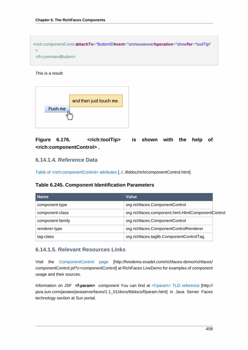
Chapter 6. The RichFaces Components
458
<rich:componentControl attachTo="ButtonID" event="onmouseover" operation="show" for="toolTip" /
>
</h:commandButton>
This is a result:
Figure 6.176. <rich:toolTip> is shown with the help of
<rich:componentControl> .
6.14.1.4. Reference Data
Table of <rich:componentControl> attributes [../../tlddoc/rich/componentControl.html].
Table 6.245. Component Identification Parameters
Name Value
component-type org.richfaces.ComponentControl
component-class org.richfaces.component.html.HtmlComponentControl
component-family org.richfaces.ComponentControl
renderer-type org.richfaces.ComponentControlRenderer
tag-class org.richfaces.taglib.ComponentControlTag
6.14.1.5. Relevant Resources Links
Visit the ComponentControl page [http://livedemo.exadel.com/richfaces-demo/richfaces/
componentControl.jsf?c=componentControl] at RichFaces LiveDemo for examples of component
usage and their sources.
Information on JSF <f:param> component You can find at <f:param> TLD reference [http://
java.sun.com/javaee/javaserverfaces/1.1_01/docs/tlddocs/f/param.html] in Java Server Faces
technology section at Sun portal.
Chapter 6. The RichFaces Components
459
6.14.2. <rich:effect> available since 3.1.0
6.14.2.1. Description
The <rich:effect> utilizes a set of effects provided by the Scriptaculous JavaScript library. It allows
to attach effects to JSF components and HTML tags.
6.14.2.2. Key Features
• Represents Scriptaculous JavaScript library functionality
• No JavaScript needed to the component
6.14.2.3. Details of Usage
It is possible to use <rich:effect> in two modes:
• attached to a JSF component or HTML tag and triggered by a particular event. Wiring effect
with JSF components might occur on the server or client. Wiring with html tag is possible only
on the client side.
• invoking from the JavaScript code by an effect name. During the rendering, <rich:effect>
generates the JavaScript function with defined name. When the function is called, the effect
is applied
Those a the typical variants of using:
<!-- triggered by an event -->
<rich:panel>
<rich:effect event="onmouseout" type="Opacity" params="duration:0.8,from:1.0,to:0.3" />
...
</rich:panel>
<!-- invoking by JavaScript -->
<div id="contentDiv">...</div>
<input type="button" onclick="hideDiv({duration:0.7})" value="Hide" />
<input type="button" onclick="showDiv()" value="Show" />
<rich:effect name="hideDiv" for="contentDiv" type="Fade" />
<rich:effect name="showDiv" for="contentDiv" type="Appear" />
<!-- attached to a window onload event and applied to a particular page element -->
<rich:effect for="window" event="onload" type="Appear" params="targetId:'contentDiv',duration:0.8,from:0.3,to:1.0" /
>

Chapter 6. The RichFaces Components
460
Figure 6.177. Initial
Figure 6.178. When the mouse cursor is over
The "name" attribute defines a name of the JavaScript function that will be generated on a
page after the component is rendered. This function will activate the needed effect. The function
accesses one parameter. It is a set of effect options in JSON format.
The "type" attribute defines the type of an effect that will be applied. Possible values are Fade,
Blind, Opacity.
The "for" attribute defines the ID of the component or HTML tag, the effect is attached to.
RichFaces converts value of "for" attribute to a component client ID if such component is found.
In case if such component is not found the value is left because of possible wirings with some
DOM element id on the client side. By default, the target of the effect is the same element that
effect is pointed to. #arget element can be redefined with the "targetId" attribute; new parameters
should be passed with the "params" attribute.
The "params" attribute allows to define a set of options (duration, delay, from, to) possible for
a particurar effect. Additionally to the options used by the effect itself, there are two option that
might override the <rich:effect>attribute:
• "targetId" allows to re-define the target of effect. The option is override the value of "for" attribute.
• "type" defines the effect type. The option is override the value of "type" attribute.
Besides all you can load the Scriptaculous library to the page and use it directly without
<rich:effect>:
<a4j:loadScript src="resource://scriptaculous/effect.js" />
But if you use the <rich:effect> there is no need to include this library because it's already there.
6.14.2.4. Reference Data
Table of <rich:effect> attributes [../../tlddoc/rich/effect.html].
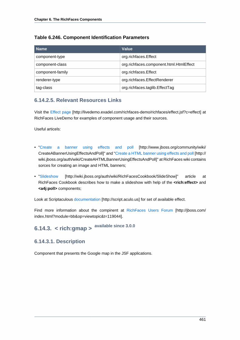
Chapter 6. The RichFaces Components
461
Table 6.246. Component Identification Parameters
Name Value
component-type org.richfaces.Effect
component-class org.richfaces.component.html.HtmlEffect
component-family org.richfaces.Effect
renderer-type org.richfaces.EffectRenderer
tag-class org.richfaces.taglib.EffectTag
6.14.2.5. Relevant Resources Links
Visit the Effect page [http://livedemo.exadel.com/richfaces-demo/richfaces/effect.jsf?c=effect] at
RichFaces LiveDemo for examples of component usage and their sources.
Useful articels:
• "Create a banner using effects and poll [http://www.jboss.org/community/wiki/
CreateABannerUsingEffectsAndPoll]" and "Create a HTML banner using effects and poll [http://
wiki.jboss.org/auth/wiki/CreateAHTMLBannerUsingEffectsAndPoll]" at RichFaces wiki contains
sorces for creating an image and HTML banners;
• "Slideshow [http://wiki.jboss.org/auth/wiki/RichFacesCookbook/SlideShow]" article at
RichFaces Cookbook describes how to make a slideshow with help of the <rich:effect> and
<a4j:poll> components;
Look at Scriptaculous documentation [http://script.aculo.us] for set of available effect.
Find more information about the compinent at RichFaces Users Forum [http://jboss.com/
index.html?module=bb&op=viewtopic&t=119044].
6.14.3. < rich:gmap > available since 3.0.0
6.14.3.1. Description
Component that presents the Google map in the JSF applications.

Chapter 6. The RichFaces Components
462
Figure 6.179. <rich:gmap> component
6.14.3.2. Key Features
• Presents all the Google map functionality
• Highly customizable via attributes
• No developers JavaScript writing needed to use on a pages
6.14.3.3. Details of Usage
To use Google Map in your application, generate a key on Google Map official resource [http://
google.com/apis/maps] . One key could be used for one directory on the server.
Here are the main settings of initial rendering performed with a component map that are accessible
with the following attributes:
• "zoom" defines an approximation size (boundary values 1-18)
• "lat" specifies an initial latitude coordinate in degrees, as a number between -90 and +90
• "lng" specifies an initial longitude coordinate in degrees, as a number between -180 and +180

Chapter 6. The RichFaces Components
463
• "mapType" specifies a type of a rendered map (G_NORMAL_MAP, G_SATELLITE_MAP (DEFAULT),
G_HYBRID_MAP)
For example, the city of Paris is shown after rendering with the following initial settings: lat =
"48.44" , lng = "2.24" and zoom = "5" .
Figure 6.180. <rich:gmap> initial rendering
It's also possible to set accessible controls on the map with the help of the attributes:
• "showGMapTypeControl" determines whether the controls for a map type definition are
switched on
• "showGScaleControl" determines whether the controls for scaling are switched on
• "showGLargeMapControl" determines whether the control for map scale rendering is rendered
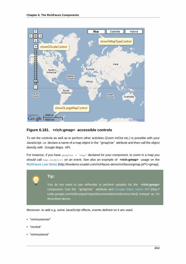
Chapter 6. The RichFaces Components
464
Figure 6.181. <rich:gmap> accessible controls
To set the controls as well as to perform other activities (Zoom In/Out etc.) is possible with your
JavaScript, i.e. declare a name of a map object in the "gmapVar" attribute and then call the object
directly with Google Maps API.
For instance, if you have gmapVar = "map" declared for your component, to zoom in a map you
should call map.zoomIn() on an event. See also an example of <rich:gmap> usage on the
RichFaces Live Demo [http://livedemo.exadel.com/richfaces-demo/richfaces/gmap.jsf?c=gmap].
Tip:
You do not need to use reRender to perform uptades for the <rich:gmap>
component. Use the "gmapVar" attribute and Google Maps native API [http://
code.google.com/intl/ru/apis/maps/documentation/reference.html] instead as it's
described above.
Moreover, to add e.g. some JavaScript effects, events defined on it are used.
• "onmouseover"
• "onclick"
• "onmouseout"
Chapter 6. The RichFaces Components
465
• etc.
Note
Google Map does not support XHTML format of the page. Thus, if you use Facelets
and JSF 1.2, do not forget to put the following tags somewhere on the page:
...
<f:view contentType="text/html">...</f:view>
...
6.14.3.4. Reference Data
Table of <rich:gmap> attributes [../../tlddoc/rich/gmap.html].
Table 6.247. Component Identification Parameters
Name Value
component-type org.richfaces.Gmap
component-class org.richfaces.component.html.HtmlGmap
component-family org.richfaces.Gmap
renderer-type org.richfaces.GmapRenderer
tag-class org.richfaces.taglib.GmapTag
Table 6.248. Classes names that define a component appearance
Class name Description
rich-gmap Defines styles for a wrapper <div> element of
a component
You can find all necessary information about style classes redefinition in Definition of Custom
Style Classes section.
6.14.3.5. Relevant Resources Links
On the component Live Demo page [http://livedemo.exadel.com/richfaces-demo/richfaces/
gmap.jsf?c=gmap] you can see the example of <rich:gmap> usage and sources for the given
example.
6.14.4. < rich:virtualEarth > available since 3.1.0
6.14.4.1. Description
The component presents the Microsoft Virtual Earth map in the JSF applications.

Chapter 6. The RichFaces Components
466
Figure 6.182. <rich:virtualEarth> component
6.14.4.2. Key Features
• Presents the Microsoft Virtual Earth map functionality
• Highly customizable via attributes
• No developers JavaScript writing is needed to use it on a pages
6.14.4.3. Details of Usage
Here are the main settings of initial rendering performed with a component map that are accessible
with the following attributes:
• "zoom" defines an approximation size (boundary values 1-18)
• "lat" specifies an initial latitude coordinate in degrees, as a number between -90 and +90
• "lng" specifies an initial longitude coordinate in degrees, as a number between -180 and +180
• "dashboardSize" specifies a type of a rendered map (Normal, Small, Tiny)
For example, the city of Paris is shown after rendering with the following initial settings: lat =
"48.833" , lng = "2.40" and zoom = "11" .
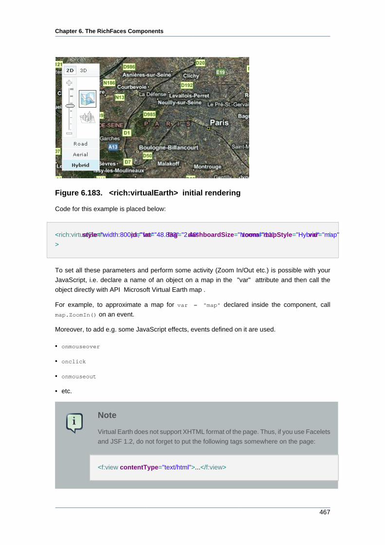
Chapter 6. The RichFaces Components
467
Figure 6.183. <rich:virtualEarth> initial rendering
Code for this example is placed below:
<rich:virtualEarth style="width:800px;" id="vm" lat="48.833" lng="2.40" dashboardSize="Normal" zoom="11" mapStyle="Hybrid" var="map" /
>
To set all these parameters and perform some activity (Zoom In/Out etc.) is possible with your
JavaScript, i.e. declare a name of an object on a map in the "var" attribute and then call the
object directly with API Microsoft Virtual Earth map .
For example, to approximate a map for var = "map" declared inside the component, call
map.ZoomIn() on an event.
Moreover, to add e.g. some JavaScript effects, events defined on it are used.
• onmouseover
• onclick
• onmouseout
• etc.
Note
Virtual Earth does not support XHTML format of the page. Thus, if you use Facelets
and JSF 1.2, do not forget to put the following tags somewhere on the page:
<f:view contentType="text/html">...</f:view>
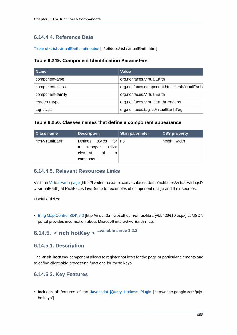
Chapter 6. The RichFaces Components
468
6.14.4.4. Reference Data
Table of <rich:virtualEarth> attributes [../../tlddoc/rich/virtualEarth.html].
Table 6.249. Component Identification Parameters
Name Value
component-type org.richfaces.VirtualEarth
component-class org.richfaces.component.html.HtmlVirtualEarth
component-family org.richfaces.VirtualEarth
renderer-type org.richfaces.VirtualEarthRenderer
tag-class org.richfaces.taglib.VirtualEarthTag
Table 6.250. Classes names that define a component appearance
Class name Description Skin parameter CSS property
rich-virtualEarth Defines styles for
a wrapper <div>
element of a
component
no height, width
6.14.4.5. Relevant Resources Links
Visit the VirtualEarth page [http://livedemo.exadel.com/richfaces-demo/richfaces/virtualEarth.jsf?
c=virtualEarth] at RichFaces LiveDemo for examples of component usage and their sources.
Useful articles:
• Bing Map Control SDK 6.2 [http://msdn2.microsoft.com/en-us/library/bb429619.aspx] at MSDN
portal provides invormation about Microsoft interactive Earth map.
6.14.5. < rich:hotKey > available since 3.2.2
6.14.5.1. Description
The <rich:hotKey> component allows to register hot keys for the page or particular elements and
to define client-side processing functions for these keys.
6.14.5.2. Key Features
• Includes all features of the Javascript jQuery Hotkeys Plugin [http://code.google.com/p/js-
hotkeys/]
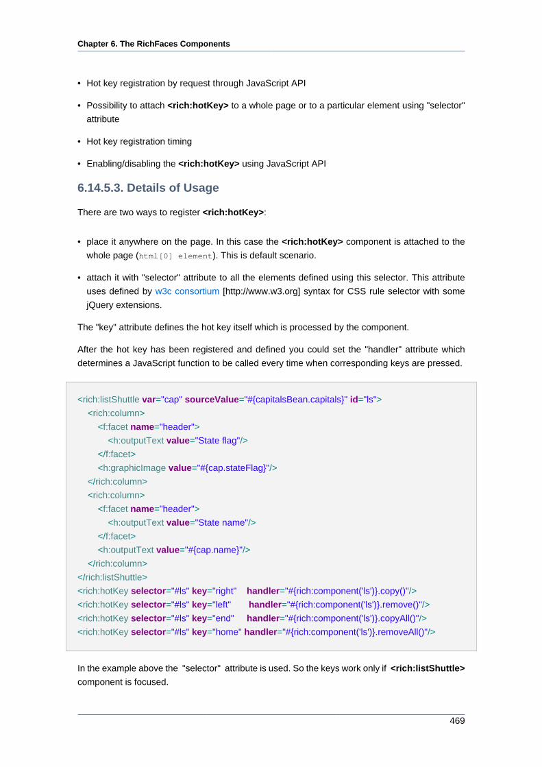
Chapter 6. The RichFaces Components
469
• Hot key registration by request through JavaScript API
• Possibility to attach <rich:hotKey> to a whole page or to a particular element using "selector"
attribute
• Hot key registration timing
• Enabling/disabling the <rich:hotKey> using JavaScript API
6.14.5.3. Details of Usage
There are two ways to register <rich:hotKey>:
• place it anywhere on the page. In this case the <rich:hotKey> component is attached to the
whole page (html[0] element). This is default scenario.
• attach it with "selector" attribute to all the elements defined using this selector. This attribute
uses defined by w3c consortium [http://www.w3.org] syntax for CSS rule selector with some
jQuery extensions.
The "key" attribute defines the hot key itself which is processed by the component.
After the hot key has been registered and defined you could set the "handler" attribute which
determines a JavaScript function to be called every time when corresponding keys are pressed.
<rich:listShuttle var="cap" sourceValue="#{capitalsBean.capitals}" id="ls">
<rich:column>
<f:facet name="header">
<h:outputText value="State flag"/>
</f:facet>
<h:graphicImage value="#{cap.stateFlag}"/>
</rich:column>
<rich:column>
<f:facet name="header">
<h:outputText value="State name"/>
</f:facet>
<h:outputText value="#{cap.name}"/>
</rich:column>
</rich:listShuttle>
<rich:hotKey selector="#ls" key="right" handler="#{rich:component('ls')}.copy()"/>
<rich:hotKey selector="#ls" key="left" handler="#{rich:component('ls')}.remove()"/>
<rich:hotKey selector="#ls" key="end" handler="#{rich:component('ls')}.copyAll()"/>
<rich:hotKey selector="#ls" key="home" handler="#{rich:component('ls')}.removeAll()"/>
In the example above the "selector" attribute is used. So the keys work only if <rich:listShuttle>
component is focused.
Chapter 6. The RichFaces Components
470
You could press Right or Left keys in order to move some selected items between lists. You could
press Home or End buttons in order to move all items between lists.
With the help of the "timing" attribute you could manage <rich:hotKey> registration timing.
There are three possible values of this attribute:
• immediate — the component is rendered in browser immediately (default value);
• onload — the component is rendered after the page is fully loaded;
• onregistercall — the component is rendered only after JavaScript API for the key registration
is used.
The "type" attribute defines the type of keyboard event. Possible values are: onkeyup, onkeypress
and onkeydown.
The "disableInInput" attribute disables the <rich:hotKey> if it is activated on input elements
and the value of this attribute is true.
The "checkParent" attribute defines the hotkey handling of events generated by child components
nested into the parent component to which the <rich:hotKey> is attached.
The <rich:hotKey> component also provides a number of JavaScript API functions. There is
an example below.
<h:form id="myForm">
<rich:hotKey id="myKey" key="ctrl+g" handler="alert('Ctrl+G is pressed')" />
<button onclick="${rich:component('myKey')}.enable(); return false;">Turn Ctrl+G On</button>
<button onclick="${rich:component('myKey')}.disable(); return false;">Turn Ctrl+G Off</button>
</h:form>
In the example above the Ctrl+G is registered as a global hotkey, so if you press this key
combination the alert window with the "Ctrl+G is pressed" text appears. With the help of
enable(), disable() JavaScript API fucntions you could enable or disable registered hotkey.
6.14.5.4. Reference Data
Table of <rich:hotKey> attributes [../../tlddoc/rich/hotKey.html].
Table 6.251. Component Identification Parameters
Name Value
component-type org.richfaces.HotKey
component-class org.richfaces.component.html.HtmlHotKey
component-family org.richfaces.HotKey
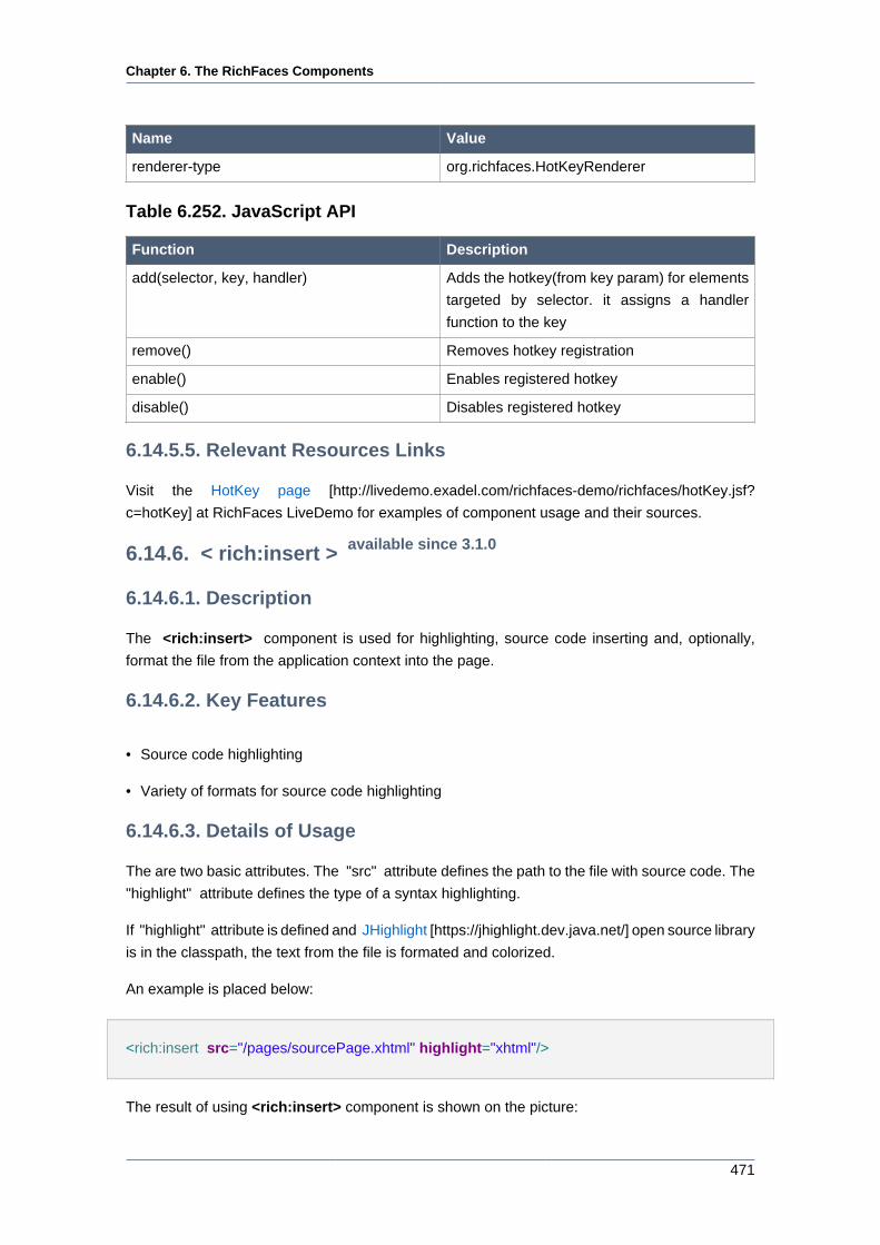
Chapter 6. The RichFaces Components
471
Name Value
renderer-type org.richfaces.HotKeyRenderer
Table 6.252. JavaScript API
Function Description
add(selector, key, handler) Adds the hotkey(from key param) for elements
targeted by selector. it assigns a handler
function to the key
remove() Removes hotkey registration
enable() Enables registered hotkey
disable() Disables registered hotkey
6.14.5.5. Relevant Resources Links
Visit the HotKey page [http://livedemo.exadel.com/richfaces-demo/richfaces/hotKey.jsf?
c=hotKey] at RichFaces LiveDemo for examples of component usage and their sources.
6.14.6. < rich:insert > available since 3.1.0
6.14.6.1. Description
The <rich:insert> component is used for highlighting, source code inserting and, optionally,
format the file from the application context into the page.
6.14.6.2. Key Features
• Source code highlighting
• Variety of formats for source code highlighting
6.14.6.3. Details of Usage
The are two basic attributes. The "src" attribute defines the path to the file with source code. The
"highlight" attribute defines the type of a syntax highlighting.
If "highlight" attribute is defined and JHighlight [https://jhighlight.dev.java.net/] open source library
is in the classpath, the text from the file is formated and colorized.
An example is placed below:
<rich:insert src="/pages/sourcePage.xhtml" highlight="xhtml"/>
The result of using <rich:insert> component is shown on the picture:
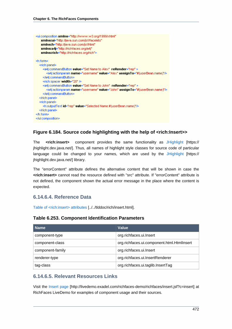
Chapter 6. The RichFaces Components
472
Figure 6.184. Source code highlighting with the help of <rich:Insert>>
The <rich:insert> component provides the same functionality as JHighlight [https://
jhighlight.dev.java.net/]. Thus, all names of highlight style classes for source code of particular
language could be changed to your names, which are used by the JHighlight [https://
jhighlight.dev.java.net/] library.
The "errorContent" attribute defines the alternative content that will be shown in case the
<rich:insert> cannot read the resource defined with "src" attribute. If "errorContent" attribute is
not defined, the component shown the actual error message in the place where the content is
expected.
6.14.6.4. Reference Data
Table of <rich:insert> attributes [../../tlddoc/rich/insert.html].
Table 6.253. Component Identification Parameters
Name Value
component-type org.richfaces.ui.Insert
component-class org.richfaces.ui.component.html.HtmlInsert
component-family org.richfaces.ui.Insert
renderer-type org.richfaces.ui.InsertRenderer
tag-class org.richfaces.ui.taglib.InsertTag
6.14.6.5. Relevant Resources Links
Visit the Insert page [http://livedemo.exadel.com/richfaces-demo/richfaces/insert.jsf?c=insert] at
RichFaces LiveDemo for examples of component usage and their sources.
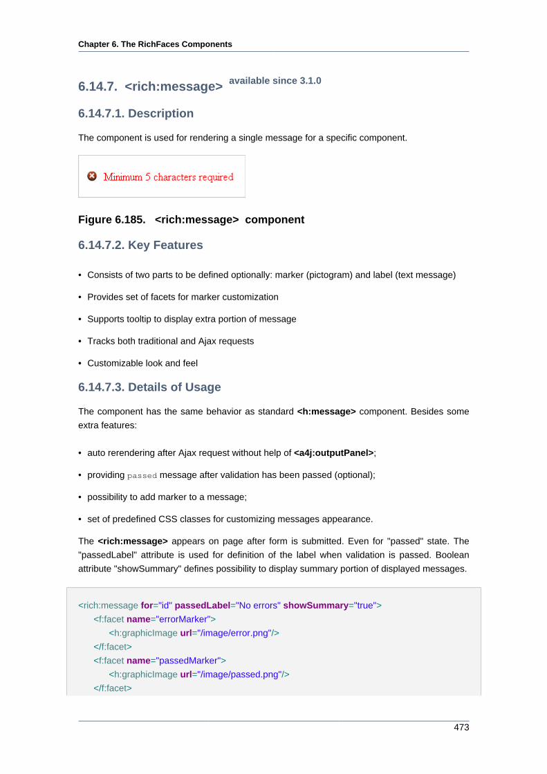
Chapter 6. The RichFaces Components
473
6.14.7. <rich:message> available since 3.1.0
6.14.7.1. Description
The component is used for rendering a single message for a specific component.
Figure 6.185. <rich:message> component
6.14.7.2. Key Features
• Consists of two parts to be defined optionally: marker (pictogram) and label (text message)
• Provides set of facets for marker customization
• Supports tooltip to display extra portion of message
• Tracks both traditional and Ajax requests
• Customizable look and feel
6.14.7.3. Details of Usage
The component has the same behavior as standard <h:message> component. Besides some
extra features:
• auto rerendering after Ajax request without help of <a4j:outputPanel>;
• providing passed message after validation has been passed (optional);
• possibility to add marker to a message;
• set of predefined CSS classes for customizing messages appearance.
The <rich:message> appears on page after form is submitted. Even for "passed" state. The
"passedLabel" attribute is used for definition of the label when validation is passed. Boolean
attribute "showSummary" defines possibility to display summary portion of displayed messages.
<rich:message for="id" passedLabel="No errors" showSummary="true">
<f:facet name="errorMarker">
<h:graphicImage url="/image/error.png"/>
</f:facet>
<f:facet name="passedMarker">
<h:graphicImage url="/image/passed.png"/>
</f:facet>
Chapter 6. The RichFaces Components
474
</rich:message>
6.14.7.4. Reference Data
Table of <rich:message> attributes [../../tlddoc/rich/message.html].
Table 6.254. Component Identification Parameters
Name Value
component-type org.richfaces.component.RichMessage
component-class org.richfaces.component.html.HtmlRichMessage
component-family org.richfaces.component.RichMessage
renderer-type org.richfaces.RichMessageRenderer
tag-class org.richfaces.taglib.RichMessageTag
Table 6.255. Facets
Facet Description
errorMarker Defines pictogram for message with error
severity class
fatalMarker Defines pictogram for message with fatal
severity class
infoMarker Defines pictogram for message with info
severity class
passedMarker Defines pictogram if there is no fatal, error,
warn or info message
warnMarker Defines pictogram for message with warn
severity class
Table 6.256. Classes names that define a component appearance
Class name Description
rich-message Defines styles for a wrapper element
rich-message-marker Defines styles for a marker
rich-message-label Defines styles for a label
You can find all necessary information about style classes redefinition in Definition of Custom
Style Classes section.
6.14.7.5. Relevant Resources Links
Visit the Message page [http://livedemo.exadel.com/richfaces-demo/richfaces/message.jsf?
c=message] at RichFaces LiveDemo for examples of component usage and their sources.
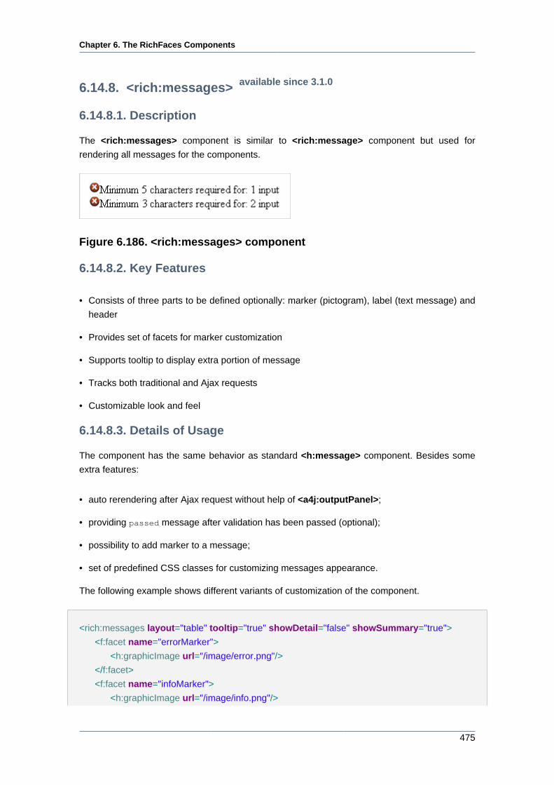
Chapter 6. The RichFaces Components
475
6.14.8. <rich:messages> available since 3.1.0
6.14.8.1. Description
The <rich:messages> component is similar to <rich:message> component but used for
rendering all messages for the components.
Figure 6.186. <rich:messages> component
6.14.8.2. Key Features
• Consists of three parts to be defined optionally: marker (pictogram), label (text message) and
header
• Provides set of facets for marker customization
• Supports tooltip to display extra portion of message
• Tracks both traditional and Ajax requests
• Customizable look and feel
6.14.8.3. Details of Usage
The component has the same behavior as standard <h:message> component. Besides some
extra features:
• auto rerendering after Ajax request without help of <a4j:outputPanel>;
• providing passed message after validation has been passed (optional);
• possibility to add marker to a message;
• set of predefined CSS classes for customizing messages appearance.
The following example shows different variants of customization of the component.
<rich:messages layout="table" tooltip="true" showDetail="false" showSummary="true">
<f:facet name="errorMarker">
<h:graphicImage url="/image/error.png"/>
</f:facet>
<f:facet name="infoMarker">
<h:graphicImage url="/image/info.png"/>
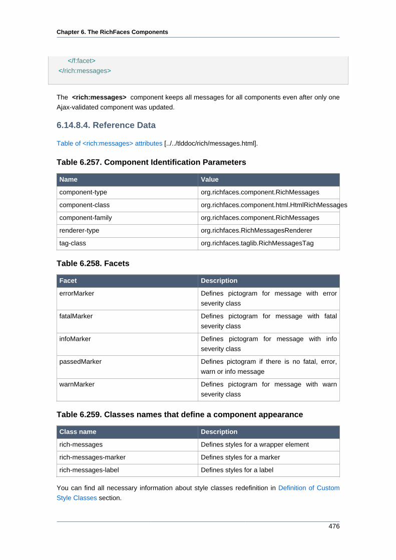
Chapter 6. The RichFaces Components
476
</f:facet>
</rich:messages>
The <rich:messages> component keeps all messages for all components even after only one
Ajax-validated component was updated.
6.14.8.4. Reference Data
Table of <rich:messages> attributes [../../tlddoc/rich/messages.html].
Table 6.257. Component Identification Parameters
Name Value
component-type org.richfaces.component.RichMessages
component-class org.richfaces.component.html.HtmlRichMessages
component-family org.richfaces.component.RichMessages
renderer-type org.richfaces.RichMessagesRenderer
tag-class org.richfaces.taglib.RichMessagesTag
Table 6.258. Facets
Facet Description
errorMarker Defines pictogram for message with error
severity class
fatalMarker Defines pictogram for message with fatal
severity class
infoMarker Defines pictogram for message with info
severity class
passedMarker Defines pictogram if there is no fatal, error,
warn or info message
warnMarker Defines pictogram for message with warn
severity class
Table 6.259. Classes names that define a component appearance
Class name Description
rich-messages Defines styles for a wrapper element
rich-messages-marker Defines styles for a marker
rich-messages-label Defines styles for a label
You can find all necessary information about style classes redefinition in Definition of Custom
Style Classes section.
Chapter 6. The RichFaces Components
477
6.14.8.5. Relevant Resources Links
Visit the Messages page [http://livedemo.exadel.com/richfaces-demo/richfaces/messages.jsf?
c=messages&tab=usage] at RichFaces LiveDemo for examples of component usage and their
sources.
6.14.9. < rich:jQuery > available since 3.0.0
6.14.9.1. Description
The <rich:jQuery> allows to apply styles and behaviour to DOM objects.
6.14.9.2. Key Features
• Presents jQuery JavaScript framework functionality
• Able to apply onto JSF components and other DOM objects.
• Works without conflicts with prototype.js library
6.14.9.3. Details of Usage
<rich:jQuery> can be used in two main modes:
• as a one-time query applied immediately or on a document ready event
• as a JavaScript function that can be invoked from the JavaScript code
The mode is chosen with "timing" attribute that has the following options:
• immediate — applying a query immediately;
• onload — applying a query when a document is loaded;
• onJScall — applying a query by invoked JavaScript function defined with the "name" attribute.
Definition of the "name" attribute is mandatory when the value of "timing" attribute is "onJScall".
If the "name" attribute is defined when "timing" value equals to "immediate" or "onload", the query
is applied according to this value, but you still have an opportunity to invoke it by a function name.
The "selector" attribute defines an object or a list of objects. The query is defined with the "query"
attribute.
Here is an example of how to highlight odd rows in a table:
<style>
.odd {background-color: #FFC;}
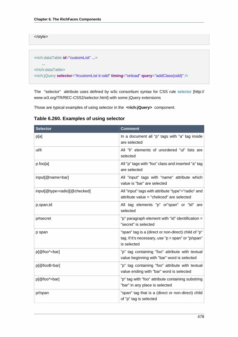
Chapter 6. The RichFaces Components
478
</style>
<rich:dataTable id="customList" ...>
...
</rich:dataTable>
<rich:jQuery selector="#customList tr:odd" timing="onload" query="addClass(odd)" />
The "selector" attribute uses defined by w3c consortium syntax for CSS rule selector [http://
www.w3.org/TR/REC-CSS2/selector.html] with some jQuery extensions
Those are typical examples of using selector in the <rich:jQuery> component.
Table 6.260. Examples of using selector
Selector Comment
p[a] In a document all "p" tags with "a" tag inside
are selected
ul/li All "li" elements of unordered "ul" lists are
selected
p.foo[a] All "p" tags with "foo" class and inserted "a" tag
are selected
input[@name=bar] All "input" tags with "name" attribute which
value is "bar" are selected
input[@type=radio][@checked] All "input" tags with attribute "type"="radio" and
attribute value = "chekced" are selected
p,span,td All tag elements "p" or"span" or "td" are
selected
p#secret "p" paragraph element with "id" identification =
"secret" is selected
p span "span" tag is a (direct or non-direct) child of "p"
tag. If it's necessary, use "p > span" or "p/span"
is selected
p[@foo^=bar] "p" tag containing "foo" attribute with textual
value beginning with "bar" word is selected
p[@foo$=bar] "p" tag containing "foo" attribute with textual
value ending with "bar" word is selected
p[@foo*=bar] "p" tag with "foo" attribute containing substring
"bar" in any place is selected
p//span "span" tag that is a (direct or non-direct) child
of "p" tag is selected
Chapter 6. The RichFaces Components
479
Selector Comment
p/../span "span" tag that is a grandchild of "p" tag is
selected
In addition, RichFaces allows using either a component id or client id if you apply the query to a
JSF component. When you define a selector, RichFaces examines its content and tries to replace
the defined in the selector id with a component id if it's found.
For example, you have the following code:
<h:form id="form">
<h:panelGrid id="menu">
<h:graphicImage value="pic1.jpg" />
<h:graphicImage value="pic2.jpg" />
</h:panelGrid>
</h:form>
The actual id of the <h:panelGrid> table in the browser DOM is "form:menu". However, you
still can reference to images inside this table using the following selector:
...
<rich:jQuery selector="#menu img" query="..." />
...
You can define the exact id in the selector if you want. The following code reference to the same
set of a DOM object:
...
<rich:jQuery selector="#form\\:menu img" query="..." />
...
Pay attention to double slashes that escape a colon in the id.
In case when the "name" attribute is defined, <rich:jQuery> generates a JavaScript function
that might be used from any place of JavaScript code on a page.
There is an example of how to enlarge the picture smoothly on a mouse over event and return
back to the normal size on mouse out:
...
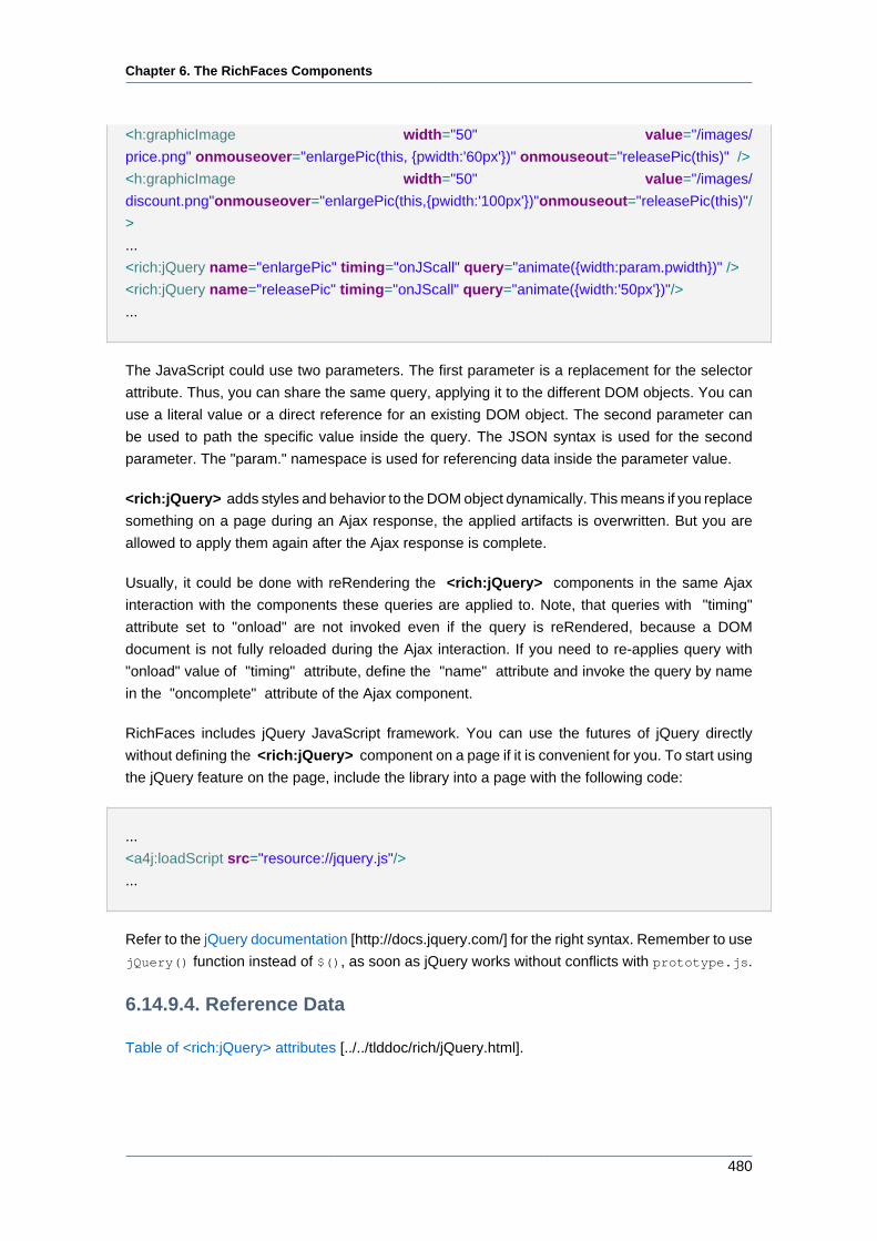
Chapter 6. The RichFaces Components
480
<h:graphicImage width="50" value="/images/
price.png" onmouseover="enlargePic(this, {pwidth:'60px'})" onmouseout="releasePic(this)" />
<h:graphicImage width="50" value="/images/
discount.png" onmouseover="enlargePic(this, {pwidth:'100px'})" onmouseout="releasePic(this)" /
>
...
<rich:jQuery name="enlargePic" timing="onJScall" query="animate({width:param.pwidth})" />
<rich:jQuery name="releasePic" timing="onJScall" query="animate({width:'50px'})"/>
...
The JavaScript could use two parameters. The first parameter is a replacement for the selector
attribute. Thus, you can share the same query, applying it to the different DOM objects. You can
use a literal value or a direct reference for an existing DOM object. The second parameter can
be used to path the specific value inside the query. The JSON syntax is used for the second
parameter. The "param." namespace is used for referencing data inside the parameter value.
<rich:jQuery> adds styles and behavior to the DOM object dynamically. This means if you replace
something on a page during an Ajax response, the applied artifacts is overwritten. But you are
allowed to apply them again after the Ajax response is complete.
Usually, it could be done with reRendering the <rich:jQuery> components in the same Ajax
interaction with the components these queries are applied to. Note, that queries with "timing"
attribute set to "onload" are not invoked even if the query is reRendered, because a DOM
document is not fully reloaded during the Ajax interaction. If you need to re-applies query with
"onload" value of "timing" attribute, define the "name" attribute and invoke the query by name
in the "oncomplete" attribute of the Ajax component.
RichFaces includes jQuery JavaScript framework. You can use the futures of jQuery directly
without defining the <rich:jQuery> component on a page if it is convenient for you. To start using
the jQuery feature on the page, include the library into a page with the following code:
...
<a4j:loadScript src="resource://jquery.js"/>
...
Refer to the jQuery documentation [http://docs.jquery.com/] for the right syntax. Remember to use
jQuery() function instead of $(), as soon as jQuery works without conflicts with prototype.js.
6.14.9.4. Reference Data
Table of <rich:jQuery> attributes [../../tlddoc/rich/jQuery.html].
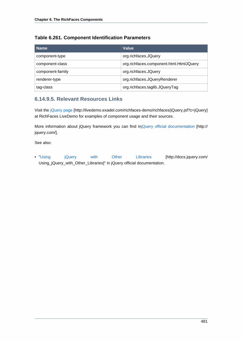
Chapter 6. The RichFaces Components
481
Table 6.261. Component Identification Parameters
Name Value
component-type org.richfaces.JQuery
component-class org.richfaces.component.html.HtmlJQuery
component-family org.richfaces.JQuery
renderer-type org.richfaces.JQueryRenderer
tag-class org.richfaces.taglib.JQueryTag
6.14.9.5. Relevant Resources Links
Visit the jQuery page [http://livedemo.exadel.com/richfaces-demo/richfaces/jQuery.jsf?c=jQuery]
at RichFaces LiveDemo for examples of component usage and their sources.
More information about jQuery framework you can find injQuery official documentation [http://
jquery.com/].
See also:
• "Using jQuery with Other Libraries [http://docs.jquery.com/
Using_jQuery_with_Other_Libraries]" in jQuery official documentation.

Chapter 7. IDE Support
483
IDE SupportRichFaces support is implemented in JBoss Developer Studio 1.0.0 GA [http://www.redhat.com/
developers/rhds/index.html] and in Jboss Tools [http://jboss.org/tools]. JBoss Developer Studio
is a fully packaged IDE that provides full support for Java Server Faces, RichFaces, Facelets,
Struts and other Web technologies. In addition to this, it seamlessly combines visual and source-
oriented development approaches. One of the special support feature for RichFaces is that it is
available as project "capabilitiy" which can be added to any existing JSF project by adding libraries
and modifying configuration files as required."
Chapter 8. Links to information resources
485
Links to information resources
Table 8.1. Web Resources
Resources Links
JBoss RichFaces JBoss RichFaces [http://labs.jboss.com/portal/
jbossrichfaces/]
JBoss Forum JBoss Forums [http://jboss.com/index.html?
module=bb&op=main&c=27]
RichFaces Wiki RichFaces Wiki [http://labs.jboss.com/wiki/
RichFaces]
RichFaces Blog RichFaces Blog [http://jroller.com/a4j/]