Review of basic probability and statistics - U-M LSA...
153
Review of basic probability and statistics Probability: basic definitions • A random variable is the outcome of a natural process that can not be predicted with certainty. – Examples: the maximum temperature next Tuesday in Chicago, the price of Wal-Mart stock two days from now, the result of flipping a coin, the response of a patient to a drug, the number of people who will vote for a certain candidate in a future election.
-
Upload
nguyencong -
Category
Documents
-
view
215 -
download
0
Transcript of Review of basic probability and statistics - U-M LSA...

Review of basic probability and statistics
Probability: basic definitions
• A random variable is the outcome of a natural process that
can not be predicted with certainty.
– Examples: the maximum temperature next Tuesday in
Chicago, the price of Wal-Mart stock two days from now,
the result of flipping a coin, the response of a patient to
a drug, the number of people who will vote for a certain
candidate in a future election.

– On the other hand, the time of sunrise next Tuesday is
for all practical purposes exactly predictable from the laws
of physics, and hence is not really a random variable (al-
though technically it may be called a degenerate random
variable).
– There is some grayness in this definition: eventually we
may be able to predict the weather or even sociological
phenomena like voting patterns with extremely high pre-
cision. From a practical standpoint this is not likely to
happen any time soon, so we consider a random variable
to be the state of a natural process that human beings
cannot currently predict with certainty.

• The set of all possible outcomes for a random variable iscalled the sample space. Corresponding to each point in thesample space is a probability, which is a number between 0and 1. The sample space together with all probabilities iscalled the distribution.
• Properties of probabilities: (i) a probability is always a num-ber between 0 and 1, (ii) the sum of probabilities for allpoints in the samples space is always exactly 1.
– Example: If X is the result of flipping a fair coin, thesample space of X is {H, T} (H for heads, T for tails).Either outcome has probability 1/2, so we write P (X =H) = 1/2 (i.e. the probability that X is a head is 1/2)and P (X = T ) = 1/2. The distribution can be written{H → 1/2, T → 1/2}.

– Example: If X is the number of heads observed in four
flips of a fair coin, the sample space of X is {0,1,2,3,4}.The probabilities are given by the binomial distribution.
The distribution is {0 → 1/16,1 → 1/4,2 → 3/8,3 →1/4,4 → 1/16}.
– Example: Suppose we select a point on the surface of
the Earth at random and measure the temperature at that
point with an infinitely precise thermometer. The temper-
ature will certainly fall between −100◦C and 100◦C, but
there are infinitely many values in that range. Thus we
can not represent the distribution using a list {x → y, . . .},as above. Solutions to this problem will be discussed be-
low.

• A random variable is either qualitative or quantitative de-
pending on the type of value in the sample space. Quantita-
tive random variables express values like temperature, mass,
and velocity. Qualitative random variables express values like
gender and race.
• The cumulative distribution function (CDF) is a way to rep-
resent a quantitative distribution. For a random variable X,
the CDF is a function F (t) such that F (t) = P (X ≤ t). That
is, the CDF is a function of t that specifies the probability of
observing a value no larger than t.

– Example: Suppose X follows a standard normal distribu-
tion. You may recall that this distribution has median 0,
so that the P (X ≤ 0) = 1/2 and P (X ≥ 0) = 1/2. Thus
for the standard normal distribution, F (0) = 1/2. There
is no simple formula for F (t) when t 6= 0, but a table of
values for F (t) is found in the back of almost any statistics
textbook. A plot of F (t) is shown below.

0
0.1
0.2
0.3
0.4
0.5
0.6
0.7
0.8
0.9
1
-4 -3 -2 -1 0 1 2 3 4
P(X
<=
t)
t
The standard normal CDF
• Any CDF F (t) has the following properties: (i) 0 ≤ F (t) ≤ 1,
(ii) F (−∞) = 0, (iii) F (∞) = 1, (iv) F is non-decreasing.

• We can read probabilities of the form P (X ≤ t) directly from the
graph of the CDF. Since P (X > t) = 1 − P (X ≤ t) = 1 − F (t),
we can also read off a probability of the form P (X > t) directly
from a graph of the CDF.
0
0.2
0.4
0.6
0.8
1
-4 -3 -2 -1 0 1 2 3 4
The length of the green line is the probability of observ-ing a value less than −1. The length of the blue line isthe probability of observing a value greater than 1. Thelength of the purple line is the probability of observing avalues less than 1.

• If a ≤ b, for any random variable X
P (a < X ≤ b) = P (X ≤ b)− P (X ≤ a) = F (b)− F (a).
Thus we can easily determine the probability of observing a value
in an interval (a, b] from the CDF.
0
0.1
0.2
0.3
0.4
0.5
0.6
0.7
0.8
0.9
1
-4 -3 -2 -1 0 1 2 3 4
The length of the purple line is the probability of observing a value
between −1 and 1.5.

• If a and b fall in an area where F is very steep, F (b) − F (a)
will be relatively large. Thus we are more likely to observe
values where F is steep than where F is flat.
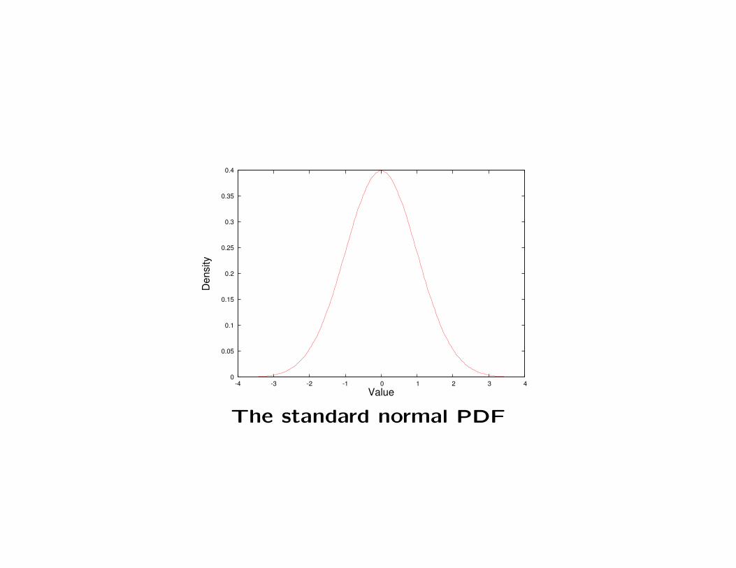
• A probability density function (PDF) is a different way to
represent a probability distribution. The PDF for X is a
function f(x) such that the probability of observing a value
of X between a and b is equal to the area under the graph of
f(x) between a and b. A plot of f(x) for the standard normal
distribution is shown below. We are more likely to observed
values where f is large than where f is small.
0
0.05
0.1
0.15
0.2
0.25
0.3
0.35
0.4
-4 -3 -2 -1 0 1 2 3 4
Den
sity
Value
The standard normal PDF

Probability: samples and populations
• If we can repeatedly and independently observe a random
variable n times, we have an independent and identically dis-
tributed sample of size n, or an iid sample of size n. This is
also called a simple random sample, or an SRS. (Note that
the word sample is being used somewhat differently in this
context compared to its use in the term sample space).
• A central problem in statistics is to answer questions about an
unknown distribution called the population based on a simple
random sample that was generated by the distribution. This
process is called inference.
Specifically, given a numerical characteristic of a distribution,
we may wish to estimate the value of that characteristic
based on data.
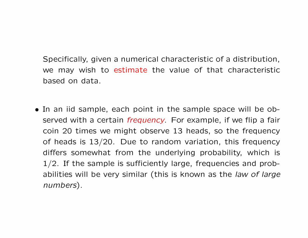
• In an iid sample, each point in the sample space will be ob-
served with a certain frequency. For example, if we flip a fair
coin 20 times we might observe 13 heads, so the frequency
of heads is 13/20. Due to random variation, this frequency
differs somewhat from the underlying probability, which is
1/2. If the sample is sufficiently large, frequencies and prob-
abilities will be very similar (this is known as the law of large
numbers).

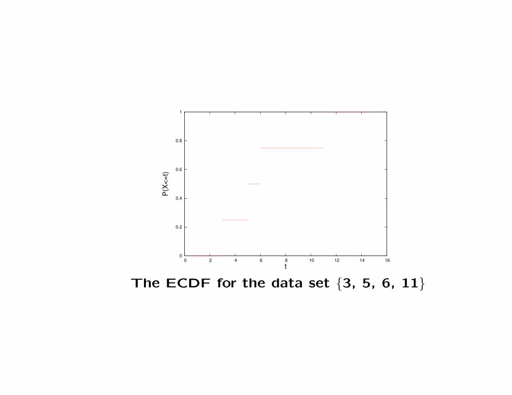
• Since probabilities can be estimated as frequencies, and the
CDF is defined in terms of probabilities (i.e. F (t) = P (X ≤t)), we can estimate the CDF as the empirical CDF (ECDF).
Suppose that X1, X2, . . . , Xn are an iid sample. Then the
ECDF (evaluated at t) is defined to be the proportion of the
Xi that are not larger than t. The ECDF is notated as F (t)
(in general the symbol ? represents an estimate based on an
iid sample of a characteristic of the population named ?).
– Example: Suppose we observe a sample of size n = 4
whose sorted values are 3,5,6,11. Then F (t) is equal to:
0 for t < 3, 1/4 for 3 ≤ t < 5, 1/2 for 5 ≤ t < 6, 3/4 for
6 ≤ t < 11, and 1 for t ≥ 11.
0
0.2
0.4
0.6
0.8
1
0 2 4 6 8 10 12 14 16
P(X
<=t)
t
The ECDF for the data set {3, 5, 6, 11}

• Since the ECDF is a function of the sample, which is random,
if we construct two ECDF’s for two samples from the same
distribution, the results will differ (even through the CDF’s
from the underlying population are the same). This is called
sampling variation. The next figure shows two ECDF’s con-
structed from two independent samples of size 50 from a
standard normal population.

0
0.1
0.2
0.3
0.4
0.5
0.6
0.7
0.8
0.9
1
-4 -3 -2 -1 0 1 2 3 4
P(X
<=t)
t
CDFECDF
0
0.1
0.2
0.3
0.4
0.5
0.6
0.7
0.8
0.9
1
-4 -3 -2 -1 0 1 2 3 4
P(X
<=t)
t
CDFECDF
Two ECDF’s for standard normal samples of size 50 (the
CDF is shown in red)
• The sampling variation gets smaller as the sample size in-
creases. The following figure shows ECDF’s based on SRS’s
of size n = 500.

0
0.1
0.2
0.3
0.4
0.5
0.6
0.7
0.8
0.9
1
-4 -3 -2 -1 0 1 2 3 4
P(X
<=t)
t
CDFECDF
0
0.1
0.2
0.3
0.4
0.5
0.6
0.7
0.8
0.9
1
-4 -3 -2 -1 0 1 2 3 4
P(X
<=t)
t
CDFECDF
Two ECDF’s for standard normal samples of size 500
(the CDF is shown in red)
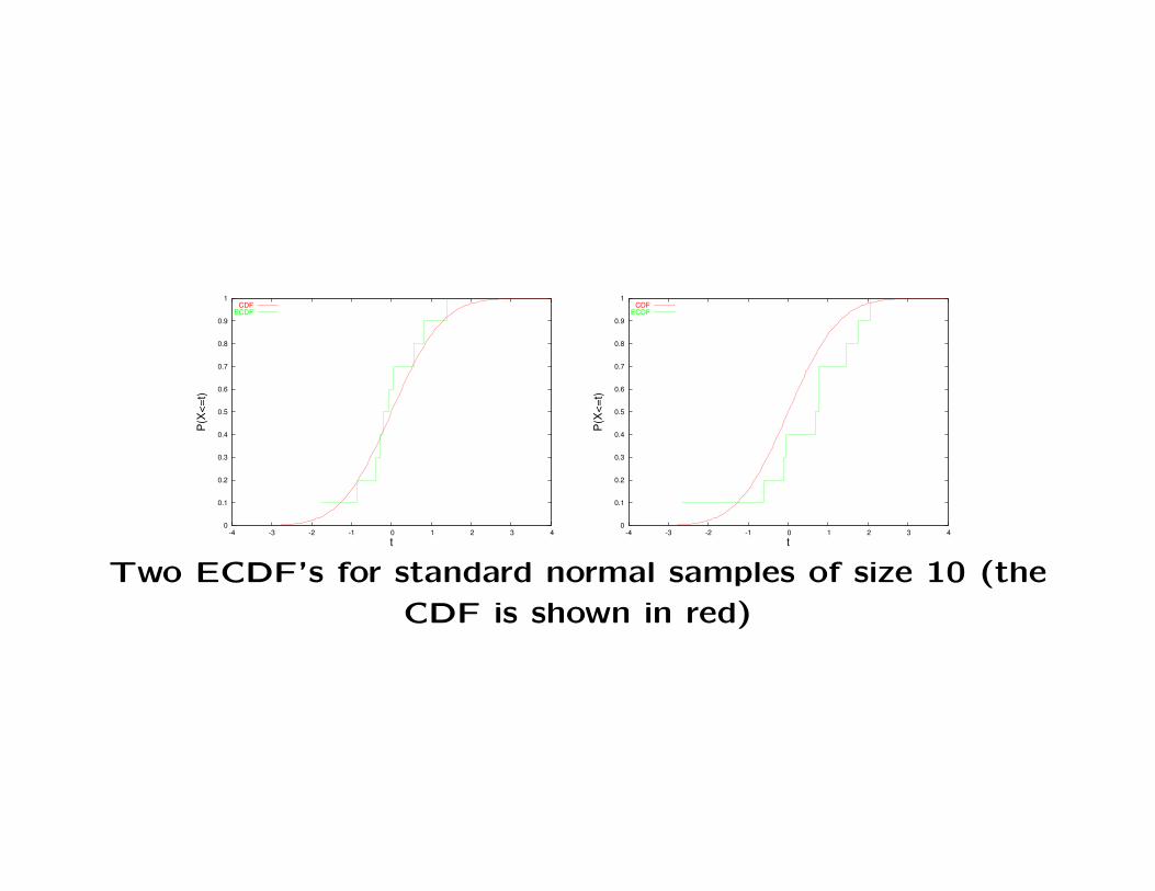
• The sampling variation gets larger as the sample size de-
creases. The following figure shows ECDF’s based on SRS’s
of size n = 10.
0
0.1
0.2
0.3
0.4
0.5
0.6
0.7
0.8
0.9
1
-4 -3 -2 -1 0 1 2 3 4
P(X
<=t)
t
CDFECDF
0
0.1
0.2
0.3
0.4
0.5
0.6
0.7
0.8
0.9
1
-4 -3 -2 -1 0 1 2 3 4
P(X
<=t)
t
CDFECDF
Two ECDF’s for standard normal samples of size 10 (the
CDF is shown in red)

• Given a SRS X1, . . . , Xn, a histogram formed from the SRS
is an estimate of the PDF. To construct a histogram, select
a bin width ∆ > 0, and let H(x) be the function such that
when (k−1)∆ ≤ x < k∆, H(x) is the number of observed Xi
that fall between (k − 1)∆ and k∆.
• To directly compare a density and a histogram they must be
put on the same scale. A density is based on a sample of size
1, so to compare it to a histogram based on n observations
using bins with width ∆, the density must be scaled by ∆n.

• There is no single best way to select ∆. A rule of thumb for the
number of bins is
∆ =R
log2(n) + 1,
where n is the number of data points and R is the range of the
data (the greatest value minus the least value). This can be
used to produce a reasonable value for ∆.

• Just as with the ECDF, sampling variation will cause the his-
togram to vary if the experiment is repeated. The next figure
shows two replicates of a histogram generated from an SRS of
50 standard normal random draws.
0
5
10
15
20
-4 -3 -2 -1 0 1 2 3 4
f(x)
x
Scaled densityHistogram
0
2
4
6
8
10
12
14
16
-4 -3 -2 -1 0 1 2 3 4f(x
)
x
Scaled densityHistogram
Two histograms for standard normal samples of size 50
(the scaled density is shown in red)

• As with the ECDF, larger sample sizes lead to less sampling
variation. This is illustrated in comparing the previous figure
to the next figure.
0
20
40
60
80
100
120
140
-4 -3 -2 -1 0 1 2 3 4
f(x)
x
Scaled densityHistogram
0
20
40
60
80
100
120
140
-4 -3 -2 -1 0 1 2 3 4f(x
)x
Scaled densityHistogram
Two histograms for standard normal samples of size 500
(the scaled density is shown in red)

• The quantile function is the inverse of the CDF. It is the
function Q(p) such that
F (Q(p)) = P (X ≤ Q(p)) = p,
where 0 ≤ p ≤ 1. In words, Q(p) is the point in the sample
space such that with probability p the observation will be less
than or equal to Q(p). For example, Q(1/2) is the median:
P (X ≤ Q(1/2)) = 1/2, and the 75th percentile is Q(3/4).
• A plot of the quantile function is just a plot of the CDF
with the x and y axes swapped. Like the CDF, the quantile
function is non-decreasing.

-4
-3
-2
-1
0
1
2
3
4
0 0.1 0.2 0.3 0.4 0.5 0.6 0.7 0.8 0.9 1
t: P
(X <
= t)
= p
p
The standard normal quantile function

• Suppose we observe an SRS X1, X2, . . . , Xn. Sort these values
to give X(1) ≤ X(2) ≤ · · · ≤ X(n) (these are called the order
statistics). The frequency of observing a value less than or equal
to X(k) is k/n. Thus it makes sense to estimate Q(k/n) with X(k),
i.e. Q(k/n) = X(k).

• It was easy to estimate Q(p) for p = 1/n,2/n, . . . ,1. To estimate
Q(p) for other values of p, we use interpolation. Suppose k/n <
p < (k+1)/n. Then Q(p) should be between Q(k/n) and Q((k+
1)/n) (i.e. between X(k) and X(k+1)). To estimate Q(p), we
draw a line between the points (k/n, X(k)) and ((k+1)/n, X(k+1))
in the x-y plane. According to the equation for this line, we
should estimate Q(p) as:
Q(p) = n((p− k/n)X(k+1) + ((k + 1)/n− p)X(k)
).
Finally, for the special case p < 1/n set Q(p) = X(1). (There are
many slightly different ways to define this interpolation. This is
the definition that will be used in this course.)

• The following two figures show empirical quantile functions for
standard normal samples of sizes 50 and 500.
-4
-3
-2
-1
0
1
2
3
4
0 0.1 0.2 0.3 0.4 0.5 0.6 0.7 0.8 0.9 1
t: P
(X <
= t)
= p
p
-4
-3
-2
-1
0
1
2
3
4
0 0.1 0.2 0.3 0.4 0.5 0.6 0.7 0.8 0.9 1
t: P
(X <
= t)
= p
p
Two empirical quantile functions for standard normal
samples of size 50 (the population quantile function is
shown in red)

-4
-3
-2
-1
0
1
2
3
4
0 0.1 0.2 0.3 0.4 0.5 0.6 0.7 0.8 0.9 1
t: P
(X <
= t)
= p
p
-4
-3
-2
-1
0
1
2
3
4
0 0.1 0.2 0.3 0.4 0.5 0.6 0.7 0.8 0.9 1
t: P
(X <
= t)
= p
p
Two histograms for standard normal samples of size 500
(the population quantile function is shown in red)

Measures of location
• When summarizing the properties of a distribution, the key fea-
tures of interest are generally: the most typical value and the
level of variability.
• A measure of the most typical value is often called a measure of
location. The most common measure of location is the mean,
denoted µ. If f(x) is a density function, then the mean of the
distribution is µ =∫
xf(x)dx.
• If the distribution has finitely many points in its sample space, it
can be notated {x1 → p1, . . . , xn → pn}, and the mean is p1x1 +
· · ·+ pnxn.

• Think of the mean as the center of mass of the distribution. If
you had an infinitely long board and marked it in inches from
−∞ to ∞, and placed an object with mass p1 at location X1, an
object with mass p2 at X2, and so on, then the mean will be the
point at which the board balances.
• The mean as defined above should really be called the popula-
tion mean, since it is a function of the distribution rather than a
sample from the distribution. If we want to estimate the popula-
tion mean based on a SRS X1, . . . , Xn, we use the sample mean,
which is the familiar average: X = (X1 + · · ·+ Xn)/n. This may
also be denoted µ.
Note that the population mean is sometimes called the expected
value.

• Although the mean is a mathematical function of the CDF and
of the PDF, it is not easy to determine the mean just by visually
inspecting graphs of these functions.
• An alternative measure of location is the median. The median
can be easily determined from the quantile function, it is Q(1/2).
It can also be determined from the CDF by moving horizontally
from (0,1/2) to the intersection with the CDF, then moving
vertically down to the x axis. The x coordinate of the intersection
point is the median. The population median can be estimated
by the sample median Q(1/2) (defined above).

• Suppose X is a random variable with median θ. Then we will
say that X has a symmetric distribution if
P (X < θ − c) = P (X > θ + c)
for every value of c. An equivalent definition is that
F (θ − c) = 1− F (θ + c).
In a symmetric distribution the mean and median are equal. The
density of a symmetric distribution is geometrically symmetric
about its median. The histogram of a symmetric distribution
will be approximately symmetric (due to sampling variation).

0
0.2
0.4
0.6
0.8
1
-4 -3 -2 -1 0 1 2 3 4
The standard normal CDF. The fact that this CDF
corresponds to a symmetric distribution is reflected in the
fact that lines of the same color have the same length.

• Suppose that for some values c > 0, P (X > θ + c) is much
larger than P (X < θ − c). That is, we are much more likely
to observe values c units larger than the median than values
c units smaller than the median. Such a distribution is right-
skewed.

0
0.2
0.4
0.6
0.8
1
0 2 4 6 8 10 12 14 16
A right-skewed CDF. The fact that the vertical lines on
the right are longer than the corresponding vertical lines
on the left reflects the fact that the distribution is
right-skewed.

The following density function is for the same distribution as
the preceeding CDF. Right-skewed distributions are charac-
terized by having long “right tails” in their density functions.
0
0.05
0.1
0.15
0.2
0.25
0 2 4 6 8 10 12 14 16
A right-skewed density.

• If P (X < θ − c) is much larger than P (X > θ + c) for values
of c > 0, then the distribution is left-skewed. The following
figures show a CDF and density for a left-skewed distribution.
0
0.1
0.2
0.3
0.4
0.5
0.6
0.7
0.8
0.9
1
0 2 4 6 8 10 12 14 16 0
0.05
0.1
0.15
0.2
0.25
0 2 4 6 8 10 12 14 16
A left-skewed CDF (left) and a left-skewed density
(right).

• In a right-skewed distribution, the mean is greater than the
median. In a left-skewed distribution, the median is greater
than the mean. In a symmetric distribution, the mean and
median are equal.

Measures of scale
• A measure of scale assesses the level of variability in a dis-
tribution. The most common measure of scale is the stan-
dard deviation, denoted σ. If f(x) is a density function then
σ =√∫
(x− µ)2f(x)dx is the standard deviation.
• If the distribution has finitely many points in its sample space
{x1 → p1, . . . , xn → pn} (notation as used above), then the stan-
dard deviation is σ =√
p1(x1 − µ)2 + · · ·+ pn(xn − µ)2.
• The square of the standard deviation is the variance, denoted
σ2.

• The standard deviation (SD) measures the distance between a
typical observation and the mean. Thus if the SD is large, ob-
servations tend to be far from the mean while if the SD is small
observations tend to be close to the mean. This is why the SD
is said to measure the variability of a distribution.
• If we have data X1, . . . , Xn and wish to estimate the population
standard deviation, we use the sample standard deviation:
σ =
√((X1 − X)2 + · · ·+ (Xn − X)2
)/(n− 1).
It may seem more natural to use n rather than n − 1 in the
denominator. The result is similar unless n is quite small.
• The scale can be assessed visually based on the histogram or
ECDF. A relatively wider histogram or a relatively flatter ECDF
suggests a more variable distribution. We must say “suggests”
because due to the sampling variation in the histogram and
ECDF, we can not be sure that what we are seeing is truly
a property of the population.
• Suppose that X and Y are two random variables. We can form
a new random variable Z = X + Y . The mean of Z is the mean
of X plus the mean of Y : µZ = µX + µY . If X and Y are
independent (to be defined later), then the variance of Z is the
variance of X plus the variance of Y : σ2Z = σ2
X + σ2Y .
Resistance
• Suppose we observe data X1, . . . , X100, so the median is X(50)
(recall the definition of order statistic given above). Then sup-
pose we observe one additional value Z and recompute the me-
dian based on X1, . . . , X100, Z. There are three possibilities:
(i) Z < X(50) and the new median is (X(49) + X(50))/2, (ii)
X(50) ≤ Z ≤ X(51), and the new median is (X(50) +Z)/2, or (iii)
Z > X(51) and the new median is (X(50)+X(51))/2. In any case,
the new median must fall between X(49) and X(51). When a new
observation can only change the value of a statistic by a finite
amount, the statistic is said to be resistant.

• On the other hand, the mean of X1, . . . , X100 is X = (X1 +
· · ·+ X100)/100, and if we observe one additional value Z then
the mean of the new data set is 100X/101 + Z/101. Therefore
depending on the value of Z, the new mean can be any number.
Thus the sample mean is not resistant.
• The standard deviation is not resistant. A resistant estimate
of scale is the interquartile range (IQR), which is defined to be
Q(3/4) − Q(1/4). It is estimated by the sample IQR, Q(3/4) −Q(1/4).

Comparing two distributions graphically
• One way to graphically compare two distributions is to plot
their CDF’s on a common set of axes. Two key features to
look for are
– The right/left position of the CDF (positions further to
the right indicate greater location values).
– The steepness (slope) of the CDF. A steep CDF (one that
moves from 0 to 1 very quickly) suggests a less variable
distribution compared to a CDF that moves from 0 to 1
more gradually.
• Location and scale characteristics can also be seen in the quantile
function.
– The vertical position of the quantile function (higher po-
sitions indicate greater location values).
– The steepness (slope) of the quantile function. A steep
quantile function suggests a more variable distribution
compared to a quantile function that is less steep.

• The following four figures show ECDF’s and empirical quantile
functions for the average daily maximum temperature over cer-
tain months in 2002. Note that January is (of course) much
colder than July, and (less obviously) January is more variable
than July. Also, the distributions in April and November are very
similar (April is a bit colder).
Can you explain why January is more variable than July?

0
0.1
0.2
0.3
0.4
0.5
0.6
0.7
0.8
0.9
1
10 20 30 40 50 60 70 80 90 100 110
P(X
<=
t)
t
JanuaryJuly
The CDF’s for January and July (average daily
maximum temperature).

10
20
30
40
50
60
70
80
90
100
110
0 0.1 0.2 0.3 0.4 0.5 0.6 0.7 0.8 0.9 1
t: P
(X <
= t)
= p
p
JanuaryJuly
The quantile functions for January and July (average
daily maximum temperature).

0
0.1
0.2
0.3
0.4
0.5
0.6
0.7
0.8
0.9
1
20 30 40 50 60 70 80 90 100
P(X
<=
t)
t
AprilOctober
The CDF’s for April and October (average daily
maximum temperature).

20
30
40
50
60
70
80
90
100
0 0.1 0.2 0.3 0.4 0.5 0.6 0.7 0.8 0.9 1
t: P
(X <
= t)
= p
p
AprilOctober
The quantile functions for April and October (average
daily maximum temperature).

• Comparisons of two distributions can also be made using his-
tograms. Since the histograms must be plotted on separate
axes, the comparisons are not as visually clear.
0
20
40
60
80
100
120
140
160
180
200
220
0 20 40 60 80 100 120
Freq
uenc
y
Temperature 0
50
100
150
200
250
300
350
0 20 40 60 80 100 120Fr
eque
ncy
Temperature
Histograms for January and July (average daily maximum
temperature).

0
50
100
150
200
250
0 20 40 60 80 100 120
Freq
uenc
y
Temperature 0
50
100
150
200
250
0 20 40 60 80 100 120
Freq
uenc
y
Temperature
Histograms for April and October (average daily
maximum temperature).

• The standard graphical method for comparing two distribu-
tions is a quantile-quantile (QQ) plot. Suppose that QX(p)
is the empirical quantile function for X1, . . . , Xm and QY (p)
is the empirical quantile function for Y1, . . . , Yn. If we make a
scatterplot of the points (QX(p), QY (p)) in the plane for ev-
ery 0 < p < 1 we get something that looks like the following:

20
40
60
80
100
20 40 60 80 100
July
qua
ntile
s
January quantiles
QQ plot of average daily maximum temperature (July vs.
January).

• The key feature in the plot is that every quantile in July is greater
than the corresponding quantile in January.
More subtly, since the slope of the points is generally shallower
than 45◦, we infer that January temperatures are more variable
than July temperatures (if the slope were much greater than 45◦
then we would infer that July temperatures are more variable
than January temperatures).

• If we take it as obvious that it is warmer in July than January,
we may wish to modify the QQ plot to make it easier to make
other comparisons.
We may median center the data (subtract the median January
temperature from every January temperature and similarly with
the July temperatures) to remove location differences.
In the median centered QQ plot, it is very clear that January
temperatures are more variable throughout most of the range,
although at the low end of the scale there are some points that
do not follow this trend.

-40
-30
-20
-10
0
10
20
30
40
-40 -30 -20 -10 0 10 20 30 40
July
qua
ntile
s (m
edia
n ce
nter
ed)
January quantiles (median centered)
QQ plot of median centered average daily maximum
temperature (July vs. January).

• A QQ plot can be used to compare the empirical quantiles of
a sample X1, . . . , Xn to the quantiles of a distribution such as
the standard normal distribution. Such a plot is called a normal
probability plot.
The main application of a normal probability plot is to assess
whether the tails of the data are thicker, thinner, or comparable
to the tails of a normal distribution.
The tail thickness determines how likely we are to observe ex-
treme values. A thick right tail indicates an increased likelihood
of observing extremely large values (relative to a normal dis-
tribution). A thin right tail indicates a decreased likelihood of
observing extremely large values.
The left tail has the same interpretation, but replace “extremely
large” with “extremely small” (where “extremely small” means
“far in the direction of −∞”).

• To assess tail thickness/thinness from a normal probability plot,
it is important to note whether the data quantiles are on the X
or Y axis. Assuming that the data quantiles are on the Y axis:
– A thick right tail falls above the 45◦ diagonal, a thin right
tail falls below the 45◦ diagonal.
– A thick left tail falls below the 45◦ diagonal, a thin left
tail falls above the 45◦ diagonal.
If the data quantiles are on the X axis, the opposite holds (thick
right tails fall below the 45◦, etc.).
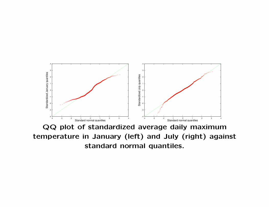
• Suppose we would like to assess whether the January or July
maximum temperatures are normally distributed. To accomplish
this, perform the following steps.

– First we standardize the temperature data, meaning that
for each of the two months, we compute the sample mean
µ and the sample standard deviation σ, then transform
each value using
Z → (Z − µ)/σ.
Once this has been done, then the transformed values for
each month will have sample mean 0 and sample standard
deviation 1, and hence can be compared to a standard
normal distribution.

– Next we construct a plot of the temperature quantiles
(for standardized data) against the corresponding popu-
lation quantiles of the standard normal distribution. The
simplest way to proceed is to plot Z(k) (where Z1, Z2, . . .
are the standardized temperature data) against Q(k/n),
where Q is the standard normal quantile function.
-4
-3
-2
-1
0
1
2
3
4
-4 -3 -2 -1 0 1 2 3 4
Sta
ndar
dize
d Ja
nuar
y qu
antil
es
Standard normal quantiles
-4
-3
-2
-1
0
1
2
3
4
-4 -3 -2 -1 0 1 2 3 4
Sta
ndar
dize
d Ju
ly q
uant
iles
Standard normal quantiles
QQ plot of standardized average daily maximum
temperature in January (left) and July (right) against
standard normal quantiles.

• In both cases, the tails for the data are roughly comparable to
normal tails. For January both tails are slightly thinner than
normal, and the left tail for July is slightly thicker than normal.
The atypical points for July turn out to correspond to a few sta-
tions at very high elevations that are unusually cold in summer,
e.g. Mount Washington and a few stations in the Rockies.

• Normal probability plots can also be used to detect skew.
The following two figures show the general pattern for the normal
probability plot for left skewed and for right skewed distributions.
The key to understanding these figures is to consider the extreme
(largest and smallest) quantiles.
– In a right skewed distribution, the largest quantiles will
be much larger compared to the corresponding normal
quantiles.
– In a left skewed distribution, the smallest quantiles will
be much smaller compared to the corresponding normal
quantiles.
Be sure to remember that “small” means “closer to −∞”, not
“closer to 0”.

-3
-2
-1
0
1
2
3
4
-3 -2 -1 0 1 2 3 4 5 6 7
Nor
mal
qua
ntile
s
�
Quantiles of a right skewed distribution
-6
-4
-2
0
2
4
-6 -4 -2 0 2 4
Nor
mal
qua
ntile
s
�
Quantiles of a left skewed distribution
• Note that the data quantiles are on the X axis (the reverse
of the preceeding normal probability plots). It is important
that you be able to read these plots both ways.
Sampling distributions of statistics
• A statistic is any function of a random variable (i.e. a function of
data). For example, the sample mean, sample median, sample
standard deviation, and sample IQR are all statistics.
• Since a statistic is formed from data, which is random, a statistic
itself is random. Hence a statistic is a random variable, and it
has a distribution. The variation in this distribution is referred
to as sampling variation.
• The distribution of a statistic is determined by the distribution of
the data used to form the statistic. However there is no simple
procedure that can be used to determine an explicit formula for
the distribution of a statistic from the distribution of the data.
• Suppose that X is the average of a SRS X1, . . . , Xn. The mean
and standard deviation of X are related to the mean µ and stan-
dard deviation σ of Xi as follows. The mean of X is µ and the
standard deviation of X is σ/√
n.
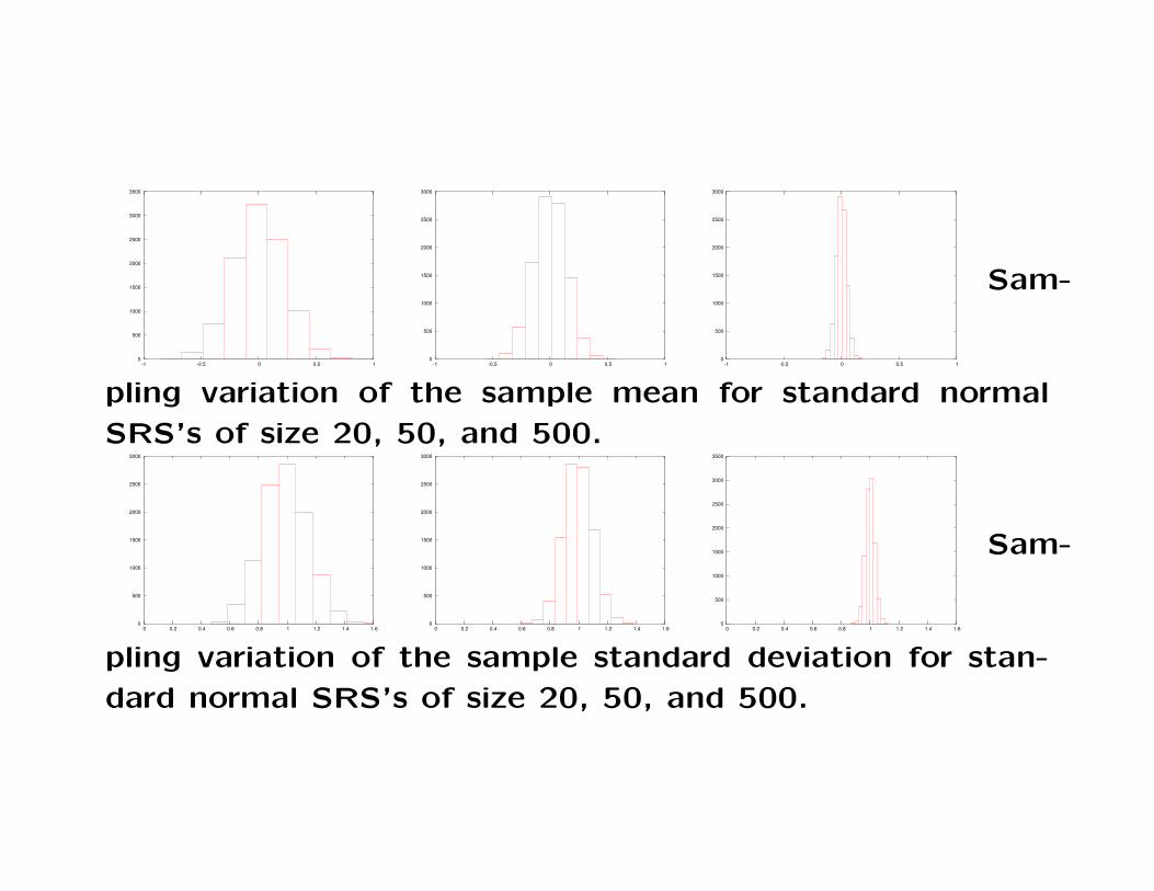
• Many simple statistics are formed from a SRS, for example the
sample mean, median, standard deviation, and IQR. For such
statistics, the key characteristic is that the sampling variation
becomes smaller as the sample size increases. The following
figures show examples of this phenomenon.
0
500
1000
1500
2000
2500
3000
3500
-1 -0.5 0 0.5 1 0
500
1000
1500
2000
2500
3000
-1 -0.5 0 0.5 1 0
500
1000
1500
2000
2500
3000
-1 -0.5 0 0.5 1
Sam-
pling variation of the sample mean for standard normal
SRS’s of size 20, 50, and 500.
0
500
1000
1500
2000
2500
3000
0 0.2 0.4 0.6 0.8 1 1.2 1.4 1.6 0
500
1000
1500
2000
2500
3000
0 0.2 0.4 0.6 0.8 1 1.2 1.4 1.6 0
500
1000
1500
2000
2500
3000
3500
0 0.2 0.4 0.6 0.8 1 1.2 1.4 1.6
Sam-
pling variation of the sample standard deviation for stan-
dard normal SRS’s of size 20, 50, and 500.

0
0.1
0.2
0.3
0.4
0.5
0.6
0.7
0.8
0.9
1
-1 -0.8 -0.6 -0.4 -0.2 0 0.2 0.4 0.6 0.8 1
n=20n=50
n=500
ECDF’s showing the sampling variation in the sample
median for standard normal SRS’s of size 20, 50, and 500.

0
0.5
1
1.5
2
2.5
3
3.5
4
0 0.5 1 1.5 2 2.5 3 3.5 4
IQR
for s
ampl
e si
ze 1
00
IQR for sample size 20
QQ plot the showing the sampling variation in the sample
IQR for standard normal SRS’s of size 20 (x axis) and
100 (y axis). The true value is 1.349.

• In the case of the sample mean, we can directly state howthe variation decreases as a function of the sample size: foran SRS of size n, the standard deviation of X is σ/
√n, where
σ is the standard deviation of one observation.
The sample size must increase by a factor of 4 to cut thestandard deviation in half. Doubling the sample size onlyreduces σ by around 30%.
For other statistics such as the sample median or samplestandard deviation, the variation declines with sample size.But it is not easy to give a formula for the standard deviationin terms of sample size.
For most statistics, it is approximately true that increasingthe sample size by a factor of F scales the sample standarddeviation by a factor of 1/
√F .

Hypothesis testing
• It is often possible to carry out inferences (from sample to pop-
ulation) based on graphical techniques (e.g. using the empirical
CDF and quantile functions and the histogram).
This type of inference may be considered informal, since it doesn’t
involve making quantitative statements about the likelihood that
certain characteristics of the population hold.
• In many cases it is important to make quantitative statements
about the degree of uncertainty in an inference. This requires a
formal and quantitative approach to inference.

• In the standard setup we are considering hypotheses, which are
statements about a population. For example, the statement that
the mean of a population is positive is a hypothesis.
More concretely, we may be comparing incomes of workers with
a BA degree to incomes of workers with an MA degree, and our
hypothesis may be that the mean MA income minus the mean
BA income is positive.
Note that hypotheses are always statements about populations,
not samples, so the means above are population means.

• Generally we are comparing two hypotheses, which are conven-
tionally referred to as the null hypothesis and the alternative
hypothesis.
If the data are inconclusive or strongly support the null hypoth-
esis, then we decide in favor of the null hypothesis. Only if the
data strongly favor the alternative hypothesis do we decide in
favor of the alternative hypothesis over the null.

– Example: If hypothesis A represents a “conventional wisdom”
that somebody is trying to overturn by proposing hypothesis B,
then A should be the null hypothesis and B should be the alter-
native hypothesis. Thus, if somebody is claiming that cigarette
smoking is not associated with increased lung cancer risk, the
null hypothesis would be that cigarette smoking is associated
with increased lung cancer risk, and the alternative would be
that it is not. Then once the data are collected and analyzed,
if the results are inconclusive, we would stick with the standard
view that smoking is a risk factor for lung cancer.
Note that the “conventional wisdom” may change over time.
One-hundred years ago smoking was not widely regarded as dan-
gerous, so the null and alternative may well have been switched
back then.

– Example: If the consequences of mistakenly accepting hypothesis
A are more severe than the consequences of mistakenly accept-
ing hypothesis B, then B should be the null hypothesis and A
should be the alternative. For example, suppose that somebody
is proposing that a certain drug prevents baldness, but it is sus-
pected that the drug may be very toxic. If we adopt the use of
the drug and it turns out to be toxic, people may die. On the
other hand if we do not adopt the use of the drug and it turns
out to be effective and non-toxic, some people will needlessly be-
come bald. The consequence of the first error is far more severe
than the consequence of the second error. Therefore we take as
the null hypothesis that the drug is toxic, and as the alternative
we take the hypothesis that the drug is non-toxic and effective.
Note that if the drug were intended to treat late stage cancer,
the null/alternative designation would not be as clear because
the risks of not treating the disease are as severe as the risk of
a toxic reaction (both are likely to be fatal).

– Example: If hypothesis A is a much simpler explanation for a
phenomenon than hypothesis B, we should take hypothesis A as
the null hypothesis and hypothesis B as the alternative hypoth-
esis. This is called the principle of parsimony, or Occam’s razor.
Stated another way, if we have no reason to favor one hypothesis
over another, the simplest explanation is preferred.
Note that there is no general theoretical justification for this prin-
cipal, and it does sometimes happen that the simplest possible
explanation turns out to be incorrect.

• Next we need to consider the level of evidence in the data for each
of the two hypotheses. The standard method is to use a test
statistic T (X1, . . . , Xn) such that extreme values of T indicate
evidence for the alternative hypothesis, and non-extreme values
of T indicate evidence for the null hypothesis.
“Extreme” may mean “closer to +∞” (a right-tailed test), or
“closer to −∞” (a left-tailed test), or “closer to one of ±∞”,
depending on the context. The first two cases are called one-
sided tests, while the final case is called a two-sided test.
The particular definition of “extreme” for a given problem is
called the rejection region.

• Example: Suppose we are investigating a coin, and the null hy-
pothesis is that the coin is fair (equally likely to land heads or
tails) while the alternative is that the coin is unfairly biased in
favor of heads. If we observe data X1, . . . , Xn where each Xi is
H or T , then the test statistic T (X1, . . . , Xn) may be the number
of heads, and the rejection region would be “large values of T”
(since the maximum value of T is n, we might also say “T close
to n”).
On the other hand, if the alternative hypothesis was that the
coin is unfairly biased in favor of tails, the rejection region would
be “small values of T” (since the minimum value of T is zero,
we might also say “T close to zero”).
Finally, if if the alternative hypothesis was that the coin is unfairly
biased in any way, the rejection region would be “large or small
values of T” (T close to 0 or n).

• Example: Suppose we are investigating the effect of eating fast
food on body shape. We choose to focus on the body mass index
X = weight/height2, which we observe for people X1, . . . , Xm
who never eat fast food and people Y1, . . . , Yn who eat fast food
three or more times per week. Our null hypothesis is that the
two populations have the same mean BMI, and the alternative
hypothesis is that people who eat fast food have a higher mean
BMI.
We shall see that a reasonable test statistic is
T = (Y − X)/√
σ2X/m + σ2
Y /n
where σX and σY are the sample standard deviations for the
Xi and the Yi respectively). The rejection region will be “large
values of T”.
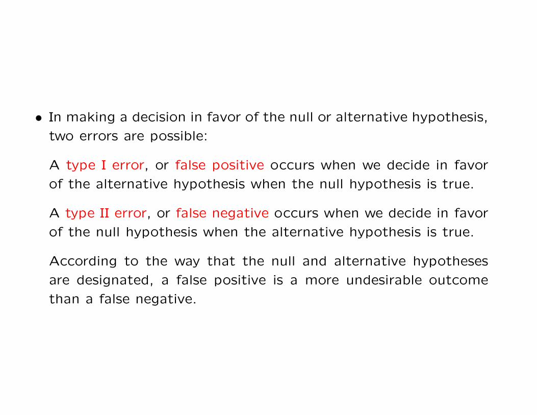
• In making a decision in favor of the null or alternative hypothesis,
two errors are possible:
A type I error, or false positive occurs when we decide in favor
of the alternative hypothesis when the null hypothesis is true.
A type II error, or false negative occurs when we decide in favor
of the null hypothesis when the alternative hypothesis is true.
According to the way that the null and alternative hypotheses
are designated, a false positive is a more undesirable outcome
than a false negative.

• Once we have a test statistic T and a rejection region, we would
like to quantify the amount of evidence in favor of the alternative
hypothesis.
The standard method is to compute the probability of observing
a value of T “as extreme or more extreme” than the observed
value of T , assuming that the null hypothesis is true.
This number is called the p-value. It is the probability of type I
error, or the probability of making a false positive decision, if we
decide in favor of the alternative based on our data.
For a right-tailed test, the p-value is P (T ≥ Tobs), where Tobs de-
notes the test statistic value computed from the observed data,
and T denotes a test statistic value generated by the null distri-
bution.
Equivalently, the right-tailed p-value is 1 − F (Tobs), where F is
the CDF of T under the null hypothesis.

For a left-tailed test, the p-value is P (T ≤ Tobs), or equivalently
F (Tobs).
For a two sided test we must locate the “most typical value of
T” under the null hypothesis and then consider extreme values
centered around this point. Suppose that µT is the expected
value of the test statistic under the null hypothesis. Then the
p-value is
P (|T − µT | > |Tobs − µT |)
which can also be written
P (T < µT − |Tobs − µT |) + P (T > µT + |Tobs − µT |).

• Example: Suppose we observe 28 heads and 12 tails in 40 flips
of a coin. Our observed test statistic value is Tobs = 28. You
may recall that under the null hypothesis (P (H) = P (T ) = 1/2)
the probability of observing exactly k heads out of 40 flips is(40k
)/240 (where
(nk
)= n!/(n − k)!k!). Therefore the probability
of observing a test statistic value of 28 or larger under the null
hypothesis (i.e. the p-value) is
P (T = 28) + P (T = 29) + · · ·+ P (T = 40)
which equals
(40
28
)/240 +
(40
29
)/240 + · · ·+
(40
40
)/240.

This value can be calculated on a computer. It is approximately
.008, indicating that it is very unlikely to observe 28 or more
heads in 40 flips of a fair coin. Thus the data suggest that the
coin is not fair, and in particular it is biased in favor of heads.
Put another way, if we decide in favor of the alternative hy-
pothesis, there is < 1% chance that we are committing a type I
error.

An alternative approach to calculating this p-value is to use a
normal approximation. Under the null distribution, T has mean
n/2 and standard deviation√
n/2 (recall the standard deviation
formula for the binomial distribution is σ =√
np(1− p) and sub-
stitute p = 1/2).
Thus the standardized test statistic is T ∗obs = 2(Tobs − n/2)/√
n,
which is 2.53 in this case. Since T ∗obs has mean 0 and standard
deviation 1 we may approximate its distribution with a stan-
dard normal distribution. Thus the p-value can be approximated
as the probability that a standard normal value exceeds 2.53.
From a table of the standard normal distribution, this is seen
to be approximately .006, which is close to the true value of
(approximately) .008 and can be calculated without the use of a
computer.

• Example: Again suppose we observe 28 heads out of 40 flips,
but now we are considering the two-sided test. Under the null
hypothesis, the expected value of T is µT = n/2 = 20. Therefore
the p-value is P (|T − 20| ≥ |Tobs − 20|), or P (|T − 20| ≥ 8). To
compute the p-value exactly using the binomial distribution we
calculate the sum
P (T = 0) + · · ·+ P (T = 12) + P (T = 28) + · · ·+ P (T = 40)
which is equal to
(40
0
)/240 + · · ·+
(40
12
)/240 +
(40
28
)/240 + · · ·+
(40
40
)/240.

To approximate the p-value using the standard normal distribu-
tion, standardize the boundary points of the rejection region (12
and 28) just as Tobs was standardized above. This yields ±2.53.
From a normal probability table, P (Z > 2.53) = P (Z < −2.53) ≈0.006, so the p-value is approximately 0.012.
Under the normal approximation, the two-sided p-value will al-
ways be twice the on-sided p-value. However for the exact p-
values this may not be true.

• Example: Suppose we observe BMI’s Y1, . . . , Y30 such that the
sample mean and standard deviation are Y = 26 and σY = 4 and
another group of BMI’s X1, . . . , X20 with X = 24 and σX = 3.
The test statistic (formula given above) has value 2.02. Under
the null hypothesis, this statistic approximately has a standard
normal distribution. The probability of observing a value greater
than 2.02 (for a right-tailed test) is .022. This is the p-value.

Planning an experiment or study
• When conducting a study, it is important to use a sample size
that is large enough to provide a good chance reaching the cor-
rect conclusion.
Increasing the sample size always increases the chances of reach-
ing the right conclusion. However every additional sample costs
time and money to collect, so it is desirable to avoid making an
unnecessarily large number of observations.

• It is common to use a p-value cutoff of .01 or .05 to indicate
“strong evidence” for the alternative hypothesis. Most people
feel comfortable concluding in favor of the alternative hypothesis
if such a p-value is found.
Thus in planning, one would like to have a reasonable chance of
obtaining such a p-value if the alternative is in fact true.
On the other hand, consider yourself lucky if you observe a large
p-value when the null is true, because you can cut your losses
and move on to a new investigation.

• In many cases, the null hypothesis is known exactly but the
precise formulation of the alternative is harder to specify.
For instance, I may suspect that somebody is using a coin that is
biased in favor of heads. If p is the probability of the coin landing
heads, it is clear that the null hypothesis should be p = 1/2.
However it is not clear what value of p should be specified for
the alternative, beyond requiring p to be greater than 1/2.
The alternative value of p may be left unspecified, or we may
consider a range of possible values. The difference between a
possible alternative value of p and the null value of p is the effect
size.

• If the alternative hypothesis is true, it is easier to get a small
p-value when the effect size is large, i.e. for a situation in which
the alternative hypothesis is “far” from the null hypothesis. This
is illustrated by the following examples.
– Suppose your null hypothesis is that a coin is fair, and the al-
ternative is p > 1/2. An effect size of 0.01 is equivalent to an
alternative heads probability of 0.51.
For reasonable sample sizes, data generated from the null and
alternative hypotheses look very similar (e.g., under the null the
probability of observing 10/20 heads is ≈ 0.17620 while under
the alternative the same probability is ≈ 0.17549).

– Now suppose your null hypothesis is that a coin is fair, the alter-
native hypothesis is p > 1/2, and the effect size is 0.4, meaning
that the alternative heads probability is 0.9.
In this case, for a sample size of 20, data generated under the
alternative looks very different from data generated under the
null (the probability of getting exactly 10/20 heads under the
alternative is around 1 in 500,000).
• If the effect size is small, a large sample size is required to distin-
guish a data set generated by the null from a data set generated
by the alternative. Consider the following two examples:

– Suppose the null hypothesis is p = 1/2 and the effect size is 0.01.
If the sample size is one million and the null hypotehsis is true,
with probability greater than 0.99 fewer than 501,500 heads will
be observed. If the alternative is true, with probability greater
than 0.99 more than 508,500 heads will be observed. Thus you
are almost certain to identify the correct hypothesis based on
such a large sample size.
– On the other hand, if the effect size is 0.4 (i.e. p = 0.5 vs.
p = 0.9), under the null chances are greater than 97% that 14
or fewer heads will be observed in 20 flips. Under the alternative
chances are greater than 98% that 15 or more heads will be
observed in 20 flips. So only 20 observations are sufficient to
have a very high chance of making the right decision in this case.

• To rationalize the trade-off between sample size and accuracy
in hypothesis testing, it is common to calculate the power for
various combinations of sample size and effect size. The power
is the probability of observing a given level of evidence for the
alternative when the alternative is true. Concretely, we may say
that the power is the probability of observing a p-value smaller
than .05 or .01 if the alternative is true.

• Usually the effect size is not known in practice. However there
are practical guidelines for establishing an effect size. Generally
a very small effect is considered unimportant. For example, if
patients treated under a new therapy survive less than one week
longer on average compared to the old therapy, it may not be
worth going to the trouble and expense of switching. Thus for
purposes of planning an experiment, the effect size is usually
taken to be the smallest difference that would lead to a change
in practice.
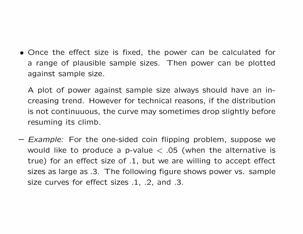
• Once the effect size is fixed, the power can be calculated for
a range of plausible sample sizes. Then power can be plotted
against sample size.
A plot of power against sample size always should have an in-
creasing trend. However for technical reasons, if the distribution
is not continuuous, the curve may sometimes drop slightly before
resuming its climb.
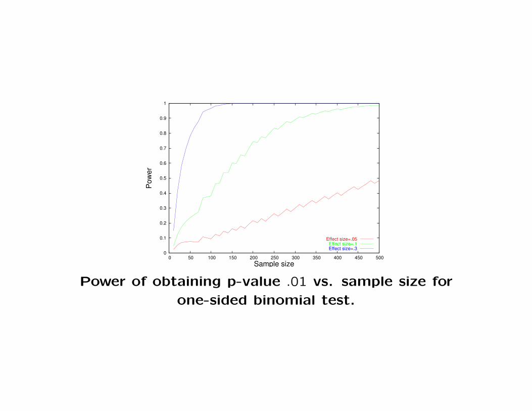
– Example: For the one-sided coin flipping problem, suppose we
would like to produce a p-value < .05 (when the alternative is
true) for an effect size of .1, but we are willing to accept effect
sizes as large as .3. The following figure shows power vs. sample
size curves for effect sizes .1, .2, and .3.

0
0.1
0.2
0.3
0.4
0.5
0.6
0.7
0.8
0.9
1
1.1
0 50 100 150 200 250 300 350 400 450 500
Pow
er
Sample size
Effect size=.05Effect size=.1Effect size=.3
Power of obtaining p-value .05 vs. sample size for
one-sided binomial test.
0
0.1
0.2
0.3
0.4
0.5
0.6
0.7
0.8
0.9
1
0 50 100 150 200 250 300 350 400 450 500
Pow
er
Sample size
Effect size=.05Effect size=.1Effect size=.3
Power of obtaining p-value .01 vs. sample size for
one-sided binomial test.

– Example: For the two-sided coin flipping problem, all p-values
are twice correpsonding value in the one-sided problem. Thus it
takes a larger sample size to achieve the same power.
0
0.1
0.2
0.3
0.4
0.5
0.6
0.7
0.8
0.9
1
0 50 100 150 200 250 300 350 400 450 500
Pow
er
Sample size
Effect size=.05Effect size=.1Effect size=.3
Power of obtaining p-value .05 vs. sample size for
two-sided binomial test.

0
0.1
0.2
0.3
0.4
0.5
0.6
0.7
0.8
0.9
1
0 50 100 150 200 250 300 350 400 450 500
Pow
er
Sample size
Effect size=.05Effect size=.1Effect size=.3
Power of obtaining p-value .01 vs. sample size for
two-sided binomial test.

– Example: Recall the BMI hypothesis testing problem from above.
The test statistic was
T = (Y − X)/√
σ2X/m + σ2
Y /n.
In order to calculate the p-value for a given value of Tobs, we
need to know the distribution of T under the null hypothesis.
This can be done exactly, but for now we will accept as an
approximation that σX and σY are exactly equal to the population
values σX and σY .
With this assumption, the expected value of T under the null
hypothesis is 0, and its variance is 1. Thus we will use the stan-
dard normal distribution as an approximation for the distribution
of T under the null hypothesis.

It follows that for the right-tailed test, T must exceed Q(0.95) ≈1.64 to obtain a p-value less than 0.05, where Q is the standard
normal quantile function.
Suppose that the Y (fast food eating) sample size is always
1/3 greater than the X (non fast food eating) sample size, so
n = 4m/3. If the effect size is c (so µY − µX = c), the test
statistic can be written
T = c/σ + T ∗, T ∗ = (Y − X − c)/σ
where σ =√
σ2X/m + 3σ2
Y /(4m) is the denominator of the test
statistic.
Under the alternative hypothesis, T ∗ has mean 0 and standard
deviation 1, so we will aprpoximate its distribution with a stan-
dard normal distribution.

Thus the power is P (T > Q(.95)) = P (T ∗ > Q(.95) − c/σ),
where probabilities are calculated under the alternative hypothe-
sis. This is equal to 1−F (Q(.95)−c/σ) (where F is the standard
normal CDF). Note that this is a function of both c and m.

0.1
0.2
0.3
0.4
0.5
0.6
0.7
0.8
0.9
1
0 20 40 60 80 100 120 140 160 180 200
Pow
er
Sample size
Effect size=1Effect size=2Effect size=3
Power of obtaining p-value .05 vs. sample size for one
sided Z-test.

0
0.1
0.2
0.3
0.4
0.5
0.6
0.7
0.8
0.9
1
0 20 40 60 80 100 120 140 160 180 200
Pow
er
Sample size
Effect size=1Effect size=2Effect size=3
Power of obtaining p-value .01 vs. sample size for one
sided Z-test.

t-tests and Z-tests
• Previously we assumed that the estimated standard deviations
σX and σY were exactly equal to the population values σX and
σY . This allowed us to use the standard normal distribution to
approximate p-values for the two sample Z test statistic:
(Y − X)/√
σ2X/m + σ2
Y /n.

• The idea behind using the standard normal distribution here is:
– The variance of X is σ2X/m and the variance of Y is σ2
Y /n.
– X and Y are independent, so the variance of Y − X is the
sum of the variance of Y and the variance of X.
Hence Y − X has variance σ2X/m+σ2
Y /n. Under the null hypoth-
esis, Y − X has mean zero. Thus
(Y − X)/√
σ2X/m + σ2
Y /n.
is approximately the “standardization” of Y − X.

• In truth,
σ2X/m + σ2
Y /n
and
σ2X/m + σ2
Y /n
differ somewhat, as the former is a random variable while the
latter is a constant. Therefore, p-values calculated assuming
that the Z-statistic is normal are slightly inaccurate.

• To get exact p-values, the following “two sample t-test statistic”
can be used:
T =
√mn
m + n·Y − X
Sp
where S2p is the pooled variance estimate:
S2p =
((m− 1)σ2
X + (n− 1)σ2Y
)/(m + n− 2)
The distribution of T under the null hypothesis is called tm+n−2,
or a “t distribution with m + n− 2 degrees of freedom.”
p-values under a t distribution can be looked up in a table.

• Example: Suppose we observe the following:
• X1, . . . , X10, X = 1, σX = 3
• Y1, . . . , Y8, Y = 3, σY = 2
The Z test statistic is (1− 3)/√
9/10 + 1/2 ≈ −1.6, with a one-
sided p-value of ≈ 0.05.
The pooled variance is S2p = (9 · 9 + 7 · 4)/(10 + 8− 2) ≈ 6.8 so
Sp ≈ 2.6. The two-sample t-test statistic is√
80/18(1−3)/2.6 ≈−1.62, with 10+8−2 = 16 df. The one-sided p-value is ≈ 0.06.

• The two sample Z or t-test is used to compare two samples
from two populations, with the goal of inferring whether the two
populations have the same mean.
A related problem is to consider a sample from a single popula-
tion, with the goal of inferring whether the population mean is
equal to a fixed value, usually zero.

• Suppose we only have one sample X1, . . . , Xn and we compute
the sample mean X and sample standard deviation σ. Then we
can use
T =√
n(X − θ)/σ
as a test statistic for the null hypothesis µ = θ (where µ is the
population mean of the Xi). Under the null hypothesis, T follows
a t-distribution with n− 1 degrees of freedom.
Most often the null hypothesis is θ = 0.

• For example, suppose we wish to test the null hypothesis µ = 0
against an alternative µ > 0. The test statistic is
T =√
nX/σ.
Under the null hypothesis T has a tn−1 distribution, which can
be used to calculate p-values exactly. For example, if X = 6,
n = 11, and σ = 10, then
Tobs =√
11 · 3/5 ≈ 2
has a t10 distribution, which gives a p-value of around .04.

• If we use the same test statistic as above, but assume that σ = σ,
then we can use the normal approximation to get an approximate
p-value.
For the example above, the Z statistic p-value is .02 which gives
an overly strong assessment of the evidence for the alternative
compared to the exact p-value computed under the t distribution.
If we were to use the two sided alternative µ 6= 0, then the p-
value would be .07 under the t10 distribution and .05 under the
standard normal distribution.

• For small degrees of freedom, the t distribution is substantially
more variable than the standard normal distribution.
Therefore under a t-distribution the p-values will be somewhat
larger (suggesting less evidence for the alternative).
If the sample size is larger than 50 or so, the two distributions
are so close that they can be used interchangeably.

1.6
1.8
2
2.2
2.4
2.6
2.8
3
0 10 20 30 40 50 60 70 80 90 100
.95
quan
tile
Sample size
t distributionstandard normal distribution
.95 quantile for the t-distribution as a function of sample
size, and the .95 quantile for the standard normal
distribution.

-4
-3
-2
-1
0
1
2
3
4
-4 -3 -2 -1 0 1 2 3 4
t qua
ntile
Normal quantile
df=5df=15
QQ plot comparing the quantiles of a standard normal
distribution (x axis) to the quantiles of the t-distribution
with two different degrees of freedom.

• A special case of the one-sample test is the paired two-sample
test. Suppose we make observations X1, Y1 on subject 1, X2, Y2
on subject 2, etc. For example, the observations might be “be-
fore” and “after” measurements of the same quantity (e.g. tu-
mor size before and after treatment with a drug).
Let Di = Yi −Xi be the change for subject i. Now suppose we
wish to test whether the before and after measurements for each
subject have the same mean. To accomplish this we can do a
one-sample Z-test or t-test on the Di.
If the data are paired, it is much better to do a paired test,
rather than to ignore the pairing and do an unpaired two-sample
test. We will see why this is so later.

• Example: Suppose we observe the following paired data:
X Y D X Y D
5 4 1 7 3 22 1 1 6 5 19 7 2 3 1 2
D = 1.5 and σD =√
0.3, so the paired test statistic is√
6 ·1.5/
√0.3 ≈ 16, which is highly significant.
X = 16/3, σX ≈ 2.6, Y = 21/6, σY ≈ 2.3, so the unpaired two-
sample Z test statistic is (16/3 − 21/6)/√
2.62/6 + 2.32/6 ≈ 0.9
which is not significant.

• The one and two sample t-statistics only have a t-distribution
when the underlying data have a normal distribution.
Moreover, for the two sample test the population standard devi-
ations σX and σY must be equal.
If the sample size is large, then p-values computed from the
standard normal or t-distributions will not be too far from the
true values even if the underlying data are not normal, or if σX
and σY differ.
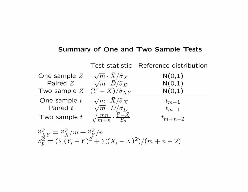
Summary of One and Two Sample Tests
Test statistic Reference distribution
One sample Z√
m · X/σX N(0,1)Paired Z
√m · D/σD N(0,1)
Two sample Z (Y − X)/σXY N(0,1)
One sample t√
m · X/σX tm−1Paired t
√m · D/σD tm−1
Two sample t√
mnm+n ·
Y−XSp
tm+n−2
σ2XY = σ2
X/m + σ2Y /n
S2p = (
∑(Yi − Y )2 +
∑(Xi − X)2)/(m + n− 2)

Confidence intervals and prediction intervals
• Suppose that our goal is to estimate an unknown constant. For
example, we may be interested in estimating the acceleration
due to gravity g (which is 9.8m/s2).
We assume that our experimental measurements are unbiased,
meaning that the mean of each Xi is g. In this case, it makes
sense to estimate g using X.
The value of X is a point estimate of g. But we would like to
quantify the uncertainty in the estimate.
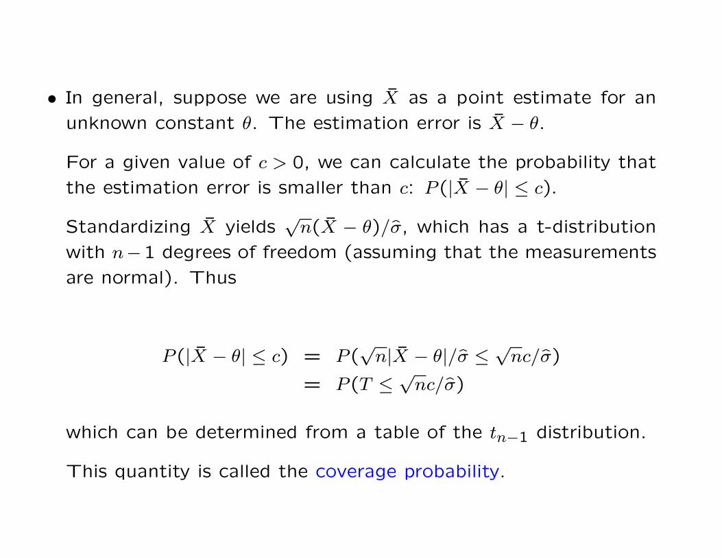
• In general, suppose we are using X as a point estimate for an
unknown constant θ. The estimation error is X − θ.
For a given value of c > 0, we can calculate the probability that
the estimation error is smaller than c: P (|X − θ| ≤ c).
Standardizing X yields√
n(X − θ)/σ, which has a t-distribution
with n−1 degrees of freedom (assuming that the measurements
are normal). Thus
P (|X − θ| ≤ c) = P (√
n|X − θ|/σ ≤√
nc/σ)
= P (T ≤√
nc/σ)
which can be determined from a table of the tn−1 distribution.
This quantity is called the coverage probability.

• We would like to control the coverage probability by holding it
at a fixed value, usually 0.9, 0.95, or 0.99.
This means we will set
√nc/σ = Q,
where Q is the 1− (1−α)/2 quantile of the tn−1 distribution for
α = 0.9,0.95, etc. Solving this for c yields
c = Qσ/√
n.

• Thus the 100×α% confidence interval (CI) is
X ±Qσ/√
n,
which may also be written
(X −Qσ/√
n, X + Qσ/√
n).
The width of the CI is 2Qσ/√
n. Note how its scales with α, σ,
and n.
If n is not too small, normal quantiles can be used in place of
tn−1 quantiles.

• Example: Suppose we observe X1, . . . , X10 with X = 9.6 and
σ = 0.7. The CI is
9.6± 2.26 · 0.7/√
10,
or 9.6± 0.5.
• A terminological nuance for a 95% CI:
OK: “There is a 95% chance that θ falls within X ±Qσ/√
n.
Better: “There is a 95% chance that the interval X ± Qσ/√
n
covers θ.

• Whether a confidence interval is a truthful description of the
actual error distribution may depend strongly on the assumption
that the data (i.e. the Xi) follow a normal distribution. If the
data are strongly non-normal (e.g. skewed or with thick tails),
the CI is typically inaccurate (i.e. you tell somebody that a CI
has a 95% chance of containing the true value, but the actual
probability is lower).
• Confidence intervals are often reported casually as “margins of
error”. For example you may read in the newspaper that the
proportion of people supporting a certain government policy is
.7± .03. This statement doesn’t mean anything unless the prob-
ability is given as well. Generally, intervals reported this way in
newspapers, etc., are 95% CI’s, but the 95% figure is almost
never stated.

• Suppose we wish to quantify the uncertainty in a prediction that
we make of a future observation. For example, today we ob-
serve a SRS X1, . . . , Xn and tomorrow we will observe a single
additional observation Z from the same distribution.
Concretely, we may be carrying out a chemical synthesis in which
fixed amounts of two reactants are combined to yield a product.
Our goal is to predict the value of Z before observing it, and to
quantify the uncertainty in our prediction.
Since the Xi and Z have the same mean, our prediction of Z will
be X. In order to quantify the prediction error we will find c so
that P (|Z − X| ≤ c) = α. This is called the 100 · α% prediction
interval.

To find c, note that Z − X has mean 0 and standard deviation√(n + 1)σ2/n. Thus
P (|Z − X| ≤ c) = P (√
n|Z − X|/σ√
n + 1 ≤√
nc/σ√
n + 1)
= P (T ≤√
nc/σ√
n + 1)
Let Q be the 1−(1−α)/2 quantile of a tn−1 distribution. Solving
for c yields
c = Q
√n + 1
nσ.
Note how this scales with Q, n, and σ.
If n is not too small, normal quantiles can be substituted for the
tn−1 quantiles.

• Example: Suppose that n = 8 replicates of an experiment carried
out today yielded X = 17 and σ = 1.5. The 95% PI is
X ± 2.36 ·√
9/8 · 1.5,
or 17± 3.8.

• The width of the CI goes to zero as the sample size gets large,
but the width of the PI never is smaller than 2Qσ.
The CI measures uncertainty in a point estimate of an unknown
constant. This uncertainty arises from estimation of µ (using X)
and σ (using σ).
The PI measures uncertainty in an unobserved random quan-
tity. This includes the uncertainty in X and σ, in addition to
uncertainty in Z. This is why the PI is wider.

• Summary of CI’s and PI’s: To obtain a CI or PI with cover-
age probability α for a SRS X1 . . . , Xn with sample mean X and
sample standard deviation σ, let α∗ = 1 − (1 − q)/2, let QN be
the standard normal quantile function, and let QT be the tn−1
distribution quantile function.
CI PI
Approximate X ±QN(α∗)σ/√
n X ±√
(n + 1)/nQN(α∗)σ
Exact X ±QT (α∗)σ/√
n X ±√
(n + 1)/nQT (α∗)σ

Transformations
• The accuracy of confidence intervals, prediction intervals, and
p-values may depend strongly upon whether the data follow a
normal distribution.
Normality is critical if the sample size is small, but much less so
for large sample sizes.
It is a good idea to check the normality of the data before giving
too much credence to the results of any statistical analysis that
depends on normality.
The main diagnostic for assessing the normality of a SRS is the
normal probability plot.

• If the data are not approximately normal, it may be possible to
transform the data so that they become so.
The most common transformations are
Xi → log(Xi − c) logarithmic transformXi → (Xi − c)q power transform
Xi → log(Xi − c +√
(Xi − c)2 + d) generalized log transformXi → log(Xi/(1−Xi)) logistic transform
We select c > minXi to ensure that the transforms are defined.
The logistic transform is only applied if 0 ≤ Xi ≤ 1.
The values c, q, and d are chosen to improve the normality of
the data.

• As q → 0 the power transform becomes more like a log-transform:
ddx logx = 1/x d
dxxq ∝ xq−1
d2
dx2 logx = −1/x2 d2
dx2xq ∝ xq−2
• Log transforms and power transforms (with q < 1) generally are
used to reduce right skew. The log transform carries out the
strongest correction, while power transforms are milder.

• The upper left plot in the following figure shows a normal proba-
bility plot for the distribution of US family income in 2001. The
rest of the figure contains normal probability plots for various
transformations of the income data.
The transform X → X1/4 is the most effective at producing
normality.

-3
-2
-1
0
1
2
3
4
-3 -2 -1 0 1 2 3 4
Nor
mal
qua
ntile
s
Income quantiles (untransformed)
-3
-2
-1
0
1
2
3
4
-4 -3 -2 -1 0 1 2 3 4
Nor
mal
qua
ntile
s
Income quantiles (log transformed)
-3
-2
-1
0
1
2
3
4
-3 -2 -1 0 1 2 3 4
Nor
mal
qua
ntile
s
Income quantiles (square root transformed)
-3
-2
-1
0
1
2
3
4
-3 -2 -1 0 1 2 3 4
Nor
mal
qua
ntile
s
Income quantiles (raised to 1/4 power)

• The log transform is especially common for right skewed data
because the transformed values are easily interpretable. With
log-transformed data, differences become fold changes. For ex-
ample, if X∗i = log(Xi) and Y ∗
i = log(Yi), then
X∗ − Y ∗ =∑i
log(Xi)/m−∑j
log(Yj)/n
= log(∏i
Xi)/m− log(∏j
Yj)/n
= log
(∏i
Xi)1/m
− log
(∏j
Yj)1/n
= log
((∏
Xi)1/m/(
∏Yj)
1/n)
,
where (∏
Xi)1/m and (
∏Yj)
1/n are the geometric means of the
Xi and the Yi respectively.

• If base 10 log are used, and X∗ − Y ∗ = c, then we can say that
the X values are 10c times greater than the Y values on average
(where “average” is the “geometric average”, to be precise).
Similarly, if base 2 logs are used, we can say that the X values
are 2c times greater than the Y values on average, or there are
“c doublings” between the X and Y values (on average).

• The normal probability transform forces the normal probability
plot to follow the diagonal exactly. If the sample size is n, and
Q is the normal quantile function, we have:
X(k) → Q(k/(n + 1)).
The main drawback to this transform is that it is difficult to
interpret or explain what has been done.
• Data occuring as proportions are often not normal. To improve
the normality of this type of data, apply the logistic transform.
This transform maps (0,1) to (−∞,∞).

• The following figures show normal probability plots for the pro-
portion of male babies in the 1990’s given each of the 500
most popular names. QQ plots are shown for unstransformed
data, for logit transformed data, and for data transformed via
X → (logit(X) + 10)3/10.
The unstransformed data are seen to be strongly non-normal
(right skewed). The logit scale data are much better, but still
show substantial deviation from normality (the left tail that drops
below the diagonal comprises around 17% of the data).
The transform (logit(X) + 10)3/10 brings the distribution very
close to normality (there are deviations in the extreme tails, but
these account for less than 2% of the data).

-4
-2
0
2
4
6
8
10
-4 -2 0 2 4 6 8 10
Nor
mal
qua
ntile
s
Quantiles of baby name proportions
-3
-2
-1
0
1
2
3
-3 -2 -1 0 1 2 3 4
Nor
mal
qua
ntile
s
Quantiles of logit baby name proportions
-3
-2
-1
0
1
2
3
-3 -2 -1 0 1 2 3
Nor
mal
qua
ntile
s
Quantiles of (logit +10)^.3 baby name proportions

Multiple testing
• Under the null hypothesis, the probability of observing a p-value
smaller than p is equal to p. For example, the probability of
observing a p-value smaller than .05 is .05.
It is often the case that many hypotheses are being considered
simultaneously. These are called simultaneous hypotheses.
For each hypothesis individually, the chance of making a false
positive decision is .05, but the chance of making a false positive
decision for at least one of several hypotheses may be much
higher.

• Example: Suppose that the IRS has devised a test to determine
if somebody has cheated on his or her taxes. A test statistic T
is constructed based on the data in a tax return, and a critical
point Tcrit is determined such that T ≥ Tcrit implies a p-value of
less than .01.
Suppose that 100 tax returns are selected, and that in truth
nobody is cheating (so all 100 null hypotheses are true). Let
Xi = 1 if the test for return i yields a p-value smaller than .01,
let Xi = 0 otherwise, and let S = X1 + · · ·+ Xn (the number of
accusations).
The distribution of S is binomial with n = 100 and success
probability p = .01. The mean of S is 1, and P (S = 0) =
(99/100)100 ≈ .37. Thus chances are around 2/3 that some-
body will be falsely accused of cheating. If n = 500 then the
chances are greater than 99%.

• The key difficulty in screening problems (like the tax problem)
is that we have no idea which person to focus on until after the
data are collected.
If we have reason to suspect a particular person ahead of time,
and if the p-value for that person’s return is smaller than .01,
then the chances of making a false accusation are .01. The
problem only arises when we search through many candidate
hypotheses to find the one with the strongest evidence for the
alternative.
• One remedy is to require stronger evidence (i.e. a smaller p-
value) for each individual test. If the p-values are required to be
small enough, the overall probability of making a false positive
can be fixed at a prescribed level.
In the above example, the p-value for each test must satisfy
1−(1−p)n = .05, giving p ≈ .0005 when n = 100. Unfortunately,
if we require this level of evidence we will have very little power.
• A different remedy is to change the goal – instead of attempt-
ing to acquire strong evidence that a specific person is cheating,
we aim to acquire strong evidence that cheating is taking place
somewhere in the population. This would be helpful in deter-
mining whether tax policy should be changed, but it would not
allow us to prosecute anybody for current transgressions.
Recall that out of a large number of hypothesis tests for which
the null hypothesis is true, on average fraction p of the tests
will yield p-values smaller than p. Thus we can form a QQ
plot comparing the uniform quantiles Q(k/n) = k/n (which are
the correct quantiles if the null hypothesis is always true) to the
observed quantiles for the p-values p1, . . . , pn in all the hypothesis
tests.
If the QQ shows that the p-values are strongly left-skewed com-
pared to a uniform distribution, there is substantial evidence in
the data that some people are cheating, even though we don’t
have sufficient evidence to prosecute any specific people.

• As an example, for each decade over the last century, the US
Social Security Administration calculated the proportion of baby
boys given each of the 1000 most popular names in a given
decade (based on a sample of 5% of all social security regis-
trations). We can extract from these names the 395 names
that occur at least once in each decade of the twentieth cen-
tury, and convert their proportions using the transform X →(logit(X) + 10)3/10 described above. Using two sample t tests,
for each name we can test whether the mean proportion in the
first five decades (1900-1949) is equal to the mean proportion
in the second five decades (1950-2000). Since we are carrying
out a hypothesis test for each name, we are carrying out 395
hypothesis tests. The QQ plot of the t test p-values follows.

0
0.2
0.4
0.6
0.8
1
0 0.2 0.4 0.6 0.8 1
Uni
form
qua
ntile
s
Quantiles of t-test p-values
Since the quantiles corresponding to the t test p-values are much
smaller than the corresponding uniform quantiles, we conclude
that there is substantial evidence that at least some names be-
came more popular or less popular in the second half of the
century.
This does not quantify the evidence for specific names that may
have changed, but we can look at the smallest individual p-values
to determine some of the best candidates (“Conrad” down by a
factor of 3, “Dexter” up by a factor of 10, “Christopher” up by
a factor of 100).