

Responsive Classroom Sampler Presented by: Andrew Moral Responsive Classroom Approach.
Upload
aaron-bernardoCategory
view
102download
1
By: Aaron Bernardo
Responsive Web DesignBridging the Gap Between Art Directorsand Developers
Me.
Aaron Bernardo
@steamin
Experience Architect

Goals for Today
1. What is Responsive Web Design?
2. Present Best Practice Patterns for Art Directors
INTRODUCTION

Phrase coined by Ethan Marcotte in a2010 article in A List Apart
What is Responsive Web Design?
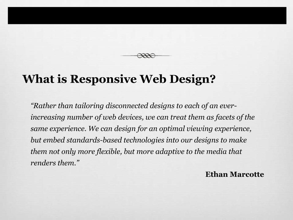
“Rather than tailoring disconnected designs to each of an ever-
increasing number of web devices, we can treat them as facets of the
same experience. We can design for an optimal viewing experience,
but embed standards-based technologies into our designs to make
them not only more flexible, but more adaptive to the media that
renders them.”
Ethan Marcotte
What is Responsive Web Design?
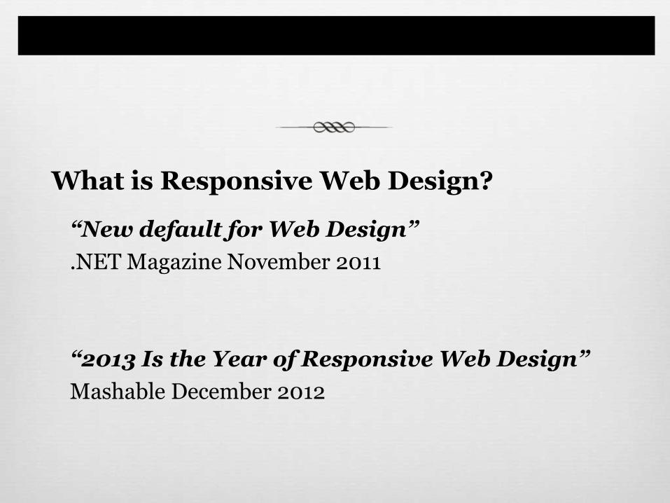
“New default for Web Design”
.NET Magazine November 2011
“2013 Is the Year of Responsive Web Design”
Mashable December 2012
What is Responsive Web Design?
An Example

Desktop view
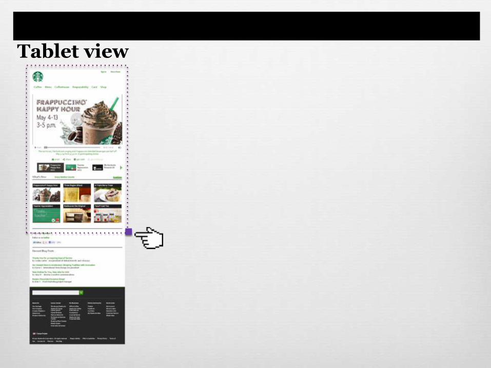
Tablet view
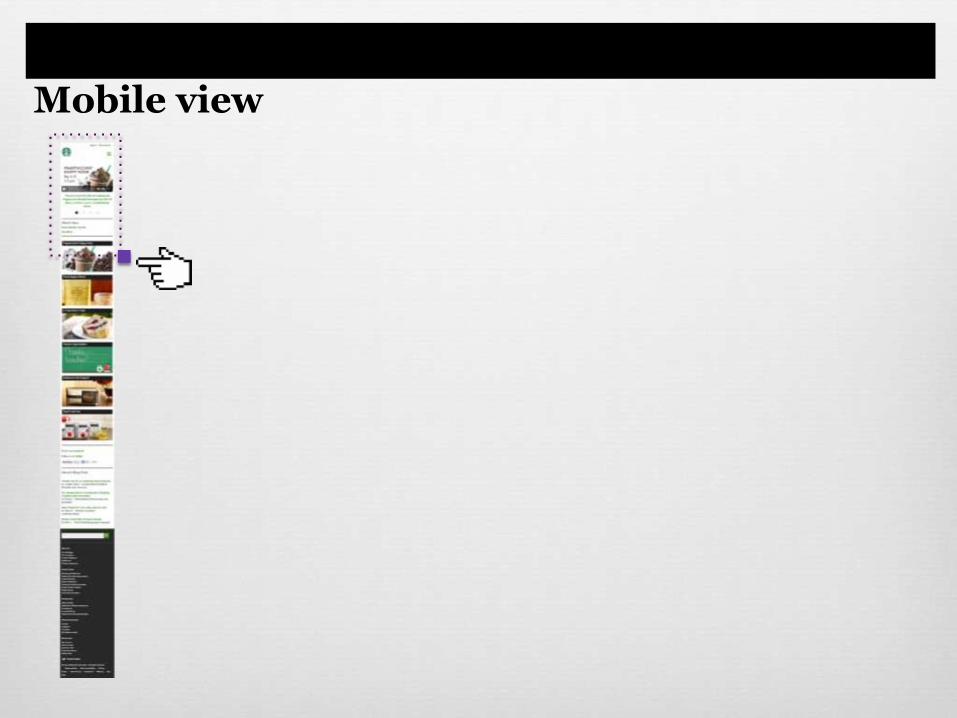
Mobile view
So… How Does it Work?

There are 3 Essential Ingredients
A Flexible, Grid-based Layout
Flexible Images and Media
Media Queries
A Flexible, Grid-based Layout
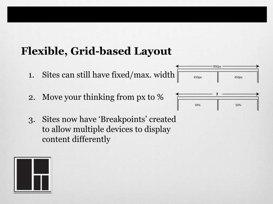
1. Sites can still have fixed/max. width
2. Move your thinking from px to %
3. Sites now have ‘Breakpoints’ createdto allow multiple devices to displaycontent differently
Flexible, Grid-based Layout
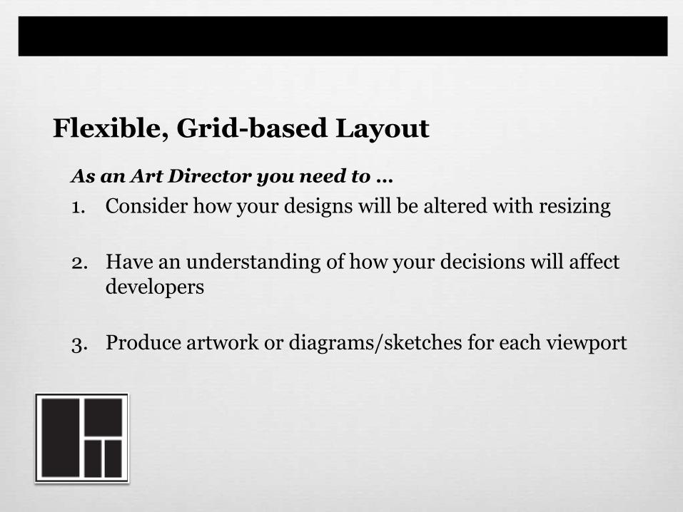
As an Art Director you need to …
1. Consider how your designs will be altered with resizing
2. Have an understanding of how your decisions will affect developers
3. Produce artwork or diagrams/sketches for each viewport
Flexible, Grid-based Layout
Flexible images and media
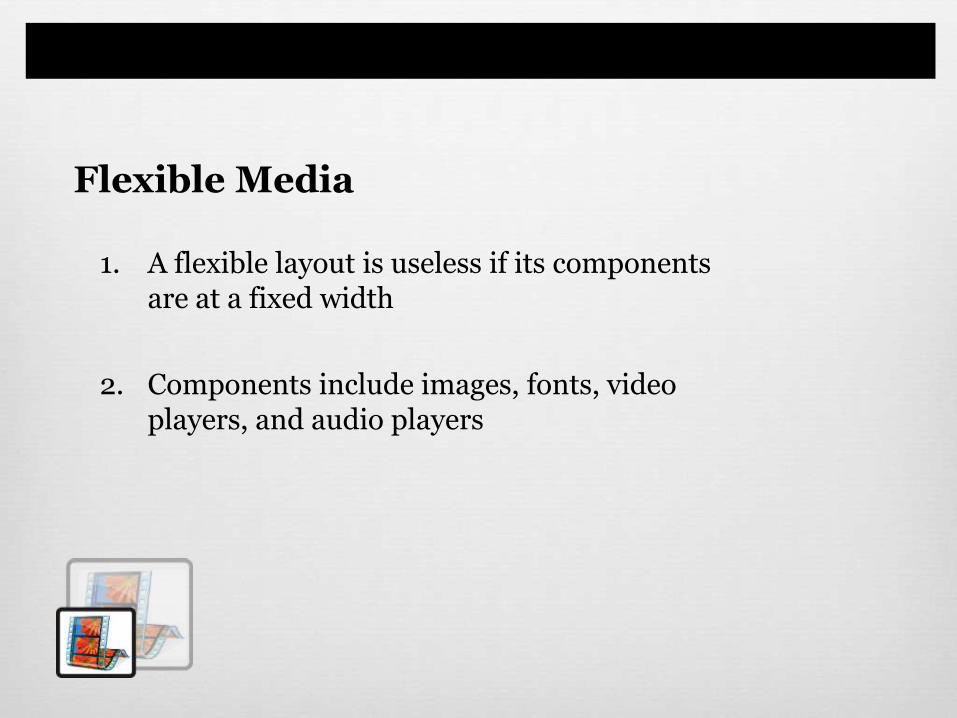
1. A flexible layout is useless if its componentsare at a fixed width
2. Components include images, fonts, videoplayers, and audio players
Flexible Media

As an Art Director you need to …
1. Remember images containing embedded
fonts will scale smaller
2. Think about images as being inside
fluid containers
Flexible Media
Media Queries
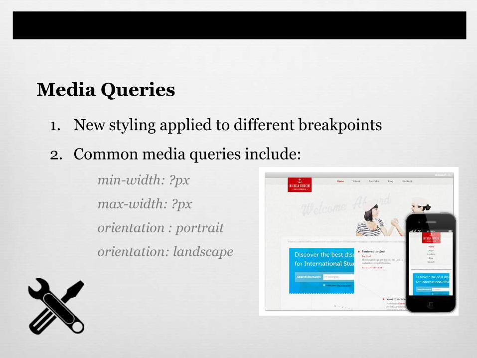
1. New styling applied to different breakpoints
2. Common media queries include:
min-width: ?px
max-width: ?px
orientation : portrait
orientation: landscape
Media Queries
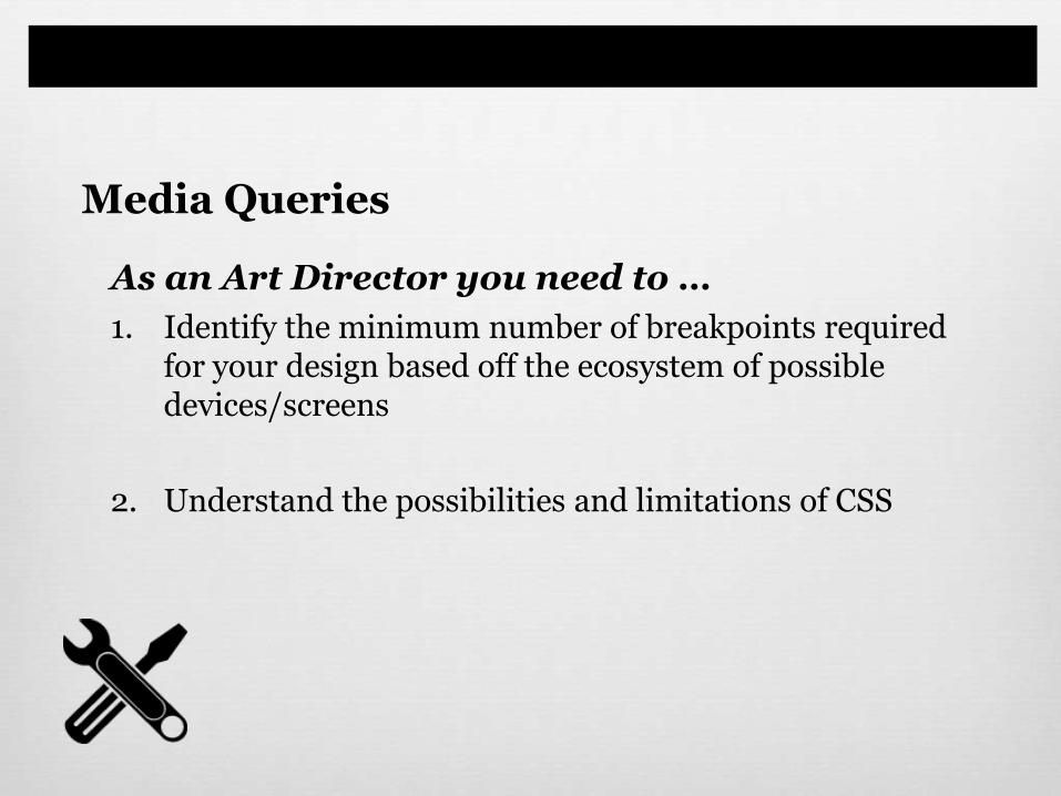
As an Art Director you need to …
1. Identify the minimum number of breakpoints required for your design based off the ecosystem of possible devices/screens
2. Understand the possibilities and limitations of CSS
Media Queries
The Challenge…How do you create mockups that align with Development?
Pattern List
Best Practices
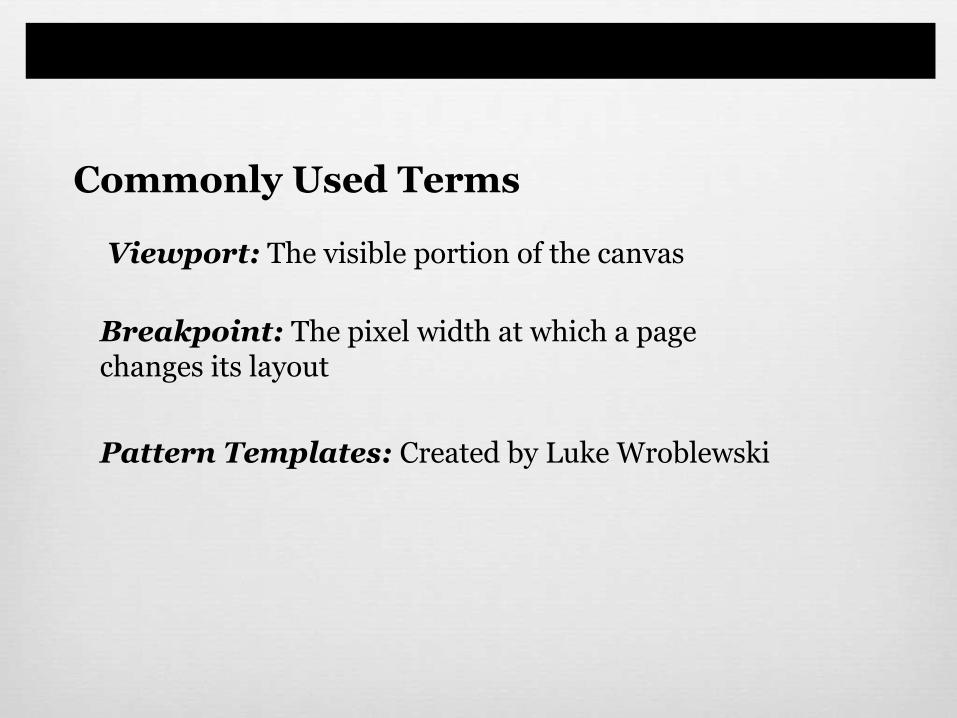
Viewport: The visible portion of the canvas
Breakpoint: The pixel width at which a page changes its layout
Pattern Templates: Created by Luke Wroblewski
Commonly Used Terms

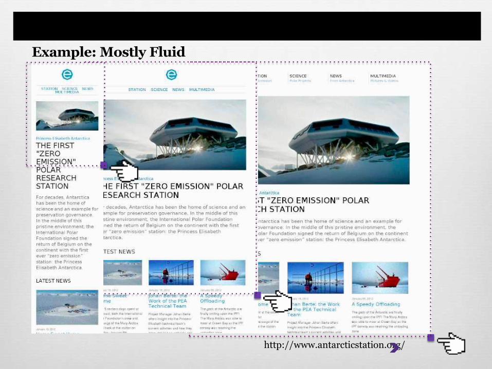
1. Mostly Fluid
A
B C
A
B C
A
B C
A
B
C
MOBILE tablet netbook DESKTOP
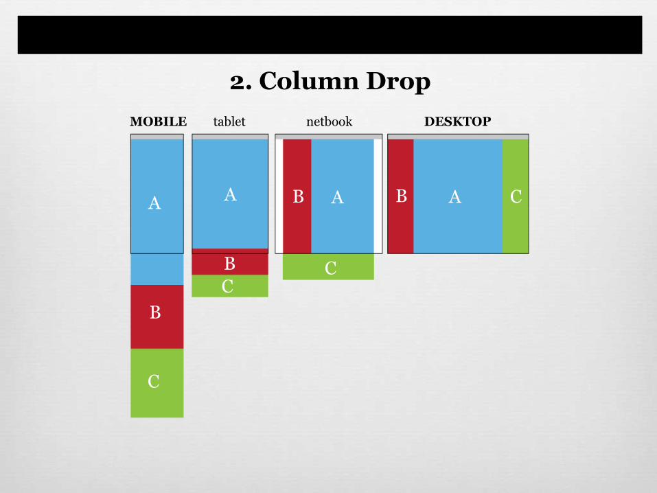
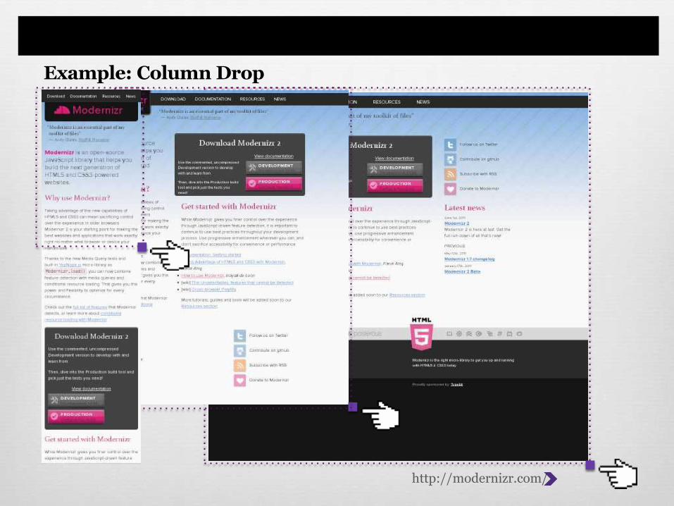
2. Column Drop
AB CAB
C
A
B
C
A
B
C
MOBILE tablet netbook DESKTOP
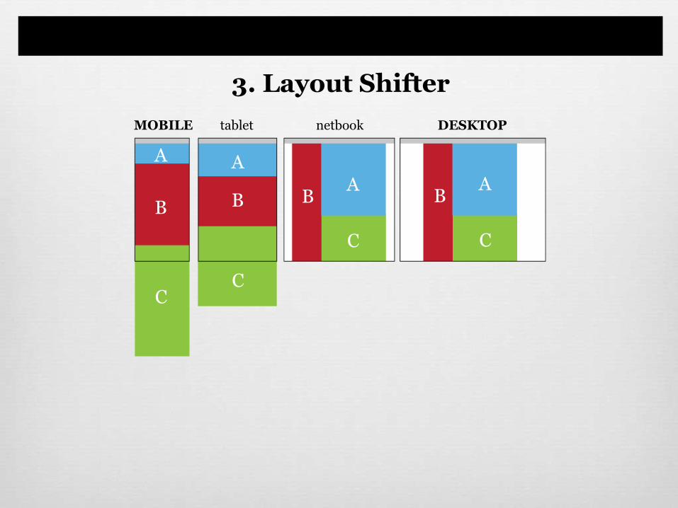
3. Layout Shifter
AB
C
AB
C
A
B
C
A
B
C
MOBILE tablet netbook DESKTOP
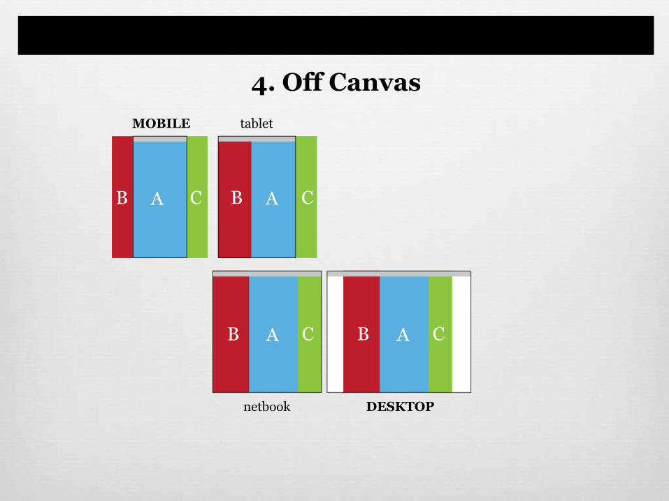
4. Off Canvas
AB C AB C
AB C AB C
MOBILE tablet
netbook DESKTOP
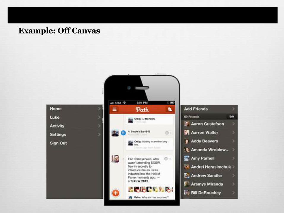
Example: Off Canvas
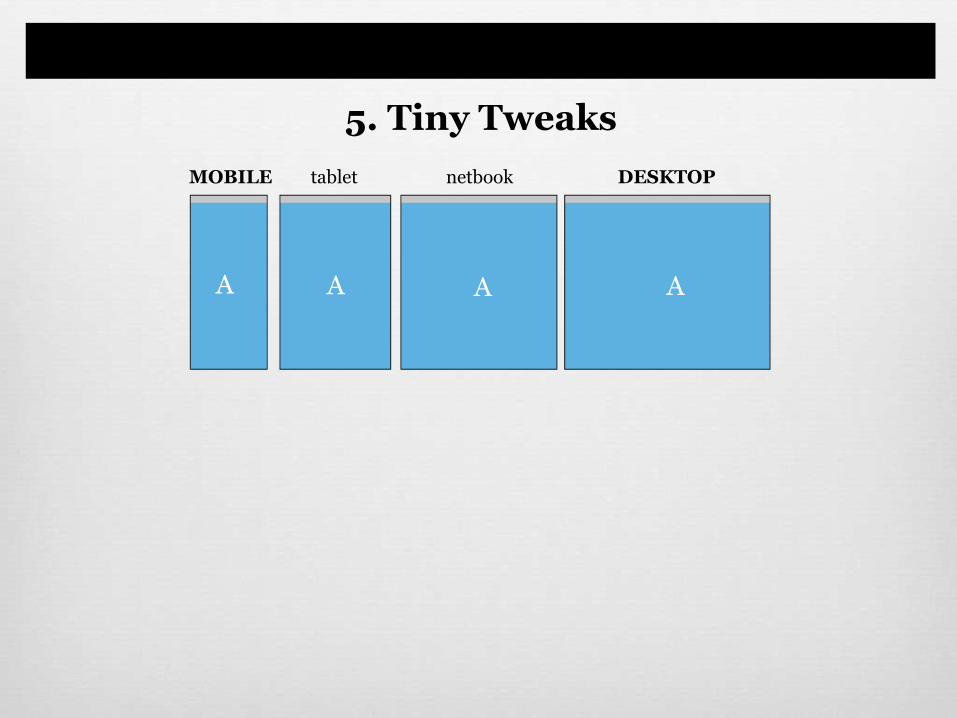
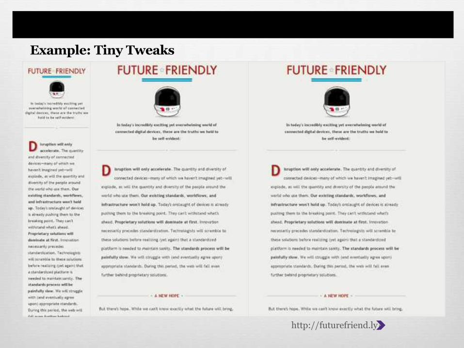
5. Tiny Tweaks
A A A A
MOBILE tablet netbook DESKTOP
Helpful Resources
Luke Wroblewski
Responsive sketch templates
Adobe Reflow (comes with Creative Cloud)
12 Helpful Tools
In Conclusion…
Thank you.
@steamin