responsive web design: why image optimization is crucial for a ...
Upload
merixstudioCategory
view
173download
3
Stop ignoring your mobile customers! Learn about and implement Responsive Web Design

Let’s face it, there is a new browsing trend that’s growingexponentially and businesses must adapt.
Why is it so crucial?
93% of small-medium sized business websites do not properly render on mobile devices40% of consumers say that a bad mobile web experience would send them to a competitor who offered the same or similar products or services.
There are over 6 billion cellphones around the world13.2% of them are smarphones. Mobiles have become the most ubiquitous communication device in human history.
95%of smartphone users have searched for a local or regional business77% of smartphone users have made contact with a business online, 61% have called directly, and 59% have visited the business.
These are hard facts. You’re driving
customers away everyday if the content on your website isn’t adjusted
to mobile devices.

In 2015 more people will access the mobile web than the desktop web55% of Twitter’s traffic and 33% of Facebook updatescome from mobile devices. Nearly 7% of all onlinepurchases were made using iPads .
5 common mobile website mistakesConsumers searching for local businesses on their mobile devices act differently from desktop users.
Mobile users are much more impatient and demand results right here and right now. Giving customers what they need in the most practical and usable way is crucial.
Interface notadapted to mobile
Neglected mobile marketing
Long page-loadtimes
Don’t forget,it’s all about the
users.
Usabilitymistakes

Responsive webdesign- the new trend, not a fad.Responsive approach combines fluid layouts, flexible images and media queries that help to build siteswhich gracefully adapt to any environment they encounter.
1280 px 1024 px 768 px 320 px
Visit www.akumulator.pl and resize your browser slowly until it’s very narrow. Watch how the layout adapts for each viewport.

1280 px 1024 px 768 px
Visit www.nowe.allegro.pl and resize your browser slowly until it’s very narrow. Watch how the layout adapts for each viewport.
New Allegro responsive width range: 768 –1600px responsive HTML5 video player

1024 px 768 px 320 px
Visit www.grupanokaut.pl and resize your browser slowly until it’s very narrow. Watch how the layout adapts for each viewport.
Grupa Nokaut responsive width range: 320 –1024px compatible with mobile browsers
1024 px 768 px 320 px
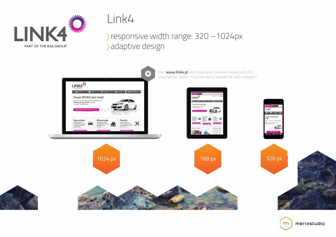
Visit www.link4.pl and resize your browser slowly until it’s very narrow. Watch how the layout adapts for each viewport.
Link4 responsive width range: 320 –1024px adaptive design

With the responsive website you don’t have to worry about device limitations. Correctly developed responsive website guarantees that customer will find desired, useful information quickly and effectively.
Pros of building responsive website
Lower costs. Maintaining one,
universal site is less expensive.
Guarantee that site displays correctly on all
devices
Happy customers who can quickly find
relevant content they were looking for

Client list:

Client list:

Contact:
Let us help you with your project!Get in touch with one of our Project Managers. Różana 13/3
61-577, Poznań
e: [email protected]: +48 61 835 94 70www.merixstudio.com

www.merixstudio.com