
Responsive Design Workflow
35
RESPONSIVE WEB DESIGN didn’t we settle this already?
-
Upload
shivanku-kumar -
Category
Design
-
view
44 -
download
0
Transcript of Responsive Design Workflow
RESPONSIVE WEB DESIGN didn’t we settle this already?
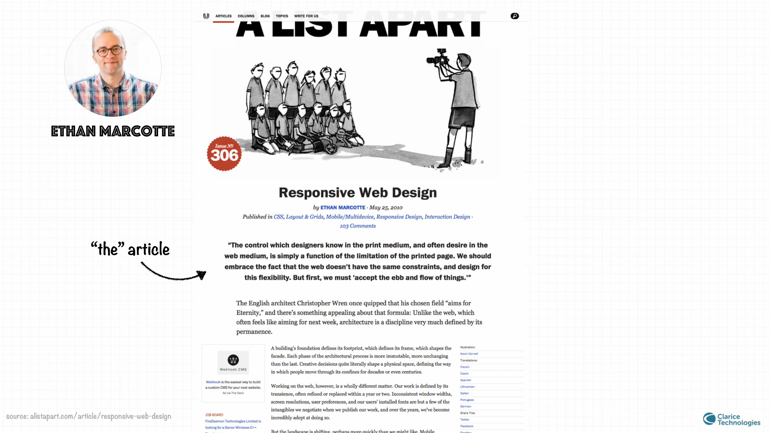
Ethan Marcotte
“the” article
source: alistapart.com/article/responsive-web-design

“Rather than tailoring disconnected designs to each of an ever-increasing number of web devices, we can treat them as facets of the same experience.
In short, we need to practice responsive web design.”
-May, 2010
coined the term
• Fluid Grids
• Flexible Images
• Media Queries
responsive techniques

“Rather than tailoring disconnected designs to each of an ever-increasing number of web devices, we can treat them as facets of the same experience.
In short, we need to practice responsive web design.”
-May, 2010
coined the term
• Fluid Grids
• Flexible Images
• Media Queries
responsive techniques
adaptive
Instead of one flexible design, adaptive design detects the device and then provides the appropriate feature and layout based on a predefined set of viewport sizes.

How to execute a Responsive web design project?
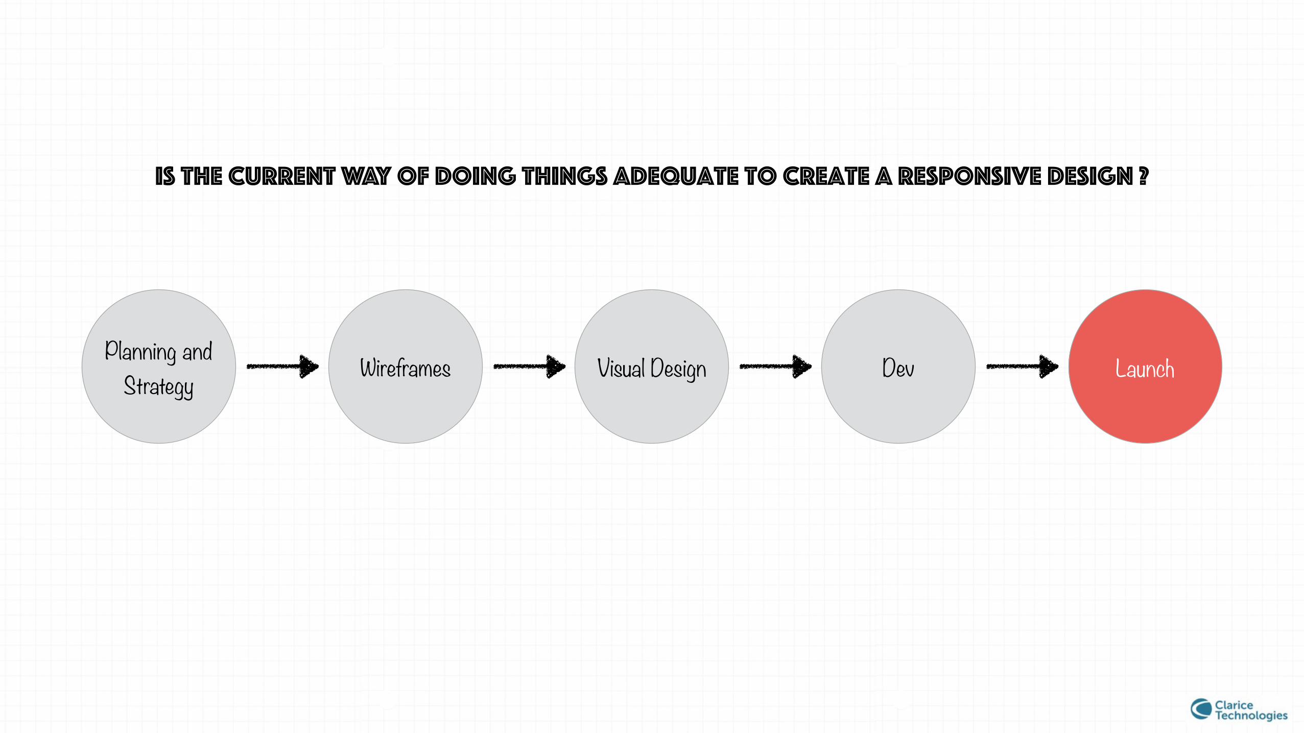
Is the current way of doing things adequate to create a responsive design ?
Planning and Strategy Wireframes Visual Design Dev Launch

Is the current way of doing things adequate to create a responsive design ?
764px
1024px
320px

why does this question arise?

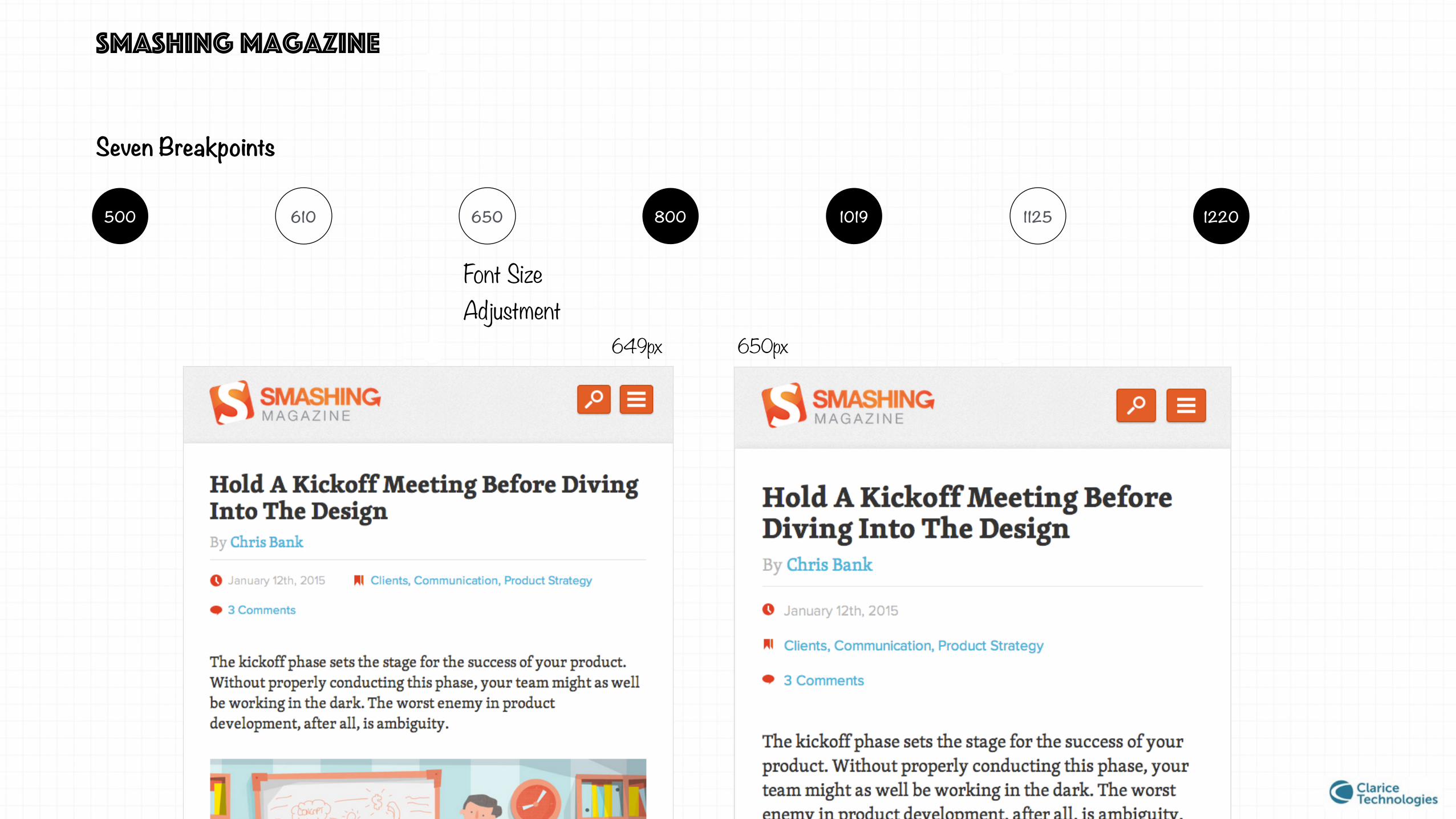
smashing magazine

smashing magazine
1220 11251019800650610500
Seven Breakpoints
• Logo size readjustment
• Footer layout change
• Logo size readjustment
• Font Size Adjustment
• Icon Size Adjustment
• Images in body stop resizing
• Layout Changes to two columns
• Logo Changes • Font size
adjustment
• Primary Navigation layout changes
• Right side column becomes visible
• Changes in logo size
• Footer Resizes
• Full text in label becomes visible
• Layout changes to three columns
• Logo size adjustment
• Layout changes in social icons
• Footer layout changes

smashing magazine
Logo size readjustment
609px 610px
Seven Breakpoints
1220 11251019800650610500
smashing magazine
Font Size Adjustment
649px 650px
Seven Breakpoints
1220 11251019800650610500

smashing magazine
Full text in label becomes visible
1124px
1125px
Seven Breakpoints
1220 11251019800650610500

smashing magazine
Seven Breakpoints
1020px
1125px
1220 11251019800650610500

smashing magazine v/s traditional approach
• Design dictates breakpoints
• Component level responsive strategy, finer control
• Behaviour suggests an collaborative approach.
• Three breakpoints irrespective of design
• Page level responsive strategy
• Ineffective communication tools for the task.

three case studies

three case studies
We are looking for an approach in which design dictates breakpoints, component level control, collaborative

CASE STUDY 1: the boston globe
Ethan Marcotte was involved in the re-design of Boston Globe
The website was built in November 2010
Design driven breakpoints
Collaborative
Component level control
“Designing in Browser”

CASE STUDY 1: the boston globe
Get Requirements
Decide Breakpoints
High-level design strategy Code (asap)
2 weeks Test
Iterate in static
1 week cycles

CASE STUDY 1: the boston globe
Pros: • Gives component level control
• Very collaborative and iterative.
• many breakpoints
Cons: • Not device independent
• Designing at template level is challenging
• Designing in browser is challenging
Planning and Strategy Wireframes Visual
Design Dev
Traditional
Boston Globe
Get Requirement
s
Decide Breakpoints
High-level design
strategyCode (asap)
Test
Iterate in static

CASE STUDY 2: the responsive workflow
By Mark Boulton, Stephen Hay, Viljami Salminen in 2012
Design driven breakpoints
Collaborative
Component level control
“Design in Browser”
“Text Design”
“Content Out”

Content
CASE STUDY 2: the responsive workflow
Sketch
Prototype
Visual Design
Test
Discuss
Design in Text
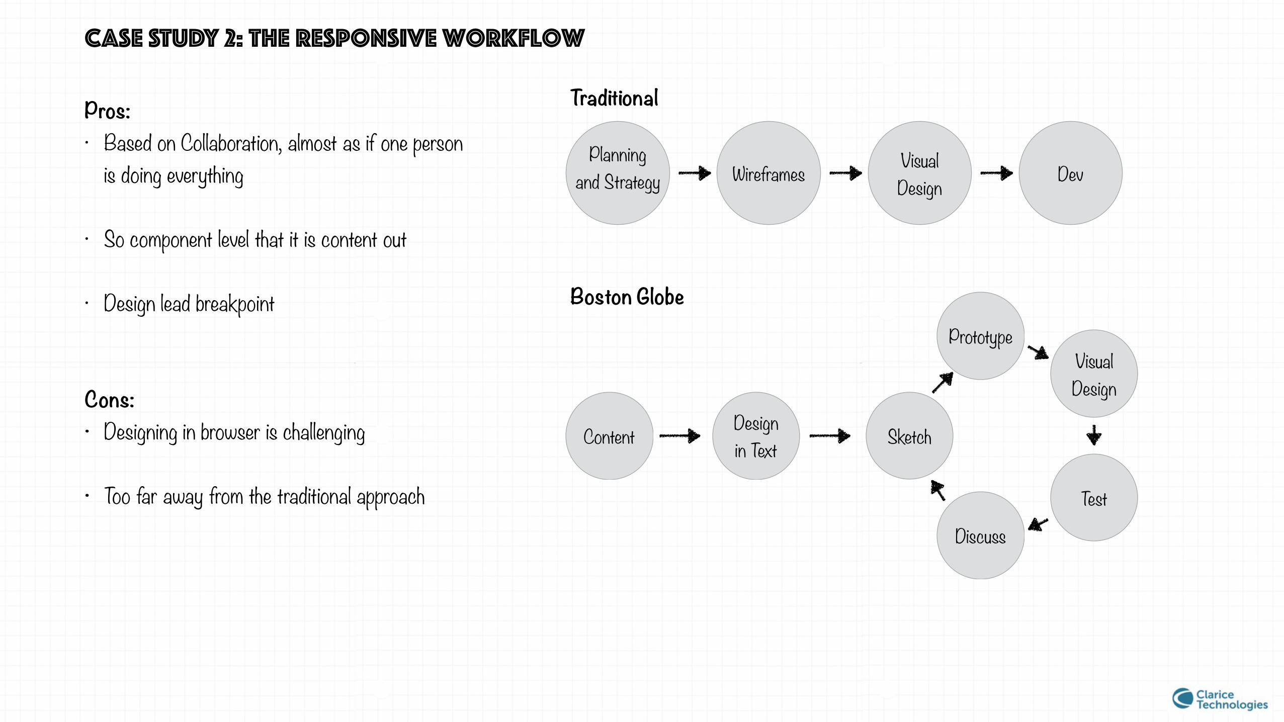
Pros: • Based on Collaboration, almost as if one person
is doing everything
• So component level that it is content out
• Design lead breakpoint
Cons: • Designing in browser is challenging
• Too far away from the traditional approach
Planning and Strategy Wireframes Visual
Design Dev
Traditional
Boston Globe
CASE STUDY 2: the responsive workflow
Content Sketch
PrototypeVisual Design
Test
Discuss
Design in Text
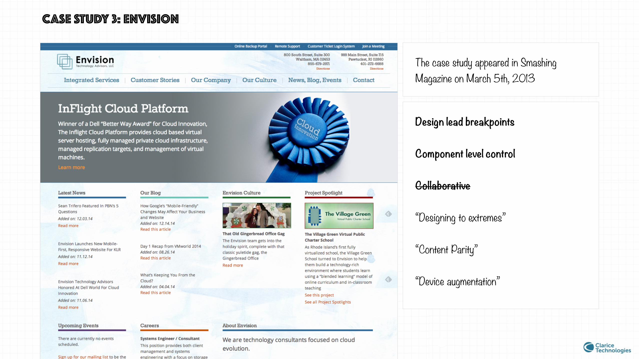
CASE STUDY 3: envision
The case study appeared in Smashing Magazine on March 5th, 2013
Design lead breakpoints
Component level control
Collaborative
“Designing to extremes”
“Content Parity”
“Device augmentation”

Content first Design to Extremes Code
CASE STUDY 3: envision
Sketch Deduce Breakpoints
Device augmentation

CASE STUDY 3: envision
Pros
• Better approach for deciding breakpoints
• Component level control
• Closer to our approach and deliverables
Cons
• Not as collaborative
• Less scope for iteration
Content Strategy
Wireframes all bps
Visual Design Dev
Traditional
Envision
Content first Design to Extremes Code
SketchDeduce
Breakpoints
Device augmentatio
n

lets look back a bit
Traditional approach does not give us enough control over our design
An approach in which design dictates breakpoints, component level control, iterative
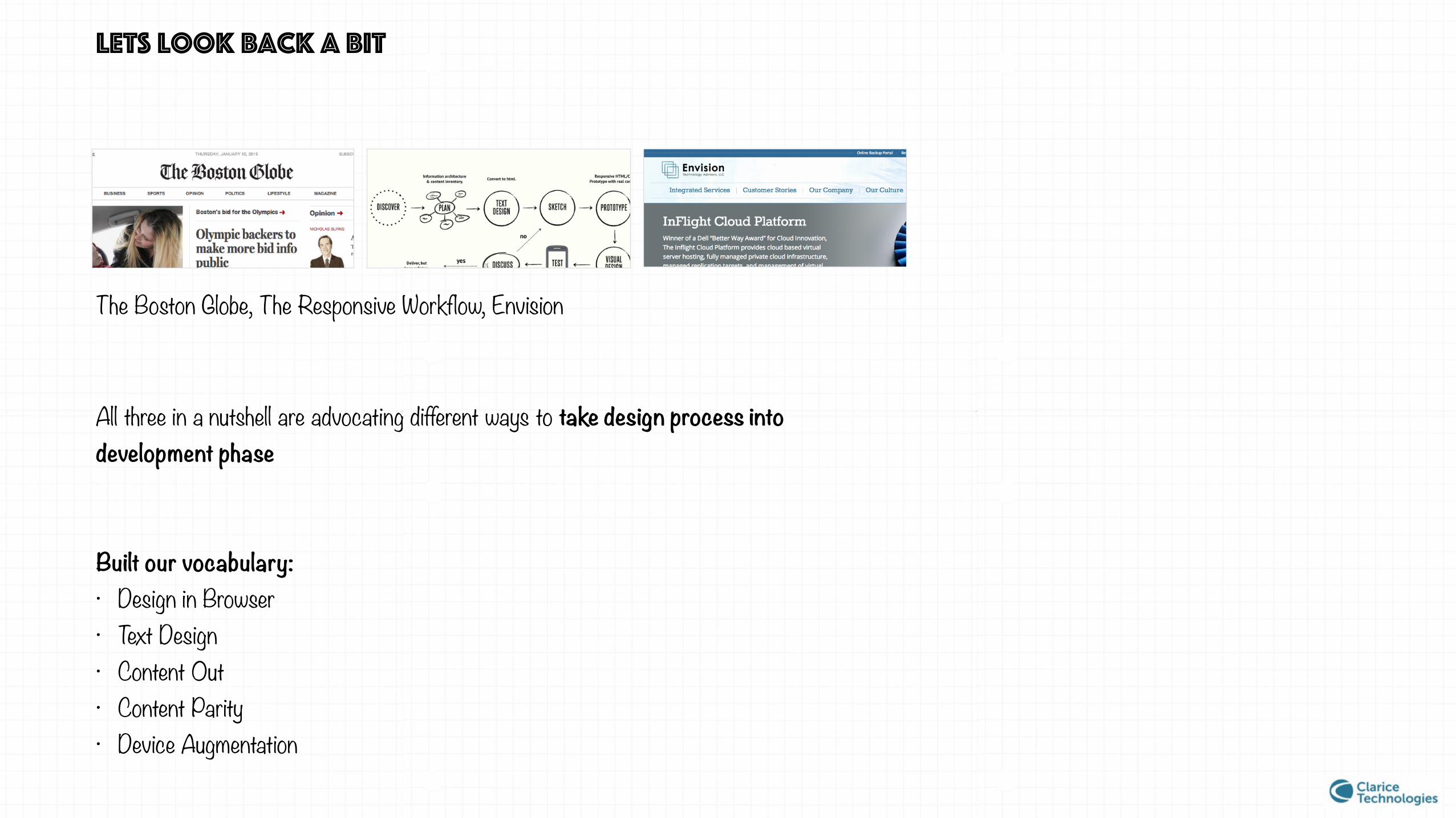
lets look back a bit
The Boston Globe, The Responsive Workflow, Envision
All three in a nutshell are advocating different ways to take design process into development phase
Built our vocabulary: • Design in Browser • Text Design • Content Out • Content Parity • Device Augmentation

Which approach should we follow?

Which approach should we follow?
The discussion is ongoing, Share the realisation that in responsive world the traditional workflow is not jut an inconvenience we can ignore, Contemporary solutions people have found
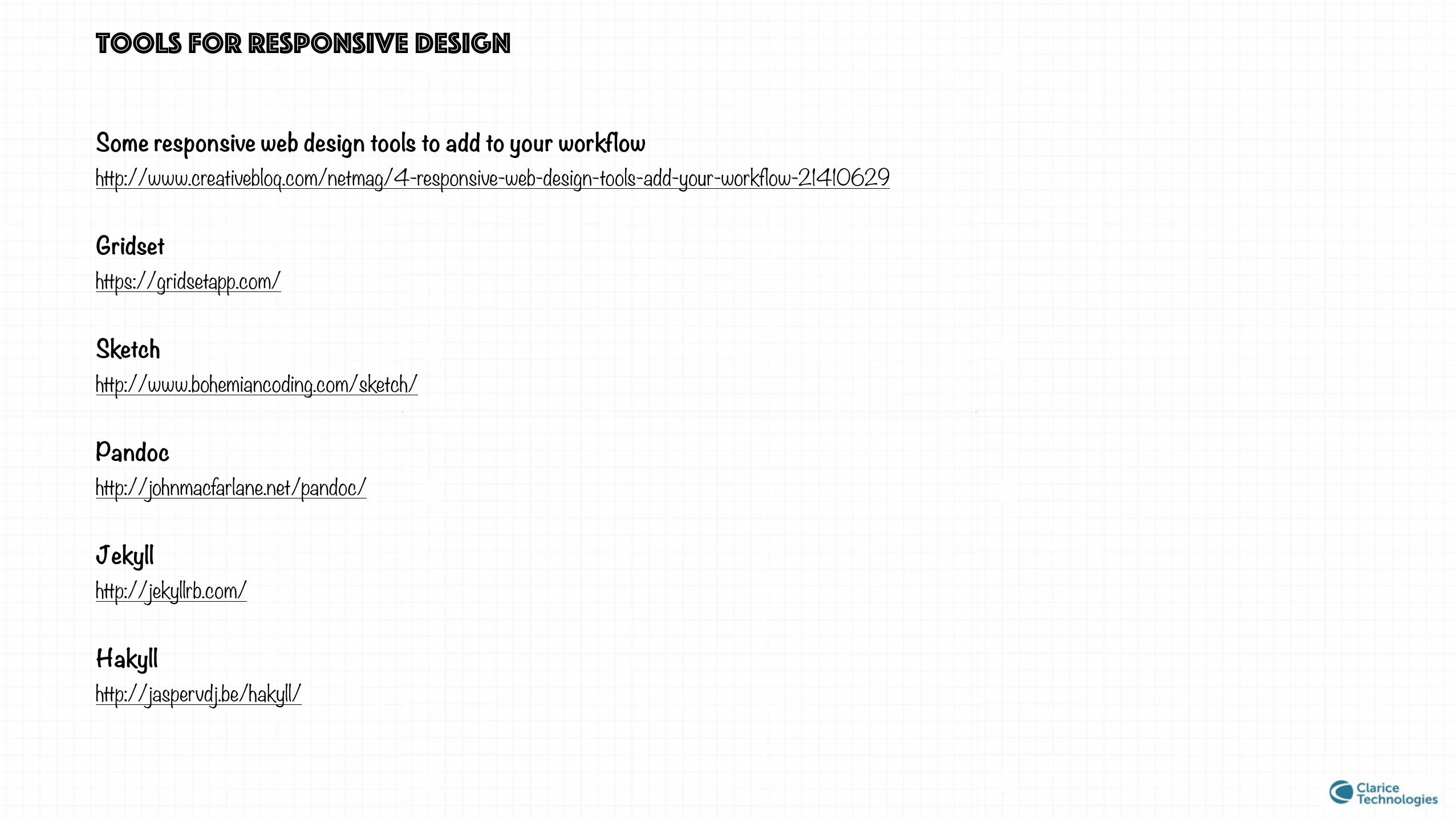
Tools for responsive design
Some responsive web design tools to add to your workflow http://www.creativebloq.com/netmag/4-responsive-web-design-tools-add-your-workflow-21410629
Gridset https://gridsetapp.com/
Sketch http://www.bohemiancoding.com/sketch/
Pandoc http://johnmacfarlane.net/pandoc/
Jekyll http://jekyllrb.com/
Hakyll http://jaspervdj.be/hakyll/

Tools for responsive design
Dexy http://dexy.it/
RWD Wireframes http://www.lifeishao.com/rwdwire/
Responsinator http://www.responsinator.com/
Responsive Deliverables http://daverupert.com/2013/04/responsive-deliverables/
REFERENCES
A List Apart alistapart.com
Smashing Magazine smashingmagazine.com
The Boston Globe — Responsive Web Design responsivewebdesign.com
Personal Disquite of Mark Boulton markboulton.co.uk/
Envision Case Study smashingmagazine.com/2013/03/05/building-a-better-responsive-website/
9 Basic Principle of Responsive Web Design froont.com/
* This presentation is available FREE of cost. Images used under Creative Common License but can be remove on objection
Build a responsive site in a week: designing responsively (part 1) creativebloq.com/css3/build-responsive-site-week-designing-responsively-part-1-4122850
Mixing Responsive Design and Mobile Templates css-tricks.com/mixing-responsive-design-and-mobile-templates/
Adaptive Images adaptive-images.com/
Medium medium.com
Content Parity bradfrost.com

SPECIAL thanks to
@vishujuneja kumar bhaskar reddy @Avinash_US
THANKS FOR VIEWING
https://in.linkedin.com/pub/shivanku-kumar/21/9a0/4a2
https://www.behance.net/kshivanku


![Responsive Design Fundamentals [Read-Only] - … Design Fundame… · Responsive Design Fundamentals Carolyn Yon, PMI-ACP Development Manager ... Responsive Design • web design](https://static.fdocuments.us/doc/165x107/5b7c060b7f8b9adb4c8df8c4/responsive-design-fundamentals-read-only-design-fundame-responsive-design.jpg)
