
Responsive Design Presentation
24
Responsive Web Design
-
Upload
eugen-figursky -
Category
Internet
-
view
241 -
download
1
Transcript of Responsive Design Presentation

Responsive Web Design

Statistics
June, 2012 - 10,40% July, 2012 - 11,09% August, 2012 - 11,78%

More Statistics
In 2011, there were 835 million smartphone users, 5.6 billion feature phone users (Business Insider)
Global internet usage will more than double by 2015, and most of these users will be mobile
In December 2011, 47.6% of the total mobile audience in the U.S. used apps, 47.5% used mobile browsers; in Europe

What exactly is RWD?
“Responsive Web Design (RWD) is an approach to web design in which a site is crafted to provide an optimal viewing experience—easy reading and navigation with a minimum of resizing, panning, and scrolling—across a wide range of devices (from desktop computer monitors to mobile phones)”
Wikipedia

Problem
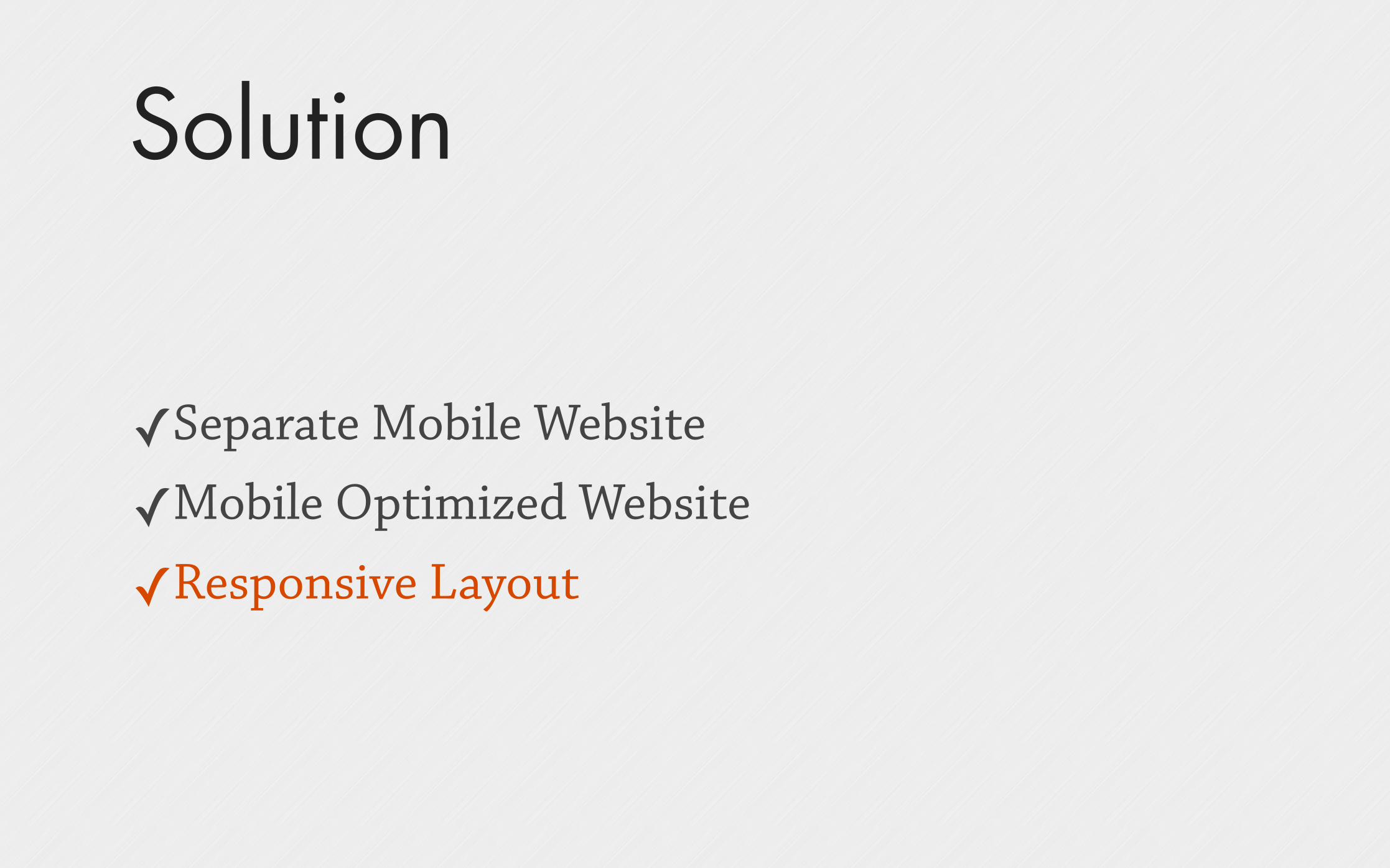
Solution
✓Separate Mobile Website
✓Mobile Optimized Website
✓Responsive Layout

Responsive is NOT Mobile
Respond to environments
Different devices, same content
Single deliverable, many destinations

Layout Types
Adaptive - Fixed width layout Responsive - Fluid width layout Mixed - Fixed/Fluid width layouts (fixed for large & medium, fluid for small)

Adaptive Layout
Fixed width Width changes depending on screen resolution Breakpoints Less flexibility
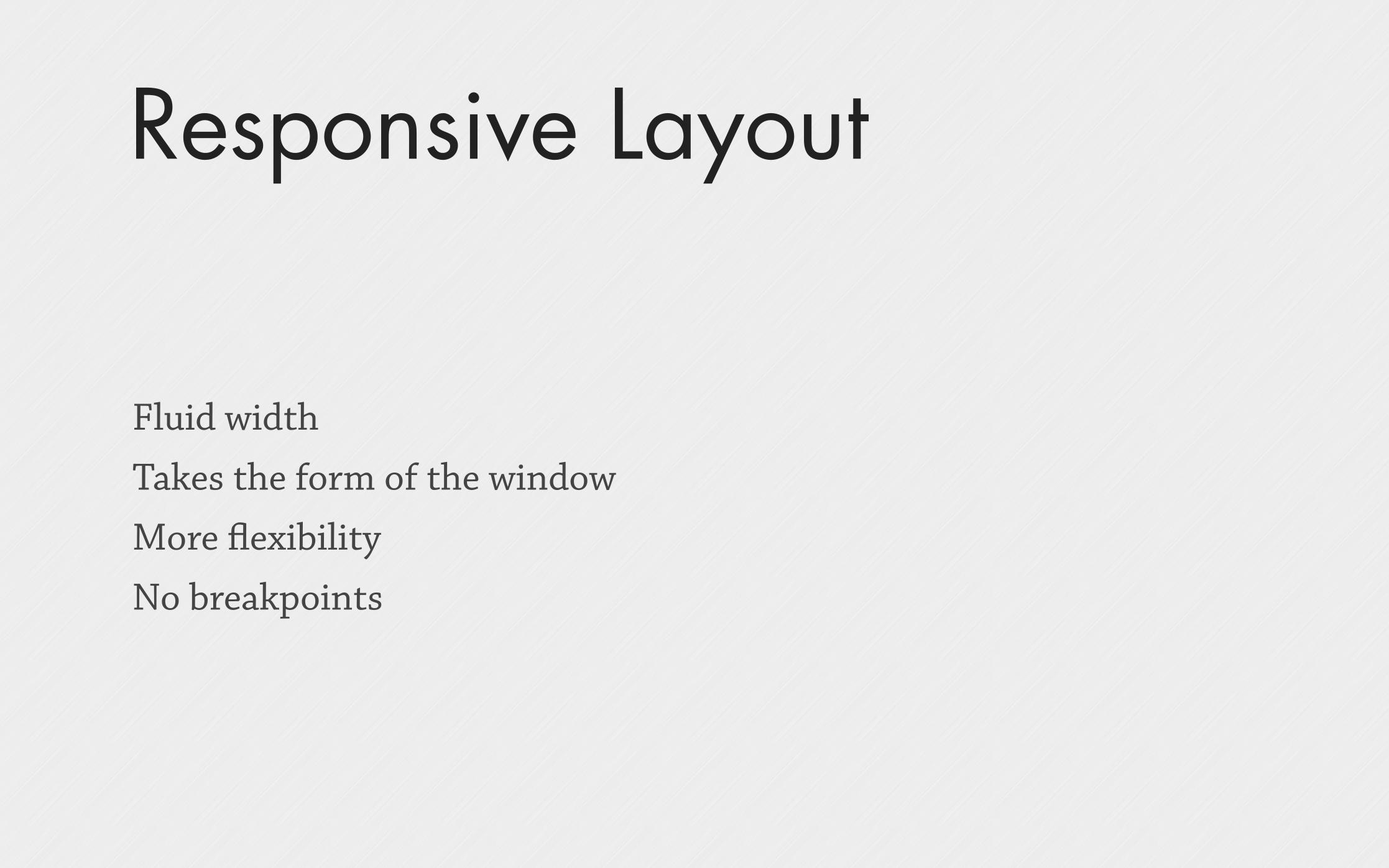
Responsive Layout
Fluid width Takes the form of the window More flexibility No breakpoints

Mixed Layout
Fluid / Fixed width Any resolution More adaptation Breakpoints for important devices

Breakpoints
Standard 1600+ (large desktop) 1200 (desktop) 980 (tablet landscape) 760 (tablet portrait) 480 (mobile landscape) 320 (mobile portrait)
Custom 1400 1100 860 600 380 240

Which one to choose?

Use Wireframes

VS
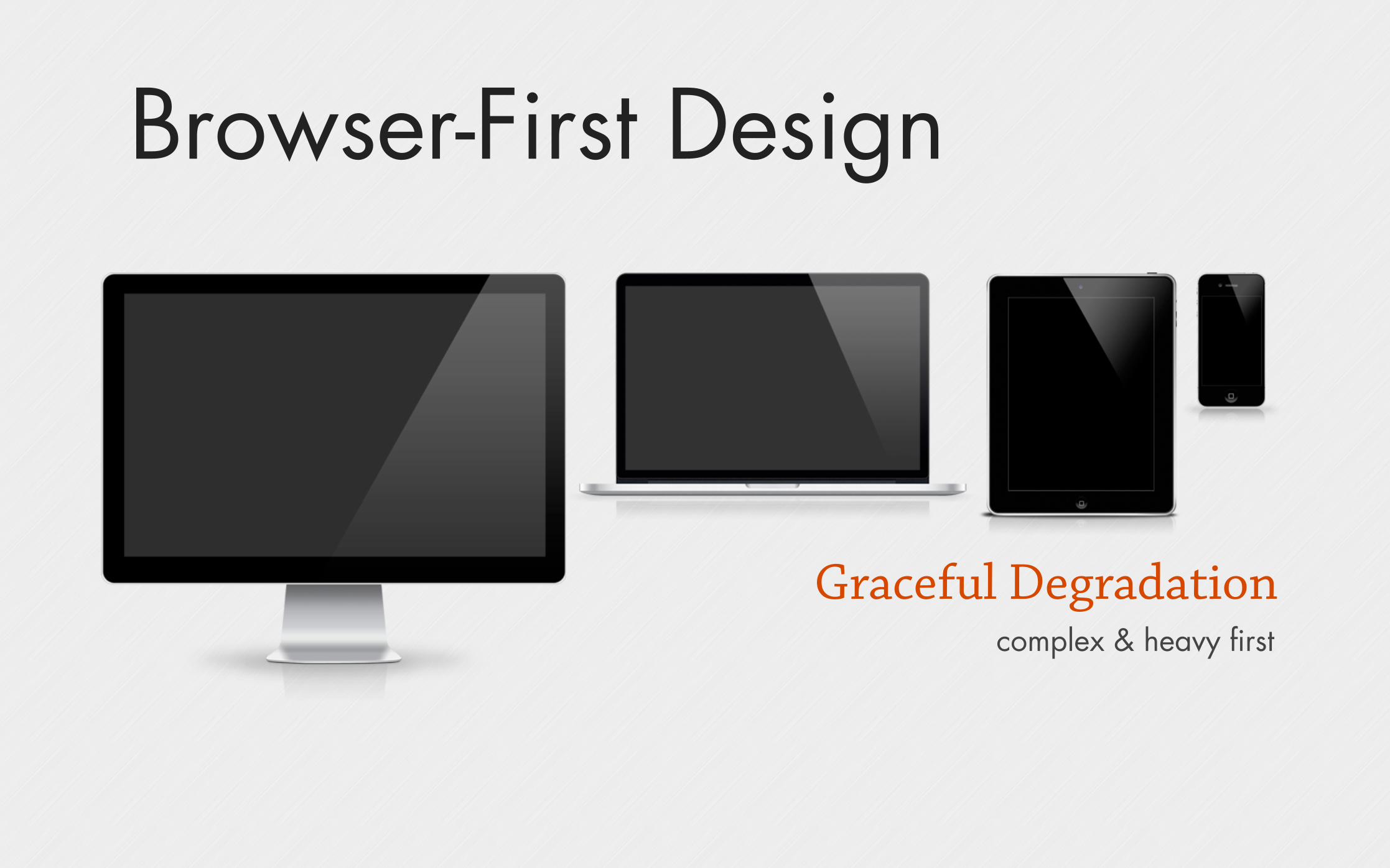
Browser-First Design
Graceful Degradationcomplex & heavy first

Mobile-First Design
Progressive enhancementlight & clean first

Typography
Make it easy to readMake it easy to read
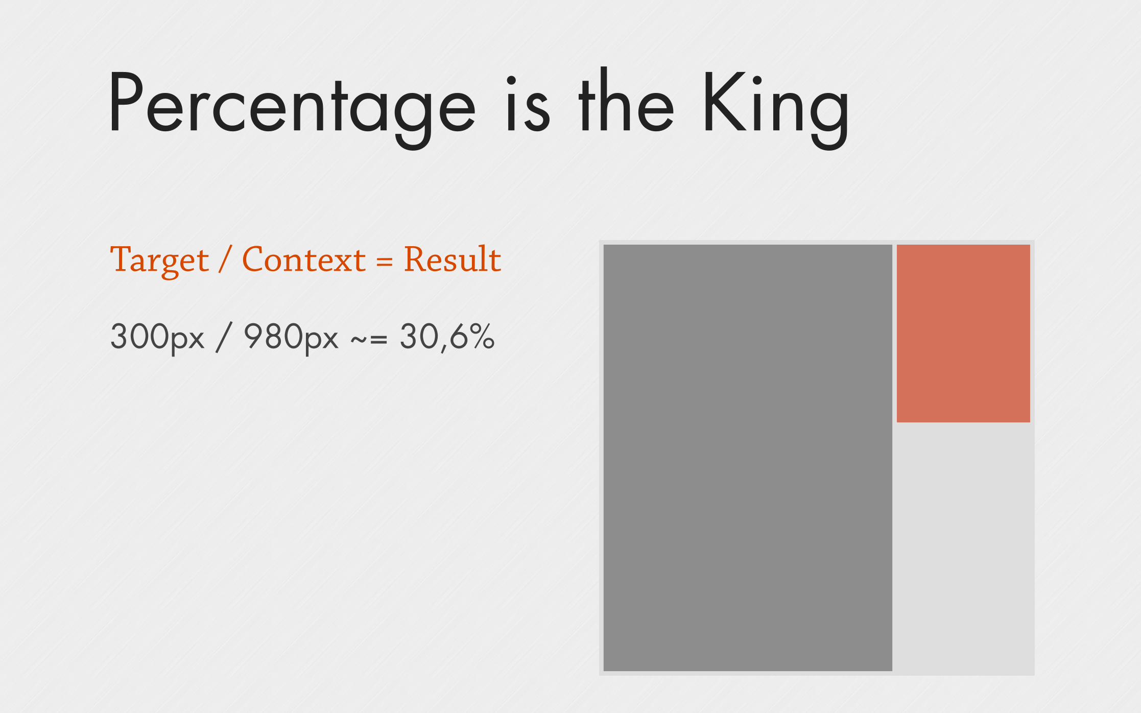
Percentage is the King
Target / Context = Result
300px / 980px ~= 30,6%

The Rule
Stop thinking in pages Start thinking in Systems

Test
Different resolutions Different devices User Experience

Examples
http://www.warface.co.uk http://www.bloominteriordesign.com.au http://2011.dconstruct.org http://foodsense.is http://www.anderssonwise.com http://www.cacaotour.com/

Resources
http://cssglobe.com/post/5914/90-new-and-high-quality-photoshop-web-layout-tutorials
http://elliotjaystocks.com/blog/a-better-photoshop-grid-for-responsive-web-design/
http://www.smashingmagazine.com/responsive-web-design-guidelines-tutorials/
http://www.smashingmagazine.com/2011/07/22/responsive-web-design-techniques-tools-and-design-strategies/
http://blog.teamtreehouse.com/beginners-guide-to-responsive-web-design

Thank You
![Responsive Design Fundamentals [Read-Only] - … Design Fundame… · Responsive Design Fundamentals Carolyn Yon, PMI-ACP Development Manager ... Responsive Design • web design](https://static.fdocuments.us/doc/165x107/5b7c060b7f8b9adb4c8df8c4/responsive-design-fundamentals-read-only-design-fundame-responsive-design.jpg)