Reading performance of dyslexics with a special font and a colored background
38
MASTER THESIS Reading performance of dyslexics with a special font and a colored background Author Tineke Pijpker University of Twente Faculty of Behavioral Sciences Department Instructional Technology Master track Psychology of Learning Sciences Date May 2013
Transcript of Reading performance of dyslexics with a special font and a colored background
MASTER THESIS
Reading performance of dyslexics with a special font and a
colored background
Author
Tineke Pijpker
University of Twente
Faculty of Behavioral Sciences
Department
Instructional Technology
Master track
Psychology of Learning Sciences
Date
May 2013
2
Does reading performance of dyslexics improve with a special font and/or a
colored background?
Tineke Pijpker
University of Twente
Faculty of Behavioral Sciences
Department of Instructional Technology
Master track Psychology of Learning Sciences
1st supervisor: Dr. H. van der Meij
2nd
supervisor: R. de Leeuw, MSc.
3
Abstract
This research examined if the reading performance of dyslexics and non-dyslexics was
positively affected by the adaptation of background color and font. Using a light yellow
background could have a positive influence on reading performance in comparison with a
white background. Also, the font Dyslexie was compared with the font Arial. According to
the magnocellular theory the adaptation of these visual elements can improve the reading
performance of dyslexics and non-dyslexics. Measurements of reading performance were
speed and accuracy. Twenty-two dyslexics and forty-two non-dyslexics with a lower and
higher reading level participated in this study. Every child read four different texts with the
following color-font combination: Yellow-Dyslexie, White-Dyslexie, Yellow-Arial and
White-Arial.
For reading accuracy an interaction was found of the color yellow and the font
Dyslexie for dyslexics with a lower reading level. Findings also showed a positive main effect
of the font Dyslexie with the reading accuracy for the total group of dyslexics and for
dyslexics with a lower reading level. Further research is needed to fully explore the role of
background color and level of prior knowledge between dyslexics with a lower and higher
reading level and the influence on reading performance. Practical implication could be the
implementation of the color yellow and the font Dyslexie for dyslexics with a lower reading
level.
4
Samenvatting
Dit onderzoek analyseerde of de leesprestatie van kinderen met en zonder dyslexie positief
zou worden beïnvloed door de aanpassing van achtergrondkleur en lettertype. Het gebruik van
een lichtgele achtergrond zou een positieve invloed kunnen hebben op de leesprestatie in
vergelijking met een witte achtergrond. Het lettertype Dyslexie werd vergeleken met het
lettertype Arial. Volgens de magnocellulaire theorie kan de aanpassing van deze visuele
elementen de leesprestatie van dyslecten en niet-dyslecten verbeteren. Metingen van de
leesprestatie waren leessnelheid en de accuratesse. Tweeëntwintig dyslecten en tweeënveertig
niet-dyslecten met een lager en hoger leesniveau hebben deelgenomen aan dit onderzoek. Elk
kind heeft vier verschillende teksten gelezen met de volgende kleurlettertype combinatie:
Geel-Dyslexie, Wit-Dyslexie, Geel-Arial en Wit-Arial.
Voor accuratesse is een interactie gevonden van de kleur geel en het lettertype
Dyslexie voor dyslecten met een lager leesniveau. De bevindingen lieten ook een positief
hoofdeffect zien van het lettertype Dyslexie bij de accuratesse voor de totale groep dyslecten
en voor dyslecten met een lager leesniveau. Verder onderzoek is nodig om volledig te
onderzoeken wat de rol van achtergrondkleur en het niveau van voorkennis is tussen dyslecten
met een lager en hoger leesniveau en de invloed hiervan op de leesprestatie. Praktische
implicatie kan de implementatie zijn van de kleur geel en het lettertype Dyslexie voor
dyslecten met een lager leesniveau.
5
Introduction
One of the most common learning disorders in children is developmental dyslexia.
The prevalence of developmental dyslexia has been estimated at 4 – 10 % (Castles, Mclean &
Mcarthur, 2010) and also at 5 – 17.5 % (Démonet, Taylor & Chaix, 2004). In the Netherlands
the commission Dyslexia Health Council estimates the percentage of pupils with severe
dyslexia around 3%. In addition, there is a larger percentage with less severe dyslexia
(Braams, 2002).
There are different definitions of developmental dyslexia. For example, the definition
of the Diagnostic and Statistical Manual of Mental Disorders [DSM] IV (DSM IV, 1994 in
Essential Learning Institute, 2012) is as follows: ‘Reading achievement is substantially below
that expected given the person’s chronological age, measured intelligence and age-appropriate
education. The disturbance significantly interferes with academic achievement or activities of
daily living that require reading skills. If a sensory deficit is present, the reading difficulties
are in excess of those usually associated with it.’ The definition used by the International
Dyslexia Association [IDA] (Lyon, Shaywitz & Shaywitz, 2003) is: ‘Dyslexia is a specific
learning disability that is neurobiological in origin. It is characterized by difficulties with
accurate and/or fluent word recognition and by poor spelling and decoding abilities. These
difficulties typically result from a deficit in the phonological component of language that is
often unexpected in relation to other cognitive abilities and the provision of effective
classroom instruction. Secondary consequences may include problems in reading
comprehension and reduced reading experience that can impede growth of vocabulary and
background knowledge.’
These definitions show that children with dyslexia have difficulty with reading.
Children with dyslexia make more reading errors and they need more time to read something
than children without dyslexia. As a result, they often experience less pleasure in reading
(Braams, 2002). The current study investigates the effect of a colored background and a
special font to achieve a better reading performance. To understand and deal with this it is
important to look at the underlying theories about the potential causes of dyslexia.
Theoretical background
Phonological deficit theory. At an early age children learn phonological or non-lexical
reading skills, this is the knowledge of the sounds of letters (Mayer, 2008). Children need
these skills for reading new and unfamiliar words. The acquisition of these skills in children
6
with dyslexia is affected by phonological deficits. A phonological deficit is a lack of the
ability to represent, store or retrieve speech sounds. This makes it difficult for children to
learn associate sounds with their corresponding letters when learning to read in an alphabetic
system (Castles et al., 2010).
Auditory processing deficit theory. Connected to phonological deficits is the auditory
processing deficit theory. This theory suggest that children with developmental dyslexia are
born with an impaired ability to process non-speech and speech sounds. According to Castles
et al. (2010) this causes atypical neural representations of phonemes which impairs the
acquisition of non-lexical reading skills. According to this theory phonological problems are
secondary to the auditory deficits (Heim et al., 2008). Besides theories about phonological
and auditory processing several researchers claim that dyslexia is due to a visual processing
deficit of the magnocellular system.
Magnocellular deficit theory. The magnocellular deficit theory assumes an impairment
of the visual transient system in dyslexics. This leads to impaired sensitivity for low contrast
(Lovegrove, Bowling, Badcock & Blackwood, 1980 cited in De Jong et al., 2009) or coherent
visual motion (Stein & Walsh, 1997). The magnocellular system is responsible for
determining the location of objects, the ‘where’ stream (Ray, Fowler & Stein, 2005; Stein,
2003; Talcott, Hansen, Willis-Owen, McKinnell, Richardson & Stein, 1998).
Research of Boets, Wouters, Van Wieringen, De Smedt and Ghesquière (2008)
showed that visual processing is related to orthographic skills. Orthographic or lexical skills
are the ability to recognize words as whole units. These skills are necessary for reading
fluency (Castles et al., 2010). The magnocellular system plays an important role in the
development of orthographic skills. This role probably exists of a steady direction of visual
attention and eye fixations on words (Stein, 2003). So an important function of the
magnocellular system is to help control eye movements (Stein, 2003; Stein & Walsh, 1997).
With dyslexics this function is impaired and might cause problems with fixation. Letters
might then appear to move around and this in turn causes visual confusion (Stein, 2003; Stein
& Walsh, 1997). Especially with reading small letters their vision is unstable. Visual reading
errors are made less when dyslexics are given larger letters. Also less visual reading errors are
made when one eye is occluded. Reading with one eye ensures less confusion from
independently moving images (Stein, 2003; Stein & Walsh, 1997). A common visual reading
error of dyslexics are reversals (Stein & Walsh, 1997; Terepocki, Kruk & Willows, 2002).
7
This study focuses on this theory in how the adaptation of visual elements can help to
improve the reading performance of dyslexics. In several studies reading performance tends to
be better with the use of color.
Use of color with reading
Since it is known that the magnocellular pathway is the visual system for text
perception many research has focused on the use of color and its influence on reading
performance. Results from several studies show that the use of colored filters or overlays
improves reading (Chase, Ashourzadeh, Kelly, Monfette & Kinsey, 2003; O’Connor, Sofo,
Kendall & Olsen, 1990; Ray et al., 2005; Smith & Wilkins, 2007; Stein, 2003; Waldie &
Wilkins, 2004). Research of Ray et al. (2005) and Stein (2003) shows that children with
reading difficulties who had worn a yellow filter improved in accommodation and
convergence. Also their motion sensitivity was lowered and their contrast improved. In
addition to the use of filters the use of overlays or transparencies is tested. Using a colored
overlay ensures that children’s reading speed improves. To achieve this Waldie and Wilkins
(2004) found that the overlay has to cover the entire text. According to Chase et al. (2003) and
O’Connor et al. (1990) the use of colored transparencies also improves reading accuracy and
comprehension.
Research has also focused on the use of color while reading from computer screens.
Buchner, Mayr and Brandt (2009) say that reading text from computer screens is better when
text is printed in dark letters on a light background. Their research shows that text is more
readable when the overall display luminance is high. Scharff, Ahumada and Hill (1999) used
black letters on different background colors at two intensities to test reading speed. They
found that text on a light yellow background read faster than text on a light gray or light blue
background. Wu and Yuan (2003) also studied the effect of color on reading speed. To
improve reading speed the foreground, the text, should be darker and the background should
be lighter. Best results were black on green and black on yellow (Wu & Yuan, 2003). It is
striking that the worst results came from black on white while this is used in everyday life.
Less research has been done about the use of colored paper such as colored texts or
backgrounds. One suggestion about the use of color is to print difficult letters in color
(Altschuler, Altschuler, Altschuler, Samber & Ramachandran, 2007). Printing the difficult
letters in color could make it easier to read these letters and therefore reading speed could
increase. Several studies indicate that when using colors on paper the background color must
be a light shade. For example Tinker and Paterson (1963, in Bloodsworth, 1993) found that
8
contrast of brightness between print and paper is important. Therefore dark ink on lightly
tinted paper is the best legible combination when using colors. This was also found by Bix,
Lockhart, Cardoso and Selke (2003). They examined different color combinations to be most
legible. The best reading results was black letters on a white background. The next best result
was with blue letters on a yellow background. These colors had the highest contrast of colors
and luminance level.
Fonts
Another way of improving reading performance is by adjustments in the font. Several
researchers say that a font affects the reading performance. An important difference in fonts is
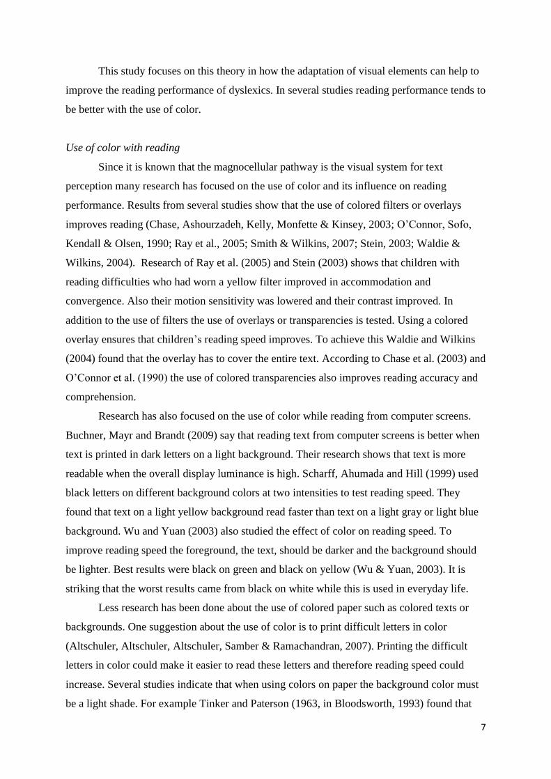
whether or not they have serifs (Coronel-Beltrán & Alvarez-Borrego, 2010). A serif is a
horizontal line at the end stroke of a letter (Bernard, Chaparro, Mills & Halcomb, 2003;
Lockhead & Crist, 1980). See Figure 1 for serif and sans serif letters. A well-known serif font
is Times New Roman and a well-known sans serif font is Arial.
Figure 1. Letters with serif and sans serif
It is said that the use of serifs is not only ornamental but also functional. Serifs could
help distinguish letters and therefore can help reading (Arditi & Cho, 2005; Bernard et al.,
2003). Research into the effects of serif and sans serif fonts shows different outcomes. Arditi
and Cho (2005) found that reading with their own made serif font had stronger effects on the
legibility of the text than reading without serifs. The same results were found in studies of
Bernard et al. (2003) and Lockhead and Crist (1980), they found that reading without serifs
was slower. While performance was worse, the overall preference of the participants was for
the use of sans serif font (Bernard, Chaparro, Mills & Halcomb, 2002; Bernard et al., 2003;
Ling & Van Schaik, 2006). The researchers explain that the use of serifs and narrow space
could affect the perceived readability (Bernard et al., 2003).
9
Other researchers have found positive results for reading performance with sans serif
font. Wilkins and others found that reading was slightly faster with the sans serif font
(Wilkins, Cleave, Grayson & Wilson, 2009; Wilkins et al., 2007). An explanation for this
result was that the sans serif font has less ‘stripy’ words. Similarity between letters in a word
can cause a striped appearance of the word (Wilkins et al. 2007). According to Jainta,
Jaschinski and Wilkins (2010) this striped appearance affects the reading speed because both
eyes have to take longer time to recognize the letters and the word. Research from Moret-
Tatay and Perea (2011) confirms this statement. They found that a sans serif font leads to
faster word identification. The use of serifs does not facilitate visual-word identification. A
possible explanation is that without serifs there is more space between the letters. Research
has shown that a small increase in inter-letter spacing produces faster word identification and
faster reading times (Perea & Gomez, 2012; Perea, Moret-Tatay & Gómez, 2011; Perea,
Panadero, Moret-Tatay & Gómez, 2012; Spinelli, De Luca, Judica & Zoccolotti, 2002). The
position of the letters is clearer, so there is less crowding and less perceptual uncertainty
(Perea et al., 2012). Besides an increase in inter-letter spacing, increasing interline spacing
also produces faster reading times (Van Overschelde & Healy, 2005). It improves letter - and
word identification. This is probably due to the reduced amount of information in the visual
field (Van Overschelde & Healy, 2005). Hartley (1978) describes that the interline spacing is
best when the minimum line space is increased with the amount of word-spacing. In this way
the interline space will not appear less than the word-space. The word-space should be large
enough to clearly distinguish the words (Hartley, 1978).
Sheedy, Subbaram, Zimmerman and Hayes (2005) studied the difference of legibility
between upper case and lower case letters and words with different serif and sans serif font
types. They found that sans serif fonts Verdana and Arial had the best legibility.
Another difference that affects reading performance is the size of a font (Rudnicky &
Kolers, 1984). Several researches showed that children benefit from a larger font point size
(Bernard et al., 2003; Hughes & Wilkins, 2000; Wilkins et al., 2009) and that they also prefer
a larger font point size (Bernard et al., 2002). According to Bernard et al. (2002) the larger 14-
point size was reported as more legible and faster to read than the 12-point size. Sheedy et al.
(2005) found similar results, namely that 14-point size generally had the highest legibility.
Wilkins et al. (2009) found that a larger font size increased the reading speed which was
accompanied by an increase in accuracy. So the reading speed was not due to a greater
tolerance of inaccuracy. Hughes and Wilkins (2000) found that children made more errors
10
with the smaller text than the larger texts and that reading speed could increase with a larger
point size.
The appearance of fonts is affected by the x-height, the height of the body of a letter
(Bernard et al., 2002; Wilkins et al. 2009). This height differs in fonts and makes it look
smaller or larger. For example the x-height of Arial is larger than Times New Roman in the
same point size. A larger x-height gives the letters a bigger body and this may help in
discriminating letters but it reduces the ascenders and descenders of letters (Bernard et al.,
2002; Bernard et al. 2003). Ascenders are the strokes of letters above the x-height and
descenders are the strokes below the x-height. Therefore a medium to large x-height should be
optimal (Bernard et al., 2002).
Besides a larger x-height and no serifs more can be done to distinguish letters. For
example, Lockhead and Crist (1980) made letters distinctive with dots and slashes. They
compared the readability of these letters with normal letters. Results showed that children
with and without reading disabilities and adults were more accurate and faster (Lockhead &
Crist, 1980). Sometimes letters are made italic or bold to ease reading. According to Sheedy
et al. (2005) the use of italics decreases the legibility of letters and words. The use of bold
letters could increase legibility but the strokes must not be too width (Sheedy et al., 2005).
More recent are the adjustments of a font done by Boer. He made several adjustments and this
created a special font named Dyslexie.
Font Dyslexie
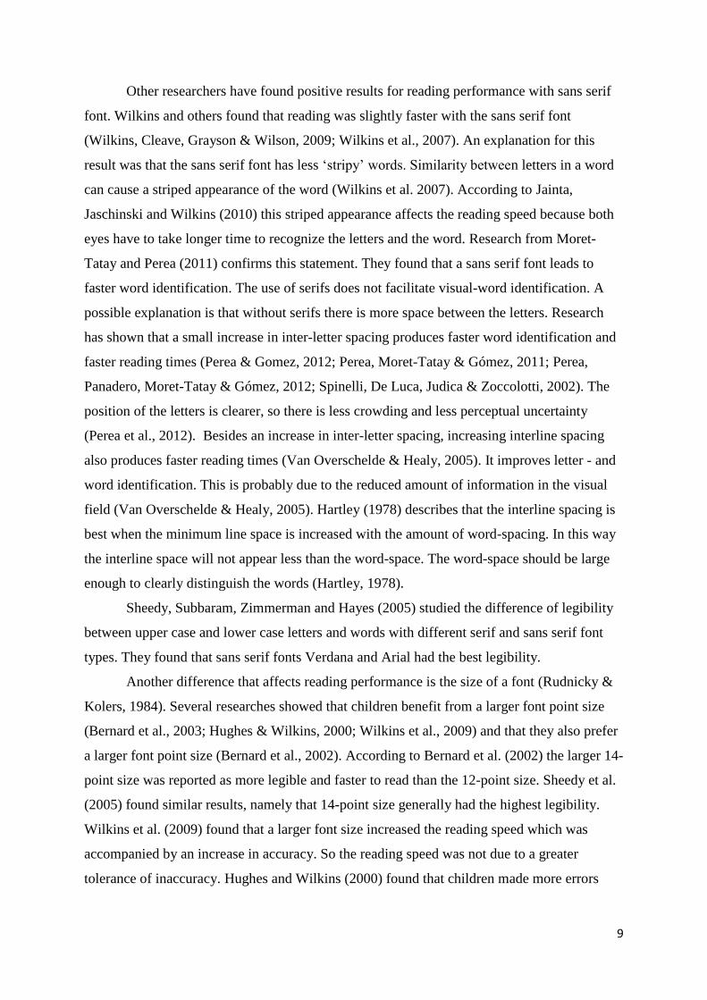
The font Dyslexie is especially designed for people with dyslexia (Boer, 2011). The
specific characteristics in the font are designed to make it easier to distinguish letters. This
should reduce the effort it takes for dyslexics to read a text which enhances the reading speed
and the font should reduce reading errors. Figure 2 shows the letters of the font Dyslexie.
Figure 2. Letters font Dyslexie
Several adjustments have been made to make the letters more distinguished. The
bottom part of each letter is made heavier which prevents the letter from turning upside down.
The openings of the letters are enlarged so they look less alike and have a clearer shape. Some
11
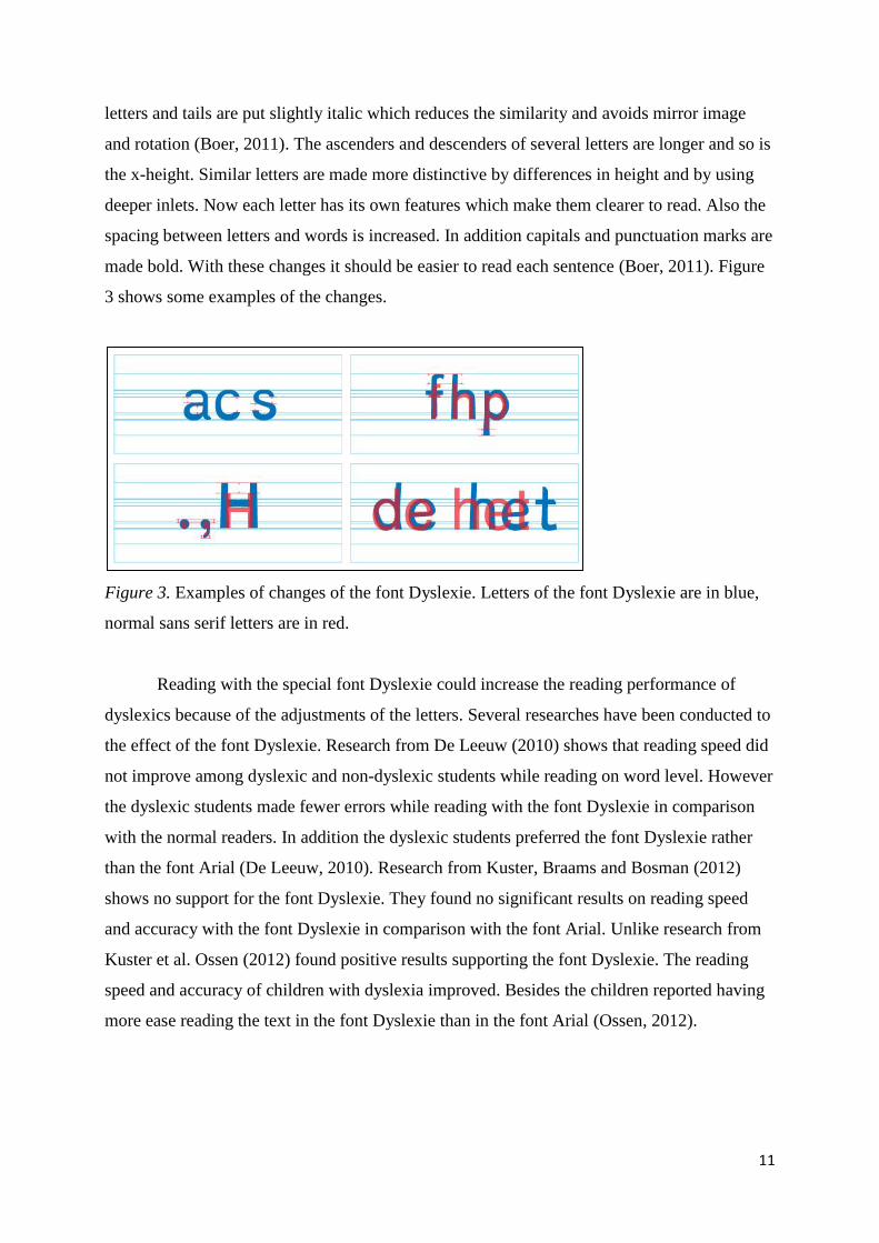
letters and tails are put slightly italic which reduces the similarity and avoids mirror image
and rotation (Boer, 2011). The ascenders and descenders of several letters are longer and so is
the x-height. Similar letters are made more distinctive by differences in height and by using
deeper inlets. Now each letter has its own features which make them clearer to read. Also the
spacing between letters and words is increased. In addition capitals and punctuation marks are
made bold. With these changes it should be easier to read each sentence (Boer, 2011). Figure
3 shows some examples of the changes.
Figure 3. Examples of changes of the font Dyslexie. Letters of the font Dyslexie are in blue,
normal sans serif letters are in red.
Reading with the special font Dyslexie could increase the reading performance of
dyslexics because of the adjustments of the letters. Several researches have been conducted to
the effect of the font Dyslexie. Research from De Leeuw (2010) shows that reading speed did
not improve among dyslexic and non-dyslexic students while reading on word level. However
the dyslexic students made fewer errors while reading with the font Dyslexie in comparison
with the normal readers. In addition the dyslexic students preferred the font Dyslexie rather
than the font Arial (De Leeuw, 2010). Research from Kuster, Braams and Bosman (2012)
shows no support for the font Dyslexie. They found no significant results on reading speed
and accuracy with the font Dyslexie in comparison with the font Arial. Unlike research from
Kuster et al. Ossen (2012) found positive results supporting the font Dyslexie. The reading
speed and accuracy of children with dyslexia improved. Besides the children reported having
more ease reading the text in the font Dyslexie than in the font Arial (Ossen, 2012).
12
Reading level dyslexics
Children with dyslexia differ in their reading level. This difference in reading level
could be influenced by the level of prior knowledge. Research from Taft and Leslie (1985)
with average readers showed that children with low prior knowledge made more errors with
oral reading than children with high prior knowledge. As a consequence the reading accuracy
of the children with low prior knowledge was worse (Taft & Leslie, 1985). Research from
Priebe, Keenan and Miller (2010) supports this finding. The level of prior knowledge affected
word identification skills. Children with low prior knowledge relied more on graphic cues
where children with high prior knowledge relied more on semantic cues (Priebe et al., 2010;
Taft & Leslie, 1985). Research showed that this also accounts for below average readers, they
rely more on graphic cues (Leslie, 1980).
Research from Badian (1997) also showed that children with dyslexia can be divided
into more and less impaired readers. These children did not differ in verbal IQ (Badian, 1997).
More impaired readers were more likely to have problems with phonological, naming-speed
and orthographic skills. These children have more difficulty with reading because they have
less compensatory skills to fall back on (Badian, 1997). As a consequence the more impaired
dyslexics had a lower reading level than the less impaired dyslexics.
In view of these findings dyslexics in this study will be distinguished between a lower
reading level and a higher reading level given the expectation in difference of performance.
The adaptation of the visual elements color and font could serve as compensator for the lack
of prior knowledge or reading skills like naming-speed and orthographic skills. With these
visual adaptations the graphic outlay changes. This leads to the expectation that dyslexics
with a lower reading level will benefit more from the visual adaptations because they rely
more on graphic cues than dyslexics with a higher reading level.
Hypotheses and design
Hypotheses. Based on the literature the question arises whether or not dyslexics will
have a better reading performance when the color yellow is used as background color and
when the font Dyslexie is used. In addition, the expectation is that dyslexics with a lower
reading level benefit more from these visual adaptations than dyslexics with a higher reading
level.
In this study the reading performance will be compared with the reading performance
on a yellow and white paper and the font Dyslexie and as control font the sans serif font Arial.
The performance is based on reading speed and the amount of errors made while reading texts
13
out loud. The hypothesized benefits of using the color yellow as background color and the
hypothesized benefits of using the font Dyslexie could reinforce each other. For this reason
the combination of the color yellow and the font Dyslexie could provide the best reading
performance. Based on these expectations the following hypotheses are made:
Hypothesis 1a: The reading speed of dyslexics will increase when the color yellow is used
as background color while reading text.
1b: The reading speed of dyslexics will increase when they read a text in the
font Dyslexie.
Hypothesis 2a: The reading accuracy of dyslexics will improve when the color yellow is
used as background color while reading text.
2b: The reading accuracy of dyslexics will improve when they read a text in
the font Dyslexie.
Hypothesis 3a: The reading speed and accuracy of dyslexics will increase when they read
a text in the font Dyslexie with a yellow background.
3b: The reading speed and accuracy of dyslexics with a lower reading level
will increase more with the font Dyslexie and a yellow background than
the reading speed and accuracy of dyslexics with a higher reading level.
All these hypotheses will also be examined for children without dyslexia. Owing to this the
differences between dyslexics and non-dyslexics for color and font can be viewed.
Design. This study has a within subject design and consists of several independent and
dependent variables. The independent within subject variables are the background color and
font, with gender and dyslexia as independent between subject variables. The dependent
variables are the reading speed and reading accuracy in order to measure the reading
performance with the background color yellow and the font Dyslexie. By using a fixed
sequence of the texts a 2 x 2 x 2 design was used for color and font which resulted in four test
conditions, the children were assigned to one of them. Table 1 gives an overview.
14
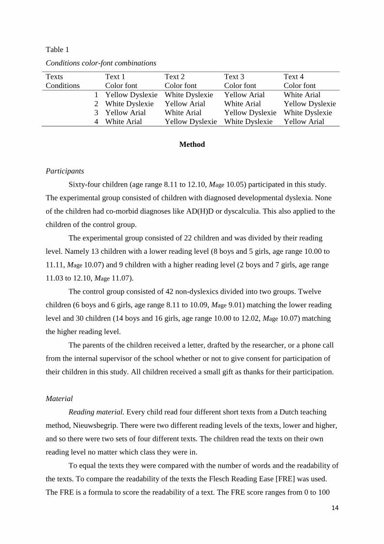
Table 1
Conditions color-font combinations
Texts Text 1 Text 2 Text 3 Text 4
Conditions Color font Color font Color font Color font
1 Yellow Dyslexie White Dyslexie Yellow Arial White Arial
2 White Dyslexie Yellow Arial White Arial Yellow Dyslexie
3 Yellow Arial White Arial Yellow Dyslexie White Dyslexie
4 White Arial Yellow Dyslexie White Dyslexie Yellow Arial
Method
Participants
Sixty-four children (age range 8.11 to 12.10, Mage 10.05) participated in this study.
The experimental group consisted of children with diagnosed developmental dyslexia. None
of the children had co-morbid diagnoses like AD(H)D or dyscalculia. This also applied to the
children of the control group.
The experimental group consisted of 22 children and was divided by their reading
level. Namely 13 children with a lower reading level (8 boys and 5 girls, age range 10.00 to
11.11, Mage 10.07) and 9 children with a higher reading level (2 boys and 7 girls, age range
11.03 to 12.10, Mage 11.07).
The control group consisted of 42 non-dyslexics divided into two groups. Twelve
children (6 boys and 6 girls, age range 8.11 to 10.09, Mage 9.01) matching the lower reading
level and 30 children (14 boys and 16 girls, age range 10.00 to 12.02, Mage 10.07) matching
the higher reading level.
The parents of the children received a letter, drafted by the researcher, or a phone call
from the internal supervisor of the school whether or not to give consent for participation of
their children in this study. All children received a small gift as thanks for their participation.
Material
Reading material. Every child read four different short texts from a Dutch teaching
method, Nieuwsbegrip. There were two different reading levels of the texts, lower and higher,
and so there were two sets of four different texts. The children read the texts on their own
reading level no matter which class they were in.
To equal the texts they were compared with the number of words and the readability of
the texts. To compare the readability of the texts the Flesch Reading Ease [FRE] was used.
The FRE is a formula to score the readability of a text. The FRE score ranges from 0 to 100
15
(Graesser, McNamara, Louwerse & Cai, 2004). A higher score means that it is easier to read.
The formula uses the average sentence length which is computed with the number of words in
a text divided by the number of sentences. It also uses the average number of syllables per
word which is computed with the number of syllables divided by the number of words
(Graesser et al., 2004).
Three different calculators were used to calculate the FRE of each text. The first
calculator implemented the FRE for the Dutch language (Van der Gun, 2009). The second
calculator used was for the English language (MyBylineMedia, n.d.). Although this differs
with the Dutch language it treated the texts in Dutch equal so the deviations within the scores
were the same. This also applied to the third calculator which was also for the English
language (McNamara, Louwerse, Cai & Graessar, 2005). The last calculator did not work
adequately with all texts. The retrieved scores of some texts were included in the comparison
because of the incompletion the scores will not be mentioned here. The results of the
calculators were compared and the texts with the most equal readability scores were used in
this study.
For the higher reading level the mean readability score with the Dutch and English
calculator was respectively 73 (range 70 to 76) and 59.1 (range 55.3 to 61.2). The mean
readability score of the lower reading level was 75.3 (range 72 to 78) and 62.9 (range 60.8 to
64). The range of the scores almost all fall in one category. The category with the scores 70 –
80 is seen as fairly easy texts and the categories with scores 50-59 and 60-69 are seen as
respectively fairly difficult and standard (MyBylineMedia, n.d.). These scores showed that the
higher reading level texts had a slightly more difficult readability than the lower reading level
texts.
The number of words for the higher reading level texts ranged from 400 – 402 words.
The number of words for the lower level reading texts ranged from 310 – 311 words. The
number and length of paragraphs in each text was also taken into account. The higher reading
level texts all had between four and six paragraphs and the lower reading level texts all had
four or five paragraphs.
Test. In order to establish or exclude a cognitive profile for dyslexia each child
administered a test, the Dutch Continuous Naming and Word Reading (in Dutch: Continu
Benoemen & Woorden lezen) [CB&WL]. The first part of the test consists of four tasks:
naming of colors, figures, images and letters. The second part of the test contains two tasks:
reading words consisting of one syllable and reading words correctly in one minute. The test
16
was conducted conform the manual of the CB&WL. The raw score in seconds on every task
has been converted into standard scores and also into three standard combination scores. The
combinations scores are: reading words, alphanumeric consisting of the tasks naming
numbers and letters, and non- alphanumeric consisting of the tasks naming colors and images.
Certain combinations of the combinations scores indicate a cognitive profile for dyslexia, a
risk for dyslexia, or no dyslexia. These indications are based on the diagnostic instructions
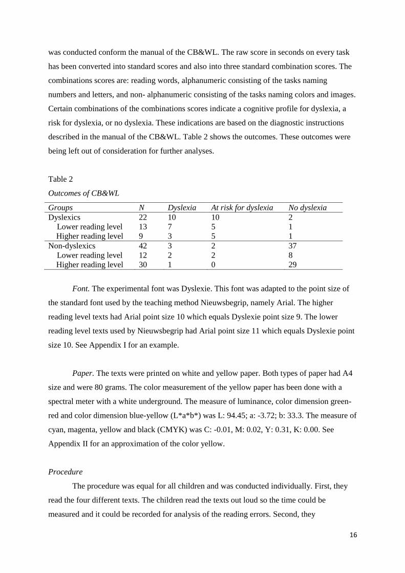
described in the manual of the CB&WL. Table 2 shows the outcomes. These outcomes were
being left out of consideration for further analyses.
Table 2
Outcomes of CB&WL
Groups N Dyslexia At risk for dyslexia No dyslexia
Dyslexics 22 10 10 2
Lower reading level
Higher reading level
13
9
7
3
5
5
1
1
Non-dyslexics
Lower reading level
Higher reading level
42
12
30
3
2
1
2
2
0
37
8
29
Font. The experimental font was Dyslexie. This font was adapted to the point size of
the standard font used by the teaching method Nieuwsbegrip, namely Arial. The higher
reading level texts had Arial point size 10 which equals Dyslexie point size 9. The lower
reading level texts used by Nieuwsbegrip had Arial point size 11 which equals Dyslexie point
size 10. See Appendix I for an example.
Paper. The texts were printed on white and yellow paper. Both types of paper had A4
size and were 80 grams. The color measurement of the yellow paper has been done with a
spectral meter with a white underground. The measure of luminance, color dimension green-
red and color dimension blue-yellow (L*a*b*) was L: 94.45; a: -3.72; b: 33.3. The measure of
cyan, magenta, yellow and black (CMYK) was C: -0.01, M: 0.02, Y: 0.31, K: 0.00. See
Appendix II for an approximation of the color yellow.
Procedure
The procedure was equal for all children and was conducted individually. First, they
read the four different texts. The children read the texts out loud so the time could be
measured and it could be recorded for analysis of the reading errors. Second, they
17
administered the CB&WL. When they were ready, they received a small gift.
Analyses
Design. The reading performance consists of the reading speed and reading accuracy.
The reading accuracy was measured through the amount of errors and the kind of errors. The
reading speed was the raw score in seconds. A lower score means a better reading speed. The
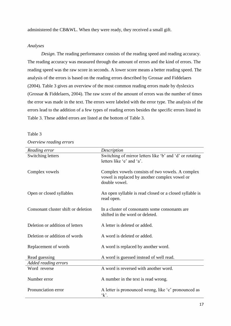
analysis of the errors is based on the reading errors described by Grossar and Fiddelaers
(2004). Table 3 gives an overview of the most common reading errors made by dyslexics
(Grossar & Fiddelaers, 2004). The raw score of the amount of errors was the number of times
the error was made in the text. The errors were labeled with the error type. The analysis of the
errors lead to the addition of a few types of reading errors besides the specific errors listed in
Table 3. These added errors are listed at the bottom of Table 3.
Table 3
Overview reading errors
Reading error Description
Switching letters Switching of mirror letters like ‘b’ and ‘d’ or rotating
letters like ‘e’ and ‘a’.
Complex vowels Complex vowels consists of two vowels. A complex
vowel is replaced by another complex vowel or
double vowel.
Open or closed syllables An open syllable is read closed or a closed syllable is
read open.
Consonant cluster shift or deletion In a cluster of consonants some consonants are
shifted in the word or deleted.
Deletion or addition of letters A letter is deleted or added.
Deletion or addition of words A word is deleted or added.
Replacement of words A word is replaced by another word.
Read guessing A word is guessed instead of well read.
Added reading errors
Word reverse A word is reversed with another word.
Number error A number in the text is read wrong.
Pronunciation error A letter is pronounced wrong, like ‘c’ pronounced as
‘k’.
18
Analysis. For the analyses parametric and non-parametric tests were used. This was
done to compare the background colors yellow and white in spite of the font and to compare
the fonts Dyslexie and Arial in spite of the background color. Regarding the reading speed
and total amount of errors the distribution was very slightly skewed to the right close to a
normal distribution. So for this reason the parametric test paired samples t-test was used for
analyses. With regards to the different error types the statistics showed that these were more
skewed to the right. For these analyses the non-parametric test Wilcoxon signed-rank test was
used. For both parametric and non-parametric tests one-tailed tests were used because of the
directional hypotheses.
For further specified analyses repeated measure analyses were used. This was used to
compare the four different color-font combinations with each other: Yellow-Dyslexie, White-
Dyslexie, Yellow-Arial and White-Arial. The assumption of sphericity has been taken into
account to test if the variances of the differences between conditions were equal. When the
differences were significant and so the condition of sphericity was not met the Greenhouse-
Geisser correction was used when values were under 0.75 and the Huyn-Feldt correction was
used when values were above 0.75.
Besides significant results also trends will be described. Trends are mentioned when
the value was between 0.05 < p < 0.10 in the predicted direction.
Results
The effect of background color on reading speed
The hypothesis that the reading speed of dyslexics will increase when the color yellow
is used as background color (H1a) was first analyzed by a parametric test comparing the
background colors yellow and white in spite of the font. Table 4 gives an overview of the
results. Further specified analyses were conducted with repeated measure analyses. Table 5
gives an overview of the results.
Dyslexics lower reading level. On average dyslexics with the lower reading level read
slower with the white condition (M = 414.62, SD = 49.16) than with the yellow condition (M
= 406.00, SD = 60.92). However this difference was not significant (t (12) = -0.78, p = 0.23).
Table 5 shows that the mean reading speed with the combination Yellow-Dyslexie (M =
200.39, SD = 33.94) and Yellow-Arial (M = 205.62, SD = 33.11) was faster compared to the
combinations White-Dyslexie (M = 208.54, SD = 28.26) and White-Arial (M = 206.08, SD =
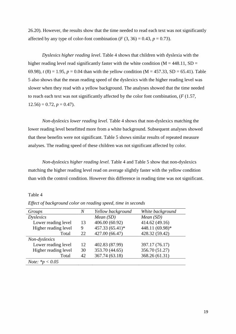
19
26.20). However, the results show that the time needed to read each text was not significantly
affected by any type of color-font combination (F (3, 36) = 0.43, p = 0.73).
Dyslexics higher reading level. Table 4 shows that children with dyslexia with the
higher reading level read significantly faster with the white condition (M = 448.11, SD =
69.98), t (8) = 1.95, p = 0.04 than with the yellow condition (M = 457.33, SD = 65.41). Table
5 also shows that the mean reading speed of the dyslexics with the higher reading level was
slower when they read with a yellow background. The analyses showed that the time needed
to reach each text was not significantly affected by the color font combination, (F (1.57,
12.56) = 0.72, p = 0.47).
Non-dyslexics lower reading level. Table 4 shows that non-dyslexics matching the
lower reading level benefitted more from a white background. Subsequent analyses showed
that these benefits were not significant. Table 5 shows similar results of repeated measure
analyses. The reading speed of these children was not significant affected by color.
Non-dyslexics higher reading level. Table 4 and Table 5 show that non-dyslexics
matching the higher reading level read on average slightly faster with the yellow condition
than with the control condition. However this difference in reading time was not significant.
Table 4
Effect of background color on reading speed, time in seconds
Groups N Yellow background White background
Dyslexics Mean (SD) Mean (SD)
Lower reading level
Higher reading level
Total
13
9
22
406.00 (60.92)
457.33 (65.41)*
427.00 (66.47)
414.62 (49.16)
448.11 (69.98)*
428.32 (59.42)
Non-dyslexics
Lower reading level
Higher reading level
Total
12
30
42
402.83 (87.99)
353.70 (44.65)
367.74 (63.18)
397.17 (76.17)
356.70 (51.27)
368.26 (61.31)
Note: *p < 0.05
20
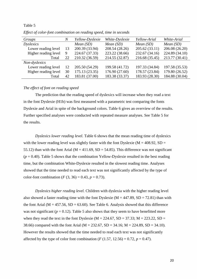
Table 5
Effect of color-font combination on reading speed, time in seconds
Groups N Yellow-Dyslexie White-Dyslexie Yellow-Arial White-Arial
Dyslexics
Lower reading level
13
Mean (SD)
200.39 (33.94)
Mean (SD)
208.54 (28.26)
Mean (SD)
205.62 (33.11)
Mean (SD)
206.08 (26.20)
Higher reading level
Total
9
22
224.67 (37.33)
210.32 (36.59)
223.22 (38.66)
214.55 (32.87)
232.67 (34.16)
216.68 (35.45)
224.89 (34.10)
213.77 (30.41)
Non-dyslexics
Lower reading level
12
205.50 (54.29)
199.58 (41.72)
197.33 (34.84)
197.58 (35.53)
Higher reading level
Total
30
42
175.13 (23.35)
183.81 (37.00)
176.90 (27.60)
183.38 (33.37)
178.57 (23.84)
183.93 (28.30)
179.80 (26.52)
184.88 (30.04)
The effect of font on reading speed
The prediction that the reading speed of dyslexics will increase when they read a text
in the font Dyslexie (H1b) was first measured with a parametric test comparing the fonts
Dyslexie and Arial in spite of the background colors. Table 6 gives an overview of the results.
Further specified analyses were conducted with repeated measure analyses. See Table 5 for
the results.
Dyslexics lower reading level. Table 6 shows that the mean reading time of dyslexics
with the lower reading level was slightly faster with the font Dyslexie (M = 408.92, SD =
55.12) than with the font Arial (M = 411.69, SD = 54.85). This difference was not significant
(p = 0.40). Table 5 shows that the combination Yellow-Dyslexie resulted in the best reading
time, but the combination White-Dyslexie resulted in the slowest reading time. Analyses
showed that the time needed to read each text was not significantly affected by the type of
color-font combination (F (3, 36) = 0.43, p = 0.73).
Dyslexics higher reading level. Children with dyslexia with the higher reading level
also showed a faster reading time with the font Dyslexie (M = 447.89, SD = 72.81) than with
the font Arial (M = 457.56, SD = 63.60). See Table 6. Analysis showed that this difference
was not significant (p = 0.12). Table 5 also shows that they seem to have benefitted more
when they read the text in the font Dyslexie (M = 224.67, SD = 37.33; M = 223.22, SD =
38.66) compared with the font Arial (M = 232.67, SD = 34.16; M = 224.89, SD = 34.10).
However the results showed that the time needed to read each text was not significantly
affected by the type of color font combination (F (1.57, 12.56) = 0.72, p = 0.47).
21
Non-dyslexics lower reading level. The results in Table 5 and Table 6 show that the
non-dyslexics matching the lower reading level seemed to benefit more from the font Arial.
Further analyses showed that these differences were not significant.
Non-dyslexics higher reading level. Non-dyslexics with the higher reading level
seemed to benefit more from the font Dyslexie, see Table 5 and Table 6. Analyses showed a
trend of a statistically significant difference in reading time with the font Arial (M = 358.37
SD = 48.60) compared with the font Dyslexie (M = 352.03, SD = 47.92), t (29) = -1.59, p =
0.06.
Table 6
Effect of font on reading speed, time in seconds
Groups N Dyslexie font Arial font
Dyslexics
Lower reading level
13
Mean (SD)
408.92 (55.12)
Mean (SD)
411.69 (54.85)
Higher reading level
Total
9
22
447.89 (72.81)
424.86 (64.34)
457.56 (63.60)
430.45 (61.58)
Non-dyslexics
Lower reading level
Higher reading level
Total
12
30
42
405.08 (94.80)
352.03 (47.92)
367.19 (68.00)
394.92 (66.22)
358.37 (48.60)
368.81 (55.92)
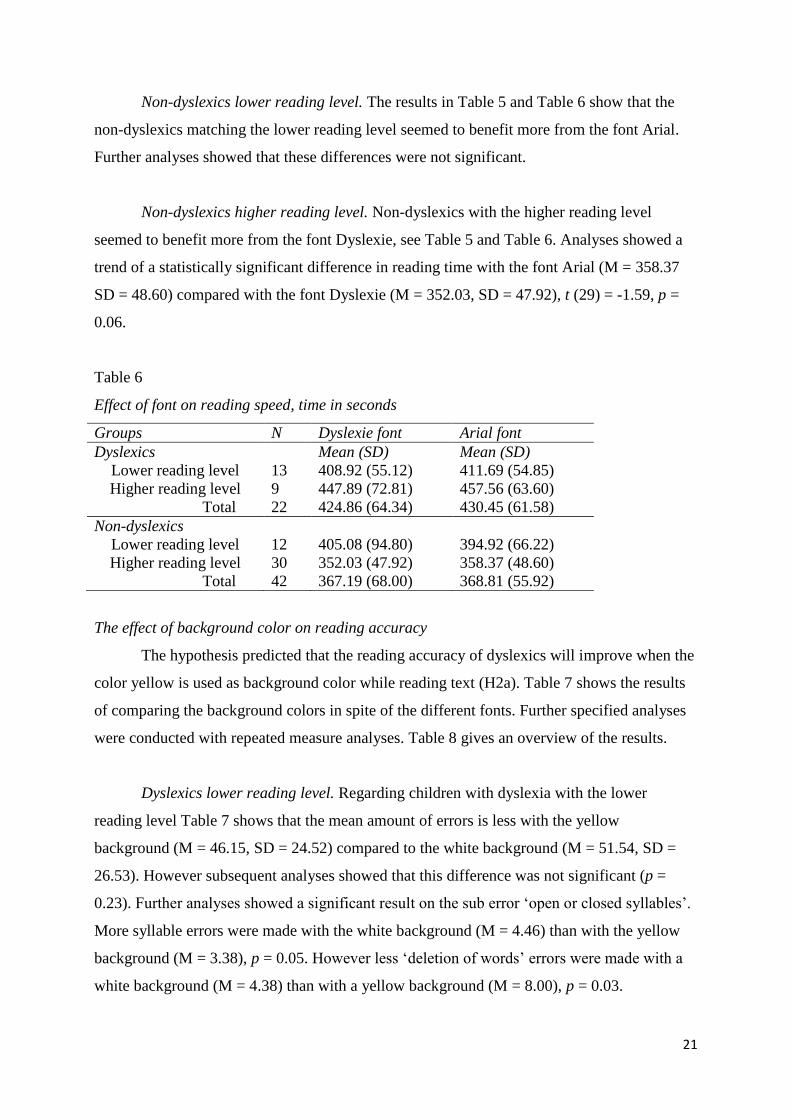
The effect of background color on reading accuracy
The hypothesis predicted that the reading accuracy of dyslexics will improve when the
color yellow is used as background color while reading text (H2a). Table 7 shows the results
of comparing the background colors in spite of the different fonts. Further specified analyses
were conducted with repeated measure analyses. Table 8 gives an overview of the results.
Dyslexics lower reading level. Regarding children with dyslexia with the lower
reading level Table 7 shows that the mean amount of errors is less with the yellow
background (M = 46.15, SD = 24.52) compared to the white background (M = 51.54, SD =
26.53). However subsequent analyses showed that this difference was not significant (p =
0.23). Further analyses showed a significant result on the sub error ‘open or closed syllables’.
More syllable errors were made with the white background (M = 4.46) than with the yellow
background (M = 3.38), p = 0.05. However less ‘deletion of words’ errors were made with a
white background (M = 4.38) than with a yellow background (M = 8.00), p = 0.03.
22
Table 8 shows the results of the repeated measure analyses. The mean amount of
errors made by the dyslexics with the lower reading level was lowest with the combination
Yellow-Dyslexie compared to the combinations with a white background. However, the
combination Yellow-Arial had the highest amount of errors. The total amount of errors made
shows a trend towards a significant affect by the type of color-font combination, (F (3, 36) =
2.41, p = 0.08. The difference between Yellow-Dyslexie and White-Dyslexie was not
significant (p = 0.26). However analyses did show a significant result on the sub error
‘deletion of words’. With the combination Yellow-Dyslexie these children made significant
less word-deletion errors (M = 0.85) compared with the combination White-Dyslexie (M =
1.85), p = 0.01.
Dyslexics higher reading level. Dyslexics with the higher reading level showed a less
amount of errors when reading with the yellow background (M = 51.44, SD = 21.29)
compared with the white background (M = 58.67, SD = 21.37). See Table 7. This difference
showed a trend towards a significant difference between a yellow and white background (p =
0.09). Further analyses showed a significant difference on the sub error ‘addition of words’.
The children added more words with a white background (M = 8.89) than with a yellow
background (M = 6.00) (p = 0.05). Table 8 also shows that when the color yellow is used as
background color the total amount of errors is slightly less (M = 24.33, SD = 10.72; M =
27.11, SD = 15.66) than with a white background (M = 27.22, SD = 12.23; M = 31.44, SD =
10.43) . Subsequent analyses showed that the amount of errors was not affected by color-font
combination (F (3, 24) = 1.06, p = 0.39).
Non-dyslexics lower reading level. Table 7 shows that non-dyslexics matching the
lower reading level had less errors with the white background than with the yellow
background. Table 8 also shows that these children benefitted more from a white background
reading with the font Dyslexie and Arial. Analysis showed that these differences were not
significant.
Non-dyslexics higher reading level. Non-dyslexics matching the higher reading level
seemed to make slightly less errors with a yellow background than with a white background.
Table 8 also confirms this finding. Subsequent analyses showed that this difference between
the colors yellow and white was not statistically significant. However these children did made
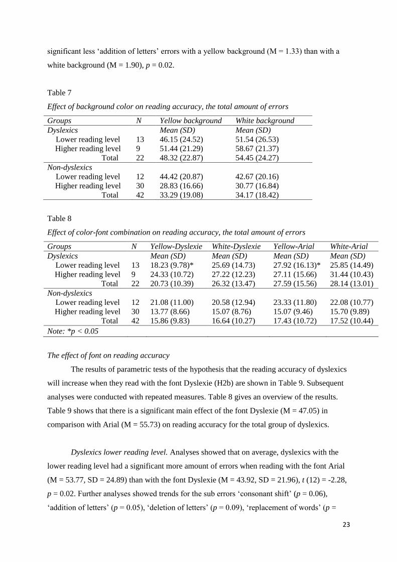
23
significant less ‘addition of letters’ errors with a yellow background (M = 1.33) than with a
white background (M = 1.90), p = 0.02.
Table 7
Effect of background color on reading accuracy, the total amount of errors
Groups N Yellow background White background
Dyslexics
Lower reading level
13
Mean (SD)
46.15 (24.52)
Mean (SD)
51.54 (26.53)
Higher reading level
Total
9
22
51.44 (21.29)
48.32 (22.87)
58.67 (21.37)
54.45 (24.27)
Non-dyslexics
Lower reading level
12
44.42 (20.87)
42.67 (20.16)
Higher reading level
Total
30
42
28.83 (16.66)
33.29 (19.08)
30.77 (16.84)
34.17 (18.42)
Table 8
Effect of color-font combination on reading accuracy, the total amount of errors
Groups N Yellow-Dyslexie White-Dyslexie Yellow-Arial White-Arial
Dyslexics
Lower reading level
13
Mean (SD)
18.23 (9.78)*
Mean (SD)
25.69 (14.73)
Mean (SD)
27.92 (16.13)*
Mean (SD)
25.85 (14.49)
Higher reading level
Total
9
22
24.33 (10.72)
20.73 (10.39)
27.22 (12.23)
26.32 (13.47)
27.11 (15.66)
27.59 (15.56)
31.44 (10.43)
28.14 (13.01)
Non-dyslexics
Lower reading level
Higher reading level
12
30
21.08 (11.00)
13.77 (8.66)
20.58 (12.94)
15.07 (8.76)
23.33 (11.80)
15.07 (9.46)
22.08 (10.77)
15.70 (9.89)
Total 42 15.86 (9.83) 16.64 (10.27) 17.43 (10.72) 17.52 (10.44)
Note: *p < 0.05
The effect of font on reading accuracy
The results of parametric tests of the hypothesis that the reading accuracy of dyslexics
will increase when they read with the font Dyslexie (H2b) are shown in Table 9. Subsequent
analyses were conducted with repeated measures. Table 8 gives an overview of the results.
Table 9 shows that there is a significant main effect of the font Dyslexie (M = 47.05) in
comparison with Arial (M = 55.73) on reading accuracy for the total group of dyslexics.
Dyslexics lower reading level. Analyses showed that on average, dyslexics with the
lower reading level had a significant more amount of errors when reading with the font Arial
(M = 53.77, SD = 24.89) than with the font Dyslexie (M = 43.92, SD = 21.96), t (12) = -2.28,
p = 0.02. Further analyses showed trends for the sub errors ‘consonant shift’ (p = 0.06),
‘addition of letters’ (p = 0.05), ‘deletion of letters’ (p = 0.09), ‘replacement of words’ (p =
24
0.06), ‘word reverse’ (p = 0.09) and ‘number error’ (p = 0.08) for the font Dyslexie. The sub
error ‘deletion of words’ showed a significant difference between the font Dyslexie (M =
2.69) and the font Arial (M = 5.54), p = 0.01. Further specified analyses on this sub error
showed a significant difference between Yellow-Dyslexie (M = 0.85) and Yellow-Arial (M =
3.00) (p = 0.01).
Subsequent analyses with repeated measure also showed that these children had the
least amount of errors with the font Dyslexie compared to the font Arial, see Table 8. The
results showed a trend by the total amount of errors made and the type of color-font
combination (F (3, 36) = 2.41, p = 0.08). Further analyses with the Bonferroni method
showed that the mean difference of the combination Yellow-Dyslexie compared with Yellow-
Arial was statistically significant (p = 0.04).
Dyslexics higher reading level. Children with dyslexia with the higher reading level
showed a less amount of errors when reading with the font Dyslexie (M = 51.56, SD = 19.21)
compared to the font Arial (M = 58.56, SD = 24.01). See table 9. This difference inclines
towards a trend of font on reading accuracy (p = 0.13). Further analyses of the sub errors
showed that these children made significant less ‘consonant deletion’ errors with the font
Dyslexie than with the font Arial, p = 0.03. They also made less ‘deletion of words’ errors
with the font Dyslexie (M = 6.33) than with the font Arial (M = 9.11), p = 0.07.
Table 8 shows that dyslexics at the higher reading level had the lowest amount of
errors with the font Dyslexie in combination with a yellow background. They also had a fewer
amount of errors when they read with the font Dyslexie with a white background (M = 27.22,
SD = 12.23) compared to the font Arial with a white background (M = 31.44, SD = 10.43).
Analysis showed that the total amount of errors made was not significantly affected by the
type of color-font combination (F (3, 24) = 1.06, p = 0.39).
Non-dyslexics lower reading level. Table 9 shows that non-dyslexics matching the
lower reading level made fewer errors with the font Dyslexie than with the font Arial but this
difference was not significant. However these children did made less ‘replacement of words’
errors with the font Dyslexie (M = 5.08) than with the font Arial (M = 6.58), p = 0.04. Table 8
shows that these children had the least amount of errors with the combination White-Dyslexie
compared with the other color-font combination. Further analysis did not show a significant
result.
25
Non-dyslexics higher reading level. Non-dyslexics matching the higher reading level
made fewer errors with the font Dyslexie than with the font Arial, see Table 9. Analyses
showed a significant less amount of the sub error ‘replacement of words’ with the font
Dyslexie (M = 3.13) than with the font Arial (M = 4.73), p = 0.00. Further analyses showed
trends for the amount of errors for the sub errors ‘deletion of letters’ (p = 0.11), ‘deletion of
words’ (p = 0.05) and ‘word reverse’ (p = 0.08) with the font Dyslexie compared with Arial.
However these children made more ‘consonant deletion’ errors with the font Dyslexie than
with the font Arial, p = 0.05.
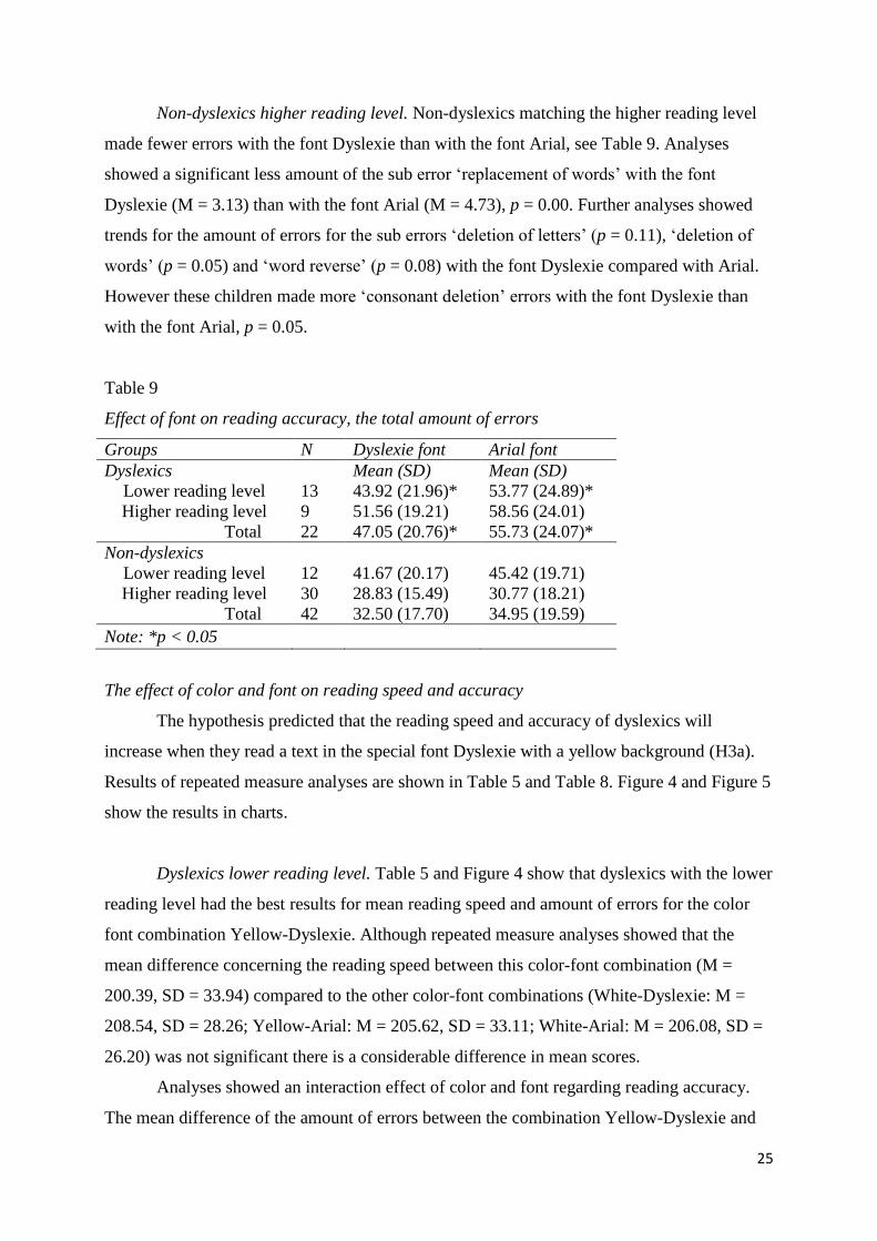
Table 9
Effect of font on reading accuracy, the total amount of errors
Groups N Dyslexie font Arial font
Dyslexics
Lower reading level
13
Mean (SD)
43.92 (21.96)*
Mean (SD)
53.77 (24.89)*
Higher reading level
Total
9
22
51.56 (19.21)
47.05 (20.76)*
58.56 (24.01)
55.73 (24.07)*
Non-dyslexics
Lower reading level
12
41.67 (20.17)
45.42 (19.71)
Higher reading level
Total
30
42
28.83 (15.49)
32.50 (17.70)
30.77 (18.21)
34.95 (19.59)
Note: *p < 0.05
The effect of color and font on reading speed and accuracy
The hypothesis predicted that the reading speed and accuracy of dyslexics will
increase when they read a text in the special font Dyslexie with a yellow background (H3a).
Results of repeated measure analyses are shown in Table 5 and Table 8. Figure 4 and Figure 5
show the results in charts.
Dyslexics lower reading level. Table 5 and Figure 4 show that dyslexics with the lower
reading level had the best results for mean reading speed and amount of errors for the color
font combination Yellow-Dyslexie. Although repeated measure analyses showed that the
mean difference concerning the reading speed between this color-font combination (M =
200.39, SD = 33.94) compared to the other color-font combinations (White-Dyslexie: M =
208.54, SD = 28.26; Yellow-Arial: M = 205.62, SD = 33.11; White-Arial: M = 206.08, SD =
26.20) was not significant there is a considerable difference in mean scores.
Analyses showed an interaction effect of color and font regarding reading accuracy.
The mean difference of the amount of errors between the combination Yellow-Dyslexie and
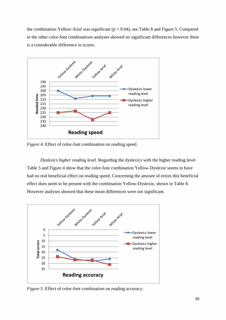
26
the combination Yellow-Arial was significant (p = 0.04), see Table 8 and Figure 5. Compared
to the other color-font combinations analyses showed no significant differences however there
is a considerable difference in scores.
Figure 4. Effect of color-font combination on reading speed.
Dyslexics higher reading level. Regarding the dyslexics with the higher reading level
Table 5 and Figure 4 show that the color-font combination Yellow-Dyslexie seems to have
had no real beneficial effect on reading speed. Concerning the amount of errors this beneficial
effect does seem to be present with the combination Yellow-Dyslexie, shown in Table 8.
However analyses showed that these mean differences were not significant.
Figure 5. Effect of color-font combination on reading accuracy.
190 195 200 205 210 215 220 225 230 235 240
Ne
ed
ed
tim
e
Reading speed
Dyslexics lower reading level
Dyslexics higher reading level
0
5
10
15
20
25
30
35
Tota
l err
ors
Reading accuracy
Dyslexics lower reading level
Dyslexics higher reading level
27
Non-dyslexics lower reading level. Table 5 shows that non-dyslexics matching the
lower reading level did not had better reading times with the combination Yellow-Dyslexie.
Regarding the reading accuracy Table 8 shows that these children had no significant better
results with the combination Yellow-Dyslexie in comparison with the other color-font
combinations.
Non-dyslexics higher reading level. Non-dyslexics matching the higher reading level
did had better results on reading speed and reading accuracy with a yellow background and
the font Dyslexie in comparison with the other color-font combinations, see Table 5 and Table
8. However these results were not significant.
Reading performance of dyslexics with the lower reading level versus the higher reading level
The last prediction was that the reading speed and accuracy of dyslexics with a lower
reading level will increase more with the special font Dyslexie and a yellow background than
the reading speed and accuracy of dyslexics with a higher reading level (H3b).
Dyslexics lower reading level versus dyslexics higher reading level. Analyses with
repeated measures showed that dyslexics with a lower reading level improved more than
dyslexics with a higher reading level on reading speed with the condition Yellow-Dyslexie in
comparison with the other color-font combinations. See Table 5 and Figure 4. Although
analyses showed that these differences were not significant, the mean score of dyslexics with
a lower reading level improved with this condition while the mean score of dyslexics with a
higher reading level got worse.
Concerning reading accuracy dyslexics with the lower reading level improved more
with the color-font combination Yellow-Dyslexie in comparison with the other conditions
than dyslexics with the higher reading level. Table 8 and Figure 5 give an overview of the
results.
Non-dyslexics lower reading level versus non-dyslexics higher reading level. Non-
dyslexics with a higher reading level showed more improvement on reading speed and
reading accuracy with the combination Yellow-Dyslexie in comparison with the other
conditions than dyslexics with a lower reading level. However these were slight
improvements and analyses showed no significant differences.
28
Discussion
The goal of this study was to examine whether a yellow background and the special
font Dyslexie could improve the reading performance of dyslexics.
Hypothesis 1. The results do not show support for the hypothesis that the reading
speed of dyslexics will increase when the color yellow is used as background color (H1a) and
when they read a text in the special font Dyslexie (H1b).
Although dyslexics with a lower reading level had a faster reading time with a yellow
background this was not significant. A possible explanation could be their sensitivity for
color. Research from Dain, Floyd and Elliot (2008) showed that with the blue/yellow
opponent color impaired readers had less contrast discrimination in comparison with normal
readers. Wearing a colored yellow lens reinforces this blue/yellow color and gives positive
reading results (Ray et al., 2005; Stein, 2003). This study used a yellow background with
black letters. The influence of the color black and the level of luminance could have give
dyslexics with a lower reading level too little visual comfort to improve reading speed.
Dyslexics with a higher reading level read significantly faster with a white background. The
reason for this result could be that they are more like non-dyslexics and have a better color
contrast discrimination. In this way the color yellow is of no help for them. Future research
could focus more on this blue/yellow opponent color in using blue letters instead of black
letters and the influence of luminance to examine the effect on reading speed between
dyslexics with a lower and higher reading level.
In addition, Leslie (1980) found that below average readers continue to try decoding
an unknown word. In doing so they rely on graphic information (Leslie, 1980). The color
yellow changes the contrast of the colors, which could make it easier to distinguish words but
it does not per se help with decoding graphic information of words. This could explain the
faster but the non-significant result for reading time.
All dyslexics read faster with the experimental font Dyslexie but this was not
significant in comparison with the standard font Arial. This effect may be related to
adaptations in the font Dyslexie. For instance, an increase in inter-letter spacing produces less
crowding and therefore faster word-identification and faster reading times (Chung, 2002;
Perea et al., 2012). However, there is a limit about the effectiveness of inter-letter spacing.
Beyond a certain point reading speed stays the same or decreases (Chung, 2002). Changing
the inter-letter spacing of the font Dyslexie could result in a significant faster reading time.
29
Further research is needed to explore the best inter-letter spacing for the font Dyslexie.
Another example is the point size of the font Dyslexie. In this study the size of the font
Dyslexie was adapted to the point size of Arial. This could explain the non-significant result.
Several studies showed that a larger point size of a font results in better reading times
(Bernard et al., 2003; Hughes & Wilkins, 2000; Wilkins et al., 2009). A larger font size is
more legible and increases the reading speed (Bernard et al., 2002; Wilkins et al., 2009).
Making the font size of Dyslexie larger could ensure a significant faster reading time. Future
research is needed to fully examine the effect of a larger size of the font Dyslexie on reading
performance.
Hypothesis 2. The hypothesis that the reading accuracy of dyslexics will improve
when they read a text with a yellow background (H2a) was partly supported by the results of
this study.
The reading accuracy of dyslexics with a lower reading level did improve with a
yellow background but this was not significant. The reading accuracy of dyslexics with a
higher reading level showed a trend in improving with a yellow background. These non-
significant effects might be due to the earlier described blue/yellow color opponent. The
effect of the color yellow in combination with the color of black letters was not strong enough
to really make a significant difference for reading accuracy. Especially for dyslexics with a
lower reading level the effect was less strong than for dyslexics with a higher reading level.
As described earlier dyslexics with a higher reading level could be more alike non-dyslexics.
Unlike with reading speed the color yellow could serve as a intensifier of contrast with letters
and words and therefore sees to a better reading accuracy.
Another explanation for the less strong effect of the color yellow for dyslexics with a
lower reading level are their reading skills. Research showed that more impaired readers have
difficulty in phonological, naming-speed and orthographic skills (Badian, 1997). Besides
below average readers rely more on graphic information than semantic information (Leslie,
1980). Using the color yellow as background color does not change the graphic outlay of
words, it only changes the contrast of colors. As findings showed this could explain the
improvement on reading accuracy but the non-significant result.
The second part of the hypothesis was that the reading accuracy of dyslexics will
improve when they read a text in the font Dyslexie (H2b). The font Dyslexie is especially
designed to make it easier for dyslexics to distinguish letters and therefore reduce reading
errors (Boer, 2011). The results support the hypothesis and showed a significant result for
30
dyslexics with a lower reading level and an incline towards a trend in the predicted direction
for dyslexics with a higher reading level. Besides both dyslexics with a lower and higher
reading level made significant fewer mistakes with several sub errors with the font Dyslexie.
Hypothesis 3. The first part of the third hypothesis predicted that the reading speed and
accuracy of dyslexics will increase when they read a text in the special font Dyslexie with a
yellow background (H3a). This hypothesis is partly supported.
Dyslexics with a lower reading level had the best results with the condition Yellow-
Dyslexie. Findings showed an interaction effect of the color yellow and the font Dyslexie for
reading accuracy. Regarding reading speed there were no significant results. Dyslexics with a
higher reading level did not improve on reading speed with the condition Yellow-Dyslexie.
They slightly improved on reading accuracy but analysis showed that this was not significant.
Striking herewith is that the color-font combination Yellow-Dyslexie does not show any
result while looked at separately both yellow as Dyslexie show a trend on reading accuracy. It
would be interesting to further study the effect of color and font on each other and the
influence of them both on the readability of texts.
The second part of the third hypothesis predicted that the reading speed and accuracy
of dyslexics with a lower reading level will increase more with the special font Dyslexie and a
yellow background than the reading speed and accuracy of dyslexics with a higher reading
level (H3b). This hypothesis is supported by the findings.
Results showed that dyslexics with a lower reading level improved more with the
condition Yellow-Dyslexie in comparison with all the other conditions than did dyslexics with
a higher reading level. A possible explanation for these findings is the difference in reading
skills between dyslexics with a lower and higher reading level. Research from Badian (1997)
showed that the more impaired readers had more problems in phonological, naming-speed and
orthographic skills. These children have less compensatory skills to fall back on during
reading (Badian, 1997). The visual elements used in this study, the background color yellow
and the font Dyslexie, could serve as a compensator for the dyslexic children with a lower
reading level. The less impaired dyslexics have better reading skills and they probably need
these visual compensators less.
Another explanation could be the difference in level of prior knowledge between
dyslexics with a lower and a higher reading level. The level of prior knowledge affects word
identification skills (Priebe et al., 2010; Taft & Leslie, 1985). Children with low prior
knowledge and a below average reading level made more oral reading errors and relied more
31
on graphic cues. Children with high prior knowledge relied more on semantic information.
(Leslie, 1980; Priebe et al., 2010; Taft & Leslie, 1985). The combination of the yellow
background and the font Dyslexie changes the color contrast and the graphic outlay but not
the semantic information. This could explain the difference in level of increase between
dyslexics with a lower and higher reading level. Future research is necessary to fully explore
the role of level of prior knowledge between dyslexics with a lower and higher reading level
and the influence on reading performance.
Limitations
An important limitation in this research is that the children read the texts with the
different color-font combination only once. Thus, they did not have time to get more familiar
with a yellow background or with the special font Dyslexie while reading. A larger exposure
of reading with these visual adaptations could further improve the reading performance of
dyslexics. In addition, another limitation of this study is the sample size of the dyslexics, 13
dyslexics with a lower reading level and 9 dyslexics with a higher reading level. Though this
study shows interesting findings more dyslexics of the lower and higher reading level are
needed to be certain of the positive effects of a yellow background and the special font
Dyslexie on reading performance. Future research should include the aspect of more exposure
and a larger sample size so the effect of color and font could be analyzed with more certainty.
In this study measurements of reading performance were speed and accuracy. Another
aspect of reading performance is comprehension. The visual elements used in this study, the
background color yellow and the font Dyslexie, could also influence reading comprehension.
For future research it would be interesting to study the effect of a yellow background and the
font Dyslexie for reading comprehension.
Conclusion and practical implications
This research was the first to examine the use of a colored background in combination
with the font Dyslexie. In addition, this research was also the first in examining the influence
of a yellow background with texts on paper with dyslexics. The findings of this study could
lead to several practical implications. These implications could exist of the implementation of
the color yellow and the font Dyslexie for dyslexics with a lower reading level and perhaps
the implementation of a yellow background or the font Dyslexie for dyslexics with a higher
reading level. In view of these different findings for dyslexics implementation of these visual
elements should be looked at individually. As a consequence implementation requires more
32
flexibility, time and money of primary schools. On the other hand these implementations
could lead to a better reading performance of dyslexics and more pleasure in reading.
Acknowledgements
With thanks to the Dutch teaching method Nieuwsbegrip for the use of the texts and the
following primary schools for their participation: De Fontein, Willem van Oranje, De Kubus,
Prins Maurits, Bonifatius, Drakensteyn, De Esmarke and De Eschmarke.
33
References
Altschuler, E.L., Altschuler, B.M., Altschuler, D.L., Samber, D., & Ramachandran, V.S.
(2007). ‘‘Stroop Concordant’’ coloring of letters for remediation of dyslexia. Medical
Hypotheses 69, 381-382.
Arditi, A., & Cho, J. (2005). Serifs and font legibility. Vision Research 45, 2926–2933.
Badian, N. (1997). Dyslexia and the double deficit hypothesis. Annals of Dyslexia, Vol. 47,
69-87.
Bernard, M.L., Chaparro, B.S., Mills, M.M., & Halcomb, C.G. (2002). Examining children’s
reading performance and preference for different computer-displayed text. Behaviour
& Information Technology, VOL. 21, NO. 2, 87-96.
Bernard, M.L., Chaparro, B.S., Mills, M.M., & Halcomb, C.G. (2003). Comparing the effects
of text size and format on the readibility of computer-displayed Times New Roman
and Arial text. International Journal of Human-Computer Studies 59, 823–835.
Bix, L., Lockhart, H., Cardoso, F., & Selke, S. (2003). The effect of color contrast on message
legibility. Journal of Design Communication, 5. Retrieved June 18, 2012, from
http://scholar.lib.vt.edu/ejournals/JDC/Spring-2003/colorcontrast.html
Bloodsworth, J.G. (1993). Legibility of Print. Retrieved June 4, 2012, from Educational
Resources Information Center http://www.eric.ed.gov/PDFS/ED355497.pdf
Boer, C. (2011). Dyslexie typeface. Retrieved June 15, 2012, from
http://www.studiostudio.nl/ lettertype-dyslexie/
Boets, B., Wouters, J., Wieringen, A., van, De Smedt, B., & Ghesquière, P. (2008). Modelling
relations between sensory processing, speech perception, orthographic and
phonological ability, and literacy achievement. Brain and Language, 106, 29-40.
Braams, T. (2002). Dyslexie. Een complex taalprobleem. (4th revised edition) Amsterdam:
Boom.
Buchner, A., Mayr, S., & Brandt, M. (2009). The advantage of positive text-background
polarity is due to high display luminance. Ergonomics, Vol. 52, No. 7, 882-886.
Castles, A., Mclean, G.M.T., & McArthur, G. (2010). Dyslexia. WIREs Cognitive Science,
Vol. 1, 426-432.
Chase, C., Ashourzadeh, A., Kelly, C., Monfette, S., & Kinsey, K. (2003). Can the
magnocellular pathway read? Evidence from studies of color. Vision Research 43,
1211–1222.
34
Chung, S.T.L. (2002). The Effect of Letter Spacing on Reading Speed in Central and
Peripheral Vision. Investigative Ophthalmology & Visual Science, Vol. 43, No. 4,
1270-1276.
Coronel-Beltrán, A., & Alvarez-Borrego, J. (2010). Comparative analysis between different
font types and letter styles using a nonlinear invariant digital correlation. Journal of
Modern Optics, Vol. 57, No. 1, 58–64.
Dain, S.J., Floyd, R.A., & Elliot, R.T. (2008). Color and luminance increment thresholds in
poor readers. Visual Neuroscience, 25, 481–486.
De Jong, T., Van Gog, T., Jenks, K., Manlove, S., Van Hell, J., Jolles, J., et al. (2009).
Explorations in Learning and the brain. Springer.
De Leeuw, R. (2010). Special font for dyslexia? Unpublished master thesis. University of
Twente.
Démonet, J., Taylor, M.J., & Chaix, Y. (2004). Developmental dyslexia. The Lancet, Vol.
363, 1451-1460.
Essential Learning Institute. (2012). Dyslexia. Diagnostic Criteria. Retrieved July 10, 2012,
from http://ldhope.com/dyslexia.htm
Graesser, A.C., McNamara, D.S., Louwerse, M.M., & Cai, Z. (2004). Coh-Metrix: Analysis
of text on cohesion and language. Behavior Research Methods, Instruments, &
Computers, 36 (2), 193-202.
Grossar, S., & Fiddelaers, W. (2004). Leeshulp voor jonge lezers en dyslectische kinderen.
Unpublished master thesis. K.U Leuven, ESAT.
Hartley, J. (1978). Designing instructional text. London: Kogan Page.
Heim, S., Tsiersche, J., Amunts, K., Wilms, M., Vossel, S., Willmes, K., et al. (2008).
Cognitive subtypes of dyslexia. Acta Neurobiologiae Experimentalis, 68, 73-82.
Hughes, L.E., & Wilkins, A.J. (2000). Typography in children’s reading schemes may be
suboptimal: Evidence from measures of reading rate. Journal of Research in Reading,
Vol. 23, 3, 314-324.
Jainta, S., Jaschinski, W., & Wilkins, A.J. (2010). Periodic letter strokes within a word affect
fixation disparity during reading. Journal of Vision, 10, 13, 2, 1–11.
Kuster, S., Braams, T., & Bosman, A.M.T. (2012). Hoezo is het lettertype Dyslexie beter?
Tijdschrift voor Remedial Teaching, 20, 26 -28.
Leslie, L. (1980). The use of graphic and contextual information by average and below-
average readers. Journal of Reading Behavior, Vol. 12, No. 2, 139-149.
35
Ling, J., & Van Schaik, P. (2006). The influence of font type and line length on visual search
and information retrieval in web pages. International Journal of Human-Computer
Studies 64, 395–404.
Lockhead, G.R., & Crist, W.B. (1980). Making Letters Distinctive. Journal of Educational
Psychology, Vol. 72, No. 4, 483-493.
Lyon, G.R., Shaywitz, S.E., & Shaywitz, B.A. (2003). A Definition of Dyslexia. Annals of
Dyslexia, Vol. 53.
Mayer, R.E. (2008). Learning and Instruction. New Jersey: Pearson Education.
McNamara, D.S., Louwerse, M.M., Cai, Z., & Graesser, A. (2005). Coh-Metrix version 1.4.
Retrieved September 19, 2012, from http//:cohmetrix.memphis.edu.
Moret-Tatay, C., & Perea, M. (2011). Do serifs provide an advantage in the recognition of
written words? Journal of Cognitive Psychology, 23, 5, 619-624.
MyBylineMedia. (n.d.). The Flesch Reading Ease Readability Formula. Retrieved September
12, 2012, from http://www.readabilityformulas.com/
O’Connor, P.D., Sofo, F., Kendall, L., & Olsen, G. (1990). Reading Disabilities and the
Effects of Colored Filters. Journal of Learning Disabilities, Volume 23, Number 10,
597-620.
Ossen, A. (2012). Effecten van het Lettertype Dyslexie in het basisonderwijs. Beter
Begeleiden Digitaal.
Perea, M., & Gomez, P. (2012). Increasing interletter spacing facilitates encoding of words.
Psychon Bull Rev, 19, 332-338.
Perea, M., Moret-Tatay, C., & Gómez, P. (2011). The effects of interletter spacing in visual-
word recognition. Acta Psychologica, 137, 345-351.
Perea, M., Panadero, V., Moret-Tatay, C., & Gómez, P. (2012). The effects of inter-letter
spacing in visual-word recognition: Evidence with young normal readers and
developmental dyslexics. Learning and Instruction, 1-11.
Priebe, S.J., Keenan, J.M., & Miller, A.C. (2010). How prior knowledge affects word
identification and comprehension. Read Writ, 25, 131-149.
Ray, N.J., Fowler, S., & Stein, J.F. (2005). Yellow Filters Can Improve Magnocellular
Function: Motion Sensitivity, Convergence, Accommodation, and Reading. New York
Academy of Sciences, 1039, 283-293.
Rudnicky, A.I., & Kolers, P.A. (1984). Size and case of type as stimuli in reading. Journal of
Experimental Psychology: Human, Perception and Performance, Vol. 10, No. 2, 231-
249.
36
Scharff, L.F.V., Ahumada, A.J., & Hill, A.L. (1999). Discriminability measures for predicting
readability. SPIE, Vol. 3644, 270-277.
Sheedy, J.E., Subbaram, M.V., Zimmerman, A.B., & Hayes, J.R. (2005). Text Legibility and
the Letter Superiority Effect. Human Factors, Vol. 47, No. 4, pp. 797–815.
Smith, L., & Wilkins, A. (2007). How many colours are necessary to increase the reading
speed of children with visual stress? A comparison of two systems. Journal of
Research in Reading, Vol. 30, Issue 3, pp 332–343.
Spinelli, D., De Luca, M., Judica, A., & Zoccolotti, P. (2002). Crowding effects on word
identification in developmental dyslexia. Cortex, 38, 179-200.
Stein, J. (2003). Visual motion sensitivity and reading. Neuropsychologia 41, 1785–1793.
Stein, J., & Walsh, V. (1997). To see but not to read; the magnocellular theory of dyslexia.
Trends Neuroscience, 20, 147-152.
Taft, M., & Leslie, L. (1985). The effects of prior knowledge and oral reading accuracy on
miscues and comprehension. Journal of Reading Behavior, Vol. 17, No. 2, 163–179.
Talcott, J.B., Hansen, P.C., Willis-Owen, C., McKinnell, I.W., Richardson, A.J., & Stein, J.F.
(1998). Visual magnocellular impairment in adult developmental dyslexics. Neuro-
ophthalmology, Vol. 20, No. 4, pp. 187-201.
Terepocki, M., Kruk, R.S., & Willows, D.M. (2002). The incidence and nature of letter
orientation errors in reading disability. Journal of Learning Disabilities, Vol. 35, No.
3, 214-233.
Van der Gun, J. (2009). Leesbaarheidsrekenmachine. Retrieved September 12, 2012, from
http://www.jeroenvandergun.nl/leesbaarheidstest#
Van Overschelde, J.P., & Healy, A.F. (2005). A blank look in reading. The effect of blank
space on the identification of letters and words during reading. Experimental
Psychology, Vol. 52, 3, 213-223.
Waldie, M., & Wilkins, A. (2004). How big does a coloured overlay have to be? Ophthal.
Physiol. Opt., 24: 57–60.
Wilkins, A., Cleave, R., Grayson, N., & Wilson, L. (2009). Typography for children may be
inappropriately designed. Journal of Research in Reading, Volume 32, Issue 4, 402–
412.
Wilkins, A.J., Smith, J., Willison, C.K., Beare, T., Boyd, A., Hardy, G., et al. (2007). Stripes
within words affect reading. Perception, volume 36, pages 1788-1803.
Wu, J.H., & Yuan, Y. (2003). Improving searching and reading performance: the effect of
highlighting and text color coding. Information & Management 40, 617–637.
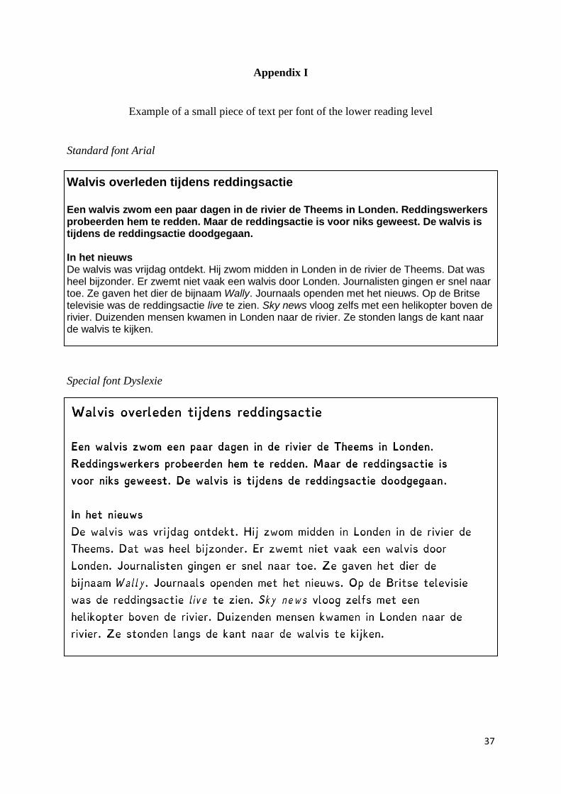
37
Appendix I
Example of a small piece of text per font of the lower reading level
Standard font Arial
Walvis overleden tijdens reddingsactie
Een walvis zwom een paar dagen in de rivier de Theems in Londen. Reddingswerkers probeerden hem te redden. Maar de reddingsactie is voor niks geweest. De walvis is tijdens de reddingsactie doodgegaan. In het nieuws De walvis was vrijdag ontdekt. Hij zwom midden in Londen in de rivier de Theems. Dat was heel bijzonder. Er zwemt niet vaak een walvis door Londen. Journalisten gingen er snel naar toe. Ze gaven het dier de bijnaam Wally. Journaals openden met het nieuws. Op de Britse televisie was de reddingsactie live te zien. Sky news vloog zelfs met een helikopter boven de rivier. Duizenden mensen kwamen in Londen naar de rivier. Ze stonden langs de kant naar de walvis te kijken.
Special font Dyslexie
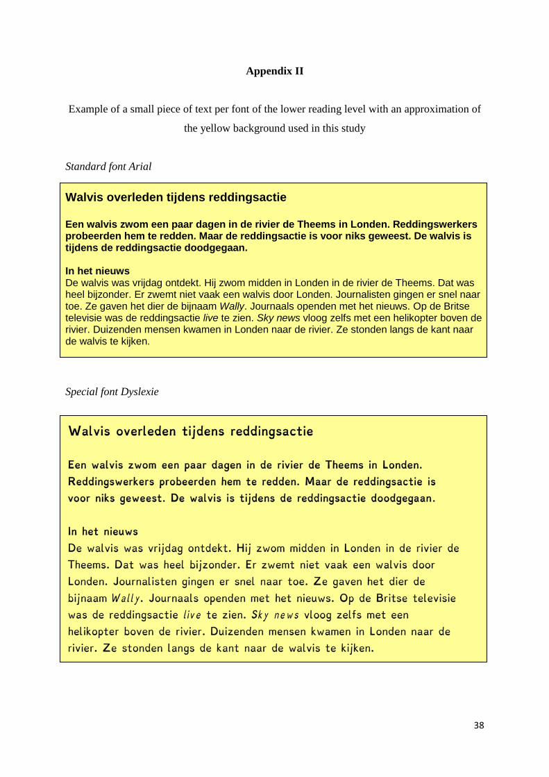
38
Appendix II
Example of a small piece of text per font of the lower reading level with an approximation of
the yellow background used in this study
Standard font Arial
Walvis overleden tijdens reddingsactie
Een walvis zwom een paar dagen in de rivier de Theems in Londen. Reddingswerkers probeerden hem te redden. Maar de reddingsactie is voor niks geweest. De walvis is tijdens de reddingsactie doodgegaan. In het nieuws De walvis was vrijdag ontdekt. Hij zwom midden in Londen in de rivier de Theems. Dat was heel bijzonder. Er zwemt niet vaak een walvis door Londen. Journalisten gingen er snel naar toe. Ze gaven het dier de bijnaam Wally. Journaals openden met het nieuws. Op de Britse televisie was de reddingsactie live te zien. Sky news vloog zelfs met een helikopter boven de rivier. Duizenden mensen kwamen in Londen naar de rivier. Ze stonden langs de kant naar de walvis te kijken.
Special font Dyslexie