Question1inevaluation 150223125654-conversion-gate01
4
In what ways does your media product use, develop or challenge forms and conventions of real media products? Sebastian Cadena
Transcript of Question1inevaluation 150223125654-conversion-gate01

In what ways does your media product use, develop or challenge forms and conventions of real media
products?
Sebastian Cadena

As we see, the masthead has been manipulated to go behind the model which keeps the main focus on him as he is the cover story and all the attention is on him. In addition to this, the headline is very bold and big, and is the main attraction to the front cover, which is common in magazine front covers, such as ‘VIBE’ who do this really well when manipulating the image and having the headline as the focal point as we see here through the use of the ‘T.I.’ text bigger than any other sell line on the page indicating it is the cover story. Moreover, the model uses a direct mode of address looking straight down the camera breaking down the fourth wall between the consumer and the model. Also through the pose of hav stone cold tough face, with slightly aggressive body language, it connotes the genre of rap, which is done well here with Eminem with the model in my magazine having a similar pose which represents the genre.
SC
Front Cover
In addition to this, the model encodes the genre of rap through the costume and props used such as the watch and cap from a big brand which is popular within the genre to wear expensive items to show off their wealth, stereotypically done in this genre. Also, through the fonts used throughout the cover such as the font for ‘SEBZY’ represents a very masculine strong persona, which is linked with artists from the rap genre. Furthermore, the sell lines are all clearly differentiated through colour and size of text, similar to the examples here, which do something similar to make sure the cover story stands out e.g. ‘EMINEM’ is in red and way bigger than anything else, apart from the masthead.

My contents page uses the same model obviously as he is the cover story so by having him as the biggest image on the page, we know he is the main focus. Not only this, but through the costume (which is different to the front cover which uses the conventions of real media products.) and props such as the money and watch used, it encodes the genre of rap and very much conforms to the conventions or real and existing media products. Along with the cover story model, I used two other models to fit in with the features and regulars as this is often done in the majority of music magazines such as this one from Q which uses multiple images on one page, and although I went for something similar, I went with my own style by cutting out the images from their original background. I feel this develops forms and conventions of real media products as commonly, magazines either use one image or a few but don’t cut them out and leave them with the original background
SC
Contents Page
so I feel like I’ve developed my own personal house style for this magazine. More-over, I made clear what the cover story is with a box in a different colour to the rest, and also the text colour is different so it is obvious to the audience. I’ve also taken inspiration from ‘Q’ magazine which uses colour so effectively to organise text, such as setting apart the numbers from the words to make them clear. In addition to this, my contents page uses the typical conventions of music magazine’s as the sectorsare clearly organised and has a ‘social corner’ and subscription box, so it conforms to conventions.
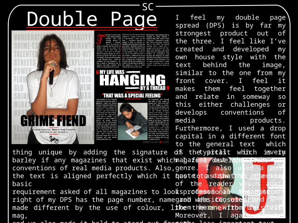
Double Page Spread I feel my double page spread (DPS) is by far my strongest product out of the three. I feel like I’ve created and developed my own house style with the text behind the image, similar to the one from my front cover. I feel it makes them feel together and relate in someway so this either challenges or develops conventions of media products. Furthermore, I used a drop capital in a different font to the general text which is typical in every magazine out there in any genre. I also used a pull quote to draw the attention of the reader which again is common in magazine to grab the consumer and keep them here with the text. Moreover, I again created some-
SC
thing unique by adding the signature of the artist which is in barley if any magazines that exist which I feel develops forms and conventions of real media products. Also,the text is aligned perfectly which it has to as that is the very basic requirement asked of all magazines to look professional. The bottomright of my DPS has the page number, name and website, clearly made different by the use of colour, like the one from this VIBE mag,and we also made it bold to stand out from the less important text. I created the title ‘Grime Fiend’ with the little introduction to beginthis DPS, similarly to this one from VIBE who have a little title to begin with.