Question 3 what have you learnt from your audience feedback?
14
WHAT HAVE YOU LEARNT FROM YOUR AUDIENCE FEEDBACK?
-
Upload
jess-stratton -
Category
Marketing
-
view
39 -
download
1
Transcript of Question 3 what have you learnt from your audience feedback?

WHAT HAVE YOU LEARNT FROM YOUR AUDIENCE FEEDBACK?
THE IMPORTANCE OF AUDIENCE FEEDBACK WHEN PRODUCING AN AD CAMPAIGN
When producing an ad campaign for a film, it is important that you fully understand your target audiences needs because this is the main way that your film will be successful and create revenue. Audience feedback is the best way to understand exactly what your audience want from the film. Before the release of a film, there is usually a test screening. This is where the film is shown to an audience and their reactions are recorded. For example, for a comedy film, they would count the amount of times people laughed and for a horror film, they might record the amount of times that people screamed. This would give an indication to the film distributors if they have reached the target audience successfully. They would also count the amount of times that people clicked on the link to a film from webpages. This would give them an indication of how many people are interested in watching the film. One film that changed the ending of their film due to the audience feedback received from the test screening was Peyton Reed’s risky rom-com, ‘The Break Up’. It is about a couple rowing for two hours as they break up and it proved a solid hit in summer 2006. Both Jenifer Aniston and Vince Vaughn came out very well. After the test screening, audiences didn’t like the fact that the lead couple stayed apart at the end of the film, a new ending was then hastily ordered and shot, which left the door open. The film was then a big hit. This shows the importance of audience feedback, even though the film was nearly finished, the film company hastily shot a new ending, costing money, time and resources. They were willing to do this to meet the audiences needs and produce a successful film.
The woman in Black had a huge Ad campaign, including competitions, teaser trailer, merchandise, webpages and much more. This was all to gather audience feedback about their film to improve it and make it better and the most successful that it can be. Due to all of these things, the film was highly successful and went on to make huge profit. The budget for the film was $15million and in the first three weeks of its release alone, is created $14 million. This is all because they fully understood the audiences feedback and created exactly the film they wanted to see.
HOW I GATHERED MY FEEDBACK (SEE EMBEDDED YOUTUBE CLIP BELOW) I started off by gather audience feedback before I even started to make my horror film trailer. Before starting
to create the trailer, we created an audience questionnaire (using google forms) to gather information about the types of things they wanted us to include within our trailer. We asked them information on their age, gender, the types of horror film they enjoy and whether or not they liked our synopsis. We then analysed these results which helped understand our audience and what elements of our film trailer would make them want to see our film. This was an important process because before we had even started the filming, we knew exactly what would appeal to the audience and essentially what would sell in a cinema if we were to release our film to make profit. It was also important in helping us understand who we were targeting our film at and therefore we would know the best marketing strategy to use.
We also gathered audience feedback after creating the draft of our trailer so we could see what we needed to improve and add. We did this by having a class screening of all of our trailers and recording every one giving verbal feedback on our trailer. You can see this video by scrolling down on this post and watching the embedded YouTube clip. Everyone also wrote down their opinions and feedback on a sheet of paper, I have embedded this below as well. This was important because we got rich qualitative data about our trailer and before submitting the final copy we could make the changes that our audience would like to see.
I gathered feedback on my horror poster and magazine cover through asking my audience to tell me areas that worked well and areas for improvement. I got this feedback when I had completed rough drafts of both products therefore it allowed me time to make these changes. This was important because it gave me a second opinion on what looks the best. Another pair of eyes helped me to pick up on areas that needed improving and this helped my products to look professional and essentially to market my film trailer most successfully.
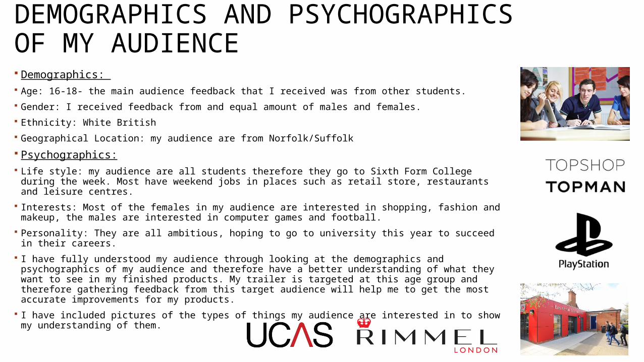
DEMOGRAPHICS AND PSYCHOGRAPHICS OF MY AUDIENCE Demographics: Age: 16-18- the main audience feedback that I received was from other students. Gender: I received feedback from and equal amount of males and females. Ethnicity: White British Geographical Location: my audience are from Norfolk/Suffolk Psychographics: Life style: my audience are all students therefore they go to Sixth Form College during the
week. Most have weekend jobs in places such as retail store, restaurants and leisure centres. Interests: Most of the females in my audience are interested in shopping, fashion and makeup,
the males are interested in computer games and football. Personality: They are all ambitious, hoping to go to university this year to succeed in their
careers. I have fully understood my audience through looking at the demographics and psychographics
of my audience and therefore have a better understanding of what they want to see in my finished products. My trailer is targeted at this age group and therefore gathering feedback from this target audience will help me to get the most accurate improvements for my products.
I have included pictures of the types of things my audience are interested in to show my understanding of them.

FEEDBACK RECEIVED FROM MY HORROR FILM TRAILER (IMPROVEMENTS) When watching the draft trailer feedback, I noticed some improvements were being mentioned by more than
one of target audience. This showed a trend to me that the same things are being noticed that need to be corrected. Firstly, a number of my target audience noticed that the title scenes were not being shown for long enough and they did not have time to read them. One said “some of the text and title shots were a little bit short” suggesting that they could not read them and this is a key element of a trailer as it gives away key information about the trailer, including the released date. Another member of my target audience said, “the titles could have been longer” this again shows that they did not have time to read them. If people do not have time to read the information from our trailer about release dates when it is shown on TV, they may not want to research and find out when they can watch it, therefore we could miss out on views and revenue. Someone else said “I would put more time into the title shots” and “the text scenes should be shown for longer”. Because this was an improvement picked up on by six members of my target audience, I will definitely have to improve this.
The next improvement noticed by seven members of my target audience was that the trailer lacked context and they Got lost throughout. To a certain extent, a horror trailer does not want to be predictable as this adds suspense, however the audience will only want to see the film if they have a rough idea about the context. I also agree that at this stage, our draft trailer lacked context and it was slightly too jumbled. It was first mentioned by someone who said, “you could add context to what is happening” another person said, “I got a little lost in the final scene in the medical room”. I agree with these improvements about the trailer lacking context at this point. The context is what makes a trailer strong and entices people to watch the film.
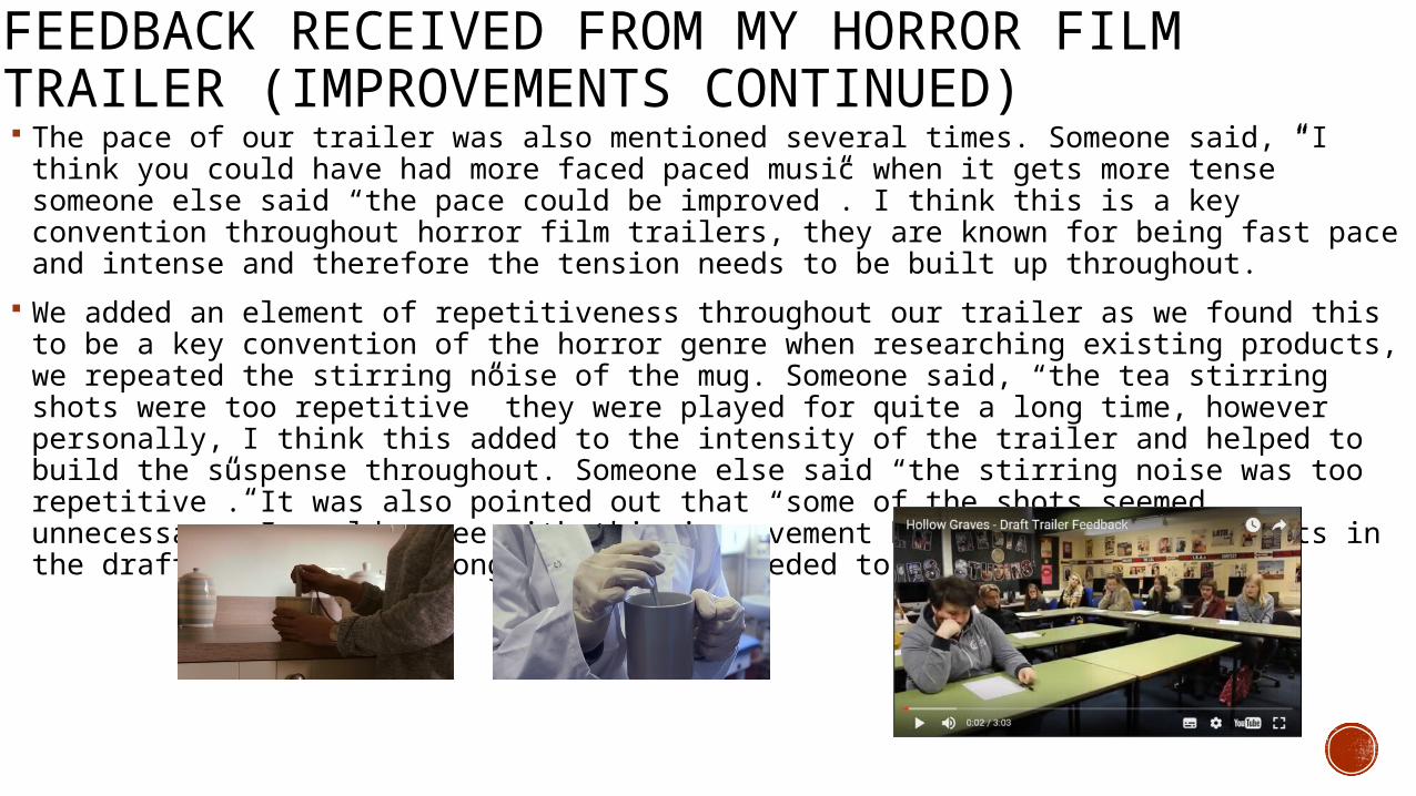
FEEDBACK RECEIVED FROM MY HORROR FILM TRAILER (IMPROVEMENTS CONTINUED) The pace of our trailer was also mentioned several times. Someone said, “I think you could
have had more faced paced music when it gets more tense” someone else said “the pace could be improved”. I think this is a key convention throughout horror film trailers, they are known for being fast pace and intense and therefore the tension needs to be built up throughout.
We added an element of repetitiveness throughout our trailer as we found this to be a key convention of the horror genre when researching existing products, we repeated the stirring noise of the mug. Someone said, “the tea stirring shots were too repetitive” they were played for quite a long time, however personally, I think this added to the intensity of the trailer and helped to build the suspense throughout. Someone else said “the stirring noise was too repetitive”. It was also pointed out that “some of the shots seemed unnecessary” I would agree with this improvement because some of the shots in the draft trailer were longer than they needed to be”.
FEEDBACK RECEIVED FROM MY HORROR FILM TRAILER (POSITIVES) I then looked at the elements of the trailer that our target audience thought worked well, this is important to ensure
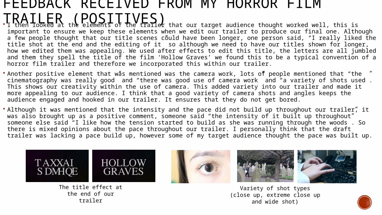
we keep these elements when we edit our trailer to produce our final one. Although a few people thought that our title scenes could have been longer, one person said, “I really liked the title shot at the end and the editing of it” so although we need to have our titles shown for longer, how we edited them was appealing. We used after effects to edit this title, the letters are all jumbled and them they spell the title of the film ‘Hollow Graves’ we found this to be a typical convention of a horror film trailer and therefore we incorporated this within our trailer.
Another positive element that was mentioned was the camera work, lots of people mentioned that “the cinematography was really good” and “there was good use of camera work” and “a variety of shots used”. This shows our creativity within the use of camera. This added variety into our trailer and made it more appealing to our audience. I think that a good variety of camera shots and angles keeps the audience engaged and hooked in our trailer. It ensures that they do not get bored.
Although it was mentioned that the intensity and the pace did not build up throughout our trailer, it was also brought up as a positive comment, someone said “the intensity of it built up throughout” someone else said “I like how the tension started to build as she was running through the woods”. So there is mixed opinions about the pace throughout our trailer. I personally think that the draft trailer was lacking a pace build up, however some of my target audience thought the pace was built up.
The title effect at the end of our trailer
Variety of shot types (close up, extreme close up and wide shot)
FEEDBACK RECEIVED FROM MY HORROR FILM POSTER
Draft Film Poster
Final Film Poster
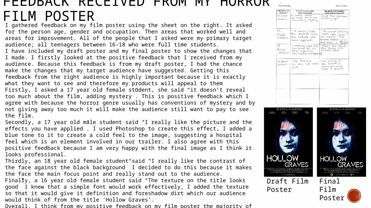
I gathered feedback on my film poster using the sheet on the right. It asked for the person age, gender and occupation. Then areas that worked well and areas for improvement. All of the people that I asked were my primary target audience; all teenagers between 16-18 who were full time students.I have included my draft poster and my final poster to show the changes that I made. I firstly looked at the positive feedback that I received from my audience. Because this feedback is from my draft poster, I had the chance make the changes that my target audience have suggested. Getting this feedback from the right audience is highly important because it is exactly what they want to see and therefore my products will appeal to them Firstly, I asked a 17 year old female student, she said “it doesn’t reveal too much about the film, adding mystery”. This is positive feedback which I agree with because the horror genre usually has conventions of mystery and by not giving away too much it will make the audience still want to pay to see the film.Secondly, a 17 year old male student said “I really like the picture and the effects you have applied”. I used Photoshop to create this effect, I added a blue tone to it to create a cold feel to the image, suggesting a hospital feel which is an element involved in our trailer. I also agree with this positive feedback because I am very happy with the final image as I think it looks professional.Thirdly, an 18 year old female student said “I really like the contrast of the face against the black background” I decided to do this because it makes the face the main focus point and really stand out to the audience. Finally, a 16 year old female student said “The texture on the title looks good” I knew that a simple font would work effectively, I added the texture so that it would give it definition and foreshadow dirt which our audience would think of from the title ‘Hollow Graves’. Overall, I think from my positive feedback on my film poster the majority of my audience liked the picture that I used, I am happy with this positive feedback because I feel that the image on a film poster is the main element as to whether it is successful or not.

FEEDBACK RECEIVED FROM MY HORROR FILM POSTER I then focussed on my areas for improvement. I feel this is the most
effective feedback because my target audience are telling me exactly what would work better for them. Firstly, a 17 year old female student suggested “Could have production company logos” I think this would make my poster look professional and give it an element of realism. Most film posters have the production logos on them so that the production companies can be identified and recognised as a successful production company. Secondly, a 17 year old male student said “you could possibly add red text to match the blood effect as I feel there is too much white” I think this is a good idea to make the poster fit together better. Red has connotations of danger so I think this would work very well in making my poster more striking. However I think subtlety is best therefore I would only add a slight bit of red. Thirdly, a 18 year old female student said “make the titles the same size as each other” I think this is referring to the main title of the film because one word is bigger than the other. I did this to add inconsistency within the poster as this is a convention of horror, uncertainty. However I think it would look better if they were both the same size. Finally, a 16 year old female student said “the writing at the bottom is stretched, could make it thinner” I think this refers to the billing block, my making it thinner it would look more conventional of a billing block.
FEEDBACK RECEIVED FROM MY MAGAZINE COVER
Draft Magazine Cover
Final Magazine Cover
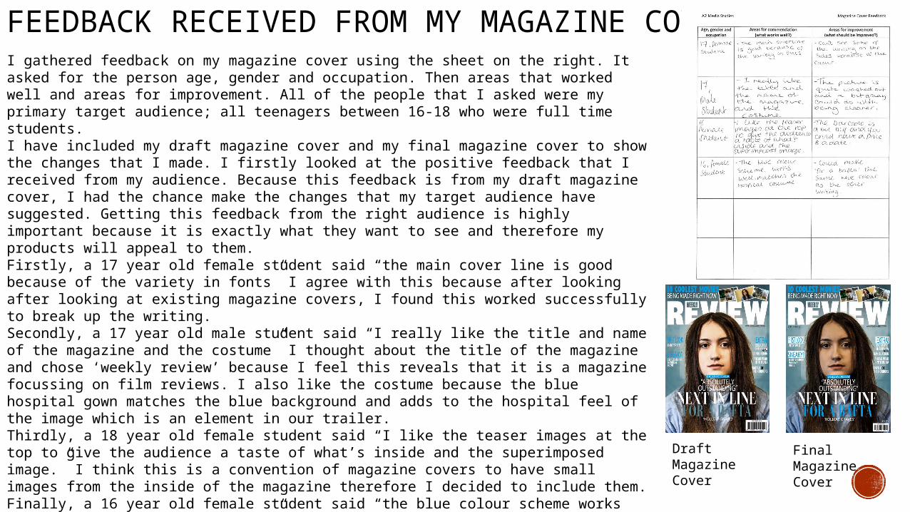
I gathered feedback on my magazine cover using the sheet on the right. It asked for the person age, gender and occupation. Then areas that worked well and areas for improvement. All of the people that I asked were my primary target audience; all teenagers between 16-18 who were full time students.I have included my draft magazine cover and my final magazine cover to show the changes that I made. I firstly looked at the positive feedback that I received from my audience. Because this feedback is from my draft magazine cover, I had the chance make the changes that my target audience have suggested. Getting this feedback from the right audience is highly important because it is exactly what they want to see and therefore my products will appeal to them.Firstly, a 17 year old female student said “the main cover line is good because of the variety in fonts” I agree with this because after looking after looking at existing magazine covers, I found this worked successfully to break up the writing. Secondly, a 17 year old male student said “I really like the title and name of the magazine and the costume” I thought about the title of the magazine and chose ‘weekly review’ because I feel this reveals that it is a magazine focussing on film reviews. I also like the costume because the blue hospital gown matches the blue background and adds to the hospital feel of the image which is an element in our trailer. Thirdly, a 18 year old female student said “I like the teaser images at the top to give the audience a taste of what’s inside and the superimposed image.” I think this is a convention of magazine covers to have small images from the inside of the magazine therefore I decided to include them.Finally, a 16 year old female student said “the blue colour scheme works well, matches the hospital gown” this links to other bit of positive feedback about how the colour scheme makes it have a hospital theme. This was intentional because the main story in this magazine is about our film ‘Hollow Graves’ and there is an element of hospitals in this film.

FEEDBACK RECEIVED FROM MY MAGAZINE COVERI then focussed on the areas suggested for improvement. This is the most effective feedback as it made me aware of things to take into consideration to make my magazine the most effective and appealing to my target audience. Firstly, a 17 year old female student said “can’t see some of the writing on the sides because of the colour”. I agree with this feedback because the blue colour that I have chosen is too similar to the background colour and therefore the audience cannot read it clearly. Although it matches the colour scheme, I need to make it bolder.Secondly, a 17 year old male student said “The picture is quite washed out and a bit grainy, could be a bit clearer”. I also agree with this feedback because the face on the front is very white in my draft front cover, it needs to be striking as this is what will draw the audiences attention. Thirdly, an a18 year old females student said “The barcode is a bit big and you could have a price and a date”. These are typical conventions of a magazine so therefore I did need to add these onto my magazine cover. The barcode does take up a considerable part of the bottom right so I agreed with making it smaller.Finally, a 16 year old female student said “Could make ‘for a Bafta’ the same blue colour as the other writing”. I think this will create unity within my product to make it flow together and be recognised as a brand as well as products.
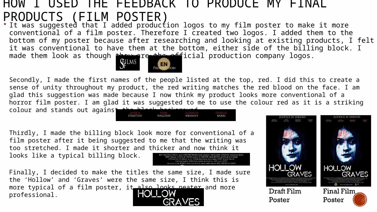
HOW I USED THE FEEDBACK TO PRODUCE MY FINAL PRODUCTS (FILM POSTER) It was suggested that I added production logos to my film poster to make it more conventional of a
film poster. Therefore I created two logos. I added them to the bottom of my poster because after researching and looking at existing products, I felt it was conventional to have them at the bottom, either side of the billing block. I made them look as though they are the official production company logos.
Secondly, I made the first names of the people listed at the top, red. I did this to create a sense of unity throughout my product, the red writing matches the red blood on the face. I am glad this suggestion was made because I now think my product looks more conventional of a horror film poster. I am glad it was suggested to me to use the colour red as it is a striking colour and stands out against the black background.
Thirdly, I made the billing block look more for conventional of a film poster after it being suggested to me that the writing was too stretched. I made it shorter and thicker and now think it looks like a typical billing block.
Finally, I decided to make the titles the same size, I made sure the ‘Hollow’ and ‘Graves’ were the same size, I think this is more typical of a film poster, it also looks neater and more professional.

HOW I USED THE FEEDBACK TO PRODUCE MY FINAL PRODUCTS (MAGAZINE COVER) Firstly, because you cant see the cover lines very well because
the colour contrasts with the background, I added boxes behind the text so that the writing would stand out and the audience would be able to read it. This is important because the cover lines tell the audience what is inside the magazine.
Secondly, I added a price and a date to my magazine cover because these are typical conventions of a magazine cover and they are what you would expect to see. I also made the barcode smaller as it was taking up too much space in the bottom corner.
The picture at the top of the magazine was too similar to the main cover image and therefore I changed this so it did not match and added more variation to the magazine cover.
I also edited the main cover image because it was pointed out that the face was too washed out, I also agreed with this and made it more true to life.
Finally, I made the words ‘For a Bafta’ the same shade of blue as the other blue that is used in the writing, this creates a sense on unity within the magazine cover.

HOW I USED THE FEEDBACK TO PRODUCE MY FINAL PRODUCTS (TRAILER) As it was mentioned by our target audience that our title were not shown within our trailer for long enough, we made them long enough so that
people can read them when watching our trailer. We also placed them throughout our trailer so they were evenly spread out, we felt this fit better because it was more conventional of the horror film trailer conventions.
As people found our trailer was lacking context, we added some dialogue as we think this helps the audience to understand what is going on. There are now three pieces of dialogue within our trailer. The main character says “I don’t know what's happening”. This helps the audience to create a mental image in their heads of the main character going crazy or loosing their train of thought. This reveals to the audience that there is a theme of craziness within our trailer. This is then further anchored by the small shots we added of the doctor character in our trailer. As it was mentioned that some people got lost at the end of the trailer when we cut to the medical room, we decided to add filler shots throughout the trailer of more scenes of this character. We added these throughout so add context to our trailer.
To improve the pace of our trailer, we used music and sound effects. The music that we used on our draft trailer did not build tension throughout so we added another piece of music that adds to the intensity of the trailer. We also added dramatic sound effects throughout so help with the pace. Some of the shots we found were too slow such as the one where the main character is sitting at the grave, therefore we added an extreme close up of an eye over the top, combined with a loud bang effect to add intensity to our trailer.
Although some people thought the tea stirring shots were too long, we felt that this helped to build the intensity of the trailer. The repetition also made the trailer seem creepy and daunting as the sound was over powering the rest of the scene. Therefore we kept the repetition within our trailer, however we did make the first shot of the tea stirring slightly shorter to suit the audiences needs.
It was also mentioned that some of our shots were too long and exhaustive, such as the ones where she is walking through the woods. I think it was necessary to have the shots where she is walking through the woods, but I decided to cut out one of the shots that was very similar to the other, this is because the shot type was the same. I changed this so there were two scenes where she is walking through the woods, but they are different shot types, making it more appealing to the audience. There were also some shots that we cut down because they were being shown for too long, by cutting down some of these shots by a couple of seconds, it meant we could add other clips to our trailer such as the doctor filler shots we used and still keep our trailer within the standard time of a trailer.