Reflection Question 1. Reflection Question 2 m Reflection Question 3.
Upload
smcmediastudiesCategory
view
345download
0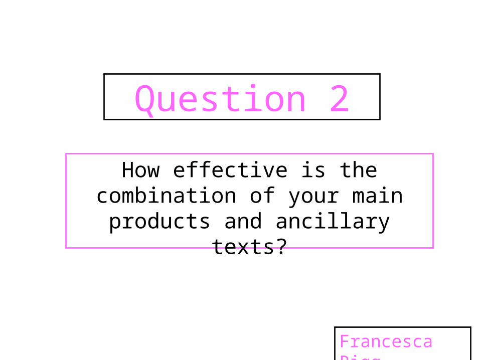
Question 2
How effective is the combination of your main products and ancillary
texts?
Francesca Rigg
What is a brand? A brand can either be a name, term,
design or logo that identifies a particular product or company and makes it distinct to its competitors. It also allows the company to form a relationship with its audience.
Companies create brands not only to
provide them with an identity but to also boost their success in the market and to promote their name worldwide. Some companies have had major success with their branding and are globally recognised by all.
A few examples of these companies are Coca Cola, McDonalds and Apple. This is proven as the red italic writing is instantly recognised as coca cola and the colours yellow and red are immediately identified as McDonalds.

Brand ImageWithin music, a brand image is an essential
part of the making of the band/artist. It defines their genre, personality and will ultimately help to sell their records. Its crucial to get the image to satisfy the artists targeted audience. A brand image is distributed through videos, album artwork, posters, mise en scene and any products they put on the market.
When carrying out our research we looked into various artists and their brand images. One example we researched was Katy Perry. Her brand image is wild, fun and crazy. This is shown mainly through her image and videos including California Gurls and Last Friday Night. In California Gurls Katy wears a blue wig and various bright outrageous outfits. This emphasises her brand image and matches her upbeat colourful music, which works well for her target audience of 13-25 year olds.

Brand Image
It is clear to see from the album covers above that this is another important form of getting her brand image across to her audience. The same font is used on all three covers which makes it instantly recognisable and bright vibrant colours are used throughout. Another aspect she has decided to use to identify herself and her image is the different hair colours she uses. The ‘California Gurls’ album in the middle proves how outrageous and wild she is by lying naked with a purple wig on a cloud.
Brand Image
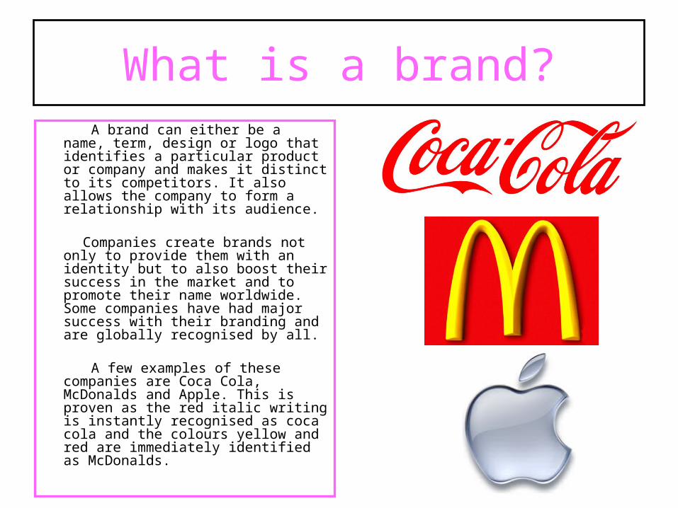
Once we had decided on our main target audience, we then began to create our own brand image. We chose the brand image of fun, young, energetic, and lively. This suits our chosen target audience of young females aged 13-19 years old as we feel they could relate to our artist and her music. Another reason why we decided on this was through Young and Rubicam’s theory which reassured us that ‘Mainstreamers’ would be interested in our music as they will be attracted to a young, successful, girly female artist.
Before we could progress any further we had to create a questionnaire to see what how our audience listen to music and to confirm who favours the pop genre. From the people we asked (which were mainly females aged 17-18) over half said their favourite type of music was pop which proved we had picked the most popular genre.
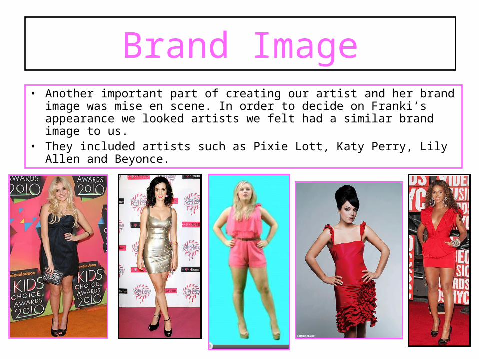
• Another important part of creating our artist and her brand image was mise en scene. In order to decide on Franki’s appearance we looked artists we felt had a similar brand image to us.
• They included artists such as Pixie Lott, Katy Perry, Lily Allen and Beyonce.
Brand Image

Looking at the artists on the previous slide, it was clear how we needed to dress and style Franki for her female parts. We decided she needed to wear pretty dresses with high heels and fairly heavy makeup.
The pink lipstick and playsuit reinforce her girly, young image and her messy blonde hair also helps to emphasise her lively and energetic nature.
Our Brand Image
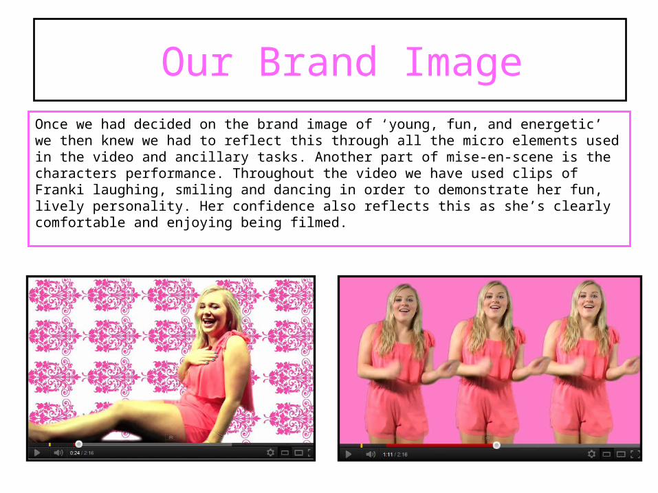
Once we had decided on the brand image of ‘young, fun, and energetic’ we then knew we had to reflect this through all the micro elements used in the video and ancillary tasks. Another part of mise-en-scene is the characters performance. Throughout the video we have used clips of Franki laughing, smiling and dancing in order to demonstrate her fun, lively personality. Her confidence also reflects this as she’s clearly comfortable and enjoying being filmed.
Our Brand Image
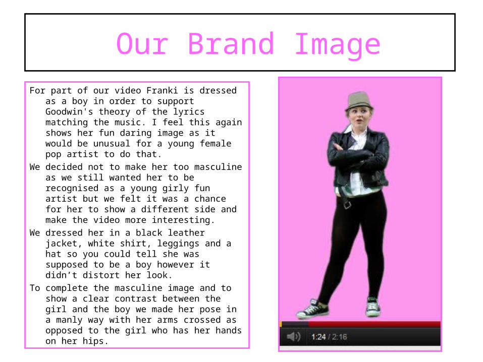
For part of our video Franki is dressed as a boy in order to support Goodwin's theory of the lyrics matching the music. I feel this again shows her fun daring image as it would be unusual for a young female pop artist to do that.
We decided not to make her too masculine as we still wanted her to be recognised as a young girly fun artist but we felt it was a chance for her to show a different side and make the video more interesting.
We dressed her in a black leather jacket, white shirt, leggings and a hat so you could tell she was supposed to be a boy however it didn’t distort her look.
To complete the masculine image and to show a clear contrast between the girl and the boy we made her pose in a manly way with her arms crossed as opposed to the girl who has her hands on her hips.
Our Brand Image

Our Brand Image – Ancillary Tasks

Our Brand Image – Ancillary Tasks
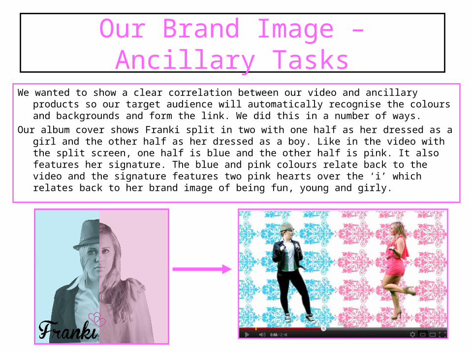
We wanted to show a clear correlation between our video and ancillary products so our target audience will automatically recognise the colours and backgrounds and form the link. We did this in a number of ways.
Our album cover shows Franki split in two with one half as her dressed as a girl and the other half as her dressed as a boy. Like in the video with the split screen, one half is blue and the other half is pink. It also features her signature. The blue and pink colours relate back to the video and the signature features two pink hearts over the ‘i’ which relates back to her brand image of being fun, young and girly.
Our Brand Image – Ancillary Tasks
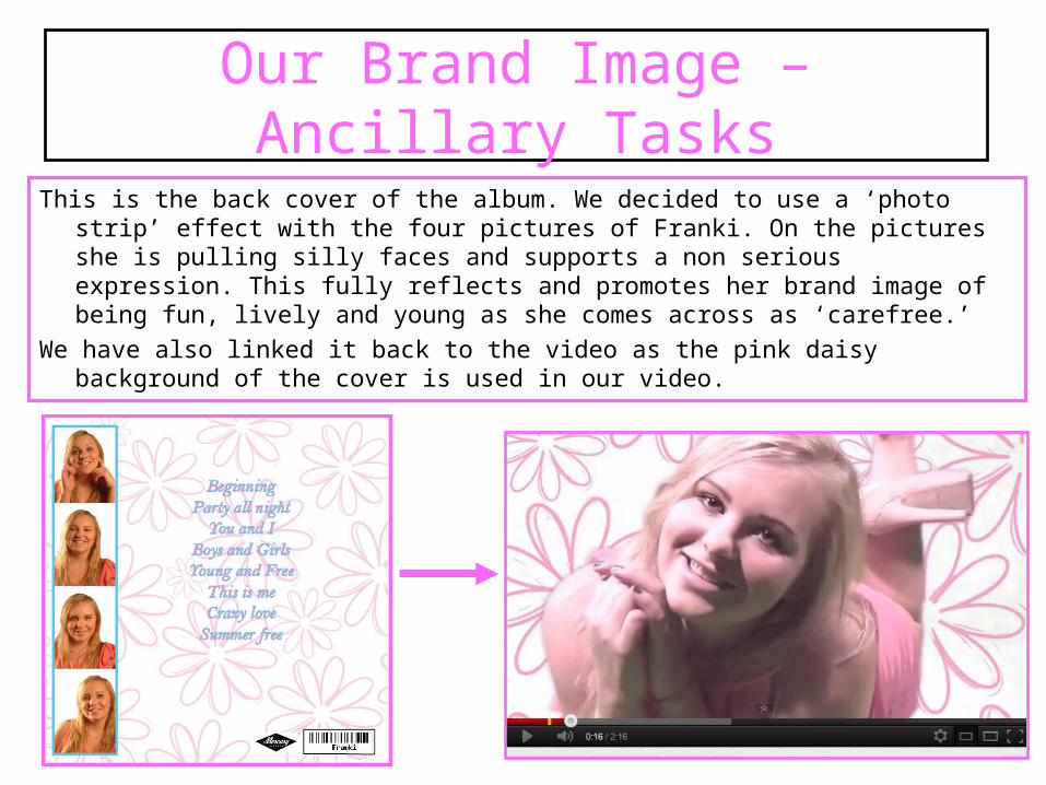
This is the back cover of the album. We decided to use a ‘photo strip’ effect with the four pictures of Franki. On the pictures she is pulling silly faces and supports a non serious expression. This fully reflects and promotes her brand image of being fun, lively and young as she comes across as ‘carefree.’
We have also linked it back to the video as the pink daisy background of the cover is used in our video.
Our Brand Image – Ancillary Tasks
How have you constructed a sense of brand identity using media language, first in the video, then how have you continued this across
the ancillary tasks?
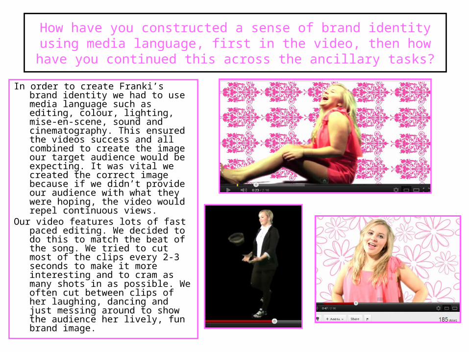
In order to create Franki’s brand identity we had to use media language such as editing, colour, lighting, mise-en-scene, sound and cinematography. This ensured the videos success and all combined to create the image our target audience would be expecting. It was vital we created the correct image because if we didn’t provide our audience with what they were hoping, the video would repel continuous views.
Our video features lots of fast paced editing. We decided to do this to match the beat of the song. We tried to cut most of the clips every 2-3 seconds to make it more interesting and to cram as many shots in as possible. We often cut between clips of her laughing, dancing and just messing around to show the audience her lively, fun brand image.
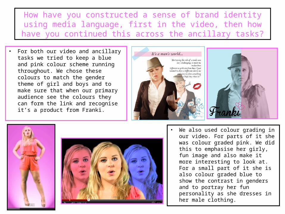
• For both our video and ancillary tasks we tried to keep a blue and pink colour scheme running throughout. We chose these colours to match the gender theme of girl and boys and to make sure that when our primary audience see the colours they can form the link and recognise it’s a product from Franki.
How have you constructed a sense of brand identity using media language, first in the video, then how have you continued this across
the ancillary tasks?
• We also used colour grading in our video. For parts of it she was colour graded pink. We did this to emphasise her girly, fun image and also make it more interesting to look at. For a small part of it she is also colour graded blue to show the contrast in genders and to portray her fun personality as she dresses in her male clothing.

For most of the video the lighting is high key and very bright. We did this so Franki was clear and easy to see. It is common for typical music videos to use high key lighting so we felt following the conventions was essential.
For the side shots of Franki dressed as a boy we used a black background and side lighting. This was to show the split personality with the two genders.
We also used high key lighting on our ancillary tasks to match the lighting on the video, another way to form a link between the two.
How have you constructed a sense of brand identity using media language, first in the video, then how have you continued this across
the ancillary tasks?

• For the video and the ancillary task we made sure Franki wore the same thing to keep the brand image consistent.
• For the boy and girl panels we've dressed her in the same white shirt hat and blazer jacket for the boy section and the pink playsuit for the girl part.
• The female panel features three pictures of her two of which with her hands on her hips and smiling showing her teeth. We used baby pink lipstick and painted her nails blue. These factors all combine again to emphasises her brand image of being lively young and fun. The background can link back to the video as it was used in a few shots.
How have you constructed a sense of brand identity using media language, first in the video, then how have you continued this across
the ancillary tasks?

• For the cinematography, we tried to use as many shots as we could. When we decided to create a studio based video we knew that in order to grasp the audience’s attention we had to make it as interesting as possible.
As Andrew Goodwin and Peter Fraser stated, a typical music video needs lots of close ups of the main artist. We followed this convention to the full, ensuring we used many close ups of Franki both male and female. This creates a connection between the audience and the artist and helps to form a strong relationship. It also helps to promote Franki as the audience are familiarised with her face.
As well as close ups we also used a variety of medium shots, long shots, extreme close ups and high angle shots of her on the floor.
We used the extreme close ups at the very start of the video to familiarise the audience with Franki and make it clear who the protagonist is.
How have you constructed a sense of brand identity using media language, first in the video, then how have you continued this across
the ancillary tasks?
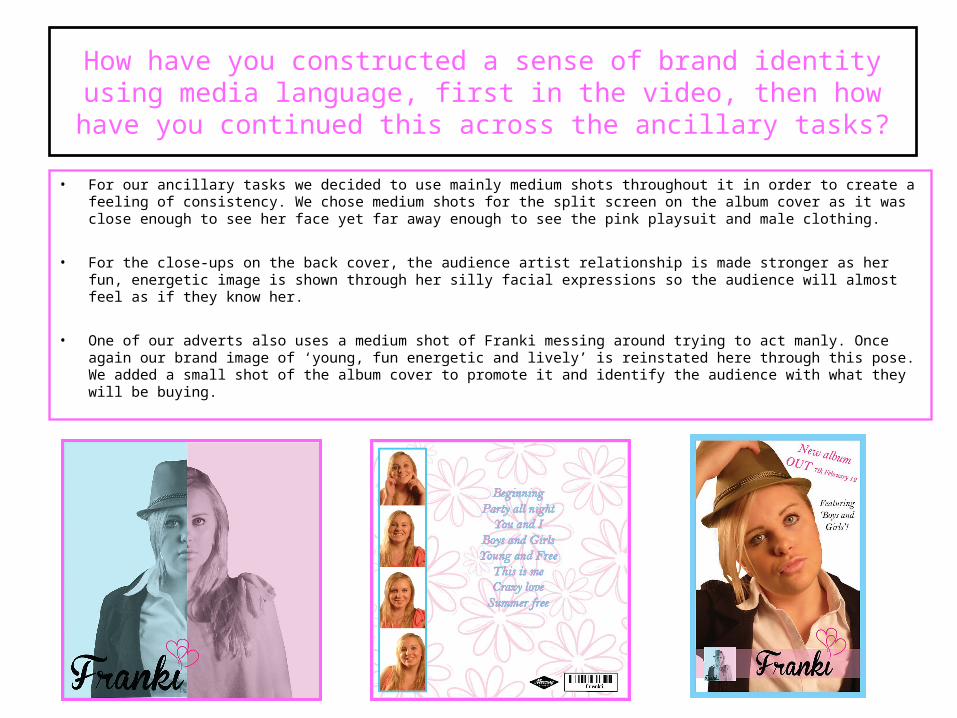
• For our ancillary tasks we decided to use mainly medium shots throughout it in order to create a feeling of consistency. We chose medium shots for the split screen on the album cover as it was close enough to see her face yet far away enough to see the pink playsuit and male clothing.
• For the close-ups on the back cover, the audience artist relationship is made stronger as her fun, energetic image is shown through her silly facial expressions so the audience will almost feel as if they know her.
• One of our adverts also uses a medium shot of Franki messing around trying to act manly. Once again our brand image of ‘young, fun energetic and lively’ is reinstated here through this pose. We added a small shot of the album cover to promote it and identify the audience with what they will be buying.
How have you constructed a sense of brand identity using media language, first in the video, then how have you continued this across
the ancillary tasks?